プレビュー準備中デザインリファレンスを見る
日本のWebデザインを、AIの制作リファレンスに。
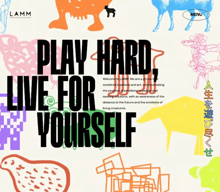
DESIGN REFERENCE
生成りの背景に多彩な羊のイラストと極太コンデンス体を重ね、日英の紹介文、事業一覧、メンバー紹介へ展開するLAMMのコーポレートサイト。
オリジナルサイトを見るMonumental black lettering and an unruly flock of colorful sheep on warm cream.
Original URL: https://corp.lamm.tokyo/
Final URL: https://corp.lamm.tokyo/
Theme: warm light canvas, black typography, multicolor illustrations, and contrasting section surfaces.
Inspected: September 22, 2026, using the supplied browser evidence captured at 2026-09-22T14:14:20.807Z — 23:14:20.807 JST.
Viewports: desktop 1440 × 1000 CSS pixels; mobile 390 × 844 CSS pixels.
Scope: the current corporate homepage: opening composition, About content, five service entries, Official Tribe, Working Tribe, footer, and navigation/loading elements recorded in the DOM. Linked pages and an opened menu were not inspected.
LAMM presents itself as a business artists’ collective connecting business, art, and culture. Its homepage combines a large illustrated brand statement with a substantial bilingual introduction, a service directory, and two member directories. The recorded document is approximately 17,484px tall on desktop and 17,920px on mobile.
The central visual relationship is between extremely heavy, narrow black letters and sheep drawn in deliberately incompatible styles. Scribbles, crayon strokes, geometric outlines, rounded cartoon bodies, flat silhouettes, and pixel-like blocks coexist on a pale cream field. The small wordmark, centered sheep emblem, and outlined oval MENU control provide a restrained navigation layer above this busy artwork.
Monumental black lettering and an unruly flock of colorful sheep on warm cream.
Original URL: https://corp.lamm.tokyo/
Final URL: https://corp.lamm.tokyo/
Theme: warm light canvas, black typography, multicolor illustrations, and contrasting section surfaces.
Inspected: September 22, 2026, using the supplied browser evidence captured at 2026-09-22T14:14:20.807Z — 23:14:20.807 JST.
Viewports: desktop 1440 × 1000 CSS pixels; mobile 390 × 844 CSS pixels.
Scope: the current corporate homepage: opening composition, About content, five service entries, Official Tribe, Working Tribe, footer, and navigation/loading elements recorded in the DOM. Linked pages and an opened menu were not inspected.
LAMM presents itself as a business artists’ collective connecting business, art, and culture. Its homepage combines a large illustrated brand statement with a substantial bilingual introduction, a service directory, and two member directories. The recorded document is approximately 17,484px tall on desktop and 17,920px on mobile.
The central visual relationship is between extremely heavy, narrow black letters and sheep drawn in deliberately incompatible styles. Scribbles, crayon strokes, geometric outlines, rounded cartoon bodies, flat silhouettes, and pixel-like blocks coexist on a pale cream field. The small wordmark, centered sheep emblem, and outlined oval MENU control provide a restrained navigation layer above this busy artwork.
The following custom-property names and values were present at both inspected widths. Descriptive aliases in the first column are for implementation planning.
| Name | Value | Source token or measurement | Role and evidence |
|---|---|---|---|
| Warm Cream | #f8f6ed |
--background-color |
Computed HTML, body, main, Service, and Working Tribe background; the principal visible canvas |
| Black Ink | #000000 |
Computed text color | Opening headline, ordinary text, and dark interface details |
| White | #ffffff |
Computed text color | Official Tribe names and biographies, menu service headings, and footer text |
| Control Gray | #efefef |
MENU computed background | Pale fill inside the outlined menu ellipse |
| Yellow | #fbea54 |
--colorPaletteYellow |
Declared artwork palette; visually related to the angular yellow sheep |
| Green | #62ca75 |
--colorPaletteGreen |
Declared artwork palette; visually related to rounded green sheep |
| Orange | #fc8940 |
--colorPaletteOrange |
Declared artwork palette; visually related to orange figures and geometric linework |
| Lime | #dbf94f |
--colorPaletteLightGreen |
Declared artwork palette; visually related to bright lime sheep and lettering |
| Light Pink | #f5c1c8 |
--colorPaletteLightPink |
Declared artwork palette; visually related to pale pink scribbled figures |
| Rust Red | #d85d3a |
--colorPaletteRed |
Exact computed footer background; visually related to the solid horned sheep |
| Pink | #ff81b6 |
--colorPalettePink |
Additional declared accent; precise allocation to individual assets was not supplied |
| Purple | #a875f8 |
--colorPalettePurple |
Declared artwork palette; visually related to large block-shaped figures |
| Blue | #4d82fa |
--colorPaletteBlue |
Exact mobile Official Tribe background; visually related to blue crosshatched sheep |
| Sky Blue | #4dbafa |
--colorPaletteSkyBlue |
Declared artwork palette; visually related to pale blue outline and textured figures |
| Light Purple | #a7aae3 |
--colorPaletteLitePurple |
Additional declared accent; precise allocation was not established |
The CSS values are exact, but illustration pixels may differ because of texture, opacity, antialiasing, or image processing. Do not claim that every blue or pink pixel in the artwork equals its corresponding CSS token.
The color system supports many independent characters rather than assigning one universal accent to every action. Black supplies hierarchy. Cream supplies continuity. The footer and mobile Official Tribe section introduce large solid color fields. No selectable theme system was evidenced.
HardbopBlack, sans-serif.700 on the opening H1 and member names.HardbopBold, sans-serif.700.124.2px on desktop and 80px on mobile.roc-grotesk, noto-sans-cjk-jp, sans-serif.16px at both widths.400.700.14px / 28px, giving dense bilingual content generous leading.normal; tightly packed display lettering is primarily a font characteristic, not evidence of a large negative letter-spacing value.These are computed family declarations. Font files, licensing, and successful loading of every individual face were not independently inspected.
The MENU button uses Arial, weight 600, with a 20px line height. Its size changes from 20px on desktop to 12px on mobile. This utility treatment is distinct from both the condensed display face and the general body stack.
Section headings and Japanese Working Tribe aliases were recorded with transparent text color. The aliases also have a transition on -webkit-text-stroke-color, supporting a stroke-based treatment there. The supplied data does not include the relevant stroke widths and colors for every heading.
A thin outlined heading is a reasonable implementation interpretation, but its exact stroke must be labeled as a recommendation. Copying color: transparent alone would make text disappear.
| Role | Desktop measurement | Mobile measurement | Notes |
|---|---|---|---|
| Opening H1 container | 324px / 388.8px, 700 |
87.75px / 105.3px, 700 |
HardbopBlack; both sizes equal 22.5vw at the inspected widths |
| About and Service headings | 100px, 700 |
48px, 700 |
Body-family stack; transparent fill recorded |
| Official Tribe section heading | 100px, 700 |
48px, 700 |
Transparent fill recorded |
| Working Tribe section heading | 90px, 700 |
48px, 700 |
Mobile rectangle is 124px tall, consistent with wrapping |
| Menu service heading | 124.2px, 700 |
80px, 700 |
HardbopBold; normal computed line height |
| Official Tribe member name | 100px / 100px, 700 |
100px / 100px, 700 |
Size remains unchanged across the two samples |
| Working Tribe member name | 270px / 216px, 700 |
80px / 64px, 700 |
Line-height ratio is 0.8 |
| Japanese Working Tribe alias | 27px, 600 |
24px, 600 |
Transparent fill; stroke-color transition recorded |
| About and Official Tribe biography | 14px / 28px, 400 |
14px / 28px, 400 |
Same reading size at both widths |
| Working Tribe biography | 13px / 24.7px, 400 |
12px / 22.8px, 400 |
Line-height ratio is 1.9 |
| MENU label | 20px / 20px, 600 |
12px / 20px, 600 |
Arial |
| Footer explanation | 12px, normal leading |
12px / 19.2px |
White text |
| Footer navigation | 14px, 600 |
14px, 600 |
Same source stack as body text |
The opening English introduction appears approximately 15–16px with relaxed leading in the desktop image. Its own computed text style was not provided; the H1 ancestor’s display size must not be applied to that paragraph.
The page combines very large display intervals with modest reading-column widths. It does not use one uniform spacing unit throughout.
| Use | Desktop | Mobile | Evidence |
|---|---|---|---|
| Header horizontal inset | 48px |
16px |
Computed padding |
| Header vertical inset | 44px |
16px |
Computed padding |
| Main Service/Working Tribe inset | 48px |
15px |
Computed padding |
| About bilingual-column gap | Approximately 16px |
16px between paragraphs |
Derived from rectangles |
| Working Tribe bilingual-column gap | 16px |
16px between paragraphs |
Derived from rectangles |
| Official Tribe language gap | 36px |
20px |
Derived from representative biography rectangles |
| Working Tribe name-to-alias gap | 8px |
8px |
Derived from rectangles |
| Working Tribe alias-to-biography gap | 16px |
16px |
Derived from rectangles |
| Space after a Working Tribe biography group | 120px |
120px |
Repeated in sampled entry positions |
| Main service-row left padding | 180px |
48.75px |
Computed; both equal 12.5vw |
| Main service-row vertical padding | 0px |
16px |
Computed |
| Working Tribe section padding | 160px 48px 120px |
50px 15px 36px |
Computed |
| Element | Treatment | Confidence |
|---|---|---|
| MENU | border-radius: 50% |
Measured; produces a true ellipse |
| Service link boxes | 0 |
Measured on sampled anchors |
| Main section containers | 0 |
Measured |
| Illustration silhouettes | Intrinsic artwork geometry | Visible; not a UI radius system |
The menu outline looks approximately 1px thick. Border width was not included in the computed-style extract, so this is a visual estimate. No general soft-shadow or elevated-card system is visible in the supplied original-page images.
| Element | Desktop | Mobile |
|---|---|---|
| Header rectangle | 1440 × 142px |
390 × 74px |
| Wordmark H1 wrapper | Approximately 98 × 38.53px |
Approximately 98 × 38.53px |
| MENU button | 130 × 54px |
Approximately 69.34 × 42px |
| Opening section | 1440 × 1114.41px |
390 × 844px |
| Main service content width | 1344px |
360px |
| Main service-row height | Approximately 401.39px |
Usually 347.75px; HEYA is 343.75px |
| About language column | Approximately 384–385px |
360px |
| Official Tribe biography column | Approximately 418.48px |
360px |
| Working Tribe language column | 380px |
360px |
Role: maintain identity and a compact navigation entry over the illustrated field.
The wordmark sits at the upper left, a small black sheep emblem is centered horizontally, and the oval MENU button sits at the upper right. There is no opaque full-width header strip or visible bottom divider in the supplied screenshots. The surrounding cream and artwork continue behind the controls.
At desktop width, the logo wrapper begins at approximately x=48, y=51.73. The menu begins at x=1262, y=44. On mobile, the corresponding positions are approximately x=16, y=17.73 and x=304.66, y=16.
The wordmark remains about 98px wide at both widths. The central sheep appears approximately 50–55px wide on desktop and 24–28px wide on mobile; these are visual estimates. Its small internal light marks distinguish it from a generic solid animal icon.
The header remains at the top across the supplied visual states, including a mobile frame with a fragment of a later biography. This supports a persistent-header appearance, although its exact CSS positioning mechanism was not supplied. Only the wordmark’s homepage link and the MENU button element are confirmed; the central emblem’s interaction is unknown.
Role: establish the collective’s attitude through typography, artwork, and a short explanation.
The visible desktop headline is arranged as three separate display lines:
PLAY HARD,LIVE FORYOURSELFThe first and third lines start farther right than the middle line. In the desktop image, their visible left edges are approximately 240px, while the middle line begins near 45px. These are visual estimates of glyph placement, not DOM container offsets.
A small English introduction occupies the open area beside the middle line, beginning roughly around x=672, y=520, with an estimated width of 420–440px. A vertical Japanese statement, 人生を遊び尽くせ, runs near the right edge. Its individual characters have differing fills and a fine dark outline.
The artwork extends beneath the text rather than occupying a separate rectangular illustration panel. Large figures are cropped at the viewport edges, while the headline remains the strongest black shape.
The opening H1 contains the headline and introduction in the supplied text extraction. For a new implementation, use a semantic H1 for the statement and a sibling paragraph for the introduction. This preserves the composition without making an entire explanatory paragraph part of the heading.
The mobile DOM records the headline in a single-column grid with an 844px-tall rectangle. The supplied mobile screenshots do not establish its final visible arrangement. A legible mobile opening layout therefore needs to be treated as an implementation recommendation, not a recovered screenshot layout.
Role: connect the homepage to corporate information, services, and social destinations.
The DOM contains TOP, ABOUT, CONTACT, an SNS group, and five service destinations. Several desktop link names are duplicated in the extracted text. Such duplication can support layered visual effects, but it does not establish a particular hover animation.
Desktop navigation measurements place the main links in a left region around x=42, width 636px, and service headings in a right region around x=768, width 626px. The service headings are white HardbopBold text. These measurements describe the recorded navigation structure, not a visually verified open-menu state.
On mobile, the primary links use a 358px width at x=16. The service group appears below them in the DOM layout, with its first entry beginning beyond the initial 844px viewport. An implementation following this structure needs a reachable scrolling menu rather than assuming all navigation fits on one phone screen.
Menu opening, closing, focus management, background treatment, and scroll locking were not exercised in the supplied evidence.
Role: explain the collective through a large English statement and detailed bilingual copy.
The recorded content includes four repeated statement fragments, normalized here with spaces for readability:
EMBARK ON A JOURNEY WITHWHAT YOU LOVE AND THOSE YOU LOVE.IMMERSE YOURSELF IN YOURPASSION AND SHAPE THE FUTURE.The duplicated fragments may support a display effect, but the supplied evidence does not prove marquee direction, speed, or looping behavior.
On desktop, the Japanese paragraph starts at approximately x=607, and the English paragraph at x=1007. Their widths are approximately 384px and 385px. This places the reading block on the right side of the page, leaving a substantial open region to its left.
Both languages use 14px / 28px. On mobile, they stack at x=15, width 360px, with a 16px gap. Japanese appears first, followed by English.
The LEARN MORE link points to /about/. Its measured box is 262 × 83px and right-aligned on desktop; on mobile it is approximately 273.55 × 76px and centered. Its precise internal artwork and border treatment were not visible, so the box dimensions should not be interpreted as proof of an oval button.
Role: provide direct access to the collective’s five business areas.
Each entry combines a category, a short descriptor, a two-digit index, and a large service name. The whole recorded row is an anchor.
| Index | Category | Display name | Recorded destination |
|---|---|---|---|
| 01 | COMMUNITY | MIRAKEN | /service/miraken/ |
| 02 | STUDIO | HEYA | /service/heya/ |
| 03 | INFRASTRUCTURE | LAMM PROTOCOL | /service/lamm-protocol/ |
| 04 | WEB3 AGENCY | LAWWW | /service/lawww/ |
| 05 | CONSULTING | KEISOUSHA | /service/keisousha/ |
On desktop, rows span 1344px inside 48px page margins, with approximately 401px of height and 180px of left padding. The presentation is spacious and typographic, with enough room for the index and auxiliary content to remain subordinate to the name.
On mobile, rows remain substantial: 360px wide and approximately 344–348px tall. Their left padding is 48.75px, vertical padding is 16px, and computed gap is 16px. The padding values at both widths equal 12.5vw, a useful derived relationship.
Adjacent row starts are approximately one pixel beyond the previous row’s bottom. This is compatible with separators or spacing, but the supplied extract does not directly establish the border declaration. A thin separator in the Quick Start is recommended, not measured.
Role: introduce eight core participants with names, Japanese aliases, and bilingual biographies.
Desktop profile text forms two staggered columns. Representative text blocks begin around x=193.75 and x=827.75, both approximately 418.48px wide. The first right-side name, KOTA, begins about 432px above the first left-side name, MICHAEL. This establishes a staggered reading composition without identifying its underlying layout algorithm.
Names use white HardbopBlack at 100px / 100px. Japanese and English biographies follow vertically at 14px / 28px, with a measured 36px gap between languages in representative desktop entries.
On mobile, profiles become one sequence at x=15, width 360px: KOTA, MICHAEL, ESOTCHI, CHAKO, KOTO UTAKATA, SHINODA, MORE ROCK, and JILL LAMM. Names remain 100px. The language gap reduces to 20px.
The mobile section has a measured blue background of #4d82fa. The desktop section’s own background is transparent in the recorded state, so its final composited backdrop cannot be established from that declaration alone. Portraits or other media associated with these profiles were not shown clearly enough to describe their treatment.
Role: present nine additional participants in a repeating typographic sequence.
Each entry contains a large Roman-alphabet name, a Japanese alias, and two short biographies. The desktop name is 270px / 216px, followed after 8px by a 27px Japanese alias. Biography columns begin 16px below the alias and measure 380px each, separated by 16px.
The text group starts at the main 48px left inset and occupies only part of the page width. This leaves broad open space to the right rather than distributing content into equal cards.
On mobile, names reduce to 80px / 64px, aliases to 24px, and biographies to 12px / 22.8px. The languages stack at 360px wide. The 120px interval after each biography group remains present in both measurements, retaining a deliberate pause between people despite the smaller headings.
These entries are recorded as headings and paragraphs. No profile-link interaction was established. Biographies describe members’ professional roles and do not independently identify who produced the website.
Role: close with an invitation, reinforce the sheep symbol, and repeat essential navigation.
The footer contains LET’S TAKE EACH / OTHER’S HANDS., the copyright label © LAMM,Inc 2022, a bilingual explanation of the sheep symbol, and TOP, ABOUT, CONTACT links.
Its measured background is Rust Red #d85d3a, with white text. The footer rectangle is 1000px tall on desktop and 844px tall in the mobile snapshot.
The mobile footer is recorded at viewport y=0, while some of its descendants have negative coordinates. Desktop descendants also do not all align with the parent’s document position. These state-dependent rectangles do not establish a normal-flow footer layout or a specific reveal animation. Do not reproduce their negative offsets as permanent spacing rules.
The DOM retains LOADING and 100% in HardbopBlack. Their rectangles sit above the viewport: approximately y=-570 on desktop and y=-155 on mobile. The opening images show the site content rather than an active loading screen.
This supports the existence of a completed loading treatment. Its entrance, progress mechanism, exit duration, and full visual composition remain unverified.
| Treatment | Evidence | Supported interpretation |
|---|---|---|
| MENU color changes | color 0.3s cubic-bezier(0.68, -0.01, 0.41, 0.83) and matching background-color transition |
A measured 300ms color-transition definition; trigger and endpoint colors were not tested |
| Japanese Working Tribe aliases | -webkit-text-stroke-color 0.3s ease-in-out |
Stroke color is prepared to change over 300ms; the activating interaction is unverified |
| Sheep field | Original-page screenshots show different horizontal placements and different internal forms | The artwork varies between captured states; timing, input dependency, and rendering method are unknown |
| Opening headline visibility | Visible in one desktop frame and absent in other supplied frames while text remains in DOM | State-dependent visibility is evidenced; its trigger and transition are not established |
| Repeated navigation/service/statement text | Duplicate strings in the DOM | Compatible with layered display effects; insufficient evidence for a specific rolling or marquee animation |
| Loading exit | Completed loading elements are positioned above the viewport | An offscreen completed state, without verified exit timing |
| Footer positioning | Parent/descendant rectangles differ substantially by state | Position-sensitive presentation; exact scroll relationship remains unknown |
Most sampled parent elements report animation: none. This does not exclude animation on descendants, animated image assets, or JavaScript-driven rendering. Similarly, a generic transition: all record without a useful duration is not evidence of a visible transition.
For an adaptation, keep utility transitions brief and reserve substantial visual change for the illustrated field. Background drift, shape changes, text reveals, and pointer effects need separate specifications and testing. The supplied material does not establish autoplay duration, parallax ratios, sound, draggable animals, or hover-triggered illustration changes.
| Layer | Appearance | Evidence and use |
|---|---|---|
| Main canvas | Warm cream #f8f6ed |
Measured and directly visible |
| Illustrated field | Large multicolor sheep with open cream between figures | Directly visible; figures extend beyond viewport boundaries |
| Header | Visually transparent around logo, emblem, and menu | Directly visible across supplied states |
| MENU control | Pale gray fill, fine dark outline, elliptical boundary | Fill/radius measured; outline thickness estimated |
| Service and Working Tribe | Opaque warm cream | Computed section backgrounds |
| Mobile Official Tribe | Blue #4d82fa with white profile text |
Computed background and text colors |
| Desktop Official Tribe | Transparent section background in the sampled state | Underlying composited surface not established |
| Footer | Rust Red #d85d3a with white text |
Computed colors |
Hierarchy comes from type size, solid fields, color, and open space. Keep surfaces flat. The evidence does not support adding a general system of glass panels, gradients, or floating shadowed cards.
The sheep are the main identity-bearing assets. They share a subject while deliberately avoiding a uniform drawing style:
The field has an approximate row rhythm, but individual figures differ in density, texture, and proportion. Cropping gives the impression that the flock extends beyond the screen. On mobile, individual motifs still occupy much of the 390px-wide viewport; the full desktop composition is not simply reduced into a miniature image.
Preserve the distinction between smooth silhouettes, fuzzy strokes, tangled lines, and geometric blocks. Applying one global pixelation or smoothing treatment would erase those differences. Use natural image rendering for mixed artwork unless a particular supplied asset requires otherwise.
No original asset URLs, intrinsic image dimensions, formats, or animation frame counts were included in the evidence.
| Asset | Observed use | Implementation guidance |
|---|---|---|
| LAMM wordmark with tiny tagline | Upper-left identity | Preserve as authorized artwork; do not reconstruct the logo with ordinary text and assume equivalence |
| Small black sheep emblem | Header center | Retain its detailed silhouette and compact scale |
| Multicolor sheep collection | Large background field | Preserve varied drawing styles and intentional cropping |
| Multicolor Japanese statement | Right side of the visible desktop opening | Prefer accessible text with per-character styling when recreating the treatment |
The small tagline belongs to the logo artwork; it is not sufficient evidence for categorizing the company as a food business. No photographic style or profile-image treatment can be established from the supplied visual coverage.
The homepage has a continuous document structure: opening statement, About, Service, Official Tribe, Working Tribe, and footer. Main content widths follow broad desktop margins and narrow mobile margins, while reading columns stay relatively modest.
These are sampled rectangles, not recommended fixed section heights.
| Section | Desktop start / height | Mobile start / height |
|---|---|---|
| Opening | 0 / 1114.41px |
0 / 844px |
| About | 1394.41 / 2103px |
1187 / 2155.22px |
| Service | 3997.41 / 2336.95px |
3842.22 / 1847.75px |
| Official Tribe | 6334.36 / 5042.67px |
5689.97 / 7501.86px |
| Working Tribe | 11377.03 / 5106.81px |
13191.83 / 4060.61px |
The mobile Official Tribe section becomes substantially taller as two staggered columns become a single sequence. Working Tribe becomes shorter despite stacking its biographies because its 270px desktop names reduce to 80px.
44px 48px to 16px; its logo retains approximately the same width.130 × 54px to approximately 69.34 × 42px.22.5vw in both samples, while its container changes from block layout to a one-column grid.The original mobile captures are dominated by artwork. One contains a fragment of the final Working Tribe biography near the top, while the header remains visible. These frames do not prove that all mobile copy is intentionally hidden or that the page is only an illustration viewer.
Only two viewport widths were measured. Tablet layout, exact breakpoint thresholds, landscape behavior, safe-area handling, and all intermediate font-sizing rules remain unknown. Preserve readable content at intermediate widths rather than interpolating every recorded dimension mechanically.
#f8f6ed as the main canvas and black as the strongest typographic anchor.These are recommendations for a new implementation, not verified features of the original:
aria-expanded and aria-controls. If the opened navigation is modal, add appropriate focus containment, Escape handling, and focus return.aria-hidden and expose one readable label per control.#4d82fa has an approximately calculated contrast of 3.6:1; small biographies need a higher-contrast adaptation, such as darker reading surfaces or black body text.#f8f6ed.#000000.#efefef.#fbea54, blue #4d82fa, sky blue #4dbafa, green #62ca75, orange #fc8940, lime #dbf94f, light pink #f5c1c8, and purple #a875f8.#d85d3a, with white text in the recorded page.“Create a corporate homepage for an art-and-business collective using warm cream #f8f6ed, monumental black condensed display typography, and a field of large sheep illustrations in varied drawing styles. Use HardbopBlack for the main statement and member names when properly licensed, with roc-grotesk and a Japanese sans-serif for reading text. Place a small wordmark at upper left, a black sheep emblem at center, and an outlined elliptical MENU control at upper right. Arrange the desktop opening statement across three staggered lines, with a compact explanatory paragraph beside the middle line and multicolor vertical Japanese lettering near the right edge. Continue into a bilingual About section, five numbered service rows, a staggered core-member directory, a second directory with oversized names, and a rust-red footer. Keep mobile artwork large and cropped, stack language columns, and preserve readable content independently of animation.”
This starter provides reusable typography, spacing, surfaces, and component relationships. It is not a recovered stylesheet. The 48rem breakpoint, illustration positioning interface, thin heading strokes, service separators, and mobile opening arrangement are recommendations.
The display-family names are taken from the evidence, but font files are not supplied. Load authorized fonts separately. Add authorized logo and sheep assets to the indicated elements; no original asset paths are assumed.
:root {
  /* Measured colors */
  --paper: #f8f6ed;
  --ink: #000000;
  --white: #ffffff;
  --control: #efefef;
  --yellow: #fbea54;
  --green: #62ca75;
  --orange: #fc8940;
  --lime: #dbf94f;
  --light-pink: #f5c1c8;
  --rust: #d85d3a;
  --pink: #ff81b6;
  --purple: #a875f8;
  --blue: #4d82fa;
  --sky-blue: #4dbafa;
  --light-purple: #a7aae3;

  /* Recorded family declarations; font assets are separate */
  --font-body: roc-grotesk, noto-sans-cjk-jp, sans-serif;
  --font-display: HardbopBlack, sans-serif;
  --font-menu-display: HardbopBold, sans-serif;

  /* Desktop measurements */
  --gutter: 48px;
  --header-x: 48px;
  --header-y: 44px;
  --section-size: 100px;
  --working-name-size: 270px;
  --reading-size: 14px;
  --reading-leading: 2;
  --language-gap: 16px;
  --member-gap: 120px;

  /* Measured menu transition */
  --menu-duration: 300ms;
  --menu-ease: cubic-bezier(0.68, -0.01, 0.41, 0.83);
}

* { box-sizing: border-box; }

html {
  color: var(--ink);
  background: var(--paper);
  font-family: var(--font-body);
  font-size: 16px;
}

body { margin: 0; }
button, a { -webkit-tap-highlight-color: transparent; }
img { display: block; max-inline-size: 100%; }
a { color: inherit; }

/* Recommended persistent layer matching the captured appearance */
.site-header {
  position: fixed;
  inset: 0 0 auto;
  z-index: 30;
  display: flex;
  align-items: center;
  justify-content: space-between;
  padding: var(--header-y) var(--header-x);
}

.brand {
  display: block;
  inline-size: 98px;
  text-decoration: none;
}

.brand img { inline-size: 100%; }

/* Emblem dimensions and top offset are visual approximations */
.header-sheep {
  position: absolute;
  inset-block-start: 26px;
  inset-inline-start: 50%;
  inline-size: 54px;
  transform: translateX(-50%);
}

.menu-button {
  display: inline-flex;
  align-items: center;
  justify-content: center;
  min-inline-size: 130px;
  min-block-size: 54px;
  padding: 16px 32px;
  border: 1px solid var(--ink);
  border-radius: 50%;
  color: var(--ink);
  background: var(--control);
  font: 600 20px / 20px Arial, sans-serif;
  text-transform: uppercase;
  cursor: pointer;
  transition:
    color var(--menu-duration) var(--menu-ease),
    background-color var(--menu-duration) var(--menu-ease);
}

/* Recommended endpoint colors; the original hover was not tested */
@media (hover: hover) {
  .menu-button:hover {
    color: var(--paper);
    background: var(--ink);
  }
}

/* Recommended artwork layer; no animation timing is assumed */
.art-field {
  position: fixed;
  inset: 0;
  z-index: 0;
  overflow: hidden;
  pointer-events: none;
  background: var(--paper);
}

.art-field img {
  position: absolute;
  inset-inline-start: var(--x, 0px);
  inset-block-start: var(--y, 0px);
  inline-size: var(--w, 360px);
  max-inline-size: none;
  block-size: auto;
}

main, .site-footer {
  position: relative;
  z-index: 1;
}

.hero {
  position: relative;
  min-block-size: max(100svh, 77.39vw);
  padding: 128px 0 8.5vw 3vw;
}

.hero-title {
  margin: 0;
  font-family: var(--font-display);
  font-size: min(22.5vw, 324px);
  font-weight: 700;
  line-height: 1.2;
  text-transform: uppercase;
}

/* Child rhythm approximates visible rows, not the measured H1 leading */
.hero-line {
  display: block;
  line-height: 0.74;
}

.hero-line:nth-child(1),
.hero-line:nth-child(3) {
  margin-inline-start: 13.6vw;
}

/* Copy placement and its own type size are visual approximations */
.hero-copy {
  position: absolute;
  inset-block-start: 35.8vw;
  inset-inline-start: 46.67vw;
  inline-size: min(30vw, 440px);
  margin: 0;
  font-size: 16px;
  line-height: 1.75;
}

.hero-motto {
  position: absolute;
  inset-block-start: 49vh;
  inset-inline-end: 3vw;
  margin: 0;
  font-size: clamp(28px, 4.4vw, 64px);
  font-weight: 700;
  line-height: 1;
}

.hero-motto span {
  display: block;
  color: var(--character-color, var(--lime));
  -webkit-text-stroke: 1px var(--ink);
}

.section {
  padding-inline: var(--gutter);
}

.section-title {
  margin: 0;
  font-size: var(--section-size);
  font-weight: 700;
  line-height: 1.25;
}

/* Recommended outline width; keep a readable fallback */
@supports (-webkit-text-stroke: 1px black) {
  .section-title,
  .member-alias {
    color: transparent;
    -webkit-text-stroke: 1px var(--ink);
  }
}

.reading-copy {
  font-size: var(--reading-size);
  line-height: var(--reading-leading);
}

.reading-copy p { margin: 0; }

.about-copy {
  display: grid;
  grid-template-columns: repeat(2, minmax(0, 1fr));
  gap: var(--language-gap);
  max-inline-size: 785px;
  margin-inline-start: auto;
}

.service-section,
.working-section {
  background: var(--paper);
}

.service-row {
  display: grid;
  grid-template-columns: minmax(0, 1fr);
  align-content: center;
  min-block-size: 401px;
  padding-inline-start: 12.5vw;
  border-block-end: 1px solid var(--ink);
  text-decoration: none;
}

.service-category { font-size: 14px; }

/* Recommended main-row size; nested source size was not supplied */
.service-name {
  margin: 0.12em 0 0;
  font-family: var(--font-menu-display);
  font-size: clamp(64px, 9vw, 130px);
  line-height: 0.95;
  overflow-wrap: anywhere;
}

/* Use source colors after testing small-text contrast */
.official-section {
  padding-block: 80px 67px;
  background: var(--blue);
}

.official-grid {
  display: grid;
  grid-template-columns: repeat(2, minmax(0, 418.5px));
  justify-content: space-evenly;
  gap: 120px 48px;
}

.official-name {
  margin: 0 0 24px;
  color: var(--white);
  font: 700 100px / 1 var(--font-display);
  overflow-wrap: anywhere;
}

/* Recommended contrast improvement; source biographies were white */
.official-bio {
  color: var(--ink);
  font-size: 14px;
  line-height: 2;
}

.official-bio p { margin: 0; }
.official-bio p + p { margin-block-start: 36px; }

.working-section { padding-block: 160px 120px; }
.working-section > .section-title { font-size: 90px; }
.working-list { margin-block-start: 120px; }
.working-member + .working-member { margin-block-start: var(--member-gap); }

.working-name {
  margin: 0;
  font: 700 var(--working-name-size) / 0.8 var(--font-display);
  text-transform: uppercase;
  overflow-wrap: anywhere;
}

.member-alias {
  margin: 8px 0 16px;
  font-size: 27px;
  font-weight: 600;
}

.member-copy {
  display: grid;
  grid-template-columns: repeat(2, minmax(0, 380px));
  gap: 16px;
  font-size: 13px;
  line-height: 1.9;
}

.member-copy p { margin: 0; }

/* Normal-flow adaptation; the source footer reveal is unverified */
.site-footer {
  min-block-size: 100svh;
  padding: 80px var(--gutter);
  color: var(--white);
  background: var(--rust);
}

:focus-visible {
  outline: 2px solid currentColor;
  outline-offset: 5px;
}

/* Chosen adaptation breakpoint, not a recovered source breakpoint */
@media (max-width: 48rem) {
  :root {
    --gutter: 15px;
    --header-x: 16px;
    --header-y: 16px;
    --section-size: 48px;
    --working-name-size: 80px;
  }

  .header-sheep {
    inset-block-start: 17px;
    inline-size: 26px;
  }

  .menu-button {
    min-inline-size: 69.34px;
    min-block-size: 44px;
    padding: 10px 16px;
    font-size: 12px;
  }

  /* Readable static fallback; mobile headline placement is unverified */
  .hero {
    min-block-size: 100svh;
    padding: 116px var(--gutter) 64px;
  }

  .hero-title { font-size: 22.5vw; }
  .hero-line { line-height: 0.95; }
  .hero-line:nth-child(1),
  .hero-line:nth-child(3) { margin-inline-start: 0; }

  .hero-copy {
    position: static;
    inline-size: 100%;
    margin-block-start: 40px;
    font-size: 14px;
    line-height: 2;
  }

  /* Recommended horizontal fallback for the same readable phrase */
  .hero-motto {
    position: static;
    display: flex;
    flex-wrap: wrap;
    margin-block-start: 32px;
    font-size: 32px;
  }

  .about-copy,
  .member-copy,
  .official-grid { grid-template-columns: minmax(0, 1fr); }

  .service-row {
    min-block-size: 348px;
    padding-block: 16px;
    gap: 16px;
  }

  .official-section { padding-block-start: 50px; }
  .official-bio p + p { margin-block-start: 20px; }
  .working-section { padding-block: 50px 36px; }
  .working-section > .section-title { font-size: 48px; }
  .member-alias { font-size: 24px; }
  .member-copy { font-size: 12px; }
}

/* Scope motion controls to any decorative layers added later */
@media (prefers-reduced-motion: reduce) {
  .art-field,
  .art-field * {
    animation: none !important;
    transition: none !important;
  }
  .menu-button { transition: none; }
}
Use three .hero-line spans inside .hero-title, with .hero-copy as a sibling paragraph. Each .hero-motto character can receive a --character-color value. Give the complete Japanese phrase one accessible label and hide the individual decorative spans from assistive technology if necessary.
The .art-field expects positioned artwork with per-image --x, --y, and --w values. No animation is supplied because the original timing and mechanism are unknown. The blue Official Tribe surface at desktop width is a deliberate adaptation from the verified mobile surface, and the starter grid does not reconstruct the original stagger offsets.
Optional aliases for a project already using Tailwind v4. This does not imply that the original website uses Tailwind. Define the custom properties above first.
@theme inline {
  --color-paper: var(--paper);
  --color-ink: var(--ink);
  --color-control: var(--control);
  --color-art-blue: var(--blue);
  --color-art-purple: var(--purple);
  --color-art-lime: var(--lime);
  --color-footer-rust: var(--rust);

  --font-body: roc-grotesk, noto-sans-cjk-jp, sans-serif;
  --font-display: HardbopBlack, sans-serif;
  --font-menu-display: HardbopBold, sans-serif;

  --text-section: var(--section-size);
  --text-member: var(--working-name-size);
  --spacing-page: var(--gutter);
  --spacing-language: var(--language-gap);
  --spacing-member: var(--member-gap);
  --radius-menu: 50%;
}
2026-09-22T14:14:20.807Z, September 22, 2026. Desktop viewport: 1440 × 1000; mobile viewport: 390 × 844 CSS pixels.This reference describes the current homepage supported by the supplied original-page evidence. The CSS and prompts preserve its documented visual relationships while explicitly labeling adaptations and unresolved behavior.
# LAMM — Style Reference

> Monumental black lettering and an unruly flock of colorful sheep on warm cream.

**Original URL:** [https://corp.lamm.tokyo/](https://corp.lamm.tokyo/)
**Final URL:** [https://corp.lamm.tokyo/](https://corp.lamm.tokyo/)
**Theme:** warm light canvas, black typography, multicolor illustrations, and contrasting section surfaces.
**Inspected:** September 22, 2026, using the supplied browser evidence captured at `2026-09-22T14:14:20.807Z` — 23:14:20.807 JST.
**Viewports:** desktop `1440 × 1000` CSS pixels; mobile `390 × 844` CSS pixels.
**Scope:** the current corporate homepage: opening composition, About content, five service entries, Official Tribe, Working Tribe, footer, and navigation/loading elements recorded in the DOM. Linked pages and an opened menu were not inspected.

LAMM presents itself as a business artists’ collective connecting business, art, and culture. Its homepage combines a large illustrated brand statement with a substantial bilingual introduction, a service directory, and two member directories. The recorded document is approximately 17,484px tall on desktop and 17,920px on mobile.

The central visual relationship is between extremely heavy, narrow black letters and sheep drawn in deliberately incompatible styles. Scribbles, crayon strokes, geometric outlines, rounded cartoon bodies, flat silhouettes, and pixel-like blocks coexist on a pale cream field. The small wordmark, centered sheep emblem, and outlined oval MENU control provide a restrained navigation layer above this busy artwork.
# LAMM — Style Reference

> Monumental black lettering and an unruly flock of colorful sheep on warm cream.

**Original URL:** [https://corp.lamm.tokyo/](https://corp.lamm.tokyo/)
**Final URL:** [https://corp.lamm.tokyo/](https://corp.lamm.tokyo/)
**Theme:** warm light canvas, black typography, multicolor illustrations, and contrasting section surfaces.
**Inspected:** September 22, 2026, using the supplied browser evidence captured at `2026-09-22T14:14:20.807Z` — 23:14:20.807 JST.
**Viewports:** desktop `1440 × 1000` CSS pixels; mobile `390 × 844` CSS pixels.
**Scope:** the current corporate homepage: opening composition, About content, five service entries, Official Tribe, Working Tribe, footer, and navigation/loading elements recorded in the DOM. Linked pages and an opened menu were not inspected.

LAMM presents itself as a business artists’ collective connecting business, art, and culture. Its homepage combines a large illustrated brand statement with a substantial bilingual introduction, a service directory, and two member directories. The recorded document is approximately 17,484px tall on desktop and 17,920px on mobile.

The central visual relationship is between extremely heavy, narrow black letters and sheep drawn in deliberately incompatible styles. Scribbles, crayon strokes, geometric outlines, rounded cartoon bodies, flat silhouettes, and pixel-like blocks coexist on a pale cream field. The small wordmark, centered sheep emblem, and outlined oval MENU control provide a restrained navigation layer above this busy artwork.

## How to Read This Reference

- **Measured values** come from the supplied rendered DOM, computed styles, custom properties, and element rectangles. Measurements are CSS pixels unless stated otherwise.
- **Visual estimates** describe the original-page screenshots. Approximate artwork dimensions, stroke thicknesses, and visible headline positions are identified as estimates.
- **Derived values** are calculations from the measurements. A matching formula at two viewports does not establish the complete original stylesheet.
- **Recommendations** describe a reusable implementation. The Quick Start is an adaptation, with an explicitly chosen breakpoint and fallback behavior.
- **DOM presence is not proof of visibility.** Navigation elements, completed loading text, and offscreen content appear in the extraction. Several screenshots show artwork without the opening headline even though its text remains in the DOM.
- **Visual coverage is uneven.** The opening artwork and header are directly visible. Most lower-page component details are supported by DOM measurements rather than unobstructed screenshots of those sections.

## Tokens — Colors

### Default Palette

The following custom-property names and values were present at both inspected widths. Descriptive aliases in the first column are for implementation planning.

| Name | Value | Source token or measurement | Role and evidence |
| --- | --- | --- | --- |
| Warm Cream | `#f8f6ed` | `--background-color` | Computed HTML, body, main, Service, and Working Tribe background; the principal visible canvas |
| Black Ink | `#000000` | Computed text color | Opening headline, ordinary text, and dark interface details |
| White | `#ffffff` | Computed text color | Official Tribe names and biographies, menu service headings, and footer text |
| Control Gray | `#efefef` | MENU computed background | Pale fill inside the outlined menu ellipse |
| Yellow | `#fbea54` | `--colorPaletteYellow` | Declared artwork palette; visually related to the angular yellow sheep |
| Green | `#62ca75` | `--colorPaletteGreen` | Declared artwork palette; visually related to rounded green sheep |
| Orange | `#fc8940` | `--colorPaletteOrange` | Declared artwork palette; visually related to orange figures and geometric linework |
| Lime | `#dbf94f` | `--colorPaletteLightGreen` | Declared artwork palette; visually related to bright lime sheep and lettering |
| Light Pink | `#f5c1c8` | `--colorPaletteLightPink` | Declared artwork palette; visually related to pale pink scribbled figures |
| Rust Red | `#d85d3a` | `--colorPaletteRed` | Exact computed footer background; visually related to the solid horned sheep |
| Pink | `#ff81b6` | `--colorPalettePink` | Additional declared accent; precise allocation to individual assets was not supplied |
| Purple | `#a875f8` | `--colorPalettePurple` | Declared artwork palette; visually related to large block-shaped figures |
| Blue | `#4d82fa` | `--colorPaletteBlue` | Exact mobile Official Tribe background; visually related to blue crosshatched sheep |
| Sky Blue | `#4dbafa` | `--colorPaletteSkyBlue` | Declared artwork palette; visually related to pale blue outline and textured figures |
| Light Purple | `#a7aae3` | `--colorPaletteLitePurple` | Additional declared accent; precise allocation was not established |

The CSS values are exact, but illustration pixels may differ because of texture, opacity, antialiasing, or image processing. Do not claim that every blue or pink pixel in the artwork equals its corresponding CSS token.

The color system supports many independent characters rather than assigning one universal accent to every action. Black supplies hierarchy. Cream supplies continuity. The footer and mobile Official Tribe section introduce large solid color fields. No selectable theme system was evidenced.

## Tokens — Typography

### Condensed Display — Main Statements and Names

- **Recorded family:** `HardbopBlack, sans-serif`.
- **Recorded weight:** `700` on the opening H1 and member names.
- **Character:** extremely narrow, tall, heavy uppercase forms with dense black coverage.
- **Roles:** opening statement, Official Tribe names, and Working Tribe names.
- **Important distinction:** the opening H1’s computed line height belongs to its container. It does not independently establish the line height or transforms of every nested display fragment.

### Secondary Display — Menu Service Names

- **Recorded family:** `HardbopBold, sans-serif`.
- **Recorded weight:** `700`.
- **Measured role:** service headings inside the navigation structure, at `124.2px` on desktop and `80px` on mobile.
- The main Service rows contain duplicated display names, but their nested heading measurements were not supplied. Do not transfer the menu’s exact heading size to those rows as an observed fact.

### Body and Section Labels

- **Recorded stack:** `roc-grotesk, noto-sans-cjk-jp, sans-serif`.
- **Root size:** `16px` at both widths.
- **Body weight:** `400`.
- **Section-label weight:** `700`.
- **Body rhythm:** About and Official Tribe use `14px / 28px`, giving dense bilingual content generous leading.
- **Tracking:** the sampled elements report `normal`; tightly packed display lettering is primarily a font characteristic, not evidence of a large negative letter-spacing value.

These are computed family declarations. Font files, licensing, and successful loading of every individual face were not independently inspected.

### Menu Label

The MENU button uses `Arial`, weight `600`, with a `20px` line height. Its size changes from `20px` on desktop to `12px` on mobile. This utility treatment is distinct from both the condensed display face and the general body stack.

### Transparent Text Fill

Section headings and Japanese Working Tribe aliases were recorded with transparent text color. The aliases also have a transition on `-webkit-text-stroke-color`, supporting a stroke-based treatment there. The supplied data does not include the relevant stroke widths and colors for every heading.

A thin outlined heading is a reasonable implementation interpretation, but its exact stroke must be labeled as a recommendation. Copying `color: transparent` alone would make text disappear.

### Type Scale

| Role | Desktop measurement | Mobile measurement | Notes |
| --- | --- | --- | --- |
| Opening H1 container | `324px / 388.8px`, 700 | `87.75px / 105.3px`, 700 | HardbopBlack; both sizes equal `22.5vw` at the inspected widths |
| About and Service headings | `100px`, 700 | `48px`, 700 | Body-family stack; transparent fill recorded |
| Official Tribe section heading | `100px`, 700 | `48px`, 700 | Transparent fill recorded |
| Working Tribe section heading | `90px`, 700 | `48px`, 700 | Mobile rectangle is 124px tall, consistent with wrapping |
| Menu service heading | `124.2px`, 700 | `80px`, 700 | HardbopBold; normal computed line height |
| Official Tribe member name | `100px / 100px`, 700 | `100px / 100px`, 700 | Size remains unchanged across the two samples |
| Working Tribe member name | `270px / 216px`, 700 | `80px / 64px`, 700 | Line-height ratio is `0.8` |
| Japanese Working Tribe alias | `27px`, 600 | `24px`, 600 | Transparent fill; stroke-color transition recorded |
| About and Official Tribe biography | `14px / 28px`, 400 | `14px / 28px`, 400 | Same reading size at both widths |
| Working Tribe biography | `13px / 24.7px`, 400 | `12px / 22.8px`, 400 | Line-height ratio is `1.9` |
| MENU label | `20px / 20px`, 600 | `12px / 20px`, 600 | Arial |
| Footer explanation | `12px`, normal leading | `12px / 19.2px` | White text |
| Footer navigation | `14px`, 600 | `14px`, 600 | Same source stack as body text |

The opening English introduction appears approximately `15–16px` with relaxed leading in the desktop image. Its own computed text style was not provided; the H1 ancestor’s display size must not be applied to that paragraph.

## Tokens — Spacing & Shapes

The page combines very large display intervals with modest reading-column widths. It does not use one uniform spacing unit throughout.

### Spacing Scale

| Use | Desktop | Mobile | Evidence |
| --- | --- | --- | --- |
| Header horizontal inset | `48px` | `16px` | Computed padding |
| Header vertical inset | `44px` | `16px` | Computed padding |
| Main Service/Working Tribe inset | `48px` | `15px` | Computed padding |
| About bilingual-column gap | Approximately `16px` | `16px` between paragraphs | Derived from rectangles |
| Working Tribe bilingual-column gap | `16px` | `16px` between paragraphs | Derived from rectangles |
| Official Tribe language gap | `36px` | `20px` | Derived from representative biography rectangles |
| Working Tribe name-to-alias gap | `8px` | `8px` | Derived from rectangles |
| Working Tribe alias-to-biography gap | `16px` | `16px` | Derived from rectangles |
| Space after a Working Tribe biography group | `120px` | `120px` | Repeated in sampled entry positions |
| Main service-row left padding | `180px` | `48.75px` | Computed; both equal `12.5vw` |
| Main service-row vertical padding | `0px` | `16px` | Computed |
| Working Tribe section padding | `160px 48px 120px` | `50px 15px 36px` | Computed |

### Border Radius

| Element | Treatment | Confidence |
| --- | --- | --- |
| MENU | `border-radius: 50%` | Measured; produces a true ellipse |
| Service link boxes | `0` | Measured on sampled anchors |
| Main section containers | `0` | Measured |
| Illustration silhouettes | Intrinsic artwork geometry | Visible; not a UI radius system |

The menu outline looks approximately `1px` thick. Border width was not included in the computed-style extract, so this is a visual estimate. No general soft-shadow or elevated-card system is visible in the supplied original-page images.

### Layout Measurements

| Element | Desktop | Mobile |
| --- | --- | --- |
| Header rectangle | `1440 × 142px` | `390 × 74px` |
| Wordmark H1 wrapper | Approximately `98 × 38.53px` | Approximately `98 × 38.53px` |
| MENU button | `130 × 54px` | Approximately `69.34 × 42px` |
| Opening section | `1440 × 1114.41px` | `390 × 844px` |
| Main service content width | `1344px` | `360px` |
| Main service-row height | Approximately `401.39px` | Usually `347.75px`; HEYA is `343.75px` |
| About language column | Approximately `384–385px` | `360px` |
| Official Tribe biography column | Approximately `418.48px` | `360px` |
| Working Tribe language column | `380px` | `360px` |

## Components

### Persistent Brand Header

**Role:** maintain identity and a compact navigation entry over the illustrated field.

The wordmark sits at the upper left, a small black sheep emblem is centered horizontally, and the oval MENU button sits at the upper right. There is no opaque full-width header strip or visible bottom divider in the supplied screenshots. The surrounding cream and artwork continue behind the controls.

At desktop width, the logo wrapper begins at approximately `x=48, y=51.73`. The menu begins at `x=1262, y=44`. On mobile, the corresponding positions are approximately `x=16, y=17.73` and `x=304.66, y=16`.

The wordmark remains about 98px wide at both widths. The central sheep appears approximately 50–55px wide on desktop and 24–28px wide on mobile; these are visual estimates. Its small internal light marks distinguish it from a generic solid animal icon.

The header remains at the top across the supplied visual states, including a mobile frame with a fragment of a later biography. This supports a persistent-header appearance, although its exact CSS positioning mechanism was not supplied. Only the wordmark’s homepage link and the MENU button element are confirmed; the central emblem’s interaction is unknown.

### Opening Statement

**Role:** establish the collective’s attitude through typography, artwork, and a short explanation.

The visible desktop headline is arranged as three separate display lines:

1. `PLAY HARD,`
2. `LIVE FOR`
3. `YOURSELF`

The first and third lines start farther right than the middle line. In the desktop image, their visible left edges are approximately 240px, while the middle line begins near 45px. These are visual estimates of glyph placement, not DOM container offsets.

A small English introduction occupies the open area beside the middle line, beginning roughly around `x=672, y=520`, with an estimated width of 420–440px. A vertical Japanese statement, `人生を遊び尽くせ`, runs near the right edge. Its individual characters have differing fills and a fine dark outline.

The artwork extends beneath the text rather than occupying a separate rectangular illustration panel. Large figures are cropped at the viewport edges, while the headline remains the strongest black shape.

The opening H1 contains the headline and introduction in the supplied text extraction. For a new implementation, use a semantic H1 for the statement and a sibling paragraph for the introduction. This preserves the composition without making an entire explanatory paragraph part of the heading.

The mobile DOM records the headline in a single-column grid with an 844px-tall rectangle. The supplied mobile screenshots do not establish its final visible arrangement. A legible mobile opening layout therefore needs to be treated as an implementation recommendation, not a recovered screenshot layout.

### Navigation Structure

**Role:** connect the homepage to corporate information, services, and social destinations.

The DOM contains TOP, ABOUT, CONTACT, an SNS group, and five service destinations. Several desktop link names are duplicated in the extracted text. Such duplication can support layered visual effects, but it does not establish a particular hover animation.

Desktop navigation measurements place the main links in a left region around `x=42`, width `636px`, and service headings in a right region around `x=768`, width `626px`. The service headings are white HardbopBold text. These measurements describe the recorded navigation structure, not a visually verified open-menu state.

On mobile, the primary links use a `358px` width at `x=16`. The service group appears below them in the DOM layout, with its first entry beginning beyond the initial 844px viewport. An implementation following this structure needs a reachable scrolling menu rather than assuming all navigation fits on one phone screen.

Menu opening, closing, focus management, background treatment, and scroll locking were not exercised in the supplied evidence.

### About Section

**Role:** explain the collective through a large English statement and detailed bilingual copy.

The recorded content includes four repeated statement fragments, normalized here with spaces for readability:

- `EMBARK ON A JOURNEY WITH`
- `WHAT YOU LOVE AND THOSE YOU LOVE.`
- `IMMERSE YOURSELF IN YOUR`
- `PASSION AND SHAPE THE FUTURE.`

The duplicated fragments may support a display effect, but the supplied evidence does not prove marquee direction, speed, or looping behavior.

On desktop, the Japanese paragraph starts at approximately `x=607`, and the English paragraph at `x=1007`. Their widths are approximately 384px and 385px. This places the reading block on the right side of the page, leaving a substantial open region to its left.

Both languages use `14px / 28px`. On mobile, they stack at `x=15`, width `360px`, with a 16px gap. Japanese appears first, followed by English.

The LEARN MORE link points to `/about/`. Its measured box is `262 × 83px` and right-aligned on desktop; on mobile it is approximately `273.55 × 76px` and centered. Its precise internal artwork and border treatment were not visible, so the box dimensions should not be interpreted as proof of an oval button.

### Service Directory

**Role:** provide direct access to the collective’s five business areas.

Each entry combines a category, a short descriptor, a two-digit index, and a large service name. The whole recorded row is an anchor.

| Index | Category | Display name | Recorded destination |
| --- | --- | --- | --- |
| 01 | COMMUNITY | MIRAKEN | `/service/miraken/` |
| 02 | STUDIO | HEYA | `/service/heya/` |
| 03 | INFRASTRUCTURE | LAMM PROTOCOL | `/service/lamm-protocol/` |
| 04 | WEB3 AGENCY | LAWWW | `/service/lawww/` |
| 05 | CONSULTING | KEISOUSHA | `/service/keisousha/` |

On desktop, rows span 1344px inside 48px page margins, with approximately 401px of height and 180px of left padding. The presentation is spacious and typographic, with enough room for the index and auxiliary content to remain subordinate to the name.

On mobile, rows remain substantial: 360px wide and approximately 344–348px tall. Their left padding is 48.75px, vertical padding is 16px, and computed gap is 16px. The padding values at both widths equal `12.5vw`, a useful derived relationship.

Adjacent row starts are approximately one pixel beyond the previous row’s bottom. This is compatible with separators or spacing, but the supplied extract does not directly establish the border declaration. A thin separator in the Quick Start is recommended, not measured.

### Official Tribe Profiles

**Role:** introduce eight core participants with names, Japanese aliases, and bilingual biographies.

Desktop profile text forms two staggered columns. Representative text blocks begin around `x=193.75` and `x=827.75`, both approximately 418.48px wide. The first right-side name, KOTA, begins about 432px above the first left-side name, MICHAEL. This establishes a staggered reading composition without identifying its underlying layout algorithm.

Names use white HardbopBlack at `100px / 100px`. Japanese and English biographies follow vertically at `14px / 28px`, with a measured 36px gap between languages in representative desktop entries.

On mobile, profiles become one sequence at `x=15`, width `360px`: KOTA, MICHAEL, ESOTCHI, CHAKO, KOTO UTAKATA, SHINODA, MORE ROCK, and JILL LAMM. Names remain 100px. The language gap reduces to 20px.

The mobile section has a measured blue background of `#4d82fa`. The desktop section’s own background is transparent in the recorded state, so its final composited backdrop cannot be established from that declaration alone. Portraits or other media associated with these profiles were not shown clearly enough to describe their treatment.

### Working Tribe Directory

**Role:** present nine additional participants in a repeating typographic sequence.

Each entry contains a large Roman-alphabet name, a Japanese alias, and two short biographies. The desktop name is `270px / 216px`, followed after 8px by a 27px Japanese alias. Biography columns begin 16px below the alias and measure 380px each, separated by 16px.

The text group starts at the main 48px left inset and occupies only part of the page width. This leaves broad open space to the right rather than distributing content into equal cards.

On mobile, names reduce to `80px / 64px`, aliases to 24px, and biographies to `12px / 22.8px`. The languages stack at 360px wide. The 120px interval after each biography group remains present in both measurements, retaining a deliberate pause between people despite the smaller headings.

These entries are recorded as headings and paragraphs. No profile-link interaction was established. Biographies describe members’ professional roles and do not independently identify who produced the website.

### Footer

**Role:** close with an invitation, reinforce the sheep symbol, and repeat essential navigation.

The footer contains `LET’S TAKE EACH / OTHER’S HANDS.`, the copyright label `© LAMM,Inc 2022`, a bilingual explanation of the sheep symbol, and TOP, ABOUT, CONTACT links.

Its measured background is Rust Red `#d85d3a`, with white text. The footer rectangle is 1000px tall on desktop and 844px tall in the mobile snapshot.

The mobile footer is recorded at viewport `y=0`, while some of its descendants have negative coordinates. Desktop descendants also do not all align with the parent’s document position. These state-dependent rectangles do not establish a normal-flow footer layout or a specific reveal animation. Do not reproduce their negative offsets as permanent spacing rules.

### Loading Elements

The DOM retains LOADING and `100%` in HardbopBlack. Their rectangles sit above the viewport: approximately `y=-570` on desktop and `y=-155` on mobile. The opening images show the site content rather than an active loading screen.

This supports the existence of a completed loading treatment. Its entrance, progress mechanism, exit duration, and full visual composition remain unverified.

## Tokens — Motion & Interaction

| Treatment | Evidence | Supported interpretation |
| --- | --- | --- |
| MENU color changes | `color 0.3s cubic-bezier(0.68, -0.01, 0.41, 0.83)` and matching background-color transition | A measured 300ms color-transition definition; trigger and endpoint colors were not tested |
| Japanese Working Tribe aliases | `-webkit-text-stroke-color 0.3s ease-in-out` | Stroke color is prepared to change over 300ms; the activating interaction is unverified |
| Sheep field | Original-page screenshots show different horizontal placements and different internal forms | The artwork varies between captured states; timing, input dependency, and rendering method are unknown |
| Opening headline visibility | Visible in one desktop frame and absent in other supplied frames while text remains in DOM | State-dependent visibility is evidenced; its trigger and transition are not established |
| Repeated navigation/service/statement text | Duplicate strings in the DOM | Compatible with layered display effects; insufficient evidence for a specific rolling or marquee animation |
| Loading exit | Completed loading elements are positioned above the viewport | An offscreen completed state, without verified exit timing |
| Footer positioning | Parent/descendant rectangles differ substantially by state | Position-sensitive presentation; exact scroll relationship remains unknown |

Most sampled parent elements report `animation: none`. This does not exclude animation on descendants, animated image assets, or JavaScript-driven rendering. Similarly, a generic `transition: all` record without a useful duration is not evidence of a visible transition.

For an adaptation, keep utility transitions brief and reserve substantial visual change for the illustrated field. Background drift, shape changes, text reveals, and pointer effects need separate specifications and testing. The supplied material does not establish autoplay duration, parallax ratios, sound, draggable animals, or hover-triggered illustration changes.

## Surfaces

| Layer | Appearance | Evidence and use |
| --- | --- | --- |
| Main canvas | Warm cream `#f8f6ed` | Measured and directly visible |
| Illustrated field | Large multicolor sheep with open cream between figures | Directly visible; figures extend beyond viewport boundaries |
| Header | Visually transparent around logo, emblem, and menu | Directly visible across supplied states |
| MENU control | Pale gray fill, fine dark outline, elliptical boundary | Fill/radius measured; outline thickness estimated |
| Service and Working Tribe | Opaque warm cream | Computed section backgrounds |
| Mobile Official Tribe | Blue `#4d82fa` with white profile text | Computed background and text colors |
| Desktop Official Tribe | Transparent section background in the sampled state | Underlying composited surface not established |
| Footer | Rust Red `#d85d3a` with white text | Computed colors |

Hierarchy comes from type size, solid fields, color, and open space. Keep surfaces flat. The evidence does not support adding a general system of glass panels, gradients, or floating shadowed cards.

## Imagery

The sheep are the main identity-bearing assets. They share a subject while deliberately avoiding a uniform drawing style:

- Pink figures use loose loops and tangled linework.
- Blue figures use rough hatching and triangular legs.
- Pale blue figures use sparse geometric outlines.
- Orange figures include rectangular construction lines and blunt filled shapes.
- A rust-red horned figure uses a clean, heavy silhouette.
- Yellow figures use angular bodies and thin legs.
- Green figures use rounded bodies, oversized eyes, and curling horns.
- Purple figures use large block-like geometry, with visibly different shapes between captures.
- Lime figures use bright, irregular, wool-like masses.

The field has an approximate row rhythm, but individual figures differ in density, texture, and proportion. Cropping gives the impression that the flock extends beyond the screen. On mobile, individual motifs still occupy much of the 390px-wide viewport; the full desktop composition is not simply reduced into a miniature image.

Preserve the distinction between smooth silhouettes, fuzzy strokes, tangled lines, and geometric blocks. Applying one global pixelation or smoothing treatment would erase those differences. Use natural image rendering for mixed artwork unless a particular supplied asset requires otherwise.

### Observed Asset References

No original asset URLs, intrinsic image dimensions, formats, or animation frame counts were included in the evidence.

| Asset | Observed use | Implementation guidance |
| --- | --- | --- |
| LAMM wordmark with tiny tagline | Upper-left identity | Preserve as authorized artwork; do not reconstruct the logo with ordinary text and assume equivalence |
| Small black sheep emblem | Header center | Retain its detailed silhouette and compact scale |
| Multicolor sheep collection | Large background field | Preserve varied drawing styles and intentional cropping |
| Multicolor Japanese statement | Right side of the visible desktop opening | Prefer accessible text with per-character styling when recreating the treatment |

The small tagline belongs to the logo artwork; it is not sufficient evidence for categorizing the company as a food business. No photographic style or profile-image treatment can be established from the supplied visual coverage.

## Layout & Responsive Behavior

The homepage has a continuous document structure: opening statement, About, Service, Official Tribe, Working Tribe, and footer. Main content widths follow broad desktop margins and narrow mobile margins, while reading columns stay relatively modest.

### Section Geometry

These are sampled rectangles, not recommended fixed section heights.

| Section | Desktop start / height | Mobile start / height |
| --- | --- | --- |
| Opening | `0 / 1114.41px` | `0 / 844px` |
| About | `1394.41 / 2103px` | `1187 / 2155.22px` |
| Service | `3997.41 / 2336.95px` | `3842.22 / 1847.75px` |
| Official Tribe | `6334.36 / 5042.67px` | `5689.97 / 7501.86px` |
| Working Tribe | `11377.03 / 5106.81px` | `13191.83 / 4060.61px` |

The mobile Official Tribe section becomes substantially taller as two staggered columns become a single sequence. Working Tribe becomes shorter despite stacking its biographies because its 270px desktop names reduce to 80px.

### Confirmed Responsive Changes

- Header padding changes from `44px 48px` to `16px`; its logo retains approximately the same width.
- The menu ellipse changes from `130 × 54px` to approximately `69.34 × 42px`.
- Main content margins change from 48px to 15px, producing 1344px and 360px content widths respectively.
- About language columns move from a right-aligned pair to a single full-width stack.
- Official Tribe becomes a single profile sequence; its name size remains 100px.
- Working Tribe language columns stack, and its name size changes from 270px to 80px.
- The opening H1 size equals `22.5vw` in both samples, while its container changes from block layout to a one-column grid.
- The artwork remains large and cropped on mobile.

### Visibility and Breakpoint Limits

The original mobile captures are dominated by artwork. One contains a fragment of the final Working Tribe biography near the top, while the header remains visible. These frames do not prove that all mobile copy is intentionally hidden or that the page is only an illustration viewer.

Only two viewport widths were measured. Tablet layout, exact breakpoint thresholds, landscape behavior, safe-area handling, and all intermediate font-sizing rules remain unknown. Preserve readable content at intermediate widths rather than interpolating every recorded dimension mechanically.

## Do’s and Don’ts

### Do

- Use `#f8f6ed` as the main canvas and black as the strongest typographic anchor.
- Pair extremely condensed, heavy display letters with restrained bilingual body text.
- Preserve the three-line, staggered opening statement on desktop.
- Keep the wordmark small relative to the headline and the artwork.
- Use a true elliptical MENU control with a fine outline.
- Give sheep illustrations different textures, silhouettes, and degrees of abstraction.
- Let large decorative figures crop at viewport edges.
- Preserve the five numbered service entries and the distinction between the two member directories.
- Stack bilingual paragraphs on mobile while retaining their language order.
- Distinguish confirmed colors and dimensions from inferred effects.

### Don’t

- Don’t replace the sheep collection with a single polished mascot repeated everywhere.
- Don’t turn the typography into a conventional broad geometric sans-serif headline.
- Don’t enclose every service or person in a rounded card.
- Don’t make all artwork share the same stroke width, texture, or rendering filter.
- Don’t scale the whole desktop scene down until mobile text becomes tiny.
- Don’t interpret transparent computed text as a complete heading style.
- Don’t reproduce repeated DOM labels as duplicated accessible link names.
- Don’t invent menu transitions, illustration interaction, or scroll timing from static frames.
- Don’t use the footer copyright year as the capture date or proof of the current design’s launch year.
- Don’t infer website production credits from member biographies.

## Recommended Implementation Additions

These are recommendations for a new implementation, not verified features of the original:

- Keep the opening statement and explanatory copy available before animation initializes and when motion is disabled.
- Implement MENU as a button with `aria-expanded` and `aria-controls`. If the opened navigation is modal, add appropriate focus containment, Escape handling, and focus return.
- Give the mobile menu a usable scroll region. Its recorded content extends beyond one screen.
- Add a visible focus indicator and a skip link for the long page.
- Increase the mobile menu’s interactive height from the measured 42px to at least 44px without substantially changing its appearance.
- Keep decorative sheep out of the accessibility tree. Give the homepage logo an accessible name.
- Mark decorative duplicate text layers `aria-hidden` and expose one readable label per control.
- Provide reduced-motion and pause behavior for any continuously changing background.
- Test text contrast on solid and composited surfaces. Direct white text on `#4d82fa` has an approximately calculated contrast of 3.6:1; small biographies need a higher-contrast adaptation, such as darker reading surfaces or black body text.
- Allow long names, translated copy, and increased text size to expand naturally. Avoid reproducing sampled section heights as hard clipping boundaries.
- Use properly licensed display fonts and reserve layout space while assets load.

## Agent Prompt Guide

### Quick Color Reference

- Main canvas: `#f8f6ed`.
- Main type and fine outlines: `#000000`.
- MENU fill: `#efefef`.
- Major illustration colors: yellow `#fbea54`, blue `#4d82fa`, sky blue `#4dbafa`, green `#62ca75`, orange `#fc8940`, lime `#dbf94f`, light pink `#f5c1c8`, and purple `#a875f8`.
- Footer surface: `#d85d3a`, with white text in the recorded page.
- Use the rainbow primarily through artwork and selective lettering rather than assigning a different UI badge color to every content type.

### Overall Prompt

“Create a corporate homepage for an art-and-business collective using warm cream `#f8f6ed`, monumental black condensed display typography, and a field of large sheep illustrations in varied drawing styles. Use HardbopBlack for the main statement and member names when properly licensed, with roc-grotesk and a Japanese sans-serif for reading text. Place a small wordmark at upper left, a black sheep emblem at center, and an outlined elliptical MENU control at upper right. Arrange the desktop opening statement across three staggered lines, with a compact explanatory paragraph beside the middle line and multicolor vertical Japanese lettering near the right edge. Continue into a bilingual About section, five numbered service rows, a staggered core-member directory, a second directory with oversized names, and a rust-red footer. Keep mobile artwork large and cropped, stack language columns, and preserve readable content independently of animation.”

### Example Component Prompts

1. **Opening composition:** “Build a cream opening scene with huge black condensed words arranged as PLAY HARD, / LIVE FOR / YOURSELF. Indent the first and third lines farther than the second. Place small reading text in the right-side opening. Surround the typography with rough blue hatching, pale pink loops, a solid rust-red sheep, yellow angular figures, and purple block shapes. Use actual supplied artwork; keep timing unspecified until motion is designed.”
2. **Header:** “Create a transparent header with a roughly 98px-wide wordmark, a small centered sheep emblem, and a pale gray MENU ellipse. At 1440px use 48px horizontal and 44px vertical padding with a 130 × 54px button. At 390px use 16px padding and a visually compact button, expanding its hit area to at least 44px as an accessibility improvement.”
3. **Service directory:** “Create five large square-edged link rows on cream. Each row contains a two-digit index, a parenthesized category, a short descriptor, and a condensed service name. Use broad desktop spacing and retain substantial row height on mobile. Avoid cards and shadows; a fine divider is an optional implementation choice.”
4. **Member directory:** “Use staggered desktop columns for core-member profiles with 100px condensed names and 14px text at 28px leading. Stack profiles on mobile without shrinking their names. Follow with a separate cream directory using 270px desktop names, Japanese aliases, and paired short biographies; reduce those names to 80px and stack the biographies on phones.”
5. **Mobile adaptation:** “Keep the sheep field larger than the phone viewport so individual figures crop at the sides. Preserve 15px content margins, a roughly 98px logo, and readable stacked paragraphs. Treat a static visible opening statement as the baseline, with decorative motion added progressively.”

## Quick Start

### CSS Custom Properties

This starter provides reusable typography, spacing, surfaces, and component relationships. It is not a recovered stylesheet. The `48rem` breakpoint, illustration positioning interface, thin heading strokes, service separators, and mobile opening arrangement are recommendations.

The display-family names are taken from the evidence, but font files are not supplied. Load authorized fonts separately. Add authorized logo and sheep assets to the indicated elements; no original asset paths are assumed.

```css
:root {
  /* Measured colors */
  --paper: #f8f6ed;
  --ink: #000000;
  --white: #ffffff;
  --control: #efefef;
  --yellow: #fbea54;
  --green: #62ca75;
  --orange: #fc8940;
  --lime: #dbf94f;
  --light-pink: #f5c1c8;
  --rust: #d85d3a;
  --pink: #ff81b6;
  --purple: #a875f8;
  --blue: #4d82fa;
  --sky-blue: #4dbafa;
  --light-purple: #a7aae3;

  /* Recorded family declarations; font assets are separate */
  --font-body: roc-grotesk, noto-sans-cjk-jp, sans-serif;
  --font-display: HardbopBlack, sans-serif;
  --font-menu-display: HardbopBold, sans-serif;

  /* Desktop measurements */
  --gutter: 48px;
  --header-x: 48px;
  --header-y: 44px;
  --section-size: 100px;
  --working-name-size: 270px;
  --reading-size: 14px;
  --reading-leading: 2;
  --language-gap: 16px;
  --member-gap: 120px;

  /* Measured menu transition */
  --menu-duration: 300ms;
  --menu-ease: cubic-bezier(0.68, -0.01, 0.41, 0.83);
}

* { box-sizing: border-box; }

html {
  color: var(--ink);
  background: var(--paper);
  font-family: var(--font-body);
  font-size: 16px;
}

body { margin: 0; }
button, a { -webkit-tap-highlight-color: transparent; }
img { display: block; max-inline-size: 100%; }
a { color: inherit; }

/* Recommended persistent layer matching the captured appearance */
.site-header {
  position: fixed;
  inset: 0 0 auto;
  z-index: 30;
  display: flex;
  align-items: center;
  justify-content: space-between;
  padding: var(--header-y) var(--header-x);
}

.brand {
  display: block;
  inline-size: 98px;
  text-decoration: none;
}

.brand img { inline-size: 100%; }

/* Emblem dimensions and top offset are visual approximations */
.header-sheep {
  position: absolute;
  inset-block-start: 26px;
  inset-inline-start: 50%;
  inline-size: 54px;
  transform: translateX(-50%);
}

.menu-button {
  display: inline-flex;
  align-items: center;
  justify-content: center;
  min-inline-size: 130px;
  min-block-size: 54px;
  padding: 16px 32px;
  border: 1px solid var(--ink);
  border-radius: 50%;
  color: var(--ink);
  background: var(--control);
  font: 600 20px / 20px Arial, sans-serif;
  text-transform: uppercase;
  cursor: pointer;
  transition:
    color var(--menu-duration) var(--menu-ease),
    background-color var(--menu-duration) var(--menu-ease);
}

/* Recommended endpoint colors; the original hover was not tested */
@media (hover: hover) {
  .menu-button:hover {
    color: var(--paper);
    background: var(--ink);
  }
}

/* Recommended artwork layer; no animation timing is assumed */
.art-field {
  position: fixed;
  inset: 0;
  z-index: 0;
  overflow: hidden;
  pointer-events: none;
  background: var(--paper);
}

.art-field img {
  position: absolute;
  inset-inline-start: var(--x, 0px);
  inset-block-start: var(--y, 0px);
  inline-size: var(--w, 360px);
  max-inline-size: none;
  block-size: auto;
}

main, .site-footer {
  position: relative;
  z-index: 1;
}

.hero {
  position: relative;
  min-block-size: max(100svh, 77.39vw);
  padding: 128px 0 8.5vw 3vw;
}

.hero-title {
  margin: 0;
  font-family: var(--font-display);
  font-size: min(22.5vw, 324px);
  font-weight: 700;
  line-height: 1.2;
  text-transform: uppercase;
}

/* Child rhythm approximates visible rows, not the measured H1 leading */
.hero-line {
  display: block;
  line-height: 0.74;
}

.hero-line:nth-child(1),
.hero-line:nth-child(3) {
  margin-inline-start: 13.6vw;
}

/* Copy placement and its own type size are visual approximations */
.hero-copy {
  position: absolute;
  inset-block-start: 35.8vw;
  inset-inline-start: 46.67vw;
  inline-size: min(30vw, 440px);
  margin: 0;
  font-size: 16px;
  line-height: 1.75;
}

.hero-motto {
  position: absolute;
  inset-block-start: 49vh;
  inset-inline-end: 3vw;
  margin: 0;
  font-size: clamp(28px, 4.4vw, 64px);
  font-weight: 700;
  line-height: 1;
}

.hero-motto span {
  display: block;
  color: var(--character-color, var(--lime));
  -webkit-text-stroke: 1px var(--ink);
}

.section {
  padding-inline: var(--gutter);
}

.section-title {
  margin: 0;
  font-size: var(--section-size);
  font-weight: 700;
  line-height: 1.25;
}

/* Recommended outline width; keep a readable fallback */
@supports (-webkit-text-stroke: 1px black) {
  .section-title,
  .member-alias {
    color: transparent;
    -webkit-text-stroke: 1px var(--ink);
  }
}

.reading-copy {
  font-size: var(--reading-size);
  line-height: var(--reading-leading);
}

.reading-copy p { margin: 0; }

.about-copy {
  display: grid;
  grid-template-columns: repeat(2, minmax(0, 1fr));
  gap: var(--language-gap);
  max-inline-size: 785px;
  margin-inline-start: auto;
}

.service-section,
.working-section {
  background: var(--paper);
}

.service-row {
  display: grid;
  grid-template-columns: minmax(0, 1fr);
  align-content: center;
  min-block-size: 401px;
  padding-inline-start: 12.5vw;
  border-block-end: 1px solid var(--ink);
  text-decoration: none;
}

.service-category { font-size: 14px; }

/* Recommended main-row size; nested source size was not supplied */
.service-name {
  margin: 0.12em 0 0;
  font-family: var(--font-menu-display);
  font-size: clamp(64px, 9vw, 130px);
  line-height: 0.95;
  overflow-wrap: anywhere;
}

/* Use source colors after testing small-text contrast */
.official-section {
  padding-block: 80px 67px;
  background: var(--blue);
}

.official-grid {
  display: grid;
  grid-template-columns: repeat(2, minmax(0, 418.5px));
  justify-content: space-evenly;
  gap: 120px 48px;
}

.official-name {
  margin: 0 0 24px;
  color: var(--white);
  font: 700 100px / 1 var(--font-display);
  overflow-wrap: anywhere;
}

/* Recommended contrast improvement; source biographies were white */
.official-bio {
  color: var(--ink);
  font-size: 14px;
  line-height: 2;
}

.official-bio p { margin: 0; }
.official-bio p + p { margin-block-start: 36px; }

.working-section { padding-block: 160px 120px; }
.working-section > .section-title { font-size: 90px; }
.working-list { margin-block-start: 120px; }
.working-member + .working-member { margin-block-start: var(--member-gap); }

.working-name {
  margin: 0;
  font: 700 var(--working-name-size) / 0.8 var(--font-display);
  text-transform: uppercase;
  overflow-wrap: anywhere;
}

.member-alias {
  margin: 8px 0 16px;
  font-size: 27px;
  font-weight: 600;
}

.member-copy {
  display: grid;
  grid-template-columns: repeat(2, minmax(0, 380px));
  gap: 16px;
  font-size: 13px;
  line-height: 1.9;
}

.member-copy p { margin: 0; }

/* Normal-flow adaptation; the source footer reveal is unverified */
.site-footer {
  min-block-size: 100svh;
  padding: 80px var(--gutter);
  color: var(--white);
  background: var(--rust);
}

:focus-visible {
  outline: 2px solid currentColor;
  outline-offset: 5px;
}

/* Chosen adaptation breakpoint, not a recovered source breakpoint */
@media (max-width: 48rem) {
  :root {
    --gutter: 15px;
    --header-x: 16px;
    --header-y: 16px;
    --section-size: 48px;
    --working-name-size: 80px;
  }

  .header-sheep {
    inset-block-start: 17px;
    inline-size: 26px;
  }

  .menu-button {
    min-inline-size: 69.34px;
    min-block-size: 44px;
    padding: 10px 16px;
    font-size: 12px;
  }

  /* Readable static fallback; mobile headline placement is unverified */
  .hero {
    min-block-size: 100svh;
    padding: 116px var(--gutter) 64px;
  }

  .hero-title { font-size: 22.5vw; }
  .hero-line { line-height: 0.95; }
  .hero-line:nth-child(1),
  .hero-line:nth-child(3) { margin-inline-start: 0; }

  .hero-copy {
    position: static;
    inline-size: 100%;
    margin-block-start: 40px;
    font-size: 14px;
    line-height: 2;
  }

  /* Recommended horizontal fallback for the same readable phrase */
  .hero-motto {
    position: static;
    display: flex;
    flex-wrap: wrap;
    margin-block-start: 32px;
    font-size: 32px;
  }

  .about-copy,
  .member-copy,
  .official-grid { grid-template-columns: minmax(0, 1fr); }

  .service-row {
    min-block-size: 348px;
    padding-block: 16px;
    gap: 16px;
  }

  .official-section { padding-block-start: 50px; }
  .official-bio p + p { margin-block-start: 20px; }
  .working-section { padding-block: 50px 36px; }
  .working-section > .section-title { font-size: 48px; }
  .member-alias { font-size: 24px; }
  .member-copy { font-size: 12px; }
}

/* Scope motion controls to any decorative layers added later */
@media (prefers-reduced-motion: reduce) {
  .art-field,
  .art-field * {
    animation: none !important;
    transition: none !important;
  }
  .menu-button { transition: none; }
}
```

Use three `.hero-line` spans inside `.hero-title`, with `.hero-copy` as a sibling paragraph. Each `.hero-motto` character can receive a `--character-color` value. Give the complete Japanese phrase one accessible label and hide the individual decorative spans from assistive technology if necessary.

The `.art-field` expects positioned artwork with per-image `--x`, `--y`, and `--w` values. No animation is supplied because the original timing and mechanism are unknown. The blue Official Tribe surface at desktop width is a deliberate adaptation from the verified mobile surface, and the starter grid does not reconstruct the original stagger offsets.

### Tailwind v4 Token Mapping

Optional aliases for a project already using Tailwind v4. This does not imply that the original website uses Tailwind. Define the custom properties above first.

```css
@theme inline {
  --color-paper: var(--paper);
  --color-ink: var(--ink);
  --color-control: var(--control);
  --color-art-blue: var(--blue);
  --color-art-purple: var(--purple);
  --color-art-lime: var(--lime);
  --color-footer-rust: var(--rust);

  --font-body: roc-grotesk, noto-sans-cjk-jp, sans-serif;
  --font-display: HardbopBlack, sans-serif;
  --font-menu-display: HardbopBold, sans-serif;

  --text-section: var(--section-size);
  --text-member: var(--working-name-size);
  --spacing-page: var(--gutter);
  --spacing-language: var(--language-gap);
  --spacing-member: var(--member-gap);
  --radius-menu: 50%;
}
```

## Sources & Evidence

- [LAMM — original and final homepage](https://corp.lamm.tokyo/): the supplied browser record reports HTTP 200 with the same original and final URL. The page title is LAMM, and the original-page copyright identifies LAMM,Inc.
- **Capture timestamp:** `2026-09-22T14:14:20.807Z`, September 22, 2026. Desktop viewport: `1440 × 1000`; mobile viewport: `390 × 844` CSS pixels.
- **Original-page images:** three desktop frames and two mobile frames support the visible header, illustrated field, desktop opening typography, cropping, and state differences.
- **Rendered evidence:** page text, link destinations, custom properties, computed family declarations, text sizes, colors, padding, display modes, transition definitions, and element rectangles support the numerical tables and content anatomy.
- **Capture procedure:** initial observation lasted at least five seconds. Readiness checks considered document loading, finite animation, layout/text stability, and image decoding, with bounded waits. Perpetual animations were paused during checks and resumed afterward. These checks do not prove semantic completeness or expose every interactive state.
- **Limitations:** no independent browsing or asset inspection was performed for this reference. Menu interaction, hover endpoints, linked pages, image formats, font files, precise illustration timing, footer reveal behavior, and intermediate responsive widths remain unverified. SharedWorkers and service workers were disabled during the supplied inspection.

This reference describes the current homepage supported by the supplied original-page evidence. The CSS and prompts preserve its documented visual relationships while explicitly labeling adaptations and unresolved behavior.スタイルやページの種類、ジャンルが近いデザインを集めました。