プレビュー準備中デザインリファレンスを見る
日本のWebデザインを、AIの制作リファレンスに。
DESIGN REFERENCE
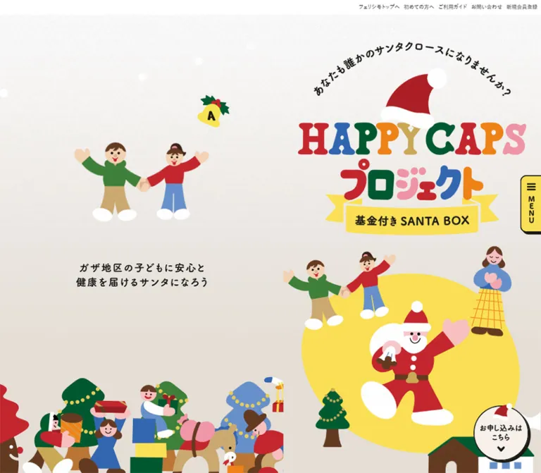
基金付きSANTA BOXを紹介するチャリティーページ。紙のような背景、多色のロゴ、親しみやすいサンタのイラストを使い、中央の縦長コンテンツと追従ナビゲーションで支援先やギフトを案内する。
オリジナルサイトを見るA Christmas picture book unfolded into a long charity catalog, with a small invitation to become someone’s Santa always nearby.
Website: HAPPY CAPS PROJECT Original URL: https://www.felissimo.co.jp/gopeace/happycaps/ Final URL: https://www.felissimo.co.jp/gopeace/happycaps/ Response: HTTP 200; original and final URLs are identical. Theme: light; warm paper, snowy white texture, Christmas colors, and dark brown-black text. Inspected: September 17, 2026, at 04:04 JST. The supplied retrieval timestamp is September 16, 2026, at 19:04:00.961 UTC. Viewports: 1440 × 1000 and 390 × 844 CSS pixels. Scope: the current charity campaign page within Felissimo’s commerce website. Evidence includes desktop opening, gift-section and closing captures; mobile opening and closing captures; and rendered text, links, element geometry, custom properties, and computed styles covering the long document. Menu-open states and destination pages were not inspected.
The page presents charitable participation through the visual language of a cheerful Christmas story. A multicolored illustrated wordmark wears a Santa hat. Rounded people, animals, trees, gifts, and houses surround a waving Santa. Yellow bells identify projects and prize quantities, ribbon banners announce gift groups, and photographs make the promised gifts tangible. Warm gray-beige paper and broad areas of snowy white prevent the saturated artwork from becoming visually exhausting.
Its defining desktop structure is a 500px-wide story column between two illustrated side regions. The left region presents a charity vignette; the right contains a smaller campaign logo, section navigation, and an application button. A crowded parade of people and trees anchors the lower edges. On mobile, the story fills the screen, with a yellow edge-mounted menu tab and a circular application control. The same narrow reading format supports the introduction, eight support projects, gift catalog, and two participation modes.
A Christmas picture book unfolded into a long charity catalog, with a small invitation to become someone’s Santa always nearby.
Website: HAPPY CAPS PROJECT Original URL: https://www.felissimo.co.jp/gopeace/happycaps/ Final URL: https://www.felissimo.co.jp/gopeace/happycaps/ Response: HTTP 200; original and final URLs are identical. Theme: light; warm paper, snowy white texture, Christmas colors, and dark brown-black text. Inspected: September 17, 2026, at 04:04 JST. The supplied retrieval timestamp is September 16, 2026, at 19:04:00.961 UTC. Viewports: 1440 × 1000 and 390 × 844 CSS pixels. Scope: the current charity campaign page within Felissimo’s commerce website. Evidence includes desktop opening, gift-section and closing captures; mobile opening and closing captures; and rendered text, links, element geometry, custom properties, and computed styles covering the long document. Menu-open states and destination pages were not inspected.
The page presents charitable participation through the visual language of a cheerful Christmas story. A multicolored illustrated wordmark wears a Santa hat. Rounded people, animals, trees, gifts, and houses surround a waving Santa. Yellow bells identify projects and prize quantities, ribbon banners announce gift groups, and photographs make the promised gifts tangible. Warm gray-beige paper and broad areas of snowy white prevent the saturated artwork from becoming visually exhausting.
Its defining desktop structure is a 500px-wide story column between two illustrated side regions. The left region presents a charity vignette; the right contains a smaller campaign logo, section navigation, and an application button. A crowded parade of people and trees anchors the lower edges. On mobile, the story fills the screen, with a yellow edge-mounted menu tab and a circular application control. The same narrow reading format supports the introduction, eight support projects, gift catalog, and two participation modes.
--hc- names.| Name | Value | Evidence | Role |
|---|---|---|---|
| Warm paper | #e5ded6 |
Source --hc-color-bg |
Main campaign canvas and the neutral space around illustrations |
| Dark ink | #1a1916 |
Source --hc-color-base; computed main text |
Body copy, navigation lettering, and the visual outline color for controls |
| Yellow | #fadf55 |
Source --hc-color-yellow |
Reusable campaign yellow; visually related to bells, ribbons, and the menu tab |
| White | #ffffff |
Source --hc-color-white; computed reversed text |
Snow, Santa details, footer, and text on saturated fields |
| Cream action surface | #f6f0ea |
Computed support-link background | Large project-selection pills |
| Brown-gray | #3a3526 |
Source --hc-color-gray |
Available secondary neutral; its specific visible application was not established |
| Santa red | #c3262e |
Computed project F label and SANTA BOX title fill |
Strong warm accent and gift-included participation marker |
| Donation blue | #6690ca |
Computed mobile FULL DONATE title fill |
Donation-only participation marker |
| Gift-stage red | Approximately #b51d2a |
Visual estimate from the desktop gift capture | Broad red field behind the Felissimo prize grid; exact CSS fill was not supplied |
The illustrated yellow areas are not necessarily identical to the yellow CSS token. Likewise, the logo contains orange, pink, gold, blue, green, and red artwork whose exact embedded colors were not measured. Preserve the artwork’s palette rather than recoloring every illustration to match a small CSS token set.
These are measured backgrounds of the project-name labels. Every sampled label uses white text.
| Project | Subject | Background |
|---|---|---|
| A | Ukraine refugee support | #3d8039 |
| B | Ghana school-meal support | #3c8039 |
| C | Wildlife conservation | #005b32 |
| D | AIM medical research | #668fca |
| E | Beach cleanup | #2961ad |
| F | Support for single-parent households facing difficulties | #c3262e |
| G | Noto woodland recovery | #668fca |
| H | Independence through disability arts | #3d8039 |
The source contains small color differences: projects A and B differ by one red-channel value, while the donation-only title has slightly more green than the blue project labels. A faithful extraction should preserve these values. Consolidating them into fewer tokens would be a deliberate adaptation.
Computed campaign stack: Noto Sans JP, yugothic, メイリオ, meiryo, sans-serif.
The main campaign uses medium-weight Japanese sans-serif text, with bold paragraphs and labels at key points. Wide tracking and generous line spacing soften the dense information. The introduction is centered and emphatic; project descriptions and product captions are more compact.
The computed family string identifies the requested fonts. A font-file manifest or network log was not supplied, so individual font downloads were not independently verified.
Computed stack: Nerko One, cursive, sans-serif.
Measured examples include What’s Charity Santa Box?, INSIDE THE SANTA BOX, and the participation-mode titles. Their chunky, irregular forms connect the text to the rounded illustration style. Tight display line heights allow the English words to stack into compact graphic shapes.
The multicolored HAPPY CAPS logo and expressive Japanese campaign lettering are artwork. Their shapes should not be recreated by assigning Nerko One or the body font to ordinary text.
The thin top utility strip uses a separate Japanese system-sans stack beginning with Yu Gothic and including Hiragino and Meiryo fallbacks. Its measured links are only 10px on desktop and 8px on mobile. This small corporate layer sits outside the campaign’s expressive typography.
The default Times value on the HTML and BODY nodes does not describe the campaign text: the MAIN element overrides it.
| Role | Desktop size / line height | Mobile size / line height | Weight | Tracking |
|---|---|---|---|---|
| Main inherited text | 20 / 34px |
13.52 / 22.98px |
500 | 0.05em |
| Introductory narrative | 18.67 / 37.33px |
14.56 / 29.12px |
700 | 0.12em |
| Box explanation | 17.33 / 31.20px |
13.52 / 24.34px |
500 | 0.10em |
| Project-name label | 17.33 / 26px |
13.52 / 20.28px |
700 | 0.12em |
| Project description | 16 / 28.80px |
12.48 / 22.46px |
500 | 0.10em |
| Recipient organization | 16 / 25.60px |
12.48 / 19.97px |
700 | 0.11em |
| Support-link label | 16 / 24px |
12.48 / 18.72px |
700 | 0.07em |
| Prize caption | 16 / 24px |
12.48 / 18.72px |
500 | 0.10em |
| Gift-group introduction | 17.33 / 34.67px |
13.52 / 27.04px |
500 | 0.10em |
What’s Charity Santa Box? |
58.67 / 46.93px |
45.76 / 36.61px |
500 | Normal |
INSIDE THE SANTA BOX |
98.67 / 74px |
76.96 / 57.72px |
500 | Normal |
SANTA BOX mode title |
72 / 72px |
56.16 / 56.16px |
500 | Normal |
| Corporate utility link | 10 / 16px |
8 / 8px |
500 | Normal |
FULL DONATE also measures 56.16 / 56.16px on mobile. Its desktop text node was not included in the supplied element sample.
Hierarchy principle: let artwork carry the expressive headline treatment. Use measured, readable sans-serif text for explanations, beneficiary names, prices, and destinations.
The source exposes a custom length named --hc-rem. This is a custom property, not proof that the browser’s root rem has been changed.
At the inspected desktop viewport:
--hc-rem: calc(1440px * 0.66667 / 90);
This evaluates to approximately 10.66672px.
At the inspected mobile viewport:
--hc-rem: calc(390px / 46.875);
This evaluates to 8.32px.
In the tables below, 1u refers to that custom length. Many measured dimensions scale by approximately 390 / 500 = 0.78 between the two views. The inherited MAIN font changes its multiplier as well: 1.875u on desktop and 1.625u on mobile.
The source’s --hc-contents-width evaluates to approximately 502px on desktop and 392px on mobile, including its explicit + 2px. The actual measured story sections are 500px and 390px. The consuming rules that explain the difference were not supplied. Use the rendered section widths when reproducing the layout.
| Use | Desktop | Mobile | Evidence |
|---|---|---|---|
| Standard content inset | 40px |
31.2px |
Measured; approximately 3.75u or 8% of the story width |
| Hero top padding | 53.33px |
41.6px |
Measured; 5u |
| Hero bottom padding | 50px |
39px |
Measured; 4.6875u |
| Intro paragraph gap | Approximately 37.33px |
Approximately 29.12px |
Calculated from successive paragraph rectangles |
| Prize column gap | 30.66px |
23.91px |
Calculated from caption positions and widths |
| Application-list row gap | 10.66px |
8.31px |
Calculated from consecutive link rectangles |
| Project-label vertical padding | 5.33px |
4.16px |
Measured; 0.5u |
| Project-label horizontal padding | 10px |
7.8px |
Measured; 0.9375u |
| Project-section top padding | 133.33px |
104px |
Measured; 12.5u |
| Gift-section top padding | 144px |
112.32px |
Measured; 13.5u |
Large illustrated section openings consume substantial vertical space. These are part of the storytelling rhythm, not empty gaps to remove automatically.
| Element | Value | Status |
|---|---|---|
| Project-name label | 9.33px desktop; 7.28px mobile |
Measured |
| Project-selection pill | 69.33px desktop; 54.08px mobile |
Measured; large enough to produce fully rounded ends |
| Prize-image corner | Approximately 20px on desktop |
Visual estimate |
| Desktop application control | Fully rounded capsule | Visually observed |
| Mobile application control | Approximately 84px circle |
Visual estimate |
| Menu tab | Rounded left corners, square edge against viewport | Visually observed |
| Application outline | Approximately 2px dark stroke |
Visual estimate |
| Application shadow | Approximately 3–4px hard offset |
Visual estimate; no blur is apparent |
The visual vocabulary combines organic illustrated silhouettes, ribbon folds, small rounded labels, square-format product images, and a few strongly outlined controls. It does not use a uniform radius for every element.
| Element | Desktop: 1440 × 1000 | Mobile: 390 × 844 |
|---|---|---|
| Document height | Approximately 22,349px |
Approximately 17,550px |
| Corporate header | 28px high |
20px high |
| MAIN layout | Grid: 470px 500px 470px |
Block, 390px wide |
| Story column | x = 470px, width 500px |
x = 0, width 390px |
| Standard text width | 420px |
327.63px |
| Opening section | 500 × 901.69px |
390 × 703.31px |
| Curved introductory caption box | 382.66 × 105.33px |
298.47 × 82.16px |
| Main wordmark heading box | 500 × 218.27px |
390 × 170.25px |
| Profile support link | 420 × 74.66px |
327.63 × 58.23px |
| Application-list support link | 423.33 × 74.66px |
330.19 × 58.23px |
| Prize caption column | 194.67px |
151.86px |
| Project bell box | 111.33 × 110px |
86.83 × 85.80px |
| Desktop sidebar bell box | 62 × 63.28px |
Sidebar not displayed |
The intro section begins before the opening section’s rectangle ends: approximately 71.33px of overlap on desktop and 55.63px on mobile. This supports the visually interlocking illustration composition. Do not assume every section is separated by an ordinary positive margin.
Role: provides access to the parent commerce service.
A narrow white strip sits above the campaign artwork. Five small links align toward the right: フェリシモトップへ, 初めての方へ, ご利用ガイド, お問い合わせ, and 新規会員登録.
Desktop links have 4px padding and 24px-high boxes inside the 28px header. Mobile links have 2px padding and 12px-high boxes inside the 20px header. The campaign identity remains visually dominant below this strip.
Role: keeps a support cause present while the central story changes.
The left region contains three separated parts: a yellow holly-topped letter bell near the upper right, a friendly cause illustration below it, and a centered two-line appeal farther down. The opening capture shows project A with two people; later captures show project B with children eating.
The observed sidebar bell is 62px wide. In the initial desktop geometry, its top is approximately 225px and the appeal begins around 551px. The loose spacing makes the illustration feel placed on a broad sheet of paper rather than enclosed in a card.
Different causes are visible across captures. The evidence does not establish whether a timer, scroll position, or another trigger selects the sidebar state.
Role: persistent orientation and access to participation.
A smaller illustrated campaign logo sits above three plain text links:
SANTA BOXって?支援先を選ぼう!SANTA BOXの中身Each has a dark right-pointing chevron. Below them is the larger お申し込みはこちら capsule, with a Santa-hat icon at the left and a downward chevron at the right.
The logo is approximately 165–170px wide in the desktop capture. The application capsule is approximately 280px wide and 64px high. Its cream surface, dark outline, and hard lower-right shadow make it look like a small physical sign.
The navigation and side illustrations remain visible at widely separated document depths. Their exact CSS positioning was not included in the sampled records. A sidebar bounded by the campaign container is a suitable implementation approach for the visible footer relationship.
Role: establishes identity, warmth, and the invitation to participate.
The composition stacks a curved Japanese invitation, a Santa hat, the multicolored HAPPY CAPS wordmark, oversized Japanese project lettering, and a yellow 基金付き SANTA BOX ribbon. A waving Santa appears below on an irregular yellow field, accompanied by small charity-related scenes, a Christmas tree, and a house with a smoking chimney.
The hat overlaps the typography. Characters and scenery overlap the yellow field and cross between the nominal section regions. Preserve the artwork’s internal whitespace and layering: the measured heading box is wider than the visibly painted letters.
On desktop, the hero occupies the central 500px strip. On mobile, the same composition fills 390px and finishes near the beginning of the next illustrated heading. It is not a forced full-screen section: the measured mobile hero is about 703px tall beneath the 20px utility header.
The surrounding cause illustrations differ between captures. These differences should not be treated as confirmed breakpoint-specific artwork swaps.
Role: explains the charitable relationship before asking visitors to choose a project.
The narrative uses centered, bold paragraphs inside an 84%-width text region. Its 2.0 line-height and 0.12em tracking produce an open, deliberate rhythm. Paragraphs remain short and are separated by approximately one line of vertical space.
The box explanation introduces the English display heading What’s Charity Santa Box?, supporting artwork, and a two-part price explanation. The served copy distinguishes a product portion of 150 yen, 165 yen including tax, from a 350-yen fund contribution. The stated total is 515 yen including tax.
Keep the financial explanation as structured text with clear labels and units. Decorative headings can be artwork, but the amount, tax treatment, and contribution should remain independently readable.
Role: explains one of eight causes and links to its associated product entry.
Each profile is a vertically stacked section within the narrow story column. Its observed content anatomy is:
The text and support link are 420px wide on desktop and approximately 327.63px on mobile. Description text is 16px / 1.8 on desktop and 12.48px / 1.8 on mobile. Recipient names increase in weight rather than size.
The support link’s label starts approximately 78.67px from its left edge on desktop and 61.81px on mobile, leaving a substantial leading slot. The element sample does not identify the exact artwork occupying that slot.
Profile media was not shown in a dedicated supplied screenshot, so its detailed crops and image treatment cannot be established from text rectangles alone. The DOM does establish all eight topics, descriptions, recipient names, label colors, and destination links.
Role: explains what participants may receive and makes the gift selection appealing.
The gift section opens with large stacked English lettering and expressive Japanese artwork reading ハズレなし!何が届くかはお楽しみ!. The supplied desktop detail then shows a yellow ribbon carrying フェリシモ賞, with red English lettering above it.
Below the ribbon, a broad curved red field contains a white introduction. An angel with a trumpet and a gingerbread figure flank the text. A dotted ornament separates the introduction from the product grid.
Prize tiles form two columns. Each tile has:
The measured caption widths are 194.67px on desktop and 151.86px on mobile. The grid retains two columns at the inspected mobile width, as established by the two distinct x positions in the DOM.
The desktop capture shows colored pencils and a black Dick Bruna TABLE graphic. The full text evidence also lists household goods, tickets, bags, and other gifts. Captions remain on the section’s colored background; there is no separate white card surface around each entire tile.
Three gift groups appear in the rendered content: Felissimo prizes, the general original-paper-file gift, and sponsor-provided prizes. The supplied screenshot directly establishes the red treatment of the Felissimo group; it does not establish every later group’s exact background color.
Role: offers two distinct ways to support the same eight activities.
The ordering section repeats the eight causes under two mode headings:
SANTA BOX: the served explanation states that 350 yen becomes a fund contribution and a gift is included.FULL DONATE: the served explanation states that all 500 yen becomes a fund contribution and no Santa Box is delivered.The measured SANTA BOX title has white Nerko One text on #c3262e. The mobile FULL DONATE title uses white text on #6690ca. The complete surrounding panel silhouettes were not captured closely enough to specify their construction.
Each mode presents a vertical list of cream project links. These links are slightly wider than the profile links and have approximately one u of space between rows. Preserve the two separate destination sets: the gift-included and donation-only links point to different product entries.
The presence of application links does not establish that the campaign is currently accepting orders. The served copy includes a February 25, 2026 deadline for a specified group of customers; destination availability was not tested.
Role: retains navigation and participation access without the desktop sidebars.
The yellow menu tab is attached to the right edge. In both supplied mobile captures it appears near y = 266px, with roughly 30px of visible width and 86–88px of height. A compact hamburger sits above vertically stacked MENU lettering. Its dark outline, rounded left corners, and hard offset edge match the application button’s physical-sign character.
A cream application circle remains near the lower-right corner in both the opening and closing views. It is approximately 84px in diameter, with roughly 18px right and bottom clearance. A Santa hat overlaps its top, the Japanese label wraps into short lines, and a downward chevron sits below.
The open menu was not captured. Its panel dimensions, backdrop, focus behavior, opening motion, and close controls are unknown. The supplied anchor destinations support section navigation, but click behavior was not exercised.
Role: closes the story with a familiar campaign image before returning to the parent brand.
The outro repeats the large logo, Santa hat, waving Santa, Christmas tree, and house. Here the composition sits against a snowy white treatment rather than the opening yellow field. The desktop side parade continues to frame the central image above the footer.
The white footer spans the full desktop width. It contains a centered row of legal and corporate links, a black FELISSIMO logo, and subdued copyright text. On mobile the links wrap into two rows. The floating application circle remains visible over the lower-right footer area.
The rendered link inventory also includes the broader GO!PEACE! page, a fund-report page, and X, LINE, and Facebook sharing destinations. Their destination presence is established; sharing dialogs were not tested.
| Treatment | Supplied evidence | What can be concluded |
|---|---|---|
| Letter-bell animation | animation: 1s linear both bell on selected bell elements |
A one-second animation named bell is assigned. Its transform path and activation logic were not supplied. |
| Illustrated-heading fade | transition: opacity 0.25s on several mobile heading/message elements |
A short opacity transition is defined. Exact reveal thresholds are unknown. |
| Project-section heading | transition: opacity 0.5s 0.5s |
A half-second fade with a half-second delay is defined on the sampled heading. |
| Gift decoration transition | opacity 0.25s, transform 0.5s cubic-bezier(0.34, 1.56, 0.64, 1) |
Some gift decorations have an overshooting transform transition. Start/end transforms were not supplied. |
| Support-link feedback | box-shadow 0.1s ease-out, transform 0.1s ease-out |
A quick shadow/position response is defined. Hover and pressed offsets were not sampled. |
| Sidebar cause changes | Project A in one desktop capture, project B in later captures | Multiple visible states exist. Timing, sequence, and trigger remain unverified. |
| Section navigation | Links to #box_hc, #project_hc, #award_hc, and #buy_hc |
Section destinations exist. Smooth scrolling, duration, and final alignment were not tested. |
| Snow and hero characters | Visible in static screenshots | Movement, repetition rate, and trajectories cannot be determined from these frames. |
The source exposes a large collection of easing variables, including power, circular, exponential, and back curves. Their presence does not mean every curve is used. The table above lists bindings actually present on sampled elements.
The capture process allowed an initial observation period of at least five seconds and waited for image decoding and layout stability within bounded limits. Perpetual animations were temporarily paused during readiness checks and then resumed. This process supports the settled composition but does not provide a complete animation recording.
Recommended motion character: use brief fades, a restrained playful overshoot for decorative arrivals, and fast tactile control feedback. Keep essential content visible when animation is unavailable. Provide reduced-motion behavior and a pause mechanism if continuously changing decorative scenes are implemented.
| Layer | Appearance | Purpose |
|---|---|---|
| Campaign canvas | Warm beige paper with a white snowy wash and fine grain | Creates a soft seasonal setting |
| Desktop side regions | Mostly unboxed artwork, text, and open space | Frames the story without competing with it |
| Hero focal field | Irregular bright yellow shape | Makes Santa and supporting characters the visual center |
| Project label | Small saturated rounded rectangle with white text | Identifies each cause |
| Support link | Pale cream pill | Separates a clickable destination from explanatory copy |
| Main application control | Cream, dark outline, hard offset shadow | Makes persistent participation access recognizable |
| Gift stage | Saturated red, ribbon artwork, white captions | Introduces a denser catalog segment |
| Mode title | White display type on red or blue | Distinguishes gift-included and donation-only participation |
| Corporate footer | Plain white with restrained dark and gray content | Returns to the parent website’s utility layer |
The background’s grain is visible in the current screenshots, but no texture asset or gradient definition was supplied. Exact grain density and color stops remain visual, not measured, properties.
The illustration style uses flat color, irregular rounded silhouettes, simplified faces, and very little internal shading. Santa’s oversized boots and mitten-like hands, holly-topped bells, broad trees, and small houses have the clarity of cut-paper shapes. People appear as warm, approachable groups rather than isolated stock figures.
Color is distributed across many small shapes: green coats and trees, red clothing and hats, blue trousers and water, yellow ribbons and ornaments, pink accents, and warm brown faces or buildings. The warm background keeps this variety coherent.
Large scenic artwork should retain its silhouette and internal arrangement. The lower desktop parade intentionally crops against the outer viewport edges. The main logo, Santa, and core support information should remain legible within the central story.
Photography appears in the gift catalog. It provides a concrete counterweight to the illustration, while rounded corners and quantity bells integrate it with the campaign. Brand graphics such as the black Dick Bruna tile retain their own identity inside the same image format.
No image src URLs or asset manifest were included in the supplied evidence. The following entries describe visible or text-supported assets; they are not invented filenames.
| Asset | Evidence | Reuse guidance |
|---|---|---|
| Multicolored campaign logo, hat, and yellow ribbon | Opening, sidebar, and closing screenshots | Preserve as artwork with its original proportions |
| Waving Santa | Desktop and mobile opening and closing screenshots | Keep the broad silhouette, white boots, beard, and pink hand accents |
| Charity vignettes | Current hero and desktop left-side captures | Keep each scene distinct; do not infer a fixed rotation schedule |
| Letter and quantity bells | Sidebar screenshots, gift screenshot, and measured project nodes | Reuse the holly-topped bell motif for both identification and counts |
| Lower parade of people and trees | Desktop captures | Treat as framing decoration with intentional edge cropping |
| Angel and gingerbread figure | Desktop gift capture | Use as section ornaments around the introductory text |
| Prize photographs and brand graphics | Desktop gift capture; full prize text inventory | Use consistent square-format media slots and separate live captions |
| Wildlife image credit | Rendered text includes 画像提供:鳥羽水族館 |
This credit concerns the referenced image; it does not identify overall site production |
| FELISSIMO footer mark | Desktop and mobile closing captures | Keep separate from the colorful campaign identity |
Use authorized artwork when available. CSS can reproduce the layout and control geometry; it cannot reproduce the identity carried by the custom lettering and character illustrations.
At 1440px, MAIN is a three-column grid: 470px 500px 470px. The center remains narrow through the entire page. The project content does not expand into a wide desktop dashboard, and the prize grid stays inside the story column.
Most text uses 40px insets, leaving 420px of reading width. The side regions provide brand navigation, changing charity artwork, and the lower parade. This balances the unusually long document with a stable surrounding scene.
The final desktop capture shows the corporate footer across the entire viewport, with the illustrated campaign composition above it. A new implementation should allow side decorations to finish with the campaign rather than cover the corporate footer indefinitely.
At 390px, MAIN becomes a normal block and the story width is 390px. Standard insets scale to 31.2px. Desktop side navigation and the large side charity display disappear from the visible layout.
The mobile view preserves the illustrated opening, generous section transitions, eight stacked projects, two-column gift grid, ordering lists, and illustrated closing. The yellow menu tab and circular application control provide persistent access at the right edge.
Many measurements are exactly or nearly 78% of their desktop counterparts. This preserves line breaks and artwork proportions. The resulting project-description size is 12.48px, which is an observed fidelity detail rather than a recommended minimum for every new implementation.
The source exposes named breakpoint values of 320, 768, 1024, 1280, 1440, 1680, and 9999px. Only the 390px and 1440px layouts were inspected. The evidence does not establish the exact threshold for showing the desktop rails, intermediate column widths, or landscape behavior.
The source also declares --hc-first-view-height: 100svh, but the measured hero section is shorter than the viewport at both inspected sizes. Do not infer a mandatory height: 100svh hero from that token alone.
Recommended adaptation: retain a 500px story cap, switch to desktop rails only when both side regions have enough room, and use normal document scrolling. The Quick Start selects 1280px for that switch as an implementation choice, not a verified original rule.
#e5ded6, dark ink #1a1916, and the measured cream action surface.These are recommendations for a new implementation, not verified features of the original page:
aria-expanded, a controlled navigation region, and appropriate focus handling. The original open-state behavior is unknown.#e5ded6.#1a1916.#f6f0ea.#fadf55.#c3262e.#005b32.#668fca; donation-only title: #6690ca.#b51d2a, visually estimated.“Create a Japanese charity campaign page with the warmth of an illustrated Christmas picture book. At a 1440px desktop viewport, place a 500px story column between two 470px side regions. Use warm beige paper #e5ded6, dark ink #1a1916, snowy white texture, and flat festive illustration. Put a charity vignette and yellow letter bell on the left; place a small illustrated logo, three chevron-led section links, and a cream outlined application capsule on the right. The story opens with custom multicolored lettering, a Santa hat, yellow ribbon, waving Santa, and an irregular yellow field. Continue through centered introductory copy, eight stacked cause profiles, a colorful gift catalog, and two participation modes. Use Noto Sans JP for copy and Nerko One for English display labels. At 390px, let the story fill the screen and provide a narrow yellow menu tab plus an 84px circular application control. Keep the gift grid in two columns and finish with a repeated Santa illustration above a plain white corporate footer.”
This is an adaptation with a normal browser root font size. --u matches the measured 390px and 500px story proportions. The 500px cap and 1280px rail breakpoint are recommended interpolation rules for untested widths.
The class names are implementation examples, not recovered source selectors. Supply authorized artwork in the image slots. The texture variable defaults to none; no original asset path is assumed. Estimated red, outlines, image corners, and control offsets are marked in comments. This CSS was not executed against the original page.
:root {
  /* Measured source colors */
  --paper: #e5ded6;
  --ink: #1a1916;
  --cream: #f6f0ea;
  --yellow: #fadf55;
  --white: #ffffff;
  --red: #c3262e;
  --green: #3d8039;
  --donate-blue: #6690ca;

  /* Visual approximation of the photographed gift-stage field */
  --award-red: #b51d2a;

  /* Source-declared families; load fonts in the host project */
  --font-body: 'Noto Sans JP', yugothic, Meiryo, sans-serif;
  --font-display: 'Nerko One', cursive, sans-serif;

  /* Endpoint-matching adaptation, not the original full formula */
  --story-width: min(100vw, 500px);
  --u: calc(var(--story-width) / 46.875);
  --content-inset: calc(3.75 * var(--u));
  --body-size: calc(1.5 * var(--u));
  --grid-gap: calc(2.875 * var(--u));
  --tag-radius: calc(0.875 * var(--u));
  --pill-radius: calc(6.5 * var(--u));
  --feedback: 100ms ease-out;

  /* Optional authorized repeating texture */
  --paper-texture: none;
}

* { box-sizing: border-box; }

body {
  margin: 0;
  color: var(--ink);
  background: var(--paper);
}

.hc-layout {
  position: relative;
  font-family: var(--font-body);
  font-size: calc(1.625 * var(--u));
  font-weight: 500;
  line-height: 1.7;
  letter-spacing: 0.05em;
  background-image: var(--paper-texture);
}

.hc-story {
  position: relative;
  min-width: 0;
  width: min(100%, 500px);
  margin-inline: auto;
}

.hc-rail { display: none; }

.hc-art {
  display: block;
  width: 100%;
  height: auto;
}

.hc-hero {
  padding-block: calc(5 * var(--u)) calc(4.6875 * var(--u));
  /* Approximation of the visible snowy wash */
  background-image: var(--paper-texture),
    linear-gradient(to bottom, #ffffffdd, #ffffff00 65%);
}

.hc-narrative {
  width: 84%;
  margin-inline: auto;
  text-align: center;
  font-size: calc(1.75 * var(--u));
  font-weight: 700;
  line-height: 2;
  letter-spacing: 0.12em;
}

.hc-narrative p { margin: 0 0 2em; }

.hc-display {
  font-family: var(--font-display);
  font-weight: 500;
  letter-spacing: normal;
}

.hc-display--box {
  font-size: calc(5.5 * var(--u));
  line-height: 0.8;
}

.hc-display--inside {
  font-size: calc(9.25 * var(--u));
  line-height: 0.75;
}

.hc-project {
  --project-color: var(--green);
  position: relative;
  width: 84%;
  margin-inline: auto;
  /* Recommended spacing; illustrated openings need their own layout */
  padding-block: calc(5 * var(--u));
}

.hc-project[data-project='B'] { --project-color: #3c8039; }
.hc-project[data-project='C'] { --project-color: #005b32; }
.hc-project[data-project='D'],
.hc-project[data-project='G'] { --project-color: #668fca; }
.hc-project[data-project='E'] { --project-color: #2961ad; }
.hc-project[data-project='F'] { --project-color: #c3262e; }

.hc-project__title {
  display: inline-block;
  margin: 0 0 1.7em;
  padding: calc(0.5 * var(--u)) calc(0.9375 * var(--u));
  border-radius: var(--tag-radius);
  color: var(--white);
  background: var(--project-color);
  font-size: calc(1.625 * var(--u));
  font-weight: 700;
  line-height: 1.5;
  letter-spacing: 0.12em;
}

.hc-copy {
  font-size: var(--body-size);
  line-height: 1.8;
  letter-spacing: 0.1em;
}

.hc-recipient {
  font-size: var(--body-size);
  font-weight: 700;
  line-height: 1.6;
  letter-spacing: 0.11em;
}

.hc-support-link {
  position: relative;
  display: flex;
  align-items: center;
  width: 100%;
  min-height: calc(7 * var(--u));
  padding: 0.5em calc(2.5 * var(--u))
    0.5em calc(7.375 * var(--u));
  border-radius: var(--pill-radius);
  color: var(--ink);
  background: var(--cream);
  font-size: var(--body-size);
  font-weight: 700;
  line-height: 1.5;
  letter-spacing: 0.07em;
  text-decoration: none;
  transition: box-shadow var(--feedback), transform var(--feedback);
}

/* Optional leading artwork slot; its exact source image is unknown */
.hc-support-link__icon {
  position: absolute;
  left: var(--u);
  width: calc(5 * var(--u));
  height: calc(5 * var(--u));
  object-fit: contain;
}

.hc-awards {
  position: relative;
  padding-block: calc(8 * var(--u));
  color: var(--white);
  background: var(--award-red);
  /* Approximation of the visible curved upper edge */
  border-radius: 50% 50% 0 0 /
    calc(7 * var(--u)) calc(7 * var(--u)) 0 0;
}

.hc-awards__ribbon {
  display: block;
  width: 83.333%;
  height: auto;
  margin-inline: auto;
}

.hc-prize-grid {
  display: grid;
  grid-template-columns: repeat(2, minmax(0, 1fr));
  gap: calc(5 * var(--u)) var(--grid-gap);
  width: 84%;
  margin-inline: auto;
  padding: 0;
  list-style: none;
}

.hc-prize { position: relative; min-width: 0; }

.hc-prize__media {
  aspect-ratio: 1;
  overflow: hidden;
  /* Desktop radius visually estimated at approximately 20px */
  border-radius: calc(1.875 * var(--u));
}

.hc-prize__media img {
  display: block;
  width: 100%;
  height: 100%;
  object-fit: contain;
}

.hc-prize__bell {
  position: absolute;
  top: calc(-1 * var(--u));
  right: calc(-0.75 * var(--u));
  width: calc(6 * var(--u));
  height: auto;
}

.hc-prize__caption {
  margin: 0.9em 0 0;
  font-size: var(--body-size);
  line-height: 1.5;
  letter-spacing: 0.1em;
}

.hc-mode-title {
  display: table;
  margin-inline: auto;
  padding-inline: calc(1.125 * var(--u));
  color: var(--white);
  background: var(--red);
  font-family: var(--font-display);
  font-size: calc(6.75 * var(--u));
  font-weight: 500;
  line-height: 1;
  letter-spacing: normal;
}

.hc-mode-title--donate { background: var(--donate-blue); }

.hc-order-list {
  display: grid;
  gap: var(--u);
  width: 84.667%;
  margin-inline: auto;
}

/* Outline and hard shadow are screenshot-based approximations */
.hc-action {
  display: flex;
  align-items: center;
  justify-content: center;
  gap: 10px;
  border: 2px solid var(--ink);
  border-radius: 999px;
  color: var(--ink);
  background: var(--cream);
  box-shadow: 2px 3px 0 var(--ink);
  font-family: var(--font-body);
  font-weight: 700;
  text-decoration: none;
  transition: box-shadow var(--feedback), transform var(--feedback);
}

.hc-apply-float {
  position: fixed;
  z-index: 100;
  right: max(18px, env(safe-area-inset-right, 0px));
  bottom: max(18px, env(safe-area-inset-bottom, 0px));
  flex-direction: column;
  gap: 3px;
  width: 84px;
  height: 84px;
  padding: 18px 7px 8px;
  border-radius: 50%;
  font-size: 11px;
  line-height: 1.2;
  text-align: center;
}

.hc-apply-float__hat {
  position: absolute;
  top: -6px;
  width: 30px;
  height: auto;
}

/* Recommended 44px hit target around a narrow visible tab */
.hc-menu-tab {
  position: fixed;
  z-index: 100;
  top: 31.5svh;
  right: 0;
  width: 44px;
  padding: 0 0 0 12px;
  border: 0;
  background: transparent;
  color: var(--ink);
  cursor: pointer;
}

.hc-menu-tab__face {
  display: grid;
  justify-items: center;
  gap: 6px;
  min-height: 86px;
  padding: 8px 4px;
  border: 2px solid var(--ink);
  border-right: 0;
  border-radius: 10px 0 0 10px;
  background: var(--yellow);
  box-shadow: 0 3px 0 var(--ink);
}

.hc-menu-tab__word {
  writing-mode: vertical-rl;
  text-orientation: upright;
  font: 700 11px/1 var(--font-body);
}

.hc-outro {
  background-image: var(--paper-texture),
    linear-gradient(to bottom, #ffffff00, #ffffff);
}

.hc-footer {
  padding: 14px 20px 36px;
  color: var(--ink);
  background: var(--white);
  font: 400 14px/1.6 var(--font-body);
  text-align: center;
}

.hc-footer__links {
  display: flex;
  flex-wrap: wrap;
  justify-content: center;
  gap: 4px 12px;
}

.hc-footer__brand {
  display: block;
  width: 116px;
  height: auto;
  margin: 30px auto 16px;
}

/* Recommended rail breakpoint; only the endpoints were inspected */
@media (min-width: 1280px) {
  .hc-layout {
    display: grid;
    grid-template-columns: minmax(0, 1fr) 500px minmax(0, 1fr);
    align-items: start;
    font-size: calc(1.875 * var(--u));
  }

  .hc-rail {
    display: block;
    position: sticky;
    top: 0;
    height: 100svh;
    min-width: 0;
  }

  .hc-rail__inner {
    width: min(300px, 90%);
    margin-inline: auto;
    padding-top: 22svh;
  }

  .hc-rail__parade {
    position: absolute;
    right: 0;
    bottom: 0;
    left: 0;
    width: 100%;
    height: auto;
    pointer-events: none;
  }

  .hc-rail__apply {
    width: 280px;
    min-height: 64px;
    margin: 40px auto 0;
    font-size: 20px;
  }

  .hc-menu-tab,
  .hc-apply-float { display: none; }
}

/* Recommended optional readability adjustment */
.hc-readable { --body-size: max(14px, calc(1.5 * var(--u))); }

/* Recommended feedback; exact original offsets were not sampled */
@media (hover: hover) {
  .hc-action:hover {
    transform: translate(1px, 1px);
    box-shadow: 1px 2px 0 var(--ink);
  }
}

:where(.hc-layout, .hc-footer) :focus-visible,
.hc-menu-tab:focus-visible,
.hc-apply-float:focus-visible {
  outline: 3px solid currentColor;
  outline-offset: 4px;
}

@media (prefers-reduced-motion: reduce) {
  .hc-layout *,
  .hc-menu-tab,
  .hc-apply-float {
    animation: none !important;
    transition: none !important;
  }
}
Place the desktop left rail, .hc-story, and desktop right rail as three siblings inside .hc-layout. Place .hc-footer after that container so the sticky rails finish above it. Place the floating mobile controls outside any transformed ancestor. Keep the original anchor IDs on their corresponding story sections if preserving the supplied navigation structure.
The snippet supplies visual primitives rather than a complete illustration composition. It intentionally leaves menu-open styling, reveal logic, bell keyframes, and scene sequencing unspecified because those details were not established by the evidence.
Optional aliases for a project that already uses Tailwind v4. Define the custom properties above first. This mapping does not imply that the original website uses Tailwind.
@theme inline {
  --color-hc-paper: var(--paper);
  --color-hc-ink: var(--ink);
  --color-hc-cream: var(--cream);
  --color-hc-yellow: var(--yellow);
  --color-hc-red: var(--red);
  --color-hc-donate: var(--donate-blue);

  --font-hc-body: var(--font-body);
  --font-hc-display: var(--font-display);

  --text-hc-body: var(--body-size);
  --text-hc-intro: calc(1.75 * var(--u));
  --text-hc-label: calc(1.625 * var(--u));
  --text-hc-mode: calc(6.75 * var(--u));

  --spacing-hc-unit: var(--u);
  --spacing-hc-inset: var(--content-inset);
  --spacing-hc-grid: var(--grid-gap);

  --radius-hc-tag: var(--tag-radius);
  --radius-hc-pill: var(--pill-radius);
}
2026-09-16T19:04:00.961Z, equivalent to September 17, 2026, at 04:04 JST.470px 500px 470px; document height is approximately 22,349px.Measured values describe the supplied rendered page. Visual approximations and implementation recommendations are identified separately throughout this reference.
# HAPPY CAPS PROJECT / FELISSIMO — Style Reference

> A Christmas picture book unfolded into a long charity catalog, with a small invitation to become someone’s Santa always nearby.

**Website:** [HAPPY CAPS PROJECT](https://www.felissimo.co.jp/gopeace/happycaps/)
**Original URL:** https://www.felissimo.co.jp/gopeace/happycaps/
**Final URL:** https://www.felissimo.co.jp/gopeace/happycaps/
**Response:** HTTP 200; original and final URLs are identical.
**Theme:** light; warm paper, snowy white texture, Christmas colors, and dark brown-black text.
**Inspected:** September 17, 2026, at 04:04 JST. The supplied retrieval timestamp is September 16, 2026, at 19:04:00.961 UTC.
**Viewports:** 1440 × 1000 and 390 × 844 CSS pixels.
**Scope:** the current charity campaign page within Felissimo’s commerce website. Evidence includes desktop opening, gift-section and closing captures; mobile opening and closing captures; and rendered text, links, element geometry, custom properties, and computed styles covering the long document. Menu-open states and destination pages were not inspected.

The page presents charitable participation through the visual language of a cheerful Christmas story. A multicolored illustrated wordmark wears a Santa hat. Rounded people, animals, trees, gifts, and houses surround a waving Santa. Yellow bells identify projects and prize quantities, ribbon banners announce gift groups, and photographs make the promised gifts tangible. Warm gray-beige paper and broad areas of snowy white prevent the saturated artwork from becoming visually exhausting.

Its defining desktop structure is a **500px-wide story column between two illustrated side regions**. The left region presents a charity vignette; the right contains a smaller campaign logo, section navigation, and an application button. A crowded parade of people and trees anchors the lower edges. On mobile, the story fills the screen, with a yellow edge-mounted menu tab and a circular application control. The same narrow reading format supports the introduction, eight support projects, gift catalog, and two participation modes.
# HAPPY CAPS PROJECT / FELISSIMO — Style Reference

> A Christmas picture book unfolded into a long charity catalog, with a small invitation to become someone’s Santa always nearby.

**Website:** [HAPPY CAPS PROJECT](https://www.felissimo.co.jp/gopeace/happycaps/)
**Original URL:** https://www.felissimo.co.jp/gopeace/happycaps/
**Final URL:** https://www.felissimo.co.jp/gopeace/happycaps/
**Response:** HTTP 200; original and final URLs are identical.
**Theme:** light; warm paper, snowy white texture, Christmas colors, and dark brown-black text.
**Inspected:** September 17, 2026, at 04:04 JST. The supplied retrieval timestamp is September 16, 2026, at 19:04:00.961 UTC.
**Viewports:** 1440 × 1000 and 390 × 844 CSS pixels.
**Scope:** the current charity campaign page within Felissimo’s commerce website. Evidence includes desktop opening, gift-section and closing captures; mobile opening and closing captures; and rendered text, links, element geometry, custom properties, and computed styles covering the long document. Menu-open states and destination pages were not inspected.

The page presents charitable participation through the visual language of a cheerful Christmas story. A multicolored illustrated wordmark wears a Santa hat. Rounded people, animals, trees, gifts, and houses surround a waving Santa. Yellow bells identify projects and prize quantities, ribbon banners announce gift groups, and photographs make the promised gifts tangible. Warm gray-beige paper and broad areas of snowy white prevent the saturated artwork from becoming visually exhausting.

Its defining desktop structure is a **500px-wide story column between two illustrated side regions**. The left region presents a charity vignette; the right contains a smaller campaign logo, section navigation, and an application button. A crowded parade of people and trees anchors the lower edges. On mobile, the story fills the screen, with a yellow edge-mounted menu tab and a circular application control. The same narrow reading format supports the introduction, eight support projects, gift catalog, and two participation modes.

## How to Read This Reference

- **Measured** means a value appears in the supplied rendered DOM, element geometry, computed styles, or custom properties. Decimal values below are rounded for readability.
- **Calculated** means a value is derived from those measurements, such as a grid gap or the ratio between mobile and desktop sizes.
- **Visual estimate** means an approximation from the current-page screenshots. Border thickness, some artwork colors, and unreported image radii belong in this category.
- **Recommended** means an implementation choice for a new project. It is not a claim about the original site.
- Token aliases in this document are descriptive. Original variables are explicitly identified with their `--hc-` names.
- The evidence contains two viewport endpoints, not the complete stylesheet. Named breakpoints do not establish which component changes at each breakpoint.
- The CSS Quick Start reproduces the measured endpoints and recognizable component relationships. Original artwork, exact animation keyframes, and menu behavior require separate assets or implementation.

## Tokens — Colors

### Core Palette

| Name | Value | Evidence | Role |
| --- | --- | --- | --- |
| Warm paper | `#e5ded6` | Source `--hc-color-bg` | Main campaign canvas and the neutral space around illustrations |
| Dark ink | `#1a1916` | Source `--hc-color-base`; computed main text | Body copy, navigation lettering, and the visual outline color for controls |
| Yellow | `#fadf55` | Source `--hc-color-yellow` | Reusable campaign yellow; visually related to bells, ribbons, and the menu tab |
| White | `#ffffff` | Source `--hc-color-white`; computed reversed text | Snow, Santa details, footer, and text on saturated fields |
| Cream action surface | `#f6f0ea` | Computed support-link background | Large project-selection pills |
| Brown-gray | `#3a3526` | Source `--hc-color-gray` | Available secondary neutral; its specific visible application was not established |
| Santa red | `#c3262e` | Computed project F label and `SANTA BOX` title fill | Strong warm accent and gift-included participation marker |
| Donation blue | `#6690ca` | Computed mobile `FULL DONATE` title fill | Donation-only participation marker |
| Gift-stage red | Approximately `#b51d2a` | Visual estimate from the desktop gift capture | Broad red field behind the Felissimo prize grid; exact CSS fill was not supplied |

The illustrated yellow areas are not necessarily identical to the yellow CSS token. Likewise, the logo contains orange, pink, gold, blue, green, and red artwork whose exact embedded colors were not measured. Preserve the artwork’s palette rather than recoloring every illustration to match a small CSS token set.

### Project Label Colors

These are measured backgrounds of the project-name labels. Every sampled label uses white text.

| Project | Subject | Background |
| --- | --- | --- |
| A | Ukraine refugee support | `#3d8039` |
| B | Ghana school-meal support | `#3c8039` |
| C | Wildlife conservation | `#005b32` |
| D | AIM medical research | `#668fca` |
| E | Beach cleanup | `#2961ad` |
| F | Support for single-parent households facing difficulties | `#c3262e` |
| G | Noto woodland recovery | `#668fca` |
| H | Independence through disability arts | `#3d8039` |

The source contains small color differences: projects A and B differ by one red-channel value, while the donation-only title has slightly more green than the blue project labels. A faithful extraction should preserve these values. Consolidating them into fewer tokens would be a deliberate adaptation.

## Tokens — Typography

### Japanese Body and Interface Text

**Computed campaign stack:** `Noto Sans JP, yugothic, メイリオ, meiryo, sans-serif`.

The main campaign uses medium-weight Japanese sans-serif text, with bold paragraphs and labels at key points. Wide tracking and generous line spacing soften the dense information. The introduction is centered and emphatic; project descriptions and product captions are more compact.

The computed family string identifies the requested fonts. A font-file manifest or network log was not supplied, so individual font downloads were not independently verified.

### English Display Text

**Computed stack:** `Nerko One, cursive, sans-serif`.

Measured examples include `What’s Charity Santa Box?`, `INSIDE THE SANTA BOX`, and the participation-mode titles. Their chunky, irregular forms connect the text to the rounded illustration style. Tight display line heights allow the English words to stack into compact graphic shapes.

The multicolored `HAPPY CAPS` logo and expressive Japanese campaign lettering are artwork. Their shapes should not be recreated by assigning Nerko One or the body font to ordinary text.

### Corporate Utility Text

The thin top utility strip uses a separate Japanese system-sans stack beginning with Yu Gothic and including Hiragino and Meiryo fallbacks. Its measured links are only 10px on desktop and 8px on mobile. This small corporate layer sits outside the campaign’s expressive typography.

The default `Times` value on the HTML and BODY nodes does not describe the campaign text: the MAIN element overrides it.

### Type Scale

| Role | Desktop size / line height | Mobile size / line height | Weight | Tracking |
| --- | --- | --- | --- | --- |
| Main inherited text | `20 / 34px` | `13.52 / 22.98px` | 500 | `0.05em` |
| Introductory narrative | `18.67 / 37.33px` | `14.56 / 29.12px` | 700 | `0.12em` |
| Box explanation | `17.33 / 31.20px` | `13.52 / 24.34px` | 500 | `0.10em` |
| Project-name label | `17.33 / 26px` | `13.52 / 20.28px` | 700 | `0.12em` |
| Project description | `16 / 28.80px` | `12.48 / 22.46px` | 500 | `0.10em` |
| Recipient organization | `16 / 25.60px` | `12.48 / 19.97px` | 700 | `0.11em` |
| Support-link label | `16 / 24px` | `12.48 / 18.72px` | 700 | `0.07em` |
| Prize caption | `16 / 24px` | `12.48 / 18.72px` | 500 | `0.10em` |
| Gift-group introduction | `17.33 / 34.67px` | `13.52 / 27.04px` | 500 | `0.10em` |
| `What’s Charity Santa Box?` | `58.67 / 46.93px` | `45.76 / 36.61px` | 500 | Normal |
| `INSIDE THE SANTA BOX` | `98.67 / 74px` | `76.96 / 57.72px` | 500 | Normal |
| `SANTA BOX` mode title | `72 / 72px` | `56.16 / 56.16px` | 500 | Normal |
| Corporate utility link | `10 / 16px` | `8 / 8px` | 500 | Normal |

`FULL DONATE` also measures `56.16 / 56.16px` on mobile. Its desktop text node was not included in the supplied element sample.

**Hierarchy principle:** let artwork carry the expressive headline treatment. Use measured, readable sans-serif text for explanations, beneficiary names, prices, and destinations.

## Tokens — Spacing & Shapes

### Source Scaling Unit

The source exposes a custom length named `--hc-rem`. This is a custom property, not proof that the browser’s root `rem` has been changed.

At the inspected desktop viewport:

```css
--hc-rem: calc(1440px * 0.66667 / 90);
```

This evaluates to approximately **10.66672px**.

At the inspected mobile viewport:

```css
--hc-rem: calc(390px / 46.875);
```

This evaluates to **8.32px**.

In the tables below, **1u refers to that custom length**. Many measured dimensions scale by approximately `390 / 500 = 0.78` between the two views. The inherited MAIN font changes its multiplier as well: `1.875u` on desktop and `1.625u` on mobile.

The source’s `--hc-contents-width` evaluates to approximately 502px on desktop and 392px on mobile, including its explicit `+ 2px`. The actual measured story sections are **500px and 390px**. The consuming rules that explain the difference were not supplied. Use the rendered section widths when reproducing the layout.

### Spacing Scale

| Use | Desktop | Mobile | Evidence |
| --- | --- | --- | --- |
| Standard content inset | `40px` | `31.2px` | Measured; approximately `3.75u` or 8% of the story width |
| Hero top padding | `53.33px` | `41.6px` | Measured; `5u` |
| Hero bottom padding | `50px` | `39px` | Measured; `4.6875u` |
| Intro paragraph gap | Approximately `37.33px` | Approximately `29.12px` | Calculated from successive paragraph rectangles |
| Prize column gap | `30.66px` | `23.91px` | Calculated from caption positions and widths |
| Application-list row gap | `10.66px` | `8.31px` | Calculated from consecutive link rectangles |
| Project-label vertical padding | `5.33px` | `4.16px` | Measured; `0.5u` |
| Project-label horizontal padding | `10px` | `7.8px` | Measured; `0.9375u` |
| Project-section top padding | `133.33px` | `104px` | Measured; `12.5u` |
| Gift-section top padding | `144px` | `112.32px` | Measured; `13.5u` |

Large illustrated section openings consume substantial vertical space. These are part of the storytelling rhythm, not empty gaps to remove automatically.

### Border Radius and Edges

| Element | Value | Status |
| --- | --- | --- |
| Project-name label | `9.33px` desktop; `7.28px` mobile | Measured |
| Project-selection pill | `69.33px` desktop; `54.08px` mobile | Measured; large enough to produce fully rounded ends |
| Prize-image corner | Approximately `20px` on desktop | Visual estimate |
| Desktop application control | Fully rounded capsule | Visually observed |
| Mobile application control | Approximately `84px` circle | Visual estimate |
| Menu tab | Rounded left corners, square edge against viewport | Visually observed |
| Application outline | Approximately `2px` dark stroke | Visual estimate |
| Application shadow | Approximately `3–4px` hard offset | Visual estimate; no blur is apparent |

The visual vocabulary combines organic illustrated silhouettes, ribbon folds, small rounded labels, square-format product images, and a few strongly outlined controls. It does not use a uniform radius for every element.

### Layout Measurements

| Element | Desktop: 1440 × 1000 | Mobile: 390 × 844 |
| --- | --- | --- |
| Document height | Approximately `22,349px` | Approximately `17,550px` |
| Corporate header | `28px` high | `20px` high |
| MAIN layout | Grid: `470px 500px 470px` | Block, `390px` wide |
| Story column | `x = 470px`, width `500px` | `x = 0`, width `390px` |
| Standard text width | `420px` | `327.63px` |
| Opening section | `500 × 901.69px` | `390 × 703.31px` |
| Curved introductory caption box | `382.66 × 105.33px` | `298.47 × 82.16px` |
| Main wordmark heading box | `500 × 218.27px` | `390 × 170.25px` |
| Profile support link | `420 × 74.66px` | `327.63 × 58.23px` |
| Application-list support link | `423.33 × 74.66px` | `330.19 × 58.23px` |
| Prize caption column | `194.67px` | `151.86px` |
| Project bell box | `111.33 × 110px` | `86.83 × 85.80px` |
| Desktop sidebar bell box | `62 × 63.28px` | Sidebar not displayed |

The intro section begins before the opening section’s rectangle ends: approximately 71.33px of overlap on desktop and 55.63px on mobile. This supports the visually interlocking illustration composition. Do not assume every section is separated by an ordinary positive margin.

## Components

### Corporate Utility Strip

**Role:** provides access to the parent commerce service.

A narrow white strip sits above the campaign artwork. Five small links align toward the right: `フェリシモトップへ`, `初めての方へ`, `ご利用ガイド`, `お問い合わせ`, and `新規会員登録`.

Desktop links have 4px padding and 24px-high boxes inside the 28px header. Mobile links have 2px padding and 12px-high boxes inside the 20px header. The campaign identity remains visually dominant below this strip.

### Desktop Charity Sidebar

**Role:** keeps a support cause present while the central story changes.

The left region contains three separated parts: a yellow holly-topped letter bell near the upper right, a friendly cause illustration below it, and a centered two-line appeal farther down. The opening capture shows project A with two people; later captures show project B with children eating.

The observed sidebar bell is 62px wide. In the initial desktop geometry, its top is approximately 225px and the appeal begins around 551px. The loose spacing makes the illustration feel placed on a broad sheet of paper rather than enclosed in a card.

Different causes are visible across captures. The evidence does not establish whether a timer, scroll position, or another trigger selects the sidebar state.

### Desktop Campaign Navigation

**Role:** persistent orientation and access to participation.

A smaller illustrated campaign logo sits above three plain text links:

- `SANTA BOXって?`
- `支援先を選ぼう!`
- `SANTA BOXの中身`

Each has a dark right-pointing chevron. Below them is the larger `お申し込みはこちら` capsule, with a Santa-hat icon at the left and a downward chevron at the right.

The logo is approximately 165–170px wide in the desktop capture. The application capsule is approximately 280px wide and 64px high. Its cream surface, dark outline, and hard lower-right shadow make it look like a small physical sign.

The navigation and side illustrations remain visible at widely separated document depths. Their exact CSS positioning was not included in the sampled records. A sidebar bounded by the campaign container is a suitable implementation approach for the visible footer relationship.

### Opening Illustration

**Role:** establishes identity, warmth, and the invitation to participate.

The composition stacks a curved Japanese invitation, a Santa hat, the multicolored `HAPPY CAPS` wordmark, oversized Japanese project lettering, and a yellow `基金付き SANTA BOX` ribbon. A waving Santa appears below on an irregular yellow field, accompanied by small charity-related scenes, a Christmas tree, and a house with a smoking chimney.

The hat overlaps the typography. Characters and scenery overlap the yellow field and cross between the nominal section regions. Preserve the artwork’s internal whitespace and layering: the measured heading box is wider than the visibly painted letters.

On desktop, the hero occupies the central 500px strip. On mobile, the same composition fills 390px and finishes near the beginning of the next illustrated heading. It is not a forced full-screen section: the measured mobile hero is about 703px tall beneath the 20px utility header.

The surrounding cause illustrations differ between captures. These differences should not be treated as confirmed breakpoint-specific artwork swaps.

### Introductory Narrative and Box Explanation

**Role:** explains the charitable relationship before asking visitors to choose a project.

The narrative uses centered, bold paragraphs inside an 84%-width text region. Its 2.0 line-height and 0.12em tracking produce an open, deliberate rhythm. Paragraphs remain short and are separated by approximately one line of vertical space.

The box explanation introduces the English display heading `What’s Charity Santa Box?`, supporting artwork, and a two-part price explanation. The served copy distinguishes a product portion of 150 yen, 165 yen including tax, from a 350-yen fund contribution. The stated total is 515 yen including tax.

Keep the financial explanation as structured text with clear labels and units. Decorative headings can be artwork, but the amount, tax treatment, and contribution should remain independently readable.

### Charity Project Profile

**Role:** explains one of eight causes and links to its associated product entry.

Each profile is a vertically stacked section within the narrow story column. Its observed content anatomy is:

1. A colored rounded project-name label.
2. A large yellow letter bell, positioned near the upper-right portion of the composition.
3. A separate illustrated message or heading region and supporting media.
4. A project description.
5. A bold recipient-organization name.
6. A wide cream support link.

The text and support link are 420px wide on desktop and approximately 327.63px on mobile. Description text is `16px / 1.8` on desktop and `12.48px / 1.8` on mobile. Recipient names increase in weight rather than size.

The support link’s label starts approximately 78.67px from its left edge on desktop and 61.81px on mobile, leaving a substantial leading slot. The element sample does not identify the exact artwork occupying that slot.

Profile media was not shown in a dedicated supplied screenshot, so its detailed crops and image treatment cannot be established from text rectangles alone. The DOM does establish all eight topics, descriptions, recipient names, label colors, and destination links.

### Gift Stage and Prize Tiles

**Role:** explains what participants may receive and makes the gift selection appealing.

The gift section opens with large stacked English lettering and expressive Japanese artwork reading `ハズレなし!何が届くかはお楽しみ!`. The supplied desktop detail then shows a yellow ribbon carrying `フェリシモ賞`, with red English lettering above it.

Below the ribbon, a broad curved red field contains a white introduction. An angel with a trumpet and a gingerbread figure flank the text. A dotted ornament separates the introduction from the product grid.

Prize tiles form two columns. Each tile has:

- A square-format product photograph or brand graphic with rounded corners.
- A yellow holly-topped quantity bell overlapping the upper-right corner.
- A white, left-aligned caption below the image.
- An additional note when required, kept within the caption area.

The measured caption widths are 194.67px on desktop and 151.86px on mobile. The grid retains two columns at the inspected mobile width, as established by the two distinct x positions in the DOM.

The desktop capture shows colored pencils and a black `Dick Bruna TABLE` graphic. The full text evidence also lists household goods, tickets, bags, and other gifts. Captions remain on the section’s colored background; there is no separate white card surface around each entire tile.

Three gift groups appear in the rendered content: Felissimo prizes, the general original-paper-file gift, and sponsor-provided prizes. The supplied screenshot directly establishes the red treatment of the Felissimo group; it does not establish every later group’s exact background color.

### Participation Modes and Support Lists

**Role:** offers two distinct ways to support the same eight activities.

The ordering section repeats the eight causes under two mode headings:

- `SANTA BOX`: the served explanation states that 350 yen becomes a fund contribution and a gift is included.
- `FULL DONATE`: the served explanation states that all 500 yen becomes a fund contribution and no Santa Box is delivered.

The measured `SANTA BOX` title has white Nerko One text on `#c3262e`. The mobile `FULL DONATE` title uses white text on `#6690ca`. The complete surrounding panel silhouettes were not captured closely enough to specify their construction.

Each mode presents a vertical list of cream project links. These links are slightly wider than the profile links and have approximately one `u` of space between rows. Preserve the two separate destination sets: the gift-included and donation-only links point to different product entries.

The presence of application links does not establish that the campaign is currently accepting orders. The served copy includes a February 25, 2026 deadline for a specified group of customers; destination availability was not tested.

### Mobile Menu Tab and Floating Application Control

**Role:** retains navigation and participation access without the desktop sidebars.

The yellow menu tab is attached to the right edge. In both supplied mobile captures it appears near y = 266px, with roughly 30px of visible width and 86–88px of height. A compact hamburger sits above vertically stacked `MENU` lettering. Its dark outline, rounded left corners, and hard offset edge match the application button’s physical-sign character.

A cream application circle remains near the lower-right corner in both the opening and closing views. It is approximately 84px in diameter, with roughly 18px right and bottom clearance. A Santa hat overlaps its top, the Japanese label wraps into short lines, and a downward chevron sits below.

The open menu was not captured. Its panel dimensions, backdrop, focus behavior, opening motion, and close controls are unknown. The supplied anchor destinations support section navigation, but click behavior was not exercised.

### Closing Illustration and Corporate Footer

**Role:** closes the story with a familiar campaign image before returning to the parent brand.

The outro repeats the large logo, Santa hat, waving Santa, Christmas tree, and house. Here the composition sits against a snowy white treatment rather than the opening yellow field. The desktop side parade continues to frame the central image above the footer.

The white footer spans the full desktop width. It contains a centered row of legal and corporate links, a black FELISSIMO logo, and subdued copyright text. On mobile the links wrap into two rows. The floating application circle remains visible over the lower-right footer area.

The rendered link inventory also includes the broader GO!PEACE! page, a fund-report page, and X, LINE, and Facebook sharing destinations. Their destination presence is established; sharing dialogs were not tested.

## Tokens — Motion & Interaction

| Treatment | Supplied evidence | What can be concluded |
| --- | --- | --- |
| Letter-bell animation | `animation: 1s linear both bell` on selected bell elements | A one-second animation named `bell` is assigned. Its transform path and activation logic were not supplied. |
| Illustrated-heading fade | `transition: opacity 0.25s` on several mobile heading/message elements | A short opacity transition is defined. Exact reveal thresholds are unknown. |
| Project-section heading | `transition: opacity 0.5s 0.5s` | A half-second fade with a half-second delay is defined on the sampled heading. |
| Gift decoration transition | `opacity 0.25s, transform 0.5s cubic-bezier(0.34, 1.56, 0.64, 1)` | Some gift decorations have an overshooting transform transition. Start/end transforms were not supplied. |
| Support-link feedback | `box-shadow 0.1s ease-out, transform 0.1s ease-out` | A quick shadow/position response is defined. Hover and pressed offsets were not sampled. |
| Sidebar cause changes | Project A in one desktop capture, project B in later captures | Multiple visible states exist. Timing, sequence, and trigger remain unverified. |
| Section navigation | Links to `#box_hc`, `#project_hc`, `#award_hc`, and `#buy_hc` | Section destinations exist. Smooth scrolling, duration, and final alignment were not tested. |
| Snow and hero characters | Visible in static screenshots | Movement, repetition rate, and trajectories cannot be determined from these frames. |

The source exposes a large collection of easing variables, including power, circular, exponential, and back curves. Their presence does not mean every curve is used. The table above lists bindings actually present on sampled elements.

The capture process allowed an initial observation period of at least five seconds and waited for image decoding and layout stability within bounded limits. Perpetual animations were temporarily paused during readiness checks and then resumed. This process supports the settled composition but does not provide a complete animation recording.

**Recommended motion character:** use brief fades, a restrained playful overshoot for decorative arrivals, and fast tactile control feedback. Keep essential content visible when animation is unavailable. Provide reduced-motion behavior and a pause mechanism if continuously changing decorative scenes are implemented.

## Surfaces

| Layer | Appearance | Purpose |
| --- | --- | --- |
| Campaign canvas | Warm beige paper with a white snowy wash and fine grain | Creates a soft seasonal setting |
| Desktop side regions | Mostly unboxed artwork, text, and open space | Frames the story without competing with it |
| Hero focal field | Irregular bright yellow shape | Makes Santa and supporting characters the visual center |
| Project label | Small saturated rounded rectangle with white text | Identifies each cause |
| Support link | Pale cream pill | Separates a clickable destination from explanatory copy |
| Main application control | Cream, dark outline, hard offset shadow | Makes persistent participation access recognizable |
| Gift stage | Saturated red, ribbon artwork, white captions | Introduces a denser catalog segment |
| Mode title | White display type on red or blue | Distinguishes gift-included and donation-only participation |
| Corporate footer | Plain white with restrained dark and gray content | Returns to the parent website’s utility layer |

The background’s grain is visible in the current screenshots, but no texture asset or gradient definition was supplied. Exact grain density and color stops remain visual, not measured, properties.

## Imagery

The illustration style uses flat color, irregular rounded silhouettes, simplified faces, and very little internal shading. Santa’s oversized boots and mitten-like hands, holly-topped bells, broad trees, and small houses have the clarity of cut-paper shapes. People appear as warm, approachable groups rather than isolated stock figures.

Color is distributed across many small shapes: green coats and trees, red clothing and hats, blue trousers and water, yellow ribbons and ornaments, pink accents, and warm brown faces or buildings. The warm background keeps this variety coherent.

Large scenic artwork should retain its silhouette and internal arrangement. The lower desktop parade intentionally crops against the outer viewport edges. The main logo, Santa, and core support information should remain legible within the central story.

Photography appears in the gift catalog. It provides a concrete counterweight to the illustration, while rounded corners and quantity bells integrate it with the campaign. Brand graphics such as the black Dick Bruna tile retain their own identity inside the same image format.

### Observed Asset References

No image `src` URLs or asset manifest were included in the supplied evidence. The following entries describe visible or text-supported assets; they are not invented filenames.

| Asset | Evidence | Reuse guidance |
| --- | --- | --- |
| Multicolored campaign logo, hat, and yellow ribbon | Opening, sidebar, and closing screenshots | Preserve as artwork with its original proportions |
| Waving Santa | Desktop and mobile opening and closing screenshots | Keep the broad silhouette, white boots, beard, and pink hand accents |
| Charity vignettes | Current hero and desktop left-side captures | Keep each scene distinct; do not infer a fixed rotation schedule |
| Letter and quantity bells | Sidebar screenshots, gift screenshot, and measured project nodes | Reuse the holly-topped bell motif for both identification and counts |
| Lower parade of people and trees | Desktop captures | Treat as framing decoration with intentional edge cropping |
| Angel and gingerbread figure | Desktop gift capture | Use as section ornaments around the introductory text |
| Prize photographs and brand graphics | Desktop gift capture; full prize text inventory | Use consistent square-format media slots and separate live captions |
| Wildlife image credit | Rendered text includes `画像提供:鳥羽水族館` | This credit concerns the referenced image; it does not identify overall site production |
| FELISSIMO footer mark | Desktop and mobile closing captures | Keep separate from the colorful campaign identity |

Use authorized artwork when available. CSS can reproduce the layout and control geometry; it cannot reproduce the identity carried by the custom lettering and character illustrations.

## Layout & Responsive Behavior

### Desktop: A Narrow Story Between Persistent Side Regions

At 1440px, MAIN is a three-column grid: `470px 500px 470px`. The center remains narrow through the entire page. The project content does not expand into a wide desktop dashboard, and the prize grid stays inside the story column.

Most text uses 40px insets, leaving 420px of reading width. The side regions provide brand navigation, changing charity artwork, and the lower parade. This balances the unusually long document with a stable surrounding scene.

The final desktop capture shows the corporate footer across the entire viewport, with the illustrated campaign composition above it. A new implementation should allow side decorations to finish with the campaign rather than cover the corporate footer indefinitely.

### Mobile: The Story Becomes the Page

At 390px, MAIN becomes a normal block and the story width is 390px. Standard insets scale to 31.2px. Desktop side navigation and the large side charity display disappear from the visible layout.

The mobile view preserves the illustrated opening, generous section transitions, eight stacked projects, two-column gift grid, ordering lists, and illustrated closing. The yellow menu tab and circular application control provide persistent access at the right edge.

Many measurements are exactly or nearly 78% of their desktop counterparts. This preserves line breaks and artwork proportions. The resulting project-description size is 12.48px, which is an observed fidelity detail rather than a recommended minimum for every new implementation.

### Known Breakpoints and Unknown Intermediate Behavior

The source exposes named breakpoint values of `320`, `768`, `1024`, `1280`, `1440`, `1680`, and `9999px`. Only the 390px and 1440px layouts were inspected. The evidence does not establish the exact threshold for showing the desktop rails, intermediate column widths, or landscape behavior.

The source also declares `--hc-first-view-height: 100svh`, but the measured hero section is shorter than the viewport at both inspected sizes. Do not infer a mandatory `height: 100svh` hero from that token alone.

**Recommended adaptation:** retain a 500px story cap, switch to desktop rails only when both side regions have enough room, and use normal document scrolling. The Quick Start selects 1280px for that switch as an implementation choice, not a verified original rule.

## Do’s and Don’ts

### Do

- Preserve the 500px desktop story column and the full-width mobile story.
- Use warm paper `#e5ded6`, dark ink `#1a1916`, and the measured cream action surface.
- Let the campaign logo and illustrated headings retain their custom lettering.
- Use Noto Sans JP for practical copy and Nerko One for the measured English display roles.
- Keep the desktop sides spacious and illustrated, with clear section navigation on the right.
- Reuse the yellow bell consistently for project letters and prize quantities.
- Keep product captions outside the image, directly on the colored gift-stage surface.
- Preserve the two-column prize arrangement at the inspected mobile width.
- Distinguish the gift-included and donation-only modes in text as well as color.
- Repeat the campaign illustration at the end to create a recognizable closing scene.
- Keep motion subordinate to reading and choosing a cause.

### Don’t

- Don’t stretch the central story across the whole desktop viewport.
- Don’t replace the side scenes with a generic card grid or a large horizontal navigation bar.
- Don’t typeset the multicolored logo using an assumed display font.
- Don’t treat every yellow or red artwork pixel as an exact match to a CSS token.
- Don’t add soft elevation shadows to every component; the visible controls use crisp outlines and hard offsets.
- Don’t crop essential characters or lettering merely to fill a fixed-height hero.
- Don’t turn prize counts into generic circular badges when the bell motif is central to the design.
- Don’t infer continuous snowfall, a carousel interval, or menu animation from static captures.
- Don’t equate existing product links with verified application availability.
- Don’t copy the source’s tiny utility text without considering readability in the new context.

## Recommended Implementation Additions

These are recommendations for a new implementation, not verified features of the original page:

- Give the illustrated campaign title a meaningful text equivalent and maintain a real heading hierarchy through the project, gift, and participation sections.
- Mark snow, scenery, and repeated ornamental artwork as decorative. Keep essential cause names, prices, and recipient names as selectable text.
- Give the mobile menu an accessible name, `aria-expanded`, a controlled navigation region, and appropriate focus handling. The original open-state behavior is unknown.
- Expand the menu tab’s interactive target to at least 44px wide while retaining its narrow visible face.
- Maintain a visible keyboard focus indicator on cream, yellow, red, blue, and white backgrounds.
- Consider a 14–16px minimum for mobile explanatory copy. This intentionally changes the measured 12.48px profile text and requires checking line breaks and section heights.
- Check contrast for white text on the lighter project blues and for small utility links. A visual match alone does not establish accessibility conformance.
- Reserve sufficient clearance around the floating application circle, including at the footer and when device safe areas are present.
- Make all content available without scroll-reveal JavaScript, and provide a static state under reduced motion.
- Store project letters, colors, recipient names, and the two destination URLs together so repeated support lists remain consistent.
- Treat campaign dates and order availability as maintained content rather than embedding them permanently in decorative artwork.

## Agent Prompt Guide

### Quick Color Reference

- Canvas: `#e5ded6`.
- Main text and visual control outline: `#1a1916`.
- Project-link surface: `#f6f0ea`.
- Source yellow: `#fadf55`.
- Strong red: `#c3262e`.
- Deep green: `#005b32`.
- Project blue: `#668fca`; donation-only title: `#6690ca`.
- Felissimo gift-stage approximation: `#b51d2a`, visually estimated.
- Background texture: fine grain and a snowy white wash; exact asset and stops unknown.

### Overall Prompt

“Create a Japanese charity campaign page with the warmth of an illustrated Christmas picture book. At a 1440px desktop viewport, place a 500px story column between two 470px side regions. Use warm beige paper `#e5ded6`, dark ink `#1a1916`, snowy white texture, and flat festive illustration. Put a charity vignette and yellow letter bell on the left; place a small illustrated logo, three chevron-led section links, and a cream outlined application capsule on the right. The story opens with custom multicolored lettering, a Santa hat, yellow ribbon, waving Santa, and an irregular yellow field. Continue through centered introductory copy, eight stacked cause profiles, a colorful gift catalog, and two participation modes. Use Noto Sans JP for copy and Nerko One for English display labels. At 390px, let the story fill the screen and provide a narrow yellow menu tab plus an 84px circular application control. Keep the gift grid in two columns and finish with a repeated Santa illustration above a plain white corporate footer.”

### Example Component Prompts

1. **Desktop frame:** “Frame a 500px vertical story with broad beige side regions. On the left, separate a yellow holly bell, a friendly charity illustration, and a two-line appeal with generous space. On the right, stack a small campaign logo, three dark chevron links, and a cream outlined application capsule. Anchor a parade of illustrated people and trees near the bottom edges.”
2. **Project profile:** “Build a 420px-wide charity profile inside the desktop story. Use a small green rounded title label, an oversized yellow letter bell near the upper right, an illustrated message area, 16px medium-weight Japanese copy at 1.8 line-height, a bold recipient name, and a 74.7px-high cream support pill. Scale the content width to about 327.6px at a 390px viewport.”
3. **Prize stage:** “Create a festive gift section with a broad curved red field, yellow ribbon heading, angel and gingerbread ornaments, and white introductory text. Below it, use two columns of square product images with approximately 20px corners. Overlay yellow holly bells for quantities and place white captions directly on the red field.”
4. **Mobile controls:** “Use a right-edge yellow MENU tab with a hamburger, stacked lettering, dark outline, and hard shadow. Keep a cream circular application link near the lower-right corner, topped by a small Santa hat and containing a short Japanese label plus downward chevron. Retain a larger transparent hit area around the narrow menu face.”
5. **Closing scene:** “Repeat the campaign logo and waving Santa on a snowy white background, with a Christmas tree at the lower left and a house at the lower right. Transition into a full-width white footer with restrained legal links, a black parent-brand logo, and small copyright text.”

## Quick Start

### CSS Custom Properties

This is an adaptation with a normal browser root font size. `--u` matches the measured 390px and 500px story proportions. The 500px cap and 1280px rail breakpoint are recommended interpolation rules for untested widths.

The class names are implementation examples, not recovered source selectors. Supply authorized artwork in the image slots. The texture variable defaults to `none`; no original asset path is assumed. Estimated red, outlines, image corners, and control offsets are marked in comments. This CSS was not executed against the original page.

```css
:root {
  /* Measured source colors */
  --paper: #e5ded6;
  --ink: #1a1916;
  --cream: #f6f0ea;
  --yellow: #fadf55;
  --white: #ffffff;
  --red: #c3262e;
  --green: #3d8039;
  --donate-blue: #6690ca;

  /* Visual approximation of the photographed gift-stage field */
  --award-red: #b51d2a;

  /* Source-declared families; load fonts in the host project */
  --font-body: 'Noto Sans JP', yugothic, Meiryo, sans-serif;
  --font-display: 'Nerko One', cursive, sans-serif;

  /* Endpoint-matching adaptation, not the original full formula */
  --story-width: min(100vw, 500px);
  --u: calc(var(--story-width) / 46.875);
  --content-inset: calc(3.75 * var(--u));
  --body-size: calc(1.5 * var(--u));
  --grid-gap: calc(2.875 * var(--u));
  --tag-radius: calc(0.875 * var(--u));
  --pill-radius: calc(6.5 * var(--u));
  --feedback: 100ms ease-out;

  /* Optional authorized repeating texture */
  --paper-texture: none;
}

* { box-sizing: border-box; }

body {
  margin: 0;
  color: var(--ink);
  background: var(--paper);
}

.hc-layout {
  position: relative;
  font-family: var(--font-body);
  font-size: calc(1.625 * var(--u));
  font-weight: 500;
  line-height: 1.7;
  letter-spacing: 0.05em;
  background-image: var(--paper-texture);
}

.hc-story {
  position: relative;
  min-width: 0;
  width: min(100%, 500px);
  margin-inline: auto;
}

.hc-rail { display: none; }

.hc-art {
  display: block;
  width: 100%;
  height: auto;
}

.hc-hero {
  padding-block: calc(5 * var(--u)) calc(4.6875 * var(--u));
  /* Approximation of the visible snowy wash */
  background-image: var(--paper-texture),
    linear-gradient(to bottom, #ffffffdd, #ffffff00 65%);
}

.hc-narrative {
  width: 84%;
  margin-inline: auto;
  text-align: center;
  font-size: calc(1.75 * var(--u));
  font-weight: 700;
  line-height: 2;
  letter-spacing: 0.12em;
}

.hc-narrative p { margin: 0 0 2em; }

.hc-display {
  font-family: var(--font-display);
  font-weight: 500;
  letter-spacing: normal;
}

.hc-display--box {
  font-size: calc(5.5 * var(--u));
  line-height: 0.8;
}

.hc-display--inside {
  font-size: calc(9.25 * var(--u));
  line-height: 0.75;
}

.hc-project {
  --project-color: var(--green);
  position: relative;
  width: 84%;
  margin-inline: auto;
  /* Recommended spacing; illustrated openings need their own layout */
  padding-block: calc(5 * var(--u));
}

.hc-project[data-project='B'] { --project-color: #3c8039; }
.hc-project[data-project='C'] { --project-color: #005b32; }
.hc-project[data-project='D'],
.hc-project[data-project='G'] { --project-color: #668fca; }
.hc-project[data-project='E'] { --project-color: #2961ad; }
.hc-project[data-project='F'] { --project-color: #c3262e; }

.hc-project__title {
  display: inline-block;
  margin: 0 0 1.7em;
  padding: calc(0.5 * var(--u)) calc(0.9375 * var(--u));
  border-radius: var(--tag-radius);
  color: var(--white);
  background: var(--project-color);
  font-size: calc(1.625 * var(--u));
  font-weight: 700;
  line-height: 1.5;
  letter-spacing: 0.12em;
}

.hc-copy {
  font-size: var(--body-size);
  line-height: 1.8;
  letter-spacing: 0.1em;
}

.hc-recipient {
  font-size: var(--body-size);
  font-weight: 700;
  line-height: 1.6;
  letter-spacing: 0.11em;
}

.hc-support-link {
  position: relative;
  display: flex;
  align-items: center;
  width: 100%;
  min-height: calc(7 * var(--u));
  padding: 0.5em calc(2.5 * var(--u))
    0.5em calc(7.375 * var(--u));
  border-radius: var(--pill-radius);
  color: var(--ink);
  background: var(--cream);
  font-size: var(--body-size);
  font-weight: 700;
  line-height: 1.5;
  letter-spacing: 0.07em;
  text-decoration: none;
  transition: box-shadow var(--feedback), transform var(--feedback);
}

/* Optional leading artwork slot; its exact source image is unknown */
.hc-support-link__icon {
  position: absolute;
  left: var(--u);
  width: calc(5 * var(--u));
  height: calc(5 * var(--u));
  object-fit: contain;
}

.hc-awards {
  position: relative;
  padding-block: calc(8 * var(--u));
  color: var(--white);
  background: var(--award-red);
  /* Approximation of the visible curved upper edge */
  border-radius: 50% 50% 0 0 /
    calc(7 * var(--u)) calc(7 * var(--u)) 0 0;
}

.hc-awards__ribbon {
  display: block;
  width: 83.333%;
  height: auto;
  margin-inline: auto;
}

.hc-prize-grid {
  display: grid;
  grid-template-columns: repeat(2, minmax(0, 1fr));
  gap: calc(5 * var(--u)) var(--grid-gap);
  width: 84%;
  margin-inline: auto;
  padding: 0;
  list-style: none;
}

.hc-prize { position: relative; min-width: 0; }

.hc-prize__media {
  aspect-ratio: 1;
  overflow: hidden;
  /* Desktop radius visually estimated at approximately 20px */
  border-radius: calc(1.875 * var(--u));
}

.hc-prize__media img {
  display: block;
  width: 100%;
  height: 100%;
  object-fit: contain;
}

.hc-prize__bell {
  position: absolute;
  top: calc(-1 * var(--u));
  right: calc(-0.75 * var(--u));
  width: calc(6 * var(--u));
  height: auto;
}

.hc-prize__caption {
  margin: 0.9em 0 0;
  font-size: var(--body-size);
  line-height: 1.5;
  letter-spacing: 0.1em;
}

.hc-mode-title {
  display: table;
  margin-inline: auto;
  padding-inline: calc(1.125 * var(--u));
  color: var(--white);
  background: var(--red);
  font-family: var(--font-display);
  font-size: calc(6.75 * var(--u));
  font-weight: 500;
  line-height: 1;
  letter-spacing: normal;
}

.hc-mode-title--donate { background: var(--donate-blue); }

.hc-order-list {
  display: grid;
  gap: var(--u);
  width: 84.667%;
  margin-inline: auto;
}

/* Outline and hard shadow are screenshot-based approximations */
.hc-action {
  display: flex;
  align-items: center;
  justify-content: center;
  gap: 10px;
  border: 2px solid var(--ink);
  border-radius: 999px;
  color: var(--ink);
  background: var(--cream);
  box-shadow: 2px 3px 0 var(--ink);
  font-family: var(--font-body);
  font-weight: 700;
  text-decoration: none;
  transition: box-shadow var(--feedback), transform var(--feedback);
}

.hc-apply-float {
  position: fixed;
  z-index: 100;
  right: max(18px, env(safe-area-inset-right, 0px));
  bottom: max(18px, env(safe-area-inset-bottom, 0px));
  flex-direction: column;
  gap: 3px;
  width: 84px;
  height: 84px;
  padding: 18px 7px 8px;
  border-radius: 50%;
  font-size: 11px;
  line-height: 1.2;
  text-align: center;
}

.hc-apply-float__hat {
  position: absolute;
  top: -6px;
  width: 30px;
  height: auto;
}

/* Recommended 44px hit target around a narrow visible tab */
.hc-menu-tab {
  position: fixed;
  z-index: 100;
  top: 31.5svh;
  right: 0;
  width: 44px;
  padding: 0 0 0 12px;
  border: 0;
  background: transparent;
  color: var(--ink);
  cursor: pointer;
}

.hc-menu-tab__face {
  display: grid;
  justify-items: center;
  gap: 6px;
  min-height: 86px;
  padding: 8px 4px;
  border: 2px solid var(--ink);
  border-right: 0;
  border-radius: 10px 0 0 10px;
  background: var(--yellow);
  box-shadow: 0 3px 0 var(--ink);
}

.hc-menu-tab__word {
  writing-mode: vertical-rl;
  text-orientation: upright;
  font: 700 11px/1 var(--font-body);
}

.hc-outro {
  background-image: var(--paper-texture),
    linear-gradient(to bottom, #ffffff00, #ffffff);
}

.hc-footer {
  padding: 14px 20px 36px;
  color: var(--ink);
  background: var(--white);
  font: 400 14px/1.6 var(--font-body);
  text-align: center;
}

.hc-footer__links {
  display: flex;
  flex-wrap: wrap;
  justify-content: center;
  gap: 4px 12px;
}

.hc-footer__brand {
  display: block;
  width: 116px;
  height: auto;
  margin: 30px auto 16px;
}

/* Recommended rail breakpoint; only the endpoints were inspected */
@media (min-width: 1280px) {
  .hc-layout {
    display: grid;
    grid-template-columns: minmax(0, 1fr) 500px minmax(0, 1fr);
    align-items: start;
    font-size: calc(1.875 * var(--u));
  }

  .hc-rail {
    display: block;
    position: sticky;
    top: 0;
    height: 100svh;
    min-width: 0;
  }

  .hc-rail__inner {
    width: min(300px, 90%);
    margin-inline: auto;
    padding-top: 22svh;
  }

  .hc-rail__parade {
    position: absolute;
    right: 0;
    bottom: 0;
    left: 0;
    width: 100%;
    height: auto;
    pointer-events: none;
  }

  .hc-rail__apply {
    width: 280px;
    min-height: 64px;
    margin: 40px auto 0;
    font-size: 20px;
  }

  .hc-menu-tab,
  .hc-apply-float { display: none; }
}

/* Recommended optional readability adjustment */
.hc-readable { --body-size: max(14px, calc(1.5 * var(--u))); }

/* Recommended feedback; exact original offsets were not sampled */
@media (hover: hover) {
  .hc-action:hover {
    transform: translate(1px, 1px);
    box-shadow: 1px 2px 0 var(--ink);
  }
}

:where(.hc-layout, .hc-footer) :focus-visible,
.hc-menu-tab:focus-visible,
.hc-apply-float:focus-visible {
  outline: 3px solid currentColor;
  outline-offset: 4px;
}

@media (prefers-reduced-motion: reduce) {
  .hc-layout *,
  .hc-menu-tab,
  .hc-apply-float {
    animation: none !important;
    transition: none !important;
  }
}
```

Place the desktop left rail, `.hc-story`, and desktop right rail as three siblings inside `.hc-layout`. Place `.hc-footer` after that container so the sticky rails finish above it. Place the floating mobile controls outside any transformed ancestor. Keep the original anchor IDs on their corresponding story sections if preserving the supplied navigation structure.

The snippet supplies visual primitives rather than a complete illustration composition. It intentionally leaves menu-open styling, reveal logic, bell keyframes, and scene sequencing unspecified because those details were not established by the evidence.

### Tailwind v4 Token Mapping

Optional aliases for a project that already uses Tailwind v4. Define the custom properties above first. This mapping does not imply that the original website uses Tailwind.

```css
@theme inline {
  --color-hc-paper: var(--paper);
  --color-hc-ink: var(--ink);
  --color-hc-cream: var(--cream);
  --color-hc-yellow: var(--yellow);
  --color-hc-red: var(--red);
  --color-hc-donate: var(--donate-blue);

  --font-hc-body: var(--font-body);
  --font-hc-display: var(--font-display);

  --text-hc-body: var(--body-size);
  --text-hc-intro: calc(1.75 * var(--u));
  --text-hc-label: calc(1.625 * var(--u));
  --text-hc-mode: calc(6.75 * var(--u));

  --spacing-hc-unit: var(--u);
  --spacing-hc-inset: var(--content-inset);
  --spacing-hc-grid: var(--grid-gap);

  --radius-hc-tag: var(--tag-radius);
  --radius-hc-pill: var(--pill-radius);
}
```

## Sources & Evidence

- [HAPPY CAPS PROJECT — original and final page](https://www.felissimo.co.jp/gopeace/happycaps/): the supplied browser observation reports HTTP 200 with no URL change, retrieved at `2026-09-16T19:04:00.961Z`, equivalent to September 17, 2026, at 04:04 JST.
- **Desktop evidence:** three current-page screenshots at 1440 × 1000, showing the opening, a gift-section position, and the closing/footer. Rendered MAIN geometry confirms `470px 500px 470px`; document height is approximately 22,349px.
- **Mobile evidence:** two current-page screenshots at 390 × 844, showing the opening and closing/footer. Rendered MAIN geometry confirms a 390px block; document height is approximately 17,550px.
- **Rendered DOM and computed styles:** source custom properties, font stacks, text sizes, line heights, tracking, section rectangles, label colors, link dimensions, and selected animation/transition declarations supplied with those two viewport observations.
- **Section destinations:** rendered links identify [box explanation](https://www.felissimo.co.jp/gopeace/happycaps/#box_hc), [support projects](https://www.felissimo.co.jp/gopeace/happycaps/#project_hc), [gift contents](https://www.felissimo.co.jp/gopeace/happycaps/#award_hc), and [participation](https://www.felissimo.co.jp/gopeace/happycaps/#buy_hc). These links were observed, not clicked during this analysis.
- **Inspection limits:** no additional browsing, command execution, or file inspection was performed. No menu-open capture, hover/pressed-state capture, transaction test, animation recording, asset URL inventory, or intermediate-width capture was supplied. Some element records describe offscreen content without a corresponding close-up screenshot.
- **Content scope:** the page is currently served, but its text includes dated sponsor information and a past deadline for some applicants. This document records the supplied current design and does not verify current campaign eligibility or checkout availability.

Measured values describe the supplied rendered page. Visual approximations and implementation recommendations are identified separately throughout this reference.スタイルやページの種類、ジャンルが近いデザインを集めました。