プレビュー準備中デザインリファレンスを見る
Roppongi Nandemo Day — Style Reference
A fluorescent parade of geometric creatures wrapped around a practical event guide.
Website: whatever.co/nandemo-day/ja Original URL: https://whatever.co/nandemo-day/ja/ Final URL: https://whatever.co/nandemo-day/ja/ Theme: saturated orange and multicolor illustration, with white graphic lettering and black utility areas; no selectable theme was evidenced. Inspected: October 2, 2026, at 03:28 JST / October 1, 2026, at 18:28:07.775 UTC. Viewports: desktop 1440 × 1000 CSS pixels; mobile 390 × 844 CSS pixels. Scope: the currently served Japanese event website. Supplied screenshots show the desktop opening scene, floor guide, contact/footer region, and mobile opening and contact/footer regions. Rendered text covers the event overview, creators, floors, programs, tickets, access, visitor information, and contact links. Detailed element measurements primarily cover the opening, overview, and creator listing.
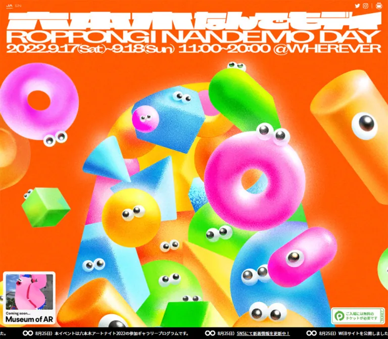
Roppongi Nandemo Day turns a long event-information page into a crowded world of friendly objects. Donuts, capsules, spheres, wedges, and cubes have glossy eyes and brightly shaded bodies. Fine grain covers the illustration and several interface surfaces. A huge white custom wordmark presses against the top of the scene, while small social links, a museum promotion, a ticket stamp, and a black announcement strip occupy the edges.
The same character language continues into navigation. Floor cards have eyes, directional buttons resemble small creatures, and the contact section starts with an uneven skyline of white blocks and peeking pupils. Dense spectacle alternates with comparatively simple maps and information. The site retains its September 2022 event content and an event-ended announcement; this reference describes that content as currently served.
A critical implementation detail is the captured mobile behavior: major sections remain 1300px wide inside a 390px viewport. Titles, creator columns, and contact content are cut off horizontally. This is an observed limitation, not evidence of an intentionally sparse mobile composition.
閉じる
Roppongi Nandemo Day — Style Reference
A fluorescent parade of geometric creatures wrapped around a practical event guide.
Website: whatever.co/nandemo-day/ja Original URL: https://whatever.co/nandemo-day/ja/ Final URL: https://whatever.co/nandemo-day/ja/ Theme: saturated orange and multicolor illustration, with white graphic lettering and black utility areas; no selectable theme was evidenced. Inspected: October 2, 2026, at 03:28 JST / October 1, 2026, at 18:28:07.775 UTC. Viewports: desktop 1440 × 1000 CSS pixels; mobile 390 × 844 CSS pixels. Scope: the currently served Japanese event website. Supplied screenshots show the desktop opening scene, floor guide, contact/footer region, and mobile opening and contact/footer regions. Rendered text covers the event overview, creators, floors, programs, tickets, access, visitor information, and contact links. Detailed element measurements primarily cover the opening, overview, and creator listing.
Roppongi Nandemo Day turns a long event-information page into a crowded world of friendly objects. Donuts, capsules, spheres, wedges, and cubes have glossy eyes and brightly shaded bodies. Fine grain covers the illustration and several interface surfaces. A huge white custom wordmark presses against the top of the scene, while small social links, a museum promotion, a ticket stamp, and a black announcement strip occupy the edges.
The same character language continues into navigation. Floor cards have eyes, directional buttons resemble small creatures, and the contact section starts with an uneven skyline of white blocks and peeking pupils. Dense spectacle alternates with comparatively simple maps and information. The site retains its September 2022 event content and an event-ended announcement; this reference describes that content as currently served.
A critical implementation detail is the captured mobile behavior: major sections remain 1300px wide inside a 390px viewport. Titles, creator columns, and contact content are cut off horizontally. This is an observed limitation, not evidence of an intentionally sparse mobile composition.
How to Read This Reference
- Measured means a value appears in the supplied rendered DOM or computed styles. Coordinates describe the recorded state, not a guaranteed permanent CSS rule.
- Calculated means arithmetic based on those measurements, such as the 6px distance between creator-card bounds.
- Estimated means a visual approximation from an original-page screenshot. Secondary color hex values and most floor/contact dimensions fall into this category.
- Recommended means implementation guidance for reuse. It is not a claim about the original website.
- Named tokens are new descriptive aliases. The only supplied source custom properties are Swiper-related defaults.
- Computed font declarations establish the requested stack, not which font file actually rendered every glyph. Graphic lettering must be treated separately from its HTML wrapper.
- Screenshots establish appearance and visible states. They do not establish carousel behavior, hover effects, animation loops, or dialog operation without additional interaction evidence.
Tokens — Colors
Default Palette
| Name | Value | Suggested token | Evidence and role |
|---|---|---|---|
| Event Orange | #ff5703 |
--nd-orange |
Measured: body background is rgb(255, 87, 3) at both viewports. The dominant opening field. |
| White | #ffffff |
--nd-white |
Measured: overview and announcement text, and creator image-slot backgrounds. Visually also used for logos, eyes, map paper, and circular controls. |
| Black | #000000 |
--nd-ink |
Measured: default body and creator text. Visually used for pupils, map lines, arrows, ticker, and footer. |
| Candy Pink | Approximately #f76abc |
--nd-pink |
Estimated: the 1F floor panel and contact action. Illustration pink ranges from pale highlights to vivid magenta. |
| Electric Cyan | Approximately #00c5df |
--nd-cyan |
Estimated: visitor-information background above contact. |
| Acid Green | Approximately #73df00 |
--nd-lime |
Estimated: the neighboring 2F panel and bright green character bodies. |
| Sun Yellow | Approximately #ffe43b |
--nd-yellow |
Estimated: yellow bodies and illuminated sections of the central illustration. |
| Sky Blue | Approximately #62dfff |
--nd-blue |
Estimated: blue geometric characters; actual artwork includes much darker blue shading. |
| Ticket Green | Approximately #50ae41 |
--nd-ticket-green |
Estimated: the green ticket mark, border, and Japanese copy inside the white ticket stamp. |
| Textured Paper | Approximately #f5f5f5 in appearance |
--nd-paper |
Estimated: the contact surface. A white base with grain is a practical starting point. |
The orange base is exact; the illustration is not a set of flat color fills. Its highlights approach white, shadows deepen the local hue, and grain changes the perceived color at every scale. Use the estimated supporting colors as starting values, then tune them against the original screenshots.
Color Distribution
Orange supplies the dominant environmental color. Pink, green, yellow, and blue appear as large objects within it. White anchors identity and controls. Black concentrates in readable linework and the announcement/footer bands.
The supplied --swiper-theme-color: #007aff is a library variable. It is not evidence that the visible floor controls use that blue. Similarly, the screenshot's green ticket stamp is a specific linked graphic, not proof of a universal green primary-action system.
Tokens — Typography
Japanese Body and Information Text
Measured stack: begins with Noto Sans JP, followed by Apple/system and Japanese sans-serif fallbacks including Yu Gothic, Hiragino Kaku Gothic ProN, and Meiryo.
- Body:
16px, weight400, line height32px. - Overview statement:
29px, weight500, line height43.007px. - Event fact labels:
16px / 24px, weight400. - Creator names:
16px / 24px, weight400. - Creator categories:
12px / 18px, weight400. - Announcement text:
14px / 39.998px, weight400. - Sampled text uses normal letter spacing.
The Japanese text is clear and fairly neutral. The illustration and custom lettering provide most of the personality; ordinary paragraphs do not need an eccentric display face.
Custom Identity and Section Graphics
The opening combines three tightly stacked graphic lines: the Japanese event name, an extremely wide uppercase English name, and the date/time/venue line. Letterforms are compressed vertically, extended horizontally, and cut into bold geometric shapes.
The opening H1 reports 16px / 32px in computed styles, but its visible artwork spans 1280px. That wrapper value does not describe the apparent lettering size. No font name for the custom wordmark is established.
The FLOOR title sits inside a white speech bubble. Its compact black lettering looks graphically composed. The floor number is a separate, much larger white label. Preserve this hierarchy rather than assigning the same font treatment to all headings.
Type Scale
| Role | Size / line height | Weight | Evidence |
|---|---|---|---|
| Root sizing context | 10px / normal |
400 | Measured HTML style; inherited Times is not evidence of visible serif body text. |
| Creator category | 12px / 18px |
400 | Measured. |
| Announcement | 14px / approximately 40px |
400 | Measured. |
| General paragraph | 16px / 32px |
400 | Measured body style. |
| Creator name / fact label | 16px / 24px |
400 | Measured. |
| Overview statement | 29px / 43.007px |
500 | Measured at both desktop and mobile. |
| Contact action | Approximately 24px |
Medium-looking | Screenshot estimate; no computed value supplied. |
| Contact heading | Approximately 50px |
Regular-to-medium appearance | Screenshot estimate. |
| Floor number | Approximately 96px |
Light-looking graphic form | Screenshot estimate; font identity unverified. |
| Main wordmark | 1280px-wide graphic region | Not applicable | Measured wrapper; not a live-text font-size measurement. |
Recommended alias: use the measured Japanese body stack for prose. Keep supplied identity artwork as artwork. If creating a new identity, commission or draw original lettering rather than claiming an unrelated font is the source typeface.
Tokens — Spacing & Shapes
The page combines tightly packed graphics with large section spans. There is no evidenced universal spacing-unit formula. Most sampled dimensions remain unchanged between desktop and mobile.
Spacing Scale
| Use | Value | Evidence |
|---|---|---|
| Creator-column gap | 6px |
Calculated from a 246px column pitch and 240px card width. |
| Creator image inset | 10px from card top and left |
Measured. |
| Hero promotion / ticket edge inset | 10px |
Measured horizontally. |
| Compact brand left inset | 15px |
Measured. |
| Social group right edge | 20px |
Measured from the guideline icon bounds. |
| Creator-row gap | 20px |
Calculated from successive card rows; tall names increase row height. |
| Creator text left offset | 40px from card edge |
Measured. |
| Main title top padding | 40px |
Measured. |
| Announcement height | Approximately 40px |
Measured. |
| Hero promotion / ticket bottom offset | 50px |
Calculated at both viewports. |
| Overview top / bottom padding | 88px / 62px |
Measured. |
| Desktop content inset | 80px |
Measured for the 1280px title and overview text region. |
| Floor-panel gap | Approximately 40px |
Screenshot estimate. |
Border Radius
| Element | Radius | Evidence |
|---|---|---|
| Creator image slot | 14px |
Measured. |
| Floor panel | Approximately 40px |
Screenshot estimate. |
| Museum promotional frame | Approximately 10–12px |
Screenshot estimate. |
| Ticket stamp | Approximately 8px |
Screenshot estimate. |
| Contact action | Full pill, approximately 41px end radius |
Estimated from an approximately 82px-tall control. |
| Arrow controls / eye whites / pupils | Circular | Visually observed. |
| Speech bubble | Broad ellipse with a projecting tail | Visually observed; not a generic rounded rectangle. |
Layout Measurements
| Element | Desktop 1440 × 1000 | Mobile 390 × 844 | Evidence |
|---|---|---|---|
| Document height | 9454.969px |
9298.969px |
Measured, reported rounded as 9455 / 9299. |
| Opening section | 1440 × 1000px |
1300 × 844px |
Measured. |
| Main title wrapper | x 80, width 1280, height 188px |
x 10, width 1280, height 188px |
Measured; includes 40px top padding. |
| Compact header, initial state | x 15, y -65, 185 × 45px |
Same | Measured offscreen state. |
| Museum promotion | x 10, y 770, 179 × 180px |
x 10, y 614, same size |
Measured. |
| Ticket stamp | x 1246, y 892, 184 × 58px |
x 196, y 736, same size |
Measured. |
| Announcement strip | y 960, approximately 40px tall |
y 804, same height |
Measured text bounds and screenshot. |
| Overview section | x 0, y 1058, 1440 × 1181px |
x 0, y 902, 1300 × 1181px |
Measured. |
| Overview statement | x 80, width 1280, height 516px |
x 10, same size |
Measured. |
| Creator section | y 2159, height 2018px |
y 2003, same height |
Measured. |
| Typical creator link | 240 × 246px |
Same | Measured; two-line names can produce 270px height. |
| Creator image slot | 200 × 200px |
Same | Measured. |
| Active floor panel | Approximately x 220, y 159, 1000 × 654px |
Not visually supplied | Screenshot estimate. |
| Contact action | Approximately 396 × 82px |
Outside the supplied visible crop | Screenshot estimate. |
The overview and creator section rectangles overlap vertically by 80px. Their boundaries should not be interpreted as a conventional stack of isolated rectangular panels. Decorative headings and section transitions occupy shared space.
Components
Opening Illustration and Title
Role: announce the event and establish the entire visual world immediately.
The opening occupies one viewport in height. A broad white identity graphic sits above an overflowing composition of textured 3D-looking objects. Some creatures are almost entirely outside the frame; others overlap in a tall central cluster. The scene remains dense near the bottom behind the promotional links.
The title wrapper is 1280px wide with 40px top padding. Its remaining 148px is consistent with the visible three-line identity block, although the exact internal asset bounds were not supplied. The graphic contains the event name, September 17–18, 2022 dates, 11:00–20:00 hours, and WHEREVER venue label.
On mobile, the title retains its width and only its left portion is visible. The illustration shows a substantial crop of the central characters. Its positioning should be considered separately from the title: no supplied image CSS establishes that both share the same sizing or crop rule.
Compact Brand and Corner Utilities
Role: maintain identity and small utility links as the visitor moves through the page.
The compact white event logo appears near the upper-left corner in the floor and footer screenshots. Its measured initial bounds are above the viewport at y -65px; its visible scrolled position is approximately y 15px. An 80px vertical translation would connect those positions, but that transform distance is an inference.
At the upper right, Twitter and Instagram have 18 × 18px link boxes. The adjacent guideline symbol has a 21 × 22px box, separated visually by a thin vertical divider. These remain aligned to the viewport edge in both captured sizes.
The opening has small JA and EN labels at the upper left. JA is visually underlined, and EN links to the English edition. The exact language-label font cannot be inferred from the tiny link bounds alone.
Museum Promotion
Role: link to the related Museum of AR experience.
A 179 × 180px promotional tile sits 10px from the left edge and 50px above the viewport bottom in both opening captures. A white rounded frame contains an approximately 160 × 120px media region, a small English kicker, and a bold Museum of AR label.
Its destination is https://whatever.co/moar/. The image content differs between the supplied desktop and mobile captures. That establishes differing displayed media states, but not the file format, playback rate, or whether the change is caused by video, image animation, or another mechanism.
The promotion is not visible in the supplied floor or footer screenshots. Do not assume it is shown throughout the entire document.
Ticket Stamp
Role: provide a compact route to ticket information.
The 184 × 58px stamp is anchored 10px from the right edge and 50px above the bottom in the opening captures. It uses a white field, green outline, green ticket-service mark, two lines of Japanese copy, and a narrow vertical ticket detail at the right.
The visible label is ご入場には無料のチケットが必要です. Its link targets #ticketsPoint; it does not directly open the ticket service. On the 390px viewport, it sits beside the museum promotion with only 7px between their measured boxes.
Retain the distinction between this compact stamp and the larger ticket action within the page.
Announcement Strip
Role: display current event status within the otherwise celebratory scene.
A black strip occupies approximately 40px at the bottom of the opening and floor screenshots. White infinity-like symbols precede repeated Japanese announcements. The current message says the event has ended and thanks visitors.
Each sampled text segment is approximately 592.33px wide, including 43px left and 50px right padding. Text is 14px, with a line box matching the strip height. Repeated segments extend outside the viewport.
This construction suggests a marquee, but the supplied evidence does not establish its direction, speed, or animation engine. The strip is absent from the supplied contact/footer screenshots, so a permanently visible full-document ticker would not match every observed state.
Event Overview and Facts
Role: explain the event's multidisciplinary purpose and provide essential logistics.
The overview uses white 29px / 43.007px Japanese text at weight 500 in a 1280px-wide region. It is followed by a narrower fact list for name, dates, location, admission, organizer, and supporting organization.
Fact labels have 185px-wide boxes with 23px left and 46px right padding. Their 24px line boxes recur on a 32px vertical pitch, implying an 8px interval between these rows.
The rendered original-page text explicitly names Whatever Co. as the event organizer, and its footer copyright links to the same organization. This establishes organizer/operator identity; it does not establish website design or development credits.
Only the overview's geometry and typography are well evidenced here. A complete visual treatment of its decorative heading and background layers cannot be reconstructed from these element samples alone.
Creator Listing
Role: browse the participating creators and disciplines.
The rendered roster contains 34 entries. Five columns are measured on desktop, and the same five-column geometry persists in the narrow viewport.
A typical entry has the following anatomy:
- A transparent link wrapper,
240 × 246px. - A white
200 × 200pximage-slot element, inset 10px from the top and left, with a 14px radius. - A 180px-wide creator-name region starting 40px from the card's left edge.
- A category label directly below, using
12px / 18pxtext.
The name begins 187px below the link's top, while the square image ends at 210px. Their measured rectangles therefore overlap by 23px vertically. Do not silently turn this into a conventional image-above-caption card when matching the supplied geometry. The detailed image and label layering is not visually shown in the provided screenshots.
Columns advance by 246px, leaving 6px between link wrappers. Typical rows have 20px gaps. Longer names, such as New Stand Tokyo by WTFC, wrap to two lines and increase the relevant card height by 24px.
Creator links use href='#' in the supplied evidence. Additional profile and program text exists in the document, but the opening, closing, focus behavior, and appearance of any associated detail UI were not exercised.
Floor Guide
Role: explain the building's floor-by-floor contents without leaving the character world.
The captured 1F view centers a large pink panel over the orange creature scene. The panel is approximately 1000px wide and 654px tall, with roughly 40px corners. Neighboring panels remain visible at both sides; the right-hand 2F panel is bright green.
The panel contains:
- A white floor number near the upper left.
- A pair of flat black-and-white eyes projecting above its upper edge.
- A white speech bubble above the panel containing
FLOOR. - A white architectural diagram with heavy exterior walls and thinner internal divisions.
- Black leader lines and endpoint dots connecting positions to exhibitor names.
- Pale gray entrance and reception labels inside the plan.
The visible map is approximately 480 × 420px. Labels include fermata inc., New Stand Tokyo by WTFC, and MoAR – Museum of AR. Keep the map highly legible against the noisy pink surface; its linework is crisp and largely untextured.
Two approximately 100px white circular navigation controls overlap the panel's side boundaries. Each contains a substantial black arrow and tiny eyes at the top. Five pagination markers sit along the lower edge: four small black dots and one black dot inside a larger white disc.
The floor labels in rendered content are 1F, 2F, 4F, 7F, and RF. Repeated floor content is consistent with a carousel implementation, but does not prove autoplay, looping, swipe support, or a particular transition.
Programs, Tickets, and Access
Role: translate the event identity into actionable visit information.
Rendered text establishes a 2F PROGRAMS schedule with an 11:00–20:00 time axis and two event dates. Each date contains five sessions. Session anatomy comprises a time range, a title, and a type label such as FILM or TALK EVENT.
The ticket section explains free timed admission and links to https://nandemodayticket.peatix.com/. Access content provides the WHEREVER address, a map link, and walking directions from Nogizaka and Roppongi stations.
These sections are confirmed as content, but their full visual layouts are not among the supplied screenshots. Do not invent schedule block colors, ticket-button dimensions, an embedded map, or expanded-session states.
Visitor Information and Contact Transition
Role: present practical conditions, then move into a simple contact area.
The desktop lower-page screenshot shows three columns of white visitor-information copy over a cyan textured background. They address cashless payment, advance tickets, and infection precautions. Visible columns begin around x 260, 590, and 920; widths of approximately 260px and gaps near 70px are visual estimates.
An irregular white stepped edge separates this cyan field from contact. Pairs of flat eyes peek over different step heights. Some are cut off by the viewport edges. This turns a section boundary into a group of characters without adding another large illustration.
The exact boundary asset or CSS construction is unknown. A reusable version can use decorative stepped blocks and paired circles, provided they remain outside the reading order.
Contact and Footer
Role: close the long page with a clear inquiry route and organization links.
The contact area uses textured white, centered black text, and a wide pink pill action. The heading is お問い合わせ; the action reads 問い合わせる and includes an external-link mark. Its destination is a Google Forms URL present in the rendered page.
The action is approximately 396 × 82px. A generous vertical interval separates it from the short explanatory sentence. There is no surrounding card border or prominent elevation shadow.
The footer changes abruptly to black. A white event logo and Whatever wordmark form a left-hand stack; three small white utility links occupy the right. A white circular upward-arrow control, with tiny eyes, overlaps the upper boundary near the right side. Its visual purpose is a return-to-top affordance; activation behavior was not tested.
On mobile, the footer brand is visible while the centered contact heading, button, and right-hand utility links lie outside the shown crop. This agrees with the retained wide layout and should not be documented as content removal.
Tokens — Motion & Interaction
| Treatment | Evidence | Value or limitation |
|---|---|---|
| Compact header transform | Computed declaration | transform 0.25s cubic-bezier(0.22, 1, 0.36, 1) |
| Opening title transform | Computed declaration | transform 0.8s cubic-bezier(0.22, 1, 0.36, 1) |
| Overview / creator heading reveal | Computed mobile declaration | scale_visible, 0.3s cubic-bezier(0.34, 1.56, 0.64, 1), forwards fill |
| Compact logo appearance after opening | Different supplied page states | Logo is initially above the viewport and visible in scrolled screenshots; trigger threshold unverified. |
| Repeating announcement | Screenshot and repeated DOM segments | Marquee-like construction; direction, duration, pause behavior, and engine unverified. |
| Floor navigation | Visible arrows and five markers | Controls are evidenced; click, swipe, keyboard, looping, and autoplay behavior unverified. |
| Museum media | Different displayed images | Format and playback behavior unverified. |
| Ticket / access anchors | Rendered link destinations | Targets exist; scroll animation and landing offsets unverified. |
| Creator / program details | Hash links and additional document text | No verified opened state or dialog interaction. |
The heading reveal uses an overshooting timing curve, while the header and title use a pronounced ease-out. Their starting scale, transform distance, trigger conditions, and keyframes are not supplied. Reusing the timing curve is supported; inventing exact original trajectories is not.
Most sampled elements report no CSS animation on themselves. That does not rule out animation on ancestors, pseudo-elements, image assets, or JavaScript-driven graphics. There is no evidence here for cursor-following eyes, physical collisions, parallax, or a live 3D renderer.
Surfaces
| Surface | Appearance | Function |
|---|---|---|
| Opening environment | Orange with fine grain and shaded multicolor characters | Immersive event identity. |
| Creator image slot | White, 200px square, 14px radius | Consistent media container within a dense roster. |
| Floor card | Large grainy pink or green rounded panel | Separates a floor's information from the busy scene. |
| Floor map | White paper-like shape with crisp black linework | High legibility and spatial information. |
| Navigation creature | White circular body, black arrow, small eyes | Clear action with event-specific character. |
| Visitor information | Cyan grain with white text | Distinct practical-information region. |
| Contact | Light grain with black text and pink action | Quiet closing area. |
| Ticker / footer | Solid black with white content | Strong boundaries and readable utilities. |
There is no evidenced general-purpose elevation system. Depth comes primarily from illustration shading, overlapping shapes, exposed neighboring panels, and elements projecting beyond section edges.
Imagery
The defining artwork uses simple solids with deliberately expressive placement: toruses tilt toward the viewer, capsules lean diagonally, cubes rotate into view, and spheres collect around larger bodies. Eyes are often offset or attached to unexpected edges. Dense overlap makes the central composition feel populated rather than arranged as a clean icon grid.
Materials combine bright gradients, pale highlights, colored shadow, and fine stochastic grain. The creatures look soft and toy-like, although their material or rendering software is not established. Their eyes have reflective, dimensional highlights. In contrast, interface eyes use flat white circles and black pupils.
Preserve these two eye styles. Applying photorealistic eyeballs to every button would weaken the simple control language; flattening the main illustration into plain circles would lose its volume.
Observed Asset References
No image src values, background-image URLs, font-file URLs, or asset manifest were supplied. The following is an asset-role inventory, not a list of invented filenames.
| Asset role | Observed form | Implementation implication |
|---|---|---|
| Opening title | Wide white three-line identity graphic | Preserve its lettering and aspect ratio; retain an accessible textual title. |
| Compact event logo | White mark, approximately 185 × 45px | Separate small identity treatment for scrolled states. |
| Main character scene | Dense colored geometric creatures with grain | Use suitable high-resolution artwork; the runtime rendering method is unknown. |
| Museum promotion | Framed photographic/AR media and typography | Keep it distinct from the decorative hero illustration. |
| Floor diagram | White architectural plan, black lines, labels, dots | Prefer crisp scalable linework or a sufficiently large image. |
| Eye motif | Flat paired circles in controls and boundaries | Suitable for lightweight CSS or SVG recreation. |
| Texture | Fine noise visible on orange, pink, cyan, and white | Use a small repeating tile or texture already embedded in artwork. |
| Footer marks | White event logo and Whatever wordmark | Preserve identity assets rather than approximating them with body text. |
Use normal image resampling for the shaded illustration. The grain is fine texture, not intentional low-resolution pixel art. Avoid nearest-neighbor scaling or oversized noise particles.
Layout & Responsive Behavior
Desktop Composition
At 1440px wide, the main title and overview text sit in a 1280px region with 80px outer margins. The opening height is 1000px, matching the viewport. The document then continues for approximately 8455px beyond the opening.
The roster uses five columns. Its measured card-bound extent is 1224px: five 240px links plus four 6px intervals. The first row begins at x 118; this is slightly right of a perfectly centered 1224px box, so a generic centered grid is only an approximation unless that offset is preserved.
The floor guide changes the rhythm to one large central panel with parts of adjacent panels visible. Later, contact is centered above a black footer with branding left and links right. The page is a long document, not a fixed application shell with an internally scrolling main pane.
Actual Mobile Observation
At 390 × 844:
- The body and HTML bounds are 390px wide, while the opening, overview, and creator sections are 1300px wide.
- The title and overview region remain 1280px wide, now starting at x
10. - The overview remains
29px / 43.007pxand 516px tall. - Creator links remain 240px wide; the first two columns begin at x
48and294, followed by columns well outside the viewport. - The museum promotion remains
179 × 180px; the ticket stamp remains184 × 58px. - Top social controls and bottom promotional links follow the viewport edges instead of the 1300px content width.
- The contact/footer screenshot exposes the left portion of the wide layout, leaving a large apparently empty white region and showing only part of a sentence at the right edge.
The total document-height difference is exactly 156px in the supplied measurements, matching the difference between the two opening viewport heights. The sampled downstream section heights are unchanged. This strongly supports a retained desktop composition rather than responsive text reflow.
The evidence does not establish whether horizontal panning is available, deliberately suppressed, or affected by other runtime conditions. Document the clipping itself without assigning an unsupported cause.
Recommended Responsive Adaptation
For a new implementation, preserve the dense illustration while making information fit the device:
- Let the title graphic scale within the viewport, with an accessible text equivalent.
- Keep artwork cropping independent from text layout.
- Switch creators to two columns on phones and allow captions to sit fully below their images.
- Fit floor panels to the available width; move detailed exhibitor labels into a readable list when the plan becomes too small.
- Stack visitor notes and footer links.
- Keep contact headings and actions inside the viewport.
- Recalculate the two bottom promotional elements for smaller phones, safe areas, and text enlargement.
These are corrections for reuse. They are not descriptions of the captured mobile page.
Do’s and Don’ts
Do
- Keep the measured orange base
#ff5703as the dominant opening field. - Combine fine grain with convincing shaded volume in the main artwork.
- Preserve the white custom identity graphic and its compressed, crowded proportions.
- Distinguish dimensional creature eyes from flat interface eyes.
- Let selected objects and neighboring floor panels extend beyond visible boundaries.
- Use crisp black map lines and readable labels inside the noisy scene.
- Retain the compact corner utilities, ticket stamp, museum tile, and black announcement strip as separate components.
- Use the measured Japanese sans-serif hierarchy for practical information.
- Reuse the eye motif at meaningful boundaries and controls.
- Keep the event-ended notice visible when representing the current content.
Don’t
- Don’t replace the character scene with a generic orange gradient and floating UI cards.
- Don’t label the custom wordmark as Noto Sans JP because its H1 wrapper inherits that family.
- Don’t substitute large pixel noise for the observed fine grain.
- Don’t introduce glass blur or a universal soft card-shadow system.
- Don’t make every secondary action a large pink pill; the ticket stamp has a different anatomy.
- Don’t use Swiper's default blue as a brand color without visible evidence.
- Don’t claim autoplay, cursor tracking, physics, or modal behavior from static screenshots.
- Don’t invent portraits, timetable styling, or unavailable asset paths.
- Don’t describe the mobile contact crop as deliberate content removal.
- Don’t carry the 1300px information canvas into a new mobile implementation without explicitly choosing and addressing its overflow.
Recommended Implementation Additions
These are proposed improvements, not verified original features:
- Give icon-only navigation and social controls accessible names. Keep eye decorations hidden from assistive technology.
- Expand small visible social icons into comfortably spaced touch targets without letting neighboring targets overlap.
- Provide keyboard-operable floor navigation, a programmatic current-floor state, and meaningful names for pagination controls.
- Offer a static announcement or pause control if the ticker moves continuously. Hide repeated decorative copies from screen readers.
- Supply reduced-motion alternatives for heading reveals and animated media. CSS alone cannot freeze every animated image format.
- Preserve an accessible event title, dates, and venue outside purely decorative lettering assets.
- Verify text contrast over textured cyan and pink. Dark text is a useful optional treatment for newly implemented pink actions.
- Use a structured definition list for event facts and a semantic schedule representation for programs.
- If creator links open dialogs, add focus management, Escape handling, and focus restoration; no existing implementation is assumed.
- Distinguish current event status from retained ticket information so visitors do not mistake the 2022 listing for a future event.
- Fix content-width overflow rather than concealing it with global horizontal clipping.
Agent Prompt Guide
Quick Color Reference
- Measured canvas: orange
#ff5703. - Measured text primitives: white
#ffffffand black#000000. - Estimated supporting fields: pink
#f76abc, cyan#00c5df, lime#73df00. - Estimated artwork accents: yellow
#ffe43band sky blue#62dfff. - Estimated ticket accent: green
#50ae41on white. - Texture: fine grain on broad colored and light surfaces; keep essential linework clear.
Overall Prompt
“Create a long creative-event website inspired by the supplied Roppongi Nandemo Day reference. Start with a viewport-height orange scene using #ff5703, packed with shaded, grainy geometric creatures: donuts, capsules, spheres, cubes, and wedges with reflective eyes. Place a custom white three-line event identity across the top. Add tiny corner utilities, a framed museum promotion, a green-and-white ticket stamp, and a black status strip. Continue with Japanese sans-serif event information, a dense creator roster, and an oversized floor guide using pink and lime panels, white map paper, black leader lines, and circular arrow creatures. End with cyan visitor information, a stepped white eye border, centered contact content, and a black footer. Preserve the visual density while making information fit narrow screens; the supplied original mobile capture clips a fixed-width layout.”
Example Component Prompts
- Floor panel: “Build an approximately 1000 × 654px pink floor card with 40px corners and fine grain. Add a large white floor number, flat eyes above the edge, and a white FLOOR speech bubble. Center a crisp white architectural diagram with black lines and external name callouts. Overlap both sides with 100px circular white arrow controls carrying tiny eyes.”
- Creator entry: “Use the measured 240px-wide creator-link geometry with a 200px square white image slot, 14px corners, 16px name text, and a 12px category. Desktop columns have a 246px pitch. Preserve the documented overlapping label geometry only for a fidelity study; use fully readable captions in the mobile adaptation.”
- Contact boundary: “Transition from a grainy cyan section to white with an irregular stepped skyline. Place pairs of black pupils inside white circles along several step heights. Keep the eyes decorative, and use centered black contact text with a broad pink pill action below.”
- Ticket stamp: “Create a compact 184 × 58px white ticket graphic with a green outline, a green service mark at left, two short Japanese text lines, and a narrow ticket detail at right. Keep it visually distinct from a full-width CTA.”
- Responsive correction: “Retain the oversized artwork crop but remove minimum widths from information sections. Scale the title within the device, use two creator columns, fit the floor guide to the screen, and stack contact/footer content. Do not reproduce the clipped 1300px mobile content canvas.”
Quick Start
CSS Custom Properties
This is a reusable CSS starting point, not an extracted stylesheet or a tested reconstruction. Exact DOM measurements are mixed with explicitly estimated visual tokens. The base layout preserves the observed minimum-width geometry for comparison; the optional mobile override below corrects it.
Supply your own title, logo, scene, creator media, and map assets. No original asset filenames were available. The embedded noise tile is a recommended approximation. The floor map, exhibitor callouts, and functional carousel require separate content and behavior.
Expected structure: .event-canvas wraps wide document sections; .container supplies the main content width; .creator-card contains an image, .creator-name, and .creator-category; .eyes is an empty decorative element; .floor-panel contains its title bubble, floor number, map, controls, and pagination. State classes such as .is-reading and .at-footer are adaptation hooks, not observed source class names.
:root {
  /* Measured colors */
  --nd-orange: #ff5703;
  --nd-white: #ffffff;
  --nd-ink: #000000;

  /* Screenshot estimates */
  --nd-pink: #f76abc;
  --nd-cyan: #00c5df;
  --nd-lime: #73df00;
  --nd-yellow: #ffe43b;
  --nd-blue: #62dfff;
  --nd-ticket-green: #50ae41;

  /* Recommended stack using the evidenced primary family */
  --nd-font: 'Noto Sans JP', -apple-system, system-ui,
    'Yu Gothic', YuGothic, 'Hiragino Kaku Gothic ProN',
    Meiryo, sans-serif;
  --nd-text-small: 12px;
  --nd-text-ticker: 14px;
  --nd-text-body: 16px;
  --nd-text-intro: 29px;

  /* Measured geometry */
  --nd-canvas-min: 1300px;
  --nd-content: 1280px;
  --nd-ticker-height: 40px;
  --nd-card-radius: 14px;

  /* Estimated floor geometry */
  --nd-floor-width: 1000px;
  --nd-floor-height: 654px;
  --nd-floor-radius: 40px;

  /* Evidenced timing curves */
  --nd-ease-out: cubic-bezier(0.22, 1, 0.36, 1);
  --nd-ease-pop: cubic-bezier(0.34, 1.56, 0.64, 1);

  /* Recommended self-contained fine-grain approximation */
  --nd-grain: url("data:image/svg+xml,%3Csvg xmlns='http://www.w3.org/2000/svg' width='160' height='160'%3E%3Cfilter id='n'%3E%3CfeTurbulence type='fractalNoise' baseFrequency='.8' numOctaves='3' stitchTiles='stitch'/%3E%3CfeColorMatrix type='saturate' values='0'/%3E%3C/filter%3E%3Cpath fill='%23808080' filter='url(%23n)' opacity='.16' d='M0 0h160v160H0z'/%3E%3C/svg%3E");
}

* { box-sizing: border-box; }
html { font-size: 16px; }
body {
  margin: 0;
  color: var(--nd-ink);
  background: var(--nd-orange);
  font: 400 var(--nd-text-body)/2 var(--nd-font);
}
button, a { -webkit-tap-highlight-color: transparent; }
button { font: inherit; }
a { color: inherit; }
img { display: block; }

/* Fixed pixel values preserve proportions despite the adapted root size. */
.event-canvas { min-width: var(--nd-canvas-min); }
.container { width: var(--nd-content); margin-inline: auto; }
.grain { background-image: var(--nd-grain); }

.hero {
  position: relative;
  height: 100vh;
  height: 100svh;
  background-color: var(--nd-orange);
}
.scene-art {
  position: absolute;
  inset: 0 auto 0 0;
  width: 100vw;
  height: 100%;
  object-fit: cover;
  object-position: center;
  pointer-events: none;
}
.hero-title {
  position: relative;
  width: var(--nd-content);
  height: 188px;
  margin: 0 auto;
  padding-top: 40px;
  transition: transform 800ms var(--nd-ease-out);
}
.hero-title img { width: 100%; height: 148px; object-fit: contain; }

.compact-brand {
  position: fixed;
  z-index: 50;
  top: 15px;
  left: 15px;
  width: 185px;
  height: 45px;
  transform: translateY(-80px);
  transition: transform 250ms var(--nd-ease-out);
}
.compact-brand img { width: 100%; height: 100%; object-fit: contain; }
.is-reading .compact-brand { transform: translateY(0); }
.socials {
  position: fixed;
  z-index: 50;
  top: 9px;
  right: 20px;
  display: flex;
  align-items: center;
  gap: 10px;
  color: var(--nd-white);
}
.socials img, .socials svg { width: 18px; height: 18px; }

.hero-promo, .ticket-stamp {
  position: fixed;
  z-index: 40;
  bottom: 50px;
  display: block;
}
.hero-promo { left: 10px; width: 179px; height: 180px; }
.ticket-stamp { right: 10px; width: 184px; height: 58px; }
.hero-promo img, .ticket-stamp img { width: 100%; height: 100%; }
.is-reading .hero-promo, .is-reading .ticket-stamp { display: none; }

.ticker {
  position: fixed;
  z-index: 60;
  inset: auto 0 0;
  height: var(--nd-ticker-height);
  overflow: hidden;
  color: var(--nd-white);
  background: var(--nd-ink);
}
.ticker-track { display: flex; width: max-content; }
.ticker-item {
  flex: 0 0 592.33px;
  margin: 0;
  padding: 0 50px 0 43px;
  white-space: nowrap;
  font-size: var(--nd-text-ticker);
  line-height: var(--nd-ticker-height);
}
.at-footer .ticker { display: none; }
/* The ticker is static here because its original speed is unverified. */

.about { padding-block: 88px 62px; color: var(--nd-white); }
.about-intro {
  font-size: var(--nd-text-intro);
  font-weight: 500;
  line-height: 43.007px;
}
.creator-grid {
  position: relative;
  left: 10px;
  display: grid;
  grid-template-columns: repeat(5, 240px);
  gap: 20px 6px;
  width: 1224px;
  margin-inline: auto;
}
.creator-card {
  display: block;
  min-height: 246px;
  padding: 10px 20px 16px 10px;
  color: var(--nd-ink);
  text-decoration: none;
}
.creator-card > img {
  width: 200px;
  height: 200px;
  border-radius: var(--nd-card-radius);
  background: var(--nd-white);
  object-fit: cover;
}
.creator-name {
  position: relative;
  width: 180px;
  margin: -23px 0 0 30px;
  font-size: 16px;
  line-height: 24px;
}
.creator-category {
  width: 180px;
  margin: 1px 0 0 30px;
  font-size: 12px;
  line-height: 18px;
}

.floor-section { position: relative; padding-block: 160px 146px; }
.floor-panel {
  position: relative;
  width: var(--nd-floor-width);
  min-height: var(--nd-floor-height);
  margin-inline: auto;
  padding: 48px 72px;
  border-radius: var(--nd-floor-radius);
  background-color: var(--nd-pink);
}
.floor-panel--green { background-color: var(--nd-lime); }
.floor-number {
  position: absolute;
  top: 40px;
  left: 72px;
  margin: 0;
  color: var(--nd-white);
  font-size: 96px;
  line-height: 1;
}
.speech-bubble {
  position: absolute;
  top: -72px;
  left: 196px;
  display: grid;
  place-items: center;
  width: 254px;
  min-height: 104px;
  border-radius: 50%;
  background: var(--nd-white);
  font-size: 42px;
  font-weight: 700;
  line-height: 1;
}
.speech-bubble::after {
  content: '';
  position: absolute;
  left: 14px;
  bottom: -18px;
  border: 18px solid transparent;
  border-top-color: var(--nd-white);
  transform: rotate(24deg);
}
.floor-map { width: 480px; height: auto; margin: 76px auto 0; }
.eyes {
  --eye-size: 40px;
  position: absolute;
  top: calc(var(--eye-size) / -2);
  left: 93px;
  display: flex;
  pointer-events: none;
}
.eyes::before, .eyes::after {
  content: '';
  width: var(--eye-size);
  height: var(--eye-size);
  border-radius: 50%;
  background: radial-gradient(circle, #000 0 27%, #fff 29% 100%);
}
.floor-nav {
  position: absolute;
  top: 48%;
  display: grid;
  place-items: center;
  width: 100px;
  height: 100px;
  padding: 0;
  border: 0;
  border-radius: 50%;
  color: var(--nd-ink);
  background: var(--nd-white);
  transform: translateY(-50%);
  cursor: pointer;
}
.floor-nav--prev { left: -70px; }
.floor-nav--next { right: -70px; }
.floor-nav svg { width: 64px; height: 44px; }
.floor-nav .eyes { --eye-size: 20px; left: 30px; }
.floor-dots {
  position: absolute;
  bottom: -16px;
  left: 50%;
  display: flex;
  align-items: center;
  gap: 8px;
  transform: translateX(-50%);
}
.floor-dots button {
  width: 16px;
  height: 16px;
  padding: 0;
  border: 0;
  border-radius: 50%;
  background: var(--nd-ink);
}
.floor-dots [aria-current='true'] {
  width: 32px;
  height: 32px;
  border: 8px solid var(--nd-white);
}

.visitor-info { color: var(--nd-white); background-color: var(--nd-cyan); }
.contact {
  position: relative;
  padding: 75px 80px 77px;
  text-align: center;
  background-color: var(--nd-white);
}
.contact h2 { margin: 0; font-size: 50px; font-weight: 500; line-height: 65px; }
.contact p { margin: 32px 0 54px; }
.contact-action {
  display: inline-flex;
  align-items: center;
  justify-content: center;
  gap: 12px;
  width: 396px;
  min-height: 82px;
  padding: 16px 24px;
  border-radius: 999px;
  color: var(--nd-white);
  background-color: var(--nd-pink);
  font-size: 24px;
  font-weight: 500;
  line-height: 1.5;
  text-decoration: none;
}
.contact-action--high-contrast { color: var(--nd-ink); }
.site-footer { min-height: 248px; padding-block: 70px; color: #fff; background: #000; }
.footer-inner {
  display: flex;
  justify-content: space-between;
  gap: 48px;
  width: 1200px;
  margin-inline: auto;
}
.footer-brand { display: grid; align-content: start; gap: 28px; }
.footer-brand > img:first-child { width: 250px; height: auto; }

/* Recommended focus treatment, not a source elevation style. */
a:focus-visible, button:focus-visible {
  outline: 2px solid #fff;
  outline-offset: 1px;
  box-shadow: 0 0 0 5px #000;
}

/* Recommended keyframes using the measured reveal duration and curve. */
.reveal.is-visible { animation: nd-pop 300ms var(--nd-ease-pop) both; }
@keyframes nd-pop {
  from { opacity: 0; transform: scale(.9); }
  to { opacity: 1; transform: scale(1); }
}
@media (prefers-reduced-motion: reduce) {
  .compact-brand, .hero-title { transition: none; }
  .reveal.is-visible { animation: none; }
}
The title and logo require real assets for fidelity. The CSS speech-bubble text is a functional substitute, not a verified match for the original graphic lettering. Add the stepped contact boundary as a decorative SVG or separate block component; the screenshot does not establish its source construction.
Recommended Mobile Override
Add .adapt-mobile to the body to enable this correction. The 800px breakpoint is a recommendation, not a discovered source breakpoint. This override intentionally changes the captured mobile behavior.
@media (max-width: 800px) {
  .adapt-mobile .event-canvas { min-width: 0; }
  .adapt-mobile .container { width: auto; margin-inline: 20px; }
  .adapt-mobile .hero-title {
    width: calc(100% - 40px);
    height: auto;
    padding-top: 72px;
  }
  .adapt-mobile .hero-title img { height: auto; }
  .adapt-mobile .about-intro { font-size: 22px; line-height: 1.7; }
  .adapt-mobile .creator-grid {
    left: 0;
    width: auto;
    margin-inline: 20px;
    grid-template-columns: repeat(2, minmax(0, 1fr));
    gap: 24px 16px;
  }
  .adapt-mobile .creator-card { min-height: 0; padding: 0; }
  .adapt-mobile .creator-card > img {
    width: 100%;
    height: auto;
    aspect-ratio: 1;
  }
  .adapt-mobile .creator-name { width: auto; margin: 10px 0 0; }
  .adapt-mobile .creator-category { width: auto; margin: 2px 0 0; }
  .adapt-mobile .floor-section { padding-block: 112px 72px; }
  .adapt-mobile .floor-panel {
    width: calc(100% - 48px);
    min-height: 0;
    padding: 90px 20px 40px;
    border-radius: 28px;
  }
  .adapt-mobile .floor-number { top: 24px; left: 24px; font-size: 56px; }
  .adapt-mobile .speech-bubble {
    top: -64px;
    left: 44px;
    width: 190px;
    min-height: 80px;
    font-size: 32px;
  }
  .adapt-mobile .floor-map { width: 100%; margin-top: 20px; }
  .adapt-mobile .floor-nav { width: 48px; height: 48px; }
  .adapt-mobile .floor-nav--prev { left: -24px; }
  .adapt-mobile .floor-nav--next { right: -24px; }
  .adapt-mobile .floor-nav svg { width: 30px; height: 24px; }
  .adapt-mobile .floor-nav .eyes { --eye-size: 14px; left: 10px; }
  .adapt-mobile .contact { padding: 64px 20px; }
  .adapt-mobile .contact h2 { font-size: 34px; line-height: 1.4; }
  .adapt-mobile .contact-action { width: min(100%, 396px); }
  .adapt-mobile .footer-inner {
    width: auto;
    margin-inline: 24px;
    flex-direction: column;
  }
  .adapt-mobile .hero-promo { width: 120px; height: auto; }
  .adapt-mobile .hero-promo img { height: auto; }
  .adapt-mobile .ticket-stamp { width: min(184px, 45vw); height: auto; }
  .adapt-mobile .ticket-stamp img { height: auto; }
}
A scaled floor diagram may still have unreadably small labels. Pair it with an ordinary text list of exhibitors and locations. Also test the promotion pair below 390px and with safe-area insets; this snippet does not establish behavior for every device.
Tailwind v4 Token Mapping
Optional aliases for a project already using Tailwind v4. There is no claim that the original site uses Tailwind. Define the custom properties above first.
@theme inline {
  --color-event-orange: var(--nd-orange);
  --color-event-pink: var(--nd-pink);
  --color-event-cyan: var(--nd-cyan);
  --color-event-lime: var(--nd-lime);
  --color-event-ink: var(--nd-ink);
  --color-event-white: var(--nd-white);
  --font-event: var(--nd-font);
  --text-event-caption: 12px;
  --text-event-body: 16px;
  --text-event-intro: 29px;
  --radius-creator: 14px;
  --radius-floor: 40px;
  --spacing-event-content: 1280px;
  --spacing-event-ticker: 40px;
}
Sources & Evidence
- Original and final website: Roppongi Nandemo Day, Japanese edition. The supplied browser record reports HTTP 200 at the unchanged URL.
- Capture timestamp: October 1, 2026, 18:28:07.775 UTC, equivalent to October 2, 2026, 03:28:07.775 JST.
- Desktop evidence: three supplied original-page screenshots at 1440 × 1000 showing the opening, floor guide, and contact/footer region; rendered text, link destinations, element bounds, and computed styles.
- Mobile evidence: two supplied original-page screenshots at 390 × 844 showing the opening and contact/footer region, plus corresponding rendered element measurements.
- Interaction scope: supplied scroll captures and recorded CSS declarations. No independently exercised carousel controls, creator details, guideline panels, language switch, ticket flow, or external destinations are claimed.
- Readiness limitations: the supplied inspection waited for document loading, visible images, sampled layout stability, and finite animations within bounded time limits. Initial observation lasted at least five seconds. Perpetual animations were temporarily paused during readiness checks and resumed. These procedures do not prove that every delayed state or interaction was captured.
- Environment limitations: service workers and SharedWorkers were disabled during the supplied inspection. No additional browsing, commands, file inspection, asset retrieval, or historical reconstruction was performed for this reference.
All site-specific findings above derive from the supplied current original-page captures and rendered evidence. Estimated tokens and recommended implementation behavior are labeled separately from measured values.
# Roppongi Nandemo Day — Style Reference

> A fluorescent parade of geometric creatures wrapped around a practical event guide.

**Website:** [whatever.co/nandemo-day/ja](https://whatever.co/nandemo-day/ja/)
**Original URL:** https://whatever.co/nandemo-day/ja/
**Final URL:** https://whatever.co/nandemo-day/ja/
**Theme:** saturated orange and multicolor illustration, with white graphic lettering and black utility areas; no selectable theme was evidenced.
**Inspected:** October 2, 2026, at 03:28 JST / October 1, 2026, at 18:28:07.775 UTC.
**Viewports:** desktop 1440 × 1000 CSS pixels; mobile 390 × 844 CSS pixels.
**Scope:** the currently served Japanese event website. Supplied screenshots show the desktop opening scene, floor guide, contact/footer region, and mobile opening and contact/footer regions. Rendered text covers the event overview, creators, floors, programs, tickets, access, visitor information, and contact links. Detailed element measurements primarily cover the opening, overview, and creator listing.

Roppongi Nandemo Day turns a long event-information page into a crowded world of friendly objects. Donuts, capsules, spheres, wedges, and cubes have glossy eyes and brightly shaded bodies. Fine grain covers the illustration and several interface surfaces. A huge white custom wordmark presses against the top of the scene, while small social links, a museum promotion, a ticket stamp, and a black announcement strip occupy the edges.

The same character language continues into navigation. Floor cards have eyes, directional buttons resemble small creatures, and the contact section starts with an uneven skyline of white blocks and peeking pupils. Dense spectacle alternates with comparatively simple maps and information. The site retains its September 2022 event content and an event-ended announcement; this reference describes that content as currently served.

A critical implementation detail is the captured mobile behavior: major sections remain 1300px wide inside a 390px viewport. Titles, creator columns, and contact content are cut off horizontally. This is an observed limitation, not evidence of an intentionally sparse mobile composition.
閉じる
# Roppongi Nandemo Day — Style Reference

> A fluorescent parade of geometric creatures wrapped around a practical event guide.

**Website:** [whatever.co/nandemo-day/ja](https://whatever.co/nandemo-day/ja/)
**Original URL:** https://whatever.co/nandemo-day/ja/
**Final URL:** https://whatever.co/nandemo-day/ja/
**Theme:** saturated orange and multicolor illustration, with white graphic lettering and black utility areas; no selectable theme was evidenced.
**Inspected:** October 2, 2026, at 03:28 JST / October 1, 2026, at 18:28:07.775 UTC.
**Viewports:** desktop 1440 × 1000 CSS pixels; mobile 390 × 844 CSS pixels.
**Scope:** the currently served Japanese event website. Supplied screenshots show the desktop opening scene, floor guide, contact/footer region, and mobile opening and contact/footer regions. Rendered text covers the event overview, creators, floors, programs, tickets, access, visitor information, and contact links. Detailed element measurements primarily cover the opening, overview, and creator listing.

Roppongi Nandemo Day turns a long event-information page into a crowded world of friendly objects. Donuts, capsules, spheres, wedges, and cubes have glossy eyes and brightly shaded bodies. Fine grain covers the illustration and several interface surfaces. A huge white custom wordmark presses against the top of the scene, while small social links, a museum promotion, a ticket stamp, and a black announcement strip occupy the edges.

The same character language continues into navigation. Floor cards have eyes, directional buttons resemble small creatures, and the contact section starts with an uneven skyline of white blocks and peeking pupils. Dense spectacle alternates with comparatively simple maps and information. The site retains its September 2022 event content and an event-ended announcement; this reference describes that content as currently served.

A critical implementation detail is the captured mobile behavior: major sections remain 1300px wide inside a 390px viewport. Titles, creator columns, and contact content are cut off horizontally. This is an observed limitation, not evidence of an intentionally sparse mobile composition.

## How to Read This Reference

- **Measured** means a value appears in the supplied rendered DOM or computed styles. Coordinates describe the recorded state, not a guaranteed permanent CSS rule.
- **Calculated** means arithmetic based on those measurements, such as the 6px distance between creator-card bounds.
- **Estimated** means a visual approximation from an original-page screenshot. Secondary color hex values and most floor/contact dimensions fall into this category.
- **Recommended** means implementation guidance for reuse. It is not a claim about the original website.
- Named tokens are new descriptive aliases. The only supplied source custom properties are Swiper-related defaults.
- Computed font declarations establish the requested stack, not which font file actually rendered every glyph. Graphic lettering must be treated separately from its HTML wrapper.
- Screenshots establish appearance and visible states. They do not establish carousel behavior, hover effects, animation loops, or dialog operation without additional interaction evidence.

## Tokens — Colors

### Default Palette

| Name | Value | Suggested token | Evidence and role |
| --- | --- | --- | --- |
| Event Orange | `#ff5703` | `--nd-orange` | **Measured:** body background is `rgb(255, 87, 3)` at both viewports. The dominant opening field. |
| White | `#ffffff` | `--nd-white` | **Measured:** overview and announcement text, and creator image-slot backgrounds. Visually also used for logos, eyes, map paper, and circular controls. |
| Black | `#000000` | `--nd-ink` | **Measured:** default body and creator text. Visually used for pupils, map lines, arrows, ticker, and footer. |
| Candy Pink | Approximately `#f76abc` | `--nd-pink` | **Estimated:** the 1F floor panel and contact action. Illustration pink ranges from pale highlights to vivid magenta. |
| Electric Cyan | Approximately `#00c5df` | `--nd-cyan` | **Estimated:** visitor-information background above contact. |
| Acid Green | Approximately `#73df00` | `--nd-lime` | **Estimated:** the neighboring 2F panel and bright green character bodies. |
| Sun Yellow | Approximately `#ffe43b` | `--nd-yellow` | **Estimated:** yellow bodies and illuminated sections of the central illustration. |
| Sky Blue | Approximately `#62dfff` | `--nd-blue` | **Estimated:** blue geometric characters; actual artwork includes much darker blue shading. |
| Ticket Green | Approximately `#50ae41` | `--nd-ticket-green` | **Estimated:** the green ticket mark, border, and Japanese copy inside the white ticket stamp. |
| Textured Paper | Approximately `#f5f5f5` in appearance | `--nd-paper` | **Estimated:** the contact surface. A white base with grain is a practical starting point. |

The orange base is exact; the illustration is not a set of flat color fills. Its highlights approach white, shadows deepen the local hue, and grain changes the perceived color at every scale. Use the estimated supporting colors as starting values, then tune them against the original screenshots.

### Color Distribution

Orange supplies the dominant environmental color. Pink, green, yellow, and blue appear as large objects within it. White anchors identity and controls. Black concentrates in readable linework and the announcement/footer bands.

The supplied `--swiper-theme-color: #007aff` is a library variable. It is not evidence that the visible floor controls use that blue. Similarly, the screenshot's green ticket stamp is a specific linked graphic, not proof of a universal green primary-action system.

## Tokens — Typography

### Japanese Body and Information Text

**Measured stack:** begins with `Noto Sans JP`, followed by Apple/system and Japanese sans-serif fallbacks including Yu Gothic, Hiragino Kaku Gothic ProN, and Meiryo.

- Body: `16px`, weight `400`, line height `32px`.
- Overview statement: `29px`, weight `500`, line height `43.007px`.
- Event fact labels: `16px / 24px`, weight `400`.
- Creator names: `16px / 24px`, weight `400`.
- Creator categories: `12px / 18px`, weight `400`.
- Announcement text: `14px / 39.998px`, weight `400`.
- Sampled text uses normal letter spacing.

The Japanese text is clear and fairly neutral. The illustration and custom lettering provide most of the personality; ordinary paragraphs do not need an eccentric display face.

### Custom Identity and Section Graphics

The opening combines three tightly stacked graphic lines: the Japanese event name, an extremely wide uppercase English name, and the date/time/venue line. Letterforms are compressed vertically, extended horizontally, and cut into bold geometric shapes.

The opening H1 reports `16px / 32px` in computed styles, but its visible artwork spans 1280px. That wrapper value does not describe the apparent lettering size. No font name for the custom wordmark is established.

The `FLOOR` title sits inside a white speech bubble. Its compact black lettering looks graphically composed. The floor number is a separate, much larger white label. Preserve this hierarchy rather than assigning the same font treatment to all headings.

### Type Scale

| Role | Size / line height | Weight | Evidence |
| --- | --- | --- | --- |
| Root sizing context | `10px / normal` | 400 | Measured HTML style; inherited Times is not evidence of visible serif body text. |
| Creator category | `12px / 18px` | 400 | Measured. |
| Announcement | `14px / approximately 40px` | 400 | Measured. |
| General paragraph | `16px / 32px` | 400 | Measured body style. |
| Creator name / fact label | `16px / 24px` | 400 | Measured. |
| Overview statement | `29px / 43.007px` | 500 | Measured at both desktop and mobile. |
| Contact action | Approximately `24px` | Medium-looking | Screenshot estimate; no computed value supplied. |
| Contact heading | Approximately `50px` | Regular-to-medium appearance | Screenshot estimate. |
| Floor number | Approximately `96px` | Light-looking graphic form | Screenshot estimate; font identity unverified. |
| Main wordmark | 1280px-wide graphic region | Not applicable | Measured wrapper; not a live-text font-size measurement. |

**Recommended alias:** use the measured Japanese body stack for prose. Keep supplied identity artwork as artwork. If creating a new identity, commission or draw original lettering rather than claiming an unrelated font is the source typeface.

## Tokens — Spacing & Shapes

The page combines tightly packed graphics with large section spans. There is no evidenced universal spacing-unit formula. Most sampled dimensions remain unchanged between desktop and mobile.

### Spacing Scale

| Use | Value | Evidence |
| --- | --- | --- |
| Creator-column gap | `6px` | Calculated from a 246px column pitch and 240px card width. |
| Creator image inset | `10px` from card top and left | Measured. |
| Hero promotion / ticket edge inset | `10px` | Measured horizontally. |
| Compact brand left inset | `15px` | Measured. |
| Social group right edge | `20px` | Measured from the guideline icon bounds. |
| Creator-row gap | `20px` | Calculated from successive card rows; tall names increase row height. |
| Creator text left offset | `40px` from card edge | Measured. |
| Main title top padding | `40px` | Measured. |
| Announcement height | Approximately `40px` | Measured. |
| Hero promotion / ticket bottom offset | `50px` | Calculated at both viewports. |
| Overview top / bottom padding | `88px / 62px` | Measured. |
| Desktop content inset | `80px` | Measured for the 1280px title and overview text region. |
| Floor-panel gap | Approximately `40px` | Screenshot estimate. |

### Border Radius

| Element | Radius | Evidence |
| --- | --- | --- |
| Creator image slot | `14px` | Measured. |
| Floor panel | Approximately `40px` | Screenshot estimate. |
| Museum promotional frame | Approximately `10–12px` | Screenshot estimate. |
| Ticket stamp | Approximately `8px` | Screenshot estimate. |
| Contact action | Full pill, approximately `41px` end radius | Estimated from an approximately 82px-tall control. |
| Arrow controls / eye whites / pupils | Circular | Visually observed. |
| Speech bubble | Broad ellipse with a projecting tail | Visually observed; not a generic rounded rectangle. |

### Layout Measurements

| Element | Desktop 1440 × 1000 | Mobile 390 × 844 | Evidence |
| --- | --- | --- | --- |
| Document height | `9454.969px` | `9298.969px` | Measured, reported rounded as 9455 / 9299. |
| Opening section | `1440 × 1000px` | `1300 × 844px` | Measured. |
| Main title wrapper | x `80`, width `1280`, height `188px` | x `10`, width `1280`, height `188px` | Measured; includes 40px top padding. |
| Compact header, initial state | x `15`, y `-65`, `185 × 45px` | Same | Measured offscreen state. |
| Museum promotion | x `10`, y `770`, `179 × 180px` | x `10`, y `614`, same size | Measured. |
| Ticket stamp | x `1246`, y `892`, `184 × 58px` | x `196`, y `736`, same size | Measured. |
| Announcement strip | y `960`, approximately 40px tall | y `804`, same height | Measured text bounds and screenshot. |
| Overview section | x `0`, y `1058`, `1440 × 1181px` | x `0`, y `902`, `1300 × 1181px` | Measured. |
| Overview statement | x `80`, width `1280`, height `516px` | x `10`, same size | Measured. |
| Creator section | y `2159`, height `2018px` | y `2003`, same height | Measured. |
| Typical creator link | `240 × 246px` | Same | Measured; two-line names can produce 270px height. |
| Creator image slot | `200 × 200px` | Same | Measured. |
| Active floor panel | Approximately x `220`, y `159`, `1000 × 654px` | Not visually supplied | Screenshot estimate. |
| Contact action | Approximately `396 × 82px` | Outside the supplied visible crop | Screenshot estimate. |

The overview and creator section rectangles overlap vertically by 80px. Their boundaries should not be interpreted as a conventional stack of isolated rectangular panels. Decorative headings and section transitions occupy shared space.

## Components

### Opening Illustration and Title

**Role:** announce the event and establish the entire visual world immediately.

The opening occupies one viewport in height. A broad white identity graphic sits above an overflowing composition of textured 3D-looking objects. Some creatures are almost entirely outside the frame; others overlap in a tall central cluster. The scene remains dense near the bottom behind the promotional links.

The title wrapper is 1280px wide with 40px top padding. Its remaining 148px is consistent with the visible three-line identity block, although the exact internal asset bounds were not supplied. The graphic contains the event name, September 17–18, 2022 dates, 11:00–20:00 hours, and WHEREVER venue label.

On mobile, the title retains its width and only its left portion is visible. The illustration shows a substantial crop of the central characters. Its positioning should be considered separately from the title: no supplied image CSS establishes that both share the same sizing or crop rule.

### Compact Brand and Corner Utilities

**Role:** maintain identity and small utility links as the visitor moves through the page.

The compact white event logo appears near the upper-left corner in the floor and footer screenshots. Its measured initial bounds are above the viewport at y `-65px`; its visible scrolled position is approximately y `15px`. An 80px vertical translation would connect those positions, but that transform distance is an inference.

At the upper right, Twitter and Instagram have `18 × 18px` link boxes. The adjacent guideline symbol has a `21 × 22px` box, separated visually by a thin vertical divider. These remain aligned to the viewport edge in both captured sizes.

The opening has small `JA` and `EN` labels at the upper left. `JA` is visually underlined, and `EN` links to the English edition. The exact language-label font cannot be inferred from the tiny link bounds alone.

### Museum Promotion

**Role:** link to the related Museum of AR experience.

A `179 × 180px` promotional tile sits 10px from the left edge and 50px above the viewport bottom in both opening captures. A white rounded frame contains an approximately `160 × 120px` media region, a small English kicker, and a bold Museum of AR label.

Its destination is `https://whatever.co/moar/`. The image content differs between the supplied desktop and mobile captures. That establishes differing displayed media states, but not the file format, playback rate, or whether the change is caused by video, image animation, or another mechanism.

The promotion is not visible in the supplied floor or footer screenshots. Do not assume it is shown throughout the entire document.

### Ticket Stamp

**Role:** provide a compact route to ticket information.

The `184 × 58px` stamp is anchored 10px from the right edge and 50px above the bottom in the opening captures. It uses a white field, green outline, green ticket-service mark, two lines of Japanese copy, and a narrow vertical ticket detail at the right.

The visible label is `ご入場には無料のチケットが必要です`. Its link targets `#ticketsPoint`; it does not directly open the ticket service. On the 390px viewport, it sits beside the museum promotion with only 7px between their measured boxes.

Retain the distinction between this compact stamp and the larger ticket action within the page.

### Announcement Strip

**Role:** display current event status within the otherwise celebratory scene.

A black strip occupies approximately 40px at the bottom of the opening and floor screenshots. White infinity-like symbols precede repeated Japanese announcements. The current message says the event has ended and thanks visitors.

Each sampled text segment is approximately `592.33px` wide, including `43px` left and `50px` right padding. Text is `14px`, with a line box matching the strip height. Repeated segments extend outside the viewport.

This construction suggests a marquee, but the supplied evidence does not establish its direction, speed, or animation engine. The strip is absent from the supplied contact/footer screenshots, so a permanently visible full-document ticker would not match every observed state.

### Event Overview and Facts

**Role:** explain the event's multidisciplinary purpose and provide essential logistics.

The overview uses white `29px / 43.007px` Japanese text at weight 500 in a 1280px-wide region. It is followed by a narrower fact list for name, dates, location, admission, organizer, and supporting organization.

Fact labels have 185px-wide boxes with `23px` left and `46px` right padding. Their 24px line boxes recur on a 32px vertical pitch, implying an 8px interval between these rows.

The rendered original-page text explicitly names Whatever Co. as the event organizer, and its footer copyright links to the same organization. This establishes organizer/operator identity; it does not establish website design or development credits.

Only the overview's geometry and typography are well evidenced here. A complete visual treatment of its decorative heading and background layers cannot be reconstructed from these element samples alone.

### Creator Listing

**Role:** browse the participating creators and disciplines.

The rendered roster contains 34 entries. Five columns are measured on desktop, and the same five-column geometry persists in the narrow viewport.

A typical entry has the following anatomy:

1. A transparent link wrapper, `240 × 246px`.
2. A white `200 × 200px` image-slot element, inset 10px from the top and left, with a 14px radius.
3. A 180px-wide creator-name region starting 40px from the card's left edge.
4. A category label directly below, using `12px / 18px` text.

The name begins 187px below the link's top, while the square image ends at 210px. Their measured rectangles therefore overlap by 23px vertically. Do not silently turn this into a conventional image-above-caption card when matching the supplied geometry. The detailed image and label layering is not visually shown in the provided screenshots.

Columns advance by 246px, leaving 6px between link wrappers. Typical rows have 20px gaps. Longer names, such as New Stand Tokyo by WTFC, wrap to two lines and increase the relevant card height by 24px.

Creator links use `href='#'` in the supplied evidence. Additional profile and program text exists in the document, but the opening, closing, focus behavior, and appearance of any associated detail UI were not exercised.

### Floor Guide

**Role:** explain the building's floor-by-floor contents without leaving the character world.

The captured 1F view centers a large pink panel over the orange creature scene. The panel is approximately 1000px wide and 654px tall, with roughly 40px corners. Neighboring panels remain visible at both sides; the right-hand 2F panel is bright green.

The panel contains:

- A white floor number near the upper left.
- A pair of flat black-and-white eyes projecting above its upper edge.
- A white speech bubble above the panel containing `FLOOR`.
- A white architectural diagram with heavy exterior walls and thinner internal divisions.
- Black leader lines and endpoint dots connecting positions to exhibitor names.
- Pale gray entrance and reception labels inside the plan.

The visible map is approximately `480 × 420px`. Labels include fermata inc., New Stand Tokyo by WTFC, and MoAR – Museum of AR. Keep the map highly legible against the noisy pink surface; its linework is crisp and largely untextured.

Two approximately 100px white circular navigation controls overlap the panel's side boundaries. Each contains a substantial black arrow and tiny eyes at the top. Five pagination markers sit along the lower edge: four small black dots and one black dot inside a larger white disc.

The floor labels in rendered content are 1F, 2F, 4F, 7F, and RF. Repeated floor content is consistent with a carousel implementation, but does not prove autoplay, looping, swipe support, or a particular transition.

### Programs, Tickets, and Access

**Role:** translate the event identity into actionable visit information.

Rendered text establishes a `2F PROGRAMS` schedule with an 11:00–20:00 time axis and two event dates. Each date contains five sessions. Session anatomy comprises a time range, a title, and a type label such as `FILM` or `TALK EVENT`.

The ticket section explains free timed admission and links to `https://nandemodayticket.peatix.com/`. Access content provides the WHEREVER address, a map link, and walking directions from Nogizaka and Roppongi stations.

These sections are confirmed as content, but their full visual layouts are not among the supplied screenshots. Do not invent schedule block colors, ticket-button dimensions, an embedded map, or expanded-session states.

### Visitor Information and Contact Transition

**Role:** present practical conditions, then move into a simple contact area.

The desktop lower-page screenshot shows three columns of white visitor-information copy over a cyan textured background. They address cashless payment, advance tickets, and infection precautions. Visible columns begin around x `260`, `590`, and `920`; widths of approximately 260px and gaps near 70px are visual estimates.

An irregular white stepped edge separates this cyan field from contact. Pairs of flat eyes peek over different step heights. Some are cut off by the viewport edges. This turns a section boundary into a group of characters without adding another large illustration.

The exact boundary asset or CSS construction is unknown. A reusable version can use decorative stepped blocks and paired circles, provided they remain outside the reading order.

### Contact and Footer

**Role:** close the long page with a clear inquiry route and organization links.

The contact area uses textured white, centered black text, and a wide pink pill action. The heading is `お問い合わせ`; the action reads `問い合わせる` and includes an external-link mark. Its destination is a Google Forms URL present in the rendered page.

The action is approximately `396 × 82px`. A generous vertical interval separates it from the short explanatory sentence. There is no surrounding card border or prominent elevation shadow.

The footer changes abruptly to black. A white event logo and Whatever wordmark form a left-hand stack; three small white utility links occupy the right. A white circular upward-arrow control, with tiny eyes, overlaps the upper boundary near the right side. Its visual purpose is a return-to-top affordance; activation behavior was not tested.

On mobile, the footer brand is visible while the centered contact heading, button, and right-hand utility links lie outside the shown crop. This agrees with the retained wide layout and should not be documented as content removal.

## Tokens — Motion & Interaction

| Treatment | Evidence | Value or limitation |
| --- | --- | --- |
| Compact header transform | Computed declaration | `transform 0.25s cubic-bezier(0.22, 1, 0.36, 1)` |
| Opening title transform | Computed declaration | `transform 0.8s cubic-bezier(0.22, 1, 0.36, 1)` |
| Overview / creator heading reveal | Computed mobile declaration | `scale_visible`, `0.3s cubic-bezier(0.34, 1.56, 0.64, 1)`, forwards fill |
| Compact logo appearance after opening | Different supplied page states | Logo is initially above the viewport and visible in scrolled screenshots; trigger threshold unverified. |
| Repeating announcement | Screenshot and repeated DOM segments | Marquee-like construction; direction, duration, pause behavior, and engine unverified. |
| Floor navigation | Visible arrows and five markers | Controls are evidenced; click, swipe, keyboard, looping, and autoplay behavior unverified. |
| Museum media | Different displayed images | Format and playback behavior unverified. |
| Ticket / access anchors | Rendered link destinations | Targets exist; scroll animation and landing offsets unverified. |
| Creator / program details | Hash links and additional document text | No verified opened state or dialog interaction. |

The heading reveal uses an overshooting timing curve, while the header and title use a pronounced ease-out. Their starting scale, transform distance, trigger conditions, and keyframes are not supplied. Reusing the timing curve is supported; inventing exact original trajectories is not.

Most sampled elements report no CSS animation on themselves. That does not rule out animation on ancestors, pseudo-elements, image assets, or JavaScript-driven graphics. There is no evidence here for cursor-following eyes, physical collisions, parallax, or a live 3D renderer.

## Surfaces

| Surface | Appearance | Function |
| --- | --- | --- |
| Opening environment | Orange with fine grain and shaded multicolor characters | Immersive event identity. |
| Creator image slot | White, 200px square, 14px radius | Consistent media container within a dense roster. |
| Floor card | Large grainy pink or green rounded panel | Separates a floor's information from the busy scene. |
| Floor map | White paper-like shape with crisp black linework | High legibility and spatial information. |
| Navigation creature | White circular body, black arrow, small eyes | Clear action with event-specific character. |
| Visitor information | Cyan grain with white text | Distinct practical-information region. |
| Contact | Light grain with black text and pink action | Quiet closing area. |
| Ticker / footer | Solid black with white content | Strong boundaries and readable utilities. |

There is no evidenced general-purpose elevation system. Depth comes primarily from illustration shading, overlapping shapes, exposed neighboring panels, and elements projecting beyond section edges.

## Imagery

The defining artwork uses simple solids with deliberately expressive placement: toruses tilt toward the viewer, capsules lean diagonally, cubes rotate into view, and spheres collect around larger bodies. Eyes are often offset or attached to unexpected edges. Dense overlap makes the central composition feel populated rather than arranged as a clean icon grid.

Materials combine bright gradients, pale highlights, colored shadow, and fine stochastic grain. The creatures look soft and toy-like, although their material or rendering software is not established. Their eyes have reflective, dimensional highlights. In contrast, interface eyes use flat white circles and black pupils.

Preserve these two eye styles. Applying photorealistic eyeballs to every button would weaken the simple control language; flattening the main illustration into plain circles would lose its volume.

### Observed Asset References

No image `src` values, background-image URLs, font-file URLs, or asset manifest were supplied. The following is an asset-role inventory, not a list of invented filenames.

| Asset role | Observed form | Implementation implication |
| --- | --- | --- |
| Opening title | Wide white three-line identity graphic | Preserve its lettering and aspect ratio; retain an accessible textual title. |
| Compact event logo | White mark, approximately 185 × 45px | Separate small identity treatment for scrolled states. |
| Main character scene | Dense colored geometric creatures with grain | Use suitable high-resolution artwork; the runtime rendering method is unknown. |
| Museum promotion | Framed photographic/AR media and typography | Keep it distinct from the decorative hero illustration. |
| Floor diagram | White architectural plan, black lines, labels, dots | Prefer crisp scalable linework or a sufficiently large image. |
| Eye motif | Flat paired circles in controls and boundaries | Suitable for lightweight CSS or SVG recreation. |
| Texture | Fine noise visible on orange, pink, cyan, and white | Use a small repeating tile or texture already embedded in artwork. |
| Footer marks | White event logo and Whatever wordmark | Preserve identity assets rather than approximating them with body text. |

Use normal image resampling for the shaded illustration. The grain is fine texture, not intentional low-resolution pixel art. Avoid nearest-neighbor scaling or oversized noise particles.

## Layout & Responsive Behavior

### Desktop Composition

At 1440px wide, the main title and overview text sit in a 1280px region with 80px outer margins. The opening height is 1000px, matching the viewport. The document then continues for approximately 8455px beyond the opening.

The roster uses five columns. Its measured card-bound extent is 1224px: five 240px links plus four 6px intervals. The first row begins at x `118`; this is slightly right of a perfectly centered 1224px box, so a generic centered grid is only an approximation unless that offset is preserved.

The floor guide changes the rhythm to one large central panel with parts of adjacent panels visible. Later, contact is centered above a black footer with branding left and links right. The page is a long document, not a fixed application shell with an internally scrolling main pane.

### Actual Mobile Observation

At 390 × 844:

- The body and HTML bounds are 390px wide, while the opening, overview, and creator sections are 1300px wide.
- The title and overview region remain 1280px wide, now starting at x `10`.
- The overview remains `29px / 43.007px` and 516px tall.
- Creator links remain 240px wide; the first two columns begin at x `48` and `294`, followed by columns well outside the viewport.
- The museum promotion remains `179 × 180px`; the ticket stamp remains `184 × 58px`.
- Top social controls and bottom promotional links follow the viewport edges instead of the 1300px content width.
- The contact/footer screenshot exposes the left portion of the wide layout, leaving a large apparently empty white region and showing only part of a sentence at the right edge.

The total document-height difference is exactly 156px in the supplied measurements, matching the difference between the two opening viewport heights. The sampled downstream section heights are unchanged. This strongly supports a retained desktop composition rather than responsive text reflow.

The evidence does not establish whether horizontal panning is available, deliberately suppressed, or affected by other runtime conditions. Document the clipping itself without assigning an unsupported cause.

### Recommended Responsive Adaptation

For a new implementation, preserve the dense illustration while making information fit the device:

- Let the title graphic scale within the viewport, with an accessible text equivalent.
- Keep artwork cropping independent from text layout.
- Switch creators to two columns on phones and allow captions to sit fully below their images.
- Fit floor panels to the available width; move detailed exhibitor labels into a readable list when the plan becomes too small.
- Stack visitor notes and footer links.
- Keep contact headings and actions inside the viewport.
- Recalculate the two bottom promotional elements for smaller phones, safe areas, and text enlargement.

These are corrections for reuse. They are not descriptions of the captured mobile page.

## Do’s and Don’ts

### Do

- Keep the measured orange base `#ff5703` as the dominant opening field.
- Combine fine grain with convincing shaded volume in the main artwork.
- Preserve the white custom identity graphic and its compressed, crowded proportions.
- Distinguish dimensional creature eyes from flat interface eyes.
- Let selected objects and neighboring floor panels extend beyond visible boundaries.
- Use crisp black map lines and readable labels inside the noisy scene.
- Retain the compact corner utilities, ticket stamp, museum tile, and black announcement strip as separate components.
- Use the measured Japanese sans-serif hierarchy for practical information.
- Reuse the eye motif at meaningful boundaries and controls.
- Keep the event-ended notice visible when representing the current content.

### Don’t

- Don’t replace the character scene with a generic orange gradient and floating UI cards.
- Don’t label the custom wordmark as Noto Sans JP because its H1 wrapper inherits that family.
- Don’t substitute large pixel noise for the observed fine grain.
- Don’t introduce glass blur or a universal soft card-shadow system.
- Don’t make every secondary action a large pink pill; the ticket stamp has a different anatomy.
- Don’t use Swiper's default blue as a brand color without visible evidence.
- Don’t claim autoplay, cursor tracking, physics, or modal behavior from static screenshots.
- Don’t invent portraits, timetable styling, or unavailable asset paths.
- Don’t describe the mobile contact crop as deliberate content removal.
- Don’t carry the 1300px information canvas into a new mobile implementation without explicitly choosing and addressing its overflow.

## Recommended Implementation Additions

These are proposed improvements, not verified original features:

- Give icon-only navigation and social controls accessible names. Keep eye decorations hidden from assistive technology.
- Expand small visible social icons into comfortably spaced touch targets without letting neighboring targets overlap.
- Provide keyboard-operable floor navigation, a programmatic current-floor state, and meaningful names for pagination controls.
- Offer a static announcement or pause control if the ticker moves continuously. Hide repeated decorative copies from screen readers.
- Supply reduced-motion alternatives for heading reveals and animated media. CSS alone cannot freeze every animated image format.
- Preserve an accessible event title, dates, and venue outside purely decorative lettering assets.
- Verify text contrast over textured cyan and pink. Dark text is a useful optional treatment for newly implemented pink actions.
- Use a structured definition list for event facts and a semantic schedule representation for programs.
- If creator links open dialogs, add focus management, Escape handling, and focus restoration; no existing implementation is assumed.
- Distinguish current event status from retained ticket information so visitors do not mistake the 2022 listing for a future event.
- Fix content-width overflow rather than concealing it with global horizontal clipping.

## Agent Prompt Guide

### Quick Color Reference

- Measured canvas: orange `#ff5703`.
- Measured text primitives: white `#ffffff` and black `#000000`.
- Estimated supporting fields: pink `#f76abc`, cyan `#00c5df`, lime `#73df00`.
- Estimated artwork accents: yellow `#ffe43b` and sky blue `#62dfff`.
- Estimated ticket accent: green `#50ae41` on white.
- Texture: fine grain on broad colored and light surfaces; keep essential linework clear.

### Overall Prompt

“Create a long creative-event website inspired by the supplied Roppongi Nandemo Day reference. Start with a viewport-height orange scene using `#ff5703`, packed with shaded, grainy geometric creatures: donuts, capsules, spheres, cubes, and wedges with reflective eyes. Place a custom white three-line event identity across the top. Add tiny corner utilities, a framed museum promotion, a green-and-white ticket stamp, and a black status strip. Continue with Japanese sans-serif event information, a dense creator roster, and an oversized floor guide using pink and lime panels, white map paper, black leader lines, and circular arrow creatures. End with cyan visitor information, a stepped white eye border, centered contact content, and a black footer. Preserve the visual density while making information fit narrow screens; the supplied original mobile capture clips a fixed-width layout.”

### Example Component Prompts

1. **Floor panel:** “Build an approximately 1000 × 654px pink floor card with 40px corners and fine grain. Add a large white floor number, flat eyes above the edge, and a white FLOOR speech bubble. Center a crisp white architectural diagram with black lines and external name callouts. Overlap both sides with 100px circular white arrow controls carrying tiny eyes.”
2. **Creator entry:** “Use the measured 240px-wide creator-link geometry with a 200px square white image slot, 14px corners, 16px name text, and a 12px category. Desktop columns have a 246px pitch. Preserve the documented overlapping label geometry only for a fidelity study; use fully readable captions in the mobile adaptation.”
3. **Contact boundary:** “Transition from a grainy cyan section to white with an irregular stepped skyline. Place pairs of black pupils inside white circles along several step heights. Keep the eyes decorative, and use centered black contact text with a broad pink pill action below.”
4. **Ticket stamp:** “Create a compact 184 × 58px white ticket graphic with a green outline, a green service mark at left, two short Japanese text lines, and a narrow ticket detail at right. Keep it visually distinct from a full-width CTA.”
5. **Responsive correction:** “Retain the oversized artwork crop but remove minimum widths from information sections. Scale the title within the device, use two creator columns, fit the floor guide to the screen, and stack contact/footer content. Do not reproduce the clipped 1300px mobile content canvas.”

## Quick Start

### CSS Custom Properties

This is a reusable CSS starting point, not an extracted stylesheet or a tested reconstruction. Exact DOM measurements are mixed with explicitly estimated visual tokens. The base layout preserves the observed minimum-width geometry for comparison; the optional mobile override below corrects it.

Supply your own title, logo, scene, creator media, and map assets. No original asset filenames were available. The embedded noise tile is a recommended approximation. The floor map, exhibitor callouts, and functional carousel require separate content and behavior.

Expected structure: `.event-canvas` wraps wide document sections; `.container` supplies the main content width; `.creator-card` contains an image, `.creator-name`, and `.creator-category`; `.eyes` is an empty decorative element; `.floor-panel` contains its title bubble, floor number, map, controls, and pagination. State classes such as `.is-reading` and `.at-footer` are adaptation hooks, not observed source class names.

```css
:root {
  /* Measured colors */
  --nd-orange: #ff5703;
  --nd-white: #ffffff;
  --nd-ink: #000000;

  /* Screenshot estimates */
  --nd-pink: #f76abc;
  --nd-cyan: #00c5df;
  --nd-lime: #73df00;
  --nd-yellow: #ffe43b;
  --nd-blue: #62dfff;
  --nd-ticket-green: #50ae41;

  /* Recommended stack using the evidenced primary family */
  --nd-font: 'Noto Sans JP', -apple-system, system-ui,
    'Yu Gothic', YuGothic, 'Hiragino Kaku Gothic ProN',
    Meiryo, sans-serif;
  --nd-text-small: 12px;
  --nd-text-ticker: 14px;
  --nd-text-body: 16px;
  --nd-text-intro: 29px;

  /* Measured geometry */
  --nd-canvas-min: 1300px;
  --nd-content: 1280px;
  --nd-ticker-height: 40px;
  --nd-card-radius: 14px;

  /* Estimated floor geometry */
  --nd-floor-width: 1000px;
  --nd-floor-height: 654px;
  --nd-floor-radius: 40px;

  /* Evidenced timing curves */
  --nd-ease-out: cubic-bezier(0.22, 1, 0.36, 1);
  --nd-ease-pop: cubic-bezier(0.34, 1.56, 0.64, 1);

  /* Recommended self-contained fine-grain approximation */
  --nd-grain: url("data:image/svg+xml,%3Csvg xmlns='http://www.w3.org/2000/svg' width='160' height='160'%3E%3Cfilter id='n'%3E%3CfeTurbulence type='fractalNoise' baseFrequency='.8' numOctaves='3' stitchTiles='stitch'/%3E%3CfeColorMatrix type='saturate' values='0'/%3E%3C/filter%3E%3Cpath fill='%23808080' filter='url(%23n)' opacity='.16' d='M0 0h160v160H0z'/%3E%3C/svg%3E");
}

* { box-sizing: border-box; }
html { font-size: 16px; }
body {
  margin: 0;
  color: var(--nd-ink);
  background: var(--nd-orange);
  font: 400 var(--nd-text-body)/2 var(--nd-font);
}
button, a { -webkit-tap-highlight-color: transparent; }
button { font: inherit; }
a { color: inherit; }
img { display: block; }

/* Fixed pixel values preserve proportions despite the adapted root size. */
.event-canvas { min-width: var(--nd-canvas-min); }
.container { width: var(--nd-content); margin-inline: auto; }
.grain { background-image: var(--nd-grain); }

.hero {
  position: relative;
  height: 100vh;
  height: 100svh;
  background-color: var(--nd-orange);
}
.scene-art {
  position: absolute;
  inset: 0 auto 0 0;
  width: 100vw;
  height: 100%;
  object-fit: cover;
  object-position: center;
  pointer-events: none;
}
.hero-title {
  position: relative;
  width: var(--nd-content);
  height: 188px;
  margin: 0 auto;
  padding-top: 40px;
  transition: transform 800ms var(--nd-ease-out);
}
.hero-title img { width: 100%; height: 148px; object-fit: contain; }

.compact-brand {
  position: fixed;
  z-index: 50;
  top: 15px;
  left: 15px;
  width: 185px;
  height: 45px;
  transform: translateY(-80px);
  transition: transform 250ms var(--nd-ease-out);
}
.compact-brand img { width: 100%; height: 100%; object-fit: contain; }
.is-reading .compact-brand { transform: translateY(0); }
.socials {
  position: fixed;
  z-index: 50;
  top: 9px;
  right: 20px;
  display: flex;
  align-items: center;
  gap: 10px;
  color: var(--nd-white);
}
.socials img, .socials svg { width: 18px; height: 18px; }

.hero-promo, .ticket-stamp {
  position: fixed;
  z-index: 40;
  bottom: 50px;
  display: block;
}
.hero-promo { left: 10px; width: 179px; height: 180px; }
.ticket-stamp { right: 10px; width: 184px; height: 58px; }
.hero-promo img, .ticket-stamp img { width: 100%; height: 100%; }
.is-reading .hero-promo, .is-reading .ticket-stamp { display: none; }

.ticker {
  position: fixed;
  z-index: 60;
  inset: auto 0 0;
  height: var(--nd-ticker-height);
  overflow: hidden;
  color: var(--nd-white);
  background: var(--nd-ink);
}
.ticker-track { display: flex; width: max-content; }
.ticker-item {
  flex: 0 0 592.33px;
  margin: 0;
  padding: 0 50px 0 43px;
  white-space: nowrap;
  font-size: var(--nd-text-ticker);
  line-height: var(--nd-ticker-height);
}
.at-footer .ticker { display: none; }
/* The ticker is static here because its original speed is unverified. */

.about { padding-block: 88px 62px; color: var(--nd-white); }
.about-intro {
  font-size: var(--nd-text-intro);
  font-weight: 500;
  line-height: 43.007px;
}
.creator-grid {
  position: relative;
  left: 10px;
  display: grid;
  grid-template-columns: repeat(5, 240px);
  gap: 20px 6px;
  width: 1224px;
  margin-inline: auto;
}
.creator-card {
  display: block;
  min-height: 246px;
  padding: 10px 20px 16px 10px;
  color: var(--nd-ink);
  text-decoration: none;
}
.creator-card > img {
  width: 200px;
  height: 200px;
  border-radius: var(--nd-card-radius);
  background: var(--nd-white);
  object-fit: cover;
}
.creator-name {
  position: relative;
  width: 180px;
  margin: -23px 0 0 30px;
  font-size: 16px;
  line-height: 24px;
}
.creator-category {
  width: 180px;
  margin: 1px 0 0 30px;
  font-size: 12px;
  line-height: 18px;
}

.floor-section { position: relative; padding-block: 160px 146px; }
.floor-panel {
  position: relative;
  width: var(--nd-floor-width);
  min-height: var(--nd-floor-height);
  margin-inline: auto;
  padding: 48px 72px;
  border-radius: var(--nd-floor-radius);
  background-color: var(--nd-pink);
}
.floor-panel--green { background-color: var(--nd-lime); }
.floor-number {
  position: absolute;
  top: 40px;
  left: 72px;
  margin: 0;
  color: var(--nd-white);
  font-size: 96px;
  line-height: 1;
}
.speech-bubble {
  position: absolute;
  top: -72px;
  left: 196px;
  display: grid;
  place-items: center;
  width: 254px;
  min-height: 104px;
  border-radius: 50%;
  background: var(--nd-white);
  font-size: 42px;
  font-weight: 700;
  line-height: 1;
}
.speech-bubble::after {
  content: '';
  position: absolute;
  left: 14px;
  bottom: -18px;
  border: 18px solid transparent;
  border-top-color: var(--nd-white);
  transform: rotate(24deg);
}
.floor-map { width: 480px; height: auto; margin: 76px auto 0; }
.eyes {
  --eye-size: 40px;
  position: absolute;
  top: calc(var(--eye-size) / -2);
  left: 93px;
  display: flex;
  pointer-events: none;
}
.eyes::before, .eyes::after {
  content: '';
  width: var(--eye-size);
  height: var(--eye-size);
  border-radius: 50%;
  background: radial-gradient(circle, #000 0 27%, #fff 29% 100%);
}
.floor-nav {
  position: absolute;
  top: 48%;
  display: grid;
  place-items: center;
  width: 100px;
  height: 100px;
  padding: 0;
  border: 0;
  border-radius: 50%;
  color: var(--nd-ink);
  background: var(--nd-white);
  transform: translateY(-50%);
  cursor: pointer;
}
.floor-nav--prev { left: -70px; }
.floor-nav--next { right: -70px; }
.floor-nav svg { width: 64px; height: 44px; }
.floor-nav .eyes { --eye-size: 20px; left: 30px; }
.floor-dots {
  position: absolute;
  bottom: -16px;
  left: 50%;
  display: flex;
  align-items: center;
  gap: 8px;
  transform: translateX(-50%);
}
.floor-dots button {
  width: 16px;
  height: 16px;
  padding: 0;
  border: 0;
  border-radius: 50%;
  background: var(--nd-ink);
}
.floor-dots [aria-current='true'] {
  width: 32px;
  height: 32px;
  border: 8px solid var(--nd-white);
}

.visitor-info { color: var(--nd-white); background-color: var(--nd-cyan); }
.contact {
  position: relative;
  padding: 75px 80px 77px;
  text-align: center;
  background-color: var(--nd-white);
}
.contact h2 { margin: 0; font-size: 50px; font-weight: 500; line-height: 65px; }
.contact p { margin: 32px 0 54px; }
.contact-action {
  display: inline-flex;
  align-items: center;
  justify-content: center;
  gap: 12px;
  width: 396px;
  min-height: 82px;
  padding: 16px 24px;
  border-radius: 999px;
  color: var(--nd-white);
  background-color: var(--nd-pink);
  font-size: 24px;
  font-weight: 500;
  line-height: 1.5;
  text-decoration: none;
}
.contact-action--high-contrast { color: var(--nd-ink); }
.site-footer { min-height: 248px; padding-block: 70px; color: #fff; background: #000; }
.footer-inner {
  display: flex;
  justify-content: space-between;
  gap: 48px;
  width: 1200px;
  margin-inline: auto;
}
.footer-brand { display: grid; align-content: start; gap: 28px; }
.footer-brand > img:first-child { width: 250px; height: auto; }

/* Recommended focus treatment, not a source elevation style. */
a:focus-visible, button:focus-visible {
  outline: 2px solid #fff;
  outline-offset: 1px;
  box-shadow: 0 0 0 5px #000;
}

/* Recommended keyframes using the measured reveal duration and curve. */
.reveal.is-visible { animation: nd-pop 300ms var(--nd-ease-pop) both; }
@keyframes nd-pop {
  from { opacity: 0; transform: scale(.9); }
  to { opacity: 1; transform: scale(1); }
}
@media (prefers-reduced-motion: reduce) {
  .compact-brand, .hero-title { transition: none; }
  .reveal.is-visible { animation: none; }
}
```

The title and logo require real assets for fidelity. The CSS speech-bubble text is a functional substitute, not a verified match for the original graphic lettering. Add the stepped contact boundary as a decorative SVG or separate block component; the screenshot does not establish its source construction.

### Recommended Mobile Override

Add `.adapt-mobile` to the body to enable this correction. The 800px breakpoint is a recommendation, not a discovered source breakpoint. This override intentionally changes the captured mobile behavior.

```css
@media (max-width: 800px) {
  .adapt-mobile .event-canvas { min-width: 0; }
  .adapt-mobile .container { width: auto; margin-inline: 20px; }
  .adapt-mobile .hero-title {
    width: calc(100% - 40px);
    height: auto;
    padding-top: 72px;
  }
  .adapt-mobile .hero-title img { height: auto; }
  .adapt-mobile .about-intro { font-size: 22px; line-height: 1.7; }
  .adapt-mobile .creator-grid {
    left: 0;
    width: auto;
    margin-inline: 20px;
    grid-template-columns: repeat(2, minmax(0, 1fr));
    gap: 24px 16px;
  }
  .adapt-mobile .creator-card { min-height: 0; padding: 0; }
  .adapt-mobile .creator-card > img {
    width: 100%;
    height: auto;
    aspect-ratio: 1;
  }
  .adapt-mobile .creator-name { width: auto; margin: 10px 0 0; }
  .adapt-mobile .creator-category { width: auto; margin: 2px 0 0; }
  .adapt-mobile .floor-section { padding-block: 112px 72px; }
  .adapt-mobile .floor-panel {
    width: calc(100% - 48px);
    min-height: 0;
    padding: 90px 20px 40px;
    border-radius: 28px;
  }
  .adapt-mobile .floor-number { top: 24px; left: 24px; font-size: 56px; }
  .adapt-mobile .speech-bubble {
    top: -64px;
    left: 44px;
    width: 190px;
    min-height: 80px;
    font-size: 32px;
  }
  .adapt-mobile .floor-map { width: 100%; margin-top: 20px; }
  .adapt-mobile .floor-nav { width: 48px; height: 48px; }
  .adapt-mobile .floor-nav--prev { left: -24px; }
  .adapt-mobile .floor-nav--next { right: -24px; }
  .adapt-mobile .floor-nav svg { width: 30px; height: 24px; }
  .adapt-mobile .floor-nav .eyes { --eye-size: 14px; left: 10px; }
  .adapt-mobile .contact { padding: 64px 20px; }
  .adapt-mobile .contact h2 { font-size: 34px; line-height: 1.4; }
  .adapt-mobile .contact-action { width: min(100%, 396px); }
  .adapt-mobile .footer-inner {
    width: auto;
    margin-inline: 24px;
    flex-direction: column;
  }
  .adapt-mobile .hero-promo { width: 120px; height: auto; }
  .adapt-mobile .hero-promo img { height: auto; }
  .adapt-mobile .ticket-stamp { width: min(184px, 45vw); height: auto; }
  .adapt-mobile .ticket-stamp img { height: auto; }
}
```

A scaled floor diagram may still have unreadably small labels. Pair it with an ordinary text list of exhibitors and locations. Also test the promotion pair below 390px and with safe-area insets; this snippet does not establish behavior for every device.

### Tailwind v4 Token Mapping

Optional aliases for a project already using Tailwind v4. There is no claim that the original site uses Tailwind. Define the custom properties above first.

```css
@theme inline {
  --color-event-orange: var(--nd-orange);
  --color-event-pink: var(--nd-pink);
  --color-event-cyan: var(--nd-cyan);
  --color-event-lime: var(--nd-lime);
  --color-event-ink: var(--nd-ink);
  --color-event-white: var(--nd-white);
  --font-event: var(--nd-font);
  --text-event-caption: 12px;
  --text-event-body: 16px;
  --text-event-intro: 29px;
  --radius-creator: 14px;
  --radius-floor: 40px;
  --spacing-event-content: 1280px;
  --spacing-event-ticker: 40px;
}
```

## Sources & Evidence

- **Original and final website:** [Roppongi Nandemo Day, Japanese edition](https://whatever.co/nandemo-day/ja/). The supplied browser record reports HTTP 200 at the unchanged URL.
- **Capture timestamp:** October 1, 2026, 18:28:07.775 UTC, equivalent to October 2, 2026, 03:28:07.775 JST.
- **Desktop evidence:** three supplied original-page screenshots at 1440 × 1000 showing the opening, floor guide, and contact/footer region; rendered text, link destinations, element bounds, and computed styles.
- **Mobile evidence:** two supplied original-page screenshots at 390 × 844 showing the opening and contact/footer region, plus corresponding rendered element measurements.
- **Interaction scope:** supplied scroll captures and recorded CSS declarations. No independently exercised carousel controls, creator details, guideline panels, language switch, ticket flow, or external destinations are claimed.
- **Readiness limitations:** the supplied inspection waited for document loading, visible images, sampled layout stability, and finite animations within bounded time limits. Initial observation lasted at least five seconds. Perpetual animations were temporarily paused during readiness checks and resumed. These procedures do not prove that every delayed state or interaction was captured.
- **Environment limitations:** service workers and SharedWorkers were disabled during the supplied inspection. No additional browsing, commands, file inspection, asset retrieval, or historical reconstruction was performed for this reference.

All site-specific findings above derive from the supplied current original-page captures and rendered evidence. Estimated tokens and recommended implementation behavior are labeled separately from measured values.関連するデザイン
スタイルやページの種類、ジャンルが近いデザインを集めました。