プレビュー準備中デザインリファレンスを見る
DESIGN REFERENCE
出前館 コーポレートサイト
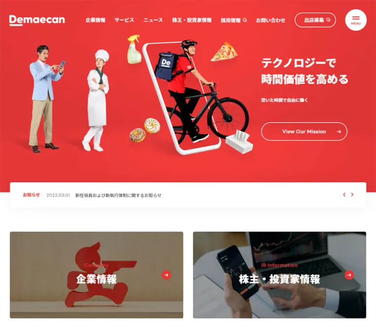
鮮やかな赤のヒーロー、人物の切り抜き写真とスマートフォン、太い見出し、丸いボタンを組み合わせた出前館の企業サイト。ニュースや事業紹介を広い余白で整理。
Demae-can Corporate Website — Style Reference
A vivid red brand stage followed by a spacious, practical corporate directory.
Website: corporate.demae-can.co.jp Original URL: https://corporate.demae-can.co.jp/ Final URL: https://corporate.demae-can.co.jp/ Theme: light content surfaces with a red hero and red utility accents Inspected: September 29, 2026, at 13:25:01 UTC / 22:25:01 JST, according to the supplied browser inspection Viewports: desktop 1440 × 1000 CSS pixels; mobile 390 × 844 CSS pixels Scope: the current corporate homepage: opening hero and navigation, latest-news strip, Company/IR entry tiles, news categories and articles, service cards, recruitment content, partner recruitment cards, and footer. Evidence consists of three desktop captures, two mobile captures, and rendered DOM/computed-style extracts. Linked destination pages and opened navigation states were not inspected.
The page combines strong consumer-brand recognition with the information structure of a corporate website. A saturated red opening scene carries a white wordmark, a bold two-line Japanese mission statement, and photographic cutouts arranged around a tilted smartphone. Below it, white and pale-gray sections organize company information, investor relations, news, services, and recruitment. The site serves several audiences; the mission link is one route among many.
The defining contrast is between an expressive opening illustration and restrained information design. Large photographs and generous margins provide visual weight, while modest 5px card corners, capsule buttons, circular arrow marks, and heavy Japanese headings make navigation approachable. On mobile, this system changes selectively: Company/IR tiles stack, news filters become a two-column group, service cards occupy a horizontal rail, and the footer becomes a tall directory.
閉じる
Demae-can Corporate Website — Style Reference
A vivid red brand stage followed by a spacious, practical corporate directory.
Website: corporate.demae-can.co.jp Original URL: https://corporate.demae-can.co.jp/ Final URL: https://corporate.demae-can.co.jp/ Theme: light content surfaces with a red hero and red utility accents Inspected: September 29, 2026, at 13:25:01 UTC / 22:25:01 JST, according to the supplied browser inspection Viewports: desktop 1440 × 1000 CSS pixels; mobile 390 × 844 CSS pixels Scope: the current corporate homepage: opening hero and navigation, latest-news strip, Company/IR entry tiles, news categories and articles, service cards, recruitment content, partner recruitment cards, and footer. Evidence consists of three desktop captures, two mobile captures, and rendered DOM/computed-style extracts. Linked destination pages and opened navigation states were not inspected.
The page combines strong consumer-brand recognition with the information structure of a corporate website. A saturated red opening scene carries a white wordmark, a bold two-line Japanese mission statement, and photographic cutouts arranged around a tilted smartphone. Below it, white and pale-gray sections organize company information, investor relations, news, services, and recruitment. The site serves several audiences; the mission link is one route among many.
The defining contrast is between an expressive opening illustration and restrained information design. Large photographs and generous margins provide visual weight, while modest 5px card corners, capsule buttons, circular arrow marks, and heavy Japanese headings make navigation approachable. On mobile, this system changes selectively: Company/IR tiles stack, news filters become a two-column group, service cards occupy a horizontal rail, and the footer becomes a tall directory.
How to Read This Reference
- Measured means a value appears in the supplied rendered DOM or computed-style evidence. Measurements apply to the captured state and viewport.
- Calculated means a value follows directly from those measurements, such as the 32px gap between two 592px cards inside a 1216px content region.
- Estimated means a visual approximation from the current screenshots. Background gradients, image overlays, and some lower-page desktop dimensions fall into this category.
- Recommended means implementation guidance for a new build. Breakpoints, accessible hit areas, and unverified interaction details must not be mistaken for recovered source behavior.
- All custom-property names in this document are reusable aliases. The supplied custom-property extraction returned no named tokens.
- A computed font stack identifies declared families, not the actual font file used for every glyph. Font loading and file URLs were not supplied.
- DOM rectangles can exist for closed navigation content and offscreen carousel copies. They do not establish that those elements were visible. Offscreen animation transforms can also affect reported coordinates.
- The document is a normal vertically scrolling corporate homepage. Recorded document heights were 4704px on desktop and approximately 4860.39px on mobile; these are observations, not recommended fixed heights.
Tokens — Colors
Default Palette
| Name | Value | Suggested token | Evidence and role |
|---|---|---|---|
| Interface Red | #da3734 |
--color-brand |
Measured: rgb(218, 55, 52) on filled links, latest-news labeling, section eyebrows, and mobile service pagination |
| Main Ink | #212121 |
--color-ink |
Measured: body text, ordinary links, and dark headings |
| Date Gray | #616161 |
--color-muted |
Measured: dates in the latest-news strip |
| White | #ffffff |
--color-surface |
Measured: latest-news and partner-card surfaces; reversed hero and recruitment text |
| Inactive Rail | #cccccc |
--color-track |
Measured: inactive mobile service pagination segment |
| Section Gray | approximately #f5f5f5 |
--color-section |
Estimated: broad news and partner-recruitment background areas |
| Hero Red | approximately #f53336 |
--color-hero |
Estimated: brighter central red in the current opening artwork |
| Hero Edge Red | approximately #e33132 |
--color-hero-edge |
Estimated: darker red toward the hero edges |
| Pale Category Tint | approximately #fff5f5 |
--color-badge |
Estimated: pale pink news-category capsule visible in the desktop middle capture |
Use the measured interface red for reusable controls and labels. The hero contains tonal variation, photographic shadows, and composited imagery; its entire appearance cannot be reduced to the button fill color.
Some computed backgrounds are transparent even where the screenshot shows a colored surface. The news section, for example, appears pale gray although its sampled section element has a transparent background. The visible color can belong to a wrapper or another painting layer.
Theme Presets
No selectable color themes are evidenced. The white-on-red opening header and the dark-on-white scrolled header are contextual navigation states, not separate site themes.
Tokens — Typography
Japanese Interface and Body Text
Measured source stack: 'LINE Seed JP', 'Noto Sans JP', -apple-system, 'system-ui', メイリオ, Meiryo, 'Hiragino Kaku Gothic ProN', sans-serif.
The declared typography is a Japanese sans-serif system with substantial weight contrast. Body text uses 400, navigation and action labels generally use 700, and principal headings use 900. This heavy heading weight is central to the page's confident, friendly character.
Desktop body text is 16px / 28px; mobile body text is 14px / 24.5px. Both use a 1.75 line-height ratio. Headings generally tighten to 1.5. Ordinary Japanese body copy has normal letter spacing, while section titles introduce approximately 0.03em tracking.
English Labels and Dates
Measured source stack: 'LINE Seed JP', Arial, Helvetica, sans-serif.
This stack appears on section eyebrows, dates, and the View Our Mission link. English labels provide compact navigational markers such as News, Service, and Recruitment, rather than competing with Japanese titles as oversized display text.
Wordmark and Icons
Treat the Demaecan wordmark as artwork. Its distinctive letterforms and underline should not be approximated by typing the name in a bold interface font. White and red wordmark appearances are visible in the opening and scrolled states.
The icon vocabulary is small: menu strokes, directional arrows, overlapping-square external-link marks, and social platform symbols. No icon font or icon-library identity is established by the evidence.
Type Scale
| Role | Desktop | Mobile | Weight / tracking | Status |
|---|---|---|---|---|
| Base body | 16px / 28px |
14px / 24.5px |
400; normal | Measured |
| Primary navigation | 16px / 28px |
Not visible in closed header | 700; normal | Measured |
| Hero heading | 41.4px / 62.1px |
29.12px / 43.68px |
900; normal | Measured |
| Hero supporting message | 16.2px / 28.35px |
14.56px / 25.48px |
700; normal | Measured |
| Mission CTA | 16px / 28px |
16.64px / 29.71px |
700; approximately 0.03em |
Measured |
| Latest-news label | 14px / 24.5px |
14px / 24.5px |
700 | Measured |
| Latest-news headline | 14px / 24.5px |
14px / 24.5px |
400 | Measured |
| Latest-news date | 14px / 24.5px |
14px / 24.5px |
400; 0.42px tracking |
Measured |
| Section eyebrow | 16px / 28px |
14px / 24.5px |
700; approximately 0.03em |
Measured on News; mobile Service and Recruitment agree |
| Section heading | 32px / 48px |
24px / 36px |
900; 0.03em |
Measured |
| News filter | 14px / 24.5px |
12px / 21px |
400; selected text 700 | Measured |
| Service-card title | Not included in desktop style extract | 17px / 25.5px |
900; 0.51px tracking |
Measured mobile |
| Partner-card title | Approximately 20px | 16px / 24px |
900 on mobile; 0.48px tracking |
Desktop estimate; mobile measured |
| Partner-card description | Approximately 16px / 28px |
12px / 21px |
400 | Desktop estimate; mobile measured |
| Standard filled CTA | 16px / 28px in sampled navigation actions |
14px / 25px |
700 | Measured |
| Footer primary links | Approximately 16px | 14px / 24.5px |
700 on mobile | Desktop estimate; mobile measured |
| Footer policy links | Approximately 12px | 10px / 17.5px |
400 | Desktop estimate; mobile measured |
| Copyright | Approximately 12px | 12px / 21px |
400; 0.36px tracking |
Desktop estimate; mobile measured |
Do not replace the hero's deliberate two-line composition with a single extremely large heading. Its impact comes from heavy type, high contrast, and the surrounding scene.
Tokens — Spacing & Shapes
The layout alternates broad section spacing with compact internal detail. A conventional root size of 16px is present in the extraction; the fractional hero values do not establish a universal fluid-unit formula.
Spacing Scale
| Use | Value | Evidence |
|---|---|---|
| Mobile page gutters | 20px |
Measured across content, cards, and footer |
| Desktop content gutters at 1440px | 112px each |
Measured |
| Desktop paired-card gap | 32px |
Calculated from card positions |
| Mobile Company/IR gap | 20px |
Calculated from measured rectangles |
| Mobile service-card gap | 20px |
Calculated |
| Mobile filter gap | 10px horizontally and vertically |
Calculated |
| Desktop filter vertical gap | 15px |
Calculated between 47.5px buttons |
| Latest-news padding, desktop | 26px 36px 28px 42px |
Measured |
| Latest-news padding, mobile | 15px 20px 18px |
Measured |
| Partner-card padding, mobile | 15px |
Measured |
| Partner image/text gap, mobile | 20px |
Measured |
| News section padding, desktop | 114px 0 125px |
Measured |
| News section padding, mobile | 60px 0 80px |
Measured |
| Service section padding, mobile | 80px 0 |
Measured |
| Mobile heading-to-service-card gap | 40px after heading block |
Calculated |
| Mobile footer top inset | 60px |
Calculated |
Border Radius
| Element | Value | Evidence |
|---|---|---|
| Latest-news surface | 5px |
Measured |
| Company and IR tiles | 5px |
Measured |
| Partner recruitment cards | 5px |
Measured |
| Header merchant CTA | 30px |
Measured desktop |
| Mission CTA | 36px desktop; 41.6px mobile |
Measured |
| News filters | 40px |
Measured |
| Filled navigation and section CTAs | 999999px |
Measured capsule treatment |
| Menu control | Circular appearance | Screenshot observation; sampled button itself reports zero radius |
The menu's circular visible surface may be drawn by a child or pseudo-element. Preserve the appearance without assuming the sampled outer button contains all of its paint styles.
Layout Measurements
| Element | Desktop 1440 × 1000 | Mobile 390 × 844 | Evidence |
|---|---|---|---|
| Main content region | 1216px wide |
350px wide |
Measured |
| Opening header | 130px high |
76px high |
Measured |
| Scrolled header | Approximately 100px high |
Approximately 76px high |
Screenshot estimate |
| Opening logo box | 180 × 36px |
120 × 24.5px |
Measured wrapper |
| Menu button | 70 × 70px at x1340, y30 |
56 × 56px at x324, y10 |
Measured |
| Header merchant CTA | 134 × 48px |
Not visible in closed header | Measured |
| Hero red-field lower edge | Approximately y738 | Approximately y694 | Screenshot estimate |
| Hero heading origin | x986.39, y214.42 | x31.19, y372.59 | Measured |
| Mission CTA | 280 × 65.78px |
348.41 × 69.20px |
Measured |
| Latest-news surface | 1216 × 103px, y686.5 |
350 × 188px, y599.67 |
Measured |
| Company/IR tile | 592 × 296px each |
350 × 175.52px each |
Measured |
| News filter | Content-dependent width; 47.5px high |
170 × 42px |
Measured |
| Service-card width | Approximately 592px |
255.83px |
Desktop screenshot estimate; mobile measured |
| Mobile service pagination | — | Two 175 × 1px button rectangles |
Measured |
| Partner recruitment card | Approximately 592 × 160px |
350 × 155.89px |
Desktop screenshot estimate; mobile measured |
| Footer wordmark | Approximately 220 × 44px |
200 × 40px |
Desktop screenshot estimate; mobile measured wrapper |
| Entire footer | 330px |
561px |
Desktop calculated from document/main heights; mobile measured |
The desktop latest-news strip approximately straddles the hero boundary by half its height. On mobile, its 188px height similarly crosses the red/white boundary. The mobile capture places its top approximately 2.5px above the mission button's bottom; a new implementation should allow clearance when text or font metrics change.
Components
Persistent Corporate Header
Role: identity, corporate navigation, merchant acquisition, and access to the broader site menu.
At the desktop opening, the header is transparent over red. The white wordmark sits 30px from the left, while bold navigation occupies the right side. The visible sequence covers company, service, news, investor information, recruitment, and contact, followed by an outlined merchant link and a circular MENU control.
The merchant link is a 134 × 48px capsule with a small external-link mark. The 70px menu circle contains two short red strokes above a compact label. The menu remains a distinct control even while desktop navigation is visible.
Scrolled captures show a white top bar, red wordmark, dark navigation, red outlined merchant link, and red menu circle with white details. The header stays at the top across the supplied scroll positions. Fixed versus sticky CSS positioning and the exact switching threshold are not established.
On mobile, only the 120px wordmark and 56px menu circle are visible in the closed header. The extracted EN link and menu contents should not be added to the visible opening composition merely because they occur in the DOM.
Navigation Content and Menu Trigger
Role: exposes deeper corporate destinations without placing every link in the header.
The DOM contains grouped company, business, news, and investor links, plus recruitment and merchant actions. Desktop subgroup headings have measured 24px/900 typography; another navigation grouping uses 20px/900 headings. Mobile top-level menu links have 350px-wide rectangles, approximately 74.64px high, with 15.8px/900 labels.
The trigger contains both MENU and CLOSE text in the extraction. No opened-menu screenshot or click result was supplied. These facts establish available labels and navigation content, not the opening animation, overlay appearance, focus behavior, or submenu activation method.
Mission Hero
Role: presents the corporate mission through the everyday delivery ecosystem.
The current desktop frame places the photographic scene across roughly the left two-thirds, with the mission statement in a narrower right column. Its source heading reads テクノロジーで followed by 時間価値を高める. Below it sits a short supporting message and the outlined View Our Mission link.
The desktop scene contains two people at the left, including a shopper carrying a basket, and an apron-wearing person moving through a large tilted smartphone. Bananas, pump bottles, an adhesive bandage, and a leafy vegetable float around the device. Clean cutout edges, natural clothing texture, soft contact shadows, and a thick white device rim create depth against the red field.
The mobile frame changes the composition to artwork above text. It visibly contains the tilted phone without the desktop people and goods. This is an observed frame, not proof that those layers are intentionally removed on mobile. Animation timing, delayed assets, or responsive art direction remain possible explanations.
The DOM includes three distinct supporting messages, each duplicated: flexible work, merchant sales, and convenient ordering. This supports the presence of alternate hero messages; their timing and synchronization with imagery were not measured.
Mission Outline Link
Role: leads to the corporate mission/vision page.
Use a transparent fill, white capsule outline, bold English label, and a right-facing arrow separated from the text. Its verified destination is /company/vision.html.
The desktop button is 280px wide. On mobile it expands to approximately 348px, nearly the full content width, while its height stays near 69px. This is a responsive change in emphasis rather than a uniform scale-down of desktop.
Latest-News Strip
Role: introduces current corporate activity at the boundary between the hero and the content directory.
A white, subtly shadowed surface contains a red 最新情報 label, muted date, regular-weight Japanese headline, and previous/next chevrons. Its corner radius is only 5px.
Desktop anatomy is horizontal: label, date, flexible headline, and controls. In the measured active record, the date starts near x230.81 and the headline near x324.61. The long headline occupies two 24.5px lines without changing the overall 103px surface height in that capture.
Mobile anatomy places the label and date on the first line, then wraps the headline underneath. The visible article text occupies a 260px-wide column, reserving room for controls at the right. The surface is 188px high in the captured state.
Previous and Next are real button labels in the extraction, although their measured rectangles are only 7 × 12px. Repeated articles extend offscreen in both directions, consistent with a looping carousel structure. Autoplay, swipe behavior, slide duration, and button outcomes were not independently exercised.
Company and IR Entry Tiles
Role: provides prominent routes to corporate and investor information.
Two equally sized image links follow the news strip. Desktop uses 592 × 296px tiles, a precise 2:1 proportion, separated by 32px. Mobile stacks approximately 2:1 tiles with a 20px gap.
The company tile uses a photographed red mascot/sign against a wood-toned background. The IR tile shows financial screens and a handheld device. Both current desktop tile tops are visible with darkened photography and red English labels. The DOM establishes the paired Japanese labels and destinations. The complete label-and-icon arrangement is not fully exposed by the current top capture.
Keep the image treatment restrained and the corners at 5px. Their measured opacity/transform transition is discussed below; it does not prove a specific hover zoom.
Section Heading System
Role: establishes a repeatable hierarchy across News, Service, and Recruitment.
Stack a small red English eyebrow above a heavy Japanese heading. News uses 16px English and 32px Japanese on desktop; mobile uses 14px and 24px. A 10px gap separates their measured text boxes.
A short red rule beneath the heading is visible in the Service desktop capture, approximately 40 × 3px. Treat these dimensions as an estimate. The larger heading block includes enough bottom space for this rule and separation from the content.
Recruitment retains the red English eyebrow while reversing the Japanese heading and paragraph to white over photography.
News Categories and Article List
Role: provides a practical, regularly updated information index.
Desktop separates a left heading/filter column from a broad white article panel. The left header is approximately 269px wide. Filters form a vertical stack of content-width capsules with 15px gaps. Available labels include ニュースリリース, IRニュース, お知らせ, 掲載記事, and テレビ・ラジオ放映.
The supplied middle desktop capture shows the lower part of the article panel: muted date, pale red category capsule, multiline headline, and a red circular arrow. A centered red capsule link below the panel leads to the complete news-release archive; it is visually about 592 × 82px.
On mobile, filters become a two-column group of 170 × 42px buttons with 10px gaps. The fifth item starts a third row. Article links use a 310px-wide area inset within the surrounding content. Their measured padding is 20px 40px 20px 0, reserving the right edge for the arrow. Rows grow from 143px to 167.5px as headlines wrap; do not impose a uniform fixed height.
The selected filter has white, bold text in computed evidence, but its sampled background is also white. Its final painted background cannot be established from this extraction alone. A red active fill is a suitable implementation recommendation, not a verified reconstruction of that painting layer.
Service Cards and Mobile Rail
Role: introduces the core delivery service and eGift offering.
The current desktop capture shows two broad image areas: a red Demaecan wordmark on white, and an illustrated delivery handoff framed by food photography and red accents. The DOM supplies the titles 出前館事業 and 出前館eGift, descriptive paragraphs, and distinct detail-page links.
On mobile, each card is approximately 255.83px wide. The first starts at x20 and the second at x295.83, demonstrating a horizontal arrangement with a 20px gap and part of the next card beyond the viewport. This is not the same stacking rule used by the Company/IR tiles.
Titles use 17px / 25.5px, weight 900, followed by a 10px gap before 14px / 24.5px descriptions. Two equal 175px pagination segments appear below, one red and one gray, followed by a full-width service-index link.
The rail structure and pagination buttons are measured. Swipe handling, snapping, button navigation, and automatic advancement are unverified.
Recruitment Feature
Role: connects the company's mission to employment opportunities.
The current lower desktop capture shows a wide team photograph with a dark overlay and a prominent filled red recruitment link. The mobile DOM confirms white Japanese heading and paragraph text, a red English eyebrow, and a 350 × 64px recruitment link.
Use a human workplace scene rather than another product screenshot. Preserve enough overlay contrast for text and place the action where it remains legible against changing photo detail. Exact overlay opacity and image focal-point rules were not supplied.
The desktop paragraph contains editorial line breaks; mobile text flows into a continuous paragraph. Treat those desktop breaks as responsive presentation, not mandatory hard breaks at every width.
Merchant and Courier Recruitment Cards
Role: separates two participation routes from corporate employment.
A pale-gray section holds two white cards on desktop and stacks them on mobile. Each card combines a square photographic cutout area, a bold title, a short explanation, and an external-link mark. The merchant card reuses the apron-wearing person; the courier card shows a person carrying packages and a red delivery bag.
Mobile cards measure 350 × 155.89px with 15px padding, a 20px image/text gap, and 5px corners. From the measured text origin and padding, the image area is approximately 125.89px wide. The text column remains beside the image, rather than moving below it.
Titles are 16px/900; descriptions are 12px with a 21px line height. In the desktop screenshot, the external mark sits toward the far right. In the mobile screenshot, it sits beside the title. Keep the card as one destination rather than introducing nested competing links.
Corporate Footer
Role: finishes the page with participation routes, policies, consumer-service access, and social links.
Desktop places a large red wordmark at the left and link groups to its right. Primary recruitment links are bold and accompanied by red circular external marks. Policy links are much smaller and arranged across the available width.
Mobile creates a 561px-tall footer. The 200 × 40px wordmark starts 60px below the white footer's top. Three primary links form a vertical list with 20px gaps. Policy links use two 165px columns separated by 20px; the longest policy wraps naturally. Their measured 10px type is considerably smaller than the main body text.
A red strip closes the page. It contains white circular X, Facebook, Instagram, and YouTube marks, followed by the copyright. Mobile social-link rectangles are approximately 30px square with 10px gaps. The copyright remains to their right at the inspected 390px width.
Tokens — Motion & Interaction
| Treatment | Supplied evidence | What can be concluded |
|---|---|---|
| Header surface change | background-color 0.3s |
A 300ms background transition is declared; scroll captures show the contrasting header states |
| Ordinary links and buttons | color 0.08s ease-out |
Fast 80ms color feedback is declared; exact hover colors were not sampled |
| Company/IR tiles | opacity 1s cubic-bezier(0.25, 0.1, 0.25, 1) and matching transform transition |
One-second opacity/transform transitions exist; trigger and travel distance are unverified |
| News section | Same one-second opacity/transform transitions | Consistent reveal capability; no complete motion sequence was supplied |
| Mobile Service heading | 0.4s 0.3s forwards fadeInBottom |
A 400ms named animation with 300ms delay and forwards fill is declared; keyframe geometry was not supplied |
| Partner recruitment cards | background-color 0.15s ease-out |
A 150ms surface-color transition is declared; target color is unverified |
| Mission and filled CTAs | Extracted transition names background-color without a nonzero duration |
No animation duration can be asserted from these entries |
| Latest-news carousel | Previous/Next buttons, offscreen duplicate records, differing captured active records | Carousel structure is supported; interval, easing, and manual interaction outcomes remain unverified |
| Hero variation | Duplicated alternate messages; different desktop/mobile visible layers | Alternate content exists; synchronized timing and the cause of the mobile bare-phone frame are unverified |
| Mobile service rail | Side-by-side offscreen card positions and two pagination buttons | A paged horizontal presentation is supported; swipe and snapping are not verified |
Entries such as transition: all without a duration are not evidence that everything animates. Likewise, animation: none on a sampled parent does not prove that its descendants or script-driven layers are static.
For an adaptation, preserve brief utility feedback and restrained entrance effects. Do not invent continuous floating, parallax, or aggressive image zoom as established features of this site.
Surfaces
| Layer | Appearance | Function |
|---|---|---|
| Hero | Saturated red with tonal variation and photographic depth | Establishes the brand and mission |
| Opening navigation | Transparent, white details | Integrates with the hero |
| Scrolled navigation | White, dark links, red identity and menu | Maintains readability over content |
| Main content | White with generous open space | Separates corporate subjects |
| News and participation bands | Pale gray, approximately #f5f5f5 |
Groups dense information and supporting routes |
| Latest-news strip | White, 5px corners, faint shadow | Bridges the hero and content |
| Image entry tiles | Darkened photographs, small rounded corners | Provides visual navigation anchors |
| Article panel | White, restrained separators and category pills | Supports scanning dates and headlines |
| Partner cards | White on gray, 5px corners | Makes two external participation routes distinct |
| Closing strip | Red with white social marks and copyright | Reasserts brand identity at the page end |
There is no broad evidence of a multi-level shadow system. Use borders, background changes, photography, and spacing for most separation; reserve a light shadow for the overlapping news surface and, if needed, the scrolled header.
Imagery
The homepage uses several intentionally different image modes. The hero is a polished photographic collage with a dimensional device frame. Corporate entry tiles use contextual photography. Service cards include both brand artwork and an illustrated delivery exchange. Recruitment uses a workplace photograph, while partner cards return to isolated human cutouts.
The unifying elements are red brand accents, people engaged in everyday activity, clean edges, and uncluttered framing. Preserve natural photographic texture; do not process these images into flat monochrome silhouettes. The phone and cutouts should remain sharp at the target viewport, without stretching or arbitrary cropping.
Observed Asset References
No original image URLs, filenames, intrinsic resolutions, or font-file URLs were included in the supplied evidence. The following table identifies visible assets without inventing paths.
| Asset identity | Current evidence | Reuse treatment |
|---|---|---|
| White and red Demaecan wordmarks | Desktop/mobile headers and footers | Use authorized artwork with its original proportions |
| Tilted white smartphone | Desktop and mobile opening captures | Preserve the thick rim, perspective, and soft ground shadow |
| Merchant, shopper, and customer cutouts | Current desktop hero | Keep separate visual layers when implementing verified animation |
| Floating household and grocery items | Current desktop hero | Use the observed scene as the composition reference; avoid adding unrelated product categories |
| Red mascot/sign photograph | Company tile in current desktop and mobile captures | Retain the warm wood setting and darkened treatment |
| Financial-device photograph | IR tile in current desktop capture | Keep device detail recognizable under the overlay |
| Wordmark service artwork | Desktop Service capture | Preserve generous white space |
| Illustrated delivery exchange with food photography | Desktop Service capture | Maintain the mixture of simple line illustration and real food imagery |
| Workplace team photograph | Lower desktop recruitment capture | Crop responsively around people and devices; maintain text contrast |
| Merchant and courier cutouts | Desktop/mobile partner cards | Contain within square pale image areas |
| Social platform marks | Desktop/mobile footer captures | Use recognizable, accessible linked icons |
CSS can recreate the layout and controls, but cannot supply the identity carried by these photographic assets and wordmarks.
Layout & Responsive Behavior
Page Sequence
The observed order is hero → latest-news strip → Company/IR tiles → News → Service → Recruitment → merchant/courier recruitment cards → footer. Maintain this directory-like hierarchy rather than flattening all destinations into equivalent promotional cards.
Desktop Composition
At 1440px, repeated content edges are x112 and x1328, giving a 1216px working width. The opening header uses its own wider 30px edge inset. Company/IR and partner cards use two equal columns with a 32px gap.
The hero's text is intentionally right aligned as a block, beginning near 68.5% of the viewport width, while its text itself is left aligned. The 331px-wide heading region gives the photographic scene room to dominate.
News uses a narrow left navigation region and a broad article panel. Service returns to two broad visual cards. The footer organizes its content horizontally and ends with a shallow red strip.
Mobile Composition
At 390px, the normal content width is 350px with 20px gutters. The hero heading has a slightly deeper inset of approximately 31.2px, while its mission link expands almost to the standard gutters.
The artwork sits above the mission text. The headline remains two lines at 29.12px, not a miniature version of the desktop composition. Latest news wraps into a compact vertical card.
Company/IR tiles stack. News filters use two columns. Service cards continue horizontally at approximately 73.1% of the 350px content width, revealing the next item. Partner cards stack while preserving their internal image/text split. Footer policies form two columns beneath a vertical primary-link group.
Breakpoint and State Limits
Only 1440px and 390px widths were inspected. The exact source breakpoints, intermediate tablet layouts, landscape behavior, and safe-area handling are unknown. The CSS below uses recommended 1280px navigation and 768px content-layout thresholds; these are implementation choices.
Preserve content-driven heights. Long Japanese news titles and policy names wrap differently across fonts, so recorded page heights and article positions should not become fixed layout constraints.
Do’s and Don’ts
Do
- Use the measured
#da3734for interface accents and preserve the hero's brighter red atmosphere separately. - Pair 900-weight Japanese headings with comfortable 1.75-line-height body text.
- Keep the hero statement compact and deliberately broken into two lines.
- Preserve the distinction between the transparent opening header and the white scrolled header.
- Use 5px corners for information surfaces and full capsules for prominent actions.
- Align desktop content to the repeated 1216px region and mobile content to 20px gutters.
- Retain the overlapping latest-news surface as a bridge between the hero and directory.
- Keep Company/IR tiles stacked on mobile while preserving the separate horizontal service-card pattern.
- Let long news headlines determine row height.
- Use actual brand artwork and carefully prepared photography where authorized.
- Distinguish verified transition declarations from untested interaction behavior.
Don’t
- Don't convert the corporate directory into a single-product sales funnel.
- Don't replace the hero collage with an unrelated generic gradient and decorative blobs.
- Don't treat every red area as the same measured flat color.
- Don't apply oversized rounded corners or heavy shadows to all cards.
- Don't enlarge English section labels until they compete with the Japanese headings.
- Don't infer an opened menu from hidden DOM contents or display
ENmerely because it was extracted. - Don't assume the bare mobile phone proves that people and props are permanently absent on mobile.
- Don't render duplicated carousel records as a normal list of repeated news articles.
- Don't impose uniform row heights on Japanese headlines.
- Don't apply
overflow-x: hiddento the whole page as a substitute for a deliberately managed service rail. - Don't claim exact animation timing, image URLs, breakpoints, or hover effects that were not supplied.
Recommended Implementation Additions
These are recommendations for a new implementation, not verified original-site features:
- Give the menu trigger an explicit accessible name,
aria-expanded, andaria-controls. If its panel behaves as a modal, implement appropriate focus containment, Escape dismissal, and focus return. - Expand the small news chevrons, service pagination segments, and social icons to comfortable hit areas, preferably at least 44px, without enlarging their visible artwork proportionally.
- Represent news filters with suitable button/tab semantics and expose the selected state. Keep all article content available if scripting fails.
- If either carousel advances automatically, provide pause behavior and stop advancement while a user is interacting with it. Remove cloned slides from sequential focus and redundant accessibility announcements.
- Provide reduced-motion handling and a useful static hero composition. Keep the mission readable if artwork animation or loading fails.
- Reserve image dimensions and stabilize the hero/news relationship. Add clearance between the mission link and news surface when fonts or copy grow.
- Consider increasing mobile policy text from the observed 10px to at least 12px for readability, allowing the footer to grow.
- Check actual red/white and text-over-photo contrast. Use a darker accessible action token if a chosen text size requires it.
- Use meaningful image alternatives when imagery communicates content; use empty alternatives for purely decorative hero props.
- Ensure every service card is reachable by keyboard and touch. A native horizontal scroll area is a practical fallback when custom rail behavior is unavailable.
Agent Prompt Guide
Quick Color Reference
- Main interface accent: measured
#da3734. - Primary text: measured
#212121. - Dates: measured
#616161. - Surfaces and reversed text: measured
#ffffff. - Inactive service rail: measured
#cccccc. - Pale section background: estimated
#f5f5f5. - Hero atmosphere: estimated bright
#f53336with darker red edges; preserve photographic depth. - Primary actions: red capsules on light content; white outline capsule over the hero.
Overall Prompt
“Build a Japanese corporate homepage inspired by the current Demae-can site. Use a saturated red opening scene with authorized photographic cutouts arranged around a tilted white smartphone. Place a compact, heavy two-line Japanese mission heading in a right-hand desktop column, with a short supporting message and white outlined mission link. Use the declared LINE Seed JP and Japanese sans-serif fallback stacks, 900-weight headings, dark #212121 body text, and #da3734 interface accents. Below the hero, overlap a white latest-news strip, then organize Company/IR tiles, a news directory, service cards, recruitment content, participation cards, and a practical footer. Use broad whitespace, 5px card corners, capsule actions, and small circular direction marks. At mobile width, stack Company/IR tiles, use two-column news filters, retain a horizontal service rail, and keep partner-card images beside their text. Treat unverified animation and menu behavior as implementation decisions.”
Example Component Prompts
- Header: “Create a persistent corporate header with a 180px wordmark, bold 16px Japanese navigation, a small outlined merchant capsule, and a 70px circular MENU control. Use white details over the red hero and a white surface with dark links in the scrolled state. At 390px, show a 120px wordmark and 56px menu circle inside a 76px header.”
- Latest news: “Create a 5px-radius white announcement surface crossing the hero boundary. Include the red label 最新情報, a muted date, a 14px Japanese headline, and small red chevrons. Arrange it horizontally on desktop and place the date beside the label with the headline below on mobile. Add generous invisible hit areas to the controls.”
- News directory: “Use a pale-gray section with a red English eyebrow, heavy Japanese title, capsule category controls, and a white article panel. Each record contains a date, pale red category label, multiline headline, and a red direction mark. Use a left filter column on desktop and a two-column filter group on mobile.”
- Service rail: “Show delivery and eGift cards with broad image areas, 900-weight Japanese titles, and relaxed descriptive text. Use two equal desktop columns. On a 390px phone, make cards about 256px wide with a 20px gap so the next card is partly visible; provide accessible horizontal navigation.”
- Participation card: “Create a white 5px-radius card on a pale-gray band, with a square merchant or courier cutout at left and a compact Japanese title and description at right. Keep this internal split on mobile with 15px padding and a 20px gap. Place an external-link mark beside the mobile title.”
- Footer: “Create a spacious white corporate footer with a large red wordmark, three bold recruitment routes, small policy links, and a red closing strip containing four white circular social icons and copyright. On mobile, stack the primary routes and retain two columns for policy links.”
Quick Start
CSS Custom Properties
This is an adaptation using measured anchors, not recovered source CSS. The hero gradient, shadow, responsive interpolation, breakpoint choices, and accessible focus treatment are recommendations. Supply authorized wordmarks and imagery through markup; no asset paths are assumed.
Use .is-scrolled on the header when your implementation enters its light state. The rules below do not implement a menu, autoplay, filtering, or carousel state. The mobile hero intentionally leaves a little more clearance above the overlapping news card than the captured frame.
:root {
  /* Measured colors */
  --color-brand: #da3734;
  --color-ink: #212121;
  --color-muted: #616161;
  --color-surface: #fff;
  --color-track: #ccc;

  /* Visual estimates for this adaptation */
  --color-section: #f5f5f5;
  --color-badge: #fff5f5;
  --color-hero: #f53336;
  --color-hero-edge: #e33132;

  /* Declared source families; font files must be supplied separately */
  --font-jp: 'LINE Seed JP', 'Noto Sans JP', -apple-system,
    system-ui, 'メイリオ', Meiryo, 'Hiragino Kaku Gothic ProN', sans-serif;
  --font-latin: 'LINE Seed JP', Arial, Helvetica, sans-serif;
  --weight-regular: 400;
  --weight-bold: 700;
  --weight-heavy: 900;
  --leading-body: 1.75;
  --leading-heading: 1.5;
  --tracking-label: 0.03em;

  /* Measured layout anchors */
  --content-width: 1216px;
  --page-gutter: 20px;
  --column-gap: 32px;
  --header-height: 130px;
  --radius-card: 5px;
  --radius-pill: 999999px;
  --space-10: 10px;
  --space-15: 15px;
  --space-20: 20px;
  --space-40: 40px;
  --space-60: 60px;
  --space-80: 80px;

  /* Observed transition declarations */
  --motion-link: 80ms ease-out;
  --motion-header: 300ms ease;
  --motion-card: 150ms ease-out;
  --motion-reveal: 1s cubic-bezier(0.25, 0.1, 0.25, 1);

  /* Recommended approximation, not a measured shadow */
  --shadow-news: 0 10px 30px rgb(0 0 0 / 0.035);
}

* { box-sizing: border-box; }
body { margin: 0; }

.dc-site {
  color: var(--color-ink);
  background: var(--color-surface);
  font: 400 16px / var(--leading-body) var(--font-jp);
}

.dc-site img { display: block; max-width: 100%; }
.dc-site button { font: inherit; cursor: pointer; }
.dc-site a { color: inherit; }
.dc-site a, .dc-site button { -webkit-tap-highlight-color: transparent; }
.dc-site :focus-visible { outline: 3px solid currentColor; outline-offset: 4px; }
.dc-site [id] { scroll-margin-top: 110px; }

.dc-container {
  width: min(var(--content-width), calc(100% - 2 * var(--page-gutter)));
  margin-inline: auto;
}

.dc-header {
  position: fixed;
  z-index: 50;
  inset: 0 0 auto;
  display: flex;
  align-items: center;
  gap: 30px;
  height: var(--header-height);
  padding-inline: 30px;
  color: #fff;
  background: transparent;
  transition: background-color var(--motion-header);
}

.dc-header__brand { flex: 0 0 180px; }
.dc-header__brand img { width: 100%; height: auto; }
.dc-header__brand .logo-red { display: none; }
.dc-nav { display: flex; align-items: center; gap: 30px; margin-left: auto; }
.dc-nav a { font-size: 16px; font-weight: 700; text-decoration: none; }

.dc-merchant {
  display: inline-flex;
  align-items: center;
  justify-content: center;
  gap: 8px;
  min-width: 134px;
  min-height: 48px;
  border: 2px solid currentColor;
  border-radius: 30px;
}

.dc-menu {
  flex: 0 0 70px;
  display: grid;
  place-content: center;
  justify-items: center;
  gap: 3px;
  width: 70px;
  height: 70px;
  padding: 0;
  border: 0;
  border-radius: 50%;
  color: var(--color-brand);
  background: #fff;
}
.dc-menu__label { font: 700 10px / 1 var(--font-latin); }

.dc-header.is-scrolled { height: 100px; color: var(--color-ink); background: #fff; }
.dc-header.is-scrolled .dc-header__brand { flex-basis: 150px; }
.dc-header.is-scrolled .logo-white { display: none; }
.dc-header.is-scrolled .logo-red { display: block; }
.dc-header.is-scrolled .dc-merchant { color: var(--color-brand); }
.dc-header.is-scrolled .dc-menu { color: #fff; background: var(--color-brand); }

.dc-hero {
  color: #fff;
  background: radial-gradient(ellipse at 48% 42%,
    var(--color-hero) 20%, var(--color-hero-edge) 100%);
}
.dc-hero__inner {
  position: relative;
  max-width: 1440px;
  min-height: 738px;
  margin-inline: auto;
  padding-top: 214.4px;
}
.dc-hero__art {
  position: absolute;
  top: 110px;
  left: 3%;
  width: 63%;
  height: 500px;
  margin: 0;
}
.dc-hero__art img { width: 100%; height: 100%; object-fit: contain; }
.dc-hero__copy { width: 23%; margin-left: 68.5%; }
.dc-hero h1 { margin: 0; font-size: 41.4px; font-weight: 900; line-height: 1.5; }
.dc-hero__message { margin: 30px 0 0; font-size: 16.2px; font-weight: 700; line-height: 1.75; }

.dc-button {
  position: relative;
  display: flex;
  align-items: center;
  justify-content: center;
  width: min(592px, 100%);
  min-height: 82px;
  padding: 25px 60px;
  border: 2px solid transparent;
  border-radius: var(--radius-pill);
  color: #fff !important;
  background: var(--color-brand);
  font-weight: 700;
  text-align: center;
  text-decoration: none;
}
.dc-button__icon { position: absolute; right: 40px; }
.dc-button--center { margin-inline: auto; }
.dc-button--mission {
  width: 280px;
  min-height: 65.78px;
  margin-top: 60px;
  padding: 16px 38px;
  border-color: currentColor;
  background: transparent;
  font-family: var(--font-latin);
  letter-spacing: 0.03em;
}
.dc-button--mission .dc-button__icon { right: 22px; }

.dc-latest {
  position: relative;
  z-index: 2;
  display: grid;
  grid-template-columns: auto minmax(0, 1fr) auto;
  align-items: center;
  gap: 10px;
  min-height: 103px;
  margin-top: -51.5px;
  padding: 26px 36px 28px 42px;
  border-radius: var(--radius-card);
  background: #fff;
  box-shadow: var(--shadow-news);
  font-size: 14px;
}
.dc-latest__label { margin: 0; color: var(--color-brand); font-size: 14px; font-weight: 700; }
.dc-latest__entry { display: flex; align-items: center; min-width: 0; text-decoration: none; }
.dc-date { flex: 0 0 94px; color: var(--color-muted); font-family: var(--font-latin); letter-spacing: 0.03em; }
.dc-latest__headline { margin: 0; }
.dc-latest__controls { display: flex; }
.dc-latest__controls button {
  width: 44px;
  height: 44px;
  padding: 0;
  border: 0;
  color: var(--color-brand);
  background: transparent;
}

.dc-feature-grid, .dc-partner-grid {
  display: grid;
  grid-template-columns: repeat(2, minmax(0, 1fr));
  gap: var(--column-gap);
}
.dc-feature-grid { margin-top: 68.5px; margin-bottom: 125px; }
.dc-feature {
  position: relative;
  display: block;
  aspect-ratio: 2 / 1;
  overflow: hidden;
  border-radius: var(--radius-card);
  text-decoration: none;
}
.dc-feature > img { width: 100%; height: 100%; object-fit: cover; }
.dc-feature::after { content: ''; position: absolute; inset: 0; background: rgb(0 0 0 / 0.4); }
.dc-feature__label {
  position: absolute;
  z-index: 1;
  inset: 0;
  display: grid;
  place-content: center;
  text-align: center;
  color: #fff;
}
.dc-feature__label small { color: var(--color-brand); font: 700 16px / 1.75 var(--font-latin); }
.dc-feature__label strong { font-size: 28px; font-weight: 900; }

.dc-section { padding-block: 114px 125px; }
.dc-section--gray { background: var(--color-section); }
.dc-section-heading { margin-bottom: 60px; }
.dc-section-heading__eyebrow {
  margin: 0 0 10px;
  color: var(--color-brand);
  font: 700 16px / 1.75 var(--font-latin);
  letter-spacing: 0.03em;
}
.dc-section-heading h2 { margin: 0; font-size: 32px; font-weight: 900; line-height: 1.5; letter-spacing: 0.03em; }
.dc-section-heading::after { content: ''; display: block; width: 40px; height: 3px; margin-top: 40px; background: var(--color-brand); }

.dc-news-layout { display: grid; grid-template-columns: 269px minmax(0, 1fr); gap: 40px; }
.dc-filters { display: grid; justify-items: start; gap: 15px; }
.dc-filter { min-height: 47.5px; padding: 10px 25px 13px; border: 0; border-radius: 40px; background: #fff; font-size: 14px; }
/* Recommended active paint; the original selected background was unresolved. */
.dc-filter[aria-selected='true'] { color: #fff; background: var(--color-brand); font-weight: 700; }
.dc-news-panel { padding-inline: 50px; border-radius: 5px; background: #fff; }
.dc-news-row { position: relative; display: block; padding: 30px 40px 30px 0; text-decoration: none; }
.dc-news-row + .dc-news-row { border-top: 1px solid #ddd; }
.dc-news-row__meta { display: flex; align-items: center; flex-wrap: wrap; gap: 20px; }
.dc-news-row__title { margin: 10px 0 0; }
.dc-news-row__arrow { position: absolute; right: 0; top: 50%; transform: translateY(-50%); color: var(--color-brand); }
.dc-badge { padding: 2px 20px; border-radius: 40px; color: var(--color-brand); background: var(--color-badge); font-size: 12px; font-weight: 700; }
.dc-section-action { margin-top: 60px; }

.dc-services { display: grid; grid-template-columns: repeat(2, minmax(0, 1fr)); gap: 32px; }
.dc-service { display: block; min-width: 0; text-decoration: none; }
.dc-service__image { width: 100%; aspect-ratio: 2 / 1; object-fit: cover; border: 1px solid #ddd; border-radius: 5px; }
.dc-service__title { margin: 16px 0 10px; font-size: 20px; font-weight: 900; line-height: 1.5; letter-spacing: 0.03em; }
.dc-service__description { margin: 0; }

.dc-recruit {
  padding-block: 80px;
  color: #fff;
  background-color: #454545;
  background-image: linear-gradient(rgb(0 0 0 / 0.45), rgb(0 0 0 / 0.45)), var(--recruit-image, none);
  background-size: cover;
  background-position: center;
}
.dc-recruit__copy { max-width: 620px; margin: 40px 0; }
.dc-partners { padding-block: 80px; background: var(--color-section); }
.dc-partner {
  display: flex;
  align-items: center;
  gap: 28px;
  padding: 15px;
  border-radius: 5px;
  background: #fff;
  text-decoration: none;
  transition: background-color var(--motion-card);
}
.dc-partner__image { flex: 0 0 130px; width: 130px; aspect-ratio: 1; object-fit: contain; border-radius: 5px; background: #f6f3f3; }
.dc-partner__title { margin: 0 0 10px; font-size: 20px; font-weight: 900; line-height: 1.5; }
.dc-partner__description { margin: 0; }

.dc-footer__main { display: grid; grid-template-columns: 220px minmax(0, 1fr); gap: 43px; padding-block: 80px; }
.dc-footer__brand { width: 220px; }
.dc-footer__primary { display: flex; flex-wrap: wrap; gap: 30px; margin-bottom: 20px; font-weight: 700; }
.dc-footer__policies { display: flex; flex-wrap: wrap; gap: 10px 20px; font-size: 12px; }
.dc-footer a { text-decoration: none; }
.dc-footer__bar { padding-block: 20px; color: #fff; background: var(--color-brand); }
.dc-footer__bar-inner { display: flex; align-items: center; flex-wrap: wrap; gap: 30px; }
.dc-social { display: flex; gap: 10px; }
.dc-social a { display: block; width: 30px; height: 30px; }
.dc-copyright { margin: 0; font-size: 12px; letter-spacing: 0.03em; }

/* Recommended navigation threshold, not a recovered source breakpoint. */
@media (max-width: 79.99rem) {
  .dc-nav { display: none; }
  .dc-menu { margin-left: auto; }
  .dc-hero__copy { width: 35%; margin-left: 60%; }
  .dc-hero h1 { font-size: clamp(30px, 3vw, 41.4px); }
  .dc-hero__art { width: 55%; }
}

/* Recommended content threshold; mobile values target the supplied 390px view. */
@media (max-width: 47.99rem) {
  .dc-site { font-size: 14px; }
  .dc-site [id] { scroll-margin-top: 90px; }
  .dc-header, .dc-header.is-scrolled { height: 76px; padding-inline: 20px 10px; }
  .dc-header__brand, .dc-header.is-scrolled .dc-header__brand { flex-basis: 120px; }
  .dc-menu { flex-basis: 56px; width: 56px; height: 56px; }

  .dc-hero__inner { min-height: 0; padding: 76px 0 106px; }
  .dc-hero__art { position: static; width: 100%; height: 280px; margin: 0 0 16.6px; }
  .dc-hero__copy { width: 84%; margin-left: 8%; }
  .dc-hero h1 { font-size: clamp(26px, 7.4667vw, 32px); }
  .dc-hero__message { margin-top: 15.6px; font-size: 14.56px; }
  .dc-button { width: 100%; min-height: 64px; padding: 17px 45px 18px; font-size: 14px; line-height: 25px; }
  .dc-button__icon { right: 24px; }
  .dc-button--mission {
    width: calc(100vw - 41.6px);
    min-height: 69.2px;
    margin-top: 31.2px;
    margin-left: calc(20.8px - 8vw);
    font-size: 16.64px;
    line-height: 29.71px;
  }

  .dc-latest { grid-template-columns: minmax(0, 1fr) auto; min-height: 188px; margin-top: -94px; padding: 15px 20px 18px; }
  .dc-latest__label { position: absolute; top: 15px; left: 20px; }
  .dc-latest__entry { display: block; }
  .dc-latest .dc-date { display: block; margin-left: 71px; }
  .dc-latest__headline { margin-top: 8px; }
  .dc-latest__controls { align-self: center; }

  .dc-feature-grid, .dc-partner-grid { grid-template-columns: minmax(0, 1fr); gap: 20px; }
  .dc-feature-grid { margin-top: 16px; margin-bottom: 80px; }
  .dc-feature__label strong { font-size: 24px; }
  .dc-section { padding-block: 80px; }
  .dc-section--news { padding-top: 60px; }
  .dc-section-heading { margin-bottom: 40px; }
  .dc-section-heading__eyebrow { font-size: 14px; }
  .dc-section-heading h2 { font-size: 24px; }
  .dc-section-heading::after { margin-top: 30px; }
  .dc-news-layout { grid-template-columns: minmax(0, 1fr); gap: 30px; }
  .dc-filters { grid-template-columns: repeat(2, minmax(0, 1fr)); gap: 10px; justify-items: stretch; }
  .dc-filter { min-height: 42px; padding: 9px 20px 12px; font-size: 12px; line-height: 21px; }
  .dc-news-panel { padding-inline: 20px; }
  .dc-news-row { padding-block: 20px; }
  .dc-section-action { margin-top: 40px; }

  /* Native scrolling is a recommended fallback, not verified original behavior. */
  .dc-services {
    grid-template-columns: none;
    grid-auto-flow: column;
    grid-auto-columns: 73.1%;
    gap: 20px;
    overflow-x: auto;
    scroll-snap-type: x proximity;
    padding-bottom: 16px;
  }
  .dc-service { scroll-snap-align: start; }
  .dc-service__title { font-size: 17px; }
  .dc-partners { padding-block: 60px; }
  .dc-partner { gap: 20px; }
  .dc-partner__image { flex-basis: 39.34375%; width: 39.34375%; }
  .dc-partner__title { margin-bottom: 5px; font-size: 16px; letter-spacing: 0.03em; }
  .dc-partner__description { font-size: 12px; line-height: 21px; }

  .dc-footer__main { grid-template-columns: minmax(0, 1fr); gap: 40px; padding-block: 60px; }
  .dc-footer__brand { width: 200px; }
  .dc-footer__primary { flex-direction: column; gap: 20px; margin-bottom: 40px; }
  .dc-footer__policies { display: grid; grid-template-columns: repeat(2, minmax(0, 1fr)); gap: 20px; font-size: 10px; }
  .dc-footer__bar { padding-block: 15px; }
  .dc-footer__bar-inner { justify-content: space-between; gap: 15px; }
}

/* Recommended reduced-motion behavior for this component namespace. */
@media (prefers-reduced-motion: reduce) {
  .dc-site *, .dc-site *::before, .dc-site *::after {
    animation: none !important;
    transition: none !important;
    scroll-behavior: auto !important;
  }
}
The CSS uses larger news-control hit areas and a simplified article layout. It does not attempt to reproduce unobserved carousel internals or menu overlays. Build those behaviors with semantic markup and verify them separately at intermediate widths.
Tailwind v4 Token Mapping
Optional mapping for a project already using Tailwind v4. This does not imply that the inspected website uses Tailwind. Define the custom properties above first.
@theme inline {
  --color-brand: #da3734;
  --color-ink: #212121;
  --color-muted: #616161;
  --color-surface: #fff;
  --color-section: #f5f5f5;
  --color-track: #ccc;
  --font-sans: var(--font-jp);
  --font-label: var(--font-latin);
  --text-caption: 0.75rem;
  --text-body-small: 0.875rem;
  --text-section-mobile: 1.5rem;
  --text-section: 2rem;
  --spacing-gutter: 20px;
  --spacing-column: 32px;
  --radius-card: 5px;
  --radius-capsule: 999999px;
}
Sources & Evidence
- Inspected original and final page: Demae-can corporate homepage. The supplied inspection reports HTTP 200 with no URL change and page title
株式会社出前館. - Capture record: September 29, 2026,
2026-09-29T13:25:01.057Z. Desktop viewport: 1440 × 1000 CSS pixels. Mobile viewport: 390 × 844 CSS pixels. - Current visual evidence: desktop opening, middle Service transition, and lower recruitment/footer captures; mobile opening and lower footer captures. These establish visible composition, imagery, contextual header states, and selected responsive arrangements.
- Rendered evidence: element rectangles, text, link destinations, computed font stacks, sizes, weights, line heights, colors, padding, radii, transitions, and selected animation declarations. Some sections are described from DOM evidence even where a complete screenshot was not supplied.
- Observed destination examples: the homepage links its mission action to
/company/vision.html, corporate tiles to/company/and/ir_information/, service cards to/business/demaecan.htmland/business/e-gift.html, and archive links to/pr/news/and/business/. These destinations were not separately inspected. - Interaction scope: scrolling and settled capture positions are represented. No menu opening, hover sampling, filter activation, carousel control result, keyboard traversal, or destination navigation was supplied.
- Readiness limitations: the supplied browser process waited for document load, finite motion, layout/text stability, and visible image decoding within bounded time limits. Perpetual animations were paused during readiness checks and resumed afterward. These checks do not establish semantic completeness or explain missing mobile hero layers. SharedWorkers and service workers were disabled during the inspection.
- Unresolved details: exact source breakpoints, image and font file URLs, hero sequencing, carousel intervals, selected-filter paint layers, and complete motion keyframes. No additional browsing, commands, or filesystem inspection were performed for this reference.
# Demae-can Corporate Website — Style Reference

> A vivid red brand stage followed by a spacious, practical corporate directory.

**Website:** [corporate.demae-can.co.jp](https://corporate.demae-can.co.jp/)
**Original URL:** https://corporate.demae-can.co.jp/
**Final URL:** https://corporate.demae-can.co.jp/
**Theme:** light content surfaces with a red hero and red utility accents
**Inspected:** September 29, 2026, at 13:25:01 UTC / 22:25:01 JST, according to the supplied browser inspection
**Viewports:** desktop 1440 × 1000 CSS pixels; mobile 390 × 844 CSS pixels
**Scope:** the current corporate homepage: opening hero and navigation, latest-news strip, Company/IR entry tiles, news categories and articles, service cards, recruitment content, partner recruitment cards, and footer. Evidence consists of three desktop captures, two mobile captures, and rendered DOM/computed-style extracts. Linked destination pages and opened navigation states were not inspected.

The page combines strong consumer-brand recognition with the information structure of a corporate website. A saturated red opening scene carries a white wordmark, a bold two-line Japanese mission statement, and photographic cutouts arranged around a tilted smartphone. Below it, white and pale-gray sections organize company information, investor relations, news, services, and recruitment. The site serves several audiences; the mission link is one route among many.

The defining contrast is between an expressive opening illustration and restrained information design. Large photographs and generous margins provide visual weight, while modest 5px card corners, capsule buttons, circular arrow marks, and heavy Japanese headings make navigation approachable. On mobile, this system changes selectively: Company/IR tiles stack, news filters become a two-column group, service cards occupy a horizontal rail, and the footer becomes a tall directory.
閉じる
# Demae-can Corporate Website — Style Reference

> A vivid red brand stage followed by a spacious, practical corporate directory.

**Website:** [corporate.demae-can.co.jp](https://corporate.demae-can.co.jp/)
**Original URL:** https://corporate.demae-can.co.jp/
**Final URL:** https://corporate.demae-can.co.jp/
**Theme:** light content surfaces with a red hero and red utility accents
**Inspected:** September 29, 2026, at 13:25:01 UTC / 22:25:01 JST, according to the supplied browser inspection
**Viewports:** desktop 1440 × 1000 CSS pixels; mobile 390 × 844 CSS pixels
**Scope:** the current corporate homepage: opening hero and navigation, latest-news strip, Company/IR entry tiles, news categories and articles, service cards, recruitment content, partner recruitment cards, and footer. Evidence consists of three desktop captures, two mobile captures, and rendered DOM/computed-style extracts. Linked destination pages and opened navigation states were not inspected.

The page combines strong consumer-brand recognition with the information structure of a corporate website. A saturated red opening scene carries a white wordmark, a bold two-line Japanese mission statement, and photographic cutouts arranged around a tilted smartphone. Below it, white and pale-gray sections organize company information, investor relations, news, services, and recruitment. The site serves several audiences; the mission link is one route among many.

The defining contrast is between an expressive opening illustration and restrained information design. Large photographs and generous margins provide visual weight, while modest 5px card corners, capsule buttons, circular arrow marks, and heavy Japanese headings make navigation approachable. On mobile, this system changes selectively: Company/IR tiles stack, news filters become a two-column group, service cards occupy a horizontal rail, and the footer becomes a tall directory.

## How to Read This Reference

- **Measured** means a value appears in the supplied rendered DOM or computed-style evidence. Measurements apply to the captured state and viewport.
- **Calculated** means a value follows directly from those measurements, such as the 32px gap between two 592px cards inside a 1216px content region.
- **Estimated** means a visual approximation from the current screenshots. Background gradients, image overlays, and some lower-page desktop dimensions fall into this category.
- **Recommended** means implementation guidance for a new build. Breakpoints, accessible hit areas, and unverified interaction details must not be mistaken for recovered source behavior.
- All custom-property names in this document are reusable aliases. The supplied custom-property extraction returned no named tokens.
- A computed font stack identifies declared families, not the actual font file used for every glyph. Font loading and file URLs were not supplied.
- DOM rectangles can exist for closed navigation content and offscreen carousel copies. They do not establish that those elements were visible. Offscreen animation transforms can also affect reported coordinates.
- The document is a normal vertically scrolling corporate homepage. Recorded document heights were 4704px on desktop and approximately 4860.39px on mobile; these are observations, not recommended fixed heights.

## Tokens — Colors

### Default Palette

| Name | Value | Suggested token | Evidence and role |
| --- | --- | --- | --- |
| Interface Red | `#da3734` | `--color-brand` | **Measured:** `rgb(218, 55, 52)` on filled links, latest-news labeling, section eyebrows, and mobile service pagination |
| Main Ink | `#212121` | `--color-ink` | **Measured:** body text, ordinary links, and dark headings |
| Date Gray | `#616161` | `--color-muted` | **Measured:** dates in the latest-news strip |
| White | `#ffffff` | `--color-surface` | **Measured:** latest-news and partner-card surfaces; reversed hero and recruitment text |
| Inactive Rail | `#cccccc` | `--color-track` | **Measured:** inactive mobile service pagination segment |
| Section Gray | approximately `#f5f5f5` | `--color-section` | **Estimated:** broad news and partner-recruitment background areas |
| Hero Red | approximately `#f53336` | `--color-hero` | **Estimated:** brighter central red in the current opening artwork |
| Hero Edge Red | approximately `#e33132` | `--color-hero-edge` | **Estimated:** darker red toward the hero edges |
| Pale Category Tint | approximately `#fff5f5` | `--color-badge` | **Estimated:** pale pink news-category capsule visible in the desktop middle capture |

Use the measured interface red for reusable controls and labels. The hero contains tonal variation, photographic shadows, and composited imagery; its entire appearance cannot be reduced to the button fill color.

Some computed backgrounds are transparent even where the screenshot shows a colored surface. The news section, for example, appears pale gray although its sampled section element has a transparent background. The visible color can belong to a wrapper or another painting layer.

### Theme Presets

No selectable color themes are evidenced. The white-on-red opening header and the dark-on-white scrolled header are contextual navigation states, not separate site themes.

## Tokens — Typography

### Japanese Interface and Body Text

**Measured source stack:** `'LINE Seed JP', 'Noto Sans JP', -apple-system, 'system-ui', メイリオ, Meiryo, 'Hiragino Kaku Gothic ProN', sans-serif`.

The declared typography is a Japanese sans-serif system with substantial weight contrast. Body text uses 400, navigation and action labels generally use 700, and principal headings use 900. This heavy heading weight is central to the page's confident, friendly character.

Desktop body text is `16px / 28px`; mobile body text is `14px / 24.5px`. Both use a 1.75 line-height ratio. Headings generally tighten to 1.5. Ordinary Japanese body copy has normal letter spacing, while section titles introduce approximately `0.03em` tracking.

### English Labels and Dates

**Measured source stack:** `'LINE Seed JP', Arial, Helvetica, sans-serif`.

This stack appears on section eyebrows, dates, and the `View Our Mission` link. English labels provide compact navigational markers such as `News`, `Service`, and `Recruitment`, rather than competing with Japanese titles as oversized display text.

### Wordmark and Icons

Treat the Demaecan wordmark as artwork. Its distinctive letterforms and underline should not be approximated by typing the name in a bold interface font. White and red wordmark appearances are visible in the opening and scrolled states.

The icon vocabulary is small: menu strokes, directional arrows, overlapping-square external-link marks, and social platform symbols. No icon font or icon-library identity is established by the evidence.

### Type Scale

| Role | Desktop | Mobile | Weight / tracking | Status |
| --- | --- | --- | --- | --- |
| Base body | `16px / 28px` | `14px / 24.5px` | 400; normal | Measured |
| Primary navigation | `16px / 28px` | Not visible in closed header | 700; normal | Measured |
| Hero heading | `41.4px / 62.1px` | `29.12px / 43.68px` | 900; normal | Measured |
| Hero supporting message | `16.2px / 28.35px` | `14.56px / 25.48px` | 700; normal | Measured |
| Mission CTA | `16px / 28px` | `16.64px / 29.71px` | 700; approximately `0.03em` | Measured |
| Latest-news label | `14px / 24.5px` | `14px / 24.5px` | 700 | Measured |
| Latest-news headline | `14px / 24.5px` | `14px / 24.5px` | 400 | Measured |
| Latest-news date | `14px / 24.5px` | `14px / 24.5px` | 400; `0.42px` tracking | Measured |
| Section eyebrow | `16px / 28px` | `14px / 24.5px` | 700; approximately `0.03em` | Measured on News; mobile Service and Recruitment agree |
| Section heading | `32px / 48px` | `24px / 36px` | 900; `0.03em` | Measured |
| News filter | `14px / 24.5px` | `12px / 21px` | 400; selected text 700 | Measured |
| Service-card title | Not included in desktop style extract | `17px / 25.5px` | 900; `0.51px` tracking | Measured mobile |
| Partner-card title | Approximately 20px | `16px / 24px` | 900 on mobile; `0.48px` tracking | Desktop estimate; mobile measured |
| Partner-card description | Approximately `16px / 28px` | `12px / 21px` | 400 | Desktop estimate; mobile measured |
| Standard filled CTA | `16px / 28px` in sampled navigation actions | `14px / 25px` | 700 | Measured |
| Footer primary links | Approximately 16px | `14px / 24.5px` | 700 on mobile | Desktop estimate; mobile measured |
| Footer policy links | Approximately 12px | `10px / 17.5px` | 400 | Desktop estimate; mobile measured |
| Copyright | Approximately 12px | `12px / 21px` | 400; `0.36px` tracking | Desktop estimate; mobile measured |

Do not replace the hero's deliberate two-line composition with a single extremely large heading. Its impact comes from heavy type, high contrast, and the surrounding scene.

## Tokens — Spacing & Shapes

The layout alternates broad section spacing with compact internal detail. A conventional root size of 16px is present in the extraction; the fractional hero values do not establish a universal fluid-unit formula.

### Spacing Scale

| Use | Value | Evidence |
| --- | --- | --- |
| Mobile page gutters | `20px` | Measured across content, cards, and footer |
| Desktop content gutters at 1440px | `112px` each | Measured |
| Desktop paired-card gap | `32px` | Calculated from card positions |
| Mobile Company/IR gap | `20px` | Calculated from measured rectangles |
| Mobile service-card gap | `20px` | Calculated |
| Mobile filter gap | `10px` horizontally and vertically | Calculated |
| Desktop filter vertical gap | `15px` | Calculated between 47.5px buttons |
| Latest-news padding, desktop | `26px 36px 28px 42px` | Measured |
| Latest-news padding, mobile | `15px 20px 18px` | Measured |
| Partner-card padding, mobile | `15px` | Measured |
| Partner image/text gap, mobile | `20px` | Measured |
| News section padding, desktop | `114px 0 125px` | Measured |
| News section padding, mobile | `60px 0 80px` | Measured |
| Service section padding, mobile | `80px 0` | Measured |
| Mobile heading-to-service-card gap | `40px` after heading block | Calculated |
| Mobile footer top inset | `60px` | Calculated |

### Border Radius

| Element | Value | Evidence |
| --- | --- | --- |
| Latest-news surface | `5px` | Measured |
| Company and IR tiles | `5px` | Measured |
| Partner recruitment cards | `5px` | Measured |
| Header merchant CTA | `30px` | Measured desktop |
| Mission CTA | `36px` desktop; `41.6px` mobile | Measured |
| News filters | `40px` | Measured |
| Filled navigation and section CTAs | `999999px` | Measured capsule treatment |
| Menu control | Circular appearance | Screenshot observation; sampled button itself reports zero radius |

The menu's circular visible surface may be drawn by a child or pseudo-element. Preserve the appearance without assuming the sampled outer button contains all of its paint styles.

### Layout Measurements

| Element | Desktop 1440 × 1000 | Mobile 390 × 844 | Evidence |
| --- | --- | --- | --- |
| Main content region | `1216px` wide | `350px` wide | Measured |
| Opening header | `130px` high | `76px` high | Measured |
| Scrolled header | Approximately `100px` high | Approximately `76px` high | Screenshot estimate |
| Opening logo box | `180 × 36px` | `120 × 24.5px` | Measured wrapper |
| Menu button | `70 × 70px` at x1340, y30 | `56 × 56px` at x324, y10 | Measured |
| Header merchant CTA | `134 × 48px` | Not visible in closed header | Measured |
| Hero red-field lower edge | Approximately y738 | Approximately y694 | Screenshot estimate |
| Hero heading origin | x986.39, y214.42 | x31.19, y372.59 | Measured |
| Mission CTA | `280 × 65.78px` | `348.41 × 69.20px` | Measured |
| Latest-news surface | `1216 × 103px`, y686.5 | `350 × 188px`, y599.67 | Measured |
| Company/IR tile | `592 × 296px` each | `350 × 175.52px` each | Measured |
| News filter | Content-dependent width; `47.5px` high | `170 × 42px` | Measured |
| Service-card width | Approximately `592px` | `255.83px` | Desktop screenshot estimate; mobile measured |
| Mobile service pagination | — | Two `175 × 1px` button rectangles | Measured |
| Partner recruitment card | Approximately `592 × 160px` | `350 × 155.89px` | Desktop screenshot estimate; mobile measured |
| Footer wordmark | Approximately `220 × 44px` | `200 × 40px` | Desktop screenshot estimate; mobile measured wrapper |
| Entire footer | `330px` | `561px` | Desktop calculated from document/main heights; mobile measured |

The desktop latest-news strip approximately straddles the hero boundary by half its height. On mobile, its 188px height similarly crosses the red/white boundary. The mobile capture places its top approximately 2.5px above the mission button's bottom; a new implementation should allow clearance when text or font metrics change.

## Components

### Persistent Corporate Header

**Role:** identity, corporate navigation, merchant acquisition, and access to the broader site menu.

At the desktop opening, the header is transparent over red. The white wordmark sits 30px from the left, while bold navigation occupies the right side. The visible sequence covers company, service, news, investor information, recruitment, and contact, followed by an outlined merchant link and a circular `MENU` control.

The merchant link is a 134 × 48px capsule with a small external-link mark. The 70px menu circle contains two short red strokes above a compact label. The menu remains a distinct control even while desktop navigation is visible.

Scrolled captures show a white top bar, red wordmark, dark navigation, red outlined merchant link, and red menu circle with white details. The header stays at the top across the supplied scroll positions. Fixed versus sticky CSS positioning and the exact switching threshold are not established.

On mobile, only the 120px wordmark and 56px menu circle are visible in the closed header. The extracted `EN` link and menu contents should not be added to the visible opening composition merely because they occur in the DOM.

### Navigation Content and Menu Trigger

**Role:** exposes deeper corporate destinations without placing every link in the header.

The DOM contains grouped company, business, news, and investor links, plus recruitment and merchant actions. Desktop subgroup headings have measured 24px/900 typography; another navigation grouping uses 20px/900 headings. Mobile top-level menu links have 350px-wide rectangles, approximately 74.64px high, with 15.8px/900 labels.

The trigger contains both `MENU` and `CLOSE` text in the extraction. No opened-menu screenshot or click result was supplied. These facts establish available labels and navigation content, not the opening animation, overlay appearance, focus behavior, or submenu activation method.

### Mission Hero

**Role:** presents the corporate mission through the everyday delivery ecosystem.

The current desktop frame places the photographic scene across roughly the left two-thirds, with the mission statement in a narrower right column. Its source heading reads `テクノロジーで` followed by `時間価値を高める`. Below it sits a short supporting message and the outlined `View Our Mission` link.

The desktop scene contains two people at the left, including a shopper carrying a basket, and an apron-wearing person moving through a large tilted smartphone. Bananas, pump bottles, an adhesive bandage, and a leafy vegetable float around the device. Clean cutout edges, natural clothing texture, soft contact shadows, and a thick white device rim create depth against the red field.

The mobile frame changes the composition to artwork above text. It visibly contains the tilted phone without the desktop people and goods. This is an observed frame, not proof that those layers are intentionally removed on mobile. Animation timing, delayed assets, or responsive art direction remain possible explanations.

The DOM includes three distinct supporting messages, each duplicated: flexible work, merchant sales, and convenient ordering. This supports the presence of alternate hero messages; their timing and synchronization with imagery were not measured.

### Mission Outline Link

**Role:** leads to the corporate mission/vision page.

Use a transparent fill, white capsule outline, bold English label, and a right-facing arrow separated from the text. Its verified destination is `/company/vision.html`.

The desktop button is 280px wide. On mobile it expands to approximately 348px, nearly the full content width, while its height stays near 69px. This is a responsive change in emphasis rather than a uniform scale-down of desktop.

### Latest-News Strip

**Role:** introduces current corporate activity at the boundary between the hero and the content directory.

A white, subtly shadowed surface contains a red `最新情報` label, muted date, regular-weight Japanese headline, and previous/next chevrons. Its corner radius is only 5px.

Desktop anatomy is horizontal: label, date, flexible headline, and controls. In the measured active record, the date starts near x230.81 and the headline near x324.61. The long headline occupies two 24.5px lines without changing the overall 103px surface height in that capture.

Mobile anatomy places the label and date on the first line, then wraps the headline underneath. The visible article text occupies a 260px-wide column, reserving room for controls at the right. The surface is 188px high in the captured state.

Previous and Next are real button labels in the extraction, although their measured rectangles are only 7 × 12px. Repeated articles extend offscreen in both directions, consistent with a looping carousel structure. Autoplay, swipe behavior, slide duration, and button outcomes were not independently exercised.

### Company and IR Entry Tiles

**Role:** provides prominent routes to corporate and investor information.

Two equally sized image links follow the news strip. Desktop uses 592 × 296px tiles, a precise 2:1 proportion, separated by 32px. Mobile stacks approximately 2:1 tiles with a 20px gap.

The company tile uses a photographed red mascot/sign against a wood-toned background. The IR tile shows financial screens and a handheld device. Both current desktop tile tops are visible with darkened photography and red English labels. The DOM establishes the paired Japanese labels and destinations. The complete label-and-icon arrangement is not fully exposed by the current top capture.

Keep the image treatment restrained and the corners at 5px. Their measured opacity/transform transition is discussed below; it does not prove a specific hover zoom.

### Section Heading System

**Role:** establishes a repeatable hierarchy across News, Service, and Recruitment.

Stack a small red English eyebrow above a heavy Japanese heading. News uses 16px English and 32px Japanese on desktop; mobile uses 14px and 24px. A 10px gap separates their measured text boxes.

A short red rule beneath the heading is visible in the Service desktop capture, approximately 40 × 3px. Treat these dimensions as an estimate. The larger heading block includes enough bottom space for this rule and separation from the content.

Recruitment retains the red English eyebrow while reversing the Japanese heading and paragraph to white over photography.

### News Categories and Article List

**Role:** provides a practical, regularly updated information index.

Desktop separates a left heading/filter column from a broad white article panel. The left header is approximately 269px wide. Filters form a vertical stack of content-width capsules with 15px gaps. Available labels include `ニュースリリース`, `IRニュース`, `お知らせ`, `掲載記事`, and `テレビ・ラジオ放映`.

The supplied middle desktop capture shows the lower part of the article panel: muted date, pale red category capsule, multiline headline, and a red circular arrow. A centered red capsule link below the panel leads to the complete news-release archive; it is visually about 592 × 82px.

On mobile, filters become a two-column group of 170 × 42px buttons with 10px gaps. The fifth item starts a third row. Article links use a 310px-wide area inset within the surrounding content. Their measured padding is `20px 40px 20px 0`, reserving the right edge for the arrow. Rows grow from 143px to 167.5px as headlines wrap; do not impose a uniform fixed height.

The selected filter has white, bold text in computed evidence, but its sampled background is also white. Its final painted background cannot be established from this extraction alone. A red active fill is a suitable implementation recommendation, not a verified reconstruction of that painting layer.

### Service Cards and Mobile Rail

**Role:** introduces the core delivery service and eGift offering.

The current desktop capture shows two broad image areas: a red Demaecan wordmark on white, and an illustrated delivery handoff framed by food photography and red accents. The DOM supplies the titles `出前館事業` and `出前館eGift`, descriptive paragraphs, and distinct detail-page links.

On mobile, each card is approximately 255.83px wide. The first starts at x20 and the second at x295.83, demonstrating a horizontal arrangement with a 20px gap and part of the next card beyond the viewport. This is not the same stacking rule used by the Company/IR tiles.

Titles use `17px / 25.5px`, weight 900, followed by a 10px gap before `14px / 24.5px` descriptions. Two equal 175px pagination segments appear below, one red and one gray, followed by a full-width service-index link.

The rail structure and pagination buttons are measured. Swipe handling, snapping, button navigation, and automatic advancement are unverified.

### Recruitment Feature

**Role:** connects the company's mission to employment opportunities.

The current lower desktop capture shows a wide team photograph with a dark overlay and a prominent filled red recruitment link. The mobile DOM confirms white Japanese heading and paragraph text, a red English eyebrow, and a 350 × 64px recruitment link.

Use a human workplace scene rather than another product screenshot. Preserve enough overlay contrast for text and place the action where it remains legible against changing photo detail. Exact overlay opacity and image focal-point rules were not supplied.

The desktop paragraph contains editorial line breaks; mobile text flows into a continuous paragraph. Treat those desktop breaks as responsive presentation, not mandatory hard breaks at every width.

### Merchant and Courier Recruitment Cards

**Role:** separates two participation routes from corporate employment.

A pale-gray section holds two white cards on desktop and stacks them on mobile. Each card combines a square photographic cutout area, a bold title, a short explanation, and an external-link mark. The merchant card reuses the apron-wearing person; the courier card shows a person carrying packages and a red delivery bag.

Mobile cards measure 350 × 155.89px with 15px padding, a 20px image/text gap, and 5px corners. From the measured text origin and padding, the image area is approximately 125.89px wide. The text column remains beside the image, rather than moving below it.

Titles are 16px/900; descriptions are 12px with a 21px line height. In the desktop screenshot, the external mark sits toward the far right. In the mobile screenshot, it sits beside the title. Keep the card as one destination rather than introducing nested competing links.

### Corporate Footer

**Role:** finishes the page with participation routes, policies, consumer-service access, and social links.

Desktop places a large red wordmark at the left and link groups to its right. Primary recruitment links are bold and accompanied by red circular external marks. Policy links are much smaller and arranged across the available width.

Mobile creates a 561px-tall footer. The 200 × 40px wordmark starts 60px below the white footer's top. Three primary links form a vertical list with 20px gaps. Policy links use two 165px columns separated by 20px; the longest policy wraps naturally. Their measured 10px type is considerably smaller than the main body text.

A red strip closes the page. It contains white circular X, Facebook, Instagram, and YouTube marks, followed by the copyright. Mobile social-link rectangles are approximately 30px square with 10px gaps. The copyright remains to their right at the inspected 390px width.

## Tokens — Motion & Interaction

| Treatment | Supplied evidence | What can be concluded |
| --- | --- | --- |
| Header surface change | `background-color 0.3s` | A 300ms background transition is declared; scroll captures show the contrasting header states |
| Ordinary links and buttons | `color 0.08s ease-out` | Fast 80ms color feedback is declared; exact hover colors were not sampled |
| Company/IR tiles | `opacity 1s cubic-bezier(0.25, 0.1, 0.25, 1)` and matching transform transition | One-second opacity/transform transitions exist; trigger and travel distance are unverified |
| News section | Same one-second opacity/transform transitions | Consistent reveal capability; no complete motion sequence was supplied |
| Mobile Service heading | `0.4s 0.3s forwards fadeInBottom` | A 400ms named animation with 300ms delay and forwards fill is declared; keyframe geometry was not supplied |
| Partner recruitment cards | `background-color 0.15s ease-out` | A 150ms surface-color transition is declared; target color is unverified |
| Mission and filled CTAs | Extracted transition names `background-color` without a nonzero duration | No animation duration can be asserted from these entries |
| Latest-news carousel | Previous/Next buttons, offscreen duplicate records, differing captured active records | Carousel structure is supported; interval, easing, and manual interaction outcomes remain unverified |
| Hero variation | Duplicated alternate messages; different desktop/mobile visible layers | Alternate content exists; synchronized timing and the cause of the mobile bare-phone frame are unverified |
| Mobile service rail | Side-by-side offscreen card positions and two pagination buttons | A paged horizontal presentation is supported; swipe and snapping are not verified |

Entries such as `transition: all` without a duration are not evidence that everything animates. Likewise, `animation: none` on a sampled parent does not prove that its descendants or script-driven layers are static.

For an adaptation, preserve brief utility feedback and restrained entrance effects. Do not invent continuous floating, parallax, or aggressive image zoom as established features of this site.

## Surfaces

| Layer | Appearance | Function |
| --- | --- | --- |
| Hero | Saturated red with tonal variation and photographic depth | Establishes the brand and mission |
| Opening navigation | Transparent, white details | Integrates with the hero |
| Scrolled navigation | White, dark links, red identity and menu | Maintains readability over content |
| Main content | White with generous open space | Separates corporate subjects |
| News and participation bands | Pale gray, approximately `#f5f5f5` | Groups dense information and supporting routes |
| Latest-news strip | White, 5px corners, faint shadow | Bridges the hero and content |
| Image entry tiles | Darkened photographs, small rounded corners | Provides visual navigation anchors |
| Article panel | White, restrained separators and category pills | Supports scanning dates and headlines |
| Partner cards | White on gray, 5px corners | Makes two external participation routes distinct |
| Closing strip | Red with white social marks and copyright | Reasserts brand identity at the page end |

There is no broad evidence of a multi-level shadow system. Use borders, background changes, photography, and spacing for most separation; reserve a light shadow for the overlapping news surface and, if needed, the scrolled header.

## Imagery

The homepage uses several intentionally different image modes. The hero is a polished photographic collage with a dimensional device frame. Corporate entry tiles use contextual photography. Service cards include both brand artwork and an illustrated delivery exchange. Recruitment uses a workplace photograph, while partner cards return to isolated human cutouts.

The unifying elements are red brand accents, people engaged in everyday activity, clean edges, and uncluttered framing. Preserve natural photographic texture; do not process these images into flat monochrome silhouettes. The phone and cutouts should remain sharp at the target viewport, without stretching or arbitrary cropping.

### Observed Asset References

No original image URLs, filenames, intrinsic resolutions, or font-file URLs were included in the supplied evidence. The following table identifies visible assets without inventing paths.

| Asset identity | Current evidence | Reuse treatment |
| --- | --- | --- |
| White and red Demaecan wordmarks | Desktop/mobile headers and footers | Use authorized artwork with its original proportions |
| Tilted white smartphone | Desktop and mobile opening captures | Preserve the thick rim, perspective, and soft ground shadow |
| Merchant, shopper, and customer cutouts | Current desktop hero | Keep separate visual layers when implementing verified animation |
| Floating household and grocery items | Current desktop hero | Use the observed scene as the composition reference; avoid adding unrelated product categories |
| Red mascot/sign photograph | Company tile in current desktop and mobile captures | Retain the warm wood setting and darkened treatment |
| Financial-device photograph | IR tile in current desktop capture | Keep device detail recognizable under the overlay |
| Wordmark service artwork | Desktop Service capture | Preserve generous white space |
| Illustrated delivery exchange with food photography | Desktop Service capture | Maintain the mixture of simple line illustration and real food imagery |
| Workplace team photograph | Lower desktop recruitment capture | Crop responsively around people and devices; maintain text contrast |
| Merchant and courier cutouts | Desktop/mobile partner cards | Contain within square pale image areas |
| Social platform marks | Desktop/mobile footer captures | Use recognizable, accessible linked icons |

CSS can recreate the layout and controls, but cannot supply the identity carried by these photographic assets and wordmarks.

## Layout & Responsive Behavior

### Page Sequence

The observed order is hero → latest-news strip → Company/IR tiles → News → Service → Recruitment → merchant/courier recruitment cards → footer. Maintain this directory-like hierarchy rather than flattening all destinations into equivalent promotional cards.

### Desktop Composition

At 1440px, repeated content edges are x112 and x1328, giving a 1216px working width. The opening header uses its own wider 30px edge inset. Company/IR and partner cards use two equal columns with a 32px gap.

The hero's text is intentionally right aligned as a block, beginning near 68.5% of the viewport width, while its text itself is left aligned. The 331px-wide heading region gives the photographic scene room to dominate.

News uses a narrow left navigation region and a broad article panel. Service returns to two broad visual cards. The footer organizes its content horizontally and ends with a shallow red strip.

### Mobile Composition

At 390px, the normal content width is 350px with 20px gutters. The hero heading has a slightly deeper inset of approximately 31.2px, while its mission link expands almost to the standard gutters.

The artwork sits above the mission text. The headline remains two lines at 29.12px, not a miniature version of the desktop composition. Latest news wraps into a compact vertical card.

Company/IR tiles stack. News filters use two columns. Service cards continue horizontally at approximately 73.1% of the 350px content width, revealing the next item. Partner cards stack while preserving their internal image/text split. Footer policies form two columns beneath a vertical primary-link group.

### Breakpoint and State Limits

Only 1440px and 390px widths were inspected. The exact source breakpoints, intermediate tablet layouts, landscape behavior, and safe-area handling are unknown. The CSS below uses recommended 1280px navigation and 768px content-layout thresholds; these are implementation choices.

Preserve content-driven heights. Long Japanese news titles and policy names wrap differently across fonts, so recorded page heights and article positions should not become fixed layout constraints.

## Do’s and Don’ts

### Do

- Use the measured `#da3734` for interface accents and preserve the hero's brighter red atmosphere separately.
- Pair 900-weight Japanese headings with comfortable 1.75-line-height body text.
- Keep the hero statement compact and deliberately broken into two lines.
- Preserve the distinction between the transparent opening header and the white scrolled header.
- Use 5px corners for information surfaces and full capsules for prominent actions.
- Align desktop content to the repeated 1216px region and mobile content to 20px gutters.
- Retain the overlapping latest-news surface as a bridge between the hero and directory.
- Keep Company/IR tiles stacked on mobile while preserving the separate horizontal service-card pattern.
- Let long news headlines determine row height.
- Use actual brand artwork and carefully prepared photography where authorized.
- Distinguish verified transition declarations from untested interaction behavior.

### Don’t

- Don't convert the corporate directory into a single-product sales funnel.
- Don't replace the hero collage with an unrelated generic gradient and decorative blobs.
- Don't treat every red area as the same measured flat color.
- Don't apply oversized rounded corners or heavy shadows to all cards.
- Don't enlarge English section labels until they compete with the Japanese headings.
- Don't infer an opened menu from hidden DOM contents or display `EN` merely because it was extracted.
- Don't assume the bare mobile phone proves that people and props are permanently absent on mobile.
- Don't render duplicated carousel records as a normal list of repeated news articles.
- Don't impose uniform row heights on Japanese headlines.
- Don't apply `overflow-x: hidden` to the whole page as a substitute for a deliberately managed service rail.
- Don't claim exact animation timing, image URLs, breakpoints, or hover effects that were not supplied.

## Recommended Implementation Additions

These are recommendations for a new implementation, not verified original-site features:

- Give the menu trigger an explicit accessible name, `aria-expanded`, and `aria-controls`. If its panel behaves as a modal, implement appropriate focus containment, Escape dismissal, and focus return.
- Expand the small news chevrons, service pagination segments, and social icons to comfortable hit areas, preferably at least 44px, without enlarging their visible artwork proportionally.
- Represent news filters with suitable button/tab semantics and expose the selected state. Keep all article content available if scripting fails.
- If either carousel advances automatically, provide pause behavior and stop advancement while a user is interacting with it. Remove cloned slides from sequential focus and redundant accessibility announcements.
- Provide reduced-motion handling and a useful static hero composition. Keep the mission readable if artwork animation or loading fails.
- Reserve image dimensions and stabilize the hero/news relationship. Add clearance between the mission link and news surface when fonts or copy grow.
- Consider increasing mobile policy text from the observed 10px to at least 12px for readability, allowing the footer to grow.
- Check actual red/white and text-over-photo contrast. Use a darker accessible action token if a chosen text size requires it.
- Use meaningful image alternatives when imagery communicates content; use empty alternatives for purely decorative hero props.
- Ensure every service card is reachable by keyboard and touch. A native horizontal scroll area is a practical fallback when custom rail behavior is unavailable.

## Agent Prompt Guide

### Quick Color Reference

- Main interface accent: measured `#da3734`.
- Primary text: measured `#212121`.
- Dates: measured `#616161`.
- Surfaces and reversed text: measured `#ffffff`.
- Inactive service rail: measured `#cccccc`.
- Pale section background: estimated `#f5f5f5`.
- Hero atmosphere: estimated bright `#f53336` with darker red edges; preserve photographic depth.
- Primary actions: red capsules on light content; white outline capsule over the hero.

### Overall Prompt

“Build a Japanese corporate homepage inspired by the current Demae-can site. Use a saturated red opening scene with authorized photographic cutouts arranged around a tilted white smartphone. Place a compact, heavy two-line Japanese mission heading in a right-hand desktop column, with a short supporting message and white outlined mission link. Use the declared LINE Seed JP and Japanese sans-serif fallback stacks, 900-weight headings, dark #212121 body text, and #da3734 interface accents. Below the hero, overlap a white latest-news strip, then organize Company/IR tiles, a news directory, service cards, recruitment content, participation cards, and a practical footer. Use broad whitespace, 5px card corners, capsule actions, and small circular direction marks. At mobile width, stack Company/IR tiles, use two-column news filters, retain a horizontal service rail, and keep partner-card images beside their text. Treat unverified animation and menu behavior as implementation decisions.”

### Example Component Prompts

1. **Header:** “Create a persistent corporate header with a 180px wordmark, bold 16px Japanese navigation, a small outlined merchant capsule, and a 70px circular MENU control. Use white details over the red hero and a white surface with dark links in the scrolled state. At 390px, show a 120px wordmark and 56px menu circle inside a 76px header.”
2. **Latest news:** “Create a 5px-radius white announcement surface crossing the hero boundary. Include the red label 最新情報, a muted date, a 14px Japanese headline, and small red chevrons. Arrange it horizontally on desktop and place the date beside the label with the headline below on mobile. Add generous invisible hit areas to the controls.”
3. **News directory:** “Use a pale-gray section with a red English eyebrow, heavy Japanese title, capsule category controls, and a white article panel. Each record contains a date, pale red category label, multiline headline, and a red direction mark. Use a left filter column on desktop and a two-column filter group on mobile.”
4. **Service rail:** “Show delivery and eGift cards with broad image areas, 900-weight Japanese titles, and relaxed descriptive text. Use two equal desktop columns. On a 390px phone, make cards about 256px wide with a 20px gap so the next card is partly visible; provide accessible horizontal navigation.”
5. **Participation card:** “Create a white 5px-radius card on a pale-gray band, with a square merchant or courier cutout at left and a compact Japanese title and description at right. Keep this internal split on mobile with 15px padding and a 20px gap. Place an external-link mark beside the mobile title.”
6. **Footer:** “Create a spacious white corporate footer with a large red wordmark, three bold recruitment routes, small policy links, and a red closing strip containing four white circular social icons and copyright. On mobile, stack the primary routes and retain two columns for policy links.”

## Quick Start

### CSS Custom Properties

This is an adaptation using measured anchors, not recovered source CSS. The hero gradient, shadow, responsive interpolation, breakpoint choices, and accessible focus treatment are recommendations. Supply authorized wordmarks and imagery through markup; no asset paths are assumed.

Use `.is-scrolled` on the header when your implementation enters its light state. The rules below do not implement a menu, autoplay, filtering, or carousel state. The mobile hero intentionally leaves a little more clearance above the overlapping news card than the captured frame.

```css
:root {
  /* Measured colors */
  --color-brand: #da3734;
  --color-ink: #212121;
  --color-muted: #616161;
  --color-surface: #fff;
  --color-track: #ccc;

  /* Visual estimates for this adaptation */
  --color-section: #f5f5f5;
  --color-badge: #fff5f5;
  --color-hero: #f53336;
  --color-hero-edge: #e33132;

  /* Declared source families; font files must be supplied separately */
  --font-jp: 'LINE Seed JP', 'Noto Sans JP', -apple-system,
    system-ui, 'メイリオ', Meiryo, 'Hiragino Kaku Gothic ProN', sans-serif;
  --font-latin: 'LINE Seed JP', Arial, Helvetica, sans-serif;
  --weight-regular: 400;
  --weight-bold: 700;
  --weight-heavy: 900;
  --leading-body: 1.75;
  --leading-heading: 1.5;
  --tracking-label: 0.03em;

  /* Measured layout anchors */
  --content-width: 1216px;
  --page-gutter: 20px;
  --column-gap: 32px;
  --header-height: 130px;
  --radius-card: 5px;
  --radius-pill: 999999px;
  --space-10: 10px;
  --space-15: 15px;
  --space-20: 20px;
  --space-40: 40px;
  --space-60: 60px;
  --space-80: 80px;

  /* Observed transition declarations */
  --motion-link: 80ms ease-out;
  --motion-header: 300ms ease;
  --motion-card: 150ms ease-out;
  --motion-reveal: 1s cubic-bezier(0.25, 0.1, 0.25, 1);

  /* Recommended approximation, not a measured shadow */
  --shadow-news: 0 10px 30px rgb(0 0 0 / 0.035);
}

* { box-sizing: border-box; }
body { margin: 0; }

.dc-site {
  color: var(--color-ink);
  background: var(--color-surface);
  font: 400 16px / var(--leading-body) var(--font-jp);
}

.dc-site img { display: block; max-width: 100%; }
.dc-site button { font: inherit; cursor: pointer; }
.dc-site a { color: inherit; }
.dc-site a, .dc-site button { -webkit-tap-highlight-color: transparent; }
.dc-site :focus-visible { outline: 3px solid currentColor; outline-offset: 4px; }
.dc-site [id] { scroll-margin-top: 110px; }

.dc-container {
  width: min(var(--content-width), calc(100% - 2 * var(--page-gutter)));
  margin-inline: auto;
}

.dc-header {
  position: fixed;
  z-index: 50;
  inset: 0 0 auto;
  display: flex;
  align-items: center;
  gap: 30px;
  height: var(--header-height);
  padding-inline: 30px;
  color: #fff;
  background: transparent;
  transition: background-color var(--motion-header);
}

.dc-header__brand { flex: 0 0 180px; }
.dc-header__brand img { width: 100%; height: auto; }
.dc-header__brand .logo-red { display: none; }
.dc-nav { display: flex; align-items: center; gap: 30px; margin-left: auto; }
.dc-nav a { font-size: 16px; font-weight: 700; text-decoration: none; }

.dc-merchant {
  display: inline-flex;
  align-items: center;
  justify-content: center;
  gap: 8px;
  min-width: 134px;
  min-height: 48px;
  border: 2px solid currentColor;
  border-radius: 30px;
}

.dc-menu {
  flex: 0 0 70px;
  display: grid;
  place-content: center;
  justify-items: center;
  gap: 3px;
  width: 70px;
  height: 70px;
  padding: 0;
  border: 0;
  border-radius: 50%;
  color: var(--color-brand);
  background: #fff;
}
.dc-menu__label { font: 700 10px / 1 var(--font-latin); }

.dc-header.is-scrolled { height: 100px; color: var(--color-ink); background: #fff; }
.dc-header.is-scrolled .dc-header__brand { flex-basis: 150px; }
.dc-header.is-scrolled .logo-white { display: none; }
.dc-header.is-scrolled .logo-red { display: block; }
.dc-header.is-scrolled .dc-merchant { color: var(--color-brand); }
.dc-header.is-scrolled .dc-menu { color: #fff; background: var(--color-brand); }

.dc-hero {
  color: #fff;
  background: radial-gradient(ellipse at 48% 42%,
    var(--color-hero) 20%, var(--color-hero-edge) 100%);
}
.dc-hero__inner {
  position: relative;
  max-width: 1440px;
  min-height: 738px;
  margin-inline: auto;
  padding-top: 214.4px;
}
.dc-hero__art {
  position: absolute;
  top: 110px;
  left: 3%;
  width: 63%;
  height: 500px;
  margin: 0;
}
.dc-hero__art img { width: 100%; height: 100%; object-fit: contain; }
.dc-hero__copy { width: 23%; margin-left: 68.5%; }
.dc-hero h1 { margin: 0; font-size: 41.4px; font-weight: 900; line-height: 1.5; }
.dc-hero__message { margin: 30px 0 0; font-size: 16.2px; font-weight: 700; line-height: 1.75; }

.dc-button {
  position: relative;
  display: flex;
  align-items: center;
  justify-content: center;
  width: min(592px, 100%);
  min-height: 82px;
  padding: 25px 60px;
  border: 2px solid transparent;
  border-radius: var(--radius-pill);
  color: #fff !important;
  background: var(--color-brand);
  font-weight: 700;
  text-align: center;
  text-decoration: none;
}
.dc-button__icon { position: absolute; right: 40px; }
.dc-button--center { margin-inline: auto; }
.dc-button--mission {
  width: 280px;
  min-height: 65.78px;
  margin-top: 60px;
  padding: 16px 38px;
  border-color: currentColor;
  background: transparent;
  font-family: var(--font-latin);
  letter-spacing: 0.03em;
}
.dc-button--mission .dc-button__icon { right: 22px; }

.dc-latest {
  position: relative;
  z-index: 2;
  display: grid;
  grid-template-columns: auto minmax(0, 1fr) auto;
  align-items: center;
  gap: 10px;
  min-height: 103px;
  margin-top: -51.5px;
  padding: 26px 36px 28px 42px;
  border-radius: var(--radius-card);
  background: #fff;
  box-shadow: var(--shadow-news);
  font-size: 14px;
}
.dc-latest__label { margin: 0; color: var(--color-brand); font-size: 14px; font-weight: 700; }
.dc-latest__entry { display: flex; align-items: center; min-width: 0; text-decoration: none; }
.dc-date { flex: 0 0 94px; color: var(--color-muted); font-family: var(--font-latin); letter-spacing: 0.03em; }
.dc-latest__headline { margin: 0; }
.dc-latest__controls { display: flex; }
.dc-latest__controls button {
  width: 44px;
  height: 44px;
  padding: 0;
  border: 0;
  color: var(--color-brand);
  background: transparent;
}

.dc-feature-grid, .dc-partner-grid {
  display: grid;
  grid-template-columns: repeat(2, minmax(0, 1fr));
  gap: var(--column-gap);
}
.dc-feature-grid { margin-top: 68.5px; margin-bottom: 125px; }
.dc-feature {
  position: relative;
  display: block;
  aspect-ratio: 2 / 1;
  overflow: hidden;
  border-radius: var(--radius-card);
  text-decoration: none;
}
.dc-feature > img { width: 100%; height: 100%; object-fit: cover; }
.dc-feature::after { content: ''; position: absolute; inset: 0; background: rgb(0 0 0 / 0.4); }
.dc-feature__label {
  position: absolute;
  z-index: 1;
  inset: 0;
  display: grid;
  place-content: center;
  text-align: center;
  color: #fff;
}
.dc-feature__label small { color: var(--color-brand); font: 700 16px / 1.75 var(--font-latin); }
.dc-feature__label strong { font-size: 28px; font-weight: 900; }

.dc-section { padding-block: 114px 125px; }
.dc-section--gray { background: var(--color-section); }
.dc-section-heading { margin-bottom: 60px; }
.dc-section-heading__eyebrow {
  margin: 0 0 10px;
  color: var(--color-brand);
  font: 700 16px / 1.75 var(--font-latin);
  letter-spacing: 0.03em;
}
.dc-section-heading h2 { margin: 0; font-size: 32px; font-weight: 900; line-height: 1.5; letter-spacing: 0.03em; }
.dc-section-heading::after { content: ''; display: block; width: 40px; height: 3px; margin-top: 40px; background: var(--color-brand); }

.dc-news-layout { display: grid; grid-template-columns: 269px minmax(0, 1fr); gap: 40px; }
.dc-filters { display: grid; justify-items: start; gap: 15px; }
.dc-filter { min-height: 47.5px; padding: 10px 25px 13px; border: 0; border-radius: 40px; background: #fff; font-size: 14px; }
/* Recommended active paint; the original selected background was unresolved. */
.dc-filter[aria-selected='true'] { color: #fff; background: var(--color-brand); font-weight: 700; }
.dc-news-panel { padding-inline: 50px; border-radius: 5px; background: #fff; }
.dc-news-row { position: relative; display: block; padding: 30px 40px 30px 0; text-decoration: none; }
.dc-news-row + .dc-news-row { border-top: 1px solid #ddd; }
.dc-news-row__meta { display: flex; align-items: center; flex-wrap: wrap; gap: 20px; }
.dc-news-row__title { margin: 10px 0 0; }
.dc-news-row__arrow { position: absolute; right: 0; top: 50%; transform: translateY(-50%); color: var(--color-brand); }
.dc-badge { padding: 2px 20px; border-radius: 40px; color: var(--color-brand); background: var(--color-badge); font-size: 12px; font-weight: 700; }
.dc-section-action { margin-top: 60px; }

.dc-services { display: grid; grid-template-columns: repeat(2, minmax(0, 1fr)); gap: 32px; }
.dc-service { display: block; min-width: 0; text-decoration: none; }
.dc-service__image { width: 100%; aspect-ratio: 2 / 1; object-fit: cover; border: 1px solid #ddd; border-radius: 5px; }
.dc-service__title { margin: 16px 0 10px; font-size: 20px; font-weight: 900; line-height: 1.5; letter-spacing: 0.03em; }
.dc-service__description { margin: 0; }

.dc-recruit {
  padding-block: 80px;
  color: #fff;
  background-color: #454545;
  background-image: linear-gradient(rgb(0 0 0 / 0.45), rgb(0 0 0 / 0.45)), var(--recruit-image, none);
  background-size: cover;
  background-position: center;
}
.dc-recruit__copy { max-width: 620px; margin: 40px 0; }
.dc-partners { padding-block: 80px; background: var(--color-section); }
.dc-partner {
  display: flex;
  align-items: center;
  gap: 28px;
  padding: 15px;
  border-radius: 5px;
  background: #fff;
  text-decoration: none;
  transition: background-color var(--motion-card);
}
.dc-partner__image { flex: 0 0 130px; width: 130px; aspect-ratio: 1; object-fit: contain; border-radius: 5px; background: #f6f3f3; }
.dc-partner__title { margin: 0 0 10px; font-size: 20px; font-weight: 900; line-height: 1.5; }
.dc-partner__description { margin: 0; }

.dc-footer__main { display: grid; grid-template-columns: 220px minmax(0, 1fr); gap: 43px; padding-block: 80px; }
.dc-footer__brand { width: 220px; }
.dc-footer__primary { display: flex; flex-wrap: wrap; gap: 30px; margin-bottom: 20px; font-weight: 700; }
.dc-footer__policies { display: flex; flex-wrap: wrap; gap: 10px 20px; font-size: 12px; }
.dc-footer a { text-decoration: none; }
.dc-footer__bar { padding-block: 20px; color: #fff; background: var(--color-brand); }
.dc-footer__bar-inner { display: flex; align-items: center; flex-wrap: wrap; gap: 30px; }
.dc-social { display: flex; gap: 10px; }
.dc-social a { display: block; width: 30px; height: 30px; }
.dc-copyright { margin: 0; font-size: 12px; letter-spacing: 0.03em; }

/* Recommended navigation threshold, not a recovered source breakpoint. */
@media (max-width: 79.99rem) {
  .dc-nav { display: none; }
  .dc-menu { margin-left: auto; }
  .dc-hero__copy { width: 35%; margin-left: 60%; }
  .dc-hero h1 { font-size: clamp(30px, 3vw, 41.4px); }
  .dc-hero__art { width: 55%; }
}

/* Recommended content threshold; mobile values target the supplied 390px view. */
@media (max-width: 47.99rem) {
  .dc-site { font-size: 14px; }
  .dc-site [id] { scroll-margin-top: 90px; }
  .dc-header, .dc-header.is-scrolled { height: 76px; padding-inline: 20px 10px; }
  .dc-header__brand, .dc-header.is-scrolled .dc-header__brand { flex-basis: 120px; }
  .dc-menu { flex-basis: 56px; width: 56px; height: 56px; }

  .dc-hero__inner { min-height: 0; padding: 76px 0 106px; }
  .dc-hero__art { position: static; width: 100%; height: 280px; margin: 0 0 16.6px; }
  .dc-hero__copy { width: 84%; margin-left: 8%; }
  .dc-hero h1 { font-size: clamp(26px, 7.4667vw, 32px); }
  .dc-hero__message { margin-top: 15.6px; font-size: 14.56px; }
  .dc-button { width: 100%; min-height: 64px; padding: 17px 45px 18px; font-size: 14px; line-height: 25px; }
  .dc-button__icon { right: 24px; }
  .dc-button--mission {
    width: calc(100vw - 41.6px);
    min-height: 69.2px;
    margin-top: 31.2px;
    margin-left: calc(20.8px - 8vw);
    font-size: 16.64px;
    line-height: 29.71px;
  }

  .dc-latest { grid-template-columns: minmax(0, 1fr) auto; min-height: 188px; margin-top: -94px; padding: 15px 20px 18px; }
  .dc-latest__label { position: absolute; top: 15px; left: 20px; }
  .dc-latest__entry { display: block; }
  .dc-latest .dc-date { display: block; margin-left: 71px; }
  .dc-latest__headline { margin-top: 8px; }
  .dc-latest__controls { align-self: center; }

  .dc-feature-grid, .dc-partner-grid { grid-template-columns: minmax(0, 1fr); gap: 20px; }
  .dc-feature-grid { margin-top: 16px; margin-bottom: 80px; }
  .dc-feature__label strong { font-size: 24px; }
  .dc-section { padding-block: 80px; }
  .dc-section--news { padding-top: 60px; }
  .dc-section-heading { margin-bottom: 40px; }
  .dc-section-heading__eyebrow { font-size: 14px; }
  .dc-section-heading h2 { font-size: 24px; }
  .dc-section-heading::after { margin-top: 30px; }
  .dc-news-layout { grid-template-columns: minmax(0, 1fr); gap: 30px; }
  .dc-filters { grid-template-columns: repeat(2, minmax(0, 1fr)); gap: 10px; justify-items: stretch; }
  .dc-filter { min-height: 42px; padding: 9px 20px 12px; font-size: 12px; line-height: 21px; }
  .dc-news-panel { padding-inline: 20px; }
  .dc-news-row { padding-block: 20px; }
  .dc-section-action { margin-top: 40px; }

  /* Native scrolling is a recommended fallback, not verified original behavior. */
  .dc-services {
    grid-template-columns: none;
    grid-auto-flow: column;
    grid-auto-columns: 73.1%;
    gap: 20px;
    overflow-x: auto;
    scroll-snap-type: x proximity;
    padding-bottom: 16px;
  }
  .dc-service { scroll-snap-align: start; }
  .dc-service__title { font-size: 17px; }
  .dc-partners { padding-block: 60px; }
  .dc-partner { gap: 20px; }
  .dc-partner__image { flex-basis: 39.34375%; width: 39.34375%; }
  .dc-partner__title { margin-bottom: 5px; font-size: 16px; letter-spacing: 0.03em; }
  .dc-partner__description { font-size: 12px; line-height: 21px; }

  .dc-footer__main { grid-template-columns: minmax(0, 1fr); gap: 40px; padding-block: 60px; }
  .dc-footer__brand { width: 200px; }
  .dc-footer__primary { flex-direction: column; gap: 20px; margin-bottom: 40px; }
  .dc-footer__policies { display: grid; grid-template-columns: repeat(2, minmax(0, 1fr)); gap: 20px; font-size: 10px; }
  .dc-footer__bar { padding-block: 15px; }
  .dc-footer__bar-inner { justify-content: space-between; gap: 15px; }
}

/* Recommended reduced-motion behavior for this component namespace. */
@media (prefers-reduced-motion: reduce) {
  .dc-site *, .dc-site *::before, .dc-site *::after {
    animation: none !important;
    transition: none !important;
    scroll-behavior: auto !important;
  }
}
```

The CSS uses larger news-control hit areas and a simplified article layout. It does not attempt to reproduce unobserved carousel internals or menu overlays. Build those behaviors with semantic markup and verify them separately at intermediate widths.

### Tailwind v4 Token Mapping

Optional mapping for a project already using Tailwind v4. This does not imply that the inspected website uses Tailwind. Define the custom properties above first.

```css
@theme inline {
  --color-brand: #da3734;
  --color-ink: #212121;
  --color-muted: #616161;
  --color-surface: #fff;
  --color-section: #f5f5f5;
  --color-track: #ccc;
  --font-sans: var(--font-jp);
  --font-label: var(--font-latin);
  --text-caption: 0.75rem;
  --text-body-small: 0.875rem;
  --text-section-mobile: 1.5rem;
  --text-section: 2rem;
  --spacing-gutter: 20px;
  --spacing-column: 32px;
  --radius-card: 5px;
  --radius-capsule: 999999px;
}
```

## Sources & Evidence

- **Inspected original and final page:** [Demae-can corporate homepage](https://corporate.demae-can.co.jp/). The supplied inspection reports HTTP 200 with no URL change and page title `株式会社出前館`.
- **Capture record:** September 29, 2026, `2026-09-29T13:25:01.057Z`. Desktop viewport: 1440 × 1000 CSS pixels. Mobile viewport: 390 × 844 CSS pixels.
- **Current visual evidence:** desktop opening, middle Service transition, and lower recruitment/footer captures; mobile opening and lower footer captures. These establish visible composition, imagery, contextual header states, and selected responsive arrangements.
- **Rendered evidence:** element rectangles, text, link destinations, computed font stacks, sizes, weights, line heights, colors, padding, radii, transitions, and selected animation declarations. Some sections are described from DOM evidence even where a complete screenshot was not supplied.
- **Observed destination examples:** the homepage links its mission action to `/company/vision.html`, corporate tiles to `/company/` and `/ir_information/`, service cards to `/business/demaecan.html` and `/business/e-gift.html`, and archive links to `/pr/news/` and `/business/`. These destinations were not separately inspected.
- **Interaction scope:** scrolling and settled capture positions are represented. No menu opening, hover sampling, filter activation, carousel control result, keyboard traversal, or destination navigation was supplied.
- **Readiness limitations:** the supplied browser process waited for document load, finite motion, layout/text stability, and visible image decoding within bounded time limits. Perpetual animations were paused during readiness checks and resumed afterward. These checks do not establish semantic completeness or explain missing mobile hero layers. SharedWorkers and service workers were disabled during the inspection.
- **Unresolved details:** exact source breakpoints, image and font file URLs, hero sequencing, carousel intervals, selected-filter paint layers, and complete motion keyframes. No additional browsing, commands, or filesystem inspection were performed for this reference.
関連するデザイン
スタイルやページの種類、ジャンルが近いデザインを集めました。