プレビュー準備中デザインリファレンスを見る
日本のWebデザインを、AIの制作リファレンスに。
DESIGN REFERENCE
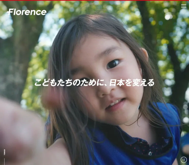
赤とチャコールを軸に、大きな写真、力強いタイポグラフィ、横スクロールの情報群を組み合わせたNPOサイト。活動紹介から寄付・採用へつなぐ構成と、充実したフッターが特徴。
オリジナルサイトを見るHuman photography, assertive typography, and a precise red accent give a large nonprofit website the energy of a public campaign.
Website / original URL: florence.or.jp
Final URL: https://florence.or.jp/
Theme: light, with white surfaces, charcoal text, cool gray supporting elements, and red identity and donation accents.
Inspected: September 17, 2026, at 03:49 JST; supplied retrieval timestamp: September 16, 2026, 18:49:41.785 UTC.
Viewports: desktop 1440 × 1000 and mobile 390 × 844 CSS pixels.
Scope: the current institutional homepage, including its photographic opening, two header states, participation topics, mission statement, four activity themes, issues rail, editorial preview, donation message, news rail, and footer. Linked destination pages were not inspected.
Florence combines an expansive visual introduction with substantial organizational navigation. A white wordmark sits over photography at the opening. Further down, a white navigation bar carries a red logo, compact utility links, a slate recruitment block, and a red donation block. Large Japanese statements and bold italic English section titles establish momentum; photographs, article summaries, taxonomy links, and dates provide substance.
The page is a long nonprofit homepage with multiple audiences and destinations. Its measured document height is approximately 14,122px on desktop and 11,643px on mobile. Preserve the alternation between broad statements, full-width activity imagery, horizontal content collections, and the detailed sitemap. Donation is prominent, while information about services, governance, recruitment, and editorial reporting remains easy to find.
Human photography, assertive typography, and a precise red accent give a large nonprofit website the energy of a public campaign.
Website / original URL: florence.or.jp
Final URL: https://florence.or.jp/
Theme: light, with white surfaces, charcoal text, cool gray supporting elements, and red identity and donation accents.
Inspected: September 17, 2026, at 03:49 JST; supplied retrieval timestamp: September 16, 2026, 18:49:41.785 UTC.
Viewports: desktop 1440 × 1000 and mobile 390 × 844 CSS pixels.
Scope: the current institutional homepage, including its photographic opening, two header states, participation topics, mission statement, four activity themes, issues rail, editorial preview, donation message, news rail, and footer. Linked destination pages were not inspected.
Florence combines an expansive visual introduction with substantial organizational navigation. A white wordmark sits over photography at the opening. Further down, a white navigation bar carries a red logo, compact utility links, a slate recruitment block, and a red donation block. Large Japanese statements and bold italic English section titles establish momentum; photographs, article summaries, taxonomy links, and dates provide substance.
The page is a long nonprofit homepage with multiple audiences and destinations. Its measured document height is approximately 14,122px on desktop and 11,643px on mobile. Preserve the alternation between broad statements, full-width activity imagery, horizontal content collections, and the detailed sitemap. Donation is prominent, while information about services, governance, recruitment, and editorial reporting remains easy to find.
line-height: 0 or inherited font sizes that do not describe their visible lettering. Do not reproduce those wrapper values as ordinary text styles.| Name | Value | Source / implementation alias | Role and evidence |
|---|---|---|---|
| Florence Red | #dc000c |
Source --color-primary |
Measured donation-button fill; mobile donation-section fill; visually consistent with the logo and copyright strip |
| Charcoal | #313841 |
Source --color-text, --color-gray01 |
Measured body text, activity-index band, participation labels, and consent acceptance button |
| Slate | #586476 |
Source --color-gray02 |
Measured recruitment-button fill; visually consistent with the desktop back-to-top circle |
| White | #ffffff |
Source --color-white |
Measured body and editorial-panel surfaces; reversed text and identity artwork |
| Pale Blue Gray | #e7ebf2 |
Alias --color-soft |
Measured news hashtag fill; footer action pills appear consistent with this color, but were not independently sampled |
| Pale Rule | #e2e9f4 |
Source --color-gray06 |
Available supporting neutral; recommended match for the fine footer separators visible in captures |
| Mid Gray | #ccd1d9 |
Source --color-gray05 |
Declared supporting neutral; no specific prominent application verified |
Red provides identity and urgency. Charcoal does more of the structural work: body copy, headings, navigation, dark labels, and a large section-wide link. Photography supplies the broader color range.
| Source token | Value | Evidence boundary |
|---|---|---|
--color-primary-hover |
#ea0000 |
Declared hover color; the hovered donation button was not captured |
--color-gray01-hover |
#2e3c4f |
Declared dark interaction color |
--color-gray03-hover |
#d4deef |
Declared pale interaction color |
--color-white-hover |
#f7fafc |
Declared near-white interaction color |
--color-bg-green |
#e8f1ea |
Declared background option; its placement is not established by the supplied screenshots |
--color-error |
#cd0000 |
Declared validation token; no error state inspected |
--color-error-bg |
#ffeceb |
Declared validation surface; no error state inspected |
A generic carousel theme variable contains blue #007aff, but the supplied navigation and pagination color variables are charcoal. Do not introduce blue as a visible brand accent on the strength of that default variable alone.
Computed family stack: "Noto Sans JP", "SF Pro JP", "SF Pro Text", "Hiragino Kaku Gothic Pro", sans-serif.
The supplied computed styles use this stack for body text, Japanese headings, navigation, buttons, and article summaries. Body weight is 500; prominent headings and navigation generally use 700; the mission headline uses 900. The record identifies the stack, not which installed fallback rendered every glyph.
Body line height is 1.8: 32.4px at desktop and 29.952px on mobile. Article titles commonly tighten to 1.5, and activity-theme titles use 1.3. This produces strong headings while keeping dense Japanese content readable.
Declared English stack: Inter, "SF Pro Text", "SF Pro Icons", "Helvetica Neue", Helvetica, sans-serif.
This stack is directly recorded on SCROLL and NEW. The visible Florence Issues heading is large, bold, and italic. Its sampled H2 wrapper reports 27px in the Japanese stack, so that wrapper cannot establish the visible display lettering's precise family or size. An approximately 72px bold italic English heading is a reasonable desktop reconstruction estimate.
The Florence wordmark is distinctive identity artwork. Use an authorized logo asset when available. Typing the name in italic Inter is an approximation, not a faithful logo replacement.
Values are font-size / line-height in CSS pixels.
| Role | Desktop | Mobile | Weight |
|---|---|---|---|
| Body | 18 / 32.4 |
16.64 / 29.952 |
500 |
| Desktop primary navigation | 18 / 32.4 |
Not exposed as visible mobile navigation | 700 |
| Desktop utility navigation | 13.5 / 24.3 |
Not exposed as visible mobile navigation | 500 |
| Header donation label | 15.75 / 28.35 |
14.56 / 26.208 |
700 |
| Participation ribbon | 13.5 / 13.5 |
12.48 / 12.48 |
700 |
| Participation card title | 18 / 27 |
14.56 / 21.84 |
500 |
| Mission headline | 90 / 121.5 |
33.28 / 44.928 |
900 |
| Mission explanation | 40.5 / 72.9 |
18.72 / 33.696 |
700 |
| Activity-theme title | 72 / 93.6 |
33.28 / 43.264 |
700 |
| Activity-index band label | 40.5 / 60.75 |
18.72 / 28.08 |
700 |
| Issue-card title | 27 / 40.5 |
18.72 / 28.08 |
700 |
| Featured editorial title | 27 / 40.5 |
18.72 / 28.08 |
700 |
| Secondary editorial title | 18 / 27 |
18.72 / 28.08 |
700 |
| News title | 18 / 27 |
16.64 / 24.96 |
700 |
| Hashtag link | 15.75 / 23.625 |
14.56 / 21.84 |
500 |
| Scroll label | 11.25 / 20.25 |
10.4 / 18.72 |
700 |
The source changes the underlying heading scale between desktop and mobile. In this table, u means the viewport unit explained in the next section.
| Source token | Desktop definition → value | Mobile definition → value |
|---|---|---|
--font-size-heading-md |
36u → 40.5px |
20u → 20.8px |
--font-size-heading-lg |
40u → 45px |
24u → 24.96px |
--font-size-heading-xl |
56u → 63px |
32u → 33.28px |
--font-size-heading-2xl |
64u → 72px |
32u → 33.28px |
--font-size-heading-3xl |
80u → 90px |
36u → 37.44px |
Component overrides matter. The measured mobile mission headline is 33.28px, not the 37.44px calculated from the mobile 3XL token.
The source declares several 0.06em tracking tokens, but the sampled body, navigation, and many headings compute to normal letter spacing. Do not apply 0.06em globally.
The source exposes two viewport-based systems:
/* Observed desktop custom property */
--vw: calc(1 / 1280 * 100vw);

/* Observed mobile custom property */
--vw: calc(1 / 375 * 100vw);

/* Observed text conversion helper */
--rem: calc(1rem / 16);
At the supplied desktop width, 1u = 1.125px; at mobile, 1u = 1.04px. The measured root sizes are 18px and 16.64px, respectively, consistent with a 16-unit base at these two viewports. The exact breakpoint and root-size behavior at other widths were not supplied.
The source also declares --vw-min: max(1px, var(--vw)) and --vw-max: min(1px, var(--vw)). Follow those expressions literally; their names should not be interpreted as container-width limits.
| Source token | Desktop | Mobile |
|---|---|---|
--spacer-xs |
5u = 5.625px |
5u = 5.2px |
--spacer-sm |
10u = 11.25px |
10u = 10.4px |
--spacer-md |
20u = 22.5px |
20u = 20.8px |
--spacer-lg |
40u = 45px |
30u = 31.2px |
--spacer-xl |
80u = 90px |
40u = 41.6px |
--spacer-2xl |
160u = 180px |
60u = 62.4px |
The main mission inset is separately measured at 67.5px on desktop and 20.8px on mobile. Large source side-spacing tokens change from 160u and 260u on desktop to 20u on mobile; those are not the universal page gutter.
| Element | Desktop | Mobile | Evidence |
|---|---|---|---|
| Activity panels and participation-card links | Square corners | Square corners | Computed |
| Standard content CTA | 90px radius |
83.2px radius |
Computed; visually a pill |
| Editorial section shell | 90px radius |
41.6px radius |
Computed |
| Hashtag chip | 15.75px radius |
14.56px radius |
Computed |
| News category badge | 5.625px radius |
5.2px radius |
Computed |
| Activity-panel arrow | 81px circle |
52px circle |
Computed |
| Consent buttons | 70px radius |
Not measured | Computed desktop |
| Footer action links | Approximately 113px tall pills |
Approximately 104px tall pills |
Screenshot estimate |
Roundness is selective. Large imagery and dark section bands remain rectangular; navigation pills, circular photographs, arrows, and the editorial shell soften particular destinations.
| Element | Desktop 1440 × 1000 |
Mobile 390 × 844 |
|---|---|---|
| Header height | 90.20px; token 90px |
67.69px; token 68px |
| Mission content width | 1305px |
348.41px |
| Participation-card link | About 517.63 × 310px |
About 286.03 × 204.23px |
| Activity-theme link | 1440 × 675px |
390 × 390px |
| Activity-index band | 1440 × 225px |
390 × 88.39px |
| Issue-card outer link | 427.5 × 235.13px |
312 × 173.66px |
| Editorial shell | 1350px wide, inset 45px |
390px wide, no outer inset |
| Lead editorial image link | 630 × 330.75px |
306.81 × 161.06px |
| News-section vertical padding | 225px |
83.2px |
The desktop container token is 1160u = 1305px. Its mobile declaration still evaluates to more than the viewport width, while measured content remains within the screen. Copying that token directly as a mobile width would be incorrect.
Role: establish identity and the human purpose behind the organization.
The current desktop opening fills the viewport with a bright classroom scene containing a group of young people. A thin red line runs across the top. White Florence identity artwork occupies the upper left, and a three-line white menu icon sits at the upper right.
The measured hero identity wrapper is approximately 300.38 × 77.61px, positioned at x: 47.25px, y: 36px. The mobile wrapper is approximately 193.44 × 52.25px, positioned at x: 10.39px, y: 15.59px; it is present in the DOM but not visibly rendered in the supplied blank mobile opening.
A centered slogan container exists in both DOM records. Its desktop bounds are 900 × 58.31px; mobile bounds are 332.8 × 21.56px. The slogan is not visibly present at the center of the supplied desktop frame. Preserve this distinction between structural presence and a confirmed visible state.
The desktop scene appears muted under the initial consent state. The evidence does not isolate whether that treatment comes from the media, a hero overlay, or consent-related dimming. Use an adjustable contrast layer in a new implementation rather than treating a specific filter or opacity as measured.
A SCROLL link targets #js-home-action. Its desktop position is near the lower-left edge; the mobile DOM centers it near the bottom. A circular control box measures 45px on desktop and approximately 41.6px on mobile. Its playback function, accessible name, and operating state were not established.
Role: expose the site's information architecture and persistent high-priority destinations.
The mid-page desktop capture shows a white header approximately 90px high. Its anatomy is:
196.88 × 51.45px.123.75px wide.78.75px menu-button column at the right.Primary labels are bold 18px; utility labels are 13.5px. Several primary labels carry small downward chevrons. Their open menus were not inspected.
At the opening measurement, this header sits above the viewport at approximately top: -91px; the mobile equivalent is approximately -69px. The source declares a top 0.5s transition, and the desktop screenshots establish hidden-at-opening and visible-mid-page states. The exact reveal threshold and scroll-direction rules remain unknown.
The mobile DOM retains a logo, a 104px donation block, and a roughly 56.16px menu column. Desktop navigation, utility links, and recruitment are absent from the mobile visible-text extraction. The mobile header's actual painted state is not confirmed by the opening screenshot.
Role: consent controls over the initial desktop view.
The visible dock spans the bottom of the viewport and is approximately 140px tall. A left branding area contains the Florence symbol and consent-provider identity; a central text column contains the English explanation and Show details; two buttons stack at the right.
Each button measures 286 × 53.59px, with 14px semibold text and pill geometry. Allow all uses charcoal with white text. Deny uses white with a dark outline and dark text. The details link is red and measures 12px in the supplied style record.
Later captures show a small dark circular consent widget at the lower-left corner without the full dock. No action log identifies how that state was reached. Do not assume a particular consent choice was made, and keep this vendor interface separate from the site's own conversion hierarchy.
Role: immediately actionable participation, fundraising, and recruitment opportunities.
The desktop section begins at approximately y: 943.75px, slightly above the nominal bottom of the opening viewport. Its white surface starts at x: 61.88px and extends to the right edge. This creates an offset transition from the opening into content.
Each of the six unique topic links combines:
The first desktop links are approximately 517.63px wide with about 46px between their measured bounds. Mobile links are approximately 286.03px wide with about 42.59px between bounds. On mobile, the first begins at 20.8px and the next at 349.42px, leaving a visible opportunity for the following item to peek into the viewport.
The label sits above the main link's image-and-title rectangle in the supplied geometry. Reproduce the compact ribbon treatment rather than turning it into a large rounded category button. The mobile title wraps into a 43.69px two-line block.
Role: express the organization's purpose with unusually strong typographic scale.
The headline quotes “こどもたちのために、日本を変える”. It uses 900 weight, 90px type on desktop, and 33.28px on mobile. A bold explanatory statement follows at 40.5px desktop and 18.72px mobile, with generous 1.8 leading.
The desktop content occupies a 1305px wide area with 67.5px side insets. Mobile uses 20.8px insets. The copy introduces deliberate line breaks rather than behaving like a long editorial paragraph.
A centered white pill link with red text leads to organization information. It measures 333 × 63px on desktop and approximately 306.8 × 49.73px on mobile. Its border width was not supplied, despite a transition declaration that includes border color.
Role: organize a broad service portfolio into four memorable social outcomes.
Four full-width linked panels correspond to poverty and abuse prevention, family isolation, parenting support, and changes to policy and culture. Each combines a sequence number, large white Japanese heading, a short service list, and a circular arrow near the lower-right corner.
Desktop link bounds are 1440 × 675px; mobile bounds are square at 390 × 390px. Desktop titles are 72px / 1.3 and occupy a roughly 596px content column. Mobile titles are 33.28px / 1.3, with sampled text widths between approximately 233px and 266px. The first title deliberately breaks into more lines on mobile.
The fourth panel is visibly backed by newspaper photography in the desktop crop. Its bullet list and outlined white arrow remain legible over a darkened image. The other panels' exact image subjects are not established by the supplied screenshots.
The arrow circles measure 81px desktop and 52px mobile. They are visual elements within the larger linked panel; their sampled DOM nodes are paragraphs, not separate buttons. A new implementation should avoid nesting another interactive control inside the panel link.
There is a measured lead-in of exactly two viewport heights between the start of the containing activity section and the first theme panel: 2000px desktop and 1688px mobile. This may accommodate a scroll-dependent scene, but its mechanism and intermediate visuals were not supplied. Do not reproduce it as an unexplained empty spacer.
Role: provide a strong transition from the four themes to the activity index.
A full-width charcoal strip follows the panels. It carries the white label “フローレンスのとりくみを見る” and a small right chevron. The desktop screenshot places this group toward the right side rather than centering it.
Measured height is 225px desktop and 88.39px mobile. Desktop text is 40.5px; mobile text is 18.72px. Keep the strip square and broad. This component is a major dark anchor in an otherwise light page.
Role: surface the policy and cultural issues the organization is currently advocating.
The visible heading is centered, bold, italic, and charcoal. A short red horizontal rule sits underneath, followed by a centered Japanese subtitle. In the desktop screenshot, the rule is approximately 50px wide and 4–5px high. The subtitle is measured at 18px, weight 700; on mobile it uses 16.64px and wraps into two lines in the text extraction.
Issue links use photographs with white overlaid titles. The desktop outer link measures 427.5 × 235.13px with 11.25px padding. Subtracting that padding gives a calculated image region of 405 × 212.63px, matching the source 1200 / 630 image ratio. Mobile links measure 312 × 173.66px, with 10.4px padding.
Five unique topics appear three times in the rendered link sequence. Their horizontal positions include negative offsets, consistent with a repeated carousel track. Do not publish those repetitions as fifteen distinct editorial items. Autoplay timing, drag behavior, and loop transitions were not tested.
Role: introduce the organization's editorial publication, “フローレンズ”.
The section has a large rounded white shell. Desktop bounds are 1350px wide with 45px outside margins, a 90px radius, and 84.38px vertical padding. Mobile removes the outside margins, reduces the radius to 41.6px, and uses 36.4px vertical padding.
The desktop composition gives the lead story a large image on the left and places two smaller stories to the right. The lead image link measures 630 × 330.75px. Secondary images measure 292.5 × 153.56px, beside text columns approximately 270px wide. All three image sizes follow the declared 1200 / 630 ratio.
On mobile, the three stories become a vertical sequence. Each image link is approximately 306.81 × 161.06px, inset to x: 41.59px. Secondary headlines increase from 18px desktop to 18.72px mobile, supporting comfortable reading after the layout stacks.
Story anatomy includes image, title, hashtags, and publication date; the lead also has a NEW label. Hashtags are small white pills in this section. The lead title computes to white, while the outer section computes to white; the intervening backing layer is not present in the sampled records or screenshots. Its color should not be invented as an observed fact.
Role: turn the mission into a direct invitation to support the organization.
The mobile DOM records an ACTION section with red background and white text. It measures approximately 390 × 556.7px, with 41.6px vertical and 20.8px horizontal padding. The Japanese message is 33.28px / 49.92px, followed by a pill link labeled “寄付についてを見る”.
The supplied desktop text and element samples do not establish this section's desktop visual composition. Its confirmed mobile presence should not be described as proof that it is mobile-only.
Role: provide current reports, announcements, events, and press releases.
The section uses the same centered heading-and-subtitle hierarchy as Issues. Its vertical padding is substantial: 225px desktop and 83.2px mobile.
Measured desktop text columns are 360px wide and start at x: 90, 540, and 990px; the next begins at 1440px. Mobile text columns are approximately 244.41px wide with a 327.59px pitch. These coordinates support a horizontal rail with roughly three desktop entries and a partial next mobile entry, rather than a conventional wrapped article grid.
Each entry includes category links, a bold title, date text, and topic hashtags. Category badges are slightly rounded rectangles; hashtags use fully rounded pale blue-gray fills. Preserve that distinction. Long titles wrap, and the supplied text does not establish truncation or line clamping.
The news image areas were not separately measured in the supplied element sample. Do not treat the text-column widths as proven total card widths.
Role: make the full organization understandable and navigable at the end of a long page.
The desktop footer organizes links into a broad left activity area and right-side organization, news, and donation areas. The activity area itself has two columns of numbered theme groups. Organization and news sit side by side above the donation links. English resources occupy a lower-left group, while the editorial publication's wordmark appears toward the right.
Small chevrons introduce links. Pale horizontal rules separate headings and utility groups. Some partnership and legacy-giving links carry external-link symbols. These symbols are visible affordances; new-tab behavior was not tested.
Below the sitemap, a centered horizontal row contains FAQ, contact, privacy, English privacy, and environment links. The mobile footer crop shows these utilities stacked vertically with generous spacing. The full upper mobile sitemap is outside the screenshot crop; its links are present in the DOM, but an accordion treatment is not verified.
Role: provide three clearly differentiated next steps after the sitemap.
The desktop footer has three pale blue-gray pills in one row: newsletter registration, recruitment, and donation. Each contains a circular photograph at the left, a bold text label, and a small right chevron. The newsletter pill is wider to accommodate its label.
Estimated desktop heights are approximately 113px, with circular images around 90px. Mobile pills stack nearly edge to edge at approximately 370 × 104px, with photographs around 83px and gaps around 10px.
The final copyright strip is red with centered white “© NPO Florence”. Its estimated height is 66px desktop and 61px mobile. This is the page's strongest full-width red footer surface.
A separate dark consent widget remains at the lower-left corner. The desktop mid-page screenshot also shows a slate circular back-to-top control around 90px in diameter; the DOM supplies a link to #page, but scrolling animation was not tested.
| Element | Recorded declaration or evidence | What can be concluded |
|---|---|---|
| Main navigation header | top 0.5s |
Header movement is defined; screenshots show opening and mid-page states |
| Recruitment and donation blocks | background-color 0.5s |
Color transitions are defined; hovered endpoints were not captured |
| Standard content CTA | background-color 0.5s, color 0.5s, border-color 0.5s |
Multiple visual properties may change; exact state styling is incomplete |
| Participation section | opacity 1s, transform 1s |
Reveal-capable styling exists; trigger and transform distance are unknown |
| Activity arrow circles | transform 0.25s |
Short transform feedback is defined; direction and scale are not supplied |
| Activity-index band | background-color 0.4s |
Background feedback is defined |
| Hashtags and category links | background-color 0.5s |
Color feedback is defined |
| Desktop hero circular control | bottom 0.8s |
Position adjustment is defined; playback behavior is unverified |
| Issues track | Repeated links and translated horizontal positions | Carousel-like structure is supported; timing and input behavior are unverified |
The source exposes circular easing functions:
--ease-in-circ: cubic-bezier(0.6, 0.04, 0.98, 0.335);
--ease-out-circ: cubic-bezier(0.075, 0.82, 0.165, 1);
--ease-in-out-circ: cubic-bezier(0.785, 0.135, 0.15, 0.86);
Their application to particular transitions was not established. Likewise, a computed transition summarized only as all does not prove a nonzero animation duration.
The opening contains photography and a circular control, but the supplied element sample does not establish the underlying media element. Video autoplay, audio, looping, pause behavior, and scene changes remain unverified. Do not invent parallax, scroll scrubbing, menu animation, or custom cursor behavior.
| Layer | Treatment | Purpose |
|---|---|---|
| Main canvas | White | Keeps a content-heavy homepage calm and readable |
| Photographic opening | Full-bleed imagery with white identity | Establishes human context |
| Activity panels | Rectangular imagery with white content | Gives each social outcome substantial visual weight |
| Activity-index band | Charcoal with white text | Creates a strong structural transition |
| Editorial shell | White with unusually large rounded corners | Groups a distinct publication within the wider site |
| Hashtags and footer actions | Pale blue gray | Distinguishes secondary destinations without adding new accent colors |
| Donation emphasis | Red with white text | Signals a high-priority action |
| Consent dock | Near-white overlay with dark controls | Separates operational consent UI from page content |
The source declares soft shadows, including 0 0 50u #3b404b26, 0 0 100u #3b404b26, and an upward shadow with a -100u offset, 50u blur, and 0.05 alpha. At desktop, those blur sizes calculate to 56.25px and 112.5px. Exact component assignments were not supplied.
Use these as evidence of broad atmospheric separation, not a mandate to place every article inside a raised card. The visible page relies primarily on whitespace, image fields, color blocks, and thin rules.
The current original-page opening shows people interacting in a bright classroom. The visible fourth activity panel uses newspaper photography, connecting policy work to public debate. Footer action images show a Florence sign, a group gathering, and an outdoor adult-and-child scene.
These images perform different jobs: the opening establishes human presence; activity imagery gives context to organizational themes; editorial images identify stories; circular footer crops make small action links more approachable. Preserve those roles rather than using one generic photograph across all components.
Photography remains continuous-tone and naturally colored. There is no evidence for pixelation, duotone processing, decorative illustration, or a uniform filter across every image. The opening's muted appearance should be interpreted in the context of its consent-overlay capture.
No original image, logo, video, or font-file URLs were included in the supplied evidence. The following inventory identifies visible or measured assets without inventing paths.
| Asset | Evidence | Implementation guidance |
|---|---|---|
| White Florence identity | Desktop opening screenshot | Use authorized artwork with intrinsic proportions |
| Red Florence identity | Desktop scrolled header | Provide a red variant for white surfaces |
| Opening classroom scene | Desktop opening screenshot | Preserve human interaction and full-bleed cropping |
| Newspaper image | Fourth activity-panel crop | Use an image contrast layer that preserves white text legibility |
| Editorial thumbnails | Measured image-link rectangles | Use the observed 1200 / 630 ratio |
| Footer action photographs | Desktop and mobile footer screenshots | Crop into circles with subject-aware positioning |
| Editorial publication wordmark | Footer screenshots | Treat as identity artwork rather than arbitrary body text |
For a new site, use appropriately authorized photographs and identity assets. An image ratio specifies geometry, not permission to reuse the original content.
The homepage retains its major content sequence on mobile. Its responsive design changes scale, alignment, and information density rather than merely shrinking the desktop canvas.
| Area | Desktop observation | Mobile observation |
|---|---|---|
| Header | Full navigation, utility row, recruitment, donation, menu | DOM exposes logo, donation, and menu |
| Participation rail | Two full large links and part of another fit within the viewport geometry | One large link plus a following sliver |
| Mission | 90px heading and 40.5px explanation |
33.28px heading and 18.72px explanation |
| Activity themes | Wide 1440 × 675px panels |
Square 390 × 390px panels |
| Issue rail | Approximately three photograph regions across | One centered outer link 312px wide, with adjacent edges |
| Editorial preview | Large lead story beside two smaller stories | Three stories in a vertical sequence |
| Footer utilities | Horizontal row | Vertically stacked links, visually confirmed |
| Footer actions | Three pills in one row | Three full-width stacked pills, visually confirmed |
The mobile opening screenshot shows a white field, a thin red top rule, and the small consent widget. At the same viewport, the DOM contains the hero identity, slogan, scroll link, and control geometry. This discrepancy limits verification of the mobile opening. It does not establish that the intended mobile design is an empty screen.
The supplied readiness process waited for document loading, finite motion, layout stability, text stability, and visible image decoding, within stated time limits. That improves capture reliability but cannot establish that delayed media or every reveal state completed. Build a new implementation so essential content remains visible if media or animation initialization fails.
Only two viewport widths were supplied. The exact source breakpoint, tablet layout, landscape behavior, and very wide-screen scaling are unknown. All sampled safe-area variables were 0px; adding safe-area handling in a new implementation is a recommendation.
#dc000c, charcoal #313841, and white as the primary visual relationship.These are recommendations for a new implementation, not verified features of the original page:
#ffffff.#313841.#dc000c.#586476.#e7ebf2.#e2e9f4 as an adaptation.#ea0000; actual hovered states require verification.“Create a substantial Japanese nonprofit homepage inspired by Florence's current visual system. Use a white canvas, charcoal #313841 typography, and red #dc000c identity and donation accents. Begin with full-viewport human photography, a white logo, and a compact menu. Introduce a white navigation header with a red logo, dense organizational links, a slate recruitment block, and a red donation block. Follow with a participation rail, a very bold Japanese mission statement, four full-width numbered activity-image panels, a charcoal activity-index band, and centered italic English section headings with short red rules. Use horizontal issue and news collections, a generously rounded editorial section, and a detailed sitemap footer. Finish with three pale photographic action pills and a red copyright strip. Keep essential content visible without animation.”
This is an implementation scaffold, not extracted source CSS. It preserves the measured palette and sampled proportions while keeping a conventional root font size. The 767px breakpoint, font-size clamps, native scroll snapping, contrast overlay, and focus treatment are recommendations. The English display size is estimated. Original media files, logo assets, menu logic, and carousel behavior require separate implementation.
Place the sticky header after the hero for a simple CSS-only adaptation. Reproducing the original above-viewport header and its reveal timing requires additional state logic. No empty two-viewport spacer is included.
:root {
  /* Observed palette */
  --color-primary: #dc000c;
  --color-primary-hover: #ea0000;
  --color-ink: #313841;
  --color-slate: #586476;
  --color-white: #fff;
  --color-soft: #e7ebf2;
  --color-soft-hover: #d4deef;
  --color-rule: #e2e9f4;

  /* Observed family stacks; font files must be supplied separately */
  --font-jp: 'Noto Sans JP', 'SF Pro JP', 'SF Pro Text',
    'Hiragino Kaku Gothic Pro', sans-serif;
  --font-en: Inter, 'SF Pro Text', 'SF Pro Icons',
    'Helvetica Neue', Helvetica, sans-serif;

  /* Desktop viewport unit, adapted without changing the root size */
  --u: calc(100vw / 1280);
  --page-gutter: calc(60 * var(--u));
  --header-height: 90px;
  --space-sm: calc(10 * var(--u));
  --space-md: calc(20 * var(--u));
  --space-lg: calc(40 * var(--u));
  --space-xl: calc(80 * var(--u));
  --panel-radius: calc(80 * var(--u));

  /* Clamps are recommended limits, not observed source limits */
  --text-body: clamp(1rem, calc(16 * var(--u)), 1.125rem);
  --text-small: clamp(.875rem, calc(14 * var(--u)), .984375rem);
  --text-mission: clamp(2rem, calc(80 * var(--u)), 6.5rem);
  --text-message: clamp(1.125rem, calc(36 * var(--u)), 3rem);
  --text-theme: clamp(2rem, calc(64 * var(--u)), 5.5rem);
  --text-display: clamp(2rem, calc(64 * var(--u)), 5.5rem);
  --hero-overlay: rgb(49 56 65 / 18%);
}

* { box-sizing: border-box; }

.florence-page {
  margin: 0;
  color: var(--color-ink);
  background: var(--color-white);
  font-family: var(--font-jp);
  font-size: var(--text-body);
  font-weight: 500;
  line-height: 1.8;
}

.florence-page img { display: block; max-inline-size: 100%; }
.florence-page a { color: inherit; text-decoration: none; }
.florence-page button { font: inherit; }

.container {
  inline-size: calc(100% - 2 * var(--page-gutter));
  margin-inline: auto;
}

.hero {
  position: relative;
  isolation: isolate;
  min-block-size: 100svh;
  border-block-start: 5px solid var(--color-primary);
  color: var(--color-white);
  background: var(--color-slate);
}

.hero__media,
.theme-panel__image {
  position: absolute;
  inset: 0;
  z-index: -2;
  inline-size: 100%;
  block-size: 100%;
  object-fit: cover;
}

.hero::before,
.theme-panel::before {
  content: '';
  position: absolute;
  inset: 0;
  z-index: -1;
  background: var(--hero-overlay);
  pointer-events: none;
}

.hero__brand {
  position: absolute;
  inset-block-start: calc(32 * var(--u));
  inset-inline-start: calc(42 * var(--u));
  inline-size: calc(267 * var(--u));
}

/* Recommended live-text fallback for the graphic-like slogan */
.hero__message {
  position: absolute;
  inset-inline: var(--page-gutter);
  inset-block-start: 50%;
  margin: 0;
  transform: translateY(-50%);
  text-align: center;
  font-size: clamp(1.25rem, 4vw, 3.75rem);
  font-weight: 700;
  line-height: 1.3;
}

.site-header {
  position: sticky;
  inset-block-start: 0;
  z-index: 30;
  display: flex;
  align-items: stretch;
  min-block-size: var(--header-height);
  background: var(--color-white);
}

.site-header__brand {
  align-self: center;
  inline-size: calc(175 * var(--u));
  margin-inline: var(--space-md);
}

.site-header__nav {
  display: flex;
  flex: 1;
  align-items: center;
  justify-content: flex-end;
  gap: calc(24 * var(--u));
  padding-inline: var(--space-md);
  font-weight: 700;
}

.site-header__action,
.menu-toggle {
  display: grid;
  place-items: center;
  flex: 0 0 auto;
  inline-size: calc(110 * var(--u));
  border: 0;
  font-size: var(--text-small);
  font-weight: 700;
}

.site-header__action {
  color: var(--color-white);
  background: var(--color-slate);
  transition: background-color .5s;
}

.site-header__action--donate { background: var(--color-primary); }
.menu-toggle { inline-size: calc(70 * var(--u)); background: white; }

.card-rail {
  display: grid;
  grid-auto-flow: column;
  grid-auto-columns: var(--rail-width);
  gap: var(--rail-gap, var(--space-lg));
  overflow-x: auto;
  padding: var(--space-md) var(--page-gutter);
  scroll-padding-inline: var(--page-gutter);
  scroll-snap-type: x proximity;
}

.card-rail > * { min-inline-size: 0; scroll-snap-align: start; }
.action-rail { --rail-width: calc(460 * var(--u)); }

.action-card__label {
  display: table;
  margin: 0;
  padding: .4em 1.14em;
  color: var(--color-white);
  background: var(--color-ink);
  font-size: calc(12 * var(--u));
  font-weight: 700;
  line-height: 1;
}

.action-card img,
.editorial-image {
  inline-size: 100%;
  aspect-ratio: 1200 / 630;
  object-fit: cover;
}

.action-card h3 {
  margin: var(--space-sm) 0 0;
  font-size: var(--text-body);
  font-weight: 500;
  line-height: 1.5;
}

.mission { padding-block: var(--space-xl); }
.mission h2 {
  margin: 0 0 var(--space-lg);
  font-size: var(--text-mission);
  font-weight: 900;
  line-height: 1.35;
}
.mission p {
  font-size: var(--text-message);
  font-weight: 700;
  line-height: 1.8;
}

.pill-link {
  display: flex;
  align-items: center;
  justify-content: center;
  gap: calc(15 * var(--u));
  inline-size: min(100%, calc(296 * var(--u)));
  min-block-size: calc(56 * var(--u));
  padding: var(--space-sm) calc(18 * var(--u));
  border: 1px solid currentColor;
  border-radius: 999px;
  color: var(--color-primary);
  background: var(--color-white);
  font-weight: 700;
  line-height: 1.5;
  transition: background-color .5s, color .5s, border-color .5s;
}

.theme-panel {
  position: relative;
  isolation: isolate;
  display: flex;
  align-items: center;
  min-block-size: calc(600 * var(--u));
  padding: var(--page-gutter);
  color: var(--color-white);
  background: var(--color-slate);
}
.theme-panel__content { max-inline-size: calc(530 * var(--u)); }
.theme-panel h3 {
  margin: var(--space-md) 0;
  font-size: var(--text-theme);
  font-weight: 700;
  line-height: 1.3;
}
.theme-panel__arrow {
  position: absolute;
  inset-inline-end: calc(30 * var(--u));
  inset-block-end: calc(30 * var(--u));
  display: grid;
  place-items: center;
  inline-size: calc(72 * var(--u));
  aspect-ratio: 1;
  border: 3px solid currentColor;
  border-radius: 50%;
}

.activity-index {
  display: flex;
  align-items: center;
  justify-content: flex-end;
  gap: calc(30 * var(--u));
  min-block-size: calc(200 * var(--u));
  padding: var(--space-lg) var(--page-gutter);
  color: var(--color-white);
  background: var(--color-ink);
  font-size: var(--text-message);
  font-weight: 700;
  line-height: 1.5;
}

.section-heading { padding-block-start: var(--space-xl); text-align: center; }
.section-heading h2 {
  margin: 0;
  font-family: var(--font-en);
  font-size: var(--text-display);
  font-style: italic;
  font-weight: 700;
  line-height: 1.2;
}
.section-heading h2::after {
  content: '';
  display: block;
  inline-size: calc(45 * var(--u));
  block-size: 4px;
  margin: var(--space-lg) auto var(--space-md);
  background: var(--color-primary);
}
.section-heading p { font-weight: 700; }

.issues-rail {
  --rail-width: calc(380 * var(--u));
  --rail-gap: var(--space-md);
}
.issue-card { padding: var(--space-sm); }
.issue-card__media {
  position: relative;
  display: grid;
  place-items: center;
  aspect-ratio: 1200 / 630;
  overflow: hidden;
  color: white;
  background: var(--color-slate);
}
.issue-card__media img {
  position: absolute;
  inset: 0;
  inline-size: 100%;
  block-size: 100%;
  object-fit: cover;
}
.issue-card__media::after {
  content: '';
  position: absolute;
  inset: 0;
  background: var(--hero-overlay);
}
.issue-card h3 {
  position: relative;
  z-index: 1;
  margin: 0;
  padding: var(--space-md);
  font-size: calc(24 * var(--u));
  line-height: 1.5;
  text-align: center;
}

.editorial-panel {
  margin: var(--space-xl) calc(40 * var(--u));
  padding: calc(75 * var(--u)) var(--space-md);
  border-radius: var(--panel-radius);
  background: white;
}
.editorial-grid {
  display: grid;
  grid-template-columns: 1fr 1fr;
  gap: calc(60 * var(--u));
}
.editorial-grid h3 { font-weight: 700; line-height: 1.5; }

/* Recommended contrast fallback; original lead backing is unverified */
.editorial-feature {
  padding: var(--space-md);
  color: white;
  background: var(--color-ink);
}

.tag-list { display: flex; flex-wrap: wrap; gap: var(--space-sm); }
.tag {
  padding: .2em .75em;
  border-radius: 999px;
  color: var(--color-ink);
  background: var(--color-soft);
  font-size: var(--text-small);
  line-height: 1.5;
}

.footer-utilities {
  display: flex;
  flex-wrap: wrap;
  justify-content: center;
  gap: var(--space-lg);
  padding-block: var(--space-md);
  border-block: 1px solid var(--color-rule);
}
.footer-actions {
  display: flex;
  justify-content: center;
  gap: var(--space-lg);
  margin: var(--space-lg) auto;
  padding-inline: var(--space-sm);
}
.footer-pill {
  display: flex;
  align-items: center;
  gap: var(--space-md);
  inline-size: calc(260 * var(--u));
  min-block-size: calc(100 * var(--u));
  padding: var(--space-sm);
  border-radius: 999px;
  background: var(--color-soft);
  font-weight: 700;
}
.footer-pill:first-child { inline-size: calc(350 * var(--u)); }
.footer-pill img {
  flex: 0 0 auto;
  inline-size: calc(80 * var(--u));
  aspect-ratio: 1;
  border-radius: 50%;
  object-fit: cover;
}
.footer-pill__arrow { margin-inline-start: auto; padding-inline-end: 1em; }
.copyright {
  margin: 0;
  padding: 22.5px 20px;
  color: white;
  background: var(--color-primary);
  font-size: .875rem;
  line-height: 1.5;
  text-align: center;
}

/* Recommended intermediate-width navigation collapse */
@media (max-width: 1199px) {
  .site-header__nav { display: none; }
  .site-header__brand { margin-inline-end: auto; }
}

/* Recommended breakpoint; the source breakpoint was not supplied */
@media (max-width: 767px) {
  :root {
    --u: calc(100vw / 375);
    --page-gutter: calc(20 * var(--u));
    --header-height: 68px;
    --space-lg: calc(30 * var(--u));
    --space-xl: calc(40 * var(--u));
    --panel-radius: calc(40 * var(--u));
    --text-mission: clamp(2rem, calc(32 * var(--u)), 3rem);
    --text-message: clamp(1.125rem, calc(18 * var(--u)), 1.5rem);
    --text-theme: clamp(2rem, calc(32 * var(--u)), 3rem);
    --text-display: clamp(2rem, calc(36 * var(--u)), 3rem);
  }
  .hero__brand {
    inset-block-start: calc(15 * var(--u));
    inset-inline-start: calc(10 * var(--u));
    inline-size: calc(186 * var(--u));
  }
  .site-header__brand { inline-size: calc(142 * var(--u)); }
  .site-header__action--recruit { display: none; }
  .site-header__action--donate { inline-size: calc(100 * var(--u)); }
  .menu-toggle { inline-size: calc(54 * var(--u)); }
  .action-rail {
    --rail-width: calc(275 * var(--u));
    --rail-gap: calc(40 * var(--u));
  }
  .action-card h3 { font-size: var(--text-small); }
  .pill-link { min-block-size: calc(48 * var(--u)); }
  .theme-panel { min-block-size: 100vw; }
  .theme-panel__content { max-inline-size: 78%; }
  .theme-panel__arrow {
    inline-size: calc(50 * var(--u));
    inset-inline-end: var(--page-gutter);
    inset-block-end: var(--page-gutter);
  }
  .activity-index {
    min-block-size: calc(85 * var(--u));
    padding: var(--page-gutter);
  }
  .issues-rail { --rail-width: calc(300 * var(--u)); --rail-gap: 0px; }
  .issue-card h3 { font-size: calc(18 * var(--u)); }
  .editorial-panel {
    margin-inline: 0;
    padding: calc(35 * var(--u)) var(--page-gutter);
  }
  .editorial-grid { grid-template-columns: 1fr; gap: var(--space-xl); }
  .footer-utilities { align-items: flex-start; flex-direction: column; gap: .5rem; }
  .footer-actions { flex-direction: column; gap: var(--space-sm); }
  .footer-pill,
  .footer-pill:first-child { inline-size: 100%; }
  .copyright { padding-block: 20px; }
}

@media (hover: hover) {
  .site-header__action--donate:hover { background: var(--color-primary-hover); }
  .footer-pill:hover,
  .tag:hover { background: var(--color-soft-hover); }
}

/* Recommended focus treatment across light and dark surfaces */
.florence-page :focus-visible {
  outline: 3px solid var(--color-ink);
  outline-offset: 4px;
  box-shadow: 0 0 0 7px white;
}

@media (prefers-reduced-motion: reduce) {
  .florence-page *,
  .florence-page *::before,
  .florence-page *::after {
    animation: none !important;
    transition: none !important;
    scroll-behavior: auto !important;
  }
  .card-rail { scroll-snap-type: none; }
}
The overlay opacity and charcoal editorial-feature backing in this scaffold are recommended contrast defaults. They are not measurements of the original layers. Adjust them against actual assets. Reduced-motion CSS does not stop video playback; implement that separately if video is used.
Optional aliases for a project already using Tailwind v4. Define the custom properties above first. This mapping does not imply that the original site uses Tailwind.
@theme inline {
  --color-florence-red: var(--color-primary);
  --color-florence-ink: var(--color-ink);
  --color-florence-slate: var(--color-slate);
  --color-florence-soft: var(--color-soft);
  --color-florence-rule: var(--color-rule);
  --font-japanese: var(--font-jp);
  --font-english: var(--font-en);
  --text-site-body: var(--text-body);
  --text-site-small: var(--text-small);
  --text-mission: var(--text-mission);
  --text-theme-title: var(--text-theme);
  --text-section-display: var(--text-display);
  --spacing-page: var(--page-gutter);
  --spacing-site-gap: var(--space-lg);
  --radius-editorial: var(--panel-radius);
}
200. The supplied page title identifies the organization as “認定NPO法人フローレンス”; the footer independently displays “© NPO Florence”. No website production credits were established by the original-page evidence.2026-09-16T18:49:41.785Z, equivalent to September 17, 2026, 03:49:41.785 JST.1440 × 1000 CSS-pixel viewport; opening, mid-page activity/Issues transition, and footer screenshots; rendered text, links, element rectangles, computed styles, and custom properties. Document height approximately 14,122px.390 × 844 CSS-pixel viewport; mostly blank opening and populated lower-footer screenshots; rendered text, links, element rectangles, computed styles, and custom properties. Document height approximately 11,643px.This reference describes the current homepage represented by the supplied original-page evidence. Measured values, screenshot estimates, and implementation recommendations are identified separately throughout.
# Florence — Style Reference

> Human photography, assertive typography, and a precise red accent give a large nonprofit website the energy of a public campaign.

**Website / original URL:** [florence.or.jp](https://florence.or.jp/)
**Final URL:** [https://florence.or.jp/](https://florence.or.jp/)
**Theme:** light, with white surfaces, charcoal text, cool gray supporting elements, and red identity and donation accents.
**Inspected:** September 17, 2026, at 03:49 JST; supplied retrieval timestamp: September 16, 2026, 18:49:41.785 UTC.
**Viewports:** desktop `1440 × 1000` and mobile `390 × 844` CSS pixels.
**Scope:** the current institutional homepage, including its photographic opening, two header states, participation topics, mission statement, four activity themes, issues rail, editorial preview, donation message, news rail, and footer. Linked destination pages were not inspected.

Florence combines an expansive visual introduction with substantial organizational navigation. A white wordmark sits over photography at the opening. Further down, a white navigation bar carries a red logo, compact utility links, a slate recruitment block, and a red donation block. Large Japanese statements and bold italic English section titles establish momentum; photographs, article summaries, taxonomy links, and dates provide substance.

The page is a long nonprofit homepage with multiple audiences and destinations. Its measured document height is approximately `14,122px` on desktop and `11,643px` on mobile. Preserve the alternation between broad statements, full-width activity imagery, horizontal content collections, and the detailed sitemap. Donation is prominent, while information about services, governance, recruitment, and editorial reporting remains easy to find.
# Florence — Style Reference

> Human photography, assertive typography, and a precise red accent give a large nonprofit website the energy of a public campaign.

**Website / original URL:** [florence.or.jp](https://florence.or.jp/)
**Final URL:** [https://florence.or.jp/](https://florence.or.jp/)
**Theme:** light, with white surfaces, charcoal text, cool gray supporting elements, and red identity and donation accents.
**Inspected:** September 17, 2026, at 03:49 JST; supplied retrieval timestamp: September 16, 2026, 18:49:41.785 UTC.
**Viewports:** desktop `1440 × 1000` and mobile `390 × 844` CSS pixels.
**Scope:** the current institutional homepage, including its photographic opening, two header states, participation topics, mission statement, four activity themes, issues rail, editorial preview, donation message, news rail, and footer. Linked destination pages were not inspected.

Florence combines an expansive visual introduction with substantial organizational navigation. A white wordmark sits over photography at the opening. Further down, a white navigation bar carries a red logo, compact utility links, a slate recruitment block, and a red donation block. Large Japanese statements and bold italic English section titles establish momentum; photographs, article summaries, taxonomy links, and dates provide substance.

The page is a long nonprofit homepage with multiple audiences and destinations. Its measured document height is approximately `14,122px` on desktop and `11,643px` on mobile. Preserve the alternation between broad statements, full-width activity imagery, horizontal content collections, and the detailed sitemap. Donation is prominent, while information about services, governance, recruitment, and editorial reporting remains easy to find.

## How to Read This Reference

- **Measured** means a value supplied by the rendered DOM or computed-style record. Measurements describe the sampled state, including elements positioned outside the visible viewport.
- **Declared** means an exposed CSS custom property. A declared token does not establish that every visible component uses it.
- **Estimated** means a visual approximation from the original-page screenshots. Footer dimensions and the visible English display-heading size are examples.
- **Calculated** means arithmetic using supplied formulas or rectangles. These values are not additional browser measurements.
- **Recommended** means guidance for a new implementation. The CSS below includes an explicitly chosen breakpoint, accessible focus styling, and content-visible fallbacks.
- The desktop screenshots show the opening, an activity-to-issues transition, and the footer. The mobile screenshots show a mostly blank opening and a populated lower footer. Mobile content geometry is available in the DOM even where its rendered appearance is not visually confirmed.
- Graphic-like headings sometimes have `line-height: 0` or inherited font sizes that do not describe their visible lettering. Do not reproduce those wrapper values as ordinary text styles.

## Tokens — Colors

### Default Palette

| Name | Value | Source / implementation alias | Role and evidence |
| --- | --- | --- | --- |
| Florence Red | `#dc000c` | Source `--color-primary` | Measured donation-button fill; mobile donation-section fill; visually consistent with the logo and copyright strip |
| Charcoal | `#313841` | Source `--color-text`, `--color-gray01` | Measured body text, activity-index band, participation labels, and consent acceptance button |
| Slate | `#586476` | Source `--color-gray02` | Measured recruitment-button fill; visually consistent with the desktop back-to-top circle |
| White | `#ffffff` | Source `--color-white` | Measured body and editorial-panel surfaces; reversed text and identity artwork |
| Pale Blue Gray | `#e7ebf2` | Alias `--color-soft` | Measured news hashtag fill; footer action pills appear consistent with this color, but were not independently sampled |
| Pale Rule | `#e2e9f4` | Source `--color-gray06` | Available supporting neutral; recommended match for the fine footer separators visible in captures |
| Mid Gray | `#ccd1d9` | Source `--color-gray05` | Declared supporting neutral; no specific prominent application verified |

Red provides identity and urgency. Charcoal does more of the structural work: body copy, headings, navigation, dark labels, and a large section-wide link. Photography supplies the broader color range.

### Supporting and State Tokens

| Source token | Value | Evidence boundary |
| --- | --- | --- |
| `--color-primary-hover` | `#ea0000` | Declared hover color; the hovered donation button was not captured |
| `--color-gray01-hover` | `#2e3c4f` | Declared dark interaction color |
| `--color-gray03-hover` | `#d4deef` | Declared pale interaction color |
| `--color-white-hover` | `#f7fafc` | Declared near-white interaction color |
| `--color-bg-green` | `#e8f1ea` | Declared background option; its placement is not established by the supplied screenshots |
| `--color-error` | `#cd0000` | Declared validation token; no error state inspected |
| `--color-error-bg` | `#ffeceb` | Declared validation surface; no error state inspected |

A generic carousel theme variable contains blue `#007aff`, but the supplied navigation and pagination color variables are charcoal. Do not introduce blue as a visible brand accent on the strength of that default variable alone.

## Tokens — Typography

### Japanese Interface and Body

**Computed family stack:** `"Noto Sans JP", "SF Pro JP", "SF Pro Text", "Hiragino Kaku Gothic Pro", sans-serif`.

The supplied computed styles use this stack for body text, Japanese headings, navigation, buttons, and article summaries. Body weight is `500`; prominent headings and navigation generally use `700`; the mission headline uses `900`. The record identifies the stack, not which installed fallback rendered every glyph.

Body line height is `1.8`: `32.4px` at desktop and `29.952px` on mobile. Article titles commonly tighten to `1.5`, and activity-theme titles use `1.3`. This produces strong headings while keeping dense Japanese content readable.

### English Labels and Display Treatment

**Declared English stack:** `Inter, "SF Pro Text", "SF Pro Icons", "Helvetica Neue", Helvetica, sans-serif`.

This stack is directly recorded on `SCROLL` and `NEW`. The visible `Florence Issues` heading is large, bold, and italic. Its sampled H2 wrapper reports `27px` in the Japanese stack, so that wrapper cannot establish the visible display lettering's precise family or size. An approximately `72px` bold italic English heading is a reasonable desktop reconstruction estimate.

The Florence wordmark is distinctive identity artwork. Use an authorized logo asset when available. Typing the name in italic Inter is an approximation, not a faithful logo replacement.

### Measured Type Scale

Values are `font-size / line-height` in CSS pixels.

| Role | Desktop | Mobile | Weight |
| --- | --- | --- | --- |
| Body | `18 / 32.4` | `16.64 / 29.952` | `500` |
| Desktop primary navigation | `18 / 32.4` | Not exposed as visible mobile navigation | `700` |
| Desktop utility navigation | `13.5 / 24.3` | Not exposed as visible mobile navigation | `500` |
| Header donation label | `15.75 / 28.35` | `14.56 / 26.208` | `700` |
| Participation ribbon | `13.5 / 13.5` | `12.48 / 12.48` | `700` |
| Participation card title | `18 / 27` | `14.56 / 21.84` | `500` |
| Mission headline | `90 / 121.5` | `33.28 / 44.928` | `900` |
| Mission explanation | `40.5 / 72.9` | `18.72 / 33.696` | `700` |
| Activity-theme title | `72 / 93.6` | `33.28 / 43.264` | `700` |
| Activity-index band label | `40.5 / 60.75` | `18.72 / 28.08` | `700` |
| Issue-card title | `27 / 40.5` | `18.72 / 28.08` | `700` |
| Featured editorial title | `27 / 40.5` | `18.72 / 28.08` | `700` |
| Secondary editorial title | `18 / 27` | `18.72 / 28.08` | `700` |
| News title | `18 / 27` | `16.64 / 24.96` | `700` |
| Hashtag link | `15.75 / 23.625` | `14.56 / 21.84` | `500` |
| Scroll label | `11.25 / 20.25` | `10.4 / 18.72` | `700` |

### Declared Heading Tokens

The source changes the underlying heading scale between desktop and mobile. In this table, `u` means the viewport unit explained in the next section.

| Source token | Desktop definition → value | Mobile definition → value |
| --- | --- | --- |
| `--font-size-heading-md` | `36u` → `40.5px` | `20u` → `20.8px` |
| `--font-size-heading-lg` | `40u` → `45px` | `24u` → `24.96px` |
| `--font-size-heading-xl` | `56u` → `63px` | `32u` → `33.28px` |
| `--font-size-heading-2xl` | `64u` → `72px` | `32u` → `33.28px` |
| `--font-size-heading-3xl` | `80u` → `90px` | `36u` → `37.44px` |

Component overrides matter. The measured mobile mission headline is `33.28px`, not the `37.44px` calculated from the mobile 3XL token.

The source declares several `0.06em` tracking tokens, but the sampled body, navigation, and many headings compute to normal letter spacing. Do not apply `0.06em` globally.

## Tokens — Spacing & Shapes

### Responsive Unit

The source exposes two viewport-based systems:

```css
/* Observed desktop custom property */
--vw: calc(1 / 1280 * 100vw);

/* Observed mobile custom property */
--vw: calc(1 / 375 * 100vw);

/* Observed text conversion helper */
--rem: calc(1rem / 16);
```

At the supplied desktop width, `1u = 1.125px`; at mobile, `1u = 1.04px`. The measured root sizes are `18px` and `16.64px`, respectively, consistent with a 16-unit base at these two viewports. The exact breakpoint and root-size behavior at other widths were not supplied.

The source also declares `--vw-min: max(1px, var(--vw))` and `--vw-max: min(1px, var(--vw))`. Follow those expressions literally; their names should not be interpreted as container-width limits.

### Spacing Scale

| Source token | Desktop | Mobile |
| --- | --- | --- |
| `--spacer-xs` | `5u = 5.625px` | `5u = 5.2px` |
| `--spacer-sm` | `10u = 11.25px` | `10u = 10.4px` |
| `--spacer-md` | `20u = 22.5px` | `20u = 20.8px` |
| `--spacer-lg` | `40u = 45px` | `30u = 31.2px` |
| `--spacer-xl` | `80u = 90px` | `40u = 41.6px` |
| `--spacer-2xl` | `160u = 180px` | `60u = 62.4px` |

The main mission inset is separately measured at `67.5px` on desktop and `20.8px` on mobile. Large source side-spacing tokens change from `160u` and `260u` on desktop to `20u` on mobile; those are not the universal page gutter.

### Shape Vocabulary

| Element | Desktop | Mobile | Evidence |
| --- | --- | --- | --- |
| Activity panels and participation-card links | Square corners | Square corners | Computed |
| Standard content CTA | `90px` radius | `83.2px` radius | Computed; visually a pill |
| Editorial section shell | `90px` radius | `41.6px` radius | Computed |
| Hashtag chip | `15.75px` radius | `14.56px` radius | Computed |
| News category badge | `5.625px` radius | `5.2px` radius | Computed |
| Activity-panel arrow | `81px` circle | `52px` circle | Computed |
| Consent buttons | `70px` radius | Not measured | Computed desktop |
| Footer action links | Approximately `113px` tall pills | Approximately `104px` tall pills | Screenshot estimate |

Roundness is selective. Large imagery and dark section bands remain rectangular; navigation pills, circular photographs, arrows, and the editorial shell soften particular destinations.

### Layout Measurements

| Element | Desktop `1440 × 1000` | Mobile `390 × 844` |
| --- | --- | --- |
| Header height | `90.20px`; token `90px` | `67.69px`; token `68px` |
| Mission content width | `1305px` | `348.41px` |
| Participation-card link | About `517.63 × 310px` | About `286.03 × 204.23px` |
| Activity-theme link | `1440 × 675px` | `390 × 390px` |
| Activity-index band | `1440 × 225px` | `390 × 88.39px` |
| Issue-card outer link | `427.5 × 235.13px` | `312 × 173.66px` |
| Editorial shell | `1350px` wide, inset `45px` | `390px` wide, no outer inset |
| Lead editorial image link | `630 × 330.75px` | `306.81 × 161.06px` |
| News-section vertical padding | `225px` | `83.2px` |

The desktop container token is `1160u = 1305px`. Its mobile declaration still evaluates to more than the viewport width, while measured content remains within the screen. Copying that token directly as a mobile width would be incorrect.

## Components

### Photographic Opening

**Role:** establish identity and the human purpose behind the organization.

The current desktop opening fills the viewport with a bright classroom scene containing a group of young people. A thin red line runs across the top. White Florence identity artwork occupies the upper left, and a three-line white menu icon sits at the upper right.

The measured hero identity wrapper is approximately `300.38 × 77.61px`, positioned at `x: 47.25px`, `y: 36px`. The mobile wrapper is approximately `193.44 × 52.25px`, positioned at `x: 10.39px`, `y: 15.59px`; it is present in the DOM but not visibly rendered in the supplied blank mobile opening.

A centered slogan container exists in both DOM records. Its desktop bounds are `900 × 58.31px`; mobile bounds are `332.8 × 21.56px`. The slogan is not visibly present at the center of the supplied desktop frame. Preserve this distinction between structural presence and a confirmed visible state.

The desktop scene appears muted under the initial consent state. The evidence does not isolate whether that treatment comes from the media, a hero overlay, or consent-related dimming. Use an adjustable contrast layer in a new implementation rather than treating a specific filter or opacity as measured.

A `SCROLL` link targets `#js-home-action`. Its desktop position is near the lower-left edge; the mobile DOM centers it near the bottom. A circular control box measures `45px` on desktop and approximately `41.6px` on mobile. Its playback function, accessible name, and operating state were not established.

### Scrolled Navigation Header

**Role:** expose the site's information architecture and persistent high-priority destinations.

The mid-page desktop capture shows a white header approximately `90px` high. Its anatomy is:

1. Red logo and small Japanese slogan at the left; measured logo link approximately `196.88 × 51.45px`.
2. A lower primary-navigation row with activity, organization, news, donation, and editorial destinations.
3. A smaller utility row above it with FAQ, contact, and English links.
4. A slate recruitment block and red donation block, each `123.75px` wide.
5. A `78.75px` menu-button column at the right.

Primary labels are bold `18px`; utility labels are `13.5px`. Several primary labels carry small downward chevrons. Their open menus were not inspected.

At the opening measurement, this header sits above the viewport at approximately `top: -91px`; the mobile equivalent is approximately `-69px`. The source declares a `top 0.5s` transition, and the desktop screenshots establish hidden-at-opening and visible-mid-page states. The exact reveal threshold and scroll-direction rules remain unknown.

The mobile DOM retains a logo, a `104px` donation block, and a roughly `56.16px` menu column. Desktop navigation, utility links, and recruitment are absent from the mobile visible-text extraction. The mobile header's actual painted state is not confirmed by the opening screenshot.

### Cookie Consent Dock

**Role:** consent controls over the initial desktop view.

The visible dock spans the bottom of the viewport and is approximately `140px` tall. A left branding area contains the Florence symbol and consent-provider identity; a central text column contains the English explanation and `Show details`; two buttons stack at the right.

Each button measures `286 × 53.59px`, with `14px` semibold text and pill geometry. `Allow all` uses charcoal with white text. `Deny` uses white with a dark outline and dark text. The details link is red and measures `12px` in the supplied style record.

Later captures show a small dark circular consent widget at the lower-left corner without the full dock. No action log identifies how that state was reached. Do not assume a particular consent choice was made, and keep this vendor interface separate from the site's own conversion hierarchy.

### Action Topics Rail

**Role:** immediately actionable participation, fundraising, and recruitment opportunities.

The desktop section begins at approximately `y: 943.75px`, slightly above the nominal bottom of the opening viewport. Its white surface starts at `x: 61.88px` and extends to the right edge. This creates an offset transition from the opening into content.

Each of the six unique topic links combines:

- A compact charcoal hashtag ribbon with white bold text and square corners.
- A wide image area.
- A Japanese title below the image, using medium rather than heavy weight.

The first desktop links are approximately `517.63px` wide with about `46px` between their measured bounds. Mobile links are approximately `286.03px` wide with about `42.59px` between bounds. On mobile, the first begins at `20.8px` and the next at `349.42px`, leaving a visible opportunity for the following item to peek into the viewport.

The label sits above the main link's image-and-title rectangle in the supplied geometry. Reproduce the compact ribbon treatment rather than turning it into a large rounded category button. The mobile title wraps into a `43.69px` two-line block.

### Mission Statement

**Role:** express the organization's purpose with unusually strong typographic scale.

The headline quotes “こどもたちのために、日本を変える”. It uses `900` weight, `90px` type on desktop, and `33.28px` on mobile. A bold explanatory statement follows at `40.5px` desktop and `18.72px` mobile, with generous `1.8` leading.

The desktop content occupies a `1305px` wide area with `67.5px` side insets. Mobile uses `20.8px` insets. The copy introduces deliberate line breaks rather than behaving like a long editorial paragraph.

A centered white pill link with red text leads to organization information. It measures `333 × 63px` on desktop and approximately `306.8 × 49.73px` on mobile. Its border width was not supplied, despite a transition declaration that includes border color.

### Four Activity Themes

**Role:** organize a broad service portfolio into four memorable social outcomes.

Four full-width linked panels correspond to poverty and abuse prevention, family isolation, parenting support, and changes to policy and culture. Each combines a sequence number, large white Japanese heading, a short service list, and a circular arrow near the lower-right corner.

Desktop link bounds are `1440 × 675px`; mobile bounds are square at `390 × 390px`. Desktop titles are `72px / 1.3` and occupy a roughly `596px` content column. Mobile titles are `33.28px / 1.3`, with sampled text widths between approximately `233px` and `266px`. The first title deliberately breaks into more lines on mobile.

The fourth panel is visibly backed by newspaper photography in the desktop crop. Its bullet list and outlined white arrow remain legible over a darkened image. The other panels' exact image subjects are not established by the supplied screenshots.

The arrow circles measure `81px` desktop and `52px` mobile. They are visual elements within the larger linked panel; their sampled DOM nodes are paragraphs, not separate buttons. A new implementation should avoid nesting another interactive control inside the panel link.

There is a measured lead-in of exactly two viewport heights between the start of the containing activity section and the first theme panel: `2000px` desktop and `1688px` mobile. This may accommodate a scroll-dependent scene, but its mechanism and intermediate visuals were not supplied. Do not reproduce it as an unexplained empty spacer.

### Activity Index Band

**Role:** provide a strong transition from the four themes to the activity index.

A full-width charcoal strip follows the panels. It carries the white label “フローレンスのとりくみを見る” and a small right chevron. The desktop screenshot places this group toward the right side rather than centering it.

Measured height is `225px` desktop and `88.39px` mobile. Desktop text is `40.5px`; mobile text is `18.72px`. Keep the strip square and broad. This component is a major dark anchor in an otherwise light page.

### Florence Issues Heading and Rail

**Role:** surface the policy and cultural issues the organization is currently advocating.

The visible heading is centered, bold, italic, and charcoal. A short red horizontal rule sits underneath, followed by a centered Japanese subtitle. In the desktop screenshot, the rule is approximately `50px` wide and `4–5px` high. The subtitle is measured at `18px`, weight `700`; on mobile it uses `16.64px` and wraps into two lines in the text extraction.

Issue links use photographs with white overlaid titles. The desktop outer link measures `427.5 × 235.13px` with `11.25px` padding. Subtracting that padding gives a calculated image region of `405 × 212.63px`, matching the source `1200 / 630` image ratio. Mobile links measure `312 × 173.66px`, with `10.4px` padding.

Five unique topics appear three times in the rendered link sequence. Their horizontal positions include negative offsets, consistent with a repeated carousel track. Do not publish those repetitions as fifteen distinct editorial items. Autoplay timing, drag behavior, and loop transitions were not tested.

### Editorial Preview Panel

**Role:** introduce the organization's editorial publication, “フローレンズ”.

The section has a large rounded white shell. Desktop bounds are `1350px` wide with `45px` outside margins, a `90px` radius, and `84.38px` vertical padding. Mobile removes the outside margins, reduces the radius to `41.6px`, and uses `36.4px` vertical padding.

The desktop composition gives the lead story a large image on the left and places two smaller stories to the right. The lead image link measures `630 × 330.75px`. Secondary images measure `292.5 × 153.56px`, beside text columns approximately `270px` wide. All three image sizes follow the declared `1200 / 630` ratio.

On mobile, the three stories become a vertical sequence. Each image link is approximately `306.81 × 161.06px`, inset to `x: 41.59px`. Secondary headlines increase from `18px` desktop to `18.72px` mobile, supporting comfortable reading after the layout stacks.

Story anatomy includes image, title, hashtags, and publication date; the lead also has a `NEW` label. Hashtags are small white pills in this section. The lead title computes to white, while the outer section computes to white; the intervening backing layer is not present in the sampled records or screenshots. Its color should not be invented as an observed fact.

### Donation Message

**Role:** turn the mission into a direct invitation to support the organization.

The mobile DOM records an `ACTION` section with red background and white text. It measures approximately `390 × 556.7px`, with `41.6px` vertical and `20.8px` horizontal padding. The Japanese message is `33.28px / 49.92px`, followed by a pill link labeled “寄付についてを見る”.

The supplied desktop text and element samples do not establish this section's desktop visual composition. Its confirmed mobile presence should not be described as proof that it is mobile-only.

### Florence News Rail

**Role:** provide current reports, announcements, events, and press releases.

The section uses the same centered heading-and-subtitle hierarchy as Issues. Its vertical padding is substantial: `225px` desktop and `83.2px` mobile.

Measured desktop text columns are `360px` wide and start at `x: 90`, `540`, and `990px`; the next begins at `1440px`. Mobile text columns are approximately `244.41px` wide with a `327.59px` pitch. These coordinates support a horizontal rail with roughly three desktop entries and a partial next mobile entry, rather than a conventional wrapped article grid.

Each entry includes category links, a bold title, date text, and topic hashtags. Category badges are slightly rounded rectangles; hashtags use fully rounded pale blue-gray fills. Preserve that distinction. Long titles wrap, and the supplied text does not establish truncation or line clamping.

The news image areas were not separately measured in the supplied element sample. Do not treat the text-column widths as proven total card widths.

### Sitemap Footer

**Role:** make the full organization understandable and navigable at the end of a long page.

The desktop footer organizes links into a broad left activity area and right-side organization, news, and donation areas. The activity area itself has two columns of numbered theme groups. Organization and news sit side by side above the donation links. English resources occupy a lower-left group, while the editorial publication's wordmark appears toward the right.

Small chevrons introduce links. Pale horizontal rules separate headings and utility groups. Some partnership and legacy-giving links carry external-link symbols. These symbols are visible affordances; new-tab behavior was not tested.

Below the sitemap, a centered horizontal row contains FAQ, contact, privacy, English privacy, and environment links. The mobile footer crop shows these utilities stacked vertically with generous spacing. The full upper mobile sitemap is outside the screenshot crop; its links are present in the DOM, but an accordion treatment is not verified.

### Footer Action Pills and Copyright

**Role:** provide three clearly differentiated next steps after the sitemap.

The desktop footer has three pale blue-gray pills in one row: newsletter registration, recruitment, and donation. Each contains a circular photograph at the left, a bold text label, and a small right chevron. The newsletter pill is wider to accommodate its label.

Estimated desktop heights are approximately `113px`, with circular images around `90px`. Mobile pills stack nearly edge to edge at approximately `370 × 104px`, with photographs around `83px` and gaps around `10px`.

The final copyright strip is red with centered white “© NPO Florence”. Its estimated height is `66px` desktop and `61px` mobile. This is the page's strongest full-width red footer surface.

A separate dark consent widget remains at the lower-left corner. The desktop mid-page screenshot also shows a slate circular back-to-top control around `90px` in diameter; the DOM supplies a link to `#page`, but scrolling animation was not tested.

## Tokens — Motion & Interaction

| Element | Recorded declaration or evidence | What can be concluded |
| --- | --- | --- |
| Main navigation header | `top 0.5s` | Header movement is defined; screenshots show opening and mid-page states |
| Recruitment and donation blocks | `background-color 0.5s` | Color transitions are defined; hovered endpoints were not captured |
| Standard content CTA | `background-color 0.5s, color 0.5s, border-color 0.5s` | Multiple visual properties may change; exact state styling is incomplete |
| Participation section | `opacity 1s, transform 1s` | Reveal-capable styling exists; trigger and transform distance are unknown |
| Activity arrow circles | `transform 0.25s` | Short transform feedback is defined; direction and scale are not supplied |
| Activity-index band | `background-color 0.4s` | Background feedback is defined |
| Hashtags and category links | `background-color 0.5s` | Color feedback is defined |
| Desktop hero circular control | `bottom 0.8s` | Position adjustment is defined; playback behavior is unverified |
| Issues track | Repeated links and translated horizontal positions | Carousel-like structure is supported; timing and input behavior are unverified |

The source exposes circular easing functions:

```css
--ease-in-circ: cubic-bezier(0.6, 0.04, 0.98, 0.335);
--ease-out-circ: cubic-bezier(0.075, 0.82, 0.165, 1);
--ease-in-out-circ: cubic-bezier(0.785, 0.135, 0.15, 0.86);
```

Their application to particular transitions was not established. Likewise, a computed transition summarized only as `all` does not prove a nonzero animation duration.

The opening contains photography and a circular control, but the supplied element sample does not establish the underlying media element. Video autoplay, audio, looping, pause behavior, and scene changes remain unverified. Do not invent parallax, scroll scrubbing, menu animation, or custom cursor behavior.

## Surfaces

| Layer | Treatment | Purpose |
| --- | --- | --- |
| Main canvas | White | Keeps a content-heavy homepage calm and readable |
| Photographic opening | Full-bleed imagery with white identity | Establishes human context |
| Activity panels | Rectangular imagery with white content | Gives each social outcome substantial visual weight |
| Activity-index band | Charcoal with white text | Creates a strong structural transition |
| Editorial shell | White with unusually large rounded corners | Groups a distinct publication within the wider site |
| Hashtags and footer actions | Pale blue gray | Distinguishes secondary destinations without adding new accent colors |
| Donation emphasis | Red with white text | Signals a high-priority action |
| Consent dock | Near-white overlay with dark controls | Separates operational consent UI from page content |

The source declares soft shadows, including `0 0 50u #3b404b26`, `0 0 100u #3b404b26`, and an upward shadow with a `-100u` offset, `50u` blur, and `0.05` alpha. At desktop, those blur sizes calculate to `56.25px` and `112.5px`. Exact component assignments were not supplied.

Use these as evidence of broad atmospheric separation, not a mandate to place every article inside a raised card. The visible page relies primarily on whitespace, image fields, color blocks, and thin rules.

## Imagery

The current original-page opening shows people interacting in a bright classroom. The visible fourth activity panel uses newspaper photography, connecting policy work to public debate. Footer action images show a Florence sign, a group gathering, and an outdoor adult-and-child scene.

These images perform different jobs: the opening establishes human presence; activity imagery gives context to organizational themes; editorial images identify stories; circular footer crops make small action links more approachable. Preserve those roles rather than using one generic photograph across all components.

Photography remains continuous-tone and naturally colored. There is no evidence for pixelation, duotone processing, decorative illustration, or a uniform filter across every image. The opening's muted appearance should be interpreted in the context of its consent-overlay capture.

### Observed Asset References

No original image, logo, video, or font-file URLs were included in the supplied evidence. The following inventory identifies visible or measured assets without inventing paths.

| Asset | Evidence | Implementation guidance |
| --- | --- | --- |
| White Florence identity | Desktop opening screenshot | Use authorized artwork with intrinsic proportions |
| Red Florence identity | Desktop scrolled header | Provide a red variant for white surfaces |
| Opening classroom scene | Desktop opening screenshot | Preserve human interaction and full-bleed cropping |
| Newspaper image | Fourth activity-panel crop | Use an image contrast layer that preserves white text legibility |
| Editorial thumbnails | Measured image-link rectangles | Use the observed `1200 / 630` ratio |
| Footer action photographs | Desktop and mobile footer screenshots | Crop into circles with subject-aware positioning |
| Editorial publication wordmark | Footer screenshots | Treat as identity artwork rather than arbitrary body text |

For a new site, use appropriately authorized photographs and identity assets. An image ratio specifies geometry, not permission to reuse the original content.

## Layout & Responsive Behavior

The homepage retains its major content sequence on mobile. Its responsive design changes scale, alignment, and information density rather than merely shrinking the desktop canvas.

| Area | Desktop observation | Mobile observation |
| --- | --- | --- |
| Header | Full navigation, utility row, recruitment, donation, menu | DOM exposes logo, donation, and menu |
| Participation rail | Two full large links and part of another fit within the viewport geometry | One large link plus a following sliver |
| Mission | `90px` heading and `40.5px` explanation | `33.28px` heading and `18.72px` explanation |
| Activity themes | Wide `1440 × 675px` panels | Square `390 × 390px` panels |
| Issue rail | Approximately three photograph regions across | One centered outer link `312px` wide, with adjacent edges |
| Editorial preview | Large lead story beside two smaller stories | Three stories in a vertical sequence |
| Footer utilities | Horizontal row | Vertically stacked links, visually confirmed |
| Footer actions | Three pills in one row | Three full-width stacked pills, visually confirmed |

The mobile opening screenshot shows a white field, a thin red top rule, and the small consent widget. At the same viewport, the DOM contains the hero identity, slogan, scroll link, and control geometry. This discrepancy limits verification of the mobile opening. It does not establish that the intended mobile design is an empty screen.

The supplied readiness process waited for document loading, finite motion, layout stability, text stability, and visible image decoding, within stated time limits. That improves capture reliability but cannot establish that delayed media or every reveal state completed. Build a new implementation so essential content remains visible if media or animation initialization fails.

Only two viewport widths were supplied. The exact source breakpoint, tablet layout, landscape behavior, and very wide-screen scaling are unknown. All sampled safe-area variables were `0px`; adding safe-area handling in a new implementation is a recommendation.

## Do’s and Don’ts

### Do

- Keep red `#dc000c`, charcoal `#313841`, and white as the primary visual relationship.
- Use bold Japanese typography for purpose and social outcomes, with generous line height for supporting statements.
- Preserve the large italic English section-heading treatment, while using proper logo assets for identity.
- Alternate full-width photographic sections with calm white editorial areas.
- Keep participation ribbons square, hashtags pill-shaped, and news categories only slightly rounded.
- Retain horizontal content rails and the visible hint of another item on mobile.
- Give the four activity themes substantial space and clear sequence numbers.
- Preserve the footer's hierarchy of activities, organization information, news, donation options, and utility links.
- Stack the footer action pills on mobile while keeping their circular images and right chevrons.
- Separate measured structure from incomplete media, reveal, and interaction evidence.

### Don't

- Don't collapse the whole homepage into a single donation funnel.
- Don't use red as the background of every button, tag, or content block.
- Don't turn every photograph into a rounded, shadowed card.
- Don't infer the visible logo or display-heading size from a zero-line-height wrapper.
- Don't apply the desktop viewport denominator to mobile typography and spacing.
- Don't apply the desktop container token directly as a mobile width.
- Don't reproduce carousel clones as duplicate editorial content.
- Don't treat offscreen DOM coordinates as proof that content is broken or missing.
- Don't reproduce the blank mobile opening or the unexplained two-viewport lead-in as intended empty space.
- Don't claim tested autoplay, swipe behavior, dropdown navigation, hover endpoints, or consent actions without evidence.

## Recommended Implementation Additions

These are recommendations for a new implementation, not verified features of the original page:

- Render the hero poster, identity, and mission text independently of animation initialization. Provide a useful image fallback if media cannot play.
- If the opening uses video, give its control a clear accessible name, expose play/pause state, and respect reduced-motion preferences.
- Keep participation, issue, and news rails keyboard-accessible. Provide clear controls or native scrolling, and ensure repeated carousel clones do not create duplicate focus stops.
- Use semantic links for destinations and buttons for menus or playback. Preserve the menu label “メニューを開く” as an accessible name when appropriate.
- Make focus indicators visible on white, photographic, charcoal, and red backgrounds.
- Verify white headline contrast against each image crop, including narrow mobile crops.
- Retain a visible route to all activities and all news when carousel scripting fails.
- Allow long Japanese titles and tags to wrap without obscuring dates or subsequent controls.
- Avoid copying the unexplained scroll lead-in until its intended visual sequence can be inspected.
- Test tablet widths and text enlargement; the two supplied samples do not establish behavior between them.

## Agent Prompt Guide

### Quick Color Reference

- Main background: white `#ffffff`.
- Main text and dark structural band: charcoal `#313841`.
- Identity and donation emphasis: red `#dc000c`.
- Recruitment and supporting dark control: slate `#586476`.
- Soft tags and footer action surfaces: `#e7ebf2`.
- Fine supporting rules: use `#e2e9f4` as an adaptation.
- Available red hover token: `#ea0000`; actual hovered states require verification.

### Overall Prompt

“Create a substantial Japanese nonprofit homepage inspired by Florence's current visual system. Use a white canvas, charcoal `#313841` typography, and red `#dc000c` identity and donation accents. Begin with full-viewport human photography, a white logo, and a compact menu. Introduce a white navigation header with a red logo, dense organizational links, a slate recruitment block, and a red donation block. Follow with a participation rail, a very bold Japanese mission statement, four full-width numbered activity-image panels, a charcoal activity-index band, and centered italic English section headings with short red rules. Use horizontal issue and news collections, a generously rounded editorial section, and a detailed sitemap footer. Finish with three pale photographic action pills and a red copyright strip. Keep essential content visible without animation.”

### Example Component Prompts

1. **Participation card:** “Create a wide square-cornered image link with a small charcoal hashtag ribbon immediately above the image and a medium-weight Japanese title below. Use about 518px width at a 1440px viewport and 286px at 390px. Place it in a horizontal rail with a partial next card.”
2. **Activity theme:** “Create a full-width photographic activity link, 675px high at desktop and square on a 390px phone. Add a sequence number, a large white Japanese title, a concise service list, and an outlined circular arrow at the lower right. Use 72px desktop and 33px mobile title text.”
3. **Section heading:** “Set ‘Florence Issues’ in large bold italic charcoal lettering, centered on white. Add a short red rule underneath and a bold Japanese subtitle. Treat approximately 72px desktop display type as a reconstruction estimate, not a measured child style.”
4. **Editorial preview:** “Build a white editorial section with a 90px desktop corner radius and a 42px mobile radius. Use one large lead story beside two smaller stories on desktop, then stack all three on mobile. Keep thumbnail proportions at 1200:630 and use compact pill hashtags.”
5. **Footer actions:** “Create three pale blue-gray pills with circular photographs, bold Japanese destination labels, and right chevrons. Make the newsletter pill wider on desktop. Stack all three at about 104px tall on a 390px mobile viewport.”
6. **Responsive reliability:** “Implement the photographic opening with a visible poster and text fallback. Do not gate essential content behind a reveal animation. Support reduced motion and accessible rail navigation; do not recreate an empty mobile opening.”

## Quick Start

### CSS Custom Properties

This is an implementation scaffold, not extracted source CSS. It preserves the measured palette and sampled proportions while keeping a conventional root font size. The `767px` breakpoint, font-size clamps, native scroll snapping, contrast overlay, and focus treatment are recommendations. The English display size is estimated. Original media files, logo assets, menu logic, and carousel behavior require separate implementation.

Place the sticky header after the hero for a simple CSS-only adaptation. Reproducing the original above-viewport header and its reveal timing requires additional state logic. No empty two-viewport spacer is included.

```css
:root {
  /* Observed palette */
  --color-primary: #dc000c;
  --color-primary-hover: #ea0000;
  --color-ink: #313841;
  --color-slate: #586476;
  --color-white: #fff;
  --color-soft: #e7ebf2;
  --color-soft-hover: #d4deef;
  --color-rule: #e2e9f4;

  /* Observed family stacks; font files must be supplied separately */
  --font-jp: 'Noto Sans JP', 'SF Pro JP', 'SF Pro Text',
    'Hiragino Kaku Gothic Pro', sans-serif;
  --font-en: Inter, 'SF Pro Text', 'SF Pro Icons',
    'Helvetica Neue', Helvetica, sans-serif;

  /* Desktop viewport unit, adapted without changing the root size */
  --u: calc(100vw / 1280);
  --page-gutter: calc(60 * var(--u));
  --header-height: 90px;
  --space-sm: calc(10 * var(--u));
  --space-md: calc(20 * var(--u));
  --space-lg: calc(40 * var(--u));
  --space-xl: calc(80 * var(--u));
  --panel-radius: calc(80 * var(--u));

  /* Clamps are recommended limits, not observed source limits */
  --text-body: clamp(1rem, calc(16 * var(--u)), 1.125rem);
  --text-small: clamp(.875rem, calc(14 * var(--u)), .984375rem);
  --text-mission: clamp(2rem, calc(80 * var(--u)), 6.5rem);
  --text-message: clamp(1.125rem, calc(36 * var(--u)), 3rem);
  --text-theme: clamp(2rem, calc(64 * var(--u)), 5.5rem);
  --text-display: clamp(2rem, calc(64 * var(--u)), 5.5rem);
  --hero-overlay: rgb(49 56 65 / 18%);
}

* { box-sizing: border-box; }

.florence-page {
  margin: 0;
  color: var(--color-ink);
  background: var(--color-white);
  font-family: var(--font-jp);
  font-size: var(--text-body);
  font-weight: 500;
  line-height: 1.8;
}

.florence-page img { display: block; max-inline-size: 100%; }
.florence-page a { color: inherit; text-decoration: none; }
.florence-page button { font: inherit; }

.container {
  inline-size: calc(100% - 2 * var(--page-gutter));
  margin-inline: auto;
}

.hero {
  position: relative;
  isolation: isolate;
  min-block-size: 100svh;
  border-block-start: 5px solid var(--color-primary);
  color: var(--color-white);
  background: var(--color-slate);
}

.hero__media,
.theme-panel__image {
  position: absolute;
  inset: 0;
  z-index: -2;
  inline-size: 100%;
  block-size: 100%;
  object-fit: cover;
}

.hero::before,
.theme-panel::before {
  content: '';
  position: absolute;
  inset: 0;
  z-index: -1;
  background: var(--hero-overlay);
  pointer-events: none;
}

.hero__brand {
  position: absolute;
  inset-block-start: calc(32 * var(--u));
  inset-inline-start: calc(42 * var(--u));
  inline-size: calc(267 * var(--u));
}

/* Recommended live-text fallback for the graphic-like slogan */
.hero__message {
  position: absolute;
  inset-inline: var(--page-gutter);
  inset-block-start: 50%;
  margin: 0;
  transform: translateY(-50%);
  text-align: center;
  font-size: clamp(1.25rem, 4vw, 3.75rem);
  font-weight: 700;
  line-height: 1.3;
}

.site-header {
  position: sticky;
  inset-block-start: 0;
  z-index: 30;
  display: flex;
  align-items: stretch;
  min-block-size: var(--header-height);
  background: var(--color-white);
}

.site-header__brand {
  align-self: center;
  inline-size: calc(175 * var(--u));
  margin-inline: var(--space-md);
}

.site-header__nav {
  display: flex;
  flex: 1;
  align-items: center;
  justify-content: flex-end;
  gap: calc(24 * var(--u));
  padding-inline: var(--space-md);
  font-weight: 700;
}

.site-header__action,
.menu-toggle {
  display: grid;
  place-items: center;
  flex: 0 0 auto;
  inline-size: calc(110 * var(--u));
  border: 0;
  font-size: var(--text-small);
  font-weight: 700;
}

.site-header__action {
  color: var(--color-white);
  background: var(--color-slate);
  transition: background-color .5s;
}

.site-header__action--donate { background: var(--color-primary); }
.menu-toggle { inline-size: calc(70 * var(--u)); background: white; }

.card-rail {
  display: grid;
  grid-auto-flow: column;
  grid-auto-columns: var(--rail-width);
  gap: var(--rail-gap, var(--space-lg));
  overflow-x: auto;
  padding: var(--space-md) var(--page-gutter);
  scroll-padding-inline: var(--page-gutter);
  scroll-snap-type: x proximity;
}

.card-rail > * { min-inline-size: 0; scroll-snap-align: start; }
.action-rail { --rail-width: calc(460 * var(--u)); }

.action-card__label {
  display: table;
  margin: 0;
  padding: .4em 1.14em;
  color: var(--color-white);
  background: var(--color-ink);
  font-size: calc(12 * var(--u));
  font-weight: 700;
  line-height: 1;
}

.action-card img,
.editorial-image {
  inline-size: 100%;
  aspect-ratio: 1200 / 630;
  object-fit: cover;
}

.action-card h3 {
  margin: var(--space-sm) 0 0;
  font-size: var(--text-body);
  font-weight: 500;
  line-height: 1.5;
}

.mission { padding-block: var(--space-xl); }
.mission h2 {
  margin: 0 0 var(--space-lg);
  font-size: var(--text-mission);
  font-weight: 900;
  line-height: 1.35;
}
.mission p {
  font-size: var(--text-message);
  font-weight: 700;
  line-height: 1.8;
}

.pill-link {
  display: flex;
  align-items: center;
  justify-content: center;
  gap: calc(15 * var(--u));
  inline-size: min(100%, calc(296 * var(--u)));
  min-block-size: calc(56 * var(--u));
  padding: var(--space-sm) calc(18 * var(--u));
  border: 1px solid currentColor;
  border-radius: 999px;
  color: var(--color-primary);
  background: var(--color-white);
  font-weight: 700;
  line-height: 1.5;
  transition: background-color .5s, color .5s, border-color .5s;
}

.theme-panel {
  position: relative;
  isolation: isolate;
  display: flex;
  align-items: center;
  min-block-size: calc(600 * var(--u));
  padding: var(--page-gutter);
  color: var(--color-white);
  background: var(--color-slate);
}
.theme-panel__content { max-inline-size: calc(530 * var(--u)); }
.theme-panel h3 {
  margin: var(--space-md) 0;
  font-size: var(--text-theme);
  font-weight: 700;
  line-height: 1.3;
}
.theme-panel__arrow {
  position: absolute;
  inset-inline-end: calc(30 * var(--u));
  inset-block-end: calc(30 * var(--u));
  display: grid;
  place-items: center;
  inline-size: calc(72 * var(--u));
  aspect-ratio: 1;
  border: 3px solid currentColor;
  border-radius: 50%;
}

.activity-index {
  display: flex;
  align-items: center;
  justify-content: flex-end;
  gap: calc(30 * var(--u));
  min-block-size: calc(200 * var(--u));
  padding: var(--space-lg) var(--page-gutter);
  color: var(--color-white);
  background: var(--color-ink);
  font-size: var(--text-message);
  font-weight: 700;
  line-height: 1.5;
}

.section-heading { padding-block-start: var(--space-xl); text-align: center; }
.section-heading h2 {
  margin: 0;
  font-family: var(--font-en);
  font-size: var(--text-display);
  font-style: italic;
  font-weight: 700;
  line-height: 1.2;
}
.section-heading h2::after {
  content: '';
  display: block;
  inline-size: calc(45 * var(--u));
  block-size: 4px;
  margin: var(--space-lg) auto var(--space-md);
  background: var(--color-primary);
}
.section-heading p { font-weight: 700; }

.issues-rail {
  --rail-width: calc(380 * var(--u));
  --rail-gap: var(--space-md);
}
.issue-card { padding: var(--space-sm); }
.issue-card__media {
  position: relative;
  display: grid;
  place-items: center;
  aspect-ratio: 1200 / 630;
  overflow: hidden;
  color: white;
  background: var(--color-slate);
}
.issue-card__media img {
  position: absolute;
  inset: 0;
  inline-size: 100%;
  block-size: 100%;
  object-fit: cover;
}
.issue-card__media::after {
  content: '';
  position: absolute;
  inset: 0;
  background: var(--hero-overlay);
}
.issue-card h3 {
  position: relative;
  z-index: 1;
  margin: 0;
  padding: var(--space-md);
  font-size: calc(24 * var(--u));
  line-height: 1.5;
  text-align: center;
}

.editorial-panel {
  margin: var(--space-xl) calc(40 * var(--u));
  padding: calc(75 * var(--u)) var(--space-md);
  border-radius: var(--panel-radius);
  background: white;
}
.editorial-grid {
  display: grid;
  grid-template-columns: 1fr 1fr;
  gap: calc(60 * var(--u));
}
.editorial-grid h3 { font-weight: 700; line-height: 1.5; }

/* Recommended contrast fallback; original lead backing is unverified */
.editorial-feature {
  padding: var(--space-md);
  color: white;
  background: var(--color-ink);
}

.tag-list { display: flex; flex-wrap: wrap; gap: var(--space-sm); }
.tag {
  padding: .2em .75em;
  border-radius: 999px;
  color: var(--color-ink);
  background: var(--color-soft);
  font-size: var(--text-small);
  line-height: 1.5;
}

.footer-utilities {
  display: flex;
  flex-wrap: wrap;
  justify-content: center;
  gap: var(--space-lg);
  padding-block: var(--space-md);
  border-block: 1px solid var(--color-rule);
}
.footer-actions {
  display: flex;
  justify-content: center;
  gap: var(--space-lg);
  margin: var(--space-lg) auto;
  padding-inline: var(--space-sm);
}
.footer-pill {
  display: flex;
  align-items: center;
  gap: var(--space-md);
  inline-size: calc(260 * var(--u));
  min-block-size: calc(100 * var(--u));
  padding: var(--space-sm);
  border-radius: 999px;
  background: var(--color-soft);
  font-weight: 700;
}
.footer-pill:first-child { inline-size: calc(350 * var(--u)); }
.footer-pill img {
  flex: 0 0 auto;
  inline-size: calc(80 * var(--u));
  aspect-ratio: 1;
  border-radius: 50%;
  object-fit: cover;
}
.footer-pill__arrow { margin-inline-start: auto; padding-inline-end: 1em; }
.copyright {
  margin: 0;
  padding: 22.5px 20px;
  color: white;
  background: var(--color-primary);
  font-size: .875rem;
  line-height: 1.5;
  text-align: center;
}

/* Recommended intermediate-width navigation collapse */
@media (max-width: 1199px) {
  .site-header__nav { display: none; }
  .site-header__brand { margin-inline-end: auto; }
}

/* Recommended breakpoint; the source breakpoint was not supplied */
@media (max-width: 767px) {
  :root {
    --u: calc(100vw / 375);
    --page-gutter: calc(20 * var(--u));
    --header-height: 68px;
    --space-lg: calc(30 * var(--u));
    --space-xl: calc(40 * var(--u));
    --panel-radius: calc(40 * var(--u));
    --text-mission: clamp(2rem, calc(32 * var(--u)), 3rem);
    --text-message: clamp(1.125rem, calc(18 * var(--u)), 1.5rem);
    --text-theme: clamp(2rem, calc(32 * var(--u)), 3rem);
    --text-display: clamp(2rem, calc(36 * var(--u)), 3rem);
  }
  .hero__brand {
    inset-block-start: calc(15 * var(--u));
    inset-inline-start: calc(10 * var(--u));
    inline-size: calc(186 * var(--u));
  }
  .site-header__brand { inline-size: calc(142 * var(--u)); }
  .site-header__action--recruit { display: none; }
  .site-header__action--donate { inline-size: calc(100 * var(--u)); }
  .menu-toggle { inline-size: calc(54 * var(--u)); }
  .action-rail {
    --rail-width: calc(275 * var(--u));
    --rail-gap: calc(40 * var(--u));
  }
  .action-card h3 { font-size: var(--text-small); }
  .pill-link { min-block-size: calc(48 * var(--u)); }
  .theme-panel { min-block-size: 100vw; }
  .theme-panel__content { max-inline-size: 78%; }
  .theme-panel__arrow {
    inline-size: calc(50 * var(--u));
    inset-inline-end: var(--page-gutter);
    inset-block-end: var(--page-gutter);
  }
  .activity-index {
    min-block-size: calc(85 * var(--u));
    padding: var(--page-gutter);
  }
  .issues-rail { --rail-width: calc(300 * var(--u)); --rail-gap: 0px; }
  .issue-card h3 { font-size: calc(18 * var(--u)); }
  .editorial-panel {
    margin-inline: 0;
    padding: calc(35 * var(--u)) var(--page-gutter);
  }
  .editorial-grid { grid-template-columns: 1fr; gap: var(--space-xl); }
  .footer-utilities { align-items: flex-start; flex-direction: column; gap: .5rem; }
  .footer-actions { flex-direction: column; gap: var(--space-sm); }
  .footer-pill,
  .footer-pill:first-child { inline-size: 100%; }
  .copyright { padding-block: 20px; }
}

@media (hover: hover) {
  .site-header__action--donate:hover { background: var(--color-primary-hover); }
  .footer-pill:hover,
  .tag:hover { background: var(--color-soft-hover); }
}

/* Recommended focus treatment across light and dark surfaces */
.florence-page :focus-visible {
  outline: 3px solid var(--color-ink);
  outline-offset: 4px;
  box-shadow: 0 0 0 7px white;
}

@media (prefers-reduced-motion: reduce) {
  .florence-page *,
  .florence-page *::before,
  .florence-page *::after {
    animation: none !important;
    transition: none !important;
    scroll-behavior: auto !important;
  }
  .card-rail { scroll-snap-type: none; }
}
```

The overlay opacity and charcoal editorial-feature backing in this scaffold are recommended contrast defaults. They are not measurements of the original layers. Adjust them against actual assets. Reduced-motion CSS does not stop video playback; implement that separately if video is used.

### Tailwind v4 Token Mapping

Optional aliases for a project already using Tailwind v4. Define the custom properties above first. This mapping does not imply that the original site uses Tailwind.

```css
@theme inline {
  --color-florence-red: var(--color-primary);
  --color-florence-ink: var(--color-ink);
  --color-florence-slate: var(--color-slate);
  --color-florence-soft: var(--color-soft);
  --color-florence-rule: var(--color-rule);
  --font-japanese: var(--font-jp);
  --font-english: var(--font-en);
  --text-site-body: var(--text-body);
  --text-site-small: var(--text-small);
  --text-mission: var(--text-mission);
  --text-theme-title: var(--text-theme);
  --text-section-display: var(--text-display);
  --spacing-page: var(--page-gutter);
  --spacing-site-gap: var(--space-lg);
  --radius-editorial: var(--panel-radius);
}
```

## Sources & Evidence

- **Original and final page:** [https://florence.or.jp/](https://florence.or.jp/), reported HTTP `200`. The supplied page title identifies the organization as “認定NPO法人フローレンス”; the footer independently displays “© NPO Florence”. No website production credits were established by the original-page evidence.
- **Capture timestamp:** `2026-09-16T18:49:41.785Z`, equivalent to September 17, 2026, 03:49:41.785 JST.
- **Desktop evidence:** `1440 × 1000` CSS-pixel viewport; opening, mid-page activity/Issues transition, and footer screenshots; rendered text, links, element rectangles, computed styles, and custom properties. Document height approximately `14,122px`.
- **Mobile evidence:** `390 × 844` CSS-pixel viewport; mostly blank opening and populated lower-footer screenshots; rendered text, links, element rectangles, computed styles, and custom properties. Document height approximately `11,643px`.
- **Capture procedure:** the supplied browser process observed the initial page for at least five seconds and used bounded readiness checks for load, finite animation, layout/text stability, and visible image decoding. Scrolling traversed intermediate positions. Perpetual animations were paused for readiness checks and resumed afterward; shared workers and service workers were disabled.
- **Observed state coverage:** desktop opening and scrolled header states, initial desktop consent dock, later consent widget, desktop section transition, and responsive footer composition. No recorded menu activation, carousel navigation, media-control activation, hover exercise, or consent-button action was supplied.
- **Limitations:** no independent browsing was performed for this reference. Asset paths, font-file loading, intermediate viewport behavior, several backing layers, and complete motion sequences are unavailable. DOM presence does not prove that the blank mobile opening painted successfully. Linked destination URLs establish navigation intent only; their pages were not inspected.

This reference describes the current homepage represented by the supplied original-page evidence. Measured values, screenshot estimates, and implementation recommendations are identified separately throughout.スタイルやページの種類、ジャンルが近いデザインを集めました。