プレビュー準備中デザインリファレンスを見る
DESIGN REFERENCE
湖山医療福祉グループ
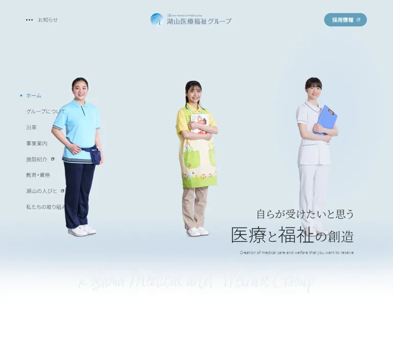
ブルーと白、職員の写真、繊細な明朝体の理念文が印象的な医療福祉グループの公式サイト。広い余白と縦書き見出しで情報を整理し、スマートフォンでは画面下部の固定ナビゲーションを採用。
KOYAMA Medical and Welfare Group — Style Reference
An airy healthcare portal built around people, quiet blue accents, and generous editorial space.
Website: 湖山医療福祉グループ Original URL: https://www.koyama-gr.com/ Final URL: https://www.koyama-gr.com/ Response: HTTP 200; the supplied evidence records no URL change. Theme: light presentation with blue accents; no theme selector is evidenced. Inspected: September 24, 2026, 05:47 JST. The supplied retrieval timestamp is September 23, 2026, 20:47:14.763 UTC. Viewports: desktop 1440 × 1000 CSS pixels; mobile 390 × 844 CSS pixels. Scope: the current corporate homepage, including its opening notice, hero, navigation, promotional banners, activities, video links, facilities, group introduction, business directory, education, media, news, partner links, and footer. Analysis uses the supplied original-page captures, rendered text, link destinations, and sampled computed styles. Linked pages were not inspected.
The homepage serves several audiences at once: people exploring care services, prospective employees, group members, and readers following institutional news. Its structure is a substantial corporate portal. A spacious introduction gives way to photographic content, service directories, institutional information, and a comprehensive footer.
The defining visual relationship is between restrained typography and human imagery. Light Japanese sans-serif text handles navigation and explanations; a Japanese serif face gives the central philosophy a more reflective tone. Rounded blue links, small dot markers, modest image radii, and occasional vertical headings soften a large information architecture without making it feel playful.
Capture-state limitation: the supplied screenshots show a pronounced pale wash over much of the interface. The desktop opening notice remains comparatively dark and crisp. However, computed styles identify dark body text and a considerably stronger blue than the screenshots appear to show. Treat the washed appearance as an observed rendering state, not as the normal semantic palette. The evidence does not establish whether every pale region results from a backdrop, another opacity layer, or a reveal state.
閉じる
KOYAMA Medical and Welfare Group — Style Reference
An airy healthcare portal built around people, quiet blue accents, and generous editorial space.
Website: 湖山医療福祉グループ Original URL: https://www.koyama-gr.com/ Final URL: https://www.koyama-gr.com/ Response: HTTP 200; the supplied evidence records no URL change. Theme: light presentation with blue accents; no theme selector is evidenced. Inspected: September 24, 2026, 05:47 JST. The supplied retrieval timestamp is September 23, 2026, 20:47:14.763 UTC. Viewports: desktop 1440 × 1000 CSS pixels; mobile 390 × 844 CSS pixels. Scope: the current corporate homepage, including its opening notice, hero, navigation, promotional banners, activities, video links, facilities, group introduction, business directory, education, media, news, partner links, and footer. Analysis uses the supplied original-page captures, rendered text, link destinations, and sampled computed styles. Linked pages were not inspected.
The homepage serves several audiences at once: people exploring care services, prospective employees, group members, and readers following institutional news. Its structure is a substantial corporate portal. A spacious introduction gives way to photographic content, service directories, institutional information, and a comprehensive footer.
The defining visual relationship is between restrained typography and human imagery. Light Japanese sans-serif text handles navigation and explanations; a Japanese serif face gives the central philosophy a more reflective tone. Rounded blue links, small dot markers, modest image radii, and occasional vertical headings soften a large information architecture without making it feel playful.
Capture-state limitation: the supplied screenshots show a pronounced pale wash over much of the interface. The desktop opening notice remains comparatively dark and crisp. However, computed styles identify dark body text and a considerably stronger blue than the screenshots appear to show. Treat the washed appearance as an observed rendering state, not as the normal semantic palette. The evidence does not establish whether every pale region results from a backdrop, another opacity layer, or a reveal state.
How to Read This Reference
- Measured means directly supplied computed styles or element rectangles. Values may be rounded to two decimal places.
- Calculated means arithmetic derived from those rectangles, such as column gaps or color contrast.
- Visual estimate means geometry or appearance inferred from a supplied screenshot; these are not stylesheet declarations.
- Recommended means a practical implementation choice where source behavior or styling is unavailable.
- Token names are implementation aliases. The supplied custom-property collection was empty; these names are not claimed as source variables.
- Font evidence identifies computed family declarations. Font files and actual font loading were not independently checked.
- Interaction evidence is limited to captured states, rendered links, and the supplied scrolling procedure. No menu, disclosure, notice close control, filter, or carousel control was exercised in the evidence provided.
Measurements describe two viewport endpoints. They do not establish the original breakpoint values or an exact interpolation formula between them.
Tokens — Colors
Default Palette
| Name | Value | Suggested token | Evidence and role |
|---|---|---|---|
| Care Blue | #619fbb |
--care-blue |
Measured recruitment and section-link backgrounds; active desktop home link; text on the inverse facility link |
| Main Ink | #171717 |
--ink |
Measured body text, introductory copy, and many section headings |
| Link Ink | #000000 |
--link-ink |
Measured ordinary navigation links and content-card text |
| Secondary Gray | #8c8c8c |
--muted |
Measured business-service descriptions |
| White | #ffffff |
--paper |
Measured text on blue links and the inverse facility-link background; white page and notice surfaces are also visible |
The body and many section wrappers report transparent backgrounds. Those declarations do not establish a separate gray or blue canvas color.
Supporting Reconstruction Colors
These values are recommendations, not recovered source colors.
| Name | Suggested value | Suggested token | Use |
|---|---|---|---|
| Hero Tint | #edf4f7 |
--hero-tint |
Approximate a cool, very light photographic stage without applying opacity to the entire page |
| Quiet Surface | #f7fafb |
--quiet-surface |
Optional background for partner or supporting-content regions |
| Fine Rule | #e6edf0 |
--line |
Subtle directory and footer separators |
| Accessible Action Blue | #386f89 |
--action-aa |
Optional darker fill for normal-size white button labels |
Captured Color State
The screenshots support the presence of a pale blue-and-white visual world, but their wash prevents reliable recovery of unreported background colors or overlay opacity. Use the measured #619fbb for the source accent rather than sampling the washed recruitment button and turning that sample into the main brand token.
White foreground text is measured within the facility and statistics sections. Their backing fills or images are not exposed by the supplied style sample and corresponding screenshots. A blue feature surface is a plausible adaptation, but its exact color and construction remain unverified.
Calculated accessibility consideration: white on #619fbb has approximately 2.9:1 contrast; #8c8c8c on white has approximately 3.4:1. Preserve these values when documenting the source, and consider the darker action token and darker secondary copy for an accessible new implementation.
Tokens — Typography
Noto Sans JP — Navigation and Content
- Measured family:
'Noto Sans JP', sans-serif. - Body weight:
300on both inspected viewport sizes. - Common emphasis:
500for section statements, service names, article titles, and major link labels. - Role: a quiet, open texture that accommodates substantial Japanese text without relying on heavy headings.
- Body tracking:
0.32pxon desktop and0.28pxon mobile, equivalent to0.02emat the respective body sizes.
Tracking is frequently inherited as a pixel value. Do not assume every heading has its own 0.02em declaration.
Noto Serif JP — The Group Philosophy
- Measured family:
'Noto Serif JP', serif. - Measured weight:
300. - Source copy: “自らが受けたいと思う / 医療と福祉の創造”.
- Role: separates the reflective brand statement from the practical navigation and content directory.
The second line contains visibly larger characters. The supplied element sample measures the paragraph, not its individual emphasized spans; the larger span sizes below are estimates.
Open Sans — English Supporting Line
- Measured family:
'Open Sans'. - Weight:
300. - Desktop:
12px / 21.6px. - Mobile:
10px / 18px. - Role: a small English translation beneath the Japanese philosophy.
A generic sans-serif fallback in the Quick Start is a recommended implementation addition. The logo lettering and faint decorative script should be treated as supplied artwork; their font identities are not established.
Type Scale
| Role | Desktop | Mobile | Weight | Status |
|---|---|---|---|---|
| Body default | 16px / 28.8px |
14px / 25.2px |
300 |
Measured |
| Introductory paragraphs | 16px / 32px |
16px / 32px |
300 |
Measured; mobile does not reduce all prose to 14px |
| Main section statement | 28px / 44.8px |
24px / 38.4px |
500 |
Measured in video, facilities, and group introduction |
| Business statement | 28px / 50.4px |
24px / 43.2px |
500 |
Measured; vertical on desktop and horizontal on mobile |
| Small section label | 14px / 21px |
14px / 21px |
300 |
Measured |
| Activities section heading | 24px / 38.4px |
20px / 32px |
500 |
Measured |
| Service name | 20px / 28px |
20px / 28px |
500 |
Measured |
| Service explanation | 14px / 25.2px |
14px / 25.2px |
300 |
Measured; Secondary Gray |
| Facility name | 20px / 36px |
20px / 36px |
500 |
Measured |
| Activity title | 16px / 28.8px |
16px / 28.8px |
500 |
Measured |
| Dates and ordinary metadata | 16px / 28.8px |
14px / 25.2px |
300 |
Measured examples |
| Main section-link label | 16px / 28.8px |
14px / 25.2px |
500 |
Measured |
| Hero paragraph base | 32px / 44.8px |
20px / 28px |
300 |
Measured; mixed-size content inside |
| Hero emphasized characters | Approximately 52–56px |
Approximately 36–40px |
Light appearance | Visual estimate; individual spans not sampled |
| Hero English line | 12px / 21.6px |
10px / 18px |
300 |
Measured |
| Education-card title | Approximately 20px |
Not established | Medium appearance | Desktop visual estimate |
| Mobile dock caption | Approximately 10px |
Approximately 10px |
Light appearance | Visual estimate from the mobile capture |
The source root computes to 10px at both viewports. This is not evidence of a fluid-root system. The Quick Start uses explicit pixel tokens while retaining a conventional root size.
Tokens — Spacing & Shapes
The system pairs broad section spacing with compact, predictable gaps inside content units. There is no evidence of a universal source spacing variable.
Spacing Scale
| Use | Value | Evidence |
|---|---|---|
| Service title to explanation | 8px |
Calculated from text rectangles |
| Standard mobile outer gutter | 16px |
Measured container starts at x = 16 and ends at x = 374 |
| Service image-to-text allowance | 16px with an approximately 100px image |
Calculated 116px offset; image size visually supported |
| Desktop side-navigation gap | 20px |
Calculated between 28.8px line boxes |
| Mobile event-row bottom padding | 24px |
Measured |
| Main link left inset | 32px |
Measured desktop and mobile padding |
| Desktop content-card gap | Approximately 40px |
Calculated activities and facilities layouts |
| Business-row vertical padding | 40px desktop; 16px mobile |
Measured interior rows |
| Activities top heading offset | 54px desktop; 40px mobile |
Calculated from section and heading positions |
| Business-panel horizontal inset | Approximately 57px desktop |
Calculated from panel and row x positions; includes any edge treatment |
| Two-column introduction gap | Approximately 80px |
Calculated from 510px columns within the 1100px container |
| Major desktop section lead-in | 120px in several sections |
Calculated from section starts and first headings |
| Corresponding mobile lead-in | 40px |
Calculated in video, facilities, group, and business sections |
Border Radius
| Element | Value | Status |
|---|---|---|
| Major blue and inverse links | 9999px |
Measured |
| Recruitment link | 9999px |
Measured |
| Education images | Approximately 6px |
Visual estimate |
| Service thumbnails | Approximately 6px |
Visual estimate |
| Circular desktop MENU control | Circle, approximately 68px diameter |
Visual estimate |
| Notice sheet | Square overall silhouette | Visual observation |
| Small plus and arrow marks | Circular carriers | Visual observation; exact radius not measured |
Layout Measurements
| Element | Desktop at 1440 × 1000 | Mobile at 390 × 844 | Status |
|---|---|---|---|
| Main content container | 1100px, x = 170px |
358px, x = 16px |
Measured |
| Logo heading box | 249 × 40px, x ≈ 578.66, y ≈ 40.39 |
249 × 40px, x = 70.5, y = 24 |
Measured |
| Recruitment link | 131.28 × 40.8px, right inset 80px |
Not shown in the opening mobile header | Measured / observed |
| Hero region | 1440 × 1000px |
390 × 572px |
Measured |
| Hero Japanese paragraph | 374.33 × 123.19px, x ≈ 945.67, y ≈ 678.03 |
358 × 84px, x = 16, y = 110 |
Measured |
| Desktop introduction columns | Approximately 510px + 80px + 510px |
Full-width introduction | Measured and calculated |
| Activity cards | Approximately 340px each, three columns |
358px rows; text starts at x = 182px |
Measured |
| Facility cards | 340px wide with 40px gaps |
290px wide with 16px gaps |
Measured and calculated |
| Business content panel | Approximately 775px wide, x ≈ 495px |
Narrower inset content | Measured |
| Business link rows | Approximately 290.5px wide |
276px wide |
Measured |
| Education cards | Approximately 276 × 360px, three across |
Card layout not visually established | Visual estimate |
| Main activity link | 260.39 × 74.8px |
358 × 59.19px |
Measured |
| Opening notice | Approximately 792 × 528px, x = 324, y = 252 |
Notice panel not visible in supplied mobile captures | Visual estimate |
| Bottom navigation | Not present | Approximately 390 × 64px, y = 780 |
Visual estimate |
| Document height | Approximately 14,014px |
Approximately 14,728px |
Measured; content-dependent |
The mobile promotional-banner anchor reports a 300px-wide box, while the visible first artwork is approximately 252px wide. Keep image dimensions and anchor geometry distinct when recreating that region.
Components
Desktop Header and Side Navigation
Role: keep the group identity and principal destinations available without occupying a conventional horizontal menu bar.
At the opening position, the logo sits near the horizontal center, approximately 40px below the viewport top. The measured box is slightly left of the exact viewport center. A small “お知らせ” utility sits toward the upper left, while “採用情報” appears as a compact blue pill near the upper right.
The primary navigation forms a vertical list at x = 80px. Its first line box begins around y = 315px, and subsequent entries advance by approximately 48.8px: 28.8px of text height plus a 20px gap. The active “ホーム” entry uses Care Blue, medium weight, and a small blue dot. Other links remain light-weight black text. External destinations have small overlapping-square marks.
Scrolled desktop captures show a different arrangement: the logo is near the upper-left corner and a circular MENU control is near the upper-right corner. This establishes two visible navigation presentations. The switching threshold, positioning rules, menu contents, and transition sequence are not supplied.
Mobile Bottom Navigation
Role: provide persistent access to principal destinations on a long page.
The mobile captures show five equal-width cells across a bottom strip approximately 64px high. At 390px wide, each cell is about 78px wide. Each cell combines a thin line icon with a small caption:
- “トップ”
- “グループ”
- “沿革”
- “事業案内”
- “メニュー”
The menu cell has a blue background with white contents. The home icon also receives blue emphasis. Do not interpret the blue menu cell alone as proof that a menu is open; it appears that way in the opening capture as well.
The bar remains at the same viewport position in the opening and footer captures, supporting a persistent bottom-navigation treatment. Safe-area handling and keyboard behavior were not measured.
Hero and Philosophy
Role: introduce the group through its care philosophy and staff imagery.
The desktop hero occupies the entire inspected 1000px viewport height. The philosophy sits low on the right, with the English translation directly underneath. Wide open space separates this copy from the logo and left-side navigation.
Most desktop hero imagery is obscured by the notice. Staff-image fragments are visible around its edges, but the number of subjects and complete arrangement cannot be established from the current desktop capture.
On mobile, the hierarchy changes clearly: centered logo, centered philosophy, small English line, then a full-length nurse holding a blue folder. The visible figure is approximately 276px tall and sits around y = 252–528. A faint decorative script appears near the lower hero edge. The next content region begins at y = 572.
Preserve the distinction between full-length cutout imagery in the hero and cropped editorial photography elsewhere. The hero is not a full-bleed photographic rectangle with text placed indiscriminately over faces.
Important Notice
Role: foreground a current institutional announcement.
The opening desktop capture contains a white, document-like sheet centered over the homepage. It is approximately 792px wide and 528px high, with a small outlined X positioned just above its upper-right corner.
The notice has a centered title, explanatory lines, and a dense ruled table about corporate mergers and name changes effective April 2026. Blue and pale peach table cells distinguish categories, while gray ornamental flourishes decorate the corners. These decorations belong to the announcement document and should not become a site-wide ornament system.
The notice body is legible in the image but is not exposed as ordinary text in the supplied extraction. Its underlying asset type is not established. A link to /news/detail?id=1682 is present in the rendered page, and the DOM text also includes a close label.
The panel's opening trigger, dismissal behavior, focus management, persistence, and mobile placement are unverified. A new implementation should provide an accessible text version and a comfortably sized close target.
Promotional Banner Strip
Role: link to timely publications and initiatives immediately after the hero.
Desktop evidence measures three anchors at approximately 300 × 169px, arranged across the 1100px content area. The first row begins 20px below the end of the hero.
Mobile evidence places the same three destinations in a vertical sequence. Their row starts are approximately y = 592, 750, and 908. The first visible artwork uses a pale blue-and-cream composition with a handwritten “home” mark.
These are campaign artworks with their own typography. Preserve their supplied aspect ratios and visual identities instead of restyling every banner as an identical text card.
Activities Cards
Role: surface recent events and reports.
The desktop section begins with a 24px medium-weight heading that combines a Japanese title and the English label “Efforts”. Three linked cards follow in a 340px / 40px-gap grid.
Each card contains an image region, category, date, a medium-weight Japanese title, and location/detail information. Card heights differ with content; the measured examples are approximately 404–444px high. The structure does not require every title to occupy the same number of lines.
On mobile, cards become horizontal image-and-text rows rather than full-width stacked posters. The complete row is 358px wide. Text begins 166px after its left edge, consistent with an approximately 150px image and 16px gap. Titles remain 16px even though ordinary metadata reduces to 14px. Rows have 24px bottom padding and visible separation in their geometry.
A blue section link closes the group: centered and content-sized on desktop, full container width on mobile.
Pill-Shaped Section Link
Role: offer a consistent route from a homepage section to its deeper destination.
Measured desktop styling is Care Blue fill, white 16px medium-weight text, 9999px radius, and padding of 22px 24px 22px 32px. A typical outer height is approximately 74.8px. Mobile styling uses 14px text and 16px 24px 16px 32px padding, producing an approximately 59.2px outer height.
A small circular arrow is visible in the education-section example. The facility section uses an inverse variant with a white surface and blue text.
The compact recruitment link shares the pill geometry but uses 5px 40px 5px 24px padding and an external-link mark. Do not use the large section-link dimensions for every header utility.
The supplied measurements do not include border widths. The Quick Start uses a 1px transparent border to reconcile padding and line-height with the observed outer heights; this is a reconstruction choice.
Video Introduction
Role: explain the group's channel and expose recent video content.
Desktop geometry divides the content into approximately 510px columns with an 80px gap. The left side contains a graphic heading region, a 28px statement, 16px explanatory copy with 32px line height, and a pill link. The right side contains four video entries in two columns of approximately 235px.
On mobile, the introduction appears first, followed by a two-column video grid with approximately 171.66px columns and a 14.69px gap. The channel link moves after the entries and becomes full width.
A direct MP4 link and several YouTube destinations are present. Playback state, controls, autoplay, sound, and loading behavior were not tested.
Facility Introduction and Horizontal Card Rail
Role: connect the national service network to individual facilities.
The section includes a small label, a two-line service-network statement, descriptive copy, a large intervening visual region, and a new-facilities subsection. The supplied computed styles establish white introductory text but do not establish the exact underlying visual treatment.
Facility cards contain an image region, organization name, a 20px facility name, an opening date, and a detail link. Desktop cards are 340px wide and advance by 380px. Mobile cards are 290px wide and advance by 306px. Multiple card rectangles extend beyond the viewport horizontally.
This is strong evidence for a horizontal rail rather than a wrapping ten-card grid. It does not prove autoplay, swipe handling, pagination, or arrow behavior. On mobile, the first measured card begins at x = 40px, and the next begins at x = 346px, allowing part of the following card to occupy the viewport edge.
Group Introduction and Statistics
Role: explain the organization and communicate its scale.
The desktop introduction places its text toward the right, beginning around x = 740px, within a roughly 530px-wide block. It combines a small section label, a 28px statement, generous-line-height body text, and a blue pill link. Mobile uses the standard 358px content width and places the statement above its description and full-width link.
The rendered content includes five dated metrics: organizations, locations, establishments, prefectures, and employees. The snapshot reports 24, 241, 548, 20, and 12,640 respectively, with a September 2026 date note. These are content values, not permanent design tokens.
Desktop statistics labels occupy multiple columns; on mobile their measured y positions advance in a single vertical sequence. Explanatory sentences present in the desktop rendered text are absent from the mobile text sample. The numeric typography and background construction were not included in the sampled elements, so do not invent a counter animation or a precise numeral scale.
Business Directory
Role: make a broad service offering easy to scan.
The desktop composition uses an editorial split. A narrow vertical heading sits on the left, while introductory copy and a bordered directory occupy a roughly 775px-wide region on the right. The vertical statement is 28px, weight 500, with a 50.4px line height. A smaller 14px section label sits alongside it.
Inside the directory, two columns contain linked service rows. Each row places an approximately 100px square thumbnail beside a text block, separated by 16px. Service names are 20px / 28px at weight 500; descriptions are 14px / 25.2px in #8c8c8c. Fine horizontal rules separate entries. Interior desktop rows use 40px vertical padding.
The categories include medical care, nursing care, child welfare, disability welfare, professional societies, care practice, and the foundation. Images are functional category cues rather than decorative icons.
On mobile, the heading becomes horizontal, the directory becomes one column, and row padding decreases to 16px. The sampled row width is 276px; the text remains beside the thumbnail rather than moving below it. This preservation of the image/text relationship is more important than copying the desktop column count.
Education Cards and Vertical Heading
Role: present training and qualification pathways as concrete, people-focused destinations.
The desktop education capture reverses the business section's editorial balance: the content occupies the left, while a vertical headline and small section label sit on the right. A short explanatory paragraph precedes three portrait-oriented photographic cards.
The cards are approximately 276 × 360px, separated by roughly 41px. They show staff holding qualifications, an instructor beside a whiteboard, and a person using a laptop. Each has modest rounded corners, a white title near the lower-left corner, and a smaller secondary label. The lower image region provides darker separation for the lettering, although its exact overlay or gradient is not measurable through the wash.
Observed labels include “KOYAMA College”, “グループ内研修”, and “こやませいさ大学”. An external-link mark appears where applicable. A blue section link follows below.
The mobile rendered text confirms these destinations remain present, but no supplied mobile capture establishes their card geometry. A stacked mobile adaptation is recommended in the Quick Start, not claimed as the source behavior.
Media, News, and Network Links
Role: organize ongoing publishing and the group's distributed web presence.
Rendered content confirms an employee-story region with four geographic destinations, a healthcare-design report region, an eight-destination media group, a news section, and a regional organization directory.
The desktop news text includes six category links, with destinations expressed as ordinary URLs such as /index?category_id=72. This establishes navigation links; it does not establish an AJAX tab interaction. Those category labels are absent from the mobile rendered-text sample.
News entries combine date, category, and title, followed by a link to the complete archive. Media entries have explanatory descriptions in the desktop rendered text, while the mobile rendered text is more compact. Three dated report entries appear in the mobile snapshot but not the desktop snapshot; differing load timing may explain this, so do not treat that difference as a proven responsive rule.
Partner Links and Footer
Role: expose related initiatives and provide a complete route map at the end of a long homepage.
The desktop footer capture shows partner-logo banners above a broad, white footer. Four navigation columns align approximately with x = 170, 455, 740, and 1025px. Categories have stronger weight than their child links, and generous line spacing keeps the directory calm. Privacy and sitemap links sit at the lower left; copyright sits toward the lower right.
On mobile, the footer becomes a single stack of separated rows within 16px side gutters. Some categories carry a small blue circular plus at the right edge, suggesting expandable groups. Child lists are not visible in that capture. Expansion behavior was not exercised.
Privacy, sitemap, and copyright move into a vertical sequence. The persistent bottom dock remains visible beneath this content. Allow enough bottom clearance for the last footer items to remain reachable.
Tokens — Motion & Interaction
| Treatment | Evidence | What can safely be implemented or claimed |
|---|---|---|
| Ordinary links and linked cards | Sampled computed transition: 0.3s |
A 300ms transition is source-supported; changed properties and hover endpoints are not supplied |
| Sampled element animation | Most sampled entries report animation: none |
No animation on those sampled nodes at extraction time; this does not rule out animated descendants, pseudo-elements, scripts, or media |
| Initial versus scrolled desktop navigation | Different arrangements visible in supplied captures | Support distinct header presentations; threshold and animated transformation remain unknown |
| Notice close control | X visible; close text present in extraction | Dismissal affordance exists; actual dismissal and persistence were not tested |
| Facility rail | Repeated cards extend horizontally outside the viewport | Horizontal layout is measured; autoplay, drag, and snap behavior are unverified |
| Mobile footer plus marks | Visible collapsed-looking rows | Disclosure affordance is visible; expanded state and animation are unverified |
| News categories | Actual category URLs are supplied | Implement as links unless another interaction is independently established |
| Video content | MP4 and video-platform links are present | Media destinations are confirmed; playback behavior is not |
| Hero subject changes | Only isolated captured states are available | Do not claim a slideshow, crossfade, or a timed sequence |
For a new implementation, restrained 200–300ms color or opacity feedback is compatible with the observed link timing. This is a recommendation, not a recovered easing specification. Avoid inventing parallax, animated counters, floating portraits, or elaborate scroll choreography.
The supplied collection process waited for visible finite motion and sampled stability, while temporarily pausing perpetual animations during readiness checks. That procedure improves capture stability but does not establish a complete motion specification.
Surfaces
| Layer | Appearance | Evidence and implementation guidance |
|---|---|---|
| Main page | White, spacious, mostly unboxed | Visible in content and footer captures; many wrappers are transparent |
| Hero stage | Very pale cool field with isolated staff imagery and faint script | Visible appearance; exact background and wash composition unknown |
| Content grouping | Fine rules, occasional light borders, minimal corner rounding | Visible business directory and footer; avoid making every section an elevated card |
| Photo cards | Natural photography with labels either below or over a darker lower region | Education capture supports image-overlay labels; other card types use text below |
| Primary link | Solid Care Blue with white text and fully rounded ends | Measured |
| Inverse link | White with Care Blue text | Measured in facilities |
| Opening notice | White rectangular document above a pale surrounding page | Visible; exact backdrop implementation unknown |
| Mobile dock | Light strip with outline icons and a blue menu cell | Visible at both supplied mobile scroll positions |
No substantial shadow-based elevation system is visible in the supplied captures. Separation primarily comes from spacing, typography, borders, and image boundaries.
Imagery
The current page combines several image treatments rather than using a single repeated stock-photo crop:
- Hero portrait: a full-length staff subject, isolated against a light stage. The mobile nurse, uniform, folder, and feet remain visible.
- Education cards: portrait crops of real learning and work situations. Faces and gestures carry the emotional emphasis.
- Business thumbnails: small square contextual images, including care scenes and interiors.
- Editorial content: activity and facility images associated with dates, institutions, and specific stories.
- Promotional artwork: banners with their own lettering and palette.
- Partner marks: existing organization graphics displayed as recognizable logos.
Keep skin tones and workplace imagery natural. The pale appearance of these captures is not evidence that every photograph should receive a permanent white filter. Avoid replacing staff imagery with unrelated abstract gradients or illustrations.
The mobile dock uses fine outline symbols, and external links use small overlapping-square marks. No icon library is identified by the supplied evidence.
Observed Asset References
The evidence does not include image src values for the logo, hero, education cards, service thumbnails, or notice. Do not invent asset filenames.
| Asset or content | Evidence reference | What the reference establishes |
|---|---|---|
| Group logo | Visible in original-page desktop and mobile captures | Appearance and measured 249 × 40px heading box; image path unknown |
| Mobile nurse portrait | Opening mobile capture | Current full-length portrait and composition; image path unknown |
| Education photography | Desktop education capture | Three distinct photographic cards; image paths unknown |
| Institutional notice | Visible notice and rendered /news/detail?id=1682 link |
Notice topic and destination; the link is not an image URL |
| Video file | /upload/save/post/48ac1cb835cedd0694ae1df7a98277fa.mp4 |
A direct media URL rendered on the original page; file was not opened |
| Education destinations | /education/training/ and /education/koyamaseisa/ |
Page destinations, not reusable image assets |
Use authorized source assets when available. CSS can reproduce the page framework, but the group logo and staff photography carry much of the identity.
Layout & Responsive Behavior
The desktop layout is organized around a 1100px content width, producing 170px side margins at 1440px. It alternates broad introductory compositions, photographic grids, narrow vertical headlines, and denser directories. The mobile layout uses a 358px content width with 16px gutters and selectively changes component structure.
| Pattern | Desktop observation | Mobile observation |
|---|---|---|
| Navigation | Upper utilities plus left-side primary list; compact controls visible in scrolled captures | Centered opening logo and persistent five-cell bottom dock |
| Hero | 1000px high, philosophy low on the right | 572px high, philosophy above a centered full-length portrait |
| Banners | Three across | Three vertically sequenced |
| Activities | Three linked columns | Image-and-text rows |
| Video section | Introduction beside a two-column media group | Introduction above the retained two-column media group; link after entries |
| Facility cards | 340px horizontal items with 40px gaps | 290px horizontal items with 16px gaps |
| Group introduction | Text placed in a right-side block | Full-width text stack |
| Statistics | Labels distributed across desktop columns | Labels appear in a vertical sequence |
| Business section | Vertical heading and two-column directory | Horizontal heading and one-column directory; thumbnails remain beside text |
| Education | Three portrait cards with a right-side vertical heading | Destinations confirmed; visual arrangement unverified |
| Footer | Four navigation columns | Single-column rows with plus-marked categories |
The desktop hero happens to equal viewport height, but only one desktop height was supplied. Using 100svh is a reasonable reconstruction choice, not a recovered source formula. Likewise, the 572px mobile hero is an observed result, not proof of a universal fixed height.
Recommended breakpoints: use approximately 768px for compact mobile controls and around 1280px for the full side-navigation and vertical-heading compositions. These are implementation choices. Test intermediate widths instead of assuming that a two-column directory can always coexist with a separate vertical heading.
The rendered document heights are about 14,014px and 14,728px. Do not hardcode those totals: photographs, live reports, announcement content, and line wrapping can change the page length.
Do’s and Don’ts
Do
- Preserve the exact measured blue, dark text, and restrained white surfaces in the source reference.
- Keep the serif philosophy distinct from the sans-serif information hierarchy.
- Use generous desktop margins and readable 16px introductory paragraphs.
- Retain full-length staff imagery in the mobile hero.
- Alternate editorial section layouts instead of repeating one card grid for the entire homepage.
- Use true vertical Japanese typesetting for the observed desktop headings; preserve natural reading order.
- Keep service thumbnails beside their descriptions on mobile.
- Preserve the different responsive treatments of event rows, video grids, and facility rails.
- Use modest image radii, fine rules, blue dots, and pill-shaped section links.
- Keep important destinations available through the mobile bottom dock and full footer.
Don’t
- Don’t reproduce the screenshot wash as a permanent low-opacity setting on the whole site.
- Don’t infer the hidden desktop portrait count or a hero slideshow from incomplete imagery.
- Don’t make every heading bold or replace the reflective serif statement with an oversized sans-serif slogan.
- Don’t turn every content region into a shadowed, heavily rounded card.
- Don’t collapse the corporate portal into a single conversion-focused page.
- Don’t turn the horizontal facility rail into an unverified wrapping grid.
- Don’t import the notice's ornamental corners into ordinary site components.
- Don’t claim footer expansion, menu transitions, autoplay, or counter motion as tested behavior.
- Don’t use linked page destinations as if they were image asset URLs.
- Don’t hide footer content behind the fixed mobile dock.
Recommended Implementation Additions
These are improvements for a new implementation, not verified features of the original site:
- Use a darker action fill where normal-size white text needs stronger contrast. Keep the original Care Blue available for identity, larger graphics, and comparison work.
- Darken essential secondary text beyond
#8c8c8cwhen used at 14px on white. - Give the notice a semantic dialog, accessible title, keyboard dismissal, controlled focus, and a text equivalent for the announcement table.
- Enlarge the notice close hit area to at least 44 × 44px while keeping its visible icon small.
- Make disclosure rows real buttons or native disclosure controls with an exposed expanded state. A decorative plus alone is insufficient.
- Provide explicit accessible names for dock icons and visible keyboard focus for all links.
- Keep facility cards reachable with a keyboard and offer controls if horizontal content otherwise lacks a clear navigation mechanism.
- Respect reduced-motion preferences and avoid making content visibility depend on an animation finishing.
- Include safe-area padding and content clearance around the mobile dock.
- Use responsive image sources and stable image dimensions. Keep important staff faces and full-body hero subjects inside their intended crops.
Agent Prompt Guide
Quick Color Reference
- Brand action and active markers: measured
#619fbb. - Main copy: measured
#171717. - Ordinary link text: measured
#000000. - Secondary service descriptions: measured
#8c8c8c. - Page and inverse-action surfaces: white.
- Hero tint for a reconstruction: recommended
#edf4f7, not a recovered source value. - Accessible action alternative: recommended
#386f89. - Do not apply a page-wide white veil as the normal appearance.
Overall Prompt
“Create a Japanese healthcare-group corporate homepage with a calm blue-and-white identity. Use Noto Sans JP at light weight for navigation and prose, medium weight for service names and section statements, and Noto Serif JP for a two-line care philosophy. Build around an 1100px desktop content width, broad section spacing, fine rules, modest image radii, and blue pill-shaped section links. Give the opening scene substantial empty space and authorized full-length staff imagery. Place the desktop philosophy low on the right, and stack it above a centered staff portrait on mobile. Alternate photographic content grids with service directories and vertical Japanese section headings. At mobile width, use 16px gutters, horizontal image-and-text event rows, a single-column service directory, and a five-cell fixed bottom navigation. Preserve readable contrast and do not reproduce the pale capture wash as a permanent effect.”
Example Component Prompts
- Business directory: “Create a two-column desktop directory within a roughly 775px panel. Each linked row has a 100px square workplace image, a 16px gap, a 20px medium-weight service name, and a 14px explanation. Separate rows with fine rules and generous vertical padding. Place a vertical Japanese heading to the left on wide screens; switch to a horizontal heading and one column on mobile while retaining the thumbnail beside the text.”
- Education section: “Place three approximately 276 × 360px photographic cards to the left of a vertical Japanese headline. Show qualifications, teaching, and laptop-based learning. Use subtle rounded corners and white lower-left captions with enough local contrast. Add a restrained blue pill link below. Treat a stacked mobile card layout as an adaptation requiring validation.”
- Section link: “Create a fully rounded blue link using #619fbb, a medium-weight Japanese label, and a small circular arrow. Use about 75px outer height on desktop and 59px on mobile, with the mobile link filling its 358px content container. Provide an optional darker fill for accessible normal-size white text.”
- Mobile dock: “Create a white bottom navigation with five equal cells, thin outline icons, and small Japanese labels. Use a blue-filled menu cell and a blue home emphasis. Keep the bar approximately 64px high before safe-area padding, with enough page clearance to expose the final footer links.”
- Facility rail: “Create a horizontally reachable collection of facility cards containing a photograph, organization, 20px facility name, opening date, and detail link. Use 340px cards with 40px gaps on wide screens and 290px cards with 16px gaps on mobile. Keep carousel controls and motion optional rather than assuming autoplay.”
Quick Start
CSS Custom Properties
This is a practical reconstruction scaffold, not extracted source CSS. It uses measured colors, font declarations, and endpoint dimensions. Background tints, intermediate breakpoints, focus styling, native rail scrolling, education-card mobile stacking, and dialog treatment are recommendations. Font files, photographs, logo artwork, header-state logic, and dialog behavior must be supplied separately.
The scaffold renders the normal interface at full opacity. Only an explicitly opened dialog receives a backdrop. The single .hero-media region can contain an authorized responsive image or composition; it does not prescribe an unverified number of desktop subjects.
:root {
  /* Measured colors */
  --care-blue: #619fbb;
  --ink: #171717;
  --link-ink: #000;
  --muted: #8c8c8c;
  --paper: #fff;

  /* Recommended reconstruction and accessibility colors */
  --hero-tint: #edf4f7;
  --quiet-surface: #f7fafb;
  --line: #e6edf0;
  --action-aa: #386f89;

  /* Computed source families; fallbacks are implementation choices */
  --font-body: 'Noto Sans JP', sans-serif;
  --font-motto: 'Noto Serif JP', serif;
  --font-latin: 'Open Sans', sans-serif;
  --text-body: 16px;
  --text-statement: 28px;
  --tracking: 0.32px;

  /* Measured proportions and reusable aliases */
  --content-width: 1100px;
  --gutter: 16px;
  --section-space: 120px;
  --space-small: 16px;
  --space-medium: 40px;
  --space-large: 80px;
  --radius-image: 6px;
  --radius-pill: 9999px;
  --dock-height: 64px;
  --safe-bottom: env(safe-area-inset-bottom, 0px);
  --link-duration: 300ms;
}

* { box-sizing: border-box; }

body {
  margin: 0;
  color: var(--ink);
  background: var(--paper);
  font-family: var(--font-body);
  font-size: var(--text-body);
  font-weight: 300;
  line-height: 1.8;
  letter-spacing: var(--tracking);
}

img { display: block; max-inline-size: 100%; }
button, input, select { font: inherit; }
a { color: var(--link-ink); }
[hidden] { display: none !important; }

.container {
  inline-size: min(
    var(--content-width),
    calc(100% - 2 * var(--gutter))
  );
  margin-inline: auto;
}

.section { padding-block: var(--section-space); }
.section--compact { padding-block: 54px; }
.lead { font-size: 16px; line-height: 2; }

.statement {
  margin: 0;
  font-size: var(--text-statement);
  font-weight: 500;
  line-height: 1.6;
}

.section-label {
  display: flex;
  align-items: center;
  gap: 10px;
  margin: 0 0 24px;
  font-size: 14px;
  font-weight: 300;
  line-height: 1.5;
}

.section-label::before {
  content: '';
  flex: 0 0 6px;
  inline-size: 6px;
  block-size: 6px;
  border-radius: 50%;
  background: var(--care-blue);
}

/* Opening header; scrolled-state switching needs separate logic. */
.site-header {
  position: absolute;
  z-index: 10;
  inset: 40px 80px auto;
  display: grid;
  grid-template-columns: 1fr auto 1fr;
  align-items: center;
}

.site-logo { grid-column: 2; inline-size: 249px; }
.site-logo img { inline-size: 249px; block-size: 40px; object-fit: contain; }
.header-news { grid-column: 1; grid-row: 1; }
.header-recruit { grid-column: 3; grid-row: 1; justify-self: end; }

.side-nav {
  position: absolute;
  z-index: 5;
  inset-block-start: 31.5%;
  inset-inline-start: 80px;
  display: grid;
  gap: 20px;
  font-size: 16px;
  line-height: 28.8px;
}

.side-nav a { position: relative; text-decoration: none; }
.side-nav [aria-current='page'] { color: var(--care-blue); font-weight: 500; }
.side-nav [aria-current='page']::before {
  content: '';
  position: absolute;
  inset-inline-start: -18px;
  inset-block-start: 12px;
  inline-size: 6px;
  block-size: 6px;
  border-radius: 50%;
  background: currentColor;
}

.hero {
  position: relative;
  min-block-size: 100svh;
  overflow: hidden;
  background: linear-gradient(var(--hero-tint) 75%, var(--paper));
}

.hero-media {
  position: absolute;
  inset: 16% 15% 20% 20%;
}

.hero-media img {
  inline-size: 100%;
  block-size: 100%;
  object-fit: contain;
}

.hero-copy {
  position: absolute;
  z-index: 2;
  inset-inline-end: max(32px, 8.333vw);
  inset-block-end: 17%;
  inline-size: 374.33px;
  text-align: right;
}

.hero-motto {
  margin: 0;
  font-family: var(--font-motto);
  font-size: 32px;
  font-weight: 300;
  line-height: 1.4;
}

/* Emphasis sizes approximate unsampled inner spans. */
.hero-motto .major { font-size: 56px; }
.hero-translation {
  margin: 8px 0 0;
  font-family: var(--font-latin);
  font-size: 12px;
  line-height: 1.8;
}

.pill-link {
  display: inline-flex;
  align-items: center;
  justify-content: space-between;
  gap: 16px;
  min-block-size: 74.8px;
  padding: 22px 24px 22px 32px;
  border: 1px solid transparent;
  border-radius: var(--radius-pill);
  background: var(--care-blue);
  color: var(--paper);
  font-size: 16px;
  font-weight: 500;
  line-height: 1.8;
  text-decoration: none;
  transition: background-color var(--link-duration),
              color var(--link-duration);
}

.pill-link--compact {
  min-block-size: 40.8px;
  padding: 5px 40px 5px 24px;
}

.pill-link--inverse { background: var(--paper); color: var(--care-blue); }
.use-aa-actions .pill-link:not(.pill-link--inverse) { background: var(--action-aa); }

.pill-arrow {
  display: grid;
  place-items: center;
  flex: 0 0 24px;
  inline-size: 24px;
  block-size: 24px;
  border-radius: 50%;
  background: var(--paper);
  color: var(--care-blue);
}

.events-grid { display: grid; grid-template-columns: repeat(3, minmax(0, 1fr)); gap: 40px; }
.event-card { display: block; text-decoration: none; }
.event-card img { inline-size: 100%; block-size: auto; border-radius: var(--radius-image); }
.event-title { margin-block: 16px; font-size: 16px; font-weight: 500; line-height: 1.8; }

/* Native overflow is a recommended implementation, not verified source behavior. */
.facility-rail {
  display: grid;
  grid-auto-flow: column;
  grid-auto-columns: 340px;
  gap: 40px;
  overflow-x: auto;
  overscroll-behavior-inline: contain;
  scroll-snap-type: inline proximity;
  padding-block: 8px 24px;
}

.facility-card { min-inline-size: 0; scroll-snap-align: start; text-decoration: none; }
.facility-name { font-size: 20px; font-weight: 500; line-height: 1.8; }

.services {
  display: grid;
  grid-template-columns: repeat(2, minmax(0, 1fr));
  column-gap: 80px;
  padding: 56px;
  border: 1px solid var(--line);
  border-radius: var(--radius-image);
}

.service-row {
  display: grid;
  grid-template-columns: 100px minmax(0, 1fr);
  align-items: start;
  gap: 16px;
  padding-block: 40px;
  border-bottom: 1px solid var(--line);
  text-decoration: none;
}

.service-row img { inline-size: 100px; block-size: 100px; object-fit: cover; border-radius: var(--radius-image); }
.service-title { margin: 0 0 8px; font-size: 20px; font-weight: 500; line-height: 1.4; }
.service-description { margin: 0; color: var(--muted); font-size: 14px; line-height: 1.8; }
.use-readable-copy .service-description { color: #666; }

.education-cards { display: grid; grid-template-columns: repeat(3, minmax(0, 1fr)); gap: 40px; }
.education-card {
  position: relative;
  display: block;
  aspect-ratio: 276 / 360;
  overflow: hidden;
  border-radius: var(--radius-image);
  color: var(--paper);
  text-decoration: none;
}

.education-card img { inline-size: 100%; block-size: 100%; object-fit: cover; }
.education-card::after {
  content: '';
  position: absolute;
  inset: 0;
  background: linear-gradient(transparent 45%, rgb(0 0 0 / 55%));
}

.education-caption { position: absolute; z-index: 1; inset: auto 24px 24px; }
.education-caption strong { display: block; font-size: 20px; font-weight: 500; }
.education-caption small { display: block; margin-block-start: 8px; font-size: 12px; }

.footer-grid { display: grid; grid-template-columns: repeat(4, minmax(0, 1fr)); gap: 40px; }
.footer-group a { display: block; padding-block: 10px; text-decoration: none; }
.mobile-dock { display: none; }

/* Recommended semantic dialog surface; opening and focus require behavior. */
.notice-dialog {
  inline-size: min(792px, calc(100vw - 32px));
  max-block-size: calc(100svh - 96px);
  padding: 24px;
  border: 0;
  overflow: auto;
  background: var(--paper);
  color: var(--ink);
}

.notice-dialog::backdrop { background: rgb(255 255 255 / 70%); }
.notice-close { display: block; min-inline-size: 44px; min-block-size: 44px; margin-inline-start: auto; }

:where(a, button, summary):focus-visible {
  outline: 3px solid var(--action-aa);
  outline-offset: 4px;
}

/* Wide editorial layouts: breakpoint is recommended. */
@media (min-width: 1280px) {
  .business-layout { display: grid; grid-template-columns: 245px minmax(0, 1fr); gap: 80px; }
  .vertical-heading { display: flex; flex-direction: row-reverse; justify-content: flex-end; gap: 12px; }
  .vertical-heading .statement { writing-mode: vertical-rl; line-height: 1.8; }
  .vertical-heading .section-label { writing-mode: vertical-rl; letter-spacing: 1.4px; }
  .education-layout { display: grid; grid-template-columns: minmax(0, 1fr) 134px; gap: 56px; }
  .education-layout > .vertical-heading { grid-column: 2; grid-row: 1; }
  .education-main { grid-column: 1; grid-row: 1; }
}

@media (min-width: 769px) and (max-width: 1279px) {
  .side-nav { display: none; }
  .site-header { inset-inline: 32px; }
  .services { column-gap: 40px; padding: 32px; }
  .education-cards { gap: 24px; }
}

@media (max-width: 768px) {
  :root {
    --text-body: 14px;
    --text-statement: 24px;
    --tracking: 0.28px;
    --section-space: 40px;
  }

  body { padding-block-end: calc(var(--dock-height) + var(--safe-bottom)); }
  .section--compact { padding-block: 40px; }
  .site-header { inset: 24px 16px auto; display: flex; justify-content: center; }
  .header-news, .header-recruit, .side-nav { display: none; }
  .hero { min-block-size: 572px; }
  .hero-copy { inset: 110px 16px auto; inline-size: auto; text-align: center; }
  .hero-motto { font-size: 20px; }
  .hero-motto .major { font-size: 40px; }
  .hero-translation { margin-block-start: 0; font-size: 10px; }
  .hero-media {
    inset: auto auto 44px 50%;
    inline-size: min(276px, calc(100% - 32px));
    block-size: 276px;
    transform: translateX(-50%);
  }

  .pill-link:not(.pill-link--compact) {
    inline-size: 100%;
    min-block-size: 59.2px;
    padding: 16px 24px 16px 32px;
    font-size: 14px;
  }

  .events-grid { grid-template-columns: 1fr; gap: 24px; }
  .event-card {
    display: grid;
    grid-template-columns: min(42%, 150px) minmax(0, 1fr);
    align-items: start;
    gap: 16px;
    padding-block-end: 24px;
    border-bottom: 1px solid var(--line);
  }

  .event-title { margin-block: 8px; }
  .facility-rail { grid-auto-columns: 290px; gap: 16px; padding-inline: 24px; }
  .services { grid-template-columns: 1fr; padding: 24px; }
  .service-row { padding-block: 16px; }
  .education-cards { grid-template-columns: 1fr; gap: 24px; }
  .footer-grid { grid-template-columns: 1fr; gap: 0; }
  .footer-group { padding-block: 16px; border-bottom: 1px solid var(--line); }

  .mobile-dock {
    position: fixed;
    z-index: 30;
    inset: auto 0 0;
    display: grid;
    grid-template-columns: repeat(5, minmax(0, 1fr));
    padding-block-end: var(--safe-bottom);
    background: var(--paper);
  }

  .dock-item {
    display: flex;
    flex-direction: column;
    align-items: center;
    justify-content: center;
    gap: 3px;
    min-block-size: var(--dock-height);
    padding: 6px 2px;
    border: 0;
    background: transparent;
    color: var(--ink);
    font-size: 10px;
    line-height: 1.4;
    text-decoration: none;
  }

  .dock-item svg { inline-size: 24px; block-size: 24px; }
  .dock-item[aria-current='page'] { color: var(--care-blue); }
  .dock-item--menu { color: var(--paper); background: var(--care-blue); }
}

@media (prefers-reduced-motion: reduce) {
  .pill-link { transition: none; }
  .facility-rail { scroll-behavior: auto; scroll-snap-type: none; }
}
Use .event-card with an image followed by a content wrapper, .service-row with an image followed by a title/description wrapper, and .education-card with an image followed by .education-caption. Supply native links for destinations and buttons for actions. The CSS does not implement footer disclosures, carousel buttons, modal activation, or the desktop header switch.
Tailwind v4 Token Mapping
Optional aliases for a project already using Tailwind v4. This is not evidence that the original site uses Tailwind. Define the custom properties above first.
@theme inline {
  --color-care: var(--care-blue);
  --color-content-ink: var(--ink);
  --color-content-muted: var(--muted);
  --color-page: var(--paper);
  --color-hero-stage: var(--hero-tint);
  --color-rule: var(--line);
  --color-action-accessible: var(--action-aa);

  --font-japanese-body: var(--font-body);
  --font-japanese-motto: var(--font-motto);
  --font-english-caption: var(--font-latin);

  --text-content: var(--text-body);
  --text-section-statement: var(--text-statement);
  --spacing-page-gutter: var(--gutter);
  --spacing-section-block: var(--section-space);
  --radius-photo: var(--radius-image);
  --radius-action: var(--radius-pill);
}
Sources & Evidence
- Current original homepage — 湖山医療福祉グループ: original and final URL in the supplied browser observation; HTTP 200. The page title, visible logo, group introduction, and copyright support the site's identity.
- Capture time: September 23, 2026, 20:47:14.763 UTC, equivalent to September 24, 2026, 05:47:14.763 JST. This document analyzes that supplied inspection rather than claiming a separate visit.
- Desktop evidence: 1440 × 1000 viewport; opening notice and hero, a scrolled business/education view, and a partner/footer view. Supplied document height is approximately 14,014px.
- Mobile evidence: 390 × 844 viewport; opening hero and promotional content, plus a footer view. Supplied document height is approximately 14,728px.
- Rendered evidence: full-page text and destinations, representative element rectangles, computed color and typography, padding, radius, display, and transition values. The detailed element sample extends into the business directory; later components rely more heavily on screenshots and rendered text.
- Collection behavior: the supplied browser process waited for document load, visible-image decoding, finite-animation readiness, and sampled layout/text stability, then traversed intermediate scroll positions. It disabled SharedWorkers and service workers. These conditions may differ from an ordinary returning visit.
- Limitations: no independent browser session, source-code inspection, image-file extraction, or linked-page visit was performed. No control activation, hover result, keyboard flow, intermediate breakpoint, carousel movement, or video playback was supplied. Exact overlay composition and most image URLs are unavailable.
Measured values describe the current supplied page. Visual estimates and recommended implementation choices are explicitly separated from those measurements.
# KOYAMA Medical and Welfare Group — Style Reference

> An airy healthcare portal built around people, quiet blue accents, and generous editorial space.

**Website:** [湖山医療福祉グループ](https://www.koyama-gr.com/)
**Original URL:** https://www.koyama-gr.com/
**Final URL:** https://www.koyama-gr.com/
**Response:** HTTP 200; the supplied evidence records no URL change.
**Theme:** light presentation with blue accents; no theme selector is evidenced.
**Inspected:** September 24, 2026, 05:47 JST. The supplied retrieval timestamp is September 23, 2026, 20:47:14.763 UTC.
**Viewports:** desktop 1440 × 1000 CSS pixels; mobile 390 × 844 CSS pixels.
**Scope:** the current corporate homepage, including its opening notice, hero, navigation, promotional banners, activities, video links, facilities, group introduction, business directory, education, media, news, partner links, and footer. Analysis uses the supplied original-page captures, rendered text, link destinations, and sampled computed styles. Linked pages were not inspected.

The homepage serves several audiences at once: people exploring care services, prospective employees, group members, and readers following institutional news. Its structure is a substantial corporate portal. A spacious introduction gives way to photographic content, service directories, institutional information, and a comprehensive footer.

The defining visual relationship is between restrained typography and human imagery. Light Japanese sans-serif text handles navigation and explanations; a Japanese serif face gives the central philosophy a more reflective tone. Rounded blue links, small dot markers, modest image radii, and occasional vertical headings soften a large information architecture without making it feel playful.

**Capture-state limitation:** the supplied screenshots show a pronounced pale wash over much of the interface. The desktop opening notice remains comparatively dark and crisp. However, computed styles identify dark body text and a considerably stronger blue than the screenshots appear to show. Treat the washed appearance as an observed rendering state, not as the normal semantic palette. The evidence does not establish whether every pale region results from a backdrop, another opacity layer, or a reveal state.
閉じる
# KOYAMA Medical and Welfare Group — Style Reference

> An airy healthcare portal built around people, quiet blue accents, and generous editorial space.

**Website:** [湖山医療福祉グループ](https://www.koyama-gr.com/)
**Original URL:** https://www.koyama-gr.com/
**Final URL:** https://www.koyama-gr.com/
**Response:** HTTP 200; the supplied evidence records no URL change.
**Theme:** light presentation with blue accents; no theme selector is evidenced.
**Inspected:** September 24, 2026, 05:47 JST. The supplied retrieval timestamp is September 23, 2026, 20:47:14.763 UTC.
**Viewports:** desktop 1440 × 1000 CSS pixels; mobile 390 × 844 CSS pixels.
**Scope:** the current corporate homepage, including its opening notice, hero, navigation, promotional banners, activities, video links, facilities, group introduction, business directory, education, media, news, partner links, and footer. Analysis uses the supplied original-page captures, rendered text, link destinations, and sampled computed styles. Linked pages were not inspected.

The homepage serves several audiences at once: people exploring care services, prospective employees, group members, and readers following institutional news. Its structure is a substantial corporate portal. A spacious introduction gives way to photographic content, service directories, institutional information, and a comprehensive footer.

The defining visual relationship is between restrained typography and human imagery. Light Japanese sans-serif text handles navigation and explanations; a Japanese serif face gives the central philosophy a more reflective tone. Rounded blue links, small dot markers, modest image radii, and occasional vertical headings soften a large information architecture without making it feel playful.

**Capture-state limitation:** the supplied screenshots show a pronounced pale wash over much of the interface. The desktop opening notice remains comparatively dark and crisp. However, computed styles identify dark body text and a considerably stronger blue than the screenshots appear to show. Treat the washed appearance as an observed rendering state, not as the normal semantic palette. The evidence does not establish whether every pale region results from a backdrop, another opacity layer, or a reveal state.

## How to Read This Reference

- **Measured** means directly supplied computed styles or element rectangles. Values may be rounded to two decimal places.
- **Calculated** means arithmetic derived from those rectangles, such as column gaps or color contrast.
- **Visual estimate** means geometry or appearance inferred from a supplied screenshot; these are not stylesheet declarations.
- **Recommended** means a practical implementation choice where source behavior or styling is unavailable.
- **Token names** are implementation aliases. The supplied custom-property collection was empty; these names are not claimed as source variables.
- **Font evidence** identifies computed family declarations. Font files and actual font loading were not independently checked.
- **Interaction evidence** is limited to captured states, rendered links, and the supplied scrolling procedure. No menu, disclosure, notice close control, filter, or carousel control was exercised in the evidence provided.

Measurements describe two viewport endpoints. They do not establish the original breakpoint values or an exact interpolation formula between them.

## Tokens — Colors

### Default Palette

| Name | Value | Suggested token | Evidence and role |
| --- | --- | --- | --- |
| Care Blue | `#619fbb` | `--care-blue` | Measured recruitment and section-link backgrounds; active desktop home link; text on the inverse facility link |
| Main Ink | `#171717` | `--ink` | Measured body text, introductory copy, and many section headings |
| Link Ink | `#000000` | `--link-ink` | Measured ordinary navigation links and content-card text |
| Secondary Gray | `#8c8c8c` | `--muted` | Measured business-service descriptions |
| White | `#ffffff` | `--paper` | Measured text on blue links and the inverse facility-link background; white page and notice surfaces are also visible |

The body and many section wrappers report transparent backgrounds. Those declarations do not establish a separate gray or blue canvas color.

### Supporting Reconstruction Colors

These values are recommendations, not recovered source colors.

| Name | Suggested value | Suggested token | Use |
| --- | --- | --- | --- |
| Hero Tint | `#edf4f7` | `--hero-tint` | Approximate a cool, very light photographic stage without applying opacity to the entire page |
| Quiet Surface | `#f7fafb` | `--quiet-surface` | Optional background for partner or supporting-content regions |
| Fine Rule | `#e6edf0` | `--line` | Subtle directory and footer separators |
| Accessible Action Blue | `#386f89` | `--action-aa` | Optional darker fill for normal-size white button labels |

### Captured Color State

The screenshots support the presence of a pale blue-and-white visual world, but their wash prevents reliable recovery of unreported background colors or overlay opacity. Use the measured `#619fbb` for the source accent rather than sampling the washed recruitment button and turning that sample into the main brand token.

White foreground text is measured within the facility and statistics sections. Their backing fills or images are not exposed by the supplied style sample and corresponding screenshots. A blue feature surface is a plausible adaptation, but its exact color and construction remain unverified.

**Calculated accessibility consideration:** white on `#619fbb` has approximately 2.9:1 contrast; `#8c8c8c` on white has approximately 3.4:1. Preserve these values when documenting the source, and consider the darker action token and darker secondary copy for an accessible new implementation.

## Tokens — Typography

### Noto Sans JP — Navigation and Content

- **Measured family:** `'Noto Sans JP', sans-serif`.
- **Body weight:** `300` on both inspected viewport sizes.
- **Common emphasis:** `500` for section statements, service names, article titles, and major link labels.
- **Role:** a quiet, open texture that accommodates substantial Japanese text without relying on heavy headings.
- **Body tracking:** `0.32px` on desktop and `0.28px` on mobile, equivalent to `0.02em` at the respective body sizes.

Tracking is frequently inherited as a pixel value. Do not assume every heading has its own `0.02em` declaration.

### Noto Serif JP — The Group Philosophy

- **Measured family:** `'Noto Serif JP', serif`.
- **Measured weight:** `300`.
- **Source copy:** “自らが受けたいと思う / 医療と福祉の創造”.
- **Role:** separates the reflective brand statement from the practical navigation and content directory.

The second line contains visibly larger characters. The supplied element sample measures the paragraph, not its individual emphasized spans; the larger span sizes below are estimates.

### Open Sans — English Supporting Line

- **Measured family:** `'Open Sans'`.
- **Weight:** `300`.
- **Desktop:** `12px / 21.6px`.
- **Mobile:** `10px / 18px`.
- **Role:** a small English translation beneath the Japanese philosophy.

A generic sans-serif fallback in the Quick Start is a recommended implementation addition. The logo lettering and faint decorative script should be treated as supplied artwork; their font identities are not established.

### Type Scale

| Role | Desktop | Mobile | Weight | Status |
| --- | --- | --- | --- | --- |
| Body default | `16px / 28.8px` | `14px / 25.2px` | `300` | Measured |
| Introductory paragraphs | `16px / 32px` | `16px / 32px` | `300` | Measured; mobile does not reduce all prose to 14px |
| Main section statement | `28px / 44.8px` | `24px / 38.4px` | `500` | Measured in video, facilities, and group introduction |
| Business statement | `28px / 50.4px` | `24px / 43.2px` | `500` | Measured; vertical on desktop and horizontal on mobile |
| Small section label | `14px / 21px` | `14px / 21px` | `300` | Measured |
| Activities section heading | `24px / 38.4px` | `20px / 32px` | `500` | Measured |
| Service name | `20px / 28px` | `20px / 28px` | `500` | Measured |
| Service explanation | `14px / 25.2px` | `14px / 25.2px` | `300` | Measured; Secondary Gray |
| Facility name | `20px / 36px` | `20px / 36px` | `500` | Measured |
| Activity title | `16px / 28.8px` | `16px / 28.8px` | `500` | Measured |
| Dates and ordinary metadata | `16px / 28.8px` | `14px / 25.2px` | `300` | Measured examples |
| Main section-link label | `16px / 28.8px` | `14px / 25.2px` | `500` | Measured |
| Hero paragraph base | `32px / 44.8px` | `20px / 28px` | `300` | Measured; mixed-size content inside |
| Hero emphasized characters | Approximately `52–56px` | Approximately `36–40px` | Light appearance | Visual estimate; individual spans not sampled |
| Hero English line | `12px / 21.6px` | `10px / 18px` | `300` | Measured |
| Education-card title | Approximately `20px` | Not established | Medium appearance | Desktop visual estimate |
| Mobile dock caption | Approximately `10px` | Approximately `10px` | Light appearance | Visual estimate from the mobile capture |

The source root computes to `10px` at both viewports. This is not evidence of a fluid-root system. The Quick Start uses explicit pixel tokens while retaining a conventional root size.

## Tokens — Spacing & Shapes

The system pairs broad section spacing with compact, predictable gaps inside content units. There is no evidence of a universal source spacing variable.

### Spacing Scale

| Use | Value | Evidence |
| --- | --- | --- |
| Service title to explanation | `8px` | Calculated from text rectangles |
| Standard mobile outer gutter | `16px` | Measured container starts at x = 16 and ends at x = 374 |
| Service image-to-text allowance | `16px` with an approximately 100px image | Calculated 116px offset; image size visually supported |
| Desktop side-navigation gap | `20px` | Calculated between 28.8px line boxes |
| Mobile event-row bottom padding | `24px` | Measured |
| Main link left inset | `32px` | Measured desktop and mobile padding |
| Desktop content-card gap | Approximately `40px` | Calculated activities and facilities layouts |
| Business-row vertical padding | `40px` desktop; `16px` mobile | Measured interior rows |
| Activities top heading offset | `54px` desktop; `40px` mobile | Calculated from section and heading positions |
| Business-panel horizontal inset | Approximately `57px` desktop | Calculated from panel and row x positions; includes any edge treatment |
| Two-column introduction gap | Approximately `80px` | Calculated from 510px columns within the 1100px container |
| Major desktop section lead-in | `120px` in several sections | Calculated from section starts and first headings |
| Corresponding mobile lead-in | `40px` | Calculated in video, facilities, group, and business sections |

### Border Radius

| Element | Value | Status |
| --- | --- | --- |
| Major blue and inverse links | `9999px` | Measured |
| Recruitment link | `9999px` | Measured |
| Education images | Approximately `6px` | Visual estimate |
| Service thumbnails | Approximately `6px` | Visual estimate |
| Circular desktop MENU control | Circle, approximately `68px` diameter | Visual estimate |
| Notice sheet | Square overall silhouette | Visual observation |
| Small plus and arrow marks | Circular carriers | Visual observation; exact radius not measured |

### Layout Measurements

| Element | Desktop at 1440 × 1000 | Mobile at 390 × 844 | Status |
| --- | --- | --- | --- |
| Main content container | `1100px`, x = `170px` | `358px`, x = `16px` | Measured |
| Logo heading box | `249 × 40px`, x ≈ `578.66`, y ≈ `40.39` | `249 × 40px`, x = `70.5`, y = `24` | Measured |
| Recruitment link | `131.28 × 40.8px`, right inset `80px` | Not shown in the opening mobile header | Measured / observed |
| Hero region | `1440 × 1000px` | `390 × 572px` | Measured |
| Hero Japanese paragraph | `374.33 × 123.19px`, x ≈ `945.67`, y ≈ `678.03` | `358 × 84px`, x = `16`, y = `110` | Measured |
| Desktop introduction columns | Approximately `510px + 80px + 510px` | Full-width introduction | Measured and calculated |
| Activity cards | Approximately `340px` each, three columns | `358px` rows; text starts at x = `182px` | Measured |
| Facility cards | `340px` wide with `40px` gaps | `290px` wide with `16px` gaps | Measured and calculated |
| Business content panel | Approximately `775px` wide, x ≈ `495px` | Narrower inset content | Measured |
| Business link rows | Approximately `290.5px` wide | `276px` wide | Measured |
| Education cards | Approximately `276 × 360px`, three across | Card layout not visually established | Visual estimate |
| Main activity link | `260.39 × 74.8px` | `358 × 59.19px` | Measured |
| Opening notice | Approximately `792 × 528px`, x = `324`, y = `252` | Notice panel not visible in supplied mobile captures | Visual estimate |
| Bottom navigation | Not present | Approximately `390 × 64px`, y = `780` | Visual estimate |
| Document height | Approximately `14,014px` | Approximately `14,728px` | Measured; content-dependent |

The mobile promotional-banner anchor reports a 300px-wide box, while the visible first artwork is approximately 252px wide. Keep image dimensions and anchor geometry distinct when recreating that region.

## Components

### Desktop Header and Side Navigation

**Role:** keep the group identity and principal destinations available without occupying a conventional horizontal menu bar.

At the opening position, the logo sits near the horizontal center, approximately 40px below the viewport top. The measured box is slightly left of the exact viewport center. A small “お知らせ” utility sits toward the upper left, while “採用情報” appears as a compact blue pill near the upper right.

The primary navigation forms a vertical list at x = 80px. Its first line box begins around y = 315px, and subsequent entries advance by approximately 48.8px: 28.8px of text height plus a 20px gap. The active “ホーム” entry uses Care Blue, medium weight, and a small blue dot. Other links remain light-weight black text. External destinations have small overlapping-square marks.

Scrolled desktop captures show a different arrangement: the logo is near the upper-left corner and a circular MENU control is near the upper-right corner. This establishes two visible navigation presentations. The switching threshold, positioning rules, menu contents, and transition sequence are not supplied.

### Mobile Bottom Navigation

**Role:** provide persistent access to principal destinations on a long page.

The mobile captures show five equal-width cells across a bottom strip approximately 64px high. At 390px wide, each cell is about 78px wide. Each cell combines a thin line icon with a small caption:

- “トップ”
- “グループ”
- “沿革”
- “事業案内”
- “メニュー”

The menu cell has a blue background with white contents. The home icon also receives blue emphasis. Do not interpret the blue menu cell alone as proof that a menu is open; it appears that way in the opening capture as well.

The bar remains at the same viewport position in the opening and footer captures, supporting a persistent bottom-navigation treatment. Safe-area handling and keyboard behavior were not measured.

### Hero and Philosophy

**Role:** introduce the group through its care philosophy and staff imagery.

The desktop hero occupies the entire inspected 1000px viewport height. The philosophy sits low on the right, with the English translation directly underneath. Wide open space separates this copy from the logo and left-side navigation.

Most desktop hero imagery is obscured by the notice. Staff-image fragments are visible around its edges, but the number of subjects and complete arrangement cannot be established from the current desktop capture.

On mobile, the hierarchy changes clearly: centered logo, centered philosophy, small English line, then a full-length nurse holding a blue folder. The visible figure is approximately 276px tall and sits around y = 252–528. A faint decorative script appears near the lower hero edge. The next content region begins at y = 572.

Preserve the distinction between full-length cutout imagery in the hero and cropped editorial photography elsewhere. The hero is not a full-bleed photographic rectangle with text placed indiscriminately over faces.

### Important Notice

**Role:** foreground a current institutional announcement.

The opening desktop capture contains a white, document-like sheet centered over the homepage. It is approximately 792px wide and 528px high, with a small outlined X positioned just above its upper-right corner.

The notice has a centered title, explanatory lines, and a dense ruled table about corporate mergers and name changes effective April 2026. Blue and pale peach table cells distinguish categories, while gray ornamental flourishes decorate the corners. These decorations belong to the announcement document and should not become a site-wide ornament system.

The notice body is legible in the image but is not exposed as ordinary text in the supplied extraction. Its underlying asset type is not established. A link to `/news/detail?id=1682` is present in the rendered page, and the DOM text also includes a close label.

The panel's opening trigger, dismissal behavior, focus management, persistence, and mobile placement are unverified. A new implementation should provide an accessible text version and a comfortably sized close target.

### Promotional Banner Strip

**Role:** link to timely publications and initiatives immediately after the hero.

Desktop evidence measures three anchors at approximately 300 × 169px, arranged across the 1100px content area. The first row begins 20px below the end of the hero.

Mobile evidence places the same three destinations in a vertical sequence. Their row starts are approximately y = 592, 750, and 908. The first visible artwork uses a pale blue-and-cream composition with a handwritten “home” mark.

These are campaign artworks with their own typography. Preserve their supplied aspect ratios and visual identities instead of restyling every banner as an identical text card.

### Activities Cards

**Role:** surface recent events and reports.

The desktop section begins with a 24px medium-weight heading that combines a Japanese title and the English label “Efforts”. Three linked cards follow in a 340px / 40px-gap grid.

Each card contains an image region, category, date, a medium-weight Japanese title, and location/detail information. Card heights differ with content; the measured examples are approximately 404–444px high. The structure does not require every title to occupy the same number of lines.

On mobile, cards become horizontal image-and-text rows rather than full-width stacked posters. The complete row is 358px wide. Text begins 166px after its left edge, consistent with an approximately 150px image and 16px gap. Titles remain 16px even though ordinary metadata reduces to 14px. Rows have 24px bottom padding and visible separation in their geometry.

A blue section link closes the group: centered and content-sized on desktop, full container width on mobile.

### Pill-Shaped Section Link

**Role:** offer a consistent route from a homepage section to its deeper destination.

Measured desktop styling is Care Blue fill, white 16px medium-weight text, `9999px` radius, and padding of `22px 24px 22px 32px`. A typical outer height is approximately 74.8px. Mobile styling uses 14px text and `16px 24px 16px 32px` padding, producing an approximately 59.2px outer height.

A small circular arrow is visible in the education-section example. The facility section uses an inverse variant with a white surface and blue text.

The compact recruitment link shares the pill geometry but uses `5px 40px 5px 24px` padding and an external-link mark. Do not use the large section-link dimensions for every header utility.

The supplied measurements do not include border widths. The Quick Start uses a 1px transparent border to reconcile padding and line-height with the observed outer heights; this is a reconstruction choice.

### Video Introduction

**Role:** explain the group's channel and expose recent video content.

Desktop geometry divides the content into approximately 510px columns with an 80px gap. The left side contains a graphic heading region, a 28px statement, 16px explanatory copy with 32px line height, and a pill link. The right side contains four video entries in two columns of approximately 235px.

On mobile, the introduction appears first, followed by a two-column video grid with approximately 171.66px columns and a 14.69px gap. The channel link moves after the entries and becomes full width.

A direct MP4 link and several YouTube destinations are present. Playback state, controls, autoplay, sound, and loading behavior were not tested.

### Facility Introduction and Horizontal Card Rail

**Role:** connect the national service network to individual facilities.

The section includes a small label, a two-line service-network statement, descriptive copy, a large intervening visual region, and a new-facilities subsection. The supplied computed styles establish white introductory text but do not establish the exact underlying visual treatment.

Facility cards contain an image region, organization name, a 20px facility name, an opening date, and a detail link. Desktop cards are 340px wide and advance by 380px. Mobile cards are 290px wide and advance by 306px. Multiple card rectangles extend beyond the viewport horizontally.

This is strong evidence for a horizontal rail rather than a wrapping ten-card grid. It does not prove autoplay, swipe handling, pagination, or arrow behavior. On mobile, the first measured card begins at x = 40px, and the next begins at x = 346px, allowing part of the following card to occupy the viewport edge.

### Group Introduction and Statistics

**Role:** explain the organization and communicate its scale.

The desktop introduction places its text toward the right, beginning around x = 740px, within a roughly 530px-wide block. It combines a small section label, a 28px statement, generous-line-height body text, and a blue pill link. Mobile uses the standard 358px content width and places the statement above its description and full-width link.

The rendered content includes five dated metrics: organizations, locations, establishments, prefectures, and employees. The snapshot reports 24, 241, 548, 20, and 12,640 respectively, with a September 2026 date note. These are content values, not permanent design tokens.

Desktop statistics labels occupy multiple columns; on mobile their measured y positions advance in a single vertical sequence. Explanatory sentences present in the desktop rendered text are absent from the mobile text sample. The numeric typography and background construction were not included in the sampled elements, so do not invent a counter animation or a precise numeral scale.

### Business Directory

**Role:** make a broad service offering easy to scan.

The desktop composition uses an editorial split. A narrow vertical heading sits on the left, while introductory copy and a bordered directory occupy a roughly 775px-wide region on the right. The vertical statement is 28px, weight 500, with a 50.4px line height. A smaller 14px section label sits alongside it.

Inside the directory, two columns contain linked service rows. Each row places an approximately 100px square thumbnail beside a text block, separated by 16px. Service names are 20px / 28px at weight 500; descriptions are 14px / 25.2px in `#8c8c8c`. Fine horizontal rules separate entries. Interior desktop rows use 40px vertical padding.

The categories include medical care, nursing care, child welfare, disability welfare, professional societies, care practice, and the foundation. Images are functional category cues rather than decorative icons.

On mobile, the heading becomes horizontal, the directory becomes one column, and row padding decreases to 16px. The sampled row width is 276px; the text remains beside the thumbnail rather than moving below it. This preservation of the image/text relationship is more important than copying the desktop column count.

### Education Cards and Vertical Heading

**Role:** present training and qualification pathways as concrete, people-focused destinations.

The desktop education capture reverses the business section's editorial balance: the content occupies the left, while a vertical headline and small section label sit on the right. A short explanatory paragraph precedes three portrait-oriented photographic cards.

The cards are approximately 276 × 360px, separated by roughly 41px. They show staff holding qualifications, an instructor beside a whiteboard, and a person using a laptop. Each has modest rounded corners, a white title near the lower-left corner, and a smaller secondary label. The lower image region provides darker separation for the lettering, although its exact overlay or gradient is not measurable through the wash.

Observed labels include “KOYAMA College”, “グループ内研修”, and “こやませいさ大学”. An external-link mark appears where applicable. A blue section link follows below.

The mobile rendered text confirms these destinations remain present, but no supplied mobile capture establishes their card geometry. A stacked mobile adaptation is recommended in the Quick Start, not claimed as the source behavior.

### Media, News, and Network Links

**Role:** organize ongoing publishing and the group's distributed web presence.

Rendered content confirms an employee-story region with four geographic destinations, a healthcare-design report region, an eight-destination media group, a news section, and a regional organization directory.

The desktop news text includes six category links, with destinations expressed as ordinary URLs such as `/index?category_id=72`. This establishes navigation links; it does not establish an AJAX tab interaction. Those category labels are absent from the mobile rendered-text sample.

News entries combine date, category, and title, followed by a link to the complete archive. Media entries have explanatory descriptions in the desktop rendered text, while the mobile rendered text is more compact. Three dated report entries appear in the mobile snapshot but not the desktop snapshot; differing load timing may explain this, so do not treat that difference as a proven responsive rule.

### Partner Links and Footer

**Role:** expose related initiatives and provide a complete route map at the end of a long homepage.

The desktop footer capture shows partner-logo banners above a broad, white footer. Four navigation columns align approximately with x = 170, 455, 740, and 1025px. Categories have stronger weight than their child links, and generous line spacing keeps the directory calm. Privacy and sitemap links sit at the lower left; copyright sits toward the lower right.

On mobile, the footer becomes a single stack of separated rows within 16px side gutters. Some categories carry a small blue circular plus at the right edge, suggesting expandable groups. Child lists are not visible in that capture. Expansion behavior was not exercised.

Privacy, sitemap, and copyright move into a vertical sequence. The persistent bottom dock remains visible beneath this content. Allow enough bottom clearance for the last footer items to remain reachable.

## Tokens — Motion & Interaction

| Treatment | Evidence | What can safely be implemented or claimed |
| --- | --- | --- |
| Ordinary links and linked cards | Sampled computed transition: `0.3s` | A 300ms transition is source-supported; changed properties and hover endpoints are not supplied |
| Sampled element animation | Most sampled entries report `animation: none` | No animation on those sampled nodes at extraction time; this does not rule out animated descendants, pseudo-elements, scripts, or media |
| Initial versus scrolled desktop navigation | Different arrangements visible in supplied captures | Support distinct header presentations; threshold and animated transformation remain unknown |
| Notice close control | X visible; close text present in extraction | Dismissal affordance exists; actual dismissal and persistence were not tested |
| Facility rail | Repeated cards extend horizontally outside the viewport | Horizontal layout is measured; autoplay, drag, and snap behavior are unverified |
| Mobile footer plus marks | Visible collapsed-looking rows | Disclosure affordance is visible; expanded state and animation are unverified |
| News categories | Actual category URLs are supplied | Implement as links unless another interaction is independently established |
| Video content | MP4 and video-platform links are present | Media destinations are confirmed; playback behavior is not |
| Hero subject changes | Only isolated captured states are available | Do not claim a slideshow, crossfade, or a timed sequence |

For a new implementation, restrained 200–300ms color or opacity feedback is compatible with the observed link timing. This is a recommendation, not a recovered easing specification. Avoid inventing parallax, animated counters, floating portraits, or elaborate scroll choreography.

The supplied collection process waited for visible finite motion and sampled stability, while temporarily pausing perpetual animations during readiness checks. That procedure improves capture stability but does not establish a complete motion specification.

## Surfaces

| Layer | Appearance | Evidence and implementation guidance |
| --- | --- | --- |
| Main page | White, spacious, mostly unboxed | Visible in content and footer captures; many wrappers are transparent |
| Hero stage | Very pale cool field with isolated staff imagery and faint script | Visible appearance; exact background and wash composition unknown |
| Content grouping | Fine rules, occasional light borders, minimal corner rounding | Visible business directory and footer; avoid making every section an elevated card |
| Photo cards | Natural photography with labels either below or over a darker lower region | Education capture supports image-overlay labels; other card types use text below |
| Primary link | Solid Care Blue with white text and fully rounded ends | Measured |
| Inverse link | White with Care Blue text | Measured in facilities |
| Opening notice | White rectangular document above a pale surrounding page | Visible; exact backdrop implementation unknown |
| Mobile dock | Light strip with outline icons and a blue menu cell | Visible at both supplied mobile scroll positions |

No substantial shadow-based elevation system is visible in the supplied captures. Separation primarily comes from spacing, typography, borders, and image boundaries.

## Imagery

The current page combines several image treatments rather than using a single repeated stock-photo crop:

- **Hero portrait:** a full-length staff subject, isolated against a light stage. The mobile nurse, uniform, folder, and feet remain visible.
- **Education cards:** portrait crops of real learning and work situations. Faces and gestures carry the emotional emphasis.
- **Business thumbnails:** small square contextual images, including care scenes and interiors.
- **Editorial content:** activity and facility images associated with dates, institutions, and specific stories.
- **Promotional artwork:** banners with their own lettering and palette.
- **Partner marks:** existing organization graphics displayed as recognizable logos.

Keep skin tones and workplace imagery natural. The pale appearance of these captures is not evidence that every photograph should receive a permanent white filter. Avoid replacing staff imagery with unrelated abstract gradients or illustrations.

The mobile dock uses fine outline symbols, and external links use small overlapping-square marks. No icon library is identified by the supplied evidence.

### Observed Asset References

The evidence does not include image `src` values for the logo, hero, education cards, service thumbnails, or notice. Do not invent asset filenames.

| Asset or content | Evidence reference | What the reference establishes |
| --- | --- | --- |
| Group logo | Visible in original-page desktop and mobile captures | Appearance and measured 249 × 40px heading box; image path unknown |
| Mobile nurse portrait | Opening mobile capture | Current full-length portrait and composition; image path unknown |
| Education photography | Desktop education capture | Three distinct photographic cards; image paths unknown |
| Institutional notice | Visible notice and rendered `/news/detail?id=1682` link | Notice topic and destination; the link is not an image URL |
| Video file | `/upload/save/post/48ac1cb835cedd0694ae1df7a98277fa.mp4` | A direct media URL rendered on the original page; file was not opened |
| Education destinations | `/education/training/` and `/education/koyamaseisa/` | Page destinations, not reusable image assets |

Use authorized source assets when available. CSS can reproduce the page framework, but the group logo and staff photography carry much of the identity.

## Layout & Responsive Behavior

The desktop layout is organized around a 1100px content width, producing 170px side margins at 1440px. It alternates broad introductory compositions, photographic grids, narrow vertical headlines, and denser directories. The mobile layout uses a 358px content width with 16px gutters and selectively changes component structure.

| Pattern | Desktop observation | Mobile observation |
| --- | --- | --- |
| Navigation | Upper utilities plus left-side primary list; compact controls visible in scrolled captures | Centered opening logo and persistent five-cell bottom dock |
| Hero | 1000px high, philosophy low on the right | 572px high, philosophy above a centered full-length portrait |
| Banners | Three across | Three vertically sequenced |
| Activities | Three linked columns | Image-and-text rows |
| Video section | Introduction beside a two-column media group | Introduction above the retained two-column media group; link after entries |
| Facility cards | 340px horizontal items with 40px gaps | 290px horizontal items with 16px gaps |
| Group introduction | Text placed in a right-side block | Full-width text stack |
| Statistics | Labels distributed across desktop columns | Labels appear in a vertical sequence |
| Business section | Vertical heading and two-column directory | Horizontal heading and one-column directory; thumbnails remain beside text |
| Education | Three portrait cards with a right-side vertical heading | Destinations confirmed; visual arrangement unverified |
| Footer | Four navigation columns | Single-column rows with plus-marked categories |

The desktop hero happens to equal viewport height, but only one desktop height was supplied. Using `100svh` is a reasonable reconstruction choice, not a recovered source formula. Likewise, the 572px mobile hero is an observed result, not proof of a universal fixed height.

**Recommended breakpoints:** use approximately 768px for compact mobile controls and around 1280px for the full side-navigation and vertical-heading compositions. These are implementation choices. Test intermediate widths instead of assuming that a two-column directory can always coexist with a separate vertical heading.

The rendered document heights are about 14,014px and 14,728px. Do not hardcode those totals: photographs, live reports, announcement content, and line wrapping can change the page length.

## Do’s and Don’ts

### Do

- Preserve the exact measured blue, dark text, and restrained white surfaces in the source reference.
- Keep the serif philosophy distinct from the sans-serif information hierarchy.
- Use generous desktop margins and readable 16px introductory paragraphs.
- Retain full-length staff imagery in the mobile hero.
- Alternate editorial section layouts instead of repeating one card grid for the entire homepage.
- Use true vertical Japanese typesetting for the observed desktop headings; preserve natural reading order.
- Keep service thumbnails beside their descriptions on mobile.
- Preserve the different responsive treatments of event rows, video grids, and facility rails.
- Use modest image radii, fine rules, blue dots, and pill-shaped section links.
- Keep important destinations available through the mobile bottom dock and full footer.

### Don’t

- Don’t reproduce the screenshot wash as a permanent low-opacity setting on the whole site.
- Don’t infer the hidden desktop portrait count or a hero slideshow from incomplete imagery.
- Don’t make every heading bold or replace the reflective serif statement with an oversized sans-serif slogan.
- Don’t turn every content region into a shadowed, heavily rounded card.
- Don’t collapse the corporate portal into a single conversion-focused page.
- Don’t turn the horizontal facility rail into an unverified wrapping grid.
- Don’t import the notice's ornamental corners into ordinary site components.
- Don’t claim footer expansion, menu transitions, autoplay, or counter motion as tested behavior.
- Don’t use linked page destinations as if they were image asset URLs.
- Don’t hide footer content behind the fixed mobile dock.

## Recommended Implementation Additions

These are improvements for a new implementation, not verified features of the original site:

- Use a darker action fill where normal-size white text needs stronger contrast. Keep the original Care Blue available for identity, larger graphics, and comparison work.
- Darken essential secondary text beyond `#8c8c8c` when used at 14px on white.
- Give the notice a semantic dialog, accessible title, keyboard dismissal, controlled focus, and a text equivalent for the announcement table.
- Enlarge the notice close hit area to at least 44 × 44px while keeping its visible icon small.
- Make disclosure rows real buttons or native disclosure controls with an exposed expanded state. A decorative plus alone is insufficient.
- Provide explicit accessible names for dock icons and visible keyboard focus for all links.
- Keep facility cards reachable with a keyboard and offer controls if horizontal content otherwise lacks a clear navigation mechanism.
- Respect reduced-motion preferences and avoid making content visibility depend on an animation finishing.
- Include safe-area padding and content clearance around the mobile dock.
- Use responsive image sources and stable image dimensions. Keep important staff faces and full-body hero subjects inside their intended crops.

## Agent Prompt Guide

### Quick Color Reference

- Brand action and active markers: measured `#619fbb`.
- Main copy: measured `#171717`.
- Ordinary link text: measured `#000000`.
- Secondary service descriptions: measured `#8c8c8c`.
- Page and inverse-action surfaces: white.
- Hero tint for a reconstruction: recommended `#edf4f7`, not a recovered source value.
- Accessible action alternative: recommended `#386f89`.
- Do not apply a page-wide white veil as the normal appearance.

### Overall Prompt

“Create a Japanese healthcare-group corporate homepage with a calm blue-and-white identity. Use Noto Sans JP at light weight for navigation and prose, medium weight for service names and section statements, and Noto Serif JP for a two-line care philosophy. Build around an 1100px desktop content width, broad section spacing, fine rules, modest image radii, and blue pill-shaped section links. Give the opening scene substantial empty space and authorized full-length staff imagery. Place the desktop philosophy low on the right, and stack it above a centered staff portrait on mobile. Alternate photographic content grids with service directories and vertical Japanese section headings. At mobile width, use 16px gutters, horizontal image-and-text event rows, a single-column service directory, and a five-cell fixed bottom navigation. Preserve readable contrast and do not reproduce the pale capture wash as a permanent effect.”

### Example Component Prompts

1. **Business directory:** “Create a two-column desktop directory within a roughly 775px panel. Each linked row has a 100px square workplace image, a 16px gap, a 20px medium-weight service name, and a 14px explanation. Separate rows with fine rules and generous vertical padding. Place a vertical Japanese heading to the left on wide screens; switch to a horizontal heading and one column on mobile while retaining the thumbnail beside the text.”
2. **Education section:** “Place three approximately 276 × 360px photographic cards to the left of a vertical Japanese headline. Show qualifications, teaching, and laptop-based learning. Use subtle rounded corners and white lower-left captions with enough local contrast. Add a restrained blue pill link below. Treat a stacked mobile card layout as an adaptation requiring validation.”
3. **Section link:** “Create a fully rounded blue link using #619fbb, a medium-weight Japanese label, and a small circular arrow. Use about 75px outer height on desktop and 59px on mobile, with the mobile link filling its 358px content container. Provide an optional darker fill for accessible normal-size white text.”
4. **Mobile dock:** “Create a white bottom navigation with five equal cells, thin outline icons, and small Japanese labels. Use a blue-filled menu cell and a blue home emphasis. Keep the bar approximately 64px high before safe-area padding, with enough page clearance to expose the final footer links.”
5. **Facility rail:** “Create a horizontally reachable collection of facility cards containing a photograph, organization, 20px facility name, opening date, and detail link. Use 340px cards with 40px gaps on wide screens and 290px cards with 16px gaps on mobile. Keep carousel controls and motion optional rather than assuming autoplay.”

## Quick Start

### CSS Custom Properties

This is a practical reconstruction scaffold, not extracted source CSS. It uses measured colors, font declarations, and endpoint dimensions. Background tints, intermediate breakpoints, focus styling, native rail scrolling, education-card mobile stacking, and dialog treatment are recommendations. Font files, photographs, logo artwork, header-state logic, and dialog behavior must be supplied separately.

The scaffold renders the normal interface at full opacity. Only an explicitly opened dialog receives a backdrop. The single `.hero-media` region can contain an authorized responsive image or composition; it does not prescribe an unverified number of desktop subjects.

```css
:root {
  /* Measured colors */
  --care-blue: #619fbb;
  --ink: #171717;
  --link-ink: #000;
  --muted: #8c8c8c;
  --paper: #fff;

  /* Recommended reconstruction and accessibility colors */
  --hero-tint: #edf4f7;
  --quiet-surface: #f7fafb;
  --line: #e6edf0;
  --action-aa: #386f89;

  /* Computed source families; fallbacks are implementation choices */
  --font-body: 'Noto Sans JP', sans-serif;
  --font-motto: 'Noto Serif JP', serif;
  --font-latin: 'Open Sans', sans-serif;
  --text-body: 16px;
  --text-statement: 28px;
  --tracking: 0.32px;

  /* Measured proportions and reusable aliases */
  --content-width: 1100px;
  --gutter: 16px;
  --section-space: 120px;
  --space-small: 16px;
  --space-medium: 40px;
  --space-large: 80px;
  --radius-image: 6px;
  --radius-pill: 9999px;
  --dock-height: 64px;
  --safe-bottom: env(safe-area-inset-bottom, 0px);
  --link-duration: 300ms;
}

* { box-sizing: border-box; }

body {
  margin: 0;
  color: var(--ink);
  background: var(--paper);
  font-family: var(--font-body);
  font-size: var(--text-body);
  font-weight: 300;
  line-height: 1.8;
  letter-spacing: var(--tracking);
}

img { display: block; max-inline-size: 100%; }
button, input, select { font: inherit; }
a { color: var(--link-ink); }
[hidden] { display: none !important; }

.container {
  inline-size: min(
    var(--content-width),
    calc(100% - 2 * var(--gutter))
  );
  margin-inline: auto;
}

.section { padding-block: var(--section-space); }
.section--compact { padding-block: 54px; }
.lead { font-size: 16px; line-height: 2; }

.statement {
  margin: 0;
  font-size: var(--text-statement);
  font-weight: 500;
  line-height: 1.6;
}

.section-label {
  display: flex;
  align-items: center;
  gap: 10px;
  margin: 0 0 24px;
  font-size: 14px;
  font-weight: 300;
  line-height: 1.5;
}

.section-label::before {
  content: '';
  flex: 0 0 6px;
  inline-size: 6px;
  block-size: 6px;
  border-radius: 50%;
  background: var(--care-blue);
}

/* Opening header; scrolled-state switching needs separate logic. */
.site-header {
  position: absolute;
  z-index: 10;
  inset: 40px 80px auto;
  display: grid;
  grid-template-columns: 1fr auto 1fr;
  align-items: center;
}

.site-logo { grid-column: 2; inline-size: 249px; }
.site-logo img { inline-size: 249px; block-size: 40px; object-fit: contain; }
.header-news { grid-column: 1; grid-row: 1; }
.header-recruit { grid-column: 3; grid-row: 1; justify-self: end; }

.side-nav {
  position: absolute;
  z-index: 5;
  inset-block-start: 31.5%;
  inset-inline-start: 80px;
  display: grid;
  gap: 20px;
  font-size: 16px;
  line-height: 28.8px;
}

.side-nav a { position: relative; text-decoration: none; }
.side-nav [aria-current='page'] { color: var(--care-blue); font-weight: 500; }
.side-nav [aria-current='page']::before {
  content: '';
  position: absolute;
  inset-inline-start: -18px;
  inset-block-start: 12px;
  inline-size: 6px;
  block-size: 6px;
  border-radius: 50%;
  background: currentColor;
}

.hero {
  position: relative;
  min-block-size: 100svh;
  overflow: hidden;
  background: linear-gradient(var(--hero-tint) 75%, var(--paper));
}

.hero-media {
  position: absolute;
  inset: 16% 15% 20% 20%;
}

.hero-media img {
  inline-size: 100%;
  block-size: 100%;
  object-fit: contain;
}

.hero-copy {
  position: absolute;
  z-index: 2;
  inset-inline-end: max(32px, 8.333vw);
  inset-block-end: 17%;
  inline-size: 374.33px;
  text-align: right;
}

.hero-motto {
  margin: 0;
  font-family: var(--font-motto);
  font-size: 32px;
  font-weight: 300;
  line-height: 1.4;
}

/* Emphasis sizes approximate unsampled inner spans. */
.hero-motto .major { font-size: 56px; }
.hero-translation {
  margin: 8px 0 0;
  font-family: var(--font-latin);
  font-size: 12px;
  line-height: 1.8;
}

.pill-link {
  display: inline-flex;
  align-items: center;
  justify-content: space-between;
  gap: 16px;
  min-block-size: 74.8px;
  padding: 22px 24px 22px 32px;
  border: 1px solid transparent;
  border-radius: var(--radius-pill);
  background: var(--care-blue);
  color: var(--paper);
  font-size: 16px;
  font-weight: 500;
  line-height: 1.8;
  text-decoration: none;
  transition: background-color var(--link-duration),
              color var(--link-duration);
}

.pill-link--compact {
  min-block-size: 40.8px;
  padding: 5px 40px 5px 24px;
}

.pill-link--inverse { background: var(--paper); color: var(--care-blue); }
.use-aa-actions .pill-link:not(.pill-link--inverse) { background: var(--action-aa); }

.pill-arrow {
  display: grid;
  place-items: center;
  flex: 0 0 24px;
  inline-size: 24px;
  block-size: 24px;
  border-radius: 50%;
  background: var(--paper);
  color: var(--care-blue);
}

.events-grid { display: grid; grid-template-columns: repeat(3, minmax(0, 1fr)); gap: 40px; }
.event-card { display: block; text-decoration: none; }
.event-card img { inline-size: 100%; block-size: auto; border-radius: var(--radius-image); }
.event-title { margin-block: 16px; font-size: 16px; font-weight: 500; line-height: 1.8; }

/* Native overflow is a recommended implementation, not verified source behavior. */
.facility-rail {
  display: grid;
  grid-auto-flow: column;
  grid-auto-columns: 340px;
  gap: 40px;
  overflow-x: auto;
  overscroll-behavior-inline: contain;
  scroll-snap-type: inline proximity;
  padding-block: 8px 24px;
}

.facility-card { min-inline-size: 0; scroll-snap-align: start; text-decoration: none; }
.facility-name { font-size: 20px; font-weight: 500; line-height: 1.8; }

.services {
  display: grid;
  grid-template-columns: repeat(2, minmax(0, 1fr));
  column-gap: 80px;
  padding: 56px;
  border: 1px solid var(--line);
  border-radius: var(--radius-image);
}

.service-row {
  display: grid;
  grid-template-columns: 100px minmax(0, 1fr);
  align-items: start;
  gap: 16px;
  padding-block: 40px;
  border-bottom: 1px solid var(--line);
  text-decoration: none;
}

.service-row img { inline-size: 100px; block-size: 100px; object-fit: cover; border-radius: var(--radius-image); }
.service-title { margin: 0 0 8px; font-size: 20px; font-weight: 500; line-height: 1.4; }
.service-description { margin: 0; color: var(--muted); font-size: 14px; line-height: 1.8; }
.use-readable-copy .service-description { color: #666; }

.education-cards { display: grid; grid-template-columns: repeat(3, minmax(0, 1fr)); gap: 40px; }
.education-card {
  position: relative;
  display: block;
  aspect-ratio: 276 / 360;
  overflow: hidden;
  border-radius: var(--radius-image);
  color: var(--paper);
  text-decoration: none;
}

.education-card img { inline-size: 100%; block-size: 100%; object-fit: cover; }
.education-card::after {
  content: '';
  position: absolute;
  inset: 0;
  background: linear-gradient(transparent 45%, rgb(0 0 0 / 55%));
}

.education-caption { position: absolute; z-index: 1; inset: auto 24px 24px; }
.education-caption strong { display: block; font-size: 20px; font-weight: 500; }
.education-caption small { display: block; margin-block-start: 8px; font-size: 12px; }

.footer-grid { display: grid; grid-template-columns: repeat(4, minmax(0, 1fr)); gap: 40px; }
.footer-group a { display: block; padding-block: 10px; text-decoration: none; }
.mobile-dock { display: none; }

/* Recommended semantic dialog surface; opening and focus require behavior. */
.notice-dialog {
  inline-size: min(792px, calc(100vw - 32px));
  max-block-size: calc(100svh - 96px);
  padding: 24px;
  border: 0;
  overflow: auto;
  background: var(--paper);
  color: var(--ink);
}

.notice-dialog::backdrop { background: rgb(255 255 255 / 70%); }
.notice-close { display: block; min-inline-size: 44px; min-block-size: 44px; margin-inline-start: auto; }

:where(a, button, summary):focus-visible {
  outline: 3px solid var(--action-aa);
  outline-offset: 4px;
}

/* Wide editorial layouts: breakpoint is recommended. */
@media (min-width: 1280px) {
  .business-layout { display: grid; grid-template-columns: 245px minmax(0, 1fr); gap: 80px; }
  .vertical-heading { display: flex; flex-direction: row-reverse; justify-content: flex-end; gap: 12px; }
  .vertical-heading .statement { writing-mode: vertical-rl; line-height: 1.8; }
  .vertical-heading .section-label { writing-mode: vertical-rl; letter-spacing: 1.4px; }
  .education-layout { display: grid; grid-template-columns: minmax(0, 1fr) 134px; gap: 56px; }
  .education-layout > .vertical-heading { grid-column: 2; grid-row: 1; }
  .education-main { grid-column: 1; grid-row: 1; }
}

@media (min-width: 769px) and (max-width: 1279px) {
  .side-nav { display: none; }
  .site-header { inset-inline: 32px; }
  .services { column-gap: 40px; padding: 32px; }
  .education-cards { gap: 24px; }
}

@media (max-width: 768px) {
  :root {
    --text-body: 14px;
    --text-statement: 24px;
    --tracking: 0.28px;
    --section-space: 40px;
  }

  body { padding-block-end: calc(var(--dock-height) + var(--safe-bottom)); }
  .section--compact { padding-block: 40px; }
  .site-header { inset: 24px 16px auto; display: flex; justify-content: center; }
  .header-news, .header-recruit, .side-nav { display: none; }
  .hero { min-block-size: 572px; }
  .hero-copy { inset: 110px 16px auto; inline-size: auto; text-align: center; }
  .hero-motto { font-size: 20px; }
  .hero-motto .major { font-size: 40px; }
  .hero-translation { margin-block-start: 0; font-size: 10px; }
  .hero-media {
    inset: auto auto 44px 50%;
    inline-size: min(276px, calc(100% - 32px));
    block-size: 276px;
    transform: translateX(-50%);
  }

  .pill-link:not(.pill-link--compact) {
    inline-size: 100%;
    min-block-size: 59.2px;
    padding: 16px 24px 16px 32px;
    font-size: 14px;
  }

  .events-grid { grid-template-columns: 1fr; gap: 24px; }
  .event-card {
    display: grid;
    grid-template-columns: min(42%, 150px) minmax(0, 1fr);
    align-items: start;
    gap: 16px;
    padding-block-end: 24px;
    border-bottom: 1px solid var(--line);
  }

  .event-title { margin-block: 8px; }
  .facility-rail { grid-auto-columns: 290px; gap: 16px; padding-inline: 24px; }
  .services { grid-template-columns: 1fr; padding: 24px; }
  .service-row { padding-block: 16px; }
  .education-cards { grid-template-columns: 1fr; gap: 24px; }
  .footer-grid { grid-template-columns: 1fr; gap: 0; }
  .footer-group { padding-block: 16px; border-bottom: 1px solid var(--line); }

  .mobile-dock {
    position: fixed;
    z-index: 30;
    inset: auto 0 0;
    display: grid;
    grid-template-columns: repeat(5, minmax(0, 1fr));
    padding-block-end: var(--safe-bottom);
    background: var(--paper);
  }

  .dock-item {
    display: flex;
    flex-direction: column;
    align-items: center;
    justify-content: center;
    gap: 3px;
    min-block-size: var(--dock-height);
    padding: 6px 2px;
    border: 0;
    background: transparent;
    color: var(--ink);
    font-size: 10px;
    line-height: 1.4;
    text-decoration: none;
  }

  .dock-item svg { inline-size: 24px; block-size: 24px; }
  .dock-item[aria-current='page'] { color: var(--care-blue); }
  .dock-item--menu { color: var(--paper); background: var(--care-blue); }
}

@media (prefers-reduced-motion: reduce) {
  .pill-link { transition: none; }
  .facility-rail { scroll-behavior: auto; scroll-snap-type: none; }
}
```

Use `.event-card` with an image followed by a content wrapper, `.service-row` with an image followed by a title/description wrapper, and `.education-card` with an image followed by `.education-caption`. Supply native links for destinations and buttons for actions. The CSS does not implement footer disclosures, carousel buttons, modal activation, or the desktop header switch.

### Tailwind v4 Token Mapping

Optional aliases for a project already using Tailwind v4. This is not evidence that the original site uses Tailwind. Define the custom properties above first.

```css
@theme inline {
  --color-care: var(--care-blue);
  --color-content-ink: var(--ink);
  --color-content-muted: var(--muted);
  --color-page: var(--paper);
  --color-hero-stage: var(--hero-tint);
  --color-rule: var(--line);
  --color-action-accessible: var(--action-aa);

  --font-japanese-body: var(--font-body);
  --font-japanese-motto: var(--font-motto);
  --font-english-caption: var(--font-latin);

  --text-content: var(--text-body);
  --text-section-statement: var(--text-statement);
  --spacing-page-gutter: var(--gutter);
  --spacing-section-block: var(--section-space);
  --radius-photo: var(--radius-image);
  --radius-action: var(--radius-pill);
}
```

## Sources & Evidence

- [Current original homepage — 湖山医療福祉グループ](https://www.koyama-gr.com/): original and final URL in the supplied browser observation; HTTP 200. The page title, visible logo, group introduction, and copyright support the site's identity.
- **Capture time:** September 23, 2026, 20:47:14.763 UTC, equivalent to September 24, 2026, 05:47:14.763 JST. This document analyzes that supplied inspection rather than claiming a separate visit.
- **Desktop evidence:** 1440 × 1000 viewport; opening notice and hero, a scrolled business/education view, and a partner/footer view. Supplied document height is approximately 14,014px.
- **Mobile evidence:** 390 × 844 viewport; opening hero and promotional content, plus a footer view. Supplied document height is approximately 14,728px.
- **Rendered evidence:** full-page text and destinations, representative element rectangles, computed color and typography, padding, radius, display, and transition values. The detailed element sample extends into the business directory; later components rely more heavily on screenshots and rendered text.
- **Collection behavior:** the supplied browser process waited for document load, visible-image decoding, finite-animation readiness, and sampled layout/text stability, then traversed intermediate scroll positions. It disabled SharedWorkers and service workers. These conditions may differ from an ordinary returning visit.
- **Limitations:** no independent browser session, source-code inspection, image-file extraction, or linked-page visit was performed. No control activation, hover result, keyboard flow, intermediate breakpoint, carousel movement, or video playback was supplied. Exact overlay composition and most image URLs are unavailable.

Measured values describe the current supplied page. Visual estimates and recommended implementation choices are explicitly separated from those measurements.関連するデザイン
スタイルやページの種類、ジャンルが近いデザインを集めました。