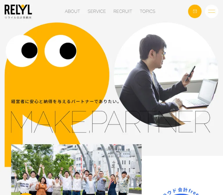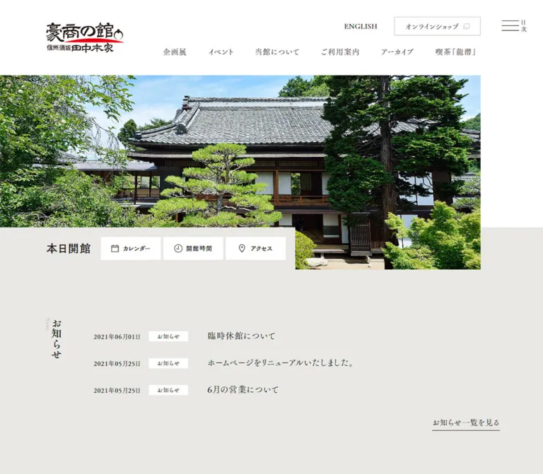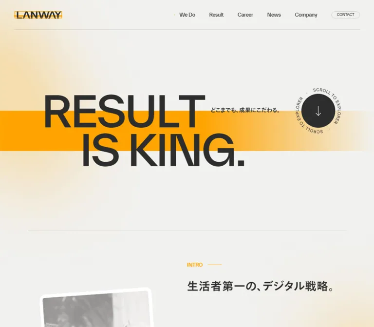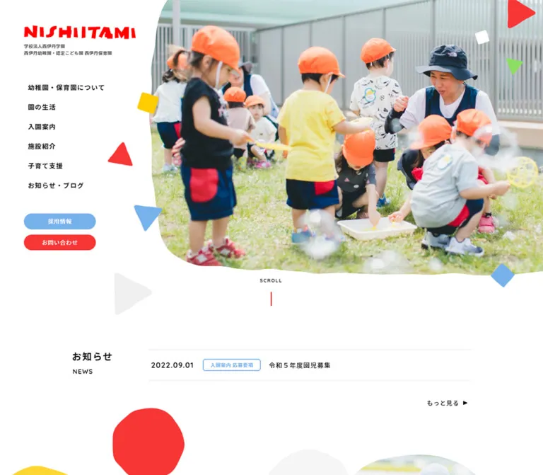
プレビュー準備中デザインリファレンスを見る
DESIGN REFERENCE
今井運送株式会社|公式コーポレートサイト
深いブルーと白、大胆なトラック写真、余白を生かした非対称レイアウトが特徴の物流企業サイト。車両紹介から採用情報まで、画面幅に応じて情報構成を切り替えています。
IMAI TRANSPORTATION — Style Reference
Deep blue fields, bright steel, and working vehicles presented with the confidence of a corporate photo book.
Website: www.imaiunso.com Original URL: https://www.imaiunso.com/ Final URL: https://www.imaiunso.com/ Theme: white content canvas with substantial deep-blue brand fields. Inspected: supplied capture batch retrieved October 5, 2026, at 06:37:29 JST — October 4, 2026, at 21:37:29.170 UTC. Viewports: 1440 × 1000 desktop and 390 × 844 mobile, in CSS pixels. Scope: the current corporate homepage: opening composition, introductory media, strengths, business, vehicle lineup, company information, promotional media, news, recruitment, special content, and footer. Visual captures cover the desktop opening, lineup, and footer, plus the mobile opening and final recruitment/footer area. Rendered DOM measurements cover the full homepage at both widths. Linked destination pages and open-menu states were not inspected.
IMAI TRANSPORTATION, identified on the page as 今井運送株式会社, uses a restrained corporate interface around unusually prominent fleet photography. Deep blue establishes identity; white provides breathing room; small yellow directional marks punctuate selected links. The photographed blue trucks reinforce the interface palette without requiring many additional UI colors.
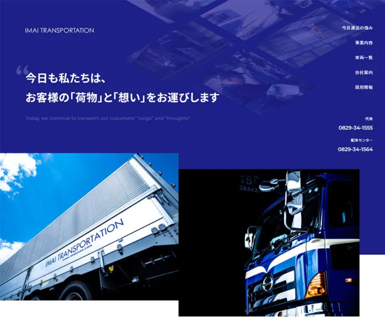
The opening is asymmetric: a slim wordmark and large Japanese statement sit toward the left, navigation occupies the far right, and two large truck photographs start at different vertical positions. Below this opening, a centered 1100px content width organizes a long corporate directory of services, vehicles, company information, news, and recruitment. On mobile, the content becomes a 358px column, while a compact contact header and an 80px bottom menu strip frame the page.
閉じる
IMAI TRANSPORTATION — Style Reference
Deep blue fields, bright steel, and working vehicles presented with the confidence of a corporate photo book.
Website: www.imaiunso.com Original URL: https://www.imaiunso.com/ Final URL: https://www.imaiunso.com/ Theme: white content canvas with substantial deep-blue brand fields. Inspected: supplied capture batch retrieved October 5, 2026, at 06:37:29 JST — October 4, 2026, at 21:37:29.170 UTC. Viewports: 1440 × 1000 desktop and 390 × 844 mobile, in CSS pixels. Scope: the current corporate homepage: opening composition, introductory media, strengths, business, vehicle lineup, company information, promotional media, news, recruitment, special content, and footer. Visual captures cover the desktop opening, lineup, and footer, plus the mobile opening and final recruitment/footer area. Rendered DOM measurements cover the full homepage at both widths. Linked destination pages and open-menu states were not inspected.
IMAI TRANSPORTATION, identified on the page as 今井運送株式会社, uses a restrained corporate interface around unusually prominent fleet photography. Deep blue establishes identity; white provides breathing room; small yellow directional marks punctuate selected links. The photographed blue trucks reinforce the interface palette without requiring many additional UI colors.
The opening is asymmetric: a slim wordmark and large Japanese statement sit toward the left, navigation occupies the far right, and two large truck photographs start at different vertical positions. Below this opening, a centered 1100px content width organizes a long corporate directory of services, vehicles, company information, news, and recruitment. On mobile, the content becomes a 358px column, while a compact contact header and an 80px bottom menu strip frame the page.
How to Read This Reference
- Measured means a value appears in the supplied rendered DOM or computed-style evidence. Decimal measurements are rounded in explanatory tables where appropriate.
- Visual estimate means a dimension, color, or treatment is inferred from an original-page screenshot. These values were not independently pixel-sampled.
- Calculated means a relationship is derived from measured dimensions, such as a grid gap or image ratio.
- Recommended means implementation guidance for a new build. Breakpoints, accessibility behavior, hover feedback, and the CSS adaptation are recommendations unless explicitly identified as measured.
- All custom-property names below are descriptive aliases. The supplied custom-property collection was empty; these are not claimed to be the site's own variable names.
- DOM presence does not guarantee visibility. The mobile extract includes navigation positioned beyond the right edge and duplicate branding nodes that are not all visible in the screenshots.
Tokens — Colors
Default Palette
| Name | Value | Suggested token | Evidence and role |
|---|---|---|---|
| Corporate Blue | #1d2087 |
--color-brand |
Measured on navigation text, CTA text, the business panel, the selected news category, and the special-content button. The hero and footer visually belong to the same blue family, but their background values were not separately sampled. |
| White | #ffffff |
--color-paper |
Measured on reversed links and headings; visually the main content canvas and compact header. |
| Body Charcoal | #333333 |
--color-text |
Measured body text and many ordinary content links. |
| Quiet Surface | #f7f8fa |
--color-surface |
Measured fill of the rounded section-detail links. |
| Media Black | #000000 |
--color-media |
Measured background of the introductory truck-video link. Deep black also appears within the truck photography. |
| Direction Yellow | Approximately #f2cf00 |
--color-accent |
Visual estimate for small arrow circles and the thin lineup label markers. Not a measured CSS color. |
| Pale Outline | Approximately #e8ebf2 |
--color-line |
Visual estimate for the light border around pale CTAs and subtle UI separation. |
The blue carries both large-area branding and ordinary navigation. Keep those roles connected. The yellow has a much smaller footprint: it directs attention inside links rather than filling large panels.
The muted English hero sentence and oversized quotation mark appear as low-contrast blue-white details. Their exact colors and opacity were not supplied. A translucent white treatment can approximate this appearance, but essential text should receive a separate contrast review.
Palette Boundaries
The cyan sky, chrome reflections, red crane equipment, Instagram gradient, and certification artwork belong to photographs or supplied badges. They are not evidence of a broader interface color system. Preserve their original image colors rather than distributing them across unrelated buttons and headings.
Tokens — Typography
Source Font Stack
- Measured stack:
Montserrat, 'Noto Sans JP', sans-serif. - Body weight:
400. - Emphasis weight:
700on section-heading parents, phone numbers, pale CTAs, and selected destination links. - Body size and leading:
14px / 25.2pxat both inspected widths. - Tracking:
0.7px, retained across many measured sizes. - Source root size:
10pxonhtml.
Montserrat supplies the declared Latin face and Noto Sans JP the declared Japanese face. The computed stack establishes the requested families; the evidence does not include font-file loading diagnostics or per-glyph font resolution.
The visible wordmark is a thin, compact brand treatment. Its enclosing H1 reports 28px, weight 700, but contains no extracted text. Those wrapper values should not be used to redraw the wordmark as a bold text heading. Prefer the actual logo asset or a separately approved brand equivalent.
Type Scale
| Role | Size / leading | Weight | Evidence |
|---|---|---|---|
| Main body and desktop navigation | 14px / 25.2px |
400 |
Measured at both widths. |
| Standard section CTA | 14px / 25.2px |
700 |
Measured. |
| Header phone number | 16px / 28.8px |
700 |
Measured. Mobile numbers wrap across two lines. |
| Section-heading parent | 21px / 21px |
700 |
Measured. Nested English/Japanese spans may override this; their individual styles were not supplied. |
| Desktop hero statement | Approximately 36px / 65px |
Visually bold | Screenshot estimate. Two lines in the supplied desktop opening. |
| Mobile hero statement | Approximately 24px / 43px |
Visually bold | Screenshot estimate. Three lines at 390px. |
| Hero English sentence | Approximately 14px desktop, 13px mobile |
Visually regular | Screenshot estimate. |
| Fleet English label | Approximately 14px |
Visually regular | Screenshot estimate. |
| Fleet Japanese label | Approximately 18px |
Visually bold | Screenshot estimate. |
| News category | 14px / 21px |
400 |
Measured. |
| Footer group link | 12px / 21.6px |
700 |
Measured. |
| Footer child link | 12px / 16.8px |
400 |
Measured on desktop. |
The distinction between bold Japanese messages and lighter Latin labels is central. Avoid giving every English section label the same heavy display treatment as the hero statement.
Keep tracking explicit in pixels when reproducing the measured system. Replacing 0.7px with 0.05em everywhere would change the spacing of 12px, 16px, and 21px text.
Tokens — Spacing & Shapes
Spacing Scale
The evidence repeatedly uses multiples of eight, alongside 10px CTA padding and content-dependent dimensions. This is an observed pattern, not proof of a declared spacing system.
| Use | Desktop | Mobile | Evidence |
|---|---|---|---|
| Main content width | 1100px |
358px |
Measured. |
| Main content side margin | 170px |
16px |
Measured at the supplied viewport widths. |
| Typical section trailing space | 120px |
48px |
Calculated from repeated differences between outer section and inner content heights. |
| Standard heading top padding | 64px |
40px |
Measured on Lineup, Company, News, and Recruit heading parents. |
| Strength-card gap | 40px horizontally |
40px vertically |
Calculated from measured rectangles. |
| CTA padding | 10px 24px |
10px 24px |
Measured. |
| Business-panel padding | 64px 80px 80px |
32px 24px |
Measured. |
| Recruitment sublink gap | Approximately 32px horizontally |
Approximately 8px vertically |
Calculated from link rectangles. |
| Footer badge gap | 8px |
8px |
Calculated. |
Border Radius
| Element | Value | Evidence |
|---|---|---|
| Fleet links, company links, business panel | 0 |
Measured. |
| Standard pale CTA | 100px |
Measured; visually a capsule. |
| Special-content CTA | 25px |
Measured. |
| News category link | 11px |
Measured. |
| Yellow arrow disc | Circular | Screenshot observation; approximately 18px in diameter. |
The page does not use rounded cards as its general container language. Large image boundaries remain square; rounding is reserved for compact navigation controls.
Layout Measurements
| Element | Desktop | Mobile |
|---|---|---|
| Entire document | 9240.625px high |
10818.609px high |
| Opening inner region | 1078.844px high |
717.156px high |
| Opening including following spacing | 1198.844px high |
765.156px high |
| Primary hero logo wrapper | 224 × 28px, at 170, 80 |
A separate visible header logo wrapper is 176.531 × 28px, at 16, 21 |
| Strength destination | 290px wide; approximately 577–602px high |
358px wide; approximately 385–417px high |
| Business link panel | 530 × 411.156px |
358 × 285.953px |
| Fleet tile | 550 × 310px |
358 × 201.781px |
| Company tile | 275 × 368.156px |
358 × 479.281px |
| Typical pale CTA | Approximately 218 × 49.188px |
358 × 49.188px |
| Footer | 811.313px high |
475.859px high |
Document heights describe this captured content, not fixed heights to impose on a new page.
Components
Desktop Header — Opening State
Role: identifies the company and exposes the five principal corporate destinations while leaving the central image composition open.
The logo sits at the content alignment, approximately 170px from the left and 80px from the top. The navigation sits independently near the right viewport edge, ending at x = 1400, leaving a 40px right margin.
The links are, in order, 今井運送の強み, 事業内容, 車両一覧, 会社案内, and 採用情報. Each uses measured white 14px text with a 25.2px line height. Their top positions advance by approximately 49.19px, producing about 24px of space between line boxes.
Below the navigation, two right-aligned contact groups pair a small purpose label with a bold 16px telephone link. These are practical contact routes, not large conversion buttons. The visible numbers are 0829-34-1555 and 0829-34-1564.
Desktop Header — Scrolled State
Role: keeps identity, navigation, and contact routes available once the visitor reaches the main content.
The lineup and footer screenshots show a white horizontal header approximately 74px high. The wordmark is blue at the left; the five navigation items form one row; the two telephone groups sit at the right. A very light lower shadow or separator distinguishes the header from the page.
This is a visibly different state from the opening's right-side navigation. The exact scroll threshold, positioning implementation, transition properties, and animation duration were not supplied. Reproduce the two layouts without inventing a dramatic transformation between them.
Mobile Contact Header and Bottom Menu Bar
Role: separates immediate telephone access from broader site navigation.
At 390px, the white top header is approximately 70px tall in the screenshots. Its visible logo begins at x = 16 and occupies about 176.53px. The two phone columns begin at x = 208.53 and x = 298.48, with measured widths of approximately 74px and 75.52px.
The phone numbers wrap after the first hyphen. Their measured 57.59px link height reflects two 28.8px lines. Combined with the small labels, this makes the original header visibly tight. A new implementation should allow the header to grow under text enlargement rather than clip these controls.
An approximately 80px bottom strip remains visible in both mobile captures. Its left 310px is white and carries the company copyright; its right 80px is a square blue MENU control with a small white menu mark above the caption. This strip is separate from the full footer, so the copyright appears again near the end of the document.
The closed mobile DOM places menu links at x = 406, beyond the 390px viewport. This supports an off-canvas menu structure. No supplied screenshot shows the menu open, so its overlay, animation, expanded groups, and focus behavior remain unverified.
Opening Hero
Role: connects the service promise to recognizable vehicles, facilities, and people.
The desktop composition has five layers:
- A large deep-blue field extending across the viewport.
- A subdued diagonal mosaic of working scenes in the upper-right area.
- A white wordmark near the left content edge.
- A bold Japanese statement with a pale oversized opening quotation mark and a quieter English sentence below.
- Two large truck photographs beginning at staggered heights and extending beyond the blue field into white space.
The statement reads 今日も私たちは、 followed by お客様の「荷物」と「想い」をお運びします. Keep this as selectable text in an adaptation.
From the desktop screenshot, the bright left image begins near x = 0, y = 505 and is approximately 635px wide. The darker right image begins near x = 635, y = 562 and ends near the 1270px content edge. The approximately 56px vertical step gives the pair its character. These are screenshot estimates, not image-element measurements.
The left photograph emphasizes a silver truck body against a saturated cyan sky. The right photograph emphasizes the blue cab, chrome mirrors, and deep shadows. Their contrasting light levels make the two images feel intentionally paired.
At 390px, the visible blue copy region runs from below the top header to approximately y = 375. The statement wraps to three lines, followed by a two-line English sentence. One full-width truck photograph occupies approximately y = 375–717. The supplied evidence does not establish whether the second desktop photograph is hidden, replaced, or managed by another mechanism on mobile.
Section Heading and Introductory Row
Role: gives each corporate topic a consistent entry point.
Lineup, Company, News, and Recruit combine an English section name, a Japanese label, explanatory copy, and a detail link. Their heading parents have measured 21px / 21px type, with 64px top padding on desktop and 40px on mobile. Individual child-span sizes were not included in the extract.
For Lineup and Company, desktop text occupies the left side while a pale capsule link aligns to the right. On mobile, the same link expands to the entire 358px content width below the introduction.
Strength and Promotion Movie use a different measured heading geometry: a narrow 60px-wide region on desktop becomes a 358 × 60px heading region on mobile. The extract does not expose the writing-mode or transform responsible for the desktop treatment.
Rounded Section Link
Role: provides a repeatable, modest route into a deeper section.
Anatomy: pale fill, thin pale outline, bold blue label, and a small yellow circular direction mark near the right edge. The measured style is 14px / 25.2px, weight 700, 10px 24px padding, and a 100px radius. Most desktop examples measure about 218 × 49.19px; the Strength link is slightly wider because of its label.
The screenshot suggests an approximately 2px outline, but border width and color were not included in the computed sample. Treat those as estimates. Keep the CTA relatively quiet so the photography and section hierarchy remain dominant.
Strength Points
Role: turns operational capabilities into three specific destinations.
Each linked block combines a numbered label, a capability statement, and a contextual destination phrase:
Point 01: warehouse facilities with cranes for steel and heavy loads.Point 02: vehicle maintenance and driver education.Point 03: special-vehicle permissions and transport.
On desktop, the cards begin at x = 320, 650, and 980. Each is 290px wide, with 40px gaps. Their starting edge sits 150px inside the main container, leaving space for the section's narrow heading treatment.
On mobile, each block spans 358px and stacks with 40px between blocks. Card heights vary with content. The evidence supports the dimensions and text hierarchy; the supplied screenshots do not show enough of these cards to specify their individual image crops or decorative details.
Business Feature Panel
Role: introduces the core transport business through one large linked surface.
The measured desktop link is a square-cornered blue panel, 530 × 411.16px, positioned at x = 740 within the 1100px section. It starts approximately 203.84px below the section's top. Its padding is 64px 80px 80px, creating a deliberately spacious interior. The heading is measured white.
On mobile, the panel fills the 358px content width, measures approximately 285.95px high, and uses 32px 24px padding. The full panel is the anchor; an adaptation should not nest a second clickable button inside it.
The surrounding media and paragraph-specific color overrides are not visible in the supplied screenshots and were not separately sampled.
Vehicle Lineup Grid
Role: offers a visual index into four vehicle categories.
This is a continuous photograph grid with no inter-card gutters. Desktop uses two columns and two rows, each tile measuring 550 × 310px. The measured ratio is 550 / 310, approximately 1.774:1. Mobile keeps this ratio while stacking all four tiles at 358 × 201.78px.
Each tile contains a full-bleed vehicle photograph, a small English label, a larger bold Japanese label, and a right-pointing chevron. Labels sit toward the lower left. A narrow yellow vertical mark reinforces the Japanese label. The desktop screenshot suggests roughly 40px left and bottom insets, though these were not sampled from the DOM.
The categories are Trailer / トレーラー, Body / 平ボディ, Wing / ウイング, and Uniq / ユニック. Preserve Uniq when quoting the inspected UI rather than silently changing the source label.
All photographs show complete working vehicles in front of an industrial building. Their blue cabs, pale bodywork, and consistent setting make the grid cohesive. The darker lower image regions support white labels; the evidence does not determine whether this darkening is baked into the images or applied with CSS.
Company Destination Panels
Role: presents four routes into the company's background and organization.
The destinations cover company information, philosophy, the 60th-anniversary history, and offices. Each includes a title and a short explanation.
Desktop uses four adjacent links, each 275 × 368.16px, across the 1100px container. Mobile stacks four 358 × 479.28px links. The calculated ratio remains approximately 0.747:1, close to a portrait 3:4 panel. Link text is measured white, and corners are square.
The source-page screenshots supplied here do not show these panels' individual artwork. Preserve their measured structure without inventing specific photographic subjects.
Introductory and Promotional Media
Role: adds company and fleet storytelling to the corporate information structure.
An introductory truck-video anchor has a measured black background, white text, and a desktop size of 1100 × 330px. At 390px, it becomes a 358 × 276.64px block, and its display changes from flex to block. The entire link container is therefore not a fixed 16:9 player.
A separate Promotion Movie section appears later, after Company. Its measured inner section height is about 735.56px on desktop and 407.75px on mobile. Its heading follows the narrow-desktop/wide-mobile pattern used by Strength.
The DOM exposes video destinations, but playback, autoplay, sound, embedded controls, and modal behavior were not exercised. Treat these as media entry points unless additional evidence establishes a player interaction.
News Categories and Article Links
Role: mixes operational announcements and recruiting updates within the corporate homepage.
Desktop uses an asymmetric arrangement: the article area occupies approximately 730px on the left, while a roughly 320px introduction sits at x = 950 on the right. Article links form two columns, each approximately 344.09px wide, separated by about 41.77px.
Each article link contains a category, date, and title. The measured padding is 24px 16px; row heights vary from 111px to 136px with title length. These are compact text destinations rather than image cards.
The categories are All, BLOG, 採用情報, お知らせ, and 重要なお知らせ. The selected All link has a blue fill and white text. Category links use 14px type, 21px line height, and an 11px radius.
On mobile, the introduction and its full-width detail link move above the categories. Category links wrap into two columns, and the articles become one 358px-wide list with 24px 0 padding. This reordering is confirmed by element coordinates even though the extracted text sequence lists the categories earlier.
Category anchors have real URL destinations, including category query parameters. Client-side filtering or animated list replacement was not verified.
Recruitment and Special Content
Role: gives employment information its own visual and navigational presence within the corporate site.
The Recruit introduction uses the standard section heading and pale detail link. Three blue bold sublinks lead to company opportunities, education and benefits, and job listings. They form a horizontal sequence on desktop and a vertical sequence on mobile. On mobile, the main recruitment CTA follows these sublinks.
The special-content feature includes DESIGN YOURSELF, supporting copy, and a solid blue capsule link. The latter measures approximately 187.61 × 49.19px on desktop and 310 × 49.19px on mobile, with 10px 48px 10px 24px padding and a 25px radius.
The supplied mobile end-of-page capture shows a large portrait of a person in dark workwear against white, with smaller portrait and detail tiles layered near the lower right. This shifts the imagery from vehicles to people while keeping a clean, photographic presentation. The identities of the pictured people cannot be established from this screenshot alone.
Corporate Footer
Role: provides a comprehensive desktop directory and a compact mobile identity block.
The desktop footer is a large blue field, approximately 811px high. Its content aligns with the same 1100px container as the page. Four corporate link columns begin at x = 170, 398, 625.98, and 853.98. A fifth interview column begins at x = 1082.02 beneath Special Contents. The groups are separated by whitespace, with fine rules beneath the broad group captions.
Group links use measured 12px bold text; child links use 12px regular text with a 16.8px line height. The lower left contains the white wordmark, postal address, telephone/fax information, and copyright. The lower right contains three image badges.
The desktop badge sequence measures 80 × 90px, 155 × 90px, and 155 × 90px, with 8px gaps. It includes a safety-recognition graphic, an Instagram banner, and a WOMEN OWNED graphic. The latter two have corresponding external links in the page evidence.
On mobile, the directory columns are absent from the visible footer and rendered visible-text evidence. The badge row moves above the centered wordmark and contact details. Its widths reduce to approximately 68.52px, 132.73px, and 132.75px, while the 8px gaps remain. The badge row begins 64px below the footer's top.
Keep footer badge artwork intact. A badge's colorful internal design is not a reason to recolor the surrounding corporate footer.
Tokens — Motion & Interaction
| Treatment | Evidence | Interpretation and limitation |
|---|---|---|
| Anchor transitions | Sampled anchors report 0.3s |
A 300ms transition is supported. Changed properties, easing, and hover endpoints were not supplied. |
| Sampled CSS animations | Listed elements report animation: none |
Describes the sampled nodes and state; it does not prove that the entire site has no animation. |
| Desktop navigation state | Right-side opening navigation; horizontal white header in scrolled captures | The two states are observed. Threshold and transition behavior are unknown. |
| Mobile menu | Persistent MENU control and links positioned beyond the right viewport edge |
Closed structure is supported; opening, closing, focus management, and submenu behavior are unverified. |
| Vehicle and company links | Real destination anchors | Navigation affordance is confirmed; destination rendering was not inspected. |
| News categories | Anchors with page/query URLs | Do not assume in-place filtering. |
| Telephone controls | tel: anchors |
Link destinations are available in the DOM; no call action was performed. |
| Video entry points | Video URLs and media text are present | Playback, sound, autoplay, and modal states are unverified. |
The capture process waited for initial loading and finite motion, checked layout/text stability and visible image decoding, and temporarily paused perpetual animations during readiness checks. These safeguards make the screenshots useful settled-state references; they do not establish a complete motion specification.
For an adaptation, use restrained 150–300ms color or opacity feedback and immediate, visible keyboard focus. These are recommendations. There is no evidence here for adding parallax, automatic image rotation, bouncing arrows, or large scroll-driven reveals.
Surfaces
| Layer | Appearance | Purpose |
|---|---|---|
| Main content | White with dark body text | Supports long corporate information and large photographic sections. |
| Brand field | Deep blue with white details | Frames the opening, business feature, and footer. |
| Fleet and company links | Square, adjacent media panels | Makes the imagery itself the destination surface. |
| Standard detail link | Pale gray capsule with blue text | Provides consistent secondary navigation. |
| Special-content link | Blue capsule with white text | Distinguishes the recruitment feature's entry point. |
| Scrolled desktop header | White, blue text, faint lower separation | Keeps navigation legible above varied content. |
| Mobile bottom strip | White copyright region and blue menu square | Maintains a stable navigation access point. |
A general card-elevation system is not visible. Structure comes from image edges, color fields, alignment, and generous gaps. The compact header's subtle separation should not become a shadow applied to every component.
Imagery
Photography is the principal expressive material. The opening pairs a low-angle silver truck body and bright sky with a much darker close view of a blue cab and chrome mirrors. The lineup uses consistent industrial surroundings to make different vehicle types easy to compare. Recruitment introduces workwear portraits and a small tiled montage.
Retain natural detail in corrugated metal, tires, load beds, mirrors, and warehouse facades. Use square image boundaries and assertive crops. Keep enough of each lineup vehicle visible to communicate its category; the introductory hero can crop more dramatically.
The upper hero collage has diagonal image boundaries and a strong blue treatment. The supplied evidence does not establish whether its color treatment is baked into the asset or produced with CSS. Inspect an authorized asset before adding another overlay, so the image is not unintentionally tinted twice.
Observed Asset References
These paths appear in embedded style text from the rendered original page. They were not fetched separately during this analysis.
| Asset declaration | Observed path | Supported use |
|---|---|---|
.kv background image |
/upload/save/template/c64c749ccd0fdeeead372c63df56e66c.jpg |
Opening key-visual background. |
.special-contents-bg background image |
/upload/save/page/5a830fc279733e03242382797fa12a99.jpg |
Recruitment special-content background. |
The extract does not supply reliable individual paths for the two large hero truck photographs, four vehicle images, logo variants, or footer badges. Do not invent filenames for those assets. Use available authorized originals or appropriate replacement imagery for the intended operator.
Layout & Responsive Behavior
Desktop Composition
At 1440px, most content occupies x = 170–1270, giving a measured width of 1100px. The hero deliberately breaks this boundary: the first large photograph reaches the left viewport edge, while the second ends at the content's right edge. The opening navigation sits farther right, near x = 1400.
The page alternates between different compositions within that stable alignment: three offset Strength blocks, a right-aligned Business panel, a two-column vehicle grid, a four-column Company row, asymmetric News columns, and a five-column footer directory. Preserve this variety instead of forcing every section into the same card grid.
Mobile Composition
At 390px, the ordinary content width is 358px with 16px side margins. The main exceptions are the full-width opening photograph and persistent top/bottom navigation surfaces.
| Region | Desktop | Mobile |
|---|---|---|
| Main navigation | Vertical in the opening; horizontal in scrolled captures | Bottom menu access with off-canvas menu structure. |
| Telephone access | Right side of opening or horizontal header | Two compact columns in the white top header. |
| Opening photography | Two staggered images visible | One full-width image visible in the supplied opening. |
| Strength points | Three 290px columns | One column with 40px vertical gaps. |
| Business panel | 530px wide, offset right | Full 358px content width. |
| Vehicle lineup | Two columns | One column, preserving the measured image ratio. |
| Company destinations | Four columns | One column, preserving the portrait panel ratio. |
| News introduction | To the right of article links | Above category links and articles. |
| News articles | Two columns | One column. |
| Recruitment sublinks | Horizontal | Vertical, followed by the main CTA. |
| Footer | Directory above identity and badges | Badges above centered identity; directory not shown. |
The document becomes about 1578px taller on mobile even though section spacing decreases. Stacked Strength, Company, and News content accounts for much of this change. Do not implement the mobile layout by shrinking the entire desktop composition.
The original breakpoint values are unknown. The Quick Start uses a recommended 980px breakpoint to protect the relatively dense header and multi-column sections. Intermediate widths, landscape phones, safe-area behavior, and browser text enlargement were not captured.
Do’s and Don’ts
Do
- Use the measured blue
#1d2087consistently for primary brand surfaces and navigation. - Keep the main desktop content aligned to a centered 1100px column, with 16px mobile gutters.
- Preserve the opening's staggered truck images and its contrast between bright sky and dark chrome.
- Use the measured Montserrat/Noto Sans JP stack, 14px body text, 25.2px leading, and 0.7px tracking.
- Keep large media panels square and adjacent where the grid requires it.
- Reserve capsules for section-detail links and category states.
- Preserve the different desktop and mobile orders in News, Recruit, and the footer.
- Let fleet photography communicate vehicle types clearly.
- Keep contact routes visible and distinguish representative and dispatch numbers.
- Treat the page as a multi-purpose corporate homepage with substantial company and recruitment information.
Don’t
- Don’t replace the long corporate structure with a short campaign page and repeated oversized conversion buttons.
- Don’t turn the vehicle lineup into isolated rounded cards with wide gutters and shadows.
- Don’t turn the small yellow direction marks into a dominant page color.
- Don’t redraw the thin wordmark using the bold font values of its H1 wrapper.
- Don’t assume all nested heading text uses the measured 21px parent size.
- Don’t reproduce offscreen menu text as visible homepage content.
- Don’t claim a carousel, parallax effect, menu animation, or video autoplay from settled screenshots.
- Don’t infer photographic subjects for sections that are represented only by DOM measurements.
- Don’t hardcode the captured document height or allow fixed controls to cover the final content.
Recommended Implementation Additions
These are recommendations for a new implementation, not verified features of the original page:
- Implement
MENUas a real button with an accessible name,aria-expanded, andaria-controls. Manage focus, Escape-to-close, and focus return when its panel opens and closes. - Make closed off-canvas navigation unavailable to keyboard and assistive-technology navigation until opened.
- Reserve bottom space for the mobile menu strip, including the device safe-area inset. Add an appropriate scroll offset for the persistent top header.
- Allow the contact header to increase in height when numbers wrap or text is enlarged. The supplied mobile layout is visibly tight.
- Correct the evidenced mobile contact mismatch: the visible dispatch number 0829-34-1564 currently has a
tel:0829-34-1555destination in the compact-header extract. An adaptation should usetel:0829-34-1564for that label. - Give image links meaningful accessible names. Empty extracted anchor text does not establish whether the source has valid image alternatives, so verify this explicitly.
- Provide larger hit areas around the 21px-high news category labels while retaining their compact visual capsules.
- Verify contrast for the subdued English hero sentence, image-overlay labels, and small footer links. Decorative quotation marks can remain quiet.
- Provide visible focus styles and reduced-motion handling. Load only necessary font weights and reserve image dimensions to limit layout movement.
- Preserve access to footer destinations through a usable mobile menu when hiding the desktop directory.
Agent Prompt Guide
Quick Color Reference
- Primary brand: measured
#1d2087. - Main canvas and reversed text:
#ffffff. - Body copy: measured
#333333. - Quiet CTA surface: measured
#f7f8fa. - Directional yellow: approximately
#f2cf00, a screenshot estimate. - Pale CTA outline: approximately
#e8ebf2, a screenshot estimate. - Photography: natural blue trucks, silver metal, cyan sky, and dark cab details; retain the image colors.
Overall Prompt
“Create a Japanese logistics corporate homepage inspired by the inspected IMAI TRANSPORTATION page. Use deep blue #1d2087, white content areas, Montserrat with Noto Sans JP, 14px body text with 1.8 leading, and generous section spacing. Build a distinctive opening with a thin wordmark, a bold Japanese service statement, a subdued diagonal workplace collage, right-side desktop navigation, and two large truck photographs staggered vertically. Organize the rest of the page around a centered 1100px content width, including strengths, business, a continuous two-by-two vehicle photo grid, company destinations, news, recruitment, and a detailed blue footer. At mobile width, use 16px gutters, stack the content grids, move the news introduction above its list, and place footer badges before company details. Add a compact contact header and a white/blue bottom menu strip. Keep large image panels square and section-detail links pale and rounded. Label any invented interaction or breakpoint as an adaptation.”
Example Component Prompts
- Opening: “Compose a deep-blue corporate opening with a white Japanese statement aligned to the main content margin. Place a pale quotation mark behind its upper-left edge and a quiet English sentence below. Add a blue-tinted diagonal workplace collage in the upper right. Below the copy, place a bright silver truck photograph flush with the left viewport edge and a darker blue-cab photograph starting about 56px lower.”
- Vehicle grid: “Create four full-image vehicle links in a gapless two-column grid. Use a 550:310 ratio, square corners, blue trucks photographed against an industrial building, and lower-left bilingual labels. Add a narrow yellow marker and a small white chevron. Stack the four links into one column on mobile.”
- Section link: “Create a roughly 49px-high pale-gray capsule link with bold 14px blue text, 10px vertical and 24px horizontal padding, a subtle outline, and a small yellow circular arrow at the right. Make it content-width on desktop and full-width on mobile.”
- News: “Build a corporate news region with a roughly 730px article area and a 320px introduction to its right. Use compact category capsules and two columns of text-only article links. On mobile, place the introduction and its CTA first, wrap categories into two columns, and display one article column.”
- Footer: “Create a deep-blue corporate footer with four company-directory columns and one interview column. Place a white wordmark and contact details at lower left, with three intact badge images at lower right. On mobile, hide the directory only when its destinations remain accessible through the menu, move the badges above the centered identity block, and leave clearance for an 80px bottom menu strip.”
Quick Start
CSS Custom Properties
This is an implementation adaptation, not a recovered stylesheet. It preserves measured palette, typography, content widths, vehicle ratios, and spacing relationships. Hero type sizes, image cropping, outline color, yellow accent, the 980px breakpoint, and hover treatment are recommendations based on the supplied captures.
Load the declared fonts separately if available. Supply authorized image assets through markup and --hero-art; no font URLs or unobserved image paths are assumed. The CSS retains a conventional root size and uses explicit pixel tokens instead of copying the original 10px-root rem system.
:root {
  /* Measured colors */
  --color-brand: #1d2087;
  --color-paper: #ffffff;
  --color-text: #333333;
  --color-surface: #f7f8fa;
  --color-media: #000000;

  /* Visual approximations */
  --color-accent: #f2cf00;
  --color-line: #e8ebf2;

  /* Measured typography */
  --font-site: Montserrat, 'Noto Sans JP', sans-serif;
  --text-body: 14px;
  --text-small: 12px;
  --text-phone: 16px;
  --text-section: 21px;
  --leading-body: 1.8;
  --tracking: 0.7px;

  /* Measured layout relationships */
  --content-max: 1100px;
  --gutter: 16px;
  --section-space: 120px;
  --heading-inset: 64px;
  --card-gap: 40px;
  --radius-pill: 100px;
  --radius-category: 11px;
  --menu-height: 80px;
  --safe-bottom: env(safe-area-inset-bottom, 0px);

  /* Recommended adaptation settings */
  --motion-link: 300ms;
  --hero-art: none;
  --outer-margin: max(16px, calc((100vw - 1100px) / 2));
}

* { box-sizing: border-box; }

body {
  margin: 0;
  color: var(--color-text);
  background: var(--color-paper);
  font-family: var(--font-site);
  font-size: var(--text-body);
  line-height: var(--leading-body);
  letter-spacing: var(--tracking);
}

img { display: block; max-width: 100%; }
a { color: inherit; }
button { font: inherit; letter-spacing: inherit; }

.container {
  width: min(var(--content-max), calc(100% - 2 * var(--gutter)));
  margin-inline: auto;
}

.content-section { margin-bottom: var(--section-space); }

.section-heading {
  margin: 0 0 40px;
  padding-top: var(--heading-inset);
  color: var(--color-brand);
  font-size: var(--text-section);
  font-weight: 700;
  line-height: 1;
}

.section-intro {
  display: flex;
  align-items: center;
  justify-content: space-between;
  gap: 40px;
  margin-bottom: 64px;
}

.section-intro p { margin: 0; }

.section-link {
  display: inline-flex;
  flex: 0 0 auto;
  align-items: center;
  justify-content: center;
  gap: 8px;
  min-height: 49.2px;
  padding: 10px 24px;
  border: 2px solid var(--color-line);
  border-radius: var(--radius-pill);
  color: var(--color-brand);
  background: var(--color-surface);
  font-weight: 700;
  line-height: 25.2px;
  text-decoration: none;
  transition:
    background-color var(--motion-link),
    border-color var(--motion-link);
}

.section-link::after {
  content: '›';
  display: grid;
  place-items: center;
  flex: 0 0 18px;
  width: 18px;
  height: 18px;
  border-radius: 50%;
  color: var(--color-paper);
  background: var(--color-accent);
  font-size: 18px;
  line-height: 1;
}

/* Approximate the observed opening geometry. */
.hero {
  position: relative;
  isolation: isolate;
  margin-bottom: var(--section-space);
}

.hero::before {
  content: '';
  position: absolute;
  z-index: -1;
  inset: 0 0 auto;
  height: 840px;
  background-color: var(--color-brand);
  background-image: var(--hero-art);
  background-repeat: no-repeat;
  background-position: top right;
  background-size: auto 390px;
}

.hero-copy {
  min-height: 505px;
  padding-top: 228px;
  padding-bottom: 96px;
  color: var(--color-paper);
}

.hero-title {
  position: relative;
  margin: 0;
  font-size: 36px;
  font-weight: 700;
  line-height: 1.8;
}

.hero-title::before {
  content: '“';
  position: absolute;
  top: -30px;
  left: -32px;
  color: rgb(255 255 255 / 25%);
  font-size: 80px;
  line-height: 1;
}

.hero-subtitle {
  margin: 24px 0 0;
  /* Recommended contrast improvement over the faint source text. */
  color: rgb(255 255 255 / 75%);
}

.hero-images {
  display: grid;
  grid-template-columns: repeat(2, minmax(0, 1fr));
  align-items: start;
  width: calc(100% - var(--outer-margin));
}

.hero-images img {
  width: 100%;
  aspect-ratio: 1.23;
  object-fit: cover;
}

.hero-images .secondary { margin-top: 56px; }

.strength-grid {
  display: grid;
  grid-template-columns: repeat(3, minmax(0, 1fr));
  gap: var(--card-gap);
  margin-left: 150px;
}

.business-panel {
  display: block;
  width: 530px;
  margin-left: auto;
  padding: 64px 80px 80px;
  color: var(--color-paper);
  background: var(--color-brand);
  text-decoration: none;
}

.vehicle-grid,
.company-grid {
  display: grid;
  gap: 0;
}

.vehicle-grid { grid-template-columns: repeat(2, minmax(0, 1fr)); }
.company-grid { grid-template-columns: repeat(4, minmax(0, 1fr)); }

.vehicle-card {
  position: relative;
  display: block;
  overflow: hidden;
  aspect-ratio: 550 / 310;
  color: var(--color-paper);
  background: var(--color-media);
  text-decoration: none;
}

.vehicle-card img {
  width: 100%;
  height: 100%;
  object-fit: cover;
}

.vehicle-card::after {
  content: '';
  position: absolute;
  inset: 40% 0 0;
  /* Recommended label protection; source compositing is unknown. */
  background: linear-gradient(transparent, rgb(0 0 0 / 50%));
  pointer-events: none;
}

.vehicle-label {
  position: absolute;
  z-index: 1;
  left: 40px;
  right: 24px;
  bottom: 40px;
}

.vehicle-label small {
  display: block;
  font-size: 14px;
}

.vehicle-label strong {
  display: block;
  position: relative;
  font-size: 18px;
}

.vehicle-label strong::before {
  content: '';
  position: absolute;
  top: 0;
  bottom: 0;
  left: -14px;
  width: 4px;
  background: var(--color-accent);
}

.company-card {
  position: relative;
  aspect-ratio: 275 / 368.15625;
  overflow: hidden;
  color: var(--color-paper);
}

.news-layout {
  display: grid;
  grid-template-columns: minmax(0, 730px) minmax(0, 320px);
  gap: 50px;
}

.news-items {
  display: grid;
  grid-template-columns: repeat(2, minmax(0, 1fr));
  column-gap: 42px;
}

.news-item {
  display: block;
  padding: 24px 16px;
  text-decoration: none;
}

.site-footer {
  padding: 120px 0;
  color: var(--color-paper);
  background: var(--color-brand);
}

.footer-directory {
  display: grid;
  grid-template-columns: repeat(5, minmax(0, 1fr));
  gap: 40px;
  font-size: 12px;
}

.footer-bottom {
  display: flex;
  align-items: flex-end;
  justify-content: space-between;
  gap: 48px;
  margin-top: 96px;
}

.footer-logo { width: 224px; }

.footer-badges {
  display: grid;
  grid-template-columns: 80fr 155fr 155fr;
  gap: 8px;
  width: 406px;
  max-width: 100%;
}

.footer-badges img { width: 100%; height: auto; }
.mobile-bar { display: none; }

/* Recommended focus and hover feedback. */
a:focus-visible,
button:focus-visible {
  outline: 3px solid currentColor;
  outline-offset: 4px;
}

@media (hover: hover) {
  .section-link:hover {
    border-color: var(--color-brand);
    background: var(--color-paper);
  }
}

/* Recommended breakpoint; the original threshold was not supplied. */
@media (max-width: 980px) {
  :root {
    --section-space: 48px;
    --heading-inset: 40px;
  }

  body { padding-bottom: calc(var(--menu-height) + var(--safe-bottom)); }

  .section-intro {
    display: grid;
    gap: 32px;
    margin-bottom: 40px;
  }

  .section-link { width: 100%; }

  .hero::before {
    height: 100%;
    background-size: auto 180px;
  }

  .hero-copy {
    min-height: 375px;
    padding-top: 108px;
    padding-bottom: 66px;
  }

  .hero-title { font-size: 24px; }
  .hero-title::before { left: 0; top: -22px; font-size: 64px; }
  .hero-subtitle { font-size: 13px; }
  .hero-images { width: 100%; grid-template-columns: 1fr; }
  .hero-images img { aspect-ratio: 390 / 342; }

  /* Static adaptation of the one-image mobile capture. */
  .hero-images .secondary { display: none; }

  .strength-grid {
    grid-template-columns: 1fr;
    margin-left: 0;
  }

  .business-panel {
    width: 100%;
    padding: 32px 24px;
  }

  .vehicle-grid,
  .company-grid,
  .news-layout,
  .news-items { grid-template-columns: 1fr; }

  .vehicle-label { left: 32px; bottom: 24px; }
  .news-intro { order: -1; }
  .news-item { padding: 24px 0; }

  .site-footer { padding: 64px 0 48px; }
  .footer-directory { display: none; }

  .footer-bottom {
    flex-direction: column;
    align-items: center;
    margin-top: 0;
    text-align: center;
  }

  .footer-logo { margin-inline: auto; }

  .footer-badges {
    order: -1;
    align-self: flex-end;
    width: calc(100% - 8px);
  }

  .mobile-bar {
    position: fixed;
    z-index: 100;
    inset: auto 0 0;
    display: grid;
    grid-template-columns: minmax(0, 1fr) 80px;
    min-height: calc(var(--menu-height) + var(--safe-bottom));
    border-top: 1px solid var(--color-line);
    color: var(--color-brand);
    background: var(--color-paper);
  }

  .mobile-bar__copyright {
    align-self: center;
    padding: 16px 16px calc(16px + var(--safe-bottom));
    font-size: 12px;
  }

  .mobile-bar__menu {
    display: grid;
    place-content: center;
    gap: 4px;
    padding: 12px 8px calc(12px + var(--safe-bottom));
    border: 0;
    color: var(--color-paper);
    background: var(--color-brand);
    font-size: 12px;
    cursor: pointer;
  }
}

@media (prefers-reduced-motion: reduce) {
  .section-link { transition: none; }
}
The hero expects a .hero-copy.container followed by .hero-images. Keep the logo and opening navigation in separate positioned elements, and implement the compact header as its own responsive state. The CSS above does not invent the original header's scroll threshold or menu behavior.
For the News layout, place the article region and .news-intro as sibling children of .news-layout; the mobile order rule moves the introduction first. For the footer, place identity information and .footer-badges inside .footer-bottom.
Example Vehicle-Link Markup
This example uses an illustrative local asset path, not an observed source filename. The surrounding link text names the destination, so the image can be decorative when it adds no further information.
<div class='vehicle-grid'>
  <a class='vehicle-card' href='/lineup/trailer/'>
    <img
      src='/images/authorized-trailer-photo.jpg'
      alt=''
      width='550'
      height='310'
      loading='lazy'
    >
    <span class='vehicle-label'>
      <small>Trailer</small>
      <strong>トレーラー <span aria-hidden='true'>›</span></strong>
    </span>
  </a>
</div>
Tailwind v4 Token Mapping
Optional aliases for a project that already uses Tailwind v4. This does not imply that the inspected website uses Tailwind. Define the custom properties above first.
@theme inline {
  --color-corporate: var(--color-brand);
  --color-canvas: var(--color-paper);
  --color-body: var(--color-text);
  --color-quiet: var(--color-surface);
  --color-direction: var(--color-accent);
  --color-rule: var(--color-line);

  --font-corporate: var(--font-site);
  --text-copy: 14px;
  --text-utility: 12px;
  --text-phone: 16px;
  --text-section: 21px;

  --spacing-page-gutter: 16px;
  --spacing-content: 1100px;
  --spacing-section: var(--section-space);
  --spacing-card-gap: 40px;

  --radius-action: 100px;
  --radius-category: 11px;
}
Sources & Evidence
- Current original homepage: supplied original-page screenshots, rendered text, link destinations, element rectangles, and computed-style samples. Original and final URLs are identical; the supplied HTTP status is 200.
- Capture batch: retrieved at
2026-10-04T21:37:29.170Z, equivalent to October 5, 2026, 06:37:29.170 JST. - Desktop evidence: 1440 × 1000 viewport; approximately 9241px document height; supplied opening, vehicle-lineup, and footer screenshots.
- Mobile evidence: 390 × 844 viewport; approximately 10819px document height; supplied opening and final recruitment/footer screenshots, plus full-page rendered measurements.
- Style evidence: the declared Montserrat/Noto Sans JP stack, body typography, blue/white/charcoal/pale-surface colors, link transitions, CTA padding and radii, grid rectangles, and responsive content ordering.
- Limitations: analysis used the supplied evidence without additional browsing or file access. There was no independent full-stylesheet inspection, asset download, font-load verification, menu activation, hover/focus test, category navigation, telephone action, or video playback test. Screenshots establish settled appearances; extracted offscreen and duplicate elements were not treated as visible UI.
This reference describes the current homepage captured at the stated date and widths. Measurements, visual estimates, and implementation recommendations are distinguished throughout.
# IMAI TRANSPORTATION — Style Reference

> Deep blue fields, bright steel, and working vehicles presented with the confidence of a corporate photo book.

**Website:** [www.imaiunso.com](https://www.imaiunso.com/)
**Original URL:** https://www.imaiunso.com/
**Final URL:** https://www.imaiunso.com/
**Theme:** white content canvas with substantial deep-blue brand fields.
**Inspected:** supplied capture batch retrieved October 5, 2026, at 06:37:29 JST — October 4, 2026, at 21:37:29.170 UTC.
**Viewports:** 1440 × 1000 desktop and 390 × 844 mobile, in CSS pixels.
**Scope:** the current corporate homepage: opening composition, introductory media, strengths, business, vehicle lineup, company information, promotional media, news, recruitment, special content, and footer. Visual captures cover the desktop opening, lineup, and footer, plus the mobile opening and final recruitment/footer area. Rendered DOM measurements cover the full homepage at both widths. Linked destination pages and open-menu states were not inspected.

IMAI TRANSPORTATION, identified on the page as 今井運送株式会社, uses a restrained corporate interface around unusually prominent fleet photography. Deep blue establishes identity; white provides breathing room; small yellow directional marks punctuate selected links. The photographed blue trucks reinforce the interface palette without requiring many additional UI colors.

The opening is asymmetric: a slim wordmark and large Japanese statement sit toward the left, navigation occupies the far right, and two large truck photographs start at different vertical positions. Below this opening, a centered 1100px content width organizes a long corporate directory of services, vehicles, company information, news, and recruitment. On mobile, the content becomes a 358px column, while a compact contact header and an 80px bottom menu strip frame the page.
閉じる
# IMAI TRANSPORTATION — Style Reference

> Deep blue fields, bright steel, and working vehicles presented with the confidence of a corporate photo book.

**Website:** [www.imaiunso.com](https://www.imaiunso.com/)
**Original URL:** https://www.imaiunso.com/
**Final URL:** https://www.imaiunso.com/
**Theme:** white content canvas with substantial deep-blue brand fields.
**Inspected:** supplied capture batch retrieved October 5, 2026, at 06:37:29 JST — October 4, 2026, at 21:37:29.170 UTC.
**Viewports:** 1440 × 1000 desktop and 390 × 844 mobile, in CSS pixels.
**Scope:** the current corporate homepage: opening composition, introductory media, strengths, business, vehicle lineup, company information, promotional media, news, recruitment, special content, and footer. Visual captures cover the desktop opening, lineup, and footer, plus the mobile opening and final recruitment/footer area. Rendered DOM measurements cover the full homepage at both widths. Linked destination pages and open-menu states were not inspected.

IMAI TRANSPORTATION, identified on the page as 今井運送株式会社, uses a restrained corporate interface around unusually prominent fleet photography. Deep blue establishes identity; white provides breathing room; small yellow directional marks punctuate selected links. The photographed blue trucks reinforce the interface palette without requiring many additional UI colors.

The opening is asymmetric: a slim wordmark and large Japanese statement sit toward the left, navigation occupies the far right, and two large truck photographs start at different vertical positions. Below this opening, a centered 1100px content width organizes a long corporate directory of services, vehicles, company information, news, and recruitment. On mobile, the content becomes a 358px column, while a compact contact header and an 80px bottom menu strip frame the page.

## How to Read This Reference

- **Measured** means a value appears in the supplied rendered DOM or computed-style evidence. Decimal measurements are rounded in explanatory tables where appropriate.
- **Visual estimate** means a dimension, color, or treatment is inferred from an original-page screenshot. These values were not independently pixel-sampled.
- **Calculated** means a relationship is derived from measured dimensions, such as a grid gap or image ratio.
- **Recommended** means implementation guidance for a new build. Breakpoints, accessibility behavior, hover feedback, and the CSS adaptation are recommendations unless explicitly identified as measured.
- All custom-property names below are descriptive aliases. The supplied custom-property collection was empty; these are not claimed to be the site's own variable names.
- DOM presence does not guarantee visibility. The mobile extract includes navigation positioned beyond the right edge and duplicate branding nodes that are not all visible in the screenshots.

## Tokens — Colors

### Default Palette

| Name | Value | Suggested token | Evidence and role |
| --- | --- | --- | --- |
| Corporate Blue | `#1d2087` | `--color-brand` | Measured on navigation text, CTA text, the business panel, the selected news category, and the special-content button. The hero and footer visually belong to the same blue family, but their background values were not separately sampled. |
| White | `#ffffff` | `--color-paper` | Measured on reversed links and headings; visually the main content canvas and compact header. |
| Body Charcoal | `#333333` | `--color-text` | Measured body text and many ordinary content links. |
| Quiet Surface | `#f7f8fa` | `--color-surface` | Measured fill of the rounded section-detail links. |
| Media Black | `#000000` | `--color-media` | Measured background of the introductory truck-video link. Deep black also appears within the truck photography. |
| Direction Yellow | Approximately `#f2cf00` | `--color-accent` | Visual estimate for small arrow circles and the thin lineup label markers. Not a measured CSS color. |
| Pale Outline | Approximately `#e8ebf2` | `--color-line` | Visual estimate for the light border around pale CTAs and subtle UI separation. |

The blue carries both large-area branding and ordinary navigation. Keep those roles connected. The yellow has a much smaller footprint: it directs attention inside links rather than filling large panels.

The muted English hero sentence and oversized quotation mark appear as low-contrast blue-white details. Their exact colors and opacity were not supplied. A translucent white treatment can approximate this appearance, but essential text should receive a separate contrast review.

### Palette Boundaries

The cyan sky, chrome reflections, red crane equipment, Instagram gradient, and certification artwork belong to photographs or supplied badges. They are not evidence of a broader interface color system. Preserve their original image colors rather than distributing them across unrelated buttons and headings.

## Tokens — Typography

### Source Font Stack

- **Measured stack:** `Montserrat, 'Noto Sans JP', sans-serif`.
- **Body weight:** `400`.
- **Emphasis weight:** `700` on section-heading parents, phone numbers, pale CTAs, and selected destination links.
- **Body size and leading:** `14px / 25.2px` at both inspected widths.
- **Tracking:** `0.7px`, retained across many measured sizes.
- **Source root size:** `10px` on `html`.

Montserrat supplies the declared Latin face and Noto Sans JP the declared Japanese face. The computed stack establishes the requested families; the evidence does not include font-file loading diagnostics or per-glyph font resolution.

The visible wordmark is a thin, compact brand treatment. Its enclosing H1 reports `28px`, weight `700`, but contains no extracted text. Those wrapper values should not be used to redraw the wordmark as a bold text heading. Prefer the actual logo asset or a separately approved brand equivalent.

### Type Scale

| Role | Size / leading | Weight | Evidence |
| --- | --- | --- | --- |
| Main body and desktop navigation | `14px / 25.2px` | `400` | Measured at both widths. |
| Standard section CTA | `14px / 25.2px` | `700` | Measured. |
| Header phone number | `16px / 28.8px` | `700` | Measured. Mobile numbers wrap across two lines. |
| Section-heading parent | `21px / 21px` | `700` | Measured. Nested English/Japanese spans may override this; their individual styles were not supplied. |
| Desktop hero statement | Approximately `36px / 65px` | Visually bold | Screenshot estimate. Two lines in the supplied desktop opening. |
| Mobile hero statement | Approximately `24px / 43px` | Visually bold | Screenshot estimate. Three lines at 390px. |
| Hero English sentence | Approximately `14px` desktop, `13px` mobile | Visually regular | Screenshot estimate. |
| Fleet English label | Approximately `14px` | Visually regular | Screenshot estimate. |
| Fleet Japanese label | Approximately `18px` | Visually bold | Screenshot estimate. |
| News category | `14px / 21px` | `400` | Measured. |
| Footer group link | `12px / 21.6px` | `700` | Measured. |
| Footer child link | `12px / 16.8px` | `400` | Measured on desktop. |

The distinction between bold Japanese messages and lighter Latin labels is central. Avoid giving every English section label the same heavy display treatment as the hero statement.

Keep tracking explicit in pixels when reproducing the measured system. Replacing `0.7px` with `0.05em` everywhere would change the spacing of 12px, 16px, and 21px text.

## Tokens — Spacing & Shapes

### Spacing Scale

The evidence repeatedly uses multiples of eight, alongside 10px CTA padding and content-dependent dimensions. This is an observed pattern, not proof of a declared spacing system.

| Use | Desktop | Mobile | Evidence |
| --- | --- | --- | --- |
| Main content width | `1100px` | `358px` | Measured. |
| Main content side margin | `170px` | `16px` | Measured at the supplied viewport widths. |
| Typical section trailing space | `120px` | `48px` | Calculated from repeated differences between outer section and inner content heights. |
| Standard heading top padding | `64px` | `40px` | Measured on Lineup, Company, News, and Recruit heading parents. |
| Strength-card gap | `40px` horizontally | `40px` vertically | Calculated from measured rectangles. |
| CTA padding | `10px 24px` | `10px 24px` | Measured. |
| Business-panel padding | `64px 80px 80px` | `32px 24px` | Measured. |
| Recruitment sublink gap | Approximately `32px` horizontally | Approximately `8px` vertically | Calculated from link rectangles. |
| Footer badge gap | `8px` | `8px` | Calculated. |

### Border Radius

| Element | Value | Evidence |
| --- | --- | --- |
| Fleet links, company links, business panel | `0` | Measured. |
| Standard pale CTA | `100px` | Measured; visually a capsule. |
| Special-content CTA | `25px` | Measured. |
| News category link | `11px` | Measured. |
| Yellow arrow disc | Circular | Screenshot observation; approximately 18px in diameter. |

The page does not use rounded cards as its general container language. Large image boundaries remain square; rounding is reserved for compact navigation controls.

### Layout Measurements

| Element | Desktop | Mobile |
| --- | --- | --- |
| Entire document | `9240.625px` high | `10818.609px` high |
| Opening inner region | `1078.844px` high | `717.156px` high |
| Opening including following spacing | `1198.844px` high | `765.156px` high |
| Primary hero logo wrapper | `224 × 28px`, at `170, 80` | A separate visible header logo wrapper is `176.531 × 28px`, at `16, 21` |
| Strength destination | `290px` wide; approximately `577–602px` high | `358px` wide; approximately `385–417px` high |
| Business link panel | `530 × 411.156px` | `358 × 285.953px` |
| Fleet tile | `550 × 310px` | `358 × 201.781px` |
| Company tile | `275 × 368.156px` | `358 × 479.281px` |
| Typical pale CTA | Approximately `218 × 49.188px` | `358 × 49.188px` |
| Footer | `811.313px` high | `475.859px` high |

Document heights describe this captured content, not fixed heights to impose on a new page.

## Components

### Desktop Header — Opening State

**Role:** identifies the company and exposes the five principal corporate destinations while leaving the central image composition open.

The logo sits at the content alignment, approximately 170px from the left and 80px from the top. The navigation sits independently near the right viewport edge, ending at x = 1400, leaving a 40px right margin.

The links are, in order, `今井運送の強み`, `事業内容`, `車両一覧`, `会社案内`, and `採用情報`. Each uses measured white 14px text with a 25.2px line height. Their top positions advance by approximately 49.19px, producing about 24px of space between line boxes.

Below the navigation, two right-aligned contact groups pair a small purpose label with a bold 16px telephone link. These are practical contact routes, not large conversion buttons. The visible numbers are 0829-34-1555 and 0829-34-1564.

### Desktop Header — Scrolled State

**Role:** keeps identity, navigation, and contact routes available once the visitor reaches the main content.

The lineup and footer screenshots show a white horizontal header approximately 74px high. The wordmark is blue at the left; the five navigation items form one row; the two telephone groups sit at the right. A very light lower shadow or separator distinguishes the header from the page.

This is a visibly different state from the opening's right-side navigation. The exact scroll threshold, positioning implementation, transition properties, and animation duration were not supplied. Reproduce the two layouts without inventing a dramatic transformation between them.

### Mobile Contact Header and Bottom Menu Bar

**Role:** separates immediate telephone access from broader site navigation.

At 390px, the white top header is approximately 70px tall in the screenshots. Its visible logo begins at x = 16 and occupies about 176.53px. The two phone columns begin at x = 208.53 and x = 298.48, with measured widths of approximately 74px and 75.52px.

The phone numbers wrap after the first hyphen. Their measured 57.59px link height reflects two 28.8px lines. Combined with the small labels, this makes the original header visibly tight. A new implementation should allow the header to grow under text enlargement rather than clip these controls.

An approximately 80px bottom strip remains visible in both mobile captures. Its left 310px is white and carries the company copyright; its right 80px is a square blue `MENU` control with a small white menu mark above the caption. This strip is separate from the full footer, so the copyright appears again near the end of the document.

The closed mobile DOM places menu links at x = 406, beyond the 390px viewport. This supports an off-canvas menu structure. No supplied screenshot shows the menu open, so its overlay, animation, expanded groups, and focus behavior remain unverified.

### Opening Hero

**Role:** connects the service promise to recognizable vehicles, facilities, and people.

The desktop composition has five layers:

1. A large deep-blue field extending across the viewport.
2. A subdued diagonal mosaic of working scenes in the upper-right area.
3. A white wordmark near the left content edge.
4. A bold Japanese statement with a pale oversized opening quotation mark and a quieter English sentence below.
5. Two large truck photographs beginning at staggered heights and extending beyond the blue field into white space.

The statement reads `今日も私たちは、` followed by `お客様の「荷物」と「想い」をお運びします`. Keep this as selectable text in an adaptation.

From the desktop screenshot, the bright left image begins near x = 0, y = 505 and is approximately 635px wide. The darker right image begins near x = 635, y = 562 and ends near the 1270px content edge. The approximately 56px vertical step gives the pair its character. These are screenshot estimates, not image-element measurements.

The left photograph emphasizes a silver truck body against a saturated cyan sky. The right photograph emphasizes the blue cab, chrome mirrors, and deep shadows. Their contrasting light levels make the two images feel intentionally paired.

At 390px, the visible blue copy region runs from below the top header to approximately y = 375. The statement wraps to three lines, followed by a two-line English sentence. One full-width truck photograph occupies approximately y = 375–717. The supplied evidence does not establish whether the second desktop photograph is hidden, replaced, or managed by another mechanism on mobile.

### Section Heading and Introductory Row

**Role:** gives each corporate topic a consistent entry point.

Lineup, Company, News, and Recruit combine an English section name, a Japanese label, explanatory copy, and a detail link. Their heading parents have measured `21px / 21px` type, with 64px top padding on desktop and 40px on mobile. Individual child-span sizes were not included in the extract.

For Lineup and Company, desktop text occupies the left side while a pale capsule link aligns to the right. On mobile, the same link expands to the entire 358px content width below the introduction.

Strength and Promotion Movie use a different measured heading geometry: a narrow 60px-wide region on desktop becomes a 358 × 60px heading region on mobile. The extract does not expose the writing-mode or transform responsible for the desktop treatment.

### Rounded Section Link

**Role:** provides a repeatable, modest route into a deeper section.

Anatomy: pale fill, thin pale outline, bold blue label, and a small yellow circular direction mark near the right edge. The measured style is `14px / 25.2px`, weight `700`, `10px 24px` padding, and a `100px` radius. Most desktop examples measure about 218 × 49.19px; the Strength link is slightly wider because of its label.

The screenshot suggests an approximately 2px outline, but border width and color were not included in the computed sample. Treat those as estimates. Keep the CTA relatively quiet so the photography and section hierarchy remain dominant.

### Strength Points

**Role:** turns operational capabilities into three specific destinations.

Each linked block combines a numbered label, a capability statement, and a contextual destination phrase:

- `Point 01`: warehouse facilities with cranes for steel and heavy loads.
- `Point 02`: vehicle maintenance and driver education.
- `Point 03`: special-vehicle permissions and transport.

On desktop, the cards begin at x = 320, 650, and 980. Each is 290px wide, with 40px gaps. Their starting edge sits 150px inside the main container, leaving space for the section's narrow heading treatment.

On mobile, each block spans 358px and stacks with 40px between blocks. Card heights vary with content. The evidence supports the dimensions and text hierarchy; the supplied screenshots do not show enough of these cards to specify their individual image crops or decorative details.

### Business Feature Panel

**Role:** introduces the core transport business through one large linked surface.

The measured desktop link is a square-cornered blue panel, 530 × 411.16px, positioned at x = 740 within the 1100px section. It starts approximately 203.84px below the section's top. Its padding is `64px 80px 80px`, creating a deliberately spacious interior. The heading is measured white.

On mobile, the panel fills the 358px content width, measures approximately 285.95px high, and uses `32px 24px` padding. The full panel is the anchor; an adaptation should not nest a second clickable button inside it.

The surrounding media and paragraph-specific color overrides are not visible in the supplied screenshots and were not separately sampled.

### Vehicle Lineup Grid

**Role:** offers a visual index into four vehicle categories.

This is a continuous photograph grid with no inter-card gutters. Desktop uses two columns and two rows, each tile measuring 550 × 310px. The measured ratio is `550 / 310`, approximately 1.774:1. Mobile keeps this ratio while stacking all four tiles at 358 × 201.78px.

Each tile contains a full-bleed vehicle photograph, a small English label, a larger bold Japanese label, and a right-pointing chevron. Labels sit toward the lower left. A narrow yellow vertical mark reinforces the Japanese label. The desktop screenshot suggests roughly 40px left and bottom insets, though these were not sampled from the DOM.

The categories are `Trailer / トレーラー`, `Body / 平ボディ`, `Wing / ウイング`, and `Uniq / ユニック`. Preserve `Uniq` when quoting the inspected UI rather than silently changing the source label.

All photographs show complete working vehicles in front of an industrial building. Their blue cabs, pale bodywork, and consistent setting make the grid cohesive. The darker lower image regions support white labels; the evidence does not determine whether this darkening is baked into the images or applied with CSS.

### Company Destination Panels

**Role:** presents four routes into the company's background and organization.

The destinations cover company information, philosophy, the 60th-anniversary history, and offices. Each includes a title and a short explanation.

Desktop uses four adjacent links, each 275 × 368.16px, across the 1100px container. Mobile stacks four 358 × 479.28px links. The calculated ratio remains approximately 0.747:1, close to a portrait 3:4 panel. Link text is measured white, and corners are square.

The source-page screenshots supplied here do not show these panels' individual artwork. Preserve their measured structure without inventing specific photographic subjects.

### Introductory and Promotional Media

**Role:** adds company and fleet storytelling to the corporate information structure.

An introductory truck-video anchor has a measured black background, white text, and a desktop size of 1100 × 330px. At 390px, it becomes a 358 × 276.64px block, and its display changes from `flex` to `block`. The entire link container is therefore not a fixed 16:9 player.

A separate Promotion Movie section appears later, after Company. Its measured inner section height is about 735.56px on desktop and 407.75px on mobile. Its heading follows the narrow-desktop/wide-mobile pattern used by Strength.

The DOM exposes video destinations, but playback, autoplay, sound, embedded controls, and modal behavior were not exercised. Treat these as media entry points unless additional evidence establishes a player interaction.

### News Categories and Article Links

**Role:** mixes operational announcements and recruiting updates within the corporate homepage.

Desktop uses an asymmetric arrangement: the article area occupies approximately 730px on the left, while a roughly 320px introduction sits at x = 950 on the right. Article links form two columns, each approximately 344.09px wide, separated by about 41.77px.

Each article link contains a category, date, and title. The measured padding is `24px 16px`; row heights vary from 111px to 136px with title length. These are compact text destinations rather than image cards.

The categories are `All`, `BLOG`, `採用情報`, `お知らせ`, and `重要なお知らせ`. The selected `All` link has a blue fill and white text. Category links use 14px type, 21px line height, and an 11px radius.

On mobile, the introduction and its full-width detail link move above the categories. Category links wrap into two columns, and the articles become one 358px-wide list with `24px 0` padding. This reordering is confirmed by element coordinates even though the extracted text sequence lists the categories earlier.

Category anchors have real URL destinations, including category query parameters. Client-side filtering or animated list replacement was not verified.

### Recruitment and Special Content

**Role:** gives employment information its own visual and navigational presence within the corporate site.

The Recruit introduction uses the standard section heading and pale detail link. Three blue bold sublinks lead to company opportunities, education and benefits, and job listings. They form a horizontal sequence on desktop and a vertical sequence on mobile. On mobile, the main recruitment CTA follows these sublinks.

The special-content feature includes `DESIGN YOURSELF`, supporting copy, and a solid blue capsule link. The latter measures approximately 187.61 × 49.19px on desktop and 310 × 49.19px on mobile, with `10px 48px 10px 24px` padding and a 25px radius.

The supplied mobile end-of-page capture shows a large portrait of a person in dark workwear against white, with smaller portrait and detail tiles layered near the lower right. This shifts the imagery from vehicles to people while keeping a clean, photographic presentation. The identities of the pictured people cannot be established from this screenshot alone.

### Corporate Footer

**Role:** provides a comprehensive desktop directory and a compact mobile identity block.

The desktop footer is a large blue field, approximately 811px high. Its content aligns with the same 1100px container as the page. Four corporate link columns begin at x = 170, 398, 625.98, and 853.98. A fifth interview column begins at x = 1082.02 beneath `Special Contents`. The groups are separated by whitespace, with fine rules beneath the broad group captions.

Group links use measured 12px bold text; child links use 12px regular text with a 16.8px line height. The lower left contains the white wordmark, postal address, telephone/fax information, and copyright. The lower right contains three image badges.

The desktop badge sequence measures 80 × 90px, 155 × 90px, and 155 × 90px, with 8px gaps. It includes a safety-recognition graphic, an Instagram banner, and a `WOMEN OWNED` graphic. The latter two have corresponding external links in the page evidence.

On mobile, the directory columns are absent from the visible footer and rendered visible-text evidence. The badge row moves above the centered wordmark and contact details. Its widths reduce to approximately 68.52px, 132.73px, and 132.75px, while the 8px gaps remain. The badge row begins 64px below the footer's top.

Keep footer badge artwork intact. A badge's colorful internal design is not a reason to recolor the surrounding corporate footer.

## Tokens — Motion & Interaction

| Treatment | Evidence | Interpretation and limitation |
| --- | --- | --- |
| Anchor transitions | Sampled anchors report `0.3s` | A 300ms transition is supported. Changed properties, easing, and hover endpoints were not supplied. |
| Sampled CSS animations | Listed elements report `animation: none` | Describes the sampled nodes and state; it does not prove that the entire site has no animation. |
| Desktop navigation state | Right-side opening navigation; horizontal white header in scrolled captures | The two states are observed. Threshold and transition behavior are unknown. |
| Mobile menu | Persistent `MENU` control and links positioned beyond the right viewport edge | Closed structure is supported; opening, closing, focus management, and submenu behavior are unverified. |
| Vehicle and company links | Real destination anchors | Navigation affordance is confirmed; destination rendering was not inspected. |
| News categories | Anchors with page/query URLs | Do not assume in-place filtering. |
| Telephone controls | `tel:` anchors | Link destinations are available in the DOM; no call action was performed. |
| Video entry points | Video URLs and media text are present | Playback, sound, autoplay, and modal states are unverified. |

The capture process waited for initial loading and finite motion, checked layout/text stability and visible image decoding, and temporarily paused perpetual animations during readiness checks. These safeguards make the screenshots useful settled-state references; they do not establish a complete motion specification.

For an adaptation, use restrained 150–300ms color or opacity feedback and immediate, visible keyboard focus. These are recommendations. There is no evidence here for adding parallax, automatic image rotation, bouncing arrows, or large scroll-driven reveals.

## Surfaces

| Layer | Appearance | Purpose |
| --- | --- | --- |
| Main content | White with dark body text | Supports long corporate information and large photographic sections. |
| Brand field | Deep blue with white details | Frames the opening, business feature, and footer. |
| Fleet and company links | Square, adjacent media panels | Makes the imagery itself the destination surface. |
| Standard detail link | Pale gray capsule with blue text | Provides consistent secondary navigation. |
| Special-content link | Blue capsule with white text | Distinguishes the recruitment feature's entry point. |
| Scrolled desktop header | White, blue text, faint lower separation | Keeps navigation legible above varied content. |
| Mobile bottom strip | White copyright region and blue menu square | Maintains a stable navigation access point. |

A general card-elevation system is not visible. Structure comes from image edges, color fields, alignment, and generous gaps. The compact header's subtle separation should not become a shadow applied to every component.

## Imagery

Photography is the principal expressive material. The opening pairs a low-angle silver truck body and bright sky with a much darker close view of a blue cab and chrome mirrors. The lineup uses consistent industrial surroundings to make different vehicle types easy to compare. Recruitment introduces workwear portraits and a small tiled montage.

Retain natural detail in corrugated metal, tires, load beds, mirrors, and warehouse facades. Use square image boundaries and assertive crops. Keep enough of each lineup vehicle visible to communicate its category; the introductory hero can crop more dramatically.

The upper hero collage has diagonal image boundaries and a strong blue treatment. The supplied evidence does not establish whether its color treatment is baked into the asset or produced with CSS. Inspect an authorized asset before adding another overlay, so the image is not unintentionally tinted twice.

### Observed Asset References

These paths appear in embedded style text from the rendered original page. They were not fetched separately during this analysis.

| Asset declaration | Observed path | Supported use |
| --- | --- | --- |
| `.kv` background image | `/upload/save/template/c64c749ccd0fdeeead372c63df56e66c.jpg` | Opening key-visual background. |
| `.special-contents-bg` background image | `/upload/save/page/5a830fc279733e03242382797fa12a99.jpg` | Recruitment special-content background. |

The extract does not supply reliable individual paths for the two large hero truck photographs, four vehicle images, logo variants, or footer badges. Do not invent filenames for those assets. Use available authorized originals or appropriate replacement imagery for the intended operator.

## Layout & Responsive Behavior

### Desktop Composition

At 1440px, most content occupies x = 170–1270, giving a measured width of 1100px. The hero deliberately breaks this boundary: the first large photograph reaches the left viewport edge, while the second ends at the content's right edge. The opening navigation sits farther right, near x = 1400.

The page alternates between different compositions within that stable alignment: three offset Strength blocks, a right-aligned Business panel, a two-column vehicle grid, a four-column Company row, asymmetric News columns, and a five-column footer directory. Preserve this variety instead of forcing every section into the same card grid.

### Mobile Composition

At 390px, the ordinary content width is 358px with 16px side margins. The main exceptions are the full-width opening photograph and persistent top/bottom navigation surfaces.

| Region | Desktop | Mobile |
| --- | --- | --- |
| Main navigation | Vertical in the opening; horizontal in scrolled captures | Bottom menu access with off-canvas menu structure. |
| Telephone access | Right side of opening or horizontal header | Two compact columns in the white top header. |
| Opening photography | Two staggered images visible | One full-width image visible in the supplied opening. |
| Strength points | Three 290px columns | One column with 40px vertical gaps. |
| Business panel | 530px wide, offset right | Full 358px content width. |
| Vehicle lineup | Two columns | One column, preserving the measured image ratio. |
| Company destinations | Four columns | One column, preserving the portrait panel ratio. |
| News introduction | To the right of article links | Above category links and articles. |
| News articles | Two columns | One column. |
| Recruitment sublinks | Horizontal | Vertical, followed by the main CTA. |
| Footer | Directory above identity and badges | Badges above centered identity; directory not shown. |

The document becomes about 1578px taller on mobile even though section spacing decreases. Stacked Strength, Company, and News content accounts for much of this change. Do not implement the mobile layout by shrinking the entire desktop composition.

The original breakpoint values are unknown. The Quick Start uses a recommended 980px breakpoint to protect the relatively dense header and multi-column sections. Intermediate widths, landscape phones, safe-area behavior, and browser text enlargement were not captured.

## Do’s and Don’ts

### Do

- Use the measured blue `#1d2087` consistently for primary brand surfaces and navigation.
- Keep the main desktop content aligned to a centered 1100px column, with 16px mobile gutters.
- Preserve the opening's staggered truck images and its contrast between bright sky and dark chrome.
- Use the measured Montserrat/Noto Sans JP stack, 14px body text, 25.2px leading, and 0.7px tracking.
- Keep large media panels square and adjacent where the grid requires it.
- Reserve capsules for section-detail links and category states.
- Preserve the different desktop and mobile orders in News, Recruit, and the footer.
- Let fleet photography communicate vehicle types clearly.
- Keep contact routes visible and distinguish representative and dispatch numbers.
- Treat the page as a multi-purpose corporate homepage with substantial company and recruitment information.

### Don’t

- Don’t replace the long corporate structure with a short campaign page and repeated oversized conversion buttons.
- Don’t turn the vehicle lineup into isolated rounded cards with wide gutters and shadows.
- Don’t turn the small yellow direction marks into a dominant page color.
- Don’t redraw the thin wordmark using the bold font values of its H1 wrapper.
- Don’t assume all nested heading text uses the measured 21px parent size.
- Don’t reproduce offscreen menu text as visible homepage content.
- Don’t claim a carousel, parallax effect, menu animation, or video autoplay from settled screenshots.
- Don’t infer photographic subjects for sections that are represented only by DOM measurements.
- Don’t hardcode the captured document height or allow fixed controls to cover the final content.

## Recommended Implementation Additions

These are recommendations for a new implementation, not verified features of the original page:

- Implement `MENU` as a real button with an accessible name, `aria-expanded`, and `aria-controls`. Manage focus, Escape-to-close, and focus return when its panel opens and closes.
- Make closed off-canvas navigation unavailable to keyboard and assistive-technology navigation until opened.
- Reserve bottom space for the mobile menu strip, including the device safe-area inset. Add an appropriate scroll offset for the persistent top header.
- Allow the contact header to increase in height when numbers wrap or text is enlarged. The supplied mobile layout is visibly tight.
- Correct the evidenced mobile contact mismatch: the visible dispatch number 0829-34-1564 currently has a `tel:0829-34-1555` destination in the compact-header extract. An adaptation should use `tel:0829-34-1564` for that label.
- Give image links meaningful accessible names. Empty extracted anchor text does not establish whether the source has valid image alternatives, so verify this explicitly.
- Provide larger hit areas around the 21px-high news category labels while retaining their compact visual capsules.
- Verify contrast for the subdued English hero sentence, image-overlay labels, and small footer links. Decorative quotation marks can remain quiet.
- Provide visible focus styles and reduced-motion handling. Load only necessary font weights and reserve image dimensions to limit layout movement.
- Preserve access to footer destinations through a usable mobile menu when hiding the desktop directory.

## Agent Prompt Guide

### Quick Color Reference

- Primary brand: measured `#1d2087`.
- Main canvas and reversed text: `#ffffff`.
- Body copy: measured `#333333`.
- Quiet CTA surface: measured `#f7f8fa`.
- Directional yellow: approximately `#f2cf00`, a screenshot estimate.
- Pale CTA outline: approximately `#e8ebf2`, a screenshot estimate.
- Photography: natural blue trucks, silver metal, cyan sky, and dark cab details; retain the image colors.

### Overall Prompt

“Create a Japanese logistics corporate homepage inspired by the inspected IMAI TRANSPORTATION page. Use deep blue `#1d2087`, white content areas, Montserrat with Noto Sans JP, 14px body text with 1.8 leading, and generous section spacing. Build a distinctive opening with a thin wordmark, a bold Japanese service statement, a subdued diagonal workplace collage, right-side desktop navigation, and two large truck photographs staggered vertically. Organize the rest of the page around a centered 1100px content width, including strengths, business, a continuous two-by-two vehicle photo grid, company destinations, news, recruitment, and a detailed blue footer. At mobile width, use 16px gutters, stack the content grids, move the news introduction above its list, and place footer badges before company details. Add a compact contact header and a white/blue bottom menu strip. Keep large image panels square and section-detail links pale and rounded. Label any invented interaction or breakpoint as an adaptation.”

### Example Component Prompts

1. **Opening:** “Compose a deep-blue corporate opening with a white Japanese statement aligned to the main content margin. Place a pale quotation mark behind its upper-left edge and a quiet English sentence below. Add a blue-tinted diagonal workplace collage in the upper right. Below the copy, place a bright silver truck photograph flush with the left viewport edge and a darker blue-cab photograph starting about 56px lower.”
2. **Vehicle grid:** “Create four full-image vehicle links in a gapless two-column grid. Use a 550:310 ratio, square corners, blue trucks photographed against an industrial building, and lower-left bilingual labels. Add a narrow yellow marker and a small white chevron. Stack the four links into one column on mobile.”
3. **Section link:** “Create a roughly 49px-high pale-gray capsule link with bold 14px blue text, 10px vertical and 24px horizontal padding, a subtle outline, and a small yellow circular arrow at the right. Make it content-width on desktop and full-width on mobile.”
4. **News:** “Build a corporate news region with a roughly 730px article area and a 320px introduction to its right. Use compact category capsules and two columns of text-only article links. On mobile, place the introduction and its CTA first, wrap categories into two columns, and display one article column.”
5. **Footer:** “Create a deep-blue corporate footer with four company-directory columns and one interview column. Place a white wordmark and contact details at lower left, with three intact badge images at lower right. On mobile, hide the directory only when its destinations remain accessible through the menu, move the badges above the centered identity block, and leave clearance for an 80px bottom menu strip.”

## Quick Start

### CSS Custom Properties

This is an implementation adaptation, not a recovered stylesheet. It preserves measured palette, typography, content widths, vehicle ratios, and spacing relationships. Hero type sizes, image cropping, outline color, yellow accent, the 980px breakpoint, and hover treatment are recommendations based on the supplied captures.

Load the declared fonts separately if available. Supply authorized image assets through markup and `--hero-art`; no font URLs or unobserved image paths are assumed. The CSS retains a conventional root size and uses explicit pixel tokens instead of copying the original 10px-root rem system.

```css
:root {
  /* Measured colors */
  --color-brand: #1d2087;
  --color-paper: #ffffff;
  --color-text: #333333;
  --color-surface: #f7f8fa;
  --color-media: #000000;

  /* Visual approximations */
  --color-accent: #f2cf00;
  --color-line: #e8ebf2;

  /* Measured typography */
  --font-site: Montserrat, 'Noto Sans JP', sans-serif;
  --text-body: 14px;
  --text-small: 12px;
  --text-phone: 16px;
  --text-section: 21px;
  --leading-body: 1.8;
  --tracking: 0.7px;

  /* Measured layout relationships */
  --content-max: 1100px;
  --gutter: 16px;
  --section-space: 120px;
  --heading-inset: 64px;
  --card-gap: 40px;
  --radius-pill: 100px;
  --radius-category: 11px;
  --menu-height: 80px;
  --safe-bottom: env(safe-area-inset-bottom, 0px);

  /* Recommended adaptation settings */
  --motion-link: 300ms;
  --hero-art: none;
  --outer-margin: max(16px, calc((100vw - 1100px) / 2));
}

* { box-sizing: border-box; }

body {
  margin: 0;
  color: var(--color-text);
  background: var(--color-paper);
  font-family: var(--font-site);
  font-size: var(--text-body);
  line-height: var(--leading-body);
  letter-spacing: var(--tracking);
}

img { display: block; max-width: 100%; }
a { color: inherit; }
button { font: inherit; letter-spacing: inherit; }

.container {
  width: min(var(--content-max), calc(100% - 2 * var(--gutter)));
  margin-inline: auto;
}

.content-section { margin-bottom: var(--section-space); }

.section-heading {
  margin: 0 0 40px;
  padding-top: var(--heading-inset);
  color: var(--color-brand);
  font-size: var(--text-section);
  font-weight: 700;
  line-height: 1;
}

.section-intro {
  display: flex;
  align-items: center;
  justify-content: space-between;
  gap: 40px;
  margin-bottom: 64px;
}

.section-intro p { margin: 0; }

.section-link {
  display: inline-flex;
  flex: 0 0 auto;
  align-items: center;
  justify-content: center;
  gap: 8px;
  min-height: 49.2px;
  padding: 10px 24px;
  border: 2px solid var(--color-line);
  border-radius: var(--radius-pill);
  color: var(--color-brand);
  background: var(--color-surface);
  font-weight: 700;
  line-height: 25.2px;
  text-decoration: none;
  transition:
    background-color var(--motion-link),
    border-color var(--motion-link);
}

.section-link::after {
  content: '›';
  display: grid;
  place-items: center;
  flex: 0 0 18px;
  width: 18px;
  height: 18px;
  border-radius: 50%;
  color: var(--color-paper);
  background: var(--color-accent);
  font-size: 18px;
  line-height: 1;
}

/* Approximate the observed opening geometry. */
.hero {
  position: relative;
  isolation: isolate;
  margin-bottom: var(--section-space);
}

.hero::before {
  content: '';
  position: absolute;
  z-index: -1;
  inset: 0 0 auto;
  height: 840px;
  background-color: var(--color-brand);
  background-image: var(--hero-art);
  background-repeat: no-repeat;
  background-position: top right;
  background-size: auto 390px;
}

.hero-copy {
  min-height: 505px;
  padding-top: 228px;
  padding-bottom: 96px;
  color: var(--color-paper);
}

.hero-title {
  position: relative;
  margin: 0;
  font-size: 36px;
  font-weight: 700;
  line-height: 1.8;
}

.hero-title::before {
  content: '“';
  position: absolute;
  top: -30px;
  left: -32px;
  color: rgb(255 255 255 / 25%);
  font-size: 80px;
  line-height: 1;
}

.hero-subtitle {
  margin: 24px 0 0;
  /* Recommended contrast improvement over the faint source text. */
  color: rgb(255 255 255 / 75%);
}

.hero-images {
  display: grid;
  grid-template-columns: repeat(2, minmax(0, 1fr));
  align-items: start;
  width: calc(100% - var(--outer-margin));
}

.hero-images img {
  width: 100%;
  aspect-ratio: 1.23;
  object-fit: cover;
}

.hero-images .secondary { margin-top: 56px; }

.strength-grid {
  display: grid;
  grid-template-columns: repeat(3, minmax(0, 1fr));
  gap: var(--card-gap);
  margin-left: 150px;
}

.business-panel {
  display: block;
  width: 530px;
  margin-left: auto;
  padding: 64px 80px 80px;
  color: var(--color-paper);
  background: var(--color-brand);
  text-decoration: none;
}

.vehicle-grid,
.company-grid {
  display: grid;
  gap: 0;
}

.vehicle-grid { grid-template-columns: repeat(2, minmax(0, 1fr)); }
.company-grid { grid-template-columns: repeat(4, minmax(0, 1fr)); }

.vehicle-card {
  position: relative;
  display: block;
  overflow: hidden;
  aspect-ratio: 550 / 310;
  color: var(--color-paper);
  background: var(--color-media);
  text-decoration: none;
}

.vehicle-card img {
  width: 100%;
  height: 100%;
  object-fit: cover;
}

.vehicle-card::after {
  content: '';
  position: absolute;
  inset: 40% 0 0;
  /* Recommended label protection; source compositing is unknown. */
  background: linear-gradient(transparent, rgb(0 0 0 / 50%));
  pointer-events: none;
}

.vehicle-label {
  position: absolute;
  z-index: 1;
  left: 40px;
  right: 24px;
  bottom: 40px;
}

.vehicle-label small {
  display: block;
  font-size: 14px;
}

.vehicle-label strong {
  display: block;
  position: relative;
  font-size: 18px;
}

.vehicle-label strong::before {
  content: '';
  position: absolute;
  top: 0;
  bottom: 0;
  left: -14px;
  width: 4px;
  background: var(--color-accent);
}

.company-card {
  position: relative;
  aspect-ratio: 275 / 368.15625;
  overflow: hidden;
  color: var(--color-paper);
}

.news-layout {
  display: grid;
  grid-template-columns: minmax(0, 730px) minmax(0, 320px);
  gap: 50px;
}

.news-items {
  display: grid;
  grid-template-columns: repeat(2, minmax(0, 1fr));
  column-gap: 42px;
}

.news-item {
  display: block;
  padding: 24px 16px;
  text-decoration: none;
}

.site-footer {
  padding: 120px 0;
  color: var(--color-paper);
  background: var(--color-brand);
}

.footer-directory {
  display: grid;
  grid-template-columns: repeat(5, minmax(0, 1fr));
  gap: 40px;
  font-size: 12px;
}

.footer-bottom {
  display: flex;
  align-items: flex-end;
  justify-content: space-between;
  gap: 48px;
  margin-top: 96px;
}

.footer-logo { width: 224px; }

.footer-badges {
  display: grid;
  grid-template-columns: 80fr 155fr 155fr;
  gap: 8px;
  width: 406px;
  max-width: 100%;
}

.footer-badges img { width: 100%; height: auto; }
.mobile-bar { display: none; }

/* Recommended focus and hover feedback. */
a:focus-visible,
button:focus-visible {
  outline: 3px solid currentColor;
  outline-offset: 4px;
}

@media (hover: hover) {
  .section-link:hover {
    border-color: var(--color-brand);
    background: var(--color-paper);
  }
}

/* Recommended breakpoint; the original threshold was not supplied. */
@media (max-width: 980px) {
  :root {
    --section-space: 48px;
    --heading-inset: 40px;
  }

  body { padding-bottom: calc(var(--menu-height) + var(--safe-bottom)); }

  .section-intro {
    display: grid;
    gap: 32px;
    margin-bottom: 40px;
  }

  .section-link { width: 100%; }

  .hero::before {
    height: 100%;
    background-size: auto 180px;
  }

  .hero-copy {
    min-height: 375px;
    padding-top: 108px;
    padding-bottom: 66px;
  }

  .hero-title { font-size: 24px; }
  .hero-title::before { left: 0; top: -22px; font-size: 64px; }
  .hero-subtitle { font-size: 13px; }
  .hero-images { width: 100%; grid-template-columns: 1fr; }
  .hero-images img { aspect-ratio: 390 / 342; }

  /* Static adaptation of the one-image mobile capture. */
  .hero-images .secondary { display: none; }

  .strength-grid {
    grid-template-columns: 1fr;
    margin-left: 0;
  }

  .business-panel {
    width: 100%;
    padding: 32px 24px;
  }

  .vehicle-grid,
  .company-grid,
  .news-layout,
  .news-items { grid-template-columns: 1fr; }

  .vehicle-label { left: 32px; bottom: 24px; }
  .news-intro { order: -1; }
  .news-item { padding: 24px 0; }

  .site-footer { padding: 64px 0 48px; }
  .footer-directory { display: none; }

  .footer-bottom {
    flex-direction: column;
    align-items: center;
    margin-top: 0;
    text-align: center;
  }

  .footer-logo { margin-inline: auto; }

  .footer-badges {
    order: -1;
    align-self: flex-end;
    width: calc(100% - 8px);
  }

  .mobile-bar {
    position: fixed;
    z-index: 100;
    inset: auto 0 0;
    display: grid;
    grid-template-columns: minmax(0, 1fr) 80px;
    min-height: calc(var(--menu-height) + var(--safe-bottom));
    border-top: 1px solid var(--color-line);
    color: var(--color-brand);
    background: var(--color-paper);
  }

  .mobile-bar__copyright {
    align-self: center;
    padding: 16px 16px calc(16px + var(--safe-bottom));
    font-size: 12px;
  }

  .mobile-bar__menu {
    display: grid;
    place-content: center;
    gap: 4px;
    padding: 12px 8px calc(12px + var(--safe-bottom));
    border: 0;
    color: var(--color-paper);
    background: var(--color-brand);
    font-size: 12px;
    cursor: pointer;
  }
}

@media (prefers-reduced-motion: reduce) {
  .section-link { transition: none; }
}
```

The hero expects a `.hero-copy.container` followed by `.hero-images`. Keep the logo and opening navigation in separate positioned elements, and implement the compact header as its own responsive state. The CSS above does not invent the original header's scroll threshold or menu behavior.

For the News layout, place the article region and `.news-intro` as sibling children of `.news-layout`; the mobile `order` rule moves the introduction first. For the footer, place identity information and `.footer-badges` inside `.footer-bottom`.

### Example Vehicle-Link Markup

This example uses an illustrative local asset path, not an observed source filename. The surrounding link text names the destination, so the image can be decorative when it adds no further information.

```html
<div class='vehicle-grid'>
  <a class='vehicle-card' href='/lineup/trailer/'>
    <img
      src='/images/authorized-trailer-photo.jpg'
      alt=''
      width='550'
      height='310'
      loading='lazy'
    >
    <span class='vehicle-label'>
      <small>Trailer</small>
      <strong>トレーラー <span aria-hidden='true'>›</span></strong>
    </span>
  </a>
</div>
```

### Tailwind v4 Token Mapping

Optional aliases for a project that already uses Tailwind v4. This does not imply that the inspected website uses Tailwind. Define the custom properties above first.

```css
@theme inline {
  --color-corporate: var(--color-brand);
  --color-canvas: var(--color-paper);
  --color-body: var(--color-text);
  --color-quiet: var(--color-surface);
  --color-direction: var(--color-accent);
  --color-rule: var(--color-line);

  --font-corporate: var(--font-site);
  --text-copy: 14px;
  --text-utility: 12px;
  --text-phone: 16px;
  --text-section: 21px;

  --spacing-page-gutter: 16px;
  --spacing-content: 1100px;
  --spacing-section: var(--section-space);
  --spacing-card-gap: 40px;

  --radius-action: 100px;
  --radius-category: 11px;
}
```

## Sources & Evidence

- [Current original homepage](https://www.imaiunso.com/): supplied original-page screenshots, rendered text, link destinations, element rectangles, and computed-style samples. Original and final URLs are identical; the supplied HTTP status is 200.
- **Capture batch:** retrieved at `2026-10-04T21:37:29.170Z`, equivalent to October 5, 2026, 06:37:29.170 JST.
- **Desktop evidence:** 1440 × 1000 viewport; approximately 9241px document height; supplied opening, vehicle-lineup, and footer screenshots.
- **Mobile evidence:** 390 × 844 viewport; approximately 10819px document height; supplied opening and final recruitment/footer screenshots, plus full-page rendered measurements.
- **Style evidence:** the declared Montserrat/Noto Sans JP stack, body typography, blue/white/charcoal/pale-surface colors, link transitions, CTA padding and radii, grid rectangles, and responsive content ordering.
- **Limitations:** analysis used the supplied evidence without additional browsing or file access. There was no independent full-stylesheet inspection, asset download, font-load verification, menu activation, hover/focus test, category navigation, telephone action, or video playback test. Screenshots establish settled appearances; extracted offscreen and duplicate elements were not treated as visible UI.

This reference describes the current homepage captured at the stated date and widths. Measurements, visual estimates, and implementation recommendations are distinguished throughout.関連するデザイン
スタイルやページの種類、ジャンルが近いデザインを集めました。