プレビュー準備中デザインリファレンスを見る
DESIGN REFERENCE
株式会社カミナシ|コーポレートサイト
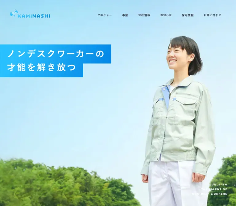
青空と働く人の写真、鮮やかなブルーのグラデーション、大きな余白が特徴。事業・カルチャー・ニュース・採用情報をつなぐコーポレートサイト。
KAMINASHI — Corporate Website Style Reference
An open blue sky, a confident worker, and generous space connect a software company to the people it serves.
Website: corp.kaminashi.jp Original URL: https://corp.kaminashi.jp/ Final URL: https://corp.kaminashi.jp/ — HTTP 200, unchanged Theme: light, with white surfaces, cyan-to-blue fields, and dark slate text Inspected: October 2, 2026, 04:08:56 JST; supplied retrieval timestamp: October 1, 2026, 19:08:56.348 UTC Viewports: desktop 1440 × 1000 CSS px; mobile 390 × 844 CSS px Scope: the current corporate homepage: hero, Message, Our Business, Culture, News, Media, Career, and footer. Visual captures show the desktop hero, final product presentation, career/footer boundary, and footer, plus the mobile hero and footer. Rendered DOM measurements cover the intervening sections at both widths.
KAMINASHI presents a corporate identity through people, mission, products, and editorial content. A smiling worker against an expansive sky establishes the opening image. Bright blue headline bands cut into that photograph, while the small navigation leaves the scene largely unobstructed. The rest of the homepage alternates spacious storytelling, substantial product presentations, culture features, compact news cards, editorial tracks, and recruitment information.
The defining relationship is between large visual fields and restrained interface details. Photography fills entire regions; blue carries identity across graphics, buttons, and product backgrounds; most text remains compact and semibold. Rounded corners are concentrated on buttons. Panels, photographs, and news cards retain square geometry.
This is a corporate homepage with several destinations and audiences. Preserve the routes into products, company information, culture, publishing, and careers when reusing its visual system.
閉じる
KAMINASHI — Corporate Website Style Reference
An open blue sky, a confident worker, and generous space connect a software company to the people it serves.
Website: corp.kaminashi.jp Original URL: https://corp.kaminashi.jp/ Final URL: https://corp.kaminashi.jp/ — HTTP 200, unchanged Theme: light, with white surfaces, cyan-to-blue fields, and dark slate text Inspected: October 2, 2026, 04:08:56 JST; supplied retrieval timestamp: October 1, 2026, 19:08:56.348 UTC Viewports: desktop 1440 × 1000 CSS px; mobile 390 × 844 CSS px Scope: the current corporate homepage: hero, Message, Our Business, Culture, News, Media, Career, and footer. Visual captures show the desktop hero, final product presentation, career/footer boundary, and footer, plus the mobile hero and footer. Rendered DOM measurements cover the intervening sections at both widths.
KAMINASHI presents a corporate identity through people, mission, products, and editorial content. A smiling worker against an expansive sky establishes the opening image. Bright blue headline bands cut into that photograph, while the small navigation leaves the scene largely unobstructed. The rest of the homepage alternates spacious storytelling, substantial product presentations, culture features, compact news cards, editorial tracks, and recruitment information.
The defining relationship is between large visual fields and restrained interface details. Photography fills entire regions; blue carries identity across graphics, buttons, and product backgrounds; most text remains compact and semibold. Rounded corners are concentrated on buttons. Panels, photographs, and news cards retain square geometry.
This is a corporate homepage with several destinations and audiences. Preserve the routes into products, company information, culture, publishing, and careers when reusing its visual system.
How to Read This Reference
- Measured means supplied rendered DOM rectangles or computed styles. Measurements are CSS pixels; tables sometimes round fractional values to two decimals.
- Observed means visible in the supplied original-page captures. It does not imply that a control was activated.
- Estimated means a visual approximation, particularly gradient endpoints, unmeasured graphic lettering, and image crops.
- Recommended means an implementation choice for a new build. Breakpoints, accessibility improvements, and the Quick Start's responsive interpolation belong to this category.
- All named CSS tokens below are implementation aliases. The only exported source custom property was
--swiper-theme-color: #007aff; its visible use was not established, so it is excluded from the brand palette. - A transparent sampled background does not describe all paint contributed by descendants, background images, or pseudo-elements. Several graphic wrappers also report default Times typography despite containing no extracted text. Those defaults are not evidence that the visible design uses Times.
- No additional browsing, file inspection, or interaction testing was performed for this reference.
Tokens — Colors
Core Palette
| Name | Value | Suggested token | Evidence and role |
|---|---|---|---|
| Action Cyan | #27b6f2 |
--color-action |
Measured background of the culture and recruitment buttons |
| Link Blue | #1499e0 |
--color-link |
Measured text on white product buttons and the mission feature link |
| White | #ffffff |
--color-white |
Measured product-button and news-card fill; measured reversed product text; visually dominant page canvas |
| Deep Ink | #1e242c |
--color-ink |
Measured mission copy, recruitment headline, media titles, and footer primary links |
| Slate | #303844 |
--color-slate |
Measured navigation, supporting copy, news titles, and news category-label fill |
| Secondary Slate | #434e5d |
--color-secondary |
Measured mission-feature body copy and copyright |
| Muted Slate | #7f8c9d |
--color-muted |
Measured dates, footer subnavigation, and publishing-channel descriptions |
| Pale Slate | #a8b3c2 |
--color-legal |
Measured footer policy and utility links |
| Ice Blue | #ebfaff |
--color-ice |
Measured background of the Mission 5 Questions panel |
| Cool Gray | #eff2f7 |
--color-cool |
Measured background of the publishing-channel directory |
Visual Approximations
| Treatment | Suggested value | Status |
|---|---|---|
| Bright gradient start | #23baf3 |
Estimated from the visible business field and headline bands |
| Deeper gradient end | #0788e4 |
Estimated; exact source stops and angle were not exported |
| Business gradient | linear-gradient(110deg, #23baf3, #0788e4) |
Recommended approximation of the predominantly left-to-right color progression |
| Career copy surface | #f7f8fa |
Estimated from the pale desktop career region |
The blue of the sky, the green trees, and the dark device frames belong to imagery. They should not become additional button or navigation colors.
The mobile Message label visibly appears blue even though its sampled wrapper reports black. Likewise, several section backgrounds are transparent in the export despite their content using reversed text. Use the captures to interpret visible paint, and avoid treating wrapper colors as a complete rendering specification.
Tokens — Typography
Main Japanese and Interface Stack
Measured stack: TTNormsPro-DmBd, 'FP-こぶりなゴシック StdN W6', sans-serif.
This stack appears on navigation, Japanese section labels, paragraphs, buttons, card titles, and footer links. The measured weight is consistently 600. It gives small text sufficient presence against generous spacing and large imagery.
The font-family declaration establishes the requested stack, not a per-glyph font-resolution audit. Licensed font files were not supplied with this reference.
English Display and Date Stack
Measured stack: TTNormsPro-Md, sans-serif, weight 500.
It appears on the oversized repeated mission phrase, the Career label, and news dates. The long mission text uses tight negative tracking; dates use small positive tracking. These are different typographic roles and should retain separate tokens.
Copyright Stack
Measured stack: TTNormsPro-Rg, sans-serif, weight 400.
The copyright is lighter than surrounding footer navigation, at 12px / 18px with 0.6px tracking.
Graphic Lettering
The hero headline, hero English slogan, and logo occupy empty-text wrappers in the supplied element export. Their visible lettering cannot be assigned the wrapper's default font size or font family.
The desktop headline graphic measures approximately 659.52 × 194.84px; mobile uses 300 × 88.63px. The nearly identical aspect ratio is stronger evidence than an estimated live-text font size. Preserve authorized artwork where available. A live-text reconstruction is an adaptation requiring optical adjustment.
Type Scale
| Role | Desktop | Mobile | Weight and tracking |
|---|---|---|---|
| Header navigation | 13px / 19.5px |
Desktop links absent from visible mobile header | 600, 0.65px |
| Japanese section label | 20px / 35px |
16px / 28px |
600, 1px → 0.8px |
| Mission body | 20px / 45px |
16px / 36px |
600, 1.5px → 1.2px |
| Repeated English mission phrase | 240px / 240px |
120px / 120px |
500, -12px → -4.8px |
| Business introduction | 16px / 28px |
14px / 24.5px |
600, 0.8px → 0.7px |
| Product description | 14px / 28px |
14px / 28px |
600, 0.35px |
| Culture/media introduction | 16px / 28px |
16px / 28px |
600, 0.8px |
| Standard button | 16px / 28px |
16px / 28px |
600, 0.8px |
| Culture feature body | 14px / 24.5px |
Same | 600, 0.35px |
| News title | 14px / 24.5px |
Same | 600, 0.35px |
| News category | 14px / 24.5px |
Same | 600, 0.7px |
| News date | 12px / 18px |
Same | 500, 0.3px |
| Featured media title | 20px / 30px |
14px / 21px |
600, 0.5px → 0.35px |
| Publishing-channel title | 18px / 27px |
16px / 24px |
600, 0.9px → 0.8px |
| Career label | 40px / 40px |
24px / 24px |
500, normal tracking |
| Career headline | 40px / 60px |
24px / 36px |
600, 3px → 1.8px |
| Footer primary link | 14px / 21px |
Same | 600, 0.7px |
| Footer secondary link | 14px / 21px |
12px / 18px |
600, 0.7px → 0.6px |
| Footer legal link | 12px / 12px |
Same | 600, 0.3px |
The mobile English Message title appears approximately 40px in the capture. Its computed size was not included. Other large bilingual heading descendants were also omitted; do not apply default H2/H3 wrapper values to their visible lettering.
Tokens — Spacing & Shapes
Density: generous section spacing surrounding compact text and controls. Geometry: square regions and cards; gently rounded rectangular buttons; diagonal corner details. Scaling: component-specific responsive changes, rather than one global scale factor.
Spacing Scale
| Value | Measured use |
|---|---|
20px |
Mobile news-card gap; top padding within news-date blocks |
25px |
Mobile news-card horizontal/bottom padding |
26px |
Mobile content and footer side insets |
30px |
Button horizontal padding; desktop news-card side padding; mobile product logo-to-copy gap |
40px |
Product copy-to-button gap; desktop news/media item gap; desktop logo-to-copy gap |
45px |
Calculated gaps between desktop navigation link rectangles |
60px |
Desktop header left inset; mobile culture-panel top padding; mobile footer bottom padding |
80px |
Mobile Message, business heading, news, and footer top spacing |
90px |
Desktop culture-feature horizontal padding |
120px |
Desktop footer side/bottom padding and news top padding |
150px |
Desktop product-row separation; Message top padding; footer top padding |
180px |
Main desktop content starting inset; culture/media top padding |
These values are a useful vocabulary, not proof of a source spacing-token system. Large narrative sections also contain nonuniform space reserved for visual material.
Border Radius
| Element | Measured radius |
|---|---|
| Service and recruitment buttons | 7px |
| News cards and category labels | 0 |
| Culture feature panels | 0 |
| Publishing-channel section | 0 |
| Header/logo wrappers | 0 |
Layout Measurements
| Element | Desktop 1440 × 1000 | Mobile 390 × 844 |
|---|---|---|
| Hero section | 1440 × 1000px |
390 × 600px |
| Header logo | 180 × 36.66px, at (60, 40) |
148 × 30.13px, at (15, 14) |
| Hero headline graphic | 659.52 × 194.84px, at (0, 200) |
300 × 88.63px, at (0, 448.38) |
| Hero English slogan | 208.80 × 67.61px, at (1171.20, 882.39) |
150 × 48px, at (215, 552) |
| Typical text container | 1080px, starting at x=180 |
338px, starting at x=26 |
| Product description | 430px wide |
338px wide |
| Standard service button | 200 × 48px |
338 × 48px |
| Culture feature panel | Two adjacent 605 × 528.5px panels |
Full-width panels, 420.5px and 469.5px high |
| News card | 240 × 240px, 40px gaps |
240 × 240px, 20px gaps |
| Featured media item | 540px wide, 40px gaps |
300px wide, approximately 24.27px gaps |
| Career columns | 780px + 660px |
Block layout |
| Footer logo | 240 × 48.88px |
200 × 40.72px |
| Footer padding | 150px 120px 120px |
80px 26px 60px |
At the inspected widths, content becomes narrower while controls often become wider relative to their container. The 48px button height does not shrink.
Components
Corporate Header
Anatomy: brand mark at left; six text navigation links at right on desktop; a diagonal corner menu control on mobile.
The desktop logo sits directly over the sky. Navigation uses dark slate text without filled tabs or large surrounding containers. The links cover culture, business, company information, news, careers, and contact. Their approximately 45px gaps give the compact 13px labels room to breathe.
On mobile, the logo moves to a 15px left and 14px top inset. A white triangular region in the upper-right corner carries the rotated MENU label in blue. The sampled menu button has a transformed bounding rectangle of approximately 161.22 × 161.22px, much of it outside the viewport. The visible corner is only about 74px tall; do not copy the full bounding box as the visible control size.
The mobile logo and menu remain in the same viewport positions in the footer capture, consistent with persistent header chrome. The implementation mechanism and open-menu state were not supplied. Desktop header persistence was not demonstrated.
Photographic Hero
Anatomy: full-width worker photograph; two-line Japanese headline graphic; compact three-line English slogan; overlaid header.
The desktop composition leaves a broad sky area on the left and places the worker toward the right. Trees anchor the lower edge. The headline reads ノンデスクワーカーの / 才能を解き放つ, reversed out of two blue bands with unequal widths. Both bands begin at the viewport edge, creating a stepped silhouette.
The English slogan sits close to the lower-right corner in white. The hero contains no visible primary CTA in the supplied capture; its purpose is identity and mission.
Mobile changes the composition substantially. The worker is centered within a portrait crop, the photograph visually ends around y=500px, and the headline begins at y=448.38px, crossing the photograph-to-white boundary. Its bottom reaches y=537px. The English slogan becomes blue on white at y=552–600px.
Reproduce that overlap explicitly. Reducing the desktop image and leaving its headline at the same proportional position will not produce the observed mobile hierarchy.
Bilingual Section Heading
Anatomy: small Japanese label followed by a more prominent English title.
Observed pairs include メッセージ / Message, カミナシの事業内容 / Our Business, カミナシのカルチャー / KAMINASHI Culture, and お知らせ / News.
The Japanese label uses the measured semibold UI stack, positive tracking, and a 35px desktop or 28px mobile line box. The mobile Message heading visibly uses blue for both levels. Reversed labels occur in the business and news sections.
Keep the two languages as a deliberate hierarchy. The export does not contain enough descendant styles to recover every English heading size or paint effect.
Message Narrative
Anatomy: bilingual heading; oversized repeated English phrase; separated Japanese mission paragraphs; brand graphic.
This section occupies approximately 2138.88px on desktop and 1745.48px on mobile. Its length supports a visual narrative rather than a compact introduction.
Desktop alternates alignment: the first measured paragraph begins at x=630px with a 630px width; later paragraphs begin at x=180px with a 660px width. Mobile brings all measured paragraphs to x=26px, width 338px.
The repeated phrase Unleash the Talent of Non-Desk Workers is enormous: 240px on desktop and 120px on mobile. Duplicate instances extend far outside the viewport. This establishes a repeated horizontal text treatment, but does not prove a particular scrolling speed, direction, or animation mechanism.
The intervening image layers were not included in the supplied captures or asset inventory. Preserve the measured rhythm without inventing specific unseen photographs or illustration sequences.
Business Section and Product Row
Anatomy: section introduction; four product presentations; each presentation contains a product lockup, explanatory copy, destination button, and associated visual material.
The four products are カミナシ レポート, カミナシ 従業員, カミナシ 教育, and カミナシ 設備保全.
The visible equipment-maintenance presentation uses a broad cyan-to-blue field. Its left column contains a white brand/product lockup, a white 14px description with 28px leading, and a white button. A laptop and smartphone showing product interfaces occupy the right side. Device images are large enough to explain the product category without requiring the small screen text to be read.
Measured desktop description width is 430px. Logo-to-description spacing is 40px; description-to-button spacing is also 40px. Product sections are separated by 150px. Their text-region heights vary with copy length rather than being normalized to identical cards.
On mobile, descriptions retain 14px / 28px typography and become 338px wide. Logo-to-copy spacing reduces to 30px, while the button gap remains 40px. Buttons fill the text column. Exact mobile product-image order and cropping were not visually captured; placing media above the text is a recommended adaptation, not a verified source rule.
The desktop business parent reports columns of 1320px 120px, but the visible blue field reaches the right viewport edge. Do not interpret those grid tracks as the full painted background boundary.
Destination Button
Anatomy: centered semibold label inside a 48px-high, 7px-radius rectangle.
Measured padding is 11px 30px 9px, with 16px / 28px type and 0.8px tracking. The unequal top/bottom padding optically centers the label.
Two measured treatments recur:
- White fill with Link Blue text for
サービスサイトへ. - Action Cyan fill with white text for culture and recruitment destinations.
Most desktop buttons are 200px wide. The longer culture label produces a measured width of approximately 228.11px. Mobile buttons are 338px wide at the inspected viewport.
Some culture and news links have transparent computed fills. Their full border treatment was not exported; do not classify them as verified outline buttons from fill values alone.
Culture Introduction and Feature Panels
Anatomy: introductory region followed by two substantial editorial destinations.
On desktop, the culture introduction's text begins at x=780px, creating a right-aligned content region. The mobile introduction uses the standard 26px inset.
Below it, two square-cornered panels sit flush together. They begin at x=115px and x=720px, each 605px wide. Both use 75px 90px 80px padding. The left panel introduces 3 min. KAMINASHI; the right introduces Mission 5 Questions.
The right panel has a measured Ice Blue background and Secondary Slate body text. The left panel has white body text; its actual background paint is not recoverable from the sampled transparent wrapper.
Mobile stacks the panels at full viewport width with 60px 26px 65px padding. Their heights differ because the mission panel requires more text lines. Keep that natural height variation.
News Card and Track
Anatomy: entire-card link; category label overlapping the top edge; title; date anchored toward the bottom.
Desktop presents four 240px-square white cards in one row. Their left coordinates are 180, 460, 740, and 1020px, establishing 40px gaps. The section's outer two-column grid is not the card layout.
Each category label uses Slate fill and white text, with 6px 15px 4px padding. Its top is 16px above the card's top. Desktop card padding is 48px 30px 30px; the title's measured inner width is 178px. Dates use muted medium-weight English type and 20px top padding.
Mobile preserves the 240px card width. Cards begin at x=26, 286, 546, and 806px, creating a horizontal sequence with 20px gaps. Internal padding becomes 40px 25px 25px, and title width becomes 188px. The list destination follows below the track as a full-width button.
Horizontal geometry is confirmed. Swipe handling, navigation arrows, snapping, looping, and autoplay were not exercised. The background behind this section's reversed heading was not included in the visual captures; its exact paint remains unverified.
Featured Media Track
Anatomy: large linked editorial item; image region; title; topical and author information.
Desktop items are 540px wide and start at x=180, 760, 1340, and 1920px. The third and fourth extend beyond the viewport. This is a horizontally arranged sequence, not a conventional four-column grid.
Mobile items shrink to 300px, with approximately 24.27px gaps. The first starts at the standard 26px inset, leaving the beginning of the next item visible toward the right edge.
Titles reduce from 20px / 30px to 14px / 21px. Keep this editorial track distinct from the smaller square news cards. The exact image assets, intrinsic ratios, and active navigation controls were not supplied.
Publishing-Channel Directory
Anatomy: a pale gray section containing three linked publishing channels and social links.
The desktop surface begins at x=180px, spans 1260px to the right edge, and uses 100px 240px 120px 180px padding. Channel links are 240px wide. Three social icons form a vertical sequence near the right side, each in a measured 25px box.
The channels are the company publication, engineering blog, and podcast. Each combines a visual region, a semibold title, and a muted two-line description.
Mobile makes the section full width with 60px 26px 80px padding. Channel links become 338px wide and stack vertically; social icons become a horizontal row. This section visibly changes its organizational structure, rather than merely reducing text sizes.
Career Section
Anatomy: Career label; large recruitment headline; supporting paragraph; blue destination button; worker photograph.
Desktop uses a measured 780px / 660px split. Text starts at x=180px, while the photograph occupies the right region. The supplied lower-page capture shows the worker image extending to the section's bottom edge beside the pale copy surface.
The headline uses 40px / 60px, weight 600, with generous 3px tracking. Mobile reduces it to 24px / 36px with 1.8px tracking and a 338px text column. The section switches from grid to block layout.
The mobile Career label begins 320px after the section start. This establishes a substantial leading region, but the supplied mobile captures do not reveal its precise image treatment. A media-first stack is a reasonable implementation recommendation requiring visual verification.
Corporate Footer
Anatomy: primary navigation groups; expanded culture and product subnavigation; brand mark; policy links; social links; copyright.
Desktop uses a wide white surface with 150px 120px 120px padding. Navigation groups form a horizontal row. The first two groups contain subordinate links in Muted Slate; the remaining groups are compact top-level destinations.
The large footer logo is 240px wide. Policy links form a small, pale horizontal line below, while four social icons sit toward the right in 20px boxes with 50px spacing between their starting positions. Copyright is aligned toward the lower-right.
Mobile stacks navigation groups and policy links. The logo becomes 200px wide, while the social row remains right aligned. Social icon starting positions are 45px apart. The footer grows from approximately 686.88px to 1118.72px high.
The mobile bottom capture includes the persistent header logo over footer content. Avoid interpreting that second logo as another footer element.
Lower-Right Corner Detail
A folded blue page-corner graphic and a small pale horned character appear at the lower-right in scrolled captures. The effect provides a small playful accent against otherwise controlled corporate geometry.
An associated empty-text button is present in the DOM, with a declared 600ms transition. Its sampled box is partly outside the viewport and does not fully describe the visible decorative paint.
No action was verified. Do not assign it a chat, back-to-top, or navigation behavior without further evidence. A decorative implementation should be noninteractive; an interactive implementation needs an explicit, tested purpose and accessible name.
Tokens — Motion & Interaction
| Element | Measured declaration | What it establishes |
|---|---|---|
| Japanese hero graphic | Opacity and transform, 1s cubic-bezier(0.25, 0.46, 0.45, 0.94), 1s delay |
A delayed entrance transition is defined |
| English hero slogan | Same duration/easing, 2s delay |
Its defined entrance follows the Japanese graphic |
| Many body paragraphs and destination links | Opacity 1s with the same curve; color/background 0.2s ease-out |
Separate content-reveal and color-feedback timings |
| Desktop navigation | color 0.2s ease-out |
A short color transition is available |
| News card | background-color 0.2s ease-out |
Card background feedback is defined |
| Corner button | 0.6s cubic-bezier(0.22, 1, 0.36, 1) |
A slower, strongly eased transition is available |
| Repeated mission phrase | Sampled animation: none; duplicated offscreen geometry |
No reliable duration, direction, or continuous-motion mechanism can be recovered |
These are declarations, not recordings of every transition. Initial transform offsets, hover endpoint colors, scroll thresholds, and triggering JavaScript were not supplied.
The capture process waited for document load, finite motion, layout/text stability, and visible-image decoding within time limits. Perpetual animations were temporarily paused during readiness checks and then resumed. Settled captures therefore cannot establish the complete motion experience.
Recommended adaptation: use the measured timings for restrained fades and small translations. Keep content visible by default, add reveal states only after scripting initializes, and remove delays and movement under reduced-motion preferences. Do not invent autoplay merely because items extend horizontally.
Surfaces
| Layer | Appearance | Evidence |
|---|---|---|
| Main canvas and footer | White, spacious, largely unboxed | Visible captures; white component fills also measured |
| Hero | Full-bleed photograph with blue text bands | Visible desktop and mobile captures |
| Business | Broad cyan-to-blue gradient with white content | Visible desktop product capture; exact stops estimated |
| Mission feature | Ice Blue panel | Measured #ebfaff |
| News cards | Square white blocks with overlapping dark labels | Measured dimensions and fills |
| News hosting region | Reversed section label; exact field paint unavailable | Partial DOM evidence only |
| Publishing directory | Cool Gray region | Measured #eff2f7 |
| Career copy region | Very pale neutral beside photography | Visual estimate |
| Mobile menu corner | White diagonal patch | Visible capture and measured button fill |
The supplied frames rely on color fields, alignment, image boundaries, and whitespace for separation. There is no visible general-purpose card elevation system in those frames. Shadow properties were not part of the DOM export, so absence of shadows across every uncaptured component is not established.
Imagery
The hero photograph is bright and direct: a smiling person in a pale gray-green work jacket and white trousers, with blue sky and leafy trees. The subject is shown with enough surrounding environment to feel connected to everyday physical work. The portrait is not framed inside a rounded card.
The desktop composition uses sky as negative space for the headline and navigation. Mobile prioritizes the person, then introduces a white lower region for the slogan. Treat the two crops as separate art-direction decisions. The source evidence does not establish whether they use the same image file, separate crops, or responsive assets.
Product imagery combines realistic device frames with legible overall interface structure. In the observed maintenance presentation, the laptop and phone sit directly on the blue background without a white card behind them. The screen contents explain desktop administration and mobile field use; they are imagery, not evidence that the homepage itself contains those application controls.
The logo combines an angular, faceted animal symbol and a geometric uppercase wordmark. Product lockups reuse that identity with Japanese product names. Retain authorized brand artwork instead of substituting an approximate typed logo.
Observed Asset References
| Asset identity | Observed use | Available evidence |
|---|---|---|
| Worker portrait | Hero and desktop career region | Visible original-page captures |
| Blue corporate lockup | Header and footer | Captures plus measured wrapper dimensions |
| Japanese mission graphic | Stepped blue headline bands | Captures plus desktop/mobile rectangles |
| English mission graphic | White on desktop photograph; blue in mobile white region | Captures plus wrapper dimensions |
| Maintenance product lockup | Business presentation | Desktop capture and measured product wrapper |
| Laptop and smartphone composition | Maintenance product explanation | Desktop capture |
| Social marks | Media directory and footer | Captures, link destinations, and icon-box measurements |
| Folded corner and character | Lower-right accent | Scrolled desktop/mobile captures |
No asset URLs, image filenames, intrinsic resolutions, or full image manifest were supplied. This reference intentionally does not invent paths. The Quick Start expects authorized assets to be provided separately.
Layout & Responsive Behavior
Page Sequence
Measured section heights, rounded to the nearest pixel:
| Section | Desktop height | Mobile height | Responsive finding |
|---|---|---|---|
| Hero | 1000px |
600px |
Mobile is not a full 844px viewport hero |
| Message | 2139px |
1745px |
Narrower text, smaller oversized lettering, different narrative spacing |
| Business | 2769px |
3392px |
Product descriptions wrap more; buttons span the column |
| Culture | 1334px |
1695px |
Feature panels stack |
| News | 692px |
628px |
Cards retain width in a horizontal track |
| Media | 1904px |
1872px |
Featured track narrows; directory becomes vertical |
| Career | 740px |
733px |
Two-column grid becomes block layout |
| Footer | 687px |
1119px |
Navigation and policies stack |
Total measured document height is 11263.67px on desktop and 11783.70px on mobile. These totals describe this content snapshot; they should not be hardcoded as page heights.
Important Responsive Relationships
- Hero rearrangement: the mobile headline crosses the photo edge and the slogan moves onto white. Preserve that sequence rather than scaling the desktop layout uniformly.
- Several alignment systems: desktop uses 60px for the header, 120px for the footer, and often 180px for main content. Mobile typically uses 26px, with a separate 15px header inset.
- Stable small text: product descriptions remain 14px and buttons remain 16px. Large display and recruitment type shrink more substantially.
- Selective horizontal overflow: news and featured media retain horizontal sequences. Culture panels and publishing channels stack. Do not convert every repeated component into the same mobile layout.
- Wider relative controls: a 200px desktop service button becomes a 338px mobile button without losing height or radius.
- Different footer hierarchy: desktop distributes groups across the width; mobile gives each group a vertical interval and places social/copyright content toward the right.
No tablet, intermediate desktop, landscape-phone, zoomed-text, or open-menu viewport was supplied. The original media-query thresholds are unknown. The Quick Start uses a recommended 1024px transition and requires testing around that boundary.
Do’s and Don’ts
Do
- Keep the worker and the surrounding sky central to the opening composition.
- Preserve the stepped, edge-aligned Japanese headline bands.
- Recreate the mobile photo/headline/white-region overlap deliberately.
- Use semibold Japanese body text with the measured generous leading.
- Keep measured Action Cyan and Link Blue as separate roles.
- Pair large visual fields with compact, 48px-high destination buttons.
- Let product descriptions retain their own lengths and row heights.
- Preserve square news cards, projecting category labels, and understated dates.
- Distinguish the news track, featured media track, and publishing directory.
- Retain the extensive corporate footer and its mobile stacking behavior.
- Keep estimates and unverified interactions clearly separate from source facts.
Don’t
- Don’t reduce the homepage to a single conversion funnel or remove its corporate destinations.
- Don’t replace the worker photograph with generic software dashboards in the hero.
- Don’t put every section inside rounded, elevated cards.
- Don’t treat trees, sky, device frames, and interface tokens as one interchangeable palette.
- Don’t use Times because empty image wrappers report browser defaults.
- Don’t assume every bilingual title inherits the sampled parent heading size.
- Don’t shrink the mobile buttons or collapse the 28px product-copy leading.
- Don’t turn the mobile news sequence into an unrelated full-width card stack.
- Don’t infer menu, mascot, carousel, or hover behavior from static geometry alone.
- Don’t make meaningful content permanently dependent on entrance animations.
Recommended Implementation Additions
These are recommendations for a new implementation, not verified original-site features:
- Give the logo, product lockups, and headline graphics appropriate text alternatives. Ensure the mission remains available as semantic text even when visible lettering is artwork.
- Give MENU an accessible name, expanded state, and a controlled navigation region. Add keyboard operation and focus handling when implementing its unobserved open state.
- Provide useful names for social links and any interactive corner control. Empty extracted text alone does not establish whether the original already has accessible names.
- Test contrast for small blue text, white text on Action Cyan, and pale footer links. Introduce darker accessible variants where required while retaining the overall color hierarchy.
- Make horizontal content reachable by keyboard and touch. A local native scrolling region is a useful baseline; add explicit controls if the chosen implementation requires them.
- Allow cards and buttons to grow when labels wrap or text is enlarged. The observed square card dimensions should not force content loss.
- Hide duplicate decorative mission phrases from assistive technology while keeping one readable statement.
- Supply responsive images with intrinsic dimensions. Prioritize the hero image and defer lower-page media where appropriate.
- Respect reduced motion and keep content visible if animation initialization fails.
- Reserve clearance around persistent mobile chrome so the logo and menu do not obscure focused content.
Agent Prompt Guide
Quick Color Reference
- Main canvas: White
#ffffff. - Main text: Deep Ink
#1e242c; supporting text and navigation: Slate#303844. - Filled destination button: Action Cyan
#27b6f2, with white text. - Reversed product button: white, with Link Blue
#1499e0text. - Supporting metadata: Muted Slate
#7f8c9d. - Mission panel: Ice Blue
#ebfaff. - Publishing directory: Cool Gray
#eff2f7. - Business gradient approximation:
#23baf3to#0788e4; these endpoints are estimates.
Overall Prompt
“Create a Japanese corporate homepage inspired by the current KAMINASHI composition. Lead with a full-width photograph of a worker against open sky, a small blue brand mark, compact desktop navigation, and two unequal blue headline bands aligned to the left viewport edge. Use a white canvas, cyan-to-blue business fields, dark slate semibold Japanese text, generous section spacing, square editorial panels, and 48px-high buttons with 7px corners. Preserve the full sequence of mission, four products, culture, news, media, careers, and corporate footer. At 390px, center the portrait, overlap the headline across the photo's lower edge, move the English slogan onto white, use 26px content gutters, and make destination buttons full width. Keep news and featured media as locally horizontal sequences. Label any newly invented menu, motion, or carousel behavior as implementation design.”
Example Component Prompts
- Hero: “Build a 1440 × 1000 desktop hero with the worker on the right and open sky on the left. Position an approximately 660 × 195 headline graphic at x=0, y=200. For a 390px phone, use a 600px hero with a 300 × 89 headline at y≈448, overlapping the photograph's bottom edge. Put a blue English slogan in the lower-right white region.”
- Product row: “Create an open product presentation on a bright blue gradient. Use a white product lockup, a 430px-wide description at 14px/28px, a 40px gap before a 200 × 48 white service button, and a large laptop-and-phone composition to the right. On mobile, use a 338px text column and full-width button; choose and document the mobile image order.”
- News track: “Create square 240px white news links with dark rectangular category labels overlapping their top edge by about 16px. Use 14px semibold titles and 12px muted dates aligned toward the bottom. Space cards by 40px on desktop and 20px on mobile. Preserve local horizontal access on narrow screens.”
- Culture panels: “Place two square-cornered editorial panels side by side, each 605px wide with 90px horizontal padding. Give the mission panel an Ice Blue background. Stack both full width on mobile with 26px side padding and natural content heights. Do not invent the unavailable first-panel artwork.”
- Footer: “Build a spacious white corporate footer with expanded culture and product navigation, a large blue brand mark, pale legal links, four small social marks, and right-aligned copyright. Use 120px desktop side padding and 26px mobile side padding. Stack mobile navigation and legal links while keeping the social row toward the right.”
Verification Prompt
“Compare the implementation at 1440 × 1000 and 390 × 844. Check hero crop and headline overlap, 26px mobile gutters, 48px button height, product-copy leading, square news-card geometry, horizontal track containment, stacked culture panels, and footer ordering. Report deviations separately from intentional accessibility improvements. Do not invent missing asset URLs or claim untested interaction parity.”
Quick Start
CSS Custom Properties
This CSS is an implementation adaptation, not recovered source code. It covers the header, hero asset placement, product rows, cards, tracks, and footer. Supply authorized logo, headline, slogan, and photographic assets separately. Hero wrappers expect an image or picture element; use an appropriate white desktop and blue mobile slogan variant.
Measured values are retained where available. Gradient stops, the 1024px breakpoint, crop positions, and the 64px desktop English heading are recommendations. Mobile product media is placed first as a recommended layout. The news hosting surface is also a chosen approximation because its original paint was not captured.
:root {
  /* Measured color roles */
  --color-white: #ffffff;
  --color-action: #27b6f2;
  --color-link: #1499e0;
  --color-ink: #1e242c;
  --color-slate: #303844;
  --color-secondary: #434e5d;
  --color-muted: #7f8c9d;
  --color-legal: #a8b3c2;
  --color-ice: #ebfaff;
  --color-cool: #eff2f7;

  /* Estimated paint, not recovered gradient stops */
  --brand-gradient: linear-gradient(110deg, #23baf3, #0788e4);
  --news-surface: var(--brand-gradient);

  /* Measured family declarations; provide licensed fonts separately */
  --font-ui: 'TTNormsPro-DmBd', 'FP-こぶりなゴシック StdN W6', sans-serif;
  --font-medium: 'TTNormsPro-Md', sans-serif;
  --font-regular: 'TTNormsPro-Rg', sans-serif;

  --content-width: 1080px;
  --mobile-gutter: 26px;
  --button-height: 48px;
  --button-radius: 7px;
  --news-width: 240px;
  --media-width: 540px;
  --track-gap: 40px;

  --motion-color: 200ms ease-out;
  --motion-reveal: 1000ms cubic-bezier(0.25, 0.46, 0.45, 0.94);
}

* { box-sizing: border-box; }
body {
  margin: 0;
  color: var(--color-ink);
  background: var(--color-white);
  font-family: var(--font-ui);
  font-weight: 600;
}
img { display: block; max-width: 100%; height: auto; }
a { color: inherit; }
button { font: inherit; }

.content {
  width: min(var(--content-width), calc(100% - 52px));
  margin-inline: auto;
}

.site-header {
  position: absolute;
  inset: 0 0 auto;
  z-index: 20;
  display: flex;
  justify-content: space-between;
  align-items: flex-start;
  padding: 40px 90px 0 60px;
}
.site-header__logo { display: block; width: 180px; }
.site-nav {
  display: flex;
  gap: 45px;
  padding-top: 14px;
}
.site-nav a {
  color: var(--color-slate);
  font-size: 13px;
  line-height: 19.5px;
  letter-spacing: 0.05em;
  text-decoration: none;
  transition: color var(--motion-color);
}
.menu-corner { display: none; }

.hero {
  position: relative;
  height: 100svh;
  min-height: 700px;
  isolation: isolate;
}
.hero__photo {
  position: absolute;
  inset: 0;
  width: 100%;
  height: 100%;
  z-index: -1;
}
.hero__photo img {
  width: 100%;
  height: 100%;
  object-fit: cover;
  object-position: center;
}
.hero__headline {
  position: absolute;
  top: 20%;
  left: 0;
  width: min(659.52px, 46vw);
  margin: 0;
}
.hero__headline img { width: 100%; }
.hero__slogan {
  position: absolute;
  right: 60px;
  bottom: 50px;
  width: 208.8px;
  margin: 0;
}
.hero__slogan img { width: 100%; }

.section-kicker {
  margin: 0;
  color: var(--color-action);
  font-size: 20px;
  line-height: 35px;
  letter-spacing: 0.05em;
}
.section-title {
  margin: 12px 0 0;
  color: var(--color-action);
  font-family: var(--font-medium);
  font-size: 64px; /* Recommended; desktop value was not exported */
  font-weight: 500;
  line-height: 1.1;
}
.section-intro {
  font-size: 16px;
  line-height: 28px;
  letter-spacing: 0.05em;
}
.message-copy {
  font-size: 20px;
  line-height: 45px;
  letter-spacing: 0.075em;
}
.mission-band { overflow: clip; }
.mission-band__text {
  margin: 0;
  white-space: nowrap;
  font-family: var(--font-medium);
  font-size: 240px;
  font-weight: 500;
  line-height: 1;
  letter-spacing: -0.05em;
  /* No automatic animation: source timing was not established. */
}

.button {
  display: inline-flex;
  align-items: center;
  justify-content: center;
  min-width: 200px;
  min-height: var(--button-height);
  padding: 11px 30px 9px;
  border: 0;
  border-radius: var(--button-radius);
  background: var(--color-action);
  color: var(--color-white);
  font-size: 16px;
  font-weight: 600;
  line-height: 28px;
  letter-spacing: 0.05em;
  text-align: center;
  text-decoration: none;
  transition: color var(--motion-color), background-color var(--motion-color);
}
.button--white {
  color: var(--color-link);
  background: var(--color-white);
}

.business {
  padding-block: 180px;
  color: var(--color-white);
  background: var(--brand-gradient);
}
.business .section-kicker,
.business .section-title { color: var(--color-white); }
.product-list {
  display: grid;
  gap: 150px;
  margin-top: 80px;
}
.product {
  display: grid;
  grid-template-columns: 430px minmax(0, 1fr);
  align-items: center;
  gap: 150px;
}
.product__copy { min-width: 0; }
.product__logo { width: 390px; max-width: 100%; }
.product__description {
  margin: 40px 0;
  font-size: 14px;
  line-height: 28px;
  letter-spacing: 0.025em;
}
.product__media { margin: 0; width: 100%; }
.product__media img { width: 100%; }

/* At the inspected desktop width, allow the device composition to extend. */
@media (min-width: 90rem) {
  .product__media { width: calc(100% + 120px); }
}

.news {
  padding-block: 120px 100px;
  background: var(--news-surface); /* Recommended hosting surface */
}
.news .section-kicker,
.news .section-title { color: var(--color-white); }
.news-track,
.media-track {
  display: grid;
  grid-auto-flow: column;
  grid-auto-columns: var(--news-width);
  gap: var(--track-gap);
  overflow-x: auto;
  overscroll-behavior-inline: contain;
  scroll-snap-type: inline proximity; /* Recommended behavior */
  padding-block: 18px 4px;
}
.news-card {
  position: relative;
  display: flex;
  flex-direction: column;
  min-height: 240px;
  padding: 48px 30px 30px;
  border: 1px solid transparent;
  border-radius: 0;
  color: var(--color-slate);
  background: var(--color-white);
  text-decoration: none;
  scroll-snap-align: start;
  transition: background-color var(--motion-color);
}
.news-card__category {
  position: absolute;
  top: -17px;
  left: 30px;
  margin: 0;
  padding: 6px 15px 4px;
  color: var(--color-white);
  background: var(--color-slate);
  font-size: 14px;
  line-height: 24.5px;
  letter-spacing: 0.05em;
}
.news-card__title {
  margin: 0;
  font-size: 14px;
  line-height: 24.5px;
  letter-spacing: 0.025em;
}
.news-card__date {
  margin-top: auto;
  padding-top: 20px;
  color: var(--color-muted);
  font-family: var(--font-medium);
  font-size: 12px;
  font-weight: 500;
  line-height: 18px;
  letter-spacing: 0.025em;
}
.media-track { grid-auto-columns: var(--media-width); }
.media-card {
  min-width: 0;
  text-decoration: none;
  scroll-snap-align: start;
}
.media-card__title {
  font-size: 20px;
  line-height: 30px;
  letter-spacing: 0.025em;
}

.site-footer {
  padding: 150px 120px 120px;
  background: var(--color-white);
}
.footer-nav {
  display: flex;
  flex-wrap: wrap;
  align-items: flex-start;
  gap: 60px;
}
.footer-nav__group { min-width: 60px; }
.footer-nav a {
  font-size: 14px;
  line-height: 21px;
  letter-spacing: 0.05em;
  text-decoration: none;
}
.footer-nav ul {
  display: grid;
  gap: 10px;
  margin: 15px 0 0;
  padding: 0;
  list-style: none;
  color: var(--color-muted);
}
.footer-bottom {
  display: grid;
  grid-template-columns: minmax(0, 1fr) auto;
  grid-template-areas: 'logo social' 'legal copyright';
  gap: 50px 30px;
  align-items: end;
  margin-top: 150px;
}
.footer-logo { grid-area: logo; width: 240px; }
.footer-legal {
  grid-area: legal;
  display: flex;
  flex-wrap: wrap;
  gap: 20px 30px;
  color: var(--color-legal);
}
.footer-legal a {
  font-size: 12px;
  line-height: 12px;
  letter-spacing: 0.025em;
  text-decoration: none;
}
.footer-social {
  grid-area: social;
  display: flex;
  gap: 30px;
  justify-self: end;
  color: var(--color-muted);
}
.footer-social a { display: block; width: 20px; height: 20px; }
.footer-copyright {
  grid-area: copyright;
  justify-self: end;
  margin: 0;
  color: var(--color-secondary);
  font-family: var(--font-regular);
  font-size: 12px;
  font-weight: 400;
  line-height: 18px;
  letter-spacing: 0.05em;
}

/* Recommended breakpoint; only the endpoint viewports were inspected. */
@media (max-width: 63.999rem) {
  :root { --media-width: 300px; --track-gap: 20px; }

  .site-header {
    position: fixed;
    padding: 14px 15px 0;
    pointer-events: none;
  }
  .site-header__logo { width: 148px; pointer-events: auto; }
  .site-nav { display: none; }
  .menu-corner {
    position: fixed;
    top: 0;
    right: 0;
    display: block;
    width: 74px;
    height: 74px;
    padding: 0;
    border: 0;
    background: var(--color-white);
    color: var(--color-action);
    clip-path: polygon(0 0, 100% 0, 100% 100%);
    pointer-events: auto;
  }
  .menu-corner span {
    position: absolute;
    top: 16px;
    right: 0;
    transform: rotate(45deg);
    font-size: 14px;
    letter-spacing: 0.15em;
  }

  .hero { height: 600px; min-height: 0; }
  .hero__photo { bottom: auto; height: 500px; }
  .hero__photo img {
    object-position: 70% center; /* Tune for the supplied mobile crop. */
  }
  .hero__headline {
    top: 448.375px;
    width: min(300px, 100%);
  }
  .hero__slogan { top: 552px; right: 25px; bottom: auto; width: 150px; }

  .section-kicker { font-size: 16px; line-height: 28px; }
  .section-title { font-size: 40px; }
  .message-copy { font-size: 16px; line-height: 36px; }
  .mission-band__text { font-size: 120px; letter-spacing: -0.04em; }
  .button { width: 100%; min-width: 0; }

  .business { padding-block: 80px 100px; }
  .product-list { gap: 80px; }
  .product { grid-template-columns: minmax(0, 1fr); gap: 30px; }
  .product__media { grid-row: 1; width: 100%; }
  .product__logo { width: 350px; max-width: 100%; }
  .product__description { margin-top: 30px; }

  .news { padding-block: 80px; }
  .news-card { padding: 40px 25px 25px; }
  .media-track { gap: 24.27px; }
  .media-card__title { font-size: 14px; line-height: 21px; }

  .site-footer { padding: 80px 26px 60px; }
  .footer-nav { display: grid; gap: 30px; }
  .footer-nav ul { gap: 15px; }
  .footer-nav ul a { font-size: 12px; line-height: 18px; }
  .footer-bottom {
    grid-template-columns: minmax(0, 1fr);
    grid-template-areas: 'logo' 'legal' 'social' 'copyright';
    gap: 0;
    margin-top: 80px;
  }
  .footer-logo { width: 200px; }
  .footer-legal { display: grid; gap: 20px; margin-top: 35px; }
  .footer-social { gap: 25px; margin-top: 60px; }
  .footer-copyright { margin-top: 17px; }
}

/* Recommended feedback; source hover endpoint colors were not supplied. */
@media (hover: hover) {
  .site-nav a:hover { color: var(--color-link); }
  .news-card:hover { background: var(--color-ice); }
}

/* Recommended accessibility: do not depend on animation for visibility. */
:where(a, button):focus-visible {
  outline: 3px solid var(--color-ink);
  outline-offset: 4px;
}
@media (prefers-reduced-motion: reduce) {
  .site-nav a,
  .button,
  .news-card { transition: none; }
  .news-track,
  .media-track { scroll-behavior: auto; scroll-snap-type: none; }
}
The cards use min-height in this adaptation so longer text can expand. The measured source cards were exactly 240px high. The CSS does not implement menu state, entrance triggers, carousel scripting, or a corner-character action. Those require separate, explicit behavior design and testing.
Tailwind v4 Token Mapping
Optional aliases for an existing Tailwind v4 project. This is not evidence that the original site uses Tailwind. Define the custom properties above first.
@theme inline {
  --color-brand: var(--color-action);
  --color-brand-link: var(--color-link);
  --color-page-ink: var(--color-ink);
  --color-page-slate: var(--color-slate);
  --color-page-muted: var(--color-muted);
  --color-panel-ice: var(--color-ice);
  --color-panel-cool: var(--color-cool);

  --font-brand-ui: var(--font-ui);
  --font-brand-display: var(--font-medium);

  --text-product: 14px;
  --text-product--line-height: 28px;
  --text-action: 16px;
  --text-action--line-height: 28px;
  --text-news-date: 12px;
  --text-news-date--line-height: 18px;

  --spacing-page-gutter: 26px;
  --spacing-action-height: 48px;
  --spacing-news-card: 240px;
  --radius-action: 7px;
}
Sources & Evidence
- KAMINASHI corporate homepage: original and final URL, HTTP 200, page title, visible corporate identity, rendered text, outgoing links, supplied desktop/mobile screenshots, and computed element measurements.
- Capture timestamp:
2026-10-01T19:08:56.348Z, equivalent to October 2, 2026, 04:08:56.348 JST. - Desktop evidence: 1440 × 1000 CSS px; measured document height 11263.67px. Captures show the hero, final business presentation, and career/footer area.
- Mobile evidence: 390 × 844 CSS px; measured document height 11783.70px. Captures show the hero and lower footer.
- Rendered DOM scope: section order, text, destination URLs, element rectangles, colors, font-family declarations, type metrics, padding, radius, display/grid values, and transition declarations across the homepage.
- Inspection procedure: the supplied browser process observed the initial page for at least five seconds and traversed intermediate scroll positions. Capture readiness included bounded checks for document load, finite motion, layout/text stability, and image decoding. SharedWorkers and service workers were disabled.
- Limitations: no menu-open capture, hover activation, carousel operation, corner-button activation, destination-page inspection, full stylesheet export, pseudo-element inventory, resolved-font audit, or asset manifest was supplied. Image and animation readiness checks do not guarantee that all delayed content or interaction states were observed.
This reference describes the current homepage represented by those captures. Measurements apply to the inspected viewports and content snapshot. Estimates, responsive interpolation, reusable CSS, and accessibility additions are identified as implementation guidance.
# KAMINASHI — Corporate Website Style Reference

> An open blue sky, a confident worker, and generous space connect a software company to the people it serves.

**Website:** [corp.kaminashi.jp](https://corp.kaminashi.jp/)
**Original URL:** https://corp.kaminashi.jp/
**Final URL:** https://corp.kaminashi.jp/ — HTTP 200, unchanged
**Theme:** light, with white surfaces, cyan-to-blue fields, and dark slate text
**Inspected:** October 2, 2026, 04:08:56 JST; supplied retrieval timestamp: October 1, 2026, 19:08:56.348 UTC
**Viewports:** desktop 1440 × 1000 CSS px; mobile 390 × 844 CSS px
**Scope:** the current corporate homepage: hero, Message, Our Business, Culture, News, Media, Career, and footer. Visual captures show the desktop hero, final product presentation, career/footer boundary, and footer, plus the mobile hero and footer. Rendered DOM measurements cover the intervening sections at both widths.

KAMINASHI presents a corporate identity through people, mission, products, and editorial content. A smiling worker against an expansive sky establishes the opening image. Bright blue headline bands cut into that photograph, while the small navigation leaves the scene largely unobstructed. The rest of the homepage alternates spacious storytelling, substantial product presentations, culture features, compact news cards, editorial tracks, and recruitment information.

The defining relationship is between large visual fields and restrained interface details. Photography fills entire regions; blue carries identity across graphics, buttons, and product backgrounds; most text remains compact and semibold. Rounded corners are concentrated on buttons. Panels, photographs, and news cards retain square geometry.

This is a corporate homepage with several destinations and audiences. Preserve the routes into products, company information, culture, publishing, and careers when reusing its visual system.
閉じる
# KAMINASHI — Corporate Website Style Reference

> An open blue sky, a confident worker, and generous space connect a software company to the people it serves.

**Website:** [corp.kaminashi.jp](https://corp.kaminashi.jp/)
**Original URL:** https://corp.kaminashi.jp/
**Final URL:** https://corp.kaminashi.jp/ — HTTP 200, unchanged
**Theme:** light, with white surfaces, cyan-to-blue fields, and dark slate text
**Inspected:** October 2, 2026, 04:08:56 JST; supplied retrieval timestamp: October 1, 2026, 19:08:56.348 UTC
**Viewports:** desktop 1440 × 1000 CSS px; mobile 390 × 844 CSS px
**Scope:** the current corporate homepage: hero, Message, Our Business, Culture, News, Media, Career, and footer. Visual captures show the desktop hero, final product presentation, career/footer boundary, and footer, plus the mobile hero and footer. Rendered DOM measurements cover the intervening sections at both widths.

KAMINASHI presents a corporate identity through people, mission, products, and editorial content. A smiling worker against an expansive sky establishes the opening image. Bright blue headline bands cut into that photograph, while the small navigation leaves the scene largely unobstructed. The rest of the homepage alternates spacious storytelling, substantial product presentations, culture features, compact news cards, editorial tracks, and recruitment information.

The defining relationship is between large visual fields and restrained interface details. Photography fills entire regions; blue carries identity across graphics, buttons, and product backgrounds; most text remains compact and semibold. Rounded corners are concentrated on buttons. Panels, photographs, and news cards retain square geometry.

This is a corporate homepage with several destinations and audiences. Preserve the routes into products, company information, culture, publishing, and careers when reusing its visual system.

## How to Read This Reference

- **Measured** means supplied rendered DOM rectangles or computed styles. Measurements are CSS pixels; tables sometimes round fractional values to two decimals.
- **Observed** means visible in the supplied original-page captures. It does not imply that a control was activated.
- **Estimated** means a visual approximation, particularly gradient endpoints, unmeasured graphic lettering, and image crops.
- **Recommended** means an implementation choice for a new build. Breakpoints, accessibility improvements, and the Quick Start's responsive interpolation belong to this category.
- All named CSS tokens below are implementation aliases. The only exported source custom property was `--swiper-theme-color: #007aff`; its visible use was not established, so it is excluded from the brand palette.
- A transparent sampled background does not describe all paint contributed by descendants, background images, or pseudo-elements. Several graphic wrappers also report default Times typography despite containing no extracted text. Those defaults are not evidence that the visible design uses Times.
- No additional browsing, file inspection, or interaction testing was performed for this reference.

## Tokens — Colors

### Core Palette

| Name | Value | Suggested token | Evidence and role |
| --- | --- | --- | --- |
| Action Cyan | `#27b6f2` | `--color-action` | Measured background of the culture and recruitment buttons |
| Link Blue | `#1499e0` | `--color-link` | Measured text on white product buttons and the mission feature link |
| White | `#ffffff` | `--color-white` | Measured product-button and news-card fill; measured reversed product text; visually dominant page canvas |
| Deep Ink | `#1e242c` | `--color-ink` | Measured mission copy, recruitment headline, media titles, and footer primary links |
| Slate | `#303844` | `--color-slate` | Measured navigation, supporting copy, news titles, and news category-label fill |
| Secondary Slate | `#434e5d` | `--color-secondary` | Measured mission-feature body copy and copyright |
| Muted Slate | `#7f8c9d` | `--color-muted` | Measured dates, footer subnavigation, and publishing-channel descriptions |
| Pale Slate | `#a8b3c2` | `--color-legal` | Measured footer policy and utility links |
| Ice Blue | `#ebfaff` | `--color-ice` | Measured background of the Mission 5 Questions panel |
| Cool Gray | `#eff2f7` | `--color-cool` | Measured background of the publishing-channel directory |

### Visual Approximations

| Treatment | Suggested value | Status |
| --- | --- | --- |
| Bright gradient start | `#23baf3` | Estimated from the visible business field and headline bands |
| Deeper gradient end | `#0788e4` | Estimated; exact source stops and angle were not exported |
| Business gradient | `linear-gradient(110deg, #23baf3, #0788e4)` | Recommended approximation of the predominantly left-to-right color progression |
| Career copy surface | `#f7f8fa` | Estimated from the pale desktop career region |

The blue of the sky, the green trees, and the dark device frames belong to imagery. They should not become additional button or navigation colors.

The mobile Message label visibly appears blue even though its sampled wrapper reports black. Likewise, several section backgrounds are transparent in the export despite their content using reversed text. Use the captures to interpret visible paint, and avoid treating wrapper colors as a complete rendering specification.

## Tokens — Typography

### Main Japanese and Interface Stack

**Measured stack:** `TTNormsPro-DmBd, 'FP-こぶりなゴシック StdN W6', sans-serif`.

This stack appears on navigation, Japanese section labels, paragraphs, buttons, card titles, and footer links. The measured weight is consistently `600`. It gives small text sufficient presence against generous spacing and large imagery.

The font-family declaration establishes the requested stack, not a per-glyph font-resolution audit. Licensed font files were not supplied with this reference.

### English Display and Date Stack

**Measured stack:** `TTNormsPro-Md, sans-serif`, weight `500`.

It appears on the oversized repeated mission phrase, the Career label, and news dates. The long mission text uses tight negative tracking; dates use small positive tracking. These are different typographic roles and should retain separate tokens.

### Copyright Stack

**Measured stack:** `TTNormsPro-Rg, sans-serif`, weight `400`.

The copyright is lighter than surrounding footer navigation, at `12px / 18px` with `0.6px` tracking.

### Graphic Lettering

The hero headline, hero English slogan, and logo occupy empty-text wrappers in the supplied element export. Their visible lettering cannot be assigned the wrapper's default font size or font family.

The desktop headline graphic measures approximately `659.52 × 194.84px`; mobile uses `300 × 88.63px`. The nearly identical aspect ratio is stronger evidence than an estimated live-text font size. Preserve authorized artwork where available. A live-text reconstruction is an adaptation requiring optical adjustment.

### Type Scale

| Role | Desktop | Mobile | Weight and tracking |
| --- | --- | --- | --- |
| Header navigation | `13px / 19.5px` | Desktop links absent from visible mobile header | `600`, `0.65px` |
| Japanese section label | `20px / 35px` | `16px / 28px` | `600`, `1px` → `0.8px` |
| Mission body | `20px / 45px` | `16px / 36px` | `600`, `1.5px` → `1.2px` |
| Repeated English mission phrase | `240px / 240px` | `120px / 120px` | `500`, `-12px` → `-4.8px` |
| Business introduction | `16px / 28px` | `14px / 24.5px` | `600`, `0.8px` → `0.7px` |
| Product description | `14px / 28px` | `14px / 28px` | `600`, `0.35px` |
| Culture/media introduction | `16px / 28px` | `16px / 28px` | `600`, `0.8px` |
| Standard button | `16px / 28px` | `16px / 28px` | `600`, `0.8px` |
| Culture feature body | `14px / 24.5px` | Same | `600`, `0.35px` |
| News title | `14px / 24.5px` | Same | `600`, `0.35px` |
| News category | `14px / 24.5px` | Same | `600`, `0.7px` |
| News date | `12px / 18px` | Same | `500`, `0.3px` |
| Featured media title | `20px / 30px` | `14px / 21px` | `600`, `0.5px` → `0.35px` |
| Publishing-channel title | `18px / 27px` | `16px / 24px` | `600`, `0.9px` → `0.8px` |
| Career label | `40px / 40px` | `24px / 24px` | `500`, normal tracking |
| Career headline | `40px / 60px` | `24px / 36px` | `600`, `3px` → `1.8px` |
| Footer primary link | `14px / 21px` | Same | `600`, `0.7px` |
| Footer secondary link | `14px / 21px` | `12px / 18px` | `600`, `0.7px` → `0.6px` |
| Footer legal link | `12px / 12px` | Same | `600`, `0.3px` |

The mobile English Message title appears approximately `40px` in the capture. Its computed size was not included. Other large bilingual heading descendants were also omitted; do not apply default H2/H3 wrapper values to their visible lettering.

## Tokens — Spacing & Shapes

**Density:** generous section spacing surrounding compact text and controls.
**Geometry:** square regions and cards; gently rounded rectangular buttons; diagonal corner details.
**Scaling:** component-specific responsive changes, rather than one global scale factor.

### Spacing Scale

| Value | Measured use |
| --- | --- |
| `20px` | Mobile news-card gap; top padding within news-date blocks |
| `25px` | Mobile news-card horizontal/bottom padding |
| `26px` | Mobile content and footer side insets |
| `30px` | Button horizontal padding; desktop news-card side padding; mobile product logo-to-copy gap |
| `40px` | Product copy-to-button gap; desktop news/media item gap; desktop logo-to-copy gap |
| `45px` | Calculated gaps between desktop navigation link rectangles |
| `60px` | Desktop header left inset; mobile culture-panel top padding; mobile footer bottom padding |
| `80px` | Mobile Message, business heading, news, and footer top spacing |
| `90px` | Desktop culture-feature horizontal padding |
| `120px` | Desktop footer side/bottom padding and news top padding |
| `150px` | Desktop product-row separation; Message top padding; footer top padding |
| `180px` | Main desktop content starting inset; culture/media top padding |

These values are a useful vocabulary, not proof of a source spacing-token system. Large narrative sections also contain nonuniform space reserved for visual material.

### Border Radius

| Element | Measured radius |
| --- | --- |
| Service and recruitment buttons | `7px` |
| News cards and category labels | `0` |
| Culture feature panels | `0` |
| Publishing-channel section | `0` |
| Header/logo wrappers | `0` |

### Layout Measurements

| Element | Desktop 1440 × 1000 | Mobile 390 × 844 |
| --- | --- | --- |
| Hero section | `1440 × 1000px` | `390 × 600px` |
| Header logo | `180 × 36.66px`, at `(60, 40)` | `148 × 30.13px`, at `(15, 14)` |
| Hero headline graphic | `659.52 × 194.84px`, at `(0, 200)` | `300 × 88.63px`, at `(0, 448.38)` |
| Hero English slogan | `208.80 × 67.61px`, at `(1171.20, 882.39)` | `150 × 48px`, at `(215, 552)` |
| Typical text container | `1080px`, starting at `x=180` | `338px`, starting at `x=26` |
| Product description | `430px` wide | `338px` wide |
| Standard service button | `200 × 48px` | `338 × 48px` |
| Culture feature panel | Two adjacent `605 × 528.5px` panels | Full-width panels, `420.5px` and `469.5px` high |
| News card | `240 × 240px`, `40px` gaps | `240 × 240px`, `20px` gaps |
| Featured media item | `540px` wide, `40px` gaps | `300px` wide, approximately `24.27px` gaps |
| Career columns | `780px + 660px` | Block layout |
| Footer logo | `240 × 48.88px` | `200 × 40.72px` |
| Footer padding | `150px 120px 120px` | `80px 26px 60px` |

At the inspected widths, content becomes narrower while controls often become wider relative to their container. The 48px button height does not shrink.

## Components

### Corporate Header

**Anatomy:** brand mark at left; six text navigation links at right on desktop; a diagonal corner menu control on mobile.

The desktop logo sits directly over the sky. Navigation uses dark slate text without filled tabs or large surrounding containers. The links cover culture, business, company information, news, careers, and contact. Their approximately 45px gaps give the compact 13px labels room to breathe.

On mobile, the logo moves to a 15px left and 14px top inset. A white triangular region in the upper-right corner carries the rotated MENU label in blue. The sampled menu button has a transformed bounding rectangle of approximately `161.22 × 161.22px`, much of it outside the viewport. The visible corner is only about 74px tall; do not copy the full bounding box as the visible control size.

The mobile logo and menu remain in the same viewport positions in the footer capture, consistent with persistent header chrome. The implementation mechanism and open-menu state were not supplied. Desktop header persistence was not demonstrated.

### Photographic Hero

**Anatomy:** full-width worker photograph; two-line Japanese headline graphic; compact three-line English slogan; overlaid header.

The desktop composition leaves a broad sky area on the left and places the worker toward the right. Trees anchor the lower edge. The headline reads `ノンデスクワーカーの` / `才能を解き放つ`, reversed out of two blue bands with unequal widths. Both bands begin at the viewport edge, creating a stepped silhouette.

The English slogan sits close to the lower-right corner in white. The hero contains no visible primary CTA in the supplied capture; its purpose is identity and mission.

Mobile changes the composition substantially. The worker is centered within a portrait crop, the photograph visually ends around `y=500px`, and the headline begins at `y=448.38px`, crossing the photograph-to-white boundary. Its bottom reaches `y=537px`. The English slogan becomes blue on white at `y=552–600px`.

Reproduce that overlap explicitly. Reducing the desktop image and leaving its headline at the same proportional position will not produce the observed mobile hierarchy.

### Bilingual Section Heading

**Anatomy:** small Japanese label followed by a more prominent English title.

Observed pairs include `メッセージ` / Message, `カミナシの事業内容` / Our Business, `カミナシのカルチャー` / KAMINASHI Culture, and `お知らせ` / News.

The Japanese label uses the measured semibold UI stack, positive tracking, and a 35px desktop or 28px mobile line box. The mobile Message heading visibly uses blue for both levels. Reversed labels occur in the business and news sections.

Keep the two languages as a deliberate hierarchy. The export does not contain enough descendant styles to recover every English heading size or paint effect.

### Message Narrative

**Anatomy:** bilingual heading; oversized repeated English phrase; separated Japanese mission paragraphs; brand graphic.

This section occupies approximately `2138.88px` on desktop and `1745.48px` on mobile. Its length supports a visual narrative rather than a compact introduction.

Desktop alternates alignment: the first measured paragraph begins at `x=630px` with a `630px` width; later paragraphs begin at `x=180px` with a `660px` width. Mobile brings all measured paragraphs to `x=26px`, width `338px`.

The repeated phrase Unleash the Talent of Non-Desk Workers is enormous: 240px on desktop and 120px on mobile. Duplicate instances extend far outside the viewport. This establishes a repeated horizontal text treatment, but does not prove a particular scrolling speed, direction, or animation mechanism.

The intervening image layers were not included in the supplied captures or asset inventory. Preserve the measured rhythm without inventing specific unseen photographs or illustration sequences.

### Business Section and Product Row

**Anatomy:** section introduction; four product presentations; each presentation contains a product lockup, explanatory copy, destination button, and associated visual material.

The four products are `カミナシ レポート`, `カミナシ 従業員`, `カミナシ 教育`, and `カミナシ 設備保全`.

The visible equipment-maintenance presentation uses a broad cyan-to-blue field. Its left column contains a white brand/product lockup, a white 14px description with 28px leading, and a white button. A laptop and smartphone showing product interfaces occupy the right side. Device images are large enough to explain the product category without requiring the small screen text to be read.

Measured desktop description width is 430px. Logo-to-description spacing is 40px; description-to-button spacing is also 40px. Product sections are separated by 150px. Their text-region heights vary with copy length rather than being normalized to identical cards.

On mobile, descriptions retain `14px / 28px` typography and become 338px wide. Logo-to-copy spacing reduces to 30px, while the button gap remains 40px. Buttons fill the text column. Exact mobile product-image order and cropping were not visually captured; placing media above the text is a recommended adaptation, not a verified source rule.

The desktop business parent reports columns of `1320px 120px`, but the visible blue field reaches the right viewport edge. Do not interpret those grid tracks as the full painted background boundary.

### Destination Button

**Anatomy:** centered semibold label inside a 48px-high, 7px-radius rectangle.

Measured padding is `11px 30px 9px`, with `16px / 28px` type and `0.8px` tracking. The unequal top/bottom padding optically centers the label.

Two measured treatments recur:

- White fill with Link Blue text for `サービスサイトへ`.
- Action Cyan fill with white text for culture and recruitment destinations.

Most desktop buttons are 200px wide. The longer culture label produces a measured width of approximately 228.11px. Mobile buttons are 338px wide at the inspected viewport.

Some culture and news links have transparent computed fills. Their full border treatment was not exported; do not classify them as verified outline buttons from fill values alone.

### Culture Introduction and Feature Panels

**Anatomy:** introductory region followed by two substantial editorial destinations.

On desktop, the culture introduction's text begins at `x=780px`, creating a right-aligned content region. The mobile introduction uses the standard 26px inset.

Below it, two square-cornered panels sit flush together. They begin at `x=115px` and `x=720px`, each 605px wide. Both use `75px 90px 80px` padding. The left panel introduces 3 min. KAMINASHI; the right introduces Mission 5 Questions.

The right panel has a measured Ice Blue background and Secondary Slate body text. The left panel has white body text; its actual background paint is not recoverable from the sampled transparent wrapper.

Mobile stacks the panels at full viewport width with `60px 26px 65px` padding. Their heights differ because the mission panel requires more text lines. Keep that natural height variation.

### News Card and Track

**Anatomy:** entire-card link; category label overlapping the top edge; title; date anchored toward the bottom.

Desktop presents four 240px-square white cards in one row. Their left coordinates are `180`, `460`, `740`, and `1020px`, establishing 40px gaps. The section's outer two-column grid is not the card layout.

Each category label uses Slate fill and white text, with `6px 15px 4px` padding. Its top is 16px above the card's top. Desktop card padding is `48px 30px 30px`; the title's measured inner width is 178px. Dates use muted medium-weight English type and 20px top padding.

Mobile preserves the 240px card width. Cards begin at `x=26`, `286`, `546`, and `806px`, creating a horizontal sequence with 20px gaps. Internal padding becomes `40px 25px 25px`, and title width becomes 188px. The list destination follows below the track as a full-width button.

Horizontal geometry is confirmed. Swipe handling, navigation arrows, snapping, looping, and autoplay were not exercised. The background behind this section's reversed heading was not included in the visual captures; its exact paint remains unverified.

### Featured Media Track

**Anatomy:** large linked editorial item; image region; title; topical and author information.

Desktop items are 540px wide and start at `x=180`, `760`, `1340`, and `1920px`. The third and fourth extend beyond the viewport. This is a horizontally arranged sequence, not a conventional four-column grid.

Mobile items shrink to 300px, with approximately 24.27px gaps. The first starts at the standard 26px inset, leaving the beginning of the next item visible toward the right edge.

Titles reduce from `20px / 30px` to `14px / 21px`. Keep this editorial track distinct from the smaller square news cards. The exact image assets, intrinsic ratios, and active navigation controls were not supplied.

### Publishing-Channel Directory

**Anatomy:** a pale gray section containing three linked publishing channels and social links.

The desktop surface begins at `x=180px`, spans 1260px to the right edge, and uses `100px 240px 120px 180px` padding. Channel links are 240px wide. Three social icons form a vertical sequence near the right side, each in a measured 25px box.

The channels are the company publication, engineering blog, and podcast. Each combines a visual region, a semibold title, and a muted two-line description.

Mobile makes the section full width with `60px 26px 80px` padding. Channel links become 338px wide and stack vertically; social icons become a horizontal row. This section visibly changes its organizational structure, rather than merely reducing text sizes.

### Career Section

**Anatomy:** Career label; large recruitment headline; supporting paragraph; blue destination button; worker photograph.

Desktop uses a measured `780px / 660px` split. Text starts at `x=180px`, while the photograph occupies the right region. The supplied lower-page capture shows the worker image extending to the section's bottom edge beside the pale copy surface.

The headline uses `40px / 60px`, weight 600, with generous 3px tracking. Mobile reduces it to `24px / 36px` with 1.8px tracking and a 338px text column. The section switches from grid to block layout.

The mobile Career label begins 320px after the section start. This establishes a substantial leading region, but the supplied mobile captures do not reveal its precise image treatment. A media-first stack is a reasonable implementation recommendation requiring visual verification.

### Corporate Footer

**Anatomy:** primary navigation groups; expanded culture and product subnavigation; brand mark; policy links; social links; copyright.

Desktop uses a wide white surface with `150px 120px 120px` padding. Navigation groups form a horizontal row. The first two groups contain subordinate links in Muted Slate; the remaining groups are compact top-level destinations.

The large footer logo is 240px wide. Policy links form a small, pale horizontal line below, while four social icons sit toward the right in 20px boxes with 50px spacing between their starting positions. Copyright is aligned toward the lower-right.

Mobile stacks navigation groups and policy links. The logo becomes 200px wide, while the social row remains right aligned. Social icon starting positions are 45px apart. The footer grows from approximately 686.88px to 1118.72px high.

The mobile bottom capture includes the persistent header logo over footer content. Avoid interpreting that second logo as another footer element.

### Lower-Right Corner Detail

A folded blue page-corner graphic and a small pale horned character appear at the lower-right in scrolled captures. The effect provides a small playful accent against otherwise controlled corporate geometry.

An associated empty-text button is present in the DOM, with a declared 600ms transition. Its sampled box is partly outside the viewport and does not fully describe the visible decorative paint.

No action was verified. Do not assign it a chat, back-to-top, or navigation behavior without further evidence. A decorative implementation should be noninteractive; an interactive implementation needs an explicit, tested purpose and accessible name.

## Tokens — Motion & Interaction

| Element | Measured declaration | What it establishes |
| --- | --- | --- |
| Japanese hero graphic | Opacity and transform, `1s cubic-bezier(0.25, 0.46, 0.45, 0.94)`, `1s` delay | A delayed entrance transition is defined |
| English hero slogan | Same duration/easing, `2s` delay | Its defined entrance follows the Japanese graphic |
| Many body paragraphs and destination links | Opacity `1s` with the same curve; color/background `0.2s ease-out` | Separate content-reveal and color-feedback timings |
| Desktop navigation | `color 0.2s ease-out` | A short color transition is available |
| News card | `background-color 0.2s ease-out` | Card background feedback is defined |
| Corner button | `0.6s cubic-bezier(0.22, 1, 0.36, 1)` | A slower, strongly eased transition is available |
| Repeated mission phrase | Sampled `animation: none`; duplicated offscreen geometry | No reliable duration, direction, or continuous-motion mechanism can be recovered |

These are declarations, not recordings of every transition. Initial transform offsets, hover endpoint colors, scroll thresholds, and triggering JavaScript were not supplied.

The capture process waited for document load, finite motion, layout/text stability, and visible-image decoding within time limits. Perpetual animations were temporarily paused during readiness checks and then resumed. Settled captures therefore cannot establish the complete motion experience.

**Recommended adaptation:** use the measured timings for restrained fades and small translations. Keep content visible by default, add reveal states only after scripting initializes, and remove delays and movement under reduced-motion preferences. Do not invent autoplay merely because items extend horizontally.

## Surfaces

| Layer | Appearance | Evidence |
| --- | --- | --- |
| Main canvas and footer | White, spacious, largely unboxed | Visible captures; white component fills also measured |
| Hero | Full-bleed photograph with blue text bands | Visible desktop and mobile captures |
| Business | Broad cyan-to-blue gradient with white content | Visible desktop product capture; exact stops estimated |
| Mission feature | Ice Blue panel | Measured `#ebfaff` |
| News cards | Square white blocks with overlapping dark labels | Measured dimensions and fills |
| News hosting region | Reversed section label; exact field paint unavailable | Partial DOM evidence only |
| Publishing directory | Cool Gray region | Measured `#eff2f7` |
| Career copy region | Very pale neutral beside photography | Visual estimate |
| Mobile menu corner | White diagonal patch | Visible capture and measured button fill |

The supplied frames rely on color fields, alignment, image boundaries, and whitespace for separation. There is no visible general-purpose card elevation system in those frames. Shadow properties were not part of the DOM export, so absence of shadows across every uncaptured component is not established.

## Imagery

The hero photograph is bright and direct: a smiling person in a pale gray-green work jacket and white trousers, with blue sky and leafy trees. The subject is shown with enough surrounding environment to feel connected to everyday physical work. The portrait is not framed inside a rounded card.

The desktop composition uses sky as negative space for the headline and navigation. Mobile prioritizes the person, then introduces a white lower region for the slogan. Treat the two crops as separate art-direction decisions. The source evidence does not establish whether they use the same image file, separate crops, or responsive assets.

Product imagery combines realistic device frames with legible overall interface structure. In the observed maintenance presentation, the laptop and phone sit directly on the blue background without a white card behind them. The screen contents explain desktop administration and mobile field use; they are imagery, not evidence that the homepage itself contains those application controls.

The logo combines an angular, faceted animal symbol and a geometric uppercase wordmark. Product lockups reuse that identity with Japanese product names. Retain authorized brand artwork instead of substituting an approximate typed logo.

### Observed Asset References

| Asset identity | Observed use | Available evidence |
| --- | --- | --- |
| Worker portrait | Hero and desktop career region | Visible original-page captures |
| Blue corporate lockup | Header and footer | Captures plus measured wrapper dimensions |
| Japanese mission graphic | Stepped blue headline bands | Captures plus desktop/mobile rectangles |
| English mission graphic | White on desktop photograph; blue in mobile white region | Captures plus wrapper dimensions |
| Maintenance product lockup | Business presentation | Desktop capture and measured product wrapper |
| Laptop and smartphone composition | Maintenance product explanation | Desktop capture |
| Social marks | Media directory and footer | Captures, link destinations, and icon-box measurements |
| Folded corner and character | Lower-right accent | Scrolled desktop/mobile captures |

No asset URLs, image filenames, intrinsic resolutions, or full image manifest were supplied. This reference intentionally does not invent paths. The Quick Start expects authorized assets to be provided separately.

## Layout & Responsive Behavior

### Page Sequence

Measured section heights, rounded to the nearest pixel:

| Section | Desktop height | Mobile height | Responsive finding |
| --- | --- | --- | --- |
| Hero | `1000px` | `600px` | Mobile is not a full 844px viewport hero |
| Message | `2139px` | `1745px` | Narrower text, smaller oversized lettering, different narrative spacing |
| Business | `2769px` | `3392px` | Product descriptions wrap more; buttons span the column |
| Culture | `1334px` | `1695px` | Feature panels stack |
| News | `692px` | `628px` | Cards retain width in a horizontal track |
| Media | `1904px` | `1872px` | Featured track narrows; directory becomes vertical |
| Career | `740px` | `733px` | Two-column grid becomes block layout |
| Footer | `687px` | `1119px` | Navigation and policies stack |

Total measured document height is `11263.67px` on desktop and `11783.70px` on mobile. These totals describe this content snapshot; they should not be hardcoded as page heights.

### Important Responsive Relationships

1. **Hero rearrangement:** the mobile headline crosses the photo edge and the slogan moves onto white. Preserve that sequence rather than scaling the desktop layout uniformly.
2. **Several alignment systems:** desktop uses 60px for the header, 120px for the footer, and often 180px for main content. Mobile typically uses 26px, with a separate 15px header inset.
3. **Stable small text:** product descriptions remain 14px and buttons remain 16px. Large display and recruitment type shrink more substantially.
4. **Selective horizontal overflow:** news and featured media retain horizontal sequences. Culture panels and publishing channels stack. Do not convert every repeated component into the same mobile layout.
5. **Wider relative controls:** a 200px desktop service button becomes a 338px mobile button without losing height or radius.
6. **Different footer hierarchy:** desktop distributes groups across the width; mobile gives each group a vertical interval and places social/copyright content toward the right.

No tablet, intermediate desktop, landscape-phone, zoomed-text, or open-menu viewport was supplied. The original media-query thresholds are unknown. The Quick Start uses a recommended 1024px transition and requires testing around that boundary.

## Do’s and Don’ts

### Do

- Keep the worker and the surrounding sky central to the opening composition.
- Preserve the stepped, edge-aligned Japanese headline bands.
- Recreate the mobile photo/headline/white-region overlap deliberately.
- Use semibold Japanese body text with the measured generous leading.
- Keep measured Action Cyan and Link Blue as separate roles.
- Pair large visual fields with compact, 48px-high destination buttons.
- Let product descriptions retain their own lengths and row heights.
- Preserve square news cards, projecting category labels, and understated dates.
- Distinguish the news track, featured media track, and publishing directory.
- Retain the extensive corporate footer and its mobile stacking behavior.
- Keep estimates and unverified interactions clearly separate from source facts.

### Don’t

- Don’t reduce the homepage to a single conversion funnel or remove its corporate destinations.
- Don’t replace the worker photograph with generic software dashboards in the hero.
- Don’t put every section inside rounded, elevated cards.
- Don’t treat trees, sky, device frames, and interface tokens as one interchangeable palette.
- Don’t use Times because empty image wrappers report browser defaults.
- Don’t assume every bilingual title inherits the sampled parent heading size.
- Don’t shrink the mobile buttons or collapse the 28px product-copy leading.
- Don’t turn the mobile news sequence into an unrelated full-width card stack.
- Don’t infer menu, mascot, carousel, or hover behavior from static geometry alone.
- Don’t make meaningful content permanently dependent on entrance animations.

## Recommended Implementation Additions

These are recommendations for a new implementation, not verified original-site features:

- Give the logo, product lockups, and headline graphics appropriate text alternatives. Ensure the mission remains available as semantic text even when visible lettering is artwork.
- Give MENU an accessible name, expanded state, and a controlled navigation region. Add keyboard operation and focus handling when implementing its unobserved open state.
- Provide useful names for social links and any interactive corner control. Empty extracted text alone does not establish whether the original already has accessible names.
- Test contrast for small blue text, white text on Action Cyan, and pale footer links. Introduce darker accessible variants where required while retaining the overall color hierarchy.
- Make horizontal content reachable by keyboard and touch. A local native scrolling region is a useful baseline; add explicit controls if the chosen implementation requires them.
- Allow cards and buttons to grow when labels wrap or text is enlarged. The observed square card dimensions should not force content loss.
- Hide duplicate decorative mission phrases from assistive technology while keeping one readable statement.
- Supply responsive images with intrinsic dimensions. Prioritize the hero image and defer lower-page media where appropriate.
- Respect reduced motion and keep content visible if animation initialization fails.
- Reserve clearance around persistent mobile chrome so the logo and menu do not obscure focused content.

## Agent Prompt Guide

### Quick Color Reference

- Main canvas: White `#ffffff`.
- Main text: Deep Ink `#1e242c`; supporting text and navigation: Slate `#303844`.
- Filled destination button: Action Cyan `#27b6f2`, with white text.
- Reversed product button: white, with Link Blue `#1499e0` text.
- Supporting metadata: Muted Slate `#7f8c9d`.
- Mission panel: Ice Blue `#ebfaff`.
- Publishing directory: Cool Gray `#eff2f7`.
- Business gradient approximation: `#23baf3` to `#0788e4`; these endpoints are estimates.

### Overall Prompt

“Create a Japanese corporate homepage inspired by the current KAMINASHI composition. Lead with a full-width photograph of a worker against open sky, a small blue brand mark, compact desktop navigation, and two unequal blue headline bands aligned to the left viewport edge. Use a white canvas, cyan-to-blue business fields, dark slate semibold Japanese text, generous section spacing, square editorial panels, and 48px-high buttons with 7px corners. Preserve the full sequence of mission, four products, culture, news, media, careers, and corporate footer. At 390px, center the portrait, overlap the headline across the photo's lower edge, move the English slogan onto white, use 26px content gutters, and make destination buttons full width. Keep news and featured media as locally horizontal sequences. Label any newly invented menu, motion, or carousel behavior as implementation design.”

### Example Component Prompts

1. **Hero:** “Build a 1440 × 1000 desktop hero with the worker on the right and open sky on the left. Position an approximately 660 × 195 headline graphic at x=0, y=200. For a 390px phone, use a 600px hero with a 300 × 89 headline at y≈448, overlapping the photograph's bottom edge. Put a blue English slogan in the lower-right white region.”
2. **Product row:** “Create an open product presentation on a bright blue gradient. Use a white product lockup, a 430px-wide description at 14px/28px, a 40px gap before a 200 × 48 white service button, and a large laptop-and-phone composition to the right. On mobile, use a 338px text column and full-width button; choose and document the mobile image order.”
3. **News track:** “Create square 240px white news links with dark rectangular category labels overlapping their top edge by about 16px. Use 14px semibold titles and 12px muted dates aligned toward the bottom. Space cards by 40px on desktop and 20px on mobile. Preserve local horizontal access on narrow screens.”
4. **Culture panels:** “Place two square-cornered editorial panels side by side, each 605px wide with 90px horizontal padding. Give the mission panel an Ice Blue background. Stack both full width on mobile with 26px side padding and natural content heights. Do not invent the unavailable first-panel artwork.”
5. **Footer:** “Build a spacious white corporate footer with expanded culture and product navigation, a large blue brand mark, pale legal links, four small social marks, and right-aligned copyright. Use 120px desktop side padding and 26px mobile side padding. Stack mobile navigation and legal links while keeping the social row toward the right.”

### Verification Prompt

“Compare the implementation at 1440 × 1000 and 390 × 844. Check hero crop and headline overlap, 26px mobile gutters, 48px button height, product-copy leading, square news-card geometry, horizontal track containment, stacked culture panels, and footer ordering. Report deviations separately from intentional accessibility improvements. Do not invent missing asset URLs or claim untested interaction parity.”

## Quick Start

### CSS Custom Properties

This CSS is an implementation adaptation, not recovered source code. It covers the header, hero asset placement, product rows, cards, tracks, and footer. Supply authorized logo, headline, slogan, and photographic assets separately. Hero wrappers expect an image or picture element; use an appropriate white desktop and blue mobile slogan variant.

Measured values are retained where available. Gradient stops, the 1024px breakpoint, crop positions, and the 64px desktop English heading are recommendations. Mobile product media is placed first as a recommended layout. The news hosting surface is also a chosen approximation because its original paint was not captured.

```css
:root {
  /* Measured color roles */
  --color-white: #ffffff;
  --color-action: #27b6f2;
  --color-link: #1499e0;
  --color-ink: #1e242c;
  --color-slate: #303844;
  --color-secondary: #434e5d;
  --color-muted: #7f8c9d;
  --color-legal: #a8b3c2;
  --color-ice: #ebfaff;
  --color-cool: #eff2f7;

  /* Estimated paint, not recovered gradient stops */
  --brand-gradient: linear-gradient(110deg, #23baf3, #0788e4);
  --news-surface: var(--brand-gradient);

  /* Measured family declarations; provide licensed fonts separately */
  --font-ui: 'TTNormsPro-DmBd', 'FP-こぶりなゴシック StdN W6', sans-serif;
  --font-medium: 'TTNormsPro-Md', sans-serif;
  --font-regular: 'TTNormsPro-Rg', sans-serif;

  --content-width: 1080px;
  --mobile-gutter: 26px;
  --button-height: 48px;
  --button-radius: 7px;
  --news-width: 240px;
  --media-width: 540px;
  --track-gap: 40px;

  --motion-color: 200ms ease-out;
  --motion-reveal: 1000ms cubic-bezier(0.25, 0.46, 0.45, 0.94);
}

* { box-sizing: border-box; }
body {
  margin: 0;
  color: var(--color-ink);
  background: var(--color-white);
  font-family: var(--font-ui);
  font-weight: 600;
}
img { display: block; max-width: 100%; height: auto; }
a { color: inherit; }
button { font: inherit; }

.content {
  width: min(var(--content-width), calc(100% - 52px));
  margin-inline: auto;
}

.site-header {
  position: absolute;
  inset: 0 0 auto;
  z-index: 20;
  display: flex;
  justify-content: space-between;
  align-items: flex-start;
  padding: 40px 90px 0 60px;
}
.site-header__logo { display: block; width: 180px; }
.site-nav {
  display: flex;
  gap: 45px;
  padding-top: 14px;
}
.site-nav a {
  color: var(--color-slate);
  font-size: 13px;
  line-height: 19.5px;
  letter-spacing: 0.05em;
  text-decoration: none;
  transition: color var(--motion-color);
}
.menu-corner { display: none; }

.hero {
  position: relative;
  height: 100svh;
  min-height: 700px;
  isolation: isolate;
}
.hero__photo {
  position: absolute;
  inset: 0;
  width: 100%;
  height: 100%;
  z-index: -1;
}
.hero__photo img {
  width: 100%;
  height: 100%;
  object-fit: cover;
  object-position: center;
}
.hero__headline {
  position: absolute;
  top: 20%;
  left: 0;
  width: min(659.52px, 46vw);
  margin: 0;
}
.hero__headline img { width: 100%; }
.hero__slogan {
  position: absolute;
  right: 60px;
  bottom: 50px;
  width: 208.8px;
  margin: 0;
}
.hero__slogan img { width: 100%; }

.section-kicker {
  margin: 0;
  color: var(--color-action);
  font-size: 20px;
  line-height: 35px;
  letter-spacing: 0.05em;
}
.section-title {
  margin: 12px 0 0;
  color: var(--color-action);
  font-family: var(--font-medium);
  font-size: 64px; /* Recommended; desktop value was not exported */
  font-weight: 500;
  line-height: 1.1;
}
.section-intro {
  font-size: 16px;
  line-height: 28px;
  letter-spacing: 0.05em;
}
.message-copy {
  font-size: 20px;
  line-height: 45px;
  letter-spacing: 0.075em;
}
.mission-band { overflow: clip; }
.mission-band__text {
  margin: 0;
  white-space: nowrap;
  font-family: var(--font-medium);
  font-size: 240px;
  font-weight: 500;
  line-height: 1;
  letter-spacing: -0.05em;
  /* No automatic animation: source timing was not established. */
}

.button {
  display: inline-flex;
  align-items: center;
  justify-content: center;
  min-width: 200px;
  min-height: var(--button-height);
  padding: 11px 30px 9px;
  border: 0;
  border-radius: var(--button-radius);
  background: var(--color-action);
  color: var(--color-white);
  font-size: 16px;
  font-weight: 600;
  line-height: 28px;
  letter-spacing: 0.05em;
  text-align: center;
  text-decoration: none;
  transition: color var(--motion-color), background-color var(--motion-color);
}
.button--white {
  color: var(--color-link);
  background: var(--color-white);
}

.business {
  padding-block: 180px;
  color: var(--color-white);
  background: var(--brand-gradient);
}
.business .section-kicker,
.business .section-title { color: var(--color-white); }
.product-list {
  display: grid;
  gap: 150px;
  margin-top: 80px;
}
.product {
  display: grid;
  grid-template-columns: 430px minmax(0, 1fr);
  align-items: center;
  gap: 150px;
}
.product__copy { min-width: 0; }
.product__logo { width: 390px; max-width: 100%; }
.product__description {
  margin: 40px 0;
  font-size: 14px;
  line-height: 28px;
  letter-spacing: 0.025em;
}
.product__media { margin: 0; width: 100%; }
.product__media img { width: 100%; }

/* At the inspected desktop width, allow the device composition to extend. */
@media (min-width: 90rem) {
  .product__media { width: calc(100% + 120px); }
}

.news {
  padding-block: 120px 100px;
  background: var(--news-surface); /* Recommended hosting surface */
}
.news .section-kicker,
.news .section-title { color: var(--color-white); }
.news-track,
.media-track {
  display: grid;
  grid-auto-flow: column;
  grid-auto-columns: var(--news-width);
  gap: var(--track-gap);
  overflow-x: auto;
  overscroll-behavior-inline: contain;
  scroll-snap-type: inline proximity; /* Recommended behavior */
  padding-block: 18px 4px;
}
.news-card {
  position: relative;
  display: flex;
  flex-direction: column;
  min-height: 240px;
  padding: 48px 30px 30px;
  border: 1px solid transparent;
  border-radius: 0;
  color: var(--color-slate);
  background: var(--color-white);
  text-decoration: none;
  scroll-snap-align: start;
  transition: background-color var(--motion-color);
}
.news-card__category {
  position: absolute;
  top: -17px;
  left: 30px;
  margin: 0;
  padding: 6px 15px 4px;
  color: var(--color-white);
  background: var(--color-slate);
  font-size: 14px;
  line-height: 24.5px;
  letter-spacing: 0.05em;
}
.news-card__title {
  margin: 0;
  font-size: 14px;
  line-height: 24.5px;
  letter-spacing: 0.025em;
}
.news-card__date {
  margin-top: auto;
  padding-top: 20px;
  color: var(--color-muted);
  font-family: var(--font-medium);
  font-size: 12px;
  font-weight: 500;
  line-height: 18px;
  letter-spacing: 0.025em;
}
.media-track { grid-auto-columns: var(--media-width); }
.media-card {
  min-width: 0;
  text-decoration: none;
  scroll-snap-align: start;
}
.media-card__title {
  font-size: 20px;
  line-height: 30px;
  letter-spacing: 0.025em;
}

.site-footer {
  padding: 150px 120px 120px;
  background: var(--color-white);
}
.footer-nav {
  display: flex;
  flex-wrap: wrap;
  align-items: flex-start;
  gap: 60px;
}
.footer-nav__group { min-width: 60px; }
.footer-nav a {
  font-size: 14px;
  line-height: 21px;
  letter-spacing: 0.05em;
  text-decoration: none;
}
.footer-nav ul {
  display: grid;
  gap: 10px;
  margin: 15px 0 0;
  padding: 0;
  list-style: none;
  color: var(--color-muted);
}
.footer-bottom {
  display: grid;
  grid-template-columns: minmax(0, 1fr) auto;
  grid-template-areas: 'logo social' 'legal copyright';
  gap: 50px 30px;
  align-items: end;
  margin-top: 150px;
}
.footer-logo { grid-area: logo; width: 240px; }
.footer-legal {
  grid-area: legal;
  display: flex;
  flex-wrap: wrap;
  gap: 20px 30px;
  color: var(--color-legal);
}
.footer-legal a {
  font-size: 12px;
  line-height: 12px;
  letter-spacing: 0.025em;
  text-decoration: none;
}
.footer-social {
  grid-area: social;
  display: flex;
  gap: 30px;
  justify-self: end;
  color: var(--color-muted);
}
.footer-social a { display: block; width: 20px; height: 20px; }
.footer-copyright {
  grid-area: copyright;
  justify-self: end;
  margin: 0;
  color: var(--color-secondary);
  font-family: var(--font-regular);
  font-size: 12px;
  font-weight: 400;
  line-height: 18px;
  letter-spacing: 0.05em;
}

/* Recommended breakpoint; only the endpoint viewports were inspected. */
@media (max-width: 63.999rem) {
  :root { --media-width: 300px; --track-gap: 20px; }

  .site-header {
    position: fixed;
    padding: 14px 15px 0;
    pointer-events: none;
  }
  .site-header__logo { width: 148px; pointer-events: auto; }
  .site-nav { display: none; }
  .menu-corner {
    position: fixed;
    top: 0;
    right: 0;
    display: block;
    width: 74px;
    height: 74px;
    padding: 0;
    border: 0;
    background: var(--color-white);
    color: var(--color-action);
    clip-path: polygon(0 0, 100% 0, 100% 100%);
    pointer-events: auto;
  }
  .menu-corner span {
    position: absolute;
    top: 16px;
    right: 0;
    transform: rotate(45deg);
    font-size: 14px;
    letter-spacing: 0.15em;
  }

  .hero { height: 600px; min-height: 0; }
  .hero__photo { bottom: auto; height: 500px; }
  .hero__photo img {
    object-position: 70% center; /* Tune for the supplied mobile crop. */
  }
  .hero__headline {
    top: 448.375px;
    width: min(300px, 100%);
  }
  .hero__slogan { top: 552px; right: 25px; bottom: auto; width: 150px; }

  .section-kicker { font-size: 16px; line-height: 28px; }
  .section-title { font-size: 40px; }
  .message-copy { font-size: 16px; line-height: 36px; }
  .mission-band__text { font-size: 120px; letter-spacing: -0.04em; }
  .button { width: 100%; min-width: 0; }

  .business { padding-block: 80px 100px; }
  .product-list { gap: 80px; }
  .product { grid-template-columns: minmax(0, 1fr); gap: 30px; }
  .product__media { grid-row: 1; width: 100%; }
  .product__logo { width: 350px; max-width: 100%; }
  .product__description { margin-top: 30px; }

  .news { padding-block: 80px; }
  .news-card { padding: 40px 25px 25px; }
  .media-track { gap: 24.27px; }
  .media-card__title { font-size: 14px; line-height: 21px; }

  .site-footer { padding: 80px 26px 60px; }
  .footer-nav { display: grid; gap: 30px; }
  .footer-nav ul { gap: 15px; }
  .footer-nav ul a { font-size: 12px; line-height: 18px; }
  .footer-bottom {
    grid-template-columns: minmax(0, 1fr);
    grid-template-areas: 'logo' 'legal' 'social' 'copyright';
    gap: 0;
    margin-top: 80px;
  }
  .footer-logo { width: 200px; }
  .footer-legal { display: grid; gap: 20px; margin-top: 35px; }
  .footer-social { gap: 25px; margin-top: 60px; }
  .footer-copyright { margin-top: 17px; }
}

/* Recommended feedback; source hover endpoint colors were not supplied. */
@media (hover: hover) {
  .site-nav a:hover { color: var(--color-link); }
  .news-card:hover { background: var(--color-ice); }
}

/* Recommended accessibility: do not depend on animation for visibility. */
:where(a, button):focus-visible {
  outline: 3px solid var(--color-ink);
  outline-offset: 4px;
}
@media (prefers-reduced-motion: reduce) {
  .site-nav a,
  .button,
  .news-card { transition: none; }
  .news-track,
  .media-track { scroll-behavior: auto; scroll-snap-type: none; }
}
```

The cards use `min-height` in this adaptation so longer text can expand. The measured source cards were exactly 240px high. The CSS does not implement menu state, entrance triggers, carousel scripting, or a corner-character action. Those require separate, explicit behavior design and testing.

### Tailwind v4 Token Mapping

Optional aliases for an existing Tailwind v4 project. This is not evidence that the original site uses Tailwind. Define the custom properties above first.

```css
@theme inline {
  --color-brand: var(--color-action);
  --color-brand-link: var(--color-link);
  --color-page-ink: var(--color-ink);
  --color-page-slate: var(--color-slate);
  --color-page-muted: var(--color-muted);
  --color-panel-ice: var(--color-ice);
  --color-panel-cool: var(--color-cool);

  --font-brand-ui: var(--font-ui);
  --font-brand-display: var(--font-medium);

  --text-product: 14px;
  --text-product--line-height: 28px;
  --text-action: 16px;
  --text-action--line-height: 28px;
  --text-news-date: 12px;
  --text-news-date--line-height: 18px;

  --spacing-page-gutter: 26px;
  --spacing-action-height: 48px;
  --spacing-news-card: 240px;
  --radius-action: 7px;
}
```

## Sources & Evidence

- [KAMINASHI corporate homepage](https://corp.kaminashi.jp/): original and final URL, HTTP 200, page title, visible corporate identity, rendered text, outgoing links, supplied desktop/mobile screenshots, and computed element measurements.
- **Capture timestamp:** `2026-10-01T19:08:56.348Z`, equivalent to October 2, 2026, 04:08:56.348 JST.
- **Desktop evidence:** 1440 × 1000 CSS px; measured document height 11263.67px. Captures show the hero, final business presentation, and career/footer area.
- **Mobile evidence:** 390 × 844 CSS px; measured document height 11783.70px. Captures show the hero and lower footer.
- **Rendered DOM scope:** section order, text, destination URLs, element rectangles, colors, font-family declarations, type metrics, padding, radius, display/grid values, and transition declarations across the homepage.
- **Inspection procedure:** the supplied browser process observed the initial page for at least five seconds and traversed intermediate scroll positions. Capture readiness included bounded checks for document load, finite motion, layout/text stability, and image decoding. SharedWorkers and service workers were disabled.
- **Limitations:** no menu-open capture, hover activation, carousel operation, corner-button activation, destination-page inspection, full stylesheet export, pseudo-element inventory, resolved-font audit, or asset manifest was supplied. Image and animation readiness checks do not guarantee that all delayed content or interaction states were observed.

This reference describes the current homepage represented by those captures. Measurements apply to the inspected viewports and content snapshot. Estimates, responsive interpolation, reusable CSS, and accessibility additions are identified as implementation guidance.関連するデザイン
スタイルやページの種類、ジャンルが近いデザインを集めました。