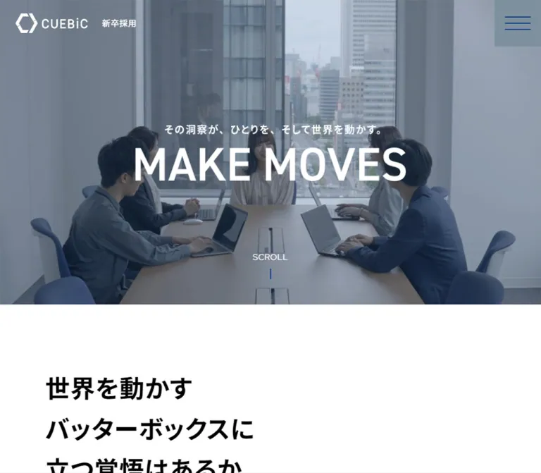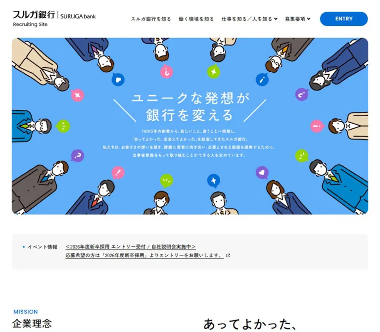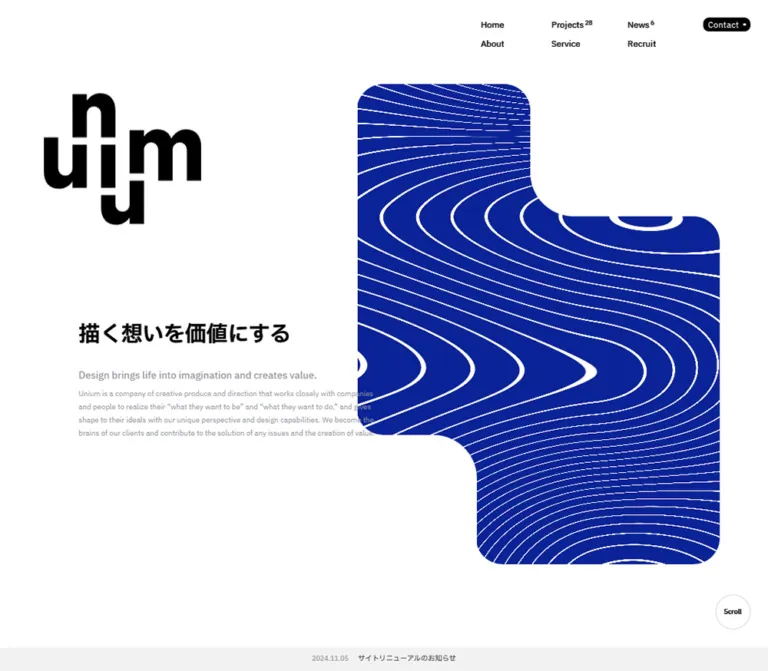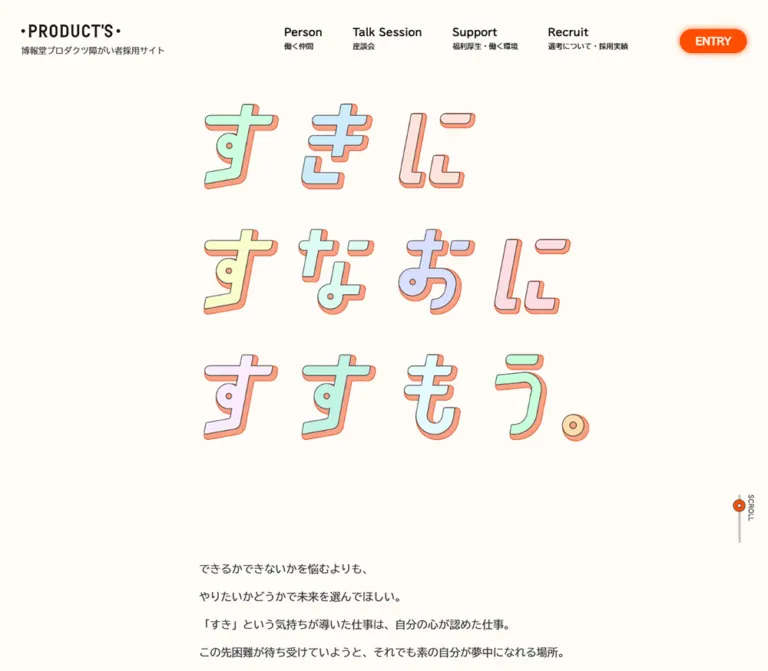
プレビュー準備中デザインリファレンスを見る
日本のWebデザインを、AIの制作リファレンスに。

DESIGN REFERENCE
コバルトブルーとミントを基調に、細身の英字見出し、職種イラスト、ピルと円形矢印を組み合わせたリンクが特徴のキャリア採用サイト。
オリジナルサイトを見るA cobalt recruitment publication built from narrow headlines, generous space, illustrated professions, and paired pill-and-circle links.
Original URL: cuebic.co.jp/recruit/careers Final URL: cuebic.co.jp/recruit/careers Theme: one observed cobalt, white, and mint palette, alternating between blue fields and white editorial sections. Inspected: September 23, 2026, at 01:00:11 JST; supplied retrieval timestamp September 22, 2026, at 16:00:11.681 UTC. Viewports: 1440 × 1000 desktop and 390 × 844 mobile, in CSS pixels. Scope: the current career-recruitment homepage, using supplied opening, profession, vacancy, and footer captures plus rendered DOM measurements. Philosophy links and navigation contents are also documented in the DOM, although their complete visual or interactive states were not captured.
This is a recruitment hub within a larger corporate website. It connects an employer proposition to a media-development model, three professional disciplines, current vacancies, organizational philosophy, and informal ways to meet the company. Its hierarchy supports exploration across several destinations rather than a single conversion action.
Cobalt carries both atmosphere and information: it fills the opening and closing regions, then becomes typography, rules, and icons on white. Mint is concentrated in the broad contact links. Narrow uppercase English headings provide the editorial rhythm, while Japanese copy explains the organization in a more conversational voice. Large empty areas, shallow corner radii, and detached circular arrow symbols keep the interface graphic without introducing a general shadow system.
The inspected page title identifies 株式会社キュービック, and the footer displays Copyright © CUEBiC Inc. with a corporate-home link. No production credits are established by the inspected page evidence.
A cobalt recruitment publication built from narrow headlines, generous space, illustrated professions, and paired pill-and-circle links.
Original URL: cuebic.co.jp/recruit/careers Final URL: cuebic.co.jp/recruit/careers Theme: one observed cobalt, white, and mint palette, alternating between blue fields and white editorial sections. Inspected: September 23, 2026, at 01:00:11 JST; supplied retrieval timestamp September 22, 2026, at 16:00:11.681 UTC. Viewports: 1440 × 1000 desktop and 390 × 844 mobile, in CSS pixels. Scope: the current career-recruitment homepage, using supplied opening, profession, vacancy, and footer captures plus rendered DOM measurements. Philosophy links and navigation contents are also documented in the DOM, although their complete visual or interactive states were not captured.
This is a recruitment hub within a larger corporate website. It connects an employer proposition to a media-development model, three professional disciplines, current vacancies, organizational philosophy, and informal ways to meet the company. Its hierarchy supports exploration across several destinations rather than a single conversion action.
Cobalt carries both atmosphere and information: it fills the opening and closing regions, then becomes typography, rules, and icons on white. Mint is concentrated in the broad contact links. Narrow uppercase English headings provide the editorial rhythm, while Japanese copy explains the organization in a more conversational voice. Large empty areas, shallow corner radii, and detached circular arrow symbols keep the interface graphic without introducing a general shadow system.
The inspected page title identifies 株式会社キュービック, and the footer displays Copyright © CUEBiC Inc. with a corporate-home link. No production credits are established by the inspected page evidence.
ENTRY control, hidden navigation content, and the mobile hero.| Name | Value | Suggested token | Evidence and role |
|---|---|---|---|
| Cobalt | #3c5ad2 |
--color-blue |
Measured rgb(60, 90, 210). Body and profession-section background; visible blue fields; copy, borders, arrows, and headings on light surfaces. |
| Mint | #87dcdc |
--color-mint |
Measured rgb(135, 220, 220). Full-width contact panels and the DOM-defined ENTRY background. |
| White | #ffffff |
--color-white |
Measured. Vacancy and philosophy surfaces, menu button, outlined-button interior, and reversed text. |
| Warm card gray | Approximately #f6f4f4 |
--color-card |
Visual estimate from profession cards. The card-container background was not included in the computed-style sample. |
| Black | #000000 |
--color-brand-black |
Measured as an inherited structural color; also visible in the wordmark variant used in later captures. It is not the dominant visible body-copy color. |
The teal sections of the colored company symbol belong to the brand artwork. Their exact fills were not measured, so they should not be promoted into additional interface tokens without inspecting the authorized asset.
The same cobalt alternates between background and foreground. White text on cobalt establishes the opening and footer; cobalt text on white supports reading and vacancy navigation. Mint is used as a large, flat destination surface rather than as a small badge color scattered throughout the page.
The profession section reports a cobalt background. Mobile visibly retains that frame around the pale cards, while the supplied desktop crop shows white around the lower ends of the profession cards. The evidence does not establish the exact background transition between these regions. Do not assume that one uninterrupted blue rectangle explains every desktop profession surface.
Reported family: TsukuGoPr5-R-AvenirNextLTPro-Regular.
This exact family string appears on the body, Japanese explanations, vacancy links, contact text, and copyright. Most sampled copy uses weight 400. The name is evidence of the computed declaration; font-file URLs, licensing, and font-loading diagnostics were not supplied.
The Japanese text has an open, approachable character. Its role is explanatory rather than decorative. Preserve the source copy's grouping and test real Japanese wrapping instead of substituting short Latin filler.
Reported family: AvenirNextLTPro-Cn.
The source uses this family for the media-development heading, side captions, navigation category labels, utility links, and ENTRY. The media-development heading reports weight 700; sampled navigation and utility labels report 400.
The large section and role headings visibly use a narrow uppercase treatment. Their descendant font sizes were not all sampled. In particular, an H2 wrapper reporting 16px does not mean that its large visible English label is 16px.
The opening DIVE INTO INSIGHTS composition behaves visually as a designed graphic. Extended capsule shapes, outlined counters, and abrupt changes in stroke width are integral to it. The sampled container is an empty-text paragraph, so its body-font declaration does not identify the lettering's construction. Preserve the authorized artwork; do not approximate it by setting an ordinary heading in the interface font.
| Role | Desktop | Mobile | Status |
|---|---|---|---|
| Body baseline | 16px / 18.4px, weight 400 |
Same | Measured inherited baseline, not a universal paragraph style. |
| Media-development title | 80px / 92px, weight 700 |
40px / 42px, weight 700 |
Measured; condensed family. |
| Media-development introduction | 30px / 34.5px |
16px / 18.4px |
Measured. |
| Media-development explanation | 20px / 23px |
16px / 18.4px |
Measured. |
| Profession-card paragraph | 20px / 26px, tracking -1px |
16px / 24px, tracking -0.8px |
Measured; both tracking values equal -0.05em. |
| Large English section labels | Approximately 80px |
Approximately 48–50px |
Visual estimate; child style not supplied. |
| Japanese section subtitle | Approximately 44–48px |
Approximately 22–24px |
Visual estimate. |
| Opening side caption | 21px / 24.15px |
13px / 14.95px |
Measured; mobile caption is clipped in the supplied state. |
| Vacancy-list pill label | 20px / 23px |
18px / 20.7px |
Measured on 求人一覧. |
| Philosophy caption | 18px / 20.7px |
16px / 18.4px |
Measured. |
| Closing invitation paragraph | 35px / 45.85px |
20px / 31px |
Measured; tracking -0.175px and -0.1px. |
| Footer category label | 22px / 22px, tracking 0.44px |
Same | Measured on PROMISE. |
| Footer child link | 14px / 16.1px |
Same declared style | Measured; mobile children are not visibly expanded. |
| Legal utility link | 16px / 18.4px |
Same | Measured; condensed family. |
| Copyright | 13px / 14.95px |
Same | Measured. |
The hidden navigation also contains measured condensed category labels: PROMISE reports 42px / 42px on desktop and 45px / 45px on mobile. These values describe DOM content, not a verified open-menu presentation.
There is no demonstrated universal spacing formula. The page uses several nested widths: viewport-wide color bands, broad profession cards, and a narrower editorial content area.
| Use | Desktop | Mobile | Evidence |
|---|---|---|---|
| Header outer inset | 20px |
10px |
Measured header padding and control positions. |
| Standard content side clearance | 100px at 1440px |
Mostly 15px at 390px |
Measured content positions; desktop implies a 1240px content width. |
| Broad profession-card clearance | Approximately 40px |
Approximately 15px |
Screenshot geometry. |
| Desktop card-column gap | Approximately 20px |
Cards stack | Screenshot geometry and repeated element positions. |
| Featured mobile card inner inset | — |
20px horizontally, approximately 25px vertically |
Inner title at x=35 inside a card beginning near x=15. |
| Vacancy-section top padding | 120px |
100px |
Measured. |
| Vacancy-row padding | 28px 10px |
24px 7.5px |
Measured. |
| Philosophy-section padding | 183px 0 150px |
55px 0 |
Measured. |
| Contact-panel horizontal padding | Approximately 99.8px |
20px |
Measured. |
| Footer padding | 100px 20px 57px |
42px 15px 20px |
Measured. |
| Element | Desktop | Mobile | Status |
|---|---|---|---|
| Menu button | 6px |
3px |
Measured. |
DOM-defined ENTRY control |
6px |
3px |
Measured, visibility unverified. |
| Vacancy-list label capsule | 27px |
21px |
Measured; half its height. |
| Arrow disc | Circle | Circle | Visually observed. |
| Profession card | Approximately 6px |
Approximately 6px |
Visual estimate. |
| Legal-links panel | Approximately 6px |
Approximately 6px |
Visual estimate. |
| Contact band and vacancy rows | Square | Square | Visually observed. |
| Element | Desktop | Mobile |
|---|---|---|
| Document height | 5419.73px, reported as 5420px |
4519.81px, reported as 4520px |
| Opening region | Professions begin at y=1000px |
Professions begin at y=0px in this captured state |
| Hero graphic container | 381 × 287px, x=70, y=643 |
212 × 160px, x=21, y=-181; outside the visible opening |
| Menu button | 63 × 63px |
50 × 50px |
| Profession cards | Approximately 440px wide in three columns |
Approximately 360px wide in one column |
| Featured mobile card | Not fully pictured | Approximately 360 × 479px |
| Vacancy column | 598.91px wide, x=741.09 |
360px wide, x=15 |
| Vacancy link rectangle | 140px high |
90px high |
| Vacancy row pitch | 142px |
91px |
| Philosophy link rectangle | Approximately 400 × 339px |
Approximately 360 × 301–303px |
| Contact destination panel | 718 × 200px each |
390 × 110px each |
| Contact-panel separation | 4px vertical strip |
2px horizontal strip |
| Footer | Approximately 494.47px high |
Approximately 588.61px high |
Vacancy row pitch minus link height indicates a calculated 2px desktop separator and 1px mobile separator. Inline logo-anchor rectangles report only a text-like height; they should not be mistaken for the visible logo artwork's height.
Role: keep identity and navigation available while the page scrolls.
The captures consistently place the logo at the upper left and a white menu square at the upper right. This supports a persistent overlay treatment, although the actual position property was not included in the evidence.
On desktop, the menu occupies x=1357, y=20, with a 63px square and 6px corners. Mobile reduces it to 50px at x=330, y=10, with 3px corners. Three thin cobalt strokes form the menu symbol. The logo is visually about 170px wide on desktop and 125px on mobile.
The opening desktop logo is white. Later desktop and mobile captures show the teal symbol with a black wordmark. The trigger or rendering mechanism behind this change is unknown; do not invent a scroll threshold or blend-mode implementation.
The DOM contains an ENTRY link to the job index, styled as a mint 117 × 63px desktop control and 80 × 50px mobile control. It is not visibly painted in the supplied captures. Its nonzero rectangle is insufficient evidence for a permanently visible entry button.
The mobile profession heading passes underneath the logo in the supplied frame. Treat that collision as an observed limitation, not a spacing pattern to reproduce automatically.
Role: establish the recruitment identity before the information sections.
The desktop opening is a full-viewport cobalt field. A white graphic is anchored 70px from the left and bottom. Its three lines read DIVE, INTO, and INSIGHTS, followed by the Japanese line ひとりを動かし 世の中を動かす.
A narrow white caption, UNLOCKED APPROACH TO INSIGHT DIVING, runs down the right edge, vertically centered. It reports a 21px condensed font and occupies a roughly 24px-wide strip.
The supplied current desktop opening has a large empty central field. No floating illustration layer is visibly established by this capture. Preserve that observation instead of filling the space with invented assets.
The mobile evidence does not establish a normal full-height opening. Its graphic is above the visible region, and the profession section begins at document y=0. The cause could involve responsive styling or runtime state; it was not determined.
Role: introduce the company's professional disciplines.
Pair the condensed uppercase OUR PROFESSIONS heading with the Japanese subtitle ひとりを動かし 世の中を動かすために. The mobile subtitle uses two lines. White text sits on cobalt, and the following pale card introduces a strong surface change.
On desktop, the heading wrapper has substantial internal space: its recorded rectangle is 320px high, including 100px of top padding. On mobile, the wrapper is 150px high with 20px horizontal padding. These are wrapper measurements, not font sizes.
Role: explain the shared working model before individual professions.
The anatomy is a condensed English title, a short Japanese introduction, a longer explanatory paragraph, an illustration, and a 詳しく見る action. The destination is the site's /recruit/careers/media-dev/ page.
Mobile provides the clearest visual evidence. A pale card spans approximately x=15 to x=375. The title begins at x=35 and breaks deliberately into MEDIA, DEVELOPMENT, and MODEL, using measured 40px type with 42px leading. A blue and cyan illustration of people occupies the upper-right corner. The text continues beneath that illustrated title area, and the split action sits close to the bottom.
The mobile title, introduction, and explanation are not proportionally scaled versions of desktop: the title drops from 80px to 40px, the introduction from 30px to 16px, and the explanation from 20px to 16px. The line breaks also change. Preserve these separate typographic decisions.
The complete desktop illustration placement is not visible in the supplied screenshots. Do not infer it from the unusually wide text rectangles alone.
Role: present MARKETER, DESIGNER, and ENGINEER as parallel routes.
Each pale card contains an illustration area, an uppercase English role name, a small Japanese translation, a short Japanese description, and the same split action. Desktop arranges three approximately 440px cards with 20px gaps. Their action wrappers are measured at 341 × 54px.
Mobile stacks the cards. The visible marketer card places the illustration on the left and the title on the right, followed by a full-width explanation and action. The title wrapper begins at x=166.5. Thin white horizontal separators appear in the cobalt gaps between cards.
The marketer illustration depicts a magnifying glass over overlapping blue and cyan bubble forms, accompanied by a peach-colored hand. The other role illustrations are not visible in the supplied current-page captures and should not be invented as source observations.
The paragraph rhythm is compact: desktop uses 20px type with 26px leading; mobile uses 16px with 24px leading. Keep the restrained corner radius and flat surface. Shadows are not part of the visible card treatment.
Role: make navigation recognizable across cards and section endings.
This is the most reusable control on the page. A long capsule contains a left-aligned label; a separate blue disc carries a white right arrow. Both pieces read as one visual action.
| Part | Desktop | Mobile |
|---|---|---|
| Action height | 54px |
42px |
| Disc diameter | Approximately 54px |
Approximately 42px |
| Inter-part gap | Approximately 11px |
Approximately 10px |
| Card action width | 341px |
320px in the feature; 330px in role cards |
| Vacancy-list label width | 276px |
308px |
| Vacancy-list complete visual width | Approximately 341px |
Approximately 360px |
The card version uses a white capsule without a prominent border. The 求人一覧 version adds a cobalt outline. The measured label padding is 25px on desktop and 18px on mobile for the vacancy-list link.
For a new implementation, make the two visual parts one accessible link with a decorative arrow. The supplied measurements do not establish whether every original instance uses that exact DOM anatomy.
Role: expose immediate opportunities without replacing the employer narrative.
A white section places POSITIONS and 現在募集中の職種 on the left, with a ruled vacancy list on the right. At 1440px, the list begins near x=741 and ends at x=1340. This leaves substantial separation between the heading and the actionable content.
Three rows are documented: WEBマーケター, and two キャリアアドバイザー entries differentiated by experience requirements. Each has a large title, a smaller qualification line, and an outlined external-link symbol at the right. Their supplied hrefs point to individual listings on HERP; click results and new-tab behavior were not tested.
The list is a set of flat editorial rows, not individual cards. Desktop links are 140px high, separated by approximately 2px rules. Mobile links are 90px high, with approximately 1px rules. The heading moves above the list, and the final split action expands across the available mobile content width.
Role: connect recruitment to values, working conditions, and leadership.
The DOM documents OUR PHILOSOPHY, a Japanese subtitle, and three links: ミッション、ビジョン、コアバリュー、クレド, 制度・環境, and CEOメッセージ.
Desktop link rectangles form three approximately 400px-wide columns with 20px gaps inside the 1240px content width. Mobile stacks approximately 360px-wide entries. Captions sit near the bottom of each tall link rectangle and use 18px desktop or 16px mobile text.
The geometry supports a visual-led editorial grid, but the images themselves were not included in the visible captures or image-element measurements. Their subjects, exact aspect ratios, and crop behavior remain unverified. Do not describe an assumed portrait or office photograph as an observed asset.
Role: invite continued contact after the formal recruitment information.
A substantial Japanese paragraph appears in white on cobalt. Its voice is informal and welcoming, proposing conversation and continued reading through the company's other channels.
Desktop uses 35px type with 45.85px leading over approximately 1240px of usable text width. Mobile changes to 20px with 31px leading and 21px side padding. This is a distinct reading treatment, not ordinary footer fine print.
Role: provide two broad relationship-building destinations.
Meetup / カジュアル面談 and 公式note each occupy a full panel. A title and smaller explanatory line sit at the left; a blue circular external-link indicator sits at the right.
Desktop places two 718 × 200px panels side by side, separated by 4px of cobalt. Mobile stacks 390 × 110px panels with a 2px horizontal separator. Mobile circles appear approximately 32px across, but the entire panel is represented by an anchor, so the visible disc is not the whole interaction target.
Use bounded text and icon columns. The longer mobile note description wraps near the icon in the capture; reserve clear space for it in a new implementation.
Role: close the page with structured routes and corporate identity.
Desktop uses three navigation groups—PROMISE, PROFESSIONS, and PHILOSOPHY—with a large white company mark on the right. Category labels are condensed and uppercase; subordinate links use smaller general-interface type. A white rounded bar below contains legal links at the left and blue copyright text at the right.
Mobile changes the information architecture visibly. PROMISE appears as a direct link row. PROFESSIONS and PHILOSOPHY appear as approximately 60px-high rows with plus signs, separated by white rules. Their children remain present in DOM evidence but are not visibly expanded. Opening behavior was not exercised.
The white company mark then centers at approximately 86px wide. Legal links stack inside a pale rounded panel approximately 360px wide and 144px high. Copyright moves below that panel and becomes white on cobalt. This is a structural reflow, not a scaled-down desktop footer.
The following transitions are present in computed styles. None establishes the trigger or final visual state on its own.
| Element | Reported transition | What is established |
|---|---|---|
| Hero graphic container | Desktop opacity 1s; mobile also transform 0.5s |
Fade and mobile transform transitions are declared; their sequence is unverified. |
| Menu button | background-color 0.3s |
Background can transition; menu opening was not captured. |
ENTRY link |
Color and background 0.3s; opacity 0.5s |
Styles support appearance changes; visible timing is unknown. |
| Profession headings and paragraphs | color 0.2s |
Text-color transition is declared. |
| Vacancy row | opacity 0.2s |
Opacity feedback is declared; target opacity is unknown. |
| Vacancy-list capsule | Width, background, and color 0.5s cubic-bezier(0.19, 1, 0.22, 1) |
The strongest measured easing signature; resulting geometry was not observed. |
| Contact panel | background-color 0.1s |
A short background transition is declared. |
Sampled elements report animation: none. This does not rule out JavaScript animation, unsampled descendants, or other rendering layers. Bare transition: all entries without a supplied duration are not sufficient evidence of a visible animation.
Scrolling is evidenced by captures at different page positions, and header controls remain at consistent screen locations. No menu opening, footer expansion, keyboard traversal, hover comparison, or destination click was supplied. Do not specify parallax, floating-object paths, accordion durations, or exact hover color inversions as original behavior.
| Layer | Appearance | Function |
|---|---|---|
| Opening and closing fields | Solid cobalt with white typography | Brand atmosphere and narrative framing. |
| Profession cards | Pale warm gray, shallow corners, blue text | Separate professional explanations from their surrounding field. |
| Vacancy and philosophy regions | White with cobalt text | Support scanning and editorial reading. |
| Contact destinations | Mint, square-edged, blue labels and discs | Establish a distinct invitation area. |
| Primary navigation control | White rounded square | Keep the menu immediately recognizable. |
| Legal panel | White with blue utility text | Consolidate corporate utility links. |
The visible interface relies on large color changes, whitespace, thin rules, and strong type proportions. There is no observed general-purpose elevation scale, glass effect, or drop-shadow hierarchy.
The current mobile profession capture establishes a clean, stylized illustration language: cobalt and cyan shapes, rounded organic forms, black hair or outlines, peach skin tones, and areas of soft shading or texture. The media-development illustration groups people together; the marketer illustration combines a hand, magnifier, and overlapping bubble forms.
Keep these illustrations visually separate from the typography and the company symbol. They add warmth to the systematic blue interface without becoming full-bleed photographic backgrounds. Preserve smooth edges and the artwork's native shading; pixelated rendering would be inappropriate here.
The hero lettering is a separate graphic asset in appearance. Its elongated counters and alternating heavy and thin strokes cannot be reproduced faithfully by choosing a condensed font alone.
| Asset or evidence | Reference | Confidence |
|---|---|---|
| Company mark | Visible in opening, header, and footer captures; original filename not provided | Appearance observed; asset URL unknown. |
| Hero lettering | Visible in the current desktop opening; container measured at 381 × 287px |
Appearance and container observed; file format and URL unknown. |
| Media-development and marketer illustrations | Visible in the supplied mobile profession capture | Appearance observed; original URLs unknown. |
| Promise asset reference | https://cuebic.co.jp/recruit/careers/wp-content/uploads/2024/01/promise13.webp |
String present in original-page inline data. Its visible appearance, decoding, placement, and dimensions were not verified. |
The inline asset reference is evidence of a referenced resource, not proof that it was rendered. It should not be used to populate the empty opening field without further original-page inspection.
The desktop page measures approximately 5420px high. Its main sequence is an opening field, professions, vacancies, philosophy, a closing invitation, the mint contact band, and the footer. Measured section starts are y=1000 for professions, y=2476.09 for vacancies, and y=3128.09 for philosophy.
At 1440px, the main editorial width is approximately 1240px with 100px side margins. Profession cards extend farther outward to roughly 40px side margins. The opening graphic uses a third alignment at x=70. Preserve these nested alignments instead of forcing every element into one uniform container.
At 390px, primary content generally uses 15px outside margins. Cards and philosophy links stack, vacancy headings move above their lists, and the contact band becomes two full-width rows. The footer converts from columns to expandable-looking navigation rows, a centered mark, stacked utility links, and a separate copyright line.
The mobile hero is a material exception. Professions begin at y=0; the hero graphic's measured bottom is y=-21. The mobile document is approximately 4520px high. The supplied state therefore does not support adding a conventional 844px opening panel and describing it as observed behavior. Whether the source intentionally suppresses that region or reached another runtime state is unresolved.
Only desktop and mobile endpoints are known. A 48rem breakpoint in the Quick Start is a recommendation for demonstrating reflow, not a recovered source breakpoint. Test intermediate widths, Japanese wrapping, fixed-header clearance, zoom, and landscape separately.
#3c5ad2 and mint #87dcdc as the central palette.ENTRY button from its rectangle.These are recommendations for a new implementation, not verified original features:
5.86:1, cobalt on mint 3.71:1, and white on mint 1.58:1. The latter two need attention for normal-sized text; this is especially relevant if exposing the DOM-defined ENTRY treatment.#3c5ad2.#ffffff.#87dcdc.#f6f4f4, a visual estimate.“Create a Japanese career-recruitment hub using cobalt #3c5ad2, white, and mint #87dcdc. Combine narrow uppercase English section headings with approachable Japanese copy. Use a spacious cobalt opening with authorized custom lettering anchored at the lower left, pale illustrated profession cards, a white vacancy section with horizontal rules, a three-link philosophy grid, and a large white-on-blue closing paragraph. Repeat a navigation motif consisting of a long capsule and a separate circular arrow. Finish with two mint contact panels and a structured blue footer. On mobile, stack the cards and panels, move vacancy headings above the list, and use accessible footer disclosures. Treat the supplied professions-first mobile opening as a documented capture state, not proof of universal hero behavior.”
詳しく見る beside a detached blue arrow disc. On a phone, place the illustration beside the heading and the paragraph beneath both.”POSITIONS heading at the left and a ruled list at the right. Each row contains a Japanese job title, a smaller qualification line, and an outlined external-link symbol. Use cobalt throughout. Stack the heading above the list on mobile.”This is a reusable shell, not the original stylesheet. Measured colors, font declarations, and major control dimensions are retained. The card gray, large section-label sizes, some layout spacing, and the 48rem breakpoint are adaptations. Original fonts require authorized font files; the fallbacks below are implementation choices.
The optional data-mobile-state='professions-first' attribute reproduces the supplied mobile composition without asserting that the original site always hides its mobile hero. Menu logic, footer disclosure state, artwork, and any runtime hero behavior require separate implementation.
:root {
  /* Measured palette; card gray is a visual approximation. */
  --color-blue: #3c5ad2;
  --color-mint: #87dcdc;
  --color-white: #ffffff;
  --color-card: #f6f4f4;

  /* Observed family names with recommended fallbacks. */
  --font-body: 'TsukuGoPr5-R-AvenirNextLTPro-Regular', sans-serif;
  --font-display: 'AvenirNextLTPro-Cn', 'Arial Narrow', sans-serif;

  --content-width: 1240px;
  --wide-width: 1360px;
  --gutter: 20px;
  --wide-gutter: 40px;
  --control-size: 54px;
  --control-gap: 11px;
  --radius-panel: 6px;
  --rule: 2px;
  --text-section: 80px;
  --text-section-jp: 48px;
  --ease-capsule: cubic-bezier(0.19, 1, 0.22, 1);
}

.careers-page,
.careers-page * {
  box-sizing: border-box;
}

.careers-page {
  margin: 0;
  color: var(--color-blue);
  background: var(--color-blue);
  font: 400 16px / 1.15 var(--font-body);
}

.careers-page a { color: inherit; }
.careers-page img { max-width: 100%; height: auto; }
.careers-page button { font: inherit; }
.careers-page [hidden] { display: none !important; }

.content {
  width: calc(100% - 2 * var(--gutter));
  max-width: var(--content-width);
  margin-inline: auto;
}

.wide-content {
  width: calc(100% - 2 * var(--wide-gutter));
  max-width: var(--wide-width);
  margin-inline: auto;
}

.site-header {
  position: fixed;
  inset: 20px 20px auto;
  z-index: 50;
  display: flex;
  align-items: flex-start;
  justify-content: space-between;
  color: var(--color-white);
}

.header-brand { display: block; width: 170px; }
.header-brand img { display: block; width: 100%; }

.menu-button {
  display: grid;
  place-content: center;
  gap: 6px;
  width: 63px;
  height: 63px;
  padding: 0;
  border: 0;
  border-radius: 6px;
  color: var(--color-blue);
  background: var(--color-white);
  cursor: pointer;
  transition: background-color 300ms;
}

.menu-button span {
  display: block;
  width: 20px;
  height: 1.5px;
  background: currentColor;
}

.hero {
  position: relative;
  min-height: 100svh;
  color: var(--color-white);
  background: var(--color-blue);
}

.hero-wordmark {
  position: absolute;
  left: 70px;
  bottom: 70px;
  width: 381px;
  max-width: calc(100% - 140px);
  margin: 0;
}

.hero-wordmark img { display: block; width: 100%; }

.hero-side-caption {
  position: absolute;
  top: 50%;
  right: 10px;
  margin: 0;
  writing-mode: vertical-rl;
  transform: translateY(-50%);
  font: 400 21px / 1.15 var(--font-display);
}

.section-title { margin: 0; font-weight: 400; }
.section-title__en {
  display: block;
  font: 400 var(--text-section) / 1 var(--font-display);
}
.section-title__jp {
  display: block;
  margin-top: 10px;
  font-size: var(--text-section-jp);
  line-height: 1.2;
}

/* Desktop spacing here is an adaptation of the observed hierarchy. */
.professions {
  padding-block: 180px 40px;
  color: var(--color-white);
}
.professions .section-title { margin-bottom: 80px; }

.feature-card,
.role-card {
  border-radius: var(--radius-panel);
  color: var(--color-blue);
  background: var(--color-card);
}

.feature-card { padding: 50px 60px; }
.feature-title {
  margin: 0;
  font: 700 80px / 1.15 var(--font-display);
}
.feature-lead { margin: 20px 0; font-size: 30px; line-height: 1.15; }
.feature-copy { margin: 0; font-size: 20px; line-height: 1.15; }
.feature-card .split-cta { margin-top: 30px; }

.role-grid {
  display: grid;
  grid-template-columns: repeat(3, minmax(0, 1fr));
  gap: 20px;
  margin-top: 40px;
}
.role-card { padding: 40px 50px; }
.role-card__title {
  margin: 0;
  font: 400 48px / 1.05 var(--font-display);
}
.role-card__label { display: block; margin-top: 5px; font-size: 14px; }
.role-copy {
  padding-inline: 10px;
  font-size: 20px;
  line-height: 1.3;
  letter-spacing: -0.05em;
}

.split-cta {
  display: inline-grid;
  grid-template-columns: minmax(0, 1fr) var(--control-size);
  align-items: center;
  gap: var(--control-gap);
  width: 341px;
  max-width: 100%;
  min-height: var(--control-size);
  text-decoration: none;
}
.cta-label,
.cta-disc {
  display: flex;
  align-items: center;
  min-height: var(--control-size);
  border-radius: 999px;
}
.cta-label {
  padding: 8px 25px;
  border: var(--rule) solid transparent;
  color: var(--color-blue);
  background: var(--color-white);
  font-size: 20px;
  transition:
    background-color 500ms var(--ease-capsule),
    color 500ms var(--ease-capsule);
}
.split-cta--outline .cta-label { border-color: var(--color-blue); }
.cta-disc {
  justify-content: center;
  width: var(--control-size);
  height: var(--control-size);
  color: var(--color-white);
  background: var(--color-blue);
}
.cta-disc svg { width: 24px; height: 24px; }

.positions {
  padding-top: 120px;
  background: var(--color-white);
}
.positions-grid {
  display: grid;
  grid-template-columns: repeat(2, minmax(0, 1fr));
  gap: 42px;
}
.positions-list {
  margin: 0;
  padding: 0;
  border-top: var(--rule) solid currentColor;
  list-style: none;
}
.position-item { border-bottom: var(--rule) solid currentColor; }
.position-link {
  position: relative;
  display: block;
  min-height: 140px;
  padding: 28px 44px 28px 10px;
  text-decoration: none;
  transition: opacity 200ms;
}
.position-title { display: block; font-size: 36px; line-height: 1.2; }
.position-detail { display: block; margin-top: 3px; font-size: 16px; }
.position-external {
  position: absolute;
  top: 30px;
  right: 10px;
  width: 22px;
  height: 22px;
}
.positions-action { display: flex; justify-content: flex-end; margin-top: 50px; }

.philosophy { padding: 183px 0 150px; background: var(--color-white); }
.philosophy-grid {
  display: grid;
  grid-template-columns: repeat(3, minmax(0, 1fr));
  gap: 20px;
  margin-top: 80px;
}
.philosophy-card { min-width: 0; text-decoration: none; }
.philosophy-card img { display: block; width: 100%; }
.philosophy-caption { padding-inline: 7px; font-size: 18px; line-height: 1.15; }

.invitation { padding-block: 100px 85px; color: var(--color-white); }
.invitation-copy {
  margin: 0;
  font-size: 35px;
  line-height: 1.31;
  letter-spacing: -0.005em;
}
.contact-band {
  display: grid;
  grid-template-columns: repeat(2, minmax(0, 1fr));
  gap: 4px;
  background: var(--color-blue);
}
.contact-panel {
  display: grid;
  grid-template-columns: minmax(0, 1fr) 54px;
  align-items: center;
  gap: 20px;
  min-height: 200px;
  padding: 30px 6.93vw;
  background: var(--color-mint);
  text-decoration: none;
  transition: background-color 100ms;
}
.contact-title { display: block; font-size: 34px; line-height: 1.2; }
.contact-description { display: block; font-size: 18px; line-height: 1.3; }

.site-footer { padding: 100px 20px 57px; color: var(--color-white); }
.footer-grid {
  display: grid;
  grid-template-columns: 0.8fr 1.4fr 2.2fr 150px;
  gap: 48px;
  max-width: var(--content-width);
  margin-inline: auto;
}
.footer-heading {
  margin: 0 0 20px;
  font: 400 22px / 1 var(--font-display);
  letter-spacing: 0.02em;
}
.footer-subnav a { display: block; padding-block: 6px; font-size: 14px; }
.footer-brand { display: block; width: 150px; }
.footer-brand img { display: block; width: 100%; }
.legal-bar {
  display: flex;
  align-items: center;
  justify-content: space-between;
  gap: 20px;
  min-height: 50px;
  margin-top: 110px;
  padding: 12px 30px;
  border-radius: 6px;
  color: var(--color-blue);
  background: var(--color-white);
}
.legal-links { display: flex; flex-wrap: wrap; gap: 16px; }
.legal-links a { font: 400 16px / 1.15 var(--font-display); text-decoration: none; }
.copyright { margin: 0; font-size: 13px; line-height: 1.15; }

/* Recommended interaction feedback; original hover endpoints are unknown. */
@media (hover: hover) {
  .split-cta:hover .cta-label { background: var(--color-mint); }
}
.careers-page :focus-visible { outline: 2px solid currentColor; outline-offset: 4px; }

/* Recommended breakpoint, not an extracted source value. */
@media (max-width: 48rem) {
  :root {
    --gutter: 15px;
    --wide-gutter: 15px;
    --control-size: 42px;
    --control-gap: 10px;
    --rule: 1px;
    --text-section: 50px;
    --text-section-jp: 24px;
  }

  .site-header { inset: 10px 10px auto; }
  .header-brand { width: 125px; }
  .menu-button { width: 50px; height: 50px; border-radius: 3px; }

  /* Explicit adaptation switch for the supplied capture state. */
  .careers-page[data-mobile-state='professions-first'] .hero { display: none; }

  .professions { padding-block: 40px 22px; }
  .professions .section-title { padding-inline: 5px; margin-bottom: 40px; }
  .feature-card { padding: 25px 20px; }
  .feature-title { font-size: 40px; line-height: 1.05; }
  .feature-lead, .feature-copy { font-size: 16px; line-height: 1.15; }
  .role-grid { grid-template-columns: 1fr; gap: 30px; margin-top: 30px; }
  .role-card { padding: 24px 15px; }
  .role-card__header {
    display: grid;
    grid-template-columns: 116.5px minmax(0, 1fr);
    align-items: center;
    gap: 20px;
  }
  .role-card__title { font-size: 40px; }
  .role-copy { padding-inline: 5px; font-size: 16px; line-height: 1.5; }
  .split-cta { width: 100%; }
  .cta-label { padding-inline: 18px; font-size: 18px; }
  .cta-disc svg { width: 20px; height: 20px; }

  .positions { padding-top: 100px; }
  .positions-grid { grid-template-columns: 1fr; gap: 30px; }
  .position-link { min-height: 90px; padding: 24px 36px 24px 7.5px; }
  .position-title { font-size: 22px; }
  .position-detail { font-size: 14px; }
  .position-external { top: 25px; right: 8px; width: 18px; height: 18px; }
  .positions-action { margin-top: 30px; }

  .philosophy { padding-block: 55px; }
  .philosophy-grid { grid-template-columns: 1fr; gap: 28px; margin-top: 30px; }
  .philosophy-caption { padding-inline: 8px; font-size: 16px; }
  .invitation { padding-block: 80px 31px; }
  .invitation .content { width: auto; margin-inline: 21px; }
  .invitation-copy { font-size: 20px; line-height: 1.55; }
  .contact-band { grid-template-columns: 1fr; gap: 2px; }
  .contact-panel { grid-template-columns: minmax(0, 1fr) 32px; min-height: 110px; padding: 20px; gap: 12px; }
  .contact-title { font-size: 26px; }
  .contact-description { font-size: 14px; }
  .contact-panel .cta-disc { width: 32px; height: 32px; min-height: 32px; }

  .site-footer { padding: 42px 15px 20px; }
  .footer-grid { display: block; }
  .footer-group { border-top: 1px solid currentColor; }
  .footer-group:last-of-type { border-bottom: 1px solid currentColor; }
  .footer-heading { min-height: 60px; margin: 0; padding: 19px 8px; }
  .footer-subnav { padding: 0 8px 20px; }
  .footer-brand { width: 86px; margin: 38px auto 24px; }
  .legal-bar { display: block; min-height: 0; margin-top: 0; padding: 0; background: transparent; }
  .legal-links { display: grid; gap: 10px; padding: 20px; border-radius: 6px; background: var(--color-white); }
  .copyright { margin-top: 20px; color: var(--color-white); text-align: center; }
}

/* Recommended reduced-motion behavior for this shell. */
@media (prefers-reduced-motion: reduce) {
  .careers-page *,
  .careers-page *::before,
  .careers-page *::after {
    animation: none !important;
    transition: none !important;
    scroll-behavior: auto !important;
  }
}
Use one anchor for the complete split action. This example points to a destination present in the original-page DOM:
<a class='split-cta split-cta--outline'
   href='https://cuebic.co.jp/recruit/careers/job/'>
  <span class='cta-label'>求人一覧</span>
  <span class='cta-disc' aria-hidden='true'>
    <svg viewBox='0 0 24 24' fill='none'>
      <path d='M4 12h16m-6-6 6 6-6 6'
            stroke='currentColor' stroke-width='1.5' />
    </svg>
  </span>
</a>
Optional aliases for a project already using Tailwind v4. This is not evidence that the original website uses Tailwind. Define the custom properties above first.
@theme inline {
  --color-career-blue: var(--color-blue);
  --color-career-mint: var(--color-mint);
  --color-career-card: var(--color-card);
  --color-career-white: var(--color-white);

  --font-career-body: var(--font-body);
  --font-career-display: var(--font-display);

  --spacing-career-control: var(--control-size);
  --spacing-career-gutter: var(--gutter);
  --radius-career-panel: var(--radius-panel);
}
This reference describes the supplied current-page evidence. Screenshot estimates, calculated values, unverified states, and implementation recommendations are labeled separately from measured source values.
# CUEBiC Career Recruitment — Style Reference

> A cobalt recruitment publication built from narrow headlines, generous space, illustrated professions, and paired pill-and-circle links.

**Original URL:** [cuebic.co.jp/recruit/careers](https://cuebic.co.jp/recruit/careers/)
**Final URL:** [cuebic.co.jp/recruit/careers](https://cuebic.co.jp/recruit/careers/)
**Theme:** one observed cobalt, white, and mint palette, alternating between blue fields and white editorial sections.
**Inspected:** September 23, 2026, at 01:00:11 JST; supplied retrieval timestamp September 22, 2026, at 16:00:11.681 UTC.
**Viewports:** 1440 × 1000 desktop and 390 × 844 mobile, in CSS pixels.
**Scope:** the current career-recruitment homepage, using supplied opening, profession, vacancy, and footer captures plus rendered DOM measurements. Philosophy links and navigation contents are also documented in the DOM, although their complete visual or interactive states were not captured.

This is a recruitment hub within a larger corporate website. It connects an employer proposition to a media-development model, three professional disciplines, current vacancies, organizational philosophy, and informal ways to meet the company. Its hierarchy supports exploration across several destinations rather than a single conversion action.

Cobalt carries both atmosphere and information: it fills the opening and closing regions, then becomes typography, rules, and icons on white. Mint is concentrated in the broad contact links. Narrow uppercase English headings provide the editorial rhythm, while Japanese copy explains the organization in a more conversational voice. Large empty areas, shallow corner radii, and detached circular arrow symbols keep the interface graphic without introducing a general shadow system.

The inspected page title identifies 株式会社キュービック, and the footer displays `Copyright © CUEBiC Inc.` with a corporate-home link. No production credits are established by the inspected page evidence.
# CUEBiC Career Recruitment — Style Reference

> A cobalt recruitment publication built from narrow headlines, generous space, illustrated professions, and paired pill-and-circle links.

**Original URL:** [cuebic.co.jp/recruit/careers](https://cuebic.co.jp/recruit/careers/)
**Final URL:** [cuebic.co.jp/recruit/careers](https://cuebic.co.jp/recruit/careers/)
**Theme:** one observed cobalt, white, and mint palette, alternating between blue fields and white editorial sections.
**Inspected:** September 23, 2026, at 01:00:11 JST; supplied retrieval timestamp September 22, 2026, at 16:00:11.681 UTC.
**Viewports:** 1440 × 1000 desktop and 390 × 844 mobile, in CSS pixels.
**Scope:** the current career-recruitment homepage, using supplied opening, profession, vacancy, and footer captures plus rendered DOM measurements. Philosophy links and navigation contents are also documented in the DOM, although their complete visual or interactive states were not captured.

This is a recruitment hub within a larger corporate website. It connects an employer proposition to a media-development model, three professional disciplines, current vacancies, organizational philosophy, and informal ways to meet the company. Its hierarchy supports exploration across several destinations rather than a single conversion action.

Cobalt carries both atmosphere and information: it fills the opening and closing regions, then becomes typography, rules, and icons on white. Mint is concentrated in the broad contact links. Narrow uppercase English headings provide the editorial rhythm, while Japanese copy explains the organization in a more conversational voice. Large empty areas, shallow corner radii, and detached circular arrow symbols keep the interface graphic without introducing a general shadow system.

The inspected page title identifies 株式会社キュービック, and the footer displays `Copyright © CUEBiC Inc.` with a corporate-home link. No production credits are established by the inspected page evidence.

## How to Read This Reference

- **Measured** means reported by the supplied rendered DOM or computed styles. Values describe the inspected state, not every possible runtime state.
- **Visual estimate** means inferred from the supplied current-page screenshots. Estimated colors and dimensions are explicitly identified.
- **Calculated** means derived from measured values, such as column gaps or color-contrast ratios.
- **Recommendation** means guidance for a new implementation. The Quick Start is an adaptation, not recovered source code.
- Token names are descriptive aliases. The supplied custom-property inventory is empty; no original CSS variable names were established.
- A DOM rectangle does not prove that an element was visibly painted. This matters for the `ENTRY` control, hidden navigation content, and the mobile hero.
- Only two viewport widths were supplied. Original breakpoint values, intermediate layouts, and landscape behavior remain unknown.

## Tokens — Colors

### Core Palette

| Name | Value | Suggested token | Evidence and role |
| --- | --- | --- | --- |
| Cobalt | `#3c5ad2` | `--color-blue` | Measured `rgb(60, 90, 210)`. Body and profession-section background; visible blue fields; copy, borders, arrows, and headings on light surfaces. |
| Mint | `#87dcdc` | `--color-mint` | Measured `rgb(135, 220, 220)`. Full-width contact panels and the DOM-defined `ENTRY` background. |
| White | `#ffffff` | `--color-white` | Measured. Vacancy and philosophy surfaces, menu button, outlined-button interior, and reversed text. |
| Warm card gray | Approximately `#f6f4f4` | `--color-card` | Visual estimate from profession cards. The card-container background was not included in the computed-style sample. |
| Black | `#000000` | `--color-brand-black` | Measured as an inherited structural color; also visible in the wordmark variant used in later captures. It is not the dominant visible body-copy color. |

The teal sections of the colored company symbol belong to the brand artwork. Their exact fills were not measured, so they should not be promoted into additional interface tokens without inspecting the authorized asset.

### Color Behavior

The same cobalt alternates between background and foreground. White text on cobalt establishes the opening and footer; cobalt text on white supports reading and vacancy navigation. Mint is used as a large, flat destination surface rather than as a small badge color scattered throughout the page.

The profession section reports a cobalt background. Mobile visibly retains that frame around the pale cards, while the supplied desktop crop shows white around the lower ends of the profession cards. The evidence does not establish the exact background transition between these regions. Do not assume that one uninterrupted blue rectangle explains every desktop profession surface.

## Tokens — Typography

### Japanese and General Interface Copy

**Reported family:** `TsukuGoPr5-R-AvenirNextLTPro-Regular`.

This exact family string appears on the body, Japanese explanations, vacancy links, contact text, and copyright. Most sampled copy uses weight `400`. The name is evidence of the computed declaration; font-file URLs, licensing, and font-loading diagnostics were not supplied.

The Japanese text has an open, approachable character. Its role is explanatory rather than decorative. Preserve the source copy's grouping and test real Japanese wrapping instead of substituting short Latin filler.

### Condensed English Display

**Reported family:** `AvenirNextLTPro-Cn`.

The source uses this family for the media-development heading, side captions, navigation category labels, utility links, and `ENTRY`. The media-development heading reports weight `700`; sampled navigation and utility labels report `400`.

The large section and role headings visibly use a narrow uppercase treatment. Their descendant font sizes were not all sampled. In particular, an `H2` wrapper reporting `16px` does not mean that its large visible English label is 16px.

### Hero Lettering and Brand Marks

The opening `DIVE INTO INSIGHTS` composition behaves visually as a designed graphic. Extended capsule shapes, outlined counters, and abrupt changes in stroke width are integral to it. The sampled container is an empty-text paragraph, so its body-font declaration does not identify the lettering's construction. Preserve the authorized artwork; do not approximate it by setting an ordinary heading in the interface font.

### Type Scale

| Role | Desktop | Mobile | Status |
| --- | --- | --- | --- |
| Body baseline | `16px / 18.4px`, weight `400` | Same | Measured inherited baseline, not a universal paragraph style. |
| Media-development title | `80px / 92px`, weight `700` | `40px / 42px`, weight `700` | Measured; condensed family. |
| Media-development introduction | `30px / 34.5px` | `16px / 18.4px` | Measured. |
| Media-development explanation | `20px / 23px` | `16px / 18.4px` | Measured. |
| Profession-card paragraph | `20px / 26px`, tracking `-1px` | `16px / 24px`, tracking `-0.8px` | Measured; both tracking values equal `-0.05em`. |
| Large English section labels | Approximately `80px` | Approximately `48–50px` | Visual estimate; child style not supplied. |
| Japanese section subtitle | Approximately `44–48px` | Approximately `22–24px` | Visual estimate. |
| Opening side caption | `21px / 24.15px` | `13px / 14.95px` | Measured; mobile caption is clipped in the supplied state. |
| Vacancy-list pill label | `20px / 23px` | `18px / 20.7px` | Measured on `求人一覧`. |
| Philosophy caption | `18px / 20.7px` | `16px / 18.4px` | Measured. |
| Closing invitation paragraph | `35px / 45.85px` | `20px / 31px` | Measured; tracking `-0.175px` and `-0.1px`. |
| Footer category label | `22px / 22px`, tracking `0.44px` | Same | Measured on `PROMISE`. |
| Footer child link | `14px / 16.1px` | Same declared style | Measured; mobile children are not visibly expanded. |
| Legal utility link | `16px / 18.4px` | Same | Measured; condensed family. |
| Copyright | `13px / 14.95px` | Same | Measured. |

The hidden navigation also contains measured condensed category labels: `PROMISE` reports `42px / 42px` on desktop and `45px / 45px` on mobile. These values describe DOM content, not a verified open-menu presentation.

## Tokens — Spacing & Shapes

There is no demonstrated universal spacing formula. The page uses several nested widths: viewport-wide color bands, broad profession cards, and a narrower editorial content area.

### Spacing Scale

| Use | Desktop | Mobile | Evidence |
| --- | --- | --- | --- |
| Header outer inset | `20px` | `10px` | Measured header padding and control positions. |
| Standard content side clearance | `100px` at 1440px | Mostly `15px` at 390px | Measured content positions; desktop implies a 1240px content width. |
| Broad profession-card clearance | Approximately `40px` | Approximately `15px` | Screenshot geometry. |
| Desktop card-column gap | Approximately `20px` | Cards stack | Screenshot geometry and repeated element positions. |
| Featured mobile card inner inset | `—` | `20px` horizontally, approximately `25px` vertically | Inner title at x=35 inside a card beginning near x=15. |
| Vacancy-section top padding | `120px` | `100px` | Measured. |
| Vacancy-row padding | `28px 10px` | `24px 7.5px` | Measured. |
| Philosophy-section padding | `183px 0 150px` | `55px 0` | Measured. |
| Contact-panel horizontal padding | Approximately `99.8px` | `20px` | Measured. |
| Footer padding | `100px 20px 57px` | `42px 15px 20px` | Measured. |

### Border Radius

| Element | Desktop | Mobile | Status |
| --- | --- | --- | --- |
| Menu button | `6px` | `3px` | Measured. |
| DOM-defined `ENTRY` control | `6px` | `3px` | Measured, visibility unverified. |
| Vacancy-list label capsule | `27px` | `21px` | Measured; half its height. |
| Arrow disc | Circle | Circle | Visually observed. |
| Profession card | Approximately `6px` | Approximately `6px` | Visual estimate. |
| Legal-links panel | Approximately `6px` | Approximately `6px` | Visual estimate. |
| Contact band and vacancy rows | Square | Square | Visually observed. |

### Layout Measurements

| Element | Desktop | Mobile |
| --- | --- | --- |
| Document height | `5419.73px`, reported as 5420px | `4519.81px`, reported as 4520px |
| Opening region | Professions begin at y=`1000px` | Professions begin at y=`0px` in this captured state |
| Hero graphic container | `381 × 287px`, x=`70`, y=`643` | `212 × 160px`, x=`21`, y=`-181`; outside the visible opening |
| Menu button | `63 × 63px` | `50 × 50px` |
| Profession cards | Approximately `440px` wide in three columns | Approximately `360px` wide in one column |
| Featured mobile card | Not fully pictured | Approximately `360 × 479px` |
| Vacancy column | `598.91px` wide, x=`741.09` | `360px` wide, x=`15` |
| Vacancy link rectangle | `140px` high | `90px` high |
| Vacancy row pitch | `142px` | `91px` |
| Philosophy link rectangle | Approximately `400 × 339px` | Approximately `360 × 301–303px` |
| Contact destination panel | `718 × 200px` each | `390 × 110px` each |
| Contact-panel separation | `4px` vertical strip | `2px` horizontal strip |
| Footer | Approximately `494.47px` high | Approximately `588.61px` high |

Vacancy row pitch minus link height indicates a calculated 2px desktop separator and 1px mobile separator. Inline logo-anchor rectangles report only a text-like height; they should not be mistaken for the visible logo artwork's height.

## Components

### Persistent Brand and Menu Controls

**Role:** keep identity and navigation available while the page scrolls.

The captures consistently place the logo at the upper left and a white menu square at the upper right. This supports a persistent overlay treatment, although the actual `position` property was not included in the evidence.

On desktop, the menu occupies x=1357, y=20, with a 63px square and 6px corners. Mobile reduces it to 50px at x=330, y=10, with 3px corners. Three thin cobalt strokes form the menu symbol. The logo is visually about 170px wide on desktop and 125px on mobile.

The opening desktop logo is white. Later desktop and mobile captures show the teal symbol with a black wordmark. The trigger or rendering mechanism behind this change is unknown; do not invent a scroll threshold or blend-mode implementation.

The DOM contains an `ENTRY` link to the job index, styled as a mint `117 × 63px` desktop control and `80 × 50px` mobile control. It is not visibly painted in the supplied captures. Its nonzero rectangle is insufficient evidence for a permanently visible entry button.

The mobile profession heading passes underneath the logo in the supplied frame. Treat that collision as an observed limitation, not a spacing pattern to reproduce automatically.

### Opening Graphic Field

**Role:** establish the recruitment identity before the information sections.

The desktop opening is a full-viewport cobalt field. A white graphic is anchored 70px from the left and bottom. Its three lines read `DIVE`, `INTO`, and `INSIGHTS`, followed by the Japanese line `ひとりを動かし 世の中を動かす`.

A narrow white caption, `UNLOCKED APPROACH TO INSIGHT DIVING`, runs down the right edge, vertically centered. It reports a 21px condensed font and occupies a roughly 24px-wide strip.

The supplied current desktop opening has a large empty central field. No floating illustration layer is visibly established by this capture. Preserve that observation instead of filling the space with invented assets.

The mobile evidence does not establish a normal full-height opening. Its graphic is above the visible region, and the profession section begins at document y=0. The cause could involve responsive styling or runtime state; it was not determined.

### Profession Section Heading

**Role:** introduce the company's professional disciplines.

Pair the condensed uppercase `OUR PROFESSIONS` heading with the Japanese subtitle `ひとりを動かし 世の中を動かすために`. The mobile subtitle uses two lines. White text sits on cobalt, and the following pale card introduces a strong surface change.

On desktop, the heading wrapper has substantial internal space: its recorded rectangle is 320px high, including 100px of top padding. On mobile, the wrapper is 150px high with 20px horizontal padding. These are wrapper measurements, not font sizes.

### Media Development Feature Card

**Role:** explain the shared working model before individual professions.

The anatomy is a condensed English title, a short Japanese introduction, a longer explanatory paragraph, an illustration, and a `詳しく見る` action. The destination is the site's `/recruit/careers/media-dev/` page.

Mobile provides the clearest visual evidence. A pale card spans approximately x=15 to x=375. The title begins at x=35 and breaks deliberately into `MEDIA`, `DEVELOPMENT`, and `MODEL`, using measured 40px type with 42px leading. A blue and cyan illustration of people occupies the upper-right corner. The text continues beneath that illustrated title area, and the split action sits close to the bottom.

The mobile title, introduction, and explanation are not proportionally scaled versions of desktop: the title drops from 80px to 40px, the introduction from 30px to 16px, and the explanation from 20px to 16px. The line breaks also change. Preserve these separate typographic decisions.

The complete desktop illustration placement is not visible in the supplied screenshots. Do not infer it from the unusually wide text rectangles alone.

### Profession Cards

**Role:** present `MARKETER`, `DESIGNER`, and `ENGINEER` as parallel routes.

Each pale card contains an illustration area, an uppercase English role name, a small Japanese translation, a short Japanese description, and the same split action. Desktop arranges three approximately 440px cards with 20px gaps. Their action wrappers are measured at `341 × 54px`.

Mobile stacks the cards. The visible marketer card places the illustration on the left and the title on the right, followed by a full-width explanation and action. The title wrapper begins at x=166.5. Thin white horizontal separators appear in the cobalt gaps between cards.

The marketer illustration depicts a magnifying glass over overlapping blue and cyan bubble forms, accompanied by a peach-colored hand. The other role illustrations are not visible in the supplied current-page captures and should not be invented as source observations.

The paragraph rhythm is compact: desktop uses 20px type with 26px leading; mobile uses 16px with 24px leading. Keep the restrained corner radius and flat surface. Shadows are not part of the visible card treatment.

### Split Pill-and-Circle Action

**Role:** make navigation recognizable across cards and section endings.

This is the most reusable control on the page. A long capsule contains a left-aligned label; a separate blue disc carries a white right arrow. Both pieces read as one visual action.

| Part | Desktop | Mobile |
| --- | --- | --- |
| Action height | `54px` | `42px` |
| Disc diameter | Approximately `54px` | Approximately `42px` |
| Inter-part gap | Approximately `11px` | Approximately `10px` |
| Card action width | `341px` | `320px` in the feature; `330px` in role cards |
| Vacancy-list label width | `276px` | `308px` |
| Vacancy-list complete visual width | Approximately `341px` | Approximately `360px` |

The card version uses a white capsule without a prominent border. The `求人一覧` version adds a cobalt outline. The measured label padding is 25px on desktop and 18px on mobile for the vacancy-list link.

For a new implementation, make the two visual parts one accessible link with a decorative arrow. The supplied measurements do not establish whether every original instance uses that exact DOM anatomy.

### Vacancy Index

**Role:** expose immediate opportunities without replacing the employer narrative.

A white section places `POSITIONS` and `現在募集中の職種` on the left, with a ruled vacancy list on the right. At 1440px, the list begins near x=741 and ends at x=1340. This leaves substantial separation between the heading and the actionable content.

Three rows are documented: `WEBマーケター`, and two `キャリアアドバイザー` entries differentiated by experience requirements. Each has a large title, a smaller qualification line, and an outlined external-link symbol at the right. Their supplied hrefs point to individual listings on HERP; click results and new-tab behavior were not tested.

The list is a set of flat editorial rows, not individual cards. Desktop links are 140px high, separated by approximately 2px rules. Mobile links are 90px high, with approximately 1px rules. The heading moves above the list, and the final split action expands across the available mobile content width.

### Philosophy Link Grid

**Role:** connect recruitment to values, working conditions, and leadership.

The DOM documents `OUR PHILOSOPHY`, a Japanese subtitle, and three links: `ミッション、ビジョン、コアバリュー、クレド`, `制度・環境`, and `CEOメッセージ`.

Desktop link rectangles form three approximately 400px-wide columns with 20px gaps inside the 1240px content width. Mobile stacks approximately 360px-wide entries. Captions sit near the bottom of each tall link rectangle and use 18px desktop or 16px mobile text.

The geometry supports a visual-led editorial grid, but the images themselves were not included in the visible captures or image-element measurements. Their subjects, exact aspect ratios, and crop behavior remain unverified. Do not describe an assumed portrait or office photograph as an observed asset.

### Closing Invitation

**Role:** invite continued contact after the formal recruitment information.

A substantial Japanese paragraph appears in white on cobalt. Its voice is informal and welcoming, proposing conversation and continued reading through the company's other channels.

Desktop uses 35px type with 45.85px leading over approximately 1240px of usable text width. Mobile changes to 20px with 31px leading and 21px side padding. This is a distinct reading treatment, not ordinary footer fine print.

### Mint Contact Band

**Role:** provide two broad relationship-building destinations.

`Meetup / カジュアル面談` and `公式note` each occupy a full panel. A title and smaller explanatory line sit at the left; a blue circular external-link indicator sits at the right.

Desktop places two `718 × 200px` panels side by side, separated by 4px of cobalt. Mobile stacks `390 × 110px` panels with a 2px horizontal separator. Mobile circles appear approximately 32px across, but the entire panel is represented by an anchor, so the visible disc is not the whole interaction target.

Use bounded text and icon columns. The longer mobile note description wraps near the icon in the capture; reserve clear space for it in a new implementation.

### Footer Navigation and Legal Panel

**Role:** close the page with structured routes and corporate identity.

Desktop uses three navigation groups—`PROMISE`, `PROFESSIONS`, and `PHILOSOPHY`—with a large white company mark on the right. Category labels are condensed and uppercase; subordinate links use smaller general-interface type. A white rounded bar below contains legal links at the left and blue copyright text at the right.

Mobile changes the information architecture visibly. `PROMISE` appears as a direct link row. `PROFESSIONS` and `PHILOSOPHY` appear as approximately 60px-high rows with plus signs, separated by white rules. Their children remain present in DOM evidence but are not visibly expanded. Opening behavior was not exercised.

The white company mark then centers at approximately 86px wide. Legal links stack inside a pale rounded panel approximately 360px wide and 144px high. Copyright moves below that panel and becomes white on cobalt. This is a structural reflow, not a scaled-down desktop footer.

## Tokens — Motion & Interaction

The following transitions are present in computed styles. None establishes the trigger or final visual state on its own.

| Element | Reported transition | What is established |
| --- | --- | --- |
| Hero graphic container | Desktop `opacity 1s`; mobile also `transform 0.5s` | Fade and mobile transform transitions are declared; their sequence is unverified. |
| Menu button | `background-color 0.3s` | Background can transition; menu opening was not captured. |
| `ENTRY` link | Color and background `0.3s`; opacity `0.5s` | Styles support appearance changes; visible timing is unknown. |
| Profession headings and paragraphs | `color 0.2s` | Text-color transition is declared. |
| Vacancy row | `opacity 0.2s` | Opacity feedback is declared; target opacity is unknown. |
| Vacancy-list capsule | Width, background, and color `0.5s cubic-bezier(0.19, 1, 0.22, 1)` | The strongest measured easing signature; resulting geometry was not observed. |
| Contact panel | `background-color 0.1s` | A short background transition is declared. |

Sampled elements report `animation: none`. This does not rule out JavaScript animation, unsampled descendants, or other rendering layers. Bare `transition: all` entries without a supplied duration are not sufficient evidence of a visible animation.

Scrolling is evidenced by captures at different page positions, and header controls remain at consistent screen locations. No menu opening, footer expansion, keyboard traversal, hover comparison, or destination click was supplied. Do not specify parallax, floating-object paths, accordion durations, or exact hover color inversions as original behavior.

## Surfaces

| Layer | Appearance | Function |
| --- | --- | --- |
| Opening and closing fields | Solid cobalt with white typography | Brand atmosphere and narrative framing. |
| Profession cards | Pale warm gray, shallow corners, blue text | Separate professional explanations from their surrounding field. |
| Vacancy and philosophy regions | White with cobalt text | Support scanning and editorial reading. |
| Contact destinations | Mint, square-edged, blue labels and discs | Establish a distinct invitation area. |
| Primary navigation control | White rounded square | Keep the menu immediately recognizable. |
| Legal panel | White with blue utility text | Consolidate corporate utility links. |

The visible interface relies on large color changes, whitespace, thin rules, and strong type proportions. There is no observed general-purpose elevation scale, glass effect, or drop-shadow hierarchy.

## Imagery

The current mobile profession capture establishes a clean, stylized illustration language: cobalt and cyan shapes, rounded organic forms, black hair or outlines, peach skin tones, and areas of soft shading or texture. The media-development illustration groups people together; the marketer illustration combines a hand, magnifier, and overlapping bubble forms.

Keep these illustrations visually separate from the typography and the company symbol. They add warmth to the systematic blue interface without becoming full-bleed photographic backgrounds. Preserve smooth edges and the artwork's native shading; pixelated rendering would be inappropriate here.

The hero lettering is a separate graphic asset in appearance. Its elongated counters and alternating heavy and thin strokes cannot be reproduced faithfully by choosing a condensed font alone.

### Observed Asset References

| Asset or evidence | Reference | Confidence |
| --- | --- | --- |
| Company mark | Visible in opening, header, and footer captures; original filename not provided | Appearance observed; asset URL unknown. |
| Hero lettering | Visible in the current desktop opening; container measured at `381 × 287px` | Appearance and container observed; file format and URL unknown. |
| Media-development and marketer illustrations | Visible in the supplied mobile profession capture | Appearance observed; original URLs unknown. |
| Promise asset reference | `https://cuebic.co.jp/recruit/careers/wp-content/uploads/2024/01/promise13.webp` | String present in original-page inline data. Its visible appearance, decoding, placement, and dimensions were not verified. |

The inline asset reference is evidence of a referenced resource, not proof that it was rendered. It should not be used to populate the empty opening field without further original-page inspection.

## Layout & Responsive Behavior

The desktop page measures approximately 5420px high. Its main sequence is an opening field, professions, vacancies, philosophy, a closing invitation, the mint contact band, and the footer. Measured section starts are y=1000 for professions, y=2476.09 for vacancies, and y=3128.09 for philosophy.

At 1440px, the main editorial width is approximately 1240px with 100px side margins. Profession cards extend farther outward to roughly 40px side margins. The opening graphic uses a third alignment at x=70. Preserve these nested alignments instead of forcing every element into one uniform container.

At 390px, primary content generally uses 15px outside margins. Cards and philosophy links stack, vacancy headings move above their lists, and the contact band becomes two full-width rows. The footer converts from columns to expandable-looking navigation rows, a centered mark, stacked utility links, and a separate copyright line.

The mobile hero is a material exception. Professions begin at y=0; the hero graphic's measured bottom is y=-21. The mobile document is approximately 4520px high. The supplied state therefore does not support adding a conventional 844px opening panel and describing it as observed behavior. Whether the source intentionally suppresses that region or reached another runtime state is unresolved.

Only desktop and mobile endpoints are known. A 48rem breakpoint in the Quick Start is a recommendation for demonstrating reflow, not a recovered source breakpoint. Test intermediate widths, Japanese wrapping, fixed-header clearance, zoom, and landscape separately.

## Do’s and Don’ts

### Do

- Keep measured cobalt `#3c5ad2` and mint `#87dcdc` as the central palette.
- Alternate blue narrative fields with white reading sections.
- Preserve the distinction between condensed English headings and Japanese explanations.
- Treat the hero lettering and company symbol as artwork.
- Reuse the detached capsule-and-disc action consistently.
- Keep vacancy entries as flat ruled rows with secondary qualification text.
- Preserve the wider profession-card container and narrower editorial container.
- Stack the contact panels and restructure the footer on mobile.
- Use the current profession illustrations as the basis for any authorized visual extension.
- Keep unverified hero and navigation states explicit in implementation notes.

### Don’t

- Don't fill the current opening with unverified decorative imagery.
- Don't turn every section into a floating card with a shadow.
- Don't replace the narrow headings with uniformly heavy geometric type.
- Don't merge the circular arrow into a conventional rectangular button.
- Don't assign ordinary font metrics to the custom hero lettering.
- Don't infer an open menu from hidden DOM text or a visible `ENTRY` button from its rectangle.
- Don't copy the mobile header overlap as an intentional composition rule.
- Don't assume the philosophy links contain particular photographs.
- Don't claim observed hover colors, accordion behavior, or animation paths without state comparisons.

## Recommended Implementation Additions

These are recommendations for a new implementation, not verified original features:

- Give the menu an accessible name, an expanded state, and a controlled navigation region. Support Escape and predictable focus handling when it opens.
- Implement mobile footer groups with native disclosure controls or buttons with synchronized expanded states. Hidden descendants should leave the keyboard tab order.
- Use one link for each capsule-and-disc action and for each entire mint contact panel. Hide decorative arrows from assistive technology.
- Provide an accessible name for the hero graphic that preserves its visible message without duplicating an adjacent text equivalent.
- Reserve enough header clearance to prevent the mobile brand and section title from colliding. Apply suitable scroll margins to linked sections.
- Respect reduced-motion preferences and keep all essential content available when optional animation does not run.
- Check small text on mint carefully. Calculated from the measured colors, white on cobalt is approximately `5.86:1`, cobalt on mint `3.71:1`, and white on mint `1.58:1`. The latter two need attention for normal-sized text; this is especially relevant if exposing the DOM-defined `ENTRY` treatment.
- Preserve complete Japanese labels under zoom and text enlargement. Let long vacancy titles and contact descriptions wrap instead of forcing fixed-height clipping.

## Agent Prompt Guide

### Quick Color Reference

- Main field and interface ink: `#3c5ad2`.
- Reading surface and reversed text: `#ffffff`.
- Contact band: `#87dcdc`.
- Profession surface: approximately `#f6f4f4`, a visual estimate.
- Primary navigation motif: white capsule plus a detached cobalt circle with a white arrow.
- Structural separation: thin cobalt or white rules; no general card-shadow system.

### Overall Prompt

“Create a Japanese career-recruitment hub using cobalt `#3c5ad2`, white, and mint `#87dcdc`. Combine narrow uppercase English section headings with approachable Japanese copy. Use a spacious cobalt opening with authorized custom lettering anchored at the lower left, pale illustrated profession cards, a white vacancy section with horizontal rules, a three-link philosophy grid, and a large white-on-blue closing paragraph. Repeat a navigation motif consisting of a long capsule and a separate circular arrow. Finish with two mint contact panels and a structured blue footer. On mobile, stack the cards and panels, move vacancy headings above the list, and use accessible footer disclosures. Treat the supplied professions-first mobile opening as a documented capture state, not proof of universal hero behavior.”

### Example Component Prompts

1. **Profession card:** “Create a pale warm-gray profession card with shallow corners, cobalt text, a narrow uppercase role heading, a small Japanese role label, an authorized blue-and-cyan illustration, and compact explanatory copy. Finish with a white capsule labeled `詳しく見る` beside a detached blue arrow disc. On a phone, place the illustration beside the heading and the paragraph beneath both.”
2. **Vacancy section:** “Build a white recruitment index with a large condensed `POSITIONS` heading at the left and a ruled list at the right. Each row contains a Japanese job title, a smaller qualification line, and an outlined external-link symbol. Use cobalt throughout. Stack the heading above the list on mobile.”
3. **Contact band:** “Create two flat mint destination panels with cobalt titles, short explanations, and circular external-link indicators. Use 200px-high side-by-side panels on desktop and 110px-high full-width rows on mobile, separated by a narrow cobalt rule.”
4. **Footer:** “Use a cobalt footer with condensed white category labels, small child links, and a large white company mark. On mobile, show ruled disclosure rows, center the mark, stack legal links in a white rounded panel, and place white copyright text below it.”

## Quick Start

### CSS Custom Properties

This is a reusable shell, not the original stylesheet. Measured colors, font declarations, and major control dimensions are retained. The card gray, large section-label sizes, some layout spacing, and the 48rem breakpoint are adaptations. Original fonts require authorized font files; the fallbacks below are implementation choices.

The optional `data-mobile-state='professions-first'` attribute reproduces the supplied mobile composition without asserting that the original site always hides its mobile hero. Menu logic, footer disclosure state, artwork, and any runtime hero behavior require separate implementation.

```css
:root {
  /* Measured palette; card gray is a visual approximation. */
  --color-blue: #3c5ad2;
  --color-mint: #87dcdc;
  --color-white: #ffffff;
  --color-card: #f6f4f4;

  /* Observed family names with recommended fallbacks. */
  --font-body: 'TsukuGoPr5-R-AvenirNextLTPro-Regular', sans-serif;
  --font-display: 'AvenirNextLTPro-Cn', 'Arial Narrow', sans-serif;

  --content-width: 1240px;
  --wide-width: 1360px;
  --gutter: 20px;
  --wide-gutter: 40px;
  --control-size: 54px;
  --control-gap: 11px;
  --radius-panel: 6px;
  --rule: 2px;
  --text-section: 80px;
  --text-section-jp: 48px;
  --ease-capsule: cubic-bezier(0.19, 1, 0.22, 1);
}

.careers-page,
.careers-page * {
  box-sizing: border-box;
}

.careers-page {
  margin: 0;
  color: var(--color-blue);
  background: var(--color-blue);
  font: 400 16px / 1.15 var(--font-body);
}

.careers-page a { color: inherit; }
.careers-page img { max-width: 100%; height: auto; }
.careers-page button { font: inherit; }
.careers-page [hidden] { display: none !important; }

.content {
  width: calc(100% - 2 * var(--gutter));
  max-width: var(--content-width);
  margin-inline: auto;
}

.wide-content {
  width: calc(100% - 2 * var(--wide-gutter));
  max-width: var(--wide-width);
  margin-inline: auto;
}

.site-header {
  position: fixed;
  inset: 20px 20px auto;
  z-index: 50;
  display: flex;
  align-items: flex-start;
  justify-content: space-between;
  color: var(--color-white);
}

.header-brand { display: block; width: 170px; }
.header-brand img { display: block; width: 100%; }

.menu-button {
  display: grid;
  place-content: center;
  gap: 6px;
  width: 63px;
  height: 63px;
  padding: 0;
  border: 0;
  border-radius: 6px;
  color: var(--color-blue);
  background: var(--color-white);
  cursor: pointer;
  transition: background-color 300ms;
}

.menu-button span {
  display: block;
  width: 20px;
  height: 1.5px;
  background: currentColor;
}

.hero {
  position: relative;
  min-height: 100svh;
  color: var(--color-white);
  background: var(--color-blue);
}

.hero-wordmark {
  position: absolute;
  left: 70px;
  bottom: 70px;
  width: 381px;
  max-width: calc(100% - 140px);
  margin: 0;
}

.hero-wordmark img { display: block; width: 100%; }

.hero-side-caption {
  position: absolute;
  top: 50%;
  right: 10px;
  margin: 0;
  writing-mode: vertical-rl;
  transform: translateY(-50%);
  font: 400 21px / 1.15 var(--font-display);
}

.section-title { margin: 0; font-weight: 400; }
.section-title__en {
  display: block;
  font: 400 var(--text-section) / 1 var(--font-display);
}
.section-title__jp {
  display: block;
  margin-top: 10px;
  font-size: var(--text-section-jp);
  line-height: 1.2;
}

/* Desktop spacing here is an adaptation of the observed hierarchy. */
.professions {
  padding-block: 180px 40px;
  color: var(--color-white);
}
.professions .section-title { margin-bottom: 80px; }

.feature-card,
.role-card {
  border-radius: var(--radius-panel);
  color: var(--color-blue);
  background: var(--color-card);
}

.feature-card { padding: 50px 60px; }
.feature-title {
  margin: 0;
  font: 700 80px / 1.15 var(--font-display);
}
.feature-lead { margin: 20px 0; font-size: 30px; line-height: 1.15; }
.feature-copy { margin: 0; font-size: 20px; line-height: 1.15; }
.feature-card .split-cta { margin-top: 30px; }

.role-grid {
  display: grid;
  grid-template-columns: repeat(3, minmax(0, 1fr));
  gap: 20px;
  margin-top: 40px;
}
.role-card { padding: 40px 50px; }
.role-card__title {
  margin: 0;
  font: 400 48px / 1.05 var(--font-display);
}
.role-card__label { display: block; margin-top: 5px; font-size: 14px; }
.role-copy {
  padding-inline: 10px;
  font-size: 20px;
  line-height: 1.3;
  letter-spacing: -0.05em;
}

.split-cta {
  display: inline-grid;
  grid-template-columns: minmax(0, 1fr) var(--control-size);
  align-items: center;
  gap: var(--control-gap);
  width: 341px;
  max-width: 100%;
  min-height: var(--control-size);
  text-decoration: none;
}
.cta-label,
.cta-disc {
  display: flex;
  align-items: center;
  min-height: var(--control-size);
  border-radius: 999px;
}
.cta-label {
  padding: 8px 25px;
  border: var(--rule) solid transparent;
  color: var(--color-blue);
  background: var(--color-white);
  font-size: 20px;
  transition:
    background-color 500ms var(--ease-capsule),
    color 500ms var(--ease-capsule);
}
.split-cta--outline .cta-label { border-color: var(--color-blue); }
.cta-disc {
  justify-content: center;
  width: var(--control-size);
  height: var(--control-size);
  color: var(--color-white);
  background: var(--color-blue);
}
.cta-disc svg { width: 24px; height: 24px; }

.positions {
  padding-top: 120px;
  background: var(--color-white);
}
.positions-grid {
  display: grid;
  grid-template-columns: repeat(2, minmax(0, 1fr));
  gap: 42px;
}
.positions-list {
  margin: 0;
  padding: 0;
  border-top: var(--rule) solid currentColor;
  list-style: none;
}
.position-item { border-bottom: var(--rule) solid currentColor; }
.position-link {
  position: relative;
  display: block;
  min-height: 140px;
  padding: 28px 44px 28px 10px;
  text-decoration: none;
  transition: opacity 200ms;
}
.position-title { display: block; font-size: 36px; line-height: 1.2; }
.position-detail { display: block; margin-top: 3px; font-size: 16px; }
.position-external {
  position: absolute;
  top: 30px;
  right: 10px;
  width: 22px;
  height: 22px;
}
.positions-action { display: flex; justify-content: flex-end; margin-top: 50px; }

.philosophy { padding: 183px 0 150px; background: var(--color-white); }
.philosophy-grid {
  display: grid;
  grid-template-columns: repeat(3, minmax(0, 1fr));
  gap: 20px;
  margin-top: 80px;
}
.philosophy-card { min-width: 0; text-decoration: none; }
.philosophy-card img { display: block; width: 100%; }
.philosophy-caption { padding-inline: 7px; font-size: 18px; line-height: 1.15; }

.invitation { padding-block: 100px 85px; color: var(--color-white); }
.invitation-copy {
  margin: 0;
  font-size: 35px;
  line-height: 1.31;
  letter-spacing: -0.005em;
}
.contact-band {
  display: grid;
  grid-template-columns: repeat(2, minmax(0, 1fr));
  gap: 4px;
  background: var(--color-blue);
}
.contact-panel {
  display: grid;
  grid-template-columns: minmax(0, 1fr) 54px;
  align-items: center;
  gap: 20px;
  min-height: 200px;
  padding: 30px 6.93vw;
  background: var(--color-mint);
  text-decoration: none;
  transition: background-color 100ms;
}
.contact-title { display: block; font-size: 34px; line-height: 1.2; }
.contact-description { display: block; font-size: 18px; line-height: 1.3; }

.site-footer { padding: 100px 20px 57px; color: var(--color-white); }
.footer-grid {
  display: grid;
  grid-template-columns: 0.8fr 1.4fr 2.2fr 150px;
  gap: 48px;
  max-width: var(--content-width);
  margin-inline: auto;
}
.footer-heading {
  margin: 0 0 20px;
  font: 400 22px / 1 var(--font-display);
  letter-spacing: 0.02em;
}
.footer-subnav a { display: block; padding-block: 6px; font-size: 14px; }
.footer-brand { display: block; width: 150px; }
.footer-brand img { display: block; width: 100%; }
.legal-bar {
  display: flex;
  align-items: center;
  justify-content: space-between;
  gap: 20px;
  min-height: 50px;
  margin-top: 110px;
  padding: 12px 30px;
  border-radius: 6px;
  color: var(--color-blue);
  background: var(--color-white);
}
.legal-links { display: flex; flex-wrap: wrap; gap: 16px; }
.legal-links a { font: 400 16px / 1.15 var(--font-display); text-decoration: none; }
.copyright { margin: 0; font-size: 13px; line-height: 1.15; }

/* Recommended interaction feedback; original hover endpoints are unknown. */
@media (hover: hover) {
  .split-cta:hover .cta-label { background: var(--color-mint); }
}
.careers-page :focus-visible { outline: 2px solid currentColor; outline-offset: 4px; }

/* Recommended breakpoint, not an extracted source value. */
@media (max-width: 48rem) {
  :root {
    --gutter: 15px;
    --wide-gutter: 15px;
    --control-size: 42px;
    --control-gap: 10px;
    --rule: 1px;
    --text-section: 50px;
    --text-section-jp: 24px;
  }

  .site-header { inset: 10px 10px auto; }
  .header-brand { width: 125px; }
  .menu-button { width: 50px; height: 50px; border-radius: 3px; }

  /* Explicit adaptation switch for the supplied capture state. */
  .careers-page[data-mobile-state='professions-first'] .hero { display: none; }

  .professions { padding-block: 40px 22px; }
  .professions .section-title { padding-inline: 5px; margin-bottom: 40px; }
  .feature-card { padding: 25px 20px; }
  .feature-title { font-size: 40px; line-height: 1.05; }
  .feature-lead, .feature-copy { font-size: 16px; line-height: 1.15; }
  .role-grid { grid-template-columns: 1fr; gap: 30px; margin-top: 30px; }
  .role-card { padding: 24px 15px; }
  .role-card__header {
    display: grid;
    grid-template-columns: 116.5px minmax(0, 1fr);
    align-items: center;
    gap: 20px;
  }
  .role-card__title { font-size: 40px; }
  .role-copy { padding-inline: 5px; font-size: 16px; line-height: 1.5; }
  .split-cta { width: 100%; }
  .cta-label { padding-inline: 18px; font-size: 18px; }
  .cta-disc svg { width: 20px; height: 20px; }

  .positions { padding-top: 100px; }
  .positions-grid { grid-template-columns: 1fr; gap: 30px; }
  .position-link { min-height: 90px; padding: 24px 36px 24px 7.5px; }
  .position-title { font-size: 22px; }
  .position-detail { font-size: 14px; }
  .position-external { top: 25px; right: 8px; width: 18px; height: 18px; }
  .positions-action { margin-top: 30px; }

  .philosophy { padding-block: 55px; }
  .philosophy-grid { grid-template-columns: 1fr; gap: 28px; margin-top: 30px; }
  .philosophy-caption { padding-inline: 8px; font-size: 16px; }
  .invitation { padding-block: 80px 31px; }
  .invitation .content { width: auto; margin-inline: 21px; }
  .invitation-copy { font-size: 20px; line-height: 1.55; }
  .contact-band { grid-template-columns: 1fr; gap: 2px; }
  .contact-panel { grid-template-columns: minmax(0, 1fr) 32px; min-height: 110px; padding: 20px; gap: 12px; }
  .contact-title { font-size: 26px; }
  .contact-description { font-size: 14px; }
  .contact-panel .cta-disc { width: 32px; height: 32px; min-height: 32px; }

  .site-footer { padding: 42px 15px 20px; }
  .footer-grid { display: block; }
  .footer-group { border-top: 1px solid currentColor; }
  .footer-group:last-of-type { border-bottom: 1px solid currentColor; }
  .footer-heading { min-height: 60px; margin: 0; padding: 19px 8px; }
  .footer-subnav { padding: 0 8px 20px; }
  .footer-brand { width: 86px; margin: 38px auto 24px; }
  .legal-bar { display: block; min-height: 0; margin-top: 0; padding: 0; background: transparent; }
  .legal-links { display: grid; gap: 10px; padding: 20px; border-radius: 6px; background: var(--color-white); }
  .copyright { margin-top: 20px; color: var(--color-white); text-align: center; }
}

/* Recommended reduced-motion behavior for this shell. */
@media (prefers-reduced-motion: reduce) {
  .careers-page *,
  .careers-page *::before,
  .careers-page *::after {
    animation: none !important;
    transition: none !important;
    scroll-behavior: auto !important;
  }
}
```

Use one anchor for the complete split action. This example points to a destination present in the original-page DOM:

```html
<a class='split-cta split-cta--outline'
   href='https://cuebic.co.jp/recruit/careers/job/'>
  <span class='cta-label'>求人一覧</span>
  <span class='cta-disc' aria-hidden='true'>
    <svg viewBox='0 0 24 24' fill='none'>
      <path d='M4 12h16m-6-6 6 6-6 6'
            stroke='currentColor' stroke-width='1.5' />
    </svg>
  </span>
</a>
```

### Tailwind v4 Token Mapping

Optional aliases for a project already using Tailwind v4. This is not evidence that the original website uses Tailwind. Define the custom properties above first.

```css
@theme inline {
  --color-career-blue: var(--color-blue);
  --color-career-mint: var(--color-mint);
  --color-career-card: var(--color-card);
  --color-career-white: var(--color-white);

  --font-career-body: var(--font-body);
  --font-career-display: var(--font-display);

  --spacing-career-control: var(--control-size);
  --spacing-career-gutter: var(--gutter);
  --radius-career-panel: var(--radius-panel);
}
```

## Sources & Evidence

- [CUEBiC career-recruitment homepage](https://cuebic.co.jp/recruit/careers/): supplied original and final URL, both identical, with HTTP status 200. The original-page title, footer copyright, and corporate-home link independently support the operator identification.
- **Capture date:** September 22, 2026, at 16:00:11.681 UTC, equivalent to September 23 at 01:00:11.681 JST. No later inspection is claimed.
- **Desktop evidence:** 1440 × 1000 CSS-pixel viewport; opening, vacancy-area, and closing/footer screenshots; rendered document height approximately 5420px.
- **Mobile evidence:** 390 × 844 CSS-pixel viewport; profession and footer screenshots; rendered document height approximately 4520px.
- **DOM and computed styles:** supplied text, destination hrefs, element rectangles, font declarations, colors, padding, radii, and transition strings. Nested heading spans, most image elements, full stylesheets, and original breakpoint rules were not included.
- **Capture protocol:** the supplied inspection waited at least five seconds initially and checked document loading, finite animation readiness, sampled layout/text stability, and visible image decoding within stated time limits. Perpetual animation was temporarily paused during readiness checks and resumed afterward. These checks do not establish semantic completeness or verify a particular animation sequence.
- **Interaction limits:** scrolling is represented by the captures. Menu opening, footer expansion, hover endpoints, keyboard behavior, destination results, and the cause of the mobile hero state were not tested in the supplied evidence. SharedWorkers and service workers were disabled during capture.

This reference describes the supplied current-page evidence. Screenshot estimates, calculated values, unverified states, and implementation recommendations are labeled separately from measured source values.スタイルやページの種類、ジャンルが近いデザインを集めました。