プレビュー準備中デザインリファレンスを見る
日本のWebデザインを、AIの制作リファレンスに。
DESIGN REFERENCE
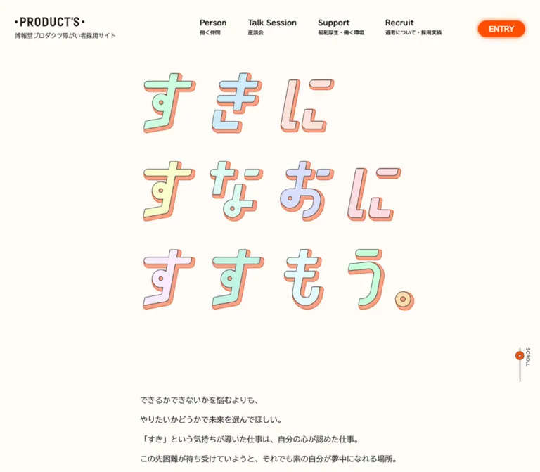
温かな白地に立体的なパステル文字を配した採用サイト。鮮やかなオレンジの丸型ボタン、大きな英字見出し、ゆとりある余白で仕事・社員・支援制度へ案内します。
オリジナルサイトを見るPastel kana with orange depth, generous warm-white space, and vivid rounded actions.
Original URL: h-products.co.jp/recruit/diversity
Final URL: h-products.co.jp/recruit/diversity
Theme: a light cream canvas, white footer surfaces, pastel illustration, and orange controls. No alternate theme was evidenced.
Inspected: September 17, 2026 JST. The supplied retrieval timestamp is September 16, 2026 at 20:21:51.761 UTC.
Viewports: 1440 × 1000 and 390 × 844 CSS pixels.
Scope: the current disability recruitment home page: persistent header, illustrated opening, introductory statement, three section shortcuts, Person and Talk Session gateways, Support and Recruit gateways, application choices, corporate links, and footer. Visual evidence consists of three desktop captures and two mobile captures; rendered DOM measurements cover additional intermediate content. Destination pages, the open mobile menu, and the result of pressing ENTRY were not inspected.
This is a recruitment hub within the company's website. It introduces the employer's message, helps visitors explore people and working conditions, and provides separate graduate and career application routes. Its information architecture includes both in-page shortcuts and links to dedicated topic pages.
The opening is unusually quiet: a small black company mark and compact navigation surround a large three-line message, ‘すきに / すなおに / すすもう。’. Each character has a pale face, a fine dark contour, and a warm orange offset edge. The illustration supplies personality without filling the background. Later sections introduce very large English headings, smaller Japanese labels, explanatory copy, and orange pill links. A white footer gathers the strongest application actions and secondary corporate navigation.
Pastel kana with orange depth, generous warm-white space, and vivid rounded actions.
Original URL: h-products.co.jp/recruit/diversity
Final URL: h-products.co.jp/recruit/diversity
Theme: a light cream canvas, white footer surfaces, pastel illustration, and orange controls. No alternate theme was evidenced.
Inspected: September 17, 2026 JST. The supplied retrieval timestamp is September 16, 2026 at 20:21:51.761 UTC.
Viewports: 1440 × 1000 and 390 × 844 CSS pixels.
Scope: the current disability recruitment home page: persistent header, illustrated opening, introductory statement, three section shortcuts, Person and Talk Session gateways, Support and Recruit gateways, application choices, corporate links, and footer. Visual evidence consists of three desktop captures and two mobile captures; rendered DOM measurements cover additional intermediate content. Destination pages, the open mobile menu, and the result of pressing ENTRY were not inspected.
This is a recruitment hub within the company's website. It introduces the employer's message, helps visitors explore people and working conditions, and provides separate graduate and career application routes. Its information architecture includes both in-page shortcuts and links to dedicated topic pages.
The opening is unusually quiet: a small black company mark and compact navigation surround a large three-line message, ‘すきに / すなおに / すすもう。’. Each character has a pale face, a fine dark contour, and a warm orange offset edge. The illustration supplies personality without filling the background. Later sections introduce very large English headings, smaller Japanese labels, explanatory copy, and orange pill links. A white footer gathers the strongest application actions and secondary corporate navigation.
| Name | Value | Suggested token | Evidence and role |
|---|---|---|---|
| Warm Paper | #fffcf7 |
--page-paper |
Measured body background; also declared as source --color-body |
| Action Orange | #ff4e00 |
--action |
Measured ENTRY, topic-link, and application-link fills |
| Body Ink | #333333 |
--ink |
Measured body text, section headings, and mobile menu disk |
| Link Black | #000000 |
--link-ink |
Measured navigation, shortcut, and corporate-link text |
| Surface White | #ffffff |
--surface |
Measured shortcut and footer backgrounds; reversed action text |
| Header Veil | rgba(255, 252, 247, 0.6) |
--header-veil |
Measured header background at both inspected sizes |
Orange is the consistent action color. The pale illustration colors are not separate navigation categories or status colors. Black branding remains visually distinct from the softer charcoal used for most prose and headings.
The source also declares --color-accent-red: #ff0014 and --color-accent-green: #84fa68. Neither is connected to a visible primary component by the supplied element measurements. Do not substitute either for the measured orange button fill.
These values are useful starting points for new artwork, not verified original asset colors.
| Name | Approximate value | Visible role |
|---|---|---|
| Mint | #c5f5df |
Several hero letter faces |
| Pale Aqua | #d5f4f0 |
Letter faces and a floating message panel |
| Powder Blue | #c8e7f4 |
Cool accents in the hero lettering |
| Lavender | #e3def5 |
Alternating letter faces |
| Blush | #fbe1e2 |
Letter faces and the larger message panel |
| Lemon | #f6f9bf |
Letter faces, laptop outline, and small illustration accents |
| Apricot | #ffdda9 |
The visible Support section ribbon and illustration details |
| Soft Orange Depth | #ffa17d |
Offset depth behind the hero letters and ribbon face |
Use pale fills with crisp outlines. The visual depth comes from a small directional offset, not metallic shading, a deep perspective extrusion, or a photorealistic material.
The measured body and component stack is:
font-family: tbudgothic-std, 'BIZ UDGothic', Roboto, 'Helvetica Neue',
  Arial, 'Hiragino Kaku Gothic ProN', 'Hiragino Sans', Meiryo, sans-serif;
The page uses a Japanese Gothic sans-serif treatment. Regular text has generous line spacing; English topic names use a much larger bold setting. The header repeats each English topic name with a compact Japanese explanation beneath it.
The stack should be preserved when the necessary fonts are available and licensed. No font-file URLs or delivery details were supplied. Do not assume that an unrelated rounded display font will reproduce the visible Japanese text.
The hero's outlined, pastel-filled lettering is bespoke display artwork in appearance. Its exact construction—image, SVG, individually drawn characters, or styled elements—is not established by the supplied DOM sample. Treat its character shapes and three-line composition as an artwork requirement, rather than naming an unsupported font.
The black Product's marks are logos. Preserve the correct brand artwork and proportions; do not recreate them by typing a similar word in a heavy sans-serif.
| Role | Desktop | Mobile | Weight | Notes |
|---|---|---|---|---|
| Root size | 16px |
8.32px |
400 | Source scaling mechanism; not the reading size of all text |
| Body default | 16px / 27.2px |
8.32px / 14.14px |
400 | Many visible components override this default |
| ENTRY | 16px / 16px |
15.6px / 15.6px |
700 | Directly measured button text |
| Introductory statement | 18px / 46px |
14.56px / 37.21px |
400 | About 2.56 line-height ratio at both sizes |
| Three shortcut cards | 22px / 40px |
12.48px / 22.69px |
400 | Text wraps within three persistent columns |
| Section ribbon H2 | 45px / 76.5px |
21.84px / 37.13px |
400 | The Japanese thematic heading |
| Topic H3 | 90px / 153px |
57.2px / 62.4px |
700 | Parent heading; nested Japanese labels may have separate styling |
| Topic description | 18px / 38px |
13.52px / 28.54px |
400 | About 2.11 line-height ratio |
| Topic action link | 20px / 42.22px |
15.6px / 32.93px |
400 | Measured anchor styles; see box dimensions separately |
| Footer invitation paragraph | 22px / 37.4px |
13.52px / 22.98px |
400 | Copy above the application choices |
| Page TOP caption | 14px / 23.8px |
11.44px / 19.45px |
400 | Outside the circular arrow control |
Do not apply the source's mobile root size to a new project without rebuilding its complete sizing system. A conventional 16px root with explicit component tokens is easier to maintain and avoids unintentionally shrinking unrelated controls.
| Role | Visual estimate | Limitation |
|---|---|---|
| Desktop navigation English labels | Around 20px |
The sampled anchor reports inherited 16px; the visible child label was not separately measured |
| Desktop navigation Japanese captions | Around 12px |
Child-level computed styles are unavailable |
| Application button labels | Around 26px desktop and 18–20px mobile |
Anchor defaults are 16px and 8.32px; these are not reliable measurements of the visible nested label |
| Corporate-link main labels | Around 30px desktop and 20px mobile |
The two-level text hierarchy is visually clear, but child sizes are not supplied |
| Copyright | Around 12px desktop and 8px mobile |
Screenshot estimate only |
Normal letter spacing is reported throughout the sampled elements. The design's openness comes primarily from layout and line height, rather than pervasive tracking.
Density: spacious editorial content, compact header controls, and large gaps between topic groups.
Geometry: fully rounded actions, rounded shortcut cards, circular utility icons, and section ribbons with a rounded trailing end.
| Relationship | Desktop | Mobile | Evidence |
|---|---|---|---|
| Header brand left inset | 120px |
14.55px |
Measured anchor position |
| Main topic-content left inset | 220px |
36.39px |
Measured topic header and paragraph positions |
| Introductory statement side inset | 414px |
27.55px |
Measured centered column |
| Shortcut-row side inset | 220px |
20.8px |
Measured card positions |
| Gap between shortcut cards | 50px |
About 13.52px |
Calculated from adjacent rectangles |
| Intro paragraph separation | About 37.33px |
About 19.41px |
Calculated paragraph-to-paragraph gap |
| Topic copy to action | 48px |
About 24.95px |
Calculated from paragraph bottom to link top |
| Gap before Support and Recruit sections | 220px |
About 114.39px |
Calculated from the preceding section boundary |
| Footer top padding | 163px |
84.76px |
Measured computed padding |
| Footer bottom padding | 200px |
104px |
Measured computed padding |
There is no single universal mobile gutter. The header, shortcut row, intro, and topic copy deliberately use different insets.
| Element | Measured or observed treatment |
|---|---|
| ENTRY and orange links | Computed radii of 1440px desktop and 844px mobile; visually fully pill-shaped |
| Shortcut cards | Measured 20px radius at both widths |
| Footer | Measured 40px 40px 0 0 radius at both widths |
| Mobile menu | Circular, approximately 40.55px square |
| Social icons | Approximately 40px desktop and 41.59px mobile; circular presentation |
| Section ribbon | Rounded right end, orange outline, and downward orange offset visible in the middle desktop capture |
| Hero and illustration contours | Fine dark linework, visually around 1px; not separately sampled |
The source global --border-radius changes from 150px to 8.125rem, equivalent to 67.6px at the sampled mobile root. Its usage is not established. Do not apply it indiscriminately to components whose own radii were measured separately.
| Element | Desktop, 1440 × 1000 | Mobile, 390 × 844 |
|---|---|---|
| Document height | 9206.84px |
6697.44px |
| Header | 1440 × 115.52px |
390 × 83.16px |
| Header brand link | 125 × 55.52px |
93.59 × 41.56px |
| ENTRY | 110.80 × 40px |
103.08 × 36.38px |
| Intro column | 612px wide |
334.89px wide |
| Shortcut card | 300 × 144px |
107.13 × 171.08px |
| Topic section container | 1000px wide |
390px wide |
| Topic copy container | 1000px wide |
317.22px wide |
| Topic action | 360 × 66px |
317.22 × 54.44px |
| Application link | 464 × 100px |
346.41 × 64.98px |
| Corporate-link block | 340 × 81.59px |
249.59 × 56.56px |
| Corporate-link icon column | 60px |
41.59px |
| Page TOP whole link | 101 × 124.80px |
72.80 × 92.23px |
The visible painted hero lettering occupies approximately 640 × 560px on desktop, starting near x=420 and y=210. On mobile it occupies approximately 330 × 285px, starting near x=40 and y=355. These are painted bounds, not measured image-element rectangles.
The three-line composition remains intact on the phone. Its lower placement leaves a pronounced area of empty paper below the header. Do not crop the artwork to make it fill the first screen, and do not move introductory prose into the opening simply to reduce whitespace.
Role: identity, topic navigation, and immediate access to the entry control.
The desktop header places the black brand mark at the left of a roughly 1200px-wide centered arrangement. Four two-level navigation links sit to its right:
A compact orange ENTRY pill completes the row. The measured desktop navigation links have 50px gaps between their bounding boxes. The brand and controls remain visible in the supplied scrolled captures.
The header background is measured at 60% opacity over the cream color. Content behind it appears blurred in the scrolled screenshots; the exact filter declaration and blur radius were not supplied. A fixed translucent header with a modest backdrop blur is a suitable adaptation, but its blur value should be labeled approximate.
On mobile, the four visible desktop links disappear. The header becomes a three-part arrangement: smaller logo, ENTRY pill, and a charcoal circular menu button with two short white horizontal strokes. The menu button is a real button in the DOM. Its accessible name, expanded state, open panel, and dismissal behavior were not captured.
Role: a persistent recruitment action affordance.
The control has white bold text, an orange fill, a fully rounded outline, and a soft orange glow. Its measured padding is 12px 26px on desktop and 10.4px 22.88px on mobile. A 100ms linear box-shadow transition is declared.
The DOM identifies ENTRY as a button, not a destination anchor. No activation result is supplied. Do not assert that it opens a modal, scrolls to the footer, or launches an external form.
Role: establishes the recruitment message before detailed information.
The headline is arranged as three left-aligned rows within a large central artwork field. Letter faces alternate among mint, blue, lavender, lemon, aqua, and blush. Thin dark outlines maintain separation from the warm background; orange offset edges supply a shallow dimensional effect.
The current captures show no large body paragraph or additional primary button beneath this artwork within the first viewport. The header's ENTRY control remains available while a narrow SCROLL cue sits near the lower right.
Retain the complete artwork and its line breaks. A generic large text heading with a single drop shadow does not capture the individually colored faces and drawn contours.
Role: indicates that the introductory experience continues below the opening.
A slim light-gray vertical rail, a small orange outlined marker, and a rotated SCROLL label occupy the bottom-right area. The rail is visually about 80px tall in both screenshots. The marker is around 20px across.
The marker appears at different positions in the two captures. This alone does not establish a scroll-progress calculation or a particular animation. Preserve the cue's form; verify its intended behavior separately before implementing it as a progress indicator.
Role: explains the employer's approach and connects the opening slogan to professional work.
The desktop statement begins at document y=1000, immediately after the first viewport. It uses a centered 612px column with left-aligned Japanese paragraphs at 18px / 46px. Paragraphs are separated by about 37px rather than boxed into cards.
On mobile the statement begins at y=925.89, around 82px beyond the first viewport. It widens proportionally to 334.89px, uses 14.56px / 37.21px, and introduces more line breaks. The reading cadence remains very open despite the smaller type.
The passage includes the employer name and disability recruitment identity. Keep the paragraphs as selectable text. Their spacious line height is a defining part of the page's tone.
Role: lets visitors choose between learning about work and colleagues, support, or the recruitment process.
The three anchors point to #style, #support, and #recruit. Their labels are ‘仕事内容や働く仲間を知る’, ‘働く上でのサポートを知る’, and ‘働くまでの流れを知る’.
Each has a white surface, black text, a 20px radius, and a declared shadow transition. At desktop size, the row is three 300px-wide cards separated by 50px. At mobile size, it remains three columns: each card becomes about 107px wide and 171px tall, with roughly 13.5px gaps.
This is an important responsive characteristic. Do not automatically stack these shortcuts into three full-width rows. Preserve their role as a compact overview, while checking readability and touch targets on smaller screens. The supplied screenshots do not independently document every decorative element inside these cards; do not invent an icon set from the text alone.
Role: introduces a thematic group before its topic headings.
The DOM contains these headings:
The middle desktop capture shows the Support ribbon: an apricot strip extending to the left viewport edge, with an orange hairline outline, a rounded right end, and a narrow orange offset beneath it. Text aligns with the main content inset at x=220. Its visual right edge is around x=1104.
The Support H2 measures 884px wide and 116.5px high, starting at x=220. Its own computed background is transparent and radius is zero. The visible ribbon therefore cannot be reconstructed from the H2's box styles alone; the decorative construction was not supplied. A pseudo-element behind the heading is a practical implementation recommendation.
Mobile H2 boxes start at x=0, are about 367px wide, and measure 77.66px high. Their text size drops to 21.84px. The full visual treatment of each mobile ribbon is not shown in the supplied mobile captures.
Role: introduces a subject and links to its dedicated page.
Each gateway follows a recurring content anatomy:
The inspected destinations are /person, /talksession, /support, and /recruit, all under the current recruitment directory. Person and Talk Session share the first thematic group; Support and Recruit each have their own group.
Desktop topic headings report 90px / 153px, and description text uses 18px / 38px. Links measure 360 × 66px and contain a 17px leading icon column, an 11px gap, and the text column. On mobile, headings become 57.2px / 62.4px; descriptions and links sit within a 317.22px-wide column inset by 36.39px.
The mobile Talk Session heading block is 162.02px tall, compared with 99.63px for the other topics. Its longer English name wraps within the narrow column. Preserve that natural wrapping rather than shrinking this title alone to force one line.
The supplied middle screenshot includes a large pastel laptop illustration above the Support ribbon. Other intermediate artwork is not visually documented in enough detail to prescribe its subjects or cropping.
Role: moves from a short introduction to the corresponding detail page.
The anchor uses orange fill, white regular-weight text, an icon area at the leading edge, and an exaggerated pill radius. It is smaller than the footer application buttons but substantially wider than ENTRY.
A 200ms linear box-shadow transition is declared. The screenshots establish orange glow around several action controls, but the exact shadow values and hover endpoint are not supplied.
For a new implementation, center the icon and label within the measured outer height. Do not blindly combine the sampled anchor padding and inherited line height into an unconstrained box: nested layout can affect how those computed values produce the final rectangle.
Role: provides a return anchor during the long page.
The visible desktop middle capture shows a large outlined circle containing an orange upward arrow, with the black Page TOP caption underneath. The whole link sits about 20px from the right and bottom viewport edges. Its href is the current page's #top anchor.
The desktop link measures 101 × 124.8px; the mobile DOM reports 72.8 × 92.23px. The exact visibility threshold is unverified: the control is visible in the middle desktop capture but not in every supplied screenshot. Smooth scrolling and its duration were not demonstrated.
Role: closes the employer message and presents separate application routes.
The footer is a full-width white panel with measured 40px upper corner radii. Its introductory appeal and explanatory paragraph are followed by graduate and career choices. Each choice pairs a short audience label with a large orange application link:
The links point to distinct category-filtered HRMOS job listings. Their destination URLs are present in the original page evidence; the external pages were not opened.
On desktop, application links measure 464 × 100px and sit side by side with an 80px gap. Each places an orange external-link symbol inside a white circular inset near the left end. The visible text is bold and centered within the remaining space.
On mobile, the choices stack. Each orange link measures about 346.41 × 64.98px, leaving roughly 22px side margins. The circular icon inset becomes about 42px across by visual comparison. The current mobile footer capture shows the career button while the graduate choice is above the captured area; both are confirmed in the DOM.
Role: provides secondary destinations and a clear employer identity after the application choices.
A large centered black Product's mark separates the application area from two corporate links. The mark is visually about 265px wide on desktop and 155px on mobile; these are screenshot estimates.
Each corporate link combines a smaller helper line, a larger destination label, and a circular orange external-link icon at the right. The destinations are the corporate home page and the general new-graduate recruitment site. Desktop link blocks use measured grid columns of 270px 60px with a 10px gap. Mobile blocks use approximately 202.81px 41.59px with a 5.2px gap.
On desktop, the two links form a row. A lower row places the small company logo and copyright at the left and Facebook, YouTube, and note icons at the right. On mobile, the corporate links stack, the social icons form a centered row below them, and the small logo and copyright finish the page beneath that row.
The footer independently supports the employer identity through the Product's marks, corporate link, and ‘© 2023 HAKUHODO PRODUCT'S All Rights Reserved.’ notice. The copyright year is not the inspection date. No production credit is visible in the supplied original-page evidence.
| Target | Measured declaration | What is established |
|---|---|---|
| Desktop navigation links | color 0.1s linear |
A short color transition is configured; endpoint color was not sampled |
| ENTRY | box-shadow 0.1s linear |
Shadow changes are configured; activation outcome is unknown |
| Shortcut cards | box-shadow 0.2s cubic-bezier(.39,.575,.565,1) |
A 200ms ease-out-sine shadow transition |
| Topic links | box-shadow 0.2s linear |
A restrained shadow transition |
| Application links | box-shadow 0.2s linear |
Same timing as topic actions |
| Social links | scale 0.2s cubic-bezier(.175,.885,.32,1.275) |
Scale changes use an overshooting ease-out-back curve; scale endpoints are unknown |
| Footer | box-shadow 0.4s linear |
The footer surface has a shadow transition; its trigger was not identified |
The source exposes many easing variables, but their presence alone does not establish an animation. The two relevant named curves above correspond to source --ease-out-sine and --ease-out-back.
animation: none in the settled state. This does not prove that entrance motion, pseudo-element animation, script-driven motion, or animated assets are absent.Recommended motion approach: keep feedback brief and attached to the actual control. Use the measured 100–200ms timings where applicable, avoid adding unsupported hero parallax or character bouncing, and provide a reduced-motion alternative.
| Layer | Appearance | Purpose |
|---|---|---|
| Main canvas | Solid warm cream | Provides quiet space around illustration and text |
| Header | Translucent cream; apparent background blur | Keeps navigation visible over scrolling content |
| Shortcut cards | White with 20px corners | Creates a compact three-way navigation group |
| Topic content | Mostly unboxed on the canvas | Maintains an editorial reading flow |
| Thematic ribbon | Pastel face, orange outline, offset lower edge | Marks a major topic group |
| Action controls | Orange fill, white text, rounded shape, warm glow | Signals navigation and application actions |
| Footer | White, 40px upper corners, fine orange edge visible in captures | Consolidates applications and corporate navigation |
| Utility controls | Circular disks or outlines | Contains menu, external-link, social, and return-to-top symbols |
This is not a general elevated-card system. The strongest shadows are warm action glows and the illustrated offset edges. Preserve the largely flat, open reading surface between them.
The observed artwork uses pastel fills, delicate dark outlines, and simple familiar shapes. The large middle illustration depicts a laptop with a white screen, pale lemon frame, floating mint and blush message panels, small badge-like details, and repeated ‘す’ characters. The illustration's lower edge is approximately 800px wide in the supplied desktop crop; this is a visual estimate.
The hero lettering and laptop belong to the same visual family: light colors, outlined contours, softened corners, and generous surrounding paper. They are clean and graphic, without visible grain or photographic texture. Preserve crisp edges when scaling; pixelated image rendering would be inappropriate here.
No original asset URLs, image filenames, intrinsic dimensions, or file formats were provided. The references below identify visible roles only.
| Asset role | Current-page evidence | Implementation guidance |
|---|---|---|
| Header brand mark | Desktop and mobile opening captures | Use authorized brand artwork; retain its small affiliation line |
| Three-line hero message | Desktop and mobile opening captures | Preserve individual letter colors, contours, orange depth, and line breaks |
| Laptop and message illustration | Middle desktop capture | Use matching clean outlined artwork; avoid inferring unseen details from the crop |
| Large footer brand mark | Desktop and mobile footer captures | Preserve full mark proportions and surrounding whitespace |
| Small footer logo | Desktop and mobile footer captures | Keep separate from the larger identity block |
| External-link symbols | Application and corporate links | Thin orange strokes; use a consistent square-and-arrow construction |
| Social marks | Footer captures and original-page hrefs | Preserve recognizable Facebook, YouTube, and note identities |
| Up arrow and SCROLL cue | Opening and middle captures | Simple utility graphics, visually subordinate to the hero |
No staff photography is visible in the supplied current-page screenshots. The Person and Talk Session text does not establish an image treatment for employee portraits. Do not invent a portrait grid, photographic color grade, or image asset path for those sections.
The page is a long, single-column recruitment overview. Desktop content alternates between a narrow introduction, a 1000px topic container, and full-width decorative or footer surfaces. Its major text anchors occur at approximately these document positions:
| Content | Desktop y | Mobile y |
|---|---|---|
| Introductory statement | 1000px |
925.89px |
| Shortcut row | 2004.66px |
1758.5px |
| First thematic group | 2368.66px |
2012.77px |
| Support group | 4821.84px |
3495.42px |
| Recruit group | 6123.27px |
4380.94px |
| Footer | 7701.56px |
5450.28px |
These are recorded content positions, not recommended hardcoded offsets. They depend on the original fonts, artwork, text wrapping, and section construction.
| Component | Desktop | Mobile |
|---|---|---|
| Header navigation | Four bilingual links plus ENTRY | Logo, ENTRY, and circular menu button |
| Hero | Large three-row artwork near the vertical center | Same three rows, smaller and positioned lower within the screen |
| Intro | 612px centered column | About 335px centered column with more line breaks |
| Shortcuts | Three wide cards in one row | Three narrow, taller cards in one row |
| Topic container | Centered 1000px section | Full-width section with inset body content |
| Topic titles | Large English heading with Japanese companion label | Smaller English heading; Japanese label below; Talk Session wraps |
| Topic actions | Fixed 360px width | Fill the 317px topic column |
| Application choices | Two columns | One column |
| Corporate links | Two columns | One column |
| Footer utility row | Identity left, social links right | Social links above centered identity and copyright |
The mobile root is 52% of the desktop root, but the page is not uniformly scaled by 52%. ENTRY remains almost the same width, the footer retains its 40px corners, and shortcut cards change aspect ratio. Reproduce the component-specific behavior rather than applying a single global transform.
The exact breakpoint and intermediate tablet rules were not supplied. Any breakpoint in the Quick Start is a recommendation. Test intermediate widths, Japanese wrapping, text zoom, and short landscape screens before treating the adaptation as complete.
#fffcf7 and orange #ff4e00 as the primary visual anchors.These are recommendations for a new implementation, not verified original-site features:
aria-expanded, and aria-controls for the mobile menu. Implement focus management and dismissal according to the actual chosen menu pattern.#ff4e00 is approximately 3.3:1, calculated from WCAG relative luminance. Small white labels need an adjusted text/background treatment to reach 4.5:1; qualifying large text has a 3:1 requirement.scroll-margin-top to section anchors so the persistent header does not cover their headings.#fffcf7, measured.#ff4e00, measured.#333333, measured.#ffffff, measured.rgba(255, 252, 247, 0.6), measured; blur amount unverified.“Create a Japanese recruitment hub inspired by the supplied current Hakuhodo Product's disability recruitment page. Use warm cream #fffcf7, charcoal text, and vivid orange #ff4e00 pill actions. Open with a nearly full-screen field of empty paper and a three-line illustrated Japanese slogan, ‘すきに / すなおに / すすもう。’, with individually colored pastel faces, thin dark outlines, and shallow orange offset depth. Keep a persistent translucent header with a small black logo, bilingual topic links, and ENTRY. Follow the opening with a narrow, generously spaced statement, a three-column shortcut row, large English topic headings with Japanese descriptors, pastel section ribbons, and orange detail links. Finish with a white rounded-top footer containing separate graduate and career applications, corporate links, and social icons. On mobile, replace topic navigation with a circular menu button, retain three shortcut columns, allow Talk Session to wrap, and stack the footer groups.”
This is an adaptation of measured component sizes and observed appearance. It keeps a conventional root font size. The 800px breakpoint, blur radius, shadow recipes, nested label sizes, and hero positioning are recommendations or visual approximations; they are not recovered original rules.
Use authorized artwork for .brand img, .hero__art, and .footer__brand. No asset paths are implied. The example expects separate label spans, icon elements, and semantic links or buttons. It does not implement an unverified ENTRY action or menu state.
:root {
  /* Measured interface colors */
  --page-paper: #fffcf7;
  --surface: #ffffff;
  --ink: #333333;
  --link-ink: #000000;
  --action: #ff4e00;
  --header-veil: rgb(255 252 247 / 60%);

  /* Visual approximations for decorative layers */
  --ribbon-face: #ffdda9;
  --soft-depth: #ffa17d;
  --action-glow: 0 0 9px rgb(255 78 0 / 45%);
  --action-glow-active: 0 0 13px rgb(255 78 0 / 55%);

  --font-ui: tbudgothic-std, 'BIZ UDGothic', Roboto,
    'Helvetica Neue', Arial, 'Hiragino Kaku Gothic ProN',
    'Hiragino Sans', Meiryo, sans-serif;

  --content-width: 1000px;
  --header-width: 1200px;
  --header-height: 115.52px;
  --radius-card: 20px;
  --radius-footer: 40px;
  --radius-pill: 9999px;

  --text-intro: 18px;
  --leading-intro: 46px;
  --text-topic: 90px;
  --leading-topic: 153px;
  --text-copy: 18px;
  --leading-copy: 38px;

  /* Measured transition timing and easing */
  --motion-fast: 100ms linear;
  --motion-action: 200ms linear;
  --ease-out-sine: cubic-bezier(.39, .575, .565, 1);
  --ease-out-back: cubic-bezier(.175, .885, .32, 1.275);
}

* { box-sizing: border-box; }
html { font-size: 16px; }
body {
  margin: 0;
  color: var(--ink);
  background: var(--page-paper);
  font: 400 16px / 1.7 var(--font-ui);
}
button, input, textarea, select { font: inherit; }
button { cursor: pointer; }
a { color: inherit; }
img { max-width: 100%; }
[hidden] { display: none !important; }
[id] { scroll-margin-top: calc(var(--header-height) + 24px); }

.site-header {
  position: fixed;
  inset: 0 0 auto;
  z-index: 30;
  background: var(--header-veil);
  /* Approximation of the visible blur, not a measured radius. */
  backdrop-filter: blur(10px);
}
.site-header__inner {
  width: min(var(--header-width), calc(100% - 40px));
  min-height: var(--header-height);
  margin-inline: auto;
  padding-block: 40px 20px;
  display: flex;
  align-items: center;
  gap: 50px;
}
.brand { flex: 0 0 125px; }
.brand img { display: block; width: 100%; height: auto; }
.primary-nav {
  display: flex;
  align-items: center;
  gap: 50px;
  margin-inline-start: auto;
}
.primary-nav a {
  color: var(--link-ink);
  text-decoration: none;
  transition: color var(--motion-fast);
}
/* Child sizes below are screenshot-based approximations. */
.primary-nav__en { display: block; font-size: 20px; line-height: 1.4; }
.primary-nav__ja { display: block; font-size: 12px; line-height: 1.65; }
.entry-button {
  flex: none;
  margin-inline-start: 36px;
  padding: 12px 26px;
  border: 0;
  border-radius: var(--radius-pill);
  color: var(--surface);
  background: var(--action);
  box-shadow: var(--action-glow);
  font-size: 16px;
  font-weight: 700;
  line-height: 1;
  transition: box-shadow var(--motion-fast);
}
.menu-button { display: none; }

.hero {
  position: relative;
  min-height: 100svh;
  display: grid;
  place-items: center;
}
.hero__art {
  display: block;
  width: min(660px, calc(100% - 48px));
  height: auto;
  /* Keep the complete artwork; do not crop it. */
  object-fit: contain;
}
.scroll-cue {
  position: absolute;
  right: 24px;
  bottom: 20px;
  height: 80px;
  width: 32px;
  border-left: 4px solid #cec9c3;
  border-radius: 2px;
  font-size: 11px;
  writing-mode: vertical-rl;
  text-align: start;
}
.scroll-cue::before {
  content: '';
  position: absolute;
  left: -12px;
  top: 30px;
  width: 20px;
  height: 20px;
  border: 1px solid var(--ink);
  border-radius: 50%;
  background: var(--action);
  /* Static approximation; no progress semantics are implied. */
}

.intro {
  width: min(612px, calc(100% - 55.12px));
  margin-inline: auto;
  font-size: var(--text-intro);
  line-height: var(--leading-intro);
}
.intro p { margin: 0; }
.intro p + p { margin-top: 37.33px; }

.shortcut-grid {
  width: min(var(--content-width), calc(100% - 41.6px));
  margin: 200px auto 220px;
  display: grid;
  grid-template-columns: repeat(3, minmax(0, 1fr));
  gap: 50px;
}
.shortcut {
  min-height: 144px;
  padding: 30px 30px 32px;
  border-radius: var(--radius-card);
  color: var(--link-ink);
  background: var(--surface);
  font-size: 22px;
  line-height: 40px;
  text-align: center;
  text-decoration: none;
  transition: box-shadow 200ms var(--ease-out-sine);
}

.topic {
  width: min(var(--content-width), calc(100% - 40px));
  margin: 0 auto 220px;
}
.section-ribbon {
  position: relative;
  isolation: isolate;
  display: table;
  max-width: 100%;
  margin: 0 0 185px;
  padding: 20px 209px 20px 0;
  font-size: 45px;
  font-weight: 400;
  line-height: 1.7;
}
.section-ribbon::before {
  content: '';
  position: absolute;
  z-index: -1;
  top: 0;
  right: 0;
  bottom: 0;
  left: min(0px, calc((1000px - 100vw) / 2));
  border: 1px solid var(--action);
  border-radius: 0 80px 80px 0;
  background: var(--ribbon-face);
  box-shadow: 0 10px 0 -1px var(--soft-depth);
}
.topic__title {
  margin: 0;
  font-size: var(--text-topic);
  font-weight: 700;
  line-height: var(--leading-topic);
}
.topic__label {
  margin-inline-start: 20px;
  font-size: 20px;
  font-weight: 400;
  line-height: 1.7;
}
.topic__copy {
  margin: 0;
  font-size: var(--text-copy);
  line-height: var(--leading-copy);
}
.pill-link {
  display: grid;
  grid-template-columns: 17px minmax(0, 1fr);
  align-items: center;
  gap: 11px;
  width: 360px;
  max-width: 100%;
  min-height: 66px;
  padding: 12px 23px;
  border-radius: var(--radius-pill);
  color: var(--surface);
  background: var(--action);
  box-shadow: var(--action-glow);
  font-size: 20px;
  line-height: 1.4;
  text-decoration: none;
  transition: box-shadow var(--motion-action);
}
.topic__copy + .pill-link { margin-top: 48px; }
.pill-link__label { text-align: center; }

.recruit-footer {
  padding: 163px 0 200px;
  border: 1px solid var(--action);
  border-bottom: 0;
  border-radius: var(--radius-footer) var(--radius-footer) 0 0;
  background: var(--surface);
}
.footer__intro {
  width: min(528px, calc(100% - 65.5px));
  margin-inline: auto;
  font-size: 22px;
  line-height: 37.4px;
}
.application-grid {
  width: min(1008px, calc(100% - 43.6px));
  margin: 80px auto 0;
  display: grid;
  grid-template-columns: repeat(2, minmax(0, 1fr));
  gap: 80px;
}
.application__audience { margin: 0 0 24px; text-align: center; }
.application-link {
  display: grid;
  grid-template-columns: 60px minmax(0, 1fr);
  align-items: center;
  gap: 24px;
  min-height: 100px;
  padding: 20px 24px;
  border-radius: var(--radius-pill);
  color: var(--surface);
  background: var(--action);
  box-shadow: var(--action-glow);
  font-size: 26px;
  font-weight: 700;
  line-height: 1.4;
  text-align: center;
  text-decoration: none;
  transition: box-shadow var(--motion-action);
}
.application-link__icon {
  display: grid;
  place-items: center;
  width: 60px;
  aspect-ratio: 1;
  border-radius: 50%;
  color: var(--action);
  background: var(--surface);
}
.footer__brand {
  display: block;
  width: 265px;
  height: auto;
  margin: 160px auto 80px;
}
.footer-directory {
  width: min(818px, calc(100% - 40px));
  margin-inline: auto;
  display: grid;
  grid-template-columns: repeat(2, minmax(0, 1fr));
  gap: 138px;
}
.directory-link {
  display: grid;
  grid-template-columns: minmax(0, 1fr) 60px;
  align-items: center;
  gap: 10px;
  color: var(--link-ink);
  text-decoration: none;
}
.directory-link__helper { display: block; font-size: 18px; }
.directory-link__title { display: block; font-size: 30px; }
.directory-link__icon {
  display: grid;
  place-items: center;
  width: 60px;
  aspect-ratio: 1;
  border: 1px solid var(--action);
  border-radius: 50%;
  color: var(--action);
  box-shadow: var(--action-glow);
}
.footer__bottom {
  width: min(1008px, calc(100% - 40px));
  margin: 160px auto 0;
  display: grid;
  grid-template-areas: 'legal socials';
  grid-template-columns: 1fr auto;
  align-items: center;
  gap: 24px;
}
.footer__legal {
  grid-area: legal;
  display: flex;
  align-items: center;
  gap: 16px;
}
.footer__legal img { display: block; width: 100px; }
.footer__legal small { font-size: 12px; }
.social-links { grid-area: socials; display: flex; gap: 16px; }
.social-links a {
  display: grid;
  place-items: center;
  width: 40px;
  aspect-ratio: 1;
  border-radius: 50%;
  transition: scale 200ms var(--ease-out-back);
}

.back-top {
  position: fixed;
  right: 20px;
  bottom: 20px;
  width: 101px;
  color: var(--link-ink);
  font-size: 14px;
  text-align: center;
  text-decoration: none;
}
.back-top__circle {
  display: grid;
  place-items: center;
  width: 100%;
  aspect-ratio: 1;
  border: 1px solid var(--action);
  border-radius: 50%;
  color: var(--action);
  background: var(--page-paper);
}

/* Recommended feedback endpoints; source endpoints were not supplied. */
@media (hover: hover) {
  .primary-nav a:hover { color: var(--action); }
  .entry-button:hover,
  .pill-link:hover,
  .application-link:hover { box-shadow: var(--action-glow-active); }
  .shortcut:hover { box-shadow: 0 0 0 2px var(--action); }
  .social-links a:hover { scale: 1.06; }
}
:where(a, button):focus-visible {
  outline: 3px solid var(--ink);
  outline-offset: 4px;
}

/* Recommended breakpoint; values target the inspected 390px layout. */
@media (max-width: 800px) {
  :root {
    --header-height: 83.16px;
    --text-intro: 14.56px;
    --leading-intro: 37.21px;
    --text-topic: 57.2px;
    --leading-topic: 62.4px;
    --text-copy: 13.52px;
    --leading-copy: 28.54px;
  }
  .site-header__inner {
    width: 100%;
    padding: 20.8px 14.56px;
    gap: 14.55px;
  }
  .brand { flex-basis: 93.6px; }
  .primary-nav { display: none; }
  .entry-button {
    margin-inline-start: auto;
    padding: 10.4px 22.88px;
    font-size: 15.6px;
  }
  .menu-button {
    flex: none;
    display: grid;
    place-content: center;
    gap: 5.72px;
    width: 40.55px;
    height: 40.55px;
    padding: 0;
    border: 0;
    border-radius: 50%;
    background: var(--ink);
  }
  .menu-button span {
    display: block;
    width: 14.55px;
    height: 2px;
    background: var(--surface);
  }
  .hero__art {
    width: min(334px, calc(100% - 56px));
    transform: translateY(9svh);
  }
  .scroll-cue { right: 20px; }
  .intro { margin-top: 81.89px; }
  .intro p + p { margin-top: 19.41px; }
  .shortcut-grid { margin-block: 83.2px; gap: 13.52px; }
  .shortcut {
    min-height: 171.08px;
    padding: 16.64px 6.76px 33.28px;
    font-size: 12.48px;
    line-height: 22.69px;
  }
  .topic { width: 100%; margin-bottom: 114.4px; }
  .section-ribbon {
    width: calc(100% - 22.4px);
    margin-bottom: 52px;
    padding: 20.28px 20.8px;
    font-size: 21.84px;
    line-height: 37.13px;
  }
  .section-ribbon::before { left: 0; }
  .topic__body { padding-inline: 36.4px; }
  .topic__label {
    display: block;
    margin: 0;
    font-size: 21.84px;
    line-height: 37.13px;
  }
  .topic__copy { margin-top: 15.6px; }
  .pill-link {
    width: 100%;
    min-height: 54.44px;
    padding: 12px 18.72px;
    gap: 10.4px;
    font-size: 15.6px;
  }
  .topic__copy + .pill-link { margin-top: 24.96px; }
  .recruit-footer { padding-block: 84.76px 104px; }
  .footer__intro { font-size: 13.52px; line-height: 22.98px; }
  .application-grid { grid-template-columns: 1fr; gap: 48px; }
  .application-link {
    grid-template-columns: 41.6px minmax(0, 1fr);
    gap: 16px;
    min-height: 64.98px;
    padding: 11.44px;
    font-size: 18px;
  }
  .application-link__icon { width: 41.6px; }
  .footer__brand { width: 155px; margin: 83.2px auto 41.6px; }
  .footer-directory {
    width: min(249.6px, calc(100% - 40px));
    grid-template-columns: 1fr;
    gap: 41.6px;
  }
  .directory-link { grid-template-columns: 1fr 41.6px; gap: 5.2px; }
  .directory-link__helper { font-size: 14px; }
  .directory-link__title { font-size: 20px; }
  .directory-link__icon { width: 41.6px; }
  .footer__bottom {
    margin-top: 83.2px;
    grid-template-areas: 'socials' 'legal';
    grid-template-columns: 1fr;
    justify-items: center;
    gap: 62.4px;
  }
  .social-links { gap: 20.8px; }
  .social-links a { width: 41.6px; }
  .footer__legal { flex-direction: column; gap: 22px; text-align: center; }
  .footer__legal img { width: 103px; }
  /* Recommended readability improvement over the tiny captured legal text. */
  .footer__legal small { font-size: 12px; }
  .back-top { width: 72.8px; font-size: 11.44px; }
}

@media (prefers-reduced-motion: reduce) {
  html { scroll-behavior: auto; }
  .entry-button,
  .primary-nav a,
  .shortcut,
  .pill-link,
  .application-link,
  .social-links a { transition: none; }
}
The decorative ribbon rule assumes a centered 1000px desktop topic container. The CSS does not reproduce total document heights, unseen illustration placement, per-section spacing exceptions, or behavior that was not exercised. White-on-orange contrast also needs the accessibility adjustment described above before shipping small text controls.
Optional aliases for a project already using Tailwind v4. This does not imply that the original site uses Tailwind. Define the custom properties above first.
@theme inline {
  --color-paper: var(--page-paper);
  --color-surface: var(--surface);
  --color-ink: var(--ink);
  --color-action: var(--action);
  --color-apricot: var(--ribbon-face);

  --font-sans: var(--font-ui);
  --text-intro: var(--text-intro);
  --text-topic-heading: var(--text-topic);
  --text-topic-copy: var(--text-copy);

  --radius-shortcut: var(--radius-card);
  --radius-footer-panel: var(--radius-footer);
  --radius-action: var(--radius-pill);
}
For the intro utility, avoid a self-referencing token if your build emits the mapping literally: use a distinct alias such as --text-statement: var(--text-intro) instead of redefining the same property.
This reference describes the current page represented by the supplied captures and rendered evidence. Measurements, visual approximations, and implementation recommendations are kept distinct throughout.
# Hakuhodo Product's Disability Recruitment — Style Reference

> Pastel kana with orange depth, generous warm-white space, and vivid rounded actions.

**Original URL:** [h-products.co.jp/recruit/diversity](https://www.h-products.co.jp/recruit/diversity/)

**Final URL:** [h-products.co.jp/recruit/diversity](https://www.h-products.co.jp/recruit/diversity/)

**Theme:** a light cream canvas, white footer surfaces, pastel illustration, and orange controls. No alternate theme was evidenced.

**Inspected:** September 17, 2026 JST. The supplied retrieval timestamp is September 16, 2026 at 20:21:51.761 UTC.

**Viewports:** 1440 × 1000 and 390 × 844 CSS pixels.

**Scope:** the current disability recruitment home page: persistent header, illustrated opening, introductory statement, three section shortcuts, Person and Talk Session gateways, Support and Recruit gateways, application choices, corporate links, and footer. Visual evidence consists of three desktop captures and two mobile captures; rendered DOM measurements cover additional intermediate content. Destination pages, the open mobile menu, and the result of pressing ENTRY were not inspected.

This is a recruitment hub within the company's website. It introduces the employer's message, helps visitors explore people and working conditions, and provides separate graduate and career application routes. Its information architecture includes both in-page shortcuts and links to dedicated topic pages.

The opening is unusually quiet: a small black company mark and compact navigation surround a large three-line message, ‘すきに / すなおに / すすもう。’. Each character has a pale face, a fine dark contour, and a warm orange offset edge. The illustration supplies personality without filling the background. Later sections introduce very large English headings, smaller Japanese labels, explanatory copy, and orange pill links. A white footer gathers the strongest application actions and secondary corporate navigation.
# Hakuhodo Product's Disability Recruitment — Style Reference

> Pastel kana with orange depth, generous warm-white space, and vivid rounded actions.

**Original URL:** [h-products.co.jp/recruit/diversity](https://www.h-products.co.jp/recruit/diversity/)

**Final URL:** [h-products.co.jp/recruit/diversity](https://www.h-products.co.jp/recruit/diversity/)

**Theme:** a light cream canvas, white footer surfaces, pastel illustration, and orange controls. No alternate theme was evidenced.

**Inspected:** September 17, 2026 JST. The supplied retrieval timestamp is September 16, 2026 at 20:21:51.761 UTC.

**Viewports:** 1440 × 1000 and 390 × 844 CSS pixels.

**Scope:** the current disability recruitment home page: persistent header, illustrated opening, introductory statement, three section shortcuts, Person and Talk Session gateways, Support and Recruit gateways, application choices, corporate links, and footer. Visual evidence consists of three desktop captures and two mobile captures; rendered DOM measurements cover additional intermediate content. Destination pages, the open mobile menu, and the result of pressing ENTRY were not inspected.

This is a recruitment hub within the company's website. It introduces the employer's message, helps visitors explore people and working conditions, and provides separate graduate and career application routes. Its information architecture includes both in-page shortcuts and links to dedicated topic pages.

The opening is unusually quiet: a small black company mark and compact navigation surround a large three-line message, ‘すきに / すなおに / すすもう。’. Each character has a pale face, a fine dark contour, and a warm orange offset edge. The illustration supplies personality without filling the background. Later sections introduce very large English headings, smaller Japanese labels, explanatory copy, and orange pill links. A white footer gathers the strongest application actions and secondary corporate navigation.

## How to Read This Reference

- **Measured** means a value appears in the supplied rendered DOM or computed-style evidence. Values are expressed in CSS pixels unless otherwise stated; tables generally round to two decimal places.
- **Calculated** means arithmetic based on those measurements, such as a gap between two element rectangles.
- **Visual estimate** means an approximate size, color, or effect inferred from the supplied current-page screenshots. Estimated hex colors are working approximations, not sampled source declarations.
- **Recommended** means an implementation choice for a new build. The CSS and prompts below are adaptations, not recovered source code.
- Custom-property names are implementation aliases unless explicitly identified as source properties.
- A computed font-family stack identifies the declared selection order. It does not establish which font file supplied every rendered glyph.
- The screenshots document settled states at selected scroll positions. They do not verify complete animations, hover outcomes, menu behavior, or all intermediate artwork.

## Tokens — Colors

### Measured Interface Palette

| Name | Value | Suggested token | Evidence and role |
| --- | --- | --- | --- |
| Warm Paper | `#fffcf7` | `--page-paper` | Measured body background; also declared as source `--color-body` |
| Action Orange | `#ff4e00` | `--action` | Measured ENTRY, topic-link, and application-link fills |
| Body Ink | `#333333` | `--ink` | Measured body text, section headings, and mobile menu disk |
| Link Black | `#000000` | `--link-ink` | Measured navigation, shortcut, and corporate-link text |
| Surface White | `#ffffff` | `--surface` | Measured shortcut and footer backgrounds; reversed action text |
| Header Veil | `rgba(255, 252, 247, 0.6)` | `--header-veil` | Measured header background at both inspected sizes |

Orange is the consistent action color. The pale illustration colors are not separate navigation categories or status colors. Black branding remains visually distinct from the softer charcoal used for most prose and headings.

The source also declares `--color-accent-red: #ff0014` and `--color-accent-green: #84fa68`. Neither is connected to a visible primary component by the supplied element measurements. Do not substitute either for the measured orange button fill.

### Illustration Palette — Visual Estimates

These values are useful starting points for new artwork, not verified original asset colors.

| Name | Approximate value | Visible role |
| --- | --- | --- |
| Mint | `#c5f5df` | Several hero letter faces |
| Pale Aqua | `#d5f4f0` | Letter faces and a floating message panel |
| Powder Blue | `#c8e7f4` | Cool accents in the hero lettering |
| Lavender | `#e3def5` | Alternating letter faces |
| Blush | `#fbe1e2` | Letter faces and the larger message panel |
| Lemon | `#f6f9bf` | Letter faces, laptop outline, and small illustration accents |
| Apricot | `#ffdda9` | The visible Support section ribbon and illustration details |
| Soft Orange Depth | `#ffa17d` | Offset depth behind the hero letters and ribbon face |

Use pale fills with crisp outlines. The visual depth comes from a small directional offset, not metallic shading, a deep perspective extrusion, or a photorealistic material.

## Tokens — Typography

### Interface and Editorial Text

The measured body and component stack is:

```css
font-family: tbudgothic-std, 'BIZ UDGothic', Roboto, 'Helvetica Neue',
  Arial, 'Hiragino Kaku Gothic ProN', 'Hiragino Sans', Meiryo, sans-serif;
```

The page uses a Japanese Gothic sans-serif treatment. Regular text has generous line spacing; English topic names use a much larger bold setting. The header repeats each English topic name with a compact Japanese explanation beneath it.

The stack should be preserved when the necessary fonts are available and licensed. No font-file URLs or delivery details were supplied. Do not assume that an unrelated rounded display font will reproduce the visible Japanese text.

### Hero Lettering and Brand Marks

The hero's outlined, pastel-filled lettering is bespoke display artwork in appearance. Its exact construction—image, SVG, individually drawn characters, or styled elements—is not established by the supplied DOM sample. Treat its character shapes and three-line composition as an artwork requirement, rather than naming an unsupported font.

The black Product's marks are logos. Preserve the correct brand artwork and proportions; do not recreate them by typing a similar word in a heavy sans-serif.

### Measured Type Scale

| Role | Desktop | Mobile | Weight | Notes |
| --- | --- | --- | --- | --- |
| Root size | `16px` | `8.32px` | 400 | Source scaling mechanism; not the reading size of all text |
| Body default | `16px / 27.2px` | `8.32px / 14.14px` | 400 | Many visible components override this default |
| ENTRY | `16px / 16px` | `15.6px / 15.6px` | 700 | Directly measured button text |
| Introductory statement | `18px / 46px` | `14.56px / 37.21px` | 400 | About 2.56 line-height ratio at both sizes |
| Three shortcut cards | `22px / 40px` | `12.48px / 22.69px` | 400 | Text wraps within three persistent columns |
| Section ribbon H2 | `45px / 76.5px` | `21.84px / 37.13px` | 400 | The Japanese thematic heading |
| Topic H3 | `90px / 153px` | `57.2px / 62.4px` | 700 | Parent heading; nested Japanese labels may have separate styling |
| Topic description | `18px / 38px` | `13.52px / 28.54px` | 400 | About 2.11 line-height ratio |
| Topic action link | `20px / 42.22px` | `15.6px / 32.93px` | 400 | Measured anchor styles; see box dimensions separately |
| Footer invitation paragraph | `22px / 37.4px` | `13.52px / 22.98px` | 400 | Copy above the application choices |
| Page TOP caption | `14px / 23.8px` | `11.44px / 19.45px` | 400 | Outside the circular arrow control |

Do not apply the source's mobile root size to a new project without rebuilding its complete sizing system. A conventional 16px root with explicit component tokens is easier to maintain and avoids unintentionally shrinking unrelated controls.

### Text Not Separately Sampled

| Role | Visual estimate | Limitation |
| --- | --- | --- |
| Desktop navigation English labels | Around `20px` | The sampled anchor reports inherited `16px`; the visible child label was not separately measured |
| Desktop navigation Japanese captions | Around `12px` | Child-level computed styles are unavailable |
| Application button labels | Around `26px` desktop and `18–20px` mobile | Anchor defaults are `16px` and `8.32px`; these are not reliable measurements of the visible nested label |
| Corporate-link main labels | Around `30px` desktop and `20px` mobile | The two-level text hierarchy is visually clear, but child sizes are not supplied |
| Copyright | Around `12px` desktop and `8px` mobile | Screenshot estimate only |

Normal letter spacing is reported throughout the sampled elements. The design's openness comes primarily from layout and line height, rather than pervasive tracking.

## Tokens — Spacing & Shapes

**Density:** spacious editorial content, compact header controls, and large gaps between topic groups.

**Geometry:** fully rounded actions, rounded shortcut cards, circular utility icons, and section ribbons with a rounded trailing end.

### Spacing Measurements

| Relationship | Desktop | Mobile | Evidence |
| --- | --- | --- | --- |
| Header brand left inset | `120px` | `14.55px` | Measured anchor position |
| Main topic-content left inset | `220px` | `36.39px` | Measured topic header and paragraph positions |
| Introductory statement side inset | `414px` | `27.55px` | Measured centered column |
| Shortcut-row side inset | `220px` | `20.8px` | Measured card positions |
| Gap between shortcut cards | `50px` | About `13.52px` | Calculated from adjacent rectangles |
| Intro paragraph separation | About `37.33px` | About `19.41px` | Calculated paragraph-to-paragraph gap |
| Topic copy to action | `48px` | About `24.95px` | Calculated from paragraph bottom to link top |
| Gap before Support and Recruit sections | `220px` | About `114.39px` | Calculated from the preceding section boundary |
| Footer top padding | `163px` | `84.76px` | Measured computed padding |
| Footer bottom padding | `200px` | `104px` | Measured computed padding |

There is no single universal mobile gutter. The header, shortcut row, intro, and topic copy deliberately use different insets.

### Shapes and Edge Treatments

| Element | Measured or observed treatment |
| --- | --- |
| ENTRY and orange links | Computed radii of `1440px` desktop and `844px` mobile; visually fully pill-shaped |
| Shortcut cards | Measured `20px` radius at both widths |
| Footer | Measured `40px 40px 0 0` radius at both widths |
| Mobile menu | Circular, approximately `40.55px` square |
| Social icons | Approximately `40px` desktop and `41.59px` mobile; circular presentation |
| Section ribbon | Rounded right end, orange outline, and downward orange offset visible in the middle desktop capture |
| Hero and illustration contours | Fine dark linework, visually around `1px`; not separately sampled |

The source global `--border-radius` changes from `150px` to `8.125rem`, equivalent to `67.6px` at the sampled mobile root. Its usage is not established. Do not apply it indiscriminately to components whose own radii were measured separately.

### Layout Measurements

| Element | Desktop, 1440 × 1000 | Mobile, 390 × 844 |
| --- | --- | --- |
| Document height | `9206.84px` | `6697.44px` |
| Header | `1440 × 115.52px` | `390 × 83.16px` |
| Header brand link | `125 × 55.52px` | `93.59 × 41.56px` |
| ENTRY | `110.80 × 40px` | `103.08 × 36.38px` |
| Intro column | `612px` wide | `334.89px` wide |
| Shortcut card | `300 × 144px` | `107.13 × 171.08px` |
| Topic section container | `1000px` wide | `390px` wide |
| Topic copy container | `1000px` wide | `317.22px` wide |
| Topic action | `360 × 66px` | `317.22 × 54.44px` |
| Application link | `464 × 100px` | `346.41 × 64.98px` |
| Corporate-link block | `340 × 81.59px` | `249.59 × 56.56px` |
| Corporate-link icon column | `60px` | `41.59px` |
| Page TOP whole link | `101 × 124.80px` | `72.80 × 92.23px` |

### Opening Artwork — Screenshot Estimates

The visible painted hero lettering occupies approximately `640 × 560px` on desktop, starting near x=420 and y=210. On mobile it occupies approximately `330 × 285px`, starting near x=40 and y=355. These are painted bounds, not measured image-element rectangles.

The three-line composition remains intact on the phone. Its lower placement leaves a pronounced area of empty paper below the header. Do not crop the artwork to make it fill the first screen, and do not move introductory prose into the opening simply to reduce whitespace.

## Components

### Persistent Site Header

**Role:** identity, topic navigation, and immediate access to the entry control.

The desktop header places the black brand mark at the left of a roughly 1200px-wide centered arrangement. Four two-level navigation links sit to its right:

- Person / ‘働く仲間’
- Talk Session / ‘座談会’
- Support / ‘福利厚生・働く環境’
- Recruit / ‘選考について・採用実績’

A compact orange ENTRY pill completes the row. The measured desktop navigation links have 50px gaps between their bounding boxes. The brand and controls remain visible in the supplied scrolled captures.

The header background is measured at 60% opacity over the cream color. Content behind it appears blurred in the scrolled screenshots; the exact filter declaration and blur radius were not supplied. A fixed translucent header with a modest backdrop blur is a suitable adaptation, but its blur value should be labeled approximate.

On mobile, the four visible desktop links disappear. The header becomes a three-part arrangement: smaller logo, ENTRY pill, and a charcoal circular menu button with two short white horizontal strokes. The menu button is a real button in the DOM. Its accessible name, expanded state, open panel, and dismissal behavior were not captured.

### ENTRY Button

**Role:** a persistent recruitment action affordance.

The control has white bold text, an orange fill, a fully rounded outline, and a soft orange glow. Its measured padding is `12px 26px` on desktop and `10.4px 22.88px` on mobile. A `100ms linear` box-shadow transition is declared.

The DOM identifies ENTRY as a button, not a destination anchor. No activation result is supplied. Do not assert that it opens a modal, scrolls to the footer, or launches an external form.

### Illustrated Opening

**Role:** establishes the recruitment message before detailed information.

The headline is arranged as three left-aligned rows within a large central artwork field. Letter faces alternate among mint, blue, lavender, lemon, aqua, and blush. Thin dark outlines maintain separation from the warm background; orange offset edges supply a shallow dimensional effect.

The current captures show no large body paragraph or additional primary button beneath this artwork within the first viewport. The header's ENTRY control remains available while a narrow SCROLL cue sits near the lower right.

Retain the complete artwork and its line breaks. A generic large text heading with a single drop shadow does not capture the individually colored faces and drawn contours.

### SCROLL Cue

**Role:** indicates that the introductory experience continues below the opening.

A slim light-gray vertical rail, a small orange outlined marker, and a rotated SCROLL label occupy the bottom-right area. The rail is visually about 80px tall in both screenshots. The marker is around 20px across.

The marker appears at different positions in the two captures. This alone does not establish a scroll-progress calculation or a particular animation. Preserve the cue's form; verify its intended behavior separately before implementing it as a progress indicator.

### Introductory Statement

**Role:** explains the employer's approach and connects the opening slogan to professional work.

The desktop statement begins at document y=1000, immediately after the first viewport. It uses a centered 612px column with left-aligned Japanese paragraphs at `18px / 46px`. Paragraphs are separated by about 37px rather than boxed into cards.

On mobile the statement begins at y=925.89, around 82px beyond the first viewport. It widens proportionally to 334.89px, uses `14.56px / 37.21px`, and introduces more line breaks. The reading cadence remains very open despite the smaller type.

The passage includes the employer name and disability recruitment identity. Keep the paragraphs as selectable text. Their spacious line height is a defining part of the page's tone.

### Three Section Shortcuts

**Role:** lets visitors choose between learning about work and colleagues, support, or the recruitment process.

The three anchors point to `#style`, `#support`, and `#recruit`. Their labels are ‘仕事内容や働く仲間を知る’, ‘働く上でのサポートを知る’, and ‘働くまでの流れを知る’.

Each has a white surface, black text, a 20px radius, and a declared shadow transition. At desktop size, the row is three 300px-wide cards separated by 50px. At mobile size, it remains three columns: each card becomes about 107px wide and 171px tall, with roughly 13.5px gaps.

This is an important responsive characteristic. Do not automatically stack these shortcuts into three full-width rows. Preserve their role as a compact overview, while checking readability and touch targets on smaller screens. The supplied screenshots do not independently document every decorative element inside these cards; do not invent an icon set from the text alone.

### Section Ribbon

**Role:** introduces a thematic group before its topic headings.

The DOM contains these headings:

- ‘「すき」を仕事にする働き方’
- ‘「すき」に全力で取り組むために’
- ‘「すき」を仕事にするために’

The middle desktop capture shows the Support ribbon: an apricot strip extending to the left viewport edge, with an orange hairline outline, a rounded right end, and a narrow orange offset beneath it. Text aligns with the main content inset at x=220. Its visual right edge is around x=1104.

The Support H2 measures 884px wide and 116.5px high, starting at x=220. Its own computed background is transparent and radius is zero. The visible ribbon therefore cannot be reconstructed from the H2's box styles alone; the decorative construction was not supplied. A pseudo-element behind the heading is a practical implementation recommendation.

Mobile H2 boxes start at x=0, are about 367px wide, and measure 77.66px high. Their text size drops to 21.84px. The full visual treatment of each mobile ribbon is not shown in the supplied mobile captures.

### Topic Gateway

**Role:** introduces a subject and links to its dedicated page.

Each gateway follows a recurring content anatomy:

1. Large bold English topic name with a smaller Japanese descriptor.
2. A short Japanese explanatory paragraph.
3. A prominent orange pill link.
4. Supporting visual space within the larger section.

The inspected destinations are `/person`, `/talksession`, `/support`, and `/recruit`, all under the current recruitment directory. Person and Talk Session share the first thematic group; Support and Recruit each have their own group.

Desktop topic headings report `90px / 153px`, and description text uses `18px / 38px`. Links measure 360 × 66px and contain a 17px leading icon column, an 11px gap, and the text column. On mobile, headings become `57.2px / 62.4px`; descriptions and links sit within a 317.22px-wide column inset by 36.39px.

The mobile Talk Session heading block is 162.02px tall, compared with 99.63px for the other topics. Its longer English name wraps within the narrow column. Preserve that natural wrapping rather than shrinking this title alone to force one line.

The supplied middle screenshot includes a large pastel laptop illustration above the Support ribbon. Other intermediate artwork is not visually documented in enough detail to prescribe its subjects or cropping.

### Topic Action Link

**Role:** moves from a short introduction to the corresponding detail page.

The anchor uses orange fill, white regular-weight text, an icon area at the leading edge, and an exaggerated pill radius. It is smaller than the footer application buttons but substantially wider than ENTRY.

A `200ms linear` box-shadow transition is declared. The screenshots establish orange glow around several action controls, but the exact shadow values and hover endpoint are not supplied.

For a new implementation, center the icon and label within the measured outer height. Do not blindly combine the sampled anchor padding and inherited line height into an unconstrained box: nested layout can affect how those computed values produce the final rectangle.

### Page TOP Control

**Role:** provides a return anchor during the long page.

The visible desktop middle capture shows a large outlined circle containing an orange upward arrow, with the black Page TOP caption underneath. The whole link sits about 20px from the right and bottom viewport edges. Its href is the current page's `#top` anchor.

The desktop link measures 101 × 124.8px; the mobile DOM reports 72.8 × 92.23px. The exact visibility threshold is unverified: the control is visible in the middle desktop capture but not in every supplied screenshot. Smooth scrolling and its duration were not demonstrated.

### Recruitment Footer and Application Choices

**Role:** closes the employer message and presents separate application routes.

The footer is a full-width white panel with measured 40px upper corner radii. Its introductory appeal and explanatory paragraph are followed by graduate and career choices. Each choice pairs a short audience label with a large orange application link:

- ‘新卒の方はこちら’ with ‘新卒採用に応募する’
- ‘経験者・既卒の方はこちら’ with ‘キャリア採用に応募する’

The links point to distinct category-filtered HRMOS job listings. Their destination URLs are present in the original page evidence; the external pages were not opened.

On desktop, application links measure 464 × 100px and sit side by side with an 80px gap. Each places an orange external-link symbol inside a white circular inset near the left end. The visible text is bold and centered within the remaining space.

On mobile, the choices stack. Each orange link measures about 346.41 × 64.98px, leaving roughly 22px side margins. The circular icon inset becomes about 42px across by visual comparison. The current mobile footer capture shows the career button while the graduate choice is above the captured area; both are confirmed in the DOM.

### Corporate Directory and Footer Identity

**Role:** provides secondary destinations and a clear employer identity after the application choices.

A large centered black Product's mark separates the application area from two corporate links. The mark is visually about 265px wide on desktop and 155px on mobile; these are screenshot estimates.

Each corporate link combines a smaller helper line, a larger destination label, and a circular orange external-link icon at the right. The destinations are the corporate home page and the general new-graduate recruitment site. Desktop link blocks use measured grid columns of `270px 60px` with a 10px gap. Mobile blocks use approximately `202.81px 41.59px` with a 5.2px gap.

On desktop, the two links form a row. A lower row places the small company logo and copyright at the left and Facebook, YouTube, and note icons at the right. On mobile, the corporate links stack, the social icons form a centered row below them, and the small logo and copyright finish the page beneath that row.

The footer independently supports the employer identity through the Product's marks, corporate link, and ‘© 2023 HAKUHODO PRODUCT'S All Rights Reserved.’ notice. The copyright year is not the inspection date. No production credit is visible in the supplied original-page evidence.

## Tokens — Motion & Interaction

### Observed Transition Declarations

| Target | Measured declaration | What is established |
| --- | --- | --- |
| Desktop navigation links | `color 0.1s linear` | A short color transition is configured; endpoint color was not sampled |
| ENTRY | `box-shadow 0.1s linear` | Shadow changes are configured; activation outcome is unknown |
| Shortcut cards | `box-shadow 0.2s cubic-bezier(.39,.575,.565,1)` | A 200ms ease-out-sine shadow transition |
| Topic links | `box-shadow 0.2s linear` | A restrained shadow transition |
| Application links | `box-shadow 0.2s linear` | Same timing as topic actions |
| Social links | `scale 0.2s cubic-bezier(.175,.885,.32,1.275)` | Scale changes use an overshooting ease-out-back curve; scale endpoints are unknown |
| Footer | `box-shadow 0.4s linear` | The footer surface has a shadow transition; its trigger was not identified |

The source exposes many easing variables, but their presence alone does not establish an animation. The two relevant named curves above correspond to source `--ease-out-sine` and `--ease-out-back`.

### Interaction Evidence and Limits

- Scrolling was performed during capture, and the header remains visible in the supplied scrolled screenshots.
- In-page shortcut hrefs, detail-page hrefs, application hrefs, corporate links, social links, and the Page TOP href are available in the rendered evidence.
- No supplied click result verifies ENTRY, the mobile menu, or any destination page.
- Sampled elements generally report `animation: none` in the settled state. This does not prove that entrance motion, pseudo-element animation, script-driven motion, or animated assets are absent.
- Capture preparation waited for load, visible image decoding, and finite motion within stated limits; perpetual animations were temporarily paused and resumed. The captures are not a motion recording.
- Hero animation, scrolling-marker movement, hover endpoint shadows, menu transitions, focus states, and reduced-motion behavior remain unverified.

**Recommended motion approach:** keep feedback brief and attached to the actual control. Use the measured 100–200ms timings where applicable, avoid adding unsupported hero parallax or character bouncing, and provide a reduced-motion alternative.

## Surfaces

| Layer | Appearance | Purpose |
| --- | --- | --- |
| Main canvas | Solid warm cream | Provides quiet space around illustration and text |
| Header | Translucent cream; apparent background blur | Keeps navigation visible over scrolling content |
| Shortcut cards | White with 20px corners | Creates a compact three-way navigation group |
| Topic content | Mostly unboxed on the canvas | Maintains an editorial reading flow |
| Thematic ribbon | Pastel face, orange outline, offset lower edge | Marks a major topic group |
| Action controls | Orange fill, white text, rounded shape, warm glow | Signals navigation and application actions |
| Footer | White, 40px upper corners, fine orange edge visible in captures | Consolidates applications and corporate navigation |
| Utility controls | Circular disks or outlines | Contains menu, external-link, social, and return-to-top symbols |

This is not a general elevated-card system. The strongest shadows are warm action glows and the illustrated offset edges. Preserve the largely flat, open reading surface between them.

## Imagery

The observed artwork uses pastel fills, delicate dark outlines, and simple familiar shapes. The large middle illustration depicts a laptop with a white screen, pale lemon frame, floating mint and blush message panels, small badge-like details, and repeated ‘す’ characters. The illustration's lower edge is approximately 800px wide in the supplied desktop crop; this is a visual estimate.

The hero lettering and laptop belong to the same visual family: light colors, outlined contours, softened corners, and generous surrounding paper. They are clean and graphic, without visible grain or photographic texture. Preserve crisp edges when scaling; pixelated image rendering would be inappropriate here.

### Observed Asset References

No original asset URLs, image filenames, intrinsic dimensions, or file formats were provided. The references below identify visible roles only.

| Asset role | Current-page evidence | Implementation guidance |
| --- | --- | --- |
| Header brand mark | Desktop and mobile opening captures | Use authorized brand artwork; retain its small affiliation line |
| Three-line hero message | Desktop and mobile opening captures | Preserve individual letter colors, contours, orange depth, and line breaks |
| Laptop and message illustration | Middle desktop capture | Use matching clean outlined artwork; avoid inferring unseen details from the crop |
| Large footer brand mark | Desktop and mobile footer captures | Preserve full mark proportions and surrounding whitespace |
| Small footer logo | Desktop and mobile footer captures | Keep separate from the larger identity block |
| External-link symbols | Application and corporate links | Thin orange strokes; use a consistent square-and-arrow construction |
| Social marks | Footer captures and original-page hrefs | Preserve recognizable Facebook, YouTube, and note identities |
| Up arrow and SCROLL cue | Opening and middle captures | Simple utility graphics, visually subordinate to the hero |

No staff photography is visible in the supplied current-page screenshots. The Person and Talk Session text does not establish an image treatment for employee portraits. Do not invent a portrait grid, photographic color grade, or image asset path for those sections.

## Layout & Responsive Behavior

### Overall Page Structure

The page is a long, single-column recruitment overview. Desktop content alternates between a narrow introduction, a 1000px topic container, and full-width decorative or footer surfaces. Its major text anchors occur at approximately these document positions:

| Content | Desktop y | Mobile y |
| --- | --- | --- |
| Introductory statement | `1000px` | `925.89px` |
| Shortcut row | `2004.66px` | `1758.5px` |
| First thematic group | `2368.66px` | `2012.77px` |
| Support group | `4821.84px` | `3495.42px` |
| Recruit group | `6123.27px` | `4380.94px` |
| Footer | `7701.56px` | `5450.28px` |

These are recorded content positions, not recommended hardcoded offsets. They depend on the original fonts, artwork, text wrapping, and section construction.

### Observed Responsive Changes

| Component | Desktop | Mobile |
| --- | --- | --- |
| Header navigation | Four bilingual links plus ENTRY | Logo, ENTRY, and circular menu button |
| Hero | Large three-row artwork near the vertical center | Same three rows, smaller and positioned lower within the screen |
| Intro | 612px centered column | About 335px centered column with more line breaks |
| Shortcuts | Three wide cards in one row | Three narrow, taller cards in one row |
| Topic container | Centered 1000px section | Full-width section with inset body content |
| Topic titles | Large English heading with Japanese companion label | Smaller English heading; Japanese label below; Talk Session wraps |
| Topic actions | Fixed 360px width | Fill the 317px topic column |
| Application choices | Two columns | One column |
| Corporate links | Two columns | One column |
| Footer utility row | Identity left, social links right | Social links above centered identity and copyright |

The mobile root is 52% of the desktop root, but the page is not uniformly scaled by 52%. ENTRY remains almost the same width, the footer retains its 40px corners, and shortcut cards change aspect ratio. Reproduce the component-specific behavior rather than applying a single global transform.

The exact breakpoint and intermediate tablet rules were not supplied. Any breakpoint in the Quick Start is a recommendation. Test intermediate widths, Japanese wrapping, text zoom, and short landscape screens before treating the adaptation as complete.

## Do’s and Don’ts

### Do

- Keep the measured cream `#fffcf7` and orange `#ff4e00` as the primary visual anchors.
- Preserve the hero's three-line Japanese composition and individual pastel letter faces.
- Give the opening substantial empty space, especially above the lettering on mobile.
- Keep interface text in the measured Japanese Gothic sans-serif family of styles.
- Use large English topic names with smaller Japanese explanations.
- Retain three shortcut columns on the inspected mobile layout.
- Distinguish the small ENTRY pill, medium topic links, and large application links.
- Keep the footer's white surface and separate graduate and career routes.
- Preserve the actual mobile footer order: corporate links, social row, then small identity and copyright.
- Treat estimated artwork colors, unmeasured child typography, and untested interactions as such.

### Don’t

- Do not replace the illustrated hero with generic bold text and one soft drop shadow.
- Do not turn the recruitment hub into a dense grid of interchangeable feature cards.
- Do not apply pastel colors to every action; orange is the consistent interaction cue.
- Do not use the source red or green variables as substitutes for the measured orange.
- Do not crop or stretch the hero to fill the viewport.
- Do not assume all mobile margins share the header's 14.56px gutter.
- Do not equate an anchor's inherited font size with the size of every nested label.
- Do not assume ENTRY opens a modal or that the SCROLL marker represents progress.
- Do not invent employee photography, asset paths, or production credits.
- Do not infer an animation sequence from a settled screenshot or a list of easing variables.

## Recommended Implementation Additions

These are recommendations for a new implementation, not verified original-site features:

- Give the hero an accessible text equivalent containing the complete slogan. Keep purely decorative duplicates out of the accessibility tree.
- Provide an explicit accessible name, `aria-expanded`, and `aria-controls` for the mobile menu. Implement focus management and dismissal according to the actual chosen menu pattern.
- Define ENTRY's real behavior before wiring it. Use a link for navigation or a button for an in-page operation, with a clear accessible name.
- Add visible keyboard focus indicators to orange links, white shortcut cards, circular controls, and social links.
- Check color contrast. White against measured orange `#ff4e00` is approximately **3.3:1**, calculated from WCAG relative luminance. Small white labels need an adjusted text/background treatment to reach 4.5:1; qualifying large text has a 3:1 requirement.
- Increase very small mobile legal text and consider a larger reading size for the measured 13.52px descriptions. Preserve the spacious line-height relationship while allowing reflow.
- Provide sufficiently large hit areas around the approximately 40px menu and social symbols without requiring the visible disks to grow.
- Add `scroll-margin-top` to section anchors so the persistent header does not cover their headings.
- Respect reduced-motion preferences and avoid making essential content depend on an animation completing.
- Reserve image dimensions to reduce layout shifts, and let the complete artwork scale without cropping.
- Verify the three-column shortcut row at widths below 390px and with enlarged text. Use a deliberate fallback when readability can no longer be maintained.

## Agent Prompt Guide

### Quick Color Reference

- Main paper: `#fffcf7`, measured.
- Primary action: `#ff4e00`, measured.
- Body text and mobile menu: `#333333`, measured.
- Navigation and branding: black, measured for link text and visually confirmed for logos.
- Cards and footer: `#ffffff`, measured.
- Header: `rgba(255, 252, 247, 0.6)`, measured; blur amount unverified.
- Illustration: pale mint, aqua, blue, lavender, blush, lemon, and apricot; exact asset colors unverified.
- Depth: narrow orange offsets and restrained orange control glow.

### Overall Prompt

“Create a Japanese recruitment hub inspired by the supplied current Hakuhodo Product's disability recruitment page. Use warm cream `#fffcf7`, charcoal text, and vivid orange `#ff4e00` pill actions. Open with a nearly full-screen field of empty paper and a three-line illustrated Japanese slogan, ‘すきに / すなおに / すすもう。’, with individually colored pastel faces, thin dark outlines, and shallow orange offset depth. Keep a persistent translucent header with a small black logo, bilingual topic links, and ENTRY. Follow the opening with a narrow, generously spaced statement, a three-column shortcut row, large English topic headings with Japanese descriptors, pastel section ribbons, and orange detail links. Finish with a white rounded-top footer containing separate graduate and career applications, corporate links, and social icons. On mobile, replace topic navigation with a circular menu button, retain three shortcut columns, allow Talk Session to wrap, and stack the footer groups.”

### Example Component Prompts

1. **Header:** “A warm translucent desktop header with a small black company logo at left, four English-over-Japanese navigation links, and a compact orange ENTRY pill with a restrained warm glow. On a 390px viewport, show the logo, ENTRY, and a 40px charcoal circular two-line menu control. Keep the open-menu behavior separate from this visual specification.”
2. **Hero artwork:** “Draw the exact phrase ‘すきに / すなおに / すすもう。’ in three aligned rows. Alternate pale mint, powder blue, lemon, lavender, aqua, and blush letter faces. Add a fine charcoal contour and a small orange offset toward the lower right. Use a clean graphic finish with no grain, photographic texture, or heavy perspective.”
3. **Shortcut row:** “Three white rounded recruitment shortcut cards on warm cream. Desktop cards are approximately 300 × 144px with 50px gaps. At 390px, retain all three columns with cards approximately 107 × 171px and 13.5px gaps. Use centered, clearly wrapped Japanese labels and 20px corners.”
4. **Topic gateway:** “An open cream section with a very large bold English title, a smaller Japanese descriptor, generously led Japanese body copy, and a 360 × 66px orange pill link. At mobile width, use a 317px content column, a 57.2px English heading, and a full-column action. Allow a long title such as Talk Session to wrap.”
5. **Section ribbon:** “An apricot heading strip extending to the left screen edge, ending in a large rounded cap on the right. Add a fine orange outline and a narrow lower orange offset. Keep the Japanese heading regular-weight and aligned with the main desktop content inset.”
6. **Footer:** “A white full-width footer with 40px upper corners, two large orange application pills, a centered black brand mark, and two corporate-directory links with outlined orange external-link circles. On mobile, stack the application and directory links; place a centered social row above the small logo and copyright. Preserve large vertical gaps.”

## Quick Start

### CSS Custom Properties

This is an adaptation of measured component sizes and observed appearance. It keeps a conventional root font size. The `800px` breakpoint, blur radius, shadow recipes, nested label sizes, and hero positioning are recommendations or visual approximations; they are not recovered original rules.

Use authorized artwork for `.brand img`, `.hero__art`, and `.footer__brand`. No asset paths are implied. The example expects separate label spans, icon elements, and semantic links or buttons. It does not implement an unverified ENTRY action or menu state.

```css
:root {
  /* Measured interface colors */
  --page-paper: #fffcf7;
  --surface: #ffffff;
  --ink: #333333;
  --link-ink: #000000;
  --action: #ff4e00;
  --header-veil: rgb(255 252 247 / 60%);

  /* Visual approximations for decorative layers */
  --ribbon-face: #ffdda9;
  --soft-depth: #ffa17d;
  --action-glow: 0 0 9px rgb(255 78 0 / 45%);
  --action-glow-active: 0 0 13px rgb(255 78 0 / 55%);

  --font-ui: tbudgothic-std, 'BIZ UDGothic', Roboto,
    'Helvetica Neue', Arial, 'Hiragino Kaku Gothic ProN',
    'Hiragino Sans', Meiryo, sans-serif;

  --content-width: 1000px;
  --header-width: 1200px;
  --header-height: 115.52px;
  --radius-card: 20px;
  --radius-footer: 40px;
  --radius-pill: 9999px;

  --text-intro: 18px;
  --leading-intro: 46px;
  --text-topic: 90px;
  --leading-topic: 153px;
  --text-copy: 18px;
  --leading-copy: 38px;

  /* Measured transition timing and easing */
  --motion-fast: 100ms linear;
  --motion-action: 200ms linear;
  --ease-out-sine: cubic-bezier(.39, .575, .565, 1);
  --ease-out-back: cubic-bezier(.175, .885, .32, 1.275);
}

* { box-sizing: border-box; }
html { font-size: 16px; }
body {
  margin: 0;
  color: var(--ink);
  background: var(--page-paper);
  font: 400 16px / 1.7 var(--font-ui);
}
button, input, textarea, select { font: inherit; }
button { cursor: pointer; }
a { color: inherit; }
img { max-width: 100%; }
[hidden] { display: none !important; }
[id] { scroll-margin-top: calc(var(--header-height) + 24px); }

.site-header {
  position: fixed;
  inset: 0 0 auto;
  z-index: 30;
  background: var(--header-veil);
  /* Approximation of the visible blur, not a measured radius. */
  backdrop-filter: blur(10px);
}
.site-header__inner {
  width: min(var(--header-width), calc(100% - 40px));
  min-height: var(--header-height);
  margin-inline: auto;
  padding-block: 40px 20px;
  display: flex;
  align-items: center;
  gap: 50px;
}
.brand { flex: 0 0 125px; }
.brand img { display: block; width: 100%; height: auto; }
.primary-nav {
  display: flex;
  align-items: center;
  gap: 50px;
  margin-inline-start: auto;
}
.primary-nav a {
  color: var(--link-ink);
  text-decoration: none;
  transition: color var(--motion-fast);
}
/* Child sizes below are screenshot-based approximations. */
.primary-nav__en { display: block; font-size: 20px; line-height: 1.4; }
.primary-nav__ja { display: block; font-size: 12px; line-height: 1.65; }
.entry-button {
  flex: none;
  margin-inline-start: 36px;
  padding: 12px 26px;
  border: 0;
  border-radius: var(--radius-pill);
  color: var(--surface);
  background: var(--action);
  box-shadow: var(--action-glow);
  font-size: 16px;
  font-weight: 700;
  line-height: 1;
  transition: box-shadow var(--motion-fast);
}
.menu-button { display: none; }

.hero {
  position: relative;
  min-height: 100svh;
  display: grid;
  place-items: center;
}
.hero__art {
  display: block;
  width: min(660px, calc(100% - 48px));
  height: auto;
  /* Keep the complete artwork; do not crop it. */
  object-fit: contain;
}
.scroll-cue {
  position: absolute;
  right: 24px;
  bottom: 20px;
  height: 80px;
  width: 32px;
  border-left: 4px solid #cec9c3;
  border-radius: 2px;
  font-size: 11px;
  writing-mode: vertical-rl;
  text-align: start;
}
.scroll-cue::before {
  content: '';
  position: absolute;
  left: -12px;
  top: 30px;
  width: 20px;
  height: 20px;
  border: 1px solid var(--ink);
  border-radius: 50%;
  background: var(--action);
  /* Static approximation; no progress semantics are implied. */
}

.intro {
  width: min(612px, calc(100% - 55.12px));
  margin-inline: auto;
  font-size: var(--text-intro);
  line-height: var(--leading-intro);
}
.intro p { margin: 0; }
.intro p + p { margin-top: 37.33px; }

.shortcut-grid {
  width: min(var(--content-width), calc(100% - 41.6px));
  margin: 200px auto 220px;
  display: grid;
  grid-template-columns: repeat(3, minmax(0, 1fr));
  gap: 50px;
}
.shortcut {
  min-height: 144px;
  padding: 30px 30px 32px;
  border-radius: var(--radius-card);
  color: var(--link-ink);
  background: var(--surface);
  font-size: 22px;
  line-height: 40px;
  text-align: center;
  text-decoration: none;
  transition: box-shadow 200ms var(--ease-out-sine);
}

.topic {
  width: min(var(--content-width), calc(100% - 40px));
  margin: 0 auto 220px;
}
.section-ribbon {
  position: relative;
  isolation: isolate;
  display: table;
  max-width: 100%;
  margin: 0 0 185px;
  padding: 20px 209px 20px 0;
  font-size: 45px;
  font-weight: 400;
  line-height: 1.7;
}
.section-ribbon::before {
  content: '';
  position: absolute;
  z-index: -1;
  top: 0;
  right: 0;
  bottom: 0;
  left: min(0px, calc((1000px - 100vw) / 2));
  border: 1px solid var(--action);
  border-radius: 0 80px 80px 0;
  background: var(--ribbon-face);
  box-shadow: 0 10px 0 -1px var(--soft-depth);
}
.topic__title {
  margin: 0;
  font-size: var(--text-topic);
  font-weight: 700;
  line-height: var(--leading-topic);
}
.topic__label {
  margin-inline-start: 20px;
  font-size: 20px;
  font-weight: 400;
  line-height: 1.7;
}
.topic__copy {
  margin: 0;
  font-size: var(--text-copy);
  line-height: var(--leading-copy);
}
.pill-link {
  display: grid;
  grid-template-columns: 17px minmax(0, 1fr);
  align-items: center;
  gap: 11px;
  width: 360px;
  max-width: 100%;
  min-height: 66px;
  padding: 12px 23px;
  border-radius: var(--radius-pill);
  color: var(--surface);
  background: var(--action);
  box-shadow: var(--action-glow);
  font-size: 20px;
  line-height: 1.4;
  text-decoration: none;
  transition: box-shadow var(--motion-action);
}
.topic__copy + .pill-link { margin-top: 48px; }
.pill-link__label { text-align: center; }

.recruit-footer {
  padding: 163px 0 200px;
  border: 1px solid var(--action);
  border-bottom: 0;
  border-radius: var(--radius-footer) var(--radius-footer) 0 0;
  background: var(--surface);
}
.footer__intro {
  width: min(528px, calc(100% - 65.5px));
  margin-inline: auto;
  font-size: 22px;
  line-height: 37.4px;
}
.application-grid {
  width: min(1008px, calc(100% - 43.6px));
  margin: 80px auto 0;
  display: grid;
  grid-template-columns: repeat(2, minmax(0, 1fr));
  gap: 80px;
}
.application__audience { margin: 0 0 24px; text-align: center; }
.application-link {
  display: grid;
  grid-template-columns: 60px minmax(0, 1fr);
  align-items: center;
  gap: 24px;
  min-height: 100px;
  padding: 20px 24px;
  border-radius: var(--radius-pill);
  color: var(--surface);
  background: var(--action);
  box-shadow: var(--action-glow);
  font-size: 26px;
  font-weight: 700;
  line-height: 1.4;
  text-align: center;
  text-decoration: none;
  transition: box-shadow var(--motion-action);
}
.application-link__icon {
  display: grid;
  place-items: center;
  width: 60px;
  aspect-ratio: 1;
  border-radius: 50%;
  color: var(--action);
  background: var(--surface);
}
.footer__brand {
  display: block;
  width: 265px;
  height: auto;
  margin: 160px auto 80px;
}
.footer-directory {
  width: min(818px, calc(100% - 40px));
  margin-inline: auto;
  display: grid;
  grid-template-columns: repeat(2, minmax(0, 1fr));
  gap: 138px;
}
.directory-link {
  display: grid;
  grid-template-columns: minmax(0, 1fr) 60px;
  align-items: center;
  gap: 10px;
  color: var(--link-ink);
  text-decoration: none;
}
.directory-link__helper { display: block; font-size: 18px; }
.directory-link__title { display: block; font-size: 30px; }
.directory-link__icon {
  display: grid;
  place-items: center;
  width: 60px;
  aspect-ratio: 1;
  border: 1px solid var(--action);
  border-radius: 50%;
  color: var(--action);
  box-shadow: var(--action-glow);
}
.footer__bottom {
  width: min(1008px, calc(100% - 40px));
  margin: 160px auto 0;
  display: grid;
  grid-template-areas: 'legal socials';
  grid-template-columns: 1fr auto;
  align-items: center;
  gap: 24px;
}
.footer__legal {
  grid-area: legal;
  display: flex;
  align-items: center;
  gap: 16px;
}
.footer__legal img { display: block; width: 100px; }
.footer__legal small { font-size: 12px; }
.social-links { grid-area: socials; display: flex; gap: 16px; }
.social-links a {
  display: grid;
  place-items: center;
  width: 40px;
  aspect-ratio: 1;
  border-radius: 50%;
  transition: scale 200ms var(--ease-out-back);
}

.back-top {
  position: fixed;
  right: 20px;
  bottom: 20px;
  width: 101px;
  color: var(--link-ink);
  font-size: 14px;
  text-align: center;
  text-decoration: none;
}
.back-top__circle {
  display: grid;
  place-items: center;
  width: 100%;
  aspect-ratio: 1;
  border: 1px solid var(--action);
  border-radius: 50%;
  color: var(--action);
  background: var(--page-paper);
}

/* Recommended feedback endpoints; source endpoints were not supplied. */
@media (hover: hover) {
  .primary-nav a:hover { color: var(--action); }
  .entry-button:hover,
  .pill-link:hover,
  .application-link:hover { box-shadow: var(--action-glow-active); }
  .shortcut:hover { box-shadow: 0 0 0 2px var(--action); }
  .social-links a:hover { scale: 1.06; }
}
:where(a, button):focus-visible {
  outline: 3px solid var(--ink);
  outline-offset: 4px;
}

/* Recommended breakpoint; values target the inspected 390px layout. */
@media (max-width: 800px) {
  :root {
    --header-height: 83.16px;
    --text-intro: 14.56px;
    --leading-intro: 37.21px;
    --text-topic: 57.2px;
    --leading-topic: 62.4px;
    --text-copy: 13.52px;
    --leading-copy: 28.54px;
  }
  .site-header__inner {
    width: 100%;
    padding: 20.8px 14.56px;
    gap: 14.55px;
  }
  .brand { flex-basis: 93.6px; }
  .primary-nav { display: none; }
  .entry-button {
    margin-inline-start: auto;
    padding: 10.4px 22.88px;
    font-size: 15.6px;
  }
  .menu-button {
    flex: none;
    display: grid;
    place-content: center;
    gap: 5.72px;
    width: 40.55px;
    height: 40.55px;
    padding: 0;
    border: 0;
    border-radius: 50%;
    background: var(--ink);
  }
  .menu-button span {
    display: block;
    width: 14.55px;
    height: 2px;
    background: var(--surface);
  }
  .hero__art {
    width: min(334px, calc(100% - 56px));
    transform: translateY(9svh);
  }
  .scroll-cue { right: 20px; }
  .intro { margin-top: 81.89px; }
  .intro p + p { margin-top: 19.41px; }
  .shortcut-grid { margin-block: 83.2px; gap: 13.52px; }
  .shortcut {
    min-height: 171.08px;
    padding: 16.64px 6.76px 33.28px;
    font-size: 12.48px;
    line-height: 22.69px;
  }
  .topic { width: 100%; margin-bottom: 114.4px; }
  .section-ribbon {
    width: calc(100% - 22.4px);
    margin-bottom: 52px;
    padding: 20.28px 20.8px;
    font-size: 21.84px;
    line-height: 37.13px;
  }
  .section-ribbon::before { left: 0; }
  .topic__body { padding-inline: 36.4px; }
  .topic__label {
    display: block;
    margin: 0;
    font-size: 21.84px;
    line-height: 37.13px;
  }
  .topic__copy { margin-top: 15.6px; }
  .pill-link {
    width: 100%;
    min-height: 54.44px;
    padding: 12px 18.72px;
    gap: 10.4px;
    font-size: 15.6px;
  }
  .topic__copy + .pill-link { margin-top: 24.96px; }
  .recruit-footer { padding-block: 84.76px 104px; }
  .footer__intro { font-size: 13.52px; line-height: 22.98px; }
  .application-grid { grid-template-columns: 1fr; gap: 48px; }
  .application-link {
    grid-template-columns: 41.6px minmax(0, 1fr);
    gap: 16px;
    min-height: 64.98px;
    padding: 11.44px;
    font-size: 18px;
  }
  .application-link__icon { width: 41.6px; }
  .footer__brand { width: 155px; margin: 83.2px auto 41.6px; }
  .footer-directory {
    width: min(249.6px, calc(100% - 40px));
    grid-template-columns: 1fr;
    gap: 41.6px;
  }
  .directory-link { grid-template-columns: 1fr 41.6px; gap: 5.2px; }
  .directory-link__helper { font-size: 14px; }
  .directory-link__title { font-size: 20px; }
  .directory-link__icon { width: 41.6px; }
  .footer__bottom {
    margin-top: 83.2px;
    grid-template-areas: 'socials' 'legal';
    grid-template-columns: 1fr;
    justify-items: center;
    gap: 62.4px;
  }
  .social-links { gap: 20.8px; }
  .social-links a { width: 41.6px; }
  .footer__legal { flex-direction: column; gap: 22px; text-align: center; }
  .footer__legal img { width: 103px; }
  /* Recommended readability improvement over the tiny captured legal text. */
  .footer__legal small { font-size: 12px; }
  .back-top { width: 72.8px; font-size: 11.44px; }
}

@media (prefers-reduced-motion: reduce) {
  html { scroll-behavior: auto; }
  .entry-button,
  .primary-nav a,
  .shortcut,
  .pill-link,
  .application-link,
  .social-links a { transition: none; }
}
```

The decorative ribbon rule assumes a centered 1000px desktop topic container. The CSS does not reproduce total document heights, unseen illustration placement, per-section spacing exceptions, or behavior that was not exercised. White-on-orange contrast also needs the accessibility adjustment described above before shipping small text controls.

### Tailwind v4 Token Mapping

Optional aliases for a project already using Tailwind v4. This does not imply that the original site uses Tailwind. Define the custom properties above first.

```css
@theme inline {
  --color-paper: var(--page-paper);
  --color-surface: var(--surface);
  --color-ink: var(--ink);
  --color-action: var(--action);
  --color-apricot: var(--ribbon-face);

  --font-sans: var(--font-ui);
  --text-intro: var(--text-intro);
  --text-topic-heading: var(--text-topic);
  --text-topic-copy: var(--text-copy);

  --radius-shortcut: var(--radius-card);
  --radius-footer-panel: var(--radius-footer);
  --radius-action: var(--radius-pill);
}
```

For the intro utility, avoid a self-referencing token if your build emits the mapping literally: use a distinct alias such as `--text-statement: var(--text-intro)` instead of redefining the same property.

## Sources & Evidence

- [Current original page](https://www.h-products.co.jp/recruit/diversity/): supplied HTTP 200 response, rendered page title, visible text, original-page links, element rectangles, computed styles, and custom properties. The final URL is the same as the original URL.
- **Capture record:** September 16, 2026 at 20:21:51.761 UTC, equivalent to September 17, 2026 at 05:21:51.761 JST. Individual image timestamps were not separately provided.
- **Desktop evidence:** 1440 × 1000 CSS pixels; current-page captures of the opening, an intermediate illustration/Support-ribbon position, and the footer. Rendered document height is approximately 9206.84px.
- **Mobile evidence:** 390 × 844 CSS pixels; current-page captures of the opening and footer. Rendered document height is approximately 6697.44px.
- **Identity evidence:** the original page's employer name, Product's branding, copyright notice, and direct [corporate-site link](https://www.h-products.co.jp/). The linked corporate page was not separately inspected.
- **Observed interaction scope:** scrolling during capture and the resulting persistent-header appearance. Link destinations are recorded hrefs, not verified destination-page visits.
- **Inspection limitations:** initial observation lasted at least five seconds; capture preparation used bounded waits for load, finite motion, image decoding, and layout/text stability. These procedures do not establish semantic completeness. SharedWorkers and service workers were disabled. Open-menu states, ENTRY activation, hover endpoints, exact asset files, resolved font files, full animation sequences, and intermediate responsive breakpoints were not supplied.

This reference describes the current page represented by the supplied captures and rendered evidence. Measurements, visual approximations, and implementation recommendations are kept distinct throughout.スタイルやページの種類、ジャンルが近いデザインを集めました。