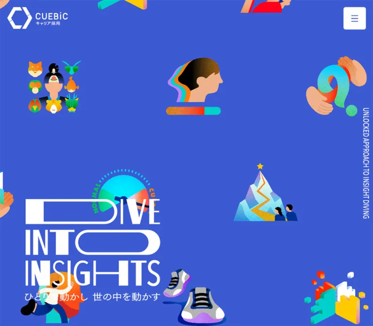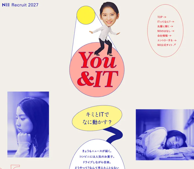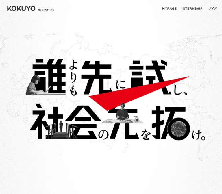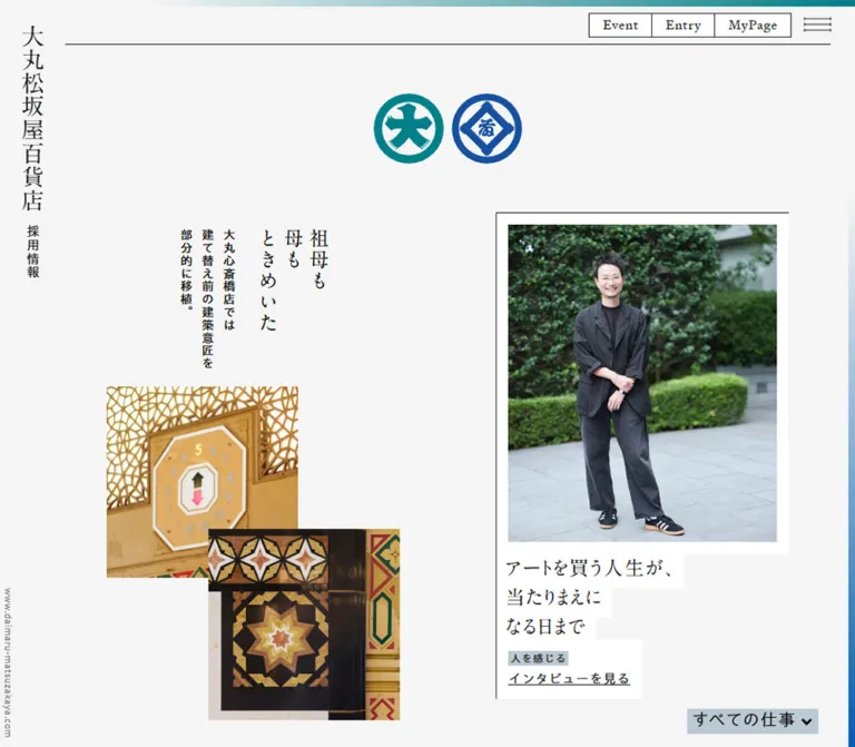
プレビュー準備中デザインリファレンスを見る
その他
日本のWebデザインを、AIの制作リファレンスに。
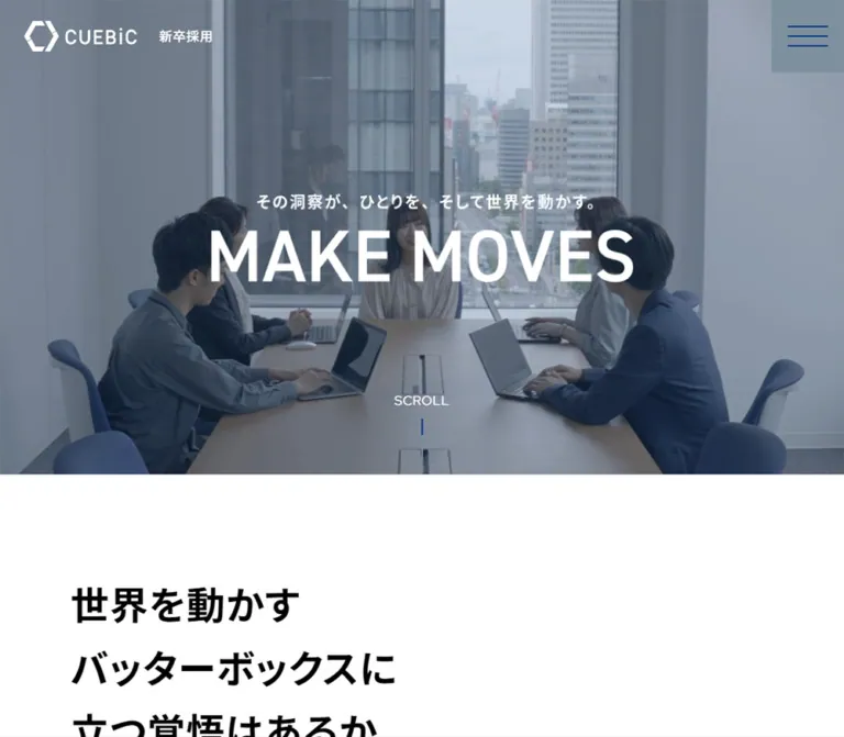
DESIGN REFERENCE
深い青と白の大きな面構成、力強い見出し、働く人の写真で企業文化を伝える新卒採用サイト。左右を入れ替える編集的なレイアウトと、黒白二段のフッターが特徴。
オリジナルサイトを見るLarge workplace photographs, emphatic Japanese headlines, and a continuous blue field interrupted by white editorial panels.
Original URL: cuebic.co.jp/recruit/newgrads/
Final URL: cuebic.co.jp/recruit/newgrads/
Theme: white introductory and editorial surfaces, deep-blue feature sections, and a black navigation footer; no selectable theme is evidenced.
Inspected: September 23, 2026, 01:00 JST. The supplied retrieval timestamp is 2026-09-22T16:00:27.281Z.
Viewports: 1440 × 1000 desktop and 390 × 844 mobile, in CSS pixels.
Scope: the current recruitment index, including its closed header, hero, introductory statement, four linked feature sections, interviews, recruitment magazine link, jobs section, closing photo composition, and footer. Screenshots directly show the desktop hero, culture/CEO transition, closing composition, and footer, plus the mobile opening and footer. Other sections are documented through the supplied rendered DOM and computed-style samples.
This is a recruitment microsite index with routes into business strategy, philosophy, culture, and a CEO message. Interviews and a magazine link extend the reading experience beyond the index. It should retain that editorial and navigational structure when reused.
The strongest visual relationship is between large, square-edged photographs and deliberately offset text. Deep blue provides continuity through several sections; white panels interrupt it without becoming floating cards. Bold Japanese headlines carry the argument, while English section labels establish a repeatable navigation vocabulary. Rounded outlines are reserved for detail links, creating a clear contrast with the rectangular page architecture.
The current application link reads “募集は終了しました”. That is an observed recruitment status, not evidence that the website has been discontinued.
Large workplace photographs, emphatic Japanese headlines, and a continuous blue field interrupted by white editorial panels.
Original URL: cuebic.co.jp/recruit/newgrads/
Final URL: cuebic.co.jp/recruit/newgrads/
Theme: white introductory and editorial surfaces, deep-blue feature sections, and a black navigation footer; no selectable theme is evidenced.
Inspected: September 23, 2026, 01:00 JST. The supplied retrieval timestamp is 2026-09-22T16:00:27.281Z.
Viewports: 1440 × 1000 desktop and 390 × 844 mobile, in CSS pixels.
Scope: the current recruitment index, including its closed header, hero, introductory statement, four linked feature sections, interviews, recruitment magazine link, jobs section, closing photo composition, and footer. Screenshots directly show the desktop hero, culture/CEO transition, closing composition, and footer, plus the mobile opening and footer. Other sections are documented through the supplied rendered DOM and computed-style samples.
This is a recruitment microsite index with routes into business strategy, philosophy, culture, and a CEO message. Interviews and a magazine link extend the reading experience beyond the index. It should retain that editorial and navigational structure when reused.
The strongest visual relationship is between large, square-edged photographs and deliberately offset text. Deep blue provides continuity through several sections; white panels interrupt it without becoming floating cards. Bold Japanese headlines carry the argument, while English section labels establish a repeatable navigation vocabulary. Rounded outlines are reserved for detail links, creating a clear contrast with the rectangular page architecture.
The current application link reads “募集は終了しました”. That is an observed recruitment status, not evidence that the website has been discontinued.
| Name | Value | Suggested token | Evidence and role |
|---|---|---|---|
| Corporate Blue | #003B85 |
--cuebic-blue |
Measured section background; also measured on blue detail links and the desktop jobs heading |
| White | #FFFFFF |
--paper |
Measured reversed text; visually established introduction, inset panels, and utility footer |
| Black | #000000 |
--ink |
Measured primary text; visually established navigation-footer background |
| Menu Slate | #7E909E |
--menu-slate |
Measured background of the square menu button at both viewports |
| Closed Recruitment Gray | #AFB2B7 |
--closed-gray |
Measured fill of the current recruitment-status link |
| Closing Photo Blue | Approximately #0762AA |
--collage-blue |
Estimated brighter blue behind the closing workplace-photo composition |
| Muted Utility Gray | Approximately #778089 |
--muted-ink |
Estimated footer translations and copyright text |
| Mobile Hero Pale Blue | Approximately #CCD9E8 |
--pale-hero |
Estimated visible background in the clipped mobile opening |
Corporate Blue is the dependable reproduction anchor. Keep it distinct from the brighter closing-photo field and the muted gray menu square.
The desktop hero has a cool, desaturated wash over workplace imagery. Its opacity and compositing method were not supplied. A slate overlay is a reasonable adaptation, but its values must be tuned against the chosen image rather than treated as measured source tokens.
The recorded root properties include numerous WordPress colors, gradients, shadows, and Swiper variables. Their presence does not show that those treatments are used in the visible page. In particular, do not replace Corporate Blue with the available #0693E3 preset or #007AFF library color.
"Noto Sans JP", sans-serif.400 for ordinary section copy, 500 for introductory prose and detail links, and 700 for principal Japanese headings.0.8px on desktop and 0.7px on mobile. These are not equivalent to applying 0.05em independently to every heading."Red Hat Display", sans-serif on the jobs heading, main footer links, and legal links.600 for JOB & ENTRY, 400 for main footer navigation, and 500 for legal links.“MAKE MOVES” appears as large white display lettering. The extracted hero H1 and closing slogan element contain no text, despite visible lettering in the captures. Their presentation is consistent with image or other non-text content; the exact implementation was not supplied.
Do not assign a measured font family to this lettering. Preserve authorized artwork when available, or identify a live-text recreation as an approximation. Likewise, the root HTML element’s Times declaration is not evidence that the rendered recruitment content uses a serif face.
Values below are measured unless explicitly marked estimated. Size and line height are expressed in pixels.
| Role | Desktop size / line height | Mobile size / line height | Weight | Notes |
|---|---|---|---|---|
| Base section copy | 16 / 27.2 |
14 / 23.8 |
400 |
Line height 1.7 |
| Introductory prose | 18 / 39.6 |
15 / 25.5 |
500 |
Desktop leading is unusually generous at 2.2 |
| Introductory headline | 48 / 79.056 |
35 / 47.495 |
700 |
Three lines in both inspected layouts |
| Feature headline | 46 / 62.422 |
35 / 47.495 |
700 |
Business, philosophy, culture, CEO, and interview headings |
| Feature English eyebrow | Approximately 28 |
Not separately measured | Visually bold | Desktop estimate from the CEO capture |
| Jobs display heading | 100 / 130 |
50 / 85 |
600 |
Red Hat Display; mobile box is two lines high |
| Jobs subheading | 28 / 47.6 |
24 / 40.8 |
500 |
The “職種” label |
| Interview caption | 19.2 / 28.8 |
16.8 / 25.2 |
700 |
Department and person grouped together |
| Magazine heading | 24 / 40.8 |
20.799 / 35.358 |
700 |
Mobile values are recorded computed results |
| Detail link | 16 / 27.2 |
14 / 23.8 |
500 |
“詳しくみる” |
| Recruitment-status link | 22 / 37.4 |
16 / 27.2 |
500 |
“募集は終了しました” |
| Main footer navigation | 22 / 28.6 |
16 / 20.8 |
400 |
English line; Japanese child text is smaller |
| Legal footer links | 13 / 22.1 |
12 / 20.4 |
500 |
Uppercase Latin text |
A feature H2 contains both an English label and Japanese headline. Its total rectangle is therefore taller than the Japanese line count alone would suggest. Do not apply the H2’s reported Japanese size to every nested label.
Density: spacious editorial sections, compact navigation details, and large intervals between major photographic compositions.
Scaling: endpoint measurements are available, but a general source spacing formula is not. The Quick Start uses recommended fluid interpolation around those endpoints.
| Use | Desktop | Mobile | Evidence |
|---|---|---|---|
| Main text inset | 120px |
20px |
Measured heading and link positions |
| Header brand inset | 30px |
20px |
Measured |
| Outer photo/panel inset | Approximately 60px |
Not established for all images | Desktop screenshot and section padding |
| Intro start to headline | 165px |
70px |
Derived from section and H2 positions |
| Intro headline to first paragraph | 60px |
35px |
Derived |
| Feature H2 to paragraph | 20px |
20px |
Derived |
| Feature paragraph to detail link | 35px |
25px |
Derived |
| Later intro paragraph gaps | 30px |
20px |
Derived; the first desktop paragraphs are contiguous |
| Culture section padding | 110px top, 270px bottom |
Not equivalent in the sampled layout | Measured desktop section padding |
| CEO section bottom padding | 380px |
Approximately 393.64px |
Measured; preserve as section-specific geometry |
| Footer navigation top inset | 120px |
58px |
Derived from footer and first-link positions |
| Footer navigation row gap | Approximately 65px |
26px |
Derived between link boxes |
The large culture and CEO spacing values belong to those compositions. They should not become universal padding for every section. Unmeasured image wrappers may occupy regions between text samples; a gap in the text record is not proof of an empty spacer.
| Element | Desktop | Mobile | Treatment |
|---|---|---|---|
| Photographs and editorial panels | Visually 0 |
Visually 0 where shown |
Square edges |
| Menu button | 0 |
0 |
Measured square surface |
| Detail links | 30px |
44px |
Measured; both produce a capsule outline |
| Recruitment-status link | 50px |
44px |
Measured filled capsule |
| Social marks | Circular | Circular | Visual observation |
Detail-link outlines appear approximately 2px thick. This is also consistent with the difference between their measured height and the sum of text line height plus vertical padding. The border width itself was not included in the style sample.
| Element | Desktop at 1440 × 1000 | Mobile at 390 × 844 |
|---|---|---|
| Document height | 10284.44px |
9396.89px |
| Header | 90px high |
60px high |
| Menu button | 90 × 90px, x = 1350 |
60 × 60px, x = 330 |
| Combined header brand link | 234.73 × 37.52px |
163.45 × 26.53px |
| Intro section start | y = 812px |
y = 152px |
| Hero H1 box | 720 × 151px, x = 360, y = 330.5 |
267 × 208px, x = 20, y = -96 |
| Intro prose column | 636px wide, x = 684 |
350px wide, x = 20 |
| Standard feature text column | 490px wide |
350px wide |
| Left feature text position | x = 120 |
x = 20 |
| Right panel text position | x = 830 |
x = 20 |
| Detail link | 280 × 61.19px |
202 × 45.80px |
| Interview caption column | 384px |
333.38px |
| Magazine link box | 1200 × 177.17px |
350 × 264.84px |
| Recruitment-status link | 561.61 × 97.39px |
350 × 73.19px |
| Entire footer | 575.55px high |
576.08px high |
Do not reproduce the page by fixing its total document height. These measurements describe the captured content, typography, and media arrangement.
Role: maintains recruitment identity and access to navigation.
The header is transparent in the supplied captures. A white horizontal CUEBiC lockup and “新卒採用” label sit at the upper left. A slate square touches the upper-right viewport edges. Inside it are three thin blue horizontal strokes, approximately 50px wide on desktop and 30px on mobile.
The brand and menu remain in the same viewport positions in the supplied scrolled captures. This supports a persistent, fixed-looking header, although its CSS positioning declaration was not included.
The desktop header is 90px high; mobile reduces it to 60px. This is a substantial component resize, not simply a smaller icon inside the same desktop header.
The menu button’s open state, animation, focus behavior, and accessible name were not tested. Additional header text includes ENTRY, but that does not establish a visible entry button in the captured closed header.
Role: introduces the recruitment proposition through people, scale, and a short slogan.
At desktop width, the hero occupies approximately a 16:9 media region, with the following white section starting at y = 812px. The background shows a person beside a handwritten whiteboard under a cool, muted overlay.
A centered lockup combines the small Japanese line “その洞察が、ひとりを、そして世界を動かす。” with a much larger “MAKE MOVES”. Its measured H1 box is 720 × 151px, centered horizontally. A small SCROLL label and thin vertical line appear near the lower center. Click behavior for that cue is unverified.
The mobile capture must be treated separately: the lockup begins above the viewport at y = -96px, only part of the slogan remains visible, and the introduction begins at y = 152px. The evidence does not establish whether this results from media sizing, an initialization problem, or another cause.
Role: explains the company’s growth and the kind of graduates it seeks.
The white section starts with the three-line headline:
“世界を動かす / バッターボックスに / 立つ覚悟はあるか”
On desktop, the headline begins at the 120px content inset. The prose begins below it and much farther right, at x = 684px, with a 636px width. This staggered composition is important: the body does not begin beside the heading on the same top baseline.
Desktop prose uses 18px medium text with 39.6px leading. On mobile, the whole composition becomes a 350px column inside 20px margins. The headline remains large at 35px, while prose becomes 15px / 25.5px and paragraphs receive clearer 20px separation.
Role: introduces a topic and links to its dedicated page.
Business strategy and culture use white editorial text on Corporate Blue. Their desktop text columns start at x = 120px and measure 490px wide.
Anatomy:
20px below the heading box.35px below the paragraph on desktop and 25px on mobile.In the culture screenshot, the workplace photograph starts at approximately x = 658px and extends to x = 1380px, giving it about 722px of width. It is wider than the text column and stops 60px short of the viewport edge. Do not replace this with two equal-width cards.
The culture image shows people collaborating around laptops in a bright office. Its square corners and direct contact with the blue field preserve the editorial character.
Role: changes the reading rhythm within the continuous blue section group.
Philosophy and CEO message use black copy and blue detail links on a white inner surface. Their parent sections still report Corporate Blue as the background. The white is therefore an inner compositional surface, not evidence that the entire parent section changes color.
Desktop headings start at x = 830px, again in 490px text columns. In the CEO screenshot, a large portrait begins around x = 60px, measures approximately 618px wide, and sits to the left of the white text area. The portrait begins slightly above the white panel edge—approximately 14px in that capture.
The panel stops around 60px before the right viewport edge. Preserve the unequal image width, text width, and intervening space. A centered, symmetrical split would lose this composition.
The supplied mobile DOM places the text at x = 20px, width 350px. Mobile image order and exact image overlaps are not visible in the provided crops, so they should not be claimed as verified.
Role: a restrained, repeated route into deeper content.
Use an unfilled capsule with a thin outline, a left-aligned Japanese label, and a small right-pointing arrow near the far end. White text and border appear on blue; blue text and border appear on white.
Measured desktop geometry is 280 × 61.19px, with padding 15px 60px 15px 30px and radius 30px. Mobile changes to 202 × 45.80px, padding 9px 50px 9px 22px, and radius 44px.
These are anchors to distinct routes: /business-strategy, /philosophy, /culture, and /ceo-message, under the recruitment base path. Hover styling and arrow motion were not exercised.
Role: connects the recruitment story to named people and their experiences.
The DOM identifies two linked interviews, each combining department information and a person’s name. Caption columns sit side by side on desktop at x = 328px and x = 728px; both are 384px wide, leaving a derived 16px gap.
On mobile, the captions occupy separate vertical positions and share x = 28.31px, width 333.38px. This confirms a stacked arrangement for the entries rather than a compressed two-column caption layout.
Captions use bold Noto Sans JP, 19.2px on desktop and 16.8px on mobile. The links point to individual articles on the company’s note domain. The supplied screenshots do not show their image treatments, so card fills, image ratios, hover effects, and decorative overlays remain unverified.
Role: provides a broader, ongoing culture-reading destination.
A wide linked region contains the recruitment-magazine heading and a short description. Its desktop box spans the 1200px content width. The title and paragraph occupy a 600px inner column beginning at x = 288px.
On mobile, the outer region is 350px wide, with an inner text width of approximately 298px and roughly 26px side insets. The title wraps across two lines and the region becomes taller.
Treat the whole region as a meaningful link. Its exact decorative surface and imagery are not established by the supplied screenshot crops.
Role: describes available role categories and communicates the current application status.
The section lists digital marketer, UI/UX designer, and engineer roles. The desktop JOB & ENTRY heading uses Red Hat Display at 100px / 130px, in Corporate Blue. On mobile, its measured treatment changes to white, 50px / 85px, in a two-line box.
The main desktop job-content region is offset to the right: the role label and status link begin at x = 763.20px and are approximately 561.61px wide. On mobile they return to the standard x = 20px, width 350px column.
The status link is a large gray capsule labeled “募集は終了しました”. It retains an external applicant-tracking-system URL in the DOM. A closed label is therefore not proof that the element is technically disabled or non-clickable.
The section’s sampled outer background is transparent, and its actual media or inner background layers are not shown in the supplied crops. White job text must not be used to invent an exact background treatment.
Role: returns to the recruitment slogan and workplace imagery before navigation.
A brighter blue field contains multiple rectangular workplace photographs at differing sizes and vertical positions. Several images extend beyond the viewport edges. Very large white “MAKE MOVES” lettering overlaps the composition.
The desktop slogan element measures approximately 996 × 123px. The mobile counterpart measures approximately 348 × 180px, consistent with a taller arrangement. The captures show intentionally cropped parts of the composition at their respective scroll positions.
Preserve square crops, varied image scale, and deliberate overlap. Motion, horizontal sliding, and parallax are not established by these still captures.
Role: provides a clear return path into the recruitment site.
A full-width black band contains five bilingual links and a vertical white brand lockup. Each link stacks an English route name over a small muted Japanese explanation.
Desktop navigation uses three columns in the first row and two in the second:
TOP, BUSINESS STRATEGY, and PHILOSOPHY.CULTURE and CEO MESSAGE.The logo sits separately at the far right, with a measured link width of 97px. On mobile, all five links form one left-hand column while the logo remains at the upper right, in an 84px-wide link region.
The mobile logo link’s tall rectangle reflects its layout container; it is not an instruction to stretch the logo artwork to that height.
Role: separates corporate utilities and social destinations from recruitment navigation.
The white lower band contains ACCESS, SECURITY POLICY, PRIVACY POLICY, and CONTACT, followed by five black circular social marks: X, LINE, Facebook, Instagram, and note. Copyright appears toward the lower right.
Desktop legal links occupy one row. Mobile uses two explicit pairs: access/security, then privacy/contact. The social glyphs are approximately 35px wide on desktop and 31.5px on mobile; their recorded inline-anchor heights are text-line boxes, not reliable measurements of complete interactive hit areas.
This black/white footer division is structural. It is not a dark-mode toggle or an elevated footer card.
| Treatment | Evidence | What remains unverified |
|---|---|---|
| Persistent header | Brand and menu remain at the viewport top across supplied scrolled captures | Exact positioning rule, scroll-direction behavior, and alternate header states |
| Hero media setup | Rendered script text references a video container and a min-width: 768px media query |
Playback, autoplay, looping, muting, asset format, and controls |
| Hero scroll cue | SCROLL and a vertical line are visible on desktop |
Whether it is clickable or animated |
| Detail navigation | Four distinct internal destination URLs are present | Click transitions and destination-page behavior |
| Interviews and magazine | External article and magazine URLs are present | New-tab behavior and external-page presentation |
| Menu | Closed three-line control is visible | Open layout, focus management, keyboard behavior, and animation |
| Closing collage | Staggered photos and overlapping slogan are visible | Continuous motion, slider behavior, and parallax |
| Sampled element animation | Sampled elements report animation: none |
Descendant, pseudo-element, media, and script-driven motion |
| Sampled transitions | The supplied transition field reads all |
Duration, delay, easing, and whether a transition actually occurs |
There is no supported source timing table. Do not turn the available transition: all field into an invented duration or claim that the entire page is static because sampled elements report no animation.
Recommended adaptation: use a restrained 160ms ease opacity transition for links and controls. Keep content visible without animation. Provide reduced-motion and static-media options if moving backgrounds are introduced. These recommendations are not descriptions of tested original behavior.
| Layer | Appearance | Purpose |
|---|---|---|
| Introduction | White with black text | Establishes the recruitment argument with generous reading space |
| Feature field | Solid #003B85 |
Connects business, philosophy, culture, and CEO material |
| Inset editorial panel | White rectangle inside blue surroundings | Changes emphasis while maintaining the continuous composition |
| Media | Large, square-edged photographs | Supplies human presence and scale |
| Menu control | Solid #7E909E square |
Gives the persistent control a stable background |
| Detail action | Transparent fill with a thin outline | Repeated navigation without a heavy conversion-button treatment |
| Recruitment status | Solid #AFB2B7 capsule |
Communicates the current closed application state |
| Closing composition | Brighter blue with overlapping photos and white lettering | Repeats the visual recruitment theme |
| Primary footer | Black with white and muted gray text | Groups recruitment navigation and identity |
| Utility footer | White with black marks and small gray copyright | Provides corporate and social links |
No general shadow-elevation system is visible in the supplied captures. Structure comes from contrasting planes, image scale, alignment, and empty space.
The visible photography is naturalistic and workplace-oriented: discussion, laptops, bright offices, handwritten ideas, and a portrait beside a window. Clothing and furniture provide subdued neutral tones against the strong blue architecture.
The culture image is a broad collaborative scene. The CEO panel uses a closer portrait of a smiling man in a dark jacket. The closing composition combines several workplace crops at different scales. The people’s identities should not be inferred from appearance alone.
The hero applies a cool wash, while the culture and portrait imagery appear clearer and brighter. Do not apply the hero’s desaturation uniformly to every photograph.
No image, logo, font-file, or video asset URLs were supplied. The following are visual references on the inspected page, not downloadable asset paths.
| Asset or group | Observed presentation | Evidence |
|---|---|---|
| Header brand lockup | White horizontal CUEBiC mark with recruitment label | Desktop and mobile captures |
| Footer brand lockup | White vertical mark, wordmark, and recruitment label | Desktop and mobile footer captures |
| Hero workplace media | Person near a whiteboard under a cool wash | Desktop opening capture |
| Hero slogan | White caption and large MAKE MOVES |
Desktop opening and clipped mobile opening |
| Culture photograph | People collaborating around laptops | Desktop culture/CEO capture |
| CEO portrait | Smiling man in a dark jacket beside a window | Desktop culture/CEO capture |
| Closing image group | Overlapping rectangular workplace photographs | Desktop and mobile closing captures |
| Social marks | Five black circular brand symbols | Desktop and mobile utility footer |
Use authorized original artwork when available. Do not substitute an approximate polygon for the corporate symbol or fabricate source filenames. For a new organization, preserve the photographic relationships and layout while supplying its own identity and people.
The desktop page uses several related alignments rather than one rigid centered grid. Main headings and utility links often begin at x = 120px; large images may begin at x = 60px or extend to x = 1380px. Right-side feature copy begins at x = 830px.
The introductory prose has its own offset at x = 684px. This variety creates a deliberate editorial rhythm while still using a limited set of repeated edges.
Blue feature sections alternate text-left/image-right compositions with white panels containing image-left/text-right arrangements. Section heights are generous: the measured culture section is about 921px, and the CEO section about 1121px. These are recorded outcomes, not recommended fixed heights.
The measured text system becomes a 350px column with 20px side insets. Japanese headlines remain assertive at 35px, rather than scaling down to ordinary card-title size. Feature paragraphs use 14px / 23.8px; the opening statement uses a slightly larger 15px / 25.5px.
Detail links shrink to 202px wide, while the recruitment-status link uses the full 350px content width. Interview entries stack. Footer navigation becomes a single list, but the logo remains alongside it rather than moving beneath all links.
The supplied mobile screenshot shows only a 152px visible opening region before the introduction. Its H1 begins at y = -96px, confirming that part of the lockup lies above the viewport in the recorded state.
Record this as an inspection limitation or implementation issue to investigate. Do not present the clipping as a proven intentional mobile design, and do not invent a complete mobile video hero from the desktop capture.
For a new implementation, a stable mobile hero with an explicit media fallback and fully visible slogan is recommended. The Quick Start makes that recommendation explicit instead of reproducing the negative top position.
A 768px media-query threshold is visible in the supplied media-setup script fragment. It supports a breakpoint for that media logic only. The original page’s full responsive stylesheet was not provided, so the same threshold cannot be asserted for every component.
The Quick Start uses 767px and below as a practical mobile adaptation. Intermediate widths, landscape phones, browser zoom, and very wide screens were not inspected.
#003B85, white, and black.490px desktop text columns and the shift between left and right alignments.These are recommendations for a new implementation, not verified original features:
44 × 44px hit areas while retaining smaller circular artwork.#003B85, measured.#7E909E, measured.#AFB2B7, measured.#0762AA, estimated.“Create a Japanese new-graduate recruitment microsite index with an editorial photographic layout. Use deep blue #003B85, white, and black. Place a white brand lockup at the upper left and a slate square menu at the upper right, sized 90px on desktop and 60px on mobile. Follow a workplace-media opening with a bold three-line Japanese statement and prose offset to the right. Alternate blue text-left sections with white inset panels containing large left-hand photographs and right-hand copy. Use Noto Sans JP, measured Red Hat Display roles, square image edges, thin outlined capsule links, and generous section spacing. Finish with a brighter blue photo composition, a black bilingual navigation footer, and a white utility footer. Preserve separate topic routes and an explicit closed recruitment status. Provide a stable mobile hero as an implementation improvement, not as a claim about the captured original.”
This is an adaptation of the measured typography, component sizes, and observed composition. It is not extracted source CSS. Fluid gutters, the overlay color, feature-grid implementation, hover timing, and stable mobile hero are recommendations.
Use .feature__grid with .feature__copy and .feature__media children. Inside the copy, use an eyebrow, title, paragraph, and detail link. Add .feature--panel for the white-panel variant. Use two .footer-legal__group elements to preserve the mobile legal-link pairs.
Supply authorized image and logo assets separately, and load the named fonts through the project’s normal font pipeline. Menu behavior and media controls require application code. The unpictured jobs background and interview-image treatments are intentionally not reconstructed here.
:root {
  /* Measured colors */
  --cuebic-blue: #003b85;
  --paper: #fff;
  --ink: #000;
  --menu-slate: #7e909e;
  --closed-gray: #afb2b7;

  /* Visual estimates and a recommended overlay */
  --collage-blue: #0762aa;
  --muted-ink: #778089;
  --pale-hero: #ccd9e8;
  --hero-wash: rgb(83 103 128 / 55%);

  /* Measured font families and desktop typography */
  --font-jp: 'Noto Sans JP', sans-serif;
  --font-latin: 'Red Hat Display', sans-serif;
  --body-size: 16px;
  --tracking: 0.8px;
  --feature-size: 46px;
  --header-height: 90px;

  /* Recommended interpolation around measured desktop insets */
  --gutter: clamp(40px, 8.3333vw, 120px);
  --outer-inset: clamp(20px, 4.1667vw, 60px);
  --feature-gap: clamp(24px, 3.3333vw, 48px);
  --panel-gap: clamp(40px, 10.5556vw, 152px);
  --panel-top: 105px;
  --control-motion: 160ms ease;
}

* { box-sizing: border-box; }

body {
  margin: 0;
  background: var(--paper);
  color: var(--ink);
  font-family: var(--font-jp);
  font-size: var(--body-size);
  line-height: 1.7;
  letter-spacing: var(--tracking);
}

img, video { display: block; max-width: 100%; }
button, a { -webkit-tap-highlight-color: transparent; }
button { font: inherit; }
a { color: inherit; }

:focus-visible {
  outline: 3px solid currentColor;
  outline-offset: 5px;
}

section[id] {
  scroll-margin-top: calc(var(--header-height) + 16px);
}

.site-header {
  position: fixed;
  inset: 0 0 auto;
  z-index: 20;
  height: var(--header-height);
  display: flex;
  align-items: center;
  pointer-events: none;
}

.site-header > * { pointer-events: auto; }

.site-brand {
  display: block;
  width: 235px;
  margin-left: 30px;
  color: var(--paper);
}

.site-brand img { width: 100%; height: auto; }

.menu-button {
  width: var(--header-height);
  height: var(--header-height);
  margin-left: auto;
  padding: 0;
  border: 0;
  border-radius: 0;
  display: grid;
  place-content: center;
  gap: 10px;
  background: var(--menu-slate);
  color: var(--cuebic-blue);
  cursor: pointer;
}

.menu-button span {
  display: block;
  width: 50px;
  height: 2px;
  background: currentColor;
}

.hero {
  position: relative;
  aspect-ratio: 16 / 9;
  overflow: hidden;
  background: var(--pale-hero);
}

.hero__media {
  position: absolute;
  inset: 0;
  width: 100%;
  height: 100%;
  object-fit: cover;
}

.hero::after {
  content: '';
  position: absolute;
  inset: 0;
  background: var(--hero-wash);
  pointer-events: none;
}

.hero__lockup {
  position: absolute;
  z-index: 1;
  top: 50%;
  left: 50%;
  width: 50%;
  transform: translate(-50%, -50%);
}

.hero__lockup img { width: 100%; height: auto; }

.hero__scroll {
  position: absolute;
  z-index: 1;
  bottom: 20px;
  left: 50%;
  transform: translateX(-50%);
  color: var(--paper);
  text-align: center;
}

.hero__scroll::after {
  content: '';
  display: block;
  width: 1px;
  height: 50px;
  margin: 10px auto 0;
  background: currentColor;
  opacity: 0.55;
}

.manifesto {
  padding: 165px var(--gutter) 180px;
}

.manifesto__title {
  margin: 0;
  font-size: 48px;
  font-weight: 700;
  line-height: 1.647;
}

.manifesto__copy {
  width: 53%;
  margin: 60px 0 0 auto;
  font-size: 18px;
  font-weight: 500;
  line-height: 2.2;
}

.manifesto__copy p { margin: 0; }
.manifesto__copy p + p { margin-top: 30px; }
.manifesto__copy p:first-child + p { margin-top: 0; }

/* Culture-like desktop proportions; not universal section heights */
.feature {
  padding: 110px var(--outer-inset) 270px var(--gutter);
  background: var(--cuebic-blue);
  color: var(--paper);
}

.feature__grid {
  display: grid;
  grid-template-columns: minmax(0, 490fr) minmax(0, 722fr);
  gap: var(--feature-gap);
  align-items: start;
}

.feature__copy { min-width: 0; }

.feature__eyebrow {
  display: block;
  margin-bottom: 30px;
  font-family: var(--font-latin);
  font-size: 28px;
  font-weight: 600;
  line-height: 1.3;
}

.feature__title {
  margin: 0;
  font-size: var(--feature-size);
  font-weight: 700;
  line-height: 1.357;
}

.feature__copy p { margin: 20px 0 0; }

.feature__media {
  min-width: 0;
  margin: 0;
}

.feature__media img {
  width: 100%;
  height: auto;
  border-radius: 0;
}

.feature--panel {
  padding: 0 var(--outer-inset) 80px 0;
}

.feature--panel .feature__grid {
  padding: var(--panel-top) var(--outer-inset) 120px;
  grid-template-columns: minmax(0, 618fr) minmax(0, 490fr);
  gap: var(--panel-gap);
  background: var(--paper);
  color: var(--ink);
}

.feature--panel .feature__copy {
  grid-column: 2;
  grid-row: 1;
}

.feature--panel .feature__media {
  grid-column: 1;
  grid-row: 1;
  /* Approximation of the visible portrait overlap */
  margin-top: calc(-1 * var(--panel-top) - 14px);
}

.feature--panel .feature__eyebrow {
  color: var(--cuebic-blue);
}

.detail-link {
  position: relative;
  display: inline-block;
  width: 280px;
  margin-top: 35px;
  padding: 15px 60px 15px 30px;
  border: 2px solid currentColor;
  border-radius: 30px;
  color: inherit;
  font-size: 16px;
  font-weight: 500;
  line-height: 1.7;
  text-decoration: none;
  transition: opacity var(--control-motion);
}

.detail-link::after {
  content: '→';
  position: absolute;
  right: 20px;
  top: 50%;
  transform: translateY(-50%);
}

.feature--panel .detail-link { color: var(--cuebic-blue); }

.recruitment-status {
  display: block;
  width: 100%;
  padding: 30px;
  border-radius: 50px;
  background: var(--closed-gray);
  color: var(--paper);
  font-size: 22px;
  font-weight: 500;
  line-height: 1.7;
  text-align: center;
  text-decoration: none;
}

.closing-collage {
  position: relative;
  overflow: hidden;
  background: var(--collage-blue);
}

/* Individual collage crop positions require authored media markup. */
.closing-collage img { border-radius: 0; }

.footer-main {
  padding: 120px var(--gutter) 110px;
  background: var(--ink);
  color: var(--paper);
}

.footer-main__inner {
  display: grid;
  grid-template-columns: minmax(0, 1fr) 97px;
  gap: clamp(40px, 12.0139vw, 173px);
  align-items: start;
}

.footer-nav {
  display: grid;
  grid-template-columns: repeat(3, minmax(0, 1fr));
  row-gap: 65px;
}

.footer-nav a {
  display: block;
  font-family: var(--font-latin);
  font-size: 22px;
  line-height: 1.3;
  text-decoration: none;
}

.footer-nav small {
  display: block;
  color: var(--muted-ink);
  font-family: var(--font-jp);
  font-size: 13px;
  line-height: 1.3;
}

.footer-brand img { width: 100%; height: auto; }

.footer-bottom {
  display: grid;
  grid-template-columns: minmax(0, 1fr) auto;
  gap: 24px;
  padding: 44px var(--gutter) 40px;
  background: var(--paper);
  color: var(--ink);
}

.footer-legal {
  grid-column: 1 / -1;
  display: flex;
  flex-wrap: wrap;
  gap: 29px;
}

.footer-legal__group { display: flex; gap: 29px; }

.footer-legal a {
  font-family: var(--font-latin);
  font-size: 13px;
  font-weight: 500;
  text-decoration: none;
}

.footer-social { display: flex; gap: 11px; }

.footer-social a {
  /* Recommended touch targets around the smaller visible symbols */
  display: grid;
  place-items: center;
  width: 44px;
  height: 44px;
}

.footer-social img { width: 35px; height: 35px; }

.footer-copyright {
  align-self: end;
  margin: 0;
  color: var(--muted-ink);
  font-size: 13px;
  text-align: right;
}

@media (hover: hover) {
  /* Recommended feedback; original hover behavior was not tested. */
  .detail-link:hover { opacity: 0.75; }
}

@media (max-width: 767px) {
  :root {
    --body-size: 14px;
    --tracking: 0.7px;
    --feature-size: 35px;
    --header-height: 60px;
    --gutter: 20px;
    --outer-inset: 20px;
  }

  .site-brand { width: 163.5px; margin-left: 20px; }
  .menu-button { gap: 5px; }
  .menu-button span { width: 30px; }

  /* Recommended stable fallback, unlike the clipped captured state. */
  .hero { aspect-ratio: auto; min-height: 440px; }
  .hero__lockup {
    top: auto;
    left: 20px;
    bottom: 56px;
    width: min(267px, calc(100% - 40px));
    transform: none;
  }
  .hero__scroll { display: none; }

  .manifesto { padding: 70px 20px 90px; }
  .manifesto__title { font-size: 35px; line-height: 1.357; }
  .manifesto__copy {
    width: 100%;
    margin-top: 35px;
    font-size: 15px;
    line-height: 1.7;
  }
  .manifesto__copy p + p,
  .manifesto__copy p:first-child + p { margin-top: 20px; }

  /* Stacking and image order are recommended where crops are absent. */
  .feature,
  .feature--panel { padding: 80px 20px; }
  .feature__grid,
  .feature--panel .feature__grid {
    grid-template-columns: minmax(0, 1fr);
    gap: 40px;
  }
  .feature--panel { padding: 0 0 80px; }
  .feature--panel .feature__grid { padding: 80px 20px; }
  .feature--panel .feature__copy,
  .feature--panel .feature__media {
    grid-column: auto;
    grid-row: auto;
  }
  .feature--panel .feature__media { margin-top: 0; }
  .feature__eyebrow { margin-bottom: 20px; font-size: 20px; }

  .detail-link {
    display: block;
    width: 202px;
    margin-top: 25px;
    padding: 9px 50px 9px 22px;
    border-radius: 44px;
    font-size: 14px;
  }

  .recruitment-status {
    padding: 23px 30px;
    border-radius: 44px;
    font-size: 16px;
  }

  .footer-main { padding: 58px 20px 60px; }
  .footer-main__inner {
    grid-template-columns: minmax(0, 1fr) 84px;
    gap: 40px;
  }
  .footer-nav {
    width: 185.66px;
    max-width: 100%;
    grid-template-columns: minmax(0, 1fr);
    row-gap: 26px;
  }
  .footer-nav a { font-size: 16px; }
  .footer-nav small { font-size: 10px; }

  .footer-bottom { display: block; padding: 26px 20px 24px; }
  .footer-legal { display: grid; gap: 25px; }
  .footer-legal__group { gap: 25px; }
  .footer-legal a { font-size: 12px; }
  .footer-social { gap: 0; margin-top: 20px; }
  .footer-social img { width: 31.5px; height: 31.5px; }
  .footer-copyright { font-size: 10px; }
}

@media (prefers-reduced-motion: reduce) {
  .detail-link { transition: none; }
  /* Video playback needs a separate application-level preference. */
}
Optional aliases for a project that already uses Tailwind v4. This does not imply that the original website uses Tailwind. Define the properties above first.
@theme inline {
  --color-cuebic: var(--cuebic-blue);
  --color-paper: var(--paper);
  --color-ink: var(--ink);
  --color-menu: var(--menu-slate);
  --color-recruitment-closed: var(--closed-gray);
  --color-collage: var(--collage-blue);
  --color-muted: var(--muted-ink);

  --font-body: var(--font-jp);
  --font-display: var(--font-latin);

  --text-body: var(--body-size);
  --text-editorial: var(--feature-size);
  --spacing-page: var(--gutter);
  --spacing-image-edge: var(--outer-inset);
  --spacing-header: var(--header-height);
  --radius-detail: 30px;
  --radius-status: 50px;
}
200.2026-09-22T16:00:27.281Z, equivalent to September 23, 2026, 01:00:27 JST.10284.44px.9396.89px.Copyright©CUEBiC Inc.. No production-credit identity is established by the supplied original-page evidence.This reference describes the current supplied page evidence. Measured values, visual estimates, and recommended adaptations are identified separately; the Quick Start does not claim to reproduce unobserved behavior.
# CUEBiC New Graduate Recruitment — Style Reference

> Large workplace photographs, emphatic Japanese headlines, and a continuous blue field interrupted by white editorial panels.

**Original URL:** [cuebic.co.jp/recruit/newgrads/](https://cuebic.co.jp/recruit/newgrads/)
**Final URL:** [cuebic.co.jp/recruit/newgrads/](https://cuebic.co.jp/recruit/newgrads/)
**Theme:** white introductory and editorial surfaces, deep-blue feature sections, and a black navigation footer; no selectable theme is evidenced.
**Inspected:** September 23, 2026, 01:00 JST. The supplied retrieval timestamp is `2026-09-22T16:00:27.281Z`.
**Viewports:** 1440 × 1000 desktop and 390 × 844 mobile, in CSS pixels.
**Scope:** the current recruitment index, including its closed header, hero, introductory statement, four linked feature sections, interviews, recruitment magazine link, jobs section, closing photo composition, and footer. Screenshots directly show the desktop hero, culture/CEO transition, closing composition, and footer, plus the mobile opening and footer. Other sections are documented through the supplied rendered DOM and computed-style samples.

This is a recruitment microsite index with routes into business strategy, philosophy, culture, and a CEO message. Interviews and a magazine link extend the reading experience beyond the index. It should retain that editorial and navigational structure when reused.

The strongest visual relationship is between large, square-edged photographs and deliberately offset text. Deep blue provides continuity through several sections; white panels interrupt it without becoming floating cards. Bold Japanese headlines carry the argument, while English section labels establish a repeatable navigation vocabulary. Rounded outlines are reserved for detail links, creating a clear contrast with the rectangular page architecture.

The current application link reads “募集は終了しました”. That is an observed recruitment status, not evidence that the website has been discontinued.
# CUEBiC New Graduate Recruitment — Style Reference

> Large workplace photographs, emphatic Japanese headlines, and a continuous blue field interrupted by white editorial panels.

**Original URL:** [cuebic.co.jp/recruit/newgrads/](https://cuebic.co.jp/recruit/newgrads/)
**Final URL:** [cuebic.co.jp/recruit/newgrads/](https://cuebic.co.jp/recruit/newgrads/)
**Theme:** white introductory and editorial surfaces, deep-blue feature sections, and a black navigation footer; no selectable theme is evidenced.
**Inspected:** September 23, 2026, 01:00 JST. The supplied retrieval timestamp is `2026-09-22T16:00:27.281Z`.
**Viewports:** 1440 × 1000 desktop and 390 × 844 mobile, in CSS pixels.
**Scope:** the current recruitment index, including its closed header, hero, introductory statement, four linked feature sections, interviews, recruitment magazine link, jobs section, closing photo composition, and footer. Screenshots directly show the desktop hero, culture/CEO transition, closing composition, and footer, plus the mobile opening and footer. Other sections are documented through the supplied rendered DOM and computed-style samples.

This is a recruitment microsite index with routes into business strategy, philosophy, culture, and a CEO message. Interviews and a magazine link extend the reading experience beyond the index. It should retain that editorial and navigational structure when reused.

The strongest visual relationship is between large, square-edged photographs and deliberately offset text. Deep blue provides continuity through several sections; white panels interrupt it without becoming floating cards. Bold Japanese headlines carry the argument, while English section labels establish a repeatable navigation vocabulary. Rounded outlines are reserved for detail links, creating a clear contrast with the rectangular page architecture.

The current application link reads “募集は終了しました”. That is an observed recruitment status, not evidence that the website has been discontinued.

## How to Read This Reference

- **Measured** means a value appears in the supplied computed styles or element rectangles. Measurements apply to the two inspected viewports, not necessarily every screen width.
- **Estimated** means a visual approximation from the original-page screenshots. Estimated colors are not pixel samples.
- **Derived** means a calculation from supplied measurements, such as the gap between two text boxes.
- **Recommended** means an implementation choice for a new build. It is not a verified feature of the original.
- All custom-property names introduced here are implementation aliases. The source’s available WordPress presets do not establish the active design palette or spacing system.
- The mobile opening is visibly clipped. This reference records that state and separates it from the recommended stable mobile implementation.
- The screenshots and DOM are supplied inspection evidence. No additional browsing, asset retrieval, or interaction testing was performed for this reference.

## Tokens — Colors

### Default Palette

| Name | Value | Suggested token | Evidence and role |
| --- | --- | --- | --- |
| Corporate Blue | `#003B85` | `--cuebic-blue` | Measured section background; also measured on blue detail links and the desktop jobs heading |
| White | `#FFFFFF` | `--paper` | Measured reversed text; visually established introduction, inset panels, and utility footer |
| Black | `#000000` | `--ink` | Measured primary text; visually established navigation-footer background |
| Menu Slate | `#7E909E` | `--menu-slate` | Measured background of the square menu button at both viewports |
| Closed Recruitment Gray | `#AFB2B7` | `--closed-gray` | Measured fill of the current recruitment-status link |
| Closing Photo Blue | Approximately `#0762AA` | `--collage-blue` | Estimated brighter blue behind the closing workplace-photo composition |
| Muted Utility Gray | Approximately `#778089` | `--muted-ink` | Estimated footer translations and copyright text |
| Mobile Hero Pale Blue | Approximately `#CCD9E8` | `--pale-hero` | Estimated visible background in the clipped mobile opening |

Corporate Blue is the dependable reproduction anchor. Keep it distinct from the brighter closing-photo field and the muted gray menu square.

The desktop hero has a cool, desaturated wash over workplace imagery. Its opacity and compositing method were not supplied. A slate overlay is a reasonable adaptation, but its values must be tuned against the chosen image rather than treated as measured source tokens.

The recorded root properties include numerous WordPress colors, gradients, shadows, and Swiper variables. Their presence does not show that those treatments are used in the visible page. In particular, do not replace Corporate Blue with the available `#0693E3` preset or `#007AFF` library color.

## Tokens — Typography

### Japanese Editorial Text

- **Measured family:** `"Noto Sans JP", sans-serif`.
- **Measured weights:** `400` for ordinary section copy, `500` for introductory prose and detail links, and `700` for principal Japanese headings.
- **Character:** dense, confident headings paired with much quieter paragraphs. Explicit headline line breaks contribute substantially to the composition.
- **Tracking:** the sampled elements inherit `0.8px` on desktop and `0.7px` on mobile. These are not equivalent to applying `0.05em` independently to every heading.

### English Display and Navigation

- **Measured family:** `"Red Hat Display", sans-serif` on the jobs heading, main footer links, and legal links.
- **Measured weights:** `600` for `JOB & ENTRY`, `400` for main footer navigation, and `500` for legal links.
- English labels above the feature headlines are visibly distinct, but their child-element font declarations were not included. Using Red Hat Display there is a recommendation consistent with the measured Latin typography, not a confirmed declaration.

### Hero and Closing Slogans

“MAKE MOVES” appears as large white display lettering. The extracted hero H1 and closing slogan element contain no text, despite visible lettering in the captures. Their presentation is consistent with image or other non-text content; the exact implementation was not supplied.

Do not assign a measured font family to this lettering. Preserve authorized artwork when available, or identify a live-text recreation as an approximation. Likewise, the root HTML element’s `Times` declaration is not evidence that the rendered recruitment content uses a serif face.

### Type Scale

Values below are measured unless explicitly marked estimated. Size and line height are expressed in pixels.

| Role | Desktop size / line height | Mobile size / line height | Weight | Notes |
| --- | --- | --- | --- | --- |
| Base section copy | `16 / 27.2` | `14 / 23.8` | `400` | Line height `1.7` |
| Introductory prose | `18 / 39.6` | `15 / 25.5` | `500` | Desktop leading is unusually generous at `2.2` |
| Introductory headline | `48 / 79.056` | `35 / 47.495` | `700` | Three lines in both inspected layouts |
| Feature headline | `46 / 62.422` | `35 / 47.495` | `700` | Business, philosophy, culture, CEO, and interview headings |
| Feature English eyebrow | Approximately `28` | Not separately measured | Visually bold | Desktop estimate from the CEO capture |
| Jobs display heading | `100 / 130` | `50 / 85` | `600` | Red Hat Display; mobile box is two lines high |
| Jobs subheading | `28 / 47.6` | `24 / 40.8` | `500` | The “職種” label |
| Interview caption | `19.2 / 28.8` | `16.8 / 25.2` | `700` | Department and person grouped together |
| Magazine heading | `24 / 40.8` | `20.799 / 35.358` | `700` | Mobile values are recorded computed results |
| Detail link | `16 / 27.2` | `14 / 23.8` | `500` | “詳しくみる” |
| Recruitment-status link | `22 / 37.4` | `16 / 27.2` | `500` | “募集は終了しました” |
| Main footer navigation | `22 / 28.6` | `16 / 20.8` | `400` | English line; Japanese child text is smaller |
| Legal footer links | `13 / 22.1` | `12 / 20.4` | `500` | Uppercase Latin text |

A feature H2 contains both an English label and Japanese headline. Its total rectangle is therefore taller than the Japanese line count alone would suggest. Do not apply the H2’s reported Japanese size to every nested label.

## Tokens — Spacing & Shapes

**Density:** spacious editorial sections, compact navigation details, and large intervals between major photographic compositions.

**Scaling:** endpoint measurements are available, but a general source spacing formula is not. The Quick Start uses recommended fluid interpolation around those endpoints.

### Spacing Scale

| Use | Desktop | Mobile | Evidence |
| --- | --- | --- | --- |
| Main text inset | `120px` | `20px` | Measured heading and link positions |
| Header brand inset | `30px` | `20px` | Measured |
| Outer photo/panel inset | Approximately `60px` | Not established for all images | Desktop screenshot and section padding |
| Intro start to headline | `165px` | `70px` | Derived from section and H2 positions |
| Intro headline to first paragraph | `60px` | `35px` | Derived |
| Feature H2 to paragraph | `20px` | `20px` | Derived |
| Feature paragraph to detail link | `35px` | `25px` | Derived |
| Later intro paragraph gaps | `30px` | `20px` | Derived; the first desktop paragraphs are contiguous |
| Culture section padding | `110px` top, `270px` bottom | Not equivalent in the sampled layout | Measured desktop section padding |
| CEO section bottom padding | `380px` | Approximately `393.64px` | Measured; preserve as section-specific geometry |
| Footer navigation top inset | `120px` | `58px` | Derived from footer and first-link positions |
| Footer navigation row gap | Approximately `65px` | `26px` | Derived between link boxes |

The large culture and CEO spacing values belong to those compositions. They should not become universal padding for every section. Unmeasured image wrappers may occupy regions between text samples; a gap in the text record is not proof of an empty spacer.

### Border Radius

| Element | Desktop | Mobile | Treatment |
| --- | --- | --- | --- |
| Photographs and editorial panels | Visually `0` | Visually `0` where shown | Square edges |
| Menu button | `0` | `0` | Measured square surface |
| Detail links | `30px` | `44px` | Measured; both produce a capsule outline |
| Recruitment-status link | `50px` | `44px` | Measured filled capsule |
| Social marks | Circular | Circular | Visual observation |

Detail-link outlines appear approximately `2px` thick. This is also consistent with the difference between their measured height and the sum of text line height plus vertical padding. The border width itself was not included in the style sample.

### Layout Measurements

| Element | Desktop at 1440 × 1000 | Mobile at 390 × 844 |
| --- | --- | --- |
| Document height | `10284.44px` | `9396.89px` |
| Header | `90px` high | `60px` high |
| Menu button | `90 × 90px`, x = `1350` | `60 × 60px`, x = `330` |
| Combined header brand link | `234.73 × 37.52px` | `163.45 × 26.53px` |
| Intro section start | y = `812px` | y = `152px` |
| Hero H1 box | `720 × 151px`, x = `360`, y = `330.5` | `267 × 208px`, x = `20`, y = `-96` |
| Intro prose column | `636px` wide, x = `684` | `350px` wide, x = `20` |
| Standard feature text column | `490px` wide | `350px` wide |
| Left feature text position | x = `120` | x = `20` |
| Right panel text position | x = `830` | x = `20` |
| Detail link | `280 × 61.19px` | `202 × 45.80px` |
| Interview caption column | `384px` | `333.38px` |
| Magazine link box | `1200 × 177.17px` | `350 × 264.84px` |
| Recruitment-status link | `561.61 × 97.39px` | `350 × 73.19px` |
| Entire footer | `575.55px` high | `576.08px` high |

Do not reproduce the page by fixing its total document height. These measurements describe the captured content, typography, and media arrangement.

## Components

### Persistent Brand Header

**Role:** maintains recruitment identity and access to navigation.

The header is transparent in the supplied captures. A white horizontal CUEBiC lockup and “新卒採用” label sit at the upper left. A slate square touches the upper-right viewport edges. Inside it are three thin blue horizontal strokes, approximately `50px` wide on desktop and `30px` on mobile.

The brand and menu remain in the same viewport positions in the supplied scrolled captures. This supports a persistent, fixed-looking header, although its CSS positioning declaration was not included.

The desktop header is `90px` high; mobile reduces it to `60px`. This is a substantial component resize, not simply a smaller icon inside the same desktop header.

The menu button’s open state, animation, focus behavior, and accessible name were not tested. Additional header text includes `ENTRY`, but that does not establish a visible entry button in the captured closed header.

### Workplace Hero

**Role:** introduces the recruitment proposition through people, scale, and a short slogan.

At desktop width, the hero occupies approximately a `16:9` media region, with the following white section starting at y = `812px`. The background shows a person beside a handwritten whiteboard under a cool, muted overlay.

A centered lockup combines the small Japanese line “その洞察が、ひとりを、そして世界を動かす。” with a much larger “MAKE MOVES”. Its measured H1 box is `720 × 151px`, centered horizontally. A small `SCROLL` label and thin vertical line appear near the lower center. Click behavior for that cue is unverified.

The mobile capture must be treated separately: the lockup begins above the viewport at y = `-96px`, only part of the slogan remains visible, and the introduction begins at y = `152px`. The evidence does not establish whether this results from media sizing, an initialization problem, or another cause.

### Introductory Statement

**Role:** explains the company’s growth and the kind of graduates it seeks.

The white section starts with the three-line headline:

“世界を動かす / バッターボックスに / 立つ覚悟はあるか”

On desktop, the headline begins at the `120px` content inset. The prose begins below it and much farther right, at x = `684px`, with a `636px` width. This staggered composition is important: the body does not begin beside the heading on the same top baseline.

Desktop prose uses `18px` medium text with `39.6px` leading. On mobile, the whole composition becomes a `350px` column inside `20px` margins. The headline remains large at `35px`, while prose becomes `15px / 25.5px` and paragraphs receive clearer `20px` separation.

### Blue Feature Teaser

**Role:** introduces a topic and links to its dedicated page.

Business strategy and culture use white editorial text on Corporate Blue. Their desktop text columns start at x = `120px` and measure `490px` wide.

Anatomy:

1. Uppercase English category label.
2. Bold Japanese headline with deliberate line breaks.
3. Short explanatory paragraph, `20px` below the heading box.
4. Outlined “詳しくみる” link, `35px` below the paragraph on desktop and `25px` on mobile.
5. A large adjacent photographic region where shown.

In the culture screenshot, the workplace photograph starts at approximately x = `658px` and extends to x = `1380px`, giving it about `722px` of width. It is wider than the text column and stops `60px` short of the viewport edge. Do not replace this with two equal-width cards.

The culture image shows people collaborating around laptops in a bright office. Its square corners and direct contact with the blue field preserve the editorial character.

### White Inset Feature Panel

**Role:** changes the reading rhythm within the continuous blue section group.

Philosophy and CEO message use black copy and blue detail links on a white inner surface. Their parent sections still report Corporate Blue as the background. The white is therefore an inner compositional surface, not evidence that the entire parent section changes color.

Desktop headings start at x = `830px`, again in `490px` text columns. In the CEO screenshot, a large portrait begins around x = `60px`, measures approximately `618px` wide, and sits to the left of the white text area. The portrait begins slightly above the white panel edge—approximately `14px` in that capture.

The panel stops around `60px` before the right viewport edge. Preserve the unequal image width, text width, and intervening space. A centered, symmetrical split would lose this composition.

The supplied mobile DOM places the text at x = `20px`, width `350px`. Mobile image order and exact image overlaps are not visible in the provided crops, so they should not be claimed as verified.

### Outlined Detail Link

**Role:** a restrained, repeated route into deeper content.

Use an unfilled capsule with a thin outline, a left-aligned Japanese label, and a small right-pointing arrow near the far end. White text and border appear on blue; blue text and border appear on white.

Measured desktop geometry is `280 × 61.19px`, with padding `15px 60px 15px 30px` and radius `30px`. Mobile changes to `202 × 45.80px`, padding `9px 50px 9px 22px`, and radius `44px`.

These are anchors to distinct routes: `/business-strategy`, `/philosophy`, `/culture`, and `/ceo-message`, under the recruitment base path. Hover styling and arrow motion were not exercised.

### Interview Entries

**Role:** connects the recruitment story to named people and their experiences.

The DOM identifies two linked interviews, each combining department information and a person’s name. Caption columns sit side by side on desktop at x = `328px` and x = `728px`; both are `384px` wide, leaving a derived `16px` gap.

On mobile, the captions occupy separate vertical positions and share x = `28.31px`, width `333.38px`. This confirms a stacked arrangement for the entries rather than a compressed two-column caption layout.

Captions use bold Noto Sans JP, `19.2px` on desktop and `16.8px` on mobile. The links point to individual articles on the company’s note domain. The supplied screenshots do not show their image treatments, so card fills, image ratios, hover effects, and decorative overlays remain unverified.

### Recruitment Magazine Link

**Role:** provides a broader, ongoing culture-reading destination.

A wide linked region contains the recruitment-magazine heading and a short description. Its desktop box spans the `1200px` content width. The title and paragraph occupy a `600px` inner column beginning at x = `288px`.

On mobile, the outer region is `350px` wide, with an inner text width of approximately `298px` and roughly `26px` side insets. The title wraps across two lines and the region becomes taller.

Treat the whole region as a meaningful link. Its exact decorative surface and imagery are not established by the supplied screenshot crops.

### Jobs and Recruitment Status

**Role:** describes available role categories and communicates the current application status.

The section lists digital marketer, UI/UX designer, and engineer roles. The desktop `JOB & ENTRY` heading uses Red Hat Display at `100px / 130px`, in Corporate Blue. On mobile, its measured treatment changes to white, `50px / 85px`, in a two-line box.

The main desktop job-content region is offset to the right: the role label and status link begin at x = `763.20px` and are approximately `561.61px` wide. On mobile they return to the standard x = `20px`, width `350px` column.

The status link is a large gray capsule labeled “募集は終了しました”. It retains an external applicant-tracking-system URL in the DOM. A closed label is therefore not proof that the element is technically disabled or non-clickable.

The section’s sampled outer background is transparent, and its actual media or inner background layers are not shown in the supplied crops. White job text must not be used to invent an exact background treatment.

### Closing Photo Composition

**Role:** returns to the recruitment slogan and workplace imagery before navigation.

A brighter blue field contains multiple rectangular workplace photographs at differing sizes and vertical positions. Several images extend beyond the viewport edges. Very large white “MAKE MOVES” lettering overlaps the composition.

The desktop slogan element measures approximately `996 × 123px`. The mobile counterpart measures approximately `348 × 180px`, consistent with a taller arrangement. The captures show intentionally cropped parts of the composition at their respective scroll positions.

Preserve square crops, varied image scale, and deliberate overlap. Motion, horizontal sliding, and parallax are not established by these still captures.

### Black Navigation Footer

**Role:** provides a clear return path into the recruitment site.

A full-width black band contains five bilingual links and a vertical white brand lockup. Each link stacks an English route name over a small muted Japanese explanation.

Desktop navigation uses three columns in the first row and two in the second:

- `TOP`, `BUSINESS STRATEGY`, and `PHILOSOPHY`.
- `CULTURE` and `CEO MESSAGE`.

The logo sits separately at the far right, with a measured link width of `97px`. On mobile, all five links form one left-hand column while the logo remains at the upper right, in an `84px`-wide link region.

The mobile logo link’s tall rectangle reflects its layout container; it is not an instruction to stretch the logo artwork to that height.

### White Utility Footer

**Role:** separates corporate utilities and social destinations from recruitment navigation.

The white lower band contains `ACCESS`, `SECURITY POLICY`, `PRIVACY POLICY`, and `CONTACT`, followed by five black circular social marks: X, LINE, Facebook, Instagram, and note. Copyright appears toward the lower right.

Desktop legal links occupy one row. Mobile uses two explicit pairs: access/security, then privacy/contact. The social glyphs are approximately `35px` wide on desktop and `31.5px` on mobile; their recorded inline-anchor heights are text-line boxes, not reliable measurements of complete interactive hit areas.

This black/white footer division is structural. It is not a dark-mode toggle or an elevated footer card.

## Tokens — Motion & Interaction

| Treatment | Evidence | What remains unverified |
| --- | --- | --- |
| Persistent header | Brand and menu remain at the viewport top across supplied scrolled captures | Exact positioning rule, scroll-direction behavior, and alternate header states |
| Hero media setup | Rendered script text references a video container and a `min-width: 768px` media query | Playback, autoplay, looping, muting, asset format, and controls |
| Hero scroll cue | `SCROLL` and a vertical line are visible on desktop | Whether it is clickable or animated |
| Detail navigation | Four distinct internal destination URLs are present | Click transitions and destination-page behavior |
| Interviews and magazine | External article and magazine URLs are present | New-tab behavior and external-page presentation |
| Menu | Closed three-line control is visible | Open layout, focus management, keyboard behavior, and animation |
| Closing collage | Staggered photos and overlapping slogan are visible | Continuous motion, slider behavior, and parallax |
| Sampled element animation | Sampled elements report `animation: none` | Descendant, pseudo-element, media, and script-driven motion |
| Sampled transitions | The supplied transition field reads `all` | Duration, delay, easing, and whether a transition actually occurs |

There is no supported source timing table. Do not turn the available `transition: all` field into an invented duration or claim that the entire page is static because sampled elements report no animation.

**Recommended adaptation:** use a restrained `160ms ease` opacity transition for links and controls. Keep content visible without animation. Provide reduced-motion and static-media options if moving backgrounds are introduced. These recommendations are not descriptions of tested original behavior.

## Surfaces

| Layer | Appearance | Purpose |
| --- | --- | --- |
| Introduction | White with black text | Establishes the recruitment argument with generous reading space |
| Feature field | Solid `#003B85` | Connects business, philosophy, culture, and CEO material |
| Inset editorial panel | White rectangle inside blue surroundings | Changes emphasis while maintaining the continuous composition |
| Media | Large, square-edged photographs | Supplies human presence and scale |
| Menu control | Solid `#7E909E` square | Gives the persistent control a stable background |
| Detail action | Transparent fill with a thin outline | Repeated navigation without a heavy conversion-button treatment |
| Recruitment status | Solid `#AFB2B7` capsule | Communicates the current closed application state |
| Closing composition | Brighter blue with overlapping photos and white lettering | Repeats the visual recruitment theme |
| Primary footer | Black with white and muted gray text | Groups recruitment navigation and identity |
| Utility footer | White with black marks and small gray copyright | Provides corporate and social links |

No general shadow-elevation system is visible in the supplied captures. Structure comes from contrasting planes, image scale, alignment, and empty space.

## Imagery

The visible photography is naturalistic and workplace-oriented: discussion, laptops, bright offices, handwritten ideas, and a portrait beside a window. Clothing and furniture provide subdued neutral tones against the strong blue architecture.

The culture image is a broad collaborative scene. The CEO panel uses a closer portrait of a smiling man in a dark jacket. The closing composition combines several workplace crops at different scales. The people’s identities should not be inferred from appearance alone.

The hero applies a cool wash, while the culture and portrait imagery appear clearer and brighter. Do not apply the hero’s desaturation uniformly to every photograph.

### Observed Asset References

No image, logo, font-file, or video asset URLs were supplied. The following are visual references on the inspected page, not downloadable asset paths.

| Asset or group | Observed presentation | Evidence |
| --- | --- | --- |
| Header brand lockup | White horizontal CUEBiC mark with recruitment label | Desktop and mobile captures |
| Footer brand lockup | White vertical mark, wordmark, and recruitment label | Desktop and mobile footer captures |
| Hero workplace media | Person near a whiteboard under a cool wash | Desktop opening capture |
| Hero slogan | White caption and large `MAKE MOVES` | Desktop opening and clipped mobile opening |
| Culture photograph | People collaborating around laptops | Desktop culture/CEO capture |
| CEO portrait | Smiling man in a dark jacket beside a window | Desktop culture/CEO capture |
| Closing image group | Overlapping rectangular workplace photographs | Desktop and mobile closing captures |
| Social marks | Five black circular brand symbols | Desktop and mobile utility footer |

Use authorized original artwork when available. Do not substitute an approximate polygon for the corporate symbol or fabricate source filenames. For a new organization, preserve the photographic relationships and layout while supplying its own identity and people.

## Layout & Responsive Behavior

### Desktop Composition

The desktop page uses several related alignments rather than one rigid centered grid. Main headings and utility links often begin at x = `120px`; large images may begin at x = `60px` or extend to x = `1380px`. Right-side feature copy begins at x = `830px`.

The introductory prose has its own offset at x = `684px`. This variety creates a deliberate editorial rhythm while still using a limited set of repeated edges.

Blue feature sections alternate text-left/image-right compositions with white panels containing image-left/text-right arrangements. Section heights are generous: the measured culture section is about `921px`, and the CEO section about `1121px`. These are recorded outcomes, not recommended fixed heights.

### Mobile Composition

The measured text system becomes a `350px` column with `20px` side insets. Japanese headlines remain assertive at `35px`, rather than scaling down to ordinary card-title size. Feature paragraphs use `14px / 23.8px`; the opening statement uses a slightly larger `15px / 25.5px`.

Detail links shrink to `202px` wide, while the recruitment-status link uses the full `350px` content width. Interview entries stack. Footer navigation becomes a single list, but the logo remains alongside it rather than moving beneath all links.

### Mobile Opening Limitation

The supplied mobile screenshot shows only a `152px` visible opening region before the introduction. Its H1 begins at y = `-96px`, confirming that part of the lockup lies above the viewport in the recorded state.

Record this as an inspection limitation or implementation issue to investigate. Do not present the clipping as a proven intentional mobile design, and do not invent a complete mobile video hero from the desktop capture.

For a new implementation, a stable mobile hero with an explicit media fallback and fully visible slogan is recommended. The Quick Start makes that recommendation explicit instead of reproducing the negative top position.

### Breakpoint Confidence

A `768px` media-query threshold is visible in the supplied media-setup script fragment. It supports a breakpoint for that media logic only. The original page’s full responsive stylesheet was not provided, so the same threshold cannot be asserted for every component.

The Quick Start uses `767px` and below as a practical mobile adaptation. Intermediate widths, landscape phones, browser zoom, and very wide screens were not inspected.

## Do’s and Don’ts

### Do

- Anchor the design in measured Corporate Blue `#003B85`, white, and black.
- Keep photographs rectangular, large, and compositionally unequal to the text columns.
- Preserve the repeated `490px` desktop text columns and the shift between left and right alignments.
- Use Noto Sans JP for Japanese content and the measured Red Hat Display roles for Latin navigation and display text.
- Preserve deliberate Japanese headline breaks where the available width supports them.
- Keep detail links outlined and relatively restrained.
- Treat the introduction, feature stories, interviews, jobs, and footer as different reading tasks.
- Retain the two-part black/white footer and its bilingual navigation hierarchy.
- Preserve the observed closed recruitment label when describing the current page.
- Identify the clipped mobile opening and untested interactions honestly.

### Don’t

- Don’t flatten the page into a generic grid of rounded feature cards.
- Don’t replace the actual multi-page destinations with arbitrary in-page anchors.
- Don’t add gradients or shadows merely because CMS presets are present.
- Don’t recolor the closed recruitment action as an active, brightly colored application button.
- Don’t treat the status link as disabled solely because of its label.
- Don’t assign a verified font to slogan artwork from its visual resemblance alone.
- Don’t infer a carousel from the presence of Swiper variables.
- Don’t claim video playback, parallax, hover animation, or menu behavior without evidence.
- Don’t stretch the footer logo to match the height of its link container.
- Don’t reproduce the mobile clipping as a general responsive rule.
- Don’t impose fixed total page heights to match a screenshot.

## Recommended Implementation Additions

These are recommendations for a new implementation, not verified original features:

- Give the menu an explicit accessible name, controlled-region association, and expanded state. Verify keyboard navigation and focus return when implementing the open menu.
- Provide readable heading text or meaningful alternatives for slogan artwork. Avoid exposing an empty primary heading to assistive technology.
- Use a stable poster or static fallback for media and reserve its layout space before loading.
- Keep the mobile slogan inside its container; investigate the observed negative H1 position before attempting exact reproduction.
- Preserve visible focus indicators on outline links, footer navigation, and social destinations.
- Give social links at least `44 × 44px` hit areas while retaining smaller circular artwork.
- Check contrast for small muted footer captions and the white-on-gray closed recruitment label. A darker status fill may be appropriate in a new build.
- Model recruitment availability as content state. Decide explicitly whether a closed action should link to further information or become non-interactive text.
- Respect reduced-motion preferences and provide media controls where needed. Do not require movement to reveal essential content.
- Validate Japanese line breaks and text expansion at widths between the two inspected endpoints.

## Agent Prompt Guide

### Quick Color Reference

- Main feature background and blue actions: `#003B85`, measured.
- Editorial panels and introduction: white.
- Primary copy and navigation footer: black.
- Menu square: `#7E909E`, measured.
- Closed recruitment action: `#AFB2B7`, measured.
- Closing collage field: approximately `#0762AA`, estimated.
- No general gradient, glass, or shadow treatment is evidenced.

### Overall Prompt

“Create a Japanese new-graduate recruitment microsite index with an editorial photographic layout. Use deep blue `#003B85`, white, and black. Place a white brand lockup at the upper left and a slate square menu at the upper right, sized 90px on desktop and 60px on mobile. Follow a workplace-media opening with a bold three-line Japanese statement and prose offset to the right. Alternate blue text-left sections with white inset panels containing large left-hand photographs and right-hand copy. Use Noto Sans JP, measured Red Hat Display roles, square image edges, thin outlined capsule links, and generous section spacing. Finish with a brighter blue photo composition, a black bilingual navigation footer, and a white utility footer. Preserve separate topic routes and an explicit closed recruitment status. Provide a stable mobile hero as an implementation improvement, not as a claim about the captured original.”

### Example Component Prompts

1. **Hero:** “Compose a desktop workplace-media opening near 16:9 with a cool slate wash, a centered white caption and MAKE MOVES lockup, and a small lower-center scroll cue. Keep the logo and slate menu square above the media. Supply an accessible static fallback; playback behavior is not specified by the reference.”
2. **Introduction:** “On a white desktop canvas, place a 48px bold Japanese headline at a 120px left inset. Start 18px medium prose below it in a 636px-wide column beginning around x = 684px at a 1440px viewport. At 390px, use 20px margins, a 35px heading, and 15px prose with 25.5px leading.”
3. **Culture feature:** “Create a deep-blue editorial section with a 490px text column at the left and a larger square-edged workplace photograph at the right. Stack an English label, a 46px Japanese headline, short body copy, and a 280px outlined detail link. Use white text and generous surrounding blue space.”
4. **CEO panel:** “Set a large portrait to the left of black Japanese copy on a white panel inside a blue section. At 1440px, aim for an image beginning around x = 60px and copy at x = 830px. Let the portrait slightly cross the panel’s upper edge. Use a blue label and outlined blue detail link; avoid shadows and rounded photo corners.”
5. **Footer:** “Build a black recruitment navigation band with three desktop link columns, English route names over small Japanese descriptions, and a separate vertical white logo at the right. On mobile, stack the five links while retaining the logo beside them. Add a white lower band with two pairs of legal links, five circular social marks, and a small right-aligned copyright.”
6. **Recruitment status:** “Render the current closed application state as a large gray capsule labeled 募集は終了しました. Keep the label distinct from active application copy. Choose link or non-interactive semantics explicitly; the original evidence retains an external URL.”

## Quick Start

### CSS Custom Properties

This is an adaptation of the measured typography, component sizes, and observed composition. It is not extracted source CSS. Fluid gutters, the overlay color, feature-grid implementation, hover timing, and stable mobile hero are recommendations.

Use `.feature__grid` with `.feature__copy` and `.feature__media` children. Inside the copy, use an eyebrow, title, paragraph, and detail link. Add `.feature--panel` for the white-panel variant. Use two `.footer-legal__group` elements to preserve the mobile legal-link pairs.

Supply authorized image and logo assets separately, and load the named fonts through the project’s normal font pipeline. Menu behavior and media controls require application code. The unpictured jobs background and interview-image treatments are intentionally not reconstructed here.

```css
:root {
  /* Measured colors */
  --cuebic-blue: #003b85;
  --paper: #fff;
  --ink: #000;
  --menu-slate: #7e909e;
  --closed-gray: #afb2b7;

  /* Visual estimates and a recommended overlay */
  --collage-blue: #0762aa;
  --muted-ink: #778089;
  --pale-hero: #ccd9e8;
  --hero-wash: rgb(83 103 128 / 55%);

  /* Measured font families and desktop typography */
  --font-jp: 'Noto Sans JP', sans-serif;
  --font-latin: 'Red Hat Display', sans-serif;
  --body-size: 16px;
  --tracking: 0.8px;
  --feature-size: 46px;
  --header-height: 90px;

  /* Recommended interpolation around measured desktop insets */
  --gutter: clamp(40px, 8.3333vw, 120px);
  --outer-inset: clamp(20px, 4.1667vw, 60px);
  --feature-gap: clamp(24px, 3.3333vw, 48px);
  --panel-gap: clamp(40px, 10.5556vw, 152px);
  --panel-top: 105px;
  --control-motion: 160ms ease;
}

* { box-sizing: border-box; }

body {
  margin: 0;
  background: var(--paper);
  color: var(--ink);
  font-family: var(--font-jp);
  font-size: var(--body-size);
  line-height: 1.7;
  letter-spacing: var(--tracking);
}

img, video { display: block; max-width: 100%; }
button, a { -webkit-tap-highlight-color: transparent; }
button { font: inherit; }
a { color: inherit; }

:focus-visible {
  outline: 3px solid currentColor;
  outline-offset: 5px;
}

section[id] {
  scroll-margin-top: calc(var(--header-height) + 16px);
}

.site-header {
  position: fixed;
  inset: 0 0 auto;
  z-index: 20;
  height: var(--header-height);
  display: flex;
  align-items: center;
  pointer-events: none;
}

.site-header > * { pointer-events: auto; }

.site-brand {
  display: block;
  width: 235px;
  margin-left: 30px;
  color: var(--paper);
}

.site-brand img { width: 100%; height: auto; }

.menu-button {
  width: var(--header-height);
  height: var(--header-height);
  margin-left: auto;
  padding: 0;
  border: 0;
  border-radius: 0;
  display: grid;
  place-content: center;
  gap: 10px;
  background: var(--menu-slate);
  color: var(--cuebic-blue);
  cursor: pointer;
}

.menu-button span {
  display: block;
  width: 50px;
  height: 2px;
  background: currentColor;
}

.hero {
  position: relative;
  aspect-ratio: 16 / 9;
  overflow: hidden;
  background: var(--pale-hero);
}

.hero__media {
  position: absolute;
  inset: 0;
  width: 100%;
  height: 100%;
  object-fit: cover;
}

.hero::after {
  content: '';
  position: absolute;
  inset: 0;
  background: var(--hero-wash);
  pointer-events: none;
}

.hero__lockup {
  position: absolute;
  z-index: 1;
  top: 50%;
  left: 50%;
  width: 50%;
  transform: translate(-50%, -50%);
}

.hero__lockup img { width: 100%; height: auto; }

.hero__scroll {
  position: absolute;
  z-index: 1;
  bottom: 20px;
  left: 50%;
  transform: translateX(-50%);
  color: var(--paper);
  text-align: center;
}

.hero__scroll::after {
  content: '';
  display: block;
  width: 1px;
  height: 50px;
  margin: 10px auto 0;
  background: currentColor;
  opacity: 0.55;
}

.manifesto {
  padding: 165px var(--gutter) 180px;
}

.manifesto__title {
  margin: 0;
  font-size: 48px;
  font-weight: 700;
  line-height: 1.647;
}

.manifesto__copy {
  width: 53%;
  margin: 60px 0 0 auto;
  font-size: 18px;
  font-weight: 500;
  line-height: 2.2;
}

.manifesto__copy p { margin: 0; }
.manifesto__copy p + p { margin-top: 30px; }
.manifesto__copy p:first-child + p { margin-top: 0; }

/* Culture-like desktop proportions; not universal section heights */
.feature {
  padding: 110px var(--outer-inset) 270px var(--gutter);
  background: var(--cuebic-blue);
  color: var(--paper);
}

.feature__grid {
  display: grid;
  grid-template-columns: minmax(0, 490fr) minmax(0, 722fr);
  gap: var(--feature-gap);
  align-items: start;
}

.feature__copy { min-width: 0; }

.feature__eyebrow {
  display: block;
  margin-bottom: 30px;
  font-family: var(--font-latin);
  font-size: 28px;
  font-weight: 600;
  line-height: 1.3;
}

.feature__title {
  margin: 0;
  font-size: var(--feature-size);
  font-weight: 700;
  line-height: 1.357;
}

.feature__copy p { margin: 20px 0 0; }

.feature__media {
  min-width: 0;
  margin: 0;
}

.feature__media img {
  width: 100%;
  height: auto;
  border-radius: 0;
}

.feature--panel {
  padding: 0 var(--outer-inset) 80px 0;
}

.feature--panel .feature__grid {
  padding: var(--panel-top) var(--outer-inset) 120px;
  grid-template-columns: minmax(0, 618fr) minmax(0, 490fr);
  gap: var(--panel-gap);
  background: var(--paper);
  color: var(--ink);
}

.feature--panel .feature__copy {
  grid-column: 2;
  grid-row: 1;
}

.feature--panel .feature__media {
  grid-column: 1;
  grid-row: 1;
  /* Approximation of the visible portrait overlap */
  margin-top: calc(-1 * var(--panel-top) - 14px);
}

.feature--panel .feature__eyebrow {
  color: var(--cuebic-blue);
}

.detail-link {
  position: relative;
  display: inline-block;
  width: 280px;
  margin-top: 35px;
  padding: 15px 60px 15px 30px;
  border: 2px solid currentColor;
  border-radius: 30px;
  color: inherit;
  font-size: 16px;
  font-weight: 500;
  line-height: 1.7;
  text-decoration: none;
  transition: opacity var(--control-motion);
}

.detail-link::after {
  content: '→';
  position: absolute;
  right: 20px;
  top: 50%;
  transform: translateY(-50%);
}

.feature--panel .detail-link { color: var(--cuebic-blue); }

.recruitment-status {
  display: block;
  width: 100%;
  padding: 30px;
  border-radius: 50px;
  background: var(--closed-gray);
  color: var(--paper);
  font-size: 22px;
  font-weight: 500;
  line-height: 1.7;
  text-align: center;
  text-decoration: none;
}

.closing-collage {
  position: relative;
  overflow: hidden;
  background: var(--collage-blue);
}

/* Individual collage crop positions require authored media markup. */
.closing-collage img { border-radius: 0; }

.footer-main {
  padding: 120px var(--gutter) 110px;
  background: var(--ink);
  color: var(--paper);
}

.footer-main__inner {
  display: grid;
  grid-template-columns: minmax(0, 1fr) 97px;
  gap: clamp(40px, 12.0139vw, 173px);
  align-items: start;
}

.footer-nav {
  display: grid;
  grid-template-columns: repeat(3, minmax(0, 1fr));
  row-gap: 65px;
}

.footer-nav a {
  display: block;
  font-family: var(--font-latin);
  font-size: 22px;
  line-height: 1.3;
  text-decoration: none;
}

.footer-nav small {
  display: block;
  color: var(--muted-ink);
  font-family: var(--font-jp);
  font-size: 13px;
  line-height: 1.3;
}

.footer-brand img { width: 100%; height: auto; }

.footer-bottom {
  display: grid;
  grid-template-columns: minmax(0, 1fr) auto;
  gap: 24px;
  padding: 44px var(--gutter) 40px;
  background: var(--paper);
  color: var(--ink);
}

.footer-legal {
  grid-column: 1 / -1;
  display: flex;
  flex-wrap: wrap;
  gap: 29px;
}

.footer-legal__group { display: flex; gap: 29px; }

.footer-legal a {
  font-family: var(--font-latin);
  font-size: 13px;
  font-weight: 500;
  text-decoration: none;
}

.footer-social { display: flex; gap: 11px; }

.footer-social a {
  /* Recommended touch targets around the smaller visible symbols */
  display: grid;
  place-items: center;
  width: 44px;
  height: 44px;
}

.footer-social img { width: 35px; height: 35px; }

.footer-copyright {
  align-self: end;
  margin: 0;
  color: var(--muted-ink);
  font-size: 13px;
  text-align: right;
}

@media (hover: hover) {
  /* Recommended feedback; original hover behavior was not tested. */
  .detail-link:hover { opacity: 0.75; }
}

@media (max-width: 767px) {
  :root {
    --body-size: 14px;
    --tracking: 0.7px;
    --feature-size: 35px;
    --header-height: 60px;
    --gutter: 20px;
    --outer-inset: 20px;
  }

  .site-brand { width: 163.5px; margin-left: 20px; }
  .menu-button { gap: 5px; }
  .menu-button span { width: 30px; }

  /* Recommended stable fallback, unlike the clipped captured state. */
  .hero { aspect-ratio: auto; min-height: 440px; }
  .hero__lockup {
    top: auto;
    left: 20px;
    bottom: 56px;
    width: min(267px, calc(100% - 40px));
    transform: none;
  }
  .hero__scroll { display: none; }

  .manifesto { padding: 70px 20px 90px; }
  .manifesto__title { font-size: 35px; line-height: 1.357; }
  .manifesto__copy {
    width: 100%;
    margin-top: 35px;
    font-size: 15px;
    line-height: 1.7;
  }
  .manifesto__copy p + p,
  .manifesto__copy p:first-child + p { margin-top: 20px; }

  /* Stacking and image order are recommended where crops are absent. */
  .feature,
  .feature--panel { padding: 80px 20px; }
  .feature__grid,
  .feature--panel .feature__grid {
    grid-template-columns: minmax(0, 1fr);
    gap: 40px;
  }
  .feature--panel { padding: 0 0 80px; }
  .feature--panel .feature__grid { padding: 80px 20px; }
  .feature--panel .feature__copy,
  .feature--panel .feature__media {
    grid-column: auto;
    grid-row: auto;
  }
  .feature--panel .feature__media { margin-top: 0; }
  .feature__eyebrow { margin-bottom: 20px; font-size: 20px; }

  .detail-link {
    display: block;
    width: 202px;
    margin-top: 25px;
    padding: 9px 50px 9px 22px;
    border-radius: 44px;
    font-size: 14px;
  }

  .recruitment-status {
    padding: 23px 30px;
    border-radius: 44px;
    font-size: 16px;
  }

  .footer-main { padding: 58px 20px 60px; }
  .footer-main__inner {
    grid-template-columns: minmax(0, 1fr) 84px;
    gap: 40px;
  }
  .footer-nav {
    width: 185.66px;
    max-width: 100%;
    grid-template-columns: minmax(0, 1fr);
    row-gap: 26px;
  }
  .footer-nav a { font-size: 16px; }
  .footer-nav small { font-size: 10px; }

  .footer-bottom { display: block; padding: 26px 20px 24px; }
  .footer-legal { display: grid; gap: 25px; }
  .footer-legal__group { gap: 25px; }
  .footer-legal a { font-size: 12px; }
  .footer-social { gap: 0; margin-top: 20px; }
  .footer-social img { width: 31.5px; height: 31.5px; }
  .footer-copyright { font-size: 10px; }
}

@media (prefers-reduced-motion: reduce) {
  .detail-link { transition: none; }
  /* Video playback needs a separate application-level preference. */
}
```

### Tailwind v4 Token Mapping

Optional aliases for a project that already uses Tailwind v4. This does not imply that the original website uses Tailwind. Define the properties above first.

```css
@theme inline {
  --color-cuebic: var(--cuebic-blue);
  --color-paper: var(--paper);
  --color-ink: var(--ink);
  --color-menu: var(--menu-slate);
  --color-recruitment-closed: var(--closed-gray);
  --color-collage: var(--collage-blue);
  --color-muted: var(--muted-ink);

  --font-body: var(--font-jp);
  --font-display: var(--font-latin);

  --text-body: var(--body-size);
  --text-editorial: var(--feature-size);
  --spacing-page: var(--gutter);
  --spacing-image-edge: var(--outer-inset);
  --spacing-header: var(--header-height);
  --radius-detail: 30px;
  --radius-status: 50px;
}
```

## Sources & Evidence

- **Inspected original and final page:** [CUEBiC New Graduate Recruitment](https://cuebic.co.jp/recruit/newgrads/). Both supplied URLs are identical; the recorded response status is HTTP `200`.
- **Capture time:** `2026-09-22T16:00:27.281Z`, equivalent to September 23, 2026, 01:00:27 JST.
- **Desktop evidence:** 1440 × 1000 viewport; three supplied original-page captures showing the opening, culture/CEO transition, and closing/footer. The measured document height is approximately `10284.44px`.
- **Mobile evidence:** 390 × 844 viewport; two supplied original-page captures showing the clipped opening/introduction and closing/footer. The measured document height is approximately `9396.89px`.
- **Rendered evidence:** page title, visible text, destination URLs, element rectangles, font declarations, colors, padding, radii, and sampled transition/animation fields for both viewports.
- **Identity:** the original-page title names 株式会社キュービック; the footer displays `Copyright©CUEBiC Inc.`. No production-credit identity is established by the supplied original-page evidence.
- **Inspection process:** the supplied browser observation included initial waiting, bounded layout and image-readiness checks, and intermediate scrolling. Such checks do not prove that all delayed content or media behavior completed.
- **Limitations:** menu opening, hover/focus states, destination-page navigation, video playback, animation timing, image asset URLs, and intermediate responsive widths were not verified. Several middle sections have DOM evidence without corresponding screenshot crops. SharedWorkers and service workers were disabled during the supplied inspection.

This reference describes the current supplied page evidence. Measured values, visual estimates, and recommended adaptations are identified separately; the Quick Start does not claim to reproduce unobserved behavior.スタイルやページの種類、ジャンルが近いデザインを集めました。