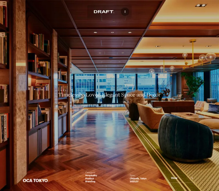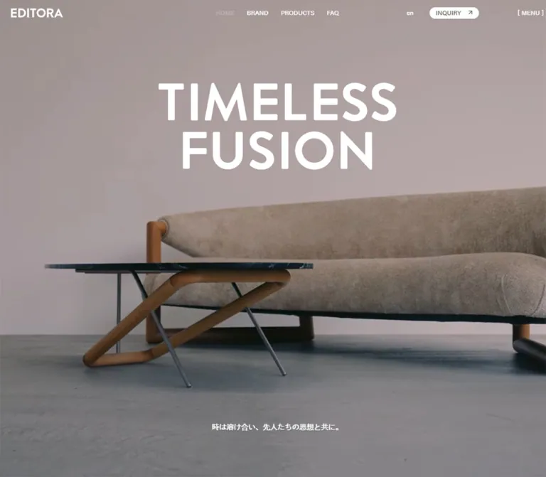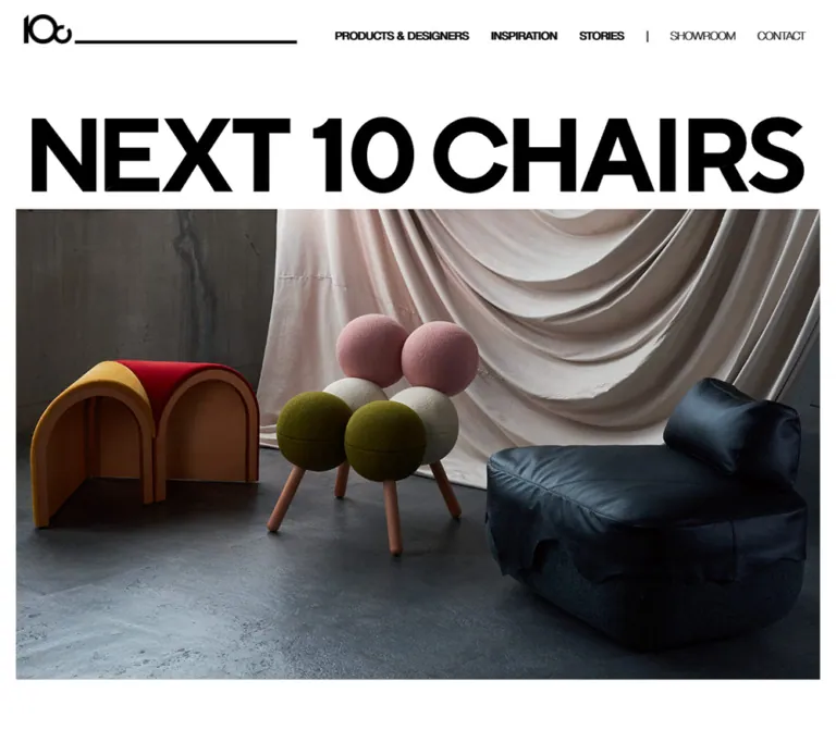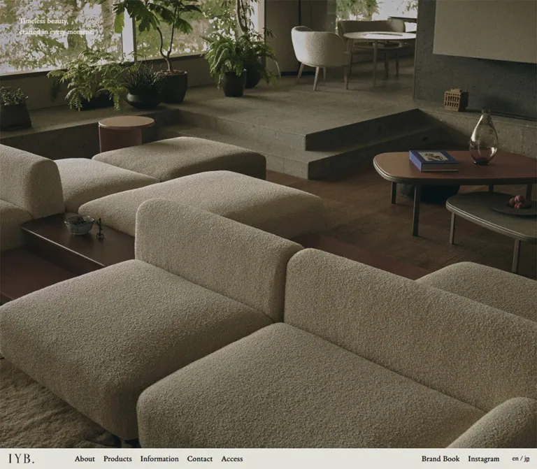
プレビュー準備中デザインリファレンスを見る
日本のWebデザインを、AIの制作リファレンスに。
DESIGN REFERENCE
温かみのあるグレー、細身のセリフ体、大判写真が印象的な家具ブランドの公式サイト。立体的なカルーセル、写真を挟んだブランドメッセージ、モバイルでのレイアウト変化を整理。
オリジナルサイトを見るA furniture showroom expressed through warm gray space, slender serif lettering, and large photographic scenes.
Website: daft-about-draft.com Original URL: https://daft-about-draft.com/ Final URL: https://daft-about-draft.com/ Theme: light; warm gray canvas with near-black typography and warm white photographic overlays. Inspected: September 23, 2026, at 02:44:48 JST; supplied retrieval timestamp: September 22, 2026, at 17:44:48.494 UTC. Viewports: 1440 × 1000 desktop and 390 × 844 mobile, in CSS pixels. Scope: the current Japanese homepage, including its opening carousel, brand statement, promotional media sections, store introduction, news, footer, and cookie notice. Navigation destinations are evidenced as links but were not inspected as separate pages. Cart and mobile navigation markup are present, but their opened states were not demonstrated.
DAFT about DRAFT presents a furniture brand and storefront through the pacing of an editorial publication. Its visual identity comes from the contrast between oversized, regular-weight Bellefair headings and small, practical navigation labels. A pale gray canvas with a warm undertone surrounds furniture sketches, interior photography, material details, and large photographic sections. Most content remains unboxed. Fine rules, carefully separated columns, and extensive empty space provide the structure.
The homepage begins with a large central carousel image and perspective views of neighboring slides at the edges. It then moves through an image-interrupted brand statement, Japanese explanatory copy, full-width brand and new-arrival features, a store section, news, and a substantial footer. Shopping is one purpose within this broader brand experience; the observed homepage is not a product-card catalog or a dedicated single-action landing page.
A furniture showroom expressed through warm gray space, slender serif lettering, and large photographic scenes.
Website: daft-about-draft.com Original URL: https://daft-about-draft.com/ Final URL: https://daft-about-draft.com/ Theme: light; warm gray canvas with near-black typography and warm white photographic overlays. Inspected: September 23, 2026, at 02:44:48 JST; supplied retrieval timestamp: September 22, 2026, at 17:44:48.494 UTC. Viewports: 1440 × 1000 desktop and 390 × 844 mobile, in CSS pixels. Scope: the current Japanese homepage, including its opening carousel, brand statement, promotional media sections, store introduction, news, footer, and cookie notice. Navigation destinations are evidenced as links but were not inspected as separate pages. Cart and mobile navigation markup are present, but their opened states were not demonstrated.
DAFT about DRAFT presents a furniture brand and storefront through the pacing of an editorial publication. Its visual identity comes from the contrast between oversized, regular-weight Bellefair headings and small, practical navigation labels. A pale gray canvas with a warm undertone surrounds furniture sketches, interior photography, material details, and large photographic sections. Most content remains unboxed. Fine rules, carefully separated columns, and extensive empty space provide the structure.
The homepage begins with a large central carousel image and perspective views of neighboring slides at the edges. It then moves through an image-interrupted brand statement, Japanese explanatory copy, full-width brand and new-arrival features, a store section, news, and a substantial footer. Shopping is one purpose within this broader brand experience; the observed homepage is not a product-card catalog or a dedicated single-action landing page.
rem values use a 10px root at both inspected widths. The Quick Start uses pixel-based aliases with a conventional browser root instead.| Name | Value | Source / implementation token | Evidence and role |
|---|---|---|---|
| Warm Canvas | #f0ecea |
Source --color-bg; alias --canvas |
Measured source token; visually corresponds to the main page, news area, and footer background |
| Near Black | #080808 |
Source --color-black; alias --ink |
Measured text color; navigation, headings, controls, and the dark cookie surface |
| Warm White | #fcfaf9 |
Source --color-white; alias --on-image |
Measured color of desktop carousel titles, photographic feature headings, and cookie actions |
| Fine Rule | #c1bebc |
Source --color-border and --color-grey-light; alias --rule |
Measured available border token; matches the quiet separators visible in news and mobile footer sections |
| Secondary Gray | #7b7978 |
Source --color-grey-dark; alias --muted |
Measured source token; its exact element assignments are not established by the supplied samples |
| Notice Copy | #999999 |
Computed paragraph color; alias --notice-copy |
Measured specifically on cookie explanatory text |
| Header Wash | rgba(240, 236, 234, 0.5) |
Computed header background | Measured translucent version of the page canvas |
| Date Chip | Approximately #e5e0de |
Recommended alias --date-chip |
Visual approximation of the pale news-date pill; not a supplied computed color |
Two additional source variables exist: --color-brown: #785b47 and --color-red: red. Their use in the visible homepage was not established. Do not turn them into prominent interface accents merely because the variables are available.
The main interface is almost monochrome. Brown, stone, charcoal, and muted gray-green enter through photography and drawings, rather than through a colorful system of buttons and badges. Image colors should remain distinct from UI tokens.
Use near-black text on the warm canvas for editorial sections and navigation. Reverse headings and outlined actions to warm white when they sit over photography. The cookie notice is the strongest solid dark rectangle in the supplied views.
The store feature changes treatment on mobile: its heading and action compute to near black, while their desktop equivalents are warm white. Preserve this change when adapting the composition; it is more than a reduction in font size.
Bellefair, serif.400 throughout the sampled carousel titles, statement, feature headings, and news heading.Large feature titles render in uppercase. The brand statement retains the name’s mixed-case wording within otherwise largely uppercase English copy. Do not replace this typography with a heavy modern display face.
'HK Grotesk', sans-serif.600 for primary navigation and footer group headings; 400 for footer links.14px with an approximately 20px line height.Some Japanese footer links also inherit this declared stack. The actual fallback used for Japanese glyphs is not identified by the supplied evidence.
'游ゴシック体', YuGothic, '游ゴシック', 'Yu Gothic', sans-serif.400.16px / 26px.14px / 23.996px.The Japanese brand explanation is larger on desktop than the general body text: 20px / 32.5px. On mobile it returns to the default 14px / approximately 24px scale.
The logo combines handwritten lettering with a broad, bold DRAFT wordmark. Treat it as identity artwork, not as a text composition assembled from the page fonts. The header uses a horizontal version; the footer uses a larger stacked arrangement.
All entries below are measured unless explicitly marked otherwise.
| Role | Desktop size / line height | Mobile size / line height | Weight | Notes |
|---|---|---|---|---|
| Photographic feature heading | 120px / 99.6px |
40px / 35px |
400 |
Bellefair; tight multiline setting |
| Latest news heading | 80px / 70px |
40px / 35px |
400 |
Two lines in the desktop capture; one measured line on mobile |
| English brand statement | 60px / 82.5px |
30px / 38.82px |
400 |
Inline imagery complicates the total paragraph height |
| Carousel title | 26px / 26px |
26px / 26px |
400 |
Desktop warm white; sampled mobile title styles are near black |
| Japanese brand explanation | 20px / 32.5px |
14px / 23.996px |
400 |
Desktop text region is narrower than the statement |
| General body | 16px / 26px |
14px / 23.996px |
400 |
Japanese body stack |
| Outlined action | 16px / 26px |
14px / 23.996px |
500 |
Japanese labels |
| Desktop navigation | 14px / 19.992px |
Not visible in the initial mobile screenshot | 600 |
HK Grotesk |
| Mobile menu entries in DOM | — | 16px / 26px |
600 |
Opened menu appearance unverified |
| Footer heading / link | 14px / 19.992px |
14px / 19.992px |
600 / 400 |
HK Grotesk |
| Store contact text | 14px / 22.75px |
Detailed block not shown in supplied mobile state | 400 |
Desktop footer |
| Cookie copy / actions | 12px / 15.96px |
12px / 15.96px |
400 / 700 |
Same scale at both widths |
| Copyright | 14px / 19.992px |
12px / 17.136px |
400 |
HK Grotesk |
The HTML element’s default Times declaration is not evidence that the editorial headings use Times. Their own computed family is Bellefair.
| Property | Desktop | Mobile | Evidence |
|---|---|---|---|
| Root font size | 10px |
10px |
Computed |
| Outer gutter | 4.4rem = 44px |
2rem = 20px |
Source custom property |
| Grid gutter | 4rem = 40px |
1rem = 10px |
Source custom property |
| Column count | 12 |
4 |
Source custom property |
| Inner width | 1352px |
350px |
Calculated from viewport and outer gutters |
| Equal column width | 76px |
80px |
Calculated assuming the declared equal-column grid |
| Header height | 6rem = 60px |
6rem = 60px |
Source property and element rectangle |
The desktop grid explains several measured content blocks precisely. Eight columns plus seven gutters produce the 888px Japanese introduction width. Six columns plus five gutters produce the 656px news-list width. Four columns plus three gutters produce the 424px news-title region.
These are recurring measurements, not a complete recovered spacing system.
| Use | Desktop | Mobile |
|---|---|---|
| Outer content inset | 44px |
20px |
| Header vertical padding | 20px |
10px |
| Space after opening section before statement | 120px |
80px |
| Statement-to-Japanese-copy separation | 60px |
30px |
| Major editorial section separation | Repeated 200px gaps |
Repeated 80px gaps |
| Feature heading box to action box | 80px |
80px |
| News heading to list | Separate desktop columns | 30px vertical gap |
| News row bottom padding | 37px |
24px |
| News row start-to-start interval | Approximately 109px |
Approximately 140px |
| News action separation | Approximately 40px |
30px |
| Footer heading to first desktop link | Approximately 35px after heading line box |
Heading uses 30px vertical padding |
| Footer bottom padding | 60px |
20px |
The retained 80px heading-to-button gap inside mobile photographic features is unusually generous. Do not compress it automatically into a standard small card spacing scale.
| Element | Geometry | Evidence |
|---|---|---|
| Main image panels | Square corners | Visible captures |
| Outlined actions | 80px border radius |
Computed |
| Header lower corners | 0 0 30px 30px |
Computed |
| Carousel pagination dots | 8 × 8px, circular |
Measured mobile buttons |
| Pagination center spacing | 16px |
Calculated from measured positions |
| Date badge | Approximately 115 × 32px, pill shape |
Visual estimate supported by surrounding layout |
| Cookie notice corners | Approximately 10–12px |
Visual estimate; wrapper radius not supplied |
| Rules and action outlines | Approximately 1px |
Visible hairlines; consistent with action box arithmetic |
Rounded geometry is selective. It belongs to controls, date badges, the cookie notice, and the subtle header silhouette. It is not applied to the photographic content as a general card style.
| Element | Desktop | Mobile |
|---|---|---|
| Recorded document height | 5946.5px |
3441.125px |
| Opening section | 1440 × 1000px |
390 × 310.797px, beginning at y = 80px |
| Active desktop carousel link | 967.5 × 544.219px at x = 236.25px |
Sampled full slide link: 390 × 276.891px, including horizontal padding and caption region |
| Central desktop carousel ratio | Exactly 16:9, calculated |
Visible artwork unavailable in supplied initial capture |
| Statement paragraph | 1352 × 598.5px |
350 × 376.5px |
| Japanese explanation | 888 × 292.5px |
350 × 215.859px |
| Brand feature section | 1440 × 810px |
390 × 259.375px |
| New-arrivals feature section | 1440 × 810px |
390 × 219.375px |
| Store feature section | 1440 × 711.438px |
390 × 522.156px |
| Typical feature action | 222 × 62px |
152 × 58.984px |
| News content column | 656px |
350px |
| Cookie notice | Approximately 420 × 133px |
Approximately 350 × 111px |
Role: immediate access to brand, collection, products, store, news, and shopping bag.
The desktop header contains seven distributed items: BRAND, NEW IN, PRODUCTS, the home-linked wordmark, STORE, NEWS, and BAG. The outside links begin at the 44px content inset and end at the opposite inset. The navigation labels use 14px semibold HK Grotesk with no enclosing button shape.
This is not a mathematically centered logo flanked by two equal groups. The measured logo link begins at approximately x = 651.98px and is 191.22px wide, placing its center about 27.6px to the right of the viewport midpoint. The positions are consistent with equal gaps between unequal-width items.
The header is 60px tall with a translucent canvas background and 30px lower corner radii. Blur was not established. Its scrolling behavior was not demonstrated clearly enough to classify it as sticky or fixed.
On mobile, the visible header contains a centered horizontal logo. Its link box is 175.5 × 40px at x = 107.25px, with a 10px top inset. The graphic itself is shallower than this link box. Menu links exist in the DOM, but no visible menu trigger or opened menu is established by the supplied screenshot.
Role: a visual index into store, news, products, brand stories, and new arrivals.
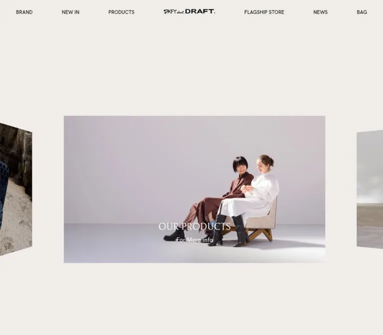
The desktop opening section occupies the inspected viewport height. The active image is a centered 967.5 × 544.219px rectangle, approximately 67.19% of viewport width, beginning at y = 288.125px. The large empty region above it is essential to the composition.
Neighboring images appear as perspective planes clipped by the left and right viewport edges. The current central slide shows white furniture sketches on a muted gray-green field, with NEWS and For More Info near its lower center. The left edge reveals store-exterior photography; the right edge reveals part of a neutral studio scene.
Each slide is a link with image content and a caption consisting of a Bellefair title plus a smaller informational line. The DOM identifies six destinations or entries: store, news, products, brand story, new arrivals, and another brand entry. Duplicate destinations do not imply duplicate visual assets.
Two empty-text button regions span roughly 120px at the desktop viewport edges. They are consistent with previous/next navigation regions, but their actions and accessible names were not exercised or fully exposed by the evidence.
On mobile, six small pagination buttons are visible near y = 383px. The first is filled; the other five are outlined. Their labels are present in the DOM as View slide 1 through View slide 6.
Important limitation: the supplied mobile screenshot shows no carousel artwork or captions in the allocated region. The DOM still contains slide links and caption styles. Record this as an incomplete visible rendering state; do not declare the empty area an intentional mobile design or infer its cause. A new implementation should provide a dependable image fallback.
Role: express the brand’s furniture philosophy through a typographic composition.
A centered English paragraph spans the main content width. Its actual wording begins DAFT about DRAFT IS A BRAND THAT CONCEIVES PRODUCTS and continues through YOUR LONG JOURNEY OF LIFE. Small rectangular images interrupt the sentence, creating a collage within the text flow.
The mobile capture visibly includes a row of chairs, a seated figure, and a close detail of a woven chair back. These insertions are approximately 80 × 40px in that screenshot. Their desktop dimensions were not supplied, so do not assume a fixed size across breakpoints.
The statement uses 60px / 82.5px Bellefair on desktop and 30px / 38.82px on mobile. Its total height cannot be reconstructed from line height alone because of inline media and line composition. Use deliberate wrapping and real inline image elements; a background collage behind ordinary text would produce a different relationship.
The supporting Japanese explanation is a separate paragraph. Its opening source copy is “空間はもっと自由になれる。家具はもっとあなたを表現する。” Desktop text occupies an 888px region centered inside the wider statement; mobile uses the full 350px inner width.
Role: provide prominent entrances to brand information and new products.
The brand and new-arrival features are full-width 1440 × 810px sections on desktop. They meet directly without an intervening canvas gap. The brand image shows a person from behind, seated at a table among dark wooden chairs in an interior. The following new-arrivals image shows pale, textured coastal rocks.
Each section combines background media, a large centered uppercase serif heading, and one outlined Japanese action. DISCOVER THE BRAND wraps onto two lines; NEW ARRIVALS occupies one measured line. Both use 120px Bellefair with a 99.6px line height.
The heading and button are separated by 80px, measured between their boxes. On mobile the headings reduce to 40px / 35px, while the same 80px separation remains. The brand section measures 259.375px tall; the new-arrivals section measures 219.375px, exactly the height of a 390px-wide 16:9 rectangle.
The observed links are /pages/brand and /pages/new-in-2025. The latter is the actual destination despite the capture taking place in 2026. Do not infer a different destination from the visible news dates.
The captures establish photographic frames, not whether the source media is a still image or playing video.
Role: a calm, consistent navigation affordance across large features and news.
An action contains a short Japanese label, transparent fill, thin current-color outline, and an 80px radius. Desktop padding is 17px 70px; mobile padding is 16.5px 40px. Including the apparent one-pixel outline, these values explain the measured 62px and approximately 59px heights.
The typical feature action measures 222px wide on desktop and 152px on mobile. The news action is slightly narrower because its glyph widths differ; width follows content rather than an identical fixed box.
Use warm white over photographic features and near black on the canvas. The supplied CSS declares a 250ms color transition, but its final hover appearance was not observed.
Role: introduce WH DAFT about DRAFT and link to /pages/store.
The desktop section retains a large warm-white serif heading and centered outlined action. Its measured height is about 711px, so it should not automatically inherit the neighboring features’ 810px height.
Mobile changes the composition substantially. The section is approximately 522px high, its title and action become near black, and the action starts at the 20px left inset. This is consistent with a media-and-copy arrangement rather than a simple scaled desktop overlay, although the supplied captures do not show the complete section visually.
The extracted text contains a literal placeholder-image markup fragment near this section. Treat that as a rendering defect in the evidence, not as intended copy or a stylistic element. Its exact visible impact was not shown.
Role: expose current announcements through a sparse editorial list.
On desktop, LATEST NEWS occupies the left four-column region. The list starts at x = 740px and spans 656px to the right gutter, leaving a substantial gap between heading and entries.
Each entry groups a pale date pill with a Japanese title and a thin horizontal divider. The date area is approximately 115 × 32px; the title begins about 40px after it. There are no article thumbnails in the observed rows.
The current entries are dated 2026/8/7 and 2026/7/7, with the labels “夏季休業のお知らせ” and “『ELLE DECOR』 2026年8月号”. The outlined “すべて見る” link sits at the right edge below the list.
Mobile stacks heading, entries, and action within the 350px content width. Each date sits above its title; the title begins about 62px below the row start, consistent with a 32px date area and 30px gap. The action aligns left instead of right.
Role: provide navigation, shopping information, social/language controls, and physical-store information.
Desktop uses four unequal regions. Their measured left anchors are approximately 44px, 246px, 549px, and 1055px: social/language controls, EXPLORE, SHIPPING INFO, and a stacked brand identity with store details.
EXPLORE repeats the principal destinations and adds CONTACT. SHIPPING INFO contains terms, privacy, commerce disclosure, and shopping guidance. The right block includes WH DAFT about DRAFT, hours of 11:00–19:00, Wednesday closure, a Minami-Aoyama address, and a telephone link. These are observed store details, not evidence of a separate legal operating entity.
The footer is approximately 464px tall on desktop. Small navigation text and a large wordmark create the hierarchy; there is no contrasting footer background. Copyright sits near the lower left with 60px bottom padding.
Mobile replaces the columns with full-width disclosure-style sections. EXPLORE is visibly expanded with a minus mark; SHIPPING INFO is collapsed with a plus mark. Heading rows are approximately 80px tall, with fine dividing rules. Below them, Instagram and EN sit on the left while the stacked logo sits on the right. Detailed desktop store contact text is not present in the supplied mobile text state.
These expanded/collapsed appearances are observed states. Toggling behavior, animation, and keyboard semantics were not tested.
Role: explain cookie use and provide acknowledgment and policy access.
A near-black panel overlays the lower-right desktop viewport, approximately 420 × 133px, with 30px right and bottom clearances. On mobile it spans 350px between 20px side margins and sits 20px above the bottom. Its corner radius is visually around 10–12px.
Desktop content has approximately 30px internal insets; mobile uses 20px. Explanatory text is 12px / 15.96px in #999999, followed by two small warm-white actions: OK and “詳しく見る”. The policy link points to /pages/privacy-policy.
The notice remains in the same viewport corner across the supplied scroll captures, supporting a viewport-pinned interpretation. It obscures some content in those states, including part of the mobile statement. Dismissal behavior and persistence were not tested.
Cart controls and empty-bag text are positioned beyond the right edge in the sampled DOM. Their presence supports shopping functionality, but does not establish the appearance of an open drawer. Mobile navigation entries likewise exist without a demonstrated open state. Do not use either set of coordinates as visible page content or invent a complete interaction design from them.
| Treatment | Supplied value or evidence | What can be concluded |
|---|---|---|
| Outlined action color | transition: color 0.25s |
A 250ms color transition is defined; hover colors were not shown |
| Mobile carousel links | transition: opacity 1s |
A one-second opacity transition is defined on sampled slides; sequencing and autoplay are unverified |
| Offscreen cart-area icon button | transform 0.3s cubic-bezier(.785,.135,.15,.86) |
A 300ms transform transition exists on that control; its activated behavior was not inspected |
| Circular easing variable | cubic-bezier(.785,.135,.15,.86) |
Measured source --ease-circInOut |
| Quadratic easing variable | cubic-bezier(.455,.03,.515,.955) |
Measured source --ease-quadInOut; specific visible use not established |
| Desktop carousel perspective | Visible angled side planes | Spatial treatment is observed; exact transforms, camera distance, and movement timing are unknown |
| Mobile pagination | Six labeled buttons, first visibly filled | Current indicated state is observed; click/swipe behavior was not exercised |
| Footer disclosures | Expanded and collapsed visual states | No toggle transition or focus behavior was demonstrated |
| Cookie notice | Repeated viewport-corner placement | Persistent positioning is supported; acknowledgment effect is unverified |
Many sampled elements report animation: none. That does not establish that the whole page is static: script-driven transforms, media playback, and unrecorded states may exist. Similarly, a generic transition: all entry without a useful duration is not evidence for a particular animation.
Recommended adaptation: preserve the measured short color transition and use the supplied easing curves where appropriate, but choose and document any new carousel movement separately. Provide reduced-motion behavior and a stable image fallback. Do not invent an autoplay interval or scroll-scrubbed sequence and describe it as original behavior.
| Layer | Appearance | Structural purpose |
|---|---|---|
| Main canvas | Solid warm gray | Continuous space around the editorial content |
| Header | Half-opacity canvas color, rounded lower corners | Quiet navigation layer |
| Carousel | Square image planes with perspective neighbors | Visual navigation and depth |
| Full-width features | Edge-to-edge photographic media | Large changes of scale and atmosphere |
| News | Canvas, small date pills, fine rules | Information hierarchy without cards |
| Footer | Same canvas, separated link groups | Dense utility content without a heavy visual block |
| Cookie notice | Near-black rounded rectangle | High-contrast utility overlay |
No general shadow-elevation system is visible. Depth comes from carousel perspective and photographic space, rather than floating cards or blurred panels.
The supplied current captures combine several kinds of image-making: white furniture drawings, architectural photography, an inhabited interior, close material details, and coastal rock textures. Together they present furniture as part of a broader visual and spatial culture.
Keep the photography restrained in saturation. Allow wood, woven surfaces, stone, gray studio backgrounds, and dark clothing to supply color. Preserve substantial quiet areas inside images so overlaid type can remain legible without turning every scene into a darkened banner.
The inline statement images are an important exception to the large media scale. They act like small editorial insertions inside a sentence. They should remain rectangular and closely connected to the surrounding line composition.
No source image, video, logo, or font file URLs were included in the evidence. The following are visual locators, not asset paths.
| Asset or scene | Where observed | Treatment |
|---|---|---|
| White chair sketches on a gray-green field | Desktop opening NEWS slide | Large, square-cornered 16:9 image |
| Store exterior with warm window light | Left carousel preview | Strong perspective and viewport clipping |
| Neutral studio scene fragment | Right carousel preview | Only a partial view is established |
| Chairs, seated figure, woven chair detail | Mobile statement | Small rectangular inline images, approximately 80 × 40px |
| Person seated at a table among dark chairs | DISCOVER THE BRAND feature | Full-width photographic composition with oversized white type |
| Pale coastal rocks | NEW ARRIVALS feature | Detailed texture beneath white display lettering |
| Horizontal wordmark | Desktop and mobile headers | Black identity artwork |
| Stacked wordmark | Desktop and mobile footers | Larger identity anchor |
Use authorized artwork or appropriately commissioned replacements. CSS can reproduce the frame and typography; it cannot supply the furniture imagery or handwritten logo identity.
The desktop page alternates between inset editorial content and full-width photographic sections. The opening carousel occupies one screen, with its center image set well below the header. The brand statement begins 120px after that section. Larger 200px gaps separate the statement from the brand feature, new arrivals from the store feature, the store from news, and news from the footer.
The brand and new-arrival features touch directly. This creates a continuous photographic sequence before the page returns to the quieter warm canvas.
The news section uses asymmetric grid placement rather than two equal columns. Its left title occupies four columns; the right list occupies six columns beginning at column seven. The footer uses a separate unequal distribution of regions, so its measured anchors should not be forced into the news grid.
At 390px wide, outer gutters become 20px, the declared grid becomes four columns, and major section gaps reduce to 80px. Display typography changes sharply: 120px feature headings become 40px, and the 60px statement becomes 30px.
The visible header reduces to a centered logo. The carousel becomes a compact region with six pagination dots, although its image content was not visible in the supplied state. The statement occupies almost the full inner width and wraps around small inline photographs.
News changes from a side-by-side title/list composition to a single vertical sequence. Date and title also stack within each row. Feature actions remain centered over the brand and arrivals sections, while store and news actions align to the left gutter.
The footer changes from four desktop regions into disclosure sections followed by a social-and-logo row. The cookie notice becomes nearly full width without changing its small text scale.
Only two viewport widths were inspected. The source breakpoint values, tablet layout, intermediate font scaling, and landscape-phone behavior are unknown. The Quick Start uses an explicitly recommended 48rem breakpoint, not a recovered breakpoint.
Some mobile footer rectangles overlap earlier section coordinates even though the screenshots establish the footer after news. Transforms or capture-coordinate state may explain this, but the mechanism is unverified. Use the visual ordering and measured local sizes; do not assemble the page by copying every sampled y coordinate as an absolute document position.
The mobile carousel’s missing visible imagery and the placeholder markup fragment are current inspection limitations. They should not become intentional motifs in a reusable design.
#f0ecea, #080808, and #fcfaf9 as the principal interface colors.These are recommendations for a new implementation, not verified original features.
8px dots.aria-expanded, or appropriate native disclosure elements. Keep desktop groups available without stale collapsed state after resizing.#f0ecea.#080808.#fcfaf9.#c1bebc.#999999 explanation, warm-white actions.#e5e0de is an approximation.“Create an editorial furniture-brand homepage using a warm gray #f0ecea canvas, near-black #080808 text, and warm-white text over photography. Use Bellefair at regular weight for large English headings, HK Grotesk for compact English navigation, and a Yu Gothic-based Japanese body stack. Begin with a spacious desktop carousel containing one large 16:9 image and perspective side previews. Follow it with a centered statement interrupted by small rectangular furniture images, Japanese explanatory copy, full-width brand and new-arrival photographs, a store introduction, a sparse dated news list, and a substantial footer. Use thin outlined pill links, fine separators, square media corners, and extensive empty space. At 390px, use 20px gutters, 30px statement type, 40px feature headings, stacked news entries, and footer disclosures. Provide a functional mobile image fallback instead of reproducing the incomplete captured carousel.”
This is an implementation scaffold, not the original stylesheet. It preserves measured desktop/mobile endpoint values without changing the browser root to 10px. Load authorized Bellefair and HK Grotesk font resources separately; no font-file locations were supplied.
The 48rem breakpoint, date-chip fill, cookie radius, footer column approximation, and static fallback behavior are recommendations. The header placement recreates the opening composition but does not claim a verified sticky-header behavior. Carousel perspective geometry and state management require separate implementation.
Expected component structure: .feature contains .feature__media and .feature__content; .news.page-grid contains .news__title and .news__body; .cookie-notice contains a paragraph and .cookie-notice__actions. Use anchors for navigation and buttons for state changes.
:root {
  /* Measured palette, with one explicitly estimated chip color. */
  --canvas: #f0ecea;
  --ink: #080808;
  --on-image: #fcfaf9;
  --rule: #c1bebc;
  --muted: #7b7978;
  --notice-copy: #999999;
  --date-chip: #e5e0de; /* Visual approximation. */

  --font-display: 'Bellefair', serif;
  --font-latin: 'HK Grotesk', sans-serif;
  --font-japanese: '游ゴシック体', YuGothic, '游ゴシック',
    'Yu Gothic', sans-serif;

  --outer: 44px;
  --grid-gap: 40px;
  --columns: 12;
  --header-height: 60px;
  --section-space: 200px;
  --statement-space: 120px;
  --feature-action-gap: 80px;

  --body-size: 16px;
  --body-leading: 26px;
  --statement-size: 60px;
  --statement-leading: 82.5px;
  --feature-size: 120px;
  --feature-leading: 0.83;
  --news-size: 80px;
  --news-leading: 0.875;

  --pill-radius: 80px;
  --notice-radius: 12px; /* Visual approximation. */
  --ease-circ: cubic-bezier(.785, .135, .15, .86);
  --ease-quad: cubic-bezier(.455, .03, .515, .955);
}

* { box-sizing: border-box; }

body {
  margin: 0;
  background: var(--canvas);
  color: var(--ink);
  font-family: var(--font-japanese);
  font-size: var(--body-size);
  line-height: var(--body-leading);
}

button, input, select, textarea { font: inherit; }
a { color: inherit; }
img, video { display: block; max-width: 100%; }

.page-width,
.page-grid {
  width: calc(100% - 2 * var(--outer));
  margin-inline: auto;
}

.page-grid {
  display: grid;
  grid-template-columns: repeat(var(--columns), minmax(0, 1fr));
  gap: var(--grid-gap);
}

.section-space { margin-top: var(--section-space); }

.site-header {
  position: absolute;
  z-index: 20;
  inset: 0 0 auto;
  height: var(--header-height);
  background: rgb(240 236 234 / 50%);
  border-radius: 0 0 30px 30px;
}

.desktop-nav {
  display: flex;
  align-items: center;
  justify-content: space-between;
  height: 100%;
  margin-inline: var(--outer);
}

.desktop-nav a {
  font: 600 14px/19.992px var(--font-latin);
  text-transform: uppercase;
  text-decoration: none;
}

.header-wordmark { width: 191.22px; height: auto; }
.mobile-brand { display: none; }

/* Stable central-slide fallback; perspective neighbors are separate. */
.hero-stage {
  position: relative;
  display: grid;
  place-items: center;
  height: 100svh;
  padding-top: 120px;
  overflow: hidden;
}

.hero-current {
  position: relative;
  display: block;
  width: 67.1875vw;
  aspect-ratio: 16 / 9;
  color: var(--on-image);
  text-decoration: none;
}

.hero-current > img {
  width: 100%;
  height: 100%;
  object-fit: cover;
}

.hero-caption {
  position: absolute;
  inset-inline: 20px;
  bottom: 52px; /* Approximation from the desktop capture. */
  text-align: center;
}

.hero-caption h3 {
  margin: 0;
  font: 400 26px/26px var(--font-display);
  text-transform: uppercase;
}

.hero-caption p { margin: 10px 0 0; }
.hero-pagination { display: none; }

.statement { margin-top: var(--statement-space); }

.statement__headline {
  margin: 0;
  font: 400 var(--statement-size)/var(--statement-leading)
    var(--font-display);
  text-align: center;
}

.statement__inline-image {
  display: inline-block;
  vertical-align: middle;
  object-fit: cover;
}

.statement__copy {
  max-width: 888px;
  margin: 60px auto 0;
  font-size: 20px;
  line-height: 32.5px;
  text-align: center;
}

.feature {
  position: relative;
  display: grid;
  place-items: center;
  min-height: 56.25vw;
  color: var(--on-image);
  isolation: isolate;
}

.feature__media {
  position: absolute;
  z-index: -1;
  inset: 0;
  width: 100%;
  height: 100%;
  object-fit: cover;
}

.feature__content {
  display: flex;
  flex-direction: column;
  align-items: center;
  gap: var(--feature-action-gap);
  width: 72.53%;
  text-align: center;
}

.feature__title {
  width: 100%;
  margin: 0;
  font: 400 var(--feature-size)/var(--feature-leading)
    var(--font-display);
  text-transform: uppercase;
}

.outline-link {
  display: inline-flex;
  align-items: center;
  justify-content: center;
  width: fit-content;
  max-width: 100%;
  padding: 17px 70px;
  border: 1px solid currentColor;
  border-radius: var(--pill-radius);
  background: transparent;
  color: inherit;
  font-size: 16px;
  font-weight: 500;
  line-height: 26px;
  text-align: center;
  text-decoration: none;
  transition: color 250ms;
}

.news { align-items: start; }

.news__title {
  grid-column: 1 / span 4;
  margin: 0;
  font: 400 var(--news-size)/var(--news-leading)
    var(--font-display);
  text-transform: uppercase;
}

.news__body { grid-column: 7 / span 6; }

.news__list {
  display: grid;
  gap: 40px;
  margin: 0;
  padding: 0;
  list-style: none;
}

.news-row {
  display: grid;
  grid-template-columns: 115px minmax(0, 1fr);
  align-items: start;
  gap: 40px;
  padding-bottom: 37px;
  border-bottom: 1px solid var(--rule);
  text-decoration: none;
}

.news-date {
  display: inline-flex;
  align-items: center;
  justify-content: center;
  width: 115px;
  min-height: 32px;
  border-radius: 999px;
  background: var(--date-chip);
  font: 600 14px/20px var(--font-latin);
}

.news-row p { margin: 0; }
.news__all { margin-top: 40px; text-align: right; }

/* Approximate the measured unequal footer regions. */
.site-footer { padding-bottom: 60px; }

.footer-grid {
  display: grid;
  grid-template-columns: 15% 22.5% 37.5% 25%;
}

.footer-group__heading {
  margin: 0 0 35px;
  font: 600 14px/19.992px var(--font-latin);
  text-transform: uppercase;
}

.footer-links {
  display: grid;
  gap: 16px;
  margin: 0;
  padding: 0;
  list-style: none;
}

.footer-links a {
  font: 400 14px/19.992px var(--font-latin);
  text-decoration: none;
}

.footer-social { display: flex; align-items: start; gap: 30px; }
.footer-logo { width: 240px; max-width: 100%; height: auto; }
.footer-store-details { font-size: 14px; line-height: 22.75px; }
.footer-disclosure-mark { display: none; }

.footer-copyright {
  margin: 80px 0 0;
  font: 400 14px/19.992px var(--font-latin);
}

.cookie-notice {
  position: fixed;
  z-index: 100;
  right: 30px;
  bottom: 30px;
  width: min(420px, calc(100vw - 60px));
  padding: 30px;
  border-radius: var(--notice-radius);
  background: var(--ink);
  color: var(--on-image);
}

.cookie-notice p {
  margin: 0 0 22px;
  color: var(--notice-copy);
  font-size: 12px;
  line-height: 15.96px;
}

.cookie-notice__actions {
  display: flex;
  align-items: center;
  flex-wrap: wrap;
  gap: 12px 35px;
  min-height: 20px;
}

.cookie-notice__actions :is(button, a) {
  padding: 0;
  border: 0;
  background: none;
  color: inherit;
  font: 700 12px/15.96px var(--font-japanese);
  text-decoration: none;
  cursor: pointer;
}

/* Recommended focus treatment; original focus states were not inspected. */
:where(a, button, summary):focus-visible {
  outline: 2px solid currentColor;
  outline-offset: 5px;
}

/* Recommended breakpoint; only endpoint layouts were measured. */
@media (max-width: 48rem) {
  :root {
    --outer: 20px;
    --grid-gap: 10px;
    --columns: 4;
    --section-space: 80px;
    --statement-space: 80px;
    --body-size: 14px;
    --body-leading: 23.996px;
    --statement-size: 30px;
    --statement-leading: 38.82px;
    --feature-size: 40px;
    --feature-leading: 0.875;
    --news-size: 40px;
  }

  .desktop-nav { display: none; }

  .mobile-brand {
    display: flex;
    align-items: center;
    width: 175.5px;
    height: 40px;
    margin: 10px auto;
  }

  .mobile-brand img { width: 100%; height: auto; }

  .hero-stage {
    display: block;
    height: auto;
    margin-top: 80px;
    padding: 0;
  }

  .hero-current {
    width: calc(100% - 2 * var(--outer));
    margin-inline: auto;
    aspect-ratio: auto;
    color: var(--ink);
  }

  .hero-current > img {
    height: auto;
    aspect-ratio: 16 / 9;
  }

  .hero-caption { position: static; margin-top: 20px; }

  /* Observed visual geometry; enlarge or redesign touch targets as needed. */
  .hero-pagination {
    display: flex;
    justify-content: center;
    gap: 8px;
    margin-top: 26px;
  }

  .hero-pagination button {
    width: 8px;
    height: 8px;
    padding: 0;
    border: 1px solid var(--ink);
    border-radius: 50%;
    background: transparent;
  }

  .hero-pagination button[aria-current='true'] {
    background: var(--ink);
  }

  .statement__inline-image { width: 80px; height: 40px; }

  .statement__copy {
    margin-top: 30px;
    font-size: 14px;
    line-height: 23.996px;
  }

  .feature--brand {
    min-height: calc(56.25vw + 40px);
    padding-block: 20px;
  }

  .feature__content { width: calc(100% - 2 * var(--outer)); }

  .outline-link {
    padding: 16.5px 40px;
    font-size: 14px;
    line-height: 23.996px;
  }

  .news { row-gap: 30px; }
  .news__title, .news__body { grid-column: 1 / -1; }
  .news__list { gap: 30px; }

  .news-row {
    grid-template-columns: minmax(0, 1fr);
    gap: 30px;
    padding-bottom: 24px;
  }

  .news__all { margin-top: 30px; text-align: left; }
  .site-footer { padding-bottom: 20px; }
  .footer-grid { grid-template-columns: 1fr 1fr; }

  .footer-explore, .footer-shipping {
    grid-column: 1 / -1;
    border-bottom: 1px solid var(--rule);
  }

  .footer-explore { grid-row: 1; }
  .footer-shipping { grid-row: 2; }

  .footer-group__heading {
    display: flex;
    align-items: center;
    justify-content: space-between;
    width: 100%;
    margin: 0;
    padding: 30px 0;
    border: 0;
    background: transparent;
    color: inherit;
    text-align: left;
  }

  .footer-disclosure-mark { display: block; }
  .footer-links { gap: 14px; padding-bottom: 32px; }
  .footer-links[hidden] { display: none; }

  .footer-social { grid-area: 3 / 1; margin-top: 40px; }
  .footer-identity { grid-area: 3 / 2; margin-top: 40px; }
  .footer-logo { width: 170px; }
  .footer-store-details { display: none; }
  .footer-copyright { font-size: 12px; line-height: 17.136px; }

  .cookie-notice {
    right: 20px;
    bottom: max(20px, env(safe-area-inset-bottom, 0px));
    left: 20px;
    width: auto;
    padding: 20px;
  }

  .cookie-notice p { margin-bottom: 19px; }
}

/* Recommended reduced-motion treatment. */
@media (prefers-reduced-motion: reduce) {
  .outline-link,
  .hero-current,
  .hero-preview {
    transition: none;
  }
}
Use a separate store-feature component rather than forcing it into .feature unchanged. Its mobile media/copy arrangement and left-aligned action require different markup or layout rules. The exact media dimensions were not supplied.
The CSS intentionally does not invent carousel sequencing, menu opening, consent storage, or footer toggle logic. Implement those behaviors with semantic controls and update their state attributes. If footer links use hidden, remove that state when switching to the fully expanded desktop layout. Add media-query handling for any JavaScript-driven motion as well as the CSS reduced-motion rule.
Optional aliases for a project already using Tailwind v4. This is not evidence that the original site uses Tailwind. Define the properties above first.
@theme inline {
  --color-canvas: var(--canvas);
  --color-ink: var(--ink);
  --color-on-image: var(--on-image);
  --color-rule: var(--rule);
  --color-muted: var(--muted);

  --font-display: 'Bellefair', serif;
  --font-latin: 'HK Grotesk', sans-serif;
  --font-japanese: '游ゴシック体', YuGothic, '游ゴシック',
    'Yu Gothic', sans-serif;

  --text-statement: var(--statement-size);
  --text-feature: var(--feature-size);
  --text-news: var(--news-size);

  --spacing-page: var(--outer);
  --spacing-editorial: var(--section-space);
  --radius-pill: var(--pill-radius);
  --radius-notice: var(--notice-radius);
}
200 with no URL change.2026-09-22T17:44:48.494Z, corresponding to September 23, 2026, at 02:44:48.494 JST.1440 × 1000 captures covering the opening carousel, photographic features, and news/footer region; rendered text, links, custom properties, and computed element measurements at the same viewport size.390 × 844 captures covering the opening/statement area and lower news/footer area, plus the corresponding rendered DOM and computed styles.This reference describes the supplied current homepage evidence. Measurements apply to the inspected endpoints; estimates and implementation recommendations are identified separately. No additional pages or external resources were accessed to create it.
# DAFT about DRAFT — Style Reference

> A furniture showroom expressed through warm gray space, slender serif lettering, and large photographic scenes.

**Website:** [daft-about-draft.com](https://daft-about-draft.com/)
**Original URL:** https://daft-about-draft.com/
**Final URL:** https://daft-about-draft.com/
**Theme:** light; warm gray canvas with near-black typography and warm white photographic overlays.
**Inspected:** September 23, 2026, at 02:44:48 JST; supplied retrieval timestamp: September 22, 2026, at 17:44:48.494 UTC.
**Viewports:** 1440 × 1000 desktop and 390 × 844 mobile, in CSS pixels.
**Scope:** the current Japanese homepage, including its opening carousel, brand statement, promotional media sections, store introduction, news, footer, and cookie notice. Navigation destinations are evidenced as links but were not inspected as separate pages. Cart and mobile navigation markup are present, but their opened states were not demonstrated.

DAFT about DRAFT presents a furniture brand and storefront through the pacing of an editorial publication. Its visual identity comes from the contrast between oversized, regular-weight Bellefair headings and small, practical navigation labels. A pale gray canvas with a warm undertone surrounds furniture sketches, interior photography, material details, and large photographic sections. Most content remains unboxed. Fine rules, carefully separated columns, and extensive empty space provide the structure.

The homepage begins with a large central carousel image and perspective views of neighboring slides at the edges. It then moves through an image-interrupted brand statement, Japanese explanatory copy, full-width brand and new-arrival features, a store section, news, and a substantial footer. Shopping is one purpose within this broader brand experience; the observed homepage is not a product-card catalog or a dedicated single-action landing page.
# DAFT about DRAFT — Style Reference

> A furniture showroom expressed through warm gray space, slender serif lettering, and large photographic scenes.

**Website:** [daft-about-draft.com](https://daft-about-draft.com/)
**Original URL:** https://daft-about-draft.com/
**Final URL:** https://daft-about-draft.com/
**Theme:** light; warm gray canvas with near-black typography and warm white photographic overlays.
**Inspected:** September 23, 2026, at 02:44:48 JST; supplied retrieval timestamp: September 22, 2026, at 17:44:48.494 UTC.
**Viewports:** 1440 × 1000 desktop and 390 × 844 mobile, in CSS pixels.
**Scope:** the current Japanese homepage, including its opening carousel, brand statement, promotional media sections, store introduction, news, footer, and cookie notice. Navigation destinations are evidenced as links but were not inspected as separate pages. Cart and mobile navigation markup are present, but their opened states were not demonstrated.

DAFT about DRAFT presents a furniture brand and storefront through the pacing of an editorial publication. Its visual identity comes from the contrast between oversized, regular-weight Bellefair headings and small, practical navigation labels. A pale gray canvas with a warm undertone surrounds furniture sketches, interior photography, material details, and large photographic sections. Most content remains unboxed. Fine rules, carefully separated columns, and extensive empty space provide the structure.

The homepage begins with a large central carousel image and perspective views of neighboring slides at the edges. It then moves through an image-interrupted brand statement, Japanese explanatory copy, full-width brand and new-arrival features, a store section, news, and a substantial footer. Shopping is one purpose within this broader brand experience; the observed homepage is not a product-card catalog or a dedicated single-action landing page.

## How to Read This Reference

- **Measured** values come from the supplied rendered DOM, computed styles, custom properties, and element rectangles. They apply to the two inspected viewport sizes.
- **Calculated** values are arithmetic derived from those measurements, such as column widths and image ratios.
- **Visual estimates** describe screenshot details for which no computed property was supplied. They are explicitly identified.
- **Recommendations** and the Quick Start are implementation guidance, not recovered source code.
- Source `rem` values use a **10px root** at both inspected widths. The Quick Start uses pixel-based aliases with a conventional browser root instead.
- Computed font families identify the declared rendering stacks. Font files, loading status, and asset URLs were not supplied.
- A DOM rectangle does not prove visibility. The mobile screenshot shows a blank carousel image region even though slide elements exist in the DOM. Likewise, cart text and mobile menu entries must not be treated as visible homepage content.

## Tokens — Colors

### Main Palette

| Name | Value | Source / implementation token | Evidence and role |
| --- | --- | --- | --- |
| Warm Canvas | `#f0ecea` | Source `--color-bg`; alias `--canvas` | Measured source token; visually corresponds to the main page, news area, and footer background |
| Near Black | `#080808` | Source `--color-black`; alias `--ink` | Measured text color; navigation, headings, controls, and the dark cookie surface |
| Warm White | `#fcfaf9` | Source `--color-white`; alias `--on-image` | Measured color of desktop carousel titles, photographic feature headings, and cookie actions |
| Fine Rule | `#c1bebc` | Source `--color-border` and `--color-grey-light`; alias `--rule` | Measured available border token; matches the quiet separators visible in news and mobile footer sections |
| Secondary Gray | `#7b7978` | Source `--color-grey-dark`; alias `--muted` | Measured source token; its exact element assignments are not established by the supplied samples |
| Notice Copy | `#999999` | Computed paragraph color; alias `--notice-copy` | Measured specifically on cookie explanatory text |
| Header Wash | `rgba(240, 236, 234, 0.5)` | Computed header background | Measured translucent version of the page canvas |
| Date Chip | Approximately `#e5e0de` | Recommended alias `--date-chip` | Visual approximation of the pale news-date pill; not a supplied computed color |

Two additional source variables exist: `--color-brown: #785b47` and `--color-red: red`. Their use in the visible homepage was not established. Do not turn them into prominent interface accents merely because the variables are available.

The main interface is almost monochrome. Brown, stone, charcoal, and muted gray-green enter through photography and drawings, rather than through a colorful system of buttons and badges. Image colors should remain distinct from UI tokens.

### Color Relationships

Use near-black text on the warm canvas for editorial sections and navigation. Reverse headings and outlined actions to warm white when they sit over photography. The cookie notice is the strongest solid dark rectangle in the supplied views.

The store feature changes treatment on mobile: its heading and action compute to near black, while their desktop equivalents are warm white. Preserve this change when adapting the composition; it is more than a reduction in font size.

## Tokens — Typography

### Bellefair — Editorial Display

- **Computed family:** `Bellefair, serif`.
- **Weight:** `400` throughout the sampled carousel titles, statement, feature headings, and news heading.
- **Tracking:** normal in the supplied samples.
- **Character:** slender, high-contrast serif lettering with an open, exhibition-like presence.
- **Role:** creates a strong hierarchy through size and line spacing rather than bold weight.

Large feature titles render in uppercase. The brand statement retains the name’s mixed-case wording within otherwise largely uppercase English copy. Do not replace this typography with a heavy modern display face.

### HK Grotesk — English Navigation and Utilities

- **Computed family:** `'HK Grotesk', sans-serif`.
- **Weights:** `600` for primary navigation and footer group headings; `400` for footer links.
- **Typical size:** `14px` with an approximately `20px` line height.
- **Role:** small, direct labels that remain visually subordinate to the imagery and serif headings.

Some Japanese footer links also inherit this declared stack. The actual fallback used for Japanese glyphs is not identified by the supplied evidence.

### Japanese Body Stack

- **Computed family:** `'游ゴシック体', YuGothic, '游ゴシック', 'Yu Gothic', sans-serif`.
- **Default weight:** `400`.
- **Desktop body:** `16px / 26px`.
- **Mobile body:** `14px / 23.996px`.
- **Role:** explanatory brand copy, news titles, store details, and Japanese actions.

The Japanese brand explanation is larger on desktop than the general body text: `20px / 32.5px`. On mobile it returns to the default `14px / approximately 24px` scale.

### Wordmark

The logo combines handwritten lettering with a broad, bold DRAFT wordmark. Treat it as identity artwork, not as a text composition assembled from the page fonts. The header uses a horizontal version; the footer uses a larger stacked arrangement.

### Type Scale

All entries below are measured unless explicitly marked otherwise.

| Role | Desktop size / line height | Mobile size / line height | Weight | Notes |
| --- | --- | --- | --- | --- |
| Photographic feature heading | `120px / 99.6px` | `40px / 35px` | `400` | Bellefair; tight multiline setting |
| Latest news heading | `80px / 70px` | `40px / 35px` | `400` | Two lines in the desktop capture; one measured line on mobile |
| English brand statement | `60px / 82.5px` | `30px / 38.82px` | `400` | Inline imagery complicates the total paragraph height |
| Carousel title | `26px / 26px` | `26px / 26px` | `400` | Desktop warm white; sampled mobile title styles are near black |
| Japanese brand explanation | `20px / 32.5px` | `14px / 23.996px` | `400` | Desktop text region is narrower than the statement |
| General body | `16px / 26px` | `14px / 23.996px` | `400` | Japanese body stack |
| Outlined action | `16px / 26px` | `14px / 23.996px` | `500` | Japanese labels |
| Desktop navigation | `14px / 19.992px` | Not visible in the initial mobile screenshot | `600` | HK Grotesk |
| Mobile menu entries in DOM | — | `16px / 26px` | `600` | Opened menu appearance unverified |
| Footer heading / link | `14px / 19.992px` | `14px / 19.992px` | `600 / 400` | HK Grotesk |
| Store contact text | `14px / 22.75px` | Detailed block not shown in supplied mobile state | `400` | Desktop footer |
| Cookie copy / actions | `12px / 15.96px` | `12px / 15.96px` | `400 / 700` | Same scale at both widths |
| Copyright | `14px / 19.992px` | `12px / 17.136px` | `400` | HK Grotesk |

The HTML element’s default Times declaration is not evidence that the editorial headings use Times. Their own computed family is Bellefair.

## Tokens — Spacing & Shapes

### Grid Foundation

| Property | Desktop | Mobile | Evidence |
| --- | --- | --- | --- |
| Root font size | `10px` | `10px` | Computed |
| Outer gutter | `4.4rem = 44px` | `2rem = 20px` | Source custom property |
| Grid gutter | `4rem = 40px` | `1rem = 10px` | Source custom property |
| Column count | `12` | `4` | Source custom property |
| Inner width | `1352px` | `350px` | Calculated from viewport and outer gutters |
| Equal column width | `76px` | `80px` | Calculated assuming the declared equal-column grid |
| Header height | `6rem = 60px` | `6rem = 60px` | Source property and element rectangle |

The desktop grid explains several measured content blocks precisely. Eight columns plus seven gutters produce the `888px` Japanese introduction width. Six columns plus five gutters produce the `656px` news-list width. Four columns plus three gutters produce the `424px` news-title region.

### Spacing Scale

These are recurring measurements, not a complete recovered spacing system.

| Use | Desktop | Mobile |
| --- | --- | --- |
| Outer content inset | `44px` | `20px` |
| Header vertical padding | `20px` | `10px` |
| Space after opening section before statement | `120px` | `80px` |
| Statement-to-Japanese-copy separation | `60px` | `30px` |
| Major editorial section separation | Repeated `200px` gaps | Repeated `80px` gaps |
| Feature heading box to action box | `80px` | `80px` |
| News heading to list | Separate desktop columns | `30px` vertical gap |
| News row bottom padding | `37px` | `24px` |
| News row start-to-start interval | Approximately `109px` | Approximately `140px` |
| News action separation | Approximately `40px` | `30px` |
| Footer heading to first desktop link | Approximately `35px` after heading line box | Heading uses `30px` vertical padding |
| Footer bottom padding | `60px` | `20px` |

The retained `80px` heading-to-button gap inside mobile photographic features is unusually generous. Do not compress it automatically into a standard small card spacing scale.

### Shapes

| Element | Geometry | Evidence |
| --- | --- | --- |
| Main image panels | Square corners | Visible captures |
| Outlined actions | `80px` border radius | Computed |
| Header lower corners | `0 0 30px 30px` | Computed |
| Carousel pagination dots | `8 × 8px`, circular | Measured mobile buttons |
| Pagination center spacing | `16px` | Calculated from measured positions |
| Date badge | Approximately `115 × 32px`, pill shape | Visual estimate supported by surrounding layout |
| Cookie notice corners | Approximately `10–12px` | Visual estimate; wrapper radius not supplied |
| Rules and action outlines | Approximately `1px` | Visible hairlines; consistent with action box arithmetic |

Rounded geometry is selective. It belongs to controls, date badges, the cookie notice, and the subtle header silhouette. It is not applied to the photographic content as a general card style.

### Key Layout Measurements

| Element | Desktop | Mobile |
| --- | --- | --- |
| Recorded document height | `5946.5px` | `3441.125px` |
| Opening section | `1440 × 1000px` | `390 × 310.797px`, beginning at `y = 80px` |
| Active desktop carousel link | `967.5 × 544.219px` at `x = 236.25px` | Sampled full slide link: `390 × 276.891px`, including horizontal padding and caption region |
| Central desktop carousel ratio | Exactly `16:9`, calculated | Visible artwork unavailable in supplied initial capture |
| Statement paragraph | `1352 × 598.5px` | `350 × 376.5px` |
| Japanese explanation | `888 × 292.5px` | `350 × 215.859px` |
| Brand feature section | `1440 × 810px` | `390 × 259.375px` |
| New-arrivals feature section | `1440 × 810px` | `390 × 219.375px` |
| Store feature section | `1440 × 711.438px` | `390 × 522.156px` |
| Typical feature action | `222 × 62px` | `152 × 58.984px` |
| News content column | `656px` | `350px` |
| Cookie notice | Approximately `420 × 133px` | Approximately `350 × 111px` |

## Components

### Distributed Header

**Role:** immediate access to brand, collection, products, store, news, and shopping bag.

The desktop header contains seven distributed items: BRAND, NEW IN, PRODUCTS, the home-linked wordmark, STORE, NEWS, and BAG. The outside links begin at the `44px` content inset and end at the opposite inset. The navigation labels use `14px` semibold HK Grotesk with no enclosing button shape.

This is not a mathematically centered logo flanked by two equal groups. The measured logo link begins at approximately `x = 651.98px` and is `191.22px` wide, placing its center about `27.6px` to the right of the viewport midpoint. The positions are consistent with equal gaps between unequal-width items.

The header is `60px` tall with a translucent canvas background and `30px` lower corner radii. Blur was not established. Its scrolling behavior was not demonstrated clearly enough to classify it as sticky or fixed.

On mobile, the visible header contains a centered horizontal logo. Its link box is `175.5 × 40px` at `x = 107.25px`, with a `10px` top inset. The graphic itself is shallower than this link box. Menu links exist in the DOM, but no visible menu trigger or opened menu is established by the supplied screenshot.

### Opening Carousel

**Role:** a visual index into store, news, products, brand stories, and new arrivals.

The desktop opening section occupies the inspected viewport height. The active image is a centered `967.5 × 544.219px` rectangle, approximately `67.19%` of viewport width, beginning at `y = 288.125px`. The large empty region above it is essential to the composition.

Neighboring images appear as perspective planes clipped by the left and right viewport edges. The current central slide shows white furniture sketches on a muted gray-green field, with NEWS and For More Info near its lower center. The left edge reveals store-exterior photography; the right edge reveals part of a neutral studio scene.

Each slide is a link with image content and a caption consisting of a Bellefair title plus a smaller informational line. The DOM identifies six destinations or entries: store, news, products, brand story, new arrivals, and another brand entry. Duplicate destinations do not imply duplicate visual assets.

Two empty-text button regions span roughly `120px` at the desktop viewport edges. They are consistent with previous/next navigation regions, but their actions and accessible names were not exercised or fully exposed by the evidence.

On mobile, six small pagination buttons are visible near `y = 383px`. The first is filled; the other five are outlined. Their labels are present in the DOM as View slide 1 through View slide 6.

**Important limitation:** the supplied mobile screenshot shows no carousel artwork or captions in the allocated region. The DOM still contains slide links and caption styles. Record this as an incomplete visible rendering state; do not declare the empty area an intentional mobile design or infer its cause. A new implementation should provide a dependable image fallback.

### Image-Interrupted Brand Statement

**Role:** express the brand’s furniture philosophy through a typographic composition.

A centered English paragraph spans the main content width. Its actual wording begins DAFT about DRAFT IS A BRAND THAT CONCEIVES PRODUCTS and continues through YOUR LONG JOURNEY OF LIFE. Small rectangular images interrupt the sentence, creating a collage within the text flow.

The mobile capture visibly includes a row of chairs, a seated figure, and a close detail of a woven chair back. These insertions are approximately `80 × 40px` in that screenshot. Their desktop dimensions were not supplied, so do not assume a fixed size across breakpoints.

The statement uses `60px / 82.5px` Bellefair on desktop and `30px / 38.82px` on mobile. Its total height cannot be reconstructed from line height alone because of inline media and line composition. Use deliberate wrapping and real inline image elements; a background collage behind ordinary text would produce a different relationship.

The supporting Japanese explanation is a separate paragraph. Its opening source copy is “空間はもっと自由になれる。家具はもっとあなたを表現する。” Desktop text occupies an `888px` region centered inside the wider statement; mobile uses the full `350px` inner width.

### Photographic Feature Sections

**Role:** provide prominent entrances to brand information and new products.

The brand and new-arrival features are full-width `1440 × 810px` sections on desktop. They meet directly without an intervening canvas gap. The brand image shows a person from behind, seated at a table among dark wooden chairs in an interior. The following new-arrivals image shows pale, textured coastal rocks.

Each section combines background media, a large centered uppercase serif heading, and one outlined Japanese action. DISCOVER THE BRAND wraps onto two lines; NEW ARRIVALS occupies one measured line. Both use `120px` Bellefair with a `99.6px` line height.

The heading and button are separated by `80px`, measured between their boxes. On mobile the headings reduce to `40px / 35px`, while the same `80px` separation remains. The brand section measures `259.375px` tall; the new-arrivals section measures `219.375px`, exactly the height of a `390px`-wide `16:9` rectangle.

The observed links are `/pages/brand` and `/pages/new-in-2025`. The latter is the actual destination despite the capture taking place in 2026. Do not infer a different destination from the visible news dates.

The captures establish photographic frames, not whether the source media is a still image or playing video.

### Outlined Pill Action

**Role:** a calm, consistent navigation affordance across large features and news.

An action contains a short Japanese label, transparent fill, thin current-color outline, and an `80px` radius. Desktop padding is `17px 70px`; mobile padding is `16.5px 40px`. Including the apparent one-pixel outline, these values explain the measured `62px` and approximately `59px` heights.

The typical feature action measures `222px` wide on desktop and `152px` on mobile. The news action is slightly narrower because its glyph widths differ; width follows content rather than an identical fixed box.

Use warm white over photographic features and near black on the canvas. The supplied CSS declares a `250ms` color transition, but its final hover appearance was not observed.

### Store Feature

**Role:** introduce WH DAFT about DRAFT and link to `/pages/store`.

The desktop section retains a large warm-white serif heading and centered outlined action. Its measured height is about `711px`, so it should not automatically inherit the neighboring features’ `810px` height.

Mobile changes the composition substantially. The section is approximately `522px` high, its title and action become near black, and the action starts at the `20px` left inset. This is consistent with a media-and-copy arrangement rather than a simple scaled desktop overlay, although the supplied captures do not show the complete section visually.

The extracted text contains a literal placeholder-image markup fragment near this section. Treat that as a rendering defect in the evidence, not as intended copy or a stylistic element. Its exact visible impact was not shown.

### Latest News

**Role:** expose current announcements through a sparse editorial list.

On desktop, LATEST NEWS occupies the left four-column region. The list starts at `x = 740px` and spans `656px` to the right gutter, leaving a substantial gap between heading and entries.

Each entry groups a pale date pill with a Japanese title and a thin horizontal divider. The date area is approximately `115 × 32px`; the title begins about `40px` after it. There are no article thumbnails in the observed rows.

The current entries are dated `2026/8/7` and `2026/7/7`, with the labels “夏季休業のお知らせ” and “『ELLE DECOR』 2026年8月号”. The outlined “すべて見る” link sits at the right edge below the list.

Mobile stacks heading, entries, and action within the `350px` content width. Each date sits above its title; the title begins about `62px` below the row start, consistent with a `32px` date area and `30px` gap. The action aligns left instead of right.

### Footer

**Role:** provide navigation, shopping information, social/language controls, and physical-store information.

Desktop uses four unequal regions. Their measured left anchors are approximately `44px`, `246px`, `549px`, and `1055px`: social/language controls, EXPLORE, SHIPPING INFO, and a stacked brand identity with store details.

EXPLORE repeats the principal destinations and adds CONTACT. SHIPPING INFO contains terms, privacy, commerce disclosure, and shopping guidance. The right block includes WH DAFT about DRAFT, hours of `11:00–19:00`, Wednesday closure, a Minami-Aoyama address, and a telephone link. These are observed store details, not evidence of a separate legal operating entity.

The footer is approximately `464px` tall on desktop. Small navigation text and a large wordmark create the hierarchy; there is no contrasting footer background. Copyright sits near the lower left with `60px` bottom padding.

Mobile replaces the columns with full-width disclosure-style sections. EXPLORE is visibly expanded with a minus mark; SHIPPING INFO is collapsed with a plus mark. Heading rows are approximately `80px` tall, with fine dividing rules. Below them, Instagram and EN sit on the left while the stacked logo sits on the right. Detailed desktop store contact text is not present in the supplied mobile text state.

These expanded/collapsed appearances are observed states. Toggling behavior, animation, and keyboard semantics were not tested.

### Cookie Notice

**Role:** explain cookie use and provide acknowledgment and policy access.

A near-black panel overlays the lower-right desktop viewport, approximately `420 × 133px`, with `30px` right and bottom clearances. On mobile it spans `350px` between `20px` side margins and sits `20px` above the bottom. Its corner radius is visually around `10–12px`.

Desktop content has approximately `30px` internal insets; mobile uses `20px`. Explanatory text is `12px / 15.96px` in `#999999`, followed by two small warm-white actions: OK and “詳しく見る”. The policy link points to `/pages/privacy-policy`.

The notice remains in the same viewport corner across the supplied scroll captures, supporting a viewport-pinned interpretation. It obscures some content in those states, including part of the mobile statement. Dismissal behavior and persistence were not tested.

### Cart and Mobile Menu — Evidence Boundary

Cart controls and empty-bag text are positioned beyond the right edge in the sampled DOM. Their presence supports shopping functionality, but does not establish the appearance of an open drawer. Mobile navigation entries likewise exist without a demonstrated open state. Do not use either set of coordinates as visible page content or invent a complete interaction design from them.

## Tokens — Motion & Interaction

| Treatment | Supplied value or evidence | What can be concluded |
| --- | --- | --- |
| Outlined action color | `transition: color 0.25s` | A 250ms color transition is defined; hover colors were not shown |
| Mobile carousel links | `transition: opacity 1s` | A one-second opacity transition is defined on sampled slides; sequencing and autoplay are unverified |
| Offscreen cart-area icon button | `transform 0.3s cubic-bezier(.785,.135,.15,.86)` | A 300ms transform transition exists on that control; its activated behavior was not inspected |
| Circular easing variable | `cubic-bezier(.785,.135,.15,.86)` | Measured source `--ease-circInOut` |
| Quadratic easing variable | `cubic-bezier(.455,.03,.515,.955)` | Measured source `--ease-quadInOut`; specific visible use not established |
| Desktop carousel perspective | Visible angled side planes | Spatial treatment is observed; exact transforms, camera distance, and movement timing are unknown |
| Mobile pagination | Six labeled buttons, first visibly filled | Current indicated state is observed; click/swipe behavior was not exercised |
| Footer disclosures | Expanded and collapsed visual states | No toggle transition or focus behavior was demonstrated |
| Cookie notice | Repeated viewport-corner placement | Persistent positioning is supported; acknowledgment effect is unverified |

Many sampled elements report `animation: none`. That does not establish that the whole page is static: script-driven transforms, media playback, and unrecorded states may exist. Similarly, a generic `transition: all` entry without a useful duration is not evidence for a particular animation.

**Recommended adaptation:** preserve the measured short color transition and use the supplied easing curves where appropriate, but choose and document any new carousel movement separately. Provide reduced-motion behavior and a stable image fallback. Do not invent an autoplay interval or scroll-scrubbed sequence and describe it as original behavior.

## Surfaces

| Layer | Appearance | Structural purpose |
| --- | --- | --- |
| Main canvas | Solid warm gray | Continuous space around the editorial content |
| Header | Half-opacity canvas color, rounded lower corners | Quiet navigation layer |
| Carousel | Square image planes with perspective neighbors | Visual navigation and depth |
| Full-width features | Edge-to-edge photographic media | Large changes of scale and atmosphere |
| News | Canvas, small date pills, fine rules | Information hierarchy without cards |
| Footer | Same canvas, separated link groups | Dense utility content without a heavy visual block |
| Cookie notice | Near-black rounded rectangle | High-contrast utility overlay |

No general shadow-elevation system is visible. Depth comes from carousel perspective and photographic space, rather than floating cards or blurred panels.

## Imagery

The supplied current captures combine several kinds of image-making: white furniture drawings, architectural photography, an inhabited interior, close material details, and coastal rock textures. Together they present furniture as part of a broader visual and spatial culture.

Keep the photography restrained in saturation. Allow wood, woven surfaces, stone, gray studio backgrounds, and dark clothing to supply color. Preserve substantial quiet areas inside images so overlaid type can remain legible without turning every scene into a darkened banner.

The inline statement images are an important exception to the large media scale. They act like small editorial insertions inside a sentence. They should remain rectangular and closely connected to the surrounding line composition.

### Observed Asset References

No source image, video, logo, or font file URLs were included in the evidence. The following are visual locators, not asset paths.

| Asset or scene | Where observed | Treatment |
| --- | --- | --- |
| White chair sketches on a gray-green field | Desktop opening NEWS slide | Large, square-cornered `16:9` image |
| Store exterior with warm window light | Left carousel preview | Strong perspective and viewport clipping |
| Neutral studio scene fragment | Right carousel preview | Only a partial view is established |
| Chairs, seated figure, woven chair detail | Mobile statement | Small rectangular inline images, approximately `80 × 40px` |
| Person seated at a table among dark chairs | DISCOVER THE BRAND feature | Full-width photographic composition with oversized white type |
| Pale coastal rocks | NEW ARRIVALS feature | Detailed texture beneath white display lettering |
| Horizontal wordmark | Desktop and mobile headers | Black identity artwork |
| Stacked wordmark | Desktop and mobile footers | Larger identity anchor |

Use authorized artwork or appropriately commissioned replacements. CSS can reproduce the frame and typography; it cannot supply the furniture imagery or handwritten logo identity.

## Layout & Responsive Behavior

### Desktop Composition

The desktop page alternates between inset editorial content and full-width photographic sections. The opening carousel occupies one screen, with its center image set well below the header. The brand statement begins `120px` after that section. Larger `200px` gaps separate the statement from the brand feature, new arrivals from the store feature, the store from news, and news from the footer.

The brand and new-arrival features touch directly. This creates a continuous photographic sequence before the page returns to the quieter warm canvas.

The news section uses asymmetric grid placement rather than two equal columns. Its left title occupies four columns; the right list occupies six columns beginning at column seven. The footer uses a separate unequal distribution of regions, so its measured anchors should not be forced into the news grid.

### Mobile Changes

At `390px` wide, outer gutters become `20px`, the declared grid becomes four columns, and major section gaps reduce to `80px`. Display typography changes sharply: `120px` feature headings become `40px`, and the `60px` statement becomes `30px`.

The visible header reduces to a centered logo. The carousel becomes a compact region with six pagination dots, although its image content was not visible in the supplied state. The statement occupies almost the full inner width and wraps around small inline photographs.

News changes from a side-by-side title/list composition to a single vertical sequence. Date and title also stack within each row. Feature actions remain centered over the brand and arrivals sections, while store and news actions align to the left gutter.

The footer changes from four desktop regions into disclosure sections followed by a social-and-logo row. The cookie notice becomes nearly full width without changing its small text scale.

### Limits of the Responsive Evidence

Only two viewport widths were inspected. The source breakpoint values, tablet layout, intermediate font scaling, and landscape-phone behavior are unknown. The Quick Start uses an explicitly recommended `48rem` breakpoint, not a recovered breakpoint.

Some mobile footer rectangles overlap earlier section coordinates even though the screenshots establish the footer after news. Transforms or capture-coordinate state may explain this, but the mechanism is unverified. Use the visual ordering and measured local sizes; do not assemble the page by copying every sampled `y` coordinate as an absolute document position.

The mobile carousel’s missing visible imagery and the placeholder markup fragment are current inspection limitations. They should not become intentional motifs in a reusable design.

## Do’s and Don’ts

### Do

- Keep `#f0ecea`, `#080808`, and `#fcfaf9` as the principal interface colors.
- Pair regular-weight Bellefair display type with compact HK Grotesk navigation and the measured Japanese body stack.
- Preserve the contrast between very large editorial headings and small utility labels.
- Use broad empty space before and between major sections.
- Keep full-width photographs square-cornered and free of decorative card frames.
- Place small images within the statement’s text flow.
- Retain thin outlined pill actions with generous horizontal padding.
- Preserve the desktop news grid and the mobile stacked date/title structure.
- Treat the footer as substantial navigation and store information.
- Distinguish visible states from hidden DOM content and untested interactions.

### Don’t

- Don’t recast the homepage as a generic sales funnel with feature cards and repeated filled purchase buttons.
- Don’t make every heading bold or replace the serif display system with an all-sans hierarchy.
- Don’t promote unused brown or red variables into dominant brand accents.
- Don’t round all photographs, add elevated cards, or introduce glass blur as a general surface treatment.
- Don’t assume the desktop logo is exactly centered when reproducing the distributed navigation.
- Don’t impose one fixed aspect ratio on every section, especially the store feature.
- Don’t copy the blank mobile carousel region or stray placeholder markup as intended design.
- Don’t assume autoplay, swipe gestures, video playback, drawer behavior, or disclosure animation from static captures.
- Don’t use offscreen cart text as homepage copy.
- Don’t invent media URLs, font files, production credits, or a separate operating-company identity.

## Recommended Implementation Additions

These are recommendations for a new implementation, not verified original features.

- Make carousel navigation keyboard-operable and provide an explicit current-slide state. Retain descriptive slide names rather than relying only on numbers.
- Improve touch targets around small controls. If necessary, increase pagination spacing rather than creating overlapping invisible targets around the tightly spaced `8px` dots.
- Provide a usable mobile navigation control even if the animation layer or carousel fails to initialize.
- Render a real image fallback before initializing any animated or perspective carousel.
- Implement mobile footer disclosures with buttons and `aria-expanded`, or appropriate native disclosure elements. Keep desktop groups available without stale collapsed state after resizing.
- Keep outlined links visibly focusable and verify white text against each photographic crop.
- Supply meaningful alternatives for furniture, material, and store imagery. Mark purely decorative statement inserts accordingly when their content is already conveyed in text.
- Respect reduced motion, and provide pause controls if an adaptation introduces automatic carousel or video playback.
- Allow long cookie copy and enlarged text to expand the notice without clipping. Ensure its actions and any covered page content remain reachable.
- Correct stray placeholder markup and preserve working store, contact, and policy links.

## Agent Prompt Guide

### Quick Color Reference

- Canvas: `#f0ecea`.
- Main text and outlines: `#080808`.
- Text over photography: `#fcfaf9`.
- Quiet separators: `#c1bebc`.
- Cookie notice: near-black surface, `#999999` explanation, warm-white actions.
- Date badge: slightly darker warm gray than the canvas; `#e5e0de` is an approximation.
- Brown and other natural colors belong primarily to the imagery.

### Overall Prompt

“Create an editorial furniture-brand homepage using a warm gray `#f0ecea` canvas, near-black `#080808` text, and warm-white text over photography. Use Bellefair at regular weight for large English headings, HK Grotesk for compact English navigation, and a Yu Gothic-based Japanese body stack. Begin with a spacious desktop carousel containing one large `16:9` image and perspective side previews. Follow it with a centered statement interrupted by small rectangular furniture images, Japanese explanatory copy, full-width brand and new-arrival photographs, a store introduction, a sparse dated news list, and a substantial footer. Use thin outlined pill links, fine separators, square media corners, and extensive empty space. At 390px, use 20px gutters, 30px statement type, 40px feature headings, stacked news entries, and footer disclosures. Provide a functional mobile image fallback instead of reproducing the incomplete captured carousel.”

### Example Component Prompts

1. **Header:** “Create a 60px-tall warm-gray header with seven desktop items distributed using equal gaps: three navigation links, a horizontal brand wordmark, and three more links. Use 14px semibold sans-serif labels and 44px outer margins. On mobile, center a 175.5px-wide logo link and provide accessible navigation separately.”
2. **Statement:** “Set a centered furniture-brand statement in regular Bellefair, 60px with 82.5px line height on desktop and 30px with approximately 38.82px line height on mobile. Insert small rectangular chair and material photographs within the text flow. Follow with a narrower Japanese paragraph and preserve generous canvas space.”
3. **Photographic feature:** “Create an edge-to-edge interior photograph with a centered uppercase Bellefair heading, 120px on desktop and 40px on mobile. Place a warm-white outlined pill link 80px below the heading box. Keep the image square-cornered and avoid card shadows.”
4. **News:** “Use a warm-gray 12-column desktop grid. Place an 80px serif LATEST NEWS title in the first four columns and two dated announcement rows in the last six. Use pale date pills, Japanese titles, thin dividers, and a right-aligned outlined all-news link. Stack all content and left-align the action on mobile.”
5. **Footer:** “Build a same-background footer with unequal desktop regions for social/language controls, exploration links, shopping information, and a stacked wordmark with store details. On mobile, use full-width disclosure rows with fine plus/minus marks, followed by social controls and the logo.”
6. **Cookie notice:** “Create a compact near-black notice with approximately 12px corners. Use 12px gray explanatory copy and small bold warm-white OK and policy actions. Position it 30px from the desktop bottom-right edge; on mobile use 20px side and bottom margins and allow the content to grow.”

## Quick Start

### CSS Custom Properties

This is an implementation scaffold, not the original stylesheet. It preserves measured desktop/mobile endpoint values without changing the browser root to 10px. Load authorized Bellefair and HK Grotesk font resources separately; no font-file locations were supplied.

The `48rem` breakpoint, date-chip fill, cookie radius, footer column approximation, and static fallback behavior are recommendations. The header placement recreates the opening composition but does not claim a verified sticky-header behavior. Carousel perspective geometry and state management require separate implementation.

Expected component structure: `.feature` contains `.feature__media` and `.feature__content`; `.news.page-grid` contains `.news__title` and `.news__body`; `.cookie-notice` contains a paragraph and `.cookie-notice__actions`. Use anchors for navigation and buttons for state changes.

```css
:root {
  /* Measured palette, with one explicitly estimated chip color. */
  --canvas: #f0ecea;
  --ink: #080808;
  --on-image: #fcfaf9;
  --rule: #c1bebc;
  --muted: #7b7978;
  --notice-copy: #999999;
  --date-chip: #e5e0de; /* Visual approximation. */

  --font-display: 'Bellefair', serif;
  --font-latin: 'HK Grotesk', sans-serif;
  --font-japanese: '游ゴシック体', YuGothic, '游ゴシック',
    'Yu Gothic', sans-serif;

  --outer: 44px;
  --grid-gap: 40px;
  --columns: 12;
  --header-height: 60px;
  --section-space: 200px;
  --statement-space: 120px;
  --feature-action-gap: 80px;

  --body-size: 16px;
  --body-leading: 26px;
  --statement-size: 60px;
  --statement-leading: 82.5px;
  --feature-size: 120px;
  --feature-leading: 0.83;
  --news-size: 80px;
  --news-leading: 0.875;

  --pill-radius: 80px;
  --notice-radius: 12px; /* Visual approximation. */
  --ease-circ: cubic-bezier(.785, .135, .15, .86);
  --ease-quad: cubic-bezier(.455, .03, .515, .955);
}

* { box-sizing: border-box; }

body {
  margin: 0;
  background: var(--canvas);
  color: var(--ink);
  font-family: var(--font-japanese);
  font-size: var(--body-size);
  line-height: var(--body-leading);
}

button, input, select, textarea { font: inherit; }
a { color: inherit; }
img, video { display: block; max-width: 100%; }

.page-width,
.page-grid {
  width: calc(100% - 2 * var(--outer));
  margin-inline: auto;
}

.page-grid {
  display: grid;
  grid-template-columns: repeat(var(--columns), minmax(0, 1fr));
  gap: var(--grid-gap);
}

.section-space { margin-top: var(--section-space); }

.site-header {
  position: absolute;
  z-index: 20;
  inset: 0 0 auto;
  height: var(--header-height);
  background: rgb(240 236 234 / 50%);
  border-radius: 0 0 30px 30px;
}

.desktop-nav {
  display: flex;
  align-items: center;
  justify-content: space-between;
  height: 100%;
  margin-inline: var(--outer);
}

.desktop-nav a {
  font: 600 14px/19.992px var(--font-latin);
  text-transform: uppercase;
  text-decoration: none;
}

.header-wordmark { width: 191.22px; height: auto; }
.mobile-brand { display: none; }

/* Stable central-slide fallback; perspective neighbors are separate. */
.hero-stage {
  position: relative;
  display: grid;
  place-items: center;
  height: 100svh;
  padding-top: 120px;
  overflow: hidden;
}

.hero-current {
  position: relative;
  display: block;
  width: 67.1875vw;
  aspect-ratio: 16 / 9;
  color: var(--on-image);
  text-decoration: none;
}

.hero-current > img {
  width: 100%;
  height: 100%;
  object-fit: cover;
}

.hero-caption {
  position: absolute;
  inset-inline: 20px;
  bottom: 52px; /* Approximation from the desktop capture. */
  text-align: center;
}

.hero-caption h3 {
  margin: 0;
  font: 400 26px/26px var(--font-display);
  text-transform: uppercase;
}

.hero-caption p { margin: 10px 0 0; }
.hero-pagination { display: none; }

.statement { margin-top: var(--statement-space); }

.statement__headline {
  margin: 0;
  font: 400 var(--statement-size)/var(--statement-leading)
    var(--font-display);
  text-align: center;
}

.statement__inline-image {
  display: inline-block;
  vertical-align: middle;
  object-fit: cover;
}

.statement__copy {
  max-width: 888px;
  margin: 60px auto 0;
  font-size: 20px;
  line-height: 32.5px;
  text-align: center;
}

.feature {
  position: relative;
  display: grid;
  place-items: center;
  min-height: 56.25vw;
  color: var(--on-image);
  isolation: isolate;
}

.feature__media {
  position: absolute;
  z-index: -1;
  inset: 0;
  width: 100%;
  height: 100%;
  object-fit: cover;
}

.feature__content {
  display: flex;
  flex-direction: column;
  align-items: center;
  gap: var(--feature-action-gap);
  width: 72.53%;
  text-align: center;
}

.feature__title {
  width: 100%;
  margin: 0;
  font: 400 var(--feature-size)/var(--feature-leading)
    var(--font-display);
  text-transform: uppercase;
}

.outline-link {
  display: inline-flex;
  align-items: center;
  justify-content: center;
  width: fit-content;
  max-width: 100%;
  padding: 17px 70px;
  border: 1px solid currentColor;
  border-radius: var(--pill-radius);
  background: transparent;
  color: inherit;
  font-size: 16px;
  font-weight: 500;
  line-height: 26px;
  text-align: center;
  text-decoration: none;
  transition: color 250ms;
}

.news { align-items: start; }

.news__title {
  grid-column: 1 / span 4;
  margin: 0;
  font: 400 var(--news-size)/var(--news-leading)
    var(--font-display);
  text-transform: uppercase;
}

.news__body { grid-column: 7 / span 6; }

.news__list {
  display: grid;
  gap: 40px;
  margin: 0;
  padding: 0;
  list-style: none;
}

.news-row {
  display: grid;
  grid-template-columns: 115px minmax(0, 1fr);
  align-items: start;
  gap: 40px;
  padding-bottom: 37px;
  border-bottom: 1px solid var(--rule);
  text-decoration: none;
}

.news-date {
  display: inline-flex;
  align-items: center;
  justify-content: center;
  width: 115px;
  min-height: 32px;
  border-radius: 999px;
  background: var(--date-chip);
  font: 600 14px/20px var(--font-latin);
}

.news-row p { margin: 0; }
.news__all { margin-top: 40px; text-align: right; }

/* Approximate the measured unequal footer regions. */
.site-footer { padding-bottom: 60px; }

.footer-grid {
  display: grid;
  grid-template-columns: 15% 22.5% 37.5% 25%;
}

.footer-group__heading {
  margin: 0 0 35px;
  font: 600 14px/19.992px var(--font-latin);
  text-transform: uppercase;
}

.footer-links {
  display: grid;
  gap: 16px;
  margin: 0;
  padding: 0;
  list-style: none;
}

.footer-links a {
  font: 400 14px/19.992px var(--font-latin);
  text-decoration: none;
}

.footer-social { display: flex; align-items: start; gap: 30px; }
.footer-logo { width: 240px; max-width: 100%; height: auto; }
.footer-store-details { font-size: 14px; line-height: 22.75px; }
.footer-disclosure-mark { display: none; }

.footer-copyright {
  margin: 80px 0 0;
  font: 400 14px/19.992px var(--font-latin);
}

.cookie-notice {
  position: fixed;
  z-index: 100;
  right: 30px;
  bottom: 30px;
  width: min(420px, calc(100vw - 60px));
  padding: 30px;
  border-radius: var(--notice-radius);
  background: var(--ink);
  color: var(--on-image);
}

.cookie-notice p {
  margin: 0 0 22px;
  color: var(--notice-copy);
  font-size: 12px;
  line-height: 15.96px;
}

.cookie-notice__actions {
  display: flex;
  align-items: center;
  flex-wrap: wrap;
  gap: 12px 35px;
  min-height: 20px;
}

.cookie-notice__actions :is(button, a) {
  padding: 0;
  border: 0;
  background: none;
  color: inherit;
  font: 700 12px/15.96px var(--font-japanese);
  text-decoration: none;
  cursor: pointer;
}

/* Recommended focus treatment; original focus states were not inspected. */
:where(a, button, summary):focus-visible {
  outline: 2px solid currentColor;
  outline-offset: 5px;
}

/* Recommended breakpoint; only endpoint layouts were measured. */
@media (max-width: 48rem) {
  :root {
    --outer: 20px;
    --grid-gap: 10px;
    --columns: 4;
    --section-space: 80px;
    --statement-space: 80px;
    --body-size: 14px;
    --body-leading: 23.996px;
    --statement-size: 30px;
    --statement-leading: 38.82px;
    --feature-size: 40px;
    --feature-leading: 0.875;
    --news-size: 40px;
  }

  .desktop-nav { display: none; }

  .mobile-brand {
    display: flex;
    align-items: center;
    width: 175.5px;
    height: 40px;
    margin: 10px auto;
  }

  .mobile-brand img { width: 100%; height: auto; }

  .hero-stage {
    display: block;
    height: auto;
    margin-top: 80px;
    padding: 0;
  }

  .hero-current {
    width: calc(100% - 2 * var(--outer));
    margin-inline: auto;
    aspect-ratio: auto;
    color: var(--ink);
  }

  .hero-current > img {
    height: auto;
    aspect-ratio: 16 / 9;
  }

  .hero-caption { position: static; margin-top: 20px; }

  /* Observed visual geometry; enlarge or redesign touch targets as needed. */
  .hero-pagination {
    display: flex;
    justify-content: center;
    gap: 8px;
    margin-top: 26px;
  }

  .hero-pagination button {
    width: 8px;
    height: 8px;
    padding: 0;
    border: 1px solid var(--ink);
    border-radius: 50%;
    background: transparent;
  }

  .hero-pagination button[aria-current='true'] {
    background: var(--ink);
  }

  .statement__inline-image { width: 80px; height: 40px; }

  .statement__copy {
    margin-top: 30px;
    font-size: 14px;
    line-height: 23.996px;
  }

  .feature--brand {
    min-height: calc(56.25vw + 40px);
    padding-block: 20px;
  }

  .feature__content { width: calc(100% - 2 * var(--outer)); }

  .outline-link {
    padding: 16.5px 40px;
    font-size: 14px;
    line-height: 23.996px;
  }

  .news { row-gap: 30px; }
  .news__title, .news__body { grid-column: 1 / -1; }
  .news__list { gap: 30px; }

  .news-row {
    grid-template-columns: minmax(0, 1fr);
    gap: 30px;
    padding-bottom: 24px;
  }

  .news__all { margin-top: 30px; text-align: left; }
  .site-footer { padding-bottom: 20px; }
  .footer-grid { grid-template-columns: 1fr 1fr; }

  .footer-explore, .footer-shipping {
    grid-column: 1 / -1;
    border-bottom: 1px solid var(--rule);
  }

  .footer-explore { grid-row: 1; }
  .footer-shipping { grid-row: 2; }

  .footer-group__heading {
    display: flex;
    align-items: center;
    justify-content: space-between;
    width: 100%;
    margin: 0;
    padding: 30px 0;
    border: 0;
    background: transparent;
    color: inherit;
    text-align: left;
  }

  .footer-disclosure-mark { display: block; }
  .footer-links { gap: 14px; padding-bottom: 32px; }
  .footer-links[hidden] { display: none; }

  .footer-social { grid-area: 3 / 1; margin-top: 40px; }
  .footer-identity { grid-area: 3 / 2; margin-top: 40px; }
  .footer-logo { width: 170px; }
  .footer-store-details { display: none; }
  .footer-copyright { font-size: 12px; line-height: 17.136px; }

  .cookie-notice {
    right: 20px;
    bottom: max(20px, env(safe-area-inset-bottom, 0px));
    left: 20px;
    width: auto;
    padding: 20px;
  }

  .cookie-notice p { margin-bottom: 19px; }
}

/* Recommended reduced-motion treatment. */
@media (prefers-reduced-motion: reduce) {
  .outline-link,
  .hero-current,
  .hero-preview {
    transition: none;
  }
}
```

Use a separate store-feature component rather than forcing it into `.feature` unchanged. Its mobile media/copy arrangement and left-aligned action require different markup or layout rules. The exact media dimensions were not supplied.

The CSS intentionally does not invent carousel sequencing, menu opening, consent storage, or footer toggle logic. Implement those behaviors with semantic controls and update their state attributes. If footer links use `hidden`, remove that state when switching to the fully expanded desktop layout. Add media-query handling for any JavaScript-driven motion as well as the CSS reduced-motion rule.

### Tailwind v4 Token Mapping

Optional aliases for a project already using Tailwind v4. This is not evidence that the original site uses Tailwind. Define the properties above first.

```css
@theme inline {
  --color-canvas: var(--canvas);
  --color-ink: var(--ink);
  --color-on-image: var(--on-image);
  --color-rule: var(--rule);
  --color-muted: var(--muted);

  --font-display: 'Bellefair', serif;
  --font-latin: 'HK Grotesk', sans-serif;
  --font-japanese: '游ゴシック体', YuGothic, '游ゴシック',
    'Yu Gothic', sans-serif;

  --text-statement: var(--statement-size);
  --text-feature: var(--feature-size);
  --text-news: var(--news-size);

  --spacing-page: var(--outer);
  --spacing-editorial: var(--section-space);
  --radius-pill: var(--pill-radius);
  --radius-notice: var(--notice-radius);
}
```

## Sources & Evidence

- **Original and final website:** [DAFT about DRAFT](https://daft-about-draft.com/). The supplied browser observation reports HTTP `200` with no URL change.
- **Capture time:** `2026-09-22T17:44:48.494Z`, corresponding to September 23, 2026, at 02:44:48.494 JST.
- **Desktop evidence:** three supplied `1440 × 1000` captures covering the opening carousel, photographic features, and news/footer region; rendered text, links, custom properties, and computed element measurements at the same viewport size.
- **Mobile evidence:** two supplied `390 × 844` captures covering the opening/statement area and lower news/footer area, plus the corresponding rendered DOM and computed styles.
- **Inspection method reported with the evidence:** an initial observation of at least five seconds; readiness checks for document loading, finite motion, sampled layout/text stability, and image decoding; traversal of intermediate scroll positions. These checks do not prove complete content loading or successful initialization of every component. SharedWorkers and service workers were disabled during inspection.
- **Interaction evidence:** scrolling and the resulting visible states are documented. No supplied event trace demonstrates carousel activation, menu opening, cart opening, cookie dismissal, footer toggling, or language switching.
- **Unverified details:** source asset URLs, font files, exact responsive breakpoints, intermediate widths, complete motion timelines, media playback, hover/focus appearances, and the cause of the blank mobile carousel region.

This reference describes the supplied current homepage evidence. Measurements apply to the inspected endpoints; estimates and implementation recommendations are identified separately. No additional pages or external resources were accessed to create it.スタイルやページの種類、ジャンルが近いデザインを集めました。