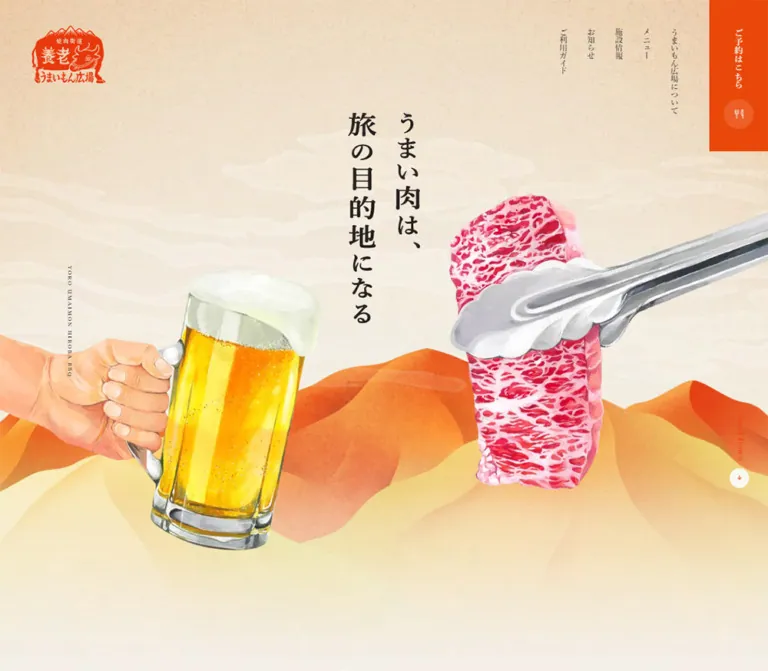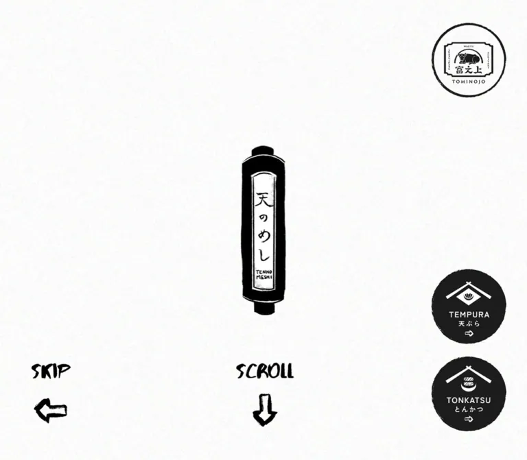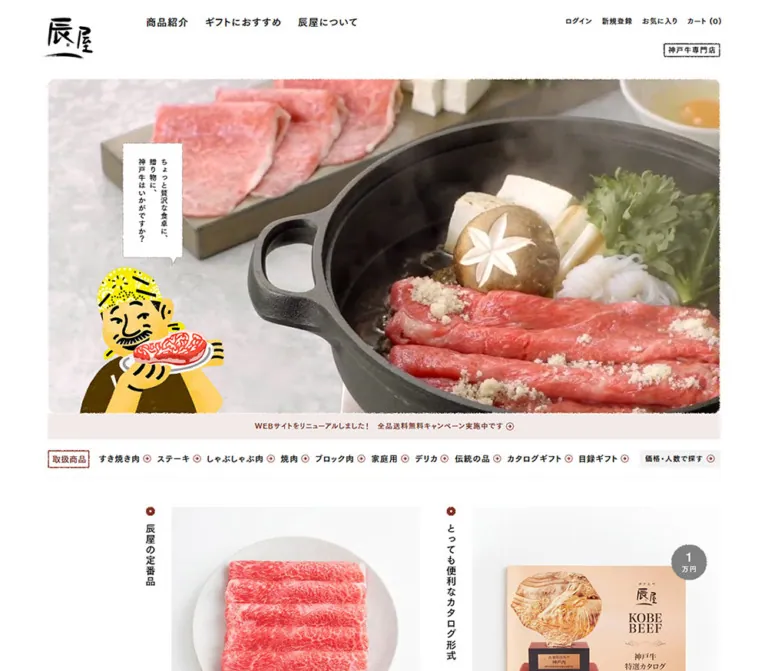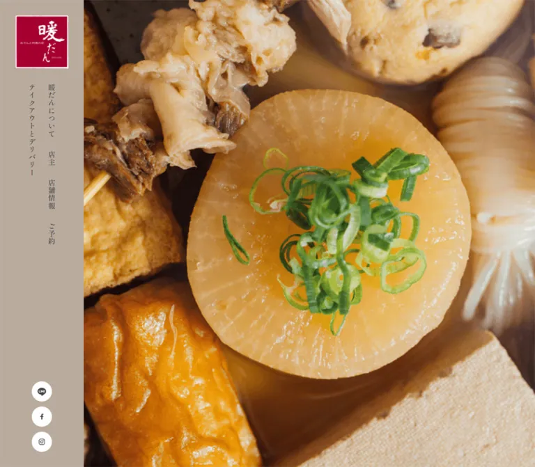
プレビュー準備中デザインリファレンスを見る
DESIGN REFERENCE
暖だん|縦書きと温かな写真で伝える飲食店サイト
夙川のおでんと地酒の店「暖だん」。トープ色のサイドナビ、大きな料理や接客の写真、明朝体の縦書きを組み合わせ、店舗の物語から予約・デリバリーまで案内する店舗サイト。
暖だん / DANDAN — Style Reference
A quiet taupe frame around warm food, human conversation, and vertical Japanese typography.
Original URL: www.dandan-jpn.com
Final URL: www.dandan-jpn.com — unchanged; reported HTTP 200.
Theme: light taupe and pale neutral surfaces, charcoal text, a crimson brand stamp, and a darkened photographic footer.
Inspected: October 2, 2026, at 06:09 JST, from the supplied browser evidence. Exact retrieval timestamp: 2026-10-01T21:09:10.465Z.
Viewports: desktop 1440 × 1000 and mobile 390 × 844 CSS pixels.
Scope: the current restaurant website: opening media, introduction, photographic storytelling, proprietor narrative, store information, reservations, takeaway and delivery, and footer. Visual evidence includes three desktop captures and two mobile captures; rendered text and selected computed styles cover additional sections.
DANDAN presents the atmosphere of a neighborhood restaurant through unusually large photographs and unusually quiet interface furniture. Warm wood, broth, food preparation, and customers supply the visual richness. The surrounding design stays restrained: a matte taupe field, small charcoal text, traditional Japanese headings, square photographic edges, and white circular social links. Crimson is concentrated in the logo rather than distributed across calls to action.
This is a long restaurant website with practical service information after an extended editorial sequence. On desktop, a persistent left rail frames the photographs and provides vertical navigation. On mobile, that rail becomes a narrow identity strip while the logo moves into the upper-right corner of the opening media. The footer breaks out across the entire viewport, covering the rail area with a close-up food photograph and white navigation.
閉じる
暖だん / DANDAN — Style Reference
A quiet taupe frame around warm food, human conversation, and vertical Japanese typography.
Original URL: www.dandan-jpn.com
Final URL: www.dandan-jpn.com — unchanged; reported HTTP 200.
Theme: light taupe and pale neutral surfaces, charcoal text, a crimson brand stamp, and a darkened photographic footer.
Inspected: October 2, 2026, at 06:09 JST, from the supplied browser evidence. Exact retrieval timestamp: 2026-10-01T21:09:10.465Z.
Viewports: desktop 1440 × 1000 and mobile 390 × 844 CSS pixels.
Scope: the current restaurant website: opening media, introduction, photographic storytelling, proprietor narrative, store information, reservations, takeaway and delivery, and footer. Visual evidence includes three desktop captures and two mobile captures; rendered text and selected computed styles cover additional sections.
DANDAN presents the atmosphere of a neighborhood restaurant through unusually large photographs and unusually quiet interface furniture. Warm wood, broth, food preparation, and customers supply the visual richness. The surrounding design stays restrained: a matte taupe field, small charcoal text, traditional Japanese headings, square photographic edges, and white circular social links. Crimson is concentrated in the logo rather than distributed across calls to action.
This is a long restaurant website with practical service information after an extended editorial sequence. On desktop, a persistent left rail frames the photographs and provides vertical navigation. On mobile, that rail becomes a narrow identity strip while the logo moves into the upper-right corner of the opening media. The footer breaks out across the entire viewport, covering the rail area with a close-up food photograph and white navigation.
How to Read This Reference
- Measured values come from the supplied rendered DOM and computed-style records. Fractional values are rounded for readability where appropriate.
- Visual estimates describe screenshot geometry or colors whose underlying CSS was not included. Estimated hexadecimal colors are starting points, not sampled or source-verified values.
- Derived values are calculations from recorded measurements, such as spacing between two element bounds.
- Named tokens are implementation aliases introduced here. The supplied custom-property records were empty; these names are not original source variables.
- Recommendations describe a reusable implementation. They do not establish the original framework, breakpoint rules, event handlers, or accessibility behavior.
- Coverage limits: mobile intermediate photography, an open navigation state, hover endpoints, and activated booking or delivery flows were not supplied.
Tokens — Colors
Default Palette
| Name | Value | Suggested token | Role and evidence |
|---|---|---|---|
| Warm Taupe | Approximately #b7aa9b |
--taupe |
Left rail and broad photographic-section background; visual estimate |
| Charcoal | #444444 |
--ink |
Measured body, navigation, heading, and action-link text |
| Service Paper | Approximately #f5f5f5 |
--service |
Pale background behind the lower service content; visual estimate |
| Brand Crimson | Approximately #b50038 |
--stamp |
Square brand artwork; visual estimate, not a general action color |
| White | #ffffff |
--white |
Measured footer navigation text; visually used for circular controls and reversed brand artwork |
| Announcement Veil | rgba(255, 255, 255, 0.6) |
--notice-surface |
Measured translucent announcement background |
| Muted Label Gray | Approximately #888888 |
--muted |
Quiet service labels visible in the lower captures; visual estimate |
The HTML and body backgrounds were reported as transparent. That does not make the visible canvas transparent or white: the screenshots show a taupe rail and other section surfaces, but their wrapper declarations were not provided.
Photographic amber, brown, green, and blue should remain image content rather than become additional interface accent tokens. The footer image appears darkened and subdued; the evidence does not identify whether this comes from an overlay, image treatment, or both. A dark overlay in a new implementation is therefore an approximation.
Tokens — Typography
Shippori Mincho B1 — Navigation and Headings
- Declared family:
Shippori Mincho B1. - Roles: vertical desktop navigation, editorial headings, service-section titles, and footer navigation.
- Weights: desktop rail links and service titles use
600; editorial headings and footer links use400. Mobile service titles use400. - Character: quiet Japanese editorial typography with fine contrast and a traditional tone. The effect depends on small scale and generous surrounding space, not large display lettering.
- Fallback caveat: the recorded stack falls back through Japanese Gothic families and ultimately
sans-serif. A generic serif fallback would be a new implementation choice.
Zen Kaku Gothic New — Body and Utility Copy
- Declared family:
Zen Kaku Gothic New. - Roles: explanatory paragraphs, store details, reservation instructions, telephone links, and the announcement.
- Measured body:
15px / 27pxon desktop and12.48px / 22.464pxon mobile, both weight400. - Leading: the main text consistently uses a relaxed
1.8line-height ratio. - Tracking: ordinary paragraphs use normal spacing. Selected external actions use
0.1em.
Both font families are present in computed declarations. The supplied evidence does not independently prove successful font-file loading or identify the font resource URLs.
Brand Lettering and Third-Party UI
The brush-style brand mark is artwork. Preserve the supplied logo treatment when authorized; do not approximate it by typing the restaurant name in the heading font.
Roboto and Arial appear in the embedded map interface and its error message. They are third-party utility typography, not additional DANDAN brand fonts. Social and delivery wordmarks should likewise remain their own artwork.
Type Scale
| Role | Desktop measurement | Mobile measurement | Weight / tracking |
|---|---|---|---|
| Root font size | 16px |
16px |
Root size remains conventional |
| Body paragraphs | 15px / 27px |
12.48px / 22.464px |
400, normal tracking |
| Opening editorial heading | 26px / 46.8px |
16.64px / 29.952px |
400 |
| Proprietor headings | 20px / 36px |
16.64px / 29.952px |
400 |
| Service-section title | 26px / 26px |
16.64px / 16.64px |
Desktop 600, 2.6px tracking; mobile 400, normal tracking |
| Desktop rail link | 14px / 14px |
Not visible in the closed mobile capture | 600, 1.4px tracking |
| Announcement | 14px / 25.2px |
10.4px / 18.72px |
400 |
| Reservation note | 13px / 23.4px |
10.4px / 18.72px |
400 |
| Selected external action | 15px / 15px |
12.48px / 12.48px |
400, 0.1em tracking |
| Footer navigation | 14px / 25.2px |
12.48px / 22.464px |
400 |
| Copyright | Approximately 9–10px |
Approximately 8px |
Screenshot estimate only |
A tall vertical heading rectangle is not an oversized font. For example, the desktop store-information heading has a 490px-high layout box while its actual font size is 26px.
Tokens — Spacing & Shapes
Responsive Unit
The original responsive formulas were not included. At the recorded mobile width, several values are consistent with scaling a 375px design by 390 / 375 = 1.04:
12 × 1.04 = 12.48pxbody text.16 × 1.04 = 16.64pxheadings.10 × 1.04 = 10.4pxsmall utility text.
This is a useful implementation hypothesis, not a recovered source formula. The Quick Start uses a capped version of that relationship and labels its breakpoint as a recommendation.
Spacing Scale
| Use | Desktop | Mobile | Evidence |
|---|---|---|---|
| Rail-link padding | 12.5px on every side |
Not applicable to the visible closed strip | Computed |
| Social-circle gap | 10px |
Approximately 10.45px |
Derived from control positions |
| Announcement padding | 15px 30px |
10.374px 0 |
Computed |
| Announcement internal gap | 20px |
20.8px |
Computed |
| Introduction heading-to-body gap | 60px |
Approximately 39.5px |
Derived from element bounds |
| Proprietor heading-to-body gap | 38px |
Approximately 29.1px |
Derived |
| Main mobile text inset from rail | — | Approximately 20.8px |
Derived from screenshot rail edge and text positions |
| Footer navigation left position | 120px |
54.05px |
Computed link positions |
| Desktop rail social bottom clearance | Approximately 30px |
No rail social stack visible | Screenshot and block-control bounds |
Border Radius
| Element | Treatment | Evidence |
|---|---|---|
| Photographs and main sections | Square corners | Visible captures |
| Brand stamp | Square artwork with a thin white edge | Visible captures |
| Announcement | 3px radius |
Computed |
| Social controls | White circles, about 40px desktop and 41.56px mobile |
Screenshots and block-link measurements |
| Delivery control | White circle, 100px desktop and 76.94px mobile |
Computed bounds and screenshots |
| Section and return-to-top rules | Approximately 1px |
Visual estimate |
There is no visible general-purpose card elevation system. Image edges, empty space, thin rules, and background changes carry the hierarchy.
Layout Measurements
| Element | Desktop at 1440 × 1000 | Mobile at 390 × 844 | Status |
|---|---|---|---|
| Left rail | Approximately 166px wide |
Approximately 54.05px wide |
Screenshot geometry |
| Main region beside rail | Approximately 1274px wide |
Approximately 335.95px wide |
Derived |
| Opening visible media | Approximately 1274 × 1000px |
Approximately 336 × 844px visible |
Screenshot bounds; mobile total media height unverified |
| Brand stamp | Approximately 106 × 106px, at (30, 30) |
Approximately 81 × 81px, near upper right |
Visual estimate |
| Announcement | 390.92 × 80.38px |
315.23 × 58.16px |
Computed |
| Announcement document position | (1019.08, 899.63) |
(64.41, 921.06) |
Computed |
| Introductory paragraph | 525px wide, starting at x = 456.75 |
219.52px wide, starting at x = 74.83 |
Computed |
| Proprietor paragraphs | Approximately 435–462px wide |
Approximately 294.28px wide |
Computed |
| Service content column | 614.53px wide for reservation text |
Approximately 294.39px wide |
Computed |
| Large mid-page food image | Approximately 1274 × 650px in the supplied frame |
Not visually supplied | Screenshot estimate |
| Footer | Approximately 650px high, full viewport width |
Approximately 537px high, full viewport width |
Screenshot estimate |
| Document height | 9469.39px |
8088.72px |
Computed |
Components
Desktop Identity Rail
Role: persistent identity, section navigation, and access to social channels.
A taupe strip approximately 166px wide occupies the left edge. Its crimson square logo sits about 30px from the top and left. Below the logo, links form two slender columns of vertical Japanese text:
- The right column contains “暖だんについて”, “店主”, “店舗情報”, and “メニュー”.
- The left column contains “ご予約” and “テイクアウトとデリバリー”.
Each recorded link box is 39px wide: 14px text plus 12.5px padding on either side. The columns begin at x = 83px and x = 44px, respectively. Text is charcoal Mincho at 14px, weight 600, with 0.1em tracking.
LINE, Facebook, and Instagram appear as a vertical stack of white circles centered at x = 83px, with 10px gaps. Their desktop block-link bounds are 40 × 40px.
The rail remains in the same visual position across the opening and intermediate captures. Its exact fixed/sticky implementation was not supplied. The footer visibly covers its lower area as it enters the viewport; the Quick Start models that with a fixed rail and a higher-layer footer.
Internal navigation labels were extracted with empty href values. Their intended section destinations are apparent, but fragment identifiers and scrolling behavior are unverified.
Mobile Identity Strip
Role: preserve the vertical brand framing while freeing space for content.
The rail narrows to approximately 54px. The desktop navigation and social stack are absent from the visible opening state. A three-stroke, pale menu-like mark appears around the middle of the strip, and a small vertical restaurant descriptor sits near the bottom.
The crimson logo moves to the upper-right corner of the media, with approximately 22px outer clearance. This is a structural rearrangement, not a uniformly shrunken desktop header.
No open-menu capture or activated control was supplied. The three-stroke mark's behavior, menu contents, transition, and focus handling must remain unspecified. If used as navigation in a new implementation, make it a labeled button with an explicit expanded state.
Opening Media
Role: establish hospitality and food quality before introducing explanatory copy.
The desktop opening is dominated by a candid restaurant scene: two customers at a wooden counter, warm interior light, and a visible drink. The photograph starts immediately to the right of the rail and reaches the viewport edges. There is no large marketing headline over this captured frame.
The phone capture instead shows an extreme close-up of food preparation. Preserve the tall crop and the small logo floating above it. The evidence does not establish whether the differing images come from video, timed media, different assets, or another mechanism. Do not infer a carousel, autoplay settings, or slide controls.
Use cover-style cropping as an implementation technique, but choose focal positions from the actual media. Faces and food should remain recognizable within the very different desktop and phone windows.
Announcement Panel
Role: a restrained external announcement within the opening sequence.
The desktop panel sits at the lower right, about 30px from the right edge and 20px from the bottom. Its anatomy is a translucent white surface, two centered lines of small sans-serif copy, and a light diagonal arrow. The observed copy introduces “美のさと うまし酒” and includes “Click”. Its link points to https://www.binosato-umashisake.jp/; that destination was not inspected.
Measured desktop styling is 14px / 25.2px, 15px 30px padding, a 20px flex gap, and 3px corner radius. It should feel like a modest notice, not a solid promotional button or floating glass card.
On mobile, the measured panel begins at document y = 921.06px, below the initial 844px viewport. Its text shrinks to 10.4px / 18.72px. Do not force it into the visible phone opening just because it overlays the desktop photograph.
Editorial Introduction
Role: explain the restaurant's atmosphere and relationship to its neighborhood.
The main heading “夙川で今日も笑顔が集う店「暖だん」” begins below the opening media. On desktop, its text area starts at x = 456.75px; the following paragraph is 525px wide. The measured heading is 26px / 46.8px, with a 60px gap before the body.
The phone introduction deliberately retains a narrow text column: approximately 219.52px, even though later sections use roughly 294px. The heading becomes 16.64px / 29.952px; the body becomes 12.48px / 22.464px.
A tall, text-empty heading box accompanies this group in the DOM. Its internal artwork was not exposed, so its font, wording, and asset format cannot be specified from this evidence. Keep that uncertainty separate from the measured live-text heading.
Asymmetric Photographic Composition
Role: create an editorial pause with food and drink rather than repeat a card grid.
The intermediate desktop capture contains a large bowl-of-oden photograph extending from the rail to the right viewport edge. A smaller portrait photograph of sake bottles overlaps its upper-right area. A cropped fragment of another dining photograph remains visible at the top left.
Approximate capture-relative geometry:
- Main food image:
x = 166px,y = 275px, width1274px, height650px. - Sake image:
x = 1128px,y = 82px, width204px, height304px. - The sake image overlaps the main image by approximately
111pxvertically. - Its right clearance is about
108px, unlike the main image, which reaches the viewport edge.
Large taupe intervals are part of the composition. Use a few unequal rectangular photographs with intentional overlap and empty space. Do not regularize them into equal tiles.
Pale, irregular steam-like strokes are visible over the image. Their animation and implementation are unverified. No mobile capture of this composition was supplied.
Proprietor Narrative
Role: connect the restaurant's welcome, food, and music activities to a personal voice.
The desktop paragraphs occupy the right side of the page, starting around x = 795.94px. Two measured text widths are approximately 435px and 462px. Their headings use Mincho at 20px / 36px, followed by sans-serif body copy at 15px / 27px.
On mobile, these groups expand to almost the full inset content width: approximately 294.28px starting at x = 74.88px. The same headings become 16.64px / 29.952px.
The rendered narrative discusses gratitude, food, sake, and music events, and is signed “藤原 直子”. Preserve the personal, paragraph-led presentation. The supplied screenshots do not establish this section's complete photographic arrangement.
Service-Section Frame
Role: organize practical information without abandoning the editorial character.
Desktop service sections place a vertical Mincho title on the left and a broad information region on the right. The visible title rule is thin and charcoal. Recorded title text begins near x = 294.5px; reservation content begins near x = 717.97px.
Store information and takeaway details use aligned label/value groups. In the desktop takeaway area, labels begin near x = 717.97px and values near x = 896.52px. The sections remain open and unboxed on a pale neutral surface.
On mobile, titles become horizontal and span roughly 294.39px. Labels and values still use two columns where practical. Their proportions differ by content: store information values begin about 101px after the label origin, while takeaway values begin about 120px after it. Do not force every definition list into one identical ratio.
Store Information
Role: make visit planning concrete.
The rendered information includes the restaurant name, address, station access, telephone number, lunch status, dinner hours, closing days, menu access, event information, and social updates. The lunch pause is ordinary inline information, not a brightly colored alert card.
Menu and event destinations are external links. Mobile telephone numbers have explicit tel:0798-74-8755 targets. Keep telephone information selectable and visually recognizable as an action where appropriate.
The mobile DOM includes an embedded Google Maps error stating that the map did not load correctly. This is a localized third-party failure, not the website's visual identity or a page-wide access challenge. Do not reproduce its dialog as a branded component.
Reservations, Takeaway, and Delivery
Role: offer several familiar contact paths without an embedded booking application.
Reservations are explained through short paragraphs, a smaller urgency note, a text link to Tabelog booking, telephone information, and LINE instructions. No internal reservation form was present in the supplied evidence.
Takeaway follows a label/value arrangement with an external menu link, telephone number, and LINE access. The rendered LINE instructions describe adding the account and sending a chat message. The actual QR image and any related interaction were not exposed in the provided element records.
Delivery uses a much larger white circular Uber Eats mark beneath a short explanation: 100px in diameter on desktop and about 76.94px on mobile. Keep this as a service identity link rather than a generic green call-to-action bar.
The recorded Uber Eats URL contains an explicit truncation marker. Obtain the intact destination before implementing it; do not copy the excerpt as a working URL.
Social Controls
Role: repeated access to LINE, Facebook, and Instagram.
The same simple white circles recur in the rail, service information, and footer. Icons are dark and small relative to their backgrounds. Desktop circles are approximately 40px; mobile block controls measure about 41.56px.
Some inline social anchors report heights of only 21px on desktop or 18px on mobile. Those are inline text-box measurements, not evidence that the visible circles are flattened. Use the screenshots and block variants to understand their visual diameter.
Full-Width Photographic Footer
Role: close the page with food imagery, repeated navigation, and a clear return path.
A close-up of daikon and other oden ingredients fills the footer. The image appears subdued enough to support white brand artwork and white Mincho links. It spans the entire viewport, including the rail's horizontal territory.
The desktop footer is approximately 650px tall. Its content begins at x = 120px: white brand artwork, six navigation links, a horizontal social row, and a small copyright line. Navigation uses 14px / 25.2px.
The phone footer is approximately 537px tall. Its content begins around x = 54px, aligned with the former rail edge rather than the more deeply inset body paragraphs. Links use 12.48px / 22.464px, and the social row retains generous circular targets.
At the right is “トップへ戻る” in vertical text, below a thin vertical rule roughly 100px long. Its appearance is established; its click behavior and scroll duration are not.
Tokens — Motion & Interaction
| Treatment | Recorded evidence | Interpretation and limitation |
|---|---|---|
| Rail links and selected social links | opacity 0.4s ease-in-out |
A defined opacity transition; trigger and endpoint were not exercised |
| Footer navigation | opacity 0.4s ease-in-out on desktop |
Subtle link feedback is supported by the declaration; exact hover opacity is unknown |
| Announcement | color 0.3s ease-in-out |
Text-color transition is defined; destination color is unavailable |
| Selected desktop heading and paragraph reveals | opacity 0.8s cubic-bezier(0.37, 0, 0.63, 1), transform 0.8s cubic-bezier(0.37, 0, 0.63, 1) |
Supports an opacity/transform reveal treatment; distance, trigger, and starting state are unknown |
| Comparable mobile narrative elements | Generic transition: all in the supplied records |
Does not establish a timed mobile reveal |
| Steam-like strokes | Visible in still captures | Movement, path, repetition, and duration are unverified |
| Opening media | Different desktop and mobile content | Does not establish a carousel, video, or responsive asset-switch rule |
| Return-to-top and section navigation | Visible labels and navigation affordances | Activation and smooth-scrolling behavior were not tested |
| Booking, social, and delivery links | Destinations exposed in the DOM | Outbound flows were not opened or validated |
The capture process waited for loading, finite motion, sampled layout stability, and image decoding, with an initial observation of at least five seconds. That improves screenshot reliability but does not prove that every delayed or continuous effect was observed. Selected elements reporting animation: none do not prove that the entire page is static.
For an adaptation, retain gentle opacity and transform transitions. Keep content visible by default, and add reveal states only after scripting is ready. Do not invent a dramatic parallax system or continuous steam animation and describe it as measured behavior.
Surfaces
| Layer | Appearance | Purpose |
|---|---|---|
| Identity rail | Flat warm taupe | Persistent framing and navigation |
| Photographic sequence | Taupe negative space and large rectangular images | Editorial rhythm and atmosphere |
| Service area | Pale neutral surface, charcoal labels, thin rules | Practical information |
| Announcement | White at 60% opacity, 3px corners |
Secondary external notice |
| Social and delivery links | White circular artwork fields | Compact, recognizable external destinations |
| Footer | Full-width food photograph with white content | Visual closure and repeated navigation |
Avoid adding shadows to compensate for the restrained palette. The design separates layers primarily through composition and contrast. The translucent notice does not establish a general blur or glass treatment.
Imagery
Photography carries most of the brand expression. The supplied current-page captures show people at a restaurant counter, food preparation, a bowl of oden, sake bottles, and a close-up cooking tray. Warm light, wooden surfaces, glossy broth, fabric, skin, and ceramic patterns provide tactile detail.
Use three complementary scales: a room or human interaction, a plated dish at table distance, and an extreme ingredient close-up. This variation is more important than applying a uniform warm filter to unrelated stock photographs.
Desktop compositions often reach the right viewport edge while leaving a taupe interval elsewhere. The phone opening uses a much taller crop. Keep image corners square and avoid placing photographs inside rounded cards.
Observed Asset References
No image src, poster URL, video source, SVG path, or font-file URL was included in the supplied evidence. The following are visual asset roles, not invented filenames.
| Asset role | Observed appearance | Reuse guidance |
|---|---|---|
| Primary brand mark | Crimson square, fine white edge, white brush lettering | Use authorized artwork; do not recreate with a text font |
| Reversed brand mark | White lettering directly over the footer image | Retain its distinct transparent-background treatment |
| Desktop opening media | Customers at a wooden counter | Preserve the human subject and warm interior context |
| Mobile opening media | Tight food-preparation close-up | Choose a deliberate portrait focal crop |
| Main editorial food image | Oden in a patterned bowl on a wooden table | Keep the broad landscape presentation |
| Overlapping detail image | Portrait crop of sake bottles | Keep its smaller scale and off-center overlap |
| Footer photograph | Daikon and other ingredients in broth | Use a crop that remains legible behind white navigation |
| Decorative strokes | Pale, irregular steam-like wisps | Treat as decorative; animation is not established |
| Service artwork | LINE, Facebook, Instagram, and Uber Eats marks | Preserve recognizable service identities |
Layout & Responsive Behavior
The desktop page is organized around a narrow left rail and a very wide photographic region. Text occupies smaller, offset columns within that region. This produces a deliberate alternation between visual immersion and quiet reading.
The mobile design preserves the left-hand frame instead of replacing it with a conventional horizontal header. The resulting main region is approximately 336px wide at a 390px viewport. Most later text sections add about 20.8px of inner space on each side, producing a 294px reading column. The introduction is narrower still.
| Relationship | Desktop observation | Mobile observation |
|---|---|---|
| Navigation | Two visible columns of vertical links | Closed narrow strip; menu-like mark visible |
| Logo | In the upper left rail | Upper-right corner of opening media |
| Main section titles | Vertical Mincho titles | Horizontal Mincho titles |
| Editorial copy | Offset columns beside other visual areas | Stacked blocks with retained side framing |
| Introduction width | 525px paragraph |
Approximately 219.52px paragraph |
| Later narrative width | Approximately 435–462px |
Approximately 294.28px |
| Announcement | Overlay inside the first desktop viewport | Below the first mobile viewport |
| Social links | Vertical in rail, horizontal elsewhere | Horizontal within content and footer |
| Footer | Full viewport width, covering rail area | Same full-width behavior |
Only two viewport widths were supplied. Tablet behavior, orientation changes, exact media-query thresholds, and intermediate scaling are unknown. The shorter mobile document height does not imply removed content: the recorded narrative and service content remain present, while layout and media proportions change.
Do’s and Don’ts
Do
- Preserve the relationship between a narrow taupe frame and expansive photography.
- Use Shippori Mincho B1 for editorial hierarchy and Zen Kaku Gothic New for practical copy when those fonts are available.
- Keep headings restrained and give paragraphs approximately
1.8line height. - Use vertical writing selectively for desktop navigation, section titles, and the return-to-top control.
- Maintain the crimson logo as a concentrated identity accent.
- Mix large landscape photographs with a few smaller, offset detail images.
- Keep white social circles consistent across the rail, content, and footer.
- Preserve the mobile rail and relocated logo as a distinct layout.
- Let the footer span the full viewport and visually cover the rail.
- Distinguish measured transition declarations from untested behavior.
Don’t
- Don’t replace the restaurant narrative with a generic hero, feature-card grid, and repeated oversized buttons.
- Don’t use the crimson logo color as the fill for every action.
- Don’t round photographic corners or add a universal card-shadow system.
- Don’t turn the asymmetric image sequence into equal-size tiles.
- Don’t treat amber food colors as additional UI accents.
- Don’t rotate entire lines of Japanese text when proper vertical writing is available.
- Don’t assume that a different opening frame proves a carousel or video.
- Don’t copy map-error typography into the brand system.
- Don’t interpret short inline-anchor bounds as the diameter of a social circle.
- Don’t invent asset paths, production credits, breakpoints, or menu-open states.
Recommended Implementation Additions
These are recommendations for a new implementation, not verified features of the original:
- Use real section anchors and a skip link. The extracted empty navigation
hrefvalues are not a useful implementation pattern. - Give the mobile menu button an accessible name,
aria-expanded, and a clearly associated navigation region. Verify keyboard and focus behavior when the menu is implemented. - Keep the visible social circles around their observed size while providing at least a
44pxinteraction target where possible. - Consider
15–16pxmobile body text for production readability. The observed12.48pxis a fidelity measurement, not an accessibility recommendation. - Provide meaningful alternatives for logo and content images. Check the text-empty heading boxes rather than assuming their artwork supplies an accessible heading.
- Use a clear heading hierarchy in new markup; the extracted page contains several
h1elements. - Keep essential content visible if reveal scripting or fonts fail. Respect reduced-motion preferences and provide a static alternative if moving media is introduced.
- Supply responsive image sizes and intentional focal positions. Do not stretch desktop crops indiscriminately onto phones.
- Retain the written address and provide a working map link when an embed fails.
- Use complete, verified outbound destinations, especially where the supplied evidence contains a truncated URL.
Agent Prompt Guide
Quick Color Reference
- Rail and editorial canvas: approximately
#b7aa9b. - Main text: measured
#444444. - Service surface: approximately
#f5f5f5. - Logo crimson: approximately
#b50038, confined mainly to brand artwork. - Footer text and circular surfaces: white.
- Announcement: measured
rgba(255, 255, 255, 0.6). - Footer darkening: choose an overlay only after checking the actual photograph; its source value is unknown.
Overall Prompt
“Create a long Japanese restaurant website inspired by the current DANDAN reference. Use a matte taupe left rail, small charcoal text, Shippori Mincho B1 headings, Zen Kaku Gothic New body copy, and large warm photographs of food and people. At a 1440px desktop width, use an approximately 166px rail with a crimson square logo, two columns of vertical Japanese navigation, and stacked white social circles. Build an editorial sequence with broad empty intervals, offset text columns, and unequal rectangular photographs, including a smaller portrait detail overlapping a wide food image. Follow this with pale service sections for store information, reservations, takeaway, and delivery. On a 390px phone, narrow the rail to about 54px, move the logo to the media’s upper right, and make service headings horizontal. End with a full-width darkened food photograph, white navigation, horizontal social circles, and a vertical return-to-top label. Treat unverified motion and menu behavior as implementation decisions.”
Example Component Prompts
- Desktop rail: “A flat taupe rail approximately 166px wide. Place a square crimson restaurant logo near the top, two narrow columns of 14px Mincho vertical links beneath it, and three 40px white social circles near the bottom. Use charcoal text, generous empty space, and no shadow.”
- Photographic composition: “A square-edged food photograph spanning the region to the right of the rail, with a smaller portrait photograph of sake bottles overlapping its upper-right area. Leave broad taupe negative space above the main image and avoid equal card dimensions.”
- Announcement: “A compact two-line external notice over the lower-right desktop photograph. Use 60%-opaque white, 3px corners, 14px charcoal sans-serif text, and a small diagonal arrow. Keep it visually secondary; place it below the initial media on mobile.”
- Service section: “A pale neutral section with a vertical Mincho title and thin charcoal rule on desktop, plus an open label/value layout for restaurant details. On mobile, use a horizontal heading and retain compact two-column details. Render reservations as text links, telephone access, and service marks.”
- Footer: “A full-width close-up photograph of oden, subdued behind a white restaurant mark and six small Mincho navigation links. Place white social circles in a horizontal row, a tiny copyright line below, and a vertical return-to-top label beneath a thin rule at the right.”
Quick Start
CSS Custom Properties
This is a reusable static shell, not recovered source code. It combines measured type and control values with estimated surfaces and recommended layout rules. The 48rem breakpoint, capped mobile unit, footer overlay, and hover endpoint are implementation choices.
Expected structure: a sibling .site-rail, .site-main, and .site-footer; .hero contains an image or poster .hero-media, a mobile .hero-logo, and .announcement. Use two .rail-nav-column groups inside .rail-nav. Service details can use a semantic dl.info-list with direct dt and dd children. Supply authorized image and logo assets; no asset URLs are assumed here.
Load the named font families separately if available. Font-family declarations alone do not fetch them. Set --footer-image to your authorized image URL. The CSS leaves reveal content visible and does not implement a menu, media playback, or navigation scripting.
:root {
  /* Estimated surfaces; charcoal and notice alpha are measured. */
  --taupe: #b7aa9b;
  --ink: #444444;
  --service: #f5f5f5;
  --stamp: #b50038;
  --white: #ffffff;
  --muted: #888888;
  --notice-surface: rgb(255 255 255 / 60%);

  /* Shortened stacks based on the recorded declarations. */
  --font-fallback: 'Yu Gothic Medium', YuGothic,
    'Hiragino Kaku Gothic ProN', Meiryo, sans-serif;
  --font-body: 'Zen Kaku Gothic New', var(--font-fallback);
  --font-editorial: 'Shippori Mincho B1', var(--font-fallback);
  --body-size: 15px;
  --title-size: 26px;
  --subhead-size: 20px;
  --body-leading: 1.8;

  /* Desktop calibration from the supplied capture. */
  --rail-width: 166px;
  --social-size: 40px;
  --social-gap: 10px;
  --delivery-size: 100px;
  --notice-radius: 3px;

  /* Measured transition timing; triggers remain implementation work. */
  --motion-link: 400ms ease-in-out;
  --motion-notice: 300ms ease-in-out;
  --motion-reveal: 800ms cubic-bezier(0.37, 0, 0.63, 1);

  /* Recommended approximation, not a measured overlay value. */
  --footer-shade: rgb(0 0 0 / 38%);
}

* { box-sizing: border-box; }
html { font-size: 16px; }
body {
  margin: 0;
  color: var(--ink);
  background: var(--taupe);
  font-family: var(--font-body);
  font-size: var(--body-size);
  line-height: var(--body-leading);
}
img { display: block; max-width: 100%; }
a { color: inherit; }
button { font: inherit; }

.site-rail {
  position: fixed;
  inset: 0 auto 0 0;
  z-index: 10;
  width: var(--rail-width);
  background: var(--taupe);
}
.site-rail .brand-stamp {
  display: block;
  width: 106px;
  margin: 30px auto 0;
}
.rail-nav {
  display: flex;
  flex-direction: row-reverse;
  justify-content: center;
  margin-top: 17.5px;
}
.rail-nav-column {
  display: flex;
  flex-direction: column;
  align-items: flex-start;
}
.rail-nav a {
  display: block;
  padding: 12.5px;
  writing-mode: vertical-rl;
  font-family: var(--font-editorial);
  font-size: 14px;
  font-weight: 600;
  line-height: 1;
  letter-spacing: 0.1em;
  text-decoration: none;
  transition: opacity var(--motion-link);
}
.rail-social {
  position: absolute;
  bottom: 30px;
  left: 50%;
  display: flex;
  flex-direction: column;
  gap: var(--social-gap);
  transform: translateX(-50%);
}
.social-row {
  display: flex;
  flex-wrap: wrap;
  gap: var(--social-gap);
}
.social-link,
.delivery-link {
  display: grid;
  place-items: center;
  flex: 0 0 auto;
  width: var(--social-size);
  height: var(--social-size);
  border-radius: 50%;
  color: var(--ink);
  background: var(--white);
  text-decoration: none;
  transition: opacity var(--motion-link);
}
.social-link img { width: 16px; height: 16px; object-fit: contain; }
.delivery-link {
  width: var(--delivery-size);
  height: var(--delivery-size);
}
.delivery-link img { width: 82%; height: auto; }
.mobile-menu,
.rail-caption,
.hero-logo { display: none; }

.site-main { margin-left: var(--rail-width); }
.hero {
  position: relative;
  min-height: 100svh;
}
.hero-media {
  position: absolute;
  inset: 0;
  width: 100%;
  height: 100%;
  object-fit: cover;
  object-position: center;
}
.announcement {
  position: absolute;
  right: 30px;
  bottom: 20px;
  display: flex;
  align-items: center;
  justify-content: center;
  gap: 20px;
  width: min(391px, calc(100% - 60px));
  padding: 15px 30px;
  border-radius: var(--notice-radius);
  background: var(--notice-surface);
  font-size: 14px;
  line-height: 1.8;
  text-align: center;
  text-decoration: none;
  transition: color var(--motion-notice);
}
.announcement .arrow { flex: 0 0 auto; }

.intro-copy {
  width: min(525px, 65%);
  margin-left: 22.8%;
  padding-block: 132px;
}
.editorial-heading {
  margin: 0;
  font-family: var(--font-editorial);
  font-size: var(--title-size);
  font-weight: 400;
  line-height: 1.8;
}
.intro-copy p { margin: 60px 0 0; }
.proprietor-copy {
  max-width: 462px;
  margin-left: 49.4%;
}
.proprietor-copy .editorial-heading { font-size: var(--subhead-size); }
.proprietor-copy p { margin: 38px 0 0; }

/* Desktop composition proportions; asset focal points need tuning. */
.photo-composition {
  position: relative;
  margin-block: 160px;
  padding-top: 15.15%;
}
.photo-wide {
  width: 100%;
  aspect-ratio: 1274 / 650;
  object-fit: cover;
}
.photo-detail {
  position: absolute;
  top: 0;
  right: 8.5%;
  width: 16%;
  aspect-ratio: 204 / 304;
  object-fit: cover;
}

.service-zone { background: var(--service); }
.service-section {
  display: grid;
  grid-template-columns: 42% minmax(0, 1fr);
  margin-inline: 8.5%;
  padding-block: 80px;
}
.section-heading {
  justify-self: start;
  margin: 0;
  padding-left: 20px;
  border-left: 1px solid currentColor;
  writing-mode: vertical-rl;
  font-family: var(--font-editorial);
  font-size: var(--title-size);
  font-weight: 600;
  line-height: 1;
  letter-spacing: 0.1em;
}
.service-content { min-width: 0; }
.service-content p { margin: 0; }
.info-list {
  display: grid;
  grid-template-columns: 29% minmax(0, 1fr);
  row-gap: 20px;
  margin: 0;
}
.info-list dt,
.info-list dd { min-width: 0; margin: 0; }
.info-list dt { color: var(--muted); }
.info-list dd { overflow-wrap: anywhere; }
.text-action {
  display: inline-flex;
  align-items: center;
  gap: 0.5em;
  line-height: 1;
  letter-spacing: 0.1em;
  text-underline-offset: 0.2em;
}
.reservation-note { font-size: 13px; }

/* A full-width sibling footer visually covers the fixed rail. */
.site-footer {
  position: relative;
  z-index: 20;
  min-height: 650px;
  padding: 80px 120px 60px;
  color: var(--white);
  background-color: var(--ink);
  background-image:
    linear-gradient(var(--footer-shade), var(--footer-shade)),
    var(--footer-image, none);
  background-position: center;
  background-size: cover;
}
.footer-brand { width: 120px; }
.footer-nav {
  display: grid;
  gap: 5px;
  margin-top: 50px;
  font-family: var(--font-editorial);
  font-size: 14px;
  line-height: 1.8;
}
.footer-nav a {
  text-decoration: none;
  transition: opacity var(--motion-link);
}
.site-footer .social-row { margin-top: 60px; }
.copyright {
  margin: 56px 0 0;
  font-size: 10px;
  line-height: 1.6;
}
.back-to-top {
  position: absolute;
  right: 8.5%;
  bottom: 80px;
  display: flex;
  flex-direction: column;
  align-items: center;
  gap: 18px;
  font-family: var(--font-editorial);
  font-size: 12px;
  text-decoration: none;
}
.back-to-top::before {
  content: '';
  width: 1px;
  height: 100px;
  background: currentColor;
}
.back-to-top span { writing-mode: vertical-rl; letter-spacing: 0.1em; }

/* Timing only: content remains visible until an implementation adds states. */
.reveal {
  transition: opacity var(--motion-reveal), transform var(--motion-reveal);
}
:where(a, button):focus-visible {
  outline: 2px solid currentColor;
  outline-offset: 4px;
}
@media (hover: hover) {
  /* Recommended endpoint; the original endpoint was not supplied. */
  .rail-nav a:hover,
  .footer-nav a:hover,
  .social-link:hover,
  .delivery-link:hover { opacity: 0.7; }
}

/* Recommended breakpoint and capped scaling, not recovered source rules. */
@media (max-width: 48rem) {
  :root {
    --mobile-u: clamp(1px, calc(100vw / 375), 1.25px);
    --rail-width: calc(52 * var(--mobile-u));
    --body-size: calc(12 * var(--mobile-u));
    --title-size: calc(16 * var(--mobile-u));
    --subhead-size: calc(16 * var(--mobile-u));
    --social-size: calc(40 * var(--mobile-u));
    --social-gap: calc(10 * var(--mobile-u));
    --delivery-size: calc(74 * var(--mobile-u));
  }
  .site-rail .brand-stamp,
  .rail-nav,
  .rail-social { display: none; }
  .mobile-menu {
    position: absolute;
    top: 50%;
    left: 50%;
    display: grid;
    place-items: center;
    min-width: 44px;
    min-height: 64px;
    padding: 0;
    border: 0;
    color: var(--white);
    background: transparent;
    transform: translate(-50%, -50%);
  }
  .rail-caption {
    position: absolute;
    bottom: 20px;
    left: 50%;
    display: block;
    writing-mode: vertical-rl;
    font-family: var(--font-editorial);
    font-size: calc(10 * var(--mobile-u));
    transform: translateX(-50%);
  }
  .hero { min-height: 0; }
  .hero-media {
    position: relative;
    height: 100svh;
  }
  .hero-logo {
    position: absolute;
    top: calc(20 * var(--mobile-u));
    right: calc(20 * var(--mobile-u));
    display: block;
    width: calc(78 * var(--mobile-u));
  }
  .announcement {
    position: relative;
    inset: auto;
    width: auto;
    /* Calibrates the below-fold notice at 390px; not a source formula. */
    margin: calc(74 * var(--mobile-u)) calc(10 * var(--mobile-u)) 0;
    padding: calc(10 * var(--mobile-u)) 0;
    gap: calc(20 * var(--mobile-u));
    font-size: calc(10 * var(--mobile-u));
  }
  .intro-copy {
    width: 65.35%;
    margin-left: calc(20 * var(--mobile-u));
    padding-block: 100px;
  }
  .intro-copy p { margin-top: 39.5px; }
  .proprietor-copy {
    max-width: none;
    margin-inline: calc(20 * var(--mobile-u));
  }
  .proprietor-copy p { margin-top: 29px; }
  /* Suggested mobile composition; no matching intermediate capture exists. */
  .photo-composition { margin-block: 80px; padding-top: 24%; }
  .photo-detail { width: 24%; right: 6%; }
  .service-section {
    grid-template-columns: minmax(0, 1fr);
    gap: 34px;
    margin-inline: calc(20 * var(--mobile-u));
    padding-block: 52px;
  }
  .section-heading {
    width: 100%;
    padding: calc(15 * var(--mobile-u)) 0 0;
    border-left: 0;
    /* A top rule is a recommended counterpart to the desktop side rule. */
    border-top: 1px solid currentColor;
    writing-mode: horizontal-tb;
    font-weight: 400;
    letter-spacing: normal;
  }
  .info-list { grid-template-columns: 34.3% minmax(0, 1fr); }
  .info-list--takeaway { grid-template-columns: 40.65% minmax(0, 1fr); }
  .reservation-note { font-size: calc(10 * var(--mobile-u)); }
  .site-footer {
    min-height: 537px;
    padding: 54px var(--rail-width) 50px;
  }
  .footer-brand { width: 104px; }
  .footer-nav { margin-top: 40px; font-size: var(--body-size); }
  .site-footer .social-row { margin-top: 36px; }
  .copyright { margin-top: 45px; font-size: calc(8 * var(--mobile-u)); }
  .back-to-top { right: var(--rail-width); bottom: 60px; }
}

@media (prefers-reduced-motion: reduce) {
  html { scroll-behavior: auto; }
  .rail-nav a,
  .footer-nav a,
  .social-link,
  .delivery-link,
  .announcement,
  .reveal {
    transition: none;
    animation: none;
  }
}
For a readability-first adaptation, increase --body-size in the mobile query and recheck the narrow introduction, information columns, and document length. Moving media requires separate reduced-motion handling; CSS transition rules cannot pause a video.
Tailwind v4 Token Mapping
Optional aliases for a project already using Tailwind v4. This is not evidence that the original website uses Tailwind. Define the custom properties above first.
@theme inline {
  --color-taupe: var(--taupe);
  --color-ink: var(--ink);
  --color-service: var(--service);
  --color-stamp: var(--stamp);
  --color-muted: var(--muted);
  --font-sans: var(--font-body);
  --font-serif: var(--font-editorial);
  --text-body: var(--body-size);
  --text-section: var(--title-size);
  --text-subhead: var(--subhead-size);
  --spacing-rail: var(--rail-width);
  --spacing-social: var(--social-size);
  --spacing-delivery: var(--delivery-size);
  --radius-notice: var(--notice-radius);
}
Sources & Evidence
- Original and final website: DANDAN. The supplied browser record reports HTTP 200 with unchanged original/final URLs and the page title “暖だん | おでんと地酒の店 / 夙川”.
- Capture date:
2026-10-01T21:09:10.465Z, equivalent to October 2, 2026, 06:09:10.465 JST. - Desktop evidence:
1440 × 1000viewport; opening photograph and rail, intermediate photographic composition, and lower service/footer captures. Recorded document height: approximately9469.39px. - Mobile evidence:
390 × 844viewport; opening identity strip and media, and lower service/footer capture. Recorded document height: approximately8088.72px. - Rendered evidence: page text, outbound link targets, selected element rectangles, declared font stacks, sizes, weights, line heights, letter spacing, backgrounds, padding, radii, and transition declarations.
- Observed limitations: no full stylesheet, image-source inventory, media metadata, original breakpoint rules, open navigation capture, or tested click sequence was supplied. The mobile map emitted a loading error. External destinations were recorded but not independently opened.
- Inspection method: this reference analyzes the supplied current-page evidence only. No additional browsing, command execution, or file inspection was performed.
This document describes the current captured restaurant website. Approximate colors, reconstructed layout rules, accessibility improvements, and reusable code are explicitly separated from recorded measurements.
# 暖だん / DANDAN — Style Reference

> A quiet taupe frame around warm food, human conversation, and vertical Japanese typography.

**Original URL:** [www.dandan-jpn.com](http://www.dandan-jpn.com/)
**Final URL:** [www.dandan-jpn.com](http://www.dandan-jpn.com/) — unchanged; reported HTTP 200.
**Theme:** light taupe and pale neutral surfaces, charcoal text, a crimson brand stamp, and a darkened photographic footer.
**Inspected:** October 2, 2026, at 06:09 JST, from the supplied browser evidence. Exact retrieval timestamp: `2026-10-01T21:09:10.465Z`.
**Viewports:** desktop `1440 × 1000` and mobile `390 × 844` CSS pixels.
**Scope:** the current restaurant website: opening media, introduction, photographic storytelling, proprietor narrative, store information, reservations, takeaway and delivery, and footer. Visual evidence includes three desktop captures and two mobile captures; rendered text and selected computed styles cover additional sections.

DANDAN presents the atmosphere of a neighborhood restaurant through unusually large photographs and unusually quiet interface furniture. Warm wood, broth, food preparation, and customers supply the visual richness. The surrounding design stays restrained: a matte taupe field, small charcoal text, traditional Japanese headings, square photographic edges, and white circular social links. Crimson is concentrated in the logo rather than distributed across calls to action.

This is a long restaurant website with practical service information after an extended editorial sequence. On desktop, a persistent left rail frames the photographs and provides vertical navigation. On mobile, that rail becomes a narrow identity strip while the logo moves into the upper-right corner of the opening media. The footer breaks out across the entire viewport, covering the rail area with a close-up food photograph and white navigation.
閉じる
# 暖だん / DANDAN — Style Reference

> A quiet taupe frame around warm food, human conversation, and vertical Japanese typography.

**Original URL:** [www.dandan-jpn.com](http://www.dandan-jpn.com/)
**Final URL:** [www.dandan-jpn.com](http://www.dandan-jpn.com/) — unchanged; reported HTTP 200.
**Theme:** light taupe and pale neutral surfaces, charcoal text, a crimson brand stamp, and a darkened photographic footer.
**Inspected:** October 2, 2026, at 06:09 JST, from the supplied browser evidence. Exact retrieval timestamp: `2026-10-01T21:09:10.465Z`.
**Viewports:** desktop `1440 × 1000` and mobile `390 × 844` CSS pixels.
**Scope:** the current restaurant website: opening media, introduction, photographic storytelling, proprietor narrative, store information, reservations, takeaway and delivery, and footer. Visual evidence includes three desktop captures and two mobile captures; rendered text and selected computed styles cover additional sections.

DANDAN presents the atmosphere of a neighborhood restaurant through unusually large photographs and unusually quiet interface furniture. Warm wood, broth, food preparation, and customers supply the visual richness. The surrounding design stays restrained: a matte taupe field, small charcoal text, traditional Japanese headings, square photographic edges, and white circular social links. Crimson is concentrated in the logo rather than distributed across calls to action.

This is a long restaurant website with practical service information after an extended editorial sequence. On desktop, a persistent left rail frames the photographs and provides vertical navigation. On mobile, that rail becomes a narrow identity strip while the logo moves into the upper-right corner of the opening media. The footer breaks out across the entire viewport, covering the rail area with a close-up food photograph and white navigation.

## How to Read This Reference

- **Measured values** come from the supplied rendered DOM and computed-style records. Fractional values are rounded for readability where appropriate.
- **Visual estimates** describe screenshot geometry or colors whose underlying CSS was not included. Estimated hexadecimal colors are starting points, not sampled or source-verified values.
- **Derived values** are calculations from recorded measurements, such as spacing between two element bounds.
- **Named tokens** are implementation aliases introduced here. The supplied custom-property records were empty; these names are not original source variables.
- **Recommendations** describe a reusable implementation. They do not establish the original framework, breakpoint rules, event handlers, or accessibility behavior.
- **Coverage limits:** mobile intermediate photography, an open navigation state, hover endpoints, and activated booking or delivery flows were not supplied.

## Tokens — Colors

### Default Palette

| Name | Value | Suggested token | Role and evidence |
| --- | --- | --- | --- |
| Warm Taupe | Approximately `#b7aa9b` | `--taupe` | Left rail and broad photographic-section background; visual estimate |
| Charcoal | `#444444` | `--ink` | Measured body, navigation, heading, and action-link text |
| Service Paper | Approximately `#f5f5f5` | `--service` | Pale background behind the lower service content; visual estimate |
| Brand Crimson | Approximately `#b50038` | `--stamp` | Square brand artwork; visual estimate, not a general action color |
| White | `#ffffff` | `--white` | Measured footer navigation text; visually used for circular controls and reversed brand artwork |
| Announcement Veil | `rgba(255, 255, 255, 0.6)` | `--notice-surface` | Measured translucent announcement background |
| Muted Label Gray | Approximately `#888888` | `--muted` | Quiet service labels visible in the lower captures; visual estimate |

The HTML and body backgrounds were reported as transparent. That does not make the visible canvas transparent or white: the screenshots show a taupe rail and other section surfaces, but their wrapper declarations were not provided.

Photographic amber, brown, green, and blue should remain image content rather than become additional interface accent tokens. The footer image appears darkened and subdued; the evidence does not identify whether this comes from an overlay, image treatment, or both. A dark overlay in a new implementation is therefore an approximation.

## Tokens — Typography

### Shippori Mincho B1 — Navigation and Headings

- **Declared family:** `Shippori Mincho B1`.
- **Roles:** vertical desktop navigation, editorial headings, service-section titles, and footer navigation.
- **Weights:** desktop rail links and service titles use `600`; editorial headings and footer links use `400`. Mobile service titles use `400`.
- **Character:** quiet Japanese editorial typography with fine contrast and a traditional tone. The effect depends on small scale and generous surrounding space, not large display lettering.
- **Fallback caveat:** the recorded stack falls back through Japanese Gothic families and ultimately `sans-serif`. A generic serif fallback would be a new implementation choice.

### Zen Kaku Gothic New — Body and Utility Copy

- **Declared family:** `Zen Kaku Gothic New`.
- **Roles:** explanatory paragraphs, store details, reservation instructions, telephone links, and the announcement.
- **Measured body:** `15px / 27px` on desktop and `12.48px / 22.464px` on mobile, both weight `400`.
- **Leading:** the main text consistently uses a relaxed `1.8` line-height ratio.
- **Tracking:** ordinary paragraphs use normal spacing. Selected external actions use `0.1em`.

Both font families are present in computed declarations. The supplied evidence does not independently prove successful font-file loading or identify the font resource URLs.

### Brand Lettering and Third-Party UI

The brush-style brand mark is artwork. Preserve the supplied logo treatment when authorized; do not approximate it by typing the restaurant name in the heading font.

Roboto and Arial appear in the embedded map interface and its error message. They are third-party utility typography, not additional DANDAN brand fonts. Social and delivery wordmarks should likewise remain their own artwork.

### Type Scale

| Role | Desktop measurement | Mobile measurement | Weight / tracking |
| --- | --- | --- | --- |
| Root font size | `16px` | `16px` | Root size remains conventional |
| Body paragraphs | `15px / 27px` | `12.48px / 22.464px` | `400`, normal tracking |
| Opening editorial heading | `26px / 46.8px` | `16.64px / 29.952px` | `400` |
| Proprietor headings | `20px / 36px` | `16.64px / 29.952px` | `400` |
| Service-section title | `26px / 26px` | `16.64px / 16.64px` | Desktop `600`, `2.6px` tracking; mobile `400`, normal tracking |
| Desktop rail link | `14px / 14px` | Not visible in the closed mobile capture | `600`, `1.4px` tracking |
| Announcement | `14px / 25.2px` | `10.4px / 18.72px` | `400` |
| Reservation note | `13px / 23.4px` | `10.4px / 18.72px` | `400` |
| Selected external action | `15px / 15px` | `12.48px / 12.48px` | `400`, `0.1em` tracking |
| Footer navigation | `14px / 25.2px` | `12.48px / 22.464px` | `400` |
| Copyright | Approximately `9–10px` | Approximately `8px` | Screenshot estimate only |

A tall vertical heading rectangle is not an oversized font. For example, the desktop store-information heading has a `490px`-high layout box while its actual font size is `26px`.

## Tokens — Spacing & Shapes

### Responsive Unit

The original responsive formulas were not included. At the recorded mobile width, several values are consistent with scaling a 375px design by `390 / 375 = 1.04`:

- `12 × 1.04 = 12.48px` body text.
- `16 × 1.04 = 16.64px` headings.
- `10 × 1.04 = 10.4px` small utility text.

This is a useful implementation hypothesis, not a recovered source formula. The Quick Start uses a capped version of that relationship and labels its breakpoint as a recommendation.

### Spacing Scale

| Use | Desktop | Mobile | Evidence |
| --- | --- | --- | --- |
| Rail-link padding | `12.5px` on every side | Not applicable to the visible closed strip | Computed |
| Social-circle gap | `10px` | Approximately `10.45px` | Derived from control positions |
| Announcement padding | `15px 30px` | `10.374px 0` | Computed |
| Announcement internal gap | `20px` | `20.8px` | Computed |
| Introduction heading-to-body gap | `60px` | Approximately `39.5px` | Derived from element bounds |
| Proprietor heading-to-body gap | `38px` | Approximately `29.1px` | Derived |
| Main mobile text inset from rail | — | Approximately `20.8px` | Derived from screenshot rail edge and text positions |
| Footer navigation left position | `120px` | `54.05px` | Computed link positions |
| Desktop rail social bottom clearance | Approximately `30px` | No rail social stack visible | Screenshot and block-control bounds |

### Border Radius

| Element | Treatment | Evidence |
| --- | --- | --- |
| Photographs and main sections | Square corners | Visible captures |
| Brand stamp | Square artwork with a thin white edge | Visible captures |
| Announcement | `3px` radius | Computed |
| Social controls | White circles, about `40px` desktop and `41.56px` mobile | Screenshots and block-link measurements |
| Delivery control | White circle, `100px` desktop and `76.94px` mobile | Computed bounds and screenshots |
| Section and return-to-top rules | Approximately `1px` | Visual estimate |

There is no visible general-purpose card elevation system. Image edges, empty space, thin rules, and background changes carry the hierarchy.

### Layout Measurements

| Element | Desktop at 1440 × 1000 | Mobile at 390 × 844 | Status |
| --- | --- | --- | --- |
| Left rail | Approximately `166px` wide | Approximately `54.05px` wide | Screenshot geometry |
| Main region beside rail | Approximately `1274px` wide | Approximately `335.95px` wide | Derived |
| Opening visible media | Approximately `1274 × 1000px` | Approximately `336 × 844px` visible | Screenshot bounds; mobile total media height unverified |
| Brand stamp | Approximately `106 × 106px`, at `(30, 30)` | Approximately `81 × 81px`, near upper right | Visual estimate |
| Announcement | `390.92 × 80.38px` | `315.23 × 58.16px` | Computed |
| Announcement document position | `(1019.08, 899.63)` | `(64.41, 921.06)` | Computed |
| Introductory paragraph | `525px` wide, starting at `x = 456.75` | `219.52px` wide, starting at `x = 74.83` | Computed |
| Proprietor paragraphs | Approximately `435–462px` wide | Approximately `294.28px` wide | Computed |
| Service content column | `614.53px` wide for reservation text | Approximately `294.39px` wide | Computed |
| Large mid-page food image | Approximately `1274 × 650px` in the supplied frame | Not visually supplied | Screenshot estimate |
| Footer | Approximately `650px` high, full viewport width | Approximately `537px` high, full viewport width | Screenshot estimate |
| Document height | `9469.39px` | `8088.72px` | Computed |

## Components

### Desktop Identity Rail

**Role:** persistent identity, section navigation, and access to social channels.

A taupe strip approximately `166px` wide occupies the left edge. Its crimson square logo sits about `30px` from the top and left. Below the logo, links form two slender columns of vertical Japanese text:

- The right column contains “暖だんについて”, “店主”, “店舗情報”, and “メニュー”.
- The left column contains “ご予約” and “テイクアウトとデリバリー”.

Each recorded link box is `39px` wide: `14px` text plus `12.5px` padding on either side. The columns begin at `x = 83px` and `x = 44px`, respectively. Text is charcoal Mincho at `14px`, weight `600`, with `0.1em` tracking.

LINE, Facebook, and Instagram appear as a vertical stack of white circles centered at `x = 83px`, with `10px` gaps. Their desktop block-link bounds are `40 × 40px`.

The rail remains in the same visual position across the opening and intermediate captures. Its exact fixed/sticky implementation was not supplied. The footer visibly covers its lower area as it enters the viewport; the Quick Start models that with a fixed rail and a higher-layer footer.

Internal navigation labels were extracted with empty `href` values. Their intended section destinations are apparent, but fragment identifiers and scrolling behavior are unverified.

### Mobile Identity Strip

**Role:** preserve the vertical brand framing while freeing space for content.

The rail narrows to approximately `54px`. The desktop navigation and social stack are absent from the visible opening state. A three-stroke, pale menu-like mark appears around the middle of the strip, and a small vertical restaurant descriptor sits near the bottom.

The crimson logo moves to the upper-right corner of the media, with approximately `22px` outer clearance. This is a structural rearrangement, not a uniformly shrunken desktop header.

No open-menu capture or activated control was supplied. The three-stroke mark's behavior, menu contents, transition, and focus handling must remain unspecified. If used as navigation in a new implementation, make it a labeled button with an explicit expanded state.

### Opening Media

**Role:** establish hospitality and food quality before introducing explanatory copy.

The desktop opening is dominated by a candid restaurant scene: two customers at a wooden counter, warm interior light, and a visible drink. The photograph starts immediately to the right of the rail and reaches the viewport edges. There is no large marketing headline over this captured frame.

The phone capture instead shows an extreme close-up of food preparation. Preserve the tall crop and the small logo floating above it. The evidence does not establish whether the differing images come from video, timed media, different assets, or another mechanism. Do not infer a carousel, autoplay settings, or slide controls.

Use cover-style cropping as an implementation technique, but choose focal positions from the actual media. Faces and food should remain recognizable within the very different desktop and phone windows.

### Announcement Panel

**Role:** a restrained external announcement within the opening sequence.

The desktop panel sits at the lower right, about `30px` from the right edge and `20px` from the bottom. Its anatomy is a translucent white surface, two centered lines of small sans-serif copy, and a light diagonal arrow. The observed copy introduces “美のさと うまし酒” and includes “Click”. Its link points to `https://www.binosato-umashisake.jp/`; that destination was not inspected.

Measured desktop styling is `14px / 25.2px`, `15px 30px` padding, a `20px` flex gap, and `3px` corner radius. It should feel like a modest notice, not a solid promotional button or floating glass card.

On mobile, the measured panel begins at document `y = 921.06px`, below the initial `844px` viewport. Its text shrinks to `10.4px / 18.72px`. Do not force it into the visible phone opening just because it overlays the desktop photograph.

### Editorial Introduction

**Role:** explain the restaurant's atmosphere and relationship to its neighborhood.

The main heading “夙川で今日も笑顔が集う店「暖だん」” begins below the opening media. On desktop, its text area starts at `x = 456.75px`; the following paragraph is `525px` wide. The measured heading is `26px / 46.8px`, with a `60px` gap before the body.

The phone introduction deliberately retains a narrow text column: approximately `219.52px`, even though later sections use roughly `294px`. The heading becomes `16.64px / 29.952px`; the body becomes `12.48px / 22.464px`.

A tall, text-empty heading box accompanies this group in the DOM. Its internal artwork was not exposed, so its font, wording, and asset format cannot be specified from this evidence. Keep that uncertainty separate from the measured live-text heading.

### Asymmetric Photographic Composition

**Role:** create an editorial pause with food and drink rather than repeat a card grid.

The intermediate desktop capture contains a large bowl-of-oden photograph extending from the rail to the right viewport edge. A smaller portrait photograph of sake bottles overlaps its upper-right area. A cropped fragment of another dining photograph remains visible at the top left.

Approximate capture-relative geometry:

- Main food image: `x = 166px`, `y = 275px`, width `1274px`, height `650px`.
- Sake image: `x = 1128px`, `y = 82px`, width `204px`, height `304px`.
- The sake image overlaps the main image by approximately `111px` vertically.
- Its right clearance is about `108px`, unlike the main image, which reaches the viewport edge.

Large taupe intervals are part of the composition. Use a few unequal rectangular photographs with intentional overlap and empty space. Do not regularize them into equal tiles.

Pale, irregular steam-like strokes are visible over the image. Their animation and implementation are unverified. No mobile capture of this composition was supplied.

### Proprietor Narrative

**Role:** connect the restaurant's welcome, food, and music activities to a personal voice.

The desktop paragraphs occupy the right side of the page, starting around `x = 795.94px`. Two measured text widths are approximately `435px` and `462px`. Their headings use Mincho at `20px / 36px`, followed by sans-serif body copy at `15px / 27px`.

On mobile, these groups expand to almost the full inset content width: approximately `294.28px` starting at `x = 74.88px`. The same headings become `16.64px / 29.952px`.

The rendered narrative discusses gratitude, food, sake, and music events, and is signed “藤原 直子”. Preserve the personal, paragraph-led presentation. The supplied screenshots do not establish this section's complete photographic arrangement.

### Service-Section Frame

**Role:** organize practical information without abandoning the editorial character.

Desktop service sections place a vertical Mincho title on the left and a broad information region on the right. The visible title rule is thin and charcoal. Recorded title text begins near `x = 294.5px`; reservation content begins near `x = 717.97px`.

Store information and takeaway details use aligned label/value groups. In the desktop takeaway area, labels begin near `x = 717.97px` and values near `x = 896.52px`. The sections remain open and unboxed on a pale neutral surface.

On mobile, titles become horizontal and span roughly `294.39px`. Labels and values still use two columns where practical. Their proportions differ by content: store information values begin about `101px` after the label origin, while takeaway values begin about `120px` after it. Do not force every definition list into one identical ratio.

### Store Information

**Role:** make visit planning concrete.

The rendered information includes the restaurant name, address, station access, telephone number, lunch status, dinner hours, closing days, menu access, event information, and social updates. The lunch pause is ordinary inline information, not a brightly colored alert card.

Menu and event destinations are external links. Mobile telephone numbers have explicit `tel:0798-74-8755` targets. Keep telephone information selectable and visually recognizable as an action where appropriate.

The mobile DOM includes an embedded Google Maps error stating that the map did not load correctly. This is a localized third-party failure, not the website's visual identity or a page-wide access challenge. Do not reproduce its dialog as a branded component.

### Reservations, Takeaway, and Delivery

**Role:** offer several familiar contact paths without an embedded booking application.

Reservations are explained through short paragraphs, a smaller urgency note, a text link to Tabelog booking, telephone information, and LINE instructions. No internal reservation form was present in the supplied evidence.

Takeaway follows a label/value arrangement with an external menu link, telephone number, and LINE access. The rendered LINE instructions describe adding the account and sending a chat message. The actual QR image and any related interaction were not exposed in the provided element records.

Delivery uses a much larger white circular Uber Eats mark beneath a short explanation: `100px` in diameter on desktop and about `76.94px` on mobile. Keep this as a service identity link rather than a generic green call-to-action bar.

The recorded Uber Eats URL contains an explicit truncation marker. Obtain the intact destination before implementing it; do not copy the excerpt as a working URL.

### Social Controls

**Role:** repeated access to LINE, Facebook, and Instagram.

The same simple white circles recur in the rail, service information, and footer. Icons are dark and small relative to their backgrounds. Desktop circles are approximately `40px`; mobile block controls measure about `41.56px`.

Some inline social anchors report heights of only `21px` on desktop or `18px` on mobile. Those are inline text-box measurements, not evidence that the visible circles are flattened. Use the screenshots and block variants to understand their visual diameter.

### Full-Width Photographic Footer

**Role:** close the page with food imagery, repeated navigation, and a clear return path.

A close-up of daikon and other oden ingredients fills the footer. The image appears subdued enough to support white brand artwork and white Mincho links. It spans the entire viewport, including the rail's horizontal territory.

The desktop footer is approximately `650px` tall. Its content begins at `x = 120px`: white brand artwork, six navigation links, a horizontal social row, and a small copyright line. Navigation uses `14px / 25.2px`.

The phone footer is approximately `537px` tall. Its content begins around `x = 54px`, aligned with the former rail edge rather than the more deeply inset body paragraphs. Links use `12.48px / 22.464px`, and the social row retains generous circular targets.

At the right is “トップへ戻る” in vertical text, below a thin vertical rule roughly `100px` long. Its appearance is established; its click behavior and scroll duration are not.

## Tokens — Motion & Interaction

| Treatment | Recorded evidence | Interpretation and limitation |
| --- | --- | --- |
| Rail links and selected social links | `opacity 0.4s ease-in-out` | A defined opacity transition; trigger and endpoint were not exercised |
| Footer navigation | `opacity 0.4s ease-in-out` on desktop | Subtle link feedback is supported by the declaration; exact hover opacity is unknown |
| Announcement | `color 0.3s ease-in-out` | Text-color transition is defined; destination color is unavailable |
| Selected desktop heading and paragraph reveals | `opacity 0.8s cubic-bezier(0.37, 0, 0.63, 1), transform 0.8s cubic-bezier(0.37, 0, 0.63, 1)` | Supports an opacity/transform reveal treatment; distance, trigger, and starting state are unknown |
| Comparable mobile narrative elements | Generic `transition: all` in the supplied records | Does not establish a timed mobile reveal |
| Steam-like strokes | Visible in still captures | Movement, path, repetition, and duration are unverified |
| Opening media | Different desktop and mobile content | Does not establish a carousel, video, or responsive asset-switch rule |
| Return-to-top and section navigation | Visible labels and navigation affordances | Activation and smooth-scrolling behavior were not tested |
| Booking, social, and delivery links | Destinations exposed in the DOM | Outbound flows were not opened or validated |

The capture process waited for loading, finite motion, sampled layout stability, and image decoding, with an initial observation of at least five seconds. That improves screenshot reliability but does not prove that every delayed or continuous effect was observed. Selected elements reporting `animation: none` do not prove that the entire page is static.

For an adaptation, retain gentle opacity and transform transitions. Keep content visible by default, and add reveal states only after scripting is ready. Do not invent a dramatic parallax system or continuous steam animation and describe it as measured behavior.

## Surfaces

| Layer | Appearance | Purpose |
| --- | --- | --- |
| Identity rail | Flat warm taupe | Persistent framing and navigation |
| Photographic sequence | Taupe negative space and large rectangular images | Editorial rhythm and atmosphere |
| Service area | Pale neutral surface, charcoal labels, thin rules | Practical information |
| Announcement | White at `60%` opacity, `3px` corners | Secondary external notice |
| Social and delivery links | White circular artwork fields | Compact, recognizable external destinations |
| Footer | Full-width food photograph with white content | Visual closure and repeated navigation |

Avoid adding shadows to compensate for the restrained palette. The design separates layers primarily through composition and contrast. The translucent notice does not establish a general blur or glass treatment.

## Imagery

Photography carries most of the brand expression. The supplied current-page captures show people at a restaurant counter, food preparation, a bowl of oden, sake bottles, and a close-up cooking tray. Warm light, wooden surfaces, glossy broth, fabric, skin, and ceramic patterns provide tactile detail.

Use three complementary scales: a room or human interaction, a plated dish at table distance, and an extreme ingredient close-up. This variation is more important than applying a uniform warm filter to unrelated stock photographs.

Desktop compositions often reach the right viewport edge while leaving a taupe interval elsewhere. The phone opening uses a much taller crop. Keep image corners square and avoid placing photographs inside rounded cards.

### Observed Asset References

No image `src`, poster URL, video source, SVG path, or font-file URL was included in the supplied evidence. The following are visual asset roles, not invented filenames.

| Asset role | Observed appearance | Reuse guidance |
| --- | --- | --- |
| Primary brand mark | Crimson square, fine white edge, white brush lettering | Use authorized artwork; do not recreate with a text font |
| Reversed brand mark | White lettering directly over the footer image | Retain its distinct transparent-background treatment |
| Desktop opening media | Customers at a wooden counter | Preserve the human subject and warm interior context |
| Mobile opening media | Tight food-preparation close-up | Choose a deliberate portrait focal crop |
| Main editorial food image | Oden in a patterned bowl on a wooden table | Keep the broad landscape presentation |
| Overlapping detail image | Portrait crop of sake bottles | Keep its smaller scale and off-center overlap |
| Footer photograph | Daikon and other ingredients in broth | Use a crop that remains legible behind white navigation |
| Decorative strokes | Pale, irregular steam-like wisps | Treat as decorative; animation is not established |
| Service artwork | LINE, Facebook, Instagram, and Uber Eats marks | Preserve recognizable service identities |

## Layout & Responsive Behavior

The desktop page is organized around a narrow left rail and a very wide photographic region. Text occupies smaller, offset columns within that region. This produces a deliberate alternation between visual immersion and quiet reading.

The mobile design preserves the left-hand frame instead of replacing it with a conventional horizontal header. The resulting main region is approximately `336px` wide at a `390px` viewport. Most later text sections add about `20.8px` of inner space on each side, producing a `294px` reading column. The introduction is narrower still.

| Relationship | Desktop observation | Mobile observation |
| --- | --- | --- |
| Navigation | Two visible columns of vertical links | Closed narrow strip; menu-like mark visible |
| Logo | In the upper left rail | Upper-right corner of opening media |
| Main section titles | Vertical Mincho titles | Horizontal Mincho titles |
| Editorial copy | Offset columns beside other visual areas | Stacked blocks with retained side framing |
| Introduction width | `525px` paragraph | Approximately `219.52px` paragraph |
| Later narrative width | Approximately `435–462px` | Approximately `294.28px` |
| Announcement | Overlay inside the first desktop viewport | Below the first mobile viewport |
| Social links | Vertical in rail, horizontal elsewhere | Horizontal within content and footer |
| Footer | Full viewport width, covering rail area | Same full-width behavior |

Only two viewport widths were supplied. Tablet behavior, orientation changes, exact media-query thresholds, and intermediate scaling are unknown. The shorter mobile document height does not imply removed content: the recorded narrative and service content remain present, while layout and media proportions change.

## Do’s and Don’ts

### Do

- Preserve the relationship between a narrow taupe frame and expansive photography.
- Use Shippori Mincho B1 for editorial hierarchy and Zen Kaku Gothic New for practical copy when those fonts are available.
- Keep headings restrained and give paragraphs approximately `1.8` line height.
- Use vertical writing selectively for desktop navigation, section titles, and the return-to-top control.
- Maintain the crimson logo as a concentrated identity accent.
- Mix large landscape photographs with a few smaller, offset detail images.
- Keep white social circles consistent across the rail, content, and footer.
- Preserve the mobile rail and relocated logo as a distinct layout.
- Let the footer span the full viewport and visually cover the rail.
- Distinguish measured transition declarations from untested behavior.

### Don’t

- Don’t replace the restaurant narrative with a generic hero, feature-card grid, and repeated oversized buttons.
- Don’t use the crimson logo color as the fill for every action.
- Don’t round photographic corners or add a universal card-shadow system.
- Don’t turn the asymmetric image sequence into equal-size tiles.
- Don’t treat amber food colors as additional UI accents.
- Don’t rotate entire lines of Japanese text when proper vertical writing is available.
- Don’t assume that a different opening frame proves a carousel or video.
- Don’t copy map-error typography into the brand system.
- Don’t interpret short inline-anchor bounds as the diameter of a social circle.
- Don’t invent asset paths, production credits, breakpoints, or menu-open states.

## Recommended Implementation Additions

These are recommendations for a new implementation, not verified features of the original:

- Use real section anchors and a skip link. The extracted empty navigation `href` values are not a useful implementation pattern.
- Give the mobile menu button an accessible name, `aria-expanded`, and a clearly associated navigation region. Verify keyboard and focus behavior when the menu is implemented.
- Keep the visible social circles around their observed size while providing at least a `44px` interaction target where possible.
- Consider `15–16px` mobile body text for production readability. The observed `12.48px` is a fidelity measurement, not an accessibility recommendation.
- Provide meaningful alternatives for logo and content images. Check the text-empty heading boxes rather than assuming their artwork supplies an accessible heading.
- Use a clear heading hierarchy in new markup; the extracted page contains several `h1` elements.
- Keep essential content visible if reveal scripting or fonts fail. Respect reduced-motion preferences and provide a static alternative if moving media is introduced.
- Supply responsive image sizes and intentional focal positions. Do not stretch desktop crops indiscriminately onto phones.
- Retain the written address and provide a working map link when an embed fails.
- Use complete, verified outbound destinations, especially where the supplied evidence contains a truncated URL.

## Agent Prompt Guide

### Quick Color Reference

- Rail and editorial canvas: approximately `#b7aa9b`.
- Main text: measured `#444444`.
- Service surface: approximately `#f5f5f5`.
- Logo crimson: approximately `#b50038`, confined mainly to brand artwork.
- Footer text and circular surfaces: white.
- Announcement: measured `rgba(255, 255, 255, 0.6)`.
- Footer darkening: choose an overlay only after checking the actual photograph; its source value is unknown.

### Overall Prompt

“Create a long Japanese restaurant website inspired by the current DANDAN reference. Use a matte taupe left rail, small charcoal text, Shippori Mincho B1 headings, Zen Kaku Gothic New body copy, and large warm photographs of food and people. At a 1440px desktop width, use an approximately 166px rail with a crimson square logo, two columns of vertical Japanese navigation, and stacked white social circles. Build an editorial sequence with broad empty intervals, offset text columns, and unequal rectangular photographs, including a smaller portrait detail overlapping a wide food image. Follow this with pale service sections for store information, reservations, takeaway, and delivery. On a 390px phone, narrow the rail to about 54px, move the logo to the media’s upper right, and make service headings horizontal. End with a full-width darkened food photograph, white navigation, horizontal social circles, and a vertical return-to-top label. Treat unverified motion and menu behavior as implementation decisions.”

### Example Component Prompts

1. **Desktop rail:** “A flat taupe rail approximately 166px wide. Place a square crimson restaurant logo near the top, two narrow columns of 14px Mincho vertical links beneath it, and three 40px white social circles near the bottom. Use charcoal text, generous empty space, and no shadow.”
2. **Photographic composition:** “A square-edged food photograph spanning the region to the right of the rail, with a smaller portrait photograph of sake bottles overlapping its upper-right area. Leave broad taupe negative space above the main image and avoid equal card dimensions.”
3. **Announcement:** “A compact two-line external notice over the lower-right desktop photograph. Use 60%-opaque white, 3px corners, 14px charcoal sans-serif text, and a small diagonal arrow. Keep it visually secondary; place it below the initial media on mobile.”
4. **Service section:** “A pale neutral section with a vertical Mincho title and thin charcoal rule on desktop, plus an open label/value layout for restaurant details. On mobile, use a horizontal heading and retain compact two-column details. Render reservations as text links, telephone access, and service marks.”
5. **Footer:** “A full-width close-up photograph of oden, subdued behind a white restaurant mark and six small Mincho navigation links. Place white social circles in a horizontal row, a tiny copyright line below, and a vertical return-to-top label beneath a thin rule at the right.”

## Quick Start

### CSS Custom Properties

This is a reusable static shell, not recovered source code. It combines measured type and control values with estimated surfaces and recommended layout rules. The `48rem` breakpoint, capped mobile unit, footer overlay, and hover endpoint are implementation choices.

Expected structure: a sibling `.site-rail`, `.site-main`, and `.site-footer`; `.hero` contains an image or poster `.hero-media`, a mobile `.hero-logo`, and `.announcement`. Use two `.rail-nav-column` groups inside `.rail-nav`. Service details can use a semantic `dl.info-list` with direct `dt` and `dd` children. Supply authorized image and logo assets; no asset URLs are assumed here.

Load the named font families separately if available. Font-family declarations alone do not fetch them. Set `--footer-image` to your authorized image URL. The CSS leaves reveal content visible and does not implement a menu, media playback, or navigation scripting.

```css
:root {
  /* Estimated surfaces; charcoal and notice alpha are measured. */
  --taupe: #b7aa9b;
  --ink: #444444;
  --service: #f5f5f5;
  --stamp: #b50038;
  --white: #ffffff;
  --muted: #888888;
  --notice-surface: rgb(255 255 255 / 60%);

  /* Shortened stacks based on the recorded declarations. */
  --font-fallback: 'Yu Gothic Medium', YuGothic,
    'Hiragino Kaku Gothic ProN', Meiryo, sans-serif;
  --font-body: 'Zen Kaku Gothic New', var(--font-fallback);
  --font-editorial: 'Shippori Mincho B1', var(--font-fallback);
  --body-size: 15px;
  --title-size: 26px;
  --subhead-size: 20px;
  --body-leading: 1.8;

  /* Desktop calibration from the supplied capture. */
  --rail-width: 166px;
  --social-size: 40px;
  --social-gap: 10px;
  --delivery-size: 100px;
  --notice-radius: 3px;

  /* Measured transition timing; triggers remain implementation work. */
  --motion-link: 400ms ease-in-out;
  --motion-notice: 300ms ease-in-out;
  --motion-reveal: 800ms cubic-bezier(0.37, 0, 0.63, 1);

  /* Recommended approximation, not a measured overlay value. */
  --footer-shade: rgb(0 0 0 / 38%);
}

* { box-sizing: border-box; }
html { font-size: 16px; }
body {
  margin: 0;
  color: var(--ink);
  background: var(--taupe);
  font-family: var(--font-body);
  font-size: var(--body-size);
  line-height: var(--body-leading);
}
img { display: block; max-width: 100%; }
a { color: inherit; }
button { font: inherit; }

.site-rail {
  position: fixed;
  inset: 0 auto 0 0;
  z-index: 10;
  width: var(--rail-width);
  background: var(--taupe);
}
.site-rail .brand-stamp {
  display: block;
  width: 106px;
  margin: 30px auto 0;
}
.rail-nav {
  display: flex;
  flex-direction: row-reverse;
  justify-content: center;
  margin-top: 17.5px;
}
.rail-nav-column {
  display: flex;
  flex-direction: column;
  align-items: flex-start;
}
.rail-nav a {
  display: block;
  padding: 12.5px;
  writing-mode: vertical-rl;
  font-family: var(--font-editorial);
  font-size: 14px;
  font-weight: 600;
  line-height: 1;
  letter-spacing: 0.1em;
  text-decoration: none;
  transition: opacity var(--motion-link);
}
.rail-social {
  position: absolute;
  bottom: 30px;
  left: 50%;
  display: flex;
  flex-direction: column;
  gap: var(--social-gap);
  transform: translateX(-50%);
}
.social-row {
  display: flex;
  flex-wrap: wrap;
  gap: var(--social-gap);
}
.social-link,
.delivery-link {
  display: grid;
  place-items: center;
  flex: 0 0 auto;
  width: var(--social-size);
  height: var(--social-size);
  border-radius: 50%;
  color: var(--ink);
  background: var(--white);
  text-decoration: none;
  transition: opacity var(--motion-link);
}
.social-link img { width: 16px; height: 16px; object-fit: contain; }
.delivery-link {
  width: var(--delivery-size);
  height: var(--delivery-size);
}
.delivery-link img { width: 82%; height: auto; }
.mobile-menu,
.rail-caption,
.hero-logo { display: none; }

.site-main { margin-left: var(--rail-width); }
.hero {
  position: relative;
  min-height: 100svh;
}
.hero-media {
  position: absolute;
  inset: 0;
  width: 100%;
  height: 100%;
  object-fit: cover;
  object-position: center;
}
.announcement {
  position: absolute;
  right: 30px;
  bottom: 20px;
  display: flex;
  align-items: center;
  justify-content: center;
  gap: 20px;
  width: min(391px, calc(100% - 60px));
  padding: 15px 30px;
  border-radius: var(--notice-radius);
  background: var(--notice-surface);
  font-size: 14px;
  line-height: 1.8;
  text-align: center;
  text-decoration: none;
  transition: color var(--motion-notice);
}
.announcement .arrow { flex: 0 0 auto; }

.intro-copy {
  width: min(525px, 65%);
  margin-left: 22.8%;
  padding-block: 132px;
}
.editorial-heading {
  margin: 0;
  font-family: var(--font-editorial);
  font-size: var(--title-size);
  font-weight: 400;
  line-height: 1.8;
}
.intro-copy p { margin: 60px 0 0; }
.proprietor-copy {
  max-width: 462px;
  margin-left: 49.4%;
}
.proprietor-copy .editorial-heading { font-size: var(--subhead-size); }
.proprietor-copy p { margin: 38px 0 0; }

/* Desktop composition proportions; asset focal points need tuning. */
.photo-composition {
  position: relative;
  margin-block: 160px;
  padding-top: 15.15%;
}
.photo-wide {
  width: 100%;
  aspect-ratio: 1274 / 650;
  object-fit: cover;
}
.photo-detail {
  position: absolute;
  top: 0;
  right: 8.5%;
  width: 16%;
  aspect-ratio: 204 / 304;
  object-fit: cover;
}

.service-zone { background: var(--service); }
.service-section {
  display: grid;
  grid-template-columns: 42% minmax(0, 1fr);
  margin-inline: 8.5%;
  padding-block: 80px;
}
.section-heading {
  justify-self: start;
  margin: 0;
  padding-left: 20px;
  border-left: 1px solid currentColor;
  writing-mode: vertical-rl;
  font-family: var(--font-editorial);
  font-size: var(--title-size);
  font-weight: 600;
  line-height: 1;
  letter-spacing: 0.1em;
}
.service-content { min-width: 0; }
.service-content p { margin: 0; }
.info-list {
  display: grid;
  grid-template-columns: 29% minmax(0, 1fr);
  row-gap: 20px;
  margin: 0;
}
.info-list dt,
.info-list dd { min-width: 0; margin: 0; }
.info-list dt { color: var(--muted); }
.info-list dd { overflow-wrap: anywhere; }
.text-action {
  display: inline-flex;
  align-items: center;
  gap: 0.5em;
  line-height: 1;
  letter-spacing: 0.1em;
  text-underline-offset: 0.2em;
}
.reservation-note { font-size: 13px; }

/* A full-width sibling footer visually covers the fixed rail. */
.site-footer {
  position: relative;
  z-index: 20;
  min-height: 650px;
  padding: 80px 120px 60px;
  color: var(--white);
  background-color: var(--ink);
  background-image:
    linear-gradient(var(--footer-shade), var(--footer-shade)),
    var(--footer-image, none);
  background-position: center;
  background-size: cover;
}
.footer-brand { width: 120px; }
.footer-nav {
  display: grid;
  gap: 5px;
  margin-top: 50px;
  font-family: var(--font-editorial);
  font-size: 14px;
  line-height: 1.8;
}
.footer-nav a {
  text-decoration: none;
  transition: opacity var(--motion-link);
}
.site-footer .social-row { margin-top: 60px; }
.copyright {
  margin: 56px 0 0;
  font-size: 10px;
  line-height: 1.6;
}
.back-to-top {
  position: absolute;
  right: 8.5%;
  bottom: 80px;
  display: flex;
  flex-direction: column;
  align-items: center;
  gap: 18px;
  font-family: var(--font-editorial);
  font-size: 12px;
  text-decoration: none;
}
.back-to-top::before {
  content: '';
  width: 1px;
  height: 100px;
  background: currentColor;
}
.back-to-top span { writing-mode: vertical-rl; letter-spacing: 0.1em; }

/* Timing only: content remains visible until an implementation adds states. */
.reveal {
  transition: opacity var(--motion-reveal), transform var(--motion-reveal);
}
:where(a, button):focus-visible {
  outline: 2px solid currentColor;
  outline-offset: 4px;
}
@media (hover: hover) {
  /* Recommended endpoint; the original endpoint was not supplied. */
  .rail-nav a:hover,
  .footer-nav a:hover,
  .social-link:hover,
  .delivery-link:hover { opacity: 0.7; }
}

/* Recommended breakpoint and capped scaling, not recovered source rules. */
@media (max-width: 48rem) {
  :root {
    --mobile-u: clamp(1px, calc(100vw / 375), 1.25px);
    --rail-width: calc(52 * var(--mobile-u));
    --body-size: calc(12 * var(--mobile-u));
    --title-size: calc(16 * var(--mobile-u));
    --subhead-size: calc(16 * var(--mobile-u));
    --social-size: calc(40 * var(--mobile-u));
    --social-gap: calc(10 * var(--mobile-u));
    --delivery-size: calc(74 * var(--mobile-u));
  }
  .site-rail .brand-stamp,
  .rail-nav,
  .rail-social { display: none; }
  .mobile-menu {
    position: absolute;
    top: 50%;
    left: 50%;
    display: grid;
    place-items: center;
    min-width: 44px;
    min-height: 64px;
    padding: 0;
    border: 0;
    color: var(--white);
    background: transparent;
    transform: translate(-50%, -50%);
  }
  .rail-caption {
    position: absolute;
    bottom: 20px;
    left: 50%;
    display: block;
    writing-mode: vertical-rl;
    font-family: var(--font-editorial);
    font-size: calc(10 * var(--mobile-u));
    transform: translateX(-50%);
  }
  .hero { min-height: 0; }
  .hero-media {
    position: relative;
    height: 100svh;
  }
  .hero-logo {
    position: absolute;
    top: calc(20 * var(--mobile-u));
    right: calc(20 * var(--mobile-u));
    display: block;
    width: calc(78 * var(--mobile-u));
  }
  .announcement {
    position: relative;
    inset: auto;
    width: auto;
    /* Calibrates the below-fold notice at 390px; not a source formula. */
    margin: calc(74 * var(--mobile-u)) calc(10 * var(--mobile-u)) 0;
    padding: calc(10 * var(--mobile-u)) 0;
    gap: calc(20 * var(--mobile-u));
    font-size: calc(10 * var(--mobile-u));
  }
  .intro-copy {
    width: 65.35%;
    margin-left: calc(20 * var(--mobile-u));
    padding-block: 100px;
  }
  .intro-copy p { margin-top: 39.5px; }
  .proprietor-copy {
    max-width: none;
    margin-inline: calc(20 * var(--mobile-u));
  }
  .proprietor-copy p { margin-top: 29px; }
  /* Suggested mobile composition; no matching intermediate capture exists. */
  .photo-composition { margin-block: 80px; padding-top: 24%; }
  .photo-detail { width: 24%; right: 6%; }
  .service-section {
    grid-template-columns: minmax(0, 1fr);
    gap: 34px;
    margin-inline: calc(20 * var(--mobile-u));
    padding-block: 52px;
  }
  .section-heading {
    width: 100%;
    padding: calc(15 * var(--mobile-u)) 0 0;
    border-left: 0;
    /* A top rule is a recommended counterpart to the desktop side rule. */
    border-top: 1px solid currentColor;
    writing-mode: horizontal-tb;
    font-weight: 400;
    letter-spacing: normal;
  }
  .info-list { grid-template-columns: 34.3% minmax(0, 1fr); }
  .info-list--takeaway { grid-template-columns: 40.65% minmax(0, 1fr); }
  .reservation-note { font-size: calc(10 * var(--mobile-u)); }
  .site-footer {
    min-height: 537px;
    padding: 54px var(--rail-width) 50px;
  }
  .footer-brand { width: 104px; }
  .footer-nav { margin-top: 40px; font-size: var(--body-size); }
  .site-footer .social-row { margin-top: 36px; }
  .copyright { margin-top: 45px; font-size: calc(8 * var(--mobile-u)); }
  .back-to-top { right: var(--rail-width); bottom: 60px; }
}

@media (prefers-reduced-motion: reduce) {
  html { scroll-behavior: auto; }
  .rail-nav a,
  .footer-nav a,
  .social-link,
  .delivery-link,
  .announcement,
  .reveal {
    transition: none;
    animation: none;
  }
}
```

For a readability-first adaptation, increase `--body-size` in the mobile query and recheck the narrow introduction, information columns, and document length. Moving media requires separate reduced-motion handling; CSS transition rules cannot pause a video.

### Tailwind v4 Token Mapping

Optional aliases for a project already using Tailwind v4. This is not evidence that the original website uses Tailwind. Define the custom properties above first.

```css
@theme inline {
  --color-taupe: var(--taupe);
  --color-ink: var(--ink);
  --color-service: var(--service);
  --color-stamp: var(--stamp);
  --color-muted: var(--muted);
  --font-sans: var(--font-body);
  --font-serif: var(--font-editorial);
  --text-body: var(--body-size);
  --text-section: var(--title-size);
  --text-subhead: var(--subhead-size);
  --spacing-rail: var(--rail-width);
  --spacing-social: var(--social-size);
  --spacing-delivery: var(--delivery-size);
  --radius-notice: var(--notice-radius);
}
```

## Sources & Evidence

- **Original and final website:** [DANDAN](http://www.dandan-jpn.com/). The supplied browser record reports HTTP 200 with unchanged original/final URLs and the page title “暖だん | おでんと地酒の店 / 夙川”.
- **Capture date:** `2026-10-01T21:09:10.465Z`, equivalent to October 2, 2026, 06:09:10.465 JST.
- **Desktop evidence:** `1440 × 1000` viewport; opening photograph and rail, intermediate photographic composition, and lower service/footer captures. Recorded document height: approximately `9469.39px`.
- **Mobile evidence:** `390 × 844` viewport; opening identity strip and media, and lower service/footer capture. Recorded document height: approximately `8088.72px`.
- **Rendered evidence:** page text, outbound link targets, selected element rectangles, declared font stacks, sizes, weights, line heights, letter spacing, backgrounds, padding, radii, and transition declarations.
- **Observed limitations:** no full stylesheet, image-source inventory, media metadata, original breakpoint rules, open navigation capture, or tested click sequence was supplied. The mobile map emitted a loading error. External destinations were recorded but not independently opened.
- **Inspection method:** this reference analyzes the supplied current-page evidence only. No additional browsing, command execution, or file inspection was performed.

This document describes the current captured restaurant website. Approximate colors, reconstructed layout rules, accessibility improvements, and reusable code are explicitly separated from recorded measurements.関連するデザイン
スタイルやページの種類、ジャンルが近いデザインを集めました。