プレビュー準備中デザインリファレンスを見る
DESIGN REFERENCE
太宰府天満宮|全国天満宮総本宮
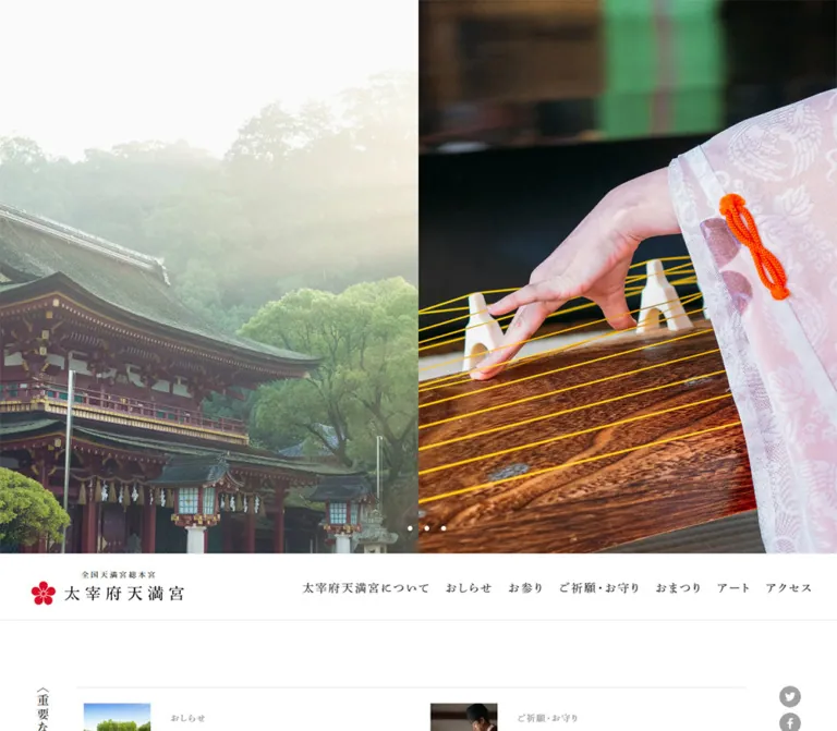
祭礼や社殿の大判写真、明朝体、白い余白、赤い梅紋が印象的な公式サイト。写真下のナビゲーション、細い輪郭のボタン、縦書きの見出しが伝統と端正さを表現しています。
Dazaifu Tenmangu — Style Reference
Ceremonial photography, finely spaced Mincho typography, and a small red plum emblem on a white canvas.
Website: Dazaifu Tenmangu Original URL: https://www.dazaifutenmangu.or.jp/ Final URL: https://www.dazaifutenmangu.or.jp/ Theme: light in the inspected states; no theme selector was evidenced. Inspected: September 29, 2026, at 12:45:31.537 UTC / 21:45:31.537 JST. Viewports: 1440 × 1000 and 390 × 844 CSS pixels. Scope: the current Japanese homepage, using supplied opening, middle, and footer captures plus rendered text, links, element rectangles, and computed styles. Destination pages and navigation-opening interactions were not inspected.
The homepage introduces the shrine through large photographs of architecture and religious ceremony, then organizes practical information through a restrained editorial layout. White surfaces, dark gray text, generous margins, and medium-weight Japanese Mincho type provide continuity between the photographs, announcements, prayer information, visiting hours, and site directory. The red plum emblem carries the strongest recurring interface accent; gold, lacquer red, and green are primarily supplied by photography.
Its opening composition is particularly distinctive: photography occupies almost the entire first viewport, with a 100px white identity and navigation strip immediately below it. In the scrolled captures, that strip remains at the top of the viewport. Below, the homepage works as an institutional information hub with multiple destinations and visitor tasks.
The narrow capture retains substantial desktop-width content. This is an observed limitation of the captured rendering and must be kept separate from recommendations for a new responsive implementation.
閉じる
Dazaifu Tenmangu — Style Reference
Ceremonial photography, finely spaced Mincho typography, and a small red plum emblem on a white canvas.
Website: Dazaifu Tenmangu Original URL: https://www.dazaifutenmangu.or.jp/ Final URL: https://www.dazaifutenmangu.or.jp/ Theme: light in the inspected states; no theme selector was evidenced. Inspected: September 29, 2026, at 12:45:31.537 UTC / 21:45:31.537 JST. Viewports: 1440 × 1000 and 390 × 844 CSS pixels. Scope: the current Japanese homepage, using supplied opening, middle, and footer captures plus rendered text, links, element rectangles, and computed styles. Destination pages and navigation-opening interactions were not inspected.
The homepage introduces the shrine through large photographs of architecture and religious ceremony, then organizes practical information through a restrained editorial layout. White surfaces, dark gray text, generous margins, and medium-weight Japanese Mincho type provide continuity between the photographs, announcements, prayer information, visiting hours, and site directory. The red plum emblem carries the strongest recurring interface accent; gold, lacquer red, and green are primarily supplied by photography.
Its opening composition is particularly distinctive: photography occupies almost the entire first viewport, with a 100px white identity and navigation strip immediately below it. In the scrolled captures, that strip remains at the top of the viewport. Below, the homepage works as an institutional information hub with multiple destinations and visitor tasks.
The narrow capture retains substantial desktop-width content. This is an observed limitation of the captured rendering and must be kept separate from recommendations for a new responsive implementation.
How to Read This Reference
- Measured values come from the supplied computed styles and element rectangles. Dimensions are CSS pixels unless otherwise stated.
- Derived values are calculations from those measurements, such as column gaps or the difference between viewport height and header position.
- Estimated values describe screenshot appearance where a computed declaration was not supplied. Estimated hex colors are practical approximations, not sampled or verified brand specifications.
- Recommended values and behaviors are implementation guidance for a new project. They do not establish behavior on the inspected site.
- Custom-property names in this document are implementation aliases. The supplied site properties mostly contain general WordPress presets; those presets do not demonstrate that their gradients, shadows, or accent colors are used in the visible design.
- Computed font-family declarations identify the requested stack, not the particular font file that rendered each glyph.
- Navigation-subtree rectangles establish the presence and dimensions of markup. They do not prove that a dropdown was opened or visible.
Tokens — Colors
Default Palette
| Name | Value | Alias | Evidence and role |
|---|---|---|---|
| White canvas | #ffffff |
--paper |
Measured body and header background; also the visible content and footer surface |
| Heading ink | #282828 |
--ink |
Measured main navigation, section headings, announcement titles, and outlined-link text |
| Body gray | #606060 |
--body-ink |
Measured body text and explanatory paragraphs |
| Quiet gray | #a0a0a0 |
--muted-ink |
Measured important-announcement category labels; footer social circles appear approximately this gray |
| Black | #000000 |
--black |
Measured links within navigation subtrees; the visible wordmark also appears black |
| Plum red | Approximately #e6002d |
--brand-red |
Estimated from the plum emblem in header and footer; exact asset color was not supplied |
| Fine rule | Approximately #e2e2e2 |
--rule |
Estimated header and visiting-hours table rules |
| Outline gray | Approximately #cccccc |
--outline |
Estimated prayer-information button borders and chevrons |
| Table shade | Approximately #f8f8f8 |
--table-shade |
Estimated background of opening/closing category cells |
| Notice tint | Approximately #fff7f7 |
--notice-tint |
Estimated pale pink temporary-hours panel |
| Notice red | Approximately #f15a4a |
--notice-ink |
Estimated warm red text in the temporary-hours panel |
The interface is predominantly white and gray. Preserve the distinction between the compact red identity mark and the much larger color fields within photographs. The gold of ceremonial objects is not evidence of a gold button or border system.
Theme Presets
Only the light presentation is evidenced. No dark mode, alternate palette, or selectable theme behavior was supplied. The available WordPress color presets should not be presented as site themes.
Tokens — Typography
Japanese Mincho — Sitewide Text
The measured body stack is:
font-family:
  dnp-shuei-mincho-pr6n,
  '游明朝体',
  '游明朝',
  YuMincho,
  'ヒラギノ明朝 ProN',
  'Hiragino Mincho ProN',
  'MS P明朝',
  'MS PMincho',
  serif;
The first family identifier is directly supported by the computed styles. Its successful font-file loading and glyph-level use were not independently verified.
Most sampled text uses weight 500, including headings and navigation. Hierarchy is created through size, tracking, line height, alignment, and white space rather than a progression to heavy bold. The vertical news-index link uses weight 600.
The HTML root measures 16px; the body measures 15px. The body's initial computed line height is also 15px, but content paragraphs override this with much more generous leading. Do not carry the body reset's tight line height into prose.
Type Scale
Values below are measured unless marked estimated.
| Role | Size | Line height | Tracking | Weight |
|---|---|---|---|---|
| Brand H1 container | 30px |
30px |
Normal | 500 |
| Primary navigation | 17px |
17px |
2.55px / 0.15em |
500 |
| Vertical important-news heading | 18px |
18px |
2.52px / 0.14em |
500 |
| Important-news category | 13px |
13px |
1.69px / 0.13em |
500 |
| Announcement title | 15px |
25.5px / 1.7 |
1.8px / 0.12em |
500 |
| General-news category | 15px |
25.5px |
2.1px / 0.14em |
500 |
| Introduction heading | 28px |
54.6px / 1.95 |
4.48px / 0.16em |
500 |
| Introduction sentence | 15px |
32.25px / 2.15 |
2.1px / 0.14em |
500 |
| Prayer/service heading | 19px |
19px |
2.85px / 0.15em |
500 |
| Prayer/service paragraph | 15px |
29.25px / 1.95 |
1.2px / 0.08em |
500 |
| Outlined service link | 15px |
24px / 1.6 |
2.1px / 0.14em |
500 |
| Destination-tile heading | 16px |
16px |
3.2px / 0.2em |
500 |
| Vertical news-index link | 15px |
15px |
2.4px / 0.16em |
600 |
| Navigation-subtree heading link, desktop | 16px |
16px |
2.4px / 0.15em |
500 |
| Navigation-subtree detail link, desktop | 13px |
20.8px / 1.6 |
1.56px / 0.12em |
500 |
| Footer group heading | Approximately 16–17px |
Not measured | Visibly open | Not measured |
| Footer detail link | Approximately 13–15px |
Not measured | Visibly open | Not measured |
The H1 measurement applies to its container. It does not establish the font or size used inside the visible wordmark artwork. Treat the horizontal and vertical identity lockups as assets when available.
Narrow-Viewport Typography
Primary navigation remains 17px, and the introduction heading remains 28px at 390px viewport width. Some navigation-subtree text becomes smaller: detail links change to 12px / 19.2px with 1.2px tracking, while certain heading links change from 16px to 15px or 13px.
These changes do not accompany a complete mobile reflow. The main navigation and content columns still extend beyond the viewport.
Tokens — Spacing & Shapes
The design combines small, precise interface spacing with very large section intervals. The evidence does not establish a universal spacing unit; reproduce the measured relationships rather than imposing an arbitrary eight-pixel system.
Spacing Scale
| Relationship | Value | Status |
|---|---|---|
| Header height | 100px |
Measured at both viewports |
| Header left inset | 46px desktop; 44px narrow |
Measured |
| Header right inset | 26px |
Measured |
| Desktop navigation-link padding | 41px 10px 39px 12px |
Measured |
| Narrow navigation-link padding | 41px 9px 39px 10px |
Measured |
| Header end to important-news section | 100px |
Derived from section coordinates |
| Important-news section side padding | 60px left, 80px right |
Measured desktop; right becomes 70px in narrow sample |
| News thumbnail-slot start to text start | 130px |
Derived; a 100px anchor width plus 30px separation |
| Important-news row cadence | 147px |
Derived from repeated positions |
| Important-news end to general-news section | 45px |
Derived |
| General-news end to introduction section | 120px |
Derived |
| Introduction end to service section | 70px |
Derived |
| Service heading to paragraph | 22px |
Derived |
| Service paragraph to outlined link | 29px |
Derived |
| Service columns | 48px gap |
Derived from two 510px columns in 1068px |
| Service section end to destination grid | 120px |
Derived |
| Destination columns | 46px gap |
Derived |
| Destination rows | 52px gap |
Derived |
| Visible hours-table end to footer identity | Approximately 350–380px |
Screenshot estimate; not an extracted padding declaration |
Border Radius
| Element | Value | Evidence |
|---|---|---|
| Content sections and destination anchors | 0 |
Measured on sampled elements |
| Photographs | Square visible corners | Screenshot observation |
| Outlined service links | 40px |
Measured; the 46px height produces a capsule silhouette |
| Carousel markers | Small circles, approximately 7px diameter |
Screenshot estimate; enclosing buttons measure 25 × 25px |
| Footer social symbols | Circular gray disks, approximately 32px |
Screenshot estimate |
| Hours table and temporary-hours panel | Square corners | Screenshot observation |
There is no visible general-purpose rounded-card or shadow system. The capsule is reserved for the two broad service-information links.
Layout Measurements
| Element | At 1440 × 1000 | At 390 × 844 | Interpretation |
|---|---|---|---|
| Body width | 1440px |
390px |
The body itself is not the wide element |
| Main width | 1440px |
1240px |
Measured overflow in the narrow capture |
| Header width | 1440px |
1200px |
Measured overflow independent of main width |
| Opening header position | y = 900px |
y = 744px |
Both equal viewport height minus 100px |
| Brand-link rectangle | 231 × 53px |
231 × 53px |
Identity remains the same size |
| Important-news section | 1140 × 442px, x 150px |
1110 × 442px, x 73px |
Wide layout retained |
| Introduction section width | 1281.594px, x 79.203px |
1165.594px, x 37.203px |
About 89% of desktop main and 94% of narrow main |
| Service section width | 1068px, x 186px |
1068px, x 86px |
Two 510px columns retained |
| Destination-grid width | 1112px, x 164px |
1112px, x 64px |
Three 340px columns retained |
| Sampled destination anchor | 340 × 276px |
340 × 276px |
Card geometry remains unchanged |
| Document height | 5397.438px |
5505.219px |
Measured body rectangle heights; reported document heights are rounded |
The service-section height differs substantially: 221.5px in the desktop element sample and 562.5px in the narrow sample. The narrow sample reserves an additional 341px before equivalent text positions, while column widths remain unchanged. Media/link geometry also differs. The evidence does not establish whether loading state, responsive rules, or another condition caused this difference.
Components
Photographic Opening
Role: introduce the shrine through atmosphere, material detail, and ceremony.
The desktop opening fills 1440 × 900px. Its visible composition is divided into two equal 720px panels with no gutter. The left photograph shows a richly ornamented shrine interior and a priest; the right shows a ceremonial procession, a portable shrine, and bright sunlight. No promotional headline or large CTA overlays this captured opening.
A group of four carousel buttons sits at x 670–770px, y 850–875px. Each button measures 25 × 25px; the visible dots are much smaller. The group is centered on the desktop canvas and ends 25px above the image's lower boundary. Marker-state meaning was not verified.
The narrow opening shows a close view of gilded architectural ornament above the same 100px header. It is a different photographed state, but the evidence does not establish a mobile-specific image selection rule. The wide canvas also changes what portion can be seen.
For reuse, preserve the large uninterrupted photographic field and its small controls. Actual slide advancement, timing, and transitions require separate implementation decisions.
Identity and Primary Navigation
Role: persistent access to the homepage and eight main site areas.
The header is white, 100px tall, and uses a horizontal flex layout. A horizontal lockup at the left combines a red plum emblem, a black wordmark, and a small line reading “全国天満宮総本宮.” The measured brand-link rectangle is 231 × 53px.
The navigation contains “太宰府天満宮について,” “式年大祭,” “おしらせ,” “お参り,” “ご祈願・お守り,” “おまつり,” “アート,” and “アクセス.” These are plain Mincho text links in heading ink, with 17px type and 0.15em tracking. Their link rectangles span the header height.
In the opening capture the header follows the photographs; in the scrolled captures it occupies the top 100px of the viewport. This supports persistent, sticky-like behavior. The supplied style sample does not establish whether CSS sticky positioning or script-controlled positioning implements it.
A fine bottom rule separates the header from content in the scrolled views. No compact menu button is visible in the narrow capture.
Navigation Subtrees — DOM Evidence Only
The rendered evidence includes nested destinations for shrine history, visiting information, prayers, amulets, and festivals. Festival links include dates; prayer links include specific purposes; visiting links include grounds information and accessibility-related destinations.
Several desktop subtree link regions measure 584 × 157px, with associated heading regions 506px wide. In the narrow sample, examples reduce to approximately 485 × 130.375px for the About region and 466 × 125.266px for Visiting.
These dimensions describe sampled markup, not a verified open-panel appearance. Hover versus click activation, panel backgrounds, dismissal, focus management, and touch behavior remain unverified. Do not construct an elaborate mega-menu animation and describe it as observed.
Important Announcements
Role: place practical visitor notices immediately after the opening.
A 1140px section contains five important announcements arranged in two columns. The vertical heading “〈重要なおしらせ〉” occupies a narrow 18px-wide rectangle along the left side. Its measured height is approximately 184.7px.
Each announcement pairs a linked media slot with a text group. The media anchor measures 100px wide; text starts 130px to its right. Actual bitmap dimensions were not supplied and must not be inferred from the anchor's 15px line-box height.
The text group has a muted 13px category above a dark 15px title with 25.5px leading. Longer titles wrap naturally. First-column and second-column media starts are 518px apart; successive rows are 147px apart.
A vertical social-link rail sits at the right. Each sampled social anchor is 40 × 40px with 4px padding, leaving a 32 × 32px inner area. The links point to X/Twitter, Facebook, YouTube, and Instagram.
General News List
Role: expose additional notices in a more compact format.
Three text-led rows follow the important-announcement section with a 45px gap. Each row separates a category on the left from a linked title on the right. Their measured vertical cadence is 63.5px.
The category remains 15px and gray; the title uses the same 15px / 25.5px dark Mincho treatment as other news titles. A vertical “一覧” link sits near the right edge and uses weight 600 with 0.16em tracking.
The distinction is organizational rather than decorative: important notices receive a media slot and more space, while secondary notices become compact text rows.
Institutional Photograph and Introduction
Role: connect the shrine's identity with its people and place.
A large photograph spans an introduction section approximately 1282px wide on desktop. The middle capture shows shrine personnel arranged across the forecourt, framed by the architecture and trees. The visible image is the lower portion encountered while scrolling; its full intrinsic aspect ratio is not established by this crop.
Below the photograph, the centered heading “人々の心のよりどころ” uses 28px Mincho, 54.6px leading, and 4.48px tracking. A centered explanatory sentence follows in gray at 15px / 32.25px with 2.1px tracking.
The section's strength comes from the photograph's scale and the modest heading beneath it. Preserve the generous separation and avoid increasing the heading into an oversized display treatment.
Prayer and Amulet Information Pair
Role: provide two clear routes to practical service information.
Two 510px columns sit inside a 1068px section with a 48px gap. Each contains a centered 19px heading, a left-aligned explanatory paragraph, and a full-width outlined link.
The observed headings are “ご祈願” and “お札・お守り.” Paragraphs use 15px / 29.25px with 1.2px tracking. In the desktop sample, each paragraph occupies two lines and 58.5px of height.
The links measure 510 × 46px, have 40px corner radius, and use 10px vertical padding around 24px line-height text. Their computed horizontal padding is 44px left and 40.5px right. A faint right-pointing chevron sits close to the right end, while the label remains visually centered.
The captured desktop section shows the copy and buttons without a substantial visible image above each heading. The narrow DOM sample reserves more media space. Preserve this uncertainty: empty or unusually small inline link rectangles are not evidence that the intended image assets are one pixel wide.
Destination Grid
Role: connect visitors to the site's cultural and practical areas.
Six destinations follow: the enshrined deity, festivals, grounds information, art, seasonal scenery, and strolling around Dazaifu. The measured layout uses three columns and two rows within 1112px.
Sampled anchors measure 340 × 276px. Column gaps are 46px; the second row begins 328px after the first, producing a 52px row gap. Each sampled title is positioned 260px below its anchor's top and occupies a 16px line box.
The upper 260px include the media area and its separation from the title. The image-only height is not provided. A practical reconstruction may use 240px of media and 20px of separation, but that decomposition is a recommendation.
Titles use dark 16px Mincho with unusually open 0.2em tracking. The seasonal destination includes Japanese season names and the English labels Spring, Summer, Autumn, and Winter in the DOM. No seasonal switching interaction was verified.
Postal Application Link
Role: provide a route for people unable to visit in person.
The DOM exposes a two-level message: “ご来社が困難な方へ” followed by “ご祈願・お守りの郵送お申し込み.” Its anchor points to https://dazaifutenmangu-gokigan.jp/.
This destination is evidenced as a homepage link; the destination website was not inspected. The callout's exact dimensions, imagery, background, and hover state are not visible in the supplied captures, so no specific card or banner treatment is assigned here.
Visiting-Hours Table and Temporary Notice
Role: make time-sensitive visitor information scannable.
The footer-area capture shows a thinly ruled table on the left and a pale pink temporary-hours panel on the right. Estimated desktop dimensions are approximately 604px for the table, 290px for the notice, and 60px between them.
The table groups rows under opening and closing labels. The left grouping cells have a very light gray fill and occupy roughly 142px; seasonal descriptions appear in the middle, with times aligned toward the right. Visible individual closing rows are approximately 58–59px high.
The supplied content records these values at inspection:
| Group | Period | Time |
|---|---|---|
| Opening | From the spring equinox | 06:00 |
| Opening | From the autumn equinox | 06:30 |
| Closing | April–May and September–November | 19:00 |
| Closing | June–August | 19:30 |
| Closing | December–March | 18:30 |
A nearby sentence asks visitors to check temporary hours as well. The temporary notice states that no temporary-hours announcement is currently available. Its warm red text on a pale pink field gives operational information a distinct treatment without turning the entire section into a warning banner.
These are captured content values, not a guarantee of future opening hours.
Footer Identity and Site Directory
Role: close the page with identity, utility destinations, and a broad site map.
A large white interval separates the hours content from the footer's visible identity and links. The footer remains white and has no dark background or elevated panel.
At the left, the red plum emblem sits above a vertical black wordmark. A smaller vertical descriptor accompanies it. Beside this lockup are four gray circular social symbols and utility links for foreign languages, the grounds art museum, and postal applications. Small overlapping-rectangle symbols precede these utility links.
The desktop directory forms five visible groups to the right: About, Visiting, Prayers and Amulets, general destinations, and contact/legal utilities. Detail links have fine underlines, while group labels receive slightly larger type. Navigation relies on alignment and spacing rather than boxed columns.
The narrow footer capture shows the vertical identity and utility group at the left of the wider layout. Other groups are outside the visible viewport; the evidence does not show a stacked mobile directory or an accordion.
Tokens — Motion & Interaction
| Treatment | Evidence | What can safely be concluded |
|---|---|---|
| Ordinary anchors | Computed transition 0.15s ease-out |
Short transitions are declared; changed properties and hover endpoints were not supplied |
| Carousel buttons | Computed transition 0.15s linear |
Controls have a short linear transition declaration |
| Other sampled elements | Many transition summaries are simply all |
This alone does not establish a nonzero duration or visible animation |
| Sampled element animations | Computed animation: none |
No CSS animation is reported on those sampled nodes; descendants, pseudo-elements, and scripted motion are not fully covered |
| Header persistence | Below the opening in initial captures; at viewport top in scrolled captures | Persistent header behavior is visually supported; implementation mechanism is unknown |
| Photographic states | Different imagery appears across the current captures; four buttons exist | A multi-state photographic opening is supported; autoplay, duration, sequence, and fade versus slide are unverified |
| Navigation subtrees | Numerous nested links and rectangles | Structure exists; activation and dismissal behavior are unverified |
| Seasonal labels | Four season names in the DOM | Labels exist; animation or interactive switching is not established |
Do not assign a measured carousel interval, crossfade duration, parallax effect, scroll reveal, or image zoom to this reference. No such timing or behavior was supplied.
For a new implementation, keep ordinary feedback restrained and close to the evidenced 150ms duration. If automatic slide advancement is added, define its timing separately and provide a pause mechanism. Reduced-motion behavior and visible keyboard focus are recommendations, not verified original features.
Surfaces
| Surface | Appearance | Purpose |
|---|---|---|
| Page canvas | Solid white | Continuous background for a long institutional homepage |
| Header | White with a fine lower rule | Persistent identity and navigation |
| Photographic field | Full-color imagery with square edges | Carries atmosphere, scale, and most visual intensity |
| Service-information link | White capsule with a fine gray outline | Quiet, clearly bounded destination link |
| Hours table | White cells, pale gray grouping cells, fine rules | Structured practical information |
| Temporary-hours notice | Pale pink rectangle with warm red text | Separates operational updates |
| Footer | The same white canvas | Spacious directory and vertical identity lockup |
No visible shadow-based elevation hierarchy is needed. Use rules, typography, alignment, and white space to establish structure.
Imagery
The inspected photographs emphasize the shrine's actual architecture, people, ceremonies, and ornament. The opening pairs a symmetrical interior view with a more dynamic outdoor procession. Gilded details, deep lacquer surfaces, yellow ceremonial garments, stone, foliage, and strong sunlight provide texture and color.
The institutional group photograph has a different function: a wide, orderly arrangement of people reinforces place and continuity. Preserve its architecture and human scale when selecting a crop.
The narrow opening photograph shows a close view of gilded plum ornament against dark architectural material. This supports the use of detail photography alongside wider documentary scenes. It does not prove a separate mobile art-direction system.
Use natural photographic rendering. There is no evidence for global duotone processing, grain overlays, sepia filters, or pixelated image rendering. Plain white space around the photographs is part of the composition.
Observed Asset References
No image source URLs or original filenames were included in the supplied DOM evidence. The following references identify visible assets without inventing paths.
| Asset | Evidence location | Implementation guidance |
|---|---|---|
| Shrine interior and priest | Current desktop opening capture | Retain architectural symmetry and material detail |
| Ceremonial procession and portable shrine | Current desktop opening capture | Preserve the human subjects, sunlight, and sense of movement |
| Gilded architectural ornament | Current narrow opening capture | Use a carefully chosen detail crop; do not infer a breakpoint-specific asset rule |
| Shrine personnel in the forecourt | Current desktop middle capture | Keep a broad composition and recognizable setting |
| Red plum emblem and horizontal identity | Header in current desktop and narrow captures | Use the actual supplied identity asset when available |
| Vertical identity lockup | Current footer captures | Preserve vertical arrangement and the smaller accompanying descriptor |
| Social symbols | Footer captures and homepage link evidence | Match the restrained circular gray treatment |
| Destination and announcement media | Linked regions in the DOM | Confirm actual assets before choosing subjects or intrinsic ratios |
Layout & Responsive Behavior
Desktop Composition
The page alternates between several related widths rather than using one universal container:
- Full-width opening photography and header.
1140pxannouncement sections.- An approximately
1282pxintroduction section. - A
1068pxtwo-column service section. - A
1112pxthree-column destination grid. - A narrower visiting-hours composition.
- A broad footer directory with identity at the left.
This progression produces an editorial rhythm: large images establish place, smaller text modules provide utility, and generous section intervals prevent the long homepage from feeling dense.
Observed Narrow Rendering
At 390 × 844, the body is 390px wide, but the header measures 1200px and main measures 1240px. The capture therefore shows a slice of a much wider layout.
Specific consequences are visible or measurable:
- The opening header remains
100pxtall and begins at y744px. - The brand remains
231pxwide, starting at x44px. - The first primary-navigation link begins at x
313.234px; most navigation is outside the viewport. - Carousel buttons occupy x
570–670px, entirely outside the visible 390px width. - Service columns remain
510pxwide, starting at x86pxand644px. - Destination columns remain
340pxwide, starting at x64px,450px, and836px. - The footer shows only its left-side identity and utility content.
The evidence does not establish the cause of this behavior, the exact breakpoint declarations, or whether horizontal panning was usable. It also does not justify reporting a hamburger menu, stacked service cards, or an accordion footer.
Recommended Adaptation
For a new implementation, retain the photographic scale, Mincho typography, and restrained surfaces while allowing content widths to shrink. Stack service columns, reduce the destination grid to one or two columns, and make all primary destinations reachable through wrapping navigation or an accessible disclosure.
Keep this adaptation explicitly separate from a fidelity reconstruction. The CSS below provides a baseline that reflects the observed wide geometry and an opt-in responsive mode with recommended behavior.
Do’s and Don’ts
Do
- Keep white as the dominant interface surface and
#282828/#606060as the main text pair. - Use the measured Mincho stack where available, with medium weight and deliberate tracking.
- Give documentary photographs substantial uninterrupted space.
- Preserve the opening relationship between large photography and the 100px white navigation strip.
- Use the red plum emblem as a concentrated identity accent.
- Keep service headings modest and their outlined links broad, thin, and capsule-shaped.
- Distinguish important notices from compact general-news rows through anatomy and spacing.
- Preserve the vertical accents in the news heading and footer identity.
- Maintain the measured two-column and three-column relationships on desktop.
- Label a mobile reflow as a recommended adaptation rather than an observed original behavior.
Don’t
- Don’t turn every homepage destination into a filled promotional CTA.
- Don’t add gold interface borders merely because the photographs contain gilded objects.
- Don’t replace the Mincho hierarchy with oversized bold sans-serif headings.
- Don’t surround destination tiles with rounded containers and drop shadows.
- Don’t add paper textures, ornamental patterns, or brush lettering that are absent from the evidence.
- Don’t treat the WordPress preset palette as the visible design system.
- Don’t interpret a short inline anchor rectangle as an image's intrinsic dimensions.
- Don’t infer mobile-specific imagery from captures taken in different photographic states.
- Don’t invent dropdown activation, carousel timing, hover colors, or scroll effects.
- Don’t reproduce clipped mobile navigation in a new production interface without explicitly identifying it as a fidelity choice.
Recommended Implementation Additions
These are recommendations for a new implementation, not verified features of the original:
- Make every destination reachable at narrow widths. Remove the wide minimums in adaptive mode and verify at both 390px and intermediate widths.
- Give carousel buttons descriptive accessible names and an explicit current state. Enlarge their interactive area to at least
44 × 44pxwhile retaining small visible dots. - If slides advance automatically, provide pause controls and honor reduced-motion preferences in the carousel logic.
- Add a visible keyboard-focus outline to links and controls. Ensure persistent navigation does not obscure focused content.
- Use semantic table headers and row groups for opening and closing hours. Allow time values to remain readable without compressing Japanese labels excessively.
- Use darker text for essential small category labels. The observed
#a0a0a0is visually subtle;#606060is a practical stronger option on white. - Preserve the complete site directory on mobile, either as visible groups or accessible disclosures with clear labels.
- Give meaningful photographs suitable alternative text and give linked identity artwork a useful accessible name.
- Reserve image dimensions before loading and supply appropriate image sizes for the very large photographic areas. Verify service-media states before fixing their heights.
Agent Prompt Guide
Quick Color Reference
- Canvas, header, and footer:
#ffffff, measured. - Main headings and navigation:
#282828, measured. - Paragraphs:
#606060, measured. - Announcement categories:
#a0a0a0, measured. - Plum emblem: approximately
#e6002d; use the actual asset color when available. - Service outlines: approximately
#cccccc. - Rules: approximately
#e2e2e2. - Temporary-hours panel: approximately
#fff7f7with warm red text. - No general shadow or gradient surface treatment is evidenced.
Overall Prompt
“Create an institutional cultural homepage inspired by the inspected Dazaifu Tenmangu website. Open with two equal, edge-to-edge documentary photographs of architecture and ceremony, followed by a 100px white identity and navigation strip that stays at the top during scrolling. Use a red plum identity asset, medium-weight Japanese Mincho typography, dark gray text, open letter spacing, and generous white space. Build important announcements with small media slots, a vertical section label, and muted categories; follow with a broad institutional photograph and a centered 28px heading. At a 1440px desktop width, use two 510px service columns with a 48px gap and three 340px destination columns with 46px gaps. Keep service links as thin outlined capsules. Finish with a ruled visiting-hours table, a pale temporary-hours notice, and a spacious white footer with vertical identity and grouped links. Implement narrow-screen reflow as an explicit adaptation; the inspected narrow capture retains overflowing desktop widths. Do not invent original animation timings or menu behavior.”
Example Component Prompts
- Photographic opening: “Two equal photographic panels without a gutter, filling the desktop viewport above a 100px white navigation strip. Use ceremonial architecture and people as the subjects. Add four small circular markers near the bottom center, with no headline overlay. Treat slide timing and transitions as separate implementation choices.”
- Important announcement: “A white announcement item with a 100px media slot, 30px separation, a muted 13px Mincho category, and a dark 15px title with 1.7 line height. Arrange items in two desktop columns beside an 18px vertical section heading. Avoid a raised card container.”
- Service information: “A 510px-wide white column with a centered 19px Mincho heading, a left-aligned 15px paragraph at 1.95 line height, and a 46px-high outlined capsule link. Use a thin gray border, centered tracked label, and a faint right chevron. Pair two columns with a 48px desktop gap.”
- Destination grid: “Three 340px-wide destinations per desktop row, with square-edged media and a centered 16px Mincho title tracked at 0.2em. Use 46px column gaps and 52px row gaps. Keep the background white and omit shadows.”
- Hours and footer: “Present seasonal opening and closing times in a thin gray ruled table with pale grouping cells and right-aligned times. Place a pale pink operational notice beside it. Follow with substantial white space, a vertical shrine identity, small gray social circles, and five groups of lightly underlined footer links.”
Quick Start
CSS Custom Properties
This is a reconstruction scaffold, not extracted source CSS. It uses measured desktop geometry and clearly identified estimates. The observed 1240px main and 1200px header widths are modeled as minimum widths; their original declarations were not supplied.
Use .dazaifu-site on the page body. Place .hero, .site-header, .content-canvas, and .site-footer in that order. Within the hero, use .hero-pair for two images and .hero-dots for four labeled buttons. The header contains .brand and .primary-nav. Content modules use the selectors below.
The example's 1280px breakpoint is an implementation choice. Adding .is-adapted to the body enables the recommended narrow layout. Without that class, the scaffold deliberately retains the captured wide-layout behavior. Header persistence is implemented with CSS sticky positioning as a practical equivalent, not a claim about the original mechanism.
:root {
  /* Measured interface colors */
  --paper: #ffffff;
  --ink: #282828;
  --body-ink: #606060;
  --muted-ink: #a0a0a0;

  /* Screenshot estimates; replace with verified asset colors if available */
  --brand-red: #e6002d;
  --rule: #e2e2e2;
  --outline: #cccccc;
  --table-shade: #f8f8f8;
  --notice-tint: #fff7f7;
  --notice-ink: #f15a4a;

  --font-mincho: dnp-shuei-mincho-pr6n, '游明朝体', '游明朝',
    YuMincho, 'ヒラギノ明朝 ProN', 'Hiragino Mincho ProN',
    'MS P明朝', 'MS PMincho', serif;
  --weight-main: 500;
  --text-body: 15px;
  --text-category: 13px;
  --text-nav: 17px;
  --text-service: 19px;
  --text-intro: 28px;

  /* Observed widths reconstructed as layout constraints */
  --canvas-min: 1240px;
  --header-min: 1200px;
  --header-height: 100px;
  --news-width: 1140px;
  --services-width: 1068px;
  --destinations-width: 1112px;
  --service-gap: 48px;
  --destination-gap-x: 46px;
  --destination-gap-y: 52px;
  --pill-radius: 40px;

  --link-motion: 150ms ease-out;
  --dot-motion: 150ms linear;
}

* {
  box-sizing: border-box;
}

.dazaifu-site {
  margin: 0;
  color: var(--body-ink);
  background: var(--paper);
  font-family: var(--font-mincho);
  font-size: var(--text-body);
  font-weight: var(--weight-main);
  line-height: 1.95;
}

.dazaifu-site a {
  color: inherit;
  text-decoration: none;
  transition: color var(--link-motion),
    border-color var(--link-motion), opacity var(--link-motion);
}

.dazaifu-site button {
  font: inherit;
}

.hero,
.content-canvas,
.site-footer {
  width: max(100%, var(--canvas-min));
}

.hero {
  position: relative;
  height: calc(100vh - var(--header-height));
  height: calc(100svh - var(--header-height));
  overflow: hidden;
}

.hero-pair {
  display: grid;
  grid-template-columns: repeat(2, minmax(0, 1fr));
  height: 100%;
}

.hero-pair img {
  display: block;
  width: 100%;
  height: 100%;
  object-fit: cover;
  object-position: var(--focal-position, center);
}

.hero-dots {
  position: absolute;
  inset-inline: 0;
  bottom: 25px;
  display: flex;
  justify-content: center;
}

.hero-dot {
  display: grid;
  place-items: center;
  width: 25px;
  height: 25px;
  padding: 0;
  border: 0;
  background: transparent;
  cursor: pointer;
}

.hero-dot::before {
  content: '';
  width: 7px;
  height: 7px;
  border-radius: 50%;
  background: white;
  opacity: 0.4;
  transition: opacity var(--dot-motion);
}

/* Recommended selected-state mapping; original semantics were not tested. */
.hero-dot[aria-current='true']::before {
  opacity: 1;
}

.site-header {
  position: sticky;
  top: 0;
  z-index: 20;
  display: flex;
  align-items: center;
  width: max(100%, var(--header-min));
  height: var(--header-height);
  padding-inline: 46px 26px;
  border-bottom: 1px solid var(--rule);
  background: var(--paper);
}

.brand {
  display: block;
  flex: 0 0 231px;
  width: 231px;
  height: 53px;
}

.brand img {
  display: block;
  width: 100%;
  height: 100%;
  object-fit: contain;
}

.primary-nav {
  display: flex;
  flex-shrink: 0;
  margin-inline-start: auto;
}

.primary-nav a {
  display: flex;
  align-items: center;
  height: 100px;
  padding: 41px 10px 39px 12px;
  color: var(--ink);
  font-size: var(--text-nav);
  line-height: 1;
  letter-spacing: 0.15em;
  white-space: nowrap;
}

.news {
  position: relative;
  width: var(--news-width);
  margin: 100px auto 0;
  padding-inline: 60px 80px;
}

.news-title {
  position: absolute;
  top: -10px;
  left: 0;
  margin: 0;
  color: var(--ink);
  writing-mode: vertical-rl;
  font-size: 18px;
  font-weight: 500;
  line-height: 1;
  letter-spacing: 0.14em;
}

.news-grid {
  display: grid;
  grid-template-columns: repeat(2, minmax(0, 1fr));
  column-gap: 36px;
  border-top: 1px solid var(--rule);
}

.news-item {
  display: grid;
  grid-template-columns: 100px minmax(0, 1fr);
  align-items: center;
  gap: 30px;
  min-height: 147px;
  padding: 20px 10px;
  border-bottom: 1px solid var(--rule);
}

.news-media img {
  display: block;
  width: 100%;
  height: auto;
}

.news-category {
  display: block;
  margin-bottom: 10px;
  color: var(--muted-ink);
  font-size: var(--text-category);
  line-height: 1;
  letter-spacing: 0.13em;
}

.news-item h3 {
  margin: 0;
  color: var(--ink);
  font-size: 15px;
  font-weight: 500;
  line-height: 1.7;
  letter-spacing: 0.12em;
}

.intro {
  width: 89%;
  margin: 120px auto 0;
  text-align: center;
}

.intro > img {
  display: block;
  width: 100%;
  height: auto;
}

.intro h2 {
  margin: 50px 0 14px;
  padding-top: 7px;
  color: var(--ink);
  font-size: var(--text-intro);
  font-weight: 500;
  line-height: 1.95;
  letter-spacing: 0.16em;
}

.intro p {
  margin: 0;
  font-size: 15px;
  line-height: 2.15;
  letter-spacing: 0.14em;
}

.services {
  display: grid;
  grid-template-columns: repeat(2, 510px);
  gap: var(--service-gap);
  width: var(--services-width);
  margin: 70px auto 0;
}

/* Matches the captured desktop copy offset without inventing media assets. */
.service {
  padding-top: 47px;
}

.service h2 {
  margin: 0;
  padding-left: 4.75px;
  color: var(--ink);
  font-size: var(--text-service);
  font-weight: 500;
  line-height: 1;
  letter-spacing: 0.15em;
  text-align: center;
}

.service p {
  min-height: 58.5px;
  margin: 22px 0 29px;
  font-size: 15px;
  line-height: 1.95;
  letter-spacing: 0.08em;
}

.pill-link {
  position: relative;
  display: block;
  min-height: 46px;
  padding: 10px 40.5px 10px 44px;
  border: 1px solid var(--outline);
  border-radius: var(--pill-radius);
  color: var(--ink);
  font-size: 15px;
  line-height: 24px;
  letter-spacing: 0.14em;
  text-align: center;
}

.pill-link::after {
  content: '';
  position: absolute;
  top: 50%;
  right: 22px;
  width: 6px;
  height: 6px;
  border-top: 1px solid var(--outline);
  border-right: 1px solid var(--outline);
  transform: translateY(-50%) rotate(45deg);
}

.destinations {
  display: grid;
  grid-template-columns: repeat(3, 340px);
  gap: var(--destination-gap-y) var(--destination-gap-x);
  width: var(--destinations-width);
  margin: 120px auto 0;
}

.destination {
  display: block;
}

/* Recommended division of the measured 260px upper region. */
.destination-media {
  height: 240px;
  overflow: hidden;
}

.destination-media img {
  display: block;
  width: 100%;
  height: 100%;
  object-fit: cover;
}

.destination h2 {
  margin: 20px 0 0;
  color: var(--ink);
  font-size: 16px;
  font-weight: 500;
  line-height: 1;
  letter-spacing: 0.2em;
  text-align: center;
}

/* Hours dimensions and surface colors are screenshot estimates. */
.visiting-hours {
  display: grid;
  grid-template-columns: 604px 290px;
  gap: 60px;
  width: 954px;
  margin: 120px auto 0;
}

.hours-table {
  width: 100%;
  border-collapse: collapse;
}

.hours-table th,
.hours-table td {
  padding: 16px;
  border: 1px solid var(--rule);
  font-weight: 500;
}

.hours-table th {
  width: 142px;
  color: var(--ink);
  background: var(--table-shade);
  text-align: center;
}

.hours-table td:last-child {
  white-space: nowrap;
  text-align: right;
}

.temporary-hours {
  padding: 28px 32px;
  color: var(--notice-ink);
  background: var(--notice-tint);
}

/* Footer grid and padding approximate the visible composition. */
.site-footer {
  display: grid;
  grid-template-columns: 390px minmax(0, 1fr);
  gap: 58px;
  padding: 300px 64px 64px;
}

.footer-identity {
  display: grid;
  grid-template-columns: 64px minmax(0, 1fr);
  gap: 50px;
  align-items: start;
}

.footer-identity img {
  display: block;
  max-width: 100%;
  height: auto;
}

.footer-nav {
  display: grid;
  grid-template-columns: repeat(5, max-content);
  justify-content: space-between;
  gap: 28px;
}

.footer-nav h2 {
  margin: 0 0 20px;
  color: var(--ink);
  font-size: 17px;
  font-weight: 500;
  letter-spacing: 0.12em;
}

.footer-nav a {
  display: block;
  width: fit-content;
  margin-bottom: 10px;
  font-size: 14px;
  text-decoration: underline;
  text-decoration-color: var(--outline);
  text-underline-offset: 4px;
}

/* Recommended feedback; original hover endpoints were not supplied. */
@media (hover: hover) {
  .pill-link:hover {
    border-color: var(--body-ink);
  }
  .text-link:hover {
    text-decoration: underline;
    text-underline-offset: 4px;
  }
}

.dazaifu-site :focus-visible {
  outline: 2px solid var(--ink);
  outline-offset: 4px;
}

/* This breakpoint is an implementation choice, not a measured source rule. */
@media (max-width: 1279px) {
  .site-header {
    padding-left: 44px;
  }
  .primary-nav a {
    padding-inline: 10px 9px;
  }
  .news {
    width: 1110px;
    padding-right: 70px;
  }
  .intro {
    width: 94%;
  }

  /* Opt-in responsive adaptation, distinct from the captured rendering. */
  .is-adapted .hero,
  .is-adapted .site-header,
  .is-adapted .content-canvas,
  .is-adapted .site-footer {
    width: 100%;
    min-width: 0;
  }
  .is-adapted .hero {
    height: 70svh;
    min-height: 360px;
  }
  .is-adapted .hero-dot {
    width: 44px;
    height: 44px;
  }
  .is-adapted .site-header {
    height: auto;
    min-height: 100px;
    flex-wrap: wrap;
    gap: 12px;
    padding: 20px 24px;
  }
  .is-adapted .primary-nav {
    flex-wrap: wrap;
    width: 100%;
    margin-left: 0;
  }
  .is-adapted .primary-nav a {
    height: auto;
    min-height: 44px;
    padding: 10px 12px;
    font-size: 15px;
    line-height: 1.6;
    white-space: normal;
  }
  .is-adapted .news,
  .is-adapted .intro,
  .is-adapted .services,
  .is-adapted .destinations,
  .is-adapted .visiting-hours {
    width: calc(100% - 48px);
    margin-top: 72px;
  }
  .is-adapted .news {
    padding: 0;
  }
  .is-adapted .news-title {
    position: static;
    margin-bottom: 24px;
    writing-mode: horizontal-tb;
    line-height: 1.6;
  }
  .is-adapted .news-grid,
  .is-adapted .services,
  .is-adapted .visiting-hours {
    grid-template-columns: minmax(0, 1fr);
  }
  .is-adapted .news-category {
    color: var(--body-ink);
  }
  .is-adapted .destinations {
    grid-template-columns: repeat(2, minmax(0, 1fr));
    gap: 40px 24px;
  }
  .is-adapted .service {
    padding-top: 0;
  }
  .is-adapted .site-footer {
    grid-template-columns: minmax(0, 1fr);
    gap: 48px;
    padding: 120px 24px 48px;
  }
  .is-adapted .footer-nav {
    grid-template-columns: repeat(2, minmax(0, 1fr));
  }
}

@media (max-width: 600px) {
  .is-adapted .destinations {
    grid-template-columns: minmax(0, 1fr);
  }
  .is-adapted .news-item {
    grid-template-columns: 80px minmax(0, 1fr);
    gap: 20px;
    padding-inline: 0;
  }
  .is-adapted .hours-table th {
    width: auto;
  }
  .is-adapted .hours-table th,
  .is-adapted .hours-table td {
    padding: 12px 8px;
  }
}

@media (prefers-reduced-motion: reduce) {
  .dazaifu-site *,
  .dazaifu-site *::before,
  .dazaifu-site *::after {
    animation: none !important;
    transition: none !important;
    scroll-behavior: auto !important;
  }
}
Image assets, actual carousel state changes, pause behavior, and any navigation disclosures require markup and logic beyond this CSS. The reduced-motion rule does not stop a JavaScript timer by itself. Use the real horizontal and vertical identity assets rather than interpreting container font measurements as a wordmark specification.
The scaffold is illustrative and was not browser-tested in this analysis. Its adaptive layouts, focus treatment, hover endpoints, and selected-dot mapping are recommendations.
Tailwind v4 Token Mapping
Optional aliases for a project already using Tailwind v4. Define the properties above first. This mapping does not imply that the original site uses Tailwind.
@theme inline {
  --color-paper: var(--paper);
  --color-ink: var(--ink);
  --color-body-ink: var(--body-ink);
  --color-muted-ink: var(--muted-ink);
  --color-brand: var(--brand-red);
  --color-rule: var(--rule);
  --color-outline: var(--outline);
  --color-notice: var(--notice-tint);

  --font-editorial: var(--font-mincho);

  --text-category: 13px;
  --text-body: 15px;
  --text-navigation: 17px;
  --text-service: 19px;
  --text-intro: 28px;

  --spacing-site-header: 100px;
  --spacing-service-gap: 48px;
  --spacing-destination-gap: 46px;
  --spacing-section: 120px;

  --radius-pill: 40px;
}
Sources & Evidence
- Inspected original and final website: https://www.dazaifutenmangu.or.jp/. The supplied browser evidence records HTTP
200, the title “太宰府天満宮|全国天満宮総本宮,” and the same original and final URL. - Capture timestamp: September 29, 2026,
12:45:31.537 UTC, equivalent to21:45:31.537 JST. - Desktop evidence: a
1440 × 1000viewport, with current opening, introduction/service, and footer-area captures. The measured body rectangle is approximately5397.438pxtall. - Narrow evidence: a
390 × 844viewport, with current opening and footer-area captures. The measured body rectangle is approximately5505.219pxtall. Header and main widths are respectively1200pxand1240px. - Rendered evidence: homepage text, anchor destinations, computed font stacks, type sizes, colors, padding, radii, transition summaries, and element rectangles. Element-level samples stop within the destination grid; hours and footer descriptions therefore combine rendered text with screenshot estimates.
- Observed state changes: the header is below the photographs initially and at the viewport top in scrolled captures. Different photographic states are present across captures. No explicit click, hover, menu-opening, pause, swipe, or keyboard-navigation test was supplied.
- Capture limitations: the supplied process waited for document loading, finite motion, layout/text stability, and visible-image decoding within finite limits. Perpetual motion was temporarily paused during readiness checks and resumed afterward. These checks do not establish complete delayed content or a carousel's timing. SharedWorkers and service workers were disabled during inspection.
- Analysis limitations: full stylesheet source, original image URLs, resolved font-file usage, exact breakpoints, accessibility behavior, and event logic were not supplied. Differences in service-media geometry remain unresolved. This reference uses the supplied evidence only; no additional navigation, command execution, or file retrieval was performed.
This document describes the current captured homepage. Measured declarations, screenshot estimates, derived relationships, and implementation recommendations are intentionally distinguished throughout.
# Dazaifu Tenmangu — Style Reference

> Ceremonial photography, finely spaced Mincho typography, and a small red plum emblem on a white canvas.

**Website:** [Dazaifu Tenmangu](https://www.dazaifutenmangu.or.jp/)
**Original URL:** https://www.dazaifutenmangu.or.jp/
**Final URL:** https://www.dazaifutenmangu.or.jp/
**Theme:** light in the inspected states; no theme selector was evidenced.
**Inspected:** September 29, 2026, at 12:45:31.537 UTC / 21:45:31.537 JST.
**Viewports:** 1440 × 1000 and 390 × 844 CSS pixels.
**Scope:** the current Japanese homepage, using supplied opening, middle, and footer captures plus rendered text, links, element rectangles, and computed styles. Destination pages and navigation-opening interactions were not inspected.

The homepage introduces the shrine through large photographs of architecture and religious ceremony, then organizes practical information through a restrained editorial layout. White surfaces, dark gray text, generous margins, and medium-weight Japanese Mincho type provide continuity between the photographs, announcements, prayer information, visiting hours, and site directory. The red plum emblem carries the strongest recurring interface accent; gold, lacquer red, and green are primarily supplied by photography.

Its opening composition is particularly distinctive: photography occupies almost the entire first viewport, with a 100px white identity and navigation strip immediately below it. In the scrolled captures, that strip remains at the top of the viewport. Below, the homepage works as an institutional information hub with multiple destinations and visitor tasks.

The narrow capture retains substantial desktop-width content. This is an observed limitation of the captured rendering and must be kept separate from recommendations for a new responsive implementation.
閉じる
# Dazaifu Tenmangu — Style Reference

> Ceremonial photography, finely spaced Mincho typography, and a small red plum emblem on a white canvas.

**Website:** [Dazaifu Tenmangu](https://www.dazaifutenmangu.or.jp/)
**Original URL:** https://www.dazaifutenmangu.or.jp/
**Final URL:** https://www.dazaifutenmangu.or.jp/
**Theme:** light in the inspected states; no theme selector was evidenced.
**Inspected:** September 29, 2026, at 12:45:31.537 UTC / 21:45:31.537 JST.
**Viewports:** 1440 × 1000 and 390 × 844 CSS pixels.
**Scope:** the current Japanese homepage, using supplied opening, middle, and footer captures plus rendered text, links, element rectangles, and computed styles. Destination pages and navigation-opening interactions were not inspected.

The homepage introduces the shrine through large photographs of architecture and religious ceremony, then organizes practical information through a restrained editorial layout. White surfaces, dark gray text, generous margins, and medium-weight Japanese Mincho type provide continuity between the photographs, announcements, prayer information, visiting hours, and site directory. The red plum emblem carries the strongest recurring interface accent; gold, lacquer red, and green are primarily supplied by photography.

Its opening composition is particularly distinctive: photography occupies almost the entire first viewport, with a 100px white identity and navigation strip immediately below it. In the scrolled captures, that strip remains at the top of the viewport. Below, the homepage works as an institutional information hub with multiple destinations and visitor tasks.

The narrow capture retains substantial desktop-width content. This is an observed limitation of the captured rendering and must be kept separate from recommendations for a new responsive implementation.

## How to Read This Reference

- **Measured** values come from the supplied computed styles and element rectangles. Dimensions are CSS pixels unless otherwise stated.
- **Derived** values are calculations from those measurements, such as column gaps or the difference between viewport height and header position.
- **Estimated** values describe screenshot appearance where a computed declaration was not supplied. Estimated hex colors are practical approximations, not sampled or verified brand specifications.
- **Recommended** values and behaviors are implementation guidance for a new project. They do not establish behavior on the inspected site.
- Custom-property names in this document are implementation aliases. The supplied site properties mostly contain general WordPress presets; those presets do not demonstrate that their gradients, shadows, or accent colors are used in the visible design.
- Computed font-family declarations identify the requested stack, not the particular font file that rendered each glyph.
- Navigation-subtree rectangles establish the presence and dimensions of markup. They do not prove that a dropdown was opened or visible.

## Tokens — Colors

### Default Palette

| Name | Value | Alias | Evidence and role |
| --- | --- | --- | --- |
| White canvas | `#ffffff` | `--paper` | Measured body and header background; also the visible content and footer surface |
| Heading ink | `#282828` | `--ink` | Measured main navigation, section headings, announcement titles, and outlined-link text |
| Body gray | `#606060` | `--body-ink` | Measured body text and explanatory paragraphs |
| Quiet gray | `#a0a0a0` | `--muted-ink` | Measured important-announcement category labels; footer social circles appear approximately this gray |
| Black | `#000000` | `--black` | Measured links within navigation subtrees; the visible wordmark also appears black |
| Plum red | Approximately `#e6002d` | `--brand-red` | Estimated from the plum emblem in header and footer; exact asset color was not supplied |
| Fine rule | Approximately `#e2e2e2` | `--rule` | Estimated header and visiting-hours table rules |
| Outline gray | Approximately `#cccccc` | `--outline` | Estimated prayer-information button borders and chevrons |
| Table shade | Approximately `#f8f8f8` | `--table-shade` | Estimated background of opening/closing category cells |
| Notice tint | Approximately `#fff7f7` | `--notice-tint` | Estimated pale pink temporary-hours panel |
| Notice red | Approximately `#f15a4a` | `--notice-ink` | Estimated warm red text in the temporary-hours panel |

The interface is predominantly white and gray. Preserve the distinction between the compact red identity mark and the much larger color fields within photographs. The gold of ceremonial objects is not evidence of a gold button or border system.

### Theme Presets

Only the light presentation is evidenced. No dark mode, alternate palette, or selectable theme behavior was supplied. The available WordPress color presets should not be presented as site themes.

## Tokens — Typography

### Japanese Mincho — Sitewide Text

The measured body stack is:

```css
font-family:
  dnp-shuei-mincho-pr6n,
  '游明朝体',
  '游明朝',
  YuMincho,
  'ヒラギノ明朝 ProN',
  'Hiragino Mincho ProN',
  'MS P明朝',
  'MS PMincho',
  serif;
```

The first family identifier is directly supported by the computed styles. Its successful font-file loading and glyph-level use were not independently verified.

Most sampled text uses weight `500`, including headings and navigation. Hierarchy is created through size, tracking, line height, alignment, and white space rather than a progression to heavy bold. The vertical news-index link uses weight `600`.

The HTML root measures `16px`; the body measures `15px`. The body's initial computed line height is also `15px`, but content paragraphs override this with much more generous leading. Do not carry the body reset's tight line height into prose.

### Type Scale

Values below are measured unless marked estimated.

| Role | Size | Line height | Tracking | Weight |
| --- | --- | --- | --- | --- |
| Brand H1 container | `30px` | `30px` | Normal | `500` |
| Primary navigation | `17px` | `17px` | `2.55px` / `0.15em` | `500` |
| Vertical important-news heading | `18px` | `18px` | `2.52px` / `0.14em` | `500` |
| Important-news category | `13px` | `13px` | `1.69px` / `0.13em` | `500` |
| Announcement title | `15px` | `25.5px` / `1.7` | `1.8px` / `0.12em` | `500` |
| General-news category | `15px` | `25.5px` | `2.1px` / `0.14em` | `500` |
| Introduction heading | `28px` | `54.6px` / `1.95` | `4.48px` / `0.16em` | `500` |
| Introduction sentence | `15px` | `32.25px` / `2.15` | `2.1px` / `0.14em` | `500` |
| Prayer/service heading | `19px` | `19px` | `2.85px` / `0.15em` | `500` |
| Prayer/service paragraph | `15px` | `29.25px` / `1.95` | `1.2px` / `0.08em` | `500` |
| Outlined service link | `15px` | `24px` / `1.6` | `2.1px` / `0.14em` | `500` |
| Destination-tile heading | `16px` | `16px` | `3.2px` / `0.2em` | `500` |
| Vertical news-index link | `15px` | `15px` | `2.4px` / `0.16em` | `600` |
| Navigation-subtree heading link, desktop | `16px` | `16px` | `2.4px` / `0.15em` | `500` |
| Navigation-subtree detail link, desktop | `13px` | `20.8px` / `1.6` | `1.56px` / `0.12em` | `500` |
| Footer group heading | Approximately `16–17px` | Not measured | Visibly open | Not measured |
| Footer detail link | Approximately `13–15px` | Not measured | Visibly open | Not measured |

The H1 measurement applies to its container. It does not establish the font or size used inside the visible wordmark artwork. Treat the horizontal and vertical identity lockups as assets when available.

### Narrow-Viewport Typography

Primary navigation remains `17px`, and the introduction heading remains `28px` at 390px viewport width. Some navigation-subtree text becomes smaller: detail links change to `12px / 19.2px` with `1.2px` tracking, while certain heading links change from `16px` to `15px` or `13px`.

These changes do not accompany a complete mobile reflow. The main navigation and content columns still extend beyond the viewport.

## Tokens — Spacing & Shapes

The design combines small, precise interface spacing with very large section intervals. The evidence does not establish a universal spacing unit; reproduce the measured relationships rather than imposing an arbitrary eight-pixel system.

### Spacing Scale

| Relationship | Value | Status |
| --- | --- | --- |
| Header height | `100px` | Measured at both viewports |
| Header left inset | `46px` desktop; `44px` narrow | Measured |
| Header right inset | `26px` | Measured |
| Desktop navigation-link padding | `41px 10px 39px 12px` | Measured |
| Narrow navigation-link padding | `41px 9px 39px 10px` | Measured |
| Header end to important-news section | `100px` | Derived from section coordinates |
| Important-news section side padding | `60px` left, `80px` right | Measured desktop; right becomes `70px` in narrow sample |
| News thumbnail-slot start to text start | `130px` | Derived; a `100px` anchor width plus `30px` separation |
| Important-news row cadence | `147px` | Derived from repeated positions |
| Important-news end to general-news section | `45px` | Derived |
| General-news end to introduction section | `120px` | Derived |
| Introduction end to service section | `70px` | Derived |
| Service heading to paragraph | `22px` | Derived |
| Service paragraph to outlined link | `29px` | Derived |
| Service columns | `48px` gap | Derived from two `510px` columns in `1068px` |
| Service section end to destination grid | `120px` | Derived |
| Destination columns | `46px` gap | Derived |
| Destination rows | `52px` gap | Derived |
| Visible hours-table end to footer identity | Approximately `350–380px` | Screenshot estimate; not an extracted padding declaration |

### Border Radius

| Element | Value | Evidence |
| --- | --- | --- |
| Content sections and destination anchors | `0` | Measured on sampled elements |
| Photographs | Square visible corners | Screenshot observation |
| Outlined service links | `40px` | Measured; the `46px` height produces a capsule silhouette |
| Carousel markers | Small circles, approximately `7px` diameter | Screenshot estimate; enclosing buttons measure `25 × 25px` |
| Footer social symbols | Circular gray disks, approximately `32px` | Screenshot estimate |
| Hours table and temporary-hours panel | Square corners | Screenshot observation |

There is no visible general-purpose rounded-card or shadow system. The capsule is reserved for the two broad service-information links.

### Layout Measurements

| Element | At 1440 × 1000 | At 390 × 844 | Interpretation |
| --- | --- | --- | --- |
| Body width | `1440px` | `390px` | The body itself is not the wide element |
| Main width | `1440px` | `1240px` | Measured overflow in the narrow capture |
| Header width | `1440px` | `1200px` | Measured overflow independent of main width |
| Opening header position | `y = 900px` | `y = 744px` | Both equal viewport height minus `100px` |
| Brand-link rectangle | `231 × 53px` | `231 × 53px` | Identity remains the same size |
| Important-news section | `1140 × 442px`, x `150px` | `1110 × 442px`, x `73px` | Wide layout retained |
| Introduction section width | `1281.594px`, x `79.203px` | `1165.594px`, x `37.203px` | About 89% of desktop main and 94% of narrow main |
| Service section width | `1068px`, x `186px` | `1068px`, x `86px` | Two `510px` columns retained |
| Destination-grid width | `1112px`, x `164px` | `1112px`, x `64px` | Three `340px` columns retained |
| Sampled destination anchor | `340 × 276px` | `340 × 276px` | Card geometry remains unchanged |
| Document height | `5397.438px` | `5505.219px` | Measured body rectangle heights; reported document heights are rounded |

The service-section height differs substantially: `221.5px` in the desktop element sample and `562.5px` in the narrow sample. The narrow sample reserves an additional `341px` before equivalent text positions, while column widths remain unchanged. Media/link geometry also differs. The evidence does not establish whether loading state, responsive rules, or another condition caused this difference.

## Components

### Photographic Opening

**Role:** introduce the shrine through atmosphere, material detail, and ceremony.

The desktop opening fills `1440 × 900px`. Its visible composition is divided into two equal `720px` panels with no gutter. The left photograph shows a richly ornamented shrine interior and a priest; the right shows a ceremonial procession, a portable shrine, and bright sunlight. No promotional headline or large CTA overlays this captured opening.

A group of four carousel buttons sits at x `670–770px`, y `850–875px`. Each button measures `25 × 25px`; the visible dots are much smaller. The group is centered on the desktop canvas and ends `25px` above the image's lower boundary. Marker-state meaning was not verified.

The narrow opening shows a close view of gilded architectural ornament above the same 100px header. It is a different photographed state, but the evidence does not establish a mobile-specific image selection rule. The wide canvas also changes what portion can be seen.

For reuse, preserve the large uninterrupted photographic field and its small controls. Actual slide advancement, timing, and transitions require separate implementation decisions.

### Identity and Primary Navigation

**Role:** persistent access to the homepage and eight main site areas.

The header is white, `100px` tall, and uses a horizontal flex layout. A horizontal lockup at the left combines a red plum emblem, a black wordmark, and a small line reading “全国天満宮総本宮.” The measured brand-link rectangle is `231 × 53px`.

The navigation contains “太宰府天満宮について,” “式年大祭,” “おしらせ,” “お参り,” “ご祈願・お守り,” “おまつり,” “アート,” and “アクセス.” These are plain Mincho text links in heading ink, with `17px` type and `0.15em` tracking. Their link rectangles span the header height.

In the opening capture the header follows the photographs; in the scrolled captures it occupies the top `100px` of the viewport. This supports persistent, sticky-like behavior. The supplied style sample does not establish whether CSS sticky positioning or script-controlled positioning implements it.

A fine bottom rule separates the header from content in the scrolled views. No compact menu button is visible in the narrow capture.

### Navigation Subtrees — DOM Evidence Only

The rendered evidence includes nested destinations for shrine history, visiting information, prayers, amulets, and festivals. Festival links include dates; prayer links include specific purposes; visiting links include grounds information and accessibility-related destinations.

Several desktop subtree link regions measure `584 × 157px`, with associated heading regions `506px` wide. In the narrow sample, examples reduce to approximately `485 × 130.375px` for the About region and `466 × 125.266px` for Visiting.

These dimensions describe sampled markup, not a verified open-panel appearance. Hover versus click activation, panel backgrounds, dismissal, focus management, and touch behavior remain unverified. Do not construct an elaborate mega-menu animation and describe it as observed.

### Important Announcements

**Role:** place practical visitor notices immediately after the opening.

A `1140px` section contains five important announcements arranged in two columns. The vertical heading “〈重要なおしらせ〉” occupies a narrow `18px`-wide rectangle along the left side. Its measured height is approximately `184.7px`.

Each announcement pairs a linked media slot with a text group. The media anchor measures `100px` wide; text starts `130px` to its right. Actual bitmap dimensions were not supplied and must not be inferred from the anchor's `15px` line-box height.

The text group has a muted `13px` category above a dark `15px` title with `25.5px` leading. Longer titles wrap naturally. First-column and second-column media starts are `518px` apart; successive rows are `147px` apart.

A vertical social-link rail sits at the right. Each sampled social anchor is `40 × 40px` with `4px` padding, leaving a `32 × 32px` inner area. The links point to X/Twitter, Facebook, YouTube, and Instagram.

### General News List

**Role:** expose additional notices in a more compact format.

Three text-led rows follow the important-announcement section with a `45px` gap. Each row separates a category on the left from a linked title on the right. Their measured vertical cadence is `63.5px`.

The category remains `15px` and gray; the title uses the same `15px / 25.5px` dark Mincho treatment as other news titles. A vertical “一覧” link sits near the right edge and uses weight `600` with `0.16em` tracking.

The distinction is organizational rather than decorative: important notices receive a media slot and more space, while secondary notices become compact text rows.

### Institutional Photograph and Introduction

**Role:** connect the shrine's identity with its people and place.

A large photograph spans an introduction section approximately `1282px` wide on desktop. The middle capture shows shrine personnel arranged across the forecourt, framed by the architecture and trees. The visible image is the lower portion encountered while scrolling; its full intrinsic aspect ratio is not established by this crop.

Below the photograph, the centered heading “人々の心のよりどころ” uses `28px` Mincho, `54.6px` leading, and `4.48px` tracking. A centered explanatory sentence follows in gray at `15px / 32.25px` with `2.1px` tracking.

The section's strength comes from the photograph's scale and the modest heading beneath it. Preserve the generous separation and avoid increasing the heading into an oversized display treatment.

### Prayer and Amulet Information Pair

**Role:** provide two clear routes to practical service information.

Two `510px` columns sit inside a `1068px` section with a `48px` gap. Each contains a centered `19px` heading, a left-aligned explanatory paragraph, and a full-width outlined link.

The observed headings are “ご祈願” and “お札・お守り.” Paragraphs use `15px / 29.25px` with `1.2px` tracking. In the desktop sample, each paragraph occupies two lines and `58.5px` of height.

The links measure `510 × 46px`, have `40px` corner radius, and use `10px` vertical padding around `24px` line-height text. Their computed horizontal padding is `44px` left and `40.5px` right. A faint right-pointing chevron sits close to the right end, while the label remains visually centered.

The captured desktop section shows the copy and buttons without a substantial visible image above each heading. The narrow DOM sample reserves more media space. Preserve this uncertainty: empty or unusually small inline link rectangles are not evidence that the intended image assets are one pixel wide.

### Destination Grid

**Role:** connect visitors to the site's cultural and practical areas.

Six destinations follow: the enshrined deity, festivals, grounds information, art, seasonal scenery, and strolling around Dazaifu. The measured layout uses three columns and two rows within `1112px`.

Sampled anchors measure `340 × 276px`. Column gaps are `46px`; the second row begins `328px` after the first, producing a `52px` row gap. Each sampled title is positioned `260px` below its anchor's top and occupies a `16px` line box.

The upper `260px` include the media area and its separation from the title. The image-only height is not provided. A practical reconstruction may use `240px` of media and `20px` of separation, but that decomposition is a recommendation.

Titles use dark `16px` Mincho with unusually open `0.2em` tracking. The seasonal destination includes Japanese season names and the English labels Spring, Summer, Autumn, and Winter in the DOM. No seasonal switching interaction was verified.

### Postal Application Link

**Role:** provide a route for people unable to visit in person.

The DOM exposes a two-level message: “ご来社が困難な方へ” followed by “ご祈願・お守りの郵送お申し込み.” Its anchor points to `https://dazaifutenmangu-gokigan.jp/`.

This destination is evidenced as a homepage link; the destination website was not inspected. The callout's exact dimensions, imagery, background, and hover state are not visible in the supplied captures, so no specific card or banner treatment is assigned here.

### Visiting-Hours Table and Temporary Notice

**Role:** make time-sensitive visitor information scannable.

The footer-area capture shows a thinly ruled table on the left and a pale pink temporary-hours panel on the right. Estimated desktop dimensions are approximately `604px` for the table, `290px` for the notice, and `60px` between them.

The table groups rows under opening and closing labels. The left grouping cells have a very light gray fill and occupy roughly `142px`; seasonal descriptions appear in the middle, with times aligned toward the right. Visible individual closing rows are approximately `58–59px` high.

The supplied content records these values at inspection:

| Group | Period | Time |
| --- | --- | --- |
| Opening | From the spring equinox | 06:00 |
| Opening | From the autumn equinox | 06:30 |
| Closing | April–May and September–November | 19:00 |
| Closing | June–August | 19:30 |
| Closing | December–March | 18:30 |

A nearby sentence asks visitors to check temporary hours as well. The temporary notice states that no temporary-hours announcement is currently available. Its warm red text on a pale pink field gives operational information a distinct treatment without turning the entire section into a warning banner.

These are captured content values, not a guarantee of future opening hours.

### Footer Identity and Site Directory

**Role:** close the page with identity, utility destinations, and a broad site map.

A large white interval separates the hours content from the footer's visible identity and links. The footer remains white and has no dark background or elevated panel.

At the left, the red plum emblem sits above a vertical black wordmark. A smaller vertical descriptor accompanies it. Beside this lockup are four gray circular social symbols and utility links for foreign languages, the grounds art museum, and postal applications. Small overlapping-rectangle symbols precede these utility links.

The desktop directory forms five visible groups to the right: About, Visiting, Prayers and Amulets, general destinations, and contact/legal utilities. Detail links have fine underlines, while group labels receive slightly larger type. Navigation relies on alignment and spacing rather than boxed columns.

The narrow footer capture shows the vertical identity and utility group at the left of the wider layout. Other groups are outside the visible viewport; the evidence does not show a stacked mobile directory or an accordion.

## Tokens — Motion & Interaction

| Treatment | Evidence | What can safely be concluded |
| --- | --- | --- |
| Ordinary anchors | Computed transition `0.15s ease-out` | Short transitions are declared; changed properties and hover endpoints were not supplied |
| Carousel buttons | Computed transition `0.15s linear` | Controls have a short linear transition declaration |
| Other sampled elements | Many transition summaries are simply `all` | This alone does not establish a nonzero duration or visible animation |
| Sampled element animations | Computed `animation: none` | No CSS animation is reported on those sampled nodes; descendants, pseudo-elements, and scripted motion are not fully covered |
| Header persistence | Below the opening in initial captures; at viewport top in scrolled captures | Persistent header behavior is visually supported; implementation mechanism is unknown |
| Photographic states | Different imagery appears across the current captures; four buttons exist | A multi-state photographic opening is supported; autoplay, duration, sequence, and fade versus slide are unverified |
| Navigation subtrees | Numerous nested links and rectangles | Structure exists; activation and dismissal behavior are unverified |
| Seasonal labels | Four season names in the DOM | Labels exist; animation or interactive switching is not established |

Do not assign a measured carousel interval, crossfade duration, parallax effect, scroll reveal, or image zoom to this reference. No such timing or behavior was supplied.

For a new implementation, keep ordinary feedback restrained and close to the evidenced `150ms` duration. If automatic slide advancement is added, define its timing separately and provide a pause mechanism. Reduced-motion behavior and visible keyboard focus are recommendations, not verified original features.

## Surfaces

| Surface | Appearance | Purpose |
| --- | --- | --- |
| Page canvas | Solid white | Continuous background for a long institutional homepage |
| Header | White with a fine lower rule | Persistent identity and navigation |
| Photographic field | Full-color imagery with square edges | Carries atmosphere, scale, and most visual intensity |
| Service-information link | White capsule with a fine gray outline | Quiet, clearly bounded destination link |
| Hours table | White cells, pale gray grouping cells, fine rules | Structured practical information |
| Temporary-hours notice | Pale pink rectangle with warm red text | Separates operational updates |
| Footer | The same white canvas | Spacious directory and vertical identity lockup |

No visible shadow-based elevation hierarchy is needed. Use rules, typography, alignment, and white space to establish structure.

## Imagery

The inspected photographs emphasize the shrine's actual architecture, people, ceremonies, and ornament. The opening pairs a symmetrical interior view with a more dynamic outdoor procession. Gilded details, deep lacquer surfaces, yellow ceremonial garments, stone, foliage, and strong sunlight provide texture and color.

The institutional group photograph has a different function: a wide, orderly arrangement of people reinforces place and continuity. Preserve its architecture and human scale when selecting a crop.

The narrow opening photograph shows a close view of gilded plum ornament against dark architectural material. This supports the use of detail photography alongside wider documentary scenes. It does not prove a separate mobile art-direction system.

Use natural photographic rendering. There is no evidence for global duotone processing, grain overlays, sepia filters, or pixelated image rendering. Plain white space around the photographs is part of the composition.

### Observed Asset References

No image source URLs or original filenames were included in the supplied DOM evidence. The following references identify visible assets without inventing paths.

| Asset | Evidence location | Implementation guidance |
| --- | --- | --- |
| Shrine interior and priest | Current desktop opening capture | Retain architectural symmetry and material detail |
| Ceremonial procession and portable shrine | Current desktop opening capture | Preserve the human subjects, sunlight, and sense of movement |
| Gilded architectural ornament | Current narrow opening capture | Use a carefully chosen detail crop; do not infer a breakpoint-specific asset rule |
| Shrine personnel in the forecourt | Current desktop middle capture | Keep a broad composition and recognizable setting |
| Red plum emblem and horizontal identity | Header in current desktop and narrow captures | Use the actual supplied identity asset when available |
| Vertical identity lockup | Current footer captures | Preserve vertical arrangement and the smaller accompanying descriptor |
| Social symbols | Footer captures and homepage link evidence | Match the restrained circular gray treatment |
| Destination and announcement media | Linked regions in the DOM | Confirm actual assets before choosing subjects or intrinsic ratios |

## Layout & Responsive Behavior

### Desktop Composition

The page alternates between several related widths rather than using one universal container:

- Full-width opening photography and header.
- `1140px` announcement sections.
- An approximately `1282px` introduction section.
- A `1068px` two-column service section.
- A `1112px` three-column destination grid.
- A narrower visiting-hours composition.
- A broad footer directory with identity at the left.

This progression produces an editorial rhythm: large images establish place, smaller text modules provide utility, and generous section intervals prevent the long homepage from feeling dense.

### Observed Narrow Rendering

At 390 × 844, the body is `390px` wide, but the header measures `1200px` and main measures `1240px`. The capture therefore shows a slice of a much wider layout.

Specific consequences are visible or measurable:

- The opening header remains `100px` tall and begins at y `744px`.
- The brand remains `231px` wide, starting at x `44px`.
- The first primary-navigation link begins at x `313.234px`; most navigation is outside the viewport.
- Carousel buttons occupy x `570–670px`, entirely outside the visible 390px width.
- Service columns remain `510px` wide, starting at x `86px` and `644px`.
- Destination columns remain `340px` wide, starting at x `64px`, `450px`, and `836px`.
- The footer shows only its left-side identity and utility content.

The evidence does not establish the cause of this behavior, the exact breakpoint declarations, or whether horizontal panning was usable. It also does not justify reporting a hamburger menu, stacked service cards, or an accordion footer.

### Recommended Adaptation

For a new implementation, retain the photographic scale, Mincho typography, and restrained surfaces while allowing content widths to shrink. Stack service columns, reduce the destination grid to one or two columns, and make all primary destinations reachable through wrapping navigation or an accessible disclosure.

Keep this adaptation explicitly separate from a fidelity reconstruction. The CSS below provides a baseline that reflects the observed wide geometry and an opt-in responsive mode with recommended behavior.

## Do’s and Don’ts

### Do

- Keep white as the dominant interface surface and `#282828` / `#606060` as the main text pair.
- Use the measured Mincho stack where available, with medium weight and deliberate tracking.
- Give documentary photographs substantial uninterrupted space.
- Preserve the opening relationship between large photography and the 100px white navigation strip.
- Use the red plum emblem as a concentrated identity accent.
- Keep service headings modest and their outlined links broad, thin, and capsule-shaped.
- Distinguish important notices from compact general-news rows through anatomy and spacing.
- Preserve the vertical accents in the news heading and footer identity.
- Maintain the measured two-column and three-column relationships on desktop.
- Label a mobile reflow as a recommended adaptation rather than an observed original behavior.

### Don’t

- Don’t turn every homepage destination into a filled promotional CTA.
- Don’t add gold interface borders merely because the photographs contain gilded objects.
- Don’t replace the Mincho hierarchy with oversized bold sans-serif headings.
- Don’t surround destination tiles with rounded containers and drop shadows.
- Don’t add paper textures, ornamental patterns, or brush lettering that are absent from the evidence.
- Don’t treat the WordPress preset palette as the visible design system.
- Don’t interpret a short inline anchor rectangle as an image's intrinsic dimensions.
- Don’t infer mobile-specific imagery from captures taken in different photographic states.
- Don’t invent dropdown activation, carousel timing, hover colors, or scroll effects.
- Don’t reproduce clipped mobile navigation in a new production interface without explicitly identifying it as a fidelity choice.

## Recommended Implementation Additions

These are recommendations for a new implementation, not verified features of the original:

- Make every destination reachable at narrow widths. Remove the wide minimums in adaptive mode and verify at both 390px and intermediate widths.
- Give carousel buttons descriptive accessible names and an explicit current state. Enlarge their interactive area to at least `44 × 44px` while retaining small visible dots.
- If slides advance automatically, provide pause controls and honor reduced-motion preferences in the carousel logic.
- Add a visible keyboard-focus outline to links and controls. Ensure persistent navigation does not obscure focused content.
- Use semantic table headers and row groups for opening and closing hours. Allow time values to remain readable without compressing Japanese labels excessively.
- Use darker text for essential small category labels. The observed `#a0a0a0` is visually subtle; `#606060` is a practical stronger option on white.
- Preserve the complete site directory on mobile, either as visible groups or accessible disclosures with clear labels.
- Give meaningful photographs suitable alternative text and give linked identity artwork a useful accessible name.
- Reserve image dimensions before loading and supply appropriate image sizes for the very large photographic areas. Verify service-media states before fixing their heights.

## Agent Prompt Guide

### Quick Color Reference

- Canvas, header, and footer: `#ffffff`, measured.
- Main headings and navigation: `#282828`, measured.
- Paragraphs: `#606060`, measured.
- Announcement categories: `#a0a0a0`, measured.
- Plum emblem: approximately `#e6002d`; use the actual asset color when available.
- Service outlines: approximately `#cccccc`.
- Rules: approximately `#e2e2e2`.
- Temporary-hours panel: approximately `#fff7f7` with warm red text.
- No general shadow or gradient surface treatment is evidenced.

### Overall Prompt

“Create an institutional cultural homepage inspired by the inspected Dazaifu Tenmangu website. Open with two equal, edge-to-edge documentary photographs of architecture and ceremony, followed by a 100px white identity and navigation strip that stays at the top during scrolling. Use a red plum identity asset, medium-weight Japanese Mincho typography, dark gray text, open letter spacing, and generous white space. Build important announcements with small media slots, a vertical section label, and muted categories; follow with a broad institutional photograph and a centered 28px heading. At a 1440px desktop width, use two 510px service columns with a 48px gap and three 340px destination columns with 46px gaps. Keep service links as thin outlined capsules. Finish with a ruled visiting-hours table, a pale temporary-hours notice, and a spacious white footer with vertical identity and grouped links. Implement narrow-screen reflow as an explicit adaptation; the inspected narrow capture retains overflowing desktop widths. Do not invent original animation timings or menu behavior.”

### Example Component Prompts

1. **Photographic opening:** “Two equal photographic panels without a gutter, filling the desktop viewport above a 100px white navigation strip. Use ceremonial architecture and people as the subjects. Add four small circular markers near the bottom center, with no headline overlay. Treat slide timing and transitions as separate implementation choices.”
2. **Important announcement:** “A white announcement item with a 100px media slot, 30px separation, a muted 13px Mincho category, and a dark 15px title with 1.7 line height. Arrange items in two desktop columns beside an 18px vertical section heading. Avoid a raised card container.”
3. **Service information:** “A 510px-wide white column with a centered 19px Mincho heading, a left-aligned 15px paragraph at 1.95 line height, and a 46px-high outlined capsule link. Use a thin gray border, centered tracked label, and a faint right chevron. Pair two columns with a 48px desktop gap.”
4. **Destination grid:** “Three 340px-wide destinations per desktop row, with square-edged media and a centered 16px Mincho title tracked at 0.2em. Use 46px column gaps and 52px row gaps. Keep the background white and omit shadows.”
5. **Hours and footer:** “Present seasonal opening and closing times in a thin gray ruled table with pale grouping cells and right-aligned times. Place a pale pink operational notice beside it. Follow with substantial white space, a vertical shrine identity, small gray social circles, and five groups of lightly underlined footer links.”

## Quick Start

### CSS Custom Properties

This is a reconstruction scaffold, not extracted source CSS. It uses measured desktop geometry and clearly identified estimates. The observed `1240px` main and `1200px` header widths are modeled as minimum widths; their original declarations were not supplied.

Use `.dazaifu-site` on the page body. Place `.hero`, `.site-header`, `.content-canvas`, and `.site-footer` in that order. Within the hero, use `.hero-pair` for two images and `.hero-dots` for four labeled buttons. The header contains `.brand` and `.primary-nav`. Content modules use the selectors below.

The example's `1280px` breakpoint is an implementation choice. Adding `.is-adapted` to the body enables the recommended narrow layout. Without that class, the scaffold deliberately retains the captured wide-layout behavior. Header persistence is implemented with CSS sticky positioning as a practical equivalent, not a claim about the original mechanism.

```css
:root {
  /* Measured interface colors */
  --paper: #ffffff;
  --ink: #282828;
  --body-ink: #606060;
  --muted-ink: #a0a0a0;

  /* Screenshot estimates; replace with verified asset colors if available */
  --brand-red: #e6002d;
  --rule: #e2e2e2;
  --outline: #cccccc;
  --table-shade: #f8f8f8;
  --notice-tint: #fff7f7;
  --notice-ink: #f15a4a;

  --font-mincho: dnp-shuei-mincho-pr6n, '游明朝体', '游明朝',
    YuMincho, 'ヒラギノ明朝 ProN', 'Hiragino Mincho ProN',
    'MS P明朝', 'MS PMincho', serif;
  --weight-main: 500;
  --text-body: 15px;
  --text-category: 13px;
  --text-nav: 17px;
  --text-service: 19px;
  --text-intro: 28px;

  /* Observed widths reconstructed as layout constraints */
  --canvas-min: 1240px;
  --header-min: 1200px;
  --header-height: 100px;
  --news-width: 1140px;
  --services-width: 1068px;
  --destinations-width: 1112px;
  --service-gap: 48px;
  --destination-gap-x: 46px;
  --destination-gap-y: 52px;
  --pill-radius: 40px;

  --link-motion: 150ms ease-out;
  --dot-motion: 150ms linear;
}

* {
  box-sizing: border-box;
}

.dazaifu-site {
  margin: 0;
  color: var(--body-ink);
  background: var(--paper);
  font-family: var(--font-mincho);
  font-size: var(--text-body);
  font-weight: var(--weight-main);
  line-height: 1.95;
}

.dazaifu-site a {
  color: inherit;
  text-decoration: none;
  transition: color var(--link-motion),
    border-color var(--link-motion), opacity var(--link-motion);
}

.dazaifu-site button {
  font: inherit;
}

.hero,
.content-canvas,
.site-footer {
  width: max(100%, var(--canvas-min));
}

.hero {
  position: relative;
  height: calc(100vh - var(--header-height));
  height: calc(100svh - var(--header-height));
  overflow: hidden;
}

.hero-pair {
  display: grid;
  grid-template-columns: repeat(2, minmax(0, 1fr));
  height: 100%;
}

.hero-pair img {
  display: block;
  width: 100%;
  height: 100%;
  object-fit: cover;
  object-position: var(--focal-position, center);
}

.hero-dots {
  position: absolute;
  inset-inline: 0;
  bottom: 25px;
  display: flex;
  justify-content: center;
}

.hero-dot {
  display: grid;
  place-items: center;
  width: 25px;
  height: 25px;
  padding: 0;
  border: 0;
  background: transparent;
  cursor: pointer;
}

.hero-dot::before {
  content: '';
  width: 7px;
  height: 7px;
  border-radius: 50%;
  background: white;
  opacity: 0.4;
  transition: opacity var(--dot-motion);
}

/* Recommended selected-state mapping; original semantics were not tested. */
.hero-dot[aria-current='true']::before {
  opacity: 1;
}

.site-header {
  position: sticky;
  top: 0;
  z-index: 20;
  display: flex;
  align-items: center;
  width: max(100%, var(--header-min));
  height: var(--header-height);
  padding-inline: 46px 26px;
  border-bottom: 1px solid var(--rule);
  background: var(--paper);
}

.brand {
  display: block;
  flex: 0 0 231px;
  width: 231px;
  height: 53px;
}

.brand img {
  display: block;
  width: 100%;
  height: 100%;
  object-fit: contain;
}

.primary-nav {
  display: flex;
  flex-shrink: 0;
  margin-inline-start: auto;
}

.primary-nav a {
  display: flex;
  align-items: center;
  height: 100px;
  padding: 41px 10px 39px 12px;
  color: var(--ink);
  font-size: var(--text-nav);
  line-height: 1;
  letter-spacing: 0.15em;
  white-space: nowrap;
}

.news {
  position: relative;
  width: var(--news-width);
  margin: 100px auto 0;
  padding-inline: 60px 80px;
}

.news-title {
  position: absolute;
  top: -10px;
  left: 0;
  margin: 0;
  color: var(--ink);
  writing-mode: vertical-rl;
  font-size: 18px;
  font-weight: 500;
  line-height: 1;
  letter-spacing: 0.14em;
}

.news-grid {
  display: grid;
  grid-template-columns: repeat(2, minmax(0, 1fr));
  column-gap: 36px;
  border-top: 1px solid var(--rule);
}

.news-item {
  display: grid;
  grid-template-columns: 100px minmax(0, 1fr);
  align-items: center;
  gap: 30px;
  min-height: 147px;
  padding: 20px 10px;
  border-bottom: 1px solid var(--rule);
}

.news-media img {
  display: block;
  width: 100%;
  height: auto;
}

.news-category {
  display: block;
  margin-bottom: 10px;
  color: var(--muted-ink);
  font-size: var(--text-category);
  line-height: 1;
  letter-spacing: 0.13em;
}

.news-item h3 {
  margin: 0;
  color: var(--ink);
  font-size: 15px;
  font-weight: 500;
  line-height: 1.7;
  letter-spacing: 0.12em;
}

.intro {
  width: 89%;
  margin: 120px auto 0;
  text-align: center;
}

.intro > img {
  display: block;
  width: 100%;
  height: auto;
}

.intro h2 {
  margin: 50px 0 14px;
  padding-top: 7px;
  color: var(--ink);
  font-size: var(--text-intro);
  font-weight: 500;
  line-height: 1.95;
  letter-spacing: 0.16em;
}

.intro p {
  margin: 0;
  font-size: 15px;
  line-height: 2.15;
  letter-spacing: 0.14em;
}

.services {
  display: grid;
  grid-template-columns: repeat(2, 510px);
  gap: var(--service-gap);
  width: var(--services-width);
  margin: 70px auto 0;
}

/* Matches the captured desktop copy offset without inventing media assets. */
.service {
  padding-top: 47px;
}

.service h2 {
  margin: 0;
  padding-left: 4.75px;
  color: var(--ink);
  font-size: var(--text-service);
  font-weight: 500;
  line-height: 1;
  letter-spacing: 0.15em;
  text-align: center;
}

.service p {
  min-height: 58.5px;
  margin: 22px 0 29px;
  font-size: 15px;
  line-height: 1.95;
  letter-spacing: 0.08em;
}

.pill-link {
  position: relative;
  display: block;
  min-height: 46px;
  padding: 10px 40.5px 10px 44px;
  border: 1px solid var(--outline);
  border-radius: var(--pill-radius);
  color: var(--ink);
  font-size: 15px;
  line-height: 24px;
  letter-spacing: 0.14em;
  text-align: center;
}

.pill-link::after {
  content: '';
  position: absolute;
  top: 50%;
  right: 22px;
  width: 6px;
  height: 6px;
  border-top: 1px solid var(--outline);
  border-right: 1px solid var(--outline);
  transform: translateY(-50%) rotate(45deg);
}

.destinations {
  display: grid;
  grid-template-columns: repeat(3, 340px);
  gap: var(--destination-gap-y) var(--destination-gap-x);
  width: var(--destinations-width);
  margin: 120px auto 0;
}

.destination {
  display: block;
}

/* Recommended division of the measured 260px upper region. */
.destination-media {
  height: 240px;
  overflow: hidden;
}

.destination-media img {
  display: block;
  width: 100%;
  height: 100%;
  object-fit: cover;
}

.destination h2 {
  margin: 20px 0 0;
  color: var(--ink);
  font-size: 16px;
  font-weight: 500;
  line-height: 1;
  letter-spacing: 0.2em;
  text-align: center;
}

/* Hours dimensions and surface colors are screenshot estimates. */
.visiting-hours {
  display: grid;
  grid-template-columns: 604px 290px;
  gap: 60px;
  width: 954px;
  margin: 120px auto 0;
}

.hours-table {
  width: 100%;
  border-collapse: collapse;
}

.hours-table th,
.hours-table td {
  padding: 16px;
  border: 1px solid var(--rule);
  font-weight: 500;
}

.hours-table th {
  width: 142px;
  color: var(--ink);
  background: var(--table-shade);
  text-align: center;
}

.hours-table td:last-child {
  white-space: nowrap;
  text-align: right;
}

.temporary-hours {
  padding: 28px 32px;
  color: var(--notice-ink);
  background: var(--notice-tint);
}

/* Footer grid and padding approximate the visible composition. */
.site-footer {
  display: grid;
  grid-template-columns: 390px minmax(0, 1fr);
  gap: 58px;
  padding: 300px 64px 64px;
}

.footer-identity {
  display: grid;
  grid-template-columns: 64px minmax(0, 1fr);
  gap: 50px;
  align-items: start;
}

.footer-identity img {
  display: block;
  max-width: 100%;
  height: auto;
}

.footer-nav {
  display: grid;
  grid-template-columns: repeat(5, max-content);
  justify-content: space-between;
  gap: 28px;
}

.footer-nav h2 {
  margin: 0 0 20px;
  color: var(--ink);
  font-size: 17px;
  font-weight: 500;
  letter-spacing: 0.12em;
}

.footer-nav a {
  display: block;
  width: fit-content;
  margin-bottom: 10px;
  font-size: 14px;
  text-decoration: underline;
  text-decoration-color: var(--outline);
  text-underline-offset: 4px;
}

/* Recommended feedback; original hover endpoints were not supplied. */
@media (hover: hover) {
  .pill-link:hover {
    border-color: var(--body-ink);
  }
  .text-link:hover {
    text-decoration: underline;
    text-underline-offset: 4px;
  }
}

.dazaifu-site :focus-visible {
  outline: 2px solid var(--ink);
  outline-offset: 4px;
}

/* This breakpoint is an implementation choice, not a measured source rule. */
@media (max-width: 1279px) {
  .site-header {
    padding-left: 44px;
  }
  .primary-nav a {
    padding-inline: 10px 9px;
  }
  .news {
    width: 1110px;
    padding-right: 70px;
  }
  .intro {
    width: 94%;
  }

  /* Opt-in responsive adaptation, distinct from the captured rendering. */
  .is-adapted .hero,
  .is-adapted .site-header,
  .is-adapted .content-canvas,
  .is-adapted .site-footer {
    width: 100%;
    min-width: 0;
  }
  .is-adapted .hero {
    height: 70svh;
    min-height: 360px;
  }
  .is-adapted .hero-dot {
    width: 44px;
    height: 44px;
  }
  .is-adapted .site-header {
    height: auto;
    min-height: 100px;
    flex-wrap: wrap;
    gap: 12px;
    padding: 20px 24px;
  }
  .is-adapted .primary-nav {
    flex-wrap: wrap;
    width: 100%;
    margin-left: 0;
  }
  .is-adapted .primary-nav a {
    height: auto;
    min-height: 44px;
    padding: 10px 12px;
    font-size: 15px;
    line-height: 1.6;
    white-space: normal;
  }
  .is-adapted .news,
  .is-adapted .intro,
  .is-adapted .services,
  .is-adapted .destinations,
  .is-adapted .visiting-hours {
    width: calc(100% - 48px);
    margin-top: 72px;
  }
  .is-adapted .news {
    padding: 0;
  }
  .is-adapted .news-title {
    position: static;
    margin-bottom: 24px;
    writing-mode: horizontal-tb;
    line-height: 1.6;
  }
  .is-adapted .news-grid,
  .is-adapted .services,
  .is-adapted .visiting-hours {
    grid-template-columns: minmax(0, 1fr);
  }
  .is-adapted .news-category {
    color: var(--body-ink);
  }
  .is-adapted .destinations {
    grid-template-columns: repeat(2, minmax(0, 1fr));
    gap: 40px 24px;
  }
  .is-adapted .service {
    padding-top: 0;
  }
  .is-adapted .site-footer {
    grid-template-columns: minmax(0, 1fr);
    gap: 48px;
    padding: 120px 24px 48px;
  }
  .is-adapted .footer-nav {
    grid-template-columns: repeat(2, minmax(0, 1fr));
  }
}

@media (max-width: 600px) {
  .is-adapted .destinations {
    grid-template-columns: minmax(0, 1fr);
  }
  .is-adapted .news-item {
    grid-template-columns: 80px minmax(0, 1fr);
    gap: 20px;
    padding-inline: 0;
  }
  .is-adapted .hours-table th {
    width: auto;
  }
  .is-adapted .hours-table th,
  .is-adapted .hours-table td {
    padding: 12px 8px;
  }
}

@media (prefers-reduced-motion: reduce) {
  .dazaifu-site *,
  .dazaifu-site *::before,
  .dazaifu-site *::after {
    animation: none !important;
    transition: none !important;
    scroll-behavior: auto !important;
  }
}
```

Image assets, actual carousel state changes, pause behavior, and any navigation disclosures require markup and logic beyond this CSS. The reduced-motion rule does not stop a JavaScript timer by itself. Use the real horizontal and vertical identity assets rather than interpreting container font measurements as a wordmark specification.

The scaffold is illustrative and was not browser-tested in this analysis. Its adaptive layouts, focus treatment, hover endpoints, and selected-dot mapping are recommendations.

### Tailwind v4 Token Mapping

Optional aliases for a project already using Tailwind v4. Define the properties above first. This mapping does not imply that the original site uses Tailwind.

```css
@theme inline {
  --color-paper: var(--paper);
  --color-ink: var(--ink);
  --color-body-ink: var(--body-ink);
  --color-muted-ink: var(--muted-ink);
  --color-brand: var(--brand-red);
  --color-rule: var(--rule);
  --color-outline: var(--outline);
  --color-notice: var(--notice-tint);

  --font-editorial: var(--font-mincho);

  --text-category: 13px;
  --text-body: 15px;
  --text-navigation: 17px;
  --text-service: 19px;
  --text-intro: 28px;

  --spacing-site-header: 100px;
  --spacing-service-gap: 48px;
  --spacing-destination-gap: 46px;
  --spacing-section: 120px;

  --radius-pill: 40px;
}
```

## Sources & Evidence

- **Inspected original and final website:** [https://www.dazaifutenmangu.or.jp/](https://www.dazaifutenmangu.or.jp/). The supplied browser evidence records HTTP `200`, the title “太宰府天満宮|全国天満宮総本宮,” and the same original and final URL.
- **Capture timestamp:** September 29, 2026, `12:45:31.537 UTC`, equivalent to `21:45:31.537 JST`.
- **Desktop evidence:** a `1440 × 1000` viewport, with current opening, introduction/service, and footer-area captures. The measured body rectangle is approximately `5397.438px` tall.
- **Narrow evidence:** a `390 × 844` viewport, with current opening and footer-area captures. The measured body rectangle is approximately `5505.219px` tall. Header and main widths are respectively `1200px` and `1240px`.
- **Rendered evidence:** homepage text, anchor destinations, computed font stacks, type sizes, colors, padding, radii, transition summaries, and element rectangles. Element-level samples stop within the destination grid; hours and footer descriptions therefore combine rendered text with screenshot estimates.
- **Observed state changes:** the header is below the photographs initially and at the viewport top in scrolled captures. Different photographic states are present across captures. No explicit click, hover, menu-opening, pause, swipe, or keyboard-navigation test was supplied.
- **Capture limitations:** the supplied process waited for document loading, finite motion, layout/text stability, and visible-image decoding within finite limits. Perpetual motion was temporarily paused during readiness checks and resumed afterward. These checks do not establish complete delayed content or a carousel's timing. SharedWorkers and service workers were disabled during inspection.
- **Analysis limitations:** full stylesheet source, original image URLs, resolved font-file usage, exact breakpoints, accessibility behavior, and event logic were not supplied. Differences in service-media geometry remain unresolved. This reference uses the supplied evidence only; no additional navigation, command execution, or file retrieval was performed.

This document describes the current captured homepage. Measured declarations, screenshot estimates, derived relationships, and implementation recommendations are intentionally distinguished throughout.関連するデザイン
スタイルやページの種類、ジャンルが近いデザインを集めました。