プレビュー準備中デザインリファレンスを見る
DESIGN REFERENCE
小野幼稚園|京都市伏見・山科・醍醐地区
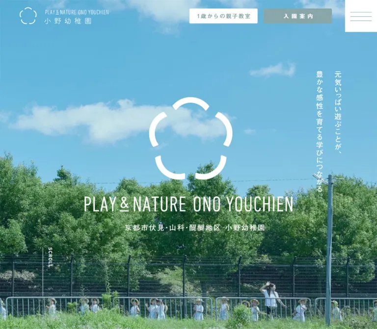
青空と緑の大きな写真、白いシンボル、落ち着いた青緑を組み合わせた幼稚園公式サイト。広い余白と細身の英字、ゆったりした日本語組版が自然な親しみを伝えます。
Ono Youchien / 小野幼稚園 — Style Reference
Open sky, abundant greenery, and quiet sage frame everyday school life.
Website: www.onoyou.jp Original URL: https://www.onoyou.jp/ Final URL: https://www.onoyou.jp/ Theme: light; white editorial areas, pale gray-green supporting surfaces, and muted sage controls. Inspected: October 5, 2026, at 05:24 JST. Supplied retrieval timestamp: October 4, 2026, 20:24:09.900 UTC. Viewports: desktop 1440 × 1000 and mobile 390 × 844 CSS pixels. Scope: the current school homepage, including its photographic opening, editorial sections, news, blog previews, family support links, admissions area, utility navigation, and footer. Visual captures cover the opening, a desktop middle-page photograph, and the lower page. Rendered DOM evidence covers the longer document. Destination pages and an opened navigation menu were not inspected.
Ono Youchien presents its identity through a full-height outdoor photograph: blue sky occupies the upper field, trees create a dense green middle, and children appear along the lower edge. A segmented flower-like emblem and the narrow uppercase wordmark PLAY & NATURE ONO YOUCHIEN sit in white over the image. Desktop places the educational message vertically near the right edge; mobile moves it into two centered horizontal lines below the identity.
The rest of the homepage uses broad white intervals, modest Japanese headings, widely spaced body text, large photographs, and thin outlined links. Muted sage connects the header utilities, admissions area, and footer actions. The footer changes substantially between viewports: a wide contact-and-sitemap composition becomes a centered contact block on mobile. These relationships give the site its character: generous space around real school life, a restrained graphic identity, and practical access to information for both prospective and current families.
閉じる
Ono Youchien / 小野幼稚園 — Style Reference
Open sky, abundant greenery, and quiet sage frame everyday school life.
Website: www.onoyou.jp Original URL: https://www.onoyou.jp/ Final URL: https://www.onoyou.jp/ Theme: light; white editorial areas, pale gray-green supporting surfaces, and muted sage controls. Inspected: October 5, 2026, at 05:24 JST. Supplied retrieval timestamp: October 4, 2026, 20:24:09.900 UTC. Viewports: desktop 1440 × 1000 and mobile 390 × 844 CSS pixels. Scope: the current school homepage, including its photographic opening, editorial sections, news, blog previews, family support links, admissions area, utility navigation, and footer. Visual captures cover the opening, a desktop middle-page photograph, and the lower page. Rendered DOM evidence covers the longer document. Destination pages and an opened navigation menu were not inspected.
Ono Youchien presents its identity through a full-height outdoor photograph: blue sky occupies the upper field, trees create a dense green middle, and children appear along the lower edge. A segmented flower-like emblem and the narrow uppercase wordmark PLAY & NATURE ONO YOUCHIEN sit in white over the image. Desktop places the educational message vertically near the right edge; mobile moves it into two centered horizontal lines below the identity.
The rest of the homepage uses broad white intervals, modest Japanese headings, widely spaced body text, large photographs, and thin outlined links. Muted sage connects the header utilities, admissions area, and footer actions. The footer changes substantially between viewports: a wide contact-and-sitemap composition becomes a centered contact block on mobile. These relationships give the site its character: generous space around real school life, a restrained graphic identity, and practical access to information for both prospective and current families.
How to Read This Reference
- Measured means reported by the supplied rendered DOM or computed-style evidence. Measurements are CSS pixels, with fractional values rounded where appropriate.
- Visual estimate means inferred from the original-page screenshots. Estimates are identified explicitly and should be checked against real assets during implementation.
- Calculated means derived from supplied measurements, such as column gaps or color contrast.
- Recommended means guidance for a new implementation, including the CSS adaptation below. It does not describe a verified original feature.
- All custom-property names in this document are reusable aliases. The supplied custom-property collection was empty.
- A sampled parent style does not necessarily describe its visible children. Several links report black text and transparent backgrounds while their screenshots show colored artwork, white lettering, or an inner filled surface.
- Bounding boxes can include transforms and can exist for concealed navigation. They do not prove visibility, exact document flow, or an exercised interaction.
Tokens — Colors
Default Palette
| Name | Value | Suggested token | Evidence and role |
|---|---|---|---|
| Muted Sage | #88a6a9 |
--ono-sage |
Measured as rgb(136, 166, 169) on footer action backgrounds, supporting copy, and navigation-related elements. Visually connects buttons and the admissions area. |
| Pale Gray-Green | #eff2f0 |
--ono-mist |
Measured as rgb(239, 242, 240) on utility tiles and the footer. |
| White | #ffffff |
--ono-white |
Measured on linked panel and navigation surfaces; visually the main page canvas, hero identity, and reversed labels. The root and body themselves report transparent backgrounds. |
| Black | #000000 |
--ono-ink |
Measured on editorial text and many link wrappers; visually used for the scrolled logo, footer identity, text, and fine outlines. |
The sky blue and foliage greens are supplied by photography. They vary across the image and are not evidenced as additional interface tokens. Preserve that distinction when extending the page: photography provides the vivid color; interface surfaces remain quiet.
Color States
| Context | Visible treatment | Confidence |
|---|---|---|
| Header over the hero | White identity; white utility rectangles with sage lettering; white menu square with sage lines | Original desktop and mobile screenshots |
| Header over lower content | Black identity; sage desktop utility rectangles with white lettering; sage menu square with white lines | Original middle and footer screenshots |
| Editorial link | Black text and fine black outline on white | Screenshot, supported by measured pill geometry |
| Footer actions | Sage rectangles with white visible labels | Screenshot; background measured independently |
| Footer and utility tiles | Pale gray-green with black principal text and sage secondary accents | Screenshot and measured backgrounds |
The exact selector or scroll threshold that switches header states was not supplied. Do not infer the final logo or label color from the enclosing anchor alone.
Calculated accessibility note: white against #88a6a9 has approximately 2.6:1 contrast. Small reversed labels and sage text on white need attention in a new implementation. Black on the same sage is approximately 8.1:1. An accessible variant can retain sage surfaces and use dark labels.
Tokens — Typography
Japanese Editorial Text
The measured editorial stack is:
YakuHanJPs, 'Noto Sans Japanese', 'Hiragino Kaku Gothic Pro', MyYuGothicM, Meiryo, sans-serif
Paragraphs and several headings use weight 500; the narrative statements in the introduction and activity sections use weight 400. Desktop paragraphs combine small type with unusually generous leading: 14px / 32.2px, with 1.4px tracking. Mobile changes to 13px / 26px, with 1.04px tracking.
These are declared family names from computed styles, not confirmation that every listed face loaded. Keep punctuation handling and fallback behavior in mind when reproducing Japanese line breaks.
General Interface Text
The body and many link wrappers use:
YakuHanJPs, 'Hiragino Kaku Gothic Pro', MyYuGothicM, Meiryo, sans-serif
Typical link-wrapper sizes are 14px on desktop and 13px on mobile, usually at weight 400. The sampled body has a 10px base, while the HTML element is 14px on desktop and 13px on mobile. Those base values are not the paragraph scale. The HTML element's reported Times family is also not evidence that visible content uses a serif face.
Narrow English Display Lettering
The hero wordmark, utility headings, and telephone number have tall, narrow proportions. The visible logo is artwork; its lettering should be preserved as part of the identity. The exact font used for live English display text was not captured in the supplied element samples.
For a new implementation, choose a licensed narrow sans-serif and test the actual labels. The Quick Start uses a clearly identified fallback approximation. Do not present that fallback as the original font.
Mobile Hero Action Declaration
Two mobile hero-area links declare:
font-family: a-otf-futo-go-b101-pr6n, sans-serif;
font-size: 10px;
font-weight: 500;
line-height: 11.5px;
letter-spacing: 1.8px;
Their boxes appear in the supplied DOM near the bottom of the hero, but the buttons are not visible in the supplied opening screenshot. Their declaration is verified; their visible state and timing are not.
Type Scale
| Role | Desktop measured value | Mobile measured value | Notes |
|---|---|---|---|
| Editorial paragraph | 14px / 32.2px, weight 500, tracking 1.4px |
13px / 26px, weight 500, tracking 1.04px |
Leading ratios are 2.3 and 2. |
| Attraction statement | 32px / 36.8px, weight 500, tracking 3.2px |
22px / 25.3px, weight 500, tracking 2.2px |
The largest measured live Japanese editorial heading. |
| Introduction/activity statement | 25px / 45px, weight 400, tracking 2.5px |
20px / 32px, weight 400, tracking 2px |
Mobile uses deliberate multiline phrasing. |
| News item title | 14px / 16.1px, weight 500, tracking 1.4px |
12px / 13.8px, weight 500, tracking 1.2px |
A compact information row. |
| Blog title | 20px / 30px, weight 500, tracking 2px |
12px / 18px, weight 500, tracking 1.2px |
Mobile retains three small previews. |
| Outline-link wrapper | 14px / 16.1px, weight 400 |
13px / 14.95px, weight 400 |
Child artwork or text can differ. |
| Footer address and visiting information | 14px / 25.2px, tracking 1.4px |
12px / 24px, tracking 0.96px |
Weight 500. |
| Footer sitemap sublink | 12px / 13.8px, tracking 0.6px |
Not displayed in the captured mobile footer | Weight 500. |
| Admissions notice title | 14px / 25.2px, tracking 1.4px |
11px / 22px, tracking 0.88px |
Measured white text. |
| Bilingual section-heading wrapper | 15px / 17.25px |
15px / 17.25px |
Wrapper declaration only; not the size of every English/Japanese child. |
The bilingual heading blocks measure approximately 79.33px high on desktop and 56.14px on mobile. Their individual display-letter sizes were not supplied. In the screenshots, utility-tile English labels appear approximately 32px on desktop and 22px on mobile; these are visual estimates.
Tokens — Spacing & Shapes
Overall rhythm: large section intervals, narrow text columns within broad image compositions, and compact supporting navigation.
Spacing Scale
| Use | Desktop | Mobile | Evidence |
|---|---|---|---|
| Main editorial side inset | 90px |
20px |
Repeated measured element positions |
| Header left inset | 55px |
20px |
Measured padding |
| Typical section top padding | 128px |
50px |
Measured across news, editorial, blog, and support sections |
| Editorial heading-to-paragraph gap | Commonly 35px |
Commonly 20px |
Calculated from sampled attraction/activity boxes |
| Paragraph-to-outline-link gap | Commonly 40px |
Commonly 25px |
Calculated from sampled attraction/activity boxes |
| Desktop header action gap | 17px |
Header row absent | Calculated from three link rectangles |
| Utility-tile gap | Approximately 6.7px |
7px |
Calculated from measured rectangles |
| Footer action gap | 5px |
5px |
Calculated |
| Footer padding | 80px 85px 65px |
45px 20px 40px |
Measured |
Border Radius and Edges
| Element | Value | Status |
|---|---|---|
| Main outline links | 32px radius |
Measured on both viewports |
| Parent-and-child linked panel | 5px radius |
Measured |
| Mobile hero action boxes | 3px radius |
Measured declaration; visible state unverified |
| Utility tiles | 0 radius |
Measured |
| Footer filled links | 0 radius |
Measured |
| Photo edges | Square in supplied captures | Visual observation |
| Outline-link border | Approximately 1px |
Visual estimate; also consistent with measured height minus padding and line height |
The design has several distinct action shapes. Wide outlined pills guide editorial exploration; filled rectangles serve recurring practical destinations; pale square tiles group the final utility links. Preserve those distinctions.
Layout Measurements
| Element | Desktop 1440 × 1000 | Mobile 390 × 844 |
|---|---|---|
| Hero section | 1440 × 1000px |
390 × 844px |
| Header box | 1440 × 120px |
390 × 60px |
| Header identity link | 298 × 60.09px, at 55, 29.95 |
178 × 37.94px, at 20, 11.03 |
| Menu square | Approximately 120 × 120px |
Approximately 60 × 60px |
| Hero H1 wrapper | 1440 × 379px, top 310.5px |
390 × 184.80px, top 219.87px |
| Common content span | 1260px, between x=90 and x=1350 |
350px, between x=20 and x=370 |
| Standard outline link | 420 × 63.09px |
350 × 49.94px |
| Membership outline link | 420 × 63.09px |
290 × 40.94px |
| Admissions outline link | 420 × 63.09px |
221 × 40.94px |
| Utility tile | 309.95 × 146.73px |
171.5 × 71.64px |
| Footer action | 400 × 67.25px |
350 × 44.94px |
| Footer height | Approximately 768.94px |
527.5px |
| Reported document height | 8238px |
5622px |
The menu-square sizes are screenshot estimates supported by header dimensions. The identity-link boxes include the artwork's layout area and should not be confused with the width of its emblem alone.
Components
Persistent Header
Anatomy: linked school identity at left, three desktop utility links toward the right, and a square menu affordance flush with the top-right corner.
At desktop, the identity begins 55px from the left. The three utility links are each 192 × 42.09px, starting at x=673, 882, and 1091. They lead to 在園児専用サイト, 0歳からの親子教室, and 入園案内. The resident-family destination carries a small lock symbol in the screenshot.
The header remains overlaid at the top in the opening, middle, and footer captures. The supplied styles do not establish whether its implementation uses fixed positioning, sticky positioning, or additional scripted movement. Its visible identity changes from white over the hero to black over lower content. The action and menu colors change with it.
On mobile, the header height halves to 60px, the identity link narrows to 178px, and the desktop utility row is absent from the captured header. Three thin horizontal lines remain inside the 60px menu square.
Implementation caution: lower-page captures show the overlaid identity crossing underlying content. Preserve the header's visual lightness while adding suitable clearance or a readable backing in a new implementation.
Menu Affordance and Navigation Evidence
The DOM contains a broad site-navigation hierarchy: top, news, attractions, school information, activities, family support, admissions, blog, FAQ, recruitment, access, and contact. Desktop samples include multiple navigation columns; mobile samples include full-width category rows.
No open-menu screenshot or click result was supplied. The existence of these boxes does not establish a visible menu panel, its backdrop, expansion behavior, keyboard handling, or animation. An implementation can reuse the information architecture, but its menu mechanics must be treated as recommended additions.
Full-Height Photographic Hero
Anatomy: edge-to-edge photograph, central identity stack, regional school label, educational statement, and a desktop scroll link.
The photographed scene offers a useful natural hierarchy: relatively open sky behind the emblem, greenery behind the wordmark, and children near the lower edge. The segmented emblem is approximately 235px wide on desktop and 112px on mobile by visual estimate. The desktop wordmark spans roughly 590–600px; mobile reduces it to approximately 284px.
The desktop H1 wrapper is vertically centered: its 379px height begins at 310.5px inside the 1000px hero. The mobile identity moves upward, beginning at approximately 26% of viewport height rather than remaining vertically centered.
The source message is 元気いっぱい遊ぶことが、豊かな感性を育てる学びにつながる。 Desktop presents it as vertical white lettering near the right side. Mobile presents two horizontal lines below the identity, around the lower-middle part of the image. A source SVG reference exists for the main message; its visible lettering should not be assigned a guessed font.
The desktop SCROLL anchor targets #first. Its measured box is approximately 28.09 × 230px, beginning at x=120, y=770. The screenshot shows a fine vertical white line with the compact label alongside it. This cue is absent from the supplied mobile opening.
The mobile DOM additionally describes two small links near y=794.5, but the opening screenshot does not show them. Do not make a permanent mobile button dock part of the reference without further verification.
Bilingual Section Heading
Sections pair a lowercase English identifier with a smaller Japanese label. Examples include news, attraction, introduction, activity, childcare support, and blog.
The English lettering supplies a narrow vertical rhythm, while Japanese identifies the content precisely. Keep the two lines as separate typographic roles. Their wrapper height is measured, but the individual English font family and size are not.
For news and blog, an ALL VIEW link gives access to the broader index. Its desktop box is approximately 92.33 × 22px; mobile uses approximately 59.22 × 15.30px. The supplied measurements include right padding for the visual indicator, whose exact construction was not captured.
News Notice Row
Desktop places the heading block at the left and the dated notice to its right. The notice link begins at x=380, spans 970px, and measures approximately 66.09px high with 25px 30px padding. Date and title share a horizontal flex row.
Mobile places the notice below the heading across the 350px content width. Its padding changes to 15px 0, and the measured date/title positions indicate a vertical arrangement. The whole notice remains a link.
The observed entry contains the date 2025.07.02 and the title 令和9年度 入園説明会・公開保育のご案内. Treat these as captured content, not permanent sample data for a new school website.
Editorial Story Sections
The attraction, introduction, and activity sections establish a repeated sequence: image or identity artwork, bilingual section heading, educational statement, explanatory copy, and one outlined destination link.
The desktop attraction copy occupies approximately 492.39px at x=838.17, establishing a right-hand text area beside the image composition. The activity copy occupies 702px at x=90, reversing the emphasis toward the left. The introduction uses full-width heading and paragraph boxes with a centered 420px link.
Mobile brings the measured headings and paragraphs into the same 350px column at x=20. Image space precedes the attraction and activity headings. Narrative statements break into shorter lines, and the standard outline link fills the content column.
Do not normalize every desktop story into identical half-width cards. The varied text widths and alignment changes are part of the editorial rhythm.
Outline Destination Link
Anatomy: one centered label, white interior, fine black outline, broad horizontal proportions, and a 32px corner radius.
Standard desktop links measure 420 × 63.09px, with 22px top and 23px bottom padding. Mobile links usually measure 350 × 49.94px, with 17px top and 16px bottom padding. The observed difference between content-plus-padding and total height is consistent with a 1px border on each side.
These controls lead to attractions, philosophy, curriculum, and childcare information. The membership and admissions variants become narrower and shorter on mobile. A 300ms background-color transition is declared, but the hovered fill was not supplied.
Childcare Photograph and Support Block
The desktop middle capture shows a large photograph of an adult lifting a young child against a bright outdoor background. The visible image area is approximately 1260 × 576px, beginning 90px from the left edge.
A white area covers the lower-left portion of the image, leaving a photographic extension at the lower right. The visible overlap is approximately 74% of the image width and 19% of its height. These are screenshot estimates. The underlying mechanism—overlapping content, masking, or clipping—is not established by the supplied styles.
Below this image area, the measured desktop support heading and copy occupy approximately 491px at the left. The 420px destination link sits toward the right at x=930. Mobile stacks the heading, copy, and full-width link in the standard inset column.
Preserve faces and gestures when adapting the crop. The exact image URL for this photographed block was not present in the supplied excerpt.
Blog Preview Row
Anatomy: linked image, date, Japanese title, and desktop MORE label. An ALL VIEW link accompanies the section heading.
Desktop contains three measured anchors, each approximately 384.30px wide, at x=90, 527.84, and 965.69. The calculated gaps are approximately 53.55px.
Mobile retains three columns. Each anchor is approximately 118.94px wide, with gaps of 16.56px, starting at x=0, 135.5, and 271. The preview row therefore uses nearly the full viewport width even though its heading retains the 20px content inset. A gap of about 4.25% reproduces the measured relationship at both supplied widths.
Mobile titles shrink to 12px / 18px, and MORE is absent from the mobile text evidence. No carousel behavior was demonstrated. The measured anchors are transparent and square; a specific image crop ratio and any hover image treatment remain unverified.
Membership Entry
A separate section provides access to the resident-family site through the English label membership login and the link 在園児専用サイト ログイン.
Desktop uses a centered 420px outlined link. Mobile places a 290 × 40.94px link at x=50, giving this destination a narrower composition than the surrounding editorial buttons. The destination is /membership; no login form or authentication behavior was inspected.
Parent-and-Child Class Panel
A single large linked panel leads to /aomushi-club. It combines the Japanese class name, the English label parent & child class aomushi club, an invitation paragraph, and a destination-style label.
The desktop anchor measures 1240 × 344.63px, with 105px 60px 85px padding, a white background, and a 5px radius. Mobile changes it to 340 × 294.88px, positioned at x=25, with 30px 0 35px padding. The mobile text block is approximately 246px wide and centered within the panel. Supporting copy is measured in sage.
Because the entire panel is one anchor, an inner visual CTA should remain a noninteractive element in a similar implementation. Avoid nesting another link or button inside it.
Admissions Band
The lower-page admissions area combines the school recruitment label, ono youchien, guidance, a dated notice, and a centered outlined destination link. The supplied mobile lower-page capture shows a full-width sage field with a white outline and label on its admission link.
The section measures approximately 679.22px high on desktop and 350.53px on mobile. Its destination link changes from 420 × 63.09px to 221 × 40.94px. The notice title is measured white, at 14px on desktop and 11px on mobile.
The enclosing section reports a transparent computed background. Its visible sage field may therefore come from another layer; the exact background selector was not supplied.
Utility Navigation Tiles
Four whole-tile links provide FAQ, recruitment, access, and contact destinations. Each uses a large narrow English label above a smaller Japanese label.
Desktop places all four in one row inside the 1260px content span. Each tile is approximately 309.95 × 146.73px, with 45px vertical padding and a pale gray-green fill. The row has approximately 75px of white space above and below it.
Mobile changes to a 2 × 2 grid, with 171.5 × 71.64px tiles and 7px gaps. The grid has 30px upper and lower clearance. The source transcript spells the access tile's English label accsess; a new implementation should use the intended spelling while retaining the visual role.
Contact Footer and Sitemap
Desktop combines a 400px contact area at the left with three sitemap groups beginning around x=677.53, 884.64, and 1230.05. The sitemap mixes Japanese category headings, small sage English labels, and compact indented sublinks.
The contact area contains the stacked school identity, address, visiting hours, telephone link, and two sage rectangular actions. The school name and contact information are independently visible on the original homepage. The telephone anchor uses tel:075-571-0409.
The desktop logo link occupies 400 × 147.09px; the visible artwork is much narrower than that box. Address text begins 85px below the logo-link box. The footer actions each measure 400 × 67.25px, separated by 5px.
On mobile, the sitemap is absent from the captured footer. The identity, single-line address, two-line visiting information, telephone number, actions, map/social links, and copyright are centered. The address follows the logo-link box after only 15px. The two actions become 350 × 44.94px.
The map pin and Instagram mark are small monochrome symbols with text labels. Their asset source or icon-library identity was not provided.
Tokens — Motion & Interaction
| Element or treatment | Supplied declaration | What can be concluded |
|---|---|---|
| Header | top 0.8s, opacity 0.8s, color 0.8s |
Header position, visibility, and color changes can transition. Trigger thresholds and scroll-direction logic are unknown. |
| Hero section | opacity 0.5s ease-in |
A half-second opacity transition is defined. Startup sequence was not recorded. |
| Hero H1 | opacity 0.8s |
Identity opacity can transition. No separate motion path is established. |
| Attraction/activity headings and paragraphs | transform 2s cubic-bezier(0.1, 0.55, 0.2, 1) |
A slow transform transition is defined. Starting transform and trigger are unknown. |
| Same editorial elements | opacity 1.5s ease-out 0.1s |
Opacity transitions over 1.5 seconds after a 0.1-second delay. |
| Many text and content links | opacity 0.3s |
Short opacity feedback is declared; exact hovered opacity is unknown. |
| Outline links and utility tiles | background-color 0.3s |
Background-color feedback is declared; destination color was not captured. |
| Some navigation actions | background-color 0.3s, color 0.3s |
Coordinated foreground/background transitions are available. |
The evidence supports a calm reveal vocabulary and short utility feedback. It does not establish parallax, a hero slideshow, video playback, image zoom, or a particular menu-opening animation.
The inspected element samples report animation: none. That does not establish that the whole site has no scripted or perpetual motion. Capture readiness waited for loading, visible image decoding, sampled layout/text stability, and finite animations within bounded time limits. Perpetual animations were temporarily paused during readiness checks and then resumed. These procedures improve capture reliability but do not verify every delayed state.
The SCROLL link's destination and the page's navigation URLs are known. Smooth scrolling, hover results, focus states, and destination-page behavior were not exercised in the supplied evidence.
Surfaces
| Surface | Appearance | Role |
|---|---|---|
| Hero | Full-bleed outdoor photograph | Identity and emotional introduction |
| Editorial canvas | White, with generous open space | Long-form school information |
| Outline action | White interior, black hairline, pill shape | Deeper editorial navigation |
| Parent-and-child panel | White, softly rounded by only 5px |
A grouped family-support destination |
| Admissions area | Visually sage with white details | Recruitment information |
| Utility tiles | Pale gray-green, square corners | Four practical destinations |
| Footer | Pale gray-green, black text, sage accents | Contact and broad navigation |
| Header utility controls | White/sage state pair | Repeated priority destinations |
The supplied captures do not establish a shadow-based elevation system. Separation comes from space, photographic boundaries, restrained fills, and fine outlines. The small radius on the class panel should not spread into every image and content block.
Imagery
Photography carries the warmth of the site. The opening frame shows a real outdoor setting with children relatively small within the landscape. The middle photograph moves closer to a parent-and-child gesture. These two scales work together: environment establishes the school's relationship with nature, while human detail communicates care.
Keep blue sky luminous, foliage detailed, and skin tones natural. Preserve breathing room around the identity in the opening crop. A mobile crop should retain the relationship between sky, trees, and children rather than simply center the largest face.
The emblem is a segmented organic outline, used in white over the hero and black in the lower identity. Wordmarks and the main message include SVG artwork. Use authorized identity assets at their native proportions; redrawing the logo with generic type or a CSS flower will change its character.
Observed Asset References
Paths are relative to https://www.onoyou.jp/. They were present in the supplied original-page DOM; no additional asset requests were performed.
| Asset | Observed path | Supported use |
|---|---|---|
| Footer identity | /wp/wp-content/themes/onoyou/assets/images/common/flogo.svg |
Stacked footer logo |
| Additional identity artwork | /wp/wp-content/themes/onoyou/assets/images/common/logo-other.svg |
Introduction-section reference |
| Main message artwork | /wp/wp-content/themes/onoyou/assets/images/home/imgtxt-maincopy.svg |
Educational hero message |
| Attraction photograph | /wp/wp-content/themes/onoyou/assets/images/home/image-attraction.jpg |
Attraction-section image reference |
| Activity photograph | /wp/wp-content/themes/onoyou/assets/images/home/image-activity.jpg |
Activity-section image reference |
| First blog image | /wp/wp-content/uploads/2022/09/38966637-B6A2-4EEC-A240-E4FA4285A8F9.jpeg |
Blog preview; DOM attributes report 1440 × 1800 |
| Second blog image | /wp/wp-content/uploads/2021/08/6a01287597ecd6970c026bdee0b0c1200c.jpg |
Blog preview; DOM attributes report 1024 × 682 |
| Third blog image | /wp/wp-content/uploads/2021/08/6a01287597ecd6970c0282e110ffc2200b.jpg |
Blog preview; DOM attributes report 1024 × 682 |
The exact hero photograph URL, header logo asset URL, and adult-and-child photograph URL were not supplied. Do not infer them from naming conventions. Blog image attributes describe source dimensions, not verified displayed crop ratios.
Layout & Responsive Behavior
Observed Changes
| Feature | Desktop | Mobile |
|---|---|---|
| Header | 120px high; identity plus three utility links |
60px high; compact identity and menu affordance |
| Hero | Full viewport; centered identity; vertical message at right | Full viewport; identity moved upward; horizontal message below |
| Main side inset | Usually 90px |
Usually 20px |
| Section top padding | Usually 128px |
Usually 50px |
| Editorial composition | Unequal text/image areas and alternating emphasis | Image space followed by one inset text column |
| Standard destination link | Fixed measured width of 420px |
Fills the 350px content column |
| Blog previews | Three columns inside the desktop inset | Three smaller columns across nearly the full viewport |
| Class panel | Wide horizontal linked composition | Narrower centered composition with wrapped English copy |
| Utility navigation | Four tiles in one row | Two columns and two rows |
| Footer | Left contact block and three sitemap groups | Centered contact block; sitemap absent |
The shorter mobile document is supported by reduced image scale, smaller spacing, a shorter admissions section, and the simplified footer. It is not evidence that mobile simply omits the editorial story sections; their content is present in the DOM.
Reuse Guidance
Only two viewport widths were supplied. The exact breakpoint, intermediate tablet behavior, maximum container width, and behavior beyond 1440px are unknown.
A practical adaptation can use a fluid desktop gutter of 6.25vw, which equals the measured 90px at 1440px, then switch to 20px for the compact layout. This is an implementation recommendation, not a recovered source formula.
The Quick Start uses a recommended 72rem breakpoint to prevent the three desktop utilities and identity from crowding. Test that choice with actual font metrics and translated labels. Use natural content height, preserve the supplied mobile reading order, and add appropriate scroll clearance beneath the persistent header.
Do’s and Don’ts
Do
- Let the outdoor photograph establish the opening's blue and green palette.
- Preserve the segmented emblem and narrow wordmark as identity artwork.
- Use the exact measured sage
#88a6a9and pale surface#eff2f0as the interface foundation. - Retain the generous desktop section spacing and the tighter mobile rhythm.
- Pair narrow English labels with clear Japanese headings.
- Keep Japanese paragraph leading generous and tracking controlled.
- Maintain distinct outline pills, filled rectangular actions, and square utility tiles.
- Preserve the three-column mobile blog row when matching this specific homepage.
- Make the mobile footer a centered contact destination with the observed simplified hierarchy.
- Treat header color changes, reveal timing, and unverified menu behavior as separate implementation concerns.
Don’t
- Do not replace the photographic identity with generic nursery illustrations or decorative mascots.
- Do not give every section the same centered card-grid layout.
- Do not round all photographs or add a general shadow system.
- Do not use the sky or foliage colors as extra UI button colors without a clear need.
- Do not force desktop vertical copy into the mobile hero.
- Do not treat a heading wrapper's
15pxdeclaration as the size of all its children. - Do not identify an English display font from appearance alone.
- Do not turn the mobile blog row into an assumed carousel.
- Do not claim an open menu, hover result, video, or parallax effect was observed.
- Do not use a DOM box alone as proof that a control was visible in the captured state.
Recommended Implementation Additions
These are recommendations for a new implementation, not verified original features:
- Give the menu button an accessible name,
aria-expanded, and a relationship to its controlled navigation. Support keyboard dismissal and appropriate focus behavior. - Maintain readable contrast for small sage/white text. Dark labels on sage preserve the palette while improving contrast.
- Add a clear focus indicator to every link, including whole-panel and whole-tile links.
- Keep content visible when reveal JavaScript fails. Reduced-motion users should receive the completed layout without entrance movement.
- Prevent the persistent header from covering focused links, anchored headings, and important copy. Use scroll margins and a suitable lower-page backing if necessary.
- Correct the footer logo alternative text, which does not match the displayed school name in the supplied DOM. Use meaningful alternatives for informative photographs and avoid duplicate spoken identity text.
- Provide at least approximately
44pxtouch targets for compact utilities and social links. Some original mobile action boxes are smaller. - Consider increasing the mobile
12–13pxinformation text when adapting the design for broader readability; recheck Japanese line breaks rather than preserving fixed heights. - Keep the class panel as a single semantic link and avoid nested interactive controls.
- Use responsive image sources and reserve image dimensions. Prioritize the opening image and defer lower-page photography without hiding essential content.
Agent Prompt Guide
Quick Color Reference
- Main canvas: white
#ffffff. - Primary text, identity on light surfaces, and outlines: black
#000000. - Brand action surface and secondary accents: muted sage
#88a6a9. - Footer and utility tiles: pale gray-green
#eff2f0. - Hero lettering: white over carefully positioned photography.
- Blue and green: supplied by the photographs, not additional interface fills.
- Small-text accessibility variant: black labels on sage.
Overall Prompt
“Create a Japanese kindergarten homepage with the visual restraint of Ono Youchien. Start with a full-height outdoor photograph containing open blue sky, dense greenery, and children near the lower edge. Overlay authorized white emblem and wordmark artwork. Use a transparent persistent header with compact utility destinations and a square menu control. On desktop, place the educational statement vertically near the right side; on mobile, place it in two centered horizontal lines below the identity. Continue with white editorial sections, generous spacing, narrow English section labels, widely led Japanese paragraphs, alternating image/text compositions, and fine black outlined pill links. Use muted sage #88a6a9 for practical actions and pale gray-green #eff2f0 for utility tiles and the footer. Include news, three blog previews, resident-family access, parent-and-child classes, admissions, and contact information. Preserve the measured mobile changes and implement accessible navigation independently.”
Example Component Prompts
- Header and hero: “At 1440px width, create a 120px overlaid header with a 298px identity link, three 192px utility links, and a 120px menu square. Use authorized white identity artwork over a natural outdoor photograph. At 390px, reduce the header and menu square to 60px, the identity link to 178px, and move the hero statement from vertical text to two horizontal lines. Treat the precise header-switch trigger as a new implementation decision.”
- Editorial block: “Compose a school activity section on white with a narrow English label, a smaller Japanese label, a 25px Japanese statement, 14px body copy at 32.2px line height, and a 420px outlined pill link. Give the desktop composition an unequal photo/text balance. On mobile, use 20px outer gutters, 20px statements, 13px body copy at 26px line height, and a full-column link.”
- Photo bridge: “Use a wide, naturally lit photograph of an adult and child with generous sky around their faces. On desktop, approximate the observed white lower-left overlap while leaving the lower-right photograph visible. Keep the image edges square and omit shadows. Treat the overlap geometry as a visual estimate and adapt the mobile crop deliberately.”
- Utility tiles: “Create four pale gray-green navigation tiles with narrow lowercase English headings and smaller Japanese captions. Arrange them in one desktop row and a 2 × 2 mobile grid with 7px gaps. Keep corners square and use the entire tile as a link.”
- Footer: “Create a pale gray-green footer with a stacked black school identity, address, visiting hours, narrow telephone lettering, two sage rectangular actions, and map/Instagram links. Add three sitemap groups on desktop. On mobile, center the contact information, hide the repeated sitemap, and keep the two actions full width inside 20px gutters.”
Quick Start
CSS Custom Properties
This is a reusable adaptation, not the site's original stylesheet. It uses ordinary pixel-based typography without copying the original root/body sizing. The palette, many dimensions, paragraph metrics, and transition durations come from the evidence above. The breakpoint, fallback display font, live display sizes, image crop rules, and interaction-state selectors are recommendations.
Use semantic markup with these class relationships:
.site-headercontains.site-brand,.header-actions, and a.menu-togglebutton with three decorative spans..herocontains.hero__media > img,.hero__identity, and.hero__message. The identity contains separate emblem and wordmark images plus a locality label; the message contains two paragraphs..story-gridcontains.story-grid__mediaand.story-grid__copy. Use.story-grid--reversefor the alternate desktop arrangement..blog-gridcontains three linked previews;.utility-gridcontains four whole-tile links..site-footercontains.footer-layout, with.footer-contactand.footer-sitemapchildren.
Supply authorized photo and identity files. Use light/dark artwork variants for header states; CSS text color alone does not recolor an external SVG image. Menu logic, header-state detection, and reveal triggers require separate implementation.
:root {
  /* Measured palette */
  --ono-white: #ffffff;
  --ono-ink: #000000;
  --ono-sage: #88a6a9;
  --ono-mist: #eff2f0;

  /* Declared source stacks; loading is not guaranteed */
  --ono-font-body: YakuHanJPs, 'Noto Sans Japanese',
    'Hiragino Kaku Gothic Pro', MyYuGothicM, Meiryo, sans-serif;
  --ono-font-ui: YakuHanJPs, 'Hiragino Kaku Gothic Pro',
    MyYuGothicM, Meiryo, sans-serif;

  /* Recommended substitute, not an identified source font */
  --ono-font-display: 'Arial Narrow', sans-serif;

  --ono-body-size: 14px;
  --ono-body-leading: 2.3;
  --ono-body-tracking: 0.1em;
  --ono-gutter: 6.25vw;
  --ono-section-space: 128px;
  --ono-header-height: 120px;
  --ono-pill-radius: 32px;
  --ono-panel-radius: 5px;
  --ono-rule: 1px;
  --ono-feedback: 300ms;
  --ono-header-motion: 800ms;
  --ono-reveal-motion: 2s cubic-bezier(0.1, 0.55, 0.2, 1);
}

.ono-site,
.ono-site * {
  box-sizing: border-box;
}

.ono-site {
  margin: 0;
  color: var(--ono-ink);
  background: var(--ono-white);
  font-family: var(--ono-font-body);
  font-size: var(--ono-body-size);
}

.ono-site img {
  display: block;
  max-width: 100%;
  height: auto;
}

.ono-site a {
  color: inherit;
}

.container {
  width: calc(100% - 2 * var(--ono-gutter));
  margin-inline: auto;
}

.editorial-section {
  padding-top: var(--ono-section-space);
  scroll-margin-top: calc(var(--ono-header-height) + 24px);
}

.body-copy {
  margin: 0;
  font-size: var(--ono-body-size);
  font-weight: 500;
  line-height: var(--ono-body-leading);
  letter-spacing: var(--ono-body-tracking);
}

.site-header {
  position: fixed;
  z-index: 30;
  inset: 0 0 auto;
  display: flex;
  align-items: center;
  height: var(--ono-header-height);
  padding-left: 55px;
  color: var(--ono-white);
  transition: top var(--ono-header-motion),
    opacity var(--ono-header-motion),
    color var(--ono-header-motion);
}

.site-brand {
  display: block;
  flex: 0 0 298px;
  width: 298px;
}

.header-actions {
  display: flex;
  gap: 17px;
  margin-left: auto;
  margin-right: 37px;
}

.header-actions a {
  display: grid;
  place-items: center;
  width: 192px;
  min-height: 42.1px;
  color: var(--ono-sage);
  background: var(--ono-white);
  font: 500 14px/1.15 var(--ono-font-ui);
  text-decoration: none;
}

.menu-toggle {
  display: flex;
  flex: 0 0 120px;
  flex-direction: column;
  align-items: center;
  justify-content: center;
  gap: 11px;
  width: 120px;
  height: 120px;
  padding: 0;
  border: 0;
  color: var(--ono-sage);
  background: var(--ono-white);
  cursor: pointer;
}

.menu-toggle span {
  display: block;
  width: 65%;
  border-top: 1px solid currentColor;
}

/* Recommended state hook; detection logic is separate. */
.site-header[data-surface='light'] {
  color: var(--ono-ink);
}

.site-header[data-surface='light'] .header-actions a,
.site-header[data-surface='light'] .menu-toggle {
  color: var(--ono-white);
  background: var(--ono-sage);
}

.hero {
  position: relative;
  height: 100vh;
  height: 100svh;
  min-height: 600px;
  overflow: hidden;
  color: var(--ono-white);
}

.hero__media {
  position: absolute;
  inset: 0;
}

.hero__media img {
  width: 100%;
  height: 100%;
  object-fit: cover;
  object-position: center;
}

.hero__identity {
  position: absolute;
  inset-inline: 0;
  top: 50%;
  display: flex;
  flex-direction: column;
  align-items: center;
  margin: 0;
  transform: translateY(-50%);
}

/* Artwork sizes approximate the supplied screenshots. */
.hero__emblem { width: 236px; }
.hero__wordmark { width: 600px; margin-top: 44px; }
.hero__locality {
  margin-top: 26px;
  font-size: 20px;
  line-height: 1.15;
  letter-spacing: 0.1em;
}

.hero__message {
  position: absolute;
  top: 20%;
  right: 14.4%;
  display: flex;
  flex-direction: row-reverse;
  gap: 28px;
}

.hero__message p {
  margin: 0;
  writing-mode: vertical-rl;
  font-size: 18px;
  line-height: 1.8;
  letter-spacing: 0.12em;
}

/* Live display sizes below are recommended approximations. */
.section-title { margin: 0 0 35px; font-weight: 400; }
.section-title__en {
  display: block;
  font: 400 50px/1.1 var(--ono-font-display);
  font-stretch: condensed;
}
.section-title__ja {
  display: block;
  margin-top: 7px;
  font-size: 15px;
  line-height: 1.15;
}

.story-grid {
  display: grid;
  grid-template-columns: 1.4fr 1fr;
  align-items: start;
  gap: 4vw;
}

.story-grid--reverse .story-grid__media { order: 2; }
.story-grid__copy { min-width: 0; }
.story-statement {
  margin: 0 0 35px;
  font-size: 25px;
  font-weight: 400;
  line-height: 1.8;
  letter-spacing: 0.1em;
}
.story-statement--large {
  font-size: 32px;
  font-weight: 500;
  line-height: 1.15;
}

.outline-link {
  display: inline-flex;
  align-items: center;
  justify-content: center;
  width: min(420px, 100%);
  min-height: 63.1px;
  padding: 22px 16px 23px;
  border: var(--ono-rule) solid currentColor;
  border-radius: var(--ono-pill-radius);
  background: transparent;
  font: 400 14px/1.15 var(--ono-font-ui);
  text-align: center;
  text-decoration: none;
  transition: background-color var(--ono-feedback);
}

.body-copy + .outline-link { margin-top: 40px; }

/* Optional approximation of the visible desktop photo overlap. */
.feature-photo { position: relative; }
.feature-photo img {
  width: 100%;
  aspect-ratio: 2.19 / 1;
  object-fit: cover;
}
.feature-photo::after {
  content: '';
  position: absolute;
  inset: auto auto 0 0;
  width: 74%;
  height: 19%;
  background: var(--ono-white);
}

.blog-grid {
  display: grid;
  grid-template-columns: repeat(3, minmax(0, 1fr));
  gap: 4.25%;
  width: calc(100% - 2 * var(--ono-gutter));
  margin-inline: auto;
}
.blog-card { text-decoration: none; }
.blog-card img {
  width: 100%;
  aspect-ratio: 3 / 2; /* Recommended crop, not measured. */
  object-fit: cover;
}
.blog-card h3 {
  margin: 12px 0 0;
  font-size: 20px;
  font-weight: 500;
  line-height: 1.5;
  letter-spacing: 0.1em;
}

.club-panel {
  display: flex;
  align-items: center;
  justify-content: space-between;
  width: calc(100% - 2 * var(--ono-gutter) - 20px);
  margin-inline: auto;
  padding: 105px 60px 85px;
  border-radius: var(--ono-panel-radius);
  background: var(--ono-white);
  text-decoration: none;
}

.admissions-band {
  display: grid;
  place-items: center;
  gap: 25px;
  min-height: 679px;
  padding: 80px var(--ono-gutter);
  color: var(--ono-white);
  background: var(--ono-sage);
  text-align: center;
}

.utility-grid {
  display: grid;
  grid-template-columns: repeat(4, minmax(0, 1fr));
  gap: 6.7px;
  padding-block: 75px;
}
.utility-tile {
  display: flex;
  flex-direction: column;
  justify-content: center;
  min-height: 146.7px;
  padding: 45px 8px;
  background: var(--ono-mist);
  text-align: center;
  text-decoration: none;
  transition: background-color var(--ono-feedback);
}
.utility-tile__en {
  font: 400 32px/1.15 var(--ono-font-display);
  font-stretch: condensed;
}
.utility-tile__ja {
  margin-top: 5px;
  font-size: 13px;
  line-height: 1.15;
}

.site-footer {
  padding: 80px 85px 65px;
  background: var(--ono-mist);
}
.footer-layout {
  display: grid;
  grid-template-columns: 400px minmax(0, 1fr);
  gap: 13.37vw;
}
.footer-logo { width: 180px; }
.footer-address {
  margin-top: 85px;
  font-size: 14px;
  line-height: 1.8;
  letter-spacing: 0.1em;
}
.footer-actions { display: grid; gap: 5px; margin-top: 30px; }
.footer-action {
  display: grid;
  place-items: center;
  min-height: 67.25px;
  padding: 25px 12px;
  color: var(--ono-white);
  background: var(--ono-sage);
  letter-spacing: 0.2em;
  text-align: center;
  text-decoration: none;
}
.footer-sitemap {
  display: grid;
  grid-template-columns: 1fr 2.3fr 1.17fr;
  gap: min(7vw, 100px);
}

/* Recommended contrast variant for small filled-action labels. */
.footer-action.is-readable,
.header-actions a.is-readable {
  color: var(--ono-ink);
}

/* Preserve measured timings without hiding content by default. */
[data-reveal] {
  transition: transform var(--ono-reveal-motion),
    opacity 1.5s ease-out 0.1s;
}

.ono-site :focus-visible {
  outline: 2px solid currentColor;
  outline-offset: 4px;
}

/* Recommended feedback colors; exact source hover states are unknown. */
@media (hover: hover) {
  .outline-link:hover { background: var(--ono-mist); }
  .utility-tile:hover { background: var(--ono-sage); }
}

/* Recommended breakpoint; the original breakpoint was not supplied. */
@media (max-width: 72rem) {
  :root {
    --ono-body-size: 13px;
    --ono-body-leading: 2;
    --ono-body-tracking: 0.08em;
    --ono-gutter: 20px;
    --ono-section-space: 50px;
    --ono-header-height: 60px;
  }

  .site-header { padding-left: 20px; }
  .site-brand { flex-basis: 178px; width: 178px; }
  .header-actions { display: none; }
  .menu-toggle {
    flex-basis: 60px;
    width: 60px;
    height: 60px;
    margin-left: auto;
    gap: 6px;
  }
  .menu-toggle span { width: 60%; }

  .hero { min-height: 560px; }
  .hero__identity { top: 26%; transform: none; }
  .hero__emblem { width: 112px; }
  .hero__wordmark { width: 284px; margin-top: 20px; }
  .hero__locality {
    margin-top: 12px;
    font-size: 11px;
    line-height: 1.4;
  }
  .hero__message {
    inset: 59.5% 20px auto;
    flex-direction: column;
    align-items: center;
    gap: 6px;
  }
  .hero__message p {
    writing-mode: horizontal-tb;
    font-size: 12px;
    line-height: 1.5;
    text-align: center;
  }

  .section-title { margin-bottom: 25px; }
  .section-title__en { font-size: 35px; }
  .section-title__ja { margin-top: 3px; font-size: 13px; }
  .story-grid { grid-template-columns: 1fr; gap: 30px; }
  .story-grid--reverse .story-grid__media { order: 0; }
  .story-statement {
    margin-bottom: 20px;
    font-size: 20px;
    line-height: 1.6;
  }
  .story-statement--large { font-size: 22px; line-height: 1.15; }
  .outline-link {
    width: 100%;
    min-height: 49.94px;
    padding: 17px 12px 16px;
    font-size: 13px;
  }
  .body-copy + .outline-link { margin-top: 25px; }
  .outline-link--membership { width: min(290px, 100%); }
  .outline-link--admissions { width: min(221px, 100%); }
  .outline-link--membership,
  .outline-link--admissions {
    min-height: 40.94px;
    padding-block: 12px;
  }

  /* Recommended mobile photo treatment; no matching capture supplied. */
  .feature-photo img { aspect-ratio: 3 / 2; }
  .feature-photo::after { display: none; }

  .blog-grid { width: 100%; }
  .blog-card h3 { font-size: 12px; line-height: 1.5; }
  .blog-card__more { display: none; }
  .club-panel {
    flex-direction: column;
    width: calc(100% - 50px);
    padding: 30px 20px 35px;
    text-align: center;
  }
  .admissions-band { min-height: 350.5px; padding-block: 40px; }
  .utility-grid {
    grid-template-columns: repeat(2, minmax(0, 1fr));
    gap: 7px;
    padding-block: 30px;
  }
  .utility-tile { min-height: 71.64px; padding: 14px 8px 16px; }
  .utility-tile__en { font-size: 22px; }
  .utility-tile__ja { margin-top: 4px; font-size: 11px; }

  .site-footer { padding: 45px 20px 40px; text-align: center; }
  .footer-layout { display: block; }
  .footer-logo { width: 135px; margin-inline: auto; }
  .footer-address {
    margin-top: 15px;
    font-size: 12px;
    line-height: 2;
    letter-spacing: 0.08em;
  }
  .footer-actions { margin-top: 20px; }
  .footer-action { min-height: 44.94px; padding-block: 15px; }
  .footer-sitemap { display: none; }
}

/* Recommended accessibility behavior. */
@media (prefers-reduced-motion: reduce) {
  .ono-site *,
  .ono-site *::before,
  .ono-site *::after {
    animation: none !important;
    transition: none !important;
  }
}
Tailwind v4 Token Mapping
Optional mapping for a project that already uses Tailwind v4. This does not identify the original site's framework. Define the custom properties above first; the display-font mapping remains a recommended substitute.
@theme inline {
  --color-ono-white: var(--ono-white);
  --color-ono-ink: var(--ono-ink);
  --color-ono-sage: var(--ono-sage);
  --color-ono-mist: var(--ono-mist);

  --font-japanese: var(--ono-font-body);
  --font-interface: var(--ono-font-ui);
  --font-display: var(--ono-font-display);

  --text-body: var(--ono-body-size);
  --spacing-page: var(--ono-gutter);
  --spacing-section: var(--ono-section-space);
  --spacing-header: var(--ono-header-height);

  --radius-pill: var(--ono-pill-radius);
  --radius-panel: var(--ono-panel-radius);
}
Sources & Evidence
- Inspected original and final page: Ono Youchien. Both supplied URLs are identical; reported HTTP status is
200. - Capture timestamp: October 4, 2026,
20:24:09.900 UTC, corresponding to October 5, 2026,05:24:09.900 JST. - Desktop evidence: three original-page captures at
1440 × 1000, showing the opening, a middle-page photo composition, and the utility/footer region. Supplied rendered document height:8238px. - Mobile evidence: two original-page captures at
390 × 844, showing the opening and the lower utility/footer region. Supplied rendered document height:5622px. - Rendered DOM and computed styles: supplied text, original-page link destinations, element rectangles, color/background declarations, typography, padding, radii, and transition strings. Individual display-font descendants, many image rectangles, pseudo-element styles, and a complete stylesheet were not supplied.
- Interaction evidence: scroll-position captures establish lower-page appearance and persistent header placement. No menu-opening, hover, keyboard, login, form, or destination-page interaction result was supplied.
- Capture limitations: readiness checks were bounded; delayed states and unexercised motion remain unverified. SharedWorkers and service workers were disabled during inspection. Only the supplied evidence was analyzed; no additional browsing or file inspection was performed.
This reference documents the current homepage represented by those captures. Exact measurements, visual estimates, and recommended implementation choices are distinguished throughout.
# Ono Youchien / 小野幼稚園 — Style Reference

> Open sky, abundant greenery, and quiet sage frame everyday school life.

**Website:** [www.onoyou.jp](https://www.onoyou.jp/)
**Original URL:** https://www.onoyou.jp/
**Final URL:** https://www.onoyou.jp/
**Theme:** light; white editorial areas, pale gray-green supporting surfaces, and muted sage controls.
**Inspected:** October 5, 2026, at 05:24 JST. Supplied retrieval timestamp: October 4, 2026, 20:24:09.900 UTC.
**Viewports:** desktop 1440 × 1000 and mobile 390 × 844 CSS pixels.
**Scope:** the current school homepage, including its photographic opening, editorial sections, news, blog previews, family support links, admissions area, utility navigation, and footer. Visual captures cover the opening, a desktop middle-page photograph, and the lower page. Rendered DOM evidence covers the longer document. Destination pages and an opened navigation menu were not inspected.

Ono Youchien presents its identity through a full-height outdoor photograph: blue sky occupies the upper field, trees create a dense green middle, and children appear along the lower edge. A segmented flower-like emblem and the narrow uppercase wordmark `PLAY & NATURE ONO YOUCHIEN` sit in white over the image. Desktop places the educational message vertically near the right edge; mobile moves it into two centered horizontal lines below the identity.

The rest of the homepage uses broad white intervals, modest Japanese headings, widely spaced body text, large photographs, and thin outlined links. Muted sage connects the header utilities, admissions area, and footer actions. The footer changes substantially between viewports: a wide contact-and-sitemap composition becomes a centered contact block on mobile. These relationships give the site its character: generous space around real school life, a restrained graphic identity, and practical access to information for both prospective and current families.
閉じる
# Ono Youchien / 小野幼稚園 — Style Reference

> Open sky, abundant greenery, and quiet sage frame everyday school life.

**Website:** [www.onoyou.jp](https://www.onoyou.jp/)
**Original URL:** https://www.onoyou.jp/
**Final URL:** https://www.onoyou.jp/
**Theme:** light; white editorial areas, pale gray-green supporting surfaces, and muted sage controls.
**Inspected:** October 5, 2026, at 05:24 JST. Supplied retrieval timestamp: October 4, 2026, 20:24:09.900 UTC.
**Viewports:** desktop 1440 × 1000 and mobile 390 × 844 CSS pixels.
**Scope:** the current school homepage, including its photographic opening, editorial sections, news, blog previews, family support links, admissions area, utility navigation, and footer. Visual captures cover the opening, a desktop middle-page photograph, and the lower page. Rendered DOM evidence covers the longer document. Destination pages and an opened navigation menu were not inspected.

Ono Youchien presents its identity through a full-height outdoor photograph: blue sky occupies the upper field, trees create a dense green middle, and children appear along the lower edge. A segmented flower-like emblem and the narrow uppercase wordmark `PLAY & NATURE ONO YOUCHIEN` sit in white over the image. Desktop places the educational message vertically near the right edge; mobile moves it into two centered horizontal lines below the identity.

The rest of the homepage uses broad white intervals, modest Japanese headings, widely spaced body text, large photographs, and thin outlined links. Muted sage connects the header utilities, admissions area, and footer actions. The footer changes substantially between viewports: a wide contact-and-sitemap composition becomes a centered contact block on mobile. These relationships give the site its character: generous space around real school life, a restrained graphic identity, and practical access to information for both prospective and current families.

## How to Read This Reference

- **Measured** means reported by the supplied rendered DOM or computed-style evidence. Measurements are CSS pixels, with fractional values rounded where appropriate.
- **Visual estimate** means inferred from the original-page screenshots. Estimates are identified explicitly and should be checked against real assets during implementation.
- **Calculated** means derived from supplied measurements, such as column gaps or color contrast.
- **Recommended** means guidance for a new implementation, including the CSS adaptation below. It does not describe a verified original feature.
- All custom-property names in this document are reusable aliases. The supplied custom-property collection was empty.
- A sampled parent style does not necessarily describe its visible children. Several links report black text and transparent backgrounds while their screenshots show colored artwork, white lettering, or an inner filled surface.
- Bounding boxes can include transforms and can exist for concealed navigation. They do not prove visibility, exact document flow, or an exercised interaction.

## Tokens — Colors

### Default Palette

| Name | Value | Suggested token | Evidence and role |
| --- | --- | --- | --- |
| Muted Sage | `#88a6a9` | `--ono-sage` | Measured as `rgb(136, 166, 169)` on footer action backgrounds, supporting copy, and navigation-related elements. Visually connects buttons and the admissions area. |
| Pale Gray-Green | `#eff2f0` | `--ono-mist` | Measured as `rgb(239, 242, 240)` on utility tiles and the footer. |
| White | `#ffffff` | `--ono-white` | Measured on linked panel and navigation surfaces; visually the main page canvas, hero identity, and reversed labels. The root and body themselves report transparent backgrounds. |
| Black | `#000000` | `--ono-ink` | Measured on editorial text and many link wrappers; visually used for the scrolled logo, footer identity, text, and fine outlines. |

The sky blue and foliage greens are supplied by photography. They vary across the image and are not evidenced as additional interface tokens. Preserve that distinction when extending the page: photography provides the vivid color; interface surfaces remain quiet.

### Color States

| Context | Visible treatment | Confidence |
| --- | --- | --- |
| Header over the hero | White identity; white utility rectangles with sage lettering; white menu square with sage lines | Original desktop and mobile screenshots |
| Header over lower content | Black identity; sage desktop utility rectangles with white lettering; sage menu square with white lines | Original middle and footer screenshots |
| Editorial link | Black text and fine black outline on white | Screenshot, supported by measured pill geometry |
| Footer actions | Sage rectangles with white visible labels | Screenshot; background measured independently |
| Footer and utility tiles | Pale gray-green with black principal text and sage secondary accents | Screenshot and measured backgrounds |

The exact selector or scroll threshold that switches header states was not supplied. Do not infer the final logo or label color from the enclosing anchor alone.

**Calculated accessibility note:** white against `#88a6a9` has approximately **2.6:1** contrast. Small reversed labels and sage text on white need attention in a new implementation. Black on the same sage is approximately **8.1:1**. An accessible variant can retain sage surfaces and use dark labels.

## Tokens — Typography

### Japanese Editorial Text

The measured editorial stack is:

```css
YakuHanJPs, 'Noto Sans Japanese', 'Hiragino Kaku Gothic Pro', MyYuGothicM, Meiryo, sans-serif
```

Paragraphs and several headings use weight `500`; the narrative statements in the introduction and activity sections use weight `400`. Desktop paragraphs combine small type with unusually generous leading: `14px / 32.2px`, with `1.4px` tracking. Mobile changes to `13px / 26px`, with `1.04px` tracking.

These are declared family names from computed styles, not confirmation that every listed face loaded. Keep punctuation handling and fallback behavior in mind when reproducing Japanese line breaks.

### General Interface Text

The body and many link wrappers use:

```css
YakuHanJPs, 'Hiragino Kaku Gothic Pro', MyYuGothicM, Meiryo, sans-serif
```

Typical link-wrapper sizes are `14px` on desktop and `13px` on mobile, usually at weight `400`. The sampled body has a `10px` base, while the HTML element is `14px` on desktop and `13px` on mobile. Those base values are not the paragraph scale. The HTML element's reported `Times` family is also not evidence that visible content uses a serif face.

### Narrow English Display Lettering

The hero wordmark, utility headings, and telephone number have tall, narrow proportions. The visible logo is artwork; its lettering should be preserved as part of the identity. The exact font used for live English display text was not captured in the supplied element samples.

For a new implementation, choose a licensed narrow sans-serif and test the actual labels. The Quick Start uses a clearly identified fallback approximation. Do not present that fallback as the original font.

### Mobile Hero Action Declaration

Two mobile hero-area links declare:

```css
font-family: a-otf-futo-go-b101-pr6n, sans-serif;
font-size: 10px;
font-weight: 500;
line-height: 11.5px;
letter-spacing: 1.8px;
```

Their boxes appear in the supplied DOM near the bottom of the hero, but the buttons are not visible in the supplied opening screenshot. Their declaration is verified; their visible state and timing are not.

### Type Scale

| Role | Desktop measured value | Mobile measured value | Notes |
| --- | --- | --- | --- |
| Editorial paragraph | `14px / 32.2px`, weight `500`, tracking `1.4px` | `13px / 26px`, weight `500`, tracking `1.04px` | Leading ratios are `2.3` and `2`. |
| Attraction statement | `32px / 36.8px`, weight `500`, tracking `3.2px` | `22px / 25.3px`, weight `500`, tracking `2.2px` | The largest measured live Japanese editorial heading. |
| Introduction/activity statement | `25px / 45px`, weight `400`, tracking `2.5px` | `20px / 32px`, weight `400`, tracking `2px` | Mobile uses deliberate multiline phrasing. |
| News item title | `14px / 16.1px`, weight `500`, tracking `1.4px` | `12px / 13.8px`, weight `500`, tracking `1.2px` | A compact information row. |
| Blog title | `20px / 30px`, weight `500`, tracking `2px` | `12px / 18px`, weight `500`, tracking `1.2px` | Mobile retains three small previews. |
| Outline-link wrapper | `14px / 16.1px`, weight `400` | `13px / 14.95px`, weight `400` | Child artwork or text can differ. |
| Footer address and visiting information | `14px / 25.2px`, tracking `1.4px` | `12px / 24px`, tracking `0.96px` | Weight `500`. |
| Footer sitemap sublink | `12px / 13.8px`, tracking `0.6px` | Not displayed in the captured mobile footer | Weight `500`. |
| Admissions notice title | `14px / 25.2px`, tracking `1.4px` | `11px / 22px`, tracking `0.88px` | Measured white text. |
| Bilingual section-heading wrapper | `15px / 17.25px` | `15px / 17.25px` | Wrapper declaration only; not the size of every English/Japanese child. |

The bilingual heading blocks measure approximately `79.33px` high on desktop and `56.14px` on mobile. Their individual display-letter sizes were not supplied. In the screenshots, utility-tile English labels appear approximately `32px` on desktop and `22px` on mobile; these are visual estimates.

## Tokens — Spacing & Shapes

**Overall rhythm:** large section intervals, narrow text columns within broad image compositions, and compact supporting navigation.

### Spacing Scale

| Use | Desktop | Mobile | Evidence |
| --- | --- | --- | --- |
| Main editorial side inset | `90px` | `20px` | Repeated measured element positions |
| Header left inset | `55px` | `20px` | Measured padding |
| Typical section top padding | `128px` | `50px` | Measured across news, editorial, blog, and support sections |
| Editorial heading-to-paragraph gap | Commonly `35px` | Commonly `20px` | Calculated from sampled attraction/activity boxes |
| Paragraph-to-outline-link gap | Commonly `40px` | Commonly `25px` | Calculated from sampled attraction/activity boxes |
| Desktop header action gap | `17px` | Header row absent | Calculated from three link rectangles |
| Utility-tile gap | Approximately `6.7px` | `7px` | Calculated from measured rectangles |
| Footer action gap | `5px` | `5px` | Calculated |
| Footer padding | `80px 85px 65px` | `45px 20px 40px` | Measured |

### Border Radius and Edges

| Element | Value | Status |
| --- | --- | --- |
| Main outline links | `32px` radius | Measured on both viewports |
| Parent-and-child linked panel | `5px` radius | Measured |
| Mobile hero action boxes | `3px` radius | Measured declaration; visible state unverified |
| Utility tiles | `0` radius | Measured |
| Footer filled links | `0` radius | Measured |
| Photo edges | Square in supplied captures | Visual observation |
| Outline-link border | Approximately `1px` | Visual estimate; also consistent with measured height minus padding and line height |

The design has several distinct action shapes. Wide outlined pills guide editorial exploration; filled rectangles serve recurring practical destinations; pale square tiles group the final utility links. Preserve those distinctions.

### Layout Measurements

| Element | Desktop 1440 × 1000 | Mobile 390 × 844 |
| --- | --- | --- |
| Hero section | `1440 × 1000px` | `390 × 844px` |
| Header box | `1440 × 120px` | `390 × 60px` |
| Header identity link | `298 × 60.09px`, at `55, 29.95` | `178 × 37.94px`, at `20, 11.03` |
| Menu square | Approximately `120 × 120px` | Approximately `60 × 60px` |
| Hero H1 wrapper | `1440 × 379px`, top `310.5px` | `390 × 184.80px`, top `219.87px` |
| Common content span | `1260px`, between `x=90` and `x=1350` | `350px`, between `x=20` and `x=370` |
| Standard outline link | `420 × 63.09px` | `350 × 49.94px` |
| Membership outline link | `420 × 63.09px` | `290 × 40.94px` |
| Admissions outline link | `420 × 63.09px` | `221 × 40.94px` |
| Utility tile | `309.95 × 146.73px` | `171.5 × 71.64px` |
| Footer action | `400 × 67.25px` | `350 × 44.94px` |
| Footer height | Approximately `768.94px` | `527.5px` |
| Reported document height | `8238px` | `5622px` |

The menu-square sizes are screenshot estimates supported by header dimensions. The identity-link boxes include the artwork's layout area and should not be confused with the width of its emblem alone.

## Components

### Persistent Header

**Anatomy:** linked school identity at left, three desktop utility links toward the right, and a square menu affordance flush with the top-right corner.

At desktop, the identity begins `55px` from the left. The three utility links are each `192 × 42.09px`, starting at `x=673`, `882`, and `1091`. They lead to `在園児専用サイト`, `0歳からの親子教室`, and `入園案内`. The resident-family destination carries a small lock symbol in the screenshot.

The header remains overlaid at the top in the opening, middle, and footer captures. The supplied styles do not establish whether its implementation uses fixed positioning, sticky positioning, or additional scripted movement. Its visible identity changes from white over the hero to black over lower content. The action and menu colors change with it.

On mobile, the header height halves to `60px`, the identity link narrows to `178px`, and the desktop utility row is absent from the captured header. Three thin horizontal lines remain inside the `60px` menu square.

**Implementation caution:** lower-page captures show the overlaid identity crossing underlying content. Preserve the header's visual lightness while adding suitable clearance or a readable backing in a new implementation.

### Menu Affordance and Navigation Evidence

The DOM contains a broad site-navigation hierarchy: top, news, attractions, school information, activities, family support, admissions, blog, FAQ, recruitment, access, and contact. Desktop samples include multiple navigation columns; mobile samples include full-width category rows.

No open-menu screenshot or click result was supplied. The existence of these boxes does not establish a visible menu panel, its backdrop, expansion behavior, keyboard handling, or animation. An implementation can reuse the information architecture, but its menu mechanics must be treated as recommended additions.

### Full-Height Photographic Hero

**Anatomy:** edge-to-edge photograph, central identity stack, regional school label, educational statement, and a desktop scroll link.

The photographed scene offers a useful natural hierarchy: relatively open sky behind the emblem, greenery behind the wordmark, and children near the lower edge. The segmented emblem is approximately `235px` wide on desktop and `112px` on mobile by visual estimate. The desktop wordmark spans roughly `590–600px`; mobile reduces it to approximately `284px`.

The desktop H1 wrapper is vertically centered: its `379px` height begins at `310.5px` inside the `1000px` hero. The mobile identity moves upward, beginning at approximately `26%` of viewport height rather than remaining vertically centered.

The source message is `元気いっぱい遊ぶことが、豊かな感性を育てる学びにつながる。` Desktop presents it as vertical white lettering near the right side. Mobile presents two horizontal lines below the identity, around the lower-middle part of the image. A source SVG reference exists for the main message; its visible lettering should not be assigned a guessed font.

The desktop `SCROLL` anchor targets `#first`. Its measured box is approximately `28.09 × 230px`, beginning at `x=120`, `y=770`. The screenshot shows a fine vertical white line with the compact label alongside it. This cue is absent from the supplied mobile opening.

The mobile DOM additionally describes two small links near `y=794.5`, but the opening screenshot does not show them. Do not make a permanent mobile button dock part of the reference without further verification.

### Bilingual Section Heading

Sections pair a lowercase English identifier with a smaller Japanese label. Examples include `news`, `attraction`, `introduction`, `activity`, `childcare support`, and `blog`.

The English lettering supplies a narrow vertical rhythm, while Japanese identifies the content precisely. Keep the two lines as separate typographic roles. Their wrapper height is measured, but the individual English font family and size are not.

For news and blog, an `ALL VIEW` link gives access to the broader index. Its desktop box is approximately `92.33 × 22px`; mobile uses approximately `59.22 × 15.30px`. The supplied measurements include right padding for the visual indicator, whose exact construction was not captured.

### News Notice Row

Desktop places the heading block at the left and the dated notice to its right. The notice link begins at `x=380`, spans `970px`, and measures approximately `66.09px` high with `25px 30px` padding. Date and title share a horizontal flex row.

Mobile places the notice below the heading across the `350px` content width. Its padding changes to `15px 0`, and the measured date/title positions indicate a vertical arrangement. The whole notice remains a link.

The observed entry contains the date `2025.07.02` and the title `令和9年度 入園説明会・公開保育のご案内`. Treat these as captured content, not permanent sample data for a new school website.

### Editorial Story Sections

The attraction, introduction, and activity sections establish a repeated sequence: image or identity artwork, bilingual section heading, educational statement, explanatory copy, and one outlined destination link.

The desktop attraction copy occupies approximately `492.39px` at `x=838.17`, establishing a right-hand text area beside the image composition. The activity copy occupies `702px` at `x=90`, reversing the emphasis toward the left. The introduction uses full-width heading and paragraph boxes with a centered `420px` link.

Mobile brings the measured headings and paragraphs into the same `350px` column at `x=20`. Image space precedes the attraction and activity headings. Narrative statements break into shorter lines, and the standard outline link fills the content column.

Do not normalize every desktop story into identical half-width cards. The varied text widths and alignment changes are part of the editorial rhythm.

### Outline Destination Link

**Anatomy:** one centered label, white interior, fine black outline, broad horizontal proportions, and a `32px` corner radius.

Standard desktop links measure `420 × 63.09px`, with `22px` top and `23px` bottom padding. Mobile links usually measure `350 × 49.94px`, with `17px` top and `16px` bottom padding. The observed difference between content-plus-padding and total height is consistent with a `1px` border on each side.

These controls lead to attractions, philosophy, curriculum, and childcare information. The membership and admissions variants become narrower and shorter on mobile. A `300ms` background-color transition is declared, but the hovered fill was not supplied.

### Childcare Photograph and Support Block

The desktop middle capture shows a large photograph of an adult lifting a young child against a bright outdoor background. The visible image area is approximately `1260 × 576px`, beginning `90px` from the left edge.

A white area covers the lower-left portion of the image, leaving a photographic extension at the lower right. The visible overlap is approximately `74%` of the image width and `19%` of its height. These are screenshot estimates. The underlying mechanism—overlapping content, masking, or clipping—is not established by the supplied styles.

Below this image area, the measured desktop support heading and copy occupy approximately `491px` at the left. The `420px` destination link sits toward the right at `x=930`. Mobile stacks the heading, copy, and full-width link in the standard inset column.

Preserve faces and gestures when adapting the crop. The exact image URL for this photographed block was not present in the supplied excerpt.

### Blog Preview Row

**Anatomy:** linked image, date, Japanese title, and desktop `MORE` label. An `ALL VIEW` link accompanies the section heading.

Desktop contains three measured anchors, each approximately `384.30px` wide, at `x=90`, `527.84`, and `965.69`. The calculated gaps are approximately `53.55px`.

Mobile retains **three columns**. Each anchor is approximately `118.94px` wide, with gaps of `16.56px`, starting at `x=0`, `135.5`, and `271`. The preview row therefore uses nearly the full viewport width even though its heading retains the `20px` content inset. A gap of about `4.25%` reproduces the measured relationship at both supplied widths.

Mobile titles shrink to `12px / 18px`, and `MORE` is absent from the mobile text evidence. No carousel behavior was demonstrated. The measured anchors are transparent and square; a specific image crop ratio and any hover image treatment remain unverified.

### Membership Entry

A separate section provides access to the resident-family site through the English label `membership login` and the link `在園児専用サイト ログイン`.

Desktop uses a centered `420px` outlined link. Mobile places a `290 × 40.94px` link at `x=50`, giving this destination a narrower composition than the surrounding editorial buttons. The destination is `/membership`; no login form or authentication behavior was inspected.

### Parent-and-Child Class Panel

A single large linked panel leads to `/aomushi-club`. It combines the Japanese class name, the English label `parent & child class aomushi club`, an invitation paragraph, and a destination-style label.

The desktop anchor measures `1240 × 344.63px`, with `105px 60px 85px` padding, a white background, and a `5px` radius. Mobile changes it to `340 × 294.88px`, positioned at `x=25`, with `30px 0 35px` padding. The mobile text block is approximately `246px` wide and centered within the panel. Supporting copy is measured in sage.

Because the entire panel is one anchor, an inner visual CTA should remain a noninteractive element in a similar implementation. Avoid nesting another link or button inside it.

### Admissions Band

The lower-page admissions area combines the school recruitment label, `ono youchien`, `guidance`, a dated notice, and a centered outlined destination link. The supplied mobile lower-page capture shows a full-width sage field with a white outline and label on its admission link.

The section measures approximately `679.22px` high on desktop and `350.53px` on mobile. Its destination link changes from `420 × 63.09px` to `221 × 40.94px`. The notice title is measured white, at `14px` on desktop and `11px` on mobile.

The enclosing section reports a transparent computed background. Its visible sage field may therefore come from another layer; the exact background selector was not supplied.

### Utility Navigation Tiles

Four whole-tile links provide FAQ, recruitment, access, and contact destinations. Each uses a large narrow English label above a smaller Japanese label.

Desktop places all four in one row inside the `1260px` content span. Each tile is approximately `309.95 × 146.73px`, with `45px` vertical padding and a pale gray-green fill. The row has approximately `75px` of white space above and below it.

Mobile changes to a `2 × 2` grid, with `171.5 × 71.64px` tiles and `7px` gaps. The grid has `30px` upper and lower clearance. The source transcript spells the access tile's English label `accsess`; a new implementation should use the intended spelling while retaining the visual role.

### Contact Footer and Sitemap

Desktop combines a `400px` contact area at the left with three sitemap groups beginning around `x=677.53`, `884.64`, and `1230.05`. The sitemap mixes Japanese category headings, small sage English labels, and compact indented sublinks.

The contact area contains the stacked school identity, address, visiting hours, telephone link, and two sage rectangular actions. The school name and contact information are independently visible on the original homepage. The telephone anchor uses `tel:075-571-0409`.

The desktop logo link occupies `400 × 147.09px`; the visible artwork is much narrower than that box. Address text begins `85px` below the logo-link box. The footer actions each measure `400 × 67.25px`, separated by `5px`.

On mobile, the sitemap is absent from the captured footer. The identity, single-line address, two-line visiting information, telephone number, actions, map/social links, and copyright are centered. The address follows the logo-link box after only `15px`. The two actions become `350 × 44.94px`.

The map pin and Instagram mark are small monochrome symbols with text labels. Their asset source or icon-library identity was not provided.

## Tokens — Motion & Interaction

| Element or treatment | Supplied declaration | What can be concluded |
| --- | --- | --- |
| Header | `top 0.8s, opacity 0.8s, color 0.8s` | Header position, visibility, and color changes can transition. Trigger thresholds and scroll-direction logic are unknown. |
| Hero section | `opacity 0.5s ease-in` | A half-second opacity transition is defined. Startup sequence was not recorded. |
| Hero H1 | `opacity 0.8s` | Identity opacity can transition. No separate motion path is established. |
| Attraction/activity headings and paragraphs | `transform 2s cubic-bezier(0.1, 0.55, 0.2, 1)` | A slow transform transition is defined. Starting transform and trigger are unknown. |
| Same editorial elements | `opacity 1.5s ease-out 0.1s` | Opacity transitions over 1.5 seconds after a 0.1-second delay. |
| Many text and content links | `opacity 0.3s` | Short opacity feedback is declared; exact hovered opacity is unknown. |
| Outline links and utility tiles | `background-color 0.3s` | Background-color feedback is declared; destination color was not captured. |
| Some navigation actions | `background-color 0.3s, color 0.3s` | Coordinated foreground/background transitions are available. |

The evidence supports a calm reveal vocabulary and short utility feedback. It does not establish parallax, a hero slideshow, video playback, image zoom, or a particular menu-opening animation.

The inspected element samples report `animation: none`. That does not establish that the whole site has no scripted or perpetual motion. Capture readiness waited for loading, visible image decoding, sampled layout/text stability, and finite animations within bounded time limits. Perpetual animations were temporarily paused during readiness checks and then resumed. These procedures improve capture reliability but do not verify every delayed state.

The `SCROLL` link's destination and the page's navigation URLs are known. Smooth scrolling, hover results, focus states, and destination-page behavior were not exercised in the supplied evidence.

## Surfaces

| Surface | Appearance | Role |
| --- | --- | --- |
| Hero | Full-bleed outdoor photograph | Identity and emotional introduction |
| Editorial canvas | White, with generous open space | Long-form school information |
| Outline action | White interior, black hairline, pill shape | Deeper editorial navigation |
| Parent-and-child panel | White, softly rounded by only `5px` | A grouped family-support destination |
| Admissions area | Visually sage with white details | Recruitment information |
| Utility tiles | Pale gray-green, square corners | Four practical destinations |
| Footer | Pale gray-green, black text, sage accents | Contact and broad navigation |
| Header utility controls | White/sage state pair | Repeated priority destinations |

The supplied captures do not establish a shadow-based elevation system. Separation comes from space, photographic boundaries, restrained fills, and fine outlines. The small radius on the class panel should not spread into every image and content block.

## Imagery

Photography carries the warmth of the site. The opening frame shows a real outdoor setting with children relatively small within the landscape. The middle photograph moves closer to a parent-and-child gesture. These two scales work together: environment establishes the school's relationship with nature, while human detail communicates care.

Keep blue sky luminous, foliage detailed, and skin tones natural. Preserve breathing room around the identity in the opening crop. A mobile crop should retain the relationship between sky, trees, and children rather than simply center the largest face.

The emblem is a segmented organic outline, used in white over the hero and black in the lower identity. Wordmarks and the main message include SVG artwork. Use authorized identity assets at their native proportions; redrawing the logo with generic type or a CSS flower will change its character.

### Observed Asset References

Paths are relative to `https://www.onoyou.jp/`. They were present in the supplied original-page DOM; no additional asset requests were performed.

| Asset | Observed path | Supported use |
| --- | --- | --- |
| Footer identity | `/wp/wp-content/themes/onoyou/assets/images/common/flogo.svg` | Stacked footer logo |
| Additional identity artwork | `/wp/wp-content/themes/onoyou/assets/images/common/logo-other.svg` | Introduction-section reference |
| Main message artwork | `/wp/wp-content/themes/onoyou/assets/images/home/imgtxt-maincopy.svg` | Educational hero message |
| Attraction photograph | `/wp/wp-content/themes/onoyou/assets/images/home/image-attraction.jpg` | Attraction-section image reference |
| Activity photograph | `/wp/wp-content/themes/onoyou/assets/images/home/image-activity.jpg` | Activity-section image reference |
| First blog image | `/wp/wp-content/uploads/2022/09/38966637-B6A2-4EEC-A240-E4FA4285A8F9.jpeg` | Blog preview; DOM attributes report `1440 × 1800` |
| Second blog image | `/wp/wp-content/uploads/2021/08/6a01287597ecd6970c026bdee0b0c1200c.jpg` | Blog preview; DOM attributes report `1024 × 682` |
| Third blog image | `/wp/wp-content/uploads/2021/08/6a01287597ecd6970c0282e110ffc2200b.jpg` | Blog preview; DOM attributes report `1024 × 682` |

The exact hero photograph URL, header logo asset URL, and adult-and-child photograph URL were not supplied. Do not infer them from naming conventions. Blog image attributes describe source dimensions, not verified displayed crop ratios.

## Layout & Responsive Behavior

### Observed Changes

| Feature | Desktop | Mobile |
| --- | --- | --- |
| Header | `120px` high; identity plus three utility links | `60px` high; compact identity and menu affordance |
| Hero | Full viewport; centered identity; vertical message at right | Full viewport; identity moved upward; horizontal message below |
| Main side inset | Usually `90px` | Usually `20px` |
| Section top padding | Usually `128px` | Usually `50px` |
| Editorial composition | Unequal text/image areas and alternating emphasis | Image space followed by one inset text column |
| Standard destination link | Fixed measured width of `420px` | Fills the `350px` content column |
| Blog previews | Three columns inside the desktop inset | Three smaller columns across nearly the full viewport |
| Class panel | Wide horizontal linked composition | Narrower centered composition with wrapped English copy |
| Utility navigation | Four tiles in one row | Two columns and two rows |
| Footer | Left contact block and three sitemap groups | Centered contact block; sitemap absent |

The shorter mobile document is supported by reduced image scale, smaller spacing, a shorter admissions section, and the simplified footer. It is not evidence that mobile simply omits the editorial story sections; their content is present in the DOM.

### Reuse Guidance

Only two viewport widths were supplied. The exact breakpoint, intermediate tablet behavior, maximum container width, and behavior beyond 1440px are unknown.

A practical adaptation can use a fluid desktop gutter of `6.25vw`, which equals the measured `90px` at 1440px, then switch to `20px` for the compact layout. This is an implementation recommendation, not a recovered source formula.

The Quick Start uses a recommended `72rem` breakpoint to prevent the three desktop utilities and identity from crowding. Test that choice with actual font metrics and translated labels. Use natural content height, preserve the supplied mobile reading order, and add appropriate scroll clearance beneath the persistent header.

## Do’s and Don’ts

### Do

- Let the outdoor photograph establish the opening's blue and green palette.
- Preserve the segmented emblem and narrow wordmark as identity artwork.
- Use the exact measured sage `#88a6a9` and pale surface `#eff2f0` as the interface foundation.
- Retain the generous desktop section spacing and the tighter mobile rhythm.
- Pair narrow English labels with clear Japanese headings.
- Keep Japanese paragraph leading generous and tracking controlled.
- Maintain distinct outline pills, filled rectangular actions, and square utility tiles.
- Preserve the three-column mobile blog row when matching this specific homepage.
- Make the mobile footer a centered contact destination with the observed simplified hierarchy.
- Treat header color changes, reveal timing, and unverified menu behavior as separate implementation concerns.

### Don’t

- Do not replace the photographic identity with generic nursery illustrations or decorative mascots.
- Do not give every section the same centered card-grid layout.
- Do not round all photographs or add a general shadow system.
- Do not use the sky or foliage colors as extra UI button colors without a clear need.
- Do not force desktop vertical copy into the mobile hero.
- Do not treat a heading wrapper's `15px` declaration as the size of all its children.
- Do not identify an English display font from appearance alone.
- Do not turn the mobile blog row into an assumed carousel.
- Do not claim an open menu, hover result, video, or parallax effect was observed.
- Do not use a DOM box alone as proof that a control was visible in the captured state.

## Recommended Implementation Additions

These are recommendations for a new implementation, not verified original features:

- Give the menu button an accessible name, `aria-expanded`, and a relationship to its controlled navigation. Support keyboard dismissal and appropriate focus behavior.
- Maintain readable contrast for small sage/white text. Dark labels on sage preserve the palette while improving contrast.
- Add a clear focus indicator to every link, including whole-panel and whole-tile links.
- Keep content visible when reveal JavaScript fails. Reduced-motion users should receive the completed layout without entrance movement.
- Prevent the persistent header from covering focused links, anchored headings, and important copy. Use scroll margins and a suitable lower-page backing if necessary.
- Correct the footer logo alternative text, which does not match the displayed school name in the supplied DOM. Use meaningful alternatives for informative photographs and avoid duplicate spoken identity text.
- Provide at least approximately `44px` touch targets for compact utilities and social links. Some original mobile action boxes are smaller.
- Consider increasing the mobile `12–13px` information text when adapting the design for broader readability; recheck Japanese line breaks rather than preserving fixed heights.
- Keep the class panel as a single semantic link and avoid nested interactive controls.
- Use responsive image sources and reserve image dimensions. Prioritize the opening image and defer lower-page photography without hiding essential content.

## Agent Prompt Guide

### Quick Color Reference

- Main canvas: white `#ffffff`.
- Primary text, identity on light surfaces, and outlines: black `#000000`.
- Brand action surface and secondary accents: muted sage `#88a6a9`.
- Footer and utility tiles: pale gray-green `#eff2f0`.
- Hero lettering: white over carefully positioned photography.
- Blue and green: supplied by the photographs, not additional interface fills.
- Small-text accessibility variant: black labels on sage.

### Overall Prompt

“Create a Japanese kindergarten homepage with the visual restraint of Ono Youchien. Start with a full-height outdoor photograph containing open blue sky, dense greenery, and children near the lower edge. Overlay authorized white emblem and wordmark artwork. Use a transparent persistent header with compact utility destinations and a square menu control. On desktop, place the educational statement vertically near the right side; on mobile, place it in two centered horizontal lines below the identity. Continue with white editorial sections, generous spacing, narrow English section labels, widely led Japanese paragraphs, alternating image/text compositions, and fine black outlined pill links. Use muted sage #88a6a9 for practical actions and pale gray-green #eff2f0 for utility tiles and the footer. Include news, three blog previews, resident-family access, parent-and-child classes, admissions, and contact information. Preserve the measured mobile changes and implement accessible navigation independently.”

### Example Component Prompts

1. **Header and hero:** “At 1440px width, create a 120px overlaid header with a 298px identity link, three 192px utility links, and a 120px menu square. Use authorized white identity artwork over a natural outdoor photograph. At 390px, reduce the header and menu square to 60px, the identity link to 178px, and move the hero statement from vertical text to two horizontal lines. Treat the precise header-switch trigger as a new implementation decision.”
2. **Editorial block:** “Compose a school activity section on white with a narrow English label, a smaller Japanese label, a 25px Japanese statement, 14px body copy at 32.2px line height, and a 420px outlined pill link. Give the desktop composition an unequal photo/text balance. On mobile, use 20px outer gutters, 20px statements, 13px body copy at 26px line height, and a full-column link.”
3. **Photo bridge:** “Use a wide, naturally lit photograph of an adult and child with generous sky around their faces. On desktop, approximate the observed white lower-left overlap while leaving the lower-right photograph visible. Keep the image edges square and omit shadows. Treat the overlap geometry as a visual estimate and adapt the mobile crop deliberately.”
4. **Utility tiles:** “Create four pale gray-green navigation tiles with narrow lowercase English headings and smaller Japanese captions. Arrange them in one desktop row and a 2 × 2 mobile grid with 7px gaps. Keep corners square and use the entire tile as a link.”
5. **Footer:** “Create a pale gray-green footer with a stacked black school identity, address, visiting hours, narrow telephone lettering, two sage rectangular actions, and map/Instagram links. Add three sitemap groups on desktop. On mobile, center the contact information, hide the repeated sitemap, and keep the two actions full width inside 20px gutters.”

## Quick Start

### CSS Custom Properties

This is a reusable adaptation, not the site's original stylesheet. It uses ordinary pixel-based typography without copying the original root/body sizing. The palette, many dimensions, paragraph metrics, and transition durations come from the evidence above. The breakpoint, fallback display font, live display sizes, image crop rules, and interaction-state selectors are recommendations.

Use semantic markup with these class relationships:

- `.site-header` contains `.site-brand`, `.header-actions`, and a `.menu-toggle` button with three decorative spans.
- `.hero` contains `.hero__media > img`, `.hero__identity`, and `.hero__message`. The identity contains separate emblem and wordmark images plus a locality label; the message contains two paragraphs.
- `.story-grid` contains `.story-grid__media` and `.story-grid__copy`. Use `.story-grid--reverse` for the alternate desktop arrangement.
- `.blog-grid` contains three linked previews; `.utility-grid` contains four whole-tile links.
- `.site-footer` contains `.footer-layout`, with `.footer-contact` and `.footer-sitemap` children.

Supply authorized photo and identity files. Use light/dark artwork variants for header states; CSS text color alone does not recolor an external SVG image. Menu logic, header-state detection, and reveal triggers require separate implementation.

```css
:root {
  /* Measured palette */
  --ono-white: #ffffff;
  --ono-ink: #000000;
  --ono-sage: #88a6a9;
  --ono-mist: #eff2f0;

  /* Declared source stacks; loading is not guaranteed */
  --ono-font-body: YakuHanJPs, 'Noto Sans Japanese',
    'Hiragino Kaku Gothic Pro', MyYuGothicM, Meiryo, sans-serif;
  --ono-font-ui: YakuHanJPs, 'Hiragino Kaku Gothic Pro',
    MyYuGothicM, Meiryo, sans-serif;

  /* Recommended substitute, not an identified source font */
  --ono-font-display: 'Arial Narrow', sans-serif;

  --ono-body-size: 14px;
  --ono-body-leading: 2.3;
  --ono-body-tracking: 0.1em;
  --ono-gutter: 6.25vw;
  --ono-section-space: 128px;
  --ono-header-height: 120px;
  --ono-pill-radius: 32px;
  --ono-panel-radius: 5px;
  --ono-rule: 1px;
  --ono-feedback: 300ms;
  --ono-header-motion: 800ms;
  --ono-reveal-motion: 2s cubic-bezier(0.1, 0.55, 0.2, 1);
}

.ono-site,
.ono-site * {
  box-sizing: border-box;
}

.ono-site {
  margin: 0;
  color: var(--ono-ink);
  background: var(--ono-white);
  font-family: var(--ono-font-body);
  font-size: var(--ono-body-size);
}

.ono-site img {
  display: block;
  max-width: 100%;
  height: auto;
}

.ono-site a {
  color: inherit;
}

.container {
  width: calc(100% - 2 * var(--ono-gutter));
  margin-inline: auto;
}

.editorial-section {
  padding-top: var(--ono-section-space);
  scroll-margin-top: calc(var(--ono-header-height) + 24px);
}

.body-copy {
  margin: 0;
  font-size: var(--ono-body-size);
  font-weight: 500;
  line-height: var(--ono-body-leading);
  letter-spacing: var(--ono-body-tracking);
}

.site-header {
  position: fixed;
  z-index: 30;
  inset: 0 0 auto;
  display: flex;
  align-items: center;
  height: var(--ono-header-height);
  padding-left: 55px;
  color: var(--ono-white);
  transition: top var(--ono-header-motion),
    opacity var(--ono-header-motion),
    color var(--ono-header-motion);
}

.site-brand {
  display: block;
  flex: 0 0 298px;
  width: 298px;
}

.header-actions {
  display: flex;
  gap: 17px;
  margin-left: auto;
  margin-right: 37px;
}

.header-actions a {
  display: grid;
  place-items: center;
  width: 192px;
  min-height: 42.1px;
  color: var(--ono-sage);
  background: var(--ono-white);
  font: 500 14px/1.15 var(--ono-font-ui);
  text-decoration: none;
}

.menu-toggle {
  display: flex;
  flex: 0 0 120px;
  flex-direction: column;
  align-items: center;
  justify-content: center;
  gap: 11px;
  width: 120px;
  height: 120px;
  padding: 0;
  border: 0;
  color: var(--ono-sage);
  background: var(--ono-white);
  cursor: pointer;
}

.menu-toggle span {
  display: block;
  width: 65%;
  border-top: 1px solid currentColor;
}

/* Recommended state hook; detection logic is separate. */
.site-header[data-surface='light'] {
  color: var(--ono-ink);
}

.site-header[data-surface='light'] .header-actions a,
.site-header[data-surface='light'] .menu-toggle {
  color: var(--ono-white);
  background: var(--ono-sage);
}

.hero {
  position: relative;
  height: 100vh;
  height: 100svh;
  min-height: 600px;
  overflow: hidden;
  color: var(--ono-white);
}

.hero__media {
  position: absolute;
  inset: 0;
}

.hero__media img {
  width: 100%;
  height: 100%;
  object-fit: cover;
  object-position: center;
}

.hero__identity {
  position: absolute;
  inset-inline: 0;
  top: 50%;
  display: flex;
  flex-direction: column;
  align-items: center;
  margin: 0;
  transform: translateY(-50%);
}

/* Artwork sizes approximate the supplied screenshots. */
.hero__emblem { width: 236px; }
.hero__wordmark { width: 600px; margin-top: 44px; }
.hero__locality {
  margin-top: 26px;
  font-size: 20px;
  line-height: 1.15;
  letter-spacing: 0.1em;
}

.hero__message {
  position: absolute;
  top: 20%;
  right: 14.4%;
  display: flex;
  flex-direction: row-reverse;
  gap: 28px;
}

.hero__message p {
  margin: 0;
  writing-mode: vertical-rl;
  font-size: 18px;
  line-height: 1.8;
  letter-spacing: 0.12em;
}

/* Live display sizes below are recommended approximations. */
.section-title { margin: 0 0 35px; font-weight: 400; }
.section-title__en {
  display: block;
  font: 400 50px/1.1 var(--ono-font-display);
  font-stretch: condensed;
}
.section-title__ja {
  display: block;
  margin-top: 7px;
  font-size: 15px;
  line-height: 1.15;
}

.story-grid {
  display: grid;
  grid-template-columns: 1.4fr 1fr;
  align-items: start;
  gap: 4vw;
}

.story-grid--reverse .story-grid__media { order: 2; }
.story-grid__copy { min-width: 0; }
.story-statement {
  margin: 0 0 35px;
  font-size: 25px;
  font-weight: 400;
  line-height: 1.8;
  letter-spacing: 0.1em;
}
.story-statement--large {
  font-size: 32px;
  font-weight: 500;
  line-height: 1.15;
}

.outline-link {
  display: inline-flex;
  align-items: center;
  justify-content: center;
  width: min(420px, 100%);
  min-height: 63.1px;
  padding: 22px 16px 23px;
  border: var(--ono-rule) solid currentColor;
  border-radius: var(--ono-pill-radius);
  background: transparent;
  font: 400 14px/1.15 var(--ono-font-ui);
  text-align: center;
  text-decoration: none;
  transition: background-color var(--ono-feedback);
}

.body-copy + .outline-link { margin-top: 40px; }

/* Optional approximation of the visible desktop photo overlap. */
.feature-photo { position: relative; }
.feature-photo img {
  width: 100%;
  aspect-ratio: 2.19 / 1;
  object-fit: cover;
}
.feature-photo::after {
  content: '';
  position: absolute;
  inset: auto auto 0 0;
  width: 74%;
  height: 19%;
  background: var(--ono-white);
}

.blog-grid {
  display: grid;
  grid-template-columns: repeat(3, minmax(0, 1fr));
  gap: 4.25%;
  width: calc(100% - 2 * var(--ono-gutter));
  margin-inline: auto;
}
.blog-card { text-decoration: none; }
.blog-card img {
  width: 100%;
  aspect-ratio: 3 / 2; /* Recommended crop, not measured. */
  object-fit: cover;
}
.blog-card h3 {
  margin: 12px 0 0;
  font-size: 20px;
  font-weight: 500;
  line-height: 1.5;
  letter-spacing: 0.1em;
}

.club-panel {
  display: flex;
  align-items: center;
  justify-content: space-between;
  width: calc(100% - 2 * var(--ono-gutter) - 20px);
  margin-inline: auto;
  padding: 105px 60px 85px;
  border-radius: var(--ono-panel-radius);
  background: var(--ono-white);
  text-decoration: none;
}

.admissions-band {
  display: grid;
  place-items: center;
  gap: 25px;
  min-height: 679px;
  padding: 80px var(--ono-gutter);
  color: var(--ono-white);
  background: var(--ono-sage);
  text-align: center;
}

.utility-grid {
  display: grid;
  grid-template-columns: repeat(4, minmax(0, 1fr));
  gap: 6.7px;
  padding-block: 75px;
}
.utility-tile {
  display: flex;
  flex-direction: column;
  justify-content: center;
  min-height: 146.7px;
  padding: 45px 8px;
  background: var(--ono-mist);
  text-align: center;
  text-decoration: none;
  transition: background-color var(--ono-feedback);
}
.utility-tile__en {
  font: 400 32px/1.15 var(--ono-font-display);
  font-stretch: condensed;
}
.utility-tile__ja {
  margin-top: 5px;
  font-size: 13px;
  line-height: 1.15;
}

.site-footer {
  padding: 80px 85px 65px;
  background: var(--ono-mist);
}
.footer-layout {
  display: grid;
  grid-template-columns: 400px minmax(0, 1fr);
  gap: 13.37vw;
}
.footer-logo { width: 180px; }
.footer-address {
  margin-top: 85px;
  font-size: 14px;
  line-height: 1.8;
  letter-spacing: 0.1em;
}
.footer-actions { display: grid; gap: 5px; margin-top: 30px; }
.footer-action {
  display: grid;
  place-items: center;
  min-height: 67.25px;
  padding: 25px 12px;
  color: var(--ono-white);
  background: var(--ono-sage);
  letter-spacing: 0.2em;
  text-align: center;
  text-decoration: none;
}
.footer-sitemap {
  display: grid;
  grid-template-columns: 1fr 2.3fr 1.17fr;
  gap: min(7vw, 100px);
}

/* Recommended contrast variant for small filled-action labels. */
.footer-action.is-readable,
.header-actions a.is-readable {
  color: var(--ono-ink);
}

/* Preserve measured timings without hiding content by default. */
[data-reveal] {
  transition: transform var(--ono-reveal-motion),
    opacity 1.5s ease-out 0.1s;
}

.ono-site :focus-visible {
  outline: 2px solid currentColor;
  outline-offset: 4px;
}

/* Recommended feedback colors; exact source hover states are unknown. */
@media (hover: hover) {
  .outline-link:hover { background: var(--ono-mist); }
  .utility-tile:hover { background: var(--ono-sage); }
}

/* Recommended breakpoint; the original breakpoint was not supplied. */
@media (max-width: 72rem) {
  :root {
    --ono-body-size: 13px;
    --ono-body-leading: 2;
    --ono-body-tracking: 0.08em;
    --ono-gutter: 20px;
    --ono-section-space: 50px;
    --ono-header-height: 60px;
  }

  .site-header { padding-left: 20px; }
  .site-brand { flex-basis: 178px; width: 178px; }
  .header-actions { display: none; }
  .menu-toggle {
    flex-basis: 60px;
    width: 60px;
    height: 60px;
    margin-left: auto;
    gap: 6px;
  }
  .menu-toggle span { width: 60%; }

  .hero { min-height: 560px; }
  .hero__identity { top: 26%; transform: none; }
  .hero__emblem { width: 112px; }
  .hero__wordmark { width: 284px; margin-top: 20px; }
  .hero__locality {
    margin-top: 12px;
    font-size: 11px;
    line-height: 1.4;
  }
  .hero__message {
    inset: 59.5% 20px auto;
    flex-direction: column;
    align-items: center;
    gap: 6px;
  }
  .hero__message p {
    writing-mode: horizontal-tb;
    font-size: 12px;
    line-height: 1.5;
    text-align: center;
  }

  .section-title { margin-bottom: 25px; }
  .section-title__en { font-size: 35px; }
  .section-title__ja { margin-top: 3px; font-size: 13px; }
  .story-grid { grid-template-columns: 1fr; gap: 30px; }
  .story-grid--reverse .story-grid__media { order: 0; }
  .story-statement {
    margin-bottom: 20px;
    font-size: 20px;
    line-height: 1.6;
  }
  .story-statement--large { font-size: 22px; line-height: 1.15; }
  .outline-link {
    width: 100%;
    min-height: 49.94px;
    padding: 17px 12px 16px;
    font-size: 13px;
  }
  .body-copy + .outline-link { margin-top: 25px; }
  .outline-link--membership { width: min(290px, 100%); }
  .outline-link--admissions { width: min(221px, 100%); }
  .outline-link--membership,
  .outline-link--admissions {
    min-height: 40.94px;
    padding-block: 12px;
  }

  /* Recommended mobile photo treatment; no matching capture supplied. */
  .feature-photo img { aspect-ratio: 3 / 2; }
  .feature-photo::after { display: none; }

  .blog-grid { width: 100%; }
  .blog-card h3 { font-size: 12px; line-height: 1.5; }
  .blog-card__more { display: none; }
  .club-panel {
    flex-direction: column;
    width: calc(100% - 50px);
    padding: 30px 20px 35px;
    text-align: center;
  }
  .admissions-band { min-height: 350.5px; padding-block: 40px; }
  .utility-grid {
    grid-template-columns: repeat(2, minmax(0, 1fr));
    gap: 7px;
    padding-block: 30px;
  }
  .utility-tile { min-height: 71.64px; padding: 14px 8px 16px; }
  .utility-tile__en { font-size: 22px; }
  .utility-tile__ja { margin-top: 4px; font-size: 11px; }

  .site-footer { padding: 45px 20px 40px; text-align: center; }
  .footer-layout { display: block; }
  .footer-logo { width: 135px; margin-inline: auto; }
  .footer-address {
    margin-top: 15px;
    font-size: 12px;
    line-height: 2;
    letter-spacing: 0.08em;
  }
  .footer-actions { margin-top: 20px; }
  .footer-action { min-height: 44.94px; padding-block: 15px; }
  .footer-sitemap { display: none; }
}

/* Recommended accessibility behavior. */
@media (prefers-reduced-motion: reduce) {
  .ono-site *,
  .ono-site *::before,
  .ono-site *::after {
    animation: none !important;
    transition: none !important;
  }
}
```

### Tailwind v4 Token Mapping

Optional mapping for a project that already uses Tailwind v4. This does not identify the original site's framework. Define the custom properties above first; the display-font mapping remains a recommended substitute.

```css
@theme inline {
  --color-ono-white: var(--ono-white);
  --color-ono-ink: var(--ono-ink);
  --color-ono-sage: var(--ono-sage);
  --color-ono-mist: var(--ono-mist);

  --font-japanese: var(--ono-font-body);
  --font-interface: var(--ono-font-ui);
  --font-display: var(--ono-font-display);

  --text-body: var(--ono-body-size);
  --spacing-page: var(--ono-gutter);
  --spacing-section: var(--ono-section-space);
  --spacing-header: var(--ono-header-height);

  --radius-pill: var(--ono-pill-radius);
  --radius-panel: var(--ono-panel-radius);
}
```

## Sources & Evidence

- **Inspected original and final page:** [Ono Youchien](https://www.onoyou.jp/). Both supplied URLs are identical; reported HTTP status is `200`.
- **Capture timestamp:** October 4, 2026, `20:24:09.900 UTC`, corresponding to October 5, 2026, `05:24:09.900 JST`.
- **Desktop evidence:** three original-page captures at `1440 × 1000`, showing the opening, a middle-page photo composition, and the utility/footer region. Supplied rendered document height: `8238px`.
- **Mobile evidence:** two original-page captures at `390 × 844`, showing the opening and the lower utility/footer region. Supplied rendered document height: `5622px`.
- **Rendered DOM and computed styles:** supplied text, original-page link destinations, element rectangles, color/background declarations, typography, padding, radii, and transition strings. Individual display-font descendants, many image rectangles, pseudo-element styles, and a complete stylesheet were not supplied.
- **Interaction evidence:** scroll-position captures establish lower-page appearance and persistent header placement. No menu-opening, hover, keyboard, login, form, or destination-page interaction result was supplied.
- **Capture limitations:** readiness checks were bounded; delayed states and unexercised motion remain unverified. SharedWorkers and service workers were disabled during inspection. Only the supplied evidence was analyzed; no additional browsing or file inspection was performed.

This reference documents the current homepage represented by those captures. Exact measurements, visual estimates, and recommended implementation choices are distinguished throughout.関連するデザイン
スタイルやページの種類、ジャンルが近いデザインを集めました。