プレビュー準備中デザインリファレンスを見る
DESIGN REFERENCE
マネーフォワード デザイン
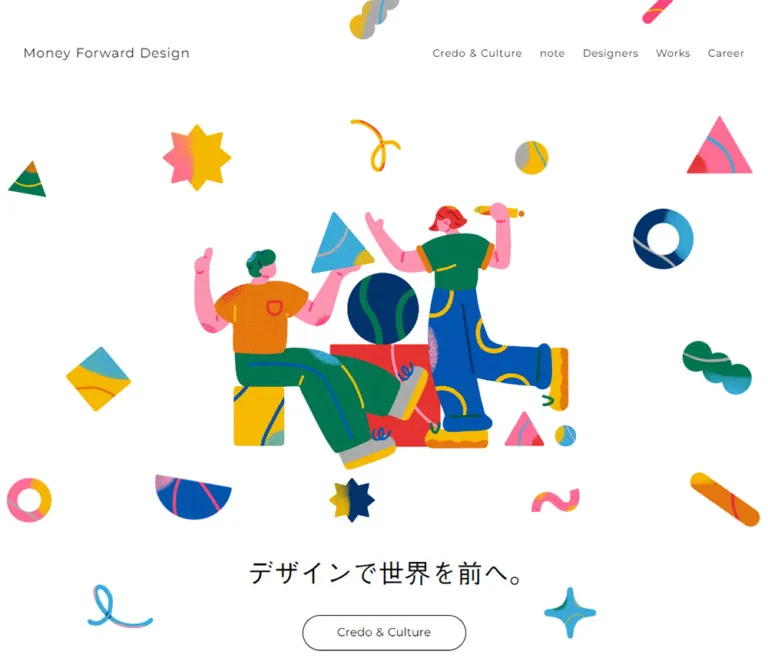
白い余白に鮮やかな人物イラストと幾何学モチーフを配したデザイン組織サイト。アーチ型の人物写真、横に流れる制作実績、オレンジの採用ボタンが特徴。
Money Forward Design — Style Reference
A spacious design-team showcase animated by colorful, textured characters and geometric fragments.
Website: design.moneyforward.com
Original URL: https://design.moneyforward.com/
Final URL: https://design.moneyforward.com/
Theme: white canvas, charcoal typography, orange recruitment actions, and multicolored artwork.
Inspected: October 2, 2026, Japan Standard Time. The supplied capture record is dated 2026-10-01T18:07:56.630Z, equivalent to October 2 at 03:07:56.630 JST.
Viewports: desktop 1440 × 1000; mobile 390 × 844, in CSS pixels.
Scope: the current homepage, including navigation, introductory illustration, Works strip, Our Team, Designers, note articles, Career, Press, and footer. Evidence comprises three desktop captures, two mobile captures, and rendered DOM measurements across the page. Linked destinations and the expanded mobile menu were not inspected.
Money Forward Design presents a company's design organization through its culture, projects, people, writing, and recruitment opportunities. Its structure supports browsing between these areas. A short Japanese statement introduces the organization, followed by a sequence of distinct editorial sections.
The visual identity comes from the relationship between restrained interface elements and exuberant artwork. White space, modest English section headings, fine outlines, and small captions establish order. Textured figures, saturated geometric shapes, and occasional oversized brand imagery supply energy. Orange filled pills consistently identify recruitment links, while other navigation stays charcoal or outlined.
Desktop uses a split introductory composition, four portraits across, and three-column article and award groups. Mobile reorganizes the introduction into an illustration-first composition, retains two columns for people, and gives articles and awards full-width rows. The underlying tone remains spacious at both sizes.
閉じる
Money Forward Design — Style Reference
A spacious design-team showcase animated by colorful, textured characters and geometric fragments.
Website: design.moneyforward.com
Original URL: https://design.moneyforward.com/
Final URL: https://design.moneyforward.com/
Theme: white canvas, charcoal typography, orange recruitment actions, and multicolored artwork.
Inspected: October 2, 2026, Japan Standard Time. The supplied capture record is dated 2026-10-01T18:07:56.630Z, equivalent to October 2 at 03:07:56.630 JST.
Viewports: desktop 1440 × 1000; mobile 390 × 844, in CSS pixels.
Scope: the current homepage, including navigation, introductory illustration, Works strip, Our Team, Designers, note articles, Career, Press, and footer. Evidence comprises three desktop captures, two mobile captures, and rendered DOM measurements across the page. Linked destinations and the expanded mobile menu were not inspected.
Money Forward Design presents a company's design organization through its culture, projects, people, writing, and recruitment opportunities. Its structure supports browsing between these areas. A short Japanese statement introduces the organization, followed by a sequence of distinct editorial sections.
The visual identity comes from the relationship between restrained interface elements and exuberant artwork. White space, modest English section headings, fine outlines, and small captions establish order. Textured figures, saturated geometric shapes, and occasional oversized brand imagery supply energy. Orange filled pills consistently identify recruitment links, while other navigation stays charcoal or outlined.
Desktop uses a split introductory composition, four portraits across, and three-column article and award groups. Mobile reorganizes the introduction into an illustration-first composition, retains two columns for people, and gives articles and awards full-width rows. The underlying tone remains spacious at both sizes.
How to Read This Reference
- Measured values come directly from the supplied element rectangles, computed styles, and custom properties. Measurements are rounded where excessive precision would obscure their use.
- Derived values are calculations from those measurements, such as column gaps and declared animation speeds.
- Estimated values describe visible artwork bounds, image colors, or shapes whose exact styles were not included.
- Recommended values and behaviors belong to the reusable implementation, rather than being verified features of the original.
- Token names beginning with
--mf-are implementation aliases introduced here. Original variable names are identified separately. - A computed font stack establishes the declared family order, but does not independently verify every downloaded font file or the face used for each glyph.
- Captures establish appearance at particular moments. Transition declarations establish available timing, but do not prove hover endpoints, menu behavior, or complete animation sequences.
Tokens — Colors
Default Palette
| Name | Value | Evidence | Role and reuse guidance |
|---|---|---|---|
| Canvas White | #ffffff |
Measured body background; source --s-color-b49d2daf: #ffffffff |
Main page, editorial surfaces, and outlined button interiors |
| Text Charcoal | #323232 |
Measured headings and most text; source --s-color-e19404e9: #323232ff |
Primary typography and social-circle fills |
| Wrapper Charcoal | #333333 |
Measured on several structural elements and mobile brand text | Small source variation; a new implementation can consolidate it with Text Charcoal |
| Brand Orange | #ed7100 |
Source --s-color-bb95982a: #ed7100ff |
Source-backed orange token for reproducing the brand/action family; see fill limitation below |
| Registered Blue | #0054ac |
Source --s-color-2a8fd90d: #0054acff |
Available brand color; blue is prominent within imagery, but no general blue-link system is demonstrated |
| Article Date Gray | #a0a0a0 |
Measured article date text | Secondary metadata beneath author names |
Visible fill limitation: recruitment anchors report rgba(255,255,255,0.95) as their own computed background, while the captures clearly show orange pills with white labels. The supplied records do not identify the layer producing that orange fill. Preserve the visible orange treatment; do not interpret the anchor background alone as a white-button design. The Quick Start uses the registered #ed7100 token as a practical approximation, not as a measured screenshot pixel value.
Additional registered neutrals and warm tints include #888888, #dadadb, #eeeeef, #f5f5f6, #fafafb, #fff5e6, #fffaf5, and #ffeed1. Their presence in the variable list does not establish a visible surface role on this homepage.
Illustration Palette
These are visual estimates, supplied only as art-direction references. Use original licensed artwork for accurate color and texture.
| Color family | Approximate reference | Visible use |
|---|---|---|
| Golden yellow | #f8bc00 |
Stars, geometric blocks, garment details, and looping strokes |
| Warm pink | #ff729f |
Skin, ribbons, triangles, and decorative fragments |
| Deep green | #00845e |
Clothing and rounded abstract shapes |
| Sky blue | #38a9cf |
Four-point shapes, triangles, and portions of rings |
| Deep navy | #00376d |
Rings, circular forms, and contrast within clothing |
| Warm red | #ef343d |
Semicircles, blocks, and illustration accents |
| Pale portrait blue-gray | #dce7e9 |
Background appearance inside the portrait arches |
Keep these saturated colors concentrated in imagery. The surrounding UI does not assign every section a different colored background or turn the illustration colors into status badges.
Tokens — Typography
Latin and Japanese UI Families
Three related computed stacks recur throughout the page:
| Alias | Observed stack | Original variable | Main roles |
|---|---|---|---|
| Regular | Montserrat, 'あおとゴシック R' |
--s-font-bf95e04d |
Navigation, section headings, names, captions, and footer |
| Medium | Montserrat, 'あおとゴシック M' |
--s-font-faa2636d |
Main statement, organization copy, article titles, award titles, and recruitment heading |
| Display emphasis | Montserrat, 'あおとゴシック DB' |
--s-font-c1944c55 |
Recruitment labels and many continuation links |
The Latin typography is geometric and relatively light. Japanese text uses several explicitly named family variants. Computed weights are predominantly 400 and 500; the heavier-looking DB family is often declared at weight 400. Preserve the family distinction rather than applying bold weight to every button.
The root HTML and body records report Times, but the visible branded text overrides that inheritance. Times is not the homepage's visual typeface. Other registered font variables, including Inter, Jost, and Poppins, are not evidence that those families style the inspected components.
Type Scale
All entries below are measured. Sizes and line heights are CSS pixels.
| Role | Desktop size / line height | Mobile size / line height | Weight and family | Tracking |
|---|---|---|---|---|
| Introductory statement | 46 / 82.8 |
40 / 72 |
400, Medium |
Normal |
| Section heading | 24 / 33.6 |
24 / 33.6 |
500, Regular |
0.01em |
| Header wordmark text | 18 / 25.2 |
13.5 / 18.9 |
500, Regular |
Normal |
| Desktop navigation | 18 / 25.2 |
Hidden in the closed mobile header | 500, Regular |
Normal |
| Introductory outline CTA | 16 / 22.4 |
16 / 22.4 |
500, Regular |
0.01em |
| Recruitment labels | 14 / 19.6 |
14 / 19.6 |
400, Display emphasis |
Usually 0.05em; desktop header career link uses 0.02em |
| Desktop continuation label | 15 / 21 |
Replaced by larger button geometry | 400, Display emphasis |
Usually 0.02em; Our Team uses 0.05em |
| Mobile continuation label | — | Usually 14 / 19.6; Our Team 16 / 22.4 |
Family and weight vary by section | Normal |
| Our Team paragraph | 14 / 28 |
14 / 28 |
500, Medium |
Normal |
| Designer name | 17 / 23.8 |
15 / 21 |
400, Regular |
0.05em |
| Designer role | 12 / 19.2 |
12 / 19.2 |
500, Regular |
0.01em |
| Article title | 15 / 24 |
16 / 25.6 |
500, Medium |
Normal |
| Article author and date | 12 / 19.2 |
12 / 19.2 |
500, Regular |
0.01em |
| Recruitment heading | 24 / 43.2 |
20 / 36 |
400, Medium |
0.05em |
| Recruitment paragraph | 12 / 19.2 |
12 / 19.2 |
500, Regular |
0.01em |
| Award title | 15 / 24 |
18 / 28.8 |
500, Medium |
Normal |
| Award metadata | 12 / 19.2 |
12 / 19.2 |
500, Regular |
0.01em |
| Footer destination link | 15 / 21 |
14 / 19.6 |
500, Display emphasis |
0.1em |
| Copyright and illustration credit | 10 / 20 |
9 / 18 |
400, Regular |
0.01em |
The mobile design does not simply shrink all text. Section headings remain 24px, article titles grow from 15px to 16px, and award titles grow to 18px. The main statement remains large enough to occupy two generously spaced lines.
Tokens — Spacing & Shapes
There is no verified universal spacing unit. The measured layout combines small relationship-specific gaps with large section intervals.
Spacing Scale
| Relationship | Value | Status |
|---|---|---|
| Logo symbol to wordmark text | 10px |
Measured flex gap |
| Recruitment buttons within a pair | 12px |
Derived from adjacent rectangles |
| Desktop navigation links | 40px |
Derived between link bounds |
| Designer role to name | 6px |
Derived |
| Portrait to role text | Approximately 20px |
Derived using estimated portrait height |
| Desktop introductory statement to CTA | 72px |
Derived between measured boxes |
| Mobile introductory statement to CTA | 62px |
Derived between measured boxes |
| Works section top inset | Desktop 120px; mobile 80px |
Measured padding |
| Works heading row to image strip | Desktop approximately 40px; mobile 30px |
Derived |
| Designers heading row to portraits | Desktop 54px; mobile 40px |
Derived |
| Mobile article-to-article interval | 40px |
Derived between complete card bounds |
| Large desktop section heading inset | Commonly 144px |
Derived for Designers, note, and Press |
| Mobile section heading inset | Commonly 80px |
Derived |
| Works strip to Our Team heading | Desktop 180px; mobile 80px |
Derived |
| Footer destination-link gap | Desktop 100px horizontally; mobile 24px vertically |
Derived |
Border Radius
| Element | Value or shape | Evidence |
|---|---|---|
| Recruitment anchor | 32px |
Measured computed radius |
| Introductory and mobile continuation pills | 128px |
Measured computed radius |
| Social links | 50%, within 35 × 35px |
Measured |
| Article anchor | 1px |
Measured; visually almost square |
| Award image | Approximately 4px |
Screenshot estimate; image radius not extracted |
| Designer portrait | Semicircular top with straight sides and a flat bottom | Visually observed; mask implementation not supplied |
| Works tiles | Square corners | Observed |
The oversized pill radii are clamped by element dimensions. A 128px declaration on a 48px-high button produces a capsule, not a 128px visible corner.
Layout Measurements
| Element | Desktop 1440 × 1000 |
Mobile 390 × 844 |
Evidence |
|---|---|---|---|
| Document height | 4191.44px |
6162.30px |
Measured; content-dependent |
| Header | 1440 × 88px |
390 × 72px |
Measured |
| Header padding | 0 80px |
16px 24px |
Measured |
| Main editorial width | 1100px, from x=170 to x=1270 |
330px, from x=30 to x=360 |
Derived from aligned content |
| Works heading width | Aligned to main editorial width | 342px, with 24px side margins |
Derived |
| Introductory section | y=88px, height=625.95px |
y=72px, height=683.64px |
Measured |
| Introductory statement box | 459.97 × 82.80px |
318.61 × 144px |
Measured |
| Introductory CTA | 225 × 49px |
200 × 48px |
Measured |
| Works tile | 480 × approximately 270px |
240 × approximately 135px |
Measured |
| Designers layout | Four 225px cards, 50px gaps |
Two 145px cards, 20px gaps |
Measured widths; derived gaps |
| Portrait image | Approximately 225 × 265px |
Approximately 145 × 171px |
Visual estimate and proportional derivation |
| Article / award column | 341px, with 38.5px gaps |
330px, single column |
Measured widths; derived gaps |
| Team and recruitment text columns | 470px |
330px |
Measured |
| Career button pair | 223px + 12px + 235px; height 48px |
153px + 12px + 165px; height 56px |
Measured and derived |
| Social-circle gap | 12px |
16px |
Derived |
Treat document heights as inspection records, not implementation targets. Article titles, font loading, and future content can change them.
Components
Site Header
Role: persistent brand identity, section navigation, and recruitment access.
The desktop header is an 88px-high horizontal arrangement with 80px side padding. The home link combines an orange symbol and the text Money Forward Design, separated by 10px. Four text links follow: Credo & Culture, Works, Our Team, and Designers. Two orange recruitment pills finish the row.
Each desktop recruitment pill is 150 × 48px; their gap is 12px. The labels are white and 14px. The second includes a small overlapping-square external-destination symbol. The outlined symbol's exported ligature name is filter_none; the supplied evidence does not identify its font family.
The header is transparent in the measured state. It remains at the viewport top in the supplied scrolled captures, allowing underlying imagery to pass behind its contents. There is no visible drop shadow, bottom divider, or opaque navigation slab in those captures.
At 390px, the header becomes 72px high with 24px side padding. The wordmark text is 13.5px, and a 40 × 40px button at x=326 replaces the visible desktop navigation. Its icon consists of two thin horizontal lines. The expanded menu's layout and behavior are unverified.
Introductory Illustration and Statement
Role: communicate the organization's design identity before introducing its content.
Desktop places the statement デザインで世界を前へ。 at the left of the main content area and two illustrated figures at the right. The statement's measured box starts at x=170, y=299.08. Its outlined Credo & Culture link starts at x=170, y=453.88.
The artwork shows two people interacting with abstract forms: a seated figure holds a triangular object, while a standing figure holds a pencil. Their oversized clothing, curved limbs, and energetic poses make the scene feel sociable and creative. Colored blocks and a large patterned sphere anchor the grouping.
Independent-looking ornaments extend across the viewport: rings, semicircles, stars, loops, triangles, diamonds, and short curved strips. Their arrangement is asymmetrical. White space between them keeps the introduction readable and allows the main figures to remain dominant.
At 390px, the figures appear above the text, occupying roughly x=40–360 and y=180–407 in the supplied capture. These are visual bounds, not extracted image rectangles. The statement begins at measured y=461.64 and wraps over two 72px line boxes. The CTA is centered at x≈95, y=667.64.
The decorative composition changes between viewports. It should be art-directed separately on mobile, rather than uniformly scaling a desktop screenshot. Preserve complete principal figures while allowing peripheral ornaments to be cropped at the screen edges.
Works Strip
Role: expose a range of projects through large visual previews.
A modest Works heading precedes a full-viewport strip of directly adjoining image links. The strip escapes the 1100px editorial container. Desktop tiles measure 480px wide and approximately 270px high; mobile tiles measure 240px wide and approximately 135px high. Their proportions are effectively 16:9.
The supplied DOM contains six unique project destinations and a repeated destination within the extracted strip. Tiles have no visible captions, padded card bodies, or rounded frames. Their artwork carries the distinction between projects.
At mobile width, the section heading shares its row with a 140 × 48px outlined もっと見る link to /works. That control is absent from the visible desktop heading row in the supplied capture.
An embedded CSS declaration defines a continuous horizontal loop. Full-cycle behavior, seam quality, drag support, and pause controls were not demonstrated. Do not add pagination dots or claim swipe interaction based solely on the strip's appearance.
Section Heading and Continuation Link
Role: establish a repeated browsing rhythm.
English section labels use 24px Montserrat-led text, weight 500, line height 33.6px, and slight tracking. On desktop, Designers, note, and Press place a compact もっと見る link at the far right of the heading row.
The desktop link measures approximately 116.5 × 35px. Its label is followed by a thin outlined circle containing a right chevron. The visible circle is approximately 30px across, with about 10px between label and circle. These circle dimensions are visual estimates; the overall link rectangle is measured.
On mobile, those continuation links move beneath the content and become centered 200 × 56px outlined capsules. The Works section is a distinct variant: its smaller capsule stays beside the heading.
Our Team Introduction
Role: explain the organization and lead to its team page.
The desktop text occupies a 470px column at x=170. A 24px section heading is followed by a 14px paragraph with 28px line height. The text describes individual strengths, diverse designers, user focus, and team approaches to product and organizational challenges.
A compact continuation link follows the paragraph. Illustration occupies the right side; only part of that illustration is visible in the supplied desktop middle capture, so its complete composition is not documented here.
On mobile, the paragraph uses the full 330px content width without reducing its type size. The large intervening region before the bottom CTA accommodates the section's imagery. Exact image dimensions were not included in the extracted element records.
Designer Profile Card
Role: make the design organization tangible through individual people.
Each card is a single profile link containing a portrait, a compact role block, and a name. Desktop shows four cards in one row, with image starts at x=195, 470, 745, and 1020. Each card is 225px wide, leaving 50px between cards.
Portraits have pale blue-gray backgrounds and a tall arch silhouette: a semicircular top, vertical sides, and a flat bottom. The subjects wear everyday clothing and are photographed consistently. Small colorful ornaments overlap selected portrait edges, connecting photography to the introductory illustration system.
Role text is centered at 12px with 19.2px line height. Names use 17px text with 0.05em tracking. The names displayed are 伊藤 セルジオ 大輔, 金井 恵子, 横坂 圭佑, and 古長 克彦; each links to its corresponding profile route.
At 390px, the cards form a two-by-two arrangement. Cards start at x=40 and x=205, measure 145px wide, and have 20px horizontal gaps. The second row begins 30px after the first row's card bounds. Names reduce to 15px; roles stay 12px and gain an additional line where needed.
Keep the image mask separate from decorative overlays. Clipping the entire card to an arch would cut off the ornaments and metadata.
note Article Card
Role: connect visitors to current design writing and event reports.
Desktop uses three 341px columns with 38.5px gaps. Each article link contains a thumbnail region, a title, and author/date metadata. The first and third measured titles occupy three lines; the middle title occupies two. Their card heights consequently differ, approximately 324px versus 300px.
Titles use 15px / 24px on desktop. Author and date text use 12px / 19.2px, with dates in #a0a0a0. The metadata text starts 40px to the right of the card's left edge. The extracted text includes profile-background-image references, but does not establish a complete avatar specification.
Mobile stacks all three cards at 330px wide, separated by 40px. Titles increase to 16px / 25.6px. The continuation control moves below the entire group.
The supplied screenshots do not show the article thumbnails in detail. Their content, crop treatment, and hover appearance should not be invented. The text and layout description here are supported by DOM measurements.
Career Invitation
Role: provide a clear recruitment destination after visitors have encountered work, people, and writing.
Desktop pairs a large orange brand illustration on the left with a 470px text column starting at x=800. A two-line invitation uses 24px / 43.2px with 0.05em tracking. A compact explanatory paragraph follows at 12px / 19.2px.
Two orange pills sit beneath the paragraph: 新卒採用 and 中途採用職種. The first points to the design site's student page; the second points to the recruitment site's designer section. These destination relationships are present in the supplied link records; the destination pages were not opened.
The buttons remain side by side at 390px. Their heights increase from 48px to 56px, while their widths become 153px and 165px. The recruitment heading reduces to 20px / 36px, and the copy occupies the 330px mobile content width.
Keep the section on the same white canvas. Its large orange symbol and filled actions provide sufficient emphasis without introducing a colored panel behind the entire section.
Press Award Card
Role: present external recognition as concise visual evidence.
The desktop section contains three image-led links: an intellectual-property award, Japan Branding Awards, and GOOD DESIGN AWARD. Each uses a 341px-wide image, a 15px title, and a 12px year/award line.
Visible image treatments differ by award: warm geometric award artwork, a turquoise typographic graphic, and a blue product composition featuring a payment card and interface screens. These colors belong to the linked-content images, not to the site's general surface system.
The thumbnail proportions appear close to 1.91:1, with slight corner rounding. That ratio is an estimate from the visible captures and adjacent text positions. It is wider than the Works strip's 16:9 tiles.
On mobile, the cards become 330px-wide vertical entries. Award titles increase to 18px / 28.8px while their metadata stays 12px. The final screenshot shows the last award followed by a centered 200 × 56px continuation pill.
Footer
Role: collect related corporate destinations, social channels, contact access, and concise attribution.
Desktop presents three destination links in one centered row: recruitment, graduate recruitment, and the corporate site. Each combines tracked Japanese text with an outlined circular external-destination symbol.
A lower row contains the company logo, contact link, copyright, illustration credit, and three charcoal social circles. Social links measure 35 × 35px and use a 12px gap. The visible symbols represent note, Facebook, and X; the supplied X destination retains a twitter.com URL.
Mobile changes the order and rhythm. Destination links stack vertically with 24px gaps. A centered row of social circles follows, now with 16px gaps, then the company logo, contact link, copyright, and illustration credit. There is substantial white space between these groups.
The inspected footer explicitly reads ©Money Forward, Inc. and Illustration : moi.. Those statements support the company identity and illustration credit. A separate website design or development credit is not established by the inspected homepage.
Tokens — Motion & Interaction
Declared Motion
| Treatment | Supplied value | Evidence and limitation |
|---|---|---|
| General element transitions | 0.3s cubic-bezier(0.4, 0.4, 0, 1) |
Computed on many elements; changed properties and interaction endpoints were not exercised |
| Outline-pill transition | 0.6s cubic-bezier(0.19, 1, 0.22, 1) with 0.1s delay |
Measured on introductory and mobile continuation links; exact hover appearance is unknown |
| Works loop, desktop | 30s linear infinite; endpoint translateX(-2880px) |
Embedded CSS specifies -480px × 6 |
| Works loop, up to 840px | 30s linear infinite; endpoint translateX(-960px) |
Embedded CSS specifies -240px × 4 |
| Individual Works links | transform 4.5s linear |
Computed on link elements; relationship to the parent loop is not fully documented |
| Header hide class | translateY(-150%) |
Present in embedded CSS associated with scroll-direction logic |
| Header transition in embedded style | transform 0.4s ease |
The sampled computed header instead reports the general 0.3s transition; effective hide timing is not conclusively established |
| Body background transition | 0.5s cubic-bezier(0.4, 0.4, 0, 1) |
Computed declaration; only a white page state was supplied |
The declared loop distances imply 96px/s on desktop and 32px/s on mobile, calculated by dividing distance by 30 seconds. These are source-derived speeds, not independently timed animation recordings.
The embedded header logic is intended to hide the header when scrolling down past its height and reveal it on upward scrolling, near the top, or at the document bottom. The supplied captures show the header visible at multiple scroll positions, but do not demonstrate the complete hide/reveal sequence.
Interaction Boundaries
- Ordinary anchors and their destinations are present for navigation, profiles, articles, awards, recruitment, and social links.
- A mobile menu button is visible, but its opening animation, focus handling, overlay, and closing behavior are unverified.
- Decorative fragments look spatially suspended. No supplied evidence establishes that each fragment floats, rotates, follows the pointer, or participates in parallax.
- A node reporting
animation: nonecan still move through an animated ancestor. Do not use the tile records to dismiss the separately declared strip animation. - The readiness procedure temporarily paused perpetual animations and later resumed them. Stable captures do not prove that the live page is static.
For a new implementation, retain gentle motion and continuous project discovery. Add explicit pause and reduced-motion behavior rather than inventing elaborate interaction throughout the page.
Surfaces
| Layer | Appearance | Purpose |
|---|---|---|
| Main canvas | Solid white | Continuous visual field across all sections |
| Header | Transparent in captured states | Lightweight navigation over the page |
| Editorial card | White or transparent; no visible elevation | Lets thumbnails and typography define the grouping |
| Outline action | White interior, fine charcoal outline | Secondary browsing and culture navigation |
| Recruitment action | Orange visible fill, white label | Strongest recurring UI emphasis |
| Portrait region | Pale photographic background inside an arch | Consistent framing for people |
| Social action | Charcoal circle with a light symbol | Compact, recognizable footer navigation |
No general shadow or elevation system is visible. Separation comes from white space, alignment, image boundaries, and selectively outlined controls. Gradients and texture inside content images should remain within those images rather than spreading into the UI chrome.
Imagery
Illustration Direction
Use large, simplified human silhouettes with expressive poses, oversized garments, and rounded forms. The artwork mixes crisp outer shapes with visible grain, halftone-like texture, curved stripes, and uneven color patches. It feels printed and tactile while remaining bright and contemporary.
The geometric vocabulary is specific: hollow rings, quarter and half circles, pointed triangles, four-point organic stars, irregular bursts, diamonds, ribbons, and looping single strokes. The strongest relationships are between differently scaled objects, not repetition of one shape at equal intervals.
Keep the principal figures readable as a complete scene. Peripheral fragments can touch or cross viewport edges. The text remains ordinary HTML typography; it should not be baked into the artwork.
Photography and Content Images
Designer portraits use consistent lighting, subdued backgrounds, and upper-body crops. Their arch framing connects them to the rounded artwork without processing the photographs into illustrations.
Project previews and award imagery retain their own visual identities. The Works strip can therefore contain illustration, photography, and interface imagery alongside one another. Avoid recoloring every preview orange or imposing the hero's grain over all content.
Use normal high-quality image rendering. The visible texture is part of the artwork, not a reason to apply image-rendering: pixelated.
Observed Asset References
| Asset group | Confirmed appearance or relationship | Availability in supplied evidence |
|---|---|---|
| Header identity | Orange symbol plus live wordmark text | Visible; complete image URL not supplied |
| Introductory scene | Two figures, patterned clothing, abstract objects | Visible at desktop and mobile sizes; asset URL not supplied |
| Decorative fragments | Rings, stars, loops, triangles, ribbons | Visible; individual asset boundaries and URLs unverified |
| Designer portraits | Four consistent photographs with arched tops | Visible on desktop; profile-link destinations supplied, image URLs absent |
| Career brand image | Large textured orange company symbol | Partly visible in the desktop lower-page capture |
| Works previews | Linked project imagery in approximately 16:9 tiles | Link rectangles and destinations supplied; complete image URLs absent |
| Article images | Thumbnail regions and profile-image references | DOM evidence only; complete reusable asset references absent |
| Award thumbnails | Three distinct award/product graphics | Visible on desktop; final item also visible on mobile |
No asset filenames should be inferred from the page routes. Obtain suitable licensed files separately, and preserve native proportions and transparent backgrounds where applicable.
Layout & Responsive Behavior
Desktop Composition
At 1440px, most editorial content occupies 1100px with 170px side margins. The header is wider, with 80px side padding, and the Works strip spans the entire viewport. These three horizontal scales are part of the page's character.
The introduction balances left-aligned typography against right-side artwork. Subsequent sections alternate larger illustrative areas with ordered content groups. Designers uses a slightly narrower 1050px row inside the main container. Articles and Press use the full container in three 341px columns.
Large vertical intervals matter. The Works heading begins at document y≈834, Designers at y≈1947, and note at y≈2570 in the measurement pass. These coordinates demonstrate pacing; they should not become absolute-positioning rules.
Mobile Composition
At 390px, most content has 30px margins, while the header and Works heading use 24px. The introductory statement uses its own approximately 319px-wide text box centered within the viewport.
| Area | Desktop | Mobile |
|---|---|---|
| Header | Wordmark, four navigation links, two recruitment pills | Smaller wordmark and two-line menu button |
| Introduction | Copy left, principal artwork right | Artwork above copy; centered outline CTA |
| Works | 480px tiles | 240px tiles; compact continuation pill beside heading |
| Our Team | Text and illustration across the page | Vertical composition with bottom continuation pill |
| Designers | Four columns | Two columns and two rows |
| note | Three columns | One column; larger article-title type |
| Career | Brand image beside text | Brand image above text; two recruitment buttons still side by side |
| Press | Three columns | One column; larger award-title type |
| Continuation links | Usually compact links near section headings | Usually centered pills below the content |
| Footer | Horizontal destination and utility rows | Stacked destinations, social row, logo, and legal text |
The explicit 840px breakpoint is established only for the Works loop declaration. The supplied text also contains a 1200px conditional line-break rule, but that does not prove the navigation breakpoint. Intermediate layout thresholds remain unverified.
A new implementation should preserve these observed endpoints, then choose intermediate breakpoints based on content fit. Keep portraits in two columns at the inspected phone width and maintain readable long role labels without clipping.
Do’s and Don’ts
Do
- Preserve the white canvas and generous intervals between sections.
- Keep charcoal typography visually quiet enough for the illustrations and photographs to lead.
- Use orange filled pills consistently for recruitment access.
- Maintain separate horizontal scales for the header, editorial container, and full-width Works strip.
- Preserve the portrait arches, flat bottoms, and small overlapping geometric accents.
- Keep desktop profiles in four columns and the inspected mobile layout in two.
- Increase mobile article and award title sizes as observed.
- Let content-card heights follow their titles instead of forcing every title into the same number of lines.
- Art-direct decorative placement separately for desktop and mobile.
- Keep source-backed measurements, visual estimates, and implementation recommendations distinguishable.
Don’t
- Don’t compress the homepage into a single recruitment pitch and discard its work, culture, people, and editorial sections.
- Don’t turn every section into a colored rounded panel.
- Don’t apply shadows, glossy surfaces, or gradient backgrounds to the general interface.
- Don’t replace textured illustration with uniformly smooth generic shapes.
- Don’t crop the principal characters merely to fill a fixed rectangle.
- Don’t make every mobile content group a single column; the profile grid remains two columns.
- Don’t assume every thumbnail is 16:9; award imagery is visibly wider.
- Don’t use root-level Times or unrelated registered font variables as the visible type system.
- Don’t reproduce exported icon names such as
filter_noneas visible text. - Don’t infer hover effects, draggable carousels, parallax, or a mobile menu design that the evidence does not show.
Recommended Implementation Additions
These are recommendations for a new implementation, not confirmed features of the original:
- Use a semantic main heading for the introductory statement. Its inspected source element is a paragraph.
- Give the mobile menu button an accessible name,
aria-expanded, andaria-controls; manage keyboard focus appropriately for the chosen menu pattern. - Keep navigation visible while keyboard focus is inside the header, even if scroll-direction hiding is implemented.
- Give image-only project links meaningful accessible names. Hide purely decorative fragments from assistive technology.
- Provide a visible pause control for automatic project motion. Also pause while a project link has keyboard focus.
- Under reduced motion, replace the moving strip with a manually scrollable row that still exposes every project.
- Preserve approximately 44px interaction areas around small circular controls without necessarily enlarging their visible artwork.
- Check small white recruitment labels against the final rendered orange fill. Adjust the implementation color if necessary to meet text-contrast requirements.
- Consider darker article dates and larger legal text where readability requirements exceed the source's small, light treatment.
- Reserve image dimensions to avoid layout shifts, and load the principal illustration before lower-page editorial imagery.
- Keep decorative artwork clear of essential copy at intermediate widths. The mobile composition leaves very little clearance around some fragments.
Agent Prompt Guide
Quick Color Reference
- Canvas and ordinary surfaces:
#ffffff. - Main text and social-circle fill:
#323232. - Source-backed brand orange:
#ed7100; exact visible recruitment fill layer is unverified. - Registered brand blue:
#0054ac. - Article dates: measured
#a0a0a0. - Illustration colors: saturated yellow, pink, green, blue, navy, and red; use licensed artwork rather than treating estimated hues as exact brand tokens.
- Borders: fine charcoal outlines; no general shadow system.
Overall Prompt
“Create a Japanese corporate design-organization homepage inspired by the inspected Money Forward Design page. Use a white canvas, charcoal text, Montserrat-led bilingual typography, generous section spacing, and orange capsule recruitment links. Introduce the organization with a large textured scene of two creative people surrounded by asymmetrically placed geometric fragments. On desktop, place the Japanese statement to the left of the illustration. Follow with a full-width moving project-image strip, a team introduction, four arched portrait cards, three editorial articles, a recruitment invitation, and three award cards. At 390px, place the introductory artwork above the statement, keep profiles in two columns, stack articles and awards, and move most continuation links into centered outline pills below their sections. Keep artwork colorful and the surrounding interface restrained.”
Example Component Prompts
- Header: “Create an 88px transparent desktop header with an orange brand symbol, an 18px wordmark, four charcoal navigation links, and two 150 × 48px orange recruitment pills. At phone width, use a 72px header, 24px side padding, a 13.5px wordmark, and a two-line menu icon. Design the expanded menu as a separately identified recommendation.”
- Introduction: “Use an approximately 1100px desktop composition with a 46px Japanese statement at left and a textured two-person illustration at right. Place a 225 × 49px thin-outline culture link beneath the statement with 72px separation. On a 390px phone, show the illustration first, use a 40px statement with 1.8 line height, and center a 200 × 48px culture link.”
- Designer card: “Build an unboxed portrait link with a pale blue-gray arched photo, a flat image bottom, small centered role text, and a lightly tracked name. Use 225px width on desktop and 145px at the reference phone width. Let one textured geometric fragment overlap the photo edge without covering the face or text.”
- Article group: “Create three 341px-wide editorial links within an 1100px container. Stack image, 15px title, and compact author/date metadata. Allow titles to occupy two or three lines naturally. On mobile, use one 330px column, 16px titles, and 40px between cards.”
- Career invitation: “Pair a large textured orange brand image with a 470px text column, a restrained two-line recruitment heading, compact paragraph, and two orange capsule links. At phone width, stack the illustration and text while keeping the two 56px-high recruitment links side by side.”
- Footer: “Use a white footer with three centered destination links and small outlined external-link circles. Include charcoal social circles, a company logo, contact link, and quiet legal text. On mobile, stack the destination links and place the social row above the logo.”
Quick Start
CSS Custom Properties
This is a reusable adaptation of the observed endpoints, not the original stylesheet. It uses the declared font names without supplying font files. Load licensed fonts and artwork separately. The portrait mask, thumbnail ratio, and introductory artwork box are approximations.
The navigation collapse at 1200px and general layout switch at 840px are recommended implementation choices; only the Works animation's 840px rule is directly evidenced.
The optional marquee below expects two identical six-item groups with no gap between groups. It uses 30 seconds on desktop. On mobile it uses 45 seconds so six 240px tiles retain the source-derived speed of 32px/s. That mobile duration is an intentional seamless-loop adaptation of the source's 30-second, four-tile travel declaration.
:root {
  /* Measured colors and source-backed brand approximation */
  --mf-canvas: #ffffff;
  --mf-ink: #323232;
  --mf-orange: #ed7100;
  --mf-blue: #0054ac;
  --mf-date: #a0a0a0;
  --mf-portrait-bg: #dce7e9; /* Visual estimate */

  /* Observed family names; font files must be supplied separately */
  --mf-font-regular: Montserrat, 'あおとゴシック R', sans-serif;
  --mf-font-medium: Montserrat, 'あおとゴシック M', sans-serif;
  --mf-font-emphasis: Montserrat, 'あおとゴシック DB', sans-serif;

  --mf-text-brand: 18px;
  --mf-text-hero: 46px;
  --mf-text-section: 24px;
  --mf-text-article: 15px;
  --mf-text-press: 15px;
  --mf-text-name: 17px;
  --mf-text-career: 24px;
  --mf-text-legal: 10px;

  --mf-content-max: 1100px;
  --mf-gutter: 30px;
  --mf-header-gutter: 80px;
  --mf-header-height: 88px;
  --mf-section-space: 144px;
  --mf-work-width: 480px;
  --mf-loop-duration: 30s;
  --mf-radius-pill: 128px;
  --mf-radius-primary: 32px;

  --mf-motion-ui: 300ms cubic-bezier(0.4, 0.4, 0, 1);
  --mf-motion-pill: 600ms cubic-bezier(0.19, 1, 0.22, 1) 100ms;
}

* { box-sizing: border-box; }

body {
  margin: 0;
  padding-top: var(--mf-header-height);
  background: var(--mf-canvas);
  color: var(--mf-ink);
  font-family: var(--mf-font-regular);
}

a { color: inherit; }
button { font: inherit; }
img { display: block; max-width: 100%; }
[hidden] { display: none !important; }

.container {
  width: min(var(--mf-content-max), calc(100% - 2 * var(--mf-gutter)));
  margin-inline: auto;
}

.site-header {
  position: fixed;
  inset: 0 0 auto;
  z-index: 50;
  height: var(--mf-header-height);
  padding-inline: var(--mf-header-gutter);
  display: flex;
  align-items: center;
  background: transparent;
  transition: transform var(--mf-motion-ui);
}

.brand {
  display: inline-flex;
  align-items: center;
  gap: 10px;
  flex: none;
  text-decoration: none;
  font-size: var(--mf-text-brand);
  font-weight: 500;
  line-height: 1.4;
  white-space: nowrap;
}

.brand__symbol { width: 46px; height: auto; }

.header-nav {
  margin-inline-start: auto;
  display: flex;
  align-items: center;
  gap: 40px;
  font-size: 18px;
  font-weight: 500;
  line-height: 1.4;
}

.header-nav a { text-decoration: none; }
.header-actions { display: flex; gap: 12px; }
.header-actions .primary-pill { width: 150px; }
.menu-toggle { display: none; }

/* Apply only through an implemented scroll controller. */
.site-header.is-unpinned:not(:focus-within) {
  transform: translateY(-150%);
}

.pill,
.primary-pill {
  display: inline-flex;
  align-items: center;
  justify-content: center;
  gap: 8px;
  min-height: 48px;
  padding-inline: 20px;
  text-decoration: none;
  text-align: center;
  border: 1px solid var(--mf-ink);
  border-radius: var(--mf-radius-pill);
  background: var(--mf-canvas);
  color: var(--mf-ink);
  font-size: 16px;
  font-weight: 500;
  line-height: 1.4;
  transition: opacity var(--mf-motion-pill);
}

.primary-pill {
  border-color: var(--mf-orange);
  border-radius: var(--mf-radius-primary);
  background: var(--mf-orange);
  color: #fff;
  font-family: var(--mf-font-emphasis);
  font-size: 14px;
  font-weight: 400;
  letter-spacing: 0.05em;
}

.hero {
  position: relative;
  isolation: isolate;
  padding-block: 120px;
}

.hero__inner {
  display: grid;
  grid-template-columns: minmax(0, 470px) minmax(0, 1fr);
  align-items: center;
  gap: 80px;
  min-height: 386px;
}

.hero__copy { grid-area: 1 / 1; min-width: 0; }

.hero__title {
  margin: 0;
  font-family: var(--mf-font-medium);
  font-size: var(--mf-text-hero);
  font-weight: 400;
  line-height: 1.8;
}

.hero__link {
  width: 225px;
  min-height: 49px;
  margin-top: 72px;
  letter-spacing: 0.01em;
}

.hero__art {
  grid-area: 1 / 2;
  width: 100%;
  aspect-ratio: 550 / 386; /* Approximate composition box */
  object-fit: contain;
}

.hero__decorations {
  position: absolute;
  inset: 0;
  z-index: -1;
  overflow: hidden;
  pointer-events: none;
}

.ornament {
  position: absolute;
  left: var(--ornament-x, 0);
  top: var(--ornament-y, 0);
  width: var(--ornament-width, 72px);
}

.section { padding-block: var(--mf-section-space) 40px; }

.section__head {
  display: flex;
  align-items: center;
  justify-content: space-between;
  gap: 24px;
  margin-bottom: 40px;
}

.section__title {
  margin: 0;
  font-size: var(--mf-text-section);
  font-weight: 500;
  line-height: 1.4;
  letter-spacing: 0.01em;
}

.more-link {
  display: inline-flex;
  align-items: center;
  gap: 10px;
  min-height: 35px;
  text-decoration: none;
  font-family: var(--mf-font-emphasis);
  font-size: 15px;
  line-height: 1.4;
  letter-spacing: 0.02em;
}

.round-icon {
  display: inline-grid;
  place-items: center;
  width: 30px;
  height: 30px;
  flex: none;
  border: 1px solid currentColor;
  border-radius: 50%;
}

.round-icon svg { width: 14px; height: 14px; }
.more--mobile,
.works-more { display: none; }

.works { padding-top: 120px; }
.works-viewport { overflow-x: auto; }
.works-track,
.works-group { display: flex; width: max-content; }

.work-tile {
  display: block;
  flex: 0 0 var(--mf-work-width);
  width: var(--mf-work-width);
}

.work-tile img {
  width: 100%;
  aspect-ratio: 16 / 9;
  object-fit: cover;
}

/* Optional motion requires two identical groups and a pause control. */
.works-track.is-looping {
  animation: mf-works var(--mf-loop-duration) linear infinite;
}

@keyframes mf-works {
  to { transform: translateX(-50%); }
}

.works-viewport:hover .works-track,
.works-viewport:focus-within .works-track,
.works-track[data-paused='true'] {
  animation-play-state: paused;
}

.split {
  display: grid;
  grid-template-columns: minmax(0, 470px) minmax(0, 470px);
  justify-content: space-between;
  align-items: center;
  gap: 60px;
}

.team-copy {
  font-family: var(--mf-font-medium);
  font-size: 14px;
  font-weight: 500;
  line-height: 2;
}

.designers .section__head { margin-bottom: 54px; }

.designer-grid {
  display: grid;
  grid-template-columns: repeat(4, minmax(0, 1fr));
  gap: 50px;
  max-width: 1050px;
  margin-inline: auto;
}

.designer-card {
  position: relative;
  display: block;
  min-width: 0;
  text-align: center;
  text-decoration: none;
}

.designer-card__photo {
  width: 100%;
  aspect-ratio: 225 / 265.2;
  object-fit: cover;
  background: var(--mf-portrait-bg);
  border-radius: 50% 50% 0 0 / 42.4% 42.4% 0 0;
}

.designer-card__role {
  margin: 20px 0 6px;
  font-size: 12px;
  font-weight: 500;
  line-height: 1.6;
  letter-spacing: 0.01em;
}

.designer-card__name {
  margin: 0;
  font-size: var(--mf-text-name);
  font-weight: 400;
  line-height: 1.4;
  letter-spacing: 0.05em;
}

.editorial-grid {
  display: grid;
  grid-template-columns: repeat(3, minmax(0, 1fr));
  column-gap: 3.5%;
  align-items: start;
}

.media-card {
  display: block;
  min-width: 0;
  text-decoration: none;
}

.media-card__image {
  width: 100%;
  aspect-ratio: 1.91 / 1; /* Approximate editorial thumbnail ratio */
  object-fit: cover;
  border-radius: 4px; /* Visual approximation */
}

.media-card__title {
  margin: 16px 0 0;
  font-family: var(--mf-font-medium);
  font-size: var(--mf-text-article);
  font-weight: 500;
  line-height: 1.6;
}

.press-card .media-card__title { font-size: var(--mf-text-press); }

.media-card__meta {
  margin: 4px 0 0;
  font-size: 12px;
  font-weight: 500;
  line-height: 1.6;
  letter-spacing: 0.01em;
}

.article-byline {
  display: flex;
  gap: 8px;
  margin-top: 20px;
}

.article-byline__avatar {
  width: 32px; /* Recommended size; exact source size unverified */
  height: 32px;
  border-radius: 50%;
  object-fit: cover;
}

.article-byline p { margin: 0; }
.article-date { color: var(--mf-date); }

.career__heading {
  margin: 0;
  font-family: var(--mf-font-medium);
  font-size: var(--mf-text-career);
  font-weight: 400;
  line-height: 1.8;
  letter-spacing: 0.05em;
}

.career__copy {
  margin-top: 40px;
  font-size: 12px;
  font-weight: 500;
  line-height: 1.6;
  letter-spacing: 0.01em;
}

.career-actions {
  display: grid;
  grid-template-columns: calc(50% - 12px) 50%;
  gap: 12px;
  margin-top: 40px;
}

.site-footer { padding: 80px 30px 40px; }

.footer-nav {
  display: flex;
  justify-content: center;
  align-items: center;
  gap: 100px;
  margin-bottom: 78px;
}

.footer-nav a {
  display: inline-flex;
  align-items: center;
  gap: 12px;
  min-height: 35px;
  text-decoration: none;
  font-family: var(--mf-font-emphasis);
  font-size: 15px;
  font-weight: 500;
  line-height: 1.4;
  letter-spacing: 0.1em;
}

.footer-bottom,
.footer-legal,
.social-links {
  display: flex;
  justify-content: center;
  align-items: center;
}

.footer-bottom,
.footer-legal { gap: 20px; }
.footer-brand { width: 140px; }
.footer-contact { font-size: 12px; line-height: 2; }
.footer-legal { font-size: var(--mf-text-legal); line-height: 2; }
.social-links { gap: 12px; }

.social-link {
  display: grid;
  place-items: center;
  width: 35px;
  height: 35px;
  border-radius: 50%;
  background: var(--mf-ink);
  color: #fff;
  text-decoration: none;
}

/* Recommended keyboard treatment */
a:focus-visible,
button:focus-visible {
  outline: 2px solid var(--mf-ink);
  outline-offset: 4px;
}

/* Recommended header breakpoint; expanded menu requires a controller. */
@media (max-width: 1200px) {
  :root { --mf-header-gutter: 24px; }
  .header-nav { display: none; }
  .menu-toggle {
    display: grid;
    place-content: center;
    gap: 8px;
    width: 40px;
    height: 40px;
    margin-inline-start: auto;
    padding: 0;
    border: 0;
    background: transparent;
    color: inherit;
    cursor: pointer;
  }
  .menu-toggle::before,
  .menu-toggle::after {
    content: '';
    width: 40px;
    height: 1px;
    background: currentColor;
  }
}

@media (max-width: 840px) {
  :root {
    --mf-header-height: 72px;
    --mf-text-brand: 13.5px;
    --mf-text-hero: 40px;
    --mf-text-article: 16px;
    --mf-text-press: 18px;
    --mf-text-name: 15px;
    --mf-text-career: 20px;
    --mf-text-legal: 9px;
    --mf-section-space: 80px;
    --mf-work-width: 240px;
    --mf-loop-duration: 45s;
  }

  .site-header { padding-block: 16px; }
  .brand__symbol { width: 36px; }
  .hero { padding-block: 100px 40px; }
  .hero__inner {
    grid-template-columns: minmax(0, 1fr);
    min-height: 0;
    gap: 58px;
  }
  .hero__art { grid-area: 1 / 1; }
  .hero__copy { grid-area: 2 / 1; }
  .hero__title { max-width: 319px; margin-inline: auto; }
  .hero__link {
    display: flex;
    width: 200px;
    min-height: 48px;
    margin: 62px auto 0;
  }

  /* Set individual mobile ornament coordinates in the component. */
  .works { padding-top: 80px; }
  .works .section__head {
    width: calc(100% - 48px);
    margin-inline: auto;
    margin-bottom: 30px;
    align-items: flex-start;
  }
  .works-more {
    display: inline-flex;
    width: 140px;
    min-height: 48px;
    font-family: var(--mf-font-emphasis);
    font-size: 14px;
  }
  .more--desktop { display: none; }
  .more--mobile {
    display: flex;
    width: 200px;
    min-height: 56px;
    margin: 40px auto 0;
    font-size: 14px;
  }

  .split { grid-template-columns: minmax(0, 1fr); gap: 40px; }
  .designers .section__head { margin-bottom: 40px; }
  .designer-grid {
    grid-template-columns: repeat(2, minmax(0, 1fr));
    gap: 30px 20px;
    padding-inline: 10px;
  }
  .editorial-grid { grid-template-columns: minmax(0, 1fr); gap: 40px; }
  .press-grid { gap: 60px; }
  .press-card .media-card__meta { margin-top: 2px; }
  .article-byline { margin-top: 12px; }
  .career__copy { margin-top: 30px; }
  .career-actions .primary-pill { min-height: 56px; }

  .site-footer { padding-block: 20px 40px; }
  .footer-nav { flex-direction: column; gap: 24px; margin-bottom: 0; }
  .footer-nav a { font-size: 14px; }
  .footer-bottom { flex-direction: column; gap: 0; }
  .footer-bottom .social-links {
    order: -1;
    gap: 16px;
    margin-block: 50px 48px;
  }
  .footer-brand { width: 165px; margin-bottom: 40px; }
  .footer-contact { margin-bottom: 10px; }
  .footer-legal { flex-direction: column; gap: 0; }
}

/* Recommended fallback for narrower screens and enlarged text. */
@media (max-width: 359px) {
  .career-actions { grid-template-columns: minmax(0, 1fr); }
  .brand { white-space: normal; }
}

@media (prefers-reduced-motion: reduce) {
  .site-header,
  .pill,
  .primary-pill { transition: none; }
  .site-header.is-unpinned { transform: none; }
  .works-track.is-looping { animation: none; transform: none; }
  .works-group[aria-hidden='true'] { display: none; }
}
Use real anchors for navigation and inline SVGs or authorized icon assets for symbols. The CSS does not supply the original artwork, a mobile-menu controller, or a marquee pause button. If duplicating the Works group, mark the duplicate as decorative and remove its links from keyboard navigation. Do not hide the only accessible copy of a project.
Tailwind v4 Token Mapping
Optional aliases for a project already using Tailwind v4. This is not evidence that the original website uses Tailwind. Define the properties above first.
@theme inline {
  --color-canvas: var(--mf-canvas);
  --color-ink: var(--mf-ink);
  --color-brand-orange: var(--mf-orange);
  --color-brand-blue: var(--mf-blue);
  --color-date: var(--mf-date);

  --font-ui: var(--mf-font-regular);
  --font-ui-medium: var(--mf-font-medium);
  --font-ui-emphasis: var(--mf-font-emphasis);

  --text-hero: var(--mf-text-hero);
  --text-section: var(--mf-text-section);
  --text-article: var(--mf-text-article);
  --text-profile: var(--mf-text-name);

  --spacing-page-gutter: var(--mf-gutter);
  --spacing-section: var(--mf-section-space);
  --radius-pill: var(--mf-radius-pill);
  --radius-primary: var(--mf-radius-primary);
}
Sources & Evidence
- Money Forward Design: original and final inspected URL, reported HTTP status
200, page identity, rendered text, destination links, computed styles, element rectangles, custom properties, and embedded motion declarations supplied with this task. - Capture record:
2026-10-01T18:07:56.630Z, corresponding to October 2, 2026 in Japan. The record covers desktop1440 × 1000and mobile390 × 844viewports; individual screenshot timestamps were not separately supplied. - Visual coverage: desktop opening, Designers region, and lower Career/Press/footer region; mobile opening and final Press/footer region. DOM measurements additionally document sections not fully visible in the selected captures.
- Measured page extents: approximately
4191.44pxdesktop and6162.30pxmobile. Coordinates in this reference belong to the supplied measurement pass and should not be treated as fixed positions for future content. - Inspection procedure: the supplied browser process waited for document loading, visible image decoding, finite animation readiness, and sampled layout/text stability, with bounded waiting periods. It traversed intermediate scroll positions. Perpetual animations were paused during readiness checks and resumed afterward. SharedWorkers and service workers were disabled.
- Interaction limits: no supplied hover sequence, keyboard-focus sequence, expanded-menu capture, destination-page inspection, or complete timed Works-loop recording. Asset URLs and actual font-file loading were not comprehensively supplied.
This reference describes the current homepage represented by the supplied original-page evidence. Its CSS and prompts are reusable adaptations; estimates, unverified states, and recommended additions are identified explicitly.
# Money Forward Design — Style Reference

> A spacious design-team showcase animated by colorful, textured characters and geometric fragments.

**Website:** [design.moneyforward.com](https://design.moneyforward.com/)
**Original URL:** https://design.moneyforward.com/
**Final URL:** https://design.moneyforward.com/
**Theme:** white canvas, charcoal typography, orange recruitment actions, and multicolored artwork.
**Inspected:** October 2, 2026, Japan Standard Time. The supplied capture record is dated `2026-10-01T18:07:56.630Z`, equivalent to October 2 at 03:07:56.630 JST.
**Viewports:** desktop `1440 × 1000`; mobile `390 × 844`, in CSS pixels.
**Scope:** the current homepage, including navigation, introductory illustration, Works strip, Our Team, Designers, note articles, Career, Press, and footer. Evidence comprises three desktop captures, two mobile captures, and rendered DOM measurements across the page. Linked destinations and the expanded mobile menu were not inspected.

Money Forward Design presents a company's design organization through its culture, projects, people, writing, and recruitment opportunities. Its structure supports browsing between these areas. A short Japanese statement introduces the organization, followed by a sequence of distinct editorial sections.

The visual identity comes from the relationship between restrained interface elements and exuberant artwork. White space, modest English section headings, fine outlines, and small captions establish order. Textured figures, saturated geometric shapes, and occasional oversized brand imagery supply energy. Orange filled pills consistently identify recruitment links, while other navigation stays charcoal or outlined.

Desktop uses a split introductory composition, four portraits across, and three-column article and award groups. Mobile reorganizes the introduction into an illustration-first composition, retains two columns for people, and gives articles and awards full-width rows. The underlying tone remains spacious at both sizes.
閉じる
# Money Forward Design — Style Reference

> A spacious design-team showcase animated by colorful, textured characters and geometric fragments.

**Website:** [design.moneyforward.com](https://design.moneyforward.com/)
**Original URL:** https://design.moneyforward.com/
**Final URL:** https://design.moneyforward.com/
**Theme:** white canvas, charcoal typography, orange recruitment actions, and multicolored artwork.
**Inspected:** October 2, 2026, Japan Standard Time. The supplied capture record is dated `2026-10-01T18:07:56.630Z`, equivalent to October 2 at 03:07:56.630 JST.
**Viewports:** desktop `1440 × 1000`; mobile `390 × 844`, in CSS pixels.
**Scope:** the current homepage, including navigation, introductory illustration, Works strip, Our Team, Designers, note articles, Career, Press, and footer. Evidence comprises three desktop captures, two mobile captures, and rendered DOM measurements across the page. Linked destinations and the expanded mobile menu were not inspected.

Money Forward Design presents a company's design organization through its culture, projects, people, writing, and recruitment opportunities. Its structure supports browsing between these areas. A short Japanese statement introduces the organization, followed by a sequence of distinct editorial sections.

The visual identity comes from the relationship between restrained interface elements and exuberant artwork. White space, modest English section headings, fine outlines, and small captions establish order. Textured figures, saturated geometric shapes, and occasional oversized brand imagery supply energy. Orange filled pills consistently identify recruitment links, while other navigation stays charcoal or outlined.

Desktop uses a split introductory composition, four portraits across, and three-column article and award groups. Mobile reorganizes the introduction into an illustration-first composition, retains two columns for people, and gives articles and awards full-width rows. The underlying tone remains spacious at both sizes.

## How to Read This Reference

- **Measured** values come directly from the supplied element rectangles, computed styles, and custom properties. Measurements are rounded where excessive precision would obscure their use.
- **Derived** values are calculations from those measurements, such as column gaps and declared animation speeds.
- **Estimated** values describe visible artwork bounds, image colors, or shapes whose exact styles were not included.
- **Recommended** values and behaviors belong to the reusable implementation, rather than being verified features of the original.
- Token names beginning with `--mf-` are implementation aliases introduced here. Original variable names are identified separately.
- A computed font stack establishes the declared family order, but does not independently verify every downloaded font file or the face used for each glyph.
- Captures establish appearance at particular moments. Transition declarations establish available timing, but do not prove hover endpoints, menu behavior, or complete animation sequences.

## Tokens — Colors

### Default Palette

| Name | Value | Evidence | Role and reuse guidance |
| --- | --- | --- | --- |
| Canvas White | `#ffffff` | Measured body background; source `--s-color-b49d2daf: #ffffffff` | Main page, editorial surfaces, and outlined button interiors |
| Text Charcoal | `#323232` | Measured headings and most text; source `--s-color-e19404e9: #323232ff` | Primary typography and social-circle fills |
| Wrapper Charcoal | `#333333` | Measured on several structural elements and mobile brand text | Small source variation; a new implementation can consolidate it with Text Charcoal |
| Brand Orange | `#ed7100` | Source `--s-color-bb95982a: #ed7100ff` | Source-backed orange token for reproducing the brand/action family; see fill limitation below |
| Registered Blue | `#0054ac` | Source `--s-color-2a8fd90d: #0054acff` | Available brand color; blue is prominent within imagery, but no general blue-link system is demonstrated |
| Article Date Gray | `#a0a0a0` | Measured article date text | Secondary metadata beneath author names |

**Visible fill limitation:** recruitment anchors report `rgba(255,255,255,0.95)` as their own computed background, while the captures clearly show orange pills with white labels. The supplied records do not identify the layer producing that orange fill. Preserve the visible orange treatment; do not interpret the anchor background alone as a white-button design. The Quick Start uses the registered `#ed7100` token as a practical approximation, not as a measured screenshot pixel value.

Additional registered neutrals and warm tints include `#888888`, `#dadadb`, `#eeeeef`, `#f5f5f6`, `#fafafb`, `#fff5e6`, `#fffaf5`, and `#ffeed1`. Their presence in the variable list does not establish a visible surface role on this homepage.

### Illustration Palette

These are **visual estimates**, supplied only as art-direction references. Use original licensed artwork for accurate color and texture.

| Color family | Approximate reference | Visible use |
| --- | --- | --- |
| Golden yellow | `#f8bc00` | Stars, geometric blocks, garment details, and looping strokes |
| Warm pink | `#ff729f` | Skin, ribbons, triangles, and decorative fragments |
| Deep green | `#00845e` | Clothing and rounded abstract shapes |
| Sky blue | `#38a9cf` | Four-point shapes, triangles, and portions of rings |
| Deep navy | `#00376d` | Rings, circular forms, and contrast within clothing |
| Warm red | `#ef343d` | Semicircles, blocks, and illustration accents |
| Pale portrait blue-gray | `#dce7e9` | Background appearance inside the portrait arches |

Keep these saturated colors concentrated in imagery. The surrounding UI does not assign every section a different colored background or turn the illustration colors into status badges.

## Tokens — Typography

### Latin and Japanese UI Families

Three related computed stacks recur throughout the page:

| Alias | Observed stack | Original variable | Main roles |
| --- | --- | --- | --- |
| Regular | `Montserrat, 'あおとゴシック R'` | `--s-font-bf95e04d` | Navigation, section headings, names, captions, and footer |
| Medium | `Montserrat, 'あおとゴシック M'` | `--s-font-faa2636d` | Main statement, organization copy, article titles, award titles, and recruitment heading |
| Display emphasis | `Montserrat, 'あおとゴシック DB'` | `--s-font-c1944c55` | Recruitment labels and many continuation links |

The Latin typography is geometric and relatively light. Japanese text uses several explicitly named family variants. Computed weights are predominantly `400` and `500`; the heavier-looking DB family is often declared at weight `400`. Preserve the family distinction rather than applying bold weight to every button.

The root HTML and body records report Times, but the visible branded text overrides that inheritance. Times is not the homepage's visual typeface. Other registered font variables, including Inter, Jost, and Poppins, are not evidence that those families style the inspected components.

### Type Scale

All entries below are **measured**. Sizes and line heights are CSS pixels.

| Role | Desktop size / line height | Mobile size / line height | Weight and family | Tracking |
| --- | --- | --- | --- | --- |
| Introductory statement | `46 / 82.8` | `40 / 72` | `400`, Medium | Normal |
| Section heading | `24 / 33.6` | `24 / 33.6` | `500`, Regular | `0.01em` |
| Header wordmark text | `18 / 25.2` | `13.5 / 18.9` | `500`, Regular | Normal |
| Desktop navigation | `18 / 25.2` | Hidden in the closed mobile header | `500`, Regular | Normal |
| Introductory outline CTA | `16 / 22.4` | `16 / 22.4` | `500`, Regular | `0.01em` |
| Recruitment labels | `14 / 19.6` | `14 / 19.6` | `400`, Display emphasis | Usually `0.05em`; desktop header career link uses `0.02em` |
| Desktop continuation label | `15 / 21` | Replaced by larger button geometry | `400`, Display emphasis | Usually `0.02em`; Our Team uses `0.05em` |
| Mobile continuation label | — | Usually `14 / 19.6`; Our Team `16 / 22.4` | Family and weight vary by section | Normal |
| Our Team paragraph | `14 / 28` | `14 / 28` | `500`, Medium | Normal |
| Designer name | `17 / 23.8` | `15 / 21` | `400`, Regular | `0.05em` |
| Designer role | `12 / 19.2` | `12 / 19.2` | `500`, Regular | `0.01em` |
| Article title | `15 / 24` | `16 / 25.6` | `500`, Medium | Normal |
| Article author and date | `12 / 19.2` | `12 / 19.2` | `500`, Regular | `0.01em` |
| Recruitment heading | `24 / 43.2` | `20 / 36` | `400`, Medium | `0.05em` |
| Recruitment paragraph | `12 / 19.2` | `12 / 19.2` | `500`, Regular | `0.01em` |
| Award title | `15 / 24` | `18 / 28.8` | `500`, Medium | Normal |
| Award metadata | `12 / 19.2` | `12 / 19.2` | `500`, Regular | `0.01em` |
| Footer destination link | `15 / 21` | `14 / 19.6` | `500`, Display emphasis | `0.1em` |
| Copyright and illustration credit | `10 / 20` | `9 / 18` | `400`, Regular | `0.01em` |

The mobile design does not simply shrink all text. Section headings remain 24px, article titles grow from 15px to 16px, and award titles grow to 18px. The main statement remains large enough to occupy two generously spaced lines.

## Tokens — Spacing & Shapes

There is no verified universal spacing unit. The measured layout combines small relationship-specific gaps with large section intervals.

### Spacing Scale

| Relationship | Value | Status |
| --- | --- | --- |
| Logo symbol to wordmark text | `10px` | Measured flex gap |
| Recruitment buttons within a pair | `12px` | Derived from adjacent rectangles |
| Desktop navigation links | `40px` | Derived between link bounds |
| Designer role to name | `6px` | Derived |
| Portrait to role text | Approximately `20px` | Derived using estimated portrait height |
| Desktop introductory statement to CTA | `72px` | Derived between measured boxes |
| Mobile introductory statement to CTA | `62px` | Derived between measured boxes |
| Works section top inset | Desktop `120px`; mobile `80px` | Measured padding |
| Works heading row to image strip | Desktop approximately `40px`; mobile `30px` | Derived |
| Designers heading row to portraits | Desktop `54px`; mobile `40px` | Derived |
| Mobile article-to-article interval | `40px` | Derived between complete card bounds |
| Large desktop section heading inset | Commonly `144px` | Derived for Designers, note, and Press |
| Mobile section heading inset | Commonly `80px` | Derived |
| Works strip to Our Team heading | Desktop `180px`; mobile `80px` | Derived |
| Footer destination-link gap | Desktop `100px` horizontally; mobile `24px` vertically | Derived |

### Border Radius

| Element | Value or shape | Evidence |
| --- | --- | --- |
| Recruitment anchor | `32px` | Measured computed radius |
| Introductory and mobile continuation pills | `128px` | Measured computed radius |
| Social links | `50%`, within `35 × 35px` | Measured |
| Article anchor | `1px` | Measured; visually almost square |
| Award image | Approximately `4px` | Screenshot estimate; image radius not extracted |
| Designer portrait | Semicircular top with straight sides and a flat bottom | Visually observed; mask implementation not supplied |
| Works tiles | Square corners | Observed |

The oversized pill radii are clamped by element dimensions. A 128px declaration on a 48px-high button produces a capsule, not a 128px visible corner.

### Layout Measurements

| Element | Desktop `1440 × 1000` | Mobile `390 × 844` | Evidence |
| --- | --- | --- | --- |
| Document height | `4191.44px` | `6162.30px` | Measured; content-dependent |
| Header | `1440 × 88px` | `390 × 72px` | Measured |
| Header padding | `0 80px` | `16px 24px` | Measured |
| Main editorial width | `1100px`, from x=170 to x=1270 | `330px`, from x=30 to x=360 | Derived from aligned content |
| Works heading width | Aligned to main editorial width | `342px`, with 24px side margins | Derived |
| Introductory section | y=`88px`, height=`625.95px` | y=`72px`, height=`683.64px` | Measured |
| Introductory statement box | `459.97 × 82.80px` | `318.61 × 144px` | Measured |
| Introductory CTA | `225 × 49px` | `200 × 48px` | Measured |
| Works tile | `480 × approximately 270px` | `240 × approximately 135px` | Measured |
| Designers layout | Four `225px` cards, `50px` gaps | Two `145px` cards, `20px` gaps | Measured widths; derived gaps |
| Portrait image | Approximately `225 × 265px` | Approximately `145 × 171px` | Visual estimate and proportional derivation |
| Article / award column | `341px`, with `38.5px` gaps | `330px`, single column | Measured widths; derived gaps |
| Team and recruitment text columns | `470px` | `330px` | Measured |
| Career button pair | `223px + 12px + 235px`; height `48px` | `153px + 12px + 165px`; height `56px` | Measured and derived |
| Social-circle gap | `12px` | `16px` | Derived |

Treat document heights as inspection records, not implementation targets. Article titles, font loading, and future content can change them.

## Components

### Site Header

**Role:** persistent brand identity, section navigation, and recruitment access.

The desktop header is an 88px-high horizontal arrangement with 80px side padding. The home link combines an orange symbol and the text `Money Forward Design`, separated by 10px. Four text links follow: `Credo & Culture`, `Works`, `Our Team`, and `Designers`. Two orange recruitment pills finish the row.

Each desktop recruitment pill is `150 × 48px`; their gap is 12px. The labels are white and 14px. The second includes a small overlapping-square external-destination symbol. The outlined symbol's exported ligature name is `filter_none`; the supplied evidence does not identify its font family.

The header is transparent in the measured state. It remains at the viewport top in the supplied scrolled captures, allowing underlying imagery to pass behind its contents. There is no visible drop shadow, bottom divider, or opaque navigation slab in those captures.

At 390px, the header becomes 72px high with 24px side padding. The wordmark text is 13.5px, and a `40 × 40px` button at x=326 replaces the visible desktop navigation. Its icon consists of two thin horizontal lines. The expanded menu's layout and behavior are unverified.

### Introductory Illustration and Statement

**Role:** communicate the organization's design identity before introducing its content.

Desktop places the statement `デザインで世界を前へ。` at the left of the main content area and two illustrated figures at the right. The statement's measured box starts at x=170, y=299.08. Its outlined `Credo & Culture` link starts at x=170, y=453.88.

The artwork shows two people interacting with abstract forms: a seated figure holds a triangular object, while a standing figure holds a pencil. Their oversized clothing, curved limbs, and energetic poses make the scene feel sociable and creative. Colored blocks and a large patterned sphere anchor the grouping.

Independent-looking ornaments extend across the viewport: rings, semicircles, stars, loops, triangles, diamonds, and short curved strips. Their arrangement is asymmetrical. White space between them keeps the introduction readable and allows the main figures to remain dominant.

At 390px, the figures appear above the text, occupying roughly x=40–360 and y=180–407 in the supplied capture. These are **visual bounds**, not extracted image rectangles. The statement begins at measured y=461.64 and wraps over two 72px line boxes. The CTA is centered at x≈95, y=667.64.

The decorative composition changes between viewports. It should be art-directed separately on mobile, rather than uniformly scaling a desktop screenshot. Preserve complete principal figures while allowing peripheral ornaments to be cropped at the screen edges.

### Works Strip

**Role:** expose a range of projects through large visual previews.

A modest `Works` heading precedes a full-viewport strip of directly adjoining image links. The strip escapes the 1100px editorial container. Desktop tiles measure 480px wide and approximately 270px high; mobile tiles measure 240px wide and approximately 135px high. Their proportions are effectively 16:9.

The supplied DOM contains six unique project destinations and a repeated destination within the extracted strip. Tiles have no visible captions, padded card bodies, or rounded frames. Their artwork carries the distinction between projects.

At mobile width, the section heading shares its row with a `140 × 48px` outlined `もっと見る` link to `/works`. That control is absent from the visible desktop heading row in the supplied capture.

An embedded CSS declaration defines a continuous horizontal loop. Full-cycle behavior, seam quality, drag support, and pause controls were not demonstrated. Do not add pagination dots or claim swipe interaction based solely on the strip's appearance.

### Section Heading and Continuation Link

**Role:** establish a repeated browsing rhythm.

English section labels use 24px Montserrat-led text, weight 500, line height 33.6px, and slight tracking. On desktop, Designers, note, and Press place a compact `もっと見る` link at the far right of the heading row.

The desktop link measures approximately `116.5 × 35px`. Its label is followed by a thin outlined circle containing a right chevron. The visible circle is approximately 30px across, with about 10px between label and circle. These circle dimensions are visual estimates; the overall link rectangle is measured.

On mobile, those continuation links move beneath the content and become centered `200 × 56px` outlined capsules. The Works section is a distinct variant: its smaller capsule stays beside the heading.

### Our Team Introduction

**Role:** explain the organization and lead to its team page.

The desktop text occupies a 470px column at x=170. A 24px section heading is followed by a 14px paragraph with 28px line height. The text describes individual strengths, diverse designers, user focus, and team approaches to product and organizational challenges.

A compact continuation link follows the paragraph. Illustration occupies the right side; only part of that illustration is visible in the supplied desktop middle capture, so its complete composition is not documented here.

On mobile, the paragraph uses the full 330px content width without reducing its type size. The large intervening region before the bottom CTA accommodates the section's imagery. Exact image dimensions were not included in the extracted element records.

### Designer Profile Card

**Role:** make the design organization tangible through individual people.

Each card is a single profile link containing a portrait, a compact role block, and a name. Desktop shows four cards in one row, with image starts at x=195, 470, 745, and 1020. Each card is 225px wide, leaving 50px between cards.

Portraits have pale blue-gray backgrounds and a tall arch silhouette: a semicircular top, vertical sides, and a flat bottom. The subjects wear everyday clothing and are photographed consistently. Small colorful ornaments overlap selected portrait edges, connecting photography to the introductory illustration system.

Role text is centered at 12px with 19.2px line height. Names use 17px text with `0.05em` tracking. The names displayed are `伊藤 セルジオ 大輔`, `金井 恵子`, `横坂 圭佑`, and `古長 克彦`; each links to its corresponding profile route.

At 390px, the cards form a two-by-two arrangement. Cards start at x=40 and x=205, measure 145px wide, and have 20px horizontal gaps. The second row begins 30px after the first row's card bounds. Names reduce to 15px; roles stay 12px and gain an additional line where needed.

Keep the image mask separate from decorative overlays. Clipping the entire card to an arch would cut off the ornaments and metadata.

### note Article Card

**Role:** connect visitors to current design writing and event reports.

Desktop uses three 341px columns with 38.5px gaps. Each article link contains a thumbnail region, a title, and author/date metadata. The first and third measured titles occupy three lines; the middle title occupies two. Their card heights consequently differ, approximately 324px versus 300px.

Titles use 15px / 24px on desktop. Author and date text use 12px / 19.2px, with dates in `#a0a0a0`. The metadata text starts 40px to the right of the card's left edge. The extracted text includes profile-background-image references, but does not establish a complete avatar specification.

Mobile stacks all three cards at 330px wide, separated by 40px. Titles increase to 16px / 25.6px. The continuation control moves below the entire group.

The supplied screenshots do not show the article thumbnails in detail. Their content, crop treatment, and hover appearance should not be invented. The text and layout description here are supported by DOM measurements.

### Career Invitation

**Role:** provide a clear recruitment destination after visitors have encountered work, people, and writing.

Desktop pairs a large orange brand illustration on the left with a 470px text column starting at x=800. A two-line invitation uses 24px / 43.2px with `0.05em` tracking. A compact explanatory paragraph follows at 12px / 19.2px.

Two orange pills sit beneath the paragraph: `新卒採用` and `中途採用職種`. The first points to the design site's student page; the second points to the recruitment site's designer section. These destination relationships are present in the supplied link records; the destination pages were not opened.

The buttons remain side by side at 390px. Their heights increase from 48px to 56px, while their widths become 153px and 165px. The recruitment heading reduces to 20px / 36px, and the copy occupies the 330px mobile content width.

Keep the section on the same white canvas. Its large orange symbol and filled actions provide sufficient emphasis without introducing a colored panel behind the entire section.

### Press Award Card

**Role:** present external recognition as concise visual evidence.

The desktop section contains three image-led links: an intellectual-property award, Japan Branding Awards, and GOOD DESIGN AWARD. Each uses a 341px-wide image, a 15px title, and a 12px year/award line.

Visible image treatments differ by award: warm geometric award artwork, a turquoise typographic graphic, and a blue product composition featuring a payment card and interface screens. These colors belong to the linked-content images, not to the site's general surface system.

The thumbnail proportions appear close to `1.91:1`, with slight corner rounding. That ratio is an estimate from the visible captures and adjacent text positions. It is wider than the Works strip's 16:9 tiles.

On mobile, the cards become 330px-wide vertical entries. Award titles increase to 18px / 28.8px while their metadata stays 12px. The final screenshot shows the last award followed by a centered `200 × 56px` continuation pill.

### Footer

**Role:** collect related corporate destinations, social channels, contact access, and concise attribution.

Desktop presents three destination links in one centered row: recruitment, graduate recruitment, and the corporate site. Each combines tracked Japanese text with an outlined circular external-destination symbol.

A lower row contains the company logo, contact link, copyright, illustration credit, and three charcoal social circles. Social links measure `35 × 35px` and use a 12px gap. The visible symbols represent note, Facebook, and X; the supplied X destination retains a `twitter.com` URL.

Mobile changes the order and rhythm. Destination links stack vertically with 24px gaps. A centered row of social circles follows, now with 16px gaps, then the company logo, contact link, copyright, and illustration credit. There is substantial white space between these groups.

The inspected footer explicitly reads `©Money Forward, Inc.` and `Illustration : moi.`. Those statements support the company identity and illustration credit. A separate website design or development credit is not established by the inspected homepage.

## Tokens — Motion & Interaction

### Declared Motion

| Treatment | Supplied value | Evidence and limitation |
| --- | --- | --- |
| General element transitions | `0.3s cubic-bezier(0.4, 0.4, 0, 1)` | Computed on many elements; changed properties and interaction endpoints were not exercised |
| Outline-pill transition | `0.6s cubic-bezier(0.19, 1, 0.22, 1)` with `0.1s` delay | Measured on introductory and mobile continuation links; exact hover appearance is unknown |
| Works loop, desktop | `30s linear infinite`; endpoint `translateX(-2880px)` | Embedded CSS specifies `-480px × 6` |
| Works loop, up to 840px | `30s linear infinite`; endpoint `translateX(-960px)` | Embedded CSS specifies `-240px × 4` |
| Individual Works links | `transform 4.5s linear` | Computed on link elements; relationship to the parent loop is not fully documented |
| Header hide class | `translateY(-150%)` | Present in embedded CSS associated with scroll-direction logic |
| Header transition in embedded style | `transform 0.4s ease` | The sampled computed header instead reports the general 0.3s transition; effective hide timing is not conclusively established |
| Body background transition | `0.5s cubic-bezier(0.4, 0.4, 0, 1)` | Computed declaration; only a white page state was supplied |

The declared loop distances imply **96px/s on desktop** and **32px/s on mobile**, calculated by dividing distance by 30 seconds. These are source-derived speeds, not independently timed animation recordings.

The embedded header logic is intended to hide the header when scrolling down past its height and reveal it on upward scrolling, near the top, or at the document bottom. The supplied captures show the header visible at multiple scroll positions, but do not demonstrate the complete hide/reveal sequence.

### Interaction Boundaries

- Ordinary anchors and their destinations are present for navigation, profiles, articles, awards, recruitment, and social links.
- A mobile menu button is visible, but its opening animation, focus handling, overlay, and closing behavior are unverified.
- Decorative fragments look spatially suspended. No supplied evidence establishes that each fragment floats, rotates, follows the pointer, or participates in parallax.
- A node reporting `animation: none` can still move through an animated ancestor. Do not use the tile records to dismiss the separately declared strip animation.
- The readiness procedure temporarily paused perpetual animations and later resumed them. Stable captures do not prove that the live page is static.

For a new implementation, retain gentle motion and continuous project discovery. Add explicit pause and reduced-motion behavior rather than inventing elaborate interaction throughout the page.

## Surfaces

| Layer | Appearance | Purpose |
| --- | --- | --- |
| Main canvas | Solid white | Continuous visual field across all sections |
| Header | Transparent in captured states | Lightweight navigation over the page |
| Editorial card | White or transparent; no visible elevation | Lets thumbnails and typography define the grouping |
| Outline action | White interior, fine charcoal outline | Secondary browsing and culture navigation |
| Recruitment action | Orange visible fill, white label | Strongest recurring UI emphasis |
| Portrait region | Pale photographic background inside an arch | Consistent framing for people |
| Social action | Charcoal circle with a light symbol | Compact, recognizable footer navigation |

No general shadow or elevation system is visible. Separation comes from white space, alignment, image boundaries, and selectively outlined controls. Gradients and texture inside content images should remain within those images rather than spreading into the UI chrome.

## Imagery

### Illustration Direction

Use large, simplified human silhouettes with expressive poses, oversized garments, and rounded forms. The artwork mixes crisp outer shapes with visible grain, halftone-like texture, curved stripes, and uneven color patches. It feels printed and tactile while remaining bright and contemporary.

The geometric vocabulary is specific: hollow rings, quarter and half circles, pointed triangles, four-point organic stars, irregular bursts, diamonds, ribbons, and looping single strokes. The strongest relationships are between differently scaled objects, not repetition of one shape at equal intervals.

Keep the principal figures readable as a complete scene. Peripheral fragments can touch or cross viewport edges. The text remains ordinary HTML typography; it should not be baked into the artwork.

### Photography and Content Images

Designer portraits use consistent lighting, subdued backgrounds, and upper-body crops. Their arch framing connects them to the rounded artwork without processing the photographs into illustrations.

Project previews and award imagery retain their own visual identities. The Works strip can therefore contain illustration, photography, and interface imagery alongside one another. Avoid recoloring every preview orange or imposing the hero's grain over all content.

Use normal high-quality image rendering. The visible texture is part of the artwork, not a reason to apply `image-rendering: pixelated`.

### Observed Asset References

| Asset group | Confirmed appearance or relationship | Availability in supplied evidence |
| --- | --- | --- |
| Header identity | Orange symbol plus live wordmark text | Visible; complete image URL not supplied |
| Introductory scene | Two figures, patterned clothing, abstract objects | Visible at desktop and mobile sizes; asset URL not supplied |
| Decorative fragments | Rings, stars, loops, triangles, ribbons | Visible; individual asset boundaries and URLs unverified |
| Designer portraits | Four consistent photographs with arched tops | Visible on desktop; profile-link destinations supplied, image URLs absent |
| Career brand image | Large textured orange company symbol | Partly visible in the desktop lower-page capture |
| Works previews | Linked project imagery in approximately 16:9 tiles | Link rectangles and destinations supplied; complete image URLs absent |
| Article images | Thumbnail regions and profile-image references | DOM evidence only; complete reusable asset references absent |
| Award thumbnails | Three distinct award/product graphics | Visible on desktop; final item also visible on mobile |

No asset filenames should be inferred from the page routes. Obtain suitable licensed files separately, and preserve native proportions and transparent backgrounds where applicable.

## Layout & Responsive Behavior

### Desktop Composition

At 1440px, most editorial content occupies 1100px with 170px side margins. The header is wider, with 80px side padding, and the Works strip spans the entire viewport. These three horizontal scales are part of the page's character.

The introduction balances left-aligned typography against right-side artwork. Subsequent sections alternate larger illustrative areas with ordered content groups. Designers uses a slightly narrower 1050px row inside the main container. Articles and Press use the full container in three 341px columns.

Large vertical intervals matter. The Works heading begins at document y≈834, Designers at y≈1947, and note at y≈2570 in the measurement pass. These coordinates demonstrate pacing; they should not become absolute-positioning rules.

### Mobile Composition

At 390px, most content has 30px margins, while the header and Works heading use 24px. The introductory statement uses its own approximately 319px-wide text box centered within the viewport.

| Area | Desktop | Mobile |
| --- | --- | --- |
| Header | Wordmark, four navigation links, two recruitment pills | Smaller wordmark and two-line menu button |
| Introduction | Copy left, principal artwork right | Artwork above copy; centered outline CTA |
| Works | 480px tiles | 240px tiles; compact continuation pill beside heading |
| Our Team | Text and illustration across the page | Vertical composition with bottom continuation pill |
| Designers | Four columns | Two columns and two rows |
| note | Three columns | One column; larger article-title type |
| Career | Brand image beside text | Brand image above text; two recruitment buttons still side by side |
| Press | Three columns | One column; larger award-title type |
| Continuation links | Usually compact links near section headings | Usually centered pills below the content |
| Footer | Horizontal destination and utility rows | Stacked destinations, social row, logo, and legal text |

The explicit `840px` breakpoint is established only for the Works loop declaration. The supplied text also contains a `1200px` conditional line-break rule, but that does not prove the navigation breakpoint. Intermediate layout thresholds remain unverified.

A new implementation should preserve these observed endpoints, then choose intermediate breakpoints based on content fit. Keep portraits in two columns at the inspected phone width and maintain readable long role labels without clipping.

## Do’s and Don’ts

### Do

- Preserve the white canvas and generous intervals between sections.
- Keep charcoal typography visually quiet enough for the illustrations and photographs to lead.
- Use orange filled pills consistently for recruitment access.
- Maintain separate horizontal scales for the header, editorial container, and full-width Works strip.
- Preserve the portrait arches, flat bottoms, and small overlapping geometric accents.
- Keep desktop profiles in four columns and the inspected mobile layout in two.
- Increase mobile article and award title sizes as observed.
- Let content-card heights follow their titles instead of forcing every title into the same number of lines.
- Art-direct decorative placement separately for desktop and mobile.
- Keep source-backed measurements, visual estimates, and implementation recommendations distinguishable.

### Don’t

- Don’t compress the homepage into a single recruitment pitch and discard its work, culture, people, and editorial sections.
- Don’t turn every section into a colored rounded panel.
- Don’t apply shadows, glossy surfaces, or gradient backgrounds to the general interface.
- Don’t replace textured illustration with uniformly smooth generic shapes.
- Don’t crop the principal characters merely to fill a fixed rectangle.
- Don’t make every mobile content group a single column; the profile grid remains two columns.
- Don’t assume every thumbnail is 16:9; award imagery is visibly wider.
- Don’t use root-level Times or unrelated registered font variables as the visible type system.
- Don’t reproduce exported icon names such as `filter_none` as visible text.
- Don’t infer hover effects, draggable carousels, parallax, or a mobile menu design that the evidence does not show.

## Recommended Implementation Additions

These are recommendations for a new implementation, not confirmed features of the original:

- Use a semantic main heading for the introductory statement. Its inspected source element is a paragraph.
- Give the mobile menu button an accessible name, `aria-expanded`, and `aria-controls`; manage keyboard focus appropriately for the chosen menu pattern.
- Keep navigation visible while keyboard focus is inside the header, even if scroll-direction hiding is implemented.
- Give image-only project links meaningful accessible names. Hide purely decorative fragments from assistive technology.
- Provide a visible pause control for automatic project motion. Also pause while a project link has keyboard focus.
- Under reduced motion, replace the moving strip with a manually scrollable row that still exposes every project.
- Preserve approximately 44px interaction areas around small circular controls without necessarily enlarging their visible artwork.
- Check small white recruitment labels against the final rendered orange fill. Adjust the implementation color if necessary to meet text-contrast requirements.
- Consider darker article dates and larger legal text where readability requirements exceed the source's small, light treatment.
- Reserve image dimensions to avoid layout shifts, and load the principal illustration before lower-page editorial imagery.
- Keep decorative artwork clear of essential copy at intermediate widths. The mobile composition leaves very little clearance around some fragments.

## Agent Prompt Guide

### Quick Color Reference

- Canvas and ordinary surfaces: `#ffffff`.
- Main text and social-circle fill: `#323232`.
- Source-backed brand orange: `#ed7100`; exact visible recruitment fill layer is unverified.
- Registered brand blue: `#0054ac`.
- Article dates: measured `#a0a0a0`.
- Illustration colors: saturated yellow, pink, green, blue, navy, and red; use licensed artwork rather than treating estimated hues as exact brand tokens.
- Borders: fine charcoal outlines; no general shadow system.

### Overall Prompt

“Create a Japanese corporate design-organization homepage inspired by the inspected Money Forward Design page. Use a white canvas, charcoal text, Montserrat-led bilingual typography, generous section spacing, and orange capsule recruitment links. Introduce the organization with a large textured scene of two creative people surrounded by asymmetrically placed geometric fragments. On desktop, place the Japanese statement to the left of the illustration. Follow with a full-width moving project-image strip, a team introduction, four arched portrait cards, three editorial articles, a recruitment invitation, and three award cards. At 390px, place the introductory artwork above the statement, keep profiles in two columns, stack articles and awards, and move most continuation links into centered outline pills below their sections. Keep artwork colorful and the surrounding interface restrained.”

### Example Component Prompts

1. **Header:** “Create an 88px transparent desktop header with an orange brand symbol, an 18px wordmark, four charcoal navigation links, and two 150 × 48px orange recruitment pills. At phone width, use a 72px header, 24px side padding, a 13.5px wordmark, and a two-line menu icon. Design the expanded menu as a separately identified recommendation.”
2. **Introduction:** “Use an approximately 1100px desktop composition with a 46px Japanese statement at left and a textured two-person illustration at right. Place a 225 × 49px thin-outline culture link beneath the statement with 72px separation. On a 390px phone, show the illustration first, use a 40px statement with 1.8 line height, and center a 200 × 48px culture link.”
3. **Designer card:** “Build an unboxed portrait link with a pale blue-gray arched photo, a flat image bottom, small centered role text, and a lightly tracked name. Use 225px width on desktop and 145px at the reference phone width. Let one textured geometric fragment overlap the photo edge without covering the face or text.”
4. **Article group:** “Create three 341px-wide editorial links within an 1100px container. Stack image, 15px title, and compact author/date metadata. Allow titles to occupy two or three lines naturally. On mobile, use one 330px column, 16px titles, and 40px between cards.”
5. **Career invitation:** “Pair a large textured orange brand image with a 470px text column, a restrained two-line recruitment heading, compact paragraph, and two orange capsule links. At phone width, stack the illustration and text while keeping the two 56px-high recruitment links side by side.”
6. **Footer:** “Use a white footer with three centered destination links and small outlined external-link circles. Include charcoal social circles, a company logo, contact link, and quiet legal text. On mobile, stack the destination links and place the social row above the logo.”

## Quick Start

### CSS Custom Properties

This is a reusable adaptation of the observed endpoints, not the original stylesheet. It uses the declared font names without supplying font files. Load licensed fonts and artwork separately. The portrait mask, thumbnail ratio, and introductory artwork box are approximations.

The navigation collapse at 1200px and general layout switch at 840px are **recommended implementation choices**; only the Works animation's 840px rule is directly evidenced.

The optional marquee below expects two identical six-item groups with no gap between groups. It uses 30 seconds on desktop. On mobile it uses 45 seconds so six 240px tiles retain the source-derived speed of 32px/s. That mobile duration is an intentional seamless-loop adaptation of the source's 30-second, four-tile travel declaration.

```css
:root {
  /* Measured colors and source-backed brand approximation */
  --mf-canvas: #ffffff;
  --mf-ink: #323232;
  --mf-orange: #ed7100;
  --mf-blue: #0054ac;
  --mf-date: #a0a0a0;
  --mf-portrait-bg: #dce7e9; /* Visual estimate */

  /* Observed family names; font files must be supplied separately */
  --mf-font-regular: Montserrat, 'あおとゴシック R', sans-serif;
  --mf-font-medium: Montserrat, 'あおとゴシック M', sans-serif;
  --mf-font-emphasis: Montserrat, 'あおとゴシック DB', sans-serif;

  --mf-text-brand: 18px;
  --mf-text-hero: 46px;
  --mf-text-section: 24px;
  --mf-text-article: 15px;
  --mf-text-press: 15px;
  --mf-text-name: 17px;
  --mf-text-career: 24px;
  --mf-text-legal: 10px;

  --mf-content-max: 1100px;
  --mf-gutter: 30px;
  --mf-header-gutter: 80px;
  --mf-header-height: 88px;
  --mf-section-space: 144px;
  --mf-work-width: 480px;
  --mf-loop-duration: 30s;
  --mf-radius-pill: 128px;
  --mf-radius-primary: 32px;

  --mf-motion-ui: 300ms cubic-bezier(0.4, 0.4, 0, 1);
  --mf-motion-pill: 600ms cubic-bezier(0.19, 1, 0.22, 1) 100ms;
}

* { box-sizing: border-box; }

body {
  margin: 0;
  padding-top: var(--mf-header-height);
  background: var(--mf-canvas);
  color: var(--mf-ink);
  font-family: var(--mf-font-regular);
}

a { color: inherit; }
button { font: inherit; }
img { display: block; max-width: 100%; }
[hidden] { display: none !important; }

.container {
  width: min(var(--mf-content-max), calc(100% - 2 * var(--mf-gutter)));
  margin-inline: auto;
}

.site-header {
  position: fixed;
  inset: 0 0 auto;
  z-index: 50;
  height: var(--mf-header-height);
  padding-inline: var(--mf-header-gutter);
  display: flex;
  align-items: center;
  background: transparent;
  transition: transform var(--mf-motion-ui);
}

.brand {
  display: inline-flex;
  align-items: center;
  gap: 10px;
  flex: none;
  text-decoration: none;
  font-size: var(--mf-text-brand);
  font-weight: 500;
  line-height: 1.4;
  white-space: nowrap;
}

.brand__symbol { width: 46px; height: auto; }

.header-nav {
  margin-inline-start: auto;
  display: flex;
  align-items: center;
  gap: 40px;
  font-size: 18px;
  font-weight: 500;
  line-height: 1.4;
}

.header-nav a { text-decoration: none; }
.header-actions { display: flex; gap: 12px; }
.header-actions .primary-pill { width: 150px; }
.menu-toggle { display: none; }

/* Apply only through an implemented scroll controller. */
.site-header.is-unpinned:not(:focus-within) {
  transform: translateY(-150%);
}

.pill,
.primary-pill {
  display: inline-flex;
  align-items: center;
  justify-content: center;
  gap: 8px;
  min-height: 48px;
  padding-inline: 20px;
  text-decoration: none;
  text-align: center;
  border: 1px solid var(--mf-ink);
  border-radius: var(--mf-radius-pill);
  background: var(--mf-canvas);
  color: var(--mf-ink);
  font-size: 16px;
  font-weight: 500;
  line-height: 1.4;
  transition: opacity var(--mf-motion-pill);
}

.primary-pill {
  border-color: var(--mf-orange);
  border-radius: var(--mf-radius-primary);
  background: var(--mf-orange);
  color: #fff;
  font-family: var(--mf-font-emphasis);
  font-size: 14px;
  font-weight: 400;
  letter-spacing: 0.05em;
}

.hero {
  position: relative;
  isolation: isolate;
  padding-block: 120px;
}

.hero__inner {
  display: grid;
  grid-template-columns: minmax(0, 470px) minmax(0, 1fr);
  align-items: center;
  gap: 80px;
  min-height: 386px;
}

.hero__copy { grid-area: 1 / 1; min-width: 0; }

.hero__title {
  margin: 0;
  font-family: var(--mf-font-medium);
  font-size: var(--mf-text-hero);
  font-weight: 400;
  line-height: 1.8;
}

.hero__link {
  width: 225px;
  min-height: 49px;
  margin-top: 72px;
  letter-spacing: 0.01em;
}

.hero__art {
  grid-area: 1 / 2;
  width: 100%;
  aspect-ratio: 550 / 386; /* Approximate composition box */
  object-fit: contain;
}

.hero__decorations {
  position: absolute;
  inset: 0;
  z-index: -1;
  overflow: hidden;
  pointer-events: none;
}

.ornament {
  position: absolute;
  left: var(--ornament-x, 0);
  top: var(--ornament-y, 0);
  width: var(--ornament-width, 72px);
}

.section { padding-block: var(--mf-section-space) 40px; }

.section__head {
  display: flex;
  align-items: center;
  justify-content: space-between;
  gap: 24px;
  margin-bottom: 40px;
}

.section__title {
  margin: 0;
  font-size: var(--mf-text-section);
  font-weight: 500;
  line-height: 1.4;
  letter-spacing: 0.01em;
}

.more-link {
  display: inline-flex;
  align-items: center;
  gap: 10px;
  min-height: 35px;
  text-decoration: none;
  font-family: var(--mf-font-emphasis);
  font-size: 15px;
  line-height: 1.4;
  letter-spacing: 0.02em;
}

.round-icon {
  display: inline-grid;
  place-items: center;
  width: 30px;
  height: 30px;
  flex: none;
  border: 1px solid currentColor;
  border-radius: 50%;
}

.round-icon svg { width: 14px; height: 14px; }
.more--mobile,
.works-more { display: none; }

.works { padding-top: 120px; }
.works-viewport { overflow-x: auto; }
.works-track,
.works-group { display: flex; width: max-content; }

.work-tile {
  display: block;
  flex: 0 0 var(--mf-work-width);
  width: var(--mf-work-width);
}

.work-tile img {
  width: 100%;
  aspect-ratio: 16 / 9;
  object-fit: cover;
}

/* Optional motion requires two identical groups and a pause control. */
.works-track.is-looping {
  animation: mf-works var(--mf-loop-duration) linear infinite;
}

@keyframes mf-works {
  to { transform: translateX(-50%); }
}

.works-viewport:hover .works-track,
.works-viewport:focus-within .works-track,
.works-track[data-paused='true'] {
  animation-play-state: paused;
}

.split {
  display: grid;
  grid-template-columns: minmax(0, 470px) minmax(0, 470px);
  justify-content: space-between;
  align-items: center;
  gap: 60px;
}

.team-copy {
  font-family: var(--mf-font-medium);
  font-size: 14px;
  font-weight: 500;
  line-height: 2;
}

.designers .section__head { margin-bottom: 54px; }

.designer-grid {
  display: grid;
  grid-template-columns: repeat(4, minmax(0, 1fr));
  gap: 50px;
  max-width: 1050px;
  margin-inline: auto;
}

.designer-card {
  position: relative;
  display: block;
  min-width: 0;
  text-align: center;
  text-decoration: none;
}

.designer-card__photo {
  width: 100%;
  aspect-ratio: 225 / 265.2;
  object-fit: cover;
  background: var(--mf-portrait-bg);
  border-radius: 50% 50% 0 0 / 42.4% 42.4% 0 0;
}

.designer-card__role {
  margin: 20px 0 6px;
  font-size: 12px;
  font-weight: 500;
  line-height: 1.6;
  letter-spacing: 0.01em;
}

.designer-card__name {
  margin: 0;
  font-size: var(--mf-text-name);
  font-weight: 400;
  line-height: 1.4;
  letter-spacing: 0.05em;
}

.editorial-grid {
  display: grid;
  grid-template-columns: repeat(3, minmax(0, 1fr));
  column-gap: 3.5%;
  align-items: start;
}

.media-card {
  display: block;
  min-width: 0;
  text-decoration: none;
}

.media-card__image {
  width: 100%;
  aspect-ratio: 1.91 / 1; /* Approximate editorial thumbnail ratio */
  object-fit: cover;
  border-radius: 4px; /* Visual approximation */
}

.media-card__title {
  margin: 16px 0 0;
  font-family: var(--mf-font-medium);
  font-size: var(--mf-text-article);
  font-weight: 500;
  line-height: 1.6;
}

.press-card .media-card__title { font-size: var(--mf-text-press); }

.media-card__meta {
  margin: 4px 0 0;
  font-size: 12px;
  font-weight: 500;
  line-height: 1.6;
  letter-spacing: 0.01em;
}

.article-byline {
  display: flex;
  gap: 8px;
  margin-top: 20px;
}

.article-byline__avatar {
  width: 32px; /* Recommended size; exact source size unverified */
  height: 32px;
  border-radius: 50%;
  object-fit: cover;
}

.article-byline p { margin: 0; }
.article-date { color: var(--mf-date); }

.career__heading {
  margin: 0;
  font-family: var(--mf-font-medium);
  font-size: var(--mf-text-career);
  font-weight: 400;
  line-height: 1.8;
  letter-spacing: 0.05em;
}

.career__copy {
  margin-top: 40px;
  font-size: 12px;
  font-weight: 500;
  line-height: 1.6;
  letter-spacing: 0.01em;
}

.career-actions {
  display: grid;
  grid-template-columns: calc(50% - 12px) 50%;
  gap: 12px;
  margin-top: 40px;
}

.site-footer { padding: 80px 30px 40px; }

.footer-nav {
  display: flex;
  justify-content: center;
  align-items: center;
  gap: 100px;
  margin-bottom: 78px;
}

.footer-nav a {
  display: inline-flex;
  align-items: center;
  gap: 12px;
  min-height: 35px;
  text-decoration: none;
  font-family: var(--mf-font-emphasis);
  font-size: 15px;
  font-weight: 500;
  line-height: 1.4;
  letter-spacing: 0.1em;
}

.footer-bottom,
.footer-legal,
.social-links {
  display: flex;
  justify-content: center;
  align-items: center;
}

.footer-bottom,
.footer-legal { gap: 20px; }
.footer-brand { width: 140px; }
.footer-contact { font-size: 12px; line-height: 2; }
.footer-legal { font-size: var(--mf-text-legal); line-height: 2; }
.social-links { gap: 12px; }

.social-link {
  display: grid;
  place-items: center;
  width: 35px;
  height: 35px;
  border-radius: 50%;
  background: var(--mf-ink);
  color: #fff;
  text-decoration: none;
}

/* Recommended keyboard treatment */
a:focus-visible,
button:focus-visible {
  outline: 2px solid var(--mf-ink);
  outline-offset: 4px;
}

/* Recommended header breakpoint; expanded menu requires a controller. */
@media (max-width: 1200px) {
  :root { --mf-header-gutter: 24px; }
  .header-nav { display: none; }
  .menu-toggle {
    display: grid;
    place-content: center;
    gap: 8px;
    width: 40px;
    height: 40px;
    margin-inline-start: auto;
    padding: 0;
    border: 0;
    background: transparent;
    color: inherit;
    cursor: pointer;
  }
  .menu-toggle::before,
  .menu-toggle::after {
    content: '';
    width: 40px;
    height: 1px;
    background: currentColor;
  }
}

@media (max-width: 840px) {
  :root {
    --mf-header-height: 72px;
    --mf-text-brand: 13.5px;
    --mf-text-hero: 40px;
    --mf-text-article: 16px;
    --mf-text-press: 18px;
    --mf-text-name: 15px;
    --mf-text-career: 20px;
    --mf-text-legal: 9px;
    --mf-section-space: 80px;
    --mf-work-width: 240px;
    --mf-loop-duration: 45s;
  }

  .site-header { padding-block: 16px; }
  .brand__symbol { width: 36px; }
  .hero { padding-block: 100px 40px; }
  .hero__inner {
    grid-template-columns: minmax(0, 1fr);
    min-height: 0;
    gap: 58px;
  }
  .hero__art { grid-area: 1 / 1; }
  .hero__copy { grid-area: 2 / 1; }
  .hero__title { max-width: 319px; margin-inline: auto; }
  .hero__link {
    display: flex;
    width: 200px;
    min-height: 48px;
    margin: 62px auto 0;
  }

  /* Set individual mobile ornament coordinates in the component. */
  .works { padding-top: 80px; }
  .works .section__head {
    width: calc(100% - 48px);
    margin-inline: auto;
    margin-bottom: 30px;
    align-items: flex-start;
  }
  .works-more {
    display: inline-flex;
    width: 140px;
    min-height: 48px;
    font-family: var(--mf-font-emphasis);
    font-size: 14px;
  }
  .more--desktop { display: none; }
  .more--mobile {
    display: flex;
    width: 200px;
    min-height: 56px;
    margin: 40px auto 0;
    font-size: 14px;
  }

  .split { grid-template-columns: minmax(0, 1fr); gap: 40px; }
  .designers .section__head { margin-bottom: 40px; }
  .designer-grid {
    grid-template-columns: repeat(2, minmax(0, 1fr));
    gap: 30px 20px;
    padding-inline: 10px;
  }
  .editorial-grid { grid-template-columns: minmax(0, 1fr); gap: 40px; }
  .press-grid { gap: 60px; }
  .press-card .media-card__meta { margin-top: 2px; }
  .article-byline { margin-top: 12px; }
  .career__copy { margin-top: 30px; }
  .career-actions .primary-pill { min-height: 56px; }

  .site-footer { padding-block: 20px 40px; }
  .footer-nav { flex-direction: column; gap: 24px; margin-bottom: 0; }
  .footer-nav a { font-size: 14px; }
  .footer-bottom { flex-direction: column; gap: 0; }
  .footer-bottom .social-links {
    order: -1;
    gap: 16px;
    margin-block: 50px 48px;
  }
  .footer-brand { width: 165px; margin-bottom: 40px; }
  .footer-contact { margin-bottom: 10px; }
  .footer-legal { flex-direction: column; gap: 0; }
}

/* Recommended fallback for narrower screens and enlarged text. */
@media (max-width: 359px) {
  .career-actions { grid-template-columns: minmax(0, 1fr); }
  .brand { white-space: normal; }
}

@media (prefers-reduced-motion: reduce) {
  .site-header,
  .pill,
  .primary-pill { transition: none; }
  .site-header.is-unpinned { transform: none; }
  .works-track.is-looping { animation: none; transform: none; }
  .works-group[aria-hidden='true'] { display: none; }
}
```

Use real anchors for navigation and inline SVGs or authorized icon assets for symbols. The CSS does not supply the original artwork, a mobile-menu controller, or a marquee pause button. If duplicating the Works group, mark the duplicate as decorative and remove its links from keyboard navigation. Do not hide the only accessible copy of a project.

### Tailwind v4 Token Mapping

Optional aliases for a project already using Tailwind v4. This is not evidence that the original website uses Tailwind. Define the properties above first.

```css
@theme inline {
  --color-canvas: var(--mf-canvas);
  --color-ink: var(--mf-ink);
  --color-brand-orange: var(--mf-orange);
  --color-brand-blue: var(--mf-blue);
  --color-date: var(--mf-date);

  --font-ui: var(--mf-font-regular);
  --font-ui-medium: var(--mf-font-medium);
  --font-ui-emphasis: var(--mf-font-emphasis);

  --text-hero: var(--mf-text-hero);
  --text-section: var(--mf-text-section);
  --text-article: var(--mf-text-article);
  --text-profile: var(--mf-text-name);

  --spacing-page-gutter: var(--mf-gutter);
  --spacing-section: var(--mf-section-space);
  --radius-pill: var(--mf-radius-pill);
  --radius-primary: var(--mf-radius-primary);
}
```

## Sources & Evidence

- [Money Forward Design](https://design.moneyforward.com/): original and final inspected URL, reported HTTP status `200`, page identity, rendered text, destination links, computed styles, element rectangles, custom properties, and embedded motion declarations supplied with this task.
- **Capture record:** `2026-10-01T18:07:56.630Z`, corresponding to October 2, 2026 in Japan. The record covers desktop `1440 × 1000` and mobile `390 × 844` viewports; individual screenshot timestamps were not separately supplied.
- **Visual coverage:** desktop opening, Designers region, and lower Career/Press/footer region; mobile opening and final Press/footer region. DOM measurements additionally document sections not fully visible in the selected captures.
- **Measured page extents:** approximately `4191.44px` desktop and `6162.30px` mobile. Coordinates in this reference belong to the supplied measurement pass and should not be treated as fixed positions for future content.
- **Inspection procedure:** the supplied browser process waited for document loading, visible image decoding, finite animation readiness, and sampled layout/text stability, with bounded waiting periods. It traversed intermediate scroll positions. Perpetual animations were paused during readiness checks and resumed afterward. SharedWorkers and service workers were disabled.
- **Interaction limits:** no supplied hover sequence, keyboard-focus sequence, expanded-menu capture, destination-page inspection, or complete timed Works-loop recording. Asset URLs and actual font-file loading were not comprehensively supplied.

This reference describes the current homepage represented by the supplied original-page evidence. Its CSS and prompts are reusable adaptations; estimates, unverified states, and recommended additions are identified explicitly.関連するデザイン
スタイルやページの種類、ジャンルが近いデザインを集めました。