その他
プレビュー準備中デザインリファレンスを見る
DESIGN REFERENCE
サステナブルな社会へ from Benesse
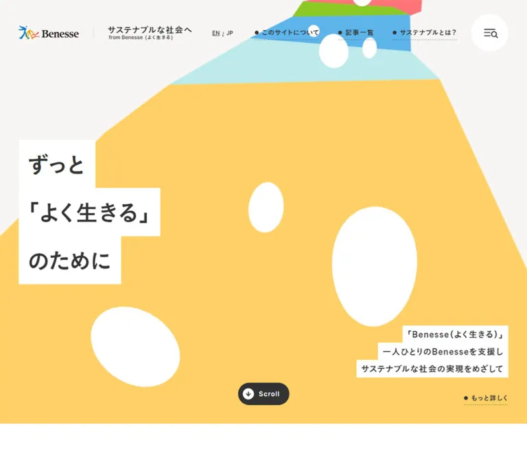
色鮮やかな道のようなビジュアルと白い帯の見出しが印象的な、ベネッセのサステナビリティ情報サイト。記事、SDGs、カテゴリ、タグを通して取り組みを紹介しています。
Benesse — Sustainability Editorial Hub — Style Reference
A broad, colorful pathway opens into a calm library of stories about living well.
Website: Sustainable Society from Benesse
Original URL: https://www.benesse.co.jp/brand/
Final URL: https://www.benesse.co.jp/brand/
HTTP status: 200
Theme: light, with warm neutral surfaces and colorful illustration accents; no theme selector was evidenced.
Inspected evidence: October 2, 2026, 05:10:52 JST. The supplied capture batch records 2026-10-01T20:10:52.641Z.
Viewports: desktop 1440 × 1000 and mobile 390 × 844 CSS pixels.
Scope: the current Japanese homepage, including its hero, nine article entries, SDG navigation, sustainability explainer, six category links, nineteen keyword links, related content, social links, and corporate footer. Linked destination pages and expanded utility states were not inspected.
Benesse combines a large illustrated opening with a substantial editorial directory. The hero uses an irregular, widening ribbon of yellow, pale aqua, blue, green, and coral, punctuated by white organic marks. Its Japanese headline sits on three separate white strips. The result feels open and approachable while keeping the words legible over a busy composition.
Below the opening, the visual system becomes quieter: warm off-white sections, charcoal text, generous section spacing, square content panels, lightly outlined topic chips, and large pill links. Color remains concentrated in the artwork, SDG number markers, and a bright yellow educational panel. This is a corporate editorial hub with several browsing routes, rather than a page organized around one conversion action.
閉じる
Benesse — Sustainability Editorial Hub — Style Reference
A broad, colorful pathway opens into a calm library of stories about living well.
Website: Sustainable Society from Benesse
Original URL: https://www.benesse.co.jp/brand/
Final URL: https://www.benesse.co.jp/brand/
HTTP status: 200
Theme: light, with warm neutral surfaces and colorful illustration accents; no theme selector was evidenced.
Inspected evidence: October 2, 2026, 05:10:52 JST. The supplied capture batch records 2026-10-01T20:10:52.641Z.
Viewports: desktop 1440 × 1000 and mobile 390 × 844 CSS pixels.
Scope: the current Japanese homepage, including its hero, nine article entries, SDG navigation, sustainability explainer, six category links, nineteen keyword links, related content, social links, and corporate footer. Linked destination pages and expanded utility states were not inspected.
Benesse combines a large illustrated opening with a substantial editorial directory. The hero uses an irregular, widening ribbon of yellow, pale aqua, blue, green, and coral, punctuated by white organic marks. Its Japanese headline sits on three separate white strips. The result feels open and approachable while keeping the words legible over a busy composition.
Below the opening, the visual system becomes quieter: warm off-white sections, charcoal text, generous section spacing, square content panels, lightly outlined topic chips, and large pill links. Color remains concentrated in the artwork, SDG number markers, and a bright yellow educational panel. This is a corporate editorial hub with several browsing routes, rather than a page organized around one conversion action.
How to Read This Reference
- Measured values come from the supplied rendered DOM rectangles and computed styles. Coordinates describe the captured state, not a recovered stylesheet formula.
- Visually observed details come from the five original-page captures: desktop hero, SDG/explainer area, desktop footer, mobile hero, and mobile footer.
- Estimates describe colors or geometry visible in screenshots but absent from the computed-style evidence. Estimated hex values are reconstruction starting points, not sampled source colors.
- Derived values are arithmetic relationships between measured rectangles, such as column gaps or repeated strip heights.
- Recommendations and the Quick Start are implementation guidance. The exact source breakpoints, illustration assets, inner span styles, and utility-panel behavior were not supplied.
- Most font measurements belong to sampled containers. Descendant spans, images, and pseudo-elements may change the visible typography or line spacing inside them.
Tokens — Colors
Default Palette
These values are directly supported by computed styles.
| Name | Value | Suggested token | Role |
|---|---|---|---|
| Warm section paper | #f7f6f4 |
--brand-paper |
Article, SDG, category, and keyword sections; selected supporting link surfaces |
| White | #ffffff |
--brand-white |
Body background, category panels, overview pills, social tiles, and visible headline strips |
| Charcoal | #333333 |
--brand-ink |
Main text, navigation, dark scroll pill, and visually matching icon details |
| Secondary gray | #999999 |
--brand-caption |
Descriptions under the three Other Contents entries |
| Legal gray | #777777 |
--brand-muted |
Footer policy links |
White headline-strip fills are visually observed; white body, button, and card fills are independently confirmed by the DOM.
Illustration and Rule Estimates
| Name | Approximate value | Suggested token | Evidence and use |
|---|---|---|---|
| Foreground yellow | #ffd570 |
--brand-hero-yellow |
Visual estimate of the broad lower hero ribbon |
| Pale aqua | #bce9e9 |
--brand-aqua |
Visual estimate of the band above the yellow foreground |
| Sky blue | #59b3e2 |
--brand-blue |
Visual estimate of the next receding band |
| Fresh green | #8dc72b |
--brand-green |
Visual estimate of the narrow upper band |
| Coral | #ff747e |
--brand-coral |
Visual estimate of the uppermost visible warm band |
| Explainer yellow | #ffe500 |
--brand-explainer-yellow |
Visual estimate of the saturated educational panel |
| Light rule | #dedede |
--brand-rule |
Approximation for subtle chip outlines and footer separators |
The two yellows have different jobs. The hero yellow covers a very large area and reads as soft and warm. The explainer yellow is brighter and more concentrated, marking a distinct educational feature.
Accent Behavior
The seventeen SDG entries use distinct colored number circles. A separate aging-society entry uses a plus marker. Their exact color declarations were not supplied; preserve their individual identities using verified assets or an authoritative goal-color dataset when implementing them.
The interface does not use these seventeen colors as general button fills. Most navigation stays charcoal on a neutral surface. Facebook, Instagram, LINE, and X also retain their recognizable brand treatments in the supplied footer capture.
Tokens — Typography
Japanese Display and Interface Face
- Observed source variable:
--font-koburina-w6. - Declared family:
'MFW-KoburinaGoStdN-W6', sans-serif. - Computed weight:
400on the sampled body, headings, and Japanese links. - Role: hero copy, article titles, category headings, chips, and most navigation.
- Character: substantial, friendly Japanese Gothic lettering with open spacing.
The face name carries the W6 distinction even though its computed CSS weight is 400. Replacing it with another family at weight 400 will not necessarily preserve the apparent weight. Avoid applying synthetic bold automatically when the intended W6 face is available.
Japanese Reading Face
- Observed source variable:
--font-koburina-w3. - Declared family:
'MFW-KoburinaGoStdN-W3', sans-serif. - Computed weight:
400. - Role: explanatory paragraphs, category descriptions, and related-content summaries.
The difference between W6 labels and W3 explanatory text is an important part of the hierarchy. Do not give every paragraph the same heavy appearance as the hero.
Latin Utility Face
Inter, sans-serif is explicitly declared for the EN/JP links, Scroll label, and FOLLOW&SHARE label. These sampled elements use weight 600 and tighter tracking than the Japanese body text.
The visible Benesse wordmark is a brand mark. Its lettering should not be reconstructed by choosing a similar serif font.
Computed family declarations establish the intended stacks; the supplied evidence does not include a separate font-file inventory or a rendered-font verification report.
Type Scale
| Role | Desktop | Mobile | Family and evidence |
|---|---|---|---|
| Root size | 10px |
10px |
Measured HTML style; not the visible body size |
| Body and sampled Japanese link containers | 16px / 27.2px |
12px / 20.4px |
W6, weight 400 |
| Global Japanese tracking | 1.6px |
1.2px |
Measured inherited value |
| Hero headline | 48px / 48px |
24px / 24px |
W6; separate padded strips establish the larger block height |
| Hero supporting copy | 18px / 18px |
16px / 16px |
W6; surrounding white strips add vertical space |
| Section-heading containers | 24px / 40.8px |
18px / 30.6px |
W6; inner graphical treatments may differ |
| Category H3 | 18.72px / 31.824px |
14.04px / 23.868px |
W6; preserve the measured distinction from body text |
| Category descriptions | 14px / 28px |
12px / 18px |
W3 |
| Explainer paragraph | 18px / 32.4px |
13px / 22.286px |
W3 |
| Other Contents titles | 18px / 28.286px |
14px / 22px |
W6 |
| Other Contents descriptions | 14px / 21px |
12px / 18px |
W3, #999999 |
| EN / JP | 12px / 12px |
Not visible in the captured header | Inter 600, normal tracking |
| Scroll | 14px / 14px |
10px / 10px |
Inter 600; tracking 1.12px / 0.6px |
| FOLLOW&SHARE | 18px / 18px |
12px / 12px |
Inter 600, normal tracking |
The article title containers inherit 16px / 27.2px on desktop and 12px / 20.4px on mobile. Their measured heights increase in 36px and 32px steps respectively. This indicates that the complete inner line treatment cannot be recovered from the sampled parent styles alone.
Likewise, the Sustainability Action heading region measures 700 × 126.20px on desktop and 330 × 68.08px on mobile, while its sampled H2 has no direct text. Treat this as a heading composition requiring its actual descendants or artwork; the H2's computed font size does not establish the visible lettering size.
Tokens — Spacing & Shapes
Spacing Scale
The spacing system uses several clearly repeated measurements rather than one uniformly scaled unit.
| Use | Desktop | Mobile | Status |
|---|---|---|---|
| Hero/header outer inset | 40px |
20px |
Measured horizontal positions |
| Main editorial section inset | 90px |
30px |
Measured |
| Related-content and footer inset | 90px |
20px |
Measured |
| Article category rail | 40px |
30px |
Measured |
| Main grid column gap | 40px |
Single column | Derived from item positions |
| Article row separation | 75px |
60px |
Derived from neighboring item bounds |
| Category-card gap | 40px |
20px |
Derived |
| Chip gap | 10px |
10px |
Derived |
| Explainer action gap | 20px |
20px vertically |
Derived |
| Social-panel internal inset | Approximately 30px |
Approximately 30px |
Screenshot and child-position evidence |
Border Radius
| Element | Desktop | Mobile |
|---|---|---|
| Hero text strips | Square | Square |
| Category and related-content cards | 0 |
0 |
| SDG and keyword chips | 12px |
6px |
| Large overview links | 40px on an 80px-high pill |
30px on a 60px-high pill |
| Scroll link | 30px |
30px |
| Utility control | Circular, approximately 80px diameter |
Circular, approximately 60px diameter |
| Goal markers and arrow discs | Circular | Circular |
Roundness is reserved mainly for controls and markers. Editorial surfaces remain rectangular.
Layout Measurements
| Element | Desktop measurement | Mobile measurement |
|---|---|---|
| Document height | 7156px |
9592.58px, reported as 9593px |
| Hero extent | Next section begins at y = 1000px |
Next section also begins at y = 1000px |
| Header box | 1440 × 110px |
390 × 90px |
| Brand-link box | 326.50 × 35px, at (40, 52.5) |
266.42 × 24px, at (20, 38) |
| Hero H1 | 303.55 × 312px, at (40, 344) |
164.58 × 162px, at (20, 120) |
| Main content width | 1260px |
330px |
| Complete article column | Approximately 393.33px, including rail |
330px, including rail |
| Article story link width | 353.33px |
300px |
| Category card | 393.33 × 202px |
330 × 152px |
| All-articles link | 300 × 80px |
270 × 60px |
| All-goals link | 360 × 80px |
330 × 60px |
| Explainer audience link | 418 × 80px |
330 × 60px |
| Social tile | 120 × 120px |
71.75 × 71.75px |
At these captures, the hero occupies exactly one desktop viewport but extends 156px beyond the initial mobile viewport. The evidence does not establish the source's general height formula.
Components
Brand Header
Role: establish identity and expose the principal browsing routes.
The header overlays the hero without an opaque full-width bar. A Benesse mark and compact two-line site identity sit on the left. The desktop right side contains EN/JP followed by four links: このサイトについて, 記事一覧, サステナブルとは?, and SDGsとは?.
The links use small charcoal dots as leading markers. Dotted underline details are visible in the desktop capture. The measured header padding is 55px 150px 0 40px; the large right reservation leaves room for the separate utility circle.
On mobile, the language links and desktop navigation are absent from the visible header. The identity remains at a 20px left inset, with the utility circle to its right. The measured mobile header padding is 35px 20px 0.
Circular Utility Control
Role: persistent access to site utilities; its exact action was not exercised.
A white circle contains a compact charcoal glyph combining horizontal lines and a magnifying-glass shape. Its apparent size is about 80px on desktop and 60px on mobile. It stays near the upper-right viewport corner in the hero and lower-page captures, strongly suggesting a fixed control.
The underlying positioning rule, accessible name, opened panel, search behavior, and close behavior were not supplied. Preserve the observed control shell, but define and test the actual interaction separately.
Illustrated Hero
Role: express the site's purpose before presenting its editorial content.
The illustration reads as a broad path or ribbon receding toward the upper right. Its yellow foreground expands beyond the viewport edges; aqua, blue, green, and coral bands become progressively narrower. White ovals and irregular pebble-like forms interrupt the color fields.
The layout has three separate text anchors: a large headline at the left, right-aligned supporting copy near the lower right, and a small Scroll control. The desktop composition leaves extensive open yellow space between them.
Mobile uses a much tighter crop and a different balance of visible shapes. The headline moves near the top, while the supporting copy begins at document y = 812px. Only its first strip is entering the initial 844px-high screenshot. Do not force all hero content above the mobile fold when reproducing this observed composition.
Stepped Headline Strips
Role: keep the message readable while integrating text with the illustration.
The H1 contains the three source lines ずっと, 「よく生きる」, and のために. Each line occupies its own white rectangle, sized to its text. Their unequal widths create a stepped silhouette.
The total measured height is 312px on desktop and 162px on mobile. Dividing by the three bands gives 104px and 54px per band. A practical reconstruction is 48px type with 28px vertical padding on desktop, and 24px type with 15px vertical padding on mobile. Those padding values are derived recommendations; the child-span padding was not sampled.
Keep square corners and touching bands. A single rounded white card would lose the defining silhouette.
Supporting Hero Copy and Scroll Link
The supporting copy repeats the white-strip device at a smaller scale and aligns each line to the right. Its block measures 325.66 × 111px on desktop and 287.91 × 108px on mobile. The もっと詳しく link sits below it and points to /brand/about/.
The dark Scroll pill measures 110 × 48px on desktop and sits at (665, 912), centered horizontally. On mobile it becomes 80 × 30px at (20, 950), aligned to the left. Its white circular arrow marker precedes the Inter label.
The link targets /brand/#scroll. This verifies an in-page destination, but not a smooth-scroll duration or easing curve.
Sustainability Action Introduction
Role: transition from the brand statement to current stories.
The section starts at document y = 1000px at both viewports and uses #f7f6f4. On desktop, the wide heading composition starts at (90, 1156) while a 350px-wide introduction sits to its right. On mobile, the heading and paragraph stack inside a 330px content width.
The desktop article grid begins at y = 1402.20px; the mobile list begins at y = 1317.08px. Preserve the generous introductory pause before the first article.
Article Entry
Role: connect a dated story with its editorial category.
Each entry has two adjacent link regions: a narrow category rail and a wider story link containing the date, title, and Read More text. The category is a separate destination, not a badge nested inside the story anchor.
Desktop uses three columns. Each complete column is approximately 393.33px wide, comprising a 40px rail and a 353.33px story link. Mobile uses one 330px-wide column with a 30px rail and 300px story link. The narrow category bounds are consistent with a vertical label treatment, but the exact writing-mode declaration was not included.
Nine entries are present, ordered from September 25, 2026 through April 28, 2025. Desktop rows accommodate varying text lengths, with a measured 75px separation between rows. Mobile entry height varies and the next entry starts 60px after the preceding link ends.
A leading region precedes the title by approximately 183.28px on desktop and 155.63px on mobile. Image sources, exact media bounds, date styling, and article-image subjects were not supplied. Preserve the measured category/story relationship without inventing those details.
Pill Navigation Link
Role: provide a clear next step after a group of content.
The recurring anatomy is a wide neutral pill, a small leading charcoal dot, a Japanese label, and a dark circular arrow disc at the right. Desktop pills are 80px high with a 40px radius and measured padding 0 15px 0 30px. Mobile pills are 60px high with a 30px radius.
Widths vary by purpose: 300px for all articles, 360px for all goals, and 418px for each audience link on desktop. The arrow disc appears approximately 40px across in the desktop explainer capture; that diameter is a visual estimate.
These are browsing links, not filled promotional CTAs. Keep their surface white or warm paper according to the surrounding section.
SDG Goal Chip
Role: browse stories through a numbered sustainability goal.
Each chip combines a lightly outlined rounded rectangle, a small colored number circle, and a charcoal label. The goal number remains visible inside the circle. The additional aging-society entry uses a plus marker instead of an eighteenth SDG number.
Measured desktop padding is 15px 18px 15px 45px, producing a height of approximately 59.19px. Mobile padding is 12px 15px 12px 36px, producing approximately 46.39px. The radius changes from 12px to 6px. Width follows label length and chips wrap with 10px gaps.
At 1440px, the eighteen entries occupy four rows with 5, 4, 5, and 4 items. Preserve their natural widths rather than forcing them into equal-width tiles.
Mobile evidence includes 全て表示する. The link rectangles continue beyond the area used by subsequent content, which is consistent with a clipped or collapsed list. The number of initially visible goals and the expansion result remain unverified.
Sustainability Explainer
Role: route adults and children to appropriate introductions.
The desktop feature spans the 1260px content width. Its upper white artwork area contains multicolored Japanese lettering, a simple adult-and-child line illustration, and colored rectangular blocks. A shallow, book-like curved meeting point connects the white header artwork with the vivid yellow body.
The body centers three lines of explanatory text in the lighter W3 face at 18px / 32.4px. Two warm-paper pills sit side by side, separated by 20px. Their labels are 【大人】のかた向けコンテンツ and 【お子さま】向けコンテンツ.
Mobile DOM measurements show the buttons stacked at 330px wide, with a 20px vertical gap. The paragraph uses 13px type. Its box is 370px wide at a 10px inset, wider than the 330px action area. The mobile artwork itself was not included in a supplied screenshot, so its crop and exact shape treatment remain unverified.
Category Card
Role: explain the six editorial subject areas.
The six cards cover education/language, technology, art, work/parenting, social contribution, and regional activity. Each is one linked white rectangle containing a W6 heading and a W3 description.
Desktop cards measure 393.33 × 202px in a three-column, two-row arrangement. Their heading region is 80px high, with a 40px left text inset. Description bounds begin 42px from the card's left edge; the sampled two-line description uses 14px / 28px.
Mobile cards measure 330 × 152px and form one column. The heading region becomes 60px high, both text areas use approximately 30px horizontal insets, and the description uses 12px / 18px. Cards are square-cornered and have no measured rounded-card treatment.
Keyword Chip
Role: provide more specific paths into the article archive.
Nineteen keyword links reuse the outlined chip family. Their measured height and radius match the SDG chips, but left padding is smaller: 33px on desktop and 30px on mobile. Do not assume that these chips carry SDG number circles.
The desktop set occupies three rows. On mobile, the same labels wrap across eight rows, retaining content-dependent widths. A flex-wrap layout is a suitable reconstruction, although the original parent layout declaration was not supplied.
Other Contents and Supporting Links
Role: connect the editorial hub to wider Benesse information.
The background changes to white. Three related-content entries link to corporate philosophy, company history, and the Naoshima art site. Desktop entries are approximately 393.33px wide, with 18px titles and lighter gray 14px descriptions.
On mobile, the three entries are each 200px wide and begin at x = 20, 230, and 440px. They remain in one horizontal row extending beyond the 390px viewport. This verifies the horizontal arrangement; it does not prove carousel controls, snapping, or drag behavior.
Below them, two groups pair explanatory labels with rectangular links to sustainability, a children's foundation, an education research institute, and an education information site. These link blocks are approximately 393 × 80px on desktop and 350 × 60px on mobile. The mobile pairs stack with 5px gaps.
Follow and Share Panel
Role: group social destinations separately from editorial navigation.
A warm neutral panel places FOLLOW&SHARE at the left and four white social tiles at the right on desktop. The tiles measure 120px square with 2px gaps. Their familiar logos are centered, at approximately 40px in the screenshot.
Mobile places the label above a four-column row. Tile width becomes 71.75px, with 1px gaps; the overall inner row is 290px wide. The panel sits inside 20px page margins with approximately 30px internal padding.
The supplied hrefs distinguish account links for Facebook and Instagram from sharing links for LINE and X. No sharing action was activated.
Corporate Footer
Role: finish the editorial experience with corporate navigation and policies.
A narrow warm strip repeats the site identity above a white footer. Its measured height is 98px on desktop and 51px on mobile, derived from adjoining section bounds.
Desktop corporate links are arranged in two horizontal groups above a pale legal-link band. Fine rules, small separators, and extensive white space organize the footer. The footer itself measures 443px high.
Mobile uses three full-width primary rows with right chevrons, followed by a two-column grid of secondary links. Primary and secondary link boxes are 42px high, separated by approximately 1px rules. Policy links become a centered multiline group on a pale background, followed by the copyright line. The mobile footer measures 614px high.
The visible copyright reads Copyright ©Benesse Corporation. All rights reserved. No production-credit statement is present in the supplied original-page evidence.
Tokens — Motion & Interaction
| Treatment | Supplied computed value or evidence | What can be concluded |
|---|---|---|
| Root opacity | opacity 0.8s |
A transition is declared; its trigger and complete visual sequence were not observed |
| Brand-link opacity | opacity 0.3s ease-in-out |
The intended transition property and timing are known; endpoint opacity is not supplied |
| Desktop header links | 0.2s |
A short transition is declared; the changed property/state was not exercised |
| Desktop overview and category links | opacity 0.3s |
Opacity transition declaration is verified |
| Desktop SDG and keyword chips | background-color 0.3s, border-color 0.3s |
Background and border feedback is defined; endpoint colors remain unknown |
| Desktop supporting and social links | 0.2s |
Duration is visible in the sampled style; interaction result is untested |
| Mobile sampled links | Frequently all without a nonzero duration |
Do not assume the desktop timed transition applies on touch layouts |
| Scroll pill | Href points to #scroll |
In-page navigation is verified; smooth scrolling is not |
| Mobile goal disclosure | 全て表示する appears in page text |
An expansion affordance is evidenced; expanded state and animation are not |
| Utility circle | Visible at similar viewport coordinates in scrolled captures | Persistence is visually supported; opening behavior is unknown |
| Hero illustration | Static supplied frames; no asset timeline | Animation, parallax, looping, and scroll coupling are unverified |
A sampled animation: none on headings and sections does not prove the hero artwork is static. Motion could belong to unlisted descendants, images, SVG, canvas, or script-controlled elements. Conversely, the readiness procedure's handling of animation does not establish that any particular hero animation exists.
For a new implementation, restrained opacity and border feedback fit the evidenced control system. Keep the hero usable as a static composition until its actual media behavior is available.
Surfaces
| Layer | Appearance | Purpose |
|---|---|---|
| Hero canvas | Light neutral field behind broad flat-color artwork | Establish the brand's visual world |
| Headline and supporting strips | Solid white, square corners, uneven line widths | Protect readability while preserving the illustration |
| Editorial section canvas | #f7f6f4 |
Unite articles, goals, categories, and keywords |
| Category cards | White, square-cornered rectangles | Separate explanatory topic entries |
| Topic chips | Transparent or matching neutral fill, fine outline | Dense but readable browsing choices |
| Overview actions | White or paper pills with charcoal arrow discs | Make section-level navigation easy to find |
| Explainer body | Saturated yellow | Emphasize the introductory educational feature |
| Related-content region | White | Separate wider corporate destinations from the editorial directory |
| Social panel | Warm neutral surround with white square tiles | Group external and sharing links |
| Footer policies | Pale gray band with muted text | Distinguish legal navigation |
No general shadow or glossy elevation system is evident in the supplied screenshots. Structure comes from color fields, white space, borders, and shape changes.
Imagery
The hero's defining quality is flat color at architectural scale. Its bands have irregular angled edges rather than mathematically perfect stripes. The white marks are slightly organic and vary greatly in size, reinforcing depth without realistic shading.
The explainer shifts to simple multicolored line drawing: an adult and child, friendly lettering, and a small skyline of colored blocks. Keep this drawing light enough to coexist with the dense goal navigation above it.
Brand and social marks should remain recognizable. The hero artwork can be expressive; the corporate wordmark and social logos should remain faithful to their supplied forms.
Observed Asset References
No image URLs, file paths, native dimensions, or media formats were included in the rendered evidence. The references below describe visible asset roles only.
| Asset role | Evidence | Implementation guidance |
|---|---|---|
| Benesse identity lockup | Desktop and mobile hero captures | Use authorized logo artwork and preserve the two-part lockup |
| Multicolor hero illustration | Desktop and mobile hero captures | Use appropriate desktop/mobile art direction; avoid stretching one raster capture |
| Sustainability explainer header | Desktop middle capture | Preserve the line drawing, multicolored lettering, and book-like join |
| Utility glyph | Hero and scrolled captures | Reproduce the compact line-and-magnifier silhouette with an accessible control |
| Social marks | Desktop and mobile footer captures | Retain the four observed services and their individual visual identities |
| Article and related-content media | Leading content regions in DOM geometry | Asset identities, subjects, formats, and exact crops remain unverified |
Use real text for the hero copy even when an illustration is supplied. Treat its white strips as interface elements rather than baking the headline into a screenshot.
Layout & Responsive Behavior
Page Sequence
| Region | Desktop start Y | Mobile start Y | Main change |
|---|---|---|---|
| Hero | 0 |
0 |
Same observed 1000px extent; much tighter mobile artwork crop |
| Sustainability Action | 1000 |
1000 |
Three article columns become one |
| SDG and explainer section | 3041.05 |
4882.70 |
Goal disclosure appears; audience buttons stack |
| Categories | 4203.16 |
5938.45 |
Three-by-two grid becomes six stacked cards |
| Keywords | 4887.16 |
7117.45 |
Chips wrap into more rows |
| Other Contents | 5294.72 |
7713.58 |
Three desktop columns become a horizontal row of 200px entries |
| Corporate footer | 6713 |
8978.58 |
Horizontal groups become rows, a small grid, and centered policies |
These are measured positions for the captured content and disclosure state. They are not values to hardcode into a responsive page.
Mobile Is a Recomposition
The hero headline halves in font size but moves much higher, from y = 344px to 120px. Its supporting copy changes only from 18px to 16px and remains near the lower-right edge. The Scroll control moves from bottom center to bottom left. This preserves a large area of illustration instead of shrinking the desktop composition as one unit.
The main editorial container changes from 1260px to 330px. Related-content and footer areas use a wider 350px mobile container. Keep these two mobile inset systems distinct: 30px for the principal content directory, 20px for the lower corporate region and hero edges.
Clipping and Horizontal Overflow
Mobile goal links have measured rectangles extending into the vertical range of later content, while the all-goals link already appears at y = 5214.70px. Combined with the show-all label, this suggests a height-limited goal container. A DOM bounding box alone does not establish visibility through an ancestor's clipping region. Do not treat the eighteen reported rectangles as eighteen simultaneously visible chips.
The Other Contents entries extend beyond the right edge while the page itself remains 390px wide. A horizontal overflow region is a reasonable implementation recommendation. Its precise scrolling mechanism was not tested.
Only two viewport sizes were supplied. Tablet behavior, landscape layouts, the breakpoint that hides desktop navigation, and the exact maximum content-width rule remain unknown.
Do’s and Don’ts
Do
- Preserve the transition from a large illustrated opening to a quieter editorial directory.
- Use measured
#f7f6f4, white, and#333333as the structural palette. - Keep the hero headline on three touching, square white strips of unequal width.
- Distinguish the substantial W6 interface face from the lighter W3 reading face.
- Keep the category rail beside each article when the grid becomes a mobile list.
- Use natural-width SDG and keyword chips with compact gaps.
- Keep goal numbers visible; color is supplementary identification.
- Reserve large pill shapes for overview and audience-routing links.
- Preserve square category panels and social tiles.
- Maintain the two mobile content insets and the horizontal Other Contents arrangement.
- Treat the 1000px mobile hero extent as a real observation when comparing a reconstruction.
Don't
- Don't reduce the page to a hero followed by generic feature cards and one repeated CTA.
- Don't turn every neutral navigation link into a saturated colored button.
- Don't replace the stepped headline strips with one rounded text panel.
- Don't give all content cards pill-like corners or floating shadows.
- Don't assume CSS weight 400 means the W6 face should look light.
- Don't infer article-image subjects from article titles.
- Don't add autoplay, parallax, or looping motion as an observed feature.
- Don't infer visibility from mobile goal-link rectangles without accounting for clipping.
- Don't claim the horizontal related-content row has snapping or carousel controls without testing it.
- Don't invent asset URLs, font-file paths, or intermediate responsive breakpoints.
Recommended Implementation Additions
These are recommendations for a new implementation, not verified features of the original page:
- Give the circular utility control an explicit accessible name matching its implemented action. If it opens an overlay, support Escape, focus placement, and focus return.
- Implement mobile goal expansion with a real button,
aria-expanded, and a controlled content region. Ensure clipped links cannot receive invisible keyboard focus. - Keep category and story links as siblings to avoid nested anchors. Give repeated Read More text a meaningful accessible association with its article title.
- Provide visible keyboard focus on chips, pills, social links, and footer links.
- Review the original 12px mobile text and 42px footer rows against the new project's readability and touch-target requirements. Increasing text or hit areas is an adaptation, not an exact match.
- Check the contrast of
#999999descriptions and colored goal markers. Retain full textual labels alongside color. - Keep the horizontal related-content region keyboard reachable and avoid whole-page horizontal scrolling.
- Supply appropriate text alternatives for meaningful illustrations, and hide purely decorative hero shapes from assistive technology.
- Respect reduced-motion preferences for any added animation and preserve a complete static hero state.
- Load the intended font faces explicitly when available, and test fallback wrapping before fixing widths or heights.
Agent Prompt Guide
Quick Color Reference
- Main section background: measured
#f7f6f4. - Text and dark control discs: measured
#333333. - Cards and headline strips: white.
- Related-content descriptions: measured
#999999. - Hero yellow: approximate
#ffd570; verify against authorized artwork. - Aqua, blue, green, and coral: illustration accents, not a general button palette.
- Explainer yellow: approximate
#ffe500, visibly stronger than the hero yellow. - Rules: subtle light gray; exact border color was not supplied.
Overall Prompt
“Create a Japanese corporate sustainability editorial hub inspired by the supplied Benesse reference. Open with a large flat-color pathway illustration that widens toward the viewer: soft yellow foreground, receding aqua, blue, green, and coral bands, and irregular white oval marks. Put the three-line Japanese headline on separate square white strips at the left, with smaller right-aligned white copy strips near the lower right. Use a transparent brand header, a persistent white circular utility control, and a compact charcoal Scroll pill. Below, use warm paper #f7f6f4, charcoal #333333, generous spacing, a three-column article directory with narrow category rails, naturally wrapping SDG chips, a vivid yellow educational panel, square category cards, and a restrained corporate footer. Recompose the layout for mobile: one article column, stacked audience buttons, compact chips, and a horizontal row of related content. Distinguish measured values from reconstruction choices and keep unverified animation static.”
Example Component Prompts
- Hero headline: “Build an accessible H1 with the source copy
ずっと,「よく生きる」, andのためにin three touching white rectangles. Use the intended W6 Japanese face at 48px on desktop and 24px on mobile. Preserve unequal line widths and square corners. Match total strip heights near 312px and 162px respectively.” - Article entry: “Create sibling category and story links. Reserve a 40px category rail beside a 353px story region on desktop; use 30px plus 300px on a 390px phone. Include date, title, and Read More within the story link. Keep the actual media assets configurable and use three desktop columns with 40px gaps.”
- SDG navigation: “Create natural-width outlined chips on warm paper, with charcoal labels and small numbered color circles. Use 12px radii and roughly 59px heights on desktop; 6px radii and roughly 46px heights on mobile. Keep 10px gaps. Add an accessible mobile disclosure only with complete focus and visibility handling.”
- Explainer panel: “Combine a white illustrated header with multicolored friendly lettering, an adult-and-child line drawing, and a vivid yellow body. Center a lighter-weight explanatory paragraph above two neutral 80px-high audience pills with charcoal arrow discs. Stack 60px-high pills on mobile.”
- Footer: “Use a warm identity strip, a white corporate-link area, a pale policy band, and a centered copyright line. On mobile, use three full-width chevron rows followed by a two-column secondary grid. Keep separators fine, text charcoal or muted gray, and avoid elevated cards.”
Quick Start
CSS Custom Properties
This is a recommended implementation scaffold calibrated to the two observed viewports. Token names and selectors are new aliases. The original root was 10px; this scaffold uses explicit pixel values and does not require changing the application's root size.
Supply authorized artwork inside .hero-art and .explainer-art. No asset URLs or font-file URLs are invented here. Each hero title and copy line should be a separate span. A .pill-action contains a .label and an aria-hidden .arrow; an .article-card contains sibling category and story anchors. Goal numbers should be real text inside .goal-number.
The 767px and 1199px breakpoints below are implementation choices, not recovered source breakpoints. The illustration remains static, and mobile goal expansion requires a separate accessible state controller.
:root {
  /* Measured neutral colors */
  --brand-paper: #f7f6f4;
  --brand-white: #ffffff;
  --brand-ink: #333333;
  --brand-muted: #777777;
  --brand-caption: #999999;

  /* Visual approximations; verify against supplied artwork */
  --brand-rule: #dedede;
  --brand-hero-yellow: #ffd570;
  --brand-aqua: #bce9e9;
  --brand-blue: #59b3e2;
  --brand-green: #8dc72b;
  --brand-coral: #ff747e;
  --brand-explainer-yellow: #ffe500;

  /* Observed family declarations; font files are not supplied */
  --brand-font-ui: 'MFW-KoburinaGoStdN-W6', sans-serif;
  --brand-font-reading: 'MFW-KoburinaGoStdN-W3', sans-serif;
  --brand-font-latin: Inter, sans-serif;
  --brand-body-size: 16px;
  --brand-tracking: 1.6px;

  /* Endpoint measurements and reconstruction aliases */
  --brand-content-inset: 90px;
  --brand-edge-inset: 40px;
  --brand-grid-gap: 40px;
  --brand-rail-width: 40px;
  --brand-chip-radius: 12px;
  --brand-action-height: 80px;
  --brand-hero-height: 1000px;
  --brand-link-motion: 300ms;
}

.brand-page,
.brand-page * {
  box-sizing: border-box;
}

.brand-page {
  margin: 0;
  color: var(--brand-ink);
  background: var(--brand-white);
  font-family: var(--brand-font-ui);
  font-size: var(--brand-body-size);
  font-weight: 400;
  line-height: 1.7;
  letter-spacing: var(--brand-tracking);
}

.brand-page :where(h1, h2, h3, p) { margin: 0; }
.brand-page :where(h1, h2, h3) { font-weight: 400; }
.brand-page a { color: inherit; }
.brand-page img { display: block; max-width: 100%; }

.content-wrap {
  width: calc(100% - 2 * var(--brand-content-inset));
  max-width: 1260px; /* Recommended cap based on the desktop width */
  margin-inline: auto;
}

.wide-wrap {
  width: calc(100% - 2 * var(--brand-edge-inset));
  max-width: 1260px;
  margin-inline: auto;
}

.site-header {
  position: absolute;
  inset: 0 0 auto;
  z-index: 10;
  height: 110px;
}

.brand-lockup {
  position: absolute;
  top: 52.5px;
  left: var(--brand-edge-inset);
  display: flex;
  align-items: center;
  max-width: calc(100% - 120px);
  text-decoration: none;
  transition: opacity 300ms ease-in-out;
}

.desktop-nav {
  position: absolute;
  top: 54.5px;
  right: 150px;
  display: flex;
  align-items: center;
  gap: 40px; /* Approximation; source parent gap was not supplied */
}

.utility-control {
  position: fixed;
  z-index: 30;
  top: 30px;
  right: var(--brand-edge-inset);
  display: grid;
  place-items: center;
  width: 80px;
  height: 80px;
  padding: 0;
  border: 0;
  border-radius: 50%;
  color: var(--brand-ink);
  background: var(--brand-white);
  cursor: pointer;
}

.utility-control svg { width: 30px; height: 30px; }

.hero {
  position: relative;
  isolation: isolate;
  min-height: var(--brand-hero-height);
  background: var(--brand-paper);
}

.hero-art {
  position: absolute;
  z-index: -1;
  inset: 0;
  overflow: hidden;
  pointer-events: none;
}

.hero-art :where(picture, img, svg) {
  display: block;
  width: 100%;
  height: 100%;
}

.hero-art img { object-fit: cover; }

.hero-title {
  position: absolute;
  top: 50%;
  left: var(--brand-edge-inset);
  display: grid;
  justify-items: start;
  transform: translateY(-50%);
  font-size: 48px;
  line-height: 1;
}

.hero-title > span {
  padding: 28px 20px; /* Derived strip reconstruction */
  background: var(--brand-white);
}

.hero-copy {
  position: absolute;
  right: var(--brand-edge-inset);
  bottom: 100px;
  display: grid;
  justify-items: end;
  font-size: 18px;
  line-height: 1;
  text-align: right;
}

.hero-copy > span {
  padding: 9.5px 10px; /* Reconstructs three 37px bands */
  background: var(--brand-white);
}

.hero-detail {
  position: absolute;
  right: var(--brand-edge-inset);
  bottom: 40px;
  min-height: 30px;
  text-decoration-style: dotted;
  text-underline-offset: 8px;
}

.scroll-cue {
  position: absolute;
  left: 50%;
  bottom: 40px;
  display: flex;
  align-items: center;
  justify-content: center;
  gap: 10px;
  width: 110px;
  height: 48px;
  border-radius: 30px;
  transform: translateX(-50%);
  color: var(--brand-white) !important;
  background: var(--brand-ink);
  font: 600 14px/1 var(--brand-font-latin);
  letter-spacing: 1.12px;
  text-decoration: none;
}

.paper-section {
  position: relative;
  padding-block: 90px 150px;
  background: var(--brand-paper);
}

.section-heading {
  position: absolute;
  top: -30px;
  display: flex;
  align-items: center;
  min-height: 60px;
  padding-inline: 25px 30px;
  background: var(--brand-paper);
  font-size: 24px;
}

.action-section { padding-top: 156px; }

.action-intro {
  display: grid;
  grid-template-columns: minmax(0, 700px) minmax(0, 350px);
  align-items: center;
  justify-content: space-between;
  gap: 40px;
}

.article-grid {
  display: grid;
  grid-template-columns: repeat(3, minmax(0, 1fr));
  gap: 75px var(--brand-grid-gap);
  margin-top: 120px;
}

.article-card {
  display: grid;
  grid-template-columns: var(--brand-rail-width) minmax(0, 1fr);
  align-items: start;
}

.article-category {
  width: var(--brand-rail-width);
  writing-mode: vertical-rl; /* Recommended interpretation of the narrow rail */
  text-decoration: none;
}

.article-story { display: block; min-width: 0; text-decoration: none; }
.article-story img { width: 100%; height: auto; }
.article-title { padding-right: 10px; }

.pill-action {
  display: flex;
  align-items: center;
  justify-content: space-between;
  gap: 15px;
  width: 300px;
  max-width: 100%;
  min-height: var(--brand-action-height);
  padding: 10px 15px 10px 30px;
  border-radius: 40px;
  background: var(--brand-white);
  text-decoration: none;
  transition: opacity var(--brand-link-motion);
}

.pill-action .label { min-width: 0; }
.pill-action .label::before {
  content: '';
  display: inline-block;
  width: 8px;
  height: 8px;
  margin-right: 8px;
  border-radius: 50%;
  background: currentColor;
}

.pill-action .arrow {
  display: grid;
  flex: 0 0 40px;
  place-items: center;
  width: 40px;
  height: 40px;
  border-radius: 50%;
  color: var(--brand-white);
  background: var(--brand-ink);
}

.pill-action .arrow::after {
  content: '';
  width: 7px;
  height: 7px;
  border-top: 2px solid currentColor;
  border-right: 2px solid currentColor;
  transform: rotate(45deg);
}

.section-action { margin: 76px auto 0; }
.goals-action { width: 360px; margin: 40px auto 0; }

.chip-list {
  display: flex;
  flex-wrap: wrap;
  align-items: flex-start;
  gap: 10px;
  margin: 0;
  padding: 0;
  list-style: none;
}

.goal-link,
.tag-link {
  position: relative;
  display: inline-block;
  max-width: 100%;
  padding: 15px 18px 15px 45px;
  border: 1px solid var(--brand-rule);
  border-radius: var(--brand-chip-radius);
  text-decoration: none;
  overflow-wrap: anywhere;
  transition: background-color 300ms, border-color 300ms;
}

.tag-link { padding-left: 33px; }

.goal-number {
  position: absolute;
  top: 50%;
  left: 15px;
  display: grid;
  place-items: center;
  width: 20px;
  height: 20px;
  border-radius: 50%;
  transform: translateY(-50%);
  color: white;
  background: var(--goal-color, #666);
  font: 600 10px/1 var(--brand-font-latin);
  letter-spacing: 0;
}

.explainer { margin-top: 40px; }
.explainer-art { background: var(--brand-white); }
.explainer-art img { width: 100%; height: auto; }

.explainer-body {
  padding: 52px 20px 58px;
  background: var(--brand-explainer-yellow);
  text-align: center;
}

.explainer-copy {
  font-family: var(--brand-font-reading);
  font-size: 18px;
  line-height: 1.8;
}

.explainer-actions {
  display: flex;
  justify-content: center;
  gap: 20px;
  margin-top: 33px;
}

.explainer-actions .pill-action {
  width: 418px;
  background: var(--brand-paper);
  text-align: left;
}

.category-grid,
.other-rail {
  display: grid;
  grid-template-columns: repeat(3, minmax(0, 1fr));
  gap: var(--brand-grid-gap);
}

.category-card {
  display: block;
  background: var(--brand-white);
  text-decoration: none;
  transition: opacity 300ms;
}

.category-card h3 {
  display: flex;
  align-items: center;
  min-height: 80px;
  padding-inline: 40px;
  font-size: 18.72px;
  line-height: 1.7;
}

.category-card p {
  margin: 33px 42px;
  font-family: var(--brand-font-reading);
  font-size: 14px;
  line-height: 2;
}

.other-card { min-width: 0; text-decoration: none; }
.other-card h3 { font-size: 18px; line-height: 1.5714; }
.other-card p {
  margin-top: 20px;
  padding-right: 60px;
  color: var(--brand-caption);
  font-family: var(--brand-font-reading);
  font-size: 14px;
  line-height: 1.5;
}

.share-panel {
  display: flex;
  align-items: center;
  justify-content: space-between;
  gap: 30px;
  padding: 30px;
  background: var(--brand-paper);
}

.share-label {
  font: 600 18px/1 var(--brand-font-latin);
  letter-spacing: 0;
}

.share-links {
  display: grid;
  grid-template-columns: repeat(4, 120px);
  gap: 2px;
}

.share-link {
  display: grid;
  place-items: center;
  aspect-ratio: 1;
  background: var(--brand-white);
}

.share-link img { width: 40px; height: 40px; object-fit: contain; }

/* Recommended feedback endpoints; source endpoints were not supplied. */
@media (hover: hover) {
  .pill-action:hover,
  .category-card:hover,
  .brand-lockup:hover { opacity: 0.75; }
  .goal-link:hover,
  .tag-link:hover { background: var(--brand-white); }
}

.brand-page :focus-visible {
  outline: 2px solid var(--brand-ink);
  outline-offset: 4px;
}

/* Recommended navigation breakpoint. */
@media (max-width: 1199px) {
  .desktop-nav { display: none; }
}

/* Recommended breakpoint calibrated to the 390px capture. */
@media (max-width: 767px) {
  :root {
    --brand-body-size: 12px;
    --brand-tracking: 1.2px;
    --brand-content-inset: 30px;
    --brand-edge-inset: 20px;
    --brand-grid-gap: 20px;
    --brand-rail-width: 30px;
    --brand-chip-radius: 6px;
    --brand-action-height: 60px;
  }

  .site-header { height: 90px; }
  .brand-lockup { top: 38px; }
  .utility-control { top: 20px; width: 60px; height: 60px; }
  .utility-control svg { width: 24px; height: 24px; }

  .hero-title { top: 120px; transform: none; font-size: 24px; }
  .hero-title > span { padding: 15px; }
  .hero-copy { bottom: 80px; font-size: 16px; }
  .hero-copy > span { padding: 10px; }

  .scroll-cue {
    left: 20px;
    bottom: 20px;
    width: 80px;
    height: 30px;
    transform: none;
    font-size: 10px;
    letter-spacing: 0.6px;
  }

  .paper-section { padding-block: 62px 105px; }
  .section-heading {
    top: -22.5px;
    min-height: 45px;
    padding-inline: 20px 25px;
    font-size: 18px;
  }

  .action-section { padding-top: 120px; }
  .action-intro { grid-template-columns: 1fr; gap: 26px; }
  .action-intro p { line-height: 24px; }
  .article-grid { grid-template-columns: 1fr; gap: 60px; margin-top: 55px; }

  .pill-action { border-radius: 30px; }
  .section-action { width: 270px; margin-top: 60px; }
  .goals-action { width: 330px; }

  .goal-link { padding: 12px 15px 12px 36px; }
  .tag-link { padding: 12px 15px 12px 30px; }
  .goal-number { left: 12px; width: 16px; height: 16px; font-size: 9px; }

  .explainer-body { padding: 32px 20px 40px; }
  .explainer-copy { font-size: 13px; line-height: 1.7143; }
  .explainer-actions { flex-direction: column; align-items: center; gap: 20px; }
  .explainer-actions .pill-action { width: 330px; }

  .category-grid { grid-template-columns: 1fr; gap: 20px; }
  .category-card h3 { min-height: 60px; padding-inline: 30px; font-size: 14.04px; }
  .category-card p { margin: 28px 30px; font-size: 12px; line-height: 18px; }

  .other-rail {
    display: flex;
    gap: 10px;
    overflow-x: auto;
    padding-bottom: 12px;
  }
  .other-card { flex: 0 0 200px; }
  .other-card h3 { font-size: 14px; line-height: 22px; }
  .other-card p { padding-right: 30px; font-size: 12px; line-height: 18px; }

  .share-panel { display: grid; gap: 17px; }
  .share-label { font-size: 12px; }
  .share-links { grid-template-columns: repeat(4, minmax(0, 1fr)); gap: 1px; }
  .share-link img { width: 24px; height: 24px; }
}

/* Recommended reduced-motion support for the scaffold. */
@media (prefers-reduced-motion: reduce) {
  .brand-page *,
  .brand-page *::before,
  .brand-page *::after {
    transition: none !important;
    animation: none !important;
    scroll-behavior: auto !important;
  }
}
This scaffold leaves text-driven cards free to grow. The measured card dimensions describe the captured copy; fixing every card to those heights would risk clipping after font substitution, translation, or text zoom. The explainer's curved artwork join, original media, and complete utility/disclosure interactions require separate assets or implementation.
Tailwind v4 Token Mapping
Optional aliases for a project already using Tailwind v4. These are not evidence that the original site uses Tailwind. Define the properties above first.
@theme inline {
  --color-brand-paper: var(--brand-paper);
  --color-brand-ink: var(--brand-ink);
  --color-brand-muted: var(--brand-muted);
  --color-brand-caption: var(--brand-caption);
  --color-brand-rule: var(--brand-rule);
  --color-brand-hero-yellow: var(--brand-hero-yellow);
  --color-brand-explainer-yellow: var(--brand-explainer-yellow);

  --font-brand-ui: var(--brand-font-ui);
  --font-brand-reading: var(--brand-font-reading);
  --font-brand-latin: var(--brand-font-latin);

  --text-brand-body: var(--brand-body-size);
  --spacing-brand-inset: var(--brand-content-inset);
  --spacing-brand-edge: var(--brand-edge-inset);
  --spacing-brand-grid: var(--brand-grid-gap);
  --spacing-brand-rail: var(--brand-rail-width);
  --radius-brand-chip: var(--brand-chip-radius);
  --radius-brand-pill: 999px;
}
Sources & Evidence
- Original and final page: https://www.benesse.co.jp/brand/. The supplied observation reports HTTP 200 and the same original/final URL.
- Capture batch: retrieved at
2026-10-01T20:10:52.641Z, equivalent to October 2, 2026, 05:10:52.641 JST. Individual frame timestamps were not supplied. - Desktop evidence:
1440 × 1000CSS pixels; document height 7156px; original-page screenshots of the hero, SDG/explainer area, and footer; rendered text, hrefs, element rectangles, computed styles, and two font custom properties. - Mobile evidence:
390 × 844CSS pixels; measured document height 9592.58px; original-page screenshots of the hero and footer; corresponding rendered text, links, geometry, and computed styles. - Inspection behavior: the supplied browser process observed the initial page for at least five seconds, checked layout/text stability and visible image decoding, and traversed intermediate scroll positions. Perpetual animations were temporarily paused during readiness checks and then resumed. SharedWorkers and service workers were disabled.
- Interaction limits: no supplied click results establish the utility panel, search, mobile goal expansion, social sharing, hover endpoints, horizontal-card movement, or anchor-scroll easing. Link destinations are DOM evidence, not inspected destination-page designs.
- Visual limits: article and category details outside the supplied screenshot crops rely on DOM measurements. Image sources, native dimensions, inner artwork structure, exact accent hex values, and full animation timelines were not provided.
This reference describes the current homepage represented by the supplied captures. Measured values, visual estimates, and implementation recommendations are distinguished throughout.
# Benesse — Sustainability Editorial Hub — Style Reference

> A broad, colorful pathway opens into a calm library of stories about living well.

**Website:** [Sustainable Society from Benesse](https://www.benesse.co.jp/brand/)
**Original URL:** https://www.benesse.co.jp/brand/
**Final URL:** https://www.benesse.co.jp/brand/
**HTTP status:** 200
**Theme:** light, with warm neutral surfaces and colorful illustration accents; no theme selector was evidenced.
**Inspected evidence:** October 2, 2026, 05:10:52 JST. The supplied capture batch records `2026-10-01T20:10:52.641Z`.
**Viewports:** desktop `1440 × 1000` and mobile `390 × 844` CSS pixels.
**Scope:** the current Japanese homepage, including its hero, nine article entries, SDG navigation, sustainability explainer, six category links, nineteen keyword links, related content, social links, and corporate footer. Linked destination pages and expanded utility states were not inspected.

Benesse combines a large illustrated opening with a substantial editorial directory. The hero uses an irregular, widening ribbon of yellow, pale aqua, blue, green, and coral, punctuated by white organic marks. Its Japanese headline sits on three separate white strips. The result feels open and approachable while keeping the words legible over a busy composition.

Below the opening, the visual system becomes quieter: warm off-white sections, charcoal text, generous section spacing, square content panels, lightly outlined topic chips, and large pill links. Color remains concentrated in the artwork, SDG number markers, and a bright yellow educational panel. This is a corporate editorial hub with several browsing routes, rather than a page organized around one conversion action.
閉じる
# Benesse — Sustainability Editorial Hub — Style Reference

> A broad, colorful pathway opens into a calm library of stories about living well.

**Website:** [Sustainable Society from Benesse](https://www.benesse.co.jp/brand/)
**Original URL:** https://www.benesse.co.jp/brand/
**Final URL:** https://www.benesse.co.jp/brand/
**HTTP status:** 200
**Theme:** light, with warm neutral surfaces and colorful illustration accents; no theme selector was evidenced.
**Inspected evidence:** October 2, 2026, 05:10:52 JST. The supplied capture batch records `2026-10-01T20:10:52.641Z`.
**Viewports:** desktop `1440 × 1000` and mobile `390 × 844` CSS pixels.
**Scope:** the current Japanese homepage, including its hero, nine article entries, SDG navigation, sustainability explainer, six category links, nineteen keyword links, related content, social links, and corporate footer. Linked destination pages and expanded utility states were not inspected.

Benesse combines a large illustrated opening with a substantial editorial directory. The hero uses an irregular, widening ribbon of yellow, pale aqua, blue, green, and coral, punctuated by white organic marks. Its Japanese headline sits on three separate white strips. The result feels open and approachable while keeping the words legible over a busy composition.

Below the opening, the visual system becomes quieter: warm off-white sections, charcoal text, generous section spacing, square content panels, lightly outlined topic chips, and large pill links. Color remains concentrated in the artwork, SDG number markers, and a bright yellow educational panel. This is a corporate editorial hub with several browsing routes, rather than a page organized around one conversion action.

## How to Read This Reference

- **Measured** values come from the supplied rendered DOM rectangles and computed styles. Coordinates describe the captured state, not a recovered stylesheet formula.
- **Visually observed** details come from the five original-page captures: desktop hero, SDG/explainer area, desktop footer, mobile hero, and mobile footer.
- **Estimates** describe colors or geometry visible in screenshots but absent from the computed-style evidence. Estimated hex values are reconstruction starting points, not sampled source colors.
- **Derived** values are arithmetic relationships between measured rectangles, such as column gaps or repeated strip heights.
- **Recommendations** and the Quick Start are implementation guidance. The exact source breakpoints, illustration assets, inner span styles, and utility-panel behavior were not supplied.
- Most font measurements belong to sampled containers. Descendant spans, images, and pseudo-elements may change the visible typography or line spacing inside them.

## Tokens — Colors

### Default Palette

These values are directly supported by computed styles.

| Name | Value | Suggested token | Role |
| --- | --- | --- | --- |
| Warm section paper | `#f7f6f4` | `--brand-paper` | Article, SDG, category, and keyword sections; selected supporting link surfaces |
| White | `#ffffff` | `--brand-white` | Body background, category panels, overview pills, social tiles, and visible headline strips |
| Charcoal | `#333333` | `--brand-ink` | Main text, navigation, dark scroll pill, and visually matching icon details |
| Secondary gray | `#999999` | `--brand-caption` | Descriptions under the three Other Contents entries |
| Legal gray | `#777777` | `--brand-muted` | Footer policy links |

White headline-strip fills are visually observed; white body, button, and card fills are independently confirmed by the DOM.

### Illustration and Rule Estimates

| Name | Approximate value | Suggested token | Evidence and use |
| --- | --- | --- | --- |
| Foreground yellow | `#ffd570` | `--brand-hero-yellow` | Visual estimate of the broad lower hero ribbon |
| Pale aqua | `#bce9e9` | `--brand-aqua` | Visual estimate of the band above the yellow foreground |
| Sky blue | `#59b3e2` | `--brand-blue` | Visual estimate of the next receding band |
| Fresh green | `#8dc72b` | `--brand-green` | Visual estimate of the narrow upper band |
| Coral | `#ff747e` | `--brand-coral` | Visual estimate of the uppermost visible warm band |
| Explainer yellow | `#ffe500` | `--brand-explainer-yellow` | Visual estimate of the saturated educational panel |
| Light rule | `#dedede` | `--brand-rule` | Approximation for subtle chip outlines and footer separators |

The two yellows have different jobs. The hero yellow covers a very large area and reads as soft and warm. The explainer yellow is brighter and more concentrated, marking a distinct educational feature.

### Accent Behavior

The seventeen SDG entries use distinct colored number circles. A separate aging-society entry uses a plus marker. Their exact color declarations were not supplied; preserve their individual identities using verified assets or an authoritative goal-color dataset when implementing them.

The interface does not use these seventeen colors as general button fills. Most navigation stays charcoal on a neutral surface. Facebook, Instagram, LINE, and X also retain their recognizable brand treatments in the supplied footer capture.

## Tokens — Typography

### Japanese Display and Interface Face

- **Observed source variable:** `--font-koburina-w6`.
- **Declared family:** `'MFW-KoburinaGoStdN-W6', sans-serif`.
- **Computed weight:** `400` on the sampled body, headings, and Japanese links.
- **Role:** hero copy, article titles, category headings, chips, and most navigation.
- **Character:** substantial, friendly Japanese Gothic lettering with open spacing.

The face name carries the W6 distinction even though its computed CSS weight is 400. Replacing it with another family at weight 400 will not necessarily preserve the apparent weight. Avoid applying synthetic bold automatically when the intended W6 face is available.

### Japanese Reading Face

- **Observed source variable:** `--font-koburina-w3`.
- **Declared family:** `'MFW-KoburinaGoStdN-W3', sans-serif`.
- **Computed weight:** `400`.
- **Role:** explanatory paragraphs, category descriptions, and related-content summaries.

The difference between W6 labels and W3 explanatory text is an important part of the hierarchy. Do not give every paragraph the same heavy appearance as the hero.

### Latin Utility Face

**Inter, sans-serif** is explicitly declared for the EN/JP links, Scroll label, and FOLLOW&SHARE label. These sampled elements use weight `600` and tighter tracking than the Japanese body text.

The visible Benesse wordmark is a brand mark. Its lettering should not be reconstructed by choosing a similar serif font.

Computed family declarations establish the intended stacks; the supplied evidence does not include a separate font-file inventory or a rendered-font verification report.

### Type Scale

| Role | Desktop | Mobile | Family and evidence |
| --- | --- | --- | --- |
| Root size | `10px` | `10px` | Measured HTML style; not the visible body size |
| Body and sampled Japanese link containers | `16px / 27.2px` | `12px / 20.4px` | W6, weight 400 |
| Global Japanese tracking | `1.6px` | `1.2px` | Measured inherited value |
| Hero headline | `48px / 48px` | `24px / 24px` | W6; separate padded strips establish the larger block height |
| Hero supporting copy | `18px / 18px` | `16px / 16px` | W6; surrounding white strips add vertical space |
| Section-heading containers | `24px / 40.8px` | `18px / 30.6px` | W6; inner graphical treatments may differ |
| Category H3 | `18.72px / 31.824px` | `14.04px / 23.868px` | W6; preserve the measured distinction from body text |
| Category descriptions | `14px / 28px` | `12px / 18px` | W3 |
| Explainer paragraph | `18px / 32.4px` | `13px / 22.286px` | W3 |
| Other Contents titles | `18px / 28.286px` | `14px / 22px` | W6 |
| Other Contents descriptions | `14px / 21px` | `12px / 18px` | W3, `#999999` |
| EN / JP | `12px / 12px` | Not visible in the captured header | Inter 600, normal tracking |
| Scroll | `14px / 14px` | `10px / 10px` | Inter 600; tracking `1.12px` / `0.6px` |
| FOLLOW&SHARE | `18px / 18px` | `12px / 12px` | Inter 600, normal tracking |

The article title containers inherit `16px / 27.2px` on desktop and `12px / 20.4px` on mobile. Their measured heights increase in 36px and 32px steps respectively. This indicates that the complete inner line treatment cannot be recovered from the sampled parent styles alone.

Likewise, the Sustainability Action heading region measures `700 × 126.20px` on desktop and `330 × 68.08px` on mobile, while its sampled H2 has no direct text. Treat this as a heading composition requiring its actual descendants or artwork; the H2's computed font size does not establish the visible lettering size.

## Tokens — Spacing & Shapes

### Spacing Scale

The spacing system uses several clearly repeated measurements rather than one uniformly scaled unit.

| Use | Desktop | Mobile | Status |
| --- | --- | --- | --- |
| Hero/header outer inset | `40px` | `20px` | Measured horizontal positions |
| Main editorial section inset | `90px` | `30px` | Measured |
| Related-content and footer inset | `90px` | `20px` | Measured |
| Article category rail | `40px` | `30px` | Measured |
| Main grid column gap | `40px` | Single column | Derived from item positions |
| Article row separation | `75px` | `60px` | Derived from neighboring item bounds |
| Category-card gap | `40px` | `20px` | Derived |
| Chip gap | `10px` | `10px` | Derived |
| Explainer action gap | `20px` | `20px` vertically | Derived |
| Social-panel internal inset | Approximately `30px` | Approximately `30px` | Screenshot and child-position evidence |

### Border Radius

| Element | Desktop | Mobile |
| --- | --- | --- |
| Hero text strips | Square | Square |
| Category and related-content cards | `0` | `0` |
| SDG and keyword chips | `12px` | `6px` |
| Large overview links | `40px` on an `80px`-high pill | `30px` on a `60px`-high pill |
| Scroll link | `30px` | `30px` |
| Utility control | Circular, approximately `80px` diameter | Circular, approximately `60px` diameter |
| Goal markers and arrow discs | Circular | Circular |

Roundness is reserved mainly for controls and markers. Editorial surfaces remain rectangular.

### Layout Measurements

| Element | Desktop measurement | Mobile measurement |
| --- | --- | --- |
| Document height | `7156px` | `9592.58px`, reported as `9593px` |
| Hero extent | Next section begins at `y = 1000px` | Next section also begins at `y = 1000px` |
| Header box | `1440 × 110px` | `390 × 90px` |
| Brand-link box | `326.50 × 35px`, at `(40, 52.5)` | `266.42 × 24px`, at `(20, 38)` |
| Hero H1 | `303.55 × 312px`, at `(40, 344)` | `164.58 × 162px`, at `(20, 120)` |
| Main content width | `1260px` | `330px` |
| Complete article column | Approximately `393.33px`, including rail | `330px`, including rail |
| Article story link width | `353.33px` | `300px` |
| Category card | `393.33 × 202px` | `330 × 152px` |
| All-articles link | `300 × 80px` | `270 × 60px` |
| All-goals link | `360 × 80px` | `330 × 60px` |
| Explainer audience link | `418 × 80px` | `330 × 60px` |
| Social tile | `120 × 120px` | `71.75 × 71.75px` |

At these captures, the hero occupies exactly one desktop viewport but extends 156px beyond the initial mobile viewport. The evidence does not establish the source's general height formula.

## Components

### Brand Header

**Role:** establish identity and expose the principal browsing routes.

The header overlays the hero without an opaque full-width bar. A Benesse mark and compact two-line site identity sit on the left. The desktop right side contains EN/JP followed by four links: `このサイトについて`, `記事一覧`, `サステナブルとは?`, and `SDGsとは?`.

The links use small charcoal dots as leading markers. Dotted underline details are visible in the desktop capture. The measured header padding is `55px 150px 0 40px`; the large right reservation leaves room for the separate utility circle.

On mobile, the language links and desktop navigation are absent from the visible header. The identity remains at a 20px left inset, with the utility circle to its right. The measured mobile header padding is `35px 20px 0`.

### Circular Utility Control

**Role:** persistent access to site utilities; its exact action was not exercised.

A white circle contains a compact charcoal glyph combining horizontal lines and a magnifying-glass shape. Its apparent size is about 80px on desktop and 60px on mobile. It stays near the upper-right viewport corner in the hero and lower-page captures, strongly suggesting a fixed control.

The underlying positioning rule, accessible name, opened panel, search behavior, and close behavior were not supplied. Preserve the observed control shell, but define and test the actual interaction separately.

### Illustrated Hero

**Role:** express the site's purpose before presenting its editorial content.

The illustration reads as a broad path or ribbon receding toward the upper right. Its yellow foreground expands beyond the viewport edges; aqua, blue, green, and coral bands become progressively narrower. White ovals and irregular pebble-like forms interrupt the color fields.

The layout has three separate text anchors: a large headline at the left, right-aligned supporting copy near the lower right, and a small Scroll control. The desktop composition leaves extensive open yellow space between them.

Mobile uses a much tighter crop and a different balance of visible shapes. The headline moves near the top, while the supporting copy begins at document `y = 812px`. Only its first strip is entering the initial 844px-high screenshot. Do not force all hero content above the mobile fold when reproducing this observed composition.

### Stepped Headline Strips

**Role:** keep the message readable while integrating text with the illustration.

The H1 contains the three source lines `ずっと`, `「よく生きる」`, and `のために`. Each line occupies its own white rectangle, sized to its text. Their unequal widths create a stepped silhouette.

The total measured height is 312px on desktop and 162px on mobile. Dividing by the three bands gives 104px and 54px per band. A practical reconstruction is 48px type with 28px vertical padding on desktop, and 24px type with 15px vertical padding on mobile. Those padding values are derived recommendations; the child-span padding was not sampled.

Keep square corners and touching bands. A single rounded white card would lose the defining silhouette.

### Supporting Hero Copy and Scroll Link

The supporting copy repeats the white-strip device at a smaller scale and aligns each line to the right. Its block measures `325.66 × 111px` on desktop and `287.91 × 108px` on mobile. The `もっと詳しく` link sits below it and points to `/brand/about/`.

The dark Scroll pill measures `110 × 48px` on desktop and sits at `(665, 912)`, centered horizontally. On mobile it becomes `80 × 30px` at `(20, 950)`, aligned to the left. Its white circular arrow marker precedes the Inter label.

The link targets `/brand/#scroll`. This verifies an in-page destination, but not a smooth-scroll duration or easing curve.

### Sustainability Action Introduction

**Role:** transition from the brand statement to current stories.

The section starts at document `y = 1000px` at both viewports and uses `#f7f6f4`. On desktop, the wide heading composition starts at `(90, 1156)` while a 350px-wide introduction sits to its right. On mobile, the heading and paragraph stack inside a 330px content width.

The desktop article grid begins at `y = 1402.20px`; the mobile list begins at `y = 1317.08px`. Preserve the generous introductory pause before the first article.

### Article Entry

**Role:** connect a dated story with its editorial category.

Each entry has two adjacent link regions: a narrow category rail and a wider story link containing the date, title, and Read More text. The category is a separate destination, not a badge nested inside the story anchor.

Desktop uses three columns. Each complete column is approximately 393.33px wide, comprising a 40px rail and a 353.33px story link. Mobile uses one 330px-wide column with a 30px rail and 300px story link. The narrow category bounds are consistent with a vertical label treatment, but the exact writing-mode declaration was not included.

Nine entries are present, ordered from September 25, 2026 through April 28, 2025. Desktop rows accommodate varying text lengths, with a measured 75px separation between rows. Mobile entry height varies and the next entry starts 60px after the preceding link ends.

A leading region precedes the title by approximately 183.28px on desktop and 155.63px on mobile. Image sources, exact media bounds, date styling, and article-image subjects were not supplied. Preserve the measured category/story relationship without inventing those details.

### Pill Navigation Link

**Role:** provide a clear next step after a group of content.

The recurring anatomy is a wide neutral pill, a small leading charcoal dot, a Japanese label, and a dark circular arrow disc at the right. Desktop pills are 80px high with a 40px radius and measured padding `0 15px 0 30px`. Mobile pills are 60px high with a 30px radius.

Widths vary by purpose: 300px for all articles, 360px for all goals, and 418px for each audience link on desktop. The arrow disc appears approximately 40px across in the desktop explainer capture; that diameter is a visual estimate.

These are browsing links, not filled promotional CTAs. Keep their surface white or warm paper according to the surrounding section.

### SDG Goal Chip

**Role:** browse stories through a numbered sustainability goal.

Each chip combines a lightly outlined rounded rectangle, a small colored number circle, and a charcoal label. The goal number remains visible inside the circle. The additional aging-society entry uses a plus marker instead of an eighteenth SDG number.

Measured desktop padding is `15px 18px 15px 45px`, producing a height of approximately 59.19px. Mobile padding is `12px 15px 12px 36px`, producing approximately 46.39px. The radius changes from 12px to 6px. Width follows label length and chips wrap with 10px gaps.

At 1440px, the eighteen entries occupy four rows with 5, 4, 5, and 4 items. Preserve their natural widths rather than forcing them into equal-width tiles.

Mobile evidence includes `全て表示する`. The link rectangles continue beyond the area used by subsequent content, which is consistent with a clipped or collapsed list. The number of initially visible goals and the expansion result remain unverified.

### Sustainability Explainer

**Role:** route adults and children to appropriate introductions.

The desktop feature spans the 1260px content width. Its upper white artwork area contains multicolored Japanese lettering, a simple adult-and-child line illustration, and colored rectangular blocks. A shallow, book-like curved meeting point connects the white header artwork with the vivid yellow body.

The body centers three lines of explanatory text in the lighter W3 face at `18px / 32.4px`. Two warm-paper pills sit side by side, separated by 20px. Their labels are `【大人】のかた向けコンテンツ` and `【お子さま】向けコンテンツ`.

Mobile DOM measurements show the buttons stacked at 330px wide, with a 20px vertical gap. The paragraph uses 13px type. Its box is 370px wide at a 10px inset, wider than the 330px action area. The mobile artwork itself was not included in a supplied screenshot, so its crop and exact shape treatment remain unverified.

### Category Card

**Role:** explain the six editorial subject areas.

The six cards cover education/language, technology, art, work/parenting, social contribution, and regional activity. Each is one linked white rectangle containing a W6 heading and a W3 description.

Desktop cards measure `393.33 × 202px` in a three-column, two-row arrangement. Their heading region is 80px high, with a 40px left text inset. Description bounds begin 42px from the card's left edge; the sampled two-line description uses `14px / 28px`.

Mobile cards measure `330 × 152px` and form one column. The heading region becomes 60px high, both text areas use approximately 30px horizontal insets, and the description uses `12px / 18px`. Cards are square-cornered and have no measured rounded-card treatment.

### Keyword Chip

**Role:** provide more specific paths into the article archive.

Nineteen keyword links reuse the outlined chip family. Their measured height and radius match the SDG chips, but left padding is smaller: 33px on desktop and 30px on mobile. Do not assume that these chips carry SDG number circles.

The desktop set occupies three rows. On mobile, the same labels wrap across eight rows, retaining content-dependent widths. A flex-wrap layout is a suitable reconstruction, although the original parent layout declaration was not supplied.

### Other Contents and Supporting Links

**Role:** connect the editorial hub to wider Benesse information.

The background changes to white. Three related-content entries link to corporate philosophy, company history, and the Naoshima art site. Desktop entries are approximately 393.33px wide, with 18px titles and lighter gray 14px descriptions.

On mobile, the three entries are each 200px wide and begin at `x = 20`, `230`, and `440px`. They remain in one horizontal row extending beyond the 390px viewport. This verifies the horizontal arrangement; it does not prove carousel controls, snapping, or drag behavior.

Below them, two groups pair explanatory labels with rectangular links to sustainability, a children's foundation, an education research institute, and an education information site. These link blocks are approximately `393 × 80px` on desktop and `350 × 60px` on mobile. The mobile pairs stack with 5px gaps.

### Follow and Share Panel

**Role:** group social destinations separately from editorial navigation.

A warm neutral panel places FOLLOW&SHARE at the left and four white social tiles at the right on desktop. The tiles measure 120px square with 2px gaps. Their familiar logos are centered, at approximately 40px in the screenshot.

Mobile places the label above a four-column row. Tile width becomes 71.75px, with 1px gaps; the overall inner row is 290px wide. The panel sits inside 20px page margins with approximately 30px internal padding.

The supplied hrefs distinguish account links for Facebook and Instagram from sharing links for LINE and X. No sharing action was activated.

### Corporate Footer

**Role:** finish the editorial experience with corporate navigation and policies.

A narrow warm strip repeats the site identity above a white footer. Its measured height is 98px on desktop and 51px on mobile, derived from adjoining section bounds.

Desktop corporate links are arranged in two horizontal groups above a pale legal-link band. Fine rules, small separators, and extensive white space organize the footer. The footer itself measures 443px high.

Mobile uses three full-width primary rows with right chevrons, followed by a two-column grid of secondary links. Primary and secondary link boxes are 42px high, separated by approximately 1px rules. Policy links become a centered multiline group on a pale background, followed by the copyright line. The mobile footer measures 614px high.

The visible copyright reads `Copyright ©Benesse Corporation. All rights reserved.` No production-credit statement is present in the supplied original-page evidence.

## Tokens — Motion & Interaction

| Treatment | Supplied computed value or evidence | What can be concluded |
| --- | --- | --- |
| Root opacity | `opacity 0.8s` | A transition is declared; its trigger and complete visual sequence were not observed |
| Brand-link opacity | `opacity 0.3s ease-in-out` | The intended transition property and timing are known; endpoint opacity is not supplied |
| Desktop header links | `0.2s` | A short transition is declared; the changed property/state was not exercised |
| Desktop overview and category links | `opacity 0.3s` | Opacity transition declaration is verified |
| Desktop SDG and keyword chips | `background-color 0.3s, border-color 0.3s` | Background and border feedback is defined; endpoint colors remain unknown |
| Desktop supporting and social links | `0.2s` | Duration is visible in the sampled style; interaction result is untested |
| Mobile sampled links | Frequently `all` without a nonzero duration | Do not assume the desktop timed transition applies on touch layouts |
| Scroll pill | Href points to `#scroll` | In-page navigation is verified; smooth scrolling is not |
| Mobile goal disclosure | `全て表示する` appears in page text | An expansion affordance is evidenced; expanded state and animation are not |
| Utility circle | Visible at similar viewport coordinates in scrolled captures | Persistence is visually supported; opening behavior is unknown |
| Hero illustration | Static supplied frames; no asset timeline | Animation, parallax, looping, and scroll coupling are unverified |

A sampled `animation: none` on headings and sections does not prove the hero artwork is static. Motion could belong to unlisted descendants, images, SVG, canvas, or script-controlled elements. Conversely, the readiness procedure's handling of animation does not establish that any particular hero animation exists.

For a new implementation, restrained opacity and border feedback fit the evidenced control system. Keep the hero usable as a static composition until its actual media behavior is available.

## Surfaces

| Layer | Appearance | Purpose |
| --- | --- | --- |
| Hero canvas | Light neutral field behind broad flat-color artwork | Establish the brand's visual world |
| Headline and supporting strips | Solid white, square corners, uneven line widths | Protect readability while preserving the illustration |
| Editorial section canvas | `#f7f6f4` | Unite articles, goals, categories, and keywords |
| Category cards | White, square-cornered rectangles | Separate explanatory topic entries |
| Topic chips | Transparent or matching neutral fill, fine outline | Dense but readable browsing choices |
| Overview actions | White or paper pills with charcoal arrow discs | Make section-level navigation easy to find |
| Explainer body | Saturated yellow | Emphasize the introductory educational feature |
| Related-content region | White | Separate wider corporate destinations from the editorial directory |
| Social panel | Warm neutral surround with white square tiles | Group external and sharing links |
| Footer policies | Pale gray band with muted text | Distinguish legal navigation |

No general shadow or glossy elevation system is evident in the supplied screenshots. Structure comes from color fields, white space, borders, and shape changes.

## Imagery

The hero's defining quality is flat color at architectural scale. Its bands have irregular angled edges rather than mathematically perfect stripes. The white marks are slightly organic and vary greatly in size, reinforcing depth without realistic shading.

The explainer shifts to simple multicolored line drawing: an adult and child, friendly lettering, and a small skyline of colored blocks. Keep this drawing light enough to coexist with the dense goal navigation above it.

Brand and social marks should remain recognizable. The hero artwork can be expressive; the corporate wordmark and social logos should remain faithful to their supplied forms.

### Observed Asset References

No image URLs, file paths, native dimensions, or media formats were included in the rendered evidence. The references below describe visible asset roles only.

| Asset role | Evidence | Implementation guidance |
| --- | --- | --- |
| Benesse identity lockup | Desktop and mobile hero captures | Use authorized logo artwork and preserve the two-part lockup |
| Multicolor hero illustration | Desktop and mobile hero captures | Use appropriate desktop/mobile art direction; avoid stretching one raster capture |
| Sustainability explainer header | Desktop middle capture | Preserve the line drawing, multicolored lettering, and book-like join |
| Utility glyph | Hero and scrolled captures | Reproduce the compact line-and-magnifier silhouette with an accessible control |
| Social marks | Desktop and mobile footer captures | Retain the four observed services and their individual visual identities |
| Article and related-content media | Leading content regions in DOM geometry | Asset identities, subjects, formats, and exact crops remain unverified |

Use real text for the hero copy even when an illustration is supplied. Treat its white strips as interface elements rather than baking the headline into a screenshot.

## Layout & Responsive Behavior

### Page Sequence

| Region | Desktop start Y | Mobile start Y | Main change |
| --- | --- | --- | --- |
| Hero | `0` | `0` | Same observed 1000px extent; much tighter mobile artwork crop |
| Sustainability Action | `1000` | `1000` | Three article columns become one |
| SDG and explainer section | `3041.05` | `4882.70` | Goal disclosure appears; audience buttons stack |
| Categories | `4203.16` | `5938.45` | Three-by-two grid becomes six stacked cards |
| Keywords | `4887.16` | `7117.45` | Chips wrap into more rows |
| Other Contents | `5294.72` | `7713.58` | Three desktop columns become a horizontal row of 200px entries |
| Corporate footer | `6713` | `8978.58` | Horizontal groups become rows, a small grid, and centered policies |

These are measured positions for the captured content and disclosure state. They are not values to hardcode into a responsive page.

### Mobile Is a Recomposition

The hero headline halves in font size but moves much higher, from `y = 344px` to `120px`. Its supporting copy changes only from 18px to 16px and remains near the lower-right edge. The Scroll control moves from bottom center to bottom left. This preserves a large area of illustration instead of shrinking the desktop composition as one unit.

The main editorial container changes from 1260px to 330px. Related-content and footer areas use a wider 350px mobile container. Keep these two mobile inset systems distinct: 30px for the principal content directory, 20px for the lower corporate region and hero edges.

### Clipping and Horizontal Overflow

Mobile goal links have measured rectangles extending into the vertical range of later content, while the all-goals link already appears at `y = 5214.70px`. Combined with the show-all label, this suggests a height-limited goal container. A DOM bounding box alone does not establish visibility through an ancestor's clipping region. Do not treat the eighteen reported rectangles as eighteen simultaneously visible chips.

The Other Contents entries extend beyond the right edge while the page itself remains 390px wide. A horizontal overflow region is a reasonable implementation recommendation. Its precise scrolling mechanism was not tested.

Only two viewport sizes were supplied. Tablet behavior, landscape layouts, the breakpoint that hides desktop navigation, and the exact maximum content-width rule remain unknown.

## Do’s and Don’ts

### Do

- Preserve the transition from a large illustrated opening to a quieter editorial directory.
- Use measured `#f7f6f4`, white, and `#333333` as the structural palette.
- Keep the hero headline on three touching, square white strips of unequal width.
- Distinguish the substantial W6 interface face from the lighter W3 reading face.
- Keep the category rail beside each article when the grid becomes a mobile list.
- Use natural-width SDG and keyword chips with compact gaps.
- Keep goal numbers visible; color is supplementary identification.
- Reserve large pill shapes for overview and audience-routing links.
- Preserve square category panels and social tiles.
- Maintain the two mobile content insets and the horizontal Other Contents arrangement.
- Treat the 1000px mobile hero extent as a real observation when comparing a reconstruction.

### Don't

- Don't reduce the page to a hero followed by generic feature cards and one repeated CTA.
- Don't turn every neutral navigation link into a saturated colored button.
- Don't replace the stepped headline strips with one rounded text panel.
- Don't give all content cards pill-like corners or floating shadows.
- Don't assume CSS weight 400 means the W6 face should look light.
- Don't infer article-image subjects from article titles.
- Don't add autoplay, parallax, or looping motion as an observed feature.
- Don't infer visibility from mobile goal-link rectangles without accounting for clipping.
- Don't claim the horizontal related-content row has snapping or carousel controls without testing it.
- Don't invent asset URLs, font-file paths, or intermediate responsive breakpoints.

## Recommended Implementation Additions

These are recommendations for a new implementation, not verified features of the original page:

- Give the circular utility control an explicit accessible name matching its implemented action. If it opens an overlay, support Escape, focus placement, and focus return.
- Implement mobile goal expansion with a real button, `aria-expanded`, and a controlled content region. Ensure clipped links cannot receive invisible keyboard focus.
- Keep category and story links as siblings to avoid nested anchors. Give repeated Read More text a meaningful accessible association with its article title.
- Provide visible keyboard focus on chips, pills, social links, and footer links.
- Review the original 12px mobile text and 42px footer rows against the new project's readability and touch-target requirements. Increasing text or hit areas is an adaptation, not an exact match.
- Check the contrast of `#999999` descriptions and colored goal markers. Retain full textual labels alongside color.
- Keep the horizontal related-content region keyboard reachable and avoid whole-page horizontal scrolling.
- Supply appropriate text alternatives for meaningful illustrations, and hide purely decorative hero shapes from assistive technology.
- Respect reduced-motion preferences for any added animation and preserve a complete static hero state.
- Load the intended font faces explicitly when available, and test fallback wrapping before fixing widths or heights.

## Agent Prompt Guide

### Quick Color Reference

- Main section background: measured `#f7f6f4`.
- Text and dark control discs: measured `#333333`.
- Cards and headline strips: white.
- Related-content descriptions: measured `#999999`.
- Hero yellow: approximate `#ffd570`; verify against authorized artwork.
- Aqua, blue, green, and coral: illustration accents, not a general button palette.
- Explainer yellow: approximate `#ffe500`, visibly stronger than the hero yellow.
- Rules: subtle light gray; exact border color was not supplied.

### Overall Prompt

“Create a Japanese corporate sustainability editorial hub inspired by the supplied Benesse reference. Open with a large flat-color pathway illustration that widens toward the viewer: soft yellow foreground, receding aqua, blue, green, and coral bands, and irregular white oval marks. Put the three-line Japanese headline on separate square white strips at the left, with smaller right-aligned white copy strips near the lower right. Use a transparent brand header, a persistent white circular utility control, and a compact charcoal Scroll pill. Below, use warm paper `#f7f6f4`, charcoal `#333333`, generous spacing, a three-column article directory with narrow category rails, naturally wrapping SDG chips, a vivid yellow educational panel, square category cards, and a restrained corporate footer. Recompose the layout for mobile: one article column, stacked audience buttons, compact chips, and a horizontal row of related content. Distinguish measured values from reconstruction choices and keep unverified animation static.”

### Example Component Prompts

1. **Hero headline:** “Build an accessible H1 with the source copy `ずっと`, `「よく生きる」`, and `のために` in three touching white rectangles. Use the intended W6 Japanese face at 48px on desktop and 24px on mobile. Preserve unequal line widths and square corners. Match total strip heights near 312px and 162px respectively.”
2. **Article entry:** “Create sibling category and story links. Reserve a 40px category rail beside a 353px story region on desktop; use 30px plus 300px on a 390px phone. Include date, title, and Read More within the story link. Keep the actual media assets configurable and use three desktop columns with 40px gaps.”
3. **SDG navigation:** “Create natural-width outlined chips on warm paper, with charcoal labels and small numbered color circles. Use 12px radii and roughly 59px heights on desktop; 6px radii and roughly 46px heights on mobile. Keep 10px gaps. Add an accessible mobile disclosure only with complete focus and visibility handling.”
4. **Explainer panel:** “Combine a white illustrated header with multicolored friendly lettering, an adult-and-child line drawing, and a vivid yellow body. Center a lighter-weight explanatory paragraph above two neutral 80px-high audience pills with charcoal arrow discs. Stack 60px-high pills on mobile.”
5. **Footer:** “Use a warm identity strip, a white corporate-link area, a pale policy band, and a centered copyright line. On mobile, use three full-width chevron rows followed by a two-column secondary grid. Keep separators fine, text charcoal or muted gray, and avoid elevated cards.”

## Quick Start

### CSS Custom Properties

This is a recommended implementation scaffold calibrated to the two observed viewports. Token names and selectors are new aliases. The original root was 10px; this scaffold uses explicit pixel values and does not require changing the application's root size.

Supply authorized artwork inside `.hero-art` and `.explainer-art`. No asset URLs or font-file URLs are invented here. Each hero title and copy line should be a separate span. A `.pill-action` contains a `.label` and an `aria-hidden` `.arrow`; an `.article-card` contains sibling category and story anchors. Goal numbers should be real text inside `.goal-number`.

The 767px and 1199px breakpoints below are implementation choices, not recovered source breakpoints. The illustration remains static, and mobile goal expansion requires a separate accessible state controller.

```css
:root {
  /* Measured neutral colors */
  --brand-paper: #f7f6f4;
  --brand-white: #ffffff;
  --brand-ink: #333333;
  --brand-muted: #777777;
  --brand-caption: #999999;

  /* Visual approximations; verify against supplied artwork */
  --brand-rule: #dedede;
  --brand-hero-yellow: #ffd570;
  --brand-aqua: #bce9e9;
  --brand-blue: #59b3e2;
  --brand-green: #8dc72b;
  --brand-coral: #ff747e;
  --brand-explainer-yellow: #ffe500;

  /* Observed family declarations; font files are not supplied */
  --brand-font-ui: 'MFW-KoburinaGoStdN-W6', sans-serif;
  --brand-font-reading: 'MFW-KoburinaGoStdN-W3', sans-serif;
  --brand-font-latin: Inter, sans-serif;
  --brand-body-size: 16px;
  --brand-tracking: 1.6px;

  /* Endpoint measurements and reconstruction aliases */
  --brand-content-inset: 90px;
  --brand-edge-inset: 40px;
  --brand-grid-gap: 40px;
  --brand-rail-width: 40px;
  --brand-chip-radius: 12px;
  --brand-action-height: 80px;
  --brand-hero-height: 1000px;
  --brand-link-motion: 300ms;
}

.brand-page,
.brand-page * {
  box-sizing: border-box;
}

.brand-page {
  margin: 0;
  color: var(--brand-ink);
  background: var(--brand-white);
  font-family: var(--brand-font-ui);
  font-size: var(--brand-body-size);
  font-weight: 400;
  line-height: 1.7;
  letter-spacing: var(--brand-tracking);
}

.brand-page :where(h1, h2, h3, p) { margin: 0; }
.brand-page :where(h1, h2, h3) { font-weight: 400; }
.brand-page a { color: inherit; }
.brand-page img { display: block; max-width: 100%; }

.content-wrap {
  width: calc(100% - 2 * var(--brand-content-inset));
  max-width: 1260px; /* Recommended cap based on the desktop width */
  margin-inline: auto;
}

.wide-wrap {
  width: calc(100% - 2 * var(--brand-edge-inset));
  max-width: 1260px;
  margin-inline: auto;
}

.site-header {
  position: absolute;
  inset: 0 0 auto;
  z-index: 10;
  height: 110px;
}

.brand-lockup {
  position: absolute;
  top: 52.5px;
  left: var(--brand-edge-inset);
  display: flex;
  align-items: center;
  max-width: calc(100% - 120px);
  text-decoration: none;
  transition: opacity 300ms ease-in-out;
}

.desktop-nav {
  position: absolute;
  top: 54.5px;
  right: 150px;
  display: flex;
  align-items: center;
  gap: 40px; /* Approximation; source parent gap was not supplied */
}

.utility-control {
  position: fixed;
  z-index: 30;
  top: 30px;
  right: var(--brand-edge-inset);
  display: grid;
  place-items: center;
  width: 80px;
  height: 80px;
  padding: 0;
  border: 0;
  border-radius: 50%;
  color: var(--brand-ink);
  background: var(--brand-white);
  cursor: pointer;
}

.utility-control svg { width: 30px; height: 30px; }

.hero {
  position: relative;
  isolation: isolate;
  min-height: var(--brand-hero-height);
  background: var(--brand-paper);
}

.hero-art {
  position: absolute;
  z-index: -1;
  inset: 0;
  overflow: hidden;
  pointer-events: none;
}

.hero-art :where(picture, img, svg) {
  display: block;
  width: 100%;
  height: 100%;
}

.hero-art img { object-fit: cover; }

.hero-title {
  position: absolute;
  top: 50%;
  left: var(--brand-edge-inset);
  display: grid;
  justify-items: start;
  transform: translateY(-50%);
  font-size: 48px;
  line-height: 1;
}

.hero-title > span {
  padding: 28px 20px; /* Derived strip reconstruction */
  background: var(--brand-white);
}

.hero-copy {
  position: absolute;
  right: var(--brand-edge-inset);
  bottom: 100px;
  display: grid;
  justify-items: end;
  font-size: 18px;
  line-height: 1;
  text-align: right;
}

.hero-copy > span {
  padding: 9.5px 10px; /* Reconstructs three 37px bands */
  background: var(--brand-white);
}

.hero-detail {
  position: absolute;
  right: var(--brand-edge-inset);
  bottom: 40px;
  min-height: 30px;
  text-decoration-style: dotted;
  text-underline-offset: 8px;
}

.scroll-cue {
  position: absolute;
  left: 50%;
  bottom: 40px;
  display: flex;
  align-items: center;
  justify-content: center;
  gap: 10px;
  width: 110px;
  height: 48px;
  border-radius: 30px;
  transform: translateX(-50%);
  color: var(--brand-white) !important;
  background: var(--brand-ink);
  font: 600 14px/1 var(--brand-font-latin);
  letter-spacing: 1.12px;
  text-decoration: none;
}

.paper-section {
  position: relative;
  padding-block: 90px 150px;
  background: var(--brand-paper);
}

.section-heading {
  position: absolute;
  top: -30px;
  display: flex;
  align-items: center;
  min-height: 60px;
  padding-inline: 25px 30px;
  background: var(--brand-paper);
  font-size: 24px;
}

.action-section { padding-top: 156px; }

.action-intro {
  display: grid;
  grid-template-columns: minmax(0, 700px) minmax(0, 350px);
  align-items: center;
  justify-content: space-between;
  gap: 40px;
}

.article-grid {
  display: grid;
  grid-template-columns: repeat(3, minmax(0, 1fr));
  gap: 75px var(--brand-grid-gap);
  margin-top: 120px;
}

.article-card {
  display: grid;
  grid-template-columns: var(--brand-rail-width) minmax(0, 1fr);
  align-items: start;
}

.article-category {
  width: var(--brand-rail-width);
  writing-mode: vertical-rl; /* Recommended interpretation of the narrow rail */
  text-decoration: none;
}

.article-story { display: block; min-width: 0; text-decoration: none; }
.article-story img { width: 100%; height: auto; }
.article-title { padding-right: 10px; }

.pill-action {
  display: flex;
  align-items: center;
  justify-content: space-between;
  gap: 15px;
  width: 300px;
  max-width: 100%;
  min-height: var(--brand-action-height);
  padding: 10px 15px 10px 30px;
  border-radius: 40px;
  background: var(--brand-white);
  text-decoration: none;
  transition: opacity var(--brand-link-motion);
}

.pill-action .label { min-width: 0; }
.pill-action .label::before {
  content: '';
  display: inline-block;
  width: 8px;
  height: 8px;
  margin-right: 8px;
  border-radius: 50%;
  background: currentColor;
}

.pill-action .arrow {
  display: grid;
  flex: 0 0 40px;
  place-items: center;
  width: 40px;
  height: 40px;
  border-radius: 50%;
  color: var(--brand-white);
  background: var(--brand-ink);
}

.pill-action .arrow::after {
  content: '';
  width: 7px;
  height: 7px;
  border-top: 2px solid currentColor;
  border-right: 2px solid currentColor;
  transform: rotate(45deg);
}

.section-action { margin: 76px auto 0; }
.goals-action { width: 360px; margin: 40px auto 0; }

.chip-list {
  display: flex;
  flex-wrap: wrap;
  align-items: flex-start;
  gap: 10px;
  margin: 0;
  padding: 0;
  list-style: none;
}

.goal-link,
.tag-link {
  position: relative;
  display: inline-block;
  max-width: 100%;
  padding: 15px 18px 15px 45px;
  border: 1px solid var(--brand-rule);
  border-radius: var(--brand-chip-radius);
  text-decoration: none;
  overflow-wrap: anywhere;
  transition: background-color 300ms, border-color 300ms;
}

.tag-link { padding-left: 33px; }

.goal-number {
  position: absolute;
  top: 50%;
  left: 15px;
  display: grid;
  place-items: center;
  width: 20px;
  height: 20px;
  border-radius: 50%;
  transform: translateY(-50%);
  color: white;
  background: var(--goal-color, #666);
  font: 600 10px/1 var(--brand-font-latin);
  letter-spacing: 0;
}

.explainer { margin-top: 40px; }
.explainer-art { background: var(--brand-white); }
.explainer-art img { width: 100%; height: auto; }

.explainer-body {
  padding: 52px 20px 58px;
  background: var(--brand-explainer-yellow);
  text-align: center;
}

.explainer-copy {
  font-family: var(--brand-font-reading);
  font-size: 18px;
  line-height: 1.8;
}

.explainer-actions {
  display: flex;
  justify-content: center;
  gap: 20px;
  margin-top: 33px;
}

.explainer-actions .pill-action {
  width: 418px;
  background: var(--brand-paper);
  text-align: left;
}

.category-grid,
.other-rail {
  display: grid;
  grid-template-columns: repeat(3, minmax(0, 1fr));
  gap: var(--brand-grid-gap);
}

.category-card {
  display: block;
  background: var(--brand-white);
  text-decoration: none;
  transition: opacity 300ms;
}

.category-card h3 {
  display: flex;
  align-items: center;
  min-height: 80px;
  padding-inline: 40px;
  font-size: 18.72px;
  line-height: 1.7;
}

.category-card p {
  margin: 33px 42px;
  font-family: var(--brand-font-reading);
  font-size: 14px;
  line-height: 2;
}

.other-card { min-width: 0; text-decoration: none; }
.other-card h3 { font-size: 18px; line-height: 1.5714; }
.other-card p {
  margin-top: 20px;
  padding-right: 60px;
  color: var(--brand-caption);
  font-family: var(--brand-font-reading);
  font-size: 14px;
  line-height: 1.5;
}

.share-panel {
  display: flex;
  align-items: center;
  justify-content: space-between;
  gap: 30px;
  padding: 30px;
  background: var(--brand-paper);
}

.share-label {
  font: 600 18px/1 var(--brand-font-latin);
  letter-spacing: 0;
}

.share-links {
  display: grid;
  grid-template-columns: repeat(4, 120px);
  gap: 2px;
}

.share-link {
  display: grid;
  place-items: center;
  aspect-ratio: 1;
  background: var(--brand-white);
}

.share-link img { width: 40px; height: 40px; object-fit: contain; }

/* Recommended feedback endpoints; source endpoints were not supplied. */
@media (hover: hover) {
  .pill-action:hover,
  .category-card:hover,
  .brand-lockup:hover { opacity: 0.75; }
  .goal-link:hover,
  .tag-link:hover { background: var(--brand-white); }
}

.brand-page :focus-visible {
  outline: 2px solid var(--brand-ink);
  outline-offset: 4px;
}

/* Recommended navigation breakpoint. */
@media (max-width: 1199px) {
  .desktop-nav { display: none; }
}

/* Recommended breakpoint calibrated to the 390px capture. */
@media (max-width: 767px) {
  :root {
    --brand-body-size: 12px;
    --brand-tracking: 1.2px;
    --brand-content-inset: 30px;
    --brand-edge-inset: 20px;
    --brand-grid-gap: 20px;
    --brand-rail-width: 30px;
    --brand-chip-radius: 6px;
    --brand-action-height: 60px;
  }

  .site-header { height: 90px; }
  .brand-lockup { top: 38px; }
  .utility-control { top: 20px; width: 60px; height: 60px; }
  .utility-control svg { width: 24px; height: 24px; }

  .hero-title { top: 120px; transform: none; font-size: 24px; }
  .hero-title > span { padding: 15px; }
  .hero-copy { bottom: 80px; font-size: 16px; }
  .hero-copy > span { padding: 10px; }

  .scroll-cue {
    left: 20px;
    bottom: 20px;
    width: 80px;
    height: 30px;
    transform: none;
    font-size: 10px;
    letter-spacing: 0.6px;
  }

  .paper-section { padding-block: 62px 105px; }
  .section-heading {
    top: -22.5px;
    min-height: 45px;
    padding-inline: 20px 25px;
    font-size: 18px;
  }

  .action-section { padding-top: 120px; }
  .action-intro { grid-template-columns: 1fr; gap: 26px; }
  .action-intro p { line-height: 24px; }
  .article-grid { grid-template-columns: 1fr; gap: 60px; margin-top: 55px; }

  .pill-action { border-radius: 30px; }
  .section-action { width: 270px; margin-top: 60px; }
  .goals-action { width: 330px; }

  .goal-link { padding: 12px 15px 12px 36px; }
  .tag-link { padding: 12px 15px 12px 30px; }
  .goal-number { left: 12px; width: 16px; height: 16px; font-size: 9px; }

  .explainer-body { padding: 32px 20px 40px; }
  .explainer-copy { font-size: 13px; line-height: 1.7143; }
  .explainer-actions { flex-direction: column; align-items: center; gap: 20px; }
  .explainer-actions .pill-action { width: 330px; }

  .category-grid { grid-template-columns: 1fr; gap: 20px; }
  .category-card h3 { min-height: 60px; padding-inline: 30px; font-size: 14.04px; }
  .category-card p { margin: 28px 30px; font-size: 12px; line-height: 18px; }

  .other-rail {
    display: flex;
    gap: 10px;
    overflow-x: auto;
    padding-bottom: 12px;
  }
  .other-card { flex: 0 0 200px; }
  .other-card h3 { font-size: 14px; line-height: 22px; }
  .other-card p { padding-right: 30px; font-size: 12px; line-height: 18px; }

  .share-panel { display: grid; gap: 17px; }
  .share-label { font-size: 12px; }
  .share-links { grid-template-columns: repeat(4, minmax(0, 1fr)); gap: 1px; }
  .share-link img { width: 24px; height: 24px; }
}

/* Recommended reduced-motion support for the scaffold. */
@media (prefers-reduced-motion: reduce) {
  .brand-page *,
  .brand-page *::before,
  .brand-page *::after {
    transition: none !important;
    animation: none !important;
    scroll-behavior: auto !important;
  }
}
```

This scaffold leaves text-driven cards free to grow. The measured card dimensions describe the captured copy; fixing every card to those heights would risk clipping after font substitution, translation, or text zoom. The explainer's curved artwork join, original media, and complete utility/disclosure interactions require separate assets or implementation.

### Tailwind v4 Token Mapping

Optional aliases for a project already using Tailwind v4. These are not evidence that the original site uses Tailwind. Define the properties above first.

```css
@theme inline {
  --color-brand-paper: var(--brand-paper);
  --color-brand-ink: var(--brand-ink);
  --color-brand-muted: var(--brand-muted);
  --color-brand-caption: var(--brand-caption);
  --color-brand-rule: var(--brand-rule);
  --color-brand-hero-yellow: var(--brand-hero-yellow);
  --color-brand-explainer-yellow: var(--brand-explainer-yellow);

  --font-brand-ui: var(--brand-font-ui);
  --font-brand-reading: var(--brand-font-reading);
  --font-brand-latin: var(--brand-font-latin);

  --text-brand-body: var(--brand-body-size);
  --spacing-brand-inset: var(--brand-content-inset);
  --spacing-brand-edge: var(--brand-edge-inset);
  --spacing-brand-grid: var(--brand-grid-gap);
  --spacing-brand-rail: var(--brand-rail-width);
  --radius-brand-chip: var(--brand-chip-radius);
  --radius-brand-pill: 999px;
}
```

## Sources & Evidence

- **Original and final page:** [https://www.benesse.co.jp/brand/](https://www.benesse.co.jp/brand/). The supplied observation reports HTTP 200 and the same original/final URL.
- **Capture batch:** retrieved at `2026-10-01T20:10:52.641Z`, equivalent to October 2, 2026, 05:10:52.641 JST. Individual frame timestamps were not supplied.
- **Desktop evidence:** `1440 × 1000` CSS pixels; document height 7156px; original-page screenshots of the hero, SDG/explainer area, and footer; rendered text, hrefs, element rectangles, computed styles, and two font custom properties.
- **Mobile evidence:** `390 × 844` CSS pixels; measured document height 9592.58px; original-page screenshots of the hero and footer; corresponding rendered text, links, geometry, and computed styles.
- **Inspection behavior:** the supplied browser process observed the initial page for at least five seconds, checked layout/text stability and visible image decoding, and traversed intermediate scroll positions. Perpetual animations were temporarily paused during readiness checks and then resumed. SharedWorkers and service workers were disabled.
- **Interaction limits:** no supplied click results establish the utility panel, search, mobile goal expansion, social sharing, hover endpoints, horizontal-card movement, or anchor-scroll easing. Link destinations are DOM evidence, not inspected destination-page designs.
- **Visual limits:** article and category details outside the supplied screenshot crops rely on DOM measurements. Image sources, native dimensions, inner artwork structure, exact accent hex values, and full animation timelines were not provided.

This reference describes the current homepage represented by the supplied captures. Measured values, visual estimates, and implementation recommendations are distinguished throughout.関連するデザイン
スタイルやページの種類、ジャンルが近いデザインを集めました。