プレビュー準備中デザインリファレンスを見る
DESIGN REFERENCE
DIMENSION株式会社 — 起業家の肖像が主役のコーポレートサイト
起業家の大きなポートレート、黒と白の面構成、凝縮した欧文書体が特徴のVCサイト。横並びの人物パネル、角丸のセクション、大きな見出しで投資先や支援実績を紹介しています。
DIMENSION — Style Reference
A charcoal stage for entrepreneurs, framed by oversized type and broad, rounded sections.
Website: dimensionfund.co.jp Original URL: https://www.dimensionfund.co.jp/ Final URL: https://www.dimensionfund.co.jp/ Theme: predominantly charcoal, with pale-gray and white content sections; no user-selectable theme was verified. Inspected: supplied browser capture session dated September 23, 2026, at 06:26:52 JST — September 22, 2026, at 21:26:52.555 UTC. Viewports: 1440 × 1000 desktop and 390 × 844 mobile, in CSS pixels. Scope: the current corporate homepage: founder showcase, About, Partners, Investee’s Insights, News, Portfolio, DIMENSION NOTE, Team, contact form, newsletter form, and footer. Visual captures cover the opening, the portfolio-to-editorial transition, and the closing sections. Rendered text covers the whole homepage; detailed computed-style records cover mainly the header, showcase, About, Partners, and Insights.
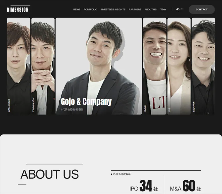
DIMENSION presents its investment business through people. Six tightly spaced founder portraits dominate the desktop opening, with one broad panel surrounded by five narrow strips. White condensed company names sit over the photographs. The surrounding interface is quieter: charcoal backgrounds, restrained gray text, thin rules, regular-weight Helvetica headings, and rounded pill links.
The page is a substantial corporate hub, with dedicated destinations for its portfolio, people, news, and business information. Its hierarchy moves from founder recognition to support capabilities, relationships, evidence, editorial content, and contact. Broad changes between dark and light surfaces organize this long page without turning every content item into a raised card.
On mobile, the opening becomes a centered portrait rail with neighboring cards visible at both edges. The full navigation gives way to a persistent header contact link and a circular MENU control. About content stacks, section headings shrink substantially, and the footer becomes a spacious single-column directory.
閉じる
DIMENSION — Style Reference
A charcoal stage for entrepreneurs, framed by oversized type and broad, rounded sections.
Website: dimensionfund.co.jp Original URL: https://www.dimensionfund.co.jp/ Final URL: https://www.dimensionfund.co.jp/ Theme: predominantly charcoal, with pale-gray and white content sections; no user-selectable theme was verified. Inspected: supplied browser capture session dated September 23, 2026, at 06:26:52 JST — September 22, 2026, at 21:26:52.555 UTC. Viewports: 1440 × 1000 desktop and 390 × 844 mobile, in CSS pixels. Scope: the current corporate homepage: founder showcase, About, Partners, Investee’s Insights, News, Portfolio, DIMENSION NOTE, Team, contact form, newsletter form, and footer. Visual captures cover the opening, the portfolio-to-editorial transition, and the closing sections. Rendered text covers the whole homepage; detailed computed-style records cover mainly the header, showcase, About, Partners, and Insights.
DIMENSION presents its investment business through people. Six tightly spaced founder portraits dominate the desktop opening, with one broad panel surrounded by five narrow strips. White condensed company names sit over the photographs. The surrounding interface is quieter: charcoal backgrounds, restrained gray text, thin rules, regular-weight Helvetica headings, and rounded pill links.
The page is a substantial corporate hub, with dedicated destinations for its portfolio, people, news, and business information. Its hierarchy moves from founder recognition to support capabilities, relationships, evidence, editorial content, and contact. Broad changes between dark and light surfaces organize this long page without turning every content item into a raised card.
On mobile, the opening becomes a centered portrait rail with neighboring cards visible at both edges. The full navigation gives way to a persistent header contact link and a circular MENU control. About content stacks, section headings shrink substantially, and the footer becomes a spacious single-column directory.
How to Read This Reference
- Measured means a value appears in the supplied rendered DOM or computed-style records. Geometry derived by subtracting recorded coordinates is labeled calculated.
- Estimated means a visual approximation from the original-page screenshots. These values are useful starting points, not exact stylesheet declarations or pixel samples.
- Recommended means an implementation choice for a new build. Recommendations do not establish how the original website behaves.
- Token names are descriptive aliases. The original stylesheet’s semantic token names were not supplied.
- The recorded root font sizes are 11.25px on desktop and 10.4px on mobile. The underlying scaling formula and breakpoint rules are unknown. The Quick Start keeps a conventional root size instead of copying unexplained source rem values.
- Computed styles belong to the recorded element, which may be a wrapper. For example, the header contact anchor reports a transparent background while the visible control is a filled pill; portrait anchors report zero radius while their visible image containers have rounded corners.
- Repeated navigation labels and duplicated carousel entries in extracted text do not mean that duplicate text is visibly printed on the page.
- No additional browsing, file inspection, form submission, or interaction testing was performed for this reference.
Tokens — Colors
Default Palette
| Name | Value | Suggested token | Role and evidence |
|---|---|---|---|
| Charcoal | #1a1a1a |
--color-canvas |
Measured BODY and MAIN background; also dark text and dark View More fills |
| White | #ffffff |
--color-white |
Measured founder titles, selected language text, dark-section headings, and inverted View More fills |
| Pale gray | Approximately #eeeeee |
--color-pale |
Estimated About surface from the original opening captures |
| Raised charcoal | #383838 |
--color-panel |
Measured on the offscreen mobile menu’s contact link; the visible newsletter surface appears similar |
| Light interface gray | #d7d7d7 |
--color-on-dark |
Measured navigation anchors and partner role/name text |
| Light paragraph gray | #d4d4d4 |
--color-copy-on-dark |
Measured Partners explanatory paragraph |
| Portrait metadata gray | #a1a1a1 |
--color-muted-on-dark |
Measured founder subtitles and partner company labels |
| Base gray | #888888 |
--color-muted |
Measured inherited body color and explanatory-note wrappers; not the color of every paragraph |
| Dark secondary gray | #6a6a6a |
--color-muted-on-light |
Measured role lines inside testimonial content |
| Inactive language gray | #6d6d6d |
--color-inactive |
Measured EN button in the Japanese state |
| Fine rule gray | Approximately #999999 |
--color-rule |
Estimated heading and portfolio rules |
| Required-field red | Approximately #d33a36 |
--color-required |
Estimated from visible required markers and explanatory text; exact applied color was not supplied |
The brand interface is almost entirely neutral. Color appears naturally inside photography, including skin tones, clothing, greenery, and the turquoise signage in editorial thumbnails. Those photographic colors should not become general interface accents.
The supplied custom-property inventory contains many --wp--preset--* colors, gradients, and shadows. Their presence does not establish that they are used in this design. The visible page does not justify a purple, cyan, gradient, or drop-shadow token system.
Surface Pairings
| Context | Surface | Foreground | Action treatment |
|---|---|---|---|
| Opening and dark sections | Charcoal | White headings, light-gray supporting text | White View More pill; darker gray header CONTACT pill |
| About | Pale gray, visually estimated | Charcoal | Charcoal View More pill with white text |
| DIMENSION NOTE | White, visually observed | Charcoal | Continue the neutral action system; its button is outside the supplied crop |
| Newsletter ending | Mid-charcoal, visually observed | White and muted gray | White submission pill with dark text |
| Founder photograph | Light studio image with a darkened lower edge | White company name, gray role line | The whole panel is a portfolio link |
These are section treatments, not separate selectable themes.
Tokens — Typography
Helvetica Stack — Interface and Section Headings
Measured stack: Helvetica, Arial, 'Hiragino Kaku Gothic ProN', 'Hiragino Sans', Meiryo, sans-serif.
Regular-weight English headings provide breadth and scale. Their tracking is tight: the measured chapter headings use -0.04em. Japanese introductory statements use weight 600, while normal paragraphs use 400.
The root element reports Times, but the body overrides that family. Times is not evidence of a visible serif design.
Anton — Founder and Testimonial Names
Measured stack: Anton, Helvetica, Arial, 'Hiragino Kaku Gothic ProN', 'Hiragino Sans', Meiryo, sans-serif.
Anton is declared at weight 400. Its naturally condensed, heavy appearance creates the visual contrast with the broad, regular chapter headings. Use it selectively for founder-company titles and large Latin-script testimonial names.
The logo also has a condensed appearance, but its construction and font were not identified. Preserve an authorized wordmark asset rather than assuming it can be recreated by typing DIMENSION in Anton.
Noto Sans JP — Selected Metadata
Measured stack: 'Noto Sans JP', Helvetica, Arial, 'Hiragino Kaku Gothic ProN', 'Hiragino Sans', Meiryo, sans-serif.
This stack appears on founder role lines and partner company/person metadata. It is not the computed first family of every Japanese paragraph.
The records establish family declarations, not font-file URLs or a separate audit of every loaded font face.
Type Scale
Values below are measured unless explicitly marked as estimates.
| Role | Desktop size / line height | Mobile size / line height | Weight and tracking |
|---|---|---|---|
| Root/base | 11.25 / 12.94px |
10.4 / 11.96px |
400; individual components override this |
| Chapter heading | 77.625 / 77.625px |
41.6 / 41.6px |
Helvetica stack, 400, -0.04em |
| Two-line Insights chapter heading | Single line at desktop | 41.6 / 39.728px |
400, -0.04em |
| Founder company title | 50.625 / 58.219px |
27.04 / 40.56px |
Anton, 400 |
| Founder role line | 15.75 / 19.688px |
9.36 / 9.828px |
Noto Sans JP, 400 |
| Collapsed portrait label | 13.5 / 19.683px |
Not shown in the mobile opening | Helvetica stack, 400 |
| About/Partners statement | 34.875 / 49.488px |
21.84 / 35.359px |
600 |
| About/Partners paragraph | 15.75 / 23.625px |
12.48 / 19.756px |
400 |
| Case description | 15.75 / 24.743px |
14.56 / 22.874px |
600, -0.04em |
| Partner company | 13.5 / 19.683px |
11.44 / 18.201px |
Noto Sans JP, 400 |
| Partner role/name | 15.75 / 19.688px |
14.56 / 18.2px |
Noto Sans JP, 400 |
| Testimonial Latin name | 69.75 / 80.213px |
44.72 / 49.192px |
Anton, 400 |
| Testimonial paragraph | 14.625 / 22.669px |
12.48 / 18.196px |
400, 0.04em |
| View More | 15.188 / 15.188px |
12.48 / 12.48px |
400 |
| Language button | 13.5 / 19.683px |
12.48 / 18.196px in the offscreen menu |
400 |
| MENU / CLOSE | Not applicable | 9.36 / 12.861px |
400 |
| Mobile menu navigation | Not applicable | 30.16 / 41.6px |
400, -0.04em; offscreen state only |
| Footer directory | Approximately 28px |
Approximately 27px |
Screenshot estimate; regular sans-serif |
The desktop navigation wrappers inherit 11.25px, but their visible labels appear closer to 15px. Nested label styles were not included, so the wrapper value should not be treated as the exact visible navigation size.
Recommended adaptation: retain the hierarchy while increasing the smallest mobile metadata. The original 9.36px portrait subtitle is a measured design detail, not a recommended minimum reading size.
Tokens — Spacing & Shapes
Density: extremely tight between founder panels, moderate inside editorial content, and generous between major sections.
Structural principle: two desktop widths coexist. The opening uses almost the entire viewport, while most content sits in a narrower centered region.
Spacing Scale
| Use | Desktop | Mobile | Evidence |
|---|---|---|---|
| Opening/header outer gutter | 45px |
20.797px for header |
Measured positions |
| Main content gutter | 135px |
Approximately 20.8px |
Measured About content |
| Main content width | 1170px |
348.406px |
Measured About content |
| Founder-panel gap | 6.75px |
6.219px |
Calculated from adjacent link bounds |
| Founder caption horizontal inset | 33.75px |
26px |
Calculated from card and text positions |
| Partner-card gap | 16.875px |
10.391px |
Calculated from repeated card positions |
| Desktop header link gap | 22.5px |
Not applicable | Calculated between anchor bounds |
| Japanese statement to paragraph | 33.75px in About |
Approximately 14.55px |
Calculated vertical separation |
| Partner role/name inline gap | 5.625px |
5.2px |
Computed gap |
| Portrait bottom to About surface | Approximately 104.7px |
Approximately 68.27px |
Calculated from card bottom and section start |
| Insights section top padding | 106.875px |
65.52px |
Computed padding |
| Insights section bottom padding | 63.563px |
41.6px |
Computed padding |
Do not replace these relationships with uniform spacing everywhere. The narrow portrait seams and the large section pauses perform different jobs.
Border Radius
| Element | Desktop | Mobile | Confidence |
|---|---|---|---|
| Major section upper corners | 22.5px |
15.6px |
Measured on Partners |
| View More pill | 22.5px |
22.88px |
Measured |
| Header contact anchor | 33.75px |
31.2px |
Measured wrapper radius |
| Founder image container | Approximately 11px |
Approximately 7px |
Screenshot estimate; wrapper radius was not supplied |
| MENU button | Circle | 50% |
Measured |
| Editorial thumbnail | Visually square | Not visually inspected | Desktop screenshot |
| Social and page-top controls | Circle | Circle | Visually observed |
Layout Measurements
| Element | Desktop at 1440 × 1000 | Mobile at 390 × 844 |
|---|---|---|
| Document height | 12423.828px |
11422.266px |
| Header box | 1440 × 109.234px |
390 × 91.516px |
| Header logo link | 149.063 × 56.813px, at x 45 |
95.156 × 36.391px, at x 20.797 |
| Header contact link | 167.594 × 60.172px |
109.141 × 46.203px |
| Mobile menu button | — | 44.719 × 44.719px |
| Founder portrait top | y 112.5px |
y 107.109px |
| Founder portrait height | 619.313px |
353.594px |
| Expanded desktop founder panel | 560.891px wide |
No expanded/narrow distinction in the visible mobile rail |
| Narrow desktop founder panel | Approximately 151.07px wide |
— |
| Centered mobile founder panel | — | 280.844px wide, at x 54.578px |
| About surface begins | y 836.513px |
y 528.975px |
| About heading box begins | y 1025.512px |
y 582.006px |
| Partner card, including metadata | 274.5 × 397.109px |
250.625 × 353.563px |
| View More link | 175.5 × 42.75px |
239.188 × 45.75px |
The desktop portrait strip spans 1350px: viewport width minus two 45px gutters. Its expanded panel is approximately 3.713 times the width of each compressed panel.
The centered mobile portrait is approximately 72.01% of the viewport width, leaving roughly 54.58px on either side before the next card begins. These are calculated proportions at the captured width, not a verified source formula.
Some recorded section rectangles overlap vertically. Their bounds alone do not establish sticky positioning, pinning, or a scroll animation. Avoid reconstructing document flow by summing all recorded section heights.
Components
Site Header
Role: identify the business and provide direct access to the corporate information architecture.
The desktop header places the white wordmark at the far left. Six compact uppercase links occupy the right half: NEWS, PORTFOLIO, INVESTEE'S INSIGHTS, PARTNERS, ABOUT US, and TEAM. A fine vertical divider introduces JP / EN, followed by a broad CONTACT pill.
The active JP label is white and underlined; EN is subdued. The contact pill appears dark gray against the darker page background. Its label is bolder than the nearby navigation.
On mobile, the visible header contains the smaller wordmark, CONTACT, and a thinly outlined circular MENU button. The language controls and full navigation are absent from this closed-state screenshot. Header persistence during scrolling was not established.
Mobile Navigation Panel
Role: hold the navigation displaced from the narrow header.
Rendered elements establish an offscreen panel to the right of the viewport. It contains another wordmark and contact control, a CLOSE button, TOP and the primary navigation links, language controls, and social links.
Its navigation text computes to 30.16px, with 41.6px line height and tight tracking. The panel’s contents are verified, but the opened appearance, opening trajectory, duration, backdrop, scroll locking, focus management, and dismissal behavior were not exercised.
Founder Showcase
Role: make the portfolio tangible through recognizable people and direct company links.
Each panel is a link containing a founder photograph, company title, and executive role/name. The desktop screenshot shows six founders, with Gojo & Company expanded in the center. The other companies remain identifiable through vertical white labels near their lower-left edges.
The expanded title is Anton at 50.625px. The supporting role line sits below it in Noto Sans JP at 15.75px. Both are anchored over the image’s darkened lower region. The active panel’s horizontal text begins 33.75px inside its left edge.
The photographs share light studio backgrounds, restrained clothing, and warm but subdued skin tones. Tight cropping makes each narrow panel feel like a slice of a larger portrait. Some images show pronounced gray shadow shapes behind the person; the evidence does not establish whether these belong to the image asset or a separate rendering layer.
The whole panel links to a company detail page. Expansion triggers were not tested, so the appearance should not be described as verified hover-to-expand behavior.
Mobile Founder Rail
Role: preserve large human imagery without reducing six portraits to tiny columns.
The mobile screenshot centers SISI in a 280.844 × 353.594px panel, with adjacent portraits peeking at both sides. Company names remain horizontal on every visible card. The title begins 26px inside the panel and uses 27.04px Anton.
Repeated entries and offscreen coordinates support a carousel structure. They do not prove a specific autoplay interval, swipe implementation, or carousel library. The centered company differs between the supplied desktop and mobile states; no particular company should be treated as an invariant starting slide.
Chapter Heading
Role: create a recognizable section boundary independent of imagery.
Large regular sans-serif text sits between an offset upper rule and a short lower-left rule. The decoration echoes the wordmark’s long upper and short lower strokes.
Desktop chapter headings use 77.625px type, equal line height, and -0.04em tracking. The measured About heading box has 28.125px top, 28.125px right, 25.875px bottom, and 15.75px left padding. Mobile uses 41.6px type with smaller surrounding space.
The rules are asymmetric. Do not replace them with a full rectangular border or a centered underline. Exact pseudo-element geometry was not supplied; the Quick Start approximates it from the screenshots.
About and Performance
Role: explain the investment approach and attach concrete evidence to it.
The light About surface follows the dark founder stage. Desktop content uses a 1170px region with two 585px halves. The left half holds a bold Japanese statement and a narrower 408.938px paragraph. Performance information and three numbered support cases occupy the right side.
Current rendered content reports 38 IPOs and 66 M&A outcomes, with a note dated April 21, 2026 and a qualification that the totals include the record of Dream Incubator, DIMENSION’s origin. The numerical typography itself was not included in the computed records, so its font and exact size are not asserted here.
The case labels are CASE 1, CASE 2, and CASE 3. Their desktop text regions are approximately 150.46px wide. On mobile, the cases become vertically separated rows: a compact case label at left and a wider description at right. The paragraph, performance block, and cases follow the statement in one column.
The source H1, DIMENSION, is visually hidden in a 1 × 1px rectangle. The opening therefore relies on the wordmark and people rather than a large visible H1 slogan.
Partners Rail
Role: connect the firm’s support model to named people and organizations.
The section has a charcoal background and measured rounded upper corners. On desktop, the chapter heading sits left while an introductory statement and paragraph begin around x 720px.
Eight linked partner entries appear in the extracted rail. Each groups a company label, role, and person’s name. Company labels use muted Noto Sans JP; the role/name line is larger and lighter. The role and name share a small inline gap.
The repeated desktop card stride is 291.375px, comprising a 274.5px card and 16.875px gap. On mobile, cards remain substantial at 250.625px, with a 10.391px gap, so subsequent entries continue beyond the viewport rather than becoming a tiny multi-column grid.
The coordinates reserve a tall region above each caption. Exact partner-photo crops and image treatment are not visible in the supplied screenshots. Card navigation points to the associated organizations’ websites; those destinations were not inspected.
Investee’s Insights
Role: present founder testimony with a strong personal identity.
The DOM contains nine unique testimonials plus duplicated entries associated with the horizontal presentation. Each entry includes a large Latin-script name, a Japanese role line, a substantial quotation, and a portfolio link on the name.
Names use Anton at 69.75px on desktop and 44.72px on mobile. Desktop testimonial text uses 14.625px type, approximately 1.55 line height, and 0.04em tracking.
The active text region measures 428.625px wide on desktop and 265.219px on mobile. Neighboring text regions measure approximately 90% of those widths, consistent with reduced side-slide scale. The actual transform declaration was not supplied.
The surrounding chapter heading is white, while testimonial text computes to charcoal. The complete inner panel surface and image arrangement are not available in the screenshots and should not be specified as measured facts. Mobile quotation boxes are much shorter than the complete extracted text; clipping and access to the full quotation remain unverified.
News Preview
Role: provide a current corporate activity feed.
The rendered desktop content includes a featured announcement followed by six additional news links. Mobile extraction includes the same featured item and three additional links. Entries provide dates, titles, and occasional category labels such as メディア and イベント.
The featured announcement concerns the third VC fund. Its extensive article text appears in desktop extraction, but the evidence does not establish how much is visibly exposed on the homepage. Do not reproduce the entire extracted article as a verified homepage layout.
The news section’s detailed visual arrangement is outside the supplied crops. A restrained date/title list is a suitable implementation recommendation, not a measured reconstruction.
Portfolio Directory
Role: offer a broad index beyond the six featured founders.
The rendered homepage includes 26 company names, with selected entries carrying a year and IPO or market-status label. The visible tail of the directory places TURING and Yoyogi Animation Group beneath thin gray top rules on charcoal.
In that crop, the entries begin around x 135px and 540px, with rules roughly 360px wide. A white View More pill sits toward the right content edge below them. The complete directory grid and mobile column count are not established by this crop.
Keep company labels prominent and status information subordinate. The directory should remain a navigation component rather than a collection of decorative brand badges.
DIMENSION NOTE Preview
Role: connect the investment business to its interview publication.
This is the clearest visible light editorial section. A full-width white surface with rounded upper corners follows the dark portfolio area. The large DIMENSION NOTE heading uses the same rule-framed treatment as other chapter headings.
A short Japanese introduction sits below the heading. Three article thumbnails align across the desktop content region, starting approximately at x 135, 540, and 945px. Their widths are about 360px, with roughly 45px gaps. These are screenshot estimates.
The thumbnails show related Safie interviews in natural color. Their rectangular edges are visually square, with no evident elevation shadow. Article titles and dates are present in the DOM below the images; those text styles are not fully visible in the crop.
Mobile rendered text splits the section title into DIMENSION and NOTE. The mobile article-card arrangement was not captured, so a single-column adaptation must be labeled as a recommendation.
Team Preview
Role: introduce the organization’s investment and operational staff.
Seven linked team entries appear in the current rendered content. Each pairs a Latin-script name with a role such as Chief Executive Officer, General Partner, Partner, or Business Producer, followed by View More.
The supplied evidence verifies the information hierarchy and destinations, but not the team grid, portrait dimensions, or hover treatment. Do not borrow the founder showcase’s geometry and present it as a measured team layout.
Contact Form
Role: support fundraising discussions, business consultation, media inquiries, and recruiting contact.
The rendered form includes an inquiry category selector, required inquiry text, family and given names, company, required email, company website, optional fundraising details, and pitch-document upload. The visible upload guidance states a maximum of 100MB; enforcement was not tested.
A privacy explanation precedes the agreement checkbox, required marker, submission control, and reCAPTCHA legal text. These are functional content groups, not decorative cards.
Input dimensions, borders, focus states, conditional fields, errors, and successful submission states were not visually captured. Any form-control styling in a new implementation should therefore be treated as a recommendation.
Newsletter Form Ending
Role: offer a lower-commitment way to follow the firm’s information.
The desktop closing capture shows a two-column arrangement: invitation text on the left and consent/submission content beginning around x 720px on the right. The surface is mid-charcoal with white copy and small red required indicators.
The visible checkbox is a small white square. Below it, a white pill approximately 258 × 57px carries the dark label 送信する. Muted reCAPTCHA text follows. These dimensions are screenshot estimates.
On mobile, the legal text wraps into two centered lines and the broad form surface ends with rounded lower corners. The email field and upper form content are outside the provided crop.
View More Link
Role: consistently move from a homepage preview to a dedicated destination.
A horizontal pill contains centered View More text and a small right arrow. Desktop examples measure 175.5 × 42.75px. On mobile, the links widen to 239.188px, become approximately 45.75px tall, and are centered in their sections.
The fill reverses with the section: white on charcoal, charcoal on pale gray. There is no need for a separate saturated call-to-action color.
Footer and Page-Top Control
Role: finish the long page with a clear directory and social destinations.
Desktop footer content follows three alignment zones: wordmark and social icons near x 135px, a large stacked navigation list near x 720px, and PRIVACY POLICY near x 1110px. Copyright sits low and toward the right.
The wordmark is larger than in the header. Beneath it are circular icons for Twitter, Facebook, YouTube, and DIMENSION NOTE. The supplied design uses the Twitter bird symbol. These icons appear about 42px across on desktop and 38px on mobile.
Mobile places the wordmark, social row, navigation, and privacy link in a single left-aligned column. Copyright remains near the lower-right edge. Large vertical gaps preserve the deliberate pacing even at the end of the page.
A circular upward chevron appears at the lower right in scrolled captures, approximately 56px across on desktop and 44px on mobile. Its intended page-top function is visually clear, but activation, smooth scrolling, and fixed-position rules were not tested.
Tokens — Motion & Interaction
The following transitions are declared on recorded elements. Their values are verified; triggering interactions and complete movement sequences are not.
| Element or state | Recorded transition | Interpretation and limit |
|---|---|---|
| Header logo link | filter 0.5s ease-out |
A filter change is prepared; the actual hover filter was not supplied |
| JP / EN | color 0.5s ease-out, border-color 0.5s ease-out |
Supports gradual language-control state styling; switching behavior was not tested |
| Desktop founder H2 | opacity 0.6s ease-out |
Horizontal company titles can fade between presentation states |
| Most desktop founder subtitles | opacity 0.6s ease-out |
Supporting labels share the title’s fade timing |
| Active Gojo subtitle | opacity 0.7s cubic-bezier(0.165, 0.84, 0.44, 1) 0.35s |
A delayed subtitle reveal is declared in the recorded active state |
| Compressed-panel vertical labels | opacity 0.4s ease-out 0.4s |
Delayed return of compact labels is supported by the style record |
| Active-panel vertical label | opacity 0.1s ease-out |
The compact label has a shorter fade in the active state |
| View More | background-color 0.15s ease-in, color 0.15s ease-in |
Quick neutral color feedback; final hover colors were not captured |
Carousel duplication, horizontal offscreen positions, and unequal slide bounds establish stateful layouts. They do not establish autoplay speed, drag thresholds, keyboard handling, or a particular animation library.
Several elements serialize their transition simply as all, without a duration. That is not sufficient evidence of visible animation. Likewise, animation: none on sampled elements does not exclude JavaScript-driven motion or effects on unrecorded ancestors.
The capture process waited for initial load, bounded image decoding, finite motion, and sampled layout/text stability. Perpetual animations were temporarily paused during readiness checks and resumed afterward. No motion recording or explicit hover, menu, language, or carousel action sequence was supplied.
Recommended additions: provide keyboard-accessible carousel navigation, pause controls if autoplay is introduced, and reduced-motion behavior. Keep state changes available without requiring pointer hover.
Surfaces
| Layer | Appearance | Structural purpose |
|---|---|---|
| Main canvas | Solid #1a1a1a |
Connects the opening, dark content regions, and footer |
| Founder panel | Light studio portrait, rounded clipping, darkened lower region | Separates people through image boundaries and narrow gutters |
| About sheet | Pale gray, rounded upper corners | Creates the first major contrast change |
| Partners region | Charcoal, rounded upper corners | Reintroduces the dark setting around relationship content |
| Editorial sheet | White with rounded upper corners | Gives interview photography and text a clean publication setting |
| Newsletter ending | Mid-charcoal with rounded lower corners | Distinguishes the form ending from the footer |
| Button | Flat white, charcoal, or mid-charcoal pill | Provides an action hierarchy through inversion |
| Footer utility | Flat circular icons and a circular chevron | Keeps small controls consistent with pill geometry |
There is no general visible card-elevation system. Separation comes from surface contrast, whitespace, rules, and photography. The gradient-like darkening at the bottom of portraits is a readability treatment, not a general background effect.
Imagery
The opening photography is the defining asset system. Use large, tightly cropped portraits against pale studio backgrounds, with consistent lighting and restrained color. Eyes sit roughly in the upper third of the visible mobile portrait. Maintain each subject’s framing individually rather than applying one crop position to all images.
Desktop compression is part of the composition: narrow panels reveal faces and fragments of clothing while the selected panel reveals a fuller upper-body portrait. A faithful adaptation needs source images with enough resolution and lateral crop tolerance for both states.
Retain natural skin color and subtle tonal variation. The images are subdued but are not uniformly pure grayscale. Hard black-and-white conversion would remove some of their warmth.
Editorial photographs have a different job. The DIMENSION NOTE thumbnails retain environmental detail, signs, screens, and greenery. Their internal turquoise and green colors are content, not part of the surrounding interface palette.
Observed Asset References
No original image-file paths, font-file URLs, intrinsic image dimensions, or asset manifests were supplied. The references below identify visible asset roles without inventing download paths.
| Asset group | Evidence in the original-page captures | Reuse guidance |
|---|---|---|
| Header/footer wordmark | White condensed DIMENSION mark with an offset upper rule and short lower rule | Use an authorized supplied logo asset; preserve its proportions |
| Founder portraits | Six desktop panels and the centered mobile SISI portrait | Prepare broad and narrow crops from the same authorized photography |
| Editorial thumbnails | Three Safie interview photographs in the white publication section | Preserve natural color and meaningful embedded signage |
| Social icons | Twitter bird, Facebook, YouTube, and DIMENSION NOTE circles | Match the captured visual weight and circular treatment |
| Utility arrows | Small right arrow in View More; upward footer chevron | Simple CSS or SVG implementations are suitable recommendations |
Portfolio links identify the associated companies, but they are page destinations rather than image-asset URLs. Permission to reuse the photographs or branding is not established by this reference.
Layout & Responsive Behavior
Desktop Composition
At 1440px, the opening uses 45px side gutters while main content generally uses 135px. This creates a broad photographic introduction followed by a more controlled reading width.
The portraits begin at y 112.5px and end near y 731.81px. About begins at y 836.51px, leaving about 104.7px of dark breathing room. Its heading begins below the first viewport at y 1025.51px; the pale area visible at the bottom of the opening screenshot is therefore consistent with the measured spacing.
The main page order is founder showcase → About → Partners → Investee’s Insights → News → Portfolio → DIMENSION NOTE → Team → Contact → newsletter → footer.
Mobile Composition
At 390px, the header uses approximately 20.8px gutters. The portrait rail intentionally extends to the viewport edges, with its main card centered at x 54.58px. The visible card starts at y 107.11px and ends near y 460.70px. About begins around y 528.98px.
About switches from a two-column flex arrangement to a block layout. Its statement uses two lines in the captured mobile state. Case descriptions remain comparatively substantial at 14.56px, even though the general paragraph size falls to 12.48px.
Partners remain horizontally arranged. Chapter headings such as INVESTEE’S INSIGHTS and DIMENSION NOTE wrap across lines. View More links become wider and centered. The footer becomes one column while retaining generous vertical spacing.
Limits and Adaptation Rules
The exact breakpoint between these layouts is unknown. A breakpoint around 900px in the Quick Start is a recommendation, not a recovered source value.
No tablet or landscape capture was supplied. Intermediate layouts should be tested for header crowding, long company names, chapter-heading wrapping, and form readability. Keep horizontal overflow localized to intentional rails; do not hide accidental page overflow to disguise layout errors.
The mobile document is shorter than the desktop document in this captured session. Responsive content exposure, slide geometry, and section treatment differ, so document height should not be used as a simple scaling target.
Do’s and Don’ts
Do
- Use
#1a1a1aas the continuous dark canvas and alternate it with broad pale or white sections. - Give founder photography the largest share of the opening.
- Preserve the distinction between regular Helvetica chapter headings and condensed Anton names.
- Keep desktop founder seams narrow and the selected panel substantially wider than its neighbors.
- Center a substantial portrait on mobile, with adjacent cards peeking into view.
- Repeat the asymmetric rule motif in the logo and chapter headings.
- Use flat pill links with neutral color inversion.
- Retain natural color in editorial photography.
- Keep dates, role lines, and status labels subordinate to names and section headings.
- Preserve qualifications attached to performance figures when presenting those figures.
- Treat the homepage as a directory of corporate content with multiple useful destinations.
Don't
- Don't replace the portrait opening with a generic slogan and a single stock photograph.
- Don't make every heading Anton; the typographic contrast is central to the design.
- Don't spread the six desktop portraits into equal-width cards if reproducing the captured composition.
- Don't shrink all six portraits into one mobile row of tiny faces.
- Don't introduce a saturated CTA color, glossy surface, or general drop-shadow system.
- Don't treat generic CMS color presets as the applied brand palette.
- Don't assume that duplicated DOM labels should appear twice visually.
- Don't describe menu opening, autoplay, hover expansion, or scroll pinning as verified behavior.
- Don't substitute guessed image paths or guessed production credits.
- Don't copy very small mobile captions into essential form labels without reviewing readability.
- Don't assume detailed layouts for sections represented only by extracted text.
Recommended Implementation Additions
These are recommendations for a new implementation, not verified features of the original website:
- Use a semantic header, navigation, main region, section headings, and footer. Retain an accessible page-level H1 if the visible identity is an image wordmark.
- Give the mobile menu an accessible name,
aria-expanded, focus management, Escape dismissal, and an inert closed state. - Keep nonvisible carousel clones out of the keyboard order and accessibility tree.
- Separate carousel selection controls from portfolio navigation when both functions are required. A user should be able to reach a company without relying on hover.
- Offer previous/next controls and a pause control if automatic movement is implemented.
- Increase founder subtitles to at least a practical readable size on mobile; use approximately 14–16px for sustained body reading where content permits.
- Use at least 16px text for mobile form inputs, explicit labels, associated error messages, and clear upload constraints.
- Expose long testimonial text through a deliberate reading path instead of silently clipping it.
- Provide visible keyboard focus on photographic links and neutral pills.
- Size portrait assets for the expanded desktop state, set dimensions to prevent layout shifts, and lazy-load lower-page images.
- Honor reduced-motion preferences without hiding headings or leaving content at zero opacity.
- Keep performance figures and news content data-driven so that design examples do not become stale factual claims.
Agent Prompt Guide
Quick Color Reference
- Main dark canvas and light-surface text:
#1a1a1a. - Bright text and inverted action fill:
#ffffff. - About surface: approximately
#eeeeee. - Secondary dark panel:
#383838. - Navigation and supporting text on dark:
#d7d7d7and#d4d4d4. - Muted founder metadata:
#a1a1a1. - Required-field indicators: a restrained red; the exact original value is unverified.
- Avoid introducing a general colored accent from the photographs.
Overall Prompt
“Create a Japanese venture-capital corporate homepage inspired by the observed DIMENSION design. Use a charcoal #1a1a1a canvas, pale-gray and white full-width sections with restrained rounded corners, and flat neutral pill links. Lead with six tightly spaced studio portraits: one wide company panel and five narrow portrait strips. Use Anton for company names over photography, regular Helvetica-style uppercase chapter headings with tight tracking, and Japanese sans-serif supporting text. Frame chapter headings with an offset upper rule and a short lower-left rule. Keep the opening wider than the main reading container. On mobile, use a centered portrait rail with neighboring cards visible, a compact logo/contact/menu header, stacked information, and a spacious single-column footer. Use authorized images and distinguish verified source behavior from newly designed interactions.”
Example Component Prompts
- Founder showcase: “At 1440px, place a 1350px portrait strip inside 45px side gutters. Use six panels at about 619px high with 6.75px gaps. Give one panel approximately 3.713 times the width of the others. Add a white Anton company title and muted role line over a darkened image bottom; show small vertical company labels on compressed panels.”
- Mobile opening: “At 390px, create a portrait rail with a centered card about 281px wide and 354px high. Leave neighboring cards visible at both sides. Use a 27px condensed company name, a readable supporting caption, and a charcoal header with a small wordmark, contact pill, and circular MENU control.”
- Chapter heading: “Create a regular-weight uppercase sans-serif heading at about 78px desktop and 42px mobile, with
-0.04emtracking. Add a thin rule offset inward above the text and a short rule below its left edge. Keep the surrounding surface flat and spacious.” - Editorial preview: “Place three natural-color interview thumbnails in a white rounded-top section. At 1440px, align approximately 360px-wide columns within a 1170px container, separated by about 45px. Use a large DIMENSION NOTE-style chapter heading, a compact introduction, and understated titles and dates. Mobile card stacking is a new responsive recommendation.”
- Footer: “Build a charcoal footer with a large white wordmark and four circular social icons at left, a regular sans-serif uppercase directory in the middle, and a small privacy link at right. On mobile, stack these groups with generous spacing and keep copyright near the lower-right edge.”
- Form adaptation: “Design a restrained neutral inquiry form with explicit Japanese labels, readable input text, visible required markers, privacy consent, and a white rounded submit button. Use accessible validation and mobile field sizing. Treat field geometry as a new design decision because the original field styles were not captured.”
Quick Start
CSS Custom Properties
This is a reusable adaptation of the measured proportions. It is not the original stylesheet. It keeps the root font size unchanged, uses a recommended 900px breakpoint, approximates heading rules and portrait gradients, and uses native horizontal scrolling as a practical mobile rail.
Load authorized Anton and Noto Sans JP font files separately if available. No font or image URLs are invented here. Use an actual wordmark asset.
Expected structure: .site-header contains .brand, .desktop-nav, .language-controls, .contact-link, and .menu-toggle. A .hero contains .hero-rail and six linked .hero-card elements; one has data-active='true'. Each card contains an image, .hero-caption, and .hero-side-label. Content sections use .section > .content.
:root {
  /* Measured colors unless noted otherwise */
  --color-canvas: #1a1a1a;
  --color-white: #fff;
  --color-panel: #383838;
  --color-on-dark: #d7d7d7;
  --color-copy-on-dark: #d4d4d4;
  --color-muted-on-dark: #a1a1a1;
  --color-muted-on-light: #6a6a6a;
  --color-pale: #eee; /* Screenshot estimate */
  --color-rule: #999; /* Screenshot estimate */
  --color-required: #d33a36; /* Screenshot estimate */

  --font-ui: Helvetica, Arial, 'Hiragino Kaku Gothic ProN',
    'Hiragino Sans', Meiryo, sans-serif;
  --font-display: Anton, var(--font-ui);
  --font-jp: 'Noto Sans JP', var(--font-ui);

  /* Interpolation and caps are adaptation choices */
  --outer-gutter: clamp(20.8px, 3.125vw, 45px);
  --content-width: min(81.25%, 1170px);
  --text-section: clamp(41.6px, 5.390625vw, 77.625px);
  --text-founder: clamp(27.04px, 3.515625vw, 50.625px);
  --text-body: 15.75px;
  --text-statement: 34.875px;
  --radius-section: 22.5px;
  --radius-portrait: 11.25px; /* Visual approximation */
  --hero-gap: 6.75px;
  --partner-gap: 16.875px;
  --motion-link: 150ms ease-in;
  --motion-caption: 600ms ease-out;
}

* { box-sizing: border-box; }

body {
  margin: 0;
  color: var(--color-on-dark);
  background: var(--color-canvas);
  font-family: var(--font-ui);
}

img { display: block; max-width: 100%; }
a { color: inherit; }
button, input, select, textarea { font: inherit; }

.content {
  width: var(--content-width);
  margin-inline: auto;
}

/* Opening placement matches the two supplied viewport states. */
.site-header {
  position: absolute;
  z-index: 10;
  inset: 0 0 auto;
  min-height: 109.234px;
  display: flex;
  align-items: center;
  gap: 22.5px;
  padding: 30.375px var(--outer-gutter) 18.688px;
}

.brand { flex: 0 0 auto; width: 149.063px; }
.brand img { width: 100%; height: auto; }

.desktop-nav {
  display: flex;
  align-items: center;
  gap: 22.5px;
  margin-inline-start: auto;
  font-size: 15px; /* Visible-label approximation */
}

.desktop-nav a { text-decoration: none; white-space: nowrap; }
.language-controls { white-space: nowrap; font-size: 13.5px; }

.contact-link {
  display: inline-flex;
  flex: 0 0 auto;
  align-items: center;
  justify-content: center;
  width: 167.594px;
  min-height: 60.172px;
  border-radius: 999px;
  color: var(--color-white);
  background: var(--color-panel);
  font-size: 15px;
  font-weight: 700;
  text-decoration: none;
}

.menu-toggle { display: none; }

.hero { padding-block: 112.5px 104.7px; }

.hero-rail {
  display: flex;
  gap: var(--hero-gap);
  width: calc(100% - 2 * var(--outer-gutter));
  height: clamp(480px, 43.0078125vw, 619.3125px);
  margin-inline: auto;
}

.hero-card {
  position: relative;
  flex: 1 1 0;
  min-width: 0;
  overflow: hidden;
  isolation: isolate;
  border-radius: var(--radius-portrait);
  color: var(--color-white);
  text-decoration: none;
}

.hero-card[data-active='true'] { flex-grow: 3.713; }

.hero-card > img {
  position: absolute;
  inset: 0;
  width: 100%;
  height: 100%;
  object-fit: cover;
  object-position: var(--portrait-focus, 50% 50%);
}

/* Approximation of the visible lower-image darkening. */
.hero-card::after {
  content: '';
  position: absolute;
  z-index: 1;
  inset: 35% 0 0;
  background: linear-gradient(transparent, rgb(0 0 0 / 72%));
  pointer-events: none;
}

.hero-caption {
  position: absolute;
  z-index: 2;
  inset-inline: 33.75px;
  bottom: 24.188px;
  opacity: 0;
  transition: opacity var(--motion-caption);
}

.hero-caption h2 {
  margin: 0 0 9.844px;
  font-family: var(--font-display);
  font-size: var(--text-founder);
  font-weight: 400;
  line-height: 1.15;
}

.hero-caption p {
  margin: 0;
  color: var(--color-muted-on-dark);
  font: 400 15.75px / 1.25 var(--font-jp);
}

.hero-side-label {
  position: absolute;
  z-index: 2;
  left: 2.25px;
  bottom: 15.188px;
  margin: 0;
  writing-mode: vertical-rl;
  font-size: 13.5px;
  line-height: 1.458;
}

.hero-card[data-active='true'] .hero-caption { opacity: 1; }
.hero-card[data-active='true'] .hero-side-label { opacity: 0; }

.section {
  padding-block: 106.875px;
  border-radius: var(--radius-section) var(--radius-section) 0 0;
}

.section--pale {
  color: var(--color-canvas);
  background: var(--color-pale);
}

.section--white {
  color: var(--color-canvas);
  background: var(--color-white);
}

.section--about { padding-block-start: 189px; }

.section-title {
  position: relative;
  display: inline-block;
  max-width: 100%;
  margin: 0 0 55.813px -21.375px;
  padding: 28.125px 28.125px 25.875px 15.75px;
  font-size: var(--text-section);
  font-weight: 400;
  line-height: 1;
  letter-spacing: -0.04em;
}

/* Rule positions are visual approximations. */
.section-title::before,
.section-title::after {
  content: '';
  position: absolute;
  border-top: 1px solid var(--color-rule);
}

.section-title::before { top: 0; left: 53.44px; right: 0; }
.section-title::after { bottom: 0; left: 0; width: 53.44px; }

.about-grid { display: grid; grid-template-columns: 1fr 1fr; }
.about-grid > * { min-width: 0; }

.statement {
  margin: 0;
  font-size: var(--text-statement);
  font-weight: 600;
  line-height: 1.419;
}

.body-copy {
  margin: 33.75px 0 0;
  font-size: var(--text-body);
  line-height: 1.5;
}

.about-copy .body-copy { max-width: 408.938px; }

.partner-rail {
  display: flex;
  gap: var(--partner-gap);
  overflow-x: auto;
  padding-block: 4px 12px;
}

.partner-card { flex: 0 0 274.5px; text-decoration: none; }

.partner-company {
  color: var(--color-muted-on-dark);
  font: 400 13.5px / 1.458 var(--font-jp);
}

.partner-person { font: 400 15.75px / 1.25 var(--font-jp); }

.insight-name {
  margin: 0;
  font: 400 69.75px / 1.15 var(--font-display);
}

.note-grid {
  display: grid;
  grid-template-columns: repeat(3, minmax(0, 1fr));
  gap: 45px;
}

.note-card { min-width: 0; text-decoration: none; }
.note-card img { width: 100%; height: auto; border-radius: 0; }

.section-action { display: flex; justify-content: flex-end; margin-top: 48px; }

.view-more {
  display: inline-flex;
  align-items: center;
  justify-content: center;
  gap: 22px;
  width: 175.5px;
  min-height: 42.75px;
  border-radius: 22.5px;
  color: var(--color-canvas);
  background: var(--color-white);
  font-size: 15.1875px;
  line-height: 1;
  text-decoration: none;
  transition: background-color var(--motion-link), color var(--motion-link);
}

.section--pale .view-more,
.section--white .view-more {
  color: var(--color-white);
  background: var(--color-canvas);
}

/* Recommended form treatment; original field geometry is unverified. */
.form-panel {
  color: var(--color-white);
  background: var(--color-panel);
  border-radius: 0 0 var(--radius-section) var(--radius-section);
}

.form-layout { display: grid; grid-template-columns: 1fr 1fr; gap: 40px; }
.field { display: grid; gap: 8px; margin-block: 20px; }

.field :is(input:not([type='checkbox']), select, textarea) {
  width: 100%;
  min-height: 44px;
  padding: 12px;
  border: 1px solid var(--color-rule);
  border-radius: 4px;
  color: var(--color-canvas);
  background: var(--color-white);
  font-size: 16px;
}

.required { color: var(--color-required); }

.submit-button {
  width: min(100%, 258px);
  min-height: 57px;
  border: 0;
  border-radius: 999px;
  color: var(--color-canvas);
  background: var(--color-white);
  font-weight: 700;
  cursor: pointer;
}

.site-footer { padding-block: 140px 45px; }
.footer-grid { display: grid; grid-template-columns: 3fr 2fr 1fr; }
.footer-brand { width: 210px; }
.social-links { display: flex; gap: 22.5px; margin-top: 40px; }

.social-links a {
  display: grid;
  place-items: center;
  width: 41.6px;
  height: 41.6px;
  border-radius: 50%;
  color: var(--color-canvas);
  background: var(--color-on-dark);
}

.footer-nav { display: grid; align-content: start; }
.footer-nav a { font-size: 28px; line-height: 1.49; text-decoration: none; }
.footer-privacy { font-size: 12.5px; }
.footer-meta { margin-top: 128px; text-align: right; font-size: 13.5px; }

/* Recommended accessible focus treatment. */
:where(a, button, input, select, textarea):focus-visible {
  outline: 2px solid currentColor;
  outline-offset: 4px;
}

@media (max-width: 900px) {
  :root {
    --content-width: calc(100% - 41.6px);
    --text-section: 41.6px;
    --text-founder: 27.04px;
    --text-statement: 21.84px;
    --text-body: 12.48px;
    --radius-section: 15.6px;
    --radius-portrait: 7px;
    --partner-gap: 10.391px;
    --mobile-card-width: min(72.01vw, 420px);
  }

  .site-header {
    min-height: 91.516px;
    padding: 19.094px 20.8px 26.219px;
    gap: 5.2px;
  }

  .brand { width: 95.156px; }
  .desktop-nav, .language-controls { display: none; }

  .contact-link {
    width: 109.141px;
    min-height: 46.203px;
    margin-inline-start: auto;
    font-size: 11.44px;
  }

  .menu-toggle {
    display: grid;
    flex: 0 0 auto;
    place-items: center;
    width: 44.719px;
    height: 44.719px;
    padding: 0;
    border: 1px solid var(--color-panel);
    border-radius: 50%;
    color: var(--color-white);
    background: var(--color-canvas);
    font-size: 9.36px;
  }

  .hero { padding-block: 107.109px 68.27px; }

  .hero-rail {
    width: 100%;
    height: calc(var(--mobile-card-width) * 1.25905);
    gap: 6.219px;
    overflow-x: auto;
    padding-inline: calc((100% - var(--mobile-card-width)) / 2);
    scroll-padding-inline: calc((100vw - var(--mobile-card-width)) / 2);
    scroll-snap-type: x mandatory;
  }

  .hero-card,
  .hero-card[data-active='true'] {
    flex: 0 0 var(--mobile-card-width);
    scroll-snap-align: center;
  }

  .hero-caption { inset-inline: 26px; bottom: 14.55px; opacity: 1; }
  .hero-caption h2 { margin-bottom: 0; line-height: 1.5; }
  .hero-caption p { font-size: 9.36px; line-height: 1.05; }
  .hero-side-label { display: none; }

  .section { padding-block: 53.03px 64px; }
  .section-title {
    margin: 0 0 35.19px -10.4px;
    padding: 18.72px 9.36px 16.64px;
  }
  .section-title::before { left: 29.6px; }
  .section-title::after { width: 31.2px; }

  .about-grid, .form-layout { grid-template-columns: 1fr; gap: 40px; }
  .statement { line-height: 1.619; }
  .body-copy { margin-top: 14.56px; line-height: 1.583; }
  .partner-card { flex-basis: 250.625px; }
  .partner-company { font-size: 11.44px; }
  .partner-person { font-size: 14.56px; }
  .insight-name { font-size: 44.72px; line-height: 1.1; }

  /* Recommended stacking; the mobile article grid was not captured. */
  .note-grid { grid-template-columns: 1fr; gap: 32px; }
  .section-action { justify-content: center; }
  .view-more { width: 239.188px; min-height: 45.75px; font-size: 12.48px; }

  .site-footer { padding-block: 78px 68px; }
  .footer-grid { grid-template-columns: 1fr; }
  .footer-brand { width: 151px; }
  .social-links { gap: 21px; margin-top: 36px; }
  .social-links a { width: 38px; height: 38px; }
  .footer-nav { margin-top: 64px; }
  .footer-nav a { font-size: 27px; line-height: 1.43; }
  .footer-privacy { margin-top: 30px; }
  .footer-meta { margin-top: 40px; font-size: 10.4px; }

  /* Optional readability variant for a new implementation. */
  .readable-copy .body-copy { font-size: 15px; line-height: 1.65; }
  .readable-copy .hero-caption p { font-size: 12px; line-height: 1.4; }
}

@media (prefers-reduced-motion: reduce) {
  .hero-caption, .view-more { transition: none; }
  .hero-rail { scroll-behavior: auto; }
}
The CSS supplies the visual shell. Menu state, carousel selection, initial mobile centering, form validation, and submission require separate implementation. The native mobile rail above is a recommendation; it does not claim to reproduce the original carousel engine. Add semantic arrow markup inside View More links rather than relying on an unexplained icon font.
Tailwind v4 Token Mapping
Optional aliases for a project already using Tailwind v4. This mapping does not imply that the original website uses Tailwind. Define the properties above first.
@theme inline {
  --color-dimension-canvas: var(--color-canvas);
  --color-dimension-white: var(--color-white);
  --color-dimension-pale: var(--color-pale);
  --color-dimension-panel: var(--color-panel);
  --color-dimension-muted: var(--color-muted-on-dark);

  --font-interface: var(--font-ui);
  --font-founder: var(--font-display);
  --font-japanese-meta: var(--font-jp);

  --text-chapter: var(--text-section);
  --text-founder: var(--text-founder);
  --text-copy: var(--text-body);

  --radius-chapter: var(--radius-section);
  --radius-portrait-card: var(--radius-portrait);
  --spacing-founder-gap: var(--hero-gap);
  --spacing-partner-gap: var(--partner-gap);
}
Sources & Evidence
- Inspected original and final page: DIMENSION. The supplied observation reports HTTP 200 with no URL change. The rendered title is
DIMENSION株式会社; the footer reads©DIMENSION, Inc. all rights reserved. - Capture session:
2026-09-22T21:26:52.555Z, equivalent to September 23, 2026 at 06:26:52.555 JST. - Desktop evidence: 1440 × 1000 viewport; opening founder showcase, portfolio-to-DIMENSION NOTE transition, and newsletter/footer captures; rendered document height approximately 12424px.
- Mobile evidence: 390 × 844 viewport; opening and footer captures; rendered document height approximately 11422px.
- Rendered DOM and computed styles: provide family declarations, text sizes, colors, coordinates, selected radii, gaps, transition strings, page content, and link destinations. Detailed element coverage is concentrated in the upper sections through Investee’s Insights.
- Recorded inspection behavior: initial observation of at least five seconds, bounded image and finite-animation readiness checks, sampled layout/text stability, and traversal through intermediate scroll positions. No explicit interaction outcomes were supplied for menu opening, language switching, carousel manipulation, form submission, or page-top activation.
- Limitations: the full loaded stylesheet, image asset URLs, pseudo-element styles, exact breakpoints, font-file loading records, and several lower-section component styles were not supplied. Transparent wrappers and overlapping rectangles require care when interpreting visual surfaces and page flow.
This reference documents the current homepage represented by those original-page captures. Estimated values and implementation recommendations are identified throughout; linked destination pages were not separately inspected.
# DIMENSION — Style Reference

> A charcoal stage for entrepreneurs, framed by oversized type and broad, rounded sections.

**Website:** [dimensionfund.co.jp](https://www.dimensionfund.co.jp/)
**Original URL:** https://www.dimensionfund.co.jp/
**Final URL:** https://www.dimensionfund.co.jp/
**Theme:** predominantly charcoal, with pale-gray and white content sections; no user-selectable theme was verified.
**Inspected:** supplied browser capture session dated September 23, 2026, at 06:26:52 JST — September 22, 2026, at 21:26:52.555 UTC.
**Viewports:** 1440 × 1000 desktop and 390 × 844 mobile, in CSS pixels.
**Scope:** the current corporate homepage: founder showcase, About, Partners, Investee’s Insights, News, Portfolio, DIMENSION NOTE, Team, contact form, newsletter form, and footer. Visual captures cover the opening, the portfolio-to-editorial transition, and the closing sections. Rendered text covers the whole homepage; detailed computed-style records cover mainly the header, showcase, About, Partners, and Insights.

DIMENSION presents its investment business through people. Six tightly spaced founder portraits dominate the desktop opening, with one broad panel surrounded by five narrow strips. White condensed company names sit over the photographs. The surrounding interface is quieter: charcoal backgrounds, restrained gray text, thin rules, regular-weight Helvetica headings, and rounded pill links.

The page is a substantial corporate hub, with dedicated destinations for its portfolio, people, news, and business information. Its hierarchy moves from founder recognition to support capabilities, relationships, evidence, editorial content, and contact. Broad changes between dark and light surfaces organize this long page without turning every content item into a raised card.

On mobile, the opening becomes a centered portrait rail with neighboring cards visible at both edges. The full navigation gives way to a persistent header contact link and a circular MENU control. About content stacks, section headings shrink substantially, and the footer becomes a spacious single-column directory.
閉じる
# DIMENSION — Style Reference

> A charcoal stage for entrepreneurs, framed by oversized type and broad, rounded sections.

**Website:** [dimensionfund.co.jp](https://www.dimensionfund.co.jp/)
**Original URL:** https://www.dimensionfund.co.jp/
**Final URL:** https://www.dimensionfund.co.jp/
**Theme:** predominantly charcoal, with pale-gray and white content sections; no user-selectable theme was verified.
**Inspected:** supplied browser capture session dated September 23, 2026, at 06:26:52 JST — September 22, 2026, at 21:26:52.555 UTC.
**Viewports:** 1440 × 1000 desktop and 390 × 844 mobile, in CSS pixels.
**Scope:** the current corporate homepage: founder showcase, About, Partners, Investee’s Insights, News, Portfolio, DIMENSION NOTE, Team, contact form, newsletter form, and footer. Visual captures cover the opening, the portfolio-to-editorial transition, and the closing sections. Rendered text covers the whole homepage; detailed computed-style records cover mainly the header, showcase, About, Partners, and Insights.

DIMENSION presents its investment business through people. Six tightly spaced founder portraits dominate the desktop opening, with one broad panel surrounded by five narrow strips. White condensed company names sit over the photographs. The surrounding interface is quieter: charcoal backgrounds, restrained gray text, thin rules, regular-weight Helvetica headings, and rounded pill links.

The page is a substantial corporate hub, with dedicated destinations for its portfolio, people, news, and business information. Its hierarchy moves from founder recognition to support capabilities, relationships, evidence, editorial content, and contact. Broad changes between dark and light surfaces organize this long page without turning every content item into a raised card.

On mobile, the opening becomes a centered portrait rail with neighboring cards visible at both edges. The full navigation gives way to a persistent header contact link and a circular MENU control. About content stacks, section headings shrink substantially, and the footer becomes a spacious single-column directory.

## How to Read This Reference

- **Measured** means a value appears in the supplied rendered DOM or computed-style records. Geometry derived by subtracting recorded coordinates is labeled **calculated**.
- **Estimated** means a visual approximation from the original-page screenshots. These values are useful starting points, not exact stylesheet declarations or pixel samples.
- **Recommended** means an implementation choice for a new build. Recommendations do not establish how the original website behaves.
- Token names are descriptive aliases. The original stylesheet’s semantic token names were not supplied.
- The recorded root font sizes are **11.25px on desktop** and **10.4px on mobile**. The underlying scaling formula and breakpoint rules are unknown. The Quick Start keeps a conventional root size instead of copying unexplained source rem values.
- Computed styles belong to the recorded element, which may be a wrapper. For example, the header contact anchor reports a transparent background while the visible control is a filled pill; portrait anchors report zero radius while their visible image containers have rounded corners.
- Repeated navigation labels and duplicated carousel entries in extracted text do not mean that duplicate text is visibly printed on the page.
- No additional browsing, file inspection, form submission, or interaction testing was performed for this reference.

## Tokens — Colors

### Default Palette

| Name | Value | Suggested token | Role and evidence |
| --- | --- | --- | --- |
| Charcoal | `#1a1a1a` | `--color-canvas` | Measured BODY and MAIN background; also dark text and dark View More fills |
| White | `#ffffff` | `--color-white` | Measured founder titles, selected language text, dark-section headings, and inverted View More fills |
| Pale gray | Approximately `#eeeeee` | `--color-pale` | Estimated About surface from the original opening captures |
| Raised charcoal | `#383838` | `--color-panel` | Measured on the offscreen mobile menu’s contact link; the visible newsletter surface appears similar |
| Light interface gray | `#d7d7d7` | `--color-on-dark` | Measured navigation anchors and partner role/name text |
| Light paragraph gray | `#d4d4d4` | `--color-copy-on-dark` | Measured Partners explanatory paragraph |
| Portrait metadata gray | `#a1a1a1` | `--color-muted-on-dark` | Measured founder subtitles and partner company labels |
| Base gray | `#888888` | `--color-muted` | Measured inherited body color and explanatory-note wrappers; not the color of every paragraph |
| Dark secondary gray | `#6a6a6a` | `--color-muted-on-light` | Measured role lines inside testimonial content |
| Inactive language gray | `#6d6d6d` | `--color-inactive` | Measured EN button in the Japanese state |
| Fine rule gray | Approximately `#999999` | `--color-rule` | Estimated heading and portfolio rules |
| Required-field red | Approximately `#d33a36` | `--color-required` | Estimated from visible required markers and explanatory text; exact applied color was not supplied |

The brand interface is almost entirely neutral. Color appears naturally inside photography, including skin tones, clothing, greenery, and the turquoise signage in editorial thumbnails. Those photographic colors should not become general interface accents.

The supplied custom-property inventory contains many `--wp--preset--*` colors, gradients, and shadows. Their presence does not establish that they are used in this design. The visible page does not justify a purple, cyan, gradient, or drop-shadow token system.

### Surface Pairings

| Context | Surface | Foreground | Action treatment |
| --- | --- | --- | --- |
| Opening and dark sections | Charcoal | White headings, light-gray supporting text | White View More pill; darker gray header CONTACT pill |
| About | Pale gray, visually estimated | Charcoal | Charcoal View More pill with white text |
| DIMENSION NOTE | White, visually observed | Charcoal | Continue the neutral action system; its button is outside the supplied crop |
| Newsletter ending | Mid-charcoal, visually observed | White and muted gray | White submission pill with dark text |
| Founder photograph | Light studio image with a darkened lower edge | White company name, gray role line | The whole panel is a portfolio link |

These are section treatments, not separate selectable themes.

## Tokens — Typography

### Helvetica Stack — Interface and Section Headings

**Measured stack:** `Helvetica, Arial, 'Hiragino Kaku Gothic ProN', 'Hiragino Sans', Meiryo, sans-serif`.

Regular-weight English headings provide breadth and scale. Their tracking is tight: the measured chapter headings use `-0.04em`. Japanese introductory statements use weight `600`, while normal paragraphs use `400`.

The root element reports Times, but the body overrides that family. Times is not evidence of a visible serif design.

### Anton — Founder and Testimonial Names

**Measured stack:** `Anton, Helvetica, Arial, 'Hiragino Kaku Gothic ProN', 'Hiragino Sans', Meiryo, sans-serif`.

Anton is declared at weight `400`. Its naturally condensed, heavy appearance creates the visual contrast with the broad, regular chapter headings. Use it selectively for founder-company titles and large Latin-script testimonial names.

The logo also has a condensed appearance, but its construction and font were not identified. Preserve an authorized wordmark asset rather than assuming it can be recreated by typing DIMENSION in Anton.

### Noto Sans JP — Selected Metadata

**Measured stack:** `'Noto Sans JP', Helvetica, Arial, 'Hiragino Kaku Gothic ProN', 'Hiragino Sans', Meiryo, sans-serif`.

This stack appears on founder role lines and partner company/person metadata. It is not the computed first family of every Japanese paragraph.

The records establish family declarations, not font-file URLs or a separate audit of every loaded font face.

### Type Scale

Values below are measured unless explicitly marked as estimates.

| Role | Desktop size / line height | Mobile size / line height | Weight and tracking |
| --- | --- | --- | --- |
| Root/base | `11.25 / 12.94px` | `10.4 / 11.96px` | `400`; individual components override this |
| Chapter heading | `77.625 / 77.625px` | `41.6 / 41.6px` | Helvetica stack, `400`, `-0.04em` |
| Two-line Insights chapter heading | Single line at desktop | `41.6 / 39.728px` | `400`, `-0.04em` |
| Founder company title | `50.625 / 58.219px` | `27.04 / 40.56px` | Anton, `400` |
| Founder role line | `15.75 / 19.688px` | `9.36 / 9.828px` | Noto Sans JP, `400` |
| Collapsed portrait label | `13.5 / 19.683px` | Not shown in the mobile opening | Helvetica stack, `400` |
| About/Partners statement | `34.875 / 49.488px` | `21.84 / 35.359px` | `600` |
| About/Partners paragraph | `15.75 / 23.625px` | `12.48 / 19.756px` | `400` |
| Case description | `15.75 / 24.743px` | `14.56 / 22.874px` | `600`, `-0.04em` |
| Partner company | `13.5 / 19.683px` | `11.44 / 18.201px` | Noto Sans JP, `400` |
| Partner role/name | `15.75 / 19.688px` | `14.56 / 18.2px` | Noto Sans JP, `400` |
| Testimonial Latin name | `69.75 / 80.213px` | `44.72 / 49.192px` | Anton, `400` |
| Testimonial paragraph | `14.625 / 22.669px` | `12.48 / 18.196px` | `400`, `0.04em` |
| View More | `15.188 / 15.188px` | `12.48 / 12.48px` | `400` |
| Language button | `13.5 / 19.683px` | `12.48 / 18.196px` in the offscreen menu | `400` |
| MENU / CLOSE | Not applicable | `9.36 / 12.861px` | `400` |
| Mobile menu navigation | Not applicable | `30.16 / 41.6px` | `400`, `-0.04em`; offscreen state only |
| Footer directory | Approximately `28px` | Approximately `27px` | Screenshot estimate; regular sans-serif |

The desktop navigation wrappers inherit `11.25px`, but their visible labels appear closer to `15px`. Nested label styles were not included, so the wrapper value should not be treated as the exact visible navigation size.

**Recommended adaptation:** retain the hierarchy while increasing the smallest mobile metadata. The original `9.36px` portrait subtitle is a measured design detail, not a recommended minimum reading size.

## Tokens — Spacing & Shapes

**Density:** extremely tight between founder panels, moderate inside editorial content, and generous between major sections.

**Structural principle:** two desktop widths coexist. The opening uses almost the entire viewport, while most content sits in a narrower centered region.

### Spacing Scale

| Use | Desktop | Mobile | Evidence |
| --- | --- | --- | --- |
| Opening/header outer gutter | `45px` | `20.797px` for header | Measured positions |
| Main content gutter | `135px` | Approximately `20.8px` | Measured About content |
| Main content width | `1170px` | `348.406px` | Measured About content |
| Founder-panel gap | `6.75px` | `6.219px` | Calculated from adjacent link bounds |
| Founder caption horizontal inset | `33.75px` | `26px` | Calculated from card and text positions |
| Partner-card gap | `16.875px` | `10.391px` | Calculated from repeated card positions |
| Desktop header link gap | `22.5px` | Not applicable | Calculated between anchor bounds |
| Japanese statement to paragraph | `33.75px` in About | Approximately `14.55px` | Calculated vertical separation |
| Partner role/name inline gap | `5.625px` | `5.2px` | Computed gap |
| Portrait bottom to About surface | Approximately `104.7px` | Approximately `68.27px` | Calculated from card bottom and section start |
| Insights section top padding | `106.875px` | `65.52px` | Computed padding |
| Insights section bottom padding | `63.563px` | `41.6px` | Computed padding |

Do not replace these relationships with uniform spacing everywhere. The narrow portrait seams and the large section pauses perform different jobs.

### Border Radius

| Element | Desktop | Mobile | Confidence |
| --- | --- | --- | --- |
| Major section upper corners | `22.5px` | `15.6px` | Measured on Partners |
| View More pill | `22.5px` | `22.88px` | Measured |
| Header contact anchor | `33.75px` | `31.2px` | Measured wrapper radius |
| Founder image container | Approximately `11px` | Approximately `7px` | Screenshot estimate; wrapper radius was not supplied |
| MENU button | Circle | `50%` | Measured |
| Editorial thumbnail | Visually square | Not visually inspected | Desktop screenshot |
| Social and page-top controls | Circle | Circle | Visually observed |

### Layout Measurements

| Element | Desktop at 1440 × 1000 | Mobile at 390 × 844 |
| --- | --- | --- |
| Document height | `12423.828px` | `11422.266px` |
| Header box | `1440 × 109.234px` | `390 × 91.516px` |
| Header logo link | `149.063 × 56.813px`, at x `45` | `95.156 × 36.391px`, at x `20.797` |
| Header contact link | `167.594 × 60.172px` | `109.141 × 46.203px` |
| Mobile menu button | — | `44.719 × 44.719px` |
| Founder portrait top | y `112.5px` | y `107.109px` |
| Founder portrait height | `619.313px` | `353.594px` |
| Expanded desktop founder panel | `560.891px` wide | No expanded/narrow distinction in the visible mobile rail |
| Narrow desktop founder panel | Approximately `151.07px` wide | — |
| Centered mobile founder panel | — | `280.844px` wide, at x `54.578px` |
| About surface begins | y `836.513px` | y `528.975px` |
| About heading box begins | y `1025.512px` | y `582.006px` |
| Partner card, including metadata | `274.5 × 397.109px` | `250.625 × 353.563px` |
| View More link | `175.5 × 42.75px` | `239.188 × 45.75px` |

The desktop portrait strip spans `1350px`: viewport width minus two `45px` gutters. Its expanded panel is approximately **3.713 times** the width of each compressed panel.

The centered mobile portrait is approximately **72.01% of the viewport width**, leaving roughly `54.58px` on either side before the next card begins. These are calculated proportions at the captured width, not a verified source formula.

Some recorded section rectangles overlap vertically. Their bounds alone do not establish sticky positioning, pinning, or a scroll animation. Avoid reconstructing document flow by summing all recorded section heights.

## Components

### Site Header

**Role:** identify the business and provide direct access to the corporate information architecture.

The desktop header places the white wordmark at the far left. Six compact uppercase links occupy the right half: NEWS, PORTFOLIO, INVESTEE'S INSIGHTS, PARTNERS, ABOUT US, and TEAM. A fine vertical divider introduces JP / EN, followed by a broad CONTACT pill.

The active JP label is white and underlined; EN is subdued. The contact pill appears dark gray against the darker page background. Its label is bolder than the nearby navigation.

On mobile, the visible header contains the smaller wordmark, CONTACT, and a thinly outlined circular MENU button. The language controls and full navigation are absent from this closed-state screenshot. Header persistence during scrolling was not established.

### Mobile Navigation Panel

**Role:** hold the navigation displaced from the narrow header.

Rendered elements establish an offscreen panel to the right of the viewport. It contains another wordmark and contact control, a CLOSE button, TOP and the primary navigation links, language controls, and social links.

Its navigation text computes to `30.16px`, with `41.6px` line height and tight tracking. The panel’s contents are verified, but the opened appearance, opening trajectory, duration, backdrop, scroll locking, focus management, and dismissal behavior were not exercised.

### Founder Showcase

**Role:** make the portfolio tangible through recognizable people and direct company links.

Each panel is a link containing a founder photograph, company title, and executive role/name. The desktop screenshot shows six founders, with Gojo & Company expanded in the center. The other companies remain identifiable through vertical white labels near their lower-left edges.

The expanded title is Anton at `50.625px`. The supporting role line sits below it in Noto Sans JP at `15.75px`. Both are anchored over the image’s darkened lower region. The active panel’s horizontal text begins `33.75px` inside its left edge.

The photographs share light studio backgrounds, restrained clothing, and warm but subdued skin tones. Tight cropping makes each narrow panel feel like a slice of a larger portrait. Some images show pronounced gray shadow shapes behind the person; the evidence does not establish whether these belong to the image asset or a separate rendering layer.

The whole panel links to a company detail page. Expansion triggers were not tested, so the appearance should not be described as verified hover-to-expand behavior.

### Mobile Founder Rail

**Role:** preserve large human imagery without reducing six portraits to tiny columns.

The mobile screenshot centers SISI in a `280.844 × 353.594px` panel, with adjacent portraits peeking at both sides. Company names remain horizontal on every visible card. The title begins `26px` inside the panel and uses `27.04px` Anton.

Repeated entries and offscreen coordinates support a carousel structure. They do not prove a specific autoplay interval, swipe implementation, or carousel library. The centered company differs between the supplied desktop and mobile states; no particular company should be treated as an invariant starting slide.

### Chapter Heading

**Role:** create a recognizable section boundary independent of imagery.

Large regular sans-serif text sits between an offset upper rule and a short lower-left rule. The decoration echoes the wordmark’s long upper and short lower strokes.

Desktop chapter headings use `77.625px` type, equal line height, and `-0.04em` tracking. The measured About heading box has `28.125px` top, `28.125px` right, `25.875px` bottom, and `15.75px` left padding. Mobile uses `41.6px` type with smaller surrounding space.

The rules are asymmetric. Do not replace them with a full rectangular border or a centered underline. Exact pseudo-element geometry was not supplied; the Quick Start approximates it from the screenshots.

### About and Performance

**Role:** explain the investment approach and attach concrete evidence to it.

The light About surface follows the dark founder stage. Desktop content uses a `1170px` region with two `585px` halves. The left half holds a bold Japanese statement and a narrower `408.938px` paragraph. Performance information and three numbered support cases occupy the right side.

Current rendered content reports **38 IPOs and 66 M&A outcomes**, with a note dated April 21, 2026 and a qualification that the totals include the record of Dream Incubator, DIMENSION’s origin. The numerical typography itself was not included in the computed records, so its font and exact size are not asserted here.

The case labels are CASE 1, CASE 2, and CASE 3. Their desktop text regions are approximately `150.46px` wide. On mobile, the cases become vertically separated rows: a compact case label at left and a wider description at right. The paragraph, performance block, and cases follow the statement in one column.

The source H1, DIMENSION, is visually hidden in a `1 × 1px` rectangle. The opening therefore relies on the wordmark and people rather than a large visible H1 slogan.

### Partners Rail

**Role:** connect the firm’s support model to named people and organizations.

The section has a charcoal background and measured rounded upper corners. On desktop, the chapter heading sits left while an introductory statement and paragraph begin around x `720px`.

Eight linked partner entries appear in the extracted rail. Each groups a company label, role, and person’s name. Company labels use muted Noto Sans JP; the role/name line is larger and lighter. The role and name share a small inline gap.

The repeated desktop card stride is `291.375px`, comprising a `274.5px` card and `16.875px` gap. On mobile, cards remain substantial at `250.625px`, with a `10.391px` gap, so subsequent entries continue beyond the viewport rather than becoming a tiny multi-column grid.

The coordinates reserve a tall region above each caption. Exact partner-photo crops and image treatment are not visible in the supplied screenshots. Card navigation points to the associated organizations’ websites; those destinations were not inspected.

### Investee’s Insights

**Role:** present founder testimony with a strong personal identity.

The DOM contains nine unique testimonials plus duplicated entries associated with the horizontal presentation. Each entry includes a large Latin-script name, a Japanese role line, a substantial quotation, and a portfolio link on the name.

Names use Anton at `69.75px` on desktop and `44.72px` on mobile. Desktop testimonial text uses `14.625px` type, approximately `1.55` line height, and `0.04em` tracking.

The active text region measures `428.625px` wide on desktop and `265.219px` on mobile. Neighboring text regions measure approximately 90% of those widths, consistent with reduced side-slide scale. The actual transform declaration was not supplied.

The surrounding chapter heading is white, while testimonial text computes to charcoal. The complete inner panel surface and image arrangement are not available in the screenshots and should not be specified as measured facts. Mobile quotation boxes are much shorter than the complete extracted text; clipping and access to the full quotation remain unverified.

### News Preview

**Role:** provide a current corporate activity feed.

The rendered desktop content includes a featured announcement followed by six additional news links. Mobile extraction includes the same featured item and three additional links. Entries provide dates, titles, and occasional category labels such as `メディア` and `イベント`.

The featured announcement concerns the third VC fund. Its extensive article text appears in desktop extraction, but the evidence does not establish how much is visibly exposed on the homepage. Do not reproduce the entire extracted article as a verified homepage layout.

The news section’s detailed visual arrangement is outside the supplied crops. A restrained date/title list is a suitable implementation recommendation, not a measured reconstruction.

### Portfolio Directory

**Role:** offer a broad index beyond the six featured founders.

The rendered homepage includes 26 company names, with selected entries carrying a year and IPO or market-status label. The visible tail of the directory places TURING and Yoyogi Animation Group beneath thin gray top rules on charcoal.

In that crop, the entries begin around x `135px` and `540px`, with rules roughly `360px` wide. A white View More pill sits toward the right content edge below them. The complete directory grid and mobile column count are not established by this crop.

Keep company labels prominent and status information subordinate. The directory should remain a navigation component rather than a collection of decorative brand badges.

### DIMENSION NOTE Preview

**Role:** connect the investment business to its interview publication.

This is the clearest visible light editorial section. A full-width white surface with rounded upper corners follows the dark portfolio area. The large DIMENSION NOTE heading uses the same rule-framed treatment as other chapter headings.

A short Japanese introduction sits below the heading. Three article thumbnails align across the desktop content region, starting approximately at x `135`, `540`, and `945px`. Their widths are about `360px`, with roughly `45px` gaps. These are screenshot estimates.

The thumbnails show related Safie interviews in natural color. Their rectangular edges are visually square, with no evident elevation shadow. Article titles and dates are present in the DOM below the images; those text styles are not fully visible in the crop.

Mobile rendered text splits the section title into DIMENSION and NOTE. The mobile article-card arrangement was not captured, so a single-column adaptation must be labeled as a recommendation.

### Team Preview

**Role:** introduce the organization’s investment and operational staff.

Seven linked team entries appear in the current rendered content. Each pairs a Latin-script name with a role such as Chief Executive Officer, General Partner, Partner, or Business Producer, followed by View More.

The supplied evidence verifies the information hierarchy and destinations, but not the team grid, portrait dimensions, or hover treatment. Do not borrow the founder showcase’s geometry and present it as a measured team layout.

### Contact Form

**Role:** support fundraising discussions, business consultation, media inquiries, and recruiting contact.

The rendered form includes an inquiry category selector, required inquiry text, family and given names, company, required email, company website, optional fundraising details, and pitch-document upload. The visible upload guidance states a maximum of 100MB; enforcement was not tested.

A privacy explanation precedes the agreement checkbox, required marker, submission control, and reCAPTCHA legal text. These are functional content groups, not decorative cards.

Input dimensions, borders, focus states, conditional fields, errors, and successful submission states were not visually captured. Any form-control styling in a new implementation should therefore be treated as a recommendation.

### Newsletter Form Ending

**Role:** offer a lower-commitment way to follow the firm’s information.

The desktop closing capture shows a two-column arrangement: invitation text on the left and consent/submission content beginning around x `720px` on the right. The surface is mid-charcoal with white copy and small red required indicators.

The visible checkbox is a small white square. Below it, a white pill approximately `258 × 57px` carries the dark label `送信する`. Muted reCAPTCHA text follows. These dimensions are screenshot estimates.

On mobile, the legal text wraps into two centered lines and the broad form surface ends with rounded lower corners. The email field and upper form content are outside the provided crop.

### View More Link

**Role:** consistently move from a homepage preview to a dedicated destination.

A horizontal pill contains centered View More text and a small right arrow. Desktop examples measure `175.5 × 42.75px`. On mobile, the links widen to `239.188px`, become approximately `45.75px` tall, and are centered in their sections.

The fill reverses with the section: white on charcoal, charcoal on pale gray. There is no need for a separate saturated call-to-action color.

### Footer and Page-Top Control

**Role:** finish the long page with a clear directory and social destinations.

Desktop footer content follows three alignment zones: wordmark and social icons near x `135px`, a large stacked navigation list near x `720px`, and PRIVACY POLICY near x `1110px`. Copyright sits low and toward the right.

The wordmark is larger than in the header. Beneath it are circular icons for Twitter, Facebook, YouTube, and DIMENSION NOTE. The supplied design uses the Twitter bird symbol. These icons appear about `42px` across on desktop and `38px` on mobile.

Mobile places the wordmark, social row, navigation, and privacy link in a single left-aligned column. Copyright remains near the lower-right edge. Large vertical gaps preserve the deliberate pacing even at the end of the page.

A circular upward chevron appears at the lower right in scrolled captures, approximately `56px` across on desktop and `44px` on mobile. Its intended page-top function is visually clear, but activation, smooth scrolling, and fixed-position rules were not tested.

## Tokens — Motion & Interaction

The following transitions are declared on recorded elements. Their values are verified; triggering interactions and complete movement sequences are not.

| Element or state | Recorded transition | Interpretation and limit |
| --- | --- | --- |
| Header logo link | `filter 0.5s ease-out` | A filter change is prepared; the actual hover filter was not supplied |
| JP / EN | `color 0.5s ease-out, border-color 0.5s ease-out` | Supports gradual language-control state styling; switching behavior was not tested |
| Desktop founder H2 | `opacity 0.6s ease-out` | Horizontal company titles can fade between presentation states |
| Most desktop founder subtitles | `opacity 0.6s ease-out` | Supporting labels share the title’s fade timing |
| Active Gojo subtitle | `opacity 0.7s cubic-bezier(0.165, 0.84, 0.44, 1) 0.35s` | A delayed subtitle reveal is declared in the recorded active state |
| Compressed-panel vertical labels | `opacity 0.4s ease-out 0.4s` | Delayed return of compact labels is supported by the style record |
| Active-panel vertical label | `opacity 0.1s ease-out` | The compact label has a shorter fade in the active state |
| View More | `background-color 0.15s ease-in, color 0.15s ease-in` | Quick neutral color feedback; final hover colors were not captured |

Carousel duplication, horizontal offscreen positions, and unequal slide bounds establish stateful layouts. They do not establish autoplay speed, drag thresholds, keyboard handling, or a particular animation library.

Several elements serialize their transition simply as `all`, without a duration. That is not sufficient evidence of visible animation. Likewise, `animation: none` on sampled elements does not exclude JavaScript-driven motion or effects on unrecorded ancestors.

The capture process waited for initial load, bounded image decoding, finite motion, and sampled layout/text stability. Perpetual animations were temporarily paused during readiness checks and resumed afterward. No motion recording or explicit hover, menu, language, or carousel action sequence was supplied.

**Recommended additions:** provide keyboard-accessible carousel navigation, pause controls if autoplay is introduced, and reduced-motion behavior. Keep state changes available without requiring pointer hover.

## Surfaces

| Layer | Appearance | Structural purpose |
| --- | --- | --- |
| Main canvas | Solid `#1a1a1a` | Connects the opening, dark content regions, and footer |
| Founder panel | Light studio portrait, rounded clipping, darkened lower region | Separates people through image boundaries and narrow gutters |
| About sheet | Pale gray, rounded upper corners | Creates the first major contrast change |
| Partners region | Charcoal, rounded upper corners | Reintroduces the dark setting around relationship content |
| Editorial sheet | White with rounded upper corners | Gives interview photography and text a clean publication setting |
| Newsletter ending | Mid-charcoal with rounded lower corners | Distinguishes the form ending from the footer |
| Button | Flat white, charcoal, or mid-charcoal pill | Provides an action hierarchy through inversion |
| Footer utility | Flat circular icons and a circular chevron | Keeps small controls consistent with pill geometry |

There is no general visible card-elevation system. Separation comes from surface contrast, whitespace, rules, and photography. The gradient-like darkening at the bottom of portraits is a readability treatment, not a general background effect.

## Imagery

The opening photography is the defining asset system. Use large, tightly cropped portraits against pale studio backgrounds, with consistent lighting and restrained color. Eyes sit roughly in the upper third of the visible mobile portrait. Maintain each subject’s framing individually rather than applying one crop position to all images.

Desktop compression is part of the composition: narrow panels reveal faces and fragments of clothing while the selected panel reveals a fuller upper-body portrait. A faithful adaptation needs source images with enough resolution and lateral crop tolerance for both states.

Retain natural skin color and subtle tonal variation. The images are subdued but are not uniformly pure grayscale. Hard black-and-white conversion would remove some of their warmth.

Editorial photographs have a different job. The DIMENSION NOTE thumbnails retain environmental detail, signs, screens, and greenery. Their internal turquoise and green colors are content, not part of the surrounding interface palette.

### Observed Asset References

No original image-file paths, font-file URLs, intrinsic image dimensions, or asset manifests were supplied. The references below identify visible asset roles without inventing download paths.

| Asset group | Evidence in the original-page captures | Reuse guidance |
| --- | --- | --- |
| Header/footer wordmark | White condensed DIMENSION mark with an offset upper rule and short lower rule | Use an authorized supplied logo asset; preserve its proportions |
| Founder portraits | Six desktop panels and the centered mobile SISI portrait | Prepare broad and narrow crops from the same authorized photography |
| Editorial thumbnails | Three Safie interview photographs in the white publication section | Preserve natural color and meaningful embedded signage |
| Social icons | Twitter bird, Facebook, YouTube, and DIMENSION NOTE circles | Match the captured visual weight and circular treatment |
| Utility arrows | Small right arrow in View More; upward footer chevron | Simple CSS or SVG implementations are suitable recommendations |

Portfolio links identify the associated companies, but they are page destinations rather than image-asset URLs. Permission to reuse the photographs or branding is not established by this reference.

## Layout & Responsive Behavior

### Desktop Composition

At 1440px, the opening uses `45px` side gutters while main content generally uses `135px`. This creates a broad photographic introduction followed by a more controlled reading width.

The portraits begin at y `112.5px` and end near y `731.81px`. About begins at y `836.51px`, leaving about `104.7px` of dark breathing room. Its heading begins below the first viewport at y `1025.51px`; the pale area visible at the bottom of the opening screenshot is therefore consistent with the measured spacing.

The main page order is founder showcase → About → Partners → Investee’s Insights → News → Portfolio → DIMENSION NOTE → Team → Contact → newsletter → footer.

### Mobile Composition

At 390px, the header uses approximately `20.8px` gutters. The portrait rail intentionally extends to the viewport edges, with its main card centered at x `54.58px`. The visible card starts at y `107.11px` and ends near y `460.70px`. About begins around y `528.98px`.

About switches from a two-column flex arrangement to a block layout. Its statement uses two lines in the captured mobile state. Case descriptions remain comparatively substantial at `14.56px`, even though the general paragraph size falls to `12.48px`.

Partners remain horizontally arranged. Chapter headings such as INVESTEE’S INSIGHTS and DIMENSION NOTE wrap across lines. View More links become wider and centered. The footer becomes one column while retaining generous vertical spacing.

### Limits and Adaptation Rules

The exact breakpoint between these layouts is unknown. A breakpoint around `900px` in the Quick Start is a recommendation, not a recovered source value.

No tablet or landscape capture was supplied. Intermediate layouts should be tested for header crowding, long company names, chapter-heading wrapping, and form readability. Keep horizontal overflow localized to intentional rails; do not hide accidental page overflow to disguise layout errors.

The mobile document is shorter than the desktop document in this captured session. Responsive content exposure, slide geometry, and section treatment differ, so document height should not be used as a simple scaling target.

## Do’s and Don’ts

### Do

- Use `#1a1a1a` as the continuous dark canvas and alternate it with broad pale or white sections.
- Give founder photography the largest share of the opening.
- Preserve the distinction between regular Helvetica chapter headings and condensed Anton names.
- Keep desktop founder seams narrow and the selected panel substantially wider than its neighbors.
- Center a substantial portrait on mobile, with adjacent cards peeking into view.
- Repeat the asymmetric rule motif in the logo and chapter headings.
- Use flat pill links with neutral color inversion.
- Retain natural color in editorial photography.
- Keep dates, role lines, and status labels subordinate to names and section headings.
- Preserve qualifications attached to performance figures when presenting those figures.
- Treat the homepage as a directory of corporate content with multiple useful destinations.

### Don't

- Don't replace the portrait opening with a generic slogan and a single stock photograph.
- Don't make every heading Anton; the typographic contrast is central to the design.
- Don't spread the six desktop portraits into equal-width cards if reproducing the captured composition.
- Don't shrink all six portraits into one mobile row of tiny faces.
- Don't introduce a saturated CTA color, glossy surface, or general drop-shadow system.
- Don't treat generic CMS color presets as the applied brand palette.
- Don't assume that duplicated DOM labels should appear twice visually.
- Don't describe menu opening, autoplay, hover expansion, or scroll pinning as verified behavior.
- Don't substitute guessed image paths or guessed production credits.
- Don't copy very small mobile captions into essential form labels without reviewing readability.
- Don't assume detailed layouts for sections represented only by extracted text.

## Recommended Implementation Additions

These are recommendations for a new implementation, not verified features of the original website:

- Use a semantic header, navigation, main region, section headings, and footer. Retain an accessible page-level H1 if the visible identity is an image wordmark.
- Give the mobile menu an accessible name, `aria-expanded`, focus management, Escape dismissal, and an inert closed state.
- Keep nonvisible carousel clones out of the keyboard order and accessibility tree.
- Separate carousel selection controls from portfolio navigation when both functions are required. A user should be able to reach a company without relying on hover.
- Offer previous/next controls and a pause control if automatic movement is implemented.
- Increase founder subtitles to at least a practical readable size on mobile; use approximately 14–16px for sustained body reading where content permits.
- Use at least 16px text for mobile form inputs, explicit labels, associated error messages, and clear upload constraints.
- Expose long testimonial text through a deliberate reading path instead of silently clipping it.
- Provide visible keyboard focus on photographic links and neutral pills.
- Size portrait assets for the expanded desktop state, set dimensions to prevent layout shifts, and lazy-load lower-page images.
- Honor reduced-motion preferences without hiding headings or leaving content at zero opacity.
- Keep performance figures and news content data-driven so that design examples do not become stale factual claims.

## Agent Prompt Guide

### Quick Color Reference

- Main dark canvas and light-surface text: `#1a1a1a`.
- Bright text and inverted action fill: `#ffffff`.
- About surface: approximately `#eeeeee`.
- Secondary dark panel: `#383838`.
- Navigation and supporting text on dark: `#d7d7d7` and `#d4d4d4`.
- Muted founder metadata: `#a1a1a1`.
- Required-field indicators: a restrained red; the exact original value is unverified.
- Avoid introducing a general colored accent from the photographs.

### Overall Prompt

“Create a Japanese venture-capital corporate homepage inspired by the observed DIMENSION design. Use a charcoal `#1a1a1a` canvas, pale-gray and white full-width sections with restrained rounded corners, and flat neutral pill links. Lead with six tightly spaced studio portraits: one wide company panel and five narrow portrait strips. Use Anton for company names over photography, regular Helvetica-style uppercase chapter headings with tight tracking, and Japanese sans-serif supporting text. Frame chapter headings with an offset upper rule and a short lower-left rule. Keep the opening wider than the main reading container. On mobile, use a centered portrait rail with neighboring cards visible, a compact logo/contact/menu header, stacked information, and a spacious single-column footer. Use authorized images and distinguish verified source behavior from newly designed interactions.”

### Example Component Prompts

1. **Founder showcase:** “At 1440px, place a 1350px portrait strip inside 45px side gutters. Use six panels at about 619px high with 6.75px gaps. Give one panel approximately 3.713 times the width of the others. Add a white Anton company title and muted role line over a darkened image bottom; show small vertical company labels on compressed panels.”
2. **Mobile opening:** “At 390px, create a portrait rail with a centered card about 281px wide and 354px high. Leave neighboring cards visible at both sides. Use a 27px condensed company name, a readable supporting caption, and a charcoal header with a small wordmark, contact pill, and circular MENU control.”
3. **Chapter heading:** “Create a regular-weight uppercase sans-serif heading at about 78px desktop and 42px mobile, with `-0.04em` tracking. Add a thin rule offset inward above the text and a short rule below its left edge. Keep the surrounding surface flat and spacious.”
4. **Editorial preview:** “Place three natural-color interview thumbnails in a white rounded-top section. At 1440px, align approximately 360px-wide columns within a 1170px container, separated by about 45px. Use a large DIMENSION NOTE-style chapter heading, a compact introduction, and understated titles and dates. Mobile card stacking is a new responsive recommendation.”
5. **Footer:** “Build a charcoal footer with a large white wordmark and four circular social icons at left, a regular sans-serif uppercase directory in the middle, and a small privacy link at right. On mobile, stack these groups with generous spacing and keep copyright near the lower-right edge.”
6. **Form adaptation:** “Design a restrained neutral inquiry form with explicit Japanese labels, readable input text, visible required markers, privacy consent, and a white rounded submit button. Use accessible validation and mobile field sizing. Treat field geometry as a new design decision because the original field styles were not captured.”

## Quick Start

### CSS Custom Properties

This is a reusable adaptation of the measured proportions. It is not the original stylesheet. It keeps the root font size unchanged, uses a recommended 900px breakpoint, approximates heading rules and portrait gradients, and uses native horizontal scrolling as a practical mobile rail.

Load authorized Anton and Noto Sans JP font files separately if available. No font or image URLs are invented here. Use an actual wordmark asset.

Expected structure: `.site-header` contains `.brand`, `.desktop-nav`, `.language-controls`, `.contact-link`, and `.menu-toggle`. A `.hero` contains `.hero-rail` and six linked `.hero-card` elements; one has `data-active='true'`. Each card contains an image, `.hero-caption`, and `.hero-side-label`. Content sections use `.section > .content`.

```css
:root {
  /* Measured colors unless noted otherwise */
  --color-canvas: #1a1a1a;
  --color-white: #fff;
  --color-panel: #383838;
  --color-on-dark: #d7d7d7;
  --color-copy-on-dark: #d4d4d4;
  --color-muted-on-dark: #a1a1a1;
  --color-muted-on-light: #6a6a6a;
  --color-pale: #eee; /* Screenshot estimate */
  --color-rule: #999; /* Screenshot estimate */
  --color-required: #d33a36; /* Screenshot estimate */

  --font-ui: Helvetica, Arial, 'Hiragino Kaku Gothic ProN',
    'Hiragino Sans', Meiryo, sans-serif;
  --font-display: Anton, var(--font-ui);
  --font-jp: 'Noto Sans JP', var(--font-ui);

  /* Interpolation and caps are adaptation choices */
  --outer-gutter: clamp(20.8px, 3.125vw, 45px);
  --content-width: min(81.25%, 1170px);
  --text-section: clamp(41.6px, 5.390625vw, 77.625px);
  --text-founder: clamp(27.04px, 3.515625vw, 50.625px);
  --text-body: 15.75px;
  --text-statement: 34.875px;
  --radius-section: 22.5px;
  --radius-portrait: 11.25px; /* Visual approximation */
  --hero-gap: 6.75px;
  --partner-gap: 16.875px;
  --motion-link: 150ms ease-in;
  --motion-caption: 600ms ease-out;
}

* { box-sizing: border-box; }

body {
  margin: 0;
  color: var(--color-on-dark);
  background: var(--color-canvas);
  font-family: var(--font-ui);
}

img { display: block; max-width: 100%; }
a { color: inherit; }
button, input, select, textarea { font: inherit; }

.content {
  width: var(--content-width);
  margin-inline: auto;
}

/* Opening placement matches the two supplied viewport states. */
.site-header {
  position: absolute;
  z-index: 10;
  inset: 0 0 auto;
  min-height: 109.234px;
  display: flex;
  align-items: center;
  gap: 22.5px;
  padding: 30.375px var(--outer-gutter) 18.688px;
}

.brand { flex: 0 0 auto; width: 149.063px; }
.brand img { width: 100%; height: auto; }

.desktop-nav {
  display: flex;
  align-items: center;
  gap: 22.5px;
  margin-inline-start: auto;
  font-size: 15px; /* Visible-label approximation */
}

.desktop-nav a { text-decoration: none; white-space: nowrap; }
.language-controls { white-space: nowrap; font-size: 13.5px; }

.contact-link {
  display: inline-flex;
  flex: 0 0 auto;
  align-items: center;
  justify-content: center;
  width: 167.594px;
  min-height: 60.172px;
  border-radius: 999px;
  color: var(--color-white);
  background: var(--color-panel);
  font-size: 15px;
  font-weight: 700;
  text-decoration: none;
}

.menu-toggle { display: none; }

.hero { padding-block: 112.5px 104.7px; }

.hero-rail {
  display: flex;
  gap: var(--hero-gap);
  width: calc(100% - 2 * var(--outer-gutter));
  height: clamp(480px, 43.0078125vw, 619.3125px);
  margin-inline: auto;
}

.hero-card {
  position: relative;
  flex: 1 1 0;
  min-width: 0;
  overflow: hidden;
  isolation: isolate;
  border-radius: var(--radius-portrait);
  color: var(--color-white);
  text-decoration: none;
}

.hero-card[data-active='true'] { flex-grow: 3.713; }

.hero-card > img {
  position: absolute;
  inset: 0;
  width: 100%;
  height: 100%;
  object-fit: cover;
  object-position: var(--portrait-focus, 50% 50%);
}

/* Approximation of the visible lower-image darkening. */
.hero-card::after {
  content: '';
  position: absolute;
  z-index: 1;
  inset: 35% 0 0;
  background: linear-gradient(transparent, rgb(0 0 0 / 72%));
  pointer-events: none;
}

.hero-caption {
  position: absolute;
  z-index: 2;
  inset-inline: 33.75px;
  bottom: 24.188px;
  opacity: 0;
  transition: opacity var(--motion-caption);
}

.hero-caption h2 {
  margin: 0 0 9.844px;
  font-family: var(--font-display);
  font-size: var(--text-founder);
  font-weight: 400;
  line-height: 1.15;
}

.hero-caption p {
  margin: 0;
  color: var(--color-muted-on-dark);
  font: 400 15.75px / 1.25 var(--font-jp);
}

.hero-side-label {
  position: absolute;
  z-index: 2;
  left: 2.25px;
  bottom: 15.188px;
  margin: 0;
  writing-mode: vertical-rl;
  font-size: 13.5px;
  line-height: 1.458;
}

.hero-card[data-active='true'] .hero-caption { opacity: 1; }
.hero-card[data-active='true'] .hero-side-label { opacity: 0; }

.section {
  padding-block: 106.875px;
  border-radius: var(--radius-section) var(--radius-section) 0 0;
}

.section--pale {
  color: var(--color-canvas);
  background: var(--color-pale);
}

.section--white {
  color: var(--color-canvas);
  background: var(--color-white);
}

.section--about { padding-block-start: 189px; }

.section-title {
  position: relative;
  display: inline-block;
  max-width: 100%;
  margin: 0 0 55.813px -21.375px;
  padding: 28.125px 28.125px 25.875px 15.75px;
  font-size: var(--text-section);
  font-weight: 400;
  line-height: 1;
  letter-spacing: -0.04em;
}

/* Rule positions are visual approximations. */
.section-title::before,
.section-title::after {
  content: '';
  position: absolute;
  border-top: 1px solid var(--color-rule);
}

.section-title::before { top: 0; left: 53.44px; right: 0; }
.section-title::after { bottom: 0; left: 0; width: 53.44px; }

.about-grid { display: grid; grid-template-columns: 1fr 1fr; }
.about-grid > * { min-width: 0; }

.statement {
  margin: 0;
  font-size: var(--text-statement);
  font-weight: 600;
  line-height: 1.419;
}

.body-copy {
  margin: 33.75px 0 0;
  font-size: var(--text-body);
  line-height: 1.5;
}

.about-copy .body-copy { max-width: 408.938px; }

.partner-rail {
  display: flex;
  gap: var(--partner-gap);
  overflow-x: auto;
  padding-block: 4px 12px;
}

.partner-card { flex: 0 0 274.5px; text-decoration: none; }

.partner-company {
  color: var(--color-muted-on-dark);
  font: 400 13.5px / 1.458 var(--font-jp);
}

.partner-person { font: 400 15.75px / 1.25 var(--font-jp); }

.insight-name {
  margin: 0;
  font: 400 69.75px / 1.15 var(--font-display);
}

.note-grid {
  display: grid;
  grid-template-columns: repeat(3, minmax(0, 1fr));
  gap: 45px;
}

.note-card { min-width: 0; text-decoration: none; }
.note-card img { width: 100%; height: auto; border-radius: 0; }

.section-action { display: flex; justify-content: flex-end; margin-top: 48px; }

.view-more {
  display: inline-flex;
  align-items: center;
  justify-content: center;
  gap: 22px;
  width: 175.5px;
  min-height: 42.75px;
  border-radius: 22.5px;
  color: var(--color-canvas);
  background: var(--color-white);
  font-size: 15.1875px;
  line-height: 1;
  text-decoration: none;
  transition: background-color var(--motion-link), color var(--motion-link);
}

.section--pale .view-more,
.section--white .view-more {
  color: var(--color-white);
  background: var(--color-canvas);
}

/* Recommended form treatment; original field geometry is unverified. */
.form-panel {
  color: var(--color-white);
  background: var(--color-panel);
  border-radius: 0 0 var(--radius-section) var(--radius-section);
}

.form-layout { display: grid; grid-template-columns: 1fr 1fr; gap: 40px; }
.field { display: grid; gap: 8px; margin-block: 20px; }

.field :is(input:not([type='checkbox']), select, textarea) {
  width: 100%;
  min-height: 44px;
  padding: 12px;
  border: 1px solid var(--color-rule);
  border-radius: 4px;
  color: var(--color-canvas);
  background: var(--color-white);
  font-size: 16px;
}

.required { color: var(--color-required); }

.submit-button {
  width: min(100%, 258px);
  min-height: 57px;
  border: 0;
  border-radius: 999px;
  color: var(--color-canvas);
  background: var(--color-white);
  font-weight: 700;
  cursor: pointer;
}

.site-footer { padding-block: 140px 45px; }
.footer-grid { display: grid; grid-template-columns: 3fr 2fr 1fr; }
.footer-brand { width: 210px; }
.social-links { display: flex; gap: 22.5px; margin-top: 40px; }

.social-links a {
  display: grid;
  place-items: center;
  width: 41.6px;
  height: 41.6px;
  border-radius: 50%;
  color: var(--color-canvas);
  background: var(--color-on-dark);
}

.footer-nav { display: grid; align-content: start; }
.footer-nav a { font-size: 28px; line-height: 1.49; text-decoration: none; }
.footer-privacy { font-size: 12.5px; }
.footer-meta { margin-top: 128px; text-align: right; font-size: 13.5px; }

/* Recommended accessible focus treatment. */
:where(a, button, input, select, textarea):focus-visible {
  outline: 2px solid currentColor;
  outline-offset: 4px;
}

@media (max-width: 900px) {
  :root {
    --content-width: calc(100% - 41.6px);
    --text-section: 41.6px;
    --text-founder: 27.04px;
    --text-statement: 21.84px;
    --text-body: 12.48px;
    --radius-section: 15.6px;
    --radius-portrait: 7px;
    --partner-gap: 10.391px;
    --mobile-card-width: min(72.01vw, 420px);
  }

  .site-header {
    min-height: 91.516px;
    padding: 19.094px 20.8px 26.219px;
    gap: 5.2px;
  }

  .brand { width: 95.156px; }
  .desktop-nav, .language-controls { display: none; }

  .contact-link {
    width: 109.141px;
    min-height: 46.203px;
    margin-inline-start: auto;
    font-size: 11.44px;
  }

  .menu-toggle {
    display: grid;
    flex: 0 0 auto;
    place-items: center;
    width: 44.719px;
    height: 44.719px;
    padding: 0;
    border: 1px solid var(--color-panel);
    border-radius: 50%;
    color: var(--color-white);
    background: var(--color-canvas);
    font-size: 9.36px;
  }

  .hero { padding-block: 107.109px 68.27px; }

  .hero-rail {
    width: 100%;
    height: calc(var(--mobile-card-width) * 1.25905);
    gap: 6.219px;
    overflow-x: auto;
    padding-inline: calc((100% - var(--mobile-card-width)) / 2);
    scroll-padding-inline: calc((100vw - var(--mobile-card-width)) / 2);
    scroll-snap-type: x mandatory;
  }

  .hero-card,
  .hero-card[data-active='true'] {
    flex: 0 0 var(--mobile-card-width);
    scroll-snap-align: center;
  }

  .hero-caption { inset-inline: 26px; bottom: 14.55px; opacity: 1; }
  .hero-caption h2 { margin-bottom: 0; line-height: 1.5; }
  .hero-caption p { font-size: 9.36px; line-height: 1.05; }
  .hero-side-label { display: none; }

  .section { padding-block: 53.03px 64px; }
  .section-title {
    margin: 0 0 35.19px -10.4px;
    padding: 18.72px 9.36px 16.64px;
  }
  .section-title::before { left: 29.6px; }
  .section-title::after { width: 31.2px; }

  .about-grid, .form-layout { grid-template-columns: 1fr; gap: 40px; }
  .statement { line-height: 1.619; }
  .body-copy { margin-top: 14.56px; line-height: 1.583; }
  .partner-card { flex-basis: 250.625px; }
  .partner-company { font-size: 11.44px; }
  .partner-person { font-size: 14.56px; }
  .insight-name { font-size: 44.72px; line-height: 1.1; }

  /* Recommended stacking; the mobile article grid was not captured. */
  .note-grid { grid-template-columns: 1fr; gap: 32px; }
  .section-action { justify-content: center; }
  .view-more { width: 239.188px; min-height: 45.75px; font-size: 12.48px; }

  .site-footer { padding-block: 78px 68px; }
  .footer-grid { grid-template-columns: 1fr; }
  .footer-brand { width: 151px; }
  .social-links { gap: 21px; margin-top: 36px; }
  .social-links a { width: 38px; height: 38px; }
  .footer-nav { margin-top: 64px; }
  .footer-nav a { font-size: 27px; line-height: 1.43; }
  .footer-privacy { margin-top: 30px; }
  .footer-meta { margin-top: 40px; font-size: 10.4px; }

  /* Optional readability variant for a new implementation. */
  .readable-copy .body-copy { font-size: 15px; line-height: 1.65; }
  .readable-copy .hero-caption p { font-size: 12px; line-height: 1.4; }
}

@media (prefers-reduced-motion: reduce) {
  .hero-caption, .view-more { transition: none; }
  .hero-rail { scroll-behavior: auto; }
}
```

The CSS supplies the visual shell. Menu state, carousel selection, initial mobile centering, form validation, and submission require separate implementation. The native mobile rail above is a recommendation; it does not claim to reproduce the original carousel engine. Add semantic arrow markup inside View More links rather than relying on an unexplained icon font.

### Tailwind v4 Token Mapping

Optional aliases for a project already using Tailwind v4. This mapping does not imply that the original website uses Tailwind. Define the properties above first.

```css
@theme inline {
  --color-dimension-canvas: var(--color-canvas);
  --color-dimension-white: var(--color-white);
  --color-dimension-pale: var(--color-pale);
  --color-dimension-panel: var(--color-panel);
  --color-dimension-muted: var(--color-muted-on-dark);

  --font-interface: var(--font-ui);
  --font-founder: var(--font-display);
  --font-japanese-meta: var(--font-jp);

  --text-chapter: var(--text-section);
  --text-founder: var(--text-founder);
  --text-copy: var(--text-body);

  --radius-chapter: var(--radius-section);
  --radius-portrait-card: var(--radius-portrait);
  --spacing-founder-gap: var(--hero-gap);
  --spacing-partner-gap: var(--partner-gap);
}
```

## Sources & Evidence

- **Inspected original and final page:** [DIMENSION](https://www.dimensionfund.co.jp/). The supplied observation reports HTTP 200 with no URL change. The rendered title is `DIMENSION株式会社`; the footer reads `©DIMENSION, Inc. all rights reserved.`
- **Capture session:** `2026-09-22T21:26:52.555Z`, equivalent to September 23, 2026 at 06:26:52.555 JST.
- **Desktop evidence:** 1440 × 1000 viewport; opening founder showcase, portfolio-to-DIMENSION NOTE transition, and newsletter/footer captures; rendered document height approximately 12424px.
- **Mobile evidence:** 390 × 844 viewport; opening and footer captures; rendered document height approximately 11422px.
- **Rendered DOM and computed styles:** provide family declarations, text sizes, colors, coordinates, selected radii, gaps, transition strings, page content, and link destinations. Detailed element coverage is concentrated in the upper sections through Investee’s Insights.
- **Recorded inspection behavior:** initial observation of at least five seconds, bounded image and finite-animation readiness checks, sampled layout/text stability, and traversal through intermediate scroll positions. No explicit interaction outcomes were supplied for menu opening, language switching, carousel manipulation, form submission, or page-top activation.
- **Limitations:** the full loaded stylesheet, image asset URLs, pseudo-element styles, exact breakpoints, font-file loading records, and several lower-section component styles were not supplied. Transparent wrappers and overlapping rectangles require care when interpreting visual surfaces and page flow.

This reference documents the current homepage represented by those original-page captures. Estimated values and implementation recommendations are identified throughout; linked destination pages were not separately inspected.関連するデザイン
スタイルやページの種類、ジャンルが近いデザインを集めました。