プレビュー準備中デザインリファレンスを見る
日本のWebデザインを、AIの制作リファレンスに。
DESIGN REFERENCE
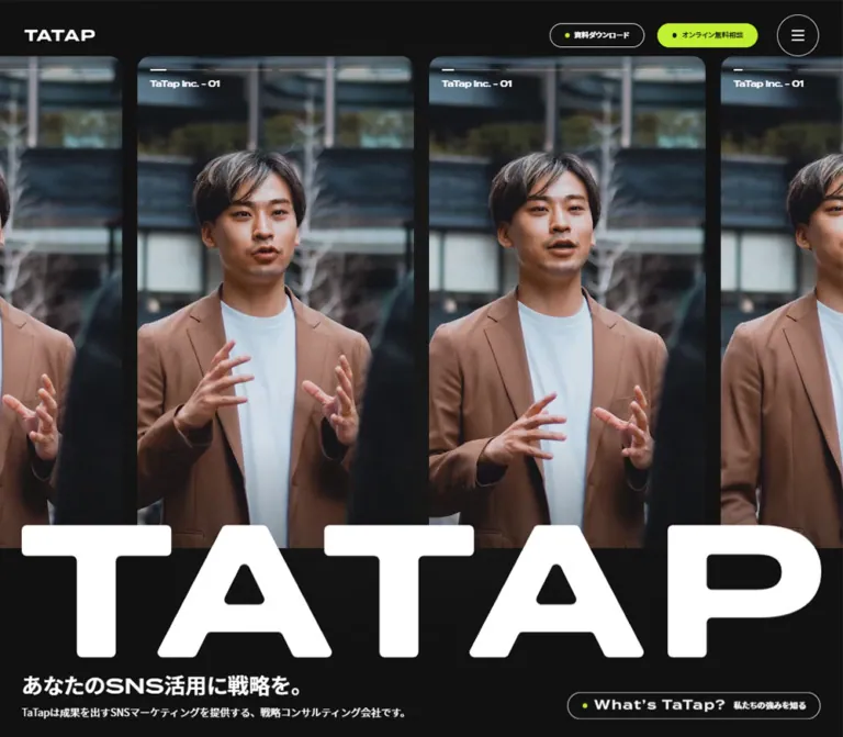
黒・白・ライムグリーンを軸に、縦長の人物ビジュアルと巨大なロゴを配置。サービス、支援実績、制作実績、記事を異なるレイアウトで展開するコーポレートサイト。
オリジナルサイトを見るPortrait media, monumental lettering, and a sharp lime accent frame a substantial marketing consultancy website.
Website: tatap.jp Original URL: https://tatap.jp/ Final URL: https://tatap.jp/ Theme: dark opening and footer, a white content base, and selective lime emphasis. Inspected: September 23, 2026, Japan Standard Time. Supplied retrieval timestamp: September 22, 2026, at 15:31:24.868 UTC. Viewports: desktop 1440 × 1000 CSS pixels; mobile 390 × 844 CSS pixels. Scope: the current corporate homepage, including its opening, news, services, case studies, creative work, knowledge articles, events, contact destinations, and footer. Visual captures cover the desktop opening, a service-to-case scroll position, and desktop/mobile footers; mobile opening imagery is also supplied. Additional section anatomy comes from rendered DOM measurements. Linked destination pages and the open navigation menu were not inspected.
TaTap combines the scale of a brand campaign with the depth of a corporate publishing site. Four tall portrait panels establish a human presence on desktop. A huge white TATAP wordmark crosses their lower boundary, followed by a compact Japanese proposition and an outlined company-introduction link. The consultation action receives the clearest color emphasis: a bright lime pill in an otherwise restrained header.
Below the opening, the site changes its presentation to suit the material. Services occupy a long, transformed horizontal sequence of portrait panels. Case studies form a horizontal rail. Creative work and events use smaller rounded white cards. Knowledge articles use a category navigation and editorial list. Oversized English section titles connect these different structures, while Japanese labels and descriptions explain their purpose.
The footer repeats the oversized wordmark and preserves conspicuous empty space on desktop. This is a corporate homepage with several content destinations and recurring inquiry routes; its visual system should retain that breadth.
Portrait media, monumental lettering, and a sharp lime accent frame a substantial marketing consultancy website.
Website: tatap.jp Original URL: https://tatap.jp/ Final URL: https://tatap.jp/ Theme: dark opening and footer, a white content base, and selective lime emphasis. Inspected: September 23, 2026, Japan Standard Time. Supplied retrieval timestamp: September 22, 2026, at 15:31:24.868 UTC. Viewports: desktop 1440 × 1000 CSS pixels; mobile 390 × 844 CSS pixels. Scope: the current corporate homepage, including its opening, news, services, case studies, creative work, knowledge articles, events, contact destinations, and footer. Visual captures cover the desktop opening, a service-to-case scroll position, and desktop/mobile footers; mobile opening imagery is also supplied. Additional section anatomy comes from rendered DOM measurements. Linked destination pages and the open navigation menu were not inspected.
TaTap combines the scale of a brand campaign with the depth of a corporate publishing site. Four tall portrait panels establish a human presence on desktop. A huge white TATAP wordmark crosses their lower boundary, followed by a compact Japanese proposition and an outlined company-introduction link. The consultation action receives the clearest color emphasis: a bright lime pill in an otherwise restrained header.
Below the opening, the site changes its presentation to suit the material. Services occupy a long, transformed horizontal sequence of portrait panels. Case studies form a horizontal rail. Creative work and events use smaller rounded white cards. Knowledge articles use a category navigation and editorial list. Oversized English section titles connect these different structures, while Japanese labels and descriptions explain their purpose.
The footer repeats the oversized wordmark and preserves conspicuous empty space on desktop. This is a corporate homepage with several content destinations and recurring inquiry routes; its visual system should retain that breadth.
--Accenct-color. Other token names are implementation aliases.| Name | Value | Source evidence | Role |
|---|---|---|---|
| Stage Black | #111111 |
--black-2-ex-bg; measured footer background |
Opening field, footer, and dark supporting surfaces |
| Content White | #ffffff |
--White; measured body and work/event card backgrounds |
Content base, reversed branding, and light header state |
| Primary Ink | #1a1a1a |
--black-1-ex-text; measured body text |
Titles and body copy on light surfaces; text inside the lime CTA |
| Signal Lime | #bfef30 |
--Accenct-color; measured consultation fill and emphasized service title |
Primary inquiry action, small dots, and service emphasis |
| Pale Text | #dcdcdc |
--White-gray; measured news and supporting text |
Secondary information on dark surfaces |
| Neutral Line / Footer Text | #d0d0d0 |
--gray-2-ex-line; measured footer sublinks |
Source line token and compact secondary navigation |
| Secondary Ink | #5a5a5a |
--gray-1-ex-text |
Available source text token; suitable for secondary text on white |
| Soft Surface | #f5f5f5 |
--white-gray-2-ex-background |
Available source background token; broad visible application is not established |
| Value | Measured use | Reuse guidance |
|---|---|---|
#c6f542 |
Inline links in the supplementary service note | Keep as a local lime variant if reproducing that detail |
#a0a0ab |
Supplementary service-note text | A subdued helper color, not a primary text color |
#9ca3af |
Work-card client names and event venue details | Small metadata treatment; assess contrast before reuse |
#4d7c0f |
Event dates | Dark green semantic emphasis on white cards |
The dominant relationship is white against near-black, with lime reserved for emphasis. Do not distribute lime equally across every headline, card, and tag. The centered service panel can have a lime English title while adjacent panel titles remain pale gray.
The root contains many WordPress preset gradients, shadows, and colors. Their presence does not establish their use in this design. They are excluded from the main palette.
The header appears dark with white branding over the opening and white with dark branding in footer captures. This is an observed contextual variation. No user-selectable theme control was demonstrated.
Measured family: source-han-sans-japanese.
The body, Japanese headings, navigation, descriptions, and card copy use this computed family. Regular copy generally uses weight 400; Japanese labels and titles use 700. Tracking is normally unchanged.
The computed body baseline is 16px / 16px, but readable content receives more generous component-specific leading. Do not apply that tight baseline to every paragraph.
Measured family: termina.
Measured weight: 600.
Termina is used for the large English section names, service names, NEWS label, and lower-page contact titles. Its broad letterforms give short words such as Service, Case, and Works substantial horizontal presence.
Case, Works, Knowledge, and Event use tracking of approximately -0.015em: -1.92px at 128px and -0.855px at 57px. Service is recorded with normal tracking.
The font declarations are directly evidenced. Font-file URLs and licensing details are not supplied. Use the recorded families when available and an explicit sans-serif fallback in an adaptation.
The TATAP wordmark has a distinctive wide silhouette and softened internal shapes. Its rendered appearance should be treated as brand artwork. The evidence does not identify its asset path or establish that ordinary text in Termina reproduces it.
The small header mark and the enormous opening/footer marks share this silhouette. Preserve their aspect ratio rather than stretching a text approximation.
Values below are measured unless marked otherwise.
| Role | Desktop | Mobile | Weight / family |
|---|---|---|---|
| Header CTA | 12px / 18px |
11px / 16.5px |
700, Japanese sans |
| Opening proposition | 36px / 54px |
22px / 33px |
700, Japanese sans |
| Opening description | 17px / 25.5px |
13px / 19.5px |
400, Japanese sans |
| NEWS label | 18px / 27px |
16px / 16px |
600, Termina |
| Main English section title | 128px / 128px |
57px / 57px |
600, Termina |
| Japanese section label | 20px / 30px |
18px / 27px |
700, Japanese sans |
| Section introduction | 16px / 32px |
14px / 28px |
400, Japanese sans |
| English service name | 32px / 32px |
24px / 30px |
600, Termina |
| Japanese service label | 12px / 18px |
11px / 16.5px |
700, Japanese sans |
| Service description | 14px / 24.5px |
13px / 22.75px |
400, Japanese sans |
| Supplementary service note | 13px / 13px |
13px / 13px |
400, Japanese sans |
| Case / knowledge article title | 18px / 27px |
16px / 24px |
700, Japanese sans |
| Work / event card title | 14px / 23.1px |
14px / 23.1px |
700, Japanese sans |
| Work / event metadata | 11px |
11px |
400, Japanese sans |
| Event date | 12px |
12px |
700, Japanese sans |
| Contact-band English title | 56px / 56px |
40px / 50px |
600, Termina |
| Contact-band description | 14px / 24.5px |
13px / 22.75px |
400, Japanese sans |
| Footer primary link | 16px / 32px |
14px / 28px |
700, Japanese sans |
| Footer secondary link | 12px / 18px |
11px / 16.5px |
700, Japanese sans |
The very large section titles coexist with small, information-dense card text. This scale contrast is central to the page. Increasing every paragraph to match the display typography would change its rhythm.
On mobile, Knowledge occupies two 57px lines in a 114px-high heading box. The source text includes a discretionary break in Knowledge. Preserve a controlled break opportunity instead of shrinking this heading arbitrarily.
These custom properties are available in the supplied page. Availability alone does not prove that every component uses them.
| Source size | Desktop token value | Mobile counterpart supplied |
|---|---|---|
XXXS |
4px |
--XXXS-sp: 0 |
XXS |
8px |
--XXS-sp: 5px |
XS |
16px |
--XS-sp: 10px |
SS |
24px |
--SS-sp: 15px |
S |
32px |
--S-sp: 20px |
M |
40px |
--M-sp: 30px |
L |
56px |
Not supplied |
LL |
64px |
--LL-sp: 50px |
XL |
80px |
--XL-sp: 60px |
XXL |
120px |
Not supplied |
XXXL |
160px |
--XXXL-sp: 100px |
Desktop fluid counterparts use a 1440px reference width. For example:
/* Recorded source formulas */
--S-pcin: calc((32 / 1440) * 100vw);
--M-pcin: calc((40 / 1440) * 100vw);
--XL-pcin: calc((80 / 1440) * 100vw);
--XXXL-pcin: calc((160 / 1440) * 100vw);
Mobile dimensions are not a uniform reduction of desktop values. The 128px section title becomes 57px, and the 36px opening proposition becomes 22px. Use the separately observed mobile hierarchy.
| Element | Value | Evidence level |
|---|---|---|
| Header pills and introduction link | 100px radius |
Measured |
| Menu outline | 100px radius on a square box |
Measured; circular result |
| Work and event cards | 14px radius |
Measured |
| Desktop opening portrait panels | Approximately 16px radius |
Screenshot estimate |
| Mobile opening media | Visually square and full bleed | Screenshot observation |
| Service panels | Square overall silhouette | Screenshot observation; sampled link radius is 0 |
| Case links | 0 radius on sampled anchor |
Measured; image-corner styling was not sampled separately |
| Pill and menu outlines | Approximately 1px |
Screenshot estimate |
| Large section-arrow circle | Approximately 2px stroke |
Screenshot estimate |
| Element | Desktop: 1440 × 1000 | Mobile: 390 × 844 | Evidence |
|---|---|---|---|
| Header height | 94px |
70px |
Measured |
| Header logo | 120 × 19.8px, x = 40 |
80 × 13.2px, x = 14 |
Measured |
| Download pill | 156.9 × 40px |
64 × 32.5px |
Measured |
| Consultation pill | 168.8 × 40px |
70 × 32.5px |
Measured |
| Menu circle | 52 × 52px |
40 × 40px |
Measured |
| Standard content region | x = 112, width ≈ 1216 | x ≈ 20.8, width ≈ 348.4 | Measured |
| Opening copy left edge | 47.5px |
20.8px |
Measured |
| Opening introduction link | 348.4 × 46px |
171.1 × 42px |
Measured |
| Opening media | Four panels, each approximately 345 × 612px |
One visible region approximately 390 × 693px |
Screenshot estimates |
| Opening media gap | Approximately 18px |
No inter-panel gutter in visible frame | Screenshot observation |
| Opening wordmark | Approximately 1344 × 222px |
Approximately 346 × 57px |
Visible-artwork estimates |
| Centered service panel | 383 × 680.2px |
303.7 × 539.3px |
Measured |
| Service text side/bottom inset | 33px |
Approximately 20.8px |
Calculated from measured boxes |
| Case item width | 384px |
288.1px |
Measured |
| Case rail gap | 32px |
Approximately 15.6px |
Calculated |
| Work/event card width | Approximately 392px |
Approximately 348.4px |
Measured |
| Work/event card gap | 20px horizontally |
20px vertically |
Calculated |
| Footer height | 811px |
1073px |
Measured |
| Footer padding | 80px 0 40px |
60px 0 30px |
Measured |
| Document height | 11540px |
11806px |
Recorded capture dimensions |
The standard desktop content inset is approximately 7.78% of viewport width. The mobile inset is approximately 5.33%. These percentages are calculated from the two inspected sizes, not confirmed media-query formulas.
Role: maintain identity and two conversion destinations while leaving the main navigation compact.
The desktop composition is a small wordmark at left and three controls at right: an outlined download pill, a lime consultation pill, and a circular menu control. The download and consultation pills are separated by 16px; the menu begins 24px after the consultation pill.
Desktop CTA anatomy is a small dot, a bold label, approximately 8px internal gap, 24px horizontal padding, and 10px vertical padding. White text and a fine white outline define the secondary action on the opening. The lime action uses dark text and a dark dot.
On mobile, the visible labels shorten from “資料ダウンロード” and “オンライン無料相談” to “資料DL” and “無料相談”. Type becomes 11px and padding becomes 7px 12px. The tiny desktop dots are not visible in the supplied mobile header. The two actions remain on screen alongside the 40px menu circle.
The header remains at the top in the supplied scrolled captures. Its exact positioning declaration and scroll-trigger logic are not included. The menu's opened state, focus handling, and dismissal behavior were not exercised.
Role: establish the team-oriented visual identity before introducing the company proposition.
At desktop size, four tall media panels begin directly below the 94px header. Their approximately 9:16 proportions resemble individual portrait reels. Faces, upper bodies, and gestures fill the panels; the compositions vary from medium shots to close crops. Small progress-like horizontal bars and a “TaTap inc. - 01” label sit near the top.
The immense white wordmark begins roughly 56px before the panels end. This overlap joins the imagery to the black area below. It is more consequential than an ornamental background logo: it sets the scale of the entire first screen.
Below it, the proposition “あなたのSNS活用に戦略を。” and one-line desktop description sit left. The outlined “What’s TaTap?” / “私たちの強みを知る” link sits to the right near the description baseline.
At 390px, the composition changes to one full-width portrait scene showing people using a tablet. The wordmark, proposition, and description overlay its lower region, supported by dark shading. The introduction link moves below the image region onto black. Its English lead-in is absent from the visible mobile rendering.
The captures show different media frames and labels, but do not establish the playback implementation, timing, audio state, or user controls. Preserve the visual layering without claiming a verified video API or carousel behavior.
Role: expose a recent publication without competing with the brand introduction.
On desktop, NEWS and the linked date/headline are arranged horizontally in the 1216px content region. The section has a 32px gap and measured padding of approximately 48px 0 24px. The news link uses pale text against the dark opening region.
On mobile, NEWS sits above the linked content, which wraps across the 348px content width. The section gap is approximately 20.8px. This is a compact editorial announcement rather than a separate filled card.
Role: provide a repeated visual landmark and a link to a full content category.
The principal anatomy is an English title, a large outlined circular arrow, a Japanese label beneath, and a paragraph after that label. The supplied Case capture shows a roughly 96px arrow circle alongside the 128px heading.
Service uses lime lettering in the dark introductory sequence. Case, Works, Knowledge, and Event use dark lettering over the light content base. Japanese labels remain much smaller at 20px desktop and 18px mobile.
Section descriptions use double leading: 16/32 desktop and 14/28 mobile. Their desktop measured width is 800px; mobile descriptions occupy the normal content width.
The heading links lead to category pages such as /case/ and /knowledge/. They are not evidenced as accordion controls.
Role: introduce six featured services through a large portrait-panel presentation.
The featured names are EC Growth, Intangible, Inhouse Studio, Influencer marketing, AD Studio, and Creative Studio. A separate note links to two additional offerings and the complete eight-service index.
Each service panel contains:
The centered desktop panel measures 383 × 680.2px. Its text occupies a 317px-wide column with 33px side and bottom insets. The English name is followed by an 8px gap before the Japanese label, then approximately 32px before the description.
The emphasized mobile panel measures 303.7 × 539.3px. Its content width is approximately 262.1px, with 20.8px insets. Name-to-label spacing becomes 5px; label-to-description spacing becomes 20px.
Adjacent panels are visibly rotated or transformed and carry less prominent text. The centered panel's English name is lime. Rectangles for neighboring panels grow or skew because of transforms; they are not separate intrinsic card widths.
The service section occupies approximately 4498px of desktop document height and 3845px on mobile. This unusually long region, transformed positions, and changing emphasized panels support a staged presentation. The exact relationship between scrolling, selection, and panel motion is unverified. Do not reproduce the entire height as unexplained blank padding.
Role: present substantial client outcomes as a browsable series.
Six case links are arranged horizontally. On desktop, the first three begin at x = 112, 528, and 944, each 384px wide. Further entries continue outside the viewport. On mobile, the first item is 288.1px wide and the next begins at x ≈ 324.5, leaving a visible continuation.
The content includes a portrait image reference, client identity, a multi-line Japanese outcome headline, and service tags. Several referenced images have native dimensions of 768 × 1024. Their exact displayed image boxes were not separately sampled.
Titles use 18/27 desktop and 16/24 mobile. Their height follows the text: cards are not forced to have identical headline lengths. The rail is distinct from the compact rounded Works grid.
Horizontal arrangement is directly supported by the coordinates. Dragging, swipe gestures, arrow controls, and snapping were not independently exercised.
Role: show concrete creative outputs and concise results.
Three cards occupy a desktop row, each approximately 392px wide with 20px gaps. At mobile size, they become a vertical list of 348.4px-wide cards with the same 20px gap.
Each card combines a creative-format label, a landscape image reference, a bold Japanese result summary, and a muted client name. The supplied image references are 768 × 432. The outer link has a white background and a measured 14px radius.
Text begins 21px inside the card boundary. This is consistent with 20px content padding plus a border, but the border width was not separately supplied. Titles remain 14/23.1 at both viewports. Card heights vary with line count: approximately 335–358px on desktop and 310–333px on mobile.
The declared transition includes border color, transform, and box shadow. Its resting shadow and hover endpoints are not present in the evidence.
Role: organize the site's ongoing educational content.
Desktop categories form a vertical navigation at the left of the content region. Article rows start at x ≈ 320 and span 1008px. Each row pairs a landscape thumbnail with an update date, headline, and tags.
The headline column starts at x = 632. A 280px image plus a 32px gap accounts for the measured 312px offset from the row's left edge. This image width is calculated rather than directly sampled. The remaining text column is approximately 696px wide.
Middle article rows use 32px top and bottom padding. Headlines use the same 18/27 style as case studies.
Mobile categories become one horizontal sequence above the articles. Later items extend beyond the viewport in the recorded geometry. Articles switch to full-width images over text, with 16/24 headlines and 32px vertical separation.
The category items are links to category URLs. Their appearance should not be described as verified in-place filtering. Horizontal scrolling is a sensible implementation for the mobile category strip, but its gesture behavior was not tested.
Role: promote scheduled webinars while showing practical attendance information.
Events reuse the 14px-radius white card treatment and landscape media of the Works section. Their additional content includes the visible status “受付中”, a dark-green date, a bold title, and small muted venue information.
At desktop size, two events occupy the first two approximately 392px tracks of the same three-column-width system. They are not stretched into two half-width cards. On mobile, the cards stack at full content width with a 20px gap.
Event dates and status are content-dependent. The inspection includes forthcoming events on September 30 and October 14, 2026; these dates should not become permanent design fixtures.
Role: repeat two next steps after the content sections.
Desktop presents Download and Let’s talk! side by side. Their measured content blocks are approximately 488px wide, beginning near x = 112 and x = 840. Each combines a large English title, a smaller bold Japanese label, and a paragraph of supporting copy.
The titles are white at 56px; descriptions are pale gray at 14/24.5. The parent surface color was not included in the sampled element list, so an exact background value cannot be assigned from those children alone.
Mobile stacks the two destinations. Content width becomes 350px with 20px side insets. English titles become 40/50, and descriptions become 13/22.75.
These controls link to separate download and consultation pages. No inline form state or submission behavior was inspected.
Role: provide comprehensive navigation and end with a strong brand impression.
The desktop footer is an 811px-high #111111 field. Its navigation starts in the right half, at x ≈ 736.6, and uses three columns beginning approximately 208px apart. The left side remains largely empty until the oversized wordmark appears near the bottom.
The three navigation groups cover services, editorial/proof content, and corporate/contact destinations. Primary links are white and bold. Service and platform sublinks are smaller and pale gray. A fine divider separates policy links in the corporate column.
The lower row pairs the oversized white TATAP artwork with the company identity, postal address, and copyright. The visible operator name is “株式会社TaTap”. This identity is supported by the inspected homepage footer.
On mobile, the navigation reorganizes into two columns. Service and editorial groups run down the left; corporate links sit at the right. The wordmark then occupies almost the whole content width, followed by company details below it. The supplied mobile view shows ordinary link lists, not collapsed accordion panels.
Preserve the deliberate change from a wide, asymmetrical desktop ending to a compact vertical brand signature.
These values describe declared transitions. They do not establish that every transition was triggered during inspection.
| Element | Recorded value | Evidence and limitation |
|---|---|---|
| Header transform | 0.7s, delay 0.5s |
A transform transition is declared; hide/show thresholds are unknown |
| Japanese section labels | 0.7s cubic-bezier(0.36, 0.14, 0, 1), delay 0.2s |
Supports a staggered reveal treatment; exact start transform not supplied |
| Introductory paragraphs | Same 0.7s curve, delay 0.4s |
Later stage in the declared reveal sequence |
| Service panel transform | 0.6s cubic-bezier(0.15, 0.84, 0.44, 1) |
Transformed neighboring panels are also visible in the evidence |
| Service English title color | Same 0.6s curve |
Emphasized and adjacent titles have different measured colors |
| Desktop service anchor overlay | opacity 0.25s |
Overlay anchor exists; activation behavior untested |
| Desktop CTA fill and border | 0.1s ease-out |
Hover/focus endpoint colors not supplied |
| Desktop case / article title | color 0.3s ease-in-out |
Endpoint color not supplied |
| Work / event cards | Border color, transform, and box shadow, each 0.3s |
No measured lift distance or shadow parameters |
| Desktop knowledge category | padding-left 0.2s ease-out |
The first category has 16px left padding in the sampled state |
| Desktop footer links | color 0.1s ease-out |
Destination color unverified |
Several mobile entries report only transition: all, without a nonzero duration. Do not automatically describe the desktop transition timing as verified mobile behavior.
For an adaptation, use the recorded easing curves for restrained reveals and service emphasis. Keep content readable without animation, and provide a static or native-scroll fallback for the service sequence.
| Surface | Appearance | Purpose |
|---|---|---|
| Opening stage | Near-black field with portrait media | High-impact introduction and brand scale |
| Header over opening | White branding and outlined utility control; lime primary control | Compact persistent navigation |
| Light header state | White surface with dark branding and outlines | Readability in later scroll positions |
| Service panel | Photography, dark text-support shading, lime or pale titles | A staged overview of offerings |
| Main content base | White body background with dark text | Case, work, knowledge, and event material |
| Work / event card | White, 14px-radius container | Smaller, repeatable content previews |
| Footer | Solid #111111, white headings, gray sublinks |
Sitemap and final brand signature |
| Middle captured state | Broad gray/dimmed field | Observed state with unresolved cause; not a reusable base token |
The broad layout relies on contrast, typography, media boundaries, and whitespace. A universal elevated-card system is not evidenced. Work and event cards have their own transition declarations, so their treatment should remain distinct from the flat footer and unboxed editorial list.
The opening uses naturalistic business portraits rather than abstract marketing illustrations. People speak, gesture, or work together around a tablet. Dark jackets, a tan blazer, glass architecture, trees, and city reflections create a restrained photographic palette against the lime UI accent.
Desktop cropping is deliberately tight and vertical. Repetition of similar subjects across adjacent panels creates a sequence-like rhythm. Mobile changes both the crop and the visible scene; it is not merely the desktop four-panel arrangement squeezed into a phone.
The visible service imagery includes laptop work and a close view of a camera. These connect service names to production activity. Dark shading supports small white descriptions near panel bottoms. Do not bake text into the photograph when implementing the layout.
Case references include portrait-oriented client imagery. Work, knowledge, and event references use landscape thumbnails. Their proportions should remain content-specific.
Paths below were included in the original page's rendered evidence. They were not independently fetched for this reference.
| Asset reference | Observed path relative to https://tatap.jp |
Evidence-supported use |
|---|---|---|
| Case photograph | /wp-content/uploads/2026/05/DSC07555-768x1024.jpg |
Portrait reference for a client case study |
| Case photograph | /wp-content/uploads/2024/10/240911-0006-768x1024.jpg |
Portrait reference for another case study |
| Work thumbnail | /wp-content/uploads/2026/08/Frame-5-768x432.jpg |
First creative-work card |
| Work thumbnail | /wp-content/uploads/2026/07/Frame-4-768x432.jpg |
Second creative-work card |
| Work thumbnail | /wp-content/uploads/2026/07/Frame-1-768x432.jpg |
Third creative-work card |
| Event thumbnail | /wp-content/uploads/2026/08/10-768x432.jpeg |
First event card |
| Event thumbnail | /wp-content/uploads/2026/09/1-768x432.jpeg |
Second event card |
The knowledge entries reference 766 × 432 PNG thumbnails. Exact opening-media, service-media, and wordmark paths were not supplied. Do not invent their filenames or imply that these assets accompany this document.
Use approved brand artwork and appropriately licensed media. For a new brand, commission similarly composed portrait scenes rather than imitating the identities of the photographed people.
The rendered order is opening → news → service sequence → case studies → creative work → knowledge → events → download/consultation → footer.
The service presentation accounts for a large share of the document's scroll depth. Later sections return to conventional content flow. Desktop Case has 160px top padding; Works, Knowledge, and Event have 180px. Mobile Case has 100px, and the latter sections have approximately 109.2px.
| Area | Desktop observation | Mobile observation |
|---|---|---|
| Header | 120px logo, full CTA labels, 52px menu | 80px logo, shortened labels, 40px menu |
| Opening | Four separated portrait panels | One full-width visible portrait scene |
| Opening copy | Under the large wordmark; introduction link on the right | Copy over lower media; introduction link below |
| English section titles | 128px | 57px; Knowledge wraps to two lines |
| Service sequence | Centered 383px panel with transformed neighbors | Centered approximately 304px panel with neighboring content outside the viewport |
| Case studies | Three complete 384px items fit inside the standard width | One 288px item and part of the next |
| Creative work | Three columns with 20px gaps | One column with 20px gaps |
| Knowledge categories | Vertical left navigation | Horizontal sequence above articles |
| Knowledge articles | Thumbnail and text side by side | Image over text |
| Events | Two entries in a three-column-width system | Single-column stack |
| Contact destinations | Two parallel content areas | Vertically stacked areas |
| Footer | Three navigation columns in the right half | Two navigation columns across the content width |
| Footer signature | Large logo and company details alongside | Logo followed by company details |
Only the two listed viewports were inspected. Tablet behavior and exact breakpoint values are unknown. A breakpoint around 768px is a recommendation for the starter below, not a recovered source value.
The source records --vh: 10px on desktop and --vh: 8.44px on mobile, each equal to one percent of the captured viewport height. Where that variable is consumed is not included in the evidence. A new implementation can use modern viewport units while testing mobile browser chrome and short screens.
#bfef30 relationship.These are improvements for a new implementation, not verified original-site features.
#9ca3af text color on white. A darker neutral and slightly larger text are reasonable accessibility adaptations.#111111.#ffffff.#1a1a1a.#bfef30.#dcdcdc.#d0d0d0.#4d7c0f.“Create a corporate homepage for a Japanese social-media marketing consultancy using TaTap's observed visual principles. Use a near-black opening and footer, a white content base, and a selective lime accent #bfef30. Place four tall portrait-media panels below a compact desktop header, then overlap their lower edge with an enormous white brand wordmark. Add a bold Japanese proposition and an outlined introduction link. Use broad 128px English section titles with smaller Japanese labels. Present services as a staged portrait sequence, case studies as a horizontal rail, creative work and events as 14px-radius cards, and knowledge articles as an editorial list with category navigation. On a 390px phone, show one full-width opening scene, shorten header labels, use 57px section titles, stack work/event cards, and move company details below the footer wordmark. Keep imagery, copy, and navigation usable without animation.”
This is a proposed implementation vocabulary, not recovered source code. It reproduces the principal measured sizes at the two reference viewports. The 768px breakpoint, header state attribute, gradients, and static service scroller are recommendations. Supply approved logo/media assets and load the recorded fonts separately if available.
Expected structure: a .tt-header with brand, action group, and menu; a .tt-hero containing its media rail, wordmark, and summary; standard .tt-container sections; separate service/case rails; work/event card grids; a knowledge layout; and a footer. Mark one hero panel with data-mobile-active for the static mobile view. Use separate desktop and mobile CTA-label spans.
:root {
  /* Colors based on recorded source values */
  --tt-stage: #111111;
  --tt-paper: #ffffff;
  --tt-ink: #1a1a1a;
  --tt-accent: #bfef30;
  --tt-pale: #dcdcdc;
  --tt-line: #d0d0d0;
  --tt-secondary: #5a5a5a;
  --tt-subtle: #9ca3af;
  --tt-event: #4d7c0f;

  /* Font declarations are evidenced; files are not bundled */
  --tt-font-body: 'source-han-sans-japanese', sans-serif;
  --tt-font-display: 'termina', sans-serif;

  /* Reference-view dimensions; proposed reusable aliases */
  --tt-gutter: 7.777778vw;
  --tt-hero-gutter: 3.3vw;
  --tt-header-height: 94px;
  --tt-heading-size: 128px;
  --tt-section-space: 180px;
  --tt-card-radius: 14px;
  --tt-pill-radius: 100px;
  --tt-service-width: 383px;
  --tt-case-width: 384px;
  --tt-rail-gap: 32px;

  /* Recorded easing curves */
  --tt-ease-reveal: cubic-bezier(0.36, 0.14, 0, 1);
  --tt-ease-service: cubic-bezier(0.15, 0.84, 0.44, 1);
}

* { box-sizing: border-box; }
body {
  margin: 0;
  color: var(--tt-ink);
  background: var(--tt-paper);
  font-family: var(--tt-font-body);
  font-size: 16px;
  line-height: 1.75;
}
img, video { display: block; max-width: 100%; }
a { color: inherit; }
button { font: inherit; }
.tt-container { margin-inline: var(--tt-gutter); }
.tt-section { padding-block-start: var(--tt-section-space); }
section { scroll-margin-top: calc(var(--tt-header-height) + 20px); }

/* Proposed persistent header and explicit surface states */
.tt-header {
  position: fixed;
  inset: 0 0 auto;
  z-index: 100;
  height: var(--tt-header-height);
  display: flex;
  align-items: center;
  padding: 6px 40px 0;
  color: var(--tt-paper);
  background: var(--tt-stage);
}
.tt-header[data-surface='light'] {
  color: var(--tt-ink);
  background: var(--tt-paper);
}
.tt-header__brand { width: 120px; margin-inline-end: auto; }
.tt-header__brand img { width: 100%; height: auto; }
.tt-header__actions { display: flex; align-items: center; gap: 16px; }
.tt-label-mobile { display: none; }
.tt-pill {
  display: inline-flex;
  align-items: center;
  justify-content: center;
  gap: 8px;
  padding: 10px 24px;
  border: 1px solid currentColor;
  border-radius: var(--tt-pill-radius);
  font-size: 12px;
  font-weight: 700;
  line-height: 18px;
  white-space: nowrap;
  text-decoration: none;
  transition: background-color 100ms ease-out, border-color 100ms ease-out;
}
.tt-pill__dot {
  width: 8px;
  height: 8px;
  flex: 0 0 auto;
  border-radius: 50%;
  background: var(--tt-accent);
}
.tt-pill--primary {
  color: var(--tt-ink);
  background: var(--tt-accent);
  border-color: var(--tt-accent);
}
.tt-pill--primary .tt-pill__dot { background: var(--tt-ink); }
.tt-menu {
  width: 52px;
  height: 52px;
  flex: 0 0 auto;
  display: grid;
  place-content: center;
  gap: 4px;
  margin-inline-start: 24px;
  padding: 0;
  border: 1px solid currentColor;
  border-radius: 50%;
  color: inherit;
  background: transparent;
  cursor: pointer;
}
.tt-menu span { width: 15px; height: 1.5px; background: currentColor; }

/* Static opening composition; media behavior is separate */
.tt-hero {
  position: relative;
  min-height: 100svh;
  padding-block: var(--tt-header-height) 30px;
  color: var(--tt-paper);
  background: var(--tt-stage);
}
.tt-hero__rail {
  display: grid;
  grid-template-columns: repeat(4, minmax(0, 1fr));
  gap: 18px;
  padding-inline: 3px;
}
.tt-hero__panel {
  position: relative;
  aspect-ratio: 9 / 16;
  overflow: hidden;
  border-radius: 16px;
}
.tt-hero__panel > img,
.tt-hero__panel > video {
  width: 100%;
  height: 100%;
  object-fit: cover;
}
.tt-hero__status {
  position: absolute;
  inset: 16px 16px auto;
  z-index: 2;
  font-size: 11px;
  line-height: 1.5;
}
.tt-hero__bars { display: flex; gap: 8px; margin-block-end: 8px; }
.tt-hero__bars span { flex: 1; height: 2px; background: rgb(255 255 255 / 30%); }
.tt-hero__bars .is-current { background: white; }
.tt-hero__brand {
  position: relative;
  z-index: 2;
  margin: -56px var(--tt-hero-gutter) 0;
}
.tt-hero__brand img { width: 100%; height: auto; }
.tt-hero__summary {
  position: relative;
  z-index: 2;
  display: flex;
  align-items: flex-end;
  justify-content: space-between;
  gap: 32px;
  margin: 18px var(--tt-hero-gutter) 0;
}
.tt-hero h1 { margin: 0; font-size: 36px; line-height: 1.5; }
.tt-hero__description { margin: 0; font-size: 17px; line-height: 1.5; }
.tt-about {
  min-height: 46px;
  padding-inline: 24px;
  font-size: 14px;
  gap: 12px;
}

/* Repeated section heading */
.tt-section-title {
  display: inline-flex;
  align-items: center;
  gap: 48px;
  text-decoration: none;
}
.tt-section-title h2 {
  margin: 0;
  font-family: var(--tt-font-display);
  font-size: var(--tt-heading-size);
  font-weight: 600;
  line-height: 1;
  letter-spacing: -0.015em;
  hyphens: manual;
}
.tt-section-title--service { color: var(--tt-accent); }
.tt-section-title--service h2 { letter-spacing: normal; }
.tt-section-arrow {
  display: grid;
  place-items: center;
  width: 96px;
  height: 96px;
  flex: 0 0 auto;
  border: 2px solid currentColor;
  border-radius: 50%;
  font-size: 44px;
  line-height: 1;
}
.tt-section-label { margin: 0; font-size: 20px; font-weight: 700; line-height: 1.5; }
.tt-section-intro { max-width: 800px; margin: 32px 0 0; line-height: 2; }

/* Accessible static fallback for the transformed service stage */
.tt-services { color: var(--tt-paper); background: var(--tt-stage); }
.tt-service-track,
.tt-case-rail {
  display: flex;
  gap: var(--tt-rail-gap);
  overflow-x: auto;
  padding-inline: var(--tt-gutter);
  scroll-padding-inline: var(--tt-gutter);
  scroll-snap-type: x proximity;
}
.tt-service-track { padding-block: 40px; }
.tt-service-card {
  position: relative;
  flex: 0 0 var(--tt-service-width);
  aspect-ratio: 9 / 16;
  overflow: hidden;
  color: var(--tt-pale);
  text-decoration: none;
  scroll-snap-align: center;
  transition: transform 600ms var(--tt-ease-service);
}
.tt-service-card > img { width: 100%; height: 100%; object-fit: cover; }
.tt-service-card::after {
  content: '';
  position: absolute;
  inset: 0;
  background: linear-gradient(transparent 25%, rgb(0 0 0 / 80%));
}
.tt-service-copy { position: absolute; inset: auto 33px 33px; z-index: 1; }
.tt-service-name {
  margin: 0;
  font: 600 32px/1 var(--tt-font-display);
  transition: color 600ms var(--tt-ease-service);
}
.tt-service-label { margin: 8px 0 0; font-size: 12px; line-height: 1.5; }
.tt-service-description { margin: 32px 0 0; font-size: 14px; line-height: 1.75; }
.tt-service-card[data-active='true'] { color: var(--tt-paper); }
.tt-service-card[data-active='true'] .tt-service-name { color: var(--tt-accent); }

/* Case rail and distinct compact card grid */
.tt-case-card {
  flex: 0 0 var(--tt-case-width);
  text-decoration: none;
  scroll-snap-align: start;
}
.tt-case-card > img { width: 100%; aspect-ratio: 3 / 4; object-fit: cover; }
.tt-case-card h3,
.tt-article h3 { font-size: 18px; line-height: 1.5; }
.tt-card-grid {
  display: grid;
  grid-template-columns: repeat(3, minmax(0, 1fr));
  align-items: start;
  gap: 20px;
}
.tt-card {
  overflow: hidden;
  border: 1px solid var(--tt-line);
  border-radius: var(--tt-card-radius);
  color: var(--tt-ink);
  background: var(--tt-paper);
  text-decoration: none;
  transition: border-color 300ms, transform 300ms, box-shadow 300ms;
}
.tt-card > img { width: 100%; aspect-ratio: 16 / 9; object-fit: cover; }
.tt-card__body { padding: 20px; }
.tt-card__title { margin: 0; font-size: 14px; font-weight: 700; line-height: 1.65; }
.tt-card__meta { margin: 8px 0 0; color: var(--tt-subtle); font-size: 11px; }
.tt-event-date { color: var(--tt-event); font-size: 12px; font-weight: 700; }

/* Editorial navigation and rows */
.tt-knowledge {
  display: grid;
  grid-template-columns: 176px minmax(0, 1fr);
  gap: 32px;
}
.tt-categories { display: flex; flex-direction: column; align-items: flex-start; gap: 18px; }
.tt-categories a { font-size: 14px; font-weight: 700; line-height: 21px; text-decoration: none; }
.tt-article {
  display: grid;
  grid-template-columns: 280px minmax(0, 1fr);
  gap: 32px;
  padding-block: 32px;
  text-decoration: none;
}
.tt-article > img { width: 100%; aspect-ratio: 766 / 432; object-fit: cover; }
.tt-article h3 { margin: 8px 0; }

/* Proposed dark contact band; exact source parent fill was not sampled */
.tt-contact-band {
  display: grid;
  grid-template-columns: repeat(2, minmax(0, 1fr));
  color: var(--tt-paper);
  background: var(--tt-stage);
}
.tt-contact-panel { padding: 80px clamp(24px, 7.78vw, 112px); }
.tt-contact-panel + .tt-contact-panel { border-inline-start: 1px solid var(--tt-secondary); }
.tt-contact-title { margin: 0; font: 600 56px/1 var(--tt-font-display); }
.tt-contact-description { color: var(--tt-pale); font-size: 14px; line-height: 1.75; }

/* Footer grouping follows the observed desktop/mobile reorganization */
.tt-footer { padding-block: 80px 40px; color: var(--tt-paper); background: var(--tt-stage); }
.tt-footer__nav {
  width: 592px;
  margin-inline-start: auto;
  display: grid;
  grid-template-columns: repeat(3, minmax(0, 1fr));
  gap: 32px;
}
.tt-footer__group { margin-block-end: 40px; }
.tt-footer__nav a { display: block; text-decoration: none; font-weight: 700; line-height: 2; }
.tt-footer__sub a { color: var(--tt-line); font-size: 12px; line-height: 1.5; margin-block-start: 8px; }
.tt-footer__base {
  display: grid;
  grid-template-columns: minmax(0, 1fr) 307px;
  align-items: end;
  gap: 64px;
  margin: 80px 40px 0;
}
.tt-footer__brand { width: 100%; height: auto; }
.tt-footer__company { font-size: 13px; line-height: 1.7; }

/* Proposed breakpoint; only the endpoint viewports were inspected */
@media (max-width: 767px) {
  :root {
    --tt-gutter: 5.333333vw;
    --tt-hero-gutter: var(--tt-gutter);
    --tt-header-height: 70px;
    --tt-heading-size: 57px;
    --tt-section-space: 109.2px;
    --tt-service-width: 77.8646vw;
    --tt-case-width: 73.8662vw;
    --tt-rail-gap: 16px;
  }
  .tt-header { padding: 0 14px; }
  .tt-header__brand { width: 80px; }
  .tt-header__actions { gap: 10px; }
  .tt-label-desktop { display: none; }
  .tt-label-mobile { display: inline; }
  .tt-header .tt-pill { padding: 7px 12px; font-size: 11px; line-height: 16.5px; gap: 5px; }
  .tt-header .tt-pill__dot { display: none; }
  .tt-menu { width: 40px; height: 40px; margin-inline-start: 25px; }

  .tt-hero__rail { position: absolute; inset: 70px 0 auto; display: block; padding: 0; }
  .tt-hero__panel { display: none; border-radius: 0; }
  .tt-hero__panel[data-mobile-active] { display: block; }
  .tt-hero__panel::after {
    content: '';
    position: absolute;
    inset: 0;
    background: linear-gradient(transparent 45%, rgb(17 17 17 / 35%) 72%, #111);
  }
  /* Screenshot-derived anchoring; tune for other heights and copy lengths */
  .tt-hero__brand { margin: 0 var(--tt-gutter); padding-top: max(280px, calc(100vw * 16 / 9 - 194px)); }
  .tt-hero__summary { display: block; margin-top: 12px; }
  .tt-hero h1 { font-size: 22px; line-height: 1.5; }
  .tt-hero__description { margin-top: 15px; font-size: 13px; line-height: 1.5; }
  .tt-about { margin-top: 45px; min-height: 42px; padding-inline: 20px; }
  .tt-about__english { display: none; }

  .tt-section-title { display: flex; width: 100%; justify-content: space-between; gap: 20px; }
  .tt-section-title h2 { min-width: 0; max-width: calc(100% - 100px); }
  .tt-section-arrow { width: 52px; height: 52px; font-size: 28px; }
  .tt-section-label { font-size: 18px; }
  .tt-section-intro { margin-top: 20px; font-size: 14px; line-height: 2; }
  .tt-service-copy { inset: auto var(--tt-gutter) var(--tt-gutter); }
  .tt-service-name { font-size: 24px; line-height: 1.25; }
  .tt-service-label { margin-top: 5px; font-size: 11px; }
  .tt-service-description { margin-top: 20px; font-size: 13px; }
  .tt-case-card h3, .tt-article h3 { font-size: 16px; line-height: 1.5; }
  .tt-card-grid { grid-template-columns: minmax(0, 1fr); }

  .tt-knowledge { grid-template-columns: minmax(0, 1fr); }
  .tt-categories { flex-direction: row; gap: 12px; overflow-x: auto; padding-bottom: 16px; }
  .tt-categories a { flex: 0 0 auto; font-size: 13px; }
  .tt-article { grid-template-columns: minmax(0, 1fr); gap: 16px; }
  .tt-contact-band { grid-template-columns: minmax(0, 1fr); }
  .tt-contact-panel { padding: 80px 20px; }
  .tt-contact-panel + .tt-contact-panel { border-inline-start: 0; border-block-start: 1px solid var(--tt-secondary); }
  .tt-contact-title { font-size: 40px; line-height: 1.25; }
  .tt-contact-description { font-size: 13px; }

  .tt-footer { padding-block: 60px 30px; }
  .tt-footer__nav { width: 100%; grid-template-columns: repeat(2, minmax(0, 1fr)); gap: 28px; }
  .tt-footer__primary, .tt-footer__editorial { grid-column: 1; }
  .tt-footer__corporate { grid-column: 2; grid-row: 1 / span 2; }
  .tt-footer__group { margin-block-end: 30px; }
  .tt-footer__nav a { font-size: 14px; }
  .tt-footer__sub a { font-size: 11px; }
  .tt-footer__base { grid-template-columns: minmax(0, 1fr); gap: 30px; margin: 60px var(--tt-gutter) 0; }
}

/* Recommended keyboard and reduced-motion behavior */
:where(a, button):focus-visible { outline: 2px solid currentColor; outline-offset: 4px; }
@media (prefers-reduced-motion: reduce) {
  .tt-pill, .tt-service-card, .tt-service-name, .tt-card { transition: none; }
  .tt-service-track, .tt-case-rail { scroll-behavior: auto; scroll-snap-type: none; }
  .tt-reveal { opacity: 1; transform: none; }
}
The service CSS deliberately supplies an ordinary accessible scroller instead of inventing the original timeline. It does not recreate the long scroll stage, panel rotations, media progression, or reveal initialization. The case-image ratio is an adaptation based on the supplied portrait asset dimensions. The mobile arrow size and contact-band fill are recommended approximations.
Optional aliases for a project already using Tailwind v4. This does not imply that the inspected site uses Tailwind. Define the custom properties above first.
@theme inline {
  --color-stage: var(--tt-stage);
  --color-paper: var(--tt-paper);
  --color-ink: var(--tt-ink);
  --color-accent: var(--tt-accent);
  --color-pale: var(--tt-pale);
  --color-rule: var(--tt-line);
  --font-body: var(--tt-font-body);
  --font-display: var(--tt-font-display);
  --text-section: var(--tt-heading-size);
  --spacing-page-gutter: var(--tt-gutter);
  --spacing-section: var(--tt-section-space);
  --radius-card: var(--tt-card-radius);
  --radius-pill: var(--tt-pill-radius);
}
This reference describes the current homepage evidenced by those captures. Measurements, screenshot estimates, and implementation recommendations remain explicitly separated.
# TaTap — Style Reference

> Portrait media, monumental lettering, and a sharp lime accent frame a substantial marketing consultancy website.

**Website:** [tatap.jp](https://tatap.jp/)
**Original URL:** https://tatap.jp/
**Final URL:** https://tatap.jp/
**Theme:** dark opening and footer, a white content base, and selective lime emphasis.
**Inspected:** September 23, 2026, Japan Standard Time. Supplied retrieval timestamp: September 22, 2026, at 15:31:24.868 UTC.
**Viewports:** desktop 1440 × 1000 CSS pixels; mobile 390 × 844 CSS pixels.
**Scope:** the current corporate homepage, including its opening, news, services, case studies, creative work, knowledge articles, events, contact destinations, and footer. Visual captures cover the desktop opening, a service-to-case scroll position, and desktop/mobile footers; mobile opening imagery is also supplied. Additional section anatomy comes from rendered DOM measurements. Linked destination pages and the open navigation menu were not inspected.

TaTap combines the scale of a brand campaign with the depth of a corporate publishing site. Four tall portrait panels establish a human presence on desktop. A huge white TATAP wordmark crosses their lower boundary, followed by a compact Japanese proposition and an outlined company-introduction link. The consultation action receives the clearest color emphasis: a bright lime pill in an otherwise restrained header.

Below the opening, the site changes its presentation to suit the material. Services occupy a long, transformed horizontal sequence of portrait panels. Case studies form a horizontal rail. Creative work and events use smaller rounded white cards. Knowledge articles use a category navigation and editorial list. Oversized English section titles connect these different structures, while Japanese labels and descriptions explain their purpose.

The footer repeats the oversized wordmark and preserves conspicuous empty space on desktop. This is a corporate homepage with several content destinations and recurring inquiry routes; its visual system should retain that breadth.
# TaTap — Style Reference
> Portrait media, monumental lettering, and a sharp lime accent frame a substantial marketing consultancy website.
**Website:** [tatap.jp](https://tatap.jp/)
**Original URL:** https://tatap.jp/
**Final URL:** https://tatap.jp/
**Theme:** dark opening and footer, a white content base, and selective lime emphasis.
**Inspected:** September 23, 2026, Japan Standard Time. Supplied retrieval timestamp: September 22, 2026, at 15:31:24.868 UTC.
**Viewports:** desktop 1440 × 1000 CSS pixels; mobile 390 × 844 CSS pixels.
**Scope:** the current corporate homepage, including its opening, news, services, case studies, creative work, knowledge articles, events, contact destinations, and footer. Visual captures cover the desktop opening, a service-to-case scroll position, and desktop/mobile footers; mobile opening imagery is also supplied. Additional section anatomy comes from rendered DOM measurements. Linked destination pages and the open navigation menu were not inspected.
TaTap combines the scale of a brand campaign with the depth of a corporate publishing site. Four tall portrait panels establish a human presence on desktop. A huge white TATAP wordmark crosses their lower boundary, followed by a compact Japanese proposition and an outlined company-introduction link. The consultation action receives the clearest color emphasis: a bright lime pill in an otherwise restrained header.
Below the opening, the site changes its presentation to suit the material. Services occupy a long, transformed horizontal sequence of portrait panels. Case studies form a horizontal rail. Creative work and events use smaller rounded white cards. Knowledge articles use a category navigation and editorial list. Oversized English section titles connect these different structures, while Japanese labels and descriptions explain their purpose.
The footer repeats the oversized wordmark and preserves conspicuous empty space on desktop. This is a corporate homepage with several content destinations and recurring inquiry routes; its visual system should retain that breadth.
## How to Read This Reference
- **Measured** means a value appears in the supplied computed styles or element rectangles. Decimal values are rounded where the difference is insignificant.
- **Calculated** means a dimension is derived from measured positions, widths, or supplied asset dimensions.
- **Estimated** means a visual approximation from an original-page screenshot. It is not a retrieved CSS declaration.
- **Recommended** means guidance for a new implementation. Proposed classes, breakpoints, fallbacks, and accessibility treatments are not claims about the original source.
- **Source tokens** retain their recorded spelling, including `--Accenct-color`. Other token names are implementation aliases.
- Element rectangles can include transforms. In particular, the service panels and some offscreen desktop headings should not be reconstructed by copying their absolute coordinates.
- The desktop service-to-case capture has a broad gray/dimmed appearance. Its cause and persistence are unresolved. Treat it as a captured rendering state, not a confirmed gray theme or a specification for permanent low contrast.
## Tokens — Colors
### Default Palette
| Name | Value | Source evidence | Role |
| --- | --- | --- | --- |
| Stage Black | `#111111` | `--black-2-ex-bg`; measured footer background | Opening field, footer, and dark supporting surfaces |
| Content White | `#ffffff` | `--White`; measured body and work/event card backgrounds | Content base, reversed branding, and light header state |
| Primary Ink | `#1a1a1a` | `--black-1-ex-text`; measured body text | Titles and body copy on light surfaces; text inside the lime CTA |
| Signal Lime | `#bfef30` | `--Accenct-color`; measured consultation fill and emphasized service title | Primary inquiry action, small dots, and service emphasis |
| Pale Text | `#dcdcdc` | `--White-gray`; measured news and supporting text | Secondary information on dark surfaces |
| Neutral Line / Footer Text | `#d0d0d0` | `--gray-2-ex-line`; measured footer sublinks | Source line token and compact secondary navigation |
| Secondary Ink | `#5a5a5a` | `--gray-1-ex-text` | Available source text token; suitable for secondary text on white |
| Soft Surface | `#f5f5f5` | `--white-gray-2-ex-background` | Available source background token; broad visible application is not established |
### Local Supporting Colors
| Value | Measured use | Reuse guidance |
| --- | --- | --- |
| `#c6f542` | Inline links in the supplementary service note | Keep as a local lime variant if reproducing that detail |
| `#a0a0ab` | Supplementary service-note text | A subdued helper color, not a primary text color |
| `#9ca3af` | Work-card client names and event venue details | Small metadata treatment; assess contrast before reuse |
| `#4d7c0f` | Event dates | Dark green semantic emphasis on white cards |
The dominant relationship is white against near-black, with lime reserved for emphasis. Do not distribute lime equally across every headline, card, and tag. The centered service panel can have a lime English title while adjacent panel titles remain pale gray.
The root contains many WordPress preset gradients, shadows, and colors. Their presence does not establish their use in this design. They are excluded from the main palette.
The header appears dark with white branding over the opening and white with dark branding in footer captures. This is an observed contextual variation. No user-selectable theme control was demonstrated.
## Tokens — Typography
### Japanese Interface and Body Copy
**Measured family:** `source-han-sans-japanese`.
The body, Japanese headings, navigation, descriptions, and card copy use this computed family. Regular copy generally uses weight `400`; Japanese labels and titles use `700`. Tracking is normally unchanged.
The computed body baseline is `16px / 16px`, but readable content receives more generous component-specific leading. Do not apply that tight baseline to every paragraph.
### English Display Headings
**Measured family:** `termina`.
**Measured weight:** `600`.
Termina is used for the large English section names, service names, NEWS label, and lower-page contact titles. Its broad letterforms give short words such as Service, Case, and Works substantial horizontal presence.
Case, Works, Knowledge, and Event use tracking of approximately `-0.015em`: `-1.92px` at 128px and `-0.855px` at 57px. Service is recorded with normal tracking.
The font declarations are directly evidenced. Font-file URLs and licensing details are not supplied. Use the recorded families when available and an explicit sans-serif fallback in an adaptation.
### Brand Wordmark
The TATAP wordmark has a distinctive wide silhouette and softened internal shapes. Its rendered appearance should be treated as brand artwork. The evidence does not identify its asset path or establish that ordinary text in Termina reproduces it.
The small header mark and the enormous opening/footer marks share this silhouette. Preserve their aspect ratio rather than stretching a text approximation.
### Type Scale
Values below are measured unless marked otherwise.
| Role | Desktop | Mobile | Weight / family |
| --- | --- | --- | --- |
| Header CTA | `12px / 18px` | `11px / 16.5px` | 700, Japanese sans |
| Opening proposition | `36px / 54px` | `22px / 33px` | 700, Japanese sans |
| Opening description | `17px / 25.5px` | `13px / 19.5px` | 400, Japanese sans |
| NEWS label | `18px / 27px` | `16px / 16px` | 600, Termina |
| Main English section title | `128px / 128px` | `57px / 57px` | 600, Termina |
| Japanese section label | `20px / 30px` | `18px / 27px` | 700, Japanese sans |
| Section introduction | `16px / 32px` | `14px / 28px` | 400, Japanese sans |
| English service name | `32px / 32px` | `24px / 30px` | 600, Termina |
| Japanese service label | `12px / 18px` | `11px / 16.5px` | 700, Japanese sans |
| Service description | `14px / 24.5px` | `13px / 22.75px` | 400, Japanese sans |
| Supplementary service note | `13px / 13px` | `13px / 13px` | 400, Japanese sans |
| Case / knowledge article title | `18px / 27px` | `16px / 24px` | 700, Japanese sans |
| Work / event card title | `14px / 23.1px` | `14px / 23.1px` | 700, Japanese sans |
| Work / event metadata | `11px` | `11px` | 400, Japanese sans |
| Event date | `12px` | `12px` | 700, Japanese sans |
| Contact-band English title | `56px / 56px` | `40px / 50px` | 600, Termina |
| Contact-band description | `14px / 24.5px` | `13px / 22.75px` | 400, Japanese sans |
| Footer primary link | `16px / 32px` | `14px / 28px` | 700, Japanese sans |
| Footer secondary link | `12px / 18px` | `11px / 16.5px` | 700, Japanese sans |
The very large section titles coexist with small, information-dense card text. This scale contrast is central to the page. Increasing every paragraph to match the display typography would change its rhythm.
On mobile, Knowledge occupies two 57px lines in a 114px-high heading box. The source text includes a discretionary break in `Knowledge`. Preserve a controlled break opportunity instead of shrinking this heading arbitrarily.
## Tokens — Spacing & Shapes
### Source Spacing Scale
These custom properties are available in the supplied page. Availability alone does not prove that every component uses them.
| Source size | Desktop token value | Mobile counterpart supplied |
| --- | --- | --- |
| `XXXS` | `4px` | `--XXXS-sp: 0` |
| `XXS` | `8px` | `--XXS-sp: 5px` |
| `XS` | `16px` | `--XS-sp: 10px` |
| `SS` | `24px` | `--SS-sp: 15px` |
| `S` | `32px` | `--S-sp: 20px` |
| `M` | `40px` | `--M-sp: 30px` |
| `L` | `56px` | Not supplied |
| `LL` | `64px` | `--LL-sp: 50px` |
| `XL` | `80px` | `--XL-sp: 60px` |
| `XXL` | `120px` | Not supplied |
| `XXXL` | `160px` | `--XXXL-sp: 100px` |
Desktop fluid counterparts use a 1440px reference width. For example:
```css
/* Recorded source formulas */
--S-pcin: calc((32 / 1440) * 100vw);
--M-pcin: calc((40 / 1440) * 100vw);
--XL-pcin: calc((80 / 1440) * 100vw);
--XXXL-pcin: calc((160 / 1440) * 100vw);
```
Mobile dimensions are not a uniform reduction of desktop values. The 128px section title becomes 57px, and the 36px opening proposition becomes 22px. Use the separately observed mobile hierarchy.
### Border Radius and Rules
| Element | Value | Evidence level |
| --- | --- | --- |
| Header pills and introduction link | `100px` radius | Measured |
| Menu outline | `100px` radius on a square box | Measured; circular result |
| Work and event cards | `14px` radius | Measured |
| Desktop opening portrait panels | Approximately `16px` radius | Screenshot estimate |
| Mobile opening media | Visually square and full bleed | Screenshot observation |
| Service panels | Square overall silhouette | Screenshot observation; sampled link radius is 0 |
| Case links | `0` radius on sampled anchor | Measured; image-corner styling was not sampled separately |
| Pill and menu outlines | Approximately `1px` | Screenshot estimate |
| Large section-arrow circle | Approximately `2px` stroke | Screenshot estimate |
### Layout Measurements
| Element | Desktop: 1440 × 1000 | Mobile: 390 × 844 | Evidence |
| --- | --- | --- | --- |
| Header height | `94px` | `70px` | Measured |
| Header logo | `120 × 19.8px`, x = 40 | `80 × 13.2px`, x = 14 | Measured |
| Download pill | `156.9 × 40px` | `64 × 32.5px` | Measured |
| Consultation pill | `168.8 × 40px` | `70 × 32.5px` | Measured |
| Menu circle | `52 × 52px` | `40 × 40px` | Measured |
| Standard content region | x = 112, width ≈ 1216 | x ≈ 20.8, width ≈ 348.4 | Measured |
| Opening copy left edge | `47.5px` | `20.8px` | Measured |
| Opening introduction link | `348.4 × 46px` | `171.1 × 42px` | Measured |
| Opening media | Four panels, each approximately `345 × 612px` | One visible region approximately `390 × 693px` | Screenshot estimates |
| Opening media gap | Approximately `18px` | No inter-panel gutter in visible frame | Screenshot observation |
| Opening wordmark | Approximately `1344 × 222px` | Approximately `346 × 57px` | Visible-artwork estimates |
| Centered service panel | `383 × 680.2px` | `303.7 × 539.3px` | Measured |
| Service text side/bottom inset | `33px` | Approximately `20.8px` | Calculated from measured boxes |
| Case item width | `384px` | `288.1px` | Measured |
| Case rail gap | `32px` | Approximately `15.6px` | Calculated |
| Work/event card width | Approximately `392px` | Approximately `348.4px` | Measured |
| Work/event card gap | `20px` horizontally | `20px` vertically | Calculated |
| Footer height | `811px` | `1073px` | Measured |
| Footer padding | `80px 0 40px` | `60px 0 30px` | Measured |
| Document height | `11540px` | `11806px` | Recorded capture dimensions |
The standard desktop content inset is approximately 7.78% of viewport width. The mobile inset is approximately 5.33%. These percentages are calculated from the two inspected sizes, not confirmed media-query formulas.
## Components
### Persistent Header
**Role:** maintain identity and two conversion destinations while leaving the main navigation compact.
The desktop composition is a small wordmark at left and three controls at right: an outlined download pill, a lime consultation pill, and a circular menu control. The download and consultation pills are separated by 16px; the menu begins 24px after the consultation pill.
Desktop CTA anatomy is a small dot, a bold label, approximately 8px internal gap, 24px horizontal padding, and 10px vertical padding. White text and a fine white outline define the secondary action on the opening. The lime action uses dark text and a dark dot.
On mobile, the visible labels shorten from “資料ダウンロード” and “オンライン無料相談” to “資料DL” and “無料相談”. Type becomes 11px and padding becomes `7px 12px`. The tiny desktop dots are not visible in the supplied mobile header. The two actions remain on screen alongside the 40px menu circle.
The header remains at the top in the supplied scrolled captures. Its exact positioning declaration and scroll-trigger logic are not included. The menu's opened state, focus handling, and dismissal behavior were not exercised.
### Opening Portrait Stage
**Role:** establish the team-oriented visual identity before introducing the company proposition.
At desktop size, four tall media panels begin directly below the 94px header. Their approximately 9:16 proportions resemble individual portrait reels. Faces, upper bodies, and gestures fill the panels; the compositions vary from medium shots to close crops. Small progress-like horizontal bars and a “TaTap inc. - 01” label sit near the top.
The immense white wordmark begins roughly 56px before the panels end. This overlap joins the imagery to the black area below. It is more consequential than an ornamental background logo: it sets the scale of the entire first screen.
Below it, the proposition “あなたのSNS活用に戦略を。” and one-line desktop description sit left. The outlined “What’s TaTap?” / “私たちの強みを知る” link sits to the right near the description baseline.
At 390px, the composition changes to one full-width portrait scene showing people using a tablet. The wordmark, proposition, and description overlay its lower region, supported by dark shading. The introduction link moves below the image region onto black. Its English lead-in is absent from the visible mobile rendering.
The captures show different media frames and labels, but do not establish the playback implementation, timing, audio state, or user controls. Preserve the visual layering without claiming a verified video API or carousel behavior.
### News Strip
**Role:** expose a recent publication without competing with the brand introduction.
On desktop, NEWS and the linked date/headline are arranged horizontally in the 1216px content region. The section has a 32px gap and measured padding of approximately `48px 0 24px`. The news link uses pale text against the dark opening region.
On mobile, NEWS sits above the linked content, which wraps across the 348px content width. The section gap is approximately 20.8px. This is a compact editorial announcement rather than a separate filled card.
### Oversized Section Heading
**Role:** provide a repeated visual landmark and a link to a full content category.
The principal anatomy is an English title, a large outlined circular arrow, a Japanese label beneath, and a paragraph after that label. The supplied Case capture shows a roughly 96px arrow circle alongside the 128px heading.
Service uses lime lettering in the dark introductory sequence. Case, Works, Knowledge, and Event use dark lettering over the light content base. Japanese labels remain much smaller at 20px desktop and 18px mobile.
Section descriptions use double leading: 16/32 desktop and 14/28 mobile. Their desktop measured width is 800px; mobile descriptions occupy the normal content width.
The heading links lead to category pages such as `/case/` and `/knowledge/`. They are not evidenced as accordion controls.
### Service Sequence
**Role:** introduce six featured services through a large portrait-panel presentation.
The featured names are EC Growth, Intangible, Inhouse Studio, Influencer marketing, AD Studio, and Creative Studio. A separate note links to two additional offerings and the complete eight-service index.
Each service panel contains:
1. Full-panel photographic media and a small service index label.
2. An English display name near the bottom.
3. A bold Japanese service label.
4. A short descriptive paragraph.
5. A link to the corresponding service page.
The centered desktop panel measures 383 × 680.2px. Its text occupies a 317px-wide column with 33px side and bottom insets. The English name is followed by an 8px gap before the Japanese label, then approximately 32px before the description.
The emphasized mobile panel measures 303.7 × 539.3px. Its content width is approximately 262.1px, with 20.8px insets. Name-to-label spacing becomes 5px; label-to-description spacing becomes 20px.
Adjacent panels are visibly rotated or transformed and carry less prominent text. The centered panel's English name is lime. Rectangles for neighboring panels grow or skew because of transforms; they are not separate intrinsic card widths.
The service section occupies approximately 4498px of desktop document height and 3845px on mobile. This unusually long region, transformed positions, and changing emphasized panels support a staged presentation. The exact relationship between scrolling, selection, and panel motion is unverified. Do not reproduce the entire height as unexplained blank padding.
### Case Study Rail
**Role:** present substantial client outcomes as a browsable series.
Six case links are arranged horizontally. On desktop, the first three begin at x = 112, 528, and 944, each 384px wide. Further entries continue outside the viewport. On mobile, the first item is 288.1px wide and the next begins at x ≈ 324.5, leaving a visible continuation.
The content includes a portrait image reference, client identity, a multi-line Japanese outcome headline, and service tags. Several referenced images have native dimensions of 768 × 1024. Their exact displayed image boxes were not separately sampled.
Titles use 18/27 desktop and 16/24 mobile. Their height follows the text: cards are not forced to have identical headline lengths. The rail is distinct from the compact rounded Works grid.
Horizontal arrangement is directly supported by the coordinates. Dragging, swipe gestures, arrow controls, and snapping were not independently exercised.
### Creative Work Cards
**Role:** show concrete creative outputs and concise results.
Three cards occupy a desktop row, each approximately 392px wide with 20px gaps. At mobile size, they become a vertical list of 348.4px-wide cards with the same 20px gap.
Each card combines a creative-format label, a landscape image reference, a bold Japanese result summary, and a muted client name. The supplied image references are 768 × 432. The outer link has a white background and a measured 14px radius.
Text begins 21px inside the card boundary. This is consistent with 20px content padding plus a border, but the border width was not separately supplied. Titles remain 14/23.1 at both viewports. Card heights vary with line count: approximately 335–358px on desktop and 310–333px on mobile.
The declared transition includes border color, transform, and box shadow. Its resting shadow and hover endpoints are not present in the evidence.
### Knowledge Navigation and Article List
**Role:** organize the site's ongoing educational content.
Desktop categories form a vertical navigation at the left of the content region. Article rows start at x ≈ 320 and span 1008px. Each row pairs a landscape thumbnail with an update date, headline, and tags.
The headline column starts at x = 632. A 280px image plus a 32px gap accounts for the measured 312px offset from the row's left edge. This image width is calculated rather than directly sampled. The remaining text column is approximately 696px wide.
Middle article rows use 32px top and bottom padding. Headlines use the same 18/27 style as case studies.
Mobile categories become one horizontal sequence above the articles. Later items extend beyond the viewport in the recorded geometry. Articles switch to full-width images over text, with 16/24 headlines and 32px vertical separation.
The category items are links to category URLs. Their appearance should not be described as verified in-place filtering. Horizontal scrolling is a sensible implementation for the mobile category strip, but its gesture behavior was not tested.
### Event Cards
**Role:** promote scheduled webinars while showing practical attendance information.
Events reuse the 14px-radius white card treatment and landscape media of the Works section. Their additional content includes the visible status “受付中”, a dark-green date, a bold title, and small muted venue information.
At desktop size, two events occupy the first two approximately 392px tracks of the same three-column-width system. They are not stretched into two half-width cards. On mobile, the cards stack at full content width with a 20px gap.
Event dates and status are content-dependent. The inspection includes forthcoming events on September 30 and October 14, 2026; these dates should not become permanent design fixtures.
### Download and Consultation Band
**Role:** repeat two next steps after the content sections.
Desktop presents Download and Let’s talk! side by side. Their measured content blocks are approximately 488px wide, beginning near x = 112 and x = 840. Each combines a large English title, a smaller bold Japanese label, and a paragraph of supporting copy.
The titles are white at 56px; descriptions are pale gray at 14/24.5. The parent surface color was not included in the sampled element list, so an exact background value cannot be assigned from those children alone.
Mobile stacks the two destinations. Content width becomes 350px with 20px side insets. English titles become 40/50, and descriptions become 13/22.75.
These controls link to separate download and consultation pages. No inline form state or submission behavior was inspected.
### Footer Sitemap and Brand Signature
**Role:** provide comprehensive navigation and end with a strong brand impression.
The desktop footer is an 811px-high `#111111` field. Its navigation starts in the right half, at x ≈ 736.6, and uses three columns beginning approximately 208px apart. The left side remains largely empty until the oversized wordmark appears near the bottom.
The three navigation groups cover services, editorial/proof content, and corporate/contact destinations. Primary links are white and bold. Service and platform sublinks are smaller and pale gray. A fine divider separates policy links in the corporate column.
The lower row pairs the oversized white TATAP artwork with the company identity, postal address, and copyright. The visible operator name is “株式会社TaTap”. This identity is supported by the inspected homepage footer.
On mobile, the navigation reorganizes into two columns. Service and editorial groups run down the left; corporate links sit at the right. The wordmark then occupies almost the whole content width, followed by company details below it. The supplied mobile view shows ordinary link lists, not collapsed accordion panels.
Preserve the deliberate change from a wide, asymmetrical desktop ending to a compact vertical brand signature.
## Tokens — Motion & Interaction
### Recorded Transition Declarations
These values describe declared transitions. They do not establish that every transition was triggered during inspection.
| Element | Recorded value | Evidence and limitation |
| --- | --- | --- |
| Header transform | `0.7s`, delay `0.5s` | A transform transition is declared; hide/show thresholds are unknown |
| Japanese section labels | `0.7s cubic-bezier(0.36, 0.14, 0, 1)`, delay `0.2s` | Supports a staggered reveal treatment; exact start transform not supplied |
| Introductory paragraphs | Same `0.7s` curve, delay `0.4s` | Later stage in the declared reveal sequence |
| Service panel transform | `0.6s cubic-bezier(0.15, 0.84, 0.44, 1)` | Transformed neighboring panels are also visible in the evidence |
| Service English title color | Same `0.6s` curve | Emphasized and adjacent titles have different measured colors |
| Desktop service anchor overlay | `opacity 0.25s` | Overlay anchor exists; activation behavior untested |
| Desktop CTA fill and border | `0.1s ease-out` | Hover/focus endpoint colors not supplied |
| Desktop case / article title | `color 0.3s ease-in-out` | Endpoint color not supplied |
| Work / event cards | Border color, transform, and box shadow, each `0.3s` | No measured lift distance or shadow parameters |
| Desktop knowledge category | `padding-left 0.2s ease-out` | The first category has 16px left padding in the sampled state |
| Desktop footer links | `color 0.1s ease-out` | Destination color unverified |
Several mobile entries report only `transition: all`, without a nonzero duration. Do not automatically describe the desktop transition timing as verified mobile behavior.
### Visible States and Unverified Behavior
- Portrait frames, progress-like bars, and indexed labels are visible. Playback duration, looping, automatic advancement, and sound are not established.
- Service panels appear in different emphasized positions across the evidence. The underlying timeline, drag behavior, and scroll pinning are not supplied.
- The header changes visual treatment between opening and footer captures. The switching threshold is unknown.
- The desktop middle capture remains gray/dimmed. It does not prove a modal is open or establish the intended endpoint of a transition.
- No open menu, hover capture, keyboard navigation sequence, form submission, or reduced-motion state is supplied.
For an adaptation, use the recorded easing curves for restrained reveals and service emphasis. Keep content readable without animation, and provide a static or native-scroll fallback for the service sequence.
## Surfaces
| Surface | Appearance | Purpose |
| --- | --- | --- |
| Opening stage | Near-black field with portrait media | High-impact introduction and brand scale |
| Header over opening | White branding and outlined utility control; lime primary control | Compact persistent navigation |
| Light header state | White surface with dark branding and outlines | Readability in later scroll positions |
| Service panel | Photography, dark text-support shading, lime or pale titles | A staged overview of offerings |
| Main content base | White body background with dark text | Case, work, knowledge, and event material |
| Work / event card | White, 14px-radius container | Smaller, repeatable content previews |
| Footer | Solid `#111111`, white headings, gray sublinks | Sitemap and final brand signature |
| Middle captured state | Broad gray/dimmed field | Observed state with unresolved cause; not a reusable base token |
The broad layout relies on contrast, typography, media boundaries, and whitespace. A universal elevated-card system is not evidenced. Work and event cards have their own transition declarations, so their treatment should remain distinct from the flat footer and unboxed editorial list.
## Imagery
The opening uses naturalistic business portraits rather than abstract marketing illustrations. People speak, gesture, or work together around a tablet. Dark jackets, a tan blazer, glass architecture, trees, and city reflections create a restrained photographic palette against the lime UI accent.
Desktop cropping is deliberately tight and vertical. Repetition of similar subjects across adjacent panels creates a sequence-like rhythm. Mobile changes both the crop and the visible scene; it is not merely the desktop four-panel arrangement squeezed into a phone.
The visible service imagery includes laptop work and a close view of a camera. These connect service names to production activity. Dark shading supports small white descriptions near panel bottoms. Do not bake text into the photograph when implementing the layout.
Case references include portrait-oriented client imagery. Work, knowledge, and event references use landscape thumbnails. Their proportions should remain content-specific.
### Observed Asset References
Paths below were included in the original page's rendered evidence. They were not independently fetched for this reference.
| Asset reference | Observed path relative to `https://tatap.jp` | Evidence-supported use |
| --- | --- | --- |
| Case photograph | `/wp-content/uploads/2026/05/DSC07555-768x1024.jpg` | Portrait reference for a client case study |
| Case photograph | `/wp-content/uploads/2024/10/240911-0006-768x1024.jpg` | Portrait reference for another case study |
| Work thumbnail | `/wp-content/uploads/2026/08/Frame-5-768x432.jpg` | First creative-work card |
| Work thumbnail | `/wp-content/uploads/2026/07/Frame-4-768x432.jpg` | Second creative-work card |
| Work thumbnail | `/wp-content/uploads/2026/07/Frame-1-768x432.jpg` | Third creative-work card |
| Event thumbnail | `/wp-content/uploads/2026/08/10-768x432.jpeg` | First event card |
| Event thumbnail | `/wp-content/uploads/2026/09/1-768x432.jpeg` | Second event card |
The knowledge entries reference 766 × 432 PNG thumbnails. Exact opening-media, service-media, and wordmark paths were not supplied. Do not invent their filenames or imply that these assets accompany this document.
Use approved brand artwork and appropriately licensed media. For a new brand, commission similarly composed portrait scenes rather than imitating the identities of the photographed people.
## Layout & Responsive Behavior
### Page Sequence
The rendered order is opening → news → service sequence → case studies → creative work → knowledge → events → download/consultation → footer.
The service presentation accounts for a large share of the document's scroll depth. Later sections return to conventional content flow. Desktop Case has 160px top padding; Works, Knowledge, and Event have 180px. Mobile Case has 100px, and the latter sections have approximately 109.2px.
### Desktop to Mobile Changes
| Area | Desktop observation | Mobile observation |
| --- | --- | --- |
| Header | 120px logo, full CTA labels, 52px menu | 80px logo, shortened labels, 40px menu |
| Opening | Four separated portrait panels | One full-width visible portrait scene |
| Opening copy | Under the large wordmark; introduction link on the right | Copy over lower media; introduction link below |
| English section titles | 128px | 57px; Knowledge wraps to two lines |
| Service sequence | Centered 383px panel with transformed neighbors | Centered approximately 304px panel with neighboring content outside the viewport |
| Case studies | Three complete 384px items fit inside the standard width | One 288px item and part of the next |
| Creative work | Three columns with 20px gaps | One column with 20px gaps |
| Knowledge categories | Vertical left navigation | Horizontal sequence above articles |
| Knowledge articles | Thumbnail and text side by side | Image over text |
| Events | Two entries in a three-column-width system | Single-column stack |
| Contact destinations | Two parallel content areas | Vertically stacked areas |
| Footer | Three navigation columns in the right half | Two navigation columns across the content width |
| Footer signature | Large logo and company details alongside | Logo followed by company details |
Only the two listed viewports were inspected. Tablet behavior and exact breakpoint values are unknown. A breakpoint around 768px is a recommendation for the starter below, not a recovered source value.
The source records `--vh: 10px` on desktop and `--vh: 8.44px` on mobile, each equal to one percent of the captured viewport height. Where that variable is consumed is not included in the evidence. A new implementation can use modern viewport units while testing mobile browser chrome and short screens.
## Do’s and Don’ts
### Do
- Preserve the near-black, white, and `#bfef30` relationship.
- Make the wordmark a major compositional element in both the opening and footer.
- Pair broad Termina English titles with Source Han Sans Japanese labels and descriptions when those fonts are available.
- Retain the opening's portrait proportions and deliberate overlap between media and branding.
- Keep service panels, case rails, rounded work cards, and article rows visually distinct.
- Keep the header's two primary destinations visible on mobile with the observed shorter labels.
- Preserve approximately 20.8px mobile content gutters while allowing opening media to reach the edges.
- Let long Japanese headlines wrap and determine card height.
- Reserve generous whitespace around section introductions and inside the desktop footer.
- Keep all content and navigation usable when motion is absent.
### Don’t
- Don’t convert every section into the same rounded-card grid.
- Don’t replace the wordmark artwork with arbitrarily stretched bold text.
- Don’t interpret the captured gray veil as the site's permanent content background.
- Don’t copy transformed offscreen coordinates as static layout margins.
- Don’t compress desktop typography using one viewport ratio; mobile has its own measured sizes.
- Don’t stretch the two desktop event cards to half-page widths.
- Don’t assume knowledge categories filter content in place; the supplied controls are links.
- Don’t claim verified autoplay, swipe, pinning, or menu behavior from still captures.
- Don’t add the unused WordPress preset gradients and shadows to the visible design system.
- Don’t force tiny gray metadata onto white without checking readability.
## Recommended Implementation Additions
These are improvements for a new implementation, not verified original-site features.
- Give the menu a real button, an accessible name, and an expanded state. If it opens a dialog, manage focus and support Escape.
- Add a skip link and ensure the persistent header does not cover focused headings or anchor destinations.
- Increase the effective hit areas of the 32.5px mobile pills and 40px menu toward 44px without crowding the visible header.
- Provide visible keyboard focus and clear accessible names for circular section arrows.
- Ensure offscreen service and case items can be reached with keyboard controls or native scrolling. Hide duplicated decorative slides from assistive technology if a looping track is introduced.
- Offer a reduced-motion presentation of the transformed service sequence. Pause moving media through the media implementation; CSS transition suppression alone cannot pause a video.
- Keep a poster image available when motion or media loading is unavailable. Preserve text and navigation independently of playback.
- Review 11px metadata and the `#9ca3af` text color on white. A darker neutral and slightly larger text are reasonable accessibility adaptations.
- Reserve media dimensions to reduce layout shifts, and defer noncritical below-fold images and media.
- Make content visible by default. Enhancement scripts should not leave entire sections permanently translated, dimmed, or hidden if initialization fails.
## Agent Prompt Guide
### Quick Color Reference
- Dark stage and footer: `#111111`.
- Light content and reversed branding: `#ffffff`.
- Main text: `#1a1a1a`.
- Consultation fill and service emphasis: `#bfef30`.
- Supporting text on dark: `#dcdcdc`.
- Footer sublinks and neutral rules: `#d0d0d0`.
- Event-date emphasis: `#4d7c0f`.
### Overall Prompt
“Create a corporate homepage for a Japanese social-media marketing consultancy using TaTap's observed visual principles. Use a near-black opening and footer, a white content base, and a selective lime accent `#bfef30`. Place four tall portrait-media panels below a compact desktop header, then overlap their lower edge with an enormous white brand wordmark. Add a bold Japanese proposition and an outlined introduction link. Use broad 128px English section titles with smaller Japanese labels. Present services as a staged portrait sequence, case studies as a horizontal rail, creative work and events as 14px-radius cards, and knowledge articles as an editorial list with category navigation. On a 390px phone, show one full-width opening scene, shorten header labels, use 57px section titles, stack work/event cards, and move company details below the footer wordmark. Keep imagery, copy, and navigation usable without animation.”
### Example Component Prompts
1. **Header:** “Build a 94px desktop header with a 120px-wide brand mark at left. At right, place an outlined download pill, a lime consultation pill, and a 52px outlined circular menu. At 390px, use a 70px header, 80px mark, labels ‘資料DL’ and ‘無料相談’, and a 40px menu. Provide dark and light contextual styles.”
2. **Opening:** “Arrange four approximately 9:16 portrait panels with 18px gaps on black. Let a nearly full-width white wordmark overlap their bottom edge by about 56px. Below it, place the Japanese proposition at 36/54 and supporting copy at 17/25.5. On mobile, use one full-width scene and put the wordmark and copy over its shaded lower portion.”
3. **Service panel:** “Create a 383 × 680px photographic service panel with a small index label and bottom-aligned text inset 33px. Use a 32px English name, 12px Japanese label, and 14/24.5 description. Emphasize the central name in lime and subordinate adjacent transformed panels. Provide a static horizontal-scroll fallback.”
4. **Case rail:** “Create six unboxed client-case previews in a horizontal rail. Use 384px items and 32px gaps on desktop; use approximately 288px items and 16px gaps on a phone. Combine portrait imagery, client identity, long Japanese outcome titles, and service tags.”
5. **Knowledge list:** “Use a vertical category navigation beside landscape-image article rows on desktop. Give article titles 18/27 typography and 32px vertical spacing. On mobile, place category links in a horizontal strip and stack each article image above its date, 16/24 title, and tags.”
6. **Footer:** “Create a near-black footer with three compact navigation columns occupying the desktop right half. Leave the upper left open. Anchor the bottom with an oversized white wordmark and a smaller company-information block. On mobile, reorganize into two navigation columns and stack the wordmark over the company details.”
## Quick Start
### CSS Custom Properties
This is a proposed implementation vocabulary, not recovered source code. It reproduces the principal measured sizes at the two reference viewports. The 768px breakpoint, header state attribute, gradients, and static service scroller are recommendations. Supply approved logo/media assets and load the recorded fonts separately if available.
Expected structure: a `.tt-header` with brand, action group, and menu; a `.tt-hero` containing its media rail, wordmark, and summary; standard `.tt-container` sections; separate service/case rails; work/event card grids; a knowledge layout; and a footer. Mark one hero panel with `data-mobile-active` for the static mobile view. Use separate desktop and mobile CTA-label spans.
```css
:root {
/* Colors based on recorded source values */
--tt-stage: #111111;
--tt-paper: #ffffff;
--tt-ink: #1a1a1a;
--tt-accent: #bfef30;
--tt-pale: #dcdcdc;
--tt-line: #d0d0d0;
--tt-secondary: #5a5a5a;
--tt-subtle: #9ca3af;
--tt-event: #4d7c0f;
/* Font declarations are evidenced; files are not bundled */
--tt-font-body: 'source-han-sans-japanese', sans-serif;
--tt-font-display: 'termina', sans-serif;
/* Reference-view dimensions; proposed reusable aliases */
--tt-gutter: 7.777778vw;
--tt-hero-gutter: 3.3vw;
--tt-header-height: 94px;
--tt-heading-size: 128px;
--tt-section-space: 180px;
--tt-card-radius: 14px;
--tt-pill-radius: 100px;
--tt-service-width: 383px;
--tt-case-width: 384px;
--tt-rail-gap: 32px;
/* Recorded easing curves */
--tt-ease-reveal: cubic-bezier(0.36, 0.14, 0, 1);
--tt-ease-service: cubic-bezier(0.15, 0.84, 0.44, 1);
}
* { box-sizing: border-box; }
body {
margin: 0;
color: var(--tt-ink);
background: var(--tt-paper);
font-family: var(--tt-font-body);
font-size: 16px;
line-height: 1.75;
}
img, video { display: block; max-width: 100%; }
a { color: inherit; }
button { font: inherit; }
.tt-container { margin-inline: var(--tt-gutter); }
.tt-section { padding-block-start: var(--tt-section-space); }
section { scroll-margin-top: calc(var(--tt-header-height) + 20px); }
/* Proposed persistent header and explicit surface states */
.tt-header {
position: fixed;
inset: 0 0 auto;
z-index: 100;
height: var(--tt-header-height);
display: flex;
align-items: center;
padding: 6px 40px 0;
color: var(--tt-paper);
background: var(--tt-stage);
}
.tt-header[data-surface='light'] {
color: var(--tt-ink);
background: var(--tt-paper);
}
.tt-header__brand { width: 120px; margin-inline-end: auto; }
.tt-header__brand img { width: 100%; height: auto; }
.tt-header__actions { display: flex; align-items: center; gap: 16px; }
.tt-label-mobile { display: none; }
.tt-pill {
display: inline-flex;
align-items: center;
justify-content: center;
gap: 8px;
padding: 10px 24px;
border: 1px solid currentColor;
border-radius: var(--tt-pill-radius);
font-size: 12px;
font-weight: 700;
line-height: 18px;
white-space: nowrap;
text-decoration: none;
transition: background-color 100ms ease-out, border-color 100ms ease-out;
}
.tt-pill__dot {
width: 8px;
height: 8px;
flex: 0 0 auto;
border-radius: 50%;
background: var(--tt-accent);
}
.tt-pill--primary {
color: var(--tt-ink);
background: var(--tt-accent);
border-color: var(--tt-accent);
}
.tt-pill--primary .tt-pill__dot { background: var(--tt-ink); }
.tt-menu {
width: 52px;
height: 52px;
flex: 0 0 auto;
display: grid;
place-content: center;
gap: 4px;
margin-inline-start: 24px;
padding: 0;
border: 1px solid currentColor;
border-radius: 50%;
color: inherit;
background: transparent;
cursor: pointer;
}
.tt-menu span { width: 15px; height: 1.5px; background: currentColor; }
/* Static opening composition; media behavior is separate */
.tt-hero {
position: relative;
min-height: 100svh;
padding-block: var(--tt-header-height) 30px;
color: var(--tt-paper);
background: var(--tt-stage);
}
.tt-hero__rail {
display: grid;
grid-template-columns: repeat(4, minmax(0, 1fr));
gap: 18px;
padding-inline: 3px;
}
.tt-hero__panel {
position: relative;
aspect-ratio: 9 / 16;
overflow: hidden;
border-radius: 16px;
}
.tt-hero__panel > img,
.tt-hero__panel > video {
width: 100%;
height: 100%;
object-fit: cover;
}
.tt-hero__status {
position: absolute;
inset: 16px 16px auto;
z-index: 2;
font-size: 11px;
line-height: 1.5;
}
.tt-hero__bars { display: flex; gap: 8px; margin-block-end: 8px; }
.tt-hero__bars span { flex: 1; height: 2px; background: rgb(255 255 255 / 30%); }
.tt-hero__bars .is-current { background: white; }
.tt-hero__brand {
position: relative;
z-index: 2;
margin: -56px var(--tt-hero-gutter) 0;
}
.tt-hero__brand img { width: 100%; height: auto; }
.tt-hero__summary {
position: relative;
z-index: 2;
display: flex;
align-items: flex-end;
justify-content: space-between;
gap: 32px;
margin: 18px var(--tt-hero-gutter) 0;
}
.tt-hero h1 { margin: 0; font-size: 36px; line-height: 1.5; }
.tt-hero__description { margin: 0; font-size: 17px; line-height: 1.5; }
.tt-about {
min-height: 46px;
padding-inline: 24px;
font-size: 14px;
gap: 12px;
}
/* Repeated section heading */
.tt-section-title {
display: inline-flex;
align-items: center;
gap: 48px;
text-decoration: none;
}
.tt-section-title h2 {
margin: 0;
font-family: var(--tt-font-display);
font-size: var(--tt-heading-size);
font-weight: 600;
line-height: 1;
letter-spacing: -0.015em;
hyphens: manual;
}
.tt-section-title--service { color: var(--tt-accent); }
.tt-section-title--service h2 { letter-spacing: normal; }
.tt-section-arrow {
display: grid;
place-items: center;
width: 96px;
height: 96px;
flex: 0 0 auto;
border: 2px solid currentColor;
border-radius: 50%;
font-size: 44px;
line-height: 1;
}
.tt-section-label { margin: 0; font-size: 20px; font-weight: 700; line-height: 1.5; }
.tt-section-intro { max-width: 800px; margin: 32px 0 0; line-height: 2; }
/* Accessible static fallback for the transformed service stage */
.tt-services { color: var(--tt-paper); background: var(--tt-stage); }
.tt-service-track,
.tt-case-rail {
display: flex;
gap: var(--tt-rail-gap);
overflow-x: auto;
padding-inline: var(--tt-gutter);
scroll-padding-inline: var(--tt-gutter);
scroll-snap-type: x proximity;
}
.tt-service-track { padding-block: 40px; }
.tt-service-card {
position: relative;
flex: 0 0 var(--tt-service-width);
aspect-ratio: 9 / 16;
overflow: hidden;
color: var(--tt-pale);
text-decoration: none;
scroll-snap-align: center;
transition: transform 600ms var(--tt-ease-service);
}
.tt-service-card > img { width: 100%; height: 100%; object-fit: cover; }
.tt-service-card::after {
content: '';
position: absolute;
inset: 0;
background: linear-gradient(transparent 25%, rgb(0 0 0 / 80%));
}
.tt-service-copy { position: absolute; inset: auto 33px 33px; z-index: 1; }
.tt-service-name {
margin: 0;
font: 600 32px/1 var(--tt-font-display);
transition: color 600ms var(--tt-ease-service);
}
.tt-service-label { margin: 8px 0 0; font-size: 12px; line-height: 1.5; }
.tt-service-description { margin: 32px 0 0; font-size: 14px; line-height: 1.75; }
.tt-service-card[data-active='true'] { color: var(--tt-paper); }
.tt-service-card[data-active='true'] .tt-service-name { color: var(--tt-accent); }
/* Case rail and distinct compact card grid */
.tt-case-card {
flex: 0 0 var(--tt-case-width);
text-decoration: none;
scroll-snap-align: start;
}
.tt-case-card > img { width: 100%; aspect-ratio: 3 / 4; object-fit: cover; }
.tt-case-card h3,
.tt-article h3 { font-size: 18px; line-height: 1.5; }
.tt-card-grid {
display: grid;
grid-template-columns: repeat(3, minmax(0, 1fr));
align-items: start;
gap: 20px;
}
.tt-card {
overflow: hidden;
border: 1px solid var(--tt-line);
border-radius: var(--tt-card-radius);
color: var(--tt-ink);
background: var(--tt-paper);
text-decoration: none;
transition: border-color 300ms, transform 300ms, box-shadow 300ms;
}
.tt-card > img { width: 100%; aspect-ratio: 16 / 9; object-fit: cover; }
.tt-card__body { padding: 20px; }
.tt-card__title { margin: 0; font-size: 14px; font-weight: 700; line-height: 1.65; }
.tt-card__meta { margin: 8px 0 0; color: var(--tt-subtle); font-size: 11px; }
.tt-event-date { color: var(--tt-event); font-size: 12px; font-weight: 700; }
/* Editorial navigation and rows */
.tt-knowledge {
display: grid;
grid-template-columns: 176px minmax(0, 1fr);
gap: 32px;
}
.tt-categories { display: flex; flex-direction: column; align-items: flex-start; gap: 18px; }
.tt-categories a { font-size: 14px; font-weight: 700; line-height: 21px; text-decoration: none; }
.tt-article {
display: grid;
grid-template-columns: 280px minmax(0, 1fr);
gap: 32px;
padding-block: 32px;
text-decoration: none;
}
.tt-article > img { width: 100%; aspect-ratio: 766 / 432; object-fit: cover; }
.tt-article h3 { margin: 8px 0; }
/* Proposed dark contact band; exact source parent fill was not sampled */
.tt-contact-band {
display: grid;
grid-template-columns: repeat(2, minmax(0, 1fr));
color: var(--tt-paper);
background: var(--tt-stage);
}
.tt-contact-panel { padding: 80px clamp(24px, 7.78vw, 112px); }
.tt-contact-panel + .tt-contact-panel { border-inline-start: 1px solid var(--tt-secondary); }
.tt-contact-title { margin: 0; font: 600 56px/1 var(--tt-font-display); }
.tt-contact-description { color: var(--tt-pale); font-size: 14px; line-height: 1.75; }
/* Footer grouping follows the observed desktop/mobile reorganization */
.tt-footer { padding-block: 80px 40px; color: var(--tt-paper); background: var(--tt-stage); }
.tt-footer__nav {
width: 592px;
margin-inline-start: auto;
display: grid;
grid-template-columns: repeat(3, minmax(0, 1fr));
gap: 32px;
}
.tt-footer__group { margin-block-end: 40px; }
.tt-footer__nav a { display: block; text-decoration: none; font-weight: 700; line-height: 2; }
.tt-footer__sub a { color: var(--tt-line); font-size: 12px; line-height: 1.5; margin-block-start: 8px; }
.tt-footer__base {
display: grid;
grid-template-columns: minmax(0, 1fr) 307px;
align-items: end;
gap: 64px;
margin: 80px 40px 0;
}
.tt-footer__brand { width: 100%; height: auto; }
.tt-footer__company { font-size: 13px; line-height: 1.7; }
/* Proposed breakpoint; only the endpoint viewports were inspected */
@media (max-width: 767px) {
:root {
--tt-gutter: 5.333333vw;
--tt-hero-gutter: var(--tt-gutter);
--tt-header-height: 70px;
--tt-heading-size: 57px;
--tt-section-space: 109.2px;
--tt-service-width: 77.8646vw;
--tt-case-width: 73.8662vw;
--tt-rail-gap: 16px;
}
.tt-header { padding: 0 14px; }
.tt-header__brand { width: 80px; }
.tt-header__actions { gap: 10px; }
.tt-label-desktop { display: none; }
.tt-label-mobile { display: inline; }
.tt-header .tt-pill { padding: 7px 12px; font-size: 11px; line-height: 16.5px; gap: 5px; }
.tt-header .tt-pill__dot { display: none; }
.tt-menu { width: 40px; height: 40px; margin-inline-start: 25px; }
.tt-hero__rail { position: absolute; inset: 70px 0 auto; display: block; padding: 0; }
.tt-hero__panel { display: none; border-radius: 0; }
.tt-hero__panel[data-mobile-active] { display: block; }
.tt-hero__panel::after {
content: '';
position: absolute;
inset: 0;
background: linear-gradient(transparent 45%, rgb(17 17 17 / 35%) 72%, #111);
}
/* Screenshot-derived anchoring; tune for other heights and copy lengths */
.tt-hero__brand { margin: 0 var(--tt-gutter); padding-top: max(280px, calc(100vw * 16 / 9 - 194px)); }
.tt-hero__summary { display: block; margin-top: 12px; }
.tt-hero h1 { font-size: 22px; line-height: 1.5; }
.tt-hero__description { margin-top: 15px; font-size: 13px; line-height: 1.5; }
.tt-about { margin-top: 45px; min-height: 42px; padding-inline: 20px; }
.tt-about__english { display: none; }
.tt-section-title { display: flex; width: 100%; justify-content: space-between; gap: 20px; }
.tt-section-title h2 { min-width: 0; max-width: calc(100% - 100px); }
.tt-section-arrow { width: 52px; height: 52px; font-size: 28px; }
.tt-section-label { font-size: 18px; }
.tt-section-intro { margin-top: 20px; font-size: 14px; line-height: 2; }
.tt-service-copy { inset: auto var(--tt-gutter) var(--tt-gutter); }
.tt-service-name { font-size: 24px; line-height: 1.25; }
.tt-service-label { margin-top: 5px; font-size: 11px; }
.tt-service-description { margin-top: 20px; font-size: 13px; }
.tt-case-card h3, .tt-article h3 { font-size: 16px; line-height: 1.5; }
.tt-card-grid { grid-template-columns: minmax(0, 1fr); }
.tt-knowledge { grid-template-columns: minmax(0, 1fr); }
.tt-categories { flex-direction: row; gap: 12px; overflow-x: auto; padding-bottom: 16px; }
.tt-categories a { flex: 0 0 auto; font-size: 13px; }
.tt-article { grid-template-columns: minmax(0, 1fr); gap: 16px; }
.tt-contact-band { grid-template-columns: minmax(0, 1fr); }
.tt-contact-panel { padding: 80px 20px; }
.tt-contact-panel + .tt-contact-panel { border-inline-start: 0; border-block-start: 1px solid var(--tt-secondary); }
.tt-contact-title { font-size: 40px; line-height: 1.25; }
.tt-contact-description { font-size: 13px; }
.tt-footer { padding-block: 60px 30px; }
.tt-footer__nav { width: 100%; grid-template-columns: repeat(2, minmax(0, 1fr)); gap: 28px; }
.tt-footer__primary, .tt-footer__editorial { grid-column: 1; }
.tt-footer__corporate { grid-column: 2; grid-row: 1 / span 2; }
.tt-footer__group { margin-block-end: 30px; }
.tt-footer__nav a { font-size: 14px; }
.tt-footer__sub a { font-size: 11px; }
.tt-footer__base { grid-template-columns: minmax(0, 1fr); gap: 30px; margin: 60px var(--tt-gutter) 0; }
}
/* Recommended keyboard and reduced-motion behavior */
:where(a, button):focus-visible { outline: 2px solid currentColor; outline-offset: 4px; }
@media (prefers-reduced-motion: reduce) {
.tt-pill, .tt-service-card, .tt-service-name, .tt-card { transition: none; }
.tt-service-track, .tt-case-rail { scroll-behavior: auto; scroll-snap-type: none; }
.tt-reveal { opacity: 1; transform: none; }
}
```
The service CSS deliberately supplies an ordinary accessible scroller instead of inventing the original timeline. It does not recreate the long scroll stage, panel rotations, media progression, or reveal initialization. The case-image ratio is an adaptation based on the supplied portrait asset dimensions. The mobile arrow size and contact-band fill are recommended approximations.
### Tailwind v4 Token Mapping
Optional aliases for a project already using Tailwind v4. This does not imply that the inspected site uses Tailwind. Define the custom properties above first.
```css
@theme inline {
--color-stage: var(--tt-stage);
--color-paper: var(--tt-paper);
--color-ink: var(--tt-ink);
--color-accent: var(--tt-accent);
--color-pale: var(--tt-pale);
--color-rule: var(--tt-line);
--font-body: var(--tt-font-body);
--font-display: var(--tt-font-display);
--text-section: var(--tt-heading-size);
--spacing-page-gutter: var(--tt-gutter);
--spacing-section: var(--tt-section-space);
--radius-card: var(--tt-card-radius);
--radius-pill: var(--tt-pill-radius);
}
```
## Sources & Evidence
- **Original and final homepage:** [https://tatap.jp/](https://tatap.jp/). Supplied retrieval returned HTTP 200; original and final URLs are identical.
- **Capture time:** September 22, 2026, 15:31:24.868 UTC, equivalent to September 23, 2026, 00:31:24.868 JST. This document analyzes that supplied inspection rather than claiming a separate later visit.
- **Desktop evidence:** 1440 × 1000 CSS pixels, recorded document height 11540px. Original-page screenshots show the opening, a service-to-case scroll position, and the footer.
- **Mobile evidence:** 390 × 844 CSS pixels, recorded document height 11806px. Original-page screenshots show the opening and lower footer. Rendered DOM measurements supply additional section geometry.
- **Computed evidence:** font families, sizes, weights, colors, line heights, padding, radii, transition declarations, custom properties, and element rectangles supplied for both viewports.
- **Content and navigation evidence:** rendered homepage text and links establish section order, six featured service panels plus supplementary offerings, six case entries, three work entries, three knowledge articles, two events, and the download/consultation destinations.
- **Capture process:** the supplied browser inspection waited for document loading, relevant finite animations, sampled layout/text stability, and image decoding within stated time limits. It traversed intermediate scroll positions. Perpetual animation handling during readiness checks does not establish the site's intended playback behavior.
- **Limitations:** no independent browser session, linked-page inspection, menu interaction, hover sequence, keyboard test, form submission, font-file inspection, or media playback measurement was performed for this analysis. Offscreen transformed geometry and the dimmed middle capture limit conclusions about animation endpoints. SharedWorkers and service workers were disabled in the supplied inspection.
This reference describes the current homepage evidenced by those captures. Measurements, screenshot estimates, and implementation recommendations remain explicitly separated.スタイルやページの種類、ジャンルが近いデザインを集めました。