プレビュー準備中デザインリファレンスを見る
日本のWebデザインを、AIの制作リファレンスに。
DESIGN REFERENCE
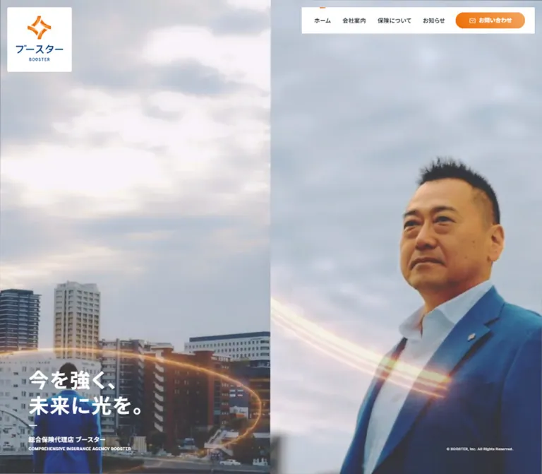
スタッフの大きな写真、深いネイビーと白のセクション、オレンジの問い合わせ導線を組み合わせた保険代理店のコーポレートサイト。
オリジナルサイトを見るLarge staff portraits, deep navy fields, and bright orange contact routes give a local insurance agency a confident, personal presence.
Website: boo-ster.co.jp Original URL: https://boo-ster.co.jp/ Final URL: https://boo-ster.co.jp/ Theme: alternating white and deep navy sections, with orange accents and white text over photography. Inspected evidence: September 23, 2026, at 00:31 JST; supplied retrieval timestamp: September 22, 2026, at 15:31:00.476 UTC. Viewports: 1440 × 1000 and 390 × 844 CSS pixels. Scope: the current corporate homepage, including its opening hero, mission content, staff panorama, business and personal insurance links, news, contact band, footer, and responsive navigation structure. Desktop captures visually cover the hero, staff/insurance transition, and contact/footer. Mobile captures cover the hero and lower sitemap/footer. Additional content measurements come from the supplied rendered DOM. Linked destination pages were not inspected.
BOOSTER uses people as its principal visual material. A close portrait fills the desktop opening screen, a wide team photograph introduces the insurance section, and a contact collage shows staff answering telephones. These images establish continuity between the promise of support and the people providing it. The company identity is independently supported by the original page title and footer.
The layout moves between expansive visual sections and straightforward information. Floating white navigation sits above the hero. Deep navy fields carry white headings and oversized background lettering. White sections give news and the sitemap a quieter reading rhythm. Orange is concentrated in the logo, small English section labels, directional details, and rounded contact buttons.
This is a corporate homepage with several destinations. Its reusable structure is a company introduction, service routing, updates, and practical contact information.
Large staff portraits, deep navy fields, and bright orange contact routes give a local insurance agency a confident, personal presence.
Website: boo-ster.co.jp Original URL: https://boo-ster.co.jp/ Final URL: https://boo-ster.co.jp/ Theme: alternating white and deep navy sections, with orange accents and white text over photography. Inspected evidence: September 23, 2026, at 00:31 JST; supplied retrieval timestamp: September 22, 2026, at 15:31:00.476 UTC. Viewports: 1440 × 1000 and 390 × 844 CSS pixels. Scope: the current corporate homepage, including its opening hero, mission content, staff panorama, business and personal insurance links, news, contact band, footer, and responsive navigation structure. Desktop captures visually cover the hero, staff/insurance transition, and contact/footer. Mobile captures cover the hero and lower sitemap/footer. Additional content measurements come from the supplied rendered DOM. Linked destination pages were not inspected.
BOOSTER uses people as its principal visual material. A close portrait fills the desktop opening screen, a wide team photograph introduces the insurance section, and a contact collage shows staff answering telephones. These images establish continuity between the promise of support and the people providing it. The company identity is independently supported by the original page title and footer.
The layout moves between expansive visual sections and straightforward information. Floating white navigation sits above the hero. Deep navy fields carry white headings and oversized background lettering. White sections give news and the sitemap a quieter reading rhythm. Orange is concentrated in the logo, small English section labels, directional details, and rounded contact buttons.
This is a corporate homepage with several destinations. Its reusable structure is a company introduction, service routing, updates, and practical contact information.
The following names are descriptive aliases. Only the first three colors have direct computed-color evidence.
| Name | Value | Evidence | Role |
|---|---|---|---|
| Paper | #FFFFFF |
Measured | Navigation panel, logo plaque, news, footer, reversed text |
| Text Ink | #0F1821 |
Measured: rgb(15, 24, 33) |
Body text, navigation, news, footer, mobile service copy |
| Action Orange | #EC6C00 |
Measured: contact-link background color | Base fill for contact buttons |
| Midnight Navy | approximately #061126 |
Visual estimate | Darkest parts of insurance and contact backgrounds |
| Deep Blue | approximately #102A59 |
Visual estimate | Brighter blue portions of the dark section treatment |
| Logo Blue | approximately #004780 |
Visual estimate | Blue lettering in the supplied brand artwork |
| Orange Gradient Start | approximately #F77700 |
Visual estimate | Saturated end of the visible action gradient |
| Orange Gradient End | approximately #F8A15B |
Visual estimate | Lighter end of contact buttons and mobile menu control |
| Quiet Rule | approximately #CCCCCC |
Visual estimate | Footer, sitemap, and badge boundaries |
| Blue Lettering | approximately #1B3E87 |
Visual estimate | Low-contrast oversized English background lettering |
The button background-color export is #EC6C00, while screenshots show a left-to-right orange gradient. Preserve both observations: the measured color is a base layer; the visible gradient stops are estimates because background-image and pseudo-element styles were not supplied.
Small INSURANCE and CONTACT labels appear orange in the desktop screenshots even though sampled paragraph nodes report Text Ink. Child styling, overlays, or another painted layer may account for the difference. Use orange to reproduce the screenshot appearance, but do not label its exact hex as measured from those text nodes.
The source exports numerous generic --wp--preset--* colors, gradients, and shadows. Their availability does not establish their use on this page. They are excluded from this palette. Similarly, --swiper-* variables do not establish a visible carousel.
The mobile hero capture has an approximately #777777 gray media area. This is a captured state with an unverified cause, not evidence of a deliberate gray theme. A reddish glow surrounds its topic marker; that glow should not become a general error or action color.
No selectable color themes were evidenced. White and navy are section treatments within one identity.
Measured family stack: YakuHanJP, 'Noto Sans JP', 游ゴシック, YuGothic, 'ヒラギノ角ゴ ProN W3', 'Hiragino Kaku Gothic ProN', メイリオ, Meiryo, 'ヒラギノ角ゴ ProN W3', 'Hiragino Kaku Gothic ProN', 'Helvetica Neue', Helvetica, Arial, sans-serif.
The source repeats the Hiragino fallbacks. A reusable implementation can remove that repetition without changing the intended order. Retain YakuHanJP and Noto Sans JP when the corresponding font resources are available; do not assume a CSS family declaration loads them.
Headings and primary navigation generally use weight 700. General service descriptions and news titles use 400. The mission paragraph is unusually emphatic at 700, with a two-times line height.
Measured family: Roboto, sans-serif.
Roboto is declared for English eyebrows, the English agency descriptor, telephone number, oversized background words, and copyright text. Small section labels use uppercase letters, weight 700, and approximately 0.1em tracking. Background words use weight 400 and 0.15em tracking.
All sizes and line heights below are measured computed values. Mobile service and footer values are DOM evidence; they were not all visible in the supplied mobile screenshots.
| Role | Desktop size / line height | Mobile size / line height | Weight and tracking |
|---|---|---|---|
| Hero headline | 52.52 / 65.65px |
28.17 / 35.21px |
700, 0.05em |
| Main mission statement | 55.52 / 69.40px |
46.58 / 58.23px |
700, 0.05em |
| Mission section title | 21 / 21px |
21.67 / 21.67px |
700, 0.05em |
| Insurance section title | 33 / 33px |
29.25 / 29.25px |
700, 0.05em |
| Service, news, contact headings | 29 / 29px |
26 / 26px |
700, 0.05em |
| Standard descriptive paragraph | 16 / 32px |
17.33 / 34.67px |
400, 0.025em |
| Mission paragraph | 18 / 36px |
19.5 / 39px |
700, 0.05em |
| Desktop navigation | 14 / 14px |
Replaced visually by menu button | 700, measured 0.4px tracking |
| Mobile/footer primary sitemap links | Desktop footer 16 / 16px |
17.33 / 17.33px |
700, 0.025em |
| English section eyebrow | 12–14px, line height 1 |
13–15.17px, line height 1 |
700, 0.1em |
| Japanese hero descriptor | 16.51 / 16.51px |
13 / 13px |
700, 0.025em |
| English hero descriptor | 11.25 / 11.25px |
8.67 / 8.67px |
700, 0.025em |
| Header contact label | 13 / 13px |
No equivalent visible header CTA | 700, 0.025em |
| Main email-contact label | 16 / 16px |
17.33 / 17.33px |
700, 0.025em |
| Telephone link | 27.01 / 27.01px |
39 / 39px |
700, 0.05em |
| News item title | 16 / 24px |
17.33 / 26px |
400, 0.05em |
| Background English word | 232.57 / 232.57px |
97.5 / 97.5px |
400, 0.15em |
| Footer address | 14.4 / 21.6px |
15.6 / 23.4px |
400, 0.025em |
| Footer copyright | 11.52 / 11.52px |
11.09 / 11.09px |
400, 0.025em |
The mobile page does not uniformly shrink desktop typography. Body copy, mission prose, and the telephone number become larger, while the opening headline becomes substantially smaller.
The measured root size is 7.5024px at 1440px wide and 10.8333px at 390px wide. The complete root-sizing formula and breakpoint thresholds were not supplied.
| Source token | Desktop expression | Calculated desktop result | Mobile expression | Calculated mobile result |
|---|---|---|---|---|
--font-size46 |
max(4.6rem, 37px) |
37px |
3rem |
32.5px |
--font-size41 |
max(4.1rem, 33px) |
33px |
2.7rem |
29.25px |
--font-size36 |
max(3.6rem, 29px) |
29px |
2.4rem |
26px |
--font-size29 |
max(2.9rem, 23px) |
23px |
2rem |
21.67px |
--font-size26 |
max(2.6rem, 21px) |
21px |
2rem |
21.67px |
--font-size22 |
max(2.2rem, 18px) |
18px |
1.8rem |
19.5px |
--font-size20 |
max(2rem, 18px) |
18px |
1.7rem |
18.42px |
--font-size18 |
max(1.8rem, 16px) |
16px |
1.6rem |
17.33px |
--font-size16 |
max(1.6rem, 14px) |
14px |
1.4rem |
15.17px |
--font-size15 |
max(1.5rem, 13px) |
13px |
1.3rem |
14.08px |
--font-size14 |
max(1.4rem, 12px) |
12px |
1.2rem |
13px |
These are available source tokens, not proof that every element uses the similarly named token. For example, the hero headline has its own larger computed size. Do not paste these rem expressions into a conventional 16px-root project and expect matching dimensions.
The site combines broad section spacing with compact navigation. It does not follow a single demonstrated 8px grid. Several large desktop dimensions are multiples of the small source root; text and controls also have independent pixel floors.
| Use | Desktop measurement | Mobile measurement or observation |
|---|---|---|
| Main outer content inset | 75.02px |
21.66–21.67px |
| Header plaque inset | 18.75px |
Flush to top-left |
| Logo plaque padding | 22.51px |
10.83px 16.25px |
| Desktop nav horizontal link padding | 14px each side |
Not the visible mobile navigation pattern |
| Insurance top padding | 112.54px |
65px |
| News top/bottom padding | 135.04 / 150.05px |
65 / 86.67px |
| News row padding | 24px 16px |
26px 17.33px |
| Footer top padding | 90.03px |
65px |
| Mobile primary sitemap row padding | — | 26px vertically |
| Gap between stacked mobile service links | — | 65px, calculated from rectangles |
| Element | Measured value |
|---|---|
| Desktop logo plaque | 3.7512px |
| Mobile logo plaque | Approximately 2.17px on the lower-right corner |
| Mobile menu button | Approximately 2.17px on the lower-left corner |
| First desktop service link | 3.7512px 0 0 3.7512px |
| Mobile service links | 0 |
| Header contact button | 52px, producing a pill |
| Main contact button | 64px desktop; 69.33px mobile |
| Secondary pill links | 30.01px desktop; 43.33px mobile |
| SDGs banner | 3.75px desktop; 5.42px mobile |
| Page-top control | 50% |
Most large image regions are square-cornered or nearly square-cornered. Pills belong to actions, while circles belong to the scene ornament, small directional markers, and page-top control.
| Element | Desktop | Mobile |
|---|---|---|
| Document height | 5052.28px |
7299.31px |
| Opening hero | 1440 × 1000px |
390 × 844px |
| Logo plaque | 168.80 × 168.80px |
162.5 × 65px |
| Navigation panel | Approximately 566 × 64px, panel width visually estimated |
Replaced by 65 × 65px menu button |
| Header contact action | 164.66 × 37.67px |
Not shown in the closed mobile header |
| Hero text left edge | 75.02px |
21.66px |
| Mission section height | 1012.52px |
2152.48px |
| Region between mission and insurance | 570.17px, calculated |
162.5px, calculated |
| Service link | Each 682.48 × 675.20px |
Each 368.34 × 600.16px |
| News row | 854.92 × 100px |
346.66 × 112.59px |
| Contact band height | 418.86px |
704.36px |
| Main email action | 285.08 × 52.80px |
346.66 × 57.19px |
| Page-top circle | 75.02 × 75.02px |
86.66 × 86.66px |
| Footer height | 462.67px |
1195.20px |
| SDGs banner | 322.55 × 86px |
346.69 × 105.97px |
The staff panorama is visible in the region between mission and insurance on desktop. Its mobile placement is supported by section geometry, but a mobile image crop was not supplied.
Do not turn these measured section heights into universal fixed heights. In particular, the long mobile mission region may contain visual or positioning behavior that the sampled nodes do not explain.
Role: retain company identity and direct visitors to the main corporate sections.
The opening logo sits in a white square plaque at approximately (18.75, 18.75). Its orange emblem is stacked above the blue Japanese wordmark and small English name. The plaque is nearly 169px square, with a very small corner radius.
A separate white navigation panel occupies the upper-right corner. Four dark text links precede an orange contact pill with a small envelope icon. The labels are ホーム, 会社案内, 保険について, お知らせ, and お問い合わせ. A short orange line appears above the active home item.
The navigation remains in the same upper-right screen position across the desktop scroll captures. The initial logo plaque is not visible in the later captures. A faithful adaptation should therefore distinguish the persistent navigation from the page-top identity plaque.
The measured header wrapper has zero height. The visual controls overlay the page rather than reserving a conventional full-width header row above the hero.
Role: retain recognizable identity while leaving the narrow hero unobstructed.
At 390px wide, the logo changes to a horizontal composition inside a 162.5 × 65px white plaque. A 65 × 65px orange gradient button is flush to the upper-right corner. Three thin white horizontal lines form its visible icon. The button remains visible in the lower-page capture.
The mobile DOM includes a separate navigation tree containing primary destinations, company subsections, insurance audiences, legal links, and copyright. It uses approximately 73.63px-tall primary link rows and two-column arrangements for some child links.
Interaction limit: no menu-opening sequence, focus behavior, close action, or icon morph was supplied. The lower white screenshot is consistent with the footer at the bottom of the measured document; it should not be treated as proof of an opened overlay.
For a new implementation, use a real button with an accessible name and expanded state. If the navigation becomes an overlay, implement focus management and background inertness explicitly.
Role: introduce the agency through a strong human image and a short promise.
The desktop hero fills the inspected viewport. A close portrait dominates the background, with the face near the center and blue clothing continuing into the lower area. White in-frame text reads 提案のプロ with PROPOSAL beneath it. This wording belongs to the captured media composition; its implementation as HTML, video content, or another layer is not established.
The foreground headline sits at the lower-left and preserves two lines:
今を強く、
未来に光を。
Below it are a short white rule, the Japanese agency descriptor, and a much smaller uppercase English descriptor. The final descriptor ends approximately 60px above the desktop viewport bottom. Keep this block anchored low enough to preserve the photographic field above it.
On mobile, the headline shrinks to 28.17px, the content inset becomes approximately 21.67px, and the descriptors finish roughly 27px above the hero boundary. The background is gray in the supplied mobile capture, while the text, logo, and scene ornament remain visible.
The visual treatment suggests a media sequence, but the supplied evidence does not establish a video element, playback settings, soundtrack, file URL, or scene order. A usable poster image is a recommended addition.
Role: identify or accompany the current hero topic.
A cluster of thin concentric arcs, small dots, and a softly glowing center sits at the lower-right. The desktop screenshot shows 提案; the mobile screenshot shows 事故. Its diameter is visually about 200px on desktop and 120–130px on mobile.
Use fine white strokes and asymmetric arc segments, rather than a thick progress-ring component. The label is compact, centered, and bold.
Different captured labels establish different states, but not the mechanism connecting them. Clickability, playback progress, rotation, and timing remain unverified. Do not implement this as an emergency contact button merely because one state reads 事故.
Role: explain the service philosophy before presenting insurance categories.
The DOM establishes a small Japanese section heading paired with MISSION, a substantially larger two-line statement, supporting copy, and a rounded link labeled 会社案内をみる pointing to /company/.
The main statement is centered according to its measured desktop bounds. The mission paragraph uses bold text at 18px / 36px on desktop and 19.5px / 39px on mobile. Mobile copy has more deliberate line breaks, including a split in the statement about an insurance contract not being the goal.
The measured foreground is white. The exact background artwork and the complete mobile visual arrangement are not visible in the supplied screenshots. Preserve the hierarchy and generous pacing without inventing a background scene or reproducing unexplained empty space as a fixed-height spacer.
Role: turn the abstract company promise into an identifiable team.
The desktop capture shows eight staff members arranged in a continuous row outdoors. Blue suits and dark uniforms sit against a pale blue sky, greenery, and a low railing. Oversized outline lettering is visible behind the group.
The photograph spans the full viewport width and meets the navy insurance section directly. It is a broad compositional break, not a gallery of individual staff cards. Preserve the line of people and the environmental context when cropping.
No names, titles, or individual roles can be established from this image alone.
Role: route visitors to business or personal insurance information.
The section begins with an orange INSURANCE eyebrow, a white Japanese heading, and a white introductory paragraph. Behind the content, a very large, low-contrast English word extends beyond the viewport edges.
The desktop content begins at approximately x=75px and continues to the right edge. Two adjoining photographic links divide the remaining width equally. Each is approximately 682.48 × 675.20px; the second begins at x=757.5px. There is no inter-card gutter.
Each link groups an English audience label, Japanese heading, and explanatory copy. The measured desktop foreground is white. Destinations are /insurance/#business and /insurance/#personal.
On mobile, the links stack with a measured 65px gap. Their text changes to Text Ink. English labels and headings occur roughly 401px and 420px below the start of each link, respectively, with the paragraph below. This geometry supports an image-first arrangement with text beneath, rather than a scaled desktop overlay. The exact mobile image crop and backing surface are not visually confirmed.
Keep the distinct desktop and mobile text treatments. A small white caption laid over every mobile image would miss a measured responsive change.
Role: provide recent company updates in a compact, readable format.
The desktop news section uses a white background and a centered content width of approximately 1140px. Its heading occupies the left quarter; a list approximately 855px wide occupies the right three quarters.
Each row is a complete link containing a date, the category 新着情報, and a title. The observed entries are dated 2026.01.05, 2025.12.26, and 2024.12.27. Titles sit below the metadata rather than becoming large editorial headlines.
Rows measure 100px high on desktop and approximately 112.59px on mobile. Mobile places the section heading above the full-width list. A rounded お知らせ一覧 link follows the rows and aligns toward the right.
A background-color transition is declared for rows, but its hover destination was not captured. Keep any recreated feedback restrained and avoid inventing image thumbnails or large category cards.
Role: make human assistance immediately accessible through telephone and a contact page.
The dark band combines a large photograph on the left with contact information on the right. The desktop photograph shows three staff members using telephones. Visually, it occupies approximately 40% of the viewport width and extends about 75px above the dark band's top edge.
The text column begins at x=720px. It contains an orange CONTACT eyebrow, a white Japanese heading, a short invitation, and a horizontal pair of contact methods.
The telephone method includes a small label, phone icon, bold number, and weekday hours. The link destination is tel:096-213-6622. The orange envelope button reads メールでのお問い合わせ and points to /contact/; it is a contact-page link, not a mailto: action.
A huge low-contrast CONTACT word sits behind the lower part of the band. It supplies scale without competing with the number or button.
On mobile, the content becomes a vertical sequence. The email action expands to approximately 346.66px wide. The telephone font grows to 39px. Its sampled link rectangle is 78px tall despite a 39px line height; the final icon and wrapping arrangement was not visually captured.
Role: close the site with company details, a full destination map, and policy access.
The desktop footer is white with approximately 90px of top padding. A horizontal logo, address, and SDGs registration banner occupy the left. A three-column sitemap occupies the right, grouping company and insurance subsections beneath bold primary links.
The SDGs banner is a small outlined rectangle containing the character artwork, two lines of registration copy, a small rights notice, and a separated directional area. Its measured desktop footprint is approximately 322.55 × 86px. This badge is evidence of the site's displayed claim; the registration itself was not independently checked.
A fine horizontal rule separates the main footer from the final copyright and legal row. On desktop, copyright sits left and policy links sit right.
Mobile expands the sitemap into broad rows with thin gray dividers and small orange circular arrows. Company and insurance children share paired columns where space permits. Legal links stack beneath the sitemap. The supplied lower capture also shows a large orange brand emblem cropped by the lower-right edge and copyright near the bottom.
Role: provide a recognizable route to the beginning of the homepage.
A white circle overlaps the contact/footer boundary near the right content edge. It contains a narrow orange upward arrow above the small label PAGETOP.
The circle measures approximately 75px on desktop and 86.66px on mobile. Its destination is /#pagetop. A click outcome and smooth-scroll behavior were not tested.
The following are declared transitions from the supplied computed styles. They establish properties and timing, not that every transition was triggered during inspection.
| Element or treatment | Measured declaration | Interpretation and limit |
|---|---|---|
| Japanese hero descriptor | Opacity and transform 0.3s, delay 0.4s |
Staggered reveal capability |
| English hero descriptor | Opacity and transform 0.3s, delay 0.5s |
Follows the Japanese descriptor by 100ms |
| Hero copyright | Opacity 0.2s |
Visibility change; trigger unverified |
| Mission paragraph | Opacity 0.5s |
Fade capability |
| Insurance introductory paragraph | Opacity and transform 0.5s, delay 0.15s |
Delayed content reveal |
| Contact introductory paragraph | Opacity and transform 0.5s, delay 0.1s |
Slightly earlier delayed reveal |
| Several section headings | Opacity 0.2s |
Short reveal capability |
| News links | Background 0.3s |
Background feedback; endpoint unverified |
| Secondary pill links | Background 0.1s |
Quick button feedback |
| Footer child and legal links | Background-size 0.4s cubic-bezier(0.83, 0, 0.17, 1) |
Consistent with a drawn link decoration; hover appearance unverified |
| SDGs banner | Border-color 0.3s |
Border feedback capability |
| Mobile menu copyright node | Opacity and transform 0.3s |
Menu-related transition declaration only |
The split characters in some exported headings may support character-level presentation, but no character-animation sequence or timing was supplied. Keep Japanese text normally joined and expose one coherent accessible label.
Repeated link text in the DOM may belong to layered visual treatments. It does not mean users should see or hear duplicate labels.
Many sampled elements report animation: none or a transition of all without an explicit duration. These values do not prove that the page is motionless, and they do not establish an animated effect either. Media, descendants, pseudo-elements, and script-driven behavior may sit outside the sampled nodes.
The supplied inspection process temporarily paused perpetual animation during readiness checks, then resumed it. Exact hero scene duration, orbit motion, section parallax, menu transitions, hover states, audio behavior, and reduced-motion support remain unverified.
| Layer | Appearance | Purpose |
|---|---|---|
| Hero media | Full-viewport photography in the desktop capture | Establishes people and atmosphere |
| Navigation and identity plaques | White, minimally rounded | Clear controls above complex imagery |
| Insurance and contact fields | Deep navy with blue variation | Strong reversed-text sections |
| Background words | Huge, widely tracked, low-contrast lettering | Adds depth and scale |
| Service links | Large adjoining photographs on desktop | Audience routing through imagery |
| News and footer | Flat white | Reading, company details, and navigation |
| Contact actions | Orange gradient pills | Concentrates attention on assistance |
| Sitemap and badge boundaries | Thin neutral rules | Organizes dense information |
There is no visible general-purpose elevated card system. Separation comes from image crops, section color, negative space, and rules. Avoid applying shadows merely because shadow presets appear in the custom-property export.
The current visual language is specific to the agency's people. Desktop imagery includes a close conversational portrait, a broad outdoor team photograph, service-related portraits, and a telephone collage. Blue tailoring, dark uniforms, natural skin tones, and bright outdoor sky reinforce the blue/orange identity without requiring every photograph to be tinted.
The hero crop is deliberately close. The staff panorama is deliberately wide. The contact collage combines several people in one visual block. Preserve those different scales instead of standardizing every image to one card ratio.
The logo is a four-part orange emblem paired with blue lettering. Use the supplied brand artwork when authorized. A CSS star or generic sparkle would lose the curved, folded shapes and orange tonal variation.
No original image, video, SVG, or font-file URLs were included in the supplied element evidence. Do not invent filenames or theme-directory paths.
| Asset role | Observed treatment | Availability limit |
|---|---|---|
| Stacked company logo | Orange emblem above blue wordmark on desktop plaque | Asset URL not supplied |
| Horizontal company logo | Mobile header and desktop footer | Asset URL not supplied |
| Hero media | Desktop close portrait with proposal wording | Media type and URL unverified |
| Team panorama | Eight staff outdoors across a broad strip | Asset URL not supplied |
| Business/personal service imagery | Two large desktop photographic regions | Complete mobile crops not supplied |
| Contact collage | Three people answering telephones | Asset URL not supplied |
| Oversized orange emblem | Cropped lower-right mobile footer decoration | Asset URL not supplied |
| SDGs character artwork | Small figure inside registration banner | Asset URL not supplied |
| Envelope, telephone, arrows, orbit details | Fine functional or decorative marks | Rendering technology not established |
Use natural photographic rendering. Pixelation, duotone conversion, or illustration filters are not supported by the current captures.
The page uses several related widths instead of one uniform centered container:
The vertical sequence is hero, mission, staff panorama, insurance, news, contact, and footer. Preserve the alternation between visual scale and informational clarity.
| Area | Observed responsive change |
|---|---|
| Identity | Square stacked plaque becomes a short horizontal plaque |
| Navigation | Desktop link row is visually replaced by a 65px menu button |
| Hero | Remains one viewport tall; smaller headline and narrower inset |
| Hero media | Gray captured state; successful mobile media rendering not established |
| Mission | Larger relative emphasis and more copy line breaks; much taller measured section |
| Insurance | Two adjoining links become vertically stacked; text changes from white to dark |
| News | Left-side heading moves above the list |
| Contact | Vertical layout, larger telephone text, full-width email button |
| Footer | Stacked identity and broad sitemap rows; legal links become vertical |
| Decorative words | Reduce from about 232.57px to 97.5px but continue to crop beyond the viewport |
No intermediate viewport or tablet capture was supplied. The exact breakpoint is unknown. The Quick Start uses 900px as a recommended implementation threshold, not as an original-site measurement.
The mobile document is approximately 2247px taller than the desktop document. This reflects changed content flow and section geometry, not simply enlarged margins. Essential paragraphs use comfortable two-times line heights at both sizes.
rem numbers without accounting for its unusual root sizes.These are recommendations for a new implementation, not verified features of the original:
aria-expanded, and aria-controls. Manage focus and background interaction when an overlay is open.tel: link for the telephone number.#FFFFFF.#0F1821.#EC6C00.#061126 through #102A59.#F77700 through #F8A15B.#CCCCCC.“Create a Japanese insurance agency corporate homepage inspired by the supplied BOOSTER reference. Use large, authentic staff photography; a full-viewport opening image; a white stacked-logo plaque at upper-left; and an independent white navigation panel at upper-right with an orange contact pill. Anchor the two-line Japanese statement at lower-left. Continue through a spacious mission section, a full-width team panorama, a deep navy insurance introduction, two adjoining audience photographs, a restrained white news list, a navy contact band with an overlapping staff collage, and a comprehensive white footer. Use the declared Noto Sans JP stack for Japanese text and Roboto for English labels and numbers when available. On mobile, use a horizontal logo plaque, a square orange menu control, stacked service content with dark text, and a full-width contact action. Keep all unverified animation behavior separate from the visual reconstruction.”
This CSS is a practical adaptation using conventional CSS pixels and a normal root font size. It reproduces the principal relationships at the supplied viewports without claiming the original breakpoint or complete source formulas.
Supply authorized images through the image elements indicated by the class names. Provide stacked and horizontal logo variants inside .brand-plaque. The static orbit is a visual approximation. Menu state management, media playback, and original reveal triggers require separate implementation.
The mission spacing, intermediate-width behavior, focus styles, and reduced-motion treatment below are recommendations. The code intentionally avoids reserving unexplained mobile mission space.
:root {
  /* Directly measured colors */
  --paper: #ffffff;
  --ink: #0f1821;
  --orange: #ec6c00;

  /* Visual approximations */
  --night: #061126;
  --deep-blue: #102a59;
  --letter-blue: #1b3e87;
  --orange-start: #f77700;
  --orange-end: #f8a15b;
  --rule: #cccccc;
  --action-fill: linear-gradient(90deg, var(--orange-start), var(--orange-end));
  --dark-fill: linear-gradient(120deg, var(--night), var(--deep-blue));

  /* Declared families; load authorized font resources separately */
  --font-jp: YakuHanJP, 'Noto Sans JP', 游ゴシック, YuGothic,
    'ヒラギノ角ゴ ProN W3', 'Hiragino Kaku Gothic ProN',
    メイリオ, Meiryo, 'Helvetica Neue', Helvetica, Arial, sans-serif;
  --font-latin: Roboto, sans-serif;

  /* Recommended fluid aliases anchored to the desktop measurements */
  --gutter: clamp(22px, 5.2094vw, 100px);
  --header-inset: clamp(16px, 1.3021vw, 25px);
  --hero-title: clamp(42px, 3.647vw, 64px);
  --mission-title: clamp(46px, 3.8554vw, 64px);
  --body-size: 16px;
  --section-title: 33px;
  --minor-title: 29px;
  --eyebrow-size: 14px;
  --word-size: 232.57px;
  --hero-bottom: 60px;
  --small-radius: 3.75px;
  --orbit-size: 200px;
  --motion-short: 200ms;
  --motion-reveal: 500ms;
}

* { box-sizing: border-box; }
body {
  margin: 0;
  color: var(--ink);
  background: var(--paper);
  font-family: var(--font-jp);
  font-size: var(--body-size);
  line-height: 1.6;
}
img { display: block; max-width: 100%; }
a { color: inherit; }
button { font: inherit; }
[hidden] { display: none !important; }
:where(a, button):focus-visible {
  outline: 3px solid currentColor;
  outline-offset: 5px;
}

.brand-plaque {
  position: absolute;
  z-index: 30;
  top: var(--header-inset);
  left: var(--header-inset);
  display: grid;
  place-items: center;
  width: 168.8px;
  height: 168.8px;
  padding: 22.51px;
  border-radius: var(--small-radius);
  background: var(--paper);
}
.brand--horizontal { display: none; }
.desktop-nav {
  position: fixed;
  z-index: 40;
  top: var(--header-inset);
  right: var(--header-inset);
  display: flex;
  align-items: center;
  min-height: 64px;
  padding-inline: 16px 24px;
  border-radius: var(--small-radius);
  background: var(--paper);
}
.desktop-nav > a:not(.button) {
  position: relative;
  display: flex;
  align-items: center;
  min-height: 64px;
  padding-inline: 14px;
  font-size: 14px;
  font-weight: 700;
  letter-spacing: .4px;
  text-decoration: none;
}
.desktop-nav > [aria-current='page']::before {
  content: '';
  position: absolute;
  top: 0;
  left: 50%;
  width: 15px;
  height: 2px;
  background: var(--orange);
  transform: translateX(-50%);
}
.button {
  display: inline-flex;
  align-items: center;
  justify-content: center;
  gap: 10px;
  min-height: 52.8px;
  padding: 16px 28px;
  border: 0;
  border-radius: 999px;
  color: var(--paper);
  background-color: var(--orange);
  background-image: var(--action-fill);
  font-weight: 700;
  line-height: 1.3;
  letter-spacing: .025em;
  text-decoration: none;
}
.desktop-nav .button {
  width: 164.66px;
  min-height: 37.67px;
  margin-left: 13px;
  padding: 10px 16px;
  font-size: 13px;
}
.button--outline {
  border: 1px solid currentColor;
  color: inherit;
  background: transparent;
  font-weight: 400;
}
.menu-toggle, .mobile-menu { display: none; }

.hero {
  position: relative;
  isolation: isolate;
  min-height: 100vh;
  min-height: 100svh;
  overflow: hidden;
  color: var(--paper);
  background: var(--night);
}
.hero-media {
  position: absolute;
  z-index: -2;
  inset: 0;
  width: 100%;
  height: 100%;
  object-fit: cover;
}
.hero::before {
  /* Recommended text protection; not an extracted source gradient */
  content: '';
  position: absolute;
  z-index: -1;
  inset: 0;
  background: linear-gradient(0deg, rgb(0 0 0 / .35), transparent 65%);
}
.hero-copy {
  position: absolute;
  z-index: 2;
  left: var(--gutter);
  bottom: var(--hero-bottom);
  max-width: calc(100% - 2 * var(--gutter));
}
.hero-title {
  margin: 0;
  font-size: var(--hero-title);
  font-weight: 700;
  line-height: 1.25;
  letter-spacing: .05em;
}
.hero-rule {
  width: 22.5px;
  height: 3px;
  margin-block: 21px 25px;
  background: currentColor;
}
.hero-name {
  margin: 0;
  font-size: 16.51px;
  font-weight: 700;
  line-height: 1;
}
.hero-english {
  margin: 11.25px 0 0;
  font: 700 11.25px/1 var(--font-latin);
  letter-spacing: .025em;
}
.scene-orbit {
  /* Static decorative approximation; no playback semantics */
  position: absolute;
  right: 48px;
  bottom: 42px;
  display: grid;
  place-items: center;
  width: var(--orbit-size);
  aspect-ratio: 1;
  border: 1px solid rgb(255 255 255 / .45);
  border-left-color: transparent;
  border-radius: 50%;
  background: radial-gradient(circle, rgb(236 108 0 / .32), transparent 70%);
  font-weight: 700;
  letter-spacing: .15em;
  pointer-events: none;
}
.scene-orbit::before, .scene-orbit::after {
  content: '';
  position: absolute;
  inset: 10px;
  border: 1px solid rgb(255 255 255 / .45);
  border-radius: 50%;
}
.scene-orbit::after { inset: 24px; border-bottom-color: transparent; }

.dark-section {
  position: relative;
  isolation: isolate;
  color: var(--paper);
  background: var(--dark-fill);
}
.section-word {
  position: absolute;
  z-index: -1;
  right: 0;
  bottom: -.15em;
  max-width: 100%;
  overflow: hidden;
  margin: 0;
  color: var(--letter-blue);
  font: 400 var(--word-size)/1 var(--font-latin);
  letter-spacing: .15em;
  white-space: nowrap;
  opacity: .45;
  pointer-events: none;
}
.eyebrow {
  margin: 0 0 7px;
  color: var(--orange-start);
  font: 700 var(--eyebrow-size)/1 var(--font-latin);
  letter-spacing: .1em;
}
.section-title {
  margin: 0;
  font-size: var(--section-title);
  font-weight: 700;
  line-height: 1.2;
  letter-spacing: .05em;
}
.section-description {
  margin: 24px 0 0;
  line-height: 2;
  letter-spacing: .025em;
}
.mission {
  padding: 160px var(--gutter) 180px;
  text-align: center;
}
.mission-statement {
  margin: 48px 0 36px;
  font-size: var(--mission-title);
  line-height: 1.25;
  letter-spacing: .05em;
}
.mission-copy {
  max-width: 680px;
  margin: 0 auto 40px;
  font-size: 18px;
  font-weight: 700;
  line-height: 2;
  letter-spacing: .05em;
}
.team-photo {
  width: 100%;
  aspect-ratio: 1440 / 570.17;
  object-fit: cover;
}
.insurance { padding-top: 112.54px; }
.insurance-intro { padding: 0 var(--gutter) 40px; }
.service-grid {
  display: grid;
  grid-template-columns: repeat(2, minmax(0, 1fr));
  margin-left: var(--gutter);
}
.service-card {
  position: relative;
  isolation: isolate;
  min-width: 0;
  aspect-ratio: 682.48 / 675.2;
  overflow: hidden;
  color: var(--paper);
  text-decoration: none;
}
.service-photo {
  position: absolute;
  z-index: -2;
  inset: 0;
  width: 100%;
  height: 100%;
  object-fit: cover;
}
.service-card::after {
  content: '';
  position: absolute;
  z-index: -1;
  inset: 0;
  background: linear-gradient(0deg, rgb(0 0 0 / .65), transparent 85%);
}
.service-copy {
  position: absolute;
  right: 13.2%;
  bottom: 23%;
  left: 13.2%;
  max-width: 304px;
}
.service-copy h3 {
  margin: 0;
  font-size: var(--minor-title);
  line-height: 1.2;
  letter-spacing: .05em;
}
.service-copy .eyebrow { color: inherit; font-size: 12px; }
.service-copy p:last-child { margin: 28px 0 0; line-height: 2; }

.news {
  display: grid;
  grid-template-columns: 1fr 3fr;
  padding: 135px calc(2 * var(--gutter)) 150px;
  background: var(--paper);
}
.news .section-title, .contact .section-title {
  font-size: var(--minor-title);
}
.news-list { min-width: 0; }
.news-row {
  display: grid;
  align-content: center;
  gap: 12px;
  min-height: 100px;
  padding: 24px 16px;
  border-bottom: 1px solid var(--rule);
  text-decoration: none;
  transition: background-color 300ms;
}
.news-row h3 {
  margin: 0;
  font-size: inherit;
  font-weight: 400;
  line-height: 1.5;
  letter-spacing: .05em;
}
.news-more { display: flex; justify-content: flex-end; margin-top: 24px; }

.contact {
  display: grid;
  grid-template-columns: 40% 10% 39.58% 10.42%;
}
.contact-photo {
  grid-column: 1;
  width: 100%;
  aspect-ratio: 577 / 438;
  object-fit: cover;
  transform: translateY(-75px);
}
.contact-content { grid-column: 3; padding-block: 97.5px; }
.contact-actions {
  display: flex;
  align-items: center;
  gap: 27px;
  margin-top: 40px;
}
.phone-link {
  display: inline-flex;
  align-items: center;
  gap: 8px;
  font: 700 27.01px/1 var(--font-latin);
  letter-spacing: .05em;
  text-decoration: none;
}
.contact-hours { margin: 8px 0 0; font-size: 14.4px; line-height: 1.4; }
.contact-actions .button { flex: 0 0 285px; }

.site-footer {
  position: relative;
  padding: 90px var(--gutter) 0;
  background: var(--paper);
}
.footer-main { display: flex; justify-content: space-between; gap: 60px; }
.footer-identity { max-width: 455px; }
.footer-logo { width: 203px; }
.footer-address { font-size: 14.4px; line-height: 1.5; }
.footer-sitemap {
  display: grid;
  grid-template-columns: 176px 176px 118px;
  gap: 36px 0;
}
.footer-sitemap a { text-decoration: none; }
.footer-primary { font-weight: 700; }
.footer-children {
  display: grid;
  gap: 20px;
  margin-top: 22px;
  font-size: 14.4px;
}
.footer-bottom {
  display: flex;
  justify-content: space-between;
  gap: 24px;
  margin-top: 60px;
  padding-block: 44px;
  border-top: 1px solid var(--rule);
  font-size: 12.8px;
}
.footer-legal { display: flex; flex-wrap: wrap; gap: 24px; }
.footer-copyright { margin: 0; font: 400 11.52px/1.5 var(--font-latin); }
.page-top {
  position: absolute;
  top: -22.5px;
  right: var(--gutter);
  display: grid;
  place-content: center;
  gap: 8px;
  width: 75px;
  aspect-ratio: 1;
  border-radius: 50%;
  background: var(--paper);
  text-align: center;
  text-decoration: none;
  font: 700 11.2px/1 var(--font-latin);
}

/* Recommended breakpoint; the original threshold is unknown. */
@media (max-width: 900px) {
  :root {
    --gutter: clamp(20px, 5.5556vw, 36px);
    --body-size: 17.33px;
    --hero-title: 28.17px;
    --mission-title: 46.58px;
    --section-title: 29.25px;
    --minor-title: 26px;
    --eyebrow-size: 15.17px;
    --word-size: 97.5px;
    --hero-bottom: 27px;
    --orbit-size: 124px;
  }
  .desktop-nav { display: none; }
  .brand-plaque {
    top: 0;
    left: 0;
    width: 162.5px;
    height: 65px;
    padding: 10.83px 16.25px;
    border-radius: 0 0 2.17px 0;
  }
  .brand--stacked { display: none; }
  .brand--horizontal { display: block; }
  .menu-toggle {
    position: fixed;
    z-index: 60;
    top: 0;
    right: 0;
    display: flex;
    flex-direction: column;
    align-items: center;
    justify-content: center;
    gap: 9px;
    width: 65px;
    height: 65px;
    padding: 0;
    border: 0;
    border-radius: 0 0 0 2.17px;
    background: var(--action-fill);
    cursor: pointer;
  }
  .menu-toggle span { width: 33px; height: 2px; background: var(--paper); }
  .mobile-menu:not([hidden]) {
    position: fixed;
    z-index: 50;
    inset: 0;
    display: block;
    overflow-y: auto;
    padding: 98px var(--gutter) 32px;
    background: var(--paper);
  }
  .hero-name { font-size: 13px; }
  .hero-english { margin-top: 8.67px; font-size: 8.67px; }
  .hero-rule { width: 14px; height: 2px; margin-block: 15px 17px; }
  .scene-orbit { right: 13px; bottom: 24px; font-size: 13px; }
  .mission { padding: 108px var(--gutter) 90px; }
  .mission-copy { font-size: 19.5px; }
  .team-photo { aspect-ratio: 12 / 5; }
  .insurance { padding-top: 0; background: var(--paper); }
  .insurance-intro {
    padding: 65px var(--gutter) 35px;
    color: var(--paper);
    background: var(--dark-fill);
  }
  .service-grid { grid-template-columns: 1fr; gap: 65px; }
  .service-card { aspect-ratio: auto; overflow: visible; color: var(--ink); }
  .service-photo {
    position: static;
    width: 100%;
    height: auto;
    aspect-ratio: 1;
  }
  .service-card::after { display: none; }
  .service-copy {
    position: static;
    max-width: none;
    padding: 32px var(--gutter) 0 0;
  }
  .service-copy .eyebrow { font-size: 13px; }
  .service-copy p:last-child { margin-top: 24px; }
  .news { grid-template-columns: 1fr; gap: 27px; padding: 65px var(--gutter) 86.67px; }
  .news-row { min-height: 112.59px; padding: 26px 17.33px; }
  .contact { grid-template-columns: 1fr; }
  .contact-photo { grid-column: 1; transform: none; }
  .contact-content { grid-column: 1; padding: 40px var(--gutter) 65px; }
  .contact-actions { flex-direction: column; align-items: stretch; gap: 22px; }
  .phone-link { font-size: clamp(28px, 10vw, 39px); }
  .contact-actions .button { flex: none; width: 100%; min-height: 57.19px; }
  .contact-hours { font-size: 15.6px; }
  .site-footer { padding-top: 65px; }
  .footer-main { display: grid; gap: 44px; }
  .footer-logo { width: 243px; }
  .footer-address { font-size: 15.6px; }
  .footer-sitemap { display: block; }
  .footer-group { padding-block: 26px; border-bottom: 1px solid var(--rule); }
  .footer-children { grid-template-columns: repeat(2, minmax(0, 1fr)); font-size: 15.6px; }
  .footer-bottom { flex-direction: column; margin-top: 40px; padding-block: 24px 32px; }
  .footer-legal { order: -1; flex-direction: column; gap: 28px; }
  .footer-copyright { margin-top: 70px; font-size: 11.09px; }
  .page-top { top: -32.5px; width: 86.66px; font-size: 12.13px; }
}

/* Recommended motion accessibility for this adaptation. */
@media (prefers-reduced-motion: reduce) {
  html { scroll-behavior: auto; }
  .news-row, .button, .mobile-menu { transition: none; }
}
The mobile contact image size, mission artwork, photographic overlays, and decorative emblem positioning still require asset-specific work. Do not treat this scaffold as a pixel-exact reconstruction of areas lacking screenshots.
Optional aliases for a project already using Tailwind v4. This does not imply that the original website uses Tailwind. Define the preceding custom properties first.
@theme inline {
  --color-paper: var(--paper);
  --color-ink: var(--ink);
  --color-action: var(--orange);
  --color-night: var(--night);
  --color-deep-blue: var(--deep-blue);
  --color-rule: var(--rule);

  --font-sans: var(--font-jp);
  --font-latin: Roboto, sans-serif;

  --text-body: var(--body-size);
  --text-hero: var(--hero-title);
  --text-mission: var(--mission-title);
  --text-section: var(--section-title);
  --text-minor: var(--minor-title);
  --text-eyebrow: var(--eyebrow-size);

  --spacing-page: var(--gutter);
  --spacing-header: var(--header-inset);
  --radius-plaque: var(--small-radius);
  --radius-pill: 999px;
}
200.2026-09-22T15:31:00.476Z, equivalent to September 23, 2026, at 00:31:00.476 JST.1440 × 1000: opening hero; staff panorama and insurance introduction; contact and footer.390 × 844: opening hero; lower sitemap/footer with the persistent menu button.This reference describes the current supplied homepage evidence. Measured tokens, screenshot estimates, and recommended implementation choices remain explicitly separated.
# BOOSTER — Style Reference

> Large staff portraits, deep navy fields, and bright orange contact routes give a local insurance agency a confident, personal presence.

**Website:** [boo-ster.co.jp](https://boo-ster.co.jp/)
**Original URL:** https://boo-ster.co.jp/
**Final URL:** https://boo-ster.co.jp/
**Theme:** alternating white and deep navy sections, with orange accents and white text over photography.
**Inspected evidence:** September 23, 2026, at 00:31 JST; supplied retrieval timestamp: September 22, 2026, at 15:31:00.476 UTC.
**Viewports:** 1440 × 1000 and 390 × 844 CSS pixels.
**Scope:** the current corporate homepage, including its opening hero, mission content, staff panorama, business and personal insurance links, news, contact band, footer, and responsive navigation structure. Desktop captures visually cover the hero, staff/insurance transition, and contact/footer. Mobile captures cover the hero and lower sitemap/footer. Additional content measurements come from the supplied rendered DOM. Linked destination pages were not inspected.

BOOSTER uses people as its principal visual material. A close portrait fills the desktop opening screen, a wide team photograph introduces the insurance section, and a contact collage shows staff answering telephones. These images establish continuity between the promise of support and the people providing it. The company identity is independently supported by the original page title and footer.

The layout moves between expansive visual sections and straightforward information. Floating white navigation sits above the hero. Deep navy fields carry white headings and oversized background lettering. White sections give news and the sitemap a quieter reading rhythm. Orange is concentrated in the logo, small English section labels, directional details, and rounded contact buttons.

This is a corporate homepage with several destinations. Its reusable structure is a company introduction, service routing, updates, and practical contact information.
# BOOSTER — Style Reference

> Large staff portraits, deep navy fields, and bright orange contact routes give a local insurance agency a confident, personal presence.

**Website:** [boo-ster.co.jp](https://boo-ster.co.jp/)
**Original URL:** https://boo-ster.co.jp/
**Final URL:** https://boo-ster.co.jp/
**Theme:** alternating white and deep navy sections, with orange accents and white text over photography.
**Inspected evidence:** September 23, 2026, at 00:31 JST; supplied retrieval timestamp: September 22, 2026, at 15:31:00.476 UTC.
**Viewports:** 1440 × 1000 and 390 × 844 CSS pixels.
**Scope:** the current corporate homepage, including its opening hero, mission content, staff panorama, business and personal insurance links, news, contact band, footer, and responsive navigation structure. Desktop captures visually cover the hero, staff/insurance transition, and contact/footer. Mobile captures cover the hero and lower sitemap/footer. Additional content measurements come from the supplied rendered DOM. Linked destination pages were not inspected.

BOOSTER uses people as its principal visual material. A close portrait fills the desktop opening screen, a wide team photograph introduces the insurance section, and a contact collage shows staff answering telephones. These images establish continuity between the promise of support and the people providing it. The company identity is independently supported by the original page title and footer.

The layout moves between expansive visual sections and straightforward information. Floating white navigation sits above the hero. Deep navy fields carry white headings and oversized background lettering. White sections give news and the sitemap a quieter reading rhythm. Orange is concentrated in the logo, small English section labels, directional details, and rounded contact buttons.

This is a corporate homepage with several destinations. Its reusable structure is a company introduction, service routing, updates, and practical contact information.

## How to Read This Reference

- **Measured** means a value appears in the supplied rendered DOM, computed styles, or element rectangles. Values are rounded for readability unless their precision matters.
- **Visual estimate** means a dimension or color is judged from an original-page screenshot. Estimated hex values are implementation approximations, not sampled source tokens.
- **Calculated** means arithmetic applied to the supplied measurements or custom-property expressions.
- **Recommended** means guidance for a new implementation. The CSS below is an adaptation, not an extracted stylesheet.
- Font-family values establish the declared stack. Font-file loading and the particular fallback used for each glyph were not independently verified.
- The desktop and mobile DOM samples are not necessarily synchronized with the screenshots. Some exported rectangles include reveal transforms; several desktop paragraphs are shifted approximately 15px from their settled visual alignment.
- Mobile element coordinates include an approximately 2px scroll offset. Use dimensions and relative spacing rather than treating every exported y-coordinate as an exact document coordinate.
- A visible mobile menu button and a menu-shaped DOM subtree do not establish that the menu was opened. The lower mobile screenshot aligns with the page-bottom footer measurements.

## Tokens — Colors

### Default Palette

The following names are descriptive aliases. Only the first three colors have direct computed-color evidence.

| Name | Value | Evidence | Role |
| --- | --- | --- | --- |
| Paper | `#FFFFFF` | Measured | Navigation panel, logo plaque, news, footer, reversed text |
| Text Ink | `#0F1821` | Measured: `rgb(15, 24, 33)` | Body text, navigation, news, footer, mobile service copy |
| Action Orange | `#EC6C00` | Measured: contact-link background color | Base fill for contact buttons |
| Midnight Navy | approximately `#061126` | Visual estimate | Darkest parts of insurance and contact backgrounds |
| Deep Blue | approximately `#102A59` | Visual estimate | Brighter blue portions of the dark section treatment |
| Logo Blue | approximately `#004780` | Visual estimate | Blue lettering in the supplied brand artwork |
| Orange Gradient Start | approximately `#F77700` | Visual estimate | Saturated end of the visible action gradient |
| Orange Gradient End | approximately `#F8A15B` | Visual estimate | Lighter end of contact buttons and mobile menu control |
| Quiet Rule | approximately `#CCCCCC` | Visual estimate | Footer, sitemap, and badge boundaries |
| Blue Lettering | approximately `#1B3E87` | Visual estimate | Low-contrast oversized English background lettering |

### Color Behavior

The button background-color export is `#EC6C00`, while screenshots show a left-to-right orange gradient. Preserve both observations: the measured color is a base layer; the visible gradient stops are estimates because background-image and pseudo-element styles were not supplied.

Small `INSURANCE` and `CONTACT` labels appear orange in the desktop screenshots even though sampled paragraph nodes report Text Ink. Child styling, overlays, or another painted layer may account for the difference. Use orange to reproduce the screenshot appearance, but do not label its exact hex as measured from those text nodes.

The source exports numerous generic `--wp--preset--*` colors, gradients, and shadows. Their availability does not establish their use on this page. They are excluded from this palette. Similarly, `--swiper-*` variables do not establish a visible carousel.

The mobile hero capture has an approximately `#777777` gray media area. This is a captured state with an unverified cause, not evidence of a deliberate gray theme. A reddish glow surrounds its topic marker; that glow should not become a general error or action color.

No selectable color themes were evidenced. White and navy are section treatments within one identity.

## Tokens — Typography

### Japanese Interface and Body Text

**Measured family stack:** `YakuHanJP, 'Noto Sans JP', 游ゴシック, YuGothic, 'ヒラギノ角ゴ ProN W3', 'Hiragino Kaku Gothic ProN', メイリオ, Meiryo, 'ヒラギノ角ゴ ProN W3', 'Hiragino Kaku Gothic ProN', 'Helvetica Neue', Helvetica, Arial, sans-serif`.

The source repeats the Hiragino fallbacks. A reusable implementation can remove that repetition without changing the intended order. Retain YakuHanJP and Noto Sans JP when the corresponding font resources are available; do not assume a CSS family declaration loads them.

Headings and primary navigation generally use weight `700`. General service descriptions and news titles use `400`. The mission paragraph is unusually emphatic at `700`, with a two-times line height.

### Latin Labels and Numbers

**Measured family:** `Roboto, sans-serif`.

Roboto is declared for English eyebrows, the English agency descriptor, telephone number, oversized background words, and copyright text. Small section labels use uppercase letters, weight `700`, and approximately `0.1em` tracking. Background words use weight `400` and `0.15em` tracking.

### Type Scale

All sizes and line heights below are measured computed values. Mobile service and footer values are DOM evidence; they were not all visible in the supplied mobile screenshots.

| Role | Desktop size / line height | Mobile size / line height | Weight and tracking |
| --- | --- | --- | --- |
| Hero headline | `52.52 / 65.65px` | `28.17 / 35.21px` | `700`, `0.05em` |
| Main mission statement | `55.52 / 69.40px` | `46.58 / 58.23px` | `700`, `0.05em` |
| Mission section title | `21 / 21px` | `21.67 / 21.67px` | `700`, `0.05em` |
| Insurance section title | `33 / 33px` | `29.25 / 29.25px` | `700`, `0.05em` |
| Service, news, contact headings | `29 / 29px` | `26 / 26px` | `700`, `0.05em` |
| Standard descriptive paragraph | `16 / 32px` | `17.33 / 34.67px` | `400`, `0.025em` |
| Mission paragraph | `18 / 36px` | `19.5 / 39px` | `700`, `0.05em` |
| Desktop navigation | `14 / 14px` | Replaced visually by menu button | `700`, measured `0.4px` tracking |
| Mobile/footer primary sitemap links | Desktop footer `16 / 16px` | `17.33 / 17.33px` | `700`, `0.025em` |
| English section eyebrow | `12–14px`, line height `1` | `13–15.17px`, line height `1` | `700`, `0.1em` |
| Japanese hero descriptor | `16.51 / 16.51px` | `13 / 13px` | `700`, `0.025em` |
| English hero descriptor | `11.25 / 11.25px` | `8.67 / 8.67px` | `700`, `0.025em` |
| Header contact label | `13 / 13px` | No equivalent visible header CTA | `700`, `0.025em` |
| Main email-contact label | `16 / 16px` | `17.33 / 17.33px` | `700`, `0.025em` |
| Telephone link | `27.01 / 27.01px` | `39 / 39px` | `700`, `0.05em` |
| News item title | `16 / 24px` | `17.33 / 26px` | `400`, `0.05em` |
| Background English word | `232.57 / 232.57px` | `97.5 / 97.5px` | `400`, `0.15em` |
| Footer address | `14.4 / 21.6px` | `15.6 / 23.4px` | `400`, `0.025em` |
| Footer copyright | `11.52 / 11.52px` | `11.09 / 11.09px` | `400`, `0.025em` |

The mobile page does not uniformly shrink desktop typography. Body copy, mission prose, and the telephone number become larger, while the opening headline becomes substantially smaller.

### Source Size Tokens

The measured root size is `7.5024px` at 1440px wide and `10.8333px` at 390px wide. The complete root-sizing formula and breakpoint thresholds were not supplied.

| Source token | Desktop expression | Calculated desktop result | Mobile expression | Calculated mobile result |
| --- | --- | --- | --- | --- |
| `--font-size46` | `max(4.6rem, 37px)` | `37px` | `3rem` | `32.5px` |
| `--font-size41` | `max(4.1rem, 33px)` | `33px` | `2.7rem` | `29.25px` |
| `--font-size36` | `max(3.6rem, 29px)` | `29px` | `2.4rem` | `26px` |
| `--font-size29` | `max(2.9rem, 23px)` | `23px` | `2rem` | `21.67px` |
| `--font-size26` | `max(2.6rem, 21px)` | `21px` | `2rem` | `21.67px` |
| `--font-size22` | `max(2.2rem, 18px)` | `18px` | `1.8rem` | `19.5px` |
| `--font-size20` | `max(2rem, 18px)` | `18px` | `1.7rem` | `18.42px` |
| `--font-size18` | `max(1.8rem, 16px)` | `16px` | `1.6rem` | `17.33px` |
| `--font-size16` | `max(1.6rem, 14px)` | `14px` | `1.4rem` | `15.17px` |
| `--font-size15` | `max(1.5rem, 13px)` | `13px` | `1.3rem` | `14.08px` |
| `--font-size14` | `max(1.4rem, 12px)` | `12px` | `1.2rem` | `13px` |

These are available source tokens, not proof that every element uses the similarly named token. For example, the hero headline has its own larger computed size. Do not paste these `rem` expressions into a conventional 16px-root project and expect matching dimensions.

## Tokens — Spacing & Shapes

The site combines broad section spacing with compact navigation. It does not follow a single demonstrated 8px grid. Several large desktop dimensions are multiples of the small source root; text and controls also have independent pixel floors.

### Spacing Scale

| Use | Desktop measurement | Mobile measurement or observation |
| --- | --- | --- |
| Main outer content inset | `75.02px` | `21.66–21.67px` |
| Header plaque inset | `18.75px` | Flush to top-left |
| Logo plaque padding | `22.51px` | `10.83px 16.25px` |
| Desktop nav horizontal link padding | `14px` each side | Not the visible mobile navigation pattern |
| Insurance top padding | `112.54px` | `65px` |
| News top/bottom padding | `135.04 / 150.05px` | `65 / 86.67px` |
| News row padding | `24px 16px` | `26px 17.33px` |
| Footer top padding | `90.03px` | `65px` |
| Mobile primary sitemap row padding | — | `26px` vertically |
| Gap between stacked mobile service links | — | `65px`, calculated from rectangles |

### Border Radius

| Element | Measured value |
| --- | --- |
| Desktop logo plaque | `3.7512px` |
| Mobile logo plaque | Approximately `2.17px` on the lower-right corner |
| Mobile menu button | Approximately `2.17px` on the lower-left corner |
| First desktop service link | `3.7512px 0 0 3.7512px` |
| Mobile service links | `0` |
| Header contact button | `52px`, producing a pill |
| Main contact button | `64px` desktop; `69.33px` mobile |
| Secondary pill links | `30.01px` desktop; `43.33px` mobile |
| SDGs banner | `3.75px` desktop; `5.42px` mobile |
| Page-top control | `50%` |

Most large image regions are square-cornered or nearly square-cornered. Pills belong to actions, while circles belong to the scene ornament, small directional markers, and page-top control.

### Layout Measurements

| Element | Desktop | Mobile |
| --- | --- | --- |
| Document height | `5052.28px` | `7299.31px` |
| Opening hero | `1440 × 1000px` | `390 × 844px` |
| Logo plaque | `168.80 × 168.80px` | `162.5 × 65px` |
| Navigation panel | Approximately `566 × 64px`, panel width visually estimated | Replaced by `65 × 65px` menu button |
| Header contact action | `164.66 × 37.67px` | Not shown in the closed mobile header |
| Hero text left edge | `75.02px` | `21.66px` |
| Mission section height | `1012.52px` | `2152.48px` |
| Region between mission and insurance | `570.17px`, calculated | `162.5px`, calculated |
| Service link | Each `682.48 × 675.20px` | Each `368.34 × 600.16px` |
| News row | `854.92 × 100px` | `346.66 × 112.59px` |
| Contact band height | `418.86px` | `704.36px` |
| Main email action | `285.08 × 52.80px` | `346.66 × 57.19px` |
| Page-top circle | `75.02 × 75.02px` | `86.66 × 86.66px` |
| Footer height | `462.67px` | `1195.20px` |
| SDGs banner | `322.55 × 86px` | `346.69 × 105.97px` |

The staff panorama is visible in the region between mission and insurance on desktop. Its mobile placement is supported by section geometry, but a mobile image crop was not supplied.

Do not turn these measured section heights into universal fixed heights. In particular, the long mobile mission region may contain visual or positioning behavior that the sampled nodes do not explain.

## Components

### Floating Identity and Desktop Navigation

**Role:** retain company identity and direct visitors to the main corporate sections.

The opening logo sits in a white square plaque at approximately `(18.75, 18.75)`. Its orange emblem is stacked above the blue Japanese wordmark and small English name. The plaque is nearly 169px square, with a very small corner radius.

A separate white navigation panel occupies the upper-right corner. Four dark text links precede an orange contact pill with a small envelope icon. The labels are `ホーム`, `会社案内`, `保険について`, `お知らせ`, and `お問い合わせ`. A short orange line appears above the active home item.

The navigation remains in the same upper-right screen position across the desktop scroll captures. The initial logo plaque is not visible in the later captures. A faithful adaptation should therefore distinguish the persistent navigation from the page-top identity plaque.

The measured header wrapper has zero height. The visual controls overlay the page rather than reserving a conventional full-width header row above the hero.

### Mobile Header and Navigation Structure

**Role:** retain recognizable identity while leaving the narrow hero unobstructed.

At 390px wide, the logo changes to a horizontal composition inside a `162.5 × 65px` white plaque. A `65 × 65px` orange gradient button is flush to the upper-right corner. Three thin white horizontal lines form its visible icon. The button remains visible in the lower-page capture.

The mobile DOM includes a separate navigation tree containing primary destinations, company subsections, insurance audiences, legal links, and copyright. It uses approximately 73.63px-tall primary link rows and two-column arrangements for some child links.

**Interaction limit:** no menu-opening sequence, focus behavior, close action, or icon morph was supplied. The lower white screenshot is consistent with the footer at the bottom of the measured document; it should not be treated as proof of an opened overlay.

For a new implementation, use a real button with an accessible name and expanded state. If the navigation becomes an overlay, implement focus management and background inertness explicitly.

### Full-Viewport Hero

**Role:** introduce the agency through a strong human image and a short promise.

The desktop hero fills the inspected viewport. A close portrait dominates the background, with the face near the center and blue clothing continuing into the lower area. White in-frame text reads `提案のプロ` with `PROPOSAL` beneath it. This wording belongs to the captured media composition; its implementation as HTML, video content, or another layer is not established.

The foreground headline sits at the lower-left and preserves two lines:

`今を強く、`
`未来に光を。`

Below it are a short white rule, the Japanese agency descriptor, and a much smaller uppercase English descriptor. The final descriptor ends approximately 60px above the desktop viewport bottom. Keep this block anchored low enough to preserve the photographic field above it.

On mobile, the headline shrinks to 28.17px, the content inset becomes approximately 21.67px, and the descriptors finish roughly 27px above the hero boundary. The background is gray in the supplied mobile capture, while the text, logo, and scene ornament remain visible.

The visual treatment suggests a media sequence, but the supplied evidence does not establish a video element, playback settings, soundtrack, file URL, or scene order. A usable poster image is a recommended addition.

### Circular Topic Ornament

**Role:** identify or accompany the current hero topic.

A cluster of thin concentric arcs, small dots, and a softly glowing center sits at the lower-right. The desktop screenshot shows `提案`; the mobile screenshot shows `事故`. Its diameter is visually about 200px on desktop and 120–130px on mobile.

Use fine white strokes and asymmetric arc segments, rather than a thick progress-ring component. The label is compact, centered, and bold.

Different captured labels establish different states, but not the mechanism connecting them. Clickability, playback progress, rotation, and timing remain unverified. Do not implement this as an emergency contact button merely because one state reads `事故`.

### Mission Section

**Role:** explain the service philosophy before presenting insurance categories.

The DOM establishes a small Japanese section heading paired with `MISSION`, a substantially larger two-line statement, supporting copy, and a rounded link labeled `会社案内をみる` pointing to `/company/`.

The main statement is centered according to its measured desktop bounds. The mission paragraph uses bold text at `18px / 36px` on desktop and `19.5px / 39px` on mobile. Mobile copy has more deliberate line breaks, including a split in the statement about an insurance contract not being the goal.

The measured foreground is white. The exact background artwork and the complete mobile visual arrangement are not visible in the supplied screenshots. Preserve the hierarchy and generous pacing without inventing a background scene or reproducing unexplained empty space as a fixed-height spacer.

### Staff Panorama

**Role:** turn the abstract company promise into an identifiable team.

The desktop capture shows eight staff members arranged in a continuous row outdoors. Blue suits and dark uniforms sit against a pale blue sky, greenery, and a low railing. Oversized outline lettering is visible behind the group.

The photograph spans the full viewport width and meets the navy insurance section directly. It is a broad compositional break, not a gallery of individual staff cards. Preserve the line of people and the environmental context when cropping.

No names, titles, or individual roles can be established from this image alone.

### Insurance Introduction and Audience Links

**Role:** route visitors to business or personal insurance information.

The section begins with an orange `INSURANCE` eyebrow, a white Japanese heading, and a white introductory paragraph. Behind the content, a very large, low-contrast English word extends beyond the viewport edges.

The desktop content begins at approximately x=75px and continues to the right edge. Two adjoining photographic links divide the remaining width equally. Each is approximately `682.48 × 675.20px`; the second begins at x=757.5px. There is no inter-card gutter.

Each link groups an English audience label, Japanese heading, and explanatory copy. The measured desktop foreground is white. Destinations are `/insurance/#business` and `/insurance/#personal`.

On mobile, the links stack with a measured 65px gap. Their text changes to Text Ink. English labels and headings occur roughly 401px and 420px below the start of each link, respectively, with the paragraph below. This geometry supports an image-first arrangement with text beneath, rather than a scaled desktop overlay. The exact mobile image crop and backing surface are not visually confirmed.

Keep the distinct desktop and mobile text treatments. A small white caption laid over every mobile image would miss a measured responsive change.

### News List

**Role:** provide recent company updates in a compact, readable format.

The desktop news section uses a white background and a centered content width of approximately 1140px. Its heading occupies the left quarter; a list approximately 855px wide occupies the right three quarters.

Each row is a complete link containing a date, the category `新着情報`, and a title. The observed entries are dated `2026.01.05`, `2025.12.26`, and `2024.12.27`. Titles sit below the metadata rather than becoming large editorial headlines.

Rows measure 100px high on desktop and approximately 112.59px on mobile. Mobile places the section heading above the full-width list. A rounded `お知らせ一覧` link follows the rows and aligns toward the right.

A background-color transition is declared for rows, but its hover destination was not captured. Keep any recreated feedback restrained and avoid inventing image thumbnails or large category cards.

### Contact Band

**Role:** make human assistance immediately accessible through telephone and a contact page.

The dark band combines a large photograph on the left with contact information on the right. The desktop photograph shows three staff members using telephones. Visually, it occupies approximately 40% of the viewport width and extends about 75px above the dark band's top edge.

The text column begins at x=720px. It contains an orange `CONTACT` eyebrow, a white Japanese heading, a short invitation, and a horizontal pair of contact methods.

The telephone method includes a small label, phone icon, bold number, and weekday hours. The link destination is `tel:096-213-6622`. The orange envelope button reads `メールでのお問い合わせ` and points to `/contact/`; it is a contact-page link, not a `mailto:` action.

A huge low-contrast `CONTACT` word sits behind the lower part of the band. It supplies scale without competing with the number or button.

On mobile, the content becomes a vertical sequence. The email action expands to approximately 346.66px wide. The telephone font grows to 39px. Its sampled link rectangle is 78px tall despite a 39px line height; the final icon and wrapping arrangement was not visually captured.

### Footer and Sitemap

**Role:** close the site with company details, a full destination map, and policy access.

The desktop footer is white with approximately 90px of top padding. A horizontal logo, address, and SDGs registration banner occupy the left. A three-column sitemap occupies the right, grouping company and insurance subsections beneath bold primary links.

The SDGs banner is a small outlined rectangle containing the character artwork, two lines of registration copy, a small rights notice, and a separated directional area. Its measured desktop footprint is approximately `322.55 × 86px`. This badge is evidence of the site's displayed claim; the registration itself was not independently checked.

A fine horizontal rule separates the main footer from the final copyright and legal row. On desktop, copyright sits left and policy links sit right.

Mobile expands the sitemap into broad rows with thin gray dividers and small orange circular arrows. Company and insurance children share paired columns where space permits. Legal links stack beneath the sitemap. The supplied lower capture also shows a large orange brand emblem cropped by the lower-right edge and copyright near the bottom.

### Page-Top Control

**Role:** provide a recognizable route to the beginning of the homepage.

A white circle overlaps the contact/footer boundary near the right content edge. It contains a narrow orange upward arrow above the small label `PAGETOP`.

The circle measures approximately 75px on desktop and 86.66px on mobile. Its destination is `/#pagetop`. A click outcome and smooth-scroll behavior were not tested.

## Tokens — Motion & Interaction

The following are declared transitions from the supplied computed styles. They establish properties and timing, not that every transition was triggered during inspection.

| Element or treatment | Measured declaration | Interpretation and limit |
| --- | --- | --- |
| Japanese hero descriptor | Opacity and transform `0.3s`, delay `0.4s` | Staggered reveal capability |
| English hero descriptor | Opacity and transform `0.3s`, delay `0.5s` | Follows the Japanese descriptor by 100ms |
| Hero copyright | Opacity `0.2s` | Visibility change; trigger unverified |
| Mission paragraph | Opacity `0.5s` | Fade capability |
| Insurance introductory paragraph | Opacity and transform `0.5s`, delay `0.15s` | Delayed content reveal |
| Contact introductory paragraph | Opacity and transform `0.5s`, delay `0.1s` | Slightly earlier delayed reveal |
| Several section headings | Opacity `0.2s` | Short reveal capability |
| News links | Background `0.3s` | Background feedback; endpoint unverified |
| Secondary pill links | Background `0.1s` | Quick button feedback |
| Footer child and legal links | Background-size `0.4s cubic-bezier(0.83, 0, 0.17, 1)` | Consistent with a drawn link decoration; hover appearance unverified |
| SDGs banner | Border-color `0.3s` | Border feedback capability |
| Mobile menu copyright node | Opacity and transform `0.3s` | Menu-related transition declaration only |

The split characters in some exported headings may support character-level presentation, but no character-animation sequence or timing was supplied. Keep Japanese text normally joined and expose one coherent accessible label.

Repeated link text in the DOM may belong to layered visual treatments. It does not mean users should see or hear duplicate labels.

Many sampled elements report `animation: none` or a transition of `all` without an explicit duration. These values do not prove that the page is motionless, and they do not establish an animated effect either. Media, descendants, pseudo-elements, and script-driven behavior may sit outside the sampled nodes.

The supplied inspection process temporarily paused perpetual animation during readiness checks, then resumed it. Exact hero scene duration, orbit motion, section parallax, menu transitions, hover states, audio behavior, and reduced-motion support remain unverified.

## Surfaces

| Layer | Appearance | Purpose |
| --- | --- | --- |
| Hero media | Full-viewport photography in the desktop capture | Establishes people and atmosphere |
| Navigation and identity plaques | White, minimally rounded | Clear controls above complex imagery |
| Insurance and contact fields | Deep navy with blue variation | Strong reversed-text sections |
| Background words | Huge, widely tracked, low-contrast lettering | Adds depth and scale |
| Service links | Large adjoining photographs on desktop | Audience routing through imagery |
| News and footer | Flat white | Reading, company details, and navigation |
| Contact actions | Orange gradient pills | Concentrates attention on assistance |
| Sitemap and badge boundaries | Thin neutral rules | Organizes dense information |

There is no visible general-purpose elevated card system. Separation comes from image crops, section color, negative space, and rules. Avoid applying shadows merely because shadow presets appear in the custom-property export.

## Imagery

The current visual language is specific to the agency's people. Desktop imagery includes a close conversational portrait, a broad outdoor team photograph, service-related portraits, and a telephone collage. Blue tailoring, dark uniforms, natural skin tones, and bright outdoor sky reinforce the blue/orange identity without requiring every photograph to be tinted.

The hero crop is deliberately close. The staff panorama is deliberately wide. The contact collage combines several people in one visual block. Preserve those different scales instead of standardizing every image to one card ratio.

The logo is a four-part orange emblem paired with blue lettering. Use the supplied brand artwork when authorized. A CSS star or generic sparkle would lose the curved, folded shapes and orange tonal variation.

### Observed Asset References

No original image, video, SVG, or font-file URLs were included in the supplied element evidence. Do not invent filenames or theme-directory paths.

| Asset role | Observed treatment | Availability limit |
| --- | --- | --- |
| Stacked company logo | Orange emblem above blue wordmark on desktop plaque | Asset URL not supplied |
| Horizontal company logo | Mobile header and desktop footer | Asset URL not supplied |
| Hero media | Desktop close portrait with proposal wording | Media type and URL unverified |
| Team panorama | Eight staff outdoors across a broad strip | Asset URL not supplied |
| Business/personal service imagery | Two large desktop photographic regions | Complete mobile crops not supplied |
| Contact collage | Three people answering telephones | Asset URL not supplied |
| Oversized orange emblem | Cropped lower-right mobile footer decoration | Asset URL not supplied |
| SDGs character artwork | Small figure inside registration banner | Asset URL not supplied |
| Envelope, telephone, arrows, orbit details | Fine functional or decorative marks | Rendering technology not established |

Use natural photographic rendering. Pixelation, duotone conversion, or illustration filters are not supported by the current captures.

## Layout & Responsive Behavior

### Desktop Composition

The page uses several related widths instead of one uniform centered container:

- Hero copy and footer identity begin around x=75px.
- The insurance content begins at the same inset but its service imagery reaches the right viewport edge.
- News uses larger outer margins of approximately 150px and a 1:3 heading/list division.
- Contact copy begins at the viewport midpoint, while its photograph starts at the left edge and overlaps upward.
- Desktop navigation floats independently near the top-right corner.

The vertical sequence is hero, mission, staff panorama, insurance, news, contact, and footer. Preserve the alternation between visual scale and informational clarity.

### Mobile Changes

| Area | Observed responsive change |
| --- | --- |
| Identity | Square stacked plaque becomes a short horizontal plaque |
| Navigation | Desktop link row is visually replaced by a 65px menu button |
| Hero | Remains one viewport tall; smaller headline and narrower inset |
| Hero media | Gray captured state; successful mobile media rendering not established |
| Mission | Larger relative emphasis and more copy line breaks; much taller measured section |
| Insurance | Two adjoining links become vertically stacked; text changes from white to dark |
| News | Left-side heading moves above the list |
| Contact | Vertical layout, larger telephone text, full-width email button |
| Footer | Stacked identity and broad sitemap rows; legal links become vertical |
| Decorative words | Reduce from about 232.57px to 97.5px but continue to crop beyond the viewport |

No intermediate viewport or tablet capture was supplied. The exact breakpoint is unknown. The Quick Start uses 900px as a recommended implementation threshold, not as an original-site measurement.

The mobile document is approximately 2247px taller than the desktop document. This reflects changed content flow and section geometry, not simply enlarged margins. Essential paragraphs use comfortable two-times line heights at both sizes.

## Do’s and Don’ts

### Do

- Lead with actual people and give the photography substantial space.
- Keep the opening statement low and left, with deliberate two-line Japanese copy.
- Preserve the separate desktop identity plaque and navigation panel.
- Use white and deep navy to establish the major page rhythm.
- Reserve orange for brand details, directional accents, and contact emphasis.
- Pair small tracked English labels with bold Japanese headings.
- Keep decorative English words oversized, cropped, and low contrast.
- Preserve the right-edge bleed of the desktop insurance imagery.
- Stack service content on mobile and honor its measured dark text treatment.
- Keep telephone hours, news, company details, and policy links easy to find.
- Use fine rules and restrained corners for information structures.

### Don’t

- Don’t flatten the corporate homepage into a single conversion section.
- Don’t replace agency photography with unrelated generic business imagery.
- Don’t use the gray mobile hero capture as the intended finished visual target.
- Don’t apply orange or blue gradients to every surface.
- Don’t introduce large rounded cards, thick borders, or a global shadow hierarchy.
- Don’t make background lettering compete with the real section heading.
- Don’t infer carousel controls, video settings, or orbit click behavior from appearance alone.
- Don’t claim that the mobile menu was opened during the supplied inspection.
- Don’t duplicate repeated DOM labels in the visible or accessible interface.
- Don’t copy the source `rem` numbers without accounting for its unusual root sizes.
- Don’t hardcode the measured mobile mission height without understanding its complete visual content.

## Recommended Implementation Additions

These are recommendations for a new implementation, not verified features of the original:

- Supply a meaningful hero poster and a stable fallback so the first screen remains complete when media is unavailable.
- If the hero is video, provide appropriate pause behavior and a reduced-motion alternative. Do not assume that audible autoplay is part of the design.
- Give the mobile menu button an accessible name, `aria-expanded`, and `aria-controls`. Manage focus and background interaction when an overlay is open.
- Keep only one accessible copy of layered or animated link labels. Treat decorative background words and orbit strokes as decorative.
- Provide visible keyboard focus and keep the page-top and telephone links operable without script.
- Test small white text against the full orange gradient. Adjust the text-bearing portion of the gradient when contrast is insufficient.
- Increase the 8.67px mobile English descriptor for production readability where matching the capture is not the primary requirement.
- Use content-driven heights for service copy, news rows, and footer groups so Japanese text can reflow when zoomed.
- Preserve the contact-page destination of the email-labeled button and retain a proper `tel:` link for the telephone number.
- Provide meaningful image alternatives for informational photography and keep ornamental brand repetitions out of the reading order.

## Agent Prompt Guide

### Quick Color Reference

- White surfaces and reversed text: measured `#FFFFFF`.
- Dark text: measured `#0F1821`.
- Contact button base: measured `#EC6C00`.
- Dark section approximation: `#061126` through `#102A59`.
- Visible orange gradient approximation: `#F77700` through `#F8A15B`.
- Thin rule approximation: `#CCCCCC`.
- Treat navy, gradient endpoints, and rule colors as visual estimates.

### Overall Prompt

“Create a Japanese insurance agency corporate homepage inspired by the supplied BOOSTER reference. Use large, authentic staff photography; a full-viewport opening image; a white stacked-logo plaque at upper-left; and an independent white navigation panel at upper-right with an orange contact pill. Anchor the two-line Japanese statement at lower-left. Continue through a spacious mission section, a full-width team panorama, a deep navy insurance introduction, two adjoining audience photographs, a restrained white news list, a navy contact band with an overlapping staff collage, and a comprehensive white footer. Use the declared Noto Sans JP stack for Japanese text and Roboto for English labels and numbers when available. On mobile, use a horizontal logo plaque, a square orange menu control, stacked service content with dark text, and a full-width contact action. Keep all unverified animation behavior separate from the visual reconstruction.”

### Example Component Prompts

1. **Desktop header:** “Place a nearly 169px square white logo plaque about 19px from the top-left. Put a separate 64px-high white navigation panel at the upper-right. Use 14px bold Japanese links, a tiny orange active marker, and a compact orange gradient contact pill with a fine envelope icon.”
2. **Hero:** “Use a full-height staff portrait with space for a lower-left white headline at approximately 52.5px and 1.25 line height. Add a short rule and two agency descriptors. Place a delicate 200px circular topic ornament at lower-right. Supply a static poster; do not invent media playback or orbit interaction.”
3. **Insurance routing:** “Create a navy introduction with a small orange English eyebrow, a 33px white Japanese heading, and a very large faint background word. Below it, place two adjoining near-square staff photographs starting at a 75px left inset and reaching the right edge. Stack them on mobile, with dark descriptive text below the images.”
4. **News:** “Use a flat white section with a compact heading in the left quarter and three 100px-tall linked rows in the right three quarters. Each row has date/category metadata above a modest Japanese title. Finish with a small outlined pill link aligned right.”
5. **Contact and footer:** “Build a deep navy contact band with a staff telephone collage overlapping upward on the left. Start the text at the desktop midpoint, pair a prominent telephone number with an orange envelope button, and add a faint oversized CONTACT word behind them. Follow with a white footer containing company identity, a compact SDGs banner, grouped navigation, thin rules, and legal links.”

## Quick Start

### CSS Custom Properties

This CSS is a practical adaptation using conventional CSS pixels and a normal root font size. It reproduces the principal relationships at the supplied viewports without claiming the original breakpoint or complete source formulas.

Supply authorized images through the image elements indicated by the class names. Provide stacked and horizontal logo variants inside `.brand-plaque`. The static orbit is a visual approximation. Menu state management, media playback, and original reveal triggers require separate implementation.

The mission spacing, intermediate-width behavior, focus styles, and reduced-motion treatment below are recommendations. The code intentionally avoids reserving unexplained mobile mission space.

```css
:root {
  /* Directly measured colors */
  --paper: #ffffff;
  --ink: #0f1821;
  --orange: #ec6c00;

  /* Visual approximations */
  --night: #061126;
  --deep-blue: #102a59;
  --letter-blue: #1b3e87;
  --orange-start: #f77700;
  --orange-end: #f8a15b;
  --rule: #cccccc;
  --action-fill: linear-gradient(90deg, var(--orange-start), var(--orange-end));
  --dark-fill: linear-gradient(120deg, var(--night), var(--deep-blue));

  /* Declared families; load authorized font resources separately */
  --font-jp: YakuHanJP, 'Noto Sans JP', 游ゴシック, YuGothic,
    'ヒラギノ角ゴ ProN W3', 'Hiragino Kaku Gothic ProN',
    メイリオ, Meiryo, 'Helvetica Neue', Helvetica, Arial, sans-serif;
  --font-latin: Roboto, sans-serif;

  /* Recommended fluid aliases anchored to the desktop measurements */
  --gutter: clamp(22px, 5.2094vw, 100px);
  --header-inset: clamp(16px, 1.3021vw, 25px);
  --hero-title: clamp(42px, 3.647vw, 64px);
  --mission-title: clamp(46px, 3.8554vw, 64px);
  --body-size: 16px;
  --section-title: 33px;
  --minor-title: 29px;
  --eyebrow-size: 14px;
  --word-size: 232.57px;
  --hero-bottom: 60px;
  --small-radius: 3.75px;
  --orbit-size: 200px;
  --motion-short: 200ms;
  --motion-reveal: 500ms;
}

* { box-sizing: border-box; }
body {
  margin: 0;
  color: var(--ink);
  background: var(--paper);
  font-family: var(--font-jp);
  font-size: var(--body-size);
  line-height: 1.6;
}
img { display: block; max-width: 100%; }
a { color: inherit; }
button { font: inherit; }
[hidden] { display: none !important; }
:where(a, button):focus-visible {
  outline: 3px solid currentColor;
  outline-offset: 5px;
}

.brand-plaque {
  position: absolute;
  z-index: 30;
  top: var(--header-inset);
  left: var(--header-inset);
  display: grid;
  place-items: center;
  width: 168.8px;
  height: 168.8px;
  padding: 22.51px;
  border-radius: var(--small-radius);
  background: var(--paper);
}
.brand--horizontal { display: none; }
.desktop-nav {
  position: fixed;
  z-index: 40;
  top: var(--header-inset);
  right: var(--header-inset);
  display: flex;
  align-items: center;
  min-height: 64px;
  padding-inline: 16px 24px;
  border-radius: var(--small-radius);
  background: var(--paper);
}
.desktop-nav > a:not(.button) {
  position: relative;
  display: flex;
  align-items: center;
  min-height: 64px;
  padding-inline: 14px;
  font-size: 14px;
  font-weight: 700;
  letter-spacing: .4px;
  text-decoration: none;
}
.desktop-nav > [aria-current='page']::before {
  content: '';
  position: absolute;
  top: 0;
  left: 50%;
  width: 15px;
  height: 2px;
  background: var(--orange);
  transform: translateX(-50%);
}
.button {
  display: inline-flex;
  align-items: center;
  justify-content: center;
  gap: 10px;
  min-height: 52.8px;
  padding: 16px 28px;
  border: 0;
  border-radius: 999px;
  color: var(--paper);
  background-color: var(--orange);
  background-image: var(--action-fill);
  font-weight: 700;
  line-height: 1.3;
  letter-spacing: .025em;
  text-decoration: none;
}
.desktop-nav .button {
  width: 164.66px;
  min-height: 37.67px;
  margin-left: 13px;
  padding: 10px 16px;
  font-size: 13px;
}
.button--outline {
  border: 1px solid currentColor;
  color: inherit;
  background: transparent;
  font-weight: 400;
}
.menu-toggle, .mobile-menu { display: none; }

.hero {
  position: relative;
  isolation: isolate;
  min-height: 100vh;
  min-height: 100svh;
  overflow: hidden;
  color: var(--paper);
  background: var(--night);
}
.hero-media {
  position: absolute;
  z-index: -2;
  inset: 0;
  width: 100%;
  height: 100%;
  object-fit: cover;
}
.hero::before {
  /* Recommended text protection; not an extracted source gradient */
  content: '';
  position: absolute;
  z-index: -1;
  inset: 0;
  background: linear-gradient(0deg, rgb(0 0 0 / .35), transparent 65%);
}
.hero-copy {
  position: absolute;
  z-index: 2;
  left: var(--gutter);
  bottom: var(--hero-bottom);
  max-width: calc(100% - 2 * var(--gutter));
}
.hero-title {
  margin: 0;
  font-size: var(--hero-title);
  font-weight: 700;
  line-height: 1.25;
  letter-spacing: .05em;
}
.hero-rule {
  width: 22.5px;
  height: 3px;
  margin-block: 21px 25px;
  background: currentColor;
}
.hero-name {
  margin: 0;
  font-size: 16.51px;
  font-weight: 700;
  line-height: 1;
}
.hero-english {
  margin: 11.25px 0 0;
  font: 700 11.25px/1 var(--font-latin);
  letter-spacing: .025em;
}
.scene-orbit {
  /* Static decorative approximation; no playback semantics */
  position: absolute;
  right: 48px;
  bottom: 42px;
  display: grid;
  place-items: center;
  width: var(--orbit-size);
  aspect-ratio: 1;
  border: 1px solid rgb(255 255 255 / .45);
  border-left-color: transparent;
  border-radius: 50%;
  background: radial-gradient(circle, rgb(236 108 0 / .32), transparent 70%);
  font-weight: 700;
  letter-spacing: .15em;
  pointer-events: none;
}
.scene-orbit::before, .scene-orbit::after {
  content: '';
  position: absolute;
  inset: 10px;
  border: 1px solid rgb(255 255 255 / .45);
  border-radius: 50%;
}
.scene-orbit::after { inset: 24px; border-bottom-color: transparent; }

.dark-section {
  position: relative;
  isolation: isolate;
  color: var(--paper);
  background: var(--dark-fill);
}
.section-word {
  position: absolute;
  z-index: -1;
  right: 0;
  bottom: -.15em;
  max-width: 100%;
  overflow: hidden;
  margin: 0;
  color: var(--letter-blue);
  font: 400 var(--word-size)/1 var(--font-latin);
  letter-spacing: .15em;
  white-space: nowrap;
  opacity: .45;
  pointer-events: none;
}
.eyebrow {
  margin: 0 0 7px;
  color: var(--orange-start);
  font: 700 var(--eyebrow-size)/1 var(--font-latin);
  letter-spacing: .1em;
}
.section-title {
  margin: 0;
  font-size: var(--section-title);
  font-weight: 700;
  line-height: 1.2;
  letter-spacing: .05em;
}
.section-description {
  margin: 24px 0 0;
  line-height: 2;
  letter-spacing: .025em;
}
.mission {
  padding: 160px var(--gutter) 180px;
  text-align: center;
}
.mission-statement {
  margin: 48px 0 36px;
  font-size: var(--mission-title);
  line-height: 1.25;
  letter-spacing: .05em;
}
.mission-copy {
  max-width: 680px;
  margin: 0 auto 40px;
  font-size: 18px;
  font-weight: 700;
  line-height: 2;
  letter-spacing: .05em;
}
.team-photo {
  width: 100%;
  aspect-ratio: 1440 / 570.17;
  object-fit: cover;
}
.insurance { padding-top: 112.54px; }
.insurance-intro { padding: 0 var(--gutter) 40px; }
.service-grid {
  display: grid;
  grid-template-columns: repeat(2, minmax(0, 1fr));
  margin-left: var(--gutter);
}
.service-card {
  position: relative;
  isolation: isolate;
  min-width: 0;
  aspect-ratio: 682.48 / 675.2;
  overflow: hidden;
  color: var(--paper);
  text-decoration: none;
}
.service-photo {
  position: absolute;
  z-index: -2;
  inset: 0;
  width: 100%;
  height: 100%;
  object-fit: cover;
}
.service-card::after {
  content: '';
  position: absolute;
  z-index: -1;
  inset: 0;
  background: linear-gradient(0deg, rgb(0 0 0 / .65), transparent 85%);
}
.service-copy {
  position: absolute;
  right: 13.2%;
  bottom: 23%;
  left: 13.2%;
  max-width: 304px;
}
.service-copy h3 {
  margin: 0;
  font-size: var(--minor-title);
  line-height: 1.2;
  letter-spacing: .05em;
}
.service-copy .eyebrow { color: inherit; font-size: 12px; }
.service-copy p:last-child { margin: 28px 0 0; line-height: 2; }

.news {
  display: grid;
  grid-template-columns: 1fr 3fr;
  padding: 135px calc(2 * var(--gutter)) 150px;
  background: var(--paper);
}
.news .section-title, .contact .section-title {
  font-size: var(--minor-title);
}
.news-list { min-width: 0; }
.news-row {
  display: grid;
  align-content: center;
  gap: 12px;
  min-height: 100px;
  padding: 24px 16px;
  border-bottom: 1px solid var(--rule);
  text-decoration: none;
  transition: background-color 300ms;
}
.news-row h3 {
  margin: 0;
  font-size: inherit;
  font-weight: 400;
  line-height: 1.5;
  letter-spacing: .05em;
}
.news-more { display: flex; justify-content: flex-end; margin-top: 24px; }

.contact {
  display: grid;
  grid-template-columns: 40% 10% 39.58% 10.42%;
}
.contact-photo {
  grid-column: 1;
  width: 100%;
  aspect-ratio: 577 / 438;
  object-fit: cover;
  transform: translateY(-75px);
}
.contact-content { grid-column: 3; padding-block: 97.5px; }
.contact-actions {
  display: flex;
  align-items: center;
  gap: 27px;
  margin-top: 40px;
}
.phone-link {
  display: inline-flex;
  align-items: center;
  gap: 8px;
  font: 700 27.01px/1 var(--font-latin);
  letter-spacing: .05em;
  text-decoration: none;
}
.contact-hours { margin: 8px 0 0; font-size: 14.4px; line-height: 1.4; }
.contact-actions .button { flex: 0 0 285px; }

.site-footer {
  position: relative;
  padding: 90px var(--gutter) 0;
  background: var(--paper);
}
.footer-main { display: flex; justify-content: space-between; gap: 60px; }
.footer-identity { max-width: 455px; }
.footer-logo { width: 203px; }
.footer-address { font-size: 14.4px; line-height: 1.5; }
.footer-sitemap {
  display: grid;
  grid-template-columns: 176px 176px 118px;
  gap: 36px 0;
}
.footer-sitemap a { text-decoration: none; }
.footer-primary { font-weight: 700; }
.footer-children {
  display: grid;
  gap: 20px;
  margin-top: 22px;
  font-size: 14.4px;
}
.footer-bottom {
  display: flex;
  justify-content: space-between;
  gap: 24px;
  margin-top: 60px;
  padding-block: 44px;
  border-top: 1px solid var(--rule);
  font-size: 12.8px;
}
.footer-legal { display: flex; flex-wrap: wrap; gap: 24px; }
.footer-copyright { margin: 0; font: 400 11.52px/1.5 var(--font-latin); }
.page-top {
  position: absolute;
  top: -22.5px;
  right: var(--gutter);
  display: grid;
  place-content: center;
  gap: 8px;
  width: 75px;
  aspect-ratio: 1;
  border-radius: 50%;
  background: var(--paper);
  text-align: center;
  text-decoration: none;
  font: 700 11.2px/1 var(--font-latin);
}

/* Recommended breakpoint; the original threshold is unknown. */
@media (max-width: 900px) {
  :root {
    --gutter: clamp(20px, 5.5556vw, 36px);
    --body-size: 17.33px;
    --hero-title: 28.17px;
    --mission-title: 46.58px;
    --section-title: 29.25px;
    --minor-title: 26px;
    --eyebrow-size: 15.17px;
    --word-size: 97.5px;
    --hero-bottom: 27px;
    --orbit-size: 124px;
  }
  .desktop-nav { display: none; }
  .brand-plaque {
    top: 0;
    left: 0;
    width: 162.5px;
    height: 65px;
    padding: 10.83px 16.25px;
    border-radius: 0 0 2.17px 0;
  }
  .brand--stacked { display: none; }
  .brand--horizontal { display: block; }
  .menu-toggle {
    position: fixed;
    z-index: 60;
    top: 0;
    right: 0;
    display: flex;
    flex-direction: column;
    align-items: center;
    justify-content: center;
    gap: 9px;
    width: 65px;
    height: 65px;
    padding: 0;
    border: 0;
    border-radius: 0 0 0 2.17px;
    background: var(--action-fill);
    cursor: pointer;
  }
  .menu-toggle span { width: 33px; height: 2px; background: var(--paper); }
  .mobile-menu:not([hidden]) {
    position: fixed;
    z-index: 50;
    inset: 0;
    display: block;
    overflow-y: auto;
    padding: 98px var(--gutter) 32px;
    background: var(--paper);
  }
  .hero-name { font-size: 13px; }
  .hero-english { margin-top: 8.67px; font-size: 8.67px; }
  .hero-rule { width: 14px; height: 2px; margin-block: 15px 17px; }
  .scene-orbit { right: 13px; bottom: 24px; font-size: 13px; }
  .mission { padding: 108px var(--gutter) 90px; }
  .mission-copy { font-size: 19.5px; }
  .team-photo { aspect-ratio: 12 / 5; }
  .insurance { padding-top: 0; background: var(--paper); }
  .insurance-intro {
    padding: 65px var(--gutter) 35px;
    color: var(--paper);
    background: var(--dark-fill);
  }
  .service-grid { grid-template-columns: 1fr; gap: 65px; }
  .service-card { aspect-ratio: auto; overflow: visible; color: var(--ink); }
  .service-photo {
    position: static;
    width: 100%;
    height: auto;
    aspect-ratio: 1;
  }
  .service-card::after { display: none; }
  .service-copy {
    position: static;
    max-width: none;
    padding: 32px var(--gutter) 0 0;
  }
  .service-copy .eyebrow { font-size: 13px; }
  .service-copy p:last-child { margin-top: 24px; }
  .news { grid-template-columns: 1fr; gap: 27px; padding: 65px var(--gutter) 86.67px; }
  .news-row { min-height: 112.59px; padding: 26px 17.33px; }
  .contact { grid-template-columns: 1fr; }
  .contact-photo { grid-column: 1; transform: none; }
  .contact-content { grid-column: 1; padding: 40px var(--gutter) 65px; }
  .contact-actions { flex-direction: column; align-items: stretch; gap: 22px; }
  .phone-link { font-size: clamp(28px, 10vw, 39px); }
  .contact-actions .button { flex: none; width: 100%; min-height: 57.19px; }
  .contact-hours { font-size: 15.6px; }
  .site-footer { padding-top: 65px; }
  .footer-main { display: grid; gap: 44px; }
  .footer-logo { width: 243px; }
  .footer-address { font-size: 15.6px; }
  .footer-sitemap { display: block; }
  .footer-group { padding-block: 26px; border-bottom: 1px solid var(--rule); }
  .footer-children { grid-template-columns: repeat(2, minmax(0, 1fr)); font-size: 15.6px; }
  .footer-bottom { flex-direction: column; margin-top: 40px; padding-block: 24px 32px; }
  .footer-legal { order: -1; flex-direction: column; gap: 28px; }
  .footer-copyright { margin-top: 70px; font-size: 11.09px; }
  .page-top { top: -32.5px; width: 86.66px; font-size: 12.13px; }
}

/* Recommended motion accessibility for this adaptation. */
@media (prefers-reduced-motion: reduce) {
  html { scroll-behavior: auto; }
  .news-row, .button, .mobile-menu { transition: none; }
}
```

The mobile contact image size, mission artwork, photographic overlays, and decorative emblem positioning still require asset-specific work. Do not treat this scaffold as a pixel-exact reconstruction of areas lacking screenshots.

### Tailwind v4 Token Mapping

Optional aliases for a project already using Tailwind v4. This does not imply that the original website uses Tailwind. Define the preceding custom properties first.

```css
@theme inline {
  --color-paper: var(--paper);
  --color-ink: var(--ink);
  --color-action: var(--orange);
  --color-night: var(--night);
  --color-deep-blue: var(--deep-blue);
  --color-rule: var(--rule);

  --font-sans: var(--font-jp);
  --font-latin: Roboto, sans-serif;

  --text-body: var(--body-size);
  --text-hero: var(--hero-title);
  --text-mission: var(--mission-title);
  --text-section: var(--section-title);
  --text-minor: var(--minor-title);
  --text-eyebrow: var(--eyebrow-size);

  --spacing-page: var(--gutter);
  --spacing-header: var(--header-inset);
  --radius-plaque: var(--small-radius);
  --radius-pill: 999px;
}
```

## Sources & Evidence

- [BOOSTER corporate homepage](https://boo-ster.co.jp/): original and final URL in the supplied browser observation; reported HTTP status `200`.
- Supplied retrieval timestamp: `2026-09-22T15:31:00.476Z`, equivalent to September 23, 2026, at 00:31:00.476 JST.
- Three supplied original-page desktop captures at `1440 × 1000`: opening hero; staff panorama and insurance introduction; contact and footer.
- Two supplied original-page mobile captures at `390 × 844`: opening hero; lower sitemap/footer with the persistent menu button.
- Rendered DOM and computed-style samples for both viewports: declared font stacks, typography, custom properties, element bounds, transition declarations, document heights, text content, and destination URLs.
- The supplied capture process waited for document load, sampled layout/text stability, finite visible animations, and image decoding within stated time limits. These checks do not establish semantic completeness or successful hero-media playback.
- Scrolling is evidenced by the supplied page positions. Menu activation, hover outcomes, telephone activation, page-top behavior, contact forms, and destination-page interactions were not independently exercised for this reference.
- No additional browsing, command execution, asset retrieval, or filesystem inspection was performed. Exact gradient stops, image/video URLs, intermediate breakpoints, complete animation timelines, and mobile below-fold image crops remain unverified.

This reference describes the current supplied homepage evidence. Measured tokens, screenshot estimates, and recommended implementation choices remain explicitly separated.スタイルやページの種類、ジャンルが近いデザインを集めました。