プレビュー準備中デザインリファレンスを見る
日本のWebデザインを、AIの制作リファレンスに。
DESIGN REFERENCE
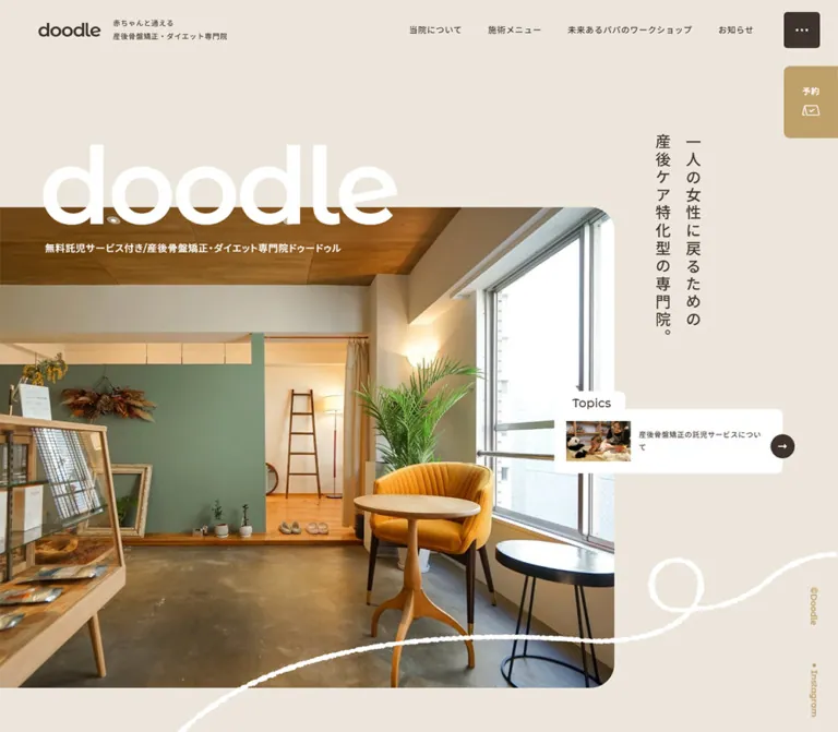
温かなベージュとブラウン、自然光の院内写真、大きなロゴ文字で構成された整体院サイト。縦書きのコピー、手描きライン、画面端に固定された予約導線が特徴です。
オリジナルサイトを見るA sunlit clinic interior, warm paper colors, and a loose white line that makes a spacious page feel personal.
Website: doodlemama.jp Original URL: https://doodlemama.jp/ Final URL: https://doodlemama.jp/ Theme: light, with warm beige and off-white surfaces Inspected: September 17, 2026, at 03:49 JST; supplied retrieval timestamp: September 16, 2026, at 18:49:19.927 UTC Viewports: desktop 1440 × 1000 CSS px; mobile 390 × 844 CSS px Scope: the current clinic homepage, including its opening composition, About features, director-message preview, treatment links, workshop content, contact information, opening-hours tables, and reservation area. Five current-page screenshots cover desktop opening, middle, and bottom positions, plus mobile opening and bottom positions. Other homepage sections have rendered DOM evidence but no corresponding screenshot in this set. Linked pages and external booking services were not inspected.
The homepage presents an Osaka postpartum-care clinic through the atmosphere of its actual rooms: timber, plants, muted green walls, daylight, and a mustard chair. The interface echoes those materials with beige backgrounds, dark brown text, muted gold accents, and restrained rounded corners. A very large white doodle heading bridges the empty canvas and the main photograph. The desktop statement sits vertically beside it, creating an asymmetric composition with substantial breathing room.
This is a clinic website with navigation to services, clinic information, workshops, and news. Its homepage combines a visual introduction with practical visiting and booking information. The defining details are the oversized lowercase brand, photography extending to the left edge, a white hand-drawn line, small English section labels, a horizontal desktop feature sequence, and a reservation tab that remains at the screen edge.
A sunlit clinic interior, warm paper colors, and a loose white line that makes a spacious page feel personal.
Website: doodlemama.jp Original URL: https://doodlemama.jp/ Final URL: https://doodlemama.jp/ Theme: light, with warm beige and off-white surfaces Inspected: September 17, 2026, at 03:49 JST; supplied retrieval timestamp: September 16, 2026, at 18:49:19.927 UTC Viewports: desktop 1440 × 1000 CSS px; mobile 390 × 844 CSS px Scope: the current clinic homepage, including its opening composition, About features, director-message preview, treatment links, workshop content, contact information, opening-hours tables, and reservation area. Five current-page screenshots cover desktop opening, middle, and bottom positions, plus mobile opening and bottom positions. Other homepage sections have rendered DOM evidence but no corresponding screenshot in this set. Linked pages and external booking services were not inspected.
The homepage presents an Osaka postpartum-care clinic through the atmosphere of its actual rooms: timber, plants, muted green walls, daylight, and a mustard chair. The interface echoes those materials with beige backgrounds, dark brown text, muted gold accents, and restrained rounded corners. A very large white doodle heading bridges the empty canvas and the main photograph. The desktop statement sits vertically beside it, creating an asymmetric composition with substantial breathing room.
This is a clinic website with navigation to services, clinic information, workshops, and news. Its homepage combines a visual introduction with practical visiting and booking information. The defining details are the oversized lowercase brand, photography extending to the left edge, a white hand-drawn line, small English section labels, a horizontal desktop feature sequence, and a reservation tab that remains at the screen edge.
| Name | Value | Suggested token | Role and evidence |
|---|---|---|---|
| Warm Beige | #ece6dc |
--color-paper |
Measured body and footer background; measured treatment-card fill |
| Deep Brown | #3f342d |
--color-ink |
Measured primary text, menu-button background, and dark action backgrounds |
| Soft Brown | #4d3f37 |
--color-ink-soft |
Measured section headings, feature paragraphs, and several footer labels |
| Muted Gold | #bfa06b |
--color-accent |
Measured English section labels and desktop Instagram text; visually matches the reservation tab and availability dots |
| Warm Off-White | #f8f6f1 |
--color-surface |
Measured treatment-section background; visually similar to the lighter middle-page canvas |
| White | #ffffff |
--color-white |
Measured hero heading, Topics label background, workshop text, and footer booking-button fill |
| Utility Gray | #807a75 |
--color-muted |
Measured FAQ and Instagram labels in the additional navigation content |
| Caption Brown | rgba(77, 63, 55, 0.6) |
--color-caption |
Measured treatment-image caption text |
The same beige appears as both a page background and a card surface. Separation depends on the adjacent off-white section, spacing, and rounded boundaries. White is reserved for selected overlays, reversed text, and the large booking button.
The supplied custom-property inventory contains standard CMS colors, gradients, shadows, and slider defaults. Their presence does not establish visible use. Bright preset blues, pinks, and gradient values are not part of the demonstrated page palette.
These values are estimates, suitable as initial matching targets rather than exact source colors.
| Name | Approximate value | Visible use |
|---|---|---|
| Feature Teal | #4f898a |
Number 2 and its two-line childcare heading in the middle desktop screenshot |
| Feature Plum | #6b4385 |
Number 3 and the partially visible care-plan heading |
| Footer Stone | #ccc8bc |
Bottom copyright strip |
| Fine Rule | #8a857e |
Thin opening-hours table outlines and row separators |
These accents should remain local. The main interface does not become a multicolor collection of badges or buttons.
No selectable color theme is evidenced. Most content uses brown on a light surface. Strong reversed areas include the dark reservation panel and its white text. The workshop's measured text is white, but its background color is not established by the supplied element samples or screenshots; do not assign it an exact source token.
Measured declaration: "Montserrat Alternates", "Noto Sans JP", sans-serif.
The Latin type has rounded, geometric forms that connect the lowercase wordmark to English labels such as Topics, Message, and View More. Japanese copy uses a clean sans-serif treatment with generous line spacing. Several section headings and address blocks explicitly declare "Noto Sans JP", sans-serif.
The large hero wordmark is an actual H1 containing doodle, measured at weight 600. The compact header mark is visually distinct in scale; its underlying asset format is not provided.
Values below are measured unless marked otherwise. Sizes and line heights are in CSS pixels.
| Role | Desktop size / line height | Mobile size / line height | Weight | Tracking |
|---|---|---|---|---|
Hero doodle |
180 / 180 |
90 / 100 |
600 | Desktop -7.2px; mobile -4.8px |
| Hero Japanese statement | 26 / 31.2 |
22 / 39.1111 |
Desktop 500; mobile 400 | Desktop 4.16px; mobile 1.07556px |
| Hero service caption | 16 / 32 |
12 / 22.8 |
500 | Desktop 0.96px; mobile 0.48px |
| Header descriptor | 12 / 21.6 |
Not visibly displayed | 500 | 0.72px |
| Desktop primary navigation | 14 / 21 |
Not visibly displayed | 500 | 0.84px |
| Introductory heading | 27 / 48.6 |
20 / 32 |
500 | Desktop 1.62px; mobile 1.2px |
| Introductory paragraph | 18 / 43.2 |
14 / 29.4 |
400 | Desktop 1.08px; mobile normal |
| English section label | 14 / 14 |
12 / 12 |
600 | Desktop normal; mobile 0.24px |
| Japanese section heading | 32 / 52.8 |
26 / 36.4 |
400 | Desktop 0.64px; mobile 1.04px |
| Feature and service paragraph | 16 / 32 |
14 / 24.5 |
400 | Desktop 0.96px; mobile 0.56px |
| Small footer information | 12 / 21.6 |
12 / 20.4 |
500 | Desktop 0.72px; mobile 0.48px |
View More |
16 / 16 |
12 / 12 |
Desktop 500; mobile 600 | Desktop normal; mobile 0.24px |
| Footer booking-button label | 18 / 32.4 |
14 / 24.5 |
700 | Desktop 0.72px; mobile 0.56px |
| Topics tab | 20 / 20 |
Not visible | 500 | Normal |
| Topics article title | 12 / 21.6 |
Not visible | 500 | 0.72px |
The feature numerals are approximately 90px tall in the desktop screenshot; their exact computed font size is not supplied. Adjacent colored feature headings appear approximately 24px and bold. Treat both as visual estimates.
Use the enormous brand heading as a special opening gesture. Ordinary section headings remain moderate and relatively light. Body copy gets its calm rhythm from line height: desktop feature paragraphs use 2, while their mobile equivalent uses 1.75.
The root font size is measured at 16px. There is no evidence of a custom miniature root unit or a site-wide viewport-unit formula. Reproduce the recorded role-specific sizes without inventing a source scaling system.
The layout uses several independent alignments: the header starts near 64px on desktop, central content starts near 127.5px, the Message area is narrower, and the hero photograph touches the left edge. These offsets are part of the composition.
| Use | Value | Evidence |
|---|---|---|
| Header mark-to-descriptor gap | 20px |
Measured flex gap |
| Desktop navigation-link horizontal padding | 10px per side |
Measured |
| Desktop content width | 1185px |
Calculated from treatment cards and their outer bounds |
| Desktop treatment-card gap | 32px |
Calculated from card bounds |
| Mobile standard content inset | 30px |
Measured across paragraphs, cards, and footer |
| Mobile treatment-card inner inset | 30px |
Measured |
| Mobile treatment-card gap | 30px |
Calculated from consecutive card bounds |
| Desktop treatment-card padding | 47px 40px 31px 42px |
Measured |
| Mobile treatment-card padding | 22px 30px 33px |
Measured |
| Footer top padding | Desktop 120px; mobile 60px |
Measured |
| Treatment-section bottom padding | Desktop 214px; mobile 160px |
Measured |
| Feature image-to-copy gap | About 40px |
Screenshot estimate consistent with DOM positions |
| Gap between desktop feature pairs | About 100px |
Derived from the estimated pair width and measured 1060px paragraph stride |
This is not a strict eight-point spacing system. Preserve the meaningful component dimensions instead of rounding every number to a single generic scale.
| Element | Radius | Status |
|---|---|---|
| Menu button | 6px |
Measured |
| Topics label | 10px 10px 0 0 |
Measured |
| Main rectangular action buttons | 10px |
Measured |
| Treatment cards | 20px |
Measured |
| Footer upper corners | Desktop 70px; mobile 20px |
Measured |
| Desktop feature photographs | About 20px |
Estimated |
| Hero photograph upper-right corner | About 40px desktop; 20px mobile |
Estimated |
| Reservation tab left corners | About 10–12px |
Estimated |
| Hours-table frame | About 8–10px |
Estimated |
| Directional arrow controls | Circle | Visually observed |
| Element | Desktop 1440 × 1000 | Mobile 390 × 844 | Status |
|---|---|---|---|
| Header identity bounds | x64, y28, about 314.69 × 43.19px |
x24, y44, 87 × 19.875px |
Measured |
| Menu button | x1350, y20, 60 × 60px |
x306, y24, 60 × 60px |
Measured |
| Hero title line box | y222, 180px high; left text inset 65px |
y250.22, 100px high; left text inset 24px |
Measured |
| Hero statement | x1083.63, y222, about 82.38 × 361.92px |
y160, two horizontal lines with 30px left inset |
Measured |
| Main photograph | Left edge 0, top about 349px, width about 1023px; bottom outside opening screenshot |
Left edge 0, top about 318px, about 330 × 405px |
Estimated |
| Reservation tab | Right edge, about 90 × 120px, top 110px |
Right edge, about 70 × 115px, bottom 20px |
Estimated |
| Treatment cards | Two cards of 576.5 × 400px |
Width 330px; heights 334px and 358.5px |
Measured |
| Footer information columns | About 342.03px and 736px, with a calculated 106.97px gap |
Single 330px content column |
Measured / calculated |
| Reservation panel | About 770 × 282px |
About 330 × 229px |
Estimated from screenshots |
| Reservation-panel button | 576 × 88.39px |
300 × 70.5px |
Measured |
The document heights were approximately 13,538px on desktop and 10,558px on mobile. These describe the inspected render, including any layout space associated with the page's effects. They are not target heights to hardcode into a reproduction.
Role: retain the clinic identity and access to the rest of the website.
On desktop, the compact brown wordmark and two-line Japanese descriptor form a left-aligned identity group. The descriptor begins at x188, after the mark and a measured 20px gap. Four text links occupy the upper-right area: 当院について, 施術メニュー, 未来のパパのワークショップ, and お知らせ. The separate dark square menu button sits near the right edge.
The menu control is a 60px square with a 6px radius and three small white dots. It remains the same size on mobile, where the descriptor and horizontal navigation disappear from the visible header. The mobile wordmark is 87px wide.
The header identity and menu control remain near the top of the later screenshots. Desktop scrolled views show a pale band approximately 100px high, with underlying content appearing softened. The evidence does not establish the precise backdrop-filter or overlay implementation. In the mobile bottom capture, the fixed identity overlaps content behind it; provide sufficient clearance when adapting this pattern.
Role: provide a fuller set of navigation and clinic information.
The DOM contains secondary navigation, FAQ and Instagram links, booking links, phone information, and location details. Desktop secondary links measure 18px/32.4px at weight 700; mobile secondary links measure 16px/28px at weight 600. This supports the existence of a larger navigation interface, but no opened-state screenshot or interaction trace was supplied.
Do not reconstruct a precise modal layout, opening gesture, focus behavior, or scroll lock from these records alone. Some extracted elements have bounds despite being absent from the visible screenshot.
Role: introduce the clinic through its environment and brand.
The desktop hero has four main layers:
doodle heading crossing the photograph's upper boundary, followed by a small white service caption.The statement reads 一人の女性に戻るための / 産後ケア特化型の専門院。. Its desktop appearance is vertical, with two text columns and generous character spacing. On mobile it becomes two horizontal lines above the wordmark.
The mobile photograph is visibly cropped into a narrower, taller window. It emphasizes the mustard chair, plant, table, and doorway, while leaving a 60px beige strip on the right. The white service caption becomes two lines. Use a deliberate crop for each layout rather than shrinking the desktop photograph with all of its surrounding composition intact.
Role: add a casual, human counterpoint to the geometric type and rectangular photographs.
A rough white line forms a loose loop and sweeps across the lower hero area. On mobile it is clearly visible below the photograph, approaching the fixed reservation tab. Its edge is irregular, like chalk or a textured pen, rather than a perfectly smooth vector stroke.
No asset path, drawing timeline, or animation keyframe was supplied. Preserve this as decorative artwork with an empty text alternative or aria-hidden="true". A supplied authorized asset will reproduce the texture more faithfully than a generic smooth Bézier line.
Role: keep booking access available while the visitor reads.
The tab is a muted-gold block attached to the right viewport edge. It contains the white label 予約 above a small white outline booking pictogram. Only the left corners are visibly rounded.
On desktop it begins near y110, below the menu button, and measures approximately 90 × 120px. On mobile it moves to the lower-right corner, approximately 20px above the viewport bottom, and narrows to approximately 70 × 115px. It appears at the same viewport position in both mobile captures.
Hot Pepper Beauty and LINE URLs are present in the rendered page. The action that exposes or follows them from this tab was not exercised. Treat its exact click or hover behavior as unverified.
Role: provide a quiet secondary connection to the clinic's social presence.
Small gold ©Doodle and Instagram text runs vertically near the right edge in desktop screenshots. The Instagram link uses measured 14px Montserrat Alternates at weight 600. It is visually subordinate to the reservation tab and main content.
This rail is not visible in the mobile captures. Do not carry it into a narrow layout where it competes with the fixed booking control.
Role: highlight one current article without taking over the hero.
The desktop card overlaps the photograph's right boundary and extends into the beige field. Its anatomy is distinctive:
Topics tab, measured at approximately 118.23 × 31px, with rounded upper corners.The article link points to /post-186/. The card has no visible elevation shadow. Its white silhouette and overlap create the emphasis. The mobile opening screenshot does not show this card, and it is absent from the mobile visible-text extract.
Role: explain the clinic's focus after the visual opening.
The desktop introduction is a centered text block approximately 397px wide. Its heading uses 27px type with a 48.6px line height; the paragraph uses 18px with a 43.2px line height. The unusually generous leading creates a slow, calm transition into the informational sections.
On mobile, the corresponding heading is 20px/32px and the paragraph is 14px/29.4px. Preserve the intentionally short lines and clear separation between heading and body.
Role: divide the homepage into recognizable chapters.
A small English label such as About or Treatment sits above a larger Japanese heading. The English label is gold and weight 600. The Japanese title uses Noto Sans JP, weight 400, at 32px desktop and 26px mobile.
Center these pairs where the evidence shows centered bounds. Keep the English labels restrained; they are orientation cues rather than the main reading content.
Role: explain four reasons to choose the clinic through photography and numbered copy.
The features cover specialized postpartum care, supervised childcare, a care-plan timeframe, and access from the nearby station. Each combines a large photograph with a number, colored two-line heading, and paragraph.
The desktop screenshot shows a horizontal sequence with neighboring entries clipped by the viewport. A childcare image is partly visible at the left, its teal number 2 and copy occupy the next column, and a large photograph of two adults holding a message board appears before the partially visible plum number 3.
The visible large image is approximately 576 × 406px. Paragraphs have a measured width of 344px. Their original x positions are separated by 1060px, supporting an approximately 960px photo-and-copy pair plus a 100px gap. A 40px image-to-copy gap is consistent with that geometry.
The mobile DOM places all four paragraphs at x30 with width 330px and increasing vertical positions. This establishes a vertical mobile sequence. The desktop movement mechanism is not established: no drag, autoplay, arrow control, or scroll-to-horizontal mapping was verified.
Role: introduce a person behind the clinic.
The visible beginning of this area uses a small Message label followed by a long dotted rule. Beneath it, a circular portrait sits to the left of a warm-gold Japanese heading. The DOM supplies a director introduction and a View More link to /clinic.
The desktop composition is narrower than the main treatment grid. The screenshot suggests an approximately 928px-wide region beginning around x256. The portrait is approximately 288px in diameter, though only its upper part is visible in the supplied crop.
On mobile, the heading contains additional line breaks in the rendered text. The full mobile composition was not visually captured, so portrait positioning and spacing beyond the available records remain unverified.
Role: connect visitor concerns to detailed service pages.
The treatment introduction includes an English/Japanese heading pair, explanatory copy, a media caption, and six concern labels. Their full visual arrangement is not shown in the supplied screenshots; do not infer a particular illustration, badge shape, or icon system from the text alone.
The following service cards are well supported by measurements. Desktop uses two equal cards, each 576.5 × 400px, separated by 32px inside a centered 1185px region. Their fill is beige against an off-white section. Each has a 20px radius and substantial internal padding.
Each whole card is a link and contains a Japanese service title, an English label—Maternity Care or Diet—a paragraph, and View More text. Destinations are /medical#menu and /medical#diet. Keep the internal View More treatment within the card's single link rather than adding a nested interactive element.
On mobile the cards stack with a 30px gap. Their width is 330px and their text width is 270px. Heights differ, 334px and 358.5px, because the copy wraps differently. Preserve content-driven height instead of forcing identical mobile boxes.
A separate brown 施術紹介 button follows the cards. Its measured width is 340px on desktop and 330px on mobile, with a height of approximately 72.4–72.5px and a 10px radius.
Role: introduce an additional service for prospective fathers.
The rendered content includes a Work Shop label, Japanese heading, explanatory paragraphs, six benefit labels, and a link to /work-shop. The text describes practical baby-care workshops, with individual and corporate participation.
Measured desktop body copy occupies approximately 579px at x733.5. Mobile copy uses the standard 330px column. Headings and paragraphs are white, and the large action button is white with brown text. The mobile title wraps into two lines.
The background artwork, exact background color, and benefit-label styling are not visible in the supplied screenshots. Repeated postnatal care text appears in the DOM, but repetition alone does not establish a moving marquee.
Role: provide practical information near the end of the homepage.
The footer begins with very large rounded upper corners: 70px on desktop and 20px on mobile. Its beige surface has 120px of desktop top padding, reduced to 60px on mobile.
Desktop uses a left identity/contact column approximately 342px wide and a right timetable column 736px wide. The left column includes the clinic descriptor, telephone link, address, station-access information, parking links, and Google Maps. A dotted separator and a small circular diagonal arrow give the access link a quiet editorial treatment.
The mobile layout uses a single 330px-wide column. Contact details retain compact 12px type with a 20.4px line height.
Role: communicate reception and childcare availability at a glance.
The tables have a fine gray rounded outline, horizontal row rules, and no visible internal vertical grid. Day labels form the top row; a wider left column contains times. Gold circles indicate availability and gray dashes indicate unavailable periods.
The desktop childcare table is approximately 736 × 258px in the bottom screenshot. Its header is about 72px high and its two time rows are about 93px each. On mobile, the same table is approximately 330 × 127px, with a roughly 41px header and 43px rows. These table-specific dimensions are screenshot estimates.
The reception table shows 9:30–20:00 availability Monday through Saturday. The childcare table shows Tuesday through Thursday at 9:30–15:00 and Monday/Friday at 9:30–16:30. These are content observations, not general styling defaults.
Desktop explanatory notes follow the tables. In the mobile screenshot, the notes appear between each heading and its table. The mobile childcare note omits Saturday while the table still marks it unavailable; keep prose and table data synchronized in a new implementation.
Role: provide a clear final booking action.
A centered brown panel contains a white heading, two short lines of booking guidance, and a wide white button labeled Web予約はこちら. The visual hierarchy is simple: one panel, one explanation, one prominent action.
The desktop panel is approximately 770 × 282px. Its button is measured at 576 × 88.39px with 28px vertical padding, 18px bold type, and a 10px radius. On mobile the panel is approximately 330 × 229px, while the button becomes 300 × 70.5px with 23px vertical padding and 14px bold type.
The visible button links to Hot Pepper Beauty. The explanatory text also mentions LINE; that wording does not mean the button opens a provider chooser.
Role: close the page with minimal visual weight.
A slightly darker stone-colored band spans the viewport and centers the brown copyright text. The screenshot suggests about 98px of desktop height and 62px on mobile. The fixed mobile reservation tab overlaps the strip's right side.
The supplied inspection waited for page load, visible image decoding, finite animations, and sampled layout stability. Perpetual animations were paused during readiness checks and then resumed. These procedures improve capture stability but do not establish complete animation behavior.
| Treatment | Supplied evidence | What can be concluded |
|---|---|---|
| Header identity entry | 0.5s 1.5s forwards slideDown |
A named 500ms entry animation follows a 1.5s delay; transform distance and keyframes are not supplied |
| Menu-button entry | 0.5s 1.5s forwards slideDown |
Same recorded entry timing as the identity |
| Hero statement entry | 1s 1s forwards fadeIn |
A named 1s animation follows a 1s delay; exact opacity curve is not supplied |
| Primary navigation | color 0.3s |
A 300ms color transition is defined; the destination color was not captured |
| FAQ and secondary social links | opacity 0.3s |
A 300ms opacity transition is defined; active and hover values are unverified |
| Service cards | 0.3s; paragraph color 0.3s |
Transition timing is available, but the resulting interaction state is not |
| Main action buttons | background 0.3s, color 0.3s |
Background and text transitions are defined |
| Header and reservation persistence | Same viewport-edge placement across distant screenshots | Persistent placement is visually supported; exact positioning rules were not included |
| Desktop feature sequence | Horizontal offscreen coordinates and clipped neighboring content | Horizontal layout is supported; its driving interaction is not |
| Decorative line and repeated words | Static imagery or repeated DOM text | Animation cannot be inferred |
Many element samples report only transition: all without a nonzero duration. Do not interpret those entries as proof that every property animates.
For an adaptation, short color transitions are consistent with the supplied styles. Keep any new scrolling or reveal effects optional and label them as implementation additions. Content should remain available when animation is reduced or scripting is unavailable.
| Layer | Appearance | Function |
|---|---|---|
| Main canvas | Solid warm beige | Connects the opening and practical footer information |
| Lighter content region | Warm off-white | Provides subtle separation behind middle-page content and beige service cards |
| Photography | Natural color, soft rounded corners | Supplies most of the texture and visual richness |
| Topics overlay | Flat white with a tab-shaped label | Creates a small information insert over the hero |
| Service cards | Beige, 20px corners | Groups linked service summaries |
| Menu control | Deep brown, 6px corners | Compact high-contrast navigation access |
| Reservation tab | Muted gold with white details | Persistent action at the viewport edge |
| Final booking panel | Deep brown with a white inset button | Strongest conversion grouping near the footer |
| Hours tables | Canvas-colored interiors and fine rules | Organizes dense information without heavy boxed cells |
| Copyright strip | Slightly darker stone beige | Quiet terminal band |
The visible cards do not rely on drop shadows or glossy gradients. Their boundaries come from contrasting flat surfaces, rounded image edges, spacing, and a few circular arrow controls.
The main photograph shows a real, welcoming interior rather than a clinical stock scene. Wood ceilings and furniture, a green partition, indoor plants, a display cabinet, natural window light, and a mustard chair establish the visual palette. The phone crop retains the chair and greenery as recognizable anchors.
Supporting photographs show childcare activity, people in the clinic, and a personal portrait. They make the service tangible without requiring extensive decorative illustration. The visible feature image with a handwritten board includes its own lettering inside the photograph; preserve it as image content rather than approximating it with HTML text.
Keep photographic color natural and warm. Avoid heavy filters, exaggerated blur, sterile blue grading, or uniform studio backgrounds. Rounded corners should frame the photographs without making every image a circular avatar.
No original image URLs or asset filenames were supplied. The following table identifies visible assets by role and capture location, not by invented paths.
| Asset | Current-page evidence | Cropping and treatment |
|---|---|---|
| Compact brown wordmark | Desktop and mobile headers | Small horizontal identity mark |
| Main interior photograph | Desktop opening and mobile opening | Broad left-edge desktop image; narrower mobile crop |
| Childcare article thumbnail | Desktop Topics card | Small landscape crop |
| Childcare feature photograph | Desktop middle screenshot, left edge | Large image partially clipped by the horizontal sequence |
| Photograph of two adults with a message board | Desktop middle screenshot | Approximately 576 × 406px with rounded corners |
| Director portrait | Lower portion of desktop middle screenshot | Circular crop, partially visible |
| White looping line | Opening screenshots | Rough decorative stroke across open space |
| Booking pictogram and arrow symbols | Reservation tab, Topics, and access link | Simple small symbols; original formats unknown |
Use photography and brand assets with appropriate permission. This evidence establishes their appearance and placement, not downloadable asset locations.
The opening is deliberately asymmetric. Its photograph occupies approximately 71% of the viewport width, while the vertical statement and Topics insert use the remaining space. The headline starts near the left header alignment, and the photograph reaches the viewport edge.
Below the introduction, the About features form a horizontal sequence. Later content returns to centered layouts, including the 1185px treatment grid and contact area. The Message section uses a narrower composition. This variation keeps a long homepage from feeling like identical stacked containers.
At 390px, the visible header contains only the compact wordmark and menu control. The hero statement changes to horizontal text, the wordmark halves from 180px to 90px, and the service caption changes from one line to two. The photograph remains attached to the left edge and leaves 60px of beige on the right.
Most body sections use 30px side insets. About features stack vertically; treatment cards become full-column links; contact details and timetables follow a single reading order. The reservation tab relocates to the lower-right corner and remains visible above the page.
The service-card mobile heights are content-driven. The workshop heading gains an intentional line break, and hours-table explanations move above their tables.
The source media-query thresholds were not supplied. The evidence establishes only the desktop and mobile endpoint layouts. A breakpoint around 1024px is a recommended starting point for the starter below, not a recovered source value.
Intermediate widths need explicit testing for header collisions, vertical-statement clearance, photograph cropping, Japanese line wrapping, and fixed-tab overlap. Avoid deriving a universal percentage layout from one desktop screenshot.
The phone screenshots demonstrate that fixed controls can overlap content. Preserve the reservation tab's visibility while keeping interactive elements and table text reachable. Account for device safe areas, provide sufficient spacing near the final action, and ensure keyboard focus is not concealed beneath fixed elements.
These recommendations are not verified features of the original website.
aria-expanded, and a relationship to its controlled navigation region. Match focus management to the actual navigation pattern chosen.#ece6dc.#3f342d.#4d3f37.#bfa06b.#f8f6f1.#ffffff.“Create a responsive Japanese clinic homepage inspired by doodle. Use warm beige #ece6dc, dark brown #3f342d, muted gold #bfa06b, and off-white #f8f6f1. Pair Montserrat Alternates for Latin text with Noto Sans JP for Japanese copy. Build an asymmetric desktop hero with a large natural-light clinic photograph touching the left edge, an oversized white lowercase wordmark crossing its top boundary, a vertical Japanese statement on the right, and a small white Topics insert. Add a restrained rough white looping line and a gold reservation tab attached to the screen edge. Continue with numbered photographic features, quiet English/Japanese heading pairs, spacious service links, contact information, thin ruled hours tables, and a brown booking panel with a large white action. On mobile, turn the statement horizontal, stack the features and service cards, use 30px content insets, and move the reservation tab to the lower-right corner. Keep unverified motion optional.”
doodle heading above and across a left-edge interior photograph. Leave beige space on the right for a two-column vertical Japanese statement. At 390px, use a 90px wordmark, two horizontal statement lines, and a 330px-wide photograph with a deliberate chair-and-plant crop.”Web予約はこちら. Use a 770px desktop panel and a 330px mobile panel, with a 300px-wide mobile button and 10px corners.”This is a reusable adaptation, not recovered source code. Measured endpoint values are retained where available. The 1024px breakpoint, intermediate scaling, feature overflow behavior, image heights, table styling, and focus treatment are recommendations. Supply authorized font files, imagery, and icons separately.
The hero expects a statement, heading, caption, image, and optional Topics element inside .hero. The statement precedes the heading in DOM order so mobile can use a natural reading sequence. Explicit line breaks should follow the observed Japanese copy where appropriate.
:root {
  /* Measured colors */
  --color-paper: #ece6dc;
  --color-ink: #3f342d;
  --color-ink-soft: #4d3f37;
  --color-accent: #bfa06b;
  --color-surface: #f8f6f1;
  --color-white: #ffffff;
  --color-muted: #807a75;
  --color-caption: rgba(77, 63, 55, 0.6);

  /* Estimated secondary colors */
  --color-feature-teal: #4f898a;
  --color-feature-plum: #6b4385;
  --color-footer-stone: #ccc8bc;
  --color-rule: #8a857e;

  /* Measured font declarations */
  --font-main: 'Montserrat Alternates', 'Noto Sans JP', sans-serif;
  --font-japanese: 'Noto Sans JP', sans-serif;
  --text-body: 16px;
  --leading-body: 2;
  --tracking-body: 0.06em;
  --text-section: 32px;
  --text-eyebrow: 14px;

  /* Measured or derived endpoint geometry */
  --content-max: 1185px;
  --radius-control: 6px;
  --radius-button: 10px;
  --radius-card: 20px;
  --radius-footer: 70px;
  --menu-size: 60px;
  --service-gap: 32px;
  --hero-top: 222px;

  /* Recommended responsive scaffolding */
  --page-gutter: 60px;
  --safe-bottom: env(safe-area-inset-bottom, 0px);
  --motion-color: 300ms ease;
}

* {
  box-sizing: border-box;
}

html {
  scroll-padding-top: 110px;
}

body {
  margin: 0;
  color: var(--color-ink);
  background: var(--color-paper);
  font-family: var(--font-main);
  font-size: var(--text-body);
  line-height: var(--leading-body);
}

button,
a {
  -webkit-tap-highlight-color: transparent;
}

button {
  font: inherit;
}

img {
  display: block;
  max-width: 100%;
}

.content {
  width: min(
    var(--content-max),
    calc(100% - var(--page-gutter) - var(--page-gutter))
  );
  margin-inline: auto;
}

.header-brand {
  position: fixed;
  z-index: 50;
  top: 28px;
  left: 64px;
  display: flex;
  align-items: center;
  gap: 20px;
  color: var(--color-ink);
  text-decoration: none;
}

.header-brand__mark {
  width: 104px;
  height: auto;
}

.header-brand__description {
  margin: 0;
  font-size: 12px;
  font-weight: 500;
  line-height: 1.8;
  letter-spacing: 0.06em;
}

.desktop-nav {
  position: fixed;
  z-index: 50;
  top: 40px;
  right: 130px;
  display: flex;
  align-items: center;
  gap: 23px;
}

.desktop-nav a {
  padding-inline: 10px;
  color: var(--color-ink);
  font-size: 14px;
  font-weight: 500;
  line-height: 1.5;
  letter-spacing: 0.06em;
  text-decoration: none;
  transition: color var(--motion-color);
}

.menu-button {
  position: fixed;
  z-index: 60;
  top: 20px;
  right: 30px;
  display: grid;
  place-items: center;
  width: var(--menu-size);
  height: var(--menu-size);
  padding: 0;
  border: 0;
  border-radius: var(--radius-control);
  color: var(--color-white);
  background: var(--color-ink);
  cursor: pointer;
}

.reservation-tab {
  position: fixed;
  z-index: 55;
  top: 110px;
  right: 0;
  display: grid;
  align-content: center;
  justify-items: center;
  gap: 12px;
  width: 90px;
  height: 120px;
  border-radius: 12px 0 0 12px;
  color: var(--color-white);
  background: var(--color-accent);
  font-size: 14px;
  font-weight: 700;
  line-height: 1.5;
  text-decoration: none;
}

.reservation-tab svg {
  width: 28px;
  height: 24px;
}

.hero {
  position: relative;
  isolation: isolate;
  min-height: 1120px;
  padding-top: var(--hero-top);
}

.hero__statement {
  position: absolute;
  z-index: 2;
  top: var(--hero-top);
  right: 19.03%;
  margin: 0;
  writing-mode: vertical-rl;
  font-size: 26px;
  font-weight: 500;
  line-height: 1.2;
  letter-spacing: 0.16em;
}

.hero__title {
  position: relative;
  z-index: 2;
  margin: 0;
  padding-left: 65px;
  color: var(--color-white);
  font-size: clamp(112px, 12.5vw, 180px);
  font-weight: 600;
  line-height: 1;
  letter-spacing: -0.04em;
}

.hero__caption {
  position: relative;
  z-index: 2;
  margin: 0;
  padding-left: 75px;
  color: var(--color-white);
  font-size: 16px;
  font-weight: 500;
  line-height: 2;
  letter-spacing: 0.06em;
}

.hero__image {
  position: absolute;
  z-index: 0;
  top: 349px;
  left: 0;
  width: 71.04%;
  height: clamp(640px, 52vw, 780px);
  object-fit: cover;
  object-position: center;
  border-radius: 0 40px 0 0;
}

.topics {
  position: absolute;
  z-index: 3;
  top: 654px;
  right: 138px;
  width: 380px;
}

.topics__label {
  display: table;
  margin: 0;
  padding: 10px 24px 1px 30px;
  border-radius: 10px 10px 0 0;
  background: var(--color-white);
  font-size: 20px;
  font-weight: 500;
  line-height: 1;
}

.topics__body {
  position: relative;
  display: grid;
  grid-template-columns: 107px minmax(0, 1fr);
  align-items: center;
  gap: 14px;
  min-height: 108px;
  padding: 20px 30px 20px 20px;
  border-radius: 0 10px 10px 10px;
  color: var(--color-ink);
  background: var(--color-white);
  font-size: 12px;
  font-weight: 500;
  line-height: 1.8;
  letter-spacing: 0.06em;
  text-decoration: none;
}

.topics__thumbnail {
  width: 107px;
  height: 68px;
  object-fit: cover;
}

.topics__arrow {
  position: absolute;
  top: 50%;
  right: -20px;
  display: grid;
  place-items: center;
  width: 40px;
  height: 40px;
  border-radius: 50%;
  color: var(--color-white);
  background: var(--color-ink);
  transform: translateY(-50%);
}

.section-heading {
  text-align: center;
}

.section-heading__eyebrow {
  margin: 0 0 34px;
  color: var(--color-accent);
  font-size: var(--text-eyebrow);
  font-weight: 600;
  line-height: 1;
}

.section-heading__title {
  margin: 0;
  color: var(--color-ink-soft);
  font-family: var(--font-japanese);
  font-size: var(--text-section);
  font-weight: 400;
  line-height: 1.65;
  letter-spacing: 0.02em;
}

/* Recommended native-scroll adaptation of the desktop sequence. */
.feature-rail {
  display: flex;
  gap: 100px;
  padding-inline: max(60px, calc((100vw - 1185px) / 2));
  overflow-x: auto;
  scroll-snap-type: x proximity;
}

.feature {
  display: grid;
  flex: 0 0 960px;
  grid-template-columns: 576px 344px;
  align-items: center;
  gap: 40px;
  scroll-snap-align: center;
}

.feature__image {
  width: 100%;
  aspect-ratio: 576 / 406;
  object-fit: cover;
  border-radius: var(--radius-card);
}

.feature__number {
  margin: 0;
  font-size: 90px;
  font-weight: 400;
  line-height: 1;
}

.feature__title {
  margin: 12px 0 18px;
  font-size: 24px;
  line-height: 1.6;
}

.feature__copy {
  margin: 0;
  color: var(--color-ink-soft);
  font-size: var(--text-body);
  line-height: var(--leading-body);
  letter-spacing: var(--tracking-body);
}

.feature--teal {
  color: var(--color-feature-teal);
}

.feature--plum {
  color: var(--color-feature-plum);
}

.services {
  padding-bottom: 214px;
  background: var(--color-surface);
}

.service-grid {
  display: grid;
  grid-template-columns: repeat(2, minmax(0, 1fr));
  gap: var(--service-gap);
}

.service-card {
  display: block;
  min-height: 400px;
  padding: 47px 40px 31px 42px;
  border-radius: var(--radius-card);
  color: var(--color-ink);
  background: var(--color-paper);
  text-decoration: none;
  transition: color var(--motion-color), background var(--motion-color);
}

.service-card p {
  font-size: var(--text-body);
  line-height: var(--leading-body);
  letter-spacing: var(--tracking-body);
}

.clinic-footer {
  padding-top: 120px;
  border-radius: var(--radius-footer) var(--radius-footer) 0 0;
  background: var(--color-paper);
}

.footer-grid {
  display: grid;
  grid-template-columns: minmax(0, 342fr) minmax(0, 736fr);
  gap: clamp(40px, 7.43vw, 107px);
}

.hours-frame {
  overflow: hidden;
  border: 1px solid var(--color-rule);
  border-radius: 10px;
}

.hours {
  width: 100%;
  border-collapse: collapse;
  table-layout: fixed;
  font-size: 20px;
  line-height: 1.4;
  text-align: center;
}

.hours th,
.hours td {
  padding: 28px 5px;
}

.hours thead th {
  padding-block: 21px;
}

.hours th:first-child {
  width: 24%;
  padding-left: 38px;
  text-align: left;
  white-space: nowrap;
}

.hours tbody tr {
  border-top: 1px solid var(--color-rule);
}

.hours__available {
  color: var(--color-accent);
}

.hours__unavailable {
  color: var(--color-muted);
}

.booking {
  width: min(770px, calc(100% - 60px));
  margin: 80px auto;
  padding: 32px 0 50px;
  border-radius: var(--radius-button);
  color: var(--color-white);
  background: var(--color-ink);
  text-align: center;
  scroll-margin-top: 110px;
}

.booking h2 {
  margin: 0 0 8px;
  font-size: 20px;
  line-height: 1.8;
}

.booking p {
  margin: 0;
  font-family: var(--font-japanese);
  font-size: 12px;
  font-weight: 500;
  line-height: 1.8;
  letter-spacing: 0.06em;
}

.booking__action {
  display: block;
  width: min(576px, calc(100% - 30px));
  margin: 24px auto 0;
  padding: 28px 0;
  border-radius: var(--radius-button);
  color: var(--color-ink);
  background: var(--color-white);
  font-size: 18px;
  font-weight: 700;
  line-height: 1.8;
  letter-spacing: 0.04em;
  text-decoration: none;
  transition: background var(--motion-color), color var(--motion-color);
}

.copyright {
  margin: 0;
  padding: 36px 30px;
  background: var(--color-footer-stone);
  font-size: 14px;
  text-align: center;
}

/* Recommended focus treatment. */
a:focus-visible,
button:focus-visible {
  outline: 3px solid var(--color-ink);
  outline-offset: 5px;
}

.menu-button:focus-visible {
  outline-color: var(--color-accent);
}

.booking a:focus-visible {
  outline-color: var(--color-white);
}

/* Recommended breakpoint; original media-query values were not supplied. */
@media (max-width: 64rem) {
  :root {
    --page-gutter: 30px;
    --text-body: 14px;
    --leading-body: 1.75;
    --tracking-body: 0.04em;
    --text-section: 26px;
    --text-eyebrow: 12px;
    --radius-footer: 20px;
    --service-gap: 30px;
    --hero-top: 160px;
  }

  .header-brand {
    top: 44px;
    left: 24px;
  }

  .header-brand__mark {
    width: 87px;
  }

  .header-brand__description,
  .desktop-nav,
  .topics,
  .social-rail {
    display: none;
  }

  .menu-button {
    top: 24px;
    right: 24px;
  }

  .reservation-tab {
    top: auto;
    bottom: calc(20px + var(--safe-bottom));
    width: 70px;
    height: 115px;
  }

  .hero {
    min-height: 844px;
  }

  .hero__statement {
    position: relative;
    top: auto;
    right: auto;
    margin: 0 0 12px;
    padding-left: 30px;
    writing-mode: horizontal-tb;
    font-size: 22px;
    font-weight: 400;
    line-height: 1.77778;
    letter-spacing: 0.048889em;
  }

  .hero__title {
    padding-left: 24px;
    font-size: clamp(72px, 23.077vw, 90px);
    line-height: 100px;
    letter-spacing: -0.053333em;
  }

  .hero__caption {
    margin-top: 7px;
    padding-left: 34px;
    font-size: 12px;
    line-height: 1.9;
    letter-spacing: 0.04em;
  }

  .hero__image {
    top: 318px;
    width: calc(100% - 60px);
    height: 405px;
    border-top-right-radius: 20px;
  }

  .section-heading__eyebrow {
    margin-bottom: 29px;
    letter-spacing: 0.02em;
  }

  .section-heading__title {
    line-height: 1.4;
    letter-spacing: 0.04em;
  }

  .feature-rail {
    display: grid;
    gap: 60px;
    padding-inline: 30px;
    overflow: visible;
    scroll-snap-type: none;
  }

  .feature {
    grid-template-columns: minmax(0, 1fr);
    gap: 24px;
  }

  .feature__image {
    aspect-ratio: 4 / 3;
  }

  .feature__number {
    font-size: 56px;
  }

  .feature__title {
    font-size: 22px;
  }

  .services {
    padding-bottom: 160px;
  }

  .service-grid,
  .footer-grid {
    grid-template-columns: minmax(0, 1fr);
  }

  .service-card {
    min-height: 334px;
    padding: 22px 30px 33px;
  }

  .clinic-footer {
    padding-top: 60px;
  }

  .hours {
    font-size: 13px;
  }

  .hours th,
  .hours td {
    padding: 12px 2px;
  }

  .hours thead th {
    padding-block: 11px;
  }

  .hours th:first-child {
    width: 28%;
    padding-left: 10px;
  }

  .booking {
    margin-block: 60px 40px;
    padding: 30px 0 41px;
  }

  .booking h2 {
    margin-bottom: 4px;
    font-size: 16px;
    line-height: 1.75;
  }

  .booking p {
    line-height: 1.7;
    letter-spacing: 0.04em;
  }

  .booking__action {
    margin-top: 17px;
    padding-block: 23px;
    font-size: 14px;
    line-height: 1.75;
  }

  .copyright {
    padding-block: 20px;
    font-size: 11px;
  }
}

@media (prefers-reduced-motion: reduce) {
  *,
  *::before,
  *::after {
    animation: none !important;
    transition: none !important;
    scroll-behavior: auto !important;
  }
}
The starter uses native horizontal overflow for the desktop features. That is an accessible implementation option, not a claim about the original mechanism. Fine-tune photograph object-position against the actual supplied assets. The rough line, navigation state management, booking-provider behavior, and original entry keyframes need separate implementation.
This example uses the observed final booking destination and source UI copy.
<section class="booking" id="booking" aria-labelledby="booking-title">
  <h2 id="booking-title">ご予約について</h2>
  <p>
    ご予約はオンラインで受け付けております<br>
    LINE・Hot Pepper Beautyからご予約ください
  </p>
  <a
    class="booking__action"
    href="https://beauty.hotpepper.jp/kr/slnH000642490/"
  >
    Web予約はこちら
  </a>
</section>
Optional aliases for a project already using Tailwind v4. This does not imply that the original website uses Tailwind. Define the custom properties above first.
@theme inline {
  --color-paper: #ece6dc;
  --color-ink: #3f342d;
  --color-ink-soft: #4d3f37;
  --color-accent: #bfa06b;
  --color-surface: #f8f6f1;
  --color-muted: #807a75;

  --font-brand: 'Montserrat Alternates', 'Noto Sans JP', sans-serif;
  --font-jp: 'Noto Sans JP', sans-serif;

  --text-copy: var(--text-body);
  --text-section-title: var(--text-section);
  --text-section-label: var(--text-eyebrow);

  --spacing-page: var(--page-gutter);
  --spacing-menu: 60px;
  --spacing-service-gap: var(--service-gap);

  --radius-menu: 6px;
  --radius-action: 10px;
  --radius-service: 20px;
  --radius-footer-top: var(--radius-footer);
}
This reference describes the current homepage shown in the supplied evidence. Exact values are separated from screenshot estimates and recommended implementation choices throughout.
# doodle — Style Reference

> A sunlit clinic interior, warm paper colors, and a loose white line that makes a spacious page feel personal.

**Website:** [doodlemama.jp](https://doodlemama.jp/)
**Original URL:** https://doodlemama.jp/
**Final URL:** https://doodlemama.jp/
**Theme:** light, with warm beige and off-white surfaces
**Inspected:** September 17, 2026, at 03:49 JST; supplied retrieval timestamp: September 16, 2026, at 18:49:19.927 UTC
**Viewports:** desktop 1440 × 1000 CSS px; mobile 390 × 844 CSS px
**Scope:** the current clinic homepage, including its opening composition, About features, director-message preview, treatment links, workshop content, contact information, opening-hours tables, and reservation area. Five current-page screenshots cover desktop opening, middle, and bottom positions, plus mobile opening and bottom positions. Other homepage sections have rendered DOM evidence but no corresponding screenshot in this set. Linked pages and external booking services were not inspected.

The homepage presents an Osaka postpartum-care clinic through the atmosphere of its actual rooms: timber, plants, muted green walls, daylight, and a mustard chair. The interface echoes those materials with beige backgrounds, dark brown text, muted gold accents, and restrained rounded corners. A very large white `doodle` heading bridges the empty canvas and the main photograph. The desktop statement sits vertically beside it, creating an asymmetric composition with substantial breathing room.

This is a clinic website with navigation to services, clinic information, workshops, and news. Its homepage combines a visual introduction with practical visiting and booking information. The defining details are the oversized lowercase brand, photography extending to the left edge, a white hand-drawn line, small English section labels, a horizontal desktop feature sequence, and a reservation tab that remains at the screen edge.
# doodle — Style Reference

> A sunlit clinic interior, warm paper colors, and a loose white line that makes a spacious page feel personal.

**Website:** [doodlemama.jp](https://doodlemama.jp/)
**Original URL:** https://doodlemama.jp/
**Final URL:** https://doodlemama.jp/
**Theme:** light, with warm beige and off-white surfaces
**Inspected:** September 17, 2026, at 03:49 JST; supplied retrieval timestamp: September 16, 2026, at 18:49:19.927 UTC
**Viewports:** desktop 1440 × 1000 CSS px; mobile 390 × 844 CSS px
**Scope:** the current clinic homepage, including its opening composition, About features, director-message preview, treatment links, workshop content, contact information, opening-hours tables, and reservation area. Five current-page screenshots cover desktop opening, middle, and bottom positions, plus mobile opening and bottom positions. Other homepage sections have rendered DOM evidence but no corresponding screenshot in this set. Linked pages and external booking services were not inspected.

The homepage presents an Osaka postpartum-care clinic through the atmosphere of its actual rooms: timber, plants, muted green walls, daylight, and a mustard chair. The interface echoes those materials with beige backgrounds, dark brown text, muted gold accents, and restrained rounded corners. A very large white `doodle` heading bridges the empty canvas and the main photograph. The desktop statement sits vertically beside it, creating an asymmetric composition with substantial breathing room.

This is a clinic website with navigation to services, clinic information, workshops, and news. Its homepage combines a visual introduction with practical visiting and booking information. The defining details are the oversized lowercase brand, photography extending to the left edge, a white hand-drawn line, small English section labels, a horizontal desktop feature sequence, and a reservation tab that remains at the screen edge.

## How to Read This Reference

- **Measured** means a value explicitly supplied in computed styles or element bounding boxes. Measurements apply to the two inspected viewports and captured states.
- **Estimated** means a visual approximation from a current-page screenshot. This includes some image bounds, secondary colors, table geometry, and decorative details.
- **Calculated** means simple arithmetic using supplied measurements, such as a desktop column gap.
- **Recommended** means an implementation choice for a new project. Breakpoints, accessible states, intermediate-width behavior, and the starter's unmeasured geometry fall into this category.
- Token names in this document are reusable aliases. The evidence does not establish equivalent custom properties in the original stylesheet.
- The rendered DOM includes additional navigation and reservation content that is not visible in the supplied closed-menu screenshots. Its existence does not prove that a menu or booking panel was opened.
- Computed font-family declarations establish the intended stack. Individual font files, versions, and glyph-level font selection were not independently inspected.

## Tokens — Colors

### Default Palette

| Name | Value | Suggested token | Role and evidence |
| --- | --- | --- | --- |
| Warm Beige | `#ece6dc` | `--color-paper` | Measured body and footer background; measured treatment-card fill |
| Deep Brown | `#3f342d` | `--color-ink` | Measured primary text, menu-button background, and dark action backgrounds |
| Soft Brown | `#4d3f37` | `--color-ink-soft` | Measured section headings, feature paragraphs, and several footer labels |
| Muted Gold | `#bfa06b` | `--color-accent` | Measured English section labels and desktop Instagram text; visually matches the reservation tab and availability dots |
| Warm Off-White | `#f8f6f1` | `--color-surface` | Measured treatment-section background; visually similar to the lighter middle-page canvas |
| White | `#ffffff` | `--color-white` | Measured hero heading, Topics label background, workshop text, and footer booking-button fill |
| Utility Gray | `#807a75` | `--color-muted` | Measured FAQ and Instagram labels in the additional navigation content |
| Caption Brown | `rgba(77, 63, 55, 0.6)` | `--color-caption` | Measured treatment-image caption text |

The same beige appears as both a page background and a card surface. Separation depends on the adjacent off-white section, spacing, and rounded boundaries. White is reserved for selected overlays, reversed text, and the large booking button.

The supplied custom-property inventory contains standard CMS colors, gradients, shadows, and slider defaults. Their presence does not establish visible use. Bright preset blues, pinks, and gradient values are not part of the demonstrated page palette.

### Secondary Visual Accents

These values are **estimates**, suitable as initial matching targets rather than exact source colors.

| Name | Approximate value | Visible use |
| --- | --- | --- |
| Feature Teal | `#4f898a` | Number 2 and its two-line childcare heading in the middle desktop screenshot |
| Feature Plum | `#6b4385` | Number 3 and the partially visible care-plan heading |
| Footer Stone | `#ccc8bc` | Bottom copyright strip |
| Fine Rule | `#8a857e` | Thin opening-hours table outlines and row separators |

These accents should remain local. The main interface does not become a multicolor collection of badges or buttons.

### Color Behavior

No selectable color theme is evidenced. Most content uses brown on a light surface. Strong reversed areas include the dark reservation panel and its white text. The workshop's measured text is white, but its background color is not established by the supplied element samples or screenshots; do not assign it an exact source token.

## Tokens — Typography

### Primary Font Stack

**Measured declaration:** `"Montserrat Alternates", "Noto Sans JP", sans-serif`.

The Latin type has rounded, geometric forms that connect the lowercase wordmark to English labels such as `Topics`, `Message`, and `View More`. Japanese copy uses a clean sans-serif treatment with generous line spacing. Several section headings and address blocks explicitly declare `"Noto Sans JP", sans-serif`.

The large hero wordmark is an actual `H1` containing `doodle`, measured at weight 600. The compact header mark is visually distinct in scale; its underlying asset format is not provided.

### Type Scale

Values below are **measured** unless marked otherwise. Sizes and line heights are in CSS pixels.

| Role | Desktop size / line height | Mobile size / line height | Weight | Tracking |
| --- | --- | --- | --- | --- |
| Hero `doodle` | `180 / 180` | `90 / 100` | 600 | Desktop `-7.2px`; mobile `-4.8px` |
| Hero Japanese statement | `26 / 31.2` | `22 / 39.1111` | Desktop 500; mobile 400 | Desktop `4.16px`; mobile `1.07556px` |
| Hero service caption | `16 / 32` | `12 / 22.8` | 500 | Desktop `0.96px`; mobile `0.48px` |
| Header descriptor | `12 / 21.6` | Not visibly displayed | 500 | `0.72px` |
| Desktop primary navigation | `14 / 21` | Not visibly displayed | 500 | `0.84px` |
| Introductory heading | `27 / 48.6` | `20 / 32` | 500 | Desktop `1.62px`; mobile `1.2px` |
| Introductory paragraph | `18 / 43.2` | `14 / 29.4` | 400 | Desktop `1.08px`; mobile normal |
| English section label | `14 / 14` | `12 / 12` | 600 | Desktop normal; mobile `0.24px` |
| Japanese section heading | `32 / 52.8` | `26 / 36.4` | 400 | Desktop `0.64px`; mobile `1.04px` |
| Feature and service paragraph | `16 / 32` | `14 / 24.5` | 400 | Desktop `0.96px`; mobile `0.56px` |
| Small footer information | `12 / 21.6` | `12 / 20.4` | 500 | Desktop `0.72px`; mobile `0.48px` |
| `View More` | `16 / 16` | `12 / 12` | Desktop 500; mobile 600 | Desktop normal; mobile `0.24px` |
| Footer booking-button label | `18 / 32.4` | `14 / 24.5` | 700 | Desktop `0.72px`; mobile `0.56px` |
| Topics tab | `20 / 20` | Not visible | 500 | Normal |
| Topics article title | `12 / 21.6` | Not visible | 500 | `0.72px` |

The feature numerals are approximately 90px tall in the desktop screenshot; their exact computed font size is not supplied. Adjacent colored feature headings appear approximately 24px and bold. Treat both as visual estimates.

### Hierarchy Rules

Use the enormous brand heading as a special opening gesture. Ordinary section headings remain moderate and relatively light. Body copy gets its calm rhythm from line height: desktop feature paragraphs use 2, while their mobile equivalent uses 1.75.

The root font size is measured at 16px. There is no evidence of a custom miniature root unit or a site-wide viewport-unit formula. Reproduce the recorded role-specific sizes without inventing a source scaling system.

## Tokens — Spacing & Shapes

The layout uses several independent alignments: the header starts near 64px on desktop, central content starts near 127.5px, the Message area is narrower, and the hero photograph touches the left edge. These offsets are part of the composition.

### Spacing Vocabulary

| Use | Value | Evidence |
| --- | --- | --- |
| Header mark-to-descriptor gap | `20px` | Measured flex gap |
| Desktop navigation-link horizontal padding | `10px` per side | Measured |
| Desktop content width | `1185px` | Calculated from treatment cards and their outer bounds |
| Desktop treatment-card gap | `32px` | Calculated from card bounds |
| Mobile standard content inset | `30px` | Measured across paragraphs, cards, and footer |
| Mobile treatment-card inner inset | `30px` | Measured |
| Mobile treatment-card gap | `30px` | Calculated from consecutive card bounds |
| Desktop treatment-card padding | `47px 40px 31px 42px` | Measured |
| Mobile treatment-card padding | `22px 30px 33px` | Measured |
| Footer top padding | Desktop `120px`; mobile `60px` | Measured |
| Treatment-section bottom padding | Desktop `214px`; mobile `160px` | Measured |
| Feature image-to-copy gap | About `40px` | Screenshot estimate consistent with DOM positions |
| Gap between desktop feature pairs | About `100px` | Derived from the estimated pair width and measured 1060px paragraph stride |

This is not a strict eight-point spacing system. Preserve the meaningful component dimensions instead of rounding every number to a single generic scale.

### Border Radius

| Element | Radius | Status |
| --- | --- | --- |
| Menu button | `6px` | Measured |
| Topics label | `10px 10px 0 0` | Measured |
| Main rectangular action buttons | `10px` | Measured |
| Treatment cards | `20px` | Measured |
| Footer upper corners | Desktop `70px`; mobile `20px` | Measured |
| Desktop feature photographs | About `20px` | Estimated |
| Hero photograph upper-right corner | About `40px` desktop; `20px` mobile | Estimated |
| Reservation tab left corners | About `10–12px` | Estimated |
| Hours-table frame | About `8–10px` | Estimated |
| Directional arrow controls | Circle | Visually observed |

### Layout Measurements

| Element | Desktop 1440 × 1000 | Mobile 390 × 844 | Status |
| --- | --- | --- | --- |
| Header identity bounds | `x64, y28`, about `314.69 × 43.19px` | `x24, y44`, `87 × 19.875px` | Measured |
| Menu button | `x1350, y20`, `60 × 60px` | `x306, y24`, `60 × 60px` | Measured |
| Hero title line box | `y222`, `180px` high; left text inset `65px` | `y250.22`, `100px` high; left text inset `24px` | Measured |
| Hero statement | `x1083.63, y222`, about `82.38 × 361.92px` | `y160`, two horizontal lines with `30px` left inset | Measured |
| Main photograph | Left edge `0`, top about `349px`, width about `1023px`; bottom outside opening screenshot | Left edge `0`, top about `318px`, about `330 × 405px` | Estimated |
| Reservation tab | Right edge, about `90 × 120px`, top `110px` | Right edge, about `70 × 115px`, bottom `20px` | Estimated |
| Treatment cards | Two cards of `576.5 × 400px` | Width `330px`; heights `334px` and `358.5px` | Measured |
| Footer information columns | About `342.03px` and `736px`, with a calculated `106.97px` gap | Single `330px` content column | Measured / calculated |
| Reservation panel | About `770 × 282px` | About `330 × 229px` | Estimated from screenshots |
| Reservation-panel button | `576 × 88.39px` | `300 × 70.5px` | Measured |

The document heights were approximately 13,538px on desktop and 10,558px on mobile. These describe the inspected render, including any layout space associated with the page's effects. They are not target heights to hardcode into a reproduction.

## Components

### Persistent Header and Navigation

**Role:** retain the clinic identity and access to the rest of the website.

On desktop, the compact brown wordmark and two-line Japanese descriptor form a left-aligned identity group. The descriptor begins at x188, after the mark and a measured 20px gap. Four text links occupy the upper-right area: `当院について`, `施術メニュー`, `未来のパパのワークショップ`, and `お知らせ`. The separate dark square menu button sits near the right edge.

The menu control is a 60px square with a 6px radius and three small white dots. It remains the same size on mobile, where the descriptor and horizontal navigation disappear from the visible header. The mobile wordmark is 87px wide.

The header identity and menu control remain near the top of the later screenshots. Desktop scrolled views show a pale band approximately 100px high, with underlying content appearing softened. The evidence does not establish the precise backdrop-filter or overlay implementation. In the mobile bottom capture, the fixed identity overlaps content behind it; provide sufficient clearance when adapting this pattern.

### Additional Navigation Content

**Role:** provide a fuller set of navigation and clinic information.

The DOM contains secondary navigation, FAQ and Instagram links, booking links, phone information, and location details. Desktop secondary links measure 18px/32.4px at weight 700; mobile secondary links measure 16px/28px at weight 600. This supports the existence of a larger navigation interface, but no opened-state screenshot or interaction trace was supplied.

Do not reconstruct a precise modal layout, opening gesture, focus behavior, or scroll lock from these records alone. Some extracted elements have bounds despite being absent from the visible screenshot.

### Hero Composition

**Role:** introduce the clinic through its environment and brand.

The desktop hero has four main layers:

1. A large beige upper field.
2. A broad room photograph touching the left viewport edge, with a rounded upper-right corner.
3. A white `doodle` heading crossing the photograph's upper boundary, followed by a small white service caption.
4. A vertical Japanese statement in the open area to the right.

The statement reads `一人の女性に戻るための / 産後ケア特化型の専門院。`. Its desktop appearance is vertical, with two text columns and generous character spacing. On mobile it becomes two horizontal lines above the wordmark.

The mobile photograph is visibly cropped into a narrower, taller window. It emphasizes the mustard chair, plant, table, and doorway, while leaving a 60px beige strip on the right. The white service caption becomes two lines. Use a deliberate crop for each layout rather than shrinking the desktop photograph with all of its surrounding composition intact.

### Hand-Drawn Line

**Role:** add a casual, human counterpoint to the geometric type and rectangular photographs.

A rough white line forms a loose loop and sweeps across the lower hero area. On mobile it is clearly visible below the photograph, approaching the fixed reservation tab. Its edge is irregular, like chalk or a textured pen, rather than a perfectly smooth vector stroke.

No asset path, drawing timeline, or animation keyframe was supplied. Preserve this as decorative artwork with an empty text alternative or `aria-hidden="true"`. A supplied authorized asset will reproduce the texture more faithfully than a generic smooth Bézier line.

### Persistent Reservation Tab

**Role:** keep booking access available while the visitor reads.

The tab is a muted-gold block attached to the right viewport edge. It contains the white label `予約` above a small white outline booking pictogram. Only the left corners are visibly rounded.

On desktop it begins near y110, below the menu button, and measures approximately 90 × 120px. On mobile it moves to the lower-right corner, approximately 20px above the viewport bottom, and narrows to approximately 70 × 115px. It appears at the same viewport position in both mobile captures.

Hot Pepper Beauty and LINE URLs are present in the rendered page. The action that exposes or follows them from this tab was not exercised. Treat its exact click or hover behavior as unverified.

### Desktop Social Rail

**Role:** provide a quiet secondary connection to the clinic's social presence.

Small gold `©Doodle` and `Instagram` text runs vertically near the right edge in desktop screenshots. The Instagram link uses measured 14px Montserrat Alternates at weight 600. It is visually subordinate to the reservation tab and main content.

This rail is not visible in the mobile captures. Do not carry it into a narrow layout where it competes with the fixed booking control.

### Topics Card

**Role:** highlight one current article without taking over the hero.

The desktop card overlaps the photograph's right boundary and extends into the beige field. Its anatomy is distinctive:

- A white `Topics` tab, measured at approximately 118.23 × 31px, with rounded upper corners.
- A white body, estimated at 380 × 108px.
- A small landscape childcare photograph at left, approximately 107 × 68px.
- A compact, two-line article link at right using 12px/21.6px type.
- A brown circular arrow approximately 40px across, protruding from the body's right edge.

The article link points to `/post-186/`. The card has no visible elevation shadow. Its white silhouette and overlap create the emphasis. The mobile opening screenshot does not show this card, and it is absent from the mobile visible-text extract.

### Introductory Copy

**Role:** explain the clinic's focus after the visual opening.

The desktop introduction is a centered text block approximately 397px wide. Its heading uses 27px type with a 48.6px line height; the paragraph uses 18px with a 43.2px line height. The unusually generous leading creates a slow, calm transition into the informational sections.

On mobile, the corresponding heading is 20px/32px and the paragraph is 14px/29.4px. Preserve the intentionally short lines and clear separation between heading and body.

### Section Heading Pair

**Role:** divide the homepage into recognizable chapters.

A small English label such as `About` or `Treatment` sits above a larger Japanese heading. The English label is gold and weight 600. The Japanese title uses Noto Sans JP, weight 400, at 32px desktop and 26px mobile.

Center these pairs where the evidence shows centered bounds. Keep the English labels restrained; they are orientation cues rather than the main reading content.

### About Feature Sequence

**Role:** explain four reasons to choose the clinic through photography and numbered copy.

The features cover specialized postpartum care, supervised childcare, a care-plan timeframe, and access from the nearby station. Each combines a large photograph with a number, colored two-line heading, and paragraph.

The desktop screenshot shows a horizontal sequence with neighboring entries clipped by the viewport. A childcare image is partly visible at the left, its teal number 2 and copy occupy the next column, and a large photograph of two adults holding a message board appears before the partially visible plum number 3.

The visible large image is approximately 576 × 406px. Paragraphs have a measured width of 344px. Their original x positions are separated by 1060px, supporting an approximately 960px photo-and-copy pair plus a 100px gap. A 40px image-to-copy gap is consistent with that geometry.

The mobile DOM places all four paragraphs at x30 with width 330px and increasing vertical positions. This establishes a vertical mobile sequence. The desktop movement mechanism is not established: no drag, autoplay, arrow control, or scroll-to-horizontal mapping was verified.

### Director Message

**Role:** introduce a person behind the clinic.

The visible beginning of this area uses a small `Message` label followed by a long dotted rule. Beneath it, a circular portrait sits to the left of a warm-gold Japanese heading. The DOM supplies a director introduction and a `View More` link to `/clinic`.

The desktop composition is narrower than the main treatment grid. The screenshot suggests an approximately 928px-wide region beginning around x256. The portrait is approximately 288px in diameter, though only its upper part is visible in the supplied crop.

On mobile, the heading contains additional line breaks in the rendered text. The full mobile composition was not visually captured, so portrait positioning and spacing beyond the available records remain unverified.

### Treatment Introduction and Service Cards

**Role:** connect visitor concerns to detailed service pages.

The treatment introduction includes an English/Japanese heading pair, explanatory copy, a media caption, and six concern labels. Their full visual arrangement is not shown in the supplied screenshots; do not infer a particular illustration, badge shape, or icon system from the text alone.

The following service cards are well supported by measurements. Desktop uses two equal cards, each 576.5 × 400px, separated by 32px inside a centered 1185px region. Their fill is beige against an off-white section. Each has a 20px radius and substantial internal padding.

Each whole card is a link and contains a Japanese service title, an English label—`Maternity Care` or `Diet`—a paragraph, and `View More` text. Destinations are `/medical#menu` and `/medical#diet`. Keep the internal `View More` treatment within the card's single link rather than adding a nested interactive element.

On mobile the cards stack with a 30px gap. Their width is 330px and their text width is 270px. Heights differ, 334px and 358.5px, because the copy wraps differently. Preserve content-driven height instead of forcing identical mobile boxes.

A separate brown `施術紹介` button follows the cards. Its measured width is 340px on desktop and 330px on mobile, with a height of approximately 72.4–72.5px and a 10px radius.

### Workshop Section

**Role:** introduce an additional service for prospective fathers.

The rendered content includes a `Work Shop` label, Japanese heading, explanatory paragraphs, six benefit labels, and a link to `/work-shop`. The text describes practical baby-care workshops, with individual and corporate participation.

Measured desktop body copy occupies approximately 579px at x733.5. Mobile copy uses the standard 330px column. Headings and paragraphs are white, and the large action button is white with brown text. The mobile title wraps into two lines.

The background artwork, exact background color, and benefit-label styling are not visible in the supplied screenshots. Repeated `postnatal care` text appears in the DOM, but repetition alone does not establish a moving marquee.

### Contact and Access Area

**Role:** provide practical information near the end of the homepage.

The footer begins with very large rounded upper corners: 70px on desktop and 20px on mobile. Its beige surface has 120px of desktop top padding, reduced to 60px on mobile.

Desktop uses a left identity/contact column approximately 342px wide and a right timetable column 736px wide. The left column includes the clinic descriptor, telephone link, address, station-access information, parking links, and Google Maps. A dotted separator and a small circular diagonal arrow give the access link a quiet editorial treatment.

The mobile layout uses a single 330px-wide column. Contact details retain compact 12px type with a 20.4px line height.

### Opening-Hours Tables

**Role:** communicate reception and childcare availability at a glance.

The tables have a fine gray rounded outline, horizontal row rules, and no visible internal vertical grid. Day labels form the top row; a wider left column contains times. Gold circles indicate availability and gray dashes indicate unavailable periods.

The desktop childcare table is approximately 736 × 258px in the bottom screenshot. Its header is about 72px high and its two time rows are about 93px each. On mobile, the same table is approximately 330 × 127px, with a roughly 41px header and 43px rows. These table-specific dimensions are screenshot estimates.

The reception table shows 9:30–20:00 availability Monday through Saturday. The childcare table shows Tuesday through Thursday at 9:30–15:00 and Monday/Friday at 9:30–16:30. These are content observations, not general styling defaults.

Desktop explanatory notes follow the tables. In the mobile screenshot, the notes appear between each heading and its table. The mobile childcare note omits Saturday while the table still marks it unavailable; keep prose and table data synchronized in a new implementation.

### Reservation Panel

**Role:** provide a clear final booking action.

A centered brown panel contains a white heading, two short lines of booking guidance, and a wide white button labeled `Web予約はこちら`. The visual hierarchy is simple: one panel, one explanation, one prominent action.

The desktop panel is approximately 770 × 282px. Its button is measured at 576 × 88.39px with 28px vertical padding, 18px bold type, and a 10px radius. On mobile the panel is approximately 330 × 229px, while the button becomes 300 × 70.5px with 23px vertical padding and 14px bold type.

The visible button links to Hot Pepper Beauty. The explanatory text also mentions LINE; that wording does not mean the button opens a provider chooser.

### Copyright Strip

**Role:** close the page with minimal visual weight.

A slightly darker stone-colored band spans the viewport and centers the brown copyright text. The screenshot suggests about 98px of desktop height and 62px on mobile. The fixed mobile reservation tab overlaps the strip's right side.

## Tokens — Motion & Interaction

The supplied inspection waited for page load, visible image decoding, finite animations, and sampled layout stability. Perpetual animations were paused during readiness checks and then resumed. These procedures improve capture stability but do not establish complete animation behavior.

| Treatment | Supplied evidence | What can be concluded |
| --- | --- | --- |
| Header identity entry | `0.5s 1.5s forwards slideDown` | A named 500ms entry animation follows a 1.5s delay; transform distance and keyframes are not supplied |
| Menu-button entry | `0.5s 1.5s forwards slideDown` | Same recorded entry timing as the identity |
| Hero statement entry | `1s 1s forwards fadeIn` | A named 1s animation follows a 1s delay; exact opacity curve is not supplied |
| Primary navigation | `color 0.3s` | A 300ms color transition is defined; the destination color was not captured |
| FAQ and secondary social links | `opacity 0.3s` | A 300ms opacity transition is defined; active and hover values are unverified |
| Service cards | `0.3s`; paragraph `color 0.3s` | Transition timing is available, but the resulting interaction state is not |
| Main action buttons | `background 0.3s, color 0.3s` | Background and text transitions are defined |
| Header and reservation persistence | Same viewport-edge placement across distant screenshots | Persistent placement is visually supported; exact positioning rules were not included |
| Desktop feature sequence | Horizontal offscreen coordinates and clipped neighboring content | Horizontal layout is supported; its driving interaction is not |
| Decorative line and repeated words | Static imagery or repeated DOM text | Animation cannot be inferred |

Many element samples report only `transition: all` without a nonzero duration. Do not interpret those entries as proof that every property animates.

For an adaptation, short color transitions are consistent with the supplied styles. Keep any new scrolling or reveal effects optional and label them as implementation additions. Content should remain available when animation is reduced or scripting is unavailable.

## Surfaces

| Layer | Appearance | Function |
| --- | --- | --- |
| Main canvas | Solid warm beige | Connects the opening and practical footer information |
| Lighter content region | Warm off-white | Provides subtle separation behind middle-page content and beige service cards |
| Photography | Natural color, soft rounded corners | Supplies most of the texture and visual richness |
| Topics overlay | Flat white with a tab-shaped label | Creates a small information insert over the hero |
| Service cards | Beige, 20px corners | Groups linked service summaries |
| Menu control | Deep brown, 6px corners | Compact high-contrast navigation access |
| Reservation tab | Muted gold with white details | Persistent action at the viewport edge |
| Final booking panel | Deep brown with a white inset button | Strongest conversion grouping near the footer |
| Hours tables | Canvas-colored interiors and fine rules | Organizes dense information without heavy boxed cells |
| Copyright strip | Slightly darker stone beige | Quiet terminal band |

The visible cards do not rely on drop shadows or glossy gradients. Their boundaries come from contrasting flat surfaces, rounded image edges, spacing, and a few circular arrow controls.

## Imagery

The main photograph shows a real, welcoming interior rather than a clinical stock scene. Wood ceilings and furniture, a green partition, indoor plants, a display cabinet, natural window light, and a mustard chair establish the visual palette. The phone crop retains the chair and greenery as recognizable anchors.

Supporting photographs show childcare activity, people in the clinic, and a personal portrait. They make the service tangible without requiring extensive decorative illustration. The visible feature image with a handwritten board includes its own lettering inside the photograph; preserve it as image content rather than approximating it with HTML text.

Keep photographic color natural and warm. Avoid heavy filters, exaggerated blur, sterile blue grading, or uniform studio backgrounds. Rounded corners should frame the photographs without making every image a circular avatar.

### Observed Asset References

No original image URLs or asset filenames were supplied. The following table identifies visible assets by role and capture location, not by invented paths.

| Asset | Current-page evidence | Cropping and treatment |
| --- | --- | --- |
| Compact brown wordmark | Desktop and mobile headers | Small horizontal identity mark |
| Main interior photograph | Desktop opening and mobile opening | Broad left-edge desktop image; narrower mobile crop |
| Childcare article thumbnail | Desktop Topics card | Small landscape crop |
| Childcare feature photograph | Desktop middle screenshot, left edge | Large image partially clipped by the horizontal sequence |
| Photograph of two adults with a message board | Desktop middle screenshot | Approximately 576 × 406px with rounded corners |
| Director portrait | Lower portion of desktop middle screenshot | Circular crop, partially visible |
| White looping line | Opening screenshots | Rough decorative stroke across open space |
| Booking pictogram and arrow symbols | Reservation tab, Topics, and access link | Simple small symbols; original formats unknown |

Use photography and brand assets with appropriate permission. This evidence establishes their appearance and placement, not downloadable asset locations.

## Layout & Responsive Behavior

### Desktop Structure

The opening is deliberately asymmetric. Its photograph occupies approximately 71% of the viewport width, while the vertical statement and Topics insert use the remaining space. The headline starts near the left header alignment, and the photograph reaches the viewport edge.

Below the introduction, the About features form a horizontal sequence. Later content returns to centered layouts, including the 1185px treatment grid and contact area. The Message section uses a narrower composition. This variation keeps a long homepage from feeling like identical stacked containers.

### Mobile Structure

At 390px, the visible header contains only the compact wordmark and menu control. The hero statement changes to horizontal text, the wordmark halves from 180px to 90px, and the service caption changes from one line to two. The photograph remains attached to the left edge and leaves 60px of beige on the right.

Most body sections use 30px side insets. About features stack vertically; treatment cards become full-column links; contact details and timetables follow a single reading order. The reservation tab relocates to the lower-right corner and remains visible above the page.

The service-card mobile heights are content-driven. The workshop heading gains an intentional line break, and hours-table explanations move above their tables.

### Breakpoints and Untested Widths

The source media-query thresholds were not supplied. The evidence establishes only the desktop and mobile endpoint layouts. A breakpoint around 1024px is a **recommended starting point** for the starter below, not a recovered source value.

Intermediate widths need explicit testing for header collisions, vertical-statement clearance, photograph cropping, Japanese line wrapping, and fixed-tab overlap. Avoid deriving a universal percentage layout from one desktop screenshot.

### Persistent Controls and Content Clearance

The phone screenshots demonstrate that fixed controls can overlap content. Preserve the reservation tab's visibility while keeping interactive elements and table text reachable. Account for device safe areas, provide sufficient spacing near the final action, and ensure keyboard focus is not concealed beneath fixed elements.

## Do’s and Don’ts

### Do

- Start with the measured beige, brown, off-white, and muted-gold palette.
- Use the declared Montserrat Alternates and Noto Sans JP stacks where available.
- Preserve the large white lowercase hero heading and its overlap with the photograph.
- Keep the vertical desktop statement and horizontal mobile statement as distinct layouts.
- Use real interior and people photography with intentional responsive crops.
- Retain the rough white line as a small, recognizable decorative gesture.
- Give body paragraphs generous line spacing and moderate column widths.
- Preserve the horizontal desktop feature sequence and vertical mobile reading order.
- Use compact English labels above larger Japanese section headings.
- Keep treatment cards spacious, flat, and rounded, with the entire card acting as the link.
- Make the hours tables clear through alignment, restrained rules, and consistent markers.
- Keep booking available at the screen edge and repeat a clear action near the footer.

### Don’t

- Don’t reduce the homepage to an isolated promotional panel; retain its service, navigation, and visiting-information roles.
- Don’t turn the hero into a centered heading above a generic full-width banner.
- Don’t replace warm brown text with pure black across every component.
- Don’t infer a visible palette from unrelated CMS presets.
- Don’t add shadows, gradients, or pill shapes to every content block.
- Don’t use gold, teal, and plum as interchangeable global action colors.
- Don’t shrink the desktop hours tables until their labels become unreadable.
- Don’t force equal heights on mobile cards with different amounts of text.
- Don’t reproduce hidden-menu DOM coordinates as an observed open state.
- Don’t invent autoplay, scroll scrubbing, hover destinations, or line-drawing animation.
- Don’t hardcode the captured document height or unexplained large vertical gaps.
- Don’t copy the visible mobile header overlap as a required design feature.

## Recommended Implementation Additions

These recommendations are not verified features of the original website.

- Give the three-dot menu button an accessible name, `aria-expanded`, and a relationship to its controlled navigation region. Match focus management to the actual navigation pattern chosen.
- Give the reservation tab and image-based provider links explicit accessible names. Ensure booking access works with touch and keyboard input.
- Add a visible brown focus outline with adequate offset around text links, cards, and buttons.
- Check small white text over photography and on gold backgrounds for contrast. Adjust the crop, add a restrained local backing, or use a darker label color where necessary.
- Mark decorative looping artwork and purely decorative arrows as hidden from assistive technology.
- Use semantic tables with captions and scoped row/column headers. Provide an accessible equivalent for available and unavailable markers.
- Keep hours-table data and explanatory text in one content model so their meaning stays consistent across breakpoints.
- Offer a vertical, readable fallback for the desktop feature sequence and honor reduced-motion preferences.
- Supply intrinsic image dimensions and responsive image sources to reduce layout movement while preserving the chosen crops.
- Reserve safe-area and focus clearance around persistent mobile controls.

## Agent Prompt Guide

### Quick Color Reference

- Main canvas and service-card fill: `#ece6dc`.
- Primary text and dark actions: `#3f342d`.
- Secondary brown text: `#4d3f37`.
- Section labels and reservation accent: `#bfa06b`.
- Lighter content sections: `#f8f6f1`.
- Hero lettering, Topics surface, and inset booking button: `#ffffff`.
- Local feature teal and plum: approximate only; keep them within numbered feature content.

### Overall Prompt

“Create a responsive Japanese clinic homepage inspired by doodle. Use warm beige `#ece6dc`, dark brown `#3f342d`, muted gold `#bfa06b`, and off-white `#f8f6f1`. Pair Montserrat Alternates for Latin text with Noto Sans JP for Japanese copy. Build an asymmetric desktop hero with a large natural-light clinic photograph touching the left edge, an oversized white lowercase wordmark crossing its top boundary, a vertical Japanese statement on the right, and a small white Topics insert. Add a restrained rough white looping line and a gold reservation tab attached to the screen edge. Continue with numbered photographic features, quiet English/Japanese heading pairs, spacious service links, contact information, thin ruled hours tables, and a brown booking panel with a large white action. On mobile, turn the statement horizontal, stack the features and service cards, use 30px content insets, and move the reservation tab to the lower-right corner. Keep unverified motion optional.”

### Example Component Prompts

1. **Hero:** “At 1440px, place a 180px white `doodle` heading above and across a left-edge interior photograph. Leave beige space on the right for a two-column vertical Japanese statement. At 390px, use a 90px wordmark, two horizontal statement lines, and a 330px-wide photograph with a deliberate chair-and-plant crop.”
2. **Topics insert:** “Create a flat white article insert with a small tab labeled Topics, a landscape childcare thumbnail, compact two-line Japanese link text, and a 40px brown arrow circle protruding from the right edge. Use subtle 10px corners and no shadow.”
3. **Feature sequence:** “Create a wide desktop sequence of large rounded photographs paired with a thin oversized numeral, a colored two-line Japanese heading, and a 344px-wide paragraph at 16px/32px. Let neighboring entries be partially visible. Stack each feature into a 330px mobile column. Any scrolling behavior is an implementation choice.”
4. **Service card:** “Create a beige linked service card on an off-white section. Use a 20px radius, Japanese title, small English service name, generous paragraph leading, and a restrained View More cue. Desktop cards are paired with a 32px gap; mobile cards stack with 30px spacing and natural height.”
5. **Hours table:** “Use a thin rounded gray frame, horizontal row rules, a wider time column, centered Japanese weekday headings, gold availability dots, and gray dashes. Maintain all seven day groups in a 330px mobile table without decorative cell fills.”
6. **Booking panel:** “Create a centered dark-brown reservation panel with a white heading, two short guidance lines, and one wide white button labeled `Web予約はこちら`. Use a 770px desktop panel and a 330px mobile panel, with a 300px-wide mobile button and 10px corners.”

## Quick Start

### CSS Custom Properties

This is a reusable adaptation, not recovered source code. Measured endpoint values are retained where available. The 1024px breakpoint, intermediate scaling, feature overflow behavior, image heights, table styling, and focus treatment are recommendations. Supply authorized font files, imagery, and icons separately.

The hero expects a statement, heading, caption, image, and optional Topics element inside `.hero`. The statement precedes the heading in DOM order so mobile can use a natural reading sequence. Explicit line breaks should follow the observed Japanese copy where appropriate.

```css
:root {
  /* Measured colors */
  --color-paper: #ece6dc;
  --color-ink: #3f342d;
  --color-ink-soft: #4d3f37;
  --color-accent: #bfa06b;
  --color-surface: #f8f6f1;
  --color-white: #ffffff;
  --color-muted: #807a75;
  --color-caption: rgba(77, 63, 55, 0.6);

  /* Estimated secondary colors */
  --color-feature-teal: #4f898a;
  --color-feature-plum: #6b4385;
  --color-footer-stone: #ccc8bc;
  --color-rule: #8a857e;

  /* Measured font declarations */
  --font-main: 'Montserrat Alternates', 'Noto Sans JP', sans-serif;
  --font-japanese: 'Noto Sans JP', sans-serif;
  --text-body: 16px;
  --leading-body: 2;
  --tracking-body: 0.06em;
  --text-section: 32px;
  --text-eyebrow: 14px;

  /* Measured or derived endpoint geometry */
  --content-max: 1185px;
  --radius-control: 6px;
  --radius-button: 10px;
  --radius-card: 20px;
  --radius-footer: 70px;
  --menu-size: 60px;
  --service-gap: 32px;
  --hero-top: 222px;

  /* Recommended responsive scaffolding */
  --page-gutter: 60px;
  --safe-bottom: env(safe-area-inset-bottom, 0px);
  --motion-color: 300ms ease;
}

* {
  box-sizing: border-box;
}

html {
  scroll-padding-top: 110px;
}

body {
  margin: 0;
  color: var(--color-ink);
  background: var(--color-paper);
  font-family: var(--font-main);
  font-size: var(--text-body);
  line-height: var(--leading-body);
}

button,
a {
  -webkit-tap-highlight-color: transparent;
}

button {
  font: inherit;
}

img {
  display: block;
  max-width: 100%;
}

.content {
  width: min(
    var(--content-max),
    calc(100% - var(--page-gutter) - var(--page-gutter))
  );
  margin-inline: auto;
}

.header-brand {
  position: fixed;
  z-index: 50;
  top: 28px;
  left: 64px;
  display: flex;
  align-items: center;
  gap: 20px;
  color: var(--color-ink);
  text-decoration: none;
}

.header-brand__mark {
  width: 104px;
  height: auto;
}

.header-brand__description {
  margin: 0;
  font-size: 12px;
  font-weight: 500;
  line-height: 1.8;
  letter-spacing: 0.06em;
}

.desktop-nav {
  position: fixed;
  z-index: 50;
  top: 40px;
  right: 130px;
  display: flex;
  align-items: center;
  gap: 23px;
}

.desktop-nav a {
  padding-inline: 10px;
  color: var(--color-ink);
  font-size: 14px;
  font-weight: 500;
  line-height: 1.5;
  letter-spacing: 0.06em;
  text-decoration: none;
  transition: color var(--motion-color);
}

.menu-button {
  position: fixed;
  z-index: 60;
  top: 20px;
  right: 30px;
  display: grid;
  place-items: center;
  width: var(--menu-size);
  height: var(--menu-size);
  padding: 0;
  border: 0;
  border-radius: var(--radius-control);
  color: var(--color-white);
  background: var(--color-ink);
  cursor: pointer;
}

.reservation-tab {
  position: fixed;
  z-index: 55;
  top: 110px;
  right: 0;
  display: grid;
  align-content: center;
  justify-items: center;
  gap: 12px;
  width: 90px;
  height: 120px;
  border-radius: 12px 0 0 12px;
  color: var(--color-white);
  background: var(--color-accent);
  font-size: 14px;
  font-weight: 700;
  line-height: 1.5;
  text-decoration: none;
}

.reservation-tab svg {
  width: 28px;
  height: 24px;
}

.hero {
  position: relative;
  isolation: isolate;
  min-height: 1120px;
  padding-top: var(--hero-top);
}

.hero__statement {
  position: absolute;
  z-index: 2;
  top: var(--hero-top);
  right: 19.03%;
  margin: 0;
  writing-mode: vertical-rl;
  font-size: 26px;
  font-weight: 500;
  line-height: 1.2;
  letter-spacing: 0.16em;
}

.hero__title {
  position: relative;
  z-index: 2;
  margin: 0;
  padding-left: 65px;
  color: var(--color-white);
  font-size: clamp(112px, 12.5vw, 180px);
  font-weight: 600;
  line-height: 1;
  letter-spacing: -0.04em;
}

.hero__caption {
  position: relative;
  z-index: 2;
  margin: 0;
  padding-left: 75px;
  color: var(--color-white);
  font-size: 16px;
  font-weight: 500;
  line-height: 2;
  letter-spacing: 0.06em;
}

.hero__image {
  position: absolute;
  z-index: 0;
  top: 349px;
  left: 0;
  width: 71.04%;
  height: clamp(640px, 52vw, 780px);
  object-fit: cover;
  object-position: center;
  border-radius: 0 40px 0 0;
}

.topics {
  position: absolute;
  z-index: 3;
  top: 654px;
  right: 138px;
  width: 380px;
}

.topics__label {
  display: table;
  margin: 0;
  padding: 10px 24px 1px 30px;
  border-radius: 10px 10px 0 0;
  background: var(--color-white);
  font-size: 20px;
  font-weight: 500;
  line-height: 1;
}

.topics__body {
  position: relative;
  display: grid;
  grid-template-columns: 107px minmax(0, 1fr);
  align-items: center;
  gap: 14px;
  min-height: 108px;
  padding: 20px 30px 20px 20px;
  border-radius: 0 10px 10px 10px;
  color: var(--color-ink);
  background: var(--color-white);
  font-size: 12px;
  font-weight: 500;
  line-height: 1.8;
  letter-spacing: 0.06em;
  text-decoration: none;
}

.topics__thumbnail {
  width: 107px;
  height: 68px;
  object-fit: cover;
}

.topics__arrow {
  position: absolute;
  top: 50%;
  right: -20px;
  display: grid;
  place-items: center;
  width: 40px;
  height: 40px;
  border-radius: 50%;
  color: var(--color-white);
  background: var(--color-ink);
  transform: translateY(-50%);
}

.section-heading {
  text-align: center;
}

.section-heading__eyebrow {
  margin: 0 0 34px;
  color: var(--color-accent);
  font-size: var(--text-eyebrow);
  font-weight: 600;
  line-height: 1;
}

.section-heading__title {
  margin: 0;
  color: var(--color-ink-soft);
  font-family: var(--font-japanese);
  font-size: var(--text-section);
  font-weight: 400;
  line-height: 1.65;
  letter-spacing: 0.02em;
}

/* Recommended native-scroll adaptation of the desktop sequence. */
.feature-rail {
  display: flex;
  gap: 100px;
  padding-inline: max(60px, calc((100vw - 1185px) / 2));
  overflow-x: auto;
  scroll-snap-type: x proximity;
}

.feature {
  display: grid;
  flex: 0 0 960px;
  grid-template-columns: 576px 344px;
  align-items: center;
  gap: 40px;
  scroll-snap-align: center;
}

.feature__image {
  width: 100%;
  aspect-ratio: 576 / 406;
  object-fit: cover;
  border-radius: var(--radius-card);
}

.feature__number {
  margin: 0;
  font-size: 90px;
  font-weight: 400;
  line-height: 1;
}

.feature__title {
  margin: 12px 0 18px;
  font-size: 24px;
  line-height: 1.6;
}

.feature__copy {
  margin: 0;
  color: var(--color-ink-soft);
  font-size: var(--text-body);
  line-height: var(--leading-body);
  letter-spacing: var(--tracking-body);
}

.feature--teal {
  color: var(--color-feature-teal);
}

.feature--plum {
  color: var(--color-feature-plum);
}

.services {
  padding-bottom: 214px;
  background: var(--color-surface);
}

.service-grid {
  display: grid;
  grid-template-columns: repeat(2, minmax(0, 1fr));
  gap: var(--service-gap);
}

.service-card {
  display: block;
  min-height: 400px;
  padding: 47px 40px 31px 42px;
  border-radius: var(--radius-card);
  color: var(--color-ink);
  background: var(--color-paper);
  text-decoration: none;
  transition: color var(--motion-color), background var(--motion-color);
}

.service-card p {
  font-size: var(--text-body);
  line-height: var(--leading-body);
  letter-spacing: var(--tracking-body);
}

.clinic-footer {
  padding-top: 120px;
  border-radius: var(--radius-footer) var(--radius-footer) 0 0;
  background: var(--color-paper);
}

.footer-grid {
  display: grid;
  grid-template-columns: minmax(0, 342fr) minmax(0, 736fr);
  gap: clamp(40px, 7.43vw, 107px);
}

.hours-frame {
  overflow: hidden;
  border: 1px solid var(--color-rule);
  border-radius: 10px;
}

.hours {
  width: 100%;
  border-collapse: collapse;
  table-layout: fixed;
  font-size: 20px;
  line-height: 1.4;
  text-align: center;
}

.hours th,
.hours td {
  padding: 28px 5px;
}

.hours thead th {
  padding-block: 21px;
}

.hours th:first-child {
  width: 24%;
  padding-left: 38px;
  text-align: left;
  white-space: nowrap;
}

.hours tbody tr {
  border-top: 1px solid var(--color-rule);
}

.hours__available {
  color: var(--color-accent);
}

.hours__unavailable {
  color: var(--color-muted);
}

.booking {
  width: min(770px, calc(100% - 60px));
  margin: 80px auto;
  padding: 32px 0 50px;
  border-radius: var(--radius-button);
  color: var(--color-white);
  background: var(--color-ink);
  text-align: center;
  scroll-margin-top: 110px;
}

.booking h2 {
  margin: 0 0 8px;
  font-size: 20px;
  line-height: 1.8;
}

.booking p {
  margin: 0;
  font-family: var(--font-japanese);
  font-size: 12px;
  font-weight: 500;
  line-height: 1.8;
  letter-spacing: 0.06em;
}

.booking__action {
  display: block;
  width: min(576px, calc(100% - 30px));
  margin: 24px auto 0;
  padding: 28px 0;
  border-radius: var(--radius-button);
  color: var(--color-ink);
  background: var(--color-white);
  font-size: 18px;
  font-weight: 700;
  line-height: 1.8;
  letter-spacing: 0.04em;
  text-decoration: none;
  transition: background var(--motion-color), color var(--motion-color);
}

.copyright {
  margin: 0;
  padding: 36px 30px;
  background: var(--color-footer-stone);
  font-size: 14px;
  text-align: center;
}

/* Recommended focus treatment. */
a:focus-visible,
button:focus-visible {
  outline: 3px solid var(--color-ink);
  outline-offset: 5px;
}

.menu-button:focus-visible {
  outline-color: var(--color-accent);
}

.booking a:focus-visible {
  outline-color: var(--color-white);
}

/* Recommended breakpoint; original media-query values were not supplied. */
@media (max-width: 64rem) {
  :root {
    --page-gutter: 30px;
    --text-body: 14px;
    --leading-body: 1.75;
    --tracking-body: 0.04em;
    --text-section: 26px;
    --text-eyebrow: 12px;
    --radius-footer: 20px;
    --service-gap: 30px;
    --hero-top: 160px;
  }

  .header-brand {
    top: 44px;
    left: 24px;
  }

  .header-brand__mark {
    width: 87px;
  }

  .header-brand__description,
  .desktop-nav,
  .topics,
  .social-rail {
    display: none;
  }

  .menu-button {
    top: 24px;
    right: 24px;
  }

  .reservation-tab {
    top: auto;
    bottom: calc(20px + var(--safe-bottom));
    width: 70px;
    height: 115px;
  }

  .hero {
    min-height: 844px;
  }

  .hero__statement {
    position: relative;
    top: auto;
    right: auto;
    margin: 0 0 12px;
    padding-left: 30px;
    writing-mode: horizontal-tb;
    font-size: 22px;
    font-weight: 400;
    line-height: 1.77778;
    letter-spacing: 0.048889em;
  }

  .hero__title {
    padding-left: 24px;
    font-size: clamp(72px, 23.077vw, 90px);
    line-height: 100px;
    letter-spacing: -0.053333em;
  }

  .hero__caption {
    margin-top: 7px;
    padding-left: 34px;
    font-size: 12px;
    line-height: 1.9;
    letter-spacing: 0.04em;
  }

  .hero__image {
    top: 318px;
    width: calc(100% - 60px);
    height: 405px;
    border-top-right-radius: 20px;
  }

  .section-heading__eyebrow {
    margin-bottom: 29px;
    letter-spacing: 0.02em;
  }

  .section-heading__title {
    line-height: 1.4;
    letter-spacing: 0.04em;
  }

  .feature-rail {
    display: grid;
    gap: 60px;
    padding-inline: 30px;
    overflow: visible;
    scroll-snap-type: none;
  }

  .feature {
    grid-template-columns: minmax(0, 1fr);
    gap: 24px;
  }

  .feature__image {
    aspect-ratio: 4 / 3;
  }

  .feature__number {
    font-size: 56px;
  }

  .feature__title {
    font-size: 22px;
  }

  .services {
    padding-bottom: 160px;
  }

  .service-grid,
  .footer-grid {
    grid-template-columns: minmax(0, 1fr);
  }

  .service-card {
    min-height: 334px;
    padding: 22px 30px 33px;
  }

  .clinic-footer {
    padding-top: 60px;
  }

  .hours {
    font-size: 13px;
  }

  .hours th,
  .hours td {
    padding: 12px 2px;
  }

  .hours thead th {
    padding-block: 11px;
  }

  .hours th:first-child {
    width: 28%;
    padding-left: 10px;
  }

  .booking {
    margin-block: 60px 40px;
    padding: 30px 0 41px;
  }

  .booking h2 {
    margin-bottom: 4px;
    font-size: 16px;
    line-height: 1.75;
  }

  .booking p {
    line-height: 1.7;
    letter-spacing: 0.04em;
  }

  .booking__action {
    margin-top: 17px;
    padding-block: 23px;
    font-size: 14px;
    line-height: 1.75;
  }

  .copyright {
    padding-block: 20px;
    font-size: 11px;
  }
}

@media (prefers-reduced-motion: reduce) {
  *,
  *::before,
  *::after {
    animation: none !important;
    transition: none !important;
    scroll-behavior: auto !important;
  }
}
```

The starter uses native horizontal overflow for the desktop features. That is an accessible implementation option, not a claim about the original mechanism. Fine-tune photograph `object-position` against the actual supplied assets. The rough line, navigation state management, booking-provider behavior, and original entry keyframes need separate implementation.

### Example Reservation Markup

This example uses the observed final booking destination and source UI copy.

```html
<section class="booking" id="booking" aria-labelledby="booking-title">
  <h2 id="booking-title">ご予約について</h2>
  <p>
    ご予約はオンラインで受け付けております<br>
    LINE・Hot Pepper Beautyからご予約ください
  </p>
  <a
    class="booking__action"
    href="https://beauty.hotpepper.jp/kr/slnH000642490/"
  >
    Web予約はこちら
  </a>
</section>
```

### Tailwind v4 Token Mapping

Optional aliases for a project already using Tailwind v4. This does not imply that the original website uses Tailwind. Define the custom properties above first.

```css
@theme inline {
  --color-paper: #ece6dc;
  --color-ink: #3f342d;
  --color-ink-soft: #4d3f37;
  --color-accent: #bfa06b;
  --color-surface: #f8f6f1;
  --color-muted: #807a75;

  --font-brand: 'Montserrat Alternates', 'Noto Sans JP', sans-serif;
  --font-jp: 'Noto Sans JP', sans-serif;

  --text-copy: var(--text-body);
  --text-section-title: var(--text-section);
  --text-section-label: var(--text-eyebrow);

  --spacing-page: var(--page-gutter);
  --spacing-menu: 60px;
  --spacing-service-gap: var(--service-gap);

  --radius-menu: 6px;
  --radius-action: 10px;
  --radius-service: 20px;
  --radius-footer-top: var(--radius-footer);
}
```

## Sources & Evidence

- **Inspected original and final website:** [https://doodlemama.jp/](https://doodlemama.jp/). The supplied retrieval reports HTTP 200 and no URL change.
- **Capture date:** September 16, 2026, at 18:49:19.927 UTC, equivalent to September 17, 2026, at 03:49:19.927 JST.
- **Desktop evidence:** three current-page screenshots at 1440 × 1000, covering the opening, a middle About/Message position, and the lower footer; rendered text, links, computed styles, element bounds, and an approximately 13,538px document height.
- **Mobile evidence:** two current-page screenshots at 390 × 844, covering the opening and lower footer; rendered text, links, computed styles, element bounds, and an approximately 10,558px document height.
- **Observed navigation:** the page exposes clinic, medical-service, workshop, news, article, telephone, maps, Instagram, Hot Pepper Beauty, and LINE destinations. Link presence was verified in the supplied DOM; destination pages and successful navigation were not tested.
- **Capture procedure:** the supplied browser process waited for load, finite-animation settling, sampled layout and visible-text stability, and image decoding within stated limits. It traversed intermediate scroll positions. SharedWorkers and service workers were disabled.
- **Interaction limitations:** no opened menu, activated reservation panel, hover result, keyboard sequence, or feature-navigation operation was supplied. Animation names and transition declarations establish only the properties and timing explicitly recorded.
- **Visual limitations:** treatment and workshop content is supported primarily by DOM measurements. Original image paths, complete stylesheet rules, animation keyframes, responsive breakpoints, and font files were not supplied.

This reference describes the current homepage shown in the supplied evidence. Exact values are separated from screenshot estimates and recommended implementation choices throughout.スタイルやページの種類、ジャンルが近いデザインを集めました。