プレビュー準備中デザインリファレンスを見る
DESIGN REFERENCE
はまだ歯科・小児歯科クリニック
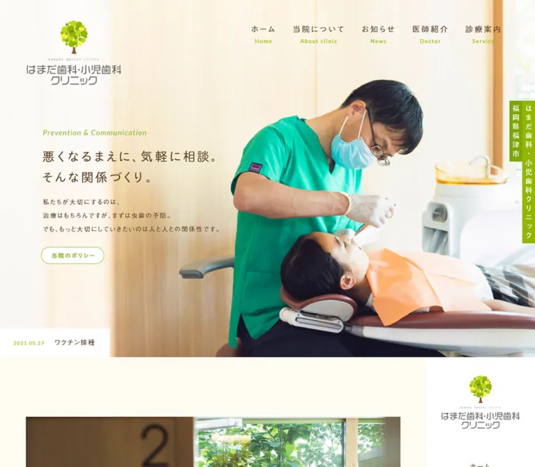
温かな診療写真に、クリーム色の背景、ブラウンの文字、黄緑のアクセントを組み合わせた歯科医院サイト。広い余白と日英併記、右サイドのナビゲーションが特徴。
Hamada Dental Clinic — Style Reference
Warm daylight, brown lettering, and fresh green details make preventive dentistry feel approachable.
Website: hamada-dental.net
Original URL: https://hamada-dental.net/
Final URL: https://hamada-dental.net/
Response: HTTP 200; original and final URLs are identical.
Theme: light, with cream content areas, white navigation surfaces, brown text, and yellow-green accents.
Inspected: supplied capture run dated October 5, 2026, at 06:24 JST; evidence retrieval timestamp 2026-10-04T21:24:28.889Z.
Viewports: desktop 1440 × 1000 CSS pixels; mobile 390 × 844 CSS pixels.
Scope: the current clinic homepage: photographic opening, navigation, policy content, news previews, treatment introductions, clinic information, appointment links, service directory, and footer. Five current-page captures and the supplied rendered DOM/computed-style records are the evidence. Linked pages and the external booking experience were not inspected.
Hamada Dental Clinic uses a warm, spacious visual language built around real treatment photography. Pale wood and daylight in the opening photograph connect naturally with the cream page background. Brown typography softens the clinical subject matter, while yellow-green identifies links, labels, rules, and the tree logo. Text remains mostly regular weight; generous tracking and long line heights provide hierarchy without heavy typography.
The page is the homepage of a multi-page dental practice website. Its structure supports several patient tasks: understanding the practice, reading updates, comparing treatments, checking hours and location, and finding appointments. On desktop, a full-width opening gives way to a narrower content area beside a persistent right navigation rail. The inspected mobile rendering retains a much wider layout and clips substantial content; that limitation is part of the observed reference.
閉じる
Hamada Dental Clinic — Style Reference
Warm daylight, brown lettering, and fresh green details make preventive dentistry feel approachable.
Website: hamada-dental.net
Original URL: https://hamada-dental.net/
Final URL: https://hamada-dental.net/
Response: HTTP 200; original and final URLs are identical.
Theme: light, with cream content areas, white navigation surfaces, brown text, and yellow-green accents.
Inspected: supplied capture run dated October 5, 2026, at 06:24 JST; evidence retrieval timestamp 2026-10-04T21:24:28.889Z.
Viewports: desktop 1440 × 1000 CSS pixels; mobile 390 × 844 CSS pixels.
Scope: the current clinic homepage: photographic opening, navigation, policy content, news previews, treatment introductions, clinic information, appointment links, service directory, and footer. Five current-page captures and the supplied rendered DOM/computed-style records are the evidence. Linked pages and the external booking experience were not inspected.
Hamada Dental Clinic uses a warm, spacious visual language built around real treatment photography. Pale wood and daylight in the opening photograph connect naturally with the cream page background. Brown typography softens the clinical subject matter, while yellow-green identifies links, labels, rules, and the tree logo. Text remains mostly regular weight; generous tracking and long line heights provide hierarchy without heavy typography.
The page is the homepage of a multi-page dental practice website. Its structure supports several patient tasks: understanding the practice, reading updates, comparing treatments, checking hours and location, and finding appointments. On desktop, a full-width opening gives way to a narrower content area beside a persistent right navigation rail. The inspected mobile rendering retains a much wider layout and clips substantial content; that limitation is part of the observed reference.
How to Read This Reference
- Measured values come from the supplied element rectangles and computed styles. All measurements are CSS pixels unless otherwise stated.
- Estimated values describe visible details whose own computed styles were not supplied, including some child labels, image dimensions, footer colors, and decorative lettering.
- Derived values are arithmetic relationships between measured values. They are not recovered source CSS declarations.
- Recommended behavior and code adaptations are explicitly identified. They do not establish that the original implements those features.
- Token names are implementation aliases created for this document. The supplied custom-property inventory contains WordPress presets, but those presets do not establish the visible site's design palette.
- Computed font-family lists identify requested families. They do not independently confirm successful font loading or the font used for every glyph.
- Several links around images have a measured height of
21pxbecause they are inline elements. Those rectangles must not be treated as the visible image dimensions.
Tokens — Colors
Default Palette
| Name | Value | Suggested token | Evidence and role |
|---|---|---|---|
| Cream Canvas | #fdfbf2 |
--clinic-paper |
Measured body background: rgb(253, 251, 242); the principal content field |
| Warm Body Brown | #7a6856 |
--clinic-text |
Measured body and paragraph color: rgb(122, 104, 86) |
| Deep Heading Brown | #5b4023 |
--clinic-heading |
Measured hero copy, treatment headings, and several navigation links |
| Leaf Green | #92b600 |
--clinic-green |
Measured outlined-button text and policy label color |
| Deep Leaf Green | #7fa401 |
--clinic-green-deep |
Measured advanced-treatment section heading color |
| White | #ffffff |
--clinic-white |
Measured right-rail background and outlined-button fill; reversed lettering in identity and booking elements |
| Appointment Brown | #593b1a |
--clinic-booking |
Measured circular appointment-link background |
| Closed-Day Brown | #8a5a26 |
--clinic-closed |
Measured fill of the clinic-information label 休診 |
A clinic-information heading uses the closely related measured brown #7b6855. This is a minor local variation, not evidence of a separate major color system.
Supporting Surface Estimates
These values are visual approximations for reconstruction. Their exact source declarations were not supplied.
| Name | Estimated value | Suggested token | Visible use |
|---|---|---|---|
| Footer Beige | approximately #f7f0e1 |
--clinic-footer |
Broad lower-footer field |
| Contact Blush | approximately #f3e9e1 |
--clinic-contact |
Contact panel at the bottom of the right rail |
| Fine Sand Rule | approximately #eee4d5 |
--clinic-rule |
Directory separators and timetable grid lines |
| Timetable Taupe | approximately #b79a7a |
--clinic-taupe |
Day-header strip in the footer timetable |
| Pale Display Tan | approximately #c6a27e |
--clinic-display |
Large, very thin footer lettering |
The small Instagram icon introduces a pink accent. It is a localized social-platform marker, not a second general action color. Likewise, turquoise clothing and orange protective fabric belong to the photography rather than the UI palette.
Use cream for continuity, white for selected functional surfaces, brown for readable information, and green for navigation and emphasis. The strongest filled action treatment is the small brown booking circle.
Tokens — Typography
Japanese Body Copy
Measured primary family: a-otf-gothic-bbb-pr6n, followed by Japanese system sans-serif fallbacks including Yu Gothic, Hiragino Sans, and Meiryo.
Measured weight: predominantly 400.
The body treatment is light and open. Paragraphs use generous leading and deliberate letter spacing. Preserve this combination when adapting the page: regular weight alone does not produce the same calm rhythm without the long line spacing.
The body's computed default is 14px / 14px, but important paragraphs override it to 28–33px line heights. Do not apply the body element's short line height to the article copy.
Navigation and Buttons
Measured family: tbchibirgothicplusk-pro, sans-serif.
This family is declared on the top navigation, side navigation, service-directory links, and outlined buttons. The visible Japanese labels have a personable, slightly informal character. Avoid replacing the entire interface with heavy geometric typography.
Navigation anchors themselves report 14px / 14px, but their Japanese and English child labels visibly differ in size. Those child styles were not included in the element sample. The anchor's inherited size is therefore not a complete measurement of the visible navigation typography.
English Labels and Display Lettering
The CLINIC POLICY heading explicitly requests Lato, sans-serif, at 18px, weight 400, with 3.6px tracking. This is the only supplied element that directly establishes Lato for that role.
The hero's English phrase is green and italic in the capture. Small English navigation translations are widely tracked. The footer's two-line Hamada Dental Clinic lettering is unusually thin and pale. Their exact individual font declarations were not supplied; do not attribute all English text or the footer display to Lato by assumption.
Type Scale
| Role | Size / line height | Tracking | Status |
|---|---|---|---|
| Body element default | 14px / 14px |
Normal | Measured; local paragraphs override this |
| Hero supporting paragraph | 15px / 33px |
Desktop 3.3px; mobile 2.7px |
Measured |
| Visible Japanese hero slogan | Approximately 28–30px, with roughly 50px line spacing |
Visibly wide; exact value unavailable | Estimated from capture |
| Hero English phrase | Approximately 16–18px, italic |
Visibly tracked | Estimated child appearance |
| Hero heading wrapper | 21px / 21px |
Normal | Measured parent; not the visible slogan's verified glyph size |
| Vertical clinic identity | 17px / 17px |
5.1px |
Measured |
| Outlined button | 15px / 21px |
2.7px |
Measured |
| Policy English label | 18px / 18px |
3.6px |
Measured; Lato requested |
| Policy paragraph | 15px / 30px |
2.25px |
Measured |
| News title | 16px / 25.6px |
1.92px |
Measured |
| News excerpt | 12px / 21.6px |
1.2px |
Measured |
| Primary treatment headline | 19px / 33.25px |
3.04px |
Measured |
| Primary treatment paragraph | 14px / 28px |
1.4px |
Measured |
| Advanced-treatment section heading | 24px / 24px |
4.8px |
Measured |
| Advanced-treatment headline | 23px / 23px |
4.37px |
Measured |
| Advanced-treatment paragraph | 14px / 30.8px |
1.4px |
Measured |
| Side-rail treatment link | Desktop 14px / 14px; mobile 13px / 13px |
2.1px / 1.56px |
Measured |
| Large footer lettering | Approximately 58–60px, very thin |
Visibly loose | Estimated; family and asset type unverified |
The treatment category labels appear smaller, greener, and underlined in the screenshots than their sampled H2 parents' 21px brown declaration. Preserve the visible child treatment, but do not describe those parent values as measurements of the green label itself.
Tokens — Spacing & Shapes
The spacing system is predominantly fixed-pixel and generous. There is no evidence of a single universal spacing unit. Broad section gaps coexist with tightly organized navigation and small controls.
Spacing Scale
| Use | Value | Status |
|---|---|---|
| Top navigation offset | 45px from the top |
Measured |
| Top navigation link padding | Desktop 15px 21.6px; mobile 15px 5.85px |
Measured; horizontal values match 1.5vw at both viewports, but that formula is inferred |
| Side navigation link padding | Desktop 11px 20px; mobile 10px 20px |
Measured |
| Standard outlined-button padding | 9px 20px 11px 24px |
Measured |
| Wider treatment-button padding | 9px 30px 11px 34px |
Measured |
| Hero paragraph to button | 28px between recorded boxes |
Derived |
| News-column gap | Approximately 57px |
Derived from column positions |
| Main service-column gap | 55px |
Derived from 270px columns at 325px intervals |
| Policy section top padding | 145px |
Measured |
| Policy-to-news gap | 100px |
Derived from section rectangles |
| News-to-services gap | 120px |
Derived from section rectangles |
| Service buttons to advanced heading | 115px |
Derived |
| Advanced treatments to following media section | 160px |
Derived |
| Footer directory thumbnail-to-label gap | Approximately 25px |
Estimated from capture |
Border Radius
| Element | Value | Status |
|---|---|---|
| Outlined buttons | 40px |
Measured; produces a pill at 43px height |
| Booking link | 50% |
Measured |
| Main service photographs | Square corners | Observed |
| Footer directory container | Approximately 16px |
Estimated |
| Footer directory thumbnails | Slight rounding, approximately 3px |
Estimated |
| Social icons and back-to-top mark | Circular | Observed |
The primary service teasers have no enclosing rounded-card surface. Their photographs, labels, headlines, paragraphs, and buttons sit directly on the cream canvas.
Layout Measurements
| Element | Desktop 1440 × 1000 |
Mobile 390 × 844 |
Evidence |
|---|---|---|---|
| Document height | 6401.81px |
6346.42px |
Measured |
| Main content start | y = 950.39px |
y = 858px |
Measured |
| Main content width | 1175px |
1035px |
Measured |
| Right rail | x = 1175px, width 265px |
x = 1035px, width 265px |
Measured |
| Main plus rail | 1440px |
1300px |
Derived effective layout width |
| Policy section | 910px wide, x = 132.5px |
910px wide, x = 62.5px |
Measured |
| News section | 880px wide, x = 147.5px |
880px wide, x = 77.5px |
Measured |
| News preview width | 255px |
255px |
Measured |
| Treatment section | 920px wide, x = 127.5px |
920px wide, x = 57.5px |
Measured |
| Primary service text width | 264px |
264px |
Measured |
| Primary service button | 270 × 43px |
270 × 43px |
Measured |
| Advanced-treatment image-link width | 365px |
365px |
Measured inline-link width; image height unavailable |
| Advanced-treatment text width | 455px |
455px |
Measured |
| Media-only section | 970 × 401px |
970 × 401px |
Measured; contents not fully established |
| Footer directory | Approximately 975 × 240px |
Same broad arrangement, beginning at x = 30px |
Derived from cell rectangles and capture |
| Footer directory cell width | Approximately 325px |
Approximately 325px |
Measured |
| Hero policy button | 160.92 × 43px |
160.92 × 43px |
Measured |
Components
Opening Identity and Primary Navigation
Role: establish the clinic's identity and provide access to the principal sections of the website.
The logo occupies the upper-left corner of the photograph. It combines a compact tree made from overlapping green circles, a brown trunk, tiny English lettering, and a gray Japanese wordmark on two lines. The visible opening lockup is approximately 230px wide, beginning around x = 65px, y = 50px.
Six navigation links sit across the upper-right area. Each stacks a Japanese label over a smaller English translation: ホーム / Home, 当院について / About clinic, お知らせ / News, 医師紹介 / Doctor, 診療案内 / Service, and アクセス / Access. Japanese labels are brown; English labels are green in this opening state.
There is no opaque navigation bar across the top. The photograph and its pale background remain visible behind the links. The navigation anchor boxes begin at y = 45px and are 77px high in the supplied desktop measurement.
Photographic Hero
Role: introduce the practice through an actual care relationship and its emphasis on prevention.
A large treatment photograph fills the opening. The clinician in green clothing and the patient occupy the right half, while pale wood and a bright area provide a quiet field for copy on the left. The photograph itself supplies most of the color and visual weight.
The copy begins around x = 122.39px, y = 342.14px on desktop. Its sequence is:
- Green italic English phrase:
Prevention & Communication. - Two-line Japanese statement:
悪くなるまえに、気軽に相談。andそんな関係づくり。. - A brown supporting paragraph with
33pxleading. - A white, green-outlined
当院のポリシーpill.
The policy link points to #sec-policy. The large visible Japanese slogan is not represented by a matching text-and-font measurement in the sampled H2. It may involve unsampled descendants or image content; its implementation type is unverified.
A narrow vertical clinic-name strip sits against the far-right edge. The sampled H1 is 31px wide and 347.5px high, with white 17px lettering and 5.1px tracking. The capture shows green behind the lettering and a shorter adjacent location strip. The H1's own background is transparent, so the green belongs to another layer or element whose style was not sampled.
The left-side brightness is visible in the photograph. The evidence does not establish whether a separate CSS wash or gradient contributes to it.
News Ticker
Role: surface a recent clinic update without interrupting the opening photograph.
A white rectangular strip is anchored at the lower-left edge of the opening. It pairs a small green date with a brown article title. It has square corners and no prominent shadow. Recorded article anchors are 65px high with 24px 36px 24px 32px padding; the visible strip is approximately 70px high.
The DOM contains repeated copies of three news links. Desktop and mobile captures show different active articles. This is consistent with a ticker or slider, but its autoplay interval, transition direction, loop behavior, and pause controls are not established.
For a static adaptation, show one ordinary article link in this slot. Add rotation only when the intended interaction has been specified.
Persistent Right Navigation
Role: keep navigation, treatment links, and contact details available beside the long homepage.
After the opening, the content occupies the left 1175px of the desktop viewport and a white 265px rail occupies the right. In the middle and footer captures, that rail remains aligned with the viewport while the main content changes.
Its anatomy is:
- A smaller tree-and-wordmark lockup near the top, approximately
190pxwide on desktop. - Six centered bilingual navigation entries, each occupying about
64pxvertically. - A separate group of five underlined treatment links, each preceded by a small green right arrow.
- A pale contact panel containing circular Instagram and location icons, the postal address, and a larger telephone number.
English translations in this rail appear pale tan, unlike the opening navigation's green translations. The contact panel occupies approximately the bottom 155px of the 1000px desktop capture.
The screenshots establish the persistent visual result. The supplied styles do not identify whether the original uses CSS sticky positioning, fixed positioning, or a script to produce it.
Clinic Policy
Role: explain the practice's approach before presenting its services.
The measured section is 910px wide, with 145px top padding and a large overall height of 1393px. Its text region is approximately 356px wide. The English CLINIC POLICY label is green, uppercase, and tracked at 0.2em.
Policy paragraphs use 15px text, 30px line height, and 2.25px tracking. Two compact outlined links close the text: one leads to the service page and the other to the practice's three-feature section at /about/#sec-obsession.
The supplied current-page screenshots do not expose the full policy composition. The DOM establishes its text, dimensions, and links, but does not justify inventing the surrounding image arrangement or the content of its text-empty H3.
News Articles
Role: make the practice feel active and provide access to announcements.
Three article previews occupy an 880px row. Each link is 255px wide, with approximately 57px between columns. Titles use regular brown 16px type with 25.6px leading. Excerpts are smaller and lighter in visual emphasis: 12px / 21.6px, with 1.2px tracking.
The current capture shows the lower text portions of these previews. Their rectangles include space above the titles, but that alone does not establish the exact appearance of their media or date treatment.
Keep previews directly on the cream field. Their hierarchy comes from the title, excerpt, spacing, and any supplied media, rather than a heavy enclosing card.
Primary Service Teasers
Role: introduce tooth preservation, checkups, and pediatric care as three parallel paths.
The desktop arrangement is three 270px columns with 55px gaps. Each column contains:
- A rectangular clinical photograph, approximately
270 × 193pxin the capture. - A small green, underlined category label.
- A two-line brown headline at measured
19px / 33.25px. - A paragraph at
14px / 28px. - A full-column outlined pill,
270 × 43px.
The first photograph shows treatment from a wider viewpoint; the second is a close view of an examination; the third shows a smiling patient interacting with the clinician. The imagery moves from procedure to relationship while maintaining a consistent photographic treatment.
Text is inset by approximately 3px relative to the image and button edges. In the capture, the three buttons align horizontally. Reproduce that alignment through flexible column layout rather than inserting arbitrary blank lines into copy.
Advanced Treatment Rows
Role: explain more specialized services with additional detail.
An underlined green heading introduces the group: 歯を残すための、新しい技術が生まれています。. Its measured type is 24px, with 4.8px tracking.
Two stacked rows cover root-canal treatment and pulp regeneration. Each has a 365px image-link width on the left and a 455px text region on the right, separated by approximately 50px. Text stacks a category label, a 23px brown headline, a paragraph with 30.8px leading, and an outlined link.
This is a change in layout rhythm from the three compact service columns. Preserve the wider explanatory row when content needs several sentences; do not compress every service into an identical small card.
Clinic Information and Appointment Links
Role: turn general interest into practical visit planning.
The lower page includes a media-only section measured at 970 × 401px, followed by clinic information. The information contains the clinic name, treatment categories, a timetable, address, telephone number, closed-day information, and appointment guidance. Fragments of exterior and outdoor-detail photographs are visible at the top of the lower desktop capture; a full gallery interaction is not established.
The displayed timetable has two periods, 8:30–13:00 and 14:00–17:30, with green dots from Monday through Saturday and a dash for Sundays and holidays. This is a description of the captured content, not independently verified current availability.
The text states that appointments are required. Both the circular booking link and the inline オンライン予約 link point to https://www.genifix.jp/hamada-dental-caa/. That destination was not opened.
The booking circle uses white lettering on measured #593b1a, accompanied by curved lettering above it. The desktop anchor sample is 45 × 45px, while the visible disk appears closer to 75px; the mobile anchor is measured at 75 × 75px. The source of that desktop difference is unresolved. Treat the entire visible badge and its measured anchor as separate evidence, rather than silently assuming they have identical bounds.
Footer Service Directory
Role: provide a final compact route into every main treatment area.
A white panel approximately 975px wide and 240px high bridges the cream content and beige footer. It has rounded corners, a thin green line near its top edge, and a shallow beige lower edge or shadow.
The panel is organized as three columns by two rows. Five cells contain treatment links; the sixth is a general service-directory link. Each treatment cell pairs an approximately 80 × 80px photograph with a Japanese title and smaller tracked green English subtitle.
The first row's link boxes are 124px high, with 26px top and 18px bottom padding. The second treatment row is 116px high, with 10px top and 26px bottom padding. Column widths are approximately 325px. Fine vertical rules separate neighboring cells within each row.
Use a single grouped panel. The individual cells should retain their shared surface and alignment.
Footer Identity and Opening Hours
Role: end with identity, contact information, practical hours, and a quiet brand statement.
The lower footer uses a broad warm beige field. A large clinic logo and address sit at left, with a prominent, thin telephone number below. A small brown booking badge sits nearby.
The middle contains large, pale, very thin Hamada Dental Clinic lettering on two lines, followed by a compact timetable. The table uses white cells, a muted taupe day-header row, fine warm rules, brown time labels, and green availability dots.
At the right of the main content area, a Japanese relationship-focused phrase runs vertically beside small vertical copyright lettering. A circular brown up-arrow sits below. The observed link target for the up-arrow is #; smooth scrolling was not tested.
The footer logo is approximately 224px wide. In the desktop capture, the timetable is approximately 409px wide. These visible components retain their broad arrangement in the mobile rendering, where much of the middle and right content is outside the viewport.
Tokens — Motion & Interaction
| Treatment | Evidence | What can be concluded |
|---|---|---|
| General links and outlined buttons | Computed transition 0.15s ease-out |
A short transition is declared; the changed property and hover end state were not captured |
| Persistent right rail | Same viewport placement in the middle and footer captures | Persistence after the opening is visible; positioning mechanism and exact trigger are unverified |
| News strip | Repeated DOM entries and different captured articles | A changing-news implementation is plausible; timing and controls are unknown |
| Policy button | Href points to #sec-policy |
In-page navigation target is verified; scrolling animation is unknown |
| Treatment and main navigation | Ordinary internal hrefs in rendered DOM | Destinations are known; their resulting pages were not inspected |
| Booking | External booking href present | Link destination is verified; booking flow and opening mode are unknown |
| Back-to-top mark | Up-arrow appearance and href # |
Intended return-to-top role is supported; easing and duration are unknown |
Offscreen Prev / Next links |
120 × 120px boxes outside the viewport |
These are not visible controls in the supplied stable captures; their owning widget and operation are unverified |
| Loading text | Present in the body sample, absent from stable captures | No visible loader design or duration can be documented |
| Sampled animations | Most sampled elements report animation: none |
This does not rule out animation on unsampled children, pseudo-elements, or through JavaScript |
The collection process waited for load, layout stability, and visible image decoding within stated time limits. It also temporarily paused perpetual animations during readiness checks. Static captures therefore cannot establish a complete motion specification.
For a new implementation, use the measured 150ms ease-out as a restrained link-feedback duration. Specific hover colors, focus behavior, ticker controls, and reduced-motion handling remain implementation recommendations.
Surfaces
| Layer | Appearance | Purpose |
|---|---|---|
| Opening | Full-width daylight photograph with a pale left region | Introduces people, treatment, and the clinic's atmosphere |
| Main canvas | Solid #fdfbf2 |
Continuous background for policy, news, and services |
| Service teasers | Photographs and text directly on the canvas | Keeps the page open and avoids excessive enclosure |
| Persistent navigation | Solid white | Separates orientation and contact tools from the content |
| Outlined links | White fill, green lettering, fine green outline | Small, approachable actions |
| Service directory | White rounded group with a green top rule and shallow lower edge | Consolidates related links near the footer |
| Footer | Estimated warm beige | Soft visual conclusion and practical clinic information |
| Booking badge | Solid dark brown circle with white lettering | Compact, high-contrast appointment access |
| Timetable | White cells, taupe header, fine sand rules | Dense information with restrained structure |
There is no broad elevation system across the page. Most grouping comes from whitespace, column alignment, photographs, and subtle changes in background color.
Imagery
The photography is bright, natural, and specific to dental care. Pale wood, window light, green clothing, clinical equipment, and patient expressions create the atmosphere. The opening photograph carries the strongest composition: a large human scene on the right and enough quiet background at left to support text.
The primary service photographs are square-cornered landscape crops. Footer thumbnails reuse clinical subjects at a smaller square scale. Preserve subject legibility when moving between these formats; a crop suitable for the large treatment scene may lose the relevant tool or expression inside an 80px thumbnail.
The logo uses a clustered circular tree canopy in several yellow-green shades. It is an identity asset, not a generic leaf icon. The tiny English line and gray Japanese wordmark belong to the lockup and should maintain their proportions.
Observed Asset References
The supplied evidence did not include image src URLs or asset filenames. The following references identify visible subjects, not downloadable paths.
| Asset role | Current-page visual evidence | Dimensions and limitations |
|---|---|---|
| Opening photograph | Clinician treating a reclining patient, green clothing, pale wood, orange protective fabric | Large opening crop; native dimensions and source path unavailable |
| Clinic logo | Green circular-leaf tree with gray Japanese wordmark | Approximately 230px wide in the opening, 190px in the desktop rail, 224px in the footer |
| Tooth-preservation teaser | Wider treatment scene | Approximately 270 × 193px visible on desktop |
| Checkup teaser | Close view of a dental examination | Same approximate desktop display format |
| Pediatric teaser | Smiling patient and clinician | Same approximate desktop display format |
| Directory thumbnails | Clinical monitor, examination, patient interaction, microscope work, and blue-toned treatment equipment | Approximately 80 × 80px; exact asset identities unavailable |
| Lower clinic imagery | Partial exterior and outdoor-detail photographs | Only fragments visible in the lower desktop capture |
| Social and location symbols | White symbols inside small colored circles | Approximately 33px diameter; implementation type unverified |
| Footer display lettering | Thin, pale Hamada Dental Clinic lettering |
Font family and image-versus-text implementation unverified |
Use authorized photographs and identity assets when available. CSS can reproduce the layout and typography relationships, but it cannot substitute for the specific clinical scenes or logo.
Layout & Responsive Behavior
Desktop Arrangement
The opening spans the complete 1440px viewport width. The main content begins at approximately 950px down the document. From that point, the layout divides into a 1175px content area and a 265px right rail.
Content sections are centered within the left area, using slightly different widths: 910px for policy, 880px for news, 920px for treatments, and approximately 970–975px for lower media and the footer directory. This subtle variation gives each content type its own alignment while preserving broad outer margins.
Three-column rows alternate with two-column treatment explanations and larger clinic-information areas. Large vertical gaps are part of the rhythm; they should not be replaced with tightly packed card stacks in a desktop reference.
Observed Mobile Rendering
At 390 × 844, the layout does not become a conventional single-column mobile page.
- The main content remains
1035pxwide, followed by the same265pxrail. Together they imply an effective1300pxcanvas. The actual minimum-width declaration was not supplied. - The logo retains its approximately
230pxopening width and65pxleft offset. - Hero copy begins at
x = 104px, leaving only286pxof the viewport to display a text region measured at approximately433pxwide. Its right side is visibly clipped. - The first top-navigation link begins beyond
x = 638px. The navigation is offscreen rather than replaced by an evidenced mobile menu. - The right rail begins at
x = 1035px, outside the mobile viewport. - News remains three
255pxcolumns. The second column starts atx = 389.5px, essentially at the right edge of the viewport. - Service text columns and
270pxbuttons retain their desktop sizes. Their horizontal starting positions remain325pxapart. - The footer directory begins at
x = 30pxand continues far to the right. The mobile footer capture shows only its left portion. - The footer logo, address, telephone number, and booking badge remain visible at left, while much of the timetable and display lettering is offscreen.
There are limited local changes: hero paragraph tracking decreases from 3.3px to 2.7px, the side-rail logo link width becomes 180px, and treatment links in the rail become 13px. These changes do not resolve the overall overflow.
The evidence demonstrates clipping at the captured horizontal position. Horizontal panning, alternate browser configurations, and other mobile states were not tested.
Recommended Reflow Strategy
For a new implementation, keep the desktop composition while replacing the wide mobile canvas with an actual responsive layout. Bring navigation into normal document flow or provide an accessible menu; show photography and hero copy in separate readable regions; stack service columns and advanced-treatment rows; and make the footer directory one column.
Keep the timetable within the viewport where possible. If its content genuinely requires additional width, confine horizontal scrolling to a labeled table container rather than the whole page.
These are improvements, not descriptions of the captured mobile website.
Do’s and Don’ts
Do
- Preserve the measured cream, brown, and yellow-green palette.
- Let the large treatment photograph establish the opening's atmosphere.
- Keep Japanese copy regular in weight, generously tracked, and comfortably spaced vertically.
- Pair Japanese navigation labels with small English translations.
- Maintain the desktop relationship between the wide opening and the narrower content beside a right rail.
- Use square landscape photographs in the primary service row.
- Keep service content directly on the cream canvas, with outlined pills below.
- Give specialized treatment explanations a wider image-and-text layout.
- Reserve the grouped white panel for the footer service directory.
- Keep booking access compact and recognizable through its brown circular treatment.
- Record the observed mobile clipping when documenting fidelity.
Don’t
- Don't treat generic WordPress color and shadow presets as the site's visible design tokens.
- Don't replace the brown-and-green identity with a generic blue medical palette.
- Don't turn every content block into a rounded white card with a large shadow.
- Don't make headings uniformly bold or oversized.
- Don't infer the font size of image-like or nested lettering from its parent H2.
- Don't use inline image-link line-box heights as photograph heights.
- Don't claim a mobile menu, stacked mobile cards, or a responsive timetable was observed.
- Don't invent ticker timing, hover transforms, scroll animations, or gallery controls.
- Don't assign asset paths, font-loading success, or production credits without evidence.
- Don't reproduce the mobile overflow unintentionally in a new patient-facing implementation.
Recommended Implementation Additions
These additions address practical implementation needs; they are not verified features of the original.
- Make every major navigation and appointment destination reachable at narrow widths without page-wide horizontal scrolling.
- Give icon-only links and the back-to-top control meaningful accessible names. The supplied empty link text does not establish whether image alternatives already provide names.
- Preserve readable text alternatives for the logo and any image-rendered headings. Use live text for new substantive copy.
- Validate contrast for small green labels on white and cream. Where necessary, use a separately tested darker green for small text while retaining the original green for decorative rules.
- Provide a visible brown focus outline and comfortable touch targets. The original pill height is measured at
43px; a new implementation can use a minimum of44px. - If news rotates automatically, provide a pause mechanism and keep all articles available through ordinary links.
- Use a semantic timetable with a caption, row and column headers, and text equivalents for availability dots.
- Make the displayed telephone number a
tel:link where appropriate. A telephone href was not present in the supplied link inventory. - Reserve image space through dimensions or aspect ratios. Load the opening image promptly and defer lower-page imagery as appropriate.
- Respect reduced-motion preferences for any added scrolling or ticker behavior.
Agent Prompt Guide
Quick Color Reference
- Main canvas: measured
#fdfbf2. - Body text: measured
#7a6856. - Strong text: measured
#5b4023. - Green links and labels: measured
#92b600. - Advanced section heading: measured
#7fa401. - Navigation rail, buttons, and directory: white.
- Booking circle: measured
#593b1awith white lettering. - Footer background: approximately
#f7f0e1; estimate, not a recovered declaration.
Overall Prompt
“Create a Japanese dental-practice homepage inspired by the current Hamada Dental Clinic reference. Use a warm cream canvas #fdfbf2, regular brown typography, and yellow-green #92b600 details. Open with a large daylight treatment photograph, a tree-and-wordmark identity at upper left, bilingual navigation across the upper right, and a left-aligned prevention message over the photograph's pale region. Below the opening, place spacious policy, news, and service content beside a 265px white right navigation rail. Use three unboxed service columns with landscape photos and green-outlined pill links, followed by wider image-and-text treatment rows. Finish with a shared white service directory and a beige footer containing contact details, a timetable, and a small brown booking circle. Preserve the desktop proportions; implement mobile reflow as an explicitly improved adaptation.”
Example Component Prompts
- Hero: “Compose a bright clinical photograph with a dentist and patient on the right and pale wood or daylight on the left. Place a green italic English phrase above a two-line brown Japanese statement, followed by restrained supporting copy and a
43pxwhite pill outlined in green. Keep the logo and top navigation directly over the photograph.” - Right rail: “Build a
265pxwhite desktop navigation rail with a centered tree logo, six Japanese-over-English links, five smaller underlined treatment links with green arrows, and a pale contact panel at the bottom. Match the persistent appearance with a suitable implementation; do not invent an observed mobile drawer.” - Service teaser: “Use a
270pxcolumn with a square-cornered landscape treatment photo, small underlined green category label, two-line19pxbrown headline,14pxbody copy with28pxleading, and a full-width outlined pill. Place the column directly on cream with55pxgaps between siblings.” - Service directory: “Create one approximately
975pxwhite rounded panel containing a three-by-two directory. Pair80pxsquare clinical thumbnails with Japanese titles and tracked green English subtitles. Add fine vertical separators, a thin inset green top rule, and a shallow beige lower edge.” - Footer: “Use a broad warm beige footer with the clinic logo and address at left, pale thin English display lettering and a compact white timetable in the middle, and a vertical Japanese statement at right. Use a small dark-brown circular booking badge and a matching circular up-arrow.”
- Mobile improvement: “Adapt this desktop clinic composition to
390pxwithout clipping: use readable in-flow navigation, a distinct treatment image above the hero copy, one-column service content, a stacked directory, and a timetable contained within the screen. Label this as a responsive improvement rather than a reconstruction of the observed mobile behavior.”
Quick Start
CSS Custom Properties
The following is a usable reconstruction scaffold, not recovered source CSS. It combines measured colors and common component dimensions with clearly marked visual estimates. The base intentionally approximates the observed wide canvas. Add the clinic-reference--adaptive class to opt into the recommended narrow-screen reflow below.
Use a full-width .clinic-hero, followed by .clinic-layout containing .clinic-main and .clinic-rail. Place service cards inside .service-grid, advanced explanations inside .treatment-row, and the footer directory inside .service-directory. Supply authorized imagery through image elements and --clinic-hero-image; no asset URLs are invented here. An optional .hero-media image is used by the adaptive layout.
:root {
  /* Measured colors */
  --clinic-paper: #fdfbf2;
  --clinic-text: #7a6856;
  --clinic-heading: #5b4023;
  --clinic-green: #92b600;
  --clinic-green-deep: #7fa401;
  --clinic-white: #ffffff;
  --clinic-booking: #593b1a;
  --clinic-closed: #8a5a26;

  /* Estimated supporting colors */
  --clinic-footer: #f7f0e1;
  --clinic-contact: #f3e9e1;
  --clinic-rule: #eee4d5;
  --clinic-taupe: #b79a7a;
  --clinic-display: #c6a27e;

  /* Source-requested families with shortened fallback stacks */
  --clinic-font-body: a-otf-gothic-bbb-pr6n,
    'Yu Gothic Medium', YuGothic, 'Hiragino Sans', Meiryo, sans-serif;
  --clinic-font-ui: tbchibirgothicplusk-pro, sans-serif;
  --clinic-font-label: Lato, sans-serif;

  /* Measured or derived desktop geometry */
  --clinic-rail-width: 265px;
  --clinic-policy-width: 910px;
  --clinic-news-width: 880px;
  --clinic-service-width: 920px;
  --clinic-directory-width: 975px;
  --clinic-service-gap: 55px;
  --clinic-pill-radius: 40px;
  --clinic-link-duration: 150ms;

  /* Reconstruction choices and visual estimates */
  --clinic-canvas-min: 1300px;
  --clinic-panel-radius: 16px;
  --clinic-hero-image: none;
}

* {
  box-sizing: border-box;
}

body {
  margin: 0;
  background: var(--clinic-paper);
}

.clinic-reference {
  min-width: var(--clinic-canvas-min);
  color: var(--clinic-text);
  background: var(--clinic-paper);
  font-family: var(--clinic-font-body);
  font-size: 14px;
  font-weight: 400;
  line-height: 2;
}

.clinic-reference img {
  display: block;
  max-width: 100%;
}

.clinic-reference a {
  color: inherit;
  transition:
    color var(--clinic-link-duration) ease-out,
    background-color var(--clinic-link-duration) ease-out,
    border-color var(--clinic-link-duration) ease-out;
}

.clinic-reference h1,
.clinic-reference h2,
.clinic-reference h3 {
  font-weight: 400;
}

.clinic-hero {
  position: relative;
  height: 950.39px;
  background-color: var(--clinic-paper);
  background-image: var(--clinic-hero-image);
  background-position: center;
  background-size: cover;
}

.hero-logo {
  position: absolute;
  top: 50px;
  left: 65px;
  width: 230px;
}

.hero-nav {
  position: absolute;
  top: 45px;
  right: 60px;
  display: flex;
}

.hero-nav a,
.rail-nav a {
  display: block;
  text-align: center;
  text-decoration: none;
  font-family: var(--clinic-font-ui);
}

.hero-nav a {
  padding: 15px 1.5vw;
}

/* Child-label sizes are visual approximations. */
.nav-jp {
  display: block;
  color: var(--clinic-heading);
  font-size: 18px;
  line-height: 1.4;
  letter-spacing: 0.15em;
}

.nav-en {
  display: block;
  margin-top: 8px;
  color: var(--clinic-green);
  font-size: 12px;
  line-height: 1.4;
  letter-spacing: 0.15em;
}

.hero-copy {
  position: absolute;
  top: 342.14px;
  left: clamp(104px, 8.5vw, 122.4px);
  width: 450px;
  color: var(--clinic-heading);
}

.hero-eyebrow {
  margin: 0;
  color: var(--clinic-green);
  font-size: 18px;
  font-style: italic;
  line-height: 21px;
  letter-spacing: 0.05em;
}

.hero-title {
  margin: 24px 0 14px;
  font-size: 30px;
  line-height: 1.7;
  letter-spacing: 0.14em;
}

.hero-copy > p:not(.hero-eyebrow) {
  margin: 0;
  font-size: 15px;
  line-height: 33px;
  letter-spacing: 3.3px;
}

.clinic-pill {
  display: inline-block;
  padding: 9px 20px 11px 24px;
  border: 1px solid var(--clinic-green);
  border-radius: var(--clinic-pill-radius);
  color: var(--clinic-green) !important;
  background: var(--clinic-white);
  font-family: var(--clinic-font-ui);
  font-size: 15px;
  line-height: 21px;
  letter-spacing: 2.7px;
  text-align: center;
  text-decoration: none;
}

.hero-copy > .clinic-pill {
  margin-top: 28px;
  margin-left: -4px;
}

.hero-identity {
  position: absolute;
  top: 30%;
  right: 0;
  margin: 0;
  padding: 10px 7px;
  color: var(--clinic-white);
  background: var(--clinic-green);
  font-size: 17px;
  line-height: 17px;
  letter-spacing: 5.1px;
  writing-mode: vertical-rl;
}

.hero-media {
  display: none;
}

.news-strip {
  position: absolute;
  bottom: 0;
  left: 0;
  max-width: 100%;
  min-height: 70px;
  background: var(--clinic-white);
}

.news-strip a {
  display: flex;
  align-items: center;
  gap: 24px;
  padding: 24px 36px 24px 32px;
  text-decoration: none;
}

.news-strip time {
  flex: none;
  color: var(--clinic-green);
  font-size: 11px;
  letter-spacing: 0.12em;
}

.clinic-layout {
  display: grid;
  grid-template-columns: minmax(0, 1fr) var(--clinic-rail-width);
  align-items: start;
}

.clinic-main {
  min-width: 0;
}

/* Sticky positioning reconstructs the visible persistence. */
.clinic-rail {
  position: sticky;
  top: 0;
  display: flex;
  flex-direction: column;
  height: 100dvh;
  overflow-y: auto;
  background: var(--clinic-white);
}

.rail-logo {
  width: 190px;
  margin: 45px auto 55px;
}

.rail-nav a {
  min-height: 64px;
  padding: 11px 20px;
}

.rail-nav .nav-en {
  color: var(--clinic-display);
}

.rail-services {
  margin: 35px 0 45px;
  padding: 0 15px 0 50px;
  list-style: none;
}

.rail-services a {
  display: block;
  padding-block: 5px;
  color: var(--clinic-heading);
  font-family: var(--clinic-font-ui);
  font-size: 14px;
  line-height: 19px;
  letter-spacing: 2.1px;
  text-underline-offset: 3px;
}

.rail-services a::before {
  content: '→';
  margin-right: 10px;
  color: var(--clinic-green);
}

.rail-contact {
  margin-top: auto;
  padding: 25px 40px;
  background: var(--clinic-contact);
  color: var(--clinic-heading);
  font-size: 12px;
  line-height: 1.8;
  letter-spacing: 0.08em;
}

.policy-section {
  width: var(--clinic-policy-width);
  margin-inline: auto;
  padding-top: 145px;
}

.policy-copy {
  width: 356px;
}

.policy-label {
  color: var(--clinic-green);
  font-family: var(--clinic-font-label);
  font-size: 18px;
  line-height: 1;
  letter-spacing: 0.2em;
}

.policy-copy p {
  font-size: 15px;
  line-height: 30px;
  letter-spacing: 2.25px;
}

.news-section {
  width: var(--clinic-news-width);
  margin: 100px auto 0;
}

.news-grid {
  display: grid;
  grid-template-columns: repeat(3, 255px);
  justify-content: space-between;
}

.news-card {
  text-decoration: none;
}

.news-card h3 {
  color: var(--clinic-heading);
  font-size: 16px;
  line-height: 1.6;
  letter-spacing: 1.92px;
}

.news-card p {
  font-size: 12px;
  line-height: 1.8;
  letter-spacing: 1.2px;
}

.service-section {
  width: var(--clinic-service-width);
  margin: 120px auto 0;
}

.service-grid {
  display: grid;
  grid-template-columns: repeat(3, 270px);
  gap: var(--clinic-service-gap);
}

.service-card {
  display: flex;
  flex-direction: column;
  min-width: 0;
}

.service-card > img,
.service-card > a:first-child img {
  width: 100%;
  aspect-ratio: 270 / 193;
  object-fit: cover;
}

.service-label {
  margin: 26px 3px 18px;
  color: var(--clinic-green-deep);
  font-size: 14px;
  letter-spacing: 0.15em;
  text-decoration: underline;
  text-underline-offset: 5px;
}

.service-card h3 {
  margin: 0 3px 16px;
  color: var(--clinic-heading);
  font-size: 19px;
  line-height: 33.25px;
  letter-spacing: 3.04px;
}

.service-card p {
  margin: 0 3px 29px;
  font-size: 14px;
  line-height: 28px;
  letter-spacing: 1.4px;
}

.service-card > .clinic-pill {
  display: block;
  width: 100%;
  margin-top: auto;
}

.advanced-heading {
  margin: 115px 0 50px;
  color: var(--clinic-green-deep);
  font-size: 24px;
  line-height: 1.5;
  letter-spacing: 4.8px;
  text-decoration: underline;
  text-underline-offset: 7px;
}

.treatment-row {
  display: grid;
  grid-template-columns: 365px 455px;
  gap: 50px;
  align-items: start;
  margin-bottom: 70px;
}

.treatment-row img {
  width: 100%;
  height: auto;
}

.treatment-copy h3 {
  color: var(--clinic-heading);
  font-size: 23px;
  line-height: 1.5;
  letter-spacing: 4.37px;
}

.treatment-copy p {
  font-size: 14px;
  line-height: 30.8px;
  letter-spacing: 1.4px;
}

/* The gradient reconstructs the visible footer boundary. */
.clinic-footer {
  margin-top: 160px;
  background: linear-gradient(
    to bottom,
    var(--clinic-paper) 180px,
    var(--clinic-footer) 180px
  );
}

.service-directory {
  position: relative;
  display: grid;
  grid-template-columns: repeat(3, 1fr);
  width: var(--clinic-directory-width);
  margin-inline: auto;
  border-radius: var(--clinic-panel-radius);
  background: var(--clinic-white);
  box-shadow: 0 3px 0 #e5dac7;
}

.service-directory::before {
  content: '';
  position: absolute;
  top: 0;
  right: 15px;
  left: 15px;
  height: 3px;
  background: var(--clinic-green);
}

.directory-cell {
  position: relative;
  display: flex;
  align-items: center;
  gap: 25px;
  min-width: 0;
  min-height: 124px;
  padding: 26px 18px 18px 28px;
  font-family: var(--clinic-font-ui);
  text-decoration: none;
}

.directory-cell:nth-child(n + 4) {
  min-height: 116px;
  padding-top: 10px;
  padding-bottom: 26px;
}

.directory-cell:not(:nth-child(3n))::after {
  content: '';
  position: absolute;
  top: 26px;
  right: 0;
  bottom: 18px;
  width: 1px;
  background: var(--clinic-rule);
}

.directory-cell:nth-child(n + 4)::after {
  top: 10px;
  bottom: 26px;
}

.directory-cell img {
  flex: 0 0 80px;
  width: 80px;
  height: 80px;
  border-radius: 3px;
  object-fit: cover;
}

.directory-jp {
  display: block;
  color: var(--clinic-heading);
  font-size: 18px;
  line-height: 1.5;
  letter-spacing: 0.12em;
}

.directory-en {
  display: block;
  margin-top: 4px;
  color: var(--clinic-green);
  font-size: 13px;
  line-height: 1.5;
  letter-spacing: 0.15em;
}

.footer-base {
  display: grid;
  grid-template-columns: 285px 409px 1fr;
  gap: 50px;
  width: 975px;
  margin-inline: auto;
  padding: 110px 5px 70px;
}

.footer-logo {
  width: 224px;
}

/* This fallback is an approximation, not a verified display face. */
.footer-display {
  margin: 0 0 30px;
  color: var(--clinic-display);
  font-family: sans-serif;
  font-size: 58px;
  font-weight: 200;
  line-height: 1.12;
  letter-spacing: 0.04em;
}

.hours-scroll {
  max-width: 100%;
  overflow-x: auto;
}

.hours-table {
  width: 100%;
  border-collapse: collapse;
  background: var(--clinic-white);
  color: var(--clinic-heading);
  font-size: 14px;
  text-align: center;
}

.hours-table th,
.hours-table td {
  padding: 8px;
  border: 1px solid var(--clinic-rule);
  font-weight: 400;
  white-space: nowrap;
}

.hours-table thead {
  color: var(--clinic-white);
  background: var(--clinic-taupe);
}

.hours-table .available {
  color: var(--clinic-green);
}

.booking-link {
  display: grid;
  place-content: center;
  width: 75px;
  height: 75px;
  border-radius: 50%;
  color: var(--clinic-white) !important;
  background: var(--clinic-booking);
  font-size: 13px;
  line-height: 1.25;
  text-align: center;
  text-decoration: none;
}

.footer-statement {
  color: var(--clinic-heading);
  font-size: 22px;
  letter-spacing: 0.2em;
  writing-mode: vertical-rl;
}

/* Recommended focus treatment; not an observed source state. */
.clinic-reference :focus-visible {
  outline: 2px solid var(--clinic-heading);
  outline-offset: 4px;
}

/* Capture-target approximation, not a recovered source breakpoint. */
@media (max-width: 1300px) {
  .clinic-hero {
    height: 858px;
  }

  .hero-copy {
    top: 308.875px;
    width: 433px;
  }

  .hero-copy > p:not(.hero-eyebrow) {
    letter-spacing: 2.7px;
  }
}

/* Optional responsive improvement. The original capture clips. */
.clinic-reference--adaptive {
  min-width: 0;
}

@media (max-width: 81.25rem) {
  .clinic-reference--adaptive .clinic-layout {
    grid-template-columns: minmax(0, 1fr);
  }

  .clinic-reference--adaptive .clinic-rail {
    position: static;
    height: auto;
    overflow: visible;
  }

  .clinic-reference--adaptive .clinic-hero {
    height: auto;
    padding: 24px;
    background-image: none;
  }

  .clinic-reference--adaptive .hero-logo {
    position: static;
    width: min(230px, 75%);
    margin: 0 auto 28px;
  }

  .clinic-reference--adaptive .hero-nav {
    position: static;
    display: grid;
    grid-template-columns: repeat(2, minmax(0, 1fr));
    margin-bottom: 28px;
  }

  .clinic-reference--adaptive .hero-nav a {
    min-height: 44px;
    padding: 12px 4px;
  }

  .clinic-reference--adaptive .hero-media {
    display: block;
    width: 100%;
    aspect-ratio: 4 / 3;
    object-fit: cover;
    object-position: 65% center;
  }

  .clinic-reference--adaptive .hero-copy {
    position: static;
    width: auto;
    margin-top: 32px;
  }

  .clinic-reference--adaptive .hero-title {
    font-size: clamp(24px, 5vw, 30px);
  }

  .clinic-reference--adaptive .hero-copy br {
    display: none;
  }

  .clinic-reference--adaptive .hero-identity {
    position: static;
    width: fit-content;
    margin-top: 24px;
    line-height: 1.6;
    letter-spacing: 0.1em;
    writing-mode: horizontal-tb;
  }

  .clinic-reference--adaptive .news-strip {
    position: static;
    margin-top: 32px;
  }

  .clinic-reference--adaptive .news-strip a {
    flex-wrap: wrap;
    gap: 8px 20px;
    padding: 20px;
  }

  .clinic-reference--adaptive .policy-section,
  .clinic-reference--adaptive .news-section,
  .clinic-reference--adaptive .service-section,
  .clinic-reference--adaptive .service-directory,
  .clinic-reference--adaptive .footer-base {
    width: min(920px, calc(100% - 40px));
  }

  .clinic-reference--adaptive .policy-copy {
    width: min(100%, 36rem);
  }

  .clinic-reference--adaptive .policy-section {
    padding-top: 64px;
  }

  .clinic-reference--adaptive .news-grid,
  .clinic-reference--adaptive .service-grid,
  .clinic-reference--adaptive .treatment-row,
  .clinic-reference--adaptive .service-directory,
  .clinic-reference--adaptive .footer-base {
    grid-template-columns: minmax(0, 1fr);
    gap: 40px;
  }

  .clinic-reference--adaptive .service-directory {
    gap: 0;
  }

  .clinic-reference--adaptive .directory-cell {
    min-height: 120px;
    padding: 20px;
  }

  .clinic-reference--adaptive .directory-cell::after {
    display: none;
  }

  .clinic-reference--adaptive .directory-cell + .directory-cell {
    border-top: 1px solid var(--clinic-rule);
  }

  .clinic-reference--adaptive .footer-display {
    font-size: clamp(38px, 8vw, 58px);
  }

  .clinic-reference--adaptive .footer-statement {
    writing-mode: horizontal-tb;
  }

  .clinic-reference--adaptive .clinic-pill {
    min-height: 44px;
  }
}

@media (prefers-reduced-motion: reduce) {
  .clinic-reference a {
    transition: none;
  }
}
The scaffold does not implement the unverified ticker, recreate curved booking lettering, load fonts, or supply the original photographs. It also avoids inventing the incompletely pictured policy-media composition. For visual fidelity, resolve those details through authorized assets and additional direct evidence.
Tailwind v4 Token Mapping
Optional aliases for a project already using Tailwind v4. This is an implementation convenience, not evidence that the original website uses Tailwind. Define the custom properties above first.
@theme inline {
  --color-clinic-paper: var(--clinic-paper);
  --color-clinic-text: var(--clinic-text);
  --color-clinic-heading: var(--clinic-heading);
  --color-clinic-green: var(--clinic-green);
  --color-clinic-green-deep: var(--clinic-green-deep);
  --color-clinic-booking: var(--clinic-booking);
  --color-clinic-footer: var(--clinic-footer);
  --color-clinic-rule: var(--clinic-rule);

  --font-clinic-body: var(--clinic-font-body);
  --font-clinic-ui: var(--clinic-font-ui);
  --font-clinic-label: var(--clinic-font-label);

  --spacing-clinic-rail: 265px;
  --spacing-clinic-service: 270px;
  --spacing-clinic-service-gap: 55px;
  --radius-clinic-pill: 40px;
  --radius-clinic-panel: 16px;
}
Sources & Evidence
- Inspected original and final page: Hamada Dental Clinic. The supplied browser record reports HTTP 200 with no change of URL.
- Capture date: evidence retrieved at
2026-10-04T21:24:28.889Z, corresponding to October 5, 2026, at 06:24:28.889 JST. - Desktop evidence: three current-page captures at
1440 × 1000, covering the opening, a middle news/service position, and the lower page/footer; rendered document height approximately6402px. - Mobile evidence: two current-page captures at
390 × 844, covering the opening and footer; rendered document height approximately6346px. - Rendered measurements: supplied element rectangles, computed colors, requested font families, font sizes, weights, line heights, letter spacing, padding, radii, transitions, and link destinations. Image source URLs and complete stylesheet rules were not supplied.
- Interaction evidence: settled page positions after scrolling, persistent desktop rail appearance, and rendered href targets. No supplied record establishes clicked hover states, booking completion, gallery operation, smooth scrolling, or a mobile-menu interaction.
- Inspection limits: readiness checks had finite timeouts; delayed content and unexercised behavior remain unverified. Perpetual animations were temporarily paused during readiness checks. SharedWorkers and service workers were disabled during collection. Other viewport sizes, browser variants, keyboard flows, and loaded-font resolution were not separately tested.
This reference describes the supplied current homepage evidence. Exact values, visual estimates, derived geometry, and implementation recommendations are identified separately throughout.
# Hamada Dental Clinic — Style Reference

> Warm daylight, brown lettering, and fresh green details make preventive dentistry feel approachable.

**Website:** [hamada-dental.net](https://hamada-dental.net/)
**Original URL:** https://hamada-dental.net/
**Final URL:** https://hamada-dental.net/
**Response:** HTTP 200; original and final URLs are identical.
**Theme:** light, with cream content areas, white navigation surfaces, brown text, and yellow-green accents.
**Inspected:** supplied capture run dated October 5, 2026, at 06:24 JST; evidence retrieval timestamp `2026-10-04T21:24:28.889Z`.
**Viewports:** desktop `1440 × 1000` CSS pixels; mobile `390 × 844` CSS pixels.
**Scope:** the current clinic homepage: photographic opening, navigation, policy content, news previews, treatment introductions, clinic information, appointment links, service directory, and footer. Five current-page captures and the supplied rendered DOM/computed-style records are the evidence. Linked pages and the external booking experience were not inspected.

Hamada Dental Clinic uses a warm, spacious visual language built around real treatment photography. Pale wood and daylight in the opening photograph connect naturally with the cream page background. Brown typography softens the clinical subject matter, while yellow-green identifies links, labels, rules, and the tree logo. Text remains mostly regular weight; generous tracking and long line heights provide hierarchy without heavy typography.

The page is the homepage of a multi-page dental practice website. Its structure supports several patient tasks: understanding the practice, reading updates, comparing treatments, checking hours and location, and finding appointments. On desktop, a full-width opening gives way to a narrower content area beside a persistent right navigation rail. The inspected mobile rendering retains a much wider layout and clips substantial content; that limitation is part of the observed reference.
閉じる
# Hamada Dental Clinic — Style Reference

> Warm daylight, brown lettering, and fresh green details make preventive dentistry feel approachable.

**Website:** [hamada-dental.net](https://hamada-dental.net/)
**Original URL:** https://hamada-dental.net/
**Final URL:** https://hamada-dental.net/
**Response:** HTTP 200; original and final URLs are identical.
**Theme:** light, with cream content areas, white navigation surfaces, brown text, and yellow-green accents.
**Inspected:** supplied capture run dated October 5, 2026, at 06:24 JST; evidence retrieval timestamp `2026-10-04T21:24:28.889Z`.
**Viewports:** desktop `1440 × 1000` CSS pixels; mobile `390 × 844` CSS pixels.
**Scope:** the current clinic homepage: photographic opening, navigation, policy content, news previews, treatment introductions, clinic information, appointment links, service directory, and footer. Five current-page captures and the supplied rendered DOM/computed-style records are the evidence. Linked pages and the external booking experience were not inspected.

Hamada Dental Clinic uses a warm, spacious visual language built around real treatment photography. Pale wood and daylight in the opening photograph connect naturally with the cream page background. Brown typography softens the clinical subject matter, while yellow-green identifies links, labels, rules, and the tree logo. Text remains mostly regular weight; generous tracking and long line heights provide hierarchy without heavy typography.

The page is the homepage of a multi-page dental practice website. Its structure supports several patient tasks: understanding the practice, reading updates, comparing treatments, checking hours and location, and finding appointments. On desktop, a full-width opening gives way to a narrower content area beside a persistent right navigation rail. The inspected mobile rendering retains a much wider layout and clips substantial content; that limitation is part of the observed reference.

## How to Read This Reference

- **Measured** values come from the supplied element rectangles and computed styles. All measurements are CSS pixels unless otherwise stated.
- **Estimated** values describe visible details whose own computed styles were not supplied, including some child labels, image dimensions, footer colors, and decorative lettering.
- **Derived** values are arithmetic relationships between measured values. They are not recovered source CSS declarations.
- **Recommended** behavior and code adaptations are explicitly identified. They do not establish that the original implements those features.
- Token names are implementation aliases created for this document. The supplied custom-property inventory contains WordPress presets, but those presets do not establish the visible site's design palette.
- Computed font-family lists identify requested families. They do not independently confirm successful font loading or the font used for every glyph.
- Several links around images have a measured height of `21px` because they are inline elements. Those rectangles must not be treated as the visible image dimensions.

## Tokens — Colors

### Default Palette

| Name | Value | Suggested token | Evidence and role |
| --- | --- | --- | --- |
| Cream Canvas | `#fdfbf2` | `--clinic-paper` | Measured body background: `rgb(253, 251, 242)`; the principal content field |
| Warm Body Brown | `#7a6856` | `--clinic-text` | Measured body and paragraph color: `rgb(122, 104, 86)` |
| Deep Heading Brown | `#5b4023` | `--clinic-heading` | Measured hero copy, treatment headings, and several navigation links |
| Leaf Green | `#92b600` | `--clinic-green` | Measured outlined-button text and policy label color |
| Deep Leaf Green | `#7fa401` | `--clinic-green-deep` | Measured advanced-treatment section heading color |
| White | `#ffffff` | `--clinic-white` | Measured right-rail background and outlined-button fill; reversed lettering in identity and booking elements |
| Appointment Brown | `#593b1a` | `--clinic-booking` | Measured circular appointment-link background |
| Closed-Day Brown | `#8a5a26` | `--clinic-closed` | Measured fill of the clinic-information label `休診` |

A clinic-information heading uses the closely related measured brown `#7b6855`. This is a minor local variation, not evidence of a separate major color system.

### Supporting Surface Estimates

These values are visual approximations for reconstruction. Their exact source declarations were not supplied.

| Name | Estimated value | Suggested token | Visible use |
| --- | --- | --- | --- |
| Footer Beige | approximately `#f7f0e1` | `--clinic-footer` | Broad lower-footer field |
| Contact Blush | approximately `#f3e9e1` | `--clinic-contact` | Contact panel at the bottom of the right rail |
| Fine Sand Rule | approximately `#eee4d5` | `--clinic-rule` | Directory separators and timetable grid lines |
| Timetable Taupe | approximately `#b79a7a` | `--clinic-taupe` | Day-header strip in the footer timetable |
| Pale Display Tan | approximately `#c6a27e` | `--clinic-display` | Large, very thin footer lettering |

The small Instagram icon introduces a pink accent. It is a localized social-platform marker, not a second general action color. Likewise, turquoise clothing and orange protective fabric belong to the photography rather than the UI palette.

Use cream for continuity, white for selected functional surfaces, brown for readable information, and green for navigation and emphasis. The strongest filled action treatment is the small brown booking circle.

## Tokens — Typography

### Japanese Body Copy

**Measured primary family:** `a-otf-gothic-bbb-pr6n`, followed by Japanese system sans-serif fallbacks including Yu Gothic, Hiragino Sans, and Meiryo.

**Measured weight:** predominantly `400`.

The body treatment is light and open. Paragraphs use generous leading and deliberate letter spacing. Preserve this combination when adapting the page: regular weight alone does not produce the same calm rhythm without the long line spacing.

The body's computed default is `14px / 14px`, but important paragraphs override it to `28–33px` line heights. Do not apply the body element's short line height to the article copy.

### Navigation and Buttons

**Measured family:** `tbchibirgothicplusk-pro, sans-serif`.

This family is declared on the top navigation, side navigation, service-directory links, and outlined buttons. The visible Japanese labels have a personable, slightly informal character. Avoid replacing the entire interface with heavy geometric typography.

Navigation anchors themselves report `14px / 14px`, but their Japanese and English child labels visibly differ in size. Those child styles were not included in the element sample. The anchor's inherited size is therefore not a complete measurement of the visible navigation typography.

### English Labels and Display Lettering

The `CLINIC POLICY` heading explicitly requests `Lato, sans-serif`, at `18px`, weight `400`, with `3.6px` tracking. This is the only supplied element that directly establishes Lato for that role.

The hero's English phrase is green and italic in the capture. Small English navigation translations are widely tracked. The footer's two-line `Hamada Dental Clinic` lettering is unusually thin and pale. Their exact individual font declarations were not supplied; do not attribute all English text or the footer display to Lato by assumption.

### Type Scale

| Role | Size / line height | Tracking | Status |
| --- | --- | --- | --- |
| Body element default | `14px / 14px` | Normal | Measured; local paragraphs override this |
| Hero supporting paragraph | `15px / 33px` | Desktop `3.3px`; mobile `2.7px` | Measured |
| Visible Japanese hero slogan | Approximately `28–30px`, with roughly `50px` line spacing | Visibly wide; exact value unavailable | Estimated from capture |
| Hero English phrase | Approximately `16–18px`, italic | Visibly tracked | Estimated child appearance |
| Hero heading wrapper | `21px / 21px` | Normal | Measured parent; not the visible slogan's verified glyph size |
| Vertical clinic identity | `17px / 17px` | `5.1px` | Measured |
| Outlined button | `15px / 21px` | `2.7px` | Measured |
| Policy English label | `18px / 18px` | `3.6px` | Measured; Lato requested |
| Policy paragraph | `15px / 30px` | `2.25px` | Measured |
| News title | `16px / 25.6px` | `1.92px` | Measured |
| News excerpt | `12px / 21.6px` | `1.2px` | Measured |
| Primary treatment headline | `19px / 33.25px` | `3.04px` | Measured |
| Primary treatment paragraph | `14px / 28px` | `1.4px` | Measured |
| Advanced-treatment section heading | `24px / 24px` | `4.8px` | Measured |
| Advanced-treatment headline | `23px / 23px` | `4.37px` | Measured |
| Advanced-treatment paragraph | `14px / 30.8px` | `1.4px` | Measured |
| Side-rail treatment link | Desktop `14px / 14px`; mobile `13px / 13px` | `2.1px` / `1.56px` | Measured |
| Large footer lettering | Approximately `58–60px`, very thin | Visibly loose | Estimated; family and asset type unverified |

The treatment category labels appear smaller, greener, and underlined in the screenshots than their sampled H2 parents' `21px` brown declaration. Preserve the visible child treatment, but do not describe those parent values as measurements of the green label itself.

## Tokens — Spacing & Shapes

The spacing system is predominantly fixed-pixel and generous. There is no evidence of a single universal spacing unit. Broad section gaps coexist with tightly organized navigation and small controls.

### Spacing Scale

| Use | Value | Status |
| --- | --- | --- |
| Top navigation offset | `45px` from the top | Measured |
| Top navigation link padding | Desktop `15px 21.6px`; mobile `15px 5.85px` | Measured; horizontal values match `1.5vw` at both viewports, but that formula is inferred |
| Side navigation link padding | Desktop `11px 20px`; mobile `10px 20px` | Measured |
| Standard outlined-button padding | `9px 20px 11px 24px` | Measured |
| Wider treatment-button padding | `9px 30px 11px 34px` | Measured |
| Hero paragraph to button | `28px` between recorded boxes | Derived |
| News-column gap | Approximately `57px` | Derived from column positions |
| Main service-column gap | `55px` | Derived from `270px` columns at `325px` intervals |
| Policy section top padding | `145px` | Measured |
| Policy-to-news gap | `100px` | Derived from section rectangles |
| News-to-services gap | `120px` | Derived from section rectangles |
| Service buttons to advanced heading | `115px` | Derived |
| Advanced treatments to following media section | `160px` | Derived |
| Footer directory thumbnail-to-label gap | Approximately `25px` | Estimated from capture |

### Border Radius

| Element | Value | Status |
| --- | --- | --- |
| Outlined buttons | `40px` | Measured; produces a pill at `43px` height |
| Booking link | `50%` | Measured |
| Main service photographs | Square corners | Observed |
| Footer directory container | Approximately `16px` | Estimated |
| Footer directory thumbnails | Slight rounding, approximately `3px` | Estimated |
| Social icons and back-to-top mark | Circular | Observed |

The primary service teasers have no enclosing rounded-card surface. Their photographs, labels, headlines, paragraphs, and buttons sit directly on the cream canvas.

### Layout Measurements

| Element | Desktop `1440 × 1000` | Mobile `390 × 844` | Evidence |
| --- | --- | --- | --- |
| Document height | `6401.81px` | `6346.42px` | Measured |
| Main content start | `y = 950.39px` | `y = 858px` | Measured |
| Main content width | `1175px` | `1035px` | Measured |
| Right rail | `x = 1175px`, width `265px` | `x = 1035px`, width `265px` | Measured |
| Main plus rail | `1440px` | `1300px` | Derived effective layout width |
| Policy section | `910px` wide, `x = 132.5px` | `910px` wide, `x = 62.5px` | Measured |
| News section | `880px` wide, `x = 147.5px` | `880px` wide, `x = 77.5px` | Measured |
| News preview width | `255px` | `255px` | Measured |
| Treatment section | `920px` wide, `x = 127.5px` | `920px` wide, `x = 57.5px` | Measured |
| Primary service text width | `264px` | `264px` | Measured |
| Primary service button | `270 × 43px` | `270 × 43px` | Measured |
| Advanced-treatment image-link width | `365px` | `365px` | Measured inline-link width; image height unavailable |
| Advanced-treatment text width | `455px` | `455px` | Measured |
| Media-only section | `970 × 401px` | `970 × 401px` | Measured; contents not fully established |
| Footer directory | Approximately `975 × 240px` | Same broad arrangement, beginning at `x = 30px` | Derived from cell rectangles and capture |
| Footer directory cell width | Approximately `325px` | Approximately `325px` | Measured |
| Hero policy button | `160.92 × 43px` | `160.92 × 43px` | Measured |

## Components

### Opening Identity and Primary Navigation

**Role:** establish the clinic's identity and provide access to the principal sections of the website.

The logo occupies the upper-left corner of the photograph. It combines a compact tree made from overlapping green circles, a brown trunk, tiny English lettering, and a gray Japanese wordmark on two lines. The visible opening lockup is approximately `230px` wide, beginning around `x = 65px`, `y = 50px`.

Six navigation links sit across the upper-right area. Each stacks a Japanese label over a smaller English translation: `ホーム / Home`, `当院について / About clinic`, `お知らせ / News`, `医師紹介 / Doctor`, `診療案内 / Service`, and `アクセス / Access`. Japanese labels are brown; English labels are green in this opening state.

There is no opaque navigation bar across the top. The photograph and its pale background remain visible behind the links. The navigation anchor boxes begin at `y = 45px` and are `77px` high in the supplied desktop measurement.

### Photographic Hero

**Role:** introduce the practice through an actual care relationship and its emphasis on prevention.

A large treatment photograph fills the opening. The clinician in green clothing and the patient occupy the right half, while pale wood and a bright area provide a quiet field for copy on the left. The photograph itself supplies most of the color and visual weight.

The copy begins around `x = 122.39px`, `y = 342.14px` on desktop. Its sequence is:

1. Green italic English phrase: `Prevention & Communication`.
2. Two-line Japanese statement: `悪くなるまえに、気軽に相談。` and `そんな関係づくり。`.
3. A brown supporting paragraph with `33px` leading.
4. A white, green-outlined `当院のポリシー` pill.

The policy link points to `#sec-policy`. The large visible Japanese slogan is not represented by a matching text-and-font measurement in the sampled H2. It may involve unsampled descendants or image content; its implementation type is unverified.

A narrow vertical clinic-name strip sits against the far-right edge. The sampled H1 is `31px` wide and `347.5px` high, with white `17px` lettering and `5.1px` tracking. The capture shows green behind the lettering and a shorter adjacent location strip. The H1's own background is transparent, so the green belongs to another layer or element whose style was not sampled.

The left-side brightness is visible in the photograph. The evidence does not establish whether a separate CSS wash or gradient contributes to it.

### News Ticker

**Role:** surface a recent clinic update without interrupting the opening photograph.

A white rectangular strip is anchored at the lower-left edge of the opening. It pairs a small green date with a brown article title. It has square corners and no prominent shadow. Recorded article anchors are `65px` high with `24px 36px 24px 32px` padding; the visible strip is approximately `70px` high.

The DOM contains repeated copies of three news links. Desktop and mobile captures show different active articles. This is consistent with a ticker or slider, but its autoplay interval, transition direction, loop behavior, and pause controls are not established.

For a static adaptation, show one ordinary article link in this slot. Add rotation only when the intended interaction has been specified.

### Persistent Right Navigation

**Role:** keep navigation, treatment links, and contact details available beside the long homepage.

After the opening, the content occupies the left `1175px` of the desktop viewport and a white `265px` rail occupies the right. In the middle and footer captures, that rail remains aligned with the viewport while the main content changes.

Its anatomy is:

- A smaller tree-and-wordmark lockup near the top, approximately `190px` wide on desktop.
- Six centered bilingual navigation entries, each occupying about `64px` vertically.
- A separate group of five underlined treatment links, each preceded by a small green right arrow.
- A pale contact panel containing circular Instagram and location icons, the postal address, and a larger telephone number.

English translations in this rail appear pale tan, unlike the opening navigation's green translations. The contact panel occupies approximately the bottom `155px` of the `1000px` desktop capture.

The screenshots establish the persistent visual result. The supplied styles do not identify whether the original uses CSS sticky positioning, fixed positioning, or a script to produce it.

### Clinic Policy

**Role:** explain the practice's approach before presenting its services.

The measured section is `910px` wide, with `145px` top padding and a large overall height of `1393px`. Its text region is approximately `356px` wide. The English `CLINIC POLICY` label is green, uppercase, and tracked at `0.2em`.

Policy paragraphs use `15px` text, `30px` line height, and `2.25px` tracking. Two compact outlined links close the text: one leads to the service page and the other to the practice's three-feature section at `/about/#sec-obsession`.

The supplied current-page screenshots do not expose the full policy composition. The DOM establishes its text, dimensions, and links, but does not justify inventing the surrounding image arrangement or the content of its text-empty H3.

### News Articles

**Role:** make the practice feel active and provide access to announcements.

Three article previews occupy an `880px` row. Each link is `255px` wide, with approximately `57px` between columns. Titles use regular brown `16px` type with `25.6px` leading. Excerpts are smaller and lighter in visual emphasis: `12px / 21.6px`, with `1.2px` tracking.

The current capture shows the lower text portions of these previews. Their rectangles include space above the titles, but that alone does not establish the exact appearance of their media or date treatment.

Keep previews directly on the cream field. Their hierarchy comes from the title, excerpt, spacing, and any supplied media, rather than a heavy enclosing card.

### Primary Service Teasers

**Role:** introduce tooth preservation, checkups, and pediatric care as three parallel paths.

The desktop arrangement is three `270px` columns with `55px` gaps. Each column contains:

1. A rectangular clinical photograph, approximately `270 × 193px` in the capture.
2. A small green, underlined category label.
3. A two-line brown headline at measured `19px / 33.25px`.
4. A paragraph at `14px / 28px`.
5. A full-column outlined pill, `270 × 43px`.

The first photograph shows treatment from a wider viewpoint; the second is a close view of an examination; the third shows a smiling patient interacting with the clinician. The imagery moves from procedure to relationship while maintaining a consistent photographic treatment.

Text is inset by approximately `3px` relative to the image and button edges. In the capture, the three buttons align horizontally. Reproduce that alignment through flexible column layout rather than inserting arbitrary blank lines into copy.

### Advanced Treatment Rows

**Role:** explain more specialized services with additional detail.

An underlined green heading introduces the group: `歯を残すための、新しい技術が生まれています。`. Its measured type is `24px`, with `4.8px` tracking.

Two stacked rows cover root-canal treatment and pulp regeneration. Each has a `365px` image-link width on the left and a `455px` text region on the right, separated by approximately `50px`. Text stacks a category label, a `23px` brown headline, a paragraph with `30.8px` leading, and an outlined link.

This is a change in layout rhythm from the three compact service columns. Preserve the wider explanatory row when content needs several sentences; do not compress every service into an identical small card.

### Clinic Information and Appointment Links

**Role:** turn general interest into practical visit planning.

The lower page includes a media-only section measured at `970 × 401px`, followed by clinic information. The information contains the clinic name, treatment categories, a timetable, address, telephone number, closed-day information, and appointment guidance. Fragments of exterior and outdoor-detail photographs are visible at the top of the lower desktop capture; a full gallery interaction is not established.

The displayed timetable has two periods, `8:30–13:00` and `14:00–17:30`, with green dots from Monday through Saturday and a dash for Sundays and holidays. This is a description of the captured content, not independently verified current availability.

The text states that appointments are required. Both the circular booking link and the inline `オンライン予約` link point to `https://www.genifix.jp/hamada-dental-caa/`. That destination was not opened.

The booking circle uses white lettering on measured `#593b1a`, accompanied by curved lettering above it. The desktop anchor sample is `45 × 45px`, while the visible disk appears closer to `75px`; the mobile anchor is measured at `75 × 75px`. The source of that desktop difference is unresolved. Treat the entire visible badge and its measured anchor as separate evidence, rather than silently assuming they have identical bounds.

### Footer Service Directory

**Role:** provide a final compact route into every main treatment area.

A white panel approximately `975px` wide and `240px` high bridges the cream content and beige footer. It has rounded corners, a thin green line near its top edge, and a shallow beige lower edge or shadow.

The panel is organized as three columns by two rows. Five cells contain treatment links; the sixth is a general service-directory link. Each treatment cell pairs an approximately `80 × 80px` photograph with a Japanese title and smaller tracked green English subtitle.

The first row's link boxes are `124px` high, with `26px` top and `18px` bottom padding. The second treatment row is `116px` high, with `10px` top and `26px` bottom padding. Column widths are approximately `325px`. Fine vertical rules separate neighboring cells within each row.

Use a single grouped panel. The individual cells should retain their shared surface and alignment.

### Footer Identity and Opening Hours

**Role:** end with identity, contact information, practical hours, and a quiet brand statement.

The lower footer uses a broad warm beige field. A large clinic logo and address sit at left, with a prominent, thin telephone number below. A small brown booking badge sits nearby.

The middle contains large, pale, very thin `Hamada Dental Clinic` lettering on two lines, followed by a compact timetable. The table uses white cells, a muted taupe day-header row, fine warm rules, brown time labels, and green availability dots.

At the right of the main content area, a Japanese relationship-focused phrase runs vertically beside small vertical copyright lettering. A circular brown up-arrow sits below. The observed link target for the up-arrow is `#`; smooth scrolling was not tested.

The footer logo is approximately `224px` wide. In the desktop capture, the timetable is approximately `409px` wide. These visible components retain their broad arrangement in the mobile rendering, where much of the middle and right content is outside the viewport.

## Tokens — Motion & Interaction

| Treatment | Evidence | What can be concluded |
| --- | --- | --- |
| General links and outlined buttons | Computed transition `0.15s ease-out` | A short transition is declared; the changed property and hover end state were not captured |
| Persistent right rail | Same viewport placement in the middle and footer captures | Persistence after the opening is visible; positioning mechanism and exact trigger are unverified |
| News strip | Repeated DOM entries and different captured articles | A changing-news implementation is plausible; timing and controls are unknown |
| Policy button | Href points to `#sec-policy` | In-page navigation target is verified; scrolling animation is unknown |
| Treatment and main navigation | Ordinary internal hrefs in rendered DOM | Destinations are known; their resulting pages were not inspected |
| Booking | External booking href present | Link destination is verified; booking flow and opening mode are unknown |
| Back-to-top mark | Up-arrow appearance and href `#` | Intended return-to-top role is supported; easing and duration are unknown |
| Offscreen `Prev` / `Next` links | `120 × 120px` boxes outside the viewport | These are not visible controls in the supplied stable captures; their owning widget and operation are unverified |
| Loading text | Present in the body sample, absent from stable captures | No visible loader design or duration can be documented |
| Sampled animations | Most sampled elements report `animation: none` | This does not rule out animation on unsampled children, pseudo-elements, or through JavaScript |

The collection process waited for load, layout stability, and visible image decoding within stated time limits. It also temporarily paused perpetual animations during readiness checks. Static captures therefore cannot establish a complete motion specification.

For a new implementation, use the measured `150ms ease-out` as a restrained link-feedback duration. Specific hover colors, focus behavior, ticker controls, and reduced-motion handling remain implementation recommendations.

## Surfaces

| Layer | Appearance | Purpose |
| --- | --- | --- |
| Opening | Full-width daylight photograph with a pale left region | Introduces people, treatment, and the clinic's atmosphere |
| Main canvas | Solid `#fdfbf2` | Continuous background for policy, news, and services |
| Service teasers | Photographs and text directly on the canvas | Keeps the page open and avoids excessive enclosure |
| Persistent navigation | Solid white | Separates orientation and contact tools from the content |
| Outlined links | White fill, green lettering, fine green outline | Small, approachable actions |
| Service directory | White rounded group with a green top rule and shallow lower edge | Consolidates related links near the footer |
| Footer | Estimated warm beige | Soft visual conclusion and practical clinic information |
| Booking badge | Solid dark brown circle with white lettering | Compact, high-contrast appointment access |
| Timetable | White cells, taupe header, fine sand rules | Dense information with restrained structure |

There is no broad elevation system across the page. Most grouping comes from whitespace, column alignment, photographs, and subtle changes in background color.

## Imagery

The photography is bright, natural, and specific to dental care. Pale wood, window light, green clothing, clinical equipment, and patient expressions create the atmosphere. The opening photograph carries the strongest composition: a large human scene on the right and enough quiet background at left to support text.

The primary service photographs are square-cornered landscape crops. Footer thumbnails reuse clinical subjects at a smaller square scale. Preserve subject legibility when moving between these formats; a crop suitable for the large treatment scene may lose the relevant tool or expression inside an `80px` thumbnail.

The logo uses a clustered circular tree canopy in several yellow-green shades. It is an identity asset, not a generic leaf icon. The tiny English line and gray Japanese wordmark belong to the lockup and should maintain their proportions.

### Observed Asset References

The supplied evidence did not include image `src` URLs or asset filenames. The following references identify visible subjects, not downloadable paths.

| Asset role | Current-page visual evidence | Dimensions and limitations |
| --- | --- | --- |
| Opening photograph | Clinician treating a reclining patient, green clothing, pale wood, orange protective fabric | Large opening crop; native dimensions and source path unavailable |
| Clinic logo | Green circular-leaf tree with gray Japanese wordmark | Approximately `230px` wide in the opening, `190px` in the desktop rail, `224px` in the footer |
| Tooth-preservation teaser | Wider treatment scene | Approximately `270 × 193px` visible on desktop |
| Checkup teaser | Close view of a dental examination | Same approximate desktop display format |
| Pediatric teaser | Smiling patient and clinician | Same approximate desktop display format |
| Directory thumbnails | Clinical monitor, examination, patient interaction, microscope work, and blue-toned treatment equipment | Approximately `80 × 80px`; exact asset identities unavailable |
| Lower clinic imagery | Partial exterior and outdoor-detail photographs | Only fragments visible in the lower desktop capture |
| Social and location symbols | White symbols inside small colored circles | Approximately `33px` diameter; implementation type unverified |
| Footer display lettering | Thin, pale `Hamada Dental Clinic` lettering | Font family and image-versus-text implementation unverified |

Use authorized photographs and identity assets when available. CSS can reproduce the layout and typography relationships, but it cannot substitute for the specific clinical scenes or logo.

## Layout & Responsive Behavior

### Desktop Arrangement

The opening spans the complete `1440px` viewport width. The main content begins at approximately `950px` down the document. From that point, the layout divides into a `1175px` content area and a `265px` right rail.

Content sections are centered within the left area, using slightly different widths: `910px` for policy, `880px` for news, `920px` for treatments, and approximately `970–975px` for lower media and the footer directory. This subtle variation gives each content type its own alignment while preserving broad outer margins.

Three-column rows alternate with two-column treatment explanations and larger clinic-information areas. Large vertical gaps are part of the rhythm; they should not be replaced with tightly packed card stacks in a desktop reference.

### Observed Mobile Rendering

At `390 × 844`, the layout does not become a conventional single-column mobile page.

- The main content remains `1035px` wide, followed by the same `265px` rail. Together they imply an effective `1300px` canvas. The actual minimum-width declaration was not supplied.
- The logo retains its approximately `230px` opening width and `65px` left offset.
- Hero copy begins at `x = 104px`, leaving only `286px` of the viewport to display a text region measured at approximately `433px` wide. Its right side is visibly clipped.
- The first top-navigation link begins beyond `x = 638px`. The navigation is offscreen rather than replaced by an evidenced mobile menu.
- The right rail begins at `x = 1035px`, outside the mobile viewport.
- News remains three `255px` columns. The second column starts at `x = 389.5px`, essentially at the right edge of the viewport.
- Service text columns and `270px` buttons retain their desktop sizes. Their horizontal starting positions remain `325px` apart.
- The footer directory begins at `x = 30px` and continues far to the right. The mobile footer capture shows only its left portion.
- The footer logo, address, telephone number, and booking badge remain visible at left, while much of the timetable and display lettering is offscreen.

There are limited local changes: hero paragraph tracking decreases from `3.3px` to `2.7px`, the side-rail logo link width becomes `180px`, and treatment links in the rail become `13px`. These changes do not resolve the overall overflow.

The evidence demonstrates clipping at the captured horizontal position. Horizontal panning, alternate browser configurations, and other mobile states were not tested.

### Recommended Reflow Strategy

For a new implementation, keep the desktop composition while replacing the wide mobile canvas with an actual responsive layout. Bring navigation into normal document flow or provide an accessible menu; show photography and hero copy in separate readable regions; stack service columns and advanced-treatment rows; and make the footer directory one column.

Keep the timetable within the viewport where possible. If its content genuinely requires additional width, confine horizontal scrolling to a labeled table container rather than the whole page.

These are improvements, not descriptions of the captured mobile website.

## Do’s and Don’ts

### Do

- Preserve the measured cream, brown, and yellow-green palette.
- Let the large treatment photograph establish the opening's atmosphere.
- Keep Japanese copy regular in weight, generously tracked, and comfortably spaced vertically.
- Pair Japanese navigation labels with small English translations.
- Maintain the desktop relationship between the wide opening and the narrower content beside a right rail.
- Use square landscape photographs in the primary service row.
- Keep service content directly on the cream canvas, with outlined pills below.
- Give specialized treatment explanations a wider image-and-text layout.
- Reserve the grouped white panel for the footer service directory.
- Keep booking access compact and recognizable through its brown circular treatment.
- Record the observed mobile clipping when documenting fidelity.

### Don’t

- Don't treat generic WordPress color and shadow presets as the site's visible design tokens.
- Don't replace the brown-and-green identity with a generic blue medical palette.
- Don't turn every content block into a rounded white card with a large shadow.
- Don't make headings uniformly bold or oversized.
- Don't infer the font size of image-like or nested lettering from its parent H2.
- Don't use inline image-link line-box heights as photograph heights.
- Don't claim a mobile menu, stacked mobile cards, or a responsive timetable was observed.
- Don't invent ticker timing, hover transforms, scroll animations, or gallery controls.
- Don't assign asset paths, font-loading success, or production credits without evidence.
- Don't reproduce the mobile overflow unintentionally in a new patient-facing implementation.

## Recommended Implementation Additions

These additions address practical implementation needs; they are not verified features of the original.

- Make every major navigation and appointment destination reachable at narrow widths without page-wide horizontal scrolling.
- Give icon-only links and the back-to-top control meaningful accessible names. The supplied empty link text does not establish whether image alternatives already provide names.
- Preserve readable text alternatives for the logo and any image-rendered headings. Use live text for new substantive copy.
- Validate contrast for small green labels on white and cream. Where necessary, use a separately tested darker green for small text while retaining the original green for decorative rules.
- Provide a visible brown focus outline and comfortable touch targets. The original pill height is measured at `43px`; a new implementation can use a minimum of `44px`.
- If news rotates automatically, provide a pause mechanism and keep all articles available through ordinary links.
- Use a semantic timetable with a caption, row and column headers, and text equivalents for availability dots.
- Make the displayed telephone number a `tel:` link where appropriate. A telephone href was not present in the supplied link inventory.
- Reserve image space through dimensions or aspect ratios. Load the opening image promptly and defer lower-page imagery as appropriate.
- Respect reduced-motion preferences for any added scrolling or ticker behavior.

## Agent Prompt Guide

### Quick Color Reference

- Main canvas: measured `#fdfbf2`.
- Body text: measured `#7a6856`.
- Strong text: measured `#5b4023`.
- Green links and labels: measured `#92b600`.
- Advanced section heading: measured `#7fa401`.
- Navigation rail, buttons, and directory: white.
- Booking circle: measured `#593b1a` with white lettering.
- Footer background: approximately `#f7f0e1`; estimate, not a recovered declaration.

### Overall Prompt

“Create a Japanese dental-practice homepage inspired by the current Hamada Dental Clinic reference. Use a warm cream canvas `#fdfbf2`, regular brown typography, and yellow-green `#92b600` details. Open with a large daylight treatment photograph, a tree-and-wordmark identity at upper left, bilingual navigation across the upper right, and a left-aligned prevention message over the photograph's pale region. Below the opening, place spacious policy, news, and service content beside a `265px` white right navigation rail. Use three unboxed service columns with landscape photos and green-outlined pill links, followed by wider image-and-text treatment rows. Finish with a shared white service directory and a beige footer containing contact details, a timetable, and a small brown booking circle. Preserve the desktop proportions; implement mobile reflow as an explicitly improved adaptation.”

### Example Component Prompts

1. **Hero:** “Compose a bright clinical photograph with a dentist and patient on the right and pale wood or daylight on the left. Place a green italic English phrase above a two-line brown Japanese statement, followed by restrained supporting copy and a `43px` white pill outlined in green. Keep the logo and top navigation directly over the photograph.”
2. **Right rail:** “Build a `265px` white desktop navigation rail with a centered tree logo, six Japanese-over-English links, five smaller underlined treatment links with green arrows, and a pale contact panel at the bottom. Match the persistent appearance with a suitable implementation; do not invent an observed mobile drawer.”
3. **Service teaser:** “Use a `270px` column with a square-cornered landscape treatment photo, small underlined green category label, two-line `19px` brown headline, `14px` body copy with `28px` leading, and a full-width outlined pill. Place the column directly on cream with `55px` gaps between siblings.”
4. **Service directory:** “Create one approximately `975px` white rounded panel containing a three-by-two directory. Pair `80px` square clinical thumbnails with Japanese titles and tracked green English subtitles. Add fine vertical separators, a thin inset green top rule, and a shallow beige lower edge.”
5. **Footer:** “Use a broad warm beige footer with the clinic logo and address at left, pale thin English display lettering and a compact white timetable in the middle, and a vertical Japanese statement at right. Use a small dark-brown circular booking badge and a matching circular up-arrow.”
6. **Mobile improvement:** “Adapt this desktop clinic composition to `390px` without clipping: use readable in-flow navigation, a distinct treatment image above the hero copy, one-column service content, a stacked directory, and a timetable contained within the screen. Label this as a responsive improvement rather than a reconstruction of the observed mobile behavior.”

## Quick Start

### CSS Custom Properties

The following is a usable reconstruction scaffold, not recovered source CSS. It combines measured colors and common component dimensions with clearly marked visual estimates. The base intentionally approximates the observed wide canvas. Add the `clinic-reference--adaptive` class to opt into the recommended narrow-screen reflow below.

Use a full-width `.clinic-hero`, followed by `.clinic-layout` containing `.clinic-main` and `.clinic-rail`. Place service cards inside `.service-grid`, advanced explanations inside `.treatment-row`, and the footer directory inside `.service-directory`. Supply authorized imagery through image elements and `--clinic-hero-image`; no asset URLs are invented here. An optional `.hero-media` image is used by the adaptive layout.

```css
:root {
  /* Measured colors */
  --clinic-paper: #fdfbf2;
  --clinic-text: #7a6856;
  --clinic-heading: #5b4023;
  --clinic-green: #92b600;
  --clinic-green-deep: #7fa401;
  --clinic-white: #ffffff;
  --clinic-booking: #593b1a;
  --clinic-closed: #8a5a26;

  /* Estimated supporting colors */
  --clinic-footer: #f7f0e1;
  --clinic-contact: #f3e9e1;
  --clinic-rule: #eee4d5;
  --clinic-taupe: #b79a7a;
  --clinic-display: #c6a27e;

  /* Source-requested families with shortened fallback stacks */
  --clinic-font-body: a-otf-gothic-bbb-pr6n,
    'Yu Gothic Medium', YuGothic, 'Hiragino Sans', Meiryo, sans-serif;
  --clinic-font-ui: tbchibirgothicplusk-pro, sans-serif;
  --clinic-font-label: Lato, sans-serif;

  /* Measured or derived desktop geometry */
  --clinic-rail-width: 265px;
  --clinic-policy-width: 910px;
  --clinic-news-width: 880px;
  --clinic-service-width: 920px;
  --clinic-directory-width: 975px;
  --clinic-service-gap: 55px;
  --clinic-pill-radius: 40px;
  --clinic-link-duration: 150ms;

  /* Reconstruction choices and visual estimates */
  --clinic-canvas-min: 1300px;
  --clinic-panel-radius: 16px;
  --clinic-hero-image: none;
}

* {
  box-sizing: border-box;
}

body {
  margin: 0;
  background: var(--clinic-paper);
}

.clinic-reference {
  min-width: var(--clinic-canvas-min);
  color: var(--clinic-text);
  background: var(--clinic-paper);
  font-family: var(--clinic-font-body);
  font-size: 14px;
  font-weight: 400;
  line-height: 2;
}

.clinic-reference img {
  display: block;
  max-width: 100%;
}

.clinic-reference a {
  color: inherit;
  transition:
    color var(--clinic-link-duration) ease-out,
    background-color var(--clinic-link-duration) ease-out,
    border-color var(--clinic-link-duration) ease-out;
}

.clinic-reference h1,
.clinic-reference h2,
.clinic-reference h3 {
  font-weight: 400;
}

.clinic-hero {
  position: relative;
  height: 950.39px;
  background-color: var(--clinic-paper);
  background-image: var(--clinic-hero-image);
  background-position: center;
  background-size: cover;
}

.hero-logo {
  position: absolute;
  top: 50px;
  left: 65px;
  width: 230px;
}

.hero-nav {
  position: absolute;
  top: 45px;
  right: 60px;
  display: flex;
}

.hero-nav a,
.rail-nav a {
  display: block;
  text-align: center;
  text-decoration: none;
  font-family: var(--clinic-font-ui);
}

.hero-nav a {
  padding: 15px 1.5vw;
}

/* Child-label sizes are visual approximations. */
.nav-jp {
  display: block;
  color: var(--clinic-heading);
  font-size: 18px;
  line-height: 1.4;
  letter-spacing: 0.15em;
}

.nav-en {
  display: block;
  margin-top: 8px;
  color: var(--clinic-green);
  font-size: 12px;
  line-height: 1.4;
  letter-spacing: 0.15em;
}

.hero-copy {
  position: absolute;
  top: 342.14px;
  left: clamp(104px, 8.5vw, 122.4px);
  width: 450px;
  color: var(--clinic-heading);
}

.hero-eyebrow {
  margin: 0;
  color: var(--clinic-green);
  font-size: 18px;
  font-style: italic;
  line-height: 21px;
  letter-spacing: 0.05em;
}

.hero-title {
  margin: 24px 0 14px;
  font-size: 30px;
  line-height: 1.7;
  letter-spacing: 0.14em;
}

.hero-copy > p:not(.hero-eyebrow) {
  margin: 0;
  font-size: 15px;
  line-height: 33px;
  letter-spacing: 3.3px;
}

.clinic-pill {
  display: inline-block;
  padding: 9px 20px 11px 24px;
  border: 1px solid var(--clinic-green);
  border-radius: var(--clinic-pill-radius);
  color: var(--clinic-green) !important;
  background: var(--clinic-white);
  font-family: var(--clinic-font-ui);
  font-size: 15px;
  line-height: 21px;
  letter-spacing: 2.7px;
  text-align: center;
  text-decoration: none;
}

.hero-copy > .clinic-pill {
  margin-top: 28px;
  margin-left: -4px;
}

.hero-identity {
  position: absolute;
  top: 30%;
  right: 0;
  margin: 0;
  padding: 10px 7px;
  color: var(--clinic-white);
  background: var(--clinic-green);
  font-size: 17px;
  line-height: 17px;
  letter-spacing: 5.1px;
  writing-mode: vertical-rl;
}

.hero-media {
  display: none;
}

.news-strip {
  position: absolute;
  bottom: 0;
  left: 0;
  max-width: 100%;
  min-height: 70px;
  background: var(--clinic-white);
}

.news-strip a {
  display: flex;
  align-items: center;
  gap: 24px;
  padding: 24px 36px 24px 32px;
  text-decoration: none;
}

.news-strip time {
  flex: none;
  color: var(--clinic-green);
  font-size: 11px;
  letter-spacing: 0.12em;
}

.clinic-layout {
  display: grid;
  grid-template-columns: minmax(0, 1fr) var(--clinic-rail-width);
  align-items: start;
}

.clinic-main {
  min-width: 0;
}

/* Sticky positioning reconstructs the visible persistence. */
.clinic-rail {
  position: sticky;
  top: 0;
  display: flex;
  flex-direction: column;
  height: 100dvh;
  overflow-y: auto;
  background: var(--clinic-white);
}

.rail-logo {
  width: 190px;
  margin: 45px auto 55px;
}

.rail-nav a {
  min-height: 64px;
  padding: 11px 20px;
}

.rail-nav .nav-en {
  color: var(--clinic-display);
}

.rail-services {
  margin: 35px 0 45px;
  padding: 0 15px 0 50px;
  list-style: none;
}

.rail-services a {
  display: block;
  padding-block: 5px;
  color: var(--clinic-heading);
  font-family: var(--clinic-font-ui);
  font-size: 14px;
  line-height: 19px;
  letter-spacing: 2.1px;
  text-underline-offset: 3px;
}

.rail-services a::before {
  content: '→';
  margin-right: 10px;
  color: var(--clinic-green);
}

.rail-contact {
  margin-top: auto;
  padding: 25px 40px;
  background: var(--clinic-contact);
  color: var(--clinic-heading);
  font-size: 12px;
  line-height: 1.8;
  letter-spacing: 0.08em;
}

.policy-section {
  width: var(--clinic-policy-width);
  margin-inline: auto;
  padding-top: 145px;
}

.policy-copy {
  width: 356px;
}

.policy-label {
  color: var(--clinic-green);
  font-family: var(--clinic-font-label);
  font-size: 18px;
  line-height: 1;
  letter-spacing: 0.2em;
}

.policy-copy p {
  font-size: 15px;
  line-height: 30px;
  letter-spacing: 2.25px;
}

.news-section {
  width: var(--clinic-news-width);
  margin: 100px auto 0;
}

.news-grid {
  display: grid;
  grid-template-columns: repeat(3, 255px);
  justify-content: space-between;
}

.news-card {
  text-decoration: none;
}

.news-card h3 {
  color: var(--clinic-heading);
  font-size: 16px;
  line-height: 1.6;
  letter-spacing: 1.92px;
}

.news-card p {
  font-size: 12px;
  line-height: 1.8;
  letter-spacing: 1.2px;
}

.service-section {
  width: var(--clinic-service-width);
  margin: 120px auto 0;
}

.service-grid {
  display: grid;
  grid-template-columns: repeat(3, 270px);
  gap: var(--clinic-service-gap);
}

.service-card {
  display: flex;
  flex-direction: column;
  min-width: 0;
}

.service-card > img,
.service-card > a:first-child img {
  width: 100%;
  aspect-ratio: 270 / 193;
  object-fit: cover;
}

.service-label {
  margin: 26px 3px 18px;
  color: var(--clinic-green-deep);
  font-size: 14px;
  letter-spacing: 0.15em;
  text-decoration: underline;
  text-underline-offset: 5px;
}

.service-card h3 {
  margin: 0 3px 16px;
  color: var(--clinic-heading);
  font-size: 19px;
  line-height: 33.25px;
  letter-spacing: 3.04px;
}

.service-card p {
  margin: 0 3px 29px;
  font-size: 14px;
  line-height: 28px;
  letter-spacing: 1.4px;
}

.service-card > .clinic-pill {
  display: block;
  width: 100%;
  margin-top: auto;
}

.advanced-heading {
  margin: 115px 0 50px;
  color: var(--clinic-green-deep);
  font-size: 24px;
  line-height: 1.5;
  letter-spacing: 4.8px;
  text-decoration: underline;
  text-underline-offset: 7px;
}

.treatment-row {
  display: grid;
  grid-template-columns: 365px 455px;
  gap: 50px;
  align-items: start;
  margin-bottom: 70px;
}

.treatment-row img {
  width: 100%;
  height: auto;
}

.treatment-copy h3 {
  color: var(--clinic-heading);
  font-size: 23px;
  line-height: 1.5;
  letter-spacing: 4.37px;
}

.treatment-copy p {
  font-size: 14px;
  line-height: 30.8px;
  letter-spacing: 1.4px;
}

/* The gradient reconstructs the visible footer boundary. */
.clinic-footer {
  margin-top: 160px;
  background: linear-gradient(
    to bottom,
    var(--clinic-paper) 180px,
    var(--clinic-footer) 180px
  );
}

.service-directory {
  position: relative;
  display: grid;
  grid-template-columns: repeat(3, 1fr);
  width: var(--clinic-directory-width);
  margin-inline: auto;
  border-radius: var(--clinic-panel-radius);
  background: var(--clinic-white);
  box-shadow: 0 3px 0 #e5dac7;
}

.service-directory::before {
  content: '';
  position: absolute;
  top: 0;
  right: 15px;
  left: 15px;
  height: 3px;
  background: var(--clinic-green);
}

.directory-cell {
  position: relative;
  display: flex;
  align-items: center;
  gap: 25px;
  min-width: 0;
  min-height: 124px;
  padding: 26px 18px 18px 28px;
  font-family: var(--clinic-font-ui);
  text-decoration: none;
}

.directory-cell:nth-child(n + 4) {
  min-height: 116px;
  padding-top: 10px;
  padding-bottom: 26px;
}

.directory-cell:not(:nth-child(3n))::after {
  content: '';
  position: absolute;
  top: 26px;
  right: 0;
  bottom: 18px;
  width: 1px;
  background: var(--clinic-rule);
}

.directory-cell:nth-child(n + 4)::after {
  top: 10px;
  bottom: 26px;
}

.directory-cell img {
  flex: 0 0 80px;
  width: 80px;
  height: 80px;
  border-radius: 3px;
  object-fit: cover;
}

.directory-jp {
  display: block;
  color: var(--clinic-heading);
  font-size: 18px;
  line-height: 1.5;
  letter-spacing: 0.12em;
}

.directory-en {
  display: block;
  margin-top: 4px;
  color: var(--clinic-green);
  font-size: 13px;
  line-height: 1.5;
  letter-spacing: 0.15em;
}

.footer-base {
  display: grid;
  grid-template-columns: 285px 409px 1fr;
  gap: 50px;
  width: 975px;
  margin-inline: auto;
  padding: 110px 5px 70px;
}

.footer-logo {
  width: 224px;
}

/* This fallback is an approximation, not a verified display face. */
.footer-display {
  margin: 0 0 30px;
  color: var(--clinic-display);
  font-family: sans-serif;
  font-size: 58px;
  font-weight: 200;
  line-height: 1.12;
  letter-spacing: 0.04em;
}

.hours-scroll {
  max-width: 100%;
  overflow-x: auto;
}

.hours-table {
  width: 100%;
  border-collapse: collapse;
  background: var(--clinic-white);
  color: var(--clinic-heading);
  font-size: 14px;
  text-align: center;
}

.hours-table th,
.hours-table td {
  padding: 8px;
  border: 1px solid var(--clinic-rule);
  font-weight: 400;
  white-space: nowrap;
}

.hours-table thead {
  color: var(--clinic-white);
  background: var(--clinic-taupe);
}

.hours-table .available {
  color: var(--clinic-green);
}

.booking-link {
  display: grid;
  place-content: center;
  width: 75px;
  height: 75px;
  border-radius: 50%;
  color: var(--clinic-white) !important;
  background: var(--clinic-booking);
  font-size: 13px;
  line-height: 1.25;
  text-align: center;
  text-decoration: none;
}

.footer-statement {
  color: var(--clinic-heading);
  font-size: 22px;
  letter-spacing: 0.2em;
  writing-mode: vertical-rl;
}

/* Recommended focus treatment; not an observed source state. */
.clinic-reference :focus-visible {
  outline: 2px solid var(--clinic-heading);
  outline-offset: 4px;
}

/* Capture-target approximation, not a recovered source breakpoint. */
@media (max-width: 1300px) {
  .clinic-hero {
    height: 858px;
  }

  .hero-copy {
    top: 308.875px;
    width: 433px;
  }

  .hero-copy > p:not(.hero-eyebrow) {
    letter-spacing: 2.7px;
  }
}

/* Optional responsive improvement. The original capture clips. */
.clinic-reference--adaptive {
  min-width: 0;
}

@media (max-width: 81.25rem) {
  .clinic-reference--adaptive .clinic-layout {
    grid-template-columns: minmax(0, 1fr);
  }

  .clinic-reference--adaptive .clinic-rail {
    position: static;
    height: auto;
    overflow: visible;
  }

  .clinic-reference--adaptive .clinic-hero {
    height: auto;
    padding: 24px;
    background-image: none;
  }

  .clinic-reference--adaptive .hero-logo {
    position: static;
    width: min(230px, 75%);
    margin: 0 auto 28px;
  }

  .clinic-reference--adaptive .hero-nav {
    position: static;
    display: grid;
    grid-template-columns: repeat(2, minmax(0, 1fr));
    margin-bottom: 28px;
  }

  .clinic-reference--adaptive .hero-nav a {
    min-height: 44px;
    padding: 12px 4px;
  }

  .clinic-reference--adaptive .hero-media {
    display: block;
    width: 100%;
    aspect-ratio: 4 / 3;
    object-fit: cover;
    object-position: 65% center;
  }

  .clinic-reference--adaptive .hero-copy {
    position: static;
    width: auto;
    margin-top: 32px;
  }

  .clinic-reference--adaptive .hero-title {
    font-size: clamp(24px, 5vw, 30px);
  }

  .clinic-reference--adaptive .hero-copy br {
    display: none;
  }

  .clinic-reference--adaptive .hero-identity {
    position: static;
    width: fit-content;
    margin-top: 24px;
    line-height: 1.6;
    letter-spacing: 0.1em;
    writing-mode: horizontal-tb;
  }

  .clinic-reference--adaptive .news-strip {
    position: static;
    margin-top: 32px;
  }

  .clinic-reference--adaptive .news-strip a {
    flex-wrap: wrap;
    gap: 8px 20px;
    padding: 20px;
  }

  .clinic-reference--adaptive .policy-section,
  .clinic-reference--adaptive .news-section,
  .clinic-reference--adaptive .service-section,
  .clinic-reference--adaptive .service-directory,
  .clinic-reference--adaptive .footer-base {
    width: min(920px, calc(100% - 40px));
  }

  .clinic-reference--adaptive .policy-copy {
    width: min(100%, 36rem);
  }

  .clinic-reference--adaptive .policy-section {
    padding-top: 64px;
  }

  .clinic-reference--adaptive .news-grid,
  .clinic-reference--adaptive .service-grid,
  .clinic-reference--adaptive .treatment-row,
  .clinic-reference--adaptive .service-directory,
  .clinic-reference--adaptive .footer-base {
    grid-template-columns: minmax(0, 1fr);
    gap: 40px;
  }

  .clinic-reference--adaptive .service-directory {
    gap: 0;
  }

  .clinic-reference--adaptive .directory-cell {
    min-height: 120px;
    padding: 20px;
  }

  .clinic-reference--adaptive .directory-cell::after {
    display: none;
  }

  .clinic-reference--adaptive .directory-cell + .directory-cell {
    border-top: 1px solid var(--clinic-rule);
  }

  .clinic-reference--adaptive .footer-display {
    font-size: clamp(38px, 8vw, 58px);
  }

  .clinic-reference--adaptive .footer-statement {
    writing-mode: horizontal-tb;
  }

  .clinic-reference--adaptive .clinic-pill {
    min-height: 44px;
  }
}

@media (prefers-reduced-motion: reduce) {
  .clinic-reference a {
    transition: none;
  }
}
```

The scaffold does not implement the unverified ticker, recreate curved booking lettering, load fonts, or supply the original photographs. It also avoids inventing the incompletely pictured policy-media composition. For visual fidelity, resolve those details through authorized assets and additional direct evidence.

### Tailwind v4 Token Mapping

Optional aliases for a project already using Tailwind v4. This is an implementation convenience, not evidence that the original website uses Tailwind. Define the custom properties above first.

```css
@theme inline {
  --color-clinic-paper: var(--clinic-paper);
  --color-clinic-text: var(--clinic-text);
  --color-clinic-heading: var(--clinic-heading);
  --color-clinic-green: var(--clinic-green);
  --color-clinic-green-deep: var(--clinic-green-deep);
  --color-clinic-booking: var(--clinic-booking);
  --color-clinic-footer: var(--clinic-footer);
  --color-clinic-rule: var(--clinic-rule);

  --font-clinic-body: var(--clinic-font-body);
  --font-clinic-ui: var(--clinic-font-ui);
  --font-clinic-label: var(--clinic-font-label);

  --spacing-clinic-rail: 265px;
  --spacing-clinic-service: 270px;
  --spacing-clinic-service-gap: 55px;
  --radius-clinic-pill: 40px;
  --radius-clinic-panel: 16px;
}
```

## Sources & Evidence

- **Inspected original and final page:** [Hamada Dental Clinic](https://hamada-dental.net/). The supplied browser record reports HTTP 200 with no change of URL.
- **Capture date:** evidence retrieved at `2026-10-04T21:24:28.889Z`, corresponding to October 5, 2026, at 06:24:28.889 JST.
- **Desktop evidence:** three current-page captures at `1440 × 1000`, covering the opening, a middle news/service position, and the lower page/footer; rendered document height approximately `6402px`.
- **Mobile evidence:** two current-page captures at `390 × 844`, covering the opening and footer; rendered document height approximately `6346px`.
- **Rendered measurements:** supplied element rectangles, computed colors, requested font families, font sizes, weights, line heights, letter spacing, padding, radii, transitions, and link destinations. Image source URLs and complete stylesheet rules were not supplied.
- **Interaction evidence:** settled page positions after scrolling, persistent desktop rail appearance, and rendered href targets. No supplied record establishes clicked hover states, booking completion, gallery operation, smooth scrolling, or a mobile-menu interaction.
- **Inspection limits:** readiness checks had finite timeouts; delayed content and unexercised behavior remain unverified. Perpetual animations were temporarily paused during readiness checks. SharedWorkers and service workers were disabled during collection. Other viewport sizes, browser variants, keyboard flows, and loaded-font resolution were not separately tested.

This reference describes the supplied current homepage evidence. Exact values, visual estimates, derived geometry, and implementation recommendations are identified separately throughout.関連するデザイン
スタイルやページの種類、ジャンルが近いデザインを集めました。