プレビュー準備中デザインリファレンスを見る
DESIGN REFERENCE
mori no oto|木の楽器とおもちゃのブランドサイト
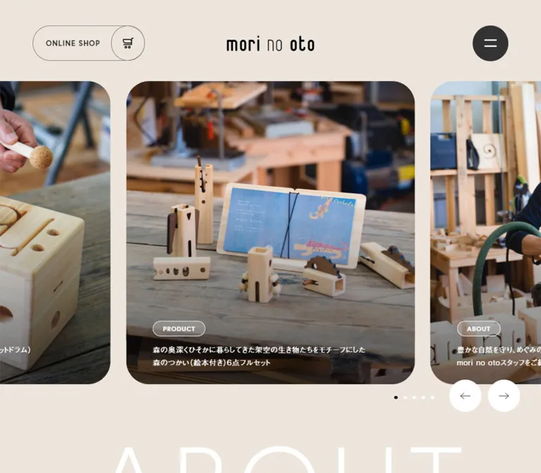
生成りの背景に木製楽器の写真を大きく配置したブランドサイト。細身の欧文見出し、丸角の写真カルーセル、円形ボタンと輪郭線のカプセル型リンクが、自然素材の温かさを引き立てます。
mori no oto — Style Reference
Warm paper, wooden instruments, and generous photographic windows framed by circles and fine outlines.
Website: mori-no-oto.com
Original URL: https://mori-no-oto.com/
Final URL: https://mori-no-oto.com/
Theme: light beige main canvas, white editorial surfaces, and a brown contact footer; no theme switch was evidenced.
Inspected: October 5, 2026, at 06:19 JST. The supplied retrieval timestamp is 2026-10-04T21:19:44.778Z.
Viewports: desktop 1440 × 1000 and mobile 390 × 844 CSS pixels.
Scope: the current homepage, using the supplied opening and scrolled captures plus rendered DOM measurements. Visual coverage includes the photographic hero, mobile About introduction, desktop OTOTABI composition, and mobile contact footer. Product rails and navigation groups have additional DOM evidence. Linked detail pages, the external shop, and an opened navigation state were not inspected.
mori no oto presents wooden musical instruments, sound-making toys, workshops, and its relationship with Nishiawakura. Its homepage is a brand and catalog gateway with editorial content and an external shop connection. The design gives photography the largest visual area, while Japanese descriptions and oversized English section names establish a calm reading rhythm.
The strongest recurring shapes are rounded photographic rectangles, thin outlined capsules, and circular controls. A nearly square hero slide sits between cropped neighboring slides. The wordmark remains small, even when the photography and section lettering become very large. Natural wood, workshop tables, hands, and children provide warmth without requiring bright interface colors.
Preserve the difference between the components: the hero is immersive and photographic; the product catalog is a horizontal sequence of smaller entries; OTOTABI uses an asymmetric editorial arrangement; and the footer becomes a solid brown field with outlined contact actions.
閉じる
mori no oto — Style Reference
Warm paper, wooden instruments, and generous photographic windows framed by circles and fine outlines.
Website: mori-no-oto.com
Original URL: https://mori-no-oto.com/
Final URL: https://mori-no-oto.com/
Theme: light beige main canvas, white editorial surfaces, and a brown contact footer; no theme switch was evidenced.
Inspected: October 5, 2026, at 06:19 JST. The supplied retrieval timestamp is 2026-10-04T21:19:44.778Z.
Viewports: desktop 1440 × 1000 and mobile 390 × 844 CSS pixels.
Scope: the current homepage, using the supplied opening and scrolled captures plus rendered DOM measurements. Visual coverage includes the photographic hero, mobile About introduction, desktop OTOTABI composition, and mobile contact footer. Product rails and navigation groups have additional DOM evidence. Linked detail pages, the external shop, and an opened navigation state were not inspected.
mori no oto presents wooden musical instruments, sound-making toys, workshops, and its relationship with Nishiawakura. Its homepage is a brand and catalog gateway with editorial content and an external shop connection. The design gives photography the largest visual area, while Japanese descriptions and oversized English section names establish a calm reading rhythm.
The strongest recurring shapes are rounded photographic rectangles, thin outlined capsules, and circular controls. A nearly square hero slide sits between cropped neighboring slides. The wordmark remains small, even when the photography and section lettering become very large. Natural wood, workshop tables, hands, and children provide warmth without requiring bright interface colors.
Preserve the difference between the components: the hero is immersive and photographic; the product catalog is a horizontal sequence of smaller entries; OTOTABI uses an asymmetric editorial arrangement; and the footer becomes a solid brown field with outlined contact actions.
How to Read This Reference
- Measured / computed values come directly from the supplied rendered DOM, bounding rectangles, or custom properties. Values are CSS pixels unless stated otherwise.
- Calculated values are simple relationships between those measurements, such as card gaps and aspect ratios. They do not establish the original CSS formula.
- Visual estimates describe screenshot features whose computed styles were not supplied, including the footer color and OTOTABI panel curvature.
- Recommendations describe adaptations for a new implementation. Breakpoints, intermediate scaling, accessible behavior, and the Quick Start are not recovered source code.
- Font-family declarations identify the requested stack. The evidence does not independently verify the font file used for every rendered glyph.
- Some navigation elements have measurable DOM boxes even though the screenshots show the menu closed. Their measurements establish structure, not a visually tested open state.
- One desktop capture contains only the beige background and menu button. Several OTOTABI media regions are also blank. Their cause is unknown; they are not evidence of an intentional empty section or a loading animation.
Tokens — Colors
Default Palette
| Name | Value | Source or implementation token | Role and evidence |
|---|---|---|---|
| Warm Paper | #ede5dc |
Source --v-main-bg; alias --m-canvas |
Exact source value and computed HTML background at both viewports. Main page canvas and spaces around photographs. |
| Main Ink | #1a1a1a |
Source --v-main-color; alias --m-ink |
Exact source value and computed body text. Japanese copy and dark section lettering. |
| Menu Charcoal | #333333 |
Alias --m-menu |
Computed background of the circular menu button at both viewports. |
| White | #ffffff |
Alias --m-white |
Computed hero text, About lettering, and desktop carousel-button backgrounds; visually present in the OTOTABI panel and footer details. |
| Outline Gray | #787878 |
Source --v-gray-border; alias --m-border |
Exact declared border token. Visually consistent with the shop outline; the shop border color itself was not separately sampled. |
| Soft Gray Rule | rgba(120,120,120,.48) |
Source --v-gray-border-opacity |
Declared translucent rule color. Specific placement is not established by the supplied element sample. |
| Light Gray Rule | rgba(167,167,167,.32) |
Source --v-light-gray-border |
Declared lighter rule color; not a separate opaque surface. |
| Footer Brown | Approximately #736355 |
Recommended alias --m-footer |
Visual estimate from the mobile contact capture, not a measured source value. |
| Pale Media Field | Approximately #f2efdf |
Recommended alias --m-media |
Visual estimate of the blank OTOTABI media regions. Do not assume these were intended to remain blank. |
The canvas is a flat warm neutral. Its relationship with pale wood matters more than introducing many beige variants. White provides large editorial contrast and reversed lettering, while the only strong dark filled control in the opening view is the menu circle.
The darkening at the bottom of hero photographs is a text-legibility treatment. Its exact gradient stops and opacity were not supplied. It is separate from the flat page-color system.
Declared Colors with Unverified Placement
| Source property | Value | Interpretation |
|---|---|---|
--v-brown-txt |
#b8a473 |
A declared muted brown text token; its use in the supplied visible regions is unconfirmed. |
--v-brown-bg |
#c9b993 |
A declared light brown background token. It should not be substituted for the visibly darker footer. |
--v-caution |
#cc3087 |
A declared caution color, not an observed primary action color. |
--swiper-theme-color |
#007aff |
A carousel-related variable. The visible controls are neutral; do not introduce blue pagination merely because this variable exists. |
Tokens — Typography
Japanese Body and Descriptions
- Computed stack:
a-otf-gothic-bbb-pr6n, sans-serif. - Weight:
400for ordinary body text and sampled Japanese category headings. - Desktop body:
16px / 28.8px, with0.96pxtracking. - Mobile body:
14.4px / 25.92px, with0.864pxtracking. - Both body measurements correspond to
1.8line height and0.06emtracking. - The About paragraph uses a more generous
2line height:32pxdesktop and28.8pxmobile.
The HTML element reports Times, but the body explicitly overrides it. Times is not the observed content typography system.
English Display Lettering
- Computed stack:
europa, sans-serif. - Weight:
300for large English section names and sampled navigation group headings. - Character: thin, open, widely spaced uppercase lettering.
- Tracking:
0.08emfor ABOUT and0.1emfor PRODUCTS. - Role: large spatial markers that sometimes sit behind the Japanese content, rather than conventional compact headings above every block.
ABOUT is white on beige and functions visually as background-scale lettering. The mobile paragraph overlaps its lower area. The dark paragraph remains the main reading layer.
Utility Labels and Strong Text
ONLINE SHOP and hero category labels use europa, sans-serif at weight 700. The telephone text in the sampled mobile navigation uses YakuHanJP, a-otf-midashi-go-mb31-pr6n, sans-serif at weight 600. This phone measurement belongs to navigation; it is not a verified computed footer style.
The wordmark is distinct artwork. Its narrow rounded forms and mixed stroke weights should not be recreated by typing the brand name in Europa.
Type Scale
| Role | Desktop | Mobile | Tracking / qualification |
|---|---|---|---|
| Main body | 16 / 28.8px |
14.4 / 25.92px |
0.06em, weight 400 |
| About paragraph | 16 / 32px |
14.4 / 28.8px |
Same body stack; line height 2 |
| Hero description | 16 / 28.8px |
13 / 23.4px |
White text; mobile inherited tracking is 0.864px |
| Hero category | 16 / 28.8px |
13 / 23.4px |
Europa 700; outline-pill geometry is separate |
| Header shop label | 16 / 28.8px |
8.424 / 15.1632px |
Europa 700, 0.08em tracking |
| ABOUT display | 208 / 208px |
89.96 / 89.96px |
Europa 300, 0.08em tracking |
| PRODUCTS display | 85 / 85px |
50.96 / 50.96px |
Europa 300, 0.1em tracking |
| Japanese category heading | 48 / 48px |
36 / 36px |
Weight 400, 0.04em tracking |
| About detail-link label | 14 / 25.2px |
12.6 / 22.68px |
Regular Japanese text beside an outlined circle |
| Product descriptor | 15 / 27px |
12.15 / 21.87px |
Examples include 木の鈴 and カスタネット |
| Product-name H3 wrapper | 16 / 28.8px |
10.368 / 18.6624px |
Inner Japanese and Latin span styles were not supplied; these are wrapper values |
| Desktop navigation group | 40 / 40px |
— | Europa 300, 6px tracking; DOM-only open-menu structure |
| Mobile navigation PRODUCTS | — | 28.6 / 28.6px |
Europa 300, 3.432px tracking; DOM-only structure |
| Mobile navigation phone | — | 15.6 / 28.08px |
Strong stack, weight 600, 1.248px tracking |
| Footer CONTACT US | — | Approximately 44–46px |
Screenshot estimate; thin Latin lettering with broad tracking |
Implementation recommendation: the measured mobile shop label is unusually small. A new implementation should enlarge it to at least approximately 10–12px, give the control enough width, and test it with fallback fonts. This is an intentional readability adjustment, not an exact reproduction.
Tokens — Spacing & Shapes
There is no verified universal spacing unit. The composition combines large section intervals, measured card gaps, broad image insets, and compact utility details.
Spacing Scale
| Use | Desktop | Mobile | Evidence |
|---|---|---|---|
| Header utility edge inset | 64px |
26px |
Measured shop/menu positions |
| Main content left edge | 153.59px |
26px |
Measured About / Products section positions |
| Hero top edge | 177px |
103.53px |
Measured card positions |
| Hero card gap | 34px |
12.47px |
Calculated from consecutive card boxes |
| Hero left text inset | 58px |
30.16px |
Computed card padding |
| Hero right text inset | 98px |
50.95px |
Computed card padding |
| Hero bottom text inset | 35px |
28.44px |
Computed card padding |
| Category wrapper to description | 14px |
Approximately 11.38px |
Calculated vertical separation |
| Product-card gap | 22px |
17.81px |
Calculated from consecutive card positions |
| About paragraph to detail link | 60px |
36px |
Calculated from measured boxes |
| Products section top padding | 115px |
103.5px |
Computed padding |
These values do not reduce to a single strict eight-pixel grid. Preserve their visual hierarchy rather than forcing every gap into the same token progression.
Border Radius
| Element | Desktop | Mobile | Status |
|---|---|---|---|
| Hero slide | 50px |
24.375px |
Computed |
| Header shop capsule | 38px |
Approximately 20.007px |
Computed |
| Menu button | 50% |
50% |
Computed |
| Carousel arrow buttons | 50% |
50% |
Computed for sampled controls |
| OTOTABI media corners | Approximately 24px |
Unverified | Desktop screenshot estimate |
| OTOTABI white panel | Large bottom-right curve, approximately 130px |
Unverified | Desktop screenshot estimate; other corners are not fully evidenced |
| Footer contact capsule | Approximately 33–34px |
Approximately 33–34px |
Geometry estimated from the mobile capture; desktop placement unverified |
The media uses clearly rounded corners, but the catalog entries are not all enclosed in rounded white cards. Circles and capsules are primarily navigation and action shapes.
Layout Measurements
| Element | At 1440 × 1000 | At 390 × 844 |
|---|---|---|
| Recorded document height | 7997.20px |
8873.89px |
| Wordmark box | 189 × 33px, at 625.5, 78 |
99.5 × 17.36px, at 26, 45.63 |
| Header shop link | 243 × 76px, at 64, 56 |
127.94 × 40px, at 178.16, 35.80 |
| Menu button | 78 × 78px, at 1298, 55 |
45.625 × 45.625px, at 318.375, 32.17 |
| Center hero card | 629 × 660px, at 405.5, 177 |
327.08 × 343.19px, at approximately 31.39, 103.53 |
| Main About section width | 1132.80px |
338px |
| About paragraph width | 579.98px |
301.59px |
| Product entry width | 350px |
162px |
| Typical sampled product entry height | 478.78px |
252.09px; longer text increases height |
| Hero arrow button | 70 × 70px |
Not present in the supplied opening screenshot |
| Product arrow button | 70 × 70px |
Approximately 48.19 × 48.19px |
| About detail-link box | 246.55 × 72px |
221.89 × 64.80px |
The hero aspect ratio is approximately 0.953:1 at both sizes. Its mobile width is approximately 83.87% of the viewport. These are calculated relationships, not recovered responsive declarations.
The source exposes unitless width properties --section-width: 1150, --section-width-wide: 1264, and --section-width-min: 1000. Their consuming CSS is unavailable. In particular, the measured desktop content width is 1132.80px; do not report it as an observed 1150px box.
Components
Homepage Header
Role: brand identity, direct shop access, and entry to site navigation.
On desktop, the wordmark is centered independently of the utilities. An outlined ONLINE SHOP capsule sits at the left and the charcoal menu circle sits at the right. The background is the same beige as the page, without an obvious dividing rule or shadow.
The shop capsule has two connected parts: a text area and a circular cart compartment at its right edge. The circular outline intersects the capsule silhouette. It is one anchor to https://mori-no-oto.stores.jp/, not two separate actions.
On mobile, the wordmark moves to the left, the shop link moves between the wordmark and menu, and all three become smaller. This is a layout reordering, not a uniformly scaled desktop header.
Persistent Menu Trigger and Navigation Structure
Role: compact access to the broader catalog and editorial hierarchy.
The visible trigger is a charcoal disc with two short white horizontal strokes. It remains at the upper right in the supplied scrolled desktop and mobile captures. That persistence is visually evidenced; the specific positioning declaration was not supplied.
The desktop navigation DOM groups TOP, CONTACT, and NEWS with sections for ABOUT, PRODUCTS, and OTOTABI. Large English group names use light Europa, while Japanese sublinks are smaller and sometimes rgba(255,255,255,.6).
The mobile navigation DOM changes the grouping: three product-category anchors sit across one row, followed by two wider About and sound-tour anchors, then news, social links, and contact actions. The three category boxes are approximately 99.41px wide; the two wider anchors are approximately 159.05px wide.
Limit: no open-menu screenshot or click sequence was supplied. The overlay background, opening trajectory, close-state icon, focus handling, and scroll locking remain unverified.
Featured Photo Carousel
Role: introduces products and workshops through large contextual photography.
The selected card is centered, with substantial portions of adjacent cards visible on desktop and narrow slivers visible on mobile. At the desktop capture, the center card starts at x = 405.5px; the neighboring cards extend beyond both viewport edges. On mobile, the center card starts near x = 31.39px and leaves approximately 19px of neighboring imagery visible at each edge after the gaps.
Each card is a linked photographic surface with this anatomy:
- A photograph filling the rounded frame.
- A darkening treatment toward the lower edge.
- A small white outlined category capsule such as
PRODUCTorWORKSHOP. - A short white Japanese description beneath the category.
The card anchor has asymmetric text padding: more room is reserved at the right than at the left. Do not center the description or place it in a separate white panel.
The current centered slide shows three small wooden percussion toys on a weathered table. The left neighbor shows children participating in a workshop; the right neighbor shows an adult playing a wooden instrument with a mallet.
Five distinct destinations appear in the hero DOM, repeated in three sequences. This is consistent with a looping carousel structure; the repeated anchors should not be mistaken for fifteen unique editorial items.
Carousel Controls
Role: explicit sequential navigation and current-position feedback.
In the desktop opening capture, five small dots precede two white circular arrow buttons near the lower right. The visible active dot is dark; the others are white. The circles measure 70px and are separated by 14px. Their top edge sits approximately 10px above the hero card's bottom edge, so they straddle the image baseline and surrounding paper.
Arrow artwork is thin and understated. There is no filled rectangular next-slide button.
The mobile opening capture does not show these hero controls. Separately, the product rail has measured mobile arrow buttons and a 1 / 12 status display. Keep those two control systems distinct.
Click results, autoplay, drag behavior, and wraparound were not exercised in the supplied evidence.
About Introduction
Role: links the products to material, place, and the maker's intentions.
The oversized white ABOUT label overlaps the composition behind dark Japanese body text. On desktop, its measured box is 738.64px wide at a 208px font size. The paragraph occupies a narrower column toward the right, beginning around x = 607.91px.
On mobile, ABOUT starts at the standard 26px gutter and uses approximately 90px type. The paragraph begins 36.4px farther right than that heading, at x = 62.41px, and overlaps the heading's lower portion. A quiet text link follows below.
The source link label is モリノオトについて詳しくはこちら. It leads to /about/ and combines ordinary text with a large thin outlined circle containing a right arrow. The circle slightly overlaps the text's trailing region rather than behaving like a detached icon button.
Products Section and Category Introduction
Role: separates the catalog into small instruments, large instruments, and handmade kits.
A dark, light-weight PRODUCTS heading introduces the catalog. The Japanese category heading is much smaller than the English section display but larger than the surrounding descriptions: 48px desktop and 36px mobile.
The desktop small-instrument introduction places the Japanese category name and a short description on the same horizontal band, with a category-list link toward the right. Mobile measurements place the category name above the description and move the category-list action below the rail.
The catalog continues with a large-instrument section and handmade-kit material. Those sections are supported by DOM text and links; the supplied captures do not establish every image crop or desktop arrangement.
Small-Instrument Product Rail
Role: makes individual instruments discoverable without turning the whole homepage into a dense shopping grid.
The DOM contains twelve product entries. Their horizontal coordinates continue beyond the viewport while sharing the same top coordinate. Desktop entries are 350px wide with 22px gaps. Mobile entries are 162px wide with approximately 17.81px gaps.
Each entry links to a detail page and contains an upper media allocation, a Japanese name paired with a Latin name, and a short object-type description. For example, コロコロ / KORO-KORO is followed by 木の鈴.
The first three desktop entry boxes begin at approximately 153.59, 525.59, and 897.59px. On mobile, the first two begin at 26 and 205.81px; the third begins near the right edge at 385.63px. This supports a horizontal rail with roughly two items across the phone, not a vertically wrapping two-column grid.
The desktop arrow controls are vertically stacked to the left of the product band. The mobile controls sit below the entries toward the right, opposite the numeric position display. Actual scrolling and counter updates were not tested.
Media limitation: product image URLs, their exact bounds, cropping rules, and corner radii are absent from the sample. Do not transfer the hero's 50px radius to every product image as an observed rule.
OTOTABI Editorial Panel
Role: presents three ways to experience the instruments through making, visiting, and events.
The desktop capture shows a white background panel offset to the right of the beige canvas. Its visible left edge is around x = 276px, while the content begins around x = 154px, allowing the first card to protrude left of the white field. The panel terminates in a large rounded bottom-right corner.
The visible composition has three columns:
- A large left card, approximately
440 × 576px, forリモートワークショップ. Its title, description, and detail link are reversed out over a dark lower gradient. - A middle column containing two approximately
286 × 274pxrounded media regions with a roughly28pxvertical gap. - A right column of dark text on white for
四季の音旅and出張イベント, each ending in a small outlined circular-arrow link.
The left card is a unified image-and-copy feature; the other two stories separate their image area from their copy. This asymmetry is a defining component relationship.
All three media regions appear blank and pale in the supplied capture. Their dimensions and surrounding composition are usable evidence, but their intended photographic subjects are not. The heading is partially cropped by the viewport, so an exact OTOTABI font size cannot be recovered from that image.
The introductory sentence is repeated three times in the supplied page text. Treat that as current content evidence, not a requirement to repeat copy in an adaptation.
Information, Picture Book, Gallery, and Shop Links
Role: keeps the homepage useful beyond the product catalog.
The mobile rendered text includes an INFORMATION section with four dated entries, including one dated 2026.09.12, followed by picture-book and gallery features. The page also contains an ONLINE SHOP block with a short catalog description and an external shop anchor.
This establishes an editorial sequence and active content destinations. It does not establish the precise news-row rules, card backgrounds, image proportions, or shop-banner artwork. Keep those visual details unasserted until they can be inspected.
Contact Footer
Role: closes the page with direct contact, location, access information, and social links.
The mobile capture changes to a full-width muted brown field. A large white CONTACT US heading sits above a short Japanese paragraph. Two outlined capsules follow: a contact-form link with an envelope icon and a telephone link with a phone icon. Each has a circular compartment at its right end, echoing the header shop link.
The visible contact capsules are approximately 299 × 67px, beginning around x = 46px. They are stacked with approximately 31px between them. These are screenshot estimates. Similarly named contact elements in the earlier DOM sample belong to navigation and should not be substituted as exact footer measurements.
A thin white horizontal rule separates the contact actions from the address and travel directions. Below those, an oversized muted SNS label accompanies white Facebook, Instagram, and YouTube marks. Small copyright text finishes the column.
The menu circle persists at the upper right over this section. In the supplied mobile frame, it sits close to the heading's final letters. A new implementation should account for this persistent control when placing large text.
Tokens — Motion & Interaction
| Treatment | Supplied evidence | What can be concluded |
|---|---|---|
| General transition token | --v-transition: .35s cubic-bezier(.39,.575,.565,1.000) |
Exact declared timing and easing |
| Desktop navigation primary links | opacity 0.35s cubic-bezier(0.39,0.575,0.565,1) |
Opacity has a defined transition; its triggered endpoint was not observed |
| Desktop navigation sublinks | color 0.35s cubic-bezier(0.39,0.575,0.565,1) |
Color has a defined transition; hover appearance remains unverified |
| Shop capsule | Border color and text color at 0.5s with the same easing |
Measured transition declaration, not proof of a particular hover inversion |
| Shop circular compartment | Border color at 0.5s with the same easing |
Supports coordinated outline treatment |
| Menu trigger | opacity 0.3s, visibility 0.3s, background-color 0.5s |
Exact sampled declaration; opening mechanics were not captured |
| Product entry container | Transition property reported as transform |
Insufficient information to assign duration or travel distance |
| Hero sequence | Repeated linked cards, dots, and arrow controls | Carousel structure is evidenced; autoplay, drag, speed, and looping behavior are unverified |
| Split English headings | Text extraction reports separate letters | Character-level structure is present; animation or stagger timing is not established |
Several sampled nodes report animation: none. This does not prove that the entire site is static: motion may belong to wrappers, pseudo-elements, scripts, or states outside the sample. Likewise, a transition value of all without a duration should not be converted into an invented animation specification.
The capture process waited for document load, layout and text stability, finite motion, and visible image decoding within stated limits. Perpetual animation was temporarily paused during readiness checks. Those procedures do not establish autoplay behavior or explain the blank desktop capture.
Recommended adaptation: retain restrained 350–500ms feedback for supported hover or state changes, provide explicit carousel navigation, and implement reduced motion. Do not invent parallax, sound playback, or elaborate letter animation as existing features.
Surfaces
| Layer | Appearance | Purpose |
|---|---|---|
| Main canvas | Exact warm beige #ede5dc |
Connects photographs, section lettering, and generous open space |
| Hero cards | Full photographic surface with large rounded corners | Primary visual introduction |
| Hero text zone | Darkened lower image area with white type | Legibility without a separate caption panel |
| Product entries | Content organized directly over the page canvas in the sampled DOM | Keeps the catalog visually open; image details remain partly unverified |
| OTOTABI backdrop | White field offset from the beige canvas, with a large lower curve | Creates a distinct editorial chapter |
| OTOTABI blank media | Pale flat regions in this capture | Recorded incomplete visual evidence, not a verified skeleton system |
| Carousel controls | White circles with dark thin arrows | High-contrast navigation on beige |
| Menu | Charcoal disc with white strokes | Persistent navigation anchor |
| Footer | Muted brown with white text and outlined capsules | Consolidates practical contact information |
There is no obvious shadow-based elevation system in the supplied visible regions. Separation comes from color fields, photographic edges, outlines, and whitespace.
Imagery
Photography carries material and human context. The visible product image combines pale wood, darker wood accents, rope, a gray worn tabletop, and a softly blurred workshop background. The adjacent images show instruments being made or played rather than isolated on pure white.
The treatment is natural and tactile: visible grain, soft ambient light, restrained saturation, and believable work surfaces. Product shapes remain prominent within the frame. The interface does not need a decorative wood texture because the photographs already supply that material information.
Use cover-style cropping within the hero's nearly square portrait frames, but choose focal positions deliberately. The three small instruments remain recognizable in the mobile crop. Preserve room below the principal subject for the label and description.
Icons are visually quiet: thin arrows, a cart, an envelope, and a phone outline, plus recognizable social marks. No icon package or source format was verified.
Observed Asset References
No direct image-file URLs or filenames were included in the evidence. The following references identify visible content and its placement, not downloadable source assets.
| Visual | Evidence | Placement / limitation |
|---|---|---|
| mori no oto wordmark | Desktop and mobile opening captures | Centered on desktop, left-aligned on mobile; exact asset format unavailable |
| Three small wooden percussion toys | Desktop and mobile opening captures | Current center hero card; links to /watashino-mori-no-oto/morino-otohajime/ |
| Children participating in a workshop | Left side of the desktop opening capture | Neighboring workshop slide; links to /news/1623/ |
| Adult playing a wooden instrument | Right side of the desktop opening capture | Neighboring product slide; links to /watashino-mori-no-oto/kan-ponpon/ |
| OTOTABI feature media | Desktop scrolled capture | Frames are visible but imagery is blank; no subject can be asserted |
| Individual catalog media | Product entry structure in the DOM | Twelve linked entries exist, but actual image assets were not supplied |
Use authorized photography and wordmark assets when implementing this direction. Do not invent original asset paths or reconstruct unavailable pictures from their destination names.
Layout & Responsive Behavior
Desktop Composition
The opening layout places the wordmark near the horizontal center and keeps the utility controls close to the page edges. The hero begins at 177px, occupies 660px vertically, and deliberately exceeds the viewport horizontally through neighboring slides.
Below the hero, the principal editorial content uses a measured width of approximately 1132.8px with 153.6px side margins. ABOUT overlaps its own section geometry, while PRODUCTS starts a more structured catalog chapter. The product rail extends beyond the principal content width.
The OTOTABI screenshot uses another composition: an offset white panel, a protruding feature card, stacked secondary media, and a text column. Do not force every section into the same centered card grid.
Mobile Composition
The header changes order to wordmark, shop capsule, menu circle. The hero remains a horizontally overflowing image sequence with one dominant card. Its aspect ratio is preserved while its corner radius and surrounding gap shrink.
At 390px, the About heading begins near y = 490.31px and the paragraph begins near y = 531.91px. The whole About introduction fits into the opening capture beneath the hero. The PRODUCTS heading begins near y = 851.45px, just below that capture's 844px bottom edge.
The product rail keeps entries side by side at 162px widths. Category introductions stack vertically, while their detail links move below the browsing controls. This behavior is directly supported by the supplied coordinates.
The footer becomes a single column with stacked contact capsules, a full-width separator, location details, and a compact social row. Its text column is approximately 336px wide in the screenshot.
What Remains Unknown
Only two viewport widths were sampled. The source breakpoint, tablet arrangements, landscape behavior, and formulas between the measured endpoints are unknown. The longer recorded mobile document height is consistent with narrower text and stacked content, but it is not a universal height target.
Some content is absent from the desktop extracted text while present in its element records or the mobile text. This should not be interpreted as deliberate desktop content removal. Blank capture regions likewise require further investigation before being reproduced.
Do’s and Don’ts
Do
- Keep
#ede5dcas the main canvas and#1a1a1aas the principal text color. - Let real wood, people, and workshop settings supply the visual warmth.
- Preserve the centered hero card and cropped neighboring slides at both inspected sizes.
- Use thin, widely tracked English section lettering with comfortable Japanese paragraphs.
- Keep the wordmark visually modest beside the photography.
- Repeat circles and outlined capsules across navigation and contact actions.
- Preserve the mobile header reordering and the horizontal product rail.
- Use darkening only where text needs contrast over imagery.
- Retain the asymmetric OTOTABI relationship between one large feature and two secondary stories.
- Treat screenshot estimates and missing media as explicit limitations.
Don’t
- Don’t turn the homepage into a single promotional panel with one conversion action.
- Don’t replace the photographic rail with an edge-to-edge background image and centered headline.
- Don’t use bright blue or magenta actions merely because those colors appear in custom properties.
- Don’t give every product entry a raised white card and a heavy shadow.
- Don’t recreate the wordmark using an ordinary display-font text string.
- Don’t assume the twelve mobile products form a wrapping two-column grid.
- Don’t reproduce repeated carousel clones as distinct content.
- Don’t treat pale empty media frames or the blank desktop capture as intentional brand motifs.
- Don’t infer autoplay, menu animation, parallax, or sound behavior from static screenshots.
- Don’t apply one proportional scale factor to the entire mobile interface.
Recommended Implementation Additions
These are recommendations for a new implementation, not verified features of the source:
- Give the menu and arrow buttons accessible names, visible keyboard focus, and appropriate state attributes.
- Keep closed navigation out of keyboard focus; support Escape and focus return when an overlay opens.
- Ensure carousel content is reachable without autoplay. If autoplay is introduced, provide a pause control and honor reduced motion.
- Avoid duplicate announcements from looping-slide clones. Preserve meaningful names for the five unique hero destinations.
- Enlarge the very small mobile shop label and retain approximately
44pxminimum action targets. - Keep essential content visible if reveal scripts or image loading fail. Provide useful image alternatives and stable media dimensions.
- Check white image captions against every crop, especially when the photograph is unusually pale.
- Treat oversized white lettering as decoration when necessary, while preserving one understandable semantic section heading.
- Give the persistent menu enough clearance from large mobile headings and linked content.
- Test fallback-font wrapping, text enlargement, narrow phones, and intermediate widths before committing to the supplied starter breakpoint.
Agent Prompt Guide
Quick Color Reference
- Main page:
#ede5dc, measured. - Main text:
#1a1a1a, measured. - Menu disc:
#333333, measured. - Reversed text, editorial panel, and carousel circles:
#ffffff. - Gray outline reference:
#787878, declared source token. - Footer adaptation: approximately
#736355, screenshot estimate. - Pale blank-media reference: approximately
#f2efdf, screenshot estimate; not an intended placeholder requirement.
Overall Prompt
“Create a Japanese wooden-instrument brand and catalog homepage inspired by mori no oto. Use a flat warm beige canvas #ede5dc, dark text #1a1a1a, natural workshop photography, light widely tracked English section headings, and relaxed Japanese body copy. Center a large nearly square photographic hero card between cropped neighboring slides. Give it rounded corners, a subtle lower darkening layer, a small outlined category pill, and a short white Japanese caption. Place a modest wordmark in the desktop center, an outlined shop capsule at left, and a charcoal circular menu at right. On mobile, move the wordmark left and the shop capsule beside the menu. Continue with an overlapping white ABOUT heading, a horizontal product rail, an asymmetric white OTOTABI editorial panel, and a brown contact footer with outlined capsules and circular icon compartments. Avoid heavy shadows and saturated interface accents.”
Example Component Prompts
- Hero slide: “Create a linked
629 × 660pxdesktop photo frame with a50pxradius. Use an authentic wooden-instrument photograph, bottom-left white copy, a small outlined PRODUCT pill, and a restrained lower gradient. At a390pxviewport, target approximately327 × 343px, a24pxradius, and visible neighboring-slide slivers.” - About introduction: “Place a very large, thin white ABOUT label behind a dark Japanese paragraph on beige. On mobile, use approximately
90pxdisplay type, start the label at a26pxgutter, and inset the paragraph another36px. Finish with a quiet text link and a thin outlined arrow circle.” - Product rail: “Build a horizontal sequence of wooden-instrument entries with Japanese and Latin names and a small descriptor. Use
350pxentries and22pxgaps on desktop; approximately162pxentries and18pxgaps on the inspected phone layout. Keep the entries directly on the beige canvas and provide accessible previous/next controls.” - OTOTABI section: “Create a white editorial panel offset to the right of a beige page, with a large rounded bottom-right corner. Let a tall feature card protrude from its left edge. Beside it, stack two smaller media areas with separate text on their right. Use authorized imagery; the supplied reference does not establish the missing media subjects.”
- Contact footer: “Create a muted brown footer with a thin, broadly tracked CONTACT US heading, white Japanese copy, and two vertically stacked outlined capsules. Attach an outlined circular envelope or phone compartment to each capsule's right edge. Separate the location block with a fine white rule and finish with a subdued SNS label and small white social marks.”
Quick Start
CSS Custom Properties
This is an implementation adaptation, not the original stylesheet. It retains measured colors and key endpoint dimensions while using a conventional root font size. The 900px breakpoint, width interpolation, gradient, and footer color are recommendations or estimates. The mobile shop control is deliberately larger than the observed control for readability.
The source font names are included as optional stacks; no font files or licensing arrangements are supplied. The rail below uses native horizontal scrolling and scroll snapping as a usable fallback. Application code is still needed for optional arrow controls, active-state updates, autoplay, or looping.
:root {
  /* Exact source colors and computed control color. */
  --m-canvas: #ede5dc;
  --m-ink: #1a1a1a;
  --m-white: #ffffff;
  --m-menu: #333333;
  --m-border: #787878;

  /* Screenshot estimates, not recovered source values. */
  --m-footer: #736355;
  --m-media: #f2efdf;

  /* Optional source-declared families; provide licensed files separately. */
  --m-font-body: 'a-otf-gothic-bbb-pr6n', sans-serif;
  --m-font-display: europa, sans-serif;
  --m-font-strong: YakuHanJP, 'a-otf-midashi-go-mb31-pr6n', sans-serif;

  --m-body-size: 16px;
  --m-section-size: 85px;
  --m-about-size: 208px;
  --m-leading: 1.8;
  --m-tracking: 0.06em;

  /* Recommended interpolation matching the inspected desktop width. */
  --m-content: min(78.6667vw, 1150px);
  --m-gutter: calc((100vw - var(--m-content)) / 2);
  --m-edge: 64px;
  --m-menu-size: 78px;
  --m-menu-top: 55px;
  --m-hero-top: 177px;
  --m-hero-width: 629px;
  --m-hero-gap: 34px;
  --m-hero-radius: 50px;
  --m-product-width: 350px;
  --m-product-gap: 22px;
  --m-arrow-size: 72px;

  --m-transition: 350ms cubic-bezier(.39, .575, .565, 1);
  --m-outline-transition: 500ms cubic-bezier(.39, .575, .565, 1);
}

* { box-sizing: border-box; }

body {
  margin: 0;
  color: var(--m-ink);
  background: var(--m-canvas);
  font-family: var(--m-font-body);
  font-size: var(--m-body-size);
  line-height: var(--m-leading);
  letter-spacing: var(--m-tracking);
}

button, input, textarea { font: inherit; }
button { cursor: pointer; }
a { color: inherit; }
img { display: block; max-inline-size: 100%; }

.content {
  inline-size: var(--m-content);
  margin-inline: auto;
}

.site-header {
  position: absolute;
  inset: 0 0 auto;
  z-index: 10;
  display: grid;
  grid-template-columns: 1fr auto 1fr;
  align-items: center;
  padding: 56px var(--m-edge) 0;
}

.brand {
  grid-column: 2;
  grid-row: 1;
  display: block;
  inline-size: 189px;
}
.brand img { inline-size: 100%; block-size: auto; }

/* One anchor contains both the label and circular icon compartment. */
.capsule {
  --cap: 76px;
  --stroke: 2px;
  position: relative;
  display: inline-flex;
  align-items: center;
  min-block-size: var(--cap);
  padding: 0 calc(var(--cap) + 12px) 0 27px;
  border: var(--stroke) solid currentColor;
  border-radius: 999px;
  text-decoration: none;
  transition: color var(--m-outline-transition),
              border-color var(--m-outline-transition);
}

.capsule__icon {
  position: absolute;
  inset-block-start: calc(-1 * var(--stroke));
  inset-inline-end: calc(-1 * var(--stroke));
  display: grid;
  place-items: center;
  inline-size: var(--cap);
  block-size: var(--cap);
  border: var(--stroke) solid currentColor;
  border-radius: 50%;
}

.capsule__icon svg {
  inline-size: 24px;
  block-size: 24px;
}

.shop-link {
  grid-column: 1;
  grid-row: 1;
  justify-self: start;
  inline-size: 243px;
  border-color: var(--m-border);
  font-family: var(--m-font-display);
  font-size: 16px;
  font-weight: 700;
  letter-spacing: 0.08em;
  white-space: nowrap;
}
.shop-link .capsule__icon { border-color: var(--m-border); }

.menu-toggle {
  position: fixed;
  z-index: 100;
  inset-block-start: var(--m-menu-top);
  inset-inline-end: var(--m-edge);
  display: grid;
  place-content: center;
  gap: 9px;
  inline-size: var(--m-menu-size);
  block-size: var(--m-menu-size);
  padding: 0;
  border: 0;
  border-radius: 50%;
  color: var(--m-white);
  background: var(--m-menu);
  transition: opacity 300ms, visibility 300ms,
              background-color 500ms;
}

.menu-toggle span {
  inline-size: 26px;
  block-size: 3px;
  background: currentColor;
}

.hero { padding-block-start: var(--m-hero-top); }

/* Native scrolling is a recommended fallback, not a source claim. */
.hero-rail {
  display: flex;
  gap: var(--m-hero-gap);
  overflow-x: auto;
  padding-inline: calc((100vw - var(--m-hero-width)) / 2);
  scroll-padding-inline: calc((100vw - var(--m-hero-width)) / 2);
  scroll-snap-type: x mandatory;
  scrollbar-width: none;
}
.hero-rail::-webkit-scrollbar { display: none; }

.hero-card {
  position: relative;
  isolation: isolate;
  display: flex;
  align-items: flex-end;
  flex: 0 0 var(--m-hero-width);
  aspect-ratio: 629 / 660;
  overflow: hidden;
  padding: 0 98px 35px 58px;
  border-radius: var(--m-hero-radius);
  color: var(--m-white);
  background: var(--m-media);
  text-decoration: none;
  scroll-snap-align: center;
}

.hero-card > img {
  position: absolute;
  inset: 0;
  z-index: 0;
  inline-size: 100%;
  block-size: 100%;
  object-fit: cover;
  object-position: var(--photo-position, center);
}

.hero-card::after {
  content: '';
  position: absolute;
  inset: 0;
  z-index: 1;
  /* Recommended approximation; source stops were not supplied. */
  background: linear-gradient(180deg, transparent 42%, rgba(0,0,0,.56));
  pointer-events: none;
}

.hero-card__copy {
  position: relative;
  z-index: 2;
  display: grid;
  justify-items: start;
  gap: 14px;
}

.hero-tag {
  display: inline-flex;
  align-items: center;
  min-block-size: 34px;
  padding-inline: 20px;
  border: 2px solid currentColor;
  border-radius: 999px;
  font-family: var(--m-font-display);
  font-size: 16px;
  font-weight: 700;
  line-height: 1.8;
}

.hero-card__description { font-size: 16px; line-height: 1.8; }

/* Reveal optional controls only after their behavior is connected. */
.hero-controls { display: none; }
.hero[data-enhanced] .hero-controls {
  position: relative;
  z-index: 2;
  display: flex;
  justify-content: flex-end;
  gap: 14px;
  margin: -10px 5.111vw 0;
}

.round-button {
  display: grid;
  place-items: center;
  inline-size: 70px;
  block-size: 70px;
  padding: 0;
  border: 0;
  border-radius: 50%;
  color: var(--m-ink);
  background: var(--m-white);
}

.about {
  position: relative;
  inline-size: var(--m-content);
  margin: 184px auto 0;
}

.about__title {
  position: absolute;
  inset-block-start: -92px;
  inset-inline-start: 98.5px;
  margin: 0;
  color: var(--m-white);
  font-family: var(--m-font-display);
  font-size: var(--m-about-size);
  font-weight: 300;
  line-height: 1;
  letter-spacing: 0.08em;
  pointer-events: none;
}

.about__copy {
  position: relative;
  inline-size: min(580px, 60%);
  margin-inline-start: auto;
  margin-inline-end: 98.5px;
}
.about__copy p { margin: 0; line-height: 2; }
.about__copy .arrow-link { margin-block-start: 60px; }

.arrow-link {
  display: inline-flex;
  align-items: center;
  min-block-size: var(--m-arrow-size);
  font-size: 14px;
  text-decoration: none;
}

.arrow-link__icon {
  display: grid;
  place-items: center;
  flex: 0 0 var(--m-arrow-size);
  inline-size: var(--m-arrow-size);
  block-size: var(--m-arrow-size);
  margin-inline-start: -20px;
  border: 1px solid var(--m-white);
  border-radius: 50%;
}

.products { padding-block-start: 115px; }
.section-title {
  margin: 0;
  font-family: var(--m-font-display);
  font-size: var(--m-section-size);
  font-weight: 300;
  line-height: 1;
  letter-spacing: 0.1em;
}

.category-title {
  font-size: 48px;
  font-weight: 400;
  line-height: 1;
  letter-spacing: 0.04em;
}

.product-rail {
  display: flex;
  gap: var(--m-product-gap);
  overflow-x: auto;
  padding-inline: var(--m-gutter);
  scroll-padding-inline: var(--m-gutter);
  scroll-snap-type: x proximity;
}

.product-card {
  flex: 0 0 var(--m-product-width);
  text-decoration: none;
  scroll-snap-align: start;
}
.product-card img { inline-size: 100%; block-size: auto; }
.product-card__description { font-size: 15px; line-height: 1.8; }

/* Footer geometry and color approximate the supplied mobile capture. */
.contact {
  padding-block: 56px 80px;
  color: var(--m-white);
  background: var(--m-footer);
}

.contact__title {
  margin: 0 0 22px;
  font-family: var(--m-font-display);
  font-size: clamp(44px, 7vw, 85px);
  font-weight: 300;
  line-height: 1.15;
  letter-spacing: 0.1em;
}

.contact__actions {
  display: grid;
  gap: 31px;
  inline-size: min(100%, 300px);
  margin: 58px auto 0;
}

.contact .capsule {
  --cap: 67px;
  --stroke: 1px;
  inline-size: 100%;
  padding-inline-start: 34px;
  font-size: 13px;
}

.contact .phone-label {
  font-family: var(--m-font-strong);
  font-size: 15.6px;
  font-weight: 600;
}

.contact__details {
  margin-block-start: 72px;
  padding-block-start: 70px;
  border-block-start: 1px solid currentColor;
  font-size: 13px;
}

:where(a, button, [tabindex]):focus-visible {
  outline: 3px solid currentColor;
  outline-offset: 4px;
}
.hero-card:focus-visible { outline-offset: -6px; }

/* Recommended breakpoint; the original breakpoint was not supplied. */
@media (max-width: 900px) {
  :root {
    --m-body-size: 14.4px;
    --m-section-size: clamp(42px, 13.0667vw, 70px);
    --m-about-size: clamp(72px, 23.0667vw, 150px);
    --m-content: calc(100vw - 52px);
    --m-edge: 26px;
    --m-menu-size: 45.625px;
    --m-menu-top: 32.172px;
    --m-hero-top: 103.545px;
    --m-hero-width: min(629px, 83.8662vw);
    --m-hero-gap: 12.469px;
    --m-hero-radius: 24.375px;
    --m-product-width: 162px;
    --m-product-gap: 17.813px;
    --m-arrow-size: 64.8px;
  }

  .site-header {
    grid-template-columns: auto minmax(0, 1fr);
    padding: 33.8px calc(26px + 45.625px + 12px) 0 26px;
  }
  .brand {
    grid-column: 1;
    inline-size: clamp(76px, 25.513vw, 99.5px);
  }
  .shop-link {
    --cap: 44px;
    --stroke: 1px;
    grid-column: 2;
    justify-self: end;
    inline-size: 146px;
    max-inline-size: 100%;
    padding-inline-start: 14px;
    padding-inline-end: 50px;
    font-size: 10px;
  }
  .shop-link .capsule__icon svg { inline-size: 16px; block-size: 16px; }
  .menu-toggle { gap: 6px; }
  .menu-toggle span { inline-size: 16px; block-size: 1px; }

  .hero-card { padding: 0 50.953px 28.438px 30.156px; }
  .hero-card__copy { gap: 11.375px; }
  .hero-card__description { font-size: 13px; }
  .hero-tag {
    min-block-size: 26.375px;
    padding-inline: 16px;
    border-width: 1px;
    font-size: 13px;
  }
  .hero[data-enhanced] .hero-controls { display: none; }

  .about { margin-block-start: 85.188px; }
  .about__title { inset-block-start: -41.594px; inset-inline-start: 0; }
  .about__copy {
    inline-size: calc(100% - 36.4px);
    margin-inline-start: 36.4px;
    margin-inline-end: 0;
  }
  .about__copy .arrow-link { margin-block-start: 36px; }
  .arrow-link { font-size: 12.6px; }
  .arrow-link__icon { margin-inline-start: -18px; }

  .products { padding-block-start: 103.5px; }
  .category-title { font-size: 36px; }
  .product-card__description { font-size: 12.15px; }
}

/* Recommended accessibility behavior, not an observed source feature. */
@media (prefers-reduced-motion: reduce) {
  .hero-rail, .product-rail { scroll-behavior: auto; }
  .capsule, .menu-toggle { transition: none; }
}
The About spacing above assumes the native rail is followed directly by the introduction. If enhanced desktop controls add layout height, compensate for that height rather than adding the full measured gap twice. The native rail starts with its first item centered; matching a different selected slide or showing a previous neighbor at initialization requires application logic.
Minimal Component Markup
The image URL below is an explicit replacement placeholder, not an observed asset path. Repeat the anchor for the five unique hero destinations. Supply meaningful alternative text for each photograph and choose the initial slide separately.
<section class='hero' aria-label='Featured products and workshops'>
  <div class='hero-rail' tabindex='0' aria-label='Browse featured stories'>
    <a class='hero-card'
       href='/watashino-mori-no-oto/morino-otohajime/'>
      <img src='YOUR_AUTHORIZED_IMAGE_URL'
           alt='Three wooden percussion toys on a workshop table'>
      <span class='hero-card__copy'>
        <span class='hero-tag'>PRODUCT</span>
        <span class='hero-card__description'>
          幼児向けカスタネット、シェーカー、ウッドベル<br>
          「カチカチ・シャカシャカ・コロコロ」セット
        </span>
      </span>
    </a>
  </div>
</section>
The CSS does not implement an opened menu, contact form, news feed, OTOTABI media loading, or carousel counters. Add those behaviors explicitly and avoid displaying controls before they work. The OTOTABI composition should be built from the component measurements above, with a stacked mobile adaptation treated as a recommendation until its original mobile layout can be inspected.
Tailwind v4 Token Mapping
Optional aliases for a project that already uses Tailwind v4. This is not evidence that the original site uses Tailwind. Define the preceding custom properties first.
@theme inline {
  --color-mori-paper: var(--m-canvas);
  --color-mori-ink: var(--m-ink);
  --color-mori-white: var(--m-white);
  --color-mori-menu: var(--m-menu);
  --color-mori-border: var(--m-border);
  --color-mori-footer: var(--m-footer);

  --font-mori-body: var(--m-font-body);
  --font-mori-display: var(--m-font-display);
  --font-mori-strong: var(--m-font-strong);

  --text-mori-body: var(--m-body-size);
  --text-mori-section: var(--m-section-size);
  --text-mori-about: var(--m-about-size);

  --spacing-mori-content: var(--m-content);
  --spacing-mori-hero: var(--m-hero-width);
  --spacing-mori-product: var(--m-product-width);
  --radius-mori-hero: var(--m-hero-radius);
}
Sources & Evidence
- Inspected original and final page: https://mori-no-oto.com/. The supplied observation reports HTTP
200, the same original and final URL, and the page title岡山の楽器とおもちゃ製作 - mori-no-oto. - Capture time:
2026-10-04T21:19:44.778Z, equivalent to October 5, 2026, at 06:19:44.778 JST. This is the supplied original-page retrieval time, not a date inferred from copyright text. - Desktop evidence:
1440 × 1000opening, scrolled OTOTABI, and mostly blank captures; document height approximately7997.20px. - Mobile evidence:
390 × 844opening/About and contact-footer captures; document height approximately8873.89px. - Rendered evidence: supplied text, anchors, custom properties, element rectangles, typography, padding, radii, and transition declarations. Coordinate-derived gaps and proportions are labeled as calculations.
- Interaction scope: scrolling is represented by the capture sequence. No menu opening, arrow activation, drag gesture, hover endpoint, form submission, or external-shop interaction was supplied.
- Inspection limitations: readiness checks had finite time limits; shared workers and service workers were disabled. Some visible media remained blank, and one desktop frame contains no content beyond the canvas and menu. These facts limit lower-section and motion claims without invalidating the detailed opening and mobile-footer observations.
- Destination links: detail-page and shop URLs are recorded as homepage anchor targets only. Their destination designs were not independently inspected.
This reference describes the current homepage represented by the supplied evidence. Exact tokens, screenshot estimates, structural deductions, and implementation recommendations remain distinct throughout.
# mori no oto — Style Reference

> Warm paper, wooden instruments, and generous photographic windows framed by circles and fine outlines.

**Website:** [mori-no-oto.com](https://mori-no-oto.com/)
**Original URL:** https://mori-no-oto.com/
**Final URL:** https://mori-no-oto.com/
**Theme:** light beige main canvas, white editorial surfaces, and a brown contact footer; no theme switch was evidenced.
**Inspected:** October 5, 2026, at 06:19 JST. The supplied retrieval timestamp is `2026-10-04T21:19:44.778Z`.
**Viewports:** desktop `1440 × 1000` and mobile `390 × 844` CSS pixels.
**Scope:** the current homepage, using the supplied opening and scrolled captures plus rendered DOM measurements. Visual coverage includes the photographic hero, mobile About introduction, desktop OTOTABI composition, and mobile contact footer. Product rails and navigation groups have additional DOM evidence. Linked detail pages, the external shop, and an opened navigation state were not inspected.

mori no oto presents wooden musical instruments, sound-making toys, workshops, and its relationship with Nishiawakura. Its homepage is a brand and catalog gateway with editorial content and an external shop connection. The design gives photography the largest visual area, while Japanese descriptions and oversized English section names establish a calm reading rhythm.

The strongest recurring shapes are rounded photographic rectangles, thin outlined capsules, and circular controls. A nearly square hero slide sits between cropped neighboring slides. The wordmark remains small, even when the photography and section lettering become very large. Natural wood, workshop tables, hands, and children provide warmth without requiring bright interface colors.

Preserve the difference between the components: the hero is immersive and photographic; the product catalog is a horizontal sequence of smaller entries; OTOTABI uses an asymmetric editorial arrangement; and the footer becomes a solid brown field with outlined contact actions.
閉じる
# mori no oto — Style Reference

> Warm paper, wooden instruments, and generous photographic windows framed by circles and fine outlines.

**Website:** [mori-no-oto.com](https://mori-no-oto.com/)
**Original URL:** https://mori-no-oto.com/
**Final URL:** https://mori-no-oto.com/
**Theme:** light beige main canvas, white editorial surfaces, and a brown contact footer; no theme switch was evidenced.
**Inspected:** October 5, 2026, at 06:19 JST. The supplied retrieval timestamp is `2026-10-04T21:19:44.778Z`.
**Viewports:** desktop `1440 × 1000` and mobile `390 × 844` CSS pixels.
**Scope:** the current homepage, using the supplied opening and scrolled captures plus rendered DOM measurements. Visual coverage includes the photographic hero, mobile About introduction, desktop OTOTABI composition, and mobile contact footer. Product rails and navigation groups have additional DOM evidence. Linked detail pages, the external shop, and an opened navigation state were not inspected.

mori no oto presents wooden musical instruments, sound-making toys, workshops, and its relationship with Nishiawakura. Its homepage is a brand and catalog gateway with editorial content and an external shop connection. The design gives photography the largest visual area, while Japanese descriptions and oversized English section names establish a calm reading rhythm.

The strongest recurring shapes are rounded photographic rectangles, thin outlined capsules, and circular controls. A nearly square hero slide sits between cropped neighboring slides. The wordmark remains small, even when the photography and section lettering become very large. Natural wood, workshop tables, hands, and children provide warmth without requiring bright interface colors.

Preserve the difference between the components: the hero is immersive and photographic; the product catalog is a horizontal sequence of smaller entries; OTOTABI uses an asymmetric editorial arrangement; and the footer becomes a solid brown field with outlined contact actions.

## How to Read This Reference

- **Measured / computed** values come directly from the supplied rendered DOM, bounding rectangles, or custom properties. Values are CSS pixels unless stated otherwise.
- **Calculated** values are simple relationships between those measurements, such as card gaps and aspect ratios. They do not establish the original CSS formula.
- **Visual estimates** describe screenshot features whose computed styles were not supplied, including the footer color and OTOTABI panel curvature.
- **Recommendations** describe adaptations for a new implementation. Breakpoints, intermediate scaling, accessible behavior, and the Quick Start are not recovered source code.
- Font-family declarations identify the requested stack. The evidence does not independently verify the font file used for every rendered glyph.
- Some navigation elements have measurable DOM boxes even though the screenshots show the menu closed. Their measurements establish structure, not a visually tested open state.
- One desktop capture contains only the beige background and menu button. Several OTOTABI media regions are also blank. Their cause is unknown; they are not evidence of an intentional empty section or a loading animation.

## Tokens — Colors

### Default Palette

| Name | Value | Source or implementation token | Role and evidence |
| --- | --- | --- | --- |
| Warm Paper | `#ede5dc` | Source `--v-main-bg`; alias `--m-canvas` | Exact source value and computed HTML background at both viewports. Main page canvas and spaces around photographs. |
| Main Ink | `#1a1a1a` | Source `--v-main-color`; alias `--m-ink` | Exact source value and computed body text. Japanese copy and dark section lettering. |
| Menu Charcoal | `#333333` | Alias `--m-menu` | Computed background of the circular menu button at both viewports. |
| White | `#ffffff` | Alias `--m-white` | Computed hero text, About lettering, and desktop carousel-button backgrounds; visually present in the OTOTABI panel and footer details. |
| Outline Gray | `#787878` | Source `--v-gray-border`; alias `--m-border` | Exact declared border token. Visually consistent with the shop outline; the shop border color itself was not separately sampled. |
| Soft Gray Rule | `rgba(120,120,120,.48)` | Source `--v-gray-border-opacity` | Declared translucent rule color. Specific placement is not established by the supplied element sample. |
| Light Gray Rule | `rgba(167,167,167,.32)` | Source `--v-light-gray-border` | Declared lighter rule color; not a separate opaque surface. |
| Footer Brown | Approximately `#736355` | Recommended alias `--m-footer` | Visual estimate from the mobile contact capture, not a measured source value. |
| Pale Media Field | Approximately `#f2efdf` | Recommended alias `--m-media` | Visual estimate of the blank OTOTABI media regions. Do not assume these were intended to remain blank. |

The canvas is a flat warm neutral. Its relationship with pale wood matters more than introducing many beige variants. White provides large editorial contrast and reversed lettering, while the only strong dark filled control in the opening view is the menu circle.

The darkening at the bottom of hero photographs is a text-legibility treatment. Its exact gradient stops and opacity were not supplied. It is separate from the flat page-color system.

### Declared Colors with Unverified Placement

| Source property | Value | Interpretation |
| --- | --- | --- |
| `--v-brown-txt` | `#b8a473` | A declared muted brown text token; its use in the supplied visible regions is unconfirmed. |
| `--v-brown-bg` | `#c9b993` | A declared light brown background token. It should not be substituted for the visibly darker footer. |
| `--v-caution` | `#cc3087` | A declared caution color, not an observed primary action color. |
| `--swiper-theme-color` | `#007aff` | A carousel-related variable. The visible controls are neutral; do not introduce blue pagination merely because this variable exists. |

## Tokens — Typography

### Japanese Body and Descriptions

- **Computed stack:** `a-otf-gothic-bbb-pr6n, sans-serif`.
- **Weight:** `400` for ordinary body text and sampled Japanese category headings.
- **Desktop body:** `16px / 28.8px`, with `0.96px` tracking.
- **Mobile body:** `14.4px / 25.92px`, with `0.864px` tracking.
- Both body measurements correspond to `1.8` line height and `0.06em` tracking.
- The About paragraph uses a more generous `2` line height: `32px` desktop and `28.8px` mobile.

The HTML element reports Times, but the body explicitly overrides it. Times is not the observed content typography system.

### English Display Lettering

- **Computed stack:** `europa, sans-serif`.
- **Weight:** `300` for large English section names and sampled navigation group headings.
- **Character:** thin, open, widely spaced uppercase lettering.
- **Tracking:** `0.08em` for ABOUT and `0.1em` for PRODUCTS.
- **Role:** large spatial markers that sometimes sit behind the Japanese content, rather than conventional compact headings above every block.

ABOUT is white on beige and functions visually as background-scale lettering. The mobile paragraph overlaps its lower area. The dark paragraph remains the main reading layer.

### Utility Labels and Strong Text

`ONLINE SHOP` and hero category labels use `europa, sans-serif` at weight `700`. The telephone text in the sampled mobile navigation uses `YakuHanJP, a-otf-midashi-go-mb31-pr6n, sans-serif` at weight `600`. This phone measurement belongs to navigation; it is not a verified computed footer style.

The wordmark is distinct artwork. Its narrow rounded forms and mixed stroke weights should not be recreated by typing the brand name in Europa.

### Type Scale

| Role | Desktop | Mobile | Tracking / qualification |
| --- | --- | --- | --- |
| Main body | `16 / 28.8px` | `14.4 / 25.92px` | `0.06em`, weight `400` |
| About paragraph | `16 / 32px` | `14.4 / 28.8px` | Same body stack; line height `2` |
| Hero description | `16 / 28.8px` | `13 / 23.4px` | White text; mobile inherited tracking is `0.864px` |
| Hero category | `16 / 28.8px` | `13 / 23.4px` | Europa `700`; outline-pill geometry is separate |
| Header shop label | `16 / 28.8px` | `8.424 / 15.1632px` | Europa `700`, `0.08em` tracking |
| ABOUT display | `208 / 208px` | `89.96 / 89.96px` | Europa `300`, `0.08em` tracking |
| PRODUCTS display | `85 / 85px` | `50.96 / 50.96px` | Europa `300`, `0.1em` tracking |
| Japanese category heading | `48 / 48px` | `36 / 36px` | Weight `400`, `0.04em` tracking |
| About detail-link label | `14 / 25.2px` | `12.6 / 22.68px` | Regular Japanese text beside an outlined circle |
| Product descriptor | `15 / 27px` | `12.15 / 21.87px` | Examples include `木の鈴` and `カスタネット` |
| Product-name H3 wrapper | `16 / 28.8px` | `10.368 / 18.6624px` | Inner Japanese and Latin span styles were not supplied; these are wrapper values |
| Desktop navigation group | `40 / 40px` | — | Europa `300`, `6px` tracking; DOM-only open-menu structure |
| Mobile navigation PRODUCTS | — | `28.6 / 28.6px` | Europa `300`, `3.432px` tracking; DOM-only structure |
| Mobile navigation phone | — | `15.6 / 28.08px` | Strong stack, weight `600`, `1.248px` tracking |
| Footer CONTACT US | — | Approximately `44–46px` | Screenshot estimate; thin Latin lettering with broad tracking |

**Implementation recommendation:** the measured mobile shop label is unusually small. A new implementation should enlarge it to at least approximately `10–12px`, give the control enough width, and test it with fallback fonts. This is an intentional readability adjustment, not an exact reproduction.

## Tokens — Spacing & Shapes

There is no verified universal spacing unit. The composition combines large section intervals, measured card gaps, broad image insets, and compact utility details.

### Spacing Scale

| Use | Desktop | Mobile | Evidence |
| --- | --- | --- | --- |
| Header utility edge inset | `64px` | `26px` | Measured shop/menu positions |
| Main content left edge | `153.59px` | `26px` | Measured About / Products section positions |
| Hero top edge | `177px` | `103.53px` | Measured card positions |
| Hero card gap | `34px` | `12.47px` | Calculated from consecutive card boxes |
| Hero left text inset | `58px` | `30.16px` | Computed card padding |
| Hero right text inset | `98px` | `50.95px` | Computed card padding |
| Hero bottom text inset | `35px` | `28.44px` | Computed card padding |
| Category wrapper to description | `14px` | Approximately `11.38px` | Calculated vertical separation |
| Product-card gap | `22px` | `17.81px` | Calculated from consecutive card positions |
| About paragraph to detail link | `60px` | `36px` | Calculated from measured boxes |
| Products section top padding | `115px` | `103.5px` | Computed padding |

These values do not reduce to a single strict eight-pixel grid. Preserve their visual hierarchy rather than forcing every gap into the same token progression.

### Border Radius

| Element | Desktop | Mobile | Status |
| --- | --- | --- | --- |
| Hero slide | `50px` | `24.375px` | Computed |
| Header shop capsule | `38px` | Approximately `20.007px` | Computed |
| Menu button | `50%` | `50%` | Computed |
| Carousel arrow buttons | `50%` | `50%` | Computed for sampled controls |
| OTOTABI media corners | Approximately `24px` | Unverified | Desktop screenshot estimate |
| OTOTABI white panel | Large bottom-right curve, approximately `130px` | Unverified | Desktop screenshot estimate; other corners are not fully evidenced |
| Footer contact capsule | Approximately `33–34px` | Approximately `33–34px` | Geometry estimated from the mobile capture; desktop placement unverified |

The media uses clearly rounded corners, but the catalog entries are not all enclosed in rounded white cards. Circles and capsules are primarily navigation and action shapes.

### Layout Measurements

| Element | At 1440 × 1000 | At 390 × 844 |
| --- | --- | --- |
| Recorded document height | `7997.20px` | `8873.89px` |
| Wordmark box | `189 × 33px`, at `625.5, 78` | `99.5 × 17.36px`, at `26, 45.63` |
| Header shop link | `243 × 76px`, at `64, 56` | `127.94 × 40px`, at `178.16, 35.80` |
| Menu button | `78 × 78px`, at `1298, 55` | `45.625 × 45.625px`, at `318.375, 32.17` |
| Center hero card | `629 × 660px`, at `405.5, 177` | `327.08 × 343.19px`, at approximately `31.39, 103.53` |
| Main About section width | `1132.80px` | `338px` |
| About paragraph width | `579.98px` | `301.59px` |
| Product entry width | `350px` | `162px` |
| Typical sampled product entry height | `478.78px` | `252.09px`; longer text increases height |
| Hero arrow button | `70 × 70px` | Not present in the supplied opening screenshot |
| Product arrow button | `70 × 70px` | Approximately `48.19 × 48.19px` |
| About detail-link box | `246.55 × 72px` | `221.89 × 64.80px` |

The hero aspect ratio is approximately `0.953:1` at both sizes. Its mobile width is approximately `83.87%` of the viewport. These are calculated relationships, not recovered responsive declarations.

The source exposes unitless width properties `--section-width: 1150`, `--section-width-wide: 1264`, and `--section-width-min: 1000`. Their consuming CSS is unavailable. In particular, the measured desktop content width is `1132.80px`; do not report it as an observed `1150px` box.

## Components

### Homepage Header

**Role:** brand identity, direct shop access, and entry to site navigation.

On desktop, the wordmark is centered independently of the utilities. An outlined `ONLINE SHOP` capsule sits at the left and the charcoal menu circle sits at the right. The background is the same beige as the page, without an obvious dividing rule or shadow.

The shop capsule has two connected parts: a text area and a circular cart compartment at its right edge. The circular outline intersects the capsule silhouette. It is one anchor to `https://mori-no-oto.stores.jp/`, not two separate actions.

On mobile, the wordmark moves to the left, the shop link moves between the wordmark and menu, and all three become smaller. This is a layout reordering, not a uniformly scaled desktop header.

### Persistent Menu Trigger and Navigation Structure

**Role:** compact access to the broader catalog and editorial hierarchy.

The visible trigger is a charcoal disc with two short white horizontal strokes. It remains at the upper right in the supplied scrolled desktop and mobile captures. That persistence is visually evidenced; the specific positioning declaration was not supplied.

The desktop navigation DOM groups TOP, CONTACT, and NEWS with sections for ABOUT, PRODUCTS, and OTOTABI. Large English group names use light Europa, while Japanese sublinks are smaller and sometimes `rgba(255,255,255,.6)`.

The mobile navigation DOM changes the grouping: three product-category anchors sit across one row, followed by two wider About and sound-tour anchors, then news, social links, and contact actions. The three category boxes are approximately `99.41px` wide; the two wider anchors are approximately `159.05px` wide.

**Limit:** no open-menu screenshot or click sequence was supplied. The overlay background, opening trajectory, close-state icon, focus handling, and scroll locking remain unverified.

### Featured Photo Carousel

**Role:** introduces products and workshops through large contextual photography.

The selected card is centered, with substantial portions of adjacent cards visible on desktop and narrow slivers visible on mobile. At the desktop capture, the center card starts at `x = 405.5px`; the neighboring cards extend beyond both viewport edges. On mobile, the center card starts near `x = 31.39px` and leaves approximately `19px` of neighboring imagery visible at each edge after the gaps.

Each card is a linked photographic surface with this anatomy:

1. A photograph filling the rounded frame.
2. A darkening treatment toward the lower edge.
3. A small white outlined category capsule such as `PRODUCT` or `WORKSHOP`.
4. A short white Japanese description beneath the category.

The card anchor has asymmetric text padding: more room is reserved at the right than at the left. Do not center the description or place it in a separate white panel.

The current centered slide shows three small wooden percussion toys on a weathered table. The left neighbor shows children participating in a workshop; the right neighbor shows an adult playing a wooden instrument with a mallet.

Five distinct destinations appear in the hero DOM, repeated in three sequences. This is consistent with a looping carousel structure; the repeated anchors should not be mistaken for fifteen unique editorial items.

### Carousel Controls

**Role:** explicit sequential navigation and current-position feedback.

In the desktop opening capture, five small dots precede two white circular arrow buttons near the lower right. The visible active dot is dark; the others are white. The circles measure `70px` and are separated by `14px`. Their top edge sits approximately `10px` above the hero card's bottom edge, so they straddle the image baseline and surrounding paper.

Arrow artwork is thin and understated. There is no filled rectangular next-slide button.

The mobile opening capture does not show these hero controls. Separately, the product rail has measured mobile arrow buttons and a `1` / `12` status display. Keep those two control systems distinct.

Click results, autoplay, drag behavior, and wraparound were not exercised in the supplied evidence.

### About Introduction

**Role:** links the products to material, place, and the maker's intentions.

The oversized white ABOUT label overlaps the composition behind dark Japanese body text. On desktop, its measured box is `738.64px` wide at a `208px` font size. The paragraph occupies a narrower column toward the right, beginning around `x = 607.91px`.

On mobile, ABOUT starts at the standard `26px` gutter and uses approximately `90px` type. The paragraph begins `36.4px` farther right than that heading, at `x = 62.41px`, and overlaps the heading's lower portion. A quiet text link follows below.

The source link label is `モリノオトについて詳しくはこちら`. It leads to `/about/` and combines ordinary text with a large thin outlined circle containing a right arrow. The circle slightly overlaps the text's trailing region rather than behaving like a detached icon button.

### Products Section and Category Introduction

**Role:** separates the catalog into small instruments, large instruments, and handmade kits.

A dark, light-weight PRODUCTS heading introduces the catalog. The Japanese category heading is much smaller than the English section display but larger than the surrounding descriptions: `48px` desktop and `36px` mobile.

The desktop small-instrument introduction places the Japanese category name and a short description on the same horizontal band, with a category-list link toward the right. Mobile measurements place the category name above the description and move the category-list action below the rail.

The catalog continues with a large-instrument section and handmade-kit material. Those sections are supported by DOM text and links; the supplied captures do not establish every image crop or desktop arrangement.

### Small-Instrument Product Rail

**Role:** makes individual instruments discoverable without turning the whole homepage into a dense shopping grid.

The DOM contains twelve product entries. Their horizontal coordinates continue beyond the viewport while sharing the same top coordinate. Desktop entries are `350px` wide with `22px` gaps. Mobile entries are `162px` wide with approximately `17.81px` gaps.

Each entry links to a detail page and contains an upper media allocation, a Japanese name paired with a Latin name, and a short object-type description. For example, `コロコロ` / `KORO-KORO` is followed by `木の鈴`.

The first three desktop entry boxes begin at approximately `153.59`, `525.59`, and `897.59px`. On mobile, the first two begin at `26` and `205.81px`; the third begins near the right edge at `385.63px`. This supports a horizontal rail with roughly two items across the phone, not a vertically wrapping two-column grid.

The desktop arrow controls are vertically stacked to the left of the product band. The mobile controls sit below the entries toward the right, opposite the numeric position display. Actual scrolling and counter updates were not tested.

**Media limitation:** product image URLs, their exact bounds, cropping rules, and corner radii are absent from the sample. Do not transfer the hero's `50px` radius to every product image as an observed rule.

### OTOTABI Editorial Panel

**Role:** presents three ways to experience the instruments through making, visiting, and events.

The desktop capture shows a white background panel offset to the right of the beige canvas. Its visible left edge is around `x = 276px`, while the content begins around `x = 154px`, allowing the first card to protrude left of the white field. The panel terminates in a large rounded bottom-right corner.

The visible composition has three columns:

- A large left card, approximately `440 × 576px`, for `リモートワークショップ`. Its title, description, and detail link are reversed out over a dark lower gradient.
- A middle column containing two approximately `286 × 274px` rounded media regions with a roughly `28px` vertical gap.
- A right column of dark text on white for `四季の音旅` and `出張イベント`, each ending in a small outlined circular-arrow link.

The left card is a unified image-and-copy feature; the other two stories separate their image area from their copy. This asymmetry is a defining component relationship.

All three media regions appear blank and pale in the supplied capture. Their dimensions and surrounding composition are usable evidence, but their intended photographic subjects are not. The heading is partially cropped by the viewport, so an exact OTOTABI font size cannot be recovered from that image.

The introductory sentence is repeated three times in the supplied page text. Treat that as current content evidence, not a requirement to repeat copy in an adaptation.

### Information, Picture Book, Gallery, and Shop Links

**Role:** keeps the homepage useful beyond the product catalog.

The mobile rendered text includes an INFORMATION section with four dated entries, including one dated `2026.09.12`, followed by picture-book and gallery features. The page also contains an ONLINE SHOP block with a short catalog description and an external shop anchor.

This establishes an editorial sequence and active content destinations. It does not establish the precise news-row rules, card backgrounds, image proportions, or shop-banner artwork. Keep those visual details unasserted until they can be inspected.

### Contact Footer

**Role:** closes the page with direct contact, location, access information, and social links.

The mobile capture changes to a full-width muted brown field. A large white CONTACT US heading sits above a short Japanese paragraph. Two outlined capsules follow: a contact-form link with an envelope icon and a telephone link with a phone icon. Each has a circular compartment at its right end, echoing the header shop link.

The visible contact capsules are approximately `299 × 67px`, beginning around `x = 46px`. They are stacked with approximately `31px` between them. These are screenshot estimates. Similarly named contact elements in the earlier DOM sample belong to navigation and should not be substituted as exact footer measurements.

A thin white horizontal rule separates the contact actions from the address and travel directions. Below those, an oversized muted SNS label accompanies white Facebook, Instagram, and YouTube marks. Small copyright text finishes the column.

The menu circle persists at the upper right over this section. In the supplied mobile frame, it sits close to the heading's final letters. A new implementation should account for this persistent control when placing large text.

## Tokens — Motion & Interaction

| Treatment | Supplied evidence | What can be concluded |
| --- | --- | --- |
| General transition token | `--v-transition: .35s cubic-bezier(.39,.575,.565,1.000)` | Exact declared timing and easing |
| Desktop navigation primary links | `opacity 0.35s cubic-bezier(0.39,0.575,0.565,1)` | Opacity has a defined transition; its triggered endpoint was not observed |
| Desktop navigation sublinks | `color 0.35s cubic-bezier(0.39,0.575,0.565,1)` | Color has a defined transition; hover appearance remains unverified |
| Shop capsule | Border color and text color at `0.5s` with the same easing | Measured transition declaration, not proof of a particular hover inversion |
| Shop circular compartment | Border color at `0.5s` with the same easing | Supports coordinated outline treatment |
| Menu trigger | `opacity 0.3s, visibility 0.3s, background-color 0.5s` | Exact sampled declaration; opening mechanics were not captured |
| Product entry container | Transition property reported as `transform` | Insufficient information to assign duration or travel distance |
| Hero sequence | Repeated linked cards, dots, and arrow controls | Carousel structure is evidenced; autoplay, drag, speed, and looping behavior are unverified |
| Split English headings | Text extraction reports separate letters | Character-level structure is present; animation or stagger timing is not established |

Several sampled nodes report `animation: none`. This does not prove that the entire site is static: motion may belong to wrappers, pseudo-elements, scripts, or states outside the sample. Likewise, a transition value of `all` without a duration should not be converted into an invented animation specification.

The capture process waited for document load, layout and text stability, finite motion, and visible image decoding within stated limits. Perpetual animation was temporarily paused during readiness checks. Those procedures do not establish autoplay behavior or explain the blank desktop capture.

**Recommended adaptation:** retain restrained `350–500ms` feedback for supported hover or state changes, provide explicit carousel navigation, and implement reduced motion. Do not invent parallax, sound playback, or elaborate letter animation as existing features.

## Surfaces

| Layer | Appearance | Purpose |
| --- | --- | --- |
| Main canvas | Exact warm beige `#ede5dc` | Connects photographs, section lettering, and generous open space |
| Hero cards | Full photographic surface with large rounded corners | Primary visual introduction |
| Hero text zone | Darkened lower image area with white type | Legibility without a separate caption panel |
| Product entries | Content organized directly over the page canvas in the sampled DOM | Keeps the catalog visually open; image details remain partly unverified |
| OTOTABI backdrop | White field offset from the beige canvas, with a large lower curve | Creates a distinct editorial chapter |
| OTOTABI blank media | Pale flat regions in this capture | Recorded incomplete visual evidence, not a verified skeleton system |
| Carousel controls | White circles with dark thin arrows | High-contrast navigation on beige |
| Menu | Charcoal disc with white strokes | Persistent navigation anchor |
| Footer | Muted brown with white text and outlined capsules | Consolidates practical contact information |

There is no obvious shadow-based elevation system in the supplied visible regions. Separation comes from color fields, photographic edges, outlines, and whitespace.

## Imagery

Photography carries material and human context. The visible product image combines pale wood, darker wood accents, rope, a gray worn tabletop, and a softly blurred workshop background. The adjacent images show instruments being made or played rather than isolated on pure white.

The treatment is natural and tactile: visible grain, soft ambient light, restrained saturation, and believable work surfaces. Product shapes remain prominent within the frame. The interface does not need a decorative wood texture because the photographs already supply that material information.

Use cover-style cropping within the hero's nearly square portrait frames, but choose focal positions deliberately. The three small instruments remain recognizable in the mobile crop. Preserve room below the principal subject for the label and description.

Icons are visually quiet: thin arrows, a cart, an envelope, and a phone outline, plus recognizable social marks. No icon package or source format was verified.

### Observed Asset References

No direct image-file URLs or filenames were included in the evidence. The following references identify visible content and its placement, not downloadable source assets.

| Visual | Evidence | Placement / limitation |
| --- | --- | --- |
| mori no oto wordmark | Desktop and mobile opening captures | Centered on desktop, left-aligned on mobile; exact asset format unavailable |
| Three small wooden percussion toys | Desktop and mobile opening captures | Current center hero card; links to `/watashino-mori-no-oto/morino-otohajime/` |
| Children participating in a workshop | Left side of the desktop opening capture | Neighboring workshop slide; links to `/news/1623/` |
| Adult playing a wooden instrument | Right side of the desktop opening capture | Neighboring product slide; links to `/watashino-mori-no-oto/kan-ponpon/` |
| OTOTABI feature media | Desktop scrolled capture | Frames are visible but imagery is blank; no subject can be asserted |
| Individual catalog media | Product entry structure in the DOM | Twelve linked entries exist, but actual image assets were not supplied |

Use authorized photography and wordmark assets when implementing this direction. Do not invent original asset paths or reconstruct unavailable pictures from their destination names.

## Layout & Responsive Behavior

### Desktop Composition

The opening layout places the wordmark near the horizontal center and keeps the utility controls close to the page edges. The hero begins at `177px`, occupies `660px` vertically, and deliberately exceeds the viewport horizontally through neighboring slides.

Below the hero, the principal editorial content uses a measured width of approximately `1132.8px` with `153.6px` side margins. ABOUT overlaps its own section geometry, while PRODUCTS starts a more structured catalog chapter. The product rail extends beyond the principal content width.

The OTOTABI screenshot uses another composition: an offset white panel, a protruding feature card, stacked secondary media, and a text column. Do not force every section into the same centered card grid.

### Mobile Composition

The header changes order to wordmark, shop capsule, menu circle. The hero remains a horizontally overflowing image sequence with one dominant card. Its aspect ratio is preserved while its corner radius and surrounding gap shrink.

At `390px`, the About heading begins near `y = 490.31px` and the paragraph begins near `y = 531.91px`. The whole About introduction fits into the opening capture beneath the hero. The PRODUCTS heading begins near `y = 851.45px`, just below that capture's `844px` bottom edge.

The product rail keeps entries side by side at `162px` widths. Category introductions stack vertically, while their detail links move below the browsing controls. This behavior is directly supported by the supplied coordinates.

The footer becomes a single column with stacked contact capsules, a full-width separator, location details, and a compact social row. Its text column is approximately `336px` wide in the screenshot.

### What Remains Unknown

Only two viewport widths were sampled. The source breakpoint, tablet arrangements, landscape behavior, and formulas between the measured endpoints are unknown. The longer recorded mobile document height is consistent with narrower text and stacked content, but it is not a universal height target.

Some content is absent from the desktop extracted text while present in its element records or the mobile text. This should not be interpreted as deliberate desktop content removal. Blank capture regions likewise require further investigation before being reproduced.

## Do’s and Don’ts

### Do

- Keep `#ede5dc` as the main canvas and `#1a1a1a` as the principal text color.
- Let real wood, people, and workshop settings supply the visual warmth.
- Preserve the centered hero card and cropped neighboring slides at both inspected sizes.
- Use thin, widely tracked English section lettering with comfortable Japanese paragraphs.
- Keep the wordmark visually modest beside the photography.
- Repeat circles and outlined capsules across navigation and contact actions.
- Preserve the mobile header reordering and the horizontal product rail.
- Use darkening only where text needs contrast over imagery.
- Retain the asymmetric OTOTABI relationship between one large feature and two secondary stories.
- Treat screenshot estimates and missing media as explicit limitations.

### Don’t

- Don’t turn the homepage into a single promotional panel with one conversion action.
- Don’t replace the photographic rail with an edge-to-edge background image and centered headline.
- Don’t use bright blue or magenta actions merely because those colors appear in custom properties.
- Don’t give every product entry a raised white card and a heavy shadow.
- Don’t recreate the wordmark using an ordinary display-font text string.
- Don’t assume the twelve mobile products form a wrapping two-column grid.
- Don’t reproduce repeated carousel clones as distinct content.
- Don’t treat pale empty media frames or the blank desktop capture as intentional brand motifs.
- Don’t infer autoplay, menu animation, parallax, or sound behavior from static screenshots.
- Don’t apply one proportional scale factor to the entire mobile interface.

## Recommended Implementation Additions

These are recommendations for a new implementation, not verified features of the source:

- Give the menu and arrow buttons accessible names, visible keyboard focus, and appropriate state attributes.
- Keep closed navigation out of keyboard focus; support Escape and focus return when an overlay opens.
- Ensure carousel content is reachable without autoplay. If autoplay is introduced, provide a pause control and honor reduced motion.
- Avoid duplicate announcements from looping-slide clones. Preserve meaningful names for the five unique hero destinations.
- Enlarge the very small mobile shop label and retain approximately `44px` minimum action targets.
- Keep essential content visible if reveal scripts or image loading fail. Provide useful image alternatives and stable media dimensions.
- Check white image captions against every crop, especially when the photograph is unusually pale.
- Treat oversized white lettering as decoration when necessary, while preserving one understandable semantic section heading.
- Give the persistent menu enough clearance from large mobile headings and linked content.
- Test fallback-font wrapping, text enlargement, narrow phones, and intermediate widths before committing to the supplied starter breakpoint.

## Agent Prompt Guide

### Quick Color Reference

- Main page: `#ede5dc`, measured.
- Main text: `#1a1a1a`, measured.
- Menu disc: `#333333`, measured.
- Reversed text, editorial panel, and carousel circles: `#ffffff`.
- Gray outline reference: `#787878`, declared source token.
- Footer adaptation: approximately `#736355`, screenshot estimate.
- Pale blank-media reference: approximately `#f2efdf`, screenshot estimate; not an intended placeholder requirement.

### Overall Prompt

“Create a Japanese wooden-instrument brand and catalog homepage inspired by mori no oto. Use a flat warm beige canvas `#ede5dc`, dark text `#1a1a1a`, natural workshop photography, light widely tracked English section headings, and relaxed Japanese body copy. Center a large nearly square photographic hero card between cropped neighboring slides. Give it rounded corners, a subtle lower darkening layer, a small outlined category pill, and a short white Japanese caption. Place a modest wordmark in the desktop center, an outlined shop capsule at left, and a charcoal circular menu at right. On mobile, move the wordmark left and the shop capsule beside the menu. Continue with an overlapping white ABOUT heading, a horizontal product rail, an asymmetric white OTOTABI editorial panel, and a brown contact footer with outlined capsules and circular icon compartments. Avoid heavy shadows and saturated interface accents.”

### Example Component Prompts

1. **Hero slide:** “Create a linked `629 × 660px` desktop photo frame with a `50px` radius. Use an authentic wooden-instrument photograph, bottom-left white copy, a small outlined PRODUCT pill, and a restrained lower gradient. At a `390px` viewport, target approximately `327 × 343px`, a `24px` radius, and visible neighboring-slide slivers.”
2. **About introduction:** “Place a very large, thin white ABOUT label behind a dark Japanese paragraph on beige. On mobile, use approximately `90px` display type, start the label at a `26px` gutter, and inset the paragraph another `36px`. Finish with a quiet text link and a thin outlined arrow circle.”
3. **Product rail:** “Build a horizontal sequence of wooden-instrument entries with Japanese and Latin names and a small descriptor. Use `350px` entries and `22px` gaps on desktop; approximately `162px` entries and `18px` gaps on the inspected phone layout. Keep the entries directly on the beige canvas and provide accessible previous/next controls.”
4. **OTOTABI section:** “Create a white editorial panel offset to the right of a beige page, with a large rounded bottom-right corner. Let a tall feature card protrude from its left edge. Beside it, stack two smaller media areas with separate text on their right. Use authorized imagery; the supplied reference does not establish the missing media subjects.”
5. **Contact footer:** “Create a muted brown footer with a thin, broadly tracked CONTACT US heading, white Japanese copy, and two vertically stacked outlined capsules. Attach an outlined circular envelope or phone compartment to each capsule's right edge. Separate the location block with a fine white rule and finish with a subdued SNS label and small white social marks.”

## Quick Start

### CSS Custom Properties

This is an implementation adaptation, not the original stylesheet. It retains measured colors and key endpoint dimensions while using a conventional root font size. The `900px` breakpoint, width interpolation, gradient, and footer color are recommendations or estimates. The mobile shop control is deliberately larger than the observed control for readability.

The source font names are included as optional stacks; no font files or licensing arrangements are supplied. The rail below uses native horizontal scrolling and scroll snapping as a usable fallback. Application code is still needed for optional arrow controls, active-state updates, autoplay, or looping.

```css
:root {
  /* Exact source colors and computed control color. */
  --m-canvas: #ede5dc;
  --m-ink: #1a1a1a;
  --m-white: #ffffff;
  --m-menu: #333333;
  --m-border: #787878;

  /* Screenshot estimates, not recovered source values. */
  --m-footer: #736355;
  --m-media: #f2efdf;

  /* Optional source-declared families; provide licensed files separately. */
  --m-font-body: 'a-otf-gothic-bbb-pr6n', sans-serif;
  --m-font-display: europa, sans-serif;
  --m-font-strong: YakuHanJP, 'a-otf-midashi-go-mb31-pr6n', sans-serif;

  --m-body-size: 16px;
  --m-section-size: 85px;
  --m-about-size: 208px;
  --m-leading: 1.8;
  --m-tracking: 0.06em;

  /* Recommended interpolation matching the inspected desktop width. */
  --m-content: min(78.6667vw, 1150px);
  --m-gutter: calc((100vw - var(--m-content)) / 2);
  --m-edge: 64px;
  --m-menu-size: 78px;
  --m-menu-top: 55px;
  --m-hero-top: 177px;
  --m-hero-width: 629px;
  --m-hero-gap: 34px;
  --m-hero-radius: 50px;
  --m-product-width: 350px;
  --m-product-gap: 22px;
  --m-arrow-size: 72px;

  --m-transition: 350ms cubic-bezier(.39, .575, .565, 1);
  --m-outline-transition: 500ms cubic-bezier(.39, .575, .565, 1);
}

* { box-sizing: border-box; }

body {
  margin: 0;
  color: var(--m-ink);
  background: var(--m-canvas);
  font-family: var(--m-font-body);
  font-size: var(--m-body-size);
  line-height: var(--m-leading);
  letter-spacing: var(--m-tracking);
}

button, input, textarea { font: inherit; }
button { cursor: pointer; }
a { color: inherit; }
img { display: block; max-inline-size: 100%; }

.content {
  inline-size: var(--m-content);
  margin-inline: auto;
}

.site-header {
  position: absolute;
  inset: 0 0 auto;
  z-index: 10;
  display: grid;
  grid-template-columns: 1fr auto 1fr;
  align-items: center;
  padding: 56px var(--m-edge) 0;
}

.brand {
  grid-column: 2;
  grid-row: 1;
  display: block;
  inline-size: 189px;
}
.brand img { inline-size: 100%; block-size: auto; }

/* One anchor contains both the label and circular icon compartment. */
.capsule {
  --cap: 76px;
  --stroke: 2px;
  position: relative;
  display: inline-flex;
  align-items: center;
  min-block-size: var(--cap);
  padding: 0 calc(var(--cap) + 12px) 0 27px;
  border: var(--stroke) solid currentColor;
  border-radius: 999px;
  text-decoration: none;
  transition: color var(--m-outline-transition),
              border-color var(--m-outline-transition);
}

.capsule__icon {
  position: absolute;
  inset-block-start: calc(-1 * var(--stroke));
  inset-inline-end: calc(-1 * var(--stroke));
  display: grid;
  place-items: center;
  inline-size: var(--cap);
  block-size: var(--cap);
  border: var(--stroke) solid currentColor;
  border-radius: 50%;
}

.capsule__icon svg {
  inline-size: 24px;
  block-size: 24px;
}

.shop-link {
  grid-column: 1;
  grid-row: 1;
  justify-self: start;
  inline-size: 243px;
  border-color: var(--m-border);
  font-family: var(--m-font-display);
  font-size: 16px;
  font-weight: 700;
  letter-spacing: 0.08em;
  white-space: nowrap;
}
.shop-link .capsule__icon { border-color: var(--m-border); }

.menu-toggle {
  position: fixed;
  z-index: 100;
  inset-block-start: var(--m-menu-top);
  inset-inline-end: var(--m-edge);
  display: grid;
  place-content: center;
  gap: 9px;
  inline-size: var(--m-menu-size);
  block-size: var(--m-menu-size);
  padding: 0;
  border: 0;
  border-radius: 50%;
  color: var(--m-white);
  background: var(--m-menu);
  transition: opacity 300ms, visibility 300ms,
              background-color 500ms;
}

.menu-toggle span {
  inline-size: 26px;
  block-size: 3px;
  background: currentColor;
}

.hero { padding-block-start: var(--m-hero-top); }

/* Native scrolling is a recommended fallback, not a source claim. */
.hero-rail {
  display: flex;
  gap: var(--m-hero-gap);
  overflow-x: auto;
  padding-inline: calc((100vw - var(--m-hero-width)) / 2);
  scroll-padding-inline: calc((100vw - var(--m-hero-width)) / 2);
  scroll-snap-type: x mandatory;
  scrollbar-width: none;
}
.hero-rail::-webkit-scrollbar { display: none; }

.hero-card {
  position: relative;
  isolation: isolate;
  display: flex;
  align-items: flex-end;
  flex: 0 0 var(--m-hero-width);
  aspect-ratio: 629 / 660;
  overflow: hidden;
  padding: 0 98px 35px 58px;
  border-radius: var(--m-hero-radius);
  color: var(--m-white);
  background: var(--m-media);
  text-decoration: none;
  scroll-snap-align: center;
}

.hero-card > img {
  position: absolute;
  inset: 0;
  z-index: 0;
  inline-size: 100%;
  block-size: 100%;
  object-fit: cover;
  object-position: var(--photo-position, center);
}

.hero-card::after {
  content: '';
  position: absolute;
  inset: 0;
  z-index: 1;
  /* Recommended approximation; source stops were not supplied. */
  background: linear-gradient(180deg, transparent 42%, rgba(0,0,0,.56));
  pointer-events: none;
}

.hero-card__copy {
  position: relative;
  z-index: 2;
  display: grid;
  justify-items: start;
  gap: 14px;
}

.hero-tag {
  display: inline-flex;
  align-items: center;
  min-block-size: 34px;
  padding-inline: 20px;
  border: 2px solid currentColor;
  border-radius: 999px;
  font-family: var(--m-font-display);
  font-size: 16px;
  font-weight: 700;
  line-height: 1.8;
}

.hero-card__description { font-size: 16px; line-height: 1.8; }

/* Reveal optional controls only after their behavior is connected. */
.hero-controls { display: none; }
.hero[data-enhanced] .hero-controls {
  position: relative;
  z-index: 2;
  display: flex;
  justify-content: flex-end;
  gap: 14px;
  margin: -10px 5.111vw 0;
}

.round-button {
  display: grid;
  place-items: center;
  inline-size: 70px;
  block-size: 70px;
  padding: 0;
  border: 0;
  border-radius: 50%;
  color: var(--m-ink);
  background: var(--m-white);
}

.about {
  position: relative;
  inline-size: var(--m-content);
  margin: 184px auto 0;
}

.about__title {
  position: absolute;
  inset-block-start: -92px;
  inset-inline-start: 98.5px;
  margin: 0;
  color: var(--m-white);
  font-family: var(--m-font-display);
  font-size: var(--m-about-size);
  font-weight: 300;
  line-height: 1;
  letter-spacing: 0.08em;
  pointer-events: none;
}

.about__copy {
  position: relative;
  inline-size: min(580px, 60%);
  margin-inline-start: auto;
  margin-inline-end: 98.5px;
}
.about__copy p { margin: 0; line-height: 2; }
.about__copy .arrow-link { margin-block-start: 60px; }

.arrow-link {
  display: inline-flex;
  align-items: center;
  min-block-size: var(--m-arrow-size);
  font-size: 14px;
  text-decoration: none;
}

.arrow-link__icon {
  display: grid;
  place-items: center;
  flex: 0 0 var(--m-arrow-size);
  inline-size: var(--m-arrow-size);
  block-size: var(--m-arrow-size);
  margin-inline-start: -20px;
  border: 1px solid var(--m-white);
  border-radius: 50%;
}

.products { padding-block-start: 115px; }
.section-title {
  margin: 0;
  font-family: var(--m-font-display);
  font-size: var(--m-section-size);
  font-weight: 300;
  line-height: 1;
  letter-spacing: 0.1em;
}

.category-title {
  font-size: 48px;
  font-weight: 400;
  line-height: 1;
  letter-spacing: 0.04em;
}

.product-rail {
  display: flex;
  gap: var(--m-product-gap);
  overflow-x: auto;
  padding-inline: var(--m-gutter);
  scroll-padding-inline: var(--m-gutter);
  scroll-snap-type: x proximity;
}

.product-card {
  flex: 0 0 var(--m-product-width);
  text-decoration: none;
  scroll-snap-align: start;
}
.product-card img { inline-size: 100%; block-size: auto; }
.product-card__description { font-size: 15px; line-height: 1.8; }

/* Footer geometry and color approximate the supplied mobile capture. */
.contact {
  padding-block: 56px 80px;
  color: var(--m-white);
  background: var(--m-footer);
}

.contact__title {
  margin: 0 0 22px;
  font-family: var(--m-font-display);
  font-size: clamp(44px, 7vw, 85px);
  font-weight: 300;
  line-height: 1.15;
  letter-spacing: 0.1em;
}

.contact__actions {
  display: grid;
  gap: 31px;
  inline-size: min(100%, 300px);
  margin: 58px auto 0;
}

.contact .capsule {
  --cap: 67px;
  --stroke: 1px;
  inline-size: 100%;
  padding-inline-start: 34px;
  font-size: 13px;
}

.contact .phone-label {
  font-family: var(--m-font-strong);
  font-size: 15.6px;
  font-weight: 600;
}

.contact__details {
  margin-block-start: 72px;
  padding-block-start: 70px;
  border-block-start: 1px solid currentColor;
  font-size: 13px;
}

:where(a, button, [tabindex]):focus-visible {
  outline: 3px solid currentColor;
  outline-offset: 4px;
}
.hero-card:focus-visible { outline-offset: -6px; }

/* Recommended breakpoint; the original breakpoint was not supplied. */
@media (max-width: 900px) {
  :root {
    --m-body-size: 14.4px;
    --m-section-size: clamp(42px, 13.0667vw, 70px);
    --m-about-size: clamp(72px, 23.0667vw, 150px);
    --m-content: calc(100vw - 52px);
    --m-edge: 26px;
    --m-menu-size: 45.625px;
    --m-menu-top: 32.172px;
    --m-hero-top: 103.545px;
    --m-hero-width: min(629px, 83.8662vw);
    --m-hero-gap: 12.469px;
    --m-hero-radius: 24.375px;
    --m-product-width: 162px;
    --m-product-gap: 17.813px;
    --m-arrow-size: 64.8px;
  }

  .site-header {
    grid-template-columns: auto minmax(0, 1fr);
    padding: 33.8px calc(26px + 45.625px + 12px) 0 26px;
  }
  .brand {
    grid-column: 1;
    inline-size: clamp(76px, 25.513vw, 99.5px);
  }
  .shop-link {
    --cap: 44px;
    --stroke: 1px;
    grid-column: 2;
    justify-self: end;
    inline-size: 146px;
    max-inline-size: 100%;
    padding-inline-start: 14px;
    padding-inline-end: 50px;
    font-size: 10px;
  }
  .shop-link .capsule__icon svg { inline-size: 16px; block-size: 16px; }
  .menu-toggle { gap: 6px; }
  .menu-toggle span { inline-size: 16px; block-size: 1px; }

  .hero-card { padding: 0 50.953px 28.438px 30.156px; }
  .hero-card__copy { gap: 11.375px; }
  .hero-card__description { font-size: 13px; }
  .hero-tag {
    min-block-size: 26.375px;
    padding-inline: 16px;
    border-width: 1px;
    font-size: 13px;
  }
  .hero[data-enhanced] .hero-controls { display: none; }

  .about { margin-block-start: 85.188px; }
  .about__title { inset-block-start: -41.594px; inset-inline-start: 0; }
  .about__copy {
    inline-size: calc(100% - 36.4px);
    margin-inline-start: 36.4px;
    margin-inline-end: 0;
  }
  .about__copy .arrow-link { margin-block-start: 36px; }
  .arrow-link { font-size: 12.6px; }
  .arrow-link__icon { margin-inline-start: -18px; }

  .products { padding-block-start: 103.5px; }
  .category-title { font-size: 36px; }
  .product-card__description { font-size: 12.15px; }
}

/* Recommended accessibility behavior, not an observed source feature. */
@media (prefers-reduced-motion: reduce) {
  .hero-rail, .product-rail { scroll-behavior: auto; }
  .capsule, .menu-toggle { transition: none; }
}
```

The About spacing above assumes the native rail is followed directly by the introduction. If enhanced desktop controls add layout height, compensate for that height rather than adding the full measured gap twice. The native rail starts with its first item centered; matching a different selected slide or showing a previous neighbor at initialization requires application logic.

### Minimal Component Markup

The image URL below is an explicit replacement placeholder, not an observed asset path. Repeat the anchor for the five unique hero destinations. Supply meaningful alternative text for each photograph and choose the initial slide separately.

```html
<section class='hero' aria-label='Featured products and workshops'>
  <div class='hero-rail' tabindex='0' aria-label='Browse featured stories'>
    <a class='hero-card'
       href='/watashino-mori-no-oto/morino-otohajime/'>
      <img src='YOUR_AUTHORIZED_IMAGE_URL'
           alt='Three wooden percussion toys on a workshop table'>
      <span class='hero-card__copy'>
        <span class='hero-tag'>PRODUCT</span>
        <span class='hero-card__description'>
          幼児向けカスタネット、シェーカー、ウッドベル<br>
          「カチカチ・シャカシャカ・コロコロ」セット
        </span>
      </span>
    </a>
  </div>
</section>
```

The CSS does not implement an opened menu, contact form, news feed, OTOTABI media loading, or carousel counters. Add those behaviors explicitly and avoid displaying controls before they work. The OTOTABI composition should be built from the component measurements above, with a stacked mobile adaptation treated as a recommendation until its original mobile layout can be inspected.

### Tailwind v4 Token Mapping

Optional aliases for a project that already uses Tailwind v4. This is not evidence that the original site uses Tailwind. Define the preceding custom properties first.

```css
@theme inline {
  --color-mori-paper: var(--m-canvas);
  --color-mori-ink: var(--m-ink);
  --color-mori-white: var(--m-white);
  --color-mori-menu: var(--m-menu);
  --color-mori-border: var(--m-border);
  --color-mori-footer: var(--m-footer);

  --font-mori-body: var(--m-font-body);
  --font-mori-display: var(--m-font-display);
  --font-mori-strong: var(--m-font-strong);

  --text-mori-body: var(--m-body-size);
  --text-mori-section: var(--m-section-size);
  --text-mori-about: var(--m-about-size);

  --spacing-mori-content: var(--m-content);
  --spacing-mori-hero: var(--m-hero-width);
  --spacing-mori-product: var(--m-product-width);
  --radius-mori-hero: var(--m-hero-radius);
}
```

## Sources & Evidence

- **Inspected original and final page:** [https://mori-no-oto.com/](https://mori-no-oto.com/). The supplied observation reports HTTP `200`, the same original and final URL, and the page title `岡山の楽器とおもちゃ製作 - mori-no-oto`.
- **Capture time:** `2026-10-04T21:19:44.778Z`, equivalent to October 5, 2026, at 06:19:44.778 JST. This is the supplied original-page retrieval time, not a date inferred from copyright text.
- **Desktop evidence:** `1440 × 1000` opening, scrolled OTOTABI, and mostly blank captures; document height approximately `7997.20px`.
- **Mobile evidence:** `390 × 844` opening/About and contact-footer captures; document height approximately `8873.89px`.
- **Rendered evidence:** supplied text, anchors, custom properties, element rectangles, typography, padding, radii, and transition declarations. Coordinate-derived gaps and proportions are labeled as calculations.
- **Interaction scope:** scrolling is represented by the capture sequence. No menu opening, arrow activation, drag gesture, hover endpoint, form submission, or external-shop interaction was supplied.
- **Inspection limitations:** readiness checks had finite time limits; shared workers and service workers were disabled. Some visible media remained blank, and one desktop frame contains no content beyond the canvas and menu. These facts limit lower-section and motion claims without invalidating the detailed opening and mobile-footer observations.
- **Destination links:** detail-page and shop URLs are recorded as homepage anchor targets only. Their destination designs were not independently inspected.

This reference describes the current homepage represented by the supplied evidence. Exact tokens, screenshot estimates, structural deductions, and implementation recommendations remain distinct throughout.関連するデザイン
スタイルやページの種類、ジャンルが近いデザインを集めました。