プレビュー準備中デザインリファレンスを見る
DESIGN REFERENCE
Droptokyo|写真と大胆な縦組みが交差するファッションメディア
ストリート写真に巨大な文字、縦組みの見出し、円形テキストを重ねた編集的なデザイン。非対称の記事一覧と鮮やかなミント色のフッターが特徴。
Droptokyo — Style Reference
A street-fashion magazine where oversized type, photographic repetition, and vertical labels share the same page.
Website: droptokyo.com
Original URL: https://droptokyo.com/
Final URL: https://droptokyo.com/
Response: HTTP 200; original and final URLs are identical.
Theme: white editorial canvas, black typography, individual story colors, and a saturated mint footer. No theme-selection interface was verified.
Inspected: October 2, 2026, at 02:03:24 JST; supplied retrieval timestamp: 2026-10-01T17:03:24.235Z.
Viewports: 1440 × 1000 and 390 × 844 CSS pixels.
Scope: the current homepage, including six featured stories, JustDropped, FreshSnaps, WeDrop, persistent identity elements, category decorations, and the footer. Desktop captures show the opening, a news-list position, and the footer. Mobile captures show the opening with the next story entering view, and the footer. Additional list geometry comes from the supplied rendered DOM.
Droptokyo presents fashion as an editorial composition. Large photographs occupy the featured sequence; names, Japanese identity labels, category titles, and repeated wordmarks overlap them. English titles turn sideways, Japanese labels run vertically, and circular category lettering occupies the right side of the viewport. White space separates these layers without containing them in conventional boxes.
The page has two distinct reading speeds. Featured stories are large photographic encounters. The subsequent indexes provide dates, English headlines, Japanese summaries, and compact editorial credits. A mint footer becomes a second major typographic composition, with oversized category links and a plainly outlined search field. The practical reference is this relationship between expressive presentation and a working publication index.
閉じる
Droptokyo — Style Reference
A street-fashion magazine where oversized type, photographic repetition, and vertical labels share the same page.
Website: droptokyo.com
Original URL: https://droptokyo.com/
Final URL: https://droptokyo.com/
Response: HTTP 200; original and final URLs are identical.
Theme: white editorial canvas, black typography, individual story colors, and a saturated mint footer. No theme-selection interface was verified.
Inspected: October 2, 2026, at 02:03:24 JST; supplied retrieval timestamp: 2026-10-01T17:03:24.235Z.
Viewports: 1440 × 1000 and 390 × 844 CSS pixels.
Scope: the current homepage, including six featured stories, JustDropped, FreshSnaps, WeDrop, persistent identity elements, category decorations, and the footer. Desktop captures show the opening, a news-list position, and the footer. Mobile captures show the opening with the next story entering view, and the footer. Additional list geometry comes from the supplied rendered DOM.
Droptokyo presents fashion as an editorial composition. Large photographs occupy the featured sequence; names, Japanese identity labels, category titles, and repeated wordmarks overlap them. English titles turn sideways, Japanese labels run vertically, and circular category lettering occupies the right side of the viewport. White space separates these layers without containing them in conventional boxes.
The page has two distinct reading speeds. Featured stories are large photographic encounters. The subsequent indexes provide dates, English headlines, Japanese summaries, and compact editorial credits. A mint footer becomes a second major typographic composition, with oversized category links and a plainly outlined search field. The practical reference is this relationship between expressive presentation and a working publication index.
How to Read This Reference
- Measured values come from the supplied computed styles and element rectangles. Tables round some measurements to two decimal places.
- Visual estimates come from the supplied current-page screenshots. Footer typography, icon dimensions, circular lettering, and some image subdivisions were not individually measured in the DOM extract.
- Calculated values are arithmetic relationships between measurements, such as column gaps and image aspect ratios. They do not establish the original CSS formulas.
- Recommended treatments describe a new implementation. The CSS, breakpoint, accessibility improvements, and compositing approximations below are explicitly adaptations.
- Named tokens beginning with
--dt-are implementation aliases. Only properties labeled as source properties were present in the evidence. - The computed font stack is known; the actual font file used for each glyph was not separately verified.
- Rotated elements sometimes have zero-height wrappers or unusually tall bounding rectangles. These are not reliable estimates of their painted text height. Use the screenshots and computed type sizes together.
- This reference analyzes the supplied inspection. No additional pages, files, or assets were accessed.
Tokens — Colors
Default Palette
| Name | Value | Evidence | Role and implementation alias |
|---|---|---|---|
| Editorial White | #ffffff |
Measured HTML and body background | Main canvas and open space between content; --dt-paper |
| Black Ink | #000000 |
Measured body color; source --color-text |
Main text, wordmarks, footer links, and social symbols; --dt-ink |
| Accent Mint | #00e8b2 |
Source --color-accent; measured FreshSnaps heading color |
Underlying color of the large category lettering; --dt-mint |
| Adjusted Mint | #00bd91 |
Source --color-accent-adjusted |
Consistent with the visible mint footer; the footer background declaration itself was not included; --dt-footer |
| Burgundy | #7f2929 |
Source --color-background; measured desktop Japanese brand label |
Utility lettering and visually corresponding menu/Page Top treatment; --dt-chrome |
| Orbit Teal | #389fb4 |
Source --color-background--neighbor |
Consistent with the visible circular category lettering; its individual computed color was not supplied; --dt-orbit |
| News Blue | #0003e0 |
Measured JustDropped section heading and Japanese strip background | Strong section identifier; --dt-news |
| Ricca Gray | #7f7f7f |
Measured featured title, credits, and identity labels | Story-specific typography; example --story-accent |
Source names do not necessarily describe the visible page surface. Although --color-background is burgundy, the measured body background is white. Likewise, the main FreshSnaps heading computes to mint while the screenshots show pink, muted red, and mint across different underlying regions.
This is evidence of a layered visual result, but the supplied properties do not establish the complete blend, filter, opacity, or duplicate-layer implementation. Preserve the distinction between a declared color and its visible composite. Do not describe the category title as a verified gradient.
The source also exposes adjusted and neighboring colors, including #601f1f, #4cb3c8, #45ff5d, #1fff3d, and #38ffd1. Their presence does not establish additional user-selectable themes or visible component states.
Story and Section Colors
| Context | Measured color | Application |
|---|---|---|
| Yuchami featured story | #29547f |
English name, Japanese name, role, and desktop credits |
| Sho Kitani featured story | #2911fe |
Story typography |
| Maylan featured story | #fe7211 |
Story typography |
| kemio featured story | #e3d997 |
Story typography |
| FreshSnaps index heading | #a8b2b4 |
Section title, subtitle, and Japanese strip background |
| WeDrop index heading | #7f7f7f |
Section title, subtitle, and Japanese strip background |
| A|X news item dated September 18 | #924574 |
Date/header accent; its image appears pink-tinted in the capture |
| Nico Ando index entry | #fed711 |
Portrait-entry typography |
| Ninon index entry | #435741 |
Portrait-entry typography |
Colors belong to individual stories as well as sections. A reusable implementation should allow a per-entry accent instead of forcing every person into one global brand color.
Tokens — Typography
Editorial Sans-Serif Stack
The measured body and sampled text elements declare:
font-family: neue-haas-unica, SystemSerif,
  toppan-bunkyu-gothic-pr6n, MyHiragino,
  メイリオ, Meiryo, Osaka, 'MS UI Gothic',
  'MS Pゴシック', 'MS PGothic', sans-serif;
The leading declared Latin family is neue-haas-unica; the Japanese stack includes toppan-bunkyu-gothic-pr6n. SystemSerif and MyHiragino are names in the declaration, not independently identified font files. Do not substitute a different named typeface and describe it as the original.
The visual character is an assertive sans-serif: heavy names, tightly spaced display headings, compact supporting labels, and relatively restrained Japanese summaries. Measured weights are primarily 400, 600, and 700.
Wordmark and Slogan
The visible identity combines a very heavy DROP with a thin TOKYO beneath it. The desktop slogan, “Discover the next new thing,” has a small, widely spaced, monospaced-looking appearance. No separate slogan font was established.
Source properties include --c-icon--logo, --c-icon--logo_h, and --c-icon--slogan, indicating dedicated glyph references. The graphic wordmark should not be reconstructed by setting the H1 text at its computed font size. Its visible geometry differs substantially from the H1's 38.27px desktop and 23.03px mobile text values.
Use an authorized wordmark asset or an equivalent identity asset supplied for the new project. The original asset URL and icon-font family were not provided.
Type Scale
All values in this table are measured. Size and line height are in CSS pixels.
| Role | Desktop size / line height | Mobile size / line height | Weight | Tracking |
|---|---|---|---|---|
| Body inheritance | 21.6 / 32.4 |
13 / 19.5 |
400 | Normal |
| Featured category rail | 192 / 192 |
86.67 / 86.67 |
600 | -0.05em |
| Featured category subtitle | 54 / 54 |
24.375 / 24.375 |
600 | -0.05em |
| Featured English name | 153.6 / 136.53 |
48.75 / 43.33 |
700 | -0.025em |
| Featured Japanese name | 43.2 / 56.16 |
19.5 / 25.35 |
400 | -0.025em |
| Person's role label | 14.4 / 14.4 |
8.67 / 8.67 |
400 | Normal |
| Featured editorial credits | 14.4 / 18 |
Not visible in mobile opening | 400 | 0.05em on desktop |
| Index section heading | 144 / 144 |
36.56 / 36.56 |
600 | Desktop -0.045em; mobile -0.04em |
| Index section subtitle | 54 / 54 |
13 / 13 |
600 | -0.05em |
| Japanese category strip | 33.6 / 33.6 |
15.17 / 15.17 |
400 | -0.025em |
| News English headline | 54 / 44.4 |
24.375 / 20.04 |
600 | -0.025em |
| News Japanese summary | 16.8 / 25.2 |
13 / 19.5 |
600 | 0.01em |
| Article date | 9.6 / 9.6 |
6.5 / 6.5 |
400 | Normal |
| Portrait-index English name | 108 / 108 |
48.75 / 48.75 |
600 | -0.025em |
| Portrait-index credits | 9.6 / 12 |
6.5 / 8.125 |
400 | -0.05em |
| View more label/link | 54 / 54 |
24.375 / 24.375 |
400 | -0.05em |
The enormous difference between display text and metadata is essential. The mobile design retains unusually small dates and credits rather than scaling every role uniformly.
Footer Type — Visual Estimates
| Role | Desktop estimate | Mobile estimate | Appearance |
|---|---|---|---|
| Main navigation | Approximately 104–108px |
Approximately 48–50px |
Home is light; category names are bold |
| Search label | Approximately 104–108px |
Approximately 48–50px |
Regular sans-serif |
| Mission paragraph | Approximately 12px |
Approximately 6–7px |
Dense black copy near the small footer wordmark |
| Legal/utility links | Approximately 14px |
Approximately 13px |
Compact, ordinary text links |
| Page Top | Approximately 52–54px |
Approximately 24px |
Bold burgundy, split across two lines |
These estimates describe the capture, not recommended minimum reading sizes. A new implementation should increase the smallest informational text while retaining the strong difference in scale.
Tokens — Spacing & Shapes
Density: large photographic fields and generous unused areas, interrupted by tightly packed typographic overlays. Geometry: square image edges, rectangular inputs, straight menu strokes, and circular text paths. Elevation: no general card-shadow system is visible.
Spacing Scale
| Use | Desktop | Mobile | Evidence |
|---|---|---|---|
| Main content left inset | 48px |
22.20px |
Measured |
| Common section top padding | 58.8px |
27.08px |
Measured |
| News column gap | 84px |
One column | Calculated from measured x positions and widths |
| Image-to-news-summary gap | 28.8px |
13px |
Calculated from measured rectangles |
| News summary to next row/header | 72px |
32.5px |
Calculated for sampled entries |
| Japanese strip padding | 5.6px |
2.53px |
Measured |
| Featured View more bottom padding | 54px |
24.92px |
Measured |
| Search outline | Approximately 2px |
Approximately 2px |
Visual estimate |
| Hamburger strokes | Approximately 1–2px |
Approximately 1–2px |
Visual estimate |
Border Radius
| Element | Observed treatment |
|---|---|
| Featured photographs | Square edges |
| News image compositions | Square edges |
| Portrait-index image links | Square edges |
| Japanese category strips | Rectangular, no visible rounding |
| Footer search input | Rectangular, no visible rounding |
| Menu control | Unboxed strokes |
| Circular category lettering | Text arranged around a circle; not a filled circular button |
Sampled content elements report border-radius: 0px. The circular Instagram symbol is part of the social icon artwork and does not establish a rounded-container system.
Layout Measurements
| Element | 1440 × 1000 | 390 × 844 | Interpretation |
|---|---|---|---|
| Document height | Approximately 18,455px |
Approximately 12,394px |
Measured document extent |
| Header wrapper height | 0px |
0px |
Identity elements do not behave like an ordinary in-flow header row |
| Main brand wrapper | x 48.02, y 58.80, width 275.19px |
x 273.64, y 27.08, width 48.94px |
Mobile wrapper is associated with the rotated identity |
| First featured image-link region | x 0, y 136.80, 1440 × 1116px |
x 0, y 96.41, 390 × 503.75px |
Link region, not an intrinsic image size |
| Featured-story vertical pitch | Approximately 1252.80px |
Approximately 600.16px |
Calculated from successive story positions |
| First/second desktop news columns | x 48 / 612 |
Both begin at x 22.20 in successive rows |
Actual two-column to one-column change |
| News image-link region | 480 × 635.98px |
216.66 × 287.06px |
Compound image composition |
| Portrait-index image-link region | 480 × 720px |
216.66 × 324.98px |
Calculated aspect ratio 2:3 |
| Japanese category strip width | 44.78px |
20.20px |
Measured JustDropped strip |
| Japanese category strip x position | 1260px |
345.88px |
Right-side category lane |
The desktop news image area spans two 480px columns with an 84px gap, giving a 1044px content span. Its right edge is at x = 1092px, leaving 348px for open space and overlapping category elements. On mobile, the image width is only about 55.56% of the viewport. Preserve this narrow, left-biased article lane when reproducing the observed composition.
Components
Persistent Identity and Menu Control
Role: keep the publication recognizable throughout a long page.
On desktop, the black DROP/TOKYO mark sits at approximately x = 48px, y = 59px. Its slogan appears underneath. A separate burgundy Japanese brand label, “ドロップトーキョー,” runs vertically near the upper-right edge. Three thin horizontal strokes form the menu affordance at the far right.
The identity occupies the same viewport corner in the opening, news, and footer captures. It visibly overlaps later content, including the footer's smaller wordmark. This persistence is observed; the precise original fixed/sticky positioning declarations were not supplied.
On mobile, the identity rotates into a narrow vertical mark near x = 274px. The menu remains to its right. The separate Japanese brand label is absent from the mobile rendered text. This is a composition change, not a scaled desktop navigation bar.
The menu's open state, available items, animation, and dismissal behavior were not exercised. The mint area shown in the captures is the page footer.
Featured Story Panel
Role: a large visual entry point into an individual fashion story.
Each panel combines five content layers:
- A full-width photographic link region showing horizontally repeated or adjacent presentations of the same subject.
- A large English name and, on desktop, a compact editorial-credit block.
- A Japanese name and a smaller bilingual role in separate vertical lanes.
- A white repeated-wordmark ribbon across the lower photograph.
- A white “View more 👉” label near the lower-right edge.
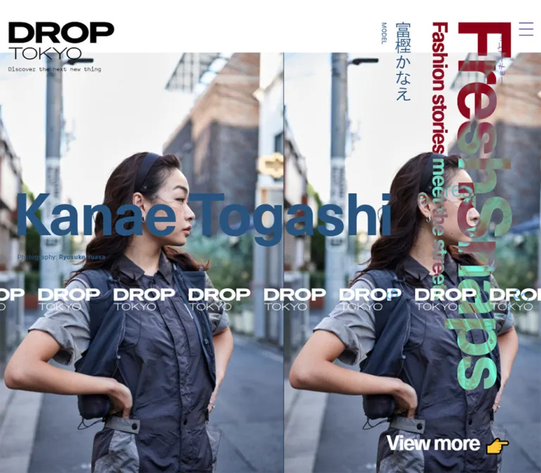
The first story is Ricca. On desktop, its English name is 153.6px, with its bounding box beginning near x = 36px, y = 475px. Credits begin at x = 48px, y = 653px. The Japanese identity sits much farther right, around x = 1051px, and the smaller role lane around x = 1024px.
On mobile, the English name turns sideways near the left side of the photograph. The Japanese name moves to approximately x = 218px, and the role to x = 204px. The credits are not visible in the opening mobile rendering, although credit text remains present in the supplied header text content. Do not conclude that all credits are removed from the mobile site: later portrait-index credits are included in the mobile evidence.
The featured sequence contains Ricca, Yuchami, Taishi Suzuki, Sho Kitani, Maylan, and kemio in that order. They are stacked down the document. The evidence does not establish that these entries form an autoplay carousel.
The visible photography, styling, and editing credits belong to individual editorial stories. They do not identify the website's designers or developers.
Featured Category Rail
Role: make FreshSnaps a large graphic presence over the photographic sequence.
“FreshSnaps” is set vertically along the right side on desktop, with “Fashion stories meet the streets” in a parallel, narrower lane immediately to its left. Their measured font sizes are 192px and 54px.
On mobile, both lanes move to the left: the category wrapper begins around x = 46.86px, and the subtitle around x = 20.05px. Their sizes become 86.67px and 24.375px. The text still overlaps the photograph and the person's name.
The screenshots show a complementary pink appearance over white and a changing color relationship over the photograph. The computed heading color remains mint. Treat the overlap as a distinct visual layer whose reproduction needs compositing tests, rather than assigning a different global color to every visible patch.
Repeated Wordmark Ribbon
Role: turn the publication identity into a horizontal graphic motif.
White DROP/TOKYO marks repeat across the photograph on a transparent background. In the first desktop capture, the ribbon appears around y = 780px. On mobile, it appears around y = 503px, just above the View more label.
Visual estimates put each desktop mark around 160–165px wide and each mobile mark around 73–75px wide. Marks at the edges are clipped, which makes the band read as a continuing sequence.
The still images establish repetition and clipping. They do not establish travel direction, animation speed, or whether the ribbon moves at all. A static implementation is a valid starting point until motion is independently verified.
Circular Category Lettering
Role: add a large, lightweight category marker in the right-hand space.
The circular text repeats FreshSnaps in the opening, JustDropped in the news capture, and WeDrop in the footer capture. It has no solid center or enclosing disc. Its teal letters overlap imagery, white space, and the footer surface.
The desktop diameter is visually about 420–440px, positioned in the lower-right portion of the viewport. The mobile diameter is about 185–200px, beginning around x = 230px and y = 190px, with the right side clipped.
Its placement is consistent across the supplied states, but no pointer-following behavior or continuous rotation was demonstrated. An SVG text path is a practical implementation recommendation, not a verified source technique.
Section Heading and Japanese Strip
Role: introduce a content index and maintain its category identity during browsing.
The indexes appear in this order:
| Section | English subtitle | Japanese UI label |
|---|---|---|
| JustDropped | From latest news to event photos | “最新ニュースからイベントスナップまで” |
| FreshSnaps | Fashion stories meet the streets | “ストリートから生まれるファッションストーリー” |
| WeDrop | Introducing new faces from our community | “コミュニティの気になる顔をピックアップ” |
Each section begins with a large English heading and a smaller English subtitle. A separate vertical Japanese label sits in the right-side lane on a solid section-colored strip.
At desktop size, headings use 144px type, while the Japanese strip uses 33.6px type with 5.6px padding. At mobile size, these become 36.56px, 15.17px, and 2.53px respectively. The mobile English subtitle falls to 13px, much smaller than the 24.375px subtitle in the opening feature rail.
Keep these two category-heading systems distinct: the opening rail is a large overlay; the index heading introduces a list in document flow.
JustDropped News Entry
Role: connect a campaign, collaboration, or event to its article.
The entry anatomy is a date, a large sideways English headline, a compound image link, and a Japanese summary below. Dates use the entry's accent color; the sampled English headlines are black.
The desktop image-link area is 480 × 635.98px. The captured On × POST ARCHIVE FACTION and A|X entries show an L-shaped composition: a wide tinted image across the upper portion, followed by a smaller natural-color image at lower left and white space at lower right. Visual estimates put the upper image near 480 × 338px and the lower image near 240 × 298px.
The English headline begins above the image and extends vertically over its left side. At 54px with a 44.4px line height, it is dense enough to behave like a poster caption. The date is a much smaller vertical annotation nearby.
The Japanese summary returns to horizontal reading at 16.8px / 25.2px, with a 28.8px gap below the image composition. It is the most conventional reading surface within this expressive layout.
On mobile, the articles stack at x = 22.20px. The image composition shrinks to 216.66 × 287.06px; English headlines remain sideways at 24.375px, and summaries use 13px / 19.5px. The remaining right-hand space is part of the layout.
The evidence does not determine whether image tinting is baked into the assets or applied with CSS.
FreshSnaps and WeDrop Portrait Entry
Role: index individual people and community profiles.
These entries use a 2:3 portrait link region, a large vertical English name, small editorial credits, a Japanese name, a role, and a date. Desktop image regions are 480 × 720px; mobile regions are approximately 216.66 × 325px.
The English name uses 108px desktop and 48.75px mobile type. The Japanese name remains in a separate vertical lane near the image's right side. Tiny dates and credits complete the editorial annotation.
Desktop entries occupy two columns. Mobile entries stack in one narrow column while preserving the vertical name and metadata arrangement. This creates compact portrait posters rather than standard image-above-title cards.
The supplied captures do not show every index portrait visually. The repeated component geometry is supported by the rendered DOM; individual unseen photographs should not be described or recreated from assumptions.
View More Link
Role: move from a featured story to its article, or from a homepage index to its category archive.
“View more 👉” is large, tightly tracked text with an emoji. There is no pill, filled button, or elevated container. It is white over featured photography and black after the content indexes.
The measured size is 54px on desktop and 24.375px on mobile. Archive links point to /justdropped/, /freshsnaps/, and /wedrop/. Featured photographic anchors point to individual articles.
For a new implementation, associate the featured label with the actual article link and provide a descriptive accessible name. The evidence's empty anchor text alone is insufficient to establish the original accessible name.
Footer Identity and Navigation
Role: close the publication index with a strong brand surface and provide broad navigation.
The footer is a full-width mint field with black content. It includes a small wordmark, a compact English mission paragraph, very large navigation, search, social symbols, utility links, and copyright text.
On desktop, Home, FreshSnaps, WeDrop, and JustDropped run across broad lines with slash separators. Home is light, while the category names are bold. Search occupies another large line with its label, input, and magnifying-glass symbol.
On mobile, the four navigation links become separate lines. The slashes are no longer visible. Search moves onto its own label line, with the input and icon underneath. Social symbols follow in a horizontal row. Utility links form two columns over three rows.
The utility labels include “運営会社,” “広告掲載,” “お問い合わせ,” “求人,” “利用規約,” and “プライバシーポリシー.” Their destinations are present in the DOM. No linked destination was opened as part of this analysis.
The desktop capture shows the persistent large masthead overlapping the smaller footer identity and introductory copy. Preserve this as a documented characteristic of the captured page; decide explicitly whether a new implementation should retain that overlap or introduce clearance.
Search and Social Controls
Role: support discovery and access to the publication's external channels.
Search is visually minimal: a transparent rectangular input with a thin black outline and a separate magnifying-glass symbol. The desktop input is visually about 600 × 77px; the mobile input is about 306 × 34px.
The search submission method, query parameter, results page, and validation were not inspected. Implement these through an actual search form and label rather than inferring a destination from the presence of an input.
Instagram, X, Threads, and Facebook appear as black symbols. Their links are present in the original-page evidence. Source custom properties reference dedicated search and social glyphs, but their font file was not identified.
Page Top Control
Role: provide a return route on a long homepage.
A burgundy “Page Top” label sits at the lower-right edge, split across two lines and accompanied by a thin upward triangular outline. It overlaps the surrounding composition rather than sitting in a filled button.
The DOM confirms a link to https://droptokyo.com/#pagetop. It does not confirm smooth scrolling, duration, or focus behavior after activation.
Tokens — Motion & Interaction
| Treatment | Evidence | What can be stated |
|---|---|---|
| Body text-color transition | color 0.6s cubic-bezier(0.55, 0.05, 0.22, 0.99) |
A 600ms color transition is declared; its trigger was not exercised |
| Japanese category-strip transition | Color and background-color, both 0.6s with the same easing |
Section-strip colors have a defined transition |
| Featured-name treatment | Text fill and text stroke, both 0.15s with the same easing |
A short 150ms title-state transition is declared |
| Ricca hover-class styling | Embedded style text sets title fill to rgba(127,127,127,.35) under .is-hover |
A class-based partial-fill state is defined; activation and complete stroke styling were not verified |
| Repeated logo band | Visible in static captures | Repetition is confirmed; movement is not |
| Circular category text | Visible in several capture states | Category text and placement are confirmed; rotation or cursor tracking is not |
| Menu | Closed icon visible | Open-state behavior is unverified |
| Search | Input and search symbol visible | Submission behavior is unverified |
| Page Top | Hash-link destination recorded | Scroll animation is unverified |
| Article and archive navigation | Original-page anchor destinations recorded | Link targets are known; destination page behavior was not inspected |
The sampled elements generally report animation: none. This does not rule out animation on unlisted descendants, pseudo-elements, or JavaScript-controlled layers. Properties reported only as transition: all do not establish a meaningful duration.
The inspection waited for initial rendering and sampled stability, traversed scroll positions, and temporarily paused perpetual animations during readiness checks before resuming them. Those procedures do not provide a motion recording or prove that every delayed interaction was observed.
For reuse, the two supported timing tokens are 150ms for title treatment and 600ms for color changes, both with cubic-bezier(0.55, 0.05, 0.22, 0.99). Keep any new marquee, orbital rotation, or menu transition separately labeled and tested.
Surfaces
| Layer | Appearance | Function |
|---|---|---|
| Editorial canvas | Flat white | Carries lists, summaries, and large open areas |
| Featured image plane | Large fashion photography with horizontal repetition | Main visual entry into stories |
| News image plane | Wide tinted image plus smaller lower image | Creates an editorial collage within the link region |
| Typography plane | Large names, sideways headlines, tiny credits | Places reading information directly over and around imagery |
| Category plane | Vertical lettering, narrow colored strips, circular text | Connects individual items to a publication section |
| Identity plane | Persistent black wordmark and white repeated logo ribbon | Keeps the brand present through the long page |
| Footer field | Saturated mint with black text | A large navigational and identity surface |
| Utility plane | Burgundy menu/brand accents and Page Top | Maintains simple navigation affordances |
Separation comes from scale, color, placement, and image boundaries. There is no observed system of soft shadows, frosted panels, or rounded card elevation.
Imagery
The current opening is a fashion portrait of Ricca wearing a sculptural olive-brown leather garment against a pale gray wall. The large crop emphasizes the face, collar, and material. A second presentation of the subject enters from the right, producing a continuous photographic strip rather than a simple centered portrait.
The mobile opening changes the crop substantially. The person is positioned toward the left, a large neutral wall area remains in the center, and another repeated subject is clipped at the right edge. The next story, Yuchami, begins below the first panel within the same 844px viewport.
The news capture combines a blue-tinted footwear image with a smaller natural-color photograph, and a pink-tinted fashion image with a smaller natural-color portrait. These treatments make article imagery function as part of the page's color system without adding separate decorative backgrounds to every item.
Preserve photographic detail, material texture, and natural image rendering. Pixelation is not part of this visual language. Use per-image focal points and appropriate crops; a universal centered object-position will not reproduce the mobile feature composition.
Observed Asset References
Original image src values, font-file URLs, and wordmark asset paths were not included. The following are content or glyph references, not downloadable image paths.
| Item | Evidence reference | Supported use |
|---|---|---|
| Ricca feature | Original-page article link | Featured subject, visible portrait composition, and associated editorial metadata |
| Yuchami feature | Original-page article link | Second featured entry and partial mobile photograph |
| On × POST ARCHIVE FACTION news | Original-page article link | News collage visible in the desktop capture |
| A|X collection snaps | Original-page article link | Pink-tinted news composition visible in the desktop capture |
| Wordmark and slogan | Source properties --c-icon--logo, --c-icon--logo_h, --c-icon--slogan |
Dedicated identity glyph references |
| Search and social symbols | Source properties including --c-icon--search, --c-icon--instagram, --c-icon--x, --c-icon--threads, --c-icon--facebook |
Dedicated interface glyph references |
The article destinations above were recorded as links on the homepage; their pages were not separately inspected. Use authorized photography and identity assets when implementing a related design.
Layout & Responsive Behavior
Desktop: Wide Features, Concentrated Indexes
At 1440px wide, the featured photograph spans the viewport, while its link region is 1116px tall. The first feature therefore continues below the 1000px capture. Its View more label is below the initial desktop fold; it is not missing.
The six featured panels occupy most of the first 7500px of the document. JustDropped begins around y = 7622px, FreshSnaps around y = 10849px, and WeDrop around y = 14091px. These are content-state measurements, not recommended fixed offsets.
The indexes shift to two 480px image columns, concentrated toward the left. Headlines extend outside their image rectangles, while category strips and circular text occupy the broad right side. A centered, evenly padded grid would materially alter this balance.
Mobile: Repositioned Identity and a Narrow Article Lane
At 390px wide, the first feature ends around y = 600px. The next feature's image begins near y = 697px, so the opening capture contains a preview of the next story.
The large category rail moves from right to left; the main brand moves from left to upper right and rotates; featured English names turn vertical; Japanese identity labels remain vertical. These changes redistribute the composition across the phone width.
News and portrait indexes become one column. Their images remain about 216.66px wide instead of filling the 390px viewport. This preserves room for the side labels and the distinctive asymmetry. Mobile news behavior is supported by DOM geometry even though a separate mobile news screenshot was not supplied.
The footer makes a different adaptation: its navigation becomes a broad vertical list, and the search field uses most of the available width. Utility links become a two-column arrangement.
Scaling Limits
The measured root font sizes are 21.6px on desktop and 13px on mobile. The source exposes the sampled viewport dimensions through --_w and --_h, but the complete scaling formulas and breakpoints were not supplied.
Several display elements share a desktop-to-mobile size ratio, while names, section headings, body text, and dates use different ratios. A single scale transform or one fluid root-size formula cannot reproduce all observed changes.
The CSS below uses separate desktop and mobile reference units and an explicitly recommended breakpoint. Intermediate widths, landscape phones, browser zoom, and very large displays still require testing.
Do’s and Don’ts
Do
- Preserve the publication structure: large featured stories followed by distinct news and people indexes.
- Let typography overlap photography and extend beyond image rectangles.
- Keep the heavy DROP and thin TOKYO relationship in the supplied identity artwork.
- Use separate English and Japanese typographic lanes.
- Preserve the mobile relocation of the brand and category rail.
- Give stories their own accent colors.
- Keep white space inside the news collage and beside the narrow article lane.
- Use square image edges and flat surfaces.
- Retain the white repeated-wordmark ribbon and lightweight circular category lettering.
- Distinguish measured source colors from their visible composited appearance.
- Keep dates, editorial credits, and Japanese summaries attached to the correct entries.
- Treat the footer as a major typographic surface with functioning navigation.
Don’t
- Don't replace the editorial sequence with a generic hero, benefits grid, and conversion banner.
- Don't turn every entry into a rounded, shadowed card.
- Don't center all mobile article images or automatically stretch them to full width.
- Don't remove the vertical text simply because the viewport is narrow.
- Don't use identical type scaling for featured names, section titles, summaries, and metadata.
- Don't interpret the burgundy source variable as the body background.
- Don't invent a font family for the logo or slogan.
- Don't infer autoplay, drag interaction, cursor tracking, or orbital rotation from still images.
- Don't claim the footer capture demonstrates an opened menu.
- Don't treat story photography and editing credits as website-production credits.
- Don't reproduce the smallest text sizes without considering readability and zoom.
- Don't assume an empty extracted anchor label proves the absence of an accessible name.
Recommended Implementation Additions
These are recommendations for a new implementation, not verified features of the original page:
- Use semantic article links with descriptive names, and mark repeated decorative image copies as hidden from assistive technology.
- Preserve a logical heading order even when headings are visually rotated or layered. The supplied DOM uses multiple section H1 elements; a new implementation can improve hierarchy without changing the appearance.
- Keep readable copies of important dates and credits. A minimum around 12px for metadata and 14–16px for sustained reading is a practical starting point.
- Give icon controls accessible labels and at least 44px interaction targets while retaining thin visible artwork.
- Add visible keyboard focus and ensure decorative rails, rings, and ribbons do not intercept pointer events.
- Provide a real search label and submission route. Do not infer the original route or parameter names.
- If a menu overlay is introduced, implement expanded state, focus management, Escape dismissal, and focus return.
- If continuous motion is added, provide reduced-motion behavior and a way to pause distracting movement.
- Test blended text over every photograph. Essential names and links should remain legible even when the decorative composite changes.
- Use responsive image sources, explicit dimensions, and appropriate lazy loading for the long index. Prioritize the first visible feature image.
- Test 200% zoom, long names, long Japanese summaries, and keyboard traversal through the layered composition.
Agent Prompt Guide
Quick Color Reference
- Main page: white
#ffffff. - Main text and identity: black
#000000. - Source feature-rail mint:
#00e8b2. - Footer approximation using an observed source token:
#00bd91. - Utility burgundy:
#7f2929. - Circular lettering approximation using an observed source token:
#389fb4. - JustDropped blue:
#0003e0. - Story accents: individually assigned, including gray
#7f7f7f, blue#29547f, violet#2911fe, and orange#fe7211. - Visible pink/mint category lettering requires a separately tested compositing treatment; the source blend mode is unknown.
Overall Prompt
“Create a Japanese street-fashion publication homepage inspired by the current Droptokyo composition. Use a white canvas, an oversized black graphic wordmark, fashion photography, tightly tracked sans-serif display type, vertical Japanese identity labels, and large sideways English names. Begin with a stack of large photographic features containing repeated imagery, a white repeated-wordmark ribbon, and an unboxed View more link. Follow with separate news and portrait indexes. On desktop, use two image columns concentrated toward the left and reserve the right side for narrow colored Japanese labels and circular category lettering. On mobile, rotate the brand into the upper-right corner, move the feature category rail to the left, and stack article entries in a narrow left-aligned lane. End with a mint footer, oversized category navigation, a rectangular search field, and black social symbols. Keep image edges square and surfaces flat.”
Example Component Prompts
- Featured story: “Build a large fashion-story panel with a repeated portrait strip, a 153.6px English name, compact desktop editorial credits, vertical Japanese name and role labels, and a white logo ribbon across the lower photograph. At 390px, use a roughly 504px-high image region, a vertical 48.75px English name, and a 24.375px View more label. Art-direct the mobile crop.”
- News entry: “Create a square-edged editorial news composition with a wide tinted lead image, a half-width natural-color image below it, and empty white space at lower right. Place a sideways English title across the left edge, a tiny colored date beside it, and a readable Japanese summary underneath. Use two 480px desktop columns with an 84px gap; switch to one approximately 217px image lane at 390px.”
- Portrait index: “Create a 2:3 fashion portrait entry with a large vertical English name, a separate Japanese name and role lane, and small editorial credits and date. Keep the information visually attached to the image while allowing the headline to overlap its boundary.”
- Category marker: “Set the category name around a large empty circle in teal. Clip part of the circle at the right viewport edge. Treat it as decoration with no pointer interception. Start static; do not invent an animation speed.”
- Footer: “Create a flat mint footer with a compact identity paragraph, very large black navigation, light Home lettering, bold category names, desktop slash separators, a plainly outlined search field, and black social symbols. On mobile, stack navigation links, remove visible slash separators, move the search label above its field, and arrange utility links in two columns.”
- Accessible adaptation: “Retain the rotated and overlapping editorial layout while giving every story a semantic link, preserving sensible reading order, increasing tiny metadata to a readable minimum, and ensuring fixed decorative elements cannot cover keyboard focus.”
Quick Start
CSS Custom Properties
This is a practical adaptation, not recovered source CSS. It keeps a conventional root font size and uses a length unit --dt-u to reproduce the measured reference dimensions at 1440px and 390px. The 48rem breakpoint is recommended, not observed.
The footer sizes and image-tile proportions are visual approximations. The category rail uses an optional difference blend to approximate its changing appearance; that mode is not verified as the original implementation. Metadata receives a readable minimum. No perpetual motion is enabled.
Suggested anatomy: .featured-sequence contains .feature articles and the category rail; each feature contains a clipped .feature-media with a .photo-track, identity labels, a .logo-ribbon, and a .feature-more link. Index sections contain .editorial-grid entries. Supply authorized wordmark and photography assets through normal image elements.
:root {
  /* Observed colors, with visual mappings documented above. */
  --dt-paper: #ffffff;
  --dt-ink: #000000;
  --dt-mint: #00e8b2;
  --dt-footer: #00bd91;
  --dt-chrome: #7f2929;
  --dt-orbit: #389fb4;
  --dt-news: #0003e0;

  /* Declared source stack; font files must be supplied separately. */
  --dt-font: neue-haas-unica, SystemSerif,
    toppan-bunkyu-gothic-pr6n, MyHiragino,
    Meiryo, Osaka, 'MS UI Gothic', 'MS PGothic', sans-serif;

  /* Recommended reference-unit system, not a source formula. */
  --dt-u: calc(100vw / 1440);
  --dt-gutter: calc(48 * var(--dt-u));
  --dt-top: calc(58.8 * var(--dt-u));
  --dt-feature-inset: calc(136.8 * var(--dt-u));
  --dt-feature-image-h: calc(1116 * var(--dt-u));
  --dt-card-w: calc(480 * var(--dt-u));
  --dt-grid-gap: calc(84 * var(--dt-u));
  --dt-news-h: calc(636 * var(--dt-u));
  --dt-card-head: calc(103.2 * var(--dt-u));

  --dt-feature-type: calc(153.6 * var(--dt-u));
  --dt-rail-type: calc(192 * var(--dt-u));
  --dt-section-type: calc(144 * var(--dt-u));
  --dt-profile-type: calc(108 * var(--dt-u));
  --dt-display-type: calc(54 * var(--dt-u));
  --dt-ja-type: calc(43.2 * var(--dt-u));
  --dt-strip-type: calc(33.6 * var(--dt-u));
  --dt-copy-type: calc(16.8 * var(--dt-u));
  --dt-credit-type: calc(14.4 * var(--dt-u));
  --dt-nav-type: calc(108 * var(--dt-u));

  --dt-ease: cubic-bezier(0.55, 0.05, 0.22, 0.99);
  --dt-title-motion: 150ms var(--dt-ease);
  --dt-color-motion: 600ms var(--dt-ease);
}

* { box-sizing: border-box; }

body {
  margin: 0;
  color: var(--dt-ink);
  background: var(--dt-paper);
  font-family: var(--dt-font);
}

img { display: block; max-width: 100%; }
a { color: inherit; }
button, input { font: inherit; }

/* A supplied graphic asset carries the wordmark geometry. */
.site-brand {
  position: fixed;
  z-index: 50;
  top: var(--dt-top);
  left: var(--dt-gutter);
  width: calc(275.2 * var(--dt-u));
}
.site-brand img { width: 100%; }

.menu-button {
  position: fixed;
  z-index: 60;
  top: var(--dt-top);
  right: 18px;
  display: grid;
  align-content: space-around;
  width: 44px;
  height: 44px;
  padding: 6px 3px;
  border: 0;
  color: var(--dt-chrome);
  background: transparent;
}
.menu-button span { height: 1px; background: currentColor; }

.featured-sequence {
  position: relative;
  isolation: isolate;
  background: var(--dt-paper);
}
.feature {
  --story-accent: #7f7f7f;
  position: relative;
  height: calc(var(--dt-feature-inset) + var(--dt-feature-image-h));
  color: var(--story-accent);
}
.feature-media {
  position: absolute;
  inset: var(--dt-feature-inset) 0 0;
  overflow: hidden;
}
.photo-track {
  display: flex;
  width: max-content;
  height: 100%;
}
.photo-track img {
  /* Approximate tile ratio; tune for the actual photography. */
  flex: 0 0 auto;
  width: calc(var(--dt-feature-image-h) * 0.8);
  max-width: none;
  height: 100%;
  object-fit: cover;
  object-position: var(--photo-position, center);
}
.feature-name {
  position: absolute;
  z-index: 2;
  top: calc(475.05 * var(--dt-u));
  left: calc(36 * var(--dt-u));
  margin: 0;
  font-size: var(--dt-feature-type);
  font-weight: 700;
  line-height: 0.88889;
  letter-spacing: -0.025em;
  transition: -webkit-text-fill-color var(--dt-title-motion),
    -webkit-text-stroke var(--dt-title-motion);
}
.feature-credits {
  position: absolute;
  z-index: 2;
  top: calc(652.95 * var(--dt-u));
  left: var(--dt-gutter);
  margin: 0;
  font-size: max(12px, var(--dt-credit-type));
  line-height: 1.25;
  letter-spacing: 0.05em;
}
.feature-ja,
.feature-role {
  position: absolute;
  z-index: 2;
  top: calc(56.4 * var(--dt-u));
  margin: 0;
  writing-mode: vertical-rl;
}
.feature-ja {
  left: calc(1050.73 * var(--dt-u));
  font-size: var(--dt-ja-type);
  line-height: 1.3;
  letter-spacing: -0.025em;
}
.feature-role {
  left: calc(1023.61 * var(--dt-u));
  font-size: max(12px, var(--dt-credit-type));
  line-height: 1;
}
.feature-rail,
.feature-tagline {
  position: absolute;
  z-index: 4;
  margin: 0;
  color: var(--dt-mint);
  writing-mode: vertical-rl;
  text-orientation: sideways;
  font-weight: 600;
  line-height: 1;
  letter-spacing: -0.05em;
  pointer-events: none;
  /* Optional approximation; the original blend mode is unknown. */
  mix-blend-mode: difference;
}
.feature-rail {
  top: calc(43.2 * var(--dt-u));
  right: calc(42.6 * var(--dt-u));
  font-size: var(--dt-rail-type);
}
.feature-tagline {
  top: calc(54.6 * var(--dt-u));
  right: calc(236.4 * var(--dt-u));
  font-size: var(--dt-display-type);
}
.logo-ribbon {
  position: absolute;
  z-index: 3;
  top: calc(780 * var(--dt-u));
  inset-inline: 0;
  display: flex;
  align-items: center;
  gap: calc(32 * var(--dt-u));
  overflow: hidden;
  pointer-events: none;
}
.logo-ribbon img {
  flex: 0 0 auto;
  width: calc(164 * var(--dt-u));
  filter: brightness(0) invert(1);
}
.feature-more {
  position: absolute;
  z-index: 5;
  right: calc(80.4 * var(--dt-u));
  bottom: calc(54 * var(--dt-u));
  color: white;
  font-size: var(--dt-display-type);
  line-height: 1;
  letter-spacing: -0.05em;
  text-decoration: none;
}

.editorial-section {
  position: relative;
  padding-top: var(--dt-top);
  margin-block: calc(105 * var(--dt-u));
}
.section-heading {
  margin: 0 var(--dt-gutter) calc(102 * var(--dt-u));
  color: var(--section-accent, var(--dt-news));
}
.section-heading h2 {
  margin: 0;
  font-size: var(--dt-section-type);
  font-weight: 600;
  line-height: 1;
  letter-spacing: -0.045em;
}
.section-heading p {
  margin: 0.2em 0 0;
  font-size: var(--dt-display-type);
  line-height: 1;
  letter-spacing: -0.05em;
}
.section-strip {
  position: absolute;
  top: calc(87 * var(--dt-u));
  right: calc(135.2 * var(--dt-u));
  margin: 0;
  padding: 0.166667em;
  writing-mode: vertical-rl;
  font-size: var(--dt-strip-type);
  line-height: 1;
  letter-spacing: -0.025em;
  background: var(--section-accent, var(--dt-news));
  transition: color var(--dt-color-motion),
    background-color var(--dt-color-motion);
}
.editorial-grid {
  display: grid;
  grid-template-columns: repeat(2, var(--dt-card-w));
  gap: calc(72 * var(--dt-u)) var(--dt-grid-gap);
  margin-left: var(--dt-gutter);
}
.editorial-card {
  position: relative;
  min-width: 0;
  padding-top: var(--dt-card-head);
}
.card-title {
  position: absolute;
  z-index: 2;
  top: 0;
  left: -0.4em;
  inline-size: calc(var(--dt-news-h) + var(--dt-card-head));
  margin: 0;
  writing-mode: vertical-rl;
  text-orientation: sideways;
  font-size: var(--dt-display-type);
  font-weight: 600;
  line-height: 0.82222;
  letter-spacing: -0.025em;
}
.card-date {
  position: absolute;
  top: 0;
  left: calc(150 * var(--dt-u));
  writing-mode: vertical-rl;
  color: var(--story-accent, var(--dt-news));
  font-size: 12px;
}
.news-media {
  display: grid;
  grid-template-columns: 1fr 1fr;
  grid-template-rows: 53.1% 46.9%;
  height: var(--dt-news-h);
}
.news-media img { width: 100%; height: 100%; object-fit: cover; }
.news-media .lead-image { grid-column: 1 / -1; }
.news-media .detail-image { grid-column: 1; }
.card-summary {
  margin: calc(28.8 * var(--dt-u)) 0 0;
  font-size: max(14px, var(--dt-copy-type));
  font-weight: 600;
  line-height: 1.5;
  letter-spacing: 0.01em;
}
.profile-media { display: block; aspect-ratio: 2 / 3; }
.profile-media img { width: 100%; height: 100%; object-fit: cover; }
.profile-card .card-title {
  font-size: var(--dt-profile-type);
  line-height: 1;
  color: var(--story-accent, #7f7f7f);
}

.category-ring {
  position: fixed;
  z-index: 10;
  top: 47vh;
  right: -1vw;
  width: 30vw;
  height: auto;
  overflow: visible;
  color: var(--dt-orbit);
  pointer-events: none;
}
.category-ring text { fill: currentColor; font: 22px var(--dt-font); }

.site-footer {
  padding: calc(48 * var(--dt-u)) var(--dt-gutter)
    calc(90 * var(--dt-u));
  color: var(--dt-ink);
  background: var(--dt-footer);
}
.footer-about { max-width: 1100px; font-size: 14px; line-height: 1.4; }
.footer-nav {
  display: flex;
  flex-wrap: wrap;
  max-width: calc(1250 * var(--dt-u));
  margin-top: calc(64 * var(--dt-u));
  font-size: var(--dt-nav-type);
  line-height: 1.04;
  letter-spacing: -0.035em;
}
.footer-nav a { font-weight: 700; text-decoration: none; }
.footer-nav .home { font-weight: 200; }
.footer-nav a::after { content: '/'; font-weight: 200; }
.footer-search {
  display: flex;
  align-items: center;
  gap: 12px;
}
.footer-search label { font-size: var(--dt-nav-type); line-height: 1; }
.footer-search input {
  width: min(42vw, 600px);
  min-width: 0;
  height: calc(77 * var(--dt-u));
  padding: 8px;
  border: 2px solid currentColor;
  border-radius: 0;
  color: inherit;
  background: transparent;
}
.footer-search button,
.footer-social a {
  display: inline-grid;
  place-items: center;
  min-width: 44px;
  min-height: 44px;
  border: 0;
  color: inherit;
  background: transparent;
}
.footer-social { display: flex; gap: 12px; margin-block: 48px 28px; }
.footer-utility { display: flex; flex-wrap: wrap; gap: 8px 16px; }
.footer-utility a { font-size: 14px; text-decoration: none; }
.page-top {
  position: fixed;
  z-index: 40;
  right: 3vw;
  bottom: 8vh;
  color: var(--dt-chrome);
  font-size: var(--dt-display-type);
  font-weight: 700;
  line-height: 0.9;
  text-decoration: none;
}
.page-top span { display: block; }

/* Recommended breakpoint; only the two supplied sizes were inspected. */
@media (max-width: 48rem) {
  :root {
    --dt-u: calc(100vw / 390);
    --dt-gutter: calc(22.203 * var(--dt-u));
    --dt-top: calc(27.078 * var(--dt-u));
    --dt-feature-inset: calc(96.406 * var(--dt-u));
    --dt-feature-image-h: calc(503.75 * var(--dt-u));
    --dt-card-w: calc(216.656 * var(--dt-u));
    --dt-news-h: calc(287.062 * var(--dt-u));
    --dt-card-head: calc(46.578 * var(--dt-u));
    --dt-feature-type: calc(48.75 * var(--dt-u));
    --dt-rail-type: calc(86.667 * var(--dt-u));
    --dt-section-type: calc(36.5625 * var(--dt-u));
    --dt-profile-type: calc(48.75 * var(--dt-u));
    --dt-display-type: calc(24.375 * var(--dt-u));
    --dt-ja-type: calc(19.5 * var(--dt-u));
    --dt-strip-type: calc(15.167 * var(--dt-u));
    --dt-copy-type: calc(13 * var(--dt-u));
    --dt-nav-type: calc(48.75 * var(--dt-u));
  }

  .site-brand {
    left: calc(273.64 * var(--dt-u));
    width: calc(100 * var(--dt-u));
    transform: rotate(90deg);
    transform-origin: calc(24.5 * var(--dt-u)) calc(24.5 * var(--dt-u));
  }
  .menu-button { right: 13px; }
  .photo-track {
    /* Starting crop only; adjust to the subject in each photograph. */
    transform: translateX(calc(-142 * var(--dt-u)));
  }
  .feature-name {
    top: var(--dt-top);
    left: calc(100 * var(--dt-u));
    writing-mode: vertical-rl;
    text-orientation: sideways;
  }
  .feature-credits { display: none; }
  .feature-ja { top: calc(26 * var(--dt-u)); left: calc(218.09 * var(--dt-u)); }
  .feature-role { top: var(--dt-top); left: calc(203.69 * var(--dt-u)); }
  .feature-rail {
    top: calc(20.05 * var(--dt-u));
    right: auto;
    left: calc(46.86 * var(--dt-u));
  }
  .feature-tagline {
    top: calc(25.19 * var(--dt-u));
    right: auto;
    left: calc(20.05 * var(--dt-u));
  }
  .logo-ribbon { top: calc(503 * var(--dt-u)); gap: calc(15 * var(--dt-u)); }
  .logo-ribbon img { width: calc(74 * var(--dt-u)); }
  .feature-more {
    right: calc(16.78 * var(--dt-u));
    bottom: calc(24.92 * var(--dt-u));
  }
  .editorial-section { margin-block: calc(14.34 * var(--dt-u)); }
  .section-heading { margin-bottom: calc(31.4 * var(--dt-u)); }
  .section-heading h2 { letter-spacing: -0.04em; }
  .section-heading p { font-size: max(13px, calc(13 * var(--dt-u))); }
  .section-strip { top: calc(34.39 * var(--dt-u)); right: calc(23.92 * var(--dt-u)); }
  .editorial-grid { grid-template-columns: var(--dt-card-w); row-gap: calc(32.5 * var(--dt-u)); }
  .card-date { left: calc(75 * var(--dt-u)); }
  .card-summary { margin-top: calc(13 * var(--dt-u)); }
  .category-ring { top: 22.3vh; right: -9vw; width: 50vw; }
  .footer-nav { display: block; }
  .footer-nav a { display: block; }
  .footer-nav a::after { content: none; }
  .footer-search { display: grid; grid-template-columns: minmax(0, 1fr) 44px; gap: 8px; }
  .footer-search label { grid-column: 1 / -1; }
  .footer-search input { width: 100%; height: 44px; }
  .footer-utility { display: grid; grid-template-columns: max-content max-content; }
  .page-top { right: 17px; bottom: 4.5vh; }
}

/* Recommended keyboard treatment and motion preference support. */
:where(a, button, input):focus-visible {
  outline: 3px solid currentColor;
  outline-offset: 4px;
}
@media (prefers-reduced-motion: reduce) {
  .feature-name, .section-strip { transition: none; }
  html { scroll-behavior: auto; }
}
The mobile credit-hiding rule above applies only to the featured credit block. Keep portrait-index credits available. The enlarged role labels, metadata, footer paragraph, and search field are intentional usability adaptations and can require small positional adjustments.
The code supplies a visual shell. Add real article links, a working search handler, named social links, and an accessible menu according to the new project's requirements. Avoid placing one link inside another when making the entire photograph clickable.
Circular Text Example
This SVG is a recommended static construction. Change the repeated words when the relevant category changes. If multiple copies are mounted, give each path a unique ID.
<svg class="category-ring" viewBox="0 0 200 200"
     aria-hidden="true" focusable="false">
  <defs>
    <path id="category-orbit"
      d="M100,20 a80,80 0 1,1 0,160 a80,80 0 1,1 0,-160" />
  </defs>
  <text textLength="502" lengthAdjust="spacing">
    <textPath href="#category-orbit">FreshSnaps FreshSnaps FreshSnaps </textPath>
  </text>
</svg>
Tailwind v4 Token Mapping
Optional aliases for an implementation already using Tailwind v4. This does not identify the original site's framework. Define the --dt- properties above first.
@theme inline {
  --color-paper: var(--dt-paper);
  --color-ink: var(--dt-ink);
  --color-mint: var(--dt-mint);
  --color-footer: var(--dt-footer);
  --color-chrome: var(--dt-chrome);
  --color-orbit: var(--dt-orbit);
  --color-news: var(--dt-news);

  --font-editorial: var(--dt-font);
  --text-feature: var(--dt-feature-type);
  --text-rail: var(--dt-rail-type);
  --text-section: var(--dt-section-type);
  --text-profile: var(--dt-profile-type);
  --text-display: var(--dt-display-type);

  --spacing-page: var(--dt-gutter);
  --spacing-card: var(--dt-card-w);
  --spacing-editorial-gap: var(--dt-grid-gap);
}
Sources & Evidence
- Inspected original and final page: Droptokyo, HTTP 200. Both supplied URL fields identify the same homepage.
- Capture timestamp:
2026-10-01T17:03:24.235Z, equivalent to October 2, 2026, 02:03:24 JST. - Desktop evidence: 1440 × 1000 CSS pixels; current-page captures of the opening feature, a JustDropped list position, and the footer; rendered document height approximately 18,455px.
- Mobile evidence: 390 × 844 CSS pixels; current-page captures of the opening and footer; rendered document height approximately 12,394px. Index layout measurements also come from the mobile DOM extract.
- Measurement evidence: supplied rendered text, anchor destinations, element rectangles, computed typography, backgrounds, colors, transitions, and custom properties. Embedded style text supplies limited evidence of a featured-title hover-class treatment.
- Observed inspection activity: initial rendering checks and scroll traversal. Menu opening, search submission, article navigation, hover activation, keyboard operation, and Page Top activation were not demonstrated.
- Limitations: no complete stylesheet, font-file list, image asset URLs, motion recording, or intermediate viewport inspection was supplied. Footer and decorative details without individual DOM measurements are explicitly marked as visual estimates. Fixed-position behavior is inferred from persistent placement across captures where the positioning declaration is unavailable.
This document describes the current homepage shown in the supplied evidence. The reusable CSS and prompts are implementation guidance, with measured geometry, visual estimates, and recommended additions kept separate.
# Droptokyo — Style Reference

> A street-fashion magazine where oversized type, photographic repetition, and vertical labels share the same page.

**Website:** [droptokyo.com](https://droptokyo.com/)
**Original URL:** https://droptokyo.com/
**Final URL:** https://droptokyo.com/
**Response:** HTTP 200; original and final URLs are identical.
**Theme:** white editorial canvas, black typography, individual story colors, and a saturated mint footer. No theme-selection interface was verified.
**Inspected:** October 2, 2026, at 02:03:24 JST; supplied retrieval timestamp: `2026-10-01T17:03:24.235Z`.
**Viewports:** 1440 × 1000 and 390 × 844 CSS pixels.
**Scope:** the current homepage, including six featured stories, JustDropped, FreshSnaps, WeDrop, persistent identity elements, category decorations, and the footer. Desktop captures show the opening, a news-list position, and the footer. Mobile captures show the opening with the next story entering view, and the footer. Additional list geometry comes from the supplied rendered DOM.

Droptokyo presents fashion as an editorial composition. Large photographs occupy the featured sequence; names, Japanese identity labels, category titles, and repeated wordmarks overlap them. English titles turn sideways, Japanese labels run vertically, and circular category lettering occupies the right side of the viewport. White space separates these layers without containing them in conventional boxes.

The page has two distinct reading speeds. Featured stories are large photographic encounters. The subsequent indexes provide dates, English headlines, Japanese summaries, and compact editorial credits. A mint footer becomes a second major typographic composition, with oversized category links and a plainly outlined search field. The practical reference is this relationship between expressive presentation and a working publication index.
閉じる
# Droptokyo — Style Reference

> A street-fashion magazine where oversized type, photographic repetition, and vertical labels share the same page.

**Website:** [droptokyo.com](https://droptokyo.com/)
**Original URL:** https://droptokyo.com/
**Final URL:** https://droptokyo.com/
**Response:** HTTP 200; original and final URLs are identical.
**Theme:** white editorial canvas, black typography, individual story colors, and a saturated mint footer. No theme-selection interface was verified.
**Inspected:** October 2, 2026, at 02:03:24 JST; supplied retrieval timestamp: `2026-10-01T17:03:24.235Z`.
**Viewports:** 1440 × 1000 and 390 × 844 CSS pixels.
**Scope:** the current homepage, including six featured stories, JustDropped, FreshSnaps, WeDrop, persistent identity elements, category decorations, and the footer. Desktop captures show the opening, a news-list position, and the footer. Mobile captures show the opening with the next story entering view, and the footer. Additional list geometry comes from the supplied rendered DOM.

Droptokyo presents fashion as an editorial composition. Large photographs occupy the featured sequence; names, Japanese identity labels, category titles, and repeated wordmarks overlap them. English titles turn sideways, Japanese labels run vertically, and circular category lettering occupies the right side of the viewport. White space separates these layers without containing them in conventional boxes.

The page has two distinct reading speeds. Featured stories are large photographic encounters. The subsequent indexes provide dates, English headlines, Japanese summaries, and compact editorial credits. A mint footer becomes a second major typographic composition, with oversized category links and a plainly outlined search field. The practical reference is this relationship between expressive presentation and a working publication index.

## How to Read This Reference

- **Measured** values come from the supplied computed styles and element rectangles. Tables round some measurements to two decimal places.
- **Visual estimates** come from the supplied current-page screenshots. Footer typography, icon dimensions, circular lettering, and some image subdivisions were not individually measured in the DOM extract.
- **Calculated** values are arithmetic relationships between measurements, such as column gaps and image aspect ratios. They do not establish the original CSS formulas.
- **Recommended** treatments describe a new implementation. The CSS, breakpoint, accessibility improvements, and compositing approximations below are explicitly adaptations.
- **Named tokens** beginning with `--dt-` are implementation aliases. Only properties labeled as source properties were present in the evidence.
- The computed font stack is known; the actual font file used for each glyph was not separately verified.
- Rotated elements sometimes have zero-height wrappers or unusually tall bounding rectangles. These are not reliable estimates of their painted text height. Use the screenshots and computed type sizes together.
- This reference analyzes the supplied inspection. No additional pages, files, or assets were accessed.

## Tokens — Colors

### Default Palette

| Name | Value | Evidence | Role and implementation alias |
| --- | --- | --- | --- |
| Editorial White | `#ffffff` | Measured HTML and body background | Main canvas and open space between content; `--dt-paper` |
| Black Ink | `#000000` | Measured body color; source `--color-text` | Main text, wordmarks, footer links, and social symbols; `--dt-ink` |
| Accent Mint | `#00e8b2` | Source `--color-accent`; measured FreshSnaps heading color | Underlying color of the large category lettering; `--dt-mint` |
| Adjusted Mint | `#00bd91` | Source `--color-accent-adjusted` | Consistent with the visible mint footer; the footer background declaration itself was not included; `--dt-footer` |
| Burgundy | `#7f2929` | Source `--color-background`; measured desktop Japanese brand label | Utility lettering and visually corresponding menu/Page Top treatment; `--dt-chrome` |
| Orbit Teal | `#389fb4` | Source `--color-background--neighbor` | Consistent with the visible circular category lettering; its individual computed color was not supplied; `--dt-orbit` |
| News Blue | `#0003e0` | Measured JustDropped section heading and Japanese strip background | Strong section identifier; `--dt-news` |
| Ricca Gray | `#7f7f7f` | Measured featured title, credits, and identity labels | Story-specific typography; example `--story-accent` |

**Source names do not necessarily describe the visible page surface.** Although `--color-background` is burgundy, the measured body background is white. Likewise, the main FreshSnaps heading computes to mint while the screenshots show pink, muted red, and mint across different underlying regions.

This is evidence of a layered visual result, but the supplied properties do not establish the complete blend, filter, opacity, or duplicate-layer implementation. Preserve the distinction between a declared color and its visible composite. Do not describe the category title as a verified gradient.

The source also exposes adjusted and neighboring colors, including `#601f1f`, `#4cb3c8`, `#45ff5d`, `#1fff3d`, and `#38ffd1`. Their presence does not establish additional user-selectable themes or visible component states.

### Story and Section Colors

| Context | Measured color | Application |
| --- | --- | --- |
| Yuchami featured story | `#29547f` | English name, Japanese name, role, and desktop credits |
| Sho Kitani featured story | `#2911fe` | Story typography |
| Maylan featured story | `#fe7211` | Story typography |
| kemio featured story | `#e3d997` | Story typography |
| FreshSnaps index heading | `#a8b2b4` | Section title, subtitle, and Japanese strip background |
| WeDrop index heading | `#7f7f7f` | Section title, subtitle, and Japanese strip background |
| A\|X news item dated September 18 | `#924574` | Date/header accent; its image appears pink-tinted in the capture |
| Nico Ando index entry | `#fed711` | Portrait-entry typography |
| Ninon index entry | `#435741` | Portrait-entry typography |

Colors belong to individual stories as well as sections. A reusable implementation should allow a per-entry accent instead of forcing every person into one global brand color.

## Tokens — Typography

### Editorial Sans-Serif Stack

The measured body and sampled text elements declare:

```css
font-family: neue-haas-unica, SystemSerif,
  toppan-bunkyu-gothic-pr6n, MyHiragino,
  メイリオ, Meiryo, Osaka, 'MS UI Gothic',
  'MS Pゴシック', 'MS PGothic', sans-serif;
```

The leading declared Latin family is `neue-haas-unica`; the Japanese stack includes `toppan-bunkyu-gothic-pr6n`. `SystemSerif` and `MyHiragino` are names in the declaration, not independently identified font files. Do not substitute a different named typeface and describe it as the original.

The visual character is an assertive sans-serif: heavy names, tightly spaced display headings, compact supporting labels, and relatively restrained Japanese summaries. Measured weights are primarily `400`, `600`, and `700`.

### Wordmark and Slogan

The visible identity combines a very heavy DROP with a thin TOKYO beneath it. The desktop slogan, “Discover the next new thing,” has a small, widely spaced, monospaced-looking appearance. No separate slogan font was established.

Source properties include `--c-icon--logo`, `--c-icon--logo_h`, and `--c-icon--slogan`, indicating dedicated glyph references. The graphic wordmark should not be reconstructed by setting the H1 text at its computed font size. Its visible geometry differs substantially from the H1's `38.27px` desktop and `23.03px` mobile text values.

Use an authorized wordmark asset or an equivalent identity asset supplied for the new project. The original asset URL and icon-font family were not provided.

### Type Scale

All values in this table are measured. Size and line height are in CSS pixels.

| Role | Desktop size / line height | Mobile size / line height | Weight | Tracking |
| --- | --- | --- | --- | --- |
| Body inheritance | `21.6 / 32.4` | `13 / 19.5` | 400 | Normal |
| Featured category rail | `192 / 192` | `86.67 / 86.67` | 600 | `-0.05em` |
| Featured category subtitle | `54 / 54` | `24.375 / 24.375` | 600 | `-0.05em` |
| Featured English name | `153.6 / 136.53` | `48.75 / 43.33` | 700 | `-0.025em` |
| Featured Japanese name | `43.2 / 56.16` | `19.5 / 25.35` | 400 | `-0.025em` |
| Person's role label | `14.4 / 14.4` | `8.67 / 8.67` | 400 | Normal |
| Featured editorial credits | `14.4 / 18` | Not visible in mobile opening | 400 | `0.05em` on desktop |
| Index section heading | `144 / 144` | `36.56 / 36.56` | 600 | Desktop `-0.045em`; mobile `-0.04em` |
| Index section subtitle | `54 / 54` | `13 / 13` | 600 | `-0.05em` |
| Japanese category strip | `33.6 / 33.6` | `15.17 / 15.17` | 400 | `-0.025em` |
| News English headline | `54 / 44.4` | `24.375 / 20.04` | 600 | `-0.025em` |
| News Japanese summary | `16.8 / 25.2` | `13 / 19.5` | 600 | `0.01em` |
| Article date | `9.6 / 9.6` | `6.5 / 6.5` | 400 | Normal |
| Portrait-index English name | `108 / 108` | `48.75 / 48.75` | 600 | `-0.025em` |
| Portrait-index credits | `9.6 / 12` | `6.5 / 8.125` | 400 | `-0.05em` |
| View more label/link | `54 / 54` | `24.375 / 24.375` | 400 | `-0.05em` |

The enormous difference between display text and metadata is essential. The mobile design retains unusually small dates and credits rather than scaling every role uniformly.

### Footer Type — Visual Estimates

| Role | Desktop estimate | Mobile estimate | Appearance |
| --- | --- | --- | --- |
| Main navigation | Approximately `104–108px` | Approximately `48–50px` | Home is light; category names are bold |
| Search label | Approximately `104–108px` | Approximately `48–50px` | Regular sans-serif |
| Mission paragraph | Approximately `12px` | Approximately `6–7px` | Dense black copy near the small footer wordmark |
| Legal/utility links | Approximately `14px` | Approximately `13px` | Compact, ordinary text links |
| Page Top | Approximately `52–54px` | Approximately `24px` | Bold burgundy, split across two lines |

These estimates describe the capture, not recommended minimum reading sizes. A new implementation should increase the smallest informational text while retaining the strong difference in scale.

## Tokens — Spacing & Shapes

**Density:** large photographic fields and generous unused areas, interrupted by tightly packed typographic overlays.
**Geometry:** square image edges, rectangular inputs, straight menu strokes, and circular text paths.
**Elevation:** no general card-shadow system is visible.

### Spacing Scale

| Use | Desktop | Mobile | Evidence |
| --- | --- | --- | --- |
| Main content left inset | `48px` | `22.20px` | Measured |
| Common section top padding | `58.8px` | `27.08px` | Measured |
| News column gap | `84px` | One column | Calculated from measured x positions and widths |
| Image-to-news-summary gap | `28.8px` | `13px` | Calculated from measured rectangles |
| News summary to next row/header | `72px` | `32.5px` | Calculated for sampled entries |
| Japanese strip padding | `5.6px` | `2.53px` | Measured |
| Featured View more bottom padding | `54px` | `24.92px` | Measured |
| Search outline | Approximately `2px` | Approximately `2px` | Visual estimate |
| Hamburger strokes | Approximately `1–2px` | Approximately `1–2px` | Visual estimate |

### Border Radius

| Element | Observed treatment |
| --- | --- |
| Featured photographs | Square edges |
| News image compositions | Square edges |
| Portrait-index image links | Square edges |
| Japanese category strips | Rectangular, no visible rounding |
| Footer search input | Rectangular, no visible rounding |
| Menu control | Unboxed strokes |
| Circular category lettering | Text arranged around a circle; not a filled circular button |

Sampled content elements report `border-radius: 0px`. The circular Instagram symbol is part of the social icon artwork and does not establish a rounded-container system.

### Layout Measurements

| Element | 1440 × 1000 | 390 × 844 | Interpretation |
| --- | --- | --- | --- |
| Document height | Approximately `18,455px` | Approximately `12,394px` | Measured document extent |
| Header wrapper height | `0px` | `0px` | Identity elements do not behave like an ordinary in-flow header row |
| Main brand wrapper | x `48.02`, y `58.80`, width `275.19px` | x `273.64`, y `27.08`, width `48.94px` | Mobile wrapper is associated with the rotated identity |
| First featured image-link region | x `0`, y `136.80`, `1440 × 1116px` | x `0`, y `96.41`, `390 × 503.75px` | Link region, not an intrinsic image size |
| Featured-story vertical pitch | Approximately `1252.80px` | Approximately `600.16px` | Calculated from successive story positions |
| First/second desktop news columns | x `48` / `612` | Both begin at x `22.20` in successive rows | Actual two-column to one-column change |
| News image-link region | `480 × 635.98px` | `216.66 × 287.06px` | Compound image composition |
| Portrait-index image-link region | `480 × 720px` | `216.66 × 324.98px` | Calculated aspect ratio `2:3` |
| Japanese category strip width | `44.78px` | `20.20px` | Measured JustDropped strip |
| Japanese category strip x position | `1260px` | `345.88px` | Right-side category lane |

The desktop news image area spans two 480px columns with an 84px gap, giving a 1044px content span. Its right edge is at x = 1092px, leaving 348px for open space and overlapping category elements. On mobile, the image width is only about 55.56% of the viewport. Preserve this narrow, left-biased article lane when reproducing the observed composition.

## Components

### Persistent Identity and Menu Control

**Role:** keep the publication recognizable throughout a long page.

On desktop, the black DROP/TOKYO mark sits at approximately x = 48px, y = 59px. Its slogan appears underneath. A separate burgundy Japanese brand label, “ドロップトーキョー,” runs vertically near the upper-right edge. Three thin horizontal strokes form the menu affordance at the far right.

The identity occupies the same viewport corner in the opening, news, and footer captures. It visibly overlaps later content, including the footer's smaller wordmark. This persistence is observed; the precise original fixed/sticky positioning declarations were not supplied.

On mobile, the identity rotates into a narrow vertical mark near x = 274px. The menu remains to its right. The separate Japanese brand label is absent from the mobile rendered text. This is a composition change, not a scaled desktop navigation bar.

The menu's open state, available items, animation, and dismissal behavior were not exercised. The mint area shown in the captures is the page footer.

### Featured Story Panel

**Role:** a large visual entry point into an individual fashion story.

Each panel combines five content layers:

1. A full-width photographic link region showing horizontally repeated or adjacent presentations of the same subject.
2. A large English name and, on desktop, a compact editorial-credit block.
3. A Japanese name and a smaller bilingual role in separate vertical lanes.
4. A white repeated-wordmark ribbon across the lower photograph.
5. A white “View more 👉” label near the lower-right edge.

The first story is Ricca. On desktop, its English name is `153.6px`, with its bounding box beginning near x = 36px, y = 475px. Credits begin at x = 48px, y = 653px. The Japanese identity sits much farther right, around x = 1051px, and the smaller role lane around x = 1024px.

On mobile, the English name turns sideways near the left side of the photograph. The Japanese name moves to approximately x = 218px, and the role to x = 204px. The credits are not visible in the opening mobile rendering, although credit text remains present in the supplied header text content. Do not conclude that all credits are removed from the mobile site: later portrait-index credits are included in the mobile evidence.

The featured sequence contains Ricca, Yuchami, Taishi Suzuki, Sho Kitani, Maylan, and kemio in that order. They are stacked down the document. The evidence does not establish that these entries form an autoplay carousel.

The visible photography, styling, and editing credits belong to individual editorial stories. They do not identify the website's designers or developers.

### Featured Category Rail

**Role:** make FreshSnaps a large graphic presence over the photographic sequence.

“FreshSnaps” is set vertically along the right side on desktop, with “Fashion stories meet the streets” in a parallel, narrower lane immediately to its left. Their measured font sizes are `192px` and `54px`.

On mobile, both lanes move to the left: the category wrapper begins around x = 46.86px, and the subtitle around x = 20.05px. Their sizes become `86.67px` and `24.375px`. The text still overlaps the photograph and the person's name.

The screenshots show a complementary pink appearance over white and a changing color relationship over the photograph. The computed heading color remains mint. Treat the overlap as a distinct visual layer whose reproduction needs compositing tests, rather than assigning a different global color to every visible patch.

### Repeated Wordmark Ribbon

**Role:** turn the publication identity into a horizontal graphic motif.

White DROP/TOKYO marks repeat across the photograph on a transparent background. In the first desktop capture, the ribbon appears around y = 780px. On mobile, it appears around y = 503px, just above the View more label.

Visual estimates put each desktop mark around 160–165px wide and each mobile mark around 73–75px wide. Marks at the edges are clipped, which makes the band read as a continuing sequence.

The still images establish repetition and clipping. They do not establish travel direction, animation speed, or whether the ribbon moves at all. A static implementation is a valid starting point until motion is independently verified.

### Circular Category Lettering

**Role:** add a large, lightweight category marker in the right-hand space.

The circular text repeats FreshSnaps in the opening, JustDropped in the news capture, and WeDrop in the footer capture. It has no solid center or enclosing disc. Its teal letters overlap imagery, white space, and the footer surface.

The desktop diameter is visually about 420–440px, positioned in the lower-right portion of the viewport. The mobile diameter is about 185–200px, beginning around x = 230px and y = 190px, with the right side clipped.

Its placement is consistent across the supplied states, but no pointer-following behavior or continuous rotation was demonstrated. An SVG text path is a practical implementation recommendation, not a verified source technique.

### Section Heading and Japanese Strip

**Role:** introduce a content index and maintain its category identity during browsing.

The indexes appear in this order:

| Section | English subtitle | Japanese UI label |
| --- | --- | --- |
| JustDropped | From latest news to event photos | “最新ニュースからイベントスナップまで” |
| FreshSnaps | Fashion stories meet the streets | “ストリートから生まれるファッションストーリー” |
| WeDrop | Introducing new faces from our community | “コミュニティの気になる顔をピックアップ” |

Each section begins with a large English heading and a smaller English subtitle. A separate vertical Japanese label sits in the right-side lane on a solid section-colored strip.

At desktop size, headings use `144px` type, while the Japanese strip uses `33.6px` type with `5.6px` padding. At mobile size, these become `36.56px`, `15.17px`, and `2.53px` respectively. The mobile English subtitle falls to `13px`, much smaller than the `24.375px` subtitle in the opening feature rail.

Keep these two category-heading systems distinct: the opening rail is a large overlay; the index heading introduces a list in document flow.

### JustDropped News Entry

**Role:** connect a campaign, collaboration, or event to its article.

The entry anatomy is a date, a large sideways English headline, a compound image link, and a Japanese summary below. Dates use the entry's accent color; the sampled English headlines are black.

The desktop image-link area is `480 × 635.98px`. The captured On × POST ARCHIVE FACTION and A|X entries show an L-shaped composition: a wide tinted image across the upper portion, followed by a smaller natural-color image at lower left and white space at lower right. Visual estimates put the upper image near `480 × 338px` and the lower image near `240 × 298px`.

The English headline begins above the image and extends vertically over its left side. At `54px` with a `44.4px` line height, it is dense enough to behave like a poster caption. The date is a much smaller vertical annotation nearby.

The Japanese summary returns to horizontal reading at `16.8px / 25.2px`, with a `28.8px` gap below the image composition. It is the most conventional reading surface within this expressive layout.

On mobile, the articles stack at x = 22.20px. The image composition shrinks to `216.66 × 287.06px`; English headlines remain sideways at `24.375px`, and summaries use `13px / 19.5px`. The remaining right-hand space is part of the layout.

The evidence does not determine whether image tinting is baked into the assets or applied with CSS.

### FreshSnaps and WeDrop Portrait Entry

**Role:** index individual people and community profiles.

These entries use a `2:3` portrait link region, a large vertical English name, small editorial credits, a Japanese name, a role, and a date. Desktop image regions are `480 × 720px`; mobile regions are approximately `216.66 × 325px`.

The English name uses `108px` desktop and `48.75px` mobile type. The Japanese name remains in a separate vertical lane near the image's right side. Tiny dates and credits complete the editorial annotation.

Desktop entries occupy two columns. Mobile entries stack in one narrow column while preserving the vertical name and metadata arrangement. This creates compact portrait posters rather than standard image-above-title cards.

The supplied captures do not show every index portrait visually. The repeated component geometry is supported by the rendered DOM; individual unseen photographs should not be described or recreated from assumptions.

### View More Link

**Role:** move from a featured story to its article, or from a homepage index to its category archive.

“View more 👉” is large, tightly tracked text with an emoji. There is no pill, filled button, or elevated container. It is white over featured photography and black after the content indexes.

The measured size is `54px` on desktop and `24.375px` on mobile. Archive links point to `/justdropped/`, `/freshsnaps/`, and `/wedrop/`. Featured photographic anchors point to individual articles.

For a new implementation, associate the featured label with the actual article link and provide a descriptive accessible name. The evidence's empty anchor text alone is insufficient to establish the original accessible name.

### Footer Identity and Navigation

**Role:** close the publication index with a strong brand surface and provide broad navigation.

The footer is a full-width mint field with black content. It includes a small wordmark, a compact English mission paragraph, very large navigation, search, social symbols, utility links, and copyright text.

On desktop, Home, FreshSnaps, WeDrop, and JustDropped run across broad lines with slash separators. Home is light, while the category names are bold. Search occupies another large line with its label, input, and magnifying-glass symbol.

On mobile, the four navigation links become separate lines. The slashes are no longer visible. Search moves onto its own label line, with the input and icon underneath. Social symbols follow in a horizontal row. Utility links form two columns over three rows.

The utility labels include “運営会社,” “広告掲載,” “お問い合わせ,” “求人,” “利用規約,” and “プライバシーポリシー.” Their destinations are present in the DOM. No linked destination was opened as part of this analysis.

The desktop capture shows the persistent large masthead overlapping the smaller footer identity and introductory copy. Preserve this as a documented characteristic of the captured page; decide explicitly whether a new implementation should retain that overlap or introduce clearance.

### Search and Social Controls

**Role:** support discovery and access to the publication's external channels.

Search is visually minimal: a transparent rectangular input with a thin black outline and a separate magnifying-glass symbol. The desktop input is visually about `600 × 77px`; the mobile input is about `306 × 34px`.

The search submission method, query parameter, results page, and validation were not inspected. Implement these through an actual search form and label rather than inferring a destination from the presence of an input.

Instagram, X, Threads, and Facebook appear as black symbols. Their links are present in the original-page evidence. Source custom properties reference dedicated search and social glyphs, but their font file was not identified.

### Page Top Control

**Role:** provide a return route on a long homepage.

A burgundy “Page Top” label sits at the lower-right edge, split across two lines and accompanied by a thin upward triangular outline. It overlaps the surrounding composition rather than sitting in a filled button.

The DOM confirms a link to `https://droptokyo.com/#pagetop`. It does not confirm smooth scrolling, duration, or focus behavior after activation.

## Tokens — Motion & Interaction

| Treatment | Evidence | What can be stated |
| --- | --- | --- |
| Body text-color transition | `color 0.6s cubic-bezier(0.55, 0.05, 0.22, 0.99)` | A 600ms color transition is declared; its trigger was not exercised |
| Japanese category-strip transition | Color and background-color, both `0.6s` with the same easing | Section-strip colors have a defined transition |
| Featured-name treatment | Text fill and text stroke, both `0.15s` with the same easing | A short 150ms title-state transition is declared |
| Ricca hover-class styling | Embedded style text sets title fill to `rgba(127,127,127,.35)` under `.is-hover` | A class-based partial-fill state is defined; activation and complete stroke styling were not verified |
| Repeated logo band | Visible in static captures | Repetition is confirmed; movement is not |
| Circular category text | Visible in several capture states | Category text and placement are confirmed; rotation or cursor tracking is not |
| Menu | Closed icon visible | Open-state behavior is unverified |
| Search | Input and search symbol visible | Submission behavior is unverified |
| Page Top | Hash-link destination recorded | Scroll animation is unverified |
| Article and archive navigation | Original-page anchor destinations recorded | Link targets are known; destination page behavior was not inspected |

The sampled elements generally report `animation: none`. This does not rule out animation on unlisted descendants, pseudo-elements, or JavaScript-controlled layers. Properties reported only as `transition: all` do not establish a meaningful duration.

The inspection waited for initial rendering and sampled stability, traversed scroll positions, and temporarily paused perpetual animations during readiness checks before resuming them. Those procedures do not provide a motion recording or prove that every delayed interaction was observed.

For reuse, the two supported timing tokens are `150ms` for title treatment and `600ms` for color changes, both with `cubic-bezier(0.55, 0.05, 0.22, 0.99)`. Keep any new marquee, orbital rotation, or menu transition separately labeled and tested.

## Surfaces

| Layer | Appearance | Function |
| --- | --- | --- |
| Editorial canvas | Flat white | Carries lists, summaries, and large open areas |
| Featured image plane | Large fashion photography with horizontal repetition | Main visual entry into stories |
| News image plane | Wide tinted image plus smaller lower image | Creates an editorial collage within the link region |
| Typography plane | Large names, sideways headlines, tiny credits | Places reading information directly over and around imagery |
| Category plane | Vertical lettering, narrow colored strips, circular text | Connects individual items to a publication section |
| Identity plane | Persistent black wordmark and white repeated logo ribbon | Keeps the brand present through the long page |
| Footer field | Saturated mint with black text | A large navigational and identity surface |
| Utility plane | Burgundy menu/brand accents and Page Top | Maintains simple navigation affordances |

Separation comes from scale, color, placement, and image boundaries. There is no observed system of soft shadows, frosted panels, or rounded card elevation.

## Imagery

The current opening is a fashion portrait of Ricca wearing a sculptural olive-brown leather garment against a pale gray wall. The large crop emphasizes the face, collar, and material. A second presentation of the subject enters from the right, producing a continuous photographic strip rather than a simple centered portrait.

The mobile opening changes the crop substantially. The person is positioned toward the left, a large neutral wall area remains in the center, and another repeated subject is clipped at the right edge. The next story, Yuchami, begins below the first panel within the same 844px viewport.

The news capture combines a blue-tinted footwear image with a smaller natural-color photograph, and a pink-tinted fashion image with a smaller natural-color portrait. These treatments make article imagery function as part of the page's color system without adding separate decorative backgrounds to every item.

Preserve photographic detail, material texture, and natural image rendering. Pixelation is not part of this visual language. Use per-image focal points and appropriate crops; a universal centered `object-position` will not reproduce the mobile feature composition.

### Observed Asset References

Original image `src` values, font-file URLs, and wordmark asset paths were not included. The following are content or glyph references, not downloadable image paths.

| Item | Evidence reference | Supported use |
| --- | --- | --- |
| Ricca feature | [Original-page article link](https://droptokyo.com/freshsnaps/styled-on-street/364615/) | Featured subject, visible portrait composition, and associated editorial metadata |
| Yuchami feature | [Original-page article link](https://droptokyo.com/freshsnaps/365383/) | Second featured entry and partial mobile photograph |
| On × POST ARCHIVE FACTION news | [Original-page article link](https://droptokyo.com/justdropped/365192/) | News collage visible in the desktop capture |
| A\|X collection snaps | [Original-page article link](https://droptokyo.com/justdropped/364741/) | Pink-tinted news composition visible in the desktop capture |
| Wordmark and slogan | Source properties `--c-icon--logo`, `--c-icon--logo_h`, `--c-icon--slogan` | Dedicated identity glyph references |
| Search and social symbols | Source properties including `--c-icon--search`, `--c-icon--instagram`, `--c-icon--x`, `--c-icon--threads`, `--c-icon--facebook` | Dedicated interface glyph references |

The article destinations above were recorded as links on the homepage; their pages were not separately inspected. Use authorized photography and identity assets when implementing a related design.

## Layout & Responsive Behavior

### Desktop: Wide Features, Concentrated Indexes

At 1440px wide, the featured photograph spans the viewport, while its link region is 1116px tall. The first feature therefore continues below the 1000px capture. Its View more label is below the initial desktop fold; it is not missing.

The six featured panels occupy most of the first 7500px of the document. JustDropped begins around y = 7622px, FreshSnaps around y = 10849px, and WeDrop around y = 14091px. These are content-state measurements, not recommended fixed offsets.

The indexes shift to two 480px image columns, concentrated toward the left. Headlines extend outside their image rectangles, while category strips and circular text occupy the broad right side. A centered, evenly padded grid would materially alter this balance.

### Mobile: Repositioned Identity and a Narrow Article Lane

At 390px wide, the first feature ends around y = 600px. The next feature's image begins near y = 697px, so the opening capture contains a preview of the next story.

The large category rail moves from right to left; the main brand moves from left to upper right and rotates; featured English names turn vertical; Japanese identity labels remain vertical. These changes redistribute the composition across the phone width.

News and portrait indexes become one column. Their images remain about 216.66px wide instead of filling the 390px viewport. This preserves room for the side labels and the distinctive asymmetry. Mobile news behavior is supported by DOM geometry even though a separate mobile news screenshot was not supplied.

The footer makes a different adaptation: its navigation becomes a broad vertical list, and the search field uses most of the available width. Utility links become a two-column arrangement.

### Scaling Limits

The measured root font sizes are `21.6px` on desktop and `13px` on mobile. The source exposes the sampled viewport dimensions through `--_w` and `--_h`, but the complete scaling formulas and breakpoints were not supplied.

Several display elements share a desktop-to-mobile size ratio, while names, section headings, body text, and dates use different ratios. A single scale transform or one fluid root-size formula cannot reproduce all observed changes.

The CSS below uses separate desktop and mobile reference units and an explicitly recommended breakpoint. Intermediate widths, landscape phones, browser zoom, and very large displays still require testing.

## Do’s and Don’ts

### Do

- Preserve the publication structure: large featured stories followed by distinct news and people indexes.
- Let typography overlap photography and extend beyond image rectangles.
- Keep the heavy DROP and thin TOKYO relationship in the supplied identity artwork.
- Use separate English and Japanese typographic lanes.
- Preserve the mobile relocation of the brand and category rail.
- Give stories their own accent colors.
- Keep white space inside the news collage and beside the narrow article lane.
- Use square image edges and flat surfaces.
- Retain the white repeated-wordmark ribbon and lightweight circular category lettering.
- Distinguish measured source colors from their visible composited appearance.
- Keep dates, editorial credits, and Japanese summaries attached to the correct entries.
- Treat the footer as a major typographic surface with functioning navigation.

### Don’t

- Don't replace the editorial sequence with a generic hero, benefits grid, and conversion banner.
- Don't turn every entry into a rounded, shadowed card.
- Don't center all mobile article images or automatically stretch them to full width.
- Don't remove the vertical text simply because the viewport is narrow.
- Don't use identical type scaling for featured names, section titles, summaries, and metadata.
- Don't interpret the burgundy source variable as the body background.
- Don't invent a font family for the logo or slogan.
- Don't infer autoplay, drag interaction, cursor tracking, or orbital rotation from still images.
- Don't claim the footer capture demonstrates an opened menu.
- Don't treat story photography and editing credits as website-production credits.
- Don't reproduce the smallest text sizes without considering readability and zoom.
- Don't assume an empty extracted anchor label proves the absence of an accessible name.

## Recommended Implementation Additions

These are recommendations for a new implementation, not verified features of the original page:

- Use semantic article links with descriptive names, and mark repeated decorative image copies as hidden from assistive technology.
- Preserve a logical heading order even when headings are visually rotated or layered. The supplied DOM uses multiple section H1 elements; a new implementation can improve hierarchy without changing the appearance.
- Keep readable copies of important dates and credits. A minimum around 12px for metadata and 14–16px for sustained reading is a practical starting point.
- Give icon controls accessible labels and at least 44px interaction targets while retaining thin visible artwork.
- Add visible keyboard focus and ensure decorative rails, rings, and ribbons do not intercept pointer events.
- Provide a real search label and submission route. Do not infer the original route or parameter names.
- If a menu overlay is introduced, implement expanded state, focus management, Escape dismissal, and focus return.
- If continuous motion is added, provide reduced-motion behavior and a way to pause distracting movement.
- Test blended text over every photograph. Essential names and links should remain legible even when the decorative composite changes.
- Use responsive image sources, explicit dimensions, and appropriate lazy loading for the long index. Prioritize the first visible feature image.
- Test 200% zoom, long names, long Japanese summaries, and keyboard traversal through the layered composition.

## Agent Prompt Guide

### Quick Color Reference

- Main page: white `#ffffff`.
- Main text and identity: black `#000000`.
- Source feature-rail mint: `#00e8b2`.
- Footer approximation using an observed source token: `#00bd91`.
- Utility burgundy: `#7f2929`.
- Circular lettering approximation using an observed source token: `#389fb4`.
- JustDropped blue: `#0003e0`.
- Story accents: individually assigned, including gray `#7f7f7f`, blue `#29547f`, violet `#2911fe`, and orange `#fe7211`.
- Visible pink/mint category lettering requires a separately tested compositing treatment; the source blend mode is unknown.

### Overall Prompt

“Create a Japanese street-fashion publication homepage inspired by the current Droptokyo composition. Use a white canvas, an oversized black graphic wordmark, fashion photography, tightly tracked sans-serif display type, vertical Japanese identity labels, and large sideways English names. Begin with a stack of large photographic features containing repeated imagery, a white repeated-wordmark ribbon, and an unboxed View more link. Follow with separate news and portrait indexes. On desktop, use two image columns concentrated toward the left and reserve the right side for narrow colored Japanese labels and circular category lettering. On mobile, rotate the brand into the upper-right corner, move the feature category rail to the left, and stack article entries in a narrow left-aligned lane. End with a mint footer, oversized category navigation, a rectangular search field, and black social symbols. Keep image edges square and surfaces flat.”

### Example Component Prompts

1. **Featured story:** “Build a large fashion-story panel with a repeated portrait strip, a 153.6px English name, compact desktop editorial credits, vertical Japanese name and role labels, and a white logo ribbon across the lower photograph. At 390px, use a roughly 504px-high image region, a vertical 48.75px English name, and a 24.375px View more label. Art-direct the mobile crop.”
2. **News entry:** “Create a square-edged editorial news composition with a wide tinted lead image, a half-width natural-color image below it, and empty white space at lower right. Place a sideways English title across the left edge, a tiny colored date beside it, and a readable Japanese summary underneath. Use two 480px desktop columns with an 84px gap; switch to one approximately 217px image lane at 390px.”
3. **Portrait index:** “Create a 2:3 fashion portrait entry with a large vertical English name, a separate Japanese name and role lane, and small editorial credits and date. Keep the information visually attached to the image while allowing the headline to overlap its boundary.”
4. **Category marker:** “Set the category name around a large empty circle in teal. Clip part of the circle at the right viewport edge. Treat it as decoration with no pointer interception. Start static; do not invent an animation speed.”
5. **Footer:** “Create a flat mint footer with a compact identity paragraph, very large black navigation, light Home lettering, bold category names, desktop slash separators, a plainly outlined search field, and black social symbols. On mobile, stack navigation links, remove visible slash separators, move the search label above its field, and arrange utility links in two columns.”
6. **Accessible adaptation:** “Retain the rotated and overlapping editorial layout while giving every story a semantic link, preserving sensible reading order, increasing tiny metadata to a readable minimum, and ensuring fixed decorative elements cannot cover keyboard focus.”

## Quick Start

### CSS Custom Properties

This is a practical adaptation, not recovered source CSS. It keeps a conventional root font size and uses a length unit `--dt-u` to reproduce the measured reference dimensions at 1440px and 390px. The `48rem` breakpoint is recommended, not observed.

The footer sizes and image-tile proportions are visual approximations. The category rail uses an optional `difference` blend to approximate its changing appearance; that mode is not verified as the original implementation. Metadata receives a readable minimum. No perpetual motion is enabled.

Suggested anatomy: `.featured-sequence` contains `.feature` articles and the category rail; each feature contains a clipped `.feature-media` with a `.photo-track`, identity labels, a `.logo-ribbon`, and a `.feature-more` link. Index sections contain `.editorial-grid` entries. Supply authorized wordmark and photography assets through normal image elements.

```css
:root {
  /* Observed colors, with visual mappings documented above. */
  --dt-paper: #ffffff;
  --dt-ink: #000000;
  --dt-mint: #00e8b2;
  --dt-footer: #00bd91;
  --dt-chrome: #7f2929;
  --dt-orbit: #389fb4;
  --dt-news: #0003e0;

  /* Declared source stack; font files must be supplied separately. */
  --dt-font: neue-haas-unica, SystemSerif,
    toppan-bunkyu-gothic-pr6n, MyHiragino,
    Meiryo, Osaka, 'MS UI Gothic', 'MS PGothic', sans-serif;

  /* Recommended reference-unit system, not a source formula. */
  --dt-u: calc(100vw / 1440);
  --dt-gutter: calc(48 * var(--dt-u));
  --dt-top: calc(58.8 * var(--dt-u));
  --dt-feature-inset: calc(136.8 * var(--dt-u));
  --dt-feature-image-h: calc(1116 * var(--dt-u));
  --dt-card-w: calc(480 * var(--dt-u));
  --dt-grid-gap: calc(84 * var(--dt-u));
  --dt-news-h: calc(636 * var(--dt-u));
  --dt-card-head: calc(103.2 * var(--dt-u));

  --dt-feature-type: calc(153.6 * var(--dt-u));
  --dt-rail-type: calc(192 * var(--dt-u));
  --dt-section-type: calc(144 * var(--dt-u));
  --dt-profile-type: calc(108 * var(--dt-u));
  --dt-display-type: calc(54 * var(--dt-u));
  --dt-ja-type: calc(43.2 * var(--dt-u));
  --dt-strip-type: calc(33.6 * var(--dt-u));
  --dt-copy-type: calc(16.8 * var(--dt-u));
  --dt-credit-type: calc(14.4 * var(--dt-u));
  --dt-nav-type: calc(108 * var(--dt-u));

  --dt-ease: cubic-bezier(0.55, 0.05, 0.22, 0.99);
  --dt-title-motion: 150ms var(--dt-ease);
  --dt-color-motion: 600ms var(--dt-ease);
}

* { box-sizing: border-box; }

body {
  margin: 0;
  color: var(--dt-ink);
  background: var(--dt-paper);
  font-family: var(--dt-font);
}

img { display: block; max-width: 100%; }
a { color: inherit; }
button, input { font: inherit; }

/* A supplied graphic asset carries the wordmark geometry. */
.site-brand {
  position: fixed;
  z-index: 50;
  top: var(--dt-top);
  left: var(--dt-gutter);
  width: calc(275.2 * var(--dt-u));
}
.site-brand img { width: 100%; }

.menu-button {
  position: fixed;
  z-index: 60;
  top: var(--dt-top);
  right: 18px;
  display: grid;
  align-content: space-around;
  width: 44px;
  height: 44px;
  padding: 6px 3px;
  border: 0;
  color: var(--dt-chrome);
  background: transparent;
}
.menu-button span { height: 1px; background: currentColor; }

.featured-sequence {
  position: relative;
  isolation: isolate;
  background: var(--dt-paper);
}
.feature {
  --story-accent: #7f7f7f;
  position: relative;
  height: calc(var(--dt-feature-inset) + var(--dt-feature-image-h));
  color: var(--story-accent);
}
.feature-media {
  position: absolute;
  inset: var(--dt-feature-inset) 0 0;
  overflow: hidden;
}
.photo-track {
  display: flex;
  width: max-content;
  height: 100%;
}
.photo-track img {
  /* Approximate tile ratio; tune for the actual photography. */
  flex: 0 0 auto;
  width: calc(var(--dt-feature-image-h) * 0.8);
  max-width: none;
  height: 100%;
  object-fit: cover;
  object-position: var(--photo-position, center);
}
.feature-name {
  position: absolute;
  z-index: 2;
  top: calc(475.05 * var(--dt-u));
  left: calc(36 * var(--dt-u));
  margin: 0;
  font-size: var(--dt-feature-type);
  font-weight: 700;
  line-height: 0.88889;
  letter-spacing: -0.025em;
  transition: -webkit-text-fill-color var(--dt-title-motion),
    -webkit-text-stroke var(--dt-title-motion);
}
.feature-credits {
  position: absolute;
  z-index: 2;
  top: calc(652.95 * var(--dt-u));
  left: var(--dt-gutter);
  margin: 0;
  font-size: max(12px, var(--dt-credit-type));
  line-height: 1.25;
  letter-spacing: 0.05em;
}
.feature-ja,
.feature-role {
  position: absolute;
  z-index: 2;
  top: calc(56.4 * var(--dt-u));
  margin: 0;
  writing-mode: vertical-rl;
}
.feature-ja {
  left: calc(1050.73 * var(--dt-u));
  font-size: var(--dt-ja-type);
  line-height: 1.3;
  letter-spacing: -0.025em;
}
.feature-role {
  left: calc(1023.61 * var(--dt-u));
  font-size: max(12px, var(--dt-credit-type));
  line-height: 1;
}
.feature-rail,
.feature-tagline {
  position: absolute;
  z-index: 4;
  margin: 0;
  color: var(--dt-mint);
  writing-mode: vertical-rl;
  text-orientation: sideways;
  font-weight: 600;
  line-height: 1;
  letter-spacing: -0.05em;
  pointer-events: none;
  /* Optional approximation; the original blend mode is unknown. */
  mix-blend-mode: difference;
}
.feature-rail {
  top: calc(43.2 * var(--dt-u));
  right: calc(42.6 * var(--dt-u));
  font-size: var(--dt-rail-type);
}
.feature-tagline {
  top: calc(54.6 * var(--dt-u));
  right: calc(236.4 * var(--dt-u));
  font-size: var(--dt-display-type);
}
.logo-ribbon {
  position: absolute;
  z-index: 3;
  top: calc(780 * var(--dt-u));
  inset-inline: 0;
  display: flex;
  align-items: center;
  gap: calc(32 * var(--dt-u));
  overflow: hidden;
  pointer-events: none;
}
.logo-ribbon img {
  flex: 0 0 auto;
  width: calc(164 * var(--dt-u));
  filter: brightness(0) invert(1);
}
.feature-more {
  position: absolute;
  z-index: 5;
  right: calc(80.4 * var(--dt-u));
  bottom: calc(54 * var(--dt-u));
  color: white;
  font-size: var(--dt-display-type);
  line-height: 1;
  letter-spacing: -0.05em;
  text-decoration: none;
}

.editorial-section {
  position: relative;
  padding-top: var(--dt-top);
  margin-block: calc(105 * var(--dt-u));
}
.section-heading {
  margin: 0 var(--dt-gutter) calc(102 * var(--dt-u));
  color: var(--section-accent, var(--dt-news));
}
.section-heading h2 {
  margin: 0;
  font-size: var(--dt-section-type);
  font-weight: 600;
  line-height: 1;
  letter-spacing: -0.045em;
}
.section-heading p {
  margin: 0.2em 0 0;
  font-size: var(--dt-display-type);
  line-height: 1;
  letter-spacing: -0.05em;
}
.section-strip {
  position: absolute;
  top: calc(87 * var(--dt-u));
  right: calc(135.2 * var(--dt-u));
  margin: 0;
  padding: 0.166667em;
  writing-mode: vertical-rl;
  font-size: var(--dt-strip-type);
  line-height: 1;
  letter-spacing: -0.025em;
  background: var(--section-accent, var(--dt-news));
  transition: color var(--dt-color-motion),
    background-color var(--dt-color-motion);
}
.editorial-grid {
  display: grid;
  grid-template-columns: repeat(2, var(--dt-card-w));
  gap: calc(72 * var(--dt-u)) var(--dt-grid-gap);
  margin-left: var(--dt-gutter);
}
.editorial-card {
  position: relative;
  min-width: 0;
  padding-top: var(--dt-card-head);
}
.card-title {
  position: absolute;
  z-index: 2;
  top: 0;
  left: -0.4em;
  inline-size: calc(var(--dt-news-h) + var(--dt-card-head));
  margin: 0;
  writing-mode: vertical-rl;
  text-orientation: sideways;
  font-size: var(--dt-display-type);
  font-weight: 600;
  line-height: 0.82222;
  letter-spacing: -0.025em;
}
.card-date {
  position: absolute;
  top: 0;
  left: calc(150 * var(--dt-u));
  writing-mode: vertical-rl;
  color: var(--story-accent, var(--dt-news));
  font-size: 12px;
}
.news-media {
  display: grid;
  grid-template-columns: 1fr 1fr;
  grid-template-rows: 53.1% 46.9%;
  height: var(--dt-news-h);
}
.news-media img { width: 100%; height: 100%; object-fit: cover; }
.news-media .lead-image { grid-column: 1 / -1; }
.news-media .detail-image { grid-column: 1; }
.card-summary {
  margin: calc(28.8 * var(--dt-u)) 0 0;
  font-size: max(14px, var(--dt-copy-type));
  font-weight: 600;
  line-height: 1.5;
  letter-spacing: 0.01em;
}
.profile-media { display: block; aspect-ratio: 2 / 3; }
.profile-media img { width: 100%; height: 100%; object-fit: cover; }
.profile-card .card-title {
  font-size: var(--dt-profile-type);
  line-height: 1;
  color: var(--story-accent, #7f7f7f);
}

.category-ring {
  position: fixed;
  z-index: 10;
  top: 47vh;
  right: -1vw;
  width: 30vw;
  height: auto;
  overflow: visible;
  color: var(--dt-orbit);
  pointer-events: none;
}
.category-ring text { fill: currentColor; font: 22px var(--dt-font); }

.site-footer {
  padding: calc(48 * var(--dt-u)) var(--dt-gutter)
    calc(90 * var(--dt-u));
  color: var(--dt-ink);
  background: var(--dt-footer);
}
.footer-about { max-width: 1100px; font-size: 14px; line-height: 1.4; }
.footer-nav {
  display: flex;
  flex-wrap: wrap;
  max-width: calc(1250 * var(--dt-u));
  margin-top: calc(64 * var(--dt-u));
  font-size: var(--dt-nav-type);
  line-height: 1.04;
  letter-spacing: -0.035em;
}
.footer-nav a { font-weight: 700; text-decoration: none; }
.footer-nav .home { font-weight: 200; }
.footer-nav a::after { content: '/'; font-weight: 200; }
.footer-search {
  display: flex;
  align-items: center;
  gap: 12px;
}
.footer-search label { font-size: var(--dt-nav-type); line-height: 1; }
.footer-search input {
  width: min(42vw, 600px);
  min-width: 0;
  height: calc(77 * var(--dt-u));
  padding: 8px;
  border: 2px solid currentColor;
  border-radius: 0;
  color: inherit;
  background: transparent;
}
.footer-search button,
.footer-social a {
  display: inline-grid;
  place-items: center;
  min-width: 44px;
  min-height: 44px;
  border: 0;
  color: inherit;
  background: transparent;
}
.footer-social { display: flex; gap: 12px; margin-block: 48px 28px; }
.footer-utility { display: flex; flex-wrap: wrap; gap: 8px 16px; }
.footer-utility a { font-size: 14px; text-decoration: none; }
.page-top {
  position: fixed;
  z-index: 40;
  right: 3vw;
  bottom: 8vh;
  color: var(--dt-chrome);
  font-size: var(--dt-display-type);
  font-weight: 700;
  line-height: 0.9;
  text-decoration: none;
}
.page-top span { display: block; }

/* Recommended breakpoint; only the two supplied sizes were inspected. */
@media (max-width: 48rem) {
  :root {
    --dt-u: calc(100vw / 390);
    --dt-gutter: calc(22.203 * var(--dt-u));
    --dt-top: calc(27.078 * var(--dt-u));
    --dt-feature-inset: calc(96.406 * var(--dt-u));
    --dt-feature-image-h: calc(503.75 * var(--dt-u));
    --dt-card-w: calc(216.656 * var(--dt-u));
    --dt-news-h: calc(287.062 * var(--dt-u));
    --dt-card-head: calc(46.578 * var(--dt-u));
    --dt-feature-type: calc(48.75 * var(--dt-u));
    --dt-rail-type: calc(86.667 * var(--dt-u));
    --dt-section-type: calc(36.5625 * var(--dt-u));
    --dt-profile-type: calc(48.75 * var(--dt-u));
    --dt-display-type: calc(24.375 * var(--dt-u));
    --dt-ja-type: calc(19.5 * var(--dt-u));
    --dt-strip-type: calc(15.167 * var(--dt-u));
    --dt-copy-type: calc(13 * var(--dt-u));
    --dt-nav-type: calc(48.75 * var(--dt-u));
  }

  .site-brand {
    left: calc(273.64 * var(--dt-u));
    width: calc(100 * var(--dt-u));
    transform: rotate(90deg);
    transform-origin: calc(24.5 * var(--dt-u)) calc(24.5 * var(--dt-u));
  }
  .menu-button { right: 13px; }
  .photo-track {
    /* Starting crop only; adjust to the subject in each photograph. */
    transform: translateX(calc(-142 * var(--dt-u)));
  }
  .feature-name {
    top: var(--dt-top);
    left: calc(100 * var(--dt-u));
    writing-mode: vertical-rl;
    text-orientation: sideways;
  }
  .feature-credits { display: none; }
  .feature-ja { top: calc(26 * var(--dt-u)); left: calc(218.09 * var(--dt-u)); }
  .feature-role { top: var(--dt-top); left: calc(203.69 * var(--dt-u)); }
  .feature-rail {
    top: calc(20.05 * var(--dt-u));
    right: auto;
    left: calc(46.86 * var(--dt-u));
  }
  .feature-tagline {
    top: calc(25.19 * var(--dt-u));
    right: auto;
    left: calc(20.05 * var(--dt-u));
  }
  .logo-ribbon { top: calc(503 * var(--dt-u)); gap: calc(15 * var(--dt-u)); }
  .logo-ribbon img { width: calc(74 * var(--dt-u)); }
  .feature-more {
    right: calc(16.78 * var(--dt-u));
    bottom: calc(24.92 * var(--dt-u));
  }
  .editorial-section { margin-block: calc(14.34 * var(--dt-u)); }
  .section-heading { margin-bottom: calc(31.4 * var(--dt-u)); }
  .section-heading h2 { letter-spacing: -0.04em; }
  .section-heading p { font-size: max(13px, calc(13 * var(--dt-u))); }
  .section-strip { top: calc(34.39 * var(--dt-u)); right: calc(23.92 * var(--dt-u)); }
  .editorial-grid { grid-template-columns: var(--dt-card-w); row-gap: calc(32.5 * var(--dt-u)); }
  .card-date { left: calc(75 * var(--dt-u)); }
  .card-summary { margin-top: calc(13 * var(--dt-u)); }
  .category-ring { top: 22.3vh; right: -9vw; width: 50vw; }
  .footer-nav { display: block; }
  .footer-nav a { display: block; }
  .footer-nav a::after { content: none; }
  .footer-search { display: grid; grid-template-columns: minmax(0, 1fr) 44px; gap: 8px; }
  .footer-search label { grid-column: 1 / -1; }
  .footer-search input { width: 100%; height: 44px; }
  .footer-utility { display: grid; grid-template-columns: max-content max-content; }
  .page-top { right: 17px; bottom: 4.5vh; }
}

/* Recommended keyboard treatment and motion preference support. */
:where(a, button, input):focus-visible {
  outline: 3px solid currentColor;
  outline-offset: 4px;
}
@media (prefers-reduced-motion: reduce) {
  .feature-name, .section-strip { transition: none; }
  html { scroll-behavior: auto; }
}
```

The mobile credit-hiding rule above applies only to the featured credit block. Keep portrait-index credits available. The enlarged role labels, metadata, footer paragraph, and search field are intentional usability adaptations and can require small positional adjustments.

The code supplies a visual shell. Add real article links, a working search handler, named social links, and an accessible menu according to the new project's requirements. Avoid placing one link inside another when making the entire photograph clickable.

### Circular Text Example

This SVG is a recommended static construction. Change the repeated words when the relevant category changes. If multiple copies are mounted, give each path a unique ID.

```html
<svg class="category-ring" viewBox="0 0 200 200"
     aria-hidden="true" focusable="false">
  <defs>
    <path id="category-orbit"
      d="M100,20 a80,80 0 1,1 0,160 a80,80 0 1,1 0,-160" />
  </defs>
  <text textLength="502" lengthAdjust="spacing">
    <textPath href="#category-orbit">FreshSnaps FreshSnaps FreshSnaps </textPath>
  </text>
</svg>
```

### Tailwind v4 Token Mapping

Optional aliases for an implementation already using Tailwind v4. This does not identify the original site's framework. Define the `--dt-` properties above first.

```css
@theme inline {
  --color-paper: var(--dt-paper);
  --color-ink: var(--dt-ink);
  --color-mint: var(--dt-mint);
  --color-footer: var(--dt-footer);
  --color-chrome: var(--dt-chrome);
  --color-orbit: var(--dt-orbit);
  --color-news: var(--dt-news);

  --font-editorial: var(--dt-font);
  --text-feature: var(--dt-feature-type);
  --text-rail: var(--dt-rail-type);
  --text-section: var(--dt-section-type);
  --text-profile: var(--dt-profile-type);
  --text-display: var(--dt-display-type);

  --spacing-page: var(--dt-gutter);
  --spacing-card: var(--dt-card-w);
  --spacing-editorial-gap: var(--dt-grid-gap);
}
```

## Sources & Evidence

- **Inspected original and final page:** [Droptokyo](https://droptokyo.com/), HTTP 200. Both supplied URL fields identify the same homepage.
- **Capture timestamp:** `2026-10-01T17:03:24.235Z`, equivalent to October 2, 2026, 02:03:24 JST.
- **Desktop evidence:** 1440 × 1000 CSS pixels; current-page captures of the opening feature, a JustDropped list position, and the footer; rendered document height approximately 18,455px.
- **Mobile evidence:** 390 × 844 CSS pixels; current-page captures of the opening and footer; rendered document height approximately 12,394px. Index layout measurements also come from the mobile DOM extract.
- **Measurement evidence:** supplied rendered text, anchor destinations, element rectangles, computed typography, backgrounds, colors, transitions, and custom properties. Embedded style text supplies limited evidence of a featured-title hover-class treatment.
- **Observed inspection activity:** initial rendering checks and scroll traversal. Menu opening, search submission, article navigation, hover activation, keyboard operation, and Page Top activation were not demonstrated.
- **Limitations:** no complete stylesheet, font-file list, image asset URLs, motion recording, or intermediate viewport inspection was supplied. Footer and decorative details without individual DOM measurements are explicitly marked as visual estimates. Fixed-position behavior is inferred from persistent placement across captures where the positioning declaration is unavailable.

This document describes the current homepage shown in the supplied evidence. The reusable CSS and prompts are implementation guidance, with measured geometry, visual estimates, and recommended additions kept separate.関連するデザイン
スタイルやページの種類、ジャンルが近いデザインを集めました。