プレビュー準備中デザインリファレンスを見る
日本のWebデザインを、AIの制作リファレンスに。
DESIGN REFERENCE
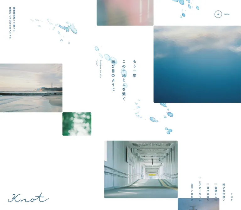
白い余白に縦書きの言葉、海辺の写真、水彩のしずくを配置。細い紺色の線と手書きロゴで、地域の日常を穏やかに伝えるメディアサイト。
オリジナルサイトを見るQuiet coastal photography, vertical Japanese writing, and pale watercolor traces on a generous white page.
Original URL: knot-to-knot.co.jp
Final URL: knot-to-knot.co.jp
Theme: light, with a contrasting slate-colored movie section
Inspected: September 22, 2026; supplied retrieval timestamp 2026-09-22T14:57:43.211Z, equivalent to 23:57 JST
Viewports: desktop 1440 × 1000 and mobile 390 × 844 CSS pixels
Scope: the current editorial homepage: opening photo composition, introductory statement, interview previews, column previews, movie previews, category tags, and footer. Visual captures show the opening and footer at both sizes, plus a desktop interview/divider view. Rendered DOM evidence supplies additional measurements throughout the page. Menu opening, video playback, hover outcomes, and linked destination pages were not inspected.
knot presents everyday life in Fukushima's Hamadori region through photographs, interviews, written articles, and films. Its homepage behaves as a slowly paced editorial index. The opening introduces a place and an attitude; content categories and recent stories follow farther down the document.
The identity comes from the relationship between broad white space and small, carefully positioned details. Deep blue text connects vertical Japanese copy, a flowing handwritten wordmark, fine circular controls, and restrained outline tags. Photographs show water, a coastline, soft foliage, interior light, and people in ordinary settings. Translucent watercolor marks travel through the empty space without becoming a full-page texture.
The desktop composition is deliberately uneven: image rectangles touch selected edges, the central message occupies a narrow vertical block, and navigation rests at the lower right of the opening view. Content sections pair a broad article area on the left with a narrow explanatory rail on the right. Mobile recomposes these relationships rather than shrinking the entire desktop layout.
Quiet coastal photography, vertical Japanese writing, and pale watercolor traces on a generous white page.
Original URL: knot-to-knot.co.jp
Final URL: knot-to-knot.co.jp
Theme: light, with a contrasting slate-colored movie section
Inspected: September 22, 2026; supplied retrieval timestamp 2026-09-22T14:57:43.211Z, equivalent to 23:57 JST
Viewports: desktop 1440 × 1000 and mobile 390 × 844 CSS pixels
Scope: the current editorial homepage: opening photo composition, introductory statement, interview previews, column previews, movie previews, category tags, and footer. Visual captures show the opening and footer at both sizes, plus a desktop interview/divider view. Rendered DOM evidence supplies additional measurements throughout the page. Menu opening, video playback, hover outcomes, and linked destination pages were not inspected.
knot presents everyday life in Fukushima's Hamadori region through photographs, interviews, written articles, and films. Its homepage behaves as a slowly paced editorial index. The opening introduces a place and an attitude; content categories and recent stories follow farther down the document.
The identity comes from the relationship between broad white space and small, carefully positioned details. Deep blue text connects vertical Japanese copy, a flowing handwritten wordmark, fine circular controls, and restrained outline tags. Photographs show water, a coastline, soft foliage, interior light, and people in ordinary settings. Translucent watercolor marks travel through the empty space without becoming a full-page texture.
The desktop composition is deliberately uneven: image rectangles touch selected edges, the central message occupies a narrow vertical block, and navigation rests at the lower right of the opening view. Content sections pair a broad article area on the left with a narrow explanatory rail on the right. Mobile recomposes these relationships rather than shrinking the entire desktop layout.
| Name | Value | Suggested token | Evidence and role |
|---|---|---|---|
| White canvas | #FFFFFF |
--color-paper |
Visually observed page ground; also measured as the back-to-top control's background |
| Coastal ink | #144B6B |
--color-ink |
Measured rgb(20, 75, 107) on body text, links, navigation, and footer copy |
| Theater text | #F2F2F2 |
--color-on-theater |
Measured on movie-section headings, descriptions, and archive links |
| Theater slate | approximately #728089 |
--color-theater |
Estimated from the visible movie-panel surface; its background declaration was not supplied |
| Quiet outline | approximately #AAC3D1 |
--color-soft-line |
Estimated pale blue used by tag outlines and secondary details |
| Watercolor wash | approximately #C5E5EE |
--color-water-wash |
Representative visual estimate within the decorative artwork; the artwork contains many tones and transparencies |
| Secondary count | approximately #9DB8C9 |
--color-muted |
Estimated appearance of small category counts above vertical navigation labels |
The main interface is essentially white and blue. Green foliage, pink interior light, warm portrait backgrounds, and deep water tones belong to photographs. They are not evidence of additional semantic button colors.
The movie area reverses text to light gray over a subdued slate surface. This is a section treatment, not evidence of a selectable dark theme. No theme switch was observed.
The body and many containers report transparent backgrounds. Their final appearance is white in the captures; do not interpret rgba(0, 0, 0, 0) as a black surface.
The supplied custom properties include WordPress administration and block-editor colors. Those properties do not describe the visible brand palette and should not be copied into a recreation. Likewise, the sampled black color on the root element does not override the measured blue body text.
Measured source stack:
YakuHanJP_Noto, 'Zen Kaku Gothic New', 'Yu Gothic', YuGothic,
'Hiragino Sans', 'ヒラギノ角ゴ ProN W3',
'Hiragino Kaku Gothic ProN', Meiryo, sans-serif
The same stack appears across the sampled body, navigation, introductory copy, and article-link containers. The measured weights are primarily 400 and 500. Hierarchy comes from writing direction, spacing, position, and photography as much as font size.
The root element reports 10px; the body reports 16px. The root's Times family is not the visible editorial font. A new implementation can retain a conventional root size and use explicit component tokens.
The opening message reads:
もう一度 / この土地と人を繋ぐ / 結び目のように
It forms three vertical columns, read from right to left. Desktop tracking is 0.3em, and the line-height equivalent creates a wide interval between columns. This spacing makes a relatively small headline occupy a substantial area without becoming typographically heavy.
Use real vertical typesetting, such as writing-mode: vertical-rl, in a recreation. Rotating an entire horizontal Japanese paragraph would produce different glyph orientation and punctuation behavior. The supplied property subset does not include the original writing-mode declaration, so this is an implementation recommendation grounded in the visible result.
Small English phrases provide an editorial counterpoint: Thoughts put into, recent articles, tag list, and parenthesized category names such as ( interview ). The hero's English phrase follows a vertical direction beside the Japanese statement. It remains secondary and does not become a competing headline.
The knot wordmark is a thin, connected handwritten graphic with long sweeping strokes. Its source format and font origin were not supplied. Treat it as a brand asset, not as evidence for a particular script font.
All numeric values below are measured computed styles unless noted.
| Role | Desktop size / line height | Mobile size / line height | Weight | Tracking or qualification |
|---|---|---|---|---|
| Body container | 16 / 16px |
16 / 16px |
400 |
Child text frequently overrides this line height |
| Opening Japanese statement | 21.024 / 63.072px |
18.72 / 52.416px |
500 |
0.3em at both sizes |
| Opening English note | 11.376 / 22.752px |
10.413 / 20.826px |
500 |
0.1em |
| Upper-left vertical descriptor | 13.392 / 23.436px |
Not visible in the mobile opening | 500 |
0.1em |
| Introductory heading | 17.136 / 34.272px |
18.72 / 37.44px |
500 |
Normal tracking |
| Introductory paragraph | 15.264 / 33.5808px |
16.653 / 36.6366px |
400 |
0.05em; line-height ratio 2.2 |
| Category description | 15.264 / 38.16px |
16.653 / 41.6325px |
400 |
Line-height ratio 2.5 |
recent articles label |
13.392 / 13.392px |
Absent from the mobile rendered-text evidence | 500 |
Desktop label-to-rule gap 13.392px |
| Navigation anchor | 16 / 16px |
16 / 16px |
500 |
Parent style; nested glyph sizing was not separately sampled |
| Tag label | 11.376 / 11.376px |
12.48 / 12.48px |
500 |
Normal tracking |
| Footer descriptor | 15.264 / 26.712px |
14.547 / 25.4573px |
400 |
Line-height ratio 1.75 |
| Copyright | 13.392 / 13.392px |
14.547 / 14.547px |
400 |
0.1em |
The category-heading containers report 16px, but the individual visible title glyphs were not separately measured. Do not apply that parent measurement to every child in the heading composition.
Mobile body copy and tags are slightly larger than their desktop equivalents. The mobile hero statement becomes smaller. A single global scale factor would miss this distinction.
Density: sparse at page and section level, compact inside metadata groups.
Structure: broad gaps, fine rules, subtly rounded photographs, circular controls, and small pill-shaped tags. There is no visible general shadow system.
These are component-specific measurements, not proof of one universal spacing unit.
| Use | Desktop | Mobile | Status |
|---|---|---|---|
| Outer footer inset | 47.664px |
15.6px |
Measured padding |
| Main editorial left inset | 95.172px |
31.188px for interviews and introductions |
Measured bounds |
| Column-grid left inset | 95.172px |
15.594px |
Measured bounds |
| Tag horizontal padding | 11.376px |
12.48px |
Measured |
| Horizontal gap between adjacent tags | approximately 4.75px |
approximately 5.17px |
Calculated from bounds |
| Vertical gap between tag rows | approximately 14.25px |
approximately 15.59px |
Calculated from bounds |
| Interview-card horizontal separation | approximately 157.09px |
Single column | Calculated between anchor boxes |
| Interview-card vertical separation | approximately 85.67px |
approximately 72.81px |
Calculated between anchor boxes |
| Column-card horizontal separation | approximately 38.16px |
approximately 16.63px |
Calculated |
| Movie-thumbnail horizontal separation | approximately 53.27px |
Single column | Calculated |
| Main-content bottom padding | 161.856px |
104.013px |
Measured |
The interview grid leaves room for vertical headline strips extending beside the portraits. Its unusually large horizontal separation should not be replaced with a standard compact card gutter.
| Element | Value | Evidence |
|---|---|---|
| Tag pills | 11.376px desktop; 12.48px mobile |
Measured |
| Back-to-top control | 100% |
Measured |
| Menu and archive-control circles | Approximately 44px desktop or 48px mobile in diameter |
Measured control dimensions plus visible circular geometry |
| Photo corners | Approximately 5–6px |
Visual estimate |
| Movie-panel lower corners | Approximately 10px |
Visual estimate from the desktop footer capture |
| Footer separator corner turns | Approximately 9–10px |
Visual estimate |
Use a roughly 1px outline for controls and decorative rules as a visual approximation. Border widths were not included in the reported computed-style subset.
| Element | Desktop 1440 × 1000 |
Mobile 390 × 844 |
|---|---|---|
| Document height | 7686.813px |
11086.531px |
| Opening Japanese text box | 189.281 × 245.953px, at x 644.969, y 352.359 |
157.219 × 218.953px, at x 136.578, y 301.578 |
| Opening English text box | 45.5 × 107.984px, at x 570.969, y 352.359 |
41.625 × 98.859px, at x 84.547, y 301.578 |
| Editorial content area | Approximately 819.063px wide |
Varies by content type |
| Right explanatory rail | Approximately 285.688px wide, starting at x 1059.141 |
Moves above its article group; approximately 327.625px wide |
| Interview anchor | Approximately 304.77 × 516.91px |
327.625 × 463.469px |
| Column anchor width | 246.969px |
171.094px |
| Movie thumbnail link | 382.891 × 215.172px |
327.625 × 184.125px |
| Archive-link box | Approximately 120.938 × 43.766px |
132.078 × 47.844px |
| Footer | 636.141px high |
1029.969px high |
Article anchor dimensions include text and may include other child elements. They are not measurements of the photographs themselves. The movie-link dimensions do support an approximately 16:9 thumbnail ratio.
Role: establish the publication's atmosphere before presenting article categories.
The opening is a white field with independently positioned photographic rectangles. A large blue-water image enters from the right, a coastal photograph meets the left edge, and smaller soft-focus images balance the composition. A photograph of a covered passage begins lower in the desktop capture.
The Japanese statement occupies the open central area. The English note sits to its left. Watercolor marks pass behind and between these elements. Keep the photographs as separate planes; there is no visible full-bleed photographic background behind the statement.
Approximate visible image boxes from the original captures:
| Image | Desktop position and visible size | Mobile position and visible size |
|---|---|---|
| Soft pink interior light | x 580, y 0, 334 × 151px visible |
x 129, y 37, 102 × 82px |
| Blue water | x 914, y 150, 526 × 455px |
x 231, y 120, 159 × 138px |
| Coastline | x 0, y 375, 380 × 289px |
x 0, y 541, 161 × 127px |
| Green bokeh | x 379, y 663, 170 × 138px |
x 160, y 668, 111 × 89px |
| Covered passage | Begins around x 625, y 830; approximately 432px wide |
Not shown in the supplied opening viewport |
These estimates describe the visible framing. They do not establish the images' full uncropped dimensions or the original positioning formulas.
Role: provide a compact global navigation entry point.
A fine blue circle contains a very small line icon. Desktop adds the word menu to the right; the mobile view shows only the circle. The control remains at the upper-right position across the supplied scrolled captures, supporting visually persistent placement. The original CSS positioning property was not included.
The mobile anchor measures 47.844 × 47.844px, positioned approximately 20.781px from the top and right. The desktop anchor includes additional horizontal space and the caption; its box is approximately 101.938 × 43.766px, at y 46px and 50px from the right edge.
The supplied href is javascript:void(0). This establishes a script-mediated trigger, but not the menu's opening direction, overlay appearance, focus handling, or animation. Additional navigation groups appear in the DOM; their presence is not evidence of an inspected open-menu state.
Role: expose the site's main editorial sections and contact route.
Six narrow vertical links appear in the desktop opening and the footer. From the right, they are TOP, 結び目の想い, 会話と人々, 日々の綴り, シアターちうか, and お問い合わせ.
The interview, column, and movie labels carry small pale counts: (8), (16), and (10) in the inspected state. Keep counts as content metadata, separate from the vertical label. Their values should come from content rather than being permanent decorative text.
The link columns share a lower baseline while their upper edges vary with label length and count placement. On mobile, the opening navigation group is absent from the visible hero; the footer retains the vertical arrangement across a centered row.
Do not infer a fixed navigation dock from the similar desktop opening and footer positions. The DOM contains separate groups at those locations.
Role: explain the publication's interest in ordinary lives and local stories.
A centered heading is followed by eight short lines of Japanese copy and a circular-arrow link to the About section. The measured introductory paragraph uses line-height 2.2 and 0.05em tracking.
The heading's surrounding space is part of the composition. Its measured padding changes from approximately 9.504px 42.912px on desktop to 5.187px 46.8px on mobile. The mobile paragraph becomes slightly larger rather than being compressed.
The intro header begins around document y 1349px on desktop and y 1287px on mobile. It is not visible within either supplied opening viewport. Preserve the distinction between the initial photographic composition and this subsequent editorial introduction.
Role: identify each content category and explain its tone.
The repeated anatomy is a parenthesized English category label, a vertical Japanese category title with a delicate bracket-like rule, a short three-line description, and an archive link labeled 一覧へ in the visible desktop capture.
Desktop places this introduction in a narrow right rail beside the article group. On mobile, it occupies a wider block before the cards. Category descriptions use line-height 2.5, producing three clearly separated lines.
The desktop mid-page capture shows the description beside the lower interview content. Whether the rail uses sticky positioning was not established by the supplied properties.
Role: offer a quiet route into a category or explanatory page.
A fine outlined circle holds a small directional chevron. Text sits outside the circle to the right. The measured archive-link height is approximately 43.766px on desktop and 47.844px on mobile. The source anchor reserves left padding of 56.16px and 61.347px, respectively, for the circular motif.
The component uses the surrounding text color. Inside the movie section it becomes light gray. It has no prominent filled rectangle, shadow, or separate accent color.
Role: introduce a person and a conversational story.
Each preview links an image, story headline, person's name, and a short description of that person. In the desktop capture, a white vertical headline strip sits beside the portrait and is finished with fine blue bracket-like linework. The name and descriptive line sit below the photograph.
The visible subjects include 志賀風夏 and 草野菜央. Their names are editorial content, not production credits.
Four interview links are present. Desktop arranges them as two rows of two widely separated cards. Mobile places all four in one column. The card remains unboxed: the photograph's boundary, vertical title strip, and text grouping provide its structure.
The image elements' dimensions and native aspect ratios were not included. Do not derive a photo ratio directly from the full anchor height.
Role: create a visual pause between article categories.
The supplied desktop middle capture contains a long, shallow photograph of blurred green foliage or reflections. It spans approximately 1344px, with about 48px of white margin on each side, and is approximately 287px high in the capture. Corners are subtly rounded.
Keep the surrounding white space substantial. This image functions as a change of pace within the editorial sequence, rather than as a banner with overlaid promotional copy. Its mobile treatment was not visually supplied.
Role: present shorter articles, work reports, dates, and topical connections.
The DOM groups a linked article preview and publication date with separate tag links below. Desktop has three columns of approximately 247px each within the left content area. Mobile retains a denser two-column arrangement, with approximately 171px cards and 16.63px between them.
Nine column previews are present in the supplied evidence. Title length changes the height of the linked content and the vertical position of its tags. Preserve this content-driven variation.
Tags remain individually navigable siblings of the article link. Do not wrap the entire card in one anchor and then nest tag anchors inside it.
Role: collect films in a visually distinct part of the homepage.
The movie section uses light text on a muted slate panel. Its lower rounded corners are visible above the footer. Desktop retains the right explanatory rail and a two-column thumbnail group. Mobile moves the introduction above a single column of four thumbnails.
The measured thumbnail links are approximately 16:9. Each has a script-mediated href. No activation result was supplied, so the evidence does not establish a modal player, inline player, autoplay, or external navigation.
Reproduce the observed thumbnail-and-caption structure independently of the eventual player choice. Any player behavior added to a new implementation should be documented as a separate design decision.
Role: let readers explore place names, daily life, announcements, and published work.
A small tag list label and short horizontal rule introduce nine outline pills. Examples include いわき市, 浜通り, 仕事, and 暮らす.
The desktop footer wraps these into two rows. Mobile wraps them into three rows, with larger text and slightly taller pills. The pills have transparent or white interiors, pale blue outlines, medium-weight blue text, and no category-specific colors.
The visible pill height is approximately 22.89px on desktop and 24.95px on mobile. These are visual dimensions, not a recommendation for minimum touch-target size.
Role: close the page with identity, navigation, social links, and topical browsing.
A long fine blue rule with short rounded downward turns begins the desktop footer. Tags sit toward the upper left; a two-line descriptor and large wordmark occupy the center; vertical navigation sits toward the lower right. Instagram and YouTube icons, followed by © 2024 knot, occupy the lower left. A watercolor motif adds texture near that corner.
On mobile, the order changes: back-to-top control, centered descriptor and wordmark, vertical navigation, tag list, then centered social links and copyright. The watercolor decoration moves toward the lower right. A large empty interval separates the tags from the social area.
The back-to-top anchor targets #wrapper. Its desktop box is approximately 43.77px square and right aligned; the mobile box is approximately 47.84px square and centered. Smooth scrolling was not verified.
The evidence includes computed transition declarations, not an interaction recording. Treat declared timing and demonstrated behavior separately.
| Target | Measured declaration or evidence | What it supports | What remains unverified |
|---|---|---|---|
| Navigation, tags, social links, back-to-top | 0.3s transition |
A short transition is configured | Which properties change and the resulting hover/focus appearance |
| Intro heading, paragraph, and About link | transform, opacity, and filter, each 0.6s |
A coordinated reveal treatment is configured | Initial transform distance, initial blur, and trigger conditions |
| Desktop editorial headings and interview links | Commonly 0.6s with 0.2s delay |
Shared reveal timing | Full sequence and whether it repeats |
| Mobile intro | Heading delay 0.2s, paragraph 0.4s, link 0.6s |
A measured stagger in these elements | Whether every visit or scroll direction restarts it |
| Mobile interview introduction | Heading 0.4s, description 0.6s, archive link 0.8s |
A longer local stagger | Exact visual endpoints |
| Menu and movie triggers | javascript:void(0) hrefs |
Script-mediated activation | Menu state, player type, dismissal, keyboard support |
| Back-to-top | Link to #wrapper |
An in-page destination | Scroll duration or easing |
Several mobile elements report animation values such as 0s 0.4s. These are not evidence of a visible looping animation. Likewise, a bare transition: all entry without a nonzero duration should not be interpreted as a timed effect.
The capture process waited for load, finite visible or potentially revealing motion, layout/text stability, and image decoding within stated limits. Perpetual motion was temporarily paused during readiness checks and then resumed. That process does not prove the presence or absence of parallax, animated water, or delayed content.
Recommended adaptation: use a restrained 600ms opacity/translation reveal with optional 200ms staggering. Keep essential content visible without JavaScript and disable the reveal under reduced-motion preferences. Do not add floating photographs or continuous watercolor movement as if those effects had been verified.
| Layer | Appearance | Purpose |
|---|---|---|
| Page canvas | White, largely uninterrupted | Establishes the slow editorial rhythm |
| Photography | Natural color, subtle rounding | Supplies atmosphere and human presence |
| Interview title strip | White with fine blue bracket-like edges | Separates vertical text from the portrait |
| Text and navigation | Deep blue without enclosing panels | Maintains a consistent visual voice |
| Tags | Pale outline, white or transparent fill | Offers compact topical navigation |
| Circular controls | Thin blue outline; white or transparent interior | Indicates interaction without visual weight |
| Movie area | Muted slate with light text | Creates a distinct film category |
| Footer separator | Fine blue rule with rounded end turns | Signals the closing section |
| Watercolor artwork | Pale translucent blues | Connects separated areas of white space |
No general card elevation, glass surface, or heavy bordered container is visible in the supplied original-page captures.
The opening combines recognizable local scenery with less literal visual fragments: a coastline, blue water, an architectural passage, soft foliage, and pink window light. This mixture gives the page a sense of place without turning every photograph into a documentary caption.
Portrait photography remains grounded in everyday environments. The supplied interview crop includes an informal seated portrait and a person seen through an interior opening. Warm yellows and wood tones are allowed within photography while the interface retains its blue-and-white palette.
Watercolor marks have irregular edges, variable transparency, and darker pigment gathered around some boundaries. They form a loose diagonal path through the hero and reappear in the footer. CSS circles or a uniform blue gradient would lose that material quality.
The handwritten wordmark is the other essential graphic asset. Its thin connected strokes contrast with the measured Japanese sans serif. Use an approved wordmark asset where available; a generic cursive font is only a placeholder.
The evidence did not supply image src values, asset filenames, or intrinsic image dimensions. The references below identify visible assets without inventing paths.
| Asset | Observed location | Implementation consideration |
|---|---|---|
| Coastline photograph | Left side of desktop and mobile opening | Preserve the horizon and pale shoreline within the crop |
| Blue-water photograph | Right side of opening | Keep the transition from pale reflected sky to deep blue water |
| Soft pink light photograph | Upper opening | Small supporting image; crop differs by viewport |
| Green bokeh photograph | Lower opening | Retain softness rather than artificially sharpening it |
| Covered-passage photograph | Lower desktop opening | Visible only in part; full placement is not documented |
| Panoramic green photograph | Desktop divider between content groups | Use a shallow crop and broad surrounding margins |
| Interview portraits | Interview previews | Preserve people and contextual environments |
| Watercolor decoration | Hero and footer | Prefer a transparent image asset with varied pigment density |
| knot wordmark | Opening and footer | Preserve the original proportions and line quality |
| Social marks | Footer | Instagram outline and compact YouTube mark in blue |
At 1440px wide, the outer decorative inset is approximately 47.66px, while article content starts approximately 95.17px from the left. The left content area is about 819.06px wide; the right introduction rail is about 285.69px wide, with approximately 144.91px between their reported bounds.
The left area changes its internal grid according to content:
16:9 thumbnail columns.The opening is independently art-directed and should not inherit the editorial grid mechanically. Its edge-aligned photographs, centered vertical message, low-left wordmark, and low-right navigation have their own spatial relationships.
At 390px wide, the opening retains vertical Japanese text and asymmetrical photographs. The water photograph remains on the right and the coastline enters from the left much farther down. The green image meets the coastline's lower-right area. The opening wordmark is approximately 168px wide near the lower-left edge of the supplied viewport.
The upper-left desktop descriptor is absent from the mobile opening. The visible menu caption is also removed, while the circle grows to approximately 48px.
The content layouts then diverge by category:
| Feature | Desktop | Mobile |
|---|---|---|
| Category introduction | Right rail beside previews | Above previews |
| Interview previews | Two columns | One column, 327.625px anchor width |
| Column previews | Three columns | Two columns, 171.094px anchor width |
| Movie previews | Two columns | One column, 327.625px thumbnail width |
| Main interview/intro gutter | Approximately 95.17px |
Approximately 31.19px |
| Column-grid gutter | Approximately 95.17px |
Approximately 15.59px |
| Hero navigation | Visible near lower right | Not visible in opening |
| Footer navigation | Lower-right group | Centered below identity |
| Footer tags | Upper-left, two rows | Below navigation, three rows |
| Social links | Lower left | Centered near the bottom |
The document becomes approximately 3399.72px taller on mobile. Much of that increase follows from interview and movie stacking, larger body text, and the taller footer.
Only two viewport sizes were supplied. The original breakpoint, intermediate interpolation, landscape behavior, and browser safe-area handling are unknown.
The custom property --vh reports 10px at both sizes, including the 844px-high mobile viewport. Its name alone is insufficient evidence that it accurately represents one percent of the current viewport height or controls a particular element.
Do not derive one source-wide scaling formula from the decimal measurements. The observed combination of smaller hero type, larger mobile body type, different gutters, and reordered footer content requires component-specific rules.
#144B6B as the primary interface ink and white as the dominant surface.0.3em tracking.These are recommendations for a new implementation, not verified features of the original page:
aria-expanded, and aria-controls. Implement focus management only after the menu's interaction model is defined.#FFFFFF.#144B6B.#F2F2F2.#728089; verify against the actual asset or stylesheet before exact reproduction.#AAC3D1.#C5E5EE, with darker irregular edges.“Create a Japanese regional editorial homepage inspired by knot's observed visual language. Use a white canvas, deep blue #144B6B text, the declared Zen Kaku Gothic New stack, a supplied thin handwritten wordmark, and abundant white space. Build an opening composition from separately positioned photographs of water, coastline, soft foliage, and interior light. Set the short Japanese statement in three vertical columns with generous tracking, with a much smaller vertical English note beside it. Add sparse translucent watercolor artwork. On desktop, pair article grids on the left with narrow category introductions on the right. Use two columns for interviews, three for written columns, and two for films. On mobile, place introductions first, stack interviews and films, and retain two columns for written articles. Use fine circular controls, pale outline tags, and a reordered spacious footer. Keep all unverified interaction behavior explicit as a new design choice.”
This is an implementation adaptation, not recovered source CSS. It preserves the measured colors and key type sizes, reproduces the four fully visible opening photo frames at the supplied sizes, and establishes the observed grid changes.
The 64rem breakpoint is recommended rather than observed. Hero image coordinates are visual estimates. The theater color, decorative rules, portrait-strip geometry, and intermediate-width behavior require visual tuning. The additional lower hero imagery is outside this starter's scope.
Use .hero-copy with a Japanese text element containing the three intended lines and an English note containing its two lines. Use .editorial-section with .section-intro followed by .article-area in logical reading order. Interview visuals contain an image and adjacent title strip; column tags are siblings of their article links. Supply authorized image and wordmark assets; no original asset URLs were provided.
:root {
  /* Measured colors */
  --color-paper: #fff;
  --color-ink: #144b6b;
  --color-on-theater: #f2f2f2;

  /* Visual estimates */
  --color-theater: #728089;
  --color-soft-line: #aac3d1;
  --color-muted: #9db8c9;
  --color-water-wash: #c5e5ee;

  /* Declared source family stack */
  --font-editorial: YakuHanJP_Noto, 'Zen Kaku Gothic New',
    'Yu Gothic', YuGothic, 'Hiragino Sans',
    'ヒラギノ角ゴ ProN W3', 'Hiragino Kaku Gothic ProN',
    Meiryo, sans-serif;

  /* Desktop measurements */
  --text-body: 15.264px;
  --text-caption: 13.392px;
  --text-tag: 11.376px;
  --text-hero: 21.024px;
  --text-hero-note: 11.376px;
  --hero-leading: 3;
  --control-size: 43.766px;
  --tag-height: 22.891px;
  --tag-gap-x: 4.75px;
  --tag-gap-y: 14.25px;

  /* Adapted layout aliases */
  --outer-gutter: 3.31vw;
  --editorial-gutter: 6.609vw;
  --editorial-gap: 10.063vw;
  --radius-photo: 6px;
  --rule: 1px;
  --motion-control: 300ms;
  --motion-reveal: 600ms;
}

* { box-sizing: border-box; }

body {
  margin: 0;
  color: var(--color-ink);
  background: var(--color-paper);
  font-family: var(--font-editorial);
  font-size: var(--text-body);
  line-height: 1.75;
}

button, a { -webkit-tap-highlight-color: transparent; }
button { font: inherit; }
a { color: inherit; }
img { display: block; max-width: 100%; }

:where(a, button):focus-visible {
  outline: 2px solid currentColor;
  outline-offset: 5px;
}

/* Opening composition: estimated placement at the reference size. */
.hero-stage {
  position: relative;
  min-height: 1348.53px;
  overflow: clip;
  isolation: isolate;
}

.hero-frame {
  position: absolute;
  z-index: 1;
  margin: 0;
  overflow: hidden;
  border-radius: var(--radius-photo);
}

.hero-frame img {
  width: 100%;
  height: 100%;
  object-fit: cover;
}

.hero-frame--light {
  left: 40.278%; top: 0;
  width: 23.194%; height: 151px;
}
.hero-frame--water {
  left: 63.472%; top: 150px;
  width: 36.528%; height: 455px;
}
.hero-frame--coast {
  left: 0; top: 375px;
  width: 26.389%; height: 289px;
}
.hero-frame--green {
  left: 26.319%; top: 663px;
  width: 11.806%; height: 138px;
}

.hero-copy {
  position: absolute;
  z-index: 2;
  left: 39.651%;
  top: 352.359px;
  display: flex;
  align-items: flex-start;
  gap: 28.5px;
  width: max-content;
}

.hero-statement,
.hero-note {
  margin: 0;
  writing-mode: vertical-rl;
  font-weight: 500;
}

.hero-statement {
  font-size: var(--text-hero);
  line-height: var(--hero-leading);
  letter-spacing: .3em;
}

.hero-note {
  order: -1;
  font-size: var(--text-hero-note);
  line-height: 2;
  letter-spacing: .1em;
}

.hero-descriptor {
  position: absolute;
  left: var(--outer-gutter);
  top: 40.031px;
  margin: 0;
  writing-mode: vertical-rl;
  font-size: 13.392px;
  font-weight: 500;
  line-height: 1.75;
  letter-spacing: .1em;
}

.hero-wordmark {
  position: absolute;
  left: var(--outer-gutter);
  top: 897px;
  width: 240px;
}

.watercolor {
  position: absolute;
  z-index: 0;
  pointer-events: none;
  /* Set asset-specific bounds for each approved decoration. */
}

/* Recommended button semantics; opening behavior is not implemented. */
.menu-trigger {
  position: fixed;
  z-index: 20;
  top: 46px;
  right: 50px;
  display: inline-flex;
  align-items: center;
  gap: 12px;
  padding: 0;
  border: 0;
  color: var(--color-ink);
  background: transparent;
  cursor: pointer;
}

.menu-trigger__circle,
.circle-link__icon {
  display: inline-grid;
  place-items: center;
  flex: 0 0 var(--control-size);
  width: var(--control-size);
  height: var(--control-size);
  border: var(--rule) solid currentColor;
  border-radius: 50%;
}

.menu-trigger__circle { background: var(--color-paper); }
.menu-trigger__caption { font-size: 11.376px; }

.circle-link {
  display: inline-flex;
  align-items: center;
  gap: 12.394px;
  min-height: var(--control-size);
  text-decoration: none;
}

/* Category structure: introductions come first in the HTML. */
.editorial-section {
  display: grid;
  grid-template-columns: minmax(0, 2.867fr) minmax(0, 1fr);
  column-gap: var(--editorial-gap);
  margin-inline: var(--editorial-gutter);
  margin-block: 160px;
}

.section-intro { grid-column: 2; grid-row: 1; }
.article-area { grid-column: 1; grid-row: 1; min-width: 0; }

.section-intro__copy {
  font-size: var(--text-body);
  line-height: 2.5;
}

.intro-copy {
  max-width: 42em;
  margin-inline: auto;
  text-align: center;
  font-size: var(--text-body);
  line-height: 2.2;
  letter-spacing: .05em;
}

.recent-label {
  display: flex;
  align-items: center;
  gap: 13.392px;
  margin: 0 0 126px;
  font-size: var(--text-caption);
  font-weight: 500;
  line-height: 1;
}

.recent-label::after {
  content: '';
  width: 38px;
  height: var(--rule);
  background: currentColor;
}

.interview-grid {
  display: grid;
  grid-template-columns: repeat(2, minmax(0, 37.21%));
  column-gap: 19.18%;
  row-gap: 85.67px;
}

.interview-card { display: block; text-decoration: none; }
.interview-visual { position: relative; }
.interview-visual img {
  width: 100%;
  height: auto;
  border-radius: var(--radius-photo);
}

/* Approximate strip geometry; preserve each image's own dimensions. */
.interview-title {
  position: absolute;
  left: 100%;
  top: 0;
  width: 72px;
  max-height: 100%;
  margin: 0;
  padding: 16px 20px;
  writing-mode: vertical-rl;
  font-size: var(--text-body);
  font-weight: 500;
  line-height: 1.8;
  letter-spacing: .1em;
  background: var(--color-paper);
  border-left: var(--rule) solid currentColor;
  border-bottom: var(--rule) solid currentColor;
  border-bottom-left-radius: 6px;
}

.interview-name { margin: 20px 0 6px; font-weight: 500; }
.interview-description { margin: 0; font-size: var(--text-caption); }

.column-grid {
  display: grid;
  grid-template-columns: repeat(3, minmax(0, 1fr));
  gap: 72px 38.16px;
}

.column-card { min-width: 0; }
.column-card__link { display: block; text-decoration: none; }
.column-card img { width: 100%; height: auto; border-radius: 6px; }
.column-card__title { font-size: var(--text-body); line-height: 1.6; }
.column-card__date { font-size: var(--text-tag); }

.tag-list {
  display: flex;
  flex-wrap: wrap;
  align-items: flex-start;
  gap: var(--tag-gap-y) var(--tag-gap-x);
}

.tag {
  display: inline-flex;
  align-items: center;
  justify-content: center;
  min-height: var(--tag-height);
  padding-inline: var(--text-tag);
  border: var(--rule) solid var(--color-soft-line);
  border-radius: 999px;
  font-size: var(--text-tag);
  font-weight: 500;
  line-height: 1;
  text-decoration: none;
  white-space: nowrap;
}

.photo-divider {
  margin-inline: var(--outer-gutter);
  overflow: hidden;
  border-radius: var(--radius-photo);
}
.photo-divider img { width: 100%; height: auto; }

.movie-panel {
  margin-inline: var(--outer-gutter);
  padding: 100px var(--outer-gutter);
  color: var(--color-on-theater);
  background: var(--color-theater);
  border-radius: 10px;
}
.movie-grid {
  display: grid;
  grid-template-columns: repeat(2, minmax(0, 1fr));
  gap: 64px 53.27px;
}
.movie-thumbnail { aspect-ratio: 16 / 9; overflow: hidden; }
.movie-thumbnail img { width: 100%; height: 100%; object-fit: cover; }

/* Keep counts horizontal above the vertical labels. */
.vertical-nav {
  display: flex;
  flex-direction: row-reverse;
  align-items: flex-end;
  gap: 31.4px;
}
.vertical-nav__link {
  display: flex;
  flex-direction: column;
  align-items: center;
  gap: 10.512px;
  text-decoration: none;
  font-weight: 500;
}
.vertical-nav__label {
  writing-mode: vertical-rl;
  font-size: 15.264px;
  line-height: 1.2;
  letter-spacing: .2em;
}
.vertical-nav__count {
  color: var(--color-muted);
  font-size: var(--text-tag);
  line-height: 1;
}

.site-footer {
  position: relative;
  display: grid;
  grid-template-columns: 1fr auto 1fr;
  grid-template-areas: 'tags brand top' 'social brand nav';
  gap: 80px 24px;
  min-height: 636px;
  margin-inline: var(--outer-gutter);
  padding-block: 104px 47.664px;
  border-top: var(--rule) solid currentColor;
  border-radius: 10px 10px 0 0;
}
.footer-tags { grid-area: tags; }
.footer-brand { grid-area: brand; align-self: center; text-align: center; }
.footer-brand img { width: 270px; margin-inline: auto; }
.footer-top { grid-area: top; justify-self: end; }
.footer-nav { grid-area: nav; align-self: end; justify-self: end; }
.footer-social { grid-area: social; align-self: end; }

/* Recommended breakpoint; the source breakpoint was not supplied. */
@media (max-width: 64rem) {
  :root {
    --text-body: 16.653px;
    --text-caption: 14.547px;
    --text-tag: 12.48px;
    --text-hero: 18.72px;
    --text-hero-note: 10.413px;
    --hero-leading: 2.8;
    --control-size: 47.844px;
    --tag-height: 24.953px;
    --tag-gap-x: 5.17px;
    --tag-gap-y: 15.59px;
    --outer-gutter: 4vw;
    --editorial-gutter: 8vw;
  }

  .hero-stage { min-height: 1286.984px; }
  .hero-descriptor, .menu-trigger__caption, .hero-nav { display: none; }
  .hero-copy { left: 21.679%; top: 301.578px; gap: 10.413px; }
  .hero-frame--light { left: 33.077%; top: 37px; width: 26.154%; height: 82px; }
  .hero-frame--water { left: 59.231%; top: 120px; width: 40.769%; height: 138px; }
  .hero-frame--coast { left: 0; top: 541px; width: 41.282%; height: 127px; }
  .hero-frame--green { left: 41.026%; top: 668px; width: 28.462%; height: 89px; }
  .hero-wordmark { left: 3.59%; top: 781px; width: 168px; }
  .menu-trigger { top: 20.781px; right: 20.781px; }

  .editorial-section { display: block; margin-block: 104px; }
  .section-intro { margin-bottom: 88px; }
  .recent-label { display: none; }
  .interview-grid { grid-template-columns: minmax(0, 1fr); row-gap: 72.81px; }
  .interview-visual { margin-right: 64px; }
  .interview-title { width: 64px; padding: 12px; font-size: 14.547px; }

  .column-grid {
    grid-template-columns: repeat(2, minmax(0, 1fr));
    column-gap: 16.63px;
    margin-inline: -4vw;
  }
  .movie-grid { grid-template-columns: minmax(0, 1fr); }
  .movie-panel { padding: 94px 4vw; }

  .site-footer {
    grid-template-columns: minmax(0, 1fr);
    grid-template-areas: 'top' 'brand' 'nav' 'tags' 'social';
    gap: 56px;
    min-height: 1030px;
    padding-block: 31.188px 41.613px;
  }
  .footer-top, .footer-nav, .footer-social { justify-self: center; }
  .footer-brand img { width: 170px; }
  .footer-tags { width: min(100%, 286px); margin-inline: auto; }
  .footer-social { margin-top: 150px; text-align: center; }
  .vertical-nav { gap: clamp(12px, 8vw, 31.2px); }
  .vertical-nav__label { font-size: 16.653px; }
  .vertical-nav__link { gap: 11.427px; }
}

/* Optional reveal: opt in only after an observer has been initialized. */
.reveal-ready [data-reveal] {
  transition: opacity var(--motion-reveal) ease,
    transform var(--motion-reveal) ease;
}
.reveal-ready [data-reveal].is-pending {
  opacity: 0;
  transform: translateY(16px);
}

/* Recommended reduced-motion behavior. */
@media (prefers-reduced-motion: reduce) {
  .reveal-ready [data-reveal],
  .reveal-ready [data-reveal].is-pending {
    opacity: 1;
    transform: none;
    transition: none;
  }
  html { scroll-behavior: auto; }
}
The optional reveal uses a recommended 16px offset; the original offset was not measured. Its class names, observer initialization, and pending-state lifecycle must be implemented separately. Leave the reveal-ready class absent when JavaScript is unavailable.
The font-family declaration does not load font files. Supply licensed font resources or accept the declared fallbacks. The desktop and mobile collage values target the two supplied captures; test intermediate widths and tune composition rather than assuming those coordinates generalize automatically.
Optional aliases for a project that already uses Tailwind v4. This is not evidence that the original website uses Tailwind. Define the custom properties above first.
@theme inline {
  --color-paper: #ffffff;
  --color-ink: #144b6b;
  --color-on-theater: #f2f2f2;
  --color-theater: #728089;
  --color-soft-line: #aac3d1;
  --color-muted: #9db8c9;

  --font-editorial: YakuHanJP_Noto, 'Zen Kaku Gothic New',
    'Yu Gothic', YuGothic, 'Hiragino Sans',
    'Hiragino Kaku Gothic ProN', Meiryo, sans-serif;

  --text-copy: var(--text-body);
  --text-note: var(--text-caption);
  --text-topic: var(--text-tag);
  --text-statement: var(--text-hero);

  --spacing-page: var(--outer-gutter);
  --spacing-editorial: var(--editorial-gutter);
  --spacing-control: var(--control-size);
  --radius-photo: 6px;
}
200 and identical original/final URLs.2026-09-22T14:57:43.211Z.1440 × 1000 viewport; opening composition, interview/divider area, and footer captures, plus rendered text, link destinations, element bounds, computed typography, padding, radii, and transition declarations throughout the homepage.390 × 844 viewport; opening and footer captures, plus rendered DOM measurements for the introductory copy and all three content categories.7686.8125px desktop and 11086.53125px mobile; reported document widths match the respective viewport widths.This reference describes the supplied current homepage evidence. It does not establish the design of linked article, archive, About, or contact pages.
# knot — Style Reference

> Quiet coastal photography, vertical Japanese writing, and pale watercolor traces on a generous white page.

**Original URL:** [knot-to-knot.co.jp](https://knot-to-knot.co.jp/)
**Final URL:** [knot-to-knot.co.jp](https://knot-to-knot.co.jp/)
**Theme:** light, with a contrasting slate-colored movie section
**Inspected:** September 22, 2026; supplied retrieval timestamp `2026-09-22T14:57:43.211Z`, equivalent to 23:57 JST
**Viewports:** desktop `1440 × 1000` and mobile `390 × 844` CSS pixels
**Scope:** the current editorial homepage: opening photo composition, introductory statement, interview previews, column previews, movie previews, category tags, and footer. Visual captures show the opening and footer at both sizes, plus a desktop interview/divider view. Rendered DOM evidence supplies additional measurements throughout the page. Menu opening, video playback, hover outcomes, and linked destination pages were not inspected.

knot presents everyday life in Fukushima's Hamadori region through photographs, interviews, written articles, and films. Its homepage behaves as a slowly paced editorial index. The opening introduces a place and an attitude; content categories and recent stories follow farther down the document.

The identity comes from the relationship between broad white space and small, carefully positioned details. Deep blue text connects vertical Japanese copy, a flowing handwritten wordmark, fine circular controls, and restrained outline tags. Photographs show water, a coastline, soft foliage, interior light, and people in ordinary settings. Translucent watercolor marks travel through the empty space without becoming a full-page texture.

The desktop composition is deliberately uneven: image rectangles touch selected edges, the central message occupies a narrow vertical block, and navigation rests at the lower right of the opening view. Content sections pair a broad article area on the left with a narrow explanatory rail on the right. Mobile recomposes these relationships rather than shrinking the entire desktop layout.
# knot — Style Reference

> Quiet coastal photography, vertical Japanese writing, and pale watercolor traces on a generous white page.

**Original URL:** [knot-to-knot.co.jp](https://knot-to-knot.co.jp/)
**Final URL:** [knot-to-knot.co.jp](https://knot-to-knot.co.jp/)
**Theme:** light, with a contrasting slate-colored movie section
**Inspected:** September 22, 2026; supplied retrieval timestamp `2026-09-22T14:57:43.211Z`, equivalent to 23:57 JST
**Viewports:** desktop `1440 × 1000` and mobile `390 × 844` CSS pixels
**Scope:** the current editorial homepage: opening photo composition, introductory statement, interview previews, column previews, movie previews, category tags, and footer. Visual captures show the opening and footer at both sizes, plus a desktop interview/divider view. Rendered DOM evidence supplies additional measurements throughout the page. Menu opening, video playback, hover outcomes, and linked destination pages were not inspected.

knot presents everyday life in Fukushima's Hamadori region through photographs, interviews, written articles, and films. Its homepage behaves as a slowly paced editorial index. The opening introduces a place and an attitude; content categories and recent stories follow farther down the document.

The identity comes from the relationship between broad white space and small, carefully positioned details. Deep blue text connects vertical Japanese copy, a flowing handwritten wordmark, fine circular controls, and restrained outline tags. Photographs show water, a coastline, soft foliage, interior light, and people in ordinary settings. Translucent watercolor marks travel through the empty space without becoming a full-page texture.

The desktop composition is deliberately uneven: image rectangles touch selected edges, the central message occupies a narrow vertical block, and navigation rests at the lower right of the opening view. Content sections pair a broad article area on the left with a narrow explanatory rail on the right. Mobile recomposes these relationships rather than shrinking the entire desktop layout.

## How to Read This Reference

- **Measured** means a value appears in the supplied rendered DOM or computed-style evidence. Decimal values describe the captured state, not necessarily the author's original CSS units.
- **Calculated** means a value is derived from reported bounds, such as the gap between two cards.
- **Estimated** means a visual approximation from an original-page capture. Image positions, some colors, and decorative radii fall into this category.
- **Recommended** means a proposed implementation decision. Breakpoints, accessibility improvements, and portions of the Quick Start are recommendations.
- Token names are descriptive aliases created for this reference. The original site's semantic token names were not supplied.
- Bounding boxes can include reveal transforms. Offscreen elements and duplicate navigation groups in the DOM do not establish that those elements were visible in the captured viewport.
- A declared font stack establishes the intended families; it does not prove which font supplied every rendered glyph.

## Tokens — Colors

### Default Palette

| Name | Value | Suggested token | Evidence and role |
| --- | --- | --- | --- |
| White canvas | `#FFFFFF` | `--color-paper` | Visually observed page ground; also measured as the back-to-top control's background |
| Coastal ink | `#144B6B` | `--color-ink` | Measured `rgb(20, 75, 107)` on body text, links, navigation, and footer copy |
| Theater text | `#F2F2F2` | `--color-on-theater` | Measured on movie-section headings, descriptions, and archive links |
| Theater slate | approximately `#728089` | `--color-theater` | Estimated from the visible movie-panel surface; its background declaration was not supplied |
| Quiet outline | approximately `#AAC3D1` | `--color-soft-line` | Estimated pale blue used by tag outlines and secondary details |
| Watercolor wash | approximately `#C5E5EE` | `--color-water-wash` | Representative visual estimate within the decorative artwork; the artwork contains many tones and transparencies |
| Secondary count | approximately `#9DB8C9` | `--color-muted` | Estimated appearance of small category counts above vertical navigation labels |

The main interface is essentially white and blue. Green foliage, pink interior light, warm portrait backgrounds, and deep water tones belong to photographs. They are not evidence of additional semantic button colors.

### Palette Behavior

The movie area reverses text to light gray over a subdued slate surface. This is a section treatment, not evidence of a selectable dark theme. No theme switch was observed.

The body and many containers report transparent backgrounds. Their final appearance is white in the captures; do not interpret `rgba(0, 0, 0, 0)` as a black surface.

The supplied custom properties include WordPress administration and block-editor colors. Those properties do not describe the visible brand palette and should not be copied into a recreation. Likewise, the sampled black color on the root element does not override the measured blue body text.

## Tokens — Typography

### Japanese Editorial Sans Serif

**Measured source stack:**

```css
YakuHanJP_Noto, 'Zen Kaku Gothic New', 'Yu Gothic', YuGothic,
'Hiragino Sans', 'ヒラギノ角ゴ ProN W3',
'Hiragino Kaku Gothic ProN', Meiryo, sans-serif
```

The same stack appears across the sampled body, navigation, introductory copy, and article-link containers. The measured weights are primarily `400` and `500`. Hierarchy comes from writing direction, spacing, position, and photography as much as font size.

The root element reports `10px`; the body reports `16px`. The root's `Times` family is not the visible editorial font. A new implementation can retain a conventional root size and use explicit component tokens.

### Vertical Japanese Copy

The opening message reads:

> もう一度 / この土地と人を繋ぐ / 結び目のように

It forms three vertical columns, read from right to left. Desktop tracking is `0.3em`, and the line-height equivalent creates a wide interval between columns. This spacing makes a relatively small headline occupy a substantial area without becoming typographically heavy.

Use real vertical typesetting, such as `writing-mode: vertical-rl`, in a recreation. Rotating an entire horizontal Japanese paragraph would produce different glyph orientation and punctuation behavior. The supplied property subset does not include the original writing-mode declaration, so this is an implementation recommendation grounded in the visible result.

### English Utility Text

Small English phrases provide an editorial counterpoint: `Thoughts put into`, `recent articles`, `tag list`, and parenthesized category names such as `( interview )`. The hero's English phrase follows a vertical direction beside the Japanese statement. It remains secondary and does not become a competing headline.

### Wordmark

The knot wordmark is a thin, connected handwritten graphic with long sweeping strokes. Its source format and font origin were not supplied. Treat it as a brand asset, not as evidence for a particular script font.

### Type Scale

All numeric values below are measured computed styles unless noted.

| Role | Desktop size / line height | Mobile size / line height | Weight | Tracking or qualification |
| --- | --- | --- | --- | --- |
| Body container | `16 / 16px` | `16 / 16px` | `400` | Child text frequently overrides this line height |
| Opening Japanese statement | `21.024 / 63.072px` | `18.72 / 52.416px` | `500` | `0.3em` at both sizes |
| Opening English note | `11.376 / 22.752px` | `10.413 / 20.826px` | `500` | `0.1em` |
| Upper-left vertical descriptor | `13.392 / 23.436px` | Not visible in the mobile opening | `500` | `0.1em` |
| Introductory heading | `17.136 / 34.272px` | `18.72 / 37.44px` | `500` | Normal tracking |
| Introductory paragraph | `15.264 / 33.5808px` | `16.653 / 36.6366px` | `400` | `0.05em`; line-height ratio `2.2` |
| Category description | `15.264 / 38.16px` | `16.653 / 41.6325px` | `400` | Line-height ratio `2.5` |
| `recent articles` label | `13.392 / 13.392px` | Absent from the mobile rendered-text evidence | `500` | Desktop label-to-rule gap `13.392px` |
| Navigation anchor | `16 / 16px` | `16 / 16px` | `500` | Parent style; nested glyph sizing was not separately sampled |
| Tag label | `11.376 / 11.376px` | `12.48 / 12.48px` | `500` | Normal tracking |
| Footer descriptor | `15.264 / 26.712px` | `14.547 / 25.4573px` | `400` | Line-height ratio `1.75` |
| Copyright | `13.392 / 13.392px` | `14.547 / 14.547px` | `400` | `0.1em` |

The category-heading containers report `16px`, but the individual visible title glyphs were not separately measured. Do not apply that parent measurement to every child in the heading composition.

Mobile body copy and tags are slightly larger than their desktop equivalents. The mobile hero statement becomes smaller. A single global scale factor would miss this distinction.

## Tokens — Spacing & Shapes

**Density:** sparse at page and section level, compact inside metadata groups.

**Structure:** broad gaps, fine rules, subtly rounded photographs, circular controls, and small pill-shaped tags. There is no visible general shadow system.

### Spacing Scale

These are component-specific measurements, not proof of one universal spacing unit.

| Use | Desktop | Mobile | Status |
| --- | --- | --- | --- |
| Outer footer inset | `47.664px` | `15.6px` | Measured padding |
| Main editorial left inset | `95.172px` | `31.188px` for interviews and introductions | Measured bounds |
| Column-grid left inset | `95.172px` | `15.594px` | Measured bounds |
| Tag horizontal padding | `11.376px` | `12.48px` | Measured |
| Horizontal gap between adjacent tags | approximately `4.75px` | approximately `5.17px` | Calculated from bounds |
| Vertical gap between tag rows | approximately `14.25px` | approximately `15.59px` | Calculated from bounds |
| Interview-card horizontal separation | approximately `157.09px` | Single column | Calculated between anchor boxes |
| Interview-card vertical separation | approximately `85.67px` | approximately `72.81px` | Calculated between anchor boxes |
| Column-card horizontal separation | approximately `38.16px` | approximately `16.63px` | Calculated |
| Movie-thumbnail horizontal separation | approximately `53.27px` | Single column | Calculated |
| Main-content bottom padding | `161.856px` | `104.013px` | Measured |

The interview grid leaves room for vertical headline strips extending beside the portraits. Its unusually large horizontal separation should not be replaced with a standard compact card gutter.

### Border Radius

| Element | Value | Evidence |
| --- | --- | --- |
| Tag pills | `11.376px` desktop; `12.48px` mobile | Measured |
| Back-to-top control | `100%` | Measured |
| Menu and archive-control circles | Approximately `44px` desktop or `48px` mobile in diameter | Measured control dimensions plus visible circular geometry |
| Photo corners | Approximately `5–6px` | Visual estimate |
| Movie-panel lower corners | Approximately `10px` | Visual estimate from the desktop footer capture |
| Footer separator corner turns | Approximately `9–10px` | Visual estimate |

Use a roughly `1px` outline for controls and decorative rules as a visual approximation. Border widths were not included in the reported computed-style subset.

### Layout Measurements

| Element | Desktop `1440 × 1000` | Mobile `390 × 844` |
| --- | --- | --- |
| Document height | `7686.813px` | `11086.531px` |
| Opening Japanese text box | `189.281 × 245.953px`, at `x 644.969`, `y 352.359` | `157.219 × 218.953px`, at `x 136.578`, `y 301.578` |
| Opening English text box | `45.5 × 107.984px`, at `x 570.969`, `y 352.359` | `41.625 × 98.859px`, at `x 84.547`, `y 301.578` |
| Editorial content area | Approximately `819.063px` wide | Varies by content type |
| Right explanatory rail | Approximately `285.688px` wide, starting at `x 1059.141` | Moves above its article group; approximately `327.625px` wide |
| Interview anchor | Approximately `304.77 × 516.91px` | `327.625 × 463.469px` |
| Column anchor width | `246.969px` | `171.094px` |
| Movie thumbnail link | `382.891 × 215.172px` | `327.625 × 184.125px` |
| Archive-link box | Approximately `120.938 × 43.766px` | `132.078 × 47.844px` |
| Footer | `636.141px` high | `1029.969px` high |

Article anchor dimensions include text and may include other child elements. They are not measurements of the photographs themselves. The movie-link dimensions do support an approximately `16:9` thumbnail ratio.

## Components

### Opening Photo Composition

**Role:** establish the publication's atmosphere before presenting article categories.

The opening is a white field with independently positioned photographic rectangles. A large blue-water image enters from the right, a coastal photograph meets the left edge, and smaller soft-focus images balance the composition. A photograph of a covered passage begins lower in the desktop capture.

The Japanese statement occupies the open central area. The English note sits to its left. Watercolor marks pass behind and between these elements. Keep the photographs as separate planes; there is no visible full-bleed photographic background behind the statement.

Approximate visible image boxes from the original captures:

| Image | Desktop position and visible size | Mobile position and visible size |
| --- | --- | --- |
| Soft pink interior light | `x 580`, `y 0`, `334 × 151px` visible | `x 129`, `y 37`, `102 × 82px` |
| Blue water | `x 914`, `y 150`, `526 × 455px` | `x 231`, `y 120`, `159 × 138px` |
| Coastline | `x 0`, `y 375`, `380 × 289px` | `x 0`, `y 541`, `161 × 127px` |
| Green bokeh | `x 379`, `y 663`, `170 × 138px` | `x 160`, `y 668`, `111 × 89px` |
| Covered passage | Begins around `x 625`, `y 830`; approximately `432px` wide | Not shown in the supplied opening viewport |

These estimates describe the visible framing. They do not establish the images' full uncropped dimensions or the original positioning formulas.

### Persistent Menu Control

**Role:** provide a compact global navigation entry point.

A fine blue circle contains a very small line icon. Desktop adds the word `menu` to the right; the mobile view shows only the circle. The control remains at the upper-right position across the supplied scrolled captures, supporting visually persistent placement. The original CSS positioning property was not included.

The mobile anchor measures `47.844 × 47.844px`, positioned approximately `20.781px` from the top and right. The desktop anchor includes additional horizontal space and the caption; its box is approximately `101.938 × 43.766px`, at `y 46px` and `50px` from the right edge.

The supplied href is `javascript:void(0)`. This establishes a script-mediated trigger, but not the menu's opening direction, overlay appearance, focus handling, or animation. Additional navigation groups appear in the DOM; their presence is not evidence of an inspected open-menu state.

### Vertical Navigation Group

**Role:** expose the site's main editorial sections and contact route.

Six narrow vertical links appear in the desktop opening and the footer. From the right, they are `TOP`, `結び目の想い`, `会話と人々`, `日々の綴り`, `シアターちうか`, and `お問い合わせ`.

The interview, column, and movie labels carry small pale counts: `(8)`, `(16)`, and `(10)` in the inspected state. Keep counts as content metadata, separate from the vertical label. Their values should come from content rather than being permanent decorative text.

The link columns share a lower baseline while their upper edges vary with label length and count placement. On mobile, the opening navigation group is absent from the visible hero; the footer retains the vertical arrangement across a centered row.

Do not infer a fixed navigation dock from the similar desktop opening and footer positions. The DOM contains separate groups at those locations.

### Introductory Statement

**Role:** explain the publication's interest in ordinary lives and local stories.

A centered heading is followed by eight short lines of Japanese copy and a circular-arrow link to the About section. The measured introductory paragraph uses line-height `2.2` and `0.05em` tracking.

The heading's surrounding space is part of the composition. Its measured padding changes from approximately `9.504px 42.912px` on desktop to `5.187px 46.8px` on mobile. The mobile paragraph becomes slightly larger rather than being compressed.

The intro header begins around document `y 1349px` on desktop and `y 1287px` on mobile. It is not visible within either supplied opening viewport. Preserve the distinction between the initial photographic composition and this subsequent editorial introduction.

### Editorial Section Introduction

**Role:** identify each content category and explain its tone.

The repeated anatomy is a parenthesized English category label, a vertical Japanese category title with a delicate bracket-like rule, a short three-line description, and an archive link labeled `一覧へ` in the visible desktop capture.

Desktop places this introduction in a narrow right rail beside the article group. On mobile, it occupies a wider block before the cards. Category descriptions use line-height `2.5`, producing three clearly separated lines.

The desktop mid-page capture shows the description beside the lower interview content. Whether the rail uses sticky positioning was not established by the supplied properties.

### Circular Arrow Link

**Role:** offer a quiet route into a category or explanatory page.

A fine outlined circle holds a small directional chevron. Text sits outside the circle to the right. The measured archive-link height is approximately `43.766px` on desktop and `47.844px` on mobile. The source anchor reserves left padding of `56.16px` and `61.347px`, respectively, for the circular motif.

The component uses the surrounding text color. Inside the movie section it becomes light gray. It has no prominent filled rectangle, shadow, or separate accent color.

### Interview Preview

**Role:** introduce a person and a conversational story.

Each preview links an image, story headline, person's name, and a short description of that person. In the desktop capture, a white vertical headline strip sits beside the portrait and is finished with fine blue bracket-like linework. The name and descriptive line sit below the photograph.

The visible subjects include `志賀風夏` and `草野菜央`. Their names are editorial content, not production credits.

Four interview links are present. Desktop arranges them as two rows of two widely separated cards. Mobile places all four in one column. The card remains unboxed: the photograph's boundary, vertical title strip, and text grouping provide its structure.

The image elements' dimensions and native aspect ratios were not included. Do not derive a photo ratio directly from the full anchor height.

### Photographic Divider

**Role:** create a visual pause between article categories.

The supplied desktop middle capture contains a long, shallow photograph of blurred green foliage or reflections. It spans approximately `1344px`, with about `48px` of white margin on each side, and is approximately `287px` high in the capture. Corners are subtly rounded.

Keep the surrounding white space substantial. This image functions as a change of pace within the editorial sequence, rather than as a banner with overlaid promotional copy. Its mobile treatment was not visually supplied.

### Column Preview

**Role:** present shorter articles, work reports, dates, and topical connections.

The DOM groups a linked article preview and publication date with separate tag links below. Desktop has three columns of approximately `247px` each within the left content area. Mobile retains a denser two-column arrangement, with approximately `171px` cards and `16.63px` between them.

Nine column previews are present in the supplied evidence. Title length changes the height of the linked content and the vertical position of its tags. Preserve this content-driven variation.

Tags remain individually navigable siblings of the article link. Do not wrap the entire card in one anchor and then nest tag anchors inside it.

### Movie Section

**Role:** collect films in a visually distinct part of the homepage.

The movie section uses light text on a muted slate panel. Its lower rounded corners are visible above the footer. Desktop retains the right explanatory rail and a two-column thumbnail group. Mobile moves the introduction above a single column of four thumbnails.

The measured thumbnail links are approximately `16:9`. Each has a script-mediated href. No activation result was supplied, so the evidence does not establish a modal player, inline player, autoplay, or external navigation.

Reproduce the observed thumbnail-and-caption structure independently of the eventual player choice. Any player behavior added to a new implementation should be documented as a separate design decision.

### Tag List

**Role:** let readers explore place names, daily life, announcements, and published work.

A small `tag list` label and short horizontal rule introduce nine outline pills. Examples include `いわき市`, `浜通り`, `仕事`, and `暮らす`.

The desktop footer wraps these into two rows. Mobile wraps them into three rows, with larger text and slightly taller pills. The pills have transparent or white interiors, pale blue outlines, medium-weight blue text, and no category-specific colors.

The visible pill height is approximately `22.89px` on desktop and `24.95px` on mobile. These are visual dimensions, not a recommendation for minimum touch-target size.

### Footer

**Role:** close the page with identity, navigation, social links, and topical browsing.

A long fine blue rule with short rounded downward turns begins the desktop footer. Tags sit toward the upper left; a two-line descriptor and large wordmark occupy the center; vertical navigation sits toward the lower right. Instagram and YouTube icons, followed by `© 2024 knot`, occupy the lower left. A watercolor motif adds texture near that corner.

On mobile, the order changes: back-to-top control, centered descriptor and wordmark, vertical navigation, tag list, then centered social links and copyright. The watercolor decoration moves toward the lower right. A large empty interval separates the tags from the social area.

The back-to-top anchor targets `#wrapper`. Its desktop box is approximately `43.77px` square and right aligned; the mobile box is approximately `47.84px` square and centered. Smooth scrolling was not verified.

## Tokens — Motion & Interaction

The evidence includes computed transition declarations, not an interaction recording. Treat declared timing and demonstrated behavior separately.

| Target | Measured declaration or evidence | What it supports | What remains unverified |
| --- | --- | --- | --- |
| Navigation, tags, social links, back-to-top | `0.3s` transition | A short transition is configured | Which properties change and the resulting hover/focus appearance |
| Intro heading, paragraph, and About link | `transform`, `opacity`, and `filter`, each `0.6s` | A coordinated reveal treatment is configured | Initial transform distance, initial blur, and trigger conditions |
| Desktop editorial headings and interview links | Commonly `0.6s` with `0.2s` delay | Shared reveal timing | Full sequence and whether it repeats |
| Mobile intro | Heading delay `0.2s`, paragraph `0.4s`, link `0.6s` | A measured stagger in these elements | Whether every visit or scroll direction restarts it |
| Mobile interview introduction | Heading `0.4s`, description `0.6s`, archive link `0.8s` | A longer local stagger | Exact visual endpoints |
| Menu and movie triggers | `javascript:void(0)` hrefs | Script-mediated activation | Menu state, player type, dismissal, keyboard support |
| Back-to-top | Link to `#wrapper` | An in-page destination | Scroll duration or easing |

Several mobile elements report animation values such as `0s 0.4s`. These are not evidence of a visible looping animation. Likewise, a bare `transition: all` entry without a nonzero duration should not be interpreted as a timed effect.

The capture process waited for load, finite visible or potentially revealing motion, layout/text stability, and image decoding within stated limits. Perpetual motion was temporarily paused during readiness checks and then resumed. That process does not prove the presence or absence of parallax, animated water, or delayed content.

**Recommended adaptation:** use a restrained `600ms` opacity/translation reveal with optional `200ms` staggering. Keep essential content visible without JavaScript and disable the reveal under reduced-motion preferences. Do not add floating photographs or continuous watercolor movement as if those effects had been verified.

## Surfaces

| Layer | Appearance | Purpose |
| --- | --- | --- |
| Page canvas | White, largely uninterrupted | Establishes the slow editorial rhythm |
| Photography | Natural color, subtle rounding | Supplies atmosphere and human presence |
| Interview title strip | White with fine blue bracket-like edges | Separates vertical text from the portrait |
| Text and navigation | Deep blue without enclosing panels | Maintains a consistent visual voice |
| Tags | Pale outline, white or transparent fill | Offers compact topical navigation |
| Circular controls | Thin blue outline; white or transparent interior | Indicates interaction without visual weight |
| Movie area | Muted slate with light text | Creates a distinct film category |
| Footer separator | Fine blue rule with rounded end turns | Signals the closing section |
| Watercolor artwork | Pale translucent blues | Connects separated areas of white space |

No general card elevation, glass surface, or heavy bordered container is visible in the supplied original-page captures.

## Imagery

The opening combines recognizable local scenery with less literal visual fragments: a coastline, blue water, an architectural passage, soft foliage, and pink window light. This mixture gives the page a sense of place without turning every photograph into a documentary caption.

Portrait photography remains grounded in everyday environments. The supplied interview crop includes an informal seated portrait and a person seen through an interior opening. Warm yellows and wood tones are allowed within photography while the interface retains its blue-and-white palette.

Watercolor marks have irregular edges, variable transparency, and darker pigment gathered around some boundaries. They form a loose diagonal path through the hero and reappear in the footer. CSS circles or a uniform blue gradient would lose that material quality.

The handwritten wordmark is the other essential graphic asset. Its thin connected strokes contrast with the measured Japanese sans serif. Use an approved wordmark asset where available; a generic cursive font is only a placeholder.

### Observed Asset References

The evidence did not supply image `src` values, asset filenames, or intrinsic image dimensions. The references below identify visible assets without inventing paths.

| Asset | Observed location | Implementation consideration |
| --- | --- | --- |
| Coastline photograph | Left side of desktop and mobile opening | Preserve the horizon and pale shoreline within the crop |
| Blue-water photograph | Right side of opening | Keep the transition from pale reflected sky to deep blue water |
| Soft pink light photograph | Upper opening | Small supporting image; crop differs by viewport |
| Green bokeh photograph | Lower opening | Retain softness rather than artificially sharpening it |
| Covered-passage photograph | Lower desktop opening | Visible only in part; full placement is not documented |
| Panoramic green photograph | Desktop divider between content groups | Use a shallow crop and broad surrounding margins |
| Interview portraits | Interview previews | Preserve people and contextual environments |
| Watercolor decoration | Hero and footer | Prefer a transparent image asset with varied pigment density |
| knot wordmark | Opening and footer | Preserve the original proportions and line quality |
| Social marks | Footer | Instagram outline and compact YouTube mark in blue |

## Layout & Responsive Behavior

### Desktop Editorial Structure

At `1440px` wide, the outer decorative inset is approximately `47.66px`, while article content starts approximately `95.17px` from the left. The left content area is about `819.06px` wide; the right introduction rail is about `285.69px` wide, with approximately `144.91px` between their reported bounds.

The left area changes its internal grid according to content:

- Interviews: two columns with broad separation and room for vertical headlines.
- Columns: three more compact columns with dates and wrapping tags.
- Movies: two approximately `16:9` thumbnail columns.

The opening is independently art-directed and should not inherit the editorial grid mechanically. Its edge-aligned photographs, centered vertical message, low-left wordmark, and low-right navigation have their own spatial relationships.

### Mobile Recomposition

At `390px` wide, the opening retains vertical Japanese text and asymmetrical photographs. The water photograph remains on the right and the coastline enters from the left much farther down. The green image meets the coastline's lower-right area. The opening wordmark is approximately `168px` wide near the lower-left edge of the supplied viewport.

The upper-left desktop descriptor is absent from the mobile opening. The visible `menu` caption is also removed, while the circle grows to approximately `48px`.

The content layouts then diverge by category:

| Feature | Desktop | Mobile |
| --- | --- | --- |
| Category introduction | Right rail beside previews | Above previews |
| Interview previews | Two columns | One column, `327.625px` anchor width |
| Column previews | Three columns | Two columns, `171.094px` anchor width |
| Movie previews | Two columns | One column, `327.625px` thumbnail width |
| Main interview/intro gutter | Approximately `95.17px` | Approximately `31.19px` |
| Column-grid gutter | Approximately `95.17px` | Approximately `15.59px` |
| Hero navigation | Visible near lower right | Not visible in opening |
| Footer navigation | Lower-right group | Centered below identity |
| Footer tags | Upper-left, two rows | Below navigation, three rows |
| Social links | Lower left | Centered near the bottom |

The document becomes approximately `3399.72px` taller on mobile. Much of that increase follows from interview and movie stacking, larger body text, and the taller footer.

### Responsive Limits

Only two viewport sizes were supplied. The original breakpoint, intermediate interpolation, landscape behavior, and browser safe-area handling are unknown.

The custom property `--vh` reports `10px` at both sizes, including the `844px`-high mobile viewport. Its name alone is insufficient evidence that it accurately represents one percent of the current viewport height or controls a particular element.

Do not derive one source-wide scaling formula from the decimal measurements. The observed combination of smaller hero type, larger mobile body type, different gutters, and reordered footer content requires component-specific rules.

## Do’s and Don’ts

### Do

- Keep `#144B6B` as the primary interface ink and white as the dominant surface.
- Preserve vertical Japanese typesetting in the opening and navigation.
- Give the hero's three text columns generous separation and `0.3em` tracking.
- Use broad white intervals to distinguish the opening, introductory statement, and content categories.
- Art-direct the opening photographs independently at desktop and mobile sizes.
- Preserve natural photographic color and soft atmospheric images.
- Keep watercolor pigment irregular and translucent.
- Retain fine circular arrow controls and modest outline tags.
- Use different grids for interviews, columns, and movies.
- Keep person names, descriptions, dates, and tags in distinct editorial roles.
- Reorder the footer for mobile while retaining its vertical navigation.
- Treat reveal timing as measured configuration and activation behavior as unverified.

### Don't

- Don't replace the measured sans-serif stack with a Japanese serif simply because the writing is vertical.
- Don't reproduce vertical copy by rotating an entire horizontal paragraph.
- Don't stretch one desktop collage uniformly to fit a phone.
- Don't collapse every content type into the same card grid.
- Don't add heavy shadows, bright filled buttons, or colorful category badges.
- Don't turn the watercolor marks into uniform dots or opaque decorative blobs.
- Don't replace the wordmark with an asserted script-font match.
- Don't mistake full article-link bounds for photograph dimensions.
- Don't interpret duplicate DOM navigation as proof of an open menu.
- Don't invent parallax, automatic video playback, or hover transformations.
- Don't use editor-related custom properties as public-facing brand colors.
- Don't hardcode article counts or publication dates into reusable presentation components.

## Recommended Implementation Additions

These are recommendations for a new implementation, not verified features of the original page:

- Use a real button for the menu, with an accessible name, `aria-expanded`, and `aria-controls`. Implement focus management only after the menu's interaction model is defined.
- Use buttons for movie playback triggers and retain working archive links as anchors.
- Keep DOM reading order logical when CSS places category introductions in a desktop right rail.
- Mark watercolor decoration as decorative and exclude it from pointer interaction. Give editorial photographs meaningful alternatives where they convey content.
- Give the wordmark an accessible brand name without repeating adjacent descriptive text unnecessarily.
- Expand the effective target areas of small tags and social icons while preserving their compact visual shapes.
- Provide a visible blue focus indicator and ensure fixed controls do not obscure focused content.
- Verify contrast for pale counts and for movie text against the actual panel background. The movie background hex in this reference is estimated.
- Respect reduced-motion preferences and ensure reveal effects cannot leave content permanently hidden.
- Reserve image dimensions to prevent layout shifts; use responsive image sources and defer below-the-fold media.
- Use one page-level heading and consistent section/card heading levels in a new semantic structure.

## Agent Prompt Guide

### Quick Color Reference

- Canvas: white `#FFFFFF`.
- Main text, wordmark, control outlines, and rules: measured blue `#144B6B`.
- Movie-section text: measured `#F2F2F2`.
- Movie surface: estimated slate `#728089`; verify against the actual asset or stylesheet before exact reproduction.
- Tag outlines: estimated pale blue `#AAC3D1`.
- Watercolor: translucent pale blues, approximately `#C5E5EE`, with darker irregular edges.
- Photograph colors remain natural; they do not become additional interface action colors.

### Overall Prompt

“Create a Japanese regional editorial homepage inspired by knot's observed visual language. Use a white canvas, deep blue `#144B6B` text, the declared Zen Kaku Gothic New stack, a supplied thin handwritten wordmark, and abundant white space. Build an opening composition from separately positioned photographs of water, coastline, soft foliage, and interior light. Set the short Japanese statement in three vertical columns with generous tracking, with a much smaller vertical English note beside it. Add sparse translucent watercolor artwork. On desktop, pair article grids on the left with narrow category introductions on the right. Use two columns for interviews, three for written columns, and two for films. On mobile, place introductions first, stack interviews and films, and retain two columns for written articles. Use fine circular controls, pale outline tags, and a reordered spacious footer. Keep all unverified interaction behavior explicit as a new design choice.”

### Example Component Prompts

1. **Opening composition:** “At a 390 × 844 reference viewport, place a small pink-light photo near the upper center, a blue-water crop entering from the right, and a coastline photo entering from the left below the vertical statement. Let a smaller green image meet the coastline's lower-right edge. Preserve substantial white space and use the supplied watercolor and wordmark assets.”
2. **Interview preview:** “Create an unboxed editorial portrait link with a narrow white vertical Japanese headline strip beside the photo. Finish the strip with a delicate blue bracket-like rule. Put the person's name and one short descriptive line below. Leave room for the strip when moving to a single mobile column.”
3. **Category introduction:** “Create a narrow desktop rail with a small parenthesized English category label, a vertical Japanese title, three lines of blue description at 2.5 line height, and a thin circular-arrow archive link. Move the same introduction above its content on mobile.”
4. **Column grid:** “Build a three-column desktop article group that becomes two columns at 390px. Separate each article link and date from its individually linked outline tags. Preserve natural title wrapping and content-driven card heights.”
5. **Footer:** “Use a fine blue separator with rounded end turns, a centered handwritten wordmark and descriptor, vertical navigation with pale counts, small outline tags, and Instagram/YouTube marks. On mobile, order identity, navigation, tags, and social links vertically, leaving a large calm interval before the social area.”

## Quick Start

### CSS Custom Properties

This is an implementation adaptation, not recovered source CSS. It preserves the measured colors and key type sizes, reproduces the four fully visible opening photo frames at the supplied sizes, and establishes the observed grid changes.

The `64rem` breakpoint is recommended rather than observed. Hero image coordinates are visual estimates. The theater color, decorative rules, portrait-strip geometry, and intermediate-width behavior require visual tuning. The additional lower hero imagery is outside this starter's scope.

Use `.hero-copy` with a Japanese text element containing the three intended lines and an English note containing its two lines. Use `.editorial-section` with `.section-intro` followed by `.article-area` in logical reading order. Interview visuals contain an image and adjacent title strip; column tags are siblings of their article links. Supply authorized image and wordmark assets; no original asset URLs were provided.

```css
:root {
  /* Measured colors */
  --color-paper: #fff;
  --color-ink: #144b6b;
  --color-on-theater: #f2f2f2;

  /* Visual estimates */
  --color-theater: #728089;
  --color-soft-line: #aac3d1;
  --color-muted: #9db8c9;
  --color-water-wash: #c5e5ee;

  /* Declared source family stack */
  --font-editorial: YakuHanJP_Noto, 'Zen Kaku Gothic New',
    'Yu Gothic', YuGothic, 'Hiragino Sans',
    'ヒラギノ角ゴ ProN W3', 'Hiragino Kaku Gothic ProN',
    Meiryo, sans-serif;

  /* Desktop measurements */
  --text-body: 15.264px;
  --text-caption: 13.392px;
  --text-tag: 11.376px;
  --text-hero: 21.024px;
  --text-hero-note: 11.376px;
  --hero-leading: 3;
  --control-size: 43.766px;
  --tag-height: 22.891px;
  --tag-gap-x: 4.75px;
  --tag-gap-y: 14.25px;

  /* Adapted layout aliases */
  --outer-gutter: 3.31vw;
  --editorial-gutter: 6.609vw;
  --editorial-gap: 10.063vw;
  --radius-photo: 6px;
  --rule: 1px;
  --motion-control: 300ms;
  --motion-reveal: 600ms;
}

* { box-sizing: border-box; }

body {
  margin: 0;
  color: var(--color-ink);
  background: var(--color-paper);
  font-family: var(--font-editorial);
  font-size: var(--text-body);
  line-height: 1.75;
}

button, a { -webkit-tap-highlight-color: transparent; }
button { font: inherit; }
a { color: inherit; }
img { display: block; max-width: 100%; }

:where(a, button):focus-visible {
  outline: 2px solid currentColor;
  outline-offset: 5px;
}

/* Opening composition: estimated placement at the reference size. */
.hero-stage {
  position: relative;
  min-height: 1348.53px;
  overflow: clip;
  isolation: isolate;
}

.hero-frame {
  position: absolute;
  z-index: 1;
  margin: 0;
  overflow: hidden;
  border-radius: var(--radius-photo);
}

.hero-frame img {
  width: 100%;
  height: 100%;
  object-fit: cover;
}

.hero-frame--light {
  left: 40.278%; top: 0;
  width: 23.194%; height: 151px;
}
.hero-frame--water {
  left: 63.472%; top: 150px;
  width: 36.528%; height: 455px;
}
.hero-frame--coast {
  left: 0; top: 375px;
  width: 26.389%; height: 289px;
}
.hero-frame--green {
  left: 26.319%; top: 663px;
  width: 11.806%; height: 138px;
}

.hero-copy {
  position: absolute;
  z-index: 2;
  left: 39.651%;
  top: 352.359px;
  display: flex;
  align-items: flex-start;
  gap: 28.5px;
  width: max-content;
}

.hero-statement,
.hero-note {
  margin: 0;
  writing-mode: vertical-rl;
  font-weight: 500;
}

.hero-statement {
  font-size: var(--text-hero);
  line-height: var(--hero-leading);
  letter-spacing: .3em;
}

.hero-note {
  order: -1;
  font-size: var(--text-hero-note);
  line-height: 2;
  letter-spacing: .1em;
}

.hero-descriptor {
  position: absolute;
  left: var(--outer-gutter);
  top: 40.031px;
  margin: 0;
  writing-mode: vertical-rl;
  font-size: 13.392px;
  font-weight: 500;
  line-height: 1.75;
  letter-spacing: .1em;
}

.hero-wordmark {
  position: absolute;
  left: var(--outer-gutter);
  top: 897px;
  width: 240px;
}

.watercolor {
  position: absolute;
  z-index: 0;
  pointer-events: none;
  /* Set asset-specific bounds for each approved decoration. */
}

/* Recommended button semantics; opening behavior is not implemented. */
.menu-trigger {
  position: fixed;
  z-index: 20;
  top: 46px;
  right: 50px;
  display: inline-flex;
  align-items: center;
  gap: 12px;
  padding: 0;
  border: 0;
  color: var(--color-ink);
  background: transparent;
  cursor: pointer;
}

.menu-trigger__circle,
.circle-link__icon {
  display: inline-grid;
  place-items: center;
  flex: 0 0 var(--control-size);
  width: var(--control-size);
  height: var(--control-size);
  border: var(--rule) solid currentColor;
  border-radius: 50%;
}

.menu-trigger__circle { background: var(--color-paper); }
.menu-trigger__caption { font-size: 11.376px; }

.circle-link {
  display: inline-flex;
  align-items: center;
  gap: 12.394px;
  min-height: var(--control-size);
  text-decoration: none;
}

/* Category structure: introductions come first in the HTML. */
.editorial-section {
  display: grid;
  grid-template-columns: minmax(0, 2.867fr) minmax(0, 1fr);
  column-gap: var(--editorial-gap);
  margin-inline: var(--editorial-gutter);
  margin-block: 160px;
}

.section-intro { grid-column: 2; grid-row: 1; }
.article-area { grid-column: 1; grid-row: 1; min-width: 0; }

.section-intro__copy {
  font-size: var(--text-body);
  line-height: 2.5;
}

.intro-copy {
  max-width: 42em;
  margin-inline: auto;
  text-align: center;
  font-size: var(--text-body);
  line-height: 2.2;
  letter-spacing: .05em;
}

.recent-label {
  display: flex;
  align-items: center;
  gap: 13.392px;
  margin: 0 0 126px;
  font-size: var(--text-caption);
  font-weight: 500;
  line-height: 1;
}

.recent-label::after {
  content: '';
  width: 38px;
  height: var(--rule);
  background: currentColor;
}

.interview-grid {
  display: grid;
  grid-template-columns: repeat(2, minmax(0, 37.21%));
  column-gap: 19.18%;
  row-gap: 85.67px;
}

.interview-card { display: block; text-decoration: none; }
.interview-visual { position: relative; }
.interview-visual img {
  width: 100%;
  height: auto;
  border-radius: var(--radius-photo);
}

/* Approximate strip geometry; preserve each image's own dimensions. */
.interview-title {
  position: absolute;
  left: 100%;
  top: 0;
  width: 72px;
  max-height: 100%;
  margin: 0;
  padding: 16px 20px;
  writing-mode: vertical-rl;
  font-size: var(--text-body);
  font-weight: 500;
  line-height: 1.8;
  letter-spacing: .1em;
  background: var(--color-paper);
  border-left: var(--rule) solid currentColor;
  border-bottom: var(--rule) solid currentColor;
  border-bottom-left-radius: 6px;
}

.interview-name { margin: 20px 0 6px; font-weight: 500; }
.interview-description { margin: 0; font-size: var(--text-caption); }

.column-grid {
  display: grid;
  grid-template-columns: repeat(3, minmax(0, 1fr));
  gap: 72px 38.16px;
}

.column-card { min-width: 0; }
.column-card__link { display: block; text-decoration: none; }
.column-card img { width: 100%; height: auto; border-radius: 6px; }
.column-card__title { font-size: var(--text-body); line-height: 1.6; }
.column-card__date { font-size: var(--text-tag); }

.tag-list {
  display: flex;
  flex-wrap: wrap;
  align-items: flex-start;
  gap: var(--tag-gap-y) var(--tag-gap-x);
}

.tag {
  display: inline-flex;
  align-items: center;
  justify-content: center;
  min-height: var(--tag-height);
  padding-inline: var(--text-tag);
  border: var(--rule) solid var(--color-soft-line);
  border-radius: 999px;
  font-size: var(--text-tag);
  font-weight: 500;
  line-height: 1;
  text-decoration: none;
  white-space: nowrap;
}

.photo-divider {
  margin-inline: var(--outer-gutter);
  overflow: hidden;
  border-radius: var(--radius-photo);
}
.photo-divider img { width: 100%; height: auto; }

.movie-panel {
  margin-inline: var(--outer-gutter);
  padding: 100px var(--outer-gutter);
  color: var(--color-on-theater);
  background: var(--color-theater);
  border-radius: 10px;
}
.movie-grid {
  display: grid;
  grid-template-columns: repeat(2, minmax(0, 1fr));
  gap: 64px 53.27px;
}
.movie-thumbnail { aspect-ratio: 16 / 9; overflow: hidden; }
.movie-thumbnail img { width: 100%; height: 100%; object-fit: cover; }

/* Keep counts horizontal above the vertical labels. */
.vertical-nav {
  display: flex;
  flex-direction: row-reverse;
  align-items: flex-end;
  gap: 31.4px;
}
.vertical-nav__link {
  display: flex;
  flex-direction: column;
  align-items: center;
  gap: 10.512px;
  text-decoration: none;
  font-weight: 500;
}
.vertical-nav__label {
  writing-mode: vertical-rl;
  font-size: 15.264px;
  line-height: 1.2;
  letter-spacing: .2em;
}
.vertical-nav__count {
  color: var(--color-muted);
  font-size: var(--text-tag);
  line-height: 1;
}

.site-footer {
  position: relative;
  display: grid;
  grid-template-columns: 1fr auto 1fr;
  grid-template-areas: 'tags brand top' 'social brand nav';
  gap: 80px 24px;
  min-height: 636px;
  margin-inline: var(--outer-gutter);
  padding-block: 104px 47.664px;
  border-top: var(--rule) solid currentColor;
  border-radius: 10px 10px 0 0;
}
.footer-tags { grid-area: tags; }
.footer-brand { grid-area: brand; align-self: center; text-align: center; }
.footer-brand img { width: 270px; margin-inline: auto; }
.footer-top { grid-area: top; justify-self: end; }
.footer-nav { grid-area: nav; align-self: end; justify-self: end; }
.footer-social { grid-area: social; align-self: end; }

/* Recommended breakpoint; the source breakpoint was not supplied. */
@media (max-width: 64rem) {
  :root {
    --text-body: 16.653px;
    --text-caption: 14.547px;
    --text-tag: 12.48px;
    --text-hero: 18.72px;
    --text-hero-note: 10.413px;
    --hero-leading: 2.8;
    --control-size: 47.844px;
    --tag-height: 24.953px;
    --tag-gap-x: 5.17px;
    --tag-gap-y: 15.59px;
    --outer-gutter: 4vw;
    --editorial-gutter: 8vw;
  }

  .hero-stage { min-height: 1286.984px; }
  .hero-descriptor, .menu-trigger__caption, .hero-nav { display: none; }
  .hero-copy { left: 21.679%; top: 301.578px; gap: 10.413px; }
  .hero-frame--light { left: 33.077%; top: 37px; width: 26.154%; height: 82px; }
  .hero-frame--water { left: 59.231%; top: 120px; width: 40.769%; height: 138px; }
  .hero-frame--coast { left: 0; top: 541px; width: 41.282%; height: 127px; }
  .hero-frame--green { left: 41.026%; top: 668px; width: 28.462%; height: 89px; }
  .hero-wordmark { left: 3.59%; top: 781px; width: 168px; }
  .menu-trigger { top: 20.781px; right: 20.781px; }

  .editorial-section { display: block; margin-block: 104px; }
  .section-intro { margin-bottom: 88px; }
  .recent-label { display: none; }
  .interview-grid { grid-template-columns: minmax(0, 1fr); row-gap: 72.81px; }
  .interview-visual { margin-right: 64px; }
  .interview-title { width: 64px; padding: 12px; font-size: 14.547px; }

  .column-grid {
    grid-template-columns: repeat(2, minmax(0, 1fr));
    column-gap: 16.63px;
    margin-inline: -4vw;
  }
  .movie-grid { grid-template-columns: minmax(0, 1fr); }
  .movie-panel { padding: 94px 4vw; }

  .site-footer {
    grid-template-columns: minmax(0, 1fr);
    grid-template-areas: 'top' 'brand' 'nav' 'tags' 'social';
    gap: 56px;
    min-height: 1030px;
    padding-block: 31.188px 41.613px;
  }
  .footer-top, .footer-nav, .footer-social { justify-self: center; }
  .footer-brand img { width: 170px; }
  .footer-tags { width: min(100%, 286px); margin-inline: auto; }
  .footer-social { margin-top: 150px; text-align: center; }
  .vertical-nav { gap: clamp(12px, 8vw, 31.2px); }
  .vertical-nav__label { font-size: 16.653px; }
  .vertical-nav__link { gap: 11.427px; }
}

/* Optional reveal: opt in only after an observer has been initialized. */
.reveal-ready [data-reveal] {
  transition: opacity var(--motion-reveal) ease,
    transform var(--motion-reveal) ease;
}
.reveal-ready [data-reveal].is-pending {
  opacity: 0;
  transform: translateY(16px);
}

/* Recommended reduced-motion behavior. */
@media (prefers-reduced-motion: reduce) {
  .reveal-ready [data-reveal],
  .reveal-ready [data-reveal].is-pending {
    opacity: 1;
    transform: none;
    transition: none;
  }
  html { scroll-behavior: auto; }
}
```

The optional reveal uses a recommended `16px` offset; the original offset was not measured. Its class names, observer initialization, and pending-state lifecycle must be implemented separately. Leave the `reveal-ready` class absent when JavaScript is unavailable.

The font-family declaration does not load font files. Supply licensed font resources or accept the declared fallbacks. The desktop and mobile collage values target the two supplied captures; test intermediate widths and tune composition rather than assuming those coordinates generalize automatically.

### Tailwind v4 Token Mapping

Optional aliases for a project that already uses Tailwind v4. This is not evidence that the original website uses Tailwind. Define the custom properties above first.

```css
@theme inline {
  --color-paper: #ffffff;
  --color-ink: #144b6b;
  --color-on-theater: #f2f2f2;
  --color-theater: #728089;
  --color-soft-line: #aac3d1;
  --color-muted: #9db8c9;

  --font-editorial: YakuHanJP_Noto, 'Zen Kaku Gothic New',
    'Yu Gothic', YuGothic, 'Hiragino Sans',
    'Hiragino Kaku Gothic ProN', Meiryo, sans-serif;

  --text-copy: var(--text-body);
  --text-note: var(--text-caption);
  --text-topic: var(--text-tag);
  --text-statement: var(--text-hero);

  --spacing-page: var(--outer-gutter);
  --spacing-editorial: var(--editorial-gutter);
  --spacing-control: var(--control-size);
  --radius-photo: 6px;
}
```

## Sources & Evidence

- **Original and final page:** [https://knot-to-knot.co.jp/](https://knot-to-knot.co.jp/). The supplied observation reports HTTP `200` and identical original/final URLs.
- **Capture date:** September 22, 2026, at the supplied retrieval timestamp `2026-09-22T14:57:43.211Z`.
- **Desktop evidence:** `1440 × 1000` viewport; opening composition, interview/divider area, and footer captures, plus rendered text, link destinations, element bounds, computed typography, padding, radii, and transition declarations throughout the homepage.
- **Mobile evidence:** `390 × 844` viewport; opening and footer captures, plus rendered DOM measurements for the introductory copy and all three content categories.
- **Document dimensions:** measured heights of `7686.8125px` desktop and `11086.53125px` mobile; reported document widths match the respective viewport widths.
- **Inspection process:** the supplied browser observation waited for document load, bounded animation/layout/text readiness, and visible image decoding. Scroll traversal included intermediate viewports. SharedWorkers and service workers were disabled during inspection.
- **Interaction evidence:** ordinary archive, article, tag, social, and in-page hrefs were recorded. Menu and movie activation outcomes, hover states, keyboard behavior, and player controls were not supplied.
- **Limitations:** no additional browsing or command execution was performed for this reference. Original stylesheet files, image URLs, image intrinsic dimensions, nested heading-glyph measurements, exact breakpoints, and open-menu/player captures were unavailable. Estimates and implementation recommendations are labeled accordingly.

This reference describes the supplied current homepage evidence. It does not establish the design of linked article, archive, About, or contact pages.スタイルやページの種類、ジャンルが近いデザインを集めました。