プレビュー準備中デザインリファレンスを見る
DESIGN REFERENCE
ニコアンド「ASIAN MARKET 2023」特設ページ
淡いピンクと赤い装飾を基調に、アジアの雑貨やフードを写真で紹介。細長い誌面とPCの固定型インデックスが特徴の特設ページ。
niko and ... PRESENTS ASIAN MARKET — Style Reference
A narrow market poster filled with merchandise photography, framed by red lattice corners and a pale pink desktop index.
Website: niko and ... ASIAN MARKET Original URL: https://www.nikoand.jp/asian_market_2023/ Final URL: https://www.nikoand.jp/asian_market_2023/ Theme: light pink shell with red navigation and locally colored merchandise chapters; no theme switch was verified. Inspected: supplied browser evidence captured September 24, 2026, at 06:12:50 JST / September 23, 2026, at 21:12:50.222 UTC. Viewports: desktop 1440 × 1000 CSS pixels; mobile 390 × 844 CSS pixels. Scope: the currently served promotional editorial catalog, including its opening, in-page navigation, four city chapters, grocery and food content, store directory, commerce links, and footer. Visual captures show the opening, a Shanghai merchandise passage, and the footer on desktop, plus the opening and footer on mobile. DOM evidence covers the longer document. Product-detail opening behavior was not exercised.
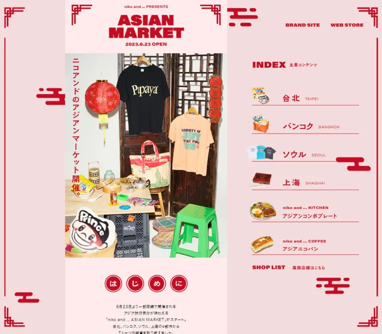
The page presents fashion, household goods, and food through the atmosphere of an Asian night market. Its identity comes from substantial display lettering, ornamental red corners, cloud-like marks, circular character seals, and densely styled photographs. The pale pink background holds these vivid elements together. Merchandise retains its own color and texture: a red lantern, dark wooden screens, printed shirts, decorated ceramics, a green plastic stool, and colorful packaging.
On desktop, the main story is a slim column immediately to the left of the viewport center. A persistent index occupies the right side while decorative rails frame the screen. On mobile, the story fills the viewport and the separate desktop navigation disappears. Images and ornamental geometry become smaller, but most measured text sizes remain almost unchanged. This distinction is essential to reproducing the responsive design.
The currently served page still displays the campaign date 2023.6.23 OPEN. This reference documents that current content; it does not establish present-day event operation, stock, or prices.
閉じる
niko and ... PRESENTS ASIAN MARKET — Style Reference
A narrow market poster filled with merchandise photography, framed by red lattice corners and a pale pink desktop index.
Website: niko and ... ASIAN MARKET Original URL: https://www.nikoand.jp/asian_market_2023/ Final URL: https://www.nikoand.jp/asian_market_2023/ Theme: light pink shell with red navigation and locally colored merchandise chapters; no theme switch was verified. Inspected: supplied browser evidence captured September 24, 2026, at 06:12:50 JST / September 23, 2026, at 21:12:50.222 UTC. Viewports: desktop 1440 × 1000 CSS pixels; mobile 390 × 844 CSS pixels. Scope: the currently served promotional editorial catalog, including its opening, in-page navigation, four city chapters, grocery and food content, store directory, commerce links, and footer. Visual captures show the opening, a Shanghai merchandise passage, and the footer on desktop, plus the opening and footer on mobile. DOM evidence covers the longer document. Product-detail opening behavior was not exercised.
The page presents fashion, household goods, and food through the atmosphere of an Asian night market. Its identity comes from substantial display lettering, ornamental red corners, cloud-like marks, circular character seals, and densely styled photographs. The pale pink background holds these vivid elements together. Merchandise retains its own color and texture: a red lantern, dark wooden screens, printed shirts, decorated ceramics, a green plastic stool, and colorful packaging.
On desktop, the main story is a slim column immediately to the left of the viewport center. A persistent index occupies the right side while decorative rails frame the screen. On mobile, the story fills the viewport and the separate desktop navigation disappears. Images and ornamental geometry become smaller, but most measured text sizes remain almost unchanged. This distinction is essential to reproducing the responsive design.
The currently served page still displays the campaign date 2023.6.23 OPEN. This reference documents that current content; it does not establish present-day event operation, stock, or prices.
How to Read This Reference
- Measured means a value appears in the supplied rendered DOM or computed-style evidence. Coordinates and sizes are CSS pixels, rounded for readability.
- Calculated means a proportion or difference derived from those measurements. It is not a recovered stylesheet formula.
- Estimated means a visual approximation from original-page captures, including colors whose computed declarations were not supplied.
- Recommended means implementation guidance for a new build. Proposed breakpoints, fallback fonts, accessibility behavior, and CSS architecture are not claims about the source implementation.
- Token names below are descriptive aliases. The evidence does not expose a complete source design-token system.
- Empty text nodes, zero-sized text, and inherited black anchor styles sometimes surround visible graphic lettering. Read the visible artwork and the measured descendants together; the wrapper styles alone do not describe the final appearance.
- The first desktop image is substantially darkened. Its cause is unresolved. The other original-page captures establish the normal light appearance, so the dark capture is not treated as a second theme or a verified modal state.
Tokens — Colors
Default Palette
| Name | Value | Evidence | Suggested token | Role |
|---|---|---|---|---|
| Story Pink | #ffebeb |
Measured section backgrounds | --paper |
Opening, grocery section, and footer |
| Market Red | #c30d23 |
Measured text color | --ink |
Latin navigation, date, food headings, prices, and selected descriptive copy |
| Outer Blush | Approximately #f5dcdc |
Visual estimate | --canvas-estimate |
Desktop margins and persistent navigation field |
| Highlight Blush | Approximately #f2c7c7 |
Visual estimate | --highlight-estimate |
Tinted Shanghai index row in the merchandise capture |
| Body Black | #000000 |
Measured | --body-ink |
Introductory copy, shop names, credits, and copyright |
| Directory White | Approximately #ffffff |
Visual estimate | --sheet |
White store-list insert within the floral surround |
| Directory Teal | #416269 |
Measured heading color | --directory-ink |
Store-directory titles and category labels |
| Pin Gold | Approximately #c4ad68 |
Visual estimate | --pin-estimate |
Small round marks at the visible lower corners of the store-list sheet |
The red graphics appear somewhat brighter than some measured live text. Their fills were not supplied independently. Use #c30d23 as the verified text token, and preserve supplied graphic assets rather than asserting that every red pixel uses that exact value.
Chapter Palette
| Chapter or element | Verified color | Evidence and limits |
|---|---|---|
| Taipei text and decorative elements | #d6c847 |
Measured on chapter description and graphic wrappers |
| Bangkok text and decorative elements | #394570 |
Measured on chapter description and graphic wrappers |
| Seoul text and decorative elements | #c5e157 |
Measured on chapter description and graphic wrappers |
| Shanghai text and decorative elements | #d6c847 |
Measured; visible yellow lettering also appears in the Shanghai capture |
| Shanghai red field | Approximately #d64b3e |
Visual approximation of a visibly textured surface, not a flat measured fill |
| Green photographic fields | No single verified token | Part of the Shanghai photography; retain their natural variations |
These are chapter accents, not selectable themes. The exact background treatment of every city chapter cannot be reconstructed from the supplied screenshots.
The supplied custom property --swiper-theme-color: #007aff does not establish a visible blue accent. Likewise, --color: $color_main is not a usable CSS color value. Neither should enter the visual palette merely because it appears in the custom-property dump.
Tokens — Typography
Japanese Body Copy
Measured source stack: "ヒラギノ角ゴ Pro", "Hiragino Kaku Gothic Pro", メイリオ, Meiryo, "MS Pゴシック", "MS PGothic", sans-serif.
Most body text uses weight 400. Store-category labels and selected food labels use 600. Paragraphs are compact but generously led: approximately 13.5–14.8px text with 24–26px line height. The introductory paragraph is centered and deliberately broken into short lines. City descriptions are narrower and align beside graphic city headings.
The document root is measured at 10px, but much of the visible text has explicit sizes. Do not turn all page text into 10px type simply because the root and several graphical wrappers report that size.
Latin Display and Utility Text
Measured source family: acumin-variable, sans-serif.
This family appears on the presentation line, opening date, Latin navigation, food headings, prices, credits, and copyright. These elements often report font-weight: 400, even where their appearance is heavy. Font variation settings and the resolved font file were not included. Do not invent a weight-axis value or claim that ordinary 400-weight fallback text will match the display treatment.
For a new implementation, use the authorized original font with verified settings when available. Otherwise, a heavy system sans-serif is a recommended approximation for display roles; retain a neutral regular sans-serif for credits and utility text.
Graphic Lettering
The ASIAN MARKET H1 contains individual character text but reports font-size: 0 and line-height: 0. Its visible lettering therefore cannot be specified from an ordinary H1 font size. Preserve the bold two-line wordmark as graphic lettering, with an accessible textual heading.
The Japanese city names, vertical opening announcement, and several section labels also appear as graphic treatments. Their wrapper dimensions are useful; their inherited font styles are not reliable descriptions of the artwork.
Type Scale
| Role | Desktop measurement | Mobile measurement | Leading / tracking |
|---|---|---|---|
| Presentation line | 12.65px |
12.48px |
Line height equals font size |
| Opening date | 16.87px |
16.64px |
Line height equals font size |
| Introductory paragraph | 13.70px |
13.52px |
24.25 / 23.92px; tracking 0.8px |
| City description | 13.70px |
13.52px |
25.30 / 24.96px; tracking 0.6px |
| Inline Latin destination label | 12.65px |
12.48px |
Line height equals font size; tracking 0.4px |
| Desktop global links | 16.87px |
Not present in the mobile snapshot | Line height equals font size |
| Desktop index food brand label | 12.65px |
Separate index absent | Tracking 0.5px |
| Grocery / food body copy | 14.76px |
14.56px |
26.35 / 26.00px |
| Food-menu heading | 23.19px |
22.90px |
25.83 / 25.50px |
| Combo-plate heading | 31.63px |
31.20px |
33.73 / 33.28px |
| Large food prices | 31.63px |
31.20px |
Line height equals font size |
| Beverage feature heading | 40.06px |
39.52px |
35.84 / 35.36px; intentionally tight |
| Store-list heading | 25.30px |
24.96px |
Line height equals font size |
| Store-category labels | 14.76px |
14.56px |
Weight 600; tracking 0.8px |
| Store names | 12.65px |
12.48px |
23.19 / 22.88px |
| Production credits | 12.65px |
12.48px |
27.41 / 27.04px |
| Copyright | 11.60px |
11.44px |
Normal line height |
Calculated relationship: the story column is about 21.6% wider on desktop than mobile, while intro text is only about 1.4% larger. Images and text clearly do not share one uniform scale factor.
Tokens — Spacing & Shapes
Density: a compact editorial strip surrounded by broad desktop space. Geometry: square image edges, fine horizontal rules, ornamental open corners, circular seals, and diamond detail marks. Spacing model: several geometric insets preserve their proportion to the story width. The source formula and breakpoint definitions were not provided.
Spacing Scale
| Use | Desktop | Mobile | Interpretation |
|---|---|---|---|
| Intro seal-to-seal gap | 12.64px |
10.39px |
Calculated from measured positions; about 2.67% of story width |
| Seal row to intro copy | 32.88px |
27.03px |
Calculated; about 6.93% of story width |
| Inline contents horizontal inset | 35.42px |
29.13px |
Measured positions; about 7.47% of story width |
| Store-directory side padding | 44.27px |
36.39px |
Measured; about 9.33% of story width |
| Store-directory vertical padding | 47.44px |
39px |
Measured; 10% of story width |
| Footer top padding | 37.94px |
31.19px |
Measured; about 8% of story width |
| Footer bottom padding | 44.27px |
36.39px |
Measured; about 9.33% of story width |
| Footer CTA to credit block | 56.92px |
46.80px |
Calculated; about 12% of story width |
| Credits to social icons | 82.22px |
67.59px |
Calculated from the first icon box; about 17.33% of story width |
These relationships are useful implementation constraints. They do not prove that the original used percentage padding or container-query units.
Border Radius
| Element | Observed treatment |
|---|---|
| Photographs and main sections | Square edges |
| Index rows | Square, flat regions separated by fine rules |
| Store-list insert | Square white sheet |
| Intro character seals | border-radius: 100% measured on wrappers |
| Cloud-like decorations | Rounded-ended graphic strokes; no source radius value supplied |
| Detail marks | Diamond silhouettes with contrasting outlines |
There is no general rounded-card or elevation system. Photographic shadows belong to the photographed objects, not to a reusable UI shadow token.
Layout Measurements
| Element | Desktop 1440 × 1000 | Mobile 390 × 844 |
|---|---|---|
| Story column | x: 245.61px, width 474.38px |
x: 0, width 390px |
| Story right edge | Approximately 720px, the viewport midpoint |
390px |
| Persistent index rows | x: 805.38px, width 402.69px |
Absent from the mobile rendered text and captures |
| Story-to-index gap | Approximately 85.39px |
Not applicable |
| H1 graphic wrapper | 474.38 × 94.84px |
390 × 93.59px |
| Hero photograph | Approximately 474 × 598px, visual estimate |
Approximately 390 × 492px, visual estimate |
| Intro seal wrapper | 51.22 × 50.17px |
42.11 × 41.95px |
| Inline contents width | 403.53px |
331.75px |
| Store-list white content width | 385.84px |
317.22px |
| Footer CTA | 379.50 × 78.36px |
312 × 71.53px |
| Footer brand-link box | 176.45 × 25.30px |
145.08 × 20.80px |
| Full document height | 16,724.05px |
14,322.78px |
The desktop exterior corner ornaments are approximately 62px square, with roughly 20px viewport insets. Long red side rails run between the corner groups. These are screenshot estimates, not measured border declarations.
Components
Desktop Decorative Frame
Role: makes the viewport resemble an ornamental market poster.
Place angular red lattice corners near all four screen corners. Connect the top and bottom zones visually with long, thin vertical rails near the left and right edges. Scatter a small number of rounded cloud-like red motifs through the open background. Their irregular placement balances the narrow story and the index without forming a repeating wallpaper.
The frame and right-side index remain in the same visible positions across the Shanghai and footer captures while the story changes. This supports persistent viewport framing; the exact use of fixed, sticky, or another mechanism was not supplied.
On mobile, the exterior desktop frame is absent. Smaller local corner ornaments remain around the masthead and footer commerce link.
Global Brand and Store Links
Role: access to the parent brand and merchandise collection.
Two unboxed red Latin links, BRAND SITE and WEB STORE, sit near the upper-right desktop edge. Their measured top is 68.36px; their text is 16.87px Acumin-family type. The horizontal gap is approximately 30px.
The brand link points to the brand homepage; the store link points to a collection on the external store domain. Those destinations were not opened during this analysis. These two upper-right links are absent from the supplied mobile rendered navigation.
Persistent Desktop Index
Role: direct access to city stories, food sections, the store directory, and merchandise.
The index begins with a large red INDEX label and a smaller Japanese descriptor, 主要コンテンツ. Its visual heading size is approximately 32px; no heading-specific computed style was supplied.
Each city row combines:
- A small isolated product image at the left.
- A large Japanese city name.
- A smaller Latin city label on the same general baseline.
- A thin red bottom rule spanning approximately 403px.
The images act as category identifiers: noodle packaging and a character for Taipei, a basket for Bangkok, shirts for Seoul, and a red case with game pieces for Shanghai. Their silhouettes vary and sometimes extend beyond the nominal row bounds. Keep that variation rather than enclosing every image in an identical tile.
The city anchors measure approximately 49–51px high, with about 39px between successive anchor boxes. The first begins at y: 250.15px. Text starts around x: 921.33px, approximately 116px after the row's left edge.
The kitchen and coffee rows are taller, approximately 65px and 63px. They pair a food cutout with two lines: a small Latin brand label and a larger Japanese menu label. Two compact text-only links, SHOP LIST and ALL ITEMS, follow below.
The Shanghai row has a pale tinted fill in the merchandise capture. Its trigger is unverified: do not assert that it is hover, focus, or automatic scroll tracking. The desktop Latin label is visibly rendered as SHAGHAI, while the inline destination label and chapter use SHANGHAI.
Opening Masthead and Hero Photograph
Role: establish the event identity and its merchandise world immediately.
The masthead stacks a small niko and ... PRESENTS line, a very heavy two-line ASIAN MARKET wordmark, and the date 2023.6.23 OPEN. Red ornamental corners occupy the upper edges. Everything is centered on the pale story surface.
On mobile, the photograph starts at approximately y: 170px and extends to y: 662px. It fills the 390px story width with square edges. Its composition is a styled display rather than a single product packshot: dark wooden screens, hanging shirts, a lantern, bags, tableware, packaging, a character cushion, and a green stool.
A red vertical announcement, ニコアンドのアジアンマーケット開催。, overlaps the left side of the masthead/photo boundary. Its measured mobile wrapper is approximately 20.27 × 329.14px at x: 15.59px, y: 140.89px. The corresponding desktop wrapper scales to approximately 24.66 × 400.45px.
Preserve the photograph's internal arrangement and natural ratio. A generic center-cropped hero would remove the merchandise relationships that define this opening.
Introductory Character Seals and Copy
Role: provide a playful transition from imagery to explanation.
Four separate circular red seals spell は, じ, め, に. They have white lettering and fine concentric outlining. These are decorative section markers; their sampled elements are paragraphs, not verified buttons.
The row is centered, approximately 42px high on mobile and 50px on desktop. After about 27px of mobile clearance, a centered paragraph explains the four-city selection and related food offerings. Its short lines and generous leading provide relief after the busy photograph.
Keep the four seals distinct. Replacing them with one conventional heading loses both the spacing rhythm and the observed staggered animation hooks.
Inline Contents Block
Role: navigation within the story, including on mobile where the separate index is absent.
The four city destinations form a two-column group approximately 85% of the story width. Measured mobile columns are 165.88px and 164.88px; their different widths are consistent with a fine central separation.
Each destination combines prominent graphic labeling with a smaller Latin label. Below the four cities, full-width destinations lead to groceries, food, and the web store. The mobile full-width rows measure approximately 92px, 119px, and 90px high respectively.
The block ends with the compact instruction ↑ TAP HERE ! SCROLL DOWN !. These are real fragment links for city and section navigation. Smooth-scroll timing, focus transfer, and click results were not recorded.
City Merchandise Chapters
Role: organize the collection as a journey through Taipei, Bangkok, Seoul, and Shanghai.
The DOM establishes this chapter order and distinct local text colors. City introductions combine tall graphic city headings with comparatively narrow descriptive paragraphs. Taipei and Seoul descriptions sit to the right of their headings; Bangkok and Shanghai descriptions sit to the left of right-side headings in the supplied measurements.
The Shanghai capture shows the strongest available visual detail: a textured red field, yellow labels, bright green photographic surfaces, decorated tea vessels, a red game case, and small embroidered pouches. Photographs, isolated objects, text, and cloud motifs overlap in a loose editorial arrangement. Prices are small, nearby annotations rather than card footers.
Use varying image widths and offsets while retaining a consistent story-column boundary. The content should read as a composed merchandise spread. Full visual treatments for the other three chapters are not available in the supplied screenshots and should not be invented from their text colors alone.
Diamond Detail Marks and Product Information
Role: connect editorial merchandise presentation with further product information.
Visible Shanghai detail marks use paired diamond shapes containing 詳 and 細, with yellow fills and white outlines. Their orientation and stacking respond to the surrounding composition. They are deliberately more decorative than a standard rectangular button.
Additional product descriptions, prices, and external item links appear in the DOM. For example, detail text measures 13px / 24px on desktop and 13.52px / 24.96px on mobile. The mobile text region is approximately 286px wide, beginning at x: 52px.
Several such groups have overlapping viewport-relative positions. This establishes that the content exists, but does not prove that all groups were visible or that a particular dialog was open. Opening, closing, backdrop appearance, focus behavior, and the relationship between each diamond and a detail layer remain unverified.
For an adaptation, use real buttons when opening a dialog and real links when navigating. Do not infer the source's control semantics from the decorative diamond shape.
Grocery and Food Features
Role: extend the merchandise journey into snacks, meals, bread, and drinks.
The grocery section returns to the measured pale pink surface. Its DOM includes HAVE SOME FUN, a centered red introductory paragraph, and three captions about snacks, curry/rice, and instant noodles. The caption elements share a vertical position, and an opacity transition is declared on a caption. This suggests layered content, but autoplay, swipe gestures, slide order, and controls were not verified.
The following food content contains ASIAN MARKET FOOD MENU, a combo-plate feature, bread offerings, and a beverage collaboration. Measured headings and prices are much larger than body text: approximately 31px for the combo heading and prices, and approximately 40px for BOULANGERIE BEURRE.
The desktop index confirms isolated plate and bread imagery. Full food-section imagery and its interaction details are outside the supplied visual captures. Reuse the measured typography and documented sequence without inventing a complete menu layout.
Store Directory
Role: provide practical participation information after the editorial content.
A patterned teal floral surround frames a square white insert. The visible lower corners have small gold circular marks, giving the insert the character of a posted notice. The sheet contains a centered heading, category labels, and centered store names in short lines.
The measured surround padding is 10% of story width vertically and approximately 9.33% horizontally. Category labels use teal, weight 600, and underlining. Store names use black regular text at approximately 12.5px with 23px leading.
Preserve the calm, text-based directory. No map, search interface, store cards, or accordion interaction is established by the evidence.
Footer Commerce Link
Role: provide a final route to the merchandise collection.
The ALL ITEMS link occupies 80% of the story width. It uses red lettering, the smaller Japanese subtitle すべての商品はこちら, a tiny right-pointing arrow, and ornamental corners. Its surface remains the same pale pink as the footer.
The measured mobile box is 312 × 71.53px, inset 39px from each side. The desktop equivalent is 379.50 × 78.36px. This is an open ornamental frame, not a filled pill or a shadowed card.
Credits, Social Links, and Brand Signature
Role: close the page with production information and the parent brand.
A centered five-line credit block follows the commerce link. The source labels are PHOTO_, STYLING_, DEVELOPMENT_, EDIT_, and DIRECTION&DESIGN_. The original page names SHO UEDA, ITSUKA WATANABE, RIHO MOCHIZUKI with Rhino inc., EMI ISHIDA with Rhino inc., and HIROAKI TAKATORI respectively.
A generous gap precedes six black social marks: LINE, Instagram, Twitter, Facebook, YouTube, and TikTok. The visible source retains the bird-shaped Twitter mark. Mobile icon boxes range from approximately 21–29px wide; desktop boxes range from approximately 26–35px.
A centered black niko and ... wordmark follows, then a small copyright line naming Adastria Co., Ltd. The footer remains inside the narrow story column. The desktop index and exterior frame continue beside it.
Tokens — Motion & Interaction
The following values are computed-style declarations, not a frame-by-frame recording of every animation. Keyframe transforms, event triggers, and final state logic were not supplied.
| Element | Supplied value | Supported interpretation and limit |
|---|---|---|
| Body | opacity 0.8s |
An opacity transition exists; its trigger and relationship to the dark capture are unresolved |
| Mobile presentation line and date | opacity 1s 1s |
One-second transition with one-second delay |
| Mobile vertical opening graphic | clip-path 1.2s 1s |
Delayed clipping transition; exact clip geometry unknown |
| Four intro seals | 0.6s linear both floating1/floating2 |
Alternating named animations with delays of 0, 0.2, 0.3, and 0.4s; no infinite repetition declared |
| Mobile chapter ornaments | 0.6s linear, sometimes delayed 0.6s |
Staged transitions; changing property and movement distance not established |
| A Seoul graphic | clip-path 1s 0.8s |
Delayed graphic reveal declaration |
| Grocery caption | opacity 1s |
Caption fading is supported; carousel behavior remains unverified |
| A food graphic | clip-path 1s 0.5s |
Another staged clipping transition |
| A tall food graphic | opacity 2s 0.2s, transform 0.65s 0.2s |
Opacity and transform use different durations; transform endpoints unknown |
| Desktop global links | opacity 0.3s |
Opacity feedback is defined; target opacity not supplied |
| Desktop food outbound links | color 0.3s |
Color transition is defined; target color not supplied |
| Desktop social links | opacity 0.2s |
Short opacity feedback declaration |
Plain transition: all entries do not establish a meaningful nonzero duration. Do not interpret them as evidence that every element animates.
The supported motion character is staggered presentation, clipping reveals, and modest link feedback. Continuous parallax, animated cloud travel, spring physics, automatic section tracking, and modal choreography were not verified.
Recommended adaptation: keep content visible by default, add progressive enhancement for reveals, and disable nonessential animation for reduced-motion preferences. Do not reproduce the unexplained darkened capture as the default state.
Surfaces
| Layer | Appearance | Function |
|---|---|---|
| Desktop canvas | Muted blush field | Space for persistent navigation and decoration |
| Opening and footer | Measured #ffebeb |
Quiet identity and reading surface |
| Index row | Transparent blush with a fine red rule | Navigation hierarchy |
| Tinted index state | Slightly deeper pink | Visible emphasis; trigger unverified |
| Shanghai chapter | Textured red with yellow accents | Local merchandise atmosphere |
| Photography | Natural object colors, texture, and shadows | Main visual density |
| Store-directory surround | Teal floral pattern | Separates practical information from the product story |
| Store-directory insert | White rectangular sheet | Readable list of locations |
The design gains depth from photographed objects, compositional overlap, and patterned framing. It does not need a generic card-elevation scale.
Imagery
The hero resembles a carefully arranged shop display: objects overlap, textiles hang, and small packaged goods sit among larger furnishings. Retain the dark wood, bright lantern, casual plastic furniture, and printed merchandise. Their contrast makes the scene feel collected and tactile.
The Shanghai spread mixes rectangular photographs with isolated objects. A red case can sit between image fields; captions occupy open portions of the colored chapter background; decorative marks overlap edges. Preserve crisp merchandise details and natural photographic texture. There is no evidence for pixelated image rendering, duotone conversion, or a universal image filter.
Navigation imagery uses small product and food cutouts rather than a uniform symbolic icon family. Their differences in shape are useful: shirts read horizontally, a basket reads vertically, and a plate forms a rounded silhouette.
Observed Asset References
The supplied evidence does not contain original image src values or downloadable asset paths. The following are visual references, not invented filenames.
| Asset | Original-page evidence | Implementation guidance |
|---|---|---|
| Two-line event wordmark | Mobile opening and desktop H1 measurements | Preserve graphic proportions; provide an accessible heading |
| Styled merchandise hero | Original desktop opening and mobile opening | Retain the complete scene and natural ratio |
| Vertical Japanese announcement | Mobile opening and measured graphic wrapper | Keep it near the left edge, overlapping the masthead/photo transition |
| City and food index cutouts | Desktop merchandise and footer captures | Preserve transparent silhouettes and varied dimensions |
| Red lattice corners | Desktop frame, mobile masthead, footer CTA | Use crisp graphic artwork at several scales |
| Cloud-like ornaments | Desktop frame and Shanghai chapter | Keep broad rounded strokes and sparse placement |
| Shanghai still-life photography | Desktop merchandise capture | Retain saturated green fields, decorated ceramics, red case, and pouches |
| Floral directory surround | Desktop and mobile footer captures | Use an appropriate repeating asset; exact tile size is unknown |
| Social marks and brand wordmark | Desktop and mobile footer | Preserve observed silhouettes and optical sizing |
Use original assets when authorized and available. The CSS shell can reproduce layout relationships, but cannot recreate the merchandise photography or custom lettering by itself.
Layout & Responsive Behavior
Desktop Composition
At 1440px wide, the story occupies approximately 32.94% of the viewport and ends at its midpoint. Its left edge is about 245.61px. The index starts about 85.39px to the right of the story and spans approximately 402.69px.
This is deliberately asymmetric. Centering the story across the full desktop viewport would displace the index and remove the broad left decorative margin. The persistent frame, upper-right links, and index stay outside the scrolling story's content hierarchy.
Mobile Composition
At 390px, the story occupies the complete viewport width. The separate desktop index, upper-right global links, and exterior rails are absent. The opening still has a full wordmark, local corner ornaments, a vertical announcement, and the complete merchandise photograph.
The inline contents remain within the document. Their first city row begins around y: 1007px, after the introduction, so they are below the initial 844px viewport. Do not invent a mobile hamburger menu or sticky bottom navigation to describe the source.
The footer keeps the same order, with proportional horizontal insets. Its 312px commerce link, six social marks, and centered brand signature all fit within the 390px story.
Document Rhythm
| Main region | Desktop start / height | Mobile start / height |
|---|---|---|
| Opening, introduction, contents | 0 / 1869.42px |
0 / 1614.72px |
| Four city chapters | 1869.42 / 7080.13px |
1614.72 / 5977.59px |
| Grocery feature | 8949.55 / 820.06px |
7592.31 / 703.23px |
| Food features | 9769.61 / 5194.88px |
8295.55 / 4422.75px |
| Store directory | 14964.48 / 1152.17px |
12718.30 / 1072.84px |
| Footer | 16116.66 / 607.39px |
13791.14 / 531.64px |
These are captured document measurements, not heights to hardcode. Different text, fonts, asset dimensions, and accessibility settings must be allowed to change them.
Responsive Limits
Only the two stated viewports were measured. Tablet behavior, the exact desktop breakpoint, maximum story width, short-screen navigation behavior, and landscape layouts remain unknown.
For an adaptation, keep image geometry proportional to the story width while using a nearly stable body-type scale. Choose the desktop breakpoint only when the story, index, and decorative clearances fit comfortably. The Quick Start uses an explicitly recommended 1100px breakpoint and a capped story width; these are not recovered source rules.
Do’s and Don’ts
Do
- Preserve the narrow editorial story and separate persistent desktop index.
- Use measured pale pink
#ffebeband text red#c30d23as the core pair. - Let chapter accents and full-color merchandise photographs add variety.
- Keep the hero's complete styled scene and recognizable object relationships.
- Mix photographic rectangles with isolated product silhouettes and nearby price annotations.
- Repeat lattice corners at viewport, masthead, and commerce-link scales.
- Keep the four introductory character seals separate.
- Preserve the nearly stable body-text size across desktop and mobile.
- Retain the inline contents when removing the separate desktop index on mobile.
- Use the floral directory surround and white insert as a clear practical-information section.
- Keep footer credits, social marks, and brand signature centered within the story width.
- Distinguish verified motion declarations from untested interaction behavior.
Don’t
- Do not convert the page into a wide hero followed by uniform product cards.
- Do not stretch the story to fill desktop width.
- Do not center the desktop story independently of the right-side index.
- Do not apply one global scale transform to images, type, and controls.
- Do not replace the merchandise cutouts with generic line icons.
- Do not add soft card shadows, glass panels, or pill-shaped controls throughout.
- Do not flatten the graphic masthead into ordinary body-font text.
- Do not infer a dark theme from the darkened opening capture.
- Do not claim a tested carousel, modal, or scroll-tracking system from DOM presence alone.
- Do not invent original asset URLs, font-axis settings, or missing city backgrounds.
- Do not treat the campaign date and displayed prices as evidence of current availability.
Recommended Implementation Additions
These are improvements for a new implementation, not verified source features:
- Give every graphical heading an accessible text equivalent. Keep ornamental corners and clouds hidden from assistive technology.
- Provide visible keyboard focus for fragment links, product controls, social icons, and outbound commerce links.
- Expand small icon and diamond hit areas toward 44 × 44px without enlarging their visible artwork unnecessarily.
- If details open in a dialog, provide a labeled close control, sensible initial focus, Escape handling, and focus restoration. Verify the desired interaction before implementing it.
- Keep reveal content readable when scripts fail or reduced motion is requested. Avoid leaving the body hidden while waiting for animation readiness.
- Check contrast for yellow and lime chapter text against the actual photographic and textured backgrounds.
- Use semantic lists for store directories and navigation, preserving the centered visual presentation.
- Supply explicit image dimensions to reduce layout shifts. Load the opening image promptly and defer distant merchandise images as appropriate.
- Allow longer localized copy and browser text enlargement to increase section height. Keep essential controls out of clipped decorative regions.
- Make the desktop index reachable on short screens, for example through constrained internal scrolling. This is an adaptation decision, not observed source behavior.
Agent Prompt Guide
Quick Color Reference
- Story paper: measured
#ffebeb. - Primary text and navigation red: measured
#c30d23. - Desktop outer blush: estimated
#f5dcdc. - Taipei and Shanghai accents: measured
#d6c847. - Bangkok accent: measured
#394570. - Seoul accent: measured
#c5e157. - Directory heading teal: measured
#416269. - Main body and footer marks: black.
- Preserve photographic colors; do not apply a global recoloring filter.
Overall Prompt
“Create an editorial merchandise microsite inspired by niko and ... ASIAN MARKET. Use a pale pink story surface, deep red text, angular lattice corners, sparse rounded cloud ornaments, and vivid styled merchandise photography. On a 1440px desktop, place a roughly 474px story column immediately left of the viewport midpoint and a roughly 403px persistent index to its right. Build the index from product cutouts, prominent Japanese city labels, smaller Latin labels, and thin red rules. On a 390px phone, let the story fill the screen and remove the separate desktop index while keeping inline contents. Use nearly stable 13.5–15px body text across both layouts. Build varied photographic chapter spreads, a floral-framed store directory, and a centered pink footer with an ornamental ALL ITEMS link, credits, black social marks, and the brand signature. Treat supplied photographs and graphic lettering as essential assets.”
Example Component Prompts
- Opening: “A pale pink mobile masthead with a small presentation line, very heavy two-line event lettering, a compact opening date, and red lattice corner graphics. Below it, show an uncropped portrait merchandise scene with a lantern, hanging shirts, bags, tableware, and a green stool. Overlap a narrow vertical Japanese announcement along the left edge.”
- Desktop index: “A persistent blush navigation area with a red INDEX heading. Give each city a thin-rule row containing a differently shaped product cutout, a large Japanese city label, and a smaller Latin label. Add taller plate and bread rows, then compact SHOP LIST and ALL ITEMS links. Use no card shadows.”
- Shanghai spread: “Compose decorated ceramics, a red game case, and embroidered pouches over a textured red chapter field. Use green photographic surfaces, yellow price annotations, rounded cloud motifs, and paired outlined diamond detail marks. Vary image widths and alignments within one narrow story column.”
- Store directory: “A centered white rectangular notice inside a teal floral surround. Use teal underlined category headings, compact black store names with generous line height, and small gold pin dots at the lower corners. Keep it a readable list.”
- Footer: “A pale pink narrow footer with an 80%-width ALL ITEMS link framed only by red ornamental corners. Follow it with five centered credit lines, generous vertical space, six black social marks, a centered black brand wordmark, and a small copyright line.”
- Motion: “Use finite staggered character-seal animation and modest opacity or clipping reveals. Keep content visible without JavaScript and disable decorative motion for reduced-motion preferences. Do not assume autoplay, parallax, or product-modal behavior without separate requirements.”
Quick Start
CSS Custom Properties
This is a recommended adaptation, calibrated to the measured endpoints. It uses a conventional root font size, container-relative geometry for the story, and an explicitly chosen desktop breakpoint. It does not reproduce undisclosed source CSS.
Use a .market-shell containing .market-story, .market-index, .global-links, and optional .viewport-frame artwork. The story is a size container, so its descendants can use cqi units. Provide authorized photography and graphic assets separately. No asset paths or font files are assumed here.
The display fallback below is intentionally approximate. Replace it with the original acumin-variable family and verified settings when available; its measured 400 weight alone is insufficient to reproduce the heavy display appearance.
:root {
  /* Verified colors */
  --paper: #ffebeb;
  --ink: #c30d23;
  --body-ink: #000;
  --chapter-gold: #d6c847;
  --chapter-indigo: #394570;
  --chapter-lime: #c5e157;
  --directory-ink: #416269;

  /* Visual estimates for this adaptation */
  --canvas-estimate: #f5dcdc;
  --highlight-estimate: #f2c7c7;
  --shanghai-estimate: #d64b3e;
  --pin-estimate: #c4ad68;
  --sheet: #fff;

  /* Recommended fallbacks; no font file is bundled */
  --font-body: 'Hiragino Kaku Gothic Pro', Meiryo,
    'MS PGothic', sans-serif;
  --font-display: 'Arial Black', Arial, sans-serif;
  --font-utility: Arial, sans-serif;

  /* Mobile measurements, independent of image scaling */
  --text-small: 12.48px;
  --text-body: 13.52px;
  --text-feature: 14.56px;
  --text-display: 31.2px;
  --leading-body: 24.96px;
  --leading-feature: 26px;
  --story-width: min(100vw, 474.375px);
  --rule: 1px;
  --feedback: 200ms;
}

* { box-sizing: border-box; }

body {
  margin: 0;
  color: var(--body-ink);
  background: var(--canvas-estimate);
  font-family: var(--font-body);
}

img, svg { max-width: 100%; }

.market-shell {
  position: relative;
  isolation: isolate;
}

.market-story {
  position: relative;
  width: var(--story-width);
  margin-inline: auto;
  background: var(--paper);
  container-type: inline-size;
}

.market-story img {
  display: block;
  height: auto;
}

.market-index,
.global-links,
.viewport-frame {
  display: none;
}

/* Opening geometry approximates the supplied mobile capture. */
.masthead {
  position: relative;
  padding: 11px 0 17px;
  color: var(--ink);
  text-align: center;
}

.masthead-kicker {
  margin: 0;
  font: 900 var(--text-small)/1 var(--font-display);
}

.hero-title {
  height: 94px;
  margin: 12px 0 0;
  font: 900 52px/.9 var(--font-display);
}

.hero-title img {
  width: 72%;
  height: 100%;
  margin-inline: auto;
  object-fit: contain;
}

.hero-date {
  margin: 7px 0 0;
  font: 900 16.64px/1 var(--font-display);
}

.hero-photo {
  width: 100%;
  height: auto;
}

/* Position this graphic within a relative opening wrapper. */
.hero-vertical {
  position: absolute;
  z-index: 1;
  top: 36.125cqi;
  left: 4%;
  width: 5.2%;
  pointer-events: none;
}

.introduction {
  padding-top: 10.67cqi;
  text-align: center;
}

.intro-seals {
  display: flex;
  justify-content: center;
  gap: 2.667cqi;
}

.intro-seal {
  display: grid;
  place-items: center;
  width: 10.8cqi;
  aspect-ratio: 1;
  border: 4px double var(--paper);
  outline: 1px solid var(--ink);
  border-radius: 50%;
  color: var(--paper);
  background: var(--ink);
  font-size: 17px;
  font-weight: 600;
}

.intro-copy {
  margin: 6.93cqi 0 0;
  padding-inline: 3%;
  font-size: var(--text-body);
  line-height: 1.77;
  letter-spacing: .8px;
}

.inline-contents {
  width: 85.07%;
  margin: 11.2cqi auto 0;
  color: var(--ink);
}

.inline-city-grid {
  display: grid;
  grid-template-columns: repeat(2, minmax(0, 1fr));
}

.inline-city,
.inline-destination {
  display: block;
  padding: 5.33cqi 2cqi;
  color: inherit;
  text-align: center;
  text-decoration: none;
  border-bottom: var(--rule) solid currentColor;
}

.inline-city:nth-child(odd) {
  border-right: var(--rule) solid currentColor;
}

.destination-latin {
  display: block;
  margin-top: 8px;
  font: var(--text-small)/1 var(--font-utility);
  letter-spacing: .4px;
}

/* Chapter styling shown only for the visually documented spread. */
.chapter-shanghai {
  position: relative;
  padding-block: 8cqi;
  color: var(--chapter-gold);
  background: var(--shanghai-estimate);
}

.chapter-copy {
  width: 64%;
  margin-inline: 5.33% auto;
  font-size: var(--text-body);
  line-height: var(--leading-body);
  letter-spacing: .6px;
}

.product-spread {
  position: relative;
  margin: 8cqi 0;
}

.product-spread img {
  width: 76%;
  margin-inline: auto 0;
}

.product-caption {
  margin: 3cqi 7%;
  font: var(--text-body)/1.35 var(--font-utility);
}

/* One target can contain the two visible character diamonds. */
.detail-link {
  display: inline-flex;
  align-items: center;
  gap: 12px;
  min-height: 44px;
  padding: 8px;
  color: #fff;
  text-decoration: none;
}

.detail-link > span {
  display: grid;
  place-items: center;
  width: 32px;
  height: 32px;
  border: 2px solid currentColor;
  background: var(--chapter-gold);
  transform: rotate(45deg);
}

.detail-link b {
  transform: rotate(-45deg);
}

.feature-copy {
  padding-inline: 5%;
  text-align: center;
  font-size: var(--text-feature);
  line-height: var(--leading-feature);
}

.feature-heading,
.feature-price {
  color: var(--ink);
  text-align: center;
  font: 900 var(--text-display)/1.07 var(--font-display);
}

.shop-directory {
  padding: 10% 9.333%;
  background-color: var(--directory-ink);
  /* Set this property to an authorized floral asset when available. */
  background-image: var(--shop-pattern, none);
}

.shop-sheet {
  position: relative;
  padding: 8% 4% 14%;
  background: var(--sheet);
  text-align: center;
}

.shop-sheet::before,
.shop-sheet::after {
  content: '';
  position: absolute;
  bottom: 12px;
  width: 11px;
  height: 11px;
  border-radius: 50%;
  background: var(--pin-estimate);
}

.shop-sheet::before { left: 12px; }
.shop-sheet::after { right: 12px; }

.shop-title {
  margin: 0;
  color: var(--directory-ink);
  font: 900 25px/1 var(--font-display);
}

.shop-category {
  margin: 32px 0 18px;
  color: var(--directory-ink);
  font-size: var(--text-feature);
  font-weight: 600;
  letter-spacing: .8px;
  text-decoration: underline;
  text-underline-offset: 4px;
}

.shop-list {
  margin: 0;
  padding: 0;
  list-style: none;
  font-size: var(--text-small);
  line-height: 1.833;
}

.market-footer {
  padding: 8% 0 9.333%;
  background: var(--paper);
  text-align: center;
}

.all-items {
  position: relative;
  display: grid;
  place-content: center;
  width: 80%;
  min-height: 72px;
  margin-inline: auto;
  color: var(--ink);
  text-decoration: none;
}

.all-items strong {
  font: 900 26px/1 var(--font-display);
}

.all-items small {
  margin-top: 5px;
  font-size: var(--text-small);
}

/* Supply the ornamental corners as noninteractive artwork. */
.ornamental-corners {
  position: absolute;
  inset: 0;
  width: 100%;
  height: 100%;
  pointer-events: none;
}

.production-credits {
  margin: 12cqi 0 0;
  padding-inline: 3%;
  font: var(--text-small)/2.167 var(--font-utility);
}

.social-links {
  display: flex;
  justify-content: center;
  gap: 3px;
  margin-top: 17.33cqi;
}

/* Larger hit areas are a recommended accessibility addition. */
.social-links a {
  display: grid;
  place-items: center;
  width: 44px;
  height: 44px;
  color: var(--body-ink);
}

.social-links img,
.social-links svg {
  width: 27px;
  max-height: 28px;
}

.footer-brand {
  display: block;
  width: 37.2%;
  margin: 8.8cqi auto 0;
}

.copyright {
  margin: 11.73cqi 0 0;
  padding-inline: 4%;
  font: 11.44px/1.4 var(--font-utility);
}

/* Recommended breakpoint; only endpoint layouts were measured. */
@media (min-width: 1100px) {
  :root {
    --story-width: clamp(390px, 32.9427vw, 474.375px);
    --text-small: 12.6501px;
    --text-body: 13.7042px;
    --text-feature: 14.7584px;
    --text-display: 31.6251px;
    --leading-body: 25.3px;
    --leading-feature: 26.3542px;
  }

  .market-story {
    margin-left: calc(50% - var(--story-width));
    margin-right: 0;
  }

  .masthead { padding: 13.28px 0 20.34px; }
  .hero-title { height: 94.84px; margin-top: 15.17px; }
  .hero-date { margin-top: 8.85px; font-size: 16.8667px; }

  .global-links {
    position: fixed;
    z-index: 3;
    top: 68px;
    right: 70px;
    display: flex;
    gap: 30px;
  }

  .global-links a {
    color: var(--ink);
    text-decoration: none;
    font: 900 16.87px/1 var(--font-display);
  }

  .market-index {
    position: fixed;
    z-index: 2;
    top: 157px;
    left: calc(50% + 5.929vw);
    display: block;
    width: min(27.9644vw, 402.6875px);
    max-height: calc(100dvh - 190px);
    overflow-y: auto;
    color: var(--ink);
  }

  .index-heading {
    margin: 0 0 60px;
    font: 900 32px/1 var(--font-display);
  }

  .index-heading small {
    margin-left: 10px;
    font: 600 14px/1 var(--font-body);
  }

  .index-row {
    position: relative;
    display: flex;
    align-items: center;
    height: 50px;
    margin-bottom: 39px;
    padding-left: 116px;
    border-bottom: var(--rule) solid var(--ink);
    color: inherit;
    text-decoration: none;
  }

  .index-row img {
    position: absolute;
    left: -8px;
    bottom: 0;
    width: 110px;
    height: 70px;
    object-fit: contain;
  }

  .index-label {
    display: flex;
    align-items: baseline;
    gap: 20px;
  }

  .index-label strong { font-size: 28px; }
  .index-label small { font-size: 13px; }
  .index-row--food { height: 65px; }
  .index-row--last { margin-bottom: 0; }

  .index-food-label {
    display: grid;
    gap: 8px;
  }

  .index-actions {
    display: grid;
    gap: 11px;
    margin-top: 24px;
  }

  .index-actions a {
    color: inherit;
    text-decoration: none;
    font: 900 19px/1 var(--font-display);
  }

  .viewport-frame {
    position: fixed;
    z-index: 1;
    inset: 20px;
    display: block;
    pointer-events: none;
  }
}

/* State behavior below is recommended, not source-verified. */
.index-row[aria-current='location'] {
  background: var(--highlight-estimate);
}

.global-links a,
.social-links a,
.all-items {
  transition: opacity var(--feedback) ease;
}

@media (hover: hover) {
  .global-links a:hover,
  .social-links a:hover,
  .all-items:hover {
    opacity: .7;
  }
}

.market-shell :focus-visible {
  outline: 2px solid var(--ink);
  outline-offset: 4px;
}

/* Content remains visible until enhancement is implemented. */
[data-reveal] { opacity: 1; }

@media (prefers-reduced-motion: reduce) {
  .market-shell *,
  .market-shell *::before,
  .market-shell *::after {
    animation: none !important;
    transition: none !important;
    scroll-behavior: auto !important;
  }

  [data-reveal] {
    opacity: 1 !important;
    transform: none !important;
    clip-path: none !important;
  }
}
The chapter example provides a flat fallback red. Add an authorized texture asset for the documented Shanghai surface. The index's aria-current state requires explicit application logic; this stylesheet does not claim that the original used automatic section tracking.
Tailwind v4 Token Mapping
Optional aliases for a project already using Tailwind v4. Define the properties above first. This mapping does not imply that the original website uses Tailwind.
@theme inline {
  --color-market-paper: var(--paper);
  --color-market-ink: var(--ink);
  --color-market-canvas: var(--canvas-estimate);
  --color-market-highlight: var(--highlight-estimate);
  --color-market-gold: var(--chapter-gold);
  --color-market-indigo: var(--chapter-indigo);
  --color-market-lime: var(--chapter-lime);
  --color-market-directory: var(--directory-ink);

  --font-market-body: var(--font-body);
  --font-market-display: var(--font-display);
  --font-market-utility: var(--font-utility);

  --text-market-small: var(--text-small);
  --text-market-body: var(--text-body);
  --text-market-feature: var(--text-feature);
  --text-market-display: var(--text-display);

  --radius-market-square: 0px;
  --radius-market-seal: 9999px;
}
Sources & Evidence
- Original and final page: niko and ... ASIAN MARKET. The supplied browser record reports HTTP
200with no URL change. - Capture time:
2026-09-23T21:12:50.222Z, equivalent to September 24, 2026, at 06:12:50.222 JST. - Desktop evidence: 1440 × 1000 CSS pixels; original-page captures of the darkened opening, Shanghai merchandise passage, and footer; rendered text, links, element bounds, computed styles, and a document height of approximately 16,724px.
- Mobile evidence: 390 × 844 CSS pixels; original-page opening and footer captures; rendered text, links, element bounds, computed styles, and a document height of approximately 14,323px.
- Navigation evidence: supplied anchors include
#country1through#country4,#grocery,#food,#kitchen,#coffee, and#shoplist. External commerce and social destinations were recorded as links, not inspected as destination pages. - Attribution evidence within the original page: the visible footer and rendered text contain the five production-credit lines and the Adastria copyright line.
- Capture limitations: the supplied process waited for document load, sampled stability, finite animation readiness, and image decoding within bounded time limits. It traversed intermediate scroll positions. These checks do not prove completeness of delayed content or unexercised interactions.
- Unverified details: exact media queries, original asset paths, font files and variation axes, the cause of the darkened opening, product-detail opening and closing, grocery autoplay or gestures, keyboard behavior, index-highlight triggers, and motion endpoints. Static captures and transition declarations cannot settle those questions.
This reference uses the supplied original-page evidence without additional browsing or file inspection. Measured endpoint values are separated from visual estimates and implementation recommendations throughout.
# niko and ... PRESENTS ASIAN MARKET — Style Reference

> A narrow market poster filled with merchandise photography, framed by red lattice corners and a pale pink desktop index.

**Website:** [niko and ... ASIAN MARKET](https://www.nikoand.jp/asian_market_2023/)
**Original URL:** https://www.nikoand.jp/asian_market_2023/
**Final URL:** https://www.nikoand.jp/asian_market_2023/
**Theme:** light pink shell with red navigation and locally colored merchandise chapters; no theme switch was verified.
**Inspected:** supplied browser evidence captured September 24, 2026, at 06:12:50 JST / September 23, 2026, at 21:12:50.222 UTC.
**Viewports:** desktop 1440 × 1000 CSS pixels; mobile 390 × 844 CSS pixels.
**Scope:** the currently served promotional editorial catalog, including its opening, in-page navigation, four city chapters, grocery and food content, store directory, commerce links, and footer. Visual captures show the opening, a Shanghai merchandise passage, and the footer on desktop, plus the opening and footer on mobile. DOM evidence covers the longer document. Product-detail opening behavior was not exercised.

The page presents fashion, household goods, and food through the atmosphere of an Asian night market. Its identity comes from substantial display lettering, ornamental red corners, cloud-like marks, circular character seals, and densely styled photographs. The pale pink background holds these vivid elements together. Merchandise retains its own color and texture: a red lantern, dark wooden screens, printed shirts, decorated ceramics, a green plastic stool, and colorful packaging.

On desktop, the main story is a slim column immediately to the left of the viewport center. A persistent index occupies the right side while decorative rails frame the screen. On mobile, the story fills the viewport and the separate desktop navigation disappears. Images and ornamental geometry become smaller, but most measured text sizes remain almost unchanged. This distinction is essential to reproducing the responsive design.

The currently served page still displays the campaign date `2023.6.23 OPEN`. This reference documents that current content; it does not establish present-day event operation, stock, or prices.
閉じる
# niko and ... PRESENTS ASIAN MARKET — Style Reference

> A narrow market poster filled with merchandise photography, framed by red lattice corners and a pale pink desktop index.

**Website:** [niko and ... ASIAN MARKET](https://www.nikoand.jp/asian_market_2023/)
**Original URL:** https://www.nikoand.jp/asian_market_2023/
**Final URL:** https://www.nikoand.jp/asian_market_2023/
**Theme:** light pink shell with red navigation and locally colored merchandise chapters; no theme switch was verified.
**Inspected:** supplied browser evidence captured September 24, 2026, at 06:12:50 JST / September 23, 2026, at 21:12:50.222 UTC.
**Viewports:** desktop 1440 × 1000 CSS pixels; mobile 390 × 844 CSS pixels.
**Scope:** the currently served promotional editorial catalog, including its opening, in-page navigation, four city chapters, grocery and food content, store directory, commerce links, and footer. Visual captures show the opening, a Shanghai merchandise passage, and the footer on desktop, plus the opening and footer on mobile. DOM evidence covers the longer document. Product-detail opening behavior was not exercised.

The page presents fashion, household goods, and food through the atmosphere of an Asian night market. Its identity comes from substantial display lettering, ornamental red corners, cloud-like marks, circular character seals, and densely styled photographs. The pale pink background holds these vivid elements together. Merchandise retains its own color and texture: a red lantern, dark wooden screens, printed shirts, decorated ceramics, a green plastic stool, and colorful packaging.

On desktop, the main story is a slim column immediately to the left of the viewport center. A persistent index occupies the right side while decorative rails frame the screen. On mobile, the story fills the viewport and the separate desktop navigation disappears. Images and ornamental geometry become smaller, but most measured text sizes remain almost unchanged. This distinction is essential to reproducing the responsive design.

The currently served page still displays the campaign date `2023.6.23 OPEN`. This reference documents that current content; it does not establish present-day event operation, stock, or prices.

## How to Read This Reference

- **Measured** means a value appears in the supplied rendered DOM or computed-style evidence. Coordinates and sizes are CSS pixels, rounded for readability.
- **Calculated** means a proportion or difference derived from those measurements. It is not a recovered stylesheet formula.
- **Estimated** means a visual approximation from original-page captures, including colors whose computed declarations were not supplied.
- **Recommended** means implementation guidance for a new build. Proposed breakpoints, fallback fonts, accessibility behavior, and CSS architecture are not claims about the source implementation.
- Token names below are descriptive aliases. The evidence does not expose a complete source design-token system.
- Empty text nodes, zero-sized text, and inherited black anchor styles sometimes surround visible graphic lettering. Read the visible artwork and the measured descendants together; the wrapper styles alone do not describe the final appearance.
- The first desktop image is substantially darkened. Its cause is unresolved. The other original-page captures establish the normal light appearance, so the dark capture is not treated as a second theme or a verified modal state.

## Tokens — Colors

### Default Palette

| Name | Value | Evidence | Suggested token | Role |
| --- | --- | --- | --- | --- |
| Story Pink | `#ffebeb` | Measured section backgrounds | `--paper` | Opening, grocery section, and footer |
| Market Red | `#c30d23` | Measured text color | `--ink` | Latin navigation, date, food headings, prices, and selected descriptive copy |
| Outer Blush | Approximately `#f5dcdc` | Visual estimate | `--canvas-estimate` | Desktop margins and persistent navigation field |
| Highlight Blush | Approximately `#f2c7c7` | Visual estimate | `--highlight-estimate` | Tinted Shanghai index row in the merchandise capture |
| Body Black | `#000000` | Measured | `--body-ink` | Introductory copy, shop names, credits, and copyright |
| Directory White | Approximately `#ffffff` | Visual estimate | `--sheet` | White store-list insert within the floral surround |
| Directory Teal | `#416269` | Measured heading color | `--directory-ink` | Store-directory titles and category labels |
| Pin Gold | Approximately `#c4ad68` | Visual estimate | `--pin-estimate` | Small round marks at the visible lower corners of the store-list sheet |

The red graphics appear somewhat brighter than some measured live text. Their fills were not supplied independently. Use `#c30d23` as the verified text token, and preserve supplied graphic assets rather than asserting that every red pixel uses that exact value.

### Chapter Palette

| Chapter or element | Verified color | Evidence and limits |
| --- | --- | --- |
| Taipei text and decorative elements | `#d6c847` | Measured on chapter description and graphic wrappers |
| Bangkok text and decorative elements | `#394570` | Measured on chapter description and graphic wrappers |
| Seoul text and decorative elements | `#c5e157` | Measured on chapter description and graphic wrappers |
| Shanghai text and decorative elements | `#d6c847` | Measured; visible yellow lettering also appears in the Shanghai capture |
| Shanghai red field | Approximately `#d64b3e` | Visual approximation of a visibly textured surface, not a flat measured fill |
| Green photographic fields | No single verified token | Part of the Shanghai photography; retain their natural variations |

These are chapter accents, not selectable themes. The exact background treatment of every city chapter cannot be reconstructed from the supplied screenshots.

The supplied custom property `--swiper-theme-color: #007aff` does not establish a visible blue accent. Likewise, `--color: $color_main` is not a usable CSS color value. Neither should enter the visual palette merely because it appears in the custom-property dump.

## Tokens — Typography

### Japanese Body Copy

**Measured source stack:** `"ヒラギノ角ゴ Pro", "Hiragino Kaku Gothic Pro", メイリオ, Meiryo, "MS Pゴシック", "MS PGothic", sans-serif`.

Most body text uses weight `400`. Store-category labels and selected food labels use `600`. Paragraphs are compact but generously led: approximately 13.5–14.8px text with 24–26px line height. The introductory paragraph is centered and deliberately broken into short lines. City descriptions are narrower and align beside graphic city headings.

The document root is measured at `10px`, but much of the visible text has explicit sizes. Do not turn all page text into 10px type simply because the root and several graphical wrappers report that size.

### Latin Display and Utility Text

**Measured source family:** `acumin-variable, sans-serif`.

This family appears on the presentation line, opening date, Latin navigation, food headings, prices, credits, and copyright. These elements often report `font-weight: 400`, even where their appearance is heavy. Font variation settings and the resolved font file were not included. Do not invent a weight-axis value or claim that ordinary 400-weight fallback text will match the display treatment.

For a new implementation, use the authorized original font with verified settings when available. Otherwise, a heavy system sans-serif is a **recommended approximation** for display roles; retain a neutral regular sans-serif for credits and utility text.

### Graphic Lettering

The `ASIAN MARKET` H1 contains individual character text but reports `font-size: 0` and `line-height: 0`. Its visible lettering therefore cannot be specified from an ordinary H1 font size. Preserve the bold two-line wordmark as graphic lettering, with an accessible textual heading.

The Japanese city names, vertical opening announcement, and several section labels also appear as graphic treatments. Their wrapper dimensions are useful; their inherited font styles are not reliable descriptions of the artwork.

### Type Scale

| Role | Desktop measurement | Mobile measurement | Leading / tracking |
| --- | --- | --- | --- |
| Presentation line | `12.65px` | `12.48px` | Line height equals font size |
| Opening date | `16.87px` | `16.64px` | Line height equals font size |
| Introductory paragraph | `13.70px` | `13.52px` | `24.25 / 23.92px`; tracking `0.8px` |
| City description | `13.70px` | `13.52px` | `25.30 / 24.96px`; tracking `0.6px` |
| Inline Latin destination label | `12.65px` | `12.48px` | Line height equals font size; tracking `0.4px` |
| Desktop global links | `16.87px` | Not present in the mobile snapshot | Line height equals font size |
| Desktop index food brand label | `12.65px` | Separate index absent | Tracking `0.5px` |
| Grocery / food body copy | `14.76px` | `14.56px` | `26.35 / 26.00px` |
| Food-menu heading | `23.19px` | `22.90px` | `25.83 / 25.50px` |
| Combo-plate heading | `31.63px` | `31.20px` | `33.73 / 33.28px` |
| Large food prices | `31.63px` | `31.20px` | Line height equals font size |
| Beverage feature heading | `40.06px` | `39.52px` | `35.84 / 35.36px`; intentionally tight |
| Store-list heading | `25.30px` | `24.96px` | Line height equals font size |
| Store-category labels | `14.76px` | `14.56px` | Weight `600`; tracking `0.8px` |
| Store names | `12.65px` | `12.48px` | `23.19 / 22.88px` |
| Production credits | `12.65px` | `12.48px` | `27.41 / 27.04px` |
| Copyright | `11.60px` | `11.44px` | Normal line height |

**Calculated relationship:** the story column is about 21.6% wider on desktop than mobile, while intro text is only about 1.4% larger. Images and text clearly do not share one uniform scale factor.

## Tokens — Spacing & Shapes

**Density:** a compact editorial strip surrounded by broad desktop space.
**Geometry:** square image edges, fine horizontal rules, ornamental open corners, circular seals, and diamond detail marks.
**Spacing model:** several geometric insets preserve their proportion to the story width. The source formula and breakpoint definitions were not provided.

### Spacing Scale

| Use | Desktop | Mobile | Interpretation |
| --- | --- | --- | --- |
| Intro seal-to-seal gap | `12.64px` | `10.39px` | Calculated from measured positions; about 2.67% of story width |
| Seal row to intro copy | `32.88px` | `27.03px` | Calculated; about 6.93% of story width |
| Inline contents horizontal inset | `35.42px` | `29.13px` | Measured positions; about 7.47% of story width |
| Store-directory side padding | `44.27px` | `36.39px` | Measured; about 9.33% of story width |
| Store-directory vertical padding | `47.44px` | `39px` | Measured; 10% of story width |
| Footer top padding | `37.94px` | `31.19px` | Measured; about 8% of story width |
| Footer bottom padding | `44.27px` | `36.39px` | Measured; about 9.33% of story width |
| Footer CTA to credit block | `56.92px` | `46.80px` | Calculated; about 12% of story width |
| Credits to social icons | `82.22px` | `67.59px` | Calculated from the first icon box; about 17.33% of story width |

These relationships are useful implementation constraints. They do not prove that the original used percentage padding or container-query units.

### Border Radius

| Element | Observed treatment |
| --- | --- |
| Photographs and main sections | Square edges |
| Index rows | Square, flat regions separated by fine rules |
| Store-list insert | Square white sheet |
| Intro character seals | `border-radius: 100%` measured on wrappers |
| Cloud-like decorations | Rounded-ended graphic strokes; no source radius value supplied |
| Detail marks | Diamond silhouettes with contrasting outlines |

There is no general rounded-card or elevation system. Photographic shadows belong to the photographed objects, not to a reusable UI shadow token.

### Layout Measurements

| Element | Desktop 1440 × 1000 | Mobile 390 × 844 |
| --- | --- | --- |
| Story column | `x: 245.61px`, width `474.38px` | `x: 0`, width `390px` |
| Story right edge | Approximately `720px`, the viewport midpoint | `390px` |
| Persistent index rows | `x: 805.38px`, width `402.69px` | Absent from the mobile rendered text and captures |
| Story-to-index gap | Approximately `85.39px` | Not applicable |
| H1 graphic wrapper | `474.38 × 94.84px` | `390 × 93.59px` |
| Hero photograph | Approximately `474 × 598px`, visual estimate | Approximately `390 × 492px`, visual estimate |
| Intro seal wrapper | `51.22 × 50.17px` | `42.11 × 41.95px` |
| Inline contents width | `403.53px` | `331.75px` |
| Store-list white content width | `385.84px` | `317.22px` |
| Footer CTA | `379.50 × 78.36px` | `312 × 71.53px` |
| Footer brand-link box | `176.45 × 25.30px` | `145.08 × 20.80px` |
| Full document height | `16,724.05px` | `14,322.78px` |

The desktop exterior corner ornaments are approximately 62px square, with roughly 20px viewport insets. Long red side rails run between the corner groups. These are screenshot estimates, not measured border declarations.

## Components

### Desktop Decorative Frame

**Role:** makes the viewport resemble an ornamental market poster.

Place angular red lattice corners near all four screen corners. Connect the top and bottom zones visually with long, thin vertical rails near the left and right edges. Scatter a small number of rounded cloud-like red motifs through the open background. Their irregular placement balances the narrow story and the index without forming a repeating wallpaper.

The frame and right-side index remain in the same visible positions across the Shanghai and footer captures while the story changes. This supports persistent viewport framing; the exact use of `fixed`, `sticky`, or another mechanism was not supplied.

On mobile, the exterior desktop frame is absent. Smaller local corner ornaments remain around the masthead and footer commerce link.

### Global Brand and Store Links

**Role:** access to the parent brand and merchandise collection.

Two unboxed red Latin links, `BRAND SITE` and `WEB STORE`, sit near the upper-right desktop edge. Their measured top is `68.36px`; their text is `16.87px` Acumin-family type. The horizontal gap is approximately 30px.

The brand link points to the brand homepage; the store link points to a collection on the external store domain. Those destinations were not opened during this analysis. These two upper-right links are absent from the supplied mobile rendered navigation.

### Persistent Desktop Index

**Role:** direct access to city stories, food sections, the store directory, and merchandise.

The index begins with a large red `INDEX` label and a smaller Japanese descriptor, `主要コンテンツ`. Its visual heading size is approximately 32px; no heading-specific computed style was supplied.

Each city row combines:

1. A small isolated product image at the left.
2. A large Japanese city name.
3. A smaller Latin city label on the same general baseline.
4. A thin red bottom rule spanning approximately 403px.

The images act as category identifiers: noodle packaging and a character for Taipei, a basket for Bangkok, shirts for Seoul, and a red case with game pieces for Shanghai. Their silhouettes vary and sometimes extend beyond the nominal row bounds. Keep that variation rather than enclosing every image in an identical tile.

The city anchors measure approximately 49–51px high, with about 39px between successive anchor boxes. The first begins at `y: 250.15px`. Text starts around `x: 921.33px`, approximately 116px after the row's left edge.

The kitchen and coffee rows are taller, approximately 65px and 63px. They pair a food cutout with two lines: a small Latin brand label and a larger Japanese menu label. Two compact text-only links, `SHOP LIST` and `ALL ITEMS`, follow below.

The Shanghai row has a pale tinted fill in the merchandise capture. Its trigger is unverified: do not assert that it is hover, focus, or automatic scroll tracking. The desktop Latin label is visibly rendered as `SHAGHAI`, while the inline destination label and chapter use `SHANGHAI`.

### Opening Masthead and Hero Photograph

**Role:** establish the event identity and its merchandise world immediately.

The masthead stacks a small `niko and ... PRESENTS` line, a very heavy two-line `ASIAN MARKET` wordmark, and the date `2023.6.23 OPEN`. Red ornamental corners occupy the upper edges. Everything is centered on the pale story surface.

On mobile, the photograph starts at approximately `y: 170px` and extends to `y: 662px`. It fills the 390px story width with square edges. Its composition is a styled display rather than a single product packshot: dark wooden screens, hanging shirts, a lantern, bags, tableware, packaging, a character cushion, and a green stool.

A red vertical announcement, `ニコアンドのアジアンマーケット開催。`, overlaps the left side of the masthead/photo boundary. Its measured mobile wrapper is approximately `20.27 × 329.14px` at `x: 15.59px`, `y: 140.89px`. The corresponding desktop wrapper scales to approximately `24.66 × 400.45px`.

Preserve the photograph's internal arrangement and natural ratio. A generic center-cropped hero would remove the merchandise relationships that define this opening.

### Introductory Character Seals and Copy

**Role:** provide a playful transition from imagery to explanation.

Four separate circular red seals spell `は`, `じ`, `め`, `に`. They have white lettering and fine concentric outlining. These are decorative section markers; their sampled elements are paragraphs, not verified buttons.

The row is centered, approximately 42px high on mobile and 50px on desktop. After about 27px of mobile clearance, a centered paragraph explains the four-city selection and related food offerings. Its short lines and generous leading provide relief after the busy photograph.

Keep the four seals distinct. Replacing them with one conventional heading loses both the spacing rhythm and the observed staggered animation hooks.

### Inline Contents Block

**Role:** navigation within the story, including on mobile where the separate index is absent.

The four city destinations form a two-column group approximately 85% of the story width. Measured mobile columns are `165.88px` and `164.88px`; their different widths are consistent with a fine central separation.

Each destination combines prominent graphic labeling with a smaller Latin label. Below the four cities, full-width destinations lead to groceries, food, and the web store. The mobile full-width rows measure approximately 92px, 119px, and 90px high respectively.

The block ends with the compact instruction `↑ TAP HERE ! SCROLL DOWN !`. These are real fragment links for city and section navigation. Smooth-scroll timing, focus transfer, and click results were not recorded.

### City Merchandise Chapters

**Role:** organize the collection as a journey through Taipei, Bangkok, Seoul, and Shanghai.

The DOM establishes this chapter order and distinct local text colors. City introductions combine tall graphic city headings with comparatively narrow descriptive paragraphs. Taipei and Seoul descriptions sit to the right of their headings; Bangkok and Shanghai descriptions sit to the left of right-side headings in the supplied measurements.

The Shanghai capture shows the strongest available visual detail: a textured red field, yellow labels, bright green photographic surfaces, decorated tea vessels, a red game case, and small embroidered pouches. Photographs, isolated objects, text, and cloud motifs overlap in a loose editorial arrangement. Prices are small, nearby annotations rather than card footers.

Use varying image widths and offsets while retaining a consistent story-column boundary. The content should read as a composed merchandise spread. Full visual treatments for the other three chapters are not available in the supplied screenshots and should not be invented from their text colors alone.

### Diamond Detail Marks and Product Information

**Role:** connect editorial merchandise presentation with further product information.

Visible Shanghai detail marks use paired diamond shapes containing `詳` and `細`, with yellow fills and white outlines. Their orientation and stacking respond to the surrounding composition. They are deliberately more decorative than a standard rectangular button.

Additional product descriptions, prices, and external item links appear in the DOM. For example, detail text measures `13px / 24px` on desktop and `13.52px / 24.96px` on mobile. The mobile text region is approximately 286px wide, beginning at `x: 52px`.

Several such groups have overlapping viewport-relative positions. This establishes that the content exists, but does not prove that all groups were visible or that a particular dialog was open. Opening, closing, backdrop appearance, focus behavior, and the relationship between each diamond and a detail layer remain unverified.

For an adaptation, use real buttons when opening a dialog and real links when navigating. Do not infer the source's control semantics from the decorative diamond shape.

### Grocery and Food Features

**Role:** extend the merchandise journey into snacks, meals, bread, and drinks.

The grocery section returns to the measured pale pink surface. Its DOM includes `HAVE SOME FUN`, a centered red introductory paragraph, and three captions about snacks, curry/rice, and instant noodles. The caption elements share a vertical position, and an opacity transition is declared on a caption. This suggests layered content, but autoplay, swipe gestures, slide order, and controls were not verified.

The following food content contains `ASIAN MARKET FOOD MENU`, a combo-plate feature, bread offerings, and a beverage collaboration. Measured headings and prices are much larger than body text: approximately 31px for the combo heading and prices, and approximately 40px for `BOULANGERIE BEURRE`.

The desktop index confirms isolated plate and bread imagery. Full food-section imagery and its interaction details are outside the supplied visual captures. Reuse the measured typography and documented sequence without inventing a complete menu layout.

### Store Directory

**Role:** provide practical participation information after the editorial content.

A patterned teal floral surround frames a square white insert. The visible lower corners have small gold circular marks, giving the insert the character of a posted notice. The sheet contains a centered heading, category labels, and centered store names in short lines.

The measured surround padding is 10% of story width vertically and approximately 9.33% horizontally. Category labels use teal, weight `600`, and underlining. Store names use black regular text at approximately 12.5px with 23px leading.

Preserve the calm, text-based directory. No map, search interface, store cards, or accordion interaction is established by the evidence.

### Footer Commerce Link

**Role:** provide a final route to the merchandise collection.

The `ALL ITEMS` link occupies 80% of the story width. It uses red lettering, the smaller Japanese subtitle `すべての商品はこちら`, a tiny right-pointing arrow, and ornamental corners. Its surface remains the same pale pink as the footer.

The measured mobile box is `312 × 71.53px`, inset 39px from each side. The desktop equivalent is `379.50 × 78.36px`. This is an open ornamental frame, not a filled pill or a shadowed card.

### Credits, Social Links, and Brand Signature

**Role:** close the page with production information and the parent brand.

A centered five-line credit block follows the commerce link. The source labels are `PHOTO_`, `STYLING_`, `DEVELOPMENT_`, `EDIT_`, and `DIRECTION&DESIGN_`. The original page names SHO UEDA, ITSUKA WATANABE, RIHO MOCHIZUKI with Rhino inc., EMI ISHIDA with Rhino inc., and HIROAKI TAKATORI respectively.

A generous gap precedes six black social marks: LINE, Instagram, Twitter, Facebook, YouTube, and TikTok. The visible source retains the bird-shaped Twitter mark. Mobile icon boxes range from approximately 21–29px wide; desktop boxes range from approximately 26–35px.

A centered black `niko and ...` wordmark follows, then a small copyright line naming Adastria Co., Ltd. The footer remains inside the narrow story column. The desktop index and exterior frame continue beside it.

## Tokens — Motion & Interaction

The following values are **computed-style declarations**, not a frame-by-frame recording of every animation. Keyframe transforms, event triggers, and final state logic were not supplied.

| Element | Supplied value | Supported interpretation and limit |
| --- | --- | --- |
| Body | `opacity 0.8s` | An opacity transition exists; its trigger and relationship to the dark capture are unresolved |
| Mobile presentation line and date | `opacity 1s 1s` | One-second transition with one-second delay |
| Mobile vertical opening graphic | `clip-path 1.2s 1s` | Delayed clipping transition; exact clip geometry unknown |
| Four intro seals | `0.6s linear both floating1/floating2` | Alternating named animations with delays of `0`, `0.2`, `0.3`, and `0.4s`; no infinite repetition declared |
| Mobile chapter ornaments | `0.6s linear`, sometimes delayed `0.6s` | Staged transitions; changing property and movement distance not established |
| A Seoul graphic | `clip-path 1s 0.8s` | Delayed graphic reveal declaration |
| Grocery caption | `opacity 1s` | Caption fading is supported; carousel behavior remains unverified |
| A food graphic | `clip-path 1s 0.5s` | Another staged clipping transition |
| A tall food graphic | `opacity 2s 0.2s, transform 0.65s 0.2s` | Opacity and transform use different durations; transform endpoints unknown |
| Desktop global links | `opacity 0.3s` | Opacity feedback is defined; target opacity not supplied |
| Desktop food outbound links | `color 0.3s` | Color transition is defined; target color not supplied |
| Desktop social links | `opacity 0.2s` | Short opacity feedback declaration |

Plain `transition: all` entries do not establish a meaningful nonzero duration. Do not interpret them as evidence that every element animates.

The supported motion character is staggered presentation, clipping reveals, and modest link feedback. Continuous parallax, animated cloud travel, spring physics, automatic section tracking, and modal choreography were not verified.

**Recommended adaptation:** keep content visible by default, add progressive enhancement for reveals, and disable nonessential animation for reduced-motion preferences. Do not reproduce the unexplained darkened capture as the default state.

## Surfaces

| Layer | Appearance | Function |
| --- | --- | --- |
| Desktop canvas | Muted blush field | Space for persistent navigation and decoration |
| Opening and footer | Measured `#ffebeb` | Quiet identity and reading surface |
| Index row | Transparent blush with a fine red rule | Navigation hierarchy |
| Tinted index state | Slightly deeper pink | Visible emphasis; trigger unverified |
| Shanghai chapter | Textured red with yellow accents | Local merchandise atmosphere |
| Photography | Natural object colors, texture, and shadows | Main visual density |
| Store-directory surround | Teal floral pattern | Separates practical information from the product story |
| Store-directory insert | White rectangular sheet | Readable list of locations |

The design gains depth from photographed objects, compositional overlap, and patterned framing. It does not need a generic card-elevation scale.

## Imagery

The hero resembles a carefully arranged shop display: objects overlap, textiles hang, and small packaged goods sit among larger furnishings. Retain the dark wood, bright lantern, casual plastic furniture, and printed merchandise. Their contrast makes the scene feel collected and tactile.

The Shanghai spread mixes rectangular photographs with isolated objects. A red case can sit between image fields; captions occupy open portions of the colored chapter background; decorative marks overlap edges. Preserve crisp merchandise details and natural photographic texture. There is no evidence for pixelated image rendering, duotone conversion, or a universal image filter.

Navigation imagery uses small product and food cutouts rather than a uniform symbolic icon family. Their differences in shape are useful: shirts read horizontally, a basket reads vertically, and a plate forms a rounded silhouette.

### Observed Asset References

The supplied evidence does not contain original image `src` values or downloadable asset paths. The following are visual references, not invented filenames.

| Asset | Original-page evidence | Implementation guidance |
| --- | --- | --- |
| Two-line event wordmark | Mobile opening and desktop H1 measurements | Preserve graphic proportions; provide an accessible heading |
| Styled merchandise hero | Original desktop opening and mobile opening | Retain the complete scene and natural ratio |
| Vertical Japanese announcement | Mobile opening and measured graphic wrapper | Keep it near the left edge, overlapping the masthead/photo transition |
| City and food index cutouts | Desktop merchandise and footer captures | Preserve transparent silhouettes and varied dimensions |
| Red lattice corners | Desktop frame, mobile masthead, footer CTA | Use crisp graphic artwork at several scales |
| Cloud-like ornaments | Desktop frame and Shanghai chapter | Keep broad rounded strokes and sparse placement |
| Shanghai still-life photography | Desktop merchandise capture | Retain saturated green fields, decorated ceramics, red case, and pouches |
| Floral directory surround | Desktop and mobile footer captures | Use an appropriate repeating asset; exact tile size is unknown |
| Social marks and brand wordmark | Desktop and mobile footer | Preserve observed silhouettes and optical sizing |

Use original assets when authorized and available. The CSS shell can reproduce layout relationships, but cannot recreate the merchandise photography or custom lettering by itself.

## Layout & Responsive Behavior

### Desktop Composition

At 1440px wide, the story occupies approximately 32.94% of the viewport and ends at its midpoint. Its left edge is about 245.61px. The index starts about 85.39px to the right of the story and spans approximately 402.69px.

This is deliberately asymmetric. Centering the story across the full desktop viewport would displace the index and remove the broad left decorative margin. The persistent frame, upper-right links, and index stay outside the scrolling story's content hierarchy.

### Mobile Composition

At 390px, the story occupies the complete viewport width. The separate desktop index, upper-right global links, and exterior rails are absent. The opening still has a full wordmark, local corner ornaments, a vertical announcement, and the complete merchandise photograph.

The inline contents remain within the document. Their first city row begins around `y: 1007px`, after the introduction, so they are below the initial 844px viewport. Do not invent a mobile hamburger menu or sticky bottom navigation to describe the source.

The footer keeps the same order, with proportional horizontal insets. Its 312px commerce link, six social marks, and centered brand signature all fit within the 390px story.

### Document Rhythm

| Main region | Desktop start / height | Mobile start / height |
| --- | --- | --- |
| Opening, introduction, contents | `0 / 1869.42px` | `0 / 1614.72px` |
| Four city chapters | `1869.42 / 7080.13px` | `1614.72 / 5977.59px` |
| Grocery feature | `8949.55 / 820.06px` | `7592.31 / 703.23px` |
| Food features | `9769.61 / 5194.88px` | `8295.55 / 4422.75px` |
| Store directory | `14964.48 / 1152.17px` | `12718.30 / 1072.84px` |
| Footer | `16116.66 / 607.39px` | `13791.14 / 531.64px` |

These are captured document measurements, not heights to hardcode. Different text, fonts, asset dimensions, and accessibility settings must be allowed to change them.

### Responsive Limits

Only the two stated viewports were measured. Tablet behavior, the exact desktop breakpoint, maximum story width, short-screen navigation behavior, and landscape layouts remain unknown.

For an adaptation, keep image geometry proportional to the story width while using a nearly stable body-type scale. Choose the desktop breakpoint only when the story, index, and decorative clearances fit comfortably. The Quick Start uses an explicitly recommended 1100px breakpoint and a capped story width; these are not recovered source rules.

## Do’s and Don’ts

### Do

- Preserve the narrow editorial story and separate persistent desktop index.
- Use measured pale pink `#ffebeb` and text red `#c30d23` as the core pair.
- Let chapter accents and full-color merchandise photographs add variety.
- Keep the hero's complete styled scene and recognizable object relationships.
- Mix photographic rectangles with isolated product silhouettes and nearby price annotations.
- Repeat lattice corners at viewport, masthead, and commerce-link scales.
- Keep the four introductory character seals separate.
- Preserve the nearly stable body-text size across desktop and mobile.
- Retain the inline contents when removing the separate desktop index on mobile.
- Use the floral directory surround and white insert as a clear practical-information section.
- Keep footer credits, social marks, and brand signature centered within the story width.
- Distinguish verified motion declarations from untested interaction behavior.

### Don’t

- Do not convert the page into a wide hero followed by uniform product cards.
- Do not stretch the story to fill desktop width.
- Do not center the desktop story independently of the right-side index.
- Do not apply one global scale transform to images, type, and controls.
- Do not replace the merchandise cutouts with generic line icons.
- Do not add soft card shadows, glass panels, or pill-shaped controls throughout.
- Do not flatten the graphic masthead into ordinary body-font text.
- Do not infer a dark theme from the darkened opening capture.
- Do not claim a tested carousel, modal, or scroll-tracking system from DOM presence alone.
- Do not invent original asset URLs, font-axis settings, or missing city backgrounds.
- Do not treat the campaign date and displayed prices as evidence of current availability.

## Recommended Implementation Additions

These are improvements for a new implementation, not verified source features:

- Give every graphical heading an accessible text equivalent. Keep ornamental corners and clouds hidden from assistive technology.
- Provide visible keyboard focus for fragment links, product controls, social icons, and outbound commerce links.
- Expand small icon and diamond hit areas toward 44 × 44px without enlarging their visible artwork unnecessarily.
- If details open in a dialog, provide a labeled close control, sensible initial focus, Escape handling, and focus restoration. Verify the desired interaction before implementing it.
- Keep reveal content readable when scripts fail or reduced motion is requested. Avoid leaving the body hidden while waiting for animation readiness.
- Check contrast for yellow and lime chapter text against the actual photographic and textured backgrounds.
- Use semantic lists for store directories and navigation, preserving the centered visual presentation.
- Supply explicit image dimensions to reduce layout shifts. Load the opening image promptly and defer distant merchandise images as appropriate.
- Allow longer localized copy and browser text enlargement to increase section height. Keep essential controls out of clipped decorative regions.
- Make the desktop index reachable on short screens, for example through constrained internal scrolling. This is an adaptation decision, not observed source behavior.

## Agent Prompt Guide

### Quick Color Reference

- Story paper: measured `#ffebeb`.
- Primary text and navigation red: measured `#c30d23`.
- Desktop outer blush: estimated `#f5dcdc`.
- Taipei and Shanghai accents: measured `#d6c847`.
- Bangkok accent: measured `#394570`.
- Seoul accent: measured `#c5e157`.
- Directory heading teal: measured `#416269`.
- Main body and footer marks: black.
- Preserve photographic colors; do not apply a global recoloring filter.

### Overall Prompt

“Create an editorial merchandise microsite inspired by niko and ... ASIAN MARKET. Use a pale pink story surface, deep red text, angular lattice corners, sparse rounded cloud ornaments, and vivid styled merchandise photography. On a 1440px desktop, place a roughly 474px story column immediately left of the viewport midpoint and a roughly 403px persistent index to its right. Build the index from product cutouts, prominent Japanese city labels, smaller Latin labels, and thin red rules. On a 390px phone, let the story fill the screen and remove the separate desktop index while keeping inline contents. Use nearly stable 13.5–15px body text across both layouts. Build varied photographic chapter spreads, a floral-framed store directory, and a centered pink footer with an ornamental ALL ITEMS link, credits, black social marks, and the brand signature. Treat supplied photographs and graphic lettering as essential assets.”

### Example Component Prompts

1. **Opening:** “A pale pink mobile masthead with a small presentation line, very heavy two-line event lettering, a compact opening date, and red lattice corner graphics. Below it, show an uncropped portrait merchandise scene with a lantern, hanging shirts, bags, tableware, and a green stool. Overlap a narrow vertical Japanese announcement along the left edge.”
2. **Desktop index:** “A persistent blush navigation area with a red INDEX heading. Give each city a thin-rule row containing a differently shaped product cutout, a large Japanese city label, and a smaller Latin label. Add taller plate and bread rows, then compact SHOP LIST and ALL ITEMS links. Use no card shadows.”
3. **Shanghai spread:** “Compose decorated ceramics, a red game case, and embroidered pouches over a textured red chapter field. Use green photographic surfaces, yellow price annotations, rounded cloud motifs, and paired outlined diamond detail marks. Vary image widths and alignments within one narrow story column.”
4. **Store directory:** “A centered white rectangular notice inside a teal floral surround. Use teal underlined category headings, compact black store names with generous line height, and small gold pin dots at the lower corners. Keep it a readable list.”
5. **Footer:** “A pale pink narrow footer with an 80%-width ALL ITEMS link framed only by red ornamental corners. Follow it with five centered credit lines, generous vertical space, six black social marks, a centered black brand wordmark, and a small copyright line.”
6. **Motion:** “Use finite staggered character-seal animation and modest opacity or clipping reveals. Keep content visible without JavaScript and disable decorative motion for reduced-motion preferences. Do not assume autoplay, parallax, or product-modal behavior without separate requirements.”

## Quick Start

### CSS Custom Properties

This is a **recommended adaptation**, calibrated to the measured endpoints. It uses a conventional root font size, container-relative geometry for the story, and an explicitly chosen desktop breakpoint. It does not reproduce undisclosed source CSS.

Use a `.market-shell` containing `.market-story`, `.market-index`, `.global-links`, and optional `.viewport-frame` artwork. The story is a size container, so its descendants can use `cqi` units. Provide authorized photography and graphic assets separately. No asset paths or font files are assumed here.

The display fallback below is intentionally approximate. Replace it with the original `acumin-variable` family and verified settings when available; its measured `400` weight alone is insufficient to reproduce the heavy display appearance.

```css
:root {
  /* Verified colors */
  --paper: #ffebeb;
  --ink: #c30d23;
  --body-ink: #000;
  --chapter-gold: #d6c847;
  --chapter-indigo: #394570;
  --chapter-lime: #c5e157;
  --directory-ink: #416269;

  /* Visual estimates for this adaptation */
  --canvas-estimate: #f5dcdc;
  --highlight-estimate: #f2c7c7;
  --shanghai-estimate: #d64b3e;
  --pin-estimate: #c4ad68;
  --sheet: #fff;

  /* Recommended fallbacks; no font file is bundled */
  --font-body: 'Hiragino Kaku Gothic Pro', Meiryo,
    'MS PGothic', sans-serif;
  --font-display: 'Arial Black', Arial, sans-serif;
  --font-utility: Arial, sans-serif;

  /* Mobile measurements, independent of image scaling */
  --text-small: 12.48px;
  --text-body: 13.52px;
  --text-feature: 14.56px;
  --text-display: 31.2px;
  --leading-body: 24.96px;
  --leading-feature: 26px;
  --story-width: min(100vw, 474.375px);
  --rule: 1px;
  --feedback: 200ms;
}

* { box-sizing: border-box; }

body {
  margin: 0;
  color: var(--body-ink);
  background: var(--canvas-estimate);
  font-family: var(--font-body);
}

img, svg { max-width: 100%; }

.market-shell {
  position: relative;
  isolation: isolate;
}

.market-story {
  position: relative;
  width: var(--story-width);
  margin-inline: auto;
  background: var(--paper);
  container-type: inline-size;
}

.market-story img {
  display: block;
  height: auto;
}

.market-index,
.global-links,
.viewport-frame {
  display: none;
}

/* Opening geometry approximates the supplied mobile capture. */
.masthead {
  position: relative;
  padding: 11px 0 17px;
  color: var(--ink);
  text-align: center;
}

.masthead-kicker {
  margin: 0;
  font: 900 var(--text-small)/1 var(--font-display);
}

.hero-title {
  height: 94px;
  margin: 12px 0 0;
  font: 900 52px/.9 var(--font-display);
}

.hero-title img {
  width: 72%;
  height: 100%;
  margin-inline: auto;
  object-fit: contain;
}

.hero-date {
  margin: 7px 0 0;
  font: 900 16.64px/1 var(--font-display);
}

.hero-photo {
  width: 100%;
  height: auto;
}

/* Position this graphic within a relative opening wrapper. */
.hero-vertical {
  position: absolute;
  z-index: 1;
  top: 36.125cqi;
  left: 4%;
  width: 5.2%;
  pointer-events: none;
}

.introduction {
  padding-top: 10.67cqi;
  text-align: center;
}

.intro-seals {
  display: flex;
  justify-content: center;
  gap: 2.667cqi;
}

.intro-seal {
  display: grid;
  place-items: center;
  width: 10.8cqi;
  aspect-ratio: 1;
  border: 4px double var(--paper);
  outline: 1px solid var(--ink);
  border-radius: 50%;
  color: var(--paper);
  background: var(--ink);
  font-size: 17px;
  font-weight: 600;
}

.intro-copy {
  margin: 6.93cqi 0 0;
  padding-inline: 3%;
  font-size: var(--text-body);
  line-height: 1.77;
  letter-spacing: .8px;
}

.inline-contents {
  width: 85.07%;
  margin: 11.2cqi auto 0;
  color: var(--ink);
}

.inline-city-grid {
  display: grid;
  grid-template-columns: repeat(2, minmax(0, 1fr));
}

.inline-city,
.inline-destination {
  display: block;
  padding: 5.33cqi 2cqi;
  color: inherit;
  text-align: center;
  text-decoration: none;
  border-bottom: var(--rule) solid currentColor;
}

.inline-city:nth-child(odd) {
  border-right: var(--rule) solid currentColor;
}

.destination-latin {
  display: block;
  margin-top: 8px;
  font: var(--text-small)/1 var(--font-utility);
  letter-spacing: .4px;
}

/* Chapter styling shown only for the visually documented spread. */
.chapter-shanghai {
  position: relative;
  padding-block: 8cqi;
  color: var(--chapter-gold);
  background: var(--shanghai-estimate);
}

.chapter-copy {
  width: 64%;
  margin-inline: 5.33% auto;
  font-size: var(--text-body);
  line-height: var(--leading-body);
  letter-spacing: .6px;
}

.product-spread {
  position: relative;
  margin: 8cqi 0;
}

.product-spread img {
  width: 76%;
  margin-inline: auto 0;
}

.product-caption {
  margin: 3cqi 7%;
  font: var(--text-body)/1.35 var(--font-utility);
}

/* One target can contain the two visible character diamonds. */
.detail-link {
  display: inline-flex;
  align-items: center;
  gap: 12px;
  min-height: 44px;
  padding: 8px;
  color: #fff;
  text-decoration: none;
}

.detail-link > span {
  display: grid;
  place-items: center;
  width: 32px;
  height: 32px;
  border: 2px solid currentColor;
  background: var(--chapter-gold);
  transform: rotate(45deg);
}

.detail-link b {
  transform: rotate(-45deg);
}

.feature-copy {
  padding-inline: 5%;
  text-align: center;
  font-size: var(--text-feature);
  line-height: var(--leading-feature);
}

.feature-heading,
.feature-price {
  color: var(--ink);
  text-align: center;
  font: 900 var(--text-display)/1.07 var(--font-display);
}

.shop-directory {
  padding: 10% 9.333%;
  background-color: var(--directory-ink);
  /* Set this property to an authorized floral asset when available. */
  background-image: var(--shop-pattern, none);
}

.shop-sheet {
  position: relative;
  padding: 8% 4% 14%;
  background: var(--sheet);
  text-align: center;
}

.shop-sheet::before,
.shop-sheet::after {
  content: '';
  position: absolute;
  bottom: 12px;
  width: 11px;
  height: 11px;
  border-radius: 50%;
  background: var(--pin-estimate);
}

.shop-sheet::before { left: 12px; }
.shop-sheet::after { right: 12px; }

.shop-title {
  margin: 0;
  color: var(--directory-ink);
  font: 900 25px/1 var(--font-display);
}

.shop-category {
  margin: 32px 0 18px;
  color: var(--directory-ink);
  font-size: var(--text-feature);
  font-weight: 600;
  letter-spacing: .8px;
  text-decoration: underline;
  text-underline-offset: 4px;
}

.shop-list {
  margin: 0;
  padding: 0;
  list-style: none;
  font-size: var(--text-small);
  line-height: 1.833;
}

.market-footer {
  padding: 8% 0 9.333%;
  background: var(--paper);
  text-align: center;
}

.all-items {
  position: relative;
  display: grid;
  place-content: center;
  width: 80%;
  min-height: 72px;
  margin-inline: auto;
  color: var(--ink);
  text-decoration: none;
}

.all-items strong {
  font: 900 26px/1 var(--font-display);
}

.all-items small {
  margin-top: 5px;
  font-size: var(--text-small);
}

/* Supply the ornamental corners as noninteractive artwork. */
.ornamental-corners {
  position: absolute;
  inset: 0;
  width: 100%;
  height: 100%;
  pointer-events: none;
}

.production-credits {
  margin: 12cqi 0 0;
  padding-inline: 3%;
  font: var(--text-small)/2.167 var(--font-utility);
}

.social-links {
  display: flex;
  justify-content: center;
  gap: 3px;
  margin-top: 17.33cqi;
}

/* Larger hit areas are a recommended accessibility addition. */
.social-links a {
  display: grid;
  place-items: center;
  width: 44px;
  height: 44px;
  color: var(--body-ink);
}

.social-links img,
.social-links svg {
  width: 27px;
  max-height: 28px;
}

.footer-brand {
  display: block;
  width: 37.2%;
  margin: 8.8cqi auto 0;
}

.copyright {
  margin: 11.73cqi 0 0;
  padding-inline: 4%;
  font: 11.44px/1.4 var(--font-utility);
}

/* Recommended breakpoint; only endpoint layouts were measured. */
@media (min-width: 1100px) {
  :root {
    --story-width: clamp(390px, 32.9427vw, 474.375px);
    --text-small: 12.6501px;
    --text-body: 13.7042px;
    --text-feature: 14.7584px;
    --text-display: 31.6251px;
    --leading-body: 25.3px;
    --leading-feature: 26.3542px;
  }

  .market-story {
    margin-left: calc(50% - var(--story-width));
    margin-right: 0;
  }

  .masthead { padding: 13.28px 0 20.34px; }
  .hero-title { height: 94.84px; margin-top: 15.17px; }
  .hero-date { margin-top: 8.85px; font-size: 16.8667px; }

  .global-links {
    position: fixed;
    z-index: 3;
    top: 68px;
    right: 70px;
    display: flex;
    gap: 30px;
  }

  .global-links a {
    color: var(--ink);
    text-decoration: none;
    font: 900 16.87px/1 var(--font-display);
  }

  .market-index {
    position: fixed;
    z-index: 2;
    top: 157px;
    left: calc(50% + 5.929vw);
    display: block;
    width: min(27.9644vw, 402.6875px);
    max-height: calc(100dvh - 190px);
    overflow-y: auto;
    color: var(--ink);
  }

  .index-heading {
    margin: 0 0 60px;
    font: 900 32px/1 var(--font-display);
  }

  .index-heading small {
    margin-left: 10px;
    font: 600 14px/1 var(--font-body);
  }

  .index-row {
    position: relative;
    display: flex;
    align-items: center;
    height: 50px;
    margin-bottom: 39px;
    padding-left: 116px;
    border-bottom: var(--rule) solid var(--ink);
    color: inherit;
    text-decoration: none;
  }

  .index-row img {
    position: absolute;
    left: -8px;
    bottom: 0;
    width: 110px;
    height: 70px;
    object-fit: contain;
  }

  .index-label {
    display: flex;
    align-items: baseline;
    gap: 20px;
  }

  .index-label strong { font-size: 28px; }
  .index-label small { font-size: 13px; }
  .index-row--food { height: 65px; }
  .index-row--last { margin-bottom: 0; }

  .index-food-label {
    display: grid;
    gap: 8px;
  }

  .index-actions {
    display: grid;
    gap: 11px;
    margin-top: 24px;
  }

  .index-actions a {
    color: inherit;
    text-decoration: none;
    font: 900 19px/1 var(--font-display);
  }

  .viewport-frame {
    position: fixed;
    z-index: 1;
    inset: 20px;
    display: block;
    pointer-events: none;
  }
}

/* State behavior below is recommended, not source-verified. */
.index-row[aria-current='location'] {
  background: var(--highlight-estimate);
}

.global-links a,
.social-links a,
.all-items {
  transition: opacity var(--feedback) ease;
}

@media (hover: hover) {
  .global-links a:hover,
  .social-links a:hover,
  .all-items:hover {
    opacity: .7;
  }
}

.market-shell :focus-visible {
  outline: 2px solid var(--ink);
  outline-offset: 4px;
}

/* Content remains visible until enhancement is implemented. */
[data-reveal] { opacity: 1; }

@media (prefers-reduced-motion: reduce) {
  .market-shell *,
  .market-shell *::before,
  .market-shell *::after {
    animation: none !important;
    transition: none !important;
    scroll-behavior: auto !important;
  }

  [data-reveal] {
    opacity: 1 !important;
    transform: none !important;
    clip-path: none !important;
  }
}
```

The chapter example provides a flat fallback red. Add an authorized texture asset for the documented Shanghai surface. The index's `aria-current` state requires explicit application logic; this stylesheet does not claim that the original used automatic section tracking.

### Tailwind v4 Token Mapping

Optional aliases for a project already using Tailwind v4. Define the properties above first. This mapping does not imply that the original website uses Tailwind.

```css
@theme inline {
  --color-market-paper: var(--paper);
  --color-market-ink: var(--ink);
  --color-market-canvas: var(--canvas-estimate);
  --color-market-highlight: var(--highlight-estimate);
  --color-market-gold: var(--chapter-gold);
  --color-market-indigo: var(--chapter-indigo);
  --color-market-lime: var(--chapter-lime);
  --color-market-directory: var(--directory-ink);

  --font-market-body: var(--font-body);
  --font-market-display: var(--font-display);
  --font-market-utility: var(--font-utility);

  --text-market-small: var(--text-small);
  --text-market-body: var(--text-body);
  --text-market-feature: var(--text-feature);
  --text-market-display: var(--text-display);

  --radius-market-square: 0px;
  --radius-market-seal: 9999px;
}
```

## Sources & Evidence

- **Original and final page:** [niko and ... ASIAN MARKET](https://www.nikoand.jp/asian_market_2023/). The supplied browser record reports HTTP `200` with no URL change.
- **Capture time:** `2026-09-23T21:12:50.222Z`, equivalent to September 24, 2026, at 06:12:50.222 JST.
- **Desktop evidence:** 1440 × 1000 CSS pixels; original-page captures of the darkened opening, Shanghai merchandise passage, and footer; rendered text, links, element bounds, computed styles, and a document height of approximately 16,724px.
- **Mobile evidence:** 390 × 844 CSS pixels; original-page opening and footer captures; rendered text, links, element bounds, computed styles, and a document height of approximately 14,323px.
- **Navigation evidence:** supplied anchors include `#country1` through `#country4`, `#grocery`, `#food`, `#kitchen`, `#coffee`, and `#shoplist`. External commerce and social destinations were recorded as links, not inspected as destination pages.
- **Attribution evidence within the original page:** the visible footer and rendered text contain the five production-credit lines and the Adastria copyright line.
- **Capture limitations:** the supplied process waited for document load, sampled stability, finite animation readiness, and image decoding within bounded time limits. It traversed intermediate scroll positions. These checks do not prove completeness of delayed content or unexercised interactions.
- **Unverified details:** exact media queries, original asset paths, font files and variation axes, the cause of the darkened opening, product-detail opening and closing, grocery autoplay or gestures, keyboard behavior, index-highlight triggers, and motion endpoints. Static captures and transition declarations cannot settle those questions.

This reference uses the supplied original-page evidence without additional browsing or file inspection. Measured endpoint values are separated from visual estimates and implementation recommendations throughout.関連するデザイン
スタイルやページの種類、ジャンルが近いデザインを集めました。