プレビュー準備中デザインリファレンスを見る
日本のWebデザインを、AIの制作リファレンスに。
DESIGN REFERENCE
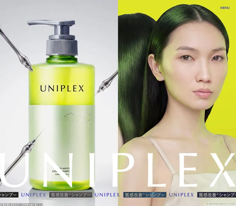
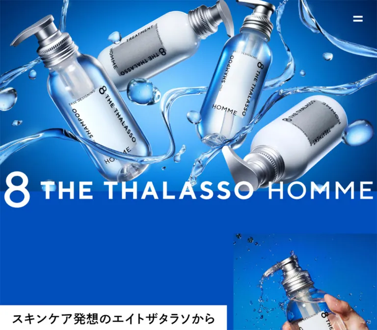
深いブルーに水流とメタリックなボトルが映えるヘアケアブランドサイト。白黒の帯見出し、大きなブランドロゴ、商品紹介と購入導線、黒いフッターが特徴。
オリジナルサイトを見るSaturated blue, suspended water, and silver pump bottles arranged like a full-width product poster.
Original URL: eightthethalasso-homme.jp
Final URL: eightthethalasso-homme.jp — unchanged; reported HTTP status 200.
Theme: deep blue canvas, white typography, black-and-white headline strips, and a black footer with brighter blue graphics.
Inspected: September 17, 2026, at 05:28 JST. Supplied evidence retrieval timestamp: 2026-09-16T20:28:29.569Z.
Viewports: desktop 1440 × 1000 and mobile 390 × 844 CSS pixels.
Scope: the current Japanese brand homepage: opening composition, introductory messaging, hair concerns, two explanatory points, formulation and fragrance content, eight steps, product range and purchase controls, news, related brands, legal notes, and footer. Visual captures cover the opening, one desktop fragrance/feature transition, and desktop/mobile footers. Rendered DOM measurements cover additional sections. Destination pages and activated menu or purchase states were not inspected.
This is a men's hair-care brand homepage with product storytelling, purchase entry points, news, and support navigation. Its identity comes from the relationship between a continuous blue field and highly dimensional product imagery. Transparent and opaque white bottles float diagonally through glossy ribbons of water. Silver pumps, bright reflections, and blue refraction supply depth while the surrounding interface stays flat and direct.
The typography works at two contrasting scales: oversized brand artwork and bold Japanese message strips establish the campaign voice; smaller, carefully spaced copy explains ingredients, benefits, prices, and qualifications. Broad areas of uninterrupted blue are intentional parts of the composition. The page closes with a decisive black surface carrying a large blue wordmark and compact navigation.
Saturated blue, suspended water, and silver pump bottles arranged like a full-width product poster.
Original URL: eightthethalasso-homme.jp
Final URL: eightthethalasso-homme.jp — unchanged; reported HTTP status 200.
Theme: deep blue canvas, white typography, black-and-white headline strips, and a black footer with brighter blue graphics.
Inspected: September 17, 2026, at 05:28 JST. Supplied evidence retrieval timestamp: 2026-09-16T20:28:29.569Z.
Viewports: desktop 1440 × 1000 and mobile 390 × 844 CSS pixels.
Scope: the current Japanese brand homepage: opening composition, introductory messaging, hair concerns, two explanatory points, formulation and fragrance content, eight steps, product range and purchase controls, news, related brands, legal notes, and footer. Visual captures cover the opening, one desktop fragrance/feature transition, and desktop/mobile footers. Rendered DOM measurements cover additional sections. Destination pages and activated menu or purchase states were not inspected.
This is a men's hair-care brand homepage with product storytelling, purchase entry points, news, and support navigation. Its identity comes from the relationship between a continuous blue field and highly dimensional product imagery. Transparent and opaque white bottles float diagonally through glossy ribbons of water. Silver pumps, bright reflections, and blue refraction supply depth while the surrounding interface stays flat and direct.
The typography works at two contrasting scales: oversized brand artwork and bold Japanese message strips establish the campaign voice; smaller, carefully spaced copy explains ingredients, benefits, prices, and qualifications. Broad areas of uninterrupted blue are intentional parts of the composition. The page closes with a decisive black surface carrying a large blue wordmark and compact navigation.
| Name | Value | Source / implementation token | Role and evidence |
|---|---|---|---|
| Canvas Blue | #004ebc |
Source --color-blue-2; alias --color-canvas |
Exact HTML and body background at both viewports; the principal blue field around the product compositions |
| Brand Blue | #004cdf |
Source --color-blue-1; alias --color-brand |
Exact footer text color and related-brand English category labels; visually brighter than the canvas blue |
| White | #ffffff |
Alias --color-white |
Measured story copy, benefit-pill backgrounds, and purchase-label text; visually used for the opening wordmark, water highlights, and fragrance diagram |
| Black | #000000 |
Alias --color-black |
Measured footer background and explanatory/product text; visibly used behind prominent Japanese announcement copy |
| Metallic / aquatic tones | No single measured value | Artwork colors, not UI tokens | Silver pumps, translucent blue bottles, white liquid, dark blue shadows, and specular water highlights |
Keep the two source blues distinct. The main canvas uses #004ebc; the footer reverses the relationship by putting #004cdf graphics and text on black. Using a single blue everywhere loses this deliberate change in intensity.
The hero contains many blue values, but those belong to the product composition and its lighting. There is no evidence for a general CSS gradient system spanning every section. The lower-page field appears more royal blue in the supplied captures; its exact compositing or section-specific declaration is not established by the sampled styles. Do not invent a third exact blue from visual impression alone.
Black and white headline strips are structural emphasis devices. They should remain sharply rectangular. Reserve the glossy treatment for photography or rendered artwork rather than applying it to ordinary panels and buttons.
dnp-shuei-gothic-gin-std, sans-serif.400, 500, and 700.--font-jp.The root size is a conventional 16px at both inspected widths. The source body line height is also 16px, but content elements supply their own line heights. Do not carry that tight root line height into all new paragraphs.
--font-en-1: "TTNormsProBold", sans-serif.TTNormsProBold, sans-serif.POINT 01, POINT 02, BUY NOW, VIEW ALL, footer navigation, line categories, and copyright.0.02em for point/view-all labels and 0.08em for main footer links and brand-line categories.The named face already identifies a bold font resource. Some elements nevertheless report CSS weight 400, while others report 700. Preserve these distinctions when using the authorized font setup; do not assume every English label needs synthetic bolding.
Font file URLs and loading declarations were not included. The family names above are supported by computed styles, not a separate audit of downloaded font binaries.
The large brand identity should be treated as supplied artwork. The sampled h1 has empty text and a zero-height box at the hero boundary, while the screenshots clearly show a large positioned wordmark. That measurement does not mean the visible identity is ordinary 16px text, and it does not by itself establish the accessible name of nested imagery.
On desktop, 8 THE THALASSO HOMME forms one broad line across the bottom of the opening artwork. On mobile, 8 THE THALASSO moves to the top and HOMME appears separately at the lower right. Reproduce this as a responsive logo composition, not automatic wrapping of a single text string.
Values below are measured font size / line height unless marked otherwise.
| Role | Desktop | Mobile | Weight / tracking |
|---|---|---|---|
| Introductory white-strip copy | 35 / 35px |
21 / 21px |
700; normal tracking |
| Feature-heading lead line | 30 / 30px |
20 / 20px |
700 |
| Feature-heading main line | 45 / 45px |
28 / 28px |
700 |
| Introductory product descriptor | 63 / 63px |
29 / 29px |
700; inline pair becomes stacked blocks |
| Introductory story copy | 24 / 48px |
16 / 26.88px |
500; 0.08em |
| Fragrance story copy | 24 / 48px |
16 / 28.8px |
500; 0.08em |
| Hair-concern item | 20 / 30px |
15 / 22.5px |
500; 0.06em |
| Point number | 20 / 20px |
18 / 18px |
English face; CSS 400; 0.02em |
| Point explanation | 16 / 28.8px |
14 / 25.2px |
400; 0.1em |
| Concluding benefit statement | 50 / 50px |
27 / 27px |
700; mobile wraps into two lines |
| Wash / moisturize label | 40 / 40px |
23 / 23px |
400; 0.04em |
| Wash / moisturize description | 19 / 30.97px |
14 / 21px |
400; 0.08em |
| Eight-step item | 23 / 23px |
15 / 22.5px |
400; 0.1em |
| Main product heading | 26 / 36.92px |
17 / 24.14px |
700; desktop 0.04em, mobile normal |
| Product description | 15 / 27px |
13 / 19.89px |
400; desktop 0.06em, mobile 0.1em |
| Benefit-pill label | 14 / 14px |
12 / 12px |
500 |
| Main product name / price | 17 / 28.05px |
15 / 21px |
700; 0.04em |
Main BUY NOW label |
40 / 40px |
24 / 24px |
English face; 700 |
Refill / trial BUY NOW label |
28 / 28px |
24 / 24px |
English face; 700 |
VIEW ALL |
20 / 20px |
14 / 14px |
English face; 400; 0.02em |
| Main footer link | 20 / 20px |
20 / 20px |
English face; 700; 0.08em |
| Footer utility link | 15 / 15px |
14 / 14px |
English face; 400 |
| Legal qualification paragraph | 12 / 23.04px |
10 / 15px |
400; 0.08em |
| Company information | 12 / 18px |
12 / 18px |
400 |
| Copyright | 10 / 10px |
10 / 10px |
English face; 400 |
The mobile announcement メンズライン登場! visually uses approximately 34–36px lettering. This is a screenshot estimate: the sampled parent paragraph reports 16px, so that wrapper value must not be presented as the visible lettering size.
Density: spacious image-led storytelling, with denser product and qualification text lower down. Geometry: square primary surfaces and message strips; rounded pills only for compact product-benefit labels. Layout principle: a centered desktop content region sits inside full-width artwork and blue space. Mobile uses several deliberate inset levels rather than one universal gutter.
| Source variable | Value | Verified interpretation |
|---|---|---|
--width-1 |
1200px |
Matches the measured main desktop content region at x = 120px |
--width-2 |
1440px |
Declared wider width token; individual uses were not traced |
--width-3 |
400px |
Declared narrow width token; point paragraphs also measure 400px, but direct linkage was not verified |
--sp-padding |
28px |
Matches mobile introduction, product-section, and legal-note outer insets |
| Use | Desktop | Mobile |
|---|---|---|
| Main content width / left inset | 1200px / 120px |
Commonly 334px / 28px |
| Concern and answer panel width / left inset | 1080px / 180px |
326px / 32px |
| Concern and answer panel padding | 72px 110px 80px |
36px 24px 68px |
| Main product panel padding | 58px 88px |
22px 20px 44px |
| Benefit-pill gap | 10px, calculated from item positions |
8px horizontally and vertically, calculated |
| Refill/trial column gap | Approximately 38px, calculated |
32px between successive panel boxes |
| Related-brand column gap | 46px, calculated |
Vertically stacked; gaps vary with card content |
| Qualification-to-footer gap | 196px, calculated |
60px, calculated |
| Footer padding | 62px 0 148px |
60px 24px 96px |
| Element | Observed geometry |
|---|---|
| Main product panels, section boxes, purchase controls | Sampled border-radius: 0 |
| Headline strips | Visually sharp rectangular edges |
| Benefit pills | Measured border-radius: 30px |
| Fragrance diagram | White triangular/trapezoidal tiers with blue separation |
| Section rail | Thin white vertical rule; approximately 1–2px visually |
| Menu icon | Two white horizontal bars; no enclosing visible card |
| Element | Desktop 1440 × 1000 |
Mobile 390 × 844 |
|---|---|---|
| Opening artwork section | 1440 × 730px, starts at y = 0 |
390 × 505.73px, starts at y = 64px |
| Opening artwork bottom | y = 730px |
y = 569.73px |
| Introductory headline top | y = 1047px |
y = 658.73px |
| Concern panel height | 492px |
652.5px |
| Answer panel height | Approximately 1117.19px |
Approximately 1208.38px |
| Main shampoo panel | 1200 × 635.81px |
334 × 901.70px |
| Main treatment panel | 1200 × 635.81px |
334 × 926.47px |
| Main purchase control | 510 × 86px |
294 × 60px |
| Refill/trial panel width | Approximately 374.66px |
334px |
| Related-brand link width | Approximately 369.33px |
294px |
| Footer wordmark box | 1066 × 104.89px |
342 × 33.64px |
| Footer height | Approximately 494.89px |
Approximately 581.64px |
| Total document height | Approximately 14630.41px |
Approximately 14500.83px |
These heights describe the captured document, not recommended fixed heights. In particular, headlines sometimes extend outside their parent section's normal box. The mobile introductory heading begins above the recorded introduction section, so copying only section coordinates would misplace the visible content.
Role: establish product identity and the water-based visual language before explanatory copy.
Four pump bottles dominate the opening: two transparent shampoo bottles and two opaque white treatment bottles. Their diagonals alternate across the frame. Silver pumps approach the edges, while water ribbons cross in front of and behind the bottles. Suspended droplets occupy the spaces between products. A bright blue central glow transitions to darker blue around the image edges.
At desktop size the image section is 730px tall. The white wordmark overlaps its lower boundary, with a large numeral 8 at the left and widely spaced English lettering across the width. The wordmark spans roughly the centered 1200px content region; its exact image box was not supplied.
Mobile uses a different composition. The transparent and opaque bottles are rearranged into a tall frame, with the main brand name above and HOMME below. Preserve the product arrangement through an art-directed portrait asset or separately composed layers. A center crop of the desktop image is not an equivalent result.
Role: compact navigation entry point that stays visually subordinate to the product imagery.
The desktop button measures 58 × 48px, at x = 1358px, y = 28px, with 16px padding. Its right clearance is therefore 24px. The mobile button measures 50 × 35px, at x = 340px, y = 12px, with 12px padding and no right clearance outside the button box.
Only two white bars are visible. The desktop strokes look heavier than the mobile strokes. The trigger remains in the same upper-right screen location across the supplied scrolled captures, consistent with persistent viewport positioning; its CSS position declaration was not supplied.
No opened menu was captured. Do not invent its layout, labels, backdrop, animation, or focus behavior. For a new implementation, enlarge the mobile hit area to at least 44px high while preserving the visible icon position.
Role: turn short Japanese claims into bold graphic blocks.
The mobile introduction shows two separate white strips for スキンケア発想の and エイトザタラソから, followed by a larger black strip containing white メンズライン登場! text. Each strip fits its own text rather than filling the viewport.
At 390px, the group starts at the source 28px gutter. White-strip text is measured at 21px, weight 700; the larger line's visible lettering is an estimate because its nested styling was not included. Later feature headings use a related two-level rhythm: 30px lead copy and 45px main copy on desktop, reducing to 20px and 28px on mobile.
Treat each message as a sequence of deliberate strips. Avoid placing a single white rectangle behind an entire multiline paragraph.
Role: connect the launch announcement to the product promise.
White Japanese copy sits directly on blue with generous leading. Desktop copy measures 24px / 48px, weight 500, with 1.92px letter spacing. The mobile equivalent is 16px / 26.88px with 1.28px tracking.
The large descriptor combining 自在髪 and シャンプー&トリートメント is an inline pair at 63px on desktop. On mobile, the two parts become separate 29px blocks. This is a specific responsive rearrangement, not simply a smaller desktop line.
Role: list eight concrete concerns before the explanatory answer.
DOM geometry establishes a 1080px desktop panel with substantial inner padding. Four concern items occupy each of two columns. Items reserve 64px on the left; the icon or marker occupying that space was not included in the evidence.
On mobile, the panel narrows to 326px, the items become one vertical sequence, and the reserved left space decreases to 44px. The text changes from 20px / 30px to 15px / 22.5px. Maintain room for two-line concerns instead of forcing all rows to a fixed single-line height.
The section heading overlaps the panel's top boundary: its measured top is 54px above the desktop section and 28px above the mobile section. The panel's full decorative backing was not visible in the supplied captures, so its transparent computed background should not be mistaken for a complete surface specification.
Role: explain the paired actions of cleansing and moisturizing.
Stack POINT 01 and POINT 02 with Japanese subheadings and explanatory paragraphs. Desktop paragraph blocks measure 400px wide. Mobile paragraphs measure 278px and the point labels are centered over the content.
The answer concludes with a larger benefit statement. Its main line is 50px on desktop and 27px on mobile, where it wraps across two lines. Keep the distinction between the compact English point number, the explanatory Japanese paragraph, and the concluding display statement.
The measurements leave substantial space between some text groups, but the intervening assets were not enumerated. Do not fill that space with invented charts or illustrations.
Role: provide a broader product explanation through alternating text placement and imagery.
Desktop feature headings alternate across the composition: one begins at x = 120px, while a later formulation heading begins around x = 662px. This creates a left/right rhythm within the full-width blue canvas.
The labels 洗う and 潤す sit above white descriptions in two desktop columns. Their text blocks begin around x = 234px and x = 820px, each approximately 386px wide. On mobile, both use centered 260px text regions and appear sequentially down the page.
Keep the descriptions free of card chrome unless the original artwork requires a backing. The measured copy is white on transparent elements, with the larger product imagery providing the composition around it.
Role: translate the fragrance description into a simple visual hierarchy.
The desktop capture places a white Japanese paragraph on the left and a three-tier white pyramid on the right. The paragraph measures 480px wide with 24px / 48px typography. The heading above it follows the black-and-white strip language, although part of that heading is cropped in the supplied image.
Visible diagram content includes LEMON, APPLE / ORANGE, MIDDLE, ROSE / MUGUET / MARINE, BOTTOM, and MUSK / AMBER / CEDARWOOD. Tier names use blue uppercase lettering; note names use smaller black text. The pyramid's upper tip is outside the screenshot, so its complete label arrangement is not verified.
Visual estimates: the bottom tier is approximately 550px wide; the middle tier is approximately 390px wide; blue gaps are around 10–12px. Preserve the taper, flat white fills, and centered labels. There is no need for shadows or a translucent surface.
The mobile DOM records a flex-based fragrance section with 16px / 28.8px copy. The exact mobile diagram placement was not captured. Stacking it below the paragraph is an implementation recommendation, not a verified screenshot finding.
Role: maintain section identity while allowing the artwork to occupy most of the canvas.
The supplied captures show vertical FEATURE and SERIES labels beside a thin white rule near the left edge. Desktop placement is approximately 48px from the edge; the mobile SERIES marker sits around 8px from the edge. These are visual estimates. Their anchoring and state-switching logic were not inspected.
The feature transition also contains very large white English lettering clipped by the viewport, behind the oversized product composition. Corresponding empty-text graphic containers measure 10401px wide on desktop and 4182px on mobile, extending far beyond both edges.
This supports an oversized decorative band, but not a specific marquee animation. Keep such lettering nonessential to reading order and clip it inside its own decorative region.
Role: organize the product explanation around the brand's numeral eight.
The sequence contains eight numbered statements. Desktop rows use 23px white text with 0.1em tracking, 20px vertical padding, and 96px left padding. The first four start at x = 120px; the latter four shift to approximately x = 752px and a lower vertical position.
Mobile rows use 15px / 22.5px, 10px vertical padding, and 48px left padding. The latter group remains slightly indented: its outer box starts at x = 76px, compared with x = 28px for the first group.
Preserve the grouping of four plus four and the clear number/text relationship. Number artwork and intermediate illustrations were not measured, so their exact construction remains open. Use a semantic ordered list in a new implementation.
Role: combine product explanation, specifications, and a purchase entry point.
Two large panels represent shampoo and hair treatment. Their desktop text placement alternates: shampoo copy starts at x = 208px, while treatment copy starts at x = 688px. Each panel is 1200px wide with 58px 88px padding.
The verified text anatomy is:
BUY NOW button.The two 370mL products are shown at ¥1,540(税込) in the captured content. These values are source content, not a promise of current inventory or future pricing.
Mobile panels measure 334px wide and use 20px internal horizontal padding, leaving 294px for the copy and button. A substantial area precedes each heading, consistent with a media-first arrangement; the exact media element was not included in the sampled records. Text and controls then form one vertical sequence.
Panel wrappers report transparent backgrounds. Their full backing artwork was not captured, so a precise panel fill cannot be claimed from the DOM alone.
Role: scan-friendly summaries inside product details.
Desktop pills are 130 × 30px, with white backgrounds, black 14px text, 8px 4px padding, and 30px radius. Four pills fit across a 550px region with 10px gaps.
Mobile switches to a two-by-two arrangement. Each pill is 143 × 24px, with 12px text and 6px vertical padding. The grid uses 8px gaps. This is the clearest observed rounded component; it should not become a universal radius for the entire site.
Role: initiate the purchase path for each product.
Five BUY NOW buttons are present: two main products, two refills, and one trial. Main desktop controls measure 510 × 86px with 40px English lettering. Smaller desktop controls measure approximately 290.66 × 64px with 28px lettering. All five become 294 × 60px with 24px lettering on the inspected phone.
The sampled buttons have square corners, white text, and transparent computed backgrounds. Their visible backing may be supplied by another layer; the exact fill, arrow treatment, and activated state are not established here.
They are DOM buttons rather than ordinary product links in the supplied extraction. No retailer chooser, modal content, checkout, or destination was observed. Do not implement an assumed purchase outcome merely because modal-related variables exist.
Role: extend the primary product pair with compact purchase options.
Three desktop panels sit in one row, each approximately 374.66px wide. Their measured left positions are 120px, 532.67px, and 945.34px. Product names, prices, and purchase controls follow an image region.
Mobile stacks all three panels at 334px wide. The refill titles use 15px / 19.95px; prices use 13px / 15.99px. Keep the trial's shorter title and multiline capacity information without forcing identical text heights.
Captured content lists 300mL refills at ¥1,100(税込) and a shampoo/treatment trial at ¥110(税込).
Role: connect the product homepage to ongoing brand information.
The rendered page contains one launch-news entry dated 2024.8.2 and a separate VIEW ALL link. The article links to /news/8-HOMME/; the overview links to /news/.
Desktop article content is 500px wide, inset to x = 204px. Its description uses 14px / 28px white type. On mobile the card is 196px wide at x = 60px, and its description box is only 36px high at 12px / 18px despite much longer extracted text. This suggests a constrained excerpt, but the exact clamping rule was not supplied.
There is no evidence of a carousel interaction. Preserve the narrow article presentation and separate overview link without inventing additional slides.
Role: place HOMME within the broader product family.
Three linked brand presentations appear in order: the original line, the U line, and the HOMME line. Desktop uses three columns approximately 369.33px wide with 46px gaps. The visible lower card surfaces are white, square, and carry centered black Japanese descriptions.
An English line category appears in Brand Blue where supplied, including UNISEX LINE and MEN’S LINE. The source does not supply a corresponding English category for the first card; do not invent one solely for symmetry.
Mobile stacks the cards at 294px wide with 48px side insets. Category text reduces from 17px to 13px; Japanese names from 18px to 14px; descriptions from 15px / 24px to 11px / 17.6px.
Role: retain the detailed numbered explanations associated with product claims.
A single white-text paragraph spans the 1200px desktop content area. It contains eleven numbered qualifications and uses 12px / 23.04px text with 0.08em tracking.
On mobile it occupies 334px, uses 10px / 15px, and measures 150px tall. It remains part of the blue content area above the footer. Keep the content selectable and connected to its claim markers; it should not be rasterized into an image.
Role: close the visual story and expose navigation, contact, social links, and company information.
Use an uninterrupted black background and Brand Blue for the wordmark, links, icons, and small print. The desktop logo box is 1066 × 104.89px, centered at x = 187px. Below it, the main links occupy a left column, utilities and social links occupy the next column, and company details sit toward the right.
The main links are TOP, NEWS, and Q&A. The next group contains CONTACT US, PRIVACY POLICY, and FOLLOW US, with Instagram and X icons. The original page names and links ステラシード株式会社 as the company in the footer. This operator identification is directly supported by the inspected page.
Mobile retains the two navigation columns instead of stacking every link. They start at x = 56px and approximately x = 201.25px. Social icons move below FOLLOW US; company information moves below both columns at x = 56px. The logo remains one horizontal line, scaled to 342 × 33.64px.
Main navigation stays at 20px on mobile. This preserves its visual strength even as the brand logo shrinks. The footer is taller on the phone, approximately 581.64px, with generous space between navigation and company information.
| Treatment | Supplied evidence | What can safely be concluded |
|---|---|---|
| Social-link transition | opacity 0.3s |
An opacity transition is defined; trigger and endpoint opacity were not captured |
| Company-link transition | opacity 0.3s |
Same limited evidence as social links |
| Purchase-button background | background-color 0s linear 0.2s |
A zero-duration change with a 200ms delay; this is not a 200ms color fade |
| Sampled section animation | animation: none on listed elements |
No keyframe animation was reported for those elements; descendants, pseudo-elements, and scripts may differ |
| Oversized letter band | Very wide offscreen boxes and clipped lettering | Supports decorative overflow, not verified continuous motion |
| Menu persistence | Same upper-right placement in scrolled captures | Supports persistent visual placement; opening behavior remains unverified |
| Modal/loading layers | Source --z-index-modal: 4, --z-index-loading: 5 |
Named layer tokens exist; their presence does not prove a captured modal or loading state |
The supplied capture process observed the initial page for at least five seconds and waited for specified loading, image, and layout-stability conditions. Perpetual animations were paused during readiness checks and resumed afterward. Those procedures do not identify the site's animation sequences or establish a scroll-linked effect.
Do not add unverified parallax, floating-bottle loops, auto-scrolling text, scroll snapping, or animated water as if they were measured behavior. A static composition is the evidence-backed baseline. Optional motion in a new implementation should be subtle, separately specified, and disabled under reduced-motion preferences.
| Layer | Appearance | Evidence status |
|---|---|---|
| Main canvas | Solid deep blue | Exact root/body color measured |
| Hero | Blue-lit product composition with water and metallic highlights | Visually observed; image asset URLs not supplied |
| Message strip | Black text on white, or white text on black | Visually observed in the mobile opening |
| Story text | White directly over the blue composition | Computed text color and captures agree |
| Explanatory/product panel backing | Not fully established | Sampled wrappers are transparent; intervening artwork and pseudo-elements were not enumerated |
| Benefit pill | White, black text, fully rounded ends | Exact computed background and radius measured |
| Related-brand card | White lower surface, black centered copy | Visible in the desktop footer-area capture |
| Footer | Black with bright blue wordmark and text | Exact computed colors and both viewport captures agree |
There is no visible general-purpose elevation system in the supplied captures. Depth comes from the product imagery, not a family of soft card shadows. Preserve flat interface surfaces and let the water and reflective packaging carry the dimensional effect.
The visual language is clean, cool, and highly polished: translucent bottles, opaque white containers, metallic pump assemblies, suspended droplets, and water ribbons with strong refraction. Bottle labels remain black and restrained, which prevents the bright background from competing with product identification.
The opening composition uses alternating diagonals and intentional edge cropping. Later feature imagery becomes oversized enough to pass behind text bands and extend beyond the viewport. Keep the difference between these decorative crops and product-detail imagery, where the package must remain identifiable.
The hero does not need a human model to establish the mood. Do not introduce unrelated lifestyle portraits as substitutes for the supplied bottle-and-water identity.
No original image URLs, filenames, native dimensions, or file formats were included in the supplied evidence. The following are asset roles, not invented paths.
| Asset role | Observed appearance | Implementation treatment |
|---|---|---|
| Desktop opening artwork | Four tilted bottles, water ribbons, droplets, blue lighting | Use authorized wide artwork or a faithful layered composition |
| Mobile opening artwork | Tall arrangement with bottle positions differing from desktop | Provide a portrait variant; do not rely on a generic center crop |
| Opening wordmark | White desktop lockup; split mobile placement | Preserve brand artwork and responsive grouping |
| Feature-transition imagery | Large transparent bottle, partial second pump, water, clipped lettering | Allow controlled overlap within a decorative clipping container |
| Fragrance pyramid | White geometric tiers with blue headings and black notes | Use authorized artwork or a semantic diagram with matching proportions |
| Footer wordmark | Long blue horizontal lockup | Preserve its approximately 10.16:1 measured box ratio |
| Social marks | Instagram outline and X symbol | Keep recognizable marks and provide accessible link names |
Use authorized brand and product assets when available. CSS can establish the layout and color relationships; it cannot reproduce accurate package geometry, labels, reflections, or water refraction by itself.
The page alternates between full-width image fields and a centered 1200px content system. Inner explanatory panels narrow to 1080px. Text blocks shift between left and right positions rather than following one uninterrupted centered column.
The opening artwork ends at y = 730px, but the first introductory heading starts at y = 1047px. The approximately 317px difference includes the overlapping identity and blue breathing room. That generous pause is part of the desktop pacing.
The product range uses two broad alternating panels followed by three smaller columns. Related brands also form a three-column row. The black footer changes the visual rhythm again with a large horizontal logo and widely distributed information.
At 390px, the artwork begins below a 64px top region and has a portrait box approximately 505.73px tall. The introductory heading starts around 89px after the artwork's bottom, much closer than on desktop. The main brand artwork splits between the top and bottom of the hero.
Concern lists and paired benefit explanations become vertical sequences. Product-benefit pills change from four columns to two. Refill/trial panels and related brands become single-column stacks. The footer retains two navigation columns while moving company details below them.
Mobile margins are purposeful: 28px for common content, 32px for explanatory panel edges, 48px for product-panel inner copy and related-brand cards, and 56px for footer navigation/company content. Do not flatten every component to the same inset.
| Region | Desktop height | Mobile height | Consequence |
|---|---|---|---|
| Product-range section | Approximately 2047.84px |
Approximately 3577.20px |
Stacking and taller main panels substantially expand the range |
| Related-brand section | Approximately 506.45px |
Approximately 1234.23px |
Three columns become three vertical presentations |
| Qualification paragraph | Approximately 92.13px |
150px |
Narrower text measure creates more lines |
| Footer | Approximately 494.89px |
Approximately 581.64px |
Company details move under navigation |
The total desktop and mobile document heights happen to be similar because earlier compositions also become shorter. This is not evidence that the whole page is uniformly scaled.
Only these two widths were inspected. Tablet layout, landscape behavior, extreme text zoom, safe-area handling, and original media-query thresholds remain unverified. Any breakpoint in the Quick Start is a recommendation.
#004ebc distinct from Brand Blue #004cdf.h1 or 16px heading-wrapper values as the visible logo scale.These are recommendations for a new build, not verified features of the original page:
44px target height on mobile. If it opens a dialog, implement focus management, Escape dismissal, and an explicit expanded state.10px mobile treatment; the original size is a measurement, not a usability target.#004ebc.#004cdf.#ffffff.30px radius.“Create a Japanese men's hair-care brand homepage inspired by 8 THE THALASSO HOMME. Use a deep blue #004ebc canvas, white story copy, sharp black-and-white Japanese headline strips, and a black footer with brighter blue #004cdf graphics. Make the opening a full-width composition of transparent and opaque white pump bottles with silver hardware, water ribbons, and suspended droplets. Place a large white brand lockup across the desktop image's lower edge. For mobile, use portrait artwork and split the brand placement between the top and lower right. Organize the page into concerns, two explanatory points, formulation and fragrance, eight steps, five product purchase entries, news, related brands, and support navigation. Use generous blue space, alternating desktop text placement, compact benefit pills, and square purchase controls. Use the observed Japanese Gothic and English bold font stacks when available. Treat menu contents, purchase behavior, and animation as separate requirements.”
スキンケア発想の and エイトザタラソから on separate white rectangles with bold black text, followed by メンズライン登場! on a larger black rectangle with white text. Keep corners square and strips fitted to their text.”This is an implementation scaffold, not recovered source CSS. Exact colors, font-family names, and endpoint measurements come from the supplied evidence. Fluid interpolation, the 48rem breakpoint, hover opacity, and the simplified product backing are recommendations.
Provide authorized hero and logo assets through markup. The hero expects a .hero__art picture/image region and separate desktop, mobile-top, and mobile-bottom brand elements. The footer expects a logo followed by a .footer__grid containing primary navigation, utility/social navigation, and company information. No asset filenames or font download URLs are assumed.
:root {
  /* Exact observed colors */
  --color-canvas: #004ebc;
  --color-brand: #004cdf;
  --color-white: #ffffff;
  --color-black: #000000;

  /* Observed family names; load authorized fonts separately */
  --font-jp: 'dnp-shuei-gothic-gin-std', sans-serif;
  --font-en: 'TTNormsProBold', sans-serif;

  /* Observed width tokens */
  --content-max: 1200px;
  --art-max: 1440px;
  --copy-narrow: 400px;
  --mobile-gutter: 28px;

  /* Recommended interpolation between measured endpoints */
  --gutter: clamp(28px, 8.333vw, 120px);
  --text-story: clamp(16px, 1.667vw, 24px);
  --text-lead: clamp(20px, 2.083vw, 30px);
  --text-display: clamp(28px, 3.125vw, 45px);
  --radius-pill: 30px;
  --link-duration: 300ms;
}

* {
  box-sizing: border-box;
}

html {
  background: var(--color-canvas);
}

body {
  margin: 0;
  color: var(--color-white);
  background: var(--color-canvas);
  font-family: var(--font-jp);
  font-size: 16px;
  line-height: 1.8;
}

img {
  display: block;
  max-width: 100%;
}

button,
a {
  -webkit-tap-highlight-color: transparent;
}

.container {
  width: min(
    var(--content-max),
    calc(100% - var(--gutter) - var(--gutter))
  );
  margin-inline: auto;
}

/* Clip only decorative media; do not hide page-wide overflow errors. */
.artwork-clip {
  overflow: hidden;
  overflow: clip;
}

.hero {
  position: relative;
  aspect-ratio: 1440 / 730;
}

.hero__art,
.hero__art img {
  width: 100%;
  height: 100%;
}

.hero__art {
  display: block;
}

.hero__art img {
  object-fit: cover;
}

/* Approximate the visible overlap; tune to the supplied logo asset. */
.hero__brand--desktop {
  position: absolute;
  inset-inline: var(--gutter);
  bottom: -45px;
}

.hero__brand--mobile-top,
.hero__brand--mobile-bottom {
  display: none;
}

.menu-toggle {
  position: fixed;
  z-index: 3;
  top: 28px;
  right: 24px;
  display: flex;
  flex-direction: column;
  align-items: center;
  justify-content: flex-start;
  gap: 6px;
  width: 58px;
  height: 48px;
  padding: 16px;
  border: 0;
  border-radius: 0;
  color: var(--color-white);
  background: transparent;
  cursor: pointer;
}

.menu-toggle span {
  flex: none;
  width: 26px;
  height: 5px;
  background: currentColor;
}

.headline-stack {
  margin: 0;
  font-weight: 700;
}

.headline-stack__line {
  display: table;
  max-width: 100%;
  margin-block: 0 12px;
}

/* Padding is an adaptation; nested source strip metrics were absent. */
.headline-strip {
  padding: 10px 14px;
  color: var(--color-black);
  background: var(--color-white);
  font-size: var(--text-lead);
  line-height: 1.3;
  box-decoration-break: clone;
  -webkit-box-decoration-break: clone;
}

.headline-strip--strong {
  color: var(--color-white);
  background: var(--color-black);
  font-size: var(--text-display);
}

.story-copy {
  max-width: 480px;
  margin-block: 0;
  font-size: var(--text-story);
  font-weight: 500;
  line-height: 2;
  letter-spacing: 0.08em;
}

.point-label {
  font-family: var(--font-en);
  font-size: 20px;
  font-weight: 400;
  line-height: 1;
  letter-spacing: 0.02em;
}

.section-rail {
  width: fit-content;
  padding-left: 6px;
  border-left: 2px solid currentColor;
  color: var(--color-white);
  font-family: var(--font-en);
  writing-mode: vertical-rl;
  text-orientation: mixed;
}

/* Recommended layout scaffold, not recovered panel artwork. */
.product-panel {
  display: grid;
  grid-template-columns: minmax(0, 1fr) minmax(0, 1fr);
  gap: 32px;
  padding: 58px 88px;
  border-radius: 0;
  color: var(--color-black);
  background: var(--color-white);
}

.product-panel > * {
  min-width: 0;
}

.product-title {
  margin: 0 0 12px;
  font-size: 26px;
  font-weight: 700;
  line-height: 1.42;
  letter-spacing: 0.04em;
}

.product-description {
  margin: 0 0 16px;
  font-size: 15px;
  line-height: 1.8;
  letter-spacing: 0.06em;
}

.benefit-list {
  display: grid;
  grid-template-columns: repeat(4, minmax(0, 1fr));
  gap: 10px;
  margin: 16px 0 20px;
  padding: 0;
  list-style: none;
}

.benefit-pill {
  padding: 8px 4px;
  border-radius: var(--radius-pill);
  color: var(--color-black);
  background: var(--color-white);
  font-size: 14px;
  font-weight: 500;
  line-height: 1;
  text-align: center;
}

.buy-button {
  display: block;
  width: min(100%, 510px);
  min-height: 86px;
  padding: 6px 26px 0;
  border: 0;
  border-radius: 0;
  color: var(--color-white);
  /* Recommended solid stand-in: original backing was not captured. */
  background: var(--color-black);
  font-family: var(--font-en);
  font-size: 40px;
  font-weight: 700;
  line-height: 1;
  text-align: left;
  cursor: pointer;
}

.series-grid {
  display: grid;
  grid-template-columns: repeat(3, minmax(0, 1fr));
  gap: 46px;
}

.series-card {
  color: var(--color-black);
  background: var(--color-white);
  text-align: center;
  text-decoration: none;
}

.qualification-copy {
  font-size: 12px;
  line-height: 1.92;
  letter-spacing: 0.08em;
}

.site-footer {
  padding: 62px 0 148px;
  color: var(--color-brand);
  background: var(--color-black);
}

.footer__logo {
  display: block;
  width: min(1066px, calc(100% - 48px));
  margin-inline: auto;
}

.footer__grid {
  display: grid;
  grid-template-columns: auto auto minmax(0, 1fr);
  gap: 76px;
  width: min(1026px, calc(100% - 112px));
  margin: 48px auto 0;
}

.footer__nav a {
  display: block;
  width: fit-content;
  padding-block: 12px;
  color: inherit;
  font-family: var(--font-en);
  font-size: 20px;
  font-weight: 700;
  line-height: 1;
  letter-spacing: 0.08em;
  text-decoration: none;
}

.footer__utilities a {
  display: block;
  width: fit-content;
  padding-block: 12px;
  color: inherit;
  font-family: var(--font-en);
  font-size: 15px;
  line-height: 1;
  text-decoration: none;
}

.footer__company {
  justify-self: end;
  align-self: end;
  max-width: 310px;
  font-size: 12px;
  line-height: 1.5;
  font-style: normal;
}

.footer__company a,
.social-link {
  color: inherit;
  transition: opacity var(--link-duration);
}

/* Recommended endpoint; only transition duration was observed. */
@media (hover: hover) {
  .footer__company a:hover,
  .social-link:hover {
    opacity: 0.7;
  }
}

/* Recommended breakpoint, not an observed source media query. */
@media (max-width: 48rem) {
  :root {
    --gutter: 28px;
    --text-story: 16px;
    --text-lead: 20px;
    --text-display: 28px;
  }

  .hero {
    margin-top: 64px;
    aspect-ratio: 390 / 505.734375;
  }

  .hero__brand--desktop {
    display: none;
  }

  .hero__brand--mobile-top {
    display: block;
    position: absolute;
    top: -25px;
    right: 24px;
    left: 24px;
  }

  .hero__brand--mobile-bottom {
    display: block;
    position: absolute;
    right: 24px;
    bottom: -16px;
    width: 56%;
  }

  .menu-toggle {
    top: 12px;
    right: 0;
    width: 50px;
    height: 44px;
    padding: 12px;
    gap: 7px;
    /* Target enlarged from the measured 35px mobile height. */
  }

  .menu-toggle span {
    height: 2px;
  }

  .story-copy {
    line-height: 1.8;
  }

  .point-label {
    font-size: 18px;
  }

  .product-panel {
    grid-template-columns: minmax(0, 1fr);
    padding: 22px 20px 44px;
  }

  .product-panel__media {
    grid-row: 1;
  }

  .product-title {
    font-size: 17px;
    letter-spacing: normal;
  }

  .product-description {
    font-size: 13px;
    line-height: 1.53;
    letter-spacing: 0.1em;
  }

  .benefit-list {
    grid-template-columns: repeat(2, minmax(0, 1fr));
    gap: 8px;
  }

  .benefit-pill {
    padding: 6px 0;
    font-size: 12px;
  }

  .buy-button {
    width: 100%;
    min-height: 60px;
    padding: 4px 16px 0;
    font-size: 24px;
  }

  .series-grid {
    grid-template-columns: minmax(0, 1fr);
    width: calc(100% - 96px);
    margin-inline: auto;
    gap: 40px;
  }

  .qualification-copy {
    font-size: 10px;
    line-height: 1.5;
  }

  .site-footer {
    padding: 60px 24px 96px;
  }

  .footer__logo {
    width: 100%;
  }

  .footer__grid {
    grid-template-columns: 1fr 1fr;
    gap: 60px 32px;
    width: auto;
    margin-inline: 32px 0;
  }

  .footer__utilities a {
    padding-block: 16px;
    font-size: 14px;
  }

  .footer__company {
    grid-column: 1 / -1;
    justify-self: start;
  }
}

/* Recommended keyboard treatment. */
:where(a, button):focus-visible {
  outline: 2px solid currentColor;
  outline-offset: 4px;
}

@media (prefers-reduced-motion: reduce) {
  .footer__company a,
  .social-link {
    transition: none;
  }
}
The simplified white product backing is deliberately a placeholder. Its benefit pills use the measured white fill, so the final authorized panel artwork or a separately chosen contrasting backing is needed to recover their visual separation. The scaffold does not attempt to recreate missing product graphics, the full page's positioned overlaps, or unobserved interaction states.
Optional aliases for a project already using Tailwind v4. There is no evidence that the original site uses Tailwind. Define the custom properties above first.
@theme inline {
  --color-canvas: #004ebc;
  --color-brand: #004cdf;
  --color-paper: #ffffff;
  --color-ink: #000000;

  --font-japanese: var(--font-jp);
  --font-english: var(--font-en);

  --text-story: var(--text-story);
  --text-feature-lead: var(--text-lead);
  --text-feature-title: var(--text-display);
  --text-footer-primary: 20px;

  --spacing-page-gutter: var(--gutter);
  --spacing-mobile-inset: 28px;
  --radius-benefit: 30px;
}
200, page identity, rendered text, links, custom properties, and computed element measurements.1440 × 1000 covering the opening, fragrance/feature transition, and footer; two mobile views at 390 × 844 covering the opening and footer.2026-09-16T20:28:29.569Z, corresponding to September 17, 2026, at 05:28 JST. Individual capture timestamps were not supplied separately.14630.41px desktop and 14500.83px mobile document heights, even though the visual captures show selected portions rather than every intervening section.This reference describes the current page represented by the supplied evidence. Measured values, screenshot estimates, and proposed implementation choices are separated throughout; no historical reconstruction or additional browsing is implied.
# 8 THE THALASSO HOMME — Style Reference

> Saturated blue, suspended water, and silver pump bottles arranged like a full-width product poster.

**Original URL:** [eightthethalasso-homme.jp](https://eightthethalasso-homme.jp/)
**Final URL:** [eightthethalasso-homme.jp](https://eightthethalasso-homme.jp/) — unchanged; reported HTTP status `200`.
**Theme:** deep blue canvas, white typography, black-and-white headline strips, and a black footer with brighter blue graphics.
**Inspected:** September 17, 2026, at 05:28 JST. Supplied evidence retrieval timestamp: `2026-09-16T20:28:29.569Z`.
**Viewports:** desktop `1440 × 1000` and mobile `390 × 844` CSS pixels.
**Scope:** the current Japanese brand homepage: opening composition, introductory messaging, hair concerns, two explanatory points, formulation and fragrance content, eight steps, product range and purchase controls, news, related brands, legal notes, and footer. Visual captures cover the opening, one desktop fragrance/feature transition, and desktop/mobile footers. Rendered DOM measurements cover additional sections. Destination pages and activated menu or purchase states were not inspected.

This is a men's hair-care brand homepage with product storytelling, purchase entry points, news, and support navigation. Its identity comes from the relationship between a continuous blue field and highly dimensional product imagery. Transparent and opaque white bottles float diagonally through glossy ribbons of water. Silver pumps, bright reflections, and blue refraction supply depth while the surrounding interface stays flat and direct.

The typography works at two contrasting scales: oversized brand artwork and bold Japanese message strips establish the campaign voice; smaller, carefully spaced copy explains ingredients, benefits, prices, and qualifications. Broad areas of uninterrupted blue are intentional parts of the composition. The page closes with a decisive black surface carrying a large blue wordmark and compact navigation.
# 8 THE THALASSO HOMME — Style Reference

> Saturated blue, suspended water, and silver pump bottles arranged like a full-width product poster.

**Original URL:** [eightthethalasso-homme.jp](https://eightthethalasso-homme.jp/)
**Final URL:** [eightthethalasso-homme.jp](https://eightthethalasso-homme.jp/) — unchanged; reported HTTP status `200`.
**Theme:** deep blue canvas, white typography, black-and-white headline strips, and a black footer with brighter blue graphics.
**Inspected:** September 17, 2026, at 05:28 JST. Supplied evidence retrieval timestamp: `2026-09-16T20:28:29.569Z`.
**Viewports:** desktop `1440 × 1000` and mobile `390 × 844` CSS pixels.
**Scope:** the current Japanese brand homepage: opening composition, introductory messaging, hair concerns, two explanatory points, formulation and fragrance content, eight steps, product range and purchase controls, news, related brands, legal notes, and footer. Visual captures cover the opening, one desktop fragrance/feature transition, and desktop/mobile footers. Rendered DOM measurements cover additional sections. Destination pages and activated menu or purchase states were not inspected.

This is a men's hair-care brand homepage with product storytelling, purchase entry points, news, and support navigation. Its identity comes from the relationship between a continuous blue field and highly dimensional product imagery. Transparent and opaque white bottles float diagonally through glossy ribbons of water. Silver pumps, bright reflections, and blue refraction supply depth while the surrounding interface stays flat and direct.

The typography works at two contrasting scales: oversized brand artwork and bold Japanese message strips establish the campaign voice; smaller, carefully spaced copy explains ingredients, benefits, prices, and qualifications. Broad areas of uninterrupted blue are intentional parts of the composition. The page closes with a decisive black surface carrying a large blue wordmark and compact navigation.

## How to Read This Reference

- **Measured values** come from the supplied rendered DOM, computed styles, and source custom properties. Coordinates refer to document position unless described as screenshot estimates.
- **Visual observations** come from the supplied original-page captures. Approximate graphic dimensions are explicitly labeled as estimates.
- **Implementation aliases** are descriptive names introduced here. Only properties identified as source variables were observed on the original page.
- **Responsive observations** compare two actual inspected viewports. The original breakpoint values and interpolation rules were not supplied.
- **Recommendations** describe a new implementation. They do not establish existing accessibility features, menu behavior, animation, or purchase flows.
- Transparent computed backgrounds do not reveal every visible surface: images, descendants, and pseudo-elements were not fully enumerated. Likewise, a heading wrapper's computed font size may not describe lettering inside nested artwork or spans.

## Tokens — Colors

### Default Palette

| Name | Value | Source / implementation token | Role and evidence |
| --- | --- | --- | --- |
| Canvas Blue | `#004ebc` | Source `--color-blue-2`; alias `--color-canvas` | Exact HTML and body background at both viewports; the principal blue field around the product compositions |
| Brand Blue | `#004cdf` | Source `--color-blue-1`; alias `--color-brand` | Exact footer text color and related-brand English category labels; visually brighter than the canvas blue |
| White | `#ffffff` | Alias `--color-white` | Measured story copy, benefit-pill backgrounds, and purchase-label text; visually used for the opening wordmark, water highlights, and fragrance diagram |
| Black | `#000000` | Alias `--color-black` | Measured footer background and explanatory/product text; visibly used behind prominent Japanese announcement copy |
| Metallic / aquatic tones | No single measured value | Artwork colors, not UI tokens | Silver pumps, translucent blue bottles, white liquid, dark blue shadows, and specular water highlights |

### Color Behavior

Keep the two source blues distinct. The main canvas uses `#004ebc`; the footer reverses the relationship by putting `#004cdf` graphics and text on black. Using a single blue everywhere loses this deliberate change in intensity.

The hero contains many blue values, but those belong to the product composition and its lighting. There is no evidence for a general CSS gradient system spanning every section. The lower-page field appears more royal blue in the supplied captures; its exact compositing or section-specific declaration is not established by the sampled styles. Do not invent a third exact blue from visual impression alone.

Black and white headline strips are structural emphasis devices. They should remain sharply rectangular. Reserve the glossy treatment for photography or rendered artwork rather than applying it to ordinary panels and buttons.

## Tokens — Typography

### Japanese Body and Headings

- **Observed computed family:** `dnp-shuei-gothic-gin-std, sans-serif`.
- **Observed weights:** `400`, `500`, and `700`.
- **Character:** a compact Japanese Gothic face with enough weight for announcement strips and enough spacing for explanatory paragraphs.
- **Roles:** Japanese headings, body copy, concerns, product descriptions, prices, legal notes, and company details.
- **Implementation alias:** `--font-jp`.

The root size is a conventional `16px` at both inspected widths. The source body line height is also `16px`, but content elements supply their own line heights. Do not carry that tight root line height into all new paragraphs.

### English Labels and Navigation

- **Source variable:** `--font-en-1: "TTNormsProBold", sans-serif`.
- **Observed computed family:** `TTNormsProBold, sans-serif`.
- **Roles:** `POINT 01`, `POINT 02`, `BUY NOW`, `VIEW ALL`, footer navigation, line categories, and copyright.
- **Tracking:** typically `0.02em` for point/view-all labels and `0.08em` for main footer links and brand-line categories.

The named face already identifies a bold font resource. Some elements nevertheless report CSS weight `400`, while others report `700`. Preserve these distinctions when using the authorized font setup; do not assume every English label needs synthetic bolding.

Font file URLs and loading declarations were not included. The family names above are supported by computed styles, not a separate audit of downloaded font binaries.

### Wordmarks and Graphic Lettering

The large brand identity should be treated as supplied artwork. The sampled `h1` has empty text and a zero-height box at the hero boundary, while the screenshots clearly show a large positioned wordmark. That measurement does not mean the visible identity is ordinary `16px` text, and it does not by itself establish the accessible name of nested imagery.

On desktop, `8 THE THALASSO HOMME` forms one broad line across the bottom of the opening artwork. On mobile, `8 THE THALASSO` moves to the top and `HOMME` appears separately at the lower right. Reproduce this as a responsive logo composition, not automatic wrapping of a single text string.

### Type Scale

Values below are measured font size / line height unless marked otherwise.

| Role | Desktop | Mobile | Weight / tracking |
| --- | --- | --- | --- |
| Introductory white-strip copy | `35 / 35px` | `21 / 21px` | `700`; normal tracking |
| Feature-heading lead line | `30 / 30px` | `20 / 20px` | `700` |
| Feature-heading main line | `45 / 45px` | `28 / 28px` | `700` |
| Introductory product descriptor | `63 / 63px` | `29 / 29px` | `700`; inline pair becomes stacked blocks |
| Introductory story copy | `24 / 48px` | `16 / 26.88px` | `500`; `0.08em` |
| Fragrance story copy | `24 / 48px` | `16 / 28.8px` | `500`; `0.08em` |
| Hair-concern item | `20 / 30px` | `15 / 22.5px` | `500`; `0.06em` |
| Point number | `20 / 20px` | `18 / 18px` | English face; CSS `400`; `0.02em` |
| Point explanation | `16 / 28.8px` | `14 / 25.2px` | `400`; `0.1em` |
| Concluding benefit statement | `50 / 50px` | `27 / 27px` | `700`; mobile wraps into two lines |
| Wash / moisturize label | `40 / 40px` | `23 / 23px` | `400`; `0.04em` |
| Wash / moisturize description | `19 / 30.97px` | `14 / 21px` | `400`; `0.08em` |
| Eight-step item | `23 / 23px` | `15 / 22.5px` | `400`; `0.1em` |
| Main product heading | `26 / 36.92px` | `17 / 24.14px` | `700`; desktop `0.04em`, mobile normal |
| Product description | `15 / 27px` | `13 / 19.89px` | `400`; desktop `0.06em`, mobile `0.1em` |
| Benefit-pill label | `14 / 14px` | `12 / 12px` | `500` |
| Main product name / price | `17 / 28.05px` | `15 / 21px` | `700`; `0.04em` |
| Main `BUY NOW` label | `40 / 40px` | `24 / 24px` | English face; `700` |
| Refill / trial `BUY NOW` label | `28 / 28px` | `24 / 24px` | English face; `700` |
| `VIEW ALL` | `20 / 20px` | `14 / 14px` | English face; `400`; `0.02em` |
| Main footer link | `20 / 20px` | `20 / 20px` | English face; `700`; `0.08em` |
| Footer utility link | `15 / 15px` | `14 / 14px` | English face; `400` |
| Legal qualification paragraph | `12 / 23.04px` | `10 / 15px` | `400`; `0.08em` |
| Company information | `12 / 18px` | `12 / 18px` | `400` |
| Copyright | `10 / 10px` | `10 / 10px` | English face; `400` |

The mobile announcement `メンズライン登場!` visually uses approximately `34–36px` lettering. This is a screenshot estimate: the sampled parent paragraph reports `16px`, so that wrapper value must not be presented as the visible lettering size.

## Tokens — Spacing & Shapes

**Density:** spacious image-led storytelling, with denser product and qualification text lower down.
**Geometry:** square primary surfaces and message strips; rounded pills only for compact product-benefit labels.
**Layout principle:** a centered desktop content region sits inside full-width artwork and blue space. Mobile uses several deliberate inset levels rather than one universal gutter.

### Source Width Variables

| Source variable | Value | Verified interpretation |
| --- | --- | --- |
| `--width-1` | `1200px` | Matches the measured main desktop content region at `x = 120px` |
| `--width-2` | `1440px` | Declared wider width token; individual uses were not traced |
| `--width-3` | `400px` | Declared narrow width token; point paragraphs also measure `400px`, but direct linkage was not verified |
| `--sp-padding` | `28px` | Matches mobile introduction, product-section, and legal-note outer insets |

### Spacing Measurements

| Use | Desktop | Mobile |
| --- | --- | --- |
| Main content width / left inset | `1200px / 120px` | Commonly `334px / 28px` |
| Concern and answer panel width / left inset | `1080px / 180px` | `326px / 32px` |
| Concern and answer panel padding | `72px 110px 80px` | `36px 24px 68px` |
| Main product panel padding | `58px 88px` | `22px 20px 44px` |
| Benefit-pill gap | `10px`, calculated from item positions | `8px` horizontally and vertically, calculated |
| Refill/trial column gap | Approximately `38px`, calculated | `32px` between successive panel boxes |
| Related-brand column gap | `46px`, calculated | Vertically stacked; gaps vary with card content |
| Qualification-to-footer gap | `196px`, calculated | `60px`, calculated |
| Footer padding | `62px 0 148px` | `60px 24px 96px` |

### Border Radius and Rules

| Element | Observed geometry |
| --- | --- |
| Main product panels, section boxes, purchase controls | Sampled `border-radius: 0` |
| Headline strips | Visually sharp rectangular edges |
| Benefit pills | Measured `border-radius: 30px` |
| Fragrance diagram | White triangular/trapezoidal tiers with blue separation |
| Section rail | Thin white vertical rule; approximately `1–2px` visually |
| Menu icon | Two white horizontal bars; no enclosing visible card |

### Layout Measurements

| Element | Desktop `1440 × 1000` | Mobile `390 × 844` |
| --- | --- | --- |
| Opening artwork section | `1440 × 730px`, starts at `y = 0` | `390 × 505.73px`, starts at `y = 64px` |
| Opening artwork bottom | `y = 730px` | `y = 569.73px` |
| Introductory headline top | `y = 1047px` | `y = 658.73px` |
| Concern panel height | `492px` | `652.5px` |
| Answer panel height | Approximately `1117.19px` | Approximately `1208.38px` |
| Main shampoo panel | `1200 × 635.81px` | `334 × 901.70px` |
| Main treatment panel | `1200 × 635.81px` | `334 × 926.47px` |
| Main purchase control | `510 × 86px` | `294 × 60px` |
| Refill/trial panel width | Approximately `374.66px` | `334px` |
| Related-brand link width | Approximately `369.33px` | `294px` |
| Footer wordmark box | `1066 × 104.89px` | `342 × 33.64px` |
| Footer height | Approximately `494.89px` | Approximately `581.64px` |
| Total document height | Approximately `14630.41px` | Approximately `14500.83px` |

These heights describe the captured document, not recommended fixed heights. In particular, headlines sometimes extend outside their parent section's normal box. The mobile introductory heading begins above the recorded introduction section, so copying only section coordinates would misplace the visible content.

## Components

### Opening Product Composition

**Role:** establish product identity and the water-based visual language before explanatory copy.

Four pump bottles dominate the opening: two transparent shampoo bottles and two opaque white treatment bottles. Their diagonals alternate across the frame. Silver pumps approach the edges, while water ribbons cross in front of and behind the bottles. Suspended droplets occupy the spaces between products. A bright blue central glow transitions to darker blue around the image edges.

At desktop size the image section is `730px` tall. The white wordmark overlaps its lower boundary, with a large numeral `8` at the left and widely spaced English lettering across the width. The wordmark spans roughly the centered `1200px` content region; its exact image box was not supplied.

Mobile uses a different composition. The transparent and opaque bottles are rearranged into a tall frame, with the main brand name above and `HOMME` below. Preserve the product arrangement through an art-directed portrait asset or separately composed layers. A center crop of the desktop image is not an equivalent result.

### Two-Bar Menu Trigger

**Role:** compact navigation entry point that stays visually subordinate to the product imagery.

The desktop button measures `58 × 48px`, at `x = 1358px`, `y = 28px`, with `16px` padding. Its right clearance is therefore `24px`. The mobile button measures `50 × 35px`, at `x = 340px`, `y = 12px`, with `12px` padding and no right clearance outside the button box.

Only two white bars are visible. The desktop strokes look heavier than the mobile strokes. The trigger remains in the same upper-right screen location across the supplied scrolled captures, consistent with persistent viewport positioning; its CSS `position` declaration was not supplied.

No opened menu was captured. Do not invent its layout, labels, backdrop, animation, or focus behavior. For a new implementation, enlarge the mobile hit area to at least `44px` high while preserving the visible icon position.

### Announcement Strips

**Role:** turn short Japanese claims into bold graphic blocks.

The mobile introduction shows two separate white strips for `スキンケア発想の` and `エイトザタラソから`, followed by a larger black strip containing white `メンズライン登場!` text. Each strip fits its own text rather than filling the viewport.

At `390px`, the group starts at the source `28px` gutter. White-strip text is measured at `21px`, weight `700`; the larger line's visible lettering is an estimate because its nested styling was not included. Later feature headings use a related two-level rhythm: `30px` lead copy and `45px` main copy on desktop, reducing to `20px` and `28px` on mobile.

Treat each message as a sequence of deliberate strips. Avoid placing a single white rectangle behind an entire multiline paragraph.

### Introductory Story Block

**Role:** connect the launch announcement to the product promise.

White Japanese copy sits directly on blue with generous leading. Desktop copy measures `24px / 48px`, weight `500`, with `1.92px` letter spacing. The mobile equivalent is `16px / 26.88px` with `1.28px` tracking.

The large descriptor combining `自在髪` and `シャンプー&トリートメント` is an inline pair at `63px` on desktop. On mobile, the two parts become separate `29px` blocks. This is a specific responsive rearrangement, not simply a smaller desktop line.

### Hair-Concern Panel

**Role:** list eight concrete concerns before the explanatory answer.

DOM geometry establishes a `1080px` desktop panel with substantial inner padding. Four concern items occupy each of two columns. Items reserve `64px` on the left; the icon or marker occupying that space was not included in the evidence.

On mobile, the panel narrows to `326px`, the items become one vertical sequence, and the reserved left space decreases to `44px`. The text changes from `20px / 30px` to `15px / 22.5px`. Maintain room for two-line concerns instead of forcing all rows to a fixed single-line height.

The section heading overlaps the panel's top boundary: its measured top is `54px` above the desktop section and `28px` above the mobile section. The panel's full decorative backing was not visible in the supplied captures, so its transparent computed background should not be mistaken for a complete surface specification.

### Two-Point Answer Panel

**Role:** explain the paired actions of cleansing and moisturizing.

Stack `POINT 01` and `POINT 02` with Japanese subheadings and explanatory paragraphs. Desktop paragraph blocks measure `400px` wide. Mobile paragraphs measure `278px` and the point labels are centered over the content.

The answer concludes with a larger benefit statement. Its main line is `50px` on desktop and `27px` on mobile, where it wraps across two lines. Keep the distinction between the compact English point number, the explanatory Japanese paragraph, and the concluding display statement.

The measurements leave substantial space between some text groups, but the intervening assets were not enumerated. Do not fill that space with invented charts or illustrations.

### Formulation and Paired Benefits

**Role:** provide a broader product explanation through alternating text placement and imagery.

Desktop feature headings alternate across the composition: one begins at `x = 120px`, while a later formulation heading begins around `x = 662px`. This creates a left/right rhythm within the full-width blue canvas.

The labels `洗う` and `潤す` sit above white descriptions in two desktop columns. Their text blocks begin around `x = 234px` and `x = 820px`, each approximately `386px` wide. On mobile, both use centered `260px` text regions and appear sequentially down the page.

Keep the descriptions free of card chrome unless the original artwork requires a backing. The measured copy is white on transparent elements, with the larger product imagery providing the composition around it.

### Fragrance Story and Pyramid

**Role:** translate the fragrance description into a simple visual hierarchy.

The desktop capture places a white Japanese paragraph on the left and a three-tier white pyramid on the right. The paragraph measures `480px` wide with `24px / 48px` typography. The heading above it follows the black-and-white strip language, although part of that heading is cropped in the supplied image.

Visible diagram content includes `LEMON`, `APPLE / ORANGE`, `MIDDLE`, `ROSE / MUGUET / MARINE`, `BOTTOM`, and `MUSK / AMBER / CEDARWOOD`. Tier names use blue uppercase lettering; note names use smaller black text. The pyramid's upper tip is outside the screenshot, so its complete label arrangement is not verified.

**Visual estimates:** the bottom tier is approximately `550px` wide; the middle tier is approximately `390px` wide; blue gaps are around `10–12px`. Preserve the taper, flat white fills, and centered labels. There is no need for shadows or a translucent surface.

The mobile DOM records a flex-based fragrance section with `16px / 28.8px` copy. The exact mobile diagram placement was not captured. Stacking it below the paragraph is an implementation recommendation, not a verified screenshot finding.

### Vertical Section Rail and Oversized Letter Band

**Role:** maintain section identity while allowing the artwork to occupy most of the canvas.

The supplied captures show vertical `FEATURE` and `SERIES` labels beside a thin white rule near the left edge. Desktop placement is approximately `48px` from the edge; the mobile `SERIES` marker sits around `8px` from the edge. These are visual estimates. Their anchoring and state-switching logic were not inspected.

The feature transition also contains very large white English lettering clipped by the viewport, behind the oversized product composition. Corresponding empty-text graphic containers measure `10401px` wide on desktop and `4182px` on mobile, extending far beyond both edges.

This supports an oversized decorative band, but not a specific marquee animation. Keep such lettering nonessential to reading order and clip it inside its own decorative region.

### Eight-Step Sequence

**Role:** organize the product explanation around the brand's numeral eight.

The sequence contains eight numbered statements. Desktop rows use `23px` white text with `0.1em` tracking, `20px` vertical padding, and `96px` left padding. The first four start at `x = 120px`; the latter four shift to approximately `x = 752px` and a lower vertical position.

Mobile rows use `15px / 22.5px`, `10px` vertical padding, and `48px` left padding. The latter group remains slightly indented: its outer box starts at `x = 76px`, compared with `x = 28px` for the first group.

Preserve the grouping of four plus four and the clear number/text relationship. Number artwork and intermediate illustrations were not measured, so their exact construction remains open. Use a semantic ordered list in a new implementation.

### Main Product Panels

**Role:** combine product explanation, specifications, and a purchase entry point.

Two large panels represent shampoo and hair treatment. Their desktop text placement alternates: shampoo copy starts at `x = 208px`, while treatment copy starts at `x = 688px`. Each panel is `1200px` wide with `58px 88px` padding.

The verified text anatomy is:

1. A bold multiline Japanese product-benefit heading.
2. A smaller explanatory paragraph.
3. A reserved graphic region not identified by the text extraction.
4. Four compact benefit pills.
5. A fine-print exclusion/formulation statement.
6. Product name, volume, and price.
7. A large `BUY NOW` button.

The two `370mL` products are shown at `¥1,540(税込)` in the captured content. These values are source content, not a promise of current inventory or future pricing.

Mobile panels measure `334px` wide and use `20px` internal horizontal padding, leaving `294px` for the copy and button. A substantial area precedes each heading, consistent with a media-first arrangement; the exact media element was not included in the sampled records. Text and controls then form one vertical sequence.

Panel wrappers report transparent backgrounds. Their full backing artwork was not captured, so a precise panel fill cannot be claimed from the DOM alone.

### Product-Benefit Pills

**Role:** scan-friendly summaries inside product details.

Desktop pills are `130 × 30px`, with white backgrounds, black `14px` text, `8px 4px` padding, and `30px` radius. Four pills fit across a `550px` region with `10px` gaps.

Mobile switches to a two-by-two arrangement. Each pill is `143 × 24px`, with `12px` text and `6px` vertical padding. The grid uses `8px` gaps. This is the clearest observed rounded component; it should not become a universal radius for the entire site.

### Purchase Controls

**Role:** initiate the purchase path for each product.

Five `BUY NOW` buttons are present: two main products, two refills, and one trial. Main desktop controls measure `510 × 86px` with `40px` English lettering. Smaller desktop controls measure approximately `290.66 × 64px` with `28px` lettering. All five become `294 × 60px` with `24px` lettering on the inspected phone.

The sampled buttons have square corners, white text, and transparent computed backgrounds. Their visible backing may be supplied by another layer; the exact fill, arrow treatment, and activated state are not established here.

They are DOM buttons rather than ordinary product links in the supplied extraction. No retailer chooser, modal content, checkout, or destination was observed. Do not implement an assumed purchase outcome merely because modal-related variables exist.

### Refill and Trial Range

**Role:** extend the primary product pair with compact purchase options.

Three desktop panels sit in one row, each approximately `374.66px` wide. Their measured left positions are `120px`, `532.67px`, and `945.34px`. Product names, prices, and purchase controls follow an image region.

Mobile stacks all three panels at `334px` wide. The refill titles use `15px / 19.95px`; prices use `13px / 15.99px`. Keep the trial's shorter title and multiline capacity information without forcing identical text heights.

Captured content lists `300mL` refills at `¥1,100(税込)` and a shampoo/treatment trial at `¥110(税込)`.

### News Preview

**Role:** connect the product homepage to ongoing brand information.

The rendered page contains one launch-news entry dated `2024.8.2` and a separate `VIEW ALL` link. The article links to `/news/8-HOMME/`; the overview links to `/news/`.

Desktop article content is `500px` wide, inset to `x = 204px`. Its description uses `14px / 28px` white type. On mobile the card is `196px` wide at `x = 60px`, and its description box is only `36px` high at `12px / 18px` despite much longer extracted text. This suggests a constrained excerpt, but the exact clamping rule was not supplied.

There is no evidence of a carousel interaction. Preserve the narrow article presentation and separate overview link without inventing additional slides.

### Related-Brand Cards

**Role:** place HOMME within the broader product family.

Three linked brand presentations appear in order: the original line, the U line, and the HOMME line. Desktop uses three columns approximately `369.33px` wide with `46px` gaps. The visible lower card surfaces are white, square, and carry centered black Japanese descriptions.

An English line category appears in Brand Blue where supplied, including `UNISEX LINE` and `MEN’S LINE`. The source does not supply a corresponding English category for the first card; do not invent one solely for symmetry.

Mobile stacks the cards at `294px` wide with `48px` side insets. Category text reduces from `17px` to `13px`; Japanese names from `18px` to `14px`; descriptions from `15px / 24px` to `11px / 17.6px`.

### Qualification Block

**Role:** retain the detailed numbered explanations associated with product claims.

A single white-text paragraph spans the `1200px` desktop content area. It contains eleven numbered qualifications and uses `12px / 23.04px` text with `0.08em` tracking.

On mobile it occupies `334px`, uses `10px / 15px`, and measures `150px` tall. It remains part of the blue content area above the footer. Keep the content selectable and connected to its claim markers; it should not be rasterized into an image.

### Footer

**Role:** close the visual story and expose navigation, contact, social links, and company information.

Use an uninterrupted black background and Brand Blue for the wordmark, links, icons, and small print. The desktop logo box is `1066 × 104.89px`, centered at `x = 187px`. Below it, the main links occupy a left column, utilities and social links occupy the next column, and company details sit toward the right.

The main links are `TOP`, `NEWS`, and `Q&A`. The next group contains `CONTACT US`, `PRIVACY POLICY`, and `FOLLOW US`, with Instagram and X icons. The original page names and links **ステラシード株式会社** as the company in the footer. This operator identification is directly supported by the inspected page.

Mobile retains the two navigation columns instead of stacking every link. They start at `x = 56px` and approximately `x = 201.25px`. Social icons move below `FOLLOW US`; company information moves below both columns at `x = 56px`. The logo remains one horizontal line, scaled to `342 × 33.64px`.

Main navigation stays at `20px` on mobile. This preserves its visual strength even as the brand logo shrinks. The footer is taller on the phone, approximately `581.64px`, with generous space between navigation and company information.

## Tokens — Motion & Interaction

| Treatment | Supplied evidence | What can safely be concluded |
| --- | --- | --- |
| Social-link transition | `opacity 0.3s` | An opacity transition is defined; trigger and endpoint opacity were not captured |
| Company-link transition | `opacity 0.3s` | Same limited evidence as social links |
| Purchase-button background | `background-color 0s linear 0.2s` | A zero-duration change with a `200ms` delay; this is not a `200ms` color fade |
| Sampled section animation | `animation: none` on listed elements | No keyframe animation was reported for those elements; descendants, pseudo-elements, and scripts may differ |
| Oversized letter band | Very wide offscreen boxes and clipped lettering | Supports decorative overflow, not verified continuous motion |
| Menu persistence | Same upper-right placement in scrolled captures | Supports persistent visual placement; opening behavior remains unverified |
| Modal/loading layers | Source `--z-index-modal: 4`, `--z-index-loading: 5` | Named layer tokens exist; their presence does not prove a captured modal or loading state |

The supplied capture process observed the initial page for at least five seconds and waited for specified loading, image, and layout-stability conditions. Perpetual animations were paused during readiness checks and resumed afterward. Those procedures do not identify the site's animation sequences or establish a scroll-linked effect.

Do not add unverified parallax, floating-bottle loops, auto-scrolling text, scroll snapping, or animated water as if they were measured behavior. A static composition is the evidence-backed baseline. Optional motion in a new implementation should be subtle, separately specified, and disabled under reduced-motion preferences.

## Surfaces

| Layer | Appearance | Evidence status |
| --- | --- | --- |
| Main canvas | Solid deep blue | Exact root/body color measured |
| Hero | Blue-lit product composition with water and metallic highlights | Visually observed; image asset URLs not supplied |
| Message strip | Black text on white, or white text on black | Visually observed in the mobile opening |
| Story text | White directly over the blue composition | Computed text color and captures agree |
| Explanatory/product panel backing | Not fully established | Sampled wrappers are transparent; intervening artwork and pseudo-elements were not enumerated |
| Benefit pill | White, black text, fully rounded ends | Exact computed background and radius measured |
| Related-brand card | White lower surface, black centered copy | Visible in the desktop footer-area capture |
| Footer | Black with bright blue wordmark and text | Exact computed colors and both viewport captures agree |

There is no visible general-purpose elevation system in the supplied captures. Depth comes from the product imagery, not a family of soft card shadows. Preserve flat interface surfaces and let the water and reflective packaging carry the dimensional effect.

## Imagery

The visual language is clean, cool, and highly polished: translucent bottles, opaque white containers, metallic pump assemblies, suspended droplets, and water ribbons with strong refraction. Bottle labels remain black and restrained, which prevents the bright background from competing with product identification.

The opening composition uses alternating diagonals and intentional edge cropping. Later feature imagery becomes oversized enough to pass behind text bands and extend beyond the viewport. Keep the difference between these decorative crops and product-detail imagery, where the package must remain identifiable.

The hero does not need a human model to establish the mood. Do not introduce unrelated lifestyle portraits as substitutes for the supplied bottle-and-water identity.

### Observed Asset References

No original image URLs, filenames, native dimensions, or file formats were included in the supplied evidence. The following are asset roles, not invented paths.

| Asset role | Observed appearance | Implementation treatment |
| --- | --- | --- |
| Desktop opening artwork | Four tilted bottles, water ribbons, droplets, blue lighting | Use authorized wide artwork or a faithful layered composition |
| Mobile opening artwork | Tall arrangement with bottle positions differing from desktop | Provide a portrait variant; do not rely on a generic center crop |
| Opening wordmark | White desktop lockup; split mobile placement | Preserve brand artwork and responsive grouping |
| Feature-transition imagery | Large transparent bottle, partial second pump, water, clipped lettering | Allow controlled overlap within a decorative clipping container |
| Fragrance pyramid | White geometric tiers with blue headings and black notes | Use authorized artwork or a semantic diagram with matching proportions |
| Footer wordmark | Long blue horizontal lockup | Preserve its approximately `10.16:1` measured box ratio |
| Social marks | Instagram outline and X symbol | Keep recognizable marks and provide accessible link names |

Use authorized brand and product assets when available. CSS can establish the layout and color relationships; it cannot reproduce accurate package geometry, labels, reflections, or water refraction by itself.

## Layout & Responsive Behavior

### Desktop Composition

The page alternates between full-width image fields and a centered `1200px` content system. Inner explanatory panels narrow to `1080px`. Text blocks shift between left and right positions rather than following one uninterrupted centered column.

The opening artwork ends at `y = 730px`, but the first introductory heading starts at `y = 1047px`. The approximately `317px` difference includes the overlapping identity and blue breathing room. That generous pause is part of the desktop pacing.

The product range uses two broad alternating panels followed by three smaller columns. Related brands also form a three-column row. The black footer changes the visual rhythm again with a large horizontal logo and widely distributed information.

### Mobile Recomposition

At `390px`, the artwork begins below a `64px` top region and has a portrait box approximately `505.73px` tall. The introductory heading starts around `89px` after the artwork's bottom, much closer than on desktop. The main brand artwork splits between the top and bottom of the hero.

Concern lists and paired benefit explanations become vertical sequences. Product-benefit pills change from four columns to two. Refill/trial panels and related brands become single-column stacks. The footer retains two navigation columns while moving company details below them.

Mobile margins are purposeful: `28px` for common content, `32px` for explanatory panel edges, `48px` for product-panel inner copy and related-brand cards, and `56px` for footer navigation/company content. Do not flatten every component to the same inset.

### Measured Content Redistribution

| Region | Desktop height | Mobile height | Consequence |
| --- | --- | --- | --- |
| Product-range section | Approximately `2047.84px` | Approximately `3577.20px` | Stacking and taller main panels substantially expand the range |
| Related-brand section | Approximately `506.45px` | Approximately `1234.23px` | Three columns become three vertical presentations |
| Qualification paragraph | Approximately `92.13px` | `150px` | Narrower text measure creates more lines |
| Footer | Approximately `494.89px` | Approximately `581.64px` | Company details move under navigation |

The total desktop and mobile document heights happen to be similar because earlier compositions also become shorter. This is not evidence that the whole page is uniformly scaled.

Only these two widths were inspected. Tablet layout, landscape behavior, extreme text zoom, safe-area handling, and original media-query thresholds remain unverified. Any breakpoint in the Quick Start is a recommendation.

## Do’s and Don’ts

### Do

- Keep Canvas Blue `#004ebc` distinct from Brand Blue `#004cdf`.
- Let water, transparent packaging, and silver pumps provide most of the depth.
- Use wide desktop artwork and a deliberately recomposed portrait hero.
- Preserve the desktop wordmark overlap and the split mobile brand placement.
- Build Japanese announcement copy from separate sharp-edged strips.
- Use the measured Japanese and English font stacks when authorized and available.
- Retain generous blue space between major compositions.
- Keep the alternating desktop text placement and the four-plus-four step grouping.
- Limit rounded shapes primarily to the observed benefit pills.
- Preserve all five product purchase entry points, news access, related brands, and footer navigation.
- Treat small qualifications as real selectable text connected to product claims.

### Don’t

- Don’t reduce the homepage to a hero and one purchase button.
- Don’t replace the imagery with generic cosmetic mockups or unrelated portraits.
- Don’t force the desktop hero into mobile with an arbitrary crop.
- Don’t use the zero-height `h1` or `16px` heading-wrapper values as the visible logo scale.
- Don’t convert the composition into a uniform rounded-card grid.
- Don’t add soft shadows, glass panels, or gradients to every interface surface.
- Don’t spread the benefit-pill radius to headings, product panels, and purchase controls.
- Don’t assume transparent computed backgrounds identify the complete visible backing.
- Don’t invent menu contents, retailer destinations, marquee speeds, or parallax behavior.
- Don’t rasterize legal copy or remove qualification markers to simplify the layout.

## Recommended Implementation Additions

These are recommendations for a new build, not verified features of the original page:

- Give the menu an accessible name and a minimum `44px` target height on mobile. If it opens a dialog, implement focus management, Escape dismissal, and an explicit expanded state.
- Provide a meaningful page heading and text alternatives for product and brand artwork. Decorative water, droplets, and repeated letter bands should be ignored by assistive technology.
- Keep the eight steps as an ordered list and expose qualification markers as navigable references where practical.
- Test the small blue-on-black footer text against the required contrast standard. If necessary, introduce a separate accessible small-text color while retaining the source blue for large brand artwork.
- Allow text enlargement and longer translations to expand panels. Avoid fixing content heights to the captured measurements.
- Preserve readable qualification text when enlarging the original `10px` mobile treatment; the original size is a measurement, not a usability target.
- Load appropriate desktop/mobile image variants, reserve their layout dimensions, and prioritize the opening artwork. Keep product imagery sharp without shipping unnecessary desktop pixels to phones.
- Add visible keyboard focus. Do not rely on the observed opacity transition as the only interaction feedback.
- Implement purchase behavior only from confirmed destinations or requirements. The presence of a button and a modal layer token does not specify its flow.
- Provide a static reduced-motion presentation for any additional decorative movement.

## Agent Prompt Guide

### Quick Color Reference

- Main canvas: `#004ebc`.
- Footer and category-label blue: `#004cdf`.
- Hero logo and story text: `#ffffff`.
- Emphasis strips: white with black text, or black with white text.
- Benefit pills: white with black text and `30px` radius.
- Footer: black with blue graphics and navigation.
- Silver and refracted blue belong to the product artwork, not a new UI accent palette.

### Overall Prompt

“Create a Japanese men's hair-care brand homepage inspired by 8 THE THALASSO HOMME. Use a deep blue `#004ebc` canvas, white story copy, sharp black-and-white Japanese headline strips, and a black footer with brighter blue `#004cdf` graphics. Make the opening a full-width composition of transparent and opaque white pump bottles with silver hardware, water ribbons, and suspended droplets. Place a large white brand lockup across the desktop image's lower edge. For mobile, use portrait artwork and split the brand placement between the top and lower right. Organize the page into concerns, two explanatory points, formulation and fragrance, eight steps, five product purchase entries, news, related brands, and support navigation. Use generous blue space, alternating desktop text placement, compact benefit pills, and square purchase controls. Use the observed Japanese Gothic and English bold font stacks when available. Treat menu contents, purchase behavior, and animation as separate requirements.”

### Example Component Prompts

1. **Opening composition:** “A blue product poster with four diagonally suspended shampoo and treatment bottles, metallic silver pumps, refracting water ribbons, and scattered droplets. Keep interface chrome minimal: a white two-bar menu in the upper right and a large white brand mark crossing the bottom boundary. Supply a separately composed portrait version.”
2. **Announcement:** “Create Japanese copy strips beginning at a 28px mobile gutter. Put `スキンケア発想の` and `エイトザタラソから` on separate white rectangles with bold black text, followed by `メンズライン登場!` on a larger black rectangle with white text. Keep corners square and strips fitted to their text.”
3. **Fragrance explanation:** “Pair spacious white Japanese copy on a saturated blue field with a white three-tier fragrance pyramid. Use blue uppercase tier names, smaller black note names, and clear blue gaps. Preserve the geometric taper; add no shadows. Treat mobile stacking as a responsive design choice to validate.”
4. **Product detail:** “Arrange a product image region, bold Japanese benefit heading, short description, four white benefit pills, qualification copy, product name and price, and a square BUY NOW control. Use four pills across on desktop and two columns on mobile. Match a 294px-wide, 60px-high mobile purchase control. Keep the actual purchase flow configurable.”
5. **Footer:** “Build a black footer with a large horizontal blue brand mark. On desktop place main navigation, utilities/social links, and company information across the width. On mobile keep two navigation columns beneath a 342px-wide logo, then place company details below. Main links remain 20px with generous vertical targets.”

## Quick Start

### CSS Custom Properties

This is an implementation scaffold, not recovered source CSS. Exact colors, font-family names, and endpoint measurements come from the supplied evidence. Fluid interpolation, the `48rem` breakpoint, hover opacity, and the simplified product backing are recommendations.

Provide authorized hero and logo assets through markup. The hero expects a `.hero__art` picture/image region and separate desktop, mobile-top, and mobile-bottom brand elements. The footer expects a logo followed by a `.footer__grid` containing primary navigation, utility/social navigation, and company information. No asset filenames or font download URLs are assumed.

```css
:root {
  /* Exact observed colors */
  --color-canvas: #004ebc;
  --color-brand: #004cdf;
  --color-white: #ffffff;
  --color-black: #000000;

  /* Observed family names; load authorized fonts separately */
  --font-jp: 'dnp-shuei-gothic-gin-std', sans-serif;
  --font-en: 'TTNormsProBold', sans-serif;

  /* Observed width tokens */
  --content-max: 1200px;
  --art-max: 1440px;
  --copy-narrow: 400px;
  --mobile-gutter: 28px;

  /* Recommended interpolation between measured endpoints */
  --gutter: clamp(28px, 8.333vw, 120px);
  --text-story: clamp(16px, 1.667vw, 24px);
  --text-lead: clamp(20px, 2.083vw, 30px);
  --text-display: clamp(28px, 3.125vw, 45px);
  --radius-pill: 30px;
  --link-duration: 300ms;
}

* {
  box-sizing: border-box;
}

html {
  background: var(--color-canvas);
}

body {
  margin: 0;
  color: var(--color-white);
  background: var(--color-canvas);
  font-family: var(--font-jp);
  font-size: 16px;
  line-height: 1.8;
}

img {
  display: block;
  max-width: 100%;
}

button,
a {
  -webkit-tap-highlight-color: transparent;
}

.container {
  width: min(
    var(--content-max),
    calc(100% - var(--gutter) - var(--gutter))
  );
  margin-inline: auto;
}

/* Clip only decorative media; do not hide page-wide overflow errors. */
.artwork-clip {
  overflow: hidden;
  overflow: clip;
}

.hero {
  position: relative;
  aspect-ratio: 1440 / 730;
}

.hero__art,
.hero__art img {
  width: 100%;
  height: 100%;
}

.hero__art {
  display: block;
}

.hero__art img {
  object-fit: cover;
}

/* Approximate the visible overlap; tune to the supplied logo asset. */
.hero__brand--desktop {
  position: absolute;
  inset-inline: var(--gutter);
  bottom: -45px;
}

.hero__brand--mobile-top,
.hero__brand--mobile-bottom {
  display: none;
}

.menu-toggle {
  position: fixed;
  z-index: 3;
  top: 28px;
  right: 24px;
  display: flex;
  flex-direction: column;
  align-items: center;
  justify-content: flex-start;
  gap: 6px;
  width: 58px;
  height: 48px;
  padding: 16px;
  border: 0;
  border-radius: 0;
  color: var(--color-white);
  background: transparent;
  cursor: pointer;
}

.menu-toggle span {
  flex: none;
  width: 26px;
  height: 5px;
  background: currentColor;
}

.headline-stack {
  margin: 0;
  font-weight: 700;
}

.headline-stack__line {
  display: table;
  max-width: 100%;
  margin-block: 0 12px;
}

/* Padding is an adaptation; nested source strip metrics were absent. */
.headline-strip {
  padding: 10px 14px;
  color: var(--color-black);
  background: var(--color-white);
  font-size: var(--text-lead);
  line-height: 1.3;
  box-decoration-break: clone;
  -webkit-box-decoration-break: clone;
}

.headline-strip--strong {
  color: var(--color-white);
  background: var(--color-black);
  font-size: var(--text-display);
}

.story-copy {
  max-width: 480px;
  margin-block: 0;
  font-size: var(--text-story);
  font-weight: 500;
  line-height: 2;
  letter-spacing: 0.08em;
}

.point-label {
  font-family: var(--font-en);
  font-size: 20px;
  font-weight: 400;
  line-height: 1;
  letter-spacing: 0.02em;
}

.section-rail {
  width: fit-content;
  padding-left: 6px;
  border-left: 2px solid currentColor;
  color: var(--color-white);
  font-family: var(--font-en);
  writing-mode: vertical-rl;
  text-orientation: mixed;
}

/* Recommended layout scaffold, not recovered panel artwork. */
.product-panel {
  display: grid;
  grid-template-columns: minmax(0, 1fr) minmax(0, 1fr);
  gap: 32px;
  padding: 58px 88px;
  border-radius: 0;
  color: var(--color-black);
  background: var(--color-white);
}

.product-panel > * {
  min-width: 0;
}

.product-title {
  margin: 0 0 12px;
  font-size: 26px;
  font-weight: 700;
  line-height: 1.42;
  letter-spacing: 0.04em;
}

.product-description {
  margin: 0 0 16px;
  font-size: 15px;
  line-height: 1.8;
  letter-spacing: 0.06em;
}

.benefit-list {
  display: grid;
  grid-template-columns: repeat(4, minmax(0, 1fr));
  gap: 10px;
  margin: 16px 0 20px;
  padding: 0;
  list-style: none;
}

.benefit-pill {
  padding: 8px 4px;
  border-radius: var(--radius-pill);
  color: var(--color-black);
  background: var(--color-white);
  font-size: 14px;
  font-weight: 500;
  line-height: 1;
  text-align: center;
}

.buy-button {
  display: block;
  width: min(100%, 510px);
  min-height: 86px;
  padding: 6px 26px 0;
  border: 0;
  border-radius: 0;
  color: var(--color-white);
  /* Recommended solid stand-in: original backing was not captured. */
  background: var(--color-black);
  font-family: var(--font-en);
  font-size: 40px;
  font-weight: 700;
  line-height: 1;
  text-align: left;
  cursor: pointer;
}

.series-grid {
  display: grid;
  grid-template-columns: repeat(3, minmax(0, 1fr));
  gap: 46px;
}

.series-card {
  color: var(--color-black);
  background: var(--color-white);
  text-align: center;
  text-decoration: none;
}

.qualification-copy {
  font-size: 12px;
  line-height: 1.92;
  letter-spacing: 0.08em;
}

.site-footer {
  padding: 62px 0 148px;
  color: var(--color-brand);
  background: var(--color-black);
}

.footer__logo {
  display: block;
  width: min(1066px, calc(100% - 48px));
  margin-inline: auto;
}

.footer__grid {
  display: grid;
  grid-template-columns: auto auto minmax(0, 1fr);
  gap: 76px;
  width: min(1026px, calc(100% - 112px));
  margin: 48px auto 0;
}

.footer__nav a {
  display: block;
  width: fit-content;
  padding-block: 12px;
  color: inherit;
  font-family: var(--font-en);
  font-size: 20px;
  font-weight: 700;
  line-height: 1;
  letter-spacing: 0.08em;
  text-decoration: none;
}

.footer__utilities a {
  display: block;
  width: fit-content;
  padding-block: 12px;
  color: inherit;
  font-family: var(--font-en);
  font-size: 15px;
  line-height: 1;
  text-decoration: none;
}

.footer__company {
  justify-self: end;
  align-self: end;
  max-width: 310px;
  font-size: 12px;
  line-height: 1.5;
  font-style: normal;
}

.footer__company a,
.social-link {
  color: inherit;
  transition: opacity var(--link-duration);
}

/* Recommended endpoint; only transition duration was observed. */
@media (hover: hover) {
  .footer__company a:hover,
  .social-link:hover {
    opacity: 0.7;
  }
}

/* Recommended breakpoint, not an observed source media query. */
@media (max-width: 48rem) {
  :root {
    --gutter: 28px;
    --text-story: 16px;
    --text-lead: 20px;
    --text-display: 28px;
  }

  .hero {
    margin-top: 64px;
    aspect-ratio: 390 / 505.734375;
  }

  .hero__brand--desktop {
    display: none;
  }

  .hero__brand--mobile-top {
    display: block;
    position: absolute;
    top: -25px;
    right: 24px;
    left: 24px;
  }

  .hero__brand--mobile-bottom {
    display: block;
    position: absolute;
    right: 24px;
    bottom: -16px;
    width: 56%;
  }

  .menu-toggle {
    top: 12px;
    right: 0;
    width: 50px;
    height: 44px;
    padding: 12px;
    gap: 7px;
    /* Target enlarged from the measured 35px mobile height. */
  }

  .menu-toggle span {
    height: 2px;
  }

  .story-copy {
    line-height: 1.8;
  }

  .point-label {
    font-size: 18px;
  }

  .product-panel {
    grid-template-columns: minmax(0, 1fr);
    padding: 22px 20px 44px;
  }

  .product-panel__media {
    grid-row: 1;
  }

  .product-title {
    font-size: 17px;
    letter-spacing: normal;
  }

  .product-description {
    font-size: 13px;
    line-height: 1.53;
    letter-spacing: 0.1em;
  }

  .benefit-list {
    grid-template-columns: repeat(2, minmax(0, 1fr));
    gap: 8px;
  }

  .benefit-pill {
    padding: 6px 0;
    font-size: 12px;
  }

  .buy-button {
    width: 100%;
    min-height: 60px;
    padding: 4px 16px 0;
    font-size: 24px;
  }

  .series-grid {
    grid-template-columns: minmax(0, 1fr);
    width: calc(100% - 96px);
    margin-inline: auto;
    gap: 40px;
  }

  .qualification-copy {
    font-size: 10px;
    line-height: 1.5;
  }

  .site-footer {
    padding: 60px 24px 96px;
  }

  .footer__logo {
    width: 100%;
  }

  .footer__grid {
    grid-template-columns: 1fr 1fr;
    gap: 60px 32px;
    width: auto;
    margin-inline: 32px 0;
  }

  .footer__utilities a {
    padding-block: 16px;
    font-size: 14px;
  }

  .footer__company {
    grid-column: 1 / -1;
    justify-self: start;
  }
}

/* Recommended keyboard treatment. */
:where(a, button):focus-visible {
  outline: 2px solid currentColor;
  outline-offset: 4px;
}

@media (prefers-reduced-motion: reduce) {
  .footer__company a,
  .social-link {
    transition: none;
  }
}
```

The simplified white product backing is deliberately a placeholder. Its benefit pills use the measured white fill, so the final authorized panel artwork or a separately chosen contrasting backing is needed to recover their visual separation. The scaffold does not attempt to recreate missing product graphics, the full page's positioned overlaps, or unobserved interaction states.

### Tailwind v4 Token Mapping

Optional aliases for a project already using Tailwind v4. There is no evidence that the original site uses Tailwind. Define the custom properties above first.

```css
@theme inline {
  --color-canvas: #004ebc;
  --color-brand: #004cdf;
  --color-paper: #ffffff;
  --color-ink: #000000;

  --font-japanese: var(--font-jp);
  --font-english: var(--font-en);

  --text-story: var(--text-story);
  --text-feature-lead: var(--text-lead);
  --text-feature-title: var(--text-display);
  --text-footer-primary: 20px;

  --spacing-page-gutter: var(--gutter);
  --spacing-mobile-inset: 28px;
  --radius-benefit: 30px;
}
```

## Sources & Evidence

- [8 THE THALASSO HOMME](https://eightthethalasso-homme.jp/): original and final inspected homepage URL; reported HTTP `200`, page identity, rendered text, links, custom properties, and computed element measurements.
- Supplied original-page captures: three desktop views at `1440 × 1000` covering the opening, fragrance/feature transition, and footer; two mobile views at `390 × 844` covering the opening and footer.
- Supplied evidence retrieval timestamp: `2026-09-16T20:28:29.569Z`, corresponding to September 17, 2026, at 05:28 JST. Individual capture timestamps were not supplied separately.
- Full-page DOM evidence records approximately `14630.41px` desktop and `14500.83px` mobile document heights, even though the visual captures show selected portions rather than every intervening section.
- The homepage's rendered links establish news, FAQ, company/contact, privacy, social, and related-brand destinations. Those destination pages were not inspected.
- Inspection limitations: no opened navigation, purchase flow, hover endpoint, keyboard sequence, animation timeline, original asset inventory, complete stylesheet, or intermediate-width capture was supplied. SharedWorkers and service workers were disabled during the reported inspection.

This reference describes the current page represented by the supplied evidence. Measured values, screenshot estimates, and proposed implementation choices are separated throughout; no historical reconstruction or additional browsing is implied.スタイルやページの種類、ジャンルが近いデザインを集めました。