プレビュー準備中デザインリファレンスを見る
DESIGN REFERENCE
フィートインデザイン|オーソティクスの企業・製品サイト
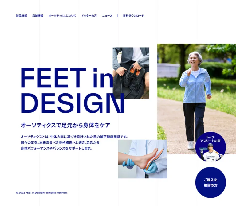
白地と濃い青、大きな欧文見出し、繊細な縦罫線、非対称な写真配置が特徴。製品紹介、医師の声、計測会、店舗案内をつなぐ企業サイト。
FEET in DESIGN — Style Reference
Clinical precision expressed through deep blue typography, open white space, and an asymmetric photographic collage.
Website: feetindesign.jp Original URL: https://feetindesign.jp/ Final URL: https://feetindesign.jp/ Theme: white canvas with deep blue text, darker blue feature bands, and natural-color photography; no theme selector was evidenced. Inspected: October 2, 2026, at 01:25 JST; supplied retrieval timestamp: October 1, 2026, at 16:25:07.436 UTC. Viewports: desktop 1440 × 1000 CSS pixels; mobile 390 × 844 CSS pixels. Scope: the current corporate and product homepage, including its introduction, product lineup, doctor testimonials, ordering information, events, news, company link, and footer. Visual captures cover the desktop introduction, doctor section, and company/footer region, plus the mobile introduction and footer. Additional sections are documented from the supplied rendered DOM and computed styles.
FEET in DESIGN uses a restrained visual system with unusually strong differences in scale. A very large two-line English wordmark sits beside compact Japanese explanatory text. Small navigation labels, fine vertical rules, and broad white margins establish order around photographs of walking, footwear, and clinical foot support. Full-width blue sections interrupt the white canvas and give testimonials and events their own visual weight.
This is a substantial corporate and product information site. Its homepage connects product families, professional testimonials, measurement events, retailers, purchase guidance, company information, and contact channels. Its identity depends on that information architecture as much as its opening composition.
The recurring visual relationship is simple: large English headings organize the page, dense Japanese text carries detail, square photographs establish context, and blue circles keep selected destinations prominent. Preserve these relationships when extending the system.
閉じる
FEET in DESIGN — Style Reference
Clinical precision expressed through deep blue typography, open white space, and an asymmetric photographic collage.
Website: feetindesign.jp Original URL: https://feetindesign.jp/ Final URL: https://feetindesign.jp/ Theme: white canvas with deep blue text, darker blue feature bands, and natural-color photography; no theme selector was evidenced. Inspected: October 2, 2026, at 01:25 JST; supplied retrieval timestamp: October 1, 2026, at 16:25:07.436 UTC. Viewports: desktop 1440 × 1000 CSS pixels; mobile 390 × 844 CSS pixels. Scope: the current corporate and product homepage, including its introduction, product lineup, doctor testimonials, ordering information, events, news, company link, and footer. Visual captures cover the desktop introduction, doctor section, and company/footer region, plus the mobile introduction and footer. Additional sections are documented from the supplied rendered DOM and computed styles.
FEET in DESIGN uses a restrained visual system with unusually strong differences in scale. A very large two-line English wordmark sits beside compact Japanese explanatory text. Small navigation labels, fine vertical rules, and broad white margins establish order around photographs of walking, footwear, and clinical foot support. Full-width blue sections interrupt the white canvas and give testimonials and events their own visual weight.
This is a substantial corporate and product information site. Its homepage connects product families, professional testimonials, measurement events, retailers, purchase guidance, company information, and contact channels. Its identity depends on that information architecture as much as its opening composition.
The recurring visual relationship is simple: large English headings organize the page, dense Japanese text carries detail, square photographs establish context, and blue circles keep selected destinations prominent. Preserve these relationships when extending the system.
How to Read This Reference
- Measured means reported by the supplied rendered DOM or computed-style evidence. Measurements are CSS pixels and are occasionally rounded for readability.
- Visual estimate means inferred from the supplied current-page screenshots. Image crops, grid-line color, footer typography, and some component boundaries fall into this category.
- Calculated means derived from reported measurements, such as a column gap or the difference between document and main-content heights.
- Recommended means an implementation choice for a new build. Breakpoints, CSS class names, accessibility additions, and fallback interactions below are recommendations unless explicitly identified otherwise.
- All custom-property names in this document are descriptive implementation aliases. The evidence did not expose a dedicated set of site-specific design variables.
- Desktop document height was approximately 8360.83px; mobile document height was approximately 7008.94px. These describe the captured content and state, not permanent layout constants.
- The evidence includes settled screenshots and automatic vertical scrolling, but no recorded menu opening, carousel advancement, accordion expansion, or hover demonstration.
The supplied custom-property inventory contains many standard WordPress presets. Their presence does not establish that the visible design uses those gradients, shadows, spacing scales, or accent colors. The tokens below prioritize values actually applied to inspected elements.
Tokens — Colors
Default Palette
| Name | Value | Suggested token | Evidence and role |
|---|---|---|---|
| Blue Ink | #000B80 |
--color-ink |
Measured as rgb(0, 11, 128) on body text, navigation, the hero title, product headings, and testimonial text |
| Deep Action Blue | #0B0085 |
--color-action |
Measured on the doctor-section background, major rectangular links, and doctor badges |
| Deep Section Blue | #070081 |
--color-section |
Measured on the events background and mobile partner-link background |
| White | #FFFFFF |
--color-paper |
Measured on reversed text and arrow-button backgrounds; visually observed as the main canvas and testimonial-card surface |
| Muted Blue | #999DCC |
--color-muted |
Measured on news dates; visually similar pale blue appears on desktop footer links |
| Faint Grid | Approximate rgba(0, 11, 128, 0.05) |
--color-grid |
Recommended approximation of the barely visible vertical rules; their exact computed color was not supplied |
Keep the blue roles distinct. Main text is slightly different from the purple-leaning blue used for filled actions and the doctor section. The events band has a third, closely related value. These differences are subtle, but replacing every blue with a bright generic primary color would change the page substantially.
The large white areas are visible rendering results. The inspected HTML and BODY backgrounds themselves were transparent, so this reference does not claim that either element explicitly declares a white background.
Color Distribution
White dominates the introduction, product lineup, ordering information, news, and footer. Deep blue occupies entire content bands and selected controls. Photography supplies green, cyan, skin tones, warm wood, and small orange product details. Those photographic colors are not a second UI accent palette.
There is no evidenced gradient-based surface system or color-theme interaction. A CSS gradient used below to draw vertical rules is a construction technique for hairlines, not a decorative gradient treatment.
Tokens — Typography
Declared Font Stack
The computed content stack is:
font-family: tke, 'Noto Sans JP', 游ゴシック, YuGothic,
  'ヒラギノ角ゴ ProN W3', 'Hiragino Kaku Gothic ProN',
  メイリオ, Meiryo, sans-serif;
tke is the first declared family. Its underlying font identity, font files, licensing, and actual glyph coverage were not supplied. Do not rename it to a familiar commercial typeface or assume every character was rendered by the same family.
Most sampled headings have a computed weight of 300, while ordinary Japanese body text and navigation generally have a computed weight of 700. The screenshots nevertheless show substantial, visually strong letterforms. Preserve the distinction between the measured CSS weight and the apparent stroke weight; do not silently relabel the headings as 700.
The desktop root computes to 10px, and the mobile root also computes to 10px. The Quick Start uses explicit pixel values and fluid calculations, so it does not require changing a project's root font size.
Typography Roles
- English display headings: large sans-serif capitals, tight line boxes, minimal ornament. The hero preserves the lowercase
inwithinFEET in DESIGN. - Japanese supporting headings: substantially smaller, with enough weight to remain clear beside the oversized English type.
- Japanese explanatory text: compact, usually bold, and carefully broken into short readable lines.
- Utility text: small navigation, badges, copyright, and social labels. Much of the visual hierarchy comes from size and placement rather than introducing extra font families.
Type Scale
Values in this table are measured unless marked otherwise. Font size and line height are listed as size / line height.
| Role | Desktop | Mobile | Weight and notes |
|---|---|---|---|
| Base body | 15 / 24px |
15 / 24px |
700; desktop tracking 0.3px, mobile tracking normal |
| Hero wordmark | 116 / 107.3px |
65.91 / 61.2963px |
300; two visual lines |
| Hero Japanese heading | 25 / 40px |
20.28 / 26.364px |
300 |
| Hero explanatory copy | 15 / 26.25px |
13.26 / 20.553px |
700; mobile tracking -0.3978px |
| Desktop navigation | 12 / 13.2px |
Not displayed in the same arrangement | 700; desktop tracking 0.3px |
| Product feature heading | 84 / 84px |
40 / 40px |
300; mobile tracking 0.8px |
| LINEUP heading | 100 / 100px |
54 / 54px |
300 |
| Section introduction | 20 / 32px |
14 / 22.68px |
700 |
| PREMIUM heading | 84 / 84px |
38 / 38px |
300 |
| MEDICAL and ELEGANT headings | 64 / 64px |
38 / 38px |
300 |
| Product descriptions | 16–17 / 25.6–27.2px |
14 / 20.3px |
700; product-link tracking -0.15px |
| DOCTORS VOICE heading | 58 / 58px |
38 / 42.56px |
300; mobile heading occupies two lines |
| Doctor-card heading | 16 / 24px |
15 / 20.7px |
300 |
| Doctor-card body | 13 / 19.5px |
12 / 18px |
700 |
| Doctor identification | 14 / 15.4px |
13 / 15.6px |
700 |
| Doctor badge | 10 / 10px |
10 / 10px |
700, white on blue |
| ORDER FLOW heading | 100 / 100px |
54 / 51.84px |
300; two mobile lines within a 220px-wide box |
| Ordering subheading | 30 / 48px |
20 / 28px |
300; mobile tracking -1px |
| Ordering paragraph | 16 / 30.4px |
14 / 24.22px |
700 |
| EVENTS heading | 62 / 62px |
38 / 38px |
300 |
| Event date | 16 / 25.6px |
12 / 19.2px |
700 |
| Event title | 17 / 26.86px |
13 / 19.89px |
700 |
| Event address | 14 / 22.4px |
11 / 15.4px |
700 |
| NEWS heading | 72 / 72px |
Not included in the supplied mobile style sample | 300 on desktop |
| News date and title | 15 / 24px |
Not included in the supplied mobile style sample | 700; dates use Muted Blue |
| COMPANY heading | 64 / 64px |
Not included in the supplied mobile style sample | 300, white on photography |
| Hero copyright | 10 / 16px |
Not visible in the mobile hero capture | 700 |
The mobile hero values equal 16.9vw, 5.2vw, and 3.4vw at a width of 390px. These are useful calculated equivalents, but one viewport cannot establish the original CSS formulas or their limits.
Letter Segmentation
The hero title is represented by individual inline-block letter elements. Several mobile section headings are segmented in the same way. This confirms the DOM anatomy, not a particular entrance animation. The evidence does not establish stagger duration, direction, easing, or replay behavior.
For a new implementation, keep a coherent accessible heading even if individual visual letters are animated.
Tokens — Spacing & Shapes
Spacing Scale
The page does not follow a visibly uniform small-spacing grid. It combines precise compact text spacing with broad section intervals.
| Use | Value | Evidence |
|---|---|---|
| Desktop navigation gap | 24px between ordinary links |
Calculated from adjacent link bounds |
| Main desktop content width | 1190px |
Measured in lineup and footer content |
| Main desktop content inset | 125px at 1440px |
Measured |
| Main mobile content inset | 30px |
Measured across hero copy, lineup, and ordering content |
| Mobile menu content inset | 32px |
Measured in menu-related DOM entries; open state not visually verified |
| Desktop hero title-to-subheading gap | Approximately 20px |
Calculated from element bounds |
| Desktop hero subheading-to-body gap | 19px |
Calculated from element bounds |
| Mobile hero subheading-to-body gap | 6px |
Calculated from element bounds |
| Desktop lineup section padding | 148px top, 120px bottom |
Measured |
| Mobile lineup section padding | 70px 30px |
Measured |
| Desktop product-row gap | 70px |
Calculated between PREMIUM and the lower pair |
| Mobile product-item gap | 38px |
Calculated |
| Desktop doctor-section padding | 108px top, 76px bottom |
Measured |
| Mobile doctor-section padding | 58px top, 80px bottom |
Measured |
| Desktop footer top padding | 100px |
Measured |
| Mobile footer category-row height | Approximately 74px |
Visual estimate |
Border Radius
| Element | Treatment | Evidence |
|---|---|---|
| Product blocks and major rectangular links | Square corners | Measured sampled links and visible treatment |
| Doctor cards and portrait crops | Square corners | Visible in the desktop capture |
| Carousel arrow buttons | 0px radius |
Measured |
| Small doctor badge | 0px radius |
Measured |
| Floating destination links | Full circles | Visible in desktop and mobile captures |
| Mobile header controls | Square adjoining blocks | Visible in mobile captures |
Circles are reserved for the floating destinations. They are not a general-purpose radius token for cards, forms, or navigation.
Layout Measurements
| Element | Desktop | Mobile | Evidence |
|---|---|---|---|
| Opening section | 1440 × 1000px |
390 × 844px |
Measured; matches the inspected viewport height |
| Hero title box | x119, y331.53, 500 × 229.19px |
x0, y175.33, 344.69 × 131.13px, including 30px horizontal padding |
Measured |
| Hero copy width | 500px |
330px inside the page gutters |
Measured |
| Major walking photograph | About 480 × 674px, at x960, y143 |
About 248 × 238px, at x142, y282 |
Visual estimate |
| Footwear photograph | About 223 × 314px, at x687, y198 |
About 110 × 135px, at x0, y334 |
Visual estimate |
| Clinical foot photograph | About 300 × 236px, at x720, y654 |
About 127 × 94px, at x77, y440 |
Visual estimate |
| Lower product columns | Two columns of 559.30px, separated by about 71.39px |
One 330px column |
Measured and calculated |
| All-products link | 1192 × 89px outer bounds |
332 × 64px outer bounds |
Measured |
| Doctor card | About 328 × 560px |
Outer card width estimated near 260px; inner copy width 204px |
Desktop visual estimate; mobile inner width measured |
| Doctor-card pitch | Approximately 374px |
Approximately 306px |
Calculated from repeated text positions |
| Carousel arrow button | 60 × 60px |
60 × 60px |
Measured |
| Floating circles | Approximately 138–140px diameter |
Approximately 90–92px diameter |
Visual estimate |
| Company photographic section | 480px high |
Not measured in the supplied mobile sample | Measured desktop section bounds |
| Footer | 694.48px high |
Approximately 1005.56px high |
Desktop measured; mobile calculated from document minus main height |
Some rectangular links measure 2px wider than their nominal content column. The available evidence does not include enough border and box-sizing information to identify the exact cause. The Quick Start uses border-box sizing and keeps actions within their containers.
Components
Header and Primary Navigation
Role: provide access to the site's main information areas and partner destination.
In the desktop opening capture, the visible navigation begins at x72, y64. It is a compact row of 12px labels with approximately 24px gaps. The first seven destinations cover products, retailers, orthotics, doctor testimonials, news, events, and a downloadable document. The partner destination follows a thin vertical separator and a small external-link-style icon.
The opening screenshot does not show a small wordmark at the left of this row. In the scrolled desktop captures, a small FEET in DESIGN wordmark appears near the upper-left corner, while navigation occupies the upper-right region. The header is visible over both page content and company photography. This establishes a persistent-looking scrolled presentation, but the exact positioning rules and state-change threshold were not supplied.
On mobile, the visible header becomes two adjoining blue blocks at the top right: a partner link approximately 91 × 54px, and a menu trigger approximately 55 × 54px. The partner label is split across two lines. The trigger uses thin white horizontal strokes.
Mobile DOM evidence contains a larger wordmark and a vertical navigation list, but those elements are absent from the supplied closed-menu screenshot. Their presence in the DOM is not proof that the menu was opened or that an opening transition was observed.
Opening Brand Composition
Role: introduce the brand and explain the product category.
The desktop opening section occupies the entire inspected viewport. The title begins about one third of the way down the screen, leaving substantial space above it. It reads as two lines: FEET in and DESIGN. A short Japanese heading and three lines of explanatory copy sit below.
The photographic arrangement is deliberately unbalanced. A large walking portrait meets the right edge. A smaller vertical footwear image floats above the middle of the composition, while a clinical foot-and-orthotic image sits lower and farther left than the main portrait. The images have hard rectangular edges, without decorative frames or shadows.
On mobile, the relationship changes substantially. The title sits above and partly overlaps the upper edge of the large walking image. The footwear crop moves to the left edge, and the clinical image overlaps the lower portion of the collage. Supporting text follows beneath the images. This is an art-directed rearrangement, not a scaled-down desktop split layout.
A small copyright line appears at the lower left of the desktop opening section. It is not visible in the mobile opening capture.
Floating Destination Circles
Role: maintain prominent access to athlete content and retailer guidance.
The upper circle reads トップ アスリートの声. It refers to top athletes; it should not be interpreted as a back-to-top control. Its destination was not present in the supplied link inventory.
The lower circle reads ご購入を 検討の方. Its evidenced destination is /shops/.
Both circles appear near the lower right of the hero. The athlete circle remains visible in the supplied scrolled captures, while the purchase circle is not visible in those captures. Their exact visibility logic is unverified.
Use centered white multiline labels with generous surrounding blue space. At desktop size, the circles are approximately 138–140px across; at mobile size, approximately 90–92px. The circles overlay nearby imagery and footer regions, making their stacking order a defining part of the composition.
Product Introduction
Role: introduce the orthotics proposition before the product lineup.
The DOM records a full-width section immediately after the hero, measuring 816px high on desktop and approximately 566.33px on mobile. It contains a small brand line, the large heading PRODUCT, a three-part Japanese attribute statement, and a secondary message with an orthotics link.
Desktop placement separates the upper-left title area from a lower-right message. On mobile, both text groups align toward the left with a 30px inset. Text is white in the computed styles.
The supplied screenshots do not show this section's complete visual surface or media. Do not infer a particular background photograph, video, illustration, or animation from its text color alone.
Product Lineup
Role: direct visitors into three featured product families.
A large LINEUP heading and a smaller Japanese introduction precede the product links. Desktop uses a 1190px content area. PREMIUM occupies the full width; MEDICAL and ELEGANT form an equal-width pair below it. The footer additionally links to the basic product family, but it is not one of these three featured blocks.
The entire measured product block is an anchor. Each contains a large media region followed by an English product name and Japanese description. The available evidence establishes the geometry and text placement, but does not provide the product media assets or enough visual coverage to describe their subjects.
Desktop text is inset 40px within the premium block and 30px within the lower blocks. On mobile, all three links stack at 330px wide, and their text starts 16px inside the block. All three mobile product names use 38px type.
A long blue 全ての製品をみる link closes the section. It spans the content width and has a centered white label with a rightward arrow visible in the desktop capture.
Doctor Testimonial Section
Role: present professional testimony in a distinct blue chapter.
A solid #0B0085 band contains a white English heading, a Japanese descriptor, and a horizontal row of white cards. In the desktop screenshot, three complete cards and part of a fourth are visible. The supplied text contains nine entries in total.
The desktop heading begins near x176; the card row begins near x180. The large English heading and smaller Japanese label share the header area. Two square arrow controls sit on the right. The left control appears muted in the captured state, but the supplied evidence does not confirm a disabled attribute.
On mobile, the English heading wraps to two lines. The Japanese descriptor is positioned beside the lower part of that heading. The first card's text column is centered around the viewport midpoint, and the two measured arrow buttons sit at x10 and x320. The rendered mobile text also includes 1 / 9.
Card movement, swipe handling, looping, autoplay, and counter updates were not exercised.
Doctor Testimonial Card
Anatomy: portrait, short heading, testimonial paragraph, professional badge, and attribution block.
The desktop card is approximately 328px wide and 560px high. Its upper photograph is roughly 230px high, showing the doctor against a pale neutral background. The white text surface continues directly beneath the image.
The inner desktop text column is measured at 256px wide, corresponding to approximately 36px side insets. Titles use 16 / 24px; body copy uses 13 / 19.5px. The identification area combines a small blue 医師 badge with tightly stacked institution, role, and name text.
Different testimonial lengths produce different attribution positions within cards of visually aligned height. Preserve the individual text lengths; do not force all cards into identical short summaries merely to equalize their internal whitespace.
Mobile text becomes 12 / 18px inside a measured 204px column. Professional identification remains slightly larger at 13 / 15.6px.
Purchase Guidance
Role: explain the custom measurement and ordering process, then provide a clear route to more detail.
The ORDER FLOW section uses the same large English heading and Japanese introduction pattern as the lineup. Desktop explanatory content sits in a 400px-wide block on the right, beginning at x880. A two-line subheading precedes a generously led paragraph and a full-width blue link to /flow/.
On mobile, the section title wraps within a 220px-wide box. Supporting content moves to the standard 330px column. The Japanese subheading is 20 / 28px, the body is 14 / 24.22px, and the action is approximately 64px high.
A substantial media area is implied by the spacing and structure, but its contents are not shown in the supplied current-page captures. The text describes measurement technology; it does not establish what image or video is displayed.
Events Band
Role: expose measurement-event dates and link to the full schedule.
The events section uses #070081. Desktop combines a white heading and introductory text on the left with horizontally distributed event information to the right. Measured date/title/address groups have 238px-wide text columns and approximately 366px horizontal pitch. Repeated offscreen coordinates establish a horizontal arrangement.
On mobile, the heading and short Japanese introduction sit beside one another. Event text columns narrow to 165px, with approximately 247px pitch. The schedule link follows the event content in the rendered mobile text order.
The supplied desktop DOM includes two 60px arrow buttons. No event-advancement interaction was recorded, and no per-event anchor was identified in the supplied link inventory. The exact tile background and border treatment are not visible in the provided screenshots.
News List
Role: provide a compact editorial update area within the corporate homepage.
Desktop separates a left title/navigation area from a 650px-wide list beginning at x560. Each of the three entries contains a muted blue date and a darker title. The date and title both use 15 / 24px.
The second and third links have measured padding of 48px above and 42px below their content. This produces substantial vertical spacing without introducing a dense grid of article cards. The full news section has 186px top and 156px bottom padding.
The mobile text inventory confirms the same three entries and a news-index link. Its complete computed layout and visual appearance were not supplied, so desktop measurements should not be projected onto mobile.
Company Photography Link
Role: transition from product and editorial content into company information.
The desktop section is 480px high, although only its lower portion appears at the top of the footer capture. It uses wide interior photography: footwear displays, a measurement screen, a chair, warm wood cabinetry, and a skeleton model are visible.
A centered white COMPANY heading and smaller 会社情報 link treatment sit over the photograph. The evidenced anchor leads to /company/.
Keep the photograph broad and architectural. It provides a real operational setting after the more isolated hero and portrait images. The exact image-overlay treatment and opacity were not supplied.
Desktop Footer
Role: provide comprehensive navigation and direct contact access.
The footer returns to white with the faint vertical grid continuing behind it. A 1190px content area starts 100px below the footer boundary. Its upper row contains a two-line brand mark, three navigation groups, and a contact column.
Navigation groups cover products, purchase information, and site contents. Group titles use dark blue, while subordinate links appear pale blue. The contact column places a large telephone number above business hours, a filled contact-form link, and a partner-recruitment image banner.
The visible telephone number is 050-5445-1429, with an evidenced tel: link. The contact-form destination is /contact/. Instagram and Facebook links accompany FOLLOW US near the lower left. A privacy-policy link sits farther right.
A full-width blue copyright strip closes the page. Its height is calculated as 70px from the supplied desktop bounds.
Mobile Footer
Role: compress the same navigation hierarchy while keeping contact information immediately readable.
The brand and social area precede three collapsed-looking navigation rows. Each row spans approximately 330px, has thin blue horizontal separators, and ends with a downward chevron. The visible labels are 製品情報, ご購入について, and サイトコンテンツ.
The contact area follows the rows. Its phone number is visually large, approximately 36–40px, followed by compact business hours and a full-width rectangular contact action. The partner banner expands to nearly the entire content width. The privacy link sits above the blue copyright strip.
Accordion expansion was not observed. Treat the captured rows as a visible closed presentation, not evidence for a specific animation, exclusive-open rule, or JavaScript library.
Tokens — Motion & Interaction
| Element or behavior | Evidence | What can safely be specified |
|---|---|---|
| Ordinary desktop links | Computed transition reports 0.1s |
A 100ms transition duration exists; changed properties and hover appearance were not demonstrated |
| Large desktop rectangular links | Computed transition reports 0.25s |
A 250ms duration exists on sampled actions |
| Desktop carousel buttons | Computed transition reports 0.25s |
A 250ms control transition exists; slide timing is not established |
| Sampled mobile links and controls | Transition reported as all, without a positive duration |
Do not carry desktop durations into mobile as an observed fact |
| Sampled headings and letter elements | animation: none in the captured state |
No active CSS animation was reported at sampling time |
| Segmented heading letters | Individual inline-block elements | Suitable structure for letter effects, but no particular effect was verified |
| Header across scroll captures | Small brand/navigation remain visible near the top in scrolled screenshots | A scrolled presentation is visible; exact trigger and positioning implementation are unknown |
| Doctor and event tracks | Repeated horizontal coordinates, arrow controls, mobile doctor counter | Horizontal content presentation is supported; movement mechanics remain unverified |
| Mobile menu | Trigger visible; menu content present in DOM | Opening, focus management, dismissal, and transition remain unverified |
| Mobile footer groups | Closed-looking rows and chevrons visible | Expansion behavior remains unverified |
The capture process waited for visible finite motion and sampled layout stability. Perpetual animations were temporarily paused during readiness checks and resumed afterward. These procedures improve screenshot stability but do not prove that the site has no entrance effects, delayed animations, or JavaScript-driven motion.
Recommended motion policy: keep interaction feedback short and restrained, using the evidenced 100ms and 250ms durations as starting points. Prefer changes in opacity, color, or underline treatment over card lifting and exaggerated scale. Treat any proposed letter reveal or carousel easing as a new implementation choice.
Surfaces
| Surface | Appearance | Purpose |
|---|---|---|
| Main canvas | White with extremely faint vertical rules | Establishes continuity through spacious sections |
| Hero photography | Unframed rectangular crops in natural color | Connects the brand to movement, footwear, and clinical fitting |
| Doctor band | Solid #0B0085 |
Creates a strong chapter boundary and supports reversed headings |
| Doctor cards | White, square, without visible elevation shadows | Holds portraits and dense testimony clearly |
| Events band | Solid #070081 |
Separates schedule content from surrounding white sections |
| Main rectangular actions | Solid #0B0085, white labels, square corners |
Provides decisive navigation without a new accent color |
| Floating destinations | Solid blue circles with centered white text | Remains prominent over both photographs and white space |
| Company band | Wide interior photograph with white text | Introduces the organization's physical setting |
| Footer | White grid field followed by a blue copyright strip | Returns to the core palette and closes the page |
There is no visible general shadow or rounded-card elevation system. Separation comes from whitespace, color inversion, photographic edges, and thin rules.
Imagery
The image direction combines everyday movement with professional fitting. In the current hero, a woman in a light cyan jacket walks outdoors; a smaller crop shows footwear being handled beside a bag; another image shows a gloved practitioner holding a foot over a layered orthotic. Natural color is retained throughout.
The large walking image has different effective crops across desktop and mobile. Desktop shows a tall scene with much more of the person and surrounding ground. Mobile uses a shorter visible crop beside and beneath the title. Preserve subject placement through breakpoint-specific image positioning rather than stretching one image into every box.
Doctor portraits use neutral pale backgrounds and similar upper-body framing. Their consistency makes the text-heavy cards read as a collection. The company photograph is wider and more environmental, showing equipment, shoes, furniture, and anatomical reference material.
Observed Asset References
No original image URLs or file paths were supplied in the rendered evidence. The references below identify visible assets without inventing filenames.
| Reference | Current capture | Treatment |
|---|---|---|
| Walking photograph | Desktop and mobile opening captures | Largest hero image; flush to the right viewport edge |
| Footwear and bag photograph | Desktop and mobile opening captures | Small vertical crop; moves to the left edge on mobile |
| Clinical foot and orthotic photograph | Desktop and mobile opening captures | Smaller landscape crop; overlaps the collage on mobile |
| Doctor portraits | Desktop doctor-section capture | Consistent landscape image slots above white text panels |
| Company interior photograph | Desktop company/footer capture | Full-width environmental image with centered white heading |
| Partner-recruitment banner | Desktop and mobile footer captures | Brand text beside a photograph of two people holding orthotics |
| Social symbols | Desktop and mobile footer captures | Recognizable blue Instagram and Facebook marks |
Use authorized original assets when available. If substituting imagery for a new project, match subject hierarchy, crop relationships, and lighting. Do not place critical text inside substitute photography unless it is intentionally part of a banner asset.
Layout & Responsive Behavior
Page Grid
The desktop white canvas shows approximately six equal vertical divisions, with rules near x240, 480, 720, 960, and 1200. Mobile shows approximately four divisions, with rules near x98, 195, and 293. These are visual observations; the source grid implementation was not supplied.
The background grid and the content container are separate systems. The principal desktop container is 1190px wide with 125px side margins, so its edges do not align with every background rule. Several large headings extend 4–7px left of neighboring text as optical adjustments.
Observed Responsive Changes
| Area | Desktop | Mobile |
|---|---|---|
| Navigation | Small horizontal text row; alternate scrolled presentation includes wordmark | Compact partner block and menu trigger at upper right |
| Opening title | 116px, left of the main photographic mass | 65.91px, above and overlapping the collage |
| Hero images | Tall right image with two floating supporting images | Shorter right crop, left-edge footwear image, overlapping clinical image |
| Hero copy | 500px-wide block beneath the title | Below the collage, within 30px page gutters |
| Product lineup | One wide feature followed by two columns | Three sequential full-width blocks |
| Doctor section | Three full cards and a partial next card visible | One centered primary card area with side controls and a 1 / 9 text indicator |
| Ordering content | Right-side explanatory block, 400px wide | Full 330px content column |
| Events | Left introduction beside a horizontal sequence | Heading and descriptor share a row above narrower event groups |
| Footer navigation | Expanded columns | Collapsed-looking rows with chevrons |
| Contact and partner banner | Narrow right footer column | Full content width |
| Floating destinations | Approximately 140px circles | Approximately 90px circles |
Vertical Rhythm
The desktop homepage uses large chapter intervals rather than equal-height sections. The lineup occupies about 2039px; the doctor band about 862px; news about 790px. Mobile compresses many of these areas while retaining large display headings and a full-height opening section.
The desktop ORDER FLOW and EVENTS section bounds overlap by approximately 105px. This is a measured relationship between containers, but the relevant visual region is not included in the screenshots. Do not prescribe a negative margin or a particular overlap effect from the bounds alone. Their measured mobile bounds meet without that overlap.
Limits of the Responsive Evidence
Only 1440px and 390px viewport widths were supplied. Tablet layouts, intermediate breakpoints, landscape phones, browser text enlargement, and safe-area behavior were not inspected. Any breakpoint introduced in a new implementation must be labeled as a recommendation and tested between these two endpoints.
The mobile hero uses tightly controlled line breaks. For a reusable implementation, allow extra height when copy length, font metrics, or text scaling differs. Preserve the collage without trapping essential text beneath fixed controls.
Do’s and Don’ts
Do
- Keep text blue
#000B80distinct from the filled-action blue#0B0085. - Let white space and large English headings establish hierarchy.
- Pair those headings with compact, clearly grouped Japanese descriptions.
- Preserve the two-line brand title and the lowercase
in. - Maintain the unequal scale of the three hero photographs.
- Rearrange the collage deliberately for mobile.
- Use square image crops, square cards, and square rectangular actions.
- Reserve circles for the prominent floating destinations.
- Retain the full-width premium feature and the lower two-column product pair on desktop.
- Give doctor portraits consistent framing and keep professional attribution attached to each quotation.
- Preserve the expanded desktop footer and compact mobile navigation hierarchy.
- Distinguish visible affordances from interactions that were actually exercised.
Don’t
- Don't replace the restrained palette with bright cyan buttons or unrelated accent colors.
- Don't turn all content into rounded, shadowed cards.
- Don't center every heading or normalize the collage into three equal image tiles.
- Don't treat the faint background grid as a thick, high-contrast decoration.
- Don't reduce the homepage to a single conversion panel; its corporate navigation and information depth are part of the design.
- Don't identify
tkeas a specific commercial font without further evidence. - Don't infer a staggered entrance animation merely from individual letter elements.
- Don't describe the athlete circle as a back-to-top button.
- Don't infer an open mobile menu from DOM entries that are absent from the screenshot.
- Don't invent product-media subjects, image paths, slider libraries, or hidden menu states.
- Don't present generic WordPress preset shadows and gradients as this site's visible design tokens.
- Don't let floating circles conceal contact actions, long text, or keyboard focus in a new implementation.
Recommended Implementation Additions
These are recommendations for a new build, not verified capabilities of the inspected site:
- Give the menu trigger and carousel arrows accessible names, visible focus indicators, and clear state information.
- Keep a single coherent accessible name for headings that are visually split into letters.
- Implement mobile footer groups as keyboard-operable disclosures with
aria-expandedand associated panels. - Make doctor content reachable without autoplay, and provide a simple scrollable fallback if carousel scripting fails.
- Avoid fixed card heights that clip longer testimonials or translated content.
- Verify small-text contrast, particularly pale footer links and news dates, against the white background.
- Test floating controls with enlarged text and short viewports. Reserve enough clearance for important links and form actions.
- Use an opaque or otherwise contrast-preserving header state where navigation crosses busy photography.
- Supply responsive image sources, explicit dimensions, and subject-aware crops to reduce layout shifts.
- Keep motion optional under
prefers-reduced-motion, including any newly added letter effects. - Preserve one continuous reading order when rearranging the hero and footer visually.
Agent Prompt Guide
Quick Color Reference
- Canvas and testimonial cards:
#FFFFFF. - Main text and primary linework:
#000B80. - Doctor section, major actions, and small professional badges:
#0B0085. - Events band and mobile partner block:
#070081. - Secondary date text:
#999DCC. - Background grid: extremely faint blue hairlines; an alpha near 0.05 is an implementation approximation.
- Photography: natural color; no global blue tint is required by the visible evidence.
Overall Prompt
“Create a Japanese corporate and product homepage inspired by the current FEET in DESIGN design system. Use a white canvas, main text in #000B80, feature bands and actions in #0B0085, and extremely faint vertical grid lines. Establish hierarchy with very large English sans-serif headings and compact Japanese explanations. Build a full-height opening composition with a two-line brand title and three unequal rectangular photographs: a large walking image at the right edge, a smaller footwear image, and a clinical fitting image. Rearrange the collage on mobile so the title overlaps its upper edge and the explanation follows below. Continue with a wide featured product, a two-column product pair, a blue doctor-testimonial band with square white portrait cards, purchase guidance, events, news, company photography, and a substantial footer. Keep surfaces flat and corners square, reserving circles for floating destination links. Treat font identity and untested motion as unresolved rather than inventing them.”
Example Component Prompts
- Hero collage: “Use a large two-line blue wordmark on white, with generous space above. Place a tall walking photograph flush right, a smaller footwear crop near the center, and a clinical foot-support photograph lower down. Keep rectangular edges and natural color. At 390px width, move the title above the collage, bring the footwear image to the left edge, and overlap the small clinical image across the lower portion.”
- Product lineup: “Create a 1190px desktop content area with a 100px English section title and a compact Japanese introduction. Use one full-width premium product link followed by two equal product links separated by a broad gutter. Give product names oversized blue type and inset descriptions. Stack all three at mobile width and finish with a full-width square blue action.”
- Doctor section: “Place white testimonial cards on a solid #0B0085 band. Each card has a neutral-background doctor portrait, a short blue title, dense blue body text, a tiny inverted professional badge, and a compact attribution block. Use square 60px arrow controls and let the next card remain partially visible on desktop. Avoid shadows and rounded corners.”
- Mobile header: “Place a 54px-high control group at the top right. Use a narrow two-line partner link beside a square menu trigger, both in deep blue with white content. Keep the opening white space clear. Implement accessible menu behavior separately from this closed visual state.”
- Footer: “Build a spacious white desktop footer with a two-line brand mark, three link groups, and a contact column containing a large telephone number, hours, a square blue contact action, and a partner banner. Move social links below the brand. On mobile, convert the navigation groups into thin-rule disclosure rows, then show full-width contact content and the partner banner.”
Quick Start
CSS Custom Properties
This is a recommended adaptation of the observed system, not extracted source CSS. It uses measured colors and representative type sizes, approximate screenshot-derived image geometry, and a recommended 900px breakpoint. The original breakpoint was not supplied.
The hero expects these children in reading order: .fid-hero__title with two line spans, .fid-hero__collage containing three images, and .fid-hero__copy. The collage becomes an absolute layer on desktop and an in-flow composition on mobile. Supply authorized image assets yourself; no image paths are invented here.
The first font family remains tke to record the observed declaration. It will only render if your project supplies an appropriate font definition. Fallback fonts require visual checking because their metrics and apparent weights will differ.
:root {
  /* Measured colors */
  --color-paper: #ffffff;
  --color-ink: #000b80;
  --color-action: #0b0085;
  --color-section: #070081;
  --color-muted: #999dcc;

  /* Recommended approximation of the visible grid */
  --color-grid: rgb(0 11 128 / 5%);

  /* Observed stack, using its Latin-named fallbacks */
  --font-site: tke, 'Noto Sans JP', YuGothic,
    'Hiragino Kaku Gothic ProN', Meiryo, sans-serif;
  --weight-display: 300;
  --weight-body: 700;
  --text-body: 15px;
  --leading-body: 1.6;
  --tracking-body: 0.3px;

  --content-width: 1190px;
  --gutter: 30px;
  --space-small: 12px;
  --space-medium: 24px;
  --space-large: 38px;
  --space-section: 70px;
  --rule-width: 1px;
  --radius-square: 0;
  --radius-circle: 50%;

  /* Durations observed on sampled desktop controls */
  --duration-link: 100ms;
  --duration-control: 250ms;
}

.fid-site,
.fid-site *,
.fid-site *::before,
.fid-site *::after {
  box-sizing: border-box;
}

.fid-site {
  color: var(--color-ink);
  background-color: var(--color-paper);
  background-image: linear-gradient(
    90deg,
    transparent calc(100% - 1px),
    var(--color-grid) 0
  );
  background-size: calc(100% / 6) 100%;
  font-family: var(--font-site);
  font-size: var(--text-body);
  font-weight: var(--weight-body);
  line-height: var(--leading-body);
  letter-spacing: var(--tracking-body);
}

.fid-site a {
  color: inherit;
  text-decoration: none;
}

.fid-site img {
  display: block;
  max-width: 100%;
}

.fid-container {
  width: min(var(--content-width), calc(100% - 60px));
  margin-inline: auto;
}

.fid-display {
  margin: 0;
  font-size: clamp(54px, 6.944vw, 100px);
  font-weight: var(--weight-display);
  line-height: 1;
}

/* Approximate the opening composition at the supplied viewports. */
.fid-hero {
  position: relative;
  isolation: isolate;
  min-height: 100svh;
  padding-block: 33.153svh 100px;
  padding-inline: max(30px, calc((100vw - 1190px) / 2 + 1px));
}

.fid-hero__title {
  position: relative;
  z-index: 2;
  left: -7px;
  width: 500px;
  max-width: 100%;
  margin: 0;
  font-size: 116px;
  font-weight: var(--weight-display);
  line-height: 0.925;
}

.fid-hero__title > span {
  display: block;
  padding-bottom: 0.063em;
}

.fid-hero__collage {
  position: absolute;
  z-index: 0;
  inset: 0;
  pointer-events: none;
}

.fid-hero__collage img {
  position: absolute;
  object-fit: cover;
  border-radius: 0;
}

.fid-hero__walking {
  top: 14.3%;
  right: 0;
  width: 33.333%;
  height: 67.4%;
}

.fid-hero__footwear {
  top: 19.8%;
  left: 47.708%;
  width: 15.486%;
  height: 31.4%;
}

.fid-hero__clinical {
  top: 65.4%;
  left: 50%;
  width: 20.833%;
  height: 23.6%;
}

.fid-hero__copy {
  position: relative;
  z-index: 2;
  width: 500px;
  max-width: 100%;
  margin-top: 20px;
}

.fid-hero__copy h2 {
  margin: 0;
  font-size: 25px;
  font-weight: var(--weight-display);
  line-height: 40px;
}

.fid-hero__copy p {
  margin: 19px 0 0;
  font-size: 15px;
  line-height: 1.75;
}

.fid-products {
  padding-block: 148px 120px;
}

.fid-products__grid {
  display: grid;
  grid-template-columns: repeat(2, minmax(0, 1fr));
  gap: 70px 6%;
  margin-top: 54px;
}

.fid-product--featured {
  grid-column: 1 / -1;
}

.fid-product__copy {
  padding-inline-start: 30px;
}

.fid-product--featured .fid-product__copy {
  padding-inline-start: 40px;
}

.fid-product h3 {
  margin: 0 0 22px;
  font-size: 64px;
  font-weight: var(--weight-display);
  line-height: 1;
  letter-spacing: -0.15px;
}

.fid-product--featured h3 {
  font-size: 84px;
}

.fid-product p {
  margin: 0;
  font-size: 16px;
  line-height: 1.6;
  letter-spacing: -0.15px;
}

.fid-site .fid-action {
  display: grid;
  place-items: center;
  width: 100%;
  min-height: 71px;
  padding: 24px 30px;
  border: 1px solid var(--color-action);
  border-radius: 0;
  color: var(--color-paper);
  background: var(--color-action);
  font-size: 15px;
  line-height: 1.2;
  text-align: center;
  transition: opacity var(--duration-control) ease;
}

.fid-action--wide {
  min-height: 89px;
}

.fid-doctors {
  padding-block: 108px 76px;
  background: var(--color-action);
}

.fid-doctors__heading {
  margin: 0;
  color: var(--color-paper);
  font-size: 58px;
  font-weight: var(--weight-display);
  line-height: 1;
}

/* Native scrolling is a recommended fallback, not verified source behavior. */
.fid-doctors__track {
  display: flex;
  gap: 46px;
  overflow-x: auto;
  margin-top: 48px;
  padding-inline: max(30px, calc((100vw - 1080px) / 2));
  padding-bottom: 12px;
  scroll-snap-type: x proximity;
}

.fid-doctor {
  flex: 0 0 328px;
  min-height: 560px;
  color: var(--color-ink);
  background: var(--color-paper);
  scroll-snap-align: start;
}

.fid-doctor__portrait {
  width: 100%;
  aspect-ratio: 328 / 231;
  object-fit: cover;
}

.fid-doctor__body {
  padding: 25px 36px 30px;
}

.fid-doctor h3 {
  margin: 0 0 12px;
  font-size: 16px;
  font-weight: var(--weight-display);
  line-height: 1.5;
}

.fid-doctor__quote {
  margin: 0;
  font-size: 13px;
  line-height: 1.5;
}

.fid-doctor__attribution {
  display: grid;
  grid-template-columns: 28px minmax(0, 1fr);
  align-items: start;
  gap: 8px;
  margin-top: 20px;
  font-size: 14px;
  line-height: 1.1;
}

.fid-doctor__badge {
  padding-block: 3px;
  color: var(--color-paper);
  background: var(--color-action);
  font-size: 10px;
  line-height: 1;
  text-align: center;
}

.fid-arrow {
  display: grid;
  place-items: center;
  width: 60px;
  height: 60px;
  border: 0;
  border-radius: 0;
  color: var(--color-ink);
  background: var(--color-paper);
  cursor: pointer;
  transition: opacity var(--duration-control) ease;
}

.fid-arrow:disabled {
  opacity: 0.3;
  cursor: default;
}

/* Apply the appropriate visible state through application logic. */
.fid-floating-links {
  position: fixed;
  z-index: 20;
  right: 45px;
  bottom: 36px;
  display: grid;
  gap: 20px;
}

.fid-site .fid-circle {
  display: grid;
  place-items: center;
  width: 138px;
  aspect-ratio: 1;
  padding: 15px;
  border-radius: 50%;
  color: var(--color-paper);
  background: var(--color-action);
  font-size: 15px;
  line-height: 1.6;
  text-align: center;
}

.fid-site .fid-circle--purchase {
  background: var(--color-ink);
}

.fid-footer {
  padding-top: 100px;
}

.fid-footer__grid {
  display: grid;
  grid-template-columns: 1.4fr 0.8fr 1fr 1fr 1.2fr;
  gap: clamp(20px, 3.3vw, 48px);
  padding-bottom: 60px;
}

.fid-footer__phone {
  display: block;
  font-size: clamp(24px, 2.3vw, 34px);
  line-height: 1.2;
  white-space: nowrap;
}

.fid-footer__copyright {
  min-height: 70px;
  padding-block: 25px;
  color: var(--color-paper);
  background: var(--color-action);
  font-size: 10px;
}

/* Recommended feedback; the original hover appearance was not captured. */
@media (hover: hover) {
  .fid-action:hover {
    opacity: 0.82;
  }
}

.fid-site :focus-visible {
  outline: 3px solid currentColor;
  outline-offset: 4px;
}

.fid-site .fid-action:focus-visible,
.fid-site .fid-circle:focus-visible {
  outline-color: var(--color-ink);
  box-shadow: 0 0 0 2px var(--color-paper);
}

@media (max-width: 900px) {
  .fid-site {
    background-size: 25% 100%;
    letter-spacing: normal;
  }

  .fid-hero {
    padding: 20.7735svh 30px 140px;
  }

  .fid-hero__title {
    left: 0;
    width: 100%;
    font-size: clamp(48px, 16.9vw, 76px);
    line-height: 0.93;
  }

  .fid-hero__title > span {
    padding-bottom: 0.065em;
  }

  .fid-hero__collage {
    position: relative;
    inset: auto;
    width: calc(100% + 60px);
    height: clamp(220px, 64.615vw, 440px);
    margin: -24px -30px 0;
  }

  .fid-hero__walking {
    top: 0;
    right: 0;
    width: 63.59%;
    height: 94.44%;
  }

  .fid-hero__footwear {
    top: 20.63%;
    left: 0;
    width: 28.205%;
    height: 53.57%;
  }

  .fid-hero__clinical {
    top: auto;
    bottom: 0;
    left: 19.744%;
    width: 32.564%;
    height: 37.30%;
  }

  .fid-hero__copy {
    width: 100%;
    margin-top: 16px;
  }

  .fid-hero__copy h2 {
    font-size: clamp(18px, 5.2vw, 25px);
    line-height: 1.3;
  }

  .fid-hero__copy p {
    max-width: 28ch;
    margin-top: 6px;
    font-size: clamp(13px, 3.4vw, 16px);
    line-height: 1.55;
    letter-spacing: -0.03em;
  }

  .fid-products {
    padding-block: 70px;
  }

  .fid-products__grid {
    grid-template-columns: minmax(0, 1fr);
    gap: 38px;
    margin-top: 30px;
  }

  .fid-product__copy,
  .fid-product--featured .fid-product__copy {
    padding-inline-start: 16px;
  }

  .fid-product h3,
  .fid-product--featured h3 {
    margin-bottom: 8px;
    font-size: 38px;
  }

  .fid-product p {
    font-size: 14px;
    line-height: 1.45;
  }

  .fid-site .fid-action {
    min-height: 64px;
    font-size: 14px;
  }

  .fid-doctors {
    padding-block: 58px 80px;
  }

  .fid-doctors__heading {
    max-width: 326px;
    font-size: 38px;
    line-height: 1.12;
  }

  .fid-doctors__track {
    padding-inline: max(30px, calc((100vw - 260px) / 2));
    scroll-padding-inline: max(30px, calc((100vw - 260px) / 2));
  }

  .fid-doctor {
    flex-basis: 260px;
    min-height: 0;
  }

  .fid-doctor__body {
    padding: 25px 28px 28px;
  }

  .fid-doctor h3 {
    margin-bottom: 5px;
    font-size: 15px;
    line-height: 1.38;
  }

  .fid-doctor__quote {
    font-size: 12px;
  }

  .fid-doctor__attribution {
    grid-template-columns: 26px minmax(0, 1fr);
    margin-top: 12px;
    font-size: 13px;
    line-height: 1.2;
  }

  .fid-floating-links {
    right: 20px;
    bottom: calc(20px + env(safe-area-inset-bottom, 0px));
    gap: 12px;
  }

  .fid-site .fid-circle {
    width: 90px;
    padding: 10px;
    font-size: 10px;
  }

  .fid-footer {
    padding-top: 60px;
  }

  .fid-footer__grid {
    grid-template-columns: minmax(0, 1fr);
    gap: 32px;
  }

  .fid-footer__phone {
    font-size: clamp(30px, 9.5vw, 40px);
  }

  .fid-footer__copyright {
    min-height: 54px;
    padding-block: 19px;
    text-align: center;
  }
}

@media (prefers-reduced-motion: reduce) {
  .fid-site *,
  .fid-site *::before,
  .fid-site *::after {
    animation: none !important;
    transition: none !important;
    scroll-behavior: auto !important;
  }
}
This starter establishes the palette, responsive hero composition, product hierarchy, testimonial cards, actions, and footer scaffolding. It deliberately leaves menu behavior, footer disclosure state, carousel arrow logic, and floating-link visibility to explicit application code. The 900px breakpoint and intermediate-width behavior require testing; they are not source measurements.
Tailwind v4 Token Mapping
Optional mapping for a project already using Tailwind v4. This does not imply that the original site uses Tailwind. Define the custom properties above first.
@theme inline {
  --color-fid-paper: var(--color-paper);
  --color-fid-ink: var(--color-ink);
  --color-fid-action: var(--color-action);
  --color-fid-section: var(--color-section);
  --color-fid-muted: var(--color-muted);
  --color-fid-grid: var(--color-grid);

  --font-fid: var(--font-site);

  --text-fid-body: 15px;
  --text-fid-caption: 12px;
  --text-fid-display-mobile: 54px;
  --text-fid-display: 100px;
  --text-fid-hero: 116px;

  --spacing-fid-gutter: 30px;
  --spacing-fid-section: 70px;
  --radius-fid-square: 0px;
}
Sources & Evidence
- Inspected original and final website: FEET in DESIGN. The supplied response was HTTP 200, and the original and final URLs were identical.
- Capture timestamp:
2026-10-01T16:25:07.436Z, equivalent to October 2, 2026, at 01:25:07.436 JST. - Desktop evidence: three supplied 1440 × 1000 screenshots showing the opening composition, doctor-testimonial region, and company/footer region; rendered text, link destinations, element bounds, and computed-style samples.
- Mobile evidence: two supplied 390 × 844 screenshots showing the opening composition and lower footer; rendered text, link destinations, element bounds, and computed-style samples for additional homepage sections.
- Geometry coverage: document heights of approximately 8360.83px on desktop and 7008.94px on mobile. Several lower-page measurements are available from the DOM even where complete visual captures are absent.
- Interaction coverage: settled initial rendering and automatic vertical scrolling. No supplied click-through, hover, menu-opening, accordion-expansion, or carousel-advancement record.
- Capture limitations: readiness checks waited for document loading, visible image decoding, finite motion, and sampled layout/text stability within stated time limits. SharedWorkers and service workers were disabled. These checks do not establish semantic completeness or reveal every delayed or unexercised state.
- Asset and font limitations: original image paths, font files, the identity behind
tke, and complete authored stylesheets were not supplied. No additional URLs, files, or linked destinations were accessed for this reference.
This document describes the current homepage represented by the supplied original-page evidence. Measured values, visual estimates, calculations, and implementation recommendations remain explicitly separated.
# FEET in DESIGN — Style Reference

> Clinical precision expressed through deep blue typography, open white space, and an asymmetric photographic collage.

**Website:** [feetindesign.jp](https://feetindesign.jp/)
**Original URL:** https://feetindesign.jp/
**Final URL:** https://feetindesign.jp/
**Theme:** white canvas with deep blue text, darker blue feature bands, and natural-color photography; no theme selector was evidenced.
**Inspected:** October 2, 2026, at 01:25 JST; supplied retrieval timestamp: October 1, 2026, at 16:25:07.436 UTC.
**Viewports:** desktop 1440 × 1000 CSS pixels; mobile 390 × 844 CSS pixels.
**Scope:** the current corporate and product homepage, including its introduction, product lineup, doctor testimonials, ordering information, events, news, company link, and footer. Visual captures cover the desktop introduction, doctor section, and company/footer region, plus the mobile introduction and footer. Additional sections are documented from the supplied rendered DOM and computed styles.

FEET in DESIGN uses a restrained visual system with unusually strong differences in scale. A very large two-line English wordmark sits beside compact Japanese explanatory text. Small navigation labels, fine vertical rules, and broad white margins establish order around photographs of walking, footwear, and clinical foot support. Full-width blue sections interrupt the white canvas and give testimonials and events their own visual weight.

This is a substantial corporate and product information site. Its homepage connects product families, professional testimonials, measurement events, retailers, purchase guidance, company information, and contact channels. Its identity depends on that information architecture as much as its opening composition.

The recurring visual relationship is simple: large English headings organize the page, dense Japanese text carries detail, square photographs establish context, and blue circles keep selected destinations prominent. Preserve these relationships when extending the system.
閉じる
# FEET in DESIGN — Style Reference

> Clinical precision expressed through deep blue typography, open white space, and an asymmetric photographic collage.

**Website:** [feetindesign.jp](https://feetindesign.jp/)
**Original URL:** https://feetindesign.jp/
**Final URL:** https://feetindesign.jp/
**Theme:** white canvas with deep blue text, darker blue feature bands, and natural-color photography; no theme selector was evidenced.
**Inspected:** October 2, 2026, at 01:25 JST; supplied retrieval timestamp: October 1, 2026, at 16:25:07.436 UTC.
**Viewports:** desktop 1440 × 1000 CSS pixels; mobile 390 × 844 CSS pixels.
**Scope:** the current corporate and product homepage, including its introduction, product lineup, doctor testimonials, ordering information, events, news, company link, and footer. Visual captures cover the desktop introduction, doctor section, and company/footer region, plus the mobile introduction and footer. Additional sections are documented from the supplied rendered DOM and computed styles.

FEET in DESIGN uses a restrained visual system with unusually strong differences in scale. A very large two-line English wordmark sits beside compact Japanese explanatory text. Small navigation labels, fine vertical rules, and broad white margins establish order around photographs of walking, footwear, and clinical foot support. Full-width blue sections interrupt the white canvas and give testimonials and events their own visual weight.

This is a substantial corporate and product information site. Its homepage connects product families, professional testimonials, measurement events, retailers, purchase guidance, company information, and contact channels. Its identity depends on that information architecture as much as its opening composition.

The recurring visual relationship is simple: large English headings organize the page, dense Japanese text carries detail, square photographs establish context, and blue circles keep selected destinations prominent. Preserve these relationships when extending the system.

## How to Read This Reference

- **Measured** means reported by the supplied rendered DOM or computed-style evidence. Measurements are CSS pixels and are occasionally rounded for readability.
- **Visual estimate** means inferred from the supplied current-page screenshots. Image crops, grid-line color, footer typography, and some component boundaries fall into this category.
- **Calculated** means derived from reported measurements, such as a column gap or the difference between document and main-content heights.
- **Recommended** means an implementation choice for a new build. Breakpoints, CSS class names, accessibility additions, and fallback interactions below are recommendations unless explicitly identified otherwise.
- All custom-property names in this document are descriptive implementation aliases. The evidence did not expose a dedicated set of site-specific design variables.
- Desktop document height was approximately **8360.83px**; mobile document height was approximately **7008.94px**. These describe the captured content and state, not permanent layout constants.
- The evidence includes settled screenshots and automatic vertical scrolling, but no recorded menu opening, carousel advancement, accordion expansion, or hover demonstration.

The supplied custom-property inventory contains many standard WordPress presets. Their presence does not establish that the visible design uses those gradients, shadows, spacing scales, or accent colors. The tokens below prioritize values actually applied to inspected elements.

## Tokens — Colors

### Default Palette

| Name | Value | Suggested token | Evidence and role |
| --- | --- | --- | --- |
| Blue Ink | `#000B80` | `--color-ink` | Measured as `rgb(0, 11, 128)` on body text, navigation, the hero title, product headings, and testimonial text |
| Deep Action Blue | `#0B0085` | `--color-action` | Measured on the doctor-section background, major rectangular links, and doctor badges |
| Deep Section Blue | `#070081` | `--color-section` | Measured on the events background and mobile partner-link background |
| White | `#FFFFFF` | `--color-paper` | Measured on reversed text and arrow-button backgrounds; visually observed as the main canvas and testimonial-card surface |
| Muted Blue | `#999DCC` | `--color-muted` | Measured on news dates; visually similar pale blue appears on desktop footer links |
| Faint Grid | Approximate `rgba(0, 11, 128, 0.05)` | `--color-grid` | Recommended approximation of the barely visible vertical rules; their exact computed color was not supplied |

**Keep the blue roles distinct.** Main text is slightly different from the purple-leaning blue used for filled actions and the doctor section. The events band has a third, closely related value. These differences are subtle, but replacing every blue with a bright generic primary color would change the page substantially.

The large white areas are visible rendering results. The inspected `HTML` and `BODY` backgrounds themselves were transparent, so this reference does not claim that either element explicitly declares a white background.

### Color Distribution

White dominates the introduction, product lineup, ordering information, news, and footer. Deep blue occupies entire content bands and selected controls. Photography supplies green, cyan, skin tones, warm wood, and small orange product details. Those photographic colors are not a second UI accent palette.

There is no evidenced gradient-based surface system or color-theme interaction. A CSS gradient used below to draw vertical rules is a construction technique for hairlines, not a decorative gradient treatment.

## Tokens — Typography

### Declared Font Stack

The computed content stack is:

```css
font-family: tke, 'Noto Sans JP', 游ゴシック, YuGothic,
  'ヒラギノ角ゴ ProN W3', 'Hiragino Kaku Gothic ProN',
  メイリオ, Meiryo, sans-serif;
```

`tke` is the first declared family. Its underlying font identity, font files, licensing, and actual glyph coverage were not supplied. Do not rename it to a familiar commercial typeface or assume every character was rendered by the same family.

Most sampled headings have a computed weight of **300**, while ordinary Japanese body text and navigation generally have a computed weight of **700**. The screenshots nevertheless show substantial, visually strong letterforms. Preserve the distinction between the measured CSS weight and the apparent stroke weight; do not silently relabel the headings as 700.

The desktop root computes to **10px**, and the mobile root also computes to **10px**. The Quick Start uses explicit pixel values and fluid calculations, so it does not require changing a project's root font size.

### Typography Roles

- **English display headings:** large sans-serif capitals, tight line boxes, minimal ornament. The hero preserves the lowercase `in` within `FEET in DESIGN`.
- **Japanese supporting headings:** substantially smaller, with enough weight to remain clear beside the oversized English type.
- **Japanese explanatory text:** compact, usually bold, and carefully broken into short readable lines.
- **Utility text:** small navigation, badges, copyright, and social labels. Much of the visual hierarchy comes from size and placement rather than introducing extra font families.

### Type Scale

Values in this table are measured unless marked otherwise. Font size and line height are listed as `size / line height`.

| Role | Desktop | Mobile | Weight and notes |
| --- | --- | --- | --- |
| Base body | `15 / 24px` | `15 / 24px` | 700; desktop tracking `0.3px`, mobile tracking normal |
| Hero wordmark | `116 / 107.3px` | `65.91 / 61.2963px` | 300; two visual lines |
| Hero Japanese heading | `25 / 40px` | `20.28 / 26.364px` | 300 |
| Hero explanatory copy | `15 / 26.25px` | `13.26 / 20.553px` | 700; mobile tracking `-0.3978px` |
| Desktop navigation | `12 / 13.2px` | Not displayed in the same arrangement | 700; desktop tracking `0.3px` |
| Product feature heading | `84 / 84px` | `40 / 40px` | 300; mobile tracking `0.8px` |
| LINEUP heading | `100 / 100px` | `54 / 54px` | 300 |
| Section introduction | `20 / 32px` | `14 / 22.68px` | 700 |
| PREMIUM heading | `84 / 84px` | `38 / 38px` | 300 |
| MEDICAL and ELEGANT headings | `64 / 64px` | `38 / 38px` | 300 |
| Product descriptions | `16–17 / 25.6–27.2px` | `14 / 20.3px` | 700; product-link tracking `-0.15px` |
| DOCTORS VOICE heading | `58 / 58px` | `38 / 42.56px` | 300; mobile heading occupies two lines |
| Doctor-card heading | `16 / 24px` | `15 / 20.7px` | 300 |
| Doctor-card body | `13 / 19.5px` | `12 / 18px` | 700 |
| Doctor identification | `14 / 15.4px` | `13 / 15.6px` | 700 |
| Doctor badge | `10 / 10px` | `10 / 10px` | 700, white on blue |
| ORDER FLOW heading | `100 / 100px` | `54 / 51.84px` | 300; two mobile lines within a 220px-wide box |
| Ordering subheading | `30 / 48px` | `20 / 28px` | 300; mobile tracking `-1px` |
| Ordering paragraph | `16 / 30.4px` | `14 / 24.22px` | 700 |
| EVENTS heading | `62 / 62px` | `38 / 38px` | 300 |
| Event date | `16 / 25.6px` | `12 / 19.2px` | 700 |
| Event title | `17 / 26.86px` | `13 / 19.89px` | 700 |
| Event address | `14 / 22.4px` | `11 / 15.4px` | 700 |
| NEWS heading | `72 / 72px` | Not included in the supplied mobile style sample | 300 on desktop |
| News date and title | `15 / 24px` | Not included in the supplied mobile style sample | 700; dates use Muted Blue |
| COMPANY heading | `64 / 64px` | Not included in the supplied mobile style sample | 300, white on photography |
| Hero copyright | `10 / 16px` | Not visible in the mobile hero capture | 700 |

The mobile hero values equal `16.9vw`, `5.2vw`, and `3.4vw` at a width of 390px. These are useful calculated equivalents, but one viewport cannot establish the original CSS formulas or their limits.

### Letter Segmentation

The hero title is represented by individual inline-block letter elements. Several mobile section headings are segmented in the same way. This confirms the DOM anatomy, not a particular entrance animation. The evidence does not establish stagger duration, direction, easing, or replay behavior.

For a new implementation, keep a coherent accessible heading even if individual visual letters are animated.

## Tokens — Spacing & Shapes

### Spacing Scale

The page does not follow a visibly uniform small-spacing grid. It combines precise compact text spacing with broad section intervals.

| Use | Value | Evidence |
| --- | --- | --- |
| Desktop navigation gap | `24px` between ordinary links | Calculated from adjacent link bounds |
| Main desktop content width | `1190px` | Measured in lineup and footer content |
| Main desktop content inset | `125px` at 1440px | Measured |
| Main mobile content inset | `30px` | Measured across hero copy, lineup, and ordering content |
| Mobile menu content inset | `32px` | Measured in menu-related DOM entries; open state not visually verified |
| Desktop hero title-to-subheading gap | Approximately `20px` | Calculated from element bounds |
| Desktop hero subheading-to-body gap | `19px` | Calculated from element bounds |
| Mobile hero subheading-to-body gap | `6px` | Calculated from element bounds |
| Desktop lineup section padding | `148px` top, `120px` bottom | Measured |
| Mobile lineup section padding | `70px 30px` | Measured |
| Desktop product-row gap | `70px` | Calculated between PREMIUM and the lower pair |
| Mobile product-item gap | `38px` | Calculated |
| Desktop doctor-section padding | `108px` top, `76px` bottom | Measured |
| Mobile doctor-section padding | `58px` top, `80px` bottom | Measured |
| Desktop footer top padding | `100px` | Measured |
| Mobile footer category-row height | Approximately `74px` | Visual estimate |

### Border Radius

| Element | Treatment | Evidence |
| --- | --- | --- |
| Product blocks and major rectangular links | Square corners | Measured sampled links and visible treatment |
| Doctor cards and portrait crops | Square corners | Visible in the desktop capture |
| Carousel arrow buttons | `0px` radius | Measured |
| Small doctor badge | `0px` radius | Measured |
| Floating destination links | Full circles | Visible in desktop and mobile captures |
| Mobile header controls | Square adjoining blocks | Visible in mobile captures |

Circles are reserved for the floating destinations. They are not a general-purpose radius token for cards, forms, or navigation.

### Layout Measurements

| Element | Desktop | Mobile | Evidence |
| --- | --- | --- | --- |
| Opening section | `1440 × 1000px` | `390 × 844px` | Measured; matches the inspected viewport height |
| Hero title box | `x119, y331.53`, `500 × 229.19px` | `x0, y175.33`, `344.69 × 131.13px`, including 30px horizontal padding | Measured |
| Hero copy width | `500px` | `330px` inside the page gutters | Measured |
| Major walking photograph | About `480 × 674px`, at `x960, y143` | About `248 × 238px`, at `x142, y282` | Visual estimate |
| Footwear photograph | About `223 × 314px`, at `x687, y198` | About `110 × 135px`, at `x0, y334` | Visual estimate |
| Clinical foot photograph | About `300 × 236px`, at `x720, y654` | About `127 × 94px`, at `x77, y440` | Visual estimate |
| Lower product columns | Two columns of `559.30px`, separated by about `71.39px` | One `330px` column | Measured and calculated |
| All-products link | `1192 × 89px` outer bounds | `332 × 64px` outer bounds | Measured |
| Doctor card | About `328 × 560px` | Outer card width estimated near `260px`; inner copy width `204px` | Desktop visual estimate; mobile inner width measured |
| Doctor-card pitch | Approximately `374px` | Approximately `306px` | Calculated from repeated text positions |
| Carousel arrow button | `60 × 60px` | `60 × 60px` | Measured |
| Floating circles | Approximately `138–140px` diameter | Approximately `90–92px` diameter | Visual estimate |
| Company photographic section | `480px` high | Not measured in the supplied mobile sample | Measured desktop section bounds |
| Footer | `694.48px` high | Approximately `1005.56px` high | Desktop measured; mobile calculated from document minus main height |

Some rectangular links measure 2px wider than their nominal content column. The available evidence does not include enough border and box-sizing information to identify the exact cause. The Quick Start uses border-box sizing and keeps actions within their containers.

## Components

### Header and Primary Navigation

**Role:** provide access to the site's main information areas and partner destination.

In the desktop opening capture, the visible navigation begins at `x72, y64`. It is a compact row of 12px labels with approximately 24px gaps. The first seven destinations cover products, retailers, orthotics, doctor testimonials, news, events, and a downloadable document. The partner destination follows a thin vertical separator and a small external-link-style icon.

The opening screenshot does not show a small wordmark at the left of this row. In the scrolled desktop captures, a small `FEET in DESIGN` wordmark appears near the upper-left corner, while navigation occupies the upper-right region. The header is visible over both page content and company photography. This establishes a persistent-looking scrolled presentation, but the exact positioning rules and state-change threshold were not supplied.

On mobile, the visible header becomes two adjoining blue blocks at the top right: a partner link approximately `91 × 54px`, and a menu trigger approximately `55 × 54px`. The partner label is split across two lines. The trigger uses thin white horizontal strokes.

Mobile DOM evidence contains a larger wordmark and a vertical navigation list, but those elements are absent from the supplied closed-menu screenshot. Their presence in the DOM is not proof that the menu was opened or that an opening transition was observed.

### Opening Brand Composition

**Role:** introduce the brand and explain the product category.

The desktop opening section occupies the entire inspected viewport. The title begins about one third of the way down the screen, leaving substantial space above it. It reads as two lines: `FEET in` and `DESIGN`. A short Japanese heading and three lines of explanatory copy sit below.

The photographic arrangement is deliberately unbalanced. A large walking portrait meets the right edge. A smaller vertical footwear image floats above the middle of the composition, while a clinical foot-and-orthotic image sits lower and farther left than the main portrait. The images have hard rectangular edges, without decorative frames or shadows.

On mobile, the relationship changes substantially. The title sits above and partly overlaps the upper edge of the large walking image. The footwear crop moves to the left edge, and the clinical image overlaps the lower portion of the collage. Supporting text follows beneath the images. This is an art-directed rearrangement, not a scaled-down desktop split layout.

A small copyright line appears at the lower left of the desktop opening section. It is not visible in the mobile opening capture.

### Floating Destination Circles

**Role:** maintain prominent access to athlete content and retailer guidance.

The upper circle reads `トップ アスリートの声`. It refers to top athletes; it should not be interpreted as a back-to-top control. Its destination was not present in the supplied link inventory.

The lower circle reads `ご購入を 検討の方`. Its evidenced destination is `/shops/`.

Both circles appear near the lower right of the hero. The athlete circle remains visible in the supplied scrolled captures, while the purchase circle is not visible in those captures. Their exact visibility logic is unverified.

Use centered white multiline labels with generous surrounding blue space. At desktop size, the circles are approximately 138–140px across; at mobile size, approximately 90–92px. The circles overlay nearby imagery and footer regions, making their stacking order a defining part of the composition.

### Product Introduction

**Role:** introduce the orthotics proposition before the product lineup.

The DOM records a full-width section immediately after the hero, measuring `816px` high on desktop and approximately `566.33px` on mobile. It contains a small brand line, the large heading `PRODUCT`, a three-part Japanese attribute statement, and a secondary message with an orthotics link.

Desktop placement separates the upper-left title area from a lower-right message. On mobile, both text groups align toward the left with a 30px inset. Text is white in the computed styles.

The supplied screenshots do not show this section's complete visual surface or media. Do not infer a particular background photograph, video, illustration, or animation from its text color alone.

### Product Lineup

**Role:** direct visitors into three featured product families.

A large `LINEUP` heading and a smaller Japanese introduction precede the product links. Desktop uses a 1190px content area. `PREMIUM` occupies the full width; `MEDICAL` and `ELEGANT` form an equal-width pair below it. The footer additionally links to the basic product family, but it is not one of these three featured blocks.

The entire measured product block is an anchor. Each contains a large media region followed by an English product name and Japanese description. The available evidence establishes the geometry and text placement, but does not provide the product media assets or enough visual coverage to describe their subjects.

Desktop text is inset 40px within the premium block and 30px within the lower blocks. On mobile, all three links stack at 330px wide, and their text starts 16px inside the block. All three mobile product names use 38px type.

A long blue `全ての製品をみる` link closes the section. It spans the content width and has a centered white label with a rightward arrow visible in the desktop capture.

### Doctor Testimonial Section

**Role:** present professional testimony in a distinct blue chapter.

A solid `#0B0085` band contains a white English heading, a Japanese descriptor, and a horizontal row of white cards. In the desktop screenshot, three complete cards and part of a fourth are visible. The supplied text contains nine entries in total.

The desktop heading begins near `x176`; the card row begins near `x180`. The large English heading and smaller Japanese label share the header area. Two square arrow controls sit on the right. The left control appears muted in the captured state, but the supplied evidence does not confirm a disabled attribute.

On mobile, the English heading wraps to two lines. The Japanese descriptor is positioned beside the lower part of that heading. The first card's text column is centered around the viewport midpoint, and the two measured arrow buttons sit at `x10` and `x320`. The rendered mobile text also includes `1 / 9`.

Card movement, swipe handling, looping, autoplay, and counter updates were not exercised.

### Doctor Testimonial Card

**Anatomy:** portrait, short heading, testimonial paragraph, professional badge, and attribution block.

The desktop card is approximately 328px wide and 560px high. Its upper photograph is roughly 230px high, showing the doctor against a pale neutral background. The white text surface continues directly beneath the image.

The inner desktop text column is measured at 256px wide, corresponding to approximately 36px side insets. Titles use `16 / 24px`; body copy uses `13 / 19.5px`. The identification area combines a small blue `医師` badge with tightly stacked institution, role, and name text.

Different testimonial lengths produce different attribution positions within cards of visually aligned height. Preserve the individual text lengths; do not force all cards into identical short summaries merely to equalize their internal whitespace.

Mobile text becomes `12 / 18px` inside a measured 204px column. Professional identification remains slightly larger at `13 / 15.6px`.

### Purchase Guidance

**Role:** explain the custom measurement and ordering process, then provide a clear route to more detail.

The `ORDER FLOW` section uses the same large English heading and Japanese introduction pattern as the lineup. Desktop explanatory content sits in a 400px-wide block on the right, beginning at `x880`. A two-line subheading precedes a generously led paragraph and a full-width blue link to `/flow/`.

On mobile, the section title wraps within a 220px-wide box. Supporting content moves to the standard 330px column. The Japanese subheading is `20 / 28px`, the body is `14 / 24.22px`, and the action is approximately 64px high.

A substantial media area is implied by the spacing and structure, but its contents are not shown in the supplied current-page captures. The text describes measurement technology; it does not establish what image or video is displayed.

### Events Band

**Role:** expose measurement-event dates and link to the full schedule.

The events section uses `#070081`. Desktop combines a white heading and introductory text on the left with horizontally distributed event information to the right. Measured date/title/address groups have 238px-wide text columns and approximately 366px horizontal pitch. Repeated offscreen coordinates establish a horizontal arrangement.

On mobile, the heading and short Japanese introduction sit beside one another. Event text columns narrow to 165px, with approximately 247px pitch. The schedule link follows the event content in the rendered mobile text order.

The supplied desktop DOM includes two 60px arrow buttons. No event-advancement interaction was recorded, and no per-event anchor was identified in the supplied link inventory. The exact tile background and border treatment are not visible in the provided screenshots.

### News List

**Role:** provide a compact editorial update area within the corporate homepage.

Desktop separates a left title/navigation area from a 650px-wide list beginning at `x560`. Each of the three entries contains a muted blue date and a darker title. The date and title both use `15 / 24px`.

The second and third links have measured padding of 48px above and 42px below their content. This produces substantial vertical spacing without introducing a dense grid of article cards. The full news section has 186px top and 156px bottom padding.

The mobile text inventory confirms the same three entries and a news-index link. Its complete computed layout and visual appearance were not supplied, so desktop measurements should not be projected onto mobile.

### Company Photography Link

**Role:** transition from product and editorial content into company information.

The desktop section is 480px high, although only its lower portion appears at the top of the footer capture. It uses wide interior photography: footwear displays, a measurement screen, a chair, warm wood cabinetry, and a skeleton model are visible.

A centered white `COMPANY` heading and smaller `会社情報` link treatment sit over the photograph. The evidenced anchor leads to `/company/`.

Keep the photograph broad and architectural. It provides a real operational setting after the more isolated hero and portrait images. The exact image-overlay treatment and opacity were not supplied.

### Desktop Footer

**Role:** provide comprehensive navigation and direct contact access.

The footer returns to white with the faint vertical grid continuing behind it. A 1190px content area starts 100px below the footer boundary. Its upper row contains a two-line brand mark, three navigation groups, and a contact column.

Navigation groups cover products, purchase information, and site contents. Group titles use dark blue, while subordinate links appear pale blue. The contact column places a large telephone number above business hours, a filled contact-form link, and a partner-recruitment image banner.

The visible telephone number is `050-5445-1429`, with an evidenced `tel:` link. The contact-form destination is `/contact/`. Instagram and Facebook links accompany `FOLLOW US` near the lower left. A privacy-policy link sits farther right.

A full-width blue copyright strip closes the page. Its height is calculated as 70px from the supplied desktop bounds.

### Mobile Footer

**Role:** compress the same navigation hierarchy while keeping contact information immediately readable.

The brand and social area precede three collapsed-looking navigation rows. Each row spans approximately 330px, has thin blue horizontal separators, and ends with a downward chevron. The visible labels are `製品情報`, `ご購入について`, and `サイトコンテンツ`.

The contact area follows the rows. Its phone number is visually large, approximately 36–40px, followed by compact business hours and a full-width rectangular contact action. The partner banner expands to nearly the entire content width. The privacy link sits above the blue copyright strip.

Accordion expansion was not observed. Treat the captured rows as a visible closed presentation, not evidence for a specific animation, exclusive-open rule, or JavaScript library.

## Tokens — Motion & Interaction

| Element or behavior | Evidence | What can safely be specified |
| --- | --- | --- |
| Ordinary desktop links | Computed transition reports `0.1s` | A 100ms transition duration exists; changed properties and hover appearance were not demonstrated |
| Large desktop rectangular links | Computed transition reports `0.25s` | A 250ms duration exists on sampled actions |
| Desktop carousel buttons | Computed transition reports `0.25s` | A 250ms control transition exists; slide timing is not established |
| Sampled mobile links and controls | Transition reported as `all`, without a positive duration | Do not carry desktop durations into mobile as an observed fact |
| Sampled headings and letter elements | `animation: none` in the captured state | No active CSS animation was reported at sampling time |
| Segmented heading letters | Individual inline-block elements | Suitable structure for letter effects, but no particular effect was verified |
| Header across scroll captures | Small brand/navigation remain visible near the top in scrolled screenshots | A scrolled presentation is visible; exact trigger and positioning implementation are unknown |
| Doctor and event tracks | Repeated horizontal coordinates, arrow controls, mobile doctor counter | Horizontal content presentation is supported; movement mechanics remain unverified |
| Mobile menu | Trigger visible; menu content present in DOM | Opening, focus management, dismissal, and transition remain unverified |
| Mobile footer groups | Closed-looking rows and chevrons visible | Expansion behavior remains unverified |

The capture process waited for visible finite motion and sampled layout stability. Perpetual animations were temporarily paused during readiness checks and resumed afterward. These procedures improve screenshot stability but do not prove that the site has no entrance effects, delayed animations, or JavaScript-driven motion.

**Recommended motion policy:** keep interaction feedback short and restrained, using the evidenced 100ms and 250ms durations as starting points. Prefer changes in opacity, color, or underline treatment over card lifting and exaggerated scale. Treat any proposed letter reveal or carousel easing as a new implementation choice.

## Surfaces

| Surface | Appearance | Purpose |
| --- | --- | --- |
| Main canvas | White with extremely faint vertical rules | Establishes continuity through spacious sections |
| Hero photography | Unframed rectangular crops in natural color | Connects the brand to movement, footwear, and clinical fitting |
| Doctor band | Solid `#0B0085` | Creates a strong chapter boundary and supports reversed headings |
| Doctor cards | White, square, without visible elevation shadows | Holds portraits and dense testimony clearly |
| Events band | Solid `#070081` | Separates schedule content from surrounding white sections |
| Main rectangular actions | Solid `#0B0085`, white labels, square corners | Provides decisive navigation without a new accent color |
| Floating destinations | Solid blue circles with centered white text | Remains prominent over both photographs and white space |
| Company band | Wide interior photograph with white text | Introduces the organization's physical setting |
| Footer | White grid field followed by a blue copyright strip | Returns to the core palette and closes the page |

There is no visible general shadow or rounded-card elevation system. Separation comes from whitespace, color inversion, photographic edges, and thin rules.

## Imagery

The image direction combines everyday movement with professional fitting. In the current hero, a woman in a light cyan jacket walks outdoors; a smaller crop shows footwear being handled beside a bag; another image shows a gloved practitioner holding a foot over a layered orthotic. Natural color is retained throughout.

The large walking image has different effective crops across desktop and mobile. Desktop shows a tall scene with much more of the person and surrounding ground. Mobile uses a shorter visible crop beside and beneath the title. Preserve subject placement through breakpoint-specific image positioning rather than stretching one image into every box.

Doctor portraits use neutral pale backgrounds and similar upper-body framing. Their consistency makes the text-heavy cards read as a collection. The company photograph is wider and more environmental, showing equipment, shoes, furniture, and anatomical reference material.

### Observed Asset References

No original image URLs or file paths were supplied in the rendered evidence. The references below identify visible assets without inventing filenames.

| Reference | Current capture | Treatment |
| --- | --- | --- |
| Walking photograph | Desktop and mobile opening captures | Largest hero image; flush to the right viewport edge |
| Footwear and bag photograph | Desktop and mobile opening captures | Small vertical crop; moves to the left edge on mobile |
| Clinical foot and orthotic photograph | Desktop and mobile opening captures | Smaller landscape crop; overlaps the collage on mobile |
| Doctor portraits | Desktop doctor-section capture | Consistent landscape image slots above white text panels |
| Company interior photograph | Desktop company/footer capture | Full-width environmental image with centered white heading |
| Partner-recruitment banner | Desktop and mobile footer captures | Brand text beside a photograph of two people holding orthotics |
| Social symbols | Desktop and mobile footer captures | Recognizable blue Instagram and Facebook marks |

Use authorized original assets when available. If substituting imagery for a new project, match subject hierarchy, crop relationships, and lighting. Do not place critical text inside substitute photography unless it is intentionally part of a banner asset.

## Layout & Responsive Behavior

### Page Grid

The desktop white canvas shows approximately six equal vertical divisions, with rules near `x240`, `480`, `720`, `960`, and `1200`. Mobile shows approximately four divisions, with rules near `x98`, `195`, and `293`. These are visual observations; the source grid implementation was not supplied.

The background grid and the content container are separate systems. The principal desktop container is 1190px wide with 125px side margins, so its edges do not align with every background rule. Several large headings extend 4–7px left of neighboring text as optical adjustments.

### Observed Responsive Changes

| Area | Desktop | Mobile |
| --- | --- | --- |
| Navigation | Small horizontal text row; alternate scrolled presentation includes wordmark | Compact partner block and menu trigger at upper right |
| Opening title | 116px, left of the main photographic mass | 65.91px, above and overlapping the collage |
| Hero images | Tall right image with two floating supporting images | Shorter right crop, left-edge footwear image, overlapping clinical image |
| Hero copy | 500px-wide block beneath the title | Below the collage, within 30px page gutters |
| Product lineup | One wide feature followed by two columns | Three sequential full-width blocks |
| Doctor section | Three full cards and a partial next card visible | One centered primary card area with side controls and a `1 / 9` text indicator |
| Ordering content | Right-side explanatory block, 400px wide | Full 330px content column |
| Events | Left introduction beside a horizontal sequence | Heading and descriptor share a row above narrower event groups |
| Footer navigation | Expanded columns | Collapsed-looking rows with chevrons |
| Contact and partner banner | Narrow right footer column | Full content width |
| Floating destinations | Approximately 140px circles | Approximately 90px circles |

### Vertical Rhythm

The desktop homepage uses large chapter intervals rather than equal-height sections. The lineup occupies about 2039px; the doctor band about 862px; news about 790px. Mobile compresses many of these areas while retaining large display headings and a full-height opening section.

The desktop ORDER FLOW and EVENTS section bounds overlap by approximately 105px. This is a measured relationship between containers, but the relevant visual region is not included in the screenshots. Do not prescribe a negative margin or a particular overlap effect from the bounds alone. Their measured mobile bounds meet without that overlap.

### Limits of the Responsive Evidence

Only 1440px and 390px viewport widths were supplied. Tablet layouts, intermediate breakpoints, landscape phones, browser text enlargement, and safe-area behavior were not inspected. Any breakpoint introduced in a new implementation must be labeled as a recommendation and tested between these two endpoints.

The mobile hero uses tightly controlled line breaks. For a reusable implementation, allow extra height when copy length, font metrics, or text scaling differs. Preserve the collage without trapping essential text beneath fixed controls.

## Do’s and Don’ts

### Do

- Keep text blue `#000B80` distinct from the filled-action blue `#0B0085`.
- Let white space and large English headings establish hierarchy.
- Pair those headings with compact, clearly grouped Japanese descriptions.
- Preserve the two-line brand title and the lowercase `in`.
- Maintain the unequal scale of the three hero photographs.
- Rearrange the collage deliberately for mobile.
- Use square image crops, square cards, and square rectangular actions.
- Reserve circles for the prominent floating destinations.
- Retain the full-width premium feature and the lower two-column product pair on desktop.
- Give doctor portraits consistent framing and keep professional attribution attached to each quotation.
- Preserve the expanded desktop footer and compact mobile navigation hierarchy.
- Distinguish visible affordances from interactions that were actually exercised.

### Don’t

- Don't replace the restrained palette with bright cyan buttons or unrelated accent colors.
- Don't turn all content into rounded, shadowed cards.
- Don't center every heading or normalize the collage into three equal image tiles.
- Don't treat the faint background grid as a thick, high-contrast decoration.
- Don't reduce the homepage to a single conversion panel; its corporate navigation and information depth are part of the design.
- Don't identify `tke` as a specific commercial font without further evidence.
- Don't infer a staggered entrance animation merely from individual letter elements.
- Don't describe the athlete circle as a back-to-top button.
- Don't infer an open mobile menu from DOM entries that are absent from the screenshot.
- Don't invent product-media subjects, image paths, slider libraries, or hidden menu states.
- Don't present generic WordPress preset shadows and gradients as this site's visible design tokens.
- Don't let floating circles conceal contact actions, long text, or keyboard focus in a new implementation.

## Recommended Implementation Additions

These are recommendations for a new build, not verified capabilities of the inspected site:

- Give the menu trigger and carousel arrows accessible names, visible focus indicators, and clear state information.
- Keep a single coherent accessible name for headings that are visually split into letters.
- Implement mobile footer groups as keyboard-operable disclosures with `aria-expanded` and associated panels.
- Make doctor content reachable without autoplay, and provide a simple scrollable fallback if carousel scripting fails.
- Avoid fixed card heights that clip longer testimonials or translated content.
- Verify small-text contrast, particularly pale footer links and news dates, against the white background.
- Test floating controls with enlarged text and short viewports. Reserve enough clearance for important links and form actions.
- Use an opaque or otherwise contrast-preserving header state where navigation crosses busy photography.
- Supply responsive image sources, explicit dimensions, and subject-aware crops to reduce layout shifts.
- Keep motion optional under `prefers-reduced-motion`, including any newly added letter effects.
- Preserve one continuous reading order when rearranging the hero and footer visually.

## Agent Prompt Guide

### Quick Color Reference

- Canvas and testimonial cards: `#FFFFFF`.
- Main text and primary linework: `#000B80`.
- Doctor section, major actions, and small professional badges: `#0B0085`.
- Events band and mobile partner block: `#070081`.
- Secondary date text: `#999DCC`.
- Background grid: extremely faint blue hairlines; an alpha near 0.05 is an implementation approximation.
- Photography: natural color; no global blue tint is required by the visible evidence.

### Overall Prompt

“Create a Japanese corporate and product homepage inspired by the current FEET in DESIGN design system. Use a white canvas, main text in #000B80, feature bands and actions in #0B0085, and extremely faint vertical grid lines. Establish hierarchy with very large English sans-serif headings and compact Japanese explanations. Build a full-height opening composition with a two-line brand title and three unequal rectangular photographs: a large walking image at the right edge, a smaller footwear image, and a clinical fitting image. Rearrange the collage on mobile so the title overlaps its upper edge and the explanation follows below. Continue with a wide featured product, a two-column product pair, a blue doctor-testimonial band with square white portrait cards, purchase guidance, events, news, company photography, and a substantial footer. Keep surfaces flat and corners square, reserving circles for floating destination links. Treat font identity and untested motion as unresolved rather than inventing them.”

### Example Component Prompts

1. **Hero collage:** “Use a large two-line blue wordmark on white, with generous space above. Place a tall walking photograph flush right, a smaller footwear crop near the center, and a clinical foot-support photograph lower down. Keep rectangular edges and natural color. At 390px width, move the title above the collage, bring the footwear image to the left edge, and overlap the small clinical image across the lower portion.”
2. **Product lineup:** “Create a 1190px desktop content area with a 100px English section title and a compact Japanese introduction. Use one full-width premium product link followed by two equal product links separated by a broad gutter. Give product names oversized blue type and inset descriptions. Stack all three at mobile width and finish with a full-width square blue action.”
3. **Doctor section:** “Place white testimonial cards on a solid #0B0085 band. Each card has a neutral-background doctor portrait, a short blue title, dense blue body text, a tiny inverted professional badge, and a compact attribution block. Use square 60px arrow controls and let the next card remain partially visible on desktop. Avoid shadows and rounded corners.”
4. **Mobile header:** “Place a 54px-high control group at the top right. Use a narrow two-line partner link beside a square menu trigger, both in deep blue with white content. Keep the opening white space clear. Implement accessible menu behavior separately from this closed visual state.”
5. **Footer:** “Build a spacious white desktop footer with a two-line brand mark, three link groups, and a contact column containing a large telephone number, hours, a square blue contact action, and a partner banner. Move social links below the brand. On mobile, convert the navigation groups into thin-rule disclosure rows, then show full-width contact content and the partner banner.”

## Quick Start

### CSS Custom Properties

This is a recommended adaptation of the observed system, not extracted source CSS. It uses measured colors and representative type sizes, approximate screenshot-derived image geometry, and a **recommended 900px breakpoint**. The original breakpoint was not supplied.

The hero expects these children in reading order: `.fid-hero__title` with two line spans, `.fid-hero__collage` containing three images, and `.fid-hero__copy`. The collage becomes an absolute layer on desktop and an in-flow composition on mobile. Supply authorized image assets yourself; no image paths are invented here.

The first font family remains `tke` to record the observed declaration. It will only render if your project supplies an appropriate font definition. Fallback fonts require visual checking because their metrics and apparent weights will differ.

```css
:root {
  /* Measured colors */
  --color-paper: #ffffff;
  --color-ink: #000b80;
  --color-action: #0b0085;
  --color-section: #070081;
  --color-muted: #999dcc;

  /* Recommended approximation of the visible grid */
  --color-grid: rgb(0 11 128 / 5%);

  /* Observed stack, using its Latin-named fallbacks */
  --font-site: tke, 'Noto Sans JP', YuGothic,
    'Hiragino Kaku Gothic ProN', Meiryo, sans-serif;
  --weight-display: 300;
  --weight-body: 700;
  --text-body: 15px;
  --leading-body: 1.6;
  --tracking-body: 0.3px;

  --content-width: 1190px;
  --gutter: 30px;
  --space-small: 12px;
  --space-medium: 24px;
  --space-large: 38px;
  --space-section: 70px;
  --rule-width: 1px;
  --radius-square: 0;
  --radius-circle: 50%;

  /* Durations observed on sampled desktop controls */
  --duration-link: 100ms;
  --duration-control: 250ms;
}

.fid-site,
.fid-site *,
.fid-site *::before,
.fid-site *::after {
  box-sizing: border-box;
}

.fid-site {
  color: var(--color-ink);
  background-color: var(--color-paper);
  background-image: linear-gradient(
    90deg,
    transparent calc(100% - 1px),
    var(--color-grid) 0
  );
  background-size: calc(100% / 6) 100%;
  font-family: var(--font-site);
  font-size: var(--text-body);
  font-weight: var(--weight-body);
  line-height: var(--leading-body);
  letter-spacing: var(--tracking-body);
}

.fid-site a {
  color: inherit;
  text-decoration: none;
}

.fid-site img {
  display: block;
  max-width: 100%;
}

.fid-container {
  width: min(var(--content-width), calc(100% - 60px));
  margin-inline: auto;
}

.fid-display {
  margin: 0;
  font-size: clamp(54px, 6.944vw, 100px);
  font-weight: var(--weight-display);
  line-height: 1;
}

/* Approximate the opening composition at the supplied viewports. */
.fid-hero {
  position: relative;
  isolation: isolate;
  min-height: 100svh;
  padding-block: 33.153svh 100px;
  padding-inline: max(30px, calc((100vw - 1190px) / 2 + 1px));
}

.fid-hero__title {
  position: relative;
  z-index: 2;
  left: -7px;
  width: 500px;
  max-width: 100%;
  margin: 0;
  font-size: 116px;
  font-weight: var(--weight-display);
  line-height: 0.925;
}

.fid-hero__title > span {
  display: block;
  padding-bottom: 0.063em;
}

.fid-hero__collage {
  position: absolute;
  z-index: 0;
  inset: 0;
  pointer-events: none;
}

.fid-hero__collage img {
  position: absolute;
  object-fit: cover;
  border-radius: 0;
}

.fid-hero__walking {
  top: 14.3%;
  right: 0;
  width: 33.333%;
  height: 67.4%;
}

.fid-hero__footwear {
  top: 19.8%;
  left: 47.708%;
  width: 15.486%;
  height: 31.4%;
}

.fid-hero__clinical {
  top: 65.4%;
  left: 50%;
  width: 20.833%;
  height: 23.6%;
}

.fid-hero__copy {
  position: relative;
  z-index: 2;
  width: 500px;
  max-width: 100%;
  margin-top: 20px;
}

.fid-hero__copy h2 {
  margin: 0;
  font-size: 25px;
  font-weight: var(--weight-display);
  line-height: 40px;
}

.fid-hero__copy p {
  margin: 19px 0 0;
  font-size: 15px;
  line-height: 1.75;
}

.fid-products {
  padding-block: 148px 120px;
}

.fid-products__grid {
  display: grid;
  grid-template-columns: repeat(2, minmax(0, 1fr));
  gap: 70px 6%;
  margin-top: 54px;
}

.fid-product--featured {
  grid-column: 1 / -1;
}

.fid-product__copy {
  padding-inline-start: 30px;
}

.fid-product--featured .fid-product__copy {
  padding-inline-start: 40px;
}

.fid-product h3 {
  margin: 0 0 22px;
  font-size: 64px;
  font-weight: var(--weight-display);
  line-height: 1;
  letter-spacing: -0.15px;
}

.fid-product--featured h3 {
  font-size: 84px;
}

.fid-product p {
  margin: 0;
  font-size: 16px;
  line-height: 1.6;
  letter-spacing: -0.15px;
}

.fid-site .fid-action {
  display: grid;
  place-items: center;
  width: 100%;
  min-height: 71px;
  padding: 24px 30px;
  border: 1px solid var(--color-action);
  border-radius: 0;
  color: var(--color-paper);
  background: var(--color-action);
  font-size: 15px;
  line-height: 1.2;
  text-align: center;
  transition: opacity var(--duration-control) ease;
}

.fid-action--wide {
  min-height: 89px;
}

.fid-doctors {
  padding-block: 108px 76px;
  background: var(--color-action);
}

.fid-doctors__heading {
  margin: 0;
  color: var(--color-paper);
  font-size: 58px;
  font-weight: var(--weight-display);
  line-height: 1;
}

/* Native scrolling is a recommended fallback, not verified source behavior. */
.fid-doctors__track {
  display: flex;
  gap: 46px;
  overflow-x: auto;
  margin-top: 48px;
  padding-inline: max(30px, calc((100vw - 1080px) / 2));
  padding-bottom: 12px;
  scroll-snap-type: x proximity;
}

.fid-doctor {
  flex: 0 0 328px;
  min-height: 560px;
  color: var(--color-ink);
  background: var(--color-paper);
  scroll-snap-align: start;
}

.fid-doctor__portrait {
  width: 100%;
  aspect-ratio: 328 / 231;
  object-fit: cover;
}

.fid-doctor__body {
  padding: 25px 36px 30px;
}

.fid-doctor h3 {
  margin: 0 0 12px;
  font-size: 16px;
  font-weight: var(--weight-display);
  line-height: 1.5;
}

.fid-doctor__quote {
  margin: 0;
  font-size: 13px;
  line-height: 1.5;
}

.fid-doctor__attribution {
  display: grid;
  grid-template-columns: 28px minmax(0, 1fr);
  align-items: start;
  gap: 8px;
  margin-top: 20px;
  font-size: 14px;
  line-height: 1.1;
}

.fid-doctor__badge {
  padding-block: 3px;
  color: var(--color-paper);
  background: var(--color-action);
  font-size: 10px;
  line-height: 1;
  text-align: center;
}

.fid-arrow {
  display: grid;
  place-items: center;
  width: 60px;
  height: 60px;
  border: 0;
  border-radius: 0;
  color: var(--color-ink);
  background: var(--color-paper);
  cursor: pointer;
  transition: opacity var(--duration-control) ease;
}

.fid-arrow:disabled {
  opacity: 0.3;
  cursor: default;
}

/* Apply the appropriate visible state through application logic. */
.fid-floating-links {
  position: fixed;
  z-index: 20;
  right: 45px;
  bottom: 36px;
  display: grid;
  gap: 20px;
}

.fid-site .fid-circle {
  display: grid;
  place-items: center;
  width: 138px;
  aspect-ratio: 1;
  padding: 15px;
  border-radius: 50%;
  color: var(--color-paper);
  background: var(--color-action);
  font-size: 15px;
  line-height: 1.6;
  text-align: center;
}

.fid-site .fid-circle--purchase {
  background: var(--color-ink);
}

.fid-footer {
  padding-top: 100px;
}

.fid-footer__grid {
  display: grid;
  grid-template-columns: 1.4fr 0.8fr 1fr 1fr 1.2fr;
  gap: clamp(20px, 3.3vw, 48px);
  padding-bottom: 60px;
}

.fid-footer__phone {
  display: block;
  font-size: clamp(24px, 2.3vw, 34px);
  line-height: 1.2;
  white-space: nowrap;
}

.fid-footer__copyright {
  min-height: 70px;
  padding-block: 25px;
  color: var(--color-paper);
  background: var(--color-action);
  font-size: 10px;
}

/* Recommended feedback; the original hover appearance was not captured. */
@media (hover: hover) {
  .fid-action:hover {
    opacity: 0.82;
  }
}

.fid-site :focus-visible {
  outline: 3px solid currentColor;
  outline-offset: 4px;
}

.fid-site .fid-action:focus-visible,
.fid-site .fid-circle:focus-visible {
  outline-color: var(--color-ink);
  box-shadow: 0 0 0 2px var(--color-paper);
}

@media (max-width: 900px) {
  .fid-site {
    background-size: 25% 100%;
    letter-spacing: normal;
  }

  .fid-hero {
    padding: 20.7735svh 30px 140px;
  }

  .fid-hero__title {
    left: 0;
    width: 100%;
    font-size: clamp(48px, 16.9vw, 76px);
    line-height: 0.93;
  }

  .fid-hero__title > span {
    padding-bottom: 0.065em;
  }

  .fid-hero__collage {
    position: relative;
    inset: auto;
    width: calc(100% + 60px);
    height: clamp(220px, 64.615vw, 440px);
    margin: -24px -30px 0;
  }

  .fid-hero__walking {
    top: 0;
    right: 0;
    width: 63.59%;
    height: 94.44%;
  }

  .fid-hero__footwear {
    top: 20.63%;
    left: 0;
    width: 28.205%;
    height: 53.57%;
  }

  .fid-hero__clinical {
    top: auto;
    bottom: 0;
    left: 19.744%;
    width: 32.564%;
    height: 37.30%;
  }

  .fid-hero__copy {
    width: 100%;
    margin-top: 16px;
  }

  .fid-hero__copy h2 {
    font-size: clamp(18px, 5.2vw, 25px);
    line-height: 1.3;
  }

  .fid-hero__copy p {
    max-width: 28ch;
    margin-top: 6px;
    font-size: clamp(13px, 3.4vw, 16px);
    line-height: 1.55;
    letter-spacing: -0.03em;
  }

  .fid-products {
    padding-block: 70px;
  }

  .fid-products__grid {
    grid-template-columns: minmax(0, 1fr);
    gap: 38px;
    margin-top: 30px;
  }

  .fid-product__copy,
  .fid-product--featured .fid-product__copy {
    padding-inline-start: 16px;
  }

  .fid-product h3,
  .fid-product--featured h3 {
    margin-bottom: 8px;
    font-size: 38px;
  }

  .fid-product p {
    font-size: 14px;
    line-height: 1.45;
  }

  .fid-site .fid-action {
    min-height: 64px;
    font-size: 14px;
  }

  .fid-doctors {
    padding-block: 58px 80px;
  }

  .fid-doctors__heading {
    max-width: 326px;
    font-size: 38px;
    line-height: 1.12;
  }

  .fid-doctors__track {
    padding-inline: max(30px, calc((100vw - 260px) / 2));
    scroll-padding-inline: max(30px, calc((100vw - 260px) / 2));
  }

  .fid-doctor {
    flex-basis: 260px;
    min-height: 0;
  }

  .fid-doctor__body {
    padding: 25px 28px 28px;
  }

  .fid-doctor h3 {
    margin-bottom: 5px;
    font-size: 15px;
    line-height: 1.38;
  }

  .fid-doctor__quote {
    font-size: 12px;
  }

  .fid-doctor__attribution {
    grid-template-columns: 26px minmax(0, 1fr);
    margin-top: 12px;
    font-size: 13px;
    line-height: 1.2;
  }

  .fid-floating-links {
    right: 20px;
    bottom: calc(20px + env(safe-area-inset-bottom, 0px));
    gap: 12px;
  }

  .fid-site .fid-circle {
    width: 90px;
    padding: 10px;
    font-size: 10px;
  }

  .fid-footer {
    padding-top: 60px;
  }

  .fid-footer__grid {
    grid-template-columns: minmax(0, 1fr);
    gap: 32px;
  }

  .fid-footer__phone {
    font-size: clamp(30px, 9.5vw, 40px);
  }

  .fid-footer__copyright {
    min-height: 54px;
    padding-block: 19px;
    text-align: center;
  }
}

@media (prefers-reduced-motion: reduce) {
  .fid-site *,
  .fid-site *::before,
  .fid-site *::after {
    animation: none !important;
    transition: none !important;
    scroll-behavior: auto !important;
  }
}
```

This starter establishes the palette, responsive hero composition, product hierarchy, testimonial cards, actions, and footer scaffolding. It deliberately leaves menu behavior, footer disclosure state, carousel arrow logic, and floating-link visibility to explicit application code. The 900px breakpoint and intermediate-width behavior require testing; they are not source measurements.

### Tailwind v4 Token Mapping

Optional mapping for a project already using Tailwind v4. This does not imply that the original site uses Tailwind. Define the custom properties above first.

```css
@theme inline {
  --color-fid-paper: var(--color-paper);
  --color-fid-ink: var(--color-ink);
  --color-fid-action: var(--color-action);
  --color-fid-section: var(--color-section);
  --color-fid-muted: var(--color-muted);
  --color-fid-grid: var(--color-grid);

  --font-fid: var(--font-site);

  --text-fid-body: 15px;
  --text-fid-caption: 12px;
  --text-fid-display-mobile: 54px;
  --text-fid-display: 100px;
  --text-fid-hero: 116px;

  --spacing-fid-gutter: 30px;
  --spacing-fid-section: 70px;
  --radius-fid-square: 0px;
}
```

## Sources & Evidence

- **Inspected original and final website:** [FEET in DESIGN](https://feetindesign.jp/). The supplied response was HTTP 200, and the original and final URLs were identical.
- **Capture timestamp:** `2026-10-01T16:25:07.436Z`, equivalent to October 2, 2026, at 01:25:07.436 JST.
- **Desktop evidence:** three supplied 1440 × 1000 screenshots showing the opening composition, doctor-testimonial region, and company/footer region; rendered text, link destinations, element bounds, and computed-style samples.
- **Mobile evidence:** two supplied 390 × 844 screenshots showing the opening composition and lower footer; rendered text, link destinations, element bounds, and computed-style samples for additional homepage sections.
- **Geometry coverage:** document heights of approximately 8360.83px on desktop and 7008.94px on mobile. Several lower-page measurements are available from the DOM even where complete visual captures are absent.
- **Interaction coverage:** settled initial rendering and automatic vertical scrolling. No supplied click-through, hover, menu-opening, accordion-expansion, or carousel-advancement record.
- **Capture limitations:** readiness checks waited for document loading, visible image decoding, finite motion, and sampled layout/text stability within stated time limits. SharedWorkers and service workers were disabled. These checks do not establish semantic completeness or reveal every delayed or unexercised state.
- **Asset and font limitations:** original image paths, font files, the identity behind `tke`, and complete authored stylesheets were not supplied. No additional URLs, files, or linked destinations were accessed for this reference.

This document describes the current homepage represented by the supplied original-page evidence. Measured values, visual estimates, calculations, and implementation recommendations remain explicitly separated.関連するデザイン
スタイルやページの種類、ジャンルが近いデザインを集めました。