プレビュー準備中デザインリファレンスを見る
DESIGN REFERENCE
ザ★シュウマイ&海老肉焼売|はい、逸品。|味の素冷凍食品
黒い背景に電子レンジの開閉演出と焼売の接写、金色の商品ロゴを組み合わせた商品特集。PCでも細い中央列を保ち、赤と白の企業サイト共通UIで包む構成。
Ajinomoto Frozen Foods / はい、逸品。 — Style Reference
A dark food showcase with gold lettering, a theatrical microwave presentation, and a compact corporate frame.
Original URL: ffa.ajinomoto.com/products/shumai_ippin
Final URL: ffa.ajinomoto.com/products/shumai-ippin/
Theme: dark campaign imagery, white corporate header, red corporate footer, and a white consent panel. No theme selector was observed.
Inspected: supplied capture batch retrieved October 1, 2026, at 17:26:28.513 UTC — October 2, 2026, at 02:26:28.513 JST. Individual frame timestamps were not supplied.
Viewports: 1440 × 1000 and 390 × 844 CSS pixels.
Scope: the current product feature within the Ajinomoto Frozen Foods website: desktop microwave presentation, mobile campaign opening, measured product-section structure, sharing links, corporate navigation/footer, and cookie notice.
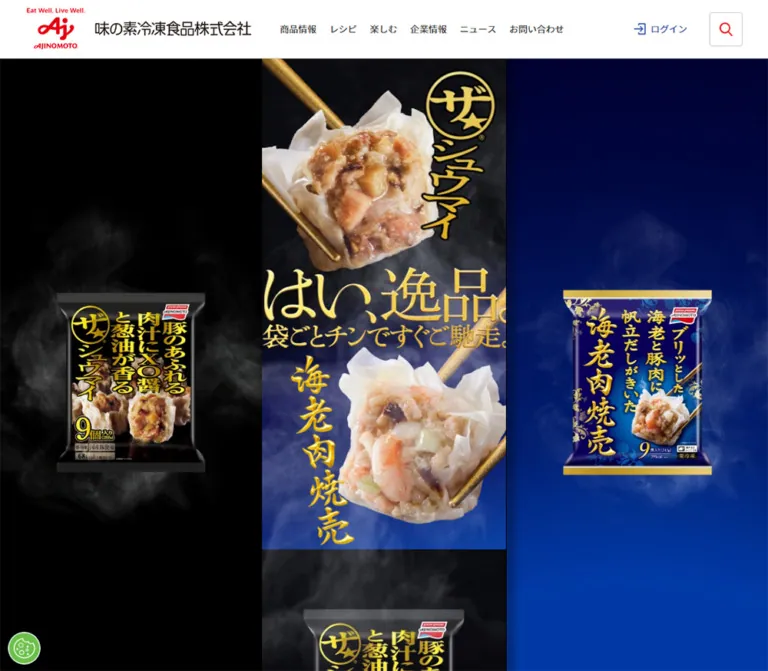
The campaign gives food photography most of the visual work. Black surroundings isolate the product; gold chopsticks, gold product lettering, pale wrapper folds, and warm filling create the focal contrast. The mobile opening uses a close, deliberately cropped food photograph with a tall product lockup at the right. Large Japanese campaign lettering continues beneath the food. The desktop captures instead show a microwave against a nearly empty black field, with its door changing from closed to open across three frames.
The underlying campaign is unusually narrow on desktop: its measured content column is only 375px wide at a 1440px viewport. At the inspected mobile size, that column fills all 390px. The corporate shell follows a separate system: a full-width white header, a red footer with shop and social links, and ordinary sans-serif utility text. A bottom-anchored cookie notice remains prominent in every supplied capture.
閉じる
Ajinomoto Frozen Foods / はい、逸品。 — Style Reference
A dark food showcase with gold lettering, a theatrical microwave presentation, and a compact corporate frame.
Original URL: ffa.ajinomoto.com/products/shumai_ippin
Final URL: ffa.ajinomoto.com/products/shumai-ippin/
Theme: dark campaign imagery, white corporate header, red corporate footer, and a white consent panel. No theme selector was observed.
Inspected: supplied capture batch retrieved October 1, 2026, at 17:26:28.513 UTC — October 2, 2026, at 02:26:28.513 JST. Individual frame timestamps were not supplied.
Viewports: 1440 × 1000 and 390 × 844 CSS pixels.
Scope: the current product feature within the Ajinomoto Frozen Foods website: desktop microwave presentation, mobile campaign opening, measured product-section structure, sharing links, corporate navigation/footer, and cookie notice.
The campaign gives food photography most of the visual work. Black surroundings isolate the product; gold chopsticks, gold product lettering, pale wrapper folds, and warm filling create the focal contrast. The mobile opening uses a close, deliberately cropped food photograph with a tall product lockup at the right. Large Japanese campaign lettering continues beneath the food. The desktop captures instead show a microwave against a nearly empty black field, with its door changing from closed to open across three frames.
The underlying campaign is unusually narrow on desktop: its measured content column is only 375px wide at a 1440px viewport. At the inspected mobile size, that column fills all 390px. The corporate shell follows a separate system: a full-width white header, a red footer with shop and social links, and ordinary sans-serif utility text. A bottom-anchored cookie notice remains prominent in every supplied capture.
How to Read This Reference
- Measured values come from the supplied rendered element rectangles or computed styles. They are CSS-pixel measurements unless stated otherwise.
- Calculated values are arithmetic relationships between those measurements, such as the 1.04× campaign scaling between 375px and 390px.
- Visual estimates describe the original-page screenshots. Approximate colors and photographic dimensions were not established by pixel sampling.
- Recommendations are implementation choices for reuse. Breakpoints, fallback behavior, accessible enhancements, and the Quick Start are not recovered source code.
- Desktop screenshots show the microwave presentation while the DOM describes the document beneath it. Element existence and geometry do not prove that those elements were visible through the presentation.
- The mobile opening and footer are visually documented. Much of the intervening campaign is represented only by DOM geometry and link destinations.
- Token names below are descriptive aliases. The only supplied source custom property was
--vh.
Tokens — Colors
Core Palette
| Name | Value | Suggested token | Evidence and role |
|---|---|---|---|
| Stage Black | Approximately #000000 |
--stage |
Visual estimate from the microwave surroundings and dark mobile campaign artwork |
| Corporate Red | #d6000f |
--brand-red |
Measured mobile menu background and breadcrumb link color; the footer visually belongs to the same red family, but its background value was not included in the computed sample |
| Artwork Gold | Approximately #d8bc62 |
--art-gold |
Recommended representative swatch for the photographed chopsticks and campaign lettering; the actual artwork contains many gold tones |
| Surface White | #ffffff |
--surface |
Measured body/header background, shop tiles, and consent settings button background |
| Interface Ink | #333333 |
--ink |
Measured corporate interface text |
| Consent Gray | #8a8a8a |
--consent-text |
Measured cookie heading color; surrounding notice copy appears in the same gray family |
| Consent Action Red | #ee1c26 |
--consent-action |
Measured OK button background |
| Consent Link Blue | #3860be |
--consent-link |
Measured settings control and inline terms link |
| Close-Control Gray | #555555 |
--close-ink |
Measured close-button color |
Color Roles
Keep three color systems distinct. The campaign uses black, food colors, metallic highlights, and gold artwork. The corporate shell uses white, dark gray, and brand red. The consent interface introduces a brighter action red and blue utility links.
Gold is primarily part of the artwork. A flat gold CSS fill can support a new implementation, but it cannot reproduce the varying highlights and texture of the source lettering. Likewise, the microwave's silver edges and warm internal light are photographic details, not a general interface gradient system.
The brighter #ee1c26 consent button should not silently replace #d6000f across the corporate shell. Their measured values differ.
Tokens — Typography
Interface Sans Serif
- Computed family:
'Noto Sans CJK JP', sans-serif. - Observed roles: corporate navigation, utility links, footer text, cookie heading, and cookie controls.
- Weights: 400 for ordinary navigation and footer text, 500 for desktop utility links, and 600–700 for consent emphasis.
- Verification limit: the computed family stack is known; font-file URLs and successful loading of a specific font file were not supplied.
The root is measured at 10px, and the body inherits 10px with a 13.5px line height. Visible components commonly override that size. Do not use 10px as the general reading size in a new implementation simply because it appears on the body.
Partner Label Serif
The descriptive text inside the second official-shop tile uses 'Noto Serif JP', serif, measured at 11px, weight 600, with a 15px line height. This is a localized partner treatment. It does not establish the font used for campaign lettering.
Artwork Lettering
The product lockup and large はい、逸品。 lettering have a designed, graphic appearance. Campaign heading elements return empty extracted text, despite occupying substantial rectangles. Their inherited sans-serif properties do not identify the typeface visible in the artwork.
Preserve authorized lettering assets when available. No display-font name can be reliably assigned from this evidence. The extraction does not establish whether each graphic is an image, background image, or another rendering method.
Type Scale
| Role | Measured size | Weight | Line height | Notes |
|---|---|---|---|---|
| Root/body baseline | 10px | 400 | 11.5px root; 13.5px body | Source baseline, not the visible campaign headline size |
| Desktop primary navigation | 16px | 400 | 21.6px | Labels such as 商品・レシピ |
| Desktop utility navigation | 12px | 500 | 16.2px | News, sustainability, recruitment, contact |
| Footer legal and account-list links | 12px | 400 | 16.2px | White on the footer's red field |
| First shop-tile caption | 11px | 400 | 14px | Sans serif |
| Second shop-tile caption | 11px | 600 | 15px | Serif stack |
| Cookie heading | 19.2px | 600 | 24.96px | Same computed size at both viewports |
| Cookie terms link | 13.008px | 700 | 19.512px | Measured inline link; nearby body copy is visually about this size |
| Cookie action labels | 13.008px | 600 | 15.6096px | Tracking: 0.13008px, approximately 0.01em |
| Campaign nodes, desktop | 16.6884px | 400 | 16.6884px | Inherited value on nodes with empty extracted text |
| Campaign nodes, mobile | 12.1875px | 400 | 12.1875px | Does not imply that the visible artwork lettering becomes smaller |
The cookie heading wraps into two lines on mobile while retaining its desktop font size. Its visual prominence comes from wrapping and panel geometry, not a larger mobile type token.
Tokens — Spacing & Shapes
Responsive Unit
The campaign has two documented width behaviors:
- Desktop: 375px wide, centered at
x = 532.5in a 1440px viewport. - Mobile: 390px wide, starting at
x = 0in a 390px viewport.
Most campaign asset dimensions scale by 390 / 375 = 1.04. For reuse, define a campaign unit equal to 1px on desktop and 100vw / 375 on narrow screens. This is a reconstruction of the measured relationship, not the recovered original CSS formula.
A universal max-width: 375px would fail to reproduce the inspected phone layout: it would leave margins where the original fills 390px.
The source custom property --vh is 10px on desktop and 8.44px on mobile, exactly 1% of each inspected viewport height. The elements that consume it were not supplied.
Spacing Scale
| Use | Desktop | Mobile | Evidence |
|---|---|---|---|
| Corporate logo left inset | 120px | 16px | Measured positions; desktop inset is consistent with a centered 1200px shell |
| Campaign copy/CTA side inset | 57.5px | Approximately 59.8px | Calculated from column and content widths |
| Product heading side inset | 63px | Approximately 65.5px | Calculated from the 249px heading width |
| First product-section top padding | 90px | 93.6px | Measured computed padding |
| Second product-section top padding | 87px | 90.48px | Measured computed padding |
| Gap after section top padding to heading | 30px | Approximately 30px | Calculated from rectangles; this gap does not show the same 1.04× scaling |
| Heading-to-copy gap | 20px | Approximately 20.8px | Calculated |
| Copy-to-first-link gap | 20px | Approximately 20.8px | Calculated |
| Gap between first section's links | 10px | Approximately 10.4px | Calculated |
| Campaign share-link gap | 30px | Approximately 31.2px | Calculated |
| Share-link bottom to footer start | 120px | Approximately 124.8px | Calculated |
| Official-shop tile gap | 13px | 13px | Calculated; the tiles themselves retain their size |
| Cookie content left inset | 32px | 20px | Measured child positions |
Border Radius
| Element | Value | Evidence |
|---|---|---|
| Campaign section and link containers | 0 | Measured; this does not establish the silhouette of artwork inside them |
| Official-shop tiles | 10px | Measured |
| Cookie buttons | 2px | Measured |
| Cookie panel | Square outer corners | Visual observation |
| Back-to-top control | Circular appearance in a 55px square | Circle is visible in the graphic; the anchor itself reports zero radius |
Layout Measurements
| Element | 1440 × 1000 | 390 × 844 |
|---|---|---|
| Document height | 4219.27px | 4619.98px |
| Corporate header | 1440 × 101px | 390 × 61px |
| Brand link | 291.19 × 56px | 218.39 × 42px |
| Campaign column | 375px, centered | 390px, full width |
| Opening campaign allocation | 753px | Approximately 783.11px |
| First product section | 375 × 850px | 390 × 884px |
| Second product section | 375 × 755px | 390 × 785.19px |
| Product copy graphic container | 260 × 191px | 270.39 × 198.63px |
| Product link | 260 × 56px | 270.39 × 58.23px |
| Campaign share link | 60 × 60px | 62.39 × 62.39px |
| Official-shop tile | 160 × 80px | 160 × 80px |
| Footer, including breadcrumb/copyright regions | 511.27px high | 807.75px high |
| Copyright region | 100px high | 100px high |
Cookie OK button |
125 × 41.61px | 350 × 41.61px |
| Cookie settings button | 125 × 39.61px | 350 × 39.61px |
| Cookie close target | 44 × 44px | 44 × 44px |
The opening campaign allocation is calculated from the header bottom to the first product-section start. It is not a directly supplied hero-container measurement.
Components
Corporate Header
Role: persistent brand identity and access to the wider corporate website.
The measured desktop header is 101px high. Its brand link begins at x = 120, with a 291.19 × 56px identity graphic centered vertically within the 100px content area. Navigation occupies the right side in two levels: small utility links above and larger primary navigation below. Primary labels include 商品・レシピ, 知る・楽しむ, and 企業情報.
On mobile, the header becomes 61px high. The brand link sits at (16, 9) and measures 218.39 × 42px. Two 60 × 60px slots occupy the right: search at x = 270 and a red menu tile at x = 330. The search icon is a fine red outline; the menu uses three white horizontal strokes. A small cyan curve is visible along the lower edge of the menu area, but its underlying asset or decorative rule is not established.
The header remains at the top in both supplied mobile scroll positions. This supports persistent mobile placement; the exact fixed-versus-sticky implementation was not included. The desktop header is measurable in the DOM but covered in the supplied microwave frames.
Search and menu opening behavior were not exercised. Their # destinations alone do not establish how the controls function.
Microwave Presentation
Role: a visual preparation scene placing the product package inside a microwave.
The desktop composition is almost entirely black. A realistically rendered dark appliance sits near the center, with silver edges, a right-hand control panel, a bright display, and a package visible inside. The closed appliance is approximately 790px wide and 467px high in the supplied frame. With the door lowered, its visible footprint widens to roughly 825px. These are screenshot estimates.
Three frames document a closed door, an intermediate opening state, and an open door. Warm internal light contrasts with the dark chassis. The large surrounding black area is essential: the appliance reads as a staged object, not as a product card inside a boxed layout.
The document contains a page-scoped .loading rule with z-index: 6000000. This is consistent with a foreground introductory layer, but its exact relationship to the captured scene and its completion behavior are not established. The package, appliance, and lighting should be supplied media in a faithful implementation; ordinary CSS boxes cannot reproduce them.
The evidence does not establish playback duration, audio, file format, frame rate, replay behavior, or whether scrolling affects the sequence.
Mobile Campaign Opening
Role: immediate product recognition through a large food image and branded lettering.
Below the white header, the mobile artwork fills the viewport width. Gold chopsticks enter diagonally and hold a large shumai close to the viewer. Pale wrapper folds and warm filling stand out against a black, softly smoky background. The product lockup runs down the right side, and the large はい、逸品。 lettering begins below the food.
The first heading/lockup box is measured at 151 × 282px on desktop, positioned 220px from the campaign column's left edge and 5px below its start. At 390px wide it becomes approximately 157.03 × 293.25px. A second heading box begins 444px below the campaign start on desktop and measures 133 × 310px; its mobile equivalent is approximately 138.31 × 322.38px.
These are artwork-container proportions, not live-text sizing instructions. The lower mobile opening is covered by the cookie panel, so the supplied screenshot does not expose the complete composition.
Product Sections
Role: two sequential product explanations with links to more information.
Both sections stay inside the same portrait campaign column. The first is 850px high on desktop; the second is 755px. Their measured anatomy is consistent:
- Substantial top padding: 90px for the first section, 87px for the second.
- A further 30px before a centered heading/artwork box.
- A centered 260 × 191px copy container, separated from the heading by 20px.
- One or more centered 260 × 56px links, beginning 20px below the copy.
The first heading box is 249 × 301px. The second is 249 × 312px. The first section contains two links separated by 10px; the second contains one.
| Position | Observed destination | Supported interpretation |
|---|---|---|
| First section, first link | /products/detail/id/240 |
Product-detail destination |
| First section, second link | /the/shaomai/ |
Related shumai feature destination |
| Second section | /products/detail/id/381 |
Second product-detail destination |
The extracted heading, copy, and link text is empty. Their dimensions and destinations are known, but exact artwork, wording, button outlines, and hover appearance are not visually established in the supplied product-section evidence.
Additional document space/content lies between the second section and the campaign share row. Its visual composition is not documented sufficiently to characterize it.
Campaign Share Row
Role: sharing the product feature itself.
Three square link regions point to Twitter/X sharing, Facebook sharing, and LINE sharing. On desktop they measure 60 × 60px and begin at x = 600, 690, and 780, producing 30px gaps. On mobile they scale to about 62.39px with 31.2px gaps.
Their measured transitions specifically target opacity over 0.3 seconds. Icon artwork and hover opacity endpoints were not supplied. Keep this row distinct from the corporate account links in the footer: the two groups have different destinations and purposes.
Breadcrumb Strip and Back-to-Top Control
A 50px allocation separates the campaign from the footer's main red region. Its breadcrumb includes ホーム, 商品情報, and the current feature title. Linked breadcrumb text uses measured corporate red at 12px.
A white circular back-to-top graphic overlaps the transition into the red footer. Its anchor measures 55 × 55px; on mobile it begins at x = 315. The destination declares a smooth scroll to the document top. No click result was supplied, so the declared behavior is stronger evidence than any assumed animation timing.
Official-Shop Tiles
Role: links to the company's external commerce destinations.
The footer contains two white tiles, each exactly 160 × 80px with 10px corner radii and a 13px gap. They retain these dimensions across both inspected viewports. At 390px, the combined 333px group is centered at x = 28.5.
Each tile stacks a small descriptive caption above a partner mark. The first links to the official Rakuten store and uses sans-serif caption text. The second links to the あえて、 destination and uses the measured serif caption stack. Internal vertical spacing is compact, with a computed 3.5px gap.
The tiles are a localized rounded treatment. They do not establish a general rounded-card system for campaign content.
Corporate Footer
Role: commerce, official social accounts, editorial content, and legal navigation.
The mobile footer is a saturated red field with white section labels and thin horizontal rules flanking the headings. The visible sequence is official shops, official social accounts, and an account-list link. The DOM also records an official web-magazine link and legal links farther down.
The social row uses recognizable white X, Instagram, Facebook, and YouTube marks. Measured inline link widths are 46px, 47px, 50px, and 103px, with 20px horizontal gaps. Their reported 15px inline rectangle heights are not the visible image heights: the marks visibly extend beyond those line boxes. The artwork appears approximately 40–50px tall. Preserve the wider YouTube mark rather than forcing every brand into an equal square.
On desktop, the commerce, social, and magazine groups occupy separate horizontal regions within an approximately 1200px shell. On mobile, they stack. The main footer region grows from 361.27px to 657.75px high. A separate white copyright region remains 100px high at both sizes.
Cookie Notice
Role: site-level consent information and access to cookie settings.
The notice is a white, square-cornered panel with a thin dark perimeter. It remains bottom anchored in all supplied screenshots and sits visibly above both the microwave scene and ordinary page content. No glass effect or soft card shadow is visible.
On desktop, the panel begins around y = 877 and occupies about 123px, or 12% of the viewport. Copy sits on the left, settings and OK appear side by side toward the right, and a 44px close target sits near the far edge. The settings control is blue and underlined; the OK control is a bright red rectangle.
On mobile, the panel begins around y = 498 and occupies about 346px, or 41% of the viewport. A close target appears at the upper right, followed by the two-line heading, explanatory copy, a centered settings control, and a full-width red OK button. Both action regions are 350px wide within 20px side insets.
The measured heading remains 19.2px at both sizes. The OK button is only about 41.61px high; a 44px minimum is a recommended enhancement, not the observed size. Settings, acceptance, dismissal, persistence, and any subsequent settings dialog were not tested.
Tokens — Motion & Interaction
| Treatment | Evidence | What can be concluded |
|---|---|---|
| Microwave door movement | Three supplied desktop frames | The scene changes from closed to open; timing, trigger, rendering format, and completion are unknown |
| Corporate navigation links | Computed 0.2s transition |
Short transition declared; affected visual property and hover result are not established |
| Mobile menu control | transform 0.3s, opacity 0.3s |
Transform/opacity transitions declared; expanded menu not inspected |
| Product links | Computed 0.3s transition |
Short transition declared; endpoint styling unknown |
| Campaign sharing links | opacity 0.3s cubic-bezier(0.215, 0.61, 0.355, 1) |
Explicit opacity transition with measured easing |
| Shop tiles | Computed 0.2s transition |
Transition declared; resulting state not captured |
| Other footer links | Computed 0.3s transition |
Transition declared; resulting state not captured |
| Back to top | Destination requests behavior: 'smooth' |
Smooth upward scrolling is declared; no observed duration |
| Cookie controls | Sampled animation none; no meaningful duration supplied |
No animated response can be claimed |
The sampled elements mostly report animation: none. This does not contradict the changing microwave frames: video, image sequences, canvas rendering, descendants, or JavaScript-driven changes may not appear as CSS animations on the sampled nodes.
The capture process waited for document loading and sampled stability, but those checks do not establish semantic completion. Do not describe the microwave as a verified scroll-scrubbed sequence, assign it a five-second duration, or assume that the mobile version omits it permanently.
For a new implementation, use the measured 200–300ms timings for small interface feedback. Specify the appliance sequence independently once the actual media and intended interaction are available.
Surfaces
| Layer | Appearance | Purpose |
|---|---|---|
| Microwave presentation | Nearly black full-screen field | Isolates the appliance and preparation scene |
| Campaign artwork | Dark photography with gold lettering and food highlights | Product appeal and recognition |
| Corporate header | White, compact, red brand/control accents | Site identity and navigation |
| Breadcrumb strip | White with small red links | Connection to the wider product hierarchy |
| Corporate footer | Saturated red with white labels and marks | Commerce and corporate destinations |
| Shop tiles | White, 10px rounded corners | Separates external shop brands from the red footer |
| Cookie notice | White with a fine dark perimeter | Persistent consent information |
| Copyright strip | White, 100px high | Legal closure |
Depth primarily comes from photography. Interface separation uses solid fields, borders, whitespace, and a few local rounded shapes. The evidence does not support a general drop-shadow elevation system.
Imagery
The campaign relies on realistic food and appliance imagery. The mobile food photograph emphasizes moist filling, pale folds of wrapper, diagonal gold chopsticks, and steam against darkness. The crop is close enough that the product feels larger than the interface surrounding it. The gold lockup supplies vertical rhythm while the larger campaign phrase broadens the composition below.
The desktop appliance scene uses realistic metallic edges and a restrained highlight range. The closed door partially obscures the package behind its mesh; the open-door frame reveals the package more directly. This is a sequence of changing visibility and preparation, not evidence of a rotating product carousel.
Corporate and partner identities remain clean and graphic. Their white/red presentation is visually separate from the food's texture. Use authorized source artwork when available. Do not substitute a generic font, stock dumpling photograph, or CSS microwave and treat it as an exact reproduction.
Observed Asset References
No direct image, video, sprite, or font-file URLs were included in the supplied evidence. The following inventory identifies observed assets without inventing file paths.
| Asset | Evidence | Known placement | Asset-path status |
|---|---|---|---|
| Microwave and package sequence | Desktop captures 1–3 | Center of black presentation | Not supplied |
| Close-up shumai and gold chopsticks | Mobile opening capture | Full-width campaign opening | Not supplied |
| Gold product lockup and campaign lettering | Mobile opening and heading rectangles | Positioned within portrait artwork | Not supplied |
| Corporate identity graphic | Mobile captures and brand-link rectangles | Header left | Not supplied |
Rakuten and あえて、 marks |
Mobile footer capture | White shop tiles | Not supplied |
| X, Instagram, Facebook, YouTube marks | Mobile footer capture | White marks on red | Not supplied |
| Product heading/copy/link graphics | Empty-text elements with measured rectangles | Two product sections | Rendering method and paths not supplied |
| Back-to-top circle and arrow | Mobile footer capture | Upper-right footer boundary | Not supplied |
The product-detail and shop URLs are navigation destinations, not media-asset references.
Layout & Responsive Behavior
The campaign and corporate shell respond differently. The campaign retains a portrait composition on desktop, while the shell spreads across the available width. At 1440px, the campaign's 375px width occupies only about 26% of the viewport. Its centered origin is exact: (1440 − 375) / 2 = 532.5px.
At 390px, the campaign fills the screen and scales most measured content dimensions by 1.04. A 260 × 56px link becomes approximately 270.39 × 58.23px; an 850px section becomes 884px high. The first section's 30px gap after its top padding remains approximately constant, so the entire page should not be treated as one uniformly scaled bitmap.
The header changes from a 101px desktop arrangement with text navigation to a 61px mobile arrangement with search and menu slots. The footer changes from horizontally distributed groups to a vertical sequence, while retaining the two 160px shop tiles side by side. This shell reflow accounts for much of the taller mobile document.
The cookie notice changes more dramatically than its typography. Its desktop horizontal arrangement becomes a vertical mobile stack, and its viewport coverage grows from about 12% to about 41%. The visible content area must be assessed with this panel present; the mobile opening screenshot exposes only about 437px between the header bottom and notice top.
Only two viewport sizes are documented. Exact media-query thresholds, tablet behavior, orientation changes, browser zoom, and safe-area handling are unknown. The Quick Start uses explicit recommended breakpoints to reproduce the observed endpoints; those breakpoints are not source findings.
Do’s and Don’ts
Do
- Preserve the narrow 375px desktop campaign and the full-width 390px mobile composition.
- Let realistic food photography, gold lettering, and the dark background carry the product identity.
- Keep the white corporate header and red corporate footer visually distinct from the campaign.
- Preserve the 1.04× relationship of most campaign dimensions at the inspected phone width.
- Keep official-shop tiles at their measured compact proportions where space permits.
- Separate campaign sharing destinations from official corporate social accounts.
- Treat the cookie panel as a responsive site utility with its own typography and colors.
- Record media timing and interaction triggers separately when they become available.
Don’t
- Don’t stretch the portrait campaign artwork across a wide desktop viewport.
- Don’t apply a universal 375px maximum that introduces margins at the inspected 390px phone width.
- Don’t infer the gold lettering's font from the inherited sans-serif properties of empty-text headings.
- Don’t invent product-section button artwork or unseen desktop surrounding content.
- Don’t replace photographic highlights with a general interface gradient or shadow system.
- Don’t assume that three changing microwave frames prove scroll synchronization or a particular playback duration.
- Don’t treat inline social-link line boxes as the actual height of their visible brand marks.
- Don’t assume that cookie dismissal, menu expansion, or sharing outcomes were verified.
Recommended Implementation Additions
These are recommendations for a new implementation, not verified original features:
- Provide real semantic headings and meaningful alternatives for campaign copy embedded in artwork. Empty extracted text alone does not prove missing accessible names; inspect
alt,aria-label, and the accessibility tree before drawing that conclusion. - Give image-based product links explicit accessible names identifying their destination and product.
- Make search, menu, close, and back-to-top controls keyboard operable with visible focus treatment.
- Use at least 44px touch targets for consent actions. Preserve the observed proportions where possible while allowing extra height.
- Consider a darker notice-copy color, such as
#595959, for improved small-text readability on white. This is an accessibility adjustment to the observed gray. - Provide a static media poster and an explicit way to bypass an introductory sequence. Keep the content reachable if media fails to initialize.
- Honor reduced-motion preferences in the actual media controller; CSS alone cannot reliably pause video or JavaScript animation.
- Allow the consent panel to scroll internally on short screens and account for bottom safe-area insets.
- Test focus visibility and target visibility when the persistent header and consent panel occupy the same small viewport.
- Load only the media needed for the current experience, reserve its geometry, and defer lower-page assets where appropriate. No original loading strategy was established.
Agent Prompt Guide
Quick Color Reference
- Campaign stage: approximately
#000000. - Campaign gold: use original artwork;
#d8bc62is only a representative implementation swatch. - Corporate red: measured
#d6000f; footer reuse is a visual approximation. - Corporate surfaces:
#ffffff; ordinary interface text:#333333. - Consent heading: measured
#8a8a8a. - Consent action: measured
#ee1c26with white text. - Consent links: measured
#3860be, visibly underlined.
Overall Prompt
“Create a Japanese frozen-food product feature within a corporate website. Use a narrow 375px centered campaign column on desktop and a full-width composition on a 390px phone. Build the campaign identity around realistic shumai photography, pale wrapper folds, warm filling, diagonal gold chopsticks, dark steam, and supplied gold product lettering. Frame it with a white corporate header and a red footer containing two compact white shop tiles and official social marks. Include a separately controlled black microwave presentation using supplied media. Reproduce the documented product-section proportions and distinguish them from unverified artwork details. Use a responsive white cookie notice with blue settings text and a brighter red confirmation button.”
Example Component Prompts
- Campaign opening: “A full-width mobile food composition below a 61px white header. Show a large shumai held by gold chopsticks against a dark smoky background. Place supplied vertical gold product lettering on the right and preserve the original artwork's cropping. Keep all display lettering as authorized graphic assets.”
- Product section: “Inside a 375px campaign column, use 90px top padding, a further 30px gap, a centered 249px-wide heading graphic, a 260 × 191px copy graphic, and 260 × 56px destination links. Use 20px content gaps and 10px between consecutive links. Scale most dimensions by 1.04 at 390px.”
- Corporate footer: “A saturated red footer with centered white section labels flanked by thin rules. Keep two white 160 × 80px shop tiles side by side with 10px radii and a 13px gap. Follow with white official social marks, preserving the wider YouTube logo. Stack footer groups on mobile.”
- Cookie notice: “A white bottom panel with a thin dark border, square outer corners, a 19.2px semibold gray heading, compact gray explanatory copy, underlined blue settings text, and a bright red confirmation button. Use horizontal actions on desktop and full-width stacked actions on mobile. Add accessible names and a visible close target.”
- Microwave presentation: “Use supplied photographic media to place a dark microwave near the center of a black viewport. Preserve silver edges, a bright display, the package inside, and warm interior lighting. Support closed and open-door states without inventing a scroll trigger or duration. Provide a static fallback and a bypass control.”
Quick Start
CSS Custom Properties
This CSS is an implementation adaptation, not recovered source code. It preserves the measured campaign relationships without changing the host project's root font size. Apply .story-column to the campaign wrapper; use supplied artwork inside .campaign-hero, .product-title-art, .product-copy-art, and .product-link.
The 768px campaign breakpoint, 1200px corporate-shell breakpoint, sticky desktop header, 44px minimum action height, and hover opacity endpoint are recommendations. Natural content height replaces rigid screenshot-height assumptions for the consent panel. Footer red reuses the measured corporate red as a visual approximation.
An optional .opening-scene should start with the hidden attribute until its controller is ready. Media playback, consent state, expanded navigation, and working control handlers require separate implementation.
:root {
  /* Measured interface colors; stage and gold are visual approximations. */
  --stage: #000000;
  --brand-red: #d6000f;
  --art-gold: #d8bc62;
  --surface: #ffffff;
  --ink: #333333;
  --consent-text: #8a8a8a;
  --consent-action: #ee1c26;
  --consent-link: #3860be;
  --close-ink: #555555;

  --font-ui: 'Noto Sans CJK JP', sans-serif;
  --font-partner: 'Noto Serif JP', serif;
  --text-nav: 16px;
  --text-utility: 12px;
  --text-consent: 13.008px;
  --text-consent-title: 19.2px;

  /* Reconstruction of the two measured campaign widths. */
  --story-width: 100%;
  --story-unit: calc(100vw / 375);
  --space-copy: calc(20 * var(--story-unit));
  --space-links: calc(10 * var(--story-unit));
  --copy-width: calc(260 * var(--story-unit));
  --product-link-height: calc(56 * var(--story-unit));

  --radius-store: 10px;
  --radius-consent: 2px;
  --motion-ui: 200ms;
  --motion-share: 300ms cubic-bezier(0.215, 0.61, 0.355, 1);
  --safe-bottom: env(safe-area-inset-bottom, 0px);
}

* {
  box-sizing: border-box;
}

body {
  margin: 0;
  color: var(--ink);
  background: var(--surface);
  font-family: var(--font-ui);
}

button,
input {
  font: inherit;
}

.site-header {
  position: sticky;
  top: 0;
  z-index: 20;
  border-bottom: 1px solid #eeeeee;
  background: var(--surface);
}

.header-inner {
  display: grid;
  grid-template-columns: minmax(0, 1fr) 60px 60px;
  align-items: center;
  min-height: 60px;
  max-width: 1200px;
  margin-inline: auto;
  padding-left: 16px;
}

.brand img {
  display: block;
  width: min(218.39px, 100%);
  height: auto;
}

.header-search,
.header-menu {
  display: grid;
  place-items: center;
  width: 60px;
  height: 60px;
  border: 0;
}

.header-search {
  color: var(--brand-red);
  background: var(--surface);
}

.header-menu {
  color: var(--surface);
  background: var(--brand-red);
}

.desktop-nav {
  display: none;
}

.story-stage {
  color: var(--surface);
  background: var(--stage);
}

.story-column {
  width: var(--story-width);
  margin-inline: auto;
}

.campaign-hero {
  position: relative;
  min-height: calc(753 * var(--story-unit));
}

.hero-art {
  display: block;
  width: 100%;
  height: auto;
}

.hero-lockup {
  position: absolute;
  display: block;
  height: auto;
}

.hero-lockup--first {
  top: calc(5 * var(--story-unit));
  left: calc(220 * var(--story-unit));
  width: calc(151 * var(--story-unit));
}

.hero-lockup--second {
  top: calc(444 * var(--story-unit));
  left: calc(26 * var(--story-unit));
  width: calc(133 * var(--story-unit));
}

.product-section {
  min-height: calc(850 * var(--story-unit));
  padding-top: calc(90 * var(--story-unit));
}

.product-section--second {
  min-height: calc(755 * var(--story-unit));
  padding-top: calc(87 * var(--story-unit));
}

.product-title-art {
  display: block;
  width: calc(249 * var(--story-unit));
  height: auto;
  margin: 30px auto 0;
}

.product-copy-art {
  display: block;
  width: var(--copy-width);
  height: auto;
  margin: var(--space-copy) auto 0;
}

.product-links {
  display: grid;
  gap: var(--space-links);
  width: var(--copy-width);
  margin: var(--space-copy) auto 0;
}

.product-link {
  display: grid;
  place-items: center;
  min-height: var(--product-link-height);
  color: inherit;
  text-decoration: none;
  transition: opacity 300ms;
}

.product-link img {
  display: block;
  width: 100%;
  height: auto;
}

.campaign-share {
  display: flex;
  justify-content: center;
  gap: calc(30 * var(--story-unit));
  padding-bottom: calc(120 * var(--story-unit));
}

.campaign-share a {
  display: grid;
  place-items: center;
  width: calc(60 * var(--story-unit));
  height: calc(60 * var(--story-unit));
  color: inherit;
  transition: opacity var(--motion-share);
}

.breadcrumbs {
  display: flex;
  align-items: center;
  min-height: 50px;
  padding-inline: 24px;
  background: var(--surface);
  font-size: var(--text-utility);
}

.breadcrumbs a {
  color: var(--brand-red);
}

.footer-main {
  position: relative;
  padding: 62px 30px 30px;
  color: var(--surface);
  background: var(--brand-red);
}

.footer-groups {
  display: grid;
  gap: 40px;
  max-width: 1200px;
  margin-inline: auto;
}

.footer-section-title {
  display: flex;
  align-items: center;
  justify-content: center;
  gap: 28px;
  margin: 0 0 32px;
  font-size: 14px;
  font-weight: 700;
}

.footer-section-title::before,
.footer-section-title::after {
  content: '';
  flex: 1;
  border-top: 1px solid currentColor;
  opacity: 0.5;
}

.store-tiles {
  display: grid;
  grid-template-columns: repeat(2, minmax(0, 160px));
  justify-content: center;
  gap: 13px;
}

.store-tile {
  display: flex;
  flex-direction: column;
  align-items: center;
  justify-content: center;
  gap: 3.5px;
  min-width: 0;
  height: 80px;
  border-radius: var(--radius-store);
  color: var(--ink);
  background: var(--surface);
  font-size: 11px;
  line-height: 14px;
  text-align: center;
  text-decoration: none;
}

.store-tile--serif {
  font-family: var(--font-partner);
  font-weight: 600;
  line-height: 15px;
}

.social-icons {
  display: flex;
  align-items: center;
  justify-content: center;
  gap: 20px;
}

.social-icons a {
  display: grid;
  place-items: center;
  min-height: 50px;
  color: inherit;
}

.social-icons img {
  display: block;
  max-height: 50px;
  max-width: 100%;
  width: auto;
}

.back-to-top {
  position: absolute;
  top: -13px;
  right: 20px;
  display: grid;
  place-items: center;
  width: 55px;
  height: 55px;
  border: 0;
  border-radius: 50%;
  color: var(--brand-red);
  background: var(--surface);
}

.copyright {
  display: grid;
  place-items: center;
  min-height: 100px;
  padding-inline: 30px;
  background: var(--surface);
  font-size: 10px;
}

.opening-scene {
  position: fixed;
  inset: 0;
  z-index: 30;
  display: grid;
  place-items: center;
  background: var(--stage);
}

.opening-scene[hidden] {
  display: none;
}

.opening-media {
  display: block;
  max-width: 100%;
  max-height: 100dvh;
  object-fit: contain;
}

.consent {
  position: fixed;
  inset: auto 0 0;
  z-index: 40;
  display: grid;
  grid-template-columns: minmax(0, 760px) minmax(0, 1fr) 44px;
  align-items: center;
  gap: 24px;
  max-height: 100dvh;
  overflow-y: auto;
  padding: 16px 9px calc(9px + var(--safe-bottom)) 31px;
  border: 1px solid var(--stage);
  color: var(--consent-text);
  background: var(--surface);
  font-size: var(--text-consent);
  line-height: 1.5;
}

.consent-title {
  margin: 0 0 4px;
  font-size: var(--text-consent-title);
  font-weight: 600;
  line-height: 1.3;
}

.consent-copy p {
  margin: 0;
}

.consent-copy a {
  color: var(--consent-link);
  font-weight: 700;
  text-decoration: underline;
}

.consent-actions {
  display: flex;
  justify-content: center;
  gap: 16.6px;
}

.consent-actions button {
  width: 125px;
  min-height: 44px;
  padding: 12px 10px;
  border: 0;
  border-radius: var(--radius-consent);
  font-size: var(--text-consent);
  font-weight: 600;
  line-height: 1.2;
  letter-spacing: 0.01em;
  cursor: pointer;
}

.consent-settings {
  color: var(--consent-link);
  background: var(--surface);
  text-decoration: underline;
}

.consent-accept {
  color: var(--surface);
  background: var(--consent-action);
}

.consent-close {
  display: grid;
  place-items: center;
  width: 44px;
  height: 44px;
  padding: 0;
  border: 0;
  color: var(--close-ink);
  background: transparent;
  cursor: pointer;
}

/* Recommended focus treatment. */
:where(a, button):focus-visible {
  outline: 3px solid currentColor;
  outline-offset: 3px;
}

/* Recommended hover endpoint; the source endpoint is unknown. */
@media (hover: hover) {
  .product-link:hover,
  .campaign-share a:hover {
    opacity: 0.8;
  }
}

/* Recommended campaign breakpoint. */
@media (min-width: 768px) {
  :root {
    --story-width: 375px;
    --story-unit: 1px;
  }
}

@media (max-width: 767px) {
  .consent {
    display: block;
    padding: 46px 19px calc(9px + var(--safe-bottom));
  }

  .consent-actions {
    display: grid;
    gap: 10px;
    margin-top: 10px;
  }

  .consent-actions button {
    width: 100%;
  }

  .consent-close {
    position: absolute;
    top: 5px;
    right: 1px;
  }
}

/* Recommended corporate-shell breakpoint. */
@media (min-width: 1200px) {
  .header-inner {
    grid-template-columns: 291.19px minmax(0, 1fr) 60px;
    min-height: 100px;
    padding-left: 0;
  }

  .brand img {
    width: 291.19px;
  }

  .desktop-nav {
    display: flex;
    flex-direction: column;
    align-items: flex-end;
    gap: 24px;
    padding-right: 30px;
  }

  .header-menu {
    display: none;
  }

  .footer-main {
    padding-top: 73px;
  }

  .footer-groups {
    grid-template-columns: repeat(3, minmax(0, 1fr));
    gap: 88px;
  }
}

/* Media controllers must independently honor reduced motion. */
@media (prefers-reduced-motion: reduce) {
  html {
    scroll-behavior: auto;
  }

  .product-link,
  .campaign-share a {
    transition: none;
  }
}
Tailwind v4 Token Mapping
Optional aliases for a project already using Tailwind v4. This is not evidence that the original site uses Tailwind. Define the custom properties above first.
@theme inline {
  --color-campaign: var(--stage);
  --color-corporate: var(--brand-red);
  --color-artwork-gold: var(--art-gold);
  --color-paper: var(--surface);
  --color-interface-ink: var(--ink);
  --color-cookie-action: var(--consent-action);
  --color-cookie-link: var(--consent-link);

  --font-sans: var(--font-ui);
  --font-partner-serif: var(--font-partner);

  --text-navigation: var(--text-nav);
  --text-utility: var(--text-utility);
  --text-cookie: var(--text-consent);
  --text-cookie-title: var(--text-consent-title);

  --spacing-story-unit: var(--story-unit);
  --spacing-product-copy: var(--copy-width);
  --spacing-product-action: var(--product-link-height);

  --radius-shop: var(--radius-store);
  --radius-cookie: var(--radius-consent);
}
Sources & Evidence
- Original requested URL: supplied as the entry point. It resolves to the hyphenated product-feature URL on the same website.
- Current final page: supplied final HTTP status 200, page title, rendered text, link destinations, element rectangles, and computed-style samples. This is the authority for the current-page measurements in this document.
- Capture batch: retrieved October 1, 2026, at 17:26:28.513 UTC / October 2, 2026, at 02:26:28.513 JST. The original-page evidence contains three 1440 × 1000 desktop frames and two 390 × 844 mobile frames, together with DOM snapshots for both viewport sizes.
- Identity: the visible corporate header identifies Ajinomoto Frozen Foods, and the captured footer contains
© AJINOMOTO FROZEN FOODS Co., Inc. All rights reserved. - Observed states: changing desktop microwave-door positions; mobile campaign opening; a mobile footer position with the header still visible; and an undismissed consent panel throughout the supplied screenshots.
- Capture limitations: the observation process waited at least five seconds initially and applied bounded readiness checks. It temporarily paused perpetual animations during those checks, then resumed them. These procedures do not prove that introductory media completed or that all delayed content appeared. SharedWorkers and service workers were disabled during inspection.
- Interaction limitations: no verified menu expansion, search execution, consent-setting dialog, acceptance persistence, product-link navigation result, share result, or back-to-top click was supplied. Motion timing, media URLs, intermediate responsive breakpoints, and much of the lower campaign artwork remain unverified.
This reference analyzes the supplied current-page evidence. No additional browsing, command execution, or asset inspection was performed. CSS adaptations and accessibility improvements are explicitly separate from source findings.
# Ajinomoto Frozen Foods / はい、逸品。 — Style Reference

> A dark food showcase with gold lettering, a theatrical microwave presentation, and a compact corporate frame.

**Original URL:** [ffa.ajinomoto.com/products/shumai_ippin](https://www.ffa.ajinomoto.com/products/shumai_ippin)
**Final URL:** [ffa.ajinomoto.com/products/shumai-ippin/](https://www.ffa.ajinomoto.com/products/shumai-ippin/)
**Theme:** dark campaign imagery, white corporate header, red corporate footer, and a white consent panel. No theme selector was observed.
**Inspected:** supplied capture batch retrieved October 1, 2026, at 17:26:28.513 UTC — October 2, 2026, at 02:26:28.513 JST. Individual frame timestamps were not supplied.
**Viewports:** 1440 × 1000 and 390 × 844 CSS pixels.
**Scope:** the current product feature within the Ajinomoto Frozen Foods website: desktop microwave presentation, mobile campaign opening, measured product-section structure, sharing links, corporate navigation/footer, and cookie notice.

The campaign gives food photography most of the visual work. Black surroundings isolate the product; gold chopsticks, gold product lettering, pale wrapper folds, and warm filling create the focal contrast. The mobile opening uses a close, deliberately cropped food photograph with a tall product lockup at the right. Large Japanese campaign lettering continues beneath the food. The desktop captures instead show a microwave against a nearly empty black field, with its door changing from closed to open across three frames.

The underlying campaign is unusually narrow on desktop: its measured content column is only 375px wide at a 1440px viewport. At the inspected mobile size, that column fills all 390px. The corporate shell follows a separate system: a full-width white header, a red footer with shop and social links, and ordinary sans-serif utility text. A bottom-anchored cookie notice remains prominent in every supplied capture.
閉じる
# Ajinomoto Frozen Foods / はい、逸品。 — Style Reference

> A dark food showcase with gold lettering, a theatrical microwave presentation, and a compact corporate frame.

**Original URL:** [ffa.ajinomoto.com/products/shumai_ippin](https://www.ffa.ajinomoto.com/products/shumai_ippin)
**Final URL:** [ffa.ajinomoto.com/products/shumai-ippin/](https://www.ffa.ajinomoto.com/products/shumai-ippin/)
**Theme:** dark campaign imagery, white corporate header, red corporate footer, and a white consent panel. No theme selector was observed.
**Inspected:** supplied capture batch retrieved October 1, 2026, at 17:26:28.513 UTC — October 2, 2026, at 02:26:28.513 JST. Individual frame timestamps were not supplied.
**Viewports:** 1440 × 1000 and 390 × 844 CSS pixels.
**Scope:** the current product feature within the Ajinomoto Frozen Foods website: desktop microwave presentation, mobile campaign opening, measured product-section structure, sharing links, corporate navigation/footer, and cookie notice.

The campaign gives food photography most of the visual work. Black surroundings isolate the product; gold chopsticks, gold product lettering, pale wrapper folds, and warm filling create the focal contrast. The mobile opening uses a close, deliberately cropped food photograph with a tall product lockup at the right. Large Japanese campaign lettering continues beneath the food. The desktop captures instead show a microwave against a nearly empty black field, with its door changing from closed to open across three frames.

The underlying campaign is unusually narrow on desktop: its measured content column is only 375px wide at a 1440px viewport. At the inspected mobile size, that column fills all 390px. The corporate shell follows a separate system: a full-width white header, a red footer with shop and social links, and ordinary sans-serif utility text. A bottom-anchored cookie notice remains prominent in every supplied capture.

## How to Read This Reference

- **Measured** values come from the supplied rendered element rectangles or computed styles. They are CSS-pixel measurements unless stated otherwise.
- **Calculated** values are arithmetic relationships between those measurements, such as the 1.04× campaign scaling between 375px and 390px.
- **Visual estimates** describe the original-page screenshots. Approximate colors and photographic dimensions were not established by pixel sampling.
- **Recommendations** are implementation choices for reuse. Breakpoints, fallback behavior, accessible enhancements, and the Quick Start are not recovered source code.
- Desktop screenshots show the microwave presentation while the DOM describes the document beneath it. Element existence and geometry do not prove that those elements were visible through the presentation.
- The mobile opening and footer are visually documented. Much of the intervening campaign is represented only by DOM geometry and link destinations.
- Token names below are descriptive aliases. The only supplied source custom property was `--vh`.

## Tokens — Colors

### Core Palette

| Name | Value | Suggested token | Evidence and role |
| --- | --- | --- | --- |
| Stage Black | Approximately `#000000` | `--stage` | Visual estimate from the microwave surroundings and dark mobile campaign artwork |
| Corporate Red | `#d6000f` | `--brand-red` | Measured mobile menu background and breadcrumb link color; the footer visually belongs to the same red family, but its background value was not included in the computed sample |
| Artwork Gold | Approximately `#d8bc62` | `--art-gold` | Recommended representative swatch for the photographed chopsticks and campaign lettering; the actual artwork contains many gold tones |
| Surface White | `#ffffff` | `--surface` | Measured body/header background, shop tiles, and consent settings button background |
| Interface Ink | `#333333` | `--ink` | Measured corporate interface text |
| Consent Gray | `#8a8a8a` | `--consent-text` | Measured cookie heading color; surrounding notice copy appears in the same gray family |
| Consent Action Red | `#ee1c26` | `--consent-action` | Measured `OK` button background |
| Consent Link Blue | `#3860be` | `--consent-link` | Measured settings control and inline terms link |
| Close-Control Gray | `#555555` | `--close-ink` | Measured close-button color |

### Color Roles

Keep three color systems distinct. The campaign uses black, food colors, metallic highlights, and gold artwork. The corporate shell uses white, dark gray, and brand red. The consent interface introduces a brighter action red and blue utility links.

Gold is primarily part of the artwork. A flat gold CSS fill can support a new implementation, but it cannot reproduce the varying highlights and texture of the source lettering. Likewise, the microwave's silver edges and warm internal light are photographic details, not a general interface gradient system.

The brighter `#ee1c26` consent button should not silently replace `#d6000f` across the corporate shell. Their measured values differ.

## Tokens — Typography

### Interface Sans Serif

- **Computed family:** `'Noto Sans CJK JP', sans-serif`.
- **Observed roles:** corporate navigation, utility links, footer text, cookie heading, and cookie controls.
- **Weights:** 400 for ordinary navigation and footer text, 500 for desktop utility links, and 600–700 for consent emphasis.
- **Verification limit:** the computed family stack is known; font-file URLs and successful loading of a specific font file were not supplied.

The root is measured at 10px, and the body inherits 10px with a 13.5px line height. Visible components commonly override that size. Do not use 10px as the general reading size in a new implementation simply because it appears on the body.

### Partner Label Serif

The descriptive text inside the second official-shop tile uses `'Noto Serif JP', serif`, measured at 11px, weight 600, with a 15px line height. This is a localized partner treatment. It does not establish the font used for campaign lettering.

### Artwork Lettering

The product lockup and large `はい、逸品。` lettering have a designed, graphic appearance. Campaign heading elements return empty extracted text, despite occupying substantial rectangles. Their inherited sans-serif properties do not identify the typeface visible in the artwork.

Preserve authorized lettering assets when available. No display-font name can be reliably assigned from this evidence. The extraction does not establish whether each graphic is an image, background image, or another rendering method.

### Type Scale

| Role | Measured size | Weight | Line height | Notes |
| --- | --- | --- | --- | --- |
| Root/body baseline | 10px | 400 | 11.5px root; 13.5px body | Source baseline, not the visible campaign headline size |
| Desktop primary navigation | 16px | 400 | 21.6px | Labels such as `商品・レシピ` |
| Desktop utility navigation | 12px | 500 | 16.2px | News, sustainability, recruitment, contact |
| Footer legal and account-list links | 12px | 400 | 16.2px | White on the footer's red field |
| First shop-tile caption | 11px | 400 | 14px | Sans serif |
| Second shop-tile caption | 11px | 600 | 15px | Serif stack |
| Cookie heading | 19.2px | 600 | 24.96px | Same computed size at both viewports |
| Cookie terms link | 13.008px | 700 | 19.512px | Measured inline link; nearby body copy is visually about this size |
| Cookie action labels | 13.008px | 600 | 15.6096px | Tracking: 0.13008px, approximately 0.01em |
| Campaign nodes, desktop | 16.6884px | 400 | 16.6884px | Inherited value on nodes with empty extracted text |
| Campaign nodes, mobile | 12.1875px | 400 | 12.1875px | Does not imply that the visible artwork lettering becomes smaller |

The cookie heading wraps into two lines on mobile while retaining its desktop font size. Its visual prominence comes from wrapping and panel geometry, not a larger mobile type token.

## Tokens — Spacing & Shapes

### Responsive Unit

The campaign has two documented width behaviors:

- **Desktop:** 375px wide, centered at `x = 532.5` in a 1440px viewport.
- **Mobile:** 390px wide, starting at `x = 0` in a 390px viewport.

Most campaign asset dimensions scale by `390 / 375 = 1.04`. For reuse, define a campaign unit equal to 1px on desktop and `100vw / 375` on narrow screens. This is a reconstruction of the measured relationship, not the recovered original CSS formula.

A universal `max-width: 375px` would fail to reproduce the inspected phone layout: it would leave margins where the original fills 390px.

The source custom property `--vh` is 10px on desktop and 8.44px on mobile, exactly 1% of each inspected viewport height. The elements that consume it were not supplied.

### Spacing Scale

| Use | Desktop | Mobile | Evidence |
| --- | --- | --- | --- |
| Corporate logo left inset | 120px | 16px | Measured positions; desktop inset is consistent with a centered 1200px shell |
| Campaign copy/CTA side inset | 57.5px | Approximately 59.8px | Calculated from column and content widths |
| Product heading side inset | 63px | Approximately 65.5px | Calculated from the 249px heading width |
| First product-section top padding | 90px | 93.6px | Measured computed padding |
| Second product-section top padding | 87px | 90.48px | Measured computed padding |
| Gap after section top padding to heading | 30px | Approximately 30px | Calculated from rectangles; this gap does not show the same 1.04× scaling |
| Heading-to-copy gap | 20px | Approximately 20.8px | Calculated |
| Copy-to-first-link gap | 20px | Approximately 20.8px | Calculated |
| Gap between first section's links | 10px | Approximately 10.4px | Calculated |
| Campaign share-link gap | 30px | Approximately 31.2px | Calculated |
| Share-link bottom to footer start | 120px | Approximately 124.8px | Calculated |
| Official-shop tile gap | 13px | 13px | Calculated; the tiles themselves retain their size |
| Cookie content left inset | 32px | 20px | Measured child positions |

### Border Radius

| Element | Value | Evidence |
| --- | --- | --- |
| Campaign section and link containers | 0 | Measured; this does not establish the silhouette of artwork inside them |
| Official-shop tiles | 10px | Measured |
| Cookie buttons | 2px | Measured |
| Cookie panel | Square outer corners | Visual observation |
| Back-to-top control | Circular appearance in a 55px square | Circle is visible in the graphic; the anchor itself reports zero radius |

### Layout Measurements

| Element | 1440 × 1000 | 390 × 844 |
| --- | --- | --- |
| Document height | 4219.27px | 4619.98px |
| Corporate header | 1440 × 101px | 390 × 61px |
| Brand link | 291.19 × 56px | 218.39 × 42px |
| Campaign column | 375px, centered | 390px, full width |
| Opening campaign allocation | 753px | Approximately 783.11px |
| First product section | 375 × 850px | 390 × 884px |
| Second product section | 375 × 755px | 390 × 785.19px |
| Product copy graphic container | 260 × 191px | 270.39 × 198.63px |
| Product link | 260 × 56px | 270.39 × 58.23px |
| Campaign share link | 60 × 60px | 62.39 × 62.39px |
| Official-shop tile | 160 × 80px | 160 × 80px |
| Footer, including breadcrumb/copyright regions | 511.27px high | 807.75px high |
| Copyright region | 100px high | 100px high |
| Cookie `OK` button | 125 × 41.61px | 350 × 41.61px |
| Cookie settings button | 125 × 39.61px | 350 × 39.61px |
| Cookie close target | 44 × 44px | 44 × 44px |

The opening campaign allocation is calculated from the header bottom to the first product-section start. It is not a directly supplied hero-container measurement.

## Components

### Corporate Header

**Role:** persistent brand identity and access to the wider corporate website.

The measured desktop header is 101px high. Its brand link begins at `x = 120`, with a 291.19 × 56px identity graphic centered vertically within the 100px content area. Navigation occupies the right side in two levels: small utility links above and larger primary navigation below. Primary labels include `商品・レシピ`, `知る・楽しむ`, and `企業情報`.

On mobile, the header becomes 61px high. The brand link sits at `(16, 9)` and measures 218.39 × 42px. Two 60 × 60px slots occupy the right: search at `x = 270` and a red menu tile at `x = 330`. The search icon is a fine red outline; the menu uses three white horizontal strokes. A small cyan curve is visible along the lower edge of the menu area, but its underlying asset or decorative rule is not established.

The header remains at the top in both supplied mobile scroll positions. This supports persistent mobile placement; the exact fixed-versus-sticky implementation was not included. The desktop header is measurable in the DOM but covered in the supplied microwave frames.

Search and menu opening behavior were not exercised. Their `#` destinations alone do not establish how the controls function.

### Microwave Presentation

**Role:** a visual preparation scene placing the product package inside a microwave.

The desktop composition is almost entirely black. A realistically rendered dark appliance sits near the center, with silver edges, a right-hand control panel, a bright display, and a package visible inside. The closed appliance is approximately 790px wide and 467px high in the supplied frame. With the door lowered, its visible footprint widens to roughly 825px. These are screenshot estimates.

Three frames document a closed door, an intermediate opening state, and an open door. Warm internal light contrasts with the dark chassis. The large surrounding black area is essential: the appliance reads as a staged object, not as a product card inside a boxed layout.

The document contains a page-scoped `.loading` rule with `z-index: 6000000`. This is consistent with a foreground introductory layer, but its exact relationship to the captured scene and its completion behavior are not established. The package, appliance, and lighting should be supplied media in a faithful implementation; ordinary CSS boxes cannot reproduce them.

The evidence does not establish playback duration, audio, file format, frame rate, replay behavior, or whether scrolling affects the sequence.

### Mobile Campaign Opening

**Role:** immediate product recognition through a large food image and branded lettering.

Below the white header, the mobile artwork fills the viewport width. Gold chopsticks enter diagonally and hold a large shumai close to the viewer. Pale wrapper folds and warm filling stand out against a black, softly smoky background. The product lockup runs down the right side, and the large `はい、逸品。` lettering begins below the food.

The first heading/lockup box is measured at 151 × 282px on desktop, positioned 220px from the campaign column's left edge and 5px below its start. At 390px wide it becomes approximately 157.03 × 293.25px. A second heading box begins 444px below the campaign start on desktop and measures 133 × 310px; its mobile equivalent is approximately 138.31 × 322.38px.

These are artwork-container proportions, not live-text sizing instructions. The lower mobile opening is covered by the cookie panel, so the supplied screenshot does not expose the complete composition.

### Product Sections

**Role:** two sequential product explanations with links to more information.

Both sections stay inside the same portrait campaign column. The first is 850px high on desktop; the second is 755px. Their measured anatomy is consistent:

1. Substantial top padding: 90px for the first section, 87px for the second.
2. A further 30px before a centered heading/artwork box.
3. A centered 260 × 191px copy container, separated from the heading by 20px.
4. One or more centered 260 × 56px links, beginning 20px below the copy.

The first heading box is 249 × 301px. The second is 249 × 312px. The first section contains two links separated by 10px; the second contains one.

| Position | Observed destination | Supported interpretation |
| --- | --- | --- |
| First section, first link | `/products/detail/id/240` | Product-detail destination |
| First section, second link | `/the/shaomai/` | Related shumai feature destination |
| Second section | `/products/detail/id/381` | Second product-detail destination |

The extracted heading, copy, and link text is empty. Their dimensions and destinations are known, but exact artwork, wording, button outlines, and hover appearance are not visually established in the supplied product-section evidence.

Additional document space/content lies between the second section and the campaign share row. Its visual composition is not documented sufficiently to characterize it.

### Campaign Share Row

**Role:** sharing the product feature itself.

Three square link regions point to Twitter/X sharing, Facebook sharing, and LINE sharing. On desktop they measure 60 × 60px and begin at `x = 600`, `690`, and `780`, producing 30px gaps. On mobile they scale to about 62.39px with 31.2px gaps.

Their measured transitions specifically target opacity over 0.3 seconds. Icon artwork and hover opacity endpoints were not supplied. Keep this row distinct from the corporate account links in the footer: the two groups have different destinations and purposes.

### Breadcrumb Strip and Back-to-Top Control

A 50px allocation separates the campaign from the footer's main red region. Its breadcrumb includes `ホーム`, `商品情報`, and the current feature title. Linked breadcrumb text uses measured corporate red at 12px.

A white circular back-to-top graphic overlaps the transition into the red footer. Its anchor measures 55 × 55px; on mobile it begins at `x = 315`. The destination declares a smooth scroll to the document top. No click result was supplied, so the declared behavior is stronger evidence than any assumed animation timing.

### Official-Shop Tiles

**Role:** links to the company's external commerce destinations.

The footer contains two white tiles, each exactly 160 × 80px with 10px corner radii and a 13px gap. They retain these dimensions across both inspected viewports. At 390px, the combined 333px group is centered at `x = 28.5`.

Each tile stacks a small descriptive caption above a partner mark. The first links to the official Rakuten store and uses sans-serif caption text. The second links to the `あえて、` destination and uses the measured serif caption stack. Internal vertical spacing is compact, with a computed 3.5px gap.

The tiles are a localized rounded treatment. They do not establish a general rounded-card system for campaign content.

### Corporate Footer

**Role:** commerce, official social accounts, editorial content, and legal navigation.

The mobile footer is a saturated red field with white section labels and thin horizontal rules flanking the headings. The visible sequence is official shops, official social accounts, and an account-list link. The DOM also records an official web-magazine link and legal links farther down.

The social row uses recognizable white X, Instagram, Facebook, and YouTube marks. Measured inline link widths are 46px, 47px, 50px, and 103px, with 20px horizontal gaps. Their reported 15px inline rectangle heights are not the visible image heights: the marks visibly extend beyond those line boxes. The artwork appears approximately 40–50px tall. Preserve the wider YouTube mark rather than forcing every brand into an equal square.

On desktop, the commerce, social, and magazine groups occupy separate horizontal regions within an approximately 1200px shell. On mobile, they stack. The main footer region grows from 361.27px to 657.75px high. A separate white copyright region remains 100px high at both sizes.

### Cookie Notice

**Role:** site-level consent information and access to cookie settings.

The notice is a white, square-cornered panel with a thin dark perimeter. It remains bottom anchored in all supplied screenshots and sits visibly above both the microwave scene and ordinary page content. No glass effect or soft card shadow is visible.

On desktop, the panel begins around `y = 877` and occupies about 123px, or 12% of the viewport. Copy sits on the left, settings and `OK` appear side by side toward the right, and a 44px close target sits near the far edge. The settings control is blue and underlined; the `OK` control is a bright red rectangle.

On mobile, the panel begins around `y = 498` and occupies about 346px, or 41% of the viewport. A close target appears at the upper right, followed by the two-line heading, explanatory copy, a centered settings control, and a full-width red `OK` button. Both action regions are 350px wide within 20px side insets.

The measured heading remains 19.2px at both sizes. The `OK` button is only about 41.61px high; a 44px minimum is a recommended enhancement, not the observed size. Settings, acceptance, dismissal, persistence, and any subsequent settings dialog were not tested.

## Tokens — Motion & Interaction

| Treatment | Evidence | What can be concluded |
| --- | --- | --- |
| Microwave door movement | Three supplied desktop frames | The scene changes from closed to open; timing, trigger, rendering format, and completion are unknown |
| Corporate navigation links | Computed `0.2s` transition | Short transition declared; affected visual property and hover result are not established |
| Mobile menu control | `transform 0.3s, opacity 0.3s` | Transform/opacity transitions declared; expanded menu not inspected |
| Product links | Computed `0.3s` transition | Short transition declared; endpoint styling unknown |
| Campaign sharing links | `opacity 0.3s cubic-bezier(0.215, 0.61, 0.355, 1)` | Explicit opacity transition with measured easing |
| Shop tiles | Computed `0.2s` transition | Transition declared; resulting state not captured |
| Other footer links | Computed `0.3s` transition | Transition declared; resulting state not captured |
| Back to top | Destination requests `behavior: 'smooth'` | Smooth upward scrolling is declared; no observed duration |
| Cookie controls | Sampled animation `none`; no meaningful duration supplied | No animated response can be claimed |

The sampled elements mostly report `animation: none`. This does not contradict the changing microwave frames: video, image sequences, canvas rendering, descendants, or JavaScript-driven changes may not appear as CSS animations on the sampled nodes.

The capture process waited for document loading and sampled stability, but those checks do not establish semantic completion. Do not describe the microwave as a verified scroll-scrubbed sequence, assign it a five-second duration, or assume that the mobile version omits it permanently.

For a new implementation, use the measured 200–300ms timings for small interface feedback. Specify the appliance sequence independently once the actual media and intended interaction are available.

## Surfaces

| Layer | Appearance | Purpose |
| --- | --- | --- |
| Microwave presentation | Nearly black full-screen field | Isolates the appliance and preparation scene |
| Campaign artwork | Dark photography with gold lettering and food highlights | Product appeal and recognition |
| Corporate header | White, compact, red brand/control accents | Site identity and navigation |
| Breadcrumb strip | White with small red links | Connection to the wider product hierarchy |
| Corporate footer | Saturated red with white labels and marks | Commerce and corporate destinations |
| Shop tiles | White, 10px rounded corners | Separates external shop brands from the red footer |
| Cookie notice | White with a fine dark perimeter | Persistent consent information |
| Copyright strip | White, 100px high | Legal closure |

Depth primarily comes from photography. Interface separation uses solid fields, borders, whitespace, and a few local rounded shapes. The evidence does not support a general drop-shadow elevation system.

## Imagery

The campaign relies on realistic food and appliance imagery. The mobile food photograph emphasizes moist filling, pale folds of wrapper, diagonal gold chopsticks, and steam against darkness. The crop is close enough that the product feels larger than the interface surrounding it. The gold lockup supplies vertical rhythm while the larger campaign phrase broadens the composition below.

The desktop appliance scene uses realistic metallic edges and a restrained highlight range. The closed door partially obscures the package behind its mesh; the open-door frame reveals the package more directly. This is a sequence of changing visibility and preparation, not evidence of a rotating product carousel.

Corporate and partner identities remain clean and graphic. Their white/red presentation is visually separate from the food's texture. Use authorized source artwork when available. Do not substitute a generic font, stock dumpling photograph, or CSS microwave and treat it as an exact reproduction.

### Observed Asset References

No direct image, video, sprite, or font-file URLs were included in the supplied evidence. The following inventory identifies observed assets without inventing file paths.

| Asset | Evidence | Known placement | Asset-path status |
| --- | --- | --- | --- |
| Microwave and package sequence | Desktop captures 1–3 | Center of black presentation | Not supplied |
| Close-up shumai and gold chopsticks | Mobile opening capture | Full-width campaign opening | Not supplied |
| Gold product lockup and campaign lettering | Mobile opening and heading rectangles | Positioned within portrait artwork | Not supplied |
| Corporate identity graphic | Mobile captures and brand-link rectangles | Header left | Not supplied |
| Rakuten and `あえて、` marks | Mobile footer capture | White shop tiles | Not supplied |
| X, Instagram, Facebook, YouTube marks | Mobile footer capture | White marks on red | Not supplied |
| Product heading/copy/link graphics | Empty-text elements with measured rectangles | Two product sections | Rendering method and paths not supplied |
| Back-to-top circle and arrow | Mobile footer capture | Upper-right footer boundary | Not supplied |

The product-detail and shop URLs are navigation destinations, not media-asset references.

## Layout & Responsive Behavior

The campaign and corporate shell respond differently. The campaign retains a portrait composition on desktop, while the shell spreads across the available width. At 1440px, the campaign's 375px width occupies only about 26% of the viewport. Its centered origin is exact: `(1440 − 375) / 2 = 532.5px`.

At 390px, the campaign fills the screen and scales most measured content dimensions by 1.04. A 260 × 56px link becomes approximately 270.39 × 58.23px; an 850px section becomes 884px high. The first section's 30px gap after its top padding remains approximately constant, so the entire page should not be treated as one uniformly scaled bitmap.

The header changes from a 101px desktop arrangement with text navigation to a 61px mobile arrangement with search and menu slots. The footer changes from horizontally distributed groups to a vertical sequence, while retaining the two 160px shop tiles side by side. This shell reflow accounts for much of the taller mobile document.

The cookie notice changes more dramatically than its typography. Its desktop horizontal arrangement becomes a vertical mobile stack, and its viewport coverage grows from about 12% to about 41%. The visible content area must be assessed with this panel present; the mobile opening screenshot exposes only about 437px between the header bottom and notice top.

Only two viewport sizes are documented. Exact media-query thresholds, tablet behavior, orientation changes, browser zoom, and safe-area handling are unknown. The Quick Start uses explicit recommended breakpoints to reproduce the observed endpoints; those breakpoints are not source findings.

## Do’s and Don’ts

### Do

- Preserve the narrow 375px desktop campaign and the full-width 390px mobile composition.
- Let realistic food photography, gold lettering, and the dark background carry the product identity.
- Keep the white corporate header and red corporate footer visually distinct from the campaign.
- Preserve the 1.04× relationship of most campaign dimensions at the inspected phone width.
- Keep official-shop tiles at their measured compact proportions where space permits.
- Separate campaign sharing destinations from official corporate social accounts.
- Treat the cookie panel as a responsive site utility with its own typography and colors.
- Record media timing and interaction triggers separately when they become available.

### Don’t

- Don’t stretch the portrait campaign artwork across a wide desktop viewport.
- Don’t apply a universal 375px maximum that introduces margins at the inspected 390px phone width.
- Don’t infer the gold lettering's font from the inherited sans-serif properties of empty-text headings.
- Don’t invent product-section button artwork or unseen desktop surrounding content.
- Don’t replace photographic highlights with a general interface gradient or shadow system.
- Don’t assume that three changing microwave frames prove scroll synchronization or a particular playback duration.
- Don’t treat inline social-link line boxes as the actual height of their visible brand marks.
- Don’t assume that cookie dismissal, menu expansion, or sharing outcomes were verified.

## Recommended Implementation Additions

These are recommendations for a new implementation, not verified original features:

- Provide real semantic headings and meaningful alternatives for campaign copy embedded in artwork. Empty extracted text alone does not prove missing accessible names; inspect `alt`, `aria-label`, and the accessibility tree before drawing that conclusion.
- Give image-based product links explicit accessible names identifying their destination and product.
- Make search, menu, close, and back-to-top controls keyboard operable with visible focus treatment.
- Use at least 44px touch targets for consent actions. Preserve the observed proportions where possible while allowing extra height.
- Consider a darker notice-copy color, such as `#595959`, for improved small-text readability on white. This is an accessibility adjustment to the observed gray.
- Provide a static media poster and an explicit way to bypass an introductory sequence. Keep the content reachable if media fails to initialize.
- Honor reduced-motion preferences in the actual media controller; CSS alone cannot reliably pause video or JavaScript animation.
- Allow the consent panel to scroll internally on short screens and account for bottom safe-area insets.
- Test focus visibility and target visibility when the persistent header and consent panel occupy the same small viewport.
- Load only the media needed for the current experience, reserve its geometry, and defer lower-page assets where appropriate. No original loading strategy was established.

## Agent Prompt Guide

### Quick Color Reference

- Campaign stage: approximately `#000000`.
- Campaign gold: use original artwork; `#d8bc62` is only a representative implementation swatch.
- Corporate red: measured `#d6000f`; footer reuse is a visual approximation.
- Corporate surfaces: `#ffffff`; ordinary interface text: `#333333`.
- Consent heading: measured `#8a8a8a`.
- Consent action: measured `#ee1c26` with white text.
- Consent links: measured `#3860be`, visibly underlined.

### Overall Prompt

“Create a Japanese frozen-food product feature within a corporate website. Use a narrow 375px centered campaign column on desktop and a full-width composition on a 390px phone. Build the campaign identity around realistic shumai photography, pale wrapper folds, warm filling, diagonal gold chopsticks, dark steam, and supplied gold product lettering. Frame it with a white corporate header and a red footer containing two compact white shop tiles and official social marks. Include a separately controlled black microwave presentation using supplied media. Reproduce the documented product-section proportions and distinguish them from unverified artwork details. Use a responsive white cookie notice with blue settings text and a brighter red confirmation button.”

### Example Component Prompts

1. **Campaign opening:** “A full-width mobile food composition below a 61px white header. Show a large shumai held by gold chopsticks against a dark smoky background. Place supplied vertical gold product lettering on the right and preserve the original artwork's cropping. Keep all display lettering as authorized graphic assets.”
2. **Product section:** “Inside a 375px campaign column, use 90px top padding, a further 30px gap, a centered 249px-wide heading graphic, a 260 × 191px copy graphic, and 260 × 56px destination links. Use 20px content gaps and 10px between consecutive links. Scale most dimensions by 1.04 at 390px.”
3. **Corporate footer:** “A saturated red footer with centered white section labels flanked by thin rules. Keep two white 160 × 80px shop tiles side by side with 10px radii and a 13px gap. Follow with white official social marks, preserving the wider YouTube logo. Stack footer groups on mobile.”
4. **Cookie notice:** “A white bottom panel with a thin dark border, square outer corners, a 19.2px semibold gray heading, compact gray explanatory copy, underlined blue settings text, and a bright red confirmation button. Use horizontal actions on desktop and full-width stacked actions on mobile. Add accessible names and a visible close target.”
5. **Microwave presentation:** “Use supplied photographic media to place a dark microwave near the center of a black viewport. Preserve silver edges, a bright display, the package inside, and warm interior lighting. Support closed and open-door states without inventing a scroll trigger or duration. Provide a static fallback and a bypass control.”

## Quick Start

### CSS Custom Properties

This CSS is an implementation adaptation, not recovered source code. It preserves the measured campaign relationships without changing the host project's root font size. Apply `.story-column` to the campaign wrapper; use supplied artwork inside `.campaign-hero`, `.product-title-art`, `.product-copy-art`, and `.product-link`.

The 768px campaign breakpoint, 1200px corporate-shell breakpoint, sticky desktop header, 44px minimum action height, and hover opacity endpoint are recommendations. Natural content height replaces rigid screenshot-height assumptions for the consent panel. Footer red reuses the measured corporate red as a visual approximation.

An optional `.opening-scene` should start with the `hidden` attribute until its controller is ready. Media playback, consent state, expanded navigation, and working control handlers require separate implementation.

```css
:root {
  /* Measured interface colors; stage and gold are visual approximations. */
  --stage: #000000;
  --brand-red: #d6000f;
  --art-gold: #d8bc62;
  --surface: #ffffff;
  --ink: #333333;
  --consent-text: #8a8a8a;
  --consent-action: #ee1c26;
  --consent-link: #3860be;
  --close-ink: #555555;

  --font-ui: 'Noto Sans CJK JP', sans-serif;
  --font-partner: 'Noto Serif JP', serif;
  --text-nav: 16px;
  --text-utility: 12px;
  --text-consent: 13.008px;
  --text-consent-title: 19.2px;

  /* Reconstruction of the two measured campaign widths. */
  --story-width: 100%;
  --story-unit: calc(100vw / 375);
  --space-copy: calc(20 * var(--story-unit));
  --space-links: calc(10 * var(--story-unit));
  --copy-width: calc(260 * var(--story-unit));
  --product-link-height: calc(56 * var(--story-unit));

  --radius-store: 10px;
  --radius-consent: 2px;
  --motion-ui: 200ms;
  --motion-share: 300ms cubic-bezier(0.215, 0.61, 0.355, 1);
  --safe-bottom: env(safe-area-inset-bottom, 0px);
}

* {
  box-sizing: border-box;
}

body {
  margin: 0;
  color: var(--ink);
  background: var(--surface);
  font-family: var(--font-ui);
}

button,
input {
  font: inherit;
}

.site-header {
  position: sticky;
  top: 0;
  z-index: 20;
  border-bottom: 1px solid #eeeeee;
  background: var(--surface);
}

.header-inner {
  display: grid;
  grid-template-columns: minmax(0, 1fr) 60px 60px;
  align-items: center;
  min-height: 60px;
  max-width: 1200px;
  margin-inline: auto;
  padding-left: 16px;
}

.brand img {
  display: block;
  width: min(218.39px, 100%);
  height: auto;
}

.header-search,
.header-menu {
  display: grid;
  place-items: center;
  width: 60px;
  height: 60px;
  border: 0;
}

.header-search {
  color: var(--brand-red);
  background: var(--surface);
}

.header-menu {
  color: var(--surface);
  background: var(--brand-red);
}

.desktop-nav {
  display: none;
}

.story-stage {
  color: var(--surface);
  background: var(--stage);
}

.story-column {
  width: var(--story-width);
  margin-inline: auto;
}

.campaign-hero {
  position: relative;
  min-height: calc(753 * var(--story-unit));
}

.hero-art {
  display: block;
  width: 100%;
  height: auto;
}

.hero-lockup {
  position: absolute;
  display: block;
  height: auto;
}

.hero-lockup--first {
  top: calc(5 * var(--story-unit));
  left: calc(220 * var(--story-unit));
  width: calc(151 * var(--story-unit));
}

.hero-lockup--second {
  top: calc(444 * var(--story-unit));
  left: calc(26 * var(--story-unit));
  width: calc(133 * var(--story-unit));
}

.product-section {
  min-height: calc(850 * var(--story-unit));
  padding-top: calc(90 * var(--story-unit));
}

.product-section--second {
  min-height: calc(755 * var(--story-unit));
  padding-top: calc(87 * var(--story-unit));
}

.product-title-art {
  display: block;
  width: calc(249 * var(--story-unit));
  height: auto;
  margin: 30px auto 0;
}

.product-copy-art {
  display: block;
  width: var(--copy-width);
  height: auto;
  margin: var(--space-copy) auto 0;
}

.product-links {
  display: grid;
  gap: var(--space-links);
  width: var(--copy-width);
  margin: var(--space-copy) auto 0;
}

.product-link {
  display: grid;
  place-items: center;
  min-height: var(--product-link-height);
  color: inherit;
  text-decoration: none;
  transition: opacity 300ms;
}

.product-link img {
  display: block;
  width: 100%;
  height: auto;
}

.campaign-share {
  display: flex;
  justify-content: center;
  gap: calc(30 * var(--story-unit));
  padding-bottom: calc(120 * var(--story-unit));
}

.campaign-share a {
  display: grid;
  place-items: center;
  width: calc(60 * var(--story-unit));
  height: calc(60 * var(--story-unit));
  color: inherit;
  transition: opacity var(--motion-share);
}

.breadcrumbs {
  display: flex;
  align-items: center;
  min-height: 50px;
  padding-inline: 24px;
  background: var(--surface);
  font-size: var(--text-utility);
}

.breadcrumbs a {
  color: var(--brand-red);
}

.footer-main {
  position: relative;
  padding: 62px 30px 30px;
  color: var(--surface);
  background: var(--brand-red);
}

.footer-groups {
  display: grid;
  gap: 40px;
  max-width: 1200px;
  margin-inline: auto;
}

.footer-section-title {
  display: flex;
  align-items: center;
  justify-content: center;
  gap: 28px;
  margin: 0 0 32px;
  font-size: 14px;
  font-weight: 700;
}

.footer-section-title::before,
.footer-section-title::after {
  content: '';
  flex: 1;
  border-top: 1px solid currentColor;
  opacity: 0.5;
}

.store-tiles {
  display: grid;
  grid-template-columns: repeat(2, minmax(0, 160px));
  justify-content: center;
  gap: 13px;
}

.store-tile {
  display: flex;
  flex-direction: column;
  align-items: center;
  justify-content: center;
  gap: 3.5px;
  min-width: 0;
  height: 80px;
  border-radius: var(--radius-store);
  color: var(--ink);
  background: var(--surface);
  font-size: 11px;
  line-height: 14px;
  text-align: center;
  text-decoration: none;
}

.store-tile--serif {
  font-family: var(--font-partner);
  font-weight: 600;
  line-height: 15px;
}

.social-icons {
  display: flex;
  align-items: center;
  justify-content: center;
  gap: 20px;
}

.social-icons a {
  display: grid;
  place-items: center;
  min-height: 50px;
  color: inherit;
}

.social-icons img {
  display: block;
  max-height: 50px;
  max-width: 100%;
  width: auto;
}

.back-to-top {
  position: absolute;
  top: -13px;
  right: 20px;
  display: grid;
  place-items: center;
  width: 55px;
  height: 55px;
  border: 0;
  border-radius: 50%;
  color: var(--brand-red);
  background: var(--surface);
}

.copyright {
  display: grid;
  place-items: center;
  min-height: 100px;
  padding-inline: 30px;
  background: var(--surface);
  font-size: 10px;
}

.opening-scene {
  position: fixed;
  inset: 0;
  z-index: 30;
  display: grid;
  place-items: center;
  background: var(--stage);
}

.opening-scene[hidden] {
  display: none;
}

.opening-media {
  display: block;
  max-width: 100%;
  max-height: 100dvh;
  object-fit: contain;
}

.consent {
  position: fixed;
  inset: auto 0 0;
  z-index: 40;
  display: grid;
  grid-template-columns: minmax(0, 760px) minmax(0, 1fr) 44px;
  align-items: center;
  gap: 24px;
  max-height: 100dvh;
  overflow-y: auto;
  padding: 16px 9px calc(9px + var(--safe-bottom)) 31px;
  border: 1px solid var(--stage);
  color: var(--consent-text);
  background: var(--surface);
  font-size: var(--text-consent);
  line-height: 1.5;
}

.consent-title {
  margin: 0 0 4px;
  font-size: var(--text-consent-title);
  font-weight: 600;
  line-height: 1.3;
}

.consent-copy p {
  margin: 0;
}

.consent-copy a {
  color: var(--consent-link);
  font-weight: 700;
  text-decoration: underline;
}

.consent-actions {
  display: flex;
  justify-content: center;
  gap: 16.6px;
}

.consent-actions button {
  width: 125px;
  min-height: 44px;
  padding: 12px 10px;
  border: 0;
  border-radius: var(--radius-consent);
  font-size: var(--text-consent);
  font-weight: 600;
  line-height: 1.2;
  letter-spacing: 0.01em;
  cursor: pointer;
}

.consent-settings {
  color: var(--consent-link);
  background: var(--surface);
  text-decoration: underline;
}

.consent-accept {
  color: var(--surface);
  background: var(--consent-action);
}

.consent-close {
  display: grid;
  place-items: center;
  width: 44px;
  height: 44px;
  padding: 0;
  border: 0;
  color: var(--close-ink);
  background: transparent;
  cursor: pointer;
}

/* Recommended focus treatment. */
:where(a, button):focus-visible {
  outline: 3px solid currentColor;
  outline-offset: 3px;
}

/* Recommended hover endpoint; the source endpoint is unknown. */
@media (hover: hover) {
  .product-link:hover,
  .campaign-share a:hover {
    opacity: 0.8;
  }
}

/* Recommended campaign breakpoint. */
@media (min-width: 768px) {
  :root {
    --story-width: 375px;
    --story-unit: 1px;
  }
}

@media (max-width: 767px) {
  .consent {
    display: block;
    padding: 46px 19px calc(9px + var(--safe-bottom));
  }

  .consent-actions {
    display: grid;
    gap: 10px;
    margin-top: 10px;
  }

  .consent-actions button {
    width: 100%;
  }

  .consent-close {
    position: absolute;
    top: 5px;
    right: 1px;
  }
}

/* Recommended corporate-shell breakpoint. */
@media (min-width: 1200px) {
  .header-inner {
    grid-template-columns: 291.19px minmax(0, 1fr) 60px;
    min-height: 100px;
    padding-left: 0;
  }

  .brand img {
    width: 291.19px;
  }

  .desktop-nav {
    display: flex;
    flex-direction: column;
    align-items: flex-end;
    gap: 24px;
    padding-right: 30px;
  }

  .header-menu {
    display: none;
  }

  .footer-main {
    padding-top: 73px;
  }

  .footer-groups {
    grid-template-columns: repeat(3, minmax(0, 1fr));
    gap: 88px;
  }
}

/* Media controllers must independently honor reduced motion. */
@media (prefers-reduced-motion: reduce) {
  html {
    scroll-behavior: auto;
  }

  .product-link,
  .campaign-share a {
    transition: none;
  }
}
```

### Tailwind v4 Token Mapping

Optional aliases for a project already using Tailwind v4. This is not evidence that the original site uses Tailwind. Define the custom properties above first.

```css
@theme inline {
  --color-campaign: var(--stage);
  --color-corporate: var(--brand-red);
  --color-artwork-gold: var(--art-gold);
  --color-paper: var(--surface);
  --color-interface-ink: var(--ink);
  --color-cookie-action: var(--consent-action);
  --color-cookie-link: var(--consent-link);

  --font-sans: var(--font-ui);
  --font-partner-serif: var(--font-partner);

  --text-navigation: var(--text-nav);
  --text-utility: var(--text-utility);
  --text-cookie: var(--text-consent);
  --text-cookie-title: var(--text-consent-title);

  --spacing-story-unit: var(--story-unit);
  --spacing-product-copy: var(--copy-width);
  --spacing-product-action: var(--product-link-height);

  --radius-shop: var(--radius-store);
  --radius-cookie: var(--radius-consent);
}
```

## Sources & Evidence

- [Original requested URL](https://www.ffa.ajinomoto.com/products/shumai_ippin): supplied as the entry point. It resolves to the hyphenated product-feature URL on the same website.
- [Current final page](https://www.ffa.ajinomoto.com/products/shumai-ippin/): supplied final HTTP status 200, page title, rendered text, link destinations, element rectangles, and computed-style samples. This is the authority for the current-page measurements in this document.
- **Capture batch:** retrieved October 1, 2026, at 17:26:28.513 UTC / October 2, 2026, at 02:26:28.513 JST. The original-page evidence contains three 1440 × 1000 desktop frames and two 390 × 844 mobile frames, together with DOM snapshots for both viewport sizes.
- **Identity:** the visible corporate header identifies Ajinomoto Frozen Foods, and the captured footer contains `© AJINOMOTO FROZEN FOODS Co., Inc. All rights reserved.`
- **Observed states:** changing desktop microwave-door positions; mobile campaign opening; a mobile footer position with the header still visible; and an undismissed consent panel throughout the supplied screenshots.
- **Capture limitations:** the observation process waited at least five seconds initially and applied bounded readiness checks. It temporarily paused perpetual animations during those checks, then resumed them. These procedures do not prove that introductory media completed or that all delayed content appeared. SharedWorkers and service workers were disabled during inspection.
- **Interaction limitations:** no verified menu expansion, search execution, consent-setting dialog, acceptance persistence, product-link navigation result, share result, or back-to-top click was supplied. Motion timing, media URLs, intermediate responsive breakpoints, and much of the lower campaign artwork remain unverified.

This reference analyzes the supplied current-page evidence. No additional browsing, command execution, or asset inspection was performed. CSS adaptations and accessibility improvements are explicitly separate from source findings.関連するデザイン
スタイルやページの種類、ジャンルが近いデザインを集めました。