プレビュー準備中デザインリファレンスを見る
日本のWebデザインを、AIの制作リファレンスに。
DESIGN REFERENCE
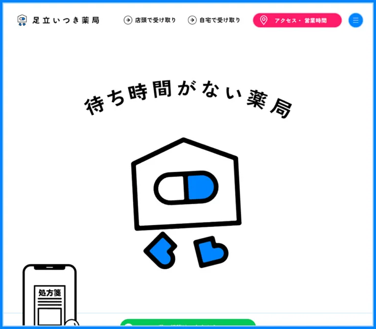
鮮やかな青と白を基調に、薬局のキャラクターや網点イラストを配置。店舗案内・患者様の声・お知らせを備え、スマートフォンではLINE相談とアクセスを画面下部に固定する薬局サイト。
オリジナルサイトを見るA neighborhood pharmacy presented through electric blue borders, friendly medicine illustrations, and direct routes to consultation and collection.
Original URL: https://adachi-itsuki-pharmacy.com/
Final URL: https://adachi-itsuki-pharmacy.com/
Theme: light; white canvas with blue structure and purpose-specific green and pink actions.
Inspected: September 17, 2026, 04:19:12 JST; supplied retrieval timestamp: 2026-09-16T19:19:12.126Z.
Viewports: desktop 1440 × 1000 and mobile 390 × 844 CSS pixels.
Scope: the current pharmacy homepage, including the opening composition, two collection routes, patient promises, review track, medication-notebook link, three-store access area, news, footer, and persistent navigation. The supplied visual evidence contains three desktop captures and two mobile captures. Linked pages and opened-menu states were not inspected.
The site combines a clean healthcare palette with a playful illustrated identity. Bright blue forms a continuous perimeter, circular controls, capsule-shaped links, and stippled illustration backgrounds. Black outlines give the mascot and human figures a clear silhouette. Pale blue softens clothing, borders, and store information, while broad white space keeps the opening composition calm.
This is a pharmacy homepage with practical information architecture. The opening introduces prescription-photo submission and two receiving methods; later sections establish service expectations, show patient feedback, list branches, and publish operational news. Green consistently identifies LINE consultation, while pink identifies access and business hours. On mobile, those two actions remain visible in a split bottom bar.
A neighborhood pharmacy presented through electric blue borders, friendly medicine illustrations, and direct routes to consultation and collection.
Original URL: https://adachi-itsuki-pharmacy.com/
Final URL: https://adachi-itsuki-pharmacy.com/
Theme: light; white canvas with blue structure and purpose-specific green and pink actions.
Inspected: September 17, 2026, 04:19:12 JST; supplied retrieval timestamp: 2026-09-16T19:19:12.126Z.
Viewports: desktop 1440 × 1000 and mobile 390 × 844 CSS pixels.
Scope: the current pharmacy homepage, including the opening composition, two collection routes, patient promises, review track, medication-notebook link, three-store access area, news, footer, and persistent navigation. The supplied visual evidence contains three desktop captures and two mobile captures. Linked pages and opened-menu states were not inspected.
The site combines a clean healthcare palette with a playful illustrated identity. Bright blue forms a continuous perimeter, circular controls, capsule-shaped links, and stippled illustration backgrounds. Black outlines give the mascot and human figures a clear silhouette. Pale blue softens clothing, borders, and store information, while broad white space keeps the opening composition calm.
This is a pharmacy homepage with practical information architecture. The opening introduces prescription-photo submission and two receiving methods; later sections establish service expectations, show patient feedback, list branches, and publish operational news. Green consistently identifies LINE consultation, while pink identifies access and business hours. On mobile, those two actions remain visible in a split bottom bar.
| Name | Value | Suggested token | Evidence and role |
|---|---|---|---|
| Pharmacy Blue | #0084FF |
--color-blue |
Measured menu-button, collection-link, and store-link backgrounds. Visually repeated in the perimeter and artwork. |
| Pale Blue | #ADD7FF |
--color-blue-soft |
Measured fill of the news-list button. Similar pale blue appears in illustration details, outlines, and the access panel; those individual surfaces were not separately sampled. |
| White | #FFFFFF |
--color-paper |
Measured telephone-link background; visible main canvas, promise circles, and review surfaces. |
| Black | #000000 |
--color-ink |
Measured primary text color; also the dominant illustration outline and mascot contour. |
| Promise Gray | #EFEFEF |
--color-section |
Measured background of the combined promises, reviews, and notebook section. |
| Notebook Gray | #E0E0E0 |
--color-banner |
Measured medication-notebook banner background. |
| Access Pink | #FF1A69 |
--color-access |
Measured access/business-hours action background on desktop and mobile. |
| LINE Green | #06C755 |
--color-line |
Measured consultation-link backgrounds, including the mobile bottom action. |
| Branch Gold | Approximately #E5A40A |
--color-branch-estimate |
Visual estimate for the branch-specific news badge. No exact computed badge color was supplied. |
| Metadata Gray | Approximately #999999 |
--color-muted-estimate |
Visual estimate for news dates and category labels. |
Blue is the identity and general navigation color. Green and pink have stable functional meanings; they are not interchangeable decorative accents. The green consultation control appears inside the desktop phone composition, in the mobile inline strip, and in the persistent mobile dock. Pink marks access and business hours in the desktop header and mobile dock.
Use black text on white, pale blue, and light gray for informational content. Screenshots show white lettering and icons inside several colored controls, even where the sampled parent anchor reports black text. Treat the visible child treatment and the parent computation as separate evidence.
The supplied custom-property inventory contains numerous WordPress preset colors, gradients, and shadows. Their presence does not demonstrate their use. The visible interface has flat fills, fine rules, and outlined artwork; no general gradient or shadow system is evident.
"Zen Kaku Gothic New", sans-serif.400 for ordinary text, 600 for major section and promise headings, and 700 for desktop navigation links.1.75 at both inspected widths.0.93px on desktop and 0.65445px on mobile, equivalent to 0.05em at the recorded body sizes.The document root remains 16px at both viewports. The body changes from 18.6px to 13.089px; this is not evidence of a globally reduced root unit.
The brand combines a small mascot mark and a separate wordmark image. The curved slogan, “待ち時間がない薬局,” is visibly graphic lettering. Its enclosing H1 has no extracted text in the supplied sample.
Preserve the curved baseline and generous character spacing as artwork or a deliberately constructed graphic treatment. Do not reproduce it as an ordinary 18.6px heading simply because that is the inherited H1 computation. The image source and its internal lettering specifications were not supplied.
Values describe the sampled elements, not necessarily every nested child.
| Role | Desktop size / line height | Mobile size / line height | Weight |
|---|---|---|---|
| Body and service descriptions | 18.6 / 32.55px |
13.089 / 22.906px |
400 |
| Desktop route navigation | 18.6 / 32.55px |
Not displayed in the mobile header | 700 |
| Main section headings | 33.496 / 50.244px |
21.513 / 32.270px |
600 |
| Desktop phone instruction | 22.32 / 39.06px |
Not visible in the mobile opening capture | 600 |
| Promise titles | 25.736 / 38.604px |
21.513 / 32.270px |
600 |
| Promise descriptions | 16.74 / 29.295px |
13.089 / 22.906px |
400 |
| Review paragraphs | 16.74 / 25.11px |
11.780 / 17.670px |
400 |
| News section title link | 25.736 / 41.178px |
17.513 / 28.021px |
600 |
| News item anchor wrapper | 18.6 / 32.55px |
13.089 / 22.906px |
400 |
| Telephone link | 16 / 28px |
16 / 28px |
400 |
| Footer navigation | 16.74 / 29.295px |
13.089 / 22.906px |
400 |
| Copyright | 13.42 / 23.485px |
10.089 / 17.656px |
400 |
The review-section heading appears larger than its sampled enclosing H2's inherited body size. Its nested typography was not supplied, so do not use that wrapper measurement as an exact visible title specification.
Roboto and Arial occur in the embedded map's controls. They belong to the third-party map interface and should not be adopted as the pharmacy's secondary typeface.
Density: spacious editorial sections surrounding compact utility controls. Dominant shapes: circles, capsules, a house-shaped mascot, arch-topped illustration fields, and thin rectangular rules.
| Use | Desktop | Mobile | Evidence |
|---|---|---|---|
| Common content width | 1224px |
331.5px |
Measured; both equal 85vw at the inspected widths |
| Common side margin | 108px |
29.25px |
Measured |
| Header horizontal padding | 44.884px |
19.5px |
Measured initial state |
| Header top padding | 36.884px |
19.5px |
Measured initial state |
| Header bottom padding | 24px |
15.6px |
Measured initial state |
| Main section vertical padding | 72px |
39px |
Measured in promises and news |
| Service paragraph-to-link gap | 24px |
16px |
Calculated from recorded element boxes |
| Promise heading-to-body gap | 16px |
16px |
Calculated from recorded element boxes |
| Notebook banner padding | 24px 40px |
16px 24px |
Measured |
| Footer padding | 96px 0 |
39px 0 112px |
Measured |
| Footer link spacing | About 25.11px horizontally |
16px vertically |
Calculated from recorded boxes |
| Element | Value | Evidence |
|---|---|---|
| Menu control | 50% |
Measured |
| Main consultation and collection links | 32px |
Measured |
| Desktop access control | 41.68px |
Measured |
| Store-information links | 16px |
Measured |
| Telephone links | 32px |
Measured |
| Notebook banner | 24px |
Measured |
| Promise text panels | Circular | Visible; approximately 410px diameter on desktop |
| Review cards | Approximately 28px |
Visual estimate from visible upper corners |
| Mobile dock segments | 0 |
Measured; rectangular halves |
| Element | Desktop | Mobile | Evidence |
|---|---|---|---|
| Initial header height | 111.27px |
81.89px |
Measured |
| Header in lower-page captures | About 82px |
About 70px |
Screenshot estimate; includes the upper frame region |
| Brand-link box | 277.14 × 50.39px |
249.59 × 46.80px |
Measured |
| Menu button | 50.39px diameter |
46.80px diameter |
Measured |
| Access header pill | 270.91 × 50.39px |
Moved to bottom dock | Measured |
| Curved-headline layout box | 725.73 × 158.75px |
273 × 59.72px |
Measured; includes graphic whitespace |
| Main consultation pill | 322.55 × 55.80px |
273 × 39.27px |
Measured |
| Service text/link width | 409.19px |
301.64px |
Measured |
| Service flow-link height | 55.80px |
39.27px |
Measured |
| Notebook banner | 725.39 × 97.53px |
331.5 × 89.53px |
Measured |
| News list width | 795.59px |
331.5px |
Measured |
| News-list button | 148.80 × 37.19px |
104.70 × 26.17px |
Measured |
| Mobile fixed actions | Not present as a split dock | Two 195 × 43.19px halves |
Measured |
The bright outer frame is approximately 9–10px thick on desktop and 4–5px on mobile, with a pale inner line of roughly 3px and 1–2px, respectively. These are visual estimates. The measured section-side paddings of 12.884px and 6.479px are consistent with an inset around the frame, but do not establish its border implementation.
Role: an immediately recognizable boundary around the website.
A bright blue perimeter follows all four viewport edges in the supplied desktop captures. A narrow pale-blue line sits immediately inside it. The same treatment scales down on mobile and remains visible beside the fixed navigation and bottom actions.
This frame gives otherwise white sections a shared identity. It is visually distinct from the pale horizontal rules used between content sections. For an adaptation, use a fixed, pointer-transparent overlay and keep its thickness separate from content padding. The original DOM implementation was not included.
Role: identity, receiving-method navigation, access, and menu entry.
Desktop anatomy, from left to right:
At the initial desktop position, the header background computes as transparent. Lower-page captures show a shallower white header with a pale bottom rule. Its padding and background have measured 0.2s transitions, supporting a changing header treatment; the exact trigger and positioning rule were not supplied.
The mobile header retains the brand and circular menu control. The two route links and large pink header capsule are absent. The logo remains comparatively large, occupying a measured 249.59px of the 390px viewport.
Only the closed menu is documented. Its expanded layout, animation, focus management, and destinations are unverified.
Role: explain the service through a memorable mascot and a prescription-photo metaphor.
The desktop capture places the curved slogan above a large, black-outlined smartphone. Inside the phone are a two-line instruction, “スマホで処方箋の / 写真を送るだけ,” the house-and-capsule mascot, and the green consultation control. A large illustrated finger enters near the lower edge. A bicycle scene sits to the left, and a person using a laptop sits to the right.
The phone is approximately 410px wide in the screenshot. Its black outline is much heavier than interface dividers, its upper corners are rounded, and a notch makes the device recognizable without photographic detail. The screen remains white.
On mobile, the composition changes substantially. The standalone mascot appears beneath the curved slogan. Below it, a small phone illustration projects into a horizontal consultation strip. The bicycle service scene follows in normal vertical flow. This is a rearranged composition rather than a proportional desktop reduction.
The mobile headline box starts at y = 117px; the inline consultation pill starts at approximately y = 427.88px, and the main service section begins at y = 480.22px. These are measured document coordinates at the initial capture.
The evidence does not establish a hero animation sequence. Do not infer timing, pinning, or a logo-to-phone transformation from these static layouts.
Role: distinguish store collection from home receipt.
Each route combines a large illustration, a narrow vertical message panel, a heading, a short audience-specific explanation, and a blue capsule link to the relevant process page.
The store route uses a parent riding a bicycle with a child. The home route uses a working adult and laptop. Both illustrations use black-and-white figures, pale-blue clothing, and bright-blue backgrounds filled with small white dots. Their containing silhouettes differ: an arch for the bicycle and a peaked house shape for the working adult.
The vertical captions use black Japanese lettering on white, bounded by a fine pale-blue outline. Preserve their narrow proportions and placement against the image edge; they function like labels attached to an illustrated poster.
Desktop text/link boxes are approximately 409.19px wide. Mobile boxes become 301.64px and stack, with the second route heading about 507.5px below the first. The recorded destinations are /tentou and /jitaku.
Desktop heading and paragraph boxes exist below the artwork in the DOM sample, but are not legible in the supplied initial screenshot. Their rectangles document structure, not a verified reveal state.
Role: provide a direct route to pharmacy consultation.
A green capsule pairs the white LINE symbol with “薬の相談はこちらから.” The central desktop version measures 322.55 × 55.80px; the mobile inline version measures 273 × 39.27px.
The recorded destination is https://page.line.me/776yzipw?openQrModal=true. This confirms a link destination, not an inspected messaging or QR-dialog interaction.
On mobile, the inline control belongs to a bordered horizontal strip, with a small phone illustration protruding above the strip's left side. Keep this overlap clear of the label and preserve enough white space around the button.
Role: retain the two most useful actions throughout the long page.
The bar has two equal-width rectangular links: green consultation on the left and pink access/business hours on the right. Each combines a white icon with a compact two-line label. There is no floating-card margin or pill radius.
At 390 × 844, each link measures 195 × 43.19px, with its top at 800.81px. Both the opening and footer captures retain this bar. The footer's generous bottom padding helps preserve access to its final content.
For a new implementation, reserve the dock's height in the document and account for the device's bottom safe area. A minimum height of 48px is recommended; that is an intentional increase over the measured source.
Role: communicate availability and delivery commitments.
A light-gray section introduces “患者様とのお約束,” with the final phrase colored blue. On desktop, two large white circles contain a hand symbol, centered two-line title, and short centered description. Between them is a pharmacist surrounded by circular medicine illustrations connected with thin dark lines.
The central image includes familiar medication forms: a bottle, sachets, tubes, tablets, and an inhaler-like object. Bright blue, pale blue, and white circles vary the arrangement while retaining a tightly controlled palette.
The text circles are approximately 410px across in the desktop capture. Their titles use measured 25.736px / 1.5 typography; body text uses 16.74px / 1.75. The second promise includes a smaller qualifying note, so retain room for secondary copy rather than forcing identical line counts.
Mobile DOM coordinates place the promise titles one below the other, separated by 344px. This verifies vertical text-panel ordering. The central portion of this mobile section is not shown in a supplied screenshot, so its exact artwork arrangement should not be treated as visually confirmed.
Role: provide social evidence through short first-person accounts.
The review area continues on the same gray background. The desktop capture shows white cards with pale-blue outlines, rounded upper corners, and a horizontally clipped continuation beyond the viewport.
Measured desktop paragraph widths are 356.70px, with consecutive paragraph starts separated by 456.59px. The visible card width is approximately 428px, giving an estimated gap near 29px. Mobile paragraph widths are 282.22px, with starts separated by 375.19px.
Cards contain the review, respondent information, and receiving-method label. Preserve this order and allow naturally different paragraph lengths. Do not replace the observed content structure with invented star ratings or portraits.
The horizontal positions, offscreen entries, and loaded Swiper properties are consistent with a slider. They do not verify autoplay, looping behavior, drag support, pagination, or transition duration. A manually scrollable track is a suitable documented fallback for a new implementation.
Role: link to a related medication-management service.
A darker-gray rounded banner sits beneath the reviews, within the larger gray section. It combines the two-part label “電子版お薬手帳 / LINEでお薬ラクラク管理” with a small supplied illustration.
The desktop banner measures 725.39 × 97.53px, centered within the page, with 24px 40px padding and 24px corners. Mobile uses the common 331.5px content width, 16px 24px padding, and the same radius.
The recorded destination is /news/108. A 0.1s transition is recorded on the desktop anchor, but its changed properties and hover endpoint were not supplied.
Role: make branch selection, opening hours, map access, and calling practical.
Desktop uses a broad split composition: an embedded map at left and pale-blue branch information at right. The lower desktop capture shows this arrangement directly. The text identifies three branches: “竹の塚店,” “島根店,” and “青井店.”
Each branch groups its name, Google map link, opening-hour text, telephone capsule, and store-information capsule. The desktop telephone and store links sit side by side at roughly 215px wide and 32px high. Telephone capsules use a white number field and a blue label segment.
Mobile DOM coordinates show branch information before the embedded map. Telephone and store-information links stack vertically and measure about 272.77px wide. Some source touch targets are short: the recorded telephone-link box is approximately 21.59px high even though its text line height is 28px. Preserve the visual vocabulary while enlarging interaction areas in an adaptation.
The “竹の塚店” store-information link currently points to /access/higashihokima. Record the supplied label and URL as they are; the route string alone does not establish a different current branch identity.
Role: publish branch announcements and operational updates.
Desktop places the section label and pale-blue “一覧” capsule in a left column. A wider right column contains three horizontally ruled rows. Each row has a compact branch badge, title, subdued category/date line, and a small blue circle with a white right arrow.
The content container measures 1224px. The list starts at x = 536.41px and measures 795.59px wide. The anchor reserves 148.8px on the left for the badge. Consecutive row anchors begin about 85.95px apart.
On mobile, the badge moves above the title, metadata stays below, and the arrow remains at the right edge. The list fills the 331.5px content column, with rows approximately 107.77px apart. The “一覧” capsule moves below the list and centers horizontally.
Gold identifies the branch-specific entries; black identifies “全店舗.” Use these as content labels, not primary actions. The entire row should retain its link target, rather than making the small arrow the only interactive area.
Role: contact and policy navigation with a restrained closing identity.
A pale-blue top rule separates the footer from the news area. Desktop places four text links in a centered horizontal row, followed by substantial white space and a small centered copyright. Mobile stacks the same links with 16px gaps and keeps the copyright centered.
The visible copyright is “© ADACHI ONLINE YAKKYOKU.” The footer has no large secondary logo, decorative illustration, social-icon cluster, or additional promotional panel in the supplied captures.
Contact and policy destinations are present in the rendered links. Their documents and contents were not opened or evaluated.
| Element or treatment | Recorded evidence | What can be concluded |
|---|---|---|
| Header | padding 0.2s, background 0.2s |
Padding and background changes have explicit short transitions. Lower-page captures show a more compact white header. |
| Menu button position | top 0.2s, right 0.2s |
Positional transitions are defined; this does not reveal menu-opening behavior. |
| Access action | Transition shorthand 0.2s |
A short transition is defined; the changed property and endpoint are unknown. |
| Notebook banner | Desktop transition shorthand 0.1s |
A short transition is defined; no hover result was captured. |
| Review track | Horizontally offset entries and Swiper custom properties | A slider-style arrangement is supported; automatic movement and controls remain unverified. |
| Hero and sampled content | Most sampled elements report animation: none |
No keyframe animation was recorded on those sampled nodes. Descendant, pseudo-element, SVG, or script-driven motion is not ruled out. |
| Other elements | Many report only transition: all |
This string alone does not establish a nonzero transition duration. |
| Service, access, news, map, and phone links | Rendered destination URLs | Navigation intent is verified; destination behavior was not exercised. |
The inspection process waited for initial loading and sampled layout stability, and temporarily paused perpetual animations during readiness checks. This improves capture consistency but does not provide a motion recording.
Recommended motion language: keep utility feedback brief, around 150–200ms, and restrict it to purposeful color, opacity, or small positional changes. Provide a static hero and usable manual review navigation until any richer motion is independently specified. Do not present a made-up scroll choreography as an original-site feature.
| Surface | Appearance | Purpose |
|---|---|---|
| Main canvas | White, with the persistent blue perimeter | Identity and generous breathing room |
| Initial header | Transparent over white content | Allows the opening composition to feel continuous |
| Scrolled header | White with a pale-blue bottom rule | Keeps navigation legible over later sections |
| Promise/review section | #EFEFEF |
Groups service assurances and patient feedback |
| Promise panels | White circles | Centers and isolates short commitments |
| Review cards | White, pale-blue outline, rounded corners | Holds denser testimonial copy |
| Notebook banner | #E0E0E0, 24px radius |
Secondary service link |
| Store information | Pale blue in the desktop capture | Groups practical branch details beside the map |
| News and footer | White with fine pale-blue rules | Quiet, structured operational information |
| Primary utility actions | Flat green and pink | Consultation and access |
No general elevation system is visible. Separate content with fill changes, outlines, shape, and spacing rather than adding shadows to every component.
The illustration system is central to the site's identity. The mascot is a simple house outline containing a horizontal capsule, with two small blue feet. Its thick black contour works at both logo size and hero scale. Human figures use simplified facial features, strong black hair silhouettes, pale-blue clothing, and expressive poses.
Dense white dots on bright blue give the service illustrations a printed halftone character. Large white cutouts and pale-blue borders prevent these fields from becoming visually heavy. The pharmacy illustration extends the same vocabulary through circular medicine symbols and connecting lines.
Use crisp supplied assets with proportional scaling. These are not pixel-art assets: do not apply image-rendering: pixelated. The key texture is the regular halftone pattern within otherwise clean artwork.
Photography is not a dominant element in the supplied captures. The embedded map is a practical third-party surface with muted geographic colors; it does not redefine the illustration palette.
Paths below are relative to the inspected original website. Dimensions are HTML attributes from the supplied evidence, not independently verified intrinsic file dimensions.
| Asset | Observed path | Declared dimensions | Use |
|---|---|---|---|
| Mascot logo mark | /cms/wp-content/themes/adachi/assets/img/s_logo.svg |
150 × 150 |
Header identity |
| Store-collection illustration | /cms/wp-content/themes/adachi/assets/img/tentou_main_home.png |
1000 × 924 |
Bicycle service scene |
| Patient-promise illustration | /cms/wp-content/themes/adachi/assets/img/promise.png |
1200 × 1200 |
Pharmacist and medicine diagram |
| Medication-notebook graphic | /cms/wp-content/themes/adachi/assets/img/tetyou.svg |
240 × 105 |
Related-service banner |
The separate wordmark, curved headline, phone, hand, home-receipt illustration, and other icon paths were not fully supplied. Do not invent filenames for them. Use authorized source assets where available, or create a coherent replacement illustration family rather than mixing unrelated stock graphics.
The opening composition is unusually spacious: a high curved headline, central phone, and flanking service scenes. Below it, the homepage follows a clear content sequence: promises, reviews, notebook link, stores/map, news, and footer.
The common content column measures 1224px, leaving 108px margins. Some sections, including the map/store split and gray background, extend toward the perimeter. The testimonial track continues horizontally beyond the content column.
The news section uses a compact left introduction and a wider right list. The footer returns to a centered horizontal arrangement.
The 390px layout makes several structural changes:
Mobile has a measured 331.5px common content width. Service panels use a narrower 301.64px text column, while the brand remains relatively large. This selective scaling is important: the interface does not shrink every component by the same ratio.
| Region | Desktop start / height | Mobile start / height |
|---|---|---|
| Receiving-method section | 0 / 2500px |
480.22 / 1015px |
| Promises, reviews, notebook | 2500 / 1336.45px |
1495.22 / 1619.91px |
| Store access region | 3836.45 / 1011.89px |
3115.13 / 1175.39px |
| News | 4848.34 / 409.44px |
4290.52 / 505.48px |
| Footer | 5257.78 / 325.77px |
4796 / 341.28px |
| Total document | Approximately 5583.55px |
Approximately 5137.28px |
These values record one settled inspection state. The desktop opening section's 2500px height is not proof of a pinned animation or a recommended fixed spacer. Its complete positioning and visibility logic was not supplied.
The exact CSS breakpoints, maximum-width rules beyond these viewports, landscape behavior, and intermediate typography formulas remain unknown. The Quick Start uses explicitly recommended formulas and a chosen breakpoint; it does not claim to recover them.
These are recommendations for a new implementation, not verified original-site features:
11.78px review copy is useful for reference, but a 14–16px adaptation is preferable for sustained reading.44px touch targets; use a 48px bottom dock and safe-area padding.pointer-events: none, and account for the fixed header when scrolling to in-page targets.#0084FF.#ADD7FF; suitable as an adaptation for rules and secondary surfaces.#FFFFFF.#000000.#EFEFEF.#E0E0E0.#06C755.#FF1A69.#E5A40A; estimated rather than measured.“Create a responsive Japanese neighborhood-pharmacy homepage using a white canvas, an electric-blue perimeter frame, pale-blue rules, and Zen Kaku Gothic New interface text. Build its identity around a thick black-outlined house-and-capsule mascot and blue halftone illustrations of everyday pharmacy use. On desktop, place a curved graphic slogan above a large phone composition, with store-collection and home-receipt scenes on either side. Follow with patient promises in white circles on light gray, a horizontal review track, a medication-notebook banner, three-store access information beside a map, ruled news rows, and a restrained footer. Use green exclusively for LINE consultation and pink for access/business hours. On mobile, show a standalone mascot, stack the receiving-method content, and retain a two-part green/pink bottom action bar. Keep shadows and gradients out of the base system. Treat menu behavior and hero motion as separately specified features.”
#EFEFEF background, a centered heading with one blue phrase, two large white circular text panels, and a central pharmacist illustration surrounded by round medicine symbols. Use black outlines, pale-blue details, and blue halftone fills. Stack the panels on mobile without compressing their text.”This is an implementation adaptation, not extracted source CSS. It covers the frame, header, actions, promise panels, review track, news, and footer. Supply the illustration assets and hero composition separately.
The palette and endpoint sizes come from the evidence. Fluid interpolation, the 75rem breakpoint, a 1224px content cap, and manual review scrolling are recommendations. Controls deliberately use a 44px minimum target and the mobile dock uses 48px, exceeding some measured source heights. Load Zen Kaku Gothic New through the project's approved font setup; no font-file URL was supplied.
:root {
  /* Measured palette, exposed through descriptive aliases. */
  --color-blue: #0084ff;
  --color-blue-soft: #add7ff;
  --color-paper: #fff;
  --color-ink: #000;
  --color-section: #efefef;
  --color-banner: #e0e0e0;
  --color-access: #ff1a69;
  --color-line: #06c755;

  /* Visual estimates; validate against approved artwork. */
  --color-branch-estimate: #e5a40a;
  --color-muted-estimate: #999;

  --font-ui: 'Zen Kaku Gothic New', sans-serif;
  --weight-regular: 400;
  --weight-heading: 600;
  --weight-navigation: 700;

  /* Recommended interpolation between the measured endpoints. */
  --text-body: clamp(13.089px, calc(11.042px + .5249vw), 18.6px);
  --text-heading: clamp(21.513px, calc(17.062px + 1.1412vw), 33.496px);
  --text-subheading: clamp(17.513px, calc(14.459px + .7831vw), 25.736px);
  --leading-body: 1.75;
  --leading-heading: 1.5;

  --content-width: min(85%, 1224px);
  --section-space: clamp(39px, 5vw, 72px);
  --space-small: 16px;
  --space-medium: 24px;
  --space-large: 40px;
  --radius-banner: 24px;
  --radius-review: 28px;
  --radius-pill: 999px;

  /* Frame dimensions approximate the screenshots. */
  --frame-blue: clamp(4px, .625vw, 9px);
  --frame-pale: clamp(1.5px, .2084vw, 3px);
  --header-inline: clamp(19.5px, 3.117vw, 44.884px);
  --menu-size: clamp(46.8px, 3.5vw, 50.39px);
  --dock-height: 48px;
  --safe-bottom: env(safe-area-inset-bottom, 0px);
  --motion-ui: 200ms ease;
}

* { box-sizing: border-box; }

html {
  font-size: 16px;
  scroll-padding-top: 100px;
}

body {
  margin: 0;
  color: var(--color-ink);
  background: var(--color-paper);
  font-family: var(--font-ui);
  font-size: var(--text-body);
  font-weight: var(--weight-regular);
  line-height: var(--leading-body);
  letter-spacing: .05em;
}

body::before {
  content: '';
  position: fixed;
  inset: 0;
  z-index: 100;
  border: var(--frame-blue) solid var(--color-blue);
  box-shadow: inset 0 0 0 var(--frame-pale) var(--color-blue-soft);
  pointer-events: none;
}

img { display: block; max-width: 100%; height: auto; }
a { color: inherit; }
button { font: inherit; }

.container {
  width: var(--content-width);
  margin-inline: auto;
}

.section { padding-block: var(--section-space); }

.section-title {
  margin: 0 0 24px;
  font-size: var(--text-heading);
  font-weight: var(--weight-heading);
  line-height: var(--leading-heading);
}

.accent { color: var(--color-blue); }

.site-header {
  position: fixed;
  inset: 0 0 auto;
  z-index: 50;
  display: flex;
  align-items: center;
  gap: 24px;
  padding: 36.884px var(--header-inline) 24px;
  background: transparent;
  transition: padding var(--motion-ui), background var(--motion-ui);
}

/* Toggle this class through the application's scroll-state logic. */
.site-header.is-scrolled {
  padding-block: 21px 10px;
  background: var(--color-paper);
  border-bottom: 1px solid var(--color-blue-soft);
}

.brand { flex: 0 0 277.14px; }
.brand img { width: 100%; }

.desktop-nav {
  display: flex;
  justify-content: center;
  flex: 1;
  gap: 32px;
  font-weight: var(--weight-navigation);
}

.desktop-nav a {
  display: inline-flex;
  align-items: center;
  gap: 10px;
  text-decoration: none;
  white-space: nowrap;
}

.route-arrow {
  display: grid;
  place-items: center;
  width: 28px;
  aspect-ratio: 1;
  border: 1px solid currentColor;
  border-radius: 50%;
  line-height: 1;
}

.header-actions { display: flex; align-items: center; gap: 16px; }

.menu-button {
  display: grid;
  place-items: center;
  flex: 0 0 var(--menu-size);
  width: var(--menu-size);
  height: var(--menu-size);
  padding: 0;
  border: 2px solid var(--color-blue-soft);
  border-radius: 50%;
  color: white;
  background: var(--color-blue);
  cursor: pointer;
}

.pill {
  display: inline-flex;
  align-items: center;
  justify-content: center;
  gap: 16px;
  min-height: max(44px, 3em);
  padding: 8px 24px;
  border: 0;
  border-radius: var(--radius-pill);
  color: white;
  background: var(--color-blue);
  text-align: center;
  text-decoration: none;
  line-height: 1.5;
}

.pill--line { background: var(--color-line); }
.pill--access { background: var(--color-access); }
.pill--soft { color: black; background: var(--color-blue-soft); }
.header-access { width: 270.91px; min-height: 50.39px; }

.hero-title {
  width: min(50.4vw, 725.73px);
  margin: 0 auto;
  padding-top: 215.28px;
}

/* Apply to the graphic within the heading, not to its lettering. */
.hero-title img { width: 100%; }

.service-art { width: 100%; object-fit: contain; }
.service-title { font-size: var(--text-heading); font-weight: 600; }
.service-flow { display: flex; width: 100%; margin-top: 24px; }

.promise-section { background: var(--color-section); }
.promise-section > .container > .section-title { text-align: center; }

.promise-layout {
  display: grid;
  grid-template-columns: repeat(3, minmax(0, 1fr));
  grid-template-areas: 'left art right';
  align-items: center;
}

.promise-panel {
  display: grid;
  align-content: center;
  aspect-ratio: 1;
  padding: 40px;
  border-radius: 50%;
  background: white;
  text-align: center;
}

.promise-panel--left { grid-area: left; }
.promise-panel--right { grid-area: right; }

.promise-panel h3 {
  margin: 0 0 16px;
  font-size: var(--text-subheading);
  font-weight: 600;
  line-height: 1.5;
}

.promise-panel p { margin: 0; font-size: .9em; }

.promise-art {
  grid-area: art;
  width: 112%;
  max-width: none;
  margin-inline: -6%;
}

.review-track {
  display: grid;
  grid-auto-flow: column;
  grid-auto-columns: 428px;
  gap: 29px;
  overflow-x: auto;
  padding: 4px 3px 16px;
  scroll-snap-type: x proximity;
}

.review-card {
  min-width: 0;
  padding: 32px;
  border: 3px solid var(--color-blue-soft);
  border-radius: var(--radius-review);
  background: white;
  scroll-snap-align: start;
}

.review-card p { margin: 0 0 16px; font-size: .9em; line-height: 1.5; }

.notebook-banner {
  display: flex;
  align-items: center;
  justify-content: space-between;
  gap: 24px;
  width: min(100%, 725.39px);
  margin: 48px auto 0;
  padding: 24px 40px;
  border-radius: var(--radius-banner);
  background: var(--color-banner);
  text-decoration: none;
}

.news-grid {
  display: grid;
  grid-template-columns: 26.14% minmax(0, 1fr);
  grid-template-areas: 'heading list' 'all list';
  column-gap: 8.86%;
  align-items: start;
}

.news-heading { grid-area: heading; margin: 0; font-size: var(--text-subheading); }
.news-list { grid-area: list; margin: 0; padding: 0; list-style: none; }
.news-list li { border-top: 1px solid var(--color-blue-soft); }
.news-list li:last-child { border-bottom: 1px solid var(--color-blue-soft); }

.news-item {
  display: grid;
  grid-template-columns: 8em minmax(0, 1fr) 28px;
  align-items: start;
  min-height: 86px;
  padding-block: 16px;
  text-decoration: none;
}

.news-badge {
  justify-self: start;
  padding: 1px 20px;
  border-radius: var(--radius-pill);
  color: white;
  background: var(--color-branch-estimate);
  font-size: .75em;
  line-height: 1.3;
}

.news-badge--all { background: black; }
.news-title { display: block; font-weight: 600; }
.news-meta { display: block; color: var(--color-muted-estimate); font-size: .72em; }

.news-arrow {
  display: grid;
  place-items: center;
  width: 26px;
  aspect-ratio: 1;
  border-radius: 50%;
  color: white;
  background: var(--color-blue);
  line-height: 1;
}

.news-all { grid-area: all; align-self: end; justify-self: start; min-width: 148.8px; }

.site-footer {
  padding: 96px 0;
  border-top: 1px solid var(--color-blue-soft);
  text-align: center;
}

.footer-links { display: flex; justify-content: center; flex-wrap: wrap; gap: 25px; }
.footer-links a { font-size: .9em; text-decoration: none; }
.copyright { margin: 64px 0 0; font-size: .72em; }
.mobile-actions { display: none; }

:where(a, button):focus-visible {
  outline: 3px solid black;
  outline-offset: 4px;
}

/* Chosen adaptation breakpoint, not a recovered source breakpoint. */
@media (max-width: 75rem) {
  body { padding-bottom: calc(var(--dock-height) + var(--safe-bottom)); }
  .site-header { justify-content: space-between; padding: 19.5px 5vw 15.6px; }
  .site-header.is-scrolled { padding-block: 15px 8px; }
  .brand { flex: 0 1 auto; width: min(64vw, 249.59px); }
  .desktop-nav, .header-access { display: none; }
  .hero-title { width: 70vw; padding-top: 117px; }
  .service-flow { margin-top: 16px; }

  .promise-layout {
    grid-template-columns: minmax(0, 1fr);
    grid-template-areas: 'art' 'left' 'right';
    justify-items: center;
    gap: 24px;
  }
  .promise-art { width: 100%; max-width: 380px; margin: 0; }
  .promise-panel { width: min(100%, 328px); padding: 36px; }
  .promise-panel h3 { font-size: var(--text-heading); }
  .promise-panel p { font-size: 1em; }

  .review-track { grid-auto-columns: 100%; gap: 44px; }
  .review-card { padding: 22px; }
  /* Recommended readability floor, larger than the observed source. */
  .review-card p { font-size: max(14px, .9em); }
  .notebook-banner { margin-top: 32px; padding: 16px 24px; }

  .news-grid {
    grid-template-columns: minmax(0, 1fr);
    grid-template-areas: 'heading' 'list' 'all';
    gap: 24px;
  }
  .news-item {
    grid-template-columns: minmax(0, 1fr) 24px;
    min-height: 108px;
    row-gap: 6px;
  }
  .news-badge { grid-column: 1; padding-inline: 16px; }
  .news-copy { grid-column: 1; }
  .news-arrow { grid-column: 2; grid-row: 1 / span 2; align-self: center; width: 21px; }
  .news-all { justify-self: center; min-width: 104.7px; }

  .site-footer { padding: 39px 0 64px; }
  .footer-links { flex-direction: column; gap: 16px; }
  .footer-links a { font-size: 1em; }
  .copyright { margin-top: 32px; }

  .mobile-actions {
    position: fixed;
    inset: auto 0 0;
    z-index: 60;
    display: grid;
    grid-template-columns: 1fr 1fr;
  }
  .mobile-actions a {
    display: flex;
    align-items: center;
    justify-content: center;
    gap: 12px;
    min-height: calc(var(--dock-height) + var(--safe-bottom));
    padding: 8px 16px calc(8px + var(--safe-bottom));
    color: white;
    font-size: 12px;
    font-weight: 600;
    line-height: 1.15;
    text-decoration: none;
  }
  .mobile-actions__line { background: var(--color-line); }
  .mobile-actions__access { background: var(--color-access); }
}

@media (prefers-reduced-motion: reduce) {
  .site-header { transition: none; }
  .review-track { scroll-snap-type: none; }
}
The header CSS expects a brand link, desktop navigation, and an actions group. It supplies the closed-menu button styling only; an accessible menu implementation remains separate. For promise panels, use the explicit left/right classes and a central image with .promise-art.
A minimal news-row structure using an observed destination:
<li>
  <a class="news-item" href="https://adachi-itsuki-pharmacy.com/news/503">
    <span class="news-badge">竹の塚店</span>
    <span class="news-copy">
      <span class="news-title">竹の塚店 新規オープンのお知らせ</span>
      <span class="news-meta">
        営業案内 <time datetime="2026-04-09">2026年4月9日</time>
      </span>
    </span>
    <span class="news-arrow" aria-hidden="true">→</span>
  </a>
</li>
Optional aliases for a project already using Tailwind v4. This does not imply that the original site uses Tailwind. Define the custom properties above first.
@theme inline {
  --color-pharmacy: var(--color-blue);
  --color-pharmacy-soft: var(--color-blue-soft);
  --color-paper: #fff;
  --color-ink: #000;
  --color-promise: var(--color-section);
  --color-notebook: var(--color-banner);
  --color-consultation: var(--color-line);
  --color-access: #ff1a69;

  --font-pharmacy: var(--font-ui);
  --text-copy: var(--text-body);
  --text-section: var(--text-heading);
  --text-subsection: var(--text-subheading);

  --spacing-section: var(--section-space);
  --spacing-dock: var(--dock-height);
  --radius-banner: 24px;
  --radius-review: 28px;
  --radius-pill: 999px;
}
200 with the same original and final URL.2026-09-16T19:19:12.126Z, equivalent to September 17, 2026, 04:19:12 JST.1440 × 1000 viewport; opening, promises/review edge, and lower access/news/footer captures. Recorded document height: approximately 5583.55px.390 × 844 viewport; opening and news/footer captures. Recorded document height: approximately 5137.28px.This reference describes the current homepage using the supplied original-page captures and rendered evidence. It does not establish every delayed state, interactive behavior, mobile middle-section appearance, or intermediate responsive rule. The reusable CSS and accessibility adjustments are explicitly documented adaptations.
# 足立いつき薬局 — Style Reference

> A neighborhood pharmacy presented through electric blue borders, friendly medicine illustrations, and direct routes to consultation and collection.

**Original URL:** https://adachi-itsuki-pharmacy.com/
**Final URL:** https://adachi-itsuki-pharmacy.com/
**Theme:** light; white canvas with blue structure and purpose-specific green and pink actions.
**Inspected:** September 17, 2026, 04:19:12 JST; supplied retrieval timestamp: `2026-09-16T19:19:12.126Z`.
**Viewports:** desktop `1440 × 1000` and mobile `390 × 844` CSS pixels.
**Scope:** the current pharmacy homepage, including the opening composition, two collection routes, patient promises, review track, medication-notebook link, three-store access area, news, footer, and persistent navigation. The supplied visual evidence contains three desktop captures and two mobile captures. Linked pages and opened-menu states were not inspected.

The site combines a clean healthcare palette with a playful illustrated identity. Bright blue forms a continuous perimeter, circular controls, capsule-shaped links, and stippled illustration backgrounds. Black outlines give the mascot and human figures a clear silhouette. Pale blue softens clothing, borders, and store information, while broad white space keeps the opening composition calm.

This is a pharmacy homepage with practical information architecture. The opening introduces prescription-photo submission and two receiving methods; later sections establish service expectations, show patient feedback, list branches, and publish operational news. Green consistently identifies LINE consultation, while pink identifies access and business hours. On mobile, those two actions remain visible in a split bottom bar.
# 足立いつき薬局 — Style Reference

> A neighborhood pharmacy presented through electric blue borders, friendly medicine illustrations, and direct routes to consultation and collection.

**Original URL:** https://adachi-itsuki-pharmacy.com/
**Final URL:** https://adachi-itsuki-pharmacy.com/
**Theme:** light; white canvas with blue structure and purpose-specific green and pink actions.
**Inspected:** September 17, 2026, 04:19:12 JST; supplied retrieval timestamp: `2026-09-16T19:19:12.126Z`.
**Viewports:** desktop `1440 × 1000` and mobile `390 × 844` CSS pixels.
**Scope:** the current pharmacy homepage, including the opening composition, two collection routes, patient promises, review track, medication-notebook link, three-store access area, news, footer, and persistent navigation. The supplied visual evidence contains three desktop captures and two mobile captures. Linked pages and opened-menu states were not inspected.

The site combines a clean healthcare palette with a playful illustrated identity. Bright blue forms a continuous perimeter, circular controls, capsule-shaped links, and stippled illustration backgrounds. Black outlines give the mascot and human figures a clear silhouette. Pale blue softens clothing, borders, and store information, while broad white space keeps the opening composition calm.

This is a pharmacy homepage with practical information architecture. The opening introduces prescription-photo submission and two receiving methods; later sections establish service expectations, show patient feedback, list branches, and publish operational news. Green consistently identifies LINE consultation, while pink identifies access and business hours. On mobile, those two actions remain visible in a split bottom bar.

## How to Read This Reference

- **Measured** means a value was supplied in the rendered DOM or computed-style evidence. Bounding boxes are CSS-pixel measurements, rounded here where appropriate.
- **Visual estimate** means a dimension or appearance was inferred from an original-page capture. Frame thickness, illustration contours, and some nested label styles fall into this category.
- **Calculated** means arithmetic applied to recorded measurements. For example, the common content width equals 85% of both inspected viewport widths.
- **Recommended** means guidance for a new implementation. The CSS, accessibility additions, intermediate scaling, and breakpoint choices are adaptations.
- Token names in this document are descriptive aliases. The evidence does not expose a corresponding custom brand-token system.
- An element's computed typography may describe its wrapper rather than a nested label or graphic. The curved slogan and logo must not be assigned the inherited font size of their enclosing elements.
- A DOM rectangle does not establish that an element was visibly revealed in a screenshot. This matters particularly around the desktop opening section.

## Tokens — Colors

### Default Palette

| Name | Value | Suggested token | Evidence and role |
| --- | --- | --- | --- |
| Pharmacy Blue | `#0084FF` | `--color-blue` | Measured menu-button, collection-link, and store-link backgrounds. Visually repeated in the perimeter and artwork. |
| Pale Blue | `#ADD7FF` | `--color-blue-soft` | Measured fill of the news-list button. Similar pale blue appears in illustration details, outlines, and the access panel; those individual surfaces were not separately sampled. |
| White | `#FFFFFF` | `--color-paper` | Measured telephone-link background; visible main canvas, promise circles, and review surfaces. |
| Black | `#000000` | `--color-ink` | Measured primary text color; also the dominant illustration outline and mascot contour. |
| Promise Gray | `#EFEFEF` | `--color-section` | Measured background of the combined promises, reviews, and notebook section. |
| Notebook Gray | `#E0E0E0` | `--color-banner` | Measured medication-notebook banner background. |
| Access Pink | `#FF1A69` | `--color-access` | Measured access/business-hours action background on desktop and mobile. |
| LINE Green | `#06C755` | `--color-line` | Measured consultation-link backgrounds, including the mobile bottom action. |
| Branch Gold | Approximately `#E5A40A` | `--color-branch-estimate` | Visual estimate for the branch-specific news badge. No exact computed badge color was supplied. |
| Metadata Gray | Approximately `#999999` | `--color-muted-estimate` | Visual estimate for news dates and category labels. |

### Color Roles

Blue is the identity and general navigation color. Green and pink have stable functional meanings; they are not interchangeable decorative accents. The green consultation control appears inside the desktop phone composition, in the mobile inline strip, and in the persistent mobile dock. Pink marks access and business hours in the desktop header and mobile dock.

Use black text on white, pale blue, and light gray for informational content. Screenshots show white lettering and icons inside several colored controls, even where the sampled parent anchor reports black text. Treat the visible child treatment and the parent computation as separate evidence.

The supplied custom-property inventory contains numerous WordPress preset colors, gradients, and shadows. Their presence does not demonstrate their use. The visible interface has flat fills, fine rules, and outlined artwork; no general gradient or shadow system is evident.

## Tokens — Typography

### Primary Typeface

- **Measured family:** `"Zen Kaku Gothic New", sans-serif`.
- **Measured weights:** `400` for ordinary text, `600` for major section and promise headings, and `700` for desktop navigation links.
- **Body line height:** `1.75` at both inspected widths.
- **Body tracking:** `0.93px` on desktop and `0.65445px` on mobile, equivalent to `0.05em` at the recorded body sizes.
- **Character:** clear Japanese Gothic lettering with open spacing and moderate heading weight. Illustration outlines supply much of the visual boldness.

The document root remains `16px` at both viewports. The body changes from `18.6px` to `13.089px`; this is not evidence of a globally reduced root unit.

### Graphic Lettering

The brand combines a small mascot mark and a separate wordmark image. The curved slogan, “待ち時間がない薬局,” is visibly graphic lettering. Its enclosing H1 has no extracted text in the supplied sample.

Preserve the curved baseline and generous character spacing as artwork or a deliberately constructed graphic treatment. Do not reproduce it as an ordinary `18.6px` heading simply because that is the inherited H1 computation. The image source and its internal lettering specifications were not supplied.

### Type Scale

Values describe the sampled elements, not necessarily every nested child.

| Role | Desktop size / line height | Mobile size / line height | Weight |
| --- | --- | --- | --- |
| Body and service descriptions | `18.6 / 32.55px` | `13.089 / 22.906px` | `400` |
| Desktop route navigation | `18.6 / 32.55px` | Not displayed in the mobile header | `700` |
| Main section headings | `33.496 / 50.244px` | `21.513 / 32.270px` | `600` |
| Desktop phone instruction | `22.32 / 39.06px` | Not visible in the mobile opening capture | `600` |
| Promise titles | `25.736 / 38.604px` | `21.513 / 32.270px` | `600` |
| Promise descriptions | `16.74 / 29.295px` | `13.089 / 22.906px` | `400` |
| Review paragraphs | `16.74 / 25.11px` | `11.780 / 17.670px` | `400` |
| News section title link | `25.736 / 41.178px` | `17.513 / 28.021px` | `600` |
| News item anchor wrapper | `18.6 / 32.55px` | `13.089 / 22.906px` | `400` |
| Telephone link | `16 / 28px` | `16 / 28px` | `400` |
| Footer navigation | `16.74 / 29.295px` | `13.089 / 22.906px` | `400` |
| Copyright | `13.42 / 23.485px` | `10.089 / 17.656px` | `400` |

The review-section heading appears larger than its sampled enclosing H2's inherited body size. Its nested typography was not supplied, so do not use that wrapper measurement as an exact visible title specification.

Roboto and Arial occur in the embedded map's controls. They belong to the third-party map interface and should not be adopted as the pharmacy's secondary typeface.

## Tokens — Spacing & Shapes

**Density:** spacious editorial sections surrounding compact utility controls.
**Dominant shapes:** circles, capsules, a house-shaped mascot, arch-topped illustration fields, and thin rectangular rules.

### Spacing Scale

| Use | Desktop | Mobile | Evidence |
| --- | --- | --- | --- |
| Common content width | `1224px` | `331.5px` | Measured; both equal `85vw` at the inspected widths |
| Common side margin | `108px` | `29.25px` | Measured |
| Header horizontal padding | `44.884px` | `19.5px` | Measured initial state |
| Header top padding | `36.884px` | `19.5px` | Measured initial state |
| Header bottom padding | `24px` | `15.6px` | Measured initial state |
| Main section vertical padding | `72px` | `39px` | Measured in promises and news |
| Service paragraph-to-link gap | `24px` | `16px` | Calculated from recorded element boxes |
| Promise heading-to-body gap | `16px` | `16px` | Calculated from recorded element boxes |
| Notebook banner padding | `24px 40px` | `16px 24px` | Measured |
| Footer padding | `96px 0` | `39px 0 112px` | Measured |
| Footer link spacing | About `25.11px` horizontally | `16px` vertically | Calculated from recorded boxes |

### Border Radius

| Element | Value | Evidence |
| --- | --- | --- |
| Menu control | `50%` | Measured |
| Main consultation and collection links | `32px` | Measured |
| Desktop access control | `41.68px` | Measured |
| Store-information links | `16px` | Measured |
| Telephone links | `32px` | Measured |
| Notebook banner | `24px` | Measured |
| Promise text panels | Circular | Visible; approximately `410px` diameter on desktop |
| Review cards | Approximately `28px` | Visual estimate from visible upper corners |
| Mobile dock segments | `0` | Measured; rectangular halves |

### Layout Measurements

| Element | Desktop | Mobile | Evidence |
| --- | --- | --- | --- |
| Initial header height | `111.27px` | `81.89px` | Measured |
| Header in lower-page captures | About `82px` | About `70px` | Screenshot estimate; includes the upper frame region |
| Brand-link box | `277.14 × 50.39px` | `249.59 × 46.80px` | Measured |
| Menu button | `50.39px` diameter | `46.80px` diameter | Measured |
| Access header pill | `270.91 × 50.39px` | Moved to bottom dock | Measured |
| Curved-headline layout box | `725.73 × 158.75px` | `273 × 59.72px` | Measured; includes graphic whitespace |
| Main consultation pill | `322.55 × 55.80px` | `273 × 39.27px` | Measured |
| Service text/link width | `409.19px` | `301.64px` | Measured |
| Service flow-link height | `55.80px` | `39.27px` | Measured |
| Notebook banner | `725.39 × 97.53px` | `331.5 × 89.53px` | Measured |
| News list width | `795.59px` | `331.5px` | Measured |
| News-list button | `148.80 × 37.19px` | `104.70 × 26.17px` | Measured |
| Mobile fixed actions | Not present as a split dock | Two `195 × 43.19px` halves | Measured |

The bright outer frame is approximately `9–10px` thick on desktop and `4–5px` on mobile, with a pale inner line of roughly `3px` and `1–2px`, respectively. These are visual estimates. The measured section-side paddings of `12.884px` and `6.479px` are consistent with an inset around the frame, but do not establish its border implementation.

## Components

### Viewport Frame

**Role:** an immediately recognizable boundary around the website.

A bright blue perimeter follows all four viewport edges in the supplied desktop captures. A narrow pale-blue line sits immediately inside it. The same treatment scales down on mobile and remains visible beside the fixed navigation and bottom actions.

This frame gives otherwise white sections a shared identity. It is visually distinct from the pale horizontal rules used between content sections. For an adaptation, use a fixed, pointer-transparent overlay and keep its thickness separate from content padding. The original DOM implementation was not included.

### Persistent Header

**Role:** identity, receiving-method navigation, access, and menu entry.

Desktop anatomy, from left to right:

1. Mascot mark and black pharmacy wordmark inside the homepage link.
2. Two bold route links: “店頭で受け取り” and “自宅で受け取り,” each preceded by a thin outlined circle containing a right arrow.
3. A broad pink access/business-hours capsule with a white location symbol.
4. A blue circular menu button with fine white horizontal strokes.

At the initial desktop position, the header background computes as transparent. Lower-page captures show a shallower white header with a pale bottom rule. Its padding and background have measured `0.2s` transitions, supporting a changing header treatment; the exact trigger and positioning rule were not supplied.

The mobile header retains the brand and circular menu control. The two route links and large pink header capsule are absent. The logo remains comparatively large, occupying a measured `249.59px` of the `390px` viewport.

Only the closed menu is documented. Its expanded layout, animation, focus management, and destinations are unverified.

### Opening Hero

**Role:** explain the service through a memorable mascot and a prescription-photo metaphor.

The desktop capture places the curved slogan above a large, black-outlined smartphone. Inside the phone are a two-line instruction, “スマホで処方箋の / 写真を送るだけ,” the house-and-capsule mascot, and the green consultation control. A large illustrated finger enters near the lower edge. A bicycle scene sits to the left, and a person using a laptop sits to the right.

The phone is approximately `410px` wide in the screenshot. Its black outline is much heavier than interface dividers, its upper corners are rounded, and a notch makes the device recognizable without photographic detail. The screen remains white.

On mobile, the composition changes substantially. The standalone mascot appears beneath the curved slogan. Below it, a small phone illustration projects into a horizontal consultation strip. The bicycle service scene follows in normal vertical flow. This is a rearranged composition rather than a proportional desktop reduction.

The mobile headline box starts at `y = 117px`; the inline consultation pill starts at approximately `y = 427.88px`, and the main service section begins at `y = 480.22px`. These are measured document coordinates at the initial capture.

The evidence does not establish a hero animation sequence. Do not infer timing, pinning, or a logo-to-phone transformation from these static layouts.

### Collection-Route Panels

**Role:** distinguish store collection from home receipt.

Each route combines a large illustration, a narrow vertical message panel, a heading, a short audience-specific explanation, and a blue capsule link to the relevant process page.

The store route uses a parent riding a bicycle with a child. The home route uses a working adult and laptop. Both illustrations use black-and-white figures, pale-blue clothing, and bright-blue backgrounds filled with small white dots. Their containing silhouettes differ: an arch for the bicycle and a peaked house shape for the working adult.

The vertical captions use black Japanese lettering on white, bounded by a fine pale-blue outline. Preserve their narrow proportions and placement against the image edge; they function like labels attached to an illustrated poster.

Desktop text/link boxes are approximately `409.19px` wide. Mobile boxes become `301.64px` and stack, with the second route heading about `507.5px` below the first. The recorded destinations are `/tentou` and `/jitaku`.

Desktop heading and paragraph boxes exist below the artwork in the DOM sample, but are not legible in the supplied initial screenshot. Their rectangles document structure, not a verified reveal state.

### LINE Consultation Control

**Role:** provide a direct route to pharmacy consultation.

A green capsule pairs the white LINE symbol with “薬の相談はこちらから.” The central desktop version measures `322.55 × 55.80px`; the mobile inline version measures `273 × 39.27px`.

The recorded destination is `https://page.line.me/776yzipw?openQrModal=true`. This confirms a link destination, not an inspected messaging or QR-dialog interaction.

On mobile, the inline control belongs to a bordered horizontal strip, with a small phone illustration protruding above the strip's left side. Keep this overlap clear of the label and preserve enough white space around the button.

### Mobile Bottom Action Bar

**Role:** retain the two most useful actions throughout the long page.

The bar has two equal-width rectangular links: green consultation on the left and pink access/business hours on the right. Each combines a white icon with a compact two-line label. There is no floating-card margin or pill radius.

At `390 × 844`, each link measures `195 × 43.19px`, with its top at `800.81px`. Both the opening and footer captures retain this bar. The footer's generous bottom padding helps preserve access to its final content.

For a new implementation, reserve the dock's height in the document and account for the device's bottom safe area. A minimum height of `48px` is recommended; that is an intentional increase over the measured source.

### Patient Promises

**Role:** communicate availability and delivery commitments.

A light-gray section introduces “患者様とのお約束,” with the final phrase colored blue. On desktop, two large white circles contain a hand symbol, centered two-line title, and short centered description. Between them is a pharmacist surrounded by circular medicine illustrations connected with thin dark lines.

The central image includes familiar medication forms: a bottle, sachets, tubes, tablets, and an inhaler-like object. Bright blue, pale blue, and white circles vary the arrangement while retaining a tightly controlled palette.

The text circles are approximately `410px` across in the desktop capture. Their titles use measured `25.736px / 1.5` typography; body text uses `16.74px / 1.75`. The second promise includes a smaller qualifying note, so retain room for secondary copy rather than forcing identical line counts.

Mobile DOM coordinates place the promise titles one below the other, separated by `344px`. This verifies vertical text-panel ordering. The central portion of this mobile section is not shown in a supplied screenshot, so its exact artwork arrangement should not be treated as visually confirmed.

### Patient Review Track

**Role:** provide social evidence through short first-person accounts.

The review area continues on the same gray background. The desktop capture shows white cards with pale-blue outlines, rounded upper corners, and a horizontally clipped continuation beyond the viewport.

Measured desktop paragraph widths are `356.70px`, with consecutive paragraph starts separated by `456.59px`. The visible card width is approximately `428px`, giving an estimated gap near `29px`. Mobile paragraph widths are `282.22px`, with starts separated by `375.19px`.

Cards contain the review, respondent information, and receiving-method label. Preserve this order and allow naturally different paragraph lengths. Do not replace the observed content structure with invented star ratings or portraits.

The horizontal positions, offscreen entries, and loaded Swiper properties are consistent with a slider. They do not verify autoplay, looping behavior, drag support, pagination, or transition duration. A manually scrollable track is a suitable documented fallback for a new implementation.

### Medication-Notebook Banner

**Role:** link to a related medication-management service.

A darker-gray rounded banner sits beneath the reviews, within the larger gray section. It combines the two-part label “電子版お薬手帳 / LINEでお薬ラクラク管理” with a small supplied illustration.

The desktop banner measures `725.39 × 97.53px`, centered within the page, with `24px 40px` padding and `24px` corners. Mobile uses the common `331.5px` content width, `16px 24px` padding, and the same radius.

The recorded destination is `/news/108`. A `0.1s` transition is recorded on the desktop anchor, but its changed properties and hover endpoint were not supplied.

### Store Access Area

**Role:** make branch selection, opening hours, map access, and calling practical.

Desktop uses a broad split composition: an embedded map at left and pale-blue branch information at right. The lower desktop capture shows this arrangement directly. The text identifies three branches: “竹の塚店,” “島根店,” and “青井店.”

Each branch groups its name, Google map link, opening-hour text, telephone capsule, and store-information capsule. The desktop telephone and store links sit side by side at roughly `215px` wide and `32px` high. Telephone capsules use a white number field and a blue label segment.

Mobile DOM coordinates show branch information before the embedded map. Telephone and store-information links stack vertically and measure about `272.77px` wide. Some source touch targets are short: the recorded telephone-link box is approximately `21.59px` high even though its text line height is `28px`. Preserve the visual vocabulary while enlarging interaction areas in an adaptation.

The “竹の塚店” store-information link currently points to `/access/higashihokima`. Record the supplied label and URL as they are; the route string alone does not establish a different current branch identity.

### News List

**Role:** publish branch announcements and operational updates.

Desktop places the section label and pale-blue “一覧” capsule in a left column. A wider right column contains three horizontally ruled rows. Each row has a compact branch badge, title, subdued category/date line, and a small blue circle with a white right arrow.

The content container measures `1224px`. The list starts at `x = 536.41px` and measures `795.59px` wide. The anchor reserves `148.8px` on the left for the badge. Consecutive row anchors begin about `85.95px` apart.

On mobile, the badge moves above the title, metadata stays below, and the arrow remains at the right edge. The list fills the `331.5px` content column, with rows approximately `107.77px` apart. The “一覧” capsule moves below the list and centers horizontally.

Gold identifies the branch-specific entries; black identifies “全店舗.” Use these as content labels, not primary actions. The entire row should retain its link target, rather than making the small arrow the only interactive area.

### Footer

**Role:** contact and policy navigation with a restrained closing identity.

A pale-blue top rule separates the footer from the news area. Desktop places four text links in a centered horizontal row, followed by substantial white space and a small centered copyright. Mobile stacks the same links with `16px` gaps and keeps the copyright centered.

The visible copyright is “© ADACHI ONLINE YAKKYOKU.” The footer has no large secondary logo, decorative illustration, social-icon cluster, or additional promotional panel in the supplied captures.

Contact and policy destinations are present in the rendered links. Their documents and contents were not opened or evaluated.

## Tokens — Motion & Interaction

| Element or treatment | Recorded evidence | What can be concluded |
| --- | --- | --- |
| Header | `padding 0.2s, background 0.2s` | Padding and background changes have explicit short transitions. Lower-page captures show a more compact white header. |
| Menu button position | `top 0.2s, right 0.2s` | Positional transitions are defined; this does not reveal menu-opening behavior. |
| Access action | Transition shorthand `0.2s` | A short transition is defined; the changed property and endpoint are unknown. |
| Notebook banner | Desktop transition shorthand `0.1s` | A short transition is defined; no hover result was captured. |
| Review track | Horizontally offset entries and Swiper custom properties | A slider-style arrangement is supported; automatic movement and controls remain unverified. |
| Hero and sampled content | Most sampled elements report `animation: none` | No keyframe animation was recorded on those sampled nodes. Descendant, pseudo-element, SVG, or script-driven motion is not ruled out. |
| Other elements | Many report only `transition: all` | This string alone does not establish a nonzero transition duration. |
| Service, access, news, map, and phone links | Rendered destination URLs | Navigation intent is verified; destination behavior was not exercised. |

The inspection process waited for initial loading and sampled layout stability, and temporarily paused perpetual animations during readiness checks. This improves capture consistency but does not provide a motion recording.

**Recommended motion language:** keep utility feedback brief, around `150–200ms`, and restrict it to purposeful color, opacity, or small positional changes. Provide a static hero and usable manual review navigation until any richer motion is independently specified. Do not present a made-up scroll choreography as an original-site feature.

## Surfaces

| Surface | Appearance | Purpose |
| --- | --- | --- |
| Main canvas | White, with the persistent blue perimeter | Identity and generous breathing room |
| Initial header | Transparent over white content | Allows the opening composition to feel continuous |
| Scrolled header | White with a pale-blue bottom rule | Keeps navigation legible over later sections |
| Promise/review section | `#EFEFEF` | Groups service assurances and patient feedback |
| Promise panels | White circles | Centers and isolates short commitments |
| Review cards | White, pale-blue outline, rounded corners | Holds denser testimonial copy |
| Notebook banner | `#E0E0E0`, `24px` radius | Secondary service link |
| Store information | Pale blue in the desktop capture | Groups practical branch details beside the map |
| News and footer | White with fine pale-blue rules | Quiet, structured operational information |
| Primary utility actions | Flat green and pink | Consultation and access |

No general elevation system is visible. Separate content with fill changes, outlines, shape, and spacing rather than adding shadows to every component.

## Imagery

The illustration system is central to the site's identity. The mascot is a simple house outline containing a horizontal capsule, with two small blue feet. Its thick black contour works at both logo size and hero scale. Human figures use simplified facial features, strong black hair silhouettes, pale-blue clothing, and expressive poses.

Dense white dots on bright blue give the service illustrations a printed halftone character. Large white cutouts and pale-blue borders prevent these fields from becoming visually heavy. The pharmacy illustration extends the same vocabulary through circular medicine symbols and connecting lines.

Use crisp supplied assets with proportional scaling. These are not pixel-art assets: do not apply `image-rendering: pixelated`. The key texture is the regular halftone pattern within otherwise clean artwork.

Photography is not a dominant element in the supplied captures. The embedded map is a practical third-party surface with muted geographic colors; it does not redefine the illustration palette.

### Observed Asset References

Paths below are relative to the inspected original website. Dimensions are HTML attributes from the supplied evidence, not independently verified intrinsic file dimensions.

| Asset | Observed path | Declared dimensions | Use |
| --- | --- | --- | --- |
| Mascot logo mark | `/cms/wp-content/themes/adachi/assets/img/s_logo.svg` | `150 × 150` | Header identity |
| Store-collection illustration | `/cms/wp-content/themes/adachi/assets/img/tentou_main_home.png` | `1000 × 924` | Bicycle service scene |
| Patient-promise illustration | `/cms/wp-content/themes/adachi/assets/img/promise.png` | `1200 × 1200` | Pharmacist and medicine diagram |
| Medication-notebook graphic | `/cms/wp-content/themes/adachi/assets/img/tetyou.svg` | `240 × 105` | Related-service banner |

The separate wordmark, curved headline, phone, hand, home-receipt illustration, and other icon paths were not fully supplied. Do not invent filenames for them. Use authorized source assets where available, or create a coherent replacement illustration family rather than mixing unrelated stock graphics.

## Layout & Responsive Behavior

### Desktop Organization

The opening composition is unusually spacious: a high curved headline, central phone, and flanking service scenes. Below it, the homepage follows a clear content sequence: promises, reviews, notebook link, stores/map, news, and footer.

The common content column measures `1224px`, leaving `108px` margins. Some sections, including the map/store split and gray background, extend toward the perimeter. The testimonial track continues horizontally beyond the content column.

The news section uses a compact left introduction and a wider right list. The footer returns to a centered horizontal arrangement.

### Mobile Reorganization

The `390px` layout makes several structural changes:

- The header keeps only the brand and menu control.
- Consultation and access become persistent equal-width bottom actions.
- The hero presents the mascot independently, followed by a small-phone consultation strip.
- Receiving-method panels stack vertically.
- Promise text panels stack vertically according to their DOM positions.
- Reviews retain a horizontal track rather than becoming a long stack of all reviews.
- Store information precedes the map, and branch action links stack.
- News badges move above titles, and the list button centers below the rows.
- Footer links become a centered vertical list.

Mobile has a measured `331.5px` common content width. Service panels use a narrower `301.64px` text column, while the brand remains relatively large. This selective scaling is important: the interface does not shrink every component by the same ratio.

### Recorded Document Geometry

| Region | Desktop start / height | Mobile start / height |
| --- | --- | --- |
| Receiving-method section | `0 / 2500px` | `480.22 / 1015px` |
| Promises, reviews, notebook | `2500 / 1336.45px` | `1495.22 / 1619.91px` |
| Store access region | `3836.45 / 1011.89px` | `3115.13 / 1175.39px` |
| News | `4848.34 / 409.44px` | `4290.52 / 505.48px` |
| Footer | `5257.78 / 325.77px` | `4796 / 341.28px` |
| Total document | Approximately `5583.55px` | Approximately `5137.28px` |

These values record one settled inspection state. The desktop opening section's `2500px` height is not proof of a pinned animation or a recommended fixed spacer. Its complete positioning and visibility logic was not supplied.

The exact CSS breakpoints, maximum-width rules beyond these viewports, landscape behavior, and intermediate typography formulas remain unknown. The Quick Start uses explicitly recommended formulas and a chosen breakpoint; it does not claim to recover them.

## Do’s and Don’ts

### Do

- Keep the blue perimeter and pale inner line as a coherent page-level motif.
- Preserve white space around the graphic headline and mascot.
- Use Zen Kaku Gothic New for interface text, with moderate heading weight and open line spacing.
- Treat the curved slogan and wordmark as graphic assets with their own proportions.
- Maintain black, white, bright blue, and pale blue throughout the illustration family.
- Keep green tied to consultation and pink tied to access/business hours.
- Use circles for the menu, promise panels, and medicine diagram; use capsules for text actions.
- Preserve both receiving methods as distinct navigation routes.
- Retain practical branch details, news, contact links, and policy navigation.
- Make mobile changes structural: move actions, stack information, and retain readable illustration sizes.
- Keep whole news rows interactive, with the arrow serving as a directional cue.

### Don't

- Don't replace the homepage with a generic conversion-only layout that loses branches, reviews, and news.
- Don't introduce gradients, glass effects, or a card-shadow system unsupported by the captures.
- Don't use green and pink as random section decorations.
- Don't replace the illustrated mascot with a generic medical cross.
- Don't stretch the halftone artwork or smooth away its dot texture.
- Don't use the H1 wrapper's inherited font size to recreate the curved graphic slogan.
- Don't treat installed WordPress presets as the visible design palette.
- Don't shrink the desktop phone composition wholesale into the mobile viewport.
- Don't invent a menu overlay, autoplay carousel, or scroll animation from static evidence.
- Don't make the small news arrow or short telephone capsule the only usable hit area.
- Don't let a fixed bottom bar cover the last footer link or keyboard focus target.

## Recommended Implementation Additions

These are recommendations for a new implementation, not verified original-site features:

- Give the logo link and menu button explicit accessible names. When implementing the menu, expose its expanded state and manage focus appropriately.
- Provide an accessible H1 containing the slogan even when its visible treatment is an image. Confirm the accessible name rather than assuming the supplied text extraction describes it fully.
- Keep essential mobile reading text at a comfortable size. The measured `11.78px` review copy is useful for reference, but a `14–16px` adaptation is preferable for sustained reading.
- Increase short mobile controls to at least `44px` touch targets; use a `48px` bottom dock and safe-area padding.
- Test white text on bright blue, green, and pink. Preserve recognizable brand fills while adjusting foreground, label size, or local treatment where needed for contrast.
- Make review content keyboard-accessible. If automatic movement is added, provide pause controls and honor reduced-motion preferences.
- Give the map a descriptive title and retain branch addresses or location links outside the map so the information remains useful without interacting with it.
- Preserve real telephone and navigation anchors rather than routing every control through click handlers.
- Give the perimeter overlay `pointer-events: none`, and account for the fixed header when scrolling to in-page targets.
- Reserve image dimensions so the complex opening composition does not shift while artwork loads.

## Agent Prompt Guide

### Quick Color Reference

- Identity blue: `#0084FF`.
- Pale-blue fill: `#ADD7FF`; suitable as an adaptation for rules and secondary surfaces.
- Canvas and promise circles: `#FFFFFF`.
- Text and illustration contours: `#000000`.
- Promises/reviews section: `#EFEFEF`.
- Notebook banner: `#E0E0E0`.
- Consultation: `#06C755`.
- Access/business hours: `#FF1A69`.
- Branch badge: gold, approximately `#E5A40A`; estimated rather than measured.

### Overall Prompt

“Create a responsive Japanese neighborhood-pharmacy homepage using a white canvas, an electric-blue perimeter frame, pale-blue rules, and Zen Kaku Gothic New interface text. Build its identity around a thick black-outlined house-and-capsule mascot and blue halftone illustrations of everyday pharmacy use. On desktop, place a curved graphic slogan above a large phone composition, with store-collection and home-receipt scenes on either side. Follow with patient promises in white circles on light gray, a horizontal review track, a medication-notebook banner, three-store access information beside a map, ruled news rows, and a restrained footer. Use green exclusively for LINE consultation and pink for access/business hours. On mobile, show a standalone mascot, stack the receiving-method content, and retain a two-part green/pink bottom action bar. Keep shadows and gradients out of the base system. Treat menu behavior and hero motion as separately specified features.”

### Example Component Prompts

1. **Header:** “Build a white Japanese pharmacy header with a small house-and-capsule logo and black wordmark at left. Add two bold receiving-method links with outlined circular arrows, a pink location capsule, and a blue circular menu button. On narrow screens retain the logo and menu, and move consultation/access to the bottom dock.”
2. **Promise section:** “Use a flat `#EFEFEF` background, a centered heading with one blue phrase, two large white circular text panels, and a central pharmacist illustration surrounded by round medicine symbols. Use black outlines, pale-blue details, and blue halftone fills. Stack the panels on mobile without compressing their text.”
3. **News row:** “Create a white full-row link separated by thin pale-blue rules. Place a gold branch badge at left, a Japanese announcement title and muted category/date beside it, and a small blue circle with a white arrow at right. On mobile move the badge above the title and retain the right-edge arrow.”
4. **Mobile dock:** “Create a full-width fixed bottom bar with two equal rectangular actions. Use LINE green on the left and access pink on the right, each with a white icon and compact two-line label. Use a recommended 48px minimum height, safe-area padding, and matching reserved space in the document.”
5. **Review track:** “Place white testimonial cards with pale-blue outlines and rounded corners on the gray section background. Show a horizontal continuation at the viewport edge. Keep review text, respondent details, and receiving-method labels; do not add invented ratings or portraits. Start with accessible manual horizontal scrolling.”

## Quick Start

### CSS Custom Properties

This is an implementation adaptation, not extracted source CSS. It covers the frame, header, actions, promise panels, review track, news, and footer. Supply the illustration assets and hero composition separately.

The palette and endpoint sizes come from the evidence. Fluid interpolation, the `75rem` breakpoint, a `1224px` content cap, and manual review scrolling are recommendations. Controls deliberately use a `44px` minimum target and the mobile dock uses `48px`, exceeding some measured source heights. Load Zen Kaku Gothic New through the project's approved font setup; no font-file URL was supplied.

```css
:root {
  /* Measured palette, exposed through descriptive aliases. */
  --color-blue: #0084ff;
  --color-blue-soft: #add7ff;
  --color-paper: #fff;
  --color-ink: #000;
  --color-section: #efefef;
  --color-banner: #e0e0e0;
  --color-access: #ff1a69;
  --color-line: #06c755;

  /* Visual estimates; validate against approved artwork. */
  --color-branch-estimate: #e5a40a;
  --color-muted-estimate: #999;

  --font-ui: 'Zen Kaku Gothic New', sans-serif;
  --weight-regular: 400;
  --weight-heading: 600;
  --weight-navigation: 700;

  /* Recommended interpolation between the measured endpoints. */
  --text-body: clamp(13.089px, calc(11.042px + .5249vw), 18.6px);
  --text-heading: clamp(21.513px, calc(17.062px + 1.1412vw), 33.496px);
  --text-subheading: clamp(17.513px, calc(14.459px + .7831vw), 25.736px);
  --leading-body: 1.75;
  --leading-heading: 1.5;

  --content-width: min(85%, 1224px);
  --section-space: clamp(39px, 5vw, 72px);
  --space-small: 16px;
  --space-medium: 24px;
  --space-large: 40px;
  --radius-banner: 24px;
  --radius-review: 28px;
  --radius-pill: 999px;

  /* Frame dimensions approximate the screenshots. */
  --frame-blue: clamp(4px, .625vw, 9px);
  --frame-pale: clamp(1.5px, .2084vw, 3px);
  --header-inline: clamp(19.5px, 3.117vw, 44.884px);
  --menu-size: clamp(46.8px, 3.5vw, 50.39px);
  --dock-height: 48px;
  --safe-bottom: env(safe-area-inset-bottom, 0px);
  --motion-ui: 200ms ease;
}

* { box-sizing: border-box; }

html {
  font-size: 16px;
  scroll-padding-top: 100px;
}

body {
  margin: 0;
  color: var(--color-ink);
  background: var(--color-paper);
  font-family: var(--font-ui);
  font-size: var(--text-body);
  font-weight: var(--weight-regular);
  line-height: var(--leading-body);
  letter-spacing: .05em;
}

body::before {
  content: '';
  position: fixed;
  inset: 0;
  z-index: 100;
  border: var(--frame-blue) solid var(--color-blue);
  box-shadow: inset 0 0 0 var(--frame-pale) var(--color-blue-soft);
  pointer-events: none;
}

img { display: block; max-width: 100%; height: auto; }
a { color: inherit; }
button { font: inherit; }

.container {
  width: var(--content-width);
  margin-inline: auto;
}

.section { padding-block: var(--section-space); }

.section-title {
  margin: 0 0 24px;
  font-size: var(--text-heading);
  font-weight: var(--weight-heading);
  line-height: var(--leading-heading);
}

.accent { color: var(--color-blue); }

.site-header {
  position: fixed;
  inset: 0 0 auto;
  z-index: 50;
  display: flex;
  align-items: center;
  gap: 24px;
  padding: 36.884px var(--header-inline) 24px;
  background: transparent;
  transition: padding var(--motion-ui), background var(--motion-ui);
}

/* Toggle this class through the application's scroll-state logic. */
.site-header.is-scrolled {
  padding-block: 21px 10px;
  background: var(--color-paper);
  border-bottom: 1px solid var(--color-blue-soft);
}

.brand { flex: 0 0 277.14px; }
.brand img { width: 100%; }

.desktop-nav {
  display: flex;
  justify-content: center;
  flex: 1;
  gap: 32px;
  font-weight: var(--weight-navigation);
}

.desktop-nav a {
  display: inline-flex;
  align-items: center;
  gap: 10px;
  text-decoration: none;
  white-space: nowrap;
}

.route-arrow {
  display: grid;
  place-items: center;
  width: 28px;
  aspect-ratio: 1;
  border: 1px solid currentColor;
  border-radius: 50%;
  line-height: 1;
}

.header-actions { display: flex; align-items: center; gap: 16px; }

.menu-button {
  display: grid;
  place-items: center;
  flex: 0 0 var(--menu-size);
  width: var(--menu-size);
  height: var(--menu-size);
  padding: 0;
  border: 2px solid var(--color-blue-soft);
  border-radius: 50%;
  color: white;
  background: var(--color-blue);
  cursor: pointer;
}

.pill {
  display: inline-flex;
  align-items: center;
  justify-content: center;
  gap: 16px;
  min-height: max(44px, 3em);
  padding: 8px 24px;
  border: 0;
  border-radius: var(--radius-pill);
  color: white;
  background: var(--color-blue);
  text-align: center;
  text-decoration: none;
  line-height: 1.5;
}

.pill--line { background: var(--color-line); }
.pill--access { background: var(--color-access); }
.pill--soft { color: black; background: var(--color-blue-soft); }
.header-access { width: 270.91px; min-height: 50.39px; }

.hero-title {
  width: min(50.4vw, 725.73px);
  margin: 0 auto;
  padding-top: 215.28px;
}

/* Apply to the graphic within the heading, not to its lettering. */
.hero-title img { width: 100%; }

.service-art { width: 100%; object-fit: contain; }
.service-title { font-size: var(--text-heading); font-weight: 600; }
.service-flow { display: flex; width: 100%; margin-top: 24px; }

.promise-section { background: var(--color-section); }
.promise-section > .container > .section-title { text-align: center; }

.promise-layout {
  display: grid;
  grid-template-columns: repeat(3, minmax(0, 1fr));
  grid-template-areas: 'left art right';
  align-items: center;
}

.promise-panel {
  display: grid;
  align-content: center;
  aspect-ratio: 1;
  padding: 40px;
  border-radius: 50%;
  background: white;
  text-align: center;
}

.promise-panel--left { grid-area: left; }
.promise-panel--right { grid-area: right; }

.promise-panel h3 {
  margin: 0 0 16px;
  font-size: var(--text-subheading);
  font-weight: 600;
  line-height: 1.5;
}

.promise-panel p { margin: 0; font-size: .9em; }

.promise-art {
  grid-area: art;
  width: 112%;
  max-width: none;
  margin-inline: -6%;
}

.review-track {
  display: grid;
  grid-auto-flow: column;
  grid-auto-columns: 428px;
  gap: 29px;
  overflow-x: auto;
  padding: 4px 3px 16px;
  scroll-snap-type: x proximity;
}

.review-card {
  min-width: 0;
  padding: 32px;
  border: 3px solid var(--color-blue-soft);
  border-radius: var(--radius-review);
  background: white;
  scroll-snap-align: start;
}

.review-card p { margin: 0 0 16px; font-size: .9em; line-height: 1.5; }

.notebook-banner {
  display: flex;
  align-items: center;
  justify-content: space-between;
  gap: 24px;
  width: min(100%, 725.39px);
  margin: 48px auto 0;
  padding: 24px 40px;
  border-radius: var(--radius-banner);
  background: var(--color-banner);
  text-decoration: none;
}

.news-grid {
  display: grid;
  grid-template-columns: 26.14% minmax(0, 1fr);
  grid-template-areas: 'heading list' 'all list';
  column-gap: 8.86%;
  align-items: start;
}

.news-heading { grid-area: heading; margin: 0; font-size: var(--text-subheading); }
.news-list { grid-area: list; margin: 0; padding: 0; list-style: none; }
.news-list li { border-top: 1px solid var(--color-blue-soft); }
.news-list li:last-child { border-bottom: 1px solid var(--color-blue-soft); }

.news-item {
  display: grid;
  grid-template-columns: 8em minmax(0, 1fr) 28px;
  align-items: start;
  min-height: 86px;
  padding-block: 16px;
  text-decoration: none;
}

.news-badge {
  justify-self: start;
  padding: 1px 20px;
  border-radius: var(--radius-pill);
  color: white;
  background: var(--color-branch-estimate);
  font-size: .75em;
  line-height: 1.3;
}

.news-badge--all { background: black; }
.news-title { display: block; font-weight: 600; }
.news-meta { display: block; color: var(--color-muted-estimate); font-size: .72em; }

.news-arrow {
  display: grid;
  place-items: center;
  width: 26px;
  aspect-ratio: 1;
  border-radius: 50%;
  color: white;
  background: var(--color-blue);
  line-height: 1;
}

.news-all { grid-area: all; align-self: end; justify-self: start; min-width: 148.8px; }

.site-footer {
  padding: 96px 0;
  border-top: 1px solid var(--color-blue-soft);
  text-align: center;
}

.footer-links { display: flex; justify-content: center; flex-wrap: wrap; gap: 25px; }
.footer-links a { font-size: .9em; text-decoration: none; }
.copyright { margin: 64px 0 0; font-size: .72em; }
.mobile-actions { display: none; }

:where(a, button):focus-visible {
  outline: 3px solid black;
  outline-offset: 4px;
}

/* Chosen adaptation breakpoint, not a recovered source breakpoint. */
@media (max-width: 75rem) {
  body { padding-bottom: calc(var(--dock-height) + var(--safe-bottom)); }
  .site-header { justify-content: space-between; padding: 19.5px 5vw 15.6px; }
  .site-header.is-scrolled { padding-block: 15px 8px; }
  .brand { flex: 0 1 auto; width: min(64vw, 249.59px); }
  .desktop-nav, .header-access { display: none; }
  .hero-title { width: 70vw; padding-top: 117px; }
  .service-flow { margin-top: 16px; }

  .promise-layout {
    grid-template-columns: minmax(0, 1fr);
    grid-template-areas: 'art' 'left' 'right';
    justify-items: center;
    gap: 24px;
  }
  .promise-art { width: 100%; max-width: 380px; margin: 0; }
  .promise-panel { width: min(100%, 328px); padding: 36px; }
  .promise-panel h3 { font-size: var(--text-heading); }
  .promise-panel p { font-size: 1em; }

  .review-track { grid-auto-columns: 100%; gap: 44px; }
  .review-card { padding: 22px; }
  /* Recommended readability floor, larger than the observed source. */
  .review-card p { font-size: max(14px, .9em); }
  .notebook-banner { margin-top: 32px; padding: 16px 24px; }

  .news-grid {
    grid-template-columns: minmax(0, 1fr);
    grid-template-areas: 'heading' 'list' 'all';
    gap: 24px;
  }
  .news-item {
    grid-template-columns: minmax(0, 1fr) 24px;
    min-height: 108px;
    row-gap: 6px;
  }
  .news-badge { grid-column: 1; padding-inline: 16px; }
  .news-copy { grid-column: 1; }
  .news-arrow { grid-column: 2; grid-row: 1 / span 2; align-self: center; width: 21px; }
  .news-all { justify-self: center; min-width: 104.7px; }

  .site-footer { padding: 39px 0 64px; }
  .footer-links { flex-direction: column; gap: 16px; }
  .footer-links a { font-size: 1em; }
  .copyright { margin-top: 32px; }

  .mobile-actions {
    position: fixed;
    inset: auto 0 0;
    z-index: 60;
    display: grid;
    grid-template-columns: 1fr 1fr;
  }
  .mobile-actions a {
    display: flex;
    align-items: center;
    justify-content: center;
    gap: 12px;
    min-height: calc(var(--dock-height) + var(--safe-bottom));
    padding: 8px 16px calc(8px + var(--safe-bottom));
    color: white;
    font-size: 12px;
    font-weight: 600;
    line-height: 1.15;
    text-decoration: none;
  }
  .mobile-actions__line { background: var(--color-line); }
  .mobile-actions__access { background: var(--color-access); }
}

@media (prefers-reduced-motion: reduce) {
  .site-header { transition: none; }
  .review-track { scroll-snap-type: none; }
}
```

The header CSS expects a brand link, desktop navigation, and an actions group. It supplies the closed-menu button styling only; an accessible menu implementation remains separate. For promise panels, use the explicit left/right classes and a central image with `.promise-art`.

A minimal news-row structure using an observed destination:

```html
<li>
  <a class="news-item" href="https://adachi-itsuki-pharmacy.com/news/503">
    <span class="news-badge">竹の塚店</span>
    <span class="news-copy">
      <span class="news-title">竹の塚店 新規オープンのお知らせ</span>
      <span class="news-meta">
        営業案内 <time datetime="2026-04-09">2026年4月9日</time>
      </span>
    </span>
    <span class="news-arrow" aria-hidden="true">→</span>
  </a>
</li>
```

### Tailwind v4 Token Mapping

Optional aliases for a project already using Tailwind v4. This does not imply that the original site uses Tailwind. Define the custom properties above first.

```css
@theme inline {
  --color-pharmacy: var(--color-blue);
  --color-pharmacy-soft: var(--color-blue-soft);
  --color-paper: #fff;
  --color-ink: #000;
  --color-promise: var(--color-section);
  --color-notebook: var(--color-banner);
  --color-consultation: var(--color-line);
  --color-access: #ff1a69;

  --font-pharmacy: var(--font-ui);
  --text-copy: var(--text-body);
  --text-section: var(--text-heading);
  --text-subsection: var(--text-subheading);

  --spacing-section: var(--section-space);
  --spacing-dock: var(--dock-height);
  --radius-banner: 24px;
  --radius-review: 28px;
  --radius-pill: 999px;
}
```

## Sources & Evidence

- **Inspected original and final page:** [足立いつき薬局](https://adachi-itsuki-pharmacy.com/). The supplied inspection records HTTP `200` with the same original and final URL.
- **Capture time:** `2026-09-16T19:19:12.126Z`, equivalent to September 17, 2026, 04:19:12 JST.
- **Desktop evidence:** `1440 × 1000` viewport; opening, promises/review edge, and lower access/news/footer captures. Recorded document height: approximately `5583.55px`.
- **Mobile evidence:** `390 × 844` viewport; opening and news/footer captures. Recorded document height: approximately `5137.28px`.
- **Rendered evidence:** supplied page text, anchor destinations, selected element rectangles, computed typography, backgrounds, spacing, radii, transition strings, and image references. The complete stylesheet, breakpoint definitions, and all descendant styles were not supplied.
- **Observed state changes:** upper navigation and mobile bottom actions remain visible in separated page captures; the lower-page header is visually more compact. Scrolling was used during collection. No menu, consultation, map, telephone, or destination-page interaction was documented as exercised.
- **Capture limitations:** initial observation lasted at least five seconds. Readiness checks had a 15-second overall limit and a five-second image wait, while scroll settling had a ten-second limit per position. Perpetual animations were paused during readiness checks and resumed. SharedWorkers and service workers were disabled.

This reference describes the current homepage using the supplied original-page captures and rendered evidence. It does not establish every delayed state, interactive behavior, mobile middle-section appearance, or intermediate responsive rule. The reusable CSS and accessibility adjustments are explicitly documented adaptations.スタイルやページの種類、ジャンルが近いデザインを集めました。