プレビュー準備中デザインリファレンスを見る
DESIGN REFERENCE
かっこ株式会社|白い余白と鮮やかな青で構成する企業サイト
広い余白、日英の書体使い分け、青いパーティクル表現が特徴。非対称な本文配置、左右分割のサービス紹介、ピル型ボタンを備えたコーポレートサイト。
Cacco — Style Reference
A spacious white corporate canvas, anchored by blue fields and luminous particles.
Website: cacco.co.jp Original URL: https://cacco.co.jp/ Final URL: https://cacco.co.jp/ Theme: white editorial sections, saturated blue service and footer surfaces, and locally reversed navigation. Inspected: October 2, 2026, at 00:45:10 JST; supplied retrieval timestamp: October 1, 2026, at 15:45:10.396 UTC. Viewports: 1440 × 1000 desktop and 390 × 844 mobile, in CSS pixels. Scope: the current Japanese corporate homepage. Visual evidence covers the desktop opening, Service 02 presentation, closing gateways and footer, plus the mobile opening and closing Contact/footer region. Rendered DOM and computed styles also cover the About, Service overview, three service descriptions, Career, News, navigation and legal links. Linked destination pages were not inspected.
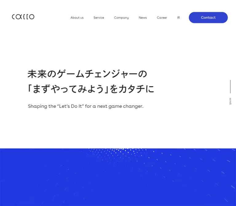
Cacco combines restrained corporate typography with a much more expressive blue particle scene. The opening deliberately separates its message from the artwork: a two-line Japanese statement sits in a large white field, a smaller English translation follows, and the particle field begins below a crisp horizontal boundary. The geometric Latin lettering, slightly tracked Japanese text and generous paragraph leading keep the page calm even when the imagery becomes dense.
The page is a corporate information hub with company, service, investor, recruitment and news destinations. Its structure relies on asymmetric text columns, broad changes of background color and a small family of pill-shaped links. On desktop, the service presentation splits the viewport between artwork and a narrow text column; on mobile, the three service sections occupy separate vertical positions. A large blue footer repeats the identity and navigation without introducing a separate visual system.
閉じる
Cacco — Style Reference
A spacious white corporate canvas, anchored by blue fields and luminous particles.
Website: cacco.co.jp Original URL: https://cacco.co.jp/ Final URL: https://cacco.co.jp/ Theme: white editorial sections, saturated blue service and footer surfaces, and locally reversed navigation. Inspected: October 2, 2026, at 00:45:10 JST; supplied retrieval timestamp: October 1, 2026, at 15:45:10.396 UTC. Viewports: 1440 × 1000 desktop and 390 × 844 mobile, in CSS pixels. Scope: the current Japanese corporate homepage. Visual evidence covers the desktop opening, Service 02 presentation, closing gateways and footer, plus the mobile opening and closing Contact/footer region. Rendered DOM and computed styles also cover the About, Service overview, three service descriptions, Career, News, navigation and legal links. Linked destination pages were not inspected.
Cacco combines restrained corporate typography with a much more expressive blue particle scene. The opening deliberately separates its message from the artwork: a two-line Japanese statement sits in a large white field, a smaller English translation follows, and the particle field begins below a crisp horizontal boundary. The geometric Latin lettering, slightly tracked Japanese text and generous paragraph leading keep the page calm even when the imagery becomes dense.
The page is a corporate information hub with company, service, investor, recruitment and news destinations. Its structure relies on asymmetric text columns, broad changes of background color and a small family of pill-shaped links. On desktop, the service presentation splits the viewport between artwork and a narrow text column; on mobile, the three service sections occupy separate vertical positions. A large blue footer repeats the identity and navigation without introducing a separate visual system.
How to Read This Reference
- Measured means a value is explicitly present in the supplied rendered DOM or computed styles. Measurements apply to the recorded state and viewport.
- Calculated means a relationship is derived from those measurements, such as a 75px gap between 325px news items positioned 400px apart.
- Visual estimate means a dimension or appearance is estimated from the supplied current-page screenshots. These values are not pixel samples or recovered CSS declarations.
- Recommended identifies implementation choices for reuse, including the starter CSS breakpoint, accessible control areas and fallback media treatment.
- Token names below are descriptive aliases. The supplied custom-property inventory did not expose a reusable brand-token system.
- Extracted navigation includes content that is not visible in the screenshots. A nonzero rectangle alone does not establish that a menu or submenu was open.
- Document coordinates are not a reliable animation specification. Several service children extend beyond their sampled section boxes, and lower mobile measurements do not agree completely with the reported document height.
Tokens — Colors
Default Palette
| Name | Value | Suggested token | Evidence and role |
|---|---|---|---|
| Corporate Blue | #3143cf |
--color-brand |
Measured as rgb(49, 67, 207) on primary links, the footer and mobile service panels; also used for reversed button text |
| White | #ffffff |
--color-canvas |
Measured page background, white narrative sections, reversed text and service-button fill |
| Main Ink | #222222 |
--color-ink |
Measured body, navigation and headline color on white |
| Reading Gray | #666666 |
--color-muted |
Measured Japanese explanatory paragraphs on white |
| News Mist | #f0f2f6 |
--color-news |
Measured News section background |
| Particle Blue | Approximately #2434e6 |
--color-art |
Recommended visual approximation only; the particle field appears brighter and more saturated than Corporate Blue, but its exact color was not exposed |
The blue field is not a generic accent sprinkled across many cards. It occupies major page regions and gives otherwise quiet navigation its strongest color. Keep the particle background and solid corporate surface conceptually separate: their visible blues are close, but they are not proven to share a source declaration.
Contextual Color States
| Context | Surface | Text and identity | Prominent link |
|---|---|---|---|
| Opening and closing white regions | White | Main Ink | Corporate Blue pill with white label |
| Desktop service capture | Bright particle blue at left; Corporate Blue at right | White logo, navigation and service text | White pill with Corporate Blue label |
| Footer | Corporate Blue | White | Mostly unboxed white navigation and legal links |
| News | News Mist | Main Ink titles | Corporate Blue All News pill |
These are section-dependent states, not evidence of a user-selectable light/dark theme. The header is visibly reversed in the service capture; the switching trigger and implementation were not supplied.
Tokens — Typography
Latin Navigation and Display Text
- Recorded family stack:
BuenosAires, dnp-shuei-gothic-kin-std, sans-serif. - Observed character: rounded geometric forms, open counters and light-looking English display headings.
- Measured weights:
400for navigation and buttons;350for the News heading and Office heading. - Role: English section labels, navigation, buttons, the hero translation and footer links.
- Implementation alias:
--font-ui: BuenosAires, dnp-shuei-gothic-kin-std, sans-serif.
The family names are supported by computed styles. Font files, licensing, loading rules and the precise face used for each glyph were not independently inspected.
Japanese Headlines and Reading Text
- Recorded stack:
dnp-shuei-gothic-kin-std, sans-serif. - Headline weight:
600. - Main paragraph weight:
500; office and legal information use400. - Recurring tracking:
0.06em, measured as 2.52px at 42px, 1.44px at 24px and 0.9px at 15px. - Role: the main statement, narrative headings, explanations and news titles.
The Japanese paragraphs use unusually generous leading. Preserve that breathing room before increasing font size or widening the columns: the sparse rhythm depends on all three properties together.
Type Scale
Values in this table are measured unless marked as estimates. Size and line height are shown as size / line-height.
| Role | Desktop | Mobile | Weight | Tracking |
|---|---|---|---|---|
| Japanese hero statement | 42 / 68px |
21 / 34px |
600 |
0.06em |
| English hero translation | 22 / 26.4px |
11 / 13.2px |
400 |
Normal |
| Japanese section/service heading | 24 / 48px |
16 / 32px |
600 |
0.06em |
| Japanese explanatory paragraph | 15 / 35px |
13 / 26px |
500 |
0.06em |
| Visible desktop navigation | 14 / 14px |
Collapsed from the visible header | 400 |
Normal |
| Language links | 16 / 16px |
Present in menu DOM; not visible in the closed header | 400 |
Normal |
| Pill-button label | 16 / 16px |
13 / 13px |
400 |
0.02em |
| News heading | 42 / 42px |
28 / 28px |
350 |
Normal |
| News article heading | 14 / 32px |
12 / 24px |
500 |
0.06em |
| Footer navigation | 20 / 20px |
20 / 20px |
400 |
0.02em |
| Office heading | 20 / 20px |
20 / 20px |
350 |
0.02em |
| Office information | 14 / 26px |
12 / 24px |
400 |
0.06em |
| Legal links | 12 / 20px |
11 / 30px |
400 |
0.06em |
| Copyright | 14 / 14px |
12 / 12px |
400 |
0.04em |
| Gateway English title | Approximately 40px |
Approximately 30px |
Visually light | Not measured |
| Service index and progress label | Approximately 12px |
Not visually captured | Not measured | Not measured |
Interpretation details: the sampled HTML element reports Times, but the visible body uses the recorded sans-serif stack. The logo sits inside an H1 with a 32px inherited size; that does not make the logo a 32px typeset wordmark. The hero statement itself is a paragraph in the inspected DOM. News anchors report font-size: 0, while their H3 children have the readable sizes above; do not reuse the wrapper value as a text token.
Tokens — Spacing & Shapes
Density: sparse at the page level, with tightly controlled text widths and ample line spacing.
Geometry: rectangular sections, fine utility lines and fully rounded action pills. The shown content surfaces do not use a general rounded-card or shadow system.
Spacing Scale
| Use | Desktop | Mobile | Status |
|---|---|---|---|
| Header horizontal edge inset | 72px |
30px |
Measured from logo and rightmost controls |
| Gap between desktop navigation items | 30px |
Not applicable in the closed header | Calculated from link rectangles |
| Hero statement to translation | 30px |
15px |
Calculated from text boxes |
| Narrative heading to paragraph | 40px |
25px |
Calculated in sampled sections |
| Paragraph to primary content link | 40px |
42px |
Calculated from sampled boxes |
Service pill to All Service link |
40px |
30px |
Calculated from link boxes |
| About top padding | 200px |
90px |
Measured |
| Service overview bottom padding | 230px |
100px |
Measured |
| Career vertical padding | 200px |
80px |
Measured |
| News vertical padding | 160px |
80px |
Measured |
| Footer padding | 160px 72px 100px 120px |
80px 40px |
Measured |
| Footer link-row pitch | 48px |
48px |
Calculated; text size remains 20px |
This is not evidence of a strict 8px spacing grid. The design uses several distinct alignment lines and section-specific spacing rules.
Border Radius
| Element | Measured or observed treatment |
|---|---|
| Desktop and body CTA | 25px radius on a 50px-high pill |
| Mobile header Contact | Computed 25px radius on a 32px-high shape; visibly a capsule |
| Main sections and service surfaces | Square boundaries |
| Closing Company/Contact gateways | Square, edge-to-edge regions |
| Footer | Square, full-width blue surface |
Layout Measurements
| Element | At 1440 × 1000 | At 390 × 844 | Evidence |
|---|---|---|---|
| Header logo | 100 × 23.09px, at 72, 64 |
64 × 14.78px, at 30, 34 |
Measured linked-logo box |
| Header Contact | 175 × 50px, at 1193, 54 |
130 × 32px, at 190, 25 |
Measured |
| Hero statement | 1106.52 × 136px, at 165.48, 298 |
331.25 × 68px, at 28.75, 176 |
Measured paragraph box, not glyph width |
| Hero translation | Starts at 168, 464 |
Starts at 30, 259 |
Measured |
| White opening boundary | Approximately y = 668px |
Approximately y = 347px |
Screenshot estimate |
| Opening particle region height | Approximately 810px |
Approximately 546px |
Opening boundary combined with the next section's measured position |
| About paragraph | 408px wide at x = 816px |
260px wide at x = 30px |
Measured |
| Service overview paragraph | 672px wide at x = 576px |
270px wide at x = 80px |
Measured |
| Desktop service stage halves | 720px each |
Separate full-width section boxes | Screenshot and DOM |
| Service paragraph | 384px wide at x = 864px |
290px wide at x = 30px |
Measured |
| Career paragraph | 384px wide at x = 240px |
270px wide at x = 80px |
Measured |
| Body CTA | 175 × 50px |
200 × 50px |
Measured |
| News item | 325px wide |
245px wide |
Measured |
| News item gap | 75px |
40px |
Calculated |
| Closing gateway | 719 × 400px each, separated by 2px |
390 × 215px each, stacked with a 2px separation |
Measured |
| Footer | 640px sampled height |
825.19px sampled box height |
Measured; mobile bottom extent is inconsistent with other records |
The desktop hero's text container is much wider than its visible words. Its two-line composition should not be recreated by setting the container to the apparent glyph width.
Components
Persistent Header
Role: keeps corporate navigation, language selection and Contact available throughout the page.
On desktop, the thin geometric logo sits at the far left. A compact horizontal navigation group begins much farther right, followed by JP / EN and the Contact pill. Visible destinations are About us, Service, Company, News, Career, IR, Sustainability and Recruit. Recruit includes a small external-link symbol in the screenshot; the symbol alone does not verify new-tab behavior.
The header remains in the same screen region in the opening, service and closing captures. Its light state uses dark lettering on white; the service capture uses white lettering and a white Contact pill over blue. Persistence and the two appearances are visually supported. Whether the original uses fixed positioning, sticky positioning or another mechanism was not exposed by the supplied style fields.
On mobile, retain three visible elements: the smaller logo, Contact and a two-line menu symbol. The desktop links and language switch are absent from the closed header. The Contact pill becomes shorter and narrower, while body buttons become wider.
Opening Statement
Role: establishes the company's purpose before introducing the main visual.
The source statement is:
未来のゲームチェンジャーの
「まずやってみよう」をカタチに
It is left aligned and remains two lines in both inspected viewports. The Japanese type scales exactly from 42px to 21px, with line height scaling from 68px to 34px. The English translation scales from 22px to 11px. The desktop translation begins at x = 168px; the Japanese paragraph begins approximately 2.52px farther left. The corresponding mobile difference is approximately 1.25px, consistent with a small optical alignment adjustment.
The opening contains no large central conversion button. Contact belongs to the header. Preserve the distinction between the main statement and the page's actions.
A small vertical scroll label and fine line sit near the right edge. The line is approximately 60px on desktop and 50px on mobile. Its activation behavior was not tested.
Particle Field
Role: supplies the page's strongest visual identity and a metaphor for data, depth and connected activity.
The opening artwork occupies its own full-width blue region below the white introduction. In the service capture it fills the left half of the viewport. White points form curved concentrations around an open center; larger bright dots, smaller distant points and elongated streaks create perspective. The shape is cropped by the viewport, rather than contained in a decorative card.
The mobile opening uses a tall, tightly cropped presentation with the bright particle structure near its upper portion. Do not simply shrink the entire desktop frame into a short banner.
The screenshots establish appearance, not the rendering method. Canvas, WebGL, video, image sequences, particle count and continuous animation timing are unverified.
About and Service Overview
Role: turns the short purpose statement into a readable corporate narrative.
The About paragraph occupies a narrow right-side desktop column: x = 816px, width = 408px. A two-line Japanese heading precedes a long gray paragraph and one blue About us pill. The section has 200px of top padding.
The Service overview uses a different alignment: its heading begins near x = 240px, while its wider paragraph begins at x = 576px and spans 672px. The content is accompanied by chapter labeling such as 02 and Service in the extracted text. The typography and placement of every chapter marker were not included in the sampled styles.
Mobile keeps deliberate asymmetry. About copy begins at x = 30px and is only 260px wide. Service overview copy begins at x = 80px and is 270px wide. These are distinct arrangements, not a universal centered container with identical padding.
Service Presentation
Role: presents the three business areas with a consistent reading and navigation pattern.
The three source titles are 不正検知サービス, 決済コンサルティングサービス and データサイエンスサービス.
The desktop Service 02 capture shows this anatomy:
- A full-height visual field in the left 720px half.
- A solid blue content half on the right.
- A small
Service 02label. - A white Japanese heading.
- A narrow white paragraph with 35px leading.
- A white Service pill with blue text and a small link symbol.
- An underlined
All Servicetext link. - A fine vertical progress indicator near the right edge, with
2 / 3below it.
The measured right-side section padding is 0 192px 0 144px, leaving a 384px reading column. The heading-to-paragraph gap is 40px. Service 02's measured paragraph is 280px high, consistent with eight 35px line boxes.
Desktop service section rectangles overlap in the initial DOM sample, while the middle screenshot shows only the active Service 02 presentation. This supports a staged presentation but does not establish whether selection is driven by scrolling, a timeline, a timer or another input.
At 390px, the three sections have separate vertical positions and individual 1 / 3, 2 / 3 and 3 / 3 strings in the extracted text. Each section has a measured blue background and 80px 70px 80px 30px padding. Preserve access to all three descriptions in the mobile flow. The exact mobile artwork placement and progress-indicator geometry were not visually captured.
Pill Links and Secondary Links
Role: provide a consistent action hierarchy without adding a second accent color.
Primary links use centered text, 0.02em tracking, a 25px radius and no visible shadow. On white, they are blue with white labels. On blue, Service links reverse to white with blue labels. Desktop pills measure 175 × 50px; mobile content pills measure 200 × 50px. The mobile header Contact control is a separate 130 × 32px variant.
All Service in a service panel is an underlined text link beneath the pill. It should remain visually secondary rather than becoming a second equally prominent button. News and narrative sections use filled pills for their main destination links.
Career Section
Role: introduces recruitment through the same editorial language as the company narrative.
The desktop reading column begins at x = 240px and is 384px wide. A two-line Japanese heading precedes a short gray paragraph and Career pill. The section uses 200px top and bottom padding.
On mobile, the copy moves to x = 80px and a 270px width, matching the inset Service overview arrangement. Vertical section padding becomes 80px. The content is confirmed by DOM evidence; surrounding visual assets are not documented by the supplied screenshots.
News Rail
Role: provides recent corporate updates without turning the homepage into a dense feed.
The background changes to #f0f2f6. A light-weight English News heading sits opposite a blue All News pill. The desktop heading starts at x = 192px, while the first article begins at x = 120px, so the title row and article rail do not use exactly the same left edge.
Article anchors form a horizontal sequence. At desktop they start at x = 120, 520, 920 and 1320px, with a width of 325px. At mobile they start at x = 30, 315 and 600px, with a width of 245px. This verifies horizontal overflow geometry; dragging, arrows, snapping and automatic advancement were not tested.
Each article contains a date, a category such as Press or Information, and a Japanese title. The supplied text contains eight entries dated September 1–30, 2026. Title heights vary with content instead of being uniformly clamped in the sampled boxes. Image subjects, image URLs and exact media aspect ratios were not exposed.
Company and Contact Gateways
Role: provides two large final navigation targets before the footer.
Desktop uses two white regions, each 719px wide and 400px high, separated by a fine 2px gap. Each centers a large English title over a smaller gray Japanese label: Company / 会社情報 and Contact / お問い合わせ.
Mobile stacks the two regions, each 390 × 215px. The supplied mobile closing screenshot shows the Contact region immediately above the footer; Company is confirmed just before it in the DOM. The gateway is the link itself, not a card containing another small button.
Corporate Footer
Role: repeats identity, primary destinations, office information and policy links.
The desktop footer is a broad blue region with white text. Its major alignment points are:
- Logo and badge area at x = 120px.
- First navigation column at x = 528px.
- Second navigation column at x = 720px.
- Office block at x = 888px.
The first navigation column contains About us, Service, Company and Sustainability; the second contains News, Career, IR and Recruit. Link rows advance by 48px. Office information uses smaller Japanese text with generous leading. Legal links and related publications occupy a lower row, while copyright sits toward the left. A vertical Page Top cue appears near the right edge of the desktop capture.
The page identifies the operator as かっこ株式会社 and displays ©2026 Cacco Inc.. These are original-page identity observations, not production credits.
Mobile places the enlarged white logo near the upper center, then retains two navigation columns at x = 40px and approximately 180px. The 20px navigation type does not shrink. The Office block moves below them and begins at approximately x = 137px, aligning its right edge at 350px. Policies become vertically spaced lines.
Observed constraint: the mobile Sustainability label ends almost exactly where Recruit begins. The screenshot shows the two labels touching. Preserve the two-column intent in a new implementation, but add a real column gap rather than reproducing this collision.
The bottom of the mobile footer is not fully visible in the supplied capture. Its measured descendants also extend beyond both the sampled footer box and the reported document height. Complete bottom-of-page reachability cannot be confirmed from this evidence.
Secondary Navigation — DOM Evidence Only
The DOM contains an additional navigation structure with 62px-high primary rows and smaller 13px IR links. IR destinations cover management, performance, libraries, stock information, schedules, news, contact and disclosures.
The provided screenshots show neither an opened mobile menu nor an opened IR submenu. Their presence in extracted text confirms available link structures, but not overlay appearance, opening animation, focus handling or dismissal behavior. Do not render the duplicate navigation groups simultaneously merely because they appear in the extraction.
Tokens — Motion & Interaction
| Treatment | Evidence | Verified limit |
|---|---|---|
| Pill fill, border and text transition | 0.3s cubic-bezier(0.3, 0.1, 0.1, 1) |
Measured transition declaration; hover destination colors were not captured |
| Service secondary-link opacity | Same 300ms curve | Measured; final hover opacity is unknown |
| Legal and related-link opacity | Same 300ms curve | Measured; interaction was not exercised |
| News heading color | Same 300ms curve | Measured on article H3 elements |
| Gateway link color | Same 300ms curve | Measured; complete hover appearance is unknown |
| Header light/reversed appearance | Both states appear in screenshots | Trigger, transition duration and switching algorithm unknown |
| Service progress | Initial text includes 1 / 3; middle screenshot shows 2 / 3 |
Multiple states supported; selection mechanism unknown |
| Particle scene | Depth, bright dots and streaks visible | No verified duration, frame rate, renderer or motion trajectory |
| Scroll and Page Top cues | Visible labels and line/arrow graphics | Activation, easing and destination behavior untested |
| News rail | Horizontal item positions measured | No verified swipe, drag, arrow or autoplay behavior |
| Mobile menu and IR submenu | Controls/content present | Open states and keyboard behavior untested |
Use the measured 300ms curve for modest color and opacity changes. Do not derive a full scroll-animation system from screenshots alone. The sampled text elements mostly report animation: none; this does not prove that graphics, JavaScript-driven movement or ancestor transforms are static.
For reuse, a static particle poster and ordinary sequential service sections are defensible fallbacks. More elaborate motion should be a separately specified implementation with an accessible reduced-motion path.
Surfaces
| Layer | Appearance | Purpose |
|---|---|---|
| Opening canvas | White with dark type | Focuses attention on the purpose statement |
| Narrative sections | White with gray reading text | Carries long explanations without additional card borders |
| Particle field | Saturated blue with luminous white points | Provides depth and brand expression |
| Service reading surface | Solid Corporate Blue, white text | Separates clear reading from the denser visual half |
| News region | Pale cool gray | Distinguishes frequently updated content |
| Closing gateways | White, fine central or horizontal separation | Creates large navigational targets |
| Footer | Corporate Blue | Consolidates identity and utility information |
| Action surface | Blue or white capsule | Creates a consistent, limited emphasis system |
There is no visible glass treatment or general drop-shadow hierarchy in the captured regions. Large color fields, white space, typographic contrast and alignment perform most of the separation work.
Imagery
The defining image is a field of white particles on electric blue. Its spatial effect comes from scale differences, soft luminous edges, curved concentrations and streaks that point into depth. The composition leaves large areas of blue open. Avoid filling every part of the frame with equally bright dots.
In the service layout, the particle field can be heavily cropped at the center seam. The text remains on a separate, quieter blue surface. The contrast between detailed artwork and a plain reading panel matters more than adding additional diagrams or decorative icons.
The Cacco wordmark is a thin geometric brand graphic, with a measured header aspect ratio of approximately 4.33:1. It is dark on white and white on blue. Use an authorized logo asset instead of approximating it with a font or ordinary typed letters.
The desktop footer includes a circular JPX/TSE graphic and a rectangular green-and-white recognition graphic with a visible 2025 mark. Their asset colors remain distinct from the site's main palette. Describe them as observed badge artwork; the screenshots alone are not an independent verification of their underlying status.
Observed Asset References
No original media filenames or asset URLs were exposed in the supplied evidence. The following inventory identifies visible roles without inventing paths.
| Asset or visual | Evidence | Implementation guidance |
|---|---|---|
| Dark and white Cacco wordmark | Desktop and mobile screenshots; linked-logo dimensions | Preserve the original graphic and proportions |
| Blue particle scene | Opening and desktop service screenshots | Use authorized media or a clearly separate approximation; provide a static fallback |
| External-link symbols | Recruit and service presentation | Keep small and aligned with text; behavior needs separate verification |
| Scroll line and Page Top cue | Current desktop captures; mobile opening | Use fine strokes and compact labels |
| Footer badge graphics | Desktop footer and partial mobile footer | Preserve their artwork and original colors when appropriate |
| News media | Not visually documented in the supplied captures | Do not invent subjects, filenames or measured crop ratios |
Layout & Responsive Behavior
Desktop Composition
The desktop layout uses several alignment lines rather than one centered maximum-width container. At 1440px, the header begins 72px from the edge, the hero text begins near 168px, the News heading begins at 192px, Career copy begins at 240px and service text begins at 864px.
Calculated as fractions of the viewport, these positions are approximately 5%, 11.67%, 13.33%, 16.67% and 60%. They are useful proportions for an adaptation, but the original CSS formulas were not provided.
The opening white region occupies approximately 668px of the 1000px-high screenshot, leaving the start of the blue field visible below. The service capture uses an equal left/right split. The closing gateways also divide the available width equally, with a fine central separation.
Mobile Composition
At 390px, the header becomes logo–Contact–menu. The hero starts at y = 176px and uses a 30px main inset. Its white region ends near y = 347px, allowing the particle scene to occupy most of the remaining first screenshot.
Content does not simply adopt one full-width mobile column. About uses a 260px reading width at x = 30px; Service overview and Career use 270px at x = 80px; service details use 290px at x = 30px. These offsets preserve the site's asymmetric rhythm.
The service panels have separate vertical positions. The News rail remains horizontal and reveals part of the next item. Company and Contact stack vertically. The footer retains two link columns, followed by a narrower Office block and stacked policy links.
Responsive Limits
- Only 1440px and 390px widths are represented. Exact breakpoints and intermediate tablet layouts are unknown.
- The supplied document-height values are 11,130px on desktop and 10,464px on mobile. Treat them as recorded snapshot values, not target heights.
- Global y-coordinates include state-dependent section positioning. Do not reproduce them with thousands of pixels of arbitrary spacer elements.
- The mobile footer measurements disagree about the final content extent. The screenshot does not establish whether the last links and copyright are reachable at the true scroll end.
- No landscape-phone, zoomed-text or open-menu screenshots were supplied.
Do’s and Don’ts
Do
- Preserve white, Corporate Blue
#3143cf, dark ink and the pale News background as the core palette. - Keep the Japanese statement separate from the particle field, with a clear white-to-blue boundary.
- Use the recorded Latin/Japanese font stacks when licensed and available.
- Retain the 0.06em Japanese tracking and generous paragraph leading.
- Preserve the two-line hero at the inspected sizes, while allowing safe wrapping when fonts or copy change.
- Use distinct alignment lines for the hero, narrative columns, News and footer.
- Keep desktop service artwork and reading content in equal-width halves.
- Distinguish the short mobile header pill from the larger mobile content pills.
- Retain unboxed secondary links and a simple footer hierarchy.
- Treat the blue particle artwork as a significant visual asset, with its own crop strategy.
- Add sufficient spacing between the mobile footer navigation columns.
Don’t
- Don’t reduce the corporate homepage to a generic conversion funnel or a grid of feature cards.
- Don’t move the opening statement onto the particle artwork.
- Don’t use a serif body font because the HTML root reports Times.
- Don’t typeset the Cacco logo using an ordinary font.
- Don’t apply one identical mobile inset to every content section.
- Don’t shrink every button on mobile; the body buttons are wider than their desktop versions.
- Don’t add gradients, glass panels or large shadows to replace the observed flat surfaces.
- Don’t claim a particular particle renderer, animation library or autoplay behavior without evidence.
- Don’t interpret all extracted menu content as simultaneously visible.
- Don’t reproduce overlapping footer labels or inconsistent document coordinates as intentional design requirements.
- Don’t fabricate image URLs, production credits or hover states.
Recommended Implementation Additions
These are recommendations for a new implementation, not verified features of the original website:
- Give the menu button an accessible name, expanded state and controlled-menu relationship. Test keyboard entry, Escape dismissal and focus return.
- Keep a visible focus indicator that works on both white and blue surfaces.
- Preserve the compact mobile Contact appearance while providing an adequately sized interactive area. Use at least a 44px target around the menu strokes.
- Add a real gap between mobile footer columns; permit reflow at narrower widths and larger text settings.
- Let footer content determine its height so badges, policies and copyright remain reachable.
- Provide a static particle poster and pause any nonessential rendering when the scene is outside the viewport. Honor reduced-motion preferences in the rendering layer as well as CSS.
- Keep service content accessible in document order. If desktop staging hides inactive panels, coordinate visibility, focusability and assistive-technology exposure.
- Make the News rail keyboard-accessible and preserve access to all entries without relying on dragging.
- Use semantic heading levels for the message and section titles in a new build, while retaining the observed appearance.
- Test font fallback and text enlargement. The 11px mobile translation and small legal text deserve particular attention.
Agent Prompt Guide
Quick Color Reference
- Main canvas and reversed controls:
#ffffff. - Primary surface and CTA:
#3143cf. - Main text:
#222222. - Explanatory text on white:
#666666. - News section:
#f0f2f6. - Particle blue: a brighter blue than the solid corporate surface;
#2434e6is an approximation, not a measured source value. - Footer and service text: white.
- Surface separation: space, background changes and fine lines; no general shadow system.
Overall Prompt
“Create a Japanese corporate homepage inspired by the current Cacco composition. Use a broad white opening with a left-aligned two-line Japanese statement, a smaller English translation and a fine vertical scroll cue. Pair BuenosAires-style geometric Latin lettering with the measured dnp-shuei-gothic-kin-std Japanese stack when available. Use Corporate Blue #3143cf for pill links, service reading panels and the footer. Place a full-width blue particle scene below the opening, then use asymmetric narrative columns, a desktop service presentation split equally between particles and text, a pale-gray horizontal News rail, two large Company/Contact gateways and a spacious blue footer. On mobile, show logo, Contact and a two-line menu; retain deliberate text offsets and separate service sections. Label any proposed motion as an implementation choice.”
Example Component Prompts
- Opening: “At 1440px, place the hero copy near x = 168px and y = 298px. Use Japanese type at 42px/68px, weight 600 and 0.06em tracking, followed after 30px by a 22px English translation. Keep the region white until approximately y = 668px, with blue particle artwork below it.”
- Service panel: “Divide the desktop viewport into equal halves. Fill the left half with cropped luminous white particles on vivid blue. Use #3143cf on the right, with a 384px reading column beginning at x = 864px in a 1440px viewport. Stack a small service index, a 24px Japanese heading, 15px/35px body text, a white pill and an underlined All Service link.”
- News rail: “Use #f0f2f6 with a light English News heading and blue All News pill. Arrange unboxed article links horizontally at 325px wide with 75px gaps on desktop, switching to 245px with 40px gaps at the inspected mobile size. Keep Japanese titles generously led and allow different title heights.”
- Mobile header: “At 390px, position a 64px-wide logo at x = 30px, a 130 × 32px Contact pill at x = 190px and a fine two-line menu symbol near the right edge. Keep the visible header restrained and provide accessible hit areas without enlarging the artwork.”
- Footer: “Create a solid #3143cf footer with a white geometric wordmark, two columns of 20px English navigation, a smaller Office block and policy links. On mobile, retain the two link columns with a real gap, then place the Office block below toward the right. Keep all lower content in normal flow.”
Quick Start
CSS Custom Properties
The following CSS is a reusable adaptation, not the original stylesheet. It reproduces measured tokens and important proportions while using ordinary document flow for services. It does not implement the original service staging, header-state detection, menu logic or particle rendering.
The 75rem breakpoint is recommended, not measured. Particle color, gateway title sizes and media heights use the estimates described above. Load licensed fonts separately; the stack alone does not provide font files. Insert authorized logo and particle assets into the corresponding elements.
:root {
  /* Measured colors */
  --color-brand: #3143cf;
  --color-canvas: #ffffff;
  --color-ink: #222222;
  --color-muted: #666666;
  --color-news: #f0f2f6;

  /* Visual approximation for media fallback */
  --color-art: #2434e6;

  /* Recorded font-family stacks */
  --font-ui: BuenosAires, dnp-shuei-gothic-kin-std, sans-serif;
  --font-jp: dnp-shuei-gothic-kin-std, sans-serif;

  --text-hero: 42px;
  --leading-hero: 68px;
  --text-translation: 22px;
  --leading-translation: 26.4px;
  --text-heading: 24px;
  --leading-heading: 48px;
  --text-body: 15px;
  --leading-body: 35px;
  --text-button: 16px;
  --text-news: 42px;
  --tracking-jp: 0.06em;
  --tracking-ui: 0.02em;

  --gap-copy: 40px;
  --gap-action: 40px;
  --button-width: 175px;
  --button-height: 50px;
  --radius-pill: 25px;
  --news-card-width: 325px;
  --news-card-gap: 75px;
  --duration-ui: 300ms;
  --ease-ui: cubic-bezier(0.3, 0.1, 0.1, 1);
}

* { box-sizing: border-box; }
body { margin: 0; }

.cacco-page {
  color: var(--color-ink);
  background: var(--color-canvas);
  font-family: var(--font-ui);
}

.cacco-page img { max-width: 100%; }
.cacco-page button { font: inherit; }

.site-header {
  position: fixed;
  z-index: 20;
  inset: 54px 5vw auto;
  display: flex;
  align-items: center;
  gap: 30px;
  height: 50px;
  color: var(--color-ink);
}

.site-header__brand {
  align-self: flex-start;
  flex: 0 0 100px;
  margin-top: 10px;
}

.site-header__brand img {
  display: block;
  width: 100%;
  height: auto;
}

.site-header__nav {
  display: flex;
  align-items: center;
  gap: 30px;
  margin-left: auto;
  white-space: nowrap;
  font-size: 14px;
  line-height: 1;
}

.site-header__nav a {
  color: inherit;
  text-decoration: none;
}

.site-header__language { font-size: 16px; }
.site-header__menu { display: none; }

.pill {
  display: inline-flex;
  align-items: center;
  justify-content: center;
  gap: 6px;
  width: var(--button-width);
  max-width: 100%;
  height: var(--button-height);
  flex-shrink: 0;
  border: 1px solid transparent;
  border-radius: var(--radius-pill);
  color: var(--color-canvas);
  background: var(--color-brand);
  font: 400 var(--text-button) / 1 var(--font-ui);
  letter-spacing: var(--tracking-ui);
  text-decoration: none;
  transition:
    background-color var(--duration-ui) var(--ease-ui),
    border-color var(--duration-ui) var(--ease-ui),
    color var(--duration-ui) var(--ease-ui);
}

.pill--inverse,
.site-header[data-tone='inverse'] .pill {
  color: var(--color-brand);
  background: var(--color-canvas);
}

/* Set this state from the actual section context. */
.site-header[data-tone='inverse'] { color: var(--color-canvas); }

.hero {
  position: relative;
  min-height: 668px;
  padding: 298px 11.6667vw 160px;
  background: var(--color-canvas);
}

.hero__title {
  margin: 0 0 0 -0.06em;
  font: 600 var(--text-hero) / var(--leading-hero) var(--font-jp);
  letter-spacing: var(--tracking-jp);
}

.hero__translation {
  margin: 30px 0 0;
  font: 400 var(--text-translation) /
    var(--leading-translation) var(--font-ui);
}

.scroll-cue {
  position: absolute;
  top: 360px;
  right: 5vw;
  display: flex;
  align-items: center;
  flex-direction: column;
  gap: 20px;
  font-size: 12px;
  line-height: 1;
}

.scroll-cue::before {
  content: '';
  width: 1px;
  height: 60px;
  background: currentColor;
}

.scroll-cue span { writing-mode: vertical-rl; }

.particle-field {
  overflow: hidden;
  background: var(--color-art);
}

/* These heights approximate the supplied viewport compositions. */
.hero-media { height: 810px; }

.particle-field > :is(img, video, canvas) {
  display: block;
  width: 100%;
  height: 100%;
  object-fit: cover;
}

.jp-heading {
  margin: 0 0 0 -0.06em;
  font: 600 var(--text-heading) /
    var(--leading-heading) var(--font-jp);
  letter-spacing: var(--tracking-jp);
}

.body-copy {
  margin: var(--gap-copy) 0 0;
  color: var(--color-muted);
  font: 500 var(--text-body) /
    var(--leading-body) var(--font-jp);
  letter-spacing: var(--tracking-jp);
}

.content-action { margin-top: var(--gap-action); }

.story { padding-block: 200px; }
.story__copy { width: 408px; margin-left: 56.6667vw; }
.story--career .story__copy { width: 384px; margin-left: 16.6667vw; }

.overview {
  display: grid;
  grid-template-columns: 1fr 2fr;
  margin-inline: 16.6667vw 13.3333vw;
  padding-bottom: 230px;
}

.overview .body-copy { margin-top: 0; }

/* A static, readable service layout; scroll staging is separate. */
.service {
  display: grid;
  grid-template-columns: minmax(0, 1fr) minmax(0, 1fr);
  min-height: 100svh;
  color: var(--color-canvas);
  background: var(--color-brand);
}

.service__copy {
  align-self: center;
  min-width: 0;
  padding: 100px 13.3333vw 100px 10vw;
}

.service__index {
  margin: 0 0 40px;
  font-size: 12px;
  line-height: 1;
}

.service .body-copy { color: inherit; }
.service__action { margin-top: var(--gap-action); }

.service__all {
  display: block;
  width: fit-content;
  margin-top: 40px;
  color: inherit;
  font-size: var(--text-button);
  line-height: 1;
  text-decoration: underline;
  text-underline-offset: 2px;
  transition: opacity var(--duration-ui) var(--ease-ui);
}

.news {
  padding-block: 160px;
  background: var(--color-news);
}

.news__heading-row {
  display: flex;
  align-items: center;
  justify-content: space-between;
  gap: 24px;
  margin-inline: 13.3333vw;
}

.news__heading {
  margin: 0;
  font-size: var(--text-news);
  font-weight: 350;
  line-height: 1;
}

/* Native horizontal scrolling is a recommended fallback. */
.news__track {
  display: grid;
  grid-auto-flow: column;
  grid-auto-columns: var(--news-card-width);
  gap: var(--news-card-gap);
  overflow-x: auto;
  margin-top: 90px;
  padding: 0 8.3333vw 24px;
  overscroll-behavior-inline: contain;
}

.news-card {
  min-width: 0;
  color: inherit;
  text-decoration: none;
}

.news-card__image { display: block; width: 100%; height: auto; }
.news-card__meta { margin-block: 24px 16px; font-size: 12px; }

.news-card__title {
  margin: 0;
  font: 500 14px / 32px var(--font-jp);
  letter-spacing: var(--tracking-jp);
  transition: color var(--duration-ui) var(--ease-ui);
}

.gateways {
  display: grid;
  grid-template-columns: repeat(2, minmax(0, 1fr));
  gap: 2px;
  background: var(--color-news);
}

.gateway {
  display: flex;
  min-height: 400px;
  align-items: center;
  justify-content: center;
  flex-direction: column;
  gap: 16px;
  padding: 40px 20px;
  color: var(--color-ink);
  background: var(--color-canvas);
  text-decoration: none;
  transition: color var(--duration-ui) var(--ease-ui);
}

/* Gateway display sizes are visual approximations. */
.gateway__title { font-size: 40px; font-weight: 350; line-height: 1.2; }
.gateway__label { color: var(--color-muted); font: 400 16px / 1.5 var(--font-jp); }

.site-footer {
  display: grid;
  grid-template-columns: 28.3333vw 13.3333vw 11.6667vw minmax(0, 1fr);
  gap: 80px 0;
  padding: 160px 5vw 100px 8.3333vw;
  color: var(--color-canvas);
  background: var(--color-brand);
}

.site-footer a { color: inherit; text-decoration: none; }
.site-footer__brand { width: 128px; }

.site-footer__nav {
  display: flex;
  flex-direction: column;
  align-items: flex-start;
  gap: 28px;
  font-size: 20px;
  line-height: 20px;
  letter-spacing: var(--tracking-ui);
}

.site-footer__office h3 {
  margin: 0 0 20px;
  font-size: 20px;
  font-weight: 350;
  line-height: 20px;
}

.site-footer__office p {
  margin: 0 0 15px;
  font: 400 14px / 26px var(--font-jp);
  letter-spacing: var(--tracking-jp);
}

.site-footer__badges { display: flex; flex-wrap: wrap; gap: 24px; }
.site-footer__legal { grid-column: 2 / 4; }
.site-footer__related { grid-column: 4; }

.site-footer__legal,
.site-footer__related {
  font: 400 12px / 20px var(--font-jp);
  letter-spacing: var(--tracking-jp);
}

.site-footer__copyright {
  margin: 0;
  font-size: 14px;
  line-height: 1;
  letter-spacing: 0.04em;
}

/* Recommended focus treatment for both surface types. */
.cacco-page :focus-visible {
  outline: 2px solid var(--color-brand);
  outline-offset: 4px;
}

.service :focus-visible,
.site-footer :focus-visible,
.site-header[data-tone='inverse'] :focus-visible {
  outline-color: var(--color-canvas);
}

/* Recommended breakpoint; the original threshold is unknown. */
@media (max-width: 75rem) {
  :root {
    --text-hero: 21px;
    --leading-hero: 34px;
    --text-translation: 11px;
    --leading-translation: 13.2px;
    --text-heading: 16px;
    --leading-heading: 32px;
    --text-body: 13px;
    --leading-body: 26px;
    --text-button: 13px;
    --text-news: 28px;
    --gap-copy: 25px;
    --gap-action: 42px;
    --button-width: 200px;
    --news-card-width: 245px;
    --news-card-gap: 40px;
  }

  .site-header {
    inset: 25px 30px auto;
    height: 32px;
    padding-right: 40px;
    gap: 20px;
  }

  .site-header__brand { flex-basis: 64px; margin-top: 9px; }
  .site-header__nav { display: none; }
  .site-header__contact { width: 130px; height: 32px; margin-left: auto; }

  /* A 44px target around approximately 20px-wide menu strokes. */
  .site-header__menu {
    position: absolute;
    display: block;
    top: -6px;
    right: -12px;
    width: 44px;
    height: 44px;
    padding: 0;
    border: 0;
    color: inherit;
    background: transparent;
  }

  .site-header__menu::before,
  .site-header__menu::after {
    content: '';
    position: absolute;
    left: 12px;
    right: 12px;
    height: 1px;
    background: currentColor;
  }

  .site-header__menu::before { top: 19px; }
  .site-header__menu::after { top: 25px; }

  .hero { min-height: 347px; padding: 176px 30px 70px; }
  .hero__translation { margin-top: 15px; }
  .scroll-cue { top: 217px; right: 18px; gap: 16px; }
  .scroll-cue::before { height: 50px; }
  .hero-media { height: 546px; }

  .story { padding: 90px 30px; }
  .story__copy { width: calc(100% - 70px); margin-left: 0; }
  .story--career { padding: 80px 40px 80px 80px; }
  .story--career .story__copy { width: 100%; margin-left: 0; }

  .overview { display: block; margin-inline: 80px 40px; padding-bottom: 100px; }
  .overview .body-copy { margin-top: 25px; }

  .service { display: block; min-height: 0; }
  .service__art { aspect-ratio: 16 / 9; }
  .service__copy { padding: 80px 70px 80px 30px; }
  .service__all { margin-top: 30px; }

  .news { padding-block: 80px; }
  .news__heading-row { margin-inline: 30px; flex-wrap: wrap; }
  .news__track { margin-top: 65px; padding-inline: 30px; }
  .news-card__title { font-size: 12px; line-height: 24px; }

  .gateways { grid-template-columns: minmax(0, 1fr); }
  .gateway { min-height: 215px; }
  .gateway__title { font-size: 30px; }
  .gateway__label { font-size: 13px; }

  /* Normal flow and a real column gap improve the observed footer. */
  .site-footer {
    grid-template-columns: repeat(2, minmax(0, 1fr));
    gap: 40px 24px;
    padding: 80px 40px;
  }

  .site-footer__brand { grid-column: 1 / -1; justify-self: center; width: 136px; }
  .site-footer__nav { overflow-wrap: anywhere; }
  .site-footer__office { grid-column: 1 / -1; justify-self: end; width: min(100%, 213px); }
  .site-footer__office p { font-size: 12px; line-height: 24px; }

  .site-footer__badges,
  .site-footer__legal,
  .site-footer__related,
  .site-footer__copyright { grid-column: 1 / -1; }

  .site-footer__legal { font-size: 11px; line-height: 30px; }
  .site-footer__related { font-size: 11px; }
  .site-footer__copyright { justify-self: end; font-size: 12px; }
}

/* Recommended only; media renderers need their own pause handling. */
@media (prefers-reduced-motion: reduce) {
  .cacco-page *,
  .cacco-page *::before,
  .cacco-page *::after {
    animation: none !important;
    transition: none !important;
    scroll-behavior: auto !important;
  }
}
Assembly notes: place the logo, navigation, Contact link and menu button inside .site-header. Use a heading and translation inside .hero, followed by a separate .hero-media.particle-field. Each .service contains a .service__art.particle-field and .service__copy. Repeat service sections in document order; the starter does not hide inactive content. The optional mobile service-art 16 / 9 ratio is a recommended media slot, not a verified original crop. Populate News with actual article media before tuning image dimensions.
The header's data-tone state and logo variant need application logic. A menu button also requires a working controlled menu; drawing its strokes does not provide the interaction. Do not ship an inert button or a blank particle region as a completed implementation.
Tailwind v4 Token Mapping
Optional aliases for a project already using Tailwind v4. This is not evidence that the original website uses Tailwind. Define the custom properties above first.
@theme inline {
  --color-cacco-blue: var(--color-brand);
  --color-cacco-white: var(--color-canvas);
  --color-cacco-ink: var(--color-ink);
  --color-cacco-muted: var(--color-muted);
  --color-cacco-news: var(--color-news);

  --font-cacco-ui: var(--font-ui);
  --font-cacco-jp: var(--font-jp);

  --text-cacco-hero: var(--text-hero);
  --text-cacco-heading: var(--text-heading);
  --text-cacco-body: var(--text-body);
  --text-cacco-button: var(--text-button);

  --radius-cacco-pill: var(--radius-pill);
  --ease-cacco: var(--ease-ui);
}
Sources & Evidence
- Cacco Japanese homepage: original and final URL, HTTP 200, page identity, text, links and computed-style evidence. Retrieved October 1, 2026, at 15:45:10.396 UTC, corresponding to October 2 at 00:45:10.396 JST.
- Desktop evidence, 1440 × 1000: three supplied current-page screenshots covering the opening, Service 02 and closing gateways/footer; rendered element rectangles, font properties, colors, spacing, link destinations and transition declarations.
- Mobile evidence, 390 × 844: two supplied current-page screenshots covering the opening and Contact/footer; corresponding rendered DOM and computed-style records.
- Capture conditions: the supplied process waited for document load, layout/text stability, applicable finite animations and visible image decoding within bounded time limits. Perpetual animations were paused during readiness checks and resumed afterward. SharedWorkers and service workers were disabled. These conditions do not establish that every delayed state or interaction was exercised.
- Observed navigation scope: links to company, service, news, career, investor, contact and language destinations were recorded on the homepage. Their destination pages were not inspected for this reference.
- Limitations: no source stylesheet files, asset URLs, font files, renderer implementation, open menus, explicit hover/focus captures or interaction timing traces were supplied. Scroll offsets for the individual screenshots were not provided. Lower mobile document measurements are internally inconsistent, so complete footer reachability remains unverified.
This reference describes the current homepage represented by the supplied original-page evidence. Estimated values and recommended implementation choices are labeled separately from measured properties.
# Cacco — Style Reference

> A spacious white corporate canvas, anchored by blue fields and luminous particles.

**Website:** [cacco.co.jp](https://cacco.co.jp/)
**Original URL:** https://cacco.co.jp/
**Final URL:** https://cacco.co.jp/
**Theme:** white editorial sections, saturated blue service and footer surfaces, and locally reversed navigation.
**Inspected:** October 2, 2026, at 00:45:10 JST; supplied retrieval timestamp: October 1, 2026, at 15:45:10.396 UTC.
**Viewports:** 1440 × 1000 desktop and 390 × 844 mobile, in CSS pixels.
**Scope:** the current Japanese corporate homepage. Visual evidence covers the desktop opening, Service 02 presentation, closing gateways and footer, plus the mobile opening and closing Contact/footer region. Rendered DOM and computed styles also cover the About, Service overview, three service descriptions, Career, News, navigation and legal links. Linked destination pages were not inspected.

Cacco combines restrained corporate typography with a much more expressive blue particle scene. The opening deliberately separates its message from the artwork: a two-line Japanese statement sits in a large white field, a smaller English translation follows, and the particle field begins below a crisp horizontal boundary. The geometric Latin lettering, slightly tracked Japanese text and generous paragraph leading keep the page calm even when the imagery becomes dense.

The page is a corporate information hub with company, service, investor, recruitment and news destinations. Its structure relies on asymmetric text columns, broad changes of background color and a small family of pill-shaped links. On desktop, the service presentation splits the viewport between artwork and a narrow text column; on mobile, the three service sections occupy separate vertical positions. A large blue footer repeats the identity and navigation without introducing a separate visual system.
閉じる
# Cacco — Style Reference

> A spacious white corporate canvas, anchored by blue fields and luminous particles.

**Website:** [cacco.co.jp](https://cacco.co.jp/)
**Original URL:** https://cacco.co.jp/
**Final URL:** https://cacco.co.jp/
**Theme:** white editorial sections, saturated blue service and footer surfaces, and locally reversed navigation.
**Inspected:** October 2, 2026, at 00:45:10 JST; supplied retrieval timestamp: October 1, 2026, at 15:45:10.396 UTC.
**Viewports:** 1440 × 1000 desktop and 390 × 844 mobile, in CSS pixels.
**Scope:** the current Japanese corporate homepage. Visual evidence covers the desktop opening, Service 02 presentation, closing gateways and footer, plus the mobile opening and closing Contact/footer region. Rendered DOM and computed styles also cover the About, Service overview, three service descriptions, Career, News, navigation and legal links. Linked destination pages were not inspected.

Cacco combines restrained corporate typography with a much more expressive blue particle scene. The opening deliberately separates its message from the artwork: a two-line Japanese statement sits in a large white field, a smaller English translation follows, and the particle field begins below a crisp horizontal boundary. The geometric Latin lettering, slightly tracked Japanese text and generous paragraph leading keep the page calm even when the imagery becomes dense.

The page is a corporate information hub with company, service, investor, recruitment and news destinations. Its structure relies on asymmetric text columns, broad changes of background color and a small family of pill-shaped links. On desktop, the service presentation splits the viewport between artwork and a narrow text column; on mobile, the three service sections occupy separate vertical positions. A large blue footer repeats the identity and navigation without introducing a separate visual system.

## How to Read This Reference

- **Measured** means a value is explicitly present in the supplied rendered DOM or computed styles. Measurements apply to the recorded state and viewport.
- **Calculated** means a relationship is derived from those measurements, such as a 75px gap between 325px news items positioned 400px apart.
- **Visual estimate** means a dimension or appearance is estimated from the supplied current-page screenshots. These values are not pixel samples or recovered CSS declarations.
- **Recommended** identifies implementation choices for reuse, including the starter CSS breakpoint, accessible control areas and fallback media treatment.
- Token names below are descriptive aliases. The supplied custom-property inventory did not expose a reusable brand-token system.
- Extracted navigation includes content that is not visible in the screenshots. A nonzero rectangle alone does not establish that a menu or submenu was open.
- Document coordinates are not a reliable animation specification. Several service children extend beyond their sampled section boxes, and lower mobile measurements do not agree completely with the reported document height.

## Tokens — Colors

### Default Palette

| Name | Value | Suggested token | Evidence and role |
| --- | --- | --- | --- |
| Corporate Blue | `#3143cf` | `--color-brand` | Measured as `rgb(49, 67, 207)` on primary links, the footer and mobile service panels; also used for reversed button text |
| White | `#ffffff` | `--color-canvas` | Measured page background, white narrative sections, reversed text and service-button fill |
| Main Ink | `#222222` | `--color-ink` | Measured body, navigation and headline color on white |
| Reading Gray | `#666666` | `--color-muted` | Measured Japanese explanatory paragraphs on white |
| News Mist | `#f0f2f6` | `--color-news` | Measured News section background |
| Particle Blue | Approximately `#2434e6` | `--color-art` | Recommended visual approximation only; the particle field appears brighter and more saturated than Corporate Blue, but its exact color was not exposed |

The blue field is not a generic accent sprinkled across many cards. It occupies major page regions and gives otherwise quiet navigation its strongest color. Keep the particle background and solid corporate surface conceptually separate: their visible blues are close, but they are not proven to share a source declaration.

### Contextual Color States

| Context | Surface | Text and identity | Prominent link |
| --- | --- | --- | --- |
| Opening and closing white regions | White | Main Ink | Corporate Blue pill with white label |
| Desktop service capture | Bright particle blue at left; Corporate Blue at right | White logo, navigation and service text | White pill with Corporate Blue label |
| Footer | Corporate Blue | White | Mostly unboxed white navigation and legal links |
| News | News Mist | Main Ink titles | Corporate Blue `All News` pill |

These are section-dependent states, not evidence of a user-selectable light/dark theme. The header is visibly reversed in the service capture; the switching trigger and implementation were not supplied.

## Tokens — Typography

### Latin Navigation and Display Text

- **Recorded family stack:** `BuenosAires, dnp-shuei-gothic-kin-std, sans-serif`.
- **Observed character:** rounded geometric forms, open counters and light-looking English display headings.
- **Measured weights:** `400` for navigation and buttons; `350` for the News heading and Office heading.
- **Role:** English section labels, navigation, buttons, the hero translation and footer links.
- **Implementation alias:** `--font-ui: BuenosAires, dnp-shuei-gothic-kin-std, sans-serif`.

The family names are supported by computed styles. Font files, licensing, loading rules and the precise face used for each glyph were not independently inspected.

### Japanese Headlines and Reading Text

- **Recorded stack:** `dnp-shuei-gothic-kin-std, sans-serif`.
- **Headline weight:** `600`.
- **Main paragraph weight:** `500`; office and legal information use `400`.
- **Recurring tracking:** `0.06em`, measured as 2.52px at 42px, 1.44px at 24px and 0.9px at 15px.
- **Role:** the main statement, narrative headings, explanations and news titles.

The Japanese paragraphs use unusually generous leading. Preserve that breathing room before increasing font size or widening the columns: the sparse rhythm depends on all three properties together.

### Type Scale

Values in this table are measured unless marked as estimates. Size and line height are shown as `size / line-height`.

| Role | Desktop | Mobile | Weight | Tracking |
| --- | --- | --- | --- | --- |
| Japanese hero statement | `42 / 68px` | `21 / 34px` | `600` | `0.06em` |
| English hero translation | `22 / 26.4px` | `11 / 13.2px` | `400` | Normal |
| Japanese section/service heading | `24 / 48px` | `16 / 32px` | `600` | `0.06em` |
| Japanese explanatory paragraph | `15 / 35px` | `13 / 26px` | `500` | `0.06em` |
| Visible desktop navigation | `14 / 14px` | Collapsed from the visible header | `400` | Normal |
| Language links | `16 / 16px` | Present in menu DOM; not visible in the closed header | `400` | Normal |
| Pill-button label | `16 / 16px` | `13 / 13px` | `400` | `0.02em` |
| News heading | `42 / 42px` | `28 / 28px` | `350` | Normal |
| News article heading | `14 / 32px` | `12 / 24px` | `500` | `0.06em` |
| Footer navigation | `20 / 20px` | `20 / 20px` | `400` | `0.02em` |
| Office heading | `20 / 20px` | `20 / 20px` | `350` | `0.02em` |
| Office information | `14 / 26px` | `12 / 24px` | `400` | `0.06em` |
| Legal links | `12 / 20px` | `11 / 30px` | `400` | `0.06em` |
| Copyright | `14 / 14px` | `12 / 12px` | `400` | `0.04em` |
| Gateway English title | Approximately `40px` | Approximately `30px` | Visually light | Not measured |
| Service index and progress label | Approximately `12px` | Not visually captured | Not measured | Not measured |

**Interpretation details:** the sampled HTML element reports Times, but the visible body uses the recorded sans-serif stack. The logo sits inside an H1 with a 32px inherited size; that does not make the logo a 32px typeset wordmark. The hero statement itself is a paragraph in the inspected DOM. News anchors report `font-size: 0`, while their H3 children have the readable sizes above; do not reuse the wrapper value as a text token.

## Tokens — Spacing & Shapes

**Density:** sparse at the page level, with tightly controlled text widths and ample line spacing.

**Geometry:** rectangular sections, fine utility lines and fully rounded action pills. The shown content surfaces do not use a general rounded-card or shadow system.

### Spacing Scale

| Use | Desktop | Mobile | Status |
| --- | --- | --- | --- |
| Header horizontal edge inset | `72px` | `30px` | Measured from logo and rightmost controls |
| Gap between desktop navigation items | `30px` | Not applicable in the closed header | Calculated from link rectangles |
| Hero statement to translation | `30px` | `15px` | Calculated from text boxes |
| Narrative heading to paragraph | `40px` | `25px` | Calculated in sampled sections |
| Paragraph to primary content link | `40px` | `42px` | Calculated from sampled boxes |
| Service pill to `All Service` link | `40px` | `30px` | Calculated from link boxes |
| About top padding | `200px` | `90px` | Measured |
| Service overview bottom padding | `230px` | `100px` | Measured |
| Career vertical padding | `200px` | `80px` | Measured |
| News vertical padding | `160px` | `80px` | Measured |
| Footer padding | `160px 72px 100px 120px` | `80px 40px` | Measured |
| Footer link-row pitch | `48px` | `48px` | Calculated; text size remains 20px |

This is not evidence of a strict 8px spacing grid. The design uses several distinct alignment lines and section-specific spacing rules.

### Border Radius

| Element | Measured or observed treatment |
| --- | --- |
| Desktop and body CTA | `25px` radius on a 50px-high pill |
| Mobile header Contact | Computed `25px` radius on a 32px-high shape; visibly a capsule |
| Main sections and service surfaces | Square boundaries |
| Closing Company/Contact gateways | Square, edge-to-edge regions |
| Footer | Square, full-width blue surface |

### Layout Measurements

| Element | At 1440 × 1000 | At 390 × 844 | Evidence |
| --- | --- | --- | --- |
| Header logo | `100 × 23.09px`, at `72, 64` | `64 × 14.78px`, at `30, 34` | Measured linked-logo box |
| Header Contact | `175 × 50px`, at `1193, 54` | `130 × 32px`, at `190, 25` | Measured |
| Hero statement | `1106.52 × 136px`, at `165.48, 298` | `331.25 × 68px`, at `28.75, 176` | Measured paragraph box, not glyph width |
| Hero translation | Starts at `168, 464` | Starts at `30, 259` | Measured |
| White opening boundary | Approximately `y = 668px` | Approximately `y = 347px` | Screenshot estimate |
| Opening particle region height | Approximately `810px` | Approximately `546px` | Opening boundary combined with the next section's measured position |
| About paragraph | `408px` wide at `x = 816px` | `260px` wide at `x = 30px` | Measured |
| Service overview paragraph | `672px` wide at `x = 576px` | `270px` wide at `x = 80px` | Measured |
| Desktop service stage halves | `720px` each | Separate full-width section boxes | Screenshot and DOM |
| Service paragraph | `384px` wide at `x = 864px` | `290px` wide at `x = 30px` | Measured |
| Career paragraph | `384px` wide at `x = 240px` | `270px` wide at `x = 80px` | Measured |
| Body CTA | `175 × 50px` | `200 × 50px` | Measured |
| News item | `325px` wide | `245px` wide | Measured |
| News item gap | `75px` | `40px` | Calculated |
| Closing gateway | `719 × 400px` each, separated by 2px | `390 × 215px` each, stacked with a 2px separation | Measured |
| Footer | `640px` sampled height | `825.19px` sampled box height | Measured; mobile bottom extent is inconsistent with other records |

The desktop hero's text container is much wider than its visible words. Its two-line composition should not be recreated by setting the container to the apparent glyph width.

## Components

### Persistent Header

**Role:** keeps corporate navigation, language selection and Contact available throughout the page.

On desktop, the thin geometric logo sits at the far left. A compact horizontal navigation group begins much farther right, followed by `JP / EN` and the Contact pill. Visible destinations are `About us`, `Service`, `Company`, `News`, `Career`, `IR`, `Sustainability` and `Recruit`. Recruit includes a small external-link symbol in the screenshot; the symbol alone does not verify new-tab behavior.

The header remains in the same screen region in the opening, service and closing captures. Its light state uses dark lettering on white; the service capture uses white lettering and a white Contact pill over blue. Persistence and the two appearances are visually supported. Whether the original uses fixed positioning, sticky positioning or another mechanism was not exposed by the supplied style fields.

On mobile, retain three visible elements: the smaller logo, Contact and a two-line menu symbol. The desktop links and language switch are absent from the closed header. The Contact pill becomes shorter and narrower, while body buttons become wider.

### Opening Statement

**Role:** establishes the company's purpose before introducing the main visual.

The source statement is:

> 未来のゲームチェンジャーの
> 「まずやってみよう」をカタチに

It is left aligned and remains two lines in both inspected viewports. The Japanese type scales exactly from 42px to 21px, with line height scaling from 68px to 34px. The English translation scales from 22px to 11px. The desktop translation begins at x = 168px; the Japanese paragraph begins approximately 2.52px farther left. The corresponding mobile difference is approximately 1.25px, consistent with a small optical alignment adjustment.

The opening contains no large central conversion button. Contact belongs to the header. Preserve the distinction between the main statement and the page's actions.

A small vertical `scroll` label and fine line sit near the right edge. The line is approximately 60px on desktop and 50px on mobile. Its activation behavior was not tested.

### Particle Field

**Role:** supplies the page's strongest visual identity and a metaphor for data, depth and connected activity.

The opening artwork occupies its own full-width blue region below the white introduction. In the service capture it fills the left half of the viewport. White points form curved concentrations around an open center; larger bright dots, smaller distant points and elongated streaks create perspective. The shape is cropped by the viewport, rather than contained in a decorative card.

The mobile opening uses a tall, tightly cropped presentation with the bright particle structure near its upper portion. Do not simply shrink the entire desktop frame into a short banner.

The screenshots establish appearance, not the rendering method. Canvas, WebGL, video, image sequences, particle count and continuous animation timing are unverified.

### About and Service Overview

**Role:** turns the short purpose statement into a readable corporate narrative.

The About paragraph occupies a narrow right-side desktop column: x = 816px, width = 408px. A two-line Japanese heading precedes a long gray paragraph and one blue About us pill. The section has 200px of top padding.

The Service overview uses a different alignment: its heading begins near x = 240px, while its wider paragraph begins at x = 576px and spans 672px. The content is accompanied by chapter labeling such as `02` and `Service` in the extracted text. The typography and placement of every chapter marker were not included in the sampled styles.

Mobile keeps deliberate asymmetry. About copy begins at x = 30px and is only 260px wide. Service overview copy begins at x = 80px and is 270px wide. These are distinct arrangements, not a universal centered container with identical padding.

### Service Presentation

**Role:** presents the three business areas with a consistent reading and navigation pattern.

The three source titles are `不正検知サービス`, `決済コンサルティングサービス` and `データサイエンスサービス`.

The desktop Service 02 capture shows this anatomy:

1. A full-height visual field in the left 720px half.
2. A solid blue content half on the right.
3. A small `Service 02` label.
4. A white Japanese heading.
5. A narrow white paragraph with 35px leading.
6. A white Service pill with blue text and a small link symbol.
7. An underlined `All Service` text link.
8. A fine vertical progress indicator near the right edge, with `2 / 3` below it.

The measured right-side section padding is `0 192px 0 144px`, leaving a 384px reading column. The heading-to-paragraph gap is 40px. Service 02's measured paragraph is 280px high, consistent with eight 35px line boxes.

Desktop service section rectangles overlap in the initial DOM sample, while the middle screenshot shows only the active Service 02 presentation. This supports a staged presentation but does not establish whether selection is driven by scrolling, a timeline, a timer or another input.

At 390px, the three sections have separate vertical positions and individual `1 / 3`, `2 / 3` and `3 / 3` strings in the extracted text. Each section has a measured blue background and `80px 70px 80px 30px` padding. Preserve access to all three descriptions in the mobile flow. The exact mobile artwork placement and progress-indicator geometry were not visually captured.

### Pill Links and Secondary Links

**Role:** provide a consistent action hierarchy without adding a second accent color.

Primary links use centered text, 0.02em tracking, a 25px radius and no visible shadow. On white, they are blue with white labels. On blue, Service links reverse to white with blue labels. Desktop pills measure 175 × 50px; mobile content pills measure 200 × 50px. The mobile header Contact control is a separate 130 × 32px variant.

`All Service` in a service panel is an underlined text link beneath the pill. It should remain visually secondary rather than becoming a second equally prominent button. News and narrative sections use filled pills for their main destination links.

### Career Section

**Role:** introduces recruitment through the same editorial language as the company narrative.

The desktop reading column begins at x = 240px and is 384px wide. A two-line Japanese heading precedes a short gray paragraph and Career pill. The section uses 200px top and bottom padding.

On mobile, the copy moves to x = 80px and a 270px width, matching the inset Service overview arrangement. Vertical section padding becomes 80px. The content is confirmed by DOM evidence; surrounding visual assets are not documented by the supplied screenshots.

### News Rail

**Role:** provides recent corporate updates without turning the homepage into a dense feed.

The background changes to `#f0f2f6`. A light-weight English News heading sits opposite a blue All News pill. The desktop heading starts at x = 192px, while the first article begins at x = 120px, so the title row and article rail do not use exactly the same left edge.

Article anchors form a horizontal sequence. At desktop they start at x = 120, 520, 920 and 1320px, with a width of 325px. At mobile they start at x = 30, 315 and 600px, with a width of 245px. This verifies horizontal overflow geometry; dragging, arrows, snapping and automatic advancement were not tested.

Each article contains a date, a category such as `Press` or `Information`, and a Japanese title. The supplied text contains eight entries dated September 1–30, 2026. Title heights vary with content instead of being uniformly clamped in the sampled boxes. Image subjects, image URLs and exact media aspect ratios were not exposed.

### Company and Contact Gateways

**Role:** provides two large final navigation targets before the footer.

Desktop uses two white regions, each 719px wide and 400px high, separated by a fine 2px gap. Each centers a large English title over a smaller gray Japanese label: `Company / 会社情報` and `Contact / お問い合わせ`.

Mobile stacks the two regions, each 390 × 215px. The supplied mobile closing screenshot shows the Contact region immediately above the footer; Company is confirmed just before it in the DOM. The gateway is the link itself, not a card containing another small button.

### Corporate Footer

**Role:** repeats identity, primary destinations, office information and policy links.

The desktop footer is a broad blue region with white text. Its major alignment points are:

- Logo and badge area at x = 120px.
- First navigation column at x = 528px.
- Second navigation column at x = 720px.
- Office block at x = 888px.

The first navigation column contains About us, Service, Company and Sustainability; the second contains News, Career, IR and Recruit. Link rows advance by 48px. Office information uses smaller Japanese text with generous leading. Legal links and related publications occupy a lower row, while copyright sits toward the left. A vertical Page Top cue appears near the right edge of the desktop capture.

The page identifies the operator as `かっこ株式会社` and displays `©2026 Cacco Inc.`. These are original-page identity observations, not production credits.

Mobile places the enlarged white logo near the upper center, then retains two navigation columns at x = 40px and approximately 180px. The 20px navigation type does not shrink. The Office block moves below them and begins at approximately x = 137px, aligning its right edge at 350px. Policies become vertically spaced lines.

**Observed constraint:** the mobile `Sustainability` label ends almost exactly where `Recruit` begins. The screenshot shows the two labels touching. Preserve the two-column intent in a new implementation, but add a real column gap rather than reproducing this collision.

The bottom of the mobile footer is not fully visible in the supplied capture. Its measured descendants also extend beyond both the sampled footer box and the reported document height. Complete bottom-of-page reachability cannot be confirmed from this evidence.

### Secondary Navigation — DOM Evidence Only

The DOM contains an additional navigation structure with 62px-high primary rows and smaller 13px IR links. IR destinations cover management, performance, libraries, stock information, schedules, news, contact and disclosures.

The provided screenshots show neither an opened mobile menu nor an opened IR submenu. Their presence in extracted text confirms available link structures, but not overlay appearance, opening animation, focus handling or dismissal behavior. Do not render the duplicate navigation groups simultaneously merely because they appear in the extraction.

## Tokens — Motion & Interaction

| Treatment | Evidence | Verified limit |
| --- | --- | --- |
| Pill fill, border and text transition | `0.3s cubic-bezier(0.3, 0.1, 0.1, 1)` | Measured transition declaration; hover destination colors were not captured |
| Service secondary-link opacity | Same 300ms curve | Measured; final hover opacity is unknown |
| Legal and related-link opacity | Same 300ms curve | Measured; interaction was not exercised |
| News heading color | Same 300ms curve | Measured on article H3 elements |
| Gateway link color | Same 300ms curve | Measured; complete hover appearance is unknown |
| Header light/reversed appearance | Both states appear in screenshots | Trigger, transition duration and switching algorithm unknown |
| Service progress | Initial text includes `1 / 3`; middle screenshot shows `2 / 3` | Multiple states supported; selection mechanism unknown |
| Particle scene | Depth, bright dots and streaks visible | No verified duration, frame rate, renderer or motion trajectory |
| Scroll and Page Top cues | Visible labels and line/arrow graphics | Activation, easing and destination behavior untested |
| News rail | Horizontal item positions measured | No verified swipe, drag, arrow or autoplay behavior |
| Mobile menu and IR submenu | Controls/content present | Open states and keyboard behavior untested |

Use the measured 300ms curve for modest color and opacity changes. Do not derive a full scroll-animation system from screenshots alone. The sampled text elements mostly report `animation: none`; this does not prove that graphics, JavaScript-driven movement or ancestor transforms are static.

For reuse, a static particle poster and ordinary sequential service sections are defensible fallbacks. More elaborate motion should be a separately specified implementation with an accessible reduced-motion path.

## Surfaces

| Layer | Appearance | Purpose |
| --- | --- | --- |
| Opening canvas | White with dark type | Focuses attention on the purpose statement |
| Narrative sections | White with gray reading text | Carries long explanations without additional card borders |
| Particle field | Saturated blue with luminous white points | Provides depth and brand expression |
| Service reading surface | Solid Corporate Blue, white text | Separates clear reading from the denser visual half |
| News region | Pale cool gray | Distinguishes frequently updated content |
| Closing gateways | White, fine central or horizontal separation | Creates large navigational targets |
| Footer | Corporate Blue | Consolidates identity and utility information |
| Action surface | Blue or white capsule | Creates a consistent, limited emphasis system |

There is no visible glass treatment or general drop-shadow hierarchy in the captured regions. Large color fields, white space, typographic contrast and alignment perform most of the separation work.

## Imagery

The defining image is a field of white particles on electric blue. Its spatial effect comes from scale differences, soft luminous edges, curved concentrations and streaks that point into depth. The composition leaves large areas of blue open. Avoid filling every part of the frame with equally bright dots.

In the service layout, the particle field can be heavily cropped at the center seam. The text remains on a separate, quieter blue surface. The contrast between detailed artwork and a plain reading panel matters more than adding additional diagrams or decorative icons.

The Cacco wordmark is a thin geometric brand graphic, with a measured header aspect ratio of approximately 4.33:1. It is dark on white and white on blue. Use an authorized logo asset instead of approximating it with a font or ordinary typed letters.

The desktop footer includes a circular JPX/TSE graphic and a rectangular green-and-white recognition graphic with a visible 2025 mark. Their asset colors remain distinct from the site's main palette. Describe them as observed badge artwork; the screenshots alone are not an independent verification of their underlying status.

### Observed Asset References

No original media filenames or asset URLs were exposed in the supplied evidence. The following inventory identifies visible roles without inventing paths.

| Asset or visual | Evidence | Implementation guidance |
| --- | --- | --- |
| Dark and white Cacco wordmark | Desktop and mobile screenshots; linked-logo dimensions | Preserve the original graphic and proportions |
| Blue particle scene | Opening and desktop service screenshots | Use authorized media or a clearly separate approximation; provide a static fallback |
| External-link symbols | Recruit and service presentation | Keep small and aligned with text; behavior needs separate verification |
| Scroll line and Page Top cue | Current desktop captures; mobile opening | Use fine strokes and compact labels |
| Footer badge graphics | Desktop footer and partial mobile footer | Preserve their artwork and original colors when appropriate |
| News media | Not visually documented in the supplied captures | Do not invent subjects, filenames or measured crop ratios |

## Layout & Responsive Behavior

### Desktop Composition

The desktop layout uses several alignment lines rather than one centered maximum-width container. At 1440px, the header begins 72px from the edge, the hero text begins near 168px, the News heading begins at 192px, Career copy begins at 240px and service text begins at 864px.

Calculated as fractions of the viewport, these positions are approximately 5%, 11.67%, 13.33%, 16.67% and 60%. They are useful proportions for an adaptation, but the original CSS formulas were not provided.

The opening white region occupies approximately 668px of the 1000px-high screenshot, leaving the start of the blue field visible below. The service capture uses an equal left/right split. The closing gateways also divide the available width equally, with a fine central separation.

### Mobile Composition

At 390px, the header becomes logo–Contact–menu. The hero starts at y = 176px and uses a 30px main inset. Its white region ends near y = 347px, allowing the particle scene to occupy most of the remaining first screenshot.

Content does not simply adopt one full-width mobile column. About uses a 260px reading width at x = 30px; Service overview and Career use 270px at x = 80px; service details use 290px at x = 30px. These offsets preserve the site's asymmetric rhythm.

The service panels have separate vertical positions. The News rail remains horizontal and reveals part of the next item. Company and Contact stack vertically. The footer retains two link columns, followed by a narrower Office block and stacked policy links.

### Responsive Limits

- Only 1440px and 390px widths are represented. Exact breakpoints and intermediate tablet layouts are unknown.
- The supplied document-height values are 11,130px on desktop and 10,464px on mobile. Treat them as recorded snapshot values, not target heights.
- Global y-coordinates include state-dependent section positioning. Do not reproduce them with thousands of pixels of arbitrary spacer elements.
- The mobile footer measurements disagree about the final content extent. The screenshot does not establish whether the last links and copyright are reachable at the true scroll end.
- No landscape-phone, zoomed-text or open-menu screenshots were supplied.

## Do’s and Don’ts

### Do

- Preserve white, Corporate Blue `#3143cf`, dark ink and the pale News background as the core palette.
- Keep the Japanese statement separate from the particle field, with a clear white-to-blue boundary.
- Use the recorded Latin/Japanese font stacks when licensed and available.
- Retain the 0.06em Japanese tracking and generous paragraph leading.
- Preserve the two-line hero at the inspected sizes, while allowing safe wrapping when fonts or copy change.
- Use distinct alignment lines for the hero, narrative columns, News and footer.
- Keep desktop service artwork and reading content in equal-width halves.
- Distinguish the short mobile header pill from the larger mobile content pills.
- Retain unboxed secondary links and a simple footer hierarchy.
- Treat the blue particle artwork as a significant visual asset, with its own crop strategy.
- Add sufficient spacing between the mobile footer navigation columns.

### Don’t

- Don’t reduce the corporate homepage to a generic conversion funnel or a grid of feature cards.
- Don’t move the opening statement onto the particle artwork.
- Don’t use a serif body font because the HTML root reports Times.
- Don’t typeset the Cacco logo using an ordinary font.
- Don’t apply one identical mobile inset to every content section.
- Don’t shrink every button on mobile; the body buttons are wider than their desktop versions.
- Don’t add gradients, glass panels or large shadows to replace the observed flat surfaces.
- Don’t claim a particular particle renderer, animation library or autoplay behavior without evidence.
- Don’t interpret all extracted menu content as simultaneously visible.
- Don’t reproduce overlapping footer labels or inconsistent document coordinates as intentional design requirements.
- Don’t fabricate image URLs, production credits or hover states.

## Recommended Implementation Additions

These are recommendations for a new implementation, not verified features of the original website:

- Give the menu button an accessible name, expanded state and controlled-menu relationship. Test keyboard entry, Escape dismissal and focus return.
- Keep a visible focus indicator that works on both white and blue surfaces.
- Preserve the compact mobile Contact appearance while providing an adequately sized interactive area. Use at least a 44px target around the menu strokes.
- Add a real gap between mobile footer columns; permit reflow at narrower widths and larger text settings.
- Let footer content determine its height so badges, policies and copyright remain reachable.
- Provide a static particle poster and pause any nonessential rendering when the scene is outside the viewport. Honor reduced-motion preferences in the rendering layer as well as CSS.
- Keep service content accessible in document order. If desktop staging hides inactive panels, coordinate visibility, focusability and assistive-technology exposure.
- Make the News rail keyboard-accessible and preserve access to all entries without relying on dragging.
- Use semantic heading levels for the message and section titles in a new build, while retaining the observed appearance.
- Test font fallback and text enlargement. The 11px mobile translation and small legal text deserve particular attention.

## Agent Prompt Guide

### Quick Color Reference

- Main canvas and reversed controls: `#ffffff`.
- Primary surface and CTA: `#3143cf`.
- Main text: `#222222`.
- Explanatory text on white: `#666666`.
- News section: `#f0f2f6`.
- Particle blue: a brighter blue than the solid corporate surface; `#2434e6` is an approximation, not a measured source value.
- Footer and service text: white.
- Surface separation: space, background changes and fine lines; no general shadow system.

### Overall Prompt

“Create a Japanese corporate homepage inspired by the current Cacco composition. Use a broad white opening with a left-aligned two-line Japanese statement, a smaller English translation and a fine vertical scroll cue. Pair BuenosAires-style geometric Latin lettering with the measured dnp-shuei-gothic-kin-std Japanese stack when available. Use Corporate Blue #3143cf for pill links, service reading panels and the footer. Place a full-width blue particle scene below the opening, then use asymmetric narrative columns, a desktop service presentation split equally between particles and text, a pale-gray horizontal News rail, two large Company/Contact gateways and a spacious blue footer. On mobile, show logo, Contact and a two-line menu; retain deliberate text offsets and separate service sections. Label any proposed motion as an implementation choice.”

### Example Component Prompts

1. **Opening:** “At 1440px, place the hero copy near x = 168px and y = 298px. Use Japanese type at 42px/68px, weight 600 and 0.06em tracking, followed after 30px by a 22px English translation. Keep the region white until approximately y = 668px, with blue particle artwork below it.”
2. **Service panel:** “Divide the desktop viewport into equal halves. Fill the left half with cropped luminous white particles on vivid blue. Use #3143cf on the right, with a 384px reading column beginning at x = 864px in a 1440px viewport. Stack a small service index, a 24px Japanese heading, 15px/35px body text, a white pill and an underlined All Service link.”
3. **News rail:** “Use #f0f2f6 with a light English News heading and blue All News pill. Arrange unboxed article links horizontally at 325px wide with 75px gaps on desktop, switching to 245px with 40px gaps at the inspected mobile size. Keep Japanese titles generously led and allow different title heights.”
4. **Mobile header:** “At 390px, position a 64px-wide logo at x = 30px, a 130 × 32px Contact pill at x = 190px and a fine two-line menu symbol near the right edge. Keep the visible header restrained and provide accessible hit areas without enlarging the artwork.”
5. **Footer:** “Create a solid #3143cf footer with a white geometric wordmark, two columns of 20px English navigation, a smaller Office block and policy links. On mobile, retain the two link columns with a real gap, then place the Office block below toward the right. Keep all lower content in normal flow.”

## Quick Start

### CSS Custom Properties

The following CSS is a reusable adaptation, not the original stylesheet. It reproduces measured tokens and important proportions while using ordinary document flow for services. It does not implement the original service staging, header-state detection, menu logic or particle rendering.

The 75rem breakpoint is recommended, not measured. Particle color, gateway title sizes and media heights use the estimates described above. Load licensed fonts separately; the stack alone does not provide font files. Insert authorized logo and particle assets into the corresponding elements.

```css
:root {
  /* Measured colors */
  --color-brand: #3143cf;
  --color-canvas: #ffffff;
  --color-ink: #222222;
  --color-muted: #666666;
  --color-news: #f0f2f6;

  /* Visual approximation for media fallback */
  --color-art: #2434e6;

  /* Recorded font-family stacks */
  --font-ui: BuenosAires, dnp-shuei-gothic-kin-std, sans-serif;
  --font-jp: dnp-shuei-gothic-kin-std, sans-serif;

  --text-hero: 42px;
  --leading-hero: 68px;
  --text-translation: 22px;
  --leading-translation: 26.4px;
  --text-heading: 24px;
  --leading-heading: 48px;
  --text-body: 15px;
  --leading-body: 35px;
  --text-button: 16px;
  --text-news: 42px;
  --tracking-jp: 0.06em;
  --tracking-ui: 0.02em;

  --gap-copy: 40px;
  --gap-action: 40px;
  --button-width: 175px;
  --button-height: 50px;
  --radius-pill: 25px;
  --news-card-width: 325px;
  --news-card-gap: 75px;
  --duration-ui: 300ms;
  --ease-ui: cubic-bezier(0.3, 0.1, 0.1, 1);
}

* { box-sizing: border-box; }
body { margin: 0; }

.cacco-page {
  color: var(--color-ink);
  background: var(--color-canvas);
  font-family: var(--font-ui);
}

.cacco-page img { max-width: 100%; }
.cacco-page button { font: inherit; }

.site-header {
  position: fixed;
  z-index: 20;
  inset: 54px 5vw auto;
  display: flex;
  align-items: center;
  gap: 30px;
  height: 50px;
  color: var(--color-ink);
}

.site-header__brand {
  align-self: flex-start;
  flex: 0 0 100px;
  margin-top: 10px;
}

.site-header__brand img {
  display: block;
  width: 100%;
  height: auto;
}

.site-header__nav {
  display: flex;
  align-items: center;
  gap: 30px;
  margin-left: auto;
  white-space: nowrap;
  font-size: 14px;
  line-height: 1;
}

.site-header__nav a {
  color: inherit;
  text-decoration: none;
}

.site-header__language { font-size: 16px; }
.site-header__menu { display: none; }

.pill {
  display: inline-flex;
  align-items: center;
  justify-content: center;
  gap: 6px;
  width: var(--button-width);
  max-width: 100%;
  height: var(--button-height);
  flex-shrink: 0;
  border: 1px solid transparent;
  border-radius: var(--radius-pill);
  color: var(--color-canvas);
  background: var(--color-brand);
  font: 400 var(--text-button) / 1 var(--font-ui);
  letter-spacing: var(--tracking-ui);
  text-decoration: none;
  transition:
    background-color var(--duration-ui) var(--ease-ui),
    border-color var(--duration-ui) var(--ease-ui),
    color var(--duration-ui) var(--ease-ui);
}

.pill--inverse,
.site-header[data-tone='inverse'] .pill {
  color: var(--color-brand);
  background: var(--color-canvas);
}

/* Set this state from the actual section context. */
.site-header[data-tone='inverse'] { color: var(--color-canvas); }

.hero {
  position: relative;
  min-height: 668px;
  padding: 298px 11.6667vw 160px;
  background: var(--color-canvas);
}

.hero__title {
  margin: 0 0 0 -0.06em;
  font: 600 var(--text-hero) / var(--leading-hero) var(--font-jp);
  letter-spacing: var(--tracking-jp);
}

.hero__translation {
  margin: 30px 0 0;
  font: 400 var(--text-translation) /
    var(--leading-translation) var(--font-ui);
}

.scroll-cue {
  position: absolute;
  top: 360px;
  right: 5vw;
  display: flex;
  align-items: center;
  flex-direction: column;
  gap: 20px;
  font-size: 12px;
  line-height: 1;
}

.scroll-cue::before {
  content: '';
  width: 1px;
  height: 60px;
  background: currentColor;
}

.scroll-cue span { writing-mode: vertical-rl; }

.particle-field {
  overflow: hidden;
  background: var(--color-art);
}

/* These heights approximate the supplied viewport compositions. */
.hero-media { height: 810px; }

.particle-field > :is(img, video, canvas) {
  display: block;
  width: 100%;
  height: 100%;
  object-fit: cover;
}

.jp-heading {
  margin: 0 0 0 -0.06em;
  font: 600 var(--text-heading) /
    var(--leading-heading) var(--font-jp);
  letter-spacing: var(--tracking-jp);
}

.body-copy {
  margin: var(--gap-copy) 0 0;
  color: var(--color-muted);
  font: 500 var(--text-body) /
    var(--leading-body) var(--font-jp);
  letter-spacing: var(--tracking-jp);
}

.content-action { margin-top: var(--gap-action); }

.story { padding-block: 200px; }
.story__copy { width: 408px; margin-left: 56.6667vw; }
.story--career .story__copy { width: 384px; margin-left: 16.6667vw; }

.overview {
  display: grid;
  grid-template-columns: 1fr 2fr;
  margin-inline: 16.6667vw 13.3333vw;
  padding-bottom: 230px;
}

.overview .body-copy { margin-top: 0; }

/* A static, readable service layout; scroll staging is separate. */
.service {
  display: grid;
  grid-template-columns: minmax(0, 1fr) minmax(0, 1fr);
  min-height: 100svh;
  color: var(--color-canvas);
  background: var(--color-brand);
}

.service__copy {
  align-self: center;
  min-width: 0;
  padding: 100px 13.3333vw 100px 10vw;
}

.service__index {
  margin: 0 0 40px;
  font-size: 12px;
  line-height: 1;
}

.service .body-copy { color: inherit; }
.service__action { margin-top: var(--gap-action); }

.service__all {
  display: block;
  width: fit-content;
  margin-top: 40px;
  color: inherit;
  font-size: var(--text-button);
  line-height: 1;
  text-decoration: underline;
  text-underline-offset: 2px;
  transition: opacity var(--duration-ui) var(--ease-ui);
}

.news {
  padding-block: 160px;
  background: var(--color-news);
}

.news__heading-row {
  display: flex;
  align-items: center;
  justify-content: space-between;
  gap: 24px;
  margin-inline: 13.3333vw;
}

.news__heading {
  margin: 0;
  font-size: var(--text-news);
  font-weight: 350;
  line-height: 1;
}

/* Native horizontal scrolling is a recommended fallback. */
.news__track {
  display: grid;
  grid-auto-flow: column;
  grid-auto-columns: var(--news-card-width);
  gap: var(--news-card-gap);
  overflow-x: auto;
  margin-top: 90px;
  padding: 0 8.3333vw 24px;
  overscroll-behavior-inline: contain;
}

.news-card {
  min-width: 0;
  color: inherit;
  text-decoration: none;
}

.news-card__image { display: block; width: 100%; height: auto; }
.news-card__meta { margin-block: 24px 16px; font-size: 12px; }

.news-card__title {
  margin: 0;
  font: 500 14px / 32px var(--font-jp);
  letter-spacing: var(--tracking-jp);
  transition: color var(--duration-ui) var(--ease-ui);
}

.gateways {
  display: grid;
  grid-template-columns: repeat(2, minmax(0, 1fr));
  gap: 2px;
  background: var(--color-news);
}

.gateway {
  display: flex;
  min-height: 400px;
  align-items: center;
  justify-content: center;
  flex-direction: column;
  gap: 16px;
  padding: 40px 20px;
  color: var(--color-ink);
  background: var(--color-canvas);
  text-decoration: none;
  transition: color var(--duration-ui) var(--ease-ui);
}

/* Gateway display sizes are visual approximations. */
.gateway__title { font-size: 40px; font-weight: 350; line-height: 1.2; }
.gateway__label { color: var(--color-muted); font: 400 16px / 1.5 var(--font-jp); }

.site-footer {
  display: grid;
  grid-template-columns: 28.3333vw 13.3333vw 11.6667vw minmax(0, 1fr);
  gap: 80px 0;
  padding: 160px 5vw 100px 8.3333vw;
  color: var(--color-canvas);
  background: var(--color-brand);
}

.site-footer a { color: inherit; text-decoration: none; }
.site-footer__brand { width: 128px; }

.site-footer__nav {
  display: flex;
  flex-direction: column;
  align-items: flex-start;
  gap: 28px;
  font-size: 20px;
  line-height: 20px;
  letter-spacing: var(--tracking-ui);
}

.site-footer__office h3 {
  margin: 0 0 20px;
  font-size: 20px;
  font-weight: 350;
  line-height: 20px;
}

.site-footer__office p {
  margin: 0 0 15px;
  font: 400 14px / 26px var(--font-jp);
  letter-spacing: var(--tracking-jp);
}

.site-footer__badges { display: flex; flex-wrap: wrap; gap: 24px; }
.site-footer__legal { grid-column: 2 / 4; }
.site-footer__related { grid-column: 4; }

.site-footer__legal,
.site-footer__related {
  font: 400 12px / 20px var(--font-jp);
  letter-spacing: var(--tracking-jp);
}

.site-footer__copyright {
  margin: 0;
  font-size: 14px;
  line-height: 1;
  letter-spacing: 0.04em;
}

/* Recommended focus treatment for both surface types. */
.cacco-page :focus-visible {
  outline: 2px solid var(--color-brand);
  outline-offset: 4px;
}

.service :focus-visible,
.site-footer :focus-visible,
.site-header[data-tone='inverse'] :focus-visible {
  outline-color: var(--color-canvas);
}

/* Recommended breakpoint; the original threshold is unknown. */
@media (max-width: 75rem) {
  :root {
    --text-hero: 21px;
    --leading-hero: 34px;
    --text-translation: 11px;
    --leading-translation: 13.2px;
    --text-heading: 16px;
    --leading-heading: 32px;
    --text-body: 13px;
    --leading-body: 26px;
    --text-button: 13px;
    --text-news: 28px;
    --gap-copy: 25px;
    --gap-action: 42px;
    --button-width: 200px;
    --news-card-width: 245px;
    --news-card-gap: 40px;
  }

  .site-header {
    inset: 25px 30px auto;
    height: 32px;
    padding-right: 40px;
    gap: 20px;
  }

  .site-header__brand { flex-basis: 64px; margin-top: 9px; }
  .site-header__nav { display: none; }
  .site-header__contact { width: 130px; height: 32px; margin-left: auto; }

  /* A 44px target around approximately 20px-wide menu strokes. */
  .site-header__menu {
    position: absolute;
    display: block;
    top: -6px;
    right: -12px;
    width: 44px;
    height: 44px;
    padding: 0;
    border: 0;
    color: inherit;
    background: transparent;
  }

  .site-header__menu::before,
  .site-header__menu::after {
    content: '';
    position: absolute;
    left: 12px;
    right: 12px;
    height: 1px;
    background: currentColor;
  }

  .site-header__menu::before { top: 19px; }
  .site-header__menu::after { top: 25px; }

  .hero { min-height: 347px; padding: 176px 30px 70px; }
  .hero__translation { margin-top: 15px; }
  .scroll-cue { top: 217px; right: 18px; gap: 16px; }
  .scroll-cue::before { height: 50px; }
  .hero-media { height: 546px; }

  .story { padding: 90px 30px; }
  .story__copy { width: calc(100% - 70px); margin-left: 0; }
  .story--career { padding: 80px 40px 80px 80px; }
  .story--career .story__copy { width: 100%; margin-left: 0; }

  .overview { display: block; margin-inline: 80px 40px; padding-bottom: 100px; }
  .overview .body-copy { margin-top: 25px; }

  .service { display: block; min-height: 0; }
  .service__art { aspect-ratio: 16 / 9; }
  .service__copy { padding: 80px 70px 80px 30px; }
  .service__all { margin-top: 30px; }

  .news { padding-block: 80px; }
  .news__heading-row { margin-inline: 30px; flex-wrap: wrap; }
  .news__track { margin-top: 65px; padding-inline: 30px; }
  .news-card__title { font-size: 12px; line-height: 24px; }

  .gateways { grid-template-columns: minmax(0, 1fr); }
  .gateway { min-height: 215px; }
  .gateway__title { font-size: 30px; }
  .gateway__label { font-size: 13px; }

  /* Normal flow and a real column gap improve the observed footer. */
  .site-footer {
    grid-template-columns: repeat(2, minmax(0, 1fr));
    gap: 40px 24px;
    padding: 80px 40px;
  }

  .site-footer__brand { grid-column: 1 / -1; justify-self: center; width: 136px; }
  .site-footer__nav { overflow-wrap: anywhere; }
  .site-footer__office { grid-column: 1 / -1; justify-self: end; width: min(100%, 213px); }
  .site-footer__office p { font-size: 12px; line-height: 24px; }

  .site-footer__badges,
  .site-footer__legal,
  .site-footer__related,
  .site-footer__copyright { grid-column: 1 / -1; }

  .site-footer__legal { font-size: 11px; line-height: 30px; }
  .site-footer__related { font-size: 11px; }
  .site-footer__copyright { justify-self: end; font-size: 12px; }
}

/* Recommended only; media renderers need their own pause handling. */
@media (prefers-reduced-motion: reduce) {
  .cacco-page *,
  .cacco-page *::before,
  .cacco-page *::after {
    animation: none !important;
    transition: none !important;
    scroll-behavior: auto !important;
  }
}
```

**Assembly notes:** place the logo, navigation, Contact link and menu button inside `.site-header`. Use a heading and translation inside `.hero`, followed by a separate `.hero-media.particle-field`. Each `.service` contains a `.service__art.particle-field` and `.service__copy`. Repeat service sections in document order; the starter does not hide inactive content. The optional mobile service-art `16 / 9` ratio is a recommended media slot, not a verified original crop. Populate News with actual article media before tuning image dimensions.

The header's `data-tone` state and logo variant need application logic. A menu button also requires a working controlled menu; drawing its strokes does not provide the interaction. Do not ship an inert button or a blank particle region as a completed implementation.

### Tailwind v4 Token Mapping

Optional aliases for a project already using Tailwind v4. This is not evidence that the original website uses Tailwind. Define the custom properties above first.

```css
@theme inline {
  --color-cacco-blue: var(--color-brand);
  --color-cacco-white: var(--color-canvas);
  --color-cacco-ink: var(--color-ink);
  --color-cacco-muted: var(--color-muted);
  --color-cacco-news: var(--color-news);

  --font-cacco-ui: var(--font-ui);
  --font-cacco-jp: var(--font-jp);

  --text-cacco-hero: var(--text-hero);
  --text-cacco-heading: var(--text-heading);
  --text-cacco-body: var(--text-body);
  --text-cacco-button: var(--text-button);

  --radius-cacco-pill: var(--radius-pill);
  --ease-cacco: var(--ease-ui);
}
```

## Sources & Evidence

- [Cacco Japanese homepage](https://cacco.co.jp/): original and final URL, HTTP 200, page identity, text, links and computed-style evidence. Retrieved October 1, 2026, at 15:45:10.396 UTC, corresponding to October 2 at 00:45:10.396 JST.
- **Desktop evidence, 1440 × 1000:** three supplied current-page screenshots covering the opening, Service 02 and closing gateways/footer; rendered element rectangles, font properties, colors, spacing, link destinations and transition declarations.
- **Mobile evidence, 390 × 844:** two supplied current-page screenshots covering the opening and Contact/footer; corresponding rendered DOM and computed-style records.
- **Capture conditions:** the supplied process waited for document load, layout/text stability, applicable finite animations and visible image decoding within bounded time limits. Perpetual animations were paused during readiness checks and resumed afterward. SharedWorkers and service workers were disabled. These conditions do not establish that every delayed state or interaction was exercised.
- **Observed navigation scope:** links to company, service, news, career, investor, contact and language destinations were recorded on the homepage. Their destination pages were not inspected for this reference.
- **Limitations:** no source stylesheet files, asset URLs, font files, renderer implementation, open menus, explicit hover/focus captures or interaction timing traces were supplied. Scroll offsets for the individual screenshots were not provided. Lower mobile document measurements are internally inconsistent, so complete footer reachability remains unverified.

This reference describes the current homepage represented by the supplied original-page evidence. Estimated values and recommended implementation choices are labeled separately from measured properties.関連するデザイン
スタイルやページの種類、ジャンルが近いデザインを集めました。