プレビュー準備中デザインリファレンスを見る
日本のWebデザインを、AIの制作リファレンスに。
DESIGN REFERENCE
買い物を通じた社会貢献を紹介するフェリシモの情報サイト。鮮やかなフォルダー型パネル、縦書きコピー、細い罫線、親しみやすいイラストで、記事・商品・支援プロジェクトをつなぐ。
オリジナルサイトを見るA colorful file of causes, stories, and shopping, held together by fine ink rules and friendly illustrated guides.
Website / Original URL: felissimo.co.jp/gopeace Final URL: https://www.felissimo.co.jp/gopeace/ Theme: white editorial surfaces, saturated project panels, and a charcoal membership/social band. Inspected: September 17, 2026, at 04:29 JST; supplied retrieval timestamp: September 16, 2026, 19:29:43.545 UTC. Viewports: desktop 1440 × 1000 CSS pixels; mobile 390 × 844 CSS pixels. Scope: the current homepage, including the masthead, featured projects, topic navigation, article collection, shopping cards, project directory, membership/social panels, and footer. Keyword and partner sections are documented from rendered text and links; their complete visual layouts are not present in the supplied captures. Destination pages and opened navigation states were not inspected.
GO!PEACE! is FELISSIMO’s social contribution editorial and shopping portal. It gives visitors several ways to explore support projects: read a recent story, choose a cause, discover a product, browse keywords, or open the project directory. Its design supports continued browsing across this collection.
The visual identity comes from the relationship between colorful folder shapes and disciplined white grids. Orange, cyan, coral, green, purple, and yellow create an inviting opening sequence and a dense directory of vertical project names. Fine charcoal outlines organize photographs, products, tags, and navigation. Illustrated people, animals, and globes cross section boundaries, turning navigation into a small conversation.
Typography combines Japanese Gothic faces with wide, compact English lettering. The main wordmark has an irregular rising arrangement; section headings mix solid and outlined words. Photography remains natural and varied, while product images sit cleanly on white. These contrasting image treatments help distinguish stories, shopping, and brand illustration without introducing separate visual systems.
A colorful file of causes, stories, and shopping, held together by fine ink rules and friendly illustrated guides.
Website / Original URL: felissimo.co.jp/gopeace Final URL: https://www.felissimo.co.jp/gopeace/ Theme: white editorial surfaces, saturated project panels, and a charcoal membership/social band. Inspected: September 17, 2026, at 04:29 JST; supplied retrieval timestamp: September 16, 2026, 19:29:43.545 UTC. Viewports: desktop 1440 × 1000 CSS pixels; mobile 390 × 844 CSS pixels. Scope: the current homepage, including the masthead, featured projects, topic navigation, article collection, shopping cards, project directory, membership/social panels, and footer. Keyword and partner sections are documented from rendered text and links; their complete visual layouts are not present in the supplied captures. Destination pages and opened navigation states were not inspected.
GO!PEACE! is FELISSIMO’s social contribution editorial and shopping portal. It gives visitors several ways to explore support projects: read a recent story, choose a cause, discover a product, browse keywords, or open the project directory. Its design supports continued browsing across this collection.
The visual identity comes from the relationship between colorful folder shapes and disciplined white grids. Orange, cyan, coral, green, purple, and yellow create an inviting opening sequence and a dense directory of vertical project names. Fine charcoal outlines organize photographs, products, tags, and navigation. Illustrated people, animals, and globes cross section boundaries, turning navigation into a small conversation.
Typography combines Japanese Gothic faces with wide, compact English lettering. The main wordmark has an irregular rising arrangement; section headings mix solid and outlined words. Photography remains natural and varied, while product images sit cleanly on white. These contrasting image treatments help distinguish stories, shopping, and brand illustration without introducing separate visual systems.
--gp- are implementation aliases created for this reference.rem values must not be copied into a conventional 16px-root project without conversion.8.Sep.2026. This is the page’s content-update label, not the inspection date.| Name | Value | Evidence / source token | Role |
|---|---|---|---|
| Paper | #ffffff |
Measured: --color-bg, --color-white, body background |
Main canvas, image mats, product cards, tags, and footer |
| Ink | #212121 |
Measured body text and filled About control; also a supplied preset | Main lettering, visual outlines, filled controls, and the matching dark closing band |
| Project Orange | #fd9b23 |
Measured: --color-orange, --color-01 |
Current Happy Toys feature panel and recurring project accents |
| Project Cyan | #47c1d3 |
Measured: --color-blue, --color-02 |
Current panda feature panel, article ribbons, and directory stripes |
| Project Coral | #fe766b |
Measured: --color-red, --color-06 |
Adjacent feature panels, article ribbons, and directory stripes |
| Project Green | #50cd5a |
Measured: --color-green |
Project directory and article accents |
| Project Purple | #af8ec8 |
Measured: --color-purple |
Current animal-support feature panel and directory stripes |
| Project Yellow | Approximately #ffdc00 |
Visual estimate; exact yellow token was not supplied | Directory stripe and illustrated clothing accents |
| Stage Gray | #cdcdcd |
Measured token: --color-gray-dark; visual correspondence with feature backdrop |
Exposed field above the colored folder shoulders |
| Separator Gray | #eeeeee |
Measured keyword-link background; visual correspondence with transition strips | Quiet section separators and keyword surfaces |
The named source colors are more authoritative than perceived screenshot colors. Rendering and image presentation can alter their apparent hue.
Use the accents as a repeating editorial palette. They are not established as a fixed taxonomy: the first two visible articles both belong to the forest project but carry different colored ribbons. Keep the textual project name and topic labels as the primary identifiers.
The supplied custom properties also contain generic publishing-system gradients, shadows, and additional colors. Their presence does not establish use in the captured design. The visible page is dominated by flat fills and thin rules.
The source token --color-line: #2ec22e should not be interpreted as the charcoal border color merely because of its name. A new implementation should define an explicit ink-colored rule token.
'A1 Gothic M', sans-serif.16px, weight 400, line height 25.6px.14.56px, weight 400, line height 23.296px.--gp-font-body.'A1 Gothic B', sans-serif on the About link and sampled mobile message.400. The bold appearance comes from the named B face; it is not evidence of font-weight: 700.--font-family-en: presicav, sans-serif.700.CHECK!, section eyebrows, VIEW MORE, and the membership/social headings have a similarly graphic English character. Their individual computed styles were not supplied.The tilted GO!PEACE! masthead is a graphic wordmark. Its appearance should not be reconstructed simply by assigning the English UI font to ordinary text. Preserve the supplied wordmark or create an authorized equivalent with deliberate letter placement.
| Role | Desktop | Mobile | Evidence |
|---|---|---|---|
| Body | 16px / 25.6px |
14.56px / 23.296px |
Measured |
| Update stamp | 10px / 10px, weight 700 |
9.36px / 9.36px, weight 700 |
Measured |
| Desktop About link | 12px / 19.2px, A1 Gothic B |
Separate mobile navigation instance: 16.64px / 16.64px |
Measured; mobile instance is not the visible top rail |
| Navigation category links | 12px / 12px |
14.56px / 14.56px |
Measured navigation variants |
| Navigation keyword links | 12px / 12px |
14.56px / 14.56px |
Measured navigation variants |
| Navigation message | 16px / 20.8px |
16.64px / 21.632px |
Measured; tracking approximately -0.06em |
| Visible horizontal topic rail | Approximately 12px |
Approximately 10–11px |
Visual estimate; distinct from the larger menu links |
| Vertical feature statement | Approximately 22px |
Approximately 16–17px |
Visual estimate |
| Main Japanese section heading | Approximately 26–28px |
Approximately 21–22px |
Visual estimate |
| Article and product title | Approximately 14–16px, leading around 1.4–1.5 |
First visible article approximately 14px |
Visual estimate |
| English section eyebrow | Approximately 7–8px |
Approximately 7–8px |
Visual estimate |
| Membership/social display | Approximately 30–32px |
Approximately 26–28px |
Visual estimate |
The support question selectively outlines part of its Japanese heading. The footer panels also alternate filled and outlined English words, such as TEAM and SNS. This is a local emphasis technique, not the treatment for every heading.
Project statements and directory titles use vertical Japanese composition. For an adaptation, use writing-mode: vertical-rl and text-orientation: mixed; do not rotate a complete horizontal paragraph. Preserve natural line breaks, punctuation, and mixed Latin text.
The evidence includes font-family declarations but no downloadable font paths. Loading and licensing of those faces are separate implementation requirements. A fallback sans-serif will change line breaks and label widths.
| Property | Desktop | Mobile | Interpretation |
|---|---|---|---|
| Root font size | 10px |
5.2px |
Measured |
--header-height |
9.1rem |
8rem |
Converts to 91px and 41.6px at the measured roots |
--font-size-base |
16px |
28px |
Raw custom-property values; the mobile body actually computes to 14.56px |
| Document height | Approximately 5473.45px |
Approximately 8007.33px |
Measured at capture time; content dependent |
The mobile root is consistent with a scaled design-unit system, but the formula and its limits were not supplied. Do not claim a particular viewport formula from these two samples. The body and controls also receive responsive changes, so the phone is not a uniform 52% reduction of desktop.
| Use | Value | Status |
|---|---|---|
| Main outlines and separators | Approximately 1px |
Visual estimate |
| Desktop update-stamp padding | 3px 5px |
Measured |
| Mobile update-stamp padding | 2.08px 4.16px |
Measured |
| Desktop navigation category padding | 8px |
Measured |
| Desktop navigation keyword padding | 8px 10px |
Measured |
| Desktop header logo left offset | 28px |
Measured |
| Shopping-section side inset | Approximately 30px |
Visual estimate |
| Product-grid horizontal / vertical gap | Approximately 14px / 20px |
Visual estimate |
| Desktop article-image side inset | Approximately 60px within a 360px column |
Visual estimate |
| Mobile article side inset | Approximately 21px |
Visual estimate |
| Footer-panel dashed-border inset | Approximately 10px |
Visual estimate |
| Desktop closing-band side inset | Approximately 80px |
Visual estimate |
| Mobile closing-band side inset | Approximately 21px |
Visual estimate |
| Element | Value / treatment | Evidence |
|---|---|---|
| Update stamp | 3px desktop; 3.12px mobile |
Measured |
| About pill and desktop menu/search control | 999px |
Measured |
| Navigation topic and keyword links | 999px |
Measured |
| Mobile menu/search cell | 0px |
Measured |
| Feature-photo frame | Approximately 14–16px |
Visual estimate |
| Article image | Approximately 16–18px |
Visual estimate |
| Product card | Approximately 12–14px |
Visual estimate |
| Membership/social outer panel | Approximately 20–22px |
Visual estimate |
| Speech panel | Rounded upper corners with a firmer lower edge | Visible treatment; exact geometry unavailable |
| Folder shoulder | Curved rise, short upper shelf, and sloping return | Custom contour; not a single border radius |
| Element | Desktop 1440 × 1000 | Mobile 390 × 844 | Evidence |
|---|---|---|---|
| Main utility header | 91px reference height |
Approximately 41.6px |
Source token conversion and matching screenshot |
| Parent-brand link box | 110 × 38.95px |
85.27 × 30.19px |
Measured |
| Desktop GO!PEACE! wordmark box | 300 × 72.75px |
Visible large masthead approximately 270 × 65px |
Desktop measured; mobile visual estimate |
| Menu/search control | 74 × 40px |
69.72 × 40.59px |
Measured |
| Separate mobile masthead area | Not separate | Approximately 112px below the utility rail |
Visual estimate |
| Message ticker | Approximately 49px high |
Approximately 41px high |
Visual estimate |
| Feature stage including gray headroom | Approximately 500px |
Approximately 404px |
Visual estimate |
| Feature-panel horizontal pitch | Approximately 470px |
Approximately 336px |
Visual estimate |
| Feature image frame | Approximately 300 × 300px |
Approximately 238 × 238px |
Visual estimate |
| Article collection | Four equal 360px columns |
One row per article, image beside text | Visible layout |
| Article image | Approximately 240 × 240px |
First visible image approximately 153px wide |
Visual estimate |
| Product collection | Six columns, cards approximately 218px wide |
Not visually supplied | Desktop visual estimate |
| Closing panels | Two panels approximately 630px wide, 20px gap |
One column, panels approximately 348px wide |
Visual estimate |
The sampled mobile H1 rectangle is only about 109 × 26.47px, unlike the large masthead visible in the screenshot. Treat that measurement as another header variant, not the dimensions of the opening wordmark. Similarly, the sampled HEADER wrapper has zero height while its children occupy the utility region; a new layout should reproduce the visible geometry, not copy that wrapper height.
Role: establish the parent brand, project identity, freshness, and navigation entry.
On desktop, place the FELISSIMO mark at the left, followed by the small outlined update stamp. Center the approximately 300px-wide GO!PEACE! wordmark independently of the side content. To its right, a peace-hand symbol and white speech panel introduce the project’s message. Finish with a filled About pill and an outlined pill containing both menu and search symbols.
The About control is directly measured at approximately 131.28 × 40px, with 8px 20px padding. The menu/search control is one sampled button, approximately 74 × 40px; the two symbols should not automatically be treated as two independent controls.
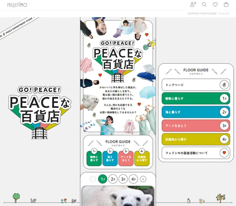
On mobile, the parent mark, date stamp, and rectangular menu/search cell share the approximately 42px utility rail. The large GO!PEACE! wordmark moves into its own white area below. The peace-hand symbol and message sit below and to the right of the wordmark. The desktop About pill is not visible in this opening layout.
Thin horizontal rules separate the utility and masthead regions. Persistent or sticky behavior was not verified, and the lower-page screenshots do not show a persistent top rail.
The rendered evidence includes an About link, a project-list link, topic links, keyword links, and partner links associated with navigation variants. Many desktop rectangles extend beyond the viewport, and the mobile menu-sized elements are absent from the painted opening capture.
Their computed styles establish component details: capsule links, gray keyword fills, compact Gothic text, and white message panels. They do not establish an observed open menu, its backdrop, slide direction, focus handling, or dismissal behavior.
Use the visible menu/search button as the entry affordance. Specify and test an accessible navigation state separately when implementing it.
Role: repeat the shopping-and-support proposition across the page width.
A narrow white strip carries the same short Japanese message repeatedly, with small colored dots separating repetitions. It has thin dark boundaries and clipped text at the viewport edges. The opening desktop capture shows several repetitions simultaneously; mobile shows a partial sentence continuing beyond both sides.
The DOM contains repeated message copies, and a responsive ticker-duration token exists. Exact keyframes and active animation behavior were not supplied. Preserve the continuous-strip appearance without assuming a measured direction, travel distance, or pause rule.
Role: provide a visually prominent entry into a support project.
The anatomy is consistent across the visible cards:
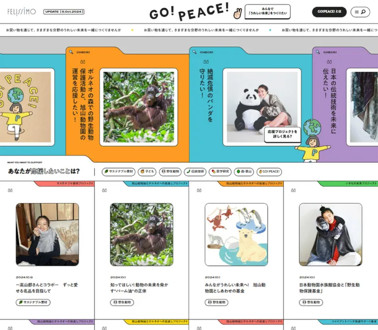
CHECK! label near the upper left.The current orange panel presents handmade animal toys and the statement “あなたの手づくりで 世界中の子どもたちを笑顔に。” The cyan panel presents a seated person with a large panda toy. The purple panel introduces animal support. These are current project examples, not interchangeable stock imagery.
On desktop, the image frame is approximately 300px square, with about 14px of white matting. It begins approximately 130px from the panel’s left edge. The vertical copy occupies the narrower area to its left. Panel pitch is approximately 470px, with adjoining colors meeting directly.
On mobile, the orange panel occupies approximately 336px horizontally, while its photo remains a substantial 238px square. The image begins about 83px inside the panel. Preserve this deliberate rebalancing rather than scaling every desktop dimension equally.
A globe-balancing illustrated guide overlaps the lower-right feature boundary. A desktop speech panel asks “応援プロジェクトを詳しく見る?” The character remains visible on mobile, while that speech panel is absent from the supplied mobile opening state.
The supplied links confirm project destinations, including the Happy Toys and panda project pages. Swipe, drag, autoplay, and arrow-control behavior were not exercised.
Role: let visitors begin with the cause they want to support.
The white section enters the colored stage through another folder-like shoulder. A tiny English eyebrow, WHAT YOU WANT TO SUPPORT, sits above the bold Japanese question “あなたが応援したいことは?” Part of the question uses outline lettering.
On desktop, the heading occupies a left region aligned with the first 360px article column. A short vertical rule separates it from a single horizontal line of topic pills. The pills combine fine outlines, dark text, and occasional emoji. They continue beyond the right edge.
On mobile, the eyebrow and question sit above the pill rail, with approximately 21px side padding. The visible pills are about 24px tall and smaller than the separate navigation-menu pills sampled in the DOM.
The recorded topic destinations are category archive URLs. This supports navigation semantics; it does not demonstrate an in-place article filter. Do not invent a selected-filter state or dynamic result count.
Role: present recent activity and connect editorial stories to projects and topics.
Desktop uses a continuous four-column grid with thin shared boundaries. These are white editorial cells, not floating cards with gutters and shadows. Each cell contains:
The first current row features the forest project in India, thread artwork on wood, a beach cleanup, and a polar bear. The rendered content contains twelve recent entries. Combined with the visible four-column arrangement, this supports a three-row desktop collection.
At 1440px, each cell is approximately 360px wide and its image approximately 240px square, leaving about 60px on either side. The ribbon and quote ornament occupy a separate upper zone before the image.
The mobile capture shows a different arrangement: a single article row with an approximately 153px image on the left and the date/title on the right. The colored ribbon still occupies the upper edge. This is an actual observed reflow, not merely a smaller desktop card.
For implementation, keep article navigation and category links as separate valid targets. Avoid nesting tag links inside an article-wide anchor.
Role: separate major collections while retaining a conversational tone.
After the article collection, a light-gray strip contains an illustration of a person and animals on a globe. White speech panels flank the scene, while a VIEW MORE capsule and adjacent circular arrow sit at the far right.
The following white section begins through a folder-shaped step. The repeated contour makes the page feel like a sequence of related files.
A second transition below the project directory uses two standing characters. The characters protrude across the gray band into the boundary above the dark closing area. Keep these illustrations on a dedicated decorative layer so their outlines remain visible and their overlap does not cover controls.
Role: connect a cause with a purchasable item.
The shopping section begins with the small English eyebrow SUPPORT BY SHOPPING and the Japanese heading “お買い物で応援する” accompanied by a shopping-bag emoji.
Desktop displays six cards per row. Each card is an independent white rounded rectangle with a fine dark border. The top is a square product-image region; a horizontal rule separates it from the information below. The card body contains a category, a centered multiline product name, and a price with a smaller tax note.
The first visible row includes clothing, a geometric paper mask, earrings, and a thread-art kit. Garments and objects retain their full silhouettes against white. Use contained product imagery rather than editorial-style cropping.
The grid has approximately 30px outer margins, 14px horizontal gaps, and 20px vertical gaps. Cards are approximately 218px wide. The first row stretches to a common bottom edge, but prices sit at different vertical positions according to title length. Do not impose a bottom-aligned price row if matching this capture.
The DOM supplies twelve products and a MORE ITEMS action. Mobile shopping geometry and product-link destinations were not included in the visual evidence.
Role: provide additional paths through a broad project collection.
The rendered content includes SEARCH BY KEYWORDS, the Japanese heading “キーワードから探す”, and many keyword archive links. It also includes a partner introduction followed by linked people and organizations, plus repeated GO! messages with human and animal emoji.
Repeated sequences are consistent with duplicated tracks or looping presentations, but their full page-level layouts are not visible in the captures. The supplied rounded gray keyword styles belong to sampled navigation elements; applying them to every homepage keyword is an implementation recommendation, not a verified measurement of that section.
The partner names describe project participation. Their presence does not establish website design or development credits.
Role: expose the breadth of support projects in a compact visual index.
The desktop lower-page capture shows tightly adjoining vertical stripes in coral, cyan, orange, green, purple, and yellow. Each stripe carries a vertically composed project name and a small circular arrow near its lower end. The stripe pitch is approximately 130px, so roughly eleven stripes fit across the 1440px view, with continuation at the edge.
Thin vertical outlines keep the colors distinct. Names remain dark and legible. The overall effect resembles a row of colorful book spines or file dividers.
The capture begins partway through this directory; its visible 401px segment does not establish the complete stripe height. Mobile geometry, movement, and scrolling controls for this section were not supplied.
Role: provide durable follow-up actions after browsing projects.
A full-width charcoal band holds two large white panels on desktop. Each has generous rounded corners and a fine dashed inner border inset by approximately 10px.
The left panel combines outlined TEAM, filled GO!PEACE!, a short registration invitation, a filled registration capsule, a separate circular arrow, and an illustration of a person with animals and plant motifs. Small speech panels overlap the illustration.
The right panel combines OFFICIAL SNS, a short Japanese caption, and three outlined capsules labeled X, INSTAGRAM, and LINE. These social controls are visually quieter than the filled registration action.
At 1440px, the outer panels are approximately 630px wide with a 20px gap and 80px side insets. At 390px, they stack vertically with approximately 21px margins. The registration illustration moves above a larger centered action, whose capsule and arrow are approximately 62px high. The social heading becomes one line, followed by three centered buttons approximately 228px wide.
The mobile social panel is approximately 285px tall. Its dashed border and generous internal whitespace remain visible; this treatment should not collapse into a dense list of footer links.
Role: close the experience with legal and parent-brand navigation.
A plain white footer follows the charcoal band. The desktop links form a centered horizontal line, separated by vertical marks. Below them is a reversed FELISSIMO logo in a black rectangle and a small gray copyright line.
Mobile wraps the links across two centered lines and reduces the logo block to approximately 92px wide. The page ends with comfortable white space. The footer is visually restrained compared with the preceding project and community sections.
| Treatment | Supplied evidence | What can be claimed |
|---|---|---|
| Common link/button feedback | opacity, color, background-color, border-color, fill, and filter transitions of 0.2s |
Short visual feedback is defined; final hover colors were not supplied |
| Navigation message transition | opacity 0.24s and transform 0.52s cubic-bezier(0.175, 0.885, 0.32, 1.275) |
A back-out transform curve is defined for sampled message panels; trigger and observed trajectory are unverified |
| Ticker duration | --ticker-speed: 80s desktop; 30s mobile |
Responsive duration tokens exist; the owning animation and complete keyframes were not supplied |
| Repeated feature entries | Repeated project sequences in rendered text and links | Consistent with a looping implementation; not proof of autoplay, dragging, or a specific carousel library |
| Repeated keywords and partners | Multiple repeated sequences in rendered text | Duplication is present; its visual and accessibility treatment is unknown |
| Header menu/search | Visible symbols inside a sampled button | An entry control exists; the opened state was not exercised |
| Topic and keyword navigation | Recorded archive href values |
Links target archive pages; in-place filtering is unverified |
| Project links | Recorded project-specific href values |
Feature content has project destinations; destination-page behavior was not inspected |
| Scroll presentation | Supplied top, middle, and bottom captures | Long-page layout is established; sticky transitions and scroll-linked animation are unverified |
The capture process waited for finite visible motion and image decoding, and temporarily paused perpetual animations during readiness checks. That procedure improves screenshot stability but does not provide a motion recording. Static captures cannot establish movement direction, frequency, hover pausing, or reduced-motion support.
Recommended adaptation: use approximately 200ms color/opacity feedback for small controls. Keep decorative motion optional. If a ticker or project loop moves automatically, add an explicit pause mechanism, stop movement during keyboard interaction, and preserve a complete static version under reduced motion. The distinctive folder geometry and illustrations should remain effective without animation.
| Layer | Appearance | Function |
|---|---|---|
| Page canvas | Flat white | Provides a consistent base for a dense collection |
| Feature backdrop | Medium gray | Reveals the stepped folder silhouettes |
| Featured projects | Saturated flat fields, fine dark edges | Establish variety and visual prominence |
| Editorial cells | White, shared grid rules | Organize stories without extra card elevation |
| Photo mats | White inset, rounded dark outline | Separate project imagery from saturated panels |
| Shopping cards | White rounded rectangle, solid outline, internal divider | Group product image, cause, title, and price |
| Section transitions | Light gray with overlapping illustrations | Give the reader a visual pause between collections |
| Speech panels | White with dark outline and a firmer bottom edge | Introduce a conversational voice |
| Membership/social band | Charcoal behind white panels | Concentrate attention on closing actions |
| Inner panel frame | Fine dashed outline | Adds a paper-and-stitch character without texture |
There is no visible general-purpose soft-shadow system. Separation comes from lines, flat contrast, rounded frames, and occasional hard lower edges on speech panels. Photographic shadows belong to the images and should not be confused with interface elevation.
Use natural, full-color imagery appropriate to each content type. Project features mix crafted objects, people, and animals. Editorial images include field visits, material processes, environmental activity, and wildlife. Product images present complete objects or garments against white.
Square frames unify these different subjects. Preserve the white mat around featured imagery, but let editorial photos occupy their own rounded square directly. Product photography needs sufficient white space to show long garments, thin jewelry, and irregular paper objects without cropping.
Do not apply a global color filter, duotone treatment, grain layer, or pixelated rendering. The interface obtains its graphic character from illustration and geometry rather than from processing every photograph.
The recurring people have simple faces, dark outlines, flat clothing colors, and modest proportions. Animals, plants, globes, and small speech panels create scenes about shared participation. The illustrations are intentionally informal but remain clean at the displayed size.
Use illustration at boundaries: a character standing beside a feature, a globe emerging from a transition strip, or a membership scene occupying half a footer panel. Keep its silhouette independent of the photo frame. Avoid placing every drawing inside an additional card.
Emoji appear within labels and headings, while menu/search symbols and arrows use simpler dark linework. These systems coexist. Do not replace every emoji with a uniform icon set if preserving the observed tone.
No image src values, SVG filenames, or font-file URLs were supplied. The following are visual references, not invented asset paths.
| Asset | Current evidence | Role |
|---|---|---|
| FELISSIMO wordmark | Header and footer captures | Parent identity |
| GO!PEACE! graphic wordmark | Desktop and mobile opening captures | Project identity |
| Happy Toys group image | Orange feature in both opening captures | Current handmade-toy project |
| Person with giant panda toy | Cyan desktop feature | Panda-support project |
| Globe-balancing guide | Lower-right feature boundary | Connects the opening projects to the next section |
| Forest, thread-art, cleanup, and polar-bear photos | First desktop article row | Current editorial content |
| Clothing, mask, jewelry, and craft photography | Desktop shopping capture | Product discovery |
| Person and animals on globe | Article-to-shopping transition | Section narration |
| Two standing characters | Directory-to-community transition | Closing project message |
| Person with animals and plants | Membership panel on both viewports | Registration invitation |
For a new implementation, supply authorized imagery or newly commissioned equivalents. CSS can reproduce the frames and contours, but it cannot replace the identity carried by these illustrations.
The page alternates full-width collections with inset card groups. The main sequence is masthead, message ticker, featured projects, topic navigation, recent articles, shopping, additional discovery sections, project directory, community actions, and corporate footer.
The article grid spans the width with four shared-rule columns. The shopping grid uses six separate cards inside approximately 30px margins. The final community panels use wider approximately 80px margins. Preserve these different densities; one universal centered container would flatten the composition.
Horizontal continuation is visible in the featured projects, topic pills, and project directory. Keep overflow confined to those components so the main document remains the viewport width.
The source exposes --breakpoints-sm: 768px, --breakpoints-md: 1024px, and --breakpoints-xl: 1680px. These are measured token values, not a complete record of the media queries controlling each component.
No tablet or large-desktop screenshot was supplied. Mobile product columns, keyword-section geometry, partner-section geometry, and directory behavior are unverified. A two-column phone product grid and a three-column tablet grid are reasonable recommended additions, not observations.
The CSS below uses the supplied 768px and 1024px boundaries as adaptation choices. It preserves measured viewport targets where available and provides practical intermediate layouts where evidence is incomplete.
rem numbers into a standard-root project unchanged.These are recommendations for a new implementation, not verified features of the original:
#ffffff.#212121.#fd9b23, cyan #47c1d3, coral #fe766b, green #50cd5a, purple #af8ec8.#ffdc00; exact source value unavailable.#cdcdcd.#eeeeee.“Create a Japanese social contribution editorial and shopping portal inspired by the current GO!PEACE! homepage. Use a white canvas, charcoal #212121 text and fine rules, and alternating orange, cyan, coral, green, purple, and yellow project panels. Build the opening as adjoining folder-shaped panels with raised curved tabs, small CHECK! labels, vertically composed Japanese statements, and square photos inside white rounded mats. Follow with a cause-navigation rail, a four-column shared-rule article grid, and a six-column product grid with separate outlined cards. Use friendly flat illustrations of people, animals, and globes at section boundaries. Finish with two white dashed-frame panels inside a charcoal band, then a restrained corporate footer. Use A1 Gothic M/B and presicav where available. On a 390px phone, separate the utility rail from the large wordmark, keep one substantial feature panel with neighboring slivers, turn articles into image-and-text rows, and stack the community panels. Treat unverified motion and phone shopping geometry as implementation choices.”
This is a new implementation scaffold, not recovered source CSS. It keeps a conventional root font size and expresses observed dimensions in CSS pixels. Color and font aliases come from supplied declarations; unmeasured dimensions, tablet behavior, phone product columns, and optional animation wiring are adaptation choices.
The folder silhouette is implemented with an inline SVG so the sloping shoulder can retain a continuous thin outline. That is a recommended technique, not a claim about the original implementation.
:root {
  /* Measured colors, with one explicitly estimated accent. */
  --gp-paper: #ffffff;
  --gp-ink: #212121;
  --gp-orange: #fd9b23;
  --gp-cyan: #47c1d3;
  --gp-coral: #fe766b;
  --gp-green: #50cd5a;
  --gp-purple: #af8ec8;
  --gp-yellow: #ffdc00; /* Visual estimate. */
  --gp-stage: #cdcdcd;
  --gp-soft: #eeeeee;

  /* Supplied font-family declarations. */
  --gp-font-body: 'A1 Gothic M', sans-serif;
  --gp-font-emphasis: 'A1 Gothic B', sans-serif;
  --gp-font-en: presicav, sans-serif;
  --gp-body-size: 16px;
  --gp-title-size: 28px;

  /* Geometry estimated from the current captures. */
  --gp-gutter: 30px;
  --gp-rule: 1px solid var(--gp-ink);
  --gp-radius-image: 16px;
  --gp-radius-card: 13px;
  --gp-radius-panel: 21px;
  --gp-radius-pill: 999px;
  --gp-feature-width: 470px;
  --gp-feature-photo: 300px;

  /* Timing values exist in the supplied styles. */
  --gp-feedback: 200ms;
  --gp-ticker-cycle: 80s;
  --gp-back-out: cubic-bezier(0.175, 0.885, 0.32, 1.275);
}

.gp-page,
.gp-page *,
.gp-page *::before,
.gp-page *::after {
  box-sizing: border-box;
}

.gp-page {
  margin: 0;
  color: var(--gp-ink);
  background: var(--gp-paper);
  font: 400 var(--gp-body-size)/1.6 var(--gp-font-body);
}

.gp-page img { display: block; max-width: 100%; }
.gp-page a { color: inherit; }

.gp-page :is(a, button):focus-visible {
  outline: 2px solid var(--gp-ink);
  outline-offset: 4px;
}

[data-tone='orange'] { --panel: var(--gp-orange); }
[data-tone='cyan'] { --panel: var(--gp-cyan); }
[data-tone='coral'] { --panel: var(--gp-coral); }
[data-tone='green'] { --panel: var(--gp-green); }
[data-tone='purple'] { --panel: var(--gp-purple); }
[data-tone='yellow'] { --panel: var(--gp-yellow); }

.eyebrow {
  margin: 0 0 12px;
  font: 700 8px/1.2 var(--gp-font-en);
}

.section-title {
  margin: 0;
  font: 400 var(--gp-title-size)/1.35 var(--gp-font-emphasis);
}

@supports (-webkit-text-stroke: 1px black) {
  .outline-word {
    color: var(--gp-paper);
    -webkit-text-stroke: 1px var(--gp-ink);
  }
}

/* Static by default; automatic movement is an explicit addition. */
.message-ticker {
  overflow: hidden;
  border-block: var(--gp-rule);
  background: var(--gp-paper);
}

.ticker-track { display: flex; width: max-content; }
.ticker-group {
  display: flex;
  flex: none;
  align-items: center;
  gap: 40px;
  min-height: 48px;
  padding-inline: 20px;
  white-space: nowrap;
  font-size: 13px;
}

/* Requires exactly two identical, equal-width groups. */
.ticker-track[data-animate='true'] {
  animation: gp-ticker var(--gp-ticker-cycle) linear infinite;
}

.message-ticker:is(:hover, :focus-within) .ticker-track,
.message-ticker[data-paused='true'] .ticker-track {
  animation-play-state: paused;
}

@keyframes gp-ticker {
  to { transform: translateX(-50%); }
}

/* Manual horizontal rail: this does not assert original swipe behavior. */
.feature-rail {
  display: flex;
  overflow-x: auto;
  padding-top: 38px;
  background: var(--gp-stage);
  scroll-snap-type: x proximity;
  scroll-padding-inline: var(--gp-gutter);
}

.feature-card {
  position: relative;
  isolation: isolate;
  display: grid;
  flex: 0 0 var(--gp-feature-width);
  grid-template-columns: 60px var(--gp-feature-photo);
  column-gap: 30px;
  min-height: 462px;
  padding: 80px 40px 56px;
  color: var(--gp-ink);
  text-decoration: none;
  scroll-snap-align: start;
}

.folder-shape {
  position: absolute;
  inset: 0;
  width: 100%;
  height: 100%;
  fill: var(--panel, var(--gp-orange));
  stroke: var(--gp-ink);
  stroke-width: 1;
  pointer-events: none;
}

.feature-kicker {
  position: absolute;
  top: 14px;
  left: 12px;
  z-index: 1;
  font: 700 10px/1 var(--gp-font-en);
}

.feature-copy {
  position: relative;
  z-index: 1;
  width: 60px;
  height: 326px;
  margin: 0;
  writing-mode: vertical-rl;
  text-orientation: mixed;
  font: 400 22px/1.35 var(--gp-font-emphasis);
}

.feature-frame {
  position: relative;
  z-index: 1;
  width: var(--gp-feature-photo);
  aspect-ratio: 1;
  margin: 0;
  padding: 14px;
  overflow: hidden;
  border: var(--gp-rule);
  border-radius: var(--gp-radius-image);
  background: var(--gp-paper);
}

.feature-frame img {
  width: 100%;
  height: 100%;
  object-fit: cover;
}

.support-bar {
  display: grid;
  grid-template-columns: 360px minmax(0, 1fr);
  align-items: center;
  border-bottom: var(--gp-rule);
  background: var(--gp-paper);
}

.support-heading { padding: 20px 30px; }
.category-rail {
  display: flex;
  gap: 10px;
  min-width: 0;
  overflow-x: auto;
  padding: 20px 28px;
  border-left: var(--gp-rule);
}

.tag {
  display: inline-flex;
  flex: none;
  align-items: center;
  gap: 4px;
  padding: 8px;
  border: var(--gp-rule);
  border-radius: var(--gp-radius-pill);
  background: var(--gp-paper);
  font-size: 12px;
  line-height: 1;
  text-decoration: none;
  white-space: nowrap;
  transition: color var(--gp-feedback),
    background-color var(--gp-feedback);
}

.keyword-list { display: flex; flex-wrap: wrap; gap: 10px; }
.keyword-list .tag { background: var(--gp-soft); }

/* Recommended hover state; original endpoint colors were not supplied. */
@media (hover: hover) {
  .tag:hover { color: var(--gp-paper); background: var(--gp-ink); }
}

.article-grid {
  display: grid;
  grid-template-columns: repeat(4, minmax(0, 1fr));
  border-top: var(--gp-rule);
}

.article-card {
  position: relative;
  min-width: 0;
  padding: 82px 60px 48px;
  border-right: var(--gp-rule);
  border-bottom: var(--gp-rule);
}

.article-project {
  position: absolute;
  top: 0;
  right: 0;
  max-width: 92%;
  padding: 2px 8px 2px 24px;
  border-bottom: var(--gp-rule);
  border-radius: 0 0 0 20px;
  background: var(--panel, var(--gp-coral));
  font-size: 9px;
  line-height: 16px;
}

.article-image {
  width: 100%;
  aspect-ratio: 1;
  object-fit: cover;
  border: var(--gp-rule);
  border-radius: var(--gp-radius-image);
}

.article-date {
  display: block;
  margin-top: 24px;
  font: 700 10px/1.3 var(--gp-font-en);
}

.article-title {
  margin: 12px 0 18px;
  font: 400 15px/1.5 var(--gp-font-emphasis);
}

.article-tags { display: flex; flex-wrap: wrap; gap: 6px; }
.article-tags .tag { padding: 5px 9px; }

.shopping-section { padding: 28px var(--gp-gutter) 40px; }
.product-grid {
  display: grid;
  grid-template-columns: repeat(6, minmax(0, 1fr));
  gap: 20px 14px;
  margin-top: 36px;
}

.product-card {
  min-width: 0;
  overflow: hidden;
  border: var(--gp-rule);
  border-radius: var(--gp-radius-card);
  background: var(--gp-paper);
}

.product-image {
  width: 100%;
  aspect-ratio: 1;
  object-fit: contain;
  border-bottom: var(--gp-rule);
}

.product-info { padding: 18px 20px; text-align: center; }
.product-category { margin: 0; font-size: 12px; }
.product-title {
  margin: 12px 0;
  font: 400 14px/1.5 var(--gp-font-emphasis);
}
.product-price { margin: 0; font: 700 14px/1.4 var(--gp-font-en); }
.product-price small { font: 400 10px/1.4 var(--gp-font-body); }

.project-directory { display: flex; overflow-x: auto; }
.project-spine {
  display: flex;
  flex: 0 0 130px;
  flex-direction: column;
  align-items: center;
  justify-content: space-between;
  gap: 30px;
  min-height: 420px; /* Recommended; full source height is unknown. */
  padding: 28px 16px;
  border: var(--gp-rule);
  border-left: 0;
  background: var(--panel, var(--gp-coral));
  text-decoration: none;
}
.project-spine strong {
  writing-mode: vertical-rl;
  text-orientation: mixed;
  font: 400 22px/1.3 var(--gp-font-emphasis);
}

.community-band {
  padding: 26px 80px 40px;
  background: var(--gp-ink);
}
.community-grid {
  display: grid;
  grid-template-columns: repeat(2, minmax(0, 1fr));
  gap: 20px;
}
.community-card {
  position: relative;
  min-width: 0;
  min-height: 260px;
  padding: 46px;
  border-radius: var(--gp-radius-panel);
  background: var(--gp-paper);
  color: var(--gp-ink);
}
.community-card::before {
  content: '';
  position: absolute;
  inset: 10px;
  border: 1px dashed var(--gp-ink);
  border-radius: 14px;
  pointer-events: none;
}
.community-inner {
  display: grid;
  grid-template-columns: repeat(auto-fit, minmax(min(100%, 200px), 1fr));
  align-items: center;
  gap: 20px;
}
.community-title { margin: 0; font: 700 32px/1.05 var(--gp-font-en); }
.social-links { display: grid; gap: 10px; width: 100%; max-width: 228px; margin-inline: auto; }
.social-link {
  display: grid;
  place-items: center;
  min-height: 42px;
  border: var(--gp-rule);
  border-radius: var(--gp-radius-pill);
  font-family: var(--gp-font-emphasis);
  text-decoration: none;
}
.action-pair {
  --action-size: 40px;
  display: inline-flex;
  align-items: stretch;
  color: var(--gp-ink);
  text-decoration: none;
}
.action-label,
.action-arrow {
  display: grid;
  place-items: center;
  min-height: var(--action-size);
  border: var(--gp-rule);
  border-radius: var(--gp-radius-pill);
  background: var(--gp-paper);
}
.action-label { padding-inline: 25px; }
.action-arrow { width: var(--action-size); flex: none; }
.action-pair.is-filled :is(.action-label, .action-arrow) {
  color: var(--gp-paper);
  background: var(--gp-ink);
}
.corporate-footer { padding: 36px 21px; text-align: center; }
.footer-links { display: flex; flex-wrap: wrap; justify-content: center; gap: 8px 12px; }

/* Intermediate layouts are recommendations, not observed screenshots. */
@media (min-width: 768px) and (max-width: 1023px) {
  .article-grid { grid-template-columns: repeat(2, minmax(0, 1fr)); }
  .product-grid { grid-template-columns: repeat(3, minmax(0, 1fr)); }
  .community-band { padding-inline: 30px; }
  .community-grid { grid-template-columns: 1fr; }
}

@media (max-width: 767px) {
  :root {
    --gp-body-size: 14.56px;
    --gp-title-size: 22px;
    --gp-gutter: 20.8px;
    --gp-feature-width: 336px;
    --gp-feature-photo: 238px;
    --gp-ticker-cycle: 30s;
  }
  .ticker-group { min-height: 40px; font-size: 12px; }
  .feature-rail { padding-top: 16px; }
  .feature-card {
    grid-template-columns: 44px var(--gp-feature-photo);
    column-gap: 15px;
    min-height: 388px;
    padding: 63px 15px 60px 24px;
  }
  .feature-copy { width: 44px; height: 264px; font-size: 16.64px; }
  .feature-frame { padding: 10.4px; border-radius: 13px; }
  .feature-kicker { font-size: 8px; }
  .support-bar { grid-template-columns: 1fr; }
  .support-heading { padding: 20px var(--gp-gutter) 16px; }
  .category-rail { border-left: 0; padding: 0 var(--gp-gutter) 20px; gap: 7px; }
  .category-rail .tag { min-height: 24px; padding: 5px 8px; font-size: 10.4px; }
  .article-grid { grid-template-columns: 1fr; }
  .article-card {
    display: grid;
    grid-template-columns: 44% minmax(0, 1fr);
    align-items: start;
    gap: 12px;
    padding: 41px var(--gp-gutter) 24px;
    border-right: 0;
  }
  .article-date { margin-top: 0; }
  .article-title { font-size: 14px; }
  .product-grid { grid-template-columns: repeat(2, minmax(0, 1fr)); }
  .product-info { padding: 14px 12px; }
  .community-band { padding: 30px var(--gp-gutter) 42px; }
  .community-grid { grid-template-columns: 1fr; gap: 21px; }
  .community-card { padding: 34px 30px; text-align: center; }
  .community-inner { grid-template-columns: 1fr; }
  .community-title { font-size: 26px; }
  .social-link { min-height: 38px; }
  .action-pair.is-filled { --action-size: 62px; }
  .footer-links { font-size: 10px; }
}

@media (prefers-reduced-motion: reduce) {
  .ticker-track[data-animate='true'] { animation: none; transform: none; }
  .ticker-track { display: block; width: auto; }
  .ticker-group { white-space: normal; }
  .ticker-group[aria-hidden='true'] { display: none; }
  .tag { transition: none; }
}
The SVG below is a newly drawn approximation of the observed folder contour. Replace PROJECT_IMAGE_URL with an authorized image URL; it is a placeholder, not a recovered source asset. Decorative quotation artwork and overlapping character illustrations can be added as separate noninteractive layers.
<div class='gp-page'>
  <div class='feature-rail' aria-label='Featured support projects'>
    <a class='feature-card' data-tone='orange'
       href='https://www.felissimo.co.jp/gopeace/archives/project/happytoysproject/'>
      <svg class='folder-shape' viewBox='0 0 470 462'
           preserveAspectRatio='none' aria-hidden='true'>
        <path vector-effect='non-scaling-stroke'
          d='M.5 461.5V16.5Q.5 .5 16.5 .5H183Q198 .5 208 11L220 22Q226 27.5 235 27.5H469.5V461.5Z'/>
      </svg>
      <span class='feature-kicker'><span aria-hidden='true'>🔍</span> CHECK!</span>
      <h2 class='feature-copy' lang='ja'>あなたの手づくりで<br>世界中の子どもたちを笑顔に。</h2>
      <figure class='feature-frame'>
        <img src='PROJECT_IMAGE_URL' width='600' height='600'
             alt='A group of handmade fabric animal toys'>
      </figure>
    </a>
  </div>
</div>
For article markup, place .article-image and a text wrapper as the two direct grid children of .article-card. Keep .article-project absolutely positioned. Place the date, title link, and independent topic links inside the text wrapper.
For an optional animated ticker, use two equal-width .ticker-group children and hide the duplicate from assistive technology. A pause button must control data-paused; hover pausing alone is insufficient. The scaffold deliberately does not implement menu state, carousel cloning, destination loading, registration, or social-link URLs.
Optional aliases for a project that already uses Tailwind v4. This is not evidence that the original site uses Tailwind. Define the properties above first.
@theme inline {
  --color-gp-paper: var(--gp-paper);
  --color-gp-ink: var(--gp-ink);
  --color-gp-orange: var(--gp-orange);
  --color-gp-cyan: var(--gp-cyan);
  --color-gp-coral: var(--gp-coral);
  --color-gp-green: var(--gp-green);
  --color-gp-purple: var(--gp-purple);
  --color-gp-yellow: var(--gp-yellow);
  --color-gp-soft: var(--gp-soft);

  --font-gp-body: var(--gp-font-body);
  --font-gp-emphasis: var(--gp-font-emphasis);
  --font-gp-en: var(--gp-font-en);

  --text-gp-body: var(--gp-body-size);
  --text-gp-title: var(--gp-title-size);
  --spacing-gp-gutter: var(--gp-gutter);
  --radius-gp-image: var(--gp-radius-image);
  --radius-gp-card: var(--gp-radius-card);
  --radius-gp-panel: var(--gp-radius-panel);
}
2026-09-16T19:29:43.545Z, equivalent to September 17, 2026, 04:29:43.545 JST. Individual screenshot timestamps were not separately provided.The supplied inspection waited for document load, finite animation readiness, sampled layout stability, and visible image decoding within bounded time limits. Perpetual animations were paused during readiness checks and resumed afterward. Scrolling traversed intermediate positions. SharedWorkers and service workers were disabled.
No additional browsing, command execution, file inspection, or interaction testing was performed for this reference. Open-menu behavior, hover endpoints, focus behavior, automatic-track mechanics, complete asset URLs, tablet layouts, mobile shopping geometry, and the complete appearance of the keyword/partner sections remain unverified. The Quick Start is an untested implementation scaffold derived from the supplied evidence, with estimates and recommendations identified above.
# GO!PEACE! / FELISSIMO — Style Reference

> A colorful file of causes, stories, and shopping, held together by fine ink rules and friendly illustrated guides.

**Website / Original URL:** [felissimo.co.jp/gopeace](https://www.felissimo.co.jp/gopeace/)
**Final URL:** [https://www.felissimo.co.jp/gopeace/](https://www.felissimo.co.jp/gopeace/)
**Theme:** white editorial surfaces, saturated project panels, and a charcoal membership/social band.
**Inspected:** September 17, 2026, at 04:29 JST; supplied retrieval timestamp: September 16, 2026, 19:29:43.545 UTC.
**Viewports:** desktop 1440 × 1000 CSS pixels; mobile 390 × 844 CSS pixels.
**Scope:** the current homepage, including the masthead, featured projects, topic navigation, article collection, shopping cards, project directory, membership/social panels, and footer. Keyword and partner sections are documented from rendered text and links; their complete visual layouts are not present in the supplied captures. Destination pages and opened navigation states were not inspected.

GO!PEACE! is FELISSIMO’s social contribution editorial and shopping portal. It gives visitors several ways to explore support projects: read a recent story, choose a cause, discover a product, browse keywords, or open the project directory. Its design supports continued browsing across this collection.

The visual identity comes from the relationship between colorful folder shapes and disciplined white grids. Orange, cyan, coral, green, purple, and yellow create an inviting opening sequence and a dense directory of vertical project names. Fine charcoal outlines organize photographs, products, tags, and navigation. Illustrated people, animals, and globes cross section boundaries, turning navigation into a small conversation.

Typography combines Japanese Gothic faces with wide, compact English lettering. The main wordmark has an irregular rising arrangement; section headings mix solid and outlined words. Photography remains natural and varied, while product images sit cleanly on white. These contrasting image treatments help distinguish stories, shopping, and brand illustration without introducing separate visual systems.
# GO!PEACE! / FELISSIMO — Style Reference

> A colorful file of causes, stories, and shopping, held together by fine ink rules and friendly illustrated guides.

**Website / Original URL:** [felissimo.co.jp/gopeace](https://www.felissimo.co.jp/gopeace/)
**Final URL:** [https://www.felissimo.co.jp/gopeace/](https://www.felissimo.co.jp/gopeace/)
**Theme:** white editorial surfaces, saturated project panels, and a charcoal membership/social band.
**Inspected:** September 17, 2026, at 04:29 JST; supplied retrieval timestamp: September 16, 2026, 19:29:43.545 UTC.
**Viewports:** desktop 1440 × 1000 CSS pixels; mobile 390 × 844 CSS pixels.
**Scope:** the current homepage, including the masthead, featured projects, topic navigation, article collection, shopping cards, project directory, membership/social panels, and footer. Keyword and partner sections are documented from rendered text and links; their complete visual layouts are not present in the supplied captures. Destination pages and opened navigation states were not inspected.

GO!PEACE! is FELISSIMO’s social contribution editorial and shopping portal. It gives visitors several ways to explore support projects: read a recent story, choose a cause, discover a product, browse keywords, or open the project directory. Its design supports continued browsing across this collection.

The visual identity comes from the relationship between colorful folder shapes and disciplined white grids. Orange, cyan, coral, green, purple, and yellow create an inviting opening sequence and a dense directory of vertical project names. Fine charcoal outlines organize photographs, products, tags, and navigation. Illustrated people, animals, and globes cross section boundaries, turning navigation into a small conversation.

Typography combines Japanese Gothic faces with wide, compact English lettering. The main wordmark has an irregular rising arrangement; section headings mix solid and outlined words. Photography remains natural and varied, while product images sit cleanly on white. These contrasting image treatments help distinguish stories, shopping, and brand illustration without introducing separate visual systems.

## How to Read This Reference

- **Measured** means a value was supplied in the rendered DOM, computed styles, or custom properties.
- **Visual estimate** means a dimension or treatment was estimated from the current desktop/mobile screenshots. These estimates are useful implementation targets, not recovered CSS declarations.
- **Recommended** means a proposed implementation choice, including the CSS below. Recommendations do not establish original behavior.
- **Source tokens** retain their supplied names. Tokens prefixed with `--gp-` are implementation aliases created for this reference.
- The element sample contains navigation and compact-header variants that are not visibly painted in the screenshots. A nonzero rectangle does not establish that an element was visible.
- The source root is **10px on desktop and 5.2px on the inspected phone**. Its numeric `rem` values must not be copied into a conventional 16px-root project without conversion.
- The visible update stamp reads `8.Sep.2026`. This is the page’s content-update label, not the inspection date.

## Tokens — Colors

### Default Palette

| Name | Value | Evidence / source token | Role |
| --- | --- | --- | --- |
| Paper | `#ffffff` | Measured: `--color-bg`, `--color-white`, body background | Main canvas, image mats, product cards, tags, and footer |
| Ink | `#212121` | Measured body text and filled About control; also a supplied preset | Main lettering, visual outlines, filled controls, and the matching dark closing band |
| Project Orange | `#fd9b23` | Measured: `--color-orange`, `--color-01` | Current Happy Toys feature panel and recurring project accents |
| Project Cyan | `#47c1d3` | Measured: `--color-blue`, `--color-02` | Current panda feature panel, article ribbons, and directory stripes |
| Project Coral | `#fe766b` | Measured: `--color-red`, `--color-06` | Adjacent feature panels, article ribbons, and directory stripes |
| Project Green | `#50cd5a` | Measured: `--color-green` | Project directory and article accents |
| Project Purple | `#af8ec8` | Measured: `--color-purple` | Current animal-support feature panel and directory stripes |
| Project Yellow | Approximately `#ffdc00` | Visual estimate; exact yellow token was not supplied | Directory stripe and illustrated clothing accents |
| Stage Gray | `#cdcdcd` | Measured token: `--color-gray-dark`; visual correspondence with feature backdrop | Exposed field above the colored folder shoulders |
| Separator Gray | `#eeeeee` | Measured keyword-link background; visual correspondence with transition strips | Quiet section separators and keyword surfaces |

The named source colors are more authoritative than perceived screenshot colors. Rendering and image presentation can alter their apparent hue.

### Color Assignment

Use the accents as a repeating editorial palette. They are not established as a fixed taxonomy: the first two visible articles both belong to the forest project but carry different colored ribbons. Keep the textual project name and topic labels as the primary identifiers.

The supplied custom properties also contain generic publishing-system gradients, shadows, and additional colors. Their presence does not establish use in the captured design. The visible page is dominated by flat fills and thin rules.

The source token `--color-line: #2ec22e` should not be interpreted as the charcoal border color merely because of its name. A new implementation should define an explicit ink-colored rule token.

## Tokens — Typography

### Japanese Body and Navigation

- **Measured source family:** `'A1 Gothic M', sans-serif`.
- **Desktop body:** `16px`, weight `400`, line height `25.6px`.
- **Mobile body:** `14.56px`, weight `400`, line height `23.296px`.
- **Character:** substantial, friendly Japanese Gothic lettering with enough density to support many short labels and article titles.
- **Implementation alias:** `--gp-font-body`.

### Japanese Emphasis

- **Measured source family:** `'A1 Gothic B', sans-serif` on the About link and sampled mobile message.
- **Computed weight on these elements:** `400`. The bold appearance comes from the named B face; it is not evidence of `font-weight: 700`.
- **Recommended use:** section titles, short project statements, membership copy, and product/article emphasis.
- **Limitation:** the exact family assignment of every visible headline was not included in the sample.

### English Utility Lettering

- **Source token:** `--font-family-en: presicav, sans-serif`.
- **Directly measured use:** the update stamp, at weight `700`.
- **Appearance:** broad, compact uppercase lettering with a strong horizontal footprint.
- **Visible related treatments:** `CHECK!`, section eyebrows, `VIEW MORE`, and the membership/social headings have a similarly graphic English character. Their individual computed styles were not supplied.

The tilted GO!PEACE! masthead is a graphic wordmark. Its appearance should not be reconstructed simply by assigning the English UI font to ordinary text. Preserve the supplied wordmark or create an authorized equivalent with deliberate letter placement.

### Type Scale

| Role | Desktop | Mobile | Evidence |
| --- | --- | --- | --- |
| Body | `16px / 25.6px` | `14.56px / 23.296px` | Measured |
| Update stamp | `10px / 10px`, weight `700` | `9.36px / 9.36px`, weight `700` | Measured |
| Desktop About link | `12px / 19.2px`, A1 Gothic B | Separate mobile navigation instance: `16.64px / 16.64px` | Measured; mobile instance is not the visible top rail |
| Navigation category links | `12px / 12px` | `14.56px / 14.56px` | Measured navigation variants |
| Navigation keyword links | `12px / 12px` | `14.56px / 14.56px` | Measured navigation variants |
| Navigation message | `16px / 20.8px` | `16.64px / 21.632px` | Measured; tracking approximately `-0.06em` |
| Visible horizontal topic rail | Approximately `12px` | Approximately `10–11px` | Visual estimate; distinct from the larger menu links |
| Vertical feature statement | Approximately `22px` | Approximately `16–17px` | Visual estimate |
| Main Japanese section heading | Approximately `26–28px` | Approximately `21–22px` | Visual estimate |
| Article and product title | Approximately `14–16px`, leading around `1.4–1.5` | First visible article approximately `14px` | Visual estimate |
| English section eyebrow | Approximately `7–8px` | Approximately `7–8px` | Visual estimate |
| Membership/social display | Approximately `30–32px` | Approximately `26–28px` | Visual estimate |

### Outline Lettering and Vertical Text

The support question selectively outlines part of its Japanese heading. The footer panels also alternate filled and outlined English words, such as `TEAM` and `SNS`. This is a local emphasis technique, not the treatment for every heading.

Project statements and directory titles use vertical Japanese composition. For an adaptation, use `writing-mode: vertical-rl` and `text-orientation: mixed`; do not rotate a complete horizontal paragraph. Preserve natural line breaks, punctuation, and mixed Latin text.

The evidence includes font-family declarations but no downloadable font paths. Loading and licensing of those faces are separate implementation requirements. A fallback sans-serif will change line breaks and label widths.

## Tokens — Spacing & Shapes

### Source Unit Behavior

| Property | Desktop | Mobile | Interpretation |
| --- | --- | --- | --- |
| Root font size | `10px` | `5.2px` | Measured |
| `--header-height` | `9.1rem` | `8rem` | Converts to `91px` and `41.6px` at the measured roots |
| `--font-size-base` | `16px` | `28px` | Raw custom-property values; the mobile body actually computes to `14.56px` |
| Document height | Approximately `5473.45px` | Approximately `8007.33px` | Measured at capture time; content dependent |

The mobile root is consistent with a scaled design-unit system, but the formula and its limits were not supplied. Do not claim a particular viewport formula from these two samples. The body and controls also receive responsive changes, so the phone is not a uniform 52% reduction of desktop.

### Spacing Scale

| Use | Value | Status |
| --- | --- | --- |
| Main outlines and separators | Approximately `1px` | Visual estimate |
| Desktop update-stamp padding | `3px 5px` | Measured |
| Mobile update-stamp padding | `2.08px 4.16px` | Measured |
| Desktop navigation category padding | `8px` | Measured |
| Desktop navigation keyword padding | `8px 10px` | Measured |
| Desktop header logo left offset | `28px` | Measured |
| Shopping-section side inset | Approximately `30px` | Visual estimate |
| Product-grid horizontal / vertical gap | Approximately `14px / 20px` | Visual estimate |
| Desktop article-image side inset | Approximately `60px` within a `360px` column | Visual estimate |
| Mobile article side inset | Approximately `21px` | Visual estimate |
| Footer-panel dashed-border inset | Approximately `10px` | Visual estimate |
| Desktop closing-band side inset | Approximately `80px` | Visual estimate |
| Mobile closing-band side inset | Approximately `21px` | Visual estimate |

### Border Radius

| Element | Value / treatment | Evidence |
| --- | --- | --- |
| Update stamp | `3px` desktop; `3.12px` mobile | Measured |
| About pill and desktop menu/search control | `999px` | Measured |
| Navigation topic and keyword links | `999px` | Measured |
| Mobile menu/search cell | `0px` | Measured |
| Feature-photo frame | Approximately `14–16px` | Visual estimate |
| Article image | Approximately `16–18px` | Visual estimate |
| Product card | Approximately `12–14px` | Visual estimate |
| Membership/social outer panel | Approximately `20–22px` | Visual estimate |
| Speech panel | Rounded upper corners with a firmer lower edge | Visible treatment; exact geometry unavailable |
| Folder shoulder | Curved rise, short upper shelf, and sloping return | Custom contour; not a single border radius |

### Layout Measurements

| Element | Desktop 1440 × 1000 | Mobile 390 × 844 | Evidence |
| --- | --- | --- | --- |
| Main utility header | `91px` reference height | Approximately `41.6px` | Source token conversion and matching screenshot |
| Parent-brand link box | `110 × 38.95px` | `85.27 × 30.19px` | Measured |
| Desktop GO!PEACE! wordmark box | `300 × 72.75px` | Visible large masthead approximately `270 × 65px` | Desktop measured; mobile visual estimate |
| Menu/search control | `74 × 40px` | `69.72 × 40.59px` | Measured |
| Separate mobile masthead area | Not separate | Approximately `112px` below the utility rail | Visual estimate |
| Message ticker | Approximately `49px` high | Approximately `41px` high | Visual estimate |
| Feature stage including gray headroom | Approximately `500px` | Approximately `404px` | Visual estimate |
| Feature-panel horizontal pitch | Approximately `470px` | Approximately `336px` | Visual estimate |
| Feature image frame | Approximately `300 × 300px` | Approximately `238 × 238px` | Visual estimate |
| Article collection | Four equal `360px` columns | One row per article, image beside text | Visible layout |
| Article image | Approximately `240 × 240px` | First visible image approximately `153px` wide | Visual estimate |
| Product collection | Six columns, cards approximately `218px` wide | Not visually supplied | Desktop visual estimate |
| Closing panels | Two panels approximately `630px` wide, `20px` gap | One column, panels approximately `348px` wide | Visual estimate |

The sampled mobile H1 rectangle is only about `109 × 26.47px`, unlike the large masthead visible in the screenshot. Treat that measurement as another header variant, not the dimensions of the opening wordmark. Similarly, the sampled `HEADER` wrapper has zero height while its children occupy the utility region; a new layout should reproduce the visible geometry, not copy that wrapper height.

## Components

### Masthead and Utility Header

**Role:** establish the parent brand, project identity, freshness, and navigation entry.

On desktop, place the FELISSIMO mark at the left, followed by the small outlined update stamp. Center the approximately 300px-wide GO!PEACE! wordmark independently of the side content. To its right, a peace-hand symbol and white speech panel introduce the project’s message. Finish with a filled About pill and an outlined pill containing both menu and search symbols.

The About control is directly measured at approximately `131.28 × 40px`, with `8px 20px` padding. The menu/search control is one sampled button, approximately `74 × 40px`; the two symbols should not automatically be treated as two independent controls.

On mobile, the parent mark, date stamp, and rectangular menu/search cell share the approximately 42px utility rail. The large GO!PEACE! wordmark moves into its own white area below. The peace-hand symbol and message sit below and to the right of the wordmark. The desktop About pill is not visible in this opening layout.

Thin horizontal rules separate the utility and masthead regions. Persistent or sticky behavior was not verified, and the lower-page screenshots do not show a persistent top rail.

### Navigation Content — DOM Evidence Only

The rendered evidence includes an About link, a project-list link, topic links, keyword links, and partner links associated with navigation variants. Many desktop rectangles extend beyond the viewport, and the mobile menu-sized elements are absent from the painted opening capture.

Their computed styles establish component details: capsule links, gray keyword fills, compact Gothic text, and white message panels. They do not establish an observed open menu, its backdrop, slide direction, focus handling, or dismissal behavior.

Use the visible menu/search button as the entry affordance. Specify and test an accessible navigation state separately when implementing it.

### Message Ticker

**Role:** repeat the shopping-and-support proposition across the page width.

A narrow white strip carries the same short Japanese message repeatedly, with small colored dots separating repetitions. It has thin dark boundaries and clipped text at the viewport edges. The opening desktop capture shows several repetitions simultaneously; mobile shows a partial sentence continuing beyond both sides.

The DOM contains repeated message copies, and a responsive ticker-duration token exists. Exact keyframes and active animation behavior were not supplied. Preserve the continuous-strip appearance without assuming a measured direction, travel distance, or pause rule.

### Featured Project Folder

**Role:** provide a visually prominent entry into a support project.

The anatomy is consistent across the visible cards:

1. A saturated panel with a raised folder tab and fine dark outline.
2. A small magnifier and `CHECK!` label near the upper left.
3. An outlined quotation ornament above the statement area.
4. Short Japanese copy set vertically beside the image.
5. A square photograph or project graphic inside a white rounded mat.
6. Neighboring panels partially visible at the viewport edges.

The current orange panel presents handmade animal toys and the statement “あなたの手づくりで 世界中の子どもたちを笑顔に。” The cyan panel presents a seated person with a large panda toy. The purple panel introduces animal support. These are current project examples, not interchangeable stock imagery.

On desktop, the image frame is approximately 300px square, with about 14px of white matting. It begins approximately 130px from the panel’s left edge. The vertical copy occupies the narrower area to its left. Panel pitch is approximately 470px, with adjoining colors meeting directly.

On mobile, the orange panel occupies approximately 336px horizontally, while its photo remains a substantial 238px square. The image begins about 83px inside the panel. Preserve this deliberate rebalancing rather than scaling every desktop dimension equally.

A globe-balancing illustrated guide overlaps the lower-right feature boundary. A desktop speech panel asks “応援プロジェクトを詳しく見る?” The character remains visible on mobile, while that speech panel is absent from the supplied mobile opening state.

The supplied links confirm project destinations, including the Happy Toys and panda project pages. Swipe, drag, autoplay, and arrow-control behavior were not exercised.

### Support Heading and Topic Rail

**Role:** let visitors begin with the cause they want to support.

The white section enters the colored stage through another folder-like shoulder. A tiny English eyebrow, `WHAT YOU WANT TO SUPPORT`, sits above the bold Japanese question “あなたが応援したいことは?” Part of the question uses outline lettering.

On desktop, the heading occupies a left region aligned with the first 360px article column. A short vertical rule separates it from a single horizontal line of topic pills. The pills combine fine outlines, dark text, and occasional emoji. They continue beyond the right edge.

On mobile, the eyebrow and question sit above the pill rail, with approximately 21px side padding. The visible pills are about 24px tall and smaller than the separate navigation-menu pills sampled in the DOM.

The recorded topic destinations are category archive URLs. This supports navigation semantics; it does not demonstrate an in-place article filter. Do not invent a selected-filter state or dynamic result count.

### Article Grid and Mobile Article Row

**Role:** present recent activity and connect editorial stories to projects and topics.

Desktop uses a continuous four-column grid with thin shared boundaries. These are white editorial cells, not floating cards with gutters and shadows. Each cell contains:

- A narrow project ribbon attached to the upper edge, colored and aligned toward the right.
- A small outlined quotation ornament near the upper left.
- A centered square photograph with rounded corners and a fine outline.
- A compact date.
- A substantial Japanese title, left aligned.
- One or more small outlined topic tags.

The first current row features the forest project in India, thread artwork on wood, a beach cleanup, and a polar bear. The rendered content contains twelve recent entries. Combined with the visible four-column arrangement, this supports a three-row desktop collection.

At 1440px, each cell is approximately 360px wide and its image approximately 240px square, leaving about 60px on either side. The ribbon and quote ornament occupy a separate upper zone before the image.

The mobile capture shows a different arrangement: a single article row with an approximately 153px image on the left and the date/title on the right. The colored ribbon still occupies the upper edge. This is an actual observed reflow, not merely a smaller desktop card.

For implementation, keep article navigation and category links as separate valid targets. Avoid nesting tag links inside an article-wide anchor.

### Illustrated Section Transition

**Role:** separate major collections while retaining a conversational tone.

After the article collection, a light-gray strip contains an illustration of a person and animals on a globe. White speech panels flank the scene, while a `VIEW MORE` capsule and adjacent circular arrow sit at the far right.

The following white section begins through a folder-shaped step. The repeated contour makes the page feel like a sequence of related files.

A second transition below the project directory uses two standing characters. The characters protrude across the gray band into the boundary above the dark closing area. Keep these illustrations on a dedicated decorative layer so their outlines remain visible and their overlap does not cover controls.

### Shopping Product Card

**Role:** connect a cause with a purchasable item.

The shopping section begins with the small English eyebrow `SUPPORT BY SHOPPING` and the Japanese heading “お買い物で応援する” accompanied by a shopping-bag emoji.

Desktop displays six cards per row. Each card is an independent white rounded rectangle with a fine dark border. The top is a square product-image region; a horizontal rule separates it from the information below. The card body contains a category, a centered multiline product name, and a price with a smaller tax note.

The first visible row includes clothing, a geometric paper mask, earrings, and a thread-art kit. Garments and objects retain their full silhouettes against white. Use contained product imagery rather than editorial-style cropping.

The grid has approximately 30px outer margins, 14px horizontal gaps, and 20px vertical gaps. Cards are approximately 218px wide. The first row stretches to a common bottom edge, but prices sit at different vertical positions according to title length. Do not impose a bottom-aligned price row if matching this capture.

The DOM supplies twelve products and a `MORE ITEMS` action. Mobile shopping geometry and product-link destinations were not included in the visual evidence.

### Keywords, Partners, and Community Messages

**Role:** provide additional paths through a broad project collection.

The rendered content includes `SEARCH BY KEYWORDS`, the Japanese heading “キーワードから探す”, and many keyword archive links. It also includes a partner introduction followed by linked people and organizations, plus repeated `GO!` messages with human and animal emoji.

Repeated sequences are consistent with duplicated tracks or looping presentations, but their full page-level layouts are not visible in the captures. The supplied rounded gray keyword styles belong to sampled navigation elements; applying them to every homepage keyword is an implementation recommendation, not a verified measurement of that section.

The partner names describe project participation. Their presence does not establish website design or development credits.

### Project Directory Stripes

**Role:** expose the breadth of support projects in a compact visual index.

The desktop lower-page capture shows tightly adjoining vertical stripes in coral, cyan, orange, green, purple, and yellow. Each stripe carries a vertically composed project name and a small circular arrow near its lower end. The stripe pitch is approximately 130px, so roughly eleven stripes fit across the 1440px view, with continuation at the edge.

Thin vertical outlines keep the colors distinct. Names remain dark and legible. The overall effect resembles a row of colorful book spines or file dividers.

The capture begins partway through this directory; its visible 401px segment does not establish the complete stripe height. Mobile geometry, movement, and scrolling controls for this section were not supplied.

### Membership and Official Social Panels

**Role:** provide durable follow-up actions after browsing projects.

A full-width charcoal band holds two large white panels on desktop. Each has generous rounded corners and a fine dashed inner border inset by approximately 10px.

The left panel combines outlined `TEAM`, filled `GO!PEACE!`, a short registration invitation, a filled registration capsule, a separate circular arrow, and an illustration of a person with animals and plant motifs. Small speech panels overlap the illustration.

The right panel combines `OFFICIAL SNS`, a short Japanese caption, and three outlined capsules labeled `X`, `INSTAGRAM`, and `LINE`. These social controls are visually quieter than the filled registration action.

At 1440px, the outer panels are approximately 630px wide with a 20px gap and 80px side insets. At 390px, they stack vertically with approximately 21px margins. The registration illustration moves above a larger centered action, whose capsule and arrow are approximately 62px high. The social heading becomes one line, followed by three centered buttons approximately 228px wide.

The mobile social panel is approximately 285px tall. Its dashed border and generous internal whitespace remain visible; this treatment should not collapse into a dense list of footer links.

### Corporate Footer

**Role:** close the experience with legal and parent-brand navigation.

A plain white footer follows the charcoal band. The desktop links form a centered horizontal line, separated by vertical marks. Below them is a reversed FELISSIMO logo in a black rectangle and a small gray copyright line.

Mobile wraps the links across two centered lines and reduces the logo block to approximately 92px wide. The page ends with comfortable white space. The footer is visually restrained compared with the preceding project and community sections.

## Tokens — Motion & Interaction

| Treatment | Supplied evidence | What can be claimed |
| --- | --- | --- |
| Common link/button feedback | `opacity`, `color`, `background-color`, `border-color`, `fill`, and `filter` transitions of `0.2s` | Short visual feedback is defined; final hover colors were not supplied |
| Navigation message transition | `opacity 0.24s` and `transform 0.52s cubic-bezier(0.175, 0.885, 0.32, 1.275)` | A back-out transform curve is defined for sampled message panels; trigger and observed trajectory are unverified |
| Ticker duration | `--ticker-speed: 80s` desktop; `30s` mobile | Responsive duration tokens exist; the owning animation and complete keyframes were not supplied |
| Repeated feature entries | Repeated project sequences in rendered text and links | Consistent with a looping implementation; not proof of autoplay, dragging, or a specific carousel library |
| Repeated keywords and partners | Multiple repeated sequences in rendered text | Duplication is present; its visual and accessibility treatment is unknown |
| Header menu/search | Visible symbols inside a sampled button | An entry control exists; the opened state was not exercised |
| Topic and keyword navigation | Recorded archive `href` values | Links target archive pages; in-place filtering is unverified |
| Project links | Recorded project-specific `href` values | Feature content has project destinations; destination-page behavior was not inspected |
| Scroll presentation | Supplied top, middle, and bottom captures | Long-page layout is established; sticky transitions and scroll-linked animation are unverified |

The capture process waited for finite visible motion and image decoding, and temporarily paused perpetual animations during readiness checks. That procedure improves screenshot stability but does not provide a motion recording. Static captures cannot establish movement direction, frequency, hover pausing, or reduced-motion support.

**Recommended adaptation:** use approximately 200ms color/opacity feedback for small controls. Keep decorative motion optional. If a ticker or project loop moves automatically, add an explicit pause mechanism, stop movement during keyboard interaction, and preserve a complete static version under reduced motion. The distinctive folder geometry and illustrations should remain effective without animation.

## Surfaces

| Layer | Appearance | Function |
| --- | --- | --- |
| Page canvas | Flat white | Provides a consistent base for a dense collection |
| Feature backdrop | Medium gray | Reveals the stepped folder silhouettes |
| Featured projects | Saturated flat fields, fine dark edges | Establish variety and visual prominence |
| Editorial cells | White, shared grid rules | Organize stories without extra card elevation |
| Photo mats | White inset, rounded dark outline | Separate project imagery from saturated panels |
| Shopping cards | White rounded rectangle, solid outline, internal divider | Group product image, cause, title, and price |
| Section transitions | Light gray with overlapping illustrations | Give the reader a visual pause between collections |
| Speech panels | White with dark outline and a firmer bottom edge | Introduce a conversational voice |
| Membership/social band | Charcoal behind white panels | Concentrate attention on closing actions |
| Inner panel frame | Fine dashed outline | Adds a paper-and-stitch character without texture |

There is no visible general-purpose soft-shadow system. Separation comes from lines, flat contrast, rounded frames, and occasional hard lower edges on speech panels. Photographic shadows belong to the images and should not be confused with interface elevation.

## Imagery

### Photography and Products

Use natural, full-color imagery appropriate to each content type. Project features mix crafted objects, people, and animals. Editorial images include field visits, material processes, environmental activity, and wildlife. Product images present complete objects or garments against white.

Square frames unify these different subjects. Preserve the white mat around featured imagery, but let editorial photos occupy their own rounded square directly. Product photography needs sufficient white space to show long garments, thin jewelry, and irregular paper objects without cropping.

Do not apply a global color filter, duotone treatment, grain layer, or pixelated rendering. The interface obtains its graphic character from illustration and geometry rather than from processing every photograph.

### Illustration and Decorative Marks

The recurring people have simple faces, dark outlines, flat clothing colors, and modest proportions. Animals, plants, globes, and small speech panels create scenes about shared participation. The illustrations are intentionally informal but remain clean at the displayed size.

Use illustration at boundaries: a character standing beside a feature, a globe emerging from a transition strip, or a membership scene occupying half a footer panel. Keep its silhouette independent of the photo frame. Avoid placing every drawing inside an additional card.

Emoji appear within labels and headings, while menu/search symbols and arrows use simpler dark linework. These systems coexist. Do not replace every emoji with a uniform icon set if preserving the observed tone.

### Observed Asset References

No image `src` values, SVG filenames, or font-file URLs were supplied. The following are visual references, not invented asset paths.

| Asset | Current evidence | Role |
| --- | --- | --- |
| FELISSIMO wordmark | Header and footer captures | Parent identity |
| GO!PEACE! graphic wordmark | Desktop and mobile opening captures | Project identity |
| Happy Toys group image | Orange feature in both opening captures | Current handmade-toy project |
| Person with giant panda toy | Cyan desktop feature | Panda-support project |
| Globe-balancing guide | Lower-right feature boundary | Connects the opening projects to the next section |
| Forest, thread-art, cleanup, and polar-bear photos | First desktop article row | Current editorial content |
| Clothing, mask, jewelry, and craft photography | Desktop shopping capture | Product discovery |
| Person and animals on globe | Article-to-shopping transition | Section narration |
| Two standing characters | Directory-to-community transition | Closing project message |
| Person with animals and plants | Membership panel on both viewports | Registration invitation |

For a new implementation, supply authorized imagery or newly commissioned equivalents. CSS can reproduce the frames and contours, but it cannot replace the identity carried by these illustrations.

## Layout & Responsive Behavior

### Desktop Organization

The page alternates full-width collections with inset card groups. The main sequence is masthead, message ticker, featured projects, topic navigation, recent articles, shopping, additional discovery sections, project directory, community actions, and corporate footer.

The article grid spans the width with four shared-rule columns. The shopping grid uses six separate cards inside approximately 30px margins. The final community panels use wider approximately 80px margins. Preserve these different densities; one universal centered container would flatten the composition.

Horizontal continuation is visible in the featured projects, topic pills, and project directory. Keep overflow confined to those components so the main document remains the viewport width.

### Observed Mobile Changes

- The utility rail becomes approximately 42px tall, and the large wordmark gains a separate masthead area.
- Feature panels narrow to approximately 336px while keeping a substantial square image and vertical copy.
- The illustrated feature guide remains, while its desktop speech panel is absent from the opening capture.
- The support question sits above the horizontal topic rail.
- Articles become one-column rows with an image on the left and text on the right.
- The two community panels stack, and their content becomes centered and more vertical.
- The registration action becomes substantially taller.
- Social buttons form a centered vertical stack.
- Corporate footer links wrap into two lines.

### Breakpoints and Unverified Regions

The source exposes `--breakpoints-sm: 768px`, `--breakpoints-md: 1024px`, and `--breakpoints-xl: 1680px`. These are measured token values, not a complete record of the media queries controlling each component.

No tablet or large-desktop screenshot was supplied. Mobile product columns, keyword-section geometry, partner-section geometry, and directory behavior are unverified. A two-column phone product grid and a three-column tablet grid are reasonable **recommended additions**, not observations.

The CSS below uses the supplied 768px and 1024px boundaries as adaptation choices. It preserves measured viewport targets where available and provides practical intermediate layouts where evidence is incomplete.

## Do’s and Don’ts

### Do

- Preserve the connection between colorful folder contours, vertical copy, and framed project imagery.
- Use the measured orange, cyan, coral, green, and purple values as the primary accents.
- Keep dark text and fine outlines consistent across bright and white surfaces.
- Differentiate the continuous article grid from the separated shopping cards.
- Retain a small English eyebrow above substantial Japanese section headings.
- Use selective outline lettering for emphasis.
- Let illustrations overlap section boundaries while keeping text and controls unobstructed.
- Preserve the observed mobile article arrangement and stacked community panels.
- Keep complete product silhouettes visible on white.
- Treat category labels as meaningful navigation, with color and emoji as supporting cues.
- Preserve the full project and keyword collection even if an animated track needs visual duplicates.

### Don’t

- Don’t reduce the homepage to a single conversion section; its editorial, shopping, and directory paths are central to its structure.
- Don’t replace the folder shoulders with ordinary rounded rectangles everywhere.
- Don’t add thick borders, broad offset shadows, glossy gradients, or translucent surfaces.
- Don’t infer a permanent color-to-cause mapping from the accent sequence.
- Don’t rotate horizontal Japanese sentences to simulate vertical typesetting.
- Don’t crop product garments as aggressively as editorial photographs.
- Don’t treat concealed navigation measurements as the dimensions of the visible topic rail.
- Don’t copy the source `rem` numbers into a standard-root project unchanged.
- Don’t claim autoplay, swipe behavior, sticky navigation, or an opened menu from static captures.
- Don’t apply generic publishing-system color or shadow presets merely because they appear in the custom-property inventory.
- Don’t recreate current content from an earlier visual state.

## Recommended Implementation Additions

These are recommendations for a new implementation, not verified features of the original:

- Give the combined menu/search control an accessible name that accurately describes the panel it opens. Provide explicit expanded state and keyboard focus management.
- Provide visible focus outlines for project links, article links, tags, social links, and registration actions.
- Make small visible circles and pills part of comfortably sized interaction targets. Where necessary, increase surrounding spacing rather than overlapping hit areas.
- Keep decorative quote marks, duplicated ticker text, and purely decorative illustrations out of the accessibility tree.
- If a loop requires cloned links, prevent clones from producing repeated keyboard stops or repeated announcements.
- Offer manual access to all horizontal content, including with a keyboard. An animation should not be the only way to reveal a project.
- Keep category names readable independently of emoji and panel color.
- Preserve article text and price information at increased zoom; do not fix card heights around one title length.
- Use descriptive image alternatives for projects and products. Keep visible project statements as real text.
- Add a pause control and reduced-motion behavior to any automatic track. The default Quick Start remains static unless animation is explicitly enabled.
- Verify the proposed phone shopping and tablet layouts separately, since those states were not visually supplied.

## Agent Prompt Guide

### Quick Color Reference

- Main canvas and cards: `#ffffff`.
- Main text, rules, and filled controls: `#212121`.
- Feature and directory accents: orange `#fd9b23`, cyan `#47c1d3`, coral `#fe766b`, green `#50cd5a`, purple `#af8ec8`.
- Yellow approximation: `#ffdc00`; exact source value unavailable.
- Feature backdrop: source gray `#cdcdcd`.
- Quiet transition and keyword surface: `#eeeeee`.
- Hierarchy comes from flat fills and fine rules, with dashed inner borders reserved for the closing community panels.

### Overall Prompt

“Create a Japanese social contribution editorial and shopping portal inspired by the current GO!PEACE! homepage. Use a white canvas, charcoal `#212121` text and fine rules, and alternating orange, cyan, coral, green, purple, and yellow project panels. Build the opening as adjoining folder-shaped panels with raised curved tabs, small CHECK! labels, vertically composed Japanese statements, and square photos inside white rounded mats. Follow with a cause-navigation rail, a four-column shared-rule article grid, and a six-column product grid with separate outlined cards. Use friendly flat illustrations of people, animals, and globes at section boundaries. Finish with two white dashed-frame panels inside a charcoal band, then a restrained corporate footer. Use A1 Gothic M/B and presicav where available. On a 390px phone, separate the utility rail from the large wordmark, keep one substantial feature panel with neighboring slivers, turn articles into image-and-text rows, and stack the community panels. Treat unverified motion and phone shopping geometry as implementation choices.”

### Example Component Prompts

1. **Feature folder:** “Design a 470px-wide orange project panel with a curved folder shoulder, a fine charcoal edge, a small magnifier and CHECK! label, vertical Japanese copy, and a 300px square white-matted photo. Keep adjoining panels flush and place a small illustrated guide across the lower boundary. At 390px viewport width, target a 336px panel and a 238px photo.”
2. **Article cell:** “Create a white editorial cell in a four-column ruled grid. Add a colored project ribbon at the top right, a small outlined quote ornament, a 240px rounded square photograph, a compact date, a left-aligned Japanese headline, and outlined topic tags. Reflow to an image-left/text-right row on phone.”
3. **Shopping card:** “Create a roughly 218px-wide white product card with a fine dark outline and 13px corners. Use a square image region containing the complete product, a horizontal divider, a small cause label, centered multiline product copy, and a compact price with a smaller tax note. Allow title length to determine price position.”
4. **Project directory:** “Build adjoining 130px-wide colored stripes like file dividers. Set Japanese project names vertically in dark Gothic type and place a small white circular arrow near each lower edge. Use the six-color project palette and thin separators. Choose and document the full stripe height because it was not measured.”
5. **Community panels:** “Place two large rounded white panels on charcoal, with a dashed inner outline inset by 10px. The membership panel combines solid and outlined English headings, an illustrated person with animals, and a filled capsule plus circular arrow. The social panel has three outlined controls labeled X, INSTAGRAM, and LINE. Stack and center both panels on phone.”
6. **Section transition:** “Create a light-gray transition strip with a small person-and-animals illustration emerging across its edge, compact white speech panels, and a right-aligned VIEW MORE capsule beside a circular arrow. Introduce the next white section through a curved folder-like step.”

## Quick Start

### CSS Custom Properties

This is a new implementation scaffold, not recovered source CSS. It keeps a conventional root font size and expresses observed dimensions in CSS pixels. Color and font aliases come from supplied declarations; unmeasured dimensions, tablet behavior, phone product columns, and optional animation wiring are adaptation choices.

The folder silhouette is implemented with an inline SVG so the sloping shoulder can retain a continuous thin outline. That is a recommended technique, not a claim about the original implementation.

```css
:root {
  /* Measured colors, with one explicitly estimated accent. */
  --gp-paper: #ffffff;
  --gp-ink: #212121;
  --gp-orange: #fd9b23;
  --gp-cyan: #47c1d3;
  --gp-coral: #fe766b;
  --gp-green: #50cd5a;
  --gp-purple: #af8ec8;
  --gp-yellow: #ffdc00; /* Visual estimate. */
  --gp-stage: #cdcdcd;
  --gp-soft: #eeeeee;

  /* Supplied font-family declarations. */
  --gp-font-body: 'A1 Gothic M', sans-serif;
  --gp-font-emphasis: 'A1 Gothic B', sans-serif;
  --gp-font-en: presicav, sans-serif;
  --gp-body-size: 16px;
  --gp-title-size: 28px;

  /* Geometry estimated from the current captures. */
  --gp-gutter: 30px;
  --gp-rule: 1px solid var(--gp-ink);
  --gp-radius-image: 16px;
  --gp-radius-card: 13px;
  --gp-radius-panel: 21px;
  --gp-radius-pill: 999px;
  --gp-feature-width: 470px;
  --gp-feature-photo: 300px;

  /* Timing values exist in the supplied styles. */
  --gp-feedback: 200ms;
  --gp-ticker-cycle: 80s;
  --gp-back-out: cubic-bezier(0.175, 0.885, 0.32, 1.275);
}

.gp-page,
.gp-page *,
.gp-page *::before,
.gp-page *::after {
  box-sizing: border-box;
}

.gp-page {
  margin: 0;
  color: var(--gp-ink);
  background: var(--gp-paper);
  font: 400 var(--gp-body-size)/1.6 var(--gp-font-body);
}

.gp-page img { display: block; max-width: 100%; }
.gp-page a { color: inherit; }

.gp-page :is(a, button):focus-visible {
  outline: 2px solid var(--gp-ink);
  outline-offset: 4px;
}

[data-tone='orange'] { --panel: var(--gp-orange); }
[data-tone='cyan'] { --panel: var(--gp-cyan); }
[data-tone='coral'] { --panel: var(--gp-coral); }
[data-tone='green'] { --panel: var(--gp-green); }
[data-tone='purple'] { --panel: var(--gp-purple); }
[data-tone='yellow'] { --panel: var(--gp-yellow); }

.eyebrow {
  margin: 0 0 12px;
  font: 700 8px/1.2 var(--gp-font-en);
}

.section-title {
  margin: 0;
  font: 400 var(--gp-title-size)/1.35 var(--gp-font-emphasis);
}

@supports (-webkit-text-stroke: 1px black) {
  .outline-word {
    color: var(--gp-paper);
    -webkit-text-stroke: 1px var(--gp-ink);
  }
}

/* Static by default; automatic movement is an explicit addition. */
.message-ticker {
  overflow: hidden;
  border-block: var(--gp-rule);
  background: var(--gp-paper);
}

.ticker-track { display: flex; width: max-content; }
.ticker-group {
  display: flex;
  flex: none;
  align-items: center;
  gap: 40px;
  min-height: 48px;
  padding-inline: 20px;
  white-space: nowrap;
  font-size: 13px;
}

/* Requires exactly two identical, equal-width groups. */
.ticker-track[data-animate='true'] {
  animation: gp-ticker var(--gp-ticker-cycle) linear infinite;
}

.message-ticker:is(:hover, :focus-within) .ticker-track,
.message-ticker[data-paused='true'] .ticker-track {
  animation-play-state: paused;
}

@keyframes gp-ticker {
  to { transform: translateX(-50%); }
}

/* Manual horizontal rail: this does not assert original swipe behavior. */
.feature-rail {
  display: flex;
  overflow-x: auto;
  padding-top: 38px;
  background: var(--gp-stage);
  scroll-snap-type: x proximity;
  scroll-padding-inline: var(--gp-gutter);
}

.feature-card {
  position: relative;
  isolation: isolate;
  display: grid;
  flex: 0 0 var(--gp-feature-width);
  grid-template-columns: 60px var(--gp-feature-photo);
  column-gap: 30px;
  min-height: 462px;
  padding: 80px 40px 56px;
  color: var(--gp-ink);
  text-decoration: none;
  scroll-snap-align: start;
}

.folder-shape {
  position: absolute;
  inset: 0;
  width: 100%;
  height: 100%;
  fill: var(--panel, var(--gp-orange));
  stroke: var(--gp-ink);
  stroke-width: 1;
  pointer-events: none;
}

.feature-kicker {
  position: absolute;
  top: 14px;
  left: 12px;
  z-index: 1;
  font: 700 10px/1 var(--gp-font-en);
}

.feature-copy {
  position: relative;
  z-index: 1;
  width: 60px;
  height: 326px;
  margin: 0;
  writing-mode: vertical-rl;
  text-orientation: mixed;
  font: 400 22px/1.35 var(--gp-font-emphasis);
}

.feature-frame {
  position: relative;
  z-index: 1;
  width: var(--gp-feature-photo);
  aspect-ratio: 1;
  margin: 0;
  padding: 14px;
  overflow: hidden;
  border: var(--gp-rule);
  border-radius: var(--gp-radius-image);
  background: var(--gp-paper);
}

.feature-frame img {
  width: 100%;
  height: 100%;
  object-fit: cover;
}

.support-bar {
  display: grid;
  grid-template-columns: 360px minmax(0, 1fr);
  align-items: center;
  border-bottom: var(--gp-rule);
  background: var(--gp-paper);
}

.support-heading { padding: 20px 30px; }
.category-rail {
  display: flex;
  gap: 10px;
  min-width: 0;
  overflow-x: auto;
  padding: 20px 28px;
  border-left: var(--gp-rule);
}

.tag {
  display: inline-flex;
  flex: none;
  align-items: center;
  gap: 4px;
  padding: 8px;
  border: var(--gp-rule);
  border-radius: var(--gp-radius-pill);
  background: var(--gp-paper);
  font-size: 12px;
  line-height: 1;
  text-decoration: none;
  white-space: nowrap;
  transition: color var(--gp-feedback),
    background-color var(--gp-feedback);
}

.keyword-list { display: flex; flex-wrap: wrap; gap: 10px; }
.keyword-list .tag { background: var(--gp-soft); }

/* Recommended hover state; original endpoint colors were not supplied. */
@media (hover: hover) {
  .tag:hover { color: var(--gp-paper); background: var(--gp-ink); }
}

.article-grid {
  display: grid;
  grid-template-columns: repeat(4, minmax(0, 1fr));
  border-top: var(--gp-rule);
}

.article-card {
  position: relative;
  min-width: 0;
  padding: 82px 60px 48px;
  border-right: var(--gp-rule);
  border-bottom: var(--gp-rule);
}

.article-project {
  position: absolute;
  top: 0;
  right: 0;
  max-width: 92%;
  padding: 2px 8px 2px 24px;
  border-bottom: var(--gp-rule);
  border-radius: 0 0 0 20px;
  background: var(--panel, var(--gp-coral));
  font-size: 9px;
  line-height: 16px;
}

.article-image {
  width: 100%;
  aspect-ratio: 1;
  object-fit: cover;
  border: var(--gp-rule);
  border-radius: var(--gp-radius-image);
}

.article-date {
  display: block;
  margin-top: 24px;
  font: 700 10px/1.3 var(--gp-font-en);
}

.article-title {
  margin: 12px 0 18px;
  font: 400 15px/1.5 var(--gp-font-emphasis);
}

.article-tags { display: flex; flex-wrap: wrap; gap: 6px; }
.article-tags .tag { padding: 5px 9px; }

.shopping-section { padding: 28px var(--gp-gutter) 40px; }
.product-grid {
  display: grid;
  grid-template-columns: repeat(6, minmax(0, 1fr));
  gap: 20px 14px;
  margin-top: 36px;
}

.product-card {
  min-width: 0;
  overflow: hidden;
  border: var(--gp-rule);
  border-radius: var(--gp-radius-card);
  background: var(--gp-paper);
}

.product-image {
  width: 100%;
  aspect-ratio: 1;
  object-fit: contain;
  border-bottom: var(--gp-rule);
}

.product-info { padding: 18px 20px; text-align: center; }
.product-category { margin: 0; font-size: 12px; }
.product-title {
  margin: 12px 0;
  font: 400 14px/1.5 var(--gp-font-emphasis);
}
.product-price { margin: 0; font: 700 14px/1.4 var(--gp-font-en); }
.product-price small { font: 400 10px/1.4 var(--gp-font-body); }

.project-directory { display: flex; overflow-x: auto; }
.project-spine {
  display: flex;
  flex: 0 0 130px;
  flex-direction: column;
  align-items: center;
  justify-content: space-between;
  gap: 30px;
  min-height: 420px; /* Recommended; full source height is unknown. */
  padding: 28px 16px;
  border: var(--gp-rule);
  border-left: 0;
  background: var(--panel, var(--gp-coral));
  text-decoration: none;
}
.project-spine strong {
  writing-mode: vertical-rl;
  text-orientation: mixed;
  font: 400 22px/1.3 var(--gp-font-emphasis);
}

.community-band {
  padding: 26px 80px 40px;
  background: var(--gp-ink);
}
.community-grid {
  display: grid;
  grid-template-columns: repeat(2, minmax(0, 1fr));
  gap: 20px;
}
.community-card {
  position: relative;
  min-width: 0;
  min-height: 260px;
  padding: 46px;
  border-radius: var(--gp-radius-panel);
  background: var(--gp-paper);
  color: var(--gp-ink);
}
.community-card::before {
  content: '';
  position: absolute;
  inset: 10px;
  border: 1px dashed var(--gp-ink);
  border-radius: 14px;
  pointer-events: none;
}
.community-inner {
  display: grid;
  grid-template-columns: repeat(auto-fit, minmax(min(100%, 200px), 1fr));
  align-items: center;
  gap: 20px;
}
.community-title { margin: 0; font: 700 32px/1.05 var(--gp-font-en); }
.social-links { display: grid; gap: 10px; width: 100%; max-width: 228px; margin-inline: auto; }
.social-link {
  display: grid;
  place-items: center;
  min-height: 42px;
  border: var(--gp-rule);
  border-radius: var(--gp-radius-pill);
  font-family: var(--gp-font-emphasis);
  text-decoration: none;
}
.action-pair {
  --action-size: 40px;
  display: inline-flex;
  align-items: stretch;
  color: var(--gp-ink);
  text-decoration: none;
}
.action-label,
.action-arrow {
  display: grid;
  place-items: center;
  min-height: var(--action-size);
  border: var(--gp-rule);
  border-radius: var(--gp-radius-pill);
  background: var(--gp-paper);
}
.action-label { padding-inline: 25px; }
.action-arrow { width: var(--action-size); flex: none; }
.action-pair.is-filled :is(.action-label, .action-arrow) {
  color: var(--gp-paper);
  background: var(--gp-ink);
}
.corporate-footer { padding: 36px 21px; text-align: center; }
.footer-links { display: flex; flex-wrap: wrap; justify-content: center; gap: 8px 12px; }

/* Intermediate layouts are recommendations, not observed screenshots. */
@media (min-width: 768px) and (max-width: 1023px) {
  .article-grid { grid-template-columns: repeat(2, minmax(0, 1fr)); }
  .product-grid { grid-template-columns: repeat(3, minmax(0, 1fr)); }
  .community-band { padding-inline: 30px; }
  .community-grid { grid-template-columns: 1fr; }
}

@media (max-width: 767px) {
  :root {
    --gp-body-size: 14.56px;
    --gp-title-size: 22px;
    --gp-gutter: 20.8px;
    --gp-feature-width: 336px;
    --gp-feature-photo: 238px;
    --gp-ticker-cycle: 30s;
  }
  .ticker-group { min-height: 40px; font-size: 12px; }
  .feature-rail { padding-top: 16px; }
  .feature-card {
    grid-template-columns: 44px var(--gp-feature-photo);
    column-gap: 15px;
    min-height: 388px;
    padding: 63px 15px 60px 24px;
  }
  .feature-copy { width: 44px; height: 264px; font-size: 16.64px; }
  .feature-frame { padding: 10.4px; border-radius: 13px; }
  .feature-kicker { font-size: 8px; }
  .support-bar { grid-template-columns: 1fr; }
  .support-heading { padding: 20px var(--gp-gutter) 16px; }
  .category-rail { border-left: 0; padding: 0 var(--gp-gutter) 20px; gap: 7px; }
  .category-rail .tag { min-height: 24px; padding: 5px 8px; font-size: 10.4px; }
  .article-grid { grid-template-columns: 1fr; }
  .article-card {
    display: grid;
    grid-template-columns: 44% minmax(0, 1fr);
    align-items: start;
    gap: 12px;
    padding: 41px var(--gp-gutter) 24px;
    border-right: 0;
  }
  .article-date { margin-top: 0; }
  .article-title { font-size: 14px; }
  .product-grid { grid-template-columns: repeat(2, minmax(0, 1fr)); }
  .product-info { padding: 14px 12px; }
  .community-band { padding: 30px var(--gp-gutter) 42px; }
  .community-grid { grid-template-columns: 1fr; gap: 21px; }
  .community-card { padding: 34px 30px; text-align: center; }
  .community-inner { grid-template-columns: 1fr; }
  .community-title { font-size: 26px; }
  .social-link { min-height: 38px; }
  .action-pair.is-filled { --action-size: 62px; }
  .footer-links { font-size: 10px; }
}

@media (prefers-reduced-motion: reduce) {
  .ticker-track[data-animate='true'] { animation: none; transform: none; }
  .ticker-track { display: block; width: auto; }
  .ticker-group { white-space: normal; }
  .ticker-group[aria-hidden='true'] { display: none; }
  .tag { transition: none; }
}
```

### Feature Markup Example

The SVG below is a newly drawn approximation of the observed folder contour. Replace `PROJECT_IMAGE_URL` with an authorized image URL; it is a placeholder, not a recovered source asset. Decorative quotation artwork and overlapping character illustrations can be added as separate noninteractive layers.

```html
<div class='gp-page'>
  <div class='feature-rail' aria-label='Featured support projects'>
    <a class='feature-card' data-tone='orange'
       href='https://www.felissimo.co.jp/gopeace/archives/project/happytoysproject/'>
      <svg class='folder-shape' viewBox='0 0 470 462'
           preserveAspectRatio='none' aria-hidden='true'>
        <path vector-effect='non-scaling-stroke'
          d='M.5 461.5V16.5Q.5 .5 16.5 .5H183Q198 .5 208 11L220 22Q226 27.5 235 27.5H469.5V461.5Z'/>
      </svg>
      <span class='feature-kicker'><span aria-hidden='true'>🔍</span> CHECK!</span>
      <h2 class='feature-copy' lang='ja'>あなたの手づくりで<br>世界中の子どもたちを笑顔に。</h2>
      <figure class='feature-frame'>
        <img src='PROJECT_IMAGE_URL' width='600' height='600'
             alt='A group of handmade fabric animal toys'>
      </figure>
    </a>
  </div>
</div>
```

For article markup, place `.article-image` and a text wrapper as the two direct grid children of `.article-card`. Keep `.article-project` absolutely positioned. Place the date, title link, and independent topic links inside the text wrapper.

For an optional animated ticker, use two equal-width `.ticker-group` children and hide the duplicate from assistive technology. A pause button must control `data-paused`; hover pausing alone is insufficient. The scaffold deliberately does not implement menu state, carousel cloning, destination loading, registration, or social-link URLs.

### Tailwind v4 Token Mapping

Optional aliases for a project that already uses Tailwind v4. This is not evidence that the original site uses Tailwind. Define the properties above first.

```css
@theme inline {
  --color-gp-paper: var(--gp-paper);
  --color-gp-ink: var(--gp-ink);
  --color-gp-orange: var(--gp-orange);
  --color-gp-cyan: var(--gp-cyan);
  --color-gp-coral: var(--gp-coral);
  --color-gp-green: var(--gp-green);
  --color-gp-purple: var(--gp-purple);
  --color-gp-yellow: var(--gp-yellow);
  --color-gp-soft: var(--gp-soft);

  --font-gp-body: var(--gp-font-body);
  --font-gp-emphasis: var(--gp-font-emphasis);
  --font-gp-en: var(--gp-font-en);

  --text-gp-body: var(--gp-body-size);
  --text-gp-title: var(--gp-title-size);
  --spacing-gp-gutter: var(--gp-gutter);
  --radius-gp-image: var(--gp-radius-image);
  --radius-gp-card: var(--gp-radius-card);
  --radius-gp-panel: var(--gp-radius-panel);
}
```

## Sources & Evidence

- **Inspected original and final page:** [GO!PEACE! — FELISSIMO](https://www.felissimo.co.jp/gopeace/). The supplied browser record reports HTTP 200 and the same original/final URL.
- **Capture timestamp:** `2026-09-16T19:29:43.545Z`, equivalent to September 17, 2026, 04:29:43.545 JST. Individual screenshot timestamps were not separately provided.
- **Desktop evidence:** three current 1440 × 1000 captures covering the opening, article-to-shopping transition, and project-directory/community/footer region; rendered document height approximately 5473.45px.
- **Mobile evidence:** two current 390 × 844 captures covering the opening and the membership/social/footer region; rendered document height approximately 8007.33px.
- **Rendered DOM and computed styles:** supplied title, text, navigation destinations, root/body sizing, font stacks, selected element rectangles, padding, radii, transitions, responsive custom properties, and color declarations.
- **Recorded link examples, not separately visited:** [About](https://www.felissimo.co.jp/gopeace/archives/98/), [Project directory](https://www.felissimo.co.jp/gopeace/projects/), [Happy Toys project](https://www.felissimo.co.jp/gopeace/archives/project/happytoysproject/), [Panda project](https://www.felissimo.co.jp/gopeace/archives/project/panda/), and [Natural environment archive](https://www.felissimo.co.jp/gopeace/archives/category/natural-environment/).
- **Parent identity evidence:** the original page displays FELISSIMO branding, links to [felissimo.co.jp](https://www.felissimo.co.jp/), and includes the FELISSIMO copyright line.

The supplied inspection waited for document load, finite animation readiness, sampled layout stability, and visible image decoding within bounded time limits. Perpetual animations were paused during readiness checks and resumed afterward. Scrolling traversed intermediate positions. SharedWorkers and service workers were disabled.

No additional browsing, command execution, file inspection, or interaction testing was performed for this reference. Open-menu behavior, hover endpoints, focus behavior, automatic-track mechanics, complete asset URLs, tablet layouts, mobile shopping geometry, and the complete appearance of the keyword/partner sections remain unverified. The Quick Start is an untested implementation scaffold derived from the supplied evidence, with estimates and recommendations identified above.スタイルやページの種類、ジャンルが近いデザインを集めました。