プレビュー準備中デザインリファレンスを見る
DESIGN REFERENCE
GREEN SPOON メインディッシュ|主菜シリーズ紹介ページ
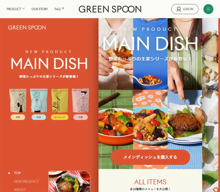
朱色と生成りを軸に、料理写真と人物イラストを組み合わせた冷凍主菜の紹介ページ。PCでは500pxの本文を左右のパネルで囲み、スマートフォンでは一列で展開します。
GREEN SPOON / MAIN DISH — Style Reference
A narrow food editorial framed by tomato-orange packaging, colorful table photography, and playful line-drawn characters.
Website: green-spoon.jp/release/maindish
Original URL: https://green-spoon.jp/release/maindish
Final URL: https://green-spoon.jp/release/maindish — unchanged; supplied response status: HTTP 200.
Theme: warm light content, orange campaign fields, green utility and purchase controls, and a charcoal global footer. No theme selector was observed.
Inspected capture: September 24, 2026, 06:30:49 JST; recorded retrieval timestamp: 2026-09-23T21:30:49.515Z.
Viewports: desktop 1440 × 1000 and mobile 390 × 844, in CSS pixels.
Scope: the currently served product-release page within GREEN SPOON's ecommerce website. Supplied images show the desktop opening, a catalog position, and the footer, plus the mobile opening and footer. Rendered DOM and computed-style evidence additionally cover the introduction, purchase panels, product explanation, features, sixteen-item catalog, and usage steps. This reference analyzes those supplied observations; it does not report a separate browser visit.
The page combines a branded product story with a browsable food catalog. Its most distinctive desktop decision is to keep the story only 500px wide. An orange identity panel occupies the left, while a close-up photograph of frozen ingredients and packaging fills the right. The center reads like a phone-sized editorial placed inside a much larger campaign composition.
Photography carries the appetite appeal: glossy vegetables, plated main dishes, patterned tablecloths, hands, and cropped clothing. Fine black character drawings provide a second visual language through illustrated pouches and category graphics. Regular-weight English headings provide scale; Japanese copy is smaller and often semibold. On mobile, the side panels disappear and the same story becomes a full-width page beneath a compact persistent header.
The current page still contains the source copy 2023.06.01 RELEASE! and a price of 780 yen with a twelve-meal subscription qualification. These are observations of the served content, not independent verification of current commercial terms or the date of the current website design.
閉じる
GREEN SPOON / MAIN DISH — Style Reference
A narrow food editorial framed by tomato-orange packaging, colorful table photography, and playful line-drawn characters.
Website: green-spoon.jp/release/maindish
Original URL: https://green-spoon.jp/release/maindish
Final URL: https://green-spoon.jp/release/maindish — unchanged; supplied response status: HTTP 200.
Theme: warm light content, orange campaign fields, green utility and purchase controls, and a charcoal global footer. No theme selector was observed.
Inspected capture: September 24, 2026, 06:30:49 JST; recorded retrieval timestamp: 2026-09-23T21:30:49.515Z.
Viewports: desktop 1440 × 1000 and mobile 390 × 844, in CSS pixels.
Scope: the currently served product-release page within GREEN SPOON's ecommerce website. Supplied images show the desktop opening, a catalog position, and the footer, plus the mobile opening and footer. Rendered DOM and computed-style evidence additionally cover the introduction, purchase panels, product explanation, features, sixteen-item catalog, and usage steps. This reference analyzes those supplied observations; it does not report a separate browser visit.
The page combines a branded product story with a browsable food catalog. Its most distinctive desktop decision is to keep the story only 500px wide. An orange identity panel occupies the left, while a close-up photograph of frozen ingredients and packaging fills the right. The center reads like a phone-sized editorial placed inside a much larger campaign composition.
Photography carries the appetite appeal: glossy vegetables, plated main dishes, patterned tablecloths, hands, and cropped clothing. Fine black character drawings provide a second visual language through illustrated pouches and category graphics. Regular-weight English headings provide scale; Japanese copy is smaller and often semibold. On mobile, the side panels disappear and the same story becomes a full-width page beneath a compact persistent header.
The current page still contains the source copy 2023.06.01 RELEASE! and a price of 780 yen with a twelve-meal subscription qualification. These are observations of the served content, not independent verification of current commercial terms or the date of the current website design.
How to Read This Reference
- Measured means a value appears in the supplied computed styles or element rectangles. Measurements belong to the recorded viewport and state.
- Calculated means a value follows from those measurements, such as the 16px gap between two category tiles.
- Visual estimate means the screenshots support the appearance, but the relevant CSS property was not supplied.
- Recommended means an implementation choice for a new build. Recommended breakpoints, accessibility behavior, and CSS architecture are not claims about the original source.
- Named tokens are descriptive aliases unless an original custom-property name is explicitly identified.
- The DOM contains global-menu content and offscreen elements that are absent from the screenshots. Their presence does not establish that a menu or overlay was opened.
- Some desktop heading rectangles are smaller than their computed typography would suggest. Do not turn those state-dependent bounds into permanent font-size or spacing tokens.
Tokens — Colors
Core Palette
| Name | Value | Suggested token / source variable | Role and evidence |
|---|---|---|---|
| Campaign Orange | #db5331 |
--color-campaign |
Measured introduction background, hero purchase-anchor fill, and English section headings; visually dominant in the left rail |
| Editorial Cream | #f8f7ee |
--color-cream |
Measured category index, explanation, features, catalog base, and usage-section background |
| Global Off-white | #fbfbf6 |
--color-paper; source --footer-foreground-color |
Measured body background and footer foreground; visible behind the transparent header layer |
| Brand Green | #1f8d61 |
--color-green; source --footer-hover-color |
Measured circular menu button and purchase-button fill; also declared as the footer hover color |
| Editorial Ink | #1f1f1f |
--color-ink |
Measured main-content text |
| Global Charcoal | #252525 |
--color-charcoal; source --primary-900, --footer-background-color |
Measured global navigation text and full-width footer background |
| White | #ffffff |
--color-white |
Measured reversed campaign text and returning-customer button surface |
| Warm Underlay | #f3daaa |
--color-underlay |
Measured main background; most of it is covered by individual section surfaces |
Keep the two pale surfaces distinct. The global header is slightly cleaner and lighter than the cream editorial sections. Orange supplies the campaign identity; green retains a specific role in global controls and purchase actions.
The orange hero button links to the page's purchase section. It is not the same action as the green purchase button farther down the page.
Cuisine Surface Tints
These values describe section backgrounds, not the exact colors printed on the illustrated pouches.
| Category | Measured background | Calculated appearance over #f8f7ee |
Role |
|---|---|---|---|
| WESTERN | rgba(226, 207, 176, 0.4) |
Approximately #efe7d5 |
Warm beige catalog field |
| JAPANESE | rgba(139, 166, 157, 0.2) |
Approximately #e2e7de |
Pale green-gray catalog field |
| CHINESE | rgba(212, 166, 163, 0.2) |
Approximately #f1e7df |
Pale rose catalog field |
| ETHNIC | rgba(178, 153, 52, 0.2) |
Approximately #eae4c9 |
Muted yellow catalog field |
The opaque equivalents are calculated approximations that assume a cream backing. Use either the translucent source treatment over cream or a calculated opaque equivalent. Applying both would change the result.
The visible category artwork uses stronger beige, aqua, yellow, and pink. Exact asset colors were not supplied. Match those through authorized artwork rather than treating the section tint values as packaging specifications.
Tokens — Typography
English Display and Utility Type
- Declared family:
Riviera, sans-seriffor campaign headings and sidebar navigation. - Global stack: begins with
Riviera, followed by Japanese Gothic fallbacks andsans-serif. - Measured display weight:
400. - Character: clean, open sans-serif lettering with large uppercase words and restrained weight.
- Important limitation: the computed family declaration establishes the requested font stack. The supplied evidence does not include font files, a font-face definition, or a glyph-level font-loading check.
The wordmark has distinctive joined circular forms. Treat it as branded artwork. The font family declared on its link wrapper does not establish how the logo itself was constructed.
Japanese Editorial Type
The campaign's main-content stack is:
'Hiragino Kaku Gothic ProN', 'Hiragino Sans', 游ゴシック体, YuGothic, '游ゴシック Medium', 'Yu Gothic Medium', 游ゴシック, sans-serif
Use regular 400 for explanatory paragraphs, 600 for introductory copy and product names, and 700 for buttons and selected supporting labels. Paragraphs commonly use a generous 2 line-height, providing breathing room within the narrow column.
The hero subtitle declares Riviera, sans-serif, including where its text is Japanese. Do not assume every Japanese string uses the campaign body stack.
Type Scale
All numeric values below are measured computed styles unless marked otherwise.
| Role | Desktop | Mobile | Weight / tracking |
|---|---|---|---|
| Hero title | 87px / 113.1px |
65px / 84.5px |
400, normal tracking |
| Left-rail title | 70px / 91px |
Hidden | 400 |
| Left-rail NEW PRODUCT | 16px / 20.8px |
Hidden | 400, 10px letter spacing |
| Hero Japanese subtitle | 21px / 42px |
16px / 32px |
600, 1.33px desktop / 1px mobile tracking |
| Main section title | 40px / 48px |
40px / 48px |
400 |
| Opening ALL ITEMS title | 32px / 44.8px |
Same | 400 |
| Cuisine title | 32px / 41.6px |
Same | 400; uppercase in the visible presentation |
| Introductory English heading | 24px / 28.8px |
Same | 400; nested content contributes additional total height |
| Explanatory Japanese lead | 20px / 36px |
Same | 600, 1px tracking |
| Usage-step English title | 20px / 26px |
Same | 400, 0.5px tracking |
| Introductory Japanese paragraphs | 15px / 30px |
Same | 600, 0.3px tracking |
| Explanatory paragraph | 14px / 28px |
Same | 400 |
| Section subtitle | 14px / 25.2px |
Same | Usually 600; category counts use 700 |
| Featured product title | 14px / 22.4px |
Same | 600 |
| Regular product title | 13px / 20.8px |
Same | 600 |
| Usage-step description | 12px / 19.2px |
Same | 400 |
| Hero purchase anchor | 20px |
15px |
700 |
| Purchase / account buttons | 15px |
Same | 700 |
| Global navigation | 14px |
Main links hidden | 400 |
| Mobile LOG IN | — | 13px / 13px |
400 |
| Closing speech bubble | 11px / 16.5px |
Same | 600 |
The hero's central NEW PRODUCT label is visibly widely tracked. Its exact computed style was not included; approximately 21px desktop and 16px mobile is a visual estimate. Do not substitute the measured sidebar label size without checking the central composition.
Reading Computed Type Versus Bounds
Several desktop section headings have a measured width of 261.6px, exactly 60% of the ordinary 436px inner width, and a measured height of 28.8px despite a computed 48px line-height. This is consistent with a scaled presentation state, but the transform and opacity values were not supplied.
The desktop opening image also shows a blank cream area where the DOM contains the ALL ITEMS heading. The mobile opening shows that heading normally. Treat this discrepancy as a capture/state limitation. A new implementation should keep headings visible by default and should not permanently reproduce the apparent missing desktop title.
Tokens — Spacing & Shapes
Layout rhythm: large uninterrupted photographs, full-width color sections, 32px editorial gutters, and compact product metadata.
Suggested spacing aliases: 4, 8, 16, 24, 32, 40, 48, 64, 80, and 96px. These organize observed dimensions; they are not a recovered source token scale.
Spacing Measurements
| Use | Value | Evidence |
|---|---|---|
| Main section horizontal padding | 32px |
Computed on both viewports |
| Standard explanation / features / usage padding | 80px 32px |
Computed on both viewports |
| Opening category-index padding | 40px 32px |
Computed |
| Main catalog introduction padding | 64px 32px 0 |
Computed |
| Introductory orange section padding | 32px 0 |
Computed |
| Category-tile gap | 16px |
Calculated from tile positions on both viewports |
| Sidebar left inset | 40px |
Measured logo and navigation positions |
| Desktop header edge inset | 32px |
Measured visible utility positions |
| Mobile menu left inset | 16px |
Measured |
| Hero CTA clearance below button | 20px |
Calculated from button and hero-end positions |
| Purchase-button side inset | 58px |
Calculated within the story column at both widths |
| Footer social-icon gap | 24px |
Calculated between 40px circles |
| Desktop footer padding | 96px 0 50px |
Computed |
| Mobile footer padding | 48px 32px 64px |
Computed |
Shapes
| Element | Geometry | Status |
|---|---|---|
| Mobile hero and purchase buttons | 28px radius on 56px height |
Measured |
| Desktop hero button | 96px radius on 74px height |
Measured; visibly a pill |
| Desktop login | 131 × 48px, fully rounded |
Measured; normalize the unusually large computed radius to a pill alias |
| Menu control | Circle, 48px desktop / 40px mobile |
Measured |
| Social links | 40 × 40px, 50% radius |
Measured |
| Product photograph corners | Approximately 10–12px |
Visual estimate |
| Category-tile silhouette | Small corner rounding with a larger upper-right curve | Visual observation; may belong to the artwork itself |
| Closing speech bubble | 30px radius, 4px 12px padding |
Measured |
| Section boundaries | Square, edge-to-edge | Visual observation |
There is no general elevated-card system. A restrained shaded seam is visible along the orange sidebar's inner edge, but its implementation and blur values are unknown.
Layout Measurements
| Element | Desktop 1440 × 1000 |
Mobile 390 × 844 |
|---|---|---|
| Header height | 88px |
63px |
| Header wordmark link width | 302px |
179px |
| Story column | x = 475px, width 500px |
x = 0, width 390px |
| Standard inner content | 436px |
326px |
| Hero area | 500 × 728px |
390 × 567.83px |
| Hero purchase anchor | 384 × 74px |
294 × 56px |
| Purchase / account buttons | 384 × 56px |
274 × 56px |
| Category shortcut | 210 × 125.28px |
155 × 92.47px |
| Regular product-column width | 210px |
155px |
| Featured product width | 436px |
326px |
| Footer height in captured state | About 746.78px |
About 675.27px |
| Document height | About 15,675.03px |
About 13,930.39px |
The measured hero ratio is approximately 500 / 728, or 0.687. The desktop story center is 5px to the right of the viewport center. That offset is measurable; its source layout formula is not available.
Components
Global Header
Role: persistent brand identity and access to the wider store.
Desktop anatomy: left-side PRODUCT, OUR STORY, and FAQ links; a centered GREEN SPOON wordmark; a bordered login pill with a person icon; and a separate green circular menu button. The header remains at the top in all supplied scroll captures.
At 1440px, the header is 88px high. The login pill begins at x = 1205px; the 48px menu circle begins at x = 1360px. English navigation uses 14px regular type. Thin icon strokes and a small external-link arrow keep the utilities light.
Mobile anatomy: the 40px menu circle moves to the left, the 179px wordmark stays centered, and login becomes an unboxed icon-over-label control on the right. The header height decreases to 63px. This is a rearrangement of controls rather than a proportional reduction of the desktop header.
The DOM contains product-menu entries and additional global navigation, but the supplied screenshots show the closed header. Open-menu composition, focus behavior, and dismissal were not exercised.
Desktop Campaign Rail
Role: preserves campaign identity and local wayfinding while the central story advances.
The orange left field occupies approximately 475px at the inspected desktop width. Its upper content contains a small white logo, a tracked NEW PRODUCT label, a 70px MAIN DISH title, a short bold Japanese subtitle, and four illustrated pouches. Each pouch has a small cuisine label beneath it.
Near the lower part of the rail, TOP, NEW PRODUCT, ABOUT, and FEATURES form a vertical navigation list. The active item has a white dot and stronger white text; inactive entries are visibly muted. The active appearance differs between the opening and later captures, but the exact update mechanism is unknown.
A rounded food preview with a small white caption sits beside the lower navigation. Its image differs across the supplied scroll captures. This supports changing content, but does not establish an autoplay interval, carousel controls, or a relationship between the preview and scrolling.
The rail remains present at the catalog position and leaves with the campaign before the full-width footer. A container-bounded sticky implementation is a useful recommendation; the original positioning properties were not supplied.
Right Ingredient Panel
Role: makes frozen ingredients and the packaging visually tangible throughout the desktop story.
A large photograph begins at x = 975px. Frozen broccoli, peppers, corn, meat, and other ingredients are scattered on a pale textured surface. Cropped branded packaging enters diagonally from the upper-right and lower-right areas. Lighting is directional enough to reveal frost and small shadows.
The image is cropped by the available right-hand field. Preserve the recognizable packaging and ingredient scale when choosing a crop. It disappears from the mobile layout. A small copyright line is visible near its bottom in later desktop captures.
Hero Collage
Role: announces the main-dish series and introduces its food and lifestyle imagery immediately.
Three equal vertical image strips fill the story width. Their upper portions show cropped people, clothing, hands, and serving gestures; their lower portions show plated dishes against green, orange, and blue textiles. The upper/lower division sits at roughly 47.5% of the hero height, estimated from the images.
The headline stack sits directly on the photographs: widely tracked NEW PRODUCT, oversized white MAIN DISH, then the Japanese subtitle 野菜たっぷりの主菜シリーズが新登場!. No large opaque text box separates the copy from the imagery.
A centered orange pill near the bottom reads メインディッシュを購入する. Its observed destination is #purchase. Desktop dimensions are 384 × 74px; mobile dimensions are 294 × 56px. Both leave approximately 20px between the button's bottom and the end of the collage.
The screenshots establish the composition, but do not establish whether it is assembled from six separate photographs, three strips, or one composite asset.
Category Shortcut Grid
Role: provides immediate access to the catalog's four cuisine groups.
A cream section begins directly after the hero. A centered orange ALL ITEMS heading and bold Japanese subtitle precede a two-by-two tile grid. Each illustrated tile combines an English cuisine label, a Japanese label, a downward indicator, and a black line-drawn character against a pastel background.
The grid uses 32px side padding and a 16px gap at both recorded widths. Tiles are 210px wide on desktop and 155px on mobile. The links point to #western, #japanese, #chinese, and #ethnic.
A second shortcut grid appears before the full catalog. Preserve this repeated navigation opportunity on a page of this length.
Introduction and Purchase Panels
Role: explains the product's place in everyday meals and provides separate paths for new and existing customers.
The introduction uses a continuous orange field with white text. The English greeting and compact Japanese paragraphs are centered; the Japanese paragraphs use 15px semibold type with 30px line-height. Category and packaging content follows before the purchase area.
The purchase anatomy is a supporting line, a new-customer label and green button, then an existing-customer label and white button. The measured buttons are 56px high with 28px radii. Their widths are the story width minus 116px: 384px on desktop and 274px on mobile.
Observed routes are distinct:
購入するlinks tohttps://green-spoon.jp/.次回お届けに追加するlinks tohttps://green-spoon.jp/login.
A similar purchase pair returns near the page's end. The evidence does not establish any checkout state beyond these link destinations.
Product Explanation and Features
Role: supplies the rationale behind the product before the detailed catalog.
These sections use cream backgrounds, 80px vertical padding, and 32px horizontal padding. Orange 40px English titles sit above smaller Japanese subtitles. The explanation lead is 20px semibold Japanese text with 36px line-height; its paragraph is 14px regular text with 28px line-height.
The feature content discusses menu variety, microwave preparation, and protein/calorie positioning. These are page claims, not independently evaluated nutritional findings.
The DOM includes a 64 × 64px button in the explanation area with a transform transition. Its graphic and activated result are not represented sufficiently to identify it as a video, carousel, or another specific control.
These sections are supported mainly by DOM and computed styles. Their full artwork arrangement is not visible in the supplied image set.
Cuisine Chapter
Role: turns the sixteen-item catalog into four recognizable visual chapters.
Each group has a full-column category illustration, an orange uppercase English heading, a Japanese category/count subtitle, and a product grid over a softly tinted field.
The served catalog is organized as WESTERN 7, JAPANESE 2, CHINESE 3, and ETHNIC 4. The first Western and Chinese items span both product columns. Japanese and Ethnic items use paired columns.
The heading begins 548px below the chapter start on desktop and 438px below it on mobile. These measurements are consistent with a square full-width artwork area followed by 48px of space. The actual image-element dimensions were not supplied, so that construction remains an informed implementation interpretation.
The visible Western illustration combines a large character, a smaller overlapping package, and isolated ingredients. Keep the chapter art larger and more expressive than ordinary product-card decoration.
Product Card
Role: presents a specific meal, its cuisine, and compact nutritional information.
Anatomy: food photograph; small circular-arrow control at the lower-right of the image; cuisine badge; linked Japanese product name; and an orange calorie/vegetable-count line. Cards sit directly on their cuisine section, without separate white shells or elevation shadows.
The visible featured Western image is approximately 3:2, 436px wide, with a fine orange edge and rounded corners. Regular media-slot offsets are consistent with a taller 4:5 format, but those image bounds were not directly sampled. Treat 4:5 as a reconstruction recommendation rather than a measured image declaration.
Featured names use 14px semibold type; regular names use 13px. On mobile, some names occupy three lines. Let card text expand naturally rather than truncating the dish name to preserve a rigid height.
The first visible dish links to its product detail URL. The circular-arrow graphic and measured buttons establish an additional control, but no image switch, flip, or modal action was tested. Keep the image link and any separate action as distinct interactive elements in a new implementation.
Usage Steps
Role: explains selection, delivery, and preparation as a short sequence.
Three steps sit under HOW TO USE. Each includes a step label, English action title, Japanese description, and a reserved illustration area to the left. The text begins 120px inside the section's inner left edge at both measured widths; the exact division between artwork width and gap is unknown.
English titles use 20px / 26px with 0.5px tracking. Japanese descriptions use 12px / 19.2px. The text column decreases from 316px to 206px on mobile, causing additional wrapping while retaining the same basic arrangement.
Closing Illustration
Role: gives the campaign a friendly ending before the global footer.
A line-drawn person in a green top raises an arm beside a small dog. A cream circular backdrop rises from the orange field. A white speech bubble reads おたのしみに!.
The illustration touches the footer boundary and visually bridges the two surfaces. Its exact asset format is unknown. The speech-bubble typography, padding, and rounded shape are measured; the supplied transition declarations suggest an animated presentation, but the timing of its trigger was not observed.
Global Footer
Role: reconnects the campaign to the whole store and closes with a large brand signature.
Desktop uses a charcoal field with four navigation groups—PRODUCT, ABOUT, STORE, HELP—and a fifth FOLLOW US group. The inner region spans approximately 1100px, beginning at x = 170px. Social links are 40px off-white circles with dark Instagram, X, and LINE marks, separated by 24px.
A thin horizontal rule precedes legal links and the copyright. An oversized off-white wordmark occupies almost the full footer width beneath them. The wordmark is artwork; its dimensions should not be inferred from the surrounding link font size.
Mobile moves FOLLOW US to the top center. Four full-width navigation rows follow, with plus signs at the right and thin dividers. They are visually closed accordion-style rows in the capture. Although child links remain present in the DOM extraction, that does not mean they were visible. Expansion behavior was not tested.
Legal links wrap into compact rows. Copyright sits below them, and the wordmark fits the 326px inner width near the bottom. The footer remains a substantial closing section rather than shrinking to a small legal bar.
Tokens — Motion & Interaction
The table distinguishes declared transitions from behaviors demonstrated by the supplied captures.
| Treatment | Supplied value or evidence | What can be concluded |
|---|---|---|
| Campaign links and buttons | opacity 0.15s linear |
An opacity transition is declared; endpoint opacity was not supplied |
| Global text links | color 0.15s linear |
Short color feedback is defined |
| Login link | color 0.15s linear, border-color 0.15s linear |
Text and outline feedback are defined |
| Menu / social controls | background 0.15s linear |
Short background feedback is defined |
| Introductory and explanatory text | opacity 0.3s linear, transform 0.75s cubic-bezier(0.23, 1, 0.32, 1) |
Reveal-like transition configuration; initial transform and trigger are unknown |
| Explanation-area button | transform 0.45s cubic-bezier(0.23, 1, 0.32, 1) |
Transform feedback exists; action is unverified |
| Closing promotional line | opacity 0.3s linear, transform 0.6s cubic-bezier(0.175, 0.885, 0.32, 1.275) |
A transform easing with overshoot is declared |
| Closing speech bubble | opacity 0.15s linear, transform 0.75s cubic-bezier(0.175, 0.885, 0.32, 1.275) |
A longer overshooting transform transition is declared |
| Header and desktop side fields | Persist across separate scroll captures | Persistent layout is supported; exact sticky/fixed mechanism is not supplied |
| Sidebar active marker | TOP and FEATURES appear active in different captures | Active-state variation is visible; update rules are unverified |
| Sidebar food preview | Different food images across captures | Changing imagery is supported; autoplay, timing, and controls are unverified |
| Fragment links | #purchase, cuisine anchors, and local section anchors |
In-page destinations are measured; smooth-scroll duration was not tested |
| Mobile footer rows | Closed rows with plus signs | Accordion appearance is visible; opened state is unverified |
The source also declares --ease-in-out: cubic-bezier(.86, 0, .07, 1), but the supplied element samples do not tie it to a specific visible transition. Likewise, Swiper-related variables do not establish which components use a slider or whether they autoplay.
Most sampled elements report animation: none. That does not rule out transitions, JavaScript motion, animated descendants, or changing media. The capture process waited for finite motion and image readiness within limits and temporarily paused perpetual animations during readiness checks. It is not a recording of the full motion system.
For reuse, favor short 150ms control feedback and selective, source-informed reveals. Keep all text visible without JavaScript. Do not add parallax, automatic card flipping, or timed carousel behavior solely from these static observations.
Surfaces
| Layer | Appearance | Purpose |
|---|---|---|
| Global header | Off-white, fine dark utility graphics | Clear navigation above dense photography |
| Campaign identity field | Solid orange with reversed text | Persistent product identity on desktop |
| Hero | Full-bleed photo collage | Appetite appeal and human context |
| Editorial sections | Cream with orange headings and dark copy | Comfortable reading within a narrow column |
| Cuisine chapters | Translucent pastel fields over cream | Groups products without introducing separate card shells |
| Purchase area | Orange field with green and white pills | Separates new-customer and account paths |
| Product media | Photograph, thin colored edge, modest corner radius | Food remains the focal point |
| Footer | Charcoal with off-white navigation and oversized branding | Clear transition back to global site information |
Use flat color, imagery, and section changes to create hierarchy. The visible page does not support a general system of glossy gradients, floating white panels, or glass effects.
Imagery
The photography has two complementary roles. Prepared-food shots feel inviting and domestic: colorful plates, wooden tables, patterned textiles, bread, cutlery, and directional natural-looking light. Ingredient photography emphasizes texture, frost, and the material contents of the pouches.
The hero introduces people through partial views rather than conventional portraits. Clothing colors align with the table textiles below, creating three strong vertical color stories. Preserve those relationships when selecting replacement photography.
Illustrations use loose black contour lines, simple faces, casual clothing, and large flat color fields. Packaging repeats a different character for each cuisine. These drawings are integral to category recognition and should not be replaced with generic food icons.
Observed Asset References
No image src, CSS background-image URL, SVG path, or font-file URL was included in the supplied evidence. The following references identify visible assets without inventing filenames.
| Asset | Observed placement | Reuse guidance |
|---|---|---|
| GREEN SPOON wordmark | Header, left rail, packaging, footer | Use authorized brand artwork; preserve proportions and distinctive circular forms |
| Lifestyle / meal collage | Central hero on desktop and mobile | Preserve the three-strip composition and overall aspect ratio |
| Frozen-ingredient photograph | Right desktop field | Use a responsive crop with visible frost, produce, and package fragments |
| Four illustrated pouches | Left rail and category storytelling | Preserve cuisine-specific character and color associations |
| Category shortcut graphics | Two repeated two-by-two grids | Keep labels legible at the measured 155px mobile tile width |
| Cuisine chapter illustration | Before each product group; Western shown in detail | Maintain the large character, pouch, and ingredient relationship |
| Prepared-food photographs | Catalog and sidebar preview | Use dish-specific imagery; keep products recognizable in narrow cards |
| Person-and-dog illustration | Campaign-to-footer boundary | Preserve its overlap with the section boundary |
| Utility and social marks | Header, product media, footer | Retain simple line work and circular containers where observed |
CSS can reproduce the page's structure, surfaces, and type hierarchy. The photography, packaging drawings, and wordmark supply much of its identity and require separately provided assets.
Layout & Responsive Behavior
Desktop Composition
The main column starts at x = 475px and ends at x = 975px. The orange field fills the left; ingredient imagery begins immediately to the right. The central column stays narrow even though the overall browser width is 1440px.
The story proceeds through hero, shortcut grid, introduction and purchase content, product explanation, features, catalog, usage steps, closing purchase content, and illustration. The surrounding site header remains visible. At the end, the footer spans the full viewport and the campaign side fields leave with their containing section.
This is a long document, not an internally scrolling full-screen application. The supplied desktop document height is approximately 15.7k pixels.
Mobile Composition
At 390px, the story becomes the full viewport width and the two desktop side fields are absent. The header rearranges into menu, wordmark, and login. The hero preserves approximately the same image ratio, decreasing from 728px to 567.83px high.
Most editorial typography and the 32px section gutters remain unchanged. This produces 326px of usable content width. Category shortcuts and regular product cards remain in two columns, each 155px wide with a 16px gap. Featured products continue to span both columns.
The footer changes more substantially than the story: social links move above navigation, link groups become closed disclosure-style rows, legal links wrap, and the large wordmark scales to the inner width.
Implementation Boundaries
- Only two viewport sizes are documented. The original breakpoint between side-panel and single-column layouts is unknown.
- A breakpoint around
1200pxis a recommended starting point for a new implementation, followed by testing against actual rail content. - A 500px maximum story width below that breakpoint is an implementation recommendation; intermediate-width behavior was not captured.
- Use container-bounded sticky rails if recreating the persistent desktop effect. Ensure the footer naturally pushes them out of view.
- Keep the global header offset in anchor scrolling so section headings are not covered.
- Preserve natural text wrapping. The phone layout does not reduce all text in proportion to the narrower story width.
- Exact safe-area handling, browser zoom behavior, and landscape-phone behavior were not supplied.
Do’s and Don’ts
Do
- Keep the desktop story at approximately 500px and give its surrounding campaign fields a meaningful visual role.
- Preserve the orange, cream, green, and charcoal hierarchy.
- Use regular-weight English display headings with compact Japanese supporting text.
- Retain 32px content gutters and the two-column category/product structure on the inspected phone width.
- Let large photographs and illustrated packaging carry the visual richness.
- Distinguish the orange in-page purchase anchor from green purchase actions and white account actions.
- Use cuisine-tinted chapter backgrounds instead of placing every dish in an elevated white card.
- Keep the footer full width, with a strong oversized wordmark.
- Treat the closed mobile footer and hidden global-menu DOM as state-dependent UI.
- Make content visible by default before enhancing it with motion.
Don’t
- Don't stretch the central story across the desktop viewport or convert the catalog into a generic four-column shop grid.
- Don't carry the desktop side panels into the phone layout.
- Don't replace the character drawings with stock outline food icons.
- Don't use heavy bold type for every English heading.
- Don't confuse pale section tints with exact packaging colors.
- Don't recreate the wordmark by selecting a roughly similar text font.
- Don't interpret zero-height image-link wrappers as zero-height photographs.
- Don't hard-code the scaled desktop heading rectangles as the intended resting layout.
- Don't infer card flipping, video playback, menu animation, or carousel timing from an icon or library variable.
- Don't treat displayed release copy, pricing, or nutrition statements as independently verified current facts.
Recommended Implementation Additions
These are recommendations for a new implementation, not verified features of the original page.
- Give the menu, social links, category artwork links, and product-image controls meaningful accessible names. Empty extracted link text does not establish whether the original has an accessible name.
- Implement menu and footer disclosures with keyboard-operable controls, synchronized expanded states, and predictable focus handling.
- Provide a visible focus outline and ensure icon controls have comfortable touch targets; the observed mobile menu is 40px, so its interactive hit area can be enlarged without changing the circle.
- Check contrast for small orange text on cream and 15px white text on orange. Preserve the campaign hue on large fields while using a tested text or button variant where necessary.
- Respect reduced motion and render every section heading in its final visible state when motion is disabled or enhancement code fails.
- Supply useful food-image alternatives and concise names for illustrated category links. Decorative duplicates in desktop rails can use empty alternatives.
- Reserve image dimensions to stabilize the long document, prioritize the opening collage, and defer below-the-fold food photography appropriately.
- Keep product-image controls separate from product-detail links; do not nest a button inside an anchor.
Agent Prompt Guide
Quick Color Reference
- Campaign orange:
#db5331. - Editorial cream:
#f8f7ee. - Global off-white:
#fbfbf6. - Menu and primary purchase green:
#1f8d61. - Editorial text:
#1f1f1f. - Global text and footer charcoal:
#252525. - Cuisine surfaces: pale beige, green-gray, rose, and muted yellow derived from the measured translucent fills.
- Purchase hierarchy: orange section-jump pill, green new-customer action, white returning-customer action.
Overall Prompt
“Create a responsive Japanese food-product story inspired by the current GREEN SPOON MAIN DISH page. On desktop, place a 500px editorial column between an orange campaign rail and a cropped frozen-ingredient photograph. Use cream sections, regular-weight uppercase English headings, semibold Japanese supporting copy, generous paragraph line-height, colorful food photography, and loose black character drawings on pastel packaging. Build the hero as three vertical lifestyle-and-meal strips with white display text and an orange pill linking to purchase content. Keep category shortcuts and regular dishes in two columns, with selected dishes spanning both columns. On mobile, remove the side fields, use a 63px header, and preserve 32px editorial gutters. Finish with a charcoal footer, circular social links, mobile disclosure rows, and an oversized wordmark. Use provided assets and keep unverified interaction behavior explicit.”
Example Component Prompts
- Hero: “Within a 500px desktop or 390px phone story column, compose three equal vertical photo strips. Pair cropped people and serving gestures above with plated vegetables and meat below. Overlay a widely tracked NEW PRODUCT label, regular-weight white MAIN DISH title, and short Japanese subtitle. Place a centered orange pill 20px above the lower edge. Preserve the measured 500:728 image-area ratio.”
- Campaign rail: “Create an orange desktop identity panel with a small white wordmark, a 70px regular MAIN DISH heading, four pastel illustrated pouches, and a lower section-navigation list with a white active dot. Add a rounded food preview beside the lower navigation. Keep the panel bounded by the campaign so it leaves before the full-width footer.”
- Category shortcuts: “Create a two-by-two cream-section grid with 32px side gutters and 16px gaps. Each tile contains a pastel cuisine graphic, black character drawing, orange English name, Japanese label, and downward indicator. Use real anchor destinations and preserve label legibility at 155px tile width.”
- Product chapter: “Use a full-column illustrated category opening followed by an orange 32px cuisine title and Japanese item count. Place food cards directly on a pale cuisine-tinted surface. Use a full-width featured dish and paired smaller dishes, fine orange photo borders, modest rounding, semibold names, and compact orange nutritional text. Do not invent an action for the circular-arrow image control.”
- Footer: “Use a charcoal full-width footer with off-white text and circular social links. Arrange four navigation groups and social links horizontally on desktop; on phones, put social links first and use keyboard-operable disclosure rows. Add a legal-link area and an oversized supplied wordmark. Keep the surface flat and spacious.”
Quick Start
CSS Custom Properties
This CSS is an adaptation using the measured palette and major dimensions. It is not recovered source code. The 1200px breakpoint, 5px desktop story offset formula, photo-slot ratios, and sticky architecture are recommended reconstruction choices. Image rounding is visually estimated. Hover opacity is a recommended endpoint; only the original transition duration was supplied.
Provide authorized imagery in the relevant image elements. Load Riviera only if an appropriate font file and permission are available; this snippet does not invent a font URL. The header expects a navigation region, brand image, and an actions wrapper containing login and menu controls. Place the footer after the campaign layout, outside its grid.
:root {
  /* Measured colors */
  --color-campaign: #db5331;
  --color-cream: #f8f7ee;
  --color-paper: #fbfbf6;
  --color-green: #1f8d61;
  --color-ink: #1f1f1f;
  --color-charcoal: #252525;
  --color-white: #fff;
  --color-underlay: #f3daaa;
  --tint-western: rgb(226 207 176 / 40%);
  --tint-japanese: rgb(139 166 157 / 20%);
  --tint-chinese: rgb(212 166 163 / 20%);
  --tint-ethnic: rgb(178 153 52 / 20%);

  /* Observed family declarations; font assets supplied separately */
  --font-display: Riviera, sans-serif;
  --font-body: 'Hiragino Kaku Gothic ProN', 'Hiragino Sans',
    YuGothic, 'Yu Gothic Medium', 'Yu Gothic', sans-serif;

  /* Measured dimensions and descriptive aliases */
  --story-max: 500px;
  --header-height: 63px;
  --gutter: 32px;
  --grid-gap: 16px;
  --section-space: 80px;
  --radius-pill: 9999px;
  --radius-media: 10px; /* Visual estimate */

  /* Measured transition values */
  --motion-fast: 150ms linear;
  --ease-out: cubic-bezier(.23, 1, .32, 1);
  --ease-out-back: cubic-bezier(.175, .885, .32, 1.275);
}

* { box-sizing: border-box; }
body {
  margin: 0;
  color: var(--color-ink);
  background: var(--color-paper);
  font-family: var(--font-body);
}
button, input { font: inherit; }
img { max-width: 100%; }
a { color: inherit; }

.site-header {
  position: fixed;
  inset: 0 0 auto;
  z-index: 50;
  display: grid;
  grid-template-columns: 1fr auto 1fr;
  align-items: center;
  height: var(--header-height);
  padding-inline: 16px;
  color: var(--color-charcoal);
  background: var(--color-paper);
  font-family: var(--font-display);
}
.header-nav { display: none; }
.header-brand {
  grid-area: 1 / 2;
  width: 179px;
}
.header-brand img { display: block; width: 100%; }
.header-actions { display: contents; }
.menu-button {
  grid-area: 1 / 1;
  justify-self: start;
  display: grid;
  place-items: center;
  width: 40px;
  height: 40px;
  padding: 0;
  border: 0;
  border-radius: 50%;
  color: var(--color-white);
  background: var(--color-green);
  cursor: pointer;
  transition: background var(--motion-fast);
}
.login-link {
  grid-area: 1 / 3;
  justify-self: end;
  display: flex;
  flex-direction: column;
  align-items: center;
  gap: 4px;
  font-size: 13px;
  line-height: 1;
  text-decoration: none;
}

.campaign-layout { padding-top: var(--header-height); }
.campaign-story {
  width: 100%;
  max-width: var(--story-max);
  min-width: 0;
  margin-inline: auto;
  background: var(--color-underlay);
}
.campaign-rail, .ingredient-rail { display: none; }
.campaign-story [id] {
  scroll-margin-top: calc(var(--header-height) + 16px);
}

.hero {
  position: relative;
  aspect-ratio: 500 / 728;
  overflow: hidden;
  color: var(--color-white);
}
.hero-art {
  position: absolute;
  inset: 0;
  display: block;
  width: 100%;
  height: 100%;
  object-fit: cover;
}
.hero-copy {
  position: absolute;
  inset: 36px 0 auto;
  text-align: center;
}
.hero-kicker {
  margin: 0 0 4px;
  font: 400 16px / 1.3 var(--font-display);
  letter-spacing: 8px; /* Visual approximation */
}
.hero-title {
  margin: 0;
  font: 400 clamp(48px, 16.667vw, 65px) / 1.3 var(--font-display);
}
.hero-subtitle {
  margin: -4px 0 0;
  padding-inline: 12px;
  font-size: 16px;
  font-weight: 600;
  line-height: 2;
  letter-spacing: 1px;
}
.pill {
  display: flex;
  align-items: center;
  justify-content: center;
  min-height: 56px;
  padding: 12px 16px;
  border: 0;
  border-radius: var(--radius-pill);
  font-size: 15px;
  font-weight: 700;
  line-height: 1.4;
  text-align: center;
  text-decoration: none;
  transition: opacity var(--motion-fast);
}
.hero-cta {
  position: absolute;
  inset: auto 0 20px;
  width: calc(100% - 96px);
  max-width: 384px;
  margin-inline: auto;
  color: var(--color-white);
  background: var(--color-campaign);
}

.story-section {
  padding: var(--section-space) var(--gutter);
  background: var(--color-cream);
}
.section-title {
  margin: 0;
  color: var(--color-campaign);
  font: 400 40px / 1.2 var(--font-display);
  text-align: center;
}
.section-subtitle {
  margin: 4px 0 0;
  font-size: 14px;
  font-weight: 600;
  line-height: 1.8;
  text-align: center;
}
.category-index { padding: 40px var(--gutter); }
.category-index .section-title { font-size: 32px; line-height: 1.4; }
.category-grid {
  display: grid;
  grid-template-columns: repeat(2, minmax(0, 1fr));
  gap: var(--grid-gap);
  margin-top: 32px;
}
.category-tile { display: block; transition: opacity var(--motion-fast); }
.category-tile img { display: block; width: 100%; height: auto; }
.story-copy { font-size: 14px; line-height: 2; }
.story-lead {
  color: var(--color-campaign);
  font-size: 20px;
  font-weight: 600;
  line-height: 1.8;
  letter-spacing: 1px;
}
.introduction, .purchase-panel {
  padding: 32px 0;
  color: var(--color-white);
  background: var(--color-campaign);
  text-align: center;
}
.introduction-copy {
  padding-inline: 24px;
  font-size: 15px;
  font-weight: 600;
  line-height: 2;
  letter-spacing: .3px;
}
.purchase-actions {
  width: calc(100% - 116px);
  max-width: 384px;
  margin-inline: auto;
}
.purchase-actions .pill { width: 100%; }
.pill--purchase { color: white; background: var(--color-green); }
.pill--account { color: var(--color-charcoal); background: white; }

.catalog { background: var(--color-cream); }
.cuisine--western { background: var(--tint-western); }
.cuisine--japanese { background: var(--tint-japanese); }
.cuisine--chinese { background: var(--tint-chinese); }
.cuisine--ethnic { background: var(--tint-ethnic); }
.cuisine-art {
  display: block;
  width: 100%;
  aspect-ratio: 1;
  object-fit: contain; /* Recommended square chapter-art slot */
}
.cuisine-body { padding: 48px var(--gutter) 64px; }
.cuisine-title {
  margin: 0;
  color: var(--color-campaign);
  font: 400 32px / 1.3 var(--font-display);
  text-align: center;
  text-transform: uppercase;
}
.product-grid {
  display: grid;
  grid-template-columns: repeat(2, minmax(0, 1fr));
  gap: 32px var(--grid-gap);
  margin-top: 24px;
}
.product-card { min-width: 0; text-align: center; }
.product-card--featured { grid-column: 1 / -1; }
.product-media {
  position: relative;
  aspect-ratio: 4 / 5; /* Inferred regular-media proportion */
  overflow: hidden;
  border: 1px solid var(--color-campaign);
  border-radius: var(--radius-media);
}
.product-card--featured .product-media { aspect-ratio: 3 / 2; }
.product-media > a { display: block; width: 100%; height: 100%; }
.product-media img {
  display: block;
  width: 100%;
  height: 100%;
  object-fit: cover;
}
.product-image-control {
  position: absolute;
  right: 8px;
  bottom: 8px;
  display: grid;
  place-items: center;
  width: 40px;
  height: 40px;
  padding: 0;
  border: 1px solid white;
  border-radius: 50%;
  color: white;
  background: transparent;
}
.product-title {
  margin: 8px 0;
  font-size: 13px;
  font-weight: 600;
  line-height: 1.6;
  overflow-wrap: anywhere;
}
.product-title a { text-decoration: none; }
.product-card--featured .product-title { font-size: 14px; }
.product-meta {
  margin: 0;
  color: var(--color-campaign);
  font-size: 12px; /* Visual estimate; check contrast */
  line-height: 1.6;
}

.site-footer {
  padding: 48px 32px 64px;
  color: var(--color-paper);
  background: var(--color-charcoal);
  font-family: var(--font-display);
}
.footer-inner { max-width: 1100px; margin-inline: auto; }
.footer-grid { display: flex; flex-direction: column; }
.footer-social { order: -1; text-align: center; margin-bottom: 32px; }
.social-links { display: flex; justify-content: center; gap: 24px; }
.social-link {
  display: grid;
  place-items: center;
  width: 40px;
  height: 40px;
  border-radius: 50%;
  color: var(--color-charcoal);
  background: var(--color-paper);
}
.footer-group { border-bottom: 1px solid rgb(251 251 246 / 20%); }
.footer-group-heading {
  display: flex;
  align-items: center;
  justify-content: space-between;
  min-height: 59px;
  margin: 0;
  font-size: 14px;
}
.footer-wordmark {
  display: block;
  width: 100%;
  height: auto;
  margin-top: 64px;
}

/* Recommended desktop threshold; original breakpoint is unknown. */
@media (min-width: 1200px) {
  :root { --header-height: 88px; }
  .site-header { padding-inline: 32px; }
  .header-nav {
    grid-area: 1 / 1;
    display: flex;
    gap: 32px;
    align-items: center;
    font-size: 14px;
  }
  .header-brand { width: 302px; }
  .header-actions {
    grid-area: 1 / 3;
    display: flex;
    justify-self: end;
    align-items: center;
    gap: 24px;
  }
  .menu-button { width: 48px; height: 48px; }
  .login-link {
    flex-direction: row;
    justify-content: center;
    gap: 8px;
    width: 131px;
    height: 48px;
    border: 1px solid currentColor;
    border-radius: var(--radius-pill);
    font-size: 14px;
  }
  .campaign-layout {
    display: grid;
    grid-template-columns:
      calc((100% - var(--story-max)) / 2 + 5px)
      var(--story-max)
      minmax(0, 1fr);
    align-items: start;
  }
  .campaign-rail, .ingredient-rail {
    position: sticky;
    top: var(--header-height);
    display: block;
    min-width: 0;
    height: calc(100vh - var(--header-height));
    height: calc(100dvh - var(--header-height));
    overflow: hidden;
  }
  .campaign-rail {
    padding: 36px 40px 40px;
    color: white;
    background: var(--color-campaign);
  }
  .ingredient-rail img {
    display: block;
    width: 100%;
    height: 100%;
    object-fit: cover;
  }
  .hero-kicker { font-size: 21px; }
  .hero-title { font-size: 87px; }
  .hero-subtitle { font-size: 21px; letter-spacing: 1.33px; }
  .hero-cta { min-height: 74px; font-size: 20px; }
  .site-footer { padding: 96px 0 50px; }
  .footer-grid {
    display: grid;
    grid-template-columns: repeat(4, minmax(0, 1fr)) 168px;
    gap: 24px;
  }
  .footer-social { order: initial; margin-bottom: 0; text-align: left; }
  .footer-group { border-bottom: 0; }
  .footer-wordmark { width: calc(100% - 96px); margin-inline: auto; }
}

/* Recommended interaction endpoints and accessibility additions. */
@media (hover: hover) {
  .pill:hover, .category-tile:hover { opacity: .82; }
}
:where(a, button, summary):focus-visible {
  outline: 3px solid currentColor;
  outline-offset: 4px;
}

/* Optional reveal enhancement: apply only after initialization. */
.motion-ready .reveal {
  transition: opacity 300ms linear, transform 750ms var(--ease-out);
}
.motion-ready .reveal[data-pending='true'] {
  opacity: 0;
  transform: translateY(20px); /* Recommended distance */
}
@media (prefers-reduced-motion: reduce) {
  .motion-ready .reveal,
  .motion-ready .reveal[data-pending='true'] {
    opacity: 1;
    transform: none;
    transition: none;
  }
  .pill, .category-tile, .menu-button { transition: none; }
}
Footer disclosure behavior, global-menu state, image-control actions, and any reveal observer need separate implementation. Render footer links and all story content accessibly before enhancement. The CSS intentionally supplies no fabricated carousel interval or product-image action.
Tailwind v4 Token Mapping
Optional aliases for a project already using Tailwind v4. This does not imply that the inspected site uses Tailwind. Define the custom properties above first.
@theme inline {
  --color-campaign: #db5331;
  --color-cream: #f8f7ee;
  --color-paper: #fbfbf6;
  --color-brand-green: #1f8d61;
  --color-editorial-ink: #1f1f1f;
  --color-charcoal: #252525;

  --font-display: Riviera, sans-serif;
  --font-editorial: var(--font-body);

  --text-section: 40px;
  --text-category: 32px;
  --text-product: 13px;
  --text-product-featured: 14px;

  --spacing-story: 500px;
  --spacing-gutter: 32px;
  --spacing-grid-gap: 16px;
  --spacing-section: 80px;
  --spacing-header: var(--header-height);

  --radius-media: 10px;
  --radius-action: 9999px;
}
Sources & Evidence
- GREEN SPOON — MAIN DISH: original and final inspected URL. The supplied browser record reports HTTP 200 and the page title GREEN SPOON(グリーンスプーン).
- Capture timestamp:
2026-09-23T21:30:49.515Z, equivalent to September 24, 2026, 06:30:49.515 JST. - Visual evidence: three desktop captures at
1440 × 1000showing the opening, Western catalog, and footer; two mobile captures at390 × 844showing the opening and footer. - Rendered evidence: supplied page text, anchor destinations, element rectangles, computed colors, font declarations, spacing, radii, transitions, and selected root custom properties for both viewport sizes.
- Interaction evidence: separate scroll positions show a persistent header, continuing desktop side fields, differing sidebar active states and preview images, and the transition to a full-width footer. No click-through, menu-open, image-control, purchase, or footer-expansion result was supplied.
- Capture limitations: readiness checks waited for document loading, finite motion, layout/text stability, and visible-image decoding within stated limits. Perpetual motion was temporarily paused during readiness checks. Delayed content and unexercised interactions remain unverified; the scaled desktop heading bounds and missing visible opening heading illustrate why DOM presence and visual readiness must be assessed separately.
- Asset and implementation limitations: asset URLs, font files, complete stylesheets, JavaScript behavior, and source breakpoint rules were not supplied. The CSS Quick Start is a reusable adaptation and has not been browser-tested in this analysis.
This reference describes the current page represented by the supplied capture, including release-era copy that remains served at that URL. Measurements, visual estimates, calculations, and recommended additions are labeled separately throughout.
# GREEN SPOON / MAIN DISH — Style Reference

> A narrow food editorial framed by tomato-orange packaging, colorful table photography, and playful line-drawn characters.

**Website:** [green-spoon.jp/release/maindish](https://green-spoon.jp/release/maindish)
**Original URL:** https://green-spoon.jp/release/maindish
**Final URL:** https://green-spoon.jp/release/maindish — unchanged; supplied response status: HTTP 200.
**Theme:** warm light content, orange campaign fields, green utility and purchase controls, and a charcoal global footer. No theme selector was observed.
**Inspected capture:** September 24, 2026, 06:30:49 JST; recorded retrieval timestamp: `2026-09-23T21:30:49.515Z`.
**Viewports:** desktop `1440 × 1000` and mobile `390 × 844`, in CSS pixels.
**Scope:** the currently served product-release page within GREEN SPOON's ecommerce website. Supplied images show the desktop opening, a catalog position, and the footer, plus the mobile opening and footer. Rendered DOM and computed-style evidence additionally cover the introduction, purchase panels, product explanation, features, sixteen-item catalog, and usage steps. This reference analyzes those supplied observations; it does not report a separate browser visit.

The page combines a branded product story with a browsable food catalog. Its most distinctive desktop decision is to keep the story only 500px wide. An orange identity panel occupies the left, while a close-up photograph of frozen ingredients and packaging fills the right. The center reads like a phone-sized editorial placed inside a much larger campaign composition.

Photography carries the appetite appeal: glossy vegetables, plated main dishes, patterned tablecloths, hands, and cropped clothing. Fine black character drawings provide a second visual language through illustrated pouches and category graphics. Regular-weight English headings provide scale; Japanese copy is smaller and often semibold. On mobile, the side panels disappear and the same story becomes a full-width page beneath a compact persistent header.

The current page still contains the source copy `2023.06.01 RELEASE!` and a price of 780 yen with a twelve-meal subscription qualification. These are observations of the served content, not independent verification of current commercial terms or the date of the current website design.
閉じる
# GREEN SPOON / MAIN DISH — Style Reference

> A narrow food editorial framed by tomato-orange packaging, colorful table photography, and playful line-drawn characters.

**Website:** [green-spoon.jp/release/maindish](https://green-spoon.jp/release/maindish)
**Original URL:** https://green-spoon.jp/release/maindish
**Final URL:** https://green-spoon.jp/release/maindish — unchanged; supplied response status: HTTP 200.
**Theme:** warm light content, orange campaign fields, green utility and purchase controls, and a charcoal global footer. No theme selector was observed.
**Inspected capture:** September 24, 2026, 06:30:49 JST; recorded retrieval timestamp: `2026-09-23T21:30:49.515Z`.
**Viewports:** desktop `1440 × 1000` and mobile `390 × 844`, in CSS pixels.
**Scope:** the currently served product-release page within GREEN SPOON's ecommerce website. Supplied images show the desktop opening, a catalog position, and the footer, plus the mobile opening and footer. Rendered DOM and computed-style evidence additionally cover the introduction, purchase panels, product explanation, features, sixteen-item catalog, and usage steps. This reference analyzes those supplied observations; it does not report a separate browser visit.

The page combines a branded product story with a browsable food catalog. Its most distinctive desktop decision is to keep the story only 500px wide. An orange identity panel occupies the left, while a close-up photograph of frozen ingredients and packaging fills the right. The center reads like a phone-sized editorial placed inside a much larger campaign composition.

Photography carries the appetite appeal: glossy vegetables, plated main dishes, patterned tablecloths, hands, and cropped clothing. Fine black character drawings provide a second visual language through illustrated pouches and category graphics. Regular-weight English headings provide scale; Japanese copy is smaller and often semibold. On mobile, the side panels disappear and the same story becomes a full-width page beneath a compact persistent header.

The current page still contains the source copy `2023.06.01 RELEASE!` and a price of 780 yen with a twelve-meal subscription qualification. These are observations of the served content, not independent verification of current commercial terms or the date of the current website design.

## How to Read This Reference

- **Measured** means a value appears in the supplied computed styles or element rectangles. Measurements belong to the recorded viewport and state.
- **Calculated** means a value follows from those measurements, such as the 16px gap between two category tiles.
- **Visual estimate** means the screenshots support the appearance, but the relevant CSS property was not supplied.
- **Recommended** means an implementation choice for a new build. Recommended breakpoints, accessibility behavior, and CSS architecture are not claims about the original source.
- **Named tokens** are descriptive aliases unless an original custom-property name is explicitly identified.
- The DOM contains global-menu content and offscreen elements that are absent from the screenshots. Their presence does not establish that a menu or overlay was opened.
- Some desktop heading rectangles are smaller than their computed typography would suggest. Do not turn those state-dependent bounds into permanent font-size or spacing tokens.

## Tokens — Colors

### Core Palette

| Name | Value | Suggested token / source variable | Role and evidence |
| --- | --- | --- | --- |
| Campaign Orange | `#db5331` | `--color-campaign` | Measured introduction background, hero purchase-anchor fill, and English section headings; visually dominant in the left rail |
| Editorial Cream | `#f8f7ee` | `--color-cream` | Measured category index, explanation, features, catalog base, and usage-section background |
| Global Off-white | `#fbfbf6` | `--color-paper`; source `--footer-foreground-color` | Measured body background and footer foreground; visible behind the transparent header layer |
| Brand Green | `#1f8d61` | `--color-green`; source `--footer-hover-color` | Measured circular menu button and purchase-button fill; also declared as the footer hover color |
| Editorial Ink | `#1f1f1f` | `--color-ink` | Measured main-content text |
| Global Charcoal | `#252525` | `--color-charcoal`; source `--primary-900`, `--footer-background-color` | Measured global navigation text and full-width footer background |
| White | `#ffffff` | `--color-white` | Measured reversed campaign text and returning-customer button surface |
| Warm Underlay | `#f3daaa` | `--color-underlay` | Measured `main` background; most of it is covered by individual section surfaces |

Keep the two pale surfaces distinct. The global header is slightly cleaner and lighter than the cream editorial sections. Orange supplies the campaign identity; green retains a specific role in global controls and purchase actions.

The orange hero button links to the page's purchase section. It is not the same action as the green purchase button farther down the page.

### Cuisine Surface Tints

These values describe section backgrounds, not the exact colors printed on the illustrated pouches.

| Category | Measured background | Calculated appearance over `#f8f7ee` | Role |
| --- | --- | --- | --- |
| WESTERN | `rgba(226, 207, 176, 0.4)` | Approximately `#efe7d5` | Warm beige catalog field |
| JAPANESE | `rgba(139, 166, 157, 0.2)` | Approximately `#e2e7de` | Pale green-gray catalog field |
| CHINESE | `rgba(212, 166, 163, 0.2)` | Approximately `#f1e7df` | Pale rose catalog field |
| ETHNIC | `rgba(178, 153, 52, 0.2)` | Approximately `#eae4c9` | Muted yellow catalog field |

The opaque equivalents are calculated approximations that assume a cream backing. Use either the translucent source treatment over cream or a calculated opaque equivalent. Applying both would change the result.

The visible category artwork uses stronger beige, aqua, yellow, and pink. Exact asset colors were not supplied. Match those through authorized artwork rather than treating the section tint values as packaging specifications.

## Tokens — Typography

### English Display and Utility Type

- **Declared family:** `Riviera, sans-serif` for campaign headings and sidebar navigation.
- **Global stack:** begins with `Riviera`, followed by Japanese Gothic fallbacks and `sans-serif`.
- **Measured display weight:** `400`.
- **Character:** clean, open sans-serif lettering with large uppercase words and restrained weight.
- **Important limitation:** the computed family declaration establishes the requested font stack. The supplied evidence does not include font files, a font-face definition, or a glyph-level font-loading check.

The wordmark has distinctive joined circular forms. Treat it as branded artwork. The font family declared on its link wrapper does not establish how the logo itself was constructed.

### Japanese Editorial Type

The campaign's main-content stack is:

`'Hiragino Kaku Gothic ProN', 'Hiragino Sans', 游ゴシック体, YuGothic, '游ゴシック Medium', 'Yu Gothic Medium', 游ゴシック, sans-serif`

Use regular `400` for explanatory paragraphs, `600` for introductory copy and product names, and `700` for buttons and selected supporting labels. Paragraphs commonly use a generous `2` line-height, providing breathing room within the narrow column.

The hero subtitle declares `Riviera, sans-serif`, including where its text is Japanese. Do not assume every Japanese string uses the campaign body stack.

### Type Scale

All numeric values below are measured computed styles unless marked otherwise.

| Role | Desktop | Mobile | Weight / tracking |
| --- | --- | --- | --- |
| Hero title | `87px / 113.1px` | `65px / 84.5px` | `400`, normal tracking |
| Left-rail title | `70px / 91px` | Hidden | `400` |
| Left-rail NEW PRODUCT | `16px / 20.8px` | Hidden | `400`, `10px` letter spacing |
| Hero Japanese subtitle | `21px / 42px` | `16px / 32px` | `600`, `1.33px` desktop / `1px` mobile tracking |
| Main section title | `40px / 48px` | `40px / 48px` | `400` |
| Opening ALL ITEMS title | `32px / 44.8px` | Same | `400` |
| Cuisine title | `32px / 41.6px` | Same | `400`; uppercase in the visible presentation |
| Introductory English heading | `24px / 28.8px` | Same | `400`; nested content contributes additional total height |
| Explanatory Japanese lead | `20px / 36px` | Same | `600`, `1px` tracking |
| Usage-step English title | `20px / 26px` | Same | `400`, `0.5px` tracking |
| Introductory Japanese paragraphs | `15px / 30px` | Same | `600`, `0.3px` tracking |
| Explanatory paragraph | `14px / 28px` | Same | `400` |
| Section subtitle | `14px / 25.2px` | Same | Usually `600`; category counts use `700` |
| Featured product title | `14px / 22.4px` | Same | `600` |
| Regular product title | `13px / 20.8px` | Same | `600` |
| Usage-step description | `12px / 19.2px` | Same | `400` |
| Hero purchase anchor | `20px` | `15px` | `700` |
| Purchase / account buttons | `15px` | Same | `700` |
| Global navigation | `14px` | Main links hidden | `400` |
| Mobile LOG IN | — | `13px / 13px` | `400` |
| Closing speech bubble | `11px / 16.5px` | Same | `600` |

The hero's central NEW PRODUCT label is visibly widely tracked. Its exact computed style was not included; approximately 21px desktop and 16px mobile is a visual estimate. Do not substitute the measured sidebar label size without checking the central composition.

### Reading Computed Type Versus Bounds

Several desktop section headings have a measured width of `261.6px`, exactly 60% of the ordinary `436px` inner width, and a measured height of `28.8px` despite a computed `48px` line-height. This is consistent with a scaled presentation state, but the transform and opacity values were not supplied.

The desktop opening image also shows a blank cream area where the DOM contains the ALL ITEMS heading. The mobile opening shows that heading normally. Treat this discrepancy as a capture/state limitation. A new implementation should keep headings visible by default and should not permanently reproduce the apparent missing desktop title.

## Tokens — Spacing & Shapes

**Layout rhythm:** large uninterrupted photographs, full-width color sections, 32px editorial gutters, and compact product metadata.

**Suggested spacing aliases:** `4`, `8`, `16`, `24`, `32`, `40`, `48`, `64`, `80`, and `96px`. These organize observed dimensions; they are not a recovered source token scale.

### Spacing Measurements

| Use | Value | Evidence |
| --- | --- | --- |
| Main section horizontal padding | `32px` | Computed on both viewports |
| Standard explanation / features / usage padding | `80px 32px` | Computed on both viewports |
| Opening category-index padding | `40px 32px` | Computed |
| Main catalog introduction padding | `64px 32px 0` | Computed |
| Introductory orange section padding | `32px 0` | Computed |
| Category-tile gap | `16px` | Calculated from tile positions on both viewports |
| Sidebar left inset | `40px` | Measured logo and navigation positions |
| Desktop header edge inset | `32px` | Measured visible utility positions |
| Mobile menu left inset | `16px` | Measured |
| Hero CTA clearance below button | `20px` | Calculated from button and hero-end positions |
| Purchase-button side inset | `58px` | Calculated within the story column at both widths |
| Footer social-icon gap | `24px` | Calculated between 40px circles |
| Desktop footer padding | `96px 0 50px` | Computed |
| Mobile footer padding | `48px 32px 64px` | Computed |

### Shapes

| Element | Geometry | Status |
| --- | --- | --- |
| Mobile hero and purchase buttons | `28px` radius on `56px` height | Measured |
| Desktop hero button | `96px` radius on `74px` height | Measured; visibly a pill |
| Desktop login | `131 × 48px`, fully rounded | Measured; normalize the unusually large computed radius to a pill alias |
| Menu control | Circle, `48px` desktop / `40px` mobile | Measured |
| Social links | `40 × 40px`, `50%` radius | Measured |
| Product photograph corners | Approximately `10–12px` | Visual estimate |
| Category-tile silhouette | Small corner rounding with a larger upper-right curve | Visual observation; may belong to the artwork itself |
| Closing speech bubble | `30px` radius, `4px 12px` padding | Measured |
| Section boundaries | Square, edge-to-edge | Visual observation |

There is no general elevated-card system. A restrained shaded seam is visible along the orange sidebar's inner edge, but its implementation and blur values are unknown.

### Layout Measurements

| Element | Desktop `1440 × 1000` | Mobile `390 × 844` |
| --- | --- | --- |
| Header height | `88px` | `63px` |
| Header wordmark link width | `302px` | `179px` |
| Story column | `x = 475px`, width `500px` | `x = 0`, width `390px` |
| Standard inner content | `436px` | `326px` |
| Hero area | `500 × 728px` | `390 × 567.83px` |
| Hero purchase anchor | `384 × 74px` | `294 × 56px` |
| Purchase / account buttons | `384 × 56px` | `274 × 56px` |
| Category shortcut | `210 × 125.28px` | `155 × 92.47px` |
| Regular product-column width | `210px` | `155px` |
| Featured product width | `436px` | `326px` |
| Footer height in captured state | About `746.78px` | About `675.27px` |
| Document height | About `15,675.03px` | About `13,930.39px` |

The measured hero ratio is approximately `500 / 728`, or `0.687`. The desktop story center is 5px to the right of the viewport center. That offset is measurable; its source layout formula is not available.

## Components

### Global Header

**Role:** persistent brand identity and access to the wider store.

Desktop anatomy: left-side PRODUCT, OUR STORY, and FAQ links; a centered GREEN SPOON wordmark; a bordered login pill with a person icon; and a separate green circular menu button. The header remains at the top in all supplied scroll captures.

At 1440px, the header is 88px high. The login pill begins at `x = 1205px`; the 48px menu circle begins at `x = 1360px`. English navigation uses 14px regular type. Thin icon strokes and a small external-link arrow keep the utilities light.

Mobile anatomy: the 40px menu circle moves to the left, the 179px wordmark stays centered, and login becomes an unboxed icon-over-label control on the right. The header height decreases to 63px. This is a rearrangement of controls rather than a proportional reduction of the desktop header.

The DOM contains product-menu entries and additional global navigation, but the supplied screenshots show the closed header. Open-menu composition, focus behavior, and dismissal were not exercised.

### Desktop Campaign Rail

**Role:** preserves campaign identity and local wayfinding while the central story advances.

The orange left field occupies approximately 475px at the inspected desktop width. Its upper content contains a small white logo, a tracked NEW PRODUCT label, a 70px MAIN DISH title, a short bold Japanese subtitle, and four illustrated pouches. Each pouch has a small cuisine label beneath it.

Near the lower part of the rail, TOP, NEW PRODUCT, ABOUT, and FEATURES form a vertical navigation list. The active item has a white dot and stronger white text; inactive entries are visibly muted. The active appearance differs between the opening and later captures, but the exact update mechanism is unknown.

A rounded food preview with a small white caption sits beside the lower navigation. Its image differs across the supplied scroll captures. This supports changing content, but does not establish an autoplay interval, carousel controls, or a relationship between the preview and scrolling.

The rail remains present at the catalog position and leaves with the campaign before the full-width footer. A container-bounded sticky implementation is a useful recommendation; the original positioning properties were not supplied.

### Right Ingredient Panel

**Role:** makes frozen ingredients and the packaging visually tangible throughout the desktop story.

A large photograph begins at `x = 975px`. Frozen broccoli, peppers, corn, meat, and other ingredients are scattered on a pale textured surface. Cropped branded packaging enters diagonally from the upper-right and lower-right areas. Lighting is directional enough to reveal frost and small shadows.

The image is cropped by the available right-hand field. Preserve the recognizable packaging and ingredient scale when choosing a crop. It disappears from the mobile layout. A small copyright line is visible near its bottom in later desktop captures.

### Hero Collage

**Role:** announces the main-dish series and introduces its food and lifestyle imagery immediately.

Three equal vertical image strips fill the story width. Their upper portions show cropped people, clothing, hands, and serving gestures; their lower portions show plated dishes against green, orange, and blue textiles. The upper/lower division sits at roughly 47.5% of the hero height, estimated from the images.

The headline stack sits directly on the photographs: widely tracked NEW PRODUCT, oversized white MAIN DISH, then the Japanese subtitle `野菜たっぷりの主菜シリーズが新登場!`. No large opaque text box separates the copy from the imagery.

A centered orange pill near the bottom reads `メインディッシュを購入する`. Its observed destination is `#purchase`. Desktop dimensions are 384 × 74px; mobile dimensions are 294 × 56px. Both leave approximately 20px between the button's bottom and the end of the collage.

The screenshots establish the composition, but do not establish whether it is assembled from six separate photographs, three strips, or one composite asset.

### Category Shortcut Grid

**Role:** provides immediate access to the catalog's four cuisine groups.

A cream section begins directly after the hero. A centered orange ALL ITEMS heading and bold Japanese subtitle precede a two-by-two tile grid. Each illustrated tile combines an English cuisine label, a Japanese label, a downward indicator, and a black line-drawn character against a pastel background.

The grid uses 32px side padding and a 16px gap at both recorded widths. Tiles are 210px wide on desktop and 155px on mobile. The links point to `#western`, `#japanese`, `#chinese`, and `#ethnic`.

A second shortcut grid appears before the full catalog. Preserve this repeated navigation opportunity on a page of this length.

### Introduction and Purchase Panels

**Role:** explains the product's place in everyday meals and provides separate paths for new and existing customers.

The introduction uses a continuous orange field with white text. The English greeting and compact Japanese paragraphs are centered; the Japanese paragraphs use 15px semibold type with 30px line-height. Category and packaging content follows before the purchase area.

The purchase anatomy is a supporting line, a new-customer label and green button, then an existing-customer label and white button. The measured buttons are 56px high with 28px radii. Their widths are the story width minus 116px: 384px on desktop and 274px on mobile.

Observed routes are distinct:

- `購入する` links to `https://green-spoon.jp/`.
- `次回お届けに追加する` links to `https://green-spoon.jp/login`.

A similar purchase pair returns near the page's end. The evidence does not establish any checkout state beyond these link destinations.

### Product Explanation and Features

**Role:** supplies the rationale behind the product before the detailed catalog.

These sections use cream backgrounds, 80px vertical padding, and 32px horizontal padding. Orange 40px English titles sit above smaller Japanese subtitles. The explanation lead is 20px semibold Japanese text with 36px line-height; its paragraph is 14px regular text with 28px line-height.

The feature content discusses menu variety, microwave preparation, and protein/calorie positioning. These are page claims, not independently evaluated nutritional findings.

The DOM includes a 64 × 64px button in the explanation area with a transform transition. Its graphic and activated result are not represented sufficiently to identify it as a video, carousel, or another specific control.

These sections are supported mainly by DOM and computed styles. Their full artwork arrangement is not visible in the supplied image set.

### Cuisine Chapter

**Role:** turns the sixteen-item catalog into four recognizable visual chapters.

Each group has a full-column category illustration, an orange uppercase English heading, a Japanese category/count subtitle, and a product grid over a softly tinted field.

The served catalog is organized as WESTERN 7, JAPANESE 2, CHINESE 3, and ETHNIC 4. The first Western and Chinese items span both product columns. Japanese and Ethnic items use paired columns.

The heading begins 548px below the chapter start on desktop and 438px below it on mobile. These measurements are consistent with a square full-width artwork area followed by 48px of space. The actual image-element dimensions were not supplied, so that construction remains an informed implementation interpretation.

The visible Western illustration combines a large character, a smaller overlapping package, and isolated ingredients. Keep the chapter art larger and more expressive than ordinary product-card decoration.

### Product Card

**Role:** presents a specific meal, its cuisine, and compact nutritional information.

Anatomy: food photograph; small circular-arrow control at the lower-right of the image; cuisine badge; linked Japanese product name; and an orange calorie/vegetable-count line. Cards sit directly on their cuisine section, without separate white shells or elevation shadows.

The visible featured Western image is approximately 3:2, 436px wide, with a fine orange edge and rounded corners. Regular media-slot offsets are consistent with a taller 4:5 format, but those image bounds were not directly sampled. Treat 4:5 as a reconstruction recommendation rather than a measured image declaration.

Featured names use 14px semibold type; regular names use 13px. On mobile, some names occupy three lines. Let card text expand naturally rather than truncating the dish name to preserve a rigid height.

The first visible dish links to [its product detail URL](https://green-spoon.jp/products/maindish/4571559281364?view=maindish). The circular-arrow graphic and measured buttons establish an additional control, but no image switch, flip, or modal action was tested. Keep the image link and any separate action as distinct interactive elements in a new implementation.

### Usage Steps

**Role:** explains selection, delivery, and preparation as a short sequence.

Three steps sit under HOW TO USE. Each includes a step label, English action title, Japanese description, and a reserved illustration area to the left. The text begins 120px inside the section's inner left edge at both measured widths; the exact division between artwork width and gap is unknown.

English titles use 20px / 26px with 0.5px tracking. Japanese descriptions use 12px / 19.2px. The text column decreases from 316px to 206px on mobile, causing additional wrapping while retaining the same basic arrangement.

### Closing Illustration

**Role:** gives the campaign a friendly ending before the global footer.

A line-drawn person in a green top raises an arm beside a small dog. A cream circular backdrop rises from the orange field. A white speech bubble reads `おたのしみに!`.

The illustration touches the footer boundary and visually bridges the two surfaces. Its exact asset format is unknown. The speech-bubble typography, padding, and rounded shape are measured; the supplied transition declarations suggest an animated presentation, but the timing of its trigger was not observed.

### Global Footer

**Role:** reconnects the campaign to the whole store and closes with a large brand signature.

Desktop uses a charcoal field with four navigation groups—PRODUCT, ABOUT, STORE, HELP—and a fifth FOLLOW US group. The inner region spans approximately 1100px, beginning at x = 170px. Social links are 40px off-white circles with dark Instagram, X, and LINE marks, separated by 24px.

A thin horizontal rule precedes legal links and the copyright. An oversized off-white wordmark occupies almost the full footer width beneath them. The wordmark is artwork; its dimensions should not be inferred from the surrounding link font size.

Mobile moves FOLLOW US to the top center. Four full-width navigation rows follow, with plus signs at the right and thin dividers. They are visually closed accordion-style rows in the capture. Although child links remain present in the DOM extraction, that does not mean they were visible. Expansion behavior was not tested.

Legal links wrap into compact rows. Copyright sits below them, and the wordmark fits the 326px inner width near the bottom. The footer remains a substantial closing section rather than shrinking to a small legal bar.

## Tokens — Motion & Interaction

The table distinguishes declared transitions from behaviors demonstrated by the supplied captures.

| Treatment | Supplied value or evidence | What can be concluded |
| --- | --- | --- |
| Campaign links and buttons | `opacity 0.15s linear` | An opacity transition is declared; endpoint opacity was not supplied |
| Global text links | `color 0.15s linear` | Short color feedback is defined |
| Login link | `color 0.15s linear, border-color 0.15s linear` | Text and outline feedback are defined |
| Menu / social controls | `background 0.15s linear` | Short background feedback is defined |
| Introductory and explanatory text | `opacity 0.3s linear, transform 0.75s cubic-bezier(0.23, 1, 0.32, 1)` | Reveal-like transition configuration; initial transform and trigger are unknown |
| Explanation-area button | `transform 0.45s cubic-bezier(0.23, 1, 0.32, 1)` | Transform feedback exists; action is unverified |
| Closing promotional line | `opacity 0.3s linear, transform 0.6s cubic-bezier(0.175, 0.885, 0.32, 1.275)` | A transform easing with overshoot is declared |
| Closing speech bubble | `opacity 0.15s linear, transform 0.75s cubic-bezier(0.175, 0.885, 0.32, 1.275)` | A longer overshooting transform transition is declared |
| Header and desktop side fields | Persist across separate scroll captures | Persistent layout is supported; exact sticky/fixed mechanism is not supplied |
| Sidebar active marker | TOP and FEATURES appear active in different captures | Active-state variation is visible; update rules are unverified |
| Sidebar food preview | Different food images across captures | Changing imagery is supported; autoplay, timing, and controls are unverified |
| Fragment links | `#purchase`, cuisine anchors, and local section anchors | In-page destinations are measured; smooth-scroll duration was not tested |
| Mobile footer rows | Closed rows with plus signs | Accordion appearance is visible; opened state is unverified |

The source also declares `--ease-in-out: cubic-bezier(.86, 0, .07, 1)`, but the supplied element samples do not tie it to a specific visible transition. Likewise, Swiper-related variables do not establish which components use a slider or whether they autoplay.

Most sampled elements report `animation: none`. That does not rule out transitions, JavaScript motion, animated descendants, or changing media. The capture process waited for finite motion and image readiness within limits and temporarily paused perpetual animations during readiness checks. It is not a recording of the full motion system.

For reuse, favor short 150ms control feedback and selective, source-informed reveals. Keep all text visible without JavaScript. Do not add parallax, automatic card flipping, or timed carousel behavior solely from these static observations.

## Surfaces

| Layer | Appearance | Purpose |
| --- | --- | --- |
| Global header | Off-white, fine dark utility graphics | Clear navigation above dense photography |
| Campaign identity field | Solid orange with reversed text | Persistent product identity on desktop |
| Hero | Full-bleed photo collage | Appetite appeal and human context |
| Editorial sections | Cream with orange headings and dark copy | Comfortable reading within a narrow column |
| Cuisine chapters | Translucent pastel fields over cream | Groups products without introducing separate card shells |
| Purchase area | Orange field with green and white pills | Separates new-customer and account paths |
| Product media | Photograph, thin colored edge, modest corner radius | Food remains the focal point |
| Footer | Charcoal with off-white navigation and oversized branding | Clear transition back to global site information |

Use flat color, imagery, and section changes to create hierarchy. The visible page does not support a general system of glossy gradients, floating white panels, or glass effects.

## Imagery

The photography has two complementary roles. Prepared-food shots feel inviting and domestic: colorful plates, wooden tables, patterned textiles, bread, cutlery, and directional natural-looking light. Ingredient photography emphasizes texture, frost, and the material contents of the pouches.

The hero introduces people through partial views rather than conventional portraits. Clothing colors align with the table textiles below, creating three strong vertical color stories. Preserve those relationships when selecting replacement photography.

Illustrations use loose black contour lines, simple faces, casual clothing, and large flat color fields. Packaging repeats a different character for each cuisine. These drawings are integral to category recognition and should not be replaced with generic food icons.

### Observed Asset References

No image `src`, CSS background-image URL, SVG path, or font-file URL was included in the supplied evidence. The following references identify visible assets without inventing filenames.

| Asset | Observed placement | Reuse guidance |
| --- | --- | --- |
| GREEN SPOON wordmark | Header, left rail, packaging, footer | Use authorized brand artwork; preserve proportions and distinctive circular forms |
| Lifestyle / meal collage | Central hero on desktop and mobile | Preserve the three-strip composition and overall aspect ratio |
| Frozen-ingredient photograph | Right desktop field | Use a responsive crop with visible frost, produce, and package fragments |
| Four illustrated pouches | Left rail and category storytelling | Preserve cuisine-specific character and color associations |
| Category shortcut graphics | Two repeated two-by-two grids | Keep labels legible at the measured 155px mobile tile width |
| Cuisine chapter illustration | Before each product group; Western shown in detail | Maintain the large character, pouch, and ingredient relationship |
| Prepared-food photographs | Catalog and sidebar preview | Use dish-specific imagery; keep products recognizable in narrow cards |
| Person-and-dog illustration | Campaign-to-footer boundary | Preserve its overlap with the section boundary |
| Utility and social marks | Header, product media, footer | Retain simple line work and circular containers where observed |

CSS can reproduce the page's structure, surfaces, and type hierarchy. The photography, packaging drawings, and wordmark supply much of its identity and require separately provided assets.

## Layout & Responsive Behavior

### Desktop Composition

The main column starts at x = 475px and ends at x = 975px. The orange field fills the left; ingredient imagery begins immediately to the right. The central column stays narrow even though the overall browser width is 1440px.

The story proceeds through hero, shortcut grid, introduction and purchase content, product explanation, features, catalog, usage steps, closing purchase content, and illustration. The surrounding site header remains visible. At the end, the footer spans the full viewport and the campaign side fields leave with their containing section.

This is a long document, not an internally scrolling full-screen application. The supplied desktop document height is approximately 15.7k pixels.

### Mobile Composition

At 390px, the story becomes the full viewport width and the two desktop side fields are absent. The header rearranges into menu, wordmark, and login. The hero preserves approximately the same image ratio, decreasing from 728px to 567.83px high.

Most editorial typography and the 32px section gutters remain unchanged. This produces 326px of usable content width. Category shortcuts and regular product cards remain in two columns, each 155px wide with a 16px gap. Featured products continue to span both columns.

The footer changes more substantially than the story: social links move above navigation, link groups become closed disclosure-style rows, legal links wrap, and the large wordmark scales to the inner width.

### Implementation Boundaries

- Only two viewport sizes are documented. The original breakpoint between side-panel and single-column layouts is unknown.
- A breakpoint around `1200px` is a recommended starting point for a new implementation, followed by testing against actual rail content.
- A 500px maximum story width below that breakpoint is an implementation recommendation; intermediate-width behavior was not captured.
- Use container-bounded sticky rails if recreating the persistent desktop effect. Ensure the footer naturally pushes them out of view.
- Keep the global header offset in anchor scrolling so section headings are not covered.
- Preserve natural text wrapping. The phone layout does not reduce all text in proportion to the narrower story width.
- Exact safe-area handling, browser zoom behavior, and landscape-phone behavior were not supplied.

## Do’s and Don’ts

### Do

- Keep the desktop story at approximately 500px and give its surrounding campaign fields a meaningful visual role.
- Preserve the orange, cream, green, and charcoal hierarchy.
- Use regular-weight English display headings with compact Japanese supporting text.
- Retain 32px content gutters and the two-column category/product structure on the inspected phone width.
- Let large photographs and illustrated packaging carry the visual richness.
- Distinguish the orange in-page purchase anchor from green purchase actions and white account actions.
- Use cuisine-tinted chapter backgrounds instead of placing every dish in an elevated white card.
- Keep the footer full width, with a strong oversized wordmark.
- Treat the closed mobile footer and hidden global-menu DOM as state-dependent UI.
- Make content visible by default before enhancing it with motion.

### Don’t

- Don't stretch the central story across the desktop viewport or convert the catalog into a generic four-column shop grid.
- Don't carry the desktop side panels into the phone layout.
- Don't replace the character drawings with stock outline food icons.
- Don't use heavy bold type for every English heading.
- Don't confuse pale section tints with exact packaging colors.
- Don't recreate the wordmark by selecting a roughly similar text font.
- Don't interpret zero-height image-link wrappers as zero-height photographs.
- Don't hard-code the scaled desktop heading rectangles as the intended resting layout.
- Don't infer card flipping, video playback, menu animation, or carousel timing from an icon or library variable.
- Don't treat displayed release copy, pricing, or nutrition statements as independently verified current facts.

## Recommended Implementation Additions

These are recommendations for a new implementation, not verified features of the original page.

- Give the menu, social links, category artwork links, and product-image controls meaningful accessible names. Empty extracted link text does not establish whether the original has an accessible name.
- Implement menu and footer disclosures with keyboard-operable controls, synchronized expanded states, and predictable focus handling.
- Provide a visible focus outline and ensure icon controls have comfortable touch targets; the observed mobile menu is 40px, so its interactive hit area can be enlarged without changing the circle.
- Check contrast for small orange text on cream and 15px white text on orange. Preserve the campaign hue on large fields while using a tested text or button variant where necessary.
- Respect reduced motion and render every section heading in its final visible state when motion is disabled or enhancement code fails.
- Supply useful food-image alternatives and concise names for illustrated category links. Decorative duplicates in desktop rails can use empty alternatives.
- Reserve image dimensions to stabilize the long document, prioritize the opening collage, and defer below-the-fold food photography appropriately.
- Keep product-image controls separate from product-detail links; do not nest a button inside an anchor.

## Agent Prompt Guide

### Quick Color Reference

- Campaign orange: `#db5331`.
- Editorial cream: `#f8f7ee`.
- Global off-white: `#fbfbf6`.
- Menu and primary purchase green: `#1f8d61`.
- Editorial text: `#1f1f1f`.
- Global text and footer charcoal: `#252525`.
- Cuisine surfaces: pale beige, green-gray, rose, and muted yellow derived from the measured translucent fills.
- Purchase hierarchy: orange section-jump pill, green new-customer action, white returning-customer action.

### Overall Prompt

“Create a responsive Japanese food-product story inspired by the current GREEN SPOON MAIN DISH page. On desktop, place a 500px editorial column between an orange campaign rail and a cropped frozen-ingredient photograph. Use cream sections, regular-weight uppercase English headings, semibold Japanese supporting copy, generous paragraph line-height, colorful food photography, and loose black character drawings on pastel packaging. Build the hero as three vertical lifestyle-and-meal strips with white display text and an orange pill linking to purchase content. Keep category shortcuts and regular dishes in two columns, with selected dishes spanning both columns. On mobile, remove the side fields, use a 63px header, and preserve 32px editorial gutters. Finish with a charcoal footer, circular social links, mobile disclosure rows, and an oversized wordmark. Use provided assets and keep unverified interaction behavior explicit.”

### Example Component Prompts

1. **Hero:** “Within a 500px desktop or 390px phone story column, compose three equal vertical photo strips. Pair cropped people and serving gestures above with plated vegetables and meat below. Overlay a widely tracked NEW PRODUCT label, regular-weight white MAIN DISH title, and short Japanese subtitle. Place a centered orange pill 20px above the lower edge. Preserve the measured 500:728 image-area ratio.”
2. **Campaign rail:** “Create an orange desktop identity panel with a small white wordmark, a 70px regular MAIN DISH heading, four pastel illustrated pouches, and a lower section-navigation list with a white active dot. Add a rounded food preview beside the lower navigation. Keep the panel bounded by the campaign so it leaves before the full-width footer.”
3. **Category shortcuts:** “Create a two-by-two cream-section grid with 32px side gutters and 16px gaps. Each tile contains a pastel cuisine graphic, black character drawing, orange English name, Japanese label, and downward indicator. Use real anchor destinations and preserve label legibility at 155px tile width.”
4. **Product chapter:** “Use a full-column illustrated category opening followed by an orange 32px cuisine title and Japanese item count. Place food cards directly on a pale cuisine-tinted surface. Use a full-width featured dish and paired smaller dishes, fine orange photo borders, modest rounding, semibold names, and compact orange nutritional text. Do not invent an action for the circular-arrow image control.”
5. **Footer:** “Use a charcoal full-width footer with off-white text and circular social links. Arrange four navigation groups and social links horizontally on desktop; on phones, put social links first and use keyboard-operable disclosure rows. Add a legal-link area and an oversized supplied wordmark. Keep the surface flat and spacious.”

## Quick Start

### CSS Custom Properties

This CSS is an adaptation using the measured palette and major dimensions. It is not recovered source code. The `1200px` breakpoint, 5px desktop story offset formula, photo-slot ratios, and sticky architecture are recommended reconstruction choices. Image rounding is visually estimated. Hover opacity is a recommended endpoint; only the original transition duration was supplied.

Provide authorized imagery in the relevant image elements. Load Riviera only if an appropriate font file and permission are available; this snippet does not invent a font URL. The header expects a navigation region, brand image, and an actions wrapper containing login and menu controls. Place the footer after the campaign layout, outside its grid.

```css
:root {
  /* Measured colors */
  --color-campaign: #db5331;
  --color-cream: #f8f7ee;
  --color-paper: #fbfbf6;
  --color-green: #1f8d61;
  --color-ink: #1f1f1f;
  --color-charcoal: #252525;
  --color-white: #fff;
  --color-underlay: #f3daaa;
  --tint-western: rgb(226 207 176 / 40%);
  --tint-japanese: rgb(139 166 157 / 20%);
  --tint-chinese: rgb(212 166 163 / 20%);
  --tint-ethnic: rgb(178 153 52 / 20%);

  /* Observed family declarations; font assets supplied separately */
  --font-display: Riviera, sans-serif;
  --font-body: 'Hiragino Kaku Gothic ProN', 'Hiragino Sans',
    YuGothic, 'Yu Gothic Medium', 'Yu Gothic', sans-serif;

  /* Measured dimensions and descriptive aliases */
  --story-max: 500px;
  --header-height: 63px;
  --gutter: 32px;
  --grid-gap: 16px;
  --section-space: 80px;
  --radius-pill: 9999px;
  --radius-media: 10px; /* Visual estimate */

  /* Measured transition values */
  --motion-fast: 150ms linear;
  --ease-out: cubic-bezier(.23, 1, .32, 1);
  --ease-out-back: cubic-bezier(.175, .885, .32, 1.275);
}

* { box-sizing: border-box; }
body {
  margin: 0;
  color: var(--color-ink);
  background: var(--color-paper);
  font-family: var(--font-body);
}
button, input { font: inherit; }
img { max-width: 100%; }
a { color: inherit; }

.site-header {
  position: fixed;
  inset: 0 0 auto;
  z-index: 50;
  display: grid;
  grid-template-columns: 1fr auto 1fr;
  align-items: center;
  height: var(--header-height);
  padding-inline: 16px;
  color: var(--color-charcoal);
  background: var(--color-paper);
  font-family: var(--font-display);
}
.header-nav { display: none; }
.header-brand {
  grid-area: 1 / 2;
  width: 179px;
}
.header-brand img { display: block; width: 100%; }
.header-actions { display: contents; }
.menu-button {
  grid-area: 1 / 1;
  justify-self: start;
  display: grid;
  place-items: center;
  width: 40px;
  height: 40px;
  padding: 0;
  border: 0;
  border-radius: 50%;
  color: var(--color-white);
  background: var(--color-green);
  cursor: pointer;
  transition: background var(--motion-fast);
}
.login-link {
  grid-area: 1 / 3;
  justify-self: end;
  display: flex;
  flex-direction: column;
  align-items: center;
  gap: 4px;
  font-size: 13px;
  line-height: 1;
  text-decoration: none;
}

.campaign-layout { padding-top: var(--header-height); }
.campaign-story {
  width: 100%;
  max-width: var(--story-max);
  min-width: 0;
  margin-inline: auto;
  background: var(--color-underlay);
}
.campaign-rail, .ingredient-rail { display: none; }
.campaign-story [id] {
  scroll-margin-top: calc(var(--header-height) + 16px);
}

.hero {
  position: relative;
  aspect-ratio: 500 / 728;
  overflow: hidden;
  color: var(--color-white);
}
.hero-art {
  position: absolute;
  inset: 0;
  display: block;
  width: 100%;
  height: 100%;
  object-fit: cover;
}
.hero-copy {
  position: absolute;
  inset: 36px 0 auto;
  text-align: center;
}
.hero-kicker {
  margin: 0 0 4px;
  font: 400 16px / 1.3 var(--font-display);
  letter-spacing: 8px; /* Visual approximation */
}
.hero-title {
  margin: 0;
  font: 400 clamp(48px, 16.667vw, 65px) / 1.3 var(--font-display);
}
.hero-subtitle {
  margin: -4px 0 0;
  padding-inline: 12px;
  font-size: 16px;
  font-weight: 600;
  line-height: 2;
  letter-spacing: 1px;
}
.pill {
  display: flex;
  align-items: center;
  justify-content: center;
  min-height: 56px;
  padding: 12px 16px;
  border: 0;
  border-radius: var(--radius-pill);
  font-size: 15px;
  font-weight: 700;
  line-height: 1.4;
  text-align: center;
  text-decoration: none;
  transition: opacity var(--motion-fast);
}
.hero-cta {
  position: absolute;
  inset: auto 0 20px;
  width: calc(100% - 96px);
  max-width: 384px;
  margin-inline: auto;
  color: var(--color-white);
  background: var(--color-campaign);
}

.story-section {
  padding: var(--section-space) var(--gutter);
  background: var(--color-cream);
}
.section-title {
  margin: 0;
  color: var(--color-campaign);
  font: 400 40px / 1.2 var(--font-display);
  text-align: center;
}
.section-subtitle {
  margin: 4px 0 0;
  font-size: 14px;
  font-weight: 600;
  line-height: 1.8;
  text-align: center;
}
.category-index { padding: 40px var(--gutter); }
.category-index .section-title { font-size: 32px; line-height: 1.4; }
.category-grid {
  display: grid;
  grid-template-columns: repeat(2, minmax(0, 1fr));
  gap: var(--grid-gap);
  margin-top: 32px;
}
.category-tile { display: block; transition: opacity var(--motion-fast); }
.category-tile img { display: block; width: 100%; height: auto; }
.story-copy { font-size: 14px; line-height: 2; }
.story-lead {
  color: var(--color-campaign);
  font-size: 20px;
  font-weight: 600;
  line-height: 1.8;
  letter-spacing: 1px;
}
.introduction, .purchase-panel {
  padding: 32px 0;
  color: var(--color-white);
  background: var(--color-campaign);
  text-align: center;
}
.introduction-copy {
  padding-inline: 24px;
  font-size: 15px;
  font-weight: 600;
  line-height: 2;
  letter-spacing: .3px;
}
.purchase-actions {
  width: calc(100% - 116px);
  max-width: 384px;
  margin-inline: auto;
}
.purchase-actions .pill { width: 100%; }
.pill--purchase { color: white; background: var(--color-green); }
.pill--account { color: var(--color-charcoal); background: white; }

.catalog { background: var(--color-cream); }
.cuisine--western { background: var(--tint-western); }
.cuisine--japanese { background: var(--tint-japanese); }
.cuisine--chinese { background: var(--tint-chinese); }
.cuisine--ethnic { background: var(--tint-ethnic); }
.cuisine-art {
  display: block;
  width: 100%;
  aspect-ratio: 1;
  object-fit: contain; /* Recommended square chapter-art slot */
}
.cuisine-body { padding: 48px var(--gutter) 64px; }
.cuisine-title {
  margin: 0;
  color: var(--color-campaign);
  font: 400 32px / 1.3 var(--font-display);
  text-align: center;
  text-transform: uppercase;
}
.product-grid {
  display: grid;
  grid-template-columns: repeat(2, minmax(0, 1fr));
  gap: 32px var(--grid-gap);
  margin-top: 24px;
}
.product-card { min-width: 0; text-align: center; }
.product-card--featured { grid-column: 1 / -1; }
.product-media {
  position: relative;
  aspect-ratio: 4 / 5; /* Inferred regular-media proportion */
  overflow: hidden;
  border: 1px solid var(--color-campaign);
  border-radius: var(--radius-media);
}
.product-card--featured .product-media { aspect-ratio: 3 / 2; }
.product-media > a { display: block; width: 100%; height: 100%; }
.product-media img {
  display: block;
  width: 100%;
  height: 100%;
  object-fit: cover;
}
.product-image-control {
  position: absolute;
  right: 8px;
  bottom: 8px;
  display: grid;
  place-items: center;
  width: 40px;
  height: 40px;
  padding: 0;
  border: 1px solid white;
  border-radius: 50%;
  color: white;
  background: transparent;
}
.product-title {
  margin: 8px 0;
  font-size: 13px;
  font-weight: 600;
  line-height: 1.6;
  overflow-wrap: anywhere;
}
.product-title a { text-decoration: none; }
.product-card--featured .product-title { font-size: 14px; }
.product-meta {
  margin: 0;
  color: var(--color-campaign);
  font-size: 12px; /* Visual estimate; check contrast */
  line-height: 1.6;
}

.site-footer {
  padding: 48px 32px 64px;
  color: var(--color-paper);
  background: var(--color-charcoal);
  font-family: var(--font-display);
}
.footer-inner { max-width: 1100px; margin-inline: auto; }
.footer-grid { display: flex; flex-direction: column; }
.footer-social { order: -1; text-align: center; margin-bottom: 32px; }
.social-links { display: flex; justify-content: center; gap: 24px; }
.social-link {
  display: grid;
  place-items: center;
  width: 40px;
  height: 40px;
  border-radius: 50%;
  color: var(--color-charcoal);
  background: var(--color-paper);
}
.footer-group { border-bottom: 1px solid rgb(251 251 246 / 20%); }
.footer-group-heading {
  display: flex;
  align-items: center;
  justify-content: space-between;
  min-height: 59px;
  margin: 0;
  font-size: 14px;
}
.footer-wordmark {
  display: block;
  width: 100%;
  height: auto;
  margin-top: 64px;
}

/* Recommended desktop threshold; original breakpoint is unknown. */
@media (min-width: 1200px) {
  :root { --header-height: 88px; }
  .site-header { padding-inline: 32px; }
  .header-nav {
    grid-area: 1 / 1;
    display: flex;
    gap: 32px;
    align-items: center;
    font-size: 14px;
  }
  .header-brand { width: 302px; }
  .header-actions {
    grid-area: 1 / 3;
    display: flex;
    justify-self: end;
    align-items: center;
    gap: 24px;
  }
  .menu-button { width: 48px; height: 48px; }
  .login-link {
    flex-direction: row;
    justify-content: center;
    gap: 8px;
    width: 131px;
    height: 48px;
    border: 1px solid currentColor;
    border-radius: var(--radius-pill);
    font-size: 14px;
  }
  .campaign-layout {
    display: grid;
    grid-template-columns:
      calc((100% - var(--story-max)) / 2 + 5px)
      var(--story-max)
      minmax(0, 1fr);
    align-items: start;
  }
  .campaign-rail, .ingredient-rail {
    position: sticky;
    top: var(--header-height);
    display: block;
    min-width: 0;
    height: calc(100vh - var(--header-height));
    height: calc(100dvh - var(--header-height));
    overflow: hidden;
  }
  .campaign-rail {
    padding: 36px 40px 40px;
    color: white;
    background: var(--color-campaign);
  }
  .ingredient-rail img {
    display: block;
    width: 100%;
    height: 100%;
    object-fit: cover;
  }
  .hero-kicker { font-size: 21px; }
  .hero-title { font-size: 87px; }
  .hero-subtitle { font-size: 21px; letter-spacing: 1.33px; }
  .hero-cta { min-height: 74px; font-size: 20px; }
  .site-footer { padding: 96px 0 50px; }
  .footer-grid {
    display: grid;
    grid-template-columns: repeat(4, minmax(0, 1fr)) 168px;
    gap: 24px;
  }
  .footer-social { order: initial; margin-bottom: 0; text-align: left; }
  .footer-group { border-bottom: 0; }
  .footer-wordmark { width: calc(100% - 96px); margin-inline: auto; }
}

/* Recommended interaction endpoints and accessibility additions. */
@media (hover: hover) {
  .pill:hover, .category-tile:hover { opacity: .82; }
}
:where(a, button, summary):focus-visible {
  outline: 3px solid currentColor;
  outline-offset: 4px;
}

/* Optional reveal enhancement: apply only after initialization. */
.motion-ready .reveal {
  transition: opacity 300ms linear, transform 750ms var(--ease-out);
}
.motion-ready .reveal[data-pending='true'] {
  opacity: 0;
  transform: translateY(20px); /* Recommended distance */
}
@media (prefers-reduced-motion: reduce) {
  .motion-ready .reveal,
  .motion-ready .reveal[data-pending='true'] {
    opacity: 1;
    transform: none;
    transition: none;
  }
  .pill, .category-tile, .menu-button { transition: none; }
}
```

Footer disclosure behavior, global-menu state, image-control actions, and any reveal observer need separate implementation. Render footer links and all story content accessibly before enhancement. The CSS intentionally supplies no fabricated carousel interval or product-image action.

### Tailwind v4 Token Mapping

Optional aliases for a project already using Tailwind v4. This does not imply that the inspected site uses Tailwind. Define the custom properties above first.

```css
@theme inline {
  --color-campaign: #db5331;
  --color-cream: #f8f7ee;
  --color-paper: #fbfbf6;
  --color-brand-green: #1f8d61;
  --color-editorial-ink: #1f1f1f;
  --color-charcoal: #252525;

  --font-display: Riviera, sans-serif;
  --font-editorial: var(--font-body);

  --text-section: 40px;
  --text-category: 32px;
  --text-product: 13px;
  --text-product-featured: 14px;

  --spacing-story: 500px;
  --spacing-gutter: 32px;
  --spacing-grid-gap: 16px;
  --spacing-section: 80px;
  --spacing-header: var(--header-height);

  --radius-media: 10px;
  --radius-action: 9999px;
}
```

## Sources & Evidence

- [GREEN SPOON — MAIN DISH](https://green-spoon.jp/release/maindish): original and final inspected URL. The supplied browser record reports HTTP 200 and the page title GREEN SPOON(グリーンスプーン).
- **Capture timestamp:** `2026-09-23T21:30:49.515Z`, equivalent to September 24, 2026, 06:30:49.515 JST.
- **Visual evidence:** three desktop captures at `1440 × 1000` showing the opening, Western catalog, and footer; two mobile captures at `390 × 844` showing the opening and footer.
- **Rendered evidence:** supplied page text, anchor destinations, element rectangles, computed colors, font declarations, spacing, radii, transitions, and selected root custom properties for both viewport sizes.
- **Interaction evidence:** separate scroll positions show a persistent header, continuing desktop side fields, differing sidebar active states and preview images, and the transition to a full-width footer. No click-through, menu-open, image-control, purchase, or footer-expansion result was supplied.
- **Capture limitations:** readiness checks waited for document loading, finite motion, layout/text stability, and visible-image decoding within stated limits. Perpetual motion was temporarily paused during readiness checks. Delayed content and unexercised interactions remain unverified; the scaled desktop heading bounds and missing visible opening heading illustrate why DOM presence and visual readiness must be assessed separately.
- **Asset and implementation limitations:** asset URLs, font files, complete stylesheets, JavaScript behavior, and source breakpoint rules were not supplied. The CSS Quick Start is a reusable adaptation and has not been browser-tested in this analysis.

This reference describes the current page represented by the supplied capture, including release-era copy that remains served at that URL. Measurements, visual estimates, calculations, and recommended additions are labeled separately throughout.関連するデザイン
スタイルやページの種類、ジャンルが近いデザインを集めました。