プレビュー準備中デザインリファレンスを見る
日本のWebデザインを、AIの制作リファレンスに。
DESIGN REFERENCE
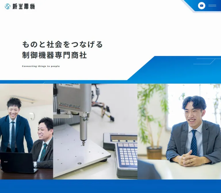
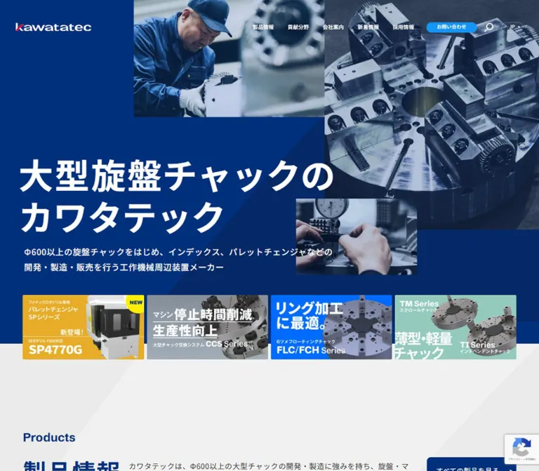
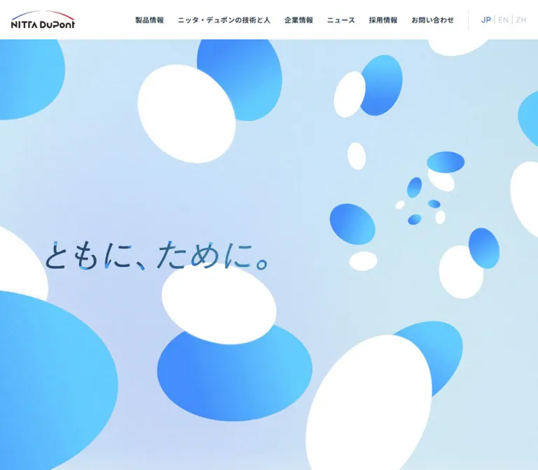
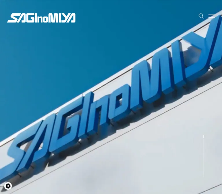
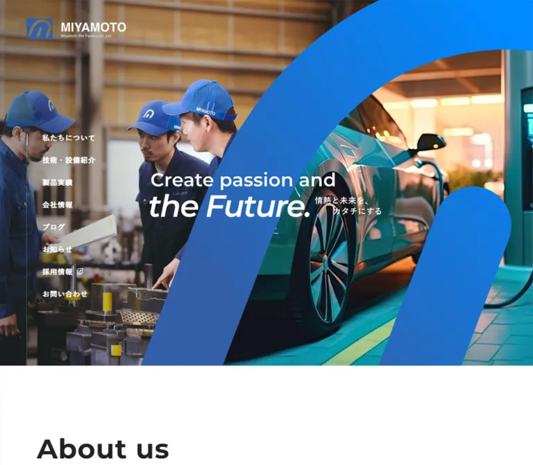
巨大なブルーのブランドモチーフと現場写真が印象的な金型メーカーのコーポレートサイト。太い英字見出し、広い余白、横に連なる製品紹介で技術力を伝えています。
オリジナルサイトを見るA broad blue brand gesture connects workshop craftsmanship with the machines it makes possible.
Website: miyamoto-kanagata.co.jp Original URL: https://miyamoto-kanagata.co.jp/ Final URL: https://miyamoto-kanagata.co.jp/ Theme: predominantly white, with blue branding and photographic sections carrying white text. Inspected: September 23, 2026, Japan Standard Time, through the supplied browser captures and rendered evidence. Retrieval timestamp: September 22, 2026, at 17:33:24.001 UTC, equivalent to September 23 at 02:33:24.001 JST. Viewports: 1440 × 1000 desktop and 390 × 844 mobile, in CSS pixels. Scope: the current corporate homepage: opening composition, navigation states, company introduction, strengths, technology and equipment introduction, product rail, company feature, blog rail, news, recruitment/contact links, and footer. Visual captures cover the desktop opening, products, and footer, plus the mobile opening and footer. Other homepage sections are documented from the supplied DOM measurements. Linked pages and activated controls were not inspected.
The homepage combines a strong industrial identity with an unusually spacious editorial layout. Its opening image pairs people working at a tool bench with an application image, divided by an enormous blue form derived from the company mark. White lettering crosses this composition. Below it, large Montserrat headings, smaller blue Japanese subtitles, long paragraph leading, and fine gray rules give the manufacturing content a clear hierarchy.
The page has several distinct reading scales: a nearly screen-filling opening image, generous company introductions, compact technical explanations, horizontal product and article collections, and large photographic destination links. The visual continuity comes from blue, consistent heading pairs, and disciplined alignment. The footer returns to an open white surface and repeats the identity, slogan, navigation, and company details.
A broad blue brand gesture connects workshop craftsmanship with the machines it makes possible.
Website: miyamoto-kanagata.co.jp Original URL: https://miyamoto-kanagata.co.jp/ Final URL: https://miyamoto-kanagata.co.jp/ Theme: predominantly white, with blue branding and photographic sections carrying white text. Inspected: September 23, 2026, Japan Standard Time, through the supplied browser captures and rendered evidence. Retrieval timestamp: September 22, 2026, at 17:33:24.001 UTC, equivalent to September 23 at 02:33:24.001 JST. Viewports: 1440 × 1000 desktop and 390 × 844 mobile, in CSS pixels. Scope: the current corporate homepage: opening composition, navigation states, company introduction, strengths, technology and equipment introduction, product rail, company feature, blog rail, news, recruitment/contact links, and footer. Visual captures cover the desktop opening, products, and footer, plus the mobile opening and footer. Other homepage sections are documented from the supplied DOM measurements. Linked pages and activated controls were not inspected.
The homepage combines a strong industrial identity with an unusually spacious editorial layout. Its opening image pairs people working at a tool bench with an application image, divided by an enormous blue form derived from the company mark. White lettering crosses this composition. Below it, large Montserrat headings, smaller blue Japanese subtitles, long paragraph leading, and fine gray rules give the manufacturing content a clear hierarchy.
The page has several distinct reading scales: a nearly screen-filling opening image, generous company introductions, compact technical explanations, horizontal product and article collections, and large photographic destination links. The visual continuity comes from blue, consistent heading pairs, and disciplined alignment. The footer returns to an open white surface and repeats the identity, slogan, navigation, and company details.
| Name | Value | Suggested token | Role and evidence |
|---|---|---|---|
| Brand Blue | #335fa8 |
--brand |
Measured on the English strength labels: Equipment, Material, and One-stop. Visually consistent with the quieter blue branding elsewhere. |
| Electric Blue | Approximately #0088ff |
--accent |
Estimated bright end of the large hero motif and contact-button gradient. Exact source stops are unavailable. |
| White | #ffffff |
--paper |
Measured page and header background; measured reversed navigation and company text. |
| Heading Ink | #222222 |
--ink |
Measured major English headings and news controls. |
| Text Charcoal | #333333 |
--text |
Measured navigation, strength descriptions, blog titles, and many links. |
| Body Black | #000000 |
--body-ink |
Measured introductory paragraphs and product information. |
| News Wash | #f9f9f9 |
--news-surface |
Measured background of the News section at both viewports. |
| Metadata Gray | #c0c5ce |
--muted |
Measured blog hashtags. This is a pale secondary text color, not the main paragraph color. |
| Fine Rule | Approximately #dddddd |
--rule |
Estimated product dividers, filter outlines, and footer separators. Border color was not included in the element samples. |
The strongest blue occupies a graphic shape, not a general page background. Preserve the relationship between the large blue opening motif and the mostly white content below. Product images remain metallic and neutral; staff and workshop photographs contribute navy, steel gray, and warm industrial browns.
The scrolled desktop header shows a bright-to-muted blue contact pill with white lettering. Its initially offscreen anchor sample reports a white background and dark text. This discrepancy may involve state or child/pseudo-element styling, neither of which was supplied. The rendered capture establishes the visible result; the anchor sample alone does not describe every painted layer.
For an adaptation, linear-gradient(90deg, #0088ff, #335fa8) is a useful contact-button approximation. A diagonal gradient through the same family can approximate the hero motif. Both gradient formulas are recommendations, not recovered source declarations.
The supplied WordPress color, gradient, and shadow presets are not evidence that those presets are visibly used. Likewise, the exposed Swiper theme blue is not a measured brand color. No alternate theme selector was observed.
Montserrat, sans-serif.700.60.8656px / 60.8656px.40.2961px / 40.2961px.1px.The headings are broad and heavy without becoming condensed. Most use a single English line followed by a much smaller Japanese subtitle. Technology&Equipment occupies two English lines at both inspected widths.
The family is directly supported by computed styles. Font-file URLs, delivery method, and available font variants were not supplied.
The measured stack is:
'游ゴシック体', YuGothic, '游ゴシック Medium',
'Yu Gothic Medium', '游ゴシック', 'Yu Gothic', sans-serif
Use regular weight for explanations and material information, and bold weight for navigation, product names, strength statements, and key labels. Most sampled text inherits 1px letter spacing. Product names explicitly use normal tracking; product category labels use slightly negative tracking.
Paragraphs are notably airy: introductory copy uses approximately twice the font size as its line height. Do not inherit the root's measured 16px line height into these paragraphs when adapting the design.
The hero slogan reads “Create passion and the Future.” with “the Future.” much larger and italic. A small Japanese line, “情熱と未来を、カタチにする”, sits beside the second line. The footer repeats this composition in blue.
The slogan's measured H2 contains no extracted text and has a stable graphic-sized box. Its inherited 16px font size does not describe the visible lettering. Treat the slogan as artwork or a separately specified typographic lockup; its precise font and asset format are unverified. The wordmark is also an identity asset, not an ordinary Montserrat heading.
| Role | Desktop | Mobile | Weight / leading / tracking | Evidence |
|---|---|---|---|---|
| Major English heading | 60.8656px |
40.2961px |
700, line height 1, tracking 1px |
Measured |
| Japanese subtitle beneath major heading | Approximately 18–20px |
Approximately 15–16px |
Bold, blue on white sections | Visual estimate; child-span styles not supplied |
| Introductory paragraph | 15.8688px |
15.008px |
400, line height 2, tracking 1px |
Measured |
| Company feature paragraph | 15.8688px |
15.008px |
700, line height 2, white |
Measured |
| Desktop header / hero navigation | 14px |
Not displayed as a desktop row | 700, line height 1, tracking 1px |
Measured |
| Mobile menu entries | — | 15px |
700, line height 1, tracking 1px |
Measured concealed structure; open state unverified |
| Strength statement | 19.7392px |
18.0277px |
700, line height 1.6, tracking 1px |
Measured |
| Strength English label | 14px |
14px |
Montserrat 700, line height 1, blue |
Measured |
| Strength explanation | 14px |
14px |
400, line height 24.5px |
Measured |
| Product title | 17.7392px |
16.0277px |
700, line height 1.2, normal tracking |
Measured |
| Product category label | 12px |
12px |
700, line height 14.4px, tracking -0.24px |
Measured |
| Product material row | 15.8688px |
15.008px |
400, line height 1, tracking 1px |
Measured |
| Blog title | 17.4768px |
14.0433px |
700, line height 1.5, tracking 1px |
Measured |
| Blog hashtags | 13.7392px |
12.0277px |
400, pale gray, tracking 1px |
Measured |
| Recruitment/contact English title | Approximately 50px |
32.2407px |
Montserrat 700, line height 1 |
Desktop estimate; mobile measured |
| Recruitment/contact Japanese label | Approximately 20px |
16.0433px |
700, white |
Desktop estimate; mobile measured |
The scale contracts selectively. Large headings become about two thirds of their desktop size, while body copy changes only slightly. The unchanged 14px strength descriptions and 12px category labels help preserve practical information density.
Layout character: generous separation between major sections, compact information inside repeated items, and almost entirely square content surfaces.
| Use | Desktop value | Mobile value | Status |
|---|---|---|---|
| Main content edge | 164px at 1440px width |
20px |
Measured section-heading positions |
| Header horizontal padding | 43.1875px |
20px |
Measured; desktop is approximately 3vw |
| Hero-to-About gap | 166.9375px |
81.21875px |
Calculated from section bounds |
| Intro heading group to paragraph | Approximately 46.95px |
Approximately 40.09px |
Calculated from About bounds |
| Intro paragraph to following mobile CTA | Side-by-side desktop arrangement | 40px |
Measured mobile positions |
| Hero navigation pitch | 44px |
Hero rail absent | Calculated from consecutive link positions |
| Strength row top padding | 47.3872px |
30.2407px |
Measured |
| Strength row bottom padding | 32px |
32px |
Measured |
| Strength English label to explanation | Separate desktop columns | 24px |
Calculated mobile gap |
| Blog card padding | 30.432px |
20.142px |
Measured |
| Product category padding | 8px |
8px |
Measured |
| Product material label/value gap | 8px |
8px |
Measured |
| News vertical padding | 151.984px |
73.129px |
Measured |
These values do not establish a single spacing multiplier. For a reusable system, use a practical small scale of 8, 16, 20, 24, 32, and 40px, plus larger section gaps around 80–170px. That normalization is a recommendation.
| Element | Value | Evidence |
|---|---|---|
| Header contact link | 9999px |
Measured anchor geometry |
| About / Technology / Company CTA links | 9999px |
Measured |
| Product and blog rail controls | 50% |
Measured |
| Product category labels | 0 |
Measured |
| Blog cards and news category controls | 0 |
Measured |
| Product filters and product cells | Square | Visible in desktop product capture |
| Recruitment/contact arrow enclosure | Narrow outlined capsule | Visible; exact radius not supplied |
Roundness identifies actions and echoes the large brand curve. It is not applied uniformly to content cards.
| Element | Desktop, 1440 × 1000 | Mobile, 390 × 844 | Qualification |
|---|---|---|---|
| Document height | 8265px |
7007px |
Supplied browser measurements |
| Hero section | 1440 × 990px |
390 × 667px |
Measured; no viewport-height formula established |
| Hero slogan box | 626.39 × 122.81px, at 403.19, 465.30 |
351 × 68.81px, at 19.5, 346.83 |
Measured |
| Persistent header | 84px high |
72px high |
Measured; initially above viewport |
| Header logo box | 181.73 × 39.98px |
144 × 31.69px |
Measured |
| Mobile menu button | — | 42 × 42px, x = 328px |
Measured |
| Main content span | Approximately 1112px |
350px |
Calculated from content edges |
| Product introduction paragraph | 667.19px wide, x = 608.81px |
350px wide, x = 20px |
Measured |
| Desktop product filter strip | Approximately 890 × 53px |
Arrangement unverified | Screenshot estimate |
| Product item pitch | Approximately 320px |
Approximately 325px |
Calculated from repeated text positions |
| Blog card | 318.55 × 412.64px |
322.33 × 381.89px |
Measured |
| Rail control diameter | 50.42px |
40.14px |
Measured |
| Company feature section | 900px high |
550px high |
Measured |
| Recruitment/contact panels | Two equal 720px columns |
Two stacked 390 × 208px links |
Desktop width visible; mobile bounds measured |
| Footer content span | Approximately 1184px, x = 128px |
350px, x = 20px |
Screenshot estimate |
The desktop recruitment/contact capture shows about 367px of photography beneath the fixed header. Its upper portion may be occluded, so that visible height should not be copied as the full panel height.
Role: connect the company’s people, manufacturing work, and application industries in one immediate composition.
The desktop opening has five visible layers or roles:
The blue shape is the defining graphic. Its scale deliberately exceeds the viewport, creating cropped contours and a large photographic opening. It should be reproduced from authorized identity artwork or a carefully prepared mask, rather than approximated with unrelated circles.
The slogan box starts at approximately 28% of the desktop width and 47% of the hero height. On mobile it starts at 5% of the width and 52% of the hero height. These percentages are calculated relationships, not recovered source CSS.
Mobile uses a different composition: people fill the upper portion, the blue arch crosses the middle, and the application photograph fills the lower portion. The supplied phone capture shows agricultural equipment. The 351px-wide slogan retains its two-line relationship, including the small Japanese phrase. The desktop side navigation is absent.
Role: expose the site’s main destinations without placing a white navigation strip over the opening image.
Eight white Japanese links form a vertical list at x = 103px in the desktop capture. Each uses 14px bold Yu Gothic with 1px tracking. Consecutive links begin 44px apart. A fine vertical line sits to their left, visually aligning the list with the logo area.
The destination set covers company introduction, technology/equipment, products, company information, blog, news, recruitment, and contact. Recruitment carries a small external-link-style indicator. Its recorded destination is the separate /recruit/index.html path on the www host over HTTP; this does not establish new-tab behavior or the destination’s current appearance.
Role: maintain navigation once the page moves beyond its opening composition.
The white desktop strip is 84px high. It places the blue logo at the left, a compact single-line Japanese navigation group at the right, and a blue gradient contact pill at the far end. The sampled link gaps are approximately 20px. The contact anchor has measured padding of 14px vertically and 28px horizontally, with a 150 × 46px outer box in the initial sample.
At the opening position, the desktop header is measured at y = -84px. Later desktop captures show it at the viewport top. This supports a scroll-associated reveal, but the trigger threshold and positioning implementation are unverified.
The mobile header is 72px high with 20px side padding, a 144px-wide logo, and a three-line blue menu icon. It is visible over the footer capture and absent from the opening capture. The initial mobile header also sits above the viewport. Concealed menu links are present in the DOM, but no open-menu screenshot or click result was supplied.
Role: make the homepage’s long sequence immediately scannable.
Use a bold English title, followed by a smaller Japanese subtitle on its own line. On white sections, the English title is nearly black and the subtitle is blue. On the Company feature, the sampled heading and copy are white.
The full About/Products heading group measures approximately 95.81px high on desktop and 68.38px on mobile. The two-line Technology&Equipment group measures 156.67px and 108.67px respectively. Keep the subtitle visually subordinate and preserve intentional English wrapping.
Role: introduce the manufacturer before technical detail.
At desktop width, the About heading and paragraph occupy a left block approximately 604px wide. A pill-shaped destination link is positioned to the right, aligned near the paragraph’s lower edge. The paragraph uses approximately 15.87px type with 31.74px leading.
On mobile, the heading, paragraph, and pill form a single column. The paragraph spans 350px and occupies four lines in the measured state. The link begins 40px below it and measures approximately 192.75 × 51.08px.
The pill geometry and white anchor background are measured. The supplied captures do not resolve every border, arrow, or hover detail of this particular link, so those should not be presented as verified artwork.
Role: explain capability through three substantial linked statements.
The entries are Equipment, Material, and One-stop. Each link contains a bold Japanese statement, a small blue English label, and a short Japanese explanation.
On desktop, a narrow heading region measuring approximately 55.56 × 517.36px sits beside a 737.88px-wide list. The heading region suggests a vertical title treatment, but its writing-mode was not included in the evidence. Each list entry measures approximately 172.45px high. The statement/English-label block is about 258px wide, while the explanation occupies about 339px in a separate column.
On mobile, the heading becomes a 350px-wide block above the list. Within each entry, the statement, English label, and explanation stack vertically. Entries expand to approximately 264–289px high according to paragraph length. The explanation remains 14px with 24.5px leading.
The links point to equipment and workflow anchors on the technology page, and to the product index. They are meaningful destination rows rather than isolated decorative feature labels.
Role: bridge the company narrative and its practical manufacturing capabilities.
The desktop section begins with a two-line English heading, Japanese subtitle, approximately 489px-wide description, and a destination pill to the right. Mobile stacks the same elements within the 350px content width.
The measured section is approximately 894px high on desktop and 593px on mobile. The upper edge of the product screenshot reveals the preceding section’s industrial imagery and part of a blue dimensional graphic. Its complete image arrangement is not shown, so the reference does not infer an unseen collage layout.
Role: connect application categories to tangible manufactured examples.
The desktop Products heading sits at the left content edge. The description begins farther right, at x = 608.81px, with its top aligned approximately to the bottom of the heading group. This staggered arrangement creates a large white breathing area without centering the content.
Below it, four equal rectangular segments form the category strip. The visible labels are “すべて”, “自動車部品”, “二輪車・飛行機部品”, and “その他部品、特殊部品”. The selected first segment uses blue bold text and a short blue dash. The remaining segments use dark regular text, white backgrounds, and fine gray outlines.
A separate “製品実績一覧” link sits to the right with a small dark circular ellipsis symbol. It is an index destination link, not evidence of an overflow menu.
On mobile, the description returns to the left-aligned content column. The index link has a separate full-width measured row. The exact mobile category-strip layout is not available in the supplied screenshots.
Role: show the real forms, categories, and materials of manufactured parts.
The rail spans the viewport rather than staying inside the text container. At 1440px, approximately four and a half 320px cells are visible. Thin vertical dividers create a continuous technical display with no gutters or floating shadows.
A product cell contains:
The source text includes sixteen product entries. Examples cover EV battery components, door parts, engine and exhaust covers, motorcycle tanks, an aircraft heat exchanger, appliance parts, and a marine frame. Preserve recognizable component silhouettes, holes, bends, and surface textures. Cropping them into decorative thumbnails would remove useful information.
Mobile item positions imply an approximately 325px pitch, leaving space for part of the following item within a 390px viewport. This is a meaningful structural change: items remain large instead of shrinking to a dense mobile grid.
Two circular controls follow the rail. Their measured diameter decreases from approximately 50.42px to 40.14px, and their group moves from the desktop right side to the phone’s center. The control actions, touch dragging, looping, and filter responses were not exercised.
Role: give the company statement a distinct full-width moment between products and updates.
This section measures 900px high on desktop and 550px on mobile. Its heading, bold paragraph, and destination link use white text. On desktop the text block begins at x = 164px, with the pill alongside it. On mobile the elements stack at x = 20px.
The supplied computed styles establish the reversed text treatment. The backdrop’s subject, asset, and motion are not shown in the original-page captures, so they remain unspecified.
Role: show recurring company activity through dated article links.
The Blog heading and index link share a heading row. Below them is another horizontal sequence extending beyond the viewport. Each entire card is a link containing a date, article title, and hashtags; the measured card geometry reserves substantial space above the title region, but the supplied screenshots do not establish individual thumbnail subjects or crop rules.
Desktop cards measure approximately 318.55 × 412.64px with 30.43px padding. Mobile cards measure approximately 322.33 × 381.89px with 20.14px padding. Their width is therefore maintained while internal spacing and typography contract.
Hashtags are pale gray and sit beneath the title. There is a paired circular control group matching the product rail. Article destinations are recorded in the DOM, but opening them and changing rail position were not tested.
Role: provide a quieter, structured announcement area.
The News section uses the measured #f9f9f9 background. Its desktop content is approximately 1120px wide, with a heading row, a left category column, and a wider announcement area to the right. The category buttons measure approximately 200 × 58px. The announcement combines a square category badge, date, and bold title.
On mobile, the heading and index link remain beside one another. The announcement becomes a 350px-wide block beneath the categories. The sampled category buttons are positioned in a horizontal sequence extending beyond the viewport; the clipping and navigation behavior of that sequence were not captured.
A January 11, 2024 announcement about the website renewal is present. That is article content, not the date of this inspection and not evidence for reconstructing an earlier design.
Role: end the main content with two large, easily recognized destinations.
Desktop presents equal-width photographic panels: a group of staff for Recruit and office staff working at computers for Contact. Both have darkened imagery, large white English headings, bold Japanese subtitles, and a small white outlined arrow capsule near the lower right.
The labels sit approximately 8% of each panel width from its left edge. The image is the panel surface; there is no separate rounded card or outer gap.
On mobile, the links stack vertically and each measures 390 × 208px. The measured text begins at x = 31.19px, preserving the approximately 8% inset. The entire panel is an anchor. Darkening is visually evident in the desktop capture, but the overlay’s exact color, opacity, and implementation were not supplied.
Role: restate the identity and provide a complete navigation and company-information endpoint.
The desktop footer has two broad bands. The upper band places a blue logo and blue slogan lockup on the left, with navigation arranged in three compact columns on the right. A muted privacy link sits beneath the navigation. The lower band is separated by a fine full-width rule and contains the legal company name, address, telephone/fax information, small marks at the right, and a pale copyright line below.
On mobile, these elements become a vertical sequence: logo, slogan, two navigation columns, privacy link, separator, company details, marks, and copyright. The visible footer logo is approximately 180px wide, larger than the 144px mobile-header logo. Side margins remain 20px.
The footer independently identifies the operator as “株式会社宮本金型製作所”. JAB/MSA imagery and a multicolor SDG wheel are visible. Their presence is a visual observation; certification scope, current validity, and linked explanations were not inspected.
| Element or behavior | Supplied evidence | What remains unverified |
|---|---|---|
| Header reveal | Header initially above viewport; visible at top in scrolled captures; computed transition 0.4s |
Trigger threshold, animated property, and exact easing |
| Header navigation | Computed transition 0.15s |
Hover transformation, color sequence, or bilingual-label animation |
| About / Technology / Company pills | Computed transition 0.4s |
Exact hover and focus appearance |
| Blog cards | Computed transition 0.4s |
Image zoom, background changes, or other hover effects |
| Product and blog control buttons | Computed transition 0.4s; paired circular geometry |
Slide duration, button action, disabled state, looping, or dragging |
| News category buttons | Computed transition 0.4s; one selected category is bold |
Actual filtering response and loading behavior |
| Recruitment/contact links | Computed transition 0.4s in mobile evidence |
Hover image motion or arrow animation |
| Hero application imagery | Aircraft in desktop capture; agricultural equipment in mobile capture | Whether variation is temporal, responsive, randomized, or otherwise selected |
| Mobile navigation | Menu button and concealed link structure | Open/close behavior, overlay, focus handling, and animation |
The supplied samples frequently report animation: none. This does not exclude JavaScript animation, animation on unsampled descendants, or pseudo-element effects. A bare transition value of all without a supplied duration is not evidence of visible movement.
The browser collection waited for document load, image decoding, and sampled layout stability, with an initial observation of at least five seconds. Perpetual animations were paused during readiness checks and resumed afterward. These procedures improve capture stability but do not establish a complete motion sequence.
For a new implementation, retain restrained 150ms navigation feedback and approximately 400ms surface/state transitions. Add any hero sequencing only as an explicitly designed behavior, with pause and reduced-motion handling. Do not attach invented timing values to the original page.
| Surface | Appearance | Function |
|---|---|---|
| Main canvas | White | Separates the large image-driven moments and keeps technical content legible |
| Hero | Full-width photography and oversized blue brand artwork | Establishes people, industry, and identity immediately |
| Persistent header | Solid white with blue identity | Provides a stable navigation surface over lower content |
| Product rail | White cells with fine gray dividers | Makes component silhouettes and metadata the focus |
| Blog rail | Square white linked cards | Keeps recurring updates within the same horizontal rhythm |
| News | Very light gray section | Differentiates structured announcements without a new accent color |
| Company feature | White text over an unspecified backdrop | Creates a strong reversed-text interval |
| Recruitment/contact | Darkened photography with white labels | Makes two destination links visually substantial |
| Footer | White, divided by a thin rule | Returns to a calm, practical information surface |
The visible product, header, and footer surfaces do not establish a general shadow-elevation system. The partial dimensional technology graphic has depth, but that is imagery, not evidence that ordinary cards should receive drop shadows.
The image system operates at three levels: people making things, industries using those things, and the individual manufactured parts. Preserve these roles when extending the site.
Workshop photography should retain the human scale of collaboration: blue workwear, concentrated faces, hands near tools, and enough machinery to identify the setting. The application field can be more expansive, as in the aircraft-and-cloud composition. Product photography takes the opposite approach: neutral white isolation, complete silhouettes, and visible metal construction.
The recruitment and contact panels make different working environments recognizable. Keep their subjects distinct rather than repeating the hero crop in both positions.
The large blue shape and italic slogan are identity assets. Their contours, proportions, and relationship to photography matter more than an approximate selection of blue UI components.
No original image filenames, font-file URLs, or mask definitions were supplied. The references below identify observed assets by location and appearance; they are not invented download paths.
| Asset | Observed evidence | Intended role |
|---|---|---|
| White logo lockup | Desktop and mobile opening captures | Identity over photography |
| Blue logo lockup | Scrolled headers and both footer captures | Identity on white surfaces |
| Workshop photograph | Both opening captures | People and manufacturing process |
| Aircraft image | Desktop opening capture | Application-industry context |
| Agricultural-equipment image | Mobile opening capture | Application-industry context |
| Large curved blue motif | Both opening captures | Structural brand framing |
| White and blue slogan lockups | Opening and footer captures | Repeated brand statement |
| Isolated metal components | Desktop Products capture | Product evidence with preserved silhouettes |
| Factory imagery and blue dimensional graphic | Partial strip above Products | Technology-section imagery; full arrangement unavailable |
| Staff group photograph | Desktop Recruit panel | Recruitment destination |
| Office work photograph | Desktop Contact panel and mobile footer-adjacent strip | Contact destination |
| Small organizational marks and SDG wheel | Desktop and mobile footers | Footer identity/supporting marks |
Use authorized assets where available. If replacement imagery is necessary, match subject role, crop, lighting, and available space for lettering. Do not imply that replacement photographs depict the original company’s actual products or employees.
The homepage follows this observed sequence:
Most editorial content begins at x = 164px and fits an approximately 1112px span. Full-width imagery and horizontal rails deliberately break out of that container. News uses a slightly wider approximately 1120px content span, while the footer appears wider again.
The layout frequently uses offset alignment rather than centered stacking. The product paragraph begins to the right and below its title; introduction pills sit beside paragraph blocks; the strengths list uses a narrow heading region and broad linked rows.
At 390px, ordinary text receives 20px side margins. Large headings remain prominent at approximately 40.3px, while body text stays near 15px. Introductions and strength rows become vertical stacks, and destination pills follow their paragraphs.
The hero is recomposed rather than uniformly scaled. Its height is 667px within an 844px viewport, leaving the beginning of About visible below it. Do not assume the opening is always 100vh.
Product and blog rails retain item widths around 322–325px. Their content extends horizontally rather than converting to a grid. Controls are centered below them. The Company feature reduces to 550px high, and the two closing photographic links stack at 208px each.
Footer navigation changes from three desktop columns to two phone columns. Company details, marks, and copyright follow underneath instead of sharing a broad horizontal band.
Only two viewport widths were supplied. The original breakpoint, tablet layout, landscape behavior, and fluid interpolation rules are unknown. A breakpoint around 768px is a reasonable starting recommendation for content stacking, with an earlier navigation collapse if the desktop links no longer fit.
The mobile menu’s DOM geometry must not be mistaken for a screenshot of an open menu. Similarly, horizontal positions beyond the viewport establish an overflowing sequence, but do not establish whether it scrolls natively, uses transforms, or supports touch gestures.
H2 element’s inherited typography.These are recommendations for a new implementation, not verified original features:
aria-pressed for filtering buttons, or full tab semantics only when the interface actually behaves as tabs.aria-expanded and aria-controls; manage focus and remove concealed navigation from the focus order.#68717d is a recommended accessible alternative, not a measured source color.#ffffff, measured.#222222, measured.#333333, measured.#335fa8, measured brand-blue reference.#0088ff, estimated.#f9f9f9, measured.#c0c5ce, measured; consider a darker accessible adaptation.#dddddd, estimated.“Create a Japanese manufacturing company homepage inspired by MIYAMOTO’s observed design. Build an opening composition from workshop staff photography, an application-industry photograph, and an oversized curved blue brand motif that extends beyond the frame. Place a white logo at the upper left, a two-line white slogan with a large italic second line, and a restrained vertical desktop navigation rail. Below the opening, use white surfaces, approximately 61px bold Montserrat English headings, smaller blue Japanese subtitles, 16px Yu Gothic body text with generous leading, and a centered content span around 1112px at a 1440px viewport. Include company capability rows, technology information, a full-width divided product rail with isolated metal parts and material labels, company information, blog and news, photographic recruitment/contact links, and a spacious footer. On a 390px phone, use 20px text margins, approximately 40px headings, a recomposed 667px opening, stacked introductions, and product items around 325px wide. Treat unverified motion and filters as separately specified implementation work.”
This CSS is an implementation adaptation, not extracted source code. It preserves the measured hierarchy and key endpoint dimensions, with estimated visual colors and recommended interpolation between viewports. Load Montserrat separately if available; the declaration alone does not load it.
Supply authorized logo, slogan, and hero artwork. .hero__art should be an art-directed <picture> containing the photographic composition and blue motif; .hero__logo and .hero__message are separate image/graphic elements. The code does not invent original asset URLs or reconstruct the exact brand contour.
Use .content for editorial content, .section-heading with an .section-heading__jp child for heading pairs, and a full-width .rail with .product-card children for products. .is-visible is a header state that application code must manage. Menu toggling, filtering, rail buttons, and any slideshow require separate behavior; horizontal rail overflow works without that scripting.
:root {
  /* Measured colors */
  --brand: #335fa8;
  --paper: #ffffff;
  --ink: #222222;
  --text: #333333;
  --body-ink: #000000;
  --news-surface: #f9f9f9;
  --muted: #c0c5ce;

  /* Visual estimates */
  --accent: #0088ff;
  --rule: #dddddd;

  /* Observed font families */
  --font-latin: 'Montserrat', sans-serif;
  --font-japanese: '游ゴシック体', YuGothic,
    '游ゴシック Medium', 'Yu Gothic Medium',
    '游ゴシック', 'Yu Gothic', sans-serif;

  /* Recommended interpolation near the measured endpoints */
  --title-size: clamp(40.296px, calc(32.656px + 1.959vw), 60.866px);
  --body-size: clamp(15.008px, calc(14.69px + 0.082vw), 15.869px);
  --section-space: clamp(81.219px, 11.6vw, 166.938px);
  --content-width: 1112px;
  --news-width: 1120px;
  --footer-width: 1184px;
  --page-inset: 20px;
  --header-height: 84px;
  --radius-pill: 9999px;
  --motion-fast: 150ms;
  --motion-standard: 400ms;
}

* { box-sizing: border-box; }
body {
  margin: 0;
  color: var(--body-ink);
  background: var(--paper);
  font-family: var(--font-japanese);
  font-size: var(--body-size);
  line-height: 1.75;
  letter-spacing: 1px;
}
img { display: block; max-width: 100%; }
button, input { font: inherit; }
a { color: inherit; }
button { cursor: pointer; }
.content {
  width: min(calc(100% - 40px), var(--content-width));
  margin-inline: auto;
}
.section-gap { margin-block-start: var(--section-space); }

/* Header visibility is controlled by application state. */
.site-header {
  position: fixed;
  inset: 0 0 auto;
  z-index: 50;
  display: flex;
  align-items: center;
  justify-content: space-between;
  height: var(--header-height);
  padding-inline: 3vw;
  background: var(--paper);
  transform: translateY(-100%);
  transition: transform var(--motion-standard) ease;
}
.site-header.is-visible { transform: translateY(0); }
.site-header__logo { width: 181.73px; }
.header-nav { display: flex; align-items: center; gap: 20px; }
.header-nav a {
  color: var(--text);
  font-size: 14px;
  font-weight: 700;
  line-height: 1;
  text-decoration: none;
  transition: color var(--motion-fast) ease;
}
.header-nav .contact-pill {
  display: inline-flex;
  align-items: center;
  justify-content: center;
  min-height: 46px;
  margin-inline-start: 42px;
  padding: 14px 28px;
  border-radius: var(--radius-pill);
  color: white;
  background: linear-gradient(90deg, var(--accent), var(--brand));
}
.menu-toggle { display: none; }

/* Artwork must contain the approved motif and responsive crops. */
.hero {
  position: relative;
  height: clamp(667px, 68.75vw, 990px);
  overflow: hidden;
  color: white;
  background: var(--brand);
}
.hero__art, .hero__art img {
  position: absolute;
  inset: 0;
  width: 100%;
  height: 100%;
}
.hero__art img { object-fit: cover; }
.hero__logo {
  position: absolute;
  top: 50px;
  left: 5%;
  width: 196px;
}
.hero__message {
  position: absolute;
  top: 47%;
  left: 28%;
  width: 43.5%;
  margin: 0;
}
.hero__message img { width: 100%; height: auto; }
.hero__rail {
  position: absolute;
  top: 50%;
  left: 5%;
  display: flex;
  flex-direction: column;
  gap: 30px;
  padding-left: 30px;
  border-left: 1px solid rgb(255 255 255 / 35%);
}
.hero__rail a {
  color: white;
  font-size: 14px;
  font-weight: 700;
  line-height: 1;
  text-decoration: none;
}

.section-heading {
  margin: 0;
  color: var(--ink);
  font-family: var(--font-latin);
  font-size: var(--title-size);
  font-weight: 700;
  line-height: 1;
  letter-spacing: 1px;
}
.section-heading__jp {
  display: block;
  margin-top: 14px;
  color: var(--brand);
  font-family: var(--font-japanese);
  font-size: 18px;
  line-height: 1.2;
}
.section-copy {
  margin: 0;
  font-size: var(--body-size);
  line-height: 2;
}
.destination-pill {
  display: inline-flex;
  align-items: center;
  gap: 24px;
  width: fit-content;
  padding: 19.48px 30.96px;
  border: 1px solid var(--rule);
  border-radius: var(--radius-pill);
  background: var(--paper);
  color: var(--text);
  font-size: 16px;
  line-height: 1;
  text-decoration: none;
  transition: border-color var(--motion-standard) ease;
}
.product-intro {
  display: grid;
  grid-template-columns: 2fr 3fr;
}
.product-intro .section-copy { margin-top: 95.81px; }
.product-tools {
  display: grid;
  grid-template-columns: minmax(0, 1fr) auto;
  align-items: center;
  gap: 85px;
  margin-top: 64px;
}
.product-filters {
  display: grid;
  grid-template-columns: repeat(4, minmax(0, 1fr));
  border: 1px solid var(--rule);
}
.product-filters button {
  min-height: 52px;
  padding: 12px 8px;
  border: 0;
  border-right: 1px solid var(--rule);
  border-radius: 0;
  background: white;
  color: var(--body-ink);
  font-size: 15px;
}
.product-filters button:last-child { border-right: 0; }
.product-filters button[aria-pressed='true'] {
  color: var(--brand);
  font-weight: 700;
}
.product-filters button[aria-pressed='true']::before {
  content: '';
  display: inline-block;
  width: 12px;
  height: 3px;
  margin-right: 8px;
  vertical-align: middle;
  background: var(--accent);
}
.index-link {
  display: inline-flex;
  align-items: center;
  gap: 8px;
  color: var(--text);
  font-weight: 700;
  text-decoration: none;
}
.index-link__symbol {
  display: grid;
  place-items: center;
  width: 28px;
  height: 28px;
  border-radius: 50%;
  color: white;
  background: var(--ink);
  letter-spacing: 0;
}

/* Native scrolling is a recommended fallback, not a source claim. */
.rail {
  display: flex;
  margin: 40px 0 0;
  padding: 0;
  overflow-x: auto;
  overscroll-behavior-inline: contain;
  scroll-snap-type: x proximity;
  border-block: 1px solid var(--rule);
  list-style: none;
}
.product-card {
  flex: 0 0 320px;
  min-width: 0;
  padding: 30.4px;
  border-right: 1px solid var(--rule);
  border-radius: 0;
  background: white;
  scroll-snap-align: start;
}
.product-card__image {
  width: 100%;
  height: 210px;
  margin-bottom: 30px;
  object-fit: contain;
}
.product-card__info {
  padding-top: 28px;
  border-top: 1px solid var(--rule);
}
.product-card__title {
  margin: 0;
  font-size: 17.739px;
  font-weight: 700;
  line-height: 1.2;
  letter-spacing: normal;
}
.product-card__category {
  display: inline-block;
  margin: 16px 0 24px;
  padding: 8px;
  border: 1px solid var(--rule);
  font-size: 12px;
  font-weight: 700;
  line-height: 1.2;
  letter-spacing: -0.24px;
}
.product-card__material {
  display: flex;
  gap: 8px;
  margin: 0;
  font-size: var(--body-size);
  line-height: 1.4;
}
.rail-controls {
  display: flex;
  justify-content: flex-end;
  gap: 14.33px;
  margin-top: 40px;
}
.rail-control {
  display: grid;
  place-items: center;
  width: 50.42px;
  height: 50.42px;
  padding: 0;
  border: 1px solid var(--rule);
  border-radius: 50%;
  background: white;
  color: var(--text);
  transition: border-color var(--motion-standard) ease;
}
.blog-card {
  flex: 0 0 318.55px;
  padding: 30.43px;
  border-right: 1px solid var(--rule);
  color: var(--text);
  background: white;
  text-decoration: none;
  scroll-snap-align: start;
}
.blog-card__title { font-size: 17.477px; line-height: 1.5; }
.blog-card__tags { color: var(--muted); font-size: 13.739px; }
.news-section {
  padding: 151.98px 20px;
  background: var(--news-surface);
}
.news-section__inner {
  max-width: var(--news-width);
  margin-inline: auto;
}

/* Desktop panel height and overlay strength are recommendations. */
.destination-panels {
  display: grid;
  grid-template-columns: repeat(2, minmax(0, 1fr));
}
.destination-panel {
  position: relative;
  isolation: isolate;
  display: grid;
  align-content: center;
  min-height: 432px;
  padding: 40px 8%;
  overflow: hidden;
  color: white;
  text-decoration: none;
}
.destination-panel > img {
  position: absolute;
  inset: 0;
  z-index: -2;
  width: 100%;
  height: 100%;
  object-fit: cover;
}
.destination-panel::before {
  content: '';
  position: absolute;
  inset: 0;
  z-index: -1;
  background: rgb(0 0 0 / 35%);
}
.destination-panel__title {
  margin: 0;
  font: 700 50px/1 var(--font-latin);
}
.destination-panel__label {
  margin: 14px 0 0;
  font-size: 20px;
  font-weight: 700;
}
.destination-panel__arrow {
  position: absolute;
  right: 5%;
  bottom: 8%;
  display: grid;
  place-items: center;
  width: 78px;
  height: 30px;
  border: 2px solid white;
  border-radius: var(--radius-pill);
}
.footer-inner {
  width: min(calc(100% - 40px), var(--footer-width));
  margin-inline: auto;
}
.footer-top {
  display: flex;
  justify-content: space-between;
  gap: 60px;
  padding-block: 112px 80px;
}
.footer-brand { width: 214px; }
.footer-links {
  display: grid;
  grid-template-columns: repeat(3, max-content);
  gap: 28px 60px;
}
.footer-links a {
  color: var(--text);
  font-weight: 700;
  text-decoration: none;
}
.footer-bottom {
  padding-block: 28px 40px;
  border-top: 1px solid var(--rule);
}
.footer-copyright { margin-top: 48px; color: var(--muted); }

/* Recommended visible focus and hover feedback. */
a:focus-visible, button:focus-visible {
  outline: 3px solid var(--brand);
  outline-offset: 4px;
}
.hero a:focus-visible,
.destination-panel:focus-visible { outline-color: white; }
@media (hover: hover) {
  .header-nav a:not(.contact-pill):hover { color: var(--brand); }
  .destination-pill:hover, .rail-control:hover {
    border-color: var(--brand);
  }
}

/* Recommended navigation breakpoint; original threshold unknown. */
@media (max-width: 1100px) {
  .header-nav { display: none; }
  .menu-toggle {
    display: grid;
    place-items: center;
    width: 44px;
    height: 44px;
    border: 0;
    background: transparent;
    color: var(--brand);
  }
}

/* Recommended content breakpoint matching the observed phone layout. */
@media (max-width: 767px) {
  :root { --header-height: 72px; }
  .site-header { padding-inline: 20px; }
  .site-header__logo { width: 144px; }
  .hero { height: 667px; }
  .hero__logo { top: 32px; left: 20px; width: 144px; }
  .hero__message { top: 52%; left: 5%; width: 90%; }
  .hero__rail { display: none; }
  .section-heading__jp { margin-top: 12px; font-size: 16px; }
  .destination-pill { padding: 16.04px 24.10px; }
  .product-intro { display: block; }
  .product-intro .section-copy { margin-top: 40px; }
  .product-tools { display: flex; flex-direction: column; gap: 24px; }
  /* Two-by-two filters are an adaptation, not an observed arrangement. */
  .product-filters { width: 100%; grid-template-columns: repeat(2, 1fr); }
  .product-filters button:nth-child(2) { border-right: 0; }
  .product-filters button:nth-child(-n + 2) {
    border-bottom: 1px solid var(--rule);
  }
  .product-card { flex-basis: 325px; padding: 15px; }
  .product-card__image { height: 240px; }
  .product-card__title { font-size: 16.028px; }
  .rail-controls { justify-content: center; gap: 6.33px; }
  /* Slightly larger than the measured 40.14px for touch usability. */
  .rail-control { width: 44px; height: 44px; }
  .blog-card { flex-basis: 322.33px; padding: 20.14px; }
  .blog-card__title { font-size: 14.043px; }
  .blog-card__tags { font-size: 12.028px; }
  .news-section { padding-block: 73.13px; }
  .destination-panels { grid-template-columns: 1fr; }
  .destination-panel { min-height: 208px; padding: 32px 8%; }
  .destination-panel__title { font-size: 32.241px; }
  .destination-panel__label { margin-top: 12px; font-size: 16.043px; }
  .footer-top { display: block; padding-block: 64px 32px; }
  .footer-brand { width: 180px; }
  .footer-links {
    grid-template-columns: repeat(2, max-content);
    gap: 26px 40px;
    margin-top: 36px;
    font-size: 12px;
  }
  .footer-bottom { padding-block: 28px 32px; }
  .footer-copyright { font-size: 11px; line-height: 2; }
}

@media (prefers-reduced-motion: reduce) {
  .site-header, .header-nav a, .destination-pill, .rail-control {
    transition: none;
  }
  .rail { scroll-behavior: auto; scroll-snap-type: none; }
}
The CSS deliberately uses a readable material-row line height, larger mobile control targets, and an explicit mobile filter arrangement. Those are adaptation choices. The exact hero artwork, menu interaction, company backdrop, article media, and source filter layout cannot be recovered from the supplied measurements alone.
Optional aliases for an implementation already using Tailwind v4. Define the custom properties above first. This does not imply that the original website uses Tailwind.
@theme inline {
  --color-brand: var(--brand);
  --color-electric: var(--accent);
  --color-paper: var(--paper);
  --color-heading: var(--ink);
  --color-copy: var(--text);
  --color-news: var(--news-surface);
  --color-metadata: var(--muted);
  --color-divider: var(--rule);

  --font-display: var(--font-latin);
  --font-body: var(--font-japanese);
  --text-section: var(--title-size);
  --text-copy: var(--body-size);

  --spacing-page: 20px;
  --spacing-section: var(--section-space);
  --radius-action: 9999px;
}
This document describes the current homepage evidenced by those captures. Measurements are viewport-specific; estimates and implementation recommendations are identified separately.
# MIYAMOTO / Miyamoto Die Factory — Style Reference

> A broad blue brand gesture connects workshop craftsmanship with the machines it makes possible.

**Website:** [miyamoto-kanagata.co.jp](https://miyamoto-kanagata.co.jp/)
**Original URL:** https://miyamoto-kanagata.co.jp/
**Final URL:** https://miyamoto-kanagata.co.jp/
**Theme:** predominantly white, with blue branding and photographic sections carrying white text.
**Inspected:** September 23, 2026, Japan Standard Time, through the supplied browser captures and rendered evidence. Retrieval timestamp: September 22, 2026, at 17:33:24.001 UTC, equivalent to September 23 at 02:33:24.001 JST.
**Viewports:** 1440 × 1000 desktop and 390 × 844 mobile, in CSS pixels.
**Scope:** the current corporate homepage: opening composition, navigation states, company introduction, strengths, technology and equipment introduction, product rail, company feature, blog rail, news, recruitment/contact links, and footer. Visual captures cover the desktop opening, products, and footer, plus the mobile opening and footer. Other homepage sections are documented from the supplied DOM measurements. Linked pages and activated controls were not inspected.

The homepage combines a strong industrial identity with an unusually spacious editorial layout. Its opening image pairs people working at a tool bench with an application image, divided by an enormous blue form derived from the company mark. White lettering crosses this composition. Below it, large Montserrat headings, smaller blue Japanese subtitles, long paragraph leading, and fine gray rules give the manufacturing content a clear hierarchy.

The page has several distinct reading scales: a nearly screen-filling opening image, generous company introductions, compact technical explanations, horizontal product and article collections, and large photographic destination links. The visual continuity comes from blue, consistent heading pairs, and disciplined alignment. The footer returns to an open white surface and repeats the identity, slogan, navigation, and company details.
# MIYAMOTO / Miyamoto Die Factory — Style Reference

> A broad blue brand gesture connects workshop craftsmanship with the machines it makes possible.

**Website:** [miyamoto-kanagata.co.jp](https://miyamoto-kanagata.co.jp/)
**Original URL:** https://miyamoto-kanagata.co.jp/
**Final URL:** https://miyamoto-kanagata.co.jp/
**Theme:** predominantly white, with blue branding and photographic sections carrying white text.
**Inspected:** September 23, 2026, Japan Standard Time, through the supplied browser captures and rendered evidence. Retrieval timestamp: September 22, 2026, at 17:33:24.001 UTC, equivalent to September 23 at 02:33:24.001 JST.
**Viewports:** 1440 × 1000 desktop and 390 × 844 mobile, in CSS pixels.
**Scope:** the current corporate homepage: opening composition, navigation states, company introduction, strengths, technology and equipment introduction, product rail, company feature, blog rail, news, recruitment/contact links, and footer. Visual captures cover the desktop opening, products, and footer, plus the mobile opening and footer. Other homepage sections are documented from the supplied DOM measurements. Linked pages and activated controls were not inspected.

The homepage combines a strong industrial identity with an unusually spacious editorial layout. Its opening image pairs people working at a tool bench with an application image, divided by an enormous blue form derived from the company mark. White lettering crosses this composition. Below it, large Montserrat headings, smaller blue Japanese subtitles, long paragraph leading, and fine gray rules give the manufacturing content a clear hierarchy.

The page has several distinct reading scales: a nearly screen-filling opening image, generous company introductions, compact technical explanations, horizontal product and article collections, and large photographic destination links. The visual continuity comes from blue, consistent heading pairs, and disciplined alignment. The footer returns to an open white surface and repeats the identity, slogan, navigation, and company details.

## How to Read This Reference

- **Measured** means a value is present in the supplied rendered DOM or computed-style evidence. Decimal values are retained where useful; they describe the inspected viewport, not necessarily an authored CSS constant.
- **Calculated** means a relationship is derived from supplied measurements, such as a content width or a gap between sections.
- **Estimated** means a visual approximation from an original-page capture. Estimated colors have not been sampled with a pixel tool.
- **Recommended** means implementation guidance for a new build. Breakpoints, interpolation formulas, accessibility additions, and the Quick Start are recommendations unless explicitly identified otherwise.
- All reusable token names are descriptive aliases. The supplied custom-property list does not expose a reliable bespoke design-token system.
- Desktop and mobile observations are independent captures. Different application photographs do not establish a slideshow, autoplay, video, or transition sequence.
- Element text and bounding boxes can include concealed navigation. Their presence in the DOM does not establish visibility or an exercised interaction.

## Tokens — Colors

### Default Palette

| Name | Value | Suggested token | Role and evidence |
| --- | --- | --- | --- |
| Brand Blue | `#335fa8` | `--brand` | Measured on the English strength labels: Equipment, Material, and One-stop. Visually consistent with the quieter blue branding elsewhere. |
| Electric Blue | Approximately `#0088ff` | `--accent` | Estimated bright end of the large hero motif and contact-button gradient. Exact source stops are unavailable. |
| White | `#ffffff` | `--paper` | Measured page and header background; measured reversed navigation and company text. |
| Heading Ink | `#222222` | `--ink` | Measured major English headings and news controls. |
| Text Charcoal | `#333333` | `--text` | Measured navigation, strength descriptions, blog titles, and many links. |
| Body Black | `#000000` | `--body-ink` | Measured introductory paragraphs and product information. |
| News Wash | `#f9f9f9` | `--news-surface` | Measured background of the News section at both viewports. |
| Metadata Gray | `#c0c5ce` | `--muted` | Measured blog hashtags. This is a pale secondary text color, not the main paragraph color. |
| Fine Rule | Approximately `#dddddd` | `--rule` | Estimated product dividers, filter outlines, and footer separators. Border color was not included in the element samples. |

### Palette Behavior

The strongest blue occupies a graphic shape, not a general page background. Preserve the relationship between the large blue opening motif and the mostly white content below. Product images remain metallic and neutral; staff and workshop photographs contribute navy, steel gray, and warm industrial browns.

The scrolled desktop header shows a bright-to-muted blue contact pill with white lettering. Its initially offscreen anchor sample reports a white background and dark text. This discrepancy may involve state or child/pseudo-element styling, neither of which was supplied. The rendered capture establishes the visible result; the anchor sample alone does not describe every painted layer.

For an adaptation, `linear-gradient(90deg, #0088ff, #335fa8)` is a useful contact-button approximation. A diagonal gradient through the same family can approximate the hero motif. Both gradient formulas are recommendations, not recovered source declarations.

The supplied WordPress color, gradient, and shadow presets are not evidence that those presets are visibly used. Likewise, the exposed Swiper theme blue is not a measured brand color. No alternate theme selector was observed.

## Tokens — Typography

### Montserrat — English Section Headings

- **Computed family:** `Montserrat, sans-serif`.
- **Measured weight:** `700`.
- **Measured desktop size and line height:** `60.8656px / 60.8656px`.
- **Measured mobile size and line height:** `40.2961px / 40.2961px`.
- **Tracking:** `1px`.
- **Role:** major section names including About us, Technology&Equipment, Products, Company, Blog, and News.

The headings are broad and heavy without becoming condensed. Most use a single English line followed by a much smaller Japanese subtitle. Technology&Equipment occupies two English lines at both inspected widths.

The family is directly supported by computed styles. Font-file URLs, delivery method, and available font variants were not supplied.

### Yu Gothic — Japanese Content and Navigation

The measured stack is:

```css
'游ゴシック体', YuGothic, '游ゴシック Medium',
'Yu Gothic Medium', '游ゴシック', 'Yu Gothic', sans-serif
```

Use regular weight for explanations and material information, and bold weight for navigation, product names, strength statements, and key labels. Most sampled text inherits `1px` letter spacing. Product names explicitly use normal tracking; product category labels use slightly negative tracking.

Paragraphs are notably airy: introductory copy uses approximately twice the font size as its line height. Do not inherit the root's measured `16px` line height into these paragraphs when adapting the design.

### Logo and Slogan Artwork

The hero slogan reads “Create passion and the Future.” with “the Future.” much larger and italic. A small Japanese line, “情熱と未来を、カタチにする”, sits beside the second line. The footer repeats this composition in blue.

The slogan's measured `H2` contains no extracted text and has a stable graphic-sized box. Its inherited `16px` font size does not describe the visible lettering. Treat the slogan as artwork or a separately specified typographic lockup; its precise font and asset format are unverified. The wordmark is also an identity asset, not an ordinary Montserrat heading.

### Type Scale

| Role | Desktop | Mobile | Weight / leading / tracking | Evidence |
| --- | --- | --- | --- | --- |
| Major English heading | `60.8656px` | `40.2961px` | `700`, line height `1`, tracking `1px` | Measured |
| Japanese subtitle beneath major heading | Approximately `18–20px` | Approximately `15–16px` | Bold, blue on white sections | Visual estimate; child-span styles not supplied |
| Introductory paragraph | `15.8688px` | `15.008px` | `400`, line height `2`, tracking `1px` | Measured |
| Company feature paragraph | `15.8688px` | `15.008px` | `700`, line height `2`, white | Measured |
| Desktop header / hero navigation | `14px` | Not displayed as a desktop row | `700`, line height `1`, tracking `1px` | Measured |
| Mobile menu entries | — | `15px` | `700`, line height `1`, tracking `1px` | Measured concealed structure; open state unverified |
| Strength statement | `19.7392px` | `18.0277px` | `700`, line height `1.6`, tracking `1px` | Measured |
| Strength English label | `14px` | `14px` | Montserrat `700`, line height `1`, blue | Measured |
| Strength explanation | `14px` | `14px` | `400`, line height `24.5px` | Measured |
| Product title | `17.7392px` | `16.0277px` | `700`, line height `1.2`, normal tracking | Measured |
| Product category label | `12px` | `12px` | `700`, line height `14.4px`, tracking `-0.24px` | Measured |
| Product material row | `15.8688px` | `15.008px` | `400`, line height `1`, tracking `1px` | Measured |
| Blog title | `17.4768px` | `14.0433px` | `700`, line height `1.5`, tracking `1px` | Measured |
| Blog hashtags | `13.7392px` | `12.0277px` | `400`, pale gray, tracking `1px` | Measured |
| Recruitment/contact English title | Approximately `50px` | `32.2407px` | Montserrat `700`, line height `1` | Desktop estimate; mobile measured |
| Recruitment/contact Japanese label | Approximately `20px` | `16.0433px` | `700`, white | Desktop estimate; mobile measured |

The scale contracts selectively. Large headings become about two thirds of their desktop size, while body copy changes only slightly. The unchanged 14px strength descriptions and 12px category labels help preserve practical information density.

## Tokens — Spacing & Shapes

**Layout character:** generous separation between major sections, compact information inside repeated items, and almost entirely square content surfaces.

### Spacing Scale

| Use | Desktop value | Mobile value | Status |
| --- | --- | --- | --- |
| Main content edge | `164px` at 1440px width | `20px` | Measured section-heading positions |
| Header horizontal padding | `43.1875px` | `20px` | Measured; desktop is approximately 3vw |
| Hero-to-About gap | `166.9375px` | `81.21875px` | Calculated from section bounds |
| Intro heading group to paragraph | Approximately `46.95px` | Approximately `40.09px` | Calculated from About bounds |
| Intro paragraph to following mobile CTA | Side-by-side desktop arrangement | `40px` | Measured mobile positions |
| Hero navigation pitch | `44px` | Hero rail absent | Calculated from consecutive link positions |
| Strength row top padding | `47.3872px` | `30.2407px` | Measured |
| Strength row bottom padding | `32px` | `32px` | Measured |
| Strength English label to explanation | Separate desktop columns | `24px` | Calculated mobile gap |
| Blog card padding | `30.432px` | `20.142px` | Measured |
| Product category padding | `8px` | `8px` | Measured |
| Product material label/value gap | `8px` | `8px` | Measured |
| News vertical padding | `151.984px` | `73.129px` | Measured |

These values do not establish a single spacing multiplier. For a reusable system, use a practical small scale of 8, 16, 20, 24, 32, and 40px, plus larger section gaps around 80–170px. That normalization is a recommendation.

### Border Radius

| Element | Value | Evidence |
| --- | --- | --- |
| Header contact link | `9999px` | Measured anchor geometry |
| About / Technology / Company CTA links | `9999px` | Measured |
| Product and blog rail controls | `50%` | Measured |
| Product category labels | `0` | Measured |
| Blog cards and news category controls | `0` | Measured |
| Product filters and product cells | Square | Visible in desktop product capture |
| Recruitment/contact arrow enclosure | Narrow outlined capsule | Visible; exact radius not supplied |

Roundness identifies actions and echoes the large brand curve. It is not applied uniformly to content cards.

### Layout Measurements

| Element | Desktop, 1440 × 1000 | Mobile, 390 × 844 | Qualification |
| --- | --- | --- | --- |
| Document height | `8265px` | `7007px` | Supplied browser measurements |
| Hero section | `1440 × 990px` | `390 × 667px` | Measured; no viewport-height formula established |
| Hero slogan box | `626.39 × 122.81px`, at `403.19, 465.30` | `351 × 68.81px`, at `19.5, 346.83` | Measured |
| Persistent header | `84px` high | `72px` high | Measured; initially above viewport |
| Header logo box | `181.73 × 39.98px` | `144 × 31.69px` | Measured |
| Mobile menu button | — | `42 × 42px`, x = `328px` | Measured |
| Main content span | Approximately `1112px` | `350px` | Calculated from content edges |
| Product introduction paragraph | `667.19px` wide, x = `608.81px` | `350px` wide, x = `20px` | Measured |
| Desktop product filter strip | Approximately `890 × 53px` | Arrangement unverified | Screenshot estimate |
| Product item pitch | Approximately `320px` | Approximately `325px` | Calculated from repeated text positions |
| Blog card | `318.55 × 412.64px` | `322.33 × 381.89px` | Measured |
| Rail control diameter | `50.42px` | `40.14px` | Measured |
| Company feature section | `900px` high | `550px` high | Measured |
| Recruitment/contact panels | Two equal `720px` columns | Two stacked `390 × 208px` links | Desktop width visible; mobile bounds measured |
| Footer content span | Approximately `1184px`, x = `128px` | `350px`, x = `20px` | Screenshot estimate |

The desktop recruitment/contact capture shows about 367px of photography beneath the fixed header. Its upper portion may be occluded, so that visible height should not be copied as the full panel height.

## Components

### Opening Hero

**Role:** connect the company’s people, manufacturing work, and application industries in one immediate composition.

The desktop opening has five visible layers or roles:

1. A workshop photograph with three people examining manufacturing work, weighted toward the left.
2. An application photograph on the right; the supplied desktop capture shows an aircraft above clouds.
3. A very large blue curved mark that traverses the frame diagonally, including a rounded upright stroke near the lower right.
4. A white brand logo near the upper left, approximately 72px from the left and 50px from the top.
5. A central white slogan and a separate left-side vertical navigation rail.

The blue shape is the defining graphic. Its scale deliberately exceeds the viewport, creating cropped contours and a large photographic opening. It should be reproduced from authorized identity artwork or a carefully prepared mask, rather than approximated with unrelated circles.

The slogan box starts at approximately 28% of the desktop width and 47% of the hero height. On mobile it starts at 5% of the width and 52% of the hero height. These percentages are calculated relationships, not recovered source CSS.

Mobile uses a different composition: people fill the upper portion, the blue arch crosses the middle, and the application photograph fills the lower portion. The supplied phone capture shows agricultural equipment. The 351px-wide slogan retains its two-line relationship, including the small Japanese phrase. The desktop side navigation is absent.

### Hero Navigation Rail

**Role:** expose the site’s main destinations without placing a white navigation strip over the opening image.

Eight white Japanese links form a vertical list at x = 103px in the desktop capture. Each uses 14px bold Yu Gothic with 1px tracking. Consecutive links begin 44px apart. A fine vertical line sits to their left, visually aligning the list with the logo area.

The destination set covers company introduction, technology/equipment, products, company information, blog, news, recruitment, and contact. Recruitment carries a small external-link-style indicator. Its recorded destination is the separate `/recruit/index.html` path on the `www` host over HTTP; this does not establish new-tab behavior or the destination’s current appearance.

### Persistent Header

**Role:** maintain navigation once the page moves beyond its opening composition.

The white desktop strip is 84px high. It places the blue logo at the left, a compact single-line Japanese navigation group at the right, and a blue gradient contact pill at the far end. The sampled link gaps are approximately 20px. The contact anchor has measured padding of 14px vertically and 28px horizontally, with a 150 × 46px outer box in the initial sample.

At the opening position, the desktop header is measured at y = -84px. Later desktop captures show it at the viewport top. This supports a scroll-associated reveal, but the trigger threshold and positioning implementation are unverified.

The mobile header is 72px high with 20px side padding, a 144px-wide logo, and a three-line blue menu icon. It is visible over the footer capture and absent from the opening capture. The initial mobile header also sits above the viewport. Concealed menu links are present in the DOM, but no open-menu screenshot or click result was supplied.

### English/Japanese Section Heading

**Role:** make the homepage’s long sequence immediately scannable.

Use a bold English title, followed by a smaller Japanese subtitle on its own line. On white sections, the English title is nearly black and the subtitle is blue. On the Company feature, the sampled heading and copy are white.

The full About/Products heading group measures approximately 95.81px high on desktop and 68.38px on mobile. The two-line Technology&Equipment group measures 156.67px and 108.67px respectively. Keep the subtitle visually subordinate and preserve intentional English wrapping.

### About Introduction and Destination Pill

**Role:** introduce the manufacturer before technical detail.

At desktop width, the About heading and paragraph occupy a left block approximately 604px wide. A pill-shaped destination link is positioned to the right, aligned near the paragraph’s lower edge. The paragraph uses approximately 15.87px type with 31.74px leading.

On mobile, the heading, paragraph, and pill form a single column. The paragraph spans 350px and occupies four lines in the measured state. The link begins 40px below it and measures approximately 192.75 × 51.08px.

The pill geometry and white anchor background are measured. The supplied captures do not resolve every border, arrow, or hover detail of this particular link, so those should not be presented as verified artwork.

### Strengths List

**Role:** explain capability through three substantial linked statements.

The entries are Equipment, Material, and One-stop. Each link contains a bold Japanese statement, a small blue English label, and a short Japanese explanation.

On desktop, a narrow heading region measuring approximately 55.56 × 517.36px sits beside a 737.88px-wide list. The heading region suggests a vertical title treatment, but its writing-mode was not included in the evidence. Each list entry measures approximately 172.45px high. The statement/English-label block is about 258px wide, while the explanation occupies about 339px in a separate column.

On mobile, the heading becomes a 350px-wide block above the list. Within each entry, the statement, English label, and explanation stack vertically. Entries expand to approximately 264–289px high according to paragraph length. The explanation remains 14px with 24.5px leading.

The links point to equipment and workflow anchors on the technology page, and to the product index. They are meaningful destination rows rather than isolated decorative feature labels.

### Technology and Equipment Introduction

**Role:** bridge the company narrative and its practical manufacturing capabilities.

The desktop section begins with a two-line English heading, Japanese subtitle, approximately 489px-wide description, and a destination pill to the right. Mobile stacks the same elements within the 350px content width.

The measured section is approximately 894px high on desktop and 593px on mobile. The upper edge of the product screenshot reveals the preceding section’s industrial imagery and part of a blue dimensional graphic. Its complete image arrangement is not shown, so the reference does not infer an unseen collage layout.

### Product Introduction and Category Strip

**Role:** connect application categories to tangible manufactured examples.

The desktop Products heading sits at the left content edge. The description begins farther right, at x = 608.81px, with its top aligned approximately to the bottom of the heading group. This staggered arrangement creates a large white breathing area without centering the content.

Below it, four equal rectangular segments form the category strip. The visible labels are “すべて”, “自動車部品”, “二輪車・飛行機部品”, and “その他部品、特殊部品”. The selected first segment uses blue bold text and a short blue dash. The remaining segments use dark regular text, white backgrounds, and fine gray outlines.

A separate “製品実績一覧” link sits to the right with a small dark circular ellipsis symbol. It is an index destination link, not evidence of an overflow menu.

On mobile, the description returns to the left-aligned content column. The index link has a separate full-width measured row. The exact mobile category-strip layout is not available in the supplied screenshots.

### Product Rail and Product Cell

**Role:** show the real forms, categories, and materials of manufactured parts.

The rail spans the viewport rather than staying inside the text container. At 1440px, approximately four and a half 320px cells are visible. Thin vertical dividers create a continuous technical display with no gutters or floating shadows.

A product cell contains:

1. An isolated metal component on a white image field, centered with generous surrounding space.
2. A thin horizontal divider inset approximately 30px from each side on desktop.
3. A bold product name, such as “エンジンカバー”.
4. A compact square category label.
5. A material row with a label and value separated by an 8px gap.

The source text includes sixteen product entries. Examples cover EV battery components, door parts, engine and exhaust covers, motorcycle tanks, an aircraft heat exchanger, appliance parts, and a marine frame. Preserve recognizable component silhouettes, holes, bends, and surface textures. Cropping them into decorative thumbnails would remove useful information.

Mobile item positions imply an approximately 325px pitch, leaving space for part of the following item within a 390px viewport. This is a meaningful structural change: items remain large instead of shrinking to a dense mobile grid.

Two circular controls follow the rail. Their measured diameter decreases from approximately 50.42px to 40.14px, and their group moves from the desktop right side to the phone’s center. The control actions, touch dragging, looping, and filter responses were not exercised.

### Company Feature

**Role:** give the company statement a distinct full-width moment between products and updates.

This section measures 900px high on desktop and 550px on mobile. Its heading, bold paragraph, and destination link use white text. On desktop the text block begins at x = 164px, with the pill alongside it. On mobile the elements stack at x = 20px.

The supplied computed styles establish the reversed text treatment. The backdrop’s subject, asset, and motion are not shown in the original-page captures, so they remain unspecified.

### Blog Rail

**Role:** show recurring company activity through dated article links.

The Blog heading and index link share a heading row. Below them is another horizontal sequence extending beyond the viewport. Each entire card is a link containing a date, article title, and hashtags; the measured card geometry reserves substantial space above the title region, but the supplied screenshots do not establish individual thumbnail subjects or crop rules.

Desktop cards measure approximately 318.55 × 412.64px with 30.43px padding. Mobile cards measure approximately 322.33 × 381.89px with 20.14px padding. Their width is therefore maintained while internal spacing and typography contract.

Hashtags are pale gray and sit beneath the title. There is a paired circular control group matching the product rail. Article destinations are recorded in the DOM, but opening them and changing rail position were not tested.

### News Section

**Role:** provide a quieter, structured announcement area.

The News section uses the measured `#f9f9f9` background. Its desktop content is approximately 1120px wide, with a heading row, a left category column, and a wider announcement area to the right. The category buttons measure approximately 200 × 58px. The announcement combines a square category badge, date, and bold title.

On mobile, the heading and index link remain beside one another. The announcement becomes a 350px-wide block beneath the categories. The sampled category buttons are positioned in a horizontal sequence extending beyond the viewport; the clipping and navigation behavior of that sequence were not captured.

A January 11, 2024 announcement about the website renewal is present. That is article content, not the date of this inspection and not evidence for reconstructing an earlier design.

### Recruitment and Contact Panels

**Role:** end the main content with two large, easily recognized destinations.

Desktop presents equal-width photographic panels: a group of staff for Recruit and office staff working at computers for Contact. Both have darkened imagery, large white English headings, bold Japanese subtitles, and a small white outlined arrow capsule near the lower right.

The labels sit approximately 8% of each panel width from its left edge. The image is the panel surface; there is no separate rounded card or outer gap.

On mobile, the links stack vertically and each measures 390 × 208px. The measured text begins at x = 31.19px, preserving the approximately 8% inset. The entire panel is an anchor. Darkening is visually evident in the desktop capture, but the overlay’s exact color, opacity, and implementation were not supplied.

### Footer

**Role:** restate the identity and provide a complete navigation and company-information endpoint.

The desktop footer has two broad bands. The upper band places a blue logo and blue slogan lockup on the left, with navigation arranged in three compact columns on the right. A muted privacy link sits beneath the navigation. The lower band is separated by a fine full-width rule and contains the legal company name, address, telephone/fax information, small marks at the right, and a pale copyright line below.

On mobile, these elements become a vertical sequence: logo, slogan, two navigation columns, privacy link, separator, company details, marks, and copyright. The visible footer logo is approximately 180px wide, larger than the 144px mobile-header logo. Side margins remain 20px.

The footer independently identifies the operator as “株式会社宮本金型製作所”. JAB/MSA imagery and a multicolor SDG wheel are visible. Their presence is a visual observation; certification scope, current validity, and linked explanations were not inspected.

## Tokens — Motion & Interaction

| Element or behavior | Supplied evidence | What remains unverified |
| --- | --- | --- |
| Header reveal | Header initially above viewport; visible at top in scrolled captures; computed transition `0.4s` | Trigger threshold, animated property, and exact easing |
| Header navigation | Computed transition `0.15s` | Hover transformation, color sequence, or bilingual-label animation |
| About / Technology / Company pills | Computed transition `0.4s` | Exact hover and focus appearance |
| Blog cards | Computed transition `0.4s` | Image zoom, background changes, or other hover effects |
| Product and blog control buttons | Computed transition `0.4s`; paired circular geometry | Slide duration, button action, disabled state, looping, or dragging |
| News category buttons | Computed transition `0.4s`; one selected category is bold | Actual filtering response and loading behavior |
| Recruitment/contact links | Computed transition `0.4s` in mobile evidence | Hover image motion or arrow animation |
| Hero application imagery | Aircraft in desktop capture; agricultural equipment in mobile capture | Whether variation is temporal, responsive, randomized, or otherwise selected |
| Mobile navigation | Menu button and concealed link structure | Open/close behavior, overlay, focus handling, and animation |

The supplied samples frequently report `animation: none`. This does not exclude JavaScript animation, animation on unsampled descendants, or pseudo-element effects. A bare transition value of `all` without a supplied duration is not evidence of visible movement.

The browser collection waited for document load, image decoding, and sampled layout stability, with an initial observation of at least five seconds. Perpetual animations were paused during readiness checks and resumed afterward. These procedures improve capture stability but do not establish a complete motion sequence.

For a new implementation, retain restrained 150ms navigation feedback and approximately 400ms surface/state transitions. Add any hero sequencing only as an explicitly designed behavior, with pause and reduced-motion handling. Do not attach invented timing values to the original page.

## Surfaces

| Surface | Appearance | Function |
| --- | --- | --- |
| Main canvas | White | Separates the large image-driven moments and keeps technical content legible |
| Hero | Full-width photography and oversized blue brand artwork | Establishes people, industry, and identity immediately |
| Persistent header | Solid white with blue identity | Provides a stable navigation surface over lower content |
| Product rail | White cells with fine gray dividers | Makes component silhouettes and metadata the focus |
| Blog rail | Square white linked cards | Keeps recurring updates within the same horizontal rhythm |
| News | Very light gray section | Differentiates structured announcements without a new accent color |
| Company feature | White text over an unspecified backdrop | Creates a strong reversed-text interval |
| Recruitment/contact | Darkened photography with white labels | Makes two destination links visually substantial |
| Footer | White, divided by a thin rule | Returns to a calm, practical information surface |

The visible product, header, and footer surfaces do not establish a general shadow-elevation system. The partial dimensional technology graphic has depth, but that is imagery, not evidence that ordinary cards should receive drop shadows.

## Imagery

The image system operates at three levels: people making things, industries using those things, and the individual manufactured parts. Preserve these roles when extending the site.

Workshop photography should retain the human scale of collaboration: blue workwear, concentrated faces, hands near tools, and enough machinery to identify the setting. The application field can be more expansive, as in the aircraft-and-cloud composition. Product photography takes the opposite approach: neutral white isolation, complete silhouettes, and visible metal construction.

The recruitment and contact panels make different working environments recognizable. Keep their subjects distinct rather than repeating the hero crop in both positions.

The large blue shape and italic slogan are identity assets. Their contours, proportions, and relationship to photography matter more than an approximate selection of blue UI components.

### Observed Asset References

No original image filenames, font-file URLs, or mask definitions were supplied. The references below identify observed assets by location and appearance; they are not invented download paths.

| Asset | Observed evidence | Intended role |
| --- | --- | --- |
| White logo lockup | Desktop and mobile opening captures | Identity over photography |
| Blue logo lockup | Scrolled headers and both footer captures | Identity on white surfaces |
| Workshop photograph | Both opening captures | People and manufacturing process |
| Aircraft image | Desktop opening capture | Application-industry context |
| Agricultural-equipment image | Mobile opening capture | Application-industry context |
| Large curved blue motif | Both opening captures | Structural brand framing |
| White and blue slogan lockups | Opening and footer captures | Repeated brand statement |
| Isolated metal components | Desktop Products capture | Product evidence with preserved silhouettes |
| Factory imagery and blue dimensional graphic | Partial strip above Products | Technology-section imagery; full arrangement unavailable |
| Staff group photograph | Desktop Recruit panel | Recruitment destination |
| Office work photograph | Desktop Contact panel and mobile footer-adjacent strip | Contact destination |
| Small organizational marks and SDG wheel | Desktop and mobile footers | Footer identity/supporting marks |

Use authorized assets where available. If replacement imagery is necessary, match subject role, crop, lighting, and available space for lettering. Do not imply that replacement photographs depict the original company’s actual products or employees.

## Layout & Responsive Behavior

### Desktop Structure

The homepage follows this observed sequence:

1. Opening hero with a left navigation rail.
2. About introduction, imagery region, and three linked strengths.
3. Technology and equipment introduction.
4. Products introduction, categories, and horizontal product rail.
5. Full-width Company feature.
6. Blog heading and horizontal article rail.
7. Light-gray News section.
8. Side-by-side recruitment/contact panels.
9. Two-band white footer.

Most editorial content begins at x = 164px and fits an approximately 1112px span. Full-width imagery and horizontal rails deliberately break out of that container. News uses a slightly wider approximately 1120px content span, while the footer appears wider again.

The layout frequently uses offset alignment rather than centered stacking. The product paragraph begins to the right and below its title; introduction pills sit beside paragraph blocks; the strengths list uses a narrow heading region and broad linked rows.

### Mobile Structure

At 390px, ordinary text receives 20px side margins. Large headings remain prominent at approximately 40.3px, while body text stays near 15px. Introductions and strength rows become vertical stacks, and destination pills follow their paragraphs.

The hero is recomposed rather than uniformly scaled. Its height is 667px within an 844px viewport, leaving the beginning of About visible below it. Do not assume the opening is always `100vh`.

Product and blog rails retain item widths around 322–325px. Their content extends horizontally rather than converting to a grid. Controls are centered below them. The Company feature reduces to 550px high, and the two closing photographic links stack at 208px each.

Footer navigation changes from three desktop columns to two phone columns. Company details, marks, and copyright follow underneath instead of sharing a broad horizontal band.

### Limits and Breakpoints

Only two viewport widths were supplied. The original breakpoint, tablet layout, landscape behavior, and fluid interpolation rules are unknown. A breakpoint around 768px is a reasonable starting recommendation for content stacking, with an earlier navigation collapse if the desktop links no longer fit.

The mobile menu’s DOM geometry must not be mistaken for a screenshot of an open menu. Similarly, horizontal positions beyond the viewport establish an overflowing sequence, but do not establish whether it scrolls natively, uses transforms, or supports touch gestures.

## Do’s and Don’ts

### Do

- Make the oversized blue brand contour and photography the defining opening composition.
- Keep the opening slogan’s large italic second line and smaller Japanese companion phrase together.
- Use Montserrat for evidenced English section titles and the supplied Yu Gothic family for Japanese information.
- Preserve broad white intervals between major sections and approximately double-spaced introductory paragraphs.
- Keep English titles dominant and Japanese subtitles smaller and blue on white sections.
- Preserve the distinction between centered editorial content and full-width image/product regions.
- Show complete metal components against white, with consistent dividers and useful material information.
- Keep product and blog items substantial on mobile, with part of the next item suggesting continuation.
- Use square content cells, circular rail controls, and pill-shaped destination links deliberately.
- Recompose the hero and stack content on mobile while retaining readable body text.
- Keep footer identity, navigation, and company details complete at both widths.

### Don’t

- Do not reduce the homepage to a single hero-and-contact sequence; its capability, product, company, and update sections are part of the design.
- Do not replace the brand contour with generic blobs or unrelated geometric decoration.
- Do not crop away distinctive product edges, holes, or bends merely to fill a thumbnail frame.
- Do not add rounded floating cards and soft shadows to the product rail.
- Do not use every WordPress preset color as part of the visible palette.
- Do not infer the slogan font from its empty `H2` element’s inherited typography.
- Do not force phone content into the desktop side-by-side arrangements.
- Do not claim autoplay, parallax, filtering results, or menu animation from static captures.
- Do not assume that every recorded DOM link was visible in the captured state.
- Do not copy desktop header offsets, rail widths, and root line height into a responsive implementation without handling their context.

## Recommended Implementation Additions

These are recommendations for a new implementation, not verified original features:

- Use real links for destinations and real buttons for filters and rail navigation. Give icon-only controls descriptive accessible names.
- Expose selected filter state programmatically. Use `aria-pressed` for filtering buttons, or full tab semantics only when the interface actually behaves as tabs.
- Make product and blog rails keyboard operable and retain a route to the complete index. Native horizontal scrolling is a useful fallback.
- Give the mobile menu button `aria-expanded` and `aria-controls`; manage focus and remove concealed navigation from the focus order.
- Ensure navigation remains available from the initial mobile view, where the supplied opening capture shows no visible menu control.
- Preserve the original 40–42px visual controls if desired, but provide at least a 44px interaction target around them.
- Increase the contrast of pale blog hashtags, privacy text, and copyright when they need to be read. A darker gray such as `#68717d` is a recommended accessible alternative, not a measured source color.
- Keep white text legible across every photographic state and crop. Validate the final overlay and gradient colors rather than assuming the brand blue guarantees contrast.
- If the slogan is an image, supply an equivalent accessible name. If recreated as text, retain the visual hierarchy without forcing an unrelated font attribution.
- If motion or autoplay is added, support reduced motion and a static or paused state. Do not hide essential content until an animation completes.
- Use responsive images with explicit dimensions. Prioritize the opening image, lazy-load lower-page media, and prevent rail images from shifting layout while decoding.
- Treat official marks as authorized assets and avoid inventing certification claims around them.

## Agent Prompt Guide

### Quick Color Reference

- Main canvas and cards: `#ffffff`, measured.
- Main English headings: `#222222`, measured.
- Navigation and supporting text: `#333333`, measured.
- Strength labels: `#335fa8`, measured brand-blue reference.
- Bright graphic blue: approximately `#0088ff`, estimated.
- News background: `#f9f9f9`, measured.
- Blog hashtags: `#c0c5ce`, measured; consider a darker accessible adaptation.
- Rules: approximately `#dddddd`, estimated.
- Contact gradient: bright blue to quieter brand blue, with white text; exact stops unverified.

### Overall Prompt

“Create a Japanese manufacturing company homepage inspired by MIYAMOTO’s observed design. Build an opening composition from workshop staff photography, an application-industry photograph, and an oversized curved blue brand motif that extends beyond the frame. Place a white logo at the upper left, a two-line white slogan with a large italic second line, and a restrained vertical desktop navigation rail. Below the opening, use white surfaces, approximately 61px bold Montserrat English headings, smaller blue Japanese subtitles, 16px Yu Gothic body text with generous leading, and a centered content span around 1112px at a 1440px viewport. Include company capability rows, technology information, a full-width divided product rail with isolated metal parts and material labels, company information, blog and news, photographic recruitment/contact links, and a spacious footer. On a 390px phone, use 20px text margins, approximately 40px headings, a recomposed 667px opening, stacked introductions, and product items around 325px wide. Treat unverified motion and filters as separately specified implementation work.”

### Example Component Prompts

1. **Opening composition:** “Use workshop staff in blue uniforms at the left and an application photograph at the right, connected by a large cropped blue curve derived from the approved brand mark. Preserve the white slogan’s two-line hierarchy. Recompose the same roles vertically on mobile instead of shrinking the desktop image.”
2. **Products section:** “Place a heavy black Products heading and small blue Japanese subtitle at the left of a spacious white section. Offset the Japanese description to the right and lower. Add four square outlined category segments, with a blue dash and bold blue text on the selected first category, followed by a full-width rail of isolated metal parts.”
3. **Product cell:** “Create a square white rail cell around 320px wide with a centered, uncropped metal component, an inset gray divider, a bold Japanese product name, a small outlined category label, and a material label/value row. Use fine separators, no shadow, and generous image space.”
4. **Strength row:** “Create a linked manufacturing capability row with a bold two-line Japanese statement, a small blue Montserrat label such as Equipment, and a 14px explanation with 24.5px leading. Use separate statement and description columns on desktop and stack them within 350px on mobile.”
5. **Closing destination panels:** “Create adjoining Recruit and Contact photo links with darkened staff/office imagery, white English titles, smaller bold Japanese labels, and a narrow outlined arrow capsule at the lower right. Stack them as 208px-high panels on a 390px phone.”
6. **Footer:** “Create a white footer with a blue logo and slogan at the left and three desktop navigation columns at the right. Separate company details and small authorized marks with a fine rule. On mobile use 20px margins, two navigation columns, then stacked company details and copyright.”

## Quick Start

### CSS Custom Properties

This CSS is an implementation adaptation, not extracted source code. It preserves the measured hierarchy and key endpoint dimensions, with estimated visual colors and recommended interpolation between viewports. Load Montserrat separately if available; the declaration alone does not load it.

Supply authorized logo, slogan, and hero artwork. `.hero__art` should be an art-directed `<picture>` containing the photographic composition and blue motif; `.hero__logo` and `.hero__message` are separate image/graphic elements. The code does not invent original asset URLs or reconstruct the exact brand contour.

Use `.content` for editorial content, `.section-heading` with an `.section-heading__jp` child for heading pairs, and a full-width `.rail` with `.product-card` children for products. `.is-visible` is a header state that application code must manage. Menu toggling, filtering, rail buttons, and any slideshow require separate behavior; horizontal rail overflow works without that scripting.

```css
:root {
  /* Measured colors */
  --brand: #335fa8;
  --paper: #ffffff;
  --ink: #222222;
  --text: #333333;
  --body-ink: #000000;
  --news-surface: #f9f9f9;
  --muted: #c0c5ce;

  /* Visual estimates */
  --accent: #0088ff;
  --rule: #dddddd;

  /* Observed font families */
  --font-latin: 'Montserrat', sans-serif;
  --font-japanese: '游ゴシック体', YuGothic,
    '游ゴシック Medium', 'Yu Gothic Medium',
    '游ゴシック', 'Yu Gothic', sans-serif;

  /* Recommended interpolation near the measured endpoints */
  --title-size: clamp(40.296px, calc(32.656px + 1.959vw), 60.866px);
  --body-size: clamp(15.008px, calc(14.69px + 0.082vw), 15.869px);
  --section-space: clamp(81.219px, 11.6vw, 166.938px);
  --content-width: 1112px;
  --news-width: 1120px;
  --footer-width: 1184px;
  --page-inset: 20px;
  --header-height: 84px;
  --radius-pill: 9999px;
  --motion-fast: 150ms;
  --motion-standard: 400ms;
}

* { box-sizing: border-box; }
body {
  margin: 0;
  color: var(--body-ink);
  background: var(--paper);
  font-family: var(--font-japanese);
  font-size: var(--body-size);
  line-height: 1.75;
  letter-spacing: 1px;
}
img { display: block; max-width: 100%; }
button, input { font: inherit; }
a { color: inherit; }
button { cursor: pointer; }
.content {
  width: min(calc(100% - 40px), var(--content-width));
  margin-inline: auto;
}
.section-gap { margin-block-start: var(--section-space); }

/* Header visibility is controlled by application state. */
.site-header {
  position: fixed;
  inset: 0 0 auto;
  z-index: 50;
  display: flex;
  align-items: center;
  justify-content: space-between;
  height: var(--header-height);
  padding-inline: 3vw;
  background: var(--paper);
  transform: translateY(-100%);
  transition: transform var(--motion-standard) ease;
}
.site-header.is-visible { transform: translateY(0); }
.site-header__logo { width: 181.73px; }
.header-nav { display: flex; align-items: center; gap: 20px; }
.header-nav a {
  color: var(--text);
  font-size: 14px;
  font-weight: 700;
  line-height: 1;
  text-decoration: none;
  transition: color var(--motion-fast) ease;
}
.header-nav .contact-pill {
  display: inline-flex;
  align-items: center;
  justify-content: center;
  min-height: 46px;
  margin-inline-start: 42px;
  padding: 14px 28px;
  border-radius: var(--radius-pill);
  color: white;
  background: linear-gradient(90deg, var(--accent), var(--brand));
}
.menu-toggle { display: none; }

/* Artwork must contain the approved motif and responsive crops. */
.hero {
  position: relative;
  height: clamp(667px, 68.75vw, 990px);
  overflow: hidden;
  color: white;
  background: var(--brand);
}
.hero__art, .hero__art img {
  position: absolute;
  inset: 0;
  width: 100%;
  height: 100%;
}
.hero__art img { object-fit: cover; }
.hero__logo {
  position: absolute;
  top: 50px;
  left: 5%;
  width: 196px;
}
.hero__message {
  position: absolute;
  top: 47%;
  left: 28%;
  width: 43.5%;
  margin: 0;
}
.hero__message img { width: 100%; height: auto; }
.hero__rail {
  position: absolute;
  top: 50%;
  left: 5%;
  display: flex;
  flex-direction: column;
  gap: 30px;
  padding-left: 30px;
  border-left: 1px solid rgb(255 255 255 / 35%);
}
.hero__rail a {
  color: white;
  font-size: 14px;
  font-weight: 700;
  line-height: 1;
  text-decoration: none;
}

.section-heading {
  margin: 0;
  color: var(--ink);
  font-family: var(--font-latin);
  font-size: var(--title-size);
  font-weight: 700;
  line-height: 1;
  letter-spacing: 1px;
}
.section-heading__jp {
  display: block;
  margin-top: 14px;
  color: var(--brand);
  font-family: var(--font-japanese);
  font-size: 18px;
  line-height: 1.2;
}
.section-copy {
  margin: 0;
  font-size: var(--body-size);
  line-height: 2;
}
.destination-pill {
  display: inline-flex;
  align-items: center;
  gap: 24px;
  width: fit-content;
  padding: 19.48px 30.96px;
  border: 1px solid var(--rule);
  border-radius: var(--radius-pill);
  background: var(--paper);
  color: var(--text);
  font-size: 16px;
  line-height: 1;
  text-decoration: none;
  transition: border-color var(--motion-standard) ease;
}
.product-intro {
  display: grid;
  grid-template-columns: 2fr 3fr;
}
.product-intro .section-copy { margin-top: 95.81px; }
.product-tools {
  display: grid;
  grid-template-columns: minmax(0, 1fr) auto;
  align-items: center;
  gap: 85px;
  margin-top: 64px;
}
.product-filters {
  display: grid;
  grid-template-columns: repeat(4, minmax(0, 1fr));
  border: 1px solid var(--rule);
}
.product-filters button {
  min-height: 52px;
  padding: 12px 8px;
  border: 0;
  border-right: 1px solid var(--rule);
  border-radius: 0;
  background: white;
  color: var(--body-ink);
  font-size: 15px;
}
.product-filters button:last-child { border-right: 0; }
.product-filters button[aria-pressed='true'] {
  color: var(--brand);
  font-weight: 700;
}
.product-filters button[aria-pressed='true']::before {
  content: '';
  display: inline-block;
  width: 12px;
  height: 3px;
  margin-right: 8px;
  vertical-align: middle;
  background: var(--accent);
}
.index-link {
  display: inline-flex;
  align-items: center;
  gap: 8px;
  color: var(--text);
  font-weight: 700;
  text-decoration: none;
}
.index-link__symbol {
  display: grid;
  place-items: center;
  width: 28px;
  height: 28px;
  border-radius: 50%;
  color: white;
  background: var(--ink);
  letter-spacing: 0;
}

/* Native scrolling is a recommended fallback, not a source claim. */
.rail {
  display: flex;
  margin: 40px 0 0;
  padding: 0;
  overflow-x: auto;
  overscroll-behavior-inline: contain;
  scroll-snap-type: x proximity;
  border-block: 1px solid var(--rule);
  list-style: none;
}
.product-card {
  flex: 0 0 320px;
  min-width: 0;
  padding: 30.4px;
  border-right: 1px solid var(--rule);
  border-radius: 0;
  background: white;
  scroll-snap-align: start;
}
.product-card__image {
  width: 100%;
  height: 210px;
  margin-bottom: 30px;
  object-fit: contain;
}
.product-card__info {
  padding-top: 28px;
  border-top: 1px solid var(--rule);
}
.product-card__title {
  margin: 0;
  font-size: 17.739px;
  font-weight: 700;
  line-height: 1.2;
  letter-spacing: normal;
}
.product-card__category {
  display: inline-block;
  margin: 16px 0 24px;
  padding: 8px;
  border: 1px solid var(--rule);
  font-size: 12px;
  font-weight: 700;
  line-height: 1.2;
  letter-spacing: -0.24px;
}
.product-card__material {
  display: flex;
  gap: 8px;
  margin: 0;
  font-size: var(--body-size);
  line-height: 1.4;
}
.rail-controls {
  display: flex;
  justify-content: flex-end;
  gap: 14.33px;
  margin-top: 40px;
}
.rail-control {
  display: grid;
  place-items: center;
  width: 50.42px;
  height: 50.42px;
  padding: 0;
  border: 1px solid var(--rule);
  border-radius: 50%;
  background: white;
  color: var(--text);
  transition: border-color var(--motion-standard) ease;
}
.blog-card {
  flex: 0 0 318.55px;
  padding: 30.43px;
  border-right: 1px solid var(--rule);
  color: var(--text);
  background: white;
  text-decoration: none;
  scroll-snap-align: start;
}
.blog-card__title { font-size: 17.477px; line-height: 1.5; }
.blog-card__tags { color: var(--muted); font-size: 13.739px; }
.news-section {
  padding: 151.98px 20px;
  background: var(--news-surface);
}
.news-section__inner {
  max-width: var(--news-width);
  margin-inline: auto;
}

/* Desktop panel height and overlay strength are recommendations. */
.destination-panels {
  display: grid;
  grid-template-columns: repeat(2, minmax(0, 1fr));
}
.destination-panel {
  position: relative;
  isolation: isolate;
  display: grid;
  align-content: center;
  min-height: 432px;
  padding: 40px 8%;
  overflow: hidden;
  color: white;
  text-decoration: none;
}
.destination-panel > img {
  position: absolute;
  inset: 0;
  z-index: -2;
  width: 100%;
  height: 100%;
  object-fit: cover;
}
.destination-panel::before {
  content: '';
  position: absolute;
  inset: 0;
  z-index: -1;
  background: rgb(0 0 0 / 35%);
}
.destination-panel__title {
  margin: 0;
  font: 700 50px/1 var(--font-latin);
}
.destination-panel__label {
  margin: 14px 0 0;
  font-size: 20px;
  font-weight: 700;
}
.destination-panel__arrow {
  position: absolute;
  right: 5%;
  bottom: 8%;
  display: grid;
  place-items: center;
  width: 78px;
  height: 30px;
  border: 2px solid white;
  border-radius: var(--radius-pill);
}
.footer-inner {
  width: min(calc(100% - 40px), var(--footer-width));
  margin-inline: auto;
}
.footer-top {
  display: flex;
  justify-content: space-between;
  gap: 60px;
  padding-block: 112px 80px;
}
.footer-brand { width: 214px; }
.footer-links {
  display: grid;
  grid-template-columns: repeat(3, max-content);
  gap: 28px 60px;
}
.footer-links a {
  color: var(--text);
  font-weight: 700;
  text-decoration: none;
}
.footer-bottom {
  padding-block: 28px 40px;
  border-top: 1px solid var(--rule);
}
.footer-copyright { margin-top: 48px; color: var(--muted); }

/* Recommended visible focus and hover feedback. */
a:focus-visible, button:focus-visible {
  outline: 3px solid var(--brand);
  outline-offset: 4px;
}
.hero a:focus-visible,
.destination-panel:focus-visible { outline-color: white; }
@media (hover: hover) {
  .header-nav a:not(.contact-pill):hover { color: var(--brand); }
  .destination-pill:hover, .rail-control:hover {
    border-color: var(--brand);
  }
}

/* Recommended navigation breakpoint; original threshold unknown. */
@media (max-width: 1100px) {
  .header-nav { display: none; }
  .menu-toggle {
    display: grid;
    place-items: center;
    width: 44px;
    height: 44px;
    border: 0;
    background: transparent;
    color: var(--brand);
  }
}

/* Recommended content breakpoint matching the observed phone layout. */
@media (max-width: 767px) {
  :root { --header-height: 72px; }
  .site-header { padding-inline: 20px; }
  .site-header__logo { width: 144px; }
  .hero { height: 667px; }
  .hero__logo { top: 32px; left: 20px; width: 144px; }
  .hero__message { top: 52%; left: 5%; width: 90%; }
  .hero__rail { display: none; }
  .section-heading__jp { margin-top: 12px; font-size: 16px; }
  .destination-pill { padding: 16.04px 24.10px; }
  .product-intro { display: block; }
  .product-intro .section-copy { margin-top: 40px; }
  .product-tools { display: flex; flex-direction: column; gap: 24px; }
  /* Two-by-two filters are an adaptation, not an observed arrangement. */
  .product-filters { width: 100%; grid-template-columns: repeat(2, 1fr); }
  .product-filters button:nth-child(2) { border-right: 0; }
  .product-filters button:nth-child(-n + 2) {
    border-bottom: 1px solid var(--rule);
  }
  .product-card { flex-basis: 325px; padding: 15px; }
  .product-card__image { height: 240px; }
  .product-card__title { font-size: 16.028px; }
  .rail-controls { justify-content: center; gap: 6.33px; }
  /* Slightly larger than the measured 40.14px for touch usability. */
  .rail-control { width: 44px; height: 44px; }
  .blog-card { flex-basis: 322.33px; padding: 20.14px; }
  .blog-card__title { font-size: 14.043px; }
  .blog-card__tags { font-size: 12.028px; }
  .news-section { padding-block: 73.13px; }
  .destination-panels { grid-template-columns: 1fr; }
  .destination-panel { min-height: 208px; padding: 32px 8%; }
  .destination-panel__title { font-size: 32.241px; }
  .destination-panel__label { margin-top: 12px; font-size: 16.043px; }
  .footer-top { display: block; padding-block: 64px 32px; }
  .footer-brand { width: 180px; }
  .footer-links {
    grid-template-columns: repeat(2, max-content);
    gap: 26px 40px;
    margin-top: 36px;
    font-size: 12px;
  }
  .footer-bottom { padding-block: 28px 32px; }
  .footer-copyright { font-size: 11px; line-height: 2; }
}

@media (prefers-reduced-motion: reduce) {
  .site-header, .header-nav a, .destination-pill, .rail-control {
    transition: none;
  }
  .rail { scroll-behavior: auto; scroll-snap-type: none; }
}
```

The CSS deliberately uses a readable material-row line height, larger mobile control targets, and an explicit mobile filter arrangement. Those are adaptation choices. The exact hero artwork, menu interaction, company backdrop, article media, and source filter layout cannot be recovered from the supplied measurements alone.

### Tailwind v4 Token Mapping

Optional aliases for an implementation already using Tailwind v4. Define the custom properties above first. This does not imply that the original website uses Tailwind.

```css
@theme inline {
  --color-brand: var(--brand);
  --color-electric: var(--accent);
  --color-paper: var(--paper);
  --color-heading: var(--ink);
  --color-copy: var(--text);
  --color-news: var(--news-surface);
  --color-metadata: var(--muted);
  --color-divider: var(--rule);

  --font-display: var(--font-latin);
  --font-body: var(--font-japanese);
  --text-section: var(--title-size);
  --text-copy: var(--body-size);

  --spacing-page: 20px;
  --spacing-section: var(--section-space);
  --radius-action: 9999px;
}
```

## Sources & Evidence

- **Inspected original and final page:** [Miyamoto Die Factory homepage](https://miyamoto-kanagata.co.jp/). Both supplied URLs are identical; the recorded HTTP status is 200.
- **Capture timestamp:** September 22, 2026, 17:33:24.001 UTC / September 23, 2026, 02:33:24.001 JST. This is the supplied retrieval timestamp, not a timestamp inferred from article dates.
- **Desktop evidence:** 1440 × 1000 CSS-pixel viewport; reported document height 8265px; opening, Products, and recruitment/contact/footer captures; rendered DOM text, link destinations, element rectangles, and computed styles.
- **Mobile evidence:** 390 × 844 CSS-pixel viewport; reported document height 7007px; opening and footer captures; rendered DOM and computed measurements across the homepage.
- **Direct identity evidence:** the original-page footer names “株式会社宮本金型製作所” and displays the company’s address and contact details.
- **Observed state evidence:** opening headers positioned above the viewport, persistent headers visible in lower-page captures, selected product-category styling, and horizontal item sequences. No supplied record demonstrates activated filters, changed carousel position, an open mobile menu, or hover/focus states.
- **Collection limitations:** readiness checks had a 15-second overall limit and a five-second limit for pending visible images; scroll positioning had a ten-second limit. SharedWorkers and service workers were disabled. Delayed content and unexercised interactions may therefore remain unobserved.
- **Analysis limitations:** this reference uses only the supplied original-page captures and rendered evidence. No additional browsing, command execution, asset downloads, or local-file inspection was performed. Asset URLs, full stylesheet rules, exact breakpoints, and complete animation definitions were not supplied.

This document describes the current homepage evidenced by those captures. Measurements are viewport-specific; estimates and implementation recommendations are identified separately.スタイルやページの種類、ジャンルが近いデザインを集めました。