プレビュー準備中デザインリファレンスを見る
DESIGN REFERENCE
ガーデンエイト — 立体キャラクターと大判タイポグラフィ
東京のデジタルデザインスタジオの公式サイト。クリーム色の立体キャラクター、装飾的な大判文字、控えめなナビゲーションを組み合わせた表現を、実測値とレスポンシブ観察から整理。
Garden Eight — Style Reference
A quiet studio identity set against monumental lettering and a weightless world of cream-colored characters.
Original URL: garden-eight.com/ja
Final URL: garden-eight.com/ja/
Theme: a light sculptural opening, with dark supporting regions indicated by the rendered DOM and computed colors. No selectable theme was demonstrated.
Inspected: supplied browser inspection dated October 2, 2026, 06:00 JST; retrieval timestamp 2026-10-01T21:00:33.979Z.
Viewports: desktop 1440 × 1000 and mobile 390 × 844 CSS pixels.
Scope: the current Japanese studio homepage. Visual evidence covers its opening scene across three desktop and two mobile frames. Rendered DOM evidence additionally covers project links, an About region, footer links, menu-related elements, and contact-copy labels. Those later regions and interaction states were not supplied as visible screenshots.
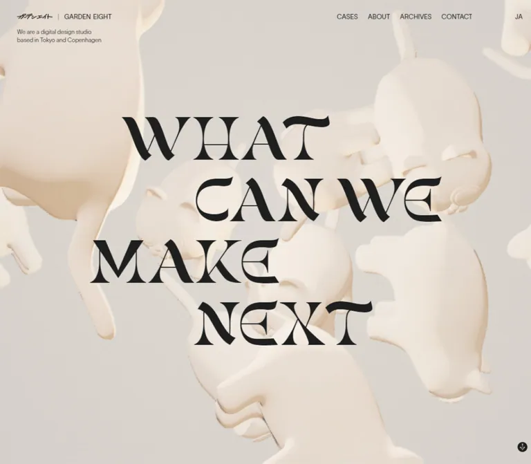
Garden Eight presents itself as a digital design studio based in Tokyo. Its homepage combines a restrained utility layer with a highly expressive central composition: small sans-serif navigation, an English studio descriptor, enormous ornamental lettering, and pale three-dimensional characters. The opening is almost monochrome. Depth comes from lighting, overlapping forms, and soft material shading rather than colored interface surfaces.
The headline reads “WHAT / CAN WE / MAKE / NEXT” in four deliberately staggered lines. Its horizontal proportions remain remarkably consistent between desktop and phone, while the navigation changes and the surrounding character composition shifts. Below the opening, the DOM identifies selected projects, a cases index link, studio information, and contact utilities. This is a studio homepage and portfolio entrance, with several routes onward.
閉じる
Garden Eight — Style Reference
A quiet studio identity set against monumental lettering and a weightless world of cream-colored characters.
Original URL: garden-eight.com/ja
Final URL: garden-eight.com/ja/
Theme: a light sculptural opening, with dark supporting regions indicated by the rendered DOM and computed colors. No selectable theme was demonstrated.
Inspected: supplied browser inspection dated October 2, 2026, 06:00 JST; retrieval timestamp 2026-10-01T21:00:33.979Z.
Viewports: desktop 1440 × 1000 and mobile 390 × 844 CSS pixels.
Scope: the current Japanese studio homepage. Visual evidence covers its opening scene across three desktop and two mobile frames. Rendered DOM evidence additionally covers project links, an About region, footer links, menu-related elements, and contact-copy labels. Those later regions and interaction states were not supplied as visible screenshots.
Garden Eight presents itself as a digital design studio based in Tokyo. Its homepage combines a restrained utility layer with a highly expressive central composition: small sans-serif navigation, an English studio descriptor, enormous ornamental lettering, and pale three-dimensional characters. The opening is almost monochrome. Depth comes from lighting, overlapping forms, and soft material shading rather than colored interface surfaces.
The headline reads “WHAT / CAN WE / MAKE / NEXT” in four deliberately staggered lines. Its horizontal proportions remain remarkably consistent between desktop and phone, while the navigation changes and the surrounding character composition shifts. Below the opening, the DOM identifies selected projects, a cases index link, studio information, and contact utilities. This is a studio homepage and portfolio entrance, with several routes onward.
How to Read This Reference
- Measured means a value supplied in the rendered DOM or computed-style evidence. Numbers in tables are rounded where that improves readability.
- Visual estimate means an approximate dimension or color inferred from the supplied current-page screenshots. It is not a recovered stylesheet declaration or an instrumented pixel sample.
- Calculated means arithmetic based on measured or estimated dimensions; the underlying inputs are identified.
- Recommended means an implementation choice for a new adaptation. It does not establish how the original works.
- Source variables retain their observed names. Other custom properties are descriptive implementation aliases.
- The screenshots establish what was actually visible. Hidden menu text and offscreen elements in the DOM do not prove that those states were opened or seen.
- No additional browsing, command execution, or asset inspection was performed for this reference.
Tokens — Colors
Default Palette
| Name | Value | Evidence | Role |
|---|---|---|---|
| Studio Ink | #1e1f1f |
Measured: --col-black; header and main text compute to this color |
Wordmark, navigation, opening text, and the page's underlying dark root |
| Warm Gray | #dbd6d0 |
Measured: --col-white; root and lower-region text compute to this color |
Light text in supporting regions; the source's nominal white |
| Scene Paper | Approximately #e7e3dc |
Visual estimate only | Practical flat fallback for the lighter rendered opening scene |
| Sculpture Highlight | Approximately #f3ebdd |
Visual estimate only | Warm, softly lit upper surfaces of the characters |
| Sculpture Shade | Approximately #cbb99e |
Visual estimate only | Local recesses and warm material shadows; not a UI accent |
Keep source colors and rendered lighting separate. The root background is measured as #1e1f1f, but the opening screenshot is predominantly pale. A foreground scene or rendering layer covers that root. Likewise, the declared --col-white value does not identify every pixel of the light background or the characters. Their shading creates many related tones.
Use Studio Ink and Warm Gray as the dependable interface pair. Treat Scene Paper and the sculpture tones as approximate art-direction references until actual scene assets are available.
Declared Supporting Colors
| Source variable | Measured value | Evidence limit |
|---|---|---|
--col-black2 |
#1c1d1d |
Declared; no distinct visible surface was independently assigned to it |
--col-black3 |
#141414 |
Declared; exact component use is unverified |
--col-gray |
#3c3c3c |
Declared; exact component use is unverified |
--col-orange |
#dc5648 |
Declared; no orange action or accent is visible in the supplied opening captures |
Do not turn the orange declaration into a prominent CTA color. The observed opening relies on cream and near-black.
Tokens — Typography
Lausanne — Interface and Supporting Text
- Observed computed stack:
lausanne, sans-serif. - Roles: wordmark, desktop navigation, menu toggle, general main content, footer utilities, and contact text.
- Weights:
400for most interface text;200for measured footer links. - Tracking:
normalin the sampled elements. - Character: compact, understated sans-serif typography that lets the artwork and headline dominate.
The computed family name is direct evidence of the declared stack. Font files, foundry information, and successful loading of every face were not independently inspected.
Japanese Supporting Copy
- Observed computed stack:
lausanne, noto-sans-cjk-jp, sans-serif. - Measured About paragraph weight:
300. - Measured line-height ratio: approximately
1.6at both inspected widths. - Role: readable explanatory prose below the more theatrical opening.
Keep Japanese body copy relatively quiet and generously led. Do not apply the headline's ornamental treatment to paragraphs.
Ornamental Hero Lettering
The headline has strong thick–thin contrast, broad wedge-like terminals, sharp internal cuts, and unusual curved details. It reads as custom display lettering rather than a conventional editorial serif heading.
The supplied element sample does not include a computed font family for the hero letters. Their exact typeface and rendering mechanism remain unverified. The DOM contains the phrase, but that does not establish whether the visible forms are ordinary text, vector artwork, or another treatment.
A separate family, gunsan, is measured on mobile navigation entries. That is not sufficient evidence to name the hero typeface.
Mobile Navigation Typography
DOM-resident mobile navigation entries declare gunsan, 24px, weight 600, and 12.24px line height. Their reported link height is approximately 18.95px.
These entries are not visible in the supplied closed-menu screenshots. Their unusually tight metrics may belong to a hidden or transitional state. Do not copy those metrics into a readable open menu without testing the actual state.
Type Scale
| Role | Desktop measurement | Mobile measurement | Status |
|---|---|---|---|
| Root/interface baseline | 14.00px / 19.88px, weight 400 |
14px / 19.88px, weight 400 |
Measured |
| Wordmark H1 | 14.99px / 21.29px, weight 400 |
15px / 21.3px, weight 400 |
Measured |
| Desktop navigation / mobile toggle | 14.00px / 19.88px |
14px / 19.88px |
Measured |
| General main text | 15.49px / 22.00px |
15px / 21.3px |
Measured; not the hero's own font size |
| About paragraph | 14.49px / 23.18px, weight 300 |
13.25px / 21.2px, weight 300 |
Measured |
| Footer utilities | 12.00px / 17.03px, weight 200 |
12.5px / 17.75px, weight 200 |
Measured |
| Mobile menu entries | Not applicable | 24px / 12.24px, weight 600 |
Measured hidden-state elements |
| Studio descriptor | Approximately 12px, two lines |
Approximately 14px, two lines |
Visual estimate |
| Hero capital height | Approximately 115–120px |
Approximately 31–33px |
Visual estimate of visible glyphs, not CSS font size |
The source assigns the semantic H1 to the wordmark. Do not assume the visually largest lettering is the measured H1.
Tokens — Spacing & Shapes
Density: very sparse in the opening, compact in the navigation, and more editorial in the supporting DOM content.
Geometry: unboxed text, uninterrupted scene coverage, and a small circular scroll symbol. There is no visible card or elevation system in the opening.
Spacing Scale
| Use | Desktop | Mobile | Evidence |
|---|---|---|---|
| Brand horizontal inset | 45px |
20px |
Measured anchor padding |
| Header control height | 90px |
60px |
Measured brand/navigation rectangles |
| Wordmark inter-word gap | 4.947px |
4.95px |
Measured H1 flex gap |
| Desktop nav horizontal padding | 10.498px per side |
Not applicable | Measured |
| Mobile menu toggle horizontal padding | Not applicable | 20px per side |
Measured |
| About-region side inset | 180px |
20px |
Measured linked-region rectangle |
| Footer brand left edge | 45px |
15px |
Measured; mobile footer uses a distinct inset |
| Scroll target | Approximately 105.59 × 90px |
60 × 60px |
Measured anchor rectangle |
These are component-specific measurements, not proof of a universal spacing unit. For an adaptation, a small spacing scale can coexist with separate header, scene, and footer insets.
Border Radius
| Element | Value or appearance | Evidence |
|---|---|---|
| Sampled text links and content regions | 0px |
Measured |
Desktop TOP link |
1440px radius on a 60 × 30.08px rectangle |
Measured; effectively pill-shaped |
| Visible scroll symbol | Approximately 20px circular dark mark |
Visual estimate |
| Sculptural forms | Rounded and organic | Artwork geometry, not CSS border radius |
No rounded cards, bordered panels, or soft interface shadows are visible in the opening.
Layout Measurements
| Element | Desktop 1440 × 1000 |
Mobile 390 × 844 |
Interpretation |
|---|---|---|---|
| Wordmark box | x 45, y 37.5, 109.84 × 15px |
x 20, y 22.5, 109.91 × 15px |
Brand size remains effectively unchanged |
| Hero lettering envelope | Approximately x 250–1185, y 254–866 |
Approximately x 70–323, y 343–512 |
Visual estimates |
| Hero lettering width | Approximately 935px |
Approximately 253px |
Both are close to 65vw, calculated from the estimates |
| Hero lettering center | Approximately 56% of viewport height |
Approximately 50.6% of viewport height |
Calculated visual estimates |
| Each project-link row | 1440 × 183.84px |
390 × 49.94px |
Measured DOM bounds |
| About linked region | 1080 × 637px |
350 × 573.73px |
Measured bounds; visual contents unverified |
| About paragraph width | 479.02px |
350px |
Measured |
| Main element height | 3828.56px |
2603.83px |
Measured bounds, not verified native scroll length |
Components
Overlay Header
Role: identify the studio and expose primary routes without competing with the scene.
The desktop header places the GARDEN EIGHT wordmark at the upper left. The right-side route group contains CASES, ABOUT, ARCHIVES, CONTACT, and AI; EN sits separately near the right edge. Navigation is uppercase in the screenshots, with no visible boxes or filled button treatment.
The brand link occupies a 199.84 × 90px rectangle, while its visible wordmark is only about 110px wide. Desktop route links also have 90px-high rectangles. This separates the restrained visual label from its larger interaction area.
The measured header element itself has zero height, while its descendants occupy the top strip. That supports an overlaid composition, but the supplied properties do not establish whether the header is fixed or how it behaves after scrolling.
Mobile Header and Menu Entry
At 390px wide, the wordmark remains approximately 15px. The right-side desktop navigation is replaced visually by MENU, aligned about 20px from the right edge. The toggle anchor occupies approximately 86.42 × 60px.
The DOM contains both CLOSE and MENU, along with Home, Cases, About, Archives, Contact, AI, and EN. The screenshots show only the closed state. The open panel's appearance, focus behavior, transition direction, and final link spacing are unverified.
Recommended implementation: use a real disclosure control with an expanded state. Keep the larger touch area even though the visible word remains small.
Studio Descriptor
Role: explain the organization in a short, quiet statement.
The descriptor reads:
We are a digital design studio
based in Tokyo
It sits under the wordmark, aligned to the same left inset. Its approximate visible top edge is 78px on desktop and 62px on mobile. The phone version appears slightly larger relative to the brand and uses more of the available width.
Treat this as independent interface copy, not a caption attached to a character. Keep it readable while decorative forms change behind the main title.
Sculptural Opening Scene
Role: express the studio's character through dimensional artwork.
The scene fills the opening without a frame. Pale, animal-like figures have rounded bodies, facial features, soft appendages, and a matte surface resembling plaster or unglazed ceramic. Forms overlap, turn away from the viewer, and extend beyond the viewport edges. Warm shadows distinguish similarly colored objects from the background.
There is no visible floor, horizon, or rectangular media player. The composition feels spatial and suspended. Fine grain is visible across the image, but whether it comes from rendering, a texture overlay, or another process is unknown.
The mobile captures contain a different arrangement and crop around the central title. Since capture timing also differs, the evidence cannot isolate responsive camera changes from animation changes.
Four-Line Hero Lettering
Role: provide the dominant verbal and graphic statement.
Preserve these four lines:
WHATCAN WEMAKENEXT
The lines are staggered rather than individually centered. Relative to the total lettering envelope, their approximate left offsets are 9%, 29%, 0%, and 29%. The second line reaches farthest right; the third starts farthest left. This creates an alternating rhythm across the page.
The overall width is approximately 65vw at both inspected sizes. Desktop lettering is about 935px wide; mobile lettering is about 253px wide. The phone version retains the composition as a compact central emblem instead of wrapping it into a different sentence layout.
The source phrase is available in the DOM. If the visible lettering is reproduced as artwork, retain one accessible text equivalent and avoid exposing four duplicate announcements.
Scroll Cue
Role: suggest continuation below the opening.
A small dark circle with a light downward mark appears near the lower-right corner. Its visual diameter is approximately 20px. Its DOM link is named Scroll and has a much larger target: about 105.59 × 90px on desktop and 60 × 60px on mobile.
At desktop size, the target begins at y 910; on mobile, at y 784. Both terminate at the captured viewport bottom. This explains the consistent corner relationship without requiring the visible icon itself to be large.
The link destination is https://garden-eight.com/#. Its actual scrolling behavior was not exercised in the supplied evidence. For a new implementation, connect it to a meaningful local section target rather than relying on a generic hash.
Project Introduction and Case Links
Role: transition from the expressive opening into the studio's work.
The source introduction states:
全てのお仕事にありったけの愛を込めています。
今までお手伝いした全てのプロジェクトが
わたしたちの宝物です。
The beginning of this Japanese copy is visible at the bottom of the mobile screenshots, around y 815. Its full layout is not shown.
The DOM identifies three full-width project links:
| Label | Observed destination | Measured row height |
|---|---|---|
| Takamitsu Motoyoshi | /ja/cases/photoyoshi/ |
183.84px desktop; 49.94px mobile |
| Phil Studio | /ja/cases/phil-studio/ |
Same measured heights |
| Anai Wood | /ja/cases/anai-wood/ |
Same measured heights |
The text extraction contains repeated project names. This could support duplicated visual treatments, but it does not prove a marquee, hover reveal, or continuous animation. No project photography or row appearance should be invented from these labels.
A centered VIEW CASES link follows. Its measured bounds are approximately 91.38 × 75.47px on desktop and 88.48 × 65px on mobile. These are interaction rectangles, not proof of a visible button enclosure.
About Region
Role: introduce the studio and link to its fuller profile.
The DOM contains a large linked region targeting /ja/about/, followed by a Japanese paragraph explaining the studio's Tokyo base and its work in website design, development, and digital communication. A separate ABOUT US link follows.
On desktop, the linked region spans 1080px with 180px side insets. The paragraph is narrower, begins at x 750, and measures about 479px wide. This supports a broad visual region with explanatory copy aligned toward the right.
On mobile, the linked region and paragraph both use 350px widths with 20px side insets. The linked region is tall rather than landscape-shaped. Its contents are not identified by the evidence, so do not label it a photograph, video, or illustration.
Text computes to Warm Gray in this region, consistent with an inverse supporting area over the dark root. The exact surface transition was not visually captured.
Footer and Contact Utilities
Role: provide secondary routes, social profiles, and contact access.
The DOM contains a smaller Garden Eight identity, ©2022, FAQ, PATIO, social abbreviations IG, TW, and IN, and an email control containing hello@garden-eight.com.
Desktop measurements place identity and secondary links toward the left, social links near the center, and the email control near the right. On mobile, the email control begins on a lower row at x 15; the other groups occupy the preceding region.
The email anchor contains Copy to clipboard and Copied. These labels support an intended copy interaction, but no successful copy action or visible feedback state was demonstrated. Do not describe it as a verified mailto: link: its supplied href is a generic hash URL.
The copyright text is observed content, not evidence of the current design's production date.
Tokens — Motion & Interaction
Observed and Declared Motion
| Element | Evidence | What can be concluded |
|---|---|---|
| Sculptural scene | Character poses and silhouettes vary across supplied frames at each viewport | The background changes between captures while the headline and interface remain stable |
| About paragraph | opacity 1.4s, transform 1.4s |
Opacity and transform transitions are declared; trigger and endpoints are unverified |
| Scroll link | transform 1.4s |
A transform transition is declared; direction and trigger are unverified |
| Mobile menu toggle | color 0.45s cubic-bezier(0.32, 0.94, 0.6, 1) |
A color transition is declared |
| Mobile menu entries | 0.4s cubic-bezier(0.32, 0.94, 0.6, 1) |
A transition is declared on DOM-resident entries; open-state choreography is unverified |
Desktop TOP link |
Color and border-color, 0.3s cubic-bezier(0.32, 0.94, 0.6, 1) |
Those transition properties and timing are directly supported |
| Email control | Copy to clipboard and Copied strings |
Intended state labels exist; clipboard success is unverified |
The sampled elements report animation: none. This does not disprove scene animation: a changing scene may be driven outside those sampled CSS animation properties.
The capture procedure allowed an initial observation period of at least five seconds and temporarily paused perpetual animation during readiness checks before resuming it. This is useful context, but it does not provide a timeline, frame rate, or complete animation specification.
Unverified: scene duration, loop period, easing, pointer response, scroll-linked camera behavior, rendering technology, menu opening behavior, hover previews, route transitions, and reduced-motion handling.
Recommended adaptation: keep interface text stationary while decorative forms move gently. Provide a composed still frame for reduced-motion users. Treat any proposed drift speed or camera path as a new design decision.
Surfaces
| Layer | Observed appearance or computed evidence | Implementation implication |
|---|---|---|
| Opening scene | Pale, full-bleed, softly shaded | Use an uninterrupted media or rendering layer with a light fallback |
| Hero lettering | Near-black over the scene | Maintain a distinct foreground layer and strong contrast |
| Header and descriptor | Transparent background, dark text | Avoid adding an opaque header bar to the opening |
| Scroll cue | Small dark circular mark | Keep its visible size separate from its larger target |
| Supporting regions | Warm Gray text; dark root background | An inverse section is supported, but its exact visual boundary is unknown |
| Content links | Mostly transparent backgrounds and zero radii in sampled styles | Do not infer boxed cards from their rectangles |
Desktop TOP control |
Pill-shaped measured bounds | A local utility shape, not a global pill-button system |
The character shadows belong to the artwork. They are not evidence for drop shadows on navigation, links, or content blocks.
Imagery
The imagery combines playful character design with restrained material treatment. Recognizable facial features and exaggerated rounded anatomy keep the figures approachable, while the neutral palette and soft lighting make them feel like sculptural objects.
Preserve these relationships:
- Material: matte ivory and warm cream, with subtle differences between lit surfaces and recesses.
- Lighting: broad, soft illumination and gentle contact or occlusion shading.
- Composition: overlapping figures at varied scales, with large forms allowed to leave the viewport.
- Depth: some figures sit close to the viewer while others recede behind the lettering.
- Texture: fine visible grain, without harsh pixelation or obvious tiled patterns.
- Type clearance: movement can pass behind the title, but the near-black letterforms remain visually dominant.
Avoid replacing the figures with glossy generic blobs. Their faces, appendages, and expressive silhouettes carry much of the page's identity.
Observed Asset References
No downloadable image paths, model URLs, font-file URLs, or scene asset filenames were supplied. No production tool or rendering library was identified.
The available imagery evidence consists of the five current-page captures. The case and About links establish content destinations, not asset locations. The CSS below therefore provides a scene slot and a flat fallback; it does not pretend to recreate the sculptures.
Layout & Responsive Behavior
Desktop
At 1440 × 1000, the page uses 45px brand-side spacing and 90px-high header controls. The descriptor occupies a small area beneath the wordmark. Most of the viewport is given to the scene and lettering.
The title is approximately 935px wide and centered horizontally. Its visual center sits around y 560, below the viewport's midpoint. The four-line arrangement creates substantial open space around the top utility layer while retaining a strong lower-center mass.
Mobile
At 390 × 844, horizontal header spacing contracts to 20px, and control height becomes 60px. The wordmark stays approximately the same size; desktop route labels collapse to the visible MENU control.
The lettering becomes approximately 253px wide while retaining the same four lines and staggered alignment. Its center is around y 427, near the viewport midpoint. The scene remains full-bleed, and large character fragments extend beyond the narrow edges.
The first line of project-introduction copy is visible near the bottom, so the phone composition includes a small hint of subsequent content. Avoid enforcing a rigid full-screen hero boundary that unintentionally removes this relationship.
Supporting Layout
The project-link heights correspond to approximately 12.77vw on desktop and 12.80vw on mobile. That is consistent with viewport-proportional geometry, but the source formula is not supplied.
The About linked region changes from 1080 × 637px to 350 × 573.73px. A single fixed media aspect ratio would not reproduce both measured rectangles. Its supporting paragraph also shifts from a narrow right-side desktop column to the full mobile content width.
Scroll and Measurement Limits
The reported document height equals the viewport height at both sizes, while main and its descendants extend substantially farther. Some mobile descendant coordinates also extend beyond the measured main rectangle or appear out of normal flow order.
These findings may reflect transforms, custom scrolling, or layered positioning, but the exact mechanism is unverified. Do not interpret the reported documentHeight as proof that the page contains only one screen. Likewise, do not copy the conflicting absolute coordinates into a normal document layout.
Only two viewport sizes were inspected. Intermediate breakpoints, landscape phones, very wide screens, header persistence, and complete scrolling behavior remain unverified. The 767px breakpoint in the Quick Start is a recommendation.
Do’s and Don’ts
Do
- Preserve the contrast between quiet sans-serif utilities and expressive central lettering.
- Keep the four headline lines and their alternating left offsets.
- Use approximately
65vwas a starting point for the title envelope at the inspected sizes. - Keep the wordmark close to
15pxacross desktop and mobile. - Separate pale scene lighting from the exact interface color tokens.
- Allow sculptural forms to overlap and extend outside the viewport.
- Retain generous targets around small navigation labels and the scroll symbol.
- Support the mobile navigation collapse and the wider single-column About copy.
- Identify hidden-state and offscreen DOM findings as such.
- Keep accessible text available when using ornamental lettering assets.
Don’t
- Don’t reorganize the homepage into generic feature cards and conversion banners.
- Don’t center every headline line independently or let the phrase wrap arbitrarily.
- Don’t identify the hero font as
gunsansolely because the mobile menu declares it. - Don’t apply the declared orange color as a new primary action treatment.
- Don’t add glass panels, rounded navigation containers, or interface shadows over the scene.
- Don’t assume repeated project text proves a marquee.
- Don’t infer project photographs or an About video from empty-text links.
- Don’t describe untested menu, clipboard, or scroll behavior as verified.
- Don’t use offscreen transformed coordinates as a literal page layout specification.
- Don’t replace the character artwork with a CSS gradient and claim a complete reproduction.
Recommended Implementation Additions
These are recommendations for a new implementation, not verified features of the original:
- Use semantic navigation and a keyboard-operable mobile disclosure with a visible expanded state.
- Give the scroll symbol a descriptive accessible name and a real section destination.
- Maintain at least
44pxtouch targets for compact utilities, including any footer links that need expansion. - Provide visible focus indicators on both light and dark backgrounds.
- Keep one accessible version of the headline; hide decorative duplicates from assistive technology.
- Exclude duplicated project-name tracks from the accessibility tree if an animated treatment is later introduced.
- Supply a static scene for reduced motion and as a loading or rendering fallback.
- Ensure the title remains legible throughout the entire animation, not just at one captured pose.
- Implement clipboard feedback only after the write succeeds, and announce the result through a polite live region.
- Keep essential content in normal document flow unless a tested custom-scrolling implementation is required.
- Test mobile viewport changes and safe-area insets without allowing the bottom cue to obscure body copy.
Agent Prompt Guide
Quick Color Reference
- Interface ink: measured
#1e1f1f. - Inverse text: measured
#dbd6d0. - Flat opening fallback: approximate
#e7e3dc. - Sculptures: warm ivory highlights and soft beige recesses, with no independent saturated accent.
- Orange
#dc5648: declared in the source, but not visibly used in the supplied opening. - Surface separation: composition and contrast, not card elevation.
Overall Prompt
“Create a digital design studio homepage inspired by the observed Garden Eight composition. Use a pale full-bleed scene of matte cream character sculptures behind near-black ornamental lettering. Set ‘WHAT / CAN WE / MAKE / NEXT’ in four staggered lines, with a total width near 65% of the viewport. Keep a small 15px sans-serif wordmark at the upper left, a two-line studio descriptor beneath it, and restrained uppercase navigation at the upper right. On mobile, retain the headline composition at a smaller scale and replace desktop navigation with MENU. Include a small circular scroll cue at the lower right. Continue into work links and studio information, using the supplied content rather than inventing a generic feature grid. Treat the exact display artwork and animation as separate assets requiring evidence or explicit design choices.”
Example Component Prompts
- Header: “Build a transparent studio header with a 15px wordmark, 14px uppercase route labels, 45px desktop edge spacing, and 90px-tall interaction areas. At phone width use 20px spacing, 60px controls, and a MENU disclosure. Keep the visible typography modest.”
- Hero lettering: “Arrange WHAT, CAN WE, MAKE, and NEXT on four lines. Stagger their left edges at approximately 9%, 29%, 0%, and 29% within the title envelope. Use supplied ornamental artwork when available; do not identify a substitute serif as the original font.”
- Scene art direction: “Compose rounded, expressive animal-like sculptures in matte ivory with soft warm shadows and fine grain. Use varied depth and edge cropping. Leave the title legible over the whole composition. Avoid glossy metallic materials and saturated UI colors.”
- About layout: “Use a broad linked visual region above a narrow right-aligned paragraph on desktop. On mobile, use 20px side insets and full-width supporting copy. Apply light text over a dark surface. The visual asset itself must be supplied; its subject is not established by the measurements.”
- Accessible motion: “Keep interface labels stationary while decorative scene elements move. Provide a composed still for reduced motion and loading fallback. Do not invent pointer interaction, scroll choreography, or marquee behavior as source features.”
Quick Start
CSS Custom Properties
This is a recommended structural adaptation, not extracted source CSS. It preserves the measured interface sizes and approximates the visible title envelope. It uses normal document scrolling, a native mobile disclosure, and a conventional root font size.
The title fallback uses Georgia only to make the example runnable. It does not reproduce or identify the original lettering. Replace that layer with an appropriate supplied font or lettering asset. The scene slot also requires artwork; its flat fill is only a fallback.
:root {
  /* Exact colors observed in source declarations. */
  --color-ink: #1e1f1f;
  --color-paper: #dbd6d0;

  /* Visual approximation for the rendered scene. */
  --color-scene: #e7e3dc;

  /* Observed family names; no font files are bundled here. */
  --font-ui: lausanne, Arial, sans-serif;
  --font-japanese: lausanne, noto-sans-cjk-jp, sans-serif;
  --font-menu: gunsan, Georgia, serif;

  /* Placeholder only: the hero family is unverified. */
  --font-display-fallback: Georgia, serif;

  --text-brand: 15px;
  --text-nav: 14px;
  --text-body: 15.5px;
  --text-about: 14.49px;
  --text-footer: 12px;
  --leading-body: 1.42;
  --leading-about: 1.6;

  /* Recommended interpolation through the measured desktop inset. */
  --edge: clamp(20px, 3.125vw, 60px);
  --header-height: 90px;
  --hero-title-width: 65vw;
  --hero-title-center: 56%;

  /* Timings observed on specific source elements. */
  --ease-interface: cubic-bezier(0.32, 0.94, 0.6, 1);
  --motion-utility: 300ms;
  --motion-menu-color: 450ms;
  --motion-reveal: 1400ms;
}

* {
  box-sizing: border-box;
}

body {
  margin: 0;
  color: var(--color-ink);
  background: var(--color-scene);
  font-family: var(--font-ui);
  font-size: var(--text-body);
  line-height: var(--leading-body);
}

a {
  color: inherit;
}

.site-header {
  position: absolute;
  inset: 0 0 auto;
  z-index: 10;
  display: flex;
  align-items: center;
  min-height: var(--header-height);
  padding-inline: var(--edge);
}

.brand {
  display: flex;
  align-items: center;
  min-height: var(--header-height);
  text-decoration: none;
}

.brand h1 {
  display: flex;
  gap: 4.95px;
  margin: 0;
  font-size: var(--text-brand);
  font-weight: 400;
  line-height: 1.42;
  text-transform: uppercase;
}

.desktop-nav {
  display: flex;
  align-items: center;
  margin-left: auto;
}

.desktop-nav a {
  display: flex;
  align-items: center;
  min-height: var(--header-height);
  padding-inline: 10.5px;
  font-size: var(--text-nav);
  text-decoration: none;
  text-transform: uppercase;
}

.desktop-nav .language {
  margin-left: clamp(32px, 6.9vw, 100px);
  padding-right: 0;
}

.mobile-nav {
  display: none;
}

.hero {
  position: relative;
  isolation: isolate;
  height: 100vh;
  height: 100svh;
  min-height: 560px;
  overflow: hidden;
  background: var(--color-scene);
}

.hero-scene {
  position: absolute;
  inset: 0;
  z-index: -1;
  overflow: hidden;
  pointer-events: none;
  background: var(--color-scene);
}

.hero-scene > :is(img, video, canvas) {
  display: block;
  width: 100%;
  height: 100%;
  object-fit: cover;
}

.studio-descriptor {
  position: absolute;
  top: 75px;
  left: var(--edge);
  margin: 0;
  font-size: 12px;
  font-weight: 400;
  line-height: 1.35;
}

.hero-title {
  position: absolute;
  top: var(--hero-title-center);
  left: 50%;
  width: var(--hero-title-width);
  aspect-ratio: 935 / 612;
  margin: 0;
  transform: translate(-50%, -50%);
}

/* Optional replacement layer for supplied lettering artwork. */
.hero-title > :is(img, svg) {
  display: block;
  width: 100%;
  height: 100%;
  object-fit: contain;
}

/* Text fallback: preserves the stagger, not the original glyphs. */
.hero-title .line {
  position: absolute;
  white-space: nowrap;
  font-family: var(--font-display-fallback);
  font-size: 11.4vw;
  font-weight: 400;
  line-height: 0.8;
  letter-spacing: -0.045em;
}

.hero-title .line:nth-child(1) { top: 0; left: 9%; }
.hero-title .line:nth-child(2) { top: 27%; left: 29%; }
.hero-title .line:nth-child(3) { top: 54%; left: 0; }
.hero-title .line:nth-child(4) { top: 81%; left: 29%; }

.scroll-cue {
  position: absolute;
  right: 0;
  bottom: 0;
  display: grid;
  place-items: center;
  width: 105.6px;
  height: 90px;
  text-decoration: none;
}

.scroll-cue svg {
  display: block;
  width: 20px;
  height: 20px;
}

/* Supporting layout is a recommendation, not a visual reconstruction. */
.work-intro {
  padding: 100px var(--edge) 120px;
  font-family: var(--font-japanese);
}

.work-intro p {
  margin: 0;
  line-height: 1.6;
}

.work-links {
  display: grid;
}

.work-link {
  display: flex;
  align-items: center;
  min-height: max(50px, 12.78vw);
  padding-inline: var(--edge);
  color: inherit;
  text-decoration: none;
}

.view-cases {
  display: flex;
  align-items: center;
  justify-content: center;
  width: max-content;
  min-height: 75px;
  margin: 80px auto;
  text-decoration: none;
}

.about-section {
  padding-block: 100px;
  color: var(--color-paper);
  background: var(--color-ink);
}

.about-inner {
  width: 75%;
  margin-inline: auto;
}

/* Bounds-only slot; the observed visual content is unknown. */
.about-visual {
  display: block;
  width: 100%;
  aspect-ratio: 1080 / 637;
}

.about-copy {
  width: min(100%, 479px);
  margin: 120px 30px 0 auto;
  font-family: var(--font-japanese);
  font-size: var(--text-about);
  font-weight: 300;
  line-height: var(--leading-about);
}

.site-footer {
  display: flex;
  flex-wrap: wrap;
  align-items: center;
  justify-content: space-between;
  gap: 24px;
  padding: 45px var(--edge);
  color: var(--color-paper);
  background: var(--color-ink);
  font-size: var(--text-footer);
}

:where(a, button, summary):focus-visible {
  outline: 2px solid currentColor;
  outline-offset: 5px;
}

@media (max-width: 767px) {
  :root {
    --edge: 20px;
    --header-height: 60px;
    --hero-title-center: 50.6%;
    --text-body: 15px;
    --text-about: 13.25px;
    --text-footer: 12.5px;
  }

  .desktop-nav {
    display: none;
  }

  .mobile-nav {
    display: block;
    margin-left: auto;
    font-size: 14px;
  }

  .mobile-nav summary {
    display: flex;
    align-items: center;
    justify-content: flex-end;
    min-width: 66px;
    min-height: 60px;
    list-style: none;
    cursor: pointer;
  }

  .mobile-nav summary::-webkit-details-marker {
    display: none;
  }

  .mobile-nav:not([open]) .label-close,
  .mobile-nav[open] .label-open {
    display: none;
  }

  /* Recommended open state; no open-menu screenshot was supplied. */
  .mobile-panel {
    position: absolute;
    inset: 60px 0 auto;
    display: grid;
    padding: 20px;
    color: var(--color-paper);
    background: var(--color-ink);
  }

  .mobile-panel a {
    display: flex;
    align-items: center;
    min-height: 44px;
    font-family: var(--font-menu);
    font-size: 24px;
    line-height: 1.2;
    text-decoration: none;
    text-transform: uppercase;
  }

  .hero {
    min-height: 560px;
  }

  .studio-descriptor {
    top: 59px;
    font-size: 14px;
    line-height: 1.35;
  }

  .scroll-cue {
    width: 60px;
    height: 60px;
  }

  /* Approximate the visible next-section hint at the captured size. */
  .work-intro {
    position: relative;
    margin-top: -36px;
    padding: 0 var(--edge) 72px;
    font-size: 14px;
  }

  .about-inner {
    width: calc(100% - 40px);
  }

  .about-visual {
    aspect-ratio: 350 / 574;
  }

  .about-copy {
    width: 100%;
    margin: 100px 0 0;
  }

  .site-footer {
    padding-inline: 15px;
  }
}

@media (prefers-reduced-motion: reduce) {
  html {
    scroll-behavior: auto;
  }

  .hero-scene {
    animation: none;
    transition: none;
  }

  /* Pause video or scripted scene motion in application code as well. */
}
Minimal Markup
This opening scaffold works with the CSS above. The native disclosure and simple arrow are recommended substitutes; their implementation is not attributed to the original. Insert scene artwork into .hero-scene when available.
<header class='site-header'>
  <a class='brand' href='/ja/'>
    <h1><span>Garden</span><span>Eight</span></h1>
  </a>

  <nav class='desktop-nav' aria-label='Primary navigation'>
    <a href='/ja/cases/'>Cases</a>
    <a href='/ja/about/'>About</a>
    <a href='/ja/archives/'>Archives</a>
    <a href='/ja/contact/'>Contact</a>
    <a href='/ja/ai/'>AI</a>
    <a class='language' href='/' lang='en'>EN</a>
  </nav>

  <details class='mobile-nav'>
    <summary>
      <span class='label-open'>MENU</span>
      <span class='label-close'>CLOSE</span>
    </summary>
    <nav class='mobile-panel' aria-label='Primary navigation'>
      <a href='/ja/'>Home</a>
      <a href='/ja/cases/'>Cases</a>
      <a href='/ja/about/'>About</a>
      <a href='/ja/archives/'>Archives</a>
      <a href='/ja/contact/'>Contact</a>
      <a href='/ja/ai/'>AI</a>
      <a href='/' lang='en'>EN</a>
    </nav>
  </details>
</header>

<main>
  <section class='hero' aria-labelledby='hero-title'>
    <div class='hero-scene' aria-hidden='true'></div>

    <p class='studio-descriptor'>
      We are a digital design studio<br>based in Tokyo
    </p>

    <h2 class='hero-title' id='hero-title'
        aria-label='What can we make next'>
      <span class='line' aria-hidden='true'>WHAT</span>
      <span class='line' aria-hidden='true'>CAN WE</span>
      <span class='line' aria-hidden='true'>MAKE</span>
      <span class='line' aria-hidden='true'>NEXT</span>
    </h2>

    <a class='scroll-cue' href='#work' aria-label='Explore our work'>
      <svg viewBox='0 0 20 20' aria-hidden='true'>
        <circle cx='10' cy='10' r='10' fill='currentColor'/>
        <path d='M10 4v11M6 11l4 4 4-4'
              fill='none' stroke='var(--color-paper)'
              stroke-width='1.4'/>
      </svg>
    </a>
  </section>

  <section class='work-intro' id='work' aria-label='Selected work'>
    <p lang='ja'>
      全てのお仕事にありったけの愛を込めています。<br>
      今までお手伝いした全てのプロジェクトが<br>
      わたしたちの宝物です。
    </p>
  </section>
</main>
Tailwind v4 Token Mapping
Optional aliases for projects already using Tailwind v4. They do not imply that the original site uses Tailwind.
@theme inline {
  --color-studio-ink: var(--color-ink);
  --color-studio-paper: var(--color-paper);
  --color-studio-scene: var(--color-scene);

  --font-interface: var(--font-ui);
  --font-japanese-copy: var(--font-japanese);
  --font-display-placeholder: var(--font-display-fallback);

  --text-brand-label: var(--text-brand);
  --text-navigation: var(--text-nav);
  --text-studio-body: var(--text-body);
  --text-studio-about: var(--text-about);

  --spacing-page-edge: var(--edge);
  --spacing-header-control: var(--header-height);
  --ease-studio: var(--ease-interface);
}
Sources & Evidence
- Original address: https://garden-eight.com/ja.
- Final inspected address: https://garden-eight.com/ja/, reported HTTP
200. The observed URL change adds a trailing slash and retains the same studio identity. - Capture timestamp:
2026-10-01T21:00:33.979Z, corresponding to October 2, 2026, 06:00 JST. - Visual evidence: three current desktop captures at
1440 × 1000and two current mobile captures at390 × 844. They show the opening scene, desktop navigation or mobile MENU control, the studio descriptor, headline, and scroll cue. Mobile also reveals the beginning of the next content section. - Rendered evidence: page title, visible/extracted text, link destinations, custom properties, element rectangles, font declarations, colors, and transition declarations for both viewports.
- Identity evidence: the page title, Garden Eight wordmark, organization text, and studio description support the site's identity. They do not independently identify its production team.
- Inspection limits: no supplied screenshots of an open menu, case rows, About contents, or footer; no demonstrated clipboard result, link activation, or complete scroll sequence. No font files, scene assets, source scripts, or rendering technology were inspected.
- Readiness limits: the supplied capture process waited for loading, layout stability, and relevant finite motion within stated time limits. Delayed content, unexercised interactions, and perpetual animation behavior remain only partially evidenced.
This reference describes the current page through the supplied inspection. Exact values, visual estimates, and recommended implementation choices remain explicitly separated.
# Garden Eight — Style Reference

> A quiet studio identity set against monumental lettering and a weightless world of cream-colored characters.

**Original URL:** [garden-eight.com/ja](https://garden-eight.com/ja)
**Final URL:** [garden-eight.com/ja/](https://garden-eight.com/ja/)
**Theme:** a light sculptural opening, with dark supporting regions indicated by the rendered DOM and computed colors. No selectable theme was demonstrated.
**Inspected:** supplied browser inspection dated October 2, 2026, 06:00 JST; retrieval timestamp `2026-10-01T21:00:33.979Z`.
**Viewports:** desktop `1440 × 1000` and mobile `390 × 844` CSS pixels.
**Scope:** the current Japanese studio homepage. Visual evidence covers its opening scene across three desktop and two mobile frames. Rendered DOM evidence additionally covers project links, an About region, footer links, menu-related elements, and contact-copy labels. Those later regions and interaction states were not supplied as visible screenshots.

Garden Eight presents itself as a digital design studio based in Tokyo. Its homepage combines a restrained utility layer with a highly expressive central composition: small sans-serif navigation, an English studio descriptor, enormous ornamental lettering, and pale three-dimensional characters. The opening is almost monochrome. Depth comes from lighting, overlapping forms, and soft material shading rather than colored interface surfaces.

The headline reads “WHAT / CAN WE / MAKE / NEXT” in four deliberately staggered lines. Its horizontal proportions remain remarkably consistent between desktop and phone, while the navigation changes and the surrounding character composition shifts. Below the opening, the DOM identifies selected projects, a cases index link, studio information, and contact utilities. This is a studio homepage and portfolio entrance, with several routes onward.
閉じる
# Garden Eight — Style Reference

> A quiet studio identity set against monumental lettering and a weightless world of cream-colored characters.

**Original URL:** [garden-eight.com/ja](https://garden-eight.com/ja)
**Final URL:** [garden-eight.com/ja/](https://garden-eight.com/ja/)
**Theme:** a light sculptural opening, with dark supporting regions indicated by the rendered DOM and computed colors. No selectable theme was demonstrated.
**Inspected:** supplied browser inspection dated October 2, 2026, 06:00 JST; retrieval timestamp `2026-10-01T21:00:33.979Z`.
**Viewports:** desktop `1440 × 1000` and mobile `390 × 844` CSS pixels.
**Scope:** the current Japanese studio homepage. Visual evidence covers its opening scene across three desktop and two mobile frames. Rendered DOM evidence additionally covers project links, an About region, footer links, menu-related elements, and contact-copy labels. Those later regions and interaction states were not supplied as visible screenshots.

Garden Eight presents itself as a digital design studio based in Tokyo. Its homepage combines a restrained utility layer with a highly expressive central composition: small sans-serif navigation, an English studio descriptor, enormous ornamental lettering, and pale three-dimensional characters. The opening is almost monochrome. Depth comes from lighting, overlapping forms, and soft material shading rather than colored interface surfaces.

The headline reads “WHAT / CAN WE / MAKE / NEXT” in four deliberately staggered lines. Its horizontal proportions remain remarkably consistent between desktop and phone, while the navigation changes and the surrounding character composition shifts. Below the opening, the DOM identifies selected projects, a cases index link, studio information, and contact utilities. This is a studio homepage and portfolio entrance, with several routes onward.

## How to Read This Reference

- **Measured** means a value supplied in the rendered DOM or computed-style evidence. Numbers in tables are rounded where that improves readability.
- **Visual estimate** means an approximate dimension or color inferred from the supplied current-page screenshots. It is not a recovered stylesheet declaration or an instrumented pixel sample.
- **Calculated** means arithmetic based on measured or estimated dimensions; the underlying inputs are identified.
- **Recommended** means an implementation choice for a new adaptation. It does not establish how the original works.
- **Source variables** retain their observed names. Other custom properties are descriptive implementation aliases.
- The screenshots establish what was actually visible. Hidden menu text and offscreen elements in the DOM do not prove that those states were opened or seen.
- No additional browsing, command execution, or asset inspection was performed for this reference.

## Tokens — Colors

### Default Palette

| Name | Value | Evidence | Role |
| --- | --- | --- | --- |
| Studio Ink | `#1e1f1f` | Measured: `--col-black`; header and main text compute to this color | Wordmark, navigation, opening text, and the page's underlying dark root |
| Warm Gray | `#dbd6d0` | Measured: `--col-white`; root and lower-region text compute to this color | Light text in supporting regions; the source's nominal white |
| Scene Paper | Approximately `#e7e3dc` | Visual estimate only | Practical flat fallback for the lighter rendered opening scene |
| Sculpture Highlight | Approximately `#f3ebdd` | Visual estimate only | Warm, softly lit upper surfaces of the characters |
| Sculpture Shade | Approximately `#cbb99e` | Visual estimate only | Local recesses and warm material shadows; not a UI accent |

**Keep source colors and rendered lighting separate.** The root background is measured as `#1e1f1f`, but the opening screenshot is predominantly pale. A foreground scene or rendering layer covers that root. Likewise, the declared `--col-white` value does not identify every pixel of the light background or the characters. Their shading creates many related tones.

Use Studio Ink and Warm Gray as the dependable interface pair. Treat Scene Paper and the sculpture tones as approximate art-direction references until actual scene assets are available.

### Declared Supporting Colors

| Source variable | Measured value | Evidence limit |
| --- | --- | --- |
| `--col-black2` | `#1c1d1d` | Declared; no distinct visible surface was independently assigned to it |
| `--col-black3` | `#141414` | Declared; exact component use is unverified |
| `--col-gray` | `#3c3c3c` | Declared; exact component use is unverified |
| `--col-orange` | `#dc5648` | Declared; no orange action or accent is visible in the supplied opening captures |

Do not turn the orange declaration into a prominent CTA color. The observed opening relies on cream and near-black.

## Tokens — Typography

### Lausanne — Interface and Supporting Text

- **Observed computed stack:** `lausanne, sans-serif`.
- **Roles:** wordmark, desktop navigation, menu toggle, general main content, footer utilities, and contact text.
- **Weights:** `400` for most interface text; `200` for measured footer links.
- **Tracking:** `normal` in the sampled elements.
- **Character:** compact, understated sans-serif typography that lets the artwork and headline dominate.

The computed family name is direct evidence of the declared stack. Font files, foundry information, and successful loading of every face were not independently inspected.

### Japanese Supporting Copy

- **Observed computed stack:** `lausanne, noto-sans-cjk-jp, sans-serif`.
- **Measured About paragraph weight:** `300`.
- **Measured line-height ratio:** approximately `1.6` at both inspected widths.
- **Role:** readable explanatory prose below the more theatrical opening.

Keep Japanese body copy relatively quiet and generously led. Do not apply the headline's ornamental treatment to paragraphs.

### Ornamental Hero Lettering

The headline has strong thick–thin contrast, broad wedge-like terminals, sharp internal cuts, and unusual curved details. It reads as custom display lettering rather than a conventional editorial serif heading.

The supplied element sample does **not** include a computed font family for the hero letters. Their exact typeface and rendering mechanism remain unverified. The DOM contains the phrase, but that does not establish whether the visible forms are ordinary text, vector artwork, or another treatment.

A separate family, `gunsan`, is measured on mobile navigation entries. That is not sufficient evidence to name the hero typeface.

### Mobile Navigation Typography

DOM-resident mobile navigation entries declare `gunsan`, `24px`, weight `600`, and `12.24px` line height. Their reported link height is approximately `18.95px`.

These entries are not visible in the supplied closed-menu screenshots. Their unusually tight metrics may belong to a hidden or transitional state. Do not copy those metrics into a readable open menu without testing the actual state.

### Type Scale

| Role | Desktop measurement | Mobile measurement | Status |
| --- | --- | --- | --- |
| Root/interface baseline | `14.00px / 19.88px`, weight `400` | `14px / 19.88px`, weight `400` | Measured |
| Wordmark H1 | `14.99px / 21.29px`, weight `400` | `15px / 21.3px`, weight `400` | Measured |
| Desktop navigation / mobile toggle | `14.00px / 19.88px` | `14px / 19.88px` | Measured |
| General main text | `15.49px / 22.00px` | `15px / 21.3px` | Measured; not the hero's own font size |
| About paragraph | `14.49px / 23.18px`, weight `300` | `13.25px / 21.2px`, weight `300` | Measured |
| Footer utilities | `12.00px / 17.03px`, weight `200` | `12.5px / 17.75px`, weight `200` | Measured |
| Mobile menu entries | Not applicable | `24px / 12.24px`, weight `600` | Measured hidden-state elements |
| Studio descriptor | Approximately `12px`, two lines | Approximately `14px`, two lines | Visual estimate |
| Hero capital height | Approximately `115–120px` | Approximately `31–33px` | Visual estimate of visible glyphs, not CSS font size |

The source assigns the semantic H1 to the wordmark. Do not assume the visually largest lettering is the measured H1.

## Tokens — Spacing & Shapes

**Density:** very sparse in the opening, compact in the navigation, and more editorial in the supporting DOM content.

**Geometry:** unboxed text, uninterrupted scene coverage, and a small circular scroll symbol. There is no visible card or elevation system in the opening.

### Spacing Scale

| Use | Desktop | Mobile | Evidence |
| --- | --- | --- | --- |
| Brand horizontal inset | `45px` | `20px` | Measured anchor padding |
| Header control height | `90px` | `60px` | Measured brand/navigation rectangles |
| Wordmark inter-word gap | `4.947px` | `4.95px` | Measured H1 flex gap |
| Desktop nav horizontal padding | `10.498px` per side | Not applicable | Measured |
| Mobile menu toggle horizontal padding | Not applicable | `20px` per side | Measured |
| About-region side inset | `180px` | `20px` | Measured linked-region rectangle |
| Footer brand left edge | `45px` | `15px` | Measured; mobile footer uses a distinct inset |
| Scroll target | Approximately `105.59 × 90px` | `60 × 60px` | Measured anchor rectangle |

These are component-specific measurements, not proof of a universal spacing unit. For an adaptation, a small spacing scale can coexist with separate header, scene, and footer insets.

### Border Radius

| Element | Value or appearance | Evidence |
| --- | --- | --- |
| Sampled text links and content regions | `0px` | Measured |
| Desktop `TOP` link | `1440px` radius on a `60 × 30.08px` rectangle | Measured; effectively pill-shaped |
| Visible scroll symbol | Approximately `20px` circular dark mark | Visual estimate |
| Sculptural forms | Rounded and organic | Artwork geometry, not CSS border radius |

No rounded cards, bordered panels, or soft interface shadows are visible in the opening.

### Layout Measurements

| Element | Desktop `1440 × 1000` | Mobile `390 × 844` | Interpretation |
| --- | --- | --- | --- |
| Wordmark box | `x 45`, `y 37.5`, `109.84 × 15px` | `x 20`, `y 22.5`, `109.91 × 15px` | Brand size remains effectively unchanged |
| Hero lettering envelope | Approximately `x 250–1185`, `y 254–866` | Approximately `x 70–323`, `y 343–512` | Visual estimates |
| Hero lettering width | Approximately `935px` | Approximately `253px` | Both are close to `65vw`, calculated from the estimates |
| Hero lettering center | Approximately `56%` of viewport height | Approximately `50.6%` of viewport height | Calculated visual estimates |
| Each project-link row | `1440 × 183.84px` | `390 × 49.94px` | Measured DOM bounds |
| About linked region | `1080 × 637px` | `350 × 573.73px` | Measured bounds; visual contents unverified |
| About paragraph width | `479.02px` | `350px` | Measured |
| Main element height | `3828.56px` | `2603.83px` | Measured bounds, not verified native scroll length |

## Components

### Overlay Header

**Role:** identify the studio and expose primary routes without competing with the scene.

The desktop header places the `GARDEN EIGHT` wordmark at the upper left. The right-side route group contains `CASES`, `ABOUT`, `ARCHIVES`, `CONTACT`, and `AI`; `EN` sits separately near the right edge. Navigation is uppercase in the screenshots, with no visible boxes or filled button treatment.

The brand link occupies a `199.84 × 90px` rectangle, while its visible wordmark is only about `110px` wide. Desktop route links also have `90px`-high rectangles. This separates the restrained visual label from its larger interaction area.

The measured header element itself has zero height, while its descendants occupy the top strip. That supports an overlaid composition, but the supplied properties do not establish whether the header is fixed or how it behaves after scrolling.

### Mobile Header and Menu Entry

At `390px` wide, the wordmark remains approximately `15px`. The right-side desktop navigation is replaced visually by `MENU`, aligned about `20px` from the right edge. The toggle anchor occupies approximately `86.42 × 60px`.

The DOM contains both `CLOSE` and `MENU`, along with Home, Cases, About, Archives, Contact, AI, and EN. The screenshots show only the closed state. The open panel's appearance, focus behavior, transition direction, and final link spacing are unverified.

**Recommended implementation:** use a real disclosure control with an expanded state. Keep the larger touch area even though the visible word remains small.

### Studio Descriptor

**Role:** explain the organization in a short, quiet statement.

The descriptor reads:

> We are a digital design studio
> based in Tokyo

It sits under the wordmark, aligned to the same left inset. Its approximate visible top edge is `78px` on desktop and `62px` on mobile. The phone version appears slightly larger relative to the brand and uses more of the available width.

Treat this as independent interface copy, not a caption attached to a character. Keep it readable while decorative forms change behind the main title.

### Sculptural Opening Scene

**Role:** express the studio's character through dimensional artwork.

The scene fills the opening without a frame. Pale, animal-like figures have rounded bodies, facial features, soft appendages, and a matte surface resembling plaster or unglazed ceramic. Forms overlap, turn away from the viewer, and extend beyond the viewport edges. Warm shadows distinguish similarly colored objects from the background.

There is no visible floor, horizon, or rectangular media player. The composition feels spatial and suspended. Fine grain is visible across the image, but whether it comes from rendering, a texture overlay, or another process is unknown.

The mobile captures contain a different arrangement and crop around the central title. Since capture timing also differs, the evidence cannot isolate responsive camera changes from animation changes.

### Four-Line Hero Lettering

**Role:** provide the dominant verbal and graphic statement.

Preserve these four lines:

1. `WHAT`
2. `CAN WE`
3. `MAKE`
4. `NEXT`

The lines are staggered rather than individually centered. Relative to the total lettering envelope, their approximate left offsets are `9%`, `29%`, `0%`, and `29%`. The second line reaches farthest right; the third starts farthest left. This creates an alternating rhythm across the page.

The overall width is approximately `65vw` at both inspected sizes. Desktop lettering is about `935px` wide; mobile lettering is about `253px` wide. The phone version retains the composition as a compact central emblem instead of wrapping it into a different sentence layout.

The source phrase is available in the DOM. If the visible lettering is reproduced as artwork, retain one accessible text equivalent and avoid exposing four duplicate announcements.

### Scroll Cue

**Role:** suggest continuation below the opening.

A small dark circle with a light downward mark appears near the lower-right corner. Its visual diameter is approximately `20px`. Its DOM link is named `Scroll` and has a much larger target: about `105.59 × 90px` on desktop and `60 × 60px` on mobile.

At desktop size, the target begins at `y 910`; on mobile, at `y 784`. Both terminate at the captured viewport bottom. This explains the consistent corner relationship without requiring the visible icon itself to be large.

The link destination is `https://garden-eight.com/#`. Its actual scrolling behavior was not exercised in the supplied evidence. For a new implementation, connect it to a meaningful local section target rather than relying on a generic hash.

### Project Introduction and Case Links

**Role:** transition from the expressive opening into the studio's work.

The source introduction states:

> 全てのお仕事にありったけの愛を込めています。
> 今までお手伝いした全てのプロジェクトが
> わたしたちの宝物です。

The beginning of this Japanese copy is visible at the bottom of the mobile screenshots, around `y 815`. Its full layout is not shown.

The DOM identifies three full-width project links:

| Label | Observed destination | Measured row height |
| --- | --- | --- |
| Takamitsu Motoyoshi | `/ja/cases/photoyoshi/` | `183.84px` desktop; `49.94px` mobile |
| Phil Studio | `/ja/cases/phil-studio/` | Same measured heights |
| Anai Wood | `/ja/cases/anai-wood/` | Same measured heights |

The text extraction contains repeated project names. This could support duplicated visual treatments, but it does not prove a marquee, hover reveal, or continuous animation. No project photography or row appearance should be invented from these labels.

A centered `VIEW CASES` link follows. Its measured bounds are approximately `91.38 × 75.47px` on desktop and `88.48 × 65px` on mobile. These are interaction rectangles, not proof of a visible button enclosure.

### About Region

**Role:** introduce the studio and link to its fuller profile.

The DOM contains a large linked region targeting `/ja/about/`, followed by a Japanese paragraph explaining the studio's Tokyo base and its work in website design, development, and digital communication. A separate `ABOUT US` link follows.

On desktop, the linked region spans `1080px` with `180px` side insets. The paragraph is narrower, begins at `x 750`, and measures about `479px` wide. This supports a broad visual region with explanatory copy aligned toward the right.

On mobile, the linked region and paragraph both use `350px` widths with `20px` side insets. The linked region is tall rather than landscape-shaped. Its contents are not identified by the evidence, so do not label it a photograph, video, or illustration.

Text computes to Warm Gray in this region, consistent with an inverse supporting area over the dark root. The exact surface transition was not visually captured.

### Footer and Contact Utilities

**Role:** provide secondary routes, social profiles, and contact access.

The DOM contains a smaller Garden Eight identity, `©2022`, `FAQ`, `PATIO`, social abbreviations `IG`, `TW`, and `IN`, and an email control containing `hello@garden-eight.com`.

Desktop measurements place identity and secondary links toward the left, social links near the center, and the email control near the right. On mobile, the email control begins on a lower row at `x 15`; the other groups occupy the preceding region.

The email anchor contains `Copy to clipboard` and `Copied`. These labels support an intended copy interaction, but no successful copy action or visible feedback state was demonstrated. Do not describe it as a verified `mailto:` link: its supplied href is a generic hash URL.

The copyright text is observed content, not evidence of the current design's production date.

## Tokens — Motion & Interaction

### Observed and Declared Motion

| Element | Evidence | What can be concluded |
| --- | --- | --- |
| Sculptural scene | Character poses and silhouettes vary across supplied frames at each viewport | The background changes between captures while the headline and interface remain stable |
| About paragraph | `opacity 1.4s, transform 1.4s` | Opacity and transform transitions are declared; trigger and endpoints are unverified |
| Scroll link | `transform 1.4s` | A transform transition is declared; direction and trigger are unverified |
| Mobile menu toggle | `color 0.45s cubic-bezier(0.32, 0.94, 0.6, 1)` | A color transition is declared |
| Mobile menu entries | `0.4s cubic-bezier(0.32, 0.94, 0.6, 1)` | A transition is declared on DOM-resident entries; open-state choreography is unverified |
| Desktop `TOP` link | Color and border-color, `0.3s cubic-bezier(0.32, 0.94, 0.6, 1)` | Those transition properties and timing are directly supported |
| Email control | `Copy to clipboard` and `Copied` strings | Intended state labels exist; clipboard success is unverified |

The sampled elements report `animation: none`. This does not disprove scene animation: a changing scene may be driven outside those sampled CSS animation properties.

The capture procedure allowed an initial observation period of at least five seconds and temporarily paused perpetual animation during readiness checks before resuming it. This is useful context, but it does not provide a timeline, frame rate, or complete animation specification.

**Unverified:** scene duration, loop period, easing, pointer response, scroll-linked camera behavior, rendering technology, menu opening behavior, hover previews, route transitions, and reduced-motion handling.

**Recommended adaptation:** keep interface text stationary while decorative forms move gently. Provide a composed still frame for reduced-motion users. Treat any proposed drift speed or camera path as a new design decision.

## Surfaces

| Layer | Observed appearance or computed evidence | Implementation implication |
| --- | --- | --- |
| Opening scene | Pale, full-bleed, softly shaded | Use an uninterrupted media or rendering layer with a light fallback |
| Hero lettering | Near-black over the scene | Maintain a distinct foreground layer and strong contrast |
| Header and descriptor | Transparent background, dark text | Avoid adding an opaque header bar to the opening |
| Scroll cue | Small dark circular mark | Keep its visible size separate from its larger target |
| Supporting regions | Warm Gray text; dark root background | An inverse section is supported, but its exact visual boundary is unknown |
| Content links | Mostly transparent backgrounds and zero radii in sampled styles | Do not infer boxed cards from their rectangles |
| Desktop `TOP` control | Pill-shaped measured bounds | A local utility shape, not a global pill-button system |

The character shadows belong to the artwork. They are not evidence for drop shadows on navigation, links, or content blocks.

## Imagery

The imagery combines playful character design with restrained material treatment. Recognizable facial features and exaggerated rounded anatomy keep the figures approachable, while the neutral palette and soft lighting make them feel like sculptural objects.

Preserve these relationships:

- **Material:** matte ivory and warm cream, with subtle differences between lit surfaces and recesses.
- **Lighting:** broad, soft illumination and gentle contact or occlusion shading.
- **Composition:** overlapping figures at varied scales, with large forms allowed to leave the viewport.
- **Depth:** some figures sit close to the viewer while others recede behind the lettering.
- **Texture:** fine visible grain, without harsh pixelation or obvious tiled patterns.
- **Type clearance:** movement can pass behind the title, but the near-black letterforms remain visually dominant.

Avoid replacing the figures with glossy generic blobs. Their faces, appendages, and expressive silhouettes carry much of the page's identity.

### Observed Asset References

No downloadable image paths, model URLs, font-file URLs, or scene asset filenames were supplied. No production tool or rendering library was identified.

The available imagery evidence consists of the five current-page captures. The case and About links establish content destinations, not asset locations. The CSS below therefore provides a scene slot and a flat fallback; it does not pretend to recreate the sculptures.

## Layout & Responsive Behavior

### Desktop

At `1440 × 1000`, the page uses `45px` brand-side spacing and `90px`-high header controls. The descriptor occupies a small area beneath the wordmark. Most of the viewport is given to the scene and lettering.

The title is approximately `935px` wide and centered horizontally. Its visual center sits around `y 560`, below the viewport's midpoint. The four-line arrangement creates substantial open space around the top utility layer while retaining a strong lower-center mass.

### Mobile

At `390 × 844`, horizontal header spacing contracts to `20px`, and control height becomes `60px`. The wordmark stays approximately the same size; desktop route labels collapse to the visible `MENU` control.

The lettering becomes approximately `253px` wide while retaining the same four lines and staggered alignment. Its center is around `y 427`, near the viewport midpoint. The scene remains full-bleed, and large character fragments extend beyond the narrow edges.

The first line of project-introduction copy is visible near the bottom, so the phone composition includes a small hint of subsequent content. Avoid enforcing a rigid full-screen hero boundary that unintentionally removes this relationship.

### Supporting Layout

The project-link heights correspond to approximately `12.77vw` on desktop and `12.80vw` on mobile. That is consistent with viewport-proportional geometry, but the source formula is not supplied.

The About linked region changes from `1080 × 637px` to `350 × 573.73px`. A single fixed media aspect ratio would not reproduce both measured rectangles. Its supporting paragraph also shifts from a narrow right-side desktop column to the full mobile content width.

### Scroll and Measurement Limits

The reported document height equals the viewport height at both sizes, while `main` and its descendants extend substantially farther. Some mobile descendant coordinates also extend beyond the measured main rectangle or appear out of normal flow order.

These findings may reflect transforms, custom scrolling, or layered positioning, but the exact mechanism is unverified. Do not interpret the reported `documentHeight` as proof that the page contains only one screen. Likewise, do not copy the conflicting absolute coordinates into a normal document layout.

Only two viewport sizes were inspected. Intermediate breakpoints, landscape phones, very wide screens, header persistence, and complete scrolling behavior remain unverified. The `767px` breakpoint in the Quick Start is a recommendation.

## Do’s and Don’ts

### Do

- Preserve the contrast between quiet sans-serif utilities and expressive central lettering.
- Keep the four headline lines and their alternating left offsets.
- Use approximately `65vw` as a starting point for the title envelope at the inspected sizes.
- Keep the wordmark close to `15px` across desktop and mobile.
- Separate pale scene lighting from the exact interface color tokens.
- Allow sculptural forms to overlap and extend outside the viewport.
- Retain generous targets around small navigation labels and the scroll symbol.
- Support the mobile navigation collapse and the wider single-column About copy.
- Identify hidden-state and offscreen DOM findings as such.
- Keep accessible text available when using ornamental lettering assets.

### Don’t

- Don’t reorganize the homepage into generic feature cards and conversion banners.
- Don’t center every headline line independently or let the phrase wrap arbitrarily.
- Don’t identify the hero font as `gunsan` solely because the mobile menu declares it.
- Don’t apply the declared orange color as a new primary action treatment.
- Don’t add glass panels, rounded navigation containers, or interface shadows over the scene.
- Don’t assume repeated project text proves a marquee.
- Don’t infer project photographs or an About video from empty-text links.
- Don’t describe untested menu, clipboard, or scroll behavior as verified.
- Don’t use offscreen transformed coordinates as a literal page layout specification.
- Don’t replace the character artwork with a CSS gradient and claim a complete reproduction.

## Recommended Implementation Additions

These are recommendations for a new implementation, not verified features of the original:

- Use semantic navigation and a keyboard-operable mobile disclosure with a visible expanded state.
- Give the scroll symbol a descriptive accessible name and a real section destination.
- Maintain at least `44px` touch targets for compact utilities, including any footer links that need expansion.
- Provide visible focus indicators on both light and dark backgrounds.
- Keep one accessible version of the headline; hide decorative duplicates from assistive technology.
- Exclude duplicated project-name tracks from the accessibility tree if an animated treatment is later introduced.
- Supply a static scene for reduced motion and as a loading or rendering fallback.
- Ensure the title remains legible throughout the entire animation, not just at one captured pose.
- Implement clipboard feedback only after the write succeeds, and announce the result through a polite live region.
- Keep essential content in normal document flow unless a tested custom-scrolling implementation is required.
- Test mobile viewport changes and safe-area insets without allowing the bottom cue to obscure body copy.

## Agent Prompt Guide

### Quick Color Reference

- Interface ink: measured `#1e1f1f`.
- Inverse text: measured `#dbd6d0`.
- Flat opening fallback: approximate `#e7e3dc`.
- Sculptures: warm ivory highlights and soft beige recesses, with no independent saturated accent.
- Orange `#dc5648`: declared in the source, but not visibly used in the supplied opening.
- Surface separation: composition and contrast, not card elevation.

### Overall Prompt

“Create a digital design studio homepage inspired by the observed Garden Eight composition. Use a pale full-bleed scene of matte cream character sculptures behind near-black ornamental lettering. Set ‘WHAT / CAN WE / MAKE / NEXT’ in four staggered lines, with a total width near 65% of the viewport. Keep a small 15px sans-serif wordmark at the upper left, a two-line studio descriptor beneath it, and restrained uppercase navigation at the upper right. On mobile, retain the headline composition at a smaller scale and replace desktop navigation with MENU. Include a small circular scroll cue at the lower right. Continue into work links and studio information, using the supplied content rather than inventing a generic feature grid. Treat the exact display artwork and animation as separate assets requiring evidence or explicit design choices.”

### Example Component Prompts

1. **Header:** “Build a transparent studio header with a 15px wordmark, 14px uppercase route labels, 45px desktop edge spacing, and 90px-tall interaction areas. At phone width use 20px spacing, 60px controls, and a MENU disclosure. Keep the visible typography modest.”
2. **Hero lettering:** “Arrange WHAT, CAN WE, MAKE, and NEXT on four lines. Stagger their left edges at approximately 9%, 29%, 0%, and 29% within the title envelope. Use supplied ornamental artwork when available; do not identify a substitute serif as the original font.”
3. **Scene art direction:** “Compose rounded, expressive animal-like sculptures in matte ivory with soft warm shadows and fine grain. Use varied depth and edge cropping. Leave the title legible over the whole composition. Avoid glossy metallic materials and saturated UI colors.”
4. **About layout:** “Use a broad linked visual region above a narrow right-aligned paragraph on desktop. On mobile, use 20px side insets and full-width supporting copy. Apply light text over a dark surface. The visual asset itself must be supplied; its subject is not established by the measurements.”
5. **Accessible motion:** “Keep interface labels stationary while decorative scene elements move. Provide a composed still for reduced motion and loading fallback. Do not invent pointer interaction, scroll choreography, or marquee behavior as source features.”

## Quick Start

### CSS Custom Properties

This is a recommended structural adaptation, not extracted source CSS. It preserves the measured interface sizes and approximates the visible title envelope. It uses normal document scrolling, a native mobile disclosure, and a conventional root font size.

The title fallback uses Georgia only to make the example runnable. It does not reproduce or identify the original lettering. Replace that layer with an appropriate supplied font or lettering asset. The scene slot also requires artwork; its flat fill is only a fallback.

```css
:root {
  /* Exact colors observed in source declarations. */
  --color-ink: #1e1f1f;
  --color-paper: #dbd6d0;

  /* Visual approximation for the rendered scene. */
  --color-scene: #e7e3dc;

  /* Observed family names; no font files are bundled here. */
  --font-ui: lausanne, Arial, sans-serif;
  --font-japanese: lausanne, noto-sans-cjk-jp, sans-serif;
  --font-menu: gunsan, Georgia, serif;

  /* Placeholder only: the hero family is unverified. */
  --font-display-fallback: Georgia, serif;

  --text-brand: 15px;
  --text-nav: 14px;
  --text-body: 15.5px;
  --text-about: 14.49px;
  --text-footer: 12px;
  --leading-body: 1.42;
  --leading-about: 1.6;

  /* Recommended interpolation through the measured desktop inset. */
  --edge: clamp(20px, 3.125vw, 60px);
  --header-height: 90px;
  --hero-title-width: 65vw;
  --hero-title-center: 56%;

  /* Timings observed on specific source elements. */
  --ease-interface: cubic-bezier(0.32, 0.94, 0.6, 1);
  --motion-utility: 300ms;
  --motion-menu-color: 450ms;
  --motion-reveal: 1400ms;
}

* {
  box-sizing: border-box;
}

body {
  margin: 0;
  color: var(--color-ink);
  background: var(--color-scene);
  font-family: var(--font-ui);
  font-size: var(--text-body);
  line-height: var(--leading-body);
}

a {
  color: inherit;
}

.site-header {
  position: absolute;
  inset: 0 0 auto;
  z-index: 10;
  display: flex;
  align-items: center;
  min-height: var(--header-height);
  padding-inline: var(--edge);
}

.brand {
  display: flex;
  align-items: center;
  min-height: var(--header-height);
  text-decoration: none;
}

.brand h1 {
  display: flex;
  gap: 4.95px;
  margin: 0;
  font-size: var(--text-brand);
  font-weight: 400;
  line-height: 1.42;
  text-transform: uppercase;
}

.desktop-nav {
  display: flex;
  align-items: center;
  margin-left: auto;
}

.desktop-nav a {
  display: flex;
  align-items: center;
  min-height: var(--header-height);
  padding-inline: 10.5px;
  font-size: var(--text-nav);
  text-decoration: none;
  text-transform: uppercase;
}

.desktop-nav .language {
  margin-left: clamp(32px, 6.9vw, 100px);
  padding-right: 0;
}

.mobile-nav {
  display: none;
}

.hero {
  position: relative;
  isolation: isolate;
  height: 100vh;
  height: 100svh;
  min-height: 560px;
  overflow: hidden;
  background: var(--color-scene);
}

.hero-scene {
  position: absolute;
  inset: 0;
  z-index: -1;
  overflow: hidden;
  pointer-events: none;
  background: var(--color-scene);
}

.hero-scene > :is(img, video, canvas) {
  display: block;
  width: 100%;
  height: 100%;
  object-fit: cover;
}

.studio-descriptor {
  position: absolute;
  top: 75px;
  left: var(--edge);
  margin: 0;
  font-size: 12px;
  font-weight: 400;
  line-height: 1.35;
}

.hero-title {
  position: absolute;
  top: var(--hero-title-center);
  left: 50%;
  width: var(--hero-title-width);
  aspect-ratio: 935 / 612;
  margin: 0;
  transform: translate(-50%, -50%);
}

/* Optional replacement layer for supplied lettering artwork. */
.hero-title > :is(img, svg) {
  display: block;
  width: 100%;
  height: 100%;
  object-fit: contain;
}

/* Text fallback: preserves the stagger, not the original glyphs. */
.hero-title .line {
  position: absolute;
  white-space: nowrap;
  font-family: var(--font-display-fallback);
  font-size: 11.4vw;
  font-weight: 400;
  line-height: 0.8;
  letter-spacing: -0.045em;
}

.hero-title .line:nth-child(1) { top: 0; left: 9%; }
.hero-title .line:nth-child(2) { top: 27%; left: 29%; }
.hero-title .line:nth-child(3) { top: 54%; left: 0; }
.hero-title .line:nth-child(4) { top: 81%; left: 29%; }

.scroll-cue {
  position: absolute;
  right: 0;
  bottom: 0;
  display: grid;
  place-items: center;
  width: 105.6px;
  height: 90px;
  text-decoration: none;
}

.scroll-cue svg {
  display: block;
  width: 20px;
  height: 20px;
}

/* Supporting layout is a recommendation, not a visual reconstruction. */
.work-intro {
  padding: 100px var(--edge) 120px;
  font-family: var(--font-japanese);
}

.work-intro p {
  margin: 0;
  line-height: 1.6;
}

.work-links {
  display: grid;
}

.work-link {
  display: flex;
  align-items: center;
  min-height: max(50px, 12.78vw);
  padding-inline: var(--edge);
  color: inherit;
  text-decoration: none;
}

.view-cases {
  display: flex;
  align-items: center;
  justify-content: center;
  width: max-content;
  min-height: 75px;
  margin: 80px auto;
  text-decoration: none;
}

.about-section {
  padding-block: 100px;
  color: var(--color-paper);
  background: var(--color-ink);
}

.about-inner {
  width: 75%;
  margin-inline: auto;
}

/* Bounds-only slot; the observed visual content is unknown. */
.about-visual {
  display: block;
  width: 100%;
  aspect-ratio: 1080 / 637;
}

.about-copy {
  width: min(100%, 479px);
  margin: 120px 30px 0 auto;
  font-family: var(--font-japanese);
  font-size: var(--text-about);
  font-weight: 300;
  line-height: var(--leading-about);
}

.site-footer {
  display: flex;
  flex-wrap: wrap;
  align-items: center;
  justify-content: space-between;
  gap: 24px;
  padding: 45px var(--edge);
  color: var(--color-paper);
  background: var(--color-ink);
  font-size: var(--text-footer);
}

:where(a, button, summary):focus-visible {
  outline: 2px solid currentColor;
  outline-offset: 5px;
}

@media (max-width: 767px) {
  :root {
    --edge: 20px;
    --header-height: 60px;
    --hero-title-center: 50.6%;
    --text-body: 15px;
    --text-about: 13.25px;
    --text-footer: 12.5px;
  }

  .desktop-nav {
    display: none;
  }

  .mobile-nav {
    display: block;
    margin-left: auto;
    font-size: 14px;
  }

  .mobile-nav summary {
    display: flex;
    align-items: center;
    justify-content: flex-end;
    min-width: 66px;
    min-height: 60px;
    list-style: none;
    cursor: pointer;
  }

  .mobile-nav summary::-webkit-details-marker {
    display: none;
  }

  .mobile-nav:not([open]) .label-close,
  .mobile-nav[open] .label-open {
    display: none;
  }

  /* Recommended open state; no open-menu screenshot was supplied. */
  .mobile-panel {
    position: absolute;
    inset: 60px 0 auto;
    display: grid;
    padding: 20px;
    color: var(--color-paper);
    background: var(--color-ink);
  }

  .mobile-panel a {
    display: flex;
    align-items: center;
    min-height: 44px;
    font-family: var(--font-menu);
    font-size: 24px;
    line-height: 1.2;
    text-decoration: none;
    text-transform: uppercase;
  }

  .hero {
    min-height: 560px;
  }

  .studio-descriptor {
    top: 59px;
    font-size: 14px;
    line-height: 1.35;
  }

  .scroll-cue {
    width: 60px;
    height: 60px;
  }

  /* Approximate the visible next-section hint at the captured size. */
  .work-intro {
    position: relative;
    margin-top: -36px;
    padding: 0 var(--edge) 72px;
    font-size: 14px;
  }

  .about-inner {
    width: calc(100% - 40px);
  }

  .about-visual {
    aspect-ratio: 350 / 574;
  }

  .about-copy {
    width: 100%;
    margin: 100px 0 0;
  }

  .site-footer {
    padding-inline: 15px;
  }
}

@media (prefers-reduced-motion: reduce) {
  html {
    scroll-behavior: auto;
  }

  .hero-scene {
    animation: none;
    transition: none;
  }

  /* Pause video or scripted scene motion in application code as well. */
}
```

### Minimal Markup

This opening scaffold works with the CSS above. The native disclosure and simple arrow are recommended substitutes; their implementation is not attributed to the original. Insert scene artwork into `.hero-scene` when available.

```html
<header class='site-header'>
  <a class='brand' href='/ja/'>
    <h1><span>Garden</span><span>Eight</span></h1>
  </a>

  <nav class='desktop-nav' aria-label='Primary navigation'>
    <a href='/ja/cases/'>Cases</a>
    <a href='/ja/about/'>About</a>
    <a href='/ja/archives/'>Archives</a>
    <a href='/ja/contact/'>Contact</a>
    <a href='/ja/ai/'>AI</a>
    <a class='language' href='/' lang='en'>EN</a>
  </nav>

  <details class='mobile-nav'>
    <summary>
      <span class='label-open'>MENU</span>
      <span class='label-close'>CLOSE</span>
    </summary>
    <nav class='mobile-panel' aria-label='Primary navigation'>
      <a href='/ja/'>Home</a>
      <a href='/ja/cases/'>Cases</a>
      <a href='/ja/about/'>About</a>
      <a href='/ja/archives/'>Archives</a>
      <a href='/ja/contact/'>Contact</a>
      <a href='/ja/ai/'>AI</a>
      <a href='/' lang='en'>EN</a>
    </nav>
  </details>
</header>

<main>
  <section class='hero' aria-labelledby='hero-title'>
    <div class='hero-scene' aria-hidden='true'></div>

    <p class='studio-descriptor'>
      We are a digital design studio<br>based in Tokyo
    </p>

    <h2 class='hero-title' id='hero-title'
        aria-label='What can we make next'>
      <span class='line' aria-hidden='true'>WHAT</span>
      <span class='line' aria-hidden='true'>CAN WE</span>
      <span class='line' aria-hidden='true'>MAKE</span>
      <span class='line' aria-hidden='true'>NEXT</span>
    </h2>

    <a class='scroll-cue' href='#work' aria-label='Explore our work'>
      <svg viewBox='0 0 20 20' aria-hidden='true'>
        <circle cx='10' cy='10' r='10' fill='currentColor'/>
        <path d='M10 4v11M6 11l4 4 4-4'
              fill='none' stroke='var(--color-paper)'
              stroke-width='1.4'/>
      </svg>
    </a>
  </section>

  <section class='work-intro' id='work' aria-label='Selected work'>
    <p lang='ja'>
      全てのお仕事にありったけの愛を込めています。<br>
      今までお手伝いした全てのプロジェクトが<br>
      わたしたちの宝物です。
    </p>
  </section>
</main>
```

### Tailwind v4 Token Mapping

Optional aliases for projects already using Tailwind v4. They do not imply that the original site uses Tailwind.

```css
@theme inline {
  --color-studio-ink: var(--color-ink);
  --color-studio-paper: var(--color-paper);
  --color-studio-scene: var(--color-scene);

  --font-interface: var(--font-ui);
  --font-japanese-copy: var(--font-japanese);
  --font-display-placeholder: var(--font-display-fallback);

  --text-brand-label: var(--text-brand);
  --text-navigation: var(--text-nav);
  --text-studio-body: var(--text-body);
  --text-studio-about: var(--text-about);

  --spacing-page-edge: var(--edge);
  --spacing-header-control: var(--header-height);
  --ease-studio: var(--ease-interface);
}
```

## Sources & Evidence

- **Original address:** [https://garden-eight.com/ja](https://garden-eight.com/ja).
- **Final inspected address:** [https://garden-eight.com/ja/](https://garden-eight.com/ja/), reported HTTP `200`. The observed URL change adds a trailing slash and retains the same studio identity.
- **Capture timestamp:** `2026-10-01T21:00:33.979Z`, corresponding to October 2, 2026, 06:00 JST.
- **Visual evidence:** three current desktop captures at `1440 × 1000` and two current mobile captures at `390 × 844`. They show the opening scene, desktop navigation or mobile MENU control, the studio descriptor, headline, and scroll cue. Mobile also reveals the beginning of the next content section.
- **Rendered evidence:** page title, visible/extracted text, link destinations, custom properties, element rectangles, font declarations, colors, and transition declarations for both viewports.
- **Identity evidence:** the page title, Garden Eight wordmark, organization text, and studio description support the site's identity. They do not independently identify its production team.
- **Inspection limits:** no supplied screenshots of an open menu, case rows, About contents, or footer; no demonstrated clipboard result, link activation, or complete scroll sequence. No font files, scene assets, source scripts, or rendering technology were inspected.
- **Readiness limits:** the supplied capture process waited for loading, layout stability, and relevant finite motion within stated time limits. Delayed content, unexercised interactions, and perpetual animation behavior remain only partially evidenced.

This reference describes the current page through the supplied inspection. Exact values, visual estimates, and recommended implementation choices remain explicitly separated.関連するデザイン
スタイルやページの種類、ジャンルが近いデザインを集めました。