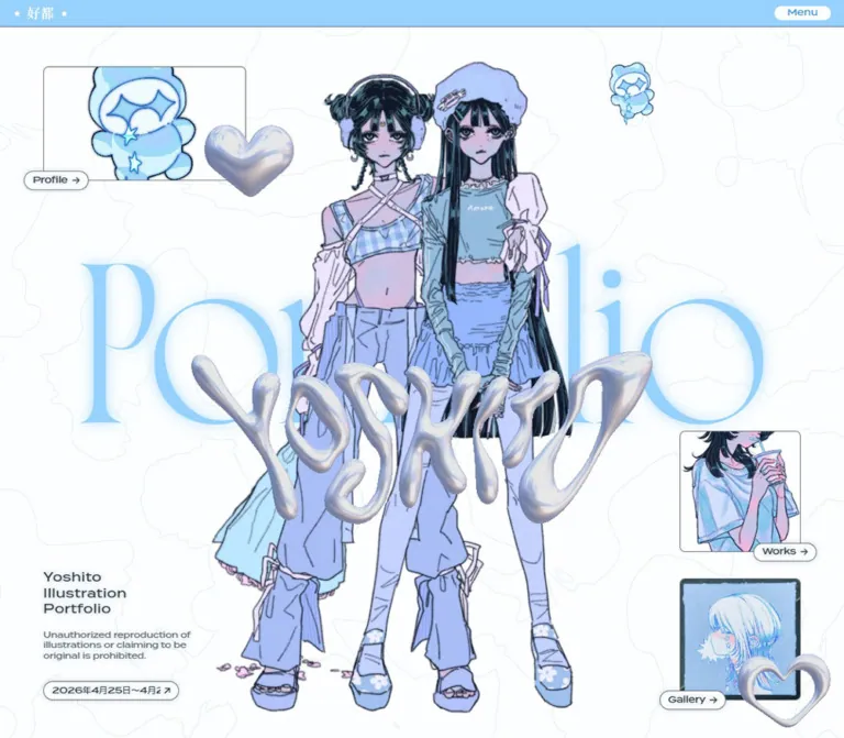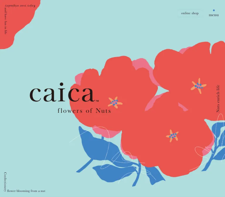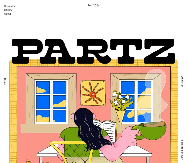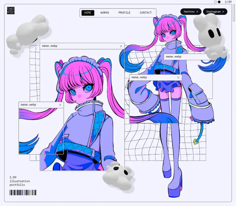
プレビュー準備中デザインリファレンスを見る
日本のWebデザインを、AIの制作リファレンスに。
DESIGN REFERENCE
ミントグリーンの店内3DCGと30種類のケーキ作品を、白いセリフ体、繊細な番号枠、余白豊かなグリッドで見せるポートフォリオ。
オリジナルサイトを見るA fictional patisserie presented as a mint-green cabinet of three-dimensional cake studies.
Website: graziexx PARLOR Original URL: https://graziexxparlor.onedesign-eno.com/ Final URL: https://graziexxparlor.onedesign-eno.com/ Theme: light pastel palette, white typography, and progressively deeper mint section backgrounds. Inspected: September 23, 2026, Japan Standard Time. Supplied retrieval timestamp: September 22, 2026 at 18:09:56.239 UTC, equivalent to September 23 at 03:09:56.239 JST. Viewports: 1440 × 1000 desktop and 390 × 844 mobile, in CSS pixels. Scope: the current opening shop scene, brand lockup, navigation, About content, decorative lettering, thirty-item cake gallery, and footer. Visual evidence consists of three desktop captures and two mobile captures. About typography and additional cake descriptions are documented through rendered DOM evidence; their complete visual presentation was not captured.
The page is a creative portfolio organized around a fictional cake shop. Its About copy explains that it collects Blender cake models and related graphic design. The shop setting gives those works a shared identity: mint walls, blush counters, branded cartons, and carefully arranged cakes establish a small, coherent world before the individual works appear.
White, high-contrast serif lettering sits lightly on broad mint surfaces. The gallery uses numbered specimens with isolated cake artwork, allowing each shape and color to remain distinct. Large section headings, small outlined number badges, generous row spacing, and an understated footer carry the hierarchy. No prices, purchase controls, or checkout flow appear in the supplied evidence.
A fictional patisserie presented as a mint-green cabinet of three-dimensional cake studies.
Website: graziexx PARLOR Original URL: https://graziexxparlor.onedesign-eno.com/ Final URL: https://graziexxparlor.onedesign-eno.com/ Theme: light pastel palette, white typography, and progressively deeper mint section backgrounds. Inspected: September 23, 2026, Japan Standard Time. Supplied retrieval timestamp: September 22, 2026 at 18:09:56.239 UTC, equivalent to September 23 at 03:09:56.239 JST. Viewports: 1440 × 1000 desktop and 390 × 844 mobile, in CSS pixels. Scope: the current opening shop scene, brand lockup, navigation, About content, decorative lettering, thirty-item cake gallery, and footer. Visual evidence consists of three desktop captures and two mobile captures. About typography and additional cake descriptions are documented through rendered DOM evidence; their complete visual presentation was not captured.
The page is a creative portfolio organized around a fictional cake shop. Its About copy explains that it collects Blender cake models and related graphic design. The shop setting gives those works a shared identity: mint walls, blush counters, branded cartons, and carefully arranged cakes establish a small, coherent world before the individual works appear.
White, high-contrast serif lettering sits lightly on broad mint surfaces. The gallery uses numbered specimens with isolated cake artwork, allowing each shape and color to remain distinct. Large section headings, small outlined number badges, generous row spacing, and an understated footer carry the hierarchy. No prices, purchase controls, or checkout flow appear in the supplied evidence.
All five values below are exact conversions of supplied RGB custom properties.
| Name | Value | Source token | Role and evidence |
|---|---|---|---|
| Pale Mint | #aacec4 |
--bg-light |
Measured body background; visible around the opening shop scene |
| Gallery Mint | #90bdb3 |
--bg-main |
Measured main background behind About and the cake collection |
| Footer Mint | #76ab9f |
--bg-dark |
Measured footer background; creates a darker closing surface |
| Deep Mint | #6aa094 |
--bg-hover |
Declared interaction color; its exact hovered application was not captured |
| White | #ffffff |
--txt-color |
Measured foreground for navigation, headings, body text, and footer links |
The source also declares --bd-main: 1px solid rgb(255, 255, 255). Thin white outlines are visible around social controls and gallery number badges.
The page progresses from Pale Mint to Gallery Mint to Footer Mint. These are separate flat surfaces, not a single page-wide gradient. The shop illustration contains its own lighting gradients, reflections, and shadows.
Blush pink, cream, chocolate brown, fruit red, lavender, and lemon yellow belong primarily to the artwork. They should remain content colors rather than becoming a collection of interface accents. White is the common thread across the brand, numbering, navigation, and section titles.
The observed white-on-mint treatment is delicate but low in contrast. White against Gallery Mint is approximately 2.1:1, calculated from the supplied RGB values. A higher-contrast reading mode is recommended later; it is not an observed feature.
Computed source family: dupincel-variable, sans-serif.
The rendered English lettering has pronounced serif contrast and a formal, confectionery-label character. The source family string is directly evidenced; font files, variable axes, and loading configuration were not supplied.
Navigation and section headings use weight 400. Their character comes from the typeface and tracking, not heavy weight. Section headings are uppercase and widely spaced. English cake names use mixed case and can wrap across two lines.
The source fallback is sans-serif. A serif fallback in the Quick Start is an explicitly recommended adaptation to preserve the visual character when the named font is unavailable.
Computed source family: dnp-shuei-gothic-kin-std, followed by Yu Gothic Medium, YuGothic, Hiragino Sans, Hiragino Kaku Gothic ProN, Meiryo, and sans-serif alternatives.
About paragraphs use weight 500, a 16px size, 35.2px line height, and 2.4px tracking. Those values correspond to 2.2 line height and 0.15em letter spacing.
Cake description paragraphs found in the DOM use the same family and weight at 14px / 30.8px, with 2.1px tracking. They retain the same 2.2 line-height ratio and 0.15em tracking.
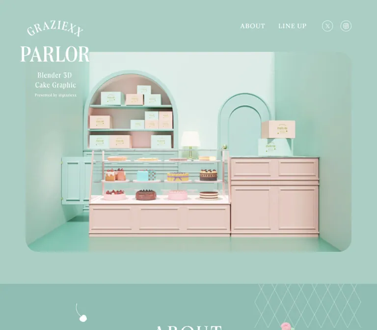
The visible brand is a composed lockup: arched GRAZIEXX lettering, a large PARLOR wordmark, two lines reading Blender 3D / Cake Graphic, and a small presenter line.
The measured heading container is approximately 217 × 240px. Its text extraction is empty. Therefore, the heading's computed 32px font size does not establish the size or font of the visible PARLOR lettering. Treat the lockup as supplied artwork unless its original construction becomes available.
The footer repeats the lockup at approximately 151 × 167px, about 70% of the opening size.
| Role | Size / line height | Weight | Tracking | Evidence |
|---|---|---|---|---|
| ABOUT and LINE UP navigation | 20px / 20px |
400 |
1.6px, or 0.08em |
Measured |
| ABOUT and LINE UP section headings | 56px / 56px |
400 |
5.6px, or 0.1em |
Measured |
| About paragraphs | 16px / 35.2px |
500 |
2.4px, or 0.15em |
Measured |
| Visible gallery names | Approximately 16px / 22px |
Visually regular | Approximately 0.05em |
Visual estimate; separate from detail headings |
| Gallery numbers | Approximately 20px |
Visually regular | Slightly open | Visual estimate |
| Cake detail H3 base style | 16px / 22.4px |
400 |
0.8px, or 0.05em |
Measured; child overrides were not supplied |
| Cake detail paragraphs | 14px / 30.8px |
500 |
2.1px, or 0.15em |
Measured; visibility unverified |
| Privacy Policy link | 18px / 18px |
400 |
0.9px, or 0.05em |
Measured |
| Footer base typography | 16px / 16px |
400 |
Normal at container level | Measured; not a measurement of every child |
| Copyright line | Approximately 14px |
Visually regular | Open | Visual estimate |
| Oversized background lettering | Approximately 120px |
Visually regular | Unverified | Visual estimate |
Use the two font roles deliberately: expressive English display lettering and airy Japanese body copy. Avoid applying the tightly set body container's inherited 16px line height to actual paragraphs; their measured line height is much larger.
The measured interface uses ordinary pixel dimensions. There is no evidence of a viewport-derived root unit or a conventional eight-point token system.
| Use | Value | Status |
|---|---|---|
| Number badge to gallery title | Approximately 14px |
Visual estimate |
| Header social icon gap | 24px |
Derived from measured positions |
| Footer social icon gap | 16px |
Derived from measured positions |
| About heading to first paragraph | 32px |
Derived from measured rectangles |
| Gap between About paragraphs | 32px |
Derived from measured rectangles |
| ABOUT to LINE UP navigation gap | 40px |
Derived from measured rectangles |
| Text navigation to social group | 48px |
Derived from measured rectangles |
| Footer top padding | 56px |
Measured |
| Opening logo top and left offsets | 64px |
Measured |
| Hero side inset | Approximately 80px |
Visible in captures; consistent with source width token |
| Footer side alignment | 80px |
Derived from measured logo and link positions |
| Footer bottom padding | 80px |
Measured |
| LINE UP top padding | 100px |
Measured |
| Main bottom padding | 100px |
Measured |
| About top padding | 130px |
Measured |
| About end to LINE UP section start | 288px |
Derived in both viewport records |
The 288px interval accommodates the decorative transition area. It should not be interpreted as a verified CSS margin declaration.
| Element | Value | Status |
|---|---|---|
| Hero scene frame | Approximately 40px |
Visual estimate |
| Footer upper corners | 48px 48px 0 0 |
Measured |
| Social controls | 17px radius on 34 × 34px boxes |
Measured |
| Gallery number badges | Approximately 40 × 48px, with fully rounded ends |
Visual estimate; slightly oval rather than circular |
| Gallery entries | No visible card surface or enclosing border | Screenshot observation |
Roundness is concentrated in the large scene frame, the footer silhouette, and tiny outlined controls. It does not create a conventional rounded-card system.
| Element | Desktop: 1440 × 1000 | Mobile: 390 × 844 | Evidence |
|---|---|---|---|
| HTML width | 1440px |
390px |
Measured |
| Body width | 1440px |
1080px |
Measured |
| Document height | 4022.125px |
4349.625px |
Measured element geometry |
| Opening brand | x64, y64, about 217 × 240px |
Same size and position | Measured |
| Hero scene | About x80, y162, 1280 × 784px |
About x80, y162, 920 × 563.5px on the wider canvas |
Screenshot estimate and derived geometry |
| Main start | y1046px |
y825.5px |
Measured |
| About block | x436.36, width 567.28px |
x256.36, width 567.28px |
Measured |
| About block height | 461.125px |
461.125px |
Measured |
| LINE UP section | x130, width 1180px |
x72, width 936px |
Measured |
| Gallery arrangement | Five columns, six rows | Four columns, eight rows on the oversized canvas | Desktop visible; mobile derived and supported by final-row capture |
| LINE UP section height | 1824px |
2372px |
Measured |
| Footer | 1440 × 303px |
1080 × 303px |
Measured |
The source declares --width-max: 1280px, --width-main: 1180px, --width-min: 1080px, --width-inner-narrow: 720px, and --width-shrink: calc(100% - 160px) at both viewport sizes. A declared token does not establish that every section uses it. In particular, the measured About block is approximately 567px wide, not 720px.
A useful gallery reconstruction is 204px columns with 40px gaps: five columns total 1180px, while four total 936px. This matches both section widths, but the actual grid declaration was not supplied.
Role: establish the fictional shop and the material language of the portfolio.
The large scene starts approximately 162px below the page top and sits inside an 80px side inset at the inspected desktop width. Its visible frame is roughly 1280 × 784px, with softly rounded corners. Pale Mint surrounds the frame.
The composition is a front-facing interior with enough elevation to see cake tops and counter surfaces. An arched shelf filled with branded cartons sits left of center. A mint arched door occupies the right background. A glass cake cabinet and taller blush counter form the foreground, with a small lamp and stacked cartons completing the scene.
The frame is the primary visual event. It has no overlaid headline paragraph or conversion button. Preserve the relationship between the image and the overlapping brand, rather than turning the scene into a background for large marketing copy.
Role: identify the fictional shop and the type of work being shown.
The opening lockup begins at 64px from the top and left. Its approximately 217px width places it slightly left of the scene's 80px edge. Its 240px height overlaps the scene's upper-left region.
The white arched name and tall PARLOR lettering dominate the lockup. Smaller centered lines communicate Blender 3D / Cake Graphic and the presenter handle. The hierarchy is internal to the artwork; rebuilding it as ordinary stacked heading text would lose the curvature and proportions.
The logo links to /index. The supplied evidence establishes the link destination but does not establish the graphic's file format or asset path.
Role: provide section navigation and access to the creator's social profiles.
The initial desktop row is aligned to the right edge of the scene, ending at x1360. It contains ABOUT, LINE UP, an outlined X control, and an outlined Instagram control.
The text links use 20px display type with 0.08em tracking. The gap between the two text links is 40px; a 48px gap separates LINE UP from the social group. Social links occupy 34 × 34px circles with thin white outlines and a 24px inter-control gap.
Later desktop captures retain navigation at the top of the viewport. The social circles appear around y24, compared with the measured initial y64. This supports a persistent navigation treatment with a more compact scrolled position. The exact fixed/sticky implementation, scroll threshold, and transition trigger are unverified.
ABOUT points to #about, LINE UP to #lineup, and the social links point to the supplied X/Twitter and Instagram profiles. Smooth scrolling and destination behavior were not exercised.
Role: explain the fictional shop and the intention behind the work.
The measured content block is about 567px wide and centered within the body. It starts with 130px of top padding, a 56px ABOUT heading, a 32px gap, and two paragraphs separated by another 32px gap.
Each paragraph measures approximately 105.56px high, consistent with three lines at 35.2px line height. The typography is airy: 16px, weight 500, and 0.15em tracking.
The copy identifies the shop as fictional and connects the work to the pleasure of choosing cakes. This context is important to the page's identity as a portfolio. It should remain a short introduction rather than expand into store-opening hours, ordering instructions, or service claims unsupported by the project.
No dedicated original-page screenshot of this section was supplied. Its text and measured geometry are supported; decorative details and exact text alignment are not independently established by the captures.
Role: separate the introduction from the cake collection without introducing a hard divider.
A desktop capture shows oversized, low-contrast GRAZIEXX PARLOR lettering repeating across and beyond the viewport. The text is much larger than the section headings, approximately 120px by visual estimate, and remains close in value to the mint background.
Treat this as a decorative layer with controlled clipping. It should not compete with the white LINE UP heading below it. A static screenshot does not prove a marquee animation; direction, speed, repetition logic, and motion trigger are unknown.
For a new implementation, hide duplicate decorative text from assistive technology and keep the semantic site name elsewhere.
Role: present thirty works as individually recognizable specimens.
The desktop collection has five evenly spaced columns. Entries combine an outlined two-digit number badge, an English cake name, and an isolated cake render beneath them. There are no visible card backgrounds, separators, prices, category pills, or purchase controls.
Visual anatomy:
40 × 48px, containing a number from 01 through 30.16px, with enough width for one or two lines.Long labels such as Chocolate Mint Checkerboard Cake wrap naturally. Short labels such as Lemon Cake remain compact. The images vary in silhouette and visible size: a single slice, a lemon-shaped cake, a tall cupcake, a low tart, and full round cakes are not enlarged until they all fill identical rectangles.
The visible column pitch is approximately 244px; row pitch is approximately 274px. A reconstruction using 204px columns, 40px gaps, and 234px row boxes matches the overall section dimensions. These are implementation deductions, not recovered grid rules.
Use a semantic ordered list in a new implementation. The original gallery container tags, item activation semantics, and precise hit areas were not included in the evidence.
Role: provide additional names and descriptions associated with individual works.
The element records include English/Japanese heading pairs and Japanese descriptions for all thirty cakes. For example, Red Velvet Cake has a Japanese name and descriptive copy about its sponge, cream, and strawberries.
The recorded H3 base style uses the display family at 16px / 22.4px, 0.05em tracking, 3px top padding, and 72px left padding. Its flex gap is 2px. Description paragraphs use 14px / 30.8px Japanese body type with 0.15em tracking.
These records are not measurements of the compact labels visible above the cake cutouts. Several detail blocks share the same coordinates within each gallery row, and their descriptions do not appear in the supplied resting screenshots. Their visibility state, panel surface, opening gesture, closing control, and keyboard behavior are unverified.
Do not invent a verified modal, hover popup, image carousel, or flip interaction from this evidence. If a new implementation exposes these descriptions, an accessible disclosure or dialog is a recommended design decision that requires its own specification.
Role: close the portfolio with repeated identity and a small set of utility links.
The footer is a 303px-high Footer Mint surface with 48px upper corner radii. It spans the body width. Measured vertical padding is 56px above and 80px below the content.
A smaller 151 × 167px logo sits 80px from the left. On desktop, a right-aligned group contains two social circles, an underlined Privacy Policy link, and the copyright line. The footer's social gap is 16px, smaller than the header's 24px gap.
Privacy Policy uses 18px display type with 0.05em tracking and links to /privacy. The visible copyright reads Copyright © machiko/eno All Rights Reserved. Its approximate 14px appearance is a screenshot estimate, while the footer's measured base font size is 16px.
The footer contains no visible newsletter form, sitemap columns, or promotional panel. Its main structural contrast comes from the darker mint and the broad curved upper edge.
| Treatment | Evidence | Supported conclusion |
|---|---|---|
| Main motion token | --anm-main: ease .2s |
A 200ms ease timing is declared; complete usage is unavailable |
| Slower motion token | --anm-slow: ease .3s |
A 300ms ease timing is declared; complete usage is unavailable |
| Links | Computed transition shorthand 0.2s |
Links have a short transition declaration; hovered properties were not captured |
| Opening H1 wrapper | 0.8s cubic-bezier(0.22, 1, 0.36, 1) |
A longer eased transition is declared; changed property and trigger are unknown |
| Navigation during scrolling | Visible near y24 in later desktop captures versus initial y64 |
Persistent, compact positioning is supported visually; mechanism is unverified |
| Decorative repeated lettering | One captured arrangement | No reliable speed, direction, or continuous animation evidence |
| Cake detail activation | Detail content exists in the DOM | No verified opening or closing behavior |
| Sampled element animations | Reported as none |
No named animation on those sampled elements at sampling time; not proof that the entire page is motionless |
The supplied capture process awaited finite motion and temporarily paused perpetual animations during readiness checks before resuming them. Settled captures therefore do not establish the complete motion system.
For an adaptation, short opacity or color transitions can use the observed 200ms timing. Any hover scaling, marquee movement, reveal animation, or dialogue transition should be labeled as a new implementation choice. Avoid turning the cake collection into an animated 3D viewer without additional evidence or requirements.
| Layer | Appearance | Purpose |
|---|---|---|
| Opening canvas | Flat Pale Mint | Gives the large scene breathing room |
| Scene frame | Rounded rendered interior | Supplies spatial depth and brand atmosphere |
| Main content | Flat Gallery Mint | Holds the introduction and specimen collection together |
| Gallery entries | Transparent against the main surface | Lets cake shape, color, and numbering establish hierarchy |
| Decorative lettering | Large, faint type on Gallery Mint | Provides a soft transition between sections |
| Footer | Flat Footer Mint with rounded upper corners | Creates a clear but gentle ending |
| Small controls | White linework without elevation | Keeps navigation and numbering visually light |
There is no visible general-purpose card-shadow system. Shadows inside the shop and cakes belong to the rendered artwork; they should not be reproduced as generic CSS shadows around gallery items.
The opening image establishes a miniature patisserie with coherent materials: painted mint cabinetry, blush panels, clear glass, cream packaging, and subtle metallic accents. Broad, soft illumination keeps the scene bright. Contact shadows and restrained reflections provide depth without harsh theatrical lighting.
The cakes are three-dimensional studies with varied geometry and finish. Visible examples include layered red velvet, a smooth lemon form, glossy berry glaze, lavender cheesecake, a pink cupcake, a checkerboard cutaway, sliced peach tart, and a ribbon-wrapped grape charlotte. Cut sections reveal interior layers and make the collection feel more carefully modeled than a set of decorative icons.
The About text attributes the Blender cake models to まちこ/江野. The evidence supports rendered 3DCG imagery; it does not establish real-time WebGL, interactive model rotation, or a particular image encoding.
Preserve whole silhouettes and use containment for gallery artwork. Let shorter tarts and taller cakes keep different visible heights. Avoid cropping every work into a uniform photo tile or applying new CSS drop shadows to assets that already contain lighting information.
The supplied evidence does not include original image src values, font-file URLs, or an asset manifest. No asset paths should be guessed.
| Asset group | Observed content | Path / format status |
|---|---|---|
| Opening scene | Mint-and-blush fictional cake shop | Not supplied |
| Main and footer lockups | White arched name, PARLOR wordmark, descriptive lines | Not supplied; graphic construction unverified |
| Cake artwork | Thirty named cake studies | Not supplied; transparent-looking compositing is visible, encoding is unknown |
| Social symbols | X and Instagram within outlined circles | Symbol asset format not supplied |
| Repeated brand lettering | Oversized faint English lettering | Text versus graphic implementation unverified |
Use authorized artwork when available. The CSS can recreate the layout and surface system, but the modeled shop, cakes, and composed logo carry much of the identity.
At 1440px, the page has three nested scales: a 1280px opening scene, an 1180px gallery, and an approximately 567px About text block. This hierarchy moves from immersive setting to explanation to a regular collection of individual works.
The scene starts around y162 and ends around y946. The main surface starts at y1046, leaving about 100px below the image. About precedes the decorative brand interval and the LINE UP section. The footer begins at y3719.125.
The gallery uses five columns and six rows. The final desktop capture shows entries 21–30 above the footer, with ample separation between the last artwork row and the curved closing surface.
The 390px viewport retains a body width of 1080px. This creates a horizontally oversized page rather than a layout fitted to the phone.
x64, y64 and keeps its desktop dimensions.x80 and extends far past the right edge. Its apparent width is approximately 920px, following the wider body rather than the viewport.x651.67, LINE UP at x770.95, and the social circles at x908 and x966. They are outside the initial phone capture, not proven to be intentionally hidden.567px wide and starts at x256.36, leaving most of its content beyond the visible right edge.936px wide. Its geometry and item grouping support four columns, with entries 29 and 30 in the final row.1080px wide. Its logo is visible at the left; its social and privacy controls lie outside the captured width.Whether users can comfortably pan to all offscreen content was not tested. No mobile menu, compact navigation replacement, or single-column layout is evidenced.
The gallery gains two rows on the narrower layout: 2372 − 1824 = 548px, or two 274px row increments. The opening section becomes 220.5px shorter. Together these explain the document-height difference: 548 − 220.5 = 327.5px.
This consistency supports a five-to-four-column reflow inside the fixed minimum canvas. It does not reveal the exact breakpoint or all intermediate widths.
For a new production implementation, remove the 1080px minimum below an explicit breakpoint, bring navigation into the viewport, scale the brand lockup, and use two gallery columns on a phone. Preserve full cake silhouettes and comfortable label wrapping.
This would be an improvement to the observed behavior. The base Quick Start retains the measured wide-canvas layout; an optional patch shows the recommended alternative separately.
#aacec4, #90bdb3, and #76ab9f.2.2 line height and 0.15em tracking.32px computed font size.These are recommendations for a new implementation, not verified features of the current page:
#173c34 is a recommended additional ink color, separate from the observed palette.44 × 44px while preserving the small visible circles where appropriate.#aacec4.#90bdb3.#76ab9f.#6aa094; original hover application is unverified.#ffffff.#173c34.“Create a creative portfolio framed as a fictional patisserie. Use a pale mint opening canvas, a large rounded image of a mint-and-blush 3D cake shop, and a white composed brand lockup overlapping its upper-left edge. Place small, widely tracked ABOUT and LINE UP links with outlined social circles at the upper right. Continue into a deeper mint surface with a narrow introduction, faint oversized brand lettering, and a thirty-work cake collection. On desktop, use five columns of isolated cake renders, each introduced by a thin oval two-digit number and a small regular serif name. Keep the works unboxed, uncropped, and generously spaced. Finish with a darker mint footer, rounded upper corners, a smaller logo, social links, privacy link, and copyright. Treat responsive improvements and unverified detail interactions as explicit implementation choices.”
#90bdb3: a roughly 40 × 48px white oval number badge beside a two-line serif cake name, followed by a centered isolated 3D cake image. Preserve the full silhouette and natural apparent size. Use thin outlines and generous empty space, without a card fill or CSS shadow.”#76ab9f footer with 48px rounded upper corners. Position a 151 × 167px white brand lockup at an 80px left inset. Align two outlined social circles, an underlined 18px privacy link, and a small copyright line at the right. Use 56px top and 80px bottom padding.”This is a standalone reconstruction recipe, not recovered source CSS. It combines measured colors, typography, and major dimensions with explicitly estimated hero and gallery geometry. It intentionally retains the observed minimum-width behavior by default.
Load authorized font files and artwork separately. The display fallback below changes the source's sans-serif fallback to Georgia, serif as a recommendation. The recipe does not implement unverified cake detail interactions.
Suggested structure: an opening logo link and navigation frame, a hero containing the scene image, a main element containing About, decorative lettering, and an ordered gallery, then the footer. Each gallery item contains a caption group and a cake image.
:root {
  /* Measured source colors */
  --bg-light: #aacec4;
  --bg-main: #90bdb3;
  --bg-dark: #76ab9f;
  --bg-hover: #6aa094;
  --txt-color: #ffffff;
  --bd-main: 1px solid var(--txt-color);

  /* Measured source width tokens */
  --width-max: 1280px;
  --width-main: 1180px;
  --width-min: 1080px;
  --width-inner-narrow: 720px;
  --width-shrink: calc(100% - 160px);

  /* Named source families; display fallback is recommended */
  --font-editorial: 'dupincel-variable', Georgia, serif;
  --font-body: 'dnp-shuei-gothic-kin-std', 'Yu Gothic Medium',
    YuGothic, 'Hiragino Sans', Meiryo, sans-serif;
  --text-section: 56px;
  --text-navigation: 20px;
  --text-body: 16px;
  --text-detail: 14px;
  --leading-body: 2.2;
  --tracking-section: 0.1em;
  --tracking-body: 0.15em;

  /* Measured or derived component geometry */
  --about-width: 567.28125px;
  --radius-footer: 48px;
  --social-size: 34px;
  --brand-gap-height: 288px;

  /* Estimated geometry for this reconstruction */
  --radius-hero: 40px;
  --cake-column: 204px;
  --cake-gap: 40px;
  --cake-row: 234px;

  /* Observed timings; application to states is a recipe choice */
  --motion-main: 200ms ease;
  --motion-slow: 300ms ease;
  --motion-brand: 800ms cubic-bezier(0.22, 1, 0.36, 1);

  /* Recommended additional color */
  --accessible-ink: #173c34;
}

* {
  box-sizing: border-box;
}

body.parlor-page {
  min-width: var(--width-min);
  margin: 0;
  color: var(--txt-color);
  background: var(--bg-light);
  font-family: var(--font-body);
  font-size: var(--text-body);
  font-weight: 500;
}

.parlor-page a {
  color: inherit;
}

.parlor-brand {
  position: absolute;
  z-index: 3;
  top: 64px;
  left: 64px;
  display: block;
  width: 217px;
  height: 240px;
  margin: 0;
}

.parlor-brand img,
.footer-brand img {
  display: block;
  width: 100%;
  height: 100%;
  object-fit: contain;
}

.parlor-hero {
  padding: 162px 80px 100px;
}

.hero-scene {
  width: 100%;
  max-width: var(--width-max);
  aspect-ratio: 80 / 49;
  margin-inline: auto;
  overflow: hidden;
  border-radius: var(--radius-hero);
}

.hero-scene img {
  display: block;
  width: 100%;
  height: 100%;
  object-fit: cover;
}

/* Persistent navigation reconstruction */
.nav-frame {
  position: fixed;
  z-index: 10;
  top: 64px;
  left: 0;
  width: max(100%, var(--width-min));
  pointer-events: none;
}

.topnav {
  display: flex;
  align-items: center;
  justify-content: flex-end;
  gap: 48px;
  width: min(var(--width-max), var(--width-shrink));
  margin-inline: auto;
  pointer-events: auto;
}

.topnav-links {
  display: flex;
  align-items: center;
  gap: 40px;
  margin: 0;
  padding: 0;
  list-style: none;
}

.topnav-links a {
  font-family: var(--font-editorial);
  font-size: var(--text-navigation);
  font-weight: 400;
  line-height: 1;
  letter-spacing: 0.08em;
  text-decoration: none;
}

.socials {
  display: flex;
  align-items: center;
  gap: 24px;
}

.social-link {
  display: grid;
  place-items: center;
  width: var(--social-size);
  height: var(--social-size);
  border: var(--bd-main);
  border-radius: 50%;
  text-decoration: none;
  transition: background-color var(--motion-main);
}

.social-link img,
.social-link svg {
  display: block;
  width: 14px;
  height: 14px;
}

/* Optional state hook; scroll trigger is not supplied evidence. */
.nav-frame[data-condensed='true'] {
  top: 24px;
}

.parlor-main {
  padding-bottom: 100px;
  background: var(--bg-main);
}

.about {
  width: var(--about-width);
  margin-inline: auto;
  padding-top: 130px;
  text-align: center;
}

.section-title {
  margin: 0;
  font-family: var(--font-editorial);
  font-size: var(--text-section);
  font-weight: 400;
  line-height: 1;
  letter-spacing: var(--tracking-section);
  text-align: center;
}

.about p {
  margin: 32px 0 0;
  font-size: var(--text-body);
  line-height: var(--leading-body);
  letter-spacing: var(--tracking-body);
}

/* Static decorative reconstruction; size and opacity are estimates. */
.brand-ribbon {
  display: flex;
  align-items: center;
  height: var(--brand-gap-height);
  overflow: hidden;
}

.brand-ribbon span {
  flex: none;
  opacity: 0.12;
  font-family: var(--font-editorial);
  font-size: 120px;
  font-weight: 400;
  line-height: 1;
  white-space: nowrap;
}

.lineup {
  width: min(var(--width-main), calc(100% - 144px));
  margin-inline: auto;
  padding-top: 100px;
}

/* Inferred grid recipe: five columns at 1440, four at 1080. */
.cake-grid {
  display: grid;
  grid-template-columns: repeat(auto-fit, var(--cake-column));
  grid-auto-rows: var(--cake-row);
  justify-content: center;
  gap: var(--cake-gap);
  margin: 64px 0 0;
  padding: 0;
  list-style: none;
}

.cake-card {
  min-width: 0;
  margin: 0;
  padding: 8px 12px 0;
}

.cake-caption {
  display: grid;
  grid-template-columns: 40px minmax(0, 1fr);
  align-items: center;
  gap: 14px;
  min-height: 48px;
  font-family: var(--font-editorial);
  font-weight: 400;
}

.cake-number {
  display: grid;
  place-items: center;
  width: 40px;
  height: 48px;
  border: var(--bd-main);
  border-radius: 50%;
  font-size: 20px;
  line-height: 1;
}

.cake-title {
  margin: 0;
  font-size: 16px;
  font-weight: 400;
  line-height: 1.4;
  letter-spacing: 0.05em;
}

/* Asset padding and silhouettes affect the final visible size. */
.cake-art {
  display: block;
  width: 100%;
  height: 140px;
  margin: 8px auto 0;
  object-fit: contain;
}

.parlor-footer {
  min-height: 303px;
  padding: 56px 80px 80px;
  border-radius: var(--radius-footer) var(--radius-footer) 0 0;
  background: var(--bg-dark);
  font-family: var(--font-editorial);
  font-weight: 400;
}

.footer-inner {
  display: flex;
  align-items: flex-end;
  justify-content: space-between;
  gap: 48px;
  max-width: var(--width-max);
  margin-inline: auto;
}

.footer-brand {
  display: block;
  flex: none;
  width: 151px;
  height: 167px;
}

.footer-meta {
  display: flex;
  flex-direction: column;
  align-items: flex-end;
}

.footer-meta .socials {
  gap: 16px;
}

.privacy-link {
  margin-top: 32px;
  font-size: 18px;
  line-height: 1;
  letter-spacing: 0.05em;
  text-decoration: underline;
}

.copyright {
  margin: 24px 0 0;
  font-size: 14px;
  line-height: 1;
  letter-spacing: 0.1em;
}

/* Recommended hover mapping; original hover state is unverified. */
@media (hover: hover) {
  .social-link:hover {
    background: var(--bg-hover);
  }
}

/* Recommended accessibility additions */
.parlor-page :focus-visible {
  outline: 2px solid var(--accessible-ink);
  outline-offset: 4px;
}

.parlor--readable .parlor-main,
.parlor--readable .parlor-footer {
  color: var(--accessible-ink);
}

@media (prefers-reduced-motion: reduce) {
  .parlor-page *,
  .parlor-page *::before,
  .parlor-page *::after {
    animation: none !important;
    transition: none !important;
    scroll-behavior: auto !important;
  }
}
The reconstruction centers About paragraphs as a chosen treatment, uses an estimated 40px hero radius, and assigns a practical image box to gallery artwork. Those choices are not additional source measurements. The optional condensed-navigation attribute also needs application logic; the original trigger is unknown.
Add parlor--fluid to the body to opt into this patch. The 700px breakpoint, two-column phone gallery, and rearranged footer are recommendations rather than observed rules.
@media (max-width: 700px) {
  body.parlor-page.parlor--fluid {
    min-width: 0;
  }

  .parlor--fluid .nav-frame {
    top: 16px;
    width: 100%;
  }

  .parlor--fluid .topnav {
    width: calc(100% - 40px);
    gap: 16px;
    flex-wrap: wrap;
  }

  .parlor--fluid .topnav-links {
    gap: 16px;
  }

  .parlor--fluid .topnav-links a {
    font-size: 14px;
  }

  .parlor--fluid .socials {
    gap: 12px;
  }

  .parlor--fluid .social-link {
    width: 44px;
    height: 44px;
  }

  .parlor--fluid .parlor-brand {
    top: 80px;
    left: 24px;
    width: 145px;
    height: 160px;
  }

  .parlor--fluid .parlor-hero {
    padding: 176px 20px 64px;
  }

  .parlor--fluid .about {
    width: calc(100% - 40px);
    padding-top: 80px;
  }

  .parlor--fluid .section-title {
    font-size: 40px;
  }

  .parlor--fluid .brand-ribbon {
    height: 160px;
  }

  .parlor--fluid .brand-ribbon span {
    font-size: 80px;
  }

  .parlor--fluid .lineup {
    width: calc(100% - 40px);
    padding-top: 64px;
  }

  .parlor--fluid .cake-grid {
    grid-template-columns: repeat(2, minmax(0, 1fr));
    grid-auto-rows: auto;
    gap: 36px 16px;
    margin-top: 40px;
  }

  .parlor--fluid .cake-card {
    padding: 0;
  }

  .parlor--fluid .cake-caption {
    grid-template-columns: 32px minmax(0, 1fr);
    gap: 8px;
  }

  .parlor--fluid .cake-number {
    width: 32px;
    height: 40px;
    font-size: 16px;
  }

  .parlor--fluid .cake-title {
    font-size: 14px;
    overflow-wrap: anywhere;
  }

  .parlor--fluid .cake-art {
    height: 120px;
  }

  .parlor--fluid .parlor-footer {
    padding: 48px 24px;
  }

  .parlor--fluid .footer-inner {
    flex-direction: column;
    align-items: flex-start;
  }

  .parlor--fluid .footer-meta {
    align-items: flex-start;
  }

  .parlor--fluid .copyright {
    line-height: 1.6;
  }
}
Optional aliases for an implementation already using Tailwind v4. These do not identify the original site's technology. Define the custom properties above first.
@theme inline {
  --color-parlor-light: var(--bg-light);
  --color-parlor-main: var(--bg-main);
  --color-parlor-dark: var(--bg-dark);
  --color-parlor-hover: var(--bg-hover);
  --color-parlor-white: var(--txt-color);
  --color-parlor-ink: var(--accessible-ink);

  --font-parlor-display: var(--font-editorial);
  --font-parlor-body: var(--font-body);

  --text-parlor-section: 56px;
  --text-parlor-navigation: 20px;
  --text-parlor-body: 16px;
  --text-parlor-detail: 14px;

  --radius-parlor-scene: var(--radius-hero);
  --radius-parlor-footer: var(--radius-footer);
  --spacing-parlor-gallery: var(--cake-gap);
  --container-parlor-wide: var(--width-max);
  --container-parlor-gallery: var(--width-main);
}
200.2026-09-22T18:09:56.239Z, corresponding to September 23, 2026 at 03:09:56.239 JST.1440 × 1000, covering the opening scene, early gallery rows, and final gallery rows with footer; rendered DOM and computed-style records describe the document at this viewport.390 × 844, covering the opening and page ending; DOM geometry records a 1080px body and a document height of approximately 4349.625px./index, #about, #lineup, /privacy, and the two social destinations appear in the supplied original-page link records. Linked pages and profiles were not separately inspected.This reference describes the current supplied page evidence. Measured behavior, visual estimates, derived geometry, and recommended improvements remain distinct throughout.
# graziexx PARLOR — Style Reference

> A fictional patisserie presented as a mint-green cabinet of three-dimensional cake studies.

**Website:** [graziexx PARLOR](https://graziexxparlor.onedesign-eno.com/)
**Original URL:** https://graziexxparlor.onedesign-eno.com/
**Final URL:** https://graziexxparlor.onedesign-eno.com/
**Theme:** light pastel palette, white typography, and progressively deeper mint section backgrounds.
**Inspected:** September 23, 2026, Japan Standard Time. Supplied retrieval timestamp: September 22, 2026 at 18:09:56.239 UTC, equivalent to September 23 at 03:09:56.239 JST.
**Viewports:** 1440 × 1000 desktop and 390 × 844 mobile, in CSS pixels.
**Scope:** the current opening shop scene, brand lockup, navigation, About content, decorative lettering, thirty-item cake gallery, and footer. Visual evidence consists of three desktop captures and two mobile captures. About typography and additional cake descriptions are documented through rendered DOM evidence; their complete visual presentation was not captured.

The page is a creative portfolio organized around a fictional cake shop. Its About copy explains that it collects Blender cake models and related graphic design. The shop setting gives those works a shared identity: mint walls, blush counters, branded cartons, and carefully arranged cakes establish a small, coherent world before the individual works appear.

White, high-contrast serif lettering sits lightly on broad mint surfaces. The gallery uses numbered specimens with isolated cake artwork, allowing each shape and color to remain distinct. Large section headings, small outlined number badges, generous row spacing, and an understated footer carry the hierarchy. No prices, purchase controls, or checkout flow appear in the supplied evidence.
# graziexx PARLOR — Style Reference

> A fictional patisserie presented as a mint-green cabinet of three-dimensional cake studies.

**Website:** [graziexx PARLOR](https://graziexxparlor.onedesign-eno.com/)
**Original URL:** https://graziexxparlor.onedesign-eno.com/
**Final URL:** https://graziexxparlor.onedesign-eno.com/
**Theme:** light pastel palette, white typography, and progressively deeper mint section backgrounds.
**Inspected:** September 23, 2026, Japan Standard Time. Supplied retrieval timestamp: September 22, 2026 at 18:09:56.239 UTC, equivalent to September 23 at 03:09:56.239 JST.
**Viewports:** 1440 × 1000 desktop and 390 × 844 mobile, in CSS pixels.
**Scope:** the current opening shop scene, brand lockup, navigation, About content, decorative lettering, thirty-item cake gallery, and footer. Visual evidence consists of three desktop captures and two mobile captures. About typography and additional cake descriptions are documented through rendered DOM evidence; their complete visual presentation was not captured.

The page is a creative portfolio organized around a fictional cake shop. Its About copy explains that it collects Blender cake models and related graphic design. The shop setting gives those works a shared identity: mint walls, blush counters, branded cartons, and carefully arranged cakes establish a small, coherent world before the individual works appear.

White, high-contrast serif lettering sits lightly on broad mint surfaces. The gallery uses numbered specimens with isolated cake artwork, allowing each shape and color to remain distinct. Large section headings, small outlined number badges, generous row spacing, and an understated footer carry the hierarchy. No prices, purchase controls, or checkout flow appear in the supplied evidence.

## How to Read This Reference

- **Measured** means a value appears in the supplied rendered DOM, computed styles, or custom properties. Values are rounded for prose where appropriate.
- **Visual estimate** means a dimension or treatment is inferred from an original-page screenshot. It is not an extracted CSS declaration.
- **Derived** means a value is calculated from supplied measurements. Calculations are identified explicitly.
- **Recommended** means guidance for a new implementation, including the CSS recipes. Recommendations are not claims about existing functionality.
- **Source tokens** retain their observed names. Additional aliases are implementation conveniences.
- The mobile capture shows a **1080px-wide body inside a 390px viewport**. It must not be described as a successfully fitted mobile layout.
- Computed styles for cake detail headings and paragraphs do not prove that those details were visible or opened. Their repeated, overlapping coordinates require separate treatment from the visible gallery labels.
- The comparison thumbnail is excluded from design observations. No additional browsing, asset retrieval, or interaction testing is represented here.

## Tokens — Colors

### Default Palette

All five values below are exact conversions of supplied RGB custom properties.

| Name | Value | Source token | Role and evidence |
| --- | --- | --- | --- |
| Pale Mint | `#aacec4` | `--bg-light` | Measured body background; visible around the opening shop scene |
| Gallery Mint | `#90bdb3` | `--bg-main` | Measured main background behind About and the cake collection |
| Footer Mint | `#76ab9f` | `--bg-dark` | Measured footer background; creates a darker closing surface |
| Deep Mint | `#6aa094` | `--bg-hover` | Declared interaction color; its exact hovered application was not captured |
| White | `#ffffff` | `--txt-color` | Measured foreground for navigation, headings, body text, and footer links |

The source also declares `--bd-main: 1px solid rgb(255, 255, 255)`. Thin white outlines are visible around social controls and gallery number badges.

### Color Relationships

The page progresses from Pale Mint to Gallery Mint to Footer Mint. These are separate flat surfaces, not a single page-wide gradient. The shop illustration contains its own lighting gradients, reflections, and shadows.

Blush pink, cream, chocolate brown, fruit red, lavender, and lemon yellow belong primarily to the artwork. They should remain content colors rather than becoming a collection of interface accents. White is the common thread across the brand, numbering, navigation, and section titles.

The observed white-on-mint treatment is delicate but low in contrast. White against Gallery Mint is approximately **2.1:1**, calculated from the supplied RGB values. A higher-contrast reading mode is recommended later; it is not an observed feature.

## Tokens — Typography

### English Display and Navigation

**Computed source family:** `dupincel-variable, sans-serif`.

The rendered English lettering has pronounced serif contrast and a formal, confectionery-label character. The source family string is directly evidenced; font files, variable axes, and loading configuration were not supplied.

Navigation and section headings use weight `400`. Their character comes from the typeface and tracking, not heavy weight. Section headings are uppercase and widely spaced. English cake names use mixed case and can wrap across two lines.

The source fallback is `sans-serif`. A serif fallback in the Quick Start is an explicitly recommended adaptation to preserve the visual character when the named font is unavailable.

### Japanese Body and Descriptive Text

**Computed source family:** `dnp-shuei-gothic-kin-std`, followed by Yu Gothic Medium, YuGothic, Hiragino Sans, Hiragino Kaku Gothic ProN, Meiryo, and sans-serif alternatives.

About paragraphs use weight `500`, a `16px` size, `35.2px` line height, and `2.4px` tracking. Those values correspond to `2.2` line height and `0.15em` letter spacing.

Cake description paragraphs found in the DOM use the same family and weight at `14px / 30.8px`, with `2.1px` tracking. They retain the same `2.2` line-height ratio and `0.15em` tracking.

### Brand Lockup

The visible brand is a composed lockup: arched GRAZIEXX lettering, a large PARLOR wordmark, two lines reading Blender 3D / Cake Graphic, and a small presenter line.

The measured heading container is approximately `217 × 240px`. Its text extraction is empty. Therefore, the heading's computed `32px` font size does **not** establish the size or font of the visible PARLOR lettering. Treat the lockup as supplied artwork unless its original construction becomes available.

The footer repeats the lockup at approximately `151 × 167px`, about 70% of the opening size.

### Type Scale

| Role | Size / line height | Weight | Tracking | Evidence |
| --- | --- | --- | --- | --- |
| ABOUT and LINE UP navigation | `20px / 20px` | `400` | `1.6px`, or `0.08em` | Measured |
| ABOUT and LINE UP section headings | `56px / 56px` | `400` | `5.6px`, or `0.1em` | Measured |
| About paragraphs | `16px / 35.2px` | `500` | `2.4px`, or `0.15em` | Measured |
| Visible gallery names | Approximately `16px / 22px` | Visually regular | Approximately `0.05em` | Visual estimate; separate from detail headings |
| Gallery numbers | Approximately `20px` | Visually regular | Slightly open | Visual estimate |
| Cake detail H3 base style | `16px / 22.4px` | `400` | `0.8px`, or `0.05em` | Measured; child overrides were not supplied |
| Cake detail paragraphs | `14px / 30.8px` | `500` | `2.1px`, or `0.15em` | Measured; visibility unverified |
| Privacy Policy link | `18px / 18px` | `400` | `0.9px`, or `0.05em` | Measured |
| Footer base typography | `16px / 16px` | `400` | Normal at container level | Measured; not a measurement of every child |
| Copyright line | Approximately `14px` | Visually regular | Open | Visual estimate |
| Oversized background lettering | Approximately `120px` | Visually regular | Unverified | Visual estimate |

Use the two font roles deliberately: expressive English display lettering and airy Japanese body copy. Avoid applying the tightly set body container's inherited `16px` line height to actual paragraphs; their measured line height is much larger.

## Tokens — Spacing & Shapes

The measured interface uses ordinary pixel dimensions. There is no evidence of a viewport-derived root unit or a conventional eight-point token system.

### Spacing Scale

| Use | Value | Status |
| --- | --- | --- |
| Number badge to gallery title | Approximately `14px` | Visual estimate |
| Header social icon gap | `24px` | Derived from measured positions |
| Footer social icon gap | `16px` | Derived from measured positions |
| About heading to first paragraph | `32px` | Derived from measured rectangles |
| Gap between About paragraphs | `32px` | Derived from measured rectangles |
| ABOUT to LINE UP navigation gap | `40px` | Derived from measured rectangles |
| Text navigation to social group | `48px` | Derived from measured rectangles |
| Footer top padding | `56px` | Measured |
| Opening logo top and left offsets | `64px` | Measured |
| Hero side inset | Approximately `80px` | Visible in captures; consistent with source width token |
| Footer side alignment | `80px` | Derived from measured logo and link positions |
| Footer bottom padding | `80px` | Measured |
| LINE UP top padding | `100px` | Measured |
| Main bottom padding | `100px` | Measured |
| About top padding | `130px` | Measured |
| About end to LINE UP section start | `288px` | Derived in both viewport records |

The `288px` interval accommodates the decorative transition area. It should not be interpreted as a verified CSS margin declaration.

### Border Radius

| Element | Value | Status |
| --- | --- | --- |
| Hero scene frame | Approximately `40px` | Visual estimate |
| Footer upper corners | `48px 48px 0 0` | Measured |
| Social controls | `17px` radius on `34 × 34px` boxes | Measured |
| Gallery number badges | Approximately `40 × 48px`, with fully rounded ends | Visual estimate; slightly oval rather than circular |
| Gallery entries | No visible card surface or enclosing border | Screenshot observation |

Roundness is concentrated in the large scene frame, the footer silhouette, and tiny outlined controls. It does not create a conventional rounded-card system.

### Layout Measurements

| Element | Desktop: 1440 × 1000 | Mobile: 390 × 844 | Evidence |
| --- | --- | --- | --- |
| HTML width | `1440px` | `390px` | Measured |
| Body width | `1440px` | `1080px` | Measured |
| Document height | `4022.125px` | `4349.625px` | Measured element geometry |
| Opening brand | `x64, y64`, about `217 × 240px` | Same size and position | Measured |
| Hero scene | About `x80, y162`, `1280 × 784px` | About `x80, y162`, `920 × 563.5px` on the wider canvas | Screenshot estimate and derived geometry |
| Main start | `y1046px` | `y825.5px` | Measured |
| About block | `x436.36`, width `567.28px` | `x256.36`, width `567.28px` | Measured |
| About block height | `461.125px` | `461.125px` | Measured |
| LINE UP section | `x130`, width `1180px` | `x72`, width `936px` | Measured |
| Gallery arrangement | Five columns, six rows | Four columns, eight rows on the oversized canvas | Desktop visible; mobile derived and supported by final-row capture |
| LINE UP section height | `1824px` | `2372px` | Measured |
| Footer | `1440 × 303px` | `1080 × 303px` | Measured |

The source declares `--width-max: 1280px`, `--width-main: 1180px`, `--width-min: 1080px`, `--width-inner-narrow: 720px`, and `--width-shrink: calc(100% - 160px)` at both viewport sizes. A declared token does not establish that every section uses it. In particular, the measured About block is approximately `567px` wide, not `720px`.

A useful gallery reconstruction is **204px columns with 40px gaps**: five columns total `1180px`, while four total `936px`. This matches both section widths, but the actual grid declaration was not supplied.

## Components

### Opening Shop Scene

**Role:** establish the fictional shop and the material language of the portfolio.

The large scene starts approximately `162px` below the page top and sits inside an `80px` side inset at the inspected desktop width. Its visible frame is roughly `1280 × 784px`, with softly rounded corners. Pale Mint surrounds the frame.

The composition is a front-facing interior with enough elevation to see cake tops and counter surfaces. An arched shelf filled with branded cartons sits left of center. A mint arched door occupies the right background. A glass cake cabinet and taller blush counter form the foreground, with a small lamp and stacked cartons completing the scene.

The frame is the primary visual event. It has no overlaid headline paragraph or conversion button. Preserve the relationship between the image and the overlapping brand, rather than turning the scene into a background for large marketing copy.

### Overlapping Brand Lockup

**Role:** identify the fictional shop and the type of work being shown.

The opening lockup begins at `64px` from the top and left. Its approximately `217px` width places it slightly left of the scene's `80px` edge. Its `240px` height overlaps the scene's upper-left region.

The white arched name and tall PARLOR lettering dominate the lockup. Smaller centered lines communicate Blender 3D / Cake Graphic and the presenter handle. The hierarchy is internal to the artwork; rebuilding it as ordinary stacked heading text would lose the curvature and proportions.

The logo links to `/index`. The supplied evidence establishes the link destination but does not establish the graphic's file format or asset path.

### Persistent Navigation

**Role:** provide section navigation and access to the creator's social profiles.

The initial desktop row is aligned to the right edge of the scene, ending at `x1360`. It contains ABOUT, LINE UP, an outlined X control, and an outlined Instagram control.

The text links use `20px` display type with `0.08em` tracking. The gap between the two text links is `40px`; a `48px` gap separates LINE UP from the social group. Social links occupy `34 × 34px` circles with thin white outlines and a `24px` inter-control gap.

Later desktop captures retain navigation at the top of the viewport. The social circles appear around `y24`, compared with the measured initial `y64`. This supports a persistent navigation treatment with a more compact scrolled position. The exact fixed/sticky implementation, scroll threshold, and transition trigger are unverified.

ABOUT points to `#about`, LINE UP to `#lineup`, and the social links point to the supplied X/Twitter and Instagram profiles. Smooth scrolling and destination behavior were not exercised.

### About Section

**Role:** explain the fictional shop and the intention behind the work.

The measured content block is about `567px` wide and centered within the body. It starts with `130px` of top padding, a `56px` ABOUT heading, a `32px` gap, and two paragraphs separated by another `32px` gap.

Each paragraph measures approximately `105.56px` high, consistent with three lines at `35.2px` line height. The typography is airy: `16px`, weight `500`, and `0.15em` tracking.

The copy identifies the shop as fictional and connects the work to the pleasure of choosing cakes. This context is important to the page's identity as a portfolio. It should remain a short introduction rather than expand into store-opening hours, ordering instructions, or service claims unsupported by the project.

No dedicated original-page screenshot of this section was supplied. Its text and measured geometry are supported; decorative details and exact text alignment are not independently established by the captures.

### Decorative Brand Band

**Role:** separate the introduction from the cake collection without introducing a hard divider.

A desktop capture shows oversized, low-contrast GRAZIEXX PARLOR lettering repeating across and beyond the viewport. The text is much larger than the section headings, approximately `120px` by visual estimate, and remains close in value to the mint background.

Treat this as a decorative layer with controlled clipping. It should not compete with the white LINE UP heading below it. A static screenshot does not prove a marquee animation; direction, speed, repetition logic, and motion trigger are unknown.

For a new implementation, hide duplicate decorative text from assistive technology and keep the semantic site name elsewhere.

### Numbered Cake Gallery

**Role:** present thirty works as individually recognizable specimens.

The desktop collection has five evenly spaced columns. Entries combine an outlined two-digit number badge, an English cake name, and an isolated cake render beneath them. There are no visible card backgrounds, separators, prices, category pills, or purchase controls.

**Visual anatomy:**

1. A small horizontal caption group, inset slightly from the column edge.
2. A thin white oval badge, approximately `40 × 48px`, containing a number from 01 through 30.
3. A regular display-serif name to the right, approximately `16px`, with enough width for one or two lines.
4. A cake render centered below the caption, retaining its full silhouette and individual proportions.
5. Generous empty mint space before the next row.

Long labels such as Chocolate Mint Checkerboard Cake wrap naturally. Short labels such as Lemon Cake remain compact. The images vary in silhouette and visible size: a single slice, a lemon-shaped cake, a tall cupcake, a low tart, and full round cakes are not enlarged until they all fill identical rectangles.

The visible column pitch is approximately `244px`; row pitch is approximately `274px`. A reconstruction using `204px` columns, `40px` gaps, and `234px` row boxes matches the overall section dimensions. These are implementation deductions, not recovered grid rules.

Use a semantic ordered list in a new implementation. The original gallery container tags, item activation semantics, and precise hit areas were not included in the evidence.

### Cake Detail Content — DOM Evidence Only

**Role:** provide additional names and descriptions associated with individual works.

The element records include English/Japanese heading pairs and Japanese descriptions for all thirty cakes. For example, Red Velvet Cake has a Japanese name and descriptive copy about its sponge, cream, and strawberries.

The recorded H3 base style uses the display family at `16px / 22.4px`, `0.05em` tracking, `3px` top padding, and `72px` left padding. Its flex gap is `2px`. Description paragraphs use `14px / 30.8px` Japanese body type with `0.15em` tracking.

These records are not measurements of the compact labels visible above the cake cutouts. Several detail blocks share the same coordinates within each gallery row, and their descriptions do not appear in the supplied resting screenshots. Their visibility state, panel surface, opening gesture, closing control, and keyboard behavior are unverified.

Do not invent a verified modal, hover popup, image carousel, or flip interaction from this evidence. If a new implementation exposes these descriptions, an accessible disclosure or dialog is a recommended design decision that requires its own specification.

### Footer

**Role:** close the portfolio with repeated identity and a small set of utility links.

The footer is a `303px`-high Footer Mint surface with `48px` upper corner radii. It spans the body width. Measured vertical padding is `56px` above and `80px` below the content.

A smaller `151 × 167px` logo sits `80px` from the left. On desktop, a right-aligned group contains two social circles, an underlined Privacy Policy link, and the copyright line. The footer's social gap is `16px`, smaller than the header's `24px` gap.

Privacy Policy uses `18px` display type with `0.05em` tracking and links to `/privacy`. The visible copyright reads Copyright © machiko/eno All Rights Reserved. Its approximate `14px` appearance is a screenshot estimate, while the footer's measured base font size is `16px`.

The footer contains no visible newsletter form, sitemap columns, or promotional panel. Its main structural contrast comes from the darker mint and the broad curved upper edge.

## Tokens — Motion & Interaction

| Treatment | Evidence | Supported conclusion |
| --- | --- | --- |
| Main motion token | `--anm-main: ease .2s` | A 200ms ease timing is declared; complete usage is unavailable |
| Slower motion token | `--anm-slow: ease .3s` | A 300ms ease timing is declared; complete usage is unavailable |
| Links | Computed transition shorthand `0.2s` | Links have a short transition declaration; hovered properties were not captured |
| Opening H1 wrapper | `0.8s cubic-bezier(0.22, 1, 0.36, 1)` | A longer eased transition is declared; changed property and trigger are unknown |
| Navigation during scrolling | Visible near `y24` in later desktop captures versus initial `y64` | Persistent, compact positioning is supported visually; mechanism is unverified |
| Decorative repeated lettering | One captured arrangement | No reliable speed, direction, or continuous animation evidence |
| Cake detail activation | Detail content exists in the DOM | No verified opening or closing behavior |
| Sampled element animations | Reported as `none` | No named animation on those sampled elements at sampling time; not proof that the entire page is motionless |

The supplied capture process awaited finite motion and temporarily paused perpetual animations during readiness checks before resuming them. Settled captures therefore do not establish the complete motion system.

For an adaptation, short opacity or color transitions can use the observed 200ms timing. Any hover scaling, marquee movement, reveal animation, or dialogue transition should be labeled as a new implementation choice. Avoid turning the cake collection into an animated 3D viewer without additional evidence or requirements.

## Surfaces

| Layer | Appearance | Purpose |
| --- | --- | --- |
| Opening canvas | Flat Pale Mint | Gives the large scene breathing room |
| Scene frame | Rounded rendered interior | Supplies spatial depth and brand atmosphere |
| Main content | Flat Gallery Mint | Holds the introduction and specimen collection together |
| Gallery entries | Transparent against the main surface | Lets cake shape, color, and numbering establish hierarchy |
| Decorative lettering | Large, faint type on Gallery Mint | Provides a soft transition between sections |
| Footer | Flat Footer Mint with rounded upper corners | Creates a clear but gentle ending |
| Small controls | White linework without elevation | Keeps navigation and numbering visually light |

There is no visible general-purpose card-shadow system. Shadows inside the shop and cakes belong to the rendered artwork; they should not be reproduced as generic CSS shadows around gallery items.

## Imagery

The opening image establishes a miniature patisserie with coherent materials: painted mint cabinetry, blush panels, clear glass, cream packaging, and subtle metallic accents. Broad, soft illumination keeps the scene bright. Contact shadows and restrained reflections provide depth without harsh theatrical lighting.

The cakes are three-dimensional studies with varied geometry and finish. Visible examples include layered red velvet, a smooth lemon form, glossy berry glaze, lavender cheesecake, a pink cupcake, a checkerboard cutaway, sliced peach tart, and a ribbon-wrapped grape charlotte. Cut sections reveal interior layers and make the collection feel more carefully modeled than a set of decorative icons.

The About text attributes the Blender cake models to まちこ/江野. The evidence supports rendered 3DCG imagery; it does not establish real-time WebGL, interactive model rotation, or a particular image encoding.

Preserve whole silhouettes and use containment for gallery artwork. Let shorter tarts and taller cakes keep different visible heights. Avoid cropping every work into a uniform photo tile or applying new CSS drop shadows to assets that already contain lighting information.

### Observed Asset References

The supplied evidence does not include original image `src` values, font-file URLs, or an asset manifest. No asset paths should be guessed.

| Asset group | Observed content | Path / format status |
| --- | --- | --- |
| Opening scene | Mint-and-blush fictional cake shop | Not supplied |
| Main and footer lockups | White arched name, PARLOR wordmark, descriptive lines | Not supplied; graphic construction unverified |
| Cake artwork | Thirty named cake studies | Not supplied; transparent-looking compositing is visible, encoding is unknown |
| Social symbols | X and Instagram within outlined circles | Symbol asset format not supplied |
| Repeated brand lettering | Oversized faint English lettering | Text versus graphic implementation unverified |

Use authorized artwork when available. The CSS can recreate the layout and surface system, but the modeled shop, cakes, and composed logo carry much of the identity.

## Layout & Responsive Behavior

### Desktop Composition

At 1440px, the page has three nested scales: a `1280px` opening scene, an `1180px` gallery, and an approximately `567px` About text block. This hierarchy moves from immersive setting to explanation to a regular collection of individual works.

The scene starts around `y162` and ends around `y946`. The main surface starts at `y1046`, leaving about `100px` below the image. About precedes the decorative brand interval and the LINE UP section. The footer begins at `y3719.125`.

The gallery uses five columns and six rows. The final desktop capture shows entries 21–30 above the footer, with ample separation between the last artwork row and the curved closing surface.

### Observed Mobile Behavior

The 390px viewport retains a body width of `1080px`. This creates a horizontally oversized page rather than a layout fitted to the phone.

- The logo remains at `x64, y64` and keeps its desktop dimensions.
- The scene begins at `x80` and extends far past the right edge. Its apparent width is approximately `920px`, following the wider body rather than the viewport.
- ABOUT begins at `x651.67`, LINE UP at `x770.95`, and the social circles at `x908` and `x966`. They are outside the initial phone capture, not proven to be intentionally hidden.
- About remains approximately `567px` wide and starts at `x256.36`, leaving most of its content beyond the visible right edge.
- The gallery section becomes `936px` wide. Its geometry and item grouping support four columns, with entries 29 and 30 in the final row.
- The footer remains `1080px` wide. Its logo is visible at the left; its social and privacy controls lie outside the captured width.

Whether users can comfortably pan to all offscreen content was not tested. No mobile menu, compact navigation replacement, or single-column layout is evidenced.

### Derived Height Change

The gallery gains two rows on the narrower layout: `2372 − 1824 = 548px`, or two `274px` row increments. The opening section becomes `220.5px` shorter. Together these explain the document-height difference: `548 − 220.5 = 327.5px`.

This consistency supports a five-to-four-column reflow inside the fixed minimum canvas. It does not reveal the exact breakpoint or all intermediate widths.

### Recommended Responsive Adaptation

For a new production implementation, remove the `1080px` minimum below an explicit breakpoint, bring navigation into the viewport, scale the brand lockup, and use two gallery columns on a phone. Preserve full cake silhouettes and comfortable label wrapping.

This would be an improvement to the observed behavior. The base Quick Start retains the measured wide-canvas layout; an optional patch shows the recommended alternative separately.

## Do’s and Don’ts

### Do

- Preserve the three-stage mint progression: `#aacec4`, `#90bdb3`, and `#76ab9f`.
- Keep the opening shop image large and allow the white brand lockup to overlap its upper-left edge.
- Use regular display-serif English lettering with deliberate tracking.
- Retain the airy Japanese paragraph rhythm: `2.2` line height and `0.15em` tracking.
- Present cakes as whole, isolated specimens with their own proportions.
- Keep two-digit numbering and thin oval outlines as a recurring gallery detail.
- Allow long English names to wrap without shrinking all labels.
- Use broad section spacing and a darker footer with rounded upper corners.
- Distinguish visible gallery labels from additional detail content found only in the DOM.
- Document the mobile overflow accurately when reproducing the inspected version.

### Don't

- Don't classify the page as a functioning cake shop or invent ordering features.
- Don't add a large sales CTA over the opening scene without a new requirement.
- Don't put every cake inside a white card, colored panel, or shadowed tile.
- Don't use artwork colors as a rainbow of interface badges.
- Don't crop slices, ribbons, fruit toppings, or cutaway sections to normalize thumbnail shapes.
- Don't infer the logo's lettering from the empty H1 wrapper's `32px` computed font size.
- Don't claim that the repeated lettering scrolls or that cake details open in a modal without testing.
- Don't describe offscreen mobile navigation as a verified hidden menu.
- Don't silently replace the observed minimum-width layout with a responsive design and call it measured behavior.
- Don't invent original asset paths, font files, or implementation libraries.

## Recommended Implementation Additions

These are recommendations for a new implementation, not verified features of the current page:

- Fit the page to narrow viewports and keep all navigation and footer links reachable without horizontal exploration.
- Provide a higher-contrast text option. A dark green such as `#173c34` is a recommended additional ink color, separate from the observed palette.
- Give social links accessible names and enlarge their effective touch targets to at least `44 × 44px` while preserving the small visible circles where appropriate.
- Give the logo link a meaningful accessible name; an empty text extraction does not establish whether the current link already has one.
- Use an ordered list for the collection and keep each visible name programmatically associated with its image and optional description.
- If details become interactive, use a keyboard-operable trigger. A dialog needs focus management, Escape handling, a visible close control, and focus restoration.
- Mark repeated decorative lettering as hidden from assistive technology and avoid duplicate heading announcements.
- Provide image alternatives that identify the cake and relevant visual features. Do not announce decorative duplicate imagery repeatedly.
- Reserve image dimensions, load below-the-fold cake artwork progressively, and load authorized fonts with appropriate fallbacks.
- Respect reduced-motion preferences for any newly implemented navigation movement, decorative animation, or image feedback.

## Agent Prompt Guide

### Quick Color Reference

- Opening canvas: `#aacec4`.
- About and gallery surface: `#90bdb3`.
- Footer: `#76ab9f`.
- Declared interaction mint: `#6aa094`; original hover application is unverified.
- Observed type, outlines, and symbols: `#ffffff`.
- Recommended accessible ink, if adding a reading variant: `#173c34`.
- Pink, cream, red, brown, yellow, and lavender should primarily come from the cake and shop artwork.

### Overall Prompt

“Create a creative portfolio framed as a fictional patisserie. Use a pale mint opening canvas, a large rounded image of a mint-and-blush 3D cake shop, and a white composed brand lockup overlapping its upper-left edge. Place small, widely tracked ABOUT and LINE UP links with outlined social circles at the upper right. Continue into a deeper mint surface with a narrow introduction, faint oversized brand lettering, and a thirty-work cake collection. On desktop, use five columns of isolated cake renders, each introduced by a thin oval two-digit number and a small regular serif name. Keep the works unboxed, uncropped, and generously spaced. Finish with a darker mint footer, rounded upper corners, a smaller logo, social links, privacy link, and copyright. Treat responsive improvements and unverified detail interactions as explicit implementation choices.”

### Example Component Prompts

1. **Opening scene:** “A 1280px-wide cake-shop render inside roughly 40px rounded corners, placed 162px below the top of a pale mint page. Show mint arches and cabinets, a blush glass display counter, branded cartons, and softly lit cakes. Place a 217 × 240px white brand lockup at x64/y64 so it overlaps the image edge. Keep the scene free of promotional overlays.”
2. **Cake specimen:** “An unboxed gallery entry on `#90bdb3`: a roughly 40 × 48px white oval number badge beside a two-line serif cake name, followed by a centered isolated 3D cake image. Preserve the full silhouette and natural apparent size. Use thin outlines and generous empty space, without a card fill or CSS shadow.”
3. **About block:** “A centered content column approximately 567px wide, with 130px top padding, a 56px regular display heading tracked at 0.1em, and two Japanese paragraphs at 16px/2.2 with 0.15em tracking. Use 32px vertical gaps. Treat paragraph alignment as an implementation choice because it was not independently captured.”
4. **Footer:** “A 303px-tall `#76ab9f` footer with 48px rounded upper corners. Position a 151 × 167px white brand lockup at an 80px left inset. Align two outlined social circles, an underlined 18px privacy link, and a small copyright line at the right. Use 56px top and 80px bottom padding.”
5. **Mobile adaptation:** “Adapt this mint cake portfolio to a 390px viewport as a deliberate improvement to the source's 1080px minimum canvas. Use two gallery columns, visible navigation, a smaller overlapping logo, whole cake images, wrapped labels, and stacked footer groups. Do not claim this fitted layout was observed on the original page.”

## Quick Start

### CSS Custom Properties

This is a standalone reconstruction recipe, not recovered source CSS. It combines measured colors, typography, and major dimensions with explicitly estimated hero and gallery geometry. It intentionally retains the observed minimum-width behavior by default.

Load authorized font files and artwork separately. The display fallback below changes the source's `sans-serif` fallback to `Georgia, serif` as a recommendation. The recipe does not implement unverified cake detail interactions.

Suggested structure: an opening logo link and navigation frame, a hero containing the scene image, a main element containing About, decorative lettering, and an ordered gallery, then the footer. Each gallery item contains a caption group and a cake image.

```css
:root {
  /* Measured source colors */
  --bg-light: #aacec4;
  --bg-main: #90bdb3;
  --bg-dark: #76ab9f;
  --bg-hover: #6aa094;
  --txt-color: #ffffff;
  --bd-main: 1px solid var(--txt-color);

  /* Measured source width tokens */
  --width-max: 1280px;
  --width-main: 1180px;
  --width-min: 1080px;
  --width-inner-narrow: 720px;
  --width-shrink: calc(100% - 160px);

  /* Named source families; display fallback is recommended */
  --font-editorial: 'dupincel-variable', Georgia, serif;
  --font-body: 'dnp-shuei-gothic-kin-std', 'Yu Gothic Medium',
    YuGothic, 'Hiragino Sans', Meiryo, sans-serif;
  --text-section: 56px;
  --text-navigation: 20px;
  --text-body: 16px;
  --text-detail: 14px;
  --leading-body: 2.2;
  --tracking-section: 0.1em;
  --tracking-body: 0.15em;

  /* Measured or derived component geometry */
  --about-width: 567.28125px;
  --radius-footer: 48px;
  --social-size: 34px;
  --brand-gap-height: 288px;

  /* Estimated geometry for this reconstruction */
  --radius-hero: 40px;
  --cake-column: 204px;
  --cake-gap: 40px;
  --cake-row: 234px;

  /* Observed timings; application to states is a recipe choice */
  --motion-main: 200ms ease;
  --motion-slow: 300ms ease;
  --motion-brand: 800ms cubic-bezier(0.22, 1, 0.36, 1);

  /* Recommended additional color */
  --accessible-ink: #173c34;
}

* {
  box-sizing: border-box;
}

body.parlor-page {
  min-width: var(--width-min);
  margin: 0;
  color: var(--txt-color);
  background: var(--bg-light);
  font-family: var(--font-body);
  font-size: var(--text-body);
  font-weight: 500;
}

.parlor-page a {
  color: inherit;
}

.parlor-brand {
  position: absolute;
  z-index: 3;
  top: 64px;
  left: 64px;
  display: block;
  width: 217px;
  height: 240px;
  margin: 0;
}

.parlor-brand img,
.footer-brand img {
  display: block;
  width: 100%;
  height: 100%;
  object-fit: contain;
}

.parlor-hero {
  padding: 162px 80px 100px;
}

.hero-scene {
  width: 100%;
  max-width: var(--width-max);
  aspect-ratio: 80 / 49;
  margin-inline: auto;
  overflow: hidden;
  border-radius: var(--radius-hero);
}

.hero-scene img {
  display: block;
  width: 100%;
  height: 100%;
  object-fit: cover;
}

/* Persistent navigation reconstruction */
.nav-frame {
  position: fixed;
  z-index: 10;
  top: 64px;
  left: 0;
  width: max(100%, var(--width-min));
  pointer-events: none;
}

.topnav {
  display: flex;
  align-items: center;
  justify-content: flex-end;
  gap: 48px;
  width: min(var(--width-max), var(--width-shrink));
  margin-inline: auto;
  pointer-events: auto;
}

.topnav-links {
  display: flex;
  align-items: center;
  gap: 40px;
  margin: 0;
  padding: 0;
  list-style: none;
}

.topnav-links a {
  font-family: var(--font-editorial);
  font-size: var(--text-navigation);
  font-weight: 400;
  line-height: 1;
  letter-spacing: 0.08em;
  text-decoration: none;
}

.socials {
  display: flex;
  align-items: center;
  gap: 24px;
}

.social-link {
  display: grid;
  place-items: center;
  width: var(--social-size);
  height: var(--social-size);
  border: var(--bd-main);
  border-radius: 50%;
  text-decoration: none;
  transition: background-color var(--motion-main);
}

.social-link img,
.social-link svg {
  display: block;
  width: 14px;
  height: 14px;
}

/* Optional state hook; scroll trigger is not supplied evidence. */
.nav-frame[data-condensed='true'] {
  top: 24px;
}

.parlor-main {
  padding-bottom: 100px;
  background: var(--bg-main);
}

.about {
  width: var(--about-width);
  margin-inline: auto;
  padding-top: 130px;
  text-align: center;
}

.section-title {
  margin: 0;
  font-family: var(--font-editorial);
  font-size: var(--text-section);
  font-weight: 400;
  line-height: 1;
  letter-spacing: var(--tracking-section);
  text-align: center;
}

.about p {
  margin: 32px 0 0;
  font-size: var(--text-body);
  line-height: var(--leading-body);
  letter-spacing: var(--tracking-body);
}

/* Static decorative reconstruction; size and opacity are estimates. */
.brand-ribbon {
  display: flex;
  align-items: center;
  height: var(--brand-gap-height);
  overflow: hidden;
}

.brand-ribbon span {
  flex: none;
  opacity: 0.12;
  font-family: var(--font-editorial);
  font-size: 120px;
  font-weight: 400;
  line-height: 1;
  white-space: nowrap;
}

.lineup {
  width: min(var(--width-main), calc(100% - 144px));
  margin-inline: auto;
  padding-top: 100px;
}

/* Inferred grid recipe: five columns at 1440, four at 1080. */
.cake-grid {
  display: grid;
  grid-template-columns: repeat(auto-fit, var(--cake-column));
  grid-auto-rows: var(--cake-row);
  justify-content: center;
  gap: var(--cake-gap);
  margin: 64px 0 0;
  padding: 0;
  list-style: none;
}

.cake-card {
  min-width: 0;
  margin: 0;
  padding: 8px 12px 0;
}

.cake-caption {
  display: grid;
  grid-template-columns: 40px minmax(0, 1fr);
  align-items: center;
  gap: 14px;
  min-height: 48px;
  font-family: var(--font-editorial);
  font-weight: 400;
}

.cake-number {
  display: grid;
  place-items: center;
  width: 40px;
  height: 48px;
  border: var(--bd-main);
  border-radius: 50%;
  font-size: 20px;
  line-height: 1;
}

.cake-title {
  margin: 0;
  font-size: 16px;
  font-weight: 400;
  line-height: 1.4;
  letter-spacing: 0.05em;
}

/* Asset padding and silhouettes affect the final visible size. */
.cake-art {
  display: block;
  width: 100%;
  height: 140px;
  margin: 8px auto 0;
  object-fit: contain;
}

.parlor-footer {
  min-height: 303px;
  padding: 56px 80px 80px;
  border-radius: var(--radius-footer) var(--radius-footer) 0 0;
  background: var(--bg-dark);
  font-family: var(--font-editorial);
  font-weight: 400;
}

.footer-inner {
  display: flex;
  align-items: flex-end;
  justify-content: space-between;
  gap: 48px;
  max-width: var(--width-max);
  margin-inline: auto;
}

.footer-brand {
  display: block;
  flex: none;
  width: 151px;
  height: 167px;
}

.footer-meta {
  display: flex;
  flex-direction: column;
  align-items: flex-end;
}

.footer-meta .socials {
  gap: 16px;
}

.privacy-link {
  margin-top: 32px;
  font-size: 18px;
  line-height: 1;
  letter-spacing: 0.05em;
  text-decoration: underline;
}

.copyright {
  margin: 24px 0 0;
  font-size: 14px;
  line-height: 1;
  letter-spacing: 0.1em;
}

/* Recommended hover mapping; original hover state is unverified. */
@media (hover: hover) {
  .social-link:hover {
    background: var(--bg-hover);
  }
}

/* Recommended accessibility additions */
.parlor-page :focus-visible {
  outline: 2px solid var(--accessible-ink);
  outline-offset: 4px;
}

.parlor--readable .parlor-main,
.parlor--readable .parlor-footer {
  color: var(--accessible-ink);
}

@media (prefers-reduced-motion: reduce) {
  .parlor-page *,
  .parlor-page *::before,
  .parlor-page *::after {
    animation: none !important;
    transition: none !important;
    scroll-behavior: auto !important;
  }
}
```

The reconstruction centers About paragraphs as a chosen treatment, uses an estimated `40px` hero radius, and assigns a practical image box to gallery artwork. Those choices are not additional source measurements. The optional condensed-navigation attribute also needs application logic; the original trigger is unknown.

### Optional Responsive Improvement

Add `parlor--fluid` to the body to opt into this patch. The `700px` breakpoint, two-column phone gallery, and rearranged footer are recommendations rather than observed rules.

```css
@media (max-width: 700px) {
  body.parlor-page.parlor--fluid {
    min-width: 0;
  }

  .parlor--fluid .nav-frame {
    top: 16px;
    width: 100%;
  }

  .parlor--fluid .topnav {
    width: calc(100% - 40px);
    gap: 16px;
    flex-wrap: wrap;
  }

  .parlor--fluid .topnav-links {
    gap: 16px;
  }

  .parlor--fluid .topnav-links a {
    font-size: 14px;
  }

  .parlor--fluid .socials {
    gap: 12px;
  }

  .parlor--fluid .social-link {
    width: 44px;
    height: 44px;
  }

  .parlor--fluid .parlor-brand {
    top: 80px;
    left: 24px;
    width: 145px;
    height: 160px;
  }

  .parlor--fluid .parlor-hero {
    padding: 176px 20px 64px;
  }

  .parlor--fluid .about {
    width: calc(100% - 40px);
    padding-top: 80px;
  }

  .parlor--fluid .section-title {
    font-size: 40px;
  }

  .parlor--fluid .brand-ribbon {
    height: 160px;
  }

  .parlor--fluid .brand-ribbon span {
    font-size: 80px;
  }

  .parlor--fluid .lineup {
    width: calc(100% - 40px);
    padding-top: 64px;
  }

  .parlor--fluid .cake-grid {
    grid-template-columns: repeat(2, minmax(0, 1fr));
    grid-auto-rows: auto;
    gap: 36px 16px;
    margin-top: 40px;
  }

  .parlor--fluid .cake-card {
    padding: 0;
  }

  .parlor--fluid .cake-caption {
    grid-template-columns: 32px minmax(0, 1fr);
    gap: 8px;
  }

  .parlor--fluid .cake-number {
    width: 32px;
    height: 40px;
    font-size: 16px;
  }

  .parlor--fluid .cake-title {
    font-size: 14px;
    overflow-wrap: anywhere;
  }

  .parlor--fluid .cake-art {
    height: 120px;
  }

  .parlor--fluid .parlor-footer {
    padding: 48px 24px;
  }

  .parlor--fluid .footer-inner {
    flex-direction: column;
    align-items: flex-start;
  }

  .parlor--fluid .footer-meta {
    align-items: flex-start;
  }

  .parlor--fluid .copyright {
    line-height: 1.6;
  }
}
```

### Tailwind v4 Token Mapping

Optional aliases for an implementation already using Tailwind v4. These do not identify the original site's technology. Define the custom properties above first.

```css
@theme inline {
  --color-parlor-light: var(--bg-light);
  --color-parlor-main: var(--bg-main);
  --color-parlor-dark: var(--bg-dark);
  --color-parlor-hover: var(--bg-hover);
  --color-parlor-white: var(--txt-color);
  --color-parlor-ink: var(--accessible-ink);

  --font-parlor-display: var(--font-editorial);
  --font-parlor-body: var(--font-body);

  --text-parlor-section: 56px;
  --text-parlor-navigation: 20px;
  --text-parlor-body: 16px;
  --text-parlor-detail: 14px;

  --radius-parlor-scene: var(--radius-hero);
  --radius-parlor-footer: var(--radius-footer);
  --spacing-parlor-gallery: var(--cake-gap);
  --container-parlor-wide: var(--width-max);
  --container-parlor-gallery: var(--width-main);
}
```

## Sources & Evidence

- **Inspected original and final website:** [https://graziexxparlor.onedesign-eno.com/](https://graziexxparlor.onedesign-eno.com/). Both supplied URLs are identical, and the recorded HTTP status is `200`.
- **Capture time:** `2026-09-22T18:09:56.239Z`, corresponding to September 23, 2026 at 03:09:56.239 JST.
- **Desktop evidence:** three original-page screenshots at `1440 × 1000`, covering the opening scene, early gallery rows, and final gallery rows with footer; rendered DOM and computed-style records describe the document at this viewport.
- **Mobile evidence:** two original-page screenshots at `390 × 844`, covering the opening and page ending; DOM geometry records a `1080px` body and a document height of approximately `4349.625px`.
- **Measured style evidence:** supplied custom properties, font-family strings, type sizes, line heights, letter spacing, element rectangles, padding, radii, backgrounds, and transition declarations.
- **Original-page content evidence:** About identifies a fictional cake shop and Blender-based work; the page contains thirty English cake labels, additional Japanese descriptions in element records, and the visible footer copyright.
- **Link evidence:** `/index`, `#about`, `#lineup`, `/privacy`, and the two social destinations appear in the supplied original-page link records. Linked pages and profiles were not separately inspected.
- **Interaction limits:** scroll-position captures support persistent navigation. Clicks, hover states, cake detail activation, focus behavior, smooth scrolling, and outbound destination behavior were not supplied as tested interactions.
- **Capture limits:** readiness checks waited for document load, finite motion, sampled stability, and visible-image decoding within stated time limits. Perpetual animations were temporarily paused during readiness checks. These procedures do not prove that all delayed content, pseudo-elements, or interactive states were captured.
- **Implementation limits:** original image URLs, font files, full stylesheets, JavaScript behavior, and accessibility-tree details were not supplied. The Quick Start is an evidence-informed adaptation, not a source-code extraction or a tested recreation.

This reference describes the current supplied page evidence. Measured behavior, visual estimates, derived geometry, and recommended improvements remain distinct throughout.スタイルやページの種類、ジャンルが近いデザインを集めました。