プレビュー準備中デザインリファレンスを見る
DESIGN REFERENCE
クライマークス|青い羽根と縦組みナビのコーポレートサイト
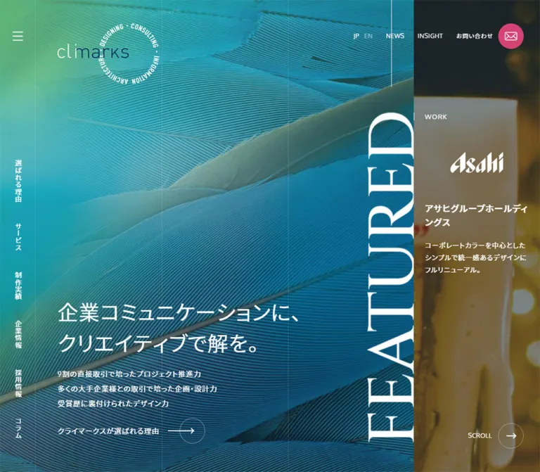
青緑の羽根写真に細い罫線と大きなセリフ体を重ね、制作実績を縦長の列で展開するWeb制作会社の公式サイト。スマートフォンでは実績を縦積み、サービスを2列に再構成。
Climarks — Style Reference
A corporate portfolio arranged as tall photographic columns across an electric blue feather, held together by fine rules and a persistent navigation spine.
Website / original URL: www.climarks.com
Final URL: https://www.climarks.com/
Theme: dark slate and blue-green photography, white typography, and a concentrated pink contact accent
Inspected: October 5, 2026, at 06:00 JST; supplied retrieval timestamp: 2026-10-04T21:00:38.872Z
Viewports: desktop 1440 × 1000 CSS pixels; mobile 390 × 844 CSS pixels
Scope: the current corporate homepage, including the opening introduction and work panels, an intermediate desktop service view, desktop and mobile contact/footer views, and supplied DOM evidence for strengths, services, journal entries, news, and navigation. Destination pages and opened menu states were not inspected.
Climarks presents its agency identity through a shared photographic environment rather than separate boxed sections. A close-up blue feather fills the background, with green and cyan toward the upper left and deeper blue through the lower and right areas. Fine vertical rules impose a precise structure over the organic texture. White Japanese sans-serif copy, exceptionally large serif section lettering, restrained outline icons, and a pink envelope button create the main hierarchy.
This is a corporate website and portfolio hub. Work, services, company information, recruitment, editorial content, news, and contact all have explicit navigation routes. On desktop, the homepage content is arranged across a long sequence of viewport-height columns. Mobile changes the reading direction: work becomes a vertical sequence, services become a two-column grid, and contact precedes the company footer. The narrow left navigation rail remains visible in both formats.
閉じる
Climarks — Style Reference
A corporate portfolio arranged as tall photographic columns across an electric blue feather, held together by fine rules and a persistent navigation spine.
Website / original URL: www.climarks.com
Final URL: https://www.climarks.com/
Theme: dark slate and blue-green photography, white typography, and a concentrated pink contact accent
Inspected: October 5, 2026, at 06:00 JST; supplied retrieval timestamp: 2026-10-04T21:00:38.872Z
Viewports: desktop 1440 × 1000 CSS pixels; mobile 390 × 844 CSS pixels
Scope: the current corporate homepage, including the opening introduction and work panels, an intermediate desktop service view, desktop and mobile contact/footer views, and supplied DOM evidence for strengths, services, journal entries, news, and navigation. Destination pages and opened menu states were not inspected.
Climarks presents its agency identity through a shared photographic environment rather than separate boxed sections. A close-up blue feather fills the background, with green and cyan toward the upper left and deeper blue through the lower and right areas. Fine vertical rules impose a precise structure over the organic texture. White Japanese sans-serif copy, exceptionally large serif section lettering, restrained outline icons, and a pink envelope button create the main hierarchy.
This is a corporate website and portfolio hub. Work, services, company information, recruitment, editorial content, news, and contact all have explicit navigation routes. On desktop, the homepage content is arranged across a long sequence of viewport-height columns. Mobile changes the reading direction: work becomes a vertical sequence, services become a two-column grid, and contact precedes the company footer. The narrow left navigation rail remains visible in both formats.
How to Read This Reference
- Measured means a value appears directly in the supplied rendered DOM or computed-style evidence. Measurements belong to the stated viewport and capture state.
- Calculated means arithmetic based on those measurements, such as the width of one desktop column.
- Estimated means a visual approximation from the current-page screenshots. Exact photo colors, overlay opacity, and uncaptured display-font styles fall into this category.
- Recommended means an implementation choice for a new build. The CSS adaptation and its breakpoint are recommendations, not recovered source code.
- All custom-property names below are descriptive aliases. The supplied custom-property extraction was empty; it does not establish an original token naming system.
- DOM presence does not prove visibility or interaction. In particular, menu content and repeated section-title text exist in the evidence without an exercised open-menu or animation sequence.
Tokens — Colors
Default Palette
| Name | Value | Evidence | Suggested token | Role |
|---|---|---|---|---|
| Deep Slate | #233036 |
Measured: body background rgb(35, 48, 54) |
--color-slate |
Base canvas; visually consistent with the terminal company/footer surface |
| Reversed White | #ffffff |
Measured on headings, rail links, service labels, and work links | --color-white |
Main copy over imagery, navigation, icons, and client marks |
| Contact Pink | #d44373 |
Measured: contact-circle background rgb(212, 67, 115) |
--color-contact |
Persistent envelope button; visually repeated in the hotline and contact pill |
| Link Teal | #1c89a6 |
Measured on several general anchor elements | --color-link |
Base anchor color; visible navigation often overrides it to white |
| Base Muted Gray | #686f75 |
Measured: body foreground rgb(104, 111, 117) |
--color-muted-source |
Inherited base text color; not proof of the final footer paragraph color |
| Soft Footer Gray | Approximately #a3adb0 |
Estimated from the footer captures | --color-muted |
Address, company description, hours, legal links, and copyright |
| Raised Contact Slate | Approximately #344147 |
Estimated from the mobile contact capture | --color-contact-surface |
The contact area above the darker mobile company footer |
| Fine White Rule | Suggested rgba(255, 255, 255, 0.10) |
Recommended approximation of visible rules | --color-rule |
Column guides and subtle boundaries |
The photograph supplies most of the blue, turquoise, and green. These are image colors, not evidence of several independent section background tokens. Keep the feather texture as an image; a cyan-to-green gradient alone loses its tightly spaced barbs and diagonal shafts.
The pink accent is unusually concentrated. It identifies contact at the top right and again near the end of the page. Service icons, work labels, and ordinary navigation remain white. Avoid distributing the accent across every component.
Overlay Treatment
Work photographs are visibly darkened or subdued so white text and client logos can sit directly over them. The supplied styles do not expose the responsible overlay, filter, or opacity. A slate scrim around 45–60% opacity is a reasonable starting recommendation, but must be adjusted against each image and checked for text contrast.
No selectable theme or alternate color scheme was demonstrated.
Tokens — Typography
Main Interface — Oxygen and Noto Sans JP
Measured family declaration: Oxygen, 'Noto Sans JP', sans-serif.
This stack appears on the body, Japanese introduction, navigation, service labels, and sampled work elements. It supports a light, open interface: the main Japanese headline uses weight 400, not a heavy promotional weight. Body copy uses generous double leading.
The declaration identifies the requested font stack, not the particular font file that rendered each glyph. No font-loading trace was supplied.
Display Lettering — Serif Appearance, Unverified Family
The enormous STRATEGY & DESIGN lettering and desktop CONTACT heading visibly use a contrasting serif treatment. The hotline is also serif and appears italic.
The sampled H2 wrapper reports the inherited sans-serif stack at a small size, while its visible contents are much larger and serif. That wrapper measurement does not identify the display typography. Child styles, graphics, or pseudo-elements were not supplied. Do not attribute the display face to Times merely because the root HTML element reports Times.
For an adaptation, Georgia, 'Times New Roman', serif is an explicit fallback recommendation. Replace it with the verified original display asset or font if separately available.
Type Scale
Sizes and line heights below are measured unless marked estimated.
| Role | Desktop size / line height | Mobile size / line height | Weight and interpretation |
|---|---|---|---|
| Base body and introduction paragraph | 16.28px / 32.56px |
13.712px / 27.424px |
400; line height 2 |
| Main Japanese headline | 37.316px / 55.974px |
25.35px / 38.025px |
400; line height 1.5 |
| Vertical rail links | 14.245px / 70px |
11.998px / 50px |
400; the large line box aligns text across the rail width |
| Top utility links | 12.21px / 20px |
11.998px / 20px in menu DOM |
400; the mobile utility row is not visible in the closed header |
| Work/service eyebrow | 14.245px / 25.641px |
11.998px / 21.5964px |
400; approximately 1.8 leading |
| Service title | 18.3964px / 27.5946px |
15.426px / 23.139px |
400; line height 1.5 |
| Testimonial lead | 18.3964px / 33.1135px |
15.426px / 27.7668px |
400; approximately 1.8 leading |
| Work client heading | Approximately 18–19px |
Approximately 15–16px |
Visibly bold; exact heading style was not included |
| Large section lettering | Approximately 120–140px before rotation |
Approximately 50–54px |
Estimated; serif, uppercase, deliberately clipped |
| Desktop CONTACT heading | Approximately 88–92px |
Not visible in the supplied terminal mobile crop | Estimated; low-contrast serif |
| Hotline | Approximately 42–44px |
Approximately 35–37px |
Estimated; pink italic serif |
Tracking
The body reports 0.814px letter spacing on desktop and 0.6856px on mobile. Both equal 0.05 × the respective base font size. The headline inherits those same pixel values.
For reproduction, anchor tracking to the body token. Applying 0.05em independently to a 37.316px headline would produce about 1.866px tracking and noticeably change its appearance.
Logo Typography
Treat the wordmark, anniversary numeral, and circular anniversary lettering as identity assets. Their appearance is not evidence that the site body uses a matching logo font. The desktop anniversary ring is visible around a central 20th; the mobile opening shows the small 20th beside the wordmark without the surrounding ring.
Tokens — Spacing & Shapes
Structural Grid
At the inspected desktop width:
Viewport width:      1440px
Left rail:             70px
Remaining width:     1370px
One grid interval:   1370 / 6 = 228.333px
The measured work-panel width is 228.328125px, reflecting browser rounding. Initial panel edges occur at approximately 754.98, 983.31, and 1211.64px.
The introduction occupies the first three intervals of the content area visually. Its copy extends into the third interval, while the oversized rotated title sits along the introduction's trailing edge. This is not a rigid arrangement of two isolated text columns followed by an unrelated title card.
Spacing Scale
| Use | Desktop | Mobile | Status |
|---|---|---|---|
| Navigation rail | 70px |
50px |
Measured |
| Major text inset from rail | 57.6px |
19.5px |
Measured; equal to 4vw and 5vw at these viewports |
| Work/service horizontal inset | 28.8px |
Commonly 19.5px |
Measured |
| Main heading to paragraph | 20px |
Approximately 16.88px |
Calculated from element rectangles |
| Desktop content start inside tall work panels | 230px from top |
Replaced by compact row layout | Measured padding |
| Service eyebrow to icon box | 10px |
Positioning differs by component | Measured desktop relationship |
| Work eyebrow to logo box | 30px |
Logo moves beside the description | Measured desktop relationship |
| Work logo box height | 100px |
First work logo wrapper approximately 50.14px high |
Measured; wrapper is not necessarily artwork size |
| Inter-item rail gap | Approximately 42px |
Approximately 35.44px |
Calculated; both happen to equal 4.2vh at the sampled sizes |
| Introduction paragraph bottom clearance | 60px |
Content continues into section lettering | Calculated desktop value |
These viewport equivalences are useful for an adaptation but do not establish the original responsive formulas.
Shapes
| Element | Geometry | Evidence |
|---|---|---|
| Work panels | Full-height, square-edged columns | Measured 228.33 × 1000px on desktop |
| Service cells | Unboxed rectangular regions | Desktop visual capture and DOM |
| Contact envelope | 50 × 50px, 50% radius |
Measured at both viewports |
| Desktop menu button | 70 × 50px |
Measured |
| Mobile menu button | Measured 70 × 50px, starting at x = -10px |
Its visible rail remains 50px; this overflow is not a recommended hit-area model |
| Contact pill | About 341 × 56px desktop; 301 × 52px mobile |
Estimated from screenshots |
| Footer social/return controls | About 50 × 50px, thin circular outline |
Visually observed; mobile top-link box also measured |
| Column guides | Approximately 1px, low contrast |
Visual estimate |
There is no visible card-shadow system. Reserve rounding for contact controls and circular utility buttons; keep content regions square.
Components
Persistent Navigation Rail
Role: a compact site-wide navigation spine that leaves most of the viewport for imagery.
A narrow strip at the far left contains a three-line menu icon near the top and vertically written Japanese links through the lower portion. The observed labels are 選ばれる理由, サービス, 実績, 企業情報, 採用情報, and コラム.
On desktop the rail is 70px wide. Its first link begins around y = 373.73px, and the last ends at 930px. Mobile reduces the rail to 50px; the first link begins around 324.63px, and the last ends near 793.38px. The background feather remains visible through the rail even beside the solid terminal footer.
The links point to distinct site URLs such as /strength/, /service/, and /portfolio/. Do not reinterpret them as verified same-page scroll controls.
Identity and Utility Header
Role: brand recognition and immediate access to language, editorial, and contact routes.
The desktop wordmark container is 140 × 28px at approximately (127.59, 90). A 120 × 120px anniversary ring sits at approximately (279.59, 50). Utility links appear at y = 65px: JP, EN, NEWS, INSIGHT, and お問い合わせ.
The pink envelope is a separate circular link, positioned at approximately (1363.61, 50). Its white envelope drawing is fine and geometric; the circle is the visual emphasis.
On mobile, the wordmark container becomes 100 × 28px at (69.5, 28), with the small anniversary mark alongside it. The envelope remains 50px in diameter at approximately (328.31, 15). The desktop utility row is absent from the closed mobile header. In the final mobile capture the menu and envelope remain visible, while the opening wordmark is no longer in view.
Expanded Navigation Structure
Role: access to a much broader corporate information architecture.
The DOM contains primary groups for strengths, services, work, company information, recruitment, and journal content. Services include nested website categories, marketing, branding, graphics, video, content, and translation.
Desktop primary menu anchors have measured boxes around 456.66 × 120px. Mobile primary rows measure 340 × 80px; several include buttons labeled 開く. These support a multi-level navigation design, but no supplied screenshot shows the menu open. Its final background, focus behavior, expansion sequence, and scrolling must remain unverified.
Do not reproduce overlapping or unusually narrow hidden submenu rectangles as intended visible layout. They are measurements of an unexercised state.
Opening Introduction
Role: position the company around strategy and design while immediately exposing client work.
The current headline is 戦略も強い、デザインも強い Web制作会社. It is white, regular-weight Japanese sans-serif, broken across two lines in the captured views. A single explanatory paragraph sits beneath it; there is no large filled hero CTA in the supplied opening view.
Desktop copy is low in the composition. The headline rectangle begins at (127.59, 677.81) and measures approximately 466.44 × 111.94px. The paragraph begins at y = 809.75px, occupies the same width, and ends at 940px. The broad empty photographic area above is intentional.
On mobile, the headline begins at (69.5, 333.38) and the paragraph at (69.5, 426.28). The paragraph width is approximately 304.19px. This preserves a substantial photographic opening without forcing the hero to consume the entire phone viewport. The first work panel starts near y = 675.89px.
Oversized Section Lettering
Role: identify transitions and give the otherwise quiet grid an editorial scale.
The desktop opening places huge white serif STRATEGY & DESIGN lettering along a vertical edge, with words extending beyond the visible bounds. On mobile, the visible lettering runs horizontally above the work sequence and is clipped at the right edge.
The DOM repeats each main section name six times, including STRATEGY & DESIGN, STRENGTH, SERVICE, JOURNAL, and NEWS. Repetition may support a moving treatment, but the evidence does not establish its timing or direction. A static clipped treatment is safer than inventing a marquee specification.
For a new implementation, expose one semantic section heading and hide purely decorative repeated copies from assistive technology.
Work Panel
Role: combine client recognition, project context, and a detail-page link within one photographic target.
The initial desktop view contains panels for 王子ホールディングス, 横浜銀行, and J-POWERハイテック. Each panel is a full-height anchor with a project image behind a darkened treatment.
The desktop anatomy is:
- Small
実績eyebrow at230pxfrom the top. - Client-logo wrapper beginning around
285.64px, with100pxheight. - Bold client name below the logo region.
- A narrow, multiline project description.
- A detail affordance represented in the DOM by
詳細を見る.
Use approximately 28.8px horizontal inset, leaving roughly 170.73px for text inside a 228.33px column. The narrow measure is part of the composition; Japanese descriptions form tall text blocks rather than short card summaries.
The entire first panel links to /portfolio/web/ojiholdings.html. Other work panels likewise have concrete project URLs. The supplied capture does not establish a visible hover reveal for the detail affordance, even though its element exists.
Mobile reassembles the same material. The work panels span about 341px from x = 49px; a category label sits near the top left, a compact client-logo region occupies the left portion, and the heading/description sit to its right. The first three measured heights are approximately 253.52, 276.66, and 276.66px. Heights vary with content.
Strength Statements
Role: explain the company's strategic, design, team, and corporate-site capabilities.
The DOM contains four numbered entries, STRENGTH - 01 through STRENGTH - 04, each followed by a heading and explanatory copy. Desktop eyebrow boxes use the same 228.33px column width and 230px top alignment as nearby content. Mobile entries occur sequentially down the page.
No dedicated strength screenshot was supplied. Preserve the verified numbering, text hierarchy, and shared grid vocabulary, but do not invent illustrations, counters, cards, or special animation for this section.
Service Tile Matrix
Role: make a broad service offering scannable through consistent icon-and-title units.
Sixteen service links are present. The desktop structure uses eight vertical pairs distributed horizontally; the supplied intermediate screenshot shows only part of that wider sequence. Each visible unit contains a small SERVICE eyebrow, a white outline icon, and a Japanese service title. There is no filled tile background, raised border, or shadow.
At the measured desktop state, upper service anchors are 615px tall with 230px top padding; lower anchors begin at 615px and are 385px tall. This gives the two content rows an equal 385px rhythm below the shared top clearance. Icon wrappers are 100px high.
Icons depict service concepts through fine outlines: laptops, a storefront, a chart, a camera, documents, books, and a globe. Their consistent stroke character matters more than adopting a particular icon library, which was not identified.
The mobile DOM establishes a two-column matrix of 170.5 × 200px tiles. Each tile keeps its eyebrow, icon, and title; longer service names wrap over multiple lines. This mobile service layout is measured from DOM evidence, not separately pictured in the supplied mobile screenshots.
Journal, News, and Section Index Links
Role: extend the homepage beyond the portfolio into ongoing editorial and company activity.
The DOM includes six journal entries and six news entries, followed by links to their respective indexes. Entry anatomy includes an uppercase category, date, Japanese title, and a detail affordance. The first measured mobile journal link is 341 × 200px.
Section index links such as 制作実績一覧 and サービス一覧 occupy full columns on desktop. On mobile, sampled index links are 341 × 190px, with a 50px text line and 70px top/bottom padding.
No supplied screenshot shows the journal or news visual surfaces. Do not assume they share the work photography or assign new thumbnail treatments without evidence.
Contact Area
Role: provide a strong terminal contact destination while maintaining access through the persistent envelope.
Desktop contact sits to the right of the company information on a large slate field. A low-contrast serif CONTACT heading is paired with a thin horizontal line. Below it, the pink italic phone number 03-6773-5445 appears above the office-hours line, while a wide pink pill labeled お問い合わせ sits to the right.
In the terminal mobile crop, the phone number, hours, and approximately 301 × 52px contact pill stack vertically on a slightly lighter slate surface. The company block follows below. The top of this capture cuts into the contact region; its visible 245px height is not a measurement of the entire contact section.
The contact link destination /contact/ is verified. A telephone link was not established by the supplied link list; implementing a tel: action is a recommendation.
Company Footer and Utility Circles
Role: identify the operator and close the page with practical company and legal information.
The original footer names 株式会社クライマークス and provides a Ginza address, a company description, site-information links, and copyright. On desktop, the company content begins around x = 128px and remains in a relatively narrow left column while contact occupies the larger right region. Fine vertical guides continue across the slate surface.
On mobile, the company block has approximately 19.5–20px internal side insets after the rail. Legal links and a two-line copyright statement appear below the company description. Circular note, X, and upward-arrow controls sit near the lower right. The note and X destinations are supported by the original-page link evidence.
The mobile upward-arrow link points to #wrapper and is labeled このページの先頭へ. Desktop captures show a left-facing return arrow; its exact action was not recorded.
Tokens — Motion & Interaction
Measured Declarations
These are computed declarations, not proof that every corresponding transition was triggered during inspection.
| Element or treatment | Recorded value | Interpretation and limit |
|---|---|---|
| Many navigation and content links | color 0.2s linear |
Short color feedback is defined; destination colors were not captured |
| Language links | opacity 0.2s linear |
Opacity feedback is defined |
| Pink envelope | background-color 0.2s linear |
Background-color feedback is defined; hover color unknown |
| Desktop submenu links | background-color 0.2s linear 0.1s |
Delayed background response in menu-related styles |
| Desktop submenu padding | padding 0.3s cubic-bezier(0, 0.6, 0.4, 1) 0.1s |
A short padding change is defined; its final amount is unknown |
| Mobile submenu buttons | opacity 0.3s linear, transform 0.7s linear |
Defined button transitions; expanded appearance unverified |
| Duplicate desktop identity/menu layers | Zero-duration opacity changes delayed 0.6–0.7s |
Timing coordination exists; this is not a measured fade duration |
| Duplicate mobile identity/menu layers | Zero-duration opacity changes delayed 0.5–0.6s |
Same limitation |
| Mobile page-top wrapper | transform 0.3s ease-out and 0.8s btn-pagetop-fadein |
Named entrance animation is present; keyframes were not supplied |
Spatial Behavior and Unverified Motion
Desktop work and service elements occupy successive offscreen x coordinates while retaining viewport-height geometry. The supplied captures show different positions along this sequence. Together with the reported 11,573px desktop document height, this is consistent with a vertically driven horizontal presentation, but the evidence does not expose its scroll controller or input mapping.
Do not claim a particular wheel multiplier, easing curve, snap interval, drag interaction, or animation library. Generic capture notes about accepting settled snap positions do not prove this site uses CSS scroll snapping.
The anniversary ring appears at different orientations across desktop captures. This is compatible with rotation, but no duration, direction, or keyframe definition is available. Repeated section text similarly suggests a possible moving treatment without establishing one.
Several sampled parents report animation: none. This does not rule out animation on descendants, pseudo-elements, or through JavaScript. The feather's own motion, any project-video playback, and reduced-motion support remain unverified.
Surfaces
| Layer | Appearance | Purpose |
|---|---|---|
| Global photographic field | Detailed blue-green feather | Shared atmosphere and continuity through the opening and service views |
| Navigation rail | Transparent photographic strip with a fine right edge | Persistent orientation without a solid sidebar slab |
| Work panels | Edge-to-edge client photography with darkening | Client identity and readable white project information |
| Service field | Shared feather with outline icons and fine guides | Service breadth without a wall of boxes |
| Terminal company surface | Solid deep slate | Calm, practical finish and company information |
| Mobile contact surface | Slightly lighter slate | Separates the stacked contact block from the company footer |
| Primary action | Solid pink circle or pill | Contact emphasis |
| Secondary utility | Transparent circular outline | Social and return controls |
Depth comes from image layering, opacity, and strong changes in content scale. Soft shadows, glass blur, and floating white cards are not part of the observed design.
Imagery
Feather Environment
The defining image is a close-up feather with diagonal shafts and dense parallel barbs. Its fine texture contrasts with the straight vertical guide system. Green illumination near the upper left moves through turquoise into deep blue, with darker diagonal strands adding depth.
Desktop uses a broad crop across the introduction and service environment. Mobile retains recognizable feather detail but crops it tightly behind the narrower content area and persistent rail. Preserve the image's direction and detailed texture; stretching a small thumbnail or replacing it with an abstract gradient will not reproduce the result.
The exact background-sizing rule and attachment behavior were not supplied. Separate desktop and mobile focal-point tuning is a recommended implementation step.
Project Photography and Marks
The initial current-page work panels show a glass vessel with natural material for the first project, a large tilted phone for the bank project, and infrastructure/building imagery for the third. Each is cropped into a narrow portrait strip on desktop. Client marks appear in white above the explanatory text.
On mobile, project imagery remains a background, while the logo and text form a compact row. Do not crop client marks as if they were photographs; use object-fit: contain for logos and cover for photographic backgrounds.
Observed Asset References
No asset src values or CSS image URLs were provided. The references below describe observed assets without inventing paths.
| Asset | Current-page evidence | Handling guidance |
|---|---|---|
| Blue-green feather photograph | Desktop opening/services and both mobile captures | Use an authorized high-resolution image; tune crops per viewport |
| Main wordmark | Desktop header and mobile opening | Preserve supplied identity artwork and its color variants |
| Anniversary ring and numeral | Desktop ring; compact mobile numeral | Treat as identity artwork rather than generic text decoration |
| Client photography | Initial three work panels | Use project-specific focal points under a tested text scrim |
| Client logos | Work-panel logo regions | Contain within the available slot; preserve aspect ratio |
| Service pictograms | Desktop service capture | Consistent thin white strokes and generous surrounding space |
| Envelope and utility icons | Header and footer captures | Fine white linework inside circular controls |
Layout & Responsive Behavior
Desktop — 1440 × 1000
The left rail reserves 70px, leaving six equal grid intervals. The opening photographic introduction occupies approximately three intervals, and three work columns fill the remainder of the first viewport. Additional work, strengths, services, journal, and news content continues horizontally outside that viewport.
The service screenshot is an intermediate track position: its leftmost tile is partly concealed by the rail, and the guide lines have shifted relative to their opening positions. Do not reinterpret this crop as a separate centered six-card layout. The underlying service sequence is wider than the screen.
Desktop MAIN reports zero height in the initial sample even though its descendants are visible and the document has substantial scroll extent. This is evidence of specialized positioning, not an empty page. Reconstruct the visible geometry rather than copying zero-height parent behavior without its controller.
Mobile — 390 × 844
The rail becomes 50px wide. Much of the content begins at x = 49px with a 341px width, creating a one-pixel overlap with the rail boundary. A new implementation can use a clean 50px offset; reproducing this seam overlap is optional.
The mobile reading order is vertical: introduction, work, strengths, services, journal, news, contact, and company information. The reported document height is approximately 10,072px.
Key transformations are:
- Work columns become full-width, content-height rows.
- Oversized section lettering becomes horizontal and remains clipped decoratively.
- Services become two columns, each approximately
170.5pxwide and200pxtall. - Desktop utilities leave the closed top header; the envelope remains prominent.
- The anniversary ring becomes a compact inline anniversary mark.
- Contact and company information stack, with contact first.
- The final return affordance points upward and has a verified page-top anchor.
Breakpoints and Intermediate Sizes
Only the two stated viewports were inspected. The original breakpoint, tablet arrangement, landscape-phone behavior, and height-based adjustments are unknown. The Quick Start uses 1024px as an explicit adaptation breakpoint, not as a source finding.
At narrow widths or large text settings, prioritize complete labels and reachable content over exact captured heights. The persistent rail, fixed envelope, and large hotline require collision checks, particularly near the top of the mobile contact area.
Do’s and Don’ts
Do
- Build the composition around the feather photograph, the persistent rail, and repeated vertical intervals.
- Keep the slate
#233036and contact pink#d44373exact where measured. - Preserve the quiet regular-weight Japanese headline and generous body leading.
- Contrast interface sans-serif with enormous serif section lettering.
- Let work photography reach panel edges and keep client marks white and legible.
- Use one large anchor for each project or service unit.
- Maintain thin white service pictograms and subtle guide lines.
- Preserve the large photographic breathing space above the introduction.
- Change work into vertical rows and services into a two-column grid on mobile.
- Keep ordinary navigation and content monochrome so contact retains its distinct pink emphasis.
Don’t
- Don’t turn this corporate homepage into a generic stack of centered marketing sections.
- Don’t replace the feather with a smooth gradient and consider the image treatment complete.
- Don’t convert every service or work item into a rounded, shadowed card.
- Don’t use bold geometric sans-serif for all typography.
- Don’t treat the small computed
H2wrapper style as the giant display lettering's actual font. - Don’t force desktop-height work panels onto mobile.
- Don’t copy hidden-menu rectangles into a visible menu layout.
- Don’t make the rail links perform unverified same-page jumps.
- Don’t infer hover reveals, autoplay video, parallax, or marquee timing from still images.
- Don’t clip essential descriptions merely because the decorative section text is intentionally clipped.
Recommended Implementation Additions
These are recommendations for a new implementation, not verified original features:
- Keep native anchors for work, services, corporate navigation, and contact. Add visible keyboard focus over both photography and slate.
- Provide explicit accessible names for the envelope, social icons, and return controls. Use
aria-expandedandaria-controlson menu disclosure buttons. - Add a skip link and ensure a horizontal desktop presentation remains usable with keyboard navigation, zoom, and assistive technology.
- If implementing a scroll-driven horizontal track, move focused content into view and provide a normal-flow fallback when the controller is unavailable.
- Hide decorative repeated section lettering from assistive technology while retaining one meaningful heading.
- Check white text against each photographic crop. Tune scrims per project instead of trusting one opacity globally.
- Allow contact numbers and long service names to fit without colliding with the fixed envelope. Consider a semantic telephone link.
- Provide static or reduced-motion alternatives for any ring rotation, scrolling text, and scroll interpolation added later.
- Prefer complete, readable content at enlarged text sizes over fixed
200pxtile heights. - Reserve high-resolution assets and explicit image dimensions to avoid soft backgrounds and late layout shifts.
Agent Prompt Guide
Quick Color Reference
- Base slate:
#233036. - Main text and line icons:
#ffffff. - Contact circle and pill:
#d44373. - Base link teal:
#1c89a6; do not apply it indiscriminately to white navigation. - Muted footer copy: visually around
#a3adb0, an estimate. - Rules: a low-opacity white, approximately
10%as an implementation starting point. - Background color variation: supplied by feather photography, not a collection of colored card fills.
Overall Prompt
“Create a Japanese corporate agency homepage inspired by the current Climarks composition. Use a detailed blue-green feather photograph as a continuous environment, a deep slate terminal footer, white typography, and contact pink #d44373. Reserve a persistent 70px left navigation rail on desktop and 50px on mobile. Arrange desktop content across equal 228px-like intervals, with a broad introductory photographic area followed by narrow full-height client-work panels. Place a regular-weight Japanese headline low in the introduction, add enormous clipped serif section lettering, and use Oxygen with Noto Sans JP for interface text. Use thin outline service pictograms and subtle vertical rules. On mobile, stack work into compact rows and present services in two columns. Keep contact available through a 50px pink envelope circle and a wide terminal contact pill. Treat unverified motion as an implementation decision, not a required reconstruction.”
Example Component Prompts
- Work panel: “Create a square-edged portrait project link with a darkened full-bleed photograph, a small white
実績eyebrow, a contained white client logo, a bold Japanese client name, and a narrow multiline description. At desktop scale use a 228px-wide full-height column with about 29px side insets and 230px top clearance. On mobile, move the logo beside the text and let content determine height.” - Service matrix: “Build transparent service tiles over the shared feather photograph. Each has a small uppercase SERVICE label, a fine white outline pictogram, and a regular-weight Japanese title. Use two rows across a desktop horizontal sequence and two columns down the phone layout. Separate tiles with subtle guides, without rounded boxes or shadows.”
- Navigation rail: “Use a slim photographic left rail with a small hamburger at the top and vertically written Japanese navigation below. Keep it 70px wide on desktop and 50px on mobile. Preserve full link hit areas and connect items to their actual destination pages.”
- Contact ending: “Create a deep slate ending with a narrow company-information column and a larger contact region. Use an oversized low-contrast serif CONTACT heading, a pink italic hotline, muted office hours, and a long pink pill. On mobile, place the contact block above company information and finish with outlined circular social and page-top controls.”
- Section lettering: “Use oversized uppercase serif words as clipped editorial dividers. Place them vertically at desktop panel boundaries and horizontally above mobile content. Keep one accessible heading and treat repetitions as decoration. Do not invent continuous animation without a separate motion specification.”
Quick Start
CSS Custom Properties
This is a usable visual adaptation, not the original stylesheet. It keeps a conventional root font size and uses the measured values as explicit tokens. Desktop uses a native horizontal scroll container; mobile returns to normal vertical document flow. The original scroll controller, menu logic, and decorative animation are not reproduced.
Set --feather-image to an authorized image URL and set --work-image per project. No original asset paths were supplied. The serif fallback, scrim, muted footer color, and 1024px breakpoint are recommendations.
Expected structure: .viewport > .track contains .intro, project .work-panel links, .service-grid, and .closing. Each work link contains .work-label, .work-logo, and .work-copy. The closing region contains .company-block, .contact-block, and .footer-bar. Header and rail elements sit outside the scroll container.
:root {
  /* Measured colors */
  --color-slate: #233036;
  --color-white: #fff;
  --color-contact: #d44373;
  --color-link: #1c89a6;
  --color-muted-source: #686f75;

  /* Estimated or recommended visual values */
  --color-muted: #a3adb0;
  --color-contact-surface: #344147;
  --color-rule: rgb(255 255 255 / 0.10);
  --work-scrim: rgb(35 48 54 / 0.52);
  --font-display: Georgia, 'Times New Roman', serif;
  --feather-image: none;

  /* Measured interface stack and desktop scale */
  --font-ui: Oxygen, 'Noto Sans JP', sans-serif;
  --text-body: 16.28px;
  --text-hero: 37.316px;
  --text-label: 14.245px;
  --text-service: 18.3964px;
  --text-utility: 12.21px;
  --tracking: 0.814px;

  /* Geometry derived from the desktop capture */
  --rail: 70px;
  --column: calc((100vw - var(--rail)) / 6);
  --major-inset: 4vw;
  --panel-inset: 2vw;
  --panel-top: 230px;
  --control: 50px;
  --feedback: 200ms linear;
}

* { box-sizing: border-box; }
body {
  margin: 0;
  color: var(--color-white);
  background: var(--color-slate);
  font-family: var(--font-ui);
  font-size: var(--text-body);
  line-height: 2;
  letter-spacing: var(--tracking);
}
a { color: inherit; }
button { font: inherit; }

.site-backdrop {
  position: fixed;
  inset: 0;
  z-index: -1;
  background-color: var(--color-link);
  background-image: var(--feather-image);
  background-position: center;
  background-size: cover;
}
.site-rail {
  position: fixed;
  inset: 0 auto 0 0;
  z-index: 20;
  width: var(--rail);
  border-right: 1px solid var(--color-rule);
}
.menu-toggle {
  position: absolute;
  top: 50px;
  width: 100%;
  height: var(--control);
  border: 0;
  color: var(--color-white);
  background: transparent;
  cursor: pointer;
}
.rail-nav {
  position: absolute;
  inset: auto 0 70px;
  display: flex;
  flex-direction: column;
  gap: 4.2vh;
}
.rail-nav a {
  align-self: center;
  writing-mode: vertical-rl;
  font-size: var(--text-label);
  line-height: var(--rail);
  text-decoration: none;
}
.brand {
  position: fixed;
  z-index: 20;
  top: 90px;
  left: calc(var(--rail) + var(--major-inset));
  width: 140px;
}
.brand img { display: block; width: 100%; height: auto; }
.utility-nav {
  position: fixed;
  z-index: 20;
  top: 65px;
  right: 6vw;
  display: flex;
  align-items: center;
  gap: 34px;
  font-size: var(--text-utility);
  line-height: 20px;
}
.utility-nav a { text-decoration: none; }
.contact-orb {
  position: fixed;
  z-index: 30;
  top: 50px;
  right: 1.8333vw;
  display: grid;
  place-items: center;
  width: var(--control);
  height: var(--control);
  border-radius: 50%;
  background: var(--color-contact);
  color: var(--color-white);
}
.contact-orb svg { width: 24px; height: 24px; }

/* Native scrolling is an adaptation, not the source controller. */
.viewport {
  width: calc(100% - var(--rail));
  height: 100svh;
  margin-left: var(--rail);
  overflow-x: auto;
  overflow-y: hidden;
}
.track {
  position: relative;
  display: flex;
  width: max-content;
  min-height: 100%;
  align-items: stretch;
}
.track::after {
  content: '';
  position: absolute;
  inset: 0;
  z-index: 5;
  pointer-events: none;
  background-image: linear-gradient(
    to right, var(--color-rule) 1px, transparent 1px
  );
  background-size: var(--column) 100%;
}
.intro {
  position: relative;
  flex: 0 0 calc(3 * var(--column));
  width: calc(3 * var(--column));
  min-height: 100svh;
  display: flex;
  align-items: flex-end;
  padding: 200px var(--major-inset) 60px;
}
.intro__copy { width: min(32.39vw, 100%); }
.intro h1 {
  margin: 0 0 20px;
  font-size: var(--text-hero);
  font-weight: 400;
  line-height: 1.5;
}
.intro p { margin: 0; }
.intro__word {
  position: absolute;
  top: 0;
  right: 0;
  bottom: 0;
  width: 110px;
  margin: 0;
  overflow: hidden;
  writing-mode: vertical-rl;
  transform: rotate(180deg);
  font-family: var(--font-display);
  font-size: 136px;
  font-weight: 400;
  line-height: 1;
  white-space: nowrap;
  pointer-events: none;
}

.work-panel {
  --work-image: none;
  flex: 0 0 var(--column);
  width: var(--column);
  min-height: 100svh;
  padding: var(--panel-top) var(--panel-inset) 40px;
  background-image:
    linear-gradient(var(--work-scrim), var(--work-scrim)),
    var(--work-image);
  background-size: cover;
  background-position: center;
  color: var(--color-white);
  text-decoration: none;
}
.work-label,
.service-label {
  margin: 0;
  font-size: var(--text-label);
  line-height: 1.8;
}
.work-logo {
  display: grid;
  place-items: center;
  height: 100px;
  margin: 30px 0;
}
.work-logo img {
  width: 100%;
  height: 100%;
  object-fit: contain;
}
.work-copy h3 {
  margin: 0 0 16px;
  font-size: var(--text-service);
  line-height: 1.5;
}
.work-copy p {
  margin: 0;
  font-size: var(--text-label);
  line-height: 1.8;
}

.service-grid {
  flex: 0 0 calc(8 * var(--column));
  display: grid;
  grid-template-columns: repeat(8, var(--column));
  grid-template-rows: repeat(2, minmax(0, 1fr));
  grid-auto-flow: column;
  height: 100svh;
  padding-top: var(--panel-top);
}
.service-tile {
  min-width: 0;
  padding-inline: var(--panel-inset);
  color: var(--color-white);
  text-decoration: none;
}
.service-icon {
  display: grid;
  place-items: center;
  height: 100px;
  margin-top: 10px;
}
.service-icon :is(img, svg) {
  width: 80px;
  height: 80px;
  object-fit: contain;
}
.service-title {
  margin: 0;
  font-size: var(--text-service);
  font-weight: 400;
  line-height: 1.5;
  overflow-wrap: anywhere;
}

.closing {
  flex: 0 0 calc(100vw - var(--rail));
  width: calc(100vw - var(--rail));
  min-height: 100svh;
  display: grid;
  grid-template-columns: 1fr 2fr;
  align-content: space-between;
  gap: 60px 6vw;
  padding: 230px var(--major-inset) 60px;
  background: var(--color-slate);
}
.company-block { color: var(--color-muted); font-size: 14px; }
.company-block h2 { color: white; font-size: 16px; }
.contact-block {
  display: grid;
  grid-template-columns: repeat(2, minmax(0, 1fr));
  align-content: start;
  align-items: center;
  gap: 50px 4vw;
}
.contact-title {
  grid-column: 1 / -1;
  margin: 0;
  color: rgb(255 255 255 / 0.12);
  font: 400 90px / 1 var(--font-display);
  letter-spacing: 0;
}
.contact-phone {
  color: var(--color-contact);
  font: italic 400 clamp(28px, 3vw, 44px) / 1.2 var(--font-display);
  white-space: nowrap;
  letter-spacing: 0;
}
.contact-hours {
  margin: 10px 0 0;
  color: var(--color-muted);
  text-align: center;
}
.contact-pill {
  display: grid;
  place-items: center;
  min-height: 56px;
  padding: 12px 24px;
  border-radius: 999px;
  background: var(--color-contact);
  color: white;
  text-decoration: none;
}
.footer-bar {
  grid-column: 1 / -1;
  display: flex;
  flex-wrap: wrap;
  align-items: center;
  justify-content: space-between;
  gap: 24px;
  color: var(--color-muted);
  font-size: 12px;
}
.footer-controls { display: flex; gap: 15px; }
.circle-control {
  display: grid;
  place-items: center;
  width: 50px;
  height: 50px;
  border: 1px solid rgb(255 255 255 / 0.35);
  border-radius: 50%;
  color: white;
  text-decoration: none;
}

/* Recommended feedback; original final hover colors are unknown. */
a, button { transition: color var(--feedback), opacity var(--feedback); }
:where(a, button):focus-visible {
  outline: 2px solid white;
  outline-offset: 4px;
}
@media (hover: hover) {
  .utility-nav a:hover,
  .rail-nav a:hover { opacity: 0.75; }
}

/* Recommended breakpoint; only 1440px and 390px were inspected. */
@media (max-width: 1023px) {
  :root {
    --rail: 50px;
    --column: calc((100vw - var(--rail)) / 2);
    --major-inset: 5vw;
    --panel-inset: 5vw;
    --text-body: 13.712px;
    --text-hero: 25.35px;
    --text-label: 11.998px;
    --text-service: 15.426px;
    --tracking: 0.6856px;
  }
  .menu-toggle { top: 15px; }
  .rail-nav { bottom: 50px; }
  .brand { position: absolute; top: 28px; width: 100px; }
  .utility-nav { display: none; }
  .contact-orb { top: 15px; right: 3vw; }
  .viewport { height: auto; overflow: visible; }
  .track { display: block; width: 100%; }
  .intro {
    display: block;
    width: 100%;
    min-height: 0;
    padding: 39.5svh 0 0 var(--major-inset);
  }
  .intro__copy { width: 100%; }
  .intro h1 { margin-bottom: 16.88px; }
  .intro p { margin-right: 4vw; }
  .intro__word {
    position: static;
    width: 100%;
    height: 65px;
    margin-top: 20px;
    writing-mode: horizontal-tb;
    transform: none;
    font-size: 52px;
    line-height: 1.25;
  }
  .work-panel {
    display: grid;
    grid-template-columns: 78px minmax(0, 1fr);
    width: 100%;
    min-height: 200px;
    padding: 20px var(--panel-inset);
  }
  .work-label { grid-column: 1 / -1; margin-bottom: 10px; }
  .work-logo { grid-column: 1; grid-row: 2; margin: auto 8px auto 0; height: 65px; }
  .work-copy { grid-column: 2; grid-row: 2; min-width: 0; }
  .work-copy h3 { margin-bottom: 12px; }
  .work-copy p { font-size: var(--text-body); }
  .service-grid {
    grid-template-columns: repeat(2, minmax(0, 1fr));
    grid-template-rows: none;
    grid-auto-flow: row;
    height: auto;
    padding-top: 0;
  }
  .service-tile { min-height: 200px; padding: 20px var(--panel-inset); }
  .service-icon { height: 60px; margin-top: 10px; }
  .service-icon :is(img, svg) { width: 60px; height: 60px; }
  .closing { display: flex; flex-direction: column; width: 100%; gap: 0; padding: 0; }
  .contact-block {
    order: -1;
    display: block;
    padding: 70px var(--major-inset) 60px;
    background: var(--color-contact-surface);
    text-align: center;
  }
  .contact-title { font-size: 52px; margin-bottom: 30px; }
  .contact-phone { font-size: clamp(25px, 9.2vw, 36px); }
  .contact-pill { min-height: 52px; margin-top: 40px; }
  .company-block { padding: 50px var(--major-inset) 30px; font-size: 12px; }
  .footer-bar { padding: 30px var(--major-inset); font-size: 11px; }
  .footer-controls { width: 100%; justify-content: flex-end; margin-top: 30px; }
}

/* Recommended static mode for any motion added to this adaptation. */
@media (prefers-reduced-motion: reduce) {
  .viewport { scroll-behavior: auto; }
  .track *, .site-rail *, .contact-orb { animation: none; transition: none; }
}
Use the project photograph as --work-image and place its client logo inside .work-logo. Keep service items in their semantic source order: the desktop column flow pairs consecutive items vertically, while the mobile row flow places those same items beside one another.
The CSS intentionally leaves menus, social glyphs, anniversary artwork, and complete content markup to the host application. Add menu behavior only with keyboard and focus handling. Do not insert repeated decorative titles as duplicate accessible headings.
Tailwind v4 Token Mapping
Optional aliases for an existing Tailwind v4 project. This does not imply the original site uses Tailwind. Define the variables above first.
@theme inline {
  --color-slate: #233036;
  --color-contact: #d44373;
  --color-link: #1c89a6;
  --color-muted: #a3adb0;
  --color-guide: rgb(255 255 255 / 0.10);
  --font-interface: Oxygen, 'Noto Sans JP', sans-serif;
  --font-editorial: Georgia, 'Times New Roman', serif;
  --text-body: var(--text-body);
  --text-heading: var(--text-hero);
  --text-eyebrow: var(--text-label);
  --text-service-title: var(--text-service);
  --spacing-rail: var(--rail);
  --spacing-column: var(--column);
  --spacing-panel: var(--panel-inset);
  --spacing-control: 50px;
}
Sources & Evidence
- Original and final page: Climarks corporate homepage. Supplied response status:
200; original and final URLs are identical. - Capture timestamp:
2026-10-04T21:00:38.872Z, equivalent to October 5, 2026, 06:00:38.872 JST. - Desktop visual evidence: supplied current-page images 1–3 at
1440 × 1000, covering the opening/work composition, an intermediate service position, and the contact/company ending. - Mobile visual evidence: supplied current-page images 4–5 at
390 × 844, covering the opening/first work panel and the terminal contact/company region. - Rendered evidence: supplied text, link destinations, bounding rectangles, computed colors, font declarations, spacing, radii, transitions, and sampled animation declarations for both viewports. Reported document heights are
11,573pxdesktop and approximately10,072pxmobile. - Capture procedure: the supplied browser process included an initial observation of at least five seconds, bounded checks for layout/text stability and image decoding, and traversal through intermediate scroll positions. Perpetual animations were temporarily paused during readiness checks and resumed afterward. These checks do not establish all delayed content or interaction behavior.
- Identity: the original page title and mobile footer independently identify
株式会社クライマークス. No current-site production-team credit was established from the supplied original-page evidence. - Limitations: no additional browsing or command execution was performed. Original image paths, complete stylesheets, display-font child styles, opened menu states, hover outcomes, destination-page content, video playback, scroll-controller code, and intermediate responsive breakpoints were not available. Service mobile geometry and most strengths/journal/news details are supported by DOM evidence rather than dedicated screenshots.
This reference describes the supplied current homepage state. Measured facts, visual estimates, and implementation recommendations are distinguished throughout.
# Climarks — Style Reference

> A corporate portfolio arranged as tall photographic columns across an electric blue feather, held together by fine rules and a persistent navigation spine.

**Website / original URL:** [www.climarks.com](https://www.climarks.com/)
**Final URL:** [https://www.climarks.com/](https://www.climarks.com/)
**Theme:** dark slate and blue-green photography, white typography, and a concentrated pink contact accent
**Inspected:** October 5, 2026, at 06:00 JST; supplied retrieval timestamp: `2026-10-04T21:00:38.872Z`
**Viewports:** desktop `1440 × 1000` CSS pixels; mobile `390 × 844` CSS pixels
**Scope:** the current corporate homepage, including the opening introduction and work panels, an intermediate desktop service view, desktop and mobile contact/footer views, and supplied DOM evidence for strengths, services, journal entries, news, and navigation. Destination pages and opened menu states were not inspected.

Climarks presents its agency identity through a shared photographic environment rather than separate boxed sections. A close-up blue feather fills the background, with green and cyan toward the upper left and deeper blue through the lower and right areas. Fine vertical rules impose a precise structure over the organic texture. White Japanese sans-serif copy, exceptionally large serif section lettering, restrained outline icons, and a pink envelope button create the main hierarchy.

This is a corporate website and portfolio hub. Work, services, company information, recruitment, editorial content, news, and contact all have explicit navigation routes. On desktop, the homepage content is arranged across a long sequence of viewport-height columns. Mobile changes the reading direction: work becomes a vertical sequence, services become a two-column grid, and contact precedes the company footer. The narrow left navigation rail remains visible in both formats.
閉じる
# Climarks — Style Reference

> A corporate portfolio arranged as tall photographic columns across an electric blue feather, held together by fine rules and a persistent navigation spine.

**Website / original URL:** [www.climarks.com](https://www.climarks.com/)
**Final URL:** [https://www.climarks.com/](https://www.climarks.com/)
**Theme:** dark slate and blue-green photography, white typography, and a concentrated pink contact accent
**Inspected:** October 5, 2026, at 06:00 JST; supplied retrieval timestamp: `2026-10-04T21:00:38.872Z`
**Viewports:** desktop `1440 × 1000` CSS pixels; mobile `390 × 844` CSS pixels
**Scope:** the current corporate homepage, including the opening introduction and work panels, an intermediate desktop service view, desktop and mobile contact/footer views, and supplied DOM evidence for strengths, services, journal entries, news, and navigation. Destination pages and opened menu states were not inspected.

Climarks presents its agency identity through a shared photographic environment rather than separate boxed sections. A close-up blue feather fills the background, with green and cyan toward the upper left and deeper blue through the lower and right areas. Fine vertical rules impose a precise structure over the organic texture. White Japanese sans-serif copy, exceptionally large serif section lettering, restrained outline icons, and a pink envelope button create the main hierarchy.

This is a corporate website and portfolio hub. Work, services, company information, recruitment, editorial content, news, and contact all have explicit navigation routes. On desktop, the homepage content is arranged across a long sequence of viewport-height columns. Mobile changes the reading direction: work becomes a vertical sequence, services become a two-column grid, and contact precedes the company footer. The narrow left navigation rail remains visible in both formats.

## How to Read This Reference

- **Measured** means a value appears directly in the supplied rendered DOM or computed-style evidence. Measurements belong to the stated viewport and capture state.
- **Calculated** means arithmetic based on those measurements, such as the width of one desktop column.
- **Estimated** means a visual approximation from the current-page screenshots. Exact photo colors, overlay opacity, and uncaptured display-font styles fall into this category.
- **Recommended** means an implementation choice for a new build. The CSS adaptation and its breakpoint are recommendations, not recovered source code.
- All custom-property names below are descriptive aliases. The supplied custom-property extraction was empty; it does not establish an original token naming system.
- DOM presence does not prove visibility or interaction. In particular, menu content and repeated section-title text exist in the evidence without an exercised open-menu or animation sequence.

## Tokens — Colors

### Default Palette

| Name | Value | Evidence | Suggested token | Role |
| --- | --- | --- | --- | --- |
| Deep Slate | `#233036` | Measured: body background `rgb(35, 48, 54)` | `--color-slate` | Base canvas; visually consistent with the terminal company/footer surface |
| Reversed White | `#ffffff` | Measured on headings, rail links, service labels, and work links | `--color-white` | Main copy over imagery, navigation, icons, and client marks |
| Contact Pink | `#d44373` | Measured: contact-circle background `rgb(212, 67, 115)` | `--color-contact` | Persistent envelope button; visually repeated in the hotline and contact pill |
| Link Teal | `#1c89a6` | Measured on several general anchor elements | `--color-link` | Base anchor color; visible navigation often overrides it to white |
| Base Muted Gray | `#686f75` | Measured: body foreground `rgb(104, 111, 117)` | `--color-muted-source` | Inherited base text color; not proof of the final footer paragraph color |
| Soft Footer Gray | Approximately `#a3adb0` | Estimated from the footer captures | `--color-muted` | Address, company description, hours, legal links, and copyright |
| Raised Contact Slate | Approximately `#344147` | Estimated from the mobile contact capture | `--color-contact-surface` | The contact area above the darker mobile company footer |
| Fine White Rule | Suggested `rgba(255, 255, 255, 0.10)` | Recommended approximation of visible rules | `--color-rule` | Column guides and subtle boundaries |

The photograph supplies most of the blue, turquoise, and green. These are image colors, not evidence of several independent section background tokens. Keep the feather texture as an image; a cyan-to-green gradient alone loses its tightly spaced barbs and diagonal shafts.

The pink accent is unusually concentrated. It identifies contact at the top right and again near the end of the page. Service icons, work labels, and ordinary navigation remain white. Avoid distributing the accent across every component.

### Overlay Treatment

Work photographs are visibly darkened or subdued so white text and client logos can sit directly over them. The supplied styles do not expose the responsible overlay, filter, or opacity. A slate scrim around `45–60%` opacity is a reasonable starting recommendation, but must be adjusted against each image and checked for text contrast.

No selectable theme or alternate color scheme was demonstrated.

## Tokens — Typography

### Main Interface — Oxygen and Noto Sans JP

**Measured family declaration:** `Oxygen, 'Noto Sans JP', sans-serif`.

This stack appears on the body, Japanese introduction, navigation, service labels, and sampled work elements. It supports a light, open interface: the main Japanese headline uses weight `400`, not a heavy promotional weight. Body copy uses generous double leading.

The declaration identifies the requested font stack, not the particular font file that rendered each glyph. No font-loading trace was supplied.

### Display Lettering — Serif Appearance, Unverified Family

The enormous `STRATEGY & DESIGN` lettering and desktop `CONTACT` heading visibly use a contrasting serif treatment. The hotline is also serif and appears italic.

The sampled `H2` wrapper reports the inherited sans-serif stack at a small size, while its visible contents are much larger and serif. That wrapper measurement does not identify the display typography. Child styles, graphics, or pseudo-elements were not supplied. Do not attribute the display face to Times merely because the root HTML element reports Times.

For an adaptation, `Georgia, 'Times New Roman', serif` is an explicit fallback recommendation. Replace it with the verified original display asset or font if separately available.

### Type Scale

Sizes and line heights below are measured unless marked estimated.

| Role | Desktop size / line height | Mobile size / line height | Weight and interpretation |
| --- | --- | --- | --- |
| Base body and introduction paragraph | `16.28px / 32.56px` | `13.712px / 27.424px` | `400`; line height `2` |
| Main Japanese headline | `37.316px / 55.974px` | `25.35px / 38.025px` | `400`; line height `1.5` |
| Vertical rail links | `14.245px / 70px` | `11.998px / 50px` | `400`; the large line box aligns text across the rail width |
| Top utility links | `12.21px / 20px` | `11.998px / 20px` in menu DOM | `400`; the mobile utility row is not visible in the closed header |
| Work/service eyebrow | `14.245px / 25.641px` | `11.998px / 21.5964px` | `400`; approximately `1.8` leading |
| Service title | `18.3964px / 27.5946px` | `15.426px / 23.139px` | `400`; line height `1.5` |
| Testimonial lead | `18.3964px / 33.1135px` | `15.426px / 27.7668px` | `400`; approximately `1.8` leading |
| Work client heading | Approximately `18–19px` | Approximately `15–16px` | Visibly bold; exact heading style was not included |
| Large section lettering | Approximately `120–140px` before rotation | Approximately `50–54px` | Estimated; serif, uppercase, deliberately clipped |
| Desktop CONTACT heading | Approximately `88–92px` | Not visible in the supplied terminal mobile crop | Estimated; low-contrast serif |
| Hotline | Approximately `42–44px` | Approximately `35–37px` | Estimated; pink italic serif |

### Tracking

The body reports `0.814px` letter spacing on desktop and `0.6856px` on mobile. Both equal `0.05 ×` the respective base font size. The headline inherits those same pixel values.

For reproduction, anchor tracking to the body token. Applying `0.05em` independently to a `37.316px` headline would produce about `1.866px` tracking and noticeably change its appearance.

### Logo Typography

Treat the wordmark, anniversary numeral, and circular anniversary lettering as identity assets. Their appearance is not evidence that the site body uses a matching logo font. The desktop anniversary ring is visible around a central `20th`; the mobile opening shows the small `20th` beside the wordmark without the surrounding ring.

## Tokens — Spacing & Shapes

### Structural Grid

At the inspected desktop width:

```text
Viewport width:      1440px
Left rail:             70px
Remaining width:     1370px
One grid interval:   1370 / 6 = 228.333px
```

The measured work-panel width is `228.328125px`, reflecting browser rounding. Initial panel edges occur at approximately `754.98`, `983.31`, and `1211.64px`.

The introduction occupies the first three intervals of the content area visually. Its copy extends into the third interval, while the oversized rotated title sits along the introduction's trailing edge. This is not a rigid arrangement of two isolated text columns followed by an unrelated title card.

### Spacing Scale

| Use | Desktop | Mobile | Status |
| --- | --- | --- | --- |
| Navigation rail | `70px` | `50px` | Measured |
| Major text inset from rail | `57.6px` | `19.5px` | Measured; equal to `4vw` and `5vw` at these viewports |
| Work/service horizontal inset | `28.8px` | Commonly `19.5px` | Measured |
| Main heading to paragraph | `20px` | Approximately `16.88px` | Calculated from element rectangles |
| Desktop content start inside tall work panels | `230px` from top | Replaced by compact row layout | Measured padding |
| Service eyebrow to icon box | `10px` | Positioning differs by component | Measured desktop relationship |
| Work eyebrow to logo box | `30px` | Logo moves beside the description | Measured desktop relationship |
| Work logo box height | `100px` | First work logo wrapper approximately `50.14px` high | Measured; wrapper is not necessarily artwork size |
| Inter-item rail gap | Approximately `42px` | Approximately `35.44px` | Calculated; both happen to equal `4.2vh` at the sampled sizes |
| Introduction paragraph bottom clearance | `60px` | Content continues into section lettering | Calculated desktop value |

These viewport equivalences are useful for an adaptation but do not establish the original responsive formulas.

### Shapes

| Element | Geometry | Evidence |
| --- | --- | --- |
| Work panels | Full-height, square-edged columns | Measured `228.33 × 1000px` on desktop |
| Service cells | Unboxed rectangular regions | Desktop visual capture and DOM |
| Contact envelope | `50 × 50px`, `50%` radius | Measured at both viewports |
| Desktop menu button | `70 × 50px` | Measured |
| Mobile menu button | Measured `70 × 50px`, starting at `x = -10px` | Its visible rail remains `50px`; this overflow is not a recommended hit-area model |
| Contact pill | About `341 × 56px` desktop; `301 × 52px` mobile | Estimated from screenshots |
| Footer social/return controls | About `50 × 50px`, thin circular outline | Visually observed; mobile top-link box also measured |
| Column guides | Approximately `1px`, low contrast | Visual estimate |

There is no visible card-shadow system. Reserve rounding for contact controls and circular utility buttons; keep content regions square.

## Components

### Persistent Navigation Rail

**Role:** a compact site-wide navigation spine that leaves most of the viewport for imagery.

A narrow strip at the far left contains a three-line menu icon near the top and vertically written Japanese links through the lower portion. The observed labels are `選ばれる理由`, `サービス`, `実績`, `企業情報`, `採用情報`, and `コラム`.

On desktop the rail is `70px` wide. Its first link begins around `y = 373.73px`, and the last ends at `930px`. Mobile reduces the rail to `50px`; the first link begins around `324.63px`, and the last ends near `793.38px`. The background feather remains visible through the rail even beside the solid terminal footer.

The links point to distinct site URLs such as `/strength/`, `/service/`, and `/portfolio/`. Do not reinterpret them as verified same-page scroll controls.

### Identity and Utility Header

**Role:** brand recognition and immediate access to language, editorial, and contact routes.

The desktop wordmark container is `140 × 28px` at approximately `(127.59, 90)`. A `120 × 120px` anniversary ring sits at approximately `(279.59, 50)`. Utility links appear at `y = 65px`: `JP`, `EN`, `NEWS`, `INSIGHT`, and `お問い合わせ`.

The pink envelope is a separate circular link, positioned at approximately `(1363.61, 50)`. Its white envelope drawing is fine and geometric; the circle is the visual emphasis.

On mobile, the wordmark container becomes `100 × 28px` at `(69.5, 28)`, with the small anniversary mark alongside it. The envelope remains `50px` in diameter at approximately `(328.31, 15)`. The desktop utility row is absent from the closed mobile header. In the final mobile capture the menu and envelope remain visible, while the opening wordmark is no longer in view.

### Expanded Navigation Structure

**Role:** access to a much broader corporate information architecture.

The DOM contains primary groups for strengths, services, work, company information, recruitment, and journal content. Services include nested website categories, marketing, branding, graphics, video, content, and translation.

Desktop primary menu anchors have measured boxes around `456.66 × 120px`. Mobile primary rows measure `340 × 80px`; several include buttons labeled `開く`. These support a multi-level navigation design, but no supplied screenshot shows the menu open. Its final background, focus behavior, expansion sequence, and scrolling must remain unverified.

Do not reproduce overlapping or unusually narrow hidden submenu rectangles as intended visible layout. They are measurements of an unexercised state.

### Opening Introduction

**Role:** position the company around strategy and design while immediately exposing client work.

The current headline is `戦略も強い、デザインも強い Web制作会社`. It is white, regular-weight Japanese sans-serif, broken across two lines in the captured views. A single explanatory paragraph sits beneath it; there is no large filled hero CTA in the supplied opening view.

Desktop copy is low in the composition. The headline rectangle begins at `(127.59, 677.81)` and measures approximately `466.44 × 111.94px`. The paragraph begins at `y = 809.75px`, occupies the same width, and ends at `940px`. The broad empty photographic area above is intentional.

On mobile, the headline begins at `(69.5, 333.38)` and the paragraph at `(69.5, 426.28)`. The paragraph width is approximately `304.19px`. This preserves a substantial photographic opening without forcing the hero to consume the entire phone viewport. The first work panel starts near `y = 675.89px`.

### Oversized Section Lettering

**Role:** identify transitions and give the otherwise quiet grid an editorial scale.

The desktop opening places huge white serif `STRATEGY & DESIGN` lettering along a vertical edge, with words extending beyond the visible bounds. On mobile, the visible lettering runs horizontally above the work sequence and is clipped at the right edge.

The DOM repeats each main section name six times, including `STRATEGY & DESIGN`, `STRENGTH`, `SERVICE`, `JOURNAL`, and `NEWS`. Repetition may support a moving treatment, but the evidence does not establish its timing or direction. A static clipped treatment is safer than inventing a marquee specification.

For a new implementation, expose one semantic section heading and hide purely decorative repeated copies from assistive technology.

### Work Panel

**Role:** combine client recognition, project context, and a detail-page link within one photographic target.

The initial desktop view contains panels for `王子ホールディングス`, `横浜銀行`, and `J-POWERハイテック`. Each panel is a full-height anchor with a project image behind a darkened treatment.

The desktop anatomy is:

1. Small `実績` eyebrow at `230px` from the top.
2. Client-logo wrapper beginning around `285.64px`, with `100px` height.
3. Bold client name below the logo region.
4. A narrow, multiline project description.
5. A detail affordance represented in the DOM by `詳細を見る`.

Use approximately `28.8px` horizontal inset, leaving roughly `170.73px` for text inside a `228.33px` column. The narrow measure is part of the composition; Japanese descriptions form tall text blocks rather than short card summaries.

The entire first panel links to `/portfolio/web/ojiholdings.html`. Other work panels likewise have concrete project URLs. The supplied capture does not establish a visible hover reveal for the detail affordance, even though its element exists.

Mobile reassembles the same material. The work panels span about `341px` from `x = 49px`; a category label sits near the top left, a compact client-logo region occupies the left portion, and the heading/description sit to its right. The first three measured heights are approximately `253.52`, `276.66`, and `276.66px`. Heights vary with content.

### Strength Statements

**Role:** explain the company's strategic, design, team, and corporate-site capabilities.

The DOM contains four numbered entries, `STRENGTH - 01` through `STRENGTH - 04`, each followed by a heading and explanatory copy. Desktop eyebrow boxes use the same `228.33px` column width and `230px` top alignment as nearby content. Mobile entries occur sequentially down the page.

No dedicated strength screenshot was supplied. Preserve the verified numbering, text hierarchy, and shared grid vocabulary, but do not invent illustrations, counters, cards, or special animation for this section.

### Service Tile Matrix

**Role:** make a broad service offering scannable through consistent icon-and-title units.

Sixteen service links are present. The desktop structure uses eight vertical pairs distributed horizontally; the supplied intermediate screenshot shows only part of that wider sequence. Each visible unit contains a small `SERVICE` eyebrow, a white outline icon, and a Japanese service title. There is no filled tile background, raised border, or shadow.

At the measured desktop state, upper service anchors are `615px` tall with `230px` top padding; lower anchors begin at `615px` and are `385px` tall. This gives the two content rows an equal `385px` rhythm below the shared top clearance. Icon wrappers are `100px` high.

Icons depict service concepts through fine outlines: laptops, a storefront, a chart, a camera, documents, books, and a globe. Their consistent stroke character matters more than adopting a particular icon library, which was not identified.

The mobile DOM establishes a two-column matrix of `170.5 × 200px` tiles. Each tile keeps its eyebrow, icon, and title; longer service names wrap over multiple lines. This mobile service layout is measured from DOM evidence, not separately pictured in the supplied mobile screenshots.

### Journal, News, and Section Index Links

**Role:** extend the homepage beyond the portfolio into ongoing editorial and company activity.

The DOM includes six journal entries and six news entries, followed by links to their respective indexes. Entry anatomy includes an uppercase category, date, Japanese title, and a detail affordance. The first measured mobile journal link is `341 × 200px`.

Section index links such as `制作実績一覧` and `サービス一覧` occupy full columns on desktop. On mobile, sampled index links are `341 × 190px`, with a `50px` text line and `70px` top/bottom padding.

No supplied screenshot shows the journal or news visual surfaces. Do not assume they share the work photography or assign new thumbnail treatments without evidence.

### Contact Area

**Role:** provide a strong terminal contact destination while maintaining access through the persistent envelope.

Desktop contact sits to the right of the company information on a large slate field. A low-contrast serif `CONTACT` heading is paired with a thin horizontal line. Below it, the pink italic phone number `03-6773-5445` appears above the office-hours line, while a wide pink pill labeled `お問い合わせ` sits to the right.

In the terminal mobile crop, the phone number, hours, and approximately `301 × 52px` contact pill stack vertically on a slightly lighter slate surface. The company block follows below. The top of this capture cuts into the contact region; its visible `245px` height is not a measurement of the entire contact section.

The contact link destination `/contact/` is verified. A telephone link was not established by the supplied link list; implementing a `tel:` action is a recommendation.

### Company Footer and Utility Circles

**Role:** identify the operator and close the page with practical company and legal information.

The original footer names `株式会社クライマークス` and provides a Ginza address, a company description, site-information links, and copyright. On desktop, the company content begins around `x = 128px` and remains in a relatively narrow left column while contact occupies the larger right region. Fine vertical guides continue across the slate surface.

On mobile, the company block has approximately `19.5–20px` internal side insets after the rail. Legal links and a two-line copyright statement appear below the company description. Circular note, X, and upward-arrow controls sit near the lower right. The note and X destinations are supported by the original-page link evidence.

The mobile upward-arrow link points to `#wrapper` and is labeled `このページの先頭へ`. Desktop captures show a left-facing return arrow; its exact action was not recorded.

## Tokens — Motion & Interaction

### Measured Declarations

These are computed declarations, not proof that every corresponding transition was triggered during inspection.

| Element or treatment | Recorded value | Interpretation and limit |
| --- | --- | --- |
| Many navigation and content links | `color 0.2s linear` | Short color feedback is defined; destination colors were not captured |
| Language links | `opacity 0.2s linear` | Opacity feedback is defined |
| Pink envelope | `background-color 0.2s linear` | Background-color feedback is defined; hover color unknown |
| Desktop submenu links | `background-color 0.2s linear 0.1s` | Delayed background response in menu-related styles |
| Desktop submenu padding | `padding 0.3s cubic-bezier(0, 0.6, 0.4, 1) 0.1s` | A short padding change is defined; its final amount is unknown |
| Mobile submenu buttons | `opacity 0.3s linear, transform 0.7s linear` | Defined button transitions; expanded appearance unverified |
| Duplicate desktop identity/menu layers | Zero-duration opacity changes delayed `0.6–0.7s` | Timing coordination exists; this is not a measured fade duration |
| Duplicate mobile identity/menu layers | Zero-duration opacity changes delayed `0.5–0.6s` | Same limitation |
| Mobile page-top wrapper | `transform 0.3s ease-out` and `0.8s btn-pagetop-fadein` | Named entrance animation is present; keyframes were not supplied |

### Spatial Behavior and Unverified Motion

Desktop work and service elements occupy successive offscreen x coordinates while retaining viewport-height geometry. The supplied captures show different positions along this sequence. Together with the reported `11,573px` desktop document height, this is consistent with a vertically driven horizontal presentation, but the evidence does not expose its scroll controller or input mapping.

Do not claim a particular wheel multiplier, easing curve, snap interval, drag interaction, or animation library. Generic capture notes about accepting settled snap positions do not prove this site uses CSS scroll snapping.

The anniversary ring appears at different orientations across desktop captures. This is compatible with rotation, but no duration, direction, or keyframe definition is available. Repeated section text similarly suggests a possible moving treatment without establishing one.

Several sampled parents report `animation: none`. This does not rule out animation on descendants, pseudo-elements, or through JavaScript. The feather's own motion, any project-video playback, and reduced-motion support remain unverified.

## Surfaces

| Layer | Appearance | Purpose |
| --- | --- | --- |
| Global photographic field | Detailed blue-green feather | Shared atmosphere and continuity through the opening and service views |
| Navigation rail | Transparent photographic strip with a fine right edge | Persistent orientation without a solid sidebar slab |
| Work panels | Edge-to-edge client photography with darkening | Client identity and readable white project information |
| Service field | Shared feather with outline icons and fine guides | Service breadth without a wall of boxes |
| Terminal company surface | Solid deep slate | Calm, practical finish and company information |
| Mobile contact surface | Slightly lighter slate | Separates the stacked contact block from the company footer |
| Primary action | Solid pink circle or pill | Contact emphasis |
| Secondary utility | Transparent circular outline | Social and return controls |

Depth comes from image layering, opacity, and strong changes in content scale. Soft shadows, glass blur, and floating white cards are not part of the observed design.

## Imagery

### Feather Environment

The defining image is a close-up feather with diagonal shafts and dense parallel barbs. Its fine texture contrasts with the straight vertical guide system. Green illumination near the upper left moves through turquoise into deep blue, with darker diagonal strands adding depth.

Desktop uses a broad crop across the introduction and service environment. Mobile retains recognizable feather detail but crops it tightly behind the narrower content area and persistent rail. Preserve the image's direction and detailed texture; stretching a small thumbnail or replacing it with an abstract gradient will not reproduce the result.

The exact background-sizing rule and attachment behavior were not supplied. Separate desktop and mobile focal-point tuning is a recommended implementation step.

### Project Photography and Marks

The initial current-page work panels show a glass vessel with natural material for the first project, a large tilted phone for the bank project, and infrastructure/building imagery for the third. Each is cropped into a narrow portrait strip on desktop. Client marks appear in white above the explanatory text.

On mobile, project imagery remains a background, while the logo and text form a compact row. Do not crop client marks as if they were photographs; use `object-fit: contain` for logos and `cover` for photographic backgrounds.

### Observed Asset References

No asset `src` values or CSS image URLs were provided. The references below describe observed assets without inventing paths.

| Asset | Current-page evidence | Handling guidance |
| --- | --- | --- |
| Blue-green feather photograph | Desktop opening/services and both mobile captures | Use an authorized high-resolution image; tune crops per viewport |
| Main wordmark | Desktop header and mobile opening | Preserve supplied identity artwork and its color variants |
| Anniversary ring and numeral | Desktop ring; compact mobile numeral | Treat as identity artwork rather than generic text decoration |
| Client photography | Initial three work panels | Use project-specific focal points under a tested text scrim |
| Client logos | Work-panel logo regions | Contain within the available slot; preserve aspect ratio |
| Service pictograms | Desktop service capture | Consistent thin white strokes and generous surrounding space |
| Envelope and utility icons | Header and footer captures | Fine white linework inside circular controls |

## Layout & Responsive Behavior

### Desktop — 1440 × 1000

The left rail reserves `70px`, leaving six equal grid intervals. The opening photographic introduction occupies approximately three intervals, and three work columns fill the remainder of the first viewport. Additional work, strengths, services, journal, and news content continues horizontally outside that viewport.

The service screenshot is an intermediate track position: its leftmost tile is partly concealed by the rail, and the guide lines have shifted relative to their opening positions. Do not reinterpret this crop as a separate centered six-card layout. The underlying service sequence is wider than the screen.

Desktop `MAIN` reports zero height in the initial sample even though its descendants are visible and the document has substantial scroll extent. This is evidence of specialized positioning, not an empty page. Reconstruct the visible geometry rather than copying zero-height parent behavior without its controller.

### Mobile — 390 × 844

The rail becomes `50px` wide. Much of the content begins at `x = 49px` with a `341px` width, creating a one-pixel overlap with the rail boundary. A new implementation can use a clean `50px` offset; reproducing this seam overlap is optional.

The mobile reading order is vertical: introduction, work, strengths, services, journal, news, contact, and company information. The reported document height is approximately `10,072px`.

Key transformations are:

- Work columns become full-width, content-height rows.
- Oversized section lettering becomes horizontal and remains clipped decoratively.
- Services become two columns, each approximately `170.5px` wide and `200px` tall.
- Desktop utilities leave the closed top header; the envelope remains prominent.
- The anniversary ring becomes a compact inline anniversary mark.
- Contact and company information stack, with contact first.
- The final return affordance points upward and has a verified page-top anchor.

### Breakpoints and Intermediate Sizes

Only the two stated viewports were inspected. The original breakpoint, tablet arrangement, landscape-phone behavior, and height-based adjustments are unknown. The Quick Start uses `1024px` as an explicit adaptation breakpoint, not as a source finding.

At narrow widths or large text settings, prioritize complete labels and reachable content over exact captured heights. The persistent rail, fixed envelope, and large hotline require collision checks, particularly near the top of the mobile contact area.

## Do’s and Don’ts

### Do

- Build the composition around the feather photograph, the persistent rail, and repeated vertical intervals.
- Keep the slate `#233036` and contact pink `#d44373` exact where measured.
- Preserve the quiet regular-weight Japanese headline and generous body leading.
- Contrast interface sans-serif with enormous serif section lettering.
- Let work photography reach panel edges and keep client marks white and legible.
- Use one large anchor for each project or service unit.
- Maintain thin white service pictograms and subtle guide lines.
- Preserve the large photographic breathing space above the introduction.
- Change work into vertical rows and services into a two-column grid on mobile.
- Keep ordinary navigation and content monochrome so contact retains its distinct pink emphasis.

### Don’t

- Don’t turn this corporate homepage into a generic stack of centered marketing sections.
- Don’t replace the feather with a smooth gradient and consider the image treatment complete.
- Don’t convert every service or work item into a rounded, shadowed card.
- Don’t use bold geometric sans-serif for all typography.
- Don’t treat the small computed `H2` wrapper style as the giant display lettering's actual font.
- Don’t force desktop-height work panels onto mobile.
- Don’t copy hidden-menu rectangles into a visible menu layout.
- Don’t make the rail links perform unverified same-page jumps.
- Don’t infer hover reveals, autoplay video, parallax, or marquee timing from still images.
- Don’t clip essential descriptions merely because the decorative section text is intentionally clipped.

## Recommended Implementation Additions

These are recommendations for a new implementation, not verified original features:

- Keep native anchors for work, services, corporate navigation, and contact. Add visible keyboard focus over both photography and slate.
- Provide explicit accessible names for the envelope, social icons, and return controls. Use `aria-expanded` and `aria-controls` on menu disclosure buttons.
- Add a skip link and ensure a horizontal desktop presentation remains usable with keyboard navigation, zoom, and assistive technology.
- If implementing a scroll-driven horizontal track, move focused content into view and provide a normal-flow fallback when the controller is unavailable.
- Hide decorative repeated section lettering from assistive technology while retaining one meaningful heading.
- Check white text against each photographic crop. Tune scrims per project instead of trusting one opacity globally.
- Allow contact numbers and long service names to fit without colliding with the fixed envelope. Consider a semantic telephone link.
- Provide static or reduced-motion alternatives for any ring rotation, scrolling text, and scroll interpolation added later.
- Prefer complete, readable content at enlarged text sizes over fixed `200px` tile heights.
- Reserve high-resolution assets and explicit image dimensions to avoid soft backgrounds and late layout shifts.

## Agent Prompt Guide

### Quick Color Reference

- Base slate: `#233036`.
- Main text and line icons: `#ffffff`.
- Contact circle and pill: `#d44373`.
- Base link teal: `#1c89a6`; do not apply it indiscriminately to white navigation.
- Muted footer copy: visually around `#a3adb0`, an estimate.
- Rules: a low-opacity white, approximately `10%` as an implementation starting point.
- Background color variation: supplied by feather photography, not a collection of colored card fills.

### Overall Prompt

“Create a Japanese corporate agency homepage inspired by the current Climarks composition. Use a detailed blue-green feather photograph as a continuous environment, a deep slate terminal footer, white typography, and contact pink `#d44373`. Reserve a persistent 70px left navigation rail on desktop and 50px on mobile. Arrange desktop content across equal 228px-like intervals, with a broad introductory photographic area followed by narrow full-height client-work panels. Place a regular-weight Japanese headline low in the introduction, add enormous clipped serif section lettering, and use Oxygen with Noto Sans JP for interface text. Use thin outline service pictograms and subtle vertical rules. On mobile, stack work into compact rows and present services in two columns. Keep contact available through a 50px pink envelope circle and a wide terminal contact pill. Treat unverified motion as an implementation decision, not a required reconstruction.”

### Example Component Prompts

1. **Work panel:** “Create a square-edged portrait project link with a darkened full-bleed photograph, a small white `実績` eyebrow, a contained white client logo, a bold Japanese client name, and a narrow multiline description. At desktop scale use a 228px-wide full-height column with about 29px side insets and 230px top clearance. On mobile, move the logo beside the text and let content determine height.”
2. **Service matrix:** “Build transparent service tiles over the shared feather photograph. Each has a small uppercase SERVICE label, a fine white outline pictogram, and a regular-weight Japanese title. Use two rows across a desktop horizontal sequence and two columns down the phone layout. Separate tiles with subtle guides, without rounded boxes or shadows.”
3. **Navigation rail:** “Use a slim photographic left rail with a small hamburger at the top and vertically written Japanese navigation below. Keep it 70px wide on desktop and 50px on mobile. Preserve full link hit areas and connect items to their actual destination pages.”
4. **Contact ending:** “Create a deep slate ending with a narrow company-information column and a larger contact region. Use an oversized low-contrast serif CONTACT heading, a pink italic hotline, muted office hours, and a long pink pill. On mobile, place the contact block above company information and finish with outlined circular social and page-top controls.”
5. **Section lettering:** “Use oversized uppercase serif words as clipped editorial dividers. Place them vertically at desktop panel boundaries and horizontally above mobile content. Keep one accessible heading and treat repetitions as decoration. Do not invent continuous animation without a separate motion specification.”

## Quick Start

### CSS Custom Properties

This is a usable visual adaptation, not the original stylesheet. It keeps a conventional root font size and uses the measured values as explicit tokens. Desktop uses a **native horizontal scroll container**; mobile returns to normal vertical document flow. The original scroll controller, menu logic, and decorative animation are not reproduced.

Set `--feather-image` to an authorized image URL and set `--work-image` per project. No original asset paths were supplied. The serif fallback, scrim, muted footer color, and `1024px` breakpoint are recommendations.

Expected structure: `.viewport > .track` contains `.intro`, project `.work-panel` links, `.service-grid`, and `.closing`. Each work link contains `.work-label`, `.work-logo`, and `.work-copy`. The closing region contains `.company-block`, `.contact-block`, and `.footer-bar`. Header and rail elements sit outside the scroll container.

```css
:root {
  /* Measured colors */
  --color-slate: #233036;
  --color-white: #fff;
  --color-contact: #d44373;
  --color-link: #1c89a6;
  --color-muted-source: #686f75;

  /* Estimated or recommended visual values */
  --color-muted: #a3adb0;
  --color-contact-surface: #344147;
  --color-rule: rgb(255 255 255 / 0.10);
  --work-scrim: rgb(35 48 54 / 0.52);
  --font-display: Georgia, 'Times New Roman', serif;
  --feather-image: none;

  /* Measured interface stack and desktop scale */
  --font-ui: Oxygen, 'Noto Sans JP', sans-serif;
  --text-body: 16.28px;
  --text-hero: 37.316px;
  --text-label: 14.245px;
  --text-service: 18.3964px;
  --text-utility: 12.21px;
  --tracking: 0.814px;

  /* Geometry derived from the desktop capture */
  --rail: 70px;
  --column: calc((100vw - var(--rail)) / 6);
  --major-inset: 4vw;
  --panel-inset: 2vw;
  --panel-top: 230px;
  --control: 50px;
  --feedback: 200ms linear;
}

* { box-sizing: border-box; }
body {
  margin: 0;
  color: var(--color-white);
  background: var(--color-slate);
  font-family: var(--font-ui);
  font-size: var(--text-body);
  line-height: 2;
  letter-spacing: var(--tracking);
}
a { color: inherit; }
button { font: inherit; }

.site-backdrop {
  position: fixed;
  inset: 0;
  z-index: -1;
  background-color: var(--color-link);
  background-image: var(--feather-image);
  background-position: center;
  background-size: cover;
}
.site-rail {
  position: fixed;
  inset: 0 auto 0 0;
  z-index: 20;
  width: var(--rail);
  border-right: 1px solid var(--color-rule);
}
.menu-toggle {
  position: absolute;
  top: 50px;
  width: 100%;
  height: var(--control);
  border: 0;
  color: var(--color-white);
  background: transparent;
  cursor: pointer;
}
.rail-nav {
  position: absolute;
  inset: auto 0 70px;
  display: flex;
  flex-direction: column;
  gap: 4.2vh;
}
.rail-nav a {
  align-self: center;
  writing-mode: vertical-rl;
  font-size: var(--text-label);
  line-height: var(--rail);
  text-decoration: none;
}
.brand {
  position: fixed;
  z-index: 20;
  top: 90px;
  left: calc(var(--rail) + var(--major-inset));
  width: 140px;
}
.brand img { display: block; width: 100%; height: auto; }
.utility-nav {
  position: fixed;
  z-index: 20;
  top: 65px;
  right: 6vw;
  display: flex;
  align-items: center;
  gap: 34px;
  font-size: var(--text-utility);
  line-height: 20px;
}
.utility-nav a { text-decoration: none; }
.contact-orb {
  position: fixed;
  z-index: 30;
  top: 50px;
  right: 1.8333vw;
  display: grid;
  place-items: center;
  width: var(--control);
  height: var(--control);
  border-radius: 50%;
  background: var(--color-contact);
  color: var(--color-white);
}
.contact-orb svg { width: 24px; height: 24px; }

/* Native scrolling is an adaptation, not the source controller. */
.viewport {
  width: calc(100% - var(--rail));
  height: 100svh;
  margin-left: var(--rail);
  overflow-x: auto;
  overflow-y: hidden;
}
.track {
  position: relative;
  display: flex;
  width: max-content;
  min-height: 100%;
  align-items: stretch;
}
.track::after {
  content: '';
  position: absolute;
  inset: 0;
  z-index: 5;
  pointer-events: none;
  background-image: linear-gradient(
    to right, var(--color-rule) 1px, transparent 1px
  );
  background-size: var(--column) 100%;
}
.intro {
  position: relative;
  flex: 0 0 calc(3 * var(--column));
  width: calc(3 * var(--column));
  min-height: 100svh;
  display: flex;
  align-items: flex-end;
  padding: 200px var(--major-inset) 60px;
}
.intro__copy { width: min(32.39vw, 100%); }
.intro h1 {
  margin: 0 0 20px;
  font-size: var(--text-hero);
  font-weight: 400;
  line-height: 1.5;
}
.intro p { margin: 0; }
.intro__word {
  position: absolute;
  top: 0;
  right: 0;
  bottom: 0;
  width: 110px;
  margin: 0;
  overflow: hidden;
  writing-mode: vertical-rl;
  transform: rotate(180deg);
  font-family: var(--font-display);
  font-size: 136px;
  font-weight: 400;
  line-height: 1;
  white-space: nowrap;
  pointer-events: none;
}

.work-panel {
  --work-image: none;
  flex: 0 0 var(--column);
  width: var(--column);
  min-height: 100svh;
  padding: var(--panel-top) var(--panel-inset) 40px;
  background-image:
    linear-gradient(var(--work-scrim), var(--work-scrim)),
    var(--work-image);
  background-size: cover;
  background-position: center;
  color: var(--color-white);
  text-decoration: none;
}
.work-label,
.service-label {
  margin: 0;
  font-size: var(--text-label);
  line-height: 1.8;
}
.work-logo {
  display: grid;
  place-items: center;
  height: 100px;
  margin: 30px 0;
}
.work-logo img {
  width: 100%;
  height: 100%;
  object-fit: contain;
}
.work-copy h3 {
  margin: 0 0 16px;
  font-size: var(--text-service);
  line-height: 1.5;
}
.work-copy p {
  margin: 0;
  font-size: var(--text-label);
  line-height: 1.8;
}

.service-grid {
  flex: 0 0 calc(8 * var(--column));
  display: grid;
  grid-template-columns: repeat(8, var(--column));
  grid-template-rows: repeat(2, minmax(0, 1fr));
  grid-auto-flow: column;
  height: 100svh;
  padding-top: var(--panel-top);
}
.service-tile {
  min-width: 0;
  padding-inline: var(--panel-inset);
  color: var(--color-white);
  text-decoration: none;
}
.service-icon {
  display: grid;
  place-items: center;
  height: 100px;
  margin-top: 10px;
}
.service-icon :is(img, svg) {
  width: 80px;
  height: 80px;
  object-fit: contain;
}
.service-title {
  margin: 0;
  font-size: var(--text-service);
  font-weight: 400;
  line-height: 1.5;
  overflow-wrap: anywhere;
}

.closing {
  flex: 0 0 calc(100vw - var(--rail));
  width: calc(100vw - var(--rail));
  min-height: 100svh;
  display: grid;
  grid-template-columns: 1fr 2fr;
  align-content: space-between;
  gap: 60px 6vw;
  padding: 230px var(--major-inset) 60px;
  background: var(--color-slate);
}
.company-block { color: var(--color-muted); font-size: 14px; }
.company-block h2 { color: white; font-size: 16px; }
.contact-block {
  display: grid;
  grid-template-columns: repeat(2, minmax(0, 1fr));
  align-content: start;
  align-items: center;
  gap: 50px 4vw;
}
.contact-title {
  grid-column: 1 / -1;
  margin: 0;
  color: rgb(255 255 255 / 0.12);
  font: 400 90px / 1 var(--font-display);
  letter-spacing: 0;
}
.contact-phone {
  color: var(--color-contact);
  font: italic 400 clamp(28px, 3vw, 44px) / 1.2 var(--font-display);
  white-space: nowrap;
  letter-spacing: 0;
}
.contact-hours {
  margin: 10px 0 0;
  color: var(--color-muted);
  text-align: center;
}
.contact-pill {
  display: grid;
  place-items: center;
  min-height: 56px;
  padding: 12px 24px;
  border-radius: 999px;
  background: var(--color-contact);
  color: white;
  text-decoration: none;
}
.footer-bar {
  grid-column: 1 / -1;
  display: flex;
  flex-wrap: wrap;
  align-items: center;
  justify-content: space-between;
  gap: 24px;
  color: var(--color-muted);
  font-size: 12px;
}
.footer-controls { display: flex; gap: 15px; }
.circle-control {
  display: grid;
  place-items: center;
  width: 50px;
  height: 50px;
  border: 1px solid rgb(255 255 255 / 0.35);
  border-radius: 50%;
  color: white;
  text-decoration: none;
}

/* Recommended feedback; original final hover colors are unknown. */
a, button { transition: color var(--feedback), opacity var(--feedback); }
:where(a, button):focus-visible {
  outline: 2px solid white;
  outline-offset: 4px;
}
@media (hover: hover) {
  .utility-nav a:hover,
  .rail-nav a:hover { opacity: 0.75; }
}

/* Recommended breakpoint; only 1440px and 390px were inspected. */
@media (max-width: 1023px) {
  :root {
    --rail: 50px;
    --column: calc((100vw - var(--rail)) / 2);
    --major-inset: 5vw;
    --panel-inset: 5vw;
    --text-body: 13.712px;
    --text-hero: 25.35px;
    --text-label: 11.998px;
    --text-service: 15.426px;
    --tracking: 0.6856px;
  }
  .menu-toggle { top: 15px; }
  .rail-nav { bottom: 50px; }
  .brand { position: absolute; top: 28px; width: 100px; }
  .utility-nav { display: none; }
  .contact-orb { top: 15px; right: 3vw; }
  .viewport { height: auto; overflow: visible; }
  .track { display: block; width: 100%; }
  .intro {
    display: block;
    width: 100%;
    min-height: 0;
    padding: 39.5svh 0 0 var(--major-inset);
  }
  .intro__copy { width: 100%; }
  .intro h1 { margin-bottom: 16.88px; }
  .intro p { margin-right: 4vw; }
  .intro__word {
    position: static;
    width: 100%;
    height: 65px;
    margin-top: 20px;
    writing-mode: horizontal-tb;
    transform: none;
    font-size: 52px;
    line-height: 1.25;
  }
  .work-panel {
    display: grid;
    grid-template-columns: 78px minmax(0, 1fr);
    width: 100%;
    min-height: 200px;
    padding: 20px var(--panel-inset);
  }
  .work-label { grid-column: 1 / -1; margin-bottom: 10px; }
  .work-logo { grid-column: 1; grid-row: 2; margin: auto 8px auto 0; height: 65px; }
  .work-copy { grid-column: 2; grid-row: 2; min-width: 0; }
  .work-copy h3 { margin-bottom: 12px; }
  .work-copy p { font-size: var(--text-body); }
  .service-grid {
    grid-template-columns: repeat(2, minmax(0, 1fr));
    grid-template-rows: none;
    grid-auto-flow: row;
    height: auto;
    padding-top: 0;
  }
  .service-tile { min-height: 200px; padding: 20px var(--panel-inset); }
  .service-icon { height: 60px; margin-top: 10px; }
  .service-icon :is(img, svg) { width: 60px; height: 60px; }
  .closing { display: flex; flex-direction: column; width: 100%; gap: 0; padding: 0; }
  .contact-block {
    order: -1;
    display: block;
    padding: 70px var(--major-inset) 60px;
    background: var(--color-contact-surface);
    text-align: center;
  }
  .contact-title { font-size: 52px; margin-bottom: 30px; }
  .contact-phone { font-size: clamp(25px, 9.2vw, 36px); }
  .contact-pill { min-height: 52px; margin-top: 40px; }
  .company-block { padding: 50px var(--major-inset) 30px; font-size: 12px; }
  .footer-bar { padding: 30px var(--major-inset); font-size: 11px; }
  .footer-controls { width: 100%; justify-content: flex-end; margin-top: 30px; }
}

/* Recommended static mode for any motion added to this adaptation. */
@media (prefers-reduced-motion: reduce) {
  .viewport { scroll-behavior: auto; }
  .track *, .site-rail *, .contact-orb { animation: none; transition: none; }
}
```

Use the project photograph as `--work-image` and place its client logo inside `.work-logo`. Keep service items in their semantic source order: the desktop column flow pairs consecutive items vertically, while the mobile row flow places those same items beside one another.

The CSS intentionally leaves menus, social glyphs, anniversary artwork, and complete content markup to the host application. Add menu behavior only with keyboard and focus handling. Do not insert repeated decorative titles as duplicate accessible headings.

### Tailwind v4 Token Mapping

Optional aliases for an existing Tailwind v4 project. This does not imply the original site uses Tailwind. Define the variables above first.

```css
@theme inline {
  --color-slate: #233036;
  --color-contact: #d44373;
  --color-link: #1c89a6;
  --color-muted: #a3adb0;
  --color-guide: rgb(255 255 255 / 0.10);
  --font-interface: Oxygen, 'Noto Sans JP', sans-serif;
  --font-editorial: Georgia, 'Times New Roman', serif;
  --text-body: var(--text-body);
  --text-heading: var(--text-hero);
  --text-eyebrow: var(--text-label);
  --text-service-title: var(--text-service);
  --spacing-rail: var(--rail);
  --spacing-column: var(--column);
  --spacing-panel: var(--panel-inset);
  --spacing-control: 50px;
}
```

## Sources & Evidence

- **Original and final page:** [Climarks corporate homepage](https://www.climarks.com/). Supplied response status: `200`; original and final URLs are identical.
- **Capture timestamp:** `2026-10-04T21:00:38.872Z`, equivalent to October 5, 2026, 06:00:38.872 JST.
- **Desktop visual evidence:** supplied current-page images 1–3 at `1440 × 1000`, covering the opening/work composition, an intermediate service position, and the contact/company ending.
- **Mobile visual evidence:** supplied current-page images 4–5 at `390 × 844`, covering the opening/first work panel and the terminal contact/company region.
- **Rendered evidence:** supplied text, link destinations, bounding rectangles, computed colors, font declarations, spacing, radii, transitions, and sampled animation declarations for both viewports. Reported document heights are `11,573px` desktop and approximately `10,072px` mobile.
- **Capture procedure:** the supplied browser process included an initial observation of at least five seconds, bounded checks for layout/text stability and image decoding, and traversal through intermediate scroll positions. Perpetual animations were temporarily paused during readiness checks and resumed afterward. These checks do not establish all delayed content or interaction behavior.
- **Identity:** the original page title and mobile footer independently identify `株式会社クライマークス`. No current-site production-team credit was established from the supplied original-page evidence.
- **Limitations:** no additional browsing or command execution was performed. Original image paths, complete stylesheets, display-font child styles, opened menu states, hover outcomes, destination-page content, video playback, scroll-controller code, and intermediate responsive breakpoints were not available. Service mobile geometry and most strengths/journal/news details are supported by DOM evidence rather than dedicated screenshots.

This reference describes the supplied current homepage state. Measured facts, visual estimates, and implementation recommendations are distinguished throughout.関連するデザイン
スタイルやページの種類、ジャンルが近いデザインを集めました。