プレビュー準備中デザインリファレンスを見る
DESIGN REFERENCE
西岡テント・かっぱや西岡
家族写真と青い点線、縦書きの商品ラベルが印象的な京都のテント製造・施工会社のサイト。白を基調に淡い水色と生成りを使い、施工事例から商品紹介、会社情報、お問い合わせまでをゆったり構成。
Nishioka Tent / かっぱや西岡 — Style Reference
A Kyoto workshop introduced through family photography, blue stitching, and an airy product catalog.
Website: nishiokatent.net Original URL: https://nishiokatent.net/ Final URL: https://nishiokatent.net/ Theme: predominantly white, with blue accents, pale aqua retail sections, warm cream information surfaces, and charcoal contact bands. Inspected: September 24, 2026, 06:16 JST. The supplied evidence timestamp is September 23, 2026, 21:16:46.359 UTC. Viewports: desktop 1440 × 1000 CSS px; mobile 390 × 844 CSS px. Scope: the current home page, including its two business entry points, announcement, company introduction, tent services, installation examples, retail catalog, contact panels, leadership and staff information, company facts, access information, contact form, and footer. Visual captures cover the desktop opening, part of the product catalog, the desktop form/footer, and the mobile opening and form/footer. Other sections are documented through the supplied rendered text and computed element styles.
Nishioka Tent presents a local business with two connected activities: tent fabrication and installation, and the sale of rainwear and canvas products through かっぱや西岡. The page is a substantial corporate and retail website organized around section anchors. The external shop is a separate destination.
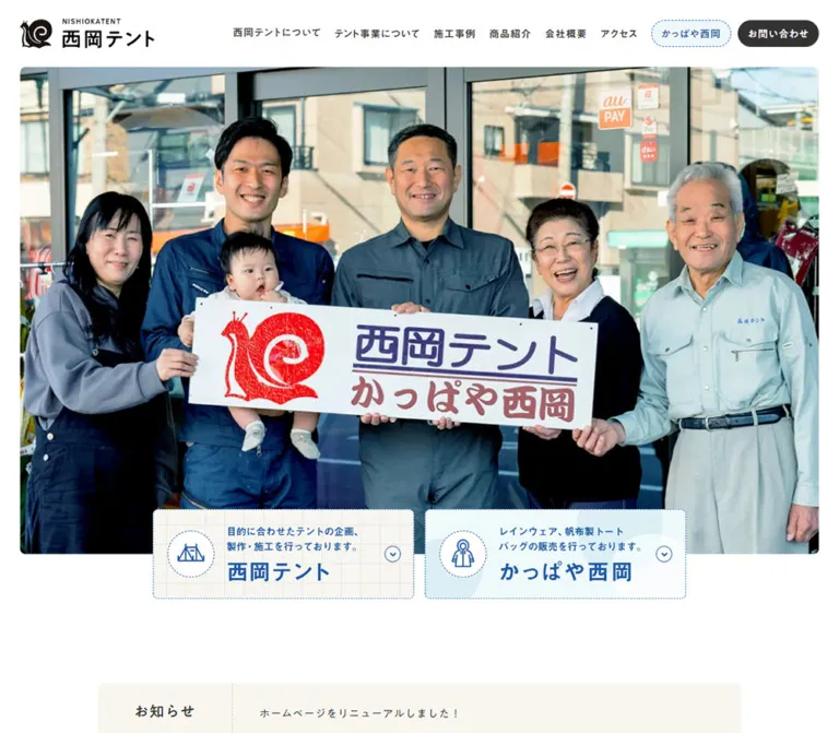
The strongest visual statement is the desktop photograph of several generations gathered outside the shop, holding its sign. The interface gives that photograph space. A white header, compact navigation, generous section intervals, and restrained typography establish order. Blue dotted borders, fine outline illustrations, vertical product labels, faint background lettering, and small rounded corners add a textile and workshop character.
The useful design principle is the relationship between personal photography and careful, quiet information design. Preserve the two business routes, the readable catalog, and the practical contact information when adapting this style.
閉じる
Nishioka Tent / かっぱや西岡 — Style Reference
A Kyoto workshop introduced through family photography, blue stitching, and an airy product catalog.
Website: nishiokatent.net Original URL: https://nishiokatent.net/ Final URL: https://nishiokatent.net/ Theme: predominantly white, with blue accents, pale aqua retail sections, warm cream information surfaces, and charcoal contact bands. Inspected: September 24, 2026, 06:16 JST. The supplied evidence timestamp is September 23, 2026, 21:16:46.359 UTC. Viewports: desktop 1440 × 1000 CSS px; mobile 390 × 844 CSS px. Scope: the current home page, including its two business entry points, announcement, company introduction, tent services, installation examples, retail catalog, contact panels, leadership and staff information, company facts, access information, contact form, and footer. Visual captures cover the desktop opening, part of the product catalog, the desktop form/footer, and the mobile opening and form/footer. Other sections are documented through the supplied rendered text and computed element styles.
Nishioka Tent presents a local business with two connected activities: tent fabrication and installation, and the sale of rainwear and canvas products through かっぱや西岡. The page is a substantial corporate and retail website organized around section anchors. The external shop is a separate destination.
The strongest visual statement is the desktop photograph of several generations gathered outside the shop, holding its sign. The interface gives that photograph space. A white header, compact navigation, generous section intervals, and restrained typography establish order. Blue dotted borders, fine outline illustrations, vertical product labels, faint background lettering, and small rounded corners add a textile and workshop character.
The useful design principle is the relationship between personal photography and careful, quiet information design. Preserve the two business routes, the readable catalog, and the practical contact information when adapting this style.
How to Read This Reference
- Measured — DOM: values directly reported by the supplied rendered element records. Decimal dimensions below may be rounded to two places.
- Derived: arithmetic based on measured rectangles, such as the distance between neighboring links or the combined width of two banners.
- Visual estimate: an approximation from an original-page screenshot where the relevant computed property was not supplied.
- Recommendation: a proposed implementation choice, including fallback fonts, breakpoints, accessible states, and CSS adaptations.
- Token names: descriptive aliases introduced by this document. Only explicitly identified source font variables are original names.
Computed font families identify the requested family on an element; they do not independently verify which font file supplied every rendered glyph. Likewise, an element's transparent background can sit over a colored ancestor or image. Read computed values together with the screenshots.
The mobile opening contains a large blank white image region. This is a recorded limitation, not evidence that the desktop photograph should intentionally disappear on every phone.
Tokens — Colors
Default Palette
| Name | Value | Suggested token | Evidence and role |
|---|---|---|---|
| Workshop Blue | #1955a6 |
--nt-blue |
Measured on introduction headings, English section labels, telephone numbers, product labels, and shop button fills |
| Canvas White | #ffffff |
--nt-white |
Measured page, header, form section, product label backgrounds, and reversed button text |
| Charcoal | #333333 |
--nt-ink |
Measured body text, contact button fills, submit button, and contact-band backgrounds |
| Rainwater Aqua | #eff8f9 |
--nt-aqua |
Measured retail section background and the header's retail pill |
| Warm Canvas | #f8f6ef |
--nt-cream |
Measured access section, footer, and the background behind the profile's MESSAGE label |
| Quiet Taupe | #77756f |
--nt-muted |
Measured company-information field labels |
| Pale Thread | #d1ccbf |
--nt-thread |
Measured MESSAGE label foreground; suitable as a recommended quiet divider color |
| Required Red | #f23a3c |
--nt-required |
Measured required-field asterisks |
| Input Outline | approximately #d8d4ca |
--nt-input-rule |
Visual estimate of the thin warm-gray form outlines; exact border color was not supplied |
Color Application
Blue carries identity and navigation across both businesses. Charcoal distinguishes inquiry actions, while the online-shop action uses blue. The retail navigation pill combines aqua, blue text, and a fine blue dotted outline.
Large color fields are flat and very light. The retail screenshot also shows oversized, low-contrast circular decoration. Its precise opacity and geometry were not measured. The cream announcement surface visually belongs to the same family as the measured access and footer color, although its wrapper color is absent from the element sample.
The red shop sign, bright orange raincoat, yellow-green jacket, and cyan protective products are photographic content. They do not establish additional interface accent colors. Keep required-field red confined to form semantics.
No theme selector or alternate color mode is evidenced. The generated --g-color-* and gradient-position properties in the records do not, by themselves, prove visible decorative gradients.
Tokens — Typography
Japanese Body Copy
Measured family: 'A1ゴシック R JIS2004'.
This family appears on explanatory paragraphs, announcements, product descriptions, company values, access details, and footer information. Most body copy uses weight 400. Its generous leading is central to the calm presentation: desktop explanatory text often uses 16px / 32px, with 16px / 28.8px common on mobile.
The introduction uses a slightly larger desktop setting of 18px / 36px, reducing to 16px / 28.8px on mobile. Do not apply the larger introductory scale to every paragraph.
Japanese Headings and Controls
Two measured families share these roles:
'A1ゴシック M JIS2004': the heritage statement, retail business name, case-study heading, several contact headings, card headings, form labels, and button labels.'見出ゴMB31 JIS2004': many major section headings, most ordinary desktop navigation labels, and vertical product-category labels.
Many visually substantial headings report weight 400; the selected family contributes their character. Navigation text reports 500, while form labels and submit text report 700. Avoid assigning a synthetic heavy weight to every heading merely because it looks bold in the screenshot.
Latin Labels and Telephone Numbers
Measured family: Lato.
English section labels use uppercase text, weight 700, and 0.08em tracking. Examples include CASE, PRODUCTS, PRESIDENT, STAFF, COMPANY, ACCESS, and CONTACT US. The service label is spelled OUR BUISINESS in the inspected page.
Telephone numbers use Lato 900, making the number a strong practical action within an otherwise quiet layout. The mobile MENU caption uses Lato 700 at 10px.
Source Font Variables
| Source variable | Reported value | Verified application in the sampled elements |
|---|---|---|
--s-font-90b141e2 |
'A1ゴシック R JIS2004' |
Paragraphs and supporting information |
--s-font-fcabb609 |
'A1ゴシック M JIS2004' |
Selected headings, labels, and controls |
--s-font-c7bcc84f |
'見出ゴMB31 JIS2004' |
Major headings and vertical product labels |
--s-font-dda042d1 |
Lato |
English labels, MENU caption, and phone numbers |
Other font families are registered in the custom-property list, but the supplied element samples do not establish their design roles. The root's reported Times family is also not the visible content type system.
Type Scale
All values in this table are measured from the supplied DOM records.
| Role | Desktop size / line height | Mobile size / line height | Weight and tracking |
|---|---|---|---|
| Heritage statement | 48px / 72px |
32px / 48px |
A1 M, 400, normal tracking |
| Retail business name | 52px / 78px |
32px / 48px |
A1 M, 400 |
| Major section heading | 40px / 56px |
28px / 39.2px |
A1 M or MB31, 400, 0.05em |
| English section label | 15px / 21px |
14px / 19.6px |
Lato, 700, 0.08em |
| Introductory paragraph | 18px / 36px |
16px / 28.8px |
A1 R, 400 |
| Service paragraph | 16px / 32px |
16px / 28.8px |
A1 R, 400, 0.05em |
| Case title | 22px / 33px |
18px / 27px |
A1 M, 400, 0.05em |
| Case/product caption | 16px / 28.8px |
15px / 27px |
A1 R, 400, 0.05em |
| Additional-gallery heading | 26px / 39px |
20px / 30px |
A1 M, 400, 0.05em |
| Vertical product label | 22px / 26.4px |
20px / 24px |
MB31, 400, 0.1em |
| Featured raincoat label | 24px / 28.8px |
20px / 24px |
MB31, 400, 0.1em |
| Telephone number | 38px / 53.2px |
30px / 42px |
Lato, 900 |
| Form label | 16px / 22.4px |
Same | A1 M, 700, 0.05em |
| Submit label | 18px / 18px |
Same | A1 M, 700; additional 2px top padding |
| Shop button label | 18px / 25.2px |
16px / 22.4px |
A1 M, 400; additional 2px top padding |
| Footer information | 15px / 24px |
Same | A1 R, 400 |
| Announcement title | 22px / 30.8px |
16px / 22.4px |
A1 M, 400, 0.05em |
| Announcement message | 16px / 25.6px |
14px / 22.4px |
A1 R, 400, 0.05em |
The logo is artwork. Its surrounding H1's computed 32px font size should not be used to recreate the wordmark as ordinary text.
Tokens — Spacing & Shapes
The spacing system mixes compact controls with large editorial intervals. There is no evidence of a single universal spacing formula.
Spacing Scale
| Use | Desktop | Mobile | Evidence |
|---|---|---|---|
| Header horizontal padding | 40px |
20px |
Measured |
| Main content left alignment | 120px |
Usually 20px |
Measured across headings and paragraphs |
| Ordinary navigation gaps | 28px |
Navigation replaced by MENU | Derived from neighboring anchor rectangles |
| Gap between header action pills | 10px |
Not visible in closed header | Derived |
| Gap between business banners | 16px |
7px |
Derived |
| English label to main heading | 12px |
8px |
Derived from line-box positions |
| Heritage heading to body | 36px |
24px |
Derived |
| Case title to description | 16px |
12px |
Derived |
| President section padding | 150px 0 |
72px 0 |
Measured |
| Company section padding | 150px 0 |
70px 0 72px |
Measured |
| Retail section padding | 180px 0 150px |
50px 0 72px |
Measured |
| Contact-form section padding | 150px 0 120px |
72px 0 60px |
Measured |
| Footer padding | 80px 0 |
40px 0 |
Measured |
| Submit clearance below textarea | About 40px |
About 40px |
Visual estimate |
Border Radius
| Element | Value | Evidence and interpretation |
|---|---|---|
| Header action pills | 50px |
Measured on anchors |
| Shop and inquiry buttons | 50px |
Measured on anchors |
| Submit button | 50px |
Measured on button |
| Vertical product labels | 4px |
Measured |
| Main photograph and product photographs | About 8px |
Visual estimate of painted corners |
| Form inputs and textarea | About 4px |
Visual estimate |
| Business-banner artwork | Approximately 4–6px at desktop size |
Visual estimate; the anchor itself reports 0px |
| Icon medallions and arrow rings | Circular | Visually observed |
Do not apply a blanket card radius to the site. Text regions are generally unboxed, photographs have modest rounding, and actions have capsule ends.
Layout Measurements
| Element | Desktop 1440 × 1000 | Mobile 390 × 844 | Evidence |
|---|---|---|---|
| Header | 1440 × 100px |
390 × 60px |
Measured |
| Header logo link | 200 × 43.20px, x 40 |
140 × 30.25px, x 125 |
Measured |
| Main content span | Approximately 1200px |
Usually 350px |
Desktop span derived from aligned content at x 120 and 1320; mobile paragraphs measured |
| Painted opening photograph | Approximately 1380 × 806px, x 30, y 100 |
Photograph not visible | Desktop visual estimate |
| Business banner, each | 390 × 134px |
171.5 × 58.875px |
Measured anchor rectangles |
| Business-banner group | 796px wide |
350px wide |
Derived |
| Announcement columns | 200px title + 760px message |
Stacked | Measured text regions |
| Case-study columns | 570px each, 60px separation |
Stacked within 350px |
Derived from text geometry |
| Three product caption columns | 360px each, 60px gaps |
280px centered columns |
Measured widths and derived gaps |
| Carousel button, each | 55 × 50px |
45 × 40px |
Measured |
| Form control width | Approximately 600px |
Approximately 350px |
Visual estimate; aligned label positions corroborate the columns |
| Textarea height | Approximately 160px |
Approximately 160px |
Visual estimate |
| Submit button | 300 × 70px |
300 × 70px |
Measured |
| Footer shop button | 370.95 × 67.19px |
322.52 × 64.39px |
Measured |
| Footer height | 269.58px |
399.25px |
Measured |
| Document height | 12679.33px |
13310.86px |
Measured HTML rectangles |
The opening SECTION rectangle includes positioning that does not correspond directly to the visible photographic crop. Use the painted screenshot bounds for a visual approximation; do not treat the entire section rectangle as an image size.
Components
Persistent Header
Role: maintain identity and access to the major parts of a long page.
The desktop header is a white, 100px strip with the black snail-and-wordmark logo at the left. Six ordinary section links occupy the right side, followed by the aqua retail pill and charcoal inquiry pill. The ordinary navigation text is 16px, with 0.05em tracking and approximately 28px between links.
The two pills are 40px tall. Their measured padding is 12px 20px 8px, which places the text slightly below a mathematically centered baseline. The retail pill is about 131px wide; the inquiry pill is about 133px wide.
On mobile, the header becomes 60px tall. The logo is truly centered at x 125, with a 140px width. A blue three-line menu symbol appears at the right, above the small MENU caption. The menu's open state is not supplied.
The header remains visible at the top of the scrolled screenshots. This supports a persistent-header treatment, although the provided computed fields do not establish whether the implementation uses fixed or sticky positioning.
Photographic Opening and Business Banners
Role: introduce the people behind the business and immediately separate the two main browsing routes.
The desktop photograph begins directly beneath the header, with approximately 30px side margins and small rounded corners. Faces and the hand-held business sign are the focal points. The visible composition has no large marketing headline over the photograph.
Two equal banners overlap the lower photographic edge. Their measured desktop positions are x 322 and 728, y 833, each 390 × 134px. This places the group on the page centerline.
Each banner contains:
- A fine blue dotted perimeter.
- A circular dotted medallion with a thin blue illustration.
- Two compact lines describing the business.
- A larger blue business name.
- A small outlined circle containing a downward chevron at the right.
The tent banner uses a warm, faintly gridded background and a tent illustration. The retail banner uses pale aqua shapes and a raincoat illustration. These are distinct business identities within one shared visual system.
The anchors point to #tent and #kappaya. Their extracted text is empty even though copy is visible in the screenshot. That does not establish the complete accessibility tree or the artwork format. An adaptation should provide meaningful link names independently of decorative imagery.
On mobile, both banners remain in one row. Each shrinks to 171.5 × 58.875px, retaining approximately the desktop artwork proportions. The supporting copy becomes very small. Their top edge is at y 340; the image region above them is blank in the supplied capture.
Announcement and Heritage Introduction
Role: present a practical notice before the company story.
The current announcement concerns email sent during a stated December date range. It is a content notice, not a promotional badge. Desktop text geometry forms a centered 960px module with a 200px title region and 760px message region.
The mobile notice is a cream rectangle spanning approximately x 20–370. Its title is centered above two centered message lines, with about 20px interior clearance and a small gap between title and body.
Below it, the heritage heading reads 「心をこめて、創業70年以上」 in blue. Its two-line structure is preserved between the measured desktop 48px / 72px setting and mobile 32px / 48px setting. Mobile paragraphs use the full 350px content width, even though the desktop introductory paragraph column is only 310px wide.
The mobile screenshot also shows faint outlined NISHIOKATENT lettering and a pale geometric accent behind the heading. These are low-contrast background details. Their motion, exact opacity, and desktop extent are unverified.
Section Heading System
Role: make a long, varied page easy to scan.
Most sections pair a small blue English label with a larger Japanese heading. The English line is Lato bold with 0.08em tracking; the Japanese heading uses a measured 40px / 56px desktop scale and 28px / 39.2px mobile scale.
The English text starts approximately 19px to the right of the Japanese heading's left edge in many measured sections. The supplied records do not establish the exact decorative element responsible for that inset. Preserve the measured alignment without inventing a particular icon.
The final form section centers its heading group. Most informational section headings remain left aligned. Contact-band headings switch to white.
Installation Examples
Role: demonstrate practical work and material knowledge.
The CASE area contains a category description, two featured examples, and an additional-work gallery. The measured featured text columns begin at x 120 and 750, with a 570px first description width. Both titles share a baseline on desktop. On mobile, their titles occur sequentially in a single column.
Use a photograph followed by a modest title and a short factual caption. One inspected example includes a named fabric and material code, showing that technical information belongs in the ordinary caption hierarchy.
The additional-gallery heading uses blue 26px text on desktop and 20px on mobile. Previous and next buttons are present in the DOM. Their operation, item count, looping, and any automatic movement are unverified.
Retail Product Catalog
Role: explain the range and practical uses of rainwear and canvas goods.
A large pale aqua section contains the retail introduction, a featured raincoat explanation, three product categories, and an additional-products rail. It is an informational catalog in the inspected page; individual prices and checkout controls are not present in the supplied content.
The three desktop category columns show a canvas tote, a waterproof apron, and a backpack cover. Photographs are prominent, softly rounded, and set against simple studio backgrounds. Captions sit directly on the aqua field rather than inside separate white cards.
A narrow white label with blue vertical text overlaps each product image. The measured smaller labels are about 42.39px wide on desktop, with 12px 7px padding, 4px corner radius, and 22px type. Their heights vary with the label text. The main raincoat label is slightly larger at 24px.
On mobile, the product captions become centered 280px columns at x 55. Category labels remain narrow and vertical, with 20px type. The featured raincoat explanation retains a side-by-side label/text arrangement: a 42px label at x 20, followed by text at x 86 in a 284px column.
The additional-products rail shows several colorful garments and bags. Desktop tiles appear approximately 276px wide with 30px gaps, and the next item is clipped at the viewport edge. These rail dimensions are visual estimates. Above the rail, a fine blue divider leads into the heading and a rounded previous/next control group. Its short solid leading segment and lighter dotted continuation are visible details, not measured source border declarations.
Contact Bands
Role: offer inquiry routes after each business presentation.
Two large contact sections interrupt the page: one after the installation examples and one after the retail catalog. Their outer sections have measured charcoal backgrounds and white headings and introductions.
The desktop text positions establish an introductory column at the left and separate form and telephone routes farther right. Mobile positions place these routes below the introduction. The form route uses a charcoal capsule with an envelope symbol; the phone route emphasizes the number in blue, heavy Lato.
The sample does not include every inner wrapper or pseudo-element. In particular, dark text and blue numbers inside a dark outer section imply additional surface context that cannot be reconstructed from the outer background alone. Do not place all sampled child colors directly on a single charcoal rectangle without checking the intervening surfaces.
The retail contact block includes both an external-shop link and text stating that the shop is being prepared. The link is evidenced; current shop availability was not verified by visiting its destination.
Leadership, Staff, Company Facts, and Access
Role: provide the people, qualifications, and practical information behind the photographic introduction.
The president section has a large Japanese section heading, a narrow vertical name treatment, adjacent qualification and award text, and a MESSAGE block. The name uses 36px type on desktop and 30px on mobile with 0.1em tracking. The compact name-and-credentials arrangement is retained on mobile rather than flattening all information into identical paragraphs.
Staff entries form two desktop columns. Within each entry, the short role label sits to the left of a longer paragraph. Mobile stacks the entries, but retains the internal label/body split: a role label at x 20 and a 278px text column at x 92.
Company facts use a label/value structure. Desktop labels are 150px wide; mobile labels are 100px wide. Values retain 26px left padding at both sizes. The mobile value box is 250px wide, leaving approximately 224px for text after that padding. This is a useful example of selective structural continuity on a narrow screen.
The access section uses measured warm cream and contains business identity, address, contact details, hours, and closure information. The supplied screenshots do not establish the appearance or behavior of any map. Do not invent an interactive map treatment.
Contact Form
Role: collect a direct inquiry at the end of the page.
The form is a single centered column on white, approximately 600px wide on desktop and 350px on the inspected phone. It contains four required fields: 「お名前」, 「フリガナ」, 「メールアドレス」, and 「お問い合わせ内容」.
Labels sit above the controls, using 16px / 22.4px, weight 700, and 0.05em tracking. A small red asterisk follows each label. Inputs have white fills, thin warm-gray outlines, and modest corners. The visible desktop single-line fields are approximately 56px high. The textarea is approximately 160px high in both supplied form captures.
The submit button is exactly 300 × 70px in both DOM snapshots. It uses a charcoal fill, 50px radius, centered white 18px text, and a small white outlined circle with a right chevron near the right edge. The arrow ring appears approximately 24px in diameter.
There is about 40px between the textarea and button. The section retains generous space before the cream footer. Validation, focus appearance, submission success, error messages, and network behavior were not exercised in the supplied evidence.
Footer
Role: repeat business identity and practical information, then provide shop and privacy destinations.
The desktop footer is a warm cream band with a fine dotted top divider. It places a roughly 200px logo at the left, multiline information in the middle, and a blue shop capsule at the right. The underlined privacy link sits below the shop button.
The mobile footer is a centered vertical composition: logo, address and hours, shop button, then privacy link. The measured information text remains 15px / 24px; the increased footer height comes from wrapping and stacking rather than much smaller type.
The blue footer shop button measures 370.95 × 67.19px on desktop and 322.52 × 64.39px on mobile. Its white cart symbol precedes the label. Preserve the visual distinction between this blue retail destination and the charcoal inquiry action.
Platform Badge
A small black platform badge appears at the bottom-left of the supplied captures. Its measured link box is 84 × 20px, positioned 20px from the viewport's left and bottom edges. It is separate from the business identity and should not be treated as an additional brand color or content component when adapting the design.
Tokens — Motion & Interaction
Measured Transition Declarations
These are computed declarations, not recordings of their triggered visual states.
| Element or property | Reported transition | Evidence limit |
|---|---|---|
| Many generated content elements | 0.3s cubic-bezier(0.4, 0.4, 0, 1) |
No specific reveal effect is established |
| Desktop navigation anchors and header pills | 0.8s cubic-bezier(0, 0.7, 0.22, 1) |
Hover endpoints were not captured |
| Submit button and right gallery control | 0.4s cubic-bezier(0.4, 0.4, 0, 1) |
No click animation or submission result is established |
| Left gallery control | 0.4s cubic-bezier(0.4, 0.4, 0.05, 1) |
Does not establish the slide movement duration |
| Body background | 0.5s cubic-bezier(0.4, 0.4, 0, 1) |
No background-changing interaction was observed |
The sampled elements report animation: none at collection time. This is not proof that the whole site lacks animation: pseudo-elements, scripts, offscreen content, and other states are outside those individual records.
Evidenced Navigation and Affordances
| Control | Evidenced destination or role | What remains unverified |
|---|---|---|
| Logo | Home URL | Activation behavior |
| Ordinary desktop navigation | #about, #tent, #case, #products, #company, #access |
Smooth-scroll timing and active-section styling |
| Retail and inquiry header pills | #kappaya, #contact |
Hover and pressed states |
| Two business banners | #tent, #kappaya |
Scroll landing position |
| Inquiry links | #contact |
Focus transfer and scrolling behavior |
| Phone number | tel:0753138498 |
Device dialer behavior |
| Shop capsules | https://nishiokatent.base.shop/ |
Destination availability and browsing behavior |
| Privacy link | https://nishiokatent.net/privacypolicy |
Destination page design |
| MENU | Closed menu affordance visible | Open layout, transitions, dismissal, and focus handling |
| Gallery arrows | Previous/next buttons present | Autoplay, looping, swipe, dragging, and slide changes |
| Submit | Button present | Validation, delivery, confirmation, and error states |
For a new implementation, keep feedback restrained and use the observed easing family as a starting point. Do not invent parallax, bouncing controls, automatic carousels, or scroll-triggered reveals as original-site findings.
Surfaces
| Surface | Appearance | Purpose |
|---|---|---|
| Main canvas | White, open, little enclosing chrome | Corporate information and long-form reading |
| Retail field | Pale aqua with faint oversized shapes | Groups rainwear and canvas products |
| Warm information field | Cream with quiet rules | Notice, access information, and footer |
| Contact-band exterior | Charcoal with white introductory text | Separates practical inquiry sections |
| Vertical category tab | White, blue text, fine dotted outline | Labels photographs without a large caption panel |
| Form controls | White, thin warm-gray border | Clear input areas on the white form section |
| Primary inquiry action | Charcoal capsule, white label | Contact navigation and submission |
| Shop action | Blue capsule, white label and cart symbol | External retail destination |
No strong card-shadow system is visible in the supplied screenshots. Separation comes from photographs, large background fields, whitespace, fine rules, and clear typographic hierarchy. The repeating stitched outline is more characteristic than elevation.
Imagery
The main photograph feels documentary and personal: a group outside the actual shop, natural expressions, work clothing, glass storefront reflections, and a physical sign. It communicates continuity and approachability without an artificial promotional overlay. Keep the faces and sign readable when cropping a comparable photograph.
Product imagery is more controlled. Plain studio backgrounds, upright garments, a worn tote, a hanging apron, and a backpack shown in use explain scale and function. Saturated fabric colors remain natural photographic accents against the quiet aqua page. Preserve product silhouettes and useful context; an aggressive crop could obscure what the product protects or how it is carried.
The black snail logo supplies a distinctive silhouette. Small tent and rainwear illustrations use thin blue linework and circular stitched medallions. They should remain secondary to the photography and names.
Vertical Japanese labels, pale graph-paper lines, and oversized faint circles give the page a connection to fabric, patternmaking, and weather. This is a visual interpretation of the observed motifs, not a stated brand rationale.
Observed Asset References
| Asset or group | Evidence | Reuse guidance |
|---|---|---|
| Snail-and-wordmark logo | Visible in original-page desktop/mobile headers and footers | Use approved artwork and preserve its proportions |
| Family storefront photograph | Fully visible in the original desktop opening | Keep faces and the physical sign inside the chosen crop |
| Tent and retail banners | Visible in both opening captures; linked anchors measured | Preserve the paired composition and provide accessible link names |
| Tote, apron, backpack-cover photographs | Visible in the original desktop product capture | Use consistent portrait presentation and quiet studio backgrounds |
| Additional product photographs | Partially visible in the desktop product rail | Maintain consistent tile treatment while retaining fabric colors |
| Leadership imagery | Background-image declaration present in the rendered president section | Specific crops and photographic treatment are not visually verified here |
The supplied DOM exposes background-image references under https://storage.googleapis.com/studio-design-asset-files/projects/rROnJjvkOA/, but the relevant filenames are truncated. No complete reusable asset URL or verified intrinsic image size can be extracted from those fragments. The CSS below therefore supplies layout styles without inventing image paths.
Layout & Responsive Behavior
The page combines a nearly full-width desktop opening with a more restrained content span of approximately 1200px. Main headings, case descriptions, catalog captions, and footer contents repeatedly align to x 120 at the 1440px viewport.
Mobile generally uses 20px side margins, producing 350px content columns. Several structures deliberately keep internal columns: the two opening banners, the raincoat label and explanation, profile credentials beside the vertical name, company label/value pairs, and staff role labels beside paragraphs.
Observed Changes
| Area | Desktop | Mobile |
|---|---|---|
| Header | Left logo, full navigation, two action pills | Centered smaller logo, right MENU control |
| Opening photograph | Large, visible, inset by about 30px |
Image not visible in supplied opening state |
| Business routes | Two overlapping 390px banners |
Two 171.5px banners in one row |
| Announcement | Horizontal title/message structure | Centered stacked title and message |
| Major headings | Usually 40px |
Usually 28px |
| Heritage and retail headings | 48px and 52px |
Both 32px |
| Featured cases | Two side-by-side entries | Sequential entries |
| Three secondary product categories | Three 360px caption columns |
Sequential 280px caption columns |
| Company facts | Heading beside a wide label/value area | Heading above retained label/value rows |
| Form | Approximately 600px column |
Approximately 350px column |
| Submit | 300 × 70px |
Same dimensions |
| Footer | Horizontal identity/information/actions | Centered vertical stack |
The shorter mobile opening and reduced section padding partially offset the extra height created by stacked content. The overall mobile document is about 632px taller than the desktop document in these snapshots, despite its much narrower width.
Mobile Opening Limitation
In the mobile screenshot, the region between the 60px header and the banners at y 340 is white. The DOM still contains an opening section and a background-image declaration. The supplied evidence cannot determine whether the absent image results from an unresolved resource, visibility rule, animation state, or another cause.
Record this state faithfully when comparing captures. For a new implementation, provide a reliable mobile image or a deliberate content-bearing fallback; that is an implementation improvement, not a verified description of the original page's intended mobile behavior.
Breakpoint Limits
A max-width: 1280px query appears in generated line-break rules. It does not prove that the navigation or every layout changes at that width. Only the two supplied viewports were inspected. The Quick Start uses explicitly recommended breakpoints and should be checked at intermediate widths.
Do’s and Don’ts
Do
- Lead with authentic people and product photography.
- Keep blue
#1955a6, charcoal#333333, aqua#eff8f9, and cream#f8f6efin their distinct roles. - Preserve two equally legible routes into tent services and retail products.
- Pair modest English section labels with larger Japanese headings.
- Use vertical white product tabs with blue text and fine stitched outlines.
- Keep descriptions directly on their section background where observed.
- Give explanatory Japanese copy comfortable
1.8–2line height. - Retain generous section intervals and small photographic corner radii.
- Preserve the mobile label/value structures that remain useful at narrow widths.
- Make phone, inquiry, shop, and access information easy to find throughout the long page.
Don’t
- Don’t impose a generic campaign-page sequence on the corporate, catalog, and company-information structure.
- Don’t place oversized promotional copy over the family photograph.
- Don’t make every content block a rounded white card with a shadow.
- Don’t turn photographic garment colors into unrelated interface accents.
- Don’t replace every distinctive Japanese heading family with one undifferentiated bold sans-serif.
- Don’t use the logo wrapper's font size to redraw the logo as text.
- Don’t force every mobile component into a single text column.
- Don’t interpret the blank mobile image region as a verified intentional design choice.
- Don’t claim carousel autoplay, menu animation, smooth scrolling, or successful form submission without interaction evidence.
- Don’t treat a visible external-shop link as proof that the shop is currently ready to transact.
Recommended Implementation Additions
These are recommendations for a new implementation, not verified features of the original page:
- Give the two business-banner links clear accessible names. If their visible copy remains in artwork, provide equivalent text independently.
- Keep essential banner labels readable on phones. Retaining the observed two-up artwork can be combined with a readable text label below each banner.
- Give MENU a real button, a sufficiently large touch target,
aria-expanded, and a defined relationship to its menu panel. Implement keyboard opening, dismissal, and focus restoration. - Add persistent blue focus indicators for navigation, gallery controls, shop links, and form controls.
- Associate every form label with its input. Use appropriate required semantics, email input behavior, and field-specific error descriptions.
- Keep the form's label text at
16pxon mobile and preserve the300 × 70pxsubmit target where space permits. - Offset anchor destinations for the persistent header so headings are not obscured.
- Give gallery buttons descriptive names and disabled states at finite boundaries. Keep the gallery usable without automatic movement.
- Resolve the mobile opening image state and reserve image dimensions to prevent unexpected layout changes.
- Respect reduced-motion preferences and avoid making content visibility depend on animation completing.
- Mark decorative lettering, circles, and line illustrations as decorative where appropriate.
Agent Prompt Guide
Quick Color Reference
- Main canvas and header:
#ffffff. - Main text and inquiry buttons:
#333333. - Identity blue, section labels, phone numbers, and shop buttons:
#1955a6. - Retail background:
#eff8f9. - Warm information surfaces and footer:
#f8f6ef. - Company fact labels:
#77756f. - Required asterisks:
#f23a3c. - Fine borders: blue for stitched identity details; a quiet warm gray for form fields.
Overall Prompt
“Create a Japanese corporate and retail website for a local tent workshop and rainwear shop. Use a white page, workshop blue #1955a6, charcoal text, a pale aqua product section, and warm cream information surfaces. Introduce the business with a large authentic group photograph outside its shop, followed by two equal illustrated business banners overlapping the photograph's lower edge. Use generous spacing, small rounded image corners, blue dotted borders, narrow vertical Japanese product labels, and modest uppercase English section labels above Japanese headings. Include tent services, installation examples, a practical product catalog, staff and company information, access details, and a centered inquiry form. On mobile, center the logo, provide a right-side MENU control, use 20px content gutters, and retain useful internal label/value arrangements. Treat menu behavior, gallery movement, and form feedback as implementation work requiring explicit design and testing.”
Example Component Prompts
- Business banners: “Create two equal business-entry banners with pale cream and aqua surfaces, fine blue stitched outlines, circular line-art medallions, short supporting copy, large blue business names, and a small circled downward chevron. Keep the pair centered and overlapping the bottom of a desktop photograph. Preserve distinct tent and rainwear identities.”
- Product category: “Place a portrait product photograph on a pale aqua section without a surrounding white card. Add a narrow white vertical Japanese label near the upper-left, with blue text, a fine dotted border, and 4px corners. Put a short, generously led caption below the image.”
- Contact form: “Build a centered 600px-wide desktop form that becomes the viewport width minus 40px on a phone. Use 16px bold Japanese labels, small red required asterisks, white fields with thin warm-gray outlines, a 160px textarea, and a 300 × 70px charcoal pill with centered white text and a circled right chevron.”
- Footer: “Use a warm cream footer with a fine dotted top rule. On desktop arrange the black logo, business address and hours, and a blue cart-and-label shop capsule horizontally. Put an underlined privacy link below the shop action. On mobile stack and center the groups, preserving readable 15px information text.”
- Company facts: “Create a restrained Japanese company-information table with muted taupe labels and charcoal values. Use 150px labels on desktop and 100px labels on mobile, keeping a 26px inset before each value. Place the section heading beside the facts on desktop and above them on mobile.”
Quick Start
CSS Custom Properties
This is an adaptation of the measured palette, type scale, and component proportions. It is not a copy of the original generated stylesheet.
The 1280px header switch and 767px content switch below are recommendations. The photograph ratio, portrait ratio, input outline, and decorative circle are approximations. The mobile image is deliberately allowed to render; supplying a reliable mobile image improves on the unresolved captured state.
Apply .nt-site to the page root or body. Supply approved logo, photograph, and banner artwork separately. The named Japanese fonts and Lato must be provisioned by the implementation; the sans-serif fallbacks are recommendations. Menu state, gallery button behavior, and form processing require separate implementation.
:root {
  /* Colors measured from the supplied rendered page. */
  --nt-blue: #1955a6;
  --nt-white: #ffffff;
  --nt-ink: #333333;
  --nt-aqua: #eff8f9;
  --nt-cream: #f8f6ef;
  --nt-muted: #77756f;
  --nt-thread: #d1ccbf;
  --nt-required: #f23a3c;

  /* Visual approximation, not a measured source border. */
  --nt-input-rule: #d8d4ca;

  /* Measured family names with recommended fallbacks. */
  --nt-font-regular: 'A1ゴシック R JIS2004', sans-serif;
  --nt-font-medium: 'A1ゴシック M JIS2004', sans-serif;
  --nt-font-heading: '見出ゴMB31 JIS2004', sans-serif;
  --nt-font-latin: Lato, sans-serif;

  --nt-text-body: 16px;
  --nt-text-section: 40px;
  --nt-text-kicker: 15px;
  --nt-leading-body: 1.8;
  --nt-tracking-body: 0.05em;

  --nt-content-width: 1200px;
  --nt-form-width: 600px;
  --nt-gutter: 20px;
  --nt-header-height: 100px;
  --nt-section-space: 150px;
  --nt-radius-label: 4px;
  --nt-radius-photo: 8px;
  --nt-radius-pill: 50px;

  /* Timing declarations observed on source elements. */
  --nt-ease: cubic-bezier(0.4, 0.4, 0, 1);
  --nt-motion-ui: 300ms var(--nt-ease);
  --nt-motion-control: 400ms var(--nt-ease);
}

.nt-site,
.nt-site *,
.nt-site *::before,
.nt-site *::after {
  box-sizing: border-box;
}

.nt-site {
  margin: 0;
  color: var(--nt-ink);
  background: var(--nt-white);
  font-family: var(--nt-font-regular);
  font-size: var(--nt-text-body);
  line-height: var(--nt-leading-body);
}

.nt-site img { display: block; max-width: 100%; }
.nt-site button,
.nt-site input,
.nt-site textarea { font: inherit; }
.nt-site button { cursor: pointer; }
.nt-site a { color: inherit; }

.nt-container {
  width: min(var(--nt-content-width), calc(100% - 40px));
  margin-inline: auto;
}

.nt-site section[id] {
  scroll-margin-top: calc(var(--nt-header-height) + 24px);
}

/* Sticky positioning is an adaptation of the persistent header. */
.nt-header {
  position: sticky;
  top: 0;
  z-index: 20;
  display: flex;
  align-items: center;
  justify-content: space-between;
  height: var(--nt-header-height);
  padding-inline: 40px;
  background: var(--nt-white);
}

.nt-brand { display: block; flex: 0 0 200px; width: 200px; }
.nt-header-right,
.nt-nav,
.nt-header-actions { display: flex; align-items: center; }
.nt-header-right { gap: 32px; }
.nt-nav { gap: 28px; }
.nt-header-actions { gap: 10px; }

.nt-nav a {
  font-family: var(--nt-font-heading);
  font-size: 16px;
  font-weight: 500;
  line-height: 1.2;
  letter-spacing: 0.05em;
  text-decoration: none;
  white-space: nowrap;
}

.nt-header-pill {
  display: inline-flex;
  align-items: center;
  justify-content: center;
  min-height: 40px;
  padding: 12px 20px 8px;
  border: 1px solid transparent;
  border-radius: var(--nt-radius-pill);
  font-family: var(--nt-font-medium);
  font-size: 15px;
  font-weight: 500;
  line-height: 1.2;
  letter-spacing: 0.05em;
  text-decoration: none;
}

.nt-header-pill--retail {
  color: var(--nt-blue);
  background: var(--nt-aqua);
  border-color: var(--nt-blue);
  border-style: dashed;
}

.nt-header-pill--contact {
  color: var(--nt-white);
  background: var(--nt-ink);
}

.nt-menu { display: none; }

/* The photograph's aspect ratio approximates the desktop capture. */
.nt-hero { width: calc(100% - 60px); margin-inline: auto; }
.nt-hero-media {
  aspect-ratio: 1380 / 806;
  overflow: hidden;
  border-radius: var(--nt-radius-photo);
}
.nt-hero-media img { width: 100%; height: 100%; object-fit: cover; }

.nt-business-links {
  position: relative;
  display: grid;
  grid-template-columns: repeat(2, minmax(0, 1fr));
  gap: 16px;
  width: min(796px, 100%);
  margin: -73px auto 0;
}

/* Banner artwork already contains its own border and illustration. */
.nt-business-link { display: block; aspect-ratio: 390 / 134; }
.nt-business-link img { width: 100%; height: auto; }

.nt-notice {
  display: grid;
  grid-template-columns: 200px minmax(0, 1fr);
  align-items: center;
  width: min(960px, calc(100% - 40px));
  margin: 112px auto 0;
  background: var(--nt-cream);
  border-radius: 4px;
}
.nt-notice-title {
  margin: 0;
  text-align: center;
  font-family: var(--nt-font-medium);
  font-size: 22px;
  line-height: 1.4;
  letter-spacing: 0.05em;
}
.nt-notice-message {
  margin: 0;
  padding: 34px 40px 30px;
  font-size: 16px;
  line-height: 1.6;
  letter-spacing: 0.05em;
}

.nt-section { padding-block: var(--nt-section-space); }
.nt-kicker {
  margin: 0 0 12px;
  padding-left: 19px;
  color: var(--nt-blue);
  font-family: var(--nt-font-latin);
  font-size: var(--nt-text-kicker);
  font-weight: 700;
  line-height: 1.4;
  letter-spacing: 0.08em;
}
.nt-section-title {
  margin: 0;
  font-family: var(--nt-font-heading);
  font-size: var(--nt-text-section);
  font-weight: 400;
  line-height: 1.4;
  letter-spacing: 0.05em;
}
.nt-section-title--soft { font-family: var(--nt-font-medium); }
.nt-copy { line-height: 2; letter-spacing: 0.05em; }
.nt-heritage-title {
  margin: 0 0 36px;
  color: var(--nt-blue);
  font-family: var(--nt-font-medium);
  font-size: 48px;
  font-weight: 400;
  line-height: 1.5;
}
.nt-intro-copy { font-size: 18px; line-height: 2; }

.nt-case-grid,
.nt-product-grid { display: grid; gap: 60px; }
.nt-case-grid { grid-template-columns: repeat(2, minmax(0, 1fr)); }
.nt-product-grid { grid-template-columns: repeat(3, minmax(0, 1fr)); }
.nt-product-card { min-width: 0; margin: 0; }

.nt-products {
  position: relative;
  overflow: clip;
  padding-block: 180px 150px;
  background: var(--nt-aqua);
}
.nt-products > .nt-container { position: relative; z-index: 1; }

/* Approximation of the faint oversized retail decoration. */
.nt-products::before {
  content: '';
  position: absolute;
  right: -220px;
  bottom: 160px;
  width: 680px;
  aspect-ratio: 1;
  border-radius: 50%;
  background: rgb(255 255 255 / 55%);
  pointer-events: none;
}

.nt-product-media { position: relative; }
.nt-product-media img {
  width: 100%;
  aspect-ratio: 2 / 3;
  object-fit: cover;
  border-radius: var(--nt-radius-photo);
}
.nt-product-label {
  position: absolute;
  top: 30px;
  left: 30px;
  margin: 0;
  padding: 12px 7px;
  border: 1px dashed var(--nt-blue);
  border-radius: var(--nt-radius-label);
  color: var(--nt-blue);
  background: var(--nt-white);
  font-family: var(--nt-font-heading);
  font-size: 22px;
  font-weight: 400;
  line-height: 1.2;
  letter-spacing: 0.1em;
  writing-mode: vertical-rl;
  text-orientation: mixed;
}
.nt-product-caption {
  margin: 30px 0 0;
  font-size: 16px;
  line-height: 1.8;
  letter-spacing: 0.05em;
}

.nt-gallery-heading {
  position: relative;
  display: flex;
  align-items: center;
  justify-content: space-between;
  gap: 20px;
  margin-top: 80px;
  padding-top: 32px;
  border-top: 1px dashed rgb(25 85 166 / 35%);
}
.nt-gallery-heading::before {
  content: '';
  position: absolute;
  top: -1px;
  left: 0;
  width: 140px;
  height: 1px;
  background: var(--nt-blue);
}
.nt-gallery-heading h3 {
  margin: 0;
  color: var(--nt-blue);
  font-family: var(--nt-font-medium);
  font-size: 26px;
  font-weight: 400;
  line-height: 1.5;
  letter-spacing: 0.05em;
}
.nt-gallery-controls {
  display: flex;
  flex: none;
  border: 1px solid var(--nt-blue);
  border-radius: var(--nt-radius-pill);
  background: var(--nt-white);
}
.nt-gallery-controls button {
  width: 55px;
  height: 50px;
  padding: 0;
  border: 0;
  border-radius: inherit;
  color: var(--nt-blue);
  background: transparent;
}

/* Native horizontal scrolling is a recommended usable baseline. */
.nt-gallery-track {
  display: grid;
  grid-auto-flow: column;
  grid-auto-columns: 276px;
  gap: 30px;
  margin-top: 40px;
  padding-block: 8px;
  overflow-x: auto;
  overscroll-behavior-inline: contain;
}
.nt-gallery-track img { width: 100%; border-radius: 8px; }

.nt-company-row {
  display: grid;
  grid-template-columns: 150px minmax(0, 1fr);
  padding-block: 24px;
  line-height: 1.8;
}
.nt-company-row dt { color: var(--nt-muted); }
.nt-company-row dd { margin: 0; padding-left: 26px; }

.nt-button {
  position: relative;
  display: inline-flex;
  align-items: center;
  justify-content: center;
  gap: 10px;
  max-width: 100%;
  min-height: 67px;
  padding: 20px 40px;
  border: 0;
  border-radius: var(--nt-radius-pill);
  color: var(--nt-white);
  background: var(--nt-ink);
  font-family: var(--nt-font-medium);
  font-size: 18px;
  line-height: 1.4;
  text-align: center;
  text-decoration: none;
  transition: background-color var(--nt-motion-control);
}
.nt-button--shop { background: var(--nt-blue); }
.nt-button svg { flex: none; width: 24px; height: 24px; }

.nt-contact { padding-block: 150px 120px; }
.nt-contact-heading { text-align: center; }
.nt-form {
  width: min(var(--nt-form-width), calc(100% - 40px));
  margin: 70px auto 0;
}
.nt-field + .nt-field { margin-top: 20px; }
.nt-field label {
  display: block;
  margin-bottom: 14px;
  font-family: var(--nt-font-medium);
  font-size: 16px;
  font-weight: 700;
  line-height: 1.4;
  letter-spacing: 0.05em;
}
.nt-required { margin-left: 5px; color: var(--nt-required); }
.nt-field input,
.nt-field textarea {
  display: block;
  width: 100%;
  border: 1px solid var(--nt-input-rule);
  border-radius: 4px;
  color: var(--nt-ink);
  background: var(--nt-white);
  font-size: 16px;
}
.nt-field input { height: 56px; padding: 12px 16px; }
.nt-field textarea { min-height: 160px; padding: 16px; resize: vertical; }
.nt-submit {
  display: flex;
  width: min(300px, 100%);
  height: 70px;
  margin: 40px auto 0;
  padding: 20px 50px;
  font-size: 18px;
  font-weight: 700;
  line-height: 1;
}
.nt-submit-arrow {
  position: absolute;
  right: 20px;
  top: 50%;
  display: grid;
  place-items: center;
  width: 24px;
  height: 24px;
  border: 1px solid currentColor;
  border-radius: 50%;
  transform: translateY(-50%);
}

.nt-footer {
  padding-block: 80px;
  border-top: 1px dashed var(--nt-thread);
  background: var(--nt-cream);
}
.nt-footer-inner { display: flex; align-items: flex-start; }
.nt-footer-logo { flex: 0 0 200px; width: 200px; margin-right: 70px; }
.nt-footer-copy { flex: 1; margin: 0; font-size: 15px; line-height: 24px; }
.nt-footer-actions { flex: none; margin-left: 55px; text-align: right; }
.nt-privacy { display: block; margin-top: 20px; text-underline-offset: 3px; }

/* Recommended focus treatment; source focus states were not captured. */
.nt-site :focus-visible {
  outline: 2px solid var(--nt-blue);
  outline-offset: 4px;
}

/* Recommended header and footer breakpoint. */
@media (max-width: 1280px) {
  :root { --nt-header-height: 60px; }
  .nt-header { padding-inline: 20px; }
  .nt-header-right { display: none; }
  .nt-brand {
    position: absolute;
    left: 50%;
    width: 140px;
    transform: translateX(-50%);
  }
  .nt-menu {
    display: grid;
    place-items: center;
    gap: 4px;
    min-width: 44px;
    min-height: 44px;
    margin-left: auto;
    padding: 4px;
    border: 0;
    color: var(--nt-blue);
    background: transparent;
    font-family: var(--nt-font-latin);
    font-size: 10px;
    font-weight: 700;
    line-height: 14px;
    letter-spacing: 0.05em;
  }
  .nt-footer-inner { flex-direction: column; align-items: center; gap: 24px; }
  .nt-footer-logo { flex-basis: auto; margin: 0; }
  .nt-footer-copy,
  .nt-footer-actions { margin: 0; text-align: center; }
}

/* Recommended content breakpoint matching the inspected phone endpoint. */
@media (max-width: 767px) {
  :root {
    --nt-text-section: 28px;
    --nt-text-kicker: 14px;
    --nt-section-space: 72px;
  }
  .nt-hero { width: 100%; }
  .nt-hero-media { height: 280px; aspect-ratio: auto; border-radius: 0; }
  .nt-business-links { width: calc(100% - 40px); gap: 7px; margin-top: 0; }
  .nt-notice { grid-template-columns: 1fr; gap: 6px; margin-top: 30px; padding: 20px; }
  .nt-notice-title { font-size: 16px; }
  .nt-notice-message { padding: 0; font-size: 14px; text-align: center; }
  .nt-kicker { margin-bottom: 8px; }
  .nt-copy { line-height: 1.8; }
  .nt-heritage-title { margin-bottom: 24px; font-size: 32px; }
  .nt-intro-copy { font-size: 16px; line-height: 1.8; }
  .nt-case-grid,
  .nt-product-grid { grid-template-columns: 1fr; gap: 30px; }
  .nt-products { padding-block: 50px 72px; }
  .nt-product-card { width: min(280px, 100%); margin-inline: auto; }
  .nt-product-label { top: 20px; left: 20px; font-size: 20px; }
  .nt-product-caption { margin-top: 20px; font-size: 15px; }
  .nt-gallery-heading { margin-top: 40px; padding-top: 24px; }
  .nt-gallery-heading h3 { font-size: 20px; }
  .nt-gallery-controls button { width: 45px; height: 40px; }
  .nt-gallery-track { grid-auto-columns: 220px; gap: 20px; }
  .nt-company-row { grid-template-columns: 100px minmax(0, 1fr); font-size: 15px; }
  .nt-button { min-height: 64px; padding: 20px 30px; font-size: 16px; }
  .nt-contact { padding-block: 72px 60px; }
  .nt-form { margin-top: 30px; }
  .nt-submit { height: 70px; padding: 20px 50px; font-size: 18px; }
  .nt-footer { padding-block: 40px; }
  .nt-privacy { margin-top: 16px; font-size: 15px; }
}

/* Recommended reduced-motion handling. */
@media (prefers-reduced-motion: reduce) {
  .nt-site *,
  .nt-site *::before,
  .nt-site *::after {
    animation: none !important;
    transition: none !important;
    scroll-behavior: auto !important;
  }
}
The portrait 2 / 3 ratio and mobile gallery width of 220px are recommended defaults, not measured original values. Adjust them after inspecting the actual approved assets. The code intentionally leaves gallery edge behavior and contact-band inner surfaces to implementation rather than presenting unverified details as exact reproductions.
Tailwind v4 Token Mapping
Optional aliases for an implementation already using Tailwind v4. Define the custom properties above first. This mapping does not imply that the original website uses Tailwind.
@theme inline {
  --color-workshop: var(--nt-blue);
  --color-canvas: var(--nt-white);
  --color-ink: var(--nt-ink);
  --color-rainwater: var(--nt-aqua);
  --color-warm-canvas: var(--nt-cream);
  --color-thread: var(--nt-thread);
  --color-required: var(--nt-required);

  --font-body: var(--nt-font-regular);
  --font-medium: var(--nt-font-medium);
  --font-heading: var(--nt-font-heading);
  --font-latin: var(--nt-font-latin);

  --text-section: var(--nt-text-section);
  --text-kicker: var(--nt-text-kicker);
  --radius-label: 4px;
  --radius-photo: 8px;
  --radius-action: 50px;
  --spacing-gutter: 20px;
  --container-content: 1200px;
  --container-form: 600px;
}
Sources & Evidence
- Current Nishioka Tent home page: the supplied browser observation reports HTTP
200, with the same original and final URL. - Capture timestamp: September 23, 2026,
21:16:46.359 UTC, equivalent to September 24, 2026,06:16:46.359 JST. This is the supplied collection timestamp, not a new browsing session conducted for this document. - Desktop evidence:
1440 × 1000CSS-pixel viewport; original-page screenshots of the opening photograph and business banners, part of the retail gallery, and the lower contact form/footer. Rendered text and computed element records cover the longer page. - Mobile evidence:
390 × 844CSS-pixel viewport; original-page screenshots of the opening/announcement/introduction and lower form/footer, plus rendered text and computed element records throughout the page. - DOM evidence: element rectangles, requested font families, font sizes, weights, leading, tracking, padding, selected backgrounds, corner radii, transition declarations, section text, and link destinations. The sample does not include every wrapper, input style, image property, pseudo-element, or interaction state.
- Collection limits: the browser collection waited for document loading, finite motion, sampled layout/text stability, and visible image decoding within bounded time limits. Those checks do not prove that every delayed background or interactive state rendered. Shared workers and service workers were disabled during collection.
- Interaction limits: scrolled screenshots establish the persistent header and page composition at those positions. No documented activation verifies the mobile menu, gallery movement, anchor scrolling, external shop, privacy page, or form submission. No intermediate viewport or device-pixel ratio was supplied.
This reference describes the current page supported by the supplied original-site evidence. Measurements, screenshot estimates, and implementation recommendations are identified separately, with the unresolved mobile opening image state retained as an explicit limitation.
# Nishioka Tent / かっぱや西岡 — Style Reference

> A Kyoto workshop introduced through family photography, blue stitching, and an airy product catalog.

**Website:** [nishiokatent.net](https://nishiokatent.net/)
**Original URL:** https://nishiokatent.net/
**Final URL:** https://nishiokatent.net/
**Theme:** predominantly white, with blue accents, pale aqua retail sections, warm cream information surfaces, and charcoal contact bands.
**Inspected:** September 24, 2026, 06:16 JST. The supplied evidence timestamp is September 23, 2026, 21:16:46.359 UTC.
**Viewports:** desktop 1440 × 1000 CSS px; mobile 390 × 844 CSS px.
**Scope:** the current home page, including its two business entry points, announcement, company introduction, tent services, installation examples, retail catalog, contact panels, leadership and staff information, company facts, access information, contact form, and footer. Visual captures cover the desktop opening, part of the product catalog, the desktop form/footer, and the mobile opening and form/footer. Other sections are documented through the supplied rendered text and computed element styles.

Nishioka Tent presents a local business with two connected activities: tent fabrication and installation, and the sale of rainwear and canvas products through かっぱや西岡. The page is a substantial corporate and retail website organized around section anchors. The external shop is a separate destination.

The strongest visual statement is the desktop photograph of several generations gathered outside the shop, holding its sign. The interface gives that photograph space. A white header, compact navigation, generous section intervals, and restrained typography establish order. Blue dotted borders, fine outline illustrations, vertical product labels, faint background lettering, and small rounded corners add a textile and workshop character.

The useful design principle is the relationship between personal photography and careful, quiet information design. Preserve the two business routes, the readable catalog, and the practical contact information when adapting this style.
閉じる
# Nishioka Tent / かっぱや西岡 — Style Reference

> A Kyoto workshop introduced through family photography, blue stitching, and an airy product catalog.

**Website:** [nishiokatent.net](https://nishiokatent.net/)
**Original URL:** https://nishiokatent.net/
**Final URL:** https://nishiokatent.net/
**Theme:** predominantly white, with blue accents, pale aqua retail sections, warm cream information surfaces, and charcoal contact bands.
**Inspected:** September 24, 2026, 06:16 JST. The supplied evidence timestamp is September 23, 2026, 21:16:46.359 UTC.
**Viewports:** desktop 1440 × 1000 CSS px; mobile 390 × 844 CSS px.
**Scope:** the current home page, including its two business entry points, announcement, company introduction, tent services, installation examples, retail catalog, contact panels, leadership and staff information, company facts, access information, contact form, and footer. Visual captures cover the desktop opening, part of the product catalog, the desktop form/footer, and the mobile opening and form/footer. Other sections are documented through the supplied rendered text and computed element styles.

Nishioka Tent presents a local business with two connected activities: tent fabrication and installation, and the sale of rainwear and canvas products through かっぱや西岡. The page is a substantial corporate and retail website organized around section anchors. The external shop is a separate destination.

The strongest visual statement is the desktop photograph of several generations gathered outside the shop, holding its sign. The interface gives that photograph space. A white header, compact navigation, generous section intervals, and restrained typography establish order. Blue dotted borders, fine outline illustrations, vertical product labels, faint background lettering, and small rounded corners add a textile and workshop character.

The useful design principle is the relationship between personal photography and careful, quiet information design. Preserve the two business routes, the readable catalog, and the practical contact information when adapting this style.

## How to Read This Reference

- **Measured — DOM:** values directly reported by the supplied rendered element records. Decimal dimensions below may be rounded to two places.
- **Derived:** arithmetic based on measured rectangles, such as the distance between neighboring links or the combined width of two banners.
- **Visual estimate:** an approximation from an original-page screenshot where the relevant computed property was not supplied.
- **Recommendation:** a proposed implementation choice, including fallback fonts, breakpoints, accessible states, and CSS adaptations.
- **Token names:** descriptive aliases introduced by this document. Only explicitly identified source font variables are original names.

Computed font families identify the requested family on an element; they do not independently verify which font file supplied every rendered glyph. Likewise, an element's transparent background can sit over a colored ancestor or image. Read computed values together with the screenshots.

The mobile opening contains a large blank white image region. This is a recorded limitation, not evidence that the desktop photograph should intentionally disappear on every phone.

## Tokens — Colors

### Default Palette

| Name | Value | Suggested token | Evidence and role |
| --- | --- | --- | --- |
| Workshop Blue | `#1955a6` | `--nt-blue` | Measured on introduction headings, English section labels, telephone numbers, product labels, and shop button fills |
| Canvas White | `#ffffff` | `--nt-white` | Measured page, header, form section, product label backgrounds, and reversed button text |
| Charcoal | `#333333` | `--nt-ink` | Measured body text, contact button fills, submit button, and contact-band backgrounds |
| Rainwater Aqua | `#eff8f9` | `--nt-aqua` | Measured retail section background and the header's retail pill |
| Warm Canvas | `#f8f6ef` | `--nt-cream` | Measured access section, footer, and the background behind the profile's MESSAGE label |
| Quiet Taupe | `#77756f` | `--nt-muted` | Measured company-information field labels |
| Pale Thread | `#d1ccbf` | `--nt-thread` | Measured MESSAGE label foreground; suitable as a recommended quiet divider color |
| Required Red | `#f23a3c` | `--nt-required` | Measured required-field asterisks |
| Input Outline | approximately `#d8d4ca` | `--nt-input-rule` | Visual estimate of the thin warm-gray form outlines; exact border color was not supplied |

### Color Application

Blue carries identity and navigation across both businesses. Charcoal distinguishes inquiry actions, while the online-shop action uses blue. The retail navigation pill combines aqua, blue text, and a fine blue dotted outline.

Large color fields are flat and very light. The retail screenshot also shows oversized, low-contrast circular decoration. Its precise opacity and geometry were not measured. The cream announcement surface visually belongs to the same family as the measured access and footer color, although its wrapper color is absent from the element sample.

The red shop sign, bright orange raincoat, yellow-green jacket, and cyan protective products are photographic content. They do not establish additional interface accent colors. Keep required-field red confined to form semantics.

No theme selector or alternate color mode is evidenced. The generated `--g-color-*` and gradient-position properties in the records do not, by themselves, prove visible decorative gradients.

## Tokens — Typography

### Japanese Body Copy

**Measured family:** `'A1ゴシック R JIS2004'`.

This family appears on explanatory paragraphs, announcements, product descriptions, company values, access details, and footer information. Most body copy uses weight `400`. Its generous leading is central to the calm presentation: desktop explanatory text often uses `16px / 32px`, with `16px / 28.8px` common on mobile.

The introduction uses a slightly larger desktop setting of `18px / 36px`, reducing to `16px / 28.8px` on mobile. Do not apply the larger introductory scale to every paragraph.

### Japanese Headings and Controls

Two measured families share these roles:

- `'A1ゴシック M JIS2004'`: the heritage statement, retail business name, case-study heading, several contact headings, card headings, form labels, and button labels.
- `'見出ゴMB31 JIS2004'`: many major section headings, most ordinary desktop navigation labels, and vertical product-category labels.

Many visually substantial headings report weight `400`; the selected family contributes their character. Navigation text reports `500`, while form labels and submit text report `700`. Avoid assigning a synthetic heavy weight to every heading merely because it looks bold in the screenshot.

### Latin Labels and Telephone Numbers

**Measured family:** `Lato`.

English section labels use uppercase text, weight `700`, and `0.08em` tracking. Examples include `CASE`, `PRODUCTS`, `PRESIDENT`, `STAFF`, `COMPANY`, `ACCESS`, and `CONTACT US`. The service label is spelled `OUR BUISINESS` in the inspected page.

Telephone numbers use Lato `900`, making the number a strong practical action within an otherwise quiet layout. The mobile MENU caption uses Lato `700` at `10px`.

### Source Font Variables

| Source variable | Reported value | Verified application in the sampled elements |
| --- | --- | --- |
| `--s-font-90b141e2` | `'A1ゴシック R JIS2004'` | Paragraphs and supporting information |
| `--s-font-fcabb609` | `'A1ゴシック M JIS2004'` | Selected headings, labels, and controls |
| `--s-font-c7bcc84f` | `'見出ゴMB31 JIS2004'` | Major headings and vertical product labels |
| `--s-font-dda042d1` | `Lato` | English labels, MENU caption, and phone numbers |

Other font families are registered in the custom-property list, but the supplied element samples do not establish their design roles. The root's reported Times family is also not the visible content type system.

### Type Scale

All values in this table are measured from the supplied DOM records.

| Role | Desktop size / line height | Mobile size / line height | Weight and tracking |
| --- | --- | --- | --- |
| Heritage statement | `48px / 72px` | `32px / 48px` | A1 M, `400`, normal tracking |
| Retail business name | `52px / 78px` | `32px / 48px` | A1 M, `400` |
| Major section heading | `40px / 56px` | `28px / 39.2px` | A1 M or MB31, `400`, `0.05em` |
| English section label | `15px / 21px` | `14px / 19.6px` | Lato, `700`, `0.08em` |
| Introductory paragraph | `18px / 36px` | `16px / 28.8px` | A1 R, `400` |
| Service paragraph | `16px / 32px` | `16px / 28.8px` | A1 R, `400`, `0.05em` |
| Case title | `22px / 33px` | `18px / 27px` | A1 M, `400`, `0.05em` |
| Case/product caption | `16px / 28.8px` | `15px / 27px` | A1 R, `400`, `0.05em` |
| Additional-gallery heading | `26px / 39px` | `20px / 30px` | A1 M, `400`, `0.05em` |
| Vertical product label | `22px / 26.4px` | `20px / 24px` | MB31, `400`, `0.1em` |
| Featured raincoat label | `24px / 28.8px` | `20px / 24px` | MB31, `400`, `0.1em` |
| Telephone number | `38px / 53.2px` | `30px / 42px` | Lato, `900` |
| Form label | `16px / 22.4px` | Same | A1 M, `700`, `0.05em` |
| Submit label | `18px / 18px` | Same | A1 M, `700`; additional `2px` top padding |
| Shop button label | `18px / 25.2px` | `16px / 22.4px` | A1 M, `400`; additional `2px` top padding |
| Footer information | `15px / 24px` | Same | A1 R, `400` |
| Announcement title | `22px / 30.8px` | `16px / 22.4px` | A1 M, `400`, `0.05em` |
| Announcement message | `16px / 25.6px` | `14px / 22.4px` | A1 R, `400`, `0.05em` |

The logo is artwork. Its surrounding H1's computed `32px` font size should not be used to recreate the wordmark as ordinary text.

## Tokens — Spacing & Shapes

The spacing system mixes compact controls with large editorial intervals. There is no evidence of a single universal spacing formula.

### Spacing Scale

| Use | Desktop | Mobile | Evidence |
| --- | --- | --- | --- |
| Header horizontal padding | `40px` | `20px` | Measured |
| Main content left alignment | `120px` | Usually `20px` | Measured across headings and paragraphs |
| Ordinary navigation gaps | `28px` | Navigation replaced by MENU | Derived from neighboring anchor rectangles |
| Gap between header action pills | `10px` | Not visible in closed header | Derived |
| Gap between business banners | `16px` | `7px` | Derived |
| English label to main heading | `12px` | `8px` | Derived from line-box positions |
| Heritage heading to body | `36px` | `24px` | Derived |
| Case title to description | `16px` | `12px` | Derived |
| President section padding | `150px 0` | `72px 0` | Measured |
| Company section padding | `150px 0` | `70px 0 72px` | Measured |
| Retail section padding | `180px 0 150px` | `50px 0 72px` | Measured |
| Contact-form section padding | `150px 0 120px` | `72px 0 60px` | Measured |
| Footer padding | `80px 0` | `40px 0` | Measured |
| Submit clearance below textarea | About `40px` | About `40px` | Visual estimate |

### Border Radius

| Element | Value | Evidence and interpretation |
| --- | --- | --- |
| Header action pills | `50px` | Measured on anchors |
| Shop and inquiry buttons | `50px` | Measured on anchors |
| Submit button | `50px` | Measured on button |
| Vertical product labels | `4px` | Measured |
| Main photograph and product photographs | About `8px` | Visual estimate of painted corners |
| Form inputs and textarea | About `4px` | Visual estimate |
| Business-banner artwork | Approximately `4–6px` at desktop size | Visual estimate; the anchor itself reports `0px` |
| Icon medallions and arrow rings | Circular | Visually observed |

Do not apply a blanket card radius to the site. Text regions are generally unboxed, photographs have modest rounding, and actions have capsule ends.

### Layout Measurements

| Element | Desktop 1440 × 1000 | Mobile 390 × 844 | Evidence |
| --- | --- | --- | --- |
| Header | `1440 × 100px` | `390 × 60px` | Measured |
| Header logo link | `200 × 43.20px`, x `40` | `140 × 30.25px`, x `125` | Measured |
| Main content span | Approximately `1200px` | Usually `350px` | Desktop span derived from aligned content at x `120` and `1320`; mobile paragraphs measured |
| Painted opening photograph | Approximately `1380 × 806px`, x `30`, y `100` | Photograph not visible | Desktop visual estimate |
| Business banner, each | `390 × 134px` | `171.5 × 58.875px` | Measured anchor rectangles |
| Business-banner group | `796px` wide | `350px` wide | Derived |
| Announcement columns | `200px` title + `760px` message | Stacked | Measured text regions |
| Case-study columns | `570px` each, `60px` separation | Stacked within `350px` | Derived from text geometry |
| Three product caption columns | `360px` each, `60px` gaps | `280px` centered columns | Measured widths and derived gaps |
| Carousel button, each | `55 × 50px` | `45 × 40px` | Measured |
| Form control width | Approximately `600px` | Approximately `350px` | Visual estimate; aligned label positions corroborate the columns |
| Textarea height | Approximately `160px` | Approximately `160px` | Visual estimate |
| Submit button | `300 × 70px` | `300 × 70px` | Measured |
| Footer shop button | `370.95 × 67.19px` | `322.52 × 64.39px` | Measured |
| Footer height | `269.58px` | `399.25px` | Measured |
| Document height | `12679.33px` | `13310.86px` | Measured HTML rectangles |

The opening SECTION rectangle includes positioning that does not correspond directly to the visible photographic crop. Use the painted screenshot bounds for a visual approximation; do not treat the entire section rectangle as an image size.

## Components

### Persistent Header

**Role:** maintain identity and access to the major parts of a long page.

The desktop header is a white, `100px` strip with the black snail-and-wordmark logo at the left. Six ordinary section links occupy the right side, followed by the aqua retail pill and charcoal inquiry pill. The ordinary navigation text is `16px`, with `0.05em` tracking and approximately `28px` between links.

The two pills are `40px` tall. Their measured padding is `12px 20px 8px`, which places the text slightly below a mathematically centered baseline. The retail pill is about `131px` wide; the inquiry pill is about `133px` wide.

On mobile, the header becomes `60px` tall. The logo is truly centered at x `125`, with a `140px` width. A blue three-line menu symbol appears at the right, above the small MENU caption. The menu's open state is not supplied.

The header remains visible at the top of the scrolled screenshots. This supports a persistent-header treatment, although the provided computed fields do not establish whether the implementation uses fixed or sticky positioning.

### Photographic Opening and Business Banners

**Role:** introduce the people behind the business and immediately separate the two main browsing routes.

The desktop photograph begins directly beneath the header, with approximately `30px` side margins and small rounded corners. Faces and the hand-held business sign are the focal points. The visible composition has no large marketing headline over the photograph.

Two equal banners overlap the lower photographic edge. Their measured desktop positions are x `322` and `728`, y `833`, each `390 × 134px`. This places the group on the page centerline.

Each banner contains:

1. A fine blue dotted perimeter.
2. A circular dotted medallion with a thin blue illustration.
3. Two compact lines describing the business.
4. A larger blue business name.
5. A small outlined circle containing a downward chevron at the right.

The tent banner uses a warm, faintly gridded background and a tent illustration. The retail banner uses pale aqua shapes and a raincoat illustration. These are distinct business identities within one shared visual system.

The anchors point to `#tent` and `#kappaya`. Their extracted text is empty even though copy is visible in the screenshot. That does not establish the complete accessibility tree or the artwork format. An adaptation should provide meaningful link names independently of decorative imagery.

On mobile, both banners remain in one row. Each shrinks to `171.5 × 58.875px`, retaining approximately the desktop artwork proportions. The supporting copy becomes very small. Their top edge is at y `340`; the image region above them is blank in the supplied capture.

### Announcement and Heritage Introduction

**Role:** present a practical notice before the company story.

The current announcement concerns email sent during a stated December date range. It is a content notice, not a promotional badge. Desktop text geometry forms a centered `960px` module with a `200px` title region and `760px` message region.

The mobile notice is a cream rectangle spanning approximately x `20–370`. Its title is centered above two centered message lines, with about `20px` interior clearance and a small gap between title and body.

Below it, the heritage heading reads 「心をこめて、創業70年以上」 in blue. Its two-line structure is preserved between the measured desktop `48px / 72px` setting and mobile `32px / 48px` setting. Mobile paragraphs use the full `350px` content width, even though the desktop introductory paragraph column is only `310px` wide.

The mobile screenshot also shows faint outlined NISHIOKATENT lettering and a pale geometric accent behind the heading. These are low-contrast background details. Their motion, exact opacity, and desktop extent are unverified.

### Section Heading System

**Role:** make a long, varied page easy to scan.

Most sections pair a small blue English label with a larger Japanese heading. The English line is Lato bold with `0.08em` tracking; the Japanese heading uses a measured `40px / 56px` desktop scale and `28px / 39.2px` mobile scale.

The English text starts approximately `19px` to the right of the Japanese heading's left edge in many measured sections. The supplied records do not establish the exact decorative element responsible for that inset. Preserve the measured alignment without inventing a particular icon.

The final form section centers its heading group. Most informational section headings remain left aligned. Contact-band headings switch to white.

### Installation Examples

**Role:** demonstrate practical work and material knowledge.

The CASE area contains a category description, two featured examples, and an additional-work gallery. The measured featured text columns begin at x `120` and `750`, with a `570px` first description width. Both titles share a baseline on desktop. On mobile, their titles occur sequentially in a single column.

Use a photograph followed by a modest title and a short factual caption. One inspected example includes a named fabric and material code, showing that technical information belongs in the ordinary caption hierarchy.

The additional-gallery heading uses blue `26px` text on desktop and `20px` on mobile. Previous and next buttons are present in the DOM. Their operation, item count, looping, and any automatic movement are unverified.

### Retail Product Catalog

**Role:** explain the range and practical uses of rainwear and canvas goods.

A large pale aqua section contains the retail introduction, a featured raincoat explanation, three product categories, and an additional-products rail. It is an informational catalog in the inspected page; individual prices and checkout controls are not present in the supplied content.

The three desktop category columns show a canvas tote, a waterproof apron, and a backpack cover. Photographs are prominent, softly rounded, and set against simple studio backgrounds. Captions sit directly on the aqua field rather than inside separate white cards.

A narrow white label with blue vertical text overlaps each product image. The measured smaller labels are about `42.39px` wide on desktop, with `12px 7px` padding, `4px` corner radius, and `22px` type. Their heights vary with the label text. The main raincoat label is slightly larger at `24px`.

On mobile, the product captions become centered `280px` columns at x `55`. Category labels remain narrow and vertical, with `20px` type. The featured raincoat explanation retains a side-by-side label/text arrangement: a `42px` label at x `20`, followed by text at x `86` in a `284px` column.

The additional-products rail shows several colorful garments and bags. Desktop tiles appear approximately `276px` wide with `30px` gaps, and the next item is clipped at the viewport edge. These rail dimensions are visual estimates. Above the rail, a fine blue divider leads into the heading and a rounded previous/next control group. Its short solid leading segment and lighter dotted continuation are visible details, not measured source border declarations.

### Contact Bands

**Role:** offer inquiry routes after each business presentation.

Two large contact sections interrupt the page: one after the installation examples and one after the retail catalog. Their outer sections have measured charcoal backgrounds and white headings and introductions.

The desktop text positions establish an introductory column at the left and separate form and telephone routes farther right. Mobile positions place these routes below the introduction. The form route uses a charcoal capsule with an envelope symbol; the phone route emphasizes the number in blue, heavy Lato.

The sample does not include every inner wrapper or pseudo-element. In particular, dark text and blue numbers inside a dark outer section imply additional surface context that cannot be reconstructed from the outer background alone. Do not place all sampled child colors directly on a single charcoal rectangle without checking the intervening surfaces.

The retail contact block includes both an external-shop link and text stating that the shop is being prepared. The link is evidenced; current shop availability was not verified by visiting its destination.

### Leadership, Staff, Company Facts, and Access

**Role:** provide the people, qualifications, and practical information behind the photographic introduction.

The president section has a large Japanese section heading, a narrow vertical name treatment, adjacent qualification and award text, and a MESSAGE block. The name uses `36px` type on desktop and `30px` on mobile with `0.1em` tracking. The compact name-and-credentials arrangement is retained on mobile rather than flattening all information into identical paragraphs.

Staff entries form two desktop columns. Within each entry, the short role label sits to the left of a longer paragraph. Mobile stacks the entries, but retains the internal label/body split: a role label at x `20` and a `278px` text column at x `92`.

Company facts use a label/value structure. Desktop labels are `150px` wide; mobile labels are `100px` wide. Values retain `26px` left padding at both sizes. The mobile value box is `250px` wide, leaving approximately `224px` for text after that padding. This is a useful example of selective structural continuity on a narrow screen.

The access section uses measured warm cream and contains business identity, address, contact details, hours, and closure information. The supplied screenshots do not establish the appearance or behavior of any map. Do not invent an interactive map treatment.

### Contact Form

**Role:** collect a direct inquiry at the end of the page.

The form is a single centered column on white, approximately `600px` wide on desktop and `350px` on the inspected phone. It contains four required fields: 「お名前」, 「フリガナ」, 「メールアドレス」, and 「お問い合わせ内容」.

Labels sit above the controls, using `16px / 22.4px`, weight `700`, and `0.05em` tracking. A small red asterisk follows each label. Inputs have white fills, thin warm-gray outlines, and modest corners. The visible desktop single-line fields are approximately `56px` high. The textarea is approximately `160px` high in both supplied form captures.

The submit button is exactly `300 × 70px` in both DOM snapshots. It uses a charcoal fill, `50px` radius, centered white `18px` text, and a small white outlined circle with a right chevron near the right edge. The arrow ring appears approximately `24px` in diameter.

There is about `40px` between the textarea and button. The section retains generous space before the cream footer. Validation, focus appearance, submission success, error messages, and network behavior were not exercised in the supplied evidence.

### Footer

**Role:** repeat business identity and practical information, then provide shop and privacy destinations.

The desktop footer is a warm cream band with a fine dotted top divider. It places a roughly `200px` logo at the left, multiline information in the middle, and a blue shop capsule at the right. The underlined privacy link sits below the shop button.

The mobile footer is a centered vertical composition: logo, address and hours, shop button, then privacy link. The measured information text remains `15px / 24px`; the increased footer height comes from wrapping and stacking rather than much smaller type.

The blue footer shop button measures `370.95 × 67.19px` on desktop and `322.52 × 64.39px` on mobile. Its white cart symbol precedes the label. Preserve the visual distinction between this blue retail destination and the charcoal inquiry action.

### Platform Badge

A small black platform badge appears at the bottom-left of the supplied captures. Its measured link box is `84 × 20px`, positioned `20px` from the viewport's left and bottom edges. It is separate from the business identity and should not be treated as an additional brand color or content component when adapting the design.

## Tokens — Motion & Interaction

### Measured Transition Declarations

These are computed declarations, not recordings of their triggered visual states.

| Element or property | Reported transition | Evidence limit |
| --- | --- | --- |
| Many generated content elements | `0.3s cubic-bezier(0.4, 0.4, 0, 1)` | No specific reveal effect is established |
| Desktop navigation anchors and header pills | `0.8s cubic-bezier(0, 0.7, 0.22, 1)` | Hover endpoints were not captured |
| Submit button and right gallery control | `0.4s cubic-bezier(0.4, 0.4, 0, 1)` | No click animation or submission result is established |
| Left gallery control | `0.4s cubic-bezier(0.4, 0.4, 0.05, 1)` | Does not establish the slide movement duration |
| Body background | `0.5s cubic-bezier(0.4, 0.4, 0, 1)` | No background-changing interaction was observed |

The sampled elements report `animation: none` at collection time. This is not proof that the whole site lacks animation: pseudo-elements, scripts, offscreen content, and other states are outside those individual records.

### Evidenced Navigation and Affordances

| Control | Evidenced destination or role | What remains unverified |
| --- | --- | --- |
| Logo | Home URL | Activation behavior |
| Ordinary desktop navigation | `#about`, `#tent`, `#case`, `#products`, `#company`, `#access` | Smooth-scroll timing and active-section styling |
| Retail and inquiry header pills | `#kappaya`, `#contact` | Hover and pressed states |
| Two business banners | `#tent`, `#kappaya` | Scroll landing position |
| Inquiry links | `#contact` | Focus transfer and scrolling behavior |
| Phone number | `tel:0753138498` | Device dialer behavior |
| Shop capsules | `https://nishiokatent.base.shop/` | Destination availability and browsing behavior |
| Privacy link | `https://nishiokatent.net/privacypolicy` | Destination page design |
| MENU | Closed menu affordance visible | Open layout, transitions, dismissal, and focus handling |
| Gallery arrows | Previous/next buttons present | Autoplay, looping, swipe, dragging, and slide changes |
| Submit | Button present | Validation, delivery, confirmation, and error states |

For a new implementation, keep feedback restrained and use the observed easing family as a starting point. Do not invent parallax, bouncing controls, automatic carousels, or scroll-triggered reveals as original-site findings.

## Surfaces

| Surface | Appearance | Purpose |
| --- | --- | --- |
| Main canvas | White, open, little enclosing chrome | Corporate information and long-form reading |
| Retail field | Pale aqua with faint oversized shapes | Groups rainwear and canvas products |
| Warm information field | Cream with quiet rules | Notice, access information, and footer |
| Contact-band exterior | Charcoal with white introductory text | Separates practical inquiry sections |
| Vertical category tab | White, blue text, fine dotted outline | Labels photographs without a large caption panel |
| Form controls | White, thin warm-gray border | Clear input areas on the white form section |
| Primary inquiry action | Charcoal capsule, white label | Contact navigation and submission |
| Shop action | Blue capsule, white label and cart symbol | External retail destination |

No strong card-shadow system is visible in the supplied screenshots. Separation comes from photographs, large background fields, whitespace, fine rules, and clear typographic hierarchy. The repeating stitched outline is more characteristic than elevation.

## Imagery

The main photograph feels documentary and personal: a group outside the actual shop, natural expressions, work clothing, glass storefront reflections, and a physical sign. It communicates continuity and approachability without an artificial promotional overlay. Keep the faces and sign readable when cropping a comparable photograph.

Product imagery is more controlled. Plain studio backgrounds, upright garments, a worn tote, a hanging apron, and a backpack shown in use explain scale and function. Saturated fabric colors remain natural photographic accents against the quiet aqua page. Preserve product silhouettes and useful context; an aggressive crop could obscure what the product protects or how it is carried.

The black snail logo supplies a distinctive silhouette. Small tent and rainwear illustrations use thin blue linework and circular stitched medallions. They should remain secondary to the photography and names.

Vertical Japanese labels, pale graph-paper lines, and oversized faint circles give the page a connection to fabric, patternmaking, and weather. This is a visual interpretation of the observed motifs, not a stated brand rationale.

### Observed Asset References

| Asset or group | Evidence | Reuse guidance |
| --- | --- | --- |
| Snail-and-wordmark logo | Visible in original-page desktop/mobile headers and footers | Use approved artwork and preserve its proportions |
| Family storefront photograph | Fully visible in the original desktop opening | Keep faces and the physical sign inside the chosen crop |
| Tent and retail banners | Visible in both opening captures; linked anchors measured | Preserve the paired composition and provide accessible link names |
| Tote, apron, backpack-cover photographs | Visible in the original desktop product capture | Use consistent portrait presentation and quiet studio backgrounds |
| Additional product photographs | Partially visible in the desktop product rail | Maintain consistent tile treatment while retaining fabric colors |
| Leadership imagery | Background-image declaration present in the rendered president section | Specific crops and photographic treatment are not visually verified here |

The supplied DOM exposes background-image references under `https://storage.googleapis.com/studio-design-asset-files/projects/rROnJjvkOA/`, but the relevant filenames are truncated. No complete reusable asset URL or verified intrinsic image size can be extracted from those fragments. The CSS below therefore supplies layout styles without inventing image paths.

## Layout & Responsive Behavior

The page combines a nearly full-width desktop opening with a more restrained content span of approximately `1200px`. Main headings, case descriptions, catalog captions, and footer contents repeatedly align to x `120` at the `1440px` viewport.

Mobile generally uses `20px` side margins, producing `350px` content columns. Several structures deliberately keep internal columns: the two opening banners, the raincoat label and explanation, profile credentials beside the vertical name, company label/value pairs, and staff role labels beside paragraphs.

### Observed Changes

| Area | Desktop | Mobile |
| --- | --- | --- |
| Header | Left logo, full navigation, two action pills | Centered smaller logo, right MENU control |
| Opening photograph | Large, visible, inset by about `30px` | Image not visible in supplied opening state |
| Business routes | Two overlapping `390px` banners | Two `171.5px` banners in one row |
| Announcement | Horizontal title/message structure | Centered stacked title and message |
| Major headings | Usually `40px` | Usually `28px` |
| Heritage and retail headings | `48px` and `52px` | Both `32px` |
| Featured cases | Two side-by-side entries | Sequential entries |
| Three secondary product categories | Three `360px` caption columns | Sequential `280px` caption columns |
| Company facts | Heading beside a wide label/value area | Heading above retained label/value rows |
| Form | Approximately `600px` column | Approximately `350px` column |
| Submit | `300 × 70px` | Same dimensions |
| Footer | Horizontal identity/information/actions | Centered vertical stack |

The shorter mobile opening and reduced section padding partially offset the extra height created by stacked content. The overall mobile document is about `632px` taller than the desktop document in these snapshots, despite its much narrower width.

### Mobile Opening Limitation

In the mobile screenshot, the region between the `60px` header and the banners at y `340` is white. The DOM still contains an opening section and a background-image declaration. The supplied evidence cannot determine whether the absent image results from an unresolved resource, visibility rule, animation state, or another cause.

Record this state faithfully when comparing captures. For a new implementation, provide a reliable mobile image or a deliberate content-bearing fallback; that is an implementation improvement, not a verified description of the original page's intended mobile behavior.

### Breakpoint Limits

A `max-width: 1280px` query appears in generated line-break rules. It does not prove that the navigation or every layout changes at that width. Only the two supplied viewports were inspected. The Quick Start uses explicitly recommended breakpoints and should be checked at intermediate widths.

## Do’s and Don’ts

### Do

- Lead with authentic people and product photography.
- Keep blue `#1955a6`, charcoal `#333333`, aqua `#eff8f9`, and cream `#f8f6ef` in their distinct roles.
- Preserve two equally legible routes into tent services and retail products.
- Pair modest English section labels with larger Japanese headings.
- Use vertical white product tabs with blue text and fine stitched outlines.
- Keep descriptions directly on their section background where observed.
- Give explanatory Japanese copy comfortable `1.8–2` line height.
- Retain generous section intervals and small photographic corner radii.
- Preserve the mobile label/value structures that remain useful at narrow widths.
- Make phone, inquiry, shop, and access information easy to find throughout the long page.

### Don’t

- Don’t impose a generic campaign-page sequence on the corporate, catalog, and company-information structure.
- Don’t place oversized promotional copy over the family photograph.
- Don’t make every content block a rounded white card with a shadow.
- Don’t turn photographic garment colors into unrelated interface accents.
- Don’t replace every distinctive Japanese heading family with one undifferentiated bold sans-serif.
- Don’t use the logo wrapper's font size to redraw the logo as text.
- Don’t force every mobile component into a single text column.
- Don’t interpret the blank mobile image region as a verified intentional design choice.
- Don’t claim carousel autoplay, menu animation, smooth scrolling, or successful form submission without interaction evidence.
- Don’t treat a visible external-shop link as proof that the shop is currently ready to transact.

## Recommended Implementation Additions

These are recommendations for a new implementation, not verified features of the original page:

- Give the two business-banner links clear accessible names. If their visible copy remains in artwork, provide equivalent text independently.
- Keep essential banner labels readable on phones. Retaining the observed two-up artwork can be combined with a readable text label below each banner.
- Give MENU a real button, a sufficiently large touch target, `aria-expanded`, and a defined relationship to its menu panel. Implement keyboard opening, dismissal, and focus restoration.
- Add persistent blue focus indicators for navigation, gallery controls, shop links, and form controls.
- Associate every form label with its input. Use appropriate required semantics, email input behavior, and field-specific error descriptions.
- Keep the form's label text at `16px` on mobile and preserve the `300 × 70px` submit target where space permits.
- Offset anchor destinations for the persistent header so headings are not obscured.
- Give gallery buttons descriptive names and disabled states at finite boundaries. Keep the gallery usable without automatic movement.
- Resolve the mobile opening image state and reserve image dimensions to prevent unexpected layout changes.
- Respect reduced-motion preferences and avoid making content visibility depend on animation completing.
- Mark decorative lettering, circles, and line illustrations as decorative where appropriate.

## Agent Prompt Guide

### Quick Color Reference

- Main canvas and header: `#ffffff`.
- Main text and inquiry buttons: `#333333`.
- Identity blue, section labels, phone numbers, and shop buttons: `#1955a6`.
- Retail background: `#eff8f9`.
- Warm information surfaces and footer: `#f8f6ef`.
- Company fact labels: `#77756f`.
- Required asterisks: `#f23a3c`.
- Fine borders: blue for stitched identity details; a quiet warm gray for form fields.

### Overall Prompt

“Create a Japanese corporate and retail website for a local tent workshop and rainwear shop. Use a white page, workshop blue `#1955a6`, charcoal text, a pale aqua product section, and warm cream information surfaces. Introduce the business with a large authentic group photograph outside its shop, followed by two equal illustrated business banners overlapping the photograph's lower edge. Use generous spacing, small rounded image corners, blue dotted borders, narrow vertical Japanese product labels, and modest uppercase English section labels above Japanese headings. Include tent services, installation examples, a practical product catalog, staff and company information, access details, and a centered inquiry form. On mobile, center the logo, provide a right-side MENU control, use 20px content gutters, and retain useful internal label/value arrangements. Treat menu behavior, gallery movement, and form feedback as implementation work requiring explicit design and testing.”

### Example Component Prompts

1. **Business banners:** “Create two equal business-entry banners with pale cream and aqua surfaces, fine blue stitched outlines, circular line-art medallions, short supporting copy, large blue business names, and a small circled downward chevron. Keep the pair centered and overlapping the bottom of a desktop photograph. Preserve distinct tent and rainwear identities.”
2. **Product category:** “Place a portrait product photograph on a pale aqua section without a surrounding white card. Add a narrow white vertical Japanese label near the upper-left, with blue text, a fine dotted border, and 4px corners. Put a short, generously led caption below the image.”
3. **Contact form:** “Build a centered 600px-wide desktop form that becomes the viewport width minus 40px on a phone. Use 16px bold Japanese labels, small red required asterisks, white fields with thin warm-gray outlines, a 160px textarea, and a 300 × 70px charcoal pill with centered white text and a circled right chevron.”
4. **Footer:** “Use a warm cream footer with a fine dotted top rule. On desktop arrange the black logo, business address and hours, and a blue cart-and-label shop capsule horizontally. Put an underlined privacy link below the shop action. On mobile stack and center the groups, preserving readable 15px information text.”
5. **Company facts:** “Create a restrained Japanese company-information table with muted taupe labels and charcoal values. Use 150px labels on desktop and 100px labels on mobile, keeping a 26px inset before each value. Place the section heading beside the facts on desktop and above them on mobile.”

## Quick Start

### CSS Custom Properties

This is an adaptation of the measured palette, type scale, and component proportions. It is not a copy of the original generated stylesheet.

The `1280px` header switch and `767px` content switch below are recommendations. The photograph ratio, portrait ratio, input outline, and decorative circle are approximations. The mobile image is deliberately allowed to render; supplying a reliable mobile image improves on the unresolved captured state.

Apply `.nt-site` to the page root or body. Supply approved logo, photograph, and banner artwork separately. The named Japanese fonts and Lato must be provisioned by the implementation; the `sans-serif` fallbacks are recommendations. Menu state, gallery button behavior, and form processing require separate implementation.

```css
:root {
  /* Colors measured from the supplied rendered page. */
  --nt-blue: #1955a6;
  --nt-white: #ffffff;
  --nt-ink: #333333;
  --nt-aqua: #eff8f9;
  --nt-cream: #f8f6ef;
  --nt-muted: #77756f;
  --nt-thread: #d1ccbf;
  --nt-required: #f23a3c;

  /* Visual approximation, not a measured source border. */
  --nt-input-rule: #d8d4ca;

  /* Measured family names with recommended fallbacks. */
  --nt-font-regular: 'A1ゴシック R JIS2004', sans-serif;
  --nt-font-medium: 'A1ゴシック M JIS2004', sans-serif;
  --nt-font-heading: '見出ゴMB31 JIS2004', sans-serif;
  --nt-font-latin: Lato, sans-serif;

  --nt-text-body: 16px;
  --nt-text-section: 40px;
  --nt-text-kicker: 15px;
  --nt-leading-body: 1.8;
  --nt-tracking-body: 0.05em;

  --nt-content-width: 1200px;
  --nt-form-width: 600px;
  --nt-gutter: 20px;
  --nt-header-height: 100px;
  --nt-section-space: 150px;
  --nt-radius-label: 4px;
  --nt-radius-photo: 8px;
  --nt-radius-pill: 50px;

  /* Timing declarations observed on source elements. */
  --nt-ease: cubic-bezier(0.4, 0.4, 0, 1);
  --nt-motion-ui: 300ms var(--nt-ease);
  --nt-motion-control: 400ms var(--nt-ease);
}

.nt-site,
.nt-site *,
.nt-site *::before,
.nt-site *::after {
  box-sizing: border-box;
}

.nt-site {
  margin: 0;
  color: var(--nt-ink);
  background: var(--nt-white);
  font-family: var(--nt-font-regular);
  font-size: var(--nt-text-body);
  line-height: var(--nt-leading-body);
}

.nt-site img { display: block; max-width: 100%; }
.nt-site button,
.nt-site input,
.nt-site textarea { font: inherit; }
.nt-site button { cursor: pointer; }
.nt-site a { color: inherit; }

.nt-container {
  width: min(var(--nt-content-width), calc(100% - 40px));
  margin-inline: auto;
}

.nt-site section[id] {
  scroll-margin-top: calc(var(--nt-header-height) + 24px);
}

/* Sticky positioning is an adaptation of the persistent header. */
.nt-header {
  position: sticky;
  top: 0;
  z-index: 20;
  display: flex;
  align-items: center;
  justify-content: space-between;
  height: var(--nt-header-height);
  padding-inline: 40px;
  background: var(--nt-white);
}

.nt-brand { display: block; flex: 0 0 200px; width: 200px; }
.nt-header-right,
.nt-nav,
.nt-header-actions { display: flex; align-items: center; }
.nt-header-right { gap: 32px; }
.nt-nav { gap: 28px; }
.nt-header-actions { gap: 10px; }

.nt-nav a {
  font-family: var(--nt-font-heading);
  font-size: 16px;
  font-weight: 500;
  line-height: 1.2;
  letter-spacing: 0.05em;
  text-decoration: none;
  white-space: nowrap;
}

.nt-header-pill {
  display: inline-flex;
  align-items: center;
  justify-content: center;
  min-height: 40px;
  padding: 12px 20px 8px;
  border: 1px solid transparent;
  border-radius: var(--nt-radius-pill);
  font-family: var(--nt-font-medium);
  font-size: 15px;
  font-weight: 500;
  line-height: 1.2;
  letter-spacing: 0.05em;
  text-decoration: none;
}

.nt-header-pill--retail {
  color: var(--nt-blue);
  background: var(--nt-aqua);
  border-color: var(--nt-blue);
  border-style: dashed;
}

.nt-header-pill--contact {
  color: var(--nt-white);
  background: var(--nt-ink);
}

.nt-menu { display: none; }

/* The photograph's aspect ratio approximates the desktop capture. */
.nt-hero { width: calc(100% - 60px); margin-inline: auto; }
.nt-hero-media {
  aspect-ratio: 1380 / 806;
  overflow: hidden;
  border-radius: var(--nt-radius-photo);
}
.nt-hero-media img { width: 100%; height: 100%; object-fit: cover; }

.nt-business-links {
  position: relative;
  display: grid;
  grid-template-columns: repeat(2, minmax(0, 1fr));
  gap: 16px;
  width: min(796px, 100%);
  margin: -73px auto 0;
}

/* Banner artwork already contains its own border and illustration. */
.nt-business-link { display: block; aspect-ratio: 390 / 134; }
.nt-business-link img { width: 100%; height: auto; }

.nt-notice {
  display: grid;
  grid-template-columns: 200px minmax(0, 1fr);
  align-items: center;
  width: min(960px, calc(100% - 40px));
  margin: 112px auto 0;
  background: var(--nt-cream);
  border-radius: 4px;
}
.nt-notice-title {
  margin: 0;
  text-align: center;
  font-family: var(--nt-font-medium);
  font-size: 22px;
  line-height: 1.4;
  letter-spacing: 0.05em;
}
.nt-notice-message {
  margin: 0;
  padding: 34px 40px 30px;
  font-size: 16px;
  line-height: 1.6;
  letter-spacing: 0.05em;
}

.nt-section { padding-block: var(--nt-section-space); }
.nt-kicker {
  margin: 0 0 12px;
  padding-left: 19px;
  color: var(--nt-blue);
  font-family: var(--nt-font-latin);
  font-size: var(--nt-text-kicker);
  font-weight: 700;
  line-height: 1.4;
  letter-spacing: 0.08em;
}
.nt-section-title {
  margin: 0;
  font-family: var(--nt-font-heading);
  font-size: var(--nt-text-section);
  font-weight: 400;
  line-height: 1.4;
  letter-spacing: 0.05em;
}
.nt-section-title--soft { font-family: var(--nt-font-medium); }
.nt-copy { line-height: 2; letter-spacing: 0.05em; }
.nt-heritage-title {
  margin: 0 0 36px;
  color: var(--nt-blue);
  font-family: var(--nt-font-medium);
  font-size: 48px;
  font-weight: 400;
  line-height: 1.5;
}
.nt-intro-copy { font-size: 18px; line-height: 2; }

.nt-case-grid,
.nt-product-grid { display: grid; gap: 60px; }
.nt-case-grid { grid-template-columns: repeat(2, minmax(0, 1fr)); }
.nt-product-grid { grid-template-columns: repeat(3, minmax(0, 1fr)); }
.nt-product-card { min-width: 0; margin: 0; }

.nt-products {
  position: relative;
  overflow: clip;
  padding-block: 180px 150px;
  background: var(--nt-aqua);
}
.nt-products > .nt-container { position: relative; z-index: 1; }

/* Approximation of the faint oversized retail decoration. */
.nt-products::before {
  content: '';
  position: absolute;
  right: -220px;
  bottom: 160px;
  width: 680px;
  aspect-ratio: 1;
  border-radius: 50%;
  background: rgb(255 255 255 / 55%);
  pointer-events: none;
}

.nt-product-media { position: relative; }
.nt-product-media img {
  width: 100%;
  aspect-ratio: 2 / 3;
  object-fit: cover;
  border-radius: var(--nt-radius-photo);
}
.nt-product-label {
  position: absolute;
  top: 30px;
  left: 30px;
  margin: 0;
  padding: 12px 7px;
  border: 1px dashed var(--nt-blue);
  border-radius: var(--nt-radius-label);
  color: var(--nt-blue);
  background: var(--nt-white);
  font-family: var(--nt-font-heading);
  font-size: 22px;
  font-weight: 400;
  line-height: 1.2;
  letter-spacing: 0.1em;
  writing-mode: vertical-rl;
  text-orientation: mixed;
}
.nt-product-caption {
  margin: 30px 0 0;
  font-size: 16px;
  line-height: 1.8;
  letter-spacing: 0.05em;
}

.nt-gallery-heading {
  position: relative;
  display: flex;
  align-items: center;
  justify-content: space-between;
  gap: 20px;
  margin-top: 80px;
  padding-top: 32px;
  border-top: 1px dashed rgb(25 85 166 / 35%);
}
.nt-gallery-heading::before {
  content: '';
  position: absolute;
  top: -1px;
  left: 0;
  width: 140px;
  height: 1px;
  background: var(--nt-blue);
}
.nt-gallery-heading h3 {
  margin: 0;
  color: var(--nt-blue);
  font-family: var(--nt-font-medium);
  font-size: 26px;
  font-weight: 400;
  line-height: 1.5;
  letter-spacing: 0.05em;
}
.nt-gallery-controls {
  display: flex;
  flex: none;
  border: 1px solid var(--nt-blue);
  border-radius: var(--nt-radius-pill);
  background: var(--nt-white);
}
.nt-gallery-controls button {
  width: 55px;
  height: 50px;
  padding: 0;
  border: 0;
  border-radius: inherit;
  color: var(--nt-blue);
  background: transparent;
}

/* Native horizontal scrolling is a recommended usable baseline. */
.nt-gallery-track {
  display: grid;
  grid-auto-flow: column;
  grid-auto-columns: 276px;
  gap: 30px;
  margin-top: 40px;
  padding-block: 8px;
  overflow-x: auto;
  overscroll-behavior-inline: contain;
}
.nt-gallery-track img { width: 100%; border-radius: 8px; }

.nt-company-row {
  display: grid;
  grid-template-columns: 150px minmax(0, 1fr);
  padding-block: 24px;
  line-height: 1.8;
}
.nt-company-row dt { color: var(--nt-muted); }
.nt-company-row dd { margin: 0; padding-left: 26px; }

.nt-button {
  position: relative;
  display: inline-flex;
  align-items: center;
  justify-content: center;
  gap: 10px;
  max-width: 100%;
  min-height: 67px;
  padding: 20px 40px;
  border: 0;
  border-radius: var(--nt-radius-pill);
  color: var(--nt-white);
  background: var(--nt-ink);
  font-family: var(--nt-font-medium);
  font-size: 18px;
  line-height: 1.4;
  text-align: center;
  text-decoration: none;
  transition: background-color var(--nt-motion-control);
}
.nt-button--shop { background: var(--nt-blue); }
.nt-button svg { flex: none; width: 24px; height: 24px; }

.nt-contact { padding-block: 150px 120px; }
.nt-contact-heading { text-align: center; }
.nt-form {
  width: min(var(--nt-form-width), calc(100% - 40px));
  margin: 70px auto 0;
}
.nt-field + .nt-field { margin-top: 20px; }
.nt-field label {
  display: block;
  margin-bottom: 14px;
  font-family: var(--nt-font-medium);
  font-size: 16px;
  font-weight: 700;
  line-height: 1.4;
  letter-spacing: 0.05em;
}
.nt-required { margin-left: 5px; color: var(--nt-required); }
.nt-field input,
.nt-field textarea {
  display: block;
  width: 100%;
  border: 1px solid var(--nt-input-rule);
  border-radius: 4px;
  color: var(--nt-ink);
  background: var(--nt-white);
  font-size: 16px;
}
.nt-field input { height: 56px; padding: 12px 16px; }
.nt-field textarea { min-height: 160px; padding: 16px; resize: vertical; }
.nt-submit {
  display: flex;
  width: min(300px, 100%);
  height: 70px;
  margin: 40px auto 0;
  padding: 20px 50px;
  font-size: 18px;
  font-weight: 700;
  line-height: 1;
}
.nt-submit-arrow {
  position: absolute;
  right: 20px;
  top: 50%;
  display: grid;
  place-items: center;
  width: 24px;
  height: 24px;
  border: 1px solid currentColor;
  border-radius: 50%;
  transform: translateY(-50%);
}

.nt-footer {
  padding-block: 80px;
  border-top: 1px dashed var(--nt-thread);
  background: var(--nt-cream);
}
.nt-footer-inner { display: flex; align-items: flex-start; }
.nt-footer-logo { flex: 0 0 200px; width: 200px; margin-right: 70px; }
.nt-footer-copy { flex: 1; margin: 0; font-size: 15px; line-height: 24px; }
.nt-footer-actions { flex: none; margin-left: 55px; text-align: right; }
.nt-privacy { display: block; margin-top: 20px; text-underline-offset: 3px; }

/* Recommended focus treatment; source focus states were not captured. */
.nt-site :focus-visible {
  outline: 2px solid var(--nt-blue);
  outline-offset: 4px;
}

/* Recommended header and footer breakpoint. */
@media (max-width: 1280px) {
  :root { --nt-header-height: 60px; }
  .nt-header { padding-inline: 20px; }
  .nt-header-right { display: none; }
  .nt-brand {
    position: absolute;
    left: 50%;
    width: 140px;
    transform: translateX(-50%);
  }
  .nt-menu {
    display: grid;
    place-items: center;
    gap: 4px;
    min-width: 44px;
    min-height: 44px;
    margin-left: auto;
    padding: 4px;
    border: 0;
    color: var(--nt-blue);
    background: transparent;
    font-family: var(--nt-font-latin);
    font-size: 10px;
    font-weight: 700;
    line-height: 14px;
    letter-spacing: 0.05em;
  }
  .nt-footer-inner { flex-direction: column; align-items: center; gap: 24px; }
  .nt-footer-logo { flex-basis: auto; margin: 0; }
  .nt-footer-copy,
  .nt-footer-actions { margin: 0; text-align: center; }
}

/* Recommended content breakpoint matching the inspected phone endpoint. */
@media (max-width: 767px) {
  :root {
    --nt-text-section: 28px;
    --nt-text-kicker: 14px;
    --nt-section-space: 72px;
  }
  .nt-hero { width: 100%; }
  .nt-hero-media { height: 280px; aspect-ratio: auto; border-radius: 0; }
  .nt-business-links { width: calc(100% - 40px); gap: 7px; margin-top: 0; }
  .nt-notice { grid-template-columns: 1fr; gap: 6px; margin-top: 30px; padding: 20px; }
  .nt-notice-title { font-size: 16px; }
  .nt-notice-message { padding: 0; font-size: 14px; text-align: center; }
  .nt-kicker { margin-bottom: 8px; }
  .nt-copy { line-height: 1.8; }
  .nt-heritage-title { margin-bottom: 24px; font-size: 32px; }
  .nt-intro-copy { font-size: 16px; line-height: 1.8; }
  .nt-case-grid,
  .nt-product-grid { grid-template-columns: 1fr; gap: 30px; }
  .nt-products { padding-block: 50px 72px; }
  .nt-product-card { width: min(280px, 100%); margin-inline: auto; }
  .nt-product-label { top: 20px; left: 20px; font-size: 20px; }
  .nt-product-caption { margin-top: 20px; font-size: 15px; }
  .nt-gallery-heading { margin-top: 40px; padding-top: 24px; }
  .nt-gallery-heading h3 { font-size: 20px; }
  .nt-gallery-controls button { width: 45px; height: 40px; }
  .nt-gallery-track { grid-auto-columns: 220px; gap: 20px; }
  .nt-company-row { grid-template-columns: 100px minmax(0, 1fr); font-size: 15px; }
  .nt-button { min-height: 64px; padding: 20px 30px; font-size: 16px; }
  .nt-contact { padding-block: 72px 60px; }
  .nt-form { margin-top: 30px; }
  .nt-submit { height: 70px; padding: 20px 50px; font-size: 18px; }
  .nt-footer { padding-block: 40px; }
  .nt-privacy { margin-top: 16px; font-size: 15px; }
}

/* Recommended reduced-motion handling. */
@media (prefers-reduced-motion: reduce) {
  .nt-site *,
  .nt-site *::before,
  .nt-site *::after {
    animation: none !important;
    transition: none !important;
    scroll-behavior: auto !important;
  }
}
```

The portrait `2 / 3` ratio and mobile gallery width of `220px` are recommended defaults, not measured original values. Adjust them after inspecting the actual approved assets. The code intentionally leaves gallery edge behavior and contact-band inner surfaces to implementation rather than presenting unverified details as exact reproductions.

### Tailwind v4 Token Mapping

Optional aliases for an implementation already using Tailwind v4. Define the custom properties above first. This mapping does not imply that the original website uses Tailwind.

```css
@theme inline {
  --color-workshop: var(--nt-blue);
  --color-canvas: var(--nt-white);
  --color-ink: var(--nt-ink);
  --color-rainwater: var(--nt-aqua);
  --color-warm-canvas: var(--nt-cream);
  --color-thread: var(--nt-thread);
  --color-required: var(--nt-required);

  --font-body: var(--nt-font-regular);
  --font-medium: var(--nt-font-medium);
  --font-heading: var(--nt-font-heading);
  --font-latin: var(--nt-font-latin);

  --text-section: var(--nt-text-section);
  --text-kicker: var(--nt-text-kicker);
  --radius-label: 4px;
  --radius-photo: 8px;
  --radius-action: 50px;
  --spacing-gutter: 20px;
  --container-content: 1200px;
  --container-form: 600px;
}
```

## Sources & Evidence

- [Current Nishioka Tent home page](https://nishiokatent.net/): the supplied browser observation reports HTTP `200`, with the same original and final URL.
- **Capture timestamp:** September 23, 2026, `21:16:46.359 UTC`, equivalent to September 24, 2026, `06:16:46.359 JST`. This is the supplied collection timestamp, not a new browsing session conducted for this document.
- **Desktop evidence:** `1440 × 1000` CSS-pixel viewport; original-page screenshots of the opening photograph and business banners, part of the retail gallery, and the lower contact form/footer. Rendered text and computed element records cover the longer page.
- **Mobile evidence:** `390 × 844` CSS-pixel viewport; original-page screenshots of the opening/announcement/introduction and lower form/footer, plus rendered text and computed element records throughout the page.
- **DOM evidence:** element rectangles, requested font families, font sizes, weights, leading, tracking, padding, selected backgrounds, corner radii, transition declarations, section text, and link destinations. The sample does not include every wrapper, input style, image property, pseudo-element, or interaction state.
- **Collection limits:** the browser collection waited for document loading, finite motion, sampled layout/text stability, and visible image decoding within bounded time limits. Those checks do not prove that every delayed background or interactive state rendered. Shared workers and service workers were disabled during collection.
- **Interaction limits:** scrolled screenshots establish the persistent header and page composition at those positions. No documented activation verifies the mobile menu, gallery movement, anchor scrolling, external shop, privacy page, or form submission. No intermediate viewport or device-pixel ratio was supplied.

This reference describes the current page supported by the supplied original-site evidence. Measurements, screenshot estimates, and implementation recommendations are identified separately, with the unresolved mobile opening image state retained as an explicit limitation.関連するデザイン
スタイルやページの種類、ジャンルが近いデザインを集めました。