プレビュー準備中デザインリファレンスを見る
はじめて花屋 — Style Reference
A flower guide on blush-pink paper, with painted shopfront scenery, thin black rules, and colorful editorial posters.
Website / original URL: hajimetehanaya.jp Final URL: https://hajimetehanaya.jp/ — HTTP 200 in the supplied inspection. Theme: light pink canvas with black interface text and independently colored artwork. Inspected: October 6, 2026, at 01:06:06 JST; capture timestamp October 5, 2026, at 16:06:06.399 UTC. Viewports: desktop 1440 × 1000 CSS pixels; mobile 390 × 844 CSS pixels. Scope: the current homepage, using three desktop captures, two mobile captures, and their supplied rendered DOM and computed-style measurements. Coverage includes the identity block, news, campaign links, an editorial carousel, SPECIAL, ABOUT, sharing links, downloadable banners, partner marks, and the closing footer illustration. Linked destinations and activated interaction states were not inspected.
The page introduces flowers as an approachable part of everyday life. Its structure is an information and campaign hub: dated announcements lead to large promotional artwork, educational content, related projects, an explanatory statement, and practical resources for flower shops.
A continuous pink background holds the page together while individual banners use orange, yellow, green, cream, and coral. The surrounding interface stays restrained: thin borders, square corners, regular Japanese sans-serif text, widely spaced English section labels, and substantial vertical gaps. The painted florist scene at the bottom supplies a warm, tactile finish.
Desktop content repeatedly returns to an 880px column. The captured mobile rendering has a significant limitation: several major regions remain 750px wide inside a 390px viewport. The reference records this overflow as observed behavior; the Quick Start provides a separately labeled fluid adaptation.
閉じる
はじめて花屋 — Style Reference
A flower guide on blush-pink paper, with painted shopfront scenery, thin black rules, and colorful editorial posters.
Website / original URL: hajimetehanaya.jp Final URL: https://hajimetehanaya.jp/ — HTTP 200 in the supplied inspection. Theme: light pink canvas with black interface text and independently colored artwork. Inspected: October 6, 2026, at 01:06:06 JST; capture timestamp October 5, 2026, at 16:06:06.399 UTC. Viewports: desktop 1440 × 1000 CSS pixels; mobile 390 × 844 CSS pixels. Scope: the current homepage, using three desktop captures, two mobile captures, and their supplied rendered DOM and computed-style measurements. Coverage includes the identity block, news, campaign links, an editorial carousel, SPECIAL, ABOUT, sharing links, downloadable banners, partner marks, and the closing footer illustration. Linked destinations and activated interaction states were not inspected.
The page introduces flowers as an approachable part of everyday life. Its structure is an information and campaign hub: dated announcements lead to large promotional artwork, educational content, related projects, an explanatory statement, and practical resources for flower shops.
A continuous pink background holds the page together while individual banners use orange, yellow, green, cream, and coral. The surrounding interface stays restrained: thin borders, square corners, regular Japanese sans-serif text, widely spaced English section labels, and substantial vertical gaps. The painted florist scene at the bottom supplies a warm, tactile finish.
Desktop content repeatedly returns to an 880px column. The captured mobile rendering has a significant limitation: several major regions remain 750px wide inside a 390px viewport. The reference records this overflow as observed behavior; the Quick Start provides a separately labeled fluid adaptation.
How to Read This Reference
- Measured values come from the supplied rendered rectangles and computed styles. Measurements are CSS pixels, rounded where useful.
- Calculated values are arithmetic derived from those measurements, such as the 280px desktop side margins or 25px banner gutters.
- Estimated values describe visible screenshot appearance. Estimated colors are approximate visual matches, not sampled source declarations.
- Recommended values are implementation choices for a new site. They do not establish behavior in the original.
- Token names are descriptive aliases. The supplied custom-property records were empty; no original CSS variable naming system was established.
- Coordinates require context: the desktop DOM sample was collected at approximately 767px of vertical scroll. Its element
ypositions are viewport-relative. The first supplied desktop image therefore shows the lower header and news, rather than the complete opening viewport. - Graphic lettering differs from wrapper typography: several visible headings have empty reported text and inherited 13px wrapper styles. Those styles do not measure the letters visible in their artwork or other rendered representation.
- Evidence has limits: mobile middle sections are documented principally through DOM measurements. The mobile screenshots show the initial blank pink viewport and the clipped lower footer.
Tokens — Colors
Default Palette
| Name | Value | Suggested token | Evidence and role |
|---|---|---|---|
| Blush canvas | #ffd4d5 |
--color-page |
Measured body background: rgb(255, 212, 213) at both viewports. Also measured behind framed section headings. |
| Black ink | #000000 |
--color-ink |
Measured primary text color. Thin visible rules and chevrons also appear black. |
| Copyright gray | #676767 |
--color-muted |
Measured copyright-link color. |
| Illustration-credit gray | #787373 |
--color-credit |
Measured footer illustration-credit color. |
| Contact blue | #4682b4 |
--color-contact |
Measured contact-link color. It is a small utility accent. |
| White panel | Approximately #ffffff |
--color-panel |
Visually observed ABOUT panel and white details in the identity artwork; the panel's own computed background was not supplied. |
| Resource cream | Approximately #fff8ec |
--color-resource |
Visual estimate for the pale interior visible at the bottom of the download section. |
| Campaign orange | Approximately #f58219 |
--color-campaign |
Visual estimate for the right-hand field of the flower campaign banner. This belongs to the campaign artwork. |
Pink is the structural color. It surrounds the news, continues between campaign banners, fills the SPECIAL frame, and carries the footer. Transparent section backgrounds expose the same body canvas.
White and cream distinguish longer reading or resource areas. They are flat fills with simple boundaries. Bright greens, yellows, reds, and blues primarily occur inside illustrations and promotional graphics; they do not form a general interface status palette.
Theme Presets
No theme selector or alternate color preset was demonstrated. Keep the current pink treatment as the documented default. The color differences between promotional banners are content-specific art direction.
Tokens — Typography
Source Body Stack
The reported body stack is:
"Noto Sans Japanese", 游ゴシック体, "Yu Gothic", YuGothic, "ヒラギノ角ゴシック Pro", "Hiragino Kaku Gothic Pro", メイリオ, Meiryo, Osaka, "MS Pゴシック", "MS PGothic", sans-serif
The body computes to 13px, weight 500, line-height 19.5px at both viewport sizes. News and explanatory paragraphs override that base.
This is evidence of a declared stack, not confirmation that its first font successfully rendered. Font-file loading and individual glyph fallback were not supplied. The root HTML element reports Times, but the body overrides it with the Japanese sans-serif stack.
Identity and Section Lettering
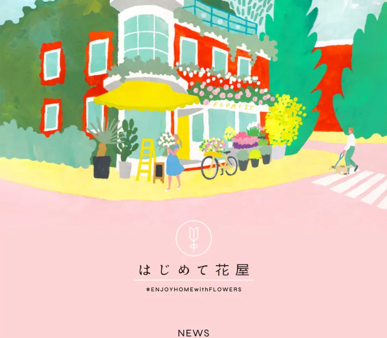
The identity graphic combines a thin white circular emblem, delicate black Japanese lettering, a white underline, and the tracked hashtag #ENJOYHOMEwithFLOWERS. Its desktop link and H1 wrapper measure 327 × 195px. Preserve the whole composition when an authorized asset is available.
Visible NEWS, SPECIAL, and ABOUT labels use open, widely spaced uppercase lettering. Their appearance is lighter and larger than the inherited styles of their measured H2 wrappers. The supplied evidence does not identify the lettering's exact font or rendering mechanism.
Campaign typography is part of each graphic: outlined green display letters, bold orange and green Japanese text, playful repeated lettering, and a muted editorial wordmark all coexist. Avoid imposing one interface heading font on these assets.
Type Scale
| Role | Desktop measurement | Mobile measurement | Interpretation |
|---|---|---|---|
| Body default | 13px / 19.5px, weight 500 | Same | General inherited style. |
| News summary | 15px / 30px, weight 500 | 24px / 36px, weight 500 | Measured text styles; mobile values belong to the overflowing layout. |
| News tracking | 0.6px | 0.96px | Both calculate to 0.04em. |
| ABOUT paragraphs | 16px / 32px, weight 500 | 28px / 56px, weight 500 | A consistent 2× line-height relationship. |
| Download introduction | 16px / 16px | 28px / 56px | The mobile introduction has explicit additional wrapping. |
| Download size labels | 14px / 14px | 24px / 24px | Labels describe offered banner formats. |
| Copyright link | 20px / 20px | 32px / 32px | Measured gray footer text. |
| Contact link | 14px / 21px | Same | Underlined blue utility link. |
| Illustration credit | 21px / 21px | 32px / 32px | Measured muted credit line. |
| News dates | Approximately 18px visually | Not established | The date element's individual computed style was not supplied. |
| NEWS and SPECIAL lettering | Approximately 26px visually | Not visually established | Optical estimate; use only as a reconstruction starting point. |
| ABOUT lettering | Approximately 32px visually | Not visually established | Optical estimate from the desktop capture. |
The important rhythm is compact news text with generous leading, followed by slow, short paragraph groups in ABOUT. Most live body text uses weight 500. Heavy display weights occur mainly within individual promotional graphics.
Tokens — Spacing & Shapes
Spacing Scale
There is no verified global spacing formula. The following recurring values are measured or calculated from the supplied geometry.
| Use | Desktop | Mobile evidence | Status |
|---|---|---|---|
| Main content width | 880px | 630px inside a 750px-wide layout | Measured. |
| Main horizontal offset | 280px | 60px | Measured; desktop is centered in 1440px. |
| Major campaign-section gap | 90px | 130px | Calculated from consecutive section bounds. |
| Identity-to-news gap | 105px | 120px | Calculated from header end to news start. |
| SPECIAL inner inset | Approximately 21px including border | Approximately 22px | Calculated from outer column and child positions. |
| SPECIAL desktop grid gutter | 25px in both directions | Cards stack vertically | Calculated. |
| News date column | 160px | Date moves above summary | Calculated from text positions. |
| News summary right inset | 85px | 60px | Measured padding. |
| ABOUT text inset from outer column | 76px on each side | 70px left offset in the measured layout | Calculated; these are geometric offsets, not verified padding declarations. |
| ABOUT paragraph-group gap | 32px | 53px | Calculated from consecutive paragraph rectangles. |
| Footer partner gap | Approximately 30px | Approximately 30px | Visual estimate supported by measured link positions. |
Border Radius
| Element | Treatment | Evidence |
|---|---|---|
| News area | Square, separated by fine horizontal rules | Screenshot observation. |
| Promotional banners | Square rectangles | Screenshots and sampled zero-radius elements. |
| SPECIAL frame | Square outer border | Screenshot observation. |
| ABOUT panel | Square white panel with a thin dark edge | Screenshot observation. |
| Brand emblem | Circular outline inside the identity composition | Artwork observation. |
| Weekend partner badge | Circular outline around a house-and-flower mark | Artwork observation. |
The circle is a property of specific marks. The page does not show a general rounded-card system. No elevation shadows are visible in the captured interface.
Layout Measurements
| Element | Desktop | Mobile | Notes |
|---|---|---|---|
| Document height | Approximately 6703px | Approximately 11573px | Reported capture values. |
| Header region | 1440 × 1011.58px | 750 × 1135.95px | Region bounds; the complete upper desktop composition is outside the supplied capture. |
| Identity link | 327 × 195px | 446 × 265.95px | Desktop document top approximately 816.58px; mobile top 870px. |
| News section | 880 × 250.5px | 630 × 465.97px | Contains two announcements. |
| Each wide campaign section | 880 × 363px | 630 × 259.88px | Section bounds, not independently measured image bounds. |
| Carousel region | 1440 × 738px | 750 × 981.38px | Extends beyond the main content column. |
| Carousel item link | 373 × 577px | 584 × 902.91px | Measured portrait-shaped interaction regions. |
| Carousel item stride | 393px | 600px | Gives 20px and 16px gaps respectively. |
| SPECIAL item section | 406.5 × 180px | 586 × 608px | Mobile link widths measure 590px; artwork bounds were not separately supplied. |
| ABOUT section | 880 × 1038px | 630 × 1827.45px | Includes its section heading and reading panel. |
| ABOUT paragraph box | 728px wide | 558px wide | Actual text wraps also depend on explicit breaks. |
| Share links | 44 × 44px each | 92 × 92px, 88 × 88px, 92 × 92px | Three measured link regions. |
| Download section | 880 × 785.33px | 630 × 2052.28px | Resource groups become a vertical sequence. |
| Footer content | 880 × 380px | 630 × 445px | Excludes the terminal illustration band. |
Components
Identity Header
Role: establishes the approachable flower-shop identity before the news.
The home link contains a vertically composed brand mark: circular white line art, the Japanese name, a horizontal white line, and a small hashtag. It is centered on the 880px desktop content axis.
The source H1 and home-link rectangles are 327 × 195px on desktop. On mobile they grow to 446 × 265.95px, centered around the 750px layout's midpoint rather than the actual 390px screen midpoint.
The supplied desktop view starts partway through the header, with a small amount of painted texture at its top edge. The complete opening illustration and its placement cannot be established from the current desktop images. The first mobile capture is entirely pink, with the measured brand starting below that viewport at y = 870px. Do not invent a loading animation or a complete upper illustration from these observations.
News List
Role: gives current announcements a readable, modest hierarchy.
A centered NEWS label sits above two linked rows. Each row contains a date at the left, a multi-line summary, and a thin open right chevron near the right edge. Fine black rules divide the entries and close the list.
Desktop anatomy:
- Overall width: 880px.
- Date-to-summary offset: 160px.
- Summary rectangle: 720px wide, including 85px of right padding.
- Summary text: 15px, 30px line-height,
0.04emtracking. - Both measured summaries occupy two lines, or 60px.
- Consecutive summary tops are 107px apart, reflecting the text, breathing room, and divider.
The dates and descriptions belong to the same anchor. The chevron reinforces the link without adding a filled button. At the captured mobile breakpoint, the date sits above the summary, the summary becomes 24px, and the entire row still measures 630px wide.
Both announcements are dated 2025.8.26. Their destinations are a press release and a note article. These hrefs were observed; navigation and hover behavior were not exercised.
Wide Campaign Banners
Role: provides the strongest promotional emphasis between news and educational content.
Two consecutive banner sections share 880 × 363px desktop bounds, with 90px of pink space between sections. Their mobile section bounds preserve approximately the same width-to-height relationship.
The first visible banner pairs a busy field of colorful repeated Japanese lettering with an orange information area. The left artwork occupies approximately 61% of the visible width and the orange panel about 39%; these proportions are visual estimates. The artwork includes #ビタミンFフェア and 花のきゅん曜日.
The second banner links to the associated note publication, but its complete appearance is outside the supplied screenshot crops. Its measured dimensions establish the repeated component slot, not its detailed art direction.
Keep these as complete, legible image compositions. The inline anchor's reported 13px-high line box does not describe the visible banner's height.
Editorial Carousel
Role: exposes illustrated flower-care topics through a horizontal sequence.
The carousel spans the full desktop viewport. Portrait panels have thin dark edges and vary strongly in color and content: simple flower illustrations, playful characters, a Q&A composition, and a photographic vase-related panel are visible in the supplied middle capture.
Measured desktop item links are 373 × 577px, separated by 20px. The composition shows clipped neighboring panels at the outer edges. Two large, unboxed chevrons sit beneath the strip, centered as a pair. Each visible chevron is approximately 45px tall; its actual hit area was not supplied.
The mobile DOM measures 584 × 902.91px item links with a 600px stride. This is consistent with larger panels inside the 750px layout and does not fit a single 390px viewport.
Several item anchors use javascript:;. This establishes scripted affordances, but it does not reveal whether activation opens a dialog, changes a panel, or starts another experience. The unique item count, looping, swipe behavior, autoplay, and arrow outcomes remain unverified. Different track offsets between samples are insufficient to establish autoplay.
SPECIAL Frame
Role: collects four related projects as a small poster board.
A thin black rectangular frame encloses a two-column, two-row grid. The SPECIAL label sits in a pink-backed opening at the center of the upper rule. Its measured desktop heading wrapper is 200px wide.
The desktop frame follows the 880px content column. Its children begin approximately 21px inside the outer edge. Each item measures 406.5 × 180px, with 25px horizontal and vertical gaps.
The four visible compositions are:
- A peach-toned
GREENS RESCUEbanner for the second indoor-green guide, with stylized leaves and an orange series marker. - A cream-toned
GREENS RESCUEbanner with pastel foliage and large green lettering. - A pale yellow workshop banner with bold orange and dark green Japanese lettering.
- A dusty-pink
Okulete gommenbanner with muted lettering and paired horizontal accent rules.
These are complete linked graphics, without separate card descriptions, shadows, or decorative button rows. The visible workshop artwork reads #花のABC; the extracted link text instead contains #鼻のABC. Preserve the visible wording and verify the accessible label when implementing a new version.
On mobile, the measured item sections form one vertical sequence, each approximately 586 × 608px. The supplied evidence does not separate their artwork dimensions from their containers, so a square mobile asset variant cannot be asserted.
ABOUT Reading Panel
Role: explains the project through reassuring, short statements.
A centered ABOUT label introduces a large white panel with a fine black border. The visible white panel begins about 63px below the heading's top in the desktop capture.
The DOM contains the headline 花は、誰にでも優しい。 followed by seven paragraph groups. These groups explain the pleasure of living with flowers, common beginner concerns, and the project's welcoming purpose.
Desktop body paragraphs use 16px text with 32px line-height in 728px-wide boxes. Two-line groups are 64px tall and usually have 32px of space before the next group. This makes the section read as a sequence of calm statements. The source uses deliberate line breaks; preserve their editorial intent when adapting the text.
The full paragraph region is outside the supplied desktop screenshots, and text alignment was not included in the computed-style extract. A centered reading treatment is a recommendation in the Quick Start, not a verified alignment declaration.
Mobile paragraphs compute to 28px / 56px. Additional line breaks increase several groups from four to five lines or from three to four. These values are part of the captured oversized layout.
Sharing Row
Role: offers lightweight distribution links below the explanatory content.
Three link regions target LINE, Twitter, and Facebook sharing endpoints. Desktop regions are 44px square and arranged around the page center. Mobile regions measure 88–92px.
The supplied screenshots do not expose the full icon artwork, so the icon style should not be reconstructed from a generic icon library and presented as observed. The captured share-query URL differs from the current homepage URL. A new implementation should construct sharing links from its verified canonical address.
Sharing success, popup behavior, and keyboard handling were not tested.
Download Resource Panel
Role: provides reusable promotional banners for flower-shop participants.
An outlined section contains introductory text, four size labels, banner previews, and underlined Download links. A pale cream interior is visible in the lower desktop crop. Desktop resources occupy two rows with differing preview widths; mobile resources are arranged in one vertical sequence.
The offered formats are 336×280, 250×250, 728×90, and 160×70. These are resource labels, not necessarily their displayed dimensions. For example, the measured desktop link region associated with the 728×90 resource is 480px wide.
The four hrefs point directly to JPEG files on the original domain. The evidence does not establish whether the browser saves them or opens them; that depends on attributes and server behavior not supplied here.
Partner Marks and Footer
Role: connects related flower initiatives and presents ownership, operation, contact, and illustration credit.
Three partner graphics sit in a centered horizontal row. The first two are approximately 140px-square promotional images. The third is a circular outlined house-and-flower mark with similarly sized visual bounds. Their destinations correspond to the women's-day flower initiative, Flower Valentine, and Weekend Flower.
Below them, the footer presents a restrained stack:
- A gray copyright line displaying
© 全国花みどり協会. - Small black text stating that
一般社団法人花の国日本協議会plans and operates the site. - An underlined blue
お問い合わせlink. - A separate muted line reading
Illustration : 紙野夏紀.
The copyright holder and stated operator are distinct labels in the original footer. Keep that distinction when describing attribution.
Large pink intervals separate the partner row, administrative text, and illustration credit. On the captured mobile screen, the row and centered text extend beyond the right edge instead of fitting the viewport.
Closing Illustration
Role: ends the page with a full-width painted flower-shop scene.
The current footer images show a yellow awning, pale mint windows, green foliage, vivid flowers, a bicycle, and people near the shop. Irregular edges and visible paint texture give it the character of a printed illustration.
The terminal image area occupies approximately the final 400px of the desktop page and 300px of the mobile page, inferred from the bottom-aligned captures and reported document heights. The desktop and mobile crops show different portions of the scene. The original image URL, intrinsic dimensions, and background-position or object-fit rules were not supplied.
Tokens — Motion & Interaction
| Treatment | Evidence | What can be concluded |
|---|---|---|
| Desktop news section | Computed transition: 0.6s ease-out |
A transition is configured; the changing property and trigger were not supplied. |
| First desktop campaign section | Computed transition: 0.6s ease-out |
Same timing evidence; a specific entrance animation cannot be reconstructed. |
| Corresponding mobile sections | Computed transition: none |
No transition on those sampled elements in that state. |
| Other sampled elements | Many serialize transition as all |
This alone does not establish a nonzero duration or visible movement. |
| Sampled CSS animations | animation: none |
No named animation was active on the sampled elements; this does not rule out descendant or JavaScript motion. |
| Carousel | Offscreen items and paired arrows are visible | Horizontal browsing is an apparent affordance; its activated behavior remains unverified. |
| News, campaign, project, contact, and resource links | Hrefs supplied | Destinations are known; clicked outcomes and hover states were not observed. |
The capture process waited for finite motion and layout stability, temporarily paused perpetual animations during readiness checks, and resumed them afterward. Static output cannot establish whether a looping effect was visible between captures.
Recommended implementation: keep all essential content visible without an entrance effect. If adding a subtle reveal, the observed 600ms ease-out timing can be a starting point, but the reveal itself is a new choice. Provide reduced-motion behavior. Use explicit, keyboard-operable carousel controls and verify their outcomes before adding autoplay or swipe gestures.
Surfaces
| Layer | Appearance | Purpose |
|---|---|---|
| Page canvas | Solid measured blush pink | Unifies the long page and supplies generous empty space. |
| News | Pink surface, black text, fine horizontal rules | Gives announcements structure without separate cards. |
| Campaign graphics | Self-contained, saturated rectangular compositions | Creates visual emphasis through artwork. |
| Carousel panels | Distinct poster-like surfaces with thin dark edges | Separates educational topics. |
| SPECIAL | Pink interior inside a fine rectangular frame | Groups four visually different projects. |
| ABOUT | White panel with a fine border | Creates a quiet reading area. |
| Downloads | Pale cream interior within the pink page | Groups practical resources. |
| Footer | Pink canvas with gray text and a small blue link | Lowers visual intensity before the illustration. |
| Closing artwork | Full-width painted scene | Gives the page an expressive final image. |
Surface hierarchy comes from fill changes, rules, spacing, and image boundaries. No sticky navigation, floating conversion bar, or overlay surface is demonstrated in the supplied captures.
Imagery
The strongest illustration language is tactile and botanical: opaque painted shapes, uneven edges, simplified people, clustered flowers, and large areas of yellow, mint, green, coral, and pink. The visible florist scene uses recognisable everyday objects rather than abstract decorative blobs.
Editorial images deliberately vary. Some use flat vector-like flowers and characters; others use bold typographic repetition, pastel botanical motifs, or photography. The consistent pink shell allows this variety to feel collected rather than chaotic.
Preserve embedded lettering, complete banner compositions, and natural image proportions. Artwork carries substantial meaning, so cropping a poster to a generic card ratio can remove titles or explanations. Standard smooth image rendering suits the painted imagery; pixelated rendering is not supported by the current visual evidence.
Observed Asset References
Only the following asset URLs were explicitly present in the supplied original-page links:
| Resource label | Observed URL | Use |
|---|---|---|
| 336×280 | https://hajimetehanaya.jp/data/banner_336x280.jpg |
Downloadable promotional banner. |
| 250×250 | https://hajimetehanaya.jp/data/banner_250x250.jpg |
Downloadable square promotional banner. |
| 728×90 | https://hajimetehanaya.jp/data/banner_728x90.jpg |
Downloadable horizontal promotional banner. |
| 160×70 | https://hajimetehanaya.jp/data/banner_160x70.jpg |
Downloadable compact promotional banner. |
The logo, campaign images, carousel artwork, SPECIAL graphics, partner marks, and closing illustration are visible or represented in the DOM, but their asset URLs were not supplied. Do not guess their filenames. The four resource links above were observed, not independently fetched or decoded for this reference.
Layout & Responsive Behavior
Desktop Composition
The primary axis is a centered 880px column. At 1440px, its margins calculate to (1440 − 880) / 2 = 280px. News, wide campaigns, SPECIAL, ABOUT, downloads, and footer content repeatedly use this alignment.
The carousel and closing illustration expand beyond that column. This gives the page two scales: a contained reading and resource rhythm, and wider image-led moments. Vertical gaps of approximately 90px keep the large banners from merging into a continuous wall of graphics.
The visible sequence is identity, news, two wide campaign sections, carousel, SPECIAL, ABOUT, sharing, downloads, partner marks, administrative footer, and closing illustration. Exact artwork in uncaptured portions remains outside scope.
Captured Mobile Behavior
The 390 × 844 capture does not show a fully fitted responsive page:
- The header and carousel remain 750px wide.
- Main sections are 630px wide at
x = 60px, placing their right edge at 690px. - The identity link is 446px wide at
x = 152pxand begins aty = 870px. - The first screenshot contains only the pink canvas. This is the captured state; its cause is not established.
- SPECIAL items become a vertical sequence of approximately 608px-tall sections.
- ABOUT and resource typography grow, and additional line breaks increase the document height.
- Footer content remains centered on the wider layout, producing visibly clipped text and partner artwork at the right edge.
The geometry is consistent with a 750px-wide internal layout inside the narrower viewport. The evidence does not identify a specific min-width rule, viewport-tag issue, scaling strategy, or delayed reveal as the cause.
Recommended Responsive Adaptation
For a new implementation, retain the 880px desktop maximum but let the actual viewport determine available width. At 390px, 20px gutters produce a 350px content column. Keep body text near 16px, stack SPECIAL and resource items, and give the carousel its own horizontal scrolling region.
The Quick Start's 48rem breakpoint is a recommendation. The original breakpoint was not supplied. Its mobile banner proportions also remain conservative: preserve the verified desktop composition until a separately verified mobile asset is available.
Do’s and Don’ts
Do
- Use the measured
#ffd4d5canvas throughout the page. - Return major desktop sections to an 880px centered axis.
- Preserve the white circular emblem, delicate wordmark, underline, and hashtag as one identity composition.
- Give news rows a clear date, readable summary, thin divider, and open chevron.
- Maintain large pink intervals between promotional sections.
- Let each campaign retain its own embedded typography and colors.
- Build SPECIAL as a thin framed board with a centered heading interruption and a precise two-column desktop grid.
- Preserve deliberate paragraph grouping and generous leading in ABOUT.
- Use complete painted illustrations with visible texture and natural proportions.
- Record the captured mobile overflow accurately and make any repair explicit.
Don’t
- Don't recast the information hub as a product checkout or a single conversion funnel.
- Don't make the campaign orange the default fill for every interface action.
- Don't add pill-shaped cards, glossy gradients, or general drop shadows.
- Don't treat inherited 13px H2 wrapper styles as the visible heading-letter size.
- Don't assign a font name to graphic lettering without direct evidence.
- Don't crop away banner titles to enforce a uniform modern card layout.
- Don't reproduce the 750px mobile overflow as a recommended pattern.
- Don't hide essential content while waiting for an assumed entrance animation.
- Don't invent carousel dialogs, autoplay intervals, swipe behavior, or hover effects.
- Don't infer the complete opening illustration from evidence that only establishes the lower header and closing scene.
Recommended Implementation Additions
These are improvements for a new implementation, not verified original features:
- Make containers fluid and test at 390px with no page-level horizontal overflow.
- Keep identity and essential navigation visible when scripts fail or motion is disabled.
- Supply accessible names for image links, share controls, and carousel arrows. Empty extracted text does not by itself establish the original accessibility tree.
- Use real buttons for scripted actions and anchors for navigation. Replace
javascript:;placeholders with appropriate semantics. - Keep carousel controls at least 44px square and provide visible keyboard focus.
- Give informational poster graphics meaningful text alternatives or adjacent text equivalents.
- Use live, semantic section headings while preserving their visual spacing; retain authorized artwork where its lettering is essential to identity.
- Check the small blue contact link against the pink background and choose a darker blue if needed for text contrast.
- Build sharing URLs from the current canonical page address.
- Reserve image dimensions to reduce layout shifts, while ensuring failed artwork does not leave unexplained blank sections.
- Verify download behavior and identify the offered dimensions clearly in each accessible link name.
Agent Prompt Guide
Quick Color Reference
- Main canvas: measured
#ffd4d5. - Primary text and linework: measured
#000000. - Copyright: measured
#676767. - Illustration credit: measured
#787373. - Contact link: measured
#4682b4. - ABOUT panel: visually white, approximately
#ffffff. - Resource panel: approximately
#fff8ec, a visual estimate. - Campaign orange: approximately
#f58219, confined to relevant artwork.
Overall Prompt
“Create an approachable Japanese flower information homepage inspired by はじめて花屋. Use a continuous blush-pink canvas #ffd4d5, black Japanese sans-serif body text, thin black rules, square-edged graphics, and broad vertical spacing. Center the main desktop sections in an 880px column. Include a delicate graphic identity, dated news rows with open chevrons, large campaign banners, a full-width editorial poster carousel, a framed SPECIAL grid, a white ABOUT reading panel, banner downloads, partner marks, and a painted florist scene at the bottom. Give campaign graphics their own typography and colors. Make the new mobile layout fluid and readable; this is an adaptation of the captured overflowing mobile rendering. Do not invent the uncaptured opening artwork or untested carousel interactions.”
Example Component Prompts
- News list: “Design an 880px-wide pink news section with a modest tracked NEWS heading. Use a 160px date column, 15px Japanese summaries at 30px line-height, thin black separators, and an open right chevron. Make each entry one accessible link. Stack the date above the summary on a fluid mobile layout.”
- SPECIAL board: “Create a square-cornered, 1px black frame on pink. Interrupt the top rule with a centered pink-backed SPECIAL label. Inside, use approximately 20px padding and a two-column grid with 25px gaps. Display four complete 406.5:180 promotional graphics without shadows or added captions.”
- ABOUT panel: “Place a white, finely bordered reading panel under an open uppercase ABOUT heading. Use short Japanese paragraph groups, 16px body text, 32px leading, and approximately 32px between groups. Keep the desktop reading box near 728px wide. Centered paragraph alignment is a design recommendation, not an established source declaration.”
- Editorial carousel: “Arrange thin-bordered portrait posters with a desktop item size near 373 × 577px and 20px gaps. Allow neighboring panels to extend beyond the visible strip. Place two unboxed chevrons underneath. Implement accessible manual navigation; leave autoplay and modal behavior unspecified.”
- Closing scene: “Create an original painted florist street scene with a yellow awning, mint windows, abundant green foliage, colorful flowers, a bicycle, and simplified pedestrians. Use opaque textured paint and irregular edges. This is an original illustration brief, not a replacement claim for the credited source artwork.”
Quick Start
CSS Custom Properties
This is a recommended implementation scaffold. It preserves measured desktop colors, widths, news typography, and SPECIAL proportions while repairing the captured mobile overflow. Heading sizes, unmeasured panel fills, the mobile breakpoint, centered ABOUT alignment, and footer image cropping are explicit adaptation choices.
Use .site-container for contained sections. A .news-list contains list items whose .news-link groups a time, .news-summary, and decorative .news-chevron. A .special-grid contains linked images. Keep the carousel and closing illustration outside the 880px container. Asset files and carousel control logic must be supplied separately.
:root {
  /* Measured colors */
  --page: #ffd4d5;
  --ink: #000000;
  --muted: #676767;
  --credit: #787373;
  --contact: #4682b4;

  /* Visual approximations, not extracted declarations */
  --panel: #ffffff;
  --resource: #fff8ec;
  --campaign-orange: #f58219;

  /* Adapted stack using names present in the source stack */
  --font-body: 'Noto Sans Japanese', 'Yu Gothic', YuGothic,
    'Hiragino Kaku Gothic Pro', Meiryo, Osaka,
    'MS PGothic', sans-serif;

  /* Measured or derived desktop geometry */
  --content-width: 880px;
  --section-gap: 90px;
  --frame-inset: 20px;
  --special-gap: 25px;
  --rule: 1px;
  --radius: 0px;
  --text-news: 15px;
  --text-body: 16px;
  --leading-news: 30px;
  --leading-body: 32px;

  /* Timing reported on selected sections; trigger unverified */
  --reported-section-transition: 600ms ease-out;
}

* {
  box-sizing: border-box;
}

body.flower-page {
  margin: 0;
  color: var(--ink);
  background: var(--page);
  font: 500 13px/1.5 var(--font-body);
}

.flower-page img {
  display: block;
  max-inline-size: 100%;
  block-size: auto;
}

.flower-page button {
  font: inherit;
  color: inherit;
}

.site-container {
  inline-size: min(var(--content-width), calc(100% - 40px));
  margin-inline: auto;
}

.page-section {
  margin-block-start: var(--section-gap);
}

.brand-link {
  display: block;
  inline-size: min(327px, calc(100% - 40px));
  margin-inline: auto;
}

.brand-link img {
  inline-size: 100%;
}

.news {
  margin-block-start: 105px;
}

/* Live-text approximation of the visible graphic headings */
.section-heading {
  margin: 0 0 16px;
  text-align: center;
  font-size: 26px;
  font-weight: 400;
  line-height: 1;
  letter-spacing: 0.14em;
}

.news-list {
  margin: 0;
  padding: 0;
  list-style: none;
}

.news-list > li {
  border-block-end: var(--rule) solid var(--ink);
}

.news-link {
  position: relative;
  display: grid;
  grid-template-columns: 160px minmax(0, 1fr);
  align-items: center;
  padding-block: 23px;
  color: inherit;
  text-decoration: none;
}

.news-link time {
  /* Visual estimate; the date's source size was not supplied */
  font-size: 18px;
}

.news-summary {
  min-inline-size: 0;
  margin: 0;
  padding-inline-end: 85px;
  font-size: var(--text-news);
  line-height: var(--leading-news);
  letter-spacing: 0.04em;
  overflow-wrap: anywhere;
}

.news-chevron {
  position: absolute;
  inset-inline-end: 29px;
  inset-block-start: 50%;
  inline-size: 16px;
  block-size: 16px;
  border-block-start: 1px solid currentColor;
  border-inline-end: 1px solid currentColor;
  transform: translateY(-50%) rotate(45deg);
}

.campaign-link {
  display: block;
  color: inherit;
}

.campaign-link img {
  inline-size: 100%;
}

/* Recommended native scroller; original mechanics unverified */
.carousel-track {
  display: flex;
  gap: 20px;
  overflow-x: auto;
  padding: 4px 20px;
  scroll-snap-type: x proximity;
  scroll-padding-inline: 20px;
}

.carousel-card {
  flex: 0 0 373px;
  aspect-ratio: 373 / 577;
  border: var(--rule) solid var(--ink);
  scroll-snap-align: center;
}

.carousel-card img {
  inline-size: 100%;
  block-size: 100%;
  object-fit: contain;
}

.carousel-controls {
  display: flex;
  justify-content: center;
  gap: 50px;
  margin-block-start: 32px;
}

.carousel-control {
  display: grid;
  place-items: center;
  min-inline-size: 44px;
  min-block-size: 44px;
  padding: 6px;
  border: 0;
  background: transparent;
  cursor: pointer;
}

.carousel-control::before {
  content: '';
  inline-size: 30px;
  block-size: 30px;
  border-block-start: 1px solid currentColor;
  border-inline-end: 1px solid currentColor;
  transform: rotate(45deg);
}

.carousel-control[data-direction='previous']::before {
  transform: rotate(-135deg);
}

.special-frame {
  position: relative;
  padding: var(--frame-inset);
  border: var(--rule) solid var(--ink);
  border-radius: var(--radius);
}

.special-frame > .section-heading {
  position: absolute;
  inset-block-start: -22px;
  inset-inline-start: 50%;
  inline-size: 200px;
  margin: 0;
  background: var(--page);
  transform: translateX(-50%);
}

.special-grid {
  display: grid;
  grid-template-columns: repeat(2, minmax(0, 1fr));
  gap: var(--special-gap);
}

.special-card {
  display: block;
  min-inline-size: 0;
  aspect-ratio: 406.5 / 180;
}

.special-card img {
  inline-size: 100%;
  block-size: 100%;
  object-fit: contain;
}

.about-section > .section-heading {
  margin-block-end: 40px;
  font-size: 32px;
}

.about-copy {
  padding: 75px;
  border: var(--rule) solid var(--ink);
  background: var(--panel);
  text-align: center;
}

.about-copy p {
  margin: 0;
  font-size: var(--text-body);
  line-height: var(--leading-body);
  overflow-wrap: anywhere;
}

.about-copy p + p {
  margin-block-start: 32px;
}

.share-row {
  display: flex;
  justify-content: center;
  gap: 44px;
  margin-block-start: 70px;
}

.share-row a {
  display: grid;
  place-items: center;
  inline-size: 44px;
  block-size: 44px;
}

.download-frame {
  padding: 20px;
  border: var(--rule) solid var(--ink);
}

.download-panel {
  padding: 60px 40px;
  background: var(--resource);
}

.download-grid {
  display: grid;
  grid-template-columns: repeat(2, minmax(0, 1fr));
  align-items: start;
  gap: 40px;
}

.download-item {
  min-inline-size: 0;
  text-align: center;
}

.download-item img {
  margin-inline: auto;
}

.download-label {
  display: inline-block;
  margin-block-start: 20px;
  text-decoration: underline;
  text-underline-offset: 3px;
}

.site-footer {
  padding-block: 70px 60px;
  text-align: center;
}

.partner-row {
  display: flex;
  justify-content: center;
  align-items: center;
  gap: 30px;
}

.partner-row img {
  inline-size: 140px;
  block-size: 140px;
  object-fit: contain;
}

.footer-copyright {
  margin-block: 50px 0;
  color: var(--muted);
  font-size: 20px;
  line-height: 1;
}

.footer-contact {
  color: var(--contact);
  font-size: 14px;
  line-height: 21px;
  text-decoration: underline;
  text-underline-offset: 2px;
}

.footer-credit {
  margin-block: 85px 0;
  color: var(--credit);
  font-size: 21px;
  line-height: 1;
}

/* Recommended crop; the original image-fit rule is unknown */
.flower-page .closing-illustration {
  inline-size: 100%;
  max-inline-size: none;
  block-size: 400px;
  object-fit: cover;
}

.flower-page :focus-visible {
  outline: 2px solid var(--ink);
  outline-offset: 4px;
}

/* Recommended breakpoint and fluid phone layout */
@media (max-width: 48rem) {
  :root {
    --section-gap: 64px;
  }

  .brand-link {
    inline-size: min(280px, calc(100% - 40px));
  }

  .news {
    margin-block-start: 64px;
  }

  .news-link {
    grid-template-columns: minmax(0, 1fr);
    gap: 6px;
    padding-inline-end: 36px;
  }

  .news-link time {
    font-size: 16px;
  }

  .news-summary {
    padding-inline-end: 0;
    font-size: 16px;
    line-height: 1.8;
  }

  .news-chevron {
    inset-inline-end: 8px;
  }

  .carousel-track {
    gap: 16px;
  }

  .carousel-card {
    flex-basis: min(78vw, 373px);
  }

  .special-grid,
  .download-grid {
    grid-template-columns: minmax(0, 1fr);
  }

  .about-copy {
    padding: 36px 24px;
  }

  .download-panel {
    padding: 32px 16px;
  }

  .partner-row {
    flex-wrap: wrap;
    gap: 24px;
  }

  .footer-credit {
    font-size: 20px;
  }

  .flower-page .closing-illustration {
    block-size: 300px;
  }
}

/* Guard for any later CSS motion added to this scaffold */
@media (prefers-reduced-motion: reduce) {
  .flower-page *,
  .flower-page *::before,
  .flower-page *::after {
    animation: none;
    transition: none;
    scroll-behavior: auto;
  }
}
The scroller works through native overflow. If chevron buttons are rendered, bind them to actual scrolling and provide accessible names; CSS alone does not implement their behavior. The scaffold deliberately leaves the unverified upper-header illustration geometry unspecified.
Tailwind v4 Token Mapping
Optional aliases for a project already using Tailwind v4. This does not imply that the original site uses Tailwind. Define the properties above first.
@theme inline {
  --color-flower-page: var(--page);
  --color-flower-ink: var(--ink);
  --color-flower-panel: var(--panel);
  --color-flower-resource: var(--resource);
  --color-flower-muted: var(--muted);
  --color-flower-contact: var(--contact);

  --font-flower: var(--font-body);

  --text-flower-news: 15px;
  --text-flower-body: 16px;
  --text-flower-section: 26px;

  --spacing-flower-content: 880px;
  --spacing-flower-section: 90px;
  --spacing-flower-inset: 20px;
  --spacing-flower-card-gap: 25px;

  --radius-flower: 0px;
}
Sources & Evidence
- Original and final page: https://hajimetehanaya.jp/. The supplied inspection reports HTTP 200 and the same original and final URL.
- Actual capture time: October 5, 2026, 16:06:06.399 UTC, equivalent to October 6, 2026, 01:06:06.399 JST.
- Desktop evidence: three supplied 1440 × 1000 screenshots and rendered DOM measurements; document height approximately 6703px. The measured desktop state has a vertical scroll offset of approximately 767px.
- Mobile evidence: two supplied 390 × 844 screenshots and rendered DOM measurements; document height approximately 11573px. The first image is blank pink; the final image shows the oversized footer and closing illustration crop.
- Computed-style evidence: body and text colors, declared font stack, text sizes, weights, leading, selected padding, element bounds, and reported transition and animation values. A complete stylesheet, font-loading report, image inventory, and accessibility tree were not supplied.
- Original-page attribution evidence: the footer displays the copyright holder, identifies the planning and operating organization, and credits the illustration. No additional production role is established by the inspected original page.
- Interaction scope: scrolling and readiness checks were part of capture preparation. No supplied evidence demonstrates clicked news or project links, carousel activation, hover states, keyboard navigation, completed sharing, or download behavior.
- Readiness limitations: the supplied process waited for document load, visible image decoding, finite motion, and sampled layout stability, with bounded waits. These checks do not prove delayed content completeness or establish the cause of the blank mobile opening.
This reference describes the supplied current homepage evidence. Visual estimates and implementation recommendations are labeled separately from measured original-page values.
# はじめて花屋 — Style Reference

> A flower guide on blush-pink paper, with painted shopfront scenery, thin black rules, and colorful editorial posters.

**Website / original URL:** [hajimetehanaya.jp](https://hajimetehanaya.jp/)
**Final URL:** [https://hajimetehanaya.jp/](https://hajimetehanaya.jp/) — HTTP 200 in the supplied inspection.
**Theme:** light pink canvas with black interface text and independently colored artwork.
**Inspected:** October 6, 2026, at 01:06:06 JST; capture timestamp October 5, 2026, at 16:06:06.399 UTC.
**Viewports:** desktop 1440 × 1000 CSS pixels; mobile 390 × 844 CSS pixels.
**Scope:** the current homepage, using three desktop captures, two mobile captures, and their supplied rendered DOM and computed-style measurements. Coverage includes the identity block, news, campaign links, an editorial carousel, SPECIAL, ABOUT, sharing links, downloadable banners, partner marks, and the closing footer illustration. Linked destinations and activated interaction states were not inspected.

The page introduces flowers as an approachable part of everyday life. Its structure is an information and campaign hub: dated announcements lead to large promotional artwork, educational content, related projects, an explanatory statement, and practical resources for flower shops.

A continuous pink background holds the page together while individual banners use orange, yellow, green, cream, and coral. The surrounding interface stays restrained: thin borders, square corners, regular Japanese sans-serif text, widely spaced English section labels, and substantial vertical gaps. The painted florist scene at the bottom supplies a warm, tactile finish.

Desktop content repeatedly returns to an 880px column. The captured mobile rendering has a significant limitation: several major regions remain 750px wide inside a 390px viewport. The reference records this overflow as observed behavior; the Quick Start provides a separately labeled fluid adaptation.
閉じる
# はじめて花屋 — Style Reference

> A flower guide on blush-pink paper, with painted shopfront scenery, thin black rules, and colorful editorial posters.

**Website / original URL:** [hajimetehanaya.jp](https://hajimetehanaya.jp/)
**Final URL:** [https://hajimetehanaya.jp/](https://hajimetehanaya.jp/) — HTTP 200 in the supplied inspection.
**Theme:** light pink canvas with black interface text and independently colored artwork.
**Inspected:** October 6, 2026, at 01:06:06 JST; capture timestamp October 5, 2026, at 16:06:06.399 UTC.
**Viewports:** desktop 1440 × 1000 CSS pixels; mobile 390 × 844 CSS pixels.
**Scope:** the current homepage, using three desktop captures, two mobile captures, and their supplied rendered DOM and computed-style measurements. Coverage includes the identity block, news, campaign links, an editorial carousel, SPECIAL, ABOUT, sharing links, downloadable banners, partner marks, and the closing footer illustration. Linked destinations and activated interaction states were not inspected.

The page introduces flowers as an approachable part of everyday life. Its structure is an information and campaign hub: dated announcements lead to large promotional artwork, educational content, related projects, an explanatory statement, and practical resources for flower shops.

A continuous pink background holds the page together while individual banners use orange, yellow, green, cream, and coral. The surrounding interface stays restrained: thin borders, square corners, regular Japanese sans-serif text, widely spaced English section labels, and substantial vertical gaps. The painted florist scene at the bottom supplies a warm, tactile finish.

Desktop content repeatedly returns to an 880px column. The captured mobile rendering has a significant limitation: several major regions remain 750px wide inside a 390px viewport. The reference records this overflow as observed behavior; the Quick Start provides a separately labeled fluid adaptation.

## How to Read This Reference

- **Measured** values come from the supplied rendered rectangles and computed styles. Measurements are CSS pixels, rounded where useful.
- **Calculated** values are arithmetic derived from those measurements, such as the 280px desktop side margins or 25px banner gutters.
- **Estimated** values describe visible screenshot appearance. Estimated colors are approximate visual matches, not sampled source declarations.
- **Recommended** values are implementation choices for a new site. They do not establish behavior in the original.
- **Token names** are descriptive aliases. The supplied custom-property records were empty; no original CSS variable naming system was established.
- **Coordinates require context:** the desktop DOM sample was collected at approximately 767px of vertical scroll. Its element `y` positions are viewport-relative. The first supplied desktop image therefore shows the lower header and news, rather than the complete opening viewport.
- **Graphic lettering differs from wrapper typography:** several visible headings have empty reported text and inherited 13px wrapper styles. Those styles do not measure the letters visible in their artwork or other rendered representation.
- **Evidence has limits:** mobile middle sections are documented principally through DOM measurements. The mobile screenshots show the initial blank pink viewport and the clipped lower footer.

## Tokens — Colors

### Default Palette

| Name | Value | Suggested token | Evidence and role |
| --- | --- | --- | --- |
| Blush canvas | `#ffd4d5` | `--color-page` | Measured body background: `rgb(255, 212, 213)` at both viewports. Also measured behind framed section headings. |
| Black ink | `#000000` | `--color-ink` | Measured primary text color. Thin visible rules and chevrons also appear black. |
| Copyright gray | `#676767` | `--color-muted` | Measured copyright-link color. |
| Illustration-credit gray | `#787373` | `--color-credit` | Measured footer illustration-credit color. |
| Contact blue | `#4682b4` | `--color-contact` | Measured contact-link color. It is a small utility accent. |
| White panel | Approximately `#ffffff` | `--color-panel` | Visually observed ABOUT panel and white details in the identity artwork; the panel's own computed background was not supplied. |
| Resource cream | Approximately `#fff8ec` | `--color-resource` | Visual estimate for the pale interior visible at the bottom of the download section. |
| Campaign orange | Approximately `#f58219` | `--color-campaign` | Visual estimate for the right-hand field of the flower campaign banner. This belongs to the campaign artwork. |

Pink is the structural color. It surrounds the news, continues between campaign banners, fills the SPECIAL frame, and carries the footer. Transparent section backgrounds expose the same body canvas.

White and cream distinguish longer reading or resource areas. They are flat fills with simple boundaries. Bright greens, yellows, reds, and blues primarily occur inside illustrations and promotional graphics; they do not form a general interface status palette.

### Theme Presets

No theme selector or alternate color preset was demonstrated. Keep the current pink treatment as the documented default. The color differences between promotional banners are content-specific art direction.

## Tokens — Typography

### Source Body Stack

The reported body stack is:

`"Noto Sans Japanese", 游ゴシック体, "Yu Gothic", YuGothic, "ヒラギノ角ゴシック Pro", "Hiragino Kaku Gothic Pro", メイリオ, Meiryo, Osaka, "MS Pゴシック", "MS PGothic", sans-serif`

The body computes to **13px, weight 500, line-height 19.5px** at both viewport sizes. News and explanatory paragraphs override that base.

This is evidence of a declared stack, not confirmation that its first font successfully rendered. Font-file loading and individual glyph fallback were not supplied. The root HTML element reports Times, but the body overrides it with the Japanese sans-serif stack.

### Identity and Section Lettering

The identity graphic combines a thin white circular emblem, delicate black Japanese lettering, a white underline, and the tracked hashtag `#ENJOYHOMEwithFLOWERS`. Its desktop link and H1 wrapper measure **327 × 195px**. Preserve the whole composition when an authorized asset is available.

Visible `NEWS`, `SPECIAL`, and `ABOUT` labels use open, widely spaced uppercase lettering. Their appearance is lighter and larger than the inherited styles of their measured H2 wrappers. The supplied evidence does not identify the lettering's exact font or rendering mechanism.

Campaign typography is part of each graphic: outlined green display letters, bold orange and green Japanese text, playful repeated lettering, and a muted editorial wordmark all coexist. Avoid imposing one interface heading font on these assets.

### Type Scale

| Role | Desktop measurement | Mobile measurement | Interpretation |
| --- | --- | --- | --- |
| Body default | 13px / 19.5px, weight 500 | Same | General inherited style. |
| News summary | 15px / 30px, weight 500 | 24px / 36px, weight 500 | Measured text styles; mobile values belong to the overflowing layout. |
| News tracking | 0.6px | 0.96px | Both calculate to `0.04em`. |
| ABOUT paragraphs | 16px / 32px, weight 500 | 28px / 56px, weight 500 | A consistent 2× line-height relationship. |
| Download introduction | 16px / 16px | 28px / 56px | The mobile introduction has explicit additional wrapping. |
| Download size labels | 14px / 14px | 24px / 24px | Labels describe offered banner formats. |
| Copyright link | 20px / 20px | 32px / 32px | Measured gray footer text. |
| Contact link | 14px / 21px | Same | Underlined blue utility link. |
| Illustration credit | 21px / 21px | 32px / 32px | Measured muted credit line. |
| News dates | Approximately 18px visually | Not established | The date element's individual computed style was not supplied. |
| NEWS and SPECIAL lettering | Approximately 26px visually | Not visually established | Optical estimate; use only as a reconstruction starting point. |
| ABOUT lettering | Approximately 32px visually | Not visually established | Optical estimate from the desktop capture. |

The important rhythm is compact news text with generous leading, followed by slow, short paragraph groups in ABOUT. Most live body text uses weight 500. Heavy display weights occur mainly within individual promotional graphics.

## Tokens — Spacing & Shapes

### Spacing Scale

There is no verified global spacing formula. The following recurring values are measured or calculated from the supplied geometry.

| Use | Desktop | Mobile evidence | Status |
| --- | --- | --- | --- |
| Main content width | 880px | 630px inside a 750px-wide layout | Measured. |
| Main horizontal offset | 280px | 60px | Measured; desktop is centered in 1440px. |
| Major campaign-section gap | 90px | 130px | Calculated from consecutive section bounds. |
| Identity-to-news gap | 105px | 120px | Calculated from header end to news start. |
| SPECIAL inner inset | Approximately 21px including border | Approximately 22px | Calculated from outer column and child positions. |
| SPECIAL desktop grid gutter | 25px in both directions | Cards stack vertically | Calculated. |
| News date column | 160px | Date moves above summary | Calculated from text positions. |
| News summary right inset | 85px | 60px | Measured padding. |
| ABOUT text inset from outer column | 76px on each side | 70px left offset in the measured layout | Calculated; these are geometric offsets, not verified padding declarations. |
| ABOUT paragraph-group gap | 32px | 53px | Calculated from consecutive paragraph rectangles. |
| Footer partner gap | Approximately 30px | Approximately 30px | Visual estimate supported by measured link positions. |

### Border Radius

| Element | Treatment | Evidence |
| --- | --- | --- |
| News area | Square, separated by fine horizontal rules | Screenshot observation. |
| Promotional banners | Square rectangles | Screenshots and sampled zero-radius elements. |
| SPECIAL frame | Square outer border | Screenshot observation. |
| ABOUT panel | Square white panel with a thin dark edge | Screenshot observation. |
| Brand emblem | Circular outline inside the identity composition | Artwork observation. |
| Weekend partner badge | Circular outline around a house-and-flower mark | Artwork observation. |

The circle is a property of specific marks. The page does not show a general rounded-card system. No elevation shadows are visible in the captured interface.

### Layout Measurements

| Element | Desktop | Mobile | Notes |
| --- | --- | --- | --- |
| Document height | Approximately 6703px | Approximately 11573px | Reported capture values. |
| Header region | 1440 × 1011.58px | 750 × 1135.95px | Region bounds; the complete upper desktop composition is outside the supplied capture. |
| Identity link | 327 × 195px | 446 × 265.95px | Desktop document top approximately 816.58px; mobile top 870px. |
| News section | 880 × 250.5px | 630 × 465.97px | Contains two announcements. |
| Each wide campaign section | 880 × 363px | 630 × 259.88px | Section bounds, not independently measured image bounds. |
| Carousel region | 1440 × 738px | 750 × 981.38px | Extends beyond the main content column. |
| Carousel item link | 373 × 577px | 584 × 902.91px | Measured portrait-shaped interaction regions. |
| Carousel item stride | 393px | 600px | Gives 20px and 16px gaps respectively. |
| SPECIAL item section | 406.5 × 180px | 586 × 608px | Mobile link widths measure 590px; artwork bounds were not separately supplied. |
| ABOUT section | 880 × 1038px | 630 × 1827.45px | Includes its section heading and reading panel. |
| ABOUT paragraph box | 728px wide | 558px wide | Actual text wraps also depend on explicit breaks. |
| Share links | 44 × 44px each | 92 × 92px, 88 × 88px, 92 × 92px | Three measured link regions. |
| Download section | 880 × 785.33px | 630 × 2052.28px | Resource groups become a vertical sequence. |
| Footer content | 880 × 380px | 630 × 445px | Excludes the terminal illustration band. |

## Components

### Identity Header

**Role:** establishes the approachable flower-shop identity before the news.

The home link contains a vertically composed brand mark: circular white line art, the Japanese name, a horizontal white line, and a small hashtag. It is centered on the 880px desktop content axis.

The source H1 and home-link rectangles are 327 × 195px on desktop. On mobile they grow to 446 × 265.95px, centered around the 750px layout's midpoint rather than the actual 390px screen midpoint.

The supplied desktop view starts partway through the header, with a small amount of painted texture at its top edge. The complete opening illustration and its placement cannot be established from the current desktop images. The first mobile capture is entirely pink, with the measured brand starting below that viewport at `y = 870px`. Do not invent a loading animation or a complete upper illustration from these observations.

### News List

**Role:** gives current announcements a readable, modest hierarchy.

A centered `NEWS` label sits above two linked rows. Each row contains a date at the left, a multi-line summary, and a thin open right chevron near the right edge. Fine black rules divide the entries and close the list.

Desktop anatomy:

- Overall width: 880px.
- Date-to-summary offset: 160px.
- Summary rectangle: 720px wide, including 85px of right padding.
- Summary text: 15px, 30px line-height, `0.04em` tracking.
- Both measured summaries occupy two lines, or 60px.
- Consecutive summary tops are 107px apart, reflecting the text, breathing room, and divider.

The dates and descriptions belong to the same anchor. The chevron reinforces the link without adding a filled button. At the captured mobile breakpoint, the date sits above the summary, the summary becomes 24px, and the entire row still measures 630px wide.

Both announcements are dated `2025.8.26`. Their destinations are a press release and a note article. These hrefs were observed; navigation and hover behavior were not exercised.

### Wide Campaign Banners

**Role:** provides the strongest promotional emphasis between news and educational content.

Two consecutive banner sections share 880 × 363px desktop bounds, with 90px of pink space between sections. Their mobile section bounds preserve approximately the same width-to-height relationship.

The first visible banner pairs a busy field of colorful repeated Japanese lettering with an orange information area. The left artwork occupies approximately 61% of the visible width and the orange panel about 39%; these proportions are visual estimates. The artwork includes `#ビタミンFフェア` and `花のきゅん曜日`.

The second banner links to the associated note publication, but its complete appearance is outside the supplied screenshot crops. Its measured dimensions establish the repeated component slot, not its detailed art direction.

Keep these as complete, legible image compositions. The inline anchor's reported 13px-high line box does not describe the visible banner's height.

### Editorial Carousel

**Role:** exposes illustrated flower-care topics through a horizontal sequence.

The carousel spans the full desktop viewport. Portrait panels have thin dark edges and vary strongly in color and content: simple flower illustrations, playful characters, a Q&A composition, and a photographic vase-related panel are visible in the supplied middle capture.

Measured desktop item links are 373 × 577px, separated by 20px. The composition shows clipped neighboring panels at the outer edges. Two large, unboxed chevrons sit beneath the strip, centered as a pair. Each visible chevron is approximately 45px tall; its actual hit area was not supplied.

The mobile DOM measures 584 × 902.91px item links with a 600px stride. This is consistent with larger panels inside the 750px layout and does not fit a single 390px viewport.

Several item anchors use `javascript:;`. This establishes scripted affordances, but it does not reveal whether activation opens a dialog, changes a panel, or starts another experience. The unique item count, looping, swipe behavior, autoplay, and arrow outcomes remain unverified. Different track offsets between samples are insufficient to establish autoplay.

### SPECIAL Frame

**Role:** collects four related projects as a small poster board.

A thin black rectangular frame encloses a two-column, two-row grid. The `SPECIAL` label sits in a pink-backed opening at the center of the upper rule. Its measured desktop heading wrapper is 200px wide.

The desktop frame follows the 880px content column. Its children begin approximately 21px inside the outer edge. Each item measures 406.5 × 180px, with 25px horizontal and vertical gaps.

The four visible compositions are:

1. A peach-toned `GREENS RESCUE` banner for the second indoor-green guide, with stylized leaves and an orange series marker.
2. A cream-toned `GREENS RESCUE` banner with pastel foliage and large green lettering.
3. A pale yellow workshop banner with bold orange and dark green Japanese lettering.
4. A dusty-pink `Okulete gommen` banner with muted lettering and paired horizontal accent rules.

These are complete linked graphics, without separate card descriptions, shadows, or decorative button rows. The visible workshop artwork reads `#花のABC`; the extracted link text instead contains `#鼻のABC`. Preserve the visible wording and verify the accessible label when implementing a new version.

On mobile, the measured item sections form one vertical sequence, each approximately 586 × 608px. The supplied evidence does not separate their artwork dimensions from their containers, so a square mobile asset variant cannot be asserted.

### ABOUT Reading Panel

**Role:** explains the project through reassuring, short statements.

A centered `ABOUT` label introduces a large white panel with a fine black border. The visible white panel begins about 63px below the heading's top in the desktop capture.

The DOM contains the headline `花は、誰にでも優しい。` followed by seven paragraph groups. These groups explain the pleasure of living with flowers, common beginner concerns, and the project's welcoming purpose.

Desktop body paragraphs use 16px text with 32px line-height in 728px-wide boxes. Two-line groups are 64px tall and usually have 32px of space before the next group. This makes the section read as a sequence of calm statements. The source uses deliberate line breaks; preserve their editorial intent when adapting the text.

The full paragraph region is outside the supplied desktop screenshots, and text alignment was not included in the computed-style extract. A centered reading treatment is a recommendation in the Quick Start, not a verified alignment declaration.

Mobile paragraphs compute to 28px / 56px. Additional line breaks increase several groups from four to five lines or from three to four. These values are part of the captured oversized layout.

### Sharing Row

**Role:** offers lightweight distribution links below the explanatory content.

Three link regions target LINE, Twitter, and Facebook sharing endpoints. Desktop regions are 44px square and arranged around the page center. Mobile regions measure 88–92px.

The supplied screenshots do not expose the full icon artwork, so the icon style should not be reconstructed from a generic icon library and presented as observed. The captured share-query URL differs from the current homepage URL. A new implementation should construct sharing links from its verified canonical address.

Sharing success, popup behavior, and keyboard handling were not tested.

### Download Resource Panel

**Role:** provides reusable promotional banners for flower-shop participants.

An outlined section contains introductory text, four size labels, banner previews, and underlined `Download` links. A pale cream interior is visible in the lower desktop crop. Desktop resources occupy two rows with differing preview widths; mobile resources are arranged in one vertical sequence.

The offered formats are `336×280`, `250×250`, `728×90`, and `160×70`. These are resource labels, not necessarily their displayed dimensions. For example, the measured desktop link region associated with the 728×90 resource is 480px wide.

The four hrefs point directly to JPEG files on the original domain. The evidence does not establish whether the browser saves them or opens them; that depends on attributes and server behavior not supplied here.

### Partner Marks and Footer

**Role:** connects related flower initiatives and presents ownership, operation, contact, and illustration credit.

Three partner graphics sit in a centered horizontal row. The first two are approximately 140px-square promotional images. The third is a circular outlined house-and-flower mark with similarly sized visual bounds. Their destinations correspond to the women's-day flower initiative, Flower Valentine, and Weekend Flower.

Below them, the footer presents a restrained stack:

- A gray copyright line displaying `© 全国花みどり協会`.
- Small black text stating that `一般社団法人花の国日本協議会` plans and operates the site.
- An underlined blue `お問い合わせ` link.
- A separate muted line reading `Illustration : 紙野夏紀`.

The copyright holder and stated operator are distinct labels in the original footer. Keep that distinction when describing attribution.

Large pink intervals separate the partner row, administrative text, and illustration credit. On the captured mobile screen, the row and centered text extend beyond the right edge instead of fitting the viewport.

### Closing Illustration

**Role:** ends the page with a full-width painted flower-shop scene.

The current footer images show a yellow awning, pale mint windows, green foliage, vivid flowers, a bicycle, and people near the shop. Irregular edges and visible paint texture give it the character of a printed illustration.

The terminal image area occupies approximately the final 400px of the desktop page and 300px of the mobile page, inferred from the bottom-aligned captures and reported document heights. The desktop and mobile crops show different portions of the scene. The original image URL, intrinsic dimensions, and background-position or object-fit rules were not supplied.

## Tokens — Motion & Interaction

| Treatment | Evidence | What can be concluded |
| --- | --- | --- |
| Desktop news section | Computed `transition: 0.6s ease-out` | A transition is configured; the changing property and trigger were not supplied. |
| First desktop campaign section | Computed `transition: 0.6s ease-out` | Same timing evidence; a specific entrance animation cannot be reconstructed. |
| Corresponding mobile sections | Computed `transition: none` | No transition on those sampled elements in that state. |
| Other sampled elements | Many serialize transition as `all` | This alone does not establish a nonzero duration or visible movement. |
| Sampled CSS animations | `animation: none` | No named animation was active on the sampled elements; this does not rule out descendant or JavaScript motion. |
| Carousel | Offscreen items and paired arrows are visible | Horizontal browsing is an apparent affordance; its activated behavior remains unverified. |
| News, campaign, project, contact, and resource links | Hrefs supplied | Destinations are known; clicked outcomes and hover states were not observed. |

The capture process waited for finite motion and layout stability, temporarily paused perpetual animations during readiness checks, and resumed them afterward. Static output cannot establish whether a looping effect was visible between captures.

**Recommended implementation:** keep all essential content visible without an entrance effect. If adding a subtle reveal, the observed 600ms ease-out timing can be a starting point, but the reveal itself is a new choice. Provide reduced-motion behavior. Use explicit, keyboard-operable carousel controls and verify their outcomes before adding autoplay or swipe gestures.

## Surfaces

| Layer | Appearance | Purpose |
| --- | --- | --- |
| Page canvas | Solid measured blush pink | Unifies the long page and supplies generous empty space. |
| News | Pink surface, black text, fine horizontal rules | Gives announcements structure without separate cards. |
| Campaign graphics | Self-contained, saturated rectangular compositions | Creates visual emphasis through artwork. |
| Carousel panels | Distinct poster-like surfaces with thin dark edges | Separates educational topics. |
| SPECIAL | Pink interior inside a fine rectangular frame | Groups four visually different projects. |
| ABOUT | White panel with a fine border | Creates a quiet reading area. |
| Downloads | Pale cream interior within the pink page | Groups practical resources. |
| Footer | Pink canvas with gray text and a small blue link | Lowers visual intensity before the illustration. |
| Closing artwork | Full-width painted scene | Gives the page an expressive final image. |

Surface hierarchy comes from fill changes, rules, spacing, and image boundaries. No sticky navigation, floating conversion bar, or overlay surface is demonstrated in the supplied captures.

## Imagery

The strongest illustration language is tactile and botanical: opaque painted shapes, uneven edges, simplified people, clustered flowers, and large areas of yellow, mint, green, coral, and pink. The visible florist scene uses recognisable everyday objects rather than abstract decorative blobs.

Editorial images deliberately vary. Some use flat vector-like flowers and characters; others use bold typographic repetition, pastel botanical motifs, or photography. The consistent pink shell allows this variety to feel collected rather than chaotic.

Preserve embedded lettering, complete banner compositions, and natural image proportions. Artwork carries substantial meaning, so cropping a poster to a generic card ratio can remove titles or explanations. Standard smooth image rendering suits the painted imagery; pixelated rendering is not supported by the current visual evidence.

### Observed Asset References

Only the following asset URLs were explicitly present in the supplied original-page links:

| Resource label | Observed URL | Use |
| --- | --- | --- |
| 336×280 | `https://hajimetehanaya.jp/data/banner_336x280.jpg` | Downloadable promotional banner. |
| 250×250 | `https://hajimetehanaya.jp/data/banner_250x250.jpg` | Downloadable square promotional banner. |
| 728×90 | `https://hajimetehanaya.jp/data/banner_728x90.jpg` | Downloadable horizontal promotional banner. |
| 160×70 | `https://hajimetehanaya.jp/data/banner_160x70.jpg` | Downloadable compact promotional banner. |

The logo, campaign images, carousel artwork, SPECIAL graphics, partner marks, and closing illustration are visible or represented in the DOM, but their asset URLs were not supplied. Do not guess their filenames. The four resource links above were observed, not independently fetched or decoded for this reference.

## Layout & Responsive Behavior

### Desktop Composition

The primary axis is a centered 880px column. At 1440px, its margins calculate to `(1440 − 880) / 2 = 280px`. News, wide campaigns, SPECIAL, ABOUT, downloads, and footer content repeatedly use this alignment.

The carousel and closing illustration expand beyond that column. This gives the page two scales: a contained reading and resource rhythm, and wider image-led moments. Vertical gaps of approximately 90px keep the large banners from merging into a continuous wall of graphics.

The visible sequence is identity, news, two wide campaign sections, carousel, SPECIAL, ABOUT, sharing, downloads, partner marks, administrative footer, and closing illustration. Exact artwork in uncaptured portions remains outside scope.

### Captured Mobile Behavior

The 390 × 844 capture does not show a fully fitted responsive page:

- The header and carousel remain 750px wide.
- Main sections are 630px wide at `x = 60px`, placing their right edge at 690px.
- The identity link is 446px wide at `x = 152px` and begins at `y = 870px`.
- The first screenshot contains only the pink canvas. This is the captured state; its cause is not established.
- SPECIAL items become a vertical sequence of approximately 608px-tall sections.
- ABOUT and resource typography grow, and additional line breaks increase the document height.
- Footer content remains centered on the wider layout, producing visibly clipped text and partner artwork at the right edge.

The geometry is consistent with a 750px-wide internal layout inside the narrower viewport. The evidence does not identify a specific min-width rule, viewport-tag issue, scaling strategy, or delayed reveal as the cause.

### Recommended Responsive Adaptation

For a new implementation, retain the 880px desktop maximum but let the actual viewport determine available width. At 390px, 20px gutters produce a 350px content column. Keep body text near 16px, stack SPECIAL and resource items, and give the carousel its own horizontal scrolling region.

The Quick Start's `48rem` breakpoint is a recommendation. The original breakpoint was not supplied. Its mobile banner proportions also remain conservative: preserve the verified desktop composition until a separately verified mobile asset is available.

## Do’s and Don’ts

### Do

- Use the measured `#ffd4d5` canvas throughout the page.
- Return major desktop sections to an 880px centered axis.
- Preserve the white circular emblem, delicate wordmark, underline, and hashtag as one identity composition.
- Give news rows a clear date, readable summary, thin divider, and open chevron.
- Maintain large pink intervals between promotional sections.
- Let each campaign retain its own embedded typography and colors.
- Build SPECIAL as a thin framed board with a centered heading interruption and a precise two-column desktop grid.
- Preserve deliberate paragraph grouping and generous leading in ABOUT.
- Use complete painted illustrations with visible texture and natural proportions.
- Record the captured mobile overflow accurately and make any repair explicit.

### Don’t

- Don't recast the information hub as a product checkout or a single conversion funnel.
- Don't make the campaign orange the default fill for every interface action.
- Don't add pill-shaped cards, glossy gradients, or general drop shadows.
- Don't treat inherited 13px H2 wrapper styles as the visible heading-letter size.
- Don't assign a font name to graphic lettering without direct evidence.
- Don't crop away banner titles to enforce a uniform modern card layout.
- Don't reproduce the 750px mobile overflow as a recommended pattern.
- Don't hide essential content while waiting for an assumed entrance animation.
- Don't invent carousel dialogs, autoplay intervals, swipe behavior, or hover effects.
- Don't infer the complete opening illustration from evidence that only establishes the lower header and closing scene.

## Recommended Implementation Additions

These are improvements for a new implementation, not verified original features:

- Make containers fluid and test at 390px with no page-level horizontal overflow.
- Keep identity and essential navigation visible when scripts fail or motion is disabled.
- Supply accessible names for image links, share controls, and carousel arrows. Empty extracted text does not by itself establish the original accessibility tree.
- Use real buttons for scripted actions and anchors for navigation. Replace `javascript:;` placeholders with appropriate semantics.
- Keep carousel controls at least 44px square and provide visible keyboard focus.
- Give informational poster graphics meaningful text alternatives or adjacent text equivalents.
- Use live, semantic section headings while preserving their visual spacing; retain authorized artwork where its lettering is essential to identity.
- Check the small blue contact link against the pink background and choose a darker blue if needed for text contrast.
- Build sharing URLs from the current canonical page address.
- Reserve image dimensions to reduce layout shifts, while ensuring failed artwork does not leave unexplained blank sections.
- Verify download behavior and identify the offered dimensions clearly in each accessible link name.

## Agent Prompt Guide

### Quick Color Reference

- Main canvas: measured `#ffd4d5`.
- Primary text and linework: measured `#000000`.
- Copyright: measured `#676767`.
- Illustration credit: measured `#787373`.
- Contact link: measured `#4682b4`.
- ABOUT panel: visually white, approximately `#ffffff`.
- Resource panel: approximately `#fff8ec`, a visual estimate.
- Campaign orange: approximately `#f58219`, confined to relevant artwork.

### Overall Prompt

“Create an approachable Japanese flower information homepage inspired by はじめて花屋. Use a continuous blush-pink canvas `#ffd4d5`, black Japanese sans-serif body text, thin black rules, square-edged graphics, and broad vertical spacing. Center the main desktop sections in an 880px column. Include a delicate graphic identity, dated news rows with open chevrons, large campaign banners, a full-width editorial poster carousel, a framed SPECIAL grid, a white ABOUT reading panel, banner downloads, partner marks, and a painted florist scene at the bottom. Give campaign graphics their own typography and colors. Make the new mobile layout fluid and readable; this is an adaptation of the captured overflowing mobile rendering. Do not invent the uncaptured opening artwork or untested carousel interactions.”

### Example Component Prompts

1. **News list:** “Design an 880px-wide pink news section with a modest tracked NEWS heading. Use a 160px date column, 15px Japanese summaries at 30px line-height, thin black separators, and an open right chevron. Make each entry one accessible link. Stack the date above the summary on a fluid mobile layout.”
2. **SPECIAL board:** “Create a square-cornered, 1px black frame on pink. Interrupt the top rule with a centered pink-backed SPECIAL label. Inside, use approximately 20px padding and a two-column grid with 25px gaps. Display four complete 406.5:180 promotional graphics without shadows or added captions.”
3. **ABOUT panel:** “Place a white, finely bordered reading panel under an open uppercase ABOUT heading. Use short Japanese paragraph groups, 16px body text, 32px leading, and approximately 32px between groups. Keep the desktop reading box near 728px wide. Centered paragraph alignment is a design recommendation, not an established source declaration.”
4. **Editorial carousel:** “Arrange thin-bordered portrait posters with a desktop item size near 373 × 577px and 20px gaps. Allow neighboring panels to extend beyond the visible strip. Place two unboxed chevrons underneath. Implement accessible manual navigation; leave autoplay and modal behavior unspecified.”
5. **Closing scene:** “Create an original painted florist street scene with a yellow awning, mint windows, abundant green foliage, colorful flowers, a bicycle, and simplified pedestrians. Use opaque textured paint and irregular edges. This is an original illustration brief, not a replacement claim for the credited source artwork.”

## Quick Start

### CSS Custom Properties

This is a recommended implementation scaffold. It preserves measured desktop colors, widths, news typography, and SPECIAL proportions while repairing the captured mobile overflow. Heading sizes, unmeasured panel fills, the mobile breakpoint, centered ABOUT alignment, and footer image cropping are explicit adaptation choices.

Use `.site-container` for contained sections. A `.news-list` contains list items whose `.news-link` groups a `time`, `.news-summary`, and decorative `.news-chevron`. A `.special-grid` contains linked images. Keep the carousel and closing illustration outside the 880px container. Asset files and carousel control logic must be supplied separately.

```css
:root {
  /* Measured colors */
  --page: #ffd4d5;
  --ink: #000000;
  --muted: #676767;
  --credit: #787373;
  --contact: #4682b4;

  /* Visual approximations, not extracted declarations */
  --panel: #ffffff;
  --resource: #fff8ec;
  --campaign-orange: #f58219;

  /* Adapted stack using names present in the source stack */
  --font-body: 'Noto Sans Japanese', 'Yu Gothic', YuGothic,
    'Hiragino Kaku Gothic Pro', Meiryo, Osaka,
    'MS PGothic', sans-serif;

  /* Measured or derived desktop geometry */
  --content-width: 880px;
  --section-gap: 90px;
  --frame-inset: 20px;
  --special-gap: 25px;
  --rule: 1px;
  --radius: 0px;
  --text-news: 15px;
  --text-body: 16px;
  --leading-news: 30px;
  --leading-body: 32px;

  /* Timing reported on selected sections; trigger unverified */
  --reported-section-transition: 600ms ease-out;
}

* {
  box-sizing: border-box;
}

body.flower-page {
  margin: 0;
  color: var(--ink);
  background: var(--page);
  font: 500 13px/1.5 var(--font-body);
}

.flower-page img {
  display: block;
  max-inline-size: 100%;
  block-size: auto;
}

.flower-page button {
  font: inherit;
  color: inherit;
}

.site-container {
  inline-size: min(var(--content-width), calc(100% - 40px));
  margin-inline: auto;
}

.page-section {
  margin-block-start: var(--section-gap);
}

.brand-link {
  display: block;
  inline-size: min(327px, calc(100% - 40px));
  margin-inline: auto;
}

.brand-link img {
  inline-size: 100%;
}

.news {
  margin-block-start: 105px;
}

/* Live-text approximation of the visible graphic headings */
.section-heading {
  margin: 0 0 16px;
  text-align: center;
  font-size: 26px;
  font-weight: 400;
  line-height: 1;
  letter-spacing: 0.14em;
}

.news-list {
  margin: 0;
  padding: 0;
  list-style: none;
}

.news-list > li {
  border-block-end: var(--rule) solid var(--ink);
}

.news-link {
  position: relative;
  display: grid;
  grid-template-columns: 160px minmax(0, 1fr);
  align-items: center;
  padding-block: 23px;
  color: inherit;
  text-decoration: none;
}

.news-link time {
  /* Visual estimate; the date's source size was not supplied */
  font-size: 18px;
}

.news-summary {
  min-inline-size: 0;
  margin: 0;
  padding-inline-end: 85px;
  font-size: var(--text-news);
  line-height: var(--leading-news);
  letter-spacing: 0.04em;
  overflow-wrap: anywhere;
}

.news-chevron {
  position: absolute;
  inset-inline-end: 29px;
  inset-block-start: 50%;
  inline-size: 16px;
  block-size: 16px;
  border-block-start: 1px solid currentColor;
  border-inline-end: 1px solid currentColor;
  transform: translateY(-50%) rotate(45deg);
}

.campaign-link {
  display: block;
  color: inherit;
}

.campaign-link img {
  inline-size: 100%;
}

/* Recommended native scroller; original mechanics unverified */
.carousel-track {
  display: flex;
  gap: 20px;
  overflow-x: auto;
  padding: 4px 20px;
  scroll-snap-type: x proximity;
  scroll-padding-inline: 20px;
}

.carousel-card {
  flex: 0 0 373px;
  aspect-ratio: 373 / 577;
  border: var(--rule) solid var(--ink);
  scroll-snap-align: center;
}

.carousel-card img {
  inline-size: 100%;
  block-size: 100%;
  object-fit: contain;
}

.carousel-controls {
  display: flex;
  justify-content: center;
  gap: 50px;
  margin-block-start: 32px;
}

.carousel-control {
  display: grid;
  place-items: center;
  min-inline-size: 44px;
  min-block-size: 44px;
  padding: 6px;
  border: 0;
  background: transparent;
  cursor: pointer;
}

.carousel-control::before {
  content: '';
  inline-size: 30px;
  block-size: 30px;
  border-block-start: 1px solid currentColor;
  border-inline-end: 1px solid currentColor;
  transform: rotate(45deg);
}

.carousel-control[data-direction='previous']::before {
  transform: rotate(-135deg);
}

.special-frame {
  position: relative;
  padding: var(--frame-inset);
  border: var(--rule) solid var(--ink);
  border-radius: var(--radius);
}

.special-frame > .section-heading {
  position: absolute;
  inset-block-start: -22px;
  inset-inline-start: 50%;
  inline-size: 200px;
  margin: 0;
  background: var(--page);
  transform: translateX(-50%);
}

.special-grid {
  display: grid;
  grid-template-columns: repeat(2, minmax(0, 1fr));
  gap: var(--special-gap);
}

.special-card {
  display: block;
  min-inline-size: 0;
  aspect-ratio: 406.5 / 180;
}

.special-card img {
  inline-size: 100%;
  block-size: 100%;
  object-fit: contain;
}

.about-section > .section-heading {
  margin-block-end: 40px;
  font-size: 32px;
}

.about-copy {
  padding: 75px;
  border: var(--rule) solid var(--ink);
  background: var(--panel);
  text-align: center;
}

.about-copy p {
  margin: 0;
  font-size: var(--text-body);
  line-height: var(--leading-body);
  overflow-wrap: anywhere;
}

.about-copy p + p {
  margin-block-start: 32px;
}

.share-row {
  display: flex;
  justify-content: center;
  gap: 44px;
  margin-block-start: 70px;
}

.share-row a {
  display: grid;
  place-items: center;
  inline-size: 44px;
  block-size: 44px;
}

.download-frame {
  padding: 20px;
  border: var(--rule) solid var(--ink);
}

.download-panel {
  padding: 60px 40px;
  background: var(--resource);
}

.download-grid {
  display: grid;
  grid-template-columns: repeat(2, minmax(0, 1fr));
  align-items: start;
  gap: 40px;
}

.download-item {
  min-inline-size: 0;
  text-align: center;
}

.download-item img {
  margin-inline: auto;
}

.download-label {
  display: inline-block;
  margin-block-start: 20px;
  text-decoration: underline;
  text-underline-offset: 3px;
}

.site-footer {
  padding-block: 70px 60px;
  text-align: center;
}

.partner-row {
  display: flex;
  justify-content: center;
  align-items: center;
  gap: 30px;
}

.partner-row img {
  inline-size: 140px;
  block-size: 140px;
  object-fit: contain;
}

.footer-copyright {
  margin-block: 50px 0;
  color: var(--muted);
  font-size: 20px;
  line-height: 1;
}

.footer-contact {
  color: var(--contact);
  font-size: 14px;
  line-height: 21px;
  text-decoration: underline;
  text-underline-offset: 2px;
}

.footer-credit {
  margin-block: 85px 0;
  color: var(--credit);
  font-size: 21px;
  line-height: 1;
}

/* Recommended crop; the original image-fit rule is unknown */
.flower-page .closing-illustration {
  inline-size: 100%;
  max-inline-size: none;
  block-size: 400px;
  object-fit: cover;
}

.flower-page :focus-visible {
  outline: 2px solid var(--ink);
  outline-offset: 4px;
}

/* Recommended breakpoint and fluid phone layout */
@media (max-width: 48rem) {
  :root {
    --section-gap: 64px;
  }

  .brand-link {
    inline-size: min(280px, calc(100% - 40px));
  }

  .news {
    margin-block-start: 64px;
  }

  .news-link {
    grid-template-columns: minmax(0, 1fr);
    gap: 6px;
    padding-inline-end: 36px;
  }

  .news-link time {
    font-size: 16px;
  }

  .news-summary {
    padding-inline-end: 0;
    font-size: 16px;
    line-height: 1.8;
  }

  .news-chevron {
    inset-inline-end: 8px;
  }

  .carousel-track {
    gap: 16px;
  }

  .carousel-card {
    flex-basis: min(78vw, 373px);
  }

  .special-grid,
  .download-grid {
    grid-template-columns: minmax(0, 1fr);
  }

  .about-copy {
    padding: 36px 24px;
  }

  .download-panel {
    padding: 32px 16px;
  }

  .partner-row {
    flex-wrap: wrap;
    gap: 24px;
  }

  .footer-credit {
    font-size: 20px;
  }

  .flower-page .closing-illustration {
    block-size: 300px;
  }
}

/* Guard for any later CSS motion added to this scaffold */
@media (prefers-reduced-motion: reduce) {
  .flower-page *,
  .flower-page *::before,
  .flower-page *::after {
    animation: none;
    transition: none;
    scroll-behavior: auto;
  }
}
```

The scroller works through native overflow. If chevron buttons are rendered, bind them to actual scrolling and provide accessible names; CSS alone does not implement their behavior. The scaffold deliberately leaves the unverified upper-header illustration geometry unspecified.

### Tailwind v4 Token Mapping

Optional aliases for a project already using Tailwind v4. This does not imply that the original site uses Tailwind. Define the properties above first.

```css
@theme inline {
  --color-flower-page: var(--page);
  --color-flower-ink: var(--ink);
  --color-flower-panel: var(--panel);
  --color-flower-resource: var(--resource);
  --color-flower-muted: var(--muted);
  --color-flower-contact: var(--contact);

  --font-flower: var(--font-body);

  --text-flower-news: 15px;
  --text-flower-body: 16px;
  --text-flower-section: 26px;

  --spacing-flower-content: 880px;
  --spacing-flower-section: 90px;
  --spacing-flower-inset: 20px;
  --spacing-flower-card-gap: 25px;

  --radius-flower: 0px;
}
```

## Sources & Evidence

- **Original and final page:** [https://hajimetehanaya.jp/](https://hajimetehanaya.jp/). The supplied inspection reports HTTP 200 and the same original and final URL.
- **Actual capture time:** October 5, 2026, 16:06:06.399 UTC, equivalent to October 6, 2026, 01:06:06.399 JST.
- **Desktop evidence:** three supplied 1440 × 1000 screenshots and rendered DOM measurements; document height approximately 6703px. The measured desktop state has a vertical scroll offset of approximately 767px.
- **Mobile evidence:** two supplied 390 × 844 screenshots and rendered DOM measurements; document height approximately 11573px. The first image is blank pink; the final image shows the oversized footer and closing illustration crop.
- **Computed-style evidence:** body and text colors, declared font stack, text sizes, weights, leading, selected padding, element bounds, and reported transition and animation values. A complete stylesheet, font-loading report, image inventory, and accessibility tree were not supplied.
- **Original-page attribution evidence:** the footer displays the copyright holder, identifies the planning and operating organization, and credits the illustration. No additional production role is established by the inspected original page.
- **Interaction scope:** scrolling and readiness checks were part of capture preparation. No supplied evidence demonstrates clicked news or project links, carousel activation, hover states, keyboard navigation, completed sharing, or download behavior.
- **Readiness limitations:** the supplied process waited for document load, visible image decoding, finite motion, and sampled layout stability, with bounded waits. These checks do not prove delayed content completeness or establish the cause of the blank mobile opening.

This reference describes the supplied current homepage evidence. Visual estimates and implementation recommendations are labeled separately from measured original-page values.関連するデザイン
スタイルやページの種類、ジャンルが近いデザインを集めました。