プレビュー準備中デザインリファレンスを見る
DESIGN REFERENCE
靴下屋 2023年春コレクション
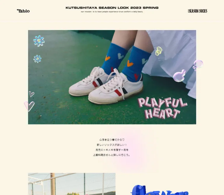
クリーム色の余白に春のファッション写真を大きく配置したルックブック。立体的なハートや花、ピンクのグラフィック、写真コラージュと小さな商品リンクを組み合わせている。
Tabio / Kutsushitaya — 2023 Spring Collection Style Reference
A spring fashion scrapbook on cream paper, with glossy sticker graphics and small shop labels.
Original URL: https://tabio.com/jp/kutsushitaya_2023spring/
Final URL: https://tabio.com/jp/kutsushitaya_2023spring/
Theme: light cream with pastel pink accents and black utility text.
Inspected: October 2, 2026, Japan Standard Time; supplied retrieval timestamp: 2026-10-01T15:17:34.533Z.
Viewports: desktop 1440 × 1000 and mobile 390 × 844 CSS pixels.
Scope: supplied desktop opening, middle, and ending captures; mobile opening and ending captures; full-document rendered text, links, and selected element measurements at both widths. Intermediate mobile photo compositions and activated media states were not visually documented.
The current page is an editorial shopping lookbook for the named 2023 spring collection. Its structure is a long sequence of fashion compositions, with product names, prices, and purchase links placed beside the imagery. The campaign year is part of the content currently served at this URL; this reference does not reconstruct an earlier version.
A warm cream canvas gives outdoor photography room to breathe. Denim, grass, teal surfaces, pink socks, and orange wave patterns supply most of the color. Translucent flowers, hearts, bubbles, inflated pink lettering, and softly blurred pink patches add a playful scrapbook character. Product information stays deliberately small and functional, making the photographs and decorative artwork the primary hierarchy.
The ending changes pace: a large pink ALL ITEMS pill, a centered SPECIAL MOVIE feature, and a compact production-credit footer. Desktop uses broad horizontal compositions; mobile preserves large imagery while changing the header, selected caption arrangements, and footer order.
閉じる
Tabio / Kutsushitaya — 2023 Spring Collection Style Reference
A spring fashion scrapbook on cream paper, with glossy sticker graphics and small shop labels.
Original URL: https://tabio.com/jp/kutsushitaya_2023spring/
Final URL: https://tabio.com/jp/kutsushitaya_2023spring/
Theme: light cream with pastel pink accents and black utility text.
Inspected: October 2, 2026, Japan Standard Time; supplied retrieval timestamp: 2026-10-01T15:17:34.533Z.
Viewports: desktop 1440 × 1000 and mobile 390 × 844 CSS pixels.
Scope: supplied desktop opening, middle, and ending captures; mobile opening and ending captures; full-document rendered text, links, and selected element measurements at both widths. Intermediate mobile photo compositions and activated media states were not visually documented.
The current page is an editorial shopping lookbook for the named 2023 spring collection. Its structure is a long sequence of fashion compositions, with product names, prices, and purchase links placed beside the imagery. The campaign year is part of the content currently served at this URL; this reference does not reconstruct an earlier version.
A warm cream canvas gives outdoor photography room to breathe. Denim, grass, teal surfaces, pink socks, and orange wave patterns supply most of the color. Translucent flowers, hearts, bubbles, inflated pink lettering, and softly blurred pink patches add a playful scrapbook character. Product information stays deliberately small and functional, making the photographs and decorative artwork the primary hierarchy.
The ending changes pace: a large pink ALL ITEMS pill, a centered SPECIAL MOVIE feature, and a compact production-credit footer. Desktop uses broad horizontal compositions; mobile preserves large imagery while changing the header, selected caption arrangements, and footer order.
How to Read This Reference
- Measured values come from the supplied rendered DOM rectangles and computed styles. Measurements are CSS pixels, rounded to two decimals where useful.
- Calculated values are arithmetic derived from those measurements, such as gaps between element bounds.
- Visual estimates describe screenshot geometry or colors that were not included in the computed-style evidence. They are approximate, not sampled or recovered CSS values.
- Recommended values belong to the implementation guidance and starter CSS. In particular, maximum widths, the proposed breakpoint, fallback fonts, and accessible hit areas are not recovered source rules.
- Token names are implementation aliases. The supplied custom-property collection was empty; it does not establish that these variables exist on the original site.
- The evidence contains selected computed styles, not the complete stylesheet, asset manifest, accessibility tree, or JavaScript behavior.
Tokens — Colors
Default Palette
| Name | Value | Suggested token | Role and evidence |
|---|---|---|---|
| Cream Paper | #FBF5E6 |
--spring-paper |
Measured BODY background at both viewports: rgb(251, 245, 230) |
| Black Ink | #000000 |
--spring-ink |
Measured text color for body copy, product information, and credits |
| Candy Pink | #FAB8E6 |
--spring-pink |
Measured ALL ITEMS background: rgb(250, 184, 230) |
| Purchase Gray | #EFEFEF |
--spring-buy |
Measured BUY-link background: rgb(239, 239, 239) |
| White | #FFFFFF |
--spring-white |
Measured ALL ITEMS text color; the desktop movie graphic also visibly contains white space |
| Pale Neutral Panel | Approximately #F2EEE4 |
--spring-panel |
Visual estimate for the large, slightly contrasting section surface visible in the desktop middle and ending captures |
| Blush Glow | Approximately #FFE5F1 |
--spring-blush |
Visual estimate for the diffuse pink color behind the introduction and photo montage |
| Printed Pink | Approximately #F4A0C3 |
--spring-print |
Visual approximation for pink display artwork such as LOVE IT and SPECIAL MOVIE; actual artwork contains tonal variation |
Use cream as the continuous page surface. Pink has three distinct roles: a solid collection-link fill, soft atmospheric patches, and lettering inside graphic assets. These should not all become the same flat pink rectangle.
The black product captions remain sharply readable against the soft environment. Green, teal, denim blue, and orange mostly belong to the photography; they are not evidenced as a general interface-color system.
No alternate theme or theme selector is documented in the supplied evidence.
Tokens — Typography
Source Families
Japanese copy and general inheritance: NOW-GM, sans-serif.
The introduction is measured at 12px, weight 400, with 24px line height. The same body values are present at both tested widths. The exact font family is reported by computed styles; the supplied evidence does not independently verify which font binary resolved on the capture system.
Season labels and production credits: EurostileLTPro.
Season labels use 10px / 12px. Credits use 10px / 20px. Their compact, technical appearance counterbalances the expressive image compositions.
Product names, prices, and BUY labels: EurostileLTPro-Demi.
Product names use 12px / 15.6px; prices use 12px / 12px. These elements report CSS weight 400 because the heavier face is selected through its family name. Replacing the family with ordinary Eurostile and adding arbitrary synthetic bold is not an exact transcription.
Graphic Lettering
The header lockup, PLAYFUL HEART lettering, LOVE IT treatments, ALL ITEMS headline, and SPECIAL MOVIE title have a distinct graphic character. The captured H1 and H2 text fields are empty despite visible lettering in the screenshots. Their inherited 12px font size does not describe the size of the visible artwork.
Treat these as graphic assets unless their original implementation is available. The source evidence does not identify the font used inside them, or whether each graphic is SVG, raster artwork, or another rendered asset.
The hierarchy combines three visual voices:
- A broad, compact black campaign lockup in the header.
- Small squared sans-serif product and credit typography.
- Decorative display lettering: glossy inflated letters in the hero and high-contrast, stencil-like pink or white lettering near the ending.
A generic serif can serve as a clearly labeled fallback for missing display artwork, but it will not reproduce the original lettering.
Type Scale
| Role | Measured size / line height | Weight or face | Other evidence |
|---|---|---|---|
| HTML root | 10px / 11.5px |
400, Times |
Root declaration; not the visible body typography |
| Introduction | 12px / 24px |
400, NOW-GM |
Four centered lines; unchanged between tested widths |
| Season label | 10px / 12px |
EurostileLTPro | Usually four stacked lines on desktop |
| Product-name link | 12px / 15.6px |
EurostileLTPro-Demi | Underlined visually; selected labels change wrapping on mobile |
| Price | 12px / 12px |
EurostileLTPro-Demi | Separate line below the name |
| BUY | 12px / 24px |
EurostileLTPro-Demi | Inside a measured 60 × 35px oval |
| ALL ITEMS Japanese subtitle | 12px / 12px |
NOW-GM | 0.24px tracking, equivalent to 0.02em |
| Movie caption | 12px / 12px |
NOW-GM | Underlined in the screenshots |
| Production credits | 10px / 20px |
EurostileLTPro | Ten visible credit lines, giving a 200px text block |
| SPECIAL MOVIE artwork container | 234 × 24px |
Graphic lettering | Same measured H2 box at both viewports; not a font-size measurement |
| Copyright | Approximately 10px |
Not independently measured | Visual estimate only |
Most recorded letter spacing is normal. Avoid adding wide editorial tracking to every product label: narrow columns and deliberate line breaks create their rhythm.
Tokens — Spacing & Shapes
Density: sparse photographic compositions surrounding very compact commerce labels.
Unit behavior: the root is measured at 10px, but the evidence does not establish one universal spacing formula. Preserve the measured relationships without assuming that all dimensions derive from a single fluid unit.
Spacing Scale
| Relationship | Desktop | Mobile | Evidence |
|---|---|---|---|
| Header top padding | 32px |
32px |
Computed |
| Header bottom padding | 40px |
18px |
Computed |
| Header to hero | Approximately 56px |
Approximately 21px |
Screenshot estimate using measured header bounds |
| Hero to introduction | Approximately 60px |
Approximately 62px |
Screenshot estimate |
| Introduction block height | 96px |
96px |
Measured; four 24px line boxes |
| Introduction end to first product section | 74px |
54px |
Calculated from DOM bounds |
| Season label to product name | 9px |
9px |
Calculated for recorded examples |
| Product name to price | 12px |
12px |
Calculated for recorded examples |
| Common gaps between product sections | 90px |
Approximately 62.39px |
Repeated DOM-bound differences; some sections use other arrangements |
| Final product section to ALL ITEMS | 80px |
60px |
Calculated |
| ALL ITEMS bottom to movie section | 80px |
60px |
Calculated |
| Movie heading box to caption | 15px |
15px |
Calculated |
| Movie section end to footer | 55px |
55px |
Calculated |
| Social-icon gap | 10px |
10px |
Calculated from link rectangles |
| Footer bottom padding | 30px |
30px |
Computed |
The repeated 90px and 62.39px gaps are useful reference points, not a rule to force onto every story. Some product sections join directly, and decorative compositions can occupy space between sampled section elements.
Border Radius
| Element | Value or shape | Evidence |
|---|---|---|
| Main photographs | Square corners | Visual observation; image-specific styles were not supplied |
| BUY links | 50% on 60 × 35px |
Computed; produces a horizontal ellipse |
| ALL ITEMS | 60px |
Computed at both viewports |
| Sock-detail crop | Circle | Visible in the desktop middle capture |
| Large neutral panel | Approximately 12px corners |
Visual estimate |
| Social icons | Dark circular artwork inside 40 × 40px links |
Visible shape; the recorded anchors themselves have border-radius: 0 |
| Movie play mark | Fine concentric circular outlines | Visual observation; exact dimensions and construction unverified |
Layout Measurements
| Element | Desktop 1440 × 1000 |
Mobile 390 × 844 |
Status |
|---|---|---|---|
| Full document height | 14529.14px |
14907.42px |
Measured |
| Header height | 101.48px |
97.17px |
Measured |
| Campaign H1 box | 438 × 28.48px, x 501 |
236 × 46.17px, x 77 |
Measured |
| Hero media frame | Approximately 1080 × 608px, x 180, y 158 |
Approximately 348 × 561px, x 21, y 118 |
Visual estimate |
| Introduction top | y 826.23 |
y 741.08 |
Measured |
| First product section top | y 996.23 |
y 891.08 |
Measured |
| ALL ITEMS | 360 × 100px, x 540 |
335 × 93px, x 27.5 |
Measured |
| Movie section width | 600px, x 420 |
348.39px, x 20.80 |
Measured |
| Movie section height | 425px |
283.25px |
Measured |
| Credit text block | 308.20 × 200px, right aligned |
390 × 200px, centered visually |
Measured bounds plus visual alignment |
| Footer height | 230px |
330px |
Measured |
| Social links | 40 × 40px each |
40 × 40px each |
Measured |
The mobile movie width corresponds to approximately 89.33vw, with 5.33vw side margins. This is a calculated equivalent at the inspected width, not a recovered responsive formula.
Components
Campaign Header
Role: establishes the collection identity before the photography.
The desktop header has three visually separate zones: the Tabio mark at left, the campaign lockup centered, and a seasonal mark at right. The left home link is measured at x 80, y 36, size 60 × 24px; the right self-link is at x 1270, y 36, size 90 × 24px. The centered H1 begins at y 32.
A very fine pale horizontal rule separates the header from the page. Its exact color was not included in the style evidence.
On mobile, the side marks are absent from the visible header and from the supplied mobile link list. The central lockup becomes taller and narrower, placing the campaign name across two main lines with a small mission statement below. Keep separate desktop and mobile lockup proportions when recreating this component.
The header is absent from the scrolled captures. Persistent or sticky behavior is not established.
Hero Media and Sticker Layer
Role: communicates the season through styling, movement, and decorative graphics.
The desktop media is a centered landscape rectangle, approximately 16:9, with substantial cream margins. The captured frame shows the model on an outdoor sports ground in denim overalls, with pink socks providing a bright focal detail.
The mobile frame is distinctly portrait, approximately 348 × 561px, and shows a close view of orange wavy socks and dark shoes. This confirms a different visible composition at the mobile capture. It does not establish whether the difference comes from separate media, playback timing, or both.
The composition includes several graphic layers:
- Iridescent blue-white flowers along the left side.
- Small yellow-green translucent hearts toward the upper or right areas.
- Pink-edged bubbles near the right edge.
- Transparent heart outlines near the lower left.
- Glossy pink PLAYFUL HEART lettering near the lower right.
Several decorations cross the media boundary into the cream margin. Keep the photographic crop separate from the decorative overlay so that clipping the media does not also clip all stickers.
The PLAYFUL HEART graphic is approximately 320px wide on desktop and 175px wide on mobile in the supplied captures. These are visual estimates. Its dimensional highlights and irregular letter placement belong to the artwork; ordinary text with a CSS shadow is only a rough substitute.
Four-Line Introduction
Role: introduces the collection and model in a quiet pause after the hero.
The actual copy is:
心浮き立つ春だから♡
新しいソックスが欲しい!
足元にトキメキを宿す一足を
上國料萌衣さんと探しに行こう。
Use centered 12px / 24px text and preserve the four-line structure. The measured paragraph occupies the full viewport width, while the text itself forms a small central block.
A diffuse pink patch sits behind and slightly to the side of the text. It reads as a localized color wash rather than a card or text container. A radial gradient is a recommended approximation; the original rendering technique was not exposed.
Editorial Look Composition
Role: presents an outfit and its sock detail as a fashion story.
The desktop middle capture provides a clear example: a collage of three narrow portraits on the left, a much larger upright portrait on the right, and a circular sock-detail crop below the collage. The larger portrait starts around x 743 and is approximately 562px wide. The visible composition spans roughly x 135 to x 1305.
Within the left montage, one portrait strip is upright and two are tilted by roughly opposite ten-degree angles. The strips overlap, and pink LOVE IT lettering sits below or across their lower edges. A broad pink glow visually joins them.
These measurements and angles are visual estimates. The supplied DOM does not establish whether the montage is one composite asset or several independently transformed image elements.
Preserve the relationship between a large anchor photograph, smaller repeated portraits, decorative lettering, and a close crop of the product. Each look can use a different composition; the page is not a repeated equal-sized card grid.
Product Caption
Role: ties an editorial photograph to an identifiable product and price.
A typical desktop caption contains:
- A four-line
SEASON / LOOK / SPRING / 2023label at10px / 12px. - A
9pxgap. - An underlined uppercase product link at
12px / 15.6px, often broken into one word per line. - A
12pxgap. - A price at
12px / 12px.
Many measured caption columns are only about 44–67px wide. Their extreme narrowness creates a small magazine-annotation effect beside much larger imagery.
Mobile behavior is selective. FLOWER, FLOAT WAVY, several LOW GAUGE presentations, and TOP LINE WAFFLE retain narrow stacked labels. CROCHET HEARTS, SHEER DAISY, the fourth LOW GAUGE presentation, and FINE RIBBED STRIPE switch to wider caption arrangements with single-line season labels and product names.
For example, the CROCHET HEARTS name changes from approximately 59.28 × 46.78px on desktop to 160.05 × 15.59px on mobile while retaining the same font size. Reproduce this by changing line-break behavior and available width, rather than shrinking the type.
BUY Oval
Role: provides a compact product-detail link attached to the imagery.
Recorded BUY links use a 60 × 35px gray ellipse, black EurostileLTPro-Demi text, and border-radius: 50%. The dimensions stay the same at both viewports. The links commonly sit over a lower corner of the product photograph.
The samples report display: grid with a 25.5px track for the label. Top-padding values vary by instance, so there is no single verified centering formula to copy. A centered grid is a practical implementation adaptation.
The links point to product-detail routes. They do not document an inline cart action or a completed purchase flow. Use an accessible product-specific link name while retaining the visible BUY label.
Product Sequence
The rendered text records ten product sections representing seven distinct product routes. LOW GAUGE 2×2 RIBBED SOCKS appears four times, allowing the same product to participate in multiple styling compositions.
| Product | Displayed price | Recorded destination |
|---|---|---|
| FLOWER LOGO AMERICAN RIB SOCKS | ¥990 |
/jp/detail/011141014/ |
| FLOAT WAVY SOCKS | ¥935 |
/jp/detail/011137373/ |
| CROCHET HEARTS SOCKS | ¥1,100 |
/jp/detail/011140609/ |
| SHEER DAISY PATTERN SOCKS | ¥990 |
/jp/detail/011141018/ |
| LOW GAUGE 2×2 RIBBED SOCKS | ¥880 |
/jp/detail/011142760/ |
| TOP LINE WAFFLE SOCKS | ¥990 |
/jp/detail/011141015/ |
| FINE RIBBED STRIPE PATTERN SOCKS | ¥990 |
/jp/detail/011140718/ |
These prices and destinations describe the captured page. Product availability and destination-page behavior were not inspected. No separate BUY anchor was recorded for TOP LINE WAFFLE, although its product-name link is present.
ALL ITEMS Link
Role: concludes the individual looks with access to the collection results.
A centered candy-pink pill combines large white ALL ITEMS artwork with the Japanese subtitle すべての商品はこちら. Its destination is https://tabio.com/jp/search/?keyword=2023SPRING.
The desktop control is 360 × 100px; mobile is 335 × 93px. Both have a computed 60px radius. The subtitle is 12px / 12px with 0.24px tracking. A 162px internal grid track is reported, but this is not independently a measurement of the headline artwork.
The pill introduces the largest solid interface accent after the image sequence. Keep its surrounding cream space generous: the measured gaps before and after it are 80px on desktop and 60px on mobile.
SPECIAL MOVIE Feature
Role: presents a secondary editorial media entry after shopping links.
The desktop feature is centered at 600px wide. Its visible media region is approximately 600 × 338px, consistent with 16:9. The capture shows a white graphic field containing an offset model-and-sock collage and a blue flower word graphic. The white framing is asymmetric, so uniform CSS padding around a photograph would not accurately reproduce it.
Mobile uses a 348.39px-wide, approximately 16:9 media slot. The supplied mobile capture shows footage filling that slot without the same visible white composition. The evidence does not determine whether this is a responsive asset change or a different media frame.
A thin circular play mark overlays the center. Below the media, the pink SPECIAL MOVIE artwork occupies a measured 234 × 24px H2 box at both widths. The underlined caption 靴下屋のシーズンムービーをチェック♡ sits 15px below that heading box.
The recorded anchor wraps the feature and uses the page's # fragment. No activated player, dialog, destination video URL, audio state, or close control was supplied. Implementing those behaviors requires a separate decision; the fragment alone does not specify a player.
Credits and Social Footer
Role: closes the editorial page with production attribution and brand channels.
Desktop places a ten-line credit block at the lower right and social icons with copyright at the lower left. The credits are 10px / 20px, right aligned, and occupy approximately 308.20 × 200px.
The inspected original footer explicitly includes DESIGN & DEVELOPMENT: NORIMASA INOUE, GRAPHIC_MASATAKA YOSHIDA (VAV), model and photography credits, styling, hair and makeup, video, editing, and special thanks. The copyright reads © Tabio Corporation.
Mobile centers the credit block first, followed by the social row and copyright. Its social row begins 35px after the 200px credit block. The four 40 × 40px icon links have 10px gaps, giving a 190px row centered between x 100 and x 290.
The visible social symbols are TikTok, Instagram, the Twitter bird, and YouTube. Their recorded destinations are the corresponding brand accounts. Preserve the captured bird symbol when matching this specific reference; an automatic substitution with a newer platform mark would change the artwork.
Tokens — Motion & Interaction
| Element or behavior | Evidence | What remains unverified |
|---|---|---|
| Long-page browsing | Supplied captures cover opening, middle, and ending positions; full-document bounds are available | Scroll-triggered effects, sticky states, and custom scroll behavior |
| Hero imagery | Desktop and mobile captures show different subjects or frames | Video versus slideshow, source switching, autoplay, looping, timing, and audio |
| Sticker graphics | Flowers, hearts, and bubbles are visible in fixed captured positions | Floating, rotation, parallax, or animation paths |
| Product-name and BUY links | Product-detail hrefs are recorded | Hover appearance, focus appearance, destination loading, and stock state |
| ALL ITEMS | Collection-search href is recorded | Activated search results and any transition |
| SPECIAL MOVIE | Central play mark and fragment-link target are visible | Player opening, media source, controls, focus handling, and dismissal |
| Social links | Four external account hrefs are recorded | Whether links open in the current tab or a new tab |
| Sampled CSS | Recorded elements report animation: none and transition: all |
Transition duration, easing, animated descendants, pseudo-elements, and JavaScript-driven effects |
The transition: all entry provides no usable timing value in this evidence. Likewise, animation: none on the sampled text and section elements does not prove that the whole page is static.
The capture process included at least five seconds of initial observation, readiness checks for finite visible motion and image decoding, and temporary pausing of perpetual animations during stability checks. No temporal sequence or activated media recording was supplied, so specific motion should not be inferred from that procedure.
Recommended adaptation: start with a stable static layout. Optional link feedback can use a short 120–180ms opacity change. Keep decorative motion restrained and independently pausable if added. Provide a static or paused media state for reduced-motion users. These are recommendations, not observed source timings.
Surfaces
| Layer | Appearance | Purpose |
|---|---|---|
| Page canvas | Solid measured cream #FBF5E6 |
Connects the entire long page |
| Section panel | Slightly darker warm neutral with gently rounded outer corners | Groups selected photographic compositions |
| Local atmosphere | Diffuse pale pink patches | Joins text, collage, and decorative lettering without adding boxes |
| Main imagery | Large square-cornered photographs and media frames | Carries the visual weight |
| Detail imagery | Occasional circular crop | Isolates socks and footwear within a larger story |
| Product control | Small gray ellipse | Adds a visible shopping target without dominating the photograph |
| Collection control | Large pink pill with white lettering | Marks the end of the product sequence |
| Movie composition | White graphic field in the desktop capture | Creates a distinct editorial media feature |
| Social symbols | Near-black circles with white symbols | Provides a compact footer anchor |
There is no visible general card-shadow system. Depth comes from the glossy graphics, overlapping photographs, color washes, and the photography itself.
Imagery
Photography is the main design material. Use natural daylight, outdoor courts and neighborhood surroundings, close views of footwear, and expressive portraits. The captured images combine slightly softened, textured photographic color with sharp graphic overlays. Keep socks visible as styling details within complete outfits as well as in close crops.
The desktop middle composition repeats the same model in neighboring portrait strips. That repetition creates the feeling of contact prints or a personal scrapbook. The large upright portrait provides a stable counterweight to the tilted strips.
Decorative artwork has two different finishes. Flowers, hearts, and bubbles look translucent and iridescent; PLAYFUL HEART looks inflated and glossy. LOVE IT and SPECIAL MOVIE use flatter, high-contrast lettering with pink tonal variation. Preserve those differences rather than applying one universal gradient or shadow treatment.
Use ordinary high-quality image rendering for the photographs. Visible grain is part of the imagery; there is no evidence for applying pixelated rendering to the page.
Observed Asset References
No image, video, or logo file URLs were exposed in the supplied evidence. The following references identify visible asset roles, not downloadable paths.
| Asset role | Original-page evidence | Implementation guidance |
|---|---|---|
| Campaign lockup | Wide desktop H1 graphic and taller mobile H1 graphic | Supply appropriately proportioned versions; retain an accessible heading name |
| Tabio and seasonal marks | Desktop header | Preserve their compact sizes and edge positions |
| Hero media | Landscape desktop composition and portrait mobile composition | Author focal points for each shape; verify any media behavior separately |
| PLAYFUL HEART | Glossy pink lower-right hero lettering | Use authorized graphic artwork rather than inferring a font |
| Flowers, hearts, bubbles | Hero overlays | Keep transparent edges and allow selected elements to cross the media boundary |
| Portrait montage and LOVE IT | Desktop middle capture | Preserve overlap, contrasting angles, and localized pink atmosphere |
| Circular sock detail | Desktop middle capture | Crop intentionally around the sock-and-footwear combination |
| ALL ITEMS and SPECIAL MOVIE lettering | Ending captures | Match graphic proportions; the source display fonts are unidentified |
| Movie preview and play mark | Desktop and mobile ending captures | Keep the media ratio and center overlay while verifying the actual playback implementation |
| Social symbols | Footer at both widths | Use the observed silhouettes and consistent circular artwork size |
CSS can recreate the page shell and caption system. The campaign photography and lettering provide much of the identity and require appropriate supplied assets.
Layout & Responsive Behavior
Desktop Composition
At 1440px, the opening hero occupies approximately 75% of the viewport width. The header lockup is narrower and centered independently from the side marks. Broad cream margins prevent the opening from becoming a full-bleed banner.
The middle capture expands the editorial composition beyond the hero's left and right edges, to roughly 1170px overall. Small captions occupy the margins or sit beside product details rather than following one fixed full-width text column.
The ending returns to a narrow central axis: 360px collection link, then 600px movie feature. The footer spreads back outward, with social links at the left and credits at the right.
Mobile Composition
At 390px, the hero and movie feature use approximately 21px side margins. The hero becomes a tall portrait frame. The header switches to a compact two-line campaign arrangement and omits the visible side marks.
Body, product, and credit font sizes remain unchanged in the supplied measurements. Responsive adaptation instead comes from different image proportions, caption placement, line-break rules, and footer ordering.
Selected product captions become wider beneath imagery. Other captions retain their narrow stacked format. A universal rule that removes every line break on mobile would therefore lose a documented part of the layout.
The ALL ITEMS pill almost fills the available width while retaining larger side margins than the movie frame. The SPECIAL MOVIE artwork keeps its 234px width, so its visual importance increases relative to the viewport.
The footer becomes a centered sequence of credits, social icons, and copyright. Its height increases from 230px to 330px.
Responsive Limits
Only two viewport widths were supplied. The exact breakpoint, intermediate layouts, landscape-phone behavior, maximum-width rules, and media source-selection logic are unknown.
The document is approximately 14.5k pixels tall on desktop and 14.9k pixels tall on mobile. This demonstrates that mobile is not a uniformly scaled miniature of desktop. Section content and compositions continue to occupy substantial vertical space.
For a new implementation, use component-specific responsive rules and explicit variants for narrow versus wide captions. A breakpoint near 768px is a reasonable starting recommendation, but it should be tested against the chosen assets and real text.
Do’s and Don’ts
Do
- Preserve the exact measured cream canvas, pink collection-link fill, and gray BUY fill.
- Give fashion photography substantially more area than product text.
- Use a varied sequence of portraits, outfit images, close crops, and collages.
- Keep the small uppercase season labels and product names tied to their corresponding photographs.
- Retain the fixed visual size of BUY ellipses across the tested layouts.
- Use glossy and translucent decorative artwork selectively around the hero.
- Keep pink glows local and soft.
- Provide different hero proportions for desktop and mobile.
- Apply mobile caption reflow selectively, matching the documented variants.
- Preserve generous gaps around ALL ITEMS and SPECIAL MOVIE.
- Center and reorder footer content on mobile.
- Treat graphic lettering as artwork with its own proportions.
Don’t
- Do not turn every look into an identical rounded product card.
- Do not replace the cream canvas with pure white throughout.
- Do not enlarge all product labels into marketing headlines.
- Do not assume that every product section needs a separate visible BUY oval.
- Do not apply the source's
10pxroot to unrelated application typography without accounting for its effects. - Do not infer a display font from the H1 or H2 inherited computed font size.
- Do not shrink the desktop hero into a short mobile landscape strip.
- Do not force every mobile product name into the same wrapping pattern.
- Do not replace translucent stickers with a generic outline-icon library.
- Do not add floating animation, autoplay, parallax, or a modal-player behavior as though it were verified.
- Do not add broad interface shadows or glass panels to imitate the artwork's dimensionality.
- Do not treat recorded product prices as verified current availability.
Recommended Implementation Additions
These are recommendations for a new implementation, not verified original features:
- Give graphic H1/H2 treatments accessible text equivalents. Empty extracted text does not establish whether the original images already have suitable alternatives.
- Give repeated BUY links product-specific accessible names, and enlarge their hit areas to at least
44pxhigh while preserving the visible60 × 35pxellipse. - Keep a visible black focus outline on cream, pink, and gray surfaces. Preserve underlines on text links.
- Review essential text contrast in the collection pill. White against the measured pink is approximately
1.6:1, calculated from the supplied colors. Dark text or a darker fill would improve readability; preserve decorative artwork separately if needed. - Consider larger credits and product text where reading comfort is more important than exact visual matching. The recorded
10–12pxscale is a source observation, not an accessibility recommendation. - Treat stickers and atmospheric glows as decorative, with empty alternatives and no pointer interception. Give content photographs useful descriptions.
- If the movie opens a dialog, use an explicit control, keyboard-operable player, managed focus, and a visible close action. Determine the actual video source before implementing playback.
- Respect reduced-motion preferences in JavaScript-driven media as well as CSS. A CSS media query alone cannot pause a video.
- Reserve image dimensions to avoid layout shifts, use responsive image sources, and defer below-the-fold assets where practical. Keep the initial hero ready promptly.
Agent Prompt Guide
Quick Color Reference
- Continuous canvas: measured
#FBF5E6. - Functional text: measured
#000000. - Collection pill: measured
#FAB8E6with white source lettering. - BUY oval: measured
#EFEFEFwith black text. - Local blush: approximately
#FFE5F1, fading into cream. - Neutral panel: approximately
#F2EEE4. - Decorative lettering: use supplied pink artwork; a single flat color is an approximation.
- Photography supplies green, teal, denim blue, orange, and stronger pink accents.
Overall Prompt
“Create a Japanese spring sock-collection lookbook with a continuous cream #FBF5E6 canvas and large editorial fashion photographs. Use a compact centered campaign lockup, small black product annotations, and varied photographic compositions with generous empty space. Combine upright outfit portraits, tilted portrait strips, circular sock details, translucent flower and heart stickers, glossy pink lettering, and localized pale pink glows. Product captions use narrow uppercase lines, small prices, and gray 60 × 35px BUY ellipses. End with a pink ALL ITEMS pill, a centered SPECIAL MOVIE feature, and compact production credits with circular social icons. On mobile, use a tall hero, selectively widen product captions, and center the footer. Treat media playback and decorative animation as separate requirements that need verification.”
Example Component Prompts
- Campaign header: “Build a cream header with a centered graphic campaign title, a small Tabio mark on the left, and a seasonal mark on the right. At 1440px, use a 438px-wide central lockup and 32px top padding. At 390px, use a 236px-wide taller lockup and omit the visible side marks. Do not infer the graphic's font from its surrounding text styles.”
- Hero composition: “Place a large landscape fashion frame inside broad cream desktop margins, with translucent flowers, bubbles, and hearts crossing selected edges. Anchor glossy pink PLAYFUL HEART artwork toward the lower right. Switch to a portrait frame on mobile and compose the overlays for that shape. Use supplied artwork and do not add unverified motion.”
- Editorial collage: “Pair a large upright model portrait with three smaller portrait strips, two tilted in opposite directions. Add a soft pink glow behind the small montage and pink LOVE IT artwork near its lower edge. Include a circular sock detail and a tiny adjacent product caption. Keep the photographs square-cornered except for the deliberate circular crop.”
- Product annotation: “Create a compact season label at 10px/12px, an underlined uppercase product name at 12px/15.6px, and a price at 12px/12px. Use 9px between the season label and name and 12px before the price. Support both stacked-word captions and a mobile-wide variant. Pair the annotation with a small gray BUY ellipse linked to the product detail.”
- Ending and footer: “Center a
360 × 100pxpink ALL ITEMS pill above a 600px-wide movie feature. On a 390px viewport, use a335 × 93pxpill and a roughly 348px movie frame. Keep the SPECIAL MOVIE graphic 234px wide. Desktop credits sit right and social icons left; mobile centers credits above the icons and copyright.”
Quick Start
CSS Custom Properties
This is an implementation starter, not a recovered stylesheet. Apply spring-page to the body. Use supplied artwork inside the graphic containers. The proposed 1080px hero cap, 1170px story cap, 768px breakpoint, and mobile story stacking are recommendations based on the visible compositions; the original rules were not provided.
Use .word spans for intentionally stacked caption words. Apply .product-info--mobile-wide only to captions that should reflow. The movie preview should be a single interactive target, with its play mark as decoration rather than a nested button. Full media behavior and the coordinates of individual decorative assets require separate implementation.
The starter retains a conventional root font size and expresses the observed small typography explicitly in pixels. Named source families need correctly licensed font files to render as observed; the fallbacks are implementation choices.
:root {
  /* Measured colors */
  --spring-paper: #fbf5e6;
  --spring-ink: #000000;
  --spring-pink: #fab8e6;
  --spring-buy: #efefef;
  --spring-white: #ffffff;

  /* Visual approximations, not recovered source colors */
  --spring-panel: #f2eee4;
  --spring-blush: #ffe5f1;
  --spring-print: #f4a0c3;

  /* Source family names with recommended fallbacks */
  --spring-font-body: 'NOW-GM', sans-serif;
  --spring-font-utility: 'EurostileLTPro', sans-serif;
  --spring-font-strong: 'EurostileLTPro-Demi', sans-serif;

  --spring-text-meta: 10px;
  --spring-text-body: 12px;
  --spring-caption-gap: 9px;
  --spring-price-gap: 12px;
  --spring-section-gap: 90px;
  --spring-end-gap: 80px;
  --spring-buy-width: 60px;
  --spring-buy-height: 35px;
  --spring-pill-radius: 60px;
  --spring-social-size: 40px;

  /* Recommended layout caps and interaction timing */
  --spring-hero-max: 1080px;
  --spring-story-max: 1170px;
  --spring-feedback: 160ms ease;
}

.spring-page,
.spring-page *,
.spring-page *::before,
.spring-page *::after {
  box-sizing: border-box;
}

.spring-page {
  margin: 0;
  color: var(--spring-ink);
  background: var(--spring-paper);
  font: 400 var(--spring-text-body) / 2 var(--spring-font-body);
}

.spring-page img {
  display: block;
  max-width: 100%;
}

.spring-page a {
  color: inherit;
}

.spring-header {
  position: relative;
  padding: 32px 0 40px;
  border-bottom: 1px solid var(--spring-white);
}

.season-lockup {
  width: 438px;
  margin: 0 auto;
  line-height: 0;
}

.season-lockup picture,
.season-lockup img {
  display: block;
  width: 100%;
  height: auto;
}

.brand-mark {
  position: absolute;
  top: 36px;
  left: 80px;
  display: grid;
  place-items: center;
  width: 60px;
  height: 24px;
}

.brand-mark--season {
  right: 80px;
  left: auto;
  width: 90px;
}

.spring-hero {
  position: relative;
  isolation: isolate;
  width: min(75vw, var(--spring-hero-max));
  margin: 56px auto 0;
}

.hero-media {
  aspect-ratio: 16 / 9;
  overflow: hidden;
}

.hero-media picture,
.hero-media img,
.hero-media video {
  display: block;
  width: 100%;
  height: 100%;
}

.hero-media img,
.hero-media video {
  object-fit: cover;
  object-position: var(--media-position, 50% 50%);
}

.hero-decoration {
  position: absolute;
  z-index: 2;
  pointer-events: none;
  /* Set placement separately for each supplied graphic. */
}

.hero-lettering {
  position: absolute;
  z-index: 3;
  right: 5%;
  bottom: 7%;
  width: 30%;
  height: auto;
  pointer-events: none;
}

.spring-intro {
  position: relative;
  isolation: isolate;
  margin: 60px auto 74px;
  text-align: center;
}

.spring-intro p {
  margin: 0;
  font-size: 12px;
  line-height: 24px;
}

.spring-intro::before {
  content: '';
  position: absolute;
  z-index: -1;
  top: 50%;
  left: calc(50% + 65px);
  width: 250px;
  height: 210px;
  transform: translate(-50%, -50%);
  background: radial-gradient(
    ellipse,
    var(--spring-blush) 0%,
    transparent 72%
  );
  pointer-events: none;
}

.story {
  width: min(81.25vw, var(--spring-story-max));
  margin: var(--spring-section-gap) auto;
}

.story--split {
  display: grid;
  grid-template-columns: minmax(0, 0.92fr) minmax(0, 1fr);
  align-items: start;
  gap: 7.5%;
}

.story-photo {
  width: 100%;
  height: auto;
  border-radius: 0;
}

.story-panel {
  margin-inline: 1.5625vw;
  padding-block: var(--spring-section-gap);
  border-radius: 12px;
  background: var(--spring-panel);
}

.sock-detail {
  width: min(100%, 292px);
  aspect-ratio: 1;
  border-radius: 50%;
  object-fit: cover;
}

.product-detail {
  display: grid;
  grid-template-columns: minmax(0, 1fr) max-content;
  align-items: end;
  gap: 20px;
}

.product-media {
  position: relative;
  min-width: 0;
}

.product-info {
  width: max-content;
  max-width: 100%;
}

.product-season {
  margin: 0;
  font: 400 10px / 12px var(--spring-font-utility);
}

.product-name {
  display: inline-block;
  margin-block: var(--spring-caption-gap) var(--spring-price-gap);
  font: 400 12px / 15.6px var(--spring-font-strong);
  text-decoration: underline;
  text-underline-offset: 2px;
}

.product-price {
  margin: 0;
  font: 400 12px / 12px var(--spring-font-strong);
}

.product-info .word {
  display: block;
}

.buy-link {
  position: relative;
  isolation: isolate;
  display: inline-grid;
  place-items: center;
  width: var(--spring-buy-width);
  min-height: 44px;
  font: 400 12px / 24px var(--spring-font-strong);
  text-decoration: none;
  /* Recommended hit area; visible source ellipse stays 35px high. */
}

.buy-link::before {
  content: '';
  position: absolute;
  z-index: -1;
  top: 50%;
  right: 0;
  left: 0;
  height: var(--spring-buy-height);
  border-radius: 50%;
  background: var(--spring-buy);
  transform: translateY(-50%);
}

.product-media > .buy-link {
  position: absolute;
  right: 10px;
  bottom: 8px;
}

.all-items {
  display: flex;
  flex-direction: column;
  align-items: center;
  justify-content: center;
  gap: 8px;
  width: 360px;
  height: 100px;
  margin: var(--spring-end-gap) auto 0;
  border-radius: var(--spring-pill-radius);
  background: var(--spring-pink);
  text-decoration: none;
}

.spring-page .all-items {
  color: var(--spring-white);
}

.all-items img {
  width: 162px;
  height: auto;
}

.all-items-caption {
  font: 400 12px / 12px var(--spring-font-body);
  letter-spacing: 0.02em;
}

/* Optional contrast improvement for essential subtitle text. */
.all-items--readable .all-items-caption {
  color: var(--spring-ink);
}

.movie-feature {
  width: min(600px, 89.333333vw);
  margin: var(--spring-end-gap) auto 0;
  text-align: center;
}

.movie-link {
  display: block;
  text-decoration: none;
}

.movie-poster {
  position: relative;
  aspect-ratio: 16 / 9;
  background: var(--spring-white);
}

.movie-poster picture,
.movie-poster img {
  display: block;
  width: 100%;
  height: 100%;
}

.movie-poster img {
  object-fit: cover;
}

.play-mark {
  position: absolute;
  top: 50%;
  left: 50%;
  display: grid;
  place-items: center;
  width: 64px;
  height: 64px;
  border: 1px solid var(--spring-white);
  border-radius: 50%;
  transform: translate(-50%, -50%);
  pointer-events: none;
  /* Approximation of the visible play artwork, not measured geometry. */
}

.play-mark::before {
  content: '';
  position: absolute;
  inset: -7px;
  border: 1px solid rgb(255 255 255 / 55%);
  border-radius: 50%;
}

.play-mark::after {
  content: '';
  margin-left: 3px;
  border-top: 6px solid transparent;
  border-bottom: 6px solid transparent;
  border-left: 12px solid var(--spring-white);
}

.movie-heading {
  width: 234px;
  height: 24px;
  margin: 30px auto 0;
}

.movie-heading img {
  width: 100%;
  height: 100%;
  object-fit: contain;
}

.movie-caption {
  margin: 15px 0 0;
  font: 400 12px / 12px var(--spring-font-body);
  text-decoration: underline;
  text-underline-offset: 2px;
}

.spring-footer {
  display: grid;
  grid-template-columns: minmax(0, 1fr) max-content;
  align-items: end;
  width: calc(100% - 180px);
  margin: 55px auto 0;
  padding-bottom: 30px;
}

.production-credits {
  grid-column: 2;
  grid-row: 1;
  margin: 0;
  font: 400 10px / 20px var(--spring-font-utility);
  text-align: right;
}

.footer-brand {
  grid-column: 1;
  grid-row: 1;
}

.social-links {
  display: flex;
  gap: 10px;
}

.social-links a {
  position: relative;
  display: grid;
  place-items: center;
  width: var(--spring-social-size);
  height: var(--spring-social-size);
}

.social-links a::after {
  content: '';
  position: absolute;
  inset: -2px;
  /* Recommended 44px hit area without enlarging the 40px artwork. */
}

.copyright {
  margin: 10px 0 0;
  font: 400 10px / 15px var(--spring-font-utility);
}

.spring-page :focus-visible {
  outline: 2px solid var(--spring-ink);
  outline-offset: 4px;
}

@media (hover: hover) {
  .buy-link,
  .all-items,
  .movie-link {
    transition: opacity var(--spring-feedback);
  }

  .buy-link:hover,
  .all-items:hover,
  .movie-link:hover {
    opacity: 0.82;
  }
}

/* Recommended breakpoint; only 390px and 1440px were inspected. */
@media (max-width: 48rem) {
  :root {
    --spring-section-gap: 62.4px;
    --spring-end-gap: 60px;
  }

  .spring-header {
    padding: 32px 0 18px;
  }

  .season-lockup {
    width: 236px;
  }

  .brand-mark {
    display: none;
  }

  .spring-hero {
    width: 89.333333vw;
    margin-top: 20px;
  }

  .hero-media {
    aspect-ratio: 348.4 / 561;
  }

  .hero-lettering {
    right: 6%;
    bottom: 4%;
    width: 50%;
  }

  .spring-intro {
    margin-block: 60px 54px;
  }

  .spring-intro::before {
    left: 65%;
    width: 65vw;
  }

  .story {
    width: 89.333333vw;
  }

  .story--split {
    grid-template-columns: minmax(0, 1fr);
    gap: 40px;
    /* Adapt individual photo stories after testing their assets. */
  }

  .product-detail--mobile-wide {
    grid-template-columns: minmax(0, 1fr);
  }

  .product-info--mobile-wide {
    width: 100%;
  }

  .product-info--mobile-wide .word {
    display: inline;
    /* Retain spaces between word spans in the HTML. */
  }

  .all-items {
    width: min(335px, calc(100vw - 55px));
    height: 93px;
  }

  .spring-footer {
    display: flex;
    flex-direction: column;
    align-items: center;
    width: 100%;
  }

  .production-credits {
    max-width: 100%;
    text-align: center;
  }

  .footer-brand {
    margin-top: 35px;
    text-align: center;
  }
}

@media (prefers-reduced-motion: reduce) {
  .spring-page *,
  .spring-page *::before,
  .spring-page *::after {
    animation: none !important;
    transition: none !important;
  }
  /* Pause or replace moving media separately in application code. */
}
Tailwind v4 Token Mapping
Optional aliases for an implementation that already uses Tailwind v4. This is not evidence that the original page uses Tailwind. Define the preceding custom properties first.
@theme inline {
  --color-paper: var(--spring-paper);
  --color-ink: var(--spring-ink);
  --color-candy: var(--spring-pink);
  --color-buy: var(--spring-buy);
  --color-panel: var(--spring-panel);
  --color-blush: var(--spring-blush);

  --font-body: var(--spring-font-body);
  --font-utility: var(--spring-font-utility);
  --font-product: var(--spring-font-strong);

  --text-meta: 10px;
  --text-meta--line-height: 12px;
  --text-product: 12px;
  --text-product--line-height: 15.6px;
  --text-intro: 12px;
  --text-intro--line-height: 24px;

  --spacing-section: var(--spring-section-gap);
  --spacing-ending: var(--spring-end-gap);
  --spacing-social: 40px;
  --radius-collection: 60px;
}
Sources & Evidence
- Original and final website: 2023 SPRING COLLECTION | 靴下屋. The supplied browser record reports HTTP
200and an unchanged final URL. - Capture date:
2026-10-01T15:17:34.533Z, equivalent to October 2, 2026 at 00:17:34.533 JST. - Desktop evidence:
1440 × 1000viewport; opening, middle, and ending screenshots; rendered text and link list; selected computed styles and DOM rectangles; document height approximately14529.14px. - Mobile evidence:
390 × 844viewport; opening and ending screenshots; rendered text and link list; selected computed styles and DOM rectangles; document height approximately14907.42px. - Directly supported findings: body and control colors, source font-family declarations, type sizes, link targets, control dimensions, header and footer geometry, caption reflow, production-credit text, and the photographed or graphic elements visible in the supplied original-page captures.
- Inspection limits: no independent browsing, source-code retrieval, asset-file inspection, product navigation, hover testing, keyboard testing, or movie activation was performed for this reference. The supplied excerpts omit most image-element measurements, exact breakpoints, complete animation declarations, media sources, and accessibility attributes.
- Capture limitations: readiness checks waited for document load, sampled stability, finite motion, and visible image decoding within stated time limits. Perpetual animations were temporarily paused during checks and resumed afterward. SharedWorkers and service workers were disabled. Delayed content and unexercised interactions remain unverified.
This reference describes the current response documented by the supplied inspection. Measured values, screenshot estimates, and implementation recommendations are identified separately throughout.
# Tabio / Kutsushitaya — 2023 Spring Collection Style Reference

> A spring fashion scrapbook on cream paper, with glossy sticker graphics and small shop labels.

**Original URL:** https://tabio.com/jp/kutsushitaya_2023spring/
**Final URL:** https://tabio.com/jp/kutsushitaya_2023spring/
**Theme:** light cream with pastel pink accents and black utility text.
**Inspected:** October 2, 2026, Japan Standard Time; supplied retrieval timestamp: `2026-10-01T15:17:34.533Z`.
**Viewports:** desktop `1440 × 1000` and mobile `390 × 844` CSS pixels.
**Scope:** supplied desktop opening, middle, and ending captures; mobile opening and ending captures; full-document rendered text, links, and selected element measurements at both widths. Intermediate mobile photo compositions and activated media states were not visually documented.

The current page is an editorial shopping lookbook for the named 2023 spring collection. Its structure is a long sequence of fashion compositions, with product names, prices, and purchase links placed beside the imagery. The campaign year is part of the content currently served at this URL; this reference does not reconstruct an earlier version.

A warm cream canvas gives outdoor photography room to breathe. Denim, grass, teal surfaces, pink socks, and orange wave patterns supply most of the color. Translucent flowers, hearts, bubbles, inflated pink lettering, and softly blurred pink patches add a playful scrapbook character. Product information stays deliberately small and functional, making the photographs and decorative artwork the primary hierarchy.

The ending changes pace: a large pink ALL ITEMS pill, a centered SPECIAL MOVIE feature, and a compact production-credit footer. Desktop uses broad horizontal compositions; mobile preserves large imagery while changing the header, selected caption arrangements, and footer order.
閉じる
# Tabio / Kutsushitaya — 2023 Spring Collection Style Reference

> A spring fashion scrapbook on cream paper, with glossy sticker graphics and small shop labels.

**Original URL:** https://tabio.com/jp/kutsushitaya_2023spring/
**Final URL:** https://tabio.com/jp/kutsushitaya_2023spring/
**Theme:** light cream with pastel pink accents and black utility text.
**Inspected:** October 2, 2026, Japan Standard Time; supplied retrieval timestamp: `2026-10-01T15:17:34.533Z`.
**Viewports:** desktop `1440 × 1000` and mobile `390 × 844` CSS pixels.
**Scope:** supplied desktop opening, middle, and ending captures; mobile opening and ending captures; full-document rendered text, links, and selected element measurements at both widths. Intermediate mobile photo compositions and activated media states were not visually documented.

The current page is an editorial shopping lookbook for the named 2023 spring collection. Its structure is a long sequence of fashion compositions, with product names, prices, and purchase links placed beside the imagery. The campaign year is part of the content currently served at this URL; this reference does not reconstruct an earlier version.

A warm cream canvas gives outdoor photography room to breathe. Denim, grass, teal surfaces, pink socks, and orange wave patterns supply most of the color. Translucent flowers, hearts, bubbles, inflated pink lettering, and softly blurred pink patches add a playful scrapbook character. Product information stays deliberately small and functional, making the photographs and decorative artwork the primary hierarchy.

The ending changes pace: a large pink ALL ITEMS pill, a centered SPECIAL MOVIE feature, and a compact production-credit footer. Desktop uses broad horizontal compositions; mobile preserves large imagery while changing the header, selected caption arrangements, and footer order.

## How to Read This Reference

- **Measured** values come from the supplied rendered DOM rectangles and computed styles. Measurements are CSS pixels, rounded to two decimals where useful.
- **Calculated** values are arithmetic derived from those measurements, such as gaps between element bounds.
- **Visual estimates** describe screenshot geometry or colors that were not included in the computed-style evidence. They are approximate, not sampled or recovered CSS values.
- **Recommended** values belong to the implementation guidance and starter CSS. In particular, maximum widths, the proposed breakpoint, fallback fonts, and accessible hit areas are not recovered source rules.
- Token names are implementation aliases. The supplied custom-property collection was empty; it does not establish that these variables exist on the original site.
- The evidence contains selected computed styles, not the complete stylesheet, asset manifest, accessibility tree, or JavaScript behavior.

## Tokens — Colors

### Default Palette

| Name | Value | Suggested token | Role and evidence |
| --- | --- | --- | --- |
| Cream Paper | `#FBF5E6` | `--spring-paper` | Measured BODY background at both viewports: `rgb(251, 245, 230)` |
| Black Ink | `#000000` | `--spring-ink` | Measured text color for body copy, product information, and credits |
| Candy Pink | `#FAB8E6` | `--spring-pink` | Measured ALL ITEMS background: `rgb(250, 184, 230)` |
| Purchase Gray | `#EFEFEF` | `--spring-buy` | Measured BUY-link background: `rgb(239, 239, 239)` |
| White | `#FFFFFF` | `--spring-white` | Measured ALL ITEMS text color; the desktop movie graphic also visibly contains white space |
| Pale Neutral Panel | Approximately `#F2EEE4` | `--spring-panel` | Visual estimate for the large, slightly contrasting section surface visible in the desktop middle and ending captures |
| Blush Glow | Approximately `#FFE5F1` | `--spring-blush` | Visual estimate for the diffuse pink color behind the introduction and photo montage |
| Printed Pink | Approximately `#F4A0C3` | `--spring-print` | Visual approximation for pink display artwork such as LOVE IT and SPECIAL MOVIE; actual artwork contains tonal variation |

Use cream as the continuous page surface. Pink has three distinct roles: a solid collection-link fill, soft atmospheric patches, and lettering inside graphic assets. These should not all become the same flat pink rectangle.

The black product captions remain sharply readable against the soft environment. Green, teal, denim blue, and orange mostly belong to the photography; they are not evidenced as a general interface-color system.

No alternate theme or theme selector is documented in the supplied evidence.

## Tokens — Typography

### Source Families

**Japanese copy and general inheritance:** `NOW-GM, sans-serif`.

The introduction is measured at `12px`, weight `400`, with `24px` line height. The same body values are present at both tested widths. The exact font family is reported by computed styles; the supplied evidence does not independently verify which font binary resolved on the capture system.

**Season labels and production credits:** `EurostileLTPro`.

Season labels use `10px / 12px`. Credits use `10px / 20px`. Their compact, technical appearance counterbalances the expressive image compositions.

**Product names, prices, and BUY labels:** `EurostileLTPro-Demi`.

Product names use `12px / 15.6px`; prices use `12px / 12px`. These elements report CSS weight `400` because the heavier face is selected through its family name. Replacing the family with ordinary Eurostile and adding arbitrary synthetic bold is not an exact transcription.

### Graphic Lettering

The header lockup, PLAYFUL HEART lettering, LOVE IT treatments, ALL ITEMS headline, and SPECIAL MOVIE title have a distinct graphic character. The captured H1 and H2 text fields are empty despite visible lettering in the screenshots. Their inherited `12px` font size does not describe the size of the visible artwork.

Treat these as graphic assets unless their original implementation is available. The source evidence does not identify the font used inside them, or whether each graphic is SVG, raster artwork, or another rendered asset.

The hierarchy combines three visual voices:

- A broad, compact black campaign lockup in the header.
- Small squared sans-serif product and credit typography.
- Decorative display lettering: glossy inflated letters in the hero and high-contrast, stencil-like pink or white lettering near the ending.

A generic serif can serve as a clearly labeled fallback for missing display artwork, but it will not reproduce the original lettering.

### Type Scale

| Role | Measured size / line height | Weight or face | Other evidence |
| --- | --- | --- | --- |
| HTML root | `10px / 11.5px` | `400`, Times | Root declaration; not the visible body typography |
| Introduction | `12px / 24px` | `400`, NOW-GM | Four centered lines; unchanged between tested widths |
| Season label | `10px / 12px` | EurostileLTPro | Usually four stacked lines on desktop |
| Product-name link | `12px / 15.6px` | EurostileLTPro-Demi | Underlined visually; selected labels change wrapping on mobile |
| Price | `12px / 12px` | EurostileLTPro-Demi | Separate line below the name |
| BUY | `12px / 24px` | EurostileLTPro-Demi | Inside a measured `60 × 35px` oval |
| ALL ITEMS Japanese subtitle | `12px / 12px` | NOW-GM | `0.24px` tracking, equivalent to `0.02em` |
| Movie caption | `12px / 12px` | NOW-GM | Underlined in the screenshots |
| Production credits | `10px / 20px` | EurostileLTPro | Ten visible credit lines, giving a `200px` text block |
| SPECIAL MOVIE artwork container | `234 × 24px` | Graphic lettering | Same measured H2 box at both viewports; not a font-size measurement |
| Copyright | Approximately `10px` | Not independently measured | Visual estimate only |

Most recorded letter spacing is `normal`. Avoid adding wide editorial tracking to every product label: narrow columns and deliberate line breaks create their rhythm.

## Tokens — Spacing & Shapes

**Density:** sparse photographic compositions surrounding very compact commerce labels.

**Unit behavior:** the root is measured at `10px`, but the evidence does not establish one universal spacing formula. Preserve the measured relationships without assuming that all dimensions derive from a single fluid unit.

### Spacing Scale

| Relationship | Desktop | Mobile | Evidence |
| --- | --- | --- | --- |
| Header top padding | `32px` | `32px` | Computed |
| Header bottom padding | `40px` | `18px` | Computed |
| Header to hero | Approximately `56px` | Approximately `21px` | Screenshot estimate using measured header bounds |
| Hero to introduction | Approximately `60px` | Approximately `62px` | Screenshot estimate |
| Introduction block height | `96px` | `96px` | Measured; four `24px` line boxes |
| Introduction end to first product section | `74px` | `54px` | Calculated from DOM bounds |
| Season label to product name | `9px` | `9px` | Calculated for recorded examples |
| Product name to price | `12px` | `12px` | Calculated for recorded examples |
| Common gaps between product sections | `90px` | Approximately `62.39px` | Repeated DOM-bound differences; some sections use other arrangements |
| Final product section to ALL ITEMS | `80px` | `60px` | Calculated |
| ALL ITEMS bottom to movie section | `80px` | `60px` | Calculated |
| Movie heading box to caption | `15px` | `15px` | Calculated |
| Movie section end to footer | `55px` | `55px` | Calculated |
| Social-icon gap | `10px` | `10px` | Calculated from link rectangles |
| Footer bottom padding | `30px` | `30px` | Computed |

The repeated `90px` and `62.39px` gaps are useful reference points, not a rule to force onto every story. Some product sections join directly, and decorative compositions can occupy space between sampled section elements.

### Border Radius

| Element | Value or shape | Evidence |
| --- | --- | --- |
| Main photographs | Square corners | Visual observation; image-specific styles were not supplied |
| BUY links | `50%` on `60 × 35px` | Computed; produces a horizontal ellipse |
| ALL ITEMS | `60px` | Computed at both viewports |
| Sock-detail crop | Circle | Visible in the desktop middle capture |
| Large neutral panel | Approximately `12px` corners | Visual estimate |
| Social icons | Dark circular artwork inside `40 × 40px` links | Visible shape; the recorded anchors themselves have `border-radius: 0` |
| Movie play mark | Fine concentric circular outlines | Visual observation; exact dimensions and construction unverified |

### Layout Measurements

| Element | Desktop `1440 × 1000` | Mobile `390 × 844` | Status |
| --- | --- | --- | --- |
| Full document height | `14529.14px` | `14907.42px` | Measured |
| Header height | `101.48px` | `97.17px` | Measured |
| Campaign H1 box | `438 × 28.48px`, x `501` | `236 × 46.17px`, x `77` | Measured |
| Hero media frame | Approximately `1080 × 608px`, x `180`, y `158` | Approximately `348 × 561px`, x `21`, y `118` | Visual estimate |
| Introduction top | y `826.23` | y `741.08` | Measured |
| First product section top | y `996.23` | y `891.08` | Measured |
| ALL ITEMS | `360 × 100px`, x `540` | `335 × 93px`, x `27.5` | Measured |
| Movie section width | `600px`, x `420` | `348.39px`, x `20.80` | Measured |
| Movie section height | `425px` | `283.25px` | Measured |
| Credit text block | `308.20 × 200px`, right aligned | `390 × 200px`, centered visually | Measured bounds plus visual alignment |
| Footer height | `230px` | `330px` | Measured |
| Social links | `40 × 40px` each | `40 × 40px` each | Measured |

The mobile movie width corresponds to approximately `89.33vw`, with `5.33vw` side margins. This is a calculated equivalent at the inspected width, not a recovered responsive formula.

## Components

### Campaign Header

**Role:** establishes the collection identity before the photography.

The desktop header has three visually separate zones: the Tabio mark at left, the campaign lockup centered, and a seasonal mark at right. The left home link is measured at x `80`, y `36`, size `60 × 24px`; the right self-link is at x `1270`, y `36`, size `90 × 24px`. The centered H1 begins at y `32`.

A very fine pale horizontal rule separates the header from the page. Its exact color was not included in the style evidence.

On mobile, the side marks are absent from the visible header and from the supplied mobile link list. The central lockup becomes taller and narrower, placing the campaign name across two main lines with a small mission statement below. Keep separate desktop and mobile lockup proportions when recreating this component.

The header is absent from the scrolled captures. Persistent or sticky behavior is not established.

### Hero Media and Sticker Layer

**Role:** communicates the season through styling, movement, and decorative graphics.

The desktop media is a centered landscape rectangle, approximately `16:9`, with substantial cream margins. The captured frame shows the model on an outdoor sports ground in denim overalls, with pink socks providing a bright focal detail.

The mobile frame is distinctly portrait, approximately `348 × 561px`, and shows a close view of orange wavy socks and dark shoes. This confirms a different visible composition at the mobile capture. It does not establish whether the difference comes from separate media, playback timing, or both.

The composition includes several graphic layers:

- Iridescent blue-white flowers along the left side.
- Small yellow-green translucent hearts toward the upper or right areas.
- Pink-edged bubbles near the right edge.
- Transparent heart outlines near the lower left.
- Glossy pink PLAYFUL HEART lettering near the lower right.

Several decorations cross the media boundary into the cream margin. Keep the photographic crop separate from the decorative overlay so that clipping the media does not also clip all stickers.

The PLAYFUL HEART graphic is approximately `320px` wide on desktop and `175px` wide on mobile in the supplied captures. These are visual estimates. Its dimensional highlights and irregular letter placement belong to the artwork; ordinary text with a CSS shadow is only a rough substitute.

### Four-Line Introduction

**Role:** introduces the collection and model in a quiet pause after the hero.

The actual copy is:

> 心浮き立つ春だから♡
> 新しいソックスが欲しい!
> 足元にトキメキを宿す一足を
> 上國料萌衣さんと探しに行こう。

Use centered `12px / 24px` text and preserve the four-line structure. The measured paragraph occupies the full viewport width, while the text itself forms a small central block.

A diffuse pink patch sits behind and slightly to the side of the text. It reads as a localized color wash rather than a card or text container. A radial gradient is a recommended approximation; the original rendering technique was not exposed.

### Editorial Look Composition

**Role:** presents an outfit and its sock detail as a fashion story.

The desktop middle capture provides a clear example: a collage of three narrow portraits on the left, a much larger upright portrait on the right, and a circular sock-detail crop below the collage. The larger portrait starts around x `743` and is approximately `562px` wide. The visible composition spans roughly x `135` to x `1305`.

Within the left montage, one portrait strip is upright and two are tilted by roughly opposite ten-degree angles. The strips overlap, and pink LOVE IT lettering sits below or across their lower edges. A broad pink glow visually joins them.

These measurements and angles are visual estimates. The supplied DOM does not establish whether the montage is one composite asset or several independently transformed image elements.

Preserve the relationship between a large anchor photograph, smaller repeated portraits, decorative lettering, and a close crop of the product. Each look can use a different composition; the page is not a repeated equal-sized card grid.

### Product Caption

**Role:** ties an editorial photograph to an identifiable product and price.

A typical desktop caption contains:

1. A four-line `SEASON / LOOK / SPRING / 2023` label at `10px / 12px`.
2. A `9px` gap.
3. An underlined uppercase product link at `12px / 15.6px`, often broken into one word per line.
4. A `12px` gap.
5. A price at `12px / 12px`.

Many measured caption columns are only about `44–67px` wide. Their extreme narrowness creates a small magazine-annotation effect beside much larger imagery.

Mobile behavior is selective. FLOWER, FLOAT WAVY, several LOW GAUGE presentations, and TOP LINE WAFFLE retain narrow stacked labels. CROCHET HEARTS, SHEER DAISY, the fourth LOW GAUGE presentation, and FINE RIBBED STRIPE switch to wider caption arrangements with single-line season labels and product names.

For example, the CROCHET HEARTS name changes from approximately `59.28 × 46.78px` on desktop to `160.05 × 15.59px` on mobile while retaining the same font size. Reproduce this by changing line-break behavior and available width, rather than shrinking the type.

### BUY Oval

**Role:** provides a compact product-detail link attached to the imagery.

Recorded BUY links use a `60 × 35px` gray ellipse, black EurostileLTPro-Demi text, and `border-radius: 50%`. The dimensions stay the same at both viewports. The links commonly sit over a lower corner of the product photograph.

The samples report `display: grid` with a `25.5px` track for the label. Top-padding values vary by instance, so there is no single verified centering formula to copy. A centered grid is a practical implementation adaptation.

The links point to product-detail routes. They do not document an inline cart action or a completed purchase flow. Use an accessible product-specific link name while retaining the visible BUY label.

### Product Sequence

The rendered text records ten product sections representing seven distinct product routes. LOW GAUGE 2×2 RIBBED SOCKS appears four times, allowing the same product to participate in multiple styling compositions.

| Product | Displayed price | Recorded destination |
| --- | --- | --- |
| FLOWER LOGO AMERICAN RIB SOCKS | `¥990` | `/jp/detail/011141014/` |
| FLOAT WAVY SOCKS | `¥935` | `/jp/detail/011137373/` |
| CROCHET HEARTS SOCKS | `¥1,100` | `/jp/detail/011140609/` |
| SHEER DAISY PATTERN SOCKS | `¥990` | `/jp/detail/011141018/` |
| LOW GAUGE 2×2 RIBBED SOCKS | `¥880` | `/jp/detail/011142760/` |
| TOP LINE WAFFLE SOCKS | `¥990` | `/jp/detail/011141015/` |
| FINE RIBBED STRIPE PATTERN SOCKS | `¥990` | `/jp/detail/011140718/` |

These prices and destinations describe the captured page. Product availability and destination-page behavior were not inspected. No separate BUY anchor was recorded for TOP LINE WAFFLE, although its product-name link is present.

### ALL ITEMS Link

**Role:** concludes the individual looks with access to the collection results.

A centered candy-pink pill combines large white ALL ITEMS artwork with the Japanese subtitle `すべての商品はこちら`. Its destination is `https://tabio.com/jp/search/?keyword=2023SPRING`.

The desktop control is `360 × 100px`; mobile is `335 × 93px`. Both have a computed `60px` radius. The subtitle is `12px / 12px` with `0.24px` tracking. A `162px` internal grid track is reported, but this is not independently a measurement of the headline artwork.

The pill introduces the largest solid interface accent after the image sequence. Keep its surrounding cream space generous: the measured gaps before and after it are `80px` on desktop and `60px` on mobile.

### SPECIAL MOVIE Feature

**Role:** presents a secondary editorial media entry after shopping links.

The desktop feature is centered at `600px` wide. Its visible media region is approximately `600 × 338px`, consistent with `16:9`. The capture shows a white graphic field containing an offset model-and-sock collage and a blue flower word graphic. The white framing is asymmetric, so uniform CSS padding around a photograph would not accurately reproduce it.

Mobile uses a `348.39px`-wide, approximately `16:9` media slot. The supplied mobile capture shows footage filling that slot without the same visible white composition. The evidence does not determine whether this is a responsive asset change or a different media frame.

A thin circular play mark overlays the center. Below the media, the pink SPECIAL MOVIE artwork occupies a measured `234 × 24px` H2 box at both widths. The underlined caption `靴下屋のシーズンムービーをチェック♡` sits `15px` below that heading box.

The recorded anchor wraps the feature and uses the page's `#` fragment. No activated player, dialog, destination video URL, audio state, or close control was supplied. Implementing those behaviors requires a separate decision; the fragment alone does not specify a player.

### Credits and Social Footer

**Role:** closes the editorial page with production attribution and brand channels.

Desktop places a ten-line credit block at the lower right and social icons with copyright at the lower left. The credits are `10px / 20px`, right aligned, and occupy approximately `308.20 × 200px`.

The inspected original footer explicitly includes `DESIGN & DEVELOPMENT: NORIMASA INOUE`, `GRAPHIC_MASATAKA YOSHIDA (VAV)`, model and photography credits, styling, hair and makeup, video, editing, and special thanks. The copyright reads `© Tabio Corporation`.

Mobile centers the credit block first, followed by the social row and copyright. Its social row begins `35px` after the `200px` credit block. The four `40 × 40px` icon links have `10px` gaps, giving a `190px` row centered between x `100` and x `290`.

The visible social symbols are TikTok, Instagram, the Twitter bird, and YouTube. Their recorded destinations are the corresponding brand accounts. Preserve the captured bird symbol when matching this specific reference; an automatic substitution with a newer platform mark would change the artwork.

## Tokens — Motion & Interaction

| Element or behavior | Evidence | What remains unverified |
| --- | --- | --- |
| Long-page browsing | Supplied captures cover opening, middle, and ending positions; full-document bounds are available | Scroll-triggered effects, sticky states, and custom scroll behavior |
| Hero imagery | Desktop and mobile captures show different subjects or frames | Video versus slideshow, source switching, autoplay, looping, timing, and audio |
| Sticker graphics | Flowers, hearts, and bubbles are visible in fixed captured positions | Floating, rotation, parallax, or animation paths |
| Product-name and BUY links | Product-detail hrefs are recorded | Hover appearance, focus appearance, destination loading, and stock state |
| ALL ITEMS | Collection-search href is recorded | Activated search results and any transition |
| SPECIAL MOVIE | Central play mark and fragment-link target are visible | Player opening, media source, controls, focus handling, and dismissal |
| Social links | Four external account hrefs are recorded | Whether links open in the current tab or a new tab |
| Sampled CSS | Recorded elements report `animation: none` and `transition: all` | Transition duration, easing, animated descendants, pseudo-elements, and JavaScript-driven effects |

The `transition: all` entry provides no usable timing value in this evidence. Likewise, `animation: none` on the sampled text and section elements does not prove that the whole page is static.

The capture process included at least five seconds of initial observation, readiness checks for finite visible motion and image decoding, and temporary pausing of perpetual animations during stability checks. No temporal sequence or activated media recording was supplied, so specific motion should not be inferred from that procedure.

**Recommended adaptation:** start with a stable static layout. Optional link feedback can use a short `120–180ms` opacity change. Keep decorative motion restrained and independently pausable if added. Provide a static or paused media state for reduced-motion users. These are recommendations, not observed source timings.

## Surfaces

| Layer | Appearance | Purpose |
| --- | --- | --- |
| Page canvas | Solid measured cream `#FBF5E6` | Connects the entire long page |
| Section panel | Slightly darker warm neutral with gently rounded outer corners | Groups selected photographic compositions |
| Local atmosphere | Diffuse pale pink patches | Joins text, collage, and decorative lettering without adding boxes |
| Main imagery | Large square-cornered photographs and media frames | Carries the visual weight |
| Detail imagery | Occasional circular crop | Isolates socks and footwear within a larger story |
| Product control | Small gray ellipse | Adds a visible shopping target without dominating the photograph |
| Collection control | Large pink pill with white lettering | Marks the end of the product sequence |
| Movie composition | White graphic field in the desktop capture | Creates a distinct editorial media feature |
| Social symbols | Near-black circles with white symbols | Provides a compact footer anchor |

There is no visible general card-shadow system. Depth comes from the glossy graphics, overlapping photographs, color washes, and the photography itself.

## Imagery

Photography is the main design material. Use natural daylight, outdoor courts and neighborhood surroundings, close views of footwear, and expressive portraits. The captured images combine slightly softened, textured photographic color with sharp graphic overlays. Keep socks visible as styling details within complete outfits as well as in close crops.

The desktop middle composition repeats the same model in neighboring portrait strips. That repetition creates the feeling of contact prints or a personal scrapbook. The large upright portrait provides a stable counterweight to the tilted strips.

Decorative artwork has two different finishes. Flowers, hearts, and bubbles look translucent and iridescent; PLAYFUL HEART looks inflated and glossy. LOVE IT and SPECIAL MOVIE use flatter, high-contrast lettering with pink tonal variation. Preserve those differences rather than applying one universal gradient or shadow treatment.

Use ordinary high-quality image rendering for the photographs. Visible grain is part of the imagery; there is no evidence for applying pixelated rendering to the page.

### Observed Asset References

No image, video, or logo file URLs were exposed in the supplied evidence. The following references identify visible asset roles, not downloadable paths.

| Asset role | Original-page evidence | Implementation guidance |
| --- | --- | --- |
| Campaign lockup | Wide desktop H1 graphic and taller mobile H1 graphic | Supply appropriately proportioned versions; retain an accessible heading name |
| Tabio and seasonal marks | Desktop header | Preserve their compact sizes and edge positions |
| Hero media | Landscape desktop composition and portrait mobile composition | Author focal points for each shape; verify any media behavior separately |
| PLAYFUL HEART | Glossy pink lower-right hero lettering | Use authorized graphic artwork rather than inferring a font |
| Flowers, hearts, bubbles | Hero overlays | Keep transparent edges and allow selected elements to cross the media boundary |
| Portrait montage and LOVE IT | Desktop middle capture | Preserve overlap, contrasting angles, and localized pink atmosphere |
| Circular sock detail | Desktop middle capture | Crop intentionally around the sock-and-footwear combination |
| ALL ITEMS and SPECIAL MOVIE lettering | Ending captures | Match graphic proportions; the source display fonts are unidentified |
| Movie preview and play mark | Desktop and mobile ending captures | Keep the media ratio and center overlay while verifying the actual playback implementation |
| Social symbols | Footer at both widths | Use the observed silhouettes and consistent circular artwork size |

CSS can recreate the page shell and caption system. The campaign photography and lettering provide much of the identity and require appropriate supplied assets.

## Layout & Responsive Behavior

### Desktop Composition

At `1440px`, the opening hero occupies approximately `75%` of the viewport width. The header lockup is narrower and centered independently from the side marks. Broad cream margins prevent the opening from becoming a full-bleed banner.

The middle capture expands the editorial composition beyond the hero's left and right edges, to roughly `1170px` overall. Small captions occupy the margins or sit beside product details rather than following one fixed full-width text column.

The ending returns to a narrow central axis: `360px` collection link, then `600px` movie feature. The footer spreads back outward, with social links at the left and credits at the right.

### Mobile Composition

At `390px`, the hero and movie feature use approximately `21px` side margins. The hero becomes a tall portrait frame. The header switches to a compact two-line campaign arrangement and omits the visible side marks.

Body, product, and credit font sizes remain unchanged in the supplied measurements. Responsive adaptation instead comes from different image proportions, caption placement, line-break rules, and footer ordering.

Selected product captions become wider beneath imagery. Other captions retain their narrow stacked format. A universal rule that removes every line break on mobile would therefore lose a documented part of the layout.

The ALL ITEMS pill almost fills the available width while retaining larger side margins than the movie frame. The SPECIAL MOVIE artwork keeps its `234px` width, so its visual importance increases relative to the viewport.

The footer becomes a centered sequence of credits, social icons, and copyright. Its height increases from `230px` to `330px`.

### Responsive Limits

Only two viewport widths were supplied. The exact breakpoint, intermediate layouts, landscape-phone behavior, maximum-width rules, and media source-selection logic are unknown.

The document is approximately `14.5k` pixels tall on desktop and `14.9k` pixels tall on mobile. This demonstrates that mobile is not a uniformly scaled miniature of desktop. Section content and compositions continue to occupy substantial vertical space.

For a new implementation, use component-specific responsive rules and explicit variants for narrow versus wide captions. A breakpoint near `768px` is a reasonable starting recommendation, but it should be tested against the chosen assets and real text.

## Do’s and Don’ts

### Do

- Preserve the exact measured cream canvas, pink collection-link fill, and gray BUY fill.
- Give fashion photography substantially more area than product text.
- Use a varied sequence of portraits, outfit images, close crops, and collages.
- Keep the small uppercase season labels and product names tied to their corresponding photographs.
- Retain the fixed visual size of BUY ellipses across the tested layouts.
- Use glossy and translucent decorative artwork selectively around the hero.
- Keep pink glows local and soft.
- Provide different hero proportions for desktop and mobile.
- Apply mobile caption reflow selectively, matching the documented variants.
- Preserve generous gaps around ALL ITEMS and SPECIAL MOVIE.
- Center and reorder footer content on mobile.
- Treat graphic lettering as artwork with its own proportions.

### Don’t

- Do not turn every look into an identical rounded product card.
- Do not replace the cream canvas with pure white throughout.
- Do not enlarge all product labels into marketing headlines.
- Do not assume that every product section needs a separate visible BUY oval.
- Do not apply the source's `10px` root to unrelated application typography without accounting for its effects.
- Do not infer a display font from the H1 or H2 inherited computed font size.
- Do not shrink the desktop hero into a short mobile landscape strip.
- Do not force every mobile product name into the same wrapping pattern.
- Do not replace translucent stickers with a generic outline-icon library.
- Do not add floating animation, autoplay, parallax, or a modal-player behavior as though it were verified.
- Do not add broad interface shadows or glass panels to imitate the artwork's dimensionality.
- Do not treat recorded product prices as verified current availability.

## Recommended Implementation Additions

These are recommendations for a new implementation, not verified original features:

- Give graphic H1/H2 treatments accessible text equivalents. Empty extracted text does not establish whether the original images already have suitable alternatives.
- Give repeated BUY links product-specific accessible names, and enlarge their hit areas to at least `44px` high while preserving the visible `60 × 35px` ellipse.
- Keep a visible black focus outline on cream, pink, and gray surfaces. Preserve underlines on text links.
- Review essential text contrast in the collection pill. White against the measured pink is approximately `1.6:1`, calculated from the supplied colors. Dark text or a darker fill would improve readability; preserve decorative artwork separately if needed.
- Consider larger credits and product text where reading comfort is more important than exact visual matching. The recorded `10–12px` scale is a source observation, not an accessibility recommendation.
- Treat stickers and atmospheric glows as decorative, with empty alternatives and no pointer interception. Give content photographs useful descriptions.
- If the movie opens a dialog, use an explicit control, keyboard-operable player, managed focus, and a visible close action. Determine the actual video source before implementing playback.
- Respect reduced-motion preferences in JavaScript-driven media as well as CSS. A CSS media query alone cannot pause a video.
- Reserve image dimensions to avoid layout shifts, use responsive image sources, and defer below-the-fold assets where practical. Keep the initial hero ready promptly.

## Agent Prompt Guide

### Quick Color Reference

- Continuous canvas: measured `#FBF5E6`.
- Functional text: measured `#000000`.
- Collection pill: measured `#FAB8E6` with white source lettering.
- BUY oval: measured `#EFEFEF` with black text.
- Local blush: approximately `#FFE5F1`, fading into cream.
- Neutral panel: approximately `#F2EEE4`.
- Decorative lettering: use supplied pink artwork; a single flat color is an approximation.
- Photography supplies green, teal, denim blue, orange, and stronger pink accents.

### Overall Prompt

“Create a Japanese spring sock-collection lookbook with a continuous cream `#FBF5E6` canvas and large editorial fashion photographs. Use a compact centered campaign lockup, small black product annotations, and varied photographic compositions with generous empty space. Combine upright outfit portraits, tilted portrait strips, circular sock details, translucent flower and heart stickers, glossy pink lettering, and localized pale pink glows. Product captions use narrow uppercase lines, small prices, and gray `60 × 35px` BUY ellipses. End with a pink ALL ITEMS pill, a centered SPECIAL MOVIE feature, and compact production credits with circular social icons. On mobile, use a tall hero, selectively widen product captions, and center the footer. Treat media playback and decorative animation as separate requirements that need verification.”

### Example Component Prompts

1. **Campaign header:** “Build a cream header with a centered graphic campaign title, a small Tabio mark on the left, and a seasonal mark on the right. At 1440px, use a 438px-wide central lockup and 32px top padding. At 390px, use a 236px-wide taller lockup and omit the visible side marks. Do not infer the graphic's font from its surrounding text styles.”
2. **Hero composition:** “Place a large landscape fashion frame inside broad cream desktop margins, with translucent flowers, bubbles, and hearts crossing selected edges. Anchor glossy pink PLAYFUL HEART artwork toward the lower right. Switch to a portrait frame on mobile and compose the overlays for that shape. Use supplied artwork and do not add unverified motion.”
3. **Editorial collage:** “Pair a large upright model portrait with three smaller portrait strips, two tilted in opposite directions. Add a soft pink glow behind the small montage and pink LOVE IT artwork near its lower edge. Include a circular sock detail and a tiny adjacent product caption. Keep the photographs square-cornered except for the deliberate circular crop.”
4. **Product annotation:** “Create a compact season label at 10px/12px, an underlined uppercase product name at 12px/15.6px, and a price at 12px/12px. Use 9px between the season label and name and 12px before the price. Support both stacked-word captions and a mobile-wide variant. Pair the annotation with a small gray BUY ellipse linked to the product detail.”
5. **Ending and footer:** “Center a `360 × 100px` pink ALL ITEMS pill above a 600px-wide movie feature. On a 390px viewport, use a `335 × 93px` pill and a roughly 348px movie frame. Keep the SPECIAL MOVIE graphic 234px wide. Desktop credits sit right and social icons left; mobile centers credits above the icons and copyright.”

## Quick Start

### CSS Custom Properties

This is an implementation starter, not a recovered stylesheet. Apply `spring-page` to the body. Use supplied artwork inside the graphic containers. The proposed `1080px` hero cap, `1170px` story cap, `768px` breakpoint, and mobile story stacking are recommendations based on the visible compositions; the original rules were not provided.

Use `.word` spans for intentionally stacked caption words. Apply `.product-info--mobile-wide` only to captions that should reflow. The movie preview should be a single interactive target, with its play mark as decoration rather than a nested button. Full media behavior and the coordinates of individual decorative assets require separate implementation.

The starter retains a conventional root font size and expresses the observed small typography explicitly in pixels. Named source families need correctly licensed font files to render as observed; the fallbacks are implementation choices.

```css
:root {
  /* Measured colors */
  --spring-paper: #fbf5e6;
  --spring-ink: #000000;
  --spring-pink: #fab8e6;
  --spring-buy: #efefef;
  --spring-white: #ffffff;

  /* Visual approximations, not recovered source colors */
  --spring-panel: #f2eee4;
  --spring-blush: #ffe5f1;
  --spring-print: #f4a0c3;

  /* Source family names with recommended fallbacks */
  --spring-font-body: 'NOW-GM', sans-serif;
  --spring-font-utility: 'EurostileLTPro', sans-serif;
  --spring-font-strong: 'EurostileLTPro-Demi', sans-serif;

  --spring-text-meta: 10px;
  --spring-text-body: 12px;
  --spring-caption-gap: 9px;
  --spring-price-gap: 12px;
  --spring-section-gap: 90px;
  --spring-end-gap: 80px;
  --spring-buy-width: 60px;
  --spring-buy-height: 35px;
  --spring-pill-radius: 60px;
  --spring-social-size: 40px;

  /* Recommended layout caps and interaction timing */
  --spring-hero-max: 1080px;
  --spring-story-max: 1170px;
  --spring-feedback: 160ms ease;
}

.spring-page,
.spring-page *,
.spring-page *::before,
.spring-page *::after {
  box-sizing: border-box;
}

.spring-page {
  margin: 0;
  color: var(--spring-ink);
  background: var(--spring-paper);
  font: 400 var(--spring-text-body) / 2 var(--spring-font-body);
}

.spring-page img {
  display: block;
  max-width: 100%;
}

.spring-page a {
  color: inherit;
}

.spring-header {
  position: relative;
  padding: 32px 0 40px;
  border-bottom: 1px solid var(--spring-white);
}

.season-lockup {
  width: 438px;
  margin: 0 auto;
  line-height: 0;
}

.season-lockup picture,
.season-lockup img {
  display: block;
  width: 100%;
  height: auto;
}

.brand-mark {
  position: absolute;
  top: 36px;
  left: 80px;
  display: grid;
  place-items: center;
  width: 60px;
  height: 24px;
}

.brand-mark--season {
  right: 80px;
  left: auto;
  width: 90px;
}

.spring-hero {
  position: relative;
  isolation: isolate;
  width: min(75vw, var(--spring-hero-max));
  margin: 56px auto 0;
}

.hero-media {
  aspect-ratio: 16 / 9;
  overflow: hidden;
}

.hero-media picture,
.hero-media img,
.hero-media video {
  display: block;
  width: 100%;
  height: 100%;
}

.hero-media img,
.hero-media video {
  object-fit: cover;
  object-position: var(--media-position, 50% 50%);
}

.hero-decoration {
  position: absolute;
  z-index: 2;
  pointer-events: none;
  /* Set placement separately for each supplied graphic. */
}

.hero-lettering {
  position: absolute;
  z-index: 3;
  right: 5%;
  bottom: 7%;
  width: 30%;
  height: auto;
  pointer-events: none;
}

.spring-intro {
  position: relative;
  isolation: isolate;
  margin: 60px auto 74px;
  text-align: center;
}

.spring-intro p {
  margin: 0;
  font-size: 12px;
  line-height: 24px;
}

.spring-intro::before {
  content: '';
  position: absolute;
  z-index: -1;
  top: 50%;
  left: calc(50% + 65px);
  width: 250px;
  height: 210px;
  transform: translate(-50%, -50%);
  background: radial-gradient(
    ellipse,
    var(--spring-blush) 0%,
    transparent 72%
  );
  pointer-events: none;
}

.story {
  width: min(81.25vw, var(--spring-story-max));
  margin: var(--spring-section-gap) auto;
}

.story--split {
  display: grid;
  grid-template-columns: minmax(0, 0.92fr) minmax(0, 1fr);
  align-items: start;
  gap: 7.5%;
}

.story-photo {
  width: 100%;
  height: auto;
  border-radius: 0;
}

.story-panel {
  margin-inline: 1.5625vw;
  padding-block: var(--spring-section-gap);
  border-radius: 12px;
  background: var(--spring-panel);
}

.sock-detail {
  width: min(100%, 292px);
  aspect-ratio: 1;
  border-radius: 50%;
  object-fit: cover;
}

.product-detail {
  display: grid;
  grid-template-columns: minmax(0, 1fr) max-content;
  align-items: end;
  gap: 20px;
}

.product-media {
  position: relative;
  min-width: 0;
}

.product-info {
  width: max-content;
  max-width: 100%;
}

.product-season {
  margin: 0;
  font: 400 10px / 12px var(--spring-font-utility);
}

.product-name {
  display: inline-block;
  margin-block: var(--spring-caption-gap) var(--spring-price-gap);
  font: 400 12px / 15.6px var(--spring-font-strong);
  text-decoration: underline;
  text-underline-offset: 2px;
}

.product-price {
  margin: 0;
  font: 400 12px / 12px var(--spring-font-strong);
}

.product-info .word {
  display: block;
}

.buy-link {
  position: relative;
  isolation: isolate;
  display: inline-grid;
  place-items: center;
  width: var(--spring-buy-width);
  min-height: 44px;
  font: 400 12px / 24px var(--spring-font-strong);
  text-decoration: none;
  /* Recommended hit area; visible source ellipse stays 35px high. */
}

.buy-link::before {
  content: '';
  position: absolute;
  z-index: -1;
  top: 50%;
  right: 0;
  left: 0;
  height: var(--spring-buy-height);
  border-radius: 50%;
  background: var(--spring-buy);
  transform: translateY(-50%);
}

.product-media > .buy-link {
  position: absolute;
  right: 10px;
  bottom: 8px;
}

.all-items {
  display: flex;
  flex-direction: column;
  align-items: center;
  justify-content: center;
  gap: 8px;
  width: 360px;
  height: 100px;
  margin: var(--spring-end-gap) auto 0;
  border-radius: var(--spring-pill-radius);
  background: var(--spring-pink);
  text-decoration: none;
}

.spring-page .all-items {
  color: var(--spring-white);
}

.all-items img {
  width: 162px;
  height: auto;
}

.all-items-caption {
  font: 400 12px / 12px var(--spring-font-body);
  letter-spacing: 0.02em;
}

/* Optional contrast improvement for essential subtitle text. */
.all-items--readable .all-items-caption {
  color: var(--spring-ink);
}

.movie-feature {
  width: min(600px, 89.333333vw);
  margin: var(--spring-end-gap) auto 0;
  text-align: center;
}

.movie-link {
  display: block;
  text-decoration: none;
}

.movie-poster {
  position: relative;
  aspect-ratio: 16 / 9;
  background: var(--spring-white);
}

.movie-poster picture,
.movie-poster img {
  display: block;
  width: 100%;
  height: 100%;
}

.movie-poster img {
  object-fit: cover;
}

.play-mark {
  position: absolute;
  top: 50%;
  left: 50%;
  display: grid;
  place-items: center;
  width: 64px;
  height: 64px;
  border: 1px solid var(--spring-white);
  border-radius: 50%;
  transform: translate(-50%, -50%);
  pointer-events: none;
  /* Approximation of the visible play artwork, not measured geometry. */
}

.play-mark::before {
  content: '';
  position: absolute;
  inset: -7px;
  border: 1px solid rgb(255 255 255 / 55%);
  border-radius: 50%;
}

.play-mark::after {
  content: '';
  margin-left: 3px;
  border-top: 6px solid transparent;
  border-bottom: 6px solid transparent;
  border-left: 12px solid var(--spring-white);
}

.movie-heading {
  width: 234px;
  height: 24px;
  margin: 30px auto 0;
}

.movie-heading img {
  width: 100%;
  height: 100%;
  object-fit: contain;
}

.movie-caption {
  margin: 15px 0 0;
  font: 400 12px / 12px var(--spring-font-body);
  text-decoration: underline;
  text-underline-offset: 2px;
}

.spring-footer {
  display: grid;
  grid-template-columns: minmax(0, 1fr) max-content;
  align-items: end;
  width: calc(100% - 180px);
  margin: 55px auto 0;
  padding-bottom: 30px;
}

.production-credits {
  grid-column: 2;
  grid-row: 1;
  margin: 0;
  font: 400 10px / 20px var(--spring-font-utility);
  text-align: right;
}

.footer-brand {
  grid-column: 1;
  grid-row: 1;
}

.social-links {
  display: flex;
  gap: 10px;
}

.social-links a {
  position: relative;
  display: grid;
  place-items: center;
  width: var(--spring-social-size);
  height: var(--spring-social-size);
}

.social-links a::after {
  content: '';
  position: absolute;
  inset: -2px;
  /* Recommended 44px hit area without enlarging the 40px artwork. */
}

.copyright {
  margin: 10px 0 0;
  font: 400 10px / 15px var(--spring-font-utility);
}

.spring-page :focus-visible {
  outline: 2px solid var(--spring-ink);
  outline-offset: 4px;
}

@media (hover: hover) {
  .buy-link,
  .all-items,
  .movie-link {
    transition: opacity var(--spring-feedback);
  }

  .buy-link:hover,
  .all-items:hover,
  .movie-link:hover {
    opacity: 0.82;
  }
}

/* Recommended breakpoint; only 390px and 1440px were inspected. */
@media (max-width: 48rem) {
  :root {
    --spring-section-gap: 62.4px;
    --spring-end-gap: 60px;
  }

  .spring-header {
    padding: 32px 0 18px;
  }

  .season-lockup {
    width: 236px;
  }

  .brand-mark {
    display: none;
  }

  .spring-hero {
    width: 89.333333vw;
    margin-top: 20px;
  }

  .hero-media {
    aspect-ratio: 348.4 / 561;
  }

  .hero-lettering {
    right: 6%;
    bottom: 4%;
    width: 50%;
  }

  .spring-intro {
    margin-block: 60px 54px;
  }

  .spring-intro::before {
    left: 65%;
    width: 65vw;
  }

  .story {
    width: 89.333333vw;
  }

  .story--split {
    grid-template-columns: minmax(0, 1fr);
    gap: 40px;
    /* Adapt individual photo stories after testing their assets. */
  }

  .product-detail--mobile-wide {
    grid-template-columns: minmax(0, 1fr);
  }

  .product-info--mobile-wide {
    width: 100%;
  }

  .product-info--mobile-wide .word {
    display: inline;
    /* Retain spaces between word spans in the HTML. */
  }

  .all-items {
    width: min(335px, calc(100vw - 55px));
    height: 93px;
  }

  .spring-footer {
    display: flex;
    flex-direction: column;
    align-items: center;
    width: 100%;
  }

  .production-credits {
    max-width: 100%;
    text-align: center;
  }

  .footer-brand {
    margin-top: 35px;
    text-align: center;
  }
}

@media (prefers-reduced-motion: reduce) {
  .spring-page *,
  .spring-page *::before,
  .spring-page *::after {
    animation: none !important;
    transition: none !important;
  }
  /* Pause or replace moving media separately in application code. */
}
```

### Tailwind v4 Token Mapping

Optional aliases for an implementation that already uses Tailwind v4. This is not evidence that the original page uses Tailwind. Define the preceding custom properties first.

```css
@theme inline {
  --color-paper: var(--spring-paper);
  --color-ink: var(--spring-ink);
  --color-candy: var(--spring-pink);
  --color-buy: var(--spring-buy);
  --color-panel: var(--spring-panel);
  --color-blush: var(--spring-blush);

  --font-body: var(--spring-font-body);
  --font-utility: var(--spring-font-utility);
  --font-product: var(--spring-font-strong);

  --text-meta: 10px;
  --text-meta--line-height: 12px;
  --text-product: 12px;
  --text-product--line-height: 15.6px;
  --text-intro: 12px;
  --text-intro--line-height: 24px;

  --spacing-section: var(--spring-section-gap);
  --spacing-ending: var(--spring-end-gap);
  --spacing-social: 40px;
  --radius-collection: 60px;
}
```

## Sources & Evidence

- **Original and final website:** [2023 SPRING COLLECTION | 靴下屋](https://tabio.com/jp/kutsushitaya_2023spring/). The supplied browser record reports HTTP `200` and an unchanged final URL.
- **Capture date:** `2026-10-01T15:17:34.533Z`, equivalent to October 2, 2026 at 00:17:34.533 JST.
- **Desktop evidence:** `1440 × 1000` viewport; opening, middle, and ending screenshots; rendered text and link list; selected computed styles and DOM rectangles; document height approximately `14529.14px`.
- **Mobile evidence:** `390 × 844` viewport; opening and ending screenshots; rendered text and link list; selected computed styles and DOM rectangles; document height approximately `14907.42px`.
- **Directly supported findings:** body and control colors, source font-family declarations, type sizes, link targets, control dimensions, header and footer geometry, caption reflow, production-credit text, and the photographed or graphic elements visible in the supplied original-page captures.
- **Inspection limits:** no independent browsing, source-code retrieval, asset-file inspection, product navigation, hover testing, keyboard testing, or movie activation was performed for this reference. The supplied excerpts omit most image-element measurements, exact breakpoints, complete animation declarations, media sources, and accessibility attributes.
- **Capture limitations:** readiness checks waited for document load, sampled stability, finite motion, and visible image decoding within stated time limits. Perpetual animations were temporarily paused during checks and resumed afterward. SharedWorkers and service workers were disabled. Delayed content and unexercised interactions remain unverified.

This reference describes the current response documented by the supplied inspection. Measured values, screenshot estimates, and implementation recommendations are identified separately throughout.関連するデザイン
スタイルやページの種類、ジャンルが近いデザインを集めました。