プレビュー準備中デザインリファレンスを見る
日本のWebデザインを、AIの制作リファレンスに。
DESIGN REFERENCE
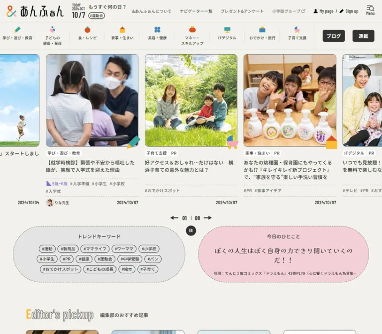
生成りの背景に自然な写真、幾何学アイコン、点線を組み合わせた子育てメディア。横送りの記事一覧、丸みのある情報パネル、モバイルの固定ナビゲーションが特徴。
オリジナルサイトを見るA welcoming family magazine on warm paper, organized by photographs, colorful geometric symbols, and compact editorial details.
Original URL: https://enfant.media/ Final URL: https://enfant.media/ Page identity: &あんふぁん, a Japanese parenting media homepage. Theme: a light editorial canvas with a charcoal footer. Inspected: September 17, 2026, Japan time. The supplied browser retrieval timestamp is September 16, 2026, at 19:31:29.939 UTC, equivalent to September 17 at 04:31:29.939 JST. Viewports: desktop 1440 × 1000 CSS pixels; mobile 390 × 844 CSS pixels. Scope: the current homepage, using five original-page captures and supplied rendered DOM/computed styles. Visual coverage includes the desktop opening carousel, discovery panels, blogger carousel, desktop footer, mobile opening carousel, and mobile footer. Other homepage sections are documented from DOM content only.
The design makes a large amount of parenting information feel approachable. A pale cream background supports dark Japanese sans-serif text, square editorial photographs, small white category labels, and restrained dashed separators. Color is concentrated in the multicolored ampersand, category pictograms, occasional geometric decorations, and a pale pink quotation panel.
The homepage opens directly into article discovery. Its primary structure is a long publication index with multiple editorial collections, contributors, blogs, series, rankings, and magazine links. The persistent two-level header supplies identity and category access. On mobile, a second navigation system stays at the bottom while article carousels retain visible fragments of neighboring stories.
A welcoming family magazine on warm paper, organized by photographs, colorful geometric symbols, and compact editorial details.
Original URL: https://enfant.media/ Final URL: https://enfant.media/ Page identity: &あんふぁん, a Japanese parenting media homepage. Theme: a light editorial canvas with a charcoal footer. Inspected: September 17, 2026, Japan time. The supplied browser retrieval timestamp is September 16, 2026, at 19:31:29.939 UTC, equivalent to September 17 at 04:31:29.939 JST. Viewports: desktop 1440 × 1000 CSS pixels; mobile 390 × 844 CSS pixels. Scope: the current homepage, using five original-page captures and supplied rendered DOM/computed styles. Visual coverage includes the desktop opening carousel, discovery panels, blogger carousel, desktop footer, mobile opening carousel, and mobile footer. Other homepage sections are documented from DOM content only.
The design makes a large amount of parenting information feel approachable. A pale cream background supports dark Japanese sans-serif text, square editorial photographs, small white category labels, and restrained dashed separators. Color is concentrated in the multicolored ampersand, category pictograms, occasional geometric decorations, and a pale pink quotation panel.
The homepage opens directly into article discovery. Its primary structure is a long publication index with multiple editorial collections, contributors, blogs, series, rankings, and magazine links. The persistent two-level header supplies identity and category access. On mobile, a second navigation system stays at the bottom while article carousels retain visible fragments of neighboring stories.
| Name | Value | Suggested token | Evidence and role |
|---|---|---|---|
| Warm Paper | #f2f2eb |
--color-paper |
Measured: body background at both viewports; the dominant page canvas |
| Charcoal Ink | #333333 |
--color-ink |
Measured: body text and desktop filled navigation buttons; the footer visually uses the same charcoal appearance |
| Secondary Ink | #666666 |
--color-muted |
Measured: the desktop group-affiliation utility link; useful for secondary metadata |
| White | #ffffff |
--color-white |
Measured: text on dark navigation buttons; white article badges are visually observed |
| Soft Pink | #f3d0d7 |
--color-pink-soft |
Measured: a mobile menu-related gift link in the DOM. The visible quotation panel is visually close, but its exact fill was not separately measured |
| Cloud Gray | approximately #e5e5e5 |
--color-cloud |
Estimated: the large trend-keyword capsule |
| Pale Rule | approximately #dcdede |
--color-rule |
Estimated: subtle header and navigation boundaries |
| Dashed Rule | approximately #bcbcbc |
--color-rule-dashed |
Estimated: article metadata separators |
| Quiet Motif | approximately #ecece1 |
--color-motif |
Estimated: the oversized pale ampersand behind the blogger section |
Paper and ink establish the hierarchy. Pink and gray distinguish discovery modules without making every article a colored card. The charcoal footer is a separate page region, not evidence of a selectable dark theme.
These colors occur primarily inside supplied artwork. Their hex values are visual estimates, not computed CSS measurements.
| Accent | Approximation | Typical visible use |
|---|---|---|
| Teal | #3da39e |
Pencil body, monitor, decorative semicircle |
| Orange Red | #e64e1b |
Tomato, purse, house roof, ampersand segment |
| Golden Yellow | #ffbd2b |
Pencil point, house body, bag handle, small icon details |
| Medium Blue | #448db8 |
Travel bag, flower, heart/person details |
| Rose Pink | #f6a2b8 |
Heart, stroller, decorative semicircle |
Keep the accents associated with recognizable objects. A category is communicated through its pictogram and written label together; it is not merely assigned a background color.
Source-token caution: the DOM includes numerous WordPress color, gradient, shadow, and size presets. Their presence does not establish visible use. For example, the registered yellow preset is not evidence for the yellow inside the category icon artwork. Do not import the entire preset inventory into this palette.
"Noto Sans JP", "sans-serif".16px, weight 400, line height 24px.0.32px, equivalent to 0.02em at the measured body size.500 for category labels and several small links; 600 for some utility headings; 700 for filled navigation buttons.The computed family establishes the declared stack. Font-file URLs and actual font-loading success were not independently checked. A new implementation should supply the named family when available and use an unquoted generic sans-serif fallback.
"Barlow Condensed", "sans-serif".TODAY, month/year, large numeric date, and desktop account links.600 for the date block; 500 for account links.Dates beneath articles and carousel numerals also appear condensed in the screenshots, but their individual computed font records were not supplied. Reusing Barlow Condensed for those roles is a reasonable recommendation, not a measured assignment.
The wordmark is artwork with expressive Japanese lettering and a multicolored ampersand. Its measured box is 197 × 40px at both inspected widths. The 16px font size recorded on its H1 container does not describe the lettering within the logo. Preserve an authorized logo asset rather than trying to reproduce it by choosing a display font.
| Role | Desktop | Mobile | Weight | Evidence |
|---|---|---|---|---|
| Body | 16 / 24px |
16 / 24px |
400 |
Measured |
| Header utility links | 13 / 24px |
Not visible in the masthead | 400 |
Measured desktop |
| Account links | 14 / 24px |
Available in navigation DOM | 500 |
Measured desktop, Barlow Condensed |
| Category-strip labels | 11 / 16.5px |
12 / 14.4px |
500 |
Measured |
TODAY and month/year |
12 / 12px |
11 / 11px |
600 |
Measured, Barlow Condensed |
| Header numeric date | 30 / 30px |
24 / 24px |
600 |
Measured, Barlow Condensed |
| Desktop blog/series buttons | 13 / 15.6px |
Absent from the visible category strip | 700 |
Measured desktop |
| Keyword-chip text | 12 / 14.4px |
12 / 14.4px |
500 |
Measured navigation keyword instances |
| Featured article headline | About 18 / 27px |
About 14 / 22px |
Approximately 600–700 |
Screenshot estimate |
| Blogger article headline | About 18 / 27px |
Not visually inspected | Approximately 600–700 |
Desktop screenshot estimate |
| Article tags | About 11–12px |
About 11–12px |
Medium | Screenshot estimate |
| Daily quotation | About 24 / 36px |
Not visually inspected | Bold | Desktop screenshot estimate |
| Footer links | About 11–14px |
About 11–14px |
Medium to bold | Screenshot estimate |
The mobile category labels become slightly larger while their line height becomes tighter. They are allowed to wrap inside fixed-width slots. Mobile is therefore not a uniform scaled-down desktop layout.
English section labels such as Editor's pickup, New articles, Bloggers, and Weekly ranking are present in the current DOM. Their display-font treatment is outside the visually captured regions and should not be inferred from other imagery.
The evidence supports several recurring dimensions, but does not establish a single original spacing scale.
| Use | Value | Status |
|---|---|---|
| Date numeral gap | 2px |
Measured |
| Desktop category icon-to-label gap | 3px |
Measured |
| Account icon-to-text gap | 5px |
Measured |
| Category horizontal padding | 8px |
Measured |
| Category top/bottom padding | 10px / 12px |
Measured |
| Keyword horizontal padding | 10px |
Measured navigation instances |
| Mobile masthead side inset | 14px |
Measured logo position |
| Desktop masthead side inset | Approximately 24px |
Measured logo position, rounded |
| Featured-card gap | Approximately 24px |
Screenshot estimate at both widths |
| Discovery-panel outside margin and center gap | Approximately 48px |
Desktop screenshot estimate |
| Blogger-card inner side inset | Approximately 50px |
Desktop screenshot estimate |
A useful adaptation scale is 2, 4, 8, 10, 12, 14, 24, 32, 48px. This is a recommended consolidation, not a recovered source variable set.
| Element | Radius or shape | Evidence |
|---|---|---|
| Desktop blog/series buttons | 5px |
Measured |
| Keyword chips | 20px |
Measured navigation instances |
| Featured photographs | Approximately 10px |
Screenshot estimate |
| Blogger photographs | Approximately 18–20px |
Screenshot estimate |
| Main blog-index button | Approximately 10px |
Screenshot estimate |
| Trend and quotation panels | Long capsule, approximately half-height end radius | Screenshot observation |
| Contributor portraits and pause symbol | Circle | Screenshot observation |
| Category illustrations | Circles, rectangles, triangles, semicircles | Artwork observation |
Roundness belongs to photographs, compact controls, and a few large information panels. Article text sits directly on the page rather than inside a second rounded container.
| Element | Desktop 1440 × 1000 | Mobile 390 × 844 | Evidence |
|---|---|---|---|
| Header clearance | 153px |
149px |
Measured --header-height and body top padding |
| Masthead lower boundary | About 79px |
65px |
Category-link starting coordinates |
| Category-link box | About 132.34 × 73.45px |
88 × 82.81px |
Measured |
| Wordmark | 197 × 40px, at approximately (24, 19) |
197 × 40px, at (14, 11) |
Measured |
| Large date position | Approximately (265, 36) |
Approximately (337, 30) |
Measured |
| Featured photograph | Approximately 350 × 350px |
Approximately 280 × 280px |
Screenshot estimate |
| Featured-image top | Approximately 172px |
Approximately 160px |
Screenshot estimate |
| Mobile centered-card left edge | — | Approximately 55px |
Screenshot estimate |
| Discovery capsules | Approximately 648 × 202px each |
Upper part of the keyword panel visible | Desktop estimate; mobile height unverified |
| Blogger photo | Approximately 245 × 245px |
Not visually inspected | Desktop estimate |
| Blogger column pitch | Approximately 346px |
Not visually inspected | Desktop estimate |
| Footer inner width | Approximately 960px |
Approximately 362px |
Screenshot estimate |
| Bottom navigation | Not visible | Approximately 61px tall |
Screenshot estimate |
| Document height | 10082.31px |
12740.09px |
Measured document rectangles |
The document heights describe this content snapshot; they are not layout targets.
Header-variable distinction: another source property, --page-header-height, reads 9.125rem on desktop and 8.25rem on mobile. At the measured 16px root, these equal 146px and 132px. They differ from the actual 153px and 149px body offsets. Use the observed header clearance when reproducing these captures; do not treat the two properties as interchangeable.
Role: identity, publication date, and utility navigation.
A paper-colored full-width strip carries the wordmark at left. On desktop, a narrow date block follows it, while small utility links occupy the right side. The last control combines a menu/search-like graphic with the caption Menu.
The utility group includes about, contributors, gifts/surveys, group affiliation, and account entry points. Account links use condensed Latin typography and small black icons. The measured menu button is approximately 30 × 36px; its accessible name cannot be determined from the supplied text record alone.
On mobile, the same 197 × 40px wordmark remains prominent. The date moves to the far right, and the desktop utility group is absent from the visible masthead. This preserves brand recognition without compressing the logo.
The masthead and category strip remain at the top in both opening and footer captures. This establishes persistent behavior; the exact positioning declarations for the containing layers were not supplied.
Role: immediate access to nine editorial subjects.
Each item combines a small geometric pictogram above a centered Japanese label. The subjects cover learning, child health, food, home, beauty, money, digital life, outings, and parenting support.
On desktop, the nine items occupy approximately 1191px, followed by a separate region containing the dark ブログ and 連載 links. Fine vertical separators divide the category slots. The category links use 10px 8px 12px padding, and their labels use 11px medium-weight type.
On mobile, each slot remains 88px wide. Four complete categories and part of the fifth are visible at once. The offscreen element coordinates establish a horizontal sequence rather than a wrapped grid. Horizontal scrolling is the appropriate implementation, but an actual swipe was not recorded.
The icon artwork occupies roughly a 32px layout box. Preserve the objects' varied silhouettes rather than replacing them with a uniform monochrome icon set.
Role: the homepage's main editorial entry point.
The desktop capture shows three complete cards with cropped neighbors at both viewport edges. The middle photograph is centered in the viewport. On mobile, one approximately 280px card is centered with narrow previews of adjacent stories.
Card anatomy follows this order:
PR badges below the photograph.The image frame clips the photograph, but the overlapping pictogram extends outside it. Use separate nested elements so image cropping does not cut off the category symbol.
Cards share the page background. There is no visible general card shadow or enclosing white panel. The visual grouping comes from image width, text alignment, metadata rules, and spacing.
The same content can include or omit an author. Preserve that variation rather than forcing placeholder avatars into every story. PR is a separate disclosure badge, not part of the category icon or title artwork.
Role: compact orientation and explicit playback affordance.
A centered row contains a left arrow, two-digit current index, vertical separator, total count, and right arrow. A small charcoal circle with a white pause glyph sits underneath. The captured featured states show 03 | 08 on desktop and 05 | 08 on mobile.
The visible pause circle is approximately 28px in diameter. A new implementation can preserve that graphic while providing a larger transparent hit area around it.
The eight-item total and changing captured indices support a carousel interpretation. Timing, easing, drag behavior, keyboard support, looping, and the outcome of pressing pause were not tested. Repeated article sequences in the DOM are compatible with loop clones but do not identify a carousel library.
Role: a compact alternative route into the archive.
A large gray capsule with a fine dashed outline contains a centered heading, トレンドキーワード, followed by several rows of outlined hashtag pills. In the desktop capture it occupies the left half of the discovery pair and shows three centered rows of chips.
The sampled keyword component uses approximately 30px height, 20px radius, 10px horizontal padding, and 12px / 14.4px medium-weight text. Those exact measurements come from navigation keyword instances; the visible homepage pills have a matching visual language.
The DOM contains substantially more keywords than fit inside the captured capsule. The evidence does not establish whether the homepage module scrolls, clips, rotates, or selects a subset. Do not invent a scrolling tag ticker from the text inventory alone.
Role: a quiet editorial moment beside the archive links.
A pale pink capsule mirrors the keyword panel's dimensions and dashed edge. It contains a small centered label, a large two-line quotation, and a compact source citation near the bottom.
The visible label is 今日のひとこと. The quotation is bold, dark, and centered; the citation is much smaller. This module links to an article, as confirmed by its anchor destination in the DOM. It is therefore an editorial discovery component, not a static testimonial.
At desktop width, the two panels use roughly 48px outside margins and a 48px central gap. Their upper edges sit near the carousel's pause control, leaving the center channel visually open.
Only the beginning of the keyword panel appears in the mobile opening screenshot. A full mobile quotation layout is not visually established.
Role: highlights personal contributions and recurring author identities.
The desktop blogger rail has smaller square photographs and wider intervals than the opening carousel. Each approximately 346px column contains a roughly 245px image, leaving about 50px of side space. Dashed vertical rules mark the column boundaries.
Its information order differs from featured articles:
The avatar is approximately 48–50px across. The author block is an important part of the card's identity, not an optional decorative footer.
A very large, low-contrast ampersand sits behind the section. Near its lower-right edge, teal and pink semicircles introduce a small decorative accent. Neither motif interferes with article text.
Below the rail are the same arrow/index/pause controls, followed by a centered charcoal ブログTOP button, approximately 250 × 52px. Small overlapping crescent-like shapes decorate the button's right side.
The mobile DOM retains blogger names but omits the short profile descriptions found in the desktop text. This supports a more concise mobile author presentation; photograph dimensions and avatar placement were not visually inspected on mobile.
The current DOM establishes the following sequence after the opening discovery area. Their detailed visual layouts are outside the supplied current-page screenshots.
| Module | Confirmed content anatomy | Inspection limit |
|---|---|---|
Editor's pickup |
Eight entries with category, optional disclosure, headline, and varying tags, age labels, author, and date | Grid geometry and heading treatment unverified |
New articles |
Four article entries and an archive link | Responsive column count unverified |
Category |
The same nine subject categories | Main-content arrangement unverified |
| Navigator section | Introductory explanation and five named contributors, with article links and a directory link | Portrait shape and card dimensions unverified |
Bloggers |
Introductory copy, member-directory link, article carousel, index link | Desktop rail visually covered |
Serializations |
Six entries with series title, episode number, date, article title, and author | Detailed visual arrangement unverified |
Weekly ranking |
Article, series, and blog labels; five entries in each desktop group | Mobile text contains only the article list; switching behavior unverified |
| About section | Publication purpose, explanatory paragraphs, and a detail link | Typography and surface treatment unverified |
| Digital magazine section | Tokyo, Kansai, and Tokai editions, plus back issues | Cover layout unverified |
For an adaptation, reuse the confirmed image, badge, tag, date, and author primitives across these modules. Do not present a guessed grid or heading style as a measured part of the source.
Role: persistent access to the main publication routes.
A paper-colored bar stays at the bottom in both mobile captures. It has a thin top boundary and five evenly distributed controls: Home, 記事, ブログ, 連載, and Menu.
The first four destinations are confirmed by DOM links to the homepage, newest articles, blog, and series. Their supplied SVG assets include multicolored line illustrations. The menu control uses a related search/menu motif; its opening behavior was not exercised.
The bar is approximately 61px tall in the 390 × 844px captures. Icons sit above small captions. It visually belongs to the same paper surface as the header, even when the page behind it is the charcoal footer.
Role: comprehensive navigation, publisher information, and related publications.
The desktop footer uses a charcoal background and light text inside an approximately 960px centered content region. Category groups form five columns in the first row and four in the second. Each group pairs a small colored category icon with a bold heading, a fine horizontal rule, and a compact list of topic links.
Below the categories are tag-directory links, a primary utility row, a smaller company/legal row, related-site links, and centered copyright text. Dashed horizontal separators establish the main layers. Generous vertical space around the final copyright gives the otherwise dense directory a clear ending.
On mobile, the visible utility and company links become centered two-column groups. Primary rows are approximately 52px high, separated by dashed rules. Related sites also form two columns, with the final unpaired link on the left. The mobile DOM includes category headings but not the desktop topic-link lists; whether these are expandable was not tested.
The original page identifies こどもりびんぐ through an operator link and displays Copyright © 2024 kodomoliving Inc. All rights reserved. The copyright year is footer content, not evidence of the current design's release date. No production-credit statement was established from the inspected original page.
The DOM includes a larger navigation directory with categories, new articles, contributors, blogs, series, policies, trend tags, age filters, account links, social links, and regional digital magazines. Mobile records also include a pink gifts/surveys link.
No supplied screenshot shows this menu open. Its coordinates must not be interpreted as visible homepage placement. The opening animation, backdrop, focus handling, scrolling behavior, and close interaction remain unverified.
| Treatment | Supplied evidence | What can be concluded |
|---|---|---|
| Utility-link transition | opacity 0.3s ease-out |
A 300ms opacity transition is declared; endpoint opacity was not captured |
| Category-link transition | Color-related properties at 0.2s linear |
A 200ms linear color transition is declared; hover colors are unknown |
| Dark navigation buttons | background-color 0.3s, color 0.3s |
Color changes are configured over 300ms; the changed state was not shown |
| Keyword-link transition | Color-related properties at 0.3s linear |
Measured on sampled navigation keyword links |
| Keyword text transition | 0.2s cubic-bezier(0.4, 0, 0.2, 1) for color-related properties |
The inner label has its own declared transition |
| Article-image hover cue | Class name hover-scale-image |
Suggests an image-scaling implementation; scale factor and duration are unavailable |
| Carousel movement | Different captured indices, arrows, pause graphics, repeated DOM sequences | A carousel presentation is established; interval, easing, and response to controls are unverified |
| Persistent navigation | Header remains visible in scrolled captures; mobile bottom bar remains visible | Persistence is visually established across captured positions |
| Menu and ranking controls | Related content and labels exist in DOM | Interaction outcomes are not established |
The observed interface supports restrained motion. There is no evidence for elaborate page transitions, parallax, continuous decorative rotation, or animated backgrounds.
For a new implementation, a small image scale such as 1.025 over 200ms is a reasonable recommendation, not a source value. Carousel autoplay should have a functioning pause control, stop during user interaction, and respect reduced-motion preferences.
| Surface | Appearance | Function |
|---|---|---|
| Page canvas | Solid warm paper | Connects the many editorial modules |
| Header and mobile bottom bar | Paper with fine boundaries | Persistent navigation without strong visual elevation |
| Article body | Transparent on paper | Keeps attention on images and headlines |
| Article-image frame | Rounded image with a fine outline | Defines the dominant card boundary |
| Category and disclosure badges | Small white labels with dark text | Compact classification and disclosure |
| Trend module | Gray capsule with dashed edge | Groups archive shortcuts |
| Quotation module | Pale pink capsule with dashed edge | Adds an editorial pause |
| Filled index links | Charcoal with white text | Indicates a route to a larger collection |
| Footer | Charcoal with light text and subdued rules | Separates the comprehensive site directory |
No broad shadow or glass-effect system is visible. Registered platform shadow presets should not be mistaken for applied elevation.
Photography carries most of the page's visual weight. The current opening rail mixes a classroom event, a family outdoors, a close food photograph, and a public parenting event. Blogger imagery includes clothing, household objects, a small activity kit, packaged products, and personal family snapshots.
The photographs retain their natural color and varied lighting. They are not unified through a monochrome filter or artificial color overlay. Square cropping provides consistency despite differing source aspect ratios. Supplied image classes include object-cover and object-center, supporting the observed centered cropping.
Category illustrations provide the common graphic language: a tilted pencil, a heart/person arrangement, tomato, house, flower, purse, monitor, travel bag, and stroller. The same objects recur at different scales in navigation, article corners, and the footer. Larger geometric decorations use the same simple shapes and colors.
Author portraits can be photographs or drawings. Preserve that mixture; it expresses the difference between professional editorial content and individual blogger voices.
Paths are relative to https://enfant.media/ and were supplied in the rendered DOM. They were not independently downloaded. Only complete asset paths are included.
| Asset | Observed path | Use |
|---|---|---|
| Learning icon | /wp-content/uploads/2025/09/icon_pen.png |
Category pictogram |
| Child-health icon | /wp-content/uploads/2025/09/icon_heart.png |
Category pictogram |
| Food icon | /wp-content/uploads/2025/09/icon_tomato.png |
Category pictogram |
| Home icon | /wp-content/uploads/2025/09/icon_house.png |
Category pictogram |
| Beauty icon | /wp-content/uploads/2025/09/icon_flower.png |
Category pictogram |
| Money icon | /wp-content/uploads/2025/09/icon_money.png |
Category pictogram |
| Digital icon | /wp-content/uploads/2025/09/icon_monitor.png |
Category pictogram |
| Travel icon | /wp-content/uploads/2025/09/icon_travel.png |
Category pictogram |
| Parenting-support icon | /wp-content/uploads/2025/09/icon_baby.png |
Category pictogram |
| Family-outing photograph | /wp-content/uploads/2026/08/tgb-eye-700x700.jpg |
Featured article image |
| Food photograph | /wp-content/uploads/2026/09/DSC01488-700x468.jpg |
Landscape source shown in a square frame |
| Classroom composition | /wp-content/uploads/2026/08/farmind-eye-700x700.jpg |
Featured article image |
| Contributor portrait | /wp-content/themes/mytheme/assets/image/user-icon/user-icon-86.png |
Author identity |
| Mobile home control | /wp-content/themes/mytheme/assets/image/button_home.svg |
Bottom navigation artwork |
| Mobile articles control | /wp-content/themes/mytheme/assets/image/button_post.svg |
Bottom navigation artwork |
| Mobile blog control | /wp-content/themes/mytheme/assets/image/button_blog.svg |
Bottom navigation artwork |
| Mobile series control | /wp-content/themes/mytheme/assets/image/button_serial.svg |
Bottom navigation artwork |
The logo, menu graphic, decorative ampersand, and several article filenames were not available as complete paths in the supplied evidence. Do not invent filenames for them.
Use authorized artwork and photographs where available. CSS can reproduce the layout and simple decorative geometry, but the custom logo and category assets carry much of the identity.
At 1440px, the page uses the entire viewport for its article rails and persistent header. This gives the photographs more visual presence than a narrow central article column would provide. The discovery panels then introduce approximately 48px outside margins, while the footer directory narrows to approximately 960px.
These are separate layout systems. Do not apply the footer width to the opening carousel or treat the WordPress global content-width presets as measurements of all visible sections.
The opening content starts roughly 19px below the 153px header clearance. The featured photographs dominate the first half of the viewport, while badges, headlines, tags, author/date rows, and controls create a compact lower information band.
At 390px, the header clearance is still 149px, only slightly shorter than desktop. The masthead itself is shorter, but wrapped category labels make the category strip taller.
The featured image is approximately 280px wide, leaving 55px from its left edge to the viewport boundary when centered. A 24px gap allows parts of the previous and next cards to remain visible. This previews lateral content without reducing the active article to a narrow grid column.
The mobile bottom bar occupies approximately 61px. Together, the persistent header and bottom bar leave about 634px of the 844px viewport between them. Account for both when sizing overlays and scrolling focused elements into view.
The footer becomes two-column navigation with centered labels. Blogger profile descriptions disappear from the mobile text snapshot. Ranking labels remain, while only the article-ranking content appears in the mobile text; a tabbed implementation is plausible but not verified.
Only the two supplied viewport sizes were inspected. Exact media-query thresholds, tablet behavior, landscape behavior, and browser safe-area handling are unknown.
For an adaptation:
88px horizontal slots until there is enough room for all categories and desktop shortcuts.1200px in the Quick Start is a recommendation.350px, with approximately 280px at the inspected phone width.#f2f2eb and ink #333333.PR disclosures.These are recommendations for a new implementation, not verified features of the original:
time elements, and separately linked tags. Avoid nesting tag links inside an all-card anchor.28px while providing a target of at least 44 × 44px.PR in text so disclosure does not depend on color or imagery.#f2f2eb.#333333.#666666.#f3d0d7; use as a close quotation-panel starting point.#e5e5e5.#3da39e, orange #e64e1b, yellow #ffbd2b, blue #448db8, pink #f6a2b8.“Create a Japanese parenting publication homepage inspired by the current &あんふぁん interface. Use warm paper #f2f2eb, charcoal #333333, Noto Sans JP, and compact Barlow Condensed date utilities. Build a persistent two-level header with a custom wordmark, publication date, and nine colorful geometric category pictograms. Open with a full-width horizontal article carousel: square rounded photographs, overlapping category symbols, small white category and PR labels, bold Japanese headlines, dashed metadata rules, and right-aligned dates. Place gray keyword and pale pink quotation capsules below. Include a distinct blogger rail with smaller photographs, vertical dashed separators, and visible author profiles. Finish with a dense charcoal directory footer. On mobile, keep one centered article with neighboring previews, horizontally overflowing category slots, and a five-item fixed bottom navigation. Preserve the editorial hierarchy and natural photography.”
This is an adaptation using the measured core colors, typography, header offsets, and navigation proportions. Screenshot-derived values are marked as approximations. The breakpoint, native scroll-snap behavior, hover endpoints, focus styles, and reduced-motion handling are recommendations.
The CSS does not load fonts, provide original artwork, implement autoplay, or wire buttons. Supply fonts and assets separately. Use .feature-track with .feature-card children; put an .image-frame and a separate .category-mark inside .feature-media so the icon can overlap without being clipped. Initialize the desired slide in the center through carousel logic when reproducing a particular captured state.
:root {
  /* Measured colors and declared font families */
  --color-paper: #f2f2eb;
  --color-ink: #333333;
  --color-muted: #666666;
  --color-white: #ffffff;
  --color-pink-soft: #f3d0d7;
  --font-body: 'Noto Sans JP', sans-serif;
  --font-utility: 'Barlow Condensed', sans-serif;

  /* Visual approximations */
  --color-cloud: #e5e5e5;
  --color-rule: #dcdede;
  --color-rule-dashed: #bcbcbc;
  --color-motif: #ecece1;
  --color-teal: #3da39e;
  --color-orange: #e64e1b;
  --color-yellow: #ffbd2b;
  --color-blue: #448db8;
  --color-rose: #f6a2b8;

  /* Measured mobile header clearance; other geometry is adapted */
  --header-height: 149px;
  --masthead-height: 65px;
  --category-height: 84px;
  --bottom-nav-height: 61px;
  --page-inset: 14px;
  --feature-size: min(350px, calc(100vw - 110px));
  --rail-gap: 24px;
  --radius-image: 10px;
  --radius-button: 5px;
  --radius-chip: 20px;
  --safe-bottom: env(safe-area-inset-bottom, 0px);

  --motion-opacity: 300ms ease-out;
  --motion-color: 200ms linear;
}

* { box-sizing: border-box; }

html {
  scroll-padding-top: calc(var(--header-height) + 16px);
  scroll-padding-bottom: calc(var(--bottom-nav-height) + 16px);
}

body {
  margin: 0;
  padding-top: var(--header-height);
  padding-bottom: calc(var(--bottom-nav-height) + var(--safe-bottom));
  color: var(--color-ink);
  background: var(--color-paper);
  font-family: var(--font-body);
  font-size: 16px;
  line-height: 1.5;
  letter-spacing: 0.32px;
}

a { color: inherit; }
button { font: inherit; }
img { display: block; max-width: 100%; }

.site-header {
  position: fixed;
  inset: 0 0 auto;
  z-index: 30;
  background: var(--color-paper);
}

.masthead {
  display: flex;
  align-items: center;
  gap: 24px;
  min-height: var(--masthead-height);
  padding: 8px var(--page-inset);
  border-bottom: 1px solid var(--color-rule);
}

.brand {
  flex: 0 0 auto;
  width: 197px;
  height: 40px;
}

.brand img { width: 100%; height: 100%; object-fit: contain; }

.date-stamp {
  margin-inline-start: auto;
  font-family: var(--font-utility);
  font-weight: 600;
  line-height: 1;
}

.date-stamp__label { display: block; font-size: 11px; }
.date-stamp__day { display: flex; gap: 2px; font-size: 24px; }
.utility-nav, .section-shortcuts { display: none; }

.category-row {
  display: flex;
  min-height: var(--category-height);
  border-bottom: 1px solid var(--color-rule);
}

.category-strip {
  display: flex;
  flex: 1;
  min-width: 0;
  overflow-x: auto;
  scrollbar-width: none;
}

.category-strip::-webkit-scrollbar { display: none; }

.category-link {
  position: relative;
  display: flex;
  flex: 0 0 88px;
  flex-direction: column;
  align-items: center;
  min-height: 83px;
  padding: 10px 8px 12px;
  text-align: center;
  text-decoration: none;
  transition: color var(--motion-color), background-color var(--motion-color);
}

.category-link img { width: 32px; height: 32px; object-fit: contain; }
.category-link span { font-size: 12px; font-weight: 500; line-height: 1.2; }

.dark-link {
  display: inline-grid;
  place-items: center;
  border: 1px solid var(--color-ink);
  border-radius: var(--radius-button);
  padding: 10px 18px;
  color: var(--color-white);
  background: var(--color-ink);
  font-size: 13px;
  font-weight: 700;
  line-height: 1.2;
  text-decoration: none;
  transition: background-color 300ms, color 300ms;
}

.feature-track {
  display: flex;
  align-items: stretch;
  gap: var(--rail-gap);
  overflow-x: auto;
  padding: 11px calc((100% - var(--feature-size)) / 2) 8px;
  scroll-snap-type: x mandatory;
  scroll-padding-inline: calc((100% - var(--feature-size)) / 2);
  scrollbar-width: none;
}

.feature-track::-webkit-scrollbar { display: none; }

.feature-card {
  flex: 0 0 var(--feature-size);
  min-width: 0;
  scroll-snap-align: center;
}

.feature-media { position: relative; }

.image-frame {
  display: block;
  overflow: hidden;
  aspect-ratio: 1;
  border: 1px solid #92928b;
  border-radius: var(--radius-image);
}

.image-frame > img {
  width: 100%;
  height: 100%;
  object-fit: cover;
  object-position: center;
  transition: transform 200ms ease-out;
}

.category-mark {
  position: absolute;
  right: -8px;
  bottom: -10px;
  width: 48px;
  height: 48px;
  object-fit: contain;
  pointer-events: none;
}

.article-badges { display: flex; flex-wrap: wrap; gap: 4px; margin-top: 12px; }

.article-badge {
  padding: 2px 6px;
  border-radius: 4px;
  background: var(--color-white);
  font-size: 12px;
  font-weight: 500;
  line-height: 1.5;
}

.card-title {
  min-block-size: 4.5em;
  margin: 10px 0 14px;
  font-size: 14px;
  font-weight: 700;
  line-height: 1.55;
  overflow-wrap: anywhere;
}

.card-title a { text-decoration: none; }

.article-tags {
  display: flex;
  flex-wrap: wrap;
  gap: 4px 10px;
  padding-block: 8px;
  border-block: 1px dashed var(--color-rule-dashed);
  color: var(--color-muted);
  font-size: 11px;
  line-height: 1.6;
}

.article-tags a { text-decoration: none; }

.article-meta {
  display: flex;
  align-items: center;
  gap: 8px;
  min-height: 36px;
  padding-top: 8px;
  font-size: 12px;
}

.article-meta time {
  margin-inline-start: auto;
  font-family: var(--font-utility);
  font-size: 14px;
  font-weight: 600;
}

.author-mini { display: flex; align-items: center; gap: 4px; }
.author-mini img { width: 28px; height: 28px; border-radius: 50%; }

.carousel-controls { display: grid; justify-items: center; margin-block: 18px; }
.carousel-index { display: flex; align-items: center; gap: 10px; }
.carousel-index output { font: 600 16px/1 var(--font-utility); }

.carousel-arrow, .carousel-pause {
  display: grid;
  place-items: center;
  width: 44px;
  height: 44px;
  padding: 0;
  border: 0;
  color: var(--color-ink);
  background: transparent;
  cursor: pointer;
}

.carousel-pause__symbol {
  display: grid;
  place-items: center;
  width: 28px;
  height: 28px;
  border-radius: 50%;
  color: white;
  background: var(--color-ink);
  font-size: 13px;
  font-weight: 700;
}

.discovery-panels {
  display: grid;
  gap: 24px;
  margin: 0 var(--page-inset) 64px;
}

.discovery-panel {
  min-width: 0;
  padding: 24px;
  border: 1px dashed #888;
  border-radius: 100px;
  text-align: center;
}

.discovery-panel--keywords { background: var(--color-cloud); }
.discovery-panel--quote { background: var(--color-pink-soft); }
.discovery-panel__label { margin: 0 0 18px; font-size: 14px; font-weight: 500; }
.keyword-list { display: flex; flex-wrap: wrap; justify-content: center; gap: 8px; }

.keyword-chip {
  display: inline-grid;
  place-items: center;
  min-height: 30px;
  padding-inline: 10px;
  border: 1px solid currentColor;
  border-radius: var(--radius-chip);
  font-size: 12px;
  font-weight: 500;
  line-height: 1.2;
  text-decoration: none;
  transition: color 300ms linear, background-color 300ms linear;
}

.daily-quote { margin: 0; font-size: 20px; font-weight: 700; line-height: 1.5; }
.daily-citation { display: block; margin-top: 20px; font-size: 12px; font-style: normal; }

.blog-card { padding-inline: 24px; border-inline-end: 1px dashed #888; }
.blog-card .image-frame { border-radius: 20px; }
.blog-author { display: flex; align-items: flex-start; gap: 8px; margin-top: 14px; }
.blog-author img { flex: 0 0 48px; width: 48px; height: 48px; border-radius: 50%; }
.blog-author__name { margin: 0; font-size: 14px; font-weight: 700; }
.blog-author__bio { display: none; margin: 2px 0 0; font-size: 12px; line-height: 1.3; }
.blog-index { width: 250px; min-height: 52px; border-radius: 10px; font-size: 16px; }

.site-footer { padding: 48px 14px 28px; color: white; background: var(--color-ink); }
.footer-inner { max-width: 960px; margin-inline: auto; }
.footer-categories { display: grid; gap: 24px; }
.footer-category h3 { display: flex; gap: 6px; align-items: center; font-size: 14px; }
.footer-category h3 img { width: 18px; height: 18px; object-fit: contain; }
.footer-topics { margin: 0; padding: 0; list-style: none; font-size: 12px; line-height: 1.8; }

.footer-links {
  display: grid;
  grid-template-columns: repeat(2, minmax(0, 1fr));
  margin-top: 32px;
  border-top: 1px dashed #707070;
}

.footer-links a {
  display: grid;
  place-items: center;
  min-height: 52px;
  padding: 10px 4px;
  border-bottom: 1px dashed #707070;
  font-size: 13px;
  font-weight: 700;
  text-align: center;
  text-decoration: none;
}

.footer-copyright { margin: 48px 0 0; font-size: 12px; text-align: center; }

.mobile-nav {
  position: fixed;
  inset: auto 0 0;
  z-index: 40;
  display: grid;
  grid-template-columns: repeat(5, minmax(0, 1fr));
  min-height: calc(var(--bottom-nav-height) + var(--safe-bottom));
  padding-bottom: var(--safe-bottom);
  border-top: 1px solid var(--color-rule);
  background: var(--color-paper);
}

.mobile-nav__item {
  display: flex;
  flex-direction: column;
  align-items: center;
  justify-content: center;
  gap: 3px;
  min-height: 60px;
  padding: 6px 2px;
  border: 0;
  color: var(--color-ink);
  background: transparent;
  font-size: 12px;
  line-height: 1.2;
  text-decoration: none;
}

/* Use this size for icon-only artwork with a separate text caption. */
.mobile-nav__icon { width: 24px; height: 24px; object-fit: contain; }

/* Recommended breakpoint; the original threshold is unverified. */
@media (min-width: 1200px) {
  :root {
    --header-height: 153px;
    --masthead-height: 79px;
    --category-height: 74px;
    --page-inset: 24px;
    --bottom-nav-height: 0px;
  }

  body { padding-bottom: 0; }
  .masthead { gap: 44px; }
  .date-stamp { margin-inline-start: 0; }
  .date-stamp__label { font-size: 12px; }
  .date-stamp__day { font-size: 30px; }

  .utility-nav { display: flex; align-items: center; gap: 24px; margin-left: auto; font-size: 13px; }
  .utility-nav a { text-decoration: none; transition: opacity var(--motion-opacity); }
  .utility-nav__account { font-family: var(--font-utility); font-size: 14px; font-weight: 500; }

  .category-link { flex: 1 1 0; min-width: 0; min-height: 73px; gap: 3px; }
  .category-link span { font-size: 11px; line-height: 1.5; }
  .category-link::after { content: ''; position: absolute; right: 0; top: 21px; height: 32px; border-right: 1px solid var(--color-rule); }

  .section-shortcuts { display: flex; flex: 0 0 248px; align-items: center; justify-content: space-between; padding-inline: 28px; }
  .section-shortcuts .dark-link { width: 82px; padding-inline: 0; }

  .feature-track { padding-top: 19px; }
  .card-title { font-size: 18px; line-height: 1.5; }
  .category-mark { width: 52px; height: 52px; }

  .discovery-panels { grid-template-columns: repeat(2, minmax(0, 1fr)); gap: 48px; margin-inline: 48px; }
  .discovery-panel { min-height: 202px; padding: 24px 36px; }
  .daily-quote { font-size: 24px; }

  .blog-card { flex: 0 0 346px; padding-inline: 50px; }
  .blog-author__bio { display: block; }
  .footer-categories { grid-template-columns: repeat(5, minmax(0, 1fr)); gap: 40px; }
  .footer-links { display: flex; justify-content: space-between; gap: 16px; }
  .footer-links a { border-bottom: 0; }
  .mobile-nav { display: none; }
}

/* Recommended hover endpoints; only transition declarations were measured. */
@media (hover: hover) {
  .utility-nav a:hover { opacity: 0.65; }
  .category-link:hover { background: var(--color-cloud); }
  .image-frame:hover > img { transform: scale(1.025); }
  .keyword-chip:hover { color: var(--color-paper); background: var(--color-ink); }
  .dark-link:hover { color: var(--color-ink); background: var(--color-paper); }
}

/* Recommended focus and reduced-motion behavior. */
:where(a, button):focus-visible {
  outline: 2px solid currentColor;
  outline-offset: 4px;
}

@media (prefers-reduced-motion: reduce) {
  .image-frame > img,
  .utility-nav a,
  .category-link,
  .keyword-chip,
  .dark-link { transition: none; }
  .image-frame:hover > img { transform: none; }
  .feature-track { scroll-behavior: auto; }
}
The source mobile SVG files may already incorporate captions, as their visible artwork suggests. Inspect the authorized assets when integrating them and avoid duplicating embedded labels with additional visible text. The .mobile-nav__icon rule above is specifically for icon-only artwork.
The discovery pair uses ordinary document flow here. Reproducing the desktop pause control's position within the central gap requires coordination with the carousel control layout. Footer topic visibility and mobile menu behavior are intentionally left to semantic component logic rather than guessed from incomplete states. JavaScript must separately honor reduced motion if it controls carousel advancement.
Optional aliases for a project using Tailwind v4. This mapping is an implementation aid, not a claim about the original site's framework version. Define the custom properties above first.
@theme inline {
  --color-paper: var(--color-paper);
  --color-editorial-ink: var(--color-ink);
  --color-editorial-muted: var(--color-muted);
  --color-editorial-cloud: var(--color-cloud);
  --color-editorial-pink: var(--color-pink-soft);
  --font-editorial: var(--font-body);
  --font-condensed: var(--font-utility);
  --radius-editorial-image: var(--radius-image);
  --radius-editorial-chip: var(--radius-chip);
  --spacing-editorial-gap: var(--rail-gap);
}
If retaining the --color-paper custom property from the base CSS, map it under a distinct Tailwind alias instead of a self-reference:
@theme inline {
  --color-editorial-paper: var(--color-paper);
}
200, an unchanged final URL, and the title &あんふぁん 小学館グループの子育てメディア.19:31:29.939 UTC; September 17, 2026, 04:31:29.939 JST.1440 × 1000, covering the opening content, blogger carousel, and footer; document height approximately 10082.31px.390 × 844, covering the opening content and footer; document height approximately 12740.09px.This reference describes the current homepage shown in the supplied original-page evidence. Intermediate-width layouts, interactive states, exact photograph crop rules beyond the supplied classes, and production credits remain limited to the evidence stated above.
# &あんふぁん — Style Reference

> A welcoming family magazine on warm paper, organized by photographs, colorful geometric symbols, and compact editorial details.

**Original URL:** [https://enfant.media/](https://enfant.media/)
**Final URL:** [https://enfant.media/](https://enfant.media/)
**Page identity:** &あんふぁん, a Japanese parenting media homepage.
**Theme:** a light editorial canvas with a charcoal footer.
**Inspected:** September 17, 2026, Japan time. The supplied browser retrieval timestamp is September 16, 2026, at 19:31:29.939 UTC, equivalent to September 17 at 04:31:29.939 JST.
**Viewports:** desktop 1440 × 1000 CSS pixels; mobile 390 × 844 CSS pixels.
**Scope:** the current homepage, using five original-page captures and supplied rendered DOM/computed styles. Visual coverage includes the desktop opening carousel, discovery panels, blogger carousel, desktop footer, mobile opening carousel, and mobile footer. Other homepage sections are documented from DOM content only.

The design makes a large amount of parenting information feel approachable. A pale cream background supports dark Japanese sans-serif text, square editorial photographs, small white category labels, and restrained dashed separators. Color is concentrated in the multicolored ampersand, category pictograms, occasional geometric decorations, and a pale pink quotation panel.

The homepage opens directly into article discovery. Its primary structure is a long publication index with multiple editorial collections, contributors, blogs, series, rankings, and magazine links. The persistent two-level header supplies identity and category access. On mobile, a second navigation system stays at the bottom while article carousels retain visible fragments of neighboring stories.
# &あんふぁん — Style Reference

> A welcoming family magazine on warm paper, organized by photographs, colorful geometric symbols, and compact editorial details.

**Original URL:** [https://enfant.media/](https://enfant.media/)
**Final URL:** [https://enfant.media/](https://enfant.media/)
**Page identity:** &あんふぁん, a Japanese parenting media homepage.
**Theme:** a light editorial canvas with a charcoal footer.
**Inspected:** September 17, 2026, Japan time. The supplied browser retrieval timestamp is September 16, 2026, at 19:31:29.939 UTC, equivalent to September 17 at 04:31:29.939 JST.
**Viewports:** desktop 1440 × 1000 CSS pixels; mobile 390 × 844 CSS pixels.
**Scope:** the current homepage, using five original-page captures and supplied rendered DOM/computed styles. Visual coverage includes the desktop opening carousel, discovery panels, blogger carousel, desktop footer, mobile opening carousel, and mobile footer. Other homepage sections are documented from DOM content only.

The design makes a large amount of parenting information feel approachable. A pale cream background supports dark Japanese sans-serif text, square editorial photographs, small white category labels, and restrained dashed separators. Color is concentrated in the multicolored ampersand, category pictograms, occasional geometric decorations, and a pale pink quotation panel.

The homepage opens directly into article discovery. Its primary structure is a long publication index with multiple editorial collections, contributors, blogs, series, rankings, and magazine links. The persistent two-level header supplies identity and category access. On mobile, a second navigation system stays at the bottom while article carousels retain visible fragments of neighboring stories.

## How to Read This Reference

- **Measured** means explicitly present in supplied computed styles or element rectangles. Measurements use CSS pixels unless stated otherwise.
- **Estimated** means judged from the current original-page screenshots. Approximate dimensions and accent hex values are implementation starting points, not recovered source declarations.
- **DOM-only** identifies content or styling records without a corresponding visible state in the supplied captures. Menu-related records can have coordinates despite the menu not appearing open.
- **Recommended** identifies implementation decisions, accessibility additions, or responsive interpolation that were not verified on the original.
- Token names are descriptive aliases, except where an original custom property is explicitly named.
- No additional browsing, file inspection, or interaction testing was performed. A declared transition is evidence of CSS configuration, not proof that a particular hover or click result was observed.

## Tokens — Colors

### Core Palette

| Name | Value | Suggested token | Evidence and role |
| --- | --- | --- | --- |
| Warm Paper | `#f2f2eb` | `--color-paper` | **Measured:** body background at both viewports; the dominant page canvas |
| Charcoal Ink | `#333333` | `--color-ink` | **Measured:** body text and desktop filled navigation buttons; the footer visually uses the same charcoal appearance |
| Secondary Ink | `#666666` | `--color-muted` | **Measured:** the desktop group-affiliation utility link; useful for secondary metadata |
| White | `#ffffff` | `--color-white` | **Measured:** text on dark navigation buttons; white article badges are visually observed |
| Soft Pink | `#f3d0d7` | `--color-pink-soft` | **Measured:** a mobile menu-related gift link in the DOM. The visible quotation panel is visually close, but its exact fill was not separately measured |
| Cloud Gray | approximately `#e5e5e5` | `--color-cloud` | **Estimated:** the large trend-keyword capsule |
| Pale Rule | approximately `#dcdede` | `--color-rule` | **Estimated:** subtle header and navigation boundaries |
| Dashed Rule | approximately `#bcbcbc` | `--color-rule-dashed` | **Estimated:** article metadata separators |
| Quiet Motif | approximately `#ecece1` | `--color-motif` | **Estimated:** the oversized pale ampersand behind the blogger section |

Paper and ink establish the hierarchy. Pink and gray distinguish discovery modules without making every article a colored card. The charcoal footer is a separate page region, not evidence of a selectable dark theme.

### Geometric Accent Palette

These colors occur primarily inside supplied artwork. Their hex values are **visual estimates**, not computed CSS measurements.

| Accent | Approximation | Typical visible use |
| --- | --- | --- |
| Teal | `#3da39e` | Pencil body, monitor, decorative semicircle |
| Orange Red | `#e64e1b` | Tomato, purse, house roof, ampersand segment |
| Golden Yellow | `#ffbd2b` | Pencil point, house body, bag handle, small icon details |
| Medium Blue | `#448db8` | Travel bag, flower, heart/person details |
| Rose Pink | `#f6a2b8` | Heart, stroller, decorative semicircle |

Keep the accents associated with recognizable objects. A category is communicated through its pictogram and written label together; it is not merely assigned a background color.

**Source-token caution:** the DOM includes numerous WordPress color, gradient, shadow, and size presets. Their presence does not establish visible use. For example, the registered yellow preset is not evidence for the yellow inside the category icon artwork. Do not import the entire preset inventory into this palette.

## Tokens — Typography

### Japanese Editorial Text

- **Measured computed family:** `"Noto Sans JP", "sans-serif"`.
- **Body:** `16px`, weight `400`, line height `24px`.
- **Body tracking:** `0.32px`, equivalent to `0.02em` at the measured body size.
- **Measured interface weights:** `500` for category labels and several small links; `600` for some utility headings; `700` for filled navigation buttons.
- **Character:** practical and friendly, with strong Japanese headlines and compact supporting information.

The computed family establishes the declared stack. Font-file URLs and actual font-loading success were not independently checked. A new implementation should supply the named family when available and use an unquoted generic `sans-serif` fallback.

### Condensed Latin Utilities

- **Measured computed family:** `"Barlow Condensed", "sans-serif"`.
- **Confirmed roles:** the header's `TODAY`, month/year, large numeric date, and desktop account links.
- **Weights:** `600` for the date block; `500` for account links.
- **Visual role:** a compact publication-style date stamp that contrasts with Japanese body copy.

Dates beneath articles and carousel numerals also appear condensed in the screenshots, but their individual computed font records were not supplied. Reusing Barlow Condensed for those roles is a reasonable recommendation, not a measured assignment.

### Wordmark

The wordmark is artwork with expressive Japanese lettering and a multicolored ampersand. Its measured box is `197 × 40px` at both inspected widths. The `16px` font size recorded on its H1 container does not describe the lettering within the logo. Preserve an authorized logo asset rather than trying to reproduce it by choosing a display font.

### Type Scale

| Role | Desktop | Mobile | Weight | Evidence |
| --- | --- | --- | --- | --- |
| Body | `16 / 24px` | `16 / 24px` | `400` | Measured |
| Header utility links | `13 / 24px` | Not visible in the masthead | `400` | Measured desktop |
| Account links | `14 / 24px` | Available in navigation DOM | `500` | Measured desktop, Barlow Condensed |
| Category-strip labels | `11 / 16.5px` | `12 / 14.4px` | `500` | Measured |
| `TODAY` and month/year | `12 / 12px` | `11 / 11px` | `600` | Measured, Barlow Condensed |
| Header numeric date | `30 / 30px` | `24 / 24px` | `600` | Measured, Barlow Condensed |
| Desktop blog/series buttons | `13 / 15.6px` | Absent from the visible category strip | `700` | Measured desktop |
| Keyword-chip text | `12 / 14.4px` | `12 / 14.4px` | `500` | Measured navigation keyword instances |
| Featured article headline | About `18 / 27px` | About `14 / 22px` | Approximately `600–700` | Screenshot estimate |
| Blogger article headline | About `18 / 27px` | Not visually inspected | Approximately `600–700` | Desktop screenshot estimate |
| Article tags | About `11–12px` | About `11–12px` | Medium | Screenshot estimate |
| Daily quotation | About `24 / 36px` | Not visually inspected | Bold | Desktop screenshot estimate |
| Footer links | About `11–14px` | About `11–14px` | Medium to bold | Screenshot estimate |

The mobile category labels become slightly larger while their line height becomes tighter. They are allowed to wrap inside fixed-width slots. Mobile is therefore not a uniform scaled-down desktop layout.

English section labels such as `Editor's pickup`, `New articles`, `Bloggers`, and `Weekly ranking` are present in the current DOM. Their display-font treatment is outside the visually captured regions and should not be inferred from other imagery.

## Tokens — Spacing & Shapes

### Spacing Scale

The evidence supports several recurring dimensions, but does not establish a single original spacing scale.

| Use | Value | Status |
| --- | --- | --- |
| Date numeral gap | `2px` | Measured |
| Desktop category icon-to-label gap | `3px` | Measured |
| Account icon-to-text gap | `5px` | Measured |
| Category horizontal padding | `8px` | Measured |
| Category top/bottom padding | `10px / 12px` | Measured |
| Keyword horizontal padding | `10px` | Measured navigation instances |
| Mobile masthead side inset | `14px` | Measured logo position |
| Desktop masthead side inset | Approximately `24px` | Measured logo position, rounded |
| Featured-card gap | Approximately `24px` | Screenshot estimate at both widths |
| Discovery-panel outside margin and center gap | Approximately `48px` | Desktop screenshot estimate |
| Blogger-card inner side inset | Approximately `50px` | Desktop screenshot estimate |

A useful adaptation scale is `2, 4, 8, 10, 12, 14, 24, 32, 48px`. This is a recommended consolidation, not a recovered source variable set.

### Border Radius

| Element | Radius or shape | Evidence |
| --- | --- | --- |
| Desktop blog/series buttons | `5px` | Measured |
| Keyword chips | `20px` | Measured navigation instances |
| Featured photographs | Approximately `10px` | Screenshot estimate |
| Blogger photographs | Approximately `18–20px` | Screenshot estimate |
| Main blog-index button | Approximately `10px` | Screenshot estimate |
| Trend and quotation panels | Long capsule, approximately half-height end radius | Screenshot observation |
| Contributor portraits and pause symbol | Circle | Screenshot observation |
| Category illustrations | Circles, rectangles, triangles, semicircles | Artwork observation |

Roundness belongs to photographs, compact controls, and a few large information panels. Article text sits directly on the page rather than inside a second rounded container.

### Layout Measurements

| Element | Desktop 1440 × 1000 | Mobile 390 × 844 | Evidence |
| --- | --- | --- | --- |
| Header clearance | `153px` | `149px` | Measured `--header-height` and body top padding |
| Masthead lower boundary | About `79px` | `65px` | Category-link starting coordinates |
| Category-link box | About `132.34 × 73.45px` | `88 × 82.81px` | Measured |
| Wordmark | `197 × 40px`, at approximately `(24, 19)` | `197 × 40px`, at `(14, 11)` | Measured |
| Large date position | Approximately `(265, 36)` | Approximately `(337, 30)` | Measured |
| Featured photograph | Approximately `350 × 350px` | Approximately `280 × 280px` | Screenshot estimate |
| Featured-image top | Approximately `172px` | Approximately `160px` | Screenshot estimate |
| Mobile centered-card left edge | — | Approximately `55px` | Screenshot estimate |
| Discovery capsules | Approximately `648 × 202px` each | Upper part of the keyword panel visible | Desktop estimate; mobile height unverified |
| Blogger photo | Approximately `245 × 245px` | Not visually inspected | Desktop estimate |
| Blogger column pitch | Approximately `346px` | Not visually inspected | Desktop estimate |
| Footer inner width | Approximately `960px` | Approximately `362px` | Screenshot estimate |
| Bottom navigation | Not visible | Approximately `61px` tall | Screenshot estimate |
| Document height | `10082.31px` | `12740.09px` | Measured document rectangles |

The document heights describe this content snapshot; they are not layout targets.

**Header-variable distinction:** another source property, `--page-header-height`, reads `9.125rem` on desktop and `8.25rem` on mobile. At the measured `16px` root, these equal `146px` and `132px`. They differ from the actual `153px` and `149px` body offsets. Use the observed header clearance when reproducing these captures; do not treat the two properties as interchangeable.

## Components

### Persistent Masthead

**Role:** identity, publication date, and utility navigation.

A paper-colored full-width strip carries the wordmark at left. On desktop, a narrow date block follows it, while small utility links occupy the right side. The last control combines a menu/search-like graphic with the caption `Menu`.

The utility group includes about, contributors, gifts/surveys, group affiliation, and account entry points. Account links use condensed Latin typography and small black icons. The measured menu button is approximately `30 × 36px`; its accessible name cannot be determined from the supplied text record alone.

On mobile, the same `197 × 40px` wordmark remains prominent. The date moves to the far right, and the desktop utility group is absent from the visible masthead. This preserves brand recognition without compressing the logo.

The masthead and category strip remain at the top in both opening and footer captures. This establishes persistent behavior; the exact positioning declarations for the containing layers were not supplied.

### Category Navigation Strip

**Role:** immediate access to nine editorial subjects.

Each item combines a small geometric pictogram above a centered Japanese label. The subjects cover learning, child health, food, home, beauty, money, digital life, outings, and parenting support.

On desktop, the nine items occupy approximately `1191px`, followed by a separate region containing the dark `ブログ` and `連載` links. Fine vertical separators divide the category slots. The category links use `10px 8px 12px` padding, and their labels use `11px` medium-weight type.

On mobile, each slot remains `88px` wide. Four complete categories and part of the fifth are visible at once. The offscreen element coordinates establish a horizontal sequence rather than a wrapped grid. Horizontal scrolling is the appropriate implementation, but an actual swipe was not recorded.

The icon artwork occupies roughly a `32px` layout box. Preserve the objects' varied silhouettes rather than replacing them with a uniform monochrome icon set.

### Featured Article Carousel

**Role:** the homepage's main editorial entry point.

The desktop capture shows three complete cards with cropped neighbors at both viewport edges. The middle photograph is centered in the viewport. On mobile, one approximately `280px` card is centered with narrow previews of adjacent stories.

Card anatomy follows this order:

1. A square, rounded photograph with a fine border.
2. A larger category pictogram overlapping the photograph's lower-right edge.
3. Small white category and optional `PR` badges below the photograph.
4. A bold, multiline Japanese headline.
5. A compact hashtag row bounded by dashed horizontal rules.
6. A bottom metadata row with an optional author avatar/name at left and publication date at right.

The image frame clips the photograph, but the overlapping pictogram extends outside it. Use separate nested elements so image cropping does not cut off the category symbol.

Cards share the page background. There is no visible general card shadow or enclosing white panel. The visual grouping comes from image width, text alignment, metadata rules, and spacing.

The same content can include or omit an author. Preserve that variation rather than forcing placeholder avatars into every story. `PR` is a separate disclosure badge, not part of the category icon or title artwork.

### Carousel Position and Playback Controls

**Role:** compact orientation and explicit playback affordance.

A centered row contains a left arrow, two-digit current index, vertical separator, total count, and right arrow. A small charcoal circle with a white pause glyph sits underneath. The captured featured states show `03 | 08` on desktop and `05 | 08` on mobile.

The visible pause circle is approximately `28px` in diameter. A new implementation can preserve that graphic while providing a larger transparent hit area around it.

The eight-item total and changing captured indices support a carousel interpretation. Timing, easing, drag behavior, keyboard support, looping, and the outcome of pressing pause were not tested. Repeated article sequences in the DOM are compatible with loop clones but do not identify a carousel library.

### Trend Keywords Capsule

**Role:** a compact alternative route into the archive.

A large gray capsule with a fine dashed outline contains a centered heading, `トレンドキーワード`, followed by several rows of outlined hashtag pills. In the desktop capture it occupies the left half of the discovery pair and shows three centered rows of chips.

The sampled keyword component uses approximately `30px` height, `20px` radius, `10px` horizontal padding, and `12px / 14.4px` medium-weight text. Those exact measurements come from navigation keyword instances; the visible homepage pills have a matching visual language.

The DOM contains substantially more keywords than fit inside the captured capsule. The evidence does not establish whether the homepage module scrolls, clips, rotates, or selects a subset. Do not invent a scrolling tag ticker from the text inventory alone.

### Daily Quotation Capsule

**Role:** a quiet editorial moment beside the archive links.

A pale pink capsule mirrors the keyword panel's dimensions and dashed edge. It contains a small centered label, a large two-line quotation, and a compact source citation near the bottom.

The visible label is `今日のひとこと`. The quotation is bold, dark, and centered; the citation is much smaller. This module links to an article, as confirmed by its anchor destination in the DOM. It is therefore an editorial discovery component, not a static testimonial.

At desktop width, the two panels use roughly `48px` outside margins and a `48px` central gap. Their upper edges sit near the carousel's pause control, leaving the center channel visually open.

Only the beginning of the keyword panel appears in the mobile opening screenshot. A full mobile quotation layout is not visually established.

### Blogger Carousel

**Role:** highlights personal contributions and recurring author identities.

The desktop blogger rail has smaller square photographs and wider intervals than the opening carousel. Each approximately `346px` column contains a roughly `245px` image, leaving about `50px` of side space. Dashed vertical rules mark the column boundaries.

Its information order differs from featured articles:

1. Rounded square image.
2. Bold headline, with visible truncation on some entries.
3. Right-aligned publication date.
4. Hashtags between dashed rules.
5. Circular author avatar, bold author name, and a short profile description.

The avatar is approximately `48–50px` across. The author block is an important part of the card's identity, not an optional decorative footer.

A very large, low-contrast ampersand sits behind the section. Near its lower-right edge, teal and pink semicircles introduce a small decorative accent. Neither motif interferes with article text.

Below the rail are the same arrow/index/pause controls, followed by a centered charcoal `ブログTOP` button, approximately `250 × 52px`. Small overlapping crescent-like shapes decorate the button's right side.

The mobile DOM retains blogger names but omits the short profile descriptions found in the desktop text. This supports a more concise mobile author presentation; photograph dimensions and avatar placement were not visually inspected on mobile.

### Editorial Collections and Supporting Modules

The current DOM establishes the following sequence after the opening discovery area. Their detailed visual layouts are outside the supplied current-page screenshots.

| Module | Confirmed content anatomy | Inspection limit |
| --- | --- | --- |
| `Editor's pickup` | Eight entries with category, optional disclosure, headline, and varying tags, age labels, author, and date | Grid geometry and heading treatment unverified |
| `New articles` | Four article entries and an archive link | Responsive column count unverified |
| `Category` | The same nine subject categories | Main-content arrangement unverified |
| Navigator section | Introductory explanation and five named contributors, with article links and a directory link | Portrait shape and card dimensions unverified |
| `Bloggers` | Introductory copy, member-directory link, article carousel, index link | Desktop rail visually covered |
| `Serializations` | Six entries with series title, episode number, date, article title, and author | Detailed visual arrangement unverified |
| `Weekly ranking` | Article, series, and blog labels; five entries in each desktop group | Mobile text contains only the article list; switching behavior unverified |
| About section | Publication purpose, explanatory paragraphs, and a detail link | Typography and surface treatment unverified |
| Digital magazine section | Tokyo, Kansai, and Tokai editions, plus back issues | Cover layout unverified |

For an adaptation, reuse the confirmed image, badge, tag, date, and author primitives across these modules. Do not present a guessed grid or heading style as a measured part of the source.

### Mobile Bottom Navigation

**Role:** persistent access to the main publication routes.

A paper-colored bar stays at the bottom in both mobile captures. It has a thin top boundary and five evenly distributed controls: `Home`, `記事`, `ブログ`, `連載`, and `Menu`.

The first four destinations are confirmed by DOM links to the homepage, newest articles, blog, and series. Their supplied SVG assets include multicolored line illustrations. The menu control uses a related search/menu motif; its opening behavior was not exercised.

The bar is approximately `61px` tall in the `390 × 844px` captures. Icons sit above small captions. It visually belongs to the same paper surface as the header, even when the page behind it is the charcoal footer.

### Footer Directory

**Role:** comprehensive navigation, publisher information, and related publications.

The desktop footer uses a charcoal background and light text inside an approximately `960px` centered content region. Category groups form five columns in the first row and four in the second. Each group pairs a small colored category icon with a bold heading, a fine horizontal rule, and a compact list of topic links.

Below the categories are tag-directory links, a primary utility row, a smaller company/legal row, related-site links, and centered copyright text. Dashed horizontal separators establish the main layers. Generous vertical space around the final copyright gives the otherwise dense directory a clear ending.

On mobile, the visible utility and company links become centered two-column groups. Primary rows are approximately `52px` high, separated by dashed rules. Related sites also form two columns, with the final unpaired link on the left. The mobile DOM includes category headings but not the desktop topic-link lists; whether these are expandable was not tested.

The original page identifies `こどもりびんぐ` through an operator link and displays `Copyright © 2024 kodomoliving Inc. All rights reserved.` The copyright year is footer content, not evidence of the current design's release date. No production-credit statement was established from the inspected original page.

### Menu Content — DOM Evidence Only

The DOM includes a larger navigation directory with categories, new articles, contributors, blogs, series, policies, trend tags, age filters, account links, social links, and regional digital magazines. Mobile records also include a pink gifts/surveys link.

No supplied screenshot shows this menu open. Its coordinates must not be interpreted as visible homepage placement. The opening animation, backdrop, focus handling, scrolling behavior, and close interaction remain unverified.

## Tokens — Motion & Interaction

| Treatment | Supplied evidence | What can be concluded |
| --- | --- | --- |
| Utility-link transition | `opacity 0.3s ease-out` | A 300ms opacity transition is declared; endpoint opacity was not captured |
| Category-link transition | Color-related properties at `0.2s linear` | A 200ms linear color transition is declared; hover colors are unknown |
| Dark navigation buttons | `background-color 0.3s, color 0.3s` | Color changes are configured over 300ms; the changed state was not shown |
| Keyword-link transition | Color-related properties at `0.3s linear` | Measured on sampled navigation keyword links |
| Keyword text transition | `0.2s cubic-bezier(0.4, 0, 0.2, 1)` for color-related properties | The inner label has its own declared transition |
| Article-image hover cue | Class name `hover-scale-image` | Suggests an image-scaling implementation; scale factor and duration are unavailable |
| Carousel movement | Different captured indices, arrows, pause graphics, repeated DOM sequences | A carousel presentation is established; interval, easing, and response to controls are unverified |
| Persistent navigation | Header remains visible in scrolled captures; mobile bottom bar remains visible | Persistence is visually established across captured positions |
| Menu and ranking controls | Related content and labels exist in DOM | Interaction outcomes are not established |

The observed interface supports restrained motion. There is no evidence for elaborate page transitions, parallax, continuous decorative rotation, or animated backgrounds.

For a new implementation, a small image scale such as `1.025` over `200ms` is a reasonable **recommendation**, not a source value. Carousel autoplay should have a functioning pause control, stop during user interaction, and respect reduced-motion preferences.

## Surfaces

| Surface | Appearance | Function |
| --- | --- | --- |
| Page canvas | Solid warm paper | Connects the many editorial modules |
| Header and mobile bottom bar | Paper with fine boundaries | Persistent navigation without strong visual elevation |
| Article body | Transparent on paper | Keeps attention on images and headlines |
| Article-image frame | Rounded image with a fine outline | Defines the dominant card boundary |
| Category and disclosure badges | Small white labels with dark text | Compact classification and disclosure |
| Trend module | Gray capsule with dashed edge | Groups archive shortcuts |
| Quotation module | Pale pink capsule with dashed edge | Adds an editorial pause |
| Filled index links | Charcoal with white text | Indicates a route to a larger collection |
| Footer | Charcoal with light text and subdued rules | Separates the comprehensive site directory |

No broad shadow or glass-effect system is visible. Registered platform shadow presets should not be mistaken for applied elevation.

## Imagery

Photography carries most of the page's visual weight. The current opening rail mixes a classroom event, a family outdoors, a close food photograph, and a public parenting event. Blogger imagery includes clothing, household objects, a small activity kit, packaged products, and personal family snapshots.

The photographs retain their natural color and varied lighting. They are not unified through a monochrome filter or artificial color overlay. Square cropping provides consistency despite differing source aspect ratios. Supplied image classes include `object-cover` and `object-center`, supporting the observed centered cropping.

Category illustrations provide the common graphic language: a tilted pencil, a heart/person arrangement, tomato, house, flower, purse, monitor, travel bag, and stroller. The same objects recur at different scales in navigation, article corners, and the footer. Larger geometric decorations use the same simple shapes and colors.

Author portraits can be photographs or drawings. Preserve that mixture; it expresses the difference between professional editorial content and individual blogger voices.

### Observed Asset References

Paths are relative to `https://enfant.media/` and were supplied in the rendered DOM. They were not independently downloaded. Only complete asset paths are included.

| Asset | Observed path | Use |
| --- | --- | --- |
| Learning icon | `/wp-content/uploads/2025/09/icon_pen.png` | Category pictogram |
| Child-health icon | `/wp-content/uploads/2025/09/icon_heart.png` | Category pictogram |
| Food icon | `/wp-content/uploads/2025/09/icon_tomato.png` | Category pictogram |
| Home icon | `/wp-content/uploads/2025/09/icon_house.png` | Category pictogram |
| Beauty icon | `/wp-content/uploads/2025/09/icon_flower.png` | Category pictogram |
| Money icon | `/wp-content/uploads/2025/09/icon_money.png` | Category pictogram |
| Digital icon | `/wp-content/uploads/2025/09/icon_monitor.png` | Category pictogram |
| Travel icon | `/wp-content/uploads/2025/09/icon_travel.png` | Category pictogram |
| Parenting-support icon | `/wp-content/uploads/2025/09/icon_baby.png` | Category pictogram |
| Family-outing photograph | `/wp-content/uploads/2026/08/tgb-eye-700x700.jpg` | Featured article image |
| Food photograph | `/wp-content/uploads/2026/09/DSC01488-700x468.jpg` | Landscape source shown in a square frame |
| Classroom composition | `/wp-content/uploads/2026/08/farmind-eye-700x700.jpg` | Featured article image |
| Contributor portrait | `/wp-content/themes/mytheme/assets/image/user-icon/user-icon-86.png` | Author identity |
| Mobile home control | `/wp-content/themes/mytheme/assets/image/button_home.svg` | Bottom navigation artwork |
| Mobile articles control | `/wp-content/themes/mytheme/assets/image/button_post.svg` | Bottom navigation artwork |
| Mobile blog control | `/wp-content/themes/mytheme/assets/image/button_blog.svg` | Bottom navigation artwork |
| Mobile series control | `/wp-content/themes/mytheme/assets/image/button_serial.svg` | Bottom navigation artwork |

The logo, menu graphic, decorative ampersand, and several article filenames were not available as complete paths in the supplied evidence. Do not invent filenames for them.

Use authorized artwork and photographs where available. CSS can reproduce the layout and simple decorative geometry, but the custom logo and category assets carry much of the identity.

## Layout & Responsive Behavior

### Desktop Composition

At `1440px`, the page uses the entire viewport for its article rails and persistent header. This gives the photographs more visual presence than a narrow central article column would provide. The discovery panels then introduce approximately `48px` outside margins, while the footer directory narrows to approximately `960px`.

These are separate layout systems. Do not apply the footer width to the opening carousel or treat the WordPress global content-width presets as measurements of all visible sections.

The opening content starts roughly `19px` below the `153px` header clearance. The featured photographs dominate the first half of the viewport, while badges, headlines, tags, author/date rows, and controls create a compact lower information band.

### Mobile Composition

At `390px`, the header clearance is still `149px`, only slightly shorter than desktop. The masthead itself is shorter, but wrapped category labels make the category strip taller.

The featured image is approximately `280px` wide, leaving `55px` from its left edge to the viewport boundary when centered. A `24px` gap allows parts of the previous and next cards to remain visible. This previews lateral content without reducing the active article to a narrow grid column.

The mobile bottom bar occupies approximately `61px`. Together, the persistent header and bottom bar leave about `634px` of the `844px` viewport between them. Account for both when sizing overlays and scrolling focused elements into view.

The footer becomes two-column navigation with centered labels. Blogger profile descriptions disappear from the mobile text snapshot. Ranking labels remain, while only the article-ranking content appears in the mobile text; a tabbed implementation is plausible but not verified.

### Unverified Breakpoints and Recommended Interpolation

Only the two supplied viewport sizes were inspected. Exact media-query thresholds, tablet behavior, landscape behavior, and browser safe-area handling are unknown.

For an adaptation:

- Keep mobile categories in `88px` horizontal slots until there is enough room for all categories and desktop shortcuts.
- Use an explicit desktop breakpoint chosen from content fit; `1200px` in the Quick Start is a recommendation.
- Keep featured cards capped near `350px`, with approximately `280px` at the inspected phone width.
- Stack the two discovery capsules when their text no longer fits comfortably side by side. This mobile stacking is recommended, not fully captured.
- Preserve logical reading order when visually centering carousel slides.
- Reserve space for the bottom bar and device safe area so footer links remain reachable.

## Do’s and Don’ts

### Do

- Start with measured paper `#f2f2eb` and ink `#333333`.
- Use Noto Sans JP for Japanese interface text and Barlow Condensed for the confirmed date/account roles.
- Preserve the full-size wordmark on mobile.
- Make photography the largest element in article cards.
- Keep category icons consistent across navigation, cards, and the footer.
- Retain small category badges and separate `PR` disclosures.
- Use dashed rules to organize article metadata and directory sections.
- Keep neighboring carousel cards partially visible.
- Give blogger authors a stronger presence than ordinary article bylines.
- Use gray and pink capsules as a distinctive paired discovery area.
- Keep the mobile bottom navigation available throughout the long page.

### Don’t

- Don’t add an oversized promotional headline above the article rail.
- Don’t surround every article with a white elevated card.
- Don’t replace the category illustrations with emoji or unrelated monochrome icons.
- Don’t color every heading, tag, and button with the accent palette.
- Don’t crop category pictograms together with the photographs they overlap.
- Don’t turn all desktop collections into one identical grid.
- Don’t squeeze all nine mobile categories into the viewport.
- Don’t infer a menu's visible placement from DOM coordinates alone.
- Don’t assume carousel timing, looping, swipe support, or pause behavior from a still image.
- Don’t use platform gradient and shadow presets merely because they appear in the custom-property inventory.
- Don’t treat contributor names as website production credits.

## Recommended Implementation Additions

These are recommendations for a new implementation, not verified features of the original:

- Use semantic article containers, linked headlines, `time` elements, and separately linked tags. Avoid nesting tag links inside an all-card anchor.
- Give arrows, pause, and menu controls explicit accessible names. Expose the carousel's current position without announcing every automatic movement.
- Keep the visible pause symbol near `28px` while providing a target of at least `44 × 44px`.
- If autoplay is implemented, stop it on focus and pointer interaction, offer persistent pause, and disable automatic advancement for reduced-motion users.
- Remove loop-clone content from keyboard and assistive-technology navigation if cloning is used.
- Keep the category strip keyboard-scrollable and show visible focus states on every navigation route.
- Use decorative empty alternatives for category art next to equivalent text. Give standalone image links an accessible name through meaningful alternative text or an associated headline.
- Preserve `PR` in text so disclosure does not depend on color or imagery.
- Allow utility labels and footer links to wrap at text zoom. Do not lock the entire interface to screenshot heights when larger text needs more space.
- Supply responsive image sizes and reserve square aspect ratios before loading. Defer below-the-fold media while prioritizing the initially visible editorial images.

## Agent Prompt Guide

### Quick Color Reference

- Measured page: `#f2f2eb`.
- Measured main text and dark buttons: `#333333`.
- Measured secondary utility text: `#666666`.
- Measured pink on a menu-related component: `#f3d0d7`; use as a close quotation-panel starting point.
- Estimated trend panel: `#e5e5e5`.
- Estimated pictogram accents: teal `#3da39e`, orange `#e64e1b`, yellow `#ffbd2b`, blue `#448db8`, pink `#f6a2b8`.
- Structure: fine boundaries and dashed rules; minimal elevation.

### Overall Prompt

“Create a Japanese parenting publication homepage inspired by the current &あんふぁん interface. Use warm paper `#f2f2eb`, charcoal `#333333`, Noto Sans JP, and compact Barlow Condensed date utilities. Build a persistent two-level header with a custom wordmark, publication date, and nine colorful geometric category pictograms. Open with a full-width horizontal article carousel: square rounded photographs, overlapping category symbols, small white category and PR labels, bold Japanese headlines, dashed metadata rules, and right-aligned dates. Place gray keyword and pale pink quotation capsules below. Include a distinct blogger rail with smaller photographs, vertical dashed separators, and visible author profiles. Finish with a dense charcoal directory footer. On mobile, keep one centered article with neighboring previews, horizontally overflowing category slots, and a five-item fixed bottom navigation. Preserve the editorial hierarchy and natural photography.”

### Example Component Prompts

1. **Featured article:** “Create an article approximately 350px wide on desktop and 280px at a 390px viewport. Use a square photograph with about 10px corner rounding, a colorful category pictogram overlapping its lower-right corner, small white category and PR badges, an 18px bold headline that becomes about 14px on mobile, dashed hashtag separators, and a compact author/date row. Keep the card background transparent.”
2. **Category strip:** “Build nine icon-over-label subject links on warm paper. At 1440px, distribute the categories across the space before two charcoal blog and series links. On phones, use 88px slots, 12px wrapped labels, and horizontal overflow with part of the next category visible. Use the supplied geometric illustrations.”
3. **Discovery pair:** “Place two broad capsules side by side with roughly 48px desktop outer margins and center gap. The left is light gray with a centered heading and outlined hashtag pills. The right is pale pink with a small label, bold centered quotation, and tiny source citation. Use delicate dashed outlines and no shadows. Stack them at narrow widths as an adaptation.”
4. **Blogger rail:** “Use roughly 346px desktop columns divided by vertical dashed lines. Inset a 245px square rounded photograph, then place a bold headline, right-aligned date, dashed tag band, and circular author portrait with name and short profile. Add a very pale oversized ampersand behind the rail and a centered dark blog-index link below.”
5. **Mobile navigation and footer:** “Keep a paper bottom bar with five multicolored line-art controls above captions. Behind it, let the footer use charcoal with centered white two-column links, dashed row separators, related publications, and restrained copyright text. Reserve enough bottom space for every link to remain accessible.”

## Quick Start

### CSS Custom Properties

This is an adaptation using the measured core colors, typography, header offsets, and navigation proportions. Screenshot-derived values are marked as approximations. The breakpoint, native scroll-snap behavior, hover endpoints, focus styles, and reduced-motion handling are recommendations.

The CSS does not load fonts, provide original artwork, implement autoplay, or wire buttons. Supply fonts and assets separately. Use `.feature-track` with `.feature-card` children; put an `.image-frame` and a separate `.category-mark` inside `.feature-media` so the icon can overlap without being clipped. Initialize the desired slide in the center through carousel logic when reproducing a particular captured state.

```css
:root {
  /* Measured colors and declared font families */
  --color-paper: #f2f2eb;
  --color-ink: #333333;
  --color-muted: #666666;
  --color-white: #ffffff;
  --color-pink-soft: #f3d0d7;
  --font-body: 'Noto Sans JP', sans-serif;
  --font-utility: 'Barlow Condensed', sans-serif;

  /* Visual approximations */
  --color-cloud: #e5e5e5;
  --color-rule: #dcdede;
  --color-rule-dashed: #bcbcbc;
  --color-motif: #ecece1;
  --color-teal: #3da39e;
  --color-orange: #e64e1b;
  --color-yellow: #ffbd2b;
  --color-blue: #448db8;
  --color-rose: #f6a2b8;

  /* Measured mobile header clearance; other geometry is adapted */
  --header-height: 149px;
  --masthead-height: 65px;
  --category-height: 84px;
  --bottom-nav-height: 61px;
  --page-inset: 14px;
  --feature-size: min(350px, calc(100vw - 110px));
  --rail-gap: 24px;
  --radius-image: 10px;
  --radius-button: 5px;
  --radius-chip: 20px;
  --safe-bottom: env(safe-area-inset-bottom, 0px);

  --motion-opacity: 300ms ease-out;
  --motion-color: 200ms linear;
}

* { box-sizing: border-box; }

html {
  scroll-padding-top: calc(var(--header-height) + 16px);
  scroll-padding-bottom: calc(var(--bottom-nav-height) + 16px);
}

body {
  margin: 0;
  padding-top: var(--header-height);
  padding-bottom: calc(var(--bottom-nav-height) + var(--safe-bottom));
  color: var(--color-ink);
  background: var(--color-paper);
  font-family: var(--font-body);
  font-size: 16px;
  line-height: 1.5;
  letter-spacing: 0.32px;
}

a { color: inherit; }
button { font: inherit; }
img { display: block; max-width: 100%; }

.site-header {
  position: fixed;
  inset: 0 0 auto;
  z-index: 30;
  background: var(--color-paper);
}

.masthead {
  display: flex;
  align-items: center;
  gap: 24px;
  min-height: var(--masthead-height);
  padding: 8px var(--page-inset);
  border-bottom: 1px solid var(--color-rule);
}

.brand {
  flex: 0 0 auto;
  width: 197px;
  height: 40px;
}

.brand img { width: 100%; height: 100%; object-fit: contain; }

.date-stamp {
  margin-inline-start: auto;
  font-family: var(--font-utility);
  font-weight: 600;
  line-height: 1;
}

.date-stamp__label { display: block; font-size: 11px; }
.date-stamp__day { display: flex; gap: 2px; font-size: 24px; }
.utility-nav, .section-shortcuts { display: none; }

.category-row {
  display: flex;
  min-height: var(--category-height);
  border-bottom: 1px solid var(--color-rule);
}

.category-strip {
  display: flex;
  flex: 1;
  min-width: 0;
  overflow-x: auto;
  scrollbar-width: none;
}

.category-strip::-webkit-scrollbar { display: none; }

.category-link {
  position: relative;
  display: flex;
  flex: 0 0 88px;
  flex-direction: column;
  align-items: center;
  min-height: 83px;
  padding: 10px 8px 12px;
  text-align: center;
  text-decoration: none;
  transition: color var(--motion-color), background-color var(--motion-color);
}

.category-link img { width: 32px; height: 32px; object-fit: contain; }
.category-link span { font-size: 12px; font-weight: 500; line-height: 1.2; }

.dark-link {
  display: inline-grid;
  place-items: center;
  border: 1px solid var(--color-ink);
  border-radius: var(--radius-button);
  padding: 10px 18px;
  color: var(--color-white);
  background: var(--color-ink);
  font-size: 13px;
  font-weight: 700;
  line-height: 1.2;
  text-decoration: none;
  transition: background-color 300ms, color 300ms;
}

.feature-track {
  display: flex;
  align-items: stretch;
  gap: var(--rail-gap);
  overflow-x: auto;
  padding: 11px calc((100% - var(--feature-size)) / 2) 8px;
  scroll-snap-type: x mandatory;
  scroll-padding-inline: calc((100% - var(--feature-size)) / 2);
  scrollbar-width: none;
}

.feature-track::-webkit-scrollbar { display: none; }

.feature-card {
  flex: 0 0 var(--feature-size);
  min-width: 0;
  scroll-snap-align: center;
}

.feature-media { position: relative; }

.image-frame {
  display: block;
  overflow: hidden;
  aspect-ratio: 1;
  border: 1px solid #92928b;
  border-radius: var(--radius-image);
}

.image-frame > img {
  width: 100%;
  height: 100%;
  object-fit: cover;
  object-position: center;
  transition: transform 200ms ease-out;
}

.category-mark {
  position: absolute;
  right: -8px;
  bottom: -10px;
  width: 48px;
  height: 48px;
  object-fit: contain;
  pointer-events: none;
}

.article-badges { display: flex; flex-wrap: wrap; gap: 4px; margin-top: 12px; }

.article-badge {
  padding: 2px 6px;
  border-radius: 4px;
  background: var(--color-white);
  font-size: 12px;
  font-weight: 500;
  line-height: 1.5;
}

.card-title {
  min-block-size: 4.5em;
  margin: 10px 0 14px;
  font-size: 14px;
  font-weight: 700;
  line-height: 1.55;
  overflow-wrap: anywhere;
}

.card-title a { text-decoration: none; }

.article-tags {
  display: flex;
  flex-wrap: wrap;
  gap: 4px 10px;
  padding-block: 8px;
  border-block: 1px dashed var(--color-rule-dashed);
  color: var(--color-muted);
  font-size: 11px;
  line-height: 1.6;
}

.article-tags a { text-decoration: none; }

.article-meta {
  display: flex;
  align-items: center;
  gap: 8px;
  min-height: 36px;
  padding-top: 8px;
  font-size: 12px;
}

.article-meta time {
  margin-inline-start: auto;
  font-family: var(--font-utility);
  font-size: 14px;
  font-weight: 600;
}

.author-mini { display: flex; align-items: center; gap: 4px; }
.author-mini img { width: 28px; height: 28px; border-radius: 50%; }

.carousel-controls { display: grid; justify-items: center; margin-block: 18px; }
.carousel-index { display: flex; align-items: center; gap: 10px; }
.carousel-index output { font: 600 16px/1 var(--font-utility); }

.carousel-arrow, .carousel-pause {
  display: grid;
  place-items: center;
  width: 44px;
  height: 44px;
  padding: 0;
  border: 0;
  color: var(--color-ink);
  background: transparent;
  cursor: pointer;
}

.carousel-pause__symbol {
  display: grid;
  place-items: center;
  width: 28px;
  height: 28px;
  border-radius: 50%;
  color: white;
  background: var(--color-ink);
  font-size: 13px;
  font-weight: 700;
}

.discovery-panels {
  display: grid;
  gap: 24px;
  margin: 0 var(--page-inset) 64px;
}

.discovery-panel {
  min-width: 0;
  padding: 24px;
  border: 1px dashed #888;
  border-radius: 100px;
  text-align: center;
}

.discovery-panel--keywords { background: var(--color-cloud); }
.discovery-panel--quote { background: var(--color-pink-soft); }
.discovery-panel__label { margin: 0 0 18px; font-size: 14px; font-weight: 500; }
.keyword-list { display: flex; flex-wrap: wrap; justify-content: center; gap: 8px; }

.keyword-chip {
  display: inline-grid;
  place-items: center;
  min-height: 30px;
  padding-inline: 10px;
  border: 1px solid currentColor;
  border-radius: var(--radius-chip);
  font-size: 12px;
  font-weight: 500;
  line-height: 1.2;
  text-decoration: none;
  transition: color 300ms linear, background-color 300ms linear;
}

.daily-quote { margin: 0; font-size: 20px; font-weight: 700; line-height: 1.5; }
.daily-citation { display: block; margin-top: 20px; font-size: 12px; font-style: normal; }

.blog-card { padding-inline: 24px; border-inline-end: 1px dashed #888; }
.blog-card .image-frame { border-radius: 20px; }
.blog-author { display: flex; align-items: flex-start; gap: 8px; margin-top: 14px; }
.blog-author img { flex: 0 0 48px; width: 48px; height: 48px; border-radius: 50%; }
.blog-author__name { margin: 0; font-size: 14px; font-weight: 700; }
.blog-author__bio { display: none; margin: 2px 0 0; font-size: 12px; line-height: 1.3; }
.blog-index { width: 250px; min-height: 52px; border-radius: 10px; font-size: 16px; }

.site-footer { padding: 48px 14px 28px; color: white; background: var(--color-ink); }
.footer-inner { max-width: 960px; margin-inline: auto; }
.footer-categories { display: grid; gap: 24px; }
.footer-category h3 { display: flex; gap: 6px; align-items: center; font-size: 14px; }
.footer-category h3 img { width: 18px; height: 18px; object-fit: contain; }
.footer-topics { margin: 0; padding: 0; list-style: none; font-size: 12px; line-height: 1.8; }

.footer-links {
  display: grid;
  grid-template-columns: repeat(2, minmax(0, 1fr));
  margin-top: 32px;
  border-top: 1px dashed #707070;
}

.footer-links a {
  display: grid;
  place-items: center;
  min-height: 52px;
  padding: 10px 4px;
  border-bottom: 1px dashed #707070;
  font-size: 13px;
  font-weight: 700;
  text-align: center;
  text-decoration: none;
}

.footer-copyright { margin: 48px 0 0; font-size: 12px; text-align: center; }

.mobile-nav {
  position: fixed;
  inset: auto 0 0;
  z-index: 40;
  display: grid;
  grid-template-columns: repeat(5, minmax(0, 1fr));
  min-height: calc(var(--bottom-nav-height) + var(--safe-bottom));
  padding-bottom: var(--safe-bottom);
  border-top: 1px solid var(--color-rule);
  background: var(--color-paper);
}

.mobile-nav__item {
  display: flex;
  flex-direction: column;
  align-items: center;
  justify-content: center;
  gap: 3px;
  min-height: 60px;
  padding: 6px 2px;
  border: 0;
  color: var(--color-ink);
  background: transparent;
  font-size: 12px;
  line-height: 1.2;
  text-decoration: none;
}

/* Use this size for icon-only artwork with a separate text caption. */
.mobile-nav__icon { width: 24px; height: 24px; object-fit: contain; }

/* Recommended breakpoint; the original threshold is unverified. */
@media (min-width: 1200px) {
  :root {
    --header-height: 153px;
    --masthead-height: 79px;
    --category-height: 74px;
    --page-inset: 24px;
    --bottom-nav-height: 0px;
  }

  body { padding-bottom: 0; }
  .masthead { gap: 44px; }
  .date-stamp { margin-inline-start: 0; }
  .date-stamp__label { font-size: 12px; }
  .date-stamp__day { font-size: 30px; }

  .utility-nav { display: flex; align-items: center; gap: 24px; margin-left: auto; font-size: 13px; }
  .utility-nav a { text-decoration: none; transition: opacity var(--motion-opacity); }
  .utility-nav__account { font-family: var(--font-utility); font-size: 14px; font-weight: 500; }

  .category-link { flex: 1 1 0; min-width: 0; min-height: 73px; gap: 3px; }
  .category-link span { font-size: 11px; line-height: 1.5; }
  .category-link::after { content: ''; position: absolute; right: 0; top: 21px; height: 32px; border-right: 1px solid var(--color-rule); }

  .section-shortcuts { display: flex; flex: 0 0 248px; align-items: center; justify-content: space-between; padding-inline: 28px; }
  .section-shortcuts .dark-link { width: 82px; padding-inline: 0; }

  .feature-track { padding-top: 19px; }
  .card-title { font-size: 18px; line-height: 1.5; }
  .category-mark { width: 52px; height: 52px; }

  .discovery-panels { grid-template-columns: repeat(2, minmax(0, 1fr)); gap: 48px; margin-inline: 48px; }
  .discovery-panel { min-height: 202px; padding: 24px 36px; }
  .daily-quote { font-size: 24px; }

  .blog-card { flex: 0 0 346px; padding-inline: 50px; }
  .blog-author__bio { display: block; }
  .footer-categories { grid-template-columns: repeat(5, minmax(0, 1fr)); gap: 40px; }
  .footer-links { display: flex; justify-content: space-between; gap: 16px; }
  .footer-links a { border-bottom: 0; }
  .mobile-nav { display: none; }
}

/* Recommended hover endpoints; only transition declarations were measured. */
@media (hover: hover) {
  .utility-nav a:hover { opacity: 0.65; }
  .category-link:hover { background: var(--color-cloud); }
  .image-frame:hover > img { transform: scale(1.025); }
  .keyword-chip:hover { color: var(--color-paper); background: var(--color-ink); }
  .dark-link:hover { color: var(--color-ink); background: var(--color-paper); }
}

/* Recommended focus and reduced-motion behavior. */
:where(a, button):focus-visible {
  outline: 2px solid currentColor;
  outline-offset: 4px;
}

@media (prefers-reduced-motion: reduce) {
  .image-frame > img,
  .utility-nav a,
  .category-link,
  .keyword-chip,
  .dark-link { transition: none; }
  .image-frame:hover > img { transform: none; }
  .feature-track { scroll-behavior: auto; }
}
```

The source mobile SVG files may already incorporate captions, as their visible artwork suggests. Inspect the authorized assets when integrating them and avoid duplicating embedded labels with additional visible text. The `.mobile-nav__icon` rule above is specifically for icon-only artwork.

The discovery pair uses ordinary document flow here. Reproducing the desktop pause control's position within the central gap requires coordination with the carousel control layout. Footer topic visibility and mobile menu behavior are intentionally left to semantic component logic rather than guessed from incomplete states. JavaScript must separately honor reduced motion if it controls carousel advancement.

### Tailwind v4 Token Mapping

Optional aliases for a project using Tailwind v4. This mapping is an implementation aid, not a claim about the original site's framework version. Define the custom properties above first.

```css
@theme inline {
  --color-paper: var(--color-paper);
  --color-editorial-ink: var(--color-ink);
  --color-editorial-muted: var(--color-muted);
  --color-editorial-cloud: var(--color-cloud);
  --color-editorial-pink: var(--color-pink-soft);
  --font-editorial: var(--font-body);
  --font-condensed: var(--font-utility);
  --radius-editorial-image: var(--radius-image);
  --radius-editorial-chip: var(--radius-chip);
  --spacing-editorial-gap: var(--rail-gap);
}
```

If retaining the `--color-paper` custom property from the base CSS, map it under a distinct Tailwind alias instead of a self-reference:

```css
@theme inline {
  --color-editorial-paper: var(--color-paper);
}
```

## Sources & Evidence

- **Original and final page:** [https://enfant.media/](https://enfant.media/). The supplied inspection reports HTTP `200`, an unchanged final URL, and the title `&あんふぁん 小学館グループの子育てメディア`.
- **Capture time:** September 16, 2026, `19:31:29.939 UTC`; September 17, 2026, `04:31:29.939 JST`.
- **Desktop evidence:** three current-site screenshots at `1440 × 1000`, covering the opening content, blogger carousel, and footer; document height approximately `10082.31px`.
- **Mobile evidence:** two current-site screenshots at `390 × 844`, covering the opening content and footer; document height approximately `12740.09px`.
- **Rendered DOM and computed styles:** supplied text, links, asset paths, element rectangles, font declarations, colors, spacing, custom properties, and transition declarations. These establish the measured values in this document. A complete stylesheet and event-handler implementation were not supplied.
- **Observed navigation persistence:** header visibility across opening and footer captures, with an additional persistent bottom bar on mobile. Different carousel indices are captured, but no explicit click, swipe, hover, pause, or menu-opening test result is provided.
- **Content visibility limitation:** the text inventory contains repeated carousel entries and menu-related elements. DOM presence and nonzero coordinates do not prove that every element was visible in the captured state.
- **Inspection procedure limitation:** the supplied browser process waited for document loading, image decoding, and sampled layout/text stability within finite limits. Perpetual animations were temporarily paused during readiness checks and resumed afterward. SharedWorkers and service workers were disabled. These conditions do not prove delayed content completeness or production behavior under all circumstances.

This reference describes the current homepage shown in the supplied original-page evidence. Intermediate-width layouts, interactive states, exact photograph crop rules beyond the supplied classes, and production credits remain limited to the evidence stated above.スタイルやページの種類、ジャンルが近いデザインを集めました。