プレビュー準備中デザインリファレンスを見る
DESIGN REFERENCE
HONEYQUE(ハニーク)公式サイト
艶やかな蜜と立体的な商品ビジュアルを、白とクリーム色の余白で引き立てるヘアケアブランドサイト。英字見出し、整然とした商品一覧、細い輪郭のボタンが特徴。
HONEYQUE — Style Reference
Sculptural honey, angular bottles, and a spacious product catalog.
Website: HONEYQUE Original URL: https://honeyque.jp/ Final URL: https://honeyque.jp/ Theme: light surfaces, charcoal typography, warm cream product sections, and saturated ingredient imagery. Inspected: October 2, 2026, Japan Standard Time. The supplied retrieval timestamp is October 1, 2026, at 18:56:32.484 UTC, equivalent to October 2 at 03:56:32.484 JST. Viewports: 1440 × 1000 desktop and 390 × 844 mobile, in CSS pixels. Scope: the current brand homepage: header, hero, concept section, twelve product entries, news rail, closing image banner, and footer. Navigation destinations and computed menu styles were recorded, but an opened menu and destination pages were not inspected.
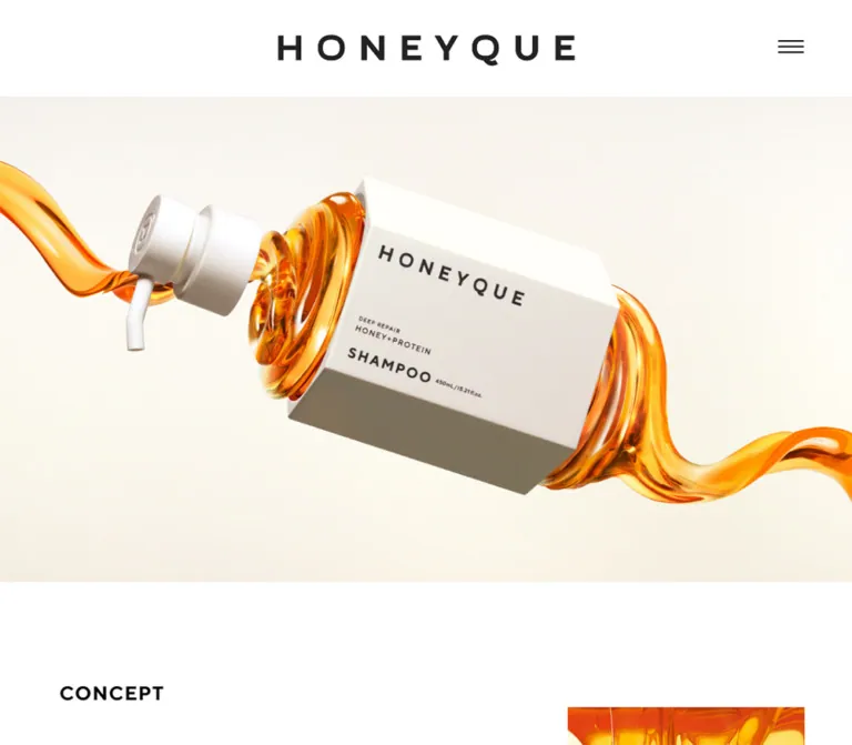
HONEYQUE builds its identity around the contrast between viscous, glossy material and precise packaging. The desktop hero suspends a white, angular shampoo package within a twisting amber stream. The supplied mobile hero shows a pink collagen composition with floating droplets. Both sit beneath a restrained white header with a centered wordmark and a small three-line menu icon.
The page continues as a brand introduction and product catalog. Small uppercase section labels, an expressive Japanese concept graphic, generously spaced Japanese paragraphs, and large isolated packshots establish the hierarchy. Product information sits directly on a warm cream field. Thin outlined pills provide the recurring detail action. A horizontal news collection and a substantial corporate footer make this a complete brand homepage.
閉じる
HONEYQUE — Style Reference
Sculptural honey, angular bottles, and a spacious product catalog.
Website: HONEYQUE Original URL: https://honeyque.jp/ Final URL: https://honeyque.jp/ Theme: light surfaces, charcoal typography, warm cream product sections, and saturated ingredient imagery. Inspected: October 2, 2026, Japan Standard Time. The supplied retrieval timestamp is October 1, 2026, at 18:56:32.484 UTC, equivalent to October 2 at 03:56:32.484 JST. Viewports: 1440 × 1000 desktop and 390 × 844 mobile, in CSS pixels. Scope: the current brand homepage: header, hero, concept section, twelve product entries, news rail, closing image banner, and footer. Navigation destinations and computed menu styles were recorded, but an opened menu and destination pages were not inspected.
HONEYQUE builds its identity around the contrast between viscous, glossy material and precise packaging. The desktop hero suspends a white, angular shampoo package within a twisting amber stream. The supplied mobile hero shows a pink collagen composition with floating droplets. Both sit beneath a restrained white header with a centered wordmark and a small three-line menu icon.
The page continues as a brand introduction and product catalog. Small uppercase section labels, an expressive Japanese concept graphic, generously spaced Japanese paragraphs, and large isolated packshots establish the hierarchy. Product information sits directly on a warm cream field. Thin outlined pills provide the recurring detail action. A horizontal news collection and a substantial corporate footer make this a complete brand homepage.
How to Read This Reference
- Measured means a value reported by the supplied rendered DOM or computed styles. Dimensions are rounded where additional decimal places would not help implementation.
- Visual estimate means a proportion, color approximation, or measurement read from an attached original-page screenshot. Screenshot colors were not programmatically sampled.
- Derived means arithmetic based on supplied element coordinates. These calculations describe the inspected layout, not a recovered stylesheet formula.
- Recommended means an implementation choice for a new project. Proposed breakpoints, accessibility behavior, and CSS architecture are recommendations unless explicitly identified otherwise.
- Token names are descriptive aliases. They are not original website custom-property names.
- The evidence covers two viewport sizes. Intermediate breakpoints, tablet layouts, hover endpoints, menu transitions, and media playback remain unverified.
The DOM includes navigation elements that are absent from the closed-header screenshots. Their dimensions establish declared styles, but do not establish how an opened menu looks. Similarly, inline links around graphics can have short text-line rectangles even when the graphic itself is much taller. Use the screenshots to interpret painted geometry.
Tokens — Colors
Core Palette
| Name | Value | Suggested token | Role | Evidence |
|---|---|---|---|---|
| Charcoal | #232323 |
--color-ink |
Body text, English labels, product information | Measured: rgb(35, 35, 35) |
| Catalog Cream | #F3F1E7 |
--color-catalog |
Continuous products-section background | Measured: rgb(243, 241, 231) at both viewports |
| White | #FFFFFF |
--color-white |
Header, concept canvas, product image fields, news and footer | Visually white; reusable hex approximation. Several sampled containers have transparent computed backgrounds |
| Concept Artwork Ink | #222222 |
--color-art-ink |
Outlined Japanese concept lettering | Recorded in embedded SVG fill and stroke declarations |
| Honey Gold | approximately #FFB000 |
--color-honey |
Representative amber highlight in honey imagery | Visual approximation, not a measured CSS fill |
| Collagen Pink | approximately #FF567C |
--color-collagen |
Circular announcement and the pink product world | Visual approximation, not a recovered source token |
The first two colors are the most reliable implementation anchors. White and cream establish the page rhythm; charcoal carries nearly all interface information. Gold and pink are concentrated in imagery and the announcement badge.
Image Color Worlds
| Treatment | Observed appearance | Application |
|---|---|---|
| Honey protein | Amber liquid, pale ivory surroundings, white packaging, dark brown transparent bottle areas | Desktop hero, protein packshots, honey macro imagery |
| Honey collagen | Pale pink surroundings, saturated pink droplets, light packaging | Supplied mobile hero |
| Neutral catalog | Cream canvas, white square image fields, charcoal names and controls | Product comparison and browsing |
These are observed art directions, not verified selectable themes. The different desktop and mobile hero states do not prove that viewport width chooses the product series; capture timing or media sequencing could also explain the difference.
The recorded --swiper-theme-color: #007aff is a library-related default. No visible blue brand treatment is established by the captures. Do not promote that value into the design palette.
Tokens — Typography
English Display and Utility Text
- Recorded family:
TTNorms-pro-Bold, followed bysans-serif. The computed stack repeats the named family. - Observed roles: section labels, series headings, English product names, detail buttons, news dates, and navigation text.
- Character: sturdy geometric sans-serif lettering with open spacing and frequent uppercase styling.
- Weight detail: many elements report
font-weight: 400while using a family explicitly namedTTNorms-pro-Bold. Category headings even report300. Those numeric values do not make the rendered lettering visually light. - Implementation alias:
--font-display: 'TTNorms-pro-Bold', sans-serif.
The computed family name is direct evidence. The actual downloaded font file, its license, and per-glyph font resolution were not independently inspected.
Japanese Body and Product Information
The recorded stack begins with Noto Sans JP, followed by Japanese system sans-serif fallbacks including Yu Gothic, Hiragino Kaku Gothic ProN, Meiryo, and MS PGothic.
Regular explanatory copy uses weight 400. Product descriptions and capacity/price information use 600. Tracking is visible throughout: the body defaults to 1.5px, concept copy uses approximately 0.1em, and mobile product metadata reduces tracking to 0.92px.
Use a Japanese sans-serif with stable punctuation and clear small-size rendering. Keep the generous leading in the concept copy, while treating product information as a more compact block.
Wordmark and Concept Lettering
The HONEYQUE wordmark should be treated as a graphic asset. Its wide spacing and proportions are visible, but the evidence does not identify a live-text font for the logo.
The Japanese concept statement, “髪の芯から鍛える蜜髪へ。”, appears as expressive serif-style lettering. Embedded SVG declarations are present in the concept section. Preserve its artwork when available; assigning an invented Japanese display font would misrepresent the evidence.
Type Scale
All values below are measured computed styles except the final row.
| Role | Desktop size / line height | Mobile size / line height | Tracking | Family / weight |
|---|---|---|---|---|
| Default body | 15 / 22.5px |
15 / 22.5px |
1.5px |
Japanese sans stack, 400 |
| Section label | 24 / 36px |
13.5 / 20.25px |
0.05em |
Display family, 400 |
| Product-series heading | 24 / 36px |
16 / 24px |
0.05em |
Display family, 400 |
| Category label | 18 / 27px |
13 / 19.5px |
0.75px |
Display family, 300 |
| Featured product name | 30 / 48px |
15 / 48px |
0.05em |
Display family, 400 |
| Compact product name | 24 / 34px |
15 / 34px |
0.05em |
Display family, 400 |
| Product description and price | 14 / 28px |
11.5 / 18.4px |
Desktop 1.5px; mobile 0.92px |
Japanese sans stack, 600 |
| Product detail action | 18 / 27px |
13.5 / 20.25px |
0.05em |
Display family, 400 |
| Concept paragraph | 18 / 40px |
13 / 25px |
0.1em |
Japanese sans stack, 400 |
| News title | 16 / 30px |
12 / 20px |
1.5px |
Japanese sans stack, 400 |
| News date | 16 / 24px |
12 / 18px |
0.05em |
Display family, 400 |
| Primary menu entry | 30 / 45px |
20 / 30px |
1.5px |
Display family, 700; menu appearance unverified |
| Secondary menu entry | 18 / 27px |
12 / 30px |
1.5px |
Display family, 400; menu appearance unverified |
| Closing image caption | Approximately 36px |
Approximately 15px |
Visibly tracked | Visual estimate only |
Computed line height and painted bounds are different measurements. Featured product titles report 48px line height at both sizes, while their recorded rectangles are approximately 30px high on desktop and 15px on mobile. The payload does not include enough descendant or transform information to reconstruct that discrepancy. The Quick Start uses conventional flowing title boxes instead of inferring hidden transformations.
The original root font size is 10px at both inspected widths. The Quick Start retains a conventional 16px root and uses explicit dimensions; copying original rem values without conversion would change the scale.
Tokens — Spacing & Shapes
The layout combines large section intervals with narrowly controlled product spacing. The evidence does not establish a single universal spacing unit.
Layout Measurements
| Element | Desktop | Mobile | Evidence |
|---|---|---|---|
| Header height | 120px |
65px |
Measured |
| Header wordmark link width | 370px |
165px |
Measured; inline rectangle height is not the full painted-logo height |
| Hero region | 1440 × 820px |
390 × 291.19px |
Measured |
| Main content left inset | Approximately 100px |
Approximately 36.39px |
Measured section-heading positions |
| Main product heading width | Approximately 1240.03px |
Approximately 317.22px |
Measured series-heading rectangles |
| Featured image field | Approximately 600 × 600px |
Not directly established | Desktop screenshot estimate |
| Featured product action | 360 × 60px |
Approximately 207.98 × 45px |
Measured |
| Compact product action | 280 × 60px |
149.75 × 45px |
Measured |
| Product-action radius | 30px |
30px |
Measured |
| News item width | 386px |
Approximately 223.59px |
Measured |
| News-item gap | 40px |
Approximately 20.80px |
Derived from consecutive x positions |
| Announcement circle | Approximately 207px diameter |
Approximately 94px diameter |
Link widths measured; circular painted bounds visually confirmed |
| Footer left inset | Approximately 100px |
Approximately 27px |
Screenshot estimate |
Spacing Scale
| Relationship | Desktop | Mobile | Status |
|---|---|---|---|
| Concept section top / bottom padding | 120 / 160px |
60 / 50px |
Measured |
| Products first action-row top inset | 200px |
50px |
Derived from section and control coordinates |
| Featured product columns | Approximately 40px gap |
Stacked | Desktop screenshot and DOM alignment |
| Compact product columns | Approximately 40px gap |
Approximately 17.72px gap |
Derived from column centers and mobile button bounds |
| Product title to metadata | 16px |
16px |
Derived from recorded rectangles |
| Metadata to detail button | 28px |
28px |
Derived from recorded rectangles |
| News section top / bottom padding | 140 / 140px |
Approximately 37.92 / 100px |
Measured |
| Footer top padding | Approximately 120px |
Approximately 60px |
Screenshot estimate |
The mobile footer uses a different inset from the main content. Preserve that distinction: approximately 27px in the footer versus 36.4px around section labels and compact products.
Shape Vocabulary
| Element | Treatment |
|---|---|
| Packshot fields | Square corners, white background, no visible card elevation |
| Main detail controls | Long outline pills; 30px recorded radius |
| Series announcement | Saturated pink circle with centered white lettering |
| Category heading | Short underline matching the label width |
| Menu icon | Three thin horizontal strokes, approximately 32px wide |
| Social icons | Monochrome Instagram and X marks |
| Section boundaries | Changes of background and generous space |
Product-button outlines appear approximately 2px thick. This is a screenshot estimate; the supplied computed-style records do not include border widths.
Components
Brand Header
Role: establish identity and provide access to the broader site.
The header is a white, full-width strip. The HONEYQUE wordmark is centered independently of the menu icon. At 1440px, its recorded link begins at x = 535px and spans 370px. At 390px, it begins at x = 112.5px and spans 165px.
The three-line menu icon sits near the right edge: approximately 60px from the desktop edge and 26px from the mobile edge. Its strokes remain visually substantial even though the wordmark scales down sharply.
A three-column grid with 1fr auto 1fr is a suitable implementation recommendation. Give the icon a larger invisible hit area while preserving its narrow painted width. Header persistence during scrolling was not established; the evidence supports its initial position at the top of the document.
Navigation Content
Role: connect the brand introduction, product families, product details, news, questions, and shop list.
Recorded destinations include TOP, ABOUT, PRODUCTS, NEWS, Q&A, SHOP LIST, US WEBSITE, social accounts, and individual product pages. Product navigation contains separate honey protein and honey collagen groups, with indented oil variants.
The menu is closed in the supplied screenshots. DOM styles show larger primary entries and smaller subentries, with mobile text reduced to 20px and 12px respectively. Some mobile menu rectangles extend beyond the viewport; without an open-state capture, these should not be copied as a verified menu layout.
The appearance of an expanded oil group, overlay backdrop, close control, focus management, and entrance direction remains unverified.
Product Hero
Role: communicate product material and identity through a large visual composition.
On desktop, the hero starts immediately below the 120px header and occupies 820px vertically. A broad amber ribbon travels through the frame, wrapping around an angular white package. The pump and surrounding liquid create the impression of suspension and separation. Cream surroundings leave enough quiet space to make the glossy edges legible.
The supplied mobile state starts below a 65px header and ends at y ≈ 356.19px. It shows a pink bottle composition, rounded liquid droplets, and edge-cropped foreground forms. There is no large live-text promotional heading placed across the hero in either supplied state.
Treat the artwork as a composed media asset. Match its framing and product scale before adding interface decoration. The evidence does not establish whether its source is an image sequence, video, carousel, or another media implementation.
Circular Series Announcement
Role: connect the opening visual to the collagen product section.
The pink circle contains the source UI label “ハニー コラーゲンシリーズ 登場” in white. Its link target is https://honeyque.jp/#collagen-series.
In the desktop screenshot, it is approximately 207px in diameter, 50px from the right edge, and 55px above the hero bottom. On mobile, it is approximately 94px in diameter, 8px from the right edge, and 14px below the hero top.
This relocation is part of the observed responsive composition. The badge remains inside the hero’s visual area. Its short inline-link DOM rectangle should not be mistaken for the circle’s height. Anchor scrolling behavior and easing were not exercised.
Concept Section
Role: connect the ingredient imagery to the brand’s hair-care proposition.
The section uses a white canvas, a small CONCEPT label, the Japanese headline artwork, an amber macro image, explanatory copy, and a MORE DETAIL link.
At the mobile viewport, the section begins at y ≈ 356.19px. The label begins around x = 36.39px, y = 416.19px. A tall honey image occupies approximately x = 201px through the right edge, beginning near the same vertical position as the label. Its visible height is about 293px.
The concept lettering sits at the left and extends partly over the image area. The paragraph begins at approximately x = 44.32px, y = 661.89px, with a width of 301.34px. Its 13px / 25px typography keeps the compact copy airy. The first paragraph lines share vertical space with the lower portion of the honey image.
Desktop DOM evidence establishes a much larger asymmetric composition: the section is 1476px tall, its label starts near x = 100px, and the paragraph sits toward the right at x ≈ 913.48px, with a width of 512.99px. No complete desktop concept capture is supplied, so its exact image placement should remain an implementation review point.
The MORE DETAIL link targets /about. Its recorded flex container is 48px high on desktop and 36px high on mobile. An icon or arrow design for that link is not established by the supplied images.
Products Section and Group Hierarchy
Role: present the range as an organized catalog.
A continuous cream background contains the PRODUCTS label, a VIEW ALL link, series headings, category headings, and product entries. The recorded order is:
- HONEY COLLAGEN SERIES: shampoo, treatment, essence mask, and hair oil.
- HONEY PROTEIN SERIES: shampoo and treatment, followed by IN & OUT BATH oils and mist, NIGHT REPAIR products, and a TOOL entry.
There are twelve product detail actions in the supplied homepage evidence. English names lead; Japanese descriptions and capacity/price information provide the supporting detail. Most listed products are priced at ¥1,650(税込), with other observed prices for masks and the brush. These values are content, not fixed design tokens.
Center the series and category labels over their product groups. The short underline beneath labels such as IN BATH is a useful separator without introducing a large banner or filled tab.
Featured Product Entry
Role: give shampoo and treatment the strongest catalog presence.
The desktop entry has four visible layers:
- A white square field, approximately
600 × 600px, containing one upright, uncropped packshot. - A centered uppercase English name,
30pxin the recorded display family. - Centered Japanese description and capacity/price information,
14px / 28px, weight600. - A centered
360 × 60pxoutlined VIEW MORE link.
The photographed or rendered bottle occupies roughly 85% of the white field’s height in the supplied protein screenshot. This is a visual estimate. Preserve white space around the pump and base, and keep neighboring bottles at comparable perceived scale.
The entry has no enclosing rounded card. The white image square ends before the typography, which rests on the cream section background. On mobile, shampoo and treatment stack vertically, with centered names and approximately 208 × 45px buttons.
Compact Product Entry
Role: accommodate oils, masks, milk, mist, and tools within a denser grid.
Compact entries use the same anatomy but smaller English titles: 24px on desktop and 15px on mobile. Several titles deliberately break into two lines. Desktop detail buttons are 280 × 60px; mobile buttons are 149.75 × 45px.
Desktop positions indicate a three-column system with centers around x = 293, 720, and 1147px. Groups containing one or two items occupy the first available positions. The mobile system uses two columns with an approximately 17.72px gap. The third IN & OUT BATH item wraps to the left column of the next row.
Some recorded mobile metadata rectangles extend beyond the corresponding button-column width. For a reusable implementation, allow natural line wrapping and verify long Japanese names rather than reproducing overflow or compression without understanding the original wrappers.
Detail and Collection Links
Role: distinguish product exploration from broader navigation.
VIEW MORE is the repeated product control: charcoal text, a dark outline, transparent interior, rounded ends, and centered uppercase labeling. It leads to an individual product URL.
VIEW ALL leads to the product or news index. MORE DETAIL leads to the brand introduction. Their recorded flex heights are 48px on desktop and 36px on mobile, but the evidence does not establish that they share the product pill’s full border treatment.
Keep the hierarchy clear: the catalog’s repeated action is an outlined detail link. No cart, quantity selector, or checkout interaction appears in the inspected homepage evidence.
News Rail
Role: expose recent announcements while maintaining a compact vertical footprint.
The DOM positions news entries in a horizontal sequence. On desktop, the first item starts at x = 400px, with subsequent starts at 826px and 1252px. Each measured item is 386px wide. On mobile, the first starts at x ≈ 36.39px, the next at 280.78px, and each is approximately 223.59px wide.
The title and date are confirmed elements. The upper portion of each linked item precedes the text by approximately 281.33px on desktop and 159.06px on mobile. A 3:2 media field with a 24px desktop or 10px mobile text gap fits those measurements, but this is a calculated reconstruction: image-element bounds and the news artwork itself were not supplied.
News titles use Japanese sans-serif text at 16px / 30px on desktop and 12px / 20px on mobile. Dates use the English display family. The latest recorded entry is dated 2026.04.22.
The desktop VIEW ALL link sits below the section label near the left edge. On mobile, it moves into the heading area at the right. Horizontal positioning and library-related custom properties support a rail-like implementation, but dragging, arrows, autoplay, pagination, and snapping were not tested.
Closing Image Banner
Role: reconnect the catalog and news content to the ingredient image before the footer.
A full-width macro view of golden honey carries the centered white caption AUTHENTIC HONEY SHAMPOO. Thick translucent folds, pale highlights, and darker amber edges provide depth.
The mobile capture shows an approximately 202px-high image band. The desktop capture begins partway through the image area, so its visible 356px remainder does not establish the full desktop banner height. The caption appears approximately 36px on desktop and 15px on mobile.
Footer
Role: provide complete navigation, company information, policies, regional access, and social links.
The desktop footer is a broad white field with approximately 120px of top padding. Its visible columns begin around x = 100px, 526px, and 952px:
- Wordmark at the left, with the price disclaimer and copyright lower down.
- HOME, ABOUT, PRODUCTS, NEWS, Q&A, and SHOP LIST in the middle.
- Company details, CONTACT US, PRIVACY POLICY, US WEBSITE, and social icons at the right.
The mobile footer reorganizes these relationships. A left-aligned wordmark comes first. The five main navigation links form a left column, while SHOP LIST and the social icons occupy a right column. Contact, privacy, and regional links form a separate row below. Company details, the disclaimer, and copyright follow.
The footer directly identifies and links ボトルワークス株式会社 at https://bottleworks.jp/, and displays ©2023 Bottle Works Inc, All Rights Reserved. The copyright year is source content, not the inspection date. No production-credit attribution is established by the inspected homepage.
Tokens — Motion & Interaction
| Element or behavior | Recorded evidence | What can be concluded | Limit |
|---|---|---|---|
| General navigation links | transition: 0.3s |
A 300ms transition is declared | Changed properties and visual endpoints are unknown |
| Product detail links | transition: 0.6s |
A 600ms transition is declared | Hover fill, opacity, transform, and easing were not established |
| Mobile product links | 0.5s 0.4s forwards product-thumbnail-link |
A named animation has 500ms duration, 400ms delay, and forwards fill | Keyframes and trigger are unavailable |
| Desktop product links | Sampled animation value none |
No animation was reported on those elements in that sample | This does not prove that desktop has no reveal behavior |
| Hero media | Amber desktop state and pink mobile state | Multiple visual states exist in the supplied evidence | Sequence, looping, autoplay, and media technology are unverified |
| Series announcement | Link to #collagen-series |
An in-page destination is declared | Scroll timing and smoothness were not tested |
| News rail | Horizontally advancing item coordinates | Content is arranged as a horizontal sequence | Gesture and control behavior are unverified |
| Header menu | Visible menu icon and recorded navigation links | A navigation affordance is present | Open/close behavior and focus handling were not exercised |
Most sampled elements report animation: none. Some report only transition: all, without a useful nonzero duration. These records do not establish a page-wide animation system.
The capture process waited for initial loading, image decoding, and sampled layout stability. It also traversed intermediate scroll positions. That supports analysis of the settled page but does not provide a frame-by-frame account of motion.
Recommended motion direction: use restrained transitions around the richly detailed media. A subtle color or opacity response can suit links. If media is animated in a new implementation, provide a reduced-motion or static alternative. The Quick Start’s hover treatment is explicitly a recommendation, not a reconstruction of an observed hover state.
Surfaces
| Surface | Appearance | Purpose |
|---|---|---|
| Header | White, unboxed, spacious | Keep the logo and navigation legible |
| Hero | Pale image environment with saturated liquid and packaging | Carry the strongest visual expression |
| Concept | White with overlapping artwork and honey imagery | Present the brand proposition |
| Product section | Continuous #F3F1E7 field |
Unite the catalog |
| Product image field | White square | Isolate packaging and standardize comparisons |
| Product information | Directly on cream | Avoid unnecessary card boundaries |
| News | White, horizontally arranged entries | Add editorial updates |
| Closing banner | Full-width golden macro image | Restore ingredient identity |
| Footer | White, large spacing, charcoal navigation | Provide a calm and complete ending |
The visible interface relies on spacing, image boundaries, type scale, and background changes. Product shading belongs primarily to the imagery. There is no visible general system of elevated cards, glass panels, or decorative interface shadows.
Imagery
The imagery has a polished, three-dimensional advertising character: thick transparent liquid, large specular highlights, suspended packaging, and precisely controlled neutral backgrounds. This describes the appearance; the evidence does not identify the production software or rendering method.
Three image roles should remain distinct:
- Hero composition: diagonal packaging and liquid extending beyond the viewport edges. Cropping is part of the composition.
- Catalog packshot: upright product, complete pump and base, white square field, consistent perceived scale. Cropping would impair comparison.
- Ingredient macro: close views of honey folds and drops, used for atmosphere in concept and closing sections.
The angular matte sleeve and spaced black packaging typography contrast with soft, glossy liquid. Preserve both materials. An ordinary bottle silhouette on a flat gold gradient would lose the defining relationship.
Observed Asset References
The supplied evidence does not include original image or font file URLs. The following references describe observed roles without inventing source paths.
| Asset role | Evidence | Implementation handling |
|---|---|---|
| HONEYQUE wordmark | Desktop and mobile header/footer captures | Use a supplied graphic asset; retain intrinsic proportions |
| Amber product hero | Desktop opening capture | Use wide composition and preserve its edge-crossing liquid ribbon |
| Pink collagen hero | Mobile opening capture | Preserve the observed mobile framing; verify media selection logic separately |
| Concept statement | Mobile capture and embedded SVG declarations | Preserve vector lettering and provide a text alternative |
| Honey macro | Mobile concept and desktop/mobile closing captures | Use a separate crop appropriate to each placement |
| Protein shampoo and treatment | Desktop product capture | Complete upright products inside white square fields |
| Announcement badge | Desktop and mobile opening captures | Circular graphic or accessible styled link |
| Instagram and X symbols | Desktop and mobile footer captures | Use accurate monochrome marks with accessible link names |
| News media | Upper media space inferred from DOM geometry | Confirm actual assets before specifying their visual treatment |
Use object-fit: contain for product imagery when the white field is supplied by the layout. If the white square is already part of the asset, preserve that composition. Use deliberate cover cropping for the hero and ingredient banners.
Layout & Responsive Behavior
Measured Page Structure
| Region | Desktop start / height | Mobile start / height |
|---|---|---|
| Header | 0 / 120px |
0 / 65px |
| Hero | 120 / 820px |
65 / 291.19px |
| Concept | 940 / 1476px |
356.19 / 839.14px |
| Products | 2416 / 5775.73px |
1195.33 / 4887.38px |
| News | 8191.73 / 761.33px |
6082.70 / 517.22px |
| Whole document | Approximately 10260.06px high |
Approximately 7471.83px high |
These values describe one captured content state. Do not hardcode section or document heights from this table. Text wrapping, fonts, media, and content changes must remain able to affect normal flow.
Responsive Transformations
| Relationship | Desktop | Mobile |
|---|---|---|
| Header | 120px high, 370px wordmark link |
65px high, 165px wordmark link |
| Hero frame | Approximately 1.756:1 |
Approximately 1.339:1 |
| Announcement | Large circle near lower-right corner | Smaller circle near upper-right corner |
| Concept | Large asymmetric field; copy positioned toward right | Narrow left headline overlapping a right-side image; copy below |
| Shampoo/treatment groups | Two large columns | One centered entry per row |
| Smaller product groups | Three-column positions | Two columns, with remaining items wrapping left |
| News | Items begin to the right of a left utility column | Heading and action above a rail starting at the main inset |
| Footer | Three broad information columns | Reordered navigation, utilities, company details, and legal text |
The main mobile content width is approximately 81.34% of the viewport, derived from 317.22 / 390. Desktop content width is approximately 86.11%, derived from 1240 / 1440. These percentages describe the two observations; they are not confirmed source width formulas.
A 768px breakpoint is a reasonable starting recommendation for the adaptation below. It is not a measured breakpoint. Validate intermediate widths with actual product labels, especially the two-column mobile grid and footer utilities.
The first mobile viewport already reveals substantial concept content beneath the hero. Preserve this proportion rather than automatically making the hero fill the phone screen.
Do’s and Don’ts
Do
- Anchor the interface in measured charcoal
#232323and catalog cream#F3F1E7. - Keep rich liquid imagery against quiet white and pale backgrounds.
- Preserve the angular packaging and its contrast with rounded liquid forms.
- Use the recorded display family for English labels when available, with Japanese sans-serif for explanatory text.
- Treat the wordmark and expressive concept headline as artwork.
- Keep square product image fields and place metadata directly on the cream surface.
- Preserve the distinction between featured two-column products and compact three-column products on desktop.
- Stack featured products on mobile while retaining a two-column compact grid.
- Keep detail actions outlined and generously wide.
- Reposition the announcement badge to protect the product composition on mobile.
- Reorder footer groups deliberately instead of merely shrinking desktop columns.
- Separate declared animation values from interactions that were actually observed.
Don’t
- Don’t turn every product entry into a rounded, shadowed card.
- Don’t use amber or pink as an indiscriminate fill for every control.
- Don’t mistake the recorded library blue for a brand color.
- Don’t crop catalog bottles as though they were decorative hero images.
- Don’t apply one crop or aspect ratio to both hero viewports.
- Don’t infer that the pink hero is exclusively a mobile design rule.
- Don’t replace the concept lettering with an unverified font name.
- Don’t shrink all product groups into one uniform mobile layout.
- Don’t copy hidden menu coordinates as a verified open-state layout.
- Don’t invent carousel timing, parallax, sticky navigation, or hover transformations.
- Don’t hardcode the measured document height or every section’s captured height.
- Don’t interpret the footer’s 2023 copyright as evidence of the capture date.
Recommended Implementation Additions
These are recommendations for a new implementation, not verified features of the original page:
- Give the menu a semantic button, an accessible name, a controlled expanded state, and a reliable keyboard path back to the trigger.
- Keep hidden navigation out of the focus order. If it behaves as a modal overlay, implement appropriate focus containment and dismissal.
- Give repeated VIEW MORE links product-specific accessible names while retaining the visible label.
- Use meaningful text alternatives for the concept artwork and product images. Decorative honey imagery can have empty alternatives when equivalent content is already available.
- Preserve visible keyboard focus on the monochrome controls.
- Aim for at least
44 × 44pxinteractive areas around menu and social icons. The painted symbols can remain smaller. - Consider increasing mobile metadata from the observed
11.5pxto at least13px, then adjust wrapping and spacing. This is an intentional readability adaptation. - Use a coherent heading hierarchy. Repeated news-item H1 elements appear in the extracted DOM; a new implementation can use appropriately nested article headings.
- If media rotates or animates automatically, provide suitable pause and reduced-motion behavior. The evidence does not establish existing playback controls.
- Verify white-text contrast on the pink badge and honey banner with the final assets and font sizes.
- Make a horizontal news rail keyboard reachable and provide an obvious way to reach all items.
- Reserve image dimensions, prioritize the opening hero, and defer below-the-fold packshots where practical.
Agent Prompt Guide
Quick Color Reference
- Main text: measured
#232323. - Product-section background: measured
#F3F1E7. - Header, image fields, and footer: visually white; use
#FFFFFFas the adaptation token. - Honey highlight: approximate
#FFB000, primarily within imagery. - Announcement and collagen accent: approximate
#FF567C. - Action style: charcoal outline, transparent interior, pill-shaped ends.
- Depth: glossy product imagery, rather than a general interface-shadow system.
Overall Prompt
“Create a Japanese hair-care brand homepage inspired by the observed HONEYQUE composition. Use a white header with a centered graphic wordmark and a small three-line menu icon. Follow it with an edge-to-edge product visual combining an angular pale package and thick glossy liquid. Keep interface typography charcoal, with bold geometric uppercase English labels and carefully spaced Japanese sans-serif copy. Introduce the brand with an expressive Japanese headline graphic and an asymmetric honey macro image. Build a continuous cream product section using large white square packshots, centered names, Japanese capacity/price details, and thin outlined pill links. Use two featured columns and three compact columns on desktop; switch to one featured column and two compact columns on mobile. Finish with a horizontal news rail, a honey image banner, and a spacious footer that reorders for mobile. Treat amber and pink as image-led accents. Keep unverified menu and media behavior separate from the visual specification.”
Example Component Prompts
- Header: “Build a 120px white desktop header with a centered 370px-wide wordmark asset and a three-stroke menu icon near the right edge. At 390px width, use a 65px header and a 165px wordmark. Keep the logo centered independently of the icon and provide a 44px interaction target.”
- Featured product entry: “Place an upright amber shampoo bottle in a white square field on a cream
#F3F1E7section. Beneath it, center an uppercase product name, a two-line Japanese description and price block, and a 360 × 60px outlined VIEW MORE pill. Keep the image square and the surrounding entry unboxed.” - Mobile compact catalog: “Create two approximately 150px-wide product columns inside a 317px content area. Use 15px English names, compact Japanese metadata, and 45px-high outline links. Let a third item wrap to the left of the next row. Verify long Japanese labels without clipping them.”
- Concept composition: “At phone width, place a small CONCEPT label near a 36px left inset. Position a tall amber honey macro against the right edge. Layer the supplied Japanese headline artwork partly across that image boundary, then set explanatory text at approximately 13px with 25px leading. Preserve the asymmetric overlap.”
- Closing banner and footer: “Follow the news with a full-width golden honey macro and the centered white caption AUTHENTIC HONEY SHAMPOO. Use a white footer with broad spacing, a graphic wordmark, uppercase navigation, corporate information, policy links, and monochrome social icons. On mobile, move shop and social links alongside the main navigation, with utility links and company details below.”
- Hero artwork direction: “Compose a premium product image with a pale angular sleeve, dark widely spaced packaging lettering, a white pump, and translucent amber liquid twisting around the package. Use strong specular highlights, believable transparent depth, and a pale warm environment. Keep the liquid extending beyond the frame and preserve room for a circular announcement.”
Quick Start
CSS Custom Properties
This is a reusable adaptation of the observed header, hero, product system, news rail, and closing banner. The selectors are new implementation names. The 768px breakpoint, fluid gutter rules, normal-flow title boxes, and hover endpoint are recommendations.
Supply the recorded display font through the project’s font loader if available. Its observed numeric weight is 400. If substituting a conventional system sans-serif, change --weight-display to 700 to retain the visible emphasis. Font-file URLs were not provided.
:root {
  /* Measured interface colors */
  --color-ink: #232323;
  --color-catalog: #f3f1e7;
  --color-art-ink: #222;

  /* Visual approximations for reusable styling */
  --color-white: #fff;
  --color-honey: #ffb000;
  --color-collagen: #ff567c;

  /* Recorded families with a simplified fallback stack */
  --font-display: 'TTNorms-pro-Bold', Arial, sans-serif;
  --font-body: 'Noto Sans JP', 'Yu Gothic Medium', YuGothic,
    'Hiragino Kaku Gothic ProN', Meiryo, sans-serif;
  --weight-display: 400;
  --weight-body: 400;
  --weight-meta: 600;

  --text-section: 24px;
  --text-series: 24px;
  --text-product: 30px;
  --text-compact: 24px;
  --text-meta: 14px;
  --text-action: 18px;
  --leading-meta: 28px;
  --tracking-display: 0.05em;
  --tracking-meta: 1.5px;

  /* Adaptation rules matching the inspected desktop scale */
  --content-max: 1240px;
  --gutter: min(6.944444vw, 100px);
  --header-height: 120px;
  --wordmark-width: 370px;
  --grid-gap: 40px;
  --action-height: 60px;
  --action-radius: 30px;
  --outline-width: 2px;

  /* Recorded durations; visual endpoints are recommendations */
  --duration-link: 300ms;
  --duration-product: 600ms;
}
Component CSS
The hero aspect ratios reproduce the two captured frame proportions. They are not recovered source formulas. Product imagery should supply its own internal packshot spacing. The optional news media ratio is the calculated 3:2 reconstruction described above.
* {
  box-sizing: border-box;
}

html {
  font-size: 16px;
}

body {
  margin: 0;
  color: var(--color-ink);
  background: var(--color-white);
  font: var(--weight-body) 15px / 1.5 var(--font-body);
  letter-spacing: 0.1em;
}

img {
  display: block;
  max-width: 100%;
}

a {
  color: inherit;
}

.honey-container {
  width: min(var(--content-max), calc(100% - 2 * var(--gutter)));
  margin-inline: auto;
}

.honey-header {
  display: grid;
  grid-template-columns: 1fr auto 1fr;
  align-items: center;
  height: var(--header-height);
  padding-inline: min(4.166667vw, 60px);
  background: var(--color-white);
}

.honey-brand {
  grid-column: 2;
  display: block;
  width: var(--wordmark-width);
}

.honey-brand img {
  width: 100%;
  height: auto;
}

.honey-menu {
  grid-column: 3;
  justify-self: end;
  display: grid;
  align-content: center;
  justify-items: end;
  gap: 5px;
  width: 44px;
  height: 44px;
  padding: 0;
  border: 0;
  color: var(--color-ink);
  background: transparent;
  cursor: pointer;
}

.honey-menu span {
  width: 32px;
  height: 2px;
  background: currentColor;
}

.honey-hero {
  position: relative;
  aspect-ratio: 72 / 41;
  overflow: hidden;
  background: var(--color-catalog);
}

.honey-hero picture,
.honey-hero picture img {
  display: block;
  width: 100%;
  height: 100%;
}

.honey-hero picture img {
  object-fit: cover;
}

.honey-announcement {
  position: absolute;
  right: 50px;
  bottom: 55px;
  display: grid;
  place-content: center;
  width: 207px;
  aspect-ratio: 1;
  border-radius: 50%;
  color: var(--color-white);
  background: var(--color-collagen);
  text-align: center;
  text-decoration: none;
  font-size: 24px;
  font-weight: 700;
  line-height: 1.35;
  letter-spacing: 0;
}

.honey-announcement strong {
  font-size: 40px;
}

.honey-products {
  padding-block: 200px 160px;
  background: var(--color-catalog);
}

.honey-section-heading {
  display: flex;
  align-items: center;
  justify-content: space-between;
  gap: 24px;
}

.honey-section-title,
.honey-series-title,
.honey-category,
.honey-product-name,
.honey-action,
.honey-news-date {
  font-family: var(--font-display);
  font-weight: var(--weight-display);
  letter-spacing: var(--tracking-display);
}

.honey-section-title {
  margin: 0;
  font-size: var(--text-section);
  line-height: 1.5;
}

.honey-series-title {
  margin: 42px 0 40px;
  text-align: center;
  font-size: var(--text-series);
  line-height: 1.5;
}

.honey-category {
  display: table;
  margin: 0 auto 52px;
  padding-bottom: 3px;
  border-bottom: 2px solid currentColor;
  font-size: 18px;
  line-height: 1.5;
}

.honey-product-grid {
  display: grid;
  grid-template-columns: repeat(2, minmax(0, 1fr));
  gap: 72px var(--grid-gap);
}

.honey-product-grid--compact {
  grid-template-columns: repeat(3, minmax(0, 1fr));
}

.honey-product {
  min-width: 0;
  text-align: center;
}

.honey-product-media {
  aspect-ratio: 1;
  background: var(--color-white);
}

.honey-product-media img {
  width: 100%;
  height: 100%;
  object-fit: contain;
}

.honey-product-name {
  margin: 30px 0 16px;
  font-size: var(--text-product);
  line-height: 1.6;
  overflow-wrap: anywhere;
}

.honey-product-grid--compact .honey-product-name {
  font-size: var(--text-compact);
  line-height: 34px;
}

.honey-product-meta {
  margin: 0;
  font-size: var(--text-meta);
  font-weight: var(--weight-meta);
  line-height: var(--leading-meta);
  letter-spacing: var(--tracking-meta);
  overflow-wrap: anywhere;
}

.honey-action {
  display: flex;
  align-items: center;
  justify-content: center;
  width: min(360px, 100%);
  min-height: var(--action-height);
  margin: 28px auto 0;
  padding: 8px 16px;
  border: var(--outline-width) solid currentColor;
  border-radius: var(--action-radius);
  color: var(--color-ink);
  background: transparent;
  text-decoration: none;
  font-size: var(--text-action);
  line-height: 1.5;
  transition: color var(--duration-product),
    background-color var(--duration-product);
}

.honey-product-grid--compact .honey-action {
  width: min(280px, 100%);
}

/* Recommended hover endpoint; not verified on the source site. */
@media (hover: hover) {
  .honey-action:hover {
    color: var(--color-white);
    background: var(--color-ink);
    border-color: var(--color-ink);
  }
}

.honey-news {
  padding-block: 140px;
}

.honey-news-layout {
  display: grid;
  grid-template-columns: 260px minmax(0, 1fr);
  gap: 40px;
}

/* Native scrolling and snap are recommended interaction choices. */
.honey-news-rail {
  display: grid;
  grid-auto-flow: column;
  grid-auto-columns: 386px;
  gap: 40px;
  min-width: 0;
  overflow-x: auto;
  overscroll-behavior-inline: contain;
  scroll-snap-type: x proximity;
}

.honey-news-item {
  min-width: 0;
  color: inherit;
  text-decoration: none;
  scroll-snap-align: start;
}

.honey-news-media {
  aspect-ratio: 3 / 2;
  overflow: hidden;
}

.honey-news-media img {
  width: 100%;
  height: 100%;
  object-fit: cover;
}

.honey-news-title {
  margin: 24px 0 18px;
  font-size: 16px;
  font-weight: 400;
  line-height: 30px;
  letter-spacing: 1.5px;
}

.honey-news-date {
  font-size: 16px;
  line-height: 24px;
}

/* Desktop height is an adaptation; mobile matches the visible band. */
.honey-closing {
  position: relative;
  display: grid;
  place-items: center;
  min-height: clamp(202px, 33.333vw, 480px);
  overflow: hidden;
}

.honey-closing img {
  position: absolute;
  inset: 0;
  width: 100%;
  height: 100%;
  object-fit: cover;
}

.honey-closing p {
  position: relative;
  margin: 0;
  padding: 24px;
  color: var(--color-white);
  font: var(--weight-display) clamp(15px, 2.5vw, 36px) / 1.5
    var(--font-display);
  letter-spacing: 0.05em;
  text-align: center;
}

/* Recommended keyboard treatment. */
a:focus-visible,
button:focus-visible {
  outline: 3px solid var(--color-ink);
  outline-offset: 5px;
}

@media (max-width: 767px) {
  :root {
    --gutter: 9.333333vw;
    --header-height: 65px;
    --wordmark-width: 165px;
    --text-section: 13.5px;
    --text-series: 16px;
    --text-product: 15px;
    --text-compact: 15px;
    --text-meta: 11.5px;
    --text-action: 13.5px;
    --leading-meta: 18.4px;
    --tracking-meta: 0.92px;
    --grid-gap: 4.54359vw;
    --action-height: 45px;
  }

  .honey-header {
    padding-inline: 6.666667vw;
  }

  .honey-hero {
    aspect-ratio: 390 / 291.1875;
  }

  .honey-announcement {
    top: 14px;
    right: 8px;
    bottom: auto;
    width: 94px;
    font-size: 12px;
  }

  .honey-announcement strong {
    font-size: 20px;
  }

  .honey-products {
    padding-block: 50px 100px;
  }

  .honey-series-title {
    margin-bottom: 22px;
  }

  .honey-category {
    margin-bottom: 32px;
    font-size: 13px;
  }

  .honey-product-grid {
    grid-template-columns: minmax(0, 1fr);
    row-gap: 52px;
  }

  .honey-product-grid--compact {
    grid-template-columns: repeat(2, minmax(0, 1fr));
  }

  /* Normal-flow title boxes replace unverified source transforms. */
  .honey-product-name,
  .honey-product-grid--compact .honey-product-name {
    line-height: 1.5;
  }

  .honey-action {
    width: min(208px, 100%);
  }

  .honey-product-grid--compact .honey-action {
    width: 100%;
    padding-inline: 6px;
  }

  .honey-news {
    padding-block: 38px 100px;
  }

  .honey-news-layout {
    grid-template-columns: minmax(0, 1fr);
  }

  .honey-news-rail {
    grid-auto-columns: 57.333333vw;
    gap: 5.333333vw;
  }

  .honey-news-title {
    margin-block: 10px 12px;
    font-size: 12px;
    line-height: 20px;
  }

  .honey-news-date {
    font-size: 12px;
    line-height: 18px;
  }
}

@media (prefers-reduced-motion: reduce) {
  .honey-action {
    transition: none;
  }

  .honey-news-rail {
    scroll-behavior: auto;
    scroll-snap-type: none;
  }
}
Minimal Markup
The asset filenames below are local integration placeholders, not original website paths. Replace them with supplied project assets. The picture element demonstrates viewport-specific cropping; use the same campaign in both files unless different campaigns are an intentional content decision. It does not assert the original hero’s selection logic.
The menu button requires a navigation implementation. Add its expanded state and panel relationship when that behavior is built.
<header class='honey-header'>
  <a class='honey-brand' href='/' aria-label='HONEYQUE home'>
    <img src='/assets/brand-wordmark.svg' alt='HONEYQUE'>
  </a>
  <button class='honey-menu' type='button' aria-label='Open navigation'>
    <span aria-hidden='true'></span>
    <span aria-hidden='true'></span>
    <span aria-hidden='true'></span>
  </button>
</header>

<section class='honey-hero' aria-label='Featured collection'>
  <picture>
    <source media='(max-width: 767px)' srcset='/assets/hero-mobile.webp'>
    <img src='/assets/hero-wide.webp'
      alt='HONEYQUE shampoo surrounded by glossy liquid'
      fetchpriority='high' decoding='async'>
  </picture>
  <a class='honey-announcement' href='#collagen-series'>
    <span lang='ja'>ハニー<br>コラーゲンシリーズ</span>
    <strong lang='ja'>登場</strong>
  </a>
</section>

<section class='honey-products' aria-labelledby='products-title'>
  <div class='honey-container'>
    <div class='honey-section-heading'>
      <h2 class='honey-section-title' id='products-title'>PRODUCTS</h2>
      <a href='/products/'>VIEW ALL</a>
    </div>

    <h3 class='honey-series-title' id='collagen-series'>
      HONEY COLLAGEN SERIES
    </h3>
    <p class='honey-category'>IN BATH</p>

    <div class='honey-product-grid'>
      <article class='honey-product'>
        <div class='honey-product-media'>
          <img src='/assets/rich-gloss-shampoo.webp'
            alt='HONEYQUE Rich Gloss Shampoo'
            width='600' height='600' loading='lazy'>
        </div>
        <h4 class='honey-product-name'>RICH GLOSS SHAMPOO</h4>
        <p class='honey-product-meta' lang='ja'>
          ハニーク リッチグロス シャンプー シャイニー<br>
          450mL/¥1,650(税込)
        </p>
        <a class='honey-action' href='/products/rich-gloss-shampoo/'
          aria-label='View Rich Gloss Shampoo details'>VIEW MORE</a>
      </article>
      <!-- Add the treatment entry using the same structure. -->
    </div>
  </div>
</section>
For compact product groups, add honey-product-grid--compact to the grid. Preserve semantic grouping and let content determine row height. Build the concept composition and footer with separate responsive structures, using the measured relationships above instead of forcing them into the product grid.
Tailwind v4 Token Mapping
Optional aliases for projects already using Tailwind v4. This is an implementation convenience, not evidence that the original site uses Tailwind. Define the custom properties above first.
@theme inline {
  --color-honey-ink: var(--color-ink);
  --color-honey-catalog: var(--color-catalog);
  --color-honey-white: var(--color-white);
  --color-honey-gold: var(--color-honey);
  --color-honey-pink: var(--color-collagen);

  --font-honey-display: var(--font-display);
  --font-honey-body: var(--font-body);

  --text-honey-section: var(--text-section);
  --text-honey-product: var(--text-product);
  --text-honey-meta: var(--text-meta);
  --text-honey-action: var(--text-action);

  --spacing-honey-gutter: var(--gutter);
  --spacing-honey-gap: var(--grid-gap);
  --radius-honey-action: var(--action-radius);
}
Sources & Evidence
- Inspected original and final website: https://honeyque.jp/. Both supplied URL fields are identical; the recorded HTTP status is
200. - Capture timestamp:
2026-10-01T18:56:32.484Z, equivalent to October 2, 2026, at 03:56:32.484 JST. - Desktop evidence: 1440 × 1000 CSS-pixel viewport; opening hero, protein product pair, and closing/footer screenshots, plus rendered text, link destinations, element rectangles, and computed styles.
- Mobile evidence: 390 × 844 CSS-pixel viewport; opening hero/concept and closing/footer screenshots, plus rendered text, link destinations, element rectangles, and computed styles.
- Capture procedure: the supplied process observed the initial page for at least five seconds, waited for document loading, visible image decoding, finite animation readiness, and sampled layout stability, and traversed intermediate scroll positions. Perpetual animations were temporarily paused during readiness checks and resumed. SharedWorkers and service workers were disabled.
- Interaction scope: link destinations and CSS timing declarations were available. No supplied click sequence establishes opened navigation, product-page behavior, hover endpoints, hero playback controls, or news-rail gestures.
- Measurement limits: no complete stylesheet, original asset inventory, font files, source breakpoints, or keyframe definitions were supplied. White, amber, pink, footer measurements, and several image proportions are explicitly marked as visual estimates or implementation approximations.
This reference describes the current homepage represented by the supplied original-page captures and DOM evidence. No additional browsing, command execution, file access, or historical reconstruction was used.
# HONEYQUE — Style Reference

> Sculptural honey, angular bottles, and a spacious product catalog.

**Website:** [HONEYQUE](https://honeyque.jp/)
**Original URL:** https://honeyque.jp/
**Final URL:** https://honeyque.jp/
**Theme:** light surfaces, charcoal typography, warm cream product sections, and saturated ingredient imagery.
**Inspected:** October 2, 2026, Japan Standard Time. The supplied retrieval timestamp is October 1, 2026, at 18:56:32.484 UTC, equivalent to October 2 at 03:56:32.484 JST.
**Viewports:** 1440 × 1000 desktop and 390 × 844 mobile, in CSS pixels.
**Scope:** the current brand homepage: header, hero, concept section, twelve product entries, news rail, closing image banner, and footer. Navigation destinations and computed menu styles were recorded, but an opened menu and destination pages were not inspected.

HONEYQUE builds its identity around the contrast between viscous, glossy material and precise packaging. The desktop hero suspends a white, angular shampoo package within a twisting amber stream. The supplied mobile hero shows a pink collagen composition with floating droplets. Both sit beneath a restrained white header with a centered wordmark and a small three-line menu icon.

The page continues as a brand introduction and product catalog. Small uppercase section labels, an expressive Japanese concept graphic, generously spaced Japanese paragraphs, and large isolated packshots establish the hierarchy. Product information sits directly on a warm cream field. Thin outlined pills provide the recurring detail action. A horizontal news collection and a substantial corporate footer make this a complete brand homepage.
閉じる
# HONEYQUE — Style Reference

> Sculptural honey, angular bottles, and a spacious product catalog.

**Website:** [HONEYQUE](https://honeyque.jp/)
**Original URL:** https://honeyque.jp/
**Final URL:** https://honeyque.jp/
**Theme:** light surfaces, charcoal typography, warm cream product sections, and saturated ingredient imagery.
**Inspected:** October 2, 2026, Japan Standard Time. The supplied retrieval timestamp is October 1, 2026, at 18:56:32.484 UTC, equivalent to October 2 at 03:56:32.484 JST.
**Viewports:** 1440 × 1000 desktop and 390 × 844 mobile, in CSS pixels.
**Scope:** the current brand homepage: header, hero, concept section, twelve product entries, news rail, closing image banner, and footer. Navigation destinations and computed menu styles were recorded, but an opened menu and destination pages were not inspected.

HONEYQUE builds its identity around the contrast between viscous, glossy material and precise packaging. The desktop hero suspends a white, angular shampoo package within a twisting amber stream. The supplied mobile hero shows a pink collagen composition with floating droplets. Both sit beneath a restrained white header with a centered wordmark and a small three-line menu icon.

The page continues as a brand introduction and product catalog. Small uppercase section labels, an expressive Japanese concept graphic, generously spaced Japanese paragraphs, and large isolated packshots establish the hierarchy. Product information sits directly on a warm cream field. Thin outlined pills provide the recurring detail action. A horizontal news collection and a substantial corporate footer make this a complete brand homepage.

## How to Read This Reference

- **Measured** means a value reported by the supplied rendered DOM or computed styles. Dimensions are rounded where additional decimal places would not help implementation.
- **Visual estimate** means a proportion, color approximation, or measurement read from an attached original-page screenshot. Screenshot colors were not programmatically sampled.
- **Derived** means arithmetic based on supplied element coordinates. These calculations describe the inspected layout, not a recovered stylesheet formula.
- **Recommended** means an implementation choice for a new project. Proposed breakpoints, accessibility behavior, and CSS architecture are recommendations unless explicitly identified otherwise.
- **Token names** are descriptive aliases. They are not original website custom-property names.
- The evidence covers two viewport sizes. Intermediate breakpoints, tablet layouts, hover endpoints, menu transitions, and media playback remain unverified.

The DOM includes navigation elements that are absent from the closed-header screenshots. Their dimensions establish declared styles, but do not establish how an opened menu looks. Similarly, inline links around graphics can have short text-line rectangles even when the graphic itself is much taller. Use the screenshots to interpret painted geometry.

## Tokens — Colors

### Core Palette

| Name | Value | Suggested token | Role | Evidence |
| --- | --- | --- | --- | --- |
| Charcoal | `#232323` | `--color-ink` | Body text, English labels, product information | Measured: `rgb(35, 35, 35)` |
| Catalog Cream | `#F3F1E7` | `--color-catalog` | Continuous products-section background | Measured: `rgb(243, 241, 231)` at both viewports |
| White | `#FFFFFF` | `--color-white` | Header, concept canvas, product image fields, news and footer | Visually white; reusable hex approximation. Several sampled containers have transparent computed backgrounds |
| Concept Artwork Ink | `#222222` | `--color-art-ink` | Outlined Japanese concept lettering | Recorded in embedded SVG fill and stroke declarations |
| Honey Gold | approximately `#FFB000` | `--color-honey` | Representative amber highlight in honey imagery | Visual approximation, not a measured CSS fill |
| Collagen Pink | approximately `#FF567C` | `--color-collagen` | Circular announcement and the pink product world | Visual approximation, not a recovered source token |

The first two colors are the most reliable implementation anchors. White and cream establish the page rhythm; charcoal carries nearly all interface information. Gold and pink are concentrated in imagery and the announcement badge.

### Image Color Worlds

| Treatment | Observed appearance | Application |
| --- | --- | --- |
| Honey protein | Amber liquid, pale ivory surroundings, white packaging, dark brown transparent bottle areas | Desktop hero, protein packshots, honey macro imagery |
| Honey collagen | Pale pink surroundings, saturated pink droplets, light packaging | Supplied mobile hero |
| Neutral catalog | Cream canvas, white square image fields, charcoal names and controls | Product comparison and browsing |

These are observed art directions, not verified selectable themes. The different desktop and mobile hero states do not prove that viewport width chooses the product series; capture timing or media sequencing could also explain the difference.

The recorded `--swiper-theme-color: #007aff` is a library-related default. No visible blue brand treatment is established by the captures. Do not promote that value into the design palette.

## Tokens — Typography

### English Display and Utility Text

- **Recorded family:** `TTNorms-pro-Bold`, followed by `sans-serif`. The computed stack repeats the named family.
- **Observed roles:** section labels, series headings, English product names, detail buttons, news dates, and navigation text.
- **Character:** sturdy geometric sans-serif lettering with open spacing and frequent uppercase styling.
- **Weight detail:** many elements report `font-weight: 400` while using a family explicitly named `TTNorms-pro-Bold`. Category headings even report `300`. Those numeric values do not make the rendered lettering visually light.
- **Implementation alias:** `--font-display: 'TTNorms-pro-Bold', sans-serif`.

The computed family name is direct evidence. The actual downloaded font file, its license, and per-glyph font resolution were not independently inspected.

### Japanese Body and Product Information

The recorded stack begins with `Noto Sans JP`, followed by Japanese system sans-serif fallbacks including Yu Gothic, Hiragino Kaku Gothic ProN, Meiryo, and MS PGothic.

Regular explanatory copy uses weight `400`. Product descriptions and capacity/price information use `600`. Tracking is visible throughout: the body defaults to `1.5px`, concept copy uses approximately `0.1em`, and mobile product metadata reduces tracking to `0.92px`.

Use a Japanese sans-serif with stable punctuation and clear small-size rendering. Keep the generous leading in the concept copy, while treating product information as a more compact block.

### Wordmark and Concept Lettering

The HONEYQUE wordmark should be treated as a graphic asset. Its wide spacing and proportions are visible, but the evidence does not identify a live-text font for the logo.

The Japanese concept statement, “髪の芯から鍛える蜜髪へ。”, appears as expressive serif-style lettering. Embedded SVG declarations are present in the concept section. Preserve its artwork when available; assigning an invented Japanese display font would misrepresent the evidence.

### Type Scale

All values below are measured computed styles except the final row.

| Role | Desktop size / line height | Mobile size / line height | Tracking | Family / weight |
| --- | --- | --- | --- | --- |
| Default body | `15 / 22.5px` | `15 / 22.5px` | `1.5px` | Japanese sans stack, `400` |
| Section label | `24 / 36px` | `13.5 / 20.25px` | `0.05em` | Display family, `400` |
| Product-series heading | `24 / 36px` | `16 / 24px` | `0.05em` | Display family, `400` |
| Category label | `18 / 27px` | `13 / 19.5px` | `0.75px` | Display family, `300` |
| Featured product name | `30 / 48px` | `15 / 48px` | `0.05em` | Display family, `400` |
| Compact product name | `24 / 34px` | `15 / 34px` | `0.05em` | Display family, `400` |
| Product description and price | `14 / 28px` | `11.5 / 18.4px` | Desktop `1.5px`; mobile `0.92px` | Japanese sans stack, `600` |
| Product detail action | `18 / 27px` | `13.5 / 20.25px` | `0.05em` | Display family, `400` |
| Concept paragraph | `18 / 40px` | `13 / 25px` | `0.1em` | Japanese sans stack, `400` |
| News title | `16 / 30px` | `12 / 20px` | `1.5px` | Japanese sans stack, `400` |
| News date | `16 / 24px` | `12 / 18px` | `0.05em` | Display family, `400` |
| Primary menu entry | `30 / 45px` | `20 / 30px` | `1.5px` | Display family, `700`; menu appearance unverified |
| Secondary menu entry | `18 / 27px` | `12 / 30px` | `1.5px` | Display family, `400`; menu appearance unverified |
| Closing image caption | Approximately `36px` | Approximately `15px` | Visibly tracked | Visual estimate only |

**Computed line height and painted bounds are different measurements.** Featured product titles report `48px` line height at both sizes, while their recorded rectangles are approximately `30px` high on desktop and `15px` on mobile. The payload does not include enough descendant or transform information to reconstruct that discrepancy. The Quick Start uses conventional flowing title boxes instead of inferring hidden transformations.

The original root font size is `10px` at both inspected widths. The Quick Start retains a conventional `16px` root and uses explicit dimensions; copying original rem values without conversion would change the scale.

## Tokens — Spacing & Shapes

The layout combines large section intervals with narrowly controlled product spacing. The evidence does not establish a single universal spacing unit.

### Layout Measurements

| Element | Desktop | Mobile | Evidence |
| --- | --- | --- | --- |
| Header height | `120px` | `65px` | Measured |
| Header wordmark link width | `370px` | `165px` | Measured; inline rectangle height is not the full painted-logo height |
| Hero region | `1440 × 820px` | `390 × 291.19px` | Measured |
| Main content left inset | Approximately `100px` | Approximately `36.39px` | Measured section-heading positions |
| Main product heading width | Approximately `1240.03px` | Approximately `317.22px` | Measured series-heading rectangles |
| Featured image field | Approximately `600 × 600px` | Not directly established | Desktop screenshot estimate |
| Featured product action | `360 × 60px` | Approximately `207.98 × 45px` | Measured |
| Compact product action | `280 × 60px` | `149.75 × 45px` | Measured |
| Product-action radius | `30px` | `30px` | Measured |
| News item width | `386px` | Approximately `223.59px` | Measured |
| News-item gap | `40px` | Approximately `20.80px` | Derived from consecutive x positions |
| Announcement circle | Approximately `207px` diameter | Approximately `94px` diameter | Link widths measured; circular painted bounds visually confirmed |
| Footer left inset | Approximately `100px` | Approximately `27px` | Screenshot estimate |

### Spacing Scale

| Relationship | Desktop | Mobile | Status |
| --- | --- | --- | --- |
| Concept section top / bottom padding | `120 / 160px` | `60 / 50px` | Measured |
| Products first action-row top inset | `200px` | `50px` | Derived from section and control coordinates |
| Featured product columns | Approximately `40px` gap | Stacked | Desktop screenshot and DOM alignment |
| Compact product columns | Approximately `40px` gap | Approximately `17.72px` gap | Derived from column centers and mobile button bounds |
| Product title to metadata | `16px` | `16px` | Derived from recorded rectangles |
| Metadata to detail button | `28px` | `28px` | Derived from recorded rectangles |
| News section top / bottom padding | `140 / 140px` | Approximately `37.92 / 100px` | Measured |
| Footer top padding | Approximately `120px` | Approximately `60px` | Screenshot estimate |

The mobile footer uses a different inset from the main content. Preserve that distinction: approximately `27px` in the footer versus `36.4px` around section labels and compact products.

### Shape Vocabulary

| Element | Treatment |
| --- | --- |
| Packshot fields | Square corners, white background, no visible card elevation |
| Main detail controls | Long outline pills; `30px` recorded radius |
| Series announcement | Saturated pink circle with centered white lettering |
| Category heading | Short underline matching the label width |
| Menu icon | Three thin horizontal strokes, approximately `32px` wide |
| Social icons | Monochrome Instagram and X marks |
| Section boundaries | Changes of background and generous space |

Product-button outlines appear approximately `2px` thick. This is a screenshot estimate; the supplied computed-style records do not include border widths.

## Components

### Brand Header

**Role:** establish identity and provide access to the broader site.

The header is a white, full-width strip. The HONEYQUE wordmark is centered independently of the menu icon. At 1440px, its recorded link begins at x = `535px` and spans `370px`. At 390px, it begins at x = `112.5px` and spans `165px`.

The three-line menu icon sits near the right edge: approximately `60px` from the desktop edge and `26px` from the mobile edge. Its strokes remain visually substantial even though the wordmark scales down sharply.

A three-column grid with `1fr auto 1fr` is a suitable implementation recommendation. Give the icon a larger invisible hit area while preserving its narrow painted width. Header persistence during scrolling was not established; the evidence supports its initial position at the top of the document.

### Navigation Content

**Role:** connect the brand introduction, product families, product details, news, questions, and shop list.

Recorded destinations include TOP, ABOUT, PRODUCTS, NEWS, Q&A, SHOP LIST, US WEBSITE, social accounts, and individual product pages. Product navigation contains separate honey protein and honey collagen groups, with indented oil variants.

The menu is closed in the supplied screenshots. DOM styles show larger primary entries and smaller subentries, with mobile text reduced to `20px` and `12px` respectively. Some mobile menu rectangles extend beyond the viewport; without an open-state capture, these should not be copied as a verified menu layout.

The appearance of an expanded oil group, overlay backdrop, close control, focus management, and entrance direction remains unverified.

### Product Hero

**Role:** communicate product material and identity through a large visual composition.

On desktop, the hero starts immediately below the `120px` header and occupies `820px` vertically. A broad amber ribbon travels through the frame, wrapping around an angular white package. The pump and surrounding liquid create the impression of suspension and separation. Cream surroundings leave enough quiet space to make the glossy edges legible.

The supplied mobile state starts below a `65px` header and ends at y ≈ `356.19px`. It shows a pink bottle composition, rounded liquid droplets, and edge-cropped foreground forms. There is no large live-text promotional heading placed across the hero in either supplied state.

Treat the artwork as a composed media asset. Match its framing and product scale before adding interface decoration. The evidence does not establish whether its source is an image sequence, video, carousel, or another media implementation.

### Circular Series Announcement

**Role:** connect the opening visual to the collagen product section.

The pink circle contains the source UI label “ハニー コラーゲンシリーズ 登場” in white. Its link target is `https://honeyque.jp/#collagen-series`.

In the desktop screenshot, it is approximately `207px` in diameter, `50px` from the right edge, and `55px` above the hero bottom. On mobile, it is approximately `94px` in diameter, `8px` from the right edge, and `14px` below the hero top.

This relocation is part of the observed responsive composition. The badge remains inside the hero’s visual area. Its short inline-link DOM rectangle should not be mistaken for the circle’s height. Anchor scrolling behavior and easing were not exercised.

### Concept Section

**Role:** connect the ingredient imagery to the brand’s hair-care proposition.

The section uses a white canvas, a small CONCEPT label, the Japanese headline artwork, an amber macro image, explanatory copy, and a MORE DETAIL link.

At the mobile viewport, the section begins at y ≈ `356.19px`. The label begins around x = `36.39px`, y = `416.19px`. A tall honey image occupies approximately x = `201px` through the right edge, beginning near the same vertical position as the label. Its visible height is about `293px`.

The concept lettering sits at the left and extends partly over the image area. The paragraph begins at approximately x = `44.32px`, y = `661.89px`, with a width of `301.34px`. Its `13px / 25px` typography keeps the compact copy airy. The first paragraph lines share vertical space with the lower portion of the honey image.

Desktop DOM evidence establishes a much larger asymmetric composition: the section is `1476px` tall, its label starts near x = `100px`, and the paragraph sits toward the right at x ≈ `913.48px`, with a width of `512.99px`. No complete desktop concept capture is supplied, so its exact image placement should remain an implementation review point.

The MORE DETAIL link targets `/about`. Its recorded flex container is `48px` high on desktop and `36px` high on mobile. An icon or arrow design for that link is not established by the supplied images.

### Products Section and Group Hierarchy

**Role:** present the range as an organized catalog.

A continuous cream background contains the PRODUCTS label, a VIEW ALL link, series headings, category headings, and product entries. The recorded order is:

1. HONEY COLLAGEN SERIES: shampoo, treatment, essence mask, and hair oil.
2. HONEY PROTEIN SERIES: shampoo and treatment, followed by IN & OUT BATH oils and mist, NIGHT REPAIR products, and a TOOL entry.

There are twelve product detail actions in the supplied homepage evidence. English names lead; Japanese descriptions and capacity/price information provide the supporting detail. Most listed products are priced at `¥1,650(税込)`, with other observed prices for masks and the brush. These values are content, not fixed design tokens.

Center the series and category labels over their product groups. The short underline beneath labels such as IN BATH is a useful separator without introducing a large banner or filled tab.

### Featured Product Entry

**Role:** give shampoo and treatment the strongest catalog presence.

The desktop entry has four visible layers:

1. A white square field, approximately `600 × 600px`, containing one upright, uncropped packshot.
2. A centered uppercase English name, `30px` in the recorded display family.
3. Centered Japanese description and capacity/price information, `14px / 28px`, weight `600`.
4. A centered `360 × 60px` outlined VIEW MORE link.

The photographed or rendered bottle occupies roughly 85% of the white field’s height in the supplied protein screenshot. This is a visual estimate. Preserve white space around the pump and base, and keep neighboring bottles at comparable perceived scale.

The entry has no enclosing rounded card. The white image square ends before the typography, which rests on the cream section background. On mobile, shampoo and treatment stack vertically, with centered names and approximately `208 × 45px` buttons.

### Compact Product Entry

**Role:** accommodate oils, masks, milk, mist, and tools within a denser grid.

Compact entries use the same anatomy but smaller English titles: `24px` on desktop and `15px` on mobile. Several titles deliberately break into two lines. Desktop detail buttons are `280 × 60px`; mobile buttons are `149.75 × 45px`.

Desktop positions indicate a three-column system with centers around x = `293`, `720`, and `1147px`. Groups containing one or two items occupy the first available positions. The mobile system uses two columns with an approximately `17.72px` gap. The third IN & OUT BATH item wraps to the left column of the next row.

Some recorded mobile metadata rectangles extend beyond the corresponding button-column width. For a reusable implementation, allow natural line wrapping and verify long Japanese names rather than reproducing overflow or compression without understanding the original wrappers.

### Detail and Collection Links

**Role:** distinguish product exploration from broader navigation.

VIEW MORE is the repeated product control: charcoal text, a dark outline, transparent interior, rounded ends, and centered uppercase labeling. It leads to an individual product URL.

VIEW ALL leads to the product or news index. MORE DETAIL leads to the brand introduction. Their recorded flex heights are `48px` on desktop and `36px` on mobile, but the evidence does not establish that they share the product pill’s full border treatment.

Keep the hierarchy clear: the catalog’s repeated action is an outlined detail link. No cart, quantity selector, or checkout interaction appears in the inspected homepage evidence.

### News Rail

**Role:** expose recent announcements while maintaining a compact vertical footprint.

The DOM positions news entries in a horizontal sequence. On desktop, the first item starts at x = `400px`, with subsequent starts at `826px` and `1252px`. Each measured item is `386px` wide. On mobile, the first starts at x ≈ `36.39px`, the next at `280.78px`, and each is approximately `223.59px` wide.

The title and date are confirmed elements. The upper portion of each linked item precedes the text by approximately `281.33px` on desktop and `159.06px` on mobile. A `3:2` media field with a `24px` desktop or `10px` mobile text gap fits those measurements, but this is a calculated reconstruction: image-element bounds and the news artwork itself were not supplied.

News titles use Japanese sans-serif text at `16px / 30px` on desktop and `12px / 20px` on mobile. Dates use the English display family. The latest recorded entry is dated `2026.04.22`.

The desktop VIEW ALL link sits below the section label near the left edge. On mobile, it moves into the heading area at the right. Horizontal positioning and library-related custom properties support a rail-like implementation, but dragging, arrows, autoplay, pagination, and snapping were not tested.

### Closing Image Banner

**Role:** reconnect the catalog and news content to the ingredient image before the footer.

A full-width macro view of golden honey carries the centered white caption AUTHENTIC HONEY SHAMPOO. Thick translucent folds, pale highlights, and darker amber edges provide depth.

The mobile capture shows an approximately `202px`-high image band. The desktop capture begins partway through the image area, so its visible `356px` remainder does not establish the full desktop banner height. The caption appears approximately `36px` on desktop and `15px` on mobile.

### Footer

**Role:** provide complete navigation, company information, policies, regional access, and social links.

The desktop footer is a broad white field with approximately `120px` of top padding. Its visible columns begin around x = `100px`, `526px`, and `952px`:

- Wordmark at the left, with the price disclaimer and copyright lower down.
- HOME, ABOUT, PRODUCTS, NEWS, Q&A, and SHOP LIST in the middle.
- Company details, CONTACT US, PRIVACY POLICY, US WEBSITE, and social icons at the right.

The mobile footer reorganizes these relationships. A left-aligned wordmark comes first. The five main navigation links form a left column, while SHOP LIST and the social icons occupy a right column. Contact, privacy, and regional links form a separate row below. Company details, the disclaimer, and copyright follow.

The footer directly identifies and links **ボトルワークス株式会社** at `https://bottleworks.jp/`, and displays `©2023 Bottle Works Inc, All Rights Reserved.` The copyright year is source content, not the inspection date. No production-credit attribution is established by the inspected homepage.

## Tokens — Motion & Interaction

| Element or behavior | Recorded evidence | What can be concluded | Limit |
| --- | --- | --- | --- |
| General navigation links | `transition: 0.3s` | A 300ms transition is declared | Changed properties and visual endpoints are unknown |
| Product detail links | `transition: 0.6s` | A 600ms transition is declared | Hover fill, opacity, transform, and easing were not established |
| Mobile product links | `0.5s 0.4s forwards product-thumbnail-link` | A named animation has 500ms duration, 400ms delay, and forwards fill | Keyframes and trigger are unavailable |
| Desktop product links | Sampled animation value `none` | No animation was reported on those elements in that sample | This does not prove that desktop has no reveal behavior |
| Hero media | Amber desktop state and pink mobile state | Multiple visual states exist in the supplied evidence | Sequence, looping, autoplay, and media technology are unverified |
| Series announcement | Link to `#collagen-series` | An in-page destination is declared | Scroll timing and smoothness were not tested |
| News rail | Horizontally advancing item coordinates | Content is arranged as a horizontal sequence | Gesture and control behavior are unverified |
| Header menu | Visible menu icon and recorded navigation links | A navigation affordance is present | Open/close behavior and focus handling were not exercised |

Most sampled elements report `animation: none`. Some report only `transition: all`, without a useful nonzero duration. These records do not establish a page-wide animation system.

The capture process waited for initial loading, image decoding, and sampled layout stability. It also traversed intermediate scroll positions. That supports analysis of the settled page but does not provide a frame-by-frame account of motion.

**Recommended motion direction:** use restrained transitions around the richly detailed media. A subtle color or opacity response can suit links. If media is animated in a new implementation, provide a reduced-motion or static alternative. The Quick Start’s hover treatment is explicitly a recommendation, not a reconstruction of an observed hover state.

## Surfaces

| Surface | Appearance | Purpose |
| --- | --- | --- |
| Header | White, unboxed, spacious | Keep the logo and navigation legible |
| Hero | Pale image environment with saturated liquid and packaging | Carry the strongest visual expression |
| Concept | White with overlapping artwork and honey imagery | Present the brand proposition |
| Product section | Continuous `#F3F1E7` field | Unite the catalog |
| Product image field | White square | Isolate packaging and standardize comparisons |
| Product information | Directly on cream | Avoid unnecessary card boundaries |
| News | White, horizontally arranged entries | Add editorial updates |
| Closing banner | Full-width golden macro image | Restore ingredient identity |
| Footer | White, large spacing, charcoal navigation | Provide a calm and complete ending |

The visible interface relies on spacing, image boundaries, type scale, and background changes. Product shading belongs primarily to the imagery. There is no visible general system of elevated cards, glass panels, or decorative interface shadows.

## Imagery

The imagery has a polished, three-dimensional advertising character: thick transparent liquid, large specular highlights, suspended packaging, and precisely controlled neutral backgrounds. This describes the appearance; the evidence does not identify the production software or rendering method.

Three image roles should remain distinct:

1. **Hero composition:** diagonal packaging and liquid extending beyond the viewport edges. Cropping is part of the composition.
2. **Catalog packshot:** upright product, complete pump and base, white square field, consistent perceived scale. Cropping would impair comparison.
3. **Ingredient macro:** close views of honey folds and drops, used for atmosphere in concept and closing sections.

The angular matte sleeve and spaced black packaging typography contrast with soft, glossy liquid. Preserve both materials. An ordinary bottle silhouette on a flat gold gradient would lose the defining relationship.

### Observed Asset References

The supplied evidence does not include original image or font file URLs. The following references describe observed roles without inventing source paths.

| Asset role | Evidence | Implementation handling |
| --- | --- | --- |
| HONEYQUE wordmark | Desktop and mobile header/footer captures | Use a supplied graphic asset; retain intrinsic proportions |
| Amber product hero | Desktop opening capture | Use wide composition and preserve its edge-crossing liquid ribbon |
| Pink collagen hero | Mobile opening capture | Preserve the observed mobile framing; verify media selection logic separately |
| Concept statement | Mobile capture and embedded SVG declarations | Preserve vector lettering and provide a text alternative |
| Honey macro | Mobile concept and desktop/mobile closing captures | Use a separate crop appropriate to each placement |
| Protein shampoo and treatment | Desktop product capture | Complete upright products inside white square fields |
| Announcement badge | Desktop and mobile opening captures | Circular graphic or accessible styled link |
| Instagram and X symbols | Desktop and mobile footer captures | Use accurate monochrome marks with accessible link names |
| News media | Upper media space inferred from DOM geometry | Confirm actual assets before specifying their visual treatment |

Use `object-fit: contain` for product imagery when the white field is supplied by the layout. If the white square is already part of the asset, preserve that composition. Use deliberate cover cropping for the hero and ingredient banners.

## Layout & Responsive Behavior

### Measured Page Structure

| Region | Desktop start / height | Mobile start / height |
| --- | --- | --- |
| Header | `0 / 120px` | `0 / 65px` |
| Hero | `120 / 820px` | `65 / 291.19px` |
| Concept | `940 / 1476px` | `356.19 / 839.14px` |
| Products | `2416 / 5775.73px` | `1195.33 / 4887.38px` |
| News | `8191.73 / 761.33px` | `6082.70 / 517.22px` |
| Whole document | Approximately `10260.06px` high | Approximately `7471.83px` high |

These values describe one captured content state. Do not hardcode section or document heights from this table. Text wrapping, fonts, media, and content changes must remain able to affect normal flow.

### Responsive Transformations

| Relationship | Desktop | Mobile |
| --- | --- | --- |
| Header | `120px` high, `370px` wordmark link | `65px` high, `165px` wordmark link |
| Hero frame | Approximately `1.756:1` | Approximately `1.339:1` |
| Announcement | Large circle near lower-right corner | Smaller circle near upper-right corner |
| Concept | Large asymmetric field; copy positioned toward right | Narrow left headline overlapping a right-side image; copy below |
| Shampoo/treatment groups | Two large columns | One centered entry per row |
| Smaller product groups | Three-column positions | Two columns, with remaining items wrapping left |
| News | Items begin to the right of a left utility column | Heading and action above a rail starting at the main inset |
| Footer | Three broad information columns | Reordered navigation, utilities, company details, and legal text |

The main mobile content width is approximately `81.34%` of the viewport, derived from `317.22 / 390`. Desktop content width is approximately `86.11%`, derived from `1240 / 1440`. These percentages describe the two observations; they are not confirmed source width formulas.

A `768px` breakpoint is a reasonable starting recommendation for the adaptation below. It is not a measured breakpoint. Validate intermediate widths with actual product labels, especially the two-column mobile grid and footer utilities.

The first mobile viewport already reveals substantial concept content beneath the hero. Preserve this proportion rather than automatically making the hero fill the phone screen.

## Do’s and Don’ts

### Do

- Anchor the interface in measured charcoal `#232323` and catalog cream `#F3F1E7`.
- Keep rich liquid imagery against quiet white and pale backgrounds.
- Preserve the angular packaging and its contrast with rounded liquid forms.
- Use the recorded display family for English labels when available, with Japanese sans-serif for explanatory text.
- Treat the wordmark and expressive concept headline as artwork.
- Keep square product image fields and place metadata directly on the cream surface.
- Preserve the distinction between featured two-column products and compact three-column products on desktop.
- Stack featured products on mobile while retaining a two-column compact grid.
- Keep detail actions outlined and generously wide.
- Reposition the announcement badge to protect the product composition on mobile.
- Reorder footer groups deliberately instead of merely shrinking desktop columns.
- Separate declared animation values from interactions that were actually observed.

### Don’t

- Don’t turn every product entry into a rounded, shadowed card.
- Don’t use amber or pink as an indiscriminate fill for every control.
- Don’t mistake the recorded library blue for a brand color.
- Don’t crop catalog bottles as though they were decorative hero images.
- Don’t apply one crop or aspect ratio to both hero viewports.
- Don’t infer that the pink hero is exclusively a mobile design rule.
- Don’t replace the concept lettering with an unverified font name.
- Don’t shrink all product groups into one uniform mobile layout.
- Don’t copy hidden menu coordinates as a verified open-state layout.
- Don’t invent carousel timing, parallax, sticky navigation, or hover transformations.
- Don’t hardcode the measured document height or every section’s captured height.
- Don’t interpret the footer’s 2023 copyright as evidence of the capture date.

## Recommended Implementation Additions

These are recommendations for a new implementation, not verified features of the original page:

- Give the menu a semantic button, an accessible name, a controlled expanded state, and a reliable keyboard path back to the trigger.
- Keep hidden navigation out of the focus order. If it behaves as a modal overlay, implement appropriate focus containment and dismissal.
- Give repeated VIEW MORE links product-specific accessible names while retaining the visible label.
- Use meaningful text alternatives for the concept artwork and product images. Decorative honey imagery can have empty alternatives when equivalent content is already available.
- Preserve visible keyboard focus on the monochrome controls.
- Aim for at least `44 × 44px` interactive areas around menu and social icons. The painted symbols can remain smaller.
- Consider increasing mobile metadata from the observed `11.5px` to at least `13px`, then adjust wrapping and spacing. This is an intentional readability adaptation.
- Use a coherent heading hierarchy. Repeated news-item H1 elements appear in the extracted DOM; a new implementation can use appropriately nested article headings.
- If media rotates or animates automatically, provide suitable pause and reduced-motion behavior. The evidence does not establish existing playback controls.
- Verify white-text contrast on the pink badge and honey banner with the final assets and font sizes.
- Make a horizontal news rail keyboard reachable and provide an obvious way to reach all items.
- Reserve image dimensions, prioritize the opening hero, and defer below-the-fold packshots where practical.

## Agent Prompt Guide

### Quick Color Reference

- Main text: measured `#232323`.
- Product-section background: measured `#F3F1E7`.
- Header, image fields, and footer: visually white; use `#FFFFFF` as the adaptation token.
- Honey highlight: approximate `#FFB000`, primarily within imagery.
- Announcement and collagen accent: approximate `#FF567C`.
- Action style: charcoal outline, transparent interior, pill-shaped ends.
- Depth: glossy product imagery, rather than a general interface-shadow system.

### Overall Prompt

“Create a Japanese hair-care brand homepage inspired by the observed HONEYQUE composition. Use a white header with a centered graphic wordmark and a small three-line menu icon. Follow it with an edge-to-edge product visual combining an angular pale package and thick glossy liquid. Keep interface typography charcoal, with bold geometric uppercase English labels and carefully spaced Japanese sans-serif copy. Introduce the brand with an expressive Japanese headline graphic and an asymmetric honey macro image. Build a continuous cream product section using large white square packshots, centered names, Japanese capacity/price details, and thin outlined pill links. Use two featured columns and three compact columns on desktop; switch to one featured column and two compact columns on mobile. Finish with a horizontal news rail, a honey image banner, and a spacious footer that reorders for mobile. Treat amber and pink as image-led accents. Keep unverified menu and media behavior separate from the visual specification.”

### Example Component Prompts

1. **Header:** “Build a 120px white desktop header with a centered 370px-wide wordmark asset and a three-stroke menu icon near the right edge. At 390px width, use a 65px header and a 165px wordmark. Keep the logo centered independently of the icon and provide a 44px interaction target.”
2. **Featured product entry:** “Place an upright amber shampoo bottle in a white square field on a cream `#F3F1E7` section. Beneath it, center an uppercase product name, a two-line Japanese description and price block, and a 360 × 60px outlined VIEW MORE pill. Keep the image square and the surrounding entry unboxed.”
3. **Mobile compact catalog:** “Create two approximately 150px-wide product columns inside a 317px content area. Use 15px English names, compact Japanese metadata, and 45px-high outline links. Let a third item wrap to the left of the next row. Verify long Japanese labels without clipping them.”
4. **Concept composition:** “At phone width, place a small CONCEPT label near a 36px left inset. Position a tall amber honey macro against the right edge. Layer the supplied Japanese headline artwork partly across that image boundary, then set explanatory text at approximately 13px with 25px leading. Preserve the asymmetric overlap.”
5. **Closing banner and footer:** “Follow the news with a full-width golden honey macro and the centered white caption AUTHENTIC HONEY SHAMPOO. Use a white footer with broad spacing, a graphic wordmark, uppercase navigation, corporate information, policy links, and monochrome social icons. On mobile, move shop and social links alongside the main navigation, with utility links and company details below.”
6. **Hero artwork direction:** “Compose a premium product image with a pale angular sleeve, dark widely spaced packaging lettering, a white pump, and translucent amber liquid twisting around the package. Use strong specular highlights, believable transparent depth, and a pale warm environment. Keep the liquid extending beyond the frame and preserve room for a circular announcement.”

## Quick Start

### CSS Custom Properties

This is a reusable adaptation of the observed header, hero, product system, news rail, and closing banner. The selectors are new implementation names. The `768px` breakpoint, fluid gutter rules, normal-flow title boxes, and hover endpoint are recommendations.

Supply the recorded display font through the project’s font loader if available. Its observed numeric weight is `400`. If substituting a conventional system sans-serif, change `--weight-display` to `700` to retain the visible emphasis. Font-file URLs were not provided.

```css
:root {
  /* Measured interface colors */
  --color-ink: #232323;
  --color-catalog: #f3f1e7;
  --color-art-ink: #222;

  /* Visual approximations for reusable styling */
  --color-white: #fff;
  --color-honey: #ffb000;
  --color-collagen: #ff567c;

  /* Recorded families with a simplified fallback stack */
  --font-display: 'TTNorms-pro-Bold', Arial, sans-serif;
  --font-body: 'Noto Sans JP', 'Yu Gothic Medium', YuGothic,
    'Hiragino Kaku Gothic ProN', Meiryo, sans-serif;
  --weight-display: 400;
  --weight-body: 400;
  --weight-meta: 600;

  --text-section: 24px;
  --text-series: 24px;
  --text-product: 30px;
  --text-compact: 24px;
  --text-meta: 14px;
  --text-action: 18px;
  --leading-meta: 28px;
  --tracking-display: 0.05em;
  --tracking-meta: 1.5px;

  /* Adaptation rules matching the inspected desktop scale */
  --content-max: 1240px;
  --gutter: min(6.944444vw, 100px);
  --header-height: 120px;
  --wordmark-width: 370px;
  --grid-gap: 40px;
  --action-height: 60px;
  --action-radius: 30px;
  --outline-width: 2px;

  /* Recorded durations; visual endpoints are recommendations */
  --duration-link: 300ms;
  --duration-product: 600ms;
}
```

### Component CSS

The hero aspect ratios reproduce the two captured frame proportions. They are not recovered source formulas. Product imagery should supply its own internal packshot spacing. The optional news media ratio is the calculated `3:2` reconstruction described above.

```css
* {
  box-sizing: border-box;
}

html {
  font-size: 16px;
}

body {
  margin: 0;
  color: var(--color-ink);
  background: var(--color-white);
  font: var(--weight-body) 15px / 1.5 var(--font-body);
  letter-spacing: 0.1em;
}

img {
  display: block;
  max-width: 100%;
}

a {
  color: inherit;
}

.honey-container {
  width: min(var(--content-max), calc(100% - 2 * var(--gutter)));
  margin-inline: auto;
}

.honey-header {
  display: grid;
  grid-template-columns: 1fr auto 1fr;
  align-items: center;
  height: var(--header-height);
  padding-inline: min(4.166667vw, 60px);
  background: var(--color-white);
}

.honey-brand {
  grid-column: 2;
  display: block;
  width: var(--wordmark-width);
}

.honey-brand img {
  width: 100%;
  height: auto;
}

.honey-menu {
  grid-column: 3;
  justify-self: end;
  display: grid;
  align-content: center;
  justify-items: end;
  gap: 5px;
  width: 44px;
  height: 44px;
  padding: 0;
  border: 0;
  color: var(--color-ink);
  background: transparent;
  cursor: pointer;
}

.honey-menu span {
  width: 32px;
  height: 2px;
  background: currentColor;
}

.honey-hero {
  position: relative;
  aspect-ratio: 72 / 41;
  overflow: hidden;
  background: var(--color-catalog);
}

.honey-hero picture,
.honey-hero picture img {
  display: block;
  width: 100%;
  height: 100%;
}

.honey-hero picture img {
  object-fit: cover;
}

.honey-announcement {
  position: absolute;
  right: 50px;
  bottom: 55px;
  display: grid;
  place-content: center;
  width: 207px;
  aspect-ratio: 1;
  border-radius: 50%;
  color: var(--color-white);
  background: var(--color-collagen);
  text-align: center;
  text-decoration: none;
  font-size: 24px;
  font-weight: 700;
  line-height: 1.35;
  letter-spacing: 0;
}

.honey-announcement strong {
  font-size: 40px;
}

.honey-products {
  padding-block: 200px 160px;
  background: var(--color-catalog);
}

.honey-section-heading {
  display: flex;
  align-items: center;
  justify-content: space-between;
  gap: 24px;
}

.honey-section-title,
.honey-series-title,
.honey-category,
.honey-product-name,
.honey-action,
.honey-news-date {
  font-family: var(--font-display);
  font-weight: var(--weight-display);
  letter-spacing: var(--tracking-display);
}

.honey-section-title {
  margin: 0;
  font-size: var(--text-section);
  line-height: 1.5;
}

.honey-series-title {
  margin: 42px 0 40px;
  text-align: center;
  font-size: var(--text-series);
  line-height: 1.5;
}

.honey-category {
  display: table;
  margin: 0 auto 52px;
  padding-bottom: 3px;
  border-bottom: 2px solid currentColor;
  font-size: 18px;
  line-height: 1.5;
}

.honey-product-grid {
  display: grid;
  grid-template-columns: repeat(2, minmax(0, 1fr));
  gap: 72px var(--grid-gap);
}

.honey-product-grid--compact {
  grid-template-columns: repeat(3, minmax(0, 1fr));
}

.honey-product {
  min-width: 0;
  text-align: center;
}

.honey-product-media {
  aspect-ratio: 1;
  background: var(--color-white);
}

.honey-product-media img {
  width: 100%;
  height: 100%;
  object-fit: contain;
}

.honey-product-name {
  margin: 30px 0 16px;
  font-size: var(--text-product);
  line-height: 1.6;
  overflow-wrap: anywhere;
}

.honey-product-grid--compact .honey-product-name {
  font-size: var(--text-compact);
  line-height: 34px;
}

.honey-product-meta {
  margin: 0;
  font-size: var(--text-meta);
  font-weight: var(--weight-meta);
  line-height: var(--leading-meta);
  letter-spacing: var(--tracking-meta);
  overflow-wrap: anywhere;
}

.honey-action {
  display: flex;
  align-items: center;
  justify-content: center;
  width: min(360px, 100%);
  min-height: var(--action-height);
  margin: 28px auto 0;
  padding: 8px 16px;
  border: var(--outline-width) solid currentColor;
  border-radius: var(--action-radius);
  color: var(--color-ink);
  background: transparent;
  text-decoration: none;
  font-size: var(--text-action);
  line-height: 1.5;
  transition: color var(--duration-product),
    background-color var(--duration-product);
}

.honey-product-grid--compact .honey-action {
  width: min(280px, 100%);
}

/* Recommended hover endpoint; not verified on the source site. */
@media (hover: hover) {
  .honey-action:hover {
    color: var(--color-white);
    background: var(--color-ink);
    border-color: var(--color-ink);
  }
}

.honey-news {
  padding-block: 140px;
}

.honey-news-layout {
  display: grid;
  grid-template-columns: 260px minmax(0, 1fr);
  gap: 40px;
}

/* Native scrolling and snap are recommended interaction choices. */
.honey-news-rail {
  display: grid;
  grid-auto-flow: column;
  grid-auto-columns: 386px;
  gap: 40px;
  min-width: 0;
  overflow-x: auto;
  overscroll-behavior-inline: contain;
  scroll-snap-type: x proximity;
}

.honey-news-item {
  min-width: 0;
  color: inherit;
  text-decoration: none;
  scroll-snap-align: start;
}

.honey-news-media {
  aspect-ratio: 3 / 2;
  overflow: hidden;
}

.honey-news-media img {
  width: 100%;
  height: 100%;
  object-fit: cover;
}

.honey-news-title {
  margin: 24px 0 18px;
  font-size: 16px;
  font-weight: 400;
  line-height: 30px;
  letter-spacing: 1.5px;
}

.honey-news-date {
  font-size: 16px;
  line-height: 24px;
}

/* Desktop height is an adaptation; mobile matches the visible band. */
.honey-closing {
  position: relative;
  display: grid;
  place-items: center;
  min-height: clamp(202px, 33.333vw, 480px);
  overflow: hidden;
}

.honey-closing img {
  position: absolute;
  inset: 0;
  width: 100%;
  height: 100%;
  object-fit: cover;
}

.honey-closing p {
  position: relative;
  margin: 0;
  padding: 24px;
  color: var(--color-white);
  font: var(--weight-display) clamp(15px, 2.5vw, 36px) / 1.5
    var(--font-display);
  letter-spacing: 0.05em;
  text-align: center;
}

/* Recommended keyboard treatment. */
a:focus-visible,
button:focus-visible {
  outline: 3px solid var(--color-ink);
  outline-offset: 5px;
}

@media (max-width: 767px) {
  :root {
    --gutter: 9.333333vw;
    --header-height: 65px;
    --wordmark-width: 165px;
    --text-section: 13.5px;
    --text-series: 16px;
    --text-product: 15px;
    --text-compact: 15px;
    --text-meta: 11.5px;
    --text-action: 13.5px;
    --leading-meta: 18.4px;
    --tracking-meta: 0.92px;
    --grid-gap: 4.54359vw;
    --action-height: 45px;
  }

  .honey-header {
    padding-inline: 6.666667vw;
  }

  .honey-hero {
    aspect-ratio: 390 / 291.1875;
  }

  .honey-announcement {
    top: 14px;
    right: 8px;
    bottom: auto;
    width: 94px;
    font-size: 12px;
  }

  .honey-announcement strong {
    font-size: 20px;
  }

  .honey-products {
    padding-block: 50px 100px;
  }

  .honey-series-title {
    margin-bottom: 22px;
  }

  .honey-category {
    margin-bottom: 32px;
    font-size: 13px;
  }

  .honey-product-grid {
    grid-template-columns: minmax(0, 1fr);
    row-gap: 52px;
  }

  .honey-product-grid--compact {
    grid-template-columns: repeat(2, minmax(0, 1fr));
  }

  /* Normal-flow title boxes replace unverified source transforms. */
  .honey-product-name,
  .honey-product-grid--compact .honey-product-name {
    line-height: 1.5;
  }

  .honey-action {
    width: min(208px, 100%);
  }

  .honey-product-grid--compact .honey-action {
    width: 100%;
    padding-inline: 6px;
  }

  .honey-news {
    padding-block: 38px 100px;
  }

  .honey-news-layout {
    grid-template-columns: minmax(0, 1fr);
  }

  .honey-news-rail {
    grid-auto-columns: 57.333333vw;
    gap: 5.333333vw;
  }

  .honey-news-title {
    margin-block: 10px 12px;
    font-size: 12px;
    line-height: 20px;
  }

  .honey-news-date {
    font-size: 12px;
    line-height: 18px;
  }
}

@media (prefers-reduced-motion: reduce) {
  .honey-action {
    transition: none;
  }

  .honey-news-rail {
    scroll-behavior: auto;
    scroll-snap-type: none;
  }
}
```

### Minimal Markup

The asset filenames below are **local integration placeholders**, not original website paths. Replace them with supplied project assets. The picture element demonstrates viewport-specific cropping; use the same campaign in both files unless different campaigns are an intentional content decision. It does not assert the original hero’s selection logic.

The menu button requires a navigation implementation. Add its expanded state and panel relationship when that behavior is built.

```html
<header class='honey-header'>
  <a class='honey-brand' href='/' aria-label='HONEYQUE home'>
    <img src='/assets/brand-wordmark.svg' alt='HONEYQUE'>
  </a>
  <button class='honey-menu' type='button' aria-label='Open navigation'>
    <span aria-hidden='true'></span>
    <span aria-hidden='true'></span>
    <span aria-hidden='true'></span>
  </button>
</header>

<section class='honey-hero' aria-label='Featured collection'>
  <picture>
    <source media='(max-width: 767px)' srcset='/assets/hero-mobile.webp'>
    <img src='/assets/hero-wide.webp'
      alt='HONEYQUE shampoo surrounded by glossy liquid'
      fetchpriority='high' decoding='async'>
  </picture>
  <a class='honey-announcement' href='#collagen-series'>
    <span lang='ja'>ハニー<br>コラーゲンシリーズ</span>
    <strong lang='ja'>登場</strong>
  </a>
</section>

<section class='honey-products' aria-labelledby='products-title'>
  <div class='honey-container'>
    <div class='honey-section-heading'>
      <h2 class='honey-section-title' id='products-title'>PRODUCTS</h2>
      <a href='/products/'>VIEW ALL</a>
    </div>

    <h3 class='honey-series-title' id='collagen-series'>
      HONEY COLLAGEN SERIES
    </h3>
    <p class='honey-category'>IN BATH</p>

    <div class='honey-product-grid'>
      <article class='honey-product'>
        <div class='honey-product-media'>
          <img src='/assets/rich-gloss-shampoo.webp'
            alt='HONEYQUE Rich Gloss Shampoo'
            width='600' height='600' loading='lazy'>
        </div>
        <h4 class='honey-product-name'>RICH GLOSS SHAMPOO</h4>
        <p class='honey-product-meta' lang='ja'>
          ハニーク リッチグロス シャンプー シャイニー<br>
          450mL/¥1,650(税込)
        </p>
        <a class='honey-action' href='/products/rich-gloss-shampoo/'
          aria-label='View Rich Gloss Shampoo details'>VIEW MORE</a>
      </article>
      <!-- Add the treatment entry using the same structure. -->
    </div>
  </div>
</section>
```

For compact product groups, add `honey-product-grid--compact` to the grid. Preserve semantic grouping and let content determine row height. Build the concept composition and footer with separate responsive structures, using the measured relationships above instead of forcing them into the product grid.

### Tailwind v4 Token Mapping

Optional aliases for projects already using Tailwind v4. This is an implementation convenience, not evidence that the original site uses Tailwind. Define the custom properties above first.

```css
@theme inline {
  --color-honey-ink: var(--color-ink);
  --color-honey-catalog: var(--color-catalog);
  --color-honey-white: var(--color-white);
  --color-honey-gold: var(--color-honey);
  --color-honey-pink: var(--color-collagen);

  --font-honey-display: var(--font-display);
  --font-honey-body: var(--font-body);

  --text-honey-section: var(--text-section);
  --text-honey-product: var(--text-product);
  --text-honey-meta: var(--text-meta);
  --text-honey-action: var(--text-action);

  --spacing-honey-gutter: var(--gutter);
  --spacing-honey-gap: var(--grid-gap);
  --radius-honey-action: var(--action-radius);
}
```

## Sources & Evidence

- **Inspected original and final website:** [https://honeyque.jp/](https://honeyque.jp/). Both supplied URL fields are identical; the recorded HTTP status is `200`.
- **Capture timestamp:** `2026-10-01T18:56:32.484Z`, equivalent to October 2, 2026, at 03:56:32.484 JST.
- **Desktop evidence:** 1440 × 1000 CSS-pixel viewport; opening hero, protein product pair, and closing/footer screenshots, plus rendered text, link destinations, element rectangles, and computed styles.
- **Mobile evidence:** 390 × 844 CSS-pixel viewport; opening hero/concept and closing/footer screenshots, plus rendered text, link destinations, element rectangles, and computed styles.
- **Capture procedure:** the supplied process observed the initial page for at least five seconds, waited for document loading, visible image decoding, finite animation readiness, and sampled layout stability, and traversed intermediate scroll positions. Perpetual animations were temporarily paused during readiness checks and resumed. SharedWorkers and service workers were disabled.
- **Interaction scope:** link destinations and CSS timing declarations were available. No supplied click sequence establishes opened navigation, product-page behavior, hover endpoints, hero playback controls, or news-rail gestures.
- **Measurement limits:** no complete stylesheet, original asset inventory, font files, source breakpoints, or keyframe definitions were supplied. White, amber, pink, footer measurements, and several image proportions are explicitly marked as visual estimates or implementation approximations.

This reference describes the current homepage represented by the supplied original-page captures and DOM evidence. No additional browsing, command execution, file access, or historical reconstruction was used.関連するデザイン
スタイルやページの種類、ジャンルが近いデザインを集めました。