プレビュー準備中デザインリファレンスを見る
DESIGN REFERENCE
MERAY(ミレイ)|セレクタブルビューティーブランド
淡いピンクの余白にスマートフォン幅のコンテンツを配置。明るい人物写真、繊細な線画アイコン、広い字間が印象的なスキンケアブランドの公式ECサイト。
MERAY — Style Reference
A narrow beauty editorial framed by blush space, bright portraits, and quietly spaced typography.
Website: meray.tokyo Original URL: https://meray.tokyo/ Final URL: https://meray.tokyo/ Theme: light in the supplied captures; white content surfaces and pale blush surroundings. Inspected: October 2, 2026, at 01:02:07 JST; supplied retrieval timestamp: October 1, 2026, 16:02:07.634 UTC. Viewports: desktop 1440 × 1000 and mobile 390 × 844 CSS pixels. Scope: the current homepage, including its opening portrait, introductory statement, product links, brand explanation, readings, news, footer, desktop side panels, and visible header states. Product pages, articles, account, cart, and menu interactions were not independently inspected.
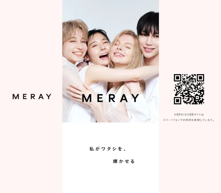
MERAY presents a skincare shop and editorial homepage through a deliberately narrow composition. At the inspected desktop width, the main column is only 464px wide. Pale pink panels occupy the remaining space, with a large wordmark on the left and a QR code plus smartphone guidance on the right. On mobile, the same content fills the 390px viewport.
The opening photograph supplies the strongest visual contrast: four people in white clothing, closely grouped against a cool, pale background. Black lettering sits across the lower part of the image. Below it, a short Japanese statement occupies a large white field, with its second line shifted right. Product discovery, explanatory copy, articles, and utility navigation follow as a long scrolling document.
The design depends on scale relationships rather than decorative components: small captions beneath generous photography, tracked uppercase English headings above narrow Japanese copy, thin utility icons beside a compact logo, and large pauses between sections. The desktop layout preserves these mobile proportions instead of expanding into a conventional wide storefront.
閉じる
MERAY — Style Reference
A narrow beauty editorial framed by blush space, bright portraits, and quietly spaced typography.
Website: meray.tokyo Original URL: https://meray.tokyo/ Final URL: https://meray.tokyo/ Theme: light in the supplied captures; white content surfaces and pale blush surroundings. Inspected: October 2, 2026, at 01:02:07 JST; supplied retrieval timestamp: October 1, 2026, 16:02:07.634 UTC. Viewports: desktop 1440 × 1000 and mobile 390 × 844 CSS pixels. Scope: the current homepage, including its opening portrait, introductory statement, product links, brand explanation, readings, news, footer, desktop side panels, and visible header states. Product pages, articles, account, cart, and menu interactions were not independently inspected.
MERAY presents a skincare shop and editorial homepage through a deliberately narrow composition. At the inspected desktop width, the main column is only 464px wide. Pale pink panels occupy the remaining space, with a large wordmark on the left and a QR code plus smartphone guidance on the right. On mobile, the same content fills the 390px viewport.
The opening photograph supplies the strongest visual contrast: four people in white clothing, closely grouped against a cool, pale background. Black lettering sits across the lower part of the image. Below it, a short Japanese statement occupies a large white field, with its second line shifted right. Product discovery, explanatory copy, articles, and utility navigation follow as a long scrolling document.
The design depends on scale relationships rather than decorative components: small captions beneath generous photography, tracked uppercase English headings above narrow Japanese copy, thin utility icons beside a compact logo, and large pauses between sections. The desktop layout preserves these mobile proportions instead of expanding into a conventional wide storefront.
How to Read This Reference
- Measured values come from the supplied rendered DOM and computed-style records. Values are rounded for readability unless additional precision matters.
- Screenshot estimates describe visible geometry or colors without a corresponding computed measurement. They are explicitly identified.
- Calculated values express relationships between the two measured viewports. They do not establish the original stylesheet formula.
- Recommended values and the Quick Start are implementation guidance, not claims about unobserved source behavior.
- Named tokens are descriptive aliases unless an original custom property is explicitly identified.
- The five current-page screenshots provide visual evidence for the opening, a middle section, and the footer. Product layout and some lower-page details are supported by DOM measurements rather than complete visual captures.
- A font-family declaration identifies the requested stack, not necessarily the font that supplied every rendered glyph.
Tokens — Colors
Default Palette
| Name | Value | Suggested token | Evidence and role |
|---|---|---|---|
| Blush Canvas | #fff5f5 |
--color-blush |
Measured desktop body and brand-story background; also visible behind footer navigation |
| White Surface | #ffffff |
--color-surface |
Measured mobile body and header; visibly forms the opening statement and editorial content surfaces |
| Black Ink | #000000 |
--color-ink |
Measured primary text, article titles, section headings, and navigation |
| Muted Gray | #6e6e6e |
--color-muted |
Measured category links, secondary footer links, and copyright |
| Fine Gray Rule | Approximately #b3b3b3 |
--color-rule |
Visual approximation for the header divider; its actual border color was not supplied |
The logo artwork appears slightly warmer than pure black in some placements. Its precise color was not measured; retain an approved logo asset rather than assigning it an invented brand-color token.
White and blush are separate structural surfaces. Blush creates the desktop surround and softer explanatory/navigation sections; white supports photography and the principal browsing sequence. The site does not rely on a saturated CTA accent in the inspected states.
Source Variables Versus Visible Styling
The supplied custom properties include generic theme colors such as blue, yellow, and red, plus --color-text: #3a3a3a and Helvetica-based font variables. These are not evidence that those values govern the visible homepage. The sampled content instead computes to black text, the specialized font stacks below, and the blush/white palette.
Some generic custom-property values contain unresolved template output. They are not usable design tokens and are excluded from this reference. No alternate color theme or theme selector was demonstrated.
Tokens — Typography
Primary Text Stack
The measured body stack is:
font-family:
  punctuation-light,
  aktiv-grotesk,
  'A+tanp-こぶりなゴシック StdN W1',
  'こぶりなゴシック Std W1',
  メイリオ,
  sans-serif;
Body paragraphs and article titles use computed weight 300. Section headings and primary navigation use 500, despite inheriting a stack whose family names include light variants. Preserve the measured weight separately from the family name.
The result is restrained and open: simple Latin forms, lightly drawn Japanese text, and more tracking than a default storefront. The introductory statement should not be reinterpreted as a serif headline based on its screenshot appearance; its computed stack belongs to the same font system.
Introductory Statement Stack
The statement requests punctuation-bold, aktiv-grotesk, and W6 variants of Koburina Gothic, followed by W1 variants, Meiryo, and sans-serif fallbacks. Its measured weight is 500.
The complete recorded family sequence includes:
font-family:
  punctuation-bold,
  aktiv-grotesk,
  'A+tanp-こぶりなゴシック StdN W6',
  'Koburina Gothic Std W6',
  'こぶりなゴシック Std W6',
  'A+tanp-こぶりなゴシック StdN W1',
  'Koburina Gothic Std W1',
  メイリオ,
  sans-serif;
Font files and loading results were not supplied. These names are observed declarations, not instructions to obtain or redistribute licensed fonts.
Type Scale
The root font size is unusually small: 0.618667px on desktop and 0.52px on mobile. These are scaling units, not readable body sizes. Descendant text has much larger explicit sizes.
For the tables below, 1u equals the observed root font size. Multipliers are calculated from the measurements, not recovered source declarations.
| Role | Calculated units | Desktop | Mobile | Weight | Line height | Tracking |
|---|---|---|---|---|---|---|
| Section heading | 44u |
27.221px | 22.88px | 500 | 1.2 | 0.1em |
| Introductory statement | 35.5u |
21.963px | 18.46px | 500 | 1 | 0.34em |
| Primary footer navigation | 34u |
21.035px | 17.68px | 500 | 1 | Approximately 0.053em |
| Brand-story paragraph | 28u |
17.323px | 14.56px | 300 | 1.78 | 0.04em |
| Reading title and issue number | 28u |
17.323px | 14.56px | 300 | 1.64 | 0.1em |
| Secondary footer link | 22u |
13.611px | 11.44px | 300 | 1 | 0.11em |
| Reading category | 16u |
9.899px | 8.32px | 300 | 1.5 | 0.1em |
| Copyright | 15u |
9.28px | 7.8px | 300 | 1 | 0.08em |
| Desktop smartphone guidance | Independent | 13px | Not visible | 300 | 26px | 1.3px |
The tiny category and copyright sizes are faithful observations, not accessibility recommendations. A new implementation should consider explicit minimum sizes.
Wordmarks and Bilingual Labels
The MERAY identity uses widely separated uppercase letters. Header logo geometry is measured on mobile at approximately 97.75 × 13.73px. The hero and desktop side-panel logos are substantially larger, but their font construction was not established. Treat them as identity artwork rather than ordinary heading text.
Footer links place a prominent English label beside a much smaller Japanese explanation, such as SKIN CHECK and 肌診断. The smaller annotation sizes were not separately measured; the screenshots suggest approximately 9–10px on mobile and 11–12px on desktop. These are visual estimates.
Tokens — Spacing & Shapes
Density: sparse overall, with compact navigation and tightly grouped product pairs. Geometry: flat, rectangular, and almost entirely unboxed.
Responsive Unit
Both samples fit the relationship:
u = content-column width / 750

Desktop: 464 / 750 = 0.618667px
Mobile:  390 / 750 = 0.52px
This is a calculated reconstruction model. The original root-size rule and the breakpoint that changes desktop presentation were not supplied. A 464px maximum column is a useful adaptation of the observed desktop width, not a proven maximum across every device.
Spacing Scale
| Use | Calculated units | Desktop measurement | Mobile measurement |
|---|---|---|---|
| Standard article/content inset | 40u |
24.75px | 20.80px |
| Footer left inset | 48u |
29.69px | 24.95px |
| Story-copy side inset | Approximately 107.5u |
66.52px | 55.91px |
| Gap between story paragraphs | Approximately 28u |
17.31px | 14.55px |
| Products top padding | 150u |
92.80px | 78px |
| Products bottom padding | 180u |
111.36px | 93.60px |
| Story bottom padding | 120u |
74.24px | 62.40px |
| Readings top padding | 190u |
117.55px | 98.80px |
| Readings bottom padding | 30u |
18.56px | 15.60px |
| News top padding | 150u |
92.80px | 78px |
| News bottom padding | 165u |
102.08px | 85.80px |
| Secondary footer link bottom padding | 41u |
25.37px | 21.32px |
The large section intervals are part of the visual identity. Reducing them to a standard 24px or 32px rhythm would noticeably change the page.
Layout Measurements
| Element | Desktop: 1440 × 1000 | Mobile: 390 × 844 | Evidence |
|---|---|---|---|
| Main column | x = 488px; width = 464px | x = 0; width = 390px | Measured |
| Desktop side space | 488px on each side | None | Calculated from column bounds |
| Document height | Approximately 7064px | Approximately 5934px | Measured |
| Header height | Approximately 74px | 62.39px | Desktop screenshot estimate; mobile measured |
| Hero lower edge | Approximately y = 588px | Approximately y = 494px | Screenshot estimate |
| First statement line top | y = 699.08px | y = 587.59px | Measured element bounds |
| Second statement line top | y = 759.55px | y = 638.42px | Measured element bounds |
| Story paragraph width | 330.97px | 278.17px | Measured |
| Reading link width | 414.50px | 348.39px | Measured |
| Footer height | 1056.25px | 887.95px | Measured |
Borders, Corners, and Elevation
Sampled sections, links, and containers report border-radius: 0. Visible photographs also have square corners. The header has a fine horizontal divider; the READINGS heading has a short black underline approximately 3px thick in the desktop screenshot.
No general shadow, raised-card, pill, or rounded-panel system is visible. Separation comes from whitespace, surface changes, type hierarchy, and image boundaries.
Components
Desktop Side Panels
Role: frame the mobile-oriented page and direct desktop visitors toward a phone.
At 1440px, each panel occupies 488px beside the central column. A large MERAY wordmark is centered in the left region. The right region contains a black QR code and two centered lines of guidance:
MERAYのWEBサイトは
スマートフォンでの利用を推奨しています。
The guidance is measured at 13px with 26px line height. The visible QR pattern is approximately 146px square, estimated from the screenshot; its image box and encoded destination were not supplied.
The side content stays in the same screen position across the opening, middle, and footer captures. This establishes persistent viewport placement visually, although the exact positioning rules were not recorded. Both panels disappear from the mobile composition.
Top Header
Role: compact identity and shopping utilities.
A white bar spans only the content column. The logo sits left; account, cart, and a three-line menu icon align right. Icons are delicate outlines with no filled button backgrounds. A thin gray divider runs across the lower edge.
At 390px, the header measures 62.39px high with 20.8px left padding and 16.64px right padding. The account artwork occupies approximately 17.56 × 20.80px, and the cart artwork approximately 24.88 × 19.75px. These are recorded anchor bounds, not verified accessible hit areas.
The header is visible at the top of both mobile captures and the scrolled desktop captures. It is absent from the supplied desktop opening image. Its precise show/hide trigger is unverified; do not assume a particular scroll threshold or direction-sensitive behavior.
The DOM contains navigation links beneath the header as well as in the footer. That does not establish that the menu was opened. No menu activation, overlay geometry, close state, or keyboard behavior was demonstrated.
Hero Portrait and Wordmark
Role: establish the brand through people and emotional proximity.
The portrait fills the column without rounded corners or an enclosing card. Four people lean together, with faces grouped in the upper area and white clothing and overlapping arms below. The pale blue-gray photographic background introduces coolness without becoming a separate UI accent.
The large black MERAY mark occupies the lower part of the photograph. Its visible width is roughly 59–60% of the column. Whether this lettering is a separate overlay or part of an image asset was not established.
The desktop photo region is approximately 464 × 588px. A full hero box near 15:19 also explains the mobile lower edge at y ≈ 494px. On mobile, the fixed-looking header covers its upper portion: the photograph is visible from around y = 62px. Do not mistake that exposed region for the complete image ratio.
Introductory Statement
Role: provide a quiet pause after the portrait.
The text is split into two distinct lines:
私がワタシを、
輝かせる
The first line begins about 23.3% into the column; the second begins about 47.7% into it, based on element bounds. Their top positions are separated by 50.83px on mobile and 60.47px on desktop. Tracking is an unusually open 0.34em.
The white space before the first line is approximately 94px on mobile and 111px on desktop, measured from the estimated hero boundary. Preserve the staggered arrangement and surrounding space rather than centering both lines as a single heading block.
Section Heading
Role: mark transitions into products, readings, and news.
Use centered uppercase English text at 22.88px on mobile and 27.221px on desktop, weight 500, with 0.1em tracking. The middle screenshot confirms an underline beneath READINGS. Other heading decorations are not fully visible, so a shared underline across every section is an implementation choice rather than a verified requirement.
Desktop DOM samples contain empty section-heading text while the mobile DOM and scrolled screenshot expose the labels. Delayed display rules are also recorded. Treat this as a capture/reveal limitation, not evidence that the desktop design intentionally omits headings.
Product Discovery Section
Role: introduce the trial kit, then the four cleansing formats.
The recorded order is:
Selectable Kit / Cleansingwith a Japanese subtitle, presented as one full-column link.Moist Cleansing OilandMelting Cleansing Butterin the first paired row.Rich Cleansing MilkandClear Cleansing Gelin the second paired row.
The featured kit link bounds measure 464 × 519.95px on desktop and 390 × 437.05px on mobile. Each smaller product link measures approximately 200.41 × 256.36px and 168.44 × 215.48px, respectively.
These are aggregate linked-content bounds, not isolated image dimensions. The records support a featured item followed by a two-column arrangement, but do not establish product-image aspect ratios, packaging colors, or precise caption styling. The supplied screenshots do not expose the complete product area.
The smaller links begin at the standard content inset. Their recorded fragments imply a narrow horizontal separation of roughly 9.1px on desktop and 7.7px on mobile. Do not treat those fragment differences as a recovered CSS grid-gap declaration.
Brand Explanation
Role: explain the trial-and-selection proposition through readable editorial copy.
The section has a measured blush background and includes the phrase 4種類から試して選ぶ セレクタブルクレンジング, followed by three paragraphs. Its lower paragraphs are visible in the middle desktop capture.
Text occupies approximately 71.3% of the column width, leaving substantially wider margins than the article images. Use 1.78 line height, 0.04em tracking, and roughly one text-size unit between paragraphs. At the measured widths, the first paragraph occupies two lines, while the following paragraphs each occupy six.
The upper composition of this section is not fully shown. Its overall height and copy positions are known, but any preceding media or decorative treatment should remain unspecified until assets or additional captures are available.
Reading Entry
Role: connect skincare education and interviews to the shopping experience.
The homepage lists four numbered entries, #58 through #55, followed by an interview. Each entry has a broad photographic region, a title row, and a small category link. The numbered entries use BEAUTY CHANNEL; the interview uses JOURNAL.
The visible first image shows a person touching their cheek, with pale mint-colored hair, a striped top, and a bright, softly blurred background. Its displayed crop is approximately 414 × 258px on desktop, close to 8:5. That ratio is a visual estimate for this image, not a verified universal asset ratio.
Below the image, the issue number sits left of the Japanese title. Both use the same 28u type size, 1.64 line height, and 0.1em tracking. The first title begins approximately 44.63px after the number's left edge on desktop and 37.5px after it on mobile. Longer titles wrap to two lines.
The category link is separate from the article link in the supplied DOM. Preserve that structure with sibling links; do not nest a category anchor inside an article anchor. There is no visible card border, shadow, rounded image frame, or colored category badge.
News List
Role: provide a compact update area after the longer editorial list.
The measured homepage contains two linked items, each pairing a title with a date. Their link bounds are about 414.50 × 47.56px on desktop and 348.39 × 39.95px on mobile. The observed dates are 2024.03.07 and 2023.05.26; these are content dates, not the inspection date.
Keep this treatment typographic and restrained. The evidence supports a short vertical list, not large promotional cards. Inner title/date font metrics and detailed divider styling were not supplied.
Footer Navigation
Role: provide the full site directory and administrative links.
The footer uses the blush field and a single left-aligned column. It begins with three groups:
Contents: top page and products.Readings: talks, journal, and CEO blog.Our Service: skin check, partner, Q&A, and about.
Primary links pair medium-weight uppercase English with small Japanese annotations. Footer rows begin approximately 35.88px apart on mobile and 42.67px apart on desktop. A gray Instagram outline follows the primary groups, separated by generous whitespace.
Secondary links form a quieter list: MY PAGE, CONTACT, NEWS, COMPANY, TERMS OF SERVICE, PRIVACY POLICY, and 特定商取引法に基づく表記. Muted gray, lighter weight, and smaller type distinguish them without boxes or separators. A very small copyright line finishes the page.
The supplied bottom captures show this footer at a scrolled position. The earlier Contents links lie above or behind the persistent header. These captures should not be interpreted as proof of an expanded hamburger menu.
Tokens — Motion & Interaction
| Element | Recorded animation | What the evidence establishes |
|---|---|---|
| Section headings | 0.5s linear 0.8s forwards delayedDisplay |
A 500ms animation with an 800ms delay; its exact keyframes were not supplied |
| Mobile header | 0.3s ease-in-out forwards sample01 |
A 300ms entry/state animation; movement direction and trigger are unknown |
| Mobile reading numbers and titles | 0.3s ease-in-out forwards fadeInUp |
A named fade/up animation with 300ms duration; opacity values and translation distance are unknown |
| Footer | 1s ease-in-out 1s forwards fadeIn |
A 1s animation after a 1s delay; no full motion recording was supplied |
| Desktop side panels | Same screen placement across captures | Visually persistent placement during page scrolling |
| Account, cart, products, readings, and footer links | Destination URLs in rendered DOM | Navigation affordances and destinations exist; destination behavior was not tested |
The computed records frequently report transition: all without a useful nonzero timing value. This does not establish a particular hover animation.
The overall motion vocabulary appears restrained and reveal-oriented, but static captures cannot establish choreography. No carousel, video playback, parallax, product hover treatment, menu-opening transition, or cart feedback was verified. The hero should not be implemented as a slideshow solely because it occupies a prominent image region.
The supplied collection process waited for loading, finite animation, sampled layout/text stability, and image decoding, then traversed intermediate scroll positions. Those checks improve capture reliability but do not prove that every delayed element or interaction state was exercised.
Surfaces
| Layer | Appearance | Function |
|---|---|---|
| Desktop surround | Solid #fff5f5 |
Holds the persistent wordmark and QR guidance |
| Main editorial field | White | Supports hero, statement, products, readings, and news |
| Brand explanation | Solid #fff5f5 |
Distinguishes longer explanatory copy |
| Header | White with a fine gray bottom rule | Separates utility navigation from scrolling content |
| Footer | Visually blush with black and gray text | Groups the site directory and administrative links |
| Product and reading entries | Unboxed linked content | Uses imagery, captions, and spacing instead of elevation |
Some measured main/section backgrounds are transparent even where the screenshot appears white. The table describes the effective visible surface, not a claim that each element independently declares a white fill.
Imagery
The opening image is high-key portrait photography with natural skin detail, soft illumination, white clothing, and a pale cool background. The group is closely cropped, with overlapping bodies and arms creating an informal, welcoming composition. Its visual energy comes from expressions and proximity rather than graphic effects.
The visible reading photograph is similarly bright but more instructional: a hand touches the cheek, the background is soft and cool, and the striped clothing adds a small amount of visual structure. Preserve this relationship between expressive brand photography and practical skincare imagery.
Use smooth photographic rendering at sufficient resolution. Square image boundaries and generous white margins are characteristic; grain overlays, duotone filters, rounded masks, and heavy color grading are not evidenced.
The utility symbols use fine outlines: account, cart, three-line menu, and Instagram. No icon-library identity or SVG source was supplied. Match the light stroke character without inventing a library attribution.
Observed Asset References
Primary asset URLs were not included in the evidence. The following are page associations, not downloadable image paths.
| Visual | Evidence reference | Asset limitation |
|---|---|---|
| Four-person hero portrait | Homepage opening captures | Image URL, intrinsic dimensions, and logo layering unknown |
| MERAY wordmarks | Homepage header, hero, and desktop side panel | Artwork format and exact fill not supplied |
| Desktop QR code | Homepage desktop side panel | Encoded target and image URL not supplied |
| First reading portrait | Homepage entry linking to talks058 | Destination observed in DOM; article and image file not independently opened |
| Account/cart/menu symbols | Homepage header captures | Source files and interaction states unknown |
| Instagram symbol | Homepage footer | Destination link observed; icon asset URL unknown |
Use authorized photography and identity assets when available. For a new brand, commission or select equivalent bright portraiture and create its own wordmark; CSS spacing alone cannot reproduce the photographic character.
Layout & Responsive Behavior
A Mobile Column Preserved on Desktop
At 1440px, the column occupies x = 488–952px. At 390px, it occupies the entire viewport. The desktop-to-mobile content-width ratio is approximately 1.18974, and most measured typography and spacing follow that ratio closely.
This is more than a narrow text measure: product presentation, editorial photography, footer links, and section spacing all remain inside the same column. The product pairs stay paired; the readings remain a single vertical stream. No wide desktop editorial grid is evidenced.
Header and Hero Relationship
The mobile main element begins at y = 0, while the header occupies the top 62.39px. The photo continues behind that area and ends around y = 494px. This supports an overlapping, top-pinned header rather than an additional header-height spacer before the hero.
Later desktop captures also show a top-pinned header constrained to the 464px column. The initial desktop capture does not show it. Implementing the exact initial visibility requires more evidence about its trigger.
Long-Page Scrolling
This is a normal long homepage, with measured document heights near 7064px and 5934px. It is not evidenced as a fixed-height application with a separately scrolling central panel. A reconstruction should allow document scrolling and let the desktop side elements remain visually stationary.
What Is Not Known
Only two viewport sizes were supplied. Tablet behavior, landscape behavior, the true maximum content width, and the desktop/mobile breakpoint remain unverified. Generic breakpoint variables in the theme do not prove which breakpoint controls this layout.
Recommended reconstruction: use a column capped at 464px, proportional units based on a 750-unit design width, and desktop side panels enabled around 1024px. That breakpoint is a practical choice for fitting both panels, not an observed source value. Test intermediate widths and text zoom rather than extrapolating the two screenshots without validation.
Do’s and Don’ts
Do
- Keep the desktop content deliberately narrow and centered.
- Preserve the measured blush
#fff5f5, white, black, and muted gray palette. - Let bright portrait photography carry the opening visual impact.
- Retain the two staggered lines and wide tracking of the introductory statement.
- Use uppercase English section labels with smaller Japanese explanations where observed.
- Keep product discovery as one featured kit followed by paired cleansing formats.
- Give story paragraphs a narrower measure than article imagery.
- Use square photographs, thin utility icons, and unboxed links.
- Preserve the large vertical pauses between major sections.
- Treat footer navigation and header navigation as separate structures until menu behavior is verified.
Don’t
- Don’t stretch the hero and editorial list across the desktop viewport.
- Don’t replace the blush side panels with a conventional horizontal navigation layout.
- Don’t introduce saturated CTA colors from unused theme variables.
- Don’t add rounded cards, soft shadows, floating badges, or glass surfaces.
- Don’t turn the statement into a large bold promotional headline.
- Don’t copy the tiny root font size into a conventional application without remapping its units.
- Don’t infer product packaging, image ratios, or detailed captions from link names alone.
- Don’t assume an open menu from a screenshot of the footer.
- Don’t recreate unreadable or temporarily missing text as an intentional design feature.
- Don’t invent asset URLs, font loading results, animation distances, or interaction outcomes.
Recommended Implementation Additions
These are recommendations for a new implementation, not verified features of the original page:
- Give the account, cart, menu, and Instagram controls accessible names. Keep their artwork small while providing hit areas of at least 44 × 44px.
- Provide visible keyboard focus, a skip link, and real heading text even if a visual reveal effect is used.
- Use a readable floor for small metadata and legal text. Consider at least 11–12px for captions and 16px for long mobile paragraphs, accepting that line breaks and page height will change.
- Preserve text resizing and prevent the fixed header from obscuring focused content or anchor targets.
- If implementing a menu, define its focus behavior, expanded state, Escape handling, and background interaction explicitly. Those behaviors cannot be copied from the supplied evidence.
- Pair the QR code with a normal link to its intended destination and provide an adequate quiet zone. Verify the encoded URL rather than guessing it.
- Reserve image dimensions to prevent layout shifts; keep the hero prioritized and load lower-page photography as needed.
- Keep content visible by default and make reveal animation optional. Respect reduced-motion preferences.
- Test 320px, intermediate tablet widths, landscape, and enlarged text before adopting the proportional scaling model broadly.
Agent Prompt Guide
Quick Color Reference
- Desktop surround, explanation, and footer:
#fff5f5. - Main browsing surfaces and header:
#ffffff. - Main text and heading underline:
#000000. - Category and secondary navigation text:
#6e6e6e. - Header divider: light gray;
#b3b3b3is an approximation. - Photography supplies the cool blue-gray and skin tones; these are not extra UI accent tokens.
Overall Prompt
“Create a skincare brand homepage with the measured visual relationships of MERAY: a mobile-oriented column, approximately 464px wide on a large desktop, framed by pale blush #fff5f5 side panels. Place a widely tracked wordmark in the left panel and a QR code with two quiet guidance lines in the right. Use white content surfaces, black text, muted gray metadata, thin outline utility icons, and bright square-cornered photography. Open with a closely grouped portrait and a large wordmark, then a spacious white statement area with two Japanese lines offset horizontally. Follow with a featured trial kit, four products in two columns, narrow explanatory paragraphs, a single-column readings list, compact news, and a bilingual directory footer. Preserve generous vertical spacing and avoid raised cards or decorative gradients.”
Example Component Prompts
- Header: “Build a white header constrained to a narrow content column, approximately 62px high at 390px width. Put a compact, tracked logo left and fine outline account, cart, and three-line menu symbols right. Add a subtle bottom divider and accessible 44px control areas. Do not invent a menu transition.”
- Opening statement: “On a white field below a bright portrait, place
私がワタシを、near 23% of the column width and輝かせるnear 48%. Use approximately 18.46px type at 390px, medium weight, 0.34em tracking, and about 51px between the lines’ top positions. Keep the surrounding whitespace generous.” - Reading entry: “Create an unboxed editorial entry with a broad, approximately 8:5 portrait crop. Beneath it, align a small issue number with a Japanese title in light black type. Add a separate small gray category link below. Use square corners, no shadow, and roughly 21px side insets at 390px width.”
- Footer: “Create a pale blush directory with small group labels, medium-weight uppercase English navigation, and much smaller Japanese annotations on the same rows. Follow with an outline Instagram icon, a widely spaced gray utility list, and a quiet copyright line. Keep everything in one left-aligned column.”
- Responsive shell: “At 390px, show a full-width scrolling page. At 1440px, center a 464px content column with equal blush side regions. Scale internal spacing in proportion to the content width. Keep articles vertical and products paired; do not expand into a desktop card grid.”
Quick Start
CSS Custom Properties
This is a reusable approximation of the measured proportions, not recovered source CSS. It keeps a conventional root font size and exposes the small design unit as --u.
Expected structure: .meray-page contains the optional desktop rails, a fixed .site-header, and a .meray-column containing the hero, statement, sections, and footer. Supply real image/logo assets and semantic links. Reading category links should be siblings of their article links.
The 464px cap, 1024px desktop breakpoint, approximate hero crop, product-grid gap, and estimated small-label styling are reconstruction choices. The header starts visible in this example; the original desktop opening visibility trigger remains unresolved. Motion durations are recorded as tokens, but content is not hidden behind invented reveal keyframes.
:root {
  --color-blush: #fff5f5;
  --color-surface: #ffffff;
  --color-ink: #000000;
  --color-muted: #6e6e6e;
  --color-rule: #b3b3b3; /* Visual approximation */

  --font-body: punctuation-light, aktiv-grotesk,
    'A+tanp-こぶりなゴシック StdN W1',
    'こぶりなゴシック Std W1', Meiryo, sans-serif;
  --font-statement: punctuation-bold, aktiv-grotesk,
    'A+tanp-こぶりなゴシック StdN W6',
    'Koburina Gothic Std W6', Meiryo, sans-serif;

  /* Model fitted to the two supplied viewport measurements. */
  --column-width: min(100vw, 464px);
  --u: min(0.1333333333vw, 0.618666667px);

  --text-section: calc(44 * var(--u));
  --text-statement: calc(35.5 * var(--u));
  --text-nav: calc(34 * var(--u));
  --text-body: calc(28 * var(--u));
  --text-utility: calc(22 * var(--u));
  --text-caption: calc(16 * var(--u));
  --text-fine: calc(15 * var(--u));

  --inset: calc(40 * var(--u));
  --footer-inset: calc(48 * var(--u));
  --header-height: calc(120 * var(--u));
  --section-space: calc(150 * var(--u));

  --duration-entry: 300ms;
  --duration-heading: 500ms;
  --delay-heading: 800ms;
  --duration-footer: 1000ms;
  --delay-footer: 1000ms;
}

* {
  box-sizing: border-box;
}

body.meray-page {
  margin: 0;
  color: var(--color-ink);
  background: var(--color-surface);
  font-family: var(--font-body);
  font-size: var(--text-body);
  font-weight: 300;
}

.meray-page img {
  display: block;
  max-width: 100%;
}

.meray-page a {
  color: inherit;
  text-decoration: none;
}

.meray-column {
  width: var(--column-width);
  margin-inline: auto;
  background: var(--color-surface);
}

.site-header {
  position: fixed;
  z-index: 20;
  top: 0;
  left: 50%;
  transform: translateX(-50%);
  display: flex;
  align-items: center;
  justify-content: space-between;
  width: var(--column-width);
  height: var(--header-height);
  padding-inline: var(--inset) calc(32 * var(--u));
  background: var(--color-surface);
  border-bottom: 1px solid var(--color-rule);
}

.header-logo {
  display: block;
  width: calc(188 * var(--u));
}

.header-actions {
  display: flex;
  align-items: center;
}

.icon-control {
  display: grid;
  place-items: center;
  min-width: 44px; /* Recommended hit-area addition */
  min-height: 44px;
  padding: 0;
  border: 0;
  color: inherit;
  background: transparent;
  cursor: pointer;
}

.icon-control svg,
.icon-control img {
  width: calc(48 * var(--u));
  height: auto;
}

.hero {
  position: relative;
  aspect-ratio: 15 / 19; /* Screenshot-derived approximation */
  overflow: hidden;
}

.hero-photo {
  width: 100%;
  height: 100%;
  object-fit: cover;
}

/* Use only when the photograph does not already contain the wordmark. */
.hero-wordmark {
  position: absolute;
  left: 20%;
  bottom: 16.6%;
  width: 60%;
}

.statement {
  min-height: calc(465 * var(--u));
  padding-top: calc(180 * var(--u));
  background: var(--color-surface);
}

.statement p {
  margin: 0 0 0 23.333%;
  font-family: var(--font-statement);
  font-size: var(--text-statement);
  font-weight: 500;
  line-height: 1;
  letter-spacing: 0.34em;
}

.statement p + p {
  margin-top: calc(62.25 * var(--u));
  margin-left: 47.733%;
}

.section-title {
  margin: 0;
  text-align: center;
  font-size: var(--text-section);
  font-weight: 500;
  line-height: 1.2;
  letter-spacing: 0.1em;
}

.section-title > span {
  position: relative;
  display: inline-block;
}

/* The underline is visually confirmed for READINGS. */
.section-title--ruled > span::after {
  content: '';
  position: absolute;
  inset-inline: 0;
  bottom: calc(-18 * var(--u));
  height: calc(5 * var(--u));
  background: currentColor;
}

.products {
  padding-block: var(--section-space) calc(180 * var(--u));
}

.featured-product {
  display: block;
  margin-top: calc(90 * var(--u));
}

.product-grid {
  display: grid;
  grid-template-columns: repeat(2, minmax(0, 1fr));
  gap: calc(30 * var(--u)) calc(16 * var(--u));
  margin-top: calc(80 * var(--u));
  padding-inline: var(--inset);
}

.product-grid a {
  display: block;
  min-width: 0;
}

.product-grid img {
  width: 100%;
  height: auto;
}

/* Product caption sizing is an adaptation, not a measured source value. */
.product-label {
  margin-top: calc(16 * var(--u));
  font-size: var(--text-utility);
  line-height: 1.6;
}

.story {
  padding-bottom: calc(120 * var(--u));
  background: var(--color-blush);
}

/* Add verified lead content above this copy; its composition is unknown. */
.story-copy {
  width: 71.333%;
  margin-inline: auto;
  font-size: var(--text-body);
  line-height: 1.78;
  letter-spacing: 0.04em;
}

.story-copy p {
  margin: 0 0 1em;
}

.story-copy p:last-child {
  margin-bottom: 0;
}

.readings {
  padding-block: calc(190 * var(--u)) calc(30 * var(--u));
}

.readings-list {
  margin-top: calc(130 * var(--u));
  padding-inline: var(--inset);
}

.reading-item + .reading-item {
  margin-top: calc(80 * var(--u));
}

.reading-link {
  display: block;
}

.reading-image {
  width: 100%;
  aspect-ratio: 8 / 5; /* Approximation of the visible first image */
  object-fit: cover;
}

.reading-caption {
  display: flex;
  align-items: baseline;
  gap: calc(14 * var(--u));
  margin-top: calc(20 * var(--u));
  font-size: var(--text-body);
  line-height: 1.64;
  letter-spacing: 0.1em;
}

.reading-caption h3,
.reading-caption p {
  margin: 0;
  font: inherit;
}

.reading-caption p {
  flex-shrink: 0;
}

.reading-meta {
  display: inline-block;
  margin-top: calc(8 * var(--u));
  color: var(--color-muted);
  font-size: var(--text-caption);
  line-height: 1.5;
  letter-spacing: 0.1em;
}

.news {
  padding-block: var(--section-space) calc(165 * var(--u));
}

.news-list {
  margin-top: calc(125 * var(--u));
  padding-inline: var(--inset);
}

.news-list a {
  display: block;
  margin-top: calc(36 * var(--u));
}

.site-footer {
  padding: calc(32 * var(--u)) var(--footer-inset)
    calc(25 * var(--u));
  background: var(--color-blush);
}

.footer-group + .footer-group {
  margin-top: calc(70 * var(--u));
}

.footer-group-label {
  margin: 0 0 calc(30 * var(--u));
  font-size: var(--text-caption);
  font-weight: 300;
  letter-spacing: 0.1em;
}

.footer-primary-link {
  display: flex;
  align-items: baseline;
  gap: calc(24 * var(--u));
  min-height: calc(69 * var(--u));
  font-size: var(--text-nav);
  font-weight: 500;
  line-height: 1;
  letter-spacing: 0.053em;
}

.footer-primary-link small {
  font-size: calc(20 * var(--u)); /* Visual approximation */
  font-weight: 300;
  letter-spacing: 0;
}

.footer-social {
  margin-block: calc(80 * var(--u)) calc(120 * var(--u));
}

.footer-utility a {
  display: block;
  padding-bottom: calc(41 * var(--u));
  color: var(--color-muted);
  font-size: var(--text-utility);
  line-height: 1;
  letter-spacing: 0.11em;
}

.footer-copyright {
  margin: calc(78 * var(--u)) 0 0;
  color: var(--color-muted);
  font-size: var(--text-fine);
  line-height: 1;
  letter-spacing: 0.08em;
}

.desktop-rail {
  display: none;
}

/* Recommended breakpoint; the original breakpoint was not supplied. */
@media (min-width: 1024px) {
  body.meray-page {
    background: var(--color-blush);
  }

  .desktop-rail {
    position: fixed;
    inset-block: 0;
    display: flex;
    flex-direction: column;
    align-items: center;
    justify-content: center;
    width: calc((100vw - var(--column-width)) / 2);
  }

  .desktop-rail--brand {
    left: 0;
  }

  .desktop-rail--phone {
    right: 0;
    gap: 34px;
  }

  .desktop-rail--brand img {
    width: 190px; /* Screenshot approximation */
  }

  .desktop-rail--phone img {
    width: 146px; /* Visible QR size approximation */
  }

  .desktop-rail--phone p {
    margin: 0;
    text-align: center;
    font-size: 13px;
    line-height: 26px;
    letter-spacing: 1.3px;
  }
}

/* Recommended interaction additions; source states were not tested. */
.meray-page :focus-visible {
  outline: 2px solid var(--color-ink);
  outline-offset: 4px;
}

.meray-page [id] {
  scroll-margin-top: calc(var(--header-height) + 16px);
}

@media (hover: hover) {
  .reading-meta:hover,
  .footer-utility a:hover {
    text-decoration: underline;
    text-underline-offset: 0.25em;
  }
}

@media (prefers-reduced-motion: reduce) {
  .meray-page *,
  .meray-page *::before,
  .meray-page *::after {
    animation: none !important;
    transition: none !important;
    scroll-behavior: auto !important;
  }
}
The starter intentionally leaves the upper brand-story composition and actual media assets to verified content. Its exact-size caption tokens reproduce observed proportions; apply readable minimums when adapting the design for production.
Tailwind v4 Token Mapping
Optional aliases for a project that already uses Tailwind v4. This does not identify the original site's framework. Define the custom properties above first.
@theme inline {
  --color-blush: #fff5f5;
  --color-surface: #ffffff;
  --color-ink: #000000;
  --color-muted: #6e6e6e;

  --font-meray: var(--font-body);
  --font-meray-statement: var(--font-statement);

  --text-section: calc(44 * var(--u));
  --text-statement: calc(35.5 * var(--u));
  --text-navigation: calc(34 * var(--u));
  --text-copy: calc(28 * var(--u));
  --text-utility: calc(22 * var(--u));
  --text-caption: calc(16 * var(--u));

  --spacing-inset: calc(40 * var(--u));
  --spacing-footer-inset: calc(48 * var(--u));
  --spacing-section: calc(150 * var(--u));
  --spacing-reading-top: calc(190 * var(--u));
}
Sources & Evidence
- Inspected original and final page: https://meray.tokyo/. The supplied retrieval reports HTTP 200 and no URL change.
- Capture timestamp: October 1, 2026, 16:02:07.634 UTC, equivalent to October 2, 2026, 01:02:07.634 JST.
- Desktop evidence: 1440 × 1000 CSS-pixel viewport; opening, middle-page, and footer screenshots; rendered document height approximately 7064px.
- Mobile evidence: 390 × 844 CSS-pixel viewport; opening and footer screenshots; rendered document height approximately 5934px.
- Measurement authority: supplied rendered element rectangles, computed colors, font stacks, sizes, weights, line heights, tracking, padding, animation declarations, and link destinations.
- Visual authority: the five supplied current-page captures. They establish the photography, effective surfaces, logo placements, thin icon treatment, persistent desktop side panels, and visible header/footer composition.
- Inspection limits: no independent browsing or command execution was performed for this reference. Linked destination pages were not inspected. Primary asset URLs, exact font resolution, original scaling formulas, layout breakpoints, animation keyframes, menu states, hover/focus behavior, and commerce outcomes remain unverified. SharedWorkers and service workers were disabled during the supplied collection process.
This reference describes the current homepage evidenced by those captures. Measured values, screenshot estimates, calculated relationships, and recommended adaptations are distinguished throughout.
# MERAY — Style Reference

> A narrow beauty editorial framed by blush space, bright portraits, and quietly spaced typography.

**Website:** [meray.tokyo](https://meray.tokyo/)
**Original URL:** https://meray.tokyo/
**Final URL:** https://meray.tokyo/
**Theme:** light in the supplied captures; white content surfaces and pale blush surroundings.
**Inspected:** October 2, 2026, at 01:02:07 JST; supplied retrieval timestamp: October 1, 2026, 16:02:07.634 UTC.
**Viewports:** desktop **1440 × 1000** and mobile **390 × 844** CSS pixels.
**Scope:** the current homepage, including its opening portrait, introductory statement, product links, brand explanation, readings, news, footer, desktop side panels, and visible header states. Product pages, articles, account, cart, and menu interactions were not independently inspected.

MERAY presents a skincare shop and editorial homepage through a deliberately narrow composition. At the inspected desktop width, the main column is only 464px wide. Pale pink panels occupy the remaining space, with a large wordmark on the left and a QR code plus smartphone guidance on the right. On mobile, the same content fills the 390px viewport.

The opening photograph supplies the strongest visual contrast: four people in white clothing, closely grouped against a cool, pale background. Black lettering sits across the lower part of the image. Below it, a short Japanese statement occupies a large white field, with its second line shifted right. Product discovery, explanatory copy, articles, and utility navigation follow as a long scrolling document.

The design depends on scale relationships rather than decorative components: small captions beneath generous photography, tracked uppercase English headings above narrow Japanese copy, thin utility icons beside a compact logo, and large pauses between sections. The desktop layout preserves these mobile proportions instead of expanding into a conventional wide storefront.
閉じる
# MERAY — Style Reference

> A narrow beauty editorial framed by blush space, bright portraits, and quietly spaced typography.

**Website:** [meray.tokyo](https://meray.tokyo/)
**Original URL:** https://meray.tokyo/
**Final URL:** https://meray.tokyo/
**Theme:** light in the supplied captures; white content surfaces and pale blush surroundings.
**Inspected:** October 2, 2026, at 01:02:07 JST; supplied retrieval timestamp: October 1, 2026, 16:02:07.634 UTC.
**Viewports:** desktop **1440 × 1000** and mobile **390 × 844** CSS pixels.
**Scope:** the current homepage, including its opening portrait, introductory statement, product links, brand explanation, readings, news, footer, desktop side panels, and visible header states. Product pages, articles, account, cart, and menu interactions were not independently inspected.

MERAY presents a skincare shop and editorial homepage through a deliberately narrow composition. At the inspected desktop width, the main column is only 464px wide. Pale pink panels occupy the remaining space, with a large wordmark on the left and a QR code plus smartphone guidance on the right. On mobile, the same content fills the 390px viewport.

The opening photograph supplies the strongest visual contrast: four people in white clothing, closely grouped against a cool, pale background. Black lettering sits across the lower part of the image. Below it, a short Japanese statement occupies a large white field, with its second line shifted right. Product discovery, explanatory copy, articles, and utility navigation follow as a long scrolling document.

The design depends on scale relationships rather than decorative components: small captions beneath generous photography, tracked uppercase English headings above narrow Japanese copy, thin utility icons beside a compact logo, and large pauses between sections. The desktop layout preserves these mobile proportions instead of expanding into a conventional wide storefront.

## How to Read This Reference

- **Measured** values come from the supplied rendered DOM and computed-style records. Values are rounded for readability unless additional precision matters.
- **Screenshot estimates** describe visible geometry or colors without a corresponding computed measurement. They are explicitly identified.
- **Calculated** values express relationships between the two measured viewports. They do not establish the original stylesheet formula.
- **Recommended** values and the Quick Start are implementation guidance, not claims about unobserved source behavior.
- **Named tokens** are descriptive aliases unless an original custom property is explicitly identified.
- The five current-page screenshots provide visual evidence for the opening, a middle section, and the footer. Product layout and some lower-page details are supported by DOM measurements rather than complete visual captures.
- A font-family declaration identifies the requested stack, not necessarily the font that supplied every rendered glyph.

## Tokens — Colors

### Default Palette

| Name | Value | Suggested token | Evidence and role |
| --- | --- | --- | --- |
| Blush Canvas | `#fff5f5` | `--color-blush` | Measured desktop body and brand-story background; also visible behind footer navigation |
| White Surface | `#ffffff` | `--color-surface` | Measured mobile body and header; visibly forms the opening statement and editorial content surfaces |
| Black Ink | `#000000` | `--color-ink` | Measured primary text, article titles, section headings, and navigation |
| Muted Gray | `#6e6e6e` | `--color-muted` | Measured category links, secondary footer links, and copyright |
| Fine Gray Rule | Approximately `#b3b3b3` | `--color-rule` | Visual approximation for the header divider; its actual border color was not supplied |

The logo artwork appears slightly warmer than pure black in some placements. Its precise color was not measured; retain an approved logo asset rather than assigning it an invented brand-color token.

White and blush are separate structural surfaces. Blush creates the desktop surround and softer explanatory/navigation sections; white supports photography and the principal browsing sequence. The site does not rely on a saturated CTA accent in the inspected states.

### Source Variables Versus Visible Styling

The supplied custom properties include generic theme colors such as blue, yellow, and red, plus `--color-text: #3a3a3a` and Helvetica-based font variables. These are not evidence that those values govern the visible homepage. The sampled content instead computes to black text, the specialized font stacks below, and the blush/white palette.

Some generic custom-property values contain unresolved template output. They are not usable design tokens and are excluded from this reference. No alternate color theme or theme selector was demonstrated.

## Tokens — Typography

### Primary Text Stack

The measured body stack is:

```css
font-family:
  punctuation-light,
  aktiv-grotesk,
  'A+tanp-こぶりなゴシック StdN W1',
  'こぶりなゴシック Std W1',
  メイリオ,
  sans-serif;
```

Body paragraphs and article titles use computed weight `300`. Section headings and primary navigation use `500`, despite inheriting a stack whose family names include light variants. Preserve the measured weight separately from the family name.

The result is restrained and open: simple Latin forms, lightly drawn Japanese text, and more tracking than a default storefront. The introductory statement should not be reinterpreted as a serif headline based on its screenshot appearance; its computed stack belongs to the same font system.

### Introductory Statement Stack

The statement requests `punctuation-bold`, `aktiv-grotesk`, and W6 variants of Koburina Gothic, followed by W1 variants, Meiryo, and sans-serif fallbacks. Its measured weight is `500`.

The complete recorded family sequence includes:

```css
font-family:
  punctuation-bold,
  aktiv-grotesk,
  'A+tanp-こぶりなゴシック StdN W6',
  'Koburina Gothic Std W6',
  'こぶりなゴシック Std W6',
  'A+tanp-こぶりなゴシック StdN W1',
  'Koburina Gothic Std W1',
  メイリオ,
  sans-serif;
```

Font files and loading results were not supplied. These names are observed declarations, not instructions to obtain or redistribute licensed fonts.

### Type Scale

The root font size is unusually small: **0.618667px on desktop** and **0.52px on mobile**. These are scaling units, not readable body sizes. Descendant text has much larger explicit sizes.

For the tables below, **1u equals the observed root font size**. Multipliers are calculated from the measurements, not recovered source declarations.

| Role | Calculated units | Desktop | Mobile | Weight | Line height | Tracking |
| --- | --- | --- | --- | --- | --- | --- |
| Section heading | `44u` | 27.221px | 22.88px | 500 | 1.2 | 0.1em |
| Introductory statement | `35.5u` | 21.963px | 18.46px | 500 | 1 | 0.34em |
| Primary footer navigation | `34u` | 21.035px | 17.68px | 500 | 1 | Approximately 0.053em |
| Brand-story paragraph | `28u` | 17.323px | 14.56px | 300 | 1.78 | 0.04em |
| Reading title and issue number | `28u` | 17.323px | 14.56px | 300 | 1.64 | 0.1em |
| Secondary footer link | `22u` | 13.611px | 11.44px | 300 | 1 | 0.11em |
| Reading category | `16u` | 9.899px | 8.32px | 300 | 1.5 | 0.1em |
| Copyright | `15u` | 9.28px | 7.8px | 300 | 1 | 0.08em |
| Desktop smartphone guidance | Independent | 13px | Not visible | 300 | 26px | 1.3px |

The tiny category and copyright sizes are faithful observations, not accessibility recommendations. A new implementation should consider explicit minimum sizes.

### Wordmarks and Bilingual Labels

The MERAY identity uses widely separated uppercase letters. Header logo geometry is measured on mobile at approximately **97.75 × 13.73px**. The hero and desktop side-panel logos are substantially larger, but their font construction was not established. Treat them as identity artwork rather than ordinary heading text.

Footer links place a prominent English label beside a much smaller Japanese explanation, such as `SKIN CHECK` and `肌診断`. The smaller annotation sizes were not separately measured; the screenshots suggest approximately 9–10px on mobile and 11–12px on desktop. These are visual estimates.

## Tokens — Spacing & Shapes

**Density:** sparse overall, with compact navigation and tightly grouped product pairs.
**Geometry:** flat, rectangular, and almost entirely unboxed.

### Responsive Unit

Both samples fit the relationship:

```text
u = content-column width / 750

Desktop: 464 / 750 = 0.618667px
Mobile:  390 / 750 = 0.52px
```

This is a calculated reconstruction model. The original root-size rule and the breakpoint that changes desktop presentation were not supplied. A 464px maximum column is a useful adaptation of the observed desktop width, not a proven maximum across every device.

### Spacing Scale

| Use | Calculated units | Desktop measurement | Mobile measurement |
| --- | --- | --- | --- |
| Standard article/content inset | `40u` | 24.75px | 20.80px |
| Footer left inset | `48u` | 29.69px | 24.95px |
| Story-copy side inset | Approximately `107.5u` | 66.52px | 55.91px |
| Gap between story paragraphs | Approximately `28u` | 17.31px | 14.55px |
| Products top padding | `150u` | 92.80px | 78px |
| Products bottom padding | `180u` | 111.36px | 93.60px |
| Story bottom padding | `120u` | 74.24px | 62.40px |
| Readings top padding | `190u` | 117.55px | 98.80px |
| Readings bottom padding | `30u` | 18.56px | 15.60px |
| News top padding | `150u` | 92.80px | 78px |
| News bottom padding | `165u` | 102.08px | 85.80px |
| Secondary footer link bottom padding | `41u` | 25.37px | 21.32px |

The large section intervals are part of the visual identity. Reducing them to a standard 24px or 32px rhythm would noticeably change the page.

### Layout Measurements

| Element | Desktop: 1440 × 1000 | Mobile: 390 × 844 | Evidence |
| --- | --- | --- | --- |
| Main column | x = 488px; width = 464px | x = 0; width = 390px | Measured |
| Desktop side space | 488px on each side | None | Calculated from column bounds |
| Document height | Approximately 7064px | Approximately 5934px | Measured |
| Header height | Approximately 74px | 62.39px | Desktop screenshot estimate; mobile measured |
| Hero lower edge | Approximately y = 588px | Approximately y = 494px | Screenshot estimate |
| First statement line top | y = 699.08px | y = 587.59px | Measured element bounds |
| Second statement line top | y = 759.55px | y = 638.42px | Measured element bounds |
| Story paragraph width | 330.97px | 278.17px | Measured |
| Reading link width | 414.50px | 348.39px | Measured |
| Footer height | 1056.25px | 887.95px | Measured |

### Borders, Corners, and Elevation

Sampled sections, links, and containers report `border-radius: 0`. Visible photographs also have square corners. The header has a fine horizontal divider; the `READINGS` heading has a short black underline approximately 3px thick in the desktop screenshot.

No general shadow, raised-card, pill, or rounded-panel system is visible. Separation comes from whitespace, surface changes, type hierarchy, and image boundaries.

## Components

### Desktop Side Panels

**Role:** frame the mobile-oriented page and direct desktop visitors toward a phone.

At 1440px, each panel occupies 488px beside the central column. A large MERAY wordmark is centered in the left region. The right region contains a black QR code and two centered lines of guidance:

`MERAYのWEBサイトは`

`スマートフォンでの利用を推奨しています。`

The guidance is measured at 13px with 26px line height. The visible QR pattern is approximately 146px square, estimated from the screenshot; its image box and encoded destination were not supplied.

The side content stays in the same screen position across the opening, middle, and footer captures. This establishes persistent viewport placement visually, although the exact positioning rules were not recorded. Both panels disappear from the mobile composition.

### Top Header

**Role:** compact identity and shopping utilities.

A white bar spans only the content column. The logo sits left; account, cart, and a three-line menu icon align right. Icons are delicate outlines with no filled button backgrounds. A thin gray divider runs across the lower edge.

At 390px, the header measures 62.39px high with 20.8px left padding and 16.64px right padding. The account artwork occupies approximately 17.56 × 20.80px, and the cart artwork approximately 24.88 × 19.75px. These are recorded anchor bounds, not verified accessible hit areas.

The header is visible at the top of both mobile captures and the scrolled desktop captures. It is absent from the supplied desktop opening image. Its precise show/hide trigger is unverified; do not assume a particular scroll threshold or direction-sensitive behavior.

The DOM contains navigation links beneath the header as well as in the footer. That does not establish that the menu was opened. No menu activation, overlay geometry, close state, or keyboard behavior was demonstrated.

### Hero Portrait and Wordmark

**Role:** establish the brand through people and emotional proximity.

The portrait fills the column without rounded corners or an enclosing card. Four people lean together, with faces grouped in the upper area and white clothing and overlapping arms below. The pale blue-gray photographic background introduces coolness without becoming a separate UI accent.

The large black MERAY mark occupies the lower part of the photograph. Its visible width is roughly 59–60% of the column. Whether this lettering is a separate overlay or part of an image asset was not established.

The desktop photo region is approximately 464 × 588px. A full hero box near **15:19** also explains the mobile lower edge at y ≈ 494px. On mobile, the fixed-looking header covers its upper portion: the photograph is visible from around y = 62px. Do not mistake that exposed region for the complete image ratio.

### Introductory Statement

**Role:** provide a quiet pause after the portrait.

The text is split into two distinct lines:

`私がワタシを、`

`輝かせる`

The first line begins about 23.3% into the column; the second begins about 47.7% into it, based on element bounds. Their top positions are separated by 50.83px on mobile and 60.47px on desktop. Tracking is an unusually open 0.34em.

The white space before the first line is approximately 94px on mobile and 111px on desktop, measured from the estimated hero boundary. Preserve the staggered arrangement and surrounding space rather than centering both lines as a single heading block.

### Section Heading

**Role:** mark transitions into products, readings, and news.

Use centered uppercase English text at 22.88px on mobile and 27.221px on desktop, weight 500, with 0.1em tracking. The middle screenshot confirms an underline beneath `READINGS`. Other heading decorations are not fully visible, so a shared underline across every section is an implementation choice rather than a verified requirement.

Desktop DOM samples contain empty section-heading text while the mobile DOM and scrolled screenshot expose the labels. Delayed display rules are also recorded. Treat this as a capture/reveal limitation, not evidence that the desktop design intentionally omits headings.

### Product Discovery Section

**Role:** introduce the trial kit, then the four cleansing formats.

The recorded order is:

1. `Selectable Kit / Cleansing` with a Japanese subtitle, presented as one full-column link.
2. `Moist Cleansing Oil` and `Melting Cleansing Butter` in the first paired row.
3. `Rich Cleansing Milk` and `Clear Cleansing Gel` in the second paired row.

The featured kit link bounds measure **464 × 519.95px** on desktop and **390 × 437.05px** on mobile. Each smaller product link measures approximately **200.41 × 256.36px** and **168.44 × 215.48px**, respectively.

These are aggregate linked-content bounds, not isolated image dimensions. The records support a featured item followed by a two-column arrangement, but do not establish product-image aspect ratios, packaging colors, or precise caption styling. The supplied screenshots do not expose the complete product area.

The smaller links begin at the standard content inset. Their recorded fragments imply a narrow horizontal separation of roughly 9.1px on desktop and 7.7px on mobile. Do not treat those fragment differences as a recovered CSS grid-gap declaration.

### Brand Explanation

**Role:** explain the trial-and-selection proposition through readable editorial copy.

The section has a measured blush background and includes the phrase `4種類から試して選ぶ セレクタブルクレンジング`, followed by three paragraphs. Its lower paragraphs are visible in the middle desktop capture.

Text occupies approximately **71.3% of the column width**, leaving substantially wider margins than the article images. Use 1.78 line height, 0.04em tracking, and roughly one text-size unit between paragraphs. At the measured widths, the first paragraph occupies two lines, while the following paragraphs each occupy six.

The upper composition of this section is not fully shown. Its overall height and copy positions are known, but any preceding media or decorative treatment should remain unspecified until assets or additional captures are available.

### Reading Entry

**Role:** connect skincare education and interviews to the shopping experience.

The homepage lists four numbered entries, `#58` through `#55`, followed by an interview. Each entry has a broad photographic region, a title row, and a small category link. The numbered entries use `BEAUTY CHANNEL`; the interview uses `JOURNAL`.

The visible first image shows a person touching their cheek, with pale mint-colored hair, a striped top, and a bright, softly blurred background. Its displayed crop is approximately 414 × 258px on desktop, close to **8:5**. That ratio is a visual estimate for this image, not a verified universal asset ratio.

Below the image, the issue number sits left of the Japanese title. Both use the same 28u type size, 1.64 line height, and 0.1em tracking. The first title begins approximately 44.63px after the number's left edge on desktop and 37.5px after it on mobile. Longer titles wrap to two lines.

The category link is separate from the article link in the supplied DOM. Preserve that structure with sibling links; do not nest a category anchor inside an article anchor. There is no visible card border, shadow, rounded image frame, or colored category badge.

### News List

**Role:** provide a compact update area after the longer editorial list.

The measured homepage contains two linked items, each pairing a title with a date. Their link bounds are about **414.50 × 47.56px** on desktop and **348.39 × 39.95px** on mobile. The observed dates are `2024.03.07` and `2023.05.26`; these are content dates, not the inspection date.

Keep this treatment typographic and restrained. The evidence supports a short vertical list, not large promotional cards. Inner title/date font metrics and detailed divider styling were not supplied.

### Footer Navigation

**Role:** provide the full site directory and administrative links.

The footer uses the blush field and a single left-aligned column. It begins with three groups:

- `Contents`: top page and products.
- `Readings`: talks, journal, and CEO blog.
- `Our Service`: skin check, partner, Q&A, and about.

Primary links pair medium-weight uppercase English with small Japanese annotations. Footer rows begin approximately 35.88px apart on mobile and 42.67px apart on desktop. A gray Instagram outline follows the primary groups, separated by generous whitespace.

Secondary links form a quieter list: `MY PAGE`, `CONTACT`, `NEWS`, `COMPANY`, `TERMS OF SERVICE`, `PRIVACY POLICY`, and `特定商取引法に基づく表記`. Muted gray, lighter weight, and smaller type distinguish them without boxes or separators. A very small copyright line finishes the page.

The supplied bottom captures show this footer at a scrolled position. The earlier `Contents` links lie above or behind the persistent header. These captures should not be interpreted as proof of an expanded hamburger menu.

## Tokens — Motion & Interaction

| Element | Recorded animation | What the evidence establishes |
| --- | --- | --- |
| Section headings | `0.5s linear 0.8s forwards delayedDisplay` | A 500ms animation with an 800ms delay; its exact keyframes were not supplied |
| Mobile header | `0.3s ease-in-out forwards sample01` | A 300ms entry/state animation; movement direction and trigger are unknown |
| Mobile reading numbers and titles | `0.3s ease-in-out forwards fadeInUp` | A named fade/up animation with 300ms duration; opacity values and translation distance are unknown |
| Footer | `1s ease-in-out 1s forwards fadeIn` | A 1s animation after a 1s delay; no full motion recording was supplied |
| Desktop side panels | Same screen placement across captures | Visually persistent placement during page scrolling |
| Account, cart, products, readings, and footer links | Destination URLs in rendered DOM | Navigation affordances and destinations exist; destination behavior was not tested |

The computed records frequently report `transition: all` without a useful nonzero timing value. This does not establish a particular hover animation.

The overall motion vocabulary appears restrained and reveal-oriented, but static captures cannot establish choreography. No carousel, video playback, parallax, product hover treatment, menu-opening transition, or cart feedback was verified. The hero should not be implemented as a slideshow solely because it occupies a prominent image region.

The supplied collection process waited for loading, finite animation, sampled layout/text stability, and image decoding, then traversed intermediate scroll positions. Those checks improve capture reliability but do not prove that every delayed element or interaction state was exercised.

## Surfaces

| Layer | Appearance | Function |
| --- | --- | --- |
| Desktop surround | Solid `#fff5f5` | Holds the persistent wordmark and QR guidance |
| Main editorial field | White | Supports hero, statement, products, readings, and news |
| Brand explanation | Solid `#fff5f5` | Distinguishes longer explanatory copy |
| Header | White with a fine gray bottom rule | Separates utility navigation from scrolling content |
| Footer | Visually blush with black and gray text | Groups the site directory and administrative links |
| Product and reading entries | Unboxed linked content | Uses imagery, captions, and spacing instead of elevation |

Some measured main/section backgrounds are transparent even where the screenshot appears white. The table describes the effective visible surface, not a claim that each element independently declares a white fill.

## Imagery

The opening image is high-key portrait photography with natural skin detail, soft illumination, white clothing, and a pale cool background. The group is closely cropped, with overlapping bodies and arms creating an informal, welcoming composition. Its visual energy comes from expressions and proximity rather than graphic effects.

The visible reading photograph is similarly bright but more instructional: a hand touches the cheek, the background is soft and cool, and the striped clothing adds a small amount of visual structure. Preserve this relationship between expressive brand photography and practical skincare imagery.

Use smooth photographic rendering at sufficient resolution. Square image boundaries and generous white margins are characteristic; grain overlays, duotone filters, rounded masks, and heavy color grading are not evidenced.

The utility symbols use fine outlines: account, cart, three-line menu, and Instagram. No icon-library identity or SVG source was supplied. Match the light stroke character without inventing a library attribution.

### Observed Asset References

Primary asset URLs were not included in the evidence. The following are page associations, not downloadable image paths.

| Visual | Evidence reference | Asset limitation |
| --- | --- | --- |
| Four-person hero portrait | [Homepage](https://meray.tokyo/) opening captures | Image URL, intrinsic dimensions, and logo layering unknown |
| MERAY wordmarks | Homepage header, hero, and desktop side panel | Artwork format and exact fill not supplied |
| Desktop QR code | Homepage desktop side panel | Encoded target and image URL not supplied |
| First reading portrait | Homepage entry linking to [talks058](https://meray.tokyo/blogs/talks/talks058) | Destination observed in DOM; article and image file not independently opened |
| Account/cart/menu symbols | Homepage header captures | Source files and interaction states unknown |
| Instagram symbol | Homepage footer | Destination link observed; icon asset URL unknown |

Use authorized photography and identity assets when available. For a new brand, commission or select equivalent bright portraiture and create its own wordmark; CSS spacing alone cannot reproduce the photographic character.

## Layout & Responsive Behavior

### A Mobile Column Preserved on Desktop

At 1440px, the column occupies x = 488–952px. At 390px, it occupies the entire viewport. The desktop-to-mobile content-width ratio is approximately **1.18974**, and most measured typography and spacing follow that ratio closely.

This is more than a narrow text measure: product presentation, editorial photography, footer links, and section spacing all remain inside the same column. The product pairs stay paired; the readings remain a single vertical stream. No wide desktop editorial grid is evidenced.

### Header and Hero Relationship

The mobile main element begins at y = 0, while the header occupies the top 62.39px. The photo continues behind that area and ends around y = 494px. This supports an overlapping, top-pinned header rather than an additional header-height spacer before the hero.

Later desktop captures also show a top-pinned header constrained to the 464px column. The initial desktop capture does not show it. Implementing the exact initial visibility requires more evidence about its trigger.

### Long-Page Scrolling

This is a normal long homepage, with measured document heights near 7064px and 5934px. It is not evidenced as a fixed-height application with a separately scrolling central panel. A reconstruction should allow document scrolling and let the desktop side elements remain visually stationary.

### What Is Not Known

Only two viewport sizes were supplied. Tablet behavior, landscape behavior, the true maximum content width, and the desktop/mobile breakpoint remain unverified. Generic breakpoint variables in the theme do not prove which breakpoint controls this layout.

**Recommended reconstruction:** use a column capped at 464px, proportional units based on a 750-unit design width, and desktop side panels enabled around 1024px. That breakpoint is a practical choice for fitting both panels, not an observed source value. Test intermediate widths and text zoom rather than extrapolating the two screenshots without validation.

## Do’s and Don’ts

### Do

- Keep the desktop content deliberately narrow and centered.
- Preserve the measured blush `#fff5f5`, white, black, and muted gray palette.
- Let bright portrait photography carry the opening visual impact.
- Retain the two staggered lines and wide tracking of the introductory statement.
- Use uppercase English section labels with smaller Japanese explanations where observed.
- Keep product discovery as one featured kit followed by paired cleansing formats.
- Give story paragraphs a narrower measure than article imagery.
- Use square photographs, thin utility icons, and unboxed links.
- Preserve the large vertical pauses between major sections.
- Treat footer navigation and header navigation as separate structures until menu behavior is verified.

### Don’t

- Don’t stretch the hero and editorial list across the desktop viewport.
- Don’t replace the blush side panels with a conventional horizontal navigation layout.
- Don’t introduce saturated CTA colors from unused theme variables.
- Don’t add rounded cards, soft shadows, floating badges, or glass surfaces.
- Don’t turn the statement into a large bold promotional headline.
- Don’t copy the tiny root font size into a conventional application without remapping its units.
- Don’t infer product packaging, image ratios, or detailed captions from link names alone.
- Don’t assume an open menu from a screenshot of the footer.
- Don’t recreate unreadable or temporarily missing text as an intentional design feature.
- Don’t invent asset URLs, font loading results, animation distances, or interaction outcomes.

## Recommended Implementation Additions

These are recommendations for a new implementation, not verified features of the original page:

- Give the account, cart, menu, and Instagram controls accessible names. Keep their artwork small while providing hit areas of at least 44 × 44px.
- Provide visible keyboard focus, a skip link, and real heading text even if a visual reveal effect is used.
- Use a readable floor for small metadata and legal text. Consider at least 11–12px for captions and 16px for long mobile paragraphs, accepting that line breaks and page height will change.
- Preserve text resizing and prevent the fixed header from obscuring focused content or anchor targets.
- If implementing a menu, define its focus behavior, expanded state, Escape handling, and background interaction explicitly. Those behaviors cannot be copied from the supplied evidence.
- Pair the QR code with a normal link to its intended destination and provide an adequate quiet zone. Verify the encoded URL rather than guessing it.
- Reserve image dimensions to prevent layout shifts; keep the hero prioritized and load lower-page photography as needed.
- Keep content visible by default and make reveal animation optional. Respect reduced-motion preferences.
- Test 320px, intermediate tablet widths, landscape, and enlarged text before adopting the proportional scaling model broadly.

## Agent Prompt Guide

### Quick Color Reference

- Desktop surround, explanation, and footer: `#fff5f5`.
- Main browsing surfaces and header: `#ffffff`.
- Main text and heading underline: `#000000`.
- Category and secondary navigation text: `#6e6e6e`.
- Header divider: light gray; `#b3b3b3` is an approximation.
- Photography supplies the cool blue-gray and skin tones; these are not extra UI accent tokens.

### Overall Prompt

“Create a skincare brand homepage with the measured visual relationships of MERAY: a mobile-oriented column, approximately 464px wide on a large desktop, framed by pale blush `#fff5f5` side panels. Place a widely tracked wordmark in the left panel and a QR code with two quiet guidance lines in the right. Use white content surfaces, black text, muted gray metadata, thin outline utility icons, and bright square-cornered photography. Open with a closely grouped portrait and a large wordmark, then a spacious white statement area with two Japanese lines offset horizontally. Follow with a featured trial kit, four products in two columns, narrow explanatory paragraphs, a single-column readings list, compact news, and a bilingual directory footer. Preserve generous vertical spacing and avoid raised cards or decorative gradients.”

### Example Component Prompts

1. **Header:** “Build a white header constrained to a narrow content column, approximately 62px high at 390px width. Put a compact, tracked logo left and fine outline account, cart, and three-line menu symbols right. Add a subtle bottom divider and accessible 44px control areas. Do not invent a menu transition.”
2. **Opening statement:** “On a white field below a bright portrait, place `私がワタシを、` near 23% of the column width and `輝かせる` near 48%. Use approximately 18.46px type at 390px, medium weight, 0.34em tracking, and about 51px between the lines’ top positions. Keep the surrounding whitespace generous.”
3. **Reading entry:** “Create an unboxed editorial entry with a broad, approximately 8:5 portrait crop. Beneath it, align a small issue number with a Japanese title in light black type. Add a separate small gray category link below. Use square corners, no shadow, and roughly 21px side insets at 390px width.”
4. **Footer:** “Create a pale blush directory with small group labels, medium-weight uppercase English navigation, and much smaller Japanese annotations on the same rows. Follow with an outline Instagram icon, a widely spaced gray utility list, and a quiet copyright line. Keep everything in one left-aligned column.”
5. **Responsive shell:** “At 390px, show a full-width scrolling page. At 1440px, center a 464px content column with equal blush side regions. Scale internal spacing in proportion to the content width. Keep articles vertical and products paired; do not expand into a desktop card grid.”

## Quick Start

### CSS Custom Properties

This is a reusable approximation of the measured proportions, not recovered source CSS. It keeps a conventional root font size and exposes the small design unit as `--u`.

Expected structure: `.meray-page` contains the optional desktop rails, a fixed `.site-header`, and a `.meray-column` containing the hero, statement, sections, and footer. Supply real image/logo assets and semantic links. Reading category links should be siblings of their article links.

The 464px cap, 1024px desktop breakpoint, approximate hero crop, product-grid gap, and estimated small-label styling are reconstruction choices. The header starts visible in this example; the original desktop opening visibility trigger remains unresolved. Motion durations are recorded as tokens, but content is not hidden behind invented reveal keyframes.

```css
:root {
  --color-blush: #fff5f5;
  --color-surface: #ffffff;
  --color-ink: #000000;
  --color-muted: #6e6e6e;
  --color-rule: #b3b3b3; /* Visual approximation */

  --font-body: punctuation-light, aktiv-grotesk,
    'A+tanp-こぶりなゴシック StdN W1',
    'こぶりなゴシック Std W1', Meiryo, sans-serif;
  --font-statement: punctuation-bold, aktiv-grotesk,
    'A+tanp-こぶりなゴシック StdN W6',
    'Koburina Gothic Std W6', Meiryo, sans-serif;

  /* Model fitted to the two supplied viewport measurements. */
  --column-width: min(100vw, 464px);
  --u: min(0.1333333333vw, 0.618666667px);

  --text-section: calc(44 * var(--u));
  --text-statement: calc(35.5 * var(--u));
  --text-nav: calc(34 * var(--u));
  --text-body: calc(28 * var(--u));
  --text-utility: calc(22 * var(--u));
  --text-caption: calc(16 * var(--u));
  --text-fine: calc(15 * var(--u));

  --inset: calc(40 * var(--u));
  --footer-inset: calc(48 * var(--u));
  --header-height: calc(120 * var(--u));
  --section-space: calc(150 * var(--u));

  --duration-entry: 300ms;
  --duration-heading: 500ms;
  --delay-heading: 800ms;
  --duration-footer: 1000ms;
  --delay-footer: 1000ms;
}

* {
  box-sizing: border-box;
}

body.meray-page {
  margin: 0;
  color: var(--color-ink);
  background: var(--color-surface);
  font-family: var(--font-body);
  font-size: var(--text-body);
  font-weight: 300;
}

.meray-page img {
  display: block;
  max-width: 100%;
}

.meray-page a {
  color: inherit;
  text-decoration: none;
}

.meray-column {
  width: var(--column-width);
  margin-inline: auto;
  background: var(--color-surface);
}

.site-header {
  position: fixed;
  z-index: 20;
  top: 0;
  left: 50%;
  transform: translateX(-50%);
  display: flex;
  align-items: center;
  justify-content: space-between;
  width: var(--column-width);
  height: var(--header-height);
  padding-inline: var(--inset) calc(32 * var(--u));
  background: var(--color-surface);
  border-bottom: 1px solid var(--color-rule);
}

.header-logo {
  display: block;
  width: calc(188 * var(--u));
}

.header-actions {
  display: flex;
  align-items: center;
}

.icon-control {
  display: grid;
  place-items: center;
  min-width: 44px; /* Recommended hit-area addition */
  min-height: 44px;
  padding: 0;
  border: 0;
  color: inherit;
  background: transparent;
  cursor: pointer;
}

.icon-control svg,
.icon-control img {
  width: calc(48 * var(--u));
  height: auto;
}

.hero {
  position: relative;
  aspect-ratio: 15 / 19; /* Screenshot-derived approximation */
  overflow: hidden;
}

.hero-photo {
  width: 100%;
  height: 100%;
  object-fit: cover;
}

/* Use only when the photograph does not already contain the wordmark. */
.hero-wordmark {
  position: absolute;
  left: 20%;
  bottom: 16.6%;
  width: 60%;
}

.statement {
  min-height: calc(465 * var(--u));
  padding-top: calc(180 * var(--u));
  background: var(--color-surface);
}

.statement p {
  margin: 0 0 0 23.333%;
  font-family: var(--font-statement);
  font-size: var(--text-statement);
  font-weight: 500;
  line-height: 1;
  letter-spacing: 0.34em;
}

.statement p + p {
  margin-top: calc(62.25 * var(--u));
  margin-left: 47.733%;
}

.section-title {
  margin: 0;
  text-align: center;
  font-size: var(--text-section);
  font-weight: 500;
  line-height: 1.2;
  letter-spacing: 0.1em;
}

.section-title > span {
  position: relative;
  display: inline-block;
}

/* The underline is visually confirmed for READINGS. */
.section-title--ruled > span::after {
  content: '';
  position: absolute;
  inset-inline: 0;
  bottom: calc(-18 * var(--u));
  height: calc(5 * var(--u));
  background: currentColor;
}

.products {
  padding-block: var(--section-space) calc(180 * var(--u));
}

.featured-product {
  display: block;
  margin-top: calc(90 * var(--u));
}

.product-grid {
  display: grid;
  grid-template-columns: repeat(2, minmax(0, 1fr));
  gap: calc(30 * var(--u)) calc(16 * var(--u));
  margin-top: calc(80 * var(--u));
  padding-inline: var(--inset);
}

.product-grid a {
  display: block;
  min-width: 0;
}

.product-grid img {
  width: 100%;
  height: auto;
}

/* Product caption sizing is an adaptation, not a measured source value. */
.product-label {
  margin-top: calc(16 * var(--u));
  font-size: var(--text-utility);
  line-height: 1.6;
}

.story {
  padding-bottom: calc(120 * var(--u));
  background: var(--color-blush);
}

/* Add verified lead content above this copy; its composition is unknown. */
.story-copy {
  width: 71.333%;
  margin-inline: auto;
  font-size: var(--text-body);
  line-height: 1.78;
  letter-spacing: 0.04em;
}

.story-copy p {
  margin: 0 0 1em;
}

.story-copy p:last-child {
  margin-bottom: 0;
}

.readings {
  padding-block: calc(190 * var(--u)) calc(30 * var(--u));
}

.readings-list {
  margin-top: calc(130 * var(--u));
  padding-inline: var(--inset);
}

.reading-item + .reading-item {
  margin-top: calc(80 * var(--u));
}

.reading-link {
  display: block;
}

.reading-image {
  width: 100%;
  aspect-ratio: 8 / 5; /* Approximation of the visible first image */
  object-fit: cover;
}

.reading-caption {
  display: flex;
  align-items: baseline;
  gap: calc(14 * var(--u));
  margin-top: calc(20 * var(--u));
  font-size: var(--text-body);
  line-height: 1.64;
  letter-spacing: 0.1em;
}

.reading-caption h3,
.reading-caption p {
  margin: 0;
  font: inherit;
}

.reading-caption p {
  flex-shrink: 0;
}

.reading-meta {
  display: inline-block;
  margin-top: calc(8 * var(--u));
  color: var(--color-muted);
  font-size: var(--text-caption);
  line-height: 1.5;
  letter-spacing: 0.1em;
}

.news {
  padding-block: var(--section-space) calc(165 * var(--u));
}

.news-list {
  margin-top: calc(125 * var(--u));
  padding-inline: var(--inset);
}

.news-list a {
  display: block;
  margin-top: calc(36 * var(--u));
}

.site-footer {
  padding: calc(32 * var(--u)) var(--footer-inset)
    calc(25 * var(--u));
  background: var(--color-blush);
}

.footer-group + .footer-group {
  margin-top: calc(70 * var(--u));
}

.footer-group-label {
  margin: 0 0 calc(30 * var(--u));
  font-size: var(--text-caption);
  font-weight: 300;
  letter-spacing: 0.1em;
}

.footer-primary-link {
  display: flex;
  align-items: baseline;
  gap: calc(24 * var(--u));
  min-height: calc(69 * var(--u));
  font-size: var(--text-nav);
  font-weight: 500;
  line-height: 1;
  letter-spacing: 0.053em;
}

.footer-primary-link small {
  font-size: calc(20 * var(--u)); /* Visual approximation */
  font-weight: 300;
  letter-spacing: 0;
}

.footer-social {
  margin-block: calc(80 * var(--u)) calc(120 * var(--u));
}

.footer-utility a {
  display: block;
  padding-bottom: calc(41 * var(--u));
  color: var(--color-muted);
  font-size: var(--text-utility);
  line-height: 1;
  letter-spacing: 0.11em;
}

.footer-copyright {
  margin: calc(78 * var(--u)) 0 0;
  color: var(--color-muted);
  font-size: var(--text-fine);
  line-height: 1;
  letter-spacing: 0.08em;
}

.desktop-rail {
  display: none;
}

/* Recommended breakpoint; the original breakpoint was not supplied. */
@media (min-width: 1024px) {
  body.meray-page {
    background: var(--color-blush);
  }

  .desktop-rail {
    position: fixed;
    inset-block: 0;
    display: flex;
    flex-direction: column;
    align-items: center;
    justify-content: center;
    width: calc((100vw - var(--column-width)) / 2);
  }

  .desktop-rail--brand {
    left: 0;
  }

  .desktop-rail--phone {
    right: 0;
    gap: 34px;
  }

  .desktop-rail--brand img {
    width: 190px; /* Screenshot approximation */
  }

  .desktop-rail--phone img {
    width: 146px; /* Visible QR size approximation */
  }

  .desktop-rail--phone p {
    margin: 0;
    text-align: center;
    font-size: 13px;
    line-height: 26px;
    letter-spacing: 1.3px;
  }
}

/* Recommended interaction additions; source states were not tested. */
.meray-page :focus-visible {
  outline: 2px solid var(--color-ink);
  outline-offset: 4px;
}

.meray-page [id] {
  scroll-margin-top: calc(var(--header-height) + 16px);
}

@media (hover: hover) {
  .reading-meta:hover,
  .footer-utility a:hover {
    text-decoration: underline;
    text-underline-offset: 0.25em;
  }
}

@media (prefers-reduced-motion: reduce) {
  .meray-page *,
  .meray-page *::before,
  .meray-page *::after {
    animation: none !important;
    transition: none !important;
    scroll-behavior: auto !important;
  }
}
```

The starter intentionally leaves the upper brand-story composition and actual media assets to verified content. Its exact-size caption tokens reproduce observed proportions; apply readable minimums when adapting the design for production.

### Tailwind v4 Token Mapping

Optional aliases for a project that already uses Tailwind v4. This does not identify the original site's framework. Define the custom properties above first.

```css
@theme inline {
  --color-blush: #fff5f5;
  --color-surface: #ffffff;
  --color-ink: #000000;
  --color-muted: #6e6e6e;

  --font-meray: var(--font-body);
  --font-meray-statement: var(--font-statement);

  --text-section: calc(44 * var(--u));
  --text-statement: calc(35.5 * var(--u));
  --text-navigation: calc(34 * var(--u));
  --text-copy: calc(28 * var(--u));
  --text-utility: calc(22 * var(--u));
  --text-caption: calc(16 * var(--u));

  --spacing-inset: calc(40 * var(--u));
  --spacing-footer-inset: calc(48 * var(--u));
  --spacing-section: calc(150 * var(--u));
  --spacing-reading-top: calc(190 * var(--u));
}
```

## Sources & Evidence

- **Inspected original and final page:** [https://meray.tokyo/](https://meray.tokyo/). The supplied retrieval reports HTTP 200 and no URL change.
- **Capture timestamp:** October 1, 2026, 16:02:07.634 UTC, equivalent to October 2, 2026, 01:02:07.634 JST.
- **Desktop evidence:** 1440 × 1000 CSS-pixel viewport; opening, middle-page, and footer screenshots; rendered document height approximately 7064px.
- **Mobile evidence:** 390 × 844 CSS-pixel viewport; opening and footer screenshots; rendered document height approximately 5934px.
- **Measurement authority:** supplied rendered element rectangles, computed colors, font stacks, sizes, weights, line heights, tracking, padding, animation declarations, and link destinations.
- **Visual authority:** the five supplied current-page captures. They establish the photography, effective surfaces, logo placements, thin icon treatment, persistent desktop side panels, and visible header/footer composition.
- **Inspection limits:** no independent browsing or command execution was performed for this reference. Linked destination pages were not inspected. Primary asset URLs, exact font resolution, original scaling formulas, layout breakpoints, animation keyframes, menu states, hover/focus behavior, and commerce outcomes remain unverified. SharedWorkers and service workers were disabled during the supplied collection process.

This reference describes the current homepage evidenced by those captures. Measured values, screenshot estimates, calculated relationships, and recommended adaptations are distinguished throughout.関連するデザイン
スタイルやページの種類、ジャンルが近いデザインを集めました。