プレビュー準備中デザインリファレンスを見る
日本のWebデザインを、AIの制作リファレンスに。
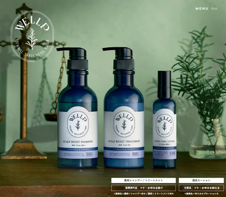
DESIGN REFERENCE
植物や薬瓶を思わせる商品写真、セージグリーンと塗り壁調の質感、楕円形の紋章が印象的なヘアケアブランドサイト。セリフ体の英字見出しと繊細な円形矢印で、自然と皮膚科学の世界観を表現しています。
オリジナルサイトを見るBotanical still lifes, pharmacy-like bottles, and oval seals against softly textured plaster.
Website: wellp-official.jp Original URL: https://wellp-official.jp/ Final URL: https://wellp-official.jp/ Theme: light textured surfaces, sage green, warm dark text, and restrained blue accents; photographic regions can be dark. Inspected: September 23, 2026, at 00:46 JST; the supplied retrieval timestamp is September 22, 2026, at 15:46 UTC. Viewports: 1440 × 1000 desktop and 390 × 844 mobile, in CSS pixels. Scope: the current brand homepage. Visual evidence covers the desktop product hero, desktop fragrance composition, desktop support/footer, mobile dry-shampoo hero, and mobile support/footer. Rendered DOM and computed styles additionally document concept copy, product entries, navigation, links, and selected transition declarations. Destination pages and an opened navigation menu were not inspected.
WELLP presents herbal scalp and hair care through the visual language of an apothecary: cobalt bottles, botanical specimens, antique scales, glassware, books, and warm wood. Photography occupies entire screens or generous rounded windows. Fine oval outlines and the botanical crest connect the interface to the product labels.
The homepage has the depth of a brand introduction and product catalog. Its sequence moves through a photographic opening, brand concept, care and fragrance narratives, product information, support links, and a compact footer. Product prices and purchase access are present, but the visible design gives greater emphasis to atmosphere, ingredients, and brand identity than to large filled sales buttons.
Botanical still lifes, pharmacy-like bottles, and oval seals against softly textured plaster.
Website: wellp-official.jp Original URL: https://wellp-official.jp/ Final URL: https://wellp-official.jp/ Theme: light textured surfaces, sage green, warm dark text, and restrained blue accents; photographic regions can be dark. Inspected: September 23, 2026, at 00:46 JST; the supplied retrieval timestamp is September 22, 2026, at 15:46 UTC. Viewports: 1440 × 1000 desktop and 390 × 844 mobile, in CSS pixels. Scope: the current brand homepage. Visual evidence covers the desktop product hero, desktop fragrance composition, desktop support/footer, mobile dry-shampoo hero, and mobile support/footer. Rendered DOM and computed styles additionally document concept copy, product entries, navigation, links, and selected transition declarations. Destination pages and an opened navigation menu were not inspected.
WELLP presents herbal scalp and hair care through the visual language of an apothecary: cobalt bottles, botanical specimens, antique scales, glassware, books, and warm wood. Photography occupies entire screens or generous rounded windows. Fine oval outlines and the botanical crest connect the interface to the product labels.
The homepage has the depth of a brand introduction and product catalog. Its sequence moves through a photographic opening, brand concept, care and fragrance narratives, product information, support links, and a compact footer. Product prices and purchase access are present, but the visible design gives greater emphasis to atmosphere, ingredients, and brand identity than to large filled sales buttons.
14.0005px are rounded to 14px for readability.--swiper-theme-color; a complete source token system was not provided.| Name | Value | Suggested token | Evidence and role |
|---|---|---|---|
| Warm ink | #231815 |
--color-ink |
Measured body text, headings, footer text, and standard links |
| Secondary ink | #4c4948 |
--color-muted |
Measured product-navigation text and fine annotations |
| Base gray | #e8e8e8 |
--color-base |
Measured body background; not the complete appearance of the textured page |
| White | #ffffff |
--color-white |
Measured reversed labels, hero menu, and selected indicators |
| Herbal cream | #dedeca |
--color-herbal |
Measured concept labels pairing herbal care with formulation |
| Care blue | #076286 |
--color-care |
Measured product-benefit text; visually also associated with the fragrance message |
| Inactive gray | #cccccc |
--color-dot |
Measured inactive mobile product-pagination dots |
| Sage plaster | Approximately #a4b49b |
--color-sage |
Estimated dominant fragrance-section background; its texture contains many shades |
| Pale plaster | Approximately #f1f1ec |
--color-paper |
Estimated visual base for the textured support surface and oval plaque |
| Bottle navy | Approximately #0b2a40 |
Reference only | Estimated photographic color; do not apply it indiscriminately to interface controls |
The photographs supply most of the color variation. Cobalt bottles, mint leaves, lavender flowers, citrus, wood, and brass do not form a set of interchangeable UI accent colors. The interface itself stays close to warm ink, white, muted sage, and a single blue for care-related emphasis.
The measured #e8e8e8 body background should not be used to describe the support section as a flat gray block. The capture shows a pale surface with irregular plaster relief. Likewise, the sage feature section gains much of its character from texture rather than a perfectly uniform fill.
--swiper-theme-color: #007aff appears in the supplied custom properties. It is not evidence that bright default blue is the visible brand accent: the sampled mobile product indicators are gray and white, and the measured benefit text is #076286.
Declared stack: "Yu Gothic Medium", "游ゴシック Medium", YuGothic, 游ゴシック体, sans-serif.
Use this family category for Japanese paragraphs, product names, benefit statements, prices, and annotations. Regular body copy is open and readable; bold Japanese statements carry the strongest verbal hierarchy. Desktop concept headlines reach 56px, while mobile versions reduce to 22px with deliberate two-line wrapping.
Declared stack: Charter, portada, "Yu Gothic Medium", "游ゴシック Medium", YuGothic, 游ゴシック体, sans-serif.
The source declares 300 for the large CONCEPT and PRODUCT headings, and 700 for SUPPORT and primary navigation entries. These serif headings connect the digital page to printed labels and botanical reference books. The evidence does not identify font-file URLs or prove which member of the stack supplied the visible glyphs.
Declared stack: Montserrat followed by the Japanese body stack.
MENU, Learn more, support-card English labels, footer links, and copyright use this stack. Tracking is deliberate: MENU is particularly spaced out, while footer labels are quieter.
The oval WELLP crest combines curved serif lettering, a botanical drawing, and fine parallel outlines. Preserve it as approved artwork. Neither the empty text of the sampled h1 nor its inherited body font identifies the logo's lettering face.
All values below are measured unless explicitly marked otherwise. Line heights are rounded.
| Role | Desktop size / line height | Mobile size / line height | Weight | Tracking |
|---|---|---|---|---|
| Body default | 14 / 28px |
14 / 24px |
400 |
0.04em |
| Concept paragraphs | 16 / 32px |
14 / 24px |
400 |
0.04em desktop; 0.02em mobile |
| CONCEPT / PRODUCT | 48 / 59px |
28 / 34px |
300 |
0.06em |
| Main Japanese concept statement | 56 / 80px |
22 / 36px |
700 |
0.02em |
| Herbal/formulation labels | 34 / 34px |
20 / 20px |
700 |
0.02em |
| Small Herbal / Scalp care labels | 13 / 16px |
10 / 12px |
700 |
0.09em desktop; 0.04em mobile |
| Navigation primary labels | 32 / 32px |
24 / 24px |
700 |
0.04em |
| MENU | 15 / 19px |
12 / 15px |
600 |
0.22em desktop; 0.15em mobile |
| Product name | 22 / 36px |
16 / 24px |
700 |
0.02em |
| Product benefit | 18 / 28px |
14 / 24px |
700 |
0.02em |
| Price paragraph | 15 / 18.46px |
12 / 14.73px |
700 |
0.04em desktop; 0.02em mobile |
| Major Learn more link | 18 / 21.38px |
14 / 16.63px |
500 |
0.03em |
| Product Learn more link | 16 / 19px |
14 / 16.63px |
500 |
0.03em |
| SUPPORT | 32 / 39.33px |
20 / 24.29px |
700 |
0.06em |
| Support-card English label | 15 / 19px |
12 / 15px |
700 |
0.04em desktop; 0.03em mobile |
| Support-card Japanese label | 24 / 24px |
18 / 18px |
700 |
0.04em desktop; 0.02em mobile |
| Footer links | 12 / 18px |
12 / 18px |
400 |
0.03em |
| Copyright | 10 / 15px |
10 / 15px |
400 |
0.03em |
| Detailed efficacy text | 10 / 16px |
10 / 16px |
400 |
Normal |
| Selected product qualifications | 6 / 10.8px |
6 / 10.8px |
400 |
0.02em |
The FRAGRANCE heading inside the oval appears approximately 54–56px in the desktop image. This is a screenshot estimate; its computed typography was not supplied.
The source root measures 10px on desktop and approximately 10px on mobile. This does not establish a responsive root formula. The Quick Start uses explicit pixel values and does not require changing a project's root size.
Overall rhythm: small, precise utility details inside very large photographic and narrative spaces. There is no evidence of a universal eight-pixel spacing system.
| Element | Desktop | Mobile | Status |
|---|---|---|---|
| Full document height | 13964.55px |
9970.89px |
Measured at the captured state |
| Hero section | 1440 × 1000px |
390 × 844px |
Measured |
| Main content width | 1100px, left edge 170px |
340px, left edge 25px |
Measured across major text/support regions |
| Large hero crest | 200 × 239px at (50, 50) |
170 × 203.14px at approximately (110, 60) |
Measured |
| Compact crest | 90 × 107px at (40, 30) |
70 × 83.22px at (10, 10) |
Measured |
| MENU button box | 143.03 × 79px |
95.08 × 55px |
Measured |
| Support card | 525 × 310px |
340 × 177px |
Measured |
| Support-card gap | 50px horizontally |
14px vertically |
Derived |
| SUPPORT heading to cards | 40px |
20px |
Derived |
| Cards to footer boundary | 200px |
100px |
Derived |
| Footer height | 137px |
189px |
Measured |
| Concept link box | 193.38 × 70px |
138.28 × 40px |
Measured |
| Product link box | 151.33 × 40px |
128.28 × 30px |
Measured |
The desktop content margin follows (1440 − 1100) / 2 = 170px. On the inspected phone, the equivalent content region uses explicit-looking 25px side margins. A reusable max-width: 1100px container with 25px minimum side clearance reproduces these two endpoints; the original interpolation and breakpoint remain unknown.
| Relationship | Desktop | Mobile | Evidence |
|---|---|---|---|
| Hero end to concept-section start | 200px |
120px |
Derived from section rectangles |
| Concept-section top padding | 260px |
100px |
Measured |
| Product-section top padding | 220px |
140px |
Measured |
| Product-section bottom padding | 106px |
140px |
Measured |
| Learn more text-to-circle gap | 15px |
14px |
Measured link gap |
These large intervals belong to the homepage's extended storytelling. Do not convert every document-coordinate gap into empty padding: some intervening visual regions and motion states are not represented by the supplied screenshots.
| Shape | Value or description | Evidence |
|---|---|---|
| Support image corners | 20px radius on both viewports |
Measured |
| Fragrance image corners | Approximately 20px |
Estimated |
| Main feature plaque | Approximately 432 × 538px, tall capsule/oval |
Estimated from the desktop capture |
| Plaque outlines | Two fine dark lines, roughly 10px apart |
Estimated |
| Major arrow circle | Approximately 70px desktop, 40px mobile |
Link-height measurement plus visible geometry |
| Product arrow circle | Approximately 40px desktop, 30px mobile |
Link-height measurement plus visible geometry |
| Hero markers | 7 × 9px, radius 4px |
Measured |
| Hero marker pitch | 16px vertically |
Derived |
| Mobile product markers | 8 × 8px; selected marker 11.2 × 11.2px |
Measured |
| Footer separator | Fine horizontal rule, approximately 1px |
Estimated |
Round the photographic windows, retain the distinctive oval seals, and keep ordinary text links unboxed. A pill-button system would give this page a different character.
The visible header is an overlay of identity and navigation controls, not a full-width navigation bar. Its sampled header element has zero layout height, while its children occupy independent positions.
The hero uses a large white crest: upper left on desktop and centered near the top on mobile. Later screenshots show a smaller dark crest on a pale oval at the upper left. MENU stays at the upper right, with two fine horizontal strokes. It appears white on the opening imagery and dark over the lighter later sections.
The desktop menu button includes 30px top/bottom padding and 80px right padding; mobile reduces these to 20px and 48px. Its line symbol appears approximately 30px wide on desktop and 20px on mobile. The persistent placement is visually supported; exact source positioning and state triggers were not included.
The tinted strip above the support section is visible preceding content behind the controls. It should not automatically be rebuilt as a permanent opaque header background.
The rendered DOM includes HOME, CONCEPT, SHOP LIST, FAQ, PRODUCT, four product-detail links, a special-selection image link, social links, and corporate utility links.
Primary labels use bold serif typography. Product sublinks use smaller bold Japanese sans-serif text in secondary ink. Measured desktop primary-label positions begin around x: 885px; mobile positions begin at x: 25px. These measurements document the navigation subtree, but no opened-menu screenshot verifies its complete composition, background, entrance, or focus behavior.
Use the inventory and hierarchy when designing navigation. Do not treat the DOM coordinates as proof of a tested open-menu state.
Anatomy: edge-to-edge photograph, large brand crest, upper-right MENU, three small vertical indicators, and product-information links near the lower edge.
The desktop capture shows two large cobalt pump bottles and a smaller lotion bottle on a wooden worktop. An antique balance occupies the left; rosemary in glass balances the right. The bottles sit prominently below the middle of the frame, leaving textured green wall space above.
Product labels at the lower right use narrow white title strips, outlined qualification strips, and very small sale-name text. Two adjacent groups distinguish shampoo/treatment from scalp lotion. These are compact informational overlays rather than large filled conversion buttons.
The mobile capture shows a different hero slide: dry shampoo with mint against a blue background. The crest sits around 60px from the top; the bottle begins in the lower half and continues below the visible crop. The bottom title strip spans approximately 370px with 10px side clearance.
The hero section itself measures 844px high on mobile, while sampled slide-link rectangles extend to approximately 992px. Preserve the observed viewport composition without assuming the complete image is visible. The different captured products establish different slide states, not a rule that mobile must always show dry shampoo.
The DOM documents a serif CONCEPT label, a compact herbal/formulation pairing, a prominent Japanese statement, explanatory copy, a brand descriptor, and a Learn more link.
The main statement reads “頭皮トラブルに悩む人々の心身の美に寄り添う。” Desktop uses 56px / 80px bold type across two lines; mobile uses 22px / 36px. Supporting paragraphs reduce from 16px / 32px to 14px / 24px.
The concept link is centered in the measured desktop layout and right-aligned to the mobile content edge. The content establishes a strong editorial hierarchy even though a complete screenshot of this introduction was not supplied. Its exact image placement and all background transitions remain unverified.
This is the most distinctive visible interior composition. A sage plaster field supports three rounded photographs and a large central white oval. Thin light vertical rules frame the outer edges of the scene.
Approximate screenshot-relative desktop positions are:
| Layer | Position and size | Role |
|---|---|---|
| Left botanical photograph | (140, 8), approximately 480 × 669px |
Tall image of herbs, flowers, and citrus |
| Upper-right product photograph | (860, 14), approximately 440 × 294px |
Product family beside botanical specimens |
| Lower-right detail photograph | (950, 357), approximately 300 × 300px |
Red botanical details, a dish, and translucent liquid |
| Central plaque | (504, 73), approximately 432 × 538px |
Main message and visual bridge between photographs |
The plaque overlaps the imagery. It has a pale textured surface, two dark outlines, an uppercase serif FRAGRANCE heading, a smaller bold Japanese introductory line, and a two-line blue benefit statement. Its proportions echo the product-label crest without repeating the entire logo.
A large Learn more link sits toward the lower right, separated from the collage by substantial open space. A small photographic qualification appears near the right edge. Three dark vertical markers are visible beside this scene; their relationship to scroll position or feature selection was not tested.
SCALP CARE and HAIR CARE also appear in the DOM alongside FRAGRANCE. Only the fragrance composition is visually documented, so do not invent the other scenes' photographs or transitions.
Four unique products are documented: moist shampoo/treatment, scalp lotion, smooth shampoo/treatment, and dry shampoo.
Each entry combines a product name, blue benefit copy, qualifications, a price/size line, classification and sale-name details, and a Learn more link. Shampoo/treatment entries also include an efficacy block divided into shampoo and treatment text.
Desktop measurements establish two columns and two rows. The first row's information blocks begin at x: 221px and x: 796px, with typical text widths of 423px. The second row begins approximately 1044px lower. Exact product-image bounds and surface construction are not available in the selected captures.
Mobile uses a horizontal carousel arrangement. Repeated product nodes share the same vertical positions while their horizontal coordinates advance by approximately 365px. The currently in-range lotion text spans approximately 286px from x: 52px. Four pagination buttons distinguish the four unique products. Repeated offscreen nodes should not be interpreted as additional products or stacked mobile content.
The recorded prices are ¥1,540 for the shampoo/treatment and lotion entries and ¥1,320 for dry shampoo. These are content observations at capture time, not enduring design tokens.
The recurring action consists of a Montserrat text label and a thin outlined circle containing a simple right arrow. There is no surrounding filled button body.
Major concept links use an approximately 70px circle on desktop. Product links use approximately 40px; mobile versions reduce to approximately 40px and 30px, respectively. The text-to-circle gap remains close to 14–15px.
On support cards, this treatment reverses to white and sits at the bottom right. The entire card is an anchor, so the visible Learn more treatment should remain a noninteractive child inside that link rather than a nested anchor.
The desktop fragrance capture includes a rectangular banner anchored at the lower-left edge. A product photograph occupies its left portion; the pale right portion contains “楽天でのご購入はこちら”, a small circular arrow, and a close symbol.
The measured desktop link is 332 × 130px; the mobile DOM contains a 260 × 101.8px equivalent. The destination is a Rakuten search URL. The desktop close-button rectangle is 15 × 15px; the mobile rectangle is only 10 × 15px.
The banner is absent from other supplied visual states despite being present in the DOM evidence. Its visibility conditions, dismissal result, and persistence were not tested. A new implementation should provide a larger close hit area without enlarging the drawn cross unnecessarily.
A centered serif SUPPORT heading introduces two image links: SHOP LIST / “お取り扱い店舗” and FAQ / “よくあるご質問”.
Each card has a 20px radius, a darkened botanical still life, a centered two-line label group, and a bottom-right Learn more treatment. The shop image shows the blue products on a desk; the FAQ image shows glassware, herbs, books, and a mortar. The photographs remain legible beneath the white text.
Desktop cards are 525 × 310px with a 50px gap. Mobile cards become 340 × 177px, stacked with a 14px gap. This changes the visible image ratio from approximately 1.69:1 to 1.92:1; the mobile cards are wider relative to their height, not simply uniformly scaled desktop cards.
The English-to-Japanese label separation is approximately 11px on desktop and 7px on mobile, derived from the measured text rectangles. Keep the Japanese destination label dominant.
The footer continues the pale plaster surface and introduces a fine horizontal separator.
Desktop uses a single horizontal arrangement within the 1100px content width: copyright at left, social/home symbols centered, and Contact, Company, and Privacy Policy at right. The three utility links have approximately 30px gaps.
Mobile reorganizes the footer into centered rows: symbols first, utility links second, copyright last. The footer grows from 137px to 189px high. The social link boxes are approximately 42 × 40px on desktop and 46 × 40px on mobile, with the third home link slightly narrower.
The visible symbols include Instagram, X, and a chain-like mark whose recorded destination is the homepage. Do not infer another social platform from that third icon. “© 2024 WELLP” is the observed footer text, not the inspection date.
The recurring measured easing is cubic-bezier(0.25, 0.46, 0.45, 0.94).
| Target | Recorded transition | What the evidence establishes |
|---|---|---|
| Compact brand link | Visibility and opacity, 0.6s |
A fade-related state transition is declared |
| Large hero crest | Visibility and opacity, 0.6s, delayed 0.3s |
A delayed crest transition is declared |
| MENU | Color, 0.6s |
Supports the observed light/dark color treatment |
| Hero markers | Background, 0.6s |
Selected-state fill can transition |
| Product navigation and footer links | Background size, 0.6s |
A background-based link effect is declared; endpoints are unavailable |
| Social links | Opacity, 0.6s |
An opacity interaction is declared; triggering state is unverified |
| Purchase banner and close control | 0.3s shorthand |
Duration is recorded; precise visual change was not captured |
| Mobile concept/product headings | Mask position, 1.2s |
A masked reveal treatment is declared |
| Mobile product markers | Transform, 0.2s linear |
A scale transition is declared; selected marker measures 1.4× the base diameter |
The captures show different hero states and a mobile product-carousel layout. They do not establish autoplay intervals, slide-transition duration, drag thresholds, scroll pinning, or animation choreography. No click, swipe, menu-opening, or banner-dismissal result is supplied.
Most sampled elements report animation: none. This does not prove that the page is motionless: transitions, descendants, pseudo-elements, and JavaScript can still animate.
For an adaptation, use the measured easing for subtle opacity and color changes. Implement any new image zoom or arrow movement as a deliberate addition, not as a recovered behavior of this site.
| Surface | Visible treatment | Implementation implication |
|---|---|---|
| Opening hero | Full-bleed photographic scene | Let art direction establish the atmosphere; avoid additional generic gradient panels |
| Fragrance canvas | Sage plaster with fine side rules | Use a restrained texture over a muted color base |
| Central plaque | Pale textured oval, double dark outline | Separate the message through shape and contrast |
| Support region | Light plaster across the full width | Continue texture behind the cards and footer |
| Support cards | Dark photographic windows with white labels | Crop imagery carefully and verify text contrast |
| Purchase banner | Rectangular photograph plus pale information panel | Keep it visually secondary to the narrative |
| Footer | Continuous pale surface with one fine divider | Use spacing and alignment rather than a separate heavy block |
There is no visible general-purpose elevation system. Depth comes from photography, overlapping images, and the central plaque. The supplied evidence does not establish whether card darkening is baked into the images or applied as an overlay.
Use composed botanical still lifes with directional light, tactile surfaces, and objects associated with formulation: blue or green bottles, herb sprigs, specimen tubes, clear glass, old balances, books, and ceramic tools. The photography balances precision with natural irregularity.
The desktop hero has a broad landscape composition. The mobile dry-shampoo scene is a portrait composition with generous blue negative space above the product. Use responsive art direction or independently approved crops; stretching one landscape image across both formats will not reproduce the observed result.
The fragrance collage deliberately combines three scales: close botanical detail, an arranged product family, and a small material study. Preserve this contrast of scale instead of filling every image window with similar product packshots.
Textures should remain fine enough to support the typography. The page reads as plaster and paper, not heavy grunge. Brass and wood belong primarily to the photography; avoid turning them into glossy interface gradients.
Actual image URLs, SVG paths, and font-file URLs were not included in the supplied evidence. The following describes visible assets rather than inventing source filenames.
| Asset | Evidence | Use |
|---|---|---|
| Large white botanical crest | Desktop and mobile hero captures | Primary opening identity |
| Compact dark crest on pale oval | Desktop fragrance/support and mobile support captures | Persistent identity after the opening |
| Cobalt product still life | Desktop hero capture | Moist shampoo/treatment and lotion presentation |
| Mint and dry-shampoo portrait | Mobile hero capture | Alternate product slide |
| Three-image botanical collage | Desktop fragrance capture | Fragrance narrative |
| Product desk photograph | Desktop and mobile support captures | Shop-list destination card |
| Herbal workbench photograph | Desktop and mobile support captures | FAQ destination card |
| Pale and sage textures | Fragrance and support captures | Tactile background treatment |
Use approved originals when available. CSS can reproduce the geometry, but the photography and crest carry much of the identity.
| Region | Desktop behavior | Mobile behavior |
|---|---|---|
| Opening crest | Large, upper left | Slightly smaller, centered near the top |
| Compact crest | 90px wide, 40px left inset |
70px wide, 10px left inset |
| Main content | 1100px centered width |
340px width with 25px margins |
| Concept headline | 56px, wide two-line statement |
22px, compact two-line statement |
| Concept action | Centered first action | Right-aligned to the content edge |
| Products | Two columns over two rows | Horizontal arrangement with four pagination markers |
| Support | Two cards side by side | Two cards stacked |
| Footer | Three horizontally aligned groups | Three centered rows |
The product section changes structure rather than simply collapsing into a long list. Its measured height reduces from 2473px to approximately 1140px, and repeated offscreen product nodes indicate a carousel implementation. The desktop and mobile product text sequences should therefore not be compared as ordinary document reading order.
The mobile hero preserves the scene's atmosphere by allocating considerable space above the product. Avoid moving all text and imagery upward just to fit more content into the first screen.
No intermediate tablet viewport or source media query was supplied. A breakpoint around 800px is a practical recommendation for the starter implementation, not a measured source breakpoint. Mobile fragrance-collage geometry is also unverified; the Quick Start provides a readable stacked alternative instead of claiming an exact reconstruction.
#231815 and care blue #076286 consistent.6px qualifications as an accessibility recommendation.These are recommendations for a new implementation, not verified features of the original page.
11–12px, while preserving their lower visual priority.aria-expanded, and aria-controls; manage focus and Escape behavior if it opens a dialog-like overlay.#231815.#4c4948.#e8e8e8.#f1f1ec.#a4b49b.#076286.#dedeca.“Create a Japanese herbal hair-care brand homepage inspired by the observed WELLP visual system. Use a full-screen botanical product photograph, an oval botanical crest, a small upper-right MENU control, sage and pale plaster textures, warm ink #231815, and care blue #076286. Pair editorial serif English headings with Japanese sans-serif body copy. Build a spacious concept narrative, an overlapping fragrance collage around a double-outline oval plaque, a product collection, and two dark photographic support cards. Use understated Learn more labels followed by outlined arrow circles. At 390px, center the opening crest, retain 25px content margins, arrange products horizontally, stack support cards, and center the footer groups. Supply approved photography and logo assets separately.”
This is a reusable adaptation, not recovered source CSS. Exact measured colors and endpoint dimensions are retained where available. Texture colors, the 800px breakpoint, overlay opacity, and narrow-screen collage layout are recommendations. No original image paths or font downloads are assumed.
Expected structure: .wellp-hero contains a .hero-media image or picture and .hero-crest artwork; each .support-card is an anchor containing an image, .support-copy, and a noninteractive .learn-more label. An .arrow-circle sits inside each action label. .product-track contains four unique .product-card articles. The footer has copyright, social, and legal groups.
The header attributes data-tone and data-compact below are adaptation hooks. Update them from your actual section-visibility logic. The starter does not implement the original menu, autoplay, or reveal choreography.
:root {
  /* Measured colors */
  --color-ink: #231815;
  --color-muted: #4c4948;
  --color-base: #e8e8e8;
  --color-white: #ffffff;
  --color-herbal: #dedeca;
  --color-care: #076286;
  --color-dot: #cccccc;

  /* Estimated texture bases */
  --color-paper: #f1f1ec;
  --color-sage: #a4b49b;
  --texture-paper: none;
  --texture-sage: none;

  /* Declared family names; serif fallback is an adaptation */
  --font-body: 'Yu Gothic Medium', YuGothic, sans-serif;
  --font-editorial: Charter, portada, serif;
  --font-utility: Montserrat, 'Yu Gothic Medium', YuGothic, sans-serif;

  /* Measured desktop endpoints */
  --content-width: 1100px;
  --page-gutter: 25px;
  --radius-photo: 20px;
  --support-gap: 50px;
  --arrow-size: 40px;
  --arrow-large: 70px;
  --action-gap: 15px;

  /* Measured transition vocabulary */
  --ease-brand: cubic-bezier(0.25, 0.46, 0.45, 0.94);
  --duration-brand: 600ms;
  --duration-reveal: 1200ms;
}

* {
  box-sizing: border-box;
}

body {
  margin: 0;
  color: var(--color-ink);
  background: var(--color-base);
  font-family: var(--font-body);
  font-size: 14px;
  line-height: 2;
  letter-spacing: 0.04em;
}

button,
input {
  font: inherit;
}

img {
  display: block;
  max-width: 100%;
}

.wellp-container {
  width: min(var(--content-width), calc(100% - 50px));
  margin-inline: auto;
}

.paper-surface {
  background-color: var(--color-paper);
  background-image: var(--texture-paper);
}

.sage-surface {
  background-color: var(--color-sage);
  background-image: var(--texture-sage);
}

/* Recommended persistent overlay implementation */
.wellp-header {
  position: fixed;
  inset: 0 0 auto;
  z-index: 30;
  color: var(--color-white);
  pointer-events: none;
}

.wellp-header[data-tone='ink'] {
  color: var(--color-ink);
}

.wellp-header a,
.wellp-header button {
  pointer-events: auto;
}

.compact-crest {
  position: absolute;
  top: 30px;
  left: 40px;
  width: 90px;
  visibility: hidden;
  opacity: 0;
  transition:
    opacity var(--duration-brand) var(--ease-brand),
    visibility var(--duration-brand) var(--ease-brand);
}

.wellp-header[data-compact='true'] .compact-crest {
  visibility: visible;
  opacity: 1;
}

.menu-trigger {
  position: absolute;
  top: 0;
  right: 0;
  display: flex;
  align-items: center;
  padding: 30px 80px 30px 0;
  border: 0;
  background: transparent;
  color: inherit;
  font: 600 15px / 19px var(--font-utility);
  letter-spacing: 0.22em;
  cursor: pointer;
  transition: color var(--duration-brand) var(--ease-brand);
}

.menu-lines {
  position: absolute;
  right: 40px;
  width: 30px;
  height: 6px;
  border-block: 1px solid currentColor;
}

.wellp-hero {
  position: relative;
  height: 100vh;
  height: 100svh;
  overflow: hidden;
}

.hero-media,
.hero-media img {
  width: 100%;
  height: 100%;
  object-fit: cover;
  object-position: var(--hero-position, 50% 50%);
}

.hero-media {
  position: absolute;
  inset: 0;
}

.hero-crest {
  position: absolute;
  top: 50px;
  left: 50px;
  width: 200px;
}

.section-title {
  margin: 0;
  font: 300 48px / 1.2292 var(--font-editorial);
  letter-spacing: 0.06em;
}

.concept-statement {
  margin: 0;
  font-size: 56px;
  font-weight: 700;
  line-height: 1.4286;
  letter-spacing: 0.02em;
}

.concept-copy {
  font-size: 16px;
  line-height: 2;
}

.learn-more {
  display: inline-flex;
  align-items: center;
  gap: var(--action-gap);
  color: inherit;
  font: 500 16px / 1.1875 var(--font-utility);
  letter-spacing: 0.03em;
  text-decoration: none;
}

.arrow-circle {
  display: grid;
  flex: 0 0 var(--arrow-size);
  place-items: center;
  width: var(--arrow-size);
  height: var(--arrow-size);
  border: 1px solid currentColor;
  border-radius: 50%;
  line-height: 1;
}

.learn-more--large {
  --arrow-size: var(--arrow-large);
  font-size: 18px;
}

/* Approximation of the captured desktop collage */
.feature-collage {
  position: relative;
  width: min(1200px, calc(100% - 50px));
  height: 700px;
  margin-inline: auto;
}

.feature-photo {
  position: absolute;
  object-fit: cover;
  border-radius: var(--radius-photo);
}

.feature-photo--botanical {
  top: 8px;
  left: 20px;
  width: 40%;
  height: 669px;
}

.feature-photo--products {
  top: 14px;
  right: 20px;
  width: 36.6667%;
  height: 294px;
}

.feature-photo--detail {
  top: 357px;
  right: 70px;
  width: 25%;
  height: 300px;
}

.feature-plaque {
  position: absolute;
  z-index: 2;
  top: 73px;
  left: 50%;
  display: grid;
  align-content: center;
  width: 432px;
  min-height: 538px;
  padding: 54px 28px;
  transform: translateX(-50%);
  border: 1px solid var(--color-ink);
  border-radius: 999px;
  background-color: var(--color-paper);
  background-image: var(--texture-paper);
  text-align: center;
}

.feature-plaque::before {
  position: absolute;
  inset: 10px;
  border: 1px solid var(--color-ink);
  border-radius: inherit;
  content: '';
  pointer-events: none;
}

.feature-plaque h3 {
  margin: 0 0 24px;
  font: 400 56px / 1.15 var(--font-editorial);
}

.feature-plaque p {
  margin: 0;
  font-size: 18px;
  font-weight: 700;
}

.feature-plaque .feature-benefit {
  margin-top: 8px;
  color: var(--color-care);
  font-size: 24px;
  line-height: 1.45;
}

.product-track {
  display: grid;
  grid-template-columns: repeat(2, minmax(0, 1fr));
  gap: 80px 50px;
  width: min(1100px, calc(100% - 50px));
  margin-inline: auto;
}

.product-card {
  min-width: 0;
  padding-inline: 51px;
}

.product-name {
  font-size: 22px;
  line-height: 36px;
  letter-spacing: 0.02em;
}

.product-benefit {
  color: var(--color-care);
  font-size: 18px;
  font-weight: 700;
  line-height: 28px;
  letter-spacing: 0.02em;
}

.product-price {
  font-size: 15px;
  font-weight: 700;
}

/* Recommended readable replacement for the observed 6px notes */
.product-note {
  color: var(--color-muted);
  font-size: 12px;
  line-height: 1.6;
  letter-spacing: 0.02em;
}

.support-title {
  margin: 0 0 40px;
  font: 700 32px / 1.2292 var(--font-editorial);
  letter-spacing: 0.06em;
  text-align: center;
}

.support-grid {
  display: grid;
  grid-template-columns: repeat(2, minmax(0, 1fr));
  gap: var(--support-gap);
}

.support-card {
  position: relative;
  display: grid;
  place-items: center;
  height: 310px;
  overflow: hidden;
  border-radius: var(--radius-photo);
  color: var(--color-white);
  text-decoration: none;
  isolation: isolate;
}

.support-card > img,
.support-card::before {
  position: absolute;
  inset: 0;
  width: 100%;
  height: 100%;
}

.support-card > img {
  z-index: -2;
  object-fit: cover;
}

/* Recommended overlay; adjust to the supplied photograph */
.support-card::before {
  z-index: -1;
  background: rgb(0 0 0 / 35%);
  content: '';
}

.support-copy {
  text-align: center;
}

.support-copy p {
  margin: 0;
}

.support-kicker {
  font: 700 15px / 19px var(--font-utility);
  letter-spacing: 0.04em;
}

.support-label {
  margin-top: 11px !important;
  font-size: 24px;
  font-weight: 700;
  line-height: 1;
}

.support-card .learn-more {
  position: absolute;
  right: 15px;
  bottom: 15px;
}

.wellp-footer {
  margin-top: 200px;
  border-top: 1px solid rgb(35 24 21 / 15%);
}

.footer-inner {
  display: grid;
  grid-template-columns: 1fr auto 1fr;
  align-items: center;
  min-height: 137px;
}

.footer-copyright {
  margin: 0;
  font: 400 10px / 15px var(--font-utility);
  letter-spacing: 0.03em;
}

.footer-social,
.footer-legal {
  display: flex;
  align-items: center;
}

.footer-social a {
  display: grid;
  place-items: center;
  min-width: 42px;
  min-height: 40px;
}

.footer-legal {
  justify-self: end;
  gap: 30px;
  font: 400 12px / 18px var(--font-utility);
  letter-spacing: 0.03em;
}

.wellp-footer a {
  color: inherit;
  text-decoration: none;
}

/* Recommended focus treatment */
a:focus-visible,
button:focus-visible {
  outline: 2px solid currentColor;
  outline-offset: 5px;
}

/* Recommended breakpoint; only endpoint viewports were inspected */
@media (max-width: 800px) {
  :root {
    --support-gap: 14px;
    --arrow-size: 30px;
    --arrow-large: 40px;
    --action-gap: 14px;
  }

  body {
    line-height: 24px;
  }

  .compact-crest {
    top: 10px;
    left: 10px;
    width: 70px;
  }

  .menu-trigger {
    padding: 20px 48px 20px 0;
    font-size: 12px;
    line-height: 15px;
    letter-spacing: 0.15em;
  }

  .menu-lines {
    right: 20px;
    width: 20px;
  }

  .hero-crest {
    top: 60px;
    left: 50%;
    width: 170px;
    transform: translateX(-50%);
  }

  .section-title {
    font-size: 28px;
    line-height: 34px;
  }

  .concept-statement {
    font-size: 22px;
    line-height: 36px;
  }

  .concept-copy {
    font-size: 14px;
    line-height: 24px;
    letter-spacing: 0.02em;
  }

  .learn-more,
  .learn-more--large {
    font-size: 14px;
  }

  /* Recommended mobile collage fallback, not an observed layout */
  .feature-collage {
    display: grid;
    grid-template-columns: repeat(2, minmax(0, 1fr));
    gap: 14px;
    height: auto;
  }

  .feature-photo,
  .feature-plaque {
    position: relative;
    inset: auto;
    width: 100%;
    height: auto;
    transform: none;
  }

  .feature-plaque {
    grid-column: 1 / -1;
    grid-row: 1;
    width: min(100%, 320px);
    min-height: 390px;
    margin-inline: auto;
  }

  .feature-plaque h3 {
    font-size: 36px;
  }

  .feature-plaque .feature-benefit {
    font-size: 20px;
  }

  .feature-photo--botanical {
    grid-row: span 2;
    height: 100%;
  }

  .feature-photo--products,
  .feature-photo--detail {
    aspect-ratio: 1;
  }

  /* Native scrolling is an adaptation, not recovered carousel code */
  .product-track {
    grid-template-columns: none;
    grid-auto-flow: column;
    grid-auto-columns: calc(100vw - 50px);
    gap: 25px;
    width: 100%;
    padding-inline: 25px;
    overflow-x: auto;
    scroll-snap-type: x mandatory;
    scroll-padding-inline: 25px;
  }

  .product-card {
    padding-inline: 27px;
    scroll-snap-align: center;
  }

  .product-name {
    font-size: 16px;
    line-height: 24px;
  }

  .product-benefit {
    font-size: 14px;
    line-height: 24px;
  }

  .product-price {
    font-size: 12px;
  }

  .support-title {
    margin-bottom: 20px;
    font-size: 20px;
    line-height: 24.29px;
  }

  .support-grid {
    grid-template-columns: 1fr;
  }

  .support-card {
    height: 177px;
  }

  .support-kicker {
    font-size: 12px;
    line-height: 15px;
    letter-spacing: 0.03em;
  }

  .support-label {
    margin-top: 7px !important;
    font-size: 18px;
    letter-spacing: 0.02em;
  }

  .support-card .learn-more {
    right: 10px;
    bottom: 10px;
  }

  .wellp-footer {
    margin-top: 100px;
  }

  .footer-inner {
    grid-template-columns: 1fr;
    justify-items: center;
    gap: 10px;
    min-height: 189px;
    padding-block: 39px;
  }

  .footer-social {
    grid-row: 1;
  }

  .footer-social a {
    min-width: 46px;
  }

  .footer-legal {
    grid-row: 2;
    justify-self: center;
  }

  .footer-copyright {
    grid-row: 3;
    margin-top: 18px;
  }
}

@media (prefers-reduced-motion: reduce) {
  .compact-crest,
  .menu-trigger {
    transition: none;
  }

  .product-track {
    scroll-behavior: auto;
  }

  /* Keep enhanced headings readable without reveal animation */
  .reveal-heading {
    animation: none;
    transition: none;
    mask-image: none;
    -webkit-mask-image: none;
  }
}
Set the texture custom properties to approved image resources when available. Until then, the CSS renders flat approximate surfaces. Supply separate responsive hero assets through a picture element; tune --hero-position per asset rather than assuming one crop fits every slide.
Optional aliases for a project already using Tailwind v4. These do not indicate the technology used by the original website. The pale and sage values remain visual estimates.
@theme {
  --color-ink: #231815;
  --color-muted: #4c4948;
  --color-base: #e8e8e8;
  --color-paper: #f1f1ec;
  --color-sage: #a4b49b;
  --color-care: #076286;
  --color-herbal: #dedeca;

  --font-editorial: Charter, portada, serif;
  --font-body: 'Yu Gothic Medium', YuGothic, sans-serif;
  --font-utility: Montserrat, 'Yu Gothic Medium', YuGothic, sans-serif;

  --radius-photo: 20px;
  --spacing-page-gutter: 25px;
  --spacing-content: 1100px;
  --ease-brand: cubic-bezier(0.25, 0.46, 0.45, 0.94);
}
200.2026-09-22T15:46:30.873Z, equivalent to September 23, 2026, at 00:46:30.873 JST.1440 × 1000: product hero, fragrance scene, and support/footer. Current mobile captures at 390 × 844: dry-shampoo hero and support/footer.This reference describes the supplied current homepage evidence. The starter CSS and accessibility additions are practical adaptations, with estimates and unverified behavior identified explicitly.
# WELLP — Style Reference

> Botanical still lifes, pharmacy-like bottles, and oval seals against softly textured plaster.

**Website:** [wellp-official.jp](https://wellp-official.jp/)
**Original URL:** https://wellp-official.jp/
**Final URL:** https://wellp-official.jp/
**Theme:** light textured surfaces, sage green, warm dark text, and restrained blue accents; photographic regions can be dark.
**Inspected:** September 23, 2026, at 00:46 JST; the supplied retrieval timestamp is September 22, 2026, at 15:46 UTC.
**Viewports:** 1440 × 1000 desktop and 390 × 844 mobile, in CSS pixels.
**Scope:** the current brand homepage. Visual evidence covers the desktop product hero, desktop fragrance composition, desktop support/footer, mobile dry-shampoo hero, and mobile support/footer. Rendered DOM and computed styles additionally document concept copy, product entries, navigation, links, and selected transition declarations. Destination pages and an opened navigation menu were not inspected.

WELLP presents herbal scalp and hair care through the visual language of an apothecary: cobalt bottles, botanical specimens, antique scales, glassware, books, and warm wood. Photography occupies entire screens or generous rounded windows. Fine oval outlines and the botanical crest connect the interface to the product labels.

The homepage has the depth of a brand introduction and product catalog. Its sequence moves through a photographic opening, brand concept, care and fragrance narratives, product information, support links, and a compact footer. Product prices and purchase access are present, but the visible design gives greater emphasis to atmosphere, ingredients, and brand identity than to large filled sales buttons.
# WELLP — Style Reference

> Botanical still lifes, pharmacy-like bottles, and oval seals against softly textured plaster.

**Website:** [wellp-official.jp](https://wellp-official.jp/)
**Original URL:** https://wellp-official.jp/
**Final URL:** https://wellp-official.jp/
**Theme:** light textured surfaces, sage green, warm dark text, and restrained blue accents; photographic regions can be dark.
**Inspected:** September 23, 2026, at 00:46 JST; the supplied retrieval timestamp is September 22, 2026, at 15:46 UTC.
**Viewports:** 1440 × 1000 desktop and 390 × 844 mobile, in CSS pixels.
**Scope:** the current brand homepage. Visual evidence covers the desktop product hero, desktop fragrance composition, desktop support/footer, mobile dry-shampoo hero, and mobile support/footer. Rendered DOM and computed styles additionally document concept copy, product entries, navigation, links, and selected transition declarations. Destination pages and an opened navigation menu were not inspected.

WELLP presents herbal scalp and hair care through the visual language of an apothecary: cobalt bottles, botanical specimens, antique scales, glassware, books, and warm wood. Photography occupies entire screens or generous rounded windows. Fine oval outlines and the botanical crest connect the interface to the product labels.

The homepage has the depth of a brand introduction and product catalog. Its sequence moves through a photographic opening, brand concept, care and fragrance narratives, product information, support links, and a compact footer. Product prices and purchase access are present, but the visible design gives greater emphasis to atmosphere, ingredients, and brand identity than to large filled sales buttons.

## How to Read This Reference

- **Measured** means a value appears in the supplied rendered DOM or computed-style evidence. Mobile values such as `14.0005px` are rounded to `14px` for readability.
- **Derived** means a value is calculated from measured rectangles, such as the gap between two cards.
- **Estimated** means a visual approximation from the five current-page captures. Estimated colors are not pixel samples or verified stylesheet values.
- **Recommended** means guidance for a new implementation. Breakpoints, accessibility improvements, and the starter CSS are explicitly adaptations.
- Token names are descriptive aliases. The only supplied source custom property is `--swiper-theme-color`; a complete source token system was not provided.
- Computed font-family lists establish declared stacks, not which font file rendered each glyph. Logo lettering remains artwork.
- DOM entries can belong to hidden navigation or offscreen carousel copies. A nonzero rectangle does not establish that an element was visible in the screenshot.

## Tokens — Colors

### Default Palette

| Name | Value | Suggested token | Evidence and role |
| --- | --- | --- | --- |
| Warm ink | `#231815` | `--color-ink` | Measured body text, headings, footer text, and standard links |
| Secondary ink | `#4c4948` | `--color-muted` | Measured product-navigation text and fine annotations |
| Base gray | `#e8e8e8` | `--color-base` | Measured body background; not the complete appearance of the textured page |
| White | `#ffffff` | `--color-white` | Measured reversed labels, hero menu, and selected indicators |
| Herbal cream | `#dedeca` | `--color-herbal` | Measured concept labels pairing herbal care with formulation |
| Care blue | `#076286` | `--color-care` | Measured product-benefit text; visually also associated with the fragrance message |
| Inactive gray | `#cccccc` | `--color-dot` | Measured inactive mobile product-pagination dots |
| Sage plaster | Approximately `#a4b49b` | `--color-sage` | Estimated dominant fragrance-section background; its texture contains many shades |
| Pale plaster | Approximately `#f1f1ec` | `--color-paper` | Estimated visual base for the textured support surface and oval plaque |
| Bottle navy | Approximately `#0b2a40` | Reference only | Estimated photographic color; do not apply it indiscriminately to interface controls |

### Color Behavior

The photographs supply most of the color variation. Cobalt bottles, mint leaves, lavender flowers, citrus, wood, and brass do not form a set of interchangeable UI accent colors. The interface itself stays close to warm ink, white, muted sage, and a single blue for care-related emphasis.

The measured `#e8e8e8` body background should not be used to describe the support section as a flat gray block. The capture shows a pale surface with irregular plaster relief. Likewise, the sage feature section gains much of its character from texture rather than a perfectly uniform fill.

`--swiper-theme-color: #007aff` appears in the supplied custom properties. It is not evidence that bright default blue is the visible brand accent: the sampled mobile product indicators are gray and white, and the measured benefit text is `#076286`.

## Tokens — Typography

### Japanese Body and Product Copy

**Declared stack:** `"Yu Gothic Medium", "游ゴシック Medium", YuGothic, 游ゴシック体, sans-serif`.

Use this family category for Japanese paragraphs, product names, benefit statements, prices, and annotations. Regular body copy is open and readable; bold Japanese statements carry the strongest verbal hierarchy. Desktop concept headlines reach `56px`, while mobile versions reduce to `22px` with deliberate two-line wrapping.

### Editorial English Headings

**Declared stack:** `Charter, portada, "Yu Gothic Medium", "游ゴシック Medium", YuGothic, 游ゴシック体, sans-serif`.

The source declares `300` for the large CONCEPT and PRODUCT headings, and `700` for SUPPORT and primary navigation entries. These serif headings connect the digital page to printed labels and botanical reference books. The evidence does not identify font-file URLs or prove which member of the stack supplied the visible glyphs.

### Utility English

**Declared stack:** `Montserrat` followed by the Japanese body stack.

MENU, Learn more, support-card English labels, footer links, and copyright use this stack. Tracking is deliberate: MENU is particularly spaced out, while footer labels are quieter.

### Brand Artwork

The oval WELLP crest combines curved serif lettering, a botanical drawing, and fine parallel outlines. Preserve it as approved artwork. Neither the empty text of the sampled `h1` nor its inherited body font identifies the logo's lettering face.

### Type Scale

All values below are measured unless explicitly marked otherwise. Line heights are rounded.

| Role | Desktop size / line height | Mobile size / line height | Weight | Tracking |
| --- | --- | --- | --- | --- |
| Body default | `14 / 28px` | `14 / 24px` | `400` | `0.04em` |
| Concept paragraphs | `16 / 32px` | `14 / 24px` | `400` | `0.04em` desktop; `0.02em` mobile |
| CONCEPT / PRODUCT | `48 / 59px` | `28 / 34px` | `300` | `0.06em` |
| Main Japanese concept statement | `56 / 80px` | `22 / 36px` | `700` | `0.02em` |
| Herbal/formulation labels | `34 / 34px` | `20 / 20px` | `700` | `0.02em` |
| Small Herbal / Scalp care labels | `13 / 16px` | `10 / 12px` | `700` | `0.09em` desktop; `0.04em` mobile |
| Navigation primary labels | `32 / 32px` | `24 / 24px` | `700` | `0.04em` |
| MENU | `15 / 19px` | `12 / 15px` | `600` | `0.22em` desktop; `0.15em` mobile |
| Product name | `22 / 36px` | `16 / 24px` | `700` | `0.02em` |
| Product benefit | `18 / 28px` | `14 / 24px` | `700` | `0.02em` |
| Price paragraph | `15 / 18.46px` | `12 / 14.73px` | `700` | `0.04em` desktop; `0.02em` mobile |
| Major Learn more link | `18 / 21.38px` | `14 / 16.63px` | `500` | `0.03em` |
| Product Learn more link | `16 / 19px` | `14 / 16.63px` | `500` | `0.03em` |
| SUPPORT | `32 / 39.33px` | `20 / 24.29px` | `700` | `0.06em` |
| Support-card English label | `15 / 19px` | `12 / 15px` | `700` | `0.04em` desktop; `0.03em` mobile |
| Support-card Japanese label | `24 / 24px` | `18 / 18px` | `700` | `0.04em` desktop; `0.02em` mobile |
| Footer links | `12 / 18px` | `12 / 18px` | `400` | `0.03em` |
| Copyright | `10 / 15px` | `10 / 15px` | `400` | `0.03em` |
| Detailed efficacy text | `10 / 16px` | `10 / 16px` | `400` | Normal |
| Selected product qualifications | `6 / 10.8px` | `6 / 10.8px` | `400` | `0.02em` |

The FRAGRANCE heading inside the oval appears approximately `54–56px` in the desktop image. This is a screenshot estimate; its computed typography was not supplied.

The source root measures `10px` on desktop and approximately `10px` on mobile. This does not establish a responsive root formula. The Quick Start uses explicit pixel values and does not require changing a project's root size.

## Tokens — Spacing & Shapes

**Overall rhythm:** small, precise utility details inside very large photographic and narrative spaces. There is no evidence of a universal eight-pixel spacing system.

### Layout Measurements

| Element | Desktop | Mobile | Status |
| --- | --- | --- | --- |
| Full document height | `13964.55px` | `9970.89px` | Measured at the captured state |
| Hero section | `1440 × 1000px` | `390 × 844px` | Measured |
| Main content width | `1100px`, left edge `170px` | `340px`, left edge `25px` | Measured across major text/support regions |
| Large hero crest | `200 × 239px` at `(50, 50)` | `170 × 203.14px` at approximately `(110, 60)` | Measured |
| Compact crest | `90 × 107px` at `(40, 30)` | `70 × 83.22px` at `(10, 10)` | Measured |
| MENU button box | `143.03 × 79px` | `95.08 × 55px` | Measured |
| Support card | `525 × 310px` | `340 × 177px` | Measured |
| Support-card gap | `50px` horizontally | `14px` vertically | Derived |
| SUPPORT heading to cards | `40px` | `20px` | Derived |
| Cards to footer boundary | `200px` | `100px` | Derived |
| Footer height | `137px` | `189px` | Measured |
| Concept link box | `193.38 × 70px` | `138.28 × 40px` | Measured |
| Product link box | `151.33 × 40px` | `128.28 × 30px` | Measured |

The desktop content margin follows `(1440 − 1100) / 2 = 170px`. On the inspected phone, the equivalent content region uses explicit-looking `25px` side margins. A reusable `max-width: 1100px` container with `25px` minimum side clearance reproduces these two endpoints; the original interpolation and breakpoint remain unknown.

### Section Spacing

| Relationship | Desktop | Mobile | Evidence |
| --- | --- | --- | --- |
| Hero end to concept-section start | `200px` | `120px` | Derived from section rectangles |
| Concept-section top padding | `260px` | `100px` | Measured |
| Product-section top padding | `220px` | `140px` | Measured |
| Product-section bottom padding | `106px` | `140px` | Measured |
| Learn more text-to-circle gap | `15px` | `14px` | Measured link gap |

These large intervals belong to the homepage's extended storytelling. Do not convert every document-coordinate gap into empty padding: some intervening visual regions and motion states are not represented by the supplied screenshots.

### Shape Vocabulary

| Shape | Value or description | Evidence |
| --- | --- | --- |
| Support image corners | `20px` radius on both viewports | Measured |
| Fragrance image corners | Approximately `20px` | Estimated |
| Main feature plaque | Approximately `432 × 538px`, tall capsule/oval | Estimated from the desktop capture |
| Plaque outlines | Two fine dark lines, roughly `10px` apart | Estimated |
| Major arrow circle | Approximately `70px` desktop, `40px` mobile | Link-height measurement plus visible geometry |
| Product arrow circle | Approximately `40px` desktop, `30px` mobile | Link-height measurement plus visible geometry |
| Hero markers | `7 × 9px`, radius `4px` | Measured |
| Hero marker pitch | `16px` vertically | Derived |
| Mobile product markers | `8 × 8px`; selected marker `11.2 × 11.2px` | Measured |
| Footer separator | Fine horizontal rule, approximately `1px` | Estimated |

Round the photographic windows, retain the distinctive oval seals, and keep ordinary text links unboxed. A pill-button system would give this page a different character.

## Components

### Persistent Brand and Menu Controls

The visible header is an overlay of identity and navigation controls, not a full-width navigation bar. Its sampled header element has zero layout height, while its children occupy independent positions.

The hero uses a large white crest: upper left on desktop and centered near the top on mobile. Later screenshots show a smaller dark crest on a pale oval at the upper left. MENU stays at the upper right, with two fine horizontal strokes. It appears white on the opening imagery and dark over the lighter later sections.

The desktop menu button includes `30px` top/bottom padding and `80px` right padding; mobile reduces these to `20px` and `48px`. Its line symbol appears approximately `30px` wide on desktop and `20px` on mobile. The persistent placement is visually supported; exact source positioning and state triggers were not included.

The tinted strip above the support section is visible preceding content behind the controls. It should not automatically be rebuilt as a permanent opaque header background.

### Navigation Inventory

The rendered DOM includes HOME, CONCEPT, SHOP LIST, FAQ, PRODUCT, four product-detail links, a special-selection image link, social links, and corporate utility links.

Primary labels use bold serif typography. Product sublinks use smaller bold Japanese sans-serif text in secondary ink. Measured desktop primary-label positions begin around `x: 885px`; mobile positions begin at `x: 25px`. These measurements document the navigation subtree, but no opened-menu screenshot verifies its complete composition, background, entrance, or focus behavior.

Use the inventory and hierarchy when designing navigation. Do not treat the DOM coordinates as proof of a tested open-menu state.

### Full-Viewport Product Hero

**Anatomy:** edge-to-edge photograph, large brand crest, upper-right MENU, three small vertical indicators, and product-information links near the lower edge.

The desktop capture shows two large cobalt pump bottles and a smaller lotion bottle on a wooden worktop. An antique balance occupies the left; rosemary in glass balances the right. The bottles sit prominently below the middle of the frame, leaving textured green wall space above.

Product labels at the lower right use narrow white title strips, outlined qualification strips, and very small sale-name text. Two adjacent groups distinguish shampoo/treatment from scalp lotion. These are compact informational overlays rather than large filled conversion buttons.

The mobile capture shows a different hero slide: dry shampoo with mint against a blue background. The crest sits around `60px` from the top; the bottle begins in the lower half and continues below the visible crop. The bottom title strip spans approximately `370px` with `10px` side clearance.

The hero section itself measures `844px` high on mobile, while sampled slide-link rectangles extend to approximately `992px`. Preserve the observed viewport composition without assuming the complete image is visible. The different captured products establish different slide states, not a rule that mobile must always show dry shampoo.

### Concept Introduction

The DOM documents a serif CONCEPT label, a compact herbal/formulation pairing, a prominent Japanese statement, explanatory copy, a brand descriptor, and a Learn more link.

The main statement reads “頭皮トラブルに悩む人々の心身の美に寄り添う。” Desktop uses `56px / 80px` bold type across two lines; mobile uses `22px / 36px`. Supporting paragraphs reduce from `16px / 32px` to `14px / 24px`.

The concept link is centered in the measured desktop layout and right-aligned to the mobile content edge. The content establishes a strong editorial hierarchy even though a complete screenshot of this introduction was not supplied. Its exact image placement and all background transitions remain unverified.

### Fragrance Feature Collage

This is the most distinctive visible interior composition. A sage plaster field supports three rounded photographs and a large central white oval. Thin light vertical rules frame the outer edges of the scene.

Approximate screenshot-relative desktop positions are:

| Layer | Position and size | Role |
| --- | --- | --- |
| Left botanical photograph | `(140, 8)`, approximately `480 × 669px` | Tall image of herbs, flowers, and citrus |
| Upper-right product photograph | `(860, 14)`, approximately `440 × 294px` | Product family beside botanical specimens |
| Lower-right detail photograph | `(950, 357)`, approximately `300 × 300px` | Red botanical details, a dish, and translucent liquid |
| Central plaque | `(504, 73)`, approximately `432 × 538px` | Main message and visual bridge between photographs |

The plaque overlaps the imagery. It has a pale textured surface, two dark outlines, an uppercase serif FRAGRANCE heading, a smaller bold Japanese introductory line, and a two-line blue benefit statement. Its proportions echo the product-label crest without repeating the entire logo.

A large Learn more link sits toward the lower right, separated from the collage by substantial open space. A small photographic qualification appears near the right edge. Three dark vertical markers are visible beside this scene; their relationship to scroll position or feature selection was not tested.

SCALP CARE and HAIR CARE also appear in the DOM alongside FRAGRANCE. Only the fragrance composition is visually documented, so do not invent the other scenes' photographs or transitions.

### Product Entries

Four unique products are documented: moist shampoo/treatment, scalp lotion, smooth shampoo/treatment, and dry shampoo.

Each entry combines a product name, blue benefit copy, qualifications, a price/size line, classification and sale-name details, and a Learn more link. Shampoo/treatment entries also include an efficacy block divided into shampoo and treatment text.

Desktop measurements establish two columns and two rows. The first row's information blocks begin at `x: 221px` and `x: 796px`, with typical text widths of `423px`. The second row begins approximately `1044px` lower. Exact product-image bounds and surface construction are not available in the selected captures.

Mobile uses a horizontal carousel arrangement. Repeated product nodes share the same vertical positions while their horizontal coordinates advance by approximately `365px`. The currently in-range lotion text spans approximately `286px` from `x: 52px`. Four pagination buttons distinguish the four unique products. Repeated offscreen nodes should not be interpreted as additional products or stacked mobile content.

The recorded prices are `¥1,540` for the shampoo/treatment and lotion entries and `¥1,320` for dry shampoo. These are content observations at capture time, not enduring design tokens.

### Learn More Link

The recurring action consists of a Montserrat text label and a thin outlined circle containing a simple right arrow. There is no surrounding filled button body.

Major concept links use an approximately `70px` circle on desktop. Product links use approximately `40px`; mobile versions reduce to approximately `40px` and `30px`, respectively. The text-to-circle gap remains close to `14–15px`.

On support cards, this treatment reverses to white and sits at the bottom right. The entire card is an anchor, so the visible Learn more treatment should remain a noninteractive child inside that link rather than a nested anchor.

### Purchase Banner

The desktop fragrance capture includes a rectangular banner anchored at the lower-left edge. A product photograph occupies its left portion; the pale right portion contains “楽天でのご購入はこちら”, a small circular arrow, and a close symbol.

The measured desktop link is `332 × 130px`; the mobile DOM contains a `260 × 101.8px` equivalent. The destination is a Rakuten search URL. The desktop close-button rectangle is `15 × 15px`; the mobile rectangle is only `10 × 15px`.

The banner is absent from other supplied visual states despite being present in the DOM evidence. Its visibility conditions, dismissal result, and persistence were not tested. A new implementation should provide a larger close hit area without enlarging the drawn cross unnecessarily.

### Support Cards

A centered serif SUPPORT heading introduces two image links: SHOP LIST / “お取り扱い店舗” and FAQ / “よくあるご質問”.

Each card has a `20px` radius, a darkened botanical still life, a centered two-line label group, and a bottom-right Learn more treatment. The shop image shows the blue products on a desk; the FAQ image shows glassware, herbs, books, and a mortar. The photographs remain legible beneath the white text.

Desktop cards are `525 × 310px` with a `50px` gap. Mobile cards become `340 × 177px`, stacked with a `14px` gap. This changes the visible image ratio from approximately `1.69:1` to `1.92:1`; the mobile cards are wider relative to their height, not simply uniformly scaled desktop cards.

The English-to-Japanese label separation is approximately `11px` on desktop and `7px` on mobile, derived from the measured text rectangles. Keep the Japanese destination label dominant.

### Footer

The footer continues the pale plaster surface and introduces a fine horizontal separator.

Desktop uses a single horizontal arrangement within the `1100px` content width: copyright at left, social/home symbols centered, and Contact, Company, and Privacy Policy at right. The three utility links have approximately `30px` gaps.

Mobile reorganizes the footer into centered rows: symbols first, utility links second, copyright last. The footer grows from `137px` to `189px` high. The social link boxes are approximately `42 × 40px` on desktop and `46 × 40px` on mobile, with the third home link slightly narrower.

The visible symbols include Instagram, X, and a chain-like mark whose recorded destination is the homepage. Do not infer another social platform from that third icon. “© 2024 WELLP” is the observed footer text, not the inspection date.

## Tokens — Motion & Interaction

The recurring measured easing is `cubic-bezier(0.25, 0.46, 0.45, 0.94)`.

| Target | Recorded transition | What the evidence establishes |
| --- | --- | --- |
| Compact brand link | Visibility and opacity, `0.6s` | A fade-related state transition is declared |
| Large hero crest | Visibility and opacity, `0.6s`, delayed `0.3s` | A delayed crest transition is declared |
| MENU | Color, `0.6s` | Supports the observed light/dark color treatment |
| Hero markers | Background, `0.6s` | Selected-state fill can transition |
| Product navigation and footer links | Background size, `0.6s` | A background-based link effect is declared; endpoints are unavailable |
| Social links | Opacity, `0.6s` | An opacity interaction is declared; triggering state is unverified |
| Purchase banner and close control | `0.3s` shorthand | Duration is recorded; precise visual change was not captured |
| Mobile concept/product headings | Mask position, `1.2s` | A masked reveal treatment is declared |
| Mobile product markers | Transform, `0.2s linear` | A scale transition is declared; selected marker measures `1.4×` the base diameter |

The captures show different hero states and a mobile product-carousel layout. They do not establish autoplay intervals, slide-transition duration, drag thresholds, scroll pinning, or animation choreography. No click, swipe, menu-opening, or banner-dismissal result is supplied.

Most sampled elements report `animation: none`. This does not prove that the page is motionless: transitions, descendants, pseudo-elements, and JavaScript can still animate.

For an adaptation, use the measured easing for subtle opacity and color changes. Implement any new image zoom or arrow movement as a deliberate addition, not as a recovered behavior of this site.

## Surfaces

| Surface | Visible treatment | Implementation implication |
| --- | --- | --- |
| Opening hero | Full-bleed photographic scene | Let art direction establish the atmosphere; avoid additional generic gradient panels |
| Fragrance canvas | Sage plaster with fine side rules | Use a restrained texture over a muted color base |
| Central plaque | Pale textured oval, double dark outline | Separate the message through shape and contrast |
| Support region | Light plaster across the full width | Continue texture behind the cards and footer |
| Support cards | Dark photographic windows with white labels | Crop imagery carefully and verify text contrast |
| Purchase banner | Rectangular photograph plus pale information panel | Keep it visually secondary to the narrative |
| Footer | Continuous pale surface with one fine divider | Use spacing and alignment rather than a separate heavy block |

There is no visible general-purpose elevation system. Depth comes from photography, overlapping images, and the central plaque. The supplied evidence does not establish whether card darkening is baked into the images or applied as an overlay.

## Imagery

Use composed botanical still lifes with directional light, tactile surfaces, and objects associated with formulation: blue or green bottles, herb sprigs, specimen tubes, clear glass, old balances, books, and ceramic tools. The photography balances precision with natural irregularity.

The desktop hero has a broad landscape composition. The mobile dry-shampoo scene is a portrait composition with generous blue negative space above the product. Use responsive art direction or independently approved crops; stretching one landscape image across both formats will not reproduce the observed result.

The fragrance collage deliberately combines three scales: close botanical detail, an arranged product family, and a small material study. Preserve this contrast of scale instead of filling every image window with similar product packshots.

Textures should remain fine enough to support the typography. The page reads as plaster and paper, not heavy grunge. Brass and wood belong primarily to the photography; avoid turning them into glossy interface gradients.

### Observed Asset References

Actual image URLs, SVG paths, and font-file URLs were not included in the supplied evidence. The following describes visible assets rather than inventing source filenames.

| Asset | Evidence | Use |
| --- | --- | --- |
| Large white botanical crest | Desktop and mobile hero captures | Primary opening identity |
| Compact dark crest on pale oval | Desktop fragrance/support and mobile support captures | Persistent identity after the opening |
| Cobalt product still life | Desktop hero capture | Moist shampoo/treatment and lotion presentation |
| Mint and dry-shampoo portrait | Mobile hero capture | Alternate product slide |
| Three-image botanical collage | Desktop fragrance capture | Fragrance narrative |
| Product desk photograph | Desktop and mobile support captures | Shop-list destination card |
| Herbal workbench photograph | Desktop and mobile support captures | FAQ destination card |
| Pale and sage textures | Fragrance and support captures | Tactile background treatment |

Use approved originals when available. CSS can reproduce the geometry, but the photography and crest carry much of the identity.

## Layout & Responsive Behavior

### Verified Changes

| Region | Desktop behavior | Mobile behavior |
| --- | --- | --- |
| Opening crest | Large, upper left | Slightly smaller, centered near the top |
| Compact crest | `90px` wide, `40px` left inset | `70px` wide, `10px` left inset |
| Main content | `1100px` centered width | `340px` width with `25px` margins |
| Concept headline | `56px`, wide two-line statement | `22px`, compact two-line statement |
| Concept action | Centered first action | Right-aligned to the content edge |
| Products | Two columns over two rows | Horizontal arrangement with four pagination markers |
| Support | Two cards side by side | Two cards stacked |
| Footer | Three horizontally aligned groups | Three centered rows |

The product section changes structure rather than simply collapsing into a long list. Its measured height reduces from `2473px` to approximately `1140px`, and repeated offscreen product nodes indicate a carousel implementation. The desktop and mobile product text sequences should therefore not be compared as ordinary document reading order.

The mobile hero preserves the scene's atmosphere by allocating considerable space above the product. Avoid moving all text and imagery upward just to fit more content into the first screen.

No intermediate tablet viewport or source media query was supplied. A breakpoint around `800px` is a practical recommendation for the starter implementation, not a measured source breakpoint. Mobile fragrance-collage geometry is also unverified; the Quick Start provides a readable stacked alternative instead of claiming an exact reconstruction.

## Do’s and Don’ts

### Do

- Build the page around botanical photography, oval identity elements, and tactile pale surfaces.
- Keep measured warm ink `#231815` and care blue `#076286` consistent.
- Pair editorial serif English headings with clear Japanese sans-serif copy.
- Maintain generous narrative spacing and a restrained amount of visible interface chrome.
- Use thin outlined arrow circles as the recurring action motif.
- Preserve the fragrance collage's overlap, mixed image scales, and central double-outline plaque.
- Keep support cards as complete image links with centered bilingual labels.
- Art-direct the hero for portrait and landscape layouts.
- Distinguish the hero's three indicators from the mobile product carousel's four indicators.
- Preserve product qualifications and their association with the relevant claims.

### Don't

- Don't replace the opening photograph with a generic headline, gradient background, and oversized sales button.
- Don't treat the source carousel's default blue variable as the visible brand palette.
- Don't make every surface a rounded white card with a shadow.
- Don't rebuild the oval crest with ordinary text and a generic leaf icon.
- Don't force the mobile support images to retain the desktop aspect ratio.
- Don't turn repeated mobile carousel nodes into duplicate product entries.
- Don't infer autoplay, parallax, hover zoom, or menu behavior from static captures.
- Don't copy the observed `6px` qualifications as an accessibility recommendation.
- Don't use unverified asset filenames or assume that a declared font is available on every device.

## Recommended Implementation Additions

These are recommendations for a new implementation, not verified features of the original page.

- Raise essential qualifications to a comfortably readable size, preferably at least `11–12px`, while preserving their lower visual priority.
- Give MENU an accessible name, `aria-expanded`, and `aria-controls`; manage focus and Escape behavior if it opens a dialog-like overlay.
- Provide explicit previous/next controls and selected-state announcements for carousels. If automatic advance is added, provide pause behavior.
- Keep decorative indicator glyphs small if desired, but provide adequately sized, nonoverlapping controls. Do not enlarge invisible hit areas until neighboring targets overlap.
- Remove inactive carousel copies from keyboard navigation and the accessibility tree where appropriate.
- Ensure the purchase banner can be dismissed with a practical touch target and does not cover essential product information.
- Use visible keyboard focus, meaningful image alternatives, and decorative-image treatment where card text already communicates the destination.
- Respect reduced-motion preferences. Masked headings must remain readable when animation is disabled or enhancement code fails.
- Reserve image dimensions and load below-the-fold photography progressively. Preserve the hero's crop when selecting responsive image sources.

## Agent Prompt Guide

### Quick Color Reference

- Main text and outlines: measured `#231815`.
- Secondary annotations: measured `#4c4948`.
- Body fallback: measured `#e8e8e8`.
- Pale plaster visual approximation: `#f1f1ec`.
- Sage plaster visual approximation: `#a4b49b`.
- Care-benefit emphasis: measured `#076286`.
- Herbal concept labels: measured `#dedeca`.
- Reversed photographic labels: white.
- Primary action treatment: text plus a fine outlined arrow circle.

### Overall Prompt

“Create a Japanese herbal hair-care brand homepage inspired by the observed WELLP visual system. Use a full-screen botanical product photograph, an oval botanical crest, a small upper-right MENU control, sage and pale plaster textures, warm ink `#231815`, and care blue `#076286`. Pair editorial serif English headings with Japanese sans-serif body copy. Build a spacious concept narrative, an overlapping fragrance collage around a double-outline oval plaque, a product collection, and two dark photographic support cards. Use understated Learn more labels followed by outlined arrow circles. At 390px, center the opening crest, retain 25px content margins, arrange products horizontally, stack support cards, and center the footer groups. Supply approved photography and logo assets separately.”

### Example Component Prompts

1. **Hero:** “A 1440 × 1000 botanical product scene with cobalt bottles on dark wood, an antique scale at left, and rosemary in glass at right. Overlay a 200px-wide white oval crest 50px from the top and left, a small tracked MENU at upper right, and compact product-information strips near the lower right. Keep the image dominant.”
2. **Fragrance scene:** “A sage plaster field with a tall botanical photograph at left, a landscape product photograph at upper right, and a square material detail below. Overlap them with a roughly 432 × 538px pale textured capsule containing two fine dark outlines, a serif FRAGRANCE heading, and blue Japanese benefit copy. Place a large circular-arrow link in the open lower-right area.”
3. **Support card:** “A complete image link, 525 × 310px on desktop and 340 × 177px on mobile, with a 20px radius. Use a dark botanical workbench photograph, centered white English and Japanese destination labels, and a small Learn more plus outlined arrow circle at bottom right. Use no card shadow.”
4. **Mobile products:** “Present four unique herbal-care products in a horizontal track, with approximately 365px between corresponding text-block positions at a 390px viewport. Use 16px bold product names, 14px blue benefit copy, and compact circle-arrow links. Provide accessible carousel controls; do not expose duplicate loop items as separate products.”
5. **Footer:** “Continue the pale plaster texture below a fine divider. On desktop align copyright left, social/home icons center, and three utility links right within 1100px. On mobile center icons, then links, then copyright in a 189px-high region.”

## Quick Start

### CSS Custom Properties

This is a reusable adaptation, not recovered source CSS. Exact measured colors and endpoint dimensions are retained where available. Texture colors, the `800px` breakpoint, overlay opacity, and narrow-screen collage layout are recommendations. No original image paths or font downloads are assumed.

Expected structure: `.wellp-hero` contains a `.hero-media` image or picture and `.hero-crest` artwork; each `.support-card` is an anchor containing an image, `.support-copy`, and a noninteractive `.learn-more` label. An `.arrow-circle` sits inside each action label. `.product-track` contains four unique `.product-card` articles. The footer has copyright, social, and legal groups.

The header attributes `data-tone` and `data-compact` below are adaptation hooks. Update them from your actual section-visibility logic. The starter does not implement the original menu, autoplay, or reveal choreography.

```css
:root {
  /* Measured colors */
  --color-ink: #231815;
  --color-muted: #4c4948;
  --color-base: #e8e8e8;
  --color-white: #ffffff;
  --color-herbal: #dedeca;
  --color-care: #076286;
  --color-dot: #cccccc;

  /* Estimated texture bases */
  --color-paper: #f1f1ec;
  --color-sage: #a4b49b;
  --texture-paper: none;
  --texture-sage: none;

  /* Declared family names; serif fallback is an adaptation */
  --font-body: 'Yu Gothic Medium', YuGothic, sans-serif;
  --font-editorial: Charter, portada, serif;
  --font-utility: Montserrat, 'Yu Gothic Medium', YuGothic, sans-serif;

  /* Measured desktop endpoints */
  --content-width: 1100px;
  --page-gutter: 25px;
  --radius-photo: 20px;
  --support-gap: 50px;
  --arrow-size: 40px;
  --arrow-large: 70px;
  --action-gap: 15px;

  /* Measured transition vocabulary */
  --ease-brand: cubic-bezier(0.25, 0.46, 0.45, 0.94);
  --duration-brand: 600ms;
  --duration-reveal: 1200ms;
}

* {
  box-sizing: border-box;
}

body {
  margin: 0;
  color: var(--color-ink);
  background: var(--color-base);
  font-family: var(--font-body);
  font-size: 14px;
  line-height: 2;
  letter-spacing: 0.04em;
}

button,
input {
  font: inherit;
}

img {
  display: block;
  max-width: 100%;
}

.wellp-container {
  width: min(var(--content-width), calc(100% - 50px));
  margin-inline: auto;
}

.paper-surface {
  background-color: var(--color-paper);
  background-image: var(--texture-paper);
}

.sage-surface {
  background-color: var(--color-sage);
  background-image: var(--texture-sage);
}

/* Recommended persistent overlay implementation */
.wellp-header {
  position: fixed;
  inset: 0 0 auto;
  z-index: 30;
  color: var(--color-white);
  pointer-events: none;
}

.wellp-header[data-tone='ink'] {
  color: var(--color-ink);
}

.wellp-header a,
.wellp-header button {
  pointer-events: auto;
}

.compact-crest {
  position: absolute;
  top: 30px;
  left: 40px;
  width: 90px;
  visibility: hidden;
  opacity: 0;
  transition:
    opacity var(--duration-brand) var(--ease-brand),
    visibility var(--duration-brand) var(--ease-brand);
}

.wellp-header[data-compact='true'] .compact-crest {
  visibility: visible;
  opacity: 1;
}

.menu-trigger {
  position: absolute;
  top: 0;
  right: 0;
  display: flex;
  align-items: center;
  padding: 30px 80px 30px 0;
  border: 0;
  background: transparent;
  color: inherit;
  font: 600 15px / 19px var(--font-utility);
  letter-spacing: 0.22em;
  cursor: pointer;
  transition: color var(--duration-brand) var(--ease-brand);
}

.menu-lines {
  position: absolute;
  right: 40px;
  width: 30px;
  height: 6px;
  border-block: 1px solid currentColor;
}

.wellp-hero {
  position: relative;
  height: 100vh;
  height: 100svh;
  overflow: hidden;
}

.hero-media,
.hero-media img {
  width: 100%;
  height: 100%;
  object-fit: cover;
  object-position: var(--hero-position, 50% 50%);
}

.hero-media {
  position: absolute;
  inset: 0;
}

.hero-crest {
  position: absolute;
  top: 50px;
  left: 50px;
  width: 200px;
}

.section-title {
  margin: 0;
  font: 300 48px / 1.2292 var(--font-editorial);
  letter-spacing: 0.06em;
}

.concept-statement {
  margin: 0;
  font-size: 56px;
  font-weight: 700;
  line-height: 1.4286;
  letter-spacing: 0.02em;
}

.concept-copy {
  font-size: 16px;
  line-height: 2;
}

.learn-more {
  display: inline-flex;
  align-items: center;
  gap: var(--action-gap);
  color: inherit;
  font: 500 16px / 1.1875 var(--font-utility);
  letter-spacing: 0.03em;
  text-decoration: none;
}

.arrow-circle {
  display: grid;
  flex: 0 0 var(--arrow-size);
  place-items: center;
  width: var(--arrow-size);
  height: var(--arrow-size);
  border: 1px solid currentColor;
  border-radius: 50%;
  line-height: 1;
}

.learn-more--large {
  --arrow-size: var(--arrow-large);
  font-size: 18px;
}

/* Approximation of the captured desktop collage */
.feature-collage {
  position: relative;
  width: min(1200px, calc(100% - 50px));
  height: 700px;
  margin-inline: auto;
}

.feature-photo {
  position: absolute;
  object-fit: cover;
  border-radius: var(--radius-photo);
}

.feature-photo--botanical {
  top: 8px;
  left: 20px;
  width: 40%;
  height: 669px;
}

.feature-photo--products {
  top: 14px;
  right: 20px;
  width: 36.6667%;
  height: 294px;
}

.feature-photo--detail {
  top: 357px;
  right: 70px;
  width: 25%;
  height: 300px;
}

.feature-plaque {
  position: absolute;
  z-index: 2;
  top: 73px;
  left: 50%;
  display: grid;
  align-content: center;
  width: 432px;
  min-height: 538px;
  padding: 54px 28px;
  transform: translateX(-50%);
  border: 1px solid var(--color-ink);
  border-radius: 999px;
  background-color: var(--color-paper);
  background-image: var(--texture-paper);
  text-align: center;
}

.feature-plaque::before {
  position: absolute;
  inset: 10px;
  border: 1px solid var(--color-ink);
  border-radius: inherit;
  content: '';
  pointer-events: none;
}

.feature-plaque h3 {
  margin: 0 0 24px;
  font: 400 56px / 1.15 var(--font-editorial);
}

.feature-plaque p {
  margin: 0;
  font-size: 18px;
  font-weight: 700;
}

.feature-plaque .feature-benefit {
  margin-top: 8px;
  color: var(--color-care);
  font-size: 24px;
  line-height: 1.45;
}

.product-track {
  display: grid;
  grid-template-columns: repeat(2, minmax(0, 1fr));
  gap: 80px 50px;
  width: min(1100px, calc(100% - 50px));
  margin-inline: auto;
}

.product-card {
  min-width: 0;
  padding-inline: 51px;
}

.product-name {
  font-size: 22px;
  line-height: 36px;
  letter-spacing: 0.02em;
}

.product-benefit {
  color: var(--color-care);
  font-size: 18px;
  font-weight: 700;
  line-height: 28px;
  letter-spacing: 0.02em;
}

.product-price {
  font-size: 15px;
  font-weight: 700;
}

/* Recommended readable replacement for the observed 6px notes */
.product-note {
  color: var(--color-muted);
  font-size: 12px;
  line-height: 1.6;
  letter-spacing: 0.02em;
}

.support-title {
  margin: 0 0 40px;
  font: 700 32px / 1.2292 var(--font-editorial);
  letter-spacing: 0.06em;
  text-align: center;
}

.support-grid {
  display: grid;
  grid-template-columns: repeat(2, minmax(0, 1fr));
  gap: var(--support-gap);
}

.support-card {
  position: relative;
  display: grid;
  place-items: center;
  height: 310px;
  overflow: hidden;
  border-radius: var(--radius-photo);
  color: var(--color-white);
  text-decoration: none;
  isolation: isolate;
}

.support-card > img,
.support-card::before {
  position: absolute;
  inset: 0;
  width: 100%;
  height: 100%;
}

.support-card > img {
  z-index: -2;
  object-fit: cover;
}

/* Recommended overlay; adjust to the supplied photograph */
.support-card::before {
  z-index: -1;
  background: rgb(0 0 0 / 35%);
  content: '';
}

.support-copy {
  text-align: center;
}

.support-copy p {
  margin: 0;
}

.support-kicker {
  font: 700 15px / 19px var(--font-utility);
  letter-spacing: 0.04em;
}

.support-label {
  margin-top: 11px !important;
  font-size: 24px;
  font-weight: 700;
  line-height: 1;
}

.support-card .learn-more {
  position: absolute;
  right: 15px;
  bottom: 15px;
}

.wellp-footer {
  margin-top: 200px;
  border-top: 1px solid rgb(35 24 21 / 15%);
}

.footer-inner {
  display: grid;
  grid-template-columns: 1fr auto 1fr;
  align-items: center;
  min-height: 137px;
}

.footer-copyright {
  margin: 0;
  font: 400 10px / 15px var(--font-utility);
  letter-spacing: 0.03em;
}

.footer-social,
.footer-legal {
  display: flex;
  align-items: center;
}

.footer-social a {
  display: grid;
  place-items: center;
  min-width: 42px;
  min-height: 40px;
}

.footer-legal {
  justify-self: end;
  gap: 30px;
  font: 400 12px / 18px var(--font-utility);
  letter-spacing: 0.03em;
}

.wellp-footer a {
  color: inherit;
  text-decoration: none;
}

/* Recommended focus treatment */
a:focus-visible,
button:focus-visible {
  outline: 2px solid currentColor;
  outline-offset: 5px;
}

/* Recommended breakpoint; only endpoint viewports were inspected */
@media (max-width: 800px) {
  :root {
    --support-gap: 14px;
    --arrow-size: 30px;
    --arrow-large: 40px;
    --action-gap: 14px;
  }

  body {
    line-height: 24px;
  }

  .compact-crest {
    top: 10px;
    left: 10px;
    width: 70px;
  }

  .menu-trigger {
    padding: 20px 48px 20px 0;
    font-size: 12px;
    line-height: 15px;
    letter-spacing: 0.15em;
  }

  .menu-lines {
    right: 20px;
    width: 20px;
  }

  .hero-crest {
    top: 60px;
    left: 50%;
    width: 170px;
    transform: translateX(-50%);
  }

  .section-title {
    font-size: 28px;
    line-height: 34px;
  }

  .concept-statement {
    font-size: 22px;
    line-height: 36px;
  }

  .concept-copy {
    font-size: 14px;
    line-height: 24px;
    letter-spacing: 0.02em;
  }

  .learn-more,
  .learn-more--large {
    font-size: 14px;
  }

  /* Recommended mobile collage fallback, not an observed layout */
  .feature-collage {
    display: grid;
    grid-template-columns: repeat(2, minmax(0, 1fr));
    gap: 14px;
    height: auto;
  }

  .feature-photo,
  .feature-plaque {
    position: relative;
    inset: auto;
    width: 100%;
    height: auto;
    transform: none;
  }

  .feature-plaque {
    grid-column: 1 / -1;
    grid-row: 1;
    width: min(100%, 320px);
    min-height: 390px;
    margin-inline: auto;
  }

  .feature-plaque h3 {
    font-size: 36px;
  }

  .feature-plaque .feature-benefit {
    font-size: 20px;
  }

  .feature-photo--botanical {
    grid-row: span 2;
    height: 100%;
  }

  .feature-photo--products,
  .feature-photo--detail {
    aspect-ratio: 1;
  }

  /* Native scrolling is an adaptation, not recovered carousel code */
  .product-track {
    grid-template-columns: none;
    grid-auto-flow: column;
    grid-auto-columns: calc(100vw - 50px);
    gap: 25px;
    width: 100%;
    padding-inline: 25px;
    overflow-x: auto;
    scroll-snap-type: x mandatory;
    scroll-padding-inline: 25px;
  }

  .product-card {
    padding-inline: 27px;
    scroll-snap-align: center;
  }

  .product-name {
    font-size: 16px;
    line-height: 24px;
  }

  .product-benefit {
    font-size: 14px;
    line-height: 24px;
  }

  .product-price {
    font-size: 12px;
  }

  .support-title {
    margin-bottom: 20px;
    font-size: 20px;
    line-height: 24.29px;
  }

  .support-grid {
    grid-template-columns: 1fr;
  }

  .support-card {
    height: 177px;
  }

  .support-kicker {
    font-size: 12px;
    line-height: 15px;
    letter-spacing: 0.03em;
  }

  .support-label {
    margin-top: 7px !important;
    font-size: 18px;
    letter-spacing: 0.02em;
  }

  .support-card .learn-more {
    right: 10px;
    bottom: 10px;
  }

  .wellp-footer {
    margin-top: 100px;
  }

  .footer-inner {
    grid-template-columns: 1fr;
    justify-items: center;
    gap: 10px;
    min-height: 189px;
    padding-block: 39px;
  }

  .footer-social {
    grid-row: 1;
  }

  .footer-social a {
    min-width: 46px;
  }

  .footer-legal {
    grid-row: 2;
    justify-self: center;
  }

  .footer-copyright {
    grid-row: 3;
    margin-top: 18px;
  }
}

@media (prefers-reduced-motion: reduce) {
  .compact-crest,
  .menu-trigger {
    transition: none;
  }

  .product-track {
    scroll-behavior: auto;
  }

  /* Keep enhanced headings readable without reveal animation */
  .reveal-heading {
    animation: none;
    transition: none;
    mask-image: none;
    -webkit-mask-image: none;
  }
}
```

Set the texture custom properties to approved image resources when available. Until then, the CSS renders flat approximate surfaces. Supply separate responsive hero assets through a `picture` element; tune `--hero-position` per asset rather than assuming one crop fits every slide.

### Tailwind v4 Token Mapping

Optional aliases for a project already using Tailwind v4. These do not indicate the technology used by the original website. The pale and sage values remain visual estimates.

```css
@theme {
  --color-ink: #231815;
  --color-muted: #4c4948;
  --color-base: #e8e8e8;
  --color-paper: #f1f1ec;
  --color-sage: #a4b49b;
  --color-care: #076286;
  --color-herbal: #dedeca;

  --font-editorial: Charter, portada, serif;
  --font-body: 'Yu Gothic Medium', YuGothic, sans-serif;
  --font-utility: Montserrat, 'Yu Gothic Medium', YuGothic, sans-serif;

  --radius-photo: 20px;
  --spacing-page-gutter: 25px;
  --spacing-content: 1100px;
  --ease-brand: cubic-bezier(0.25, 0.46, 0.45, 0.94);
}
```

## Sources & Evidence

- [WELLP official homepage](https://wellp-official.jp/): original and final URL are identical; supplied HTTP status is `200`.
- Recorded retrieval: `2026-09-22T15:46:30.873Z`, equivalent to September 23, 2026, at 00:46:30.873 JST.
- Current desktop captures at `1440 × 1000`: product hero, fragrance scene, and support/footer. Current mobile captures at `390 × 844`: dry-shampoo hero and support/footer.
- Supplied rendered DOM and computed styles: font-family declarations, text sizes, colors, rectangles, document heights, links, border radii, and selected transitions. Geometry calculations in this document are derived from that evidence.
- The recorded capture process waited for document loading, image decoding, finite animation completion, and sampled layout/text stability within bounded limits. It traversed intermediate scroll positions and temporarily paused perpetual animation during readiness checks. These measures do not establish that every delayed state or interaction was inspected.
- No additional browsing, command execution, menu opening, carousel interaction, or destination-page inspection was performed for this reference. Asset URLs, exact breakpoints, hover endpoints, autoplay timing, full motion choreography, and actual font-file selection remain unverified.

This reference describes the supplied current homepage evidence. The starter CSS and accessibility additions are practical adaptations, with estimates and unverified behavior identified explicitly.スタイルやページの種類、ジャンルが近いデザインを集めました。