プレビュー準備中デザインリファレンスを見る
日本のWebデザインを、AIの制作リファレンスに。
DESIGN REFERENCE
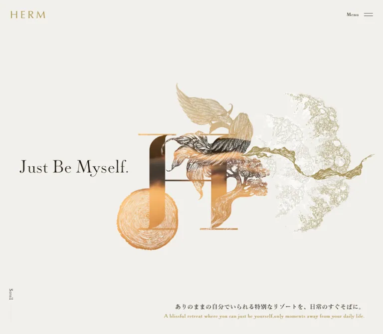
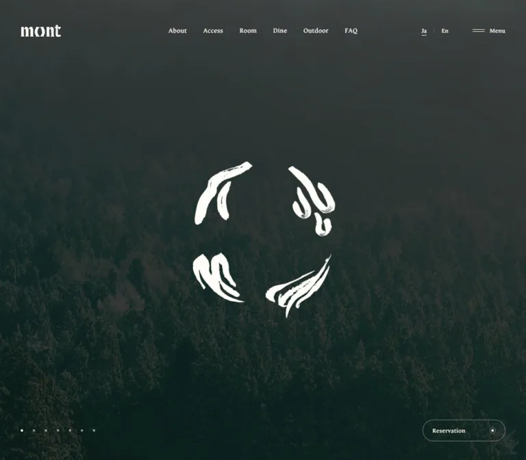
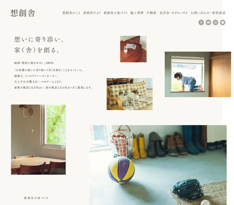
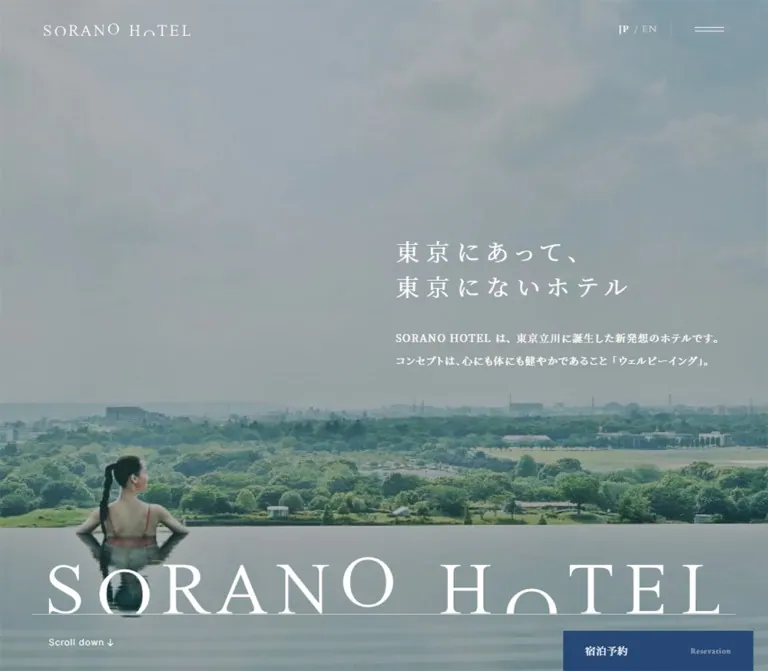
森を俯瞰する全面ビジュアルと、食事・客室の大きな写真が印象的なホテル公式サイト。明朝体と欧文セリフ、ゴールドとセージの配色、画面に固定された予約ボタンで上質な滞在へ導きます。
オリジナルサイトを見るA French country-house atmosphere expressed through forest views, fine serif lettering, and quiet gold reservation controls.
Website: hotelalpage.com Original URL: https://hotelalpage.com/ Final URL: https://hotelalpage.com/ Theme: light editorial surfaces, full-width photographic sections, and a dark photographic footer. Inspected: September 22, 2026, at 14:58:11 UTC / 23:58:11 JST, according to the supplied capture record. Viewports: 1440 × 1000 desktop and 390 × 844 mobile, in CSS pixels. Scope: the current Japanese hotel homepage. Visual evidence covers the opening view, desktop dining and room sections, and desktop/mobile footer views. Rendered DOM evidence additionally covers reservations, the seasonal announcement, stay plans, the introduction, service sections, and news. Linked pages and completed booking flows were not inspected.
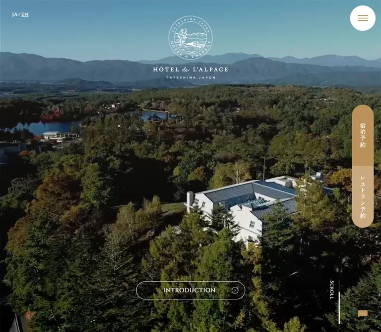
HÔTEL de L'ALPAGE presents a twelve-room auberge through its setting, cuisine, and interiors. The opening composition gives almost the entire screen to an aerial landscape. A small white crest and wordmark sit high in the center, while language links, a circular menu button, and reservation controls occupy the edges. The restrained interface lets the mountains, trees, and white hotel building establish the identity.
Below the opening view, this is a substantial hotel homepage: an embedded reservation area, a seasonal announcement, offers, an editorial introduction, large links into the hotel's facilities, news, and a complete navigation footer. Gold provides continuity between utility controls and editorial headings. Cream, sage, deep teal, and warm beige organize the quieter sections. Large English serif titles and smaller Japanese Mincho captions give the photographic links their distinctive hierarchy.
The important responsive change is structural. Desktop reservations form one vertical capsule at the right edge. On mobile, they become two separate horizontal pills near the bottom of the viewport. The hero also becomes shorter than the viewport, allowing the beginning of the booking content to appear below it.
A French country-house atmosphere expressed through forest views, fine serif lettering, and quiet gold reservation controls.
Website: hotelalpage.com Original URL: https://hotelalpage.com/ Final URL: https://hotelalpage.com/ Theme: light editorial surfaces, full-width photographic sections, and a dark photographic footer. Inspected: September 22, 2026, at 14:58:11 UTC / 23:58:11 JST, according to the supplied capture record. Viewports: 1440 × 1000 desktop and 390 × 844 mobile, in CSS pixels. Scope: the current Japanese hotel homepage. Visual evidence covers the opening view, desktop dining and room sections, and desktop/mobile footer views. Rendered DOM evidence additionally covers reservations, the seasonal announcement, stay plans, the introduction, service sections, and news. Linked pages and completed booking flows were not inspected.
HÔTEL de L'ALPAGE presents a twelve-room auberge through its setting, cuisine, and interiors. The opening composition gives almost the entire screen to an aerial landscape. A small white crest and wordmark sit high in the center, while language links, a circular menu button, and reservation controls occupy the edges. The restrained interface lets the mountains, trees, and white hotel building establish the identity.
Below the opening view, this is a substantial hotel homepage: an embedded reservation area, a seasonal announcement, offers, an editorial introduction, large links into the hotel's facilities, news, and a complete navigation footer. Gold provides continuity between utility controls and editorial headings. Cream, sage, deep teal, and warm beige organize the quieter sections. Large English serif titles and smaller Japanese Mincho captions give the photographic links their distinctive hierarchy.
The important responsive change is structural. Desktop reservations form one vertical capsule at the right edge. On mobile, they become two separate horizontal pills near the bottom of the viewport. The hero also becomes shorter than the viewport, allowing the beginning of the booking content to appear below it.
These values are measured from the original page's computed styles.
| Name | Value | Suggested token | Observed role |
|---|---|---|---|
| Reservation Gold | #ba915b |
--color-gold |
Accommodation reservation control, consent acceptance, reservation links, announcement headings, and offer labels |
| Soft Gold | #c9a97f |
--color-gold-soft |
Restaurant reservation control |
| News Sage | #a6b3ab |
--color-sage |
Background of the What's New section |
| Offer Cream | #f0e6db |
--color-cream |
Stay Plans section background |
| Service Beige | #e2ceb8 |
--color-service |
Special Services section background |
| Deep Teal | #2e5a65 |
--color-teal |
Introduction heading and body; mobile menu text in the sampled DOM |
| Page Gray | #f2f2f2 |
--color-canvas |
Body and introduction backgrounds; underlying hero surface |
| White | #ffffff |
--color-white |
Menu disc, consent surface, reversed text, and photographic-section headings |
| Body Ink | #444444 |
--color-ink |
Japanese body text and general utility content |
| Muted Ink | #888888 |
--color-muted |
Privacy detail link and reservation-management text |
| Pale Lettering | #e2e5e7 |
--color-lettering |
Large decorative Bonjour text |
Gold is an action and editorial accent, not a universal background. The page keeps accommodation and restaurant reservations distinguishable through two related gold tones. Deep teal gives the introduction a cooler, more literary character, while cream and sage separate content groups without enclosing them in cards.
| Treatment | Approximation | Evidence and limitation |
|---|---|---|
| Dining detail pill | #899a91 |
Muted green fill visible over the food photograph; exact declaration was not supplied |
| Rooms detail pill | #eca58b |
Warm peach fill visible over the bedroom photograph; exact declaration was not supplied |
| Footer base | #394144 |
Dark blue-gray appearance of the copyright area; exact declaration was not supplied |
| Footer photographic veil | Dark gray with substantial opacity | Room details remain visible behind white navigation; source overlay color and alpha are unknown |
The photographic colors are not additional UI tokens. Blue sky, green forest, wood, upholstery, cream tableware, and the red of the dish come from imagery.
No theme selector is evidenced. Cream, sage, beige, and dark gray are section treatments within the same page, not selectable color modes.
Observed declared family: Cinzel, serif.
Cinzel is declared on language links, the scroll cue, reservation actions, mobile photographic-section titles, and the decorative Bonjour heading. These elements use weight 500 and typically 0.06em tracking. The restrained weight and additional spacing are more important than making every English phrase large or bold.
Desktop photographic headings visibly use a fine serif treatment. Their exact computed font size was not included; use the mobile declaration and the desktop visual proportions as separate evidence.
Observed declared family: "Zen Old Mincho", serif.
This stack appears on reservation-panel headings, the introduction headline, Japanese photographic-section captions, hotel-name text, and primary footer navigation. Weight 400 is common. Headings often use 0.1em tracking, giving the Japanese text a spacious rhythm without making paragraphs difficult to read.
Observed primary family: "Zen Kaku Gothic New".
The supplied stack continues through Zen Old Mincho, Japanese Gothic aliases, Yu Gothic, Hiragino families, Meiryo, and sans-serif. Body copy is generally 15px / 30px, weight 400. Consent buttons use the same primary family at weight 700; dates in news rows are also bold.
Use the sans-serif for explanations, dates, privacy details, and form information. Preserve the contrast with the Mincho headings rather than applying one serif face to every element.
The white crest and wordmark are visual identity assets. They include a circular botanical and mountain illustration, a building motif, and a tightly spaced location line. Their lettering should not be reconstructed by choosing an approximately similar font.
| Role | Measured value | Weight / tracking | Scope |
|---|---|---|---|
| Root font size | 10px |
400 |
Both viewports; a sizing convention, not the normal reading size |
| Body paragraphs | 15px / 30px |
400, normal tracking |
Consent, introduction, announcement, and reservation information |
| Small booking information | 12px / 12px |
400 |
Check-in/out and reservation-management text |
| Language links | 13px / 13px |
500, 0.78px |
Both viewports |
| Scroll cue | Desktop 13px; mobile 12px |
500, 0.06em |
Cinzel declaration |
| Reservation action | 16px, link line height 16px |
500, 0.96px |
RÉSERVATION |
| Consent detail link | 14px / 28px |
400 |
Both viewports |
| Consent buttons | 15px |
700 |
Both viewports |
| Accommodation-panel heading | Desktop 26px; mobile 22px |
400, 0.1em |
DOM-only panel content |
| Restaurant-panel heading | 26px / 33.8px |
400 |
DOM-only panel content |
| Seasonal announcement heading | 26px / 41.6px |
400, 2.6px |
Mobile |
| Introduction headline | 25px / 45px |
400, 2.5px |
Mobile |
| Photographic-section title | 45px / 54.9px |
500, 2.7px |
Mobile |
| Japanese section caption | 18px / 18px |
400, 1.8px |
Mobile dining, rooms, experiences, and gallery; 4px top padding |
| Special Services caption | 18px / 28.8px |
400, 1.8px |
Mobile |
| Decorative Bonjour | 80px / 80px |
500, 4.8px |
Mobile |
| Primary footer links | 21px / 31.5px |
400 |
Mobile |
| Desktop photographic titles | Approximately 60–64px |
Visually regular serif | Screenshot estimate only |
The Stay Plans and What's New heading wrappers report 10px inherited type, but contain separate display text. Their wrapper size is not evidence that the visible section headings are 10px.
There is no evidence of a single universal spacing grid. The measured interface combines fixed pixel controls, percentage-based widths, generous section padding, and very fine rules.
| Use | Measured or derived value | Status |
|---|---|---|
| Mobile menu inset | 10px top and right |
Measured |
| Desktop menu inset | 15px top and right |
Measured |
| Desktop reservation rail inset | 20px from right |
Derived from rectangles |
| Desktop consent outside inset | Approximately 20px left and bottom |
Visual estimate supported by child positions |
| Mobile consent outside inset | Approximately 10px left and right |
Visual estimate supported by child positions |
| Consent inner horizontal padding | Approximately 30px |
Derived from panel and text edges |
| Consent action gap | 15px |
Derived |
| Mobile reservation-button gap | 10px |
Derived |
| Mobile content gutter | About 21.45px, or 5.5vw |
Measured; percentage is derived |
| Introduction mobile gutter | 19.5px, or 5vw |
Measured; percentage is derived |
| Mobile offer-row column gap | 6% |
Computed style |
| Mobile offer-row vertical separation | 56px between measured rows |
Derived |
| Introduction paragraph gap | 30px |
Derived from consecutive paragraph rectangles |
| Standard mobile content-section padding | Commonly 58–60px top and 80px bottom |
Measured on plans, introduction, and news |
| Element | Value | Status |
|---|---|---|
| Menu button | 50% |
Measured |
| Desktop accommodation rail segment | 30px 30px 0 0 |
Measured |
| Desktop restaurant rail segment | 0 0 30px 30px |
Measured |
| Mobile reservation buttons | 25px |
Measured |
| Introduction and standard action pills | 25px |
Measured |
| Consent actions | 17px |
Measured |
| Consent panel | Square corners | Visually observed |
| Photographic sections | Square, full-width boundaries | Visually observed |
| Element | Desktop: 1440 × 1000 | Mobile: 390 × 844 |
|---|---|---|
| Document height | 8259.625px, reported rounded as 8260 |
8425.578px, reported rounded as 8426 |
| Hero | 1440 × 1000px |
390 × 624px |
| Opening group including booking area | 1156px high |
1061px high |
| Introduction pill | 300 × 50.39px at x570, y859.61 |
240 × 50.39px at x75, y483.61 |
| Introduction pill clearance below | 90px to hero bottom |
90px to hero bottom |
| Menu disc | 70 × 70px |
50 × 50px |
| Reservation controls | Two 60 × 170px segments |
Two approximately 178.30 × 50px pills |
| Reservation position | Rail x1360, y330–670 | Buttons y779–829, approximately 15px above viewport bottom |
| Consent panel | Approximately 430 × 205px |
Approximately 370 × 205px |
| Consent paragraph width | 370px |
310px |
| Consent acceptance / rejection | 120 × 34px / 134.03 × 34px |
Same measured sizes |
| Main photographic sections | Full width; complete panel bounds not supplied | Dining, rooms, experiences, and gallery each 520px high |
| Special Services | Not fully measured | 656.53px high |
| Footer | Approximately 750.5px high, derived |
1202.30px high |
The desktop screenshot shows only part of the dining section above the room section. Its visible 579px portion is not a measurement of the complete dining panel.
Role: establish the hotel's landscape and identity before presenting detailed information.
The hero is an edge-to-edge aerial view of wooded terrain, distant mountains, a lake, and the hotel building. The central area remains largely free of copy. A white crest and wordmark sit near the top center; the desktop lockup is visually about 210px wide, while the mobile lockup appears about 156px wide.
Place language links at the upper left and the circular menu at the upper right. The outlined INTRODUCTION pill is centered near the bottom, with a small outlined circular arrow at its right end. A separate vertical Scroll cue and thin line sit farther right.
The introduction link goes to /introduction/. Scroll points to /#intro; it is a separate navigation affordance. The evidence establishes those destinations, not the scrolling animation.
On mobile, the aerial scene is tightly cropped, keeping the building toward the right. Preserve a deliberate focal point instead of stretching the landscape. The hero's measured height is 624px; a universal mobile 100vh treatment would not reproduce this capture.
Role: switch between the Japanese homepage and /en/.
The visible treatment is small white serif text with a slash separator. EN is visibly underlined. Desktop JA starts at x46.08, y34; mobile JA starts at x23.39, y30. Both use the declared Cinzel stack at 13px with 0.06em tracking.
These links belong to the opening composition. Their persistence while scrolling was not established.
Role: provide compact access to site navigation.
A white disc holds three thin gold horizontal strokes. Its measured diameter changes from 70px on desktop to 50px on mobile, and it remains in the same screen corner in the supplied scrolled captures. The strokes are visually about 28px wide on desktop and 20px on mobile.
The DOM contains primary links, dining subcategories, room types, and other navigation entries. On mobile, those retained entries declare teal Mincho primary links and smaller Gothic sublinks. No open-menu screenshot was supplied, so panel background, opening direction, focus behavior, and open-state animation remain unverified.
Role: make accommodation and restaurant booking continuously available.
On desktop, the two buttons form a single 60 × 340px vertical capsule, centered vertically and inset 20px from the right edge. The upper accommodation segment uses Reservation Gold; the lower restaurant segment uses Soft Gold. Their Japanese labels are white and vertically arranged in the screenshots.
On mobile, the same two actions become independent horizontal pills. Each is approximately 178.3 × 50px, with a 10px gap and outside margins close to 3% of viewport width. The bottom clearance is 15px. No opaque full-width dock surface is visible; the page or footer remains visible around the buttons.
The outer button nodes report 10px inherited type and dark text, but the screenshots show larger white labels. The child-label typography was not sampled. A Mincho label around 16–18px is an implementation approximation, not an exact measurement.
Role: present the site's cookie explanation and two explicit choices.
The notice is a square white panel, visually about 430 × 205px on desktop and 370 × 205px on mobile. Its anatomy is a two-line explanation, an underlined privacy-details link, then two horizontally arranged pills. The acceptance action is gold with white text. The rejection action is white with a thin gold border and gold text.
The paragraph is measured at 15px / 30px. The detail link is 14px / 28px. Buttons remain 34px high on both viewports, with approximately 30px horizontal padding and a 15px gap.
Desktop placement is at the lower left. Mobile placement is approximately 90px above the viewport bottom, leaving about 25px between the panel and the reservation buttons. It covers part of the hero and booking content in the opening capture, and part of the auxiliary footer content in the footer capture. This overlap is part of the observed state, not evidence that the underlying content is missing.
The detail link targets /privacy/. Accept, reject, dismissal, and preference persistence were not exercised.
Role: offer practical booking controls directly below the hero.
The rendered text includes accommodation and restaurant tabs, a date field/calendar, stay length, guest count, room count, check-in/out information, a RÉSERVATION action, and a reservation-management link. Available option text includes 1–14 nights, 1–8 guests, and 1–4 rooms.
The opening group is 156px taller than the desktop hero and 437px taller than the mobile hero. Together with the measured controls, this supports a compact desktop booking strip and a substantially taller mobile form area.
The main reservation action is 200 × 50px in the desktop strip and about 347.09 × 50px on mobile. The mobile date field is partly visible below the consent panel. Use clear field labels and retain the secondary reservation-management link beneath the primary action.
Role: provide additional accommodation and restaurant booking interfaces.
Separate panel structures appear in the DOM. The accommodation structure includes a Mincho heading, calendar links, controls, contact details, and a booking action. The restaurant structure includes a 26px Mincho heading, explanatory text, and a gold RÉSERVATION link to TableCheck.
The restaurant link measures 400 × 50px on desktop and 330 × 50px on mobile. Its text is explicitly white, with a Cinzel declaration at 16px and 0.06em tracking. The accommodation panel's mobile action is approximately 329.3px wide.
These are DOM observations, not verified open-dialog designs. Do not infer a modal backdrop, opening animation, or calendar interaction from their rectangles. The supplied reservation-management URL contains tripla_booking_widget_open=confirm; its resulting interface was not opened.
Role: communicate a current hospitality offer before the main brand story.
The inspected announcement describes a seasonal afternoon tea and related event. On mobile it occupies a substantial text section: approximately 904px high, with 44px top padding and 77px bottom padding. The gold Mincho heading is 26px / 41.6px with 0.1em tracking. Body copy uses the standard 15px / 30px Gothic stack within a roughly 347px column.
This content is operational and time-dependent. Its presence matters to the page hierarchy; its event dates should not become permanent design tokens or reusable placeholder claims.
Role: introduce specific bookable offers.
The Stay Plans section uses Offer Cream, a centered bilingual heading, two offer links, and a gold list-view pill. The measured mobile section has 58px top padding and 80px bottom padding.
Each offer remains a horizontal media-and-text row on mobile. The row is 347.09px wide, declares a 6% gap, and gives the text approximately 194.39px. The remaining allocation implies approximately 131.88px for the leading region: roughly 38% media, 6% gap, and 56% text. The media assets themselves are not identified in the supplied evidence.
The text column starts with a gold Exclusive Offer label, followed by a 15px / 30px title. These rows are not evidenced as floating white cards. Preserve their integration with the cream section. The mobile list-view action spans the same 347px content width and is about 50.39px high.
Role: explain the auberge's character and the intended feeling of a stay.
The introduction returns to Page Gray and uses Deep Teal for both its Mincho headline and Gothic paragraphs. The mobile headline is 25px / 45px with 0.1em tracking, breaking into four lines. The desktop text evidence uses fewer deliberate headline breaks.
Paragraphs have a measured 30px line height and approximately 30px between blocks. The mobile text column is 351px wide, with 19.5px side margins. The layout is spacious but still designed for extended reading.
A pale Bonjour heading declares Cinzel at 80px. Its recorded mobile box is narrow and tall, approximately 80 × 333px, positioned at the right edge. That geometry supports a decorative vertical arrangement, but the exact writing-mode or transform was not supplied. Treat the decorative word as secondary to the readable introduction.
Role: link to dining, rooms, experiences, and the gallery through large visual scenes.
The dining and room sections are directly visible on desktop. A close photograph of a plated dish fills the dining section. The room section shows a green upholstered headboard, textured dark wall, wood framing, and a large pale lampshade. White serif English headings sit above smaller Japanese captions, followed by wide detail pills.
The visible dining pill is muted green; the room pill is peach. Both are approximately 300 × 50px in the screenshot, with a circular arrow at the right. These colors are estimates, unlike the measured reservation golds.
On mobile, dining, rooms, experiences, and gallery sections each measure 390 × 520px. Titles use 45px Cinzel with 54.9px line height. Restaurant & Bar and Rooms & Suites occupy two-line heading boxes at this width; Experiences and Gallery occupy one line.
The DOM makes each destination an encompassing link containing the heading, Japanese caption, and detail treatment. In a new implementation, use one anchor with a styled CTA span inside it, avoiding a second nested interactive button.
Role: give additional services a distinct position within the destination sequence.
The mobile section is taller than the standard photographic panels at approximately 656.53px, and its computed background is Service Beige. Its English heading uses the same 45px display scale, but sits more than 350px below the section's top in the sampled geometry.
This indicates a different internal composition from the standard centered panels. Its complete imagery and desktop arrangement are not visually documented, so do not assume it shares the dining image treatment or invent a particular service photograph.
Role: publish dated hotel and restaurant updates.
What's New uses a measured sage background and white text. On mobile, each row places a date and category on one line, followed by a title. Dates use weight 700, categories 400, and titles 500; all are 15px / 30px.
Rows are full width, with approximately 21.44px horizontal padding and 23px / 25px vertical padding. Measured row heights vary with content, including 109px and 139px. Fine separators and text grouping provide structure without separate card surfaces.
A white outlined list-view pill follows the rows. The desktop footer capture shows its centered position and ample space beneath it; the mobile action is approximately 347.09 × 52.39px.
Role: consolidate hotel identity, contact information, navigation, and utility links.
The footer uses a photograph of a room corner with curtains and window light, subdued by a dark gray veil. A top strip contains a centered double-chevron back-to-top link and a fine horizontal rule. The desktop image shows a crest/address column on the left and a larger navigation area on the right.
Primary desktop navigation forms four columns of two links. On mobile it becomes two columns of four links: HOME, hotel information, dining, and rooms on the left; stay plans, experiences, gallery, and access on the right. Mobile primary links are measured at 21px / 31.5px in Zen Old Mincho.
The hotel name, address, map link, and telephone form a separate identity block. Smaller links cover news, contact, recruitment, sitemap, policies, and terms. Instagram and Facebook symbols are visible in the desktop footer. A darker copyright strip finishes the page.
The mobile footer is approximately 1202px high, compared with about 750.5px on desktop. This is a real reflow of substantial content, not a uniformly scaled desktop footer. The persistent reservation pills remain available over it.
The evidence supports declared transitions and stable captured states. It does not provide a frame sequence proving each transition's trigger or visual endpoints.
| Element or treatment | Supplied declaration or evidence | Interpretation |
|---|---|---|
| Language links | opacity 0.2s |
Short opacity feedback is defined; hover opacity was not sampled |
| Consent actions | opacity 0.2s |
Same restrained feedback family |
| Introduction and several action links | opacity 0.2s |
Link feedback declaration |
| Menu disc | background 0.3s |
Background transition is defined; open-state appearance is unknown |
| Reservation action | color 0.3s, background-color 0.3s |
Color-based feedback, with unverified endpoints |
| Calendar links | opacity 0.3s |
DOM-only calendar styling; interaction not exercised |
| Introduction text and destination sections | filter 1.8s, opacity 1.8s, transform 1.8s |
Long reveal-capable transitions; initial blur, displacement, trigger, and sequence are unknown |
| News rows and several navigation links | opacity 0.3s |
Declared link feedback |
| Mobile animation variables | --animate-duration: 1s, --animate-delay: 1s, --animate-repeat: 1 |
Available defaults, not proof that a particular visible component animates for one second |
| Sampled element animations | Generally animation: none |
No active CSS animation on those sampled nodes; does not establish that the entire page is static |
| Scroll and back-to-top | Links to #intro and #top |
Anchor destinations verified; smooth scrolling is unverified |
Aerial imagery is verified. Its delivery as a video, slideshow, or still image is not established by the supplied media evidence. Do not specify an autoplay duration, camera move, sound behavior, or parallax effect as an original-site feature.
Recommended reuse: keep control feedback brief and quiet. If implementing entrance reveals, use the measured 1.8-second transition family with independently chosen, modest endpoints, keep content visible when scripting fails, and provide reduced-motion behavior.
| Layer | Appearance | Function |
|---|---|---|
| General document | Light gray or white | Reading and booking content |
| Offer section | Solid warm cream | Groups stay plans |
| Introduction | Light gray with teal lettering | Long-form brand narrative |
| Destination sections | Full-width photography with white type | Navigation through the hotel's experiences |
| Special Services | Warm beige base | Distinct service composition |
| News | Solid sage with white text and fine rules | Dated information |
| Footer | Subdued room photograph and dark copyright strip | Dense navigation and contact information |
| Persistent controls | White circle and gold pills | Menu and reservation access |
| Consent notice | Square white rectangle | A compact utility overlay |
There is no general elevated-card system in the visible design. Separation comes from full-width color changes, photographic boundaries, thin rules, and typography. The circular menu and rounded action pills are exceptions within an otherwise rectangular page structure.
The imagery moves from landscape scale to intimate hospitality details. The aerial opening communicates seclusion and the surrounding terrain. The dining photograph emphasizes careful plating, delicate tableware, and fresh ingredients. The room photograph emphasizes upholstery, timber, lighting, and textile texture. The footer returns to a quiet interior detail rather than another promotional headline.
Use natural-looking photography with enough detail to remain credible at full width. Preserve the relationship between white architecture, dark trees, soft interior neutrals, and restrained UI color. Avoid heavy color grading that makes all photographs look uniformly gold or teal.
The images are intentionally cropped as backgrounds or large sectional media. Desktop and mobile crops require separate attention. Food, architecture, and room details should remain recognizable when a wide composition becomes a narrow 390px panel.
No image, logo, font-file, or video URLs were included in the supplied asset evidence. The following identifies visible assets without inventing their delivery paths.
| Asset | Original-page evidence | Reuse guidance |
|---|---|---|
| White crest and wordmark | Desktop/mobile opening views and desktop footer | Use authorized brand artwork; preserve line detail and proportions |
| Aerial hotel landscape | Desktop/mobile opening views | Choose responsive crops that retain the landscape and building |
| Plated dish photograph | Desktop dining section | Preserve the close composition and fine tableware detail |
| Bedroom photograph | Desktop rooms section | Retain the relationship between headboard, wood, and lamp |
| Curtain/window interior | Desktop/mobile footer views | Subdue behind navigation without erasing the photograph |
| Fine interface symbols | Menu strokes, ring arrows, scroll rule, and top chevrons | Reproduce with simple CSS or SVG where appropriate |
| Social symbols | Desktop footer | Use recognizable accessible icons; supplied asset format is unknown |
The supplied evidence does not identify the images used for Experiences, Special Services, Gallery, or the offer thumbnails. Select new authorized imagery for those roles without describing it as an observed original asset.
The page is a long, normally scrolling document. Its rendered content order is opening hero, reservation area, access link, seasonal announcement, stay plans, introduction, dining, rooms, experiences, special services, gallery, news, and footer. It should not be reduced to a single-screen booking promotion.
| Relationship | Desktop observation | Mobile observation |
|---|---|---|
| Opening media | Fills the 1000px-high viewport | 624px high within an 844px viewport |
| Brand and menu | Small identity high in the image; 70px menu | Smaller lockup and 50px menu |
| Reservation access | Connected vertical rail | Two separate bottom pills |
| Introduction link | 300px wide | 240px wide; height retained |
| Consent notice | 430px panel near lower-left corner | 370px panel above the bottom booking controls |
| Inline booking | Compact horizontal allocation | Taller stacked content; wide main action |
| Offer rows | Complete desktop geometry unavailable | Horizontal media/text arrangement retained |
| Destination links | Large landscape sections | Full-width 520px panels with wrapped titles |
| Footer navigation | Four columns, two primary links per column | Two columns, four primary links per column |
Mobile does not simply shrink all text. Body copy remains 15px, consent controls retain their dimensions, feature titles remain prominent at 45px, and primary footer links use 21px type. The increased footer height and wrapped display titles are deliberate consequences of reflow.
The exact breakpoint is not supplied. The CSS Quick Start uses 767px as a recommended adaptation boundary. Likewise, its mobile hero-height formula reproduces the sampled 390 × 844 relationship but is not claimed as the source formula.
The cookie notice and booking controls consume a substantial portion of the mobile viewport. Any implementation should test short screens, text enlargement, and open form states so that controls do not make underlying content unreachable.
These are improvements for a new implementation, not verified features of the original site:
/plans/ and mobile /plan/. Their destination behavior was not tested.#ba915b.#c9a97f.#f0e6db.#f2f2f2 with teal #2e5a65 text.#a6b3ab with white lettering.#e2ceb8.#899a91.#eca58b.#394144 over a room photograph.“Create a Japanese auberge homepage inspired by HÔTEL de L'ALPAGE. Open with a full-width aerial landscape, a small white crest near the top center, quiet language links at upper left, and a white circular menu control at upper right. Use Cinzel for English display text, Zen Old Mincho for Japanese editorial headings, and Zen Kaku Gothic New for 15px / 30px body copy. Keep accommodation and restaurant reservations visible in two related gold tones. On desktop join them into a vertical capsule at the right edge; on mobile use two horizontal bottom pills. Continue with a practical reservation form, seasonal announcement, cream offer section, teal editorial introduction, large photographic destination links, sage news list, and dark photographic footer. Use thin rules, circular arrow details, and restrained opacity feedback.”
“Use the measured palette and geometry in this reference. Treat the dining and room pill colors, footer overlay, breakpoint, and desktop display size as approximations. Do not invent asset URLs or claim unobserved menu, booking, video, or consent behavior. Keep content visible without reveal scripting, and label newly chosen motion endpoints as implementation decisions.”
This is a reusable CSS adaptation, not an extracted original stylesheet. It keeps a conventional root font size and expresses the measured dimensions directly in pixels. Font files and authorized images must be supplied by the implementing project.
The recommended class anatomy is a .hero containing media, brand artwork, language links, and an introduction link; independent fixed menu, reservation, and consent controls; then ordinary document sections. A .destination should be one anchor containing its media, heading group, and a .pill span. The footer navigation should preserve a meaningful source order before applying its visual columns.
Exact palette values and sampled control geometry are retained. Estimated colors are marked in comments. The 767px breakpoint, desktop section height, media overlays, hover endpoint, and responsive hero formula are recommendations. Booking logic, menu state, consent handling, and reveal triggers require separate implementation.
:root {
  /* Measured colors */
  --color-gold: #ba915b;
  --color-gold-soft: #c9a97f;
  --color-sage: #a6b3ab;
  --color-cream: #f0e6db;
  --color-service: #e2ceb8;
  --color-teal: #2e5a65;
  --color-canvas: #f2f2f2;
  --color-white: #ffffff;
  --color-ink: #444444;
  --color-muted: #888888;
  --color-lettering: #e2e5e7;

  /* Visual approximations */
  --color-dining: #899a91;
  --color-rooms: #eca58b;
  --color-footer: #394144;

  /* Observed primary families; simplified fallback stacks */
  --font-display: 'Cinzel', serif;
  --font-editorial: 'Zen Old Mincho', serif;
  --font-body: 'Zen Kaku Gothic New', 'Yu Gothic',
    'Hiragino Kaku Gothic ProN', Meiryo, sans-serif;

  --text-body: 15px;
  --leading-body: 2;
  --tracking-display: 0.06em;
  --tracking-editorial: 0.1em;
  --radius-pill: 25px;
  --safe-bottom: env(safe-area-inset-bottom, 0px);

  /* Recommended desktop content cap */
  --content-max: 1100px;
}

*, *::before, *::after { box-sizing: border-box; }
body {
  margin: 0;
  color: var(--color-ink);
  background: var(--color-canvas);
  font: 400 var(--text-body)/var(--leading-body) var(--font-body);
}
button, input, select { font: inherit; }
button { cursor: pointer; }
a { color: inherit; }
img { display: block; max-width: 100%; }
[hidden] { display: none !important; }
.container {
  width: min(89%, var(--content-max));
  margin-inline: auto;
}

.hero {
  position: relative;
  isolation: isolate;
  height: 100svh;
  overflow: hidden;
  color: white;
  background: var(--color-canvas);
}
.hero__media, .destination__media, .footer__media {
  position: absolute;
  inset: 0;
  width: 100%;
  height: 100%;
  object-fit: cover;
}
.hero__media { object-position: 50% 50%; }
.hero::after, .destination::after {
  content: '';
  position: absolute;
  inset: 0;
  z-index: 0;
  pointer-events: none;
  /* Recommended starting veil; adjust for each actual image. */
  background: rgb(0 0 0 / 14%);
}
.hero__brand {
  position: absolute;
  z-index: 1;
  top: 44px;
  left: 50%;
  width: 210px;
  transform: translateX(-50%);
}
.language-switch {
  position: absolute;
  z-index: 2;
  top: 34px;
  left: 3.2%;
  display: flex;
  align-items: center;
  gap: 4px;
  font: 500 13px/1 var(--font-display);
  letter-spacing: var(--tracking-display);
}
.language-switch a { transition: opacity 0.2s; }

.menu-toggle {
  position: fixed;
  z-index: 60;
  top: 15px;
  right: 15px;
  display: grid;
  place-items: center;
  width: 70px;
  height: 70px;
  padding: 0;
  border: 0;
  border-radius: 50%;
  color: var(--color-gold);
  background: white;
  transition: background 0.3s;
}
.menu-bars {
  position: relative;
  width: 28px;
  height: 16px;
  border-block: 1px solid currentColor;
}
.menu-bars::after {
  content: '';
  position: absolute;
  top: 50%;
  left: 0;
  width: 100%;
  height: 1px;
  background: currentColor;
}

.pill {
  position: relative;
  display: inline-flex;
  align-items: center;
  justify-content: center;
  width: 300px;
  max-width: 100%;
  min-height: 50px;
  padding: 13px 44px;
  border: 1px solid currentColor;
  border-radius: var(--radius-pill);
  color: white;
  background: transparent;
  font: 700 16px/1.4 var(--font-editorial);
  letter-spacing: var(--tracking-editorial);
  text-align: center;
  text-decoration: none;
  transition: opacity 0.2s;
}
.pill--latin {
  font-family: var(--font-display);
  font-weight: 500;
  letter-spacing: var(--tracking-display);
}
.pill--filled {
  border-color: transparent;
  background: var(--pill-fill, var(--color-gold));
}
.pill__arrow {
  position: absolute;
  right: 18px;
  display: grid;
  place-items: center;
  width: 18px;
  height: 18px;
  border: 1px solid currentColor;
  border-radius: 50%;
}
.pill__arrow::after {
  content: '';
  width: 4px;
  height: 4px;
  margin-left: -2px;
  border-top: 1px solid currentColor;
  border-right: 1px solid currentColor;
  transform: rotate(45deg);
}
.hero__introduction {
  position: absolute;
  z-index: 1;
  bottom: 90px;
  left: 50%;
  transform: translateX(-50%);
}
.hero__scroll {
  position: absolute;
  z-index: 1;
  right: 11%;
  bottom: 90px;
  padding-right: 14px;
  writing-mode: vertical-rl;
  font: 500 13px/1 var(--font-display);
  letter-spacing: 0.06em;
  text-decoration: none;
}
.hero__scroll::after {
  content: '';
  position: absolute;
  top: 0;
  right: 0;
  width: 1px;
  height: 104px;
  background: currentColor;
}

.booking-dock {
  position: fixed;
  z-index: 50;
  top: 50%;
  right: 20px;
  display: flex;
  flex-direction: column;
  width: 60px;
  transform: translateY(-50%);
}
.booking-dock__action {
  display: flex;
  align-items: center;
  justify-content: center;
  width: 60px;
  height: 170px;
  padding: 0;
  border: 0;
  border-radius: 30px 30px 0 0;
  color: white;
  background: var(--color-gold);
}
.booking-dock__action + .booking-dock__action {
  border-radius: 0 0 30px 30px;
  background: var(--color-gold-soft);
}
.booking-dock__label {
  writing-mode: vertical-rl;
  /* Child-label typography is an approximation. */
  font: 400 16px/1.2 var(--font-editorial);
}

.cookie-notice {
  position: fixed;
  z-index: 70;
  left: 20px;
  bottom: 20px;
  width: 430px;
  max-height: calc(100svh - 40px);
  overflow-y: auto;
  padding: 28px 30px 30px;
  color: var(--color-ink);
  background: white;
}
.cookie-notice p { margin: 0; font-size: 15px; line-height: 30px; }
.cookie-notice__more {
  display: inline-block;
  margin-top: 5px;
  color: var(--color-muted);
  font-size: 14px;
  line-height: 28px;
  text-decoration: underline;
}
.cookie-notice__actions {
  display: flex;
  flex-wrap: wrap;
  gap: 15px;
  margin-top: 20px;
}
.cookie-notice__actions button {
  min-height: 34px;
  padding: 0 30px 2px;
  border: 1px solid var(--color-gold);
  border-radius: 17px;
  color: white;
  background: var(--color-gold);
  font-size: 15px;
  font-weight: 700;
  line-height: 1.2;
  transition: opacity 0.2s;
}
.cookie-notice__actions .cookie-notice__decline {
  color: var(--color-gold);
  background: white;
}

.plans { padding: 58px 0 80px; background: var(--color-cream); }
.plan-list { display: grid; gap: 56px; }
.plan-row {
  display: grid;
  grid-template-columns: 38% minmax(0, 1fr);
  column-gap: 6%;
  color: var(--color-ink);
  text-decoration: none;
}
.plan-row__media { width: 100%; height: auto; }
.plan-row__label { margin: 0; color: var(--color-gold); }
.plan-row__title { margin: 0; font-size: 15px; font-weight: 400; line-height: 2; }
.section-action { display: flex; justify-content: center; margin-top: 55px; }

.introduction { padding: 60px 0 80px; color: var(--color-teal); }
.introduction__title {
  margin: 0 0 33px;
  font: 400 25px/1.8 var(--font-editorial);
  letter-spacing: 0.1em;
}
.introduction p { margin: 0 0 30px; }

.destination {
  position: relative;
  isolation: isolate;
  display: grid;
  place-items: center;
  /* Recommended desktop height, not a source measurement. */
  min-height: 650px;
  overflow: hidden;
  color: white;
  text-align: center;
  text-decoration: none;
}
.destination__content {
  position: relative;
  z-index: 1;
  width: min(89%, 1000px);
}
.destination__title {
  margin: 0;
  font: 500 clamp(45px, 4.45vw, 64px)/1.22 var(--font-display);
  letter-spacing: 0.06em;
}
.destination__caption {
  margin: 4px 0 36px;
  font: 400 18px/1.6 var(--font-editorial);
  letter-spacing: 0.1em;
}
.destination--dining { --pill-fill: var(--color-dining); }
.destination--rooms { --pill-fill: var(--color-rooms); }
.destination--services { background: var(--color-service); }

.news { padding: 58px 0 80px; color: white; background: var(--color-sage); }
.news__list { width: min(100%, 1036px); margin-inline: auto; }
.news__item {
  display: grid;
  grid-template-columns: 240px minmax(0, 1fr);
  gap: 24px;
  padding: 23px 0 25px;
  border-top: 1px solid rgb(255 255 255 / 35%);
  text-decoration: none;
  transition: opacity 0.3s;
}
.news__meta { display: flex; flex-wrap: wrap; gap: 12px; }
.news__date { font-weight: 700; }
.news__title { margin: 0; font-size: 15px; font-weight: 500; line-height: 2; }

.site-footer { color: white; background: var(--color-footer); }
.footer__scene { position: relative; isolation: isolate; }
.footer__scene::after {
  content: '';
  position: absolute;
  inset: 0;
  z-index: 0;
  pointer-events: none;
  /* Estimated appearance; tune against the authorized image. */
  background: rgb(57 65 68 / 80%);
}
.footer__top, .footer__inner { position: relative; z-index: 1; }
.footer__top {
  display: grid;
  place-items: center;
  min-height: 80px;
  border-bottom: 1px solid rgb(255 255 255 / 30%);
}
.footer__inner {
  display: grid;
  grid-template-columns: 260px minmax(0, 1fr);
  gap: 100px;
  width: min(89%, 1060px);
  margin-inline: auto;
  padding: 64px 0 100px;
}
.footer__identity { text-align: center; }
.footer__logo { width: 160px; margin: 0 auto 35px; }
.footer__nav {
  display: grid;
  grid-auto-flow: column;
  grid-template-columns: repeat(4, minmax(0, 1fr));
  grid-template-rows: repeat(2, auto);
  gap: 24px;
}
.footer__nav a { font: 400 20px/1.5 var(--font-editorial); text-decoration: none; }
.footer__utilities { display: flex; flex-wrap: wrap; gap: 12px 24px; margin-top: 60px; }
.footer__copyright {
  margin: 0;
  padding: 38px 20px;
  font: 400 12px/2 var(--font-display);
  letter-spacing: 0.06em;
  text-align: center;
}

/* Observed transition properties; content remains visible by default. */
.reveal {
  transition: filter 1.8s, opacity 1.8s, transform 1.8s;
}

/* Recommended feedback endpoint and visible keyboard focus. */
@media (hover: hover) {
  .pill:hover, .language-switch a:hover,
  .cookie-notice__actions button:hover, .news__item:hover { opacity: 0.8; }
}
:where(a, button, input, select):focus-visible {
  outline: 3px solid var(--color-teal);
  outline-offset: 4px;
  box-shadow: 0 0 0 2px white;
}

/* Recommended breakpoint; the original breakpoint was not supplied. */
@media (max-width: 767px) {
  .hero {
    /* Produces 624px at the inspected 844px viewport height. */
    height: max(560px, calc(100svh - 220px));
  }
  .hero__brand { top: 30px; width: 156px; }
  .language-switch { top: 30px; left: 6%; }
  .menu-toggle { top: 10px; right: 10px; width: 50px; height: 50px; }
  .menu-bars { width: 20px; height: 12px; }
  .hero__introduction { width: 240px; }
  .hero__scroll { right: 5%; bottom: 80px; font-size: 12px; }

  .booking-dock {
    top: auto;
    right: 3%;
    bottom: calc(15px + var(--safe-bottom));
    left: 3%;
    flex-direction: row;
    gap: 10px;
    width: auto;
    transform: none;
  }
  .booking-dock__action,
  .booking-dock__action + .booking-dock__action {
    flex: 1;
    min-width: 0;
    width: auto;
    height: 50px;
    padding: 11px 10px 14px;
    border-radius: 25px;
  }
  .booking-dock__label { writing-mode: horizontal-tb; font-size: 17px; }
  .cookie-notice {
    right: 10px;
    bottom: calc(90px + var(--safe-bottom));
    left: 10px;
    width: auto;
    max-height: calc(100svh - 110px - var(--safe-bottom));
  }
  .introduction .container { width: 90%; }
  .destination { min-height: 520px; }
  .destination__title { font-size: 45px; }
  .destination--services { min-height: 656px; }
  .section-action .pill { width: 89%; }
  .news__item {
    grid-template-columns: minmax(0, 1fr);
    gap: 0;
    padding-inline: 5.5%;
  }
  .footer__top { min-height: 60px; }
  .footer__inner { grid-template-columns: minmax(0, 1fr); gap: 50px; }
  .footer__nav {
    grid-template-columns: repeat(2, minmax(0, 1fr));
    grid-template-rows: repeat(4, auto);
    column-gap: 20px;
  }
  .footer__nav a { font-size: 21px; }
  .footer__copyright { padding-bottom: calc(90px + var(--safe-bottom)); }
}

@media (max-width: 359px) {
  .cookie-notice { padding-inline: 20px; }
}

@media (prefers-reduced-motion: reduce) {
  .reveal, .pill, .menu-toggle, .language-switch a,
  .cookie-notice__actions button, .news__item { transition: none; }
}
Optional aliases for a project already using Tailwind v4. These mappings do not imply that the original website uses Tailwind. Define the custom properties above first.
@theme inline {
  --color-brand-gold: var(--color-gold);
  --color-booking-soft: var(--color-gold-soft);
  --color-news-sage: var(--color-sage);
  --color-offer-cream: var(--color-cream);
  --color-service-beige: var(--color-service);
  --color-editorial-teal: var(--color-teal);
  --color-page-canvas: var(--color-canvas);
  --color-body-ink: var(--color-ink);

  --font-brand-display: var(--font-display);
  --font-japanese-editorial: var(--font-editorial);
  --font-japanese-body: var(--font-body);

  --text-reading: 15px;
  --text-reading--line-height: 2;
  --text-panel-mobile: 45px;
  --text-panel-mobile--line-height: 1.22;
  --text-panel-mobile--letter-spacing: 0.06em;

  --radius-action: 25px;
  --radius-consent: 17px;
}
This reference describes the currently supplied homepage evidence. Measurements, visual estimates, and implementation recommendations are intentionally kept distinct.
# HÔTEL de L'ALPAGE — Style Reference

> A French country-house atmosphere expressed through forest views, fine serif lettering, and quiet gold reservation controls.

**Website:** [hotelalpage.com](https://hotelalpage.com/)
**Original URL:** https://hotelalpage.com/
**Final URL:** https://hotelalpage.com/
**Theme:** light editorial surfaces, full-width photographic sections, and a dark photographic footer.
**Inspected:** September 22, 2026, at 14:58:11 UTC / 23:58:11 JST, according to the supplied capture record.
**Viewports:** 1440 × 1000 desktop and 390 × 844 mobile, in CSS pixels.
**Scope:** the current Japanese hotel homepage. Visual evidence covers the opening view, desktop dining and room sections, and desktop/mobile footer views. Rendered DOM evidence additionally covers reservations, the seasonal announcement, stay plans, the introduction, service sections, and news. Linked pages and completed booking flows were not inspected.

HÔTEL de L'ALPAGE presents a twelve-room auberge through its setting, cuisine, and interiors. The opening composition gives almost the entire screen to an aerial landscape. A small white crest and wordmark sit high in the center, while language links, a circular menu button, and reservation controls occupy the edges. The restrained interface lets the mountains, trees, and white hotel building establish the identity.

Below the opening view, this is a substantial hotel homepage: an embedded reservation area, a seasonal announcement, offers, an editorial introduction, large links into the hotel's facilities, news, and a complete navigation footer. Gold provides continuity between utility controls and editorial headings. Cream, sage, deep teal, and warm beige organize the quieter sections. Large English serif titles and smaller Japanese Mincho captions give the photographic links their distinctive hierarchy.

The important responsive change is structural. Desktop reservations form one vertical capsule at the right edge. On mobile, they become two separate horizontal pills near the bottom of the viewport. The hero also becomes shorter than the viewport, allowing the beginning of the booking content to appear below it.
# HÔTEL de L'ALPAGE — Style Reference

> A French country-house atmosphere expressed through forest views, fine serif lettering, and quiet gold reservation controls.

**Website:** [hotelalpage.com](https://hotelalpage.com/)
**Original URL:** https://hotelalpage.com/
**Final URL:** https://hotelalpage.com/
**Theme:** light editorial surfaces, full-width photographic sections, and a dark photographic footer.
**Inspected:** September 22, 2026, at 14:58:11 UTC / 23:58:11 JST, according to the supplied capture record.
**Viewports:** 1440 × 1000 desktop and 390 × 844 mobile, in CSS pixels.
**Scope:** the current Japanese hotel homepage. Visual evidence covers the opening view, desktop dining and room sections, and desktop/mobile footer views. Rendered DOM evidence additionally covers reservations, the seasonal announcement, stay plans, the introduction, service sections, and news. Linked pages and completed booking flows were not inspected.

HÔTEL de L'ALPAGE presents a twelve-room auberge through its setting, cuisine, and interiors. The opening composition gives almost the entire screen to an aerial landscape. A small white crest and wordmark sit high in the center, while language links, a circular menu button, and reservation controls occupy the edges. The restrained interface lets the mountains, trees, and white hotel building establish the identity.

Below the opening view, this is a substantial hotel homepage: an embedded reservation area, a seasonal announcement, offers, an editorial introduction, large links into the hotel's facilities, news, and a complete navigation footer. Gold provides continuity between utility controls and editorial headings. Cream, sage, deep teal, and warm beige organize the quieter sections. Large English serif titles and smaller Japanese Mincho captions give the photographic links their distinctive hierarchy.

The important responsive change is structural. Desktop reservations form one vertical capsule at the right edge. On mobile, they become two separate horizontal pills near the bottom of the viewport. The hero also becomes shorter than the viewport, allowing the beginning of the booking content to appear below it.

## How to Read This Reference

- **Measured** means a value appears in the supplied rendered DOM or computed-style evidence. Measurements apply to the stated viewport and sampled state.
- **Visual estimate** means a proportion, color, or treatment is inferred from the supplied original-page screenshots. These estimates are not extracted stylesheet tokens.
- **Derived** means arithmetic applied to measured rectangles, such as a margin or column allocation.
- **Recommended** means an implementation choice for reuse. The CSS below contains explicitly identified recommendations where the source rules are unavailable.
- All custom-property names introduced here are descriptive aliases unless explicitly identified as source properties.
- A computed font-family declaration identifies the requested stack; it does not establish which font file rendered every glyph.
- Some menu, calendar, and reservation-panel elements have recorded rectangles but are absent from the screenshots. Ancestor visibility and interaction state are not fully reported. Their geometry does not prove that those panels were open.
- Several outer buttons and heading wrappers report inherited 10px or dark-gray styles while their visible children appear larger, serif, or white. Do not use a wrapper's computed text style as the definitive style of an unsampled child.

## Tokens — Colors

### Default Palette

These values are measured from the original page's computed styles.

| Name | Value | Suggested token | Observed role |
| --- | --- | --- | --- |
| Reservation Gold | `#ba915b` | `--color-gold` | Accommodation reservation control, consent acceptance, reservation links, announcement headings, and offer labels |
| Soft Gold | `#c9a97f` | `--color-gold-soft` | Restaurant reservation control |
| News Sage | `#a6b3ab` | `--color-sage` | Background of the What's New section |
| Offer Cream | `#f0e6db` | `--color-cream` | Stay Plans section background |
| Service Beige | `#e2ceb8` | `--color-service` | Special Services section background |
| Deep Teal | `#2e5a65` | `--color-teal` | Introduction heading and body; mobile menu text in the sampled DOM |
| Page Gray | `#f2f2f2` | `--color-canvas` | Body and introduction backgrounds; underlying hero surface |
| White | `#ffffff` | `--color-white` | Menu disc, consent surface, reversed text, and photographic-section headings |
| Body Ink | `#444444` | `--color-ink` | Japanese body text and general utility content |
| Muted Ink | `#888888` | `--color-muted` | Privacy detail link and reservation-management text |
| Pale Lettering | `#e2e5e7` | `--color-lettering` | Large decorative Bonjour text |

Gold is an action and editorial accent, not a universal background. The page keeps accommodation and restaurant reservations distinguishable through two related gold tones. Deep teal gives the introduction a cooler, more literary character, while cream and sage separate content groups without enclosing them in cards.

### Visually Estimated Colors

| Treatment | Approximation | Evidence and limitation |
| --- | --- | --- |
| Dining detail pill | `#899a91` | Muted green fill visible over the food photograph; exact declaration was not supplied |
| Rooms detail pill | `#eca58b` | Warm peach fill visible over the bedroom photograph; exact declaration was not supplied |
| Footer base | `#394144` | Dark blue-gray appearance of the copyright area; exact declaration was not supplied |
| Footer photographic veil | Dark gray with substantial opacity | Room details remain visible behind white navigation; source overlay color and alpha are unknown |

The photographic colors are not additional UI tokens. Blue sky, green forest, wood, upholstery, cream tableware, and the red of the dish come from imagery.

### Theme Presets

No theme selector is evidenced. Cream, sage, beige, and dark gray are section treatments within the same page, not selectable color modes.

## Tokens — Typography

### English Display and Utility Type

**Observed declared family:** `Cinzel, serif`.

Cinzel is declared on language links, the scroll cue, reservation actions, mobile photographic-section titles, and the decorative Bonjour heading. These elements use weight `500` and typically `0.06em` tracking. The restrained weight and additional spacing are more important than making every English phrase large or bold.

Desktop photographic headings visibly use a fine serif treatment. Their exact computed font size was not included; use the mobile declaration and the desktop visual proportions as separate evidence.

### Japanese Editorial Type

**Observed declared family:** `"Zen Old Mincho", serif`.

This stack appears on reservation-panel headings, the introduction headline, Japanese photographic-section captions, hotel-name text, and primary footer navigation. Weight `400` is common. Headings often use `0.1em` tracking, giving the Japanese text a spacious rhythm without making paragraphs difficult to read.

### Japanese Body and Utility Type

**Observed primary family:** `"Zen Kaku Gothic New"`.

The supplied stack continues through Zen Old Mincho, Japanese Gothic aliases, Yu Gothic, Hiragino families, Meiryo, and sans-serif. Body copy is generally `15px / 30px`, weight `400`. Consent buttons use the same primary family at weight `700`; dates in news rows are also bold.

Use the sans-serif for explanations, dates, privacy details, and form information. Preserve the contrast with the Mincho headings rather than applying one serif face to every element.

### Brand Artwork

The white crest and wordmark are visual identity assets. They include a circular botanical and mountain illustration, a building motif, and a tightly spaced location line. Their lettering should not be reconstructed by choosing an approximately similar font.

### Type Scale

| Role | Measured value | Weight / tracking | Scope |
| --- | --- | --- | --- |
| Root font size | `10px` | `400` | Both viewports; a sizing convention, not the normal reading size |
| Body paragraphs | `15px / 30px` | `400`, normal tracking | Consent, introduction, announcement, and reservation information |
| Small booking information | `12px / 12px` | `400` | Check-in/out and reservation-management text |
| Language links | `13px / 13px` | `500`, `0.78px` | Both viewports |
| Scroll cue | Desktop `13px`; mobile `12px` | `500`, `0.06em` | Cinzel declaration |
| Reservation action | `16px`, link line height `16px` | `500`, `0.96px` | RÉSERVATION |
| Consent detail link | `14px / 28px` | `400` | Both viewports |
| Consent buttons | `15px` | `700` | Both viewports |
| Accommodation-panel heading | Desktop `26px`; mobile `22px` | `400`, `0.1em` | DOM-only panel content |
| Restaurant-panel heading | `26px / 33.8px` | `400` | DOM-only panel content |
| Seasonal announcement heading | `26px / 41.6px` | `400`, `2.6px` | Mobile |
| Introduction headline | `25px / 45px` | `400`, `2.5px` | Mobile |
| Photographic-section title | `45px / 54.9px` | `500`, `2.7px` | Mobile |
| Japanese section caption | `18px / 18px` | `400`, `1.8px` | Mobile dining, rooms, experiences, and gallery; 4px top padding |
| Special Services caption | `18px / 28.8px` | `400`, `1.8px` | Mobile |
| Decorative Bonjour | `80px / 80px` | `500`, `4.8px` | Mobile |
| Primary footer links | `21px / 31.5px` | `400` | Mobile |
| Desktop photographic titles | Approximately `60–64px` | Visually regular serif | Screenshot estimate only |

The Stay Plans and What's New heading wrappers report 10px inherited type, but contain separate display text. Their wrapper size is not evidence that the visible section headings are 10px.

## Tokens — Spacing & Shapes

There is no evidence of a single universal spacing grid. The measured interface combines fixed pixel controls, percentage-based widths, generous section padding, and very fine rules.

### Spacing Scale

| Use | Measured or derived value | Status |
| --- | --- | --- |
| Mobile menu inset | `10px` top and right | Measured |
| Desktop menu inset | `15px` top and right | Measured |
| Desktop reservation rail inset | `20px` from right | Derived from rectangles |
| Desktop consent outside inset | Approximately `20px` left and bottom | Visual estimate supported by child positions |
| Mobile consent outside inset | Approximately `10px` left and right | Visual estimate supported by child positions |
| Consent inner horizontal padding | Approximately `30px` | Derived from panel and text edges |
| Consent action gap | `15px` | Derived |
| Mobile reservation-button gap | `10px` | Derived |
| Mobile content gutter | About `21.45px`, or `5.5vw` | Measured; percentage is derived |
| Introduction mobile gutter | `19.5px`, or `5vw` | Measured; percentage is derived |
| Mobile offer-row column gap | `6%` | Computed style |
| Mobile offer-row vertical separation | `56px` between measured rows | Derived |
| Introduction paragraph gap | `30px` | Derived from consecutive paragraph rectangles |
| Standard mobile content-section padding | Commonly `58–60px` top and `80px` bottom | Measured on plans, introduction, and news |

### Border Radius

| Element | Value | Status |
| --- | --- | --- |
| Menu button | `50%` | Measured |
| Desktop accommodation rail segment | `30px 30px 0 0` | Measured |
| Desktop restaurant rail segment | `0 0 30px 30px` | Measured |
| Mobile reservation buttons | `25px` | Measured |
| Introduction and standard action pills | `25px` | Measured |
| Consent actions | `17px` | Measured |
| Consent panel | Square corners | Visually observed |
| Photographic sections | Square, full-width boundaries | Visually observed |

### Layout Measurements

| Element | Desktop: 1440 × 1000 | Mobile: 390 × 844 |
| --- | --- | --- |
| Document height | `8259.625px`, reported rounded as 8260 | `8425.578px`, reported rounded as 8426 |
| Hero | `1440 × 1000px` | `390 × 624px` |
| Opening group including booking area | `1156px` high | `1061px` high |
| Introduction pill | `300 × 50.39px` at x570, y859.61 | `240 × 50.39px` at x75, y483.61 |
| Introduction pill clearance below | `90px` to hero bottom | `90px` to hero bottom |
| Menu disc | `70 × 70px` | `50 × 50px` |
| Reservation controls | Two `60 × 170px` segments | Two approximately `178.30 × 50px` pills |
| Reservation position | Rail x1360, y330–670 | Buttons y779–829, approximately 15px above viewport bottom |
| Consent panel | Approximately `430 × 205px` | Approximately `370 × 205px` |
| Consent paragraph width | `370px` | `310px` |
| Consent acceptance / rejection | `120 × 34px` / `134.03 × 34px` | Same measured sizes |
| Main photographic sections | Full width; complete panel bounds not supplied | Dining, rooms, experiences, and gallery each `520px` high |
| Special Services | Not fully measured | `656.53px` high |
| Footer | Approximately `750.5px` high, derived | `1202.30px` high |

The desktop screenshot shows only part of the dining section above the room section. Its visible 579px portion is not a measurement of the complete dining panel.

## Components

### Opening Hero and Brand Lockup

**Role:** establish the hotel's landscape and identity before presenting detailed information.

The hero is an edge-to-edge aerial view of wooded terrain, distant mountains, a lake, and the hotel building. The central area remains largely free of copy. A white crest and wordmark sit near the top center; the desktop lockup is visually about 210px wide, while the mobile lockup appears about 156px wide.

Place language links at the upper left and the circular menu at the upper right. The outlined INTRODUCTION pill is centered near the bottom, with a small outlined circular arrow at its right end. A separate vertical Scroll cue and thin line sit farther right.

The introduction link goes to `/introduction/`. Scroll points to `/#intro`; it is a separate navigation affordance. The evidence establishes those destinations, not the scrolling animation.

On mobile, the aerial scene is tightly cropped, keeping the building toward the right. Preserve a deliberate focal point instead of stretching the landscape. The hero's measured height is 624px; a universal mobile `100vh` treatment would not reproduce this capture.

### Language Links

**Role:** switch between the Japanese homepage and `/en/`.

The visible treatment is small white serif text with a slash separator. EN is visibly underlined. Desktop JA starts at x46.08, y34; mobile JA starts at x23.39, y30. Both use the declared Cinzel stack at 13px with 0.06em tracking.

These links belong to the opening composition. Their persistence while scrolling was not established.

### Circular Menu Control

**Role:** provide compact access to site navigation.

A white disc holds three thin gold horizontal strokes. Its measured diameter changes from 70px on desktop to 50px on mobile, and it remains in the same screen corner in the supplied scrolled captures. The strokes are visually about 28px wide on desktop and 20px on mobile.

The DOM contains primary links, dining subcategories, room types, and other navigation entries. On mobile, those retained entries declare teal Mincho primary links and smaller Gothic sublinks. No open-menu screenshot was supplied, so panel background, opening direction, focus behavior, and open-state animation remain unverified.

### Persistent Reservation Controls

**Role:** make accommodation and restaurant booking continuously available.

On desktop, the two buttons form a single 60 × 340px vertical capsule, centered vertically and inset 20px from the right edge. The upper accommodation segment uses Reservation Gold; the lower restaurant segment uses Soft Gold. Their Japanese labels are white and vertically arranged in the screenshots.

On mobile, the same two actions become independent horizontal pills. Each is approximately 178.3 × 50px, with a 10px gap and outside margins close to 3% of viewport width. The bottom clearance is 15px. No opaque full-width dock surface is visible; the page or footer remains visible around the buttons.

The outer button nodes report 10px inherited type and dark text, but the screenshots show larger white labels. The child-label typography was not sampled. A Mincho label around 16–18px is an implementation approximation, not an exact measurement.

### Consent Notice

**Role:** present the site's cookie explanation and two explicit choices.

The notice is a square white panel, visually about 430 × 205px on desktop and 370 × 205px on mobile. Its anatomy is a two-line explanation, an underlined privacy-details link, then two horizontally arranged pills. The acceptance action is gold with white text. The rejection action is white with a thin gold border and gold text.

The paragraph is measured at 15px / 30px. The detail link is 14px / 28px. Buttons remain 34px high on both viewports, with approximately 30px horizontal padding and a 15px gap.

Desktop placement is at the lower left. Mobile placement is approximately 90px above the viewport bottom, leaving about 25px between the panel and the reservation buttons. It covers part of the hero and booking content in the opening capture, and part of the auxiliary footer content in the footer capture. This overlap is part of the observed state, not evidence that the underlying content is missing.

The detail link targets `/privacy/`. Accept, reject, dismissal, and preference persistence were not exercised.

### Inline Reservation Area

**Role:** offer practical booking controls directly below the hero.

The rendered text includes accommodation and restaurant tabs, a date field/calendar, stay length, guest count, room count, check-in/out information, a RÉSERVATION action, and a reservation-management link. Available option text includes 1–14 nights, 1–8 guests, and 1–4 rooms.

The opening group is 156px taller than the desktop hero and 437px taller than the mobile hero. Together with the measured controls, this supports a compact desktop booking strip and a substantially taller mobile form area.

The main reservation action is 200 × 50px in the desktop strip and about 347.09 × 50px on mobile. The mobile date field is partly visible below the consent panel. Use clear field labels and retain the secondary reservation-management link beneath the primary action.

### Reservation Panel Structures

**Role:** provide additional accommodation and restaurant booking interfaces.

Separate panel structures appear in the DOM. The accommodation structure includes a Mincho heading, calendar links, controls, contact details, and a booking action. The restaurant structure includes a 26px Mincho heading, explanatory text, and a gold RÉSERVATION link to TableCheck.

The restaurant link measures 400 × 50px on desktop and 330 × 50px on mobile. Its text is explicitly white, with a Cinzel declaration at 16px and 0.06em tracking. The accommodation panel's mobile action is approximately 329.3px wide.

These are DOM observations, not verified open-dialog designs. Do not infer a modal backdrop, opening animation, or calendar interaction from their rectangles. The supplied reservation-management URL contains `tripla_booking_widget_open=confirm`; its resulting interface was not opened.

### Seasonal Announcement

**Role:** communicate a current hospitality offer before the main brand story.

The inspected announcement describes a seasonal afternoon tea and related event. On mobile it occupies a substantial text section: approximately 904px high, with 44px top padding and 77px bottom padding. The gold Mincho heading is 26px / 41.6px with 0.1em tracking. Body copy uses the standard 15px / 30px Gothic stack within a roughly 347px column.

This content is operational and time-dependent. Its presence matters to the page hierarchy; its event dates should not become permanent design tokens or reusable placeholder claims.

### Stay Plan Rows

**Role:** introduce specific bookable offers.

The Stay Plans section uses Offer Cream, a centered bilingual heading, two offer links, and a gold list-view pill. The measured mobile section has 58px top padding and 80px bottom padding.

Each offer remains a horizontal media-and-text row on mobile. The row is 347.09px wide, declares a 6% gap, and gives the text approximately 194.39px. The remaining allocation implies approximately 131.88px for the leading region: roughly 38% media, 6% gap, and 56% text. The media assets themselves are not identified in the supplied evidence.

The text column starts with a gold Exclusive Offer label, followed by a 15px / 30px title. These rows are not evidenced as floating white cards. Preserve their integration with the cream section. The mobile list-view action spans the same 347px content width and is about 50.39px high.

### Bonjour Introduction

**Role:** explain the auberge's character and the intended feeling of a stay.

The introduction returns to Page Gray and uses Deep Teal for both its Mincho headline and Gothic paragraphs. The mobile headline is 25px / 45px with 0.1em tracking, breaking into four lines. The desktop text evidence uses fewer deliberate headline breaks.

Paragraphs have a measured 30px line height and approximately 30px between blocks. The mobile text column is 351px wide, with 19.5px side margins. The layout is spacious but still designed for extended reading.

A pale Bonjour heading declares Cinzel at 80px. Its recorded mobile box is narrow and tall, approximately 80 × 333px, positioned at the right edge. That geometry supports a decorative vertical arrangement, but the exact writing-mode or transform was not supplied. Treat the decorative word as secondary to the readable introduction.

### Photographic Destination Sections

**Role:** link to dining, rooms, experiences, and the gallery through large visual scenes.

The dining and room sections are directly visible on desktop. A close photograph of a plated dish fills the dining section. The room section shows a green upholstered headboard, textured dark wall, wood framing, and a large pale lampshade. White serif English headings sit above smaller Japanese captions, followed by wide detail pills.

The visible dining pill is muted green; the room pill is peach. Both are approximately 300 × 50px in the screenshot, with a circular arrow at the right. These colors are estimates, unlike the measured reservation golds.

On mobile, dining, rooms, experiences, and gallery sections each measure 390 × 520px. Titles use 45px Cinzel with 54.9px line height. Restaurant & Bar and Rooms & Suites occupy two-line heading boxes at this width; Experiences and Gallery occupy one line.

The DOM makes each destination an encompassing link containing the heading, Japanese caption, and detail treatment. In a new implementation, use one anchor with a styled CTA span inside it, avoiding a second nested interactive button.

### Special Services

**Role:** give additional services a distinct position within the destination sequence.

The mobile section is taller than the standard photographic panels at approximately 656.53px, and its computed background is Service Beige. Its English heading uses the same 45px display scale, but sits more than 350px below the section's top in the sampled geometry.

This indicates a different internal composition from the standard centered panels. Its complete imagery and desktop arrangement are not visually documented, so do not assume it shares the dining image treatment or invent a particular service photograph.

### News List

**Role:** publish dated hotel and restaurant updates.

What's New uses a measured sage background and white text. On mobile, each row places a date and category on one line, followed by a title. Dates use weight 700, categories 400, and titles 500; all are 15px / 30px.

Rows are full width, with approximately 21.44px horizontal padding and 23px / 25px vertical padding. Measured row heights vary with content, including 109px and 139px. Fine separators and text grouping provide structure without separate card surfaces.

A white outlined list-view pill follows the rows. The desktop footer capture shows its centered position and ample space beneath it; the mobile action is approximately 347.09 × 52.39px.

### Photographic Footer

**Role:** consolidate hotel identity, contact information, navigation, and utility links.

The footer uses a photograph of a room corner with curtains and window light, subdued by a dark gray veil. A top strip contains a centered double-chevron back-to-top link and a fine horizontal rule. The desktop image shows a crest/address column on the left and a larger navigation area on the right.

Primary desktop navigation forms four columns of two links. On mobile it becomes two columns of four links: HOME, hotel information, dining, and rooms on the left; stay plans, experiences, gallery, and access on the right. Mobile primary links are measured at 21px / 31.5px in Zen Old Mincho.

The hotel name, address, map link, and telephone form a separate identity block. Smaller links cover news, contact, recruitment, sitemap, policies, and terms. Instagram and Facebook symbols are visible in the desktop footer. A darker copyright strip finishes the page.

The mobile footer is approximately 1202px high, compared with about 750.5px on desktop. This is a real reflow of substantial content, not a uniformly scaled desktop footer. The persistent reservation pills remain available over it.

## Tokens — Motion & Interaction

The evidence supports declared transitions and stable captured states. It does not provide a frame sequence proving each transition's trigger or visual endpoints.

| Element or treatment | Supplied declaration or evidence | Interpretation |
| --- | --- | --- |
| Language links | `opacity 0.2s` | Short opacity feedback is defined; hover opacity was not sampled |
| Consent actions | `opacity 0.2s` | Same restrained feedback family |
| Introduction and several action links | `opacity 0.2s` | Link feedback declaration |
| Menu disc | `background 0.3s` | Background transition is defined; open-state appearance is unknown |
| Reservation action | `color 0.3s, background-color 0.3s` | Color-based feedback, with unverified endpoints |
| Calendar links | `opacity 0.3s` | DOM-only calendar styling; interaction not exercised |
| Introduction text and destination sections | `filter 1.8s, opacity 1.8s, transform 1.8s` | Long reveal-capable transitions; initial blur, displacement, trigger, and sequence are unknown |
| News rows and several navigation links | `opacity 0.3s` | Declared link feedback |
| Mobile animation variables | `--animate-duration: 1s`, `--animate-delay: 1s`, `--animate-repeat: 1` | Available defaults, not proof that a particular visible component animates for one second |
| Sampled element animations | Generally `animation: none` | No active CSS animation on those sampled nodes; does not establish that the entire page is static |
| Scroll and back-to-top | Links to `#intro` and `#top` | Anchor destinations verified; smooth scrolling is unverified |

Aerial imagery is verified. Its delivery as a video, slideshow, or still image is not established by the supplied media evidence. Do not specify an autoplay duration, camera move, sound behavior, or parallax effect as an original-site feature.

**Recommended reuse:** keep control feedback brief and quiet. If implementing entrance reveals, use the measured 1.8-second transition family with independently chosen, modest endpoints, keep content visible when scripting fails, and provide reduced-motion behavior.

## Surfaces

| Layer | Appearance | Function |
| --- | --- | --- |
| General document | Light gray or white | Reading and booking content |
| Offer section | Solid warm cream | Groups stay plans |
| Introduction | Light gray with teal lettering | Long-form brand narrative |
| Destination sections | Full-width photography with white type | Navigation through the hotel's experiences |
| Special Services | Warm beige base | Distinct service composition |
| News | Solid sage with white text and fine rules | Dated information |
| Footer | Subdued room photograph and dark copyright strip | Dense navigation and contact information |
| Persistent controls | White circle and gold pills | Menu and reservation access |
| Consent notice | Square white rectangle | A compact utility overlay |

There is no general elevated-card system in the visible design. Separation comes from full-width color changes, photographic boundaries, thin rules, and typography. The circular menu and rounded action pills are exceptions within an otherwise rectangular page structure.

## Imagery

The imagery moves from landscape scale to intimate hospitality details. The aerial opening communicates seclusion and the surrounding terrain. The dining photograph emphasizes careful plating, delicate tableware, and fresh ingredients. The room photograph emphasizes upholstery, timber, lighting, and textile texture. The footer returns to a quiet interior detail rather than another promotional headline.

Use natural-looking photography with enough detail to remain credible at full width. Preserve the relationship between white architecture, dark trees, soft interior neutrals, and restrained UI color. Avoid heavy color grading that makes all photographs look uniformly gold or teal.

The images are intentionally cropped as backgrounds or large sectional media. Desktop and mobile crops require separate attention. Food, architecture, and room details should remain recognizable when a wide composition becomes a narrow 390px panel.

### Observed Asset References

No image, logo, font-file, or video URLs were included in the supplied asset evidence. The following identifies visible assets without inventing their delivery paths.

| Asset | Original-page evidence | Reuse guidance |
| --- | --- | --- |
| White crest and wordmark | Desktop/mobile opening views and desktop footer | Use authorized brand artwork; preserve line detail and proportions |
| Aerial hotel landscape | Desktop/mobile opening views | Choose responsive crops that retain the landscape and building |
| Plated dish photograph | Desktop dining section | Preserve the close composition and fine tableware detail |
| Bedroom photograph | Desktop rooms section | Retain the relationship between headboard, wood, and lamp |
| Curtain/window interior | Desktop/mobile footer views | Subdue behind navigation without erasing the photograph |
| Fine interface symbols | Menu strokes, ring arrows, scroll rule, and top chevrons | Reproduce with simple CSS or SVG where appropriate |
| Social symbols | Desktop footer | Use recognizable accessible icons; supplied asset format is unknown |

The supplied evidence does not identify the images used for Experiences, Special Services, Gallery, or the offer thumbnails. Select new authorized imagery for those roles without describing it as an observed original asset.

## Layout & Responsive Behavior

The page is a long, normally scrolling document. Its rendered content order is opening hero, reservation area, access link, seasonal announcement, stay plans, introduction, dining, rooms, experiences, special services, gallery, news, and footer. It should not be reduced to a single-screen booking promotion.

| Relationship | Desktop observation | Mobile observation |
| --- | --- | --- |
| Opening media | Fills the 1000px-high viewport | 624px high within an 844px viewport |
| Brand and menu | Small identity high in the image; 70px menu | Smaller lockup and 50px menu |
| Reservation access | Connected vertical rail | Two separate bottom pills |
| Introduction link | 300px wide | 240px wide; height retained |
| Consent notice | 430px panel near lower-left corner | 370px panel above the bottom booking controls |
| Inline booking | Compact horizontal allocation | Taller stacked content; wide main action |
| Offer rows | Complete desktop geometry unavailable | Horizontal media/text arrangement retained |
| Destination links | Large landscape sections | Full-width 520px panels with wrapped titles |
| Footer navigation | Four columns, two primary links per column | Two columns, four primary links per column |

Mobile does not simply shrink all text. Body copy remains 15px, consent controls retain their dimensions, feature titles remain prominent at 45px, and primary footer links use 21px type. The increased footer height and wrapped display titles are deliberate consequences of reflow.

The exact breakpoint is not supplied. The CSS Quick Start uses 767px as a recommended adaptation boundary. Likewise, its mobile hero-height formula reproduces the sampled 390 × 844 relationship but is not claimed as the source formula.

The cookie notice and booking controls consume a substantial portion of the mobile viewport. Any implementation should test short screens, text enlargement, and open form states so that controls do not make underlying content unreachable.

## Do’s and Don’ts

### Do

- Preserve the landscape-led opening with a small centered crest and very little central copy.
- Use the measured gold pair for the two persistent reservation actions.
- Maintain the distinction between Cinzel display text, Japanese Mincho headings, and Gothic body copy.
- Keep the 15px / 30px reading rhythm for Japanese explanatory text.
- Use full-width photographs and color bands to organize the page.
- Keep the circular arrow detail inside long, low pills.
- Reflow the reservation rail into two separate mobile pills.
- Let long English headings wrap on mobile rather than making them tiny.
- Retain the offers, editorial introduction, news, and complete footer as meaningful homepage content.
- Distinguish visible states from DOM-only menu and reservation structures.

### Don’t

- Do not replace the opening landscape with an oversized slogan covering the hotel.
- Do not turn every section into a rounded white card with a drop shadow.
- Do not replace the muted golds and natural section colors with saturated action colors.
- Do not use the decorative crest as a generic text logo.
- Do not keep vertical reservation text on narrow screens.
- Do not assume that every visible heading shares the computed font of its outer wrapper.
- Do not treat the desktop dining screenshot's visible fragment as the complete section height.
- Do not describe unobserved autoplay, parallax, modal animation, or consent persistence as verified behavior.
- Do not hide offer and news content merely because it appears below a large photographic opening.
- Do not make fixed controls cover content without providing enough scroll clearance and responsive overflow handling.

## Recommended Implementation Additions

These are improvements for a new implementation, not verified features of the original site:

- Give the menu button an accessible name and an expanded state. Implement keyboard focus management when its navigation panel is open.
- Name reservation buttons explicitly and use a proper dialog pattern only if their implementation actually opens a dialog.
- Keep the visible 34px consent-button design only when a sufficiently large hit area can be provided; otherwise increase the control height to at least 44px and allow the panel to grow.
- Add bottom safe-area support and enough document clearance for the mobile reservation controls.
- Allow the consent notice and booking panels to scroll internally on short screens, and test their behavior at increased text sizes.
- Check text contrast over each image crop and on the lighter gold, sage, green, and peach fills. Adjust overlays, foregrounds, or fills where needed rather than assuming the visual palette meets every text requirement.
- Keep decorative Bonjour lettering out of the accessible reading order when it repeats no essential information.
- Use one link for each photographic destination, with a non-interactive visual CTA inside it.
- Use responsive image sources and explicit image dimensions. Load the opening image promptly and defer below-the-fold imagery where appropriate.
- Respect reduced motion for reveal effects. If moving hero media is introduced, provide a static alternative and suitable playback controls.
- Validate the stay-plan destination: supplied footer links differ between desktop `/plans/` and mobile `/plan/`. Their destination behavior was not tested.

## Agent Prompt Guide

### Quick Color Reference

- Main action: measured gold `#ba915b`.
- Secondary reservation: measured soft gold `#c9a97f`.
- Plans: measured cream `#f0e6db`.
- Introduction: measured light gray `#f2f2f2` with teal `#2e5a65` text.
- News: measured sage `#a6b3ab` with white lettering.
- Special Services: measured beige `#e2ceb8`.
- Dining pill: estimated muted green `#899a91`.
- Room pill: estimated peach `#eca58b`.
- Footer: estimated dark blue-gray `#394144` over a room photograph.

### Overall Prompt

“Create a Japanese auberge homepage inspired by HÔTEL de L'ALPAGE. Open with a full-width aerial landscape, a small white crest near the top center, quiet language links at upper left, and a white circular menu control at upper right. Use Cinzel for English display text, Zen Old Mincho for Japanese editorial headings, and Zen Kaku Gothic New for 15px / 30px body copy. Keep accommodation and restaurant reservations visible in two related gold tones. On desktop join them into a vertical capsule at the right edge; on mobile use two horizontal bottom pills. Continue with a practical reservation form, seasonal announcement, cream offer section, teal editorial introduction, large photographic destination links, sage news list, and dark photographic footer. Use thin rules, circular arrow details, and restrained opacity feedback.”

### Example Component Prompts

1. **Opening hero:** “Build an aerial hotel landscape with a small centered white crest near the top, a 70px white menu disc, and a centered 300 × 50px outlined INTRODUCTION pill near the bottom. On a 390px phone, use a 50px menu, a 240px introduction pill, and a hero shorter than the viewport. Preserve the building in the mobile crop.”
2. **Reservation controls:** “Create two gold reservation actions labeled 宿泊予約 and レストラン予約. Desktop: a 60 × 340px vertical capsule, split into equal segments, fixed 20px from the right and vertically centered. Mobile: two equal 50px-high horizontal pills, a 10px gap, and approximately 3% side margins.”
3. **Destination section:** “Use a full-width hospitality photograph with a centered white serif English title, a smaller Japanese Mincho caption, and a long pill with a thin circular arrow. Use a muted green pill for dining and peach for rooms. At 390px, keep the panel 520px high and the English title around 45px, allowing two lines.”
4. **Offer row:** “Create a cream hotel-offer section with unboxed horizontal media/text rows. On mobile use approximately 38% for media, a 6% gap, and 56% for text. Begin each text block with a gold Exclusive Offer label, then a 15px Japanese title with 30px line height.”
5. **Footer:** “Place white hotel identity, address, and navigation over a subdued curtain-and-window photograph. Use four primary navigation columns on desktop and two on mobile. Add a centered double-chevron return-to-top strip and a darker copyright area. Keep the mobile reservation pills accessible above the bottom edge.”

### Evidence-Aware Extension Prompt

“Use the measured palette and geometry in this reference. Treat the dining and room pill colors, footer overlay, breakpoint, and desktop display size as approximations. Do not invent asset URLs or claim unobserved menu, booking, video, or consent behavior. Keep content visible without reveal scripting, and label newly chosen motion endpoints as implementation decisions.”

## Quick Start

### CSS Custom Properties

This is a reusable CSS adaptation, not an extracted original stylesheet. It keeps a conventional root font size and expresses the measured dimensions directly in pixels. Font files and authorized images must be supplied by the implementing project.

The recommended class anatomy is a `.hero` containing media, brand artwork, language links, and an introduction link; independent fixed menu, reservation, and consent controls; then ordinary document sections. A `.destination` should be one anchor containing its media, heading group, and a `.pill` span. The footer navigation should preserve a meaningful source order before applying its visual columns.

Exact palette values and sampled control geometry are retained. Estimated colors are marked in comments. The 767px breakpoint, desktop section height, media overlays, hover endpoint, and responsive hero formula are recommendations. Booking logic, menu state, consent handling, and reveal triggers require separate implementation.

```css
:root {
  /* Measured colors */
  --color-gold: #ba915b;
  --color-gold-soft: #c9a97f;
  --color-sage: #a6b3ab;
  --color-cream: #f0e6db;
  --color-service: #e2ceb8;
  --color-teal: #2e5a65;
  --color-canvas: #f2f2f2;
  --color-white: #ffffff;
  --color-ink: #444444;
  --color-muted: #888888;
  --color-lettering: #e2e5e7;

  /* Visual approximations */
  --color-dining: #899a91;
  --color-rooms: #eca58b;
  --color-footer: #394144;

  /* Observed primary families; simplified fallback stacks */
  --font-display: 'Cinzel', serif;
  --font-editorial: 'Zen Old Mincho', serif;
  --font-body: 'Zen Kaku Gothic New', 'Yu Gothic',
    'Hiragino Kaku Gothic ProN', Meiryo, sans-serif;

  --text-body: 15px;
  --leading-body: 2;
  --tracking-display: 0.06em;
  --tracking-editorial: 0.1em;
  --radius-pill: 25px;
  --safe-bottom: env(safe-area-inset-bottom, 0px);

  /* Recommended desktop content cap */
  --content-max: 1100px;
}

*, *::before, *::after { box-sizing: border-box; }
body {
  margin: 0;
  color: var(--color-ink);
  background: var(--color-canvas);
  font: 400 var(--text-body)/var(--leading-body) var(--font-body);
}
button, input, select { font: inherit; }
button { cursor: pointer; }
a { color: inherit; }
img { display: block; max-width: 100%; }
[hidden] { display: none !important; }
.container {
  width: min(89%, var(--content-max));
  margin-inline: auto;
}

.hero {
  position: relative;
  isolation: isolate;
  height: 100svh;
  overflow: hidden;
  color: white;
  background: var(--color-canvas);
}
.hero__media, .destination__media, .footer__media {
  position: absolute;
  inset: 0;
  width: 100%;
  height: 100%;
  object-fit: cover;
}
.hero__media { object-position: 50% 50%; }
.hero::after, .destination::after {
  content: '';
  position: absolute;
  inset: 0;
  z-index: 0;
  pointer-events: none;
  /* Recommended starting veil; adjust for each actual image. */
  background: rgb(0 0 0 / 14%);
}
.hero__brand {
  position: absolute;
  z-index: 1;
  top: 44px;
  left: 50%;
  width: 210px;
  transform: translateX(-50%);
}
.language-switch {
  position: absolute;
  z-index: 2;
  top: 34px;
  left: 3.2%;
  display: flex;
  align-items: center;
  gap: 4px;
  font: 500 13px/1 var(--font-display);
  letter-spacing: var(--tracking-display);
}
.language-switch a { transition: opacity 0.2s; }

.menu-toggle {
  position: fixed;
  z-index: 60;
  top: 15px;
  right: 15px;
  display: grid;
  place-items: center;
  width: 70px;
  height: 70px;
  padding: 0;
  border: 0;
  border-radius: 50%;
  color: var(--color-gold);
  background: white;
  transition: background 0.3s;
}
.menu-bars {
  position: relative;
  width: 28px;
  height: 16px;
  border-block: 1px solid currentColor;
}
.menu-bars::after {
  content: '';
  position: absolute;
  top: 50%;
  left: 0;
  width: 100%;
  height: 1px;
  background: currentColor;
}

.pill {
  position: relative;
  display: inline-flex;
  align-items: center;
  justify-content: center;
  width: 300px;
  max-width: 100%;
  min-height: 50px;
  padding: 13px 44px;
  border: 1px solid currentColor;
  border-radius: var(--radius-pill);
  color: white;
  background: transparent;
  font: 700 16px/1.4 var(--font-editorial);
  letter-spacing: var(--tracking-editorial);
  text-align: center;
  text-decoration: none;
  transition: opacity 0.2s;
}
.pill--latin {
  font-family: var(--font-display);
  font-weight: 500;
  letter-spacing: var(--tracking-display);
}
.pill--filled {
  border-color: transparent;
  background: var(--pill-fill, var(--color-gold));
}
.pill__arrow {
  position: absolute;
  right: 18px;
  display: grid;
  place-items: center;
  width: 18px;
  height: 18px;
  border: 1px solid currentColor;
  border-radius: 50%;
}
.pill__arrow::after {
  content: '';
  width: 4px;
  height: 4px;
  margin-left: -2px;
  border-top: 1px solid currentColor;
  border-right: 1px solid currentColor;
  transform: rotate(45deg);
}
.hero__introduction {
  position: absolute;
  z-index: 1;
  bottom: 90px;
  left: 50%;
  transform: translateX(-50%);
}
.hero__scroll {
  position: absolute;
  z-index: 1;
  right: 11%;
  bottom: 90px;
  padding-right: 14px;
  writing-mode: vertical-rl;
  font: 500 13px/1 var(--font-display);
  letter-spacing: 0.06em;
  text-decoration: none;
}
.hero__scroll::after {
  content: '';
  position: absolute;
  top: 0;
  right: 0;
  width: 1px;
  height: 104px;
  background: currentColor;
}

.booking-dock {
  position: fixed;
  z-index: 50;
  top: 50%;
  right: 20px;
  display: flex;
  flex-direction: column;
  width: 60px;
  transform: translateY(-50%);
}
.booking-dock__action {
  display: flex;
  align-items: center;
  justify-content: center;
  width: 60px;
  height: 170px;
  padding: 0;
  border: 0;
  border-radius: 30px 30px 0 0;
  color: white;
  background: var(--color-gold);
}
.booking-dock__action + .booking-dock__action {
  border-radius: 0 0 30px 30px;
  background: var(--color-gold-soft);
}
.booking-dock__label {
  writing-mode: vertical-rl;
  /* Child-label typography is an approximation. */
  font: 400 16px/1.2 var(--font-editorial);
}

.cookie-notice {
  position: fixed;
  z-index: 70;
  left: 20px;
  bottom: 20px;
  width: 430px;
  max-height: calc(100svh - 40px);
  overflow-y: auto;
  padding: 28px 30px 30px;
  color: var(--color-ink);
  background: white;
}
.cookie-notice p { margin: 0; font-size: 15px; line-height: 30px; }
.cookie-notice__more {
  display: inline-block;
  margin-top: 5px;
  color: var(--color-muted);
  font-size: 14px;
  line-height: 28px;
  text-decoration: underline;
}
.cookie-notice__actions {
  display: flex;
  flex-wrap: wrap;
  gap: 15px;
  margin-top: 20px;
}
.cookie-notice__actions button {
  min-height: 34px;
  padding: 0 30px 2px;
  border: 1px solid var(--color-gold);
  border-radius: 17px;
  color: white;
  background: var(--color-gold);
  font-size: 15px;
  font-weight: 700;
  line-height: 1.2;
  transition: opacity 0.2s;
}
.cookie-notice__actions .cookie-notice__decline {
  color: var(--color-gold);
  background: white;
}

.plans { padding: 58px 0 80px; background: var(--color-cream); }
.plan-list { display: grid; gap: 56px; }
.plan-row {
  display: grid;
  grid-template-columns: 38% minmax(0, 1fr);
  column-gap: 6%;
  color: var(--color-ink);
  text-decoration: none;
}
.plan-row__media { width: 100%; height: auto; }
.plan-row__label { margin: 0; color: var(--color-gold); }
.plan-row__title { margin: 0; font-size: 15px; font-weight: 400; line-height: 2; }
.section-action { display: flex; justify-content: center; margin-top: 55px; }

.introduction { padding: 60px 0 80px; color: var(--color-teal); }
.introduction__title {
  margin: 0 0 33px;
  font: 400 25px/1.8 var(--font-editorial);
  letter-spacing: 0.1em;
}
.introduction p { margin: 0 0 30px; }

.destination {
  position: relative;
  isolation: isolate;
  display: grid;
  place-items: center;
  /* Recommended desktop height, not a source measurement. */
  min-height: 650px;
  overflow: hidden;
  color: white;
  text-align: center;
  text-decoration: none;
}
.destination__content {
  position: relative;
  z-index: 1;
  width: min(89%, 1000px);
}
.destination__title {
  margin: 0;
  font: 500 clamp(45px, 4.45vw, 64px)/1.22 var(--font-display);
  letter-spacing: 0.06em;
}
.destination__caption {
  margin: 4px 0 36px;
  font: 400 18px/1.6 var(--font-editorial);
  letter-spacing: 0.1em;
}
.destination--dining { --pill-fill: var(--color-dining); }
.destination--rooms { --pill-fill: var(--color-rooms); }
.destination--services { background: var(--color-service); }

.news { padding: 58px 0 80px; color: white; background: var(--color-sage); }
.news__list { width: min(100%, 1036px); margin-inline: auto; }
.news__item {
  display: grid;
  grid-template-columns: 240px minmax(0, 1fr);
  gap: 24px;
  padding: 23px 0 25px;
  border-top: 1px solid rgb(255 255 255 / 35%);
  text-decoration: none;
  transition: opacity 0.3s;
}
.news__meta { display: flex; flex-wrap: wrap; gap: 12px; }
.news__date { font-weight: 700; }
.news__title { margin: 0; font-size: 15px; font-weight: 500; line-height: 2; }

.site-footer { color: white; background: var(--color-footer); }
.footer__scene { position: relative; isolation: isolate; }
.footer__scene::after {
  content: '';
  position: absolute;
  inset: 0;
  z-index: 0;
  pointer-events: none;
  /* Estimated appearance; tune against the authorized image. */
  background: rgb(57 65 68 / 80%);
}
.footer__top, .footer__inner { position: relative; z-index: 1; }
.footer__top {
  display: grid;
  place-items: center;
  min-height: 80px;
  border-bottom: 1px solid rgb(255 255 255 / 30%);
}
.footer__inner {
  display: grid;
  grid-template-columns: 260px minmax(0, 1fr);
  gap: 100px;
  width: min(89%, 1060px);
  margin-inline: auto;
  padding: 64px 0 100px;
}
.footer__identity { text-align: center; }
.footer__logo { width: 160px; margin: 0 auto 35px; }
.footer__nav {
  display: grid;
  grid-auto-flow: column;
  grid-template-columns: repeat(4, minmax(0, 1fr));
  grid-template-rows: repeat(2, auto);
  gap: 24px;
}
.footer__nav a { font: 400 20px/1.5 var(--font-editorial); text-decoration: none; }
.footer__utilities { display: flex; flex-wrap: wrap; gap: 12px 24px; margin-top: 60px; }
.footer__copyright {
  margin: 0;
  padding: 38px 20px;
  font: 400 12px/2 var(--font-display);
  letter-spacing: 0.06em;
  text-align: center;
}

/* Observed transition properties; content remains visible by default. */
.reveal {
  transition: filter 1.8s, opacity 1.8s, transform 1.8s;
}

/* Recommended feedback endpoint and visible keyboard focus. */
@media (hover: hover) {
  .pill:hover, .language-switch a:hover,
  .cookie-notice__actions button:hover, .news__item:hover { opacity: 0.8; }
}
:where(a, button, input, select):focus-visible {
  outline: 3px solid var(--color-teal);
  outline-offset: 4px;
  box-shadow: 0 0 0 2px white;
}

/* Recommended breakpoint; the original breakpoint was not supplied. */
@media (max-width: 767px) {
  .hero {
    /* Produces 624px at the inspected 844px viewport height. */
    height: max(560px, calc(100svh - 220px));
  }
  .hero__brand { top: 30px; width: 156px; }
  .language-switch { top: 30px; left: 6%; }
  .menu-toggle { top: 10px; right: 10px; width: 50px; height: 50px; }
  .menu-bars { width: 20px; height: 12px; }
  .hero__introduction { width: 240px; }
  .hero__scroll { right: 5%; bottom: 80px; font-size: 12px; }

  .booking-dock {
    top: auto;
    right: 3%;
    bottom: calc(15px + var(--safe-bottom));
    left: 3%;
    flex-direction: row;
    gap: 10px;
    width: auto;
    transform: none;
  }
  .booking-dock__action,
  .booking-dock__action + .booking-dock__action {
    flex: 1;
    min-width: 0;
    width: auto;
    height: 50px;
    padding: 11px 10px 14px;
    border-radius: 25px;
  }
  .booking-dock__label { writing-mode: horizontal-tb; font-size: 17px; }
  .cookie-notice {
    right: 10px;
    bottom: calc(90px + var(--safe-bottom));
    left: 10px;
    width: auto;
    max-height: calc(100svh - 110px - var(--safe-bottom));
  }
  .introduction .container { width: 90%; }
  .destination { min-height: 520px; }
  .destination__title { font-size: 45px; }
  .destination--services { min-height: 656px; }
  .section-action .pill { width: 89%; }
  .news__item {
    grid-template-columns: minmax(0, 1fr);
    gap: 0;
    padding-inline: 5.5%;
  }
  .footer__top { min-height: 60px; }
  .footer__inner { grid-template-columns: minmax(0, 1fr); gap: 50px; }
  .footer__nav {
    grid-template-columns: repeat(2, minmax(0, 1fr));
    grid-template-rows: repeat(4, auto);
    column-gap: 20px;
  }
  .footer__nav a { font-size: 21px; }
  .footer__copyright { padding-bottom: calc(90px + var(--safe-bottom)); }
}

@media (max-width: 359px) {
  .cookie-notice { padding-inline: 20px; }
}

@media (prefers-reduced-motion: reduce) {
  .reveal, .pill, .menu-toggle, .language-switch a,
  .cookie-notice__actions button, .news__item { transition: none; }
}
```

### Tailwind v4 Token Mapping

Optional aliases for a project already using Tailwind v4. These mappings do not imply that the original website uses Tailwind. Define the custom properties above first.

```css
@theme inline {
  --color-brand-gold: var(--color-gold);
  --color-booking-soft: var(--color-gold-soft);
  --color-news-sage: var(--color-sage);
  --color-offer-cream: var(--color-cream);
  --color-service-beige: var(--color-service);
  --color-editorial-teal: var(--color-teal);
  --color-page-canvas: var(--color-canvas);
  --color-body-ink: var(--color-ink);

  --font-brand-display: var(--font-display);
  --font-japanese-editorial: var(--font-editorial);
  --font-japanese-body: var(--font-body);

  --text-reading: 15px;
  --text-reading--line-height: 2;
  --text-panel-mobile: 45px;
  --text-panel-mobile--line-height: 1.22;
  --text-panel-mobile--letter-spacing: 0.06em;

  --radius-action: 25px;
  --radius-consent: 17px;
}
```

## Sources & Evidence

- **Original and final website:** [HÔTEL de L'ALPAGE Japanese homepage](https://hotelalpage.com/). Both supplied URLs are identical, and the supplied HTTP status is 200.
- **Capture timestamp:** September 22, 2026, 14:58:11.897 UTC, equivalent to 23:58:11.897 JST. The reservation field's displayed travel date is not the inspection date.
- **Desktop evidence:** supplied original-page screenshots at 1440 × 1000 covering the opening view, dining/rooms, and footer; rendered text, links, computed styles, and element rectangles from the same viewport.
- **Mobile evidence:** supplied original-page screenshots at 390 × 844 covering the opening view and footer; rendered text, links, computed styles, and element rectangles across the homepage.
- **Measured styling:** the supplied computed declarations establish the exact palette values identified as measured, the declared font stacks, sampled type sizes, control geometry, section heights, and transition strings. No complete source stylesheet or asset manifest was supplied.
- **Observed navigation evidence:** original-page links establish destinations for introduction, dining, rooms, experiences, plans, gallery, news, access, privacy, language selection, and page anchors. Destinations were not independently opened for this reference.
- **Inspection method:** the supplied collection waited for document load, bounded animation/layout settling, text stability, and image readiness, and traversed intermediate scroll positions. Those checks have time limits and do not prove that every delayed component or interactive state was captured.
- **Limitations:** no open-menu capture, completed reservation interaction, consent choice, hover-state screenshot, media playback sequence, keyboard test, or reduced-motion test was supplied. SharedWorkers and service workers were disabled during collection. Asset URLs and the exact responsive breakpoint are unavailable.

This reference describes the currently supplied homepage evidence. Measurements, visual estimates, and implementation recommendations are intentionally kept distinct.スタイルやページの種類、ジャンルが近いデザインを集めました。