プレビュー準備中デザインリファレンスを見る
DESIGN REFERENCE
プラセシオン|余白と住空間の写真で魅せる住宅ブランドサイト
住空間の写真と大きなワードマークを非対称に配置。明朝体、控えめなゴールド、四角い矢印リンクで上質さを表現する住宅ブランドサイト。
PLACESION — Style Reference
Warm residential photography arranged like an architectural editorial, with generous pale space and restrained gold details.
Website / Original URL: www.placesion.com Final URL: https://www.placesion.com/ Theme: light gray canvas, deep brown-black typography, muted gold accents, and a dark mobile property bar. Inspected: supplied evidence retrieved October 5, 2026, at 06:04:48.900 JST — October 4, 2026, at 21:04:48.900 UTC. Viewports: 1440 × 1000 desktop and 390 × 844 mobile, in CSS pixels. Scope: the current residential brand homepage. Visual evidence covers three similar desktop opening states, a mobile opening state, and a mobile footer state. Rendered text and computed element samples additionally document the brand introduction and news section. Property features and the main contact section have content evidence, but their complete visual layouts were not supplied.
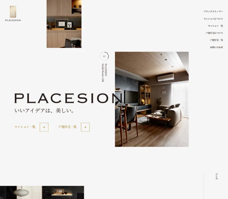
PLACESION presents a residential brand through spatial composition rather than dense property-search controls. The desktop opening places a large portrait interior photograph right of center, a smaller architectural detail against the top edge, and a broad wordmark across the left half. The wordmark slightly overlaps the main photograph. Small Japanese navigation links occupy the upper-right corner, leaving the center unusually open.
The contrast is between quiet interface geometry and richly textured rooms: timber grain, vertical slats, dark cabinetry, ceramic tableware, and localized lighting. Japanese serif typography gives the copy a measured, formal voice. Gold appears in the monogram, link labels, thin square arrow frames, and contact invitation. This is a brand homepage with routes into condominium and detached-house information, property collections, news, and contact.
閉じる
PLACESION — Style Reference
Warm residential photography arranged like an architectural editorial, with generous pale space and restrained gold details.
Website / Original URL: www.placesion.com Final URL: https://www.placesion.com/ Theme: light gray canvas, deep brown-black typography, muted gold accents, and a dark mobile property bar. Inspected: supplied evidence retrieved October 5, 2026, at 06:04:48.900 JST — October 4, 2026, at 21:04:48.900 UTC. Viewports: 1440 × 1000 desktop and 390 × 844 mobile, in CSS pixels. Scope: the current residential brand homepage. Visual evidence covers three similar desktop opening states, a mobile opening state, and a mobile footer state. Rendered text and computed element samples additionally document the brand introduction and news section. Property features and the main contact section have content evidence, but their complete visual layouts were not supplied.
PLACESION presents a residential brand through spatial composition rather than dense property-search controls. The desktop opening places a large portrait interior photograph right of center, a smaller architectural detail against the top edge, and a broad wordmark across the left half. The wordmark slightly overlaps the main photograph. Small Japanese navigation links occupy the upper-right corner, leaving the center unusually open.
The contrast is between quiet interface geometry and richly textured rooms: timber grain, vertical slats, dark cabinetry, ceramic tableware, and localized lighting. Japanese serif typography gives the copy a measured, formal voice. Gold appears in the monogram, link labels, thin square arrow frames, and contact invitation. This is a brand homepage with routes into condominium and detached-house information, property collections, news, and contact.
How to Read This Reference
- Measured values come from the supplied computed styles and element rectangles. Measurements describe the recorded state, including elements that may be hidden or clipped.
- Estimated values come from visual comparison with the supplied original-page screenshots. Photo bounds, some icon dimensions, and footer typography fall into this category.
- Calculated values are simple relationships between recorded measurements, such as gaps or proportions. They do not establish the original CSS formula.
- Recommended values and behaviors are implementation guidance. The CSS starter is an adaptation, not recovered production CSS.
- A DOM rectangle does not prove that an element was painted. This distinction is especially important for the mobile hero, menu layers, and collapsed news entries.
- No additional browsing, link activation, file inspection, or form submission was performed for this reference.
Tokens — Colors
Default Palette
The token names below are descriptive implementation aliases.
| Name | Value | Suggested token | Role and evidence |
|---|---|---|---|
| Pale Canvas | #f6f6f6 |
--color-canvas |
Measured body background at both viewports; dominant desktop hero surface |
| Brown-Black Ink | #1e0405 |
--color-ink |
Measured body text, Japanese navigation, and mobile property-bar background |
| Muted Gold | #b1883a |
--color-gold |
Measured hero links, brand-story link, and English news caption |
| White | #ffffff |
--color-white |
Measured mobile menu-button background and reversed mobile-bar labels; footer also appears white |
| Ghost Gray | #ececec |
--color-ghost |
Measured oversized English labels in the menu-related DOM; their displayed state was not captured |
| Secondary Gray | Approximately #8c8c8c |
--color-muted |
Estimated from the mobile footer's secondary headings and links |
| Hairline Gray | Approximately #d4d0cd |
--color-line |
Estimated approximation for quiet separators and the hero's fine circular outline |
Gold is primarily an ink and border color. The desktop property links are not solid gold buttons. Preserve their open relationship with the background.
The photographs contribute brown, charcoal, and subdued cream tones without expanding the interface palette. The small Instagram marks in the footer retain their recognizable multicolor treatment.
The supplied custom properties include --swiper-theme-color: #007aff and --swiper-navigation-size: 44px. These are library-named values, not evidence of a visible blue brand accent or a 44px hero control. Do not incorporate that blue into the page palette.
Theme Behavior
Only the light presentation is evidenced. No theme selector or alternate dark theme was inspected. The mobile bottom bar is a localized dark surface within the light page.
Tokens — Typography
Japanese Serif — Primary Voice
Measured family declaration:
source-han-serif-japanese, 游明朝体, 'Yu Mincho', yumincho, 'ヒラギノ明朝 ProN', 'Hiragino Mincho ProN', 'MS P明朝', 'MS PMincho', serif
This stack is used for the body, Japanese navigation, hero tagline, brand statement, and news copy. Regular copy is weight 400; navigation and the news heading use 600. The contrast between fine strokes, deliberate line breaks, and spacious leading is central to the page.
Computed family declarations do not independently prove which font file supplied every rendered glyph. Preserve the declared hierarchy and provide suitable fallbacks.
Cormorant — English Accents
Measured family declaration: Cormorant, 游明朝体, 'Yu Mincho', yumincho, serif.
Cormorant is declared for English editorial accents and arrow links. The brand-story link uses weight 500 and 0.05em tracking. Oversized menu-related words use weight 300. Japanese property-link labels share this stack and may use its Japanese fallback.
Inter — Dates and Utility Information
News dates declare Inter, sans-serif, weight 400, with 0.05em tracking. Their compact numerals provide a clear contrast with the surrounding Japanese serif text.
The menu button declares Arial in the computed sample, but its mobile screenshot presents three horizontal strokes. That declaration is not a reason to introduce Arial as a general design font.
Brand Lettering
Treat the narrow gold monogram, small PLACESION lockup, and large horizontal wordmark as supplied brand artwork. The evidence does not identify a font for the large wordmark or establish its asset format. Do not substitute a typed Cormorant heading and describe it as an exact reproduction.
Type Scale
All numeric values in this table are measured computed values unless marked otherwise.
| Role | Desktop size / line height | Mobile size / line height | Weight / tracking |
|---|---|---|---|
| Root and inherited body | 14.4 / 14.4px |
15.0724 / 15.0724px |
400; normal tracking |
| Hero Japanese tagline | 32.4 / 32.4px |
19.7826 / 19.7826px |
400; mobile text has a rectangle but is absent from the supplied opening screenshot |
| Hero property-link label | 18 / 27px |
12.2464 / 21.6666px |
500 |
| Visible desktop navigation | 12.6 / 15.12px |
Not displayed as a rail | 600 |
| Menu-layer Japanese links | 16.2 / 16.2px |
16.9565 / 16.9565px |
600; DOM-only state |
| Brand statement | 45 / 72px |
37.6811 / 51.8115px |
400 |
| Brand prose | 16.2 / 45.036px |
15.0724 / 32.1043px |
400 |
| Read Brand Story | 27 / 40.5px |
21.6666 / 21.6666px |
500; 0.05em |
| Japanese news heading | 27 / 27px |
21.6666 / 21.6666px |
600 |
| What's New caption | 12.6 / 12.6px |
9.4203 / 9.4203px |
500; 0.05em |
| News date | 12.6 / 12.6px |
11.3043 / 11.3043px |
400; 0.05em |
| News headline | 14.4 / 32.4px |
14.1304 / 28.2608px |
400; 0.05em |
| Mobile property bar | Not visibly presented in this form | 12.2464 / 12.2464px |
600 |
| Menu background words | 144 / 144px |
150.724 / 150.724px |
300; 0.05em; visibility unverified |
| Footer Contact Us | Not visually supplied | Approximately 44px |
Visual estimate; exact family and weight not sampled |
The source's inherited body line height is tight, but actual prose overrides it substantially. Brand prose uses approximately 2.78 leading on desktop and 2.13 on mobile. News headlines use 2.25 and 2 respectively. Apply those local rules rather than using the inherited line height for paragraphs.
Tokens — Spacing & Shapes
Spacing Relationships
| Relationship | Desktop | Mobile | Evidence |
|---|---|---|---|
| Hero copy left edge | 90px |
18.828px |
Measured; mobile copy not visibly painted in the opening capture |
| Brand-story left inset | 135px |
18.841px padding |
Measured |
| Brand-story top padding | 360px |
61.232px |
Measured |
| Brand text width | 585px |
352.344px |
Measured |
| Statement-to-prose gap | 72px |
Approximately 36.734px |
Calculated from rectangles |
| Prose-to-story-link gap | Approximately 54.891px |
Approximately 57.453px |
Calculated from rectangles |
| Gap between hero property links | 63px |
28.25px |
Calculated from anchor rectangles |
| Hero link height | 54px |
42.391px |
Measured anchor bounds |
| News row vertical padding | 45.9px top and bottom |
30.145px top; 22.609px bottom |
Measured |
| News row right padding | 72px |
47.101px |
Measured |
| News section vertical padding | 284.4px top; 205.2px bottom |
152.609px top; 97.029px bottom |
Measured |
The rhythm has two scales: small, precise interface details and very large editorial pauses. A conventional uniform 8px spacing system would lose the distinction if applied indiscriminately.
Shapes
| Element | Treatment | Evidence |
|---|---|---|
| Photography | Square corners; no visible frame or shadow | Screenshot observation |
| Hero arrow control | Approximately 54 × 54px, fine gold outline |
Screenshot estimate; matches measured anchor height |
| Slide marker | Approximately 53px diameter, fine circle with a darker partial arc |
Screenshot estimate |
| Mobile menu button | 70.641 × 70.641px, white, 0px radius |
Measured |
| Mobile property bar | Full-width rectangle with two divisions, 0px radius |
Measured and visible |
| Sampled text links | 0px radius, transparent background |
Measured |
Opening Composition
Coordinates below refer to the 1440 × 1000 capture. The hero section itself measures 1432px wide, leaving an approximately 8px scrollbar region.
| Element | Position and size | Evidence |
|---|---|---|
| Linked upper-left brand lockup | x 34.188, y 36.891; 94.5 × 94.5px anchor |
Measured |
| Main portrait photograph | Approximately x 716, y 203; 458 × 594px |
Screenshot estimate |
| Upper detail photograph | Approximately x 291, y 0; 216 × 297px |
Screenshot estimate |
| Lower continuation photograph | Approximately x 0, y 919; 522px visible width |
Screenshot estimate; full height unknown |
| Large wordmark | Approximately x 90, with a span near 673px |
Screenshot estimate; artwork bounds not supplied |
| Japanese tagline | x 90, y 550.433; 32.406px line box |
Measured |
| First hero link | x 90, y 644.891; 207 × 54px |
Measured |
| Second hero link | x 360, y 644.891; 189 × 54px |
Measured |
| Navigation rail | Right edge x 1387; first row y 63 |
Measured |
| Navigation row pitch | Approximately 43.516px |
Calculated |
Components
Linked Brand Lockup
The upper-left identity combines a tall gold geometric monogram with a small horizontal PLACESION wordmark. It occupies a measured 94.5px square anchor on desktop, with considerable empty space surrounding it.
On mobile, the anchor is approximately 34.309px square at x 25.689, y 18.158. It overlays the upper-left interior photograph. The same small identity remains visible in the footer capture, supporting a visually persistent header treatment. The actual positioning declaration was not included.
Keep the original artwork's proportions. Enlarging the mobile logo to match the menu button would change the observed balance.
Desktop Navigation Rail and Mobile Menu Trigger
The visible desktop navigation is a right-aligned stack of six Japanese links, beginning near the upper-right corner. It contains brand story, condominium information and listings, detached-house information and listings, and contact. Text uses 12.6px Japanese serif at weight 600, with approximately 43.5px between row starts.
The mobile capture replaces this visible rail with a white square button at the top-right edge. Three thin dark horizontal lines occupy its center. The button measures 70.641px square; the strokes appear approximately 27px wide.
The DOM also contains a separate menu layer with six larger links and oversized pale English words. Its mobile link rectangles are full-width and approximately 56.516px high. This establishes available menu content, not a verified open-menu composition. The trigger was not activated, so opening direction, focus management, backdrop, and dismissal behavior remain unverified.
Architectural Hero Collage
The desktop hero is a full-height composition rather than a centered text block above a wide banner. Its main ingredients are:
- A portrait photograph beginning at the horizontal midpoint and occupying about 32% of the available hero width.
- A much smaller portrait detail near the upper-left quarter, flush with the top edge.
- A large horizontal wordmark across the left, extending slightly into the main photo.
- The Japanese tagline
いいアイデアは、美しい。directly below the wordmark. - Two open gold links below the tagline.
- A cropped photographic continuation entering from the lower-left edge.
The main photograph's approximate center falls at the viewport's vertical midpoint. Its tall crop preserves the depth from the dining table toward the kitchen. The smaller image isolates woodwork and table styling rather than showing an unrelated scene.
Do not enclose the copy or images in cards. The pale space between them is part of the composition.
Slide Marker and Scroll Cue
A small outlined circle displaying 01 sits to the left of the main image, around x 649, y 232 at its center. Beneath it, PLACESION and Model Room LDK appear in two vertical lines. A separate vertical Scroll label and long fine rule appear near the lower-right edge.
The supplied DOM contains 01, 02, and 03, plus repeated model-room captions. Repeated desktop captures show small differences in the photo crop and circular arc. These observations suggest changing presentation states, but do not establish autoplay timing, slide-transition style, or whether the circle is interactive.
A faithful static adaptation can preserve the circle, vertical caption, and scroll cue without inventing playback controls.
Gold Arrow Link
The hero's primary navigation links use a label followed by a separate outlined square containing a small right arrow. At desktop scale, the first label occupies 126px, followed by approximately 27px of open space and a 54px square. Together these match the measured 207px anchor width.
The first label is マンション一覧; the second is 戸建住宅一覧. Their targets are /mansion-list/ and /house-list/. Both have equal visual priority.
The same family of link appears as Read Brand Story, with larger English typography and slight tracking. The measured transition is an opacity change over 200ms; the actual hover opacity was not supplied.
Keep the label and arrow inside one anchor so the entire component is a usable target. A 44px minimum mobile target is a recommended improvement over the sampled 42.391px inline-link height.
Brand Introduction
The next section repeats the brand statement across two deliberate lines and follows it with a narrow block of Japanese prose. On desktop, its heading starts at x 135, y 1360, after 360px of internal top padding. The copy column is 585px wide.
The headline uses 45px type with 72px leading. The prose uses 16.2px type with approximately 45px leading, producing a quiet, almost verse-like sequence. Read Brand Story closes the section.
Mobile geometry is substantially more compact: approximately 18.84px side insets, 61.23px top padding, and a 352.34px text width. The statement remains large at 37.68px, while prose stays near 15px with 32.10px leading. These are DOM measurements; the supplied mobile images do not visually show this section.
News Heading and Rows
The news section pairs the Japanese heading 新着情報 with a much smaller gold What's New caption. Desktop measurements place this heading block at x 135, while the list begins at x 423.
Each desktop row contains a date column approximately 153px wide and a Japanese headline region approximately 496px wide, with 72px of right-side clearance. A one-line row measures about 124.19px high; a two-line row measures about 156.59px. The roughly 1px separation between rows is consistent with fine dividers, although their exact color was not sampled.
On mobile, dates stack above headlines. Rows span approximately 352.34px; headline text has approximately 305.25px available after right padding. The first recorded row is taller because its headline wraps to two lines.
The mobile text extraction exposes three initial notices followed by View More. Older entries remain in the link and element inventory, with overlapping positions. The desktop extraction exposes a much longer archive. Do not assume that every extracted entry is simultaneously visible or reproduce the recorded archive height as a fixed layout requirement. Expansion and collapse were not tested.
Residential Categories and Featured Property Links
The rendered homepage contains separate Mansions and Detached Houses sections. Each includes a Japanese section label, a descriptive statement, explanatory copy, Read More, an Index label, three featured properties, and a link to the complete collection.
The measured element sample does not reach their detailed visual styling, so the evidence supports their information anatomy rather than a particular card grid.
Each featured link combines a Japanese property name, a two-digit index, and View Website. For example, the condominium collection includes プラセシオン植田アネシア; the house collection includes プラセシオンガーデン八事表山Ⅲ. English versions of property names repeat in the extracted content. Repetition alone does not establish a moving marquee.
For an extension, an unboxed editorial index using the established typography and arrow-link language is a reasonable recommendation. Property-image aspect ratios, hover previews, and carousel behavior require further evidence before being represented as original features.
Main Contact Section
The DOM contains Contact Us, the lines Let's get started. and Send us your questions., a Japanese contact heading, explanatory copy, and Contact Form.
Its content distinguishes general questions from requests for brochures and visits, which are directed through the property-list pages. Preserve this routing distinction. The supplied evidence does not establish the contact section's image treatment, typography scale, or form behavior.
Persistent Mobile Property Bar
A deep brown-black strip remains at the bottom of both mobile screenshots. It begins at y 768.641 in the 844px viewport and measures approximately 75.359px high.
Its two anchors measure approximately 195.25px and 194.75px wide. Each centers a small white outline icon beside a Japanese label: an apartment-like symbol for マンション一覧, and a house outline for 戸建住宅一覧. Labels use 12.2464px, weight 600. A fine vertical divider separates the halves.
This bar maintains direct access to both property categories even when the page is at its footer. It has square corners and no floating-card margin. Safe-area accommodation was not measured and should be added explicitly in a new implementation.
Mobile Footer
The supplied footer state has a white surface and a left inset near 19px. Its visible contents progress through primary navigation, privacy information, a muted Link heading, two columns of related-company links, two Instagram links, a large gold Contact Us invitation, and a pale brand/copyright signature.
The related links are visually small, approximately 10–11px, with generous vertical separation. The social links pair small colored Instagram marks with quiet gray text. Contact Us is much larger, approximately 44px, with a small arrow aligned near its baseline and a Japanese gold line beneath it.
The pale PLACESION signature is aligned toward the right near the bottom, above a small copyright line. The persistent property bar remains below. Exact footer font declarations and spacing values were not included in the computed samples, so these are screenshot estimates.
Tokens — Motion & Interaction
| Treatment | Evidence | What can be reused confidently |
|---|---|---|
| Gold arrow-link transition | opacity 0.2s cubic-bezier(0.16, 1, 0.3, 1) |
Duration, animated property, and easing are measured; hover endpoint is unknown |
| Desktop navigation | color 0.2s ease-out |
A short color transition is declared; destination color was not sampled |
| Desktop menu-layer links | height 0.2s, color 0.2s |
Declared transition properties; triggering state was not exercised |
| News links | color 0.4s cubic-bezier(0.16, 1, 0.3, 1) |
Slower color transition; actual hover color remains unverified |
| Hero image and circle | Slight differences across supplied opening captures | Preserve static composition; timing and transition mechanism are unknown |
| Mobile menu | Button and menu content are present | Toggle behavior, animation, keyboard handling, and dismissal are unverified |
| View More / Close | Labels and # link targets occur in the DOM |
Expansion behavior and default desktop item count are unverified |
| Page Top / Scroll | Labels and a Page Top link occur in the evidence | Smooth scrolling, scroll ownership, and activation results are unverified |
Many sampled elements report animation: none. That does not exclude motion on descendants, pseudo-elements, or JavaScript-controlled properties. A transition: all string without a recorded duration also does not establish an animated treatment.
The capture process waited for bounded loading and finite motion, and temporarily paused perpetual animation during readiness checks. It did not provide a continuous recording. Avoid specifying parallax, a particular animation library, stagger intervals, or a slideshow cycle as observed facts.
For an adaptation, short color and opacity changes fit the evidence. Content should be visible without waiting for an entrance animation.
Surfaces
| Surface | Appearance | Role |
|---|---|---|
| Main canvas | Flat #f6f6f6 |
Makes room for separated photography and typography |
| Photograph windows | Hard rectangular edges; no visible shadow | Supply texture, warmth, and architectural depth |
| Hero copy layer | Dark lettering directly over canvas, with a small overlap into the photograph | Connects the brand name to the room composition |
| Arrow-link frame | Transparent square with a fine gold outline | Indicates direction without becoming a heavy button |
| Mobile menu trigger | White square | Separates the utility control from the pale canvas |
| Mobile footer | Visually white | Supports navigation, related links, and the final contact invitation |
| Mobile property bar | Solid #1e0405 with white content |
Provides a strong persistent navigation anchor |
No general shadow-based elevation or rounded-card system is visible in the supplied hero and footer. Their hierarchy comes from scale, whitespace, photo placement, and a small number of outlines.
Imagery
The current desktop hero features a carefully staged dining and kitchen interior. Warm timber panels and vertical slats contrast with a dark ceiling, dark cabinetry, black table textiles, ceramic dishes, and small decorative objects. Perspective leads through the room rather than stopping at a flat furniture vignette.
Use architectural photographs with controlled verticals, visible material grain, deep but readable shadows, and a restrained palette. Preserve the difference between the main room view and the tighter detail crop. Avoid replacing the collage with a single full-bleed image or unrelated lifestyle portraits.
The photographic assets retain natural color. No global duotone, colored overlay, or blur treatment is visible. Text mostly stays on the pale canvas, allowing the imagery to remain detailed.
Observed Asset References
The supplied evidence does not include original image src values or media URLs. The following are visual roles, not invented asset paths.
| Asset role | Evidence | Reuse guidance |
|---|---|---|
| Main dining/kitchen portrait | Desktop and mobile opening screenshots | Preserve architectural depth; desktop visible ratio is approximately 458:594 |
| Upper interior detail | Desktop opening screenshots | Use a related crop with timber, slats, and table styling; approximately 216:297 visible ratio |
| Lower photographic continuation | Lower edge of desktop captures | Only the upper strip is visible; full dimensions are unknown |
| Gold monogram and small lockup | Desktop and mobile headers | Use the supplied brand artwork when available; file format is unknown |
| Large horizontal wordmark | Desktop opening | Preserve artwork proportions rather than assigning an unverified typeface |
| Building and house outlines | Mobile property bar | Approximately 16–18px visual size; source files and exact strokes are unknown |
| Instagram marks | Mobile footer | Small recognizable colored social marks |
The mobile opening shows only a 195 × 253px approximate photo region at the top-left. The large blank area below is documented as an unresolved rendered state, not a photographic art-direction requirement.
Layout & Responsive Behavior
Desktop
At 1440 × 1000, the hero section measures 1432 × 1000px. The composition has several independent anchors: small identity at upper-left, detail photograph near 20% of the width, main photograph at 50%, large wordmark at a 90px left inset, and navigation near the far-right edge.
The wordmark and main photograph overlap slightly, while the Japanese tagline and links remain on the clear canvas. A partial image enters from below before the next section's text begins. This creates continuity beyond the first viewport.
The brand introduction uses a 135px inset and a 585px text column. News uses a heading column beside a wider list. These measured relationships support a spacious editorial structure; they do not imply that every later section uses the same grid.
Mobile
At 390 × 844, the opening image sits flush with the top-left edge and occupies approximately half the screen width. The small logo overlays it. The top-right menu button and full-width bottom property bar remain visible.
The large wordmark, tagline, and inline hero links are absent from the supplied opening screenshot. Nevertheless, the DOM gives the tagline a position near y 657.28 and the inline links positions near y 704.38. Opacity, clipping, reveal state, or another rendering condition may explain the discrepancy; the evidence does not identify its cause.
Do not treat the missing copy as an intentional mobile content strategy. A recommended implementation should render essential text by default and use normal flow or a verified layout to keep it reachable.
| Relationship | Desktop evidence | Mobile evidence |
|---|---|---|
| Hero height | 1000px |
844px |
| Header identity | 94.5px square anchor |
Approximately 34.31px square anchor |
| Primary navigation | Visible vertical rail | Visible square menu trigger; open state untested |
| Property access | Two gold inline hero links | Persistent dark two-column bottom bar |
| Brand prose width | 585px |
Approximately 352.34px |
| News row arrangement | Date beside headline | Date above headline |
| Main page background | #f6f6f6 |
#f6f6f6 |
Measurement Limits
The desktop record reports a document height of 1000px even though section rectangles extend thousands of pixels below the hero. The mobile document height is approximately 8625px. This discrepancy may involve a scroll container or transformed layout, but the implementation cannot be established from the supplied fields.
The source root sizes are 14.4px on desktop and 15.0724px on mobile. The desktop value equals 1vw at the sampled width, but two observations do not establish the complete responsive formula. No exact breakpoint was supplied.
The CSS starter therefore uses a conventional root, measured values at the reference sizes, and an explicitly recommended 767px breakpoint. It does not reproduce a presumed scrolling engine or force the mobile blank state.
Do’s and Don’ts
Do
- Keep the interface centered on pale gray, brown-black, and restrained gold.
- Preserve the asymmetric relationship between the large wordmark and portrait interior photography.
- Use the brand's actual lettering assets where available.
- Maintain Japanese serif typography with generous paragraph leading.
- Use Cormorant for evidenced English accent roles and Inter for compact dates.
- Keep photograph corners square and their color treatment natural.
- Preserve the separate gold label and outlined arrow-square anatomy.
- Give condominium and detached-house routes equal prominence.
- Retain the persistent two-part property navigation on mobile.
- Separate screenshot observations from DOM-only geometry and proposed improvements.
Don’t
- Don't turn the homepage into a single-property landing page with an invented reservation flow.
- Don't replace the opening collage with a centered banner and generic headline.
- Don't use rounded cards, broad gold fills, or soft shadows as the default visual system.
- Don't infer a font for the large wordmark from the surrounding text.
- Don't mistake the library's blue custom property for a brand color.
- Don't assume hidden menu words are visible behind the current hero.
- Don't reproduce thousands of pixels of news merely because old entries have DOM rectangles.
- Don't infer autoplay, parallax, ticker motion, or menu transitions from repeated text alone.
- Don't present the missing mobile hero copy as a verified intentional design.
- Don't let a fixed bottom bar obscure the last link, contact content, or keyboard focus.
Recommended Implementation Additions
These are proposals for a new implementation, not verified original features:
- Make the hero copy visible before any enhancement script runs. Apply reveal effects only after establishing a reliable final state.
- Use a named menu button with
aria-expandedandaria-controls. If the menu is modal, support Escape, focus containment, and focus restoration. - Add clear keyboard focus indicators to the subtle gold links and footer links.
- Use at least
44pxtargets for compact mobile controls, while preserving their light visual weight. - Add safe-area padding to the bottom navigation and matching content clearance.
- Review small gold and gray text against its actual background. Where contrast is insufficient, use the dark ink for functional labels and retain gold for borders or larger accents.
- Increase very small footer and English-caption text where needed for comfortable reading; do not scale all type directly with viewport width.
- Preserve news expansion with semantic buttons and explicit expanded state. Keep collapsed items out of keyboard navigation.
- If implementing automatic image changes, provide a pause mechanism and a reduced-motion alternative. Do not make essential copy dependent on the slideshow.
- Ensure persistent header elements do not collide with footer navigation during scrolling or text zoom.
- Provide meaningful image alternatives for room photography; mark repeated decorative crops and purely ornamental lettering appropriately.
Agent Prompt Guide
Quick Color Reference
- Main canvas:
#f6f6f6. - Primary text and mobile navigation fill:
#1e0405. - Accent links and arrow frames:
#b1883a. - Mobile menu square and reversed bar content:
#ffffff. - Oversized menu-related background text:
#ececec, documented from DOM only. - Secondary footer gray and fine dividers: approximate values requiring visual tuning.
Overall Prompt
“Create an editorial homepage for a Japanese residential brand inspired by PLACESION. Use a pale gray #f6f6f6 canvas, deep brown-black #1e0405 typography, and restrained muted gold #b1883a. On desktop, arrange a portrait dining-and-kitchen photograph right of center, a smaller related detail against the top edge, a large supplied horizontal wordmark across the left, and a small six-link Japanese navigation rail at the upper-right. Let the wordmark slightly overlap the main photograph. Place a Japanese serif tagline and two gold label-plus-square-arrow links below it. Use Japanese Mincho-style typography, Cormorant English accents, Inter dates, square image corners, and generous editorial spacing. On mobile, retain a compact identity, a white square menu trigger, and a persistent dark two-part property bar. Keep essential copy visible without animation. Treat unverified property layouts and interaction effects as new design decisions.”
Example Component Prompts
- Hero collage: “Build a 1440 × 1000 reference composition with a portrait room photograph approximately 458 × 594px at x716/y203, a 216 × 297px detail at x291/y0, and brand copy beginning at x90. Use supplied wordmark artwork and preserve broad pale-gray gaps. These image dimensions are visual estimates, not original CSS declarations.”
- Arrow link: “Create one accessible anchor containing a gold serif label, a 27px gap, and a 54px square with a thin gold outline and small right arrow. Keep the surface transparent, corners square, and transition limited to subtle opacity feedback.”
- News list: “Pair a Japanese serif heading and tiny gold English caption with a list of generously spaced notices. Use Inter dates and Japanese serif headlines. Put dates beside headlines on desktop and above them on mobile. Use fine separators and no card shadows.”
- Mobile property bar: “Create a full-width bottom bar approximately 75px high in #1e0405. Divide it into equal links for condominium and detached-house listings, each with a small white outline icon and a semibold Japanese serif label. Add safe-area and content clearance.”
- Mobile footer: “Use a white footer with approximately 19px side insets, quiet related links in two columns, small social marks, and a large gold Contact Us line with a small arrow. Finish with a subdued right-aligned brand signature. Keep the fixed property bar from covering the content.”
Quick Start
CSS Custom Properties
This starter reproduces the evidenced visual language without changing the root font size. Apply placesion to the page body. It assumes authorized wordmark and room-image assets supplied by the implementation; no original media paths were available.
The desktop photo ratios and placement are screenshot-based approximations. The breakpoint, hover endpoints, focus treatment, safe-area handling, divider color, and mobile copy layout are recommendations. Font names are declared here, but font files must be supplied separately if available.
Suggested hero structure: .hero contains .hero-photo--main, .hero-photo--detail, optional .hero-photo--continuation, .hero-meta, and .hero-copy. The copy contains a .hero-wordmark image, .hero-tagline, and .hero-actions.
:root {
  /* Measured interface colors */
  --color-canvas: #f6f6f6;
  --color-ink: #1e0405;
  --color-gold: #b1883a;
  --color-white: #ffffff;
  --color-ghost: #ececec;

  /* Visual approximations for secondary details */
  --color-muted: #8c8c8c;
  --color-line: #d4d0cd;

  /* Declared source families with practical fallbacks */
  --font-jp: source-han-serif-japanese, 'Yu Mincho', yumincho,
    'Hiragino Mincho ProN', 'MS PMincho', serif;
  --font-display: Cormorant, 'Yu Mincho', yumincho, serif;
  --font-utility: Inter, sans-serif;

  --hero-inset: 6.25vw;
  --editorial-inset: 9.375vw;
  --mobile-inset: 18.84px;
  --arrow-size: 54px;
  --arrow-gap: 27px;
  --mobile-bar-height: 75.36px;
  --safe-bottom: env(safe-area-inset-bottom, 0px);
  --ease-link: cubic-bezier(0.16, 1, 0.3, 1);
}

.placesion,
.placesion * {
  box-sizing: border-box;
}

.placesion {
  margin: 0;
  background: var(--color-canvas);
  color: var(--color-ink);
  font-family: var(--font-jp);
  font-size: 16px;
  line-height: 1.8;
}

.placesion a { color: inherit; }
.placesion img { display: block; max-width: 100%; }

.brand-lockup {
  position: absolute;
  z-index: 10;
  top: 36.89px;
  left: 34.19px;
  width: 94.5px;
}

.desktop-nav {
  position: absolute;
  z-index: 10;
  top: 63px;
  right: 45px;
  display: grid;
  justify-items: end;
  gap: 28.4px;
}

.desktop-nav a {
  font-size: 12.6px;
  font-weight: 600;
  line-height: 1.2;
  text-decoration: none;
  transition: color 200ms ease-out;
}

.menu-toggle { display: none; }

.hero {
  position: relative;
  min-height: 100vh;
  min-height: 100svh;
}

.hero-photo { margin: 0; }
.hero-photo img { width: 100%; height: 100%; object-fit: cover; }

.hero-photo--main {
  position: absolute;
  left: 50%;
  top: 50%;
  width: 32%;
  aspect-ratio: 458 / 594;
  transform: translateY(-50%);
}

.hero-photo--detail {
  position: absolute;
  left: 20.32%;
  top: 0;
  width: 15.08%;
  aspect-ratio: 216 / 297;
}

.hero-photo--continuation {
  position: absolute;
  left: 0;
  top: 91.9%;
  width: 36.45%;
}

.hero-photo--continuation img { height: auto; }

.hero-copy {
  position: absolute;
  z-index: 2;
  top: 45.8%;
  left: var(--hero-inset);
  width: 47%;
}

.hero-wordmark { width: 100%; height: auto; }

.hero-tagline {
  margin: 28px 0 0;
  font-size: clamp(24px, 2.25vw, 36px);
  font-weight: 400;
  line-height: 1;
}

.hero-actions {
  display: flex;
  flex-wrap: wrap;
  gap: 24px 63px;
  margin-top: 62px;
}

.placesion .arrow-link {
  display: inline-flex;
  align-items: center;
  gap: var(--arrow-gap);
  min-height: var(--arrow-size);
  color: var(--color-gold);
  font-family: var(--font-display);
  font-size: 18px;
  font-weight: 500;
  line-height: 1.5;
  text-decoration: none;
  transition: opacity 200ms var(--ease-link);
}

.arrow-box {
  display: grid;
  place-items: center;
  flex: 0 0 var(--arrow-size);
  width: var(--arrow-size);
  height: var(--arrow-size);
  border: 1px solid currentColor;
  font-family: var(--font-utility);
  font-size: 18px;
  line-height: 1;
}

.hero-meta {
  position: absolute;
  left: 43.5%;
  top: 20.6%;
  display: grid;
  justify-items: center;
  gap: 19px;
}

.slide-number {
  position: relative;
  display: grid;
  place-items: center;
  width: 53px;
  aspect-ratio: 1;
  border: 1px solid var(--color-line);
  border-radius: 50%;
  font: 11px / 1 var(--font-utility);
}

/* Static arc approximation; no autoplay behavior is implied. */
.slide-number::after {
  content: '';
  position: absolute;
  inset: -1px;
  border: 1px solid transparent;
  border-top-color: var(--color-ink);
  border-right-color: var(--color-ink);
  border-radius: 50%;
}

.hero-meta-caption {
  writing-mode: vertical-rl;
  font-size: 12.6px;
  line-height: 1.4;
}

.brand-story {
  position: relative;
  padding: 360px var(--editorial-inset) 0;
}

.brand-copy { max-width: 585px; }
.brand-statement { margin: 0; font-size: 45px; font-weight: 400; line-height: 1.6; }
.brand-prose { margin: 72px 0 0; font-size: 16.2px; line-height: 2.78; }
.placesion .story-link { margin-top: 55px; font-size: 27px; letter-spacing: 0.05em; }

.news-section {
  display: grid;
  grid-template-columns: 20vw minmax(0, 1fr);
  margin-top: 200px;
  padding: 284.4px 20vw 205.2px var(--editorial-inset);
}

.news-heading { margin: 0; font-size: 27px; font-weight: 600; line-height: 1; }
.news-caption {
  margin: 18.9px 0 0;
  color: var(--color-gold);
  font: 500 12.6px / 1 var(--font-display);
  letter-spacing: 0.05em;
}

.news-list { min-width: 0; border-top: 1px solid var(--color-line); }
.news-row {
  display: grid;
  grid-template-columns: 153px minmax(0, 1fr);
  align-items: center;
  padding: 45.9px 72px 45.9px 0;
  border-bottom: 1px solid var(--color-line);
  text-decoration: none;
  transition: color 400ms var(--ease-link);
}

.news-date { font: 400 12.6px / 1 var(--font-utility); letter-spacing: 0.05em; }
.news-title { margin: 0; font-size: 14.4px; line-height: 2.25; letter-spacing: 0.05em; }

.site-footer { padding: 80px var(--editorial-inset); background: var(--color-white); }
.footer-links { display: grid; grid-template-columns: repeat(2, minmax(0, 1fr)); gap: 24px 16px; }
.footer-links a { font-size: 12px; text-decoration: none; }
.placesion .footer-contact { display: block; margin-block: 64px; color: var(--color-gold); text-decoration: none; }
.footer-contact-title { font: 500 44px / 1.2 var(--font-display); }
.footer-contact-copy { display: block; margin-top: 6px; font-size: 14px; }
.footer-signature { color: var(--color-muted); text-align: right; font-family: var(--font-utility); }
.property-bar { display: none; }

/* Recommended interaction endpoints; source endpoints were not sampled. */
@media (hover: hover) {
  .placesion .arrow-link:hover { opacity: 0.7; }
  .desktop-nav a:hover,
  .placesion .news-row:hover { color: var(--color-gold); }
}

.placesion :is(a, button):focus-visible {
  outline: 2px solid currentColor;
  outline-offset: 5px;
}

/* Recommended breakpoint, not a recovered source media query. */
@media (max-width: 767px) {
  :root { --arrow-size: 44px; --arrow-gap: 14.13px; }
  .placesion { padding-bottom: calc(var(--mobile-bar-height) + var(--safe-bottom)); }
  .desktop-nav { display: none; }
  .brand-lockup { position: fixed; top: 18.16px; left: 25.69px; width: 34.31px; }

  .menu-toggle {
    position: fixed;
    z-index: 30;
    top: 0;
    right: 0;
    display: grid;
    place-content: center;
    gap: 6px;
    width: 70.64px;
    height: 70.64px;
    padding: 0;
    border: 0;
    border-radius: 0;
    color: var(--color-ink);
    background: var(--color-white);
    cursor: pointer;
  }
  .menu-toggle span { display: block; width: 27px; height: 1.5px; background: currentColor; }

  /* Keep essential copy visible in normal flow. */
  .hero {
    min-height: calc(100svh - var(--mobile-bar-height));
    padding: 0 var(--mobile-inset) 56px;
  }
  .hero-photo--main {
    position: relative;
    left: auto;
    top: auto;
    width: 50vw;
    margin-left: calc(-1 * var(--mobile-inset));
    transform: none;
  }
  .hero-photo--detail,
  .hero-photo--continuation,
  .hero-meta { display: none; }
  .hero-copy { position: relative; top: auto; left: auto; width: 100%; padding-top: clamp(72px, 20vh, 170px); }
  .hero-tagline { margin-top: 22px; font-size: 19.78px; line-height: 1.4; }
  .hero-actions { gap: 20px 28px; margin-top: 28px; }
  .placesion .hero-actions .arrow-link { font-size: 12.25px; }

  .brand-story { padding: 61.23px var(--mobile-inset) 0; }
  .brand-copy { max-width: none; }
  .brand-statement { font-size: 37.68px; line-height: 1.375; }
  .brand-prose { margin-top: 36.73px; font-size: 15.07px; line-height: 2.13; }
  .placesion .story-link { margin-top: 57.45px; font-size: 21.67px; }

  .news-section { display: block; margin-top: 0; padding: 152.61px var(--mobile-inset) 97.03px; }
  .news-heading { font-size: 21.67px; }
  /* Readability floor above the sampled 9.42px caption. */
  .news-caption { margin-top: 15.07px; font-size: 11px; }
  .news-list { margin-top: 47.1px; }
  .news-row { grid-template-columns: minmax(0, 1fr); gap: 15.07px; padding: 30.14px 47.1px 22.61px 0; }
  .news-date { font-size: 11.3px; }
  .news-title { font-size: 14.13px; line-height: 2; }

  .site-footer { padding: 64px var(--mobile-inset); }
  .property-bar {
    position: fixed;
    z-index: 40;
    inset: auto 0 0;
    display: grid;
    grid-template-columns: repeat(2, minmax(0, 1fr));
    padding-bottom: var(--safe-bottom);
    background: var(--color-ink);
  }
  .placesion .property-bar a {
    display: flex;
    align-items: center;
    justify-content: center;
    gap: 12px;
    min-height: var(--mobile-bar-height);
    padding-inline: 12px;
    color: var(--color-white);
    font-size: 12.25px;
    font-weight: 600;
    line-height: 1.2;
    text-decoration: none;
  }
  .property-bar a + a { border-left: 1px solid rgb(255 255 255 / 28%); }
  .property-bar svg { width: 18px; height: 18px; flex: 0 0 18px; }
  .property-bar a:focus-visible { outline-offset: -5px; }
}

@media (prefers-reduced-motion: reduce) {
  .placesion *, .placesion *::before, .placesion *::after {
    animation: none !important;
    transition: none !important;
    scroll-behavior: auto !important;
  }
}
Use one anchor for the label and arrow:
<a class="arrow-link" href="/mansion-list/">
  <span>マンション一覧</span>
  <span class="arrow-box" aria-hidden="true">→</span>
</a>
The CSS styles the evidenced shell and representative editorial components. It does not implement menu state, news expansion, or a slideshow. Those require semantic markup and behavior appropriate to the new implementation. Validate the composition at both reference viewports, at larger text sizes, and between breakpoints.
Tailwind v4 Token Mapping
Optional aliases for an implementation already using Tailwind v4. This is not evidence that the original website uses Tailwind.
@theme inline {
  --color-canvas: #f6f6f6;
  --color-ink: #1e0405;
  --color-gold: #b1883a;
  --color-ghost: #ececec;
  --font-editorial: var(--font-jp);
  --font-accent: var(--font-display);
  --font-utility: Inter, sans-serif;
  --text-news: 14.4px;
  --text-statement: 45px;
  --spacing-arrow: var(--arrow-size);
  --spacing-editorial: var(--editorial-inset);
  --spacing-mobile-inset: var(--mobile-inset);
  --radius-square: 0px;
}
Sources & Evidence
- Inspected original and final page: PLACESION. The supplied record reports HTTP
200and identical original/final URLs. - Capture record: retrieved
2026-10-04T21:04:48.900Z, corresponding to October 5, 2026, at 06:04:48.900 JST. Desktop viewport:1440 × 1000; mobile viewport:390 × 844. - Visual evidence: supplied original-page images 1–3 show the desktop opening; image 4 shows the mobile opening; image 5 shows a mobile footer position. These are the sources for photo composition and screenshot estimates.
- Rendered evidence: page title, homepage text, original-page link inventory, computed family declarations, colors, element rectangles, padding, line heights, tracking, and transition strings. Detailed sampled geometry primarily covers navigation, hero text, brand introduction, and news.
- Operator evidence on the original page: the footer links to
丸美産業株式会社and displays the copyright name MARUMI SANGYO Co.,Ltd. These support operator identification, not a web-production credit. - Inspection limitations: no menu-open capture, exercised hover state, continuous motion recording, news-expansion result, property-link destination inspection, or contact-form test was supplied. Original image URLs and font-file URLs were not included. Mobile hero text has DOM geometry without visible correspondence in the initial screenshot.
The supplied capture process waited for document load, finite motion, sampled layout stability, and visible image decoding within bounded limits. Such checks do not establish semantic completeness. This reference describes the current supplied evidence and labels proposed implementation behavior separately.
# PLACESION — Style Reference

> Warm residential photography arranged like an architectural editorial, with generous pale space and restrained gold details.

**Website / Original URL:** [www.placesion.com](https://www.placesion.com/)
**Final URL:** [https://www.placesion.com/](https://www.placesion.com/)
**Theme:** light gray canvas, deep brown-black typography, muted gold accents, and a dark mobile property bar.
**Inspected:** supplied evidence retrieved October 5, 2026, at 06:04:48.900 JST — October 4, 2026, at 21:04:48.900 UTC.
**Viewports:** 1440 × 1000 desktop and 390 × 844 mobile, in CSS pixels.
**Scope:** the current residential brand homepage. Visual evidence covers three similar desktop opening states, a mobile opening state, and a mobile footer state. Rendered text and computed element samples additionally document the brand introduction and news section. Property features and the main contact section have content evidence, but their complete visual layouts were not supplied.

PLACESION presents a residential brand through spatial composition rather than dense property-search controls. The desktop opening places a large portrait interior photograph right of center, a smaller architectural detail against the top edge, and a broad wordmark across the left half. The wordmark slightly overlaps the main photograph. Small Japanese navigation links occupy the upper-right corner, leaving the center unusually open.

The contrast is between quiet interface geometry and richly textured rooms: timber grain, vertical slats, dark cabinetry, ceramic tableware, and localized lighting. Japanese serif typography gives the copy a measured, formal voice. Gold appears in the monogram, link labels, thin square arrow frames, and contact invitation. This is a brand homepage with routes into condominium and detached-house information, property collections, news, and contact.
閉じる
# PLACESION — Style Reference

> Warm residential photography arranged like an architectural editorial, with generous pale space and restrained gold details.

**Website / Original URL:** [www.placesion.com](https://www.placesion.com/)
**Final URL:** [https://www.placesion.com/](https://www.placesion.com/)
**Theme:** light gray canvas, deep brown-black typography, muted gold accents, and a dark mobile property bar.
**Inspected:** supplied evidence retrieved October 5, 2026, at 06:04:48.900 JST — October 4, 2026, at 21:04:48.900 UTC.
**Viewports:** 1440 × 1000 desktop and 390 × 844 mobile, in CSS pixels.
**Scope:** the current residential brand homepage. Visual evidence covers three similar desktop opening states, a mobile opening state, and a mobile footer state. Rendered text and computed element samples additionally document the brand introduction and news section. Property features and the main contact section have content evidence, but their complete visual layouts were not supplied.

PLACESION presents a residential brand through spatial composition rather than dense property-search controls. The desktop opening places a large portrait interior photograph right of center, a smaller architectural detail against the top edge, and a broad wordmark across the left half. The wordmark slightly overlaps the main photograph. Small Japanese navigation links occupy the upper-right corner, leaving the center unusually open.

The contrast is between quiet interface geometry and richly textured rooms: timber grain, vertical slats, dark cabinetry, ceramic tableware, and localized lighting. Japanese serif typography gives the copy a measured, formal voice. Gold appears in the monogram, link labels, thin square arrow frames, and contact invitation. This is a brand homepage with routes into condominium and detached-house information, property collections, news, and contact.

## How to Read This Reference

- **Measured** values come from the supplied computed styles and element rectangles. Measurements describe the recorded state, including elements that may be hidden or clipped.
- **Estimated** values come from visual comparison with the supplied original-page screenshots. Photo bounds, some icon dimensions, and footer typography fall into this category.
- **Calculated** values are simple relationships between recorded measurements, such as gaps or proportions. They do not establish the original CSS formula.
- **Recommended** values and behaviors are implementation guidance. The CSS starter is an adaptation, not recovered production CSS.
- A DOM rectangle does not prove that an element was painted. This distinction is especially important for the mobile hero, menu layers, and collapsed news entries.
- No additional browsing, link activation, file inspection, or form submission was performed for this reference.

## Tokens — Colors

### Default Palette

The token names below are descriptive implementation aliases.

| Name | Value | Suggested token | Role and evidence |
| --- | --- | --- | --- |
| Pale Canvas | `#f6f6f6` | `--color-canvas` | Measured body background at both viewports; dominant desktop hero surface |
| Brown-Black Ink | `#1e0405` | `--color-ink` | Measured body text, Japanese navigation, and mobile property-bar background |
| Muted Gold | `#b1883a` | `--color-gold` | Measured hero links, brand-story link, and English news caption |
| White | `#ffffff` | `--color-white` | Measured mobile menu-button background and reversed mobile-bar labels; footer also appears white |
| Ghost Gray | `#ececec` | `--color-ghost` | Measured oversized English labels in the menu-related DOM; their displayed state was not captured |
| Secondary Gray | Approximately `#8c8c8c` | `--color-muted` | Estimated from the mobile footer's secondary headings and links |
| Hairline Gray | Approximately `#d4d0cd` | `--color-line` | Estimated approximation for quiet separators and the hero's fine circular outline |

Gold is primarily an ink and border color. The desktop property links are not solid gold buttons. Preserve their open relationship with the background.

The photographs contribute brown, charcoal, and subdued cream tones without expanding the interface palette. The small Instagram marks in the footer retain their recognizable multicolor treatment.

The supplied custom properties include `--swiper-theme-color: #007aff` and `--swiper-navigation-size: 44px`. These are library-named values, not evidence of a visible blue brand accent or a 44px hero control. Do not incorporate that blue into the page palette.

### Theme Behavior

Only the light presentation is evidenced. No theme selector or alternate dark theme was inspected. The mobile bottom bar is a localized dark surface within the light page.

## Tokens — Typography

### Japanese Serif — Primary Voice

**Measured family declaration:**

`source-han-serif-japanese, 游明朝体, 'Yu Mincho', yumincho, 'ヒラギノ明朝 ProN', 'Hiragino Mincho ProN', 'MS P明朝', 'MS PMincho', serif`

This stack is used for the body, Japanese navigation, hero tagline, brand statement, and news copy. Regular copy is weight `400`; navigation and the news heading use `600`. The contrast between fine strokes, deliberate line breaks, and spacious leading is central to the page.

Computed family declarations do not independently prove which font file supplied every rendered glyph. Preserve the declared hierarchy and provide suitable fallbacks.

### Cormorant — English Accents

**Measured family declaration:** `Cormorant, 游明朝体, 'Yu Mincho', yumincho, serif`.

Cormorant is declared for English editorial accents and arrow links. The brand-story link uses weight `500` and `0.05em` tracking. Oversized menu-related words use weight `300`. Japanese property-link labels share this stack and may use its Japanese fallback.

### Inter — Dates and Utility Information

News dates declare `Inter, sans-serif`, weight `400`, with `0.05em` tracking. Their compact numerals provide a clear contrast with the surrounding Japanese serif text.

The menu button declares Arial in the computed sample, but its mobile screenshot presents three horizontal strokes. That declaration is not a reason to introduce Arial as a general design font.

### Brand Lettering

Treat the narrow gold monogram, small PLACESION lockup, and large horizontal wordmark as supplied brand artwork. The evidence does not identify a font for the large wordmark or establish its asset format. Do not substitute a typed Cormorant heading and describe it as an exact reproduction.

### Type Scale

All numeric values in this table are measured computed values unless marked otherwise.

| Role | Desktop size / line height | Mobile size / line height | Weight / tracking |
| --- | --- | --- | --- |
| Root and inherited body | `14.4 / 14.4px` | `15.0724 / 15.0724px` | `400`; normal tracking |
| Hero Japanese tagline | `32.4 / 32.4px` | `19.7826 / 19.7826px` | `400`; mobile text has a rectangle but is absent from the supplied opening screenshot |
| Hero property-link label | `18 / 27px` | `12.2464 / 21.6666px` | `500` |
| Visible desktop navigation | `12.6 / 15.12px` | Not displayed as a rail | `600` |
| Menu-layer Japanese links | `16.2 / 16.2px` | `16.9565 / 16.9565px` | `600`; DOM-only state |
| Brand statement | `45 / 72px` | `37.6811 / 51.8115px` | `400` |
| Brand prose | `16.2 / 45.036px` | `15.0724 / 32.1043px` | `400` |
| Read Brand Story | `27 / 40.5px` | `21.6666 / 21.6666px` | `500`; `0.05em` |
| Japanese news heading | `27 / 27px` | `21.6666 / 21.6666px` | `600` |
| What's New caption | `12.6 / 12.6px` | `9.4203 / 9.4203px` | `500`; `0.05em` |
| News date | `12.6 / 12.6px` | `11.3043 / 11.3043px` | `400`; `0.05em` |
| News headline | `14.4 / 32.4px` | `14.1304 / 28.2608px` | `400`; `0.05em` |
| Mobile property bar | Not visibly presented in this form | `12.2464 / 12.2464px` | `600` |
| Menu background words | `144 / 144px` | `150.724 / 150.724px` | `300`; `0.05em`; visibility unverified |
| Footer Contact Us | Not visually supplied | Approximately `44px` | Visual estimate; exact family and weight not sampled |

The source's inherited body line height is tight, but actual prose overrides it substantially. Brand prose uses approximately `2.78` leading on desktop and `2.13` on mobile. News headlines use `2.25` and `2` respectively. Apply those local rules rather than using the inherited line height for paragraphs.

## Tokens — Spacing & Shapes

### Spacing Relationships

| Relationship | Desktop | Mobile | Evidence |
| --- | --- | --- | --- |
| Hero copy left edge | `90px` | `18.828px` | Measured; mobile copy not visibly painted in the opening capture |
| Brand-story left inset | `135px` | `18.841px` padding | Measured |
| Brand-story top padding | `360px` | `61.232px` | Measured |
| Brand text width | `585px` | `352.344px` | Measured |
| Statement-to-prose gap | `72px` | Approximately `36.734px` | Calculated from rectangles |
| Prose-to-story-link gap | Approximately `54.891px` | Approximately `57.453px` | Calculated from rectangles |
| Gap between hero property links | `63px` | `28.25px` | Calculated from anchor rectangles |
| Hero link height | `54px` | `42.391px` | Measured anchor bounds |
| News row vertical padding | `45.9px` top and bottom | `30.145px` top; `22.609px` bottom | Measured |
| News row right padding | `72px` | `47.101px` | Measured |
| News section vertical padding | `284.4px` top; `205.2px` bottom | `152.609px` top; `97.029px` bottom | Measured |

The rhythm has two scales: small, precise interface details and very large editorial pauses. A conventional uniform 8px spacing system would lose the distinction if applied indiscriminately.

### Shapes

| Element | Treatment | Evidence |
| --- | --- | --- |
| Photography | Square corners; no visible frame or shadow | Screenshot observation |
| Hero arrow control | Approximately `54 × 54px`, fine gold outline | Screenshot estimate; matches measured anchor height |
| Slide marker | Approximately `53px` diameter, fine circle with a darker partial arc | Screenshot estimate |
| Mobile menu button | `70.641 × 70.641px`, white, `0px` radius | Measured |
| Mobile property bar | Full-width rectangle with two divisions, `0px` radius | Measured and visible |
| Sampled text links | `0px` radius, transparent background | Measured |

### Opening Composition

Coordinates below refer to the 1440 × 1000 capture. The hero section itself measures `1432px` wide, leaving an approximately 8px scrollbar region.

| Element | Position and size | Evidence |
| --- | --- | --- |
| Linked upper-left brand lockup | `x 34.188`, `y 36.891`; `94.5 × 94.5px` anchor | Measured |
| Main portrait photograph | Approximately `x 716`, `y 203`; `458 × 594px` | Screenshot estimate |
| Upper detail photograph | Approximately `x 291`, `y 0`; `216 × 297px` | Screenshot estimate |
| Lower continuation photograph | Approximately `x 0`, `y 919`; `522px` visible width | Screenshot estimate; full height unknown |
| Large wordmark | Approximately `x 90`, with a span near `673px` | Screenshot estimate; artwork bounds not supplied |
| Japanese tagline | `x 90`, `y 550.433`; `32.406px` line box | Measured |
| First hero link | `x 90`, `y 644.891`; `207 × 54px` | Measured |
| Second hero link | `x 360`, `y 644.891`; `189 × 54px` | Measured |
| Navigation rail | Right edge `x 1387`; first row `y 63` | Measured |
| Navigation row pitch | Approximately `43.516px` | Calculated |

## Components

### Linked Brand Lockup

The upper-left identity combines a tall gold geometric monogram with a small horizontal PLACESION wordmark. It occupies a measured `94.5px` square anchor on desktop, with considerable empty space surrounding it.

On mobile, the anchor is approximately `34.309px` square at `x 25.689`, `y 18.158`. It overlays the upper-left interior photograph. The same small identity remains visible in the footer capture, supporting a visually persistent header treatment. The actual positioning declaration was not included.

Keep the original artwork's proportions. Enlarging the mobile logo to match the menu button would change the observed balance.

### Desktop Navigation Rail and Mobile Menu Trigger

The visible desktop navigation is a right-aligned stack of six Japanese links, beginning near the upper-right corner. It contains brand story, condominium information and listings, detached-house information and listings, and contact. Text uses `12.6px` Japanese serif at weight `600`, with approximately `43.5px` between row starts.

The mobile capture replaces this visible rail with a white square button at the top-right edge. Three thin dark horizontal lines occupy its center. The button measures `70.641px` square; the strokes appear approximately `27px` wide.

The DOM also contains a separate menu layer with six larger links and oversized pale English words. Its mobile link rectangles are full-width and approximately `56.516px` high. This establishes available menu content, not a verified open-menu composition. The trigger was not activated, so opening direction, focus management, backdrop, and dismissal behavior remain unverified.

### Architectural Hero Collage

The desktop hero is a full-height composition rather than a centered text block above a wide banner. Its main ingredients are:

1. A portrait photograph beginning at the horizontal midpoint and occupying about 32% of the available hero width.
2. A much smaller portrait detail near the upper-left quarter, flush with the top edge.
3. A large horizontal wordmark across the left, extending slightly into the main photo.
4. The Japanese tagline `いいアイデアは、美しい。` directly below the wordmark.
5. Two open gold links below the tagline.
6. A cropped photographic continuation entering from the lower-left edge.

The main photograph's approximate center falls at the viewport's vertical midpoint. Its tall crop preserves the depth from the dining table toward the kitchen. The smaller image isolates woodwork and table styling rather than showing an unrelated scene.

Do not enclose the copy or images in cards. The pale space between them is part of the composition.

### Slide Marker and Scroll Cue

A small outlined circle displaying `01` sits to the left of the main image, around `x 649`, `y 232` at its center. Beneath it, `PLACESION` and `Model Room LDK` appear in two vertical lines. A separate vertical Scroll label and long fine rule appear near the lower-right edge.

The supplied DOM contains `01`, `02`, and `03`, plus repeated model-room captions. Repeated desktop captures show small differences in the photo crop and circular arc. These observations suggest changing presentation states, but do not establish autoplay timing, slide-transition style, or whether the circle is interactive.

A faithful static adaptation can preserve the circle, vertical caption, and scroll cue without inventing playback controls.

### Gold Arrow Link

The hero's primary navigation links use a label followed by a separate outlined square containing a small right arrow. At desktop scale, the first label occupies `126px`, followed by approximately `27px` of open space and a `54px` square. Together these match the measured `207px` anchor width.

The first label is `マンション一覧`; the second is `戸建住宅一覧`. Their targets are `/mansion-list/` and `/house-list/`. Both have equal visual priority.

The same family of link appears as Read Brand Story, with larger English typography and slight tracking. The measured transition is an opacity change over `200ms`; the actual hover opacity was not supplied.

Keep the label and arrow inside one anchor so the entire component is a usable target. A `44px` minimum mobile target is a recommended improvement over the sampled `42.391px` inline-link height.

### Brand Introduction

The next section repeats the brand statement across two deliberate lines and follows it with a narrow block of Japanese prose. On desktop, its heading starts at `x 135`, `y 1360`, after `360px` of internal top padding. The copy column is `585px` wide.

The headline uses `45px` type with `72px` leading. The prose uses `16.2px` type with approximately `45px` leading, producing a quiet, almost verse-like sequence. Read Brand Story closes the section.

Mobile geometry is substantially more compact: approximately `18.84px` side insets, `61.23px` top padding, and a `352.34px` text width. The statement remains large at `37.68px`, while prose stays near `15px` with `32.10px` leading. These are DOM measurements; the supplied mobile images do not visually show this section.

### News Heading and Rows

The news section pairs the Japanese heading `新着情報` with a much smaller gold What's New caption. Desktop measurements place this heading block at `x 135`, while the list begins at `x 423`.

Each desktop row contains a date column approximately `153px` wide and a Japanese headline region approximately `496px` wide, with `72px` of right-side clearance. A one-line row measures about `124.19px` high; a two-line row measures about `156.59px`. The roughly 1px separation between rows is consistent with fine dividers, although their exact color was not sampled.

On mobile, dates stack above headlines. Rows span approximately `352.34px`; headline text has approximately `305.25px` available after right padding. The first recorded row is taller because its headline wraps to two lines.

The mobile text extraction exposes three initial notices followed by View More. Older entries remain in the link and element inventory, with overlapping positions. The desktop extraction exposes a much longer archive. Do not assume that every extracted entry is simultaneously visible or reproduce the recorded archive height as a fixed layout requirement. Expansion and collapse were not tested.

### Residential Categories and Featured Property Links

The rendered homepage contains separate Mansions and Detached Houses sections. Each includes a Japanese section label, a descriptive statement, explanatory copy, Read More, an Index label, three featured properties, and a link to the complete collection.

The measured element sample does not reach their detailed visual styling, so the evidence supports their information anatomy rather than a particular card grid.

Each featured link combines a Japanese property name, a two-digit index, and View Website. For example, the condominium collection includes `プラセシオン植田アネシア`; the house collection includes `プラセシオンガーデン八事表山Ⅲ`. English versions of property names repeat in the extracted content. Repetition alone does not establish a moving marquee.

For an extension, an unboxed editorial index using the established typography and arrow-link language is a reasonable recommendation. Property-image aspect ratios, hover previews, and carousel behavior require further evidence before being represented as original features.

### Main Contact Section

The DOM contains Contact Us, the lines Let's get started. and Send us your questions., a Japanese contact heading, explanatory copy, and Contact Form.

Its content distinguishes general questions from requests for brochures and visits, which are directed through the property-list pages. Preserve this routing distinction. The supplied evidence does not establish the contact section's image treatment, typography scale, or form behavior.

### Persistent Mobile Property Bar

A deep brown-black strip remains at the bottom of both mobile screenshots. It begins at `y 768.641` in the `844px` viewport and measures approximately `75.359px` high.

Its two anchors measure approximately `195.25px` and `194.75px` wide. Each centers a small white outline icon beside a Japanese label: an apartment-like symbol for `マンション一覧`, and a house outline for `戸建住宅一覧`. Labels use `12.2464px`, weight `600`. A fine vertical divider separates the halves.

This bar maintains direct access to both property categories even when the page is at its footer. It has square corners and no floating-card margin. Safe-area accommodation was not measured and should be added explicitly in a new implementation.

### Mobile Footer

The supplied footer state has a white surface and a left inset near `19px`. Its visible contents progress through primary navigation, privacy information, a muted Link heading, two columns of related-company links, two Instagram links, a large gold Contact Us invitation, and a pale brand/copyright signature.

The related links are visually small, approximately `10–11px`, with generous vertical separation. The social links pair small colored Instagram marks with quiet gray text. Contact Us is much larger, approximately `44px`, with a small arrow aligned near its baseline and a Japanese gold line beneath it.

The pale PLACESION signature is aligned toward the right near the bottom, above a small copyright line. The persistent property bar remains below. Exact footer font declarations and spacing values were not included in the computed samples, so these are screenshot estimates.

## Tokens — Motion & Interaction

| Treatment | Evidence | What can be reused confidently |
| --- | --- | --- |
| Gold arrow-link transition | `opacity 0.2s cubic-bezier(0.16, 1, 0.3, 1)` | Duration, animated property, and easing are measured; hover endpoint is unknown |
| Desktop navigation | `color 0.2s ease-out` | A short color transition is declared; destination color was not sampled |
| Desktop menu-layer links | `height 0.2s, color 0.2s` | Declared transition properties; triggering state was not exercised |
| News links | `color 0.4s cubic-bezier(0.16, 1, 0.3, 1)` | Slower color transition; actual hover color remains unverified |
| Hero image and circle | Slight differences across supplied opening captures | Preserve static composition; timing and transition mechanism are unknown |
| Mobile menu | Button and menu content are present | Toggle behavior, animation, keyboard handling, and dismissal are unverified |
| View More / Close | Labels and `#` link targets occur in the DOM | Expansion behavior and default desktop item count are unverified |
| Page Top / Scroll | Labels and a Page Top link occur in the evidence | Smooth scrolling, scroll ownership, and activation results are unverified |

Many sampled elements report `animation: none`. That does not exclude motion on descendants, pseudo-elements, or JavaScript-controlled properties. A `transition: all` string without a recorded duration also does not establish an animated treatment.

The capture process waited for bounded loading and finite motion, and temporarily paused perpetual animation during readiness checks. It did not provide a continuous recording. Avoid specifying parallax, a particular animation library, stagger intervals, or a slideshow cycle as observed facts.

For an adaptation, short color and opacity changes fit the evidence. Content should be visible without waiting for an entrance animation.

## Surfaces

| Surface | Appearance | Role |
| --- | --- | --- |
| Main canvas | Flat `#f6f6f6` | Makes room for separated photography and typography |
| Photograph windows | Hard rectangular edges; no visible shadow | Supply texture, warmth, and architectural depth |
| Hero copy layer | Dark lettering directly over canvas, with a small overlap into the photograph | Connects the brand name to the room composition |
| Arrow-link frame | Transparent square with a fine gold outline | Indicates direction without becoming a heavy button |
| Mobile menu trigger | White square | Separates the utility control from the pale canvas |
| Mobile footer | Visually white | Supports navigation, related links, and the final contact invitation |
| Mobile property bar | Solid `#1e0405` with white content | Provides a strong persistent navigation anchor |

No general shadow-based elevation or rounded-card system is visible in the supplied hero and footer. Their hierarchy comes from scale, whitespace, photo placement, and a small number of outlines.

## Imagery

The current desktop hero features a carefully staged dining and kitchen interior. Warm timber panels and vertical slats contrast with a dark ceiling, dark cabinetry, black table textiles, ceramic dishes, and small decorative objects. Perspective leads through the room rather than stopping at a flat furniture vignette.

Use architectural photographs with controlled verticals, visible material grain, deep but readable shadows, and a restrained palette. Preserve the difference between the main room view and the tighter detail crop. Avoid replacing the collage with a single full-bleed image or unrelated lifestyle portraits.

The photographic assets retain natural color. No global duotone, colored overlay, or blur treatment is visible. Text mostly stays on the pale canvas, allowing the imagery to remain detailed.

### Observed Asset References

The supplied evidence does not include original image `src` values or media URLs. The following are visual roles, not invented asset paths.

| Asset role | Evidence | Reuse guidance |
| --- | --- | --- |
| Main dining/kitchen portrait | Desktop and mobile opening screenshots | Preserve architectural depth; desktop visible ratio is approximately `458:594` |
| Upper interior detail | Desktop opening screenshots | Use a related crop with timber, slats, and table styling; approximately `216:297` visible ratio |
| Lower photographic continuation | Lower edge of desktop captures | Only the upper strip is visible; full dimensions are unknown |
| Gold monogram and small lockup | Desktop and mobile headers | Use the supplied brand artwork when available; file format is unknown |
| Large horizontal wordmark | Desktop opening | Preserve artwork proportions rather than assigning an unverified typeface |
| Building and house outlines | Mobile property bar | Approximately `16–18px` visual size; source files and exact strokes are unknown |
| Instagram marks | Mobile footer | Small recognizable colored social marks |

The mobile opening shows only a `195 × 253px` approximate photo region at the top-left. The large blank area below is documented as an unresolved rendered state, not a photographic art-direction requirement.

## Layout & Responsive Behavior

### Desktop

At 1440 × 1000, the hero section measures `1432 × 1000px`. The composition has several independent anchors: small identity at upper-left, detail photograph near 20% of the width, main photograph at 50%, large wordmark at a `90px` left inset, and navigation near the far-right edge.

The wordmark and main photograph overlap slightly, while the Japanese tagline and links remain on the clear canvas. A partial image enters from below before the next section's text begins. This creates continuity beyond the first viewport.

The brand introduction uses a `135px` inset and a `585px` text column. News uses a heading column beside a wider list. These measured relationships support a spacious editorial structure; they do not imply that every later section uses the same grid.

### Mobile

At 390 × 844, the opening image sits flush with the top-left edge and occupies approximately half the screen width. The small logo overlays it. The top-right menu button and full-width bottom property bar remain visible.

The large wordmark, tagline, and inline hero links are absent from the supplied opening screenshot. Nevertheless, the DOM gives the tagline a position near `y 657.28` and the inline links positions near `y 704.38`. Opacity, clipping, reveal state, or another rendering condition may explain the discrepancy; the evidence does not identify its cause.

Do not treat the missing copy as an intentional mobile content strategy. A recommended implementation should render essential text by default and use normal flow or a verified layout to keep it reachable.

| Relationship | Desktop evidence | Mobile evidence |
| --- | --- | --- |
| Hero height | `1000px` | `844px` |
| Header identity | `94.5px` square anchor | Approximately `34.31px` square anchor |
| Primary navigation | Visible vertical rail | Visible square menu trigger; open state untested |
| Property access | Two gold inline hero links | Persistent dark two-column bottom bar |
| Brand prose width | `585px` | Approximately `352.34px` |
| News row arrangement | Date beside headline | Date above headline |
| Main page background | `#f6f6f6` | `#f6f6f6` |

### Measurement Limits

The desktop record reports a document height of `1000px` even though section rectangles extend thousands of pixels below the hero. The mobile document height is approximately `8625px`. This discrepancy may involve a scroll container or transformed layout, but the implementation cannot be established from the supplied fields.

The source root sizes are `14.4px` on desktop and `15.0724px` on mobile. The desktop value equals `1vw` at the sampled width, but two observations do not establish the complete responsive formula. No exact breakpoint was supplied.

The CSS starter therefore uses a conventional root, measured values at the reference sizes, and an explicitly recommended `767px` breakpoint. It does not reproduce a presumed scrolling engine or force the mobile blank state.

## Do’s and Don’ts

### Do

- Keep the interface centered on pale gray, brown-black, and restrained gold.
- Preserve the asymmetric relationship between the large wordmark and portrait interior photography.
- Use the brand's actual lettering assets where available.
- Maintain Japanese serif typography with generous paragraph leading.
- Use Cormorant for evidenced English accent roles and Inter for compact dates.
- Keep photograph corners square and their color treatment natural.
- Preserve the separate gold label and outlined arrow-square anatomy.
- Give condominium and detached-house routes equal prominence.
- Retain the persistent two-part property navigation on mobile.
- Separate screenshot observations from DOM-only geometry and proposed improvements.

### Don’t

- Don't turn the homepage into a single-property landing page with an invented reservation flow.
- Don't replace the opening collage with a centered banner and generic headline.
- Don't use rounded cards, broad gold fills, or soft shadows as the default visual system.
- Don't infer a font for the large wordmark from the surrounding text.
- Don't mistake the library's blue custom property for a brand color.
- Don't assume hidden menu words are visible behind the current hero.
- Don't reproduce thousands of pixels of news merely because old entries have DOM rectangles.
- Don't infer autoplay, parallax, ticker motion, or menu transitions from repeated text alone.
- Don't present the missing mobile hero copy as a verified intentional design.
- Don't let a fixed bottom bar obscure the last link, contact content, or keyboard focus.

## Recommended Implementation Additions

These are proposals for a new implementation, not verified original features:

- Make the hero copy visible before any enhancement script runs. Apply reveal effects only after establishing a reliable final state.
- Use a named menu button with `aria-expanded` and `aria-controls`. If the menu is modal, support Escape, focus containment, and focus restoration.
- Add clear keyboard focus indicators to the subtle gold links and footer links.
- Use at least `44px` targets for compact mobile controls, while preserving their light visual weight.
- Add safe-area padding to the bottom navigation and matching content clearance.
- Review small gold and gray text against its actual background. Where contrast is insufficient, use the dark ink for functional labels and retain gold for borders or larger accents.
- Increase very small footer and English-caption text where needed for comfortable reading; do not scale all type directly with viewport width.
- Preserve news expansion with semantic buttons and explicit expanded state. Keep collapsed items out of keyboard navigation.
- If implementing automatic image changes, provide a pause mechanism and a reduced-motion alternative. Do not make essential copy dependent on the slideshow.
- Ensure persistent header elements do not collide with footer navigation during scrolling or text zoom.
- Provide meaningful image alternatives for room photography; mark repeated decorative crops and purely ornamental lettering appropriately.

## Agent Prompt Guide

### Quick Color Reference

- Main canvas: `#f6f6f6`.
- Primary text and mobile navigation fill: `#1e0405`.
- Accent links and arrow frames: `#b1883a`.
- Mobile menu square and reversed bar content: `#ffffff`.
- Oversized menu-related background text: `#ececec`, documented from DOM only.
- Secondary footer gray and fine dividers: approximate values requiring visual tuning.

### Overall Prompt

“Create an editorial homepage for a Japanese residential brand inspired by PLACESION. Use a pale gray `#f6f6f6` canvas, deep brown-black `#1e0405` typography, and restrained muted gold `#b1883a`. On desktop, arrange a portrait dining-and-kitchen photograph right of center, a smaller related detail against the top edge, a large supplied horizontal wordmark across the left, and a small six-link Japanese navigation rail at the upper-right. Let the wordmark slightly overlap the main photograph. Place a Japanese serif tagline and two gold label-plus-square-arrow links below it. Use Japanese Mincho-style typography, Cormorant English accents, Inter dates, square image corners, and generous editorial spacing. On mobile, retain a compact identity, a white square menu trigger, and a persistent dark two-part property bar. Keep essential copy visible without animation. Treat unverified property layouts and interaction effects as new design decisions.”

### Example Component Prompts

1. **Hero collage:** “Build a 1440 × 1000 reference composition with a portrait room photograph approximately 458 × 594px at x716/y203, a 216 × 297px detail at x291/y0, and brand copy beginning at x90. Use supplied wordmark artwork and preserve broad pale-gray gaps. These image dimensions are visual estimates, not original CSS declarations.”
2. **Arrow link:** “Create one accessible anchor containing a gold serif label, a 27px gap, and a 54px square with a thin gold outline and small right arrow. Keep the surface transparent, corners square, and transition limited to subtle opacity feedback.”
3. **News list:** “Pair a Japanese serif heading and tiny gold English caption with a list of generously spaced notices. Use Inter dates and Japanese serif headlines. Put dates beside headlines on desktop and above them on mobile. Use fine separators and no card shadows.”
4. **Mobile property bar:** “Create a full-width bottom bar approximately 75px high in #1e0405. Divide it into equal links for condominium and detached-house listings, each with a small white outline icon and a semibold Japanese serif label. Add safe-area and content clearance.”
5. **Mobile footer:** “Use a white footer with approximately 19px side insets, quiet related links in two columns, small social marks, and a large gold Contact Us line with a small arrow. Finish with a subdued right-aligned brand signature. Keep the fixed property bar from covering the content.”

## Quick Start

### CSS Custom Properties

This starter reproduces the evidenced visual language without changing the root font size. Apply `placesion` to the page body. It assumes authorized wordmark and room-image assets supplied by the implementation; no original media paths were available.

The desktop photo ratios and placement are screenshot-based approximations. The breakpoint, hover endpoints, focus treatment, safe-area handling, divider color, and mobile copy layout are recommendations. Font names are declared here, but font files must be supplied separately if available.

Suggested hero structure: `.hero` contains `.hero-photo--main`, `.hero-photo--detail`, optional `.hero-photo--continuation`, `.hero-meta`, and `.hero-copy`. The copy contains a `.hero-wordmark` image, `.hero-tagline`, and `.hero-actions`.

```css
:root {
  /* Measured interface colors */
  --color-canvas: #f6f6f6;
  --color-ink: #1e0405;
  --color-gold: #b1883a;
  --color-white: #ffffff;
  --color-ghost: #ececec;

  /* Visual approximations for secondary details */
  --color-muted: #8c8c8c;
  --color-line: #d4d0cd;

  /* Declared source families with practical fallbacks */
  --font-jp: source-han-serif-japanese, 'Yu Mincho', yumincho,
    'Hiragino Mincho ProN', 'MS PMincho', serif;
  --font-display: Cormorant, 'Yu Mincho', yumincho, serif;
  --font-utility: Inter, sans-serif;

  --hero-inset: 6.25vw;
  --editorial-inset: 9.375vw;
  --mobile-inset: 18.84px;
  --arrow-size: 54px;
  --arrow-gap: 27px;
  --mobile-bar-height: 75.36px;
  --safe-bottom: env(safe-area-inset-bottom, 0px);
  --ease-link: cubic-bezier(0.16, 1, 0.3, 1);
}

.placesion,
.placesion * {
  box-sizing: border-box;
}

.placesion {
  margin: 0;
  background: var(--color-canvas);
  color: var(--color-ink);
  font-family: var(--font-jp);
  font-size: 16px;
  line-height: 1.8;
}

.placesion a { color: inherit; }
.placesion img { display: block; max-width: 100%; }

.brand-lockup {
  position: absolute;
  z-index: 10;
  top: 36.89px;
  left: 34.19px;
  width: 94.5px;
}

.desktop-nav {
  position: absolute;
  z-index: 10;
  top: 63px;
  right: 45px;
  display: grid;
  justify-items: end;
  gap: 28.4px;
}

.desktop-nav a {
  font-size: 12.6px;
  font-weight: 600;
  line-height: 1.2;
  text-decoration: none;
  transition: color 200ms ease-out;
}

.menu-toggle { display: none; }

.hero {
  position: relative;
  min-height: 100vh;
  min-height: 100svh;
}

.hero-photo { margin: 0; }
.hero-photo img { width: 100%; height: 100%; object-fit: cover; }

.hero-photo--main {
  position: absolute;
  left: 50%;
  top: 50%;
  width: 32%;
  aspect-ratio: 458 / 594;
  transform: translateY(-50%);
}

.hero-photo--detail {
  position: absolute;
  left: 20.32%;
  top: 0;
  width: 15.08%;
  aspect-ratio: 216 / 297;
}

.hero-photo--continuation {
  position: absolute;
  left: 0;
  top: 91.9%;
  width: 36.45%;
}

.hero-photo--continuation img { height: auto; }

.hero-copy {
  position: absolute;
  z-index: 2;
  top: 45.8%;
  left: var(--hero-inset);
  width: 47%;
}

.hero-wordmark { width: 100%; height: auto; }

.hero-tagline {
  margin: 28px 0 0;
  font-size: clamp(24px, 2.25vw, 36px);
  font-weight: 400;
  line-height: 1;
}

.hero-actions {
  display: flex;
  flex-wrap: wrap;
  gap: 24px 63px;
  margin-top: 62px;
}

.placesion .arrow-link {
  display: inline-flex;
  align-items: center;
  gap: var(--arrow-gap);
  min-height: var(--arrow-size);
  color: var(--color-gold);
  font-family: var(--font-display);
  font-size: 18px;
  font-weight: 500;
  line-height: 1.5;
  text-decoration: none;
  transition: opacity 200ms var(--ease-link);
}

.arrow-box {
  display: grid;
  place-items: center;
  flex: 0 0 var(--arrow-size);
  width: var(--arrow-size);
  height: var(--arrow-size);
  border: 1px solid currentColor;
  font-family: var(--font-utility);
  font-size: 18px;
  line-height: 1;
}

.hero-meta {
  position: absolute;
  left: 43.5%;
  top: 20.6%;
  display: grid;
  justify-items: center;
  gap: 19px;
}

.slide-number {
  position: relative;
  display: grid;
  place-items: center;
  width: 53px;
  aspect-ratio: 1;
  border: 1px solid var(--color-line);
  border-radius: 50%;
  font: 11px / 1 var(--font-utility);
}

/* Static arc approximation; no autoplay behavior is implied. */
.slide-number::after {
  content: '';
  position: absolute;
  inset: -1px;
  border: 1px solid transparent;
  border-top-color: var(--color-ink);
  border-right-color: var(--color-ink);
  border-radius: 50%;
}

.hero-meta-caption {
  writing-mode: vertical-rl;
  font-size: 12.6px;
  line-height: 1.4;
}

.brand-story {
  position: relative;
  padding: 360px var(--editorial-inset) 0;
}

.brand-copy { max-width: 585px; }
.brand-statement { margin: 0; font-size: 45px; font-weight: 400; line-height: 1.6; }
.brand-prose { margin: 72px 0 0; font-size: 16.2px; line-height: 2.78; }
.placesion .story-link { margin-top: 55px; font-size: 27px; letter-spacing: 0.05em; }

.news-section {
  display: grid;
  grid-template-columns: 20vw minmax(0, 1fr);
  margin-top: 200px;
  padding: 284.4px 20vw 205.2px var(--editorial-inset);
}

.news-heading { margin: 0; font-size: 27px; font-weight: 600; line-height: 1; }
.news-caption {
  margin: 18.9px 0 0;
  color: var(--color-gold);
  font: 500 12.6px / 1 var(--font-display);
  letter-spacing: 0.05em;
}

.news-list { min-width: 0; border-top: 1px solid var(--color-line); }
.news-row {
  display: grid;
  grid-template-columns: 153px minmax(0, 1fr);
  align-items: center;
  padding: 45.9px 72px 45.9px 0;
  border-bottom: 1px solid var(--color-line);
  text-decoration: none;
  transition: color 400ms var(--ease-link);
}

.news-date { font: 400 12.6px / 1 var(--font-utility); letter-spacing: 0.05em; }
.news-title { margin: 0; font-size: 14.4px; line-height: 2.25; letter-spacing: 0.05em; }

.site-footer { padding: 80px var(--editorial-inset); background: var(--color-white); }
.footer-links { display: grid; grid-template-columns: repeat(2, minmax(0, 1fr)); gap: 24px 16px; }
.footer-links a { font-size: 12px; text-decoration: none; }
.placesion .footer-contact { display: block; margin-block: 64px; color: var(--color-gold); text-decoration: none; }
.footer-contact-title { font: 500 44px / 1.2 var(--font-display); }
.footer-contact-copy { display: block; margin-top: 6px; font-size: 14px; }
.footer-signature { color: var(--color-muted); text-align: right; font-family: var(--font-utility); }
.property-bar { display: none; }

/* Recommended interaction endpoints; source endpoints were not sampled. */
@media (hover: hover) {
  .placesion .arrow-link:hover { opacity: 0.7; }
  .desktop-nav a:hover,
  .placesion .news-row:hover { color: var(--color-gold); }
}

.placesion :is(a, button):focus-visible {
  outline: 2px solid currentColor;
  outline-offset: 5px;
}

/* Recommended breakpoint, not a recovered source media query. */
@media (max-width: 767px) {
  :root { --arrow-size: 44px; --arrow-gap: 14.13px; }
  .placesion { padding-bottom: calc(var(--mobile-bar-height) + var(--safe-bottom)); }
  .desktop-nav { display: none; }
  .brand-lockup { position: fixed; top: 18.16px; left: 25.69px; width: 34.31px; }

  .menu-toggle {
    position: fixed;
    z-index: 30;
    top: 0;
    right: 0;
    display: grid;
    place-content: center;
    gap: 6px;
    width: 70.64px;
    height: 70.64px;
    padding: 0;
    border: 0;
    border-radius: 0;
    color: var(--color-ink);
    background: var(--color-white);
    cursor: pointer;
  }
  .menu-toggle span { display: block; width: 27px; height: 1.5px; background: currentColor; }

  /* Keep essential copy visible in normal flow. */
  .hero {
    min-height: calc(100svh - var(--mobile-bar-height));
    padding: 0 var(--mobile-inset) 56px;
  }
  .hero-photo--main {
    position: relative;
    left: auto;
    top: auto;
    width: 50vw;
    margin-left: calc(-1 * var(--mobile-inset));
    transform: none;
  }
  .hero-photo--detail,
  .hero-photo--continuation,
  .hero-meta { display: none; }
  .hero-copy { position: relative; top: auto; left: auto; width: 100%; padding-top: clamp(72px, 20vh, 170px); }
  .hero-tagline { margin-top: 22px; font-size: 19.78px; line-height: 1.4; }
  .hero-actions { gap: 20px 28px; margin-top: 28px; }
  .placesion .hero-actions .arrow-link { font-size: 12.25px; }

  .brand-story { padding: 61.23px var(--mobile-inset) 0; }
  .brand-copy { max-width: none; }
  .brand-statement { font-size: 37.68px; line-height: 1.375; }
  .brand-prose { margin-top: 36.73px; font-size: 15.07px; line-height: 2.13; }
  .placesion .story-link { margin-top: 57.45px; font-size: 21.67px; }

  .news-section { display: block; margin-top: 0; padding: 152.61px var(--mobile-inset) 97.03px; }
  .news-heading { font-size: 21.67px; }
  /* Readability floor above the sampled 9.42px caption. */
  .news-caption { margin-top: 15.07px; font-size: 11px; }
  .news-list { margin-top: 47.1px; }
  .news-row { grid-template-columns: minmax(0, 1fr); gap: 15.07px; padding: 30.14px 47.1px 22.61px 0; }
  .news-date { font-size: 11.3px; }
  .news-title { font-size: 14.13px; line-height: 2; }

  .site-footer { padding: 64px var(--mobile-inset); }
  .property-bar {
    position: fixed;
    z-index: 40;
    inset: auto 0 0;
    display: grid;
    grid-template-columns: repeat(2, minmax(0, 1fr));
    padding-bottom: var(--safe-bottom);
    background: var(--color-ink);
  }
  .placesion .property-bar a {
    display: flex;
    align-items: center;
    justify-content: center;
    gap: 12px;
    min-height: var(--mobile-bar-height);
    padding-inline: 12px;
    color: var(--color-white);
    font-size: 12.25px;
    font-weight: 600;
    line-height: 1.2;
    text-decoration: none;
  }
  .property-bar a + a { border-left: 1px solid rgb(255 255 255 / 28%); }
  .property-bar svg { width: 18px; height: 18px; flex: 0 0 18px; }
  .property-bar a:focus-visible { outline-offset: -5px; }
}

@media (prefers-reduced-motion: reduce) {
  .placesion *, .placesion *::before, .placesion *::after {
    animation: none !important;
    transition: none !important;
    scroll-behavior: auto !important;
  }
}
```

Use one anchor for the label and arrow:

```html
<a class="arrow-link" href="/mansion-list/">
  <span>マンション一覧</span>
  <span class="arrow-box" aria-hidden="true">→</span>
</a>
```

The CSS styles the evidenced shell and representative editorial components. It does not implement menu state, news expansion, or a slideshow. Those require semantic markup and behavior appropriate to the new implementation. Validate the composition at both reference viewports, at larger text sizes, and between breakpoints.

### Tailwind v4 Token Mapping

Optional aliases for an implementation already using Tailwind v4. This is not evidence that the original website uses Tailwind.

```css
@theme inline {
  --color-canvas: #f6f6f6;
  --color-ink: #1e0405;
  --color-gold: #b1883a;
  --color-ghost: #ececec;
  --font-editorial: var(--font-jp);
  --font-accent: var(--font-display);
  --font-utility: Inter, sans-serif;
  --text-news: 14.4px;
  --text-statement: 45px;
  --spacing-arrow: var(--arrow-size);
  --spacing-editorial: var(--editorial-inset);
  --spacing-mobile-inset: var(--mobile-inset);
  --radius-square: 0px;
}
```

## Sources & Evidence

- **Inspected original and final page:** [PLACESION](https://www.placesion.com/). The supplied record reports HTTP `200` and identical original/final URLs.
- **Capture record:** retrieved `2026-10-04T21:04:48.900Z`, corresponding to October 5, 2026, at 06:04:48.900 JST. Desktop viewport: `1440 × 1000`; mobile viewport: `390 × 844`.
- **Visual evidence:** supplied original-page images 1–3 show the desktop opening; image 4 shows the mobile opening; image 5 shows a mobile footer position. These are the sources for photo composition and screenshot estimates.
- **Rendered evidence:** page title, homepage text, original-page link inventory, computed family declarations, colors, element rectangles, padding, line heights, tracking, and transition strings. Detailed sampled geometry primarily covers navigation, hero text, brand introduction, and news.
- **Operator evidence on the original page:** the footer links to `丸美産業株式会社` and displays the copyright name MARUMI SANGYO Co.,Ltd. These support operator identification, not a web-production credit.
- **Inspection limitations:** no menu-open capture, exercised hover state, continuous motion recording, news-expansion result, property-link destination inspection, or contact-form test was supplied. Original image URLs and font-file URLs were not included. Mobile hero text has DOM geometry without visible correspondence in the initial screenshot.

The supplied capture process waited for document load, finite motion, sampled layout stability, and visible image decoding within bounded limits. Such checks do not establish semantic completeness. This reference describes the current supplied evidence and labels proposed implementation behavior separately.関連するデザイン
スタイルやページの種類、ジャンルが近いデザインを集めました。