プレビュー準備中デザインリファレンスを見る
DESIGN REFERENCE
Hubble 3周年記念サイト — デザインリファレンス
写真を切り抜いた巨大な「3」、太いタイポグラフィ、細い縦罫線と広い余白が特徴の周年記念サイト。白・黒・青を軸に、沿革やユーザーの声を長いスクロールで展開する構成を分析。
Hubble 3rd Anniversary — Style Reference
A corporate anniversary story presented as a spacious typographic poster, with a photographic numeral and a disciplined white, black, and blue palette.
Original URL: hubble-docs.com/3rd-anniversary
Final URL: hubble-docs.com/3rd-anniversary
Theme: predominantly white, with pale gray editorial sections, a blue history section, and a black footer. No theme selector was evidenced.
Inspected: October 2, 2026, Japan time; supplied retrieval timestamp 2026-10-01T20:54:59.149Z, equivalent to 2026-10-02 05:54:59.149 JST.
Viewports: desktop 1440 × 1000 and mobile 390 × 844 CSS pixels.
Scope: the currently served anniversary page. Visual captures cover the opening composition, a desktop logo-story section, and the event/footer area on both screen sizes. Rendered DOM measurements cover the longer document, including its section index, metrics, origin story, history, customer quotations, campaign, and events. Menu opening, hover states, and outbound destinations were not exercised in the supplied evidence.
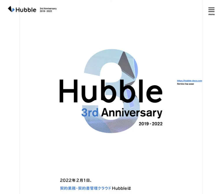
Hubble's anniversary page combines corporate storytelling with the scale and restraint of a graphic poster. An enormous black wordmark crosses a photograph-filled numeral 3. A smaller anniversary line and date complete the composition, surrounded by unusually generous white space. Fine vertical rules establish a quiet page grid; blue appears in selected lettering, links, brand graphics, and a major background section.
The page is a long commemorative editorial experience with several purposes: explaining the product's origins, presenting adoption figures, recording milestones, sharing customer voices, and directing readers to campaign and event content. Its current content still references the 2019–2022 anniversary period. Those dates describe the content being served, rather than a reconstruction of a previous design or proof that the URL is discontinued.
The strongest reusable relationships are large graphic identity against small utility navigation, consistently bold text against open space, asymmetric desktop storytelling against carefully reorganized mobile layouts, and a decisive black footer after pale event content.
閉じる
Hubble 3rd Anniversary — Style Reference
A corporate anniversary story presented as a spacious typographic poster, with a photographic numeral and a disciplined white, black, and blue palette.
Original URL: hubble-docs.com/3rd-anniversary
Final URL: hubble-docs.com/3rd-anniversary
Theme: predominantly white, with pale gray editorial sections, a blue history section, and a black footer. No theme selector was evidenced.
Inspected: October 2, 2026, Japan time; supplied retrieval timestamp 2026-10-01T20:54:59.149Z, equivalent to 2026-10-02 05:54:59.149 JST.
Viewports: desktop 1440 × 1000 and mobile 390 × 844 CSS pixels.
Scope: the currently served anniversary page. Visual captures cover the opening composition, a desktop logo-story section, and the event/footer area on both screen sizes. Rendered DOM measurements cover the longer document, including its section index, metrics, origin story, history, customer quotations, campaign, and events. Menu opening, hover states, and outbound destinations were not exercised in the supplied evidence.
Hubble's anniversary page combines corporate storytelling with the scale and restraint of a graphic poster. An enormous black wordmark crosses a photograph-filled numeral 3. A smaller anniversary line and date complete the composition, surrounded by unusually generous white space. Fine vertical rules establish a quiet page grid; blue appears in selected lettering, links, brand graphics, and a major background section.
The page is a long commemorative editorial experience with several purposes: explaining the product's origins, presenting adoption figures, recording milestones, sharing customer voices, and directing readers to campaign and event content. Its current content still references the 2019–2022 anniversary period. Those dates describe the content being served, rather than a reconstruction of a previous design or proof that the URL is discontinued.
The strongest reusable relationships are large graphic identity against small utility navigation, consistently bold text against open space, asymmetric desktop storytelling against carefully reorganized mobile layouts, and a decisive black footer after pale event content.
How to Read This Reference
- Measured values come from the supplied rendered DOM and computed-style records. They describe the two inspected viewport endpoints, not an inferred original stylesheet.
- Derived values are arithmetic from those measurements, such as column gaps or heading offsets.
- Visual estimates describe screenshot geometry or appearance where the corresponding element was not measured. Estimated colors are explicitly marked.
- Recommendations describe a reusable implementation. Suggested breakpoints, accessibility behavior, fallbacks, and CSS class names are not claims about the original implementation.
- Named tokens are aliases introduced here. The supplied
customPropertiesrecords were empty; no original token naming system was exposed. - Graphic text needs special handling. Several heading wrappers contain SVG-related content, and the opening
h1has zero measured height despite prominent visible artwork. Their inherited15pxor12pxfont sizes do not measure the visible lettering.
Tokens — Colors
Core Palette
| Name | Value | Suggested token | Evidence and role |
|---|---|---|---|
| White | #ffffff |
--color-paper |
Effective canvas color in the captures; also measured as reversed text on black and blue surfaces. The body itself reports a transparent background. |
| Black | #000000 |
--color-ink |
Measured main text, story-pill backgrounds, campaign action, and footer background; visually used for the main identity and menu. |
| Hubble Blue | #3c78c8 |
--color-brand |
Measured links, English index captions, history background, and footer service action; also present in inline SVG fill data. |
| Index Gray | #eaebec |
--color-index |
Measured background of the six-section navigation index. |
| Editorial Gray | #f0f2f3 |
--color-quiet |
Measured background of customer voices and event information. |
| Attribution Gray | #999999 |
--color-muted |
Measured customer name/company captions. |
| Guide Gray | Approximately #e8e8e8 |
--color-rule |
Visual estimate for the fine vertical guides; no computed border color was supplied. |
Blue is both an accent and a sectional background. It is not applied indiscriminately to every action: the campaign action is black, local story links are black pills, and the service-return action in the footer is blue.
The two pale gray surfaces have different measured values. Preserve that distinction when reproducing the section rhythm. Photography and embedded event graphics contain additional colors; their pixels should not be forced into the interface palette.
Color Relationships
- White canvas with black lettering provides the main contrast.
- Small blue phrases and captions punctuate the otherwise monochrome composition.
- The history section expands blue into a full-width field, with a white introductory paragraph.
- The footer reverses the identity and navigation to white on black while retaining the blue brand accent.
- The logo-construction graphic uses gray shapes and thin blue construction lines. Its exact internal gray values were not measured.
Tokens — Typography
Declared Interface Stack
The measured body stack is:
'Helvetica Neue', Arial, 'Hiragino Kaku Gothic ProN',
'Hiragino Sans', Meiryo, sans-serif
All sampled body text, navigation labels, quotations, buttons, and legal links use computed weight 700. This creates a firm, graphic voice even in explanatory paragraphs. Japanese glyphs may come from a fallback in the declared stack; the evidence does not identify which installed font supplied each glyph.
The root element measures 10px on desktop and 8px on mobile. The body measures 15px / 27px and 12px / 21.6px, respectively. Root-level serif declarations belong to the browser defaults and should not be mistaken for the visible page's typography.
Tracking: the body supplies 1.2px on desktop and 0.96px on mobile. These values remain inherited by many larger and smaller elements. Do not replace all tracking with 0.08em: that ratio describes the body size but would change the measured spacing on larger headings. English index captions and the desktop service URL explicitly use normal tracking.
Graphic Identity and Section Titles
The opening identity should be treated as composed artwork. The giant wordmark, anniversary line, photographic 3, and date form one visual lockup. No independent display-font declaration or exact CSS font size for that lettering was supplied.
Several section headings also appear to include graphic or SVG content. Their measured wrappers are substantially taller than their inherited text line height: common desktop section-heading boxes are approximately 170.89px high, compared with 90.36px on mobile. The metrics heading is shorter, and the mobile campaign heading is taller. Preserve each asset's proportions rather than imposing one universal heading height.
Measured Type Scale
Values below are font-size / line-height in CSS pixels. All rows use weight 700 in the supplied sample.
| Role | Desktop | Mobile | Notes |
|---|---|---|---|
| Body default | 15 / 27 |
12 / 21.6 |
Inherited baseline, not the size of every paragraph |
| Index Japanese title | 24.75 / 32.175 |
18.72 / 24.336 |
Heading within each section link |
| Index English caption | 13.5 / 24.3 |
10.4 / 18.72 |
Blue; normal tracking |
| Major narrative paragraph | 20.25 / 36.45 |
13.52 / 24.336 |
Origin, naming, and history introductions |
| Supporting narrative | 18 / 32.4 |
12.48 / 22.464 |
Metrics description and origin summary |
| Central statement | 40.5 / 64.8 |
24.96 / 39.936 |
Large statement about familiar Word workflows |
| Numbered point heading | 27 / 43.2 |
18.72 / 29.952 |
Logo explanation and campaign steps |
| Logo explanation detail | 15.75 / 28.35 |
11.44 / 20.592 |
Smaller text below numbered headings |
| Story pill | 20.25 / 36.45 |
12.48 / 22.464 |
White on black |
| History date | 18 / 28.8 |
12.48 / 19.968 |
Blue milestone label |
| History paragraph | 15.75 / 28.35 |
12.48 / 22.464 |
Excludes the larger concluding milestone copy |
| Customer quotation | 16.875 / 30.375 |
12.48 / 19.968 |
Mobile quotation leading tightens to 1.6 |
| Customer attribution | 11.25 / 20.25 |
10.4 / 18.72 |
Gray caption |
| Event title | 22.5 / 40.5 |
14.56 / 26.208 |
Two-line title in the visible webinar example |
| Main action label | 18 / 32.4 |
13.52 / 24.336 |
Campaign and footer actions |
| Footer legal link | 13.5 / 24.3 |
11.44 / 20.592 |
Horizontal on desktop, stacked on mobile |
| Copyright | 14.625 / 26.325 |
11.44 / 20.592 |
White on black |
Most paragraph leading is 1.8; major statements and numbered headings use 1.6; index titles use 1.3. The mobile values do not follow one uniform desktop-to-mobile scale factor.
Recommended adaptation: retain the bold hierarchy and generous leading, but test the small mobile copy and gray attributions for readability. Increasing supporting text sizes is an accessibility improvement, not a measured feature of this page.
Tokens — Spacing & Shapes
Layout Measurements
| Element | Desktop at 1440 × 1000 | Mobile at 390 × 844 | Evidence |
|---|---|---|---|
| Main content width | 1168px |
333.906px |
Measured |
| Main left/right inset | 136px |
28.047px |
Measured, symmetric |
| Main center axis | 720px |
195px |
Derived from container bounds |
| Half-column width | 584px |
166.953px |
Measured in metrics |
| Hero section height | 920px |
717.391px |
Measured |
| Intro section start | y = 920px |
y = 691.391px |
Measured; mobile starts 26px before the hero box ends |
| Typical section-heading top offset | 112.5px |
74.875px |
Derived from section and heading rectangles |
| Index item | About 365.33 × 297.72px |
333.906 × 93.594px |
Measured; last desktop item is slightly taller |
| Index horizontal / vertical gap | 36px / 36px |
Single column / 9.75px |
Derived |
| Index top inset | 135px |
36.563px |
Derived |
| Story pill | 247.5 × 78.75px |
153.906 × 41.594px |
Measured |
| Story pill gap | 20px |
About 12.469px |
Derived |
| Event column width | 557px |
333.906px |
Measured |
| Event separation | 54px horizontal |
About 41.594px between link boxes |
Derived |
| Campaign action | 503 × 81px |
333.906 × 62.391px |
Measured |
| Footer service action | 303.75 × 81px |
264.156 × 62.391px |
Measured |
| Footer height | 544.703px |
462.406px |
Measured |
| Full document height | 17530.344px |
14779.141px |
Measured |
The hero heights happen to equal approximately 92vh and 85vh at the inspected endpoints. Those relationships are useful implementation estimates, but the supplied evidence does not establish the original height formulas.
Spacing Character
The page uses several scales simultaneously:
- Small text separations keep a heading and explanation tightly grouped.
- Medium gaps distinguish individual numbered points, pills, and event links.
- Large section insets establish a slow editorial rhythm.
- Extremely large clear areas surround the opening identity and separate some story compositions.
Do not compress the entire page into a conventional compact spacing scale. The empty areas are a substantial part of the composition. Conversely, avoid assigning a fixed empty height to every story block: content wrapping and section-specific graphic dimensions affect the observed document length.
Shape Vocabulary
| Shape | Observed use | Guidance |
|---|---|---|
| Square corners | Campaign action, service action, event image and arrow tiles | Default for major rectangular elements |
| Full pill | Local story labels and links | Measured radius 39.375px desktop and 20.8px mobile |
| Circle | White step numerals on black disks | Visible in the desktop logo explanation |
| Thin straight line | Vertical page guides and logo-construction lines | Keep visually light and precise |
| Angular brand form | Hubble symbol and its geometric explanation | Preserve the supplied identity artwork |
There is no visible general system of soft card shadows in the supplied captures. Separation comes from space, flat color fields, typography, and image boundaries.
Components
Opening Identity Header
Role: establish the anniversary identity without a full navigation bar occupying document flow.
At the upper left, the Hubble symbol and wordmark sit beside a compact two-line anniversary/date signature. The desktop lockup is approximately 315px wide, starting near x = 50px, y = 39px; the mobile lockup is approximately 208px wide, beginning near x = 25px, y = 29px. These are screenshot estimates.
The header's measured height is zero. Visible positioned artwork still exists, so this should not be interpreted as an absent header. The opening logo is not visible in the supplied lower-page captures; persistence is only visually supported for the menu control.
Persistent Menu Control
Role: compact access to page navigation during a long scroll.
Three black horizontal strokes sit above the lowercase label menu. The desktop strokes span approximately 38px and begin near the top-right corner at y = 48px; the mobile strokes span about 30px and begin near y = 31px. The control occupies the same visible corner in the opening and lower-page captures, supporting a persistent presentation.
The DOM contains six header anchor destinations, but the captured state is closed. The open panel's appearance, focus behavior, animation, and dismissal behavior are unverified. Header-link rectangles alone should not be treated as a screenshot of the open menu.
Recommended anatomy: a button with decorative line spans, a visible caption, an accessible name, and aria-expanded/aria-controls connected to a real navigation region. Keep the hit area at least 44 × 44px even when the visible strokes are smaller.
Anniversary Hero
Role: a commemorative identity composition, rather than a dense product pitch.
The composition has four visual layers:
- A very large numeral 3 containing photographic imagery.
- An oversized black Hubble wordmark crossing the numeral's middle.
- A smaller
3rd Anniversaryline, with3rdin blue. - A right-aligned
2019 - 2022date below the anniversary line.
In the desktop capture, the combined graphic occupies approximately x = 380–1050px and y = 201–738px. The numeral is taller than the wordmark, leaving its upper and lower lobes visible. On mobile, the combined identity spans approximately x = 28–357px and y = 237–496px. It nearly fills the content width without rearranging the words into a conventional stacked headline.
The desktop service link is a separate marginal element, aligned close to the right content guide. Its measured URL text is 13.5px, blue, and visibly underlined; Service top page appears below in small black text. It is absent from the mobile screenshot and mobile rendered-link inventory.
A photograph inside the numeral is visible. The evidence does not establish whether that image is a video frame, an image sequence, or a static asset. Reproduce the mask and composition first; do not invent a slideshow or playback behavior.
Anniversary Introduction
Role: transition from the large visual signature into the long-form story.
The visible introduction begins with the date 2022年2月1日、 and a short anniversary message. Selected phrases are blue while connecting text remains black. On desktop, the opening lines appear in a narrower central region; on mobile, they align with the main left guide and wrap into short lines.
The rendered section text is empty in the supplied element sample despite visible lettering in the screenshots. The exact text-rendering mechanism and typography are therefore unverified. Treat the visible blue/black emphasis as observed, but do not assign a measured font size to these lines.
The mobile introduction begins at approximately y = 691px, leaving substantial breathing room below the hero graphic. Preserve this pause instead of moving the first paragraph directly beneath the date in the lockup.
Six-Section Index
Role: let readers jump into the long document by topic.
The section uses #eaebec and contains six anchors, each with a Japanese title and a smaller blue English caption:
| Source title | English caption | Destination |
|---|---|---|
数字で見るHubble |
Hubble in Numbers | #anchor1 |
Hubbleのはじまり |
Beginning | #anchor2 |
リリースからの軌跡 |
History | #anchor3 |
ユーザーの声 |
User's Voice | #anchor4 |
プレゼントキャンペーン |
Present Campaign | #anchor5 |
イベント情報 |
Event Info | #anchor6 |
Desktop rectangles establish three columns and two rows. Each item is approximately 365px wide with a 36px gap; its title begins roughly 209px below the link's top, leaving a large leading area. The exact artwork in that area is not visible in the supplied screenshots.
On mobile, the index becomes six horizontal entries in one column. Each link is about 93.6px high, and its text begins at x = 118.516px, about 90.469px inside the main container. This is a meaningful component reflow, not merely a smaller desktop grid.
Metrics Section
Role: present the anniversary's product-adoption figures as editorial information.
The first metric concerns total documents. Its explanatory paragraph describes more than 200,000 documents created and saved over three years. Secondary categories include total versions, accounts, average documents per company, retention, and maximum versions per document.
The metrics use paired Japanese/English labels. The provided extraction does not expose every displayed numerical graphic, so do not invent the missing values or claim a measured number font.
A two-column relationship persists on mobile: secondary metric wrappers measure 584px each on desktop and 166.953px each on mobile. The primary explanatory paragraph is asymmetrical: it occupies the right half of the desktop container, but a right-aligned three-quarter-width region on mobile, measuring 250.422px and starting at x = 111.531px.
This retained mobile indentation is an important part of the layout. Converting every section into identical full-width blocks would lose some of its editorial character.
Origin Story and Local Navigation
Role: organize the founding story, service-name explanation, and logo rationale.
Three black pills introduce the story subsections. The first label, Hubbleの原点, is a paragraph in the supplied DOM; サービス名の由来 and ロゴについて are links to #story-02 and #story-03. They are not evidenced as a tabbed content switcher.
Desktop pills appear in a row. Mobile wraps them into two items followed by one item. Use white bold labels and fully rounded ends, preserving the measured width and height relationships.
Desktop narrative paragraphs commonly occupy the right half of the page. On mobile, the origin and naming paragraphs expand to the full 333.906px content width. The naming footnote remains narrower and offset to the right, maintaining a secondary reading level.
Founding Dialogue and Central Statement
Role: make the origin story personal, then summarize its core idea.
The DOM identifies three speakers and alternating placement: the CEO and CTO labels sit on the left, while the CLO label sits on the right. This alternating relationship persists on mobile. Several dialogue paragraph wrappers report zero height, so their exact visual containers, portraits, and reveal behavior cannot be established from those rectangles alone.
The subsequent statement is directly measurable: 40.5px / 64.8px in an 808px desktop text region, and 24.96px / 39.936px across the mobile container. It explains using familiar Word workflows while versions are managed automatically in the cloud.
Keep the statement much larger than its supporting paragraph. The desktop supporting text uses 18px / 32.4px; mobile uses 12.48px / 22.464px.
Logo Explanation
Role: connect the brand symbol to collaboration and contract work.
The desktop capture shows two numbered explanations within the left half of the main grid. Each begins with a white numeral inside a black circle, followed by a bold heading and smaller explanatory text. The heading starts at x = 183.25px, giving a 47.25px combined marker-and-gap inset from the container edge.
The first point concerns collaboration among people, businesses, and software. The second describes creativity in contract work and the motif of A4 paper placed diagonally with light entering it.
A large construction diagram sits below: two gray geometric shapes, thin blue extension lines, and a gray Hubble wordmark. The right half remains mostly empty in this capture. A full-bleed interior photograph begins beneath the explanation and extends beyond the content rails.
Mobile heading rectangles begin at x = 66.516px and occupy 295.438px. The visual marker itself was not separately measured on mobile.
History Section
Role: present the product's evolution through dated milestones.
The section background is measured Hubble Blue. Its introductory paragraph is white. Milestones include 2017.10, 2019.2, 2020.5, 2021.1, and 2022.02.
Desktop milestone text occupies staggered left and right regions. The first two date labels start at x = 178.75px and 861.75px, with the right entry beginning 225px lower. Standard explanatory paragraphs are 399.5px wide. The concluding milestone expands across a wider composition.
On mobile, milestone text follows one vertical column at x = 55.078px, with a width of 279.844px. All dated entries retain their order. This section grows from approximately 2980px high on desktop to 3337px on mobile, unlike sections whose graphic scale shrinks substantially.
Each milestone includes a date, a heading region, space associated with media or graphics, and explanatory text. The sampled elements do not expose the immediate panel backgrounds or artwork content. The black paragraphs and blue dates are measured; exact panel fills, borders, connectors, and illustration styles are not. White milestone panels in the Quick Start are explicitly a recommended implementation choice.
Customer Voices
Role: show several customer perspectives without turning the page into a uniform testimonial-card grid.
The parent surface is #f0f2f3. Quotes have varied widths and staggered positions on desktop, with small gray company/person attributions beneath. A later quotation is centered below the paired groups.
On mobile, the quotations form a vertical sequence but retain different horizontal offsets and widths. Sample text starts alternate around x = 98.75px and 131.063px, rather than every quotation beginning on the main 28px guide.
The measured paragraph rectangles establish the composition, not the exact enclosing artwork. No quotation bubble shape, portrait style, carousel interaction, or decorative wrapper can be confirmed from the supplied captures. For reuse, preserve the variation in placement while keeping semantic quotation and attribution pairs together.
Numbered Campaign Instructions
Role: explain the commemorative giveaway and provide its sharing action.
The content describes a giveaway of branded beer and coffee, followed by three steps: follow the account, share the anniversary page with the stated hashtag, and receive results through direct messages. These are the page's displayed campaign instructions; they are not evidence that the campaign remains active at the inspection date.
Desktop step headings use 27px type and the explanatory content sits in a left-side region. The action is a square black rectangle, 503 × 81px, with a white label. On mobile it expands to the main content width and measures about 62.39px high.
The account name is a blue link. A smaller deadline note sits beneath the action. The share URL exists in the DOM, but no sharing action or external page was tested.
Event Link
Role: connect the anniversary story to related gatherings and educational content.
Desktop events occupy two 557px columns separated by 54px. Mobile stacks them at the full container width. The visible webinar entry includes a blue promotional image, a bold Japanese title below it, and a black square containing a white northeast arrow.
The visible mobile image is approximately 334 × 188px, consistent with a 16:9 graphic. Its robot illustration, white type, date, and small brand mark are part of the supplied image, rather than separately measured interface elements.
The arrow overlaps the image's lower-right edge and protrudes into the title area. Its approximate size is 61px on desktop and 37px on mobile. Event titles reserve space on the right: measured padding is 72px and 49.92px, respectively.
The first event's image is not visibly established in the supplied end captures, and its measured link box is much shorter than the webinar entry. This may reflect missing or unavailable media; the evidence does not determine the cause. Do not invent its artwork or interpret the uneven rendering as an intentional reusable design rule.
Footer
Role: provide a strong visual close and return readers to the main service.
A full-width black field follows the pale event section. Its contents align to the same main container used above. The Hubble identity reverses to white with the blue symbol detail retained; the anniversary signature remains beside it.
The blue service button uses the label HubbleサービスサイトTOPへ. Desktop dimensions are 303.75 × 81px; mobile dimensions are 264.156 × 62.391px. The mobile button deliberately stops before the right content guide.
On desktop, copyright sits at the lower left while recruitment, privacy, commercial-transaction, and information-security links form a horizontal row at the lower right. Small separators are visible between the legal links. On mobile, the links stack at the left, followed by copyright with additional vertical separation.
The original page displays ©2018-2022 Hubble, Inc.. No production-credit names were established by the inspected original-page evidence.
Tokens — Motion & Interaction
| Element or behavior | Evidence | What can be concluded |
|---|---|---|
| Index titles | Computed transition 0.3s |
A transition duration is declared; its triggered appearance was not observed. |
| Story pills | Computed transition 0.3s |
Styling can transition; no tab switching or clicked state was verified. |
| Campaign action and some supporting text | Computed transition 0.3s |
Do not infer a particular hover color or transform. |
| Event titles | Computed transition 0.3s |
No hover preview or image movement was tested. |
| Footer service action | Computed transition 0.3s |
The resting blue/white state is confirmed. |
| Section navigation | Real fragment links in the DOM | Destinations are known; smooth scrolling, offsets, and active-section tracking are unverified. |
| Menu | Persistent closed control in captures | Opening, closing, animation, and keyboard behavior are unverified. |
| Hero photograph | A photograph appears inside the 3 | Video, looping, frame changes, and playback controls are unverified. |
| Numeric graphics and story content | Sampled elements report animation: none |
This does not rule out animation on descendants, pseudo-elements, media, or script-driven layers. |
The capture process allowed an initial observation of at least five seconds and waited for image decoding and sampled layout stability within stated limits. It temporarily paused perpetual animations during readiness checks and resumed them afterward. These precautions improve screenshot stability but do not identify a particular animation or prove that every delayed element appeared.
Many sampled elements report transition: all without a useful duration. That value alone is not evidence of a visible animated effect. No animation library, timing curve, count-up effect, parallax behavior, or scroll-reveal sequence can be named reliably.
Recommended implementation: use restrained 300ms color or opacity changes for optional link feedback. Keep the hero readable as a static composition. Add reduced-motion behavior only to motion actually implemented, and provide a static fallback for any future moving image inside the numeral.
Surfaces
| Surface | Appearance | Structural role |
|---|---|---|
| Opening and story canvas | Effective white with faint vertical rules | Makes the graphic identity and asymmetric text placement legible |
| Section index | Flat #eaebec |
Groups the six topic-entry links |
| History field | Flat #3c78c8 |
Marks a substantial change of chapter |
| Voices and events | Flat #f0f2f3 |
Separates supporting content from the main white story |
| Story pills | Black with white text, fully rounded ends | Local topic navigation and labeling |
| Campaign action | Black with white text, square corners | Sharing action within campaign content |
| Event arrow | Black square with white arrow | Compact destination cue |
| Footer | Black with white identity and links | Ends the page with strong contrast |
| Footer action | Blue with white text | Return to the primary service site |
The vertical rules are quiet alignment devices, not a visible box around every component. In the desktop captures, outer guides lie around x = 135–136px and 1304px, with a center guide at 720px. Mobile outer guides sit around 28px and 362px; the center guide is visible only in some open areas. Large images and solid surfaces interrupt or obscure the guides.
Imagery
The confirmed imagery combines corporate photography, geometric brand explanation, and promotional graphics. It adds specificity to an otherwise minimal typographic environment.
The hero photograph is tightly constrained by the numeral silhouette. The identity remains the dominant shape; the image supplies texture and company context. Fine diagonal texture is visible within parts of the captured numeral, but the evidence cannot separate asset texture, masking treatment, and capture artifacts into a verified rendering recipe.
The logo explanation is diagrammatic: pale geometric forms and blue construction lines on white. A later interior photograph spans the viewport, creating a broad visual break beneath the narrow explanatory column. The visible webinar graphic uses blue, white lettering, and simple robot line art.
Observed Asset References
No original image file URLs, intrinsic dimensions, or media MIME types were provided. The following inventory records verified roles without inventing asset paths.
| Asset or graphic | Evidence | Implementation guidance |
|---|---|---|
| Opening anniversary lockup | Desktop and mobile opening captures | Preserve the wordmark, numeral, anniversary line, and date as a coordinated composition. |
| Header brand lockup | Opening captures | Use authorized vector or high-resolution artwork; keep the compact horizontal signature. |
| Photo-filled numeral | Opening captures | Use an authorized image and a matching mask; the source media mechanism is unknown. |
| Logo-construction diagram | Desktop story capture | Preserve the thin blue geometry and subdued gray shapes. |
| Full-width interior photograph | Bottom of desktop story capture | Keep the observed broad image treatment; exact source dimensions are unavailable. |
| Webinar promotional image | Desktop and mobile event captures | Preserve the image's embedded lettering and approximately 16:9 framing. |
| Reversed footer identity | Desktop and mobile footer captures | Use the light identity variant with blue accent. |
| Section-heading artwork | SVG-related DOM content and measured wrappers | Keep meaningful text alternatives; exact asset paths and outlines are not exposed. |
Do not substitute generic product mockups for the confirmed photographs and brand diagrams. Preserve normal photographic rendering; the evidence does not support a pixelated-image treatment.
Layout & Responsive Behavior
Document Structure
The measured document is approximately 17,530px tall on desktop and 14,779px on mobile. It uses normal long-page scrolling rather than a fixed-height application shell.
| Chapter | Desktop height | Mobile height | Main responsive observation |
|---|---|---|---|
| Opening hero | 920px |
717.391px |
Lockup becomes nearly container-wide; marginal service link disappears |
| Introduction | 1121.625px |
803.422px |
Narrow desktop introduction becomes left-aligned mobile copy |
| Section index | 902.328px |
683.438px |
Three-column grid becomes six compact rows |
| Metrics | 1712.703px |
1039.688px |
Secondary metrics retain two columns |
| Origin story | 4909.359px |
3665.766px |
Main paragraphs expand; graphic scale and spacing decrease |
| History | 2980.406px |
3337.281px |
Staggered desktop entries become a single vertical sequence |
| Customer voices | 2189.391px |
2279.094px |
Quotes stack while retaining varied indentation |
| Campaign | 1228.375px |
1091.625px |
Action becomes container-wide |
| Events | 918.453px |
662.453px |
Two columns become one |
| Footer | 544.703px |
462.406px |
Legal row stacks; service button remains narrower than container |
These section heights are observations, not recommended fixed CSS heights. They do not sum exactly to the document height because the sampled layout also contains gaps and a mobile overlap.
Desktop Composition
The 1168px content region is divided repeatedly at its center. Text can occupy either half, while selected statements use a narrower centered region. The logo explanation leaves the right half conspicuously open. Full-width color bands and photography contrast with these restrained inner widths.
The hero occupies only part of the wide canvas. Its central artwork is approximately 670px wide, leaving space for both the outer rails and the small service link. Utility navigation is kept at the edges, outside the main visual emphasis.
Mobile Composition
Mobile is not a proportional miniaturization of desktop:
- The hero artwork retains visual prominence at approximately the full
334pxcontent width. - The index changes its component anatomy to a leading area plus text.
- The story pills wrap into a two-plus-one arrangement.
- Main story paragraphs become full-width, but metrics explanations, footnotes, and quotations retain selective indentation.
- Metrics keep two columns, while history and events stack.
- Footer legal links become a vertical list, with copyright below.
The shorter overall mobile document is consistent with smaller artwork and tighter spacing in several large sections, even though history and customer voices become taller. It should not be interpreted as evidence that mobile content was removed.
Responsive Limits
Only two viewport endpoints were supplied. Tablet layouts, orientation changes, exact breakpoint positions, zoom behavior, safe-area treatment, and intermediate scaling formulas remain unverified. The Quick Start uses 768px as a recommended breakpoint for a new implementation; it is not an extracted source breakpoint.
Do’s and Don’ts
Do
- Preserve the photographic 3, oversized wordmark, smaller anniversary line, and date as one hierarchy.
- Keep Hubble Blue exact at
#3c78c8for interface uses established by the computed styles. - Maintain both pale gray section colors instead of collapsing them into one neutral.
- Use bold sans-serif text and generous paragraph leading.
- Align major content with the outer rails and reuse the center axis for asymmetric layouts.
- Preserve substantial whitespace around the hero and selected story compositions.
- Keep rectangular actions square and reserve pill shapes for local story navigation.
- Reorganize components on mobile according to their purpose; retain the two-column metrics where appropriate.
- Let the black footer provide a decisive ending, with a blue service-return action.
- Separate artwork lettering from measured HTML typography in implementation notes.
Don’t
- Do not turn the anniversary page into a generic product-pricing or feature-card layout.
- Do not shrink the mobile hero into a small logo above a standard text headline.
- Do not apply rounded corners, shadows, gradients, or glass effects throughout the page.
- Do not make every action blue; black pills and the black campaign action are part of the hierarchy.
- Do not use the inherited
h1or section-heading font sizes to recreate graphic lettering. - Do not infer video, parallax, number animation, or smooth scrolling from static captures.
- Do not treat the local story pills as verified interactive tabs.
- Do not invent missing metric values, event artwork, portrait treatments, or production credits.
- Do not reproduce an unavailable event image as intentional permanent blank space.
- Do not use the displayed 2022 campaign copy as evidence of present-day availability.
Recommended Implementation Additions
These are additions for a new implementation, not verified features of the original page:
- Provide a meaningful text alternative for the anniversary lockup and graphic section headings. Keep decorative numeral imagery out of the accessibility tree when the equivalent title is already present.
- Give the menu button a clear accessible name and expanded state. If its panel is modal, implement appropriate focus containment, Escape dismissal, and focus restoration; if it is ordinary navigation, use the corresponding simpler behavior.
- Keep fragment destinations keyboard-accessible and use sensible
scroll-margin-topvalues for persistent controls. - Preserve visible focus indicators on white, blue, and black surfaces.
- Increase small mobile narrative and attribution text where readability testing warrants it. The observed
#999999captions also need contrast review at their small sizes. - Reserve image space with explicit dimensions or aspect ratios. Provide an intentional fallback for unavailable event media.
- Use semantic lists for campaign steps, dated entries for history, and quotation/attribution pairs for customer voices.
- If a new version includes moving hero media, provide a static fallback and reduced-motion behavior, with no dependency on motion for reading the anniversary title.
- Clearly indicate the status of time-limited campaign content when publishing a maintained anniversary page.
Agent Prompt Guide
Quick Color Reference
- Canvas:
#ffffff. - Main lettering, pills, campaign action, and footer:
#000000. - Brand accent, English captions, history field, and footer service action:
#3c78c8. - Section index:
#eaebec. - Customer voices and events:
#f0f2f3. - Customer attribution text: source
#999999; consider a darker accessible adaptation. - Vertical guides: approximately
#e8e8e8, a visual estimate.
Overall Prompt
“Create a long corporate anniversary page inspired by Hubble's observed third-anniversary composition. Use a white canvas, black bold sans-serif typography, Hubble Blue #3c78c8, fine vertical alignment rules, and large areas of whitespace. Center a photographic numeral behind an oversized brand wordmark, with a smaller anniversary line and date. Keep utility navigation compact at the corners. Build a six-topic index, paired metrics, asymmetric origin stories, a blue history chapter, varied customer quotations, numbered campaign instructions, and event links. End with a black footer, a reversed brand signature, and a square blue service button. On mobile, retain a nearly full-width hero, convert the index to rows, stack history and events, and preserve selected text indentations. Treat motion and menu-panel styling as new design decisions unless separately verified.”
Example Component Prompts
- Anniversary hero: “On a white canvas with faint outer vertical guides, place a large photo-filled numeral behind an oversized black wordmark. Add a blue ordinal, black anniversary label, and a small right-aligned date. Leave generous clear space above and below. Preserve the lockup as coordinated artwork rather than approximating the logo with an arbitrary font.”
- Section index: “Create six topic links on
#eaebec. Use three columns with 36px gaps at a 1440px desktop viewport, bold Japanese titles, and small blue English captions. At a 390px mobile viewport, reorganize into six approximately 94px-high horizontal entries with text inset from a leading graphic area.” - Logo explanation: “Place two numbered explanations in the left half of a white desktop grid. Use white digits in black circles, bold headings, smaller bold descriptions, and an angular gray brand diagram with thin blue construction lines below. Preserve the largely empty right half and transition to full-width photography afterward.”
- History adaptation: “Use a full-width
#3c78c8chapter with white introductory copy and staggered dated entries. Use blue dates and black explanatory text on accessible light panels as a new implementation choice. Stack entries on mobile, keeping generous inner padding and clear date order. Do not invent original illustrations.” - Event link: “Pair an approximately 16:9 promotional graphic with a bold title underneath. Overlap a black square containing a white northeast arrow at the lower-right image edge. Use square corners, no elevation shadow, and enough right padding to keep the title clear of the arrow.”
- Footer: “Create a black footer aligned to the main page guides. Place a reversed brand-and-anniversary lockup above a square blue service button. On desktop, position copyright left and legal links right; on mobile, stack legal links and place copyright beneath them. Keep the mobile button narrower than the content column.”
Quick Start
CSS Custom Properties
This is a reusable approximation of the measured endpoints, not recovered source code. It keeps a conventional root size, uses explicit CSS-pixel tokens for fidelity, and introduces a recommended 768px breakpoint. The guide color, hero positioning formulas, header artwork dimensions, and event-arrow dimensions are visual approximations.
Supply authorized image or inline SVG assets for .header-brand, .anniversary-art, .index-art, .event-image, and .footer-brand. These class names do not imply known original asset paths. The menu styling expects a button containing three decorative spans inside .menu-bars plus a text caption; menu behavior requires a separate implementation.
White .milestone backgrounds are a recommended accessible adaptation because their original wrapper fills were not supplied. The code does not reproduce unverified animations or unseen decorative content.
:root {
  /* Measured palette; the rule color is an estimate. */
  --color-paper: #ffffff;
  --color-ink: #000000;
  --color-brand: #3c78c8;
  --color-index: #eaebec;
  --color-quiet: #f0f2f3;
  --color-muted: #999999;
  --color-rule: #e8e8e8;

  --font-site: 'Helvetica Neue', Arial,
    'Hiragino Kaku Gothic ProN', 'Hiragino Sans', Meiryo, sans-serif;
  --weight-bold: 700;
  --tracking: 1.2px;
  --text-base: 15px;
  --text-body: 18px;
  --text-lead: 20.25px;
  --text-index: 24.75px;
  --text-caption: 13.5px;
  --text-statement: 40.5px;
  --text-step: 27px;
  --text-detail: 15.75px;
  --text-quote: 16.875px;
  --text-credit: 11.25px;
  --text-event: 22.5px;
  --text-action: 18px;

  --content-max: 1168px;
  --page-gutter: max(28px, calc((100vw - 1168px) / 2));
  --section-top: 112.5px;
  --section-bottom: 135px;
  --index-gap: 36px;
  --event-gap: 54px;
  --event-arrow: 61px;
  --action-height: 81px;
  --feedback-duration: 300ms;
}

* { box-sizing: border-box; }

body {
  margin: 0;
  color: var(--color-ink);
  background: var(--color-paper);
  font-family: var(--font-site);
  font-size: var(--text-base);
  font-weight: var(--weight-bold);
  line-height: 1.8;
  letter-spacing: var(--tracking);
}

img, svg { max-inline-size: 100%; }
img { display: block; }
a { color: inherit; }
button { font: inherit; }

.container {
  inline-size: min(
    var(--content-max),
    calc(100% - 2 * var(--page-gutter))
  );
  margin-inline: auto;
}

.section {
  padding-block: var(--section-top) var(--section-bottom);
}

/* Apply guides only to sections where they belong. */
.guided {
  position: relative;
  isolation: isolate;
}
.guided::before {
  content: '';
  position: absolute;
  z-index: -1;
  inset-block: 0;
  inset-inline: var(--page-gutter);
  border-inline: 1px solid var(--color-rule);
  background: linear-gradient(var(--color-rule), var(--color-rule))
    center / 1px 100% no-repeat;
  pointer-events: none;
}

.site-header {
  position: absolute;
  z-index: 10;
  inset: 38px auto auto 50px;
}
.header-brand { inline-size: 315px; }

/* Persistent positioning is an adaptation of the visible placement. */
.menu-toggle {
  position: fixed;
  z-index: 30;
  inset: 48px 43px auto auto;
  display: grid;
  justify-items: center;
  gap: 5px;
  min-inline-size: 44px;
  min-block-size: 44px;
  padding: 0;
  border: 0;
  color: var(--color-ink);
  background: transparent;
  font-size: 15px;
  line-height: 1;
  letter-spacing: normal;
  cursor: pointer;
}
.menu-bars {
  display: grid;
  gap: 6px;
  inline-size: 38px;
}
.menu-bars span {
  display: block;
  block-size: 3px;
  background: currentColor;
}
.menu-toggle.on-dark { color: var(--color-paper); }

.anniversary-hero {
  position: relative;
  block-size: 92svh;
  min-block-size: 640px;
}
.anniversary-art {
  position: absolute;
  inset-block-start: 20.1svh;
  inset-inline-start: 50%;
  inline-size: min(670px, calc(100% - 2 * var(--page-gutter)));
  block-size: auto;
  transform: translateX(-50%);
}
.hero-service {
  position: absolute;
  inset-block-start: 39.4svh;
  inset-inline-end: var(--page-gutter);
  font-size: 13.5px;
  line-height: 1;
  letter-spacing: normal;
}
.hero-service a { color: var(--color-brand); }
.hero-service small {
  display: block;
  margin-block-start: 7px;
  font-size: 12px;
}

.section-index {
  padding-block: 135px;
  background: var(--color-index);
}
.index-grid {
  display: grid;
  grid-template-columns: repeat(3, minmax(0, 1fr));
  gap: var(--index-gap);
}
.index-item {
  display: grid;
  grid-template-rows: 193px auto;
  gap: 16px;
  min-block-size: 298px;
  text-decoration: none;
}
.index-art {
  inline-size: 100%;
  block-size: 100%;
  object-fit: contain;
}
.index-title {
  margin: 0;
  font-size: var(--text-index);
  line-height: 1.3;
}
.index-caption {
  margin: 5px 0 0;
  color: var(--color-brand);
  font-size: var(--text-caption);
  line-height: 1.8;
  letter-spacing: normal;
}

.lead { font-size: var(--text-lead); line-height: 1.8; }
.body-copy { font-size: var(--text-body); line-height: 1.8; }
.statement {
  max-inline-size: 808px;
  margin-inline: auto;
  font-size: var(--text-statement);
  line-height: 1.6;
}
.metrics-grid, .story-row {
  display: grid;
  grid-template-columns: repeat(2, minmax(0, 1fr));
}
.metrics-description {
  inline-size: 50%;
  margin-inline-start: auto;
}
.story-nav {
  display: flex;
  flex-wrap: wrap;
  gap: 20px;
}
.story-pill {
  display: flex;
  align-items: center;
  justify-content: center;
  inline-size: 247.5px;
  min-block-size: 78.75px;
  margin: 0;
  padding: 8px 16px;
  border-radius: 999px;
  color: var(--color-paper);
  background: var(--color-ink);
  font-size: var(--text-lead);
  text-align: center;
  text-decoration: none;
}

.numbered-list {
  margin: 0;
  padding: 0;
  list-style: none;
  counter-reset: point;
}
.numbered-point {
  display: grid;
  grid-template-columns: 36px minmax(0, 1fr);
  gap: 11.25px;
  margin-block-start: 33.75px;
  counter-increment: point;
}
.numbered-point::before {
  content: counter(point);
  display: grid;
  place-items: center;
  inline-size: 36px;
  block-size: 36px;
  border-radius: 50%;
  color: var(--color-paper);
  background: var(--color-ink);
  font-size: 18px;
  letter-spacing: normal;
}
.point-title {
  margin: 0;
  font-size: var(--text-step);
  line-height: 1.6;
}
.point-copy {
  margin: 6.75px 0 0;
  font-size: var(--text-detail);
  line-height: 1.8;
}
.full-bleed-photo { inline-size: 100%; block-size: auto; }

.history { background: var(--color-brand); }
.history-intro { color: var(--color-paper); }
.milestones {
  display: grid;
  grid-template-columns: repeat(2, minmax(0, 1fr));
  gap: 90px 198px;
  align-items: start;
}
.milestone {
  padding: 42.75px;
  color: var(--color-ink);
  /* Recommended panel surface; not an extracted wrapper value. */
  background: var(--color-paper);
}
.milestone:nth-child(even) { margin-block-start: 225px; }
.milestone:last-child { grid-column: 1 / -1; }
.milestone-date { color: var(--color-brand); }
.milestone-copy { font-size: var(--text-detail); line-height: 1.8; }

.voices, .events { background: var(--color-quiet); }
.quote-copy { font-size: var(--text-quote); line-height: 1.8; }
.quote-credit {
  color: var(--color-muted);
  font-size: var(--text-credit);
  font-style: normal;
  line-height: 1.8;
}

.action {
  display: flex;
  align-items: center;
  justify-content: center;
  min-block-size: var(--action-height);
  padding: 14px 20px;
  border: 0;
  border-radius: 0;
  color: var(--color-paper);
  background: var(--color-ink);
  font-size: var(--text-action);
  line-height: 1.8;
  text-align: center;
  text-decoration: none;
  transition: background-color var(--feedback-duration),
    color var(--feedback-duration);
}
.campaign-action { inline-size: min(503px, 100%); }

.events-grid {
  display: grid;
  grid-template-columns: repeat(2, minmax(0, 1fr));
  gap: var(--event-gap);
}
.event-card { display: block; text-decoration: none; }
.event-media { position: relative; }
.event-image {
  inline-size: 100%;
  aspect-ratio: 16 / 9;
  object-fit: cover;
}
.event-arrow {
  position: absolute;
  inset-inline-end: 0;
  inset-block-end: calc(var(--event-arrow) / -2);
  display: grid;
  place-items: center;
  inline-size: var(--event-arrow);
  block-size: var(--event-arrow);
  color: var(--color-paper);
  background: var(--color-ink);
  font-size: 32px;
  line-height: 1;
}
.event-title {
  margin: 15.75px 0 0;
  padding-inline-end: 72px;
  font-size: var(--text-event);
  line-height: 1.8;
}

.site-footer {
  padding-block: 101px 60px;
  color: var(--color-paper);
  background: var(--color-ink);
}
.footer-brand { inline-size: 450px; }
.footer-action {
  inline-size: min(303.75px, 100%);
  margin-block-start: 82px;
  background: var(--color-brand);
}
.footer-bottom {
  display: flex;
  align-items: center;
  justify-content: space-between;
  gap: 24px;
  margin-block-start: 135px;
}
.footer-legal { display: flex; gap: 20px; font-size: 13.5px; }
.footer-legal a { text-decoration: none; }
.copyright { margin: 0; font-size: 14.625px; }

/* Recommended keyboard affordances; not observed source states. */
:where(a, button):focus-visible {
  outline: 2px solid var(--color-brand);
  outline-offset: 4px;
}
:where(.history, .site-footer) :focus-visible {
  outline-color: var(--color-paper);
}
[id] { scroll-margin-block-start: 88px; }

@media (max-width: 768px) {
  :root {
    --page-gutter: 7.1915vw;
    --tracking: 0.96px;
    --text-base: 12px;
    --text-body: 12.48px;
    --text-lead: 13.52px;
    --text-index: 18.72px;
    --text-caption: 10.4px;
    --text-statement: 24.96px;
    --text-step: 18.72px;
    --text-detail: 11.44px;
    --text-quote: 12.48px;
    --text-credit: 10.4px;
    --text-event: 14.56px;
    --text-action: 13.52px;
    --section-top: 74.875px;
    --section-bottom: 74.875px;
    --index-gap: 9.75px;
    --event-gap: 41.594px;
    --event-arrow: 37px;
    --action-height: 62.391px;
  }

  .site-header { inset: 29px auto auto 25px; }
  .header-brand { inline-size: 208px; }
  .menu-toggle { inset: 31px 21px auto auto; font-size: 12px; }
  .menu-bars { inline-size: 30px; gap: 5px; }
  .menu-bars span { block-size: 2.5px; }

  .anniversary-hero { block-size: 85svh; min-block-size: 600px; }
  .anniversary-art { inset-block-start: 28.08svh; }
  .hero-service { display: none; }
  .anniversary-intro { margin-block-start: -26px; }

  .section-index { padding-block: 36.563px; }
  .index-grid { grid-template-columns: minmax(0, 1fr); }
  .index-item {
    grid-template-columns: 70px minmax(0, 1fr);
    grid-template-rows: auto;
    align-items: center;
    gap: 20.469px;
    min-block-size: 93.594px;
  }
  .index-art { block-size: 70px; }
  .index-caption { margin-block-start: 0; }
  .metrics-description { inline-size: 75%; }
  .story-row { grid-template-columns: minmax(0, 1fr); }
  .story-nav { gap: 12.469px; }
  .story-pill {
    inline-size: min(153.906px, calc((100% - 12.469px) / 2));
    min-block-size: 41.594px;
    padding: 6px 8px;
    font-size: 12.48px;
  }
  .numbered-point {
    grid-template-columns: 26px minmax(0, 1fr);
    gap: 12.469px;
    margin-block-start: 31.188px;
  }
  .numbered-point::before {
    inline-size: 26px;
    block-size: 26px;
    font-size: 14px;
  }
  .point-copy { margin-block-start: 2px; }
  .milestones { grid-template-columns: minmax(0, 1fr); gap: 72px; }
  .milestone { padding: 27.031px; }
  .milestone:nth-child(even) { margin-block-start: 0; }
  .milestone-copy { font-size: 12.48px; }
  .quote-copy { line-height: 1.6; }
  .campaign-action { inline-size: 100%; }
  .events-grid { grid-template-columns: minmax(0, 1fr); }
  .event-title { margin-block-start: 12.48px; padding-inline-end: 49.92px; }
  .event-arrow { font-size: 21px; }

  .site-footer { padding-block: 62.39px 31.188px; }
  .footer-brand { inline-size: 264.156px; }
  .footer-action {
    inline-size: min(264.156px, 100%);
    margin-block-start: 42px;
  }
  .footer-bottom {
    flex-direction: column;
    align-items: flex-start;
    gap: 41.594px;
    margin-block-start: 62.391px;
  }
  .footer-legal {
    order: 0;
    flex-direction: column;
    gap: 7.25px;
    font-size: 11.44px;
  }
  .copyright { order: 1; font-size: 11.44px; }
}

/* Applies to any optional CSS motion added to this adaptation. */
@media (prefers-reduced-motion: reduce) {
  *, *::before, *::after {
    animation-duration: 0.01ms !important;
    animation-iteration-count: 1 !important;
    transition-duration: 0.01ms !important;
    scroll-behavior: auto !important;
  }
}
The CSS deliberately leaves quotation positioning and graphic-heading dimensions to the actual content assets. Font metrics, asset proportions, and text wrapping should be checked against both supplied viewport sizes. For production accessibility, review the small mobile text before treating these fidelity-oriented sizes as final.
Tailwind v4 Token Mapping
Optional aliases for a project already using Tailwind v4. Define the properties above first. This mapping does not imply that the original page uses Tailwind.
@theme inline {
  --color-anniversary-paper: var(--color-paper);
  --color-anniversary-ink: var(--color-ink);
  --color-anniversary-blue: var(--color-brand);
  --color-anniversary-index: var(--color-index);
  --color-anniversary-quiet: var(--color-quiet);
  --color-anniversary-muted: var(--color-muted);
  --color-anniversary-rule: var(--color-rule);

  --font-anniversary: var(--font-site);
  --text-anniversary-body: var(--text-body);
  --text-anniversary-lead: var(--text-lead);
  --text-anniversary-index: var(--text-index);
  --text-anniversary-statement: var(--text-statement);
  --text-anniversary-event: var(--text-event);

  --spacing-anniversary-gutter: var(--page-gutter);
  --spacing-anniversary-section: var(--section-top);
  --radius-anniversary-pill: 999px;
}
Sources & Evidence
- Original and final page: Hubble 3rd Anniversary. The supplied browser observation reports HTTP
200and an unchanged final URL. - Capture date:
2026-10-01T20:54:59.149Z, or October 2, 2026 at 05:54:59.149 in Japan. - Desktop evidence:
1440 × 1000viewport; opening, logo-story, and event/footer screenshots; full-document rendered text, links, element rectangles, and sampled computed styles. Measured document height:17530.34375px. - Mobile evidence:
390 × 844viewport; opening and event/footer screenshots; full-document rendered text, links, element rectangles, and sampled computed styles. Measured document height:14779.140625px. - Observed destinations: six section anchors, two story anchors, the main Hubble service URL, campaign sharing/account links, event links, and footer links. Their presence was recorded; their destinations and resulting interactions were not independently inspected.
- Inspection limits: no additional browsing, commands, or file inspection was performed for this reference. The supplied record does not include complete stylesheets, exact asset URLs, an open menu capture, exercised hover states, an animation timeline, or tablet screenshots. Some graphic and dialogue wrappers have zero height or incomplete text extraction; visual evidence takes precedence over treating those wrappers as ordinary text boxes.
- Readiness limits: the supplied capture process waited for initial observation, sampled layout/text stability, finite visible motion, and image decoding within bounded time limits. SharedWorkers and service workers were disabled. Delayed content, unavailable media, and unexercised interactions remain possible limitations.
This reference describes the page currently served at the inspected URL. Exact endpoint measurements, visual estimates, and recommended implementation choices are distinguished throughout.
# Hubble 3rd Anniversary — Style Reference

> A corporate anniversary story presented as a spacious typographic poster, with a photographic numeral and a disciplined white, black, and blue palette.

**Original URL:** [hubble-docs.com/3rd-anniversary](https://hubble-docs.com/3rd-anniversary/)
**Final URL:** [hubble-docs.com/3rd-anniversary](https://hubble-docs.com/3rd-anniversary/)
**Theme:** predominantly white, with pale gray editorial sections, a blue history section, and a black footer. No theme selector was evidenced.
**Inspected:** October 2, 2026, Japan time; supplied retrieval timestamp `2026-10-01T20:54:59.149Z`, equivalent to `2026-10-02 05:54:59.149 JST`.
**Viewports:** desktop `1440 × 1000` and mobile `390 × 844` CSS pixels.
**Scope:** the currently served anniversary page. Visual captures cover the opening composition, a desktop logo-story section, and the event/footer area on both screen sizes. Rendered DOM measurements cover the longer document, including its section index, metrics, origin story, history, customer quotations, campaign, and events. Menu opening, hover states, and outbound destinations were not exercised in the supplied evidence.

Hubble's anniversary page combines corporate storytelling with the scale and restraint of a graphic poster. An enormous black wordmark crosses a photograph-filled numeral 3. A smaller anniversary line and date complete the composition, surrounded by unusually generous white space. Fine vertical rules establish a quiet page grid; blue appears in selected lettering, links, brand graphics, and a major background section.

The page is a long commemorative editorial experience with several purposes: explaining the product's origins, presenting adoption figures, recording milestones, sharing customer voices, and directing readers to campaign and event content. Its current content still references the 2019–2022 anniversary period. Those dates describe the content being served, rather than a reconstruction of a previous design or proof that the URL is discontinued.

The strongest reusable relationships are large graphic identity against small utility navigation, consistently bold text against open space, asymmetric desktop storytelling against carefully reorganized mobile layouts, and a decisive black footer after pale event content.
閉じる
# Hubble 3rd Anniversary — Style Reference

> A corporate anniversary story presented as a spacious typographic poster, with a photographic numeral and a disciplined white, black, and blue palette.

**Original URL:** [hubble-docs.com/3rd-anniversary](https://hubble-docs.com/3rd-anniversary/)
**Final URL:** [hubble-docs.com/3rd-anniversary](https://hubble-docs.com/3rd-anniversary/)
**Theme:** predominantly white, with pale gray editorial sections, a blue history section, and a black footer. No theme selector was evidenced.
**Inspected:** October 2, 2026, Japan time; supplied retrieval timestamp `2026-10-01T20:54:59.149Z`, equivalent to `2026-10-02 05:54:59.149 JST`.
**Viewports:** desktop `1440 × 1000` and mobile `390 × 844` CSS pixels.
**Scope:** the currently served anniversary page. Visual captures cover the opening composition, a desktop logo-story section, and the event/footer area on both screen sizes. Rendered DOM measurements cover the longer document, including its section index, metrics, origin story, history, customer quotations, campaign, and events. Menu opening, hover states, and outbound destinations were not exercised in the supplied evidence.

Hubble's anniversary page combines corporate storytelling with the scale and restraint of a graphic poster. An enormous black wordmark crosses a photograph-filled numeral 3. A smaller anniversary line and date complete the composition, surrounded by unusually generous white space. Fine vertical rules establish a quiet page grid; blue appears in selected lettering, links, brand graphics, and a major background section.

The page is a long commemorative editorial experience with several purposes: explaining the product's origins, presenting adoption figures, recording milestones, sharing customer voices, and directing readers to campaign and event content. Its current content still references the 2019–2022 anniversary period. Those dates describe the content being served, rather than a reconstruction of a previous design or proof that the URL is discontinued.

The strongest reusable relationships are large graphic identity against small utility navigation, consistently bold text against open space, asymmetric desktop storytelling against carefully reorganized mobile layouts, and a decisive black footer after pale event content.

## How to Read This Reference

- **Measured** values come from the supplied rendered DOM and computed-style records. They describe the two inspected viewport endpoints, not an inferred original stylesheet.
- **Derived** values are arithmetic from those measurements, such as column gaps or heading offsets.
- **Visual estimates** describe screenshot geometry or appearance where the corresponding element was not measured. Estimated colors are explicitly marked.
- **Recommendations** describe a reusable implementation. Suggested breakpoints, accessibility behavior, fallbacks, and CSS class names are not claims about the original implementation.
- **Named tokens** are aliases introduced here. The supplied `customProperties` records were empty; no original token naming system was exposed.
- **Graphic text needs special handling.** Several heading wrappers contain SVG-related content, and the opening `h1` has zero measured height despite prominent visible artwork. Their inherited `15px` or `12px` font sizes do not measure the visible lettering.

## Tokens — Colors

### Core Palette

| Name | Value | Suggested token | Evidence and role |
| --- | --- | --- | --- |
| White | `#ffffff` | `--color-paper` | Effective canvas color in the captures; also measured as reversed text on black and blue surfaces. The body itself reports a transparent background. |
| Black | `#000000` | `--color-ink` | Measured main text, story-pill backgrounds, campaign action, and footer background; visually used for the main identity and menu. |
| Hubble Blue | `#3c78c8` | `--color-brand` | Measured links, English index captions, history background, and footer service action; also present in inline SVG fill data. |
| Index Gray | `#eaebec` | `--color-index` | Measured background of the six-section navigation index. |
| Editorial Gray | `#f0f2f3` | `--color-quiet` | Measured background of customer voices and event information. |
| Attribution Gray | `#999999` | `--color-muted` | Measured customer name/company captions. |
| Guide Gray | Approximately `#e8e8e8` | `--color-rule` | Visual estimate for the fine vertical guides; no computed border color was supplied. |

Blue is both an accent and a sectional background. It is not applied indiscriminately to every action: the campaign action is black, local story links are black pills, and the service-return action in the footer is blue.

The two pale gray surfaces have different measured values. Preserve that distinction when reproducing the section rhythm. Photography and embedded event graphics contain additional colors; their pixels should not be forced into the interface palette.

### Color Relationships

- White canvas with black lettering provides the main contrast.
- Small blue phrases and captions punctuate the otherwise monochrome composition.
- The history section expands blue into a full-width field, with a white introductory paragraph.
- The footer reverses the identity and navigation to white on black while retaining the blue brand accent.
- The logo-construction graphic uses gray shapes and thin blue construction lines. Its exact internal gray values were not measured.

## Tokens — Typography

### Declared Interface Stack

The measured body stack is:

```css
'Helvetica Neue', Arial, 'Hiragino Kaku Gothic ProN',
'Hiragino Sans', Meiryo, sans-serif
```

All sampled body text, navigation labels, quotations, buttons, and legal links use computed weight `700`. This creates a firm, graphic voice even in explanatory paragraphs. Japanese glyphs may come from a fallback in the declared stack; the evidence does not identify which installed font supplied each glyph.

The root element measures `10px` on desktop and `8px` on mobile. The body measures `15px / 27px` and `12px / 21.6px`, respectively. Root-level serif declarations belong to the browser defaults and should not be mistaken for the visible page's typography.

**Tracking:** the body supplies `1.2px` on desktop and `0.96px` on mobile. These values remain inherited by many larger and smaller elements. Do not replace all tracking with `0.08em`: that ratio describes the body size but would change the measured spacing on larger headings. English index captions and the desktop service URL explicitly use normal tracking.

### Graphic Identity and Section Titles

The opening identity should be treated as composed artwork. The giant wordmark, anniversary line, photographic 3, and date form one visual lockup. No independent display-font declaration or exact CSS font size for that lettering was supplied.

Several section headings also appear to include graphic or SVG content. Their measured wrappers are substantially taller than their inherited text line height: common desktop section-heading boxes are approximately `170.89px` high, compared with `90.36px` on mobile. The metrics heading is shorter, and the mobile campaign heading is taller. Preserve each asset's proportions rather than imposing one universal heading height.

### Measured Type Scale

Values below are `font-size / line-height` in CSS pixels. All rows use weight `700` in the supplied sample.

| Role | Desktop | Mobile | Notes |
| --- | --- | --- | --- |
| Body default | `15 / 27` | `12 / 21.6` | Inherited baseline, not the size of every paragraph |
| Index Japanese title | `24.75 / 32.175` | `18.72 / 24.336` | Heading within each section link |
| Index English caption | `13.5 / 24.3` | `10.4 / 18.72` | Blue; normal tracking |
| Major narrative paragraph | `20.25 / 36.45` | `13.52 / 24.336` | Origin, naming, and history introductions |
| Supporting narrative | `18 / 32.4` | `12.48 / 22.464` | Metrics description and origin summary |
| Central statement | `40.5 / 64.8` | `24.96 / 39.936` | Large statement about familiar Word workflows |
| Numbered point heading | `27 / 43.2` | `18.72 / 29.952` | Logo explanation and campaign steps |
| Logo explanation detail | `15.75 / 28.35` | `11.44 / 20.592` | Smaller text below numbered headings |
| Story pill | `20.25 / 36.45` | `12.48 / 22.464` | White on black |
| History date | `18 / 28.8` | `12.48 / 19.968` | Blue milestone label |
| History paragraph | `15.75 / 28.35` | `12.48 / 22.464` | Excludes the larger concluding milestone copy |
| Customer quotation | `16.875 / 30.375` | `12.48 / 19.968` | Mobile quotation leading tightens to `1.6` |
| Customer attribution | `11.25 / 20.25` | `10.4 / 18.72` | Gray caption |
| Event title | `22.5 / 40.5` | `14.56 / 26.208` | Two-line title in the visible webinar example |
| Main action label | `18 / 32.4` | `13.52 / 24.336` | Campaign and footer actions |
| Footer legal link | `13.5 / 24.3` | `11.44 / 20.592` | Horizontal on desktop, stacked on mobile |
| Copyright | `14.625 / 26.325` | `11.44 / 20.592` | White on black |

Most paragraph leading is `1.8`; major statements and numbered headings use `1.6`; index titles use `1.3`. The mobile values do not follow one uniform desktop-to-mobile scale factor.

**Recommended adaptation:** retain the bold hierarchy and generous leading, but test the small mobile copy and gray attributions for readability. Increasing supporting text sizes is an accessibility improvement, not a measured feature of this page.

## Tokens — Spacing & Shapes

### Layout Measurements

| Element | Desktop at 1440 × 1000 | Mobile at 390 × 844 | Evidence |
| --- | --- | --- | --- |
| Main content width | `1168px` | `333.906px` | Measured |
| Main left/right inset | `136px` | `28.047px` | Measured, symmetric |
| Main center axis | `720px` | `195px` | Derived from container bounds |
| Half-column width | `584px` | `166.953px` | Measured in metrics |
| Hero section height | `920px` | `717.391px` | Measured |
| Intro section start | `y = 920px` | `y = 691.391px` | Measured; mobile starts 26px before the hero box ends |
| Typical section-heading top offset | `112.5px` | `74.875px` | Derived from section and heading rectangles |
| Index item | About `365.33 × 297.72px` | `333.906 × 93.594px` | Measured; last desktop item is slightly taller |
| Index horizontal / vertical gap | `36px / 36px` | Single column / `9.75px` | Derived |
| Index top inset | `135px` | `36.563px` | Derived |
| Story pill | `247.5 × 78.75px` | `153.906 × 41.594px` | Measured |
| Story pill gap | `20px` | About `12.469px` | Derived |
| Event column width | `557px` | `333.906px` | Measured |
| Event separation | `54px` horizontal | About `41.594px` between link boxes | Derived |
| Campaign action | `503 × 81px` | `333.906 × 62.391px` | Measured |
| Footer service action | `303.75 × 81px` | `264.156 × 62.391px` | Measured |
| Footer height | `544.703px` | `462.406px` | Measured |
| Full document height | `17530.344px` | `14779.141px` | Measured |

The hero heights happen to equal approximately `92vh` and `85vh` at the inspected endpoints. Those relationships are useful implementation estimates, but the supplied evidence does not establish the original height formulas.

### Spacing Character

The page uses several scales simultaneously:

- Small text separations keep a heading and explanation tightly grouped.
- Medium gaps distinguish individual numbered points, pills, and event links.
- Large section insets establish a slow editorial rhythm.
- Extremely large clear areas surround the opening identity and separate some story compositions.

Do not compress the entire page into a conventional compact spacing scale. The empty areas are a substantial part of the composition. Conversely, avoid assigning a fixed empty height to every story block: content wrapping and section-specific graphic dimensions affect the observed document length.

### Shape Vocabulary

| Shape | Observed use | Guidance |
| --- | --- | --- |
| Square corners | Campaign action, service action, event image and arrow tiles | Default for major rectangular elements |
| Full pill | Local story labels and links | Measured radius `39.375px` desktop and `20.8px` mobile |
| Circle | White step numerals on black disks | Visible in the desktop logo explanation |
| Thin straight line | Vertical page guides and logo-construction lines | Keep visually light and precise |
| Angular brand form | Hubble symbol and its geometric explanation | Preserve the supplied identity artwork |

There is no visible general system of soft card shadows in the supplied captures. Separation comes from space, flat color fields, typography, and image boundaries.

## Components

### Opening Identity Header

**Role:** establish the anniversary identity without a full navigation bar occupying document flow.

At the upper left, the Hubble symbol and wordmark sit beside a compact two-line anniversary/date signature. The desktop lockup is approximately `315px` wide, starting near `x = 50px`, `y = 39px`; the mobile lockup is approximately `208px` wide, beginning near `x = 25px`, `y = 29px`. These are screenshot estimates.

The header's measured height is zero. Visible positioned artwork still exists, so this should not be interpreted as an absent header. The opening logo is not visible in the supplied lower-page captures; persistence is only visually supported for the menu control.

### Persistent Menu Control

**Role:** compact access to page navigation during a long scroll.

Three black horizontal strokes sit above the lowercase label `menu`. The desktop strokes span approximately `38px` and begin near the top-right corner at `y = 48px`; the mobile strokes span about `30px` and begin near `y = 31px`. The control occupies the same visible corner in the opening and lower-page captures, supporting a persistent presentation.

The DOM contains six header anchor destinations, but the captured state is closed. The open panel's appearance, focus behavior, animation, and dismissal behavior are unverified. Header-link rectangles alone should not be treated as a screenshot of the open menu.

**Recommended anatomy:** a button with decorative line spans, a visible caption, an accessible name, and `aria-expanded`/`aria-controls` connected to a real navigation region. Keep the hit area at least `44 × 44px` even when the visible strokes are smaller.

### Anniversary Hero

**Role:** a commemorative identity composition, rather than a dense product pitch.

The composition has four visual layers:

1. A very large numeral 3 containing photographic imagery.
2. An oversized black Hubble wordmark crossing the numeral's middle.
3. A smaller `3rd Anniversary` line, with `3rd` in blue.
4. A right-aligned `2019 - 2022` date below the anniversary line.

In the desktop capture, the combined graphic occupies approximately `x = 380–1050px` and `y = 201–738px`. The numeral is taller than the wordmark, leaving its upper and lower lobes visible. On mobile, the combined identity spans approximately `x = 28–357px` and `y = 237–496px`. It nearly fills the content width without rearranging the words into a conventional stacked headline.

The desktop service link is a separate marginal element, aligned close to the right content guide. Its measured URL text is `13.5px`, blue, and visibly underlined; `Service top page` appears below in small black text. It is absent from the mobile screenshot and mobile rendered-link inventory.

A photograph inside the numeral is visible. The evidence does not establish whether that image is a video frame, an image sequence, or a static asset. Reproduce the mask and composition first; do not invent a slideshow or playback behavior.

### Anniversary Introduction

**Role:** transition from the large visual signature into the long-form story.

The visible introduction begins with the date `2022年2月1日、` and a short anniversary message. Selected phrases are blue while connecting text remains black. On desktop, the opening lines appear in a narrower central region; on mobile, they align with the main left guide and wrap into short lines.

The rendered section text is empty in the supplied element sample despite visible lettering in the screenshots. The exact text-rendering mechanism and typography are therefore unverified. Treat the visible blue/black emphasis as observed, but do not assign a measured font size to these lines.

The mobile introduction begins at approximately `y = 691px`, leaving substantial breathing room below the hero graphic. Preserve this pause instead of moving the first paragraph directly beneath the date in the lockup.

### Six-Section Index

**Role:** let readers jump into the long document by topic.

The section uses `#eaebec` and contains six anchors, each with a Japanese title and a smaller blue English caption:

| Source title | English caption | Destination |
| --- | --- | --- |
| `数字で見るHubble` | Hubble in Numbers | `#anchor1` |
| `Hubbleのはじまり` | Beginning | `#anchor2` |
| `リリースからの軌跡` | History | `#anchor3` |
| `ユーザーの声` | User's Voice | `#anchor4` |
| `プレゼントキャンペーン` | Present Campaign | `#anchor5` |
| `イベント情報` | Event Info | `#anchor6` |

Desktop rectangles establish three columns and two rows. Each item is approximately `365px` wide with a `36px` gap; its title begins roughly `209px` below the link's top, leaving a large leading area. The exact artwork in that area is not visible in the supplied screenshots.

On mobile, the index becomes six horizontal entries in one column. Each link is about `93.6px` high, and its text begins at `x = 118.516px`, about `90.469px` inside the main container. This is a meaningful component reflow, not merely a smaller desktop grid.

### Metrics Section

**Role:** present the anniversary's product-adoption figures as editorial information.

The first metric concerns total documents. Its explanatory paragraph describes more than 200,000 documents created and saved over three years. Secondary categories include total versions, accounts, average documents per company, retention, and maximum versions per document.

The metrics use paired Japanese/English labels. The provided extraction does not expose every displayed numerical graphic, so do not invent the missing values or claim a measured number font.

A two-column relationship persists on mobile: secondary metric wrappers measure `584px` each on desktop and `166.953px` each on mobile. The primary explanatory paragraph is asymmetrical: it occupies the right half of the desktop container, but a right-aligned three-quarter-width region on mobile, measuring `250.422px` and starting at `x = 111.531px`.

This retained mobile indentation is an important part of the layout. Converting every section into identical full-width blocks would lose some of its editorial character.

### Origin Story and Local Navigation

**Role:** organize the founding story, service-name explanation, and logo rationale.

Three black pills introduce the story subsections. The first label, `Hubbleの原点`, is a paragraph in the supplied DOM; `サービス名の由来` and `ロゴについて` are links to `#story-02` and `#story-03`. They are not evidenced as a tabbed content switcher.

Desktop pills appear in a row. Mobile wraps them into two items followed by one item. Use white bold labels and fully rounded ends, preserving the measured width and height relationships.

Desktop narrative paragraphs commonly occupy the right half of the page. On mobile, the origin and naming paragraphs expand to the full `333.906px` content width. The naming footnote remains narrower and offset to the right, maintaining a secondary reading level.

### Founding Dialogue and Central Statement

**Role:** make the origin story personal, then summarize its core idea.

The DOM identifies three speakers and alternating placement: the CEO and CTO labels sit on the left, while the CLO label sits on the right. This alternating relationship persists on mobile. Several dialogue paragraph wrappers report zero height, so their exact visual containers, portraits, and reveal behavior cannot be established from those rectangles alone.

The subsequent statement is directly measurable: `40.5px / 64.8px` in an `808px` desktop text region, and `24.96px / 39.936px` across the mobile container. It explains using familiar Word workflows while versions are managed automatically in the cloud.

Keep the statement much larger than its supporting paragraph. The desktop supporting text uses `18px / 32.4px`; mobile uses `12.48px / 22.464px`.

### Logo Explanation

**Role:** connect the brand symbol to collaboration and contract work.

The desktop capture shows two numbered explanations within the left half of the main grid. Each begins with a white numeral inside a black circle, followed by a bold heading and smaller explanatory text. The heading starts at `x = 183.25px`, giving a `47.25px` combined marker-and-gap inset from the container edge.

The first point concerns collaboration among people, businesses, and software. The second describes creativity in contract work and the motif of A4 paper placed diagonally with light entering it.

A large construction diagram sits below: two gray geometric shapes, thin blue extension lines, and a gray Hubble wordmark. The right half remains mostly empty in this capture. A full-bleed interior photograph begins beneath the explanation and extends beyond the content rails.

Mobile heading rectangles begin at `x = 66.516px` and occupy `295.438px`. The visual marker itself was not separately measured on mobile.

### History Section

**Role:** present the product's evolution through dated milestones.

The section background is measured Hubble Blue. Its introductory paragraph is white. Milestones include `2017.10`, `2019.2`, `2020.5`, `2021.1`, and `2022.02`.

Desktop milestone text occupies staggered left and right regions. The first two date labels start at `x = 178.75px` and `861.75px`, with the right entry beginning `225px` lower. Standard explanatory paragraphs are `399.5px` wide. The concluding milestone expands across a wider composition.

On mobile, milestone text follows one vertical column at `x = 55.078px`, with a width of `279.844px`. All dated entries retain their order. This section grows from approximately `2980px` high on desktop to `3337px` on mobile, unlike sections whose graphic scale shrinks substantially.

Each milestone includes a date, a heading region, space associated with media or graphics, and explanatory text. The sampled elements do not expose the immediate panel backgrounds or artwork content. The black paragraphs and blue dates are measured; exact panel fills, borders, connectors, and illustration styles are not. White milestone panels in the Quick Start are explicitly a recommended implementation choice.

### Customer Voices

**Role:** show several customer perspectives without turning the page into a uniform testimonial-card grid.

The parent surface is `#f0f2f3`. Quotes have varied widths and staggered positions on desktop, with small gray company/person attributions beneath. A later quotation is centered below the paired groups.

On mobile, the quotations form a vertical sequence but retain different horizontal offsets and widths. Sample text starts alternate around `x = 98.75px` and `131.063px`, rather than every quotation beginning on the main `28px` guide.

The measured paragraph rectangles establish the composition, not the exact enclosing artwork. No quotation bubble shape, portrait style, carousel interaction, or decorative wrapper can be confirmed from the supplied captures. For reuse, preserve the variation in placement while keeping semantic quotation and attribution pairs together.

### Numbered Campaign Instructions

**Role:** explain the commemorative giveaway and provide its sharing action.

The content describes a giveaway of branded beer and coffee, followed by three steps: follow the account, share the anniversary page with the stated hashtag, and receive results through direct messages. These are the page's displayed campaign instructions; they are not evidence that the campaign remains active at the inspection date.

Desktop step headings use `27px` type and the explanatory content sits in a left-side region. The action is a square black rectangle, `503 × 81px`, with a white label. On mobile it expands to the main content width and measures about `62.39px` high.

The account name is a blue link. A smaller deadline note sits beneath the action. The share URL exists in the DOM, but no sharing action or external page was tested.

### Event Link

**Role:** connect the anniversary story to related gatherings and educational content.

Desktop events occupy two `557px` columns separated by `54px`. Mobile stacks them at the full container width. The visible webinar entry includes a blue promotional image, a bold Japanese title below it, and a black square containing a white northeast arrow.

The visible mobile image is approximately `334 × 188px`, consistent with a `16:9` graphic. Its robot illustration, white type, date, and small brand mark are part of the supplied image, rather than separately measured interface elements.

The arrow overlaps the image's lower-right edge and protrudes into the title area. Its approximate size is `61px` on desktop and `37px` on mobile. Event titles reserve space on the right: measured padding is `72px` and `49.92px`, respectively.

The first event's image is not visibly established in the supplied end captures, and its measured link box is much shorter than the webinar entry. This may reflect missing or unavailable media; the evidence does not determine the cause. Do not invent its artwork or interpret the uneven rendering as an intentional reusable design rule.

### Footer

**Role:** provide a strong visual close and return readers to the main service.

A full-width black field follows the pale event section. Its contents align to the same main container used above. The Hubble identity reverses to white with the blue symbol detail retained; the anniversary signature remains beside it.

The blue service button uses the label `HubbleサービスサイトTOPへ`. Desktop dimensions are `303.75 × 81px`; mobile dimensions are `264.156 × 62.391px`. The mobile button deliberately stops before the right content guide.

On desktop, copyright sits at the lower left while recruitment, privacy, commercial-transaction, and information-security links form a horizontal row at the lower right. Small separators are visible between the legal links. On mobile, the links stack at the left, followed by copyright with additional vertical separation.

The original page displays `©2018-2022 Hubble, Inc.`. No production-credit names were established by the inspected original-page evidence.

## Tokens — Motion & Interaction

| Element or behavior | Evidence | What can be concluded |
| --- | --- | --- |
| Index titles | Computed transition `0.3s` | A transition duration is declared; its triggered appearance was not observed. |
| Story pills | Computed transition `0.3s` | Styling can transition; no tab switching or clicked state was verified. |
| Campaign action and some supporting text | Computed transition `0.3s` | Do not infer a particular hover color or transform. |
| Event titles | Computed transition `0.3s` | No hover preview or image movement was tested. |
| Footer service action | Computed transition `0.3s` | The resting blue/white state is confirmed. |
| Section navigation | Real fragment links in the DOM | Destinations are known; smooth scrolling, offsets, and active-section tracking are unverified. |
| Menu | Persistent closed control in captures | Opening, closing, animation, and keyboard behavior are unverified. |
| Hero photograph | A photograph appears inside the 3 | Video, looping, frame changes, and playback controls are unverified. |
| Numeric graphics and story content | Sampled elements report `animation: none` | This does not rule out animation on descendants, pseudo-elements, media, or script-driven layers. |

The capture process allowed an initial observation of at least five seconds and waited for image decoding and sampled layout stability within stated limits. It temporarily paused perpetual animations during readiness checks and resumed them afterward. These precautions improve screenshot stability but do not identify a particular animation or prove that every delayed element appeared.

Many sampled elements report `transition: all` without a useful duration. That value alone is not evidence of a visible animated effect. No animation library, timing curve, count-up effect, parallax behavior, or scroll-reveal sequence can be named reliably.

**Recommended implementation:** use restrained `300ms` color or opacity changes for optional link feedback. Keep the hero readable as a static composition. Add reduced-motion behavior only to motion actually implemented, and provide a static fallback for any future moving image inside the numeral.

## Surfaces

| Surface | Appearance | Structural role |
| --- | --- | --- |
| Opening and story canvas | Effective white with faint vertical rules | Makes the graphic identity and asymmetric text placement legible |
| Section index | Flat `#eaebec` | Groups the six topic-entry links |
| History field | Flat `#3c78c8` | Marks a substantial change of chapter |
| Voices and events | Flat `#f0f2f3` | Separates supporting content from the main white story |
| Story pills | Black with white text, fully rounded ends | Local topic navigation and labeling |
| Campaign action | Black with white text, square corners | Sharing action within campaign content |
| Event arrow | Black square with white arrow | Compact destination cue |
| Footer | Black with white identity and links | Ends the page with strong contrast |
| Footer action | Blue with white text | Return to the primary service site |

The vertical rules are quiet alignment devices, not a visible box around every component. In the desktop captures, outer guides lie around `x = 135–136px` and `1304px`, with a center guide at `720px`. Mobile outer guides sit around `28px` and `362px`; the center guide is visible only in some open areas. Large images and solid surfaces interrupt or obscure the guides.

## Imagery

The confirmed imagery combines corporate photography, geometric brand explanation, and promotional graphics. It adds specificity to an otherwise minimal typographic environment.

The hero photograph is tightly constrained by the numeral silhouette. The identity remains the dominant shape; the image supplies texture and company context. Fine diagonal texture is visible within parts of the captured numeral, but the evidence cannot separate asset texture, masking treatment, and capture artifacts into a verified rendering recipe.

The logo explanation is diagrammatic: pale geometric forms and blue construction lines on white. A later interior photograph spans the viewport, creating a broad visual break beneath the narrow explanatory column. The visible webinar graphic uses blue, white lettering, and simple robot line art.

### Observed Asset References

No original image file URLs, intrinsic dimensions, or media MIME types were provided. The following inventory records verified roles without inventing asset paths.

| Asset or graphic | Evidence | Implementation guidance |
| --- | --- | --- |
| Opening anniversary lockup | Desktop and mobile opening captures | Preserve the wordmark, numeral, anniversary line, and date as a coordinated composition. |
| Header brand lockup | Opening captures | Use authorized vector or high-resolution artwork; keep the compact horizontal signature. |
| Photo-filled numeral | Opening captures | Use an authorized image and a matching mask; the source media mechanism is unknown. |
| Logo-construction diagram | Desktop story capture | Preserve the thin blue geometry and subdued gray shapes. |
| Full-width interior photograph | Bottom of desktop story capture | Keep the observed broad image treatment; exact source dimensions are unavailable. |
| Webinar promotional image | Desktop and mobile event captures | Preserve the image's embedded lettering and approximately 16:9 framing. |
| Reversed footer identity | Desktop and mobile footer captures | Use the light identity variant with blue accent. |
| Section-heading artwork | SVG-related DOM content and measured wrappers | Keep meaningful text alternatives; exact asset paths and outlines are not exposed. |

Do not substitute generic product mockups for the confirmed photographs and brand diagrams. Preserve normal photographic rendering; the evidence does not support a pixelated-image treatment.

## Layout & Responsive Behavior

### Document Structure

The measured document is approximately `17,530px` tall on desktop and `14,779px` on mobile. It uses normal long-page scrolling rather than a fixed-height application shell.

| Chapter | Desktop height | Mobile height | Main responsive observation |
| --- | --- | --- | --- |
| Opening hero | `920px` | `717.391px` | Lockup becomes nearly container-wide; marginal service link disappears |
| Introduction | `1121.625px` | `803.422px` | Narrow desktop introduction becomes left-aligned mobile copy |
| Section index | `902.328px` | `683.438px` | Three-column grid becomes six compact rows |
| Metrics | `1712.703px` | `1039.688px` | Secondary metrics retain two columns |
| Origin story | `4909.359px` | `3665.766px` | Main paragraphs expand; graphic scale and spacing decrease |
| History | `2980.406px` | `3337.281px` | Staggered desktop entries become a single vertical sequence |
| Customer voices | `2189.391px` | `2279.094px` | Quotes stack while retaining varied indentation |
| Campaign | `1228.375px` | `1091.625px` | Action becomes container-wide |
| Events | `918.453px` | `662.453px` | Two columns become one |
| Footer | `544.703px` | `462.406px` | Legal row stacks; service button remains narrower than container |

These section heights are observations, not recommended fixed CSS heights. They do not sum exactly to the document height because the sampled layout also contains gaps and a mobile overlap.

### Desktop Composition

The `1168px` content region is divided repeatedly at its center. Text can occupy either half, while selected statements use a narrower centered region. The logo explanation leaves the right half conspicuously open. Full-width color bands and photography contrast with these restrained inner widths.

The hero occupies only part of the wide canvas. Its central artwork is approximately `670px` wide, leaving space for both the outer rails and the small service link. Utility navigation is kept at the edges, outside the main visual emphasis.

### Mobile Composition

Mobile is not a proportional miniaturization of desktop:

- The hero artwork retains visual prominence at approximately the full `334px` content width.
- The index changes its component anatomy to a leading area plus text.
- The story pills wrap into a two-plus-one arrangement.
- Main story paragraphs become full-width, but metrics explanations, footnotes, and quotations retain selective indentation.
- Metrics keep two columns, while history and events stack.
- Footer legal links become a vertical list, with copyright below.

The shorter overall mobile document is consistent with smaller artwork and tighter spacing in several large sections, even though history and customer voices become taller. It should not be interpreted as evidence that mobile content was removed.

### Responsive Limits

Only two viewport endpoints were supplied. Tablet layouts, orientation changes, exact breakpoint positions, zoom behavior, safe-area treatment, and intermediate scaling formulas remain unverified. The Quick Start uses `768px` as a recommended breakpoint for a new implementation; it is not an extracted source breakpoint.

## Do’s and Don’ts

### Do

- Preserve the photographic 3, oversized wordmark, smaller anniversary line, and date as one hierarchy.
- Keep Hubble Blue exact at `#3c78c8` for interface uses established by the computed styles.
- Maintain both pale gray section colors instead of collapsing them into one neutral.
- Use bold sans-serif text and generous paragraph leading.
- Align major content with the outer rails and reuse the center axis for asymmetric layouts.
- Preserve substantial whitespace around the hero and selected story compositions.
- Keep rectangular actions square and reserve pill shapes for local story navigation.
- Reorganize components on mobile according to their purpose; retain the two-column metrics where appropriate.
- Let the black footer provide a decisive ending, with a blue service-return action.
- Separate artwork lettering from measured HTML typography in implementation notes.

### Don’t

- Do not turn the anniversary page into a generic product-pricing or feature-card layout.
- Do not shrink the mobile hero into a small logo above a standard text headline.
- Do not apply rounded corners, shadows, gradients, or glass effects throughout the page.
- Do not make every action blue; black pills and the black campaign action are part of the hierarchy.
- Do not use the inherited `h1` or section-heading font sizes to recreate graphic lettering.
- Do not infer video, parallax, number animation, or smooth scrolling from static captures.
- Do not treat the local story pills as verified interactive tabs.
- Do not invent missing metric values, event artwork, portrait treatments, or production credits.
- Do not reproduce an unavailable event image as intentional permanent blank space.
- Do not use the displayed 2022 campaign copy as evidence of present-day availability.

## Recommended Implementation Additions

These are additions for a new implementation, not verified features of the original page:

- Provide a meaningful text alternative for the anniversary lockup and graphic section headings. Keep decorative numeral imagery out of the accessibility tree when the equivalent title is already present.
- Give the menu button a clear accessible name and expanded state. If its panel is modal, implement appropriate focus containment, Escape dismissal, and focus restoration; if it is ordinary navigation, use the corresponding simpler behavior.
- Keep fragment destinations keyboard-accessible and use sensible `scroll-margin-top` values for persistent controls.
- Preserve visible focus indicators on white, blue, and black surfaces.
- Increase small mobile narrative and attribution text where readability testing warrants it. The observed `#999999` captions also need contrast review at their small sizes.
- Reserve image space with explicit dimensions or aspect ratios. Provide an intentional fallback for unavailable event media.
- Use semantic lists for campaign steps, dated entries for history, and quotation/attribution pairs for customer voices.
- If a new version includes moving hero media, provide a static fallback and reduced-motion behavior, with no dependency on motion for reading the anniversary title.
- Clearly indicate the status of time-limited campaign content when publishing a maintained anniversary page.

## Agent Prompt Guide

### Quick Color Reference

- Canvas: `#ffffff`.
- Main lettering, pills, campaign action, and footer: `#000000`.
- Brand accent, English captions, history field, and footer service action: `#3c78c8`.
- Section index: `#eaebec`.
- Customer voices and events: `#f0f2f3`.
- Customer attribution text: source `#999999`; consider a darker accessible adaptation.
- Vertical guides: approximately `#e8e8e8`, a visual estimate.

### Overall Prompt

“Create a long corporate anniversary page inspired by Hubble's observed third-anniversary composition. Use a white canvas, black bold sans-serif typography, Hubble Blue `#3c78c8`, fine vertical alignment rules, and large areas of whitespace. Center a photographic numeral behind an oversized brand wordmark, with a smaller anniversary line and date. Keep utility navigation compact at the corners. Build a six-topic index, paired metrics, asymmetric origin stories, a blue history chapter, varied customer quotations, numbered campaign instructions, and event links. End with a black footer, a reversed brand signature, and a square blue service button. On mobile, retain a nearly full-width hero, convert the index to rows, stack history and events, and preserve selected text indentations. Treat motion and menu-panel styling as new design decisions unless separately verified.”

### Example Component Prompts

1. **Anniversary hero:** “On a white canvas with faint outer vertical guides, place a large photo-filled numeral behind an oversized black wordmark. Add a blue ordinal, black anniversary label, and a small right-aligned date. Leave generous clear space above and below. Preserve the lockup as coordinated artwork rather than approximating the logo with an arbitrary font.”
2. **Section index:** “Create six topic links on `#eaebec`. Use three columns with 36px gaps at a 1440px desktop viewport, bold Japanese titles, and small blue English captions. At a 390px mobile viewport, reorganize into six approximately 94px-high horizontal entries with text inset from a leading graphic area.”
3. **Logo explanation:** “Place two numbered explanations in the left half of a white desktop grid. Use white digits in black circles, bold headings, smaller bold descriptions, and an angular gray brand diagram with thin blue construction lines below. Preserve the largely empty right half and transition to full-width photography afterward.”
4. **History adaptation:** “Use a full-width `#3c78c8` chapter with white introductory copy and staggered dated entries. Use blue dates and black explanatory text on accessible light panels as a new implementation choice. Stack entries on mobile, keeping generous inner padding and clear date order. Do not invent original illustrations.”
5. **Event link:** “Pair an approximately 16:9 promotional graphic with a bold title underneath. Overlap a black square containing a white northeast arrow at the lower-right image edge. Use square corners, no elevation shadow, and enough right padding to keep the title clear of the arrow.”
6. **Footer:** “Create a black footer aligned to the main page guides. Place a reversed brand-and-anniversary lockup above a square blue service button. On desktop, position copyright left and legal links right; on mobile, stack legal links and place copyright beneath them. Keep the mobile button narrower than the content column.”

## Quick Start

### CSS Custom Properties

This is a reusable approximation of the measured endpoints, not recovered source code. It keeps a conventional root size, uses explicit CSS-pixel tokens for fidelity, and introduces a recommended `768px` breakpoint. The guide color, hero positioning formulas, header artwork dimensions, and event-arrow dimensions are visual approximations.

Supply authorized image or inline SVG assets for `.header-brand`, `.anniversary-art`, `.index-art`, `.event-image`, and `.footer-brand`. These class names do not imply known original asset paths. The menu styling expects a button containing three decorative spans inside `.menu-bars` plus a text caption; menu behavior requires a separate implementation.

White `.milestone` backgrounds are a recommended accessible adaptation because their original wrapper fills were not supplied. The code does not reproduce unverified animations or unseen decorative content.

```css
:root {
  /* Measured palette; the rule color is an estimate. */
  --color-paper: #ffffff;
  --color-ink: #000000;
  --color-brand: #3c78c8;
  --color-index: #eaebec;
  --color-quiet: #f0f2f3;
  --color-muted: #999999;
  --color-rule: #e8e8e8;

  --font-site: 'Helvetica Neue', Arial,
    'Hiragino Kaku Gothic ProN', 'Hiragino Sans', Meiryo, sans-serif;
  --weight-bold: 700;
  --tracking: 1.2px;
  --text-base: 15px;
  --text-body: 18px;
  --text-lead: 20.25px;
  --text-index: 24.75px;
  --text-caption: 13.5px;
  --text-statement: 40.5px;
  --text-step: 27px;
  --text-detail: 15.75px;
  --text-quote: 16.875px;
  --text-credit: 11.25px;
  --text-event: 22.5px;
  --text-action: 18px;

  --content-max: 1168px;
  --page-gutter: max(28px, calc((100vw - 1168px) / 2));
  --section-top: 112.5px;
  --section-bottom: 135px;
  --index-gap: 36px;
  --event-gap: 54px;
  --event-arrow: 61px;
  --action-height: 81px;
  --feedback-duration: 300ms;
}

* { box-sizing: border-box; }

body {
  margin: 0;
  color: var(--color-ink);
  background: var(--color-paper);
  font-family: var(--font-site);
  font-size: var(--text-base);
  font-weight: var(--weight-bold);
  line-height: 1.8;
  letter-spacing: var(--tracking);
}

img, svg { max-inline-size: 100%; }
img { display: block; }
a { color: inherit; }
button { font: inherit; }

.container {
  inline-size: min(
    var(--content-max),
    calc(100% - 2 * var(--page-gutter))
  );
  margin-inline: auto;
}

.section {
  padding-block: var(--section-top) var(--section-bottom);
}

/* Apply guides only to sections where they belong. */
.guided {
  position: relative;
  isolation: isolate;
}
.guided::before {
  content: '';
  position: absolute;
  z-index: -1;
  inset-block: 0;
  inset-inline: var(--page-gutter);
  border-inline: 1px solid var(--color-rule);
  background: linear-gradient(var(--color-rule), var(--color-rule))
    center / 1px 100% no-repeat;
  pointer-events: none;
}

.site-header {
  position: absolute;
  z-index: 10;
  inset: 38px auto auto 50px;
}
.header-brand { inline-size: 315px; }

/* Persistent positioning is an adaptation of the visible placement. */
.menu-toggle {
  position: fixed;
  z-index: 30;
  inset: 48px 43px auto auto;
  display: grid;
  justify-items: center;
  gap: 5px;
  min-inline-size: 44px;
  min-block-size: 44px;
  padding: 0;
  border: 0;
  color: var(--color-ink);
  background: transparent;
  font-size: 15px;
  line-height: 1;
  letter-spacing: normal;
  cursor: pointer;
}
.menu-bars {
  display: grid;
  gap: 6px;
  inline-size: 38px;
}
.menu-bars span {
  display: block;
  block-size: 3px;
  background: currentColor;
}
.menu-toggle.on-dark { color: var(--color-paper); }

.anniversary-hero {
  position: relative;
  block-size: 92svh;
  min-block-size: 640px;
}
.anniversary-art {
  position: absolute;
  inset-block-start: 20.1svh;
  inset-inline-start: 50%;
  inline-size: min(670px, calc(100% - 2 * var(--page-gutter)));
  block-size: auto;
  transform: translateX(-50%);
}
.hero-service {
  position: absolute;
  inset-block-start: 39.4svh;
  inset-inline-end: var(--page-gutter);
  font-size: 13.5px;
  line-height: 1;
  letter-spacing: normal;
}
.hero-service a { color: var(--color-brand); }
.hero-service small {
  display: block;
  margin-block-start: 7px;
  font-size: 12px;
}

.section-index {
  padding-block: 135px;
  background: var(--color-index);
}
.index-grid {
  display: grid;
  grid-template-columns: repeat(3, minmax(0, 1fr));
  gap: var(--index-gap);
}
.index-item {
  display: grid;
  grid-template-rows: 193px auto;
  gap: 16px;
  min-block-size: 298px;
  text-decoration: none;
}
.index-art {
  inline-size: 100%;
  block-size: 100%;
  object-fit: contain;
}
.index-title {
  margin: 0;
  font-size: var(--text-index);
  line-height: 1.3;
}
.index-caption {
  margin: 5px 0 0;
  color: var(--color-brand);
  font-size: var(--text-caption);
  line-height: 1.8;
  letter-spacing: normal;
}

.lead { font-size: var(--text-lead); line-height: 1.8; }
.body-copy { font-size: var(--text-body); line-height: 1.8; }
.statement {
  max-inline-size: 808px;
  margin-inline: auto;
  font-size: var(--text-statement);
  line-height: 1.6;
}
.metrics-grid, .story-row {
  display: grid;
  grid-template-columns: repeat(2, minmax(0, 1fr));
}
.metrics-description {
  inline-size: 50%;
  margin-inline-start: auto;
}
.story-nav {
  display: flex;
  flex-wrap: wrap;
  gap: 20px;
}
.story-pill {
  display: flex;
  align-items: center;
  justify-content: center;
  inline-size: 247.5px;
  min-block-size: 78.75px;
  margin: 0;
  padding: 8px 16px;
  border-radius: 999px;
  color: var(--color-paper);
  background: var(--color-ink);
  font-size: var(--text-lead);
  text-align: center;
  text-decoration: none;
}

.numbered-list {
  margin: 0;
  padding: 0;
  list-style: none;
  counter-reset: point;
}
.numbered-point {
  display: grid;
  grid-template-columns: 36px minmax(0, 1fr);
  gap: 11.25px;
  margin-block-start: 33.75px;
  counter-increment: point;
}
.numbered-point::before {
  content: counter(point);
  display: grid;
  place-items: center;
  inline-size: 36px;
  block-size: 36px;
  border-radius: 50%;
  color: var(--color-paper);
  background: var(--color-ink);
  font-size: 18px;
  letter-spacing: normal;
}
.point-title {
  margin: 0;
  font-size: var(--text-step);
  line-height: 1.6;
}
.point-copy {
  margin: 6.75px 0 0;
  font-size: var(--text-detail);
  line-height: 1.8;
}
.full-bleed-photo { inline-size: 100%; block-size: auto; }

.history { background: var(--color-brand); }
.history-intro { color: var(--color-paper); }
.milestones {
  display: grid;
  grid-template-columns: repeat(2, minmax(0, 1fr));
  gap: 90px 198px;
  align-items: start;
}
.milestone {
  padding: 42.75px;
  color: var(--color-ink);
  /* Recommended panel surface; not an extracted wrapper value. */
  background: var(--color-paper);
}
.milestone:nth-child(even) { margin-block-start: 225px; }
.milestone:last-child { grid-column: 1 / -1; }
.milestone-date { color: var(--color-brand); }
.milestone-copy { font-size: var(--text-detail); line-height: 1.8; }

.voices, .events { background: var(--color-quiet); }
.quote-copy { font-size: var(--text-quote); line-height: 1.8; }
.quote-credit {
  color: var(--color-muted);
  font-size: var(--text-credit);
  font-style: normal;
  line-height: 1.8;
}

.action {
  display: flex;
  align-items: center;
  justify-content: center;
  min-block-size: var(--action-height);
  padding: 14px 20px;
  border: 0;
  border-radius: 0;
  color: var(--color-paper);
  background: var(--color-ink);
  font-size: var(--text-action);
  line-height: 1.8;
  text-align: center;
  text-decoration: none;
  transition: background-color var(--feedback-duration),
    color var(--feedback-duration);
}
.campaign-action { inline-size: min(503px, 100%); }

.events-grid {
  display: grid;
  grid-template-columns: repeat(2, minmax(0, 1fr));
  gap: var(--event-gap);
}
.event-card { display: block; text-decoration: none; }
.event-media { position: relative; }
.event-image {
  inline-size: 100%;
  aspect-ratio: 16 / 9;
  object-fit: cover;
}
.event-arrow {
  position: absolute;
  inset-inline-end: 0;
  inset-block-end: calc(var(--event-arrow) / -2);
  display: grid;
  place-items: center;
  inline-size: var(--event-arrow);
  block-size: var(--event-arrow);
  color: var(--color-paper);
  background: var(--color-ink);
  font-size: 32px;
  line-height: 1;
}
.event-title {
  margin: 15.75px 0 0;
  padding-inline-end: 72px;
  font-size: var(--text-event);
  line-height: 1.8;
}

.site-footer {
  padding-block: 101px 60px;
  color: var(--color-paper);
  background: var(--color-ink);
}
.footer-brand { inline-size: 450px; }
.footer-action {
  inline-size: min(303.75px, 100%);
  margin-block-start: 82px;
  background: var(--color-brand);
}
.footer-bottom {
  display: flex;
  align-items: center;
  justify-content: space-between;
  gap: 24px;
  margin-block-start: 135px;
}
.footer-legal { display: flex; gap: 20px; font-size: 13.5px; }
.footer-legal a { text-decoration: none; }
.copyright { margin: 0; font-size: 14.625px; }

/* Recommended keyboard affordances; not observed source states. */
:where(a, button):focus-visible {
  outline: 2px solid var(--color-brand);
  outline-offset: 4px;
}
:where(.history, .site-footer) :focus-visible {
  outline-color: var(--color-paper);
}
[id] { scroll-margin-block-start: 88px; }

@media (max-width: 768px) {
  :root {
    --page-gutter: 7.1915vw;
    --tracking: 0.96px;
    --text-base: 12px;
    --text-body: 12.48px;
    --text-lead: 13.52px;
    --text-index: 18.72px;
    --text-caption: 10.4px;
    --text-statement: 24.96px;
    --text-step: 18.72px;
    --text-detail: 11.44px;
    --text-quote: 12.48px;
    --text-credit: 10.4px;
    --text-event: 14.56px;
    --text-action: 13.52px;
    --section-top: 74.875px;
    --section-bottom: 74.875px;
    --index-gap: 9.75px;
    --event-gap: 41.594px;
    --event-arrow: 37px;
    --action-height: 62.391px;
  }

  .site-header { inset: 29px auto auto 25px; }
  .header-brand { inline-size: 208px; }
  .menu-toggle { inset: 31px 21px auto auto; font-size: 12px; }
  .menu-bars { inline-size: 30px; gap: 5px; }
  .menu-bars span { block-size: 2.5px; }

  .anniversary-hero { block-size: 85svh; min-block-size: 600px; }
  .anniversary-art { inset-block-start: 28.08svh; }
  .hero-service { display: none; }
  .anniversary-intro { margin-block-start: -26px; }

  .section-index { padding-block: 36.563px; }
  .index-grid { grid-template-columns: minmax(0, 1fr); }
  .index-item {
    grid-template-columns: 70px minmax(0, 1fr);
    grid-template-rows: auto;
    align-items: center;
    gap: 20.469px;
    min-block-size: 93.594px;
  }
  .index-art { block-size: 70px; }
  .index-caption { margin-block-start: 0; }
  .metrics-description { inline-size: 75%; }
  .story-row { grid-template-columns: minmax(0, 1fr); }
  .story-nav { gap: 12.469px; }
  .story-pill {
    inline-size: min(153.906px, calc((100% - 12.469px) / 2));
    min-block-size: 41.594px;
    padding: 6px 8px;
    font-size: 12.48px;
  }
  .numbered-point {
    grid-template-columns: 26px minmax(0, 1fr);
    gap: 12.469px;
    margin-block-start: 31.188px;
  }
  .numbered-point::before {
    inline-size: 26px;
    block-size: 26px;
    font-size: 14px;
  }
  .point-copy { margin-block-start: 2px; }
  .milestones { grid-template-columns: minmax(0, 1fr); gap: 72px; }
  .milestone { padding: 27.031px; }
  .milestone:nth-child(even) { margin-block-start: 0; }
  .milestone-copy { font-size: 12.48px; }
  .quote-copy { line-height: 1.6; }
  .campaign-action { inline-size: 100%; }
  .events-grid { grid-template-columns: minmax(0, 1fr); }
  .event-title { margin-block-start: 12.48px; padding-inline-end: 49.92px; }
  .event-arrow { font-size: 21px; }

  .site-footer { padding-block: 62.39px 31.188px; }
  .footer-brand { inline-size: 264.156px; }
  .footer-action {
    inline-size: min(264.156px, 100%);
    margin-block-start: 42px;
  }
  .footer-bottom {
    flex-direction: column;
    align-items: flex-start;
    gap: 41.594px;
    margin-block-start: 62.391px;
  }
  .footer-legal {
    order: 0;
    flex-direction: column;
    gap: 7.25px;
    font-size: 11.44px;
  }
  .copyright { order: 1; font-size: 11.44px; }
}

/* Applies to any optional CSS motion added to this adaptation. */
@media (prefers-reduced-motion: reduce) {
  *, *::before, *::after {
    animation-duration: 0.01ms !important;
    animation-iteration-count: 1 !important;
    transition-duration: 0.01ms !important;
    scroll-behavior: auto !important;
  }
}
```

The CSS deliberately leaves quotation positioning and graphic-heading dimensions to the actual content assets. Font metrics, asset proportions, and text wrapping should be checked against both supplied viewport sizes. For production accessibility, review the small mobile text before treating these fidelity-oriented sizes as final.

### Tailwind v4 Token Mapping

Optional aliases for a project already using Tailwind v4. Define the properties above first. This mapping does not imply that the original page uses Tailwind.

```css
@theme inline {
  --color-anniversary-paper: var(--color-paper);
  --color-anniversary-ink: var(--color-ink);
  --color-anniversary-blue: var(--color-brand);
  --color-anniversary-index: var(--color-index);
  --color-anniversary-quiet: var(--color-quiet);
  --color-anniversary-muted: var(--color-muted);
  --color-anniversary-rule: var(--color-rule);

  --font-anniversary: var(--font-site);
  --text-anniversary-body: var(--text-body);
  --text-anniversary-lead: var(--text-lead);
  --text-anniversary-index: var(--text-index);
  --text-anniversary-statement: var(--text-statement);
  --text-anniversary-event: var(--text-event);

  --spacing-anniversary-gutter: var(--page-gutter);
  --spacing-anniversary-section: var(--section-top);
  --radius-anniversary-pill: 999px;
}
```

## Sources & Evidence

- **Original and final page:** [Hubble 3rd Anniversary](https://hubble-docs.com/3rd-anniversary/). The supplied browser observation reports HTTP `200` and an unchanged final URL.
- **Capture date:** `2026-10-01T20:54:59.149Z`, or October 2, 2026 at 05:54:59.149 in Japan.
- **Desktop evidence:** `1440 × 1000` viewport; opening, logo-story, and event/footer screenshots; full-document rendered text, links, element rectangles, and sampled computed styles. Measured document height: `17530.34375px`.
- **Mobile evidence:** `390 × 844` viewport; opening and event/footer screenshots; full-document rendered text, links, element rectangles, and sampled computed styles. Measured document height: `14779.140625px`.
- **Observed destinations:** six section anchors, two story anchors, the main [Hubble service URL](https://hubble-docs.com/), campaign sharing/account links, event links, and footer links. Their presence was recorded; their destinations and resulting interactions were not independently inspected.
- **Inspection limits:** no additional browsing, commands, or file inspection was performed for this reference. The supplied record does not include complete stylesheets, exact asset URLs, an open menu capture, exercised hover states, an animation timeline, or tablet screenshots. Some graphic and dialogue wrappers have zero height or incomplete text extraction; visual evidence takes precedence over treating those wrappers as ordinary text boxes.
- **Readiness limits:** the supplied capture process waited for initial observation, sampled layout/text stability, finite visible motion, and image decoding within bounded time limits. SharedWorkers and service workers were disabled. Delayed content, unavailable media, and unexercised interactions remain possible limitations.

This reference describes the page currently served at the inspected URL. Exact endpoint measurements, visual estimates, and recommended implementation choices are distinguished throughout.関連するデザイン
スタイルやページの種類、ジャンルが近いデザインを集めました。