プレビュー準備中デザインリファレンスを見る
DESIGN REFERENCE
劇団ゆらじしゃく「命、ギガ長ス」
淡いベージュに朱赤の勘亭流を組み合わせた公演サイト。傾けた写真ポスターと白い題字面、罫線主体の公演情報、階段状に反復するポスターが特徴。
劇団ゆらじしゃく / 命、ギガ長ス — Style Reference
A theatre playbill spread across warm paper, with vermilion lettering, tilted notices, and a staircase of repeated posters.
Original URL: https://yuraji-inochi.studio.site/
Final URL: https://yuraji-inochi.studio.site/
Theme: light, with a warm beige canvas and bright red-orange identity color.
Inspected: October 2, 2026, at 00:58:35 JST; supplied retrieval timestamp 2026-10-01T15:58:35.528Z.
Viewports: desktop 1440 × 1000 and mobile 390 × 844 CSS pixels.
Scope: the currently served single-page theatre production website: opening composition, synopsis, timetable, venue and ticket information, theatrical team table, repeated-poster band, and company footer. Analysis uses the supplied original-page captures and rendered DOM evidence. No additional browsing was performed.
The page presents the February 18–19, 2023 production of 命、ギガ長ス. Its public page remains available, with all four performance times marked sold out. The design combines expressive Japanese theatre lettering with a restrained information system: photographs and red display type carry the excitement, while dark Gothic text and horizontal rules organize practical details.
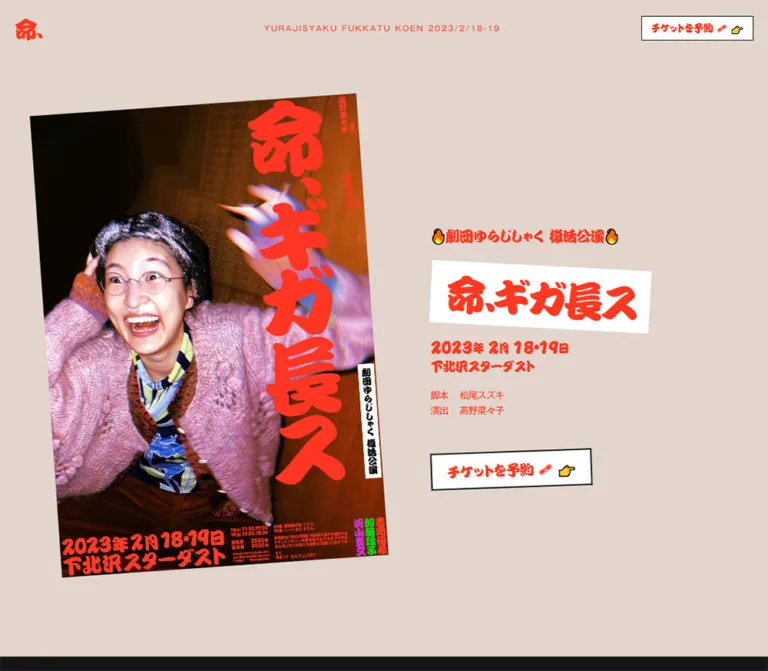
The opening desktop composition pairs a large, counterclockwise-tilted portrait poster with a smaller block of event information. The title sits on a clockwise-tilted white rectangle, and the ticket link tilts in the opposite direction. Below, alignment shifts deliberately: the synopsis starts near the left edge, the information tables occupy the right portion of the page, and the company introduction returns to the left. Mobile changes the opening order to information first, poster second, while preserving compact two-column information rows.
閉じる
劇団ゆらじしゃく / 命、ギガ長ス — Style Reference
A theatre playbill spread across warm paper, with vermilion lettering, tilted notices, and a staircase of repeated posters.
Original URL: https://yuraji-inochi.studio.site/
Final URL: https://yuraji-inochi.studio.site/
Theme: light, with a warm beige canvas and bright red-orange identity color.
Inspected: October 2, 2026, at 00:58:35 JST; supplied retrieval timestamp 2026-10-01T15:58:35.528Z.
Viewports: desktop 1440 × 1000 and mobile 390 × 844 CSS pixels.
Scope: the currently served single-page theatre production website: opening composition, synopsis, timetable, venue and ticket information, theatrical team table, repeated-poster band, and company footer. Analysis uses the supplied original-page captures and rendered DOM evidence. No additional browsing was performed.
The page presents the February 18–19, 2023 production of 命、ギガ長ス. Its public page remains available, with all four performance times marked sold out. The design combines expressive Japanese theatre lettering with a restrained information system: photographs and red display type carry the excitement, while dark Gothic text and horizontal rules organize practical details.
The opening desktop composition pairs a large, counterclockwise-tilted portrait poster with a smaller block of event information. The title sits on a clockwise-tilted white rectangle, and the ticket link tilts in the opposite direction. Below, alignment shifts deliberately: the synopsis starts near the left edge, the information tables occupy the right portion of the page, and the company introduction returns to the left. Mobile changes the opening order to information first, poster second, while preserving compact two-column information rows.
How to Read This Reference
- Measured means a value appears in the supplied computed styles or element rectangles. All pixel measurements are CSS pixels unless stated otherwise.
- Calculated means arithmetic derived from those measurements, such as column proportions or spacing between two recorded elements.
- Estimated means a visual approximation from the original-page screenshots, principally poster dimensions, rotation angles, and image repetition.
- Recommended means guidance for a new implementation. The CSS starter, accessibility changes, and proposed breakpoint are adaptations, not recovered source code.
- Token names such as
--color-paperare descriptive aliases. The original font variable names are identified separately. - DOM rectangles and scroll captures were sampled separately. For example, desktop information sections begin at
x=380in the DOM sample and approximatelyx=370in the middle screenshot. Preserve the demonstrated proportions without treating both samples as one exact geometric frame. - The supplied DOM excerpt does not include poster image URLs, image-element styles, transform matrices, or a complete event trace. Motion and asset behavior remain limited to the evidence described below.
Tokens — Colors
Default Palette
| Name | Value | Suggested token | Evidence and role |
|---|---|---|---|
| Warm beige | #e1d5cd |
--color-paper |
Measured rgb(225, 213, 205) on both body and main; continuous page canvas |
| Vermilion | #ff3721 |
--color-accent |
Measured on the logo, title, event details, action labels, footer heading, and social icon |
| Alternate vermilion | #ff3c26 |
--color-accent-alt |
Measured on the footer paragraph and the playwright name in the opening credits |
| Dark ink | #141414 |
--color-ink |
Measured on the synopsis, information headings, timetable, and sampled team text |
| Black | #000000 |
--color-black |
Measured on venue details and the platform badge background; button outlines appear black or near-black |
| White | #ffffff |
--color-white |
Measured on ticket and supporting-link surfaces; visually present behind the main title |
| Inherited gray | #333333 |
--color-inherited |
Measured on layout containers; most visible text has a more specific red or dark override |
The primary relationship is beige plus vermilion. White appears as a small pasted-paper surface for the title and links. The photographic poster supplies brown, pink, blue, and occasional bright secondary colors; these are image content, not an expanded interface palette.
The supplied --g-color-* variables are transparent. Their presence does not establish a visible gradient treatment. No alternate theme or theme selector is evidenced.
Color Use and Contrast
The opening information and company footer use red text directly on beige. Practical information switches to dark ink. Preserve this division when extending the page: decorative identity is emphatic, while dense schedules remain visually sober.
Calculated accessibility observation: #ff3721 against #e1d5cd has approximately 2.5:1 contrast; against white it has approximately 3.6:1. The small red credits, header label, and footer copy therefore need attention in an accessible adaptation. A darker red or dark ink for essential small text is a recommended change, not an observed feature.
Tokens — Typography
Theatre Display Lettering
- Measured family:
勘亭流. - Source variable:
--s-font-07a09afd. - Roles: logo, production title, revival announcement, date, venue in the opening block, and action labels.
- Character: dense, rounded, emphatic Japanese theatre lettering, with tightly packed forms and uneven internal white space.
- Weights: the main title and action labels compute to
400; the revival announcement, date, and opening venue compute to900.
The title's visual heaviness comes substantially from the family itself. Applying a generic bold sans-serif would lose its distinctive rhythm. The title is live DOM text, even though it resembles lettering placed into a poster.
Gothic Body and Information Text
- Measured family:
ゴシックMB101 M JIS2004. - Source variable:
--s-font-fea33305. - Roles: synopsis, metadata, timetable rows, venue details, team names, company introduction, and copyright.
- Weights:
400for the synopsis and company introduction,500for information rows, and900for the small opening credits and Roman header label. - Tracking: much of the information text uses
-0.05em; footer paragraphs use normal tracking.
Section Headings
- Measured family:
ゴシックMB101 H JIS2004. - Source variable:
--s-font-ef8bf148. - Weight:
700. - Roles:
タイムテーブル,概要, andチーム.
These headings are modest labels above long horizontal rules. They organize the page without competing with the title or synopsis.
Icons and Fallbacks
The desktop footer's Twitter bird is a FontAwesome glyph at 24px. Ticket, pointing-hand, fire, and shoe symbols appear as emoji within text. Their exact rendering can vary by platform.
The root element reports Times and the main container reports a generic sans-serif, but those inherited values do not describe the explicitly styled visible typography. Font URLs and font-loading diagnostics were not supplied. Fallback families in the starter are recommendations and will not reproduce the original lettering exactly.
Type Scale
Sizes and line heights in this table are measured.
| Role | Desktop size / line height | Mobile size / line height | Weight | Tracking |
|---|---|---|---|---|
| Header logo | 32 / 38.4px |
18 / 21.6px |
400 |
-0.10em |
| Roman header label | 10 / 12.1px |
Not visibly rendered | 900 |
1.5px |
| Header ticket label | 16 / 19.2px |
15 / 18px |
400 |
-0.03em |
| Revival announcement | 24 / 29.04px |
18 / 21.78px |
900 |
-0.05em |
| Title opening character | 88 / 105.6px |
54 / 64.8px |
400 |
Desktop -0.12em; mobile -0.09em |
| Remaining title lettering | 84 / 100.8px |
52 / 62.4px |
400 |
Desktop -0.12em; mobile word -0.10em |
| Date numerals | 25 / 30.25px |
24 / 29.04px |
900 |
-0.05em |
| Date suffixes | 16 / 19.36px |
16 / 19.36px |
900 |
-0.05em |
| Opening venue | 22 / 26.62px |
20 / 24.2px |
900 |
-0.05em |
| Opening script/director credits | 13 / 18.2px |
13 / 18.2px |
900 |
-0.05em |
| Main ticket label | 28 / 33.6px |
20 / 24px |
400 |
-0.05em |
| Synopsis | 45 / 51.75px |
28 / 32.2px |
400 |
-0.05em |
| Information section heading | 20 / 28px |
16 / 22.4px |
700 |
Normal |
| Timetable dates and times | 24 / 33.6px |
14 / 19.6px |
500 |
-0.05em |
| Information row label | 18 / 25.2px |
14 / 19.6px |
500 |
-0.05em |
| Information row value | 24 / 33.6px |
14 / 19.6px |
500 |
-0.05em |
| Timetable notes | 18 / 25.2px |
14 / 19.6px |
500 |
-0.05em |
| Venue address | 14 / 19.6px |
12 / 16.8px |
500 |
-0.05em |
| Supporting action label | 18 / 21.6px |
16 / 19.2px |
400 |
-0.05em |
| Company heading and paragraph | 24 / 33.6px |
16 / 22.4px |
400 |
Normal |
| Copyright | 11 / 16.5px |
11 / 16.5px |
400 |
Normal |
The title consists of separate DOM elements for 命, 、, and ギガ長ス, with slightly different sizes and optical spacing. For a new implementation, keep these as styled spans inside one meaningful heading. The original's multiple heading elements, including headings inside links, are not necessary to reproduce its appearance.
Tokens — Spacing & Shapes
The source does not expose a coherent spacing scale in the supplied custom properties. The following values are a useful inventory of repeated measurements, not a claim that the site uses an eight-point system.
Spacing Scale
| Use | Value | Evidence |
|---|---|---|
| Header and ordinary outer inset | 20px |
Measured on both viewports |
| Opening credit label column | 40px |
Measured on both viewports |
| Gap between opening credit rows | About 2px |
Calculated from 18.19px row height and 20.19px row pitch |
| Desktop small-link padding | 7px 12px 8px |
Measured header ticket link |
| Mobile small-link padding | 5px 8px 6px 10px |
Measured header ticket link |
| Desktop main-link padding | 11px 20px 12px |
Measured opening ticket link |
| Mobile main-link padding | 8px 12px 9px 16px |
Measured opening ticket link |
| Heading space before its rule | 15px |
Measured bottom padding |
| Typical information-row pitch | 55.59px desktop; 41.59px mobile |
Calculated from adjacent timetable rows |
| Synopsis paragraph separation | 32px desktop; 24px mobile |
Calculated from paragraph rectangles |
| Synopsis-to-timetable interval | 200px desktop; 144px mobile |
Calculated from recorded document positions |
| Separation between information sections | 100px |
Calculated on both viewports |
| Footer heading-to-paragraph gap | 32px desktop; 20px mobile |
Calculated |
| Footer top space before heading | 100px desktop; 80px mobile |
Calculated within the footer rectangle |
| Poster staircase drop | Approximately 40px per image |
Estimated from both lower-page screenshots |
Border Radius and Rules
| Element | Treatment | Evidence |
|---|---|---|
| Ticket and supporting links | Square corners | Measured border-radius: 0 |
| Title paper | Square rectangle | Screenshot observation |
| Posters | Square corners; no surrounding card | Screenshot observation |
| Header ticket outline | Approximately 1px |
Screenshot and box-size calculation |
| Main ticket outline | Approximately 2px |
Screenshot and padding/line-height calculation |
| Information rules | Approximately 2px |
Screenshot; section-heading height also supports a 2px rule |
| Platform badge | 4px radius |
Measured; specific to the third-party badge |
Rotation supplies the irregularity. There is no general rounded-card or drop-shadow system.
Layout Measurements
| Element | Desktop 1440 × 1000 |
Mobile 390 × 844 |
Status |
|---|---|---|---|
| Document height | 5332.84px |
5105.28px |
Measured |
| Header rectangle | 1400 × 38.39px, at (20,20) |
350 × 30px, at (20,20) |
Measured |
| Header ticket link | 175.03 × 36.19px |
160.34 × 31px |
Measured |
| Opening information width | 431.84px on sampled full-width text lines |
Title paper approximately 280px wide |
Measured desktop; estimated mobile paper |
| Opening announcement position | (784.47,314.27) |
(76.42,140) |
Measured |
| Main ticket bounding box | 285.08 × 70.44px |
208.83 × 52.21px |
Measured after transformation |
| Synopsis text column | 735px wide, at x=20 |
350px wide, at x=20 |
Measured |
| Information section | 1050px wide, at x=380 |
350px wide, at x=20 |
Measured |
| Information body inset | 315px, or 30% of its section |
35px, or 10% |
Calculated |
| Information body width | 735px, or 70% |
315px, or 90% |
Measured and calculated |
| Overview label/value split | 367.5 / 367.5px |
126 / 189px |
Measured; 50:50 becomes 40:60 |
| Company paragraph width | 700px |
350px |
Measured |
| Large poster | Approximately 581 × 823px before rotation |
Approximately viewport width | Estimated |
| Repeated poster | Approximately 202 × 285px |
Approximately 105 × 148px |
Estimated |
The rotated ticket rectangles are bounding boxes, not usable unrotated CSS width and height values. Setting those dimensions directly and rotating again would oversize the controls.
Components
Persistent Header
Role: retain identity and the ticket route throughout the page.
The header has three visual positions on desktop: the small red 命、 mark at the left, a tiny tracked Roman production label near the center, and a white outlined ticket link at the right. It has a transparent background and no bottom divider. The background and page content remain visible behind it.
Its inset stays at 20px in the supplied top and lower-page captures. This supports a persistent viewport-positioned treatment. The exact source position declaration is not included in the DOM excerpt.
On mobile, the Roman label disappears, the mark drops from 32px to 18px, and the ticket label drops only from 16px to 15px. The visible ticket box remains compact at 160.34 × 31px. There is no evidenced hamburger menu or expanded navigation.
Opening Poster
Role: provide the emotional and photographic center of the page.
The desktop poster occupies most of the left half of the opening viewport. Its upper edge rises toward the right, indicating approximately -4deg rotation. Its portrait proportions are approximately 1:1.414.
The photograph shows an exuberant performer in glasses and a pink knitted garment, with raised arms and a blurred hand. Warm brown architectural surfaces contrast with direct, bright illumination on the face. Large red vertical lettering and dense small production details are integrated into the poster composition.
On mobile, the image follows the complete event-information block. Its top enters the initial screenshot at approximately y=510, and it extends below the fold. The image approaches the viewport edges, unlike the ordinary 20px text inset. The visible rotation is milder, approximately -2deg.
Do not replace this image with a generic portrait crop: the face, movement, vertical lettering, and printed information work as one graphic.
Event Information Stack
Role: state the production identity and practical opening details.
The anatomy is:
- A red display-font announcement,
🔥劇団ゆらじしゃく 復活公演🔥. - A white rectangular title paper carrying
命、ギガ長ス. - A mixed-size date line with larger numerals and smaller Japanese suffixes.
- A second display line for
下北沢スターダスト. - Two compact Gothic credit rows, headed
脚本and演出. - A larger outlined ticket link after a distinct vertical pause.
Desktop uses a left-aligned information column to the right of the poster. Mobile centers the stack around x=195; the credit block is centered as a group but retains left-aligned label/value rows.
The title paper rotates approximately +3deg. The paper and its lettering tilt together. Its desktop width is roughly 432px; the mobile paper is roughly 280px. These paper dimensions and angles are visual estimates, because the wrapper's computed style was not supplied.
Ticket Link Family
Role: provide a repeated route to the external reservation form.
All three reservation links use the visible label チケットを予約 🎟 👉 and the same rendered destination: https://ticket.corich.jp/apply/214727/.
The shared anatomy is white fill, dark rectangular outline, vermilion theatre lettering, and inline emoji. The header version is small and level. The opening version is larger and tilted approximately -2deg. The information-table version is level and fits its value column.
| Variant | Desktop | Mobile |
|---|---|---|
| Header | 16px label; roughly 175 × 36px box |
15px label; roughly 160 × 31px box |
| Opening | 28px label; transformed box roughly 285 × 70px |
20px label; transformed box roughly 209 × 52px |
| Ticket information | 18px label; roughly 204 × 45px box |
16px label; 189 × 46.19px box |
The destination is evidenced by the link attribute. The external booking page and successful reservation behavior were not tested. The current production timetable displays sold-out notices even though these links remain visible.
Synopsis
Role: introduce the play's premise through unusually large editorial text.
The synopsis uses dark Gothic text on the unchanged beige background, with no card or accompanying thumbnail. At desktop it is 45px / 1.15, -0.05em tracking, in a 735px column aligned 20px from the left edge. On mobile it becomes 28px / 1.15 in a 350px column.
A second paragraph presents the short question さて、現実って、なんでしょうか?. Its separation is 32px on desktop and 24px on mobile. Preserve this pause and the large scale: it is a dramatic reading passage within the page, not small explanatory body copy.
The measured first paragraph begins at document y=1942.66 on desktop and y=2219.28 on mobile. The supplied screenshots do not establish every visual state in the interval between the opening poster and this paragraph.
Information Section Frame
Role: provide one consistent structure for schedule, overview, and team details.
Each section starts with a heavy Gothic heading and a full-width dark bottom rule. The rows below are narrower and aligned to the section's right edge. This creates a deliberately empty left portion under the heading.
On desktop, the 1050px section contains a 735px row area: a 30% empty inset and 70% content area. On mobile, the section fits within the 20px page margins, but its rows still retain a 10% inset. This is an important responsive detail; the original does not simply make every row full width.
Use horizontal separators between rows and leave the label/value split unboxed. No vertical grid lines, striped backgrounds, or raised cards are evidenced.
Timetable
Role: communicate performance dates, times, and attendance notes.
Two rows pair a date at left with two performance times at right. All four times include the visible status 売切. Status remains inline with the time and uses the same dark text treatment, rather than a colored badge.
Below the rows, two notes align with the beginning of the inset row area. They describe an approximately 90–100 minute running time and admission beginning 15 minutes before the performance.
Desktop row text is 24px; mobile row text is 14px. The mobile row area uses a 126px date column and a 189px time column. Maintain the date/time association when adapting to still narrower widths.
Overview and Supporting Links
Role: group venue, companion performance, and ticket information.
The overview uses label/value rows. The venue value begins with a larger name and follows with a smaller address. The companion-performance value combines a short paragraph and two vertically stacked outlined links, 合同公演の詳細 👟👉 and あゆみ公式サイト 👟👉.
The ticket row contains three price lines, an explanation of the joint-viewing arrangement, and another ticket link. These details are text within the table, not a pricing-card comparison.
On mobile, the two supporting links each fill the 189px value column. Their measured height is 46.19px, with 11px 12px 12px padding and 16px display lettering. The two-column row structure remains present even for this longer content.
Theatrical Team Table
Role: present the production's cast and stage team.
Fourteen role/name rows follow the same information-section frame. The first rows identify cast roles; later rows cover script, direction, stage work, costume, lighting, sound, publicity art, and production.
Labels use smaller Gothic text than names on desktop; both become 14px on mobile. The presentation is a continuous ruled list without portraits or profile cards.
These are theatrical production credits. They do not independently establish who designed or implemented the website.
Repeated-Poster Staircase
Role: turn the production poster into a strong lower-page graphic.
Identical photographic compositions repeat edge to edge, with each successive poster placed approximately 40px lower than the previous one. The individual tiles remain upright. The visual diagonal comes from displacement, not from rotating the whole strip.
The desktop capture shows approximately eight visible tiles including cropped edge tiles, each around 202 × 285px. The mobile capture shows approximately four visible tiles, around 105 × 148px. The strip extends beyond the horizontal viewport edges.
On desktop, the descending right-hand tiles occupy vertical space beside the beginning of the company introduction. On mobile, the visible staircase finishes above the introduction, leaving a generous beige interval.
The captures establish repetition and clipping. They do not establish automatic horizontal movement, dragging, a carousel, or a loop duration.
Company Footer and Platform Badge
Role: explain the theatre company and close the page with a small social and copyright area.
The footer returns to red Gothic type on beige. Its heading and paragraph share the same measured size: 24px desktop and 16px mobile, with 1.4 line height. The paragraph is 700px wide on desktop and 350px on mobile.
The desktop social icon and copyright sit at the lower right. The mobile DOM places the social link at the lower left and the copyright at the lower right. The footer displays (c) 2022 Nanako Kono; this is a visible copyright notice, not an explicit web-design role assignment.
A separate black Created in platform badge is fixed near the lower-left corner: 84 × 20px, 20px from the left and bottom, with 4px radius. On mobile, it occupies the same general area as the recorded social link and may obscure that link in the captured state. Treat the badge as publishing-platform chrome, not part of the theatre's reusable identity system.
Tokens — Motion & Interaction
Recorded Transition Declarations
| Target | Measured declaration | What the evidence supports |
|---|---|---|
| Body background | 0.5s cubic-bezier(0.4, 0.4, 0, 1) |
A background transition is configured; no alternate background state was demonstrated |
| Most containers, paragraphs, and links | 0.3s cubic-bezier(0.4, 0.4, 0, 1) |
Shared transition timing; hover outcomes and affected visual changes remain unverified |
| Header | 1.2s cubic-bezier(0.4, 0.4, 0, 1) |
A longer transition is configured |
| Logo, title fragments, and several action labels | 1.2s cubic-bezier(0.4, 0.4, 0, 1) 1.7s |
Duration and delay are recorded; initial and final states are not supplied |
| Information sections | 1.2s cubic-bezier(0.4, 0.4, 0, 1) 0.3s |
Section transition configuration; exact trigger and travel distance are unverified |
| Desktop supporting-link labels | 1.2s cubic-bezier(0, 0.7, 0.22, 1) |
A second easing curve appears on these labels |
| Platform badge | 0.4s cubic-bezier(0.4, 0.4, 0, 1) |
Provider-specific transition timing |
All sampled elements report animation: none. This does not prove that the entire page is static: image animation, unsampled elements, and script-driven changes are outside that observation. Conversely, transition declarations alone do not prove a particular entrance sequence.
The poster lettering has different visible forms across the original-page captures: block-like red lettering in the desktop opening, thick brush-like lettering in the desktop lower strip, and outlined lettering in the mobile captures. The assets and frame sequence were not supplied. The cause could not be established, so neither animated lettering nor breakpoint-specific artwork should be asserted as fact.
Evidenced Interaction Routes
| Control | Rendered destination or observed behavior | Limitation |
|---|---|---|
| Header mark | Original page URL | Link exists; reload versus in-page return behavior was not exercised |
| Reservation links | https://ticket.corich.jp/apply/214727/ |
External destination not visited |
| Joint-performance details | https://daffodil-pin-971.notion.site/5b3dc7bb16484a12ae1a56b61e3d1fa2 |
External destination not visited |
| Companion production | https://s11675ah.wixsite.com/mataasa |
External destination not visited |
| Social icon | https://twitter.com/yurajisyaku |
External destination not visited |
| Vertical page traversal | Supplied opening, middle, and lower-page captures | Supports document scrolling and persistent header appearance |
No menu, modal, lightbox, sound control, video playback, or theme switch was demonstrated. Static poster angles are composition evidence, not proof of an interactive rotation effect.
Surfaces
| Surface | Appearance | Purpose |
|---|---|---|
| Page canvas | Flat warm beige | Unifies the long page and its empty space |
| Opening title paper | White, square, slightly clockwise | Separates the production title from the surrounding canvas |
| Action link | White, dark outline, red lettering | Makes a small number of navigation routes conspicuous |
| Information area | Transparent over beige, dark horizontal rules | Organizes factual content without panels |
| Poster | Full-color photographic graphic, sharp edges | Carries emotional intensity and dense visual identity |
| Company introduction | Red text on the same beige | Restores the opening color emphasis at the end |
| Provider badge | Small black rounded rectangle | Third-party platform attribution |
There is no evidenced gradient, translucent glass layer, embossed button, or general shadow elevation system. The sense of layering comes from white paper, rotation, and overlaps between graphic and empty space.
Imagery
The main visual is theatrical and physical: a candid-looking, highly expressive face, glasses catching light, raised arms, pink knit texture, motion blur, and a warm interior. Red typography is placed over the photographic field at an unusually large scale. Small colored lettering and fine print remain part of the poster rather than becoming separate interface controls.
Keep the portrait aspect ratio and the relationship between the face and the vertical title. Use normal photographic image rendering; pixelated scaling is not evidenced. The original-page photos show detail and tonal variation that would be lost through a blanket duotone filter.
The page reuses one recognizable photographic composition in two scales: a dominant opening poster and a small repeated lower-page sequence. That reuse is more characteristic than adding multiple unrelated supporting photographs.
Observed Asset References
| Asset or visual | Original-page evidence | URL availability |
|---|---|---|
| Large production poster | Desktop opening and mobile opening captures | Image source URL not included |
| Repeated poster tiles | Desktop and mobile lower-page captures | Image source URLs not included |
| Production wordmark | Live text with measured 勘亭流 family |
No image file needed for this element |
| Ticket, hand, fire, and shoe symbols | Inline text and screenshots | Emoji rather than supplied asset paths |
| Twitter bird | Footer screenshot and computed FontAwesome family |
Icon-font file URL not included |
| Platform badge | Screenshots and rendered provider link | Visual asset URL not included |
No asset filenames, file formats, intrinsic image dimensions, or font download paths can be recovered reliably from the supplied evidence. A recreation requires authorized poster artwork and the appropriate font files; the CSS shell alone cannot reproduce the photographic identity.
Layout & Responsive Behavior
Desktop Composition
The opening uses a large left poster and a narrower right information stack. The stack begins substantially below the header, around y=314, while the poster begins near y=110 after rotation. This asymmetry gives the photo priority without enlarging every text element.
The narrative moves to a left-aligned column. Practical information then shifts right into a 1050px region, with an additional internal inset before the table rows. The footer returns to the left. Preserve these changing anchors: centering all sections into one uniform column would remove much of the page's character.
Mobile Composition
At 390 × 844, the header keeps 20px outer margins and hides the Roman descriptor. The event-information stack begins at y=140, and the ticket action is fully visible before the poster begins around y=510.
The synopsis becomes 350px wide. Information section headings span that same width, but the row area starts at x=55 and occupies 315px. The 40:60 label/value split leaves more room for addresses, names, and buttons. The company paragraph returns to the full 350px text width.
Type reduction is selective. The title drops from 84–88px to 52–54px, schedule values from 24px to 14px, and footer text from 24px to 16px. The opening credits stay 13px, the date numerals remain almost unchanged, and copyright stays 11px.
Recorded Document Positions
These are measurements of the supplied DOM sample, not prescribed fixed section heights.
| Region | Desktop document position | Mobile document position |
|---|---|---|
| Synopsis begins | y=1942.66 |
y=2219.28 |
| Timetable | y=2588.66, height 216.97 |
y=2676.97, height 171.77 |
| Overview | y=2905.63, height 612.70 |
y=2948.73, height 539.09 |
| Team | y=3618.33, height 828.59 |
y=3587.83, height 621.70 |
| Footer | y=4912.09, height 420.75 |
y=4674.48, height 430.80 |
The nearly equal total document heights conceal different arrangements above and below the synopsis. Do not derive the mobile layout by scaling the entire desktop page.
A max-width: 1200px rule appears in the supplied text for responsive line-break handling. It does not establish the breakpoint for every layout change. Only the two supplied viewport widths are verified; tablet behavior, intermediate widths, zoom, and landscape phones remain untested.
Do’s and Don’ts
Do
- Preserve the measured beige
#e1d5cdand primary vermilion#ff3721as the core identity pair. - Use theatre display lettering for production identity and Gothic text for narrative and practical information.
- Keep the title live and accessible, with careful punctuation spacing.
- Rotate the poster, title paper, and main action in small, opposing directions.
- Keep the photo's expression, knit texture, blurred hand, and vertical lettering together.
- Retain the left synopsis, right information region, and left footer alignment changes.
- Preserve the inset row area and two-column relationships on the measured mobile layout.
- Use horizontal rules and open space to organize information.
- Place the full event-information stack before the poster on mobile.
- Repeat the poster as an upright staircase with a consistent vertical drop.
- Distinguish theatrical credits, a copyright notice, and explicit website-production attribution.
Don’t
- Don't turn the information sections into rounded cards or pricing panels.
- Don't replace the expressive display family with generic heavy sans-serif lettering.
- Don't apply the display font to long synopsis or address text.
- Don't center every section or remove the empty left portion beneath desktop section headings.
- Don't crop the poster into a landscape hero image or isolate the face from its typography.
- Don't add shadows, gradients, glossy buttons, or extra interface accent colors.
- Don't treat a rotated bounding box as an untransformed component size.
- Don't present sold-out performance times as currently available inventory.
- Don't infer a carousel or animated lettering sequence from a set of still captures.
- Don't assume the mobile social link is intentionally absent because the provider badge overlaps its area.
- Don't reproduce multiple
h1elements merely to achieve the original title's visual segmentation.
Recommended Implementation Additions
These are recommendations for a new implementation, not verified capabilities of the original page.
- Use one page-level heading, section headings for the three information regions, and definition lists or a semantic timetable for label/value relationships.
- Keep an accessible text version of the title, date, venue, and ticket status outside the poster image. Give the main poster a useful alternative description and decorative repetitions empty alternatives.
- Make the compact header link easier to activate with a minimum
44pxhit area while preserving its modest visual treatment. - Provide a dark, clearly visible keyboard focus outline and an accessible name for the social icon.
- Resolve the low contrast of small red text. A darker accent can serve essential small copy while the brighter red remains in large display lettering and artwork.
- Ensure persistent header controls and platform chrome do not cover focused content or footer links. Include scroll offsets and safe-area handling where needed.
- Keep content visible without entrance effects. If motion is added after further inspection, support reduced motion and provide a stable poster frame.
- At widths narrower than the inspected phone, permit long table values to wrap or stack without clipping. This is an extension of the observed layout, not a verified original breakpoint.
- For a maintained event website, explain the production's completed status near reservation links rather than relying only on dates and inline sold-out labels.
- Reserve image dimensions to limit layout movement and load below-the-fold decorative repeats efficiently.
Agent Prompt Guide
Quick Color Reference
- Main canvas:
#e1d5cd. - Identity lettering and action labels:
#ff3721. - Secondary measured red:
#ff3c26. - Synopsis, schedules, labels, and rules:
#141414or the evidenced black variant. - Title paper and action surfaces:
#ffffff. - Photography supplies the remaining colors; do not turn its pinks or greens into interface badges.
Overall Prompt
“Create a Japanese theatre production website with a warm beige #e1d5cd canvas, vermilion #ff3721 theatre lettering, and an expressive portrait playbill. On desktop, place a large poster tilted slightly counterclockwise on the left and a smaller event-information stack on the right. Put the live title on a white paper rectangle tilted clockwise, then show the date, venue, compact script and direction credits, and a white outlined ticket link. Continue with a large dark Gothic synopsis aligned left, then right-aligned timetable, overview, and team sections using horizontal rules and inset label/value rows. Repeat the poster as a descending staircase before a red company introduction. On mobile, center the event details above the poster, hide the Roman header descriptor, and retain compact two-column information rows. Avoid rounded cards and shadows. Treat motion as unverified unless separately specified.”
Example Component Prompts
- Opening title: “Build a live Japanese production heading on a square white rectangle with an approximately three-degree clockwise tilt. Use dense theatre lettering in vermilion, very tight tracking, and optical spacing around the comma. Set the leading character slightly larger than the rest. Use one semantic heading with styled spans.”
- Ticket action: “Create a white rectangular ticket link with a thin dark border, red theatre lettering, and inline ticket and pointing-hand emoji. Provide small level and larger two-degree counterclockwise variants. Keep corners square and add no shadow.”
- Information section: “Place a small heavy Gothic section heading above a full-width dark rule. Inset the body by 30% on desktop and 10% on mobile. Use two label/value columns and horizontal row rules. Change the mobile split to 40:60, with 14px text and supporting links filling the value column.”
- Synopsis: “Use large dark Japanese Gothic text on the beige canvas, aligned 20px from the left. Set desktop type to 45px with 1.15 line height and mobile type to 28px. Separate the closing question into its own paragraph with a clear pause.”
- Poster band: “Repeat one portrait production poster edge to edge across a clipped horizontal band. Keep each image upright and move every successive tile down by approximately 40px. Use roughly 202px-wide tiles on desktop and 105px-wide tiles on the inspected phone. Implement a static composition unless motion requirements are supplied.”
- Company footer: “Create an unboxed company introduction in red Gothic text on beige. Use a 700px paragraph width and 24px type on desktop, then a 350px width and 16px type on mobile. Keep the copyright small and leave clear space for the social link.”
Quick Start
CSS Custom Properties
This is a static implementation starter using measured colors and type sizes, with estimated rotations and adapted layout rules. It is not a reconstruction of the original stylesheet. The 1100px layout switch is a recommendation; the source's actual composition breakpoint was not supplied.
Provide the fonts separately through an authorized font service or licensed files. The font stacks below do not download them. Provide a main poster and repeated-poster images through HTML; no source asset URLs were available.
Suggested structure: an .event-site wrapper containing .site-header, a main area with .hero, .synopsis, .details, and .poster-band, followed by .site-footer. Inside the hero, use .hero-poster and .hero-copy. Inside each information section, use .info-heading and .info-body, with .info-row label/value pairs. Give repeated images a zero-based --i custom property.
:root {
  /* Measured colors */
  --color-paper: #e1d5cd;
  --color-accent: #ff3721;
  --color-accent-alt: #ff3c26;
  --color-ink: #141414;
  --color-black: #000000;
  --color-white: #ffffff;

  /* Measured families; fallback choices are recommendations */
  --font-display: '勘亭流', serif;
  --font-body: 'ゴシックMB101 M JIS2004', sans-serif;
  --font-heading: 'ゴシックMB101 H JIS2004', sans-serif;

  --text-title: 84px;
  --text-title-first: 88px;
  --text-synopsis: 45px;
  --text-section: 20px;
  --text-label: 18px;
  --text-value: 24px;
  --text-about: 24px;
  --tracking-tight: -0.05em;

  /* Measured and derived spacing */
  --gutter: 20px;
  --section-gap: 100px;
  --rule: 2px;
  --details-max: 1050px;
  --row-area: 70%;

  /* Screenshot estimates */
  --poster-angle: -4deg;
  --title-angle: 3deg;
  --ticket-angle: -2deg;
  --tile-width: 202px;
  --tile-drop: 40px;
  --tile-crop: 85px;
  --last-visible-step: 7;

  /* Recorded timing; no entrance sequence is assumed */
  --ease-source: cubic-bezier(0.4, 0.4, 0, 1);
  --motion-short: 300ms;
  --motion-long: 1200ms;
}

* { box-sizing: border-box; }
html { scroll-padding-top: 100px; }
body {
  margin: 0;
  background: var(--color-paper);
  color: var(--color-ink);
  font-family: var(--font-body);
}
img { display: block; max-width: 100%; }
button, a { -webkit-tap-highlight-color: transparent; }

.site-header {
  position: fixed;
  z-index: 20;
  top: max(20px, env(safe-area-inset-top));
  right: var(--gutter);
  left: var(--gutter);
  display: grid;
  grid-template-columns: 1fr auto 1fr;
  align-items: center;
  background: transparent;
}
.site-brand {
  justify-self: start;
  color: var(--color-accent);
  font: 400 32px/1.2 var(--font-display);
  letter-spacing: -0.1em;
  text-decoration: none;
}
.site-descriptor {
  margin: 0;
  color: var(--color-accent);
  font-size: 10px;
  font-weight: 900;
  line-height: 1.21;
  letter-spacing: 1.5px;
}

.ticket {
  display: inline-flex;
  align-items: center;
  justify-content: center;
  max-width: 100%;
  padding: 9px 20px 10px;
  border: var(--rule) solid var(--color-ink);
  border-radius: 0;
  background: var(--color-white);
  color: var(--color-accent);
  font: 400 18px/1.2 var(--font-display);
  letter-spacing: var(--tracking-tight);
  text-align: center;
  text-decoration: none;
}
.ticket--header {
  justify-self: end;
  padding: 7px 12px 8px;
  border-width: 1px;
  font-size: 16px;
  letter-spacing: -0.03em;
}
.ticket--hero {
  margin-top: 48px;
  padding: 11px 20px 12px;
  font-size: 28px;
  transform: rotate(var(--ticket-angle));
}

.hero {
  display: grid;
  grid-template-columns: minmax(0, 580px) minmax(0, 432px);
  align-items: center;
  gap: 80px;
  width: min(1192px, calc(100% - 80px));
  margin-inline: auto;
  padding-block: 128px 80px;
}
.hero-poster {
  width: 100%;
  margin: 0;
  transform: rotate(var(--poster-angle));
}
.hero-poster img {
  width: 100%;
  height: auto;
}
.hero-copy {
  min-width: 0;
  color: var(--color-accent);
  transform: translateY(-16px);
}
.hero-kicker {
  margin: 0;
  font: 900 24px/1.21 var(--font-display);
  letter-spacing: var(--tracking-tight);
}
.hero-title {
  display: flex;
  align-items: baseline;
  justify-content: center;
  margin: 24px 0;
  padding: 10px 18px;
  background: var(--color-white);
  font: 400 var(--text-title)/1.2 var(--font-display);
  letter-spacing: -0.12em;
  white-space: nowrap;
  transform: rotate(var(--title-angle));
}
.title-first { font-size: var(--text-title-first); }
.title-comma {
  /* Optical adjustment: validate with the licensed display font */
  margin-inline-end: -0.65em;
}
.event-date {
  margin: 0;
  font: 900 25px/1.21 var(--font-display);
  letter-spacing: var(--tracking-tight);
}
.event-date small { font-size: 16px; }
.event-venue {
  margin: 2px 0 0;
  font: 900 22px/1.21 var(--font-display);
  letter-spacing: var(--tracking-tight);
}
.hero-credits {
  display: grid;
  grid-template-columns: 40px auto;
  gap: 2px 0;
  width: max-content;
  margin: 12px 0 0;
  font-size: 13px;
  font-weight: 900;
  line-height: 1.4;
  letter-spacing: var(--tracking-tight);
}
.hero-credits dt,
.hero-credits dd { margin: 0; }

.synopsis {
  /* Adapted spacing: the interval before this region is incomplete */
  max-width: 735px;
  margin: 240px var(--gutter) 200px;
  font-size: var(--text-synopsis);
  font-weight: 400;
  line-height: 1.15;
  letter-spacing: var(--tracking-tight);
}
.synopsis p { margin: 0; }
.synopsis p + p { margin-top: 32px; }

.details {
  width: min(var(--details-max), calc(100% - 40px));
  margin-inline: auto var(--gutter);
}
.info-section + .info-section { margin-top: var(--section-gap); }
.info-heading {
  margin: 0;
  padding-bottom: 15px;
  border-bottom: var(--rule) solid var(--color-ink);
  font: 700 var(--text-section)/1.4 var(--font-heading);
}
.info-body {
  width: var(--row-area);
  margin: 0 0 0 auto;
}
.info-row {
  display: grid;
  grid-template-columns: minmax(0, 1fr) minmax(0, 1fr);
  padding-block: 10px;
  border-bottom: var(--rule) solid var(--color-ink);
  font-weight: 500;
  line-height: 1.4;
  letter-spacing: var(--tracking-tight);
}
.info-label {
  margin: 0;
  padding-right: 40px;
  font-size: var(--text-label);
}
.info-value {
  min-width: 0;
  margin: 0;
  font-size: var(--text-value);
  overflow-wrap: anywhere;
}
.timetable .info-label { font-size: var(--text-value); }
.info-value p { margin: 0; }
.info-address {
  margin-top: 5px !important;
  font-size: 14px;
  line-height: 1.4;
}
.info-note {
  margin: 10px 0 0;
  font-size: 18px;
  font-weight: 500;
  line-height: 1.4;
  letter-spacing: var(--tracking-tight);
}
.info-actions {
  display: flex;
  flex-direction: column;
  align-items: flex-start;
  gap: 10px;
  margin-top: 10px;
}

.poster-band {
  /* Reserve transformed height in this safer static adaptation */
  height: calc(var(--tile-width) * 1.4142 + var(--last-visible-step) * var(--tile-drop));
  margin-top: 80px;
  overflow: hidden;
}
.poster-track {
  display: flex;
  width: max-content;
  margin-left: calc(-1 * var(--tile-crop));
}
.poster-track img {
  flex: 0 0 var(--tile-width);
  width: var(--tile-width);
  max-width: none;
  height: auto;
  aspect-ratio: 707 / 1000;
  object-fit: contain;
  transform: translateY(calc(var(--i, 0) * var(--tile-drop)));
}

.site-footer {
  display: grid;
  grid-template-columns: minmax(0, 700px) 1fr;
  align-items: end;
  gap: 40px;
  padding: 100px var(--gutter) 20px;
  color: var(--color-accent);
}
.company-about h2,
.company-about p {
  margin: 0;
  font-size: var(--text-about);
  font-weight: 400;
  line-height: 1.4;
}
.company-about p {
  margin-top: 32px;
  color: var(--color-accent-alt);
}
.footer-meta {
  display: flex;
  flex-direction: column;
  align-items: flex-end;
  gap: 8px;
}
.footer-meta a { color: inherit; }
.copyright {
  margin: 0;
  font-size: 11px;
  line-height: 1.5;
}

/* Recommended accessibility additions */
.event-site :focus-visible {
  outline: 3px solid var(--color-ink);
  outline-offset: 5px;
}
.readable-accent { color: #9e2416; }

@media (max-width: 1100px) {
  :root {
    --text-title: 52px;
    --text-title-first: 54px;
    --text-synopsis: 28px;
    --text-section: 16px;
    --text-label: 14px;
    --text-value: 14px;
    --text-about: 16px;
    --row-area: 90%;
    --poster-angle: -2deg;
    --tile-width: 105px;
    --tile-crop: 15px;
    --last-visible-step: 3;
  }
  .site-header { grid-template-columns: 1fr auto; }
  .site-brand { font-size: 18px; }
  .site-descriptor { display: none; }
  .ticket--header {
    padding: 5px 8px 6px 10px;
    font-size: 15px;
  }
  .hero {
    display: flex;
    flex-direction: column;
    gap: 64px;
    width: 100%;
    padding-block: 140px 80px;
    overflow: clip;
  }
  .hero-copy {
    order: 0;
    width: min(280px, calc(100% - 40px));
    text-align: center;
    transform: none;
  }
  .hero-poster {
    order: 1;
    width: min(100%, 580px);
  }
  .hero-kicker { font-size: 18px; }
  .hero-title {
    margin: 16px 0 18px;
    padding: 8px 14px;
    letter-spacing: -0.1em;
  }
  .title-first,
  .title-comma { letter-spacing: -0.09em; }
  .event-date { font-size: 24px; }
  .event-venue { font-size: 20px; }
  .hero-credits {
    margin: 16px auto 0;
    text-align: left;
  }
  .ticket--hero {
    margin-top: 24px;
    padding: 8px 12px 9px 16px;
    font-size: 20px;
  }
  .synopsis {
    max-width: none;
    margin-block: 144px;
  }
  .synopsis p + p { margin-top: 24px; }
  .details { margin-inline: var(--gutter); }
  .info-row { grid-template-columns: minmax(0, 40%) minmax(0, 60%); }
  .info-label { padding-right: 0; }
  .info-address { font-size: 12px; }
  .info-note { font-size: 14px; }
  .info-actions .ticket {
    width: 100%;
    padding: 11px 12px 12px;
    font-size: 16px;
  }
  .site-footer {
    grid-template-columns: minmax(0, 1fr);
    padding-top: 80px;
  }
  .company-about p { margin-top: 20px; }
  .footer-meta {
    flex-direction: row;
    justify-content: space-between;
    align-items: center;
  }
}

/* Recommended extension below the inspected phone width */
@media (max-width: 359px) {
  .info-body { width: 100%; }
  .info-row { grid-template-columns: minmax(0, 1fr); gap: 8px; }
}

@media (prefers-reduced-motion: reduce) {
  .event-site *,
  .event-site *::before,
  .event-site *::after {
    animation: none !important;
    transition: none !important;
  }
}
Use eight decorative images for the desktop staircase, with style='--i: 0' through style='--i: 7' and alt=''. The narrow layout clips the later tiles. Keep a meaningful alternative on the main poster. CSS reduced-motion rules cannot freeze an animated image file; provide a static asset if such a file is introduced.
The starter reserves the staircase's full visible height, so its desktop footer will begin lower than the overlapping source composition. It also uses normal document flow before the synopsis. Exact source scroll positions and the partially documented upper-page interval require additional original-page evidence.
Tailwind v4 Token Mapping
Optional aliases for a project already using Tailwind v4. This is not evidence that the original site uses Tailwind. Define the custom properties above first.
@theme inline {
  --color-paper: #e1d5cd;
  --color-vermilion: #ff3721;
  --color-vermilion-alt: #ff3c26;
  --color-ink: #141414;
  --color-notice: #ffffff;

  --font-theatre: '勘亭流', serif;
  --font-gothic: 'ゴシックMB101 M JIS2004', sans-serif;
  --font-section: 'ゴシックMB101 H JIS2004', sans-serif;

  --text-production: var(--text-title);
  --text-story: var(--text-synopsis);
  --text-information: var(--text-value);
  --text-company: var(--text-about);

  --spacing-page-inset: 20px;
  --spacing-section-gap: 100px;
  --spacing-poster-drop: 40px;
  --radius-notice: 0px;
}
Sources & Evidence
- Original and final website: https://yuraji-inochi.studio.site/. The supplied observation reports HTTP
200and an unchanged final URL. - Capture timestamp:
2026-10-01T15:58:35.528Z, corresponding to October 2, 2026, at 00:58:35 JST. - Desktop evidence: three original-page captures at
1440 × 1000, covering the opening, a middle information region, and the lower poster/footer region; rendered text, links, computed styles, and element rectangles for the page. - Mobile evidence: two original-page captures at
390 × 844, covering the opening and lower-page region; rendered DOM evidence also supplies the intervening synopsis and information-table measurements. - Readiness procedure reported by the supplied observation: at least five seconds of initial observation, waits for document load, visible image decoding, finite animation readiness, and sampled layout/text stability. Perpetual animation was paused for readiness checks and resumed. Scrolling traversed intermediate viewports. These procedures improve capture stability but do not establish all possible states.
- Interaction scope: vertical traversal and rendered link destinations. No click-through booking flow, hover sequence, keyboard sequence, or complete animation timeline was supplied. SharedWorkers and service workers were disabled during inspection.
- Limits: image URLs and intrinsic dimensions, font binaries, full transform declarations, intermediate responsive breakpoints, delayed content, and all states between supplied captures remain unverified. Poster geometry is estimated where indicated; transition timing is measured, while animation choreography is not.
This reference describes the currently served page, including its displayed 2023 performance information. CSS adaptations and implementation improvements are explicitly separated from original-page observations.
# 劇団ゆらじしゃく / 命、ギガ長ス — Style Reference

> A theatre playbill spread across warm paper, with vermilion lettering, tilted notices, and a staircase of repeated posters.

**Original URL:** [https://yuraji-inochi.studio.site/](https://yuraji-inochi.studio.site/)
**Final URL:** [https://yuraji-inochi.studio.site/](https://yuraji-inochi.studio.site/)
**Theme:** light, with a warm beige canvas and bright red-orange identity color.
**Inspected:** October 2, 2026, at 00:58:35 JST; supplied retrieval timestamp `2026-10-01T15:58:35.528Z`.
**Viewports:** desktop `1440 × 1000` and mobile `390 × 844` CSS pixels.
**Scope:** the currently served single-page theatre production website: opening composition, synopsis, timetable, venue and ticket information, theatrical team table, repeated-poster band, and company footer. Analysis uses the supplied original-page captures and rendered DOM evidence. No additional browsing was performed.

The page presents the February 18–19, 2023 production of `命、ギガ長ス`. Its public page remains available, with all four performance times marked sold out. The design combines expressive Japanese theatre lettering with a restrained information system: photographs and red display type carry the excitement, while dark Gothic text and horizontal rules organize practical details.

The opening desktop composition pairs a large, counterclockwise-tilted portrait poster with a smaller block of event information. The title sits on a clockwise-tilted white rectangle, and the ticket link tilts in the opposite direction. Below, alignment shifts deliberately: the synopsis starts near the left edge, the information tables occupy the right portion of the page, and the company introduction returns to the left. Mobile changes the opening order to information first, poster second, while preserving compact two-column information rows.
閉じる
# 劇団ゆらじしゃく / 命、ギガ長ス — Style Reference

> A theatre playbill spread across warm paper, with vermilion lettering, tilted notices, and a staircase of repeated posters.

**Original URL:** [https://yuraji-inochi.studio.site/](https://yuraji-inochi.studio.site/)
**Final URL:** [https://yuraji-inochi.studio.site/](https://yuraji-inochi.studio.site/)
**Theme:** light, with a warm beige canvas and bright red-orange identity color.
**Inspected:** October 2, 2026, at 00:58:35 JST; supplied retrieval timestamp `2026-10-01T15:58:35.528Z`.
**Viewports:** desktop `1440 × 1000` and mobile `390 × 844` CSS pixels.
**Scope:** the currently served single-page theatre production website: opening composition, synopsis, timetable, venue and ticket information, theatrical team table, repeated-poster band, and company footer. Analysis uses the supplied original-page captures and rendered DOM evidence. No additional browsing was performed.

The page presents the February 18–19, 2023 production of `命、ギガ長ス`. Its public page remains available, with all four performance times marked sold out. The design combines expressive Japanese theatre lettering with a restrained information system: photographs and red display type carry the excitement, while dark Gothic text and horizontal rules organize practical details.

The opening desktop composition pairs a large, counterclockwise-tilted portrait poster with a smaller block of event information. The title sits on a clockwise-tilted white rectangle, and the ticket link tilts in the opposite direction. Below, alignment shifts deliberately: the synopsis starts near the left edge, the information tables occupy the right portion of the page, and the company introduction returns to the left. Mobile changes the opening order to information first, poster second, while preserving compact two-column information rows.

## How to Read This Reference

- **Measured** means a value appears in the supplied computed styles or element rectangles. All pixel measurements are CSS pixels unless stated otherwise.
- **Calculated** means arithmetic derived from those measurements, such as column proportions or spacing between two recorded elements.
- **Estimated** means a visual approximation from the original-page screenshots, principally poster dimensions, rotation angles, and image repetition.
- **Recommended** means guidance for a new implementation. The CSS starter, accessibility changes, and proposed breakpoint are adaptations, not recovered source code.
- Token names such as `--color-paper` are descriptive aliases. The original font variable names are identified separately.
- DOM rectangles and scroll captures were sampled separately. For example, desktop information sections begin at `x=380` in the DOM sample and approximately `x=370` in the middle screenshot. Preserve the demonstrated proportions without treating both samples as one exact geometric frame.
- The supplied DOM excerpt does not include poster image URLs, image-element styles, transform matrices, or a complete event trace. Motion and asset behavior remain limited to the evidence described below.

## Tokens — Colors

### Default Palette

| Name | Value | Suggested token | Evidence and role |
| --- | --- | --- | --- |
| Warm beige | `#e1d5cd` | `--color-paper` | Measured `rgb(225, 213, 205)` on both body and main; continuous page canvas |
| Vermilion | `#ff3721` | `--color-accent` | Measured on the logo, title, event details, action labels, footer heading, and social icon |
| Alternate vermilion | `#ff3c26` | `--color-accent-alt` | Measured on the footer paragraph and the playwright name in the opening credits |
| Dark ink | `#141414` | `--color-ink` | Measured on the synopsis, information headings, timetable, and sampled team text |
| Black | `#000000` | `--color-black` | Measured on venue details and the platform badge background; button outlines appear black or near-black |
| White | `#ffffff` | `--color-white` | Measured on ticket and supporting-link surfaces; visually present behind the main title |
| Inherited gray | `#333333` | `--color-inherited` | Measured on layout containers; most visible text has a more specific red or dark override |

The primary relationship is beige plus vermilion. White appears as a small pasted-paper surface for the title and links. The photographic poster supplies brown, pink, blue, and occasional bright secondary colors; these are image content, not an expanded interface palette.

The supplied `--g-color-*` variables are transparent. Their presence does not establish a visible gradient treatment. No alternate theme or theme selector is evidenced.

### Color Use and Contrast

The opening information and company footer use red text directly on beige. Practical information switches to dark ink. Preserve this division when extending the page: decorative identity is emphatic, while dense schedules remain visually sober.

**Calculated accessibility observation:** `#ff3721` against `#e1d5cd` has approximately `2.5:1` contrast; against white it has approximately `3.6:1`. The small red credits, header label, and footer copy therefore need attention in an accessible adaptation. A darker red or dark ink for essential small text is a recommended change, not an observed feature.

## Tokens — Typography

### Theatre Display Lettering

- **Measured family:** `勘亭流`.
- **Source variable:** `--s-font-07a09afd`.
- **Roles:** logo, production title, revival announcement, date, venue in the opening block, and action labels.
- **Character:** dense, rounded, emphatic Japanese theatre lettering, with tightly packed forms and uneven internal white space.
- **Weights:** the main title and action labels compute to `400`; the revival announcement, date, and opening venue compute to `900`.

The title's visual heaviness comes substantially from the family itself. Applying a generic bold sans-serif would lose its distinctive rhythm. The title is live DOM text, even though it resembles lettering placed into a poster.

### Gothic Body and Information Text

- **Measured family:** `ゴシックMB101 M JIS2004`.
- **Source variable:** `--s-font-fea33305`.
- **Roles:** synopsis, metadata, timetable rows, venue details, team names, company introduction, and copyright.
- **Weights:** `400` for the synopsis and company introduction, `500` for information rows, and `900` for the small opening credits and Roman header label.
- **Tracking:** much of the information text uses `-0.05em`; footer paragraphs use normal tracking.

### Section Headings

- **Measured family:** `ゴシックMB101 H JIS2004`.
- **Source variable:** `--s-font-ef8bf148`.
- **Weight:** `700`.
- **Roles:** `タイムテーブル`, `概要`, and `チーム`.

These headings are modest labels above long horizontal rules. They organize the page without competing with the title or synopsis.

### Icons and Fallbacks

The desktop footer's Twitter bird is a `FontAwesome` glyph at `24px`. Ticket, pointing-hand, fire, and shoe symbols appear as emoji within text. Their exact rendering can vary by platform.

The root element reports Times and the main container reports a generic sans-serif, but those inherited values do not describe the explicitly styled visible typography. Font URLs and font-loading diagnostics were not supplied. Fallback families in the starter are recommendations and will not reproduce the original lettering exactly.

### Type Scale

Sizes and line heights in this table are measured.

| Role | Desktop size / line height | Mobile size / line height | Weight | Tracking |
| --- | --- | --- | --- | --- |
| Header logo | `32 / 38.4px` | `18 / 21.6px` | `400` | `-0.10em` |
| Roman header label | `10 / 12.1px` | Not visibly rendered | `900` | `1.5px` |
| Header ticket label | `16 / 19.2px` | `15 / 18px` | `400` | `-0.03em` |
| Revival announcement | `24 / 29.04px` | `18 / 21.78px` | `900` | `-0.05em` |
| Title opening character | `88 / 105.6px` | `54 / 64.8px` | `400` | Desktop `-0.12em`; mobile `-0.09em` |
| Remaining title lettering | `84 / 100.8px` | `52 / 62.4px` | `400` | Desktop `-0.12em`; mobile word `-0.10em` |
| Date numerals | `25 / 30.25px` | `24 / 29.04px` | `900` | `-0.05em` |
| Date suffixes | `16 / 19.36px` | `16 / 19.36px` | `900` | `-0.05em` |
| Opening venue | `22 / 26.62px` | `20 / 24.2px` | `900` | `-0.05em` |
| Opening script/director credits | `13 / 18.2px` | `13 / 18.2px` | `900` | `-0.05em` |
| Main ticket label | `28 / 33.6px` | `20 / 24px` | `400` | `-0.05em` |
| Synopsis | `45 / 51.75px` | `28 / 32.2px` | `400` | `-0.05em` |
| Information section heading | `20 / 28px` | `16 / 22.4px` | `700` | Normal |
| Timetable dates and times | `24 / 33.6px` | `14 / 19.6px` | `500` | `-0.05em` |
| Information row label | `18 / 25.2px` | `14 / 19.6px` | `500` | `-0.05em` |
| Information row value | `24 / 33.6px` | `14 / 19.6px` | `500` | `-0.05em` |
| Timetable notes | `18 / 25.2px` | `14 / 19.6px` | `500` | `-0.05em` |
| Venue address | `14 / 19.6px` | `12 / 16.8px` | `500` | `-0.05em` |
| Supporting action label | `18 / 21.6px` | `16 / 19.2px` | `400` | `-0.05em` |
| Company heading and paragraph | `24 / 33.6px` | `16 / 22.4px` | `400` | Normal |
| Copyright | `11 / 16.5px` | `11 / 16.5px` | `400` | Normal |

The title consists of separate DOM elements for `命`, `、`, and `ギガ長ス`, with slightly different sizes and optical spacing. For a new implementation, keep these as styled spans inside one meaningful heading. The original's multiple heading elements, including headings inside links, are not necessary to reproduce its appearance.

## Tokens — Spacing & Shapes

The source does not expose a coherent spacing scale in the supplied custom properties. The following values are a useful inventory of repeated measurements, not a claim that the site uses an eight-point system.

### Spacing Scale

| Use | Value | Evidence |
| --- | --- | --- |
| Header and ordinary outer inset | `20px` | Measured on both viewports |
| Opening credit label column | `40px` | Measured on both viewports |
| Gap between opening credit rows | About `2px` | Calculated from `18.19px` row height and `20.19px` row pitch |
| Desktop small-link padding | `7px 12px 8px` | Measured header ticket link |
| Mobile small-link padding | `5px 8px 6px 10px` | Measured header ticket link |
| Desktop main-link padding | `11px 20px 12px` | Measured opening ticket link |
| Mobile main-link padding | `8px 12px 9px 16px` | Measured opening ticket link |
| Heading space before its rule | `15px` | Measured bottom padding |
| Typical information-row pitch | `55.59px` desktop; `41.59px` mobile | Calculated from adjacent timetable rows |
| Synopsis paragraph separation | `32px` desktop; `24px` mobile | Calculated from paragraph rectangles |
| Synopsis-to-timetable interval | `200px` desktop; `144px` mobile | Calculated from recorded document positions |
| Separation between information sections | `100px` | Calculated on both viewports |
| Footer heading-to-paragraph gap | `32px` desktop; `20px` mobile | Calculated |
| Footer top space before heading | `100px` desktop; `80px` mobile | Calculated within the footer rectangle |
| Poster staircase drop | Approximately `40px` per image | Estimated from both lower-page screenshots |

### Border Radius and Rules

| Element | Treatment | Evidence |
| --- | --- | --- |
| Ticket and supporting links | Square corners | Measured `border-radius: 0` |
| Title paper | Square rectangle | Screenshot observation |
| Posters | Square corners; no surrounding card | Screenshot observation |
| Header ticket outline | Approximately `1px` | Screenshot and box-size calculation |
| Main ticket outline | Approximately `2px` | Screenshot and padding/line-height calculation |
| Information rules | Approximately `2px` | Screenshot; section-heading height also supports a `2px` rule |
| Platform badge | `4px` radius | Measured; specific to the third-party badge |

Rotation supplies the irregularity. There is no general rounded-card or drop-shadow system.

### Layout Measurements

| Element | Desktop `1440 × 1000` | Mobile `390 × 844` | Status |
| --- | --- | --- | --- |
| Document height | `5332.84px` | `5105.28px` | Measured |
| Header rectangle | `1400 × 38.39px`, at `(20,20)` | `350 × 30px`, at `(20,20)` | Measured |
| Header ticket link | `175.03 × 36.19px` | `160.34 × 31px` | Measured |
| Opening information width | `431.84px` on sampled full-width text lines | Title paper approximately `280px` wide | Measured desktop; estimated mobile paper |
| Opening announcement position | `(784.47,314.27)` | `(76.42,140)` | Measured |
| Main ticket bounding box | `285.08 × 70.44px` | `208.83 × 52.21px` | Measured after transformation |
| Synopsis text column | `735px` wide, at `x=20` | `350px` wide, at `x=20` | Measured |
| Information section | `1050px` wide, at `x=380` | `350px` wide, at `x=20` | Measured |
| Information body inset | `315px`, or `30%` of its section | `35px`, or `10%` | Calculated |
| Information body width | `735px`, or `70%` | `315px`, or `90%` | Measured and calculated |
| Overview label/value split | `367.5 / 367.5px` | `126 / 189px` | Measured; `50:50` becomes `40:60` |
| Company paragraph width | `700px` | `350px` | Measured |
| Large poster | Approximately `581 × 823px` before rotation | Approximately viewport width | Estimated |
| Repeated poster | Approximately `202 × 285px` | Approximately `105 × 148px` | Estimated |

The rotated ticket rectangles are bounding boxes, not usable unrotated CSS width and height values. Setting those dimensions directly and rotating again would oversize the controls.

## Components

### Persistent Header

**Role:** retain identity and the ticket route throughout the page.

The header has three visual positions on desktop: the small red `命、` mark at the left, a tiny tracked Roman production label near the center, and a white outlined ticket link at the right. It has a transparent background and no bottom divider. The background and page content remain visible behind it.

Its inset stays at `20px` in the supplied top and lower-page captures. This supports a persistent viewport-positioned treatment. The exact source `position` declaration is not included in the DOM excerpt.

On mobile, the Roman label disappears, the mark drops from `32px` to `18px`, and the ticket label drops only from `16px` to `15px`. The visible ticket box remains compact at `160.34 × 31px`. There is no evidenced hamburger menu or expanded navigation.

### Opening Poster

**Role:** provide the emotional and photographic center of the page.

The desktop poster occupies most of the left half of the opening viewport. Its upper edge rises toward the right, indicating approximately `-4deg` rotation. Its portrait proportions are approximately `1:1.414`.

The photograph shows an exuberant performer in glasses and a pink knitted garment, with raised arms and a blurred hand. Warm brown architectural surfaces contrast with direct, bright illumination on the face. Large red vertical lettering and dense small production details are integrated into the poster composition.

On mobile, the image follows the complete event-information block. Its top enters the initial screenshot at approximately `y=510`, and it extends below the fold. The image approaches the viewport edges, unlike the ordinary `20px` text inset. The visible rotation is milder, approximately `-2deg`.

Do not replace this image with a generic portrait crop: the face, movement, vertical lettering, and printed information work as one graphic.

### Event Information Stack

**Role:** state the production identity and practical opening details.

The anatomy is:

1. A red display-font announcement, `🔥劇団ゆらじしゃく 復活公演🔥`.
2. A white rectangular title paper carrying `命、ギガ長ス`.
3. A mixed-size date line with larger numerals and smaller Japanese suffixes.
4. A second display line for `下北沢スターダスト`.
5. Two compact Gothic credit rows, headed `脚本` and `演出`.
6. A larger outlined ticket link after a distinct vertical pause.

Desktop uses a left-aligned information column to the right of the poster. Mobile centers the stack around `x=195`; the credit block is centered as a group but retains left-aligned label/value rows.

The title paper rotates approximately `+3deg`. The paper and its lettering tilt together. Its desktop width is roughly `432px`; the mobile paper is roughly `280px`. These paper dimensions and angles are visual estimates, because the wrapper's computed style was not supplied.

### Ticket Link Family

**Role:** provide a repeated route to the external reservation form.

All three reservation links use the visible label `チケットを予約 🎟 👉` and the same rendered destination: `https://ticket.corich.jp/apply/214727/`.

The shared anatomy is white fill, dark rectangular outline, vermilion theatre lettering, and inline emoji. The header version is small and level. The opening version is larger and tilted approximately `-2deg`. The information-table version is level and fits its value column.

| Variant | Desktop | Mobile |
| --- | --- | --- |
| Header | `16px` label; roughly `175 × 36px` box | `15px` label; roughly `160 × 31px` box |
| Opening | `28px` label; transformed box roughly `285 × 70px` | `20px` label; transformed box roughly `209 × 52px` |
| Ticket information | `18px` label; roughly `204 × 45px` box | `16px` label; `189 × 46.19px` box |

The destination is evidenced by the link attribute. The external booking page and successful reservation behavior were not tested. The current production timetable displays sold-out notices even though these links remain visible.

### Synopsis

**Role:** introduce the play's premise through unusually large editorial text.

The synopsis uses dark Gothic text on the unchanged beige background, with no card or accompanying thumbnail. At desktop it is `45px / 1.15`, `-0.05em` tracking, in a `735px` column aligned `20px` from the left edge. On mobile it becomes `28px / 1.15` in a `350px` column.

A second paragraph presents the short question `さて、現実って、なんでしょうか?`. Its separation is `32px` on desktop and `24px` on mobile. Preserve this pause and the large scale: it is a dramatic reading passage within the page, not small explanatory body copy.

The measured first paragraph begins at document `y=1942.66` on desktop and `y=2219.28` on mobile. The supplied screenshots do not establish every visual state in the interval between the opening poster and this paragraph.

### Information Section Frame

**Role:** provide one consistent structure for schedule, overview, and team details.

Each section starts with a heavy Gothic heading and a full-width dark bottom rule. The rows below are narrower and aligned to the section's right edge. This creates a deliberately empty left portion under the heading.

On desktop, the `1050px` section contains a `735px` row area: a `30%` empty inset and `70%` content area. On mobile, the section fits within the `20px` page margins, but its rows still retain a `10%` inset. This is an important responsive detail; the original does not simply make every row full width.

Use horizontal separators between rows and leave the label/value split unboxed. No vertical grid lines, striped backgrounds, or raised cards are evidenced.

### Timetable

**Role:** communicate performance dates, times, and attendance notes.

Two rows pair a date at left with two performance times at right. All four times include the visible status `売切`. Status remains inline with the time and uses the same dark text treatment, rather than a colored badge.

Below the rows, two notes align with the beginning of the inset row area. They describe an approximately 90–100 minute running time and admission beginning 15 minutes before the performance.

Desktop row text is `24px`; mobile row text is `14px`. The mobile row area uses a `126px` date column and a `189px` time column. Maintain the date/time association when adapting to still narrower widths.

### Overview and Supporting Links

**Role:** group venue, companion performance, and ticket information.

The overview uses label/value rows. The venue value begins with a larger name and follows with a smaller address. The companion-performance value combines a short paragraph and two vertically stacked outlined links, `合同公演の詳細 👟👉` and `あゆみ公式サイト 👟👉`.

The ticket row contains three price lines, an explanation of the joint-viewing arrangement, and another ticket link. These details are text within the table, not a pricing-card comparison.

On mobile, the two supporting links each fill the `189px` value column. Their measured height is `46.19px`, with `11px 12px 12px` padding and `16px` display lettering. The two-column row structure remains present even for this longer content.

### Theatrical Team Table

**Role:** present the production's cast and stage team.

Fourteen role/name rows follow the same information-section frame. The first rows identify cast roles; later rows cover script, direction, stage work, costume, lighting, sound, publicity art, and production.

Labels use smaller Gothic text than names on desktop; both become `14px` on mobile. The presentation is a continuous ruled list without portraits or profile cards.

These are theatrical production credits. They do not independently establish who designed or implemented the website.

### Repeated-Poster Staircase

**Role:** turn the production poster into a strong lower-page graphic.

Identical photographic compositions repeat edge to edge, with each successive poster placed approximately `40px` lower than the previous one. The individual tiles remain upright. The visual diagonal comes from displacement, not from rotating the whole strip.

The desktop capture shows approximately eight visible tiles including cropped edge tiles, each around `202 × 285px`. The mobile capture shows approximately four visible tiles, around `105 × 148px`. The strip extends beyond the horizontal viewport edges.

On desktop, the descending right-hand tiles occupy vertical space beside the beginning of the company introduction. On mobile, the visible staircase finishes above the introduction, leaving a generous beige interval.

The captures establish repetition and clipping. They do not establish automatic horizontal movement, dragging, a carousel, or a loop duration.

### Company Footer and Platform Badge

**Role:** explain the theatre company and close the page with a small social and copyright area.

The footer returns to red Gothic type on beige. Its heading and paragraph share the same measured size: `24px` desktop and `16px` mobile, with `1.4` line height. The paragraph is `700px` wide on desktop and `350px` on mobile.

The desktop social icon and copyright sit at the lower right. The mobile DOM places the social link at the lower left and the copyright at the lower right. The footer displays `(c) 2022 Nanako Kono`; this is a visible copyright notice, not an explicit web-design role assignment.

A separate black `Created in` platform badge is fixed near the lower-left corner: `84 × 20px`, `20px` from the left and bottom, with `4px` radius. On mobile, it occupies the same general area as the recorded social link and may obscure that link in the captured state. Treat the badge as publishing-platform chrome, not part of the theatre's reusable identity system.

## Tokens — Motion & Interaction

### Recorded Transition Declarations

| Target | Measured declaration | What the evidence supports |
| --- | --- | --- |
| Body background | `0.5s cubic-bezier(0.4, 0.4, 0, 1)` | A background transition is configured; no alternate background state was demonstrated |
| Most containers, paragraphs, and links | `0.3s cubic-bezier(0.4, 0.4, 0, 1)` | Shared transition timing; hover outcomes and affected visual changes remain unverified |
| Header | `1.2s cubic-bezier(0.4, 0.4, 0, 1)` | A longer transition is configured |
| Logo, title fragments, and several action labels | `1.2s cubic-bezier(0.4, 0.4, 0, 1) 1.7s` | Duration and delay are recorded; initial and final states are not supplied |
| Information sections | `1.2s cubic-bezier(0.4, 0.4, 0, 1) 0.3s` | Section transition configuration; exact trigger and travel distance are unverified |
| Desktop supporting-link labels | `1.2s cubic-bezier(0, 0.7, 0.22, 1)` | A second easing curve appears on these labels |
| Platform badge | `0.4s cubic-bezier(0.4, 0.4, 0, 1)` | Provider-specific transition timing |

All sampled elements report `animation: none`. This does not prove that the entire page is static: image animation, unsampled elements, and script-driven changes are outside that observation. Conversely, transition declarations alone do not prove a particular entrance sequence.

The poster lettering has different visible forms across the original-page captures: block-like red lettering in the desktop opening, thick brush-like lettering in the desktop lower strip, and outlined lettering in the mobile captures. The assets and frame sequence were not supplied. The cause could not be established, so neither animated lettering nor breakpoint-specific artwork should be asserted as fact.

### Evidenced Interaction Routes

| Control | Rendered destination or observed behavior | Limitation |
| --- | --- | --- |
| Header mark | Original page URL | Link exists; reload versus in-page return behavior was not exercised |
| Reservation links | `https://ticket.corich.jp/apply/214727/` | External destination not visited |
| Joint-performance details | `https://daffodil-pin-971.notion.site/5b3dc7bb16484a12ae1a56b61e3d1fa2` | External destination not visited |
| Companion production | `https://s11675ah.wixsite.com/mataasa` | External destination not visited |
| Social icon | `https://twitter.com/yurajisyaku` | External destination not visited |
| Vertical page traversal | Supplied opening, middle, and lower-page captures | Supports document scrolling and persistent header appearance |

No menu, modal, lightbox, sound control, video playback, or theme switch was demonstrated. Static poster angles are composition evidence, not proof of an interactive rotation effect.

## Surfaces

| Surface | Appearance | Purpose |
| --- | --- | --- |
| Page canvas | Flat warm beige | Unifies the long page and its empty space |
| Opening title paper | White, square, slightly clockwise | Separates the production title from the surrounding canvas |
| Action link | White, dark outline, red lettering | Makes a small number of navigation routes conspicuous |
| Information area | Transparent over beige, dark horizontal rules | Organizes factual content without panels |
| Poster | Full-color photographic graphic, sharp edges | Carries emotional intensity and dense visual identity |
| Company introduction | Red text on the same beige | Restores the opening color emphasis at the end |
| Provider badge | Small black rounded rectangle | Third-party platform attribution |

There is no evidenced gradient, translucent glass layer, embossed button, or general shadow elevation system. The sense of layering comes from white paper, rotation, and overlaps between graphic and empty space.

## Imagery

The main visual is theatrical and physical: a candid-looking, highly expressive face, glasses catching light, raised arms, pink knit texture, motion blur, and a warm interior. Red typography is placed over the photographic field at an unusually large scale. Small colored lettering and fine print remain part of the poster rather than becoming separate interface controls.

Keep the portrait aspect ratio and the relationship between the face and the vertical title. Use normal photographic image rendering; pixelated scaling is not evidenced. The original-page photos show detail and tonal variation that would be lost through a blanket duotone filter.

The page reuses one recognizable photographic composition in two scales: a dominant opening poster and a small repeated lower-page sequence. That reuse is more characteristic than adding multiple unrelated supporting photographs.

### Observed Asset References

| Asset or visual | Original-page evidence | URL availability |
| --- | --- | --- |
| Large production poster | Desktop opening and mobile opening captures | Image source URL not included |
| Repeated poster tiles | Desktop and mobile lower-page captures | Image source URLs not included |
| Production wordmark | Live text with measured `勘亭流` family | No image file needed for this element |
| Ticket, hand, fire, and shoe symbols | Inline text and screenshots | Emoji rather than supplied asset paths |
| Twitter bird | Footer screenshot and computed `FontAwesome` family | Icon-font file URL not included |
| Platform badge | Screenshots and rendered provider link | Visual asset URL not included |

No asset filenames, file formats, intrinsic image dimensions, or font download paths can be recovered reliably from the supplied evidence. A recreation requires authorized poster artwork and the appropriate font files; the CSS shell alone cannot reproduce the photographic identity.

## Layout & Responsive Behavior

### Desktop Composition

The opening uses a large left poster and a narrower right information stack. The stack begins substantially below the header, around `y=314`, while the poster begins near `y=110` after rotation. This asymmetry gives the photo priority without enlarging every text element.

The narrative moves to a left-aligned column. Practical information then shifts right into a `1050px` region, with an additional internal inset before the table rows. The footer returns to the left. Preserve these changing anchors: centering all sections into one uniform column would remove much of the page's character.

### Mobile Composition

At `390 × 844`, the header keeps `20px` outer margins and hides the Roman descriptor. The event-information stack begins at `y=140`, and the ticket action is fully visible before the poster begins around `y=510`.

The synopsis becomes `350px` wide. Information section headings span that same width, but the row area starts at `x=55` and occupies `315px`. The `40:60` label/value split leaves more room for addresses, names, and buttons. The company paragraph returns to the full `350px` text width.

Type reduction is selective. The title drops from `84–88px` to `52–54px`, schedule values from `24px` to `14px`, and footer text from `24px` to `16px`. The opening credits stay `13px`, the date numerals remain almost unchanged, and copyright stays `11px`.

### Recorded Document Positions

These are measurements of the supplied DOM sample, not prescribed fixed section heights.

| Region | Desktop document position | Mobile document position |
| --- | --- | --- |
| Synopsis begins | `y=1942.66` | `y=2219.28` |
| Timetable | `y=2588.66`, height `216.97` | `y=2676.97`, height `171.77` |
| Overview | `y=2905.63`, height `612.70` | `y=2948.73`, height `539.09` |
| Team | `y=3618.33`, height `828.59` | `y=3587.83`, height `621.70` |
| Footer | `y=4912.09`, height `420.75` | `y=4674.48`, height `430.80` |

The nearly equal total document heights conceal different arrangements above and below the synopsis. Do not derive the mobile layout by scaling the entire desktop page.

A `max-width: 1200px` rule appears in the supplied text for responsive line-break handling. It does not establish the breakpoint for every layout change. Only the two supplied viewport widths are verified; tablet behavior, intermediate widths, zoom, and landscape phones remain untested.

## Do’s and Don’ts

### Do

- Preserve the measured beige `#e1d5cd` and primary vermilion `#ff3721` as the core identity pair.
- Use theatre display lettering for production identity and Gothic text for narrative and practical information.
- Keep the title live and accessible, with careful punctuation spacing.
- Rotate the poster, title paper, and main action in small, opposing directions.
- Keep the photo's expression, knit texture, blurred hand, and vertical lettering together.
- Retain the left synopsis, right information region, and left footer alignment changes.
- Preserve the inset row area and two-column relationships on the measured mobile layout.
- Use horizontal rules and open space to organize information.
- Place the full event-information stack before the poster on mobile.
- Repeat the poster as an upright staircase with a consistent vertical drop.
- Distinguish theatrical credits, a copyright notice, and explicit website-production attribution.

### Don’t

- Don't turn the information sections into rounded cards or pricing panels.
- Don't replace the expressive display family with generic heavy sans-serif lettering.
- Don't apply the display font to long synopsis or address text.
- Don't center every section or remove the empty left portion beneath desktop section headings.
- Don't crop the poster into a landscape hero image or isolate the face from its typography.
- Don't add shadows, gradients, glossy buttons, or extra interface accent colors.
- Don't treat a rotated bounding box as an untransformed component size.
- Don't present sold-out performance times as currently available inventory.
- Don't infer a carousel or animated lettering sequence from a set of still captures.
- Don't assume the mobile social link is intentionally absent because the provider badge overlaps its area.
- Don't reproduce multiple `h1` elements merely to achieve the original title's visual segmentation.

## Recommended Implementation Additions

These are recommendations for a new implementation, not verified capabilities of the original page.

- Use one page-level heading, section headings for the three information regions, and definition lists or a semantic timetable for label/value relationships.
- Keep an accessible text version of the title, date, venue, and ticket status outside the poster image. Give the main poster a useful alternative description and decorative repetitions empty alternatives.
- Make the compact header link easier to activate with a minimum `44px` hit area while preserving its modest visual treatment.
- Provide a dark, clearly visible keyboard focus outline and an accessible name for the social icon.
- Resolve the low contrast of small red text. A darker accent can serve essential small copy while the brighter red remains in large display lettering and artwork.
- Ensure persistent header controls and platform chrome do not cover focused content or footer links. Include scroll offsets and safe-area handling where needed.
- Keep content visible without entrance effects. If motion is added after further inspection, support reduced motion and provide a stable poster frame.
- At widths narrower than the inspected phone, permit long table values to wrap or stack without clipping. This is an extension of the observed layout, not a verified original breakpoint.
- For a maintained event website, explain the production's completed status near reservation links rather than relying only on dates and inline sold-out labels.
- Reserve image dimensions to limit layout movement and load below-the-fold decorative repeats efficiently.

## Agent Prompt Guide

### Quick Color Reference

- Main canvas: `#e1d5cd`.
- Identity lettering and action labels: `#ff3721`.
- Secondary measured red: `#ff3c26`.
- Synopsis, schedules, labels, and rules: `#141414` or the evidenced black variant.
- Title paper and action surfaces: `#ffffff`.
- Photography supplies the remaining colors; do not turn its pinks or greens into interface badges.

### Overall Prompt

“Create a Japanese theatre production website with a warm beige `#e1d5cd` canvas, vermilion `#ff3721` theatre lettering, and an expressive portrait playbill. On desktop, place a large poster tilted slightly counterclockwise on the left and a smaller event-information stack on the right. Put the live title on a white paper rectangle tilted clockwise, then show the date, venue, compact script and direction credits, and a white outlined ticket link. Continue with a large dark Gothic synopsis aligned left, then right-aligned timetable, overview, and team sections using horizontal rules and inset label/value rows. Repeat the poster as a descending staircase before a red company introduction. On mobile, center the event details above the poster, hide the Roman header descriptor, and retain compact two-column information rows. Avoid rounded cards and shadows. Treat motion as unverified unless separately specified.”

### Example Component Prompts

1. **Opening title:** “Build a live Japanese production heading on a square white rectangle with an approximately three-degree clockwise tilt. Use dense theatre lettering in vermilion, very tight tracking, and optical spacing around the comma. Set the leading character slightly larger than the rest. Use one semantic heading with styled spans.”
2. **Ticket action:** “Create a white rectangular ticket link with a thin dark border, red theatre lettering, and inline ticket and pointing-hand emoji. Provide small level and larger two-degree counterclockwise variants. Keep corners square and add no shadow.”
3. **Information section:** “Place a small heavy Gothic section heading above a full-width dark rule. Inset the body by 30% on desktop and 10% on mobile. Use two label/value columns and horizontal row rules. Change the mobile split to 40:60, with 14px text and supporting links filling the value column.”
4. **Synopsis:** “Use large dark Japanese Gothic text on the beige canvas, aligned 20px from the left. Set desktop type to 45px with 1.15 line height and mobile type to 28px. Separate the closing question into its own paragraph with a clear pause.”
5. **Poster band:** “Repeat one portrait production poster edge to edge across a clipped horizontal band. Keep each image upright and move every successive tile down by approximately 40px. Use roughly 202px-wide tiles on desktop and 105px-wide tiles on the inspected phone. Implement a static composition unless motion requirements are supplied.”
6. **Company footer:** “Create an unboxed company introduction in red Gothic text on beige. Use a 700px paragraph width and 24px type on desktop, then a 350px width and 16px type on mobile. Keep the copyright small and leave clear space for the social link.”

## Quick Start

### CSS Custom Properties

This is a static implementation starter using measured colors and type sizes, with estimated rotations and adapted layout rules. It is not a reconstruction of the original stylesheet. The `1100px` layout switch is a recommendation; the source's actual composition breakpoint was not supplied.

Provide the fonts separately through an authorized font service or licensed files. The font stacks below do not download them. Provide a main poster and repeated-poster images through HTML; no source asset URLs were available.

Suggested structure: an `.event-site` wrapper containing `.site-header`, a main area with `.hero`, `.synopsis`, `.details`, and `.poster-band`, followed by `.site-footer`. Inside the hero, use `.hero-poster` and `.hero-copy`. Inside each information section, use `.info-heading` and `.info-body`, with `.info-row` label/value pairs. Give repeated images a zero-based `--i` custom property.

```css
:root {
  /* Measured colors */
  --color-paper: #e1d5cd;
  --color-accent: #ff3721;
  --color-accent-alt: #ff3c26;
  --color-ink: #141414;
  --color-black: #000000;
  --color-white: #ffffff;

  /* Measured families; fallback choices are recommendations */
  --font-display: '勘亭流', serif;
  --font-body: 'ゴシックMB101 M JIS2004', sans-serif;
  --font-heading: 'ゴシックMB101 H JIS2004', sans-serif;

  --text-title: 84px;
  --text-title-first: 88px;
  --text-synopsis: 45px;
  --text-section: 20px;
  --text-label: 18px;
  --text-value: 24px;
  --text-about: 24px;
  --tracking-tight: -0.05em;

  /* Measured and derived spacing */
  --gutter: 20px;
  --section-gap: 100px;
  --rule: 2px;
  --details-max: 1050px;
  --row-area: 70%;

  /* Screenshot estimates */
  --poster-angle: -4deg;
  --title-angle: 3deg;
  --ticket-angle: -2deg;
  --tile-width: 202px;
  --tile-drop: 40px;
  --tile-crop: 85px;
  --last-visible-step: 7;

  /* Recorded timing; no entrance sequence is assumed */
  --ease-source: cubic-bezier(0.4, 0.4, 0, 1);
  --motion-short: 300ms;
  --motion-long: 1200ms;
}

* { box-sizing: border-box; }
html { scroll-padding-top: 100px; }
body {
  margin: 0;
  background: var(--color-paper);
  color: var(--color-ink);
  font-family: var(--font-body);
}
img { display: block; max-width: 100%; }
button, a { -webkit-tap-highlight-color: transparent; }

.site-header {
  position: fixed;
  z-index: 20;
  top: max(20px, env(safe-area-inset-top));
  right: var(--gutter);
  left: var(--gutter);
  display: grid;
  grid-template-columns: 1fr auto 1fr;
  align-items: center;
  background: transparent;
}
.site-brand {
  justify-self: start;
  color: var(--color-accent);
  font: 400 32px/1.2 var(--font-display);
  letter-spacing: -0.1em;
  text-decoration: none;
}
.site-descriptor {
  margin: 0;
  color: var(--color-accent);
  font-size: 10px;
  font-weight: 900;
  line-height: 1.21;
  letter-spacing: 1.5px;
}

.ticket {
  display: inline-flex;
  align-items: center;
  justify-content: center;
  max-width: 100%;
  padding: 9px 20px 10px;
  border: var(--rule) solid var(--color-ink);
  border-radius: 0;
  background: var(--color-white);
  color: var(--color-accent);
  font: 400 18px/1.2 var(--font-display);
  letter-spacing: var(--tracking-tight);
  text-align: center;
  text-decoration: none;
}
.ticket--header {
  justify-self: end;
  padding: 7px 12px 8px;
  border-width: 1px;
  font-size: 16px;
  letter-spacing: -0.03em;
}
.ticket--hero {
  margin-top: 48px;
  padding: 11px 20px 12px;
  font-size: 28px;
  transform: rotate(var(--ticket-angle));
}

.hero {
  display: grid;
  grid-template-columns: minmax(0, 580px) minmax(0, 432px);
  align-items: center;
  gap: 80px;
  width: min(1192px, calc(100% - 80px));
  margin-inline: auto;
  padding-block: 128px 80px;
}
.hero-poster {
  width: 100%;
  margin: 0;
  transform: rotate(var(--poster-angle));
}
.hero-poster img {
  width: 100%;
  height: auto;
}
.hero-copy {
  min-width: 0;
  color: var(--color-accent);
  transform: translateY(-16px);
}
.hero-kicker {
  margin: 0;
  font: 900 24px/1.21 var(--font-display);
  letter-spacing: var(--tracking-tight);
}
.hero-title {
  display: flex;
  align-items: baseline;
  justify-content: center;
  margin: 24px 0;
  padding: 10px 18px;
  background: var(--color-white);
  font: 400 var(--text-title)/1.2 var(--font-display);
  letter-spacing: -0.12em;
  white-space: nowrap;
  transform: rotate(var(--title-angle));
}
.title-first { font-size: var(--text-title-first); }
.title-comma {
  /* Optical adjustment: validate with the licensed display font */
  margin-inline-end: -0.65em;
}
.event-date {
  margin: 0;
  font: 900 25px/1.21 var(--font-display);
  letter-spacing: var(--tracking-tight);
}
.event-date small { font-size: 16px; }
.event-venue {
  margin: 2px 0 0;
  font: 900 22px/1.21 var(--font-display);
  letter-spacing: var(--tracking-tight);
}
.hero-credits {
  display: grid;
  grid-template-columns: 40px auto;
  gap: 2px 0;
  width: max-content;
  margin: 12px 0 0;
  font-size: 13px;
  font-weight: 900;
  line-height: 1.4;
  letter-spacing: var(--tracking-tight);
}
.hero-credits dt,
.hero-credits dd { margin: 0; }

.synopsis {
  /* Adapted spacing: the interval before this region is incomplete */
  max-width: 735px;
  margin: 240px var(--gutter) 200px;
  font-size: var(--text-synopsis);
  font-weight: 400;
  line-height: 1.15;
  letter-spacing: var(--tracking-tight);
}
.synopsis p { margin: 0; }
.synopsis p + p { margin-top: 32px; }

.details {
  width: min(var(--details-max), calc(100% - 40px));
  margin-inline: auto var(--gutter);
}
.info-section + .info-section { margin-top: var(--section-gap); }
.info-heading {
  margin: 0;
  padding-bottom: 15px;
  border-bottom: var(--rule) solid var(--color-ink);
  font: 700 var(--text-section)/1.4 var(--font-heading);
}
.info-body {
  width: var(--row-area);
  margin: 0 0 0 auto;
}
.info-row {
  display: grid;
  grid-template-columns: minmax(0, 1fr) minmax(0, 1fr);
  padding-block: 10px;
  border-bottom: var(--rule) solid var(--color-ink);
  font-weight: 500;
  line-height: 1.4;
  letter-spacing: var(--tracking-tight);
}
.info-label {
  margin: 0;
  padding-right: 40px;
  font-size: var(--text-label);
}
.info-value {
  min-width: 0;
  margin: 0;
  font-size: var(--text-value);
  overflow-wrap: anywhere;
}
.timetable .info-label { font-size: var(--text-value); }
.info-value p { margin: 0; }
.info-address {
  margin-top: 5px !important;
  font-size: 14px;
  line-height: 1.4;
}
.info-note {
  margin: 10px 0 0;
  font-size: 18px;
  font-weight: 500;
  line-height: 1.4;
  letter-spacing: var(--tracking-tight);
}
.info-actions {
  display: flex;
  flex-direction: column;
  align-items: flex-start;
  gap: 10px;
  margin-top: 10px;
}

.poster-band {
  /* Reserve transformed height in this safer static adaptation */
  height: calc(var(--tile-width) * 1.4142 + var(--last-visible-step) * var(--tile-drop));
  margin-top: 80px;
  overflow: hidden;
}
.poster-track {
  display: flex;
  width: max-content;
  margin-left: calc(-1 * var(--tile-crop));
}
.poster-track img {
  flex: 0 0 var(--tile-width);
  width: var(--tile-width);
  max-width: none;
  height: auto;
  aspect-ratio: 707 / 1000;
  object-fit: contain;
  transform: translateY(calc(var(--i, 0) * var(--tile-drop)));
}

.site-footer {
  display: grid;
  grid-template-columns: minmax(0, 700px) 1fr;
  align-items: end;
  gap: 40px;
  padding: 100px var(--gutter) 20px;
  color: var(--color-accent);
}
.company-about h2,
.company-about p {
  margin: 0;
  font-size: var(--text-about);
  font-weight: 400;
  line-height: 1.4;
}
.company-about p {
  margin-top: 32px;
  color: var(--color-accent-alt);
}
.footer-meta {
  display: flex;
  flex-direction: column;
  align-items: flex-end;
  gap: 8px;
}
.footer-meta a { color: inherit; }
.copyright {
  margin: 0;
  font-size: 11px;
  line-height: 1.5;
}

/* Recommended accessibility additions */
.event-site :focus-visible {
  outline: 3px solid var(--color-ink);
  outline-offset: 5px;
}
.readable-accent { color: #9e2416; }

@media (max-width: 1100px) {
  :root {
    --text-title: 52px;
    --text-title-first: 54px;
    --text-synopsis: 28px;
    --text-section: 16px;
    --text-label: 14px;
    --text-value: 14px;
    --text-about: 16px;
    --row-area: 90%;
    --poster-angle: -2deg;
    --tile-width: 105px;
    --tile-crop: 15px;
    --last-visible-step: 3;
  }
  .site-header { grid-template-columns: 1fr auto; }
  .site-brand { font-size: 18px; }
  .site-descriptor { display: none; }
  .ticket--header {
    padding: 5px 8px 6px 10px;
    font-size: 15px;
  }
  .hero {
    display: flex;
    flex-direction: column;
    gap: 64px;
    width: 100%;
    padding-block: 140px 80px;
    overflow: clip;
  }
  .hero-copy {
    order: 0;
    width: min(280px, calc(100% - 40px));
    text-align: center;
    transform: none;
  }
  .hero-poster {
    order: 1;
    width: min(100%, 580px);
  }
  .hero-kicker { font-size: 18px; }
  .hero-title {
    margin: 16px 0 18px;
    padding: 8px 14px;
    letter-spacing: -0.1em;
  }
  .title-first,
  .title-comma { letter-spacing: -0.09em; }
  .event-date { font-size: 24px; }
  .event-venue { font-size: 20px; }
  .hero-credits {
    margin: 16px auto 0;
    text-align: left;
  }
  .ticket--hero {
    margin-top: 24px;
    padding: 8px 12px 9px 16px;
    font-size: 20px;
  }
  .synopsis {
    max-width: none;
    margin-block: 144px;
  }
  .synopsis p + p { margin-top: 24px; }
  .details { margin-inline: var(--gutter); }
  .info-row { grid-template-columns: minmax(0, 40%) minmax(0, 60%); }
  .info-label { padding-right: 0; }
  .info-address { font-size: 12px; }
  .info-note { font-size: 14px; }
  .info-actions .ticket {
    width: 100%;
    padding: 11px 12px 12px;
    font-size: 16px;
  }
  .site-footer {
    grid-template-columns: minmax(0, 1fr);
    padding-top: 80px;
  }
  .company-about p { margin-top: 20px; }
  .footer-meta {
    flex-direction: row;
    justify-content: space-between;
    align-items: center;
  }
}

/* Recommended extension below the inspected phone width */
@media (max-width: 359px) {
  .info-body { width: 100%; }
  .info-row { grid-template-columns: minmax(0, 1fr); gap: 8px; }
}

@media (prefers-reduced-motion: reduce) {
  .event-site *,
  .event-site *::before,
  .event-site *::after {
    animation: none !important;
    transition: none !important;
  }
}
```

Use eight decorative images for the desktop staircase, with `style='--i: 0'` through `style='--i: 7'` and `alt=''`. The narrow layout clips the later tiles. Keep a meaningful alternative on the main poster. CSS reduced-motion rules cannot freeze an animated image file; provide a static asset if such a file is introduced.

The starter reserves the staircase's full visible height, so its desktop footer will begin lower than the overlapping source composition. It also uses normal document flow before the synopsis. Exact source scroll positions and the partially documented upper-page interval require additional original-page evidence.

### Tailwind v4 Token Mapping

Optional aliases for a project already using Tailwind v4. This is not evidence that the original site uses Tailwind. Define the custom properties above first.

```css
@theme inline {
  --color-paper: #e1d5cd;
  --color-vermilion: #ff3721;
  --color-vermilion-alt: #ff3c26;
  --color-ink: #141414;
  --color-notice: #ffffff;

  --font-theatre: '勘亭流', serif;
  --font-gothic: 'ゴシックMB101 M JIS2004', sans-serif;
  --font-section: 'ゴシックMB101 H JIS2004', sans-serif;

  --text-production: var(--text-title);
  --text-story: var(--text-synopsis);
  --text-information: var(--text-value);
  --text-company: var(--text-about);

  --spacing-page-inset: 20px;
  --spacing-section-gap: 100px;
  --spacing-poster-drop: 40px;
  --radius-notice: 0px;
}
```

## Sources & Evidence

- **Original and final website:** [https://yuraji-inochi.studio.site/](https://yuraji-inochi.studio.site/). The supplied observation reports HTTP `200` and an unchanged final URL.
- **Capture timestamp:** `2026-10-01T15:58:35.528Z`, corresponding to October 2, 2026, at 00:58:35 JST.
- **Desktop evidence:** three original-page captures at `1440 × 1000`, covering the opening, a middle information region, and the lower poster/footer region; rendered text, links, computed styles, and element rectangles for the page.
- **Mobile evidence:** two original-page captures at `390 × 844`, covering the opening and lower-page region; rendered DOM evidence also supplies the intervening synopsis and information-table measurements.
- **Readiness procedure reported by the supplied observation:** at least five seconds of initial observation, waits for document load, visible image decoding, finite animation readiness, and sampled layout/text stability. Perpetual animation was paused for readiness checks and resumed. Scrolling traversed intermediate viewports. These procedures improve capture stability but do not establish all possible states.
- **Interaction scope:** vertical traversal and rendered link destinations. No click-through booking flow, hover sequence, keyboard sequence, or complete animation timeline was supplied. SharedWorkers and service workers were disabled during inspection.
- **Limits:** image URLs and intrinsic dimensions, font binaries, full transform declarations, intermediate responsive breakpoints, delayed content, and all states between supplied captures remain unverified. Poster geometry is estimated where indicated; transition timing is measured, while animation choreography is not.

This reference describes the currently served page, including its displayed 2023 performance information. CSS adaptations and implementation improvements are explicitly separated from original-page observations.関連するデザイン
スタイルやページの種類、ジャンルが近いデザインを集めました。