プレビュー準備中デザインリファレンスを見る
DESIGN REFERENCE
インクルーシブキャンプ|医療的ケア児と家族の野遊び
医療的ケア児と家族のキャンプを支えるプロジェクトサイト。大きな映像、白い余白、英字見出し、非対称の角丸を組み合わせ、ガイド・体験談・お知らせへ案内するデザイン。
INCLUSIVE CAMP — Style Reference
Documentary camping imagery inside a spacious white frame, with bold lettering and corners rounded one at a time.
Website: inclusivecamp.com Original URL: https://inclusivecamp.com/ Final URL: https://inclusivecamp.com/ Theme: predominantly white, with black navigation and contact surfaces, a warm neutral footer, and a yellow support action. Inspected: September 23, 2026 at 06:12:56 JST; supplied retrieval timestamp: September 22, 2026 at 21:12:56.259 UTC. Viewports: 1440 × 1000 and 390 × 844 CSS pixels. Scope: the current homepage, including its opening media, project message, four camping guides, VOICE article carousel, NEWS list, resource links, contact block, and footer. Three desktop captures and two mobile captures supplement rendered DOM and computed-style evidence. Linked pages and expanded navigation were not inspected.
INCLUSIVE CAMP is a project and information website for helping children who need medical care and their families experience camping. Its homepage introduces the purpose, then opens several paths into practical advice, family experiences, current announcements, and support. The design must accommodate continuing editorial content as well as the project introduction.
The strongest visual relationship is between large photographic areas and small, carefully spaced navigation details. Black uppercase English headings organize the page; Japanese text carries the emotional message and practical information. Most rectangles remain square. Selected corners receive substantial radii, creating a recognizable shape language across the media frame, menu tab, guide group, resource links, and footer actions.
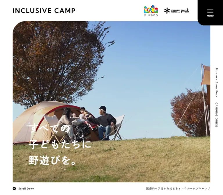
The opening desktop capture contains a buffering video player. Its black field is a captured media state, not sufficient evidence for an intentionally black hero. The mobile capture shows campsite footage behind the same headline. Build the reference around the media container and typography while treating successful playback as a separate implementation concern.
閉じる
INCLUSIVE CAMP — Style Reference
Documentary camping imagery inside a spacious white frame, with bold lettering and corners rounded one at a time.
Website: inclusivecamp.com Original URL: https://inclusivecamp.com/ Final URL: https://inclusivecamp.com/ Theme: predominantly white, with black navigation and contact surfaces, a warm neutral footer, and a yellow support action. Inspected: September 23, 2026 at 06:12:56 JST; supplied retrieval timestamp: September 22, 2026 at 21:12:56.259 UTC. Viewports: 1440 × 1000 and 390 × 844 CSS pixels. Scope: the current homepage, including its opening media, project message, four camping guides, VOICE article carousel, NEWS list, resource links, contact block, and footer. Three desktop captures and two mobile captures supplement rendered DOM and computed-style evidence. Linked pages and expanded navigation were not inspected.
INCLUSIVE CAMP is a project and information website for helping children who need medical care and their families experience camping. Its homepage introduces the purpose, then opens several paths into practical advice, family experiences, current announcements, and support. The design must accommodate continuing editorial content as well as the project introduction.
The strongest visual relationship is between large photographic areas and small, carefully spaced navigation details. Black uppercase English headings organize the page; Japanese text carries the emotional message and practical information. Most rectangles remain square. Selected corners receive substantial radii, creating a recognizable shape language across the media frame, menu tab, guide group, resource links, and footer actions.
The opening desktop capture contains a buffering video player. Its black field is a captured media state, not sufficient evidence for an intentionally black hero. The mobile capture shows campsite footage behind the same headline. Build the reference around the media container and typography while treating successful playback as a separate implementation concern.
How to Read This Reference
- Measured values are taken from the supplied rendered DOM and computed styles. They describe the recorded viewport and state, not necessarily every breakpoint.
- Calculated values are arithmetic relationships between measured rectangles, such as the 28px gaps between desktop headline lines.
- Estimated values come from the original-page screenshots. Footer colors, some decorative geometry, and painted image bounds fall into this category.
- Recommended values and behavior belong to the reusable implementation below. They are not claims about the original site's accessibility, JavaScript, or responsive formulas.
- Token names such as
--color-footerare implementation aliases. The three source font variables are identified explicitly. - Recorded element rectangles and screenshots may represent slightly different animation or media-loading moments. In particular, distinguish carousel link boxes from the visible photographs inside them.
- Only scrolling and captured states are evidenced. Menu activation, carousel advancement, hover effects, media controls, and destination-page behavior remain unverified.
Tokens — Colors
Default Palette
| Name | Value | Evidence | Suggested token | Role |
|---|---|---|---|---|
| White | #ffffff |
Measured on body, content sections, and social links | --color-page |
Main canvas and light surfaces |
| Black | #000000 |
Measured on menu background and major heading text; contact field visually black | --color-black |
Navigation tab, strong headings, contact surface, circular arrow marks |
| Charcoal | #333333 |
Measured throughout body and utility text | --color-ink |
Japanese paragraphs, dates, footer labels, side rail |
| Warm Neutral | Approximately #e8e3dd |
Screenshot estimate | --color-footer |
Broad footer background and pale resource-icon fields |
| Support Yellow | Approximately #ffd615 |
Screenshot estimate | --color-support |
The prominent support link in the footer |
| News Tan | #d2a389 |
Measured as rgb(210, 163, 137) |
--color-news-category |
Small news category labels such as “お知らせ” |
The warm footer and yellow support shape are visible even though the sampled outer elements report white or transparent backgrounds. Their painted appearance can come from nested or pseudo-element layers that were not separately measured. The estimated hex values above are practical approximations, not recovered declarations.
Guide Accents
The guide photographs have narrow pastel strips along their lower edges and matching circular arrow fields. These accents distinguish topics without turning the entire page into a multicolor interface.
| Guide | Approximate accent | Evidence and use |
|---|---|---|
| “01 準備編” | #d1dfda |
Pale mint-gray arrow visible near the top of the desktop middle capture |
| “02 ツール編” | #d5d0df |
Pale lavender arrow visible in the same capture |
| “03 食事編” | #ebcbb9 |
Peach lower strip and circular arrow |
| “04 遊び編” | #b8d9e5 |
Pale blue lower strip and circular arrow |
All four accent hex values are screenshot estimates. Keep them subordinate to the images, black typography, and white canvas.
Source-variable caution: the numerous --g-color-* variables in the supplied root data are transparent in that sample. They do not constitute a useful semantic palette. Likewise, --rebranding-loading-bg: #e5e5e5 and --rebranding-loading-bar: #222 are loading-related declarations, not evidence that the main page uses those colors everywhere.
Tokens — Typography
Kumbh Sans — English Identity and Navigation
Measured source family: "Kumbh Sans".
Source variable: --s-font-4a84a427.
This family appears on the site wordmark, section headings, guide numbers, dates, English category names, menu label, social labels, and small navigation utilities. Uppercase headings often use 0.1em tracking; smaller links can reach 0.15em. These spaced English labels provide the page's editorial structure.
The wordmark changes more than size on mobile: its computed weight rises from 700 to 800 while tracking drops from 0.1em to 0.05em.
Japanese Display and Body Face
Measured source family: "秀英角ゴシック銀 B JIS2004".
Source variable: --s-font-95b08e1a.
This face is used for the hero statement, project message, guide titles, article headlines, and much of the Japanese supporting text. Several visually substantial headings have a computed weight of 400. The family name includes a bold-face designation, and the supplied font-face excerpt also references Bold. Preserve the face and its actual appearance rather than automatically changing every 400 declaration to 700.
For a new implementation, load this face only through an authorized font setup. The fallback stack in Quick Start is a recommendation and will not reproduce its exact metrics.
Noto Sans JP — Selected Utility Text
Measured source family: "Noto Sans JP".
Source variable: --s-font-d8aff993.
This family appears on medical-care tags in VOICE cards and on the privacy-policy link. It is a secondary utility face, not the measured font for every Japanese element.
The generic Times value on the root and body does not describe the typography of the visible designed components.
Type Scale
Values below are measured. Sizes and line heights are CSS pixels. D/M means desktop/mobile.
| Role | Desktop size / line height | Mobile size / line height | Weight D/M | Tracking D/M |
|---|---|---|---|---|
| Header wordmark | 30 / 30 |
22 / 27.5 |
700 / 800 |
3 / 1.1px |
| Hero statement, each line | 48 / 48 |
36 / 36 |
400 / 400 |
2.4 / 1.8px |
| Project-message heading | 32 / 56 |
24 / 42 |
400 / 400 |
0.96 / 1.2px |
| Project-message paragraph | 14 / 28 |
12 / 24 |
500 / 500 |
0.98 / 1.8px |
| MESSAGE button | 14 / 19.6 |
Same | 700 |
2.1px |
| Guide introduction | 18 / 31.5 |
16 / 28 |
500 / 500 |
1.8 / 0.8px |
| HOW TO label | 14 / 33.6 |
12 / 28.8 |
700 / 700 |
1.4 / 1.2px |
| Guide number | 40 / 56 |
38 / 53.2 |
600 / 600 |
2 / 1.9px |
| Guide title | 36 / 50.4 |
32 / 44.8 |
400 / 400 |
Varies by title; see below |
| VOICE and NEWS heading | 32 / 76.8 |
28 / 28 |
700 / 700 |
3.2 / 2.8px |
| VOICE introductory line | 14 / 33.6 |
13 / 31.2 |
500 / 500 |
1.4 / 1.3px |
| VIEW ALL | 11 / 15.4 |
Same | 700 |
1.65px |
| VOICE article headline | 18 / 27 |
20 / 30 |
900 / 900 |
0.18 / 0.2px |
| VOICE family/professional label | 11 / normal |
Same | 600 |
0.55px |
| Medical-care tag | 11 / 11 |
10 / 10 |
500 / 500 |
0.55 / 0.5px |
| News date | 13 / 18.2 |
11 / 11 |
500 / 500 |
0.65 / 0.55px |
| News headline | 16 / 28 |
13 / 22.75 |
700 / 700 |
0.8 / 0.65px |
| Resource heading | 28 / 39.2 |
26 / 36.4 |
700 / 700 |
1.4 / 1.3px |
| CONTACT US heading | 40 / 56 |
30 / 42 |
700 / 700 |
2 / 1.5px |
| Contact description | 12 / 20.4 |
10 / 20 |
400 / 400 |
1.8 / 1.5px |
| Support action | 18 / 18 |
Same | 400 |
0.9px |
| Side-rail labels | 12 / 16.8 |
10 / 14 |
700 / 800 |
1.2 / 1px |
| Social label | 13 / 13 |
Same | 600 |
Normal |
| Copyright | 14 / 19.6 |
13 / 18.2 |
600 / 600 |
0.14 / 0.13px |
Guide-title tracking is content-specific: “準備編” and “食事編” use 0.35em; “ツール編” uses 0.05em; “遊び編” uses 0.25em. This balances the visual width of different labels. A uniform tracking token would lose that detail.
Hero line rhythm: the source renders three separate paragraph boxes. Desktop line tops are 660, 736, and 812px, producing 28px gaps between 48px boxes. Mobile line tops are 541, 597, and 653px, producing 20px gaps between 36px boxes. Recreate this with a stack and explicit gaps, rather than treating the whole statement as ordinary paragraph line-height.
Tokens — Spacing & Shapes
Spacing Scale
There is no verified single source spacing scale. The following repeated or structurally important measurements form a useful implementation vocabulary.
| Value | Evidence | Use |
|---|---|---|
4px |
Calculated from adjacent resource rectangles | Separators between resource tiles and contact block |
12px |
Measured horizontal label padding | Small family/professional labels |
20px |
Calculated on mobile; measured in several shapes | Mobile hero line gap; desktop social-link gap |
24px |
Measured news-row gap; calculated message spacing | News media/text separation; message heading-to-body gap |
25px |
Measured | Mobile left alignment for identity, hero, message, guides, and footer |
28px |
Calculated | Desktop hero line gap |
35px |
Measured or calculated by component | Support-link content gap; typical VOICE text inset within the measured link box |
40px |
Calculated | Message paragraph-to-button gap; mobile hero text inset from media edge |
60px |
Measured | Desktop outer gutter; desktop MESSAGE height |
75px |
Calculated | Desktop hero text inset; guide intro-to-grid spacing |
80px |
Calculated | Repeated desktop footer row separation; desktop hero text bottom clearance |
120px |
Calculated | Mobile gap from final guide tile to VOICE section; space after the VOICE cards |
Border Radius
| Element | Measured or estimated geometry | Evidence |
|---|---|---|
| Menu tab | 0 0 0 30px |
Measured at both viewports |
| Hero media | Upper-left corner approximately 60px; other corners square |
Screenshot estimate |
| Desktop guide group | Second tile has 0 60px 0 0; other sampled guide tiles square |
Measured |
| Mobile guide stack | First tile has 0 30px 0 0; following tiles square |
Measured |
| MESSAGE link | 30px on all corners |
Measured |
| Desktop checklist | Upper-left 60px |
Measured |
| Desktop Q&A | Upper-right 60px |
Measured |
| Mobile checklist | Both upper corners 60px |
Measured |
| Mobile Q&A | Square | Measured |
| Contact block | Lower-right 60px; other corners square |
Measured |
| Social links | 25px 25px 0 25px |
Expanded from measured three-value shorthand |
| Support shape | Rounded upper-left and right end; square lower-left | Screenshot observation; approximately 40–50px radii |
| Guide arrows | Circular, approximately 40px diameter |
Screenshot estimate |
| Desktop next-carousel button | Lower-right 16px |
Measured |
| Mobile previous-carousel button | Lower-left 20px |
Measured |
The social-link shorthand matters: 25px 25px 0 leaves only the lower-right corner square. It does not mean both lower corners are square.
Layout Measurements
| Element | 1440 × 1000 | 390 × 844 | Evidence |
|---|---|---|---|
| Document height | Approximately 5480px |
Approximately 6198px |
Recorded document height |
| Header | 1440 × 100px |
390 × 110px |
Measured |
| Header padding | 0 160px 0 60px |
0 120px 0 25px |
Measured |
| Menu | 120 × 120px, x = 1320 |
90 × 110px, x = 300 |
Measured |
| Opening section | 1440 × 1000px |
390 × 844px |
Measured; equals each inspected viewport |
| Opening-section padding | 100px 60px 0 |
135px 0 0 25px |
Measured |
| Visible hero media | Approximately 1320 × 840px |
Approximately 365 × 664px |
Screenshot bounds |
| Hero text left edge | 135px |
65px |
Measured |
| MESSAGE link | 240 × 60px |
180 × 50px |
Measured |
| Guide arrangement | Two columns, two rows | One column, four rows | Measured rectangles |
| Individual guide tile | 580 × 330px |
295 × 280px |
Measured |
| Guide left edge | 140px |
25px |
Measured |
| VOICE link slot | Approximately 364.8 × 460px |
360 × 420px |
Measured; painted image may be narrower |
| Carousel buttons | 80 × 80px |
60 × 60px |
Measured |
| News-row width | 1160px |
320px |
Measured |
| News-row height | 145px |
138.25–161px |
Measured; varies with wrapping on mobile |
| Resource tiles | Two 658 × 200px tiles |
Two stacked 330 × 198.19px tiles |
Measured |
| Contact block | 1320 × 300px |
330 × 300px |
Measured |
| Support link | 320 × 80px |
330 × 90px |
Measured |
| Social links | 160 × 50px each |
148.5 × 50px each |
Measured |
Components
Persistent Header
Role: maintain the project identity and navigation entry point throughout a long page.
The desktop header has a left-aligned text wordmark and the Burano and Snow Peak logos toward the right. The black menu tab attaches directly to the upper-right viewport corner and extends 20px below the measured 100px header.
The sampled header background is transparent. In the desktop middle and bottom captures, identity elements remain at the top while content passes beneath them. This creates visual persistence without a large opaque navigation bar. The exact positioning mechanism was not included in the computed-style fields.
On mobile, the wordmark sits above the partner-logo row at the left. The menu remains at the upper right. The opening media starts at y = 135px, leaving approximately 25px below the 110px header.
The mobile footer capture does not show every identity element with equal contrast. Do not infer a deliberate alternate header mode or a hide-on-scroll rule from that single image.
Menu Tab
Anatomy: black rectangular button → three thin white horizontal strokes → compact MENU label.
Only the lower-left corner is rounded, at 30px. The desktop button is square; the mobile version narrows to 90px while retaining 110px height. The label grows slightly from 10px to 11px on mobile.
This large, isolated control is a defining part of the page silhouette. Its expanded menu, close state, focus handling, and transition choreography were not captured.
Vertical Side Rail
Anatomy: “Burano + Snow Peak” → approximately 24px separation → “CAMPING GUIDE”, both rotated into a downward reading direction.
The rail stays near the vertical center of the viewport in the top, middle, and footer captures. On desktop its text occupies an approximately 17px-wide column around x = 1401px, inside the 60px outer margin. On mobile it occupies a 14px-wide column around x = 365px.
Because the mobile hero reaches the right edge, the rail overlays the footage there. In the footer it sits on the warm neutral background. These elements are recorded as paragraphs, not links; do not turn them into primary navigation without a separate requirement.
Opening Media and Statement
Anatomy: asymmetric media frame → embedded footage/player → three-line white statement at lower left → scroll cue below → supporting project descriptor.
The source copy is:
“すべての” “子どもたちに” “野遊びを。”
On desktop the media occupies most of the first viewport, with 60px side margins and a top edge at 100px. The headline begins 75px inside the media's left edge. Its final line ends approximately 80px above the media bottom.
On mobile the frame starts 25px from the left and reaches the right edge. The text is inset 40px from the media's left edge. Its final line ends approximately 110px above the media bottom, leaving room for the smaller descriptor below it.
The desktop descriptor, “医療的ケア児から始まるインクルーシブキャンプ”, sits outside the media at the lower right in charcoal. On mobile it moves inside the media, becomes white, and aligns with the headline at x = 65px. This is a genuine layout change, not just a smaller font.
The desktop screenshot shows a black YouTube player with a spinner, partial player title, and platform mark. The mobile screenshot shows a tent near a glass-fronted building, autumn foliage, and a central pause-style overlay. Autoplay, looping, audio state, and the control's behavior were not verified.
Scroll Cue
A small black circle with a white downward chevron sits beside “Scroll Down”. Desktop text uses 12px Kumbh Sans; mobile uses 11px. The cue remains below the media on both viewports.
Its visible shape and label are observed. The supplied link inventory does not establish a click destination for this cue, so scrolling behavior must not be described as tested.
Project Message
Anatomy: a broad section with supporting visual/background content → Japanese heading → short three-line paragraph → MESSAGE link.
The section is measured at 600px high on desktop and 710px on mobile. Desktop text begins at x = 774px, placing the message in the right half. Mobile text begins at x = 25px and y = 1204px, approximately 360px below the section's start. This establishes a stacked composition with substantial preceding space, although the supplied screenshots do not reveal that upper visual area in full.
The headline reads “自然が遠い存在なんて、子どもには不自然だから。” It is followed by a brief project explanation. The heading-to-paragraph gap is 24px at both widths, and the paragraph-to-button gap is 40px.
The MESSAGE link is a white capsule, 240 × 60px on desktop and 180 × 50px on mobile, linking to /message. Its full border and hover appearance are not established by the supplied capture set.
HOW TO Guide Group
Role: turn the project premise into four practical entry points.
The links are ordered preparation, tools, food, and play, with destinations /howto/01 through /howto/04.
Each tile combines a cropped photograph, a centered two-digit number, a short underline, a Japanese title, and a pastel circular arrow near the lower-right corner. A narrow matching strip runs along the lower edge. The desktop middle screenshot shows warm close-up food photography and an autumn campsite image in the lower row; portions of mobility equipment and red camping gear appear in the upper row.
Desktop tiles touch edge to edge within a 1160px-wide group. Each is 580 × 330px. The top-right corner belongs to the second tile and has a measured 60px radius.
On mobile, all four tiles stack at x = 25px with 295px width and 280px height. They leave a 70px right margin, deliberately wider than the left margin. The group keeps its rounded upper-right silhouette by moving the radius to the first tile and reducing it to 30px.
The HOW TO label moves from the right side of the desktop introduction to a position above the Japanese introduction on mobile. Preserve this ordering change.
Section Heading and VIEW ALL Link
VOICE and NEWS use bold uppercase Kumbh Sans headings with generous tracking. Their desktop computed line-height is unusually large, 76.8px for 32px text, contributing to the open section-header rhythm.
The desktop VOICE header combines the heading, a thin vertical divider, a Japanese explanatory line, and a small VIEW ALL link toward the right. Its card row begins 60px below the heading line box.
Mobile VOICE separates the heading, explanatory line, and VIEW ALL into successive rows. NEWS keeps its heading and VIEW ALL on the same horizontal band.
VIEW ALL is an 11px label followed by a black circular arrow. The recorded link is only 18px tall; increasing the interactive hit area is a recommended adaptation.
VOICE Article Carousel
Anatomy: horizontally clipped sequence of photographic links → family or professional label → multiline article title → medical-care tags where applicable → English content category.
Seven article destinations are present in the supplied DOM. The captured position starts visibly around the family article “名渕さん家族”; earlier links exist at negative horizontal coordinates. This is evidence of a carousel track, not evidence that those entries have been removed.
Desktop link slots measure approximately 364.8 × 460px. The visible photographs in the middle capture are closer to 335px wide, with white space between them. The outer link rectangle and painted image should therefore be treated separately. A partial next article at the right edge communicates continuation.
The imagery includes children under a camping lantern, a parent beside a child in a mobility seat, and a child near water. White titles sit over the lower image area, supported by a darkening gradient where the photograph is visible. Small family labels use a thin rounded outline around their containing shape; the sampled inner paragraph itself has zero radius.
Article headlines use 18px/27px on desktop and increase to 20px/30px on mobile. The measured mobile slot remains broad at 360 × 420px, allowing one dominant story at a time.
One desktop article area is largely white, with only faint lower content. Other DOM entries contain SVG placeholder backgrounds. Treat this as incomplete image rendering in the captured state. Do not make blank white article photography a reusable design rule.
Carousel Controls
Desktop previous/next controls form an approximately 162px-wide white block over the upper-left of the card area. Each button is 80px square, with a narrow separator between them. The next button rounds its lower-right corner by 16px.
On mobile the controls move toward the upper-right of the carousel and reduce to 60px squares. The previous button instead rounds its lower-left corner by 20px. Their recorded top is 30px above the article link boxes.
The controls are real buttons in the DOM. Click results, swipe support, autoplay, wrapping at the ends, and keyboard behavior were not tested.
NEWS List
Anatomy: leading media area → date and category → Japanese headline → trailing arrow link treatment.
The desktop list is 1160px wide and begins at x = 140px. Each of the three recorded rows is 145px high, with a measured 24px flex gap. Text begins at x = 364px. Subtracting that gap implies a 200px leading region, although its exact media bounds were not sampled.
Mobile rows are 320px wide at x = 35px. Text begins at x = 127px, implying a 68px leading region with the same 24px gap. The text column narrows to 186px, causing three or four lines of headline text and variable row heights.
Dates use Kumbh Sans. Categories are small tan Japanese labels. Headlines use the main Japanese face. The current three entries concern an event report, press coverage, and an event announcement; their dates are content, not decorative fixed strings.
The link extraction returns only an arrow label for these large row anchors. A new implementation should ensure each link has the article title as its accessible name.
CHECK LIST and Q&A Resources
Two large light tiles lead to /checklist and /qanda. Each includes a pale circular icon field, an English heading, a short horizontal rule, and a small Japanese explanation.
Desktop tiles sit side by side with a 4px separation, measuring 658 × 200px each. Only the outside upper corners are rounded, making the pair read as one joined block.
Mobile tiles stack at 330px width with approximately 198px height each. The first tile rounds both upper corners; the second stays square. Their headings reduce from 28px to 26px, while the Japanese explanations remain 12px.
The extracted strings description and forum correspond to visible document and discussion symbols. They should not be rendered as literal words in a recreation. The exact icon font was not established.
CONTACT US Block
A full-width black link sits beneath the resources, separated by 4px. It measures 1320 × 300px on desktop and 330 × 300px on mobile. Its only rounded corner is the lower-right, at 60px.
Center a white CONTACT US heading over a short pale rule and Japanese supporting copy. The desktop description spans two lines; mobile presents four lines covering consultation, press inquiries, sponsorship, and campsite consulting. The destination is /contact; no form or modal was inspected.
The measured anchor background is transparent, but its rendered surface is black. Preserve the visible result without assuming the color is assigned to that particular node.
Supporters and Support Action
The footer shows a supporter-logo strip and the yellow “活動を支援する” link. The displayed supporter artwork includes The Nippon Foundation, TOOTH FAIRY, and the Japan Dental Association. These are visible support marks, not website-production credits.
Desktop places the logos at the left and the 320 × 80px support action at the right, approximately 80px below the contact block. Mobile stacks the logo strip above a 330 × 90px action.
The support shape has a square lower-left corner, a broad rounded upper-left corner, and a rounded right end. Its text is 18px at both widths. A small white circular field contains a northeast-pointing arrow. The recorded destination is https://burano.or.jp/support/.
Footer Utilities and Oversized Identity
Two white social links combine black platform symbols with “Instagram” and “facebook”. Their lower-right corners remain square. They stay side by side on mobile, each occupying 45% of the 330px footer content width, with a 33px gap.
Desktop places Page Top at the far right of the social row. Copyright sits at the lower left and the privacy link at the lower right. Mobile moves Page Top to a centered row, followed by the privacy link and then copyright. The measured visual order differs from the text-extraction order.
The footer copyright visibly reads “Copyright © Burano. All rights reserved.” A huge dark INCLUSIVE CAMP wordmark extends into the bottom crop. Its exact font size and animation are not included in the measurements. Approximately 150px desktop and 120px mobile are useful visual starting points, not verified tokens.
Tokens — Motion & Interaction
Measured Declarations
| Target | Declaration or source fragment | What is established |
|---|---|---|
| Body background | 0.5s cubic-bezier(0.4, 0.4, 0, 1) |
A background transition is defined; its trigger is unknown |
| Common text and wrappers | Often 0.3s cubic-bezier(0.4, 0.4, 0, 1) |
Shared transition timing; no specific hover outcome proven |
| Header | 1.2s cubic-bezier(0.445, 0.05, 0.55, 0.95) 0.4s |
Long transition with a delay |
| Menu and MESSAGE link | 0.8s cubic-bezier(0.445, 0.05, 0.55, 0.95) |
Declared timing, not a verified opening or hover sequence |
| Guide tiles | 1.2s with the same easing; 0.6s desktop delay, 0.2s mobile delay |
Responsive difference in declared delay |
| VOICE links | Desktop commonly 0.6s with the same easing |
Does not independently prove carousel slide duration |
| Carousel buttons | 0.6s, with 0.1s delay |
Previous and next buttons use slightly different easing curves |
| Resource links | 1.2s with 0.2s delay |
Declared transition timing |
| Contact heading | 0.6s with 0.1s delay |
Declared transition timing |
| Social links | 0.4s cubic-bezier(0.445, 0.05, 0.55, 0.95) |
Declared link transition |
logoAnimation |
Background position from 0 to -30000px; fragment includes 1200s linear |
Source defines a horizontal background translation; iteration text is truncated |
messageAnimation |
Background position from 0 to 30000px |
Duration text is truncated after 24…; complete timing is unknown |
The source contains many transitions for generated gradient custom properties. Their presence does not prove that each component visibly animates a gradient. Similarly, animation: none on a sampled section does not exclude animation on a child or pseudo-element.
Observed States and Limits
- The top-right menu and side rail remain at consistent viewport locations across scrolled screenshots.
- A media-loading spinner is visible on desktop; a pause-style overlay is visible over footage on mobile.
- A horizontal VOICE track and previous/next buttons are present, but no before/after interaction sequence was supplied.
- Page Top links to
/#ptop; the scrolling curve and duration were not tested. - No hover capture, expanded navigation, modal, focus sequence, or reduced-motion state was supplied.
For an adaptation, use the measured easing curves for restrained opacity and color changes. Add movement only where it serves a defined interaction. Do not invent a universal slide-up reveal, image zoom, parallax effect, or footer marquee merely because transition declarations exist.
Surfaces
| Layer | Appearance | Function |
|---|---|---|
| Main canvas | White | Holds the long editorial sequence and generous negative space |
| Persistent identity | Transparent header over the current section | Maintains branding without a heavy full-width bar |
| Primary navigation | Solid black tab with white details | Strong, stable navigation landmark |
| Guide surfaces | Photographs, white centered type, pastel edge strips | Topic navigation |
| Story surfaces | Photographs with lower darkening and white copy | Human experiences and editorial content |
| Resource group | Light tiles, pale icon circles, thin separations | Practical support links |
| Contact block | Black with centered white typography | Broad contact entry point |
| Footer field | Warm neutral | Separates support and legal information from editorial content |
| Support action | Yellow asymmetric shape | Concentrated emphasis on supporting the project |
| Social actions | White asymmetric capsules | Quiet external navigation |
No general resting card-shadow system is visible. Separation comes from whitespace, color fields, image boundaries, small rules, and selective corner rounding.
Imagery
The original captures show documentary outdoor imagery: tents, autumn leaves, camping food, mobility equipment, children, and family members sharing activities. Photographs provide the color and emotional detail; the interface around them remains restrained.
The mobile hero uses a tall crop of footage containing a tent and a glass-fronted building. Guide images crop into broad landscape rectangles on desktop and nearly square rectangles on mobile. VOICE links use taller crops that leave room for faces above their lower text overlays.
A reusable image treatment should preserve people and useful environmental context. Set focal points per asset when moving between wide and narrow crops. A single centered object-position is a starting point, not a sufficient rule for every photograph.
Keep partner and supporter logos as their supplied artwork with their natural proportions. Their multicolor details belong to the marks themselves and should not be expanded into a general interface palette.
Observed Asset References
| Asset group | Evidence available | Practical implication |
|---|---|---|
| Opening video | YouTube player chrome in the desktop capture; campsite footage on mobile | No video ID or complete embed URL was supplied |
| Guide photographs | Pseudo-element background references under storage.googleapis.com/studio-design-asset-files/projects/VGOKGQDeOn/; visible filename fragments include s-1980x1321_v-frms_webp_… |
Full filenames are truncated; do not fabricate downloadable URLs |
| VOICE photography | Both design-asset and CMS-asset storage references; several SVG placeholder backgrounds in the recorded state | Preserve media slots while loading; use an intentional fallback |
| Header logos | Burano and Snow Peak artwork visible in both opening captures | Exact asset URLs were not supplied |
| Supporter strip | Three recognizable support marks in desktop and mobile footer captures | Keep artwork proportions and spacing; exact file structure is unknown |
| Oversized footer wordmark | Visible dark lettering clipped by the lower viewport edge | Text versus image implementation and motion remain unverified |
Use authorized assets in a new build. CSS can reproduce framing and hierarchy, but substituting generic outdoor stock imagery will change the page's specific relationship to family experiences and medical care.
Layout & Responsive Behavior
Page Sequence
The recorded order is opening media, project message, HOW TO, VOICE, NEWS, and the resource/contact/footer group. It remains consistent across the two viewports.
Desktop uses two main horizontal alignments: a 60px outer gutter for identity, hero, VOICE heading, and footer; and a 140px inset for the 1160px guide and news areas. These nested widths create variation without losing alignment.
Mobile does not collapse everything into one universal centered container. The hero reaches the right viewport edge, guides end at x = 320px, footer blocks end at x = 355px, and NEWS uses 35px margins on both sides. Preserve those distinctions when fidelity matters.
Verified Changes
| Region | Desktop | Mobile |
|---|---|---|
| Header identity | Wordmark left, logos right | Wordmark above logos on the left |
| Hero | White side margins | Left margin only; media reaches right edge |
| Hero descriptor | Outside image at lower right | White text inside image at lower left |
| Message | Text in right half | Text at left in a taller stacked section |
| Guide introduction | HOW TO at the right | HOW TO above the introduction |
| Guides | Joined 2 × 2 grid | Joined single-column stack |
| Guide corner | Second tile, 60px upper-right radius | First tile, 30px upper-right radius |
| VOICE header | Heading, divider, description, link in a broad band | Heading, description, and link distributed vertically |
| VOICE controls | Upper-left, 80px buttons | Upper-right, 60px buttons |
| VOICE headline size | 18px | 20px |
| NEWS | Broad rows with short headlines | Narrow text column with multiline headlines |
| Resource links | Side by side | Stacked |
| Contact description | Two lines | Four lines |
| Supporters and support CTA | Side by side | Stacked |
| Footer legal information | Copyright left, privacy right | Privacy above copyright |
Only the two listed viewport sizes were inspected. The DOM text exposes a max-width: 1140px rule for responsive line breaks, but that does not establish the breakpoints for every layout change. The 767px breakpoint used below is an implementation recommendation, not a recovered source breakpoint.
Absolute document y-coordinates are useful for understanding section order and spacing at capture time. They should not be hardcoded as layout positions. Content length, font loading, and media readiness can change the final document height.
Do’s and Don’ts
Do
- Preserve the white outer frame, black menu tab, and narrow vertical side rail.
- Pair Kumbh Sans English labels with the measured Japanese face when authorized and available.
- Reproduce the three separate hero lines and their 28px/20px gaps.
- Keep the hero descriptor's desktop-to-mobile position and color change.
- Use large radii on selected corners, with square corners retained elsewhere.
- Keep guide tiles joined, with understated pastel arrows and lower strips.
- Give photographs enough area to show people, equipment, and outdoor context.
- Maintain a horizontally continuing VOICE presentation with visible navigation controls.
- Preserve the unusually broad mobile story card and its larger headline.
- Keep the footer support action yellow and visually distinct from contact and social links.
- Distinguish measured component rectangles from image-loading artifacts and painted image bounds.
Don’t
- Do not reproduce the buffering desktop hero as permanent intended artwork.
- Do not treat a blank article image as a deliberate white card style.
- Do not apply the same four-corner radius to every tile and button.
- Do not replace the homepage's content hierarchy with a single conversion funnel.
- Do not shrink every mobile type size proportionally; VOICE titles become larger.
- Do not center the narrow mobile guide stack or erase its wider right margin.
- Do not introduce shadows, glass panels, or decorative gradients across the light surfaces.
- Do not use the support yellow as a fill for every navigation control.
- Do not render icon ligature strings such as
arrow_forwardas visible text. - Do not claim menu, carousel, autoplay, hover, or marquee behavior from static captures alone.
Recommended Implementation Additions
These are recommendations for a new implementation, not verified features of the original:
- Give the menu button an accessible name,
aria-expanded, andaria-controls. If it opens a modal navigation panel, implement focus management and Escape dismissal. - Provide a stable hero poster and explicit media controls. Essential copy must remain readable when playback fails or is paused.
- Support reduced motion for decorative background movement and programmatic scrolling. Media playback needs its own reduced-motion handling; CSS alone cannot pause an embedded player.
- Give carousel buttons descriptive names, expose the current slide position when appropriate, and ensure all article destinations remain reachable by keyboard.
- Expand small VIEW ALL and Page Top hit areas to at least 44px without enlarging their visual labels unnecessarily.
- Check the tan category labels and text over photography for contrast. Darken or back them with a solid surface when needed.
- Consider 14–16px for essential mobile explanatory copy. The measured 10–12px text is a fidelity reference, not an accessibility target.
- Use meaningful article link names, semantic dates, and ordered headings. Avoid duplicate announcements if separate desktop and mobile copy nodes are retained.
- Keep the oversized decorative footer wordmark out of the accessibility tree when an equivalent identity is already present.
- Test fixed-header overlap, safe areas, browser zoom, short screens, and intermediate widths before finalizing the responsive rules.
Agent Prompt Guide
Quick Color Reference
- Main canvas and light controls: measured
#ffffff. - Strong headings and menu: measured
#000000. - Body and utility text: measured
#333333. - Footer: approximately
#e8e3dd, visually estimated. - Support action: approximately
#ffd615, visually estimated. - News category text: measured
#d2a389. - Guide accents: muted mint, lavender, peach, and pale blue; keep them to narrow strips and circular arrows.
Overall Prompt
“Create a Japanese project and editorial homepage for inclusive family camping. Use a white canvas, Kumbh Sans uppercase English labels, substantial Japanese gothic typography, broad documentary media, and generous whitespace. Place the wordmark at upper left, partner logos nearby, and a black menu tab attached to the upper-right corner with only its lower-left corner rounded. Add a narrow vertical project label along the right edge. Follow the opening media with a project message, four joined photographic guide tiles, a horizontal family-story carousel, three news rows, joined resource links, a black contact block, and a warm neutral footer with a yellow support action. Round selected outer corners rather than every corner. At 390px, stack the guides with a wider right margin, move the hero descriptor inside the media, and reorder footer utilities vertically. Treat unverified motion as optional implementation work.”
Example Component Prompts
- Opening media: “Create a first-viewport media frame with a 60px upper-left radius and square remaining corners. At 1440 × 1000, use 60px side margins, a 100px top offset, and approximately 840px media height. Overlay ‘すべての / 子どもたちに / 野遊びを。’ as three separate white 48px lines with 28px gaps. At 390 × 844, use a 25px left margin, no right margin, 36px text, 20px line gaps, and the small descriptor inside the footage.”
- Guide tiles: “Build four joined photographic links numbered 01–04. Desktop tiles are 580 × 330px in a two-column group, with a 60px upper-right radius on the second tile. Mobile tiles are 295 × 280px in a single stack starting 25px from the left, with a 30px upper-right radius on the first tile. Center white numbers and Japanese titles; use pastel lower strips and circular arrows.”
- VOICE story: “Create a tall documentary photo link with a small outlined family label, a white multiline title near the bottom, compact care tags, and an English content category. Use 18px/27px headline type on desktop and 20px/30px on mobile. Keep the photo visible above the text and use a restrained lower scrim. Include explicit previous and next controls without assuming autoplay.”
- Contact and support: “Join two white resource tiles above a black 300px-high contact link. Round the outside upper resource corners and only the contact block's lower-right corner. Continue into a warm neutral footer with supporter logos and a yellow support link whose lower-left corner stays square.”
- Responsive footer: “On desktop, put supporter logos left and the support CTA right, then social links left and Page Top right. On mobile, stack the supporter strip and CTA, keep the two social links side by side, center Page Top, and place privacy above copyright. Finish with oversized dark decorative identity text cropped within its own container.”
Quick Start
CSS Custom Properties
This is a reusable adaptation, not the original stylesheet. Exact sampled sizes are retained where practical. The footer and guide colors are visual estimates. The intermediate breakpoint, image scrims, scroll-snap behavior, and enlarged utility hit areas are recommendations.
Load authorized fonts separately. No font files, logo files, photographs, or video URLs are bundled here. Use real links for navigation and real buttons for controls. The CSS expects a .camp-page wrapper; full-width sections contain their own .content-inner, .guide-grid, or .footer-frame. A .hero-media contains media plus .hero-copy, whose three lines are separate elements. Each .voice-slot contains one .voice-card.
:root {
  /* Measured colors */
  --color-page: #ffffff;
  --color-black: #000000;
  --color-ink: #333333;
  --color-news-category: #d2a389;

  /* Screenshot estimates */
  --color-footer: #e8e3dd;
  --color-support: #ffd615;
  --color-preparation: #d1dfda;
  --color-tools: #d5d0df;
  --color-food: #ebcbb9;
  --color-play: #b8d9e5;

  /* Observed families with recommended fallbacks */
  --font-latin: 'Kumbh Sans', Arial, sans-serif;
  --font-japanese: '秀英角ゴシック銀 B JIS2004',
    'Noto Sans JP', sans-serif;
  --font-utility: 'Noto Sans JP', sans-serif;

  --outer-gutter: 60px;
  --content-max: 1160px;
  --header-height: 100px;
  --menu-width: 120px;
  --menu-height: 120px;
  --hero-top: 100px;
  --hero-bottom-strip: 60px;
  --hero-inset: 75px;
  --hero-copy-bottom: 80px;
  --hero-size: 48px;
  --hero-line-gap: 28px;
  --radius-large: 60px;
  --radius-menu: 30px;
  --section-space: 120px;

  /* Measured easing; transition properties are adaptation choices */
  --ease-standard: cubic-bezier(0.4, 0.4, 0, 1);
  --ease-editorial: cubic-bezier(0.445, 0.05, 0.55, 0.95);
  --motion-short: 300ms;
  --motion-link: 800ms;
}

.camp-page,
.camp-page *,
.camp-page *::before,
.camp-page *::after {
  box-sizing: border-box;
}

.camp-page {
  margin: 0;
  color: var(--color-ink);
  background: var(--color-page);
  font-family: var(--font-japanese);
}

.camp-page img {
  display: block;
  max-inline-size: 100%;
}

.camp-page a {
  color: inherit;
  text-decoration: none;
}

.camp-page button {
  font: inherit;
  cursor: pointer;
}

.camp-page :is(a, button):focus-visible {
  outline: 3px solid currentColor;
  outline-offset: 5px;
}

.content-inner {
  inline-size: min(
    var(--content-max),
    calc(100% - 2 * var(--outer-gutter))
  );
  margin-inline: auto;
}

/* Fixed positioning approximates the observed persistent placement. */
.camp-header {
  position: fixed;
  inset: 0 0 auto;
  z-index: 30;
  display: flex;
  align-items: center;
  justify-content: space-between;
  block-size: var(--header-height);
  padding: 0 160px 0 var(--outer-gutter);
  background: transparent;
}

.camp-wordmark {
  margin: 0;
  color: var(--color-black);
  font: 700 30px/1 var(--font-latin);
  letter-spacing: 0.1em;
  white-space: nowrap;
}

/* Logo dimensions are visual approximations. */
.partner-logos {
  display: flex;
  align-items: center;
  gap: 30px;
}

.partner-logos img:first-child { inline-size: 67px; }
.partner-logos img:last-child { inline-size: 118px; }

.menu-tab {
  position: fixed;
  inset: 0 0 auto auto;
  z-index: 40;
  display: flex;
  flex-direction: column;
  align-items: center;
  justify-content: center;
  gap: 8px;
  inline-size: var(--menu-width);
  block-size: var(--menu-height);
  padding: 4px 0 0;
  border: 0;
  border-radius: 0 0 0 var(--radius-menu);
  color: white;
  background: black;
}

.menu-lines {
  display: grid;
  gap: 4px;
  inline-size: 28px;
}

.menu-lines span {
  block-size: 2px;
  background: currentColor;
}

.menu-label {
  font: 700 10px/1.4 var(--font-latin);
  letter-spacing: 0.05em;
}

.side-rail {
  position: fixed;
  inset: 50% 20px auto auto;
  z-index: 25;
  display: flex;
  flex-direction: column;
  align-items: center;
  gap: 24px;
  transform: translateY(-50%);
  pointer-events: none;
  font: 700 12px/1.4 var(--font-latin);
  letter-spacing: 0.1em;
}

.side-rail span {
  writing-mode: vertical-rl;
  white-space: nowrap;
}

.camp-hero {
  position: relative;
  display: grid;
  grid-template-rows: minmax(0, 1fr) var(--hero-bottom-strip);
  block-size: 100svh;
  min-block-size: 720px;
  padding: var(--hero-top) var(--outer-gutter) 0;
}

.hero-media {
  position: relative;
  min-block-size: 0;
  overflow: hidden;
  border-radius: var(--radius-large) 0 0 0;
  background: var(--color-ink);
}

.hero-media > :is(img, video) {
  position: absolute;
  inset: 0;
  inline-size: 100%;
  block-size: 100%;
  object-fit: cover;
  object-position: var(--hero-focal-point, 50% 50%);
}

/* Recommended contrast scrim; tune against each authorized asset. */
.hero-media::after {
  content: '';
  position: absolute;
  inset: 0;
  background: linear-gradient(0deg, #0005, #0001 65%);
  pointer-events: none;
}

.hero-copy {
  position: absolute;
  z-index: 1;
  inset: auto auto var(--hero-copy-bottom) var(--hero-inset);
  display: grid;
  gap: var(--hero-line-gap);
  color: white;
  font: 400 var(--hero-size)/1 var(--font-japanese);
  letter-spacing: 0.05em;
}

.hero-copy > * { margin: 0; }

.hero-meta {
  display: flex;
  align-items: center;
  gap: 12px;
  font: 700 12px/1.4 var(--font-latin);
  letter-spacing: 0.05em;
}

.hero-caption {
  position: absolute;
  z-index: 2;
  inset: auto var(--outer-gutter) 21px auto;
  margin: 0;
  font: 700 12px/1.4 var(--font-japanese);
  letter-spacing: 0.15em;
}

.message-copy h2 {
  margin: 0 0 24px;
  font-size: 32px;
  font-weight: 400;
  line-height: 1.75;
  letter-spacing: 0.03em;
}

.message-copy p {
  margin: 0;
  font-size: 14px;
  font-weight: 500;
  line-height: 2;
  letter-spacing: 0.07em;
}

.message-link {
  display: grid;
  place-items: center;
  inline-size: 240px;
  block-size: 60px;
  margin-block-start: 40px;
  border-radius: 30px;
  background: white;
  font: 700 14px/1.4 var(--font-latin);
  letter-spacing: 0.15em;
}

.guide-grid {
  display: grid;
  grid-template-columns: repeat(2, minmax(0, 1fr));
  inline-size: min(1160px, calc(100% - 120px));
  margin: 75px auto 0;
}

.guide-card {
  --guide-accent: var(--color-preparation);
  position: relative;
  display: grid;
  place-items: center;
  block-size: 330px;
  overflow: hidden;
  border-bottom: 10px solid var(--guide-accent);
  color: white;
  background: var(--color-ink);
  text-align: center;
}

.guide-card:nth-child(2) {
  --guide-accent: var(--color-tools);
  border-top-right-radius: 60px;
}

.guide-card:nth-child(3) { --guide-accent: var(--color-food); }
.guide-card:nth-child(4) { --guide-accent: var(--color-play); }

.guide-card > img,
.voice-card > img {
  position: absolute;
  inset: 0;
  inline-size: 100%;
  block-size: 100%;
  object-fit: cover;
  object-position: var(--focal-point, 50% 50%);
}

.guide-card::after {
  content: '';
  position: absolute;
  inset: 0;
  background: #0004;
  pointer-events: none;
}

.guide-label,
.guide-arrow {
  position: relative;
  z-index: 1;
}

.guide-number {
  display: table;
  margin: 0 auto;
  border-bottom: 2px solid currentColor;
  font: 600 40px/1.4 var(--font-latin);
  letter-spacing: 0.05em;
}

.guide-title {
  margin: 11px 0 0;
  font: 400 36px/1.4 var(--font-japanese);
  letter-spacing: 0.35em;
}

.guide-card:nth-child(2) .guide-title { letter-spacing: 0.05em; }
.guide-card:nth-child(4) .guide-title { letter-spacing: 0.25em; }

.guide-arrow {
  position: absolute;
  inset: auto 25px 25px auto;
  display: grid;
  place-items: center;
  inline-size: 40px;
  block-size: 40px;
  border-radius: 50%;
  color: black;
  background: var(--guide-accent);
}

.section-title {
  margin: 0;
  color: black;
  font: 700 32px/2.4 var(--font-latin);
  letter-spacing: 0.1em;
}

.view-all {
  display: inline-flex;
  align-items: center;
  gap: 12px;
  min-block-size: 44px;
  font: 700 11px/1.4 var(--font-latin);
  letter-spacing: 0.15em;
}

/* Native scrolling is a recommendation, not recovered carousel code. */
.voice-stage { position: relative; }

.voice-track {
  display: flex;
  overflow-x: auto;
  padding: 0 45px 8px;
  scroll-snap-type: x proximity;
}

.voice-slot {
  flex: 0 0 364.8px;
  block-size: 460px;
  padding-inline: 15px;
  scroll-snap-align: start;
}

.voice-card {
  position: relative;
  display: flex;
  align-items: flex-end;
  block-size: 100%;
  overflow: hidden;
  padding: 20px;
  color: white;
  background: var(--color-ink);
}

.voice-card::after {
  content: '';
  position: absolute;
  inset: 0;
  background: linear-gradient(0deg, #000c, transparent 70%);
  pointer-events: none;
}

.voice-copy { position: relative; z-index: 1; }

.voice-person {
  display: inline-block;
  padding: 3px 12px;
  border: 1px solid currentColor;
  border-radius: 999px;
  font-size: 11px;
  font-weight: 600;
  letter-spacing: 0.05em;
}

.voice-title {
  margin: 12px 0;
  font-size: 18px;
  font-weight: 900;
  line-height: 1.5;
  letter-spacing: 0.01em;
}

.voice-tags { display: flex; flex-wrap: wrap; gap: 6px; }

.voice-tag {
  padding: 5px 8px;
  color: var(--color-ink);
  background: white;
  font: 500 11px/1 var(--font-utility);
  letter-spacing: 0.05em;
}

.voice-controls {
  position: absolute;
  z-index: 3;
  inset: 0 auto auto 60px;
  display: flex;
  gap: 2px;
  background: var(--color-footer);
}

.voice-controls button {
  display: grid;
  place-items: center;
  inline-size: 80px;
  block-size: 80px;
  padding: 0;
  border: 0;
  color: var(--color-ink);
  background: white;
}

.voice-controls button:last-child {
  border-bottom-right-radius: 16px;
}

.news-row {
  display: grid;
  grid-template-columns: 200px minmax(0, 1fr) 51px;
  align-items: center;
  gap: 24px;
  min-block-size: 145px;
  padding-block: 20px;
  border-bottom: 1px solid var(--color-footer);
}

.news-meta { display: flex; align-items: center; gap: 25px; }
.news-date { font: 500 13px/1.4 var(--font-latin); }
.news-category { color: var(--color-news-category); font-size: 11px; }

.news-title {
  margin: 14px 0 0;
  font-size: 16px;
  font-weight: 700;
  line-height: 1.75;
  letter-spacing: 0.05em;
}

.camp-footer {
  padding-block-start: 100px;
  background: var(--color-footer);
}

.footer-frame { margin-inline: 60px; }

.resource-grid {
  display: grid;
  grid-template-columns: repeat(2, minmax(0, 1fr));
  gap: 4px;
}

.resource-card {
  display: flex;
  flex-direction: column;
  align-items: center;
  justify-content: center;
  min-block-size: 200px;
  padding: 30px;
  background: white;
  text-align: center;
}

.resource-card:first-child { border-radius: 60px 0 0 0; }
.resource-card:last-child { border-radius: 0 60px 0 0; }

.resource-title {
  margin: 0;
  color: black;
  font: 700 28px/1.4 var(--font-latin);
  letter-spacing: 0.05em;
}

.resource-caption { font-size: 12px; letter-spacing: 0.05em; }

.contact-block {
  display: flex;
  flex-direction: column;
  align-items: center;
  justify-content: center;
  min-block-size: 300px;
  margin-block-start: 4px;
  padding: 40px 24px;
  border-radius: 0 0 60px 0;
  color: white;
  background: black;
  text-align: center;
}

.contact-title {
  margin: 0;
  font: 700 40px/1.4 var(--font-latin);
  letter-spacing: 0.05em;
}

.short-rule {
  inline-size: 42px;
  block-size: 3px;
  margin: 12px auto 20px;
  border: 0;
  background: var(--color-footer);
}

.contact-copy {
  margin: 0;
  font-size: 12px;
  line-height: 1.7;
  letter-spacing: 0.15em;
}

.support-row,
.footer-utilities,
.footer-legal {
  display: flex;
  align-items: center;
  justify-content: space-between;
  gap: 30px;
  margin-block-start: 80px;
}

.support-link {
  display: flex;
  align-items: center;
  justify-content: center;
  gap: 35px;
  inline-size: 320px;
  min-block-size: 80px;
  border-radius: 40px 40px 40px 0;
  background: var(--color-support);
  font-size: 18px;
  letter-spacing: 0.05em;
}

.social-links { display: flex; gap: 20px; }

.social-link {
  display: flex;
  align-items: center;
  justify-content: center;
  gap: 12px;
  inline-size: 160px;
  min-block-size: 50px;
  border-radius: 25px 25px 0 25px;
  background: white;
  font: 600 13px/1 var(--font-latin);
}

.page-top {
  display: inline-flex;
  align-items: center;
  justify-content: center;
  gap: 12px;
  min-block-size: 44px;
  font: 700 14px/1.4 var(--font-latin);
  letter-spacing: 0.05em;
}

.footer-legal { font-size: 14px; }
.footer-copyright { margin: 0; font-family: var(--font-latin); }

/* Static decorative approximation; no marquee behavior is assumed. */
.footer-brand-crop {
  overflow: hidden;
  margin-block-start: 80px;
}

.footer-brand {
  margin: 0;
  font: 700 150px/1 var(--font-latin);
  white-space: nowrap;
}

/* Recommended breakpoint; only the endpoint layouts were inspected. */
@media (max-width: 767px) {
  :root {
    --outer-gutter: 25px;
    --header-height: 110px;
    --menu-width: 90px;
    --menu-height: 110px;
    --hero-top: 135px;
    --hero-bottom-strip: 45px;
    --hero-inset: 40px;
    --hero-copy-bottom: 110px;
    --hero-size: 36px;
    --hero-line-gap: 20px;
  }

  .camp-header {
    flex-direction: column;
    align-items: flex-start;
    justify-content: center;
    gap: 8px;
    padding: 0 120px 0 25px;
  }

  .camp-wordmark {
    font-size: 22px;
    font-weight: 800;
    line-height: 1.25;
    letter-spacing: 0.05em;
  }

  .partner-logos { gap: 15px; }
  .partner-logos img:first-child { inline-size: 45px; }
  .partner-logos img:last-child { inline-size: 95px; }
  .menu-lines { inline-size: 34px; gap: 6px; }
  .menu-label { font-size: 11px; }

  .side-rail {
    right: 10px;
    font-size: 10px;
    font-weight: 800;
  }

  .camp-hero { min-block-size: 760px; padding-right: 0; }
  .hero-meta { font-size: 11px; line-height: 1; }

  .hero-caption {
    inset: auto 45px 81px 65px;
    color: white;
    font-size: 10px;
    letter-spacing: 0.05em;
  }

  .content-inner {
    inline-size: calc(100% - 60px);
    margin-inline: 25px 35px;
  }

  .message-copy h2 { font-size: 24px; letter-spacing: 0.05em; }
  .message-copy p { font-size: 12px; letter-spacing: 0.15em; }
  .message-link { inline-size: 180px; block-size: 50px; }

  .guide-grid {
    grid-template-columns: minmax(0, 1fr);
    inline-size: calc(100% - 95px);
    margin: 40px 70px 0 25px;
  }

  .guide-card { block-size: 280px; }
  .guide-card:first-child { border-top-right-radius: 30px; }
  .guide-card:nth-child(2) { border-radius: 0; }
  .guide-number { font-size: 38px; }
  .guide-title { font-size: 32px; }
  .section-title { font-size: 28px; line-height: 1; }

  .voice-track { padding-inline: 10px; }
  .voice-slot { flex-basis: 360px; block-size: 420px; }
  .voice-title { font-size: 20px; }
  .voice-tag { font-size: 10px; }
  .voice-controls { inset: -30px 33px auto auto; }
  .voice-controls button { inline-size: 60px; block-size: 60px; }
  .voice-controls button:first-child { border-bottom-left-radius: 20px; }
  .voice-controls button:last-child { border-radius: 0; }

  .news-list {
    inline-size: calc(100% - 70px);
    margin-inline: 35px;
  }

  .news-row {
    grid-template-columns: 68px minmax(0, 1fr) 18px;
    min-block-size: 138px;
  }

  .news-date { font-size: 11px; line-height: 1; }
  .news-category { font-size: 10px; }
  .news-title { margin-top: 12px; font-size: 13px; }

  .camp-footer { padding-block-start: 80px; }
  .footer-frame { margin-inline: 25px 35px; }
  .resource-grid { grid-template-columns: minmax(0, 1fr); }
  .resource-card { min-block-size: 198px; }
  .resource-card:first-child { border-radius: 60px 60px 0 0; }
  .resource-card:last-child { border-radius: 0; }
  .resource-title { font-size: 26px; }
  .contact-title { font-size: 30px; }
  .contact-copy { font-size: 10px; line-height: 2; }

  .support-row {
    flex-direction: column;
    align-items: stretch;
    gap: 40px;
    margin-block-start: 60px;
  }

  .support-link {
    inline-size: 100%;
    min-block-size: 90px;
    border-radius: 50px 45px 45px 0;
  }

  .footer-utilities {
    flex-direction: column;
    gap: 60px;
    margin-block-start: 60px;
  }

  .social-links { inline-size: 100%; justify-content: space-between; gap: 0; }
  .social-link { inline-size: 45%; }

  /* Assumes copyright precedes privacy in the markup. */
  .footer-legal {
    flex-direction: column-reverse;
    gap: 35px;
    margin-block-start: 80px;
    text-align: center;
  }

  .footer-copyright { font-size: 13px; }
  .footer-brand-crop { margin-block-start: 60px; }
  .footer-brand { font-size: 120px; }
}

/* Recommended motion accommodation for added CSS interactions. */
@media (prefers-reduced-motion: reduce) {
  .camp-page *,
  .camp-page *::before,
  .camp-page *::after {
    animation: none !important;
    transition: none !important;
    scroll-behavior: auto !important;
  }
}
The snippet supplies the main visual primitives. Menu state, media loading and playback, carousel button logic, complete section positioning, and per-image focal points need separate implementation. Resource icons and arrow symbols should use accessible SVG or another verified icon source. Keep decorative symbols hidden from assistive technology when the adjacent label already names the action.
Tailwind v4 Token Mapping
Optional aliases for a project already using Tailwind v4. These do not imply that the original site uses Tailwind. Define the custom properties above first.
@theme inline {
  --color-camp-page: var(--color-page);
  --color-camp-black: var(--color-black);
  --color-camp-ink: var(--color-ink);
  --color-camp-footer: var(--color-footer);
  --color-camp-support: var(--color-support);
  --color-camp-news: var(--color-news-category);

  --font-camp-latin: var(--font-latin);
  --font-camp-japanese: var(--font-japanese);
  --font-camp-utility: var(--font-utility);

  --spacing-camp-gutter: var(--outer-gutter);
  --spacing-camp-section: var(--section-space);
  --text-camp-hero: var(--hero-size);
  --radius-camp-large: var(--radius-large);
  --radius-camp-menu: var(--radius-menu);
  --ease-camp: var(--ease-editorial);
}
Sources & Evidence
- Inspected original and final page: INCLUSIVE CAMP. Both URLs are identical; the supplied response status is HTTP 200.
- Capture time: September 22, 2026, 21:12:56.259 UTC, equivalent to September 23, 2026, 06:12:56.259 JST.
- Desktop evidence: 1440 × 1000 CSS pixels; opening, middle, and footer screenshots; rendered text, links, element rectangles, custom properties, and computed styles. Recorded document height is approximately 5480px.
- Mobile evidence: 390 × 844 CSS pixels; opening and footer screenshots plus rendered DOM measurements throughout the homepage. Recorded document height is approximately 6198px.
- Measured sources: component font families and sizes, tracking, line heights, element bounds, padding, selected radii, transition declarations, and partial embedded animation rules.
- Visual sources: the five original-page captures establish photographic treatment, persistent chrome, visible footer colors, selective corner rounding, icon appearance, and media-loading limitations.
- Inspection procedure supplied with the evidence: initial observation lasted at least five seconds; readiness checks considered document load, finite animation, layout/text stability, and visible image decoding. Perpetual animations were temporarily paused for checks and resumed. Scrolling traversed intermediate positions. These checks do not prove that every delayed image or embedded player completed loading.
- Limits: no additional browsing or file inspection was performed for this reference. No linked content page, expanded menu, hover sequence, carousel click, keyboard flow, or successful desktop video playback was independently tested. SharedWorkers and service workers were disabled in the supplied inspection environment.
This reference describes the homepage served at the recorded inspection time. Exact values, visual estimates, and recommended implementation choices are distinguished throughout.
# INCLUSIVE CAMP — Style Reference

> Documentary camping imagery inside a spacious white frame, with bold lettering and corners rounded one at a time.

**Website:** [inclusivecamp.com](https://inclusivecamp.com/)
**Original URL:** https://inclusivecamp.com/
**Final URL:** https://inclusivecamp.com/
**Theme:** predominantly white, with black navigation and contact surfaces, a warm neutral footer, and a yellow support action.
**Inspected:** September 23, 2026 at 06:12:56 JST; supplied retrieval timestamp: September 22, 2026 at 21:12:56.259 UTC.
**Viewports:** 1440 × 1000 and 390 × 844 CSS pixels.
**Scope:** the current homepage, including its opening media, project message, four camping guides, VOICE article carousel, NEWS list, resource links, contact block, and footer. Three desktop captures and two mobile captures supplement rendered DOM and computed-style evidence. Linked pages and expanded navigation were not inspected.

INCLUSIVE CAMP is a project and information website for helping children who need medical care and their families experience camping. Its homepage introduces the purpose, then opens several paths into practical advice, family experiences, current announcements, and support. The design must accommodate continuing editorial content as well as the project introduction.

The strongest visual relationship is between large photographic areas and small, carefully spaced navigation details. Black uppercase English headings organize the page; Japanese text carries the emotional message and practical information. Most rectangles remain square. Selected corners receive substantial radii, creating a recognizable shape language across the media frame, menu tab, guide group, resource links, and footer actions.

The opening desktop capture contains a buffering video player. Its black field is a captured media state, not sufficient evidence for an intentionally black hero. The mobile capture shows campsite footage behind the same headline. Build the reference around the media container and typography while treating successful playback as a separate implementation concern.
閉じる
# INCLUSIVE CAMP — Style Reference

> Documentary camping imagery inside a spacious white frame, with bold lettering and corners rounded one at a time.

**Website:** [inclusivecamp.com](https://inclusivecamp.com/)
**Original URL:** https://inclusivecamp.com/
**Final URL:** https://inclusivecamp.com/
**Theme:** predominantly white, with black navigation and contact surfaces, a warm neutral footer, and a yellow support action.
**Inspected:** September 23, 2026 at 06:12:56 JST; supplied retrieval timestamp: September 22, 2026 at 21:12:56.259 UTC.
**Viewports:** 1440 × 1000 and 390 × 844 CSS pixels.
**Scope:** the current homepage, including its opening media, project message, four camping guides, VOICE article carousel, NEWS list, resource links, contact block, and footer. Three desktop captures and two mobile captures supplement rendered DOM and computed-style evidence. Linked pages and expanded navigation were not inspected.

INCLUSIVE CAMP is a project and information website for helping children who need medical care and their families experience camping. Its homepage introduces the purpose, then opens several paths into practical advice, family experiences, current announcements, and support. The design must accommodate continuing editorial content as well as the project introduction.

The strongest visual relationship is between large photographic areas and small, carefully spaced navigation details. Black uppercase English headings organize the page; Japanese text carries the emotional message and practical information. Most rectangles remain square. Selected corners receive substantial radii, creating a recognizable shape language across the media frame, menu tab, guide group, resource links, and footer actions.

The opening desktop capture contains a buffering video player. Its black field is a captured media state, not sufficient evidence for an intentionally black hero. The mobile capture shows campsite footage behind the same headline. Build the reference around the media container and typography while treating successful playback as a separate implementation concern.

## How to Read This Reference

- **Measured** values are taken from the supplied rendered DOM and computed styles. They describe the recorded viewport and state, not necessarily every breakpoint.
- **Calculated** values are arithmetic relationships between measured rectangles, such as the 28px gaps between desktop headline lines.
- **Estimated** values come from the original-page screenshots. Footer colors, some decorative geometry, and painted image bounds fall into this category.
- **Recommended** values and behavior belong to the reusable implementation below. They are not claims about the original site's accessibility, JavaScript, or responsive formulas.
- Token names such as `--color-footer` are implementation aliases. The three source font variables are identified explicitly.
- Recorded element rectangles and screenshots may represent slightly different animation or media-loading moments. In particular, distinguish carousel link boxes from the visible photographs inside them.
- Only scrolling and captured states are evidenced. Menu activation, carousel advancement, hover effects, media controls, and destination-page behavior remain unverified.

## Tokens — Colors

### Default Palette

| Name | Value | Evidence | Suggested token | Role |
| --- | --- | --- | --- | --- |
| White | `#ffffff` | Measured on body, content sections, and social links | `--color-page` | Main canvas and light surfaces |
| Black | `#000000` | Measured on menu background and major heading text; contact field visually black | `--color-black` | Navigation tab, strong headings, contact surface, circular arrow marks |
| Charcoal | `#333333` | Measured throughout body and utility text | `--color-ink` | Japanese paragraphs, dates, footer labels, side rail |
| Warm Neutral | Approximately `#e8e3dd` | Screenshot estimate | `--color-footer` | Broad footer background and pale resource-icon fields |
| Support Yellow | Approximately `#ffd615` | Screenshot estimate | `--color-support` | The prominent support link in the footer |
| News Tan | `#d2a389` | Measured as `rgb(210, 163, 137)` | `--color-news-category` | Small news category labels such as “お知らせ” |

The warm footer and yellow support shape are visible even though the sampled outer elements report white or transparent backgrounds. Their painted appearance can come from nested or pseudo-element layers that were not separately measured. The estimated hex values above are practical approximations, not recovered declarations.

### Guide Accents

The guide photographs have narrow pastel strips along their lower edges and matching circular arrow fields. These accents distinguish topics without turning the entire page into a multicolor interface.

| Guide | Approximate accent | Evidence and use |
| --- | --- | --- |
| “01 準備編” | `#d1dfda` | Pale mint-gray arrow visible near the top of the desktop middle capture |
| “02 ツール編” | `#d5d0df` | Pale lavender arrow visible in the same capture |
| “03 食事編” | `#ebcbb9` | Peach lower strip and circular arrow |
| “04 遊び編” | `#b8d9e5` | Pale blue lower strip and circular arrow |

All four accent hex values are screenshot estimates. Keep them subordinate to the images, black typography, and white canvas.

**Source-variable caution:** the numerous `--g-color-*` variables in the supplied root data are transparent in that sample. They do not constitute a useful semantic palette. Likewise, `--rebranding-loading-bg: #e5e5e5` and `--rebranding-loading-bar: #222` are loading-related declarations, not evidence that the main page uses those colors everywhere.

## Tokens — Typography

### Kumbh Sans — English Identity and Navigation

**Measured source family:** `"Kumbh Sans"`.
**Source variable:** `--s-font-4a84a427`.

This family appears on the site wordmark, section headings, guide numbers, dates, English category names, menu label, social labels, and small navigation utilities. Uppercase headings often use `0.1em` tracking; smaller links can reach `0.15em`. These spaced English labels provide the page's editorial structure.

The wordmark changes more than size on mobile: its computed weight rises from 700 to 800 while tracking drops from `0.1em` to `0.05em`.

### Japanese Display and Body Face

**Measured source family:** `"秀英角ゴシック銀 B JIS2004"`.
**Source variable:** `--s-font-95b08e1a`.

This face is used for the hero statement, project message, guide titles, article headlines, and much of the Japanese supporting text. Several visually substantial headings have a computed weight of 400. The family name includes a bold-face designation, and the supplied font-face excerpt also references Bold. Preserve the face and its actual appearance rather than automatically changing every 400 declaration to 700.

For a new implementation, load this face only through an authorized font setup. The fallback stack in Quick Start is a recommendation and will not reproduce its exact metrics.

### Noto Sans JP — Selected Utility Text

**Measured source family:** `"Noto Sans JP"`.
**Source variable:** `--s-font-d8aff993`.

This family appears on medical-care tags in VOICE cards and on the privacy-policy link. It is a secondary utility face, not the measured font for every Japanese element.

The generic `Times` value on the root and body does not describe the typography of the visible designed components.

### Type Scale

Values below are measured. Sizes and line heights are CSS pixels. D/M means desktop/mobile.

| Role | Desktop size / line height | Mobile size / line height | Weight D/M | Tracking D/M |
| --- | --- | --- | --- | --- |
| Header wordmark | `30 / 30` | `22 / 27.5` | `700 / 800` | `3 / 1.1px` |
| Hero statement, each line | `48 / 48` | `36 / 36` | `400 / 400` | `2.4 / 1.8px` |
| Project-message heading | `32 / 56` | `24 / 42` | `400 / 400` | `0.96 / 1.2px` |
| Project-message paragraph | `14 / 28` | `12 / 24` | `500 / 500` | `0.98 / 1.8px` |
| MESSAGE button | `14 / 19.6` | Same | `700` | `2.1px` |
| Guide introduction | `18 / 31.5` | `16 / 28` | `500 / 500` | `1.8 / 0.8px` |
| HOW TO label | `14 / 33.6` | `12 / 28.8` | `700 / 700` | `1.4 / 1.2px` |
| Guide number | `40 / 56` | `38 / 53.2` | `600 / 600` | `2 / 1.9px` |
| Guide title | `36 / 50.4` | `32 / 44.8` | `400 / 400` | Varies by title; see below |
| VOICE and NEWS heading | `32 / 76.8` | `28 / 28` | `700 / 700` | `3.2 / 2.8px` |
| VOICE introductory line | `14 / 33.6` | `13 / 31.2` | `500 / 500` | `1.4 / 1.3px` |
| VIEW ALL | `11 / 15.4` | Same | `700` | `1.65px` |
| VOICE article headline | `18 / 27` | `20 / 30` | `900 / 900` | `0.18 / 0.2px` |
| VOICE family/professional label | `11 / normal` | Same | `600` | `0.55px` |
| Medical-care tag | `11 / 11` | `10 / 10` | `500 / 500` | `0.55 / 0.5px` |
| News date | `13 / 18.2` | `11 / 11` | `500 / 500` | `0.65 / 0.55px` |
| News headline | `16 / 28` | `13 / 22.75` | `700 / 700` | `0.8 / 0.65px` |
| Resource heading | `28 / 39.2` | `26 / 36.4` | `700 / 700` | `1.4 / 1.3px` |
| CONTACT US heading | `40 / 56` | `30 / 42` | `700 / 700` | `2 / 1.5px` |
| Contact description | `12 / 20.4` | `10 / 20` | `400 / 400` | `1.8 / 1.5px` |
| Support action | `18 / 18` | Same | `400` | `0.9px` |
| Side-rail labels | `12 / 16.8` | `10 / 14` | `700 / 800` | `1.2 / 1px` |
| Social label | `13 / 13` | Same | `600` | Normal |
| Copyright | `14 / 19.6` | `13 / 18.2` | `600 / 600` | `0.14 / 0.13px` |

**Guide-title tracking is content-specific:** “準備編” and “食事編” use `0.35em`; “ツール編” uses `0.05em`; “遊び編” uses `0.25em`. This balances the visual width of different labels. A uniform tracking token would lose that detail.

**Hero line rhythm:** the source renders three separate paragraph boxes. Desktop line tops are 660, 736, and 812px, producing 28px gaps between 48px boxes. Mobile line tops are 541, 597, and 653px, producing 20px gaps between 36px boxes. Recreate this with a stack and explicit gaps, rather than treating the whole statement as ordinary paragraph line-height.

## Tokens — Spacing & Shapes

### Spacing Scale

There is no verified single source spacing scale. The following repeated or structurally important measurements form a useful implementation vocabulary.

| Value | Evidence | Use |
| --- | --- | --- |
| `4px` | Calculated from adjacent resource rectangles | Separators between resource tiles and contact block |
| `12px` | Measured horizontal label padding | Small family/professional labels |
| `20px` | Calculated on mobile; measured in several shapes | Mobile hero line gap; desktop social-link gap |
| `24px` | Measured news-row gap; calculated message spacing | News media/text separation; message heading-to-body gap |
| `25px` | Measured | Mobile left alignment for identity, hero, message, guides, and footer |
| `28px` | Calculated | Desktop hero line gap |
| `35px` | Measured or calculated by component | Support-link content gap; typical VOICE text inset within the measured link box |
| `40px` | Calculated | Message paragraph-to-button gap; mobile hero text inset from media edge |
| `60px` | Measured | Desktop outer gutter; desktop MESSAGE height |
| `75px` | Calculated | Desktop hero text inset; guide intro-to-grid spacing |
| `80px` | Calculated | Repeated desktop footer row separation; desktop hero text bottom clearance |
| `120px` | Calculated | Mobile gap from final guide tile to VOICE section; space after the VOICE cards |

### Border Radius

| Element | Measured or estimated geometry | Evidence |
| --- | --- | --- |
| Menu tab | `0 0 0 30px` | Measured at both viewports |
| Hero media | Upper-left corner approximately `60px`; other corners square | Screenshot estimate |
| Desktop guide group | Second tile has `0 60px 0 0`; other sampled guide tiles square | Measured |
| Mobile guide stack | First tile has `0 30px 0 0`; following tiles square | Measured |
| MESSAGE link | `30px` on all corners | Measured |
| Desktop checklist | Upper-left `60px` | Measured |
| Desktop Q&A | Upper-right `60px` | Measured |
| Mobile checklist | Both upper corners `60px` | Measured |
| Mobile Q&A | Square | Measured |
| Contact block | Lower-right `60px`; other corners square | Measured |
| Social links | `25px 25px 0 25px` | Expanded from measured three-value shorthand |
| Support shape | Rounded upper-left and right end; square lower-left | Screenshot observation; approximately 40–50px radii |
| Guide arrows | Circular, approximately `40px` diameter | Screenshot estimate |
| Desktop next-carousel button | Lower-right `16px` | Measured |
| Mobile previous-carousel button | Lower-left `20px` | Measured |

The social-link shorthand matters: `25px 25px 0` leaves only the lower-right corner square. It does not mean both lower corners are square.

### Layout Measurements

| Element | 1440 × 1000 | 390 × 844 | Evidence |
| --- | --- | --- | --- |
| Document height | Approximately `5480px` | Approximately `6198px` | Recorded document height |
| Header | `1440 × 100px` | `390 × 110px` | Measured |
| Header padding | `0 160px 0 60px` | `0 120px 0 25px` | Measured |
| Menu | `120 × 120px`, x = 1320 | `90 × 110px`, x = 300 | Measured |
| Opening section | `1440 × 1000px` | `390 × 844px` | Measured; equals each inspected viewport |
| Opening-section padding | `100px 60px 0` | `135px 0 0 25px` | Measured |
| Visible hero media | Approximately `1320 × 840px` | Approximately `365 × 664px` | Screenshot bounds |
| Hero text left edge | `135px` | `65px` | Measured |
| MESSAGE link | `240 × 60px` | `180 × 50px` | Measured |
| Guide arrangement | Two columns, two rows | One column, four rows | Measured rectangles |
| Individual guide tile | `580 × 330px` | `295 × 280px` | Measured |
| Guide left edge | `140px` | `25px` | Measured |
| VOICE link slot | Approximately `364.8 × 460px` | `360 × 420px` | Measured; painted image may be narrower |
| Carousel buttons | `80 × 80px` | `60 × 60px` | Measured |
| News-row width | `1160px` | `320px` | Measured |
| News-row height | `145px` | `138.25–161px` | Measured; varies with wrapping on mobile |
| Resource tiles | Two `658 × 200px` tiles | Two stacked `330 × 198.19px` tiles | Measured |
| Contact block | `1320 × 300px` | `330 × 300px` | Measured |
| Support link | `320 × 80px` | `330 × 90px` | Measured |
| Social links | `160 × 50px` each | `148.5 × 50px` each | Measured |

## Components

### Persistent Header

**Role:** maintain the project identity and navigation entry point throughout a long page.

The desktop header has a left-aligned text wordmark and the Burano and Snow Peak logos toward the right. The black menu tab attaches directly to the upper-right viewport corner and extends 20px below the measured 100px header.

The sampled header background is transparent. In the desktop middle and bottom captures, identity elements remain at the top while content passes beneath them. This creates visual persistence without a large opaque navigation bar. The exact positioning mechanism was not included in the computed-style fields.

On mobile, the wordmark sits above the partner-logo row at the left. The menu remains at the upper right. The opening media starts at y = 135px, leaving approximately 25px below the 110px header.

The mobile footer capture does not show every identity element with equal contrast. Do not infer a deliberate alternate header mode or a hide-on-scroll rule from that single image.

### Menu Tab

**Anatomy:** black rectangular button → three thin white horizontal strokes → compact MENU label.

Only the lower-left corner is rounded, at 30px. The desktop button is square; the mobile version narrows to 90px while retaining 110px height. The label grows slightly from 10px to 11px on mobile.

This large, isolated control is a defining part of the page silhouette. Its expanded menu, close state, focus handling, and transition choreography were not captured.

### Vertical Side Rail

**Anatomy:** “Burano + Snow Peak” → approximately 24px separation → “CAMPING GUIDE”, both rotated into a downward reading direction.

The rail stays near the vertical center of the viewport in the top, middle, and footer captures. On desktop its text occupies an approximately 17px-wide column around x = 1401px, inside the 60px outer margin. On mobile it occupies a 14px-wide column around x = 365px.

Because the mobile hero reaches the right edge, the rail overlays the footage there. In the footer it sits on the warm neutral background. These elements are recorded as paragraphs, not links; do not turn them into primary navigation without a separate requirement.

### Opening Media and Statement

**Anatomy:** asymmetric media frame → embedded footage/player → three-line white statement at lower left → scroll cue below → supporting project descriptor.

The source copy is:

“すべての”
“子どもたちに”
“野遊びを。”

On desktop the media occupies most of the first viewport, with 60px side margins and a top edge at 100px. The headline begins 75px inside the media's left edge. Its final line ends approximately 80px above the media bottom.

On mobile the frame starts 25px from the left and reaches the right edge. The text is inset 40px from the media's left edge. Its final line ends approximately 110px above the media bottom, leaving room for the smaller descriptor below it.

The desktop descriptor, “医療的ケア児から始まるインクルーシブキャンプ”, sits outside the media at the lower right in charcoal. On mobile it moves inside the media, becomes white, and aligns with the headline at x = 65px. This is a genuine layout change, not just a smaller font.

The desktop screenshot shows a black YouTube player with a spinner, partial player title, and platform mark. The mobile screenshot shows a tent near a glass-fronted building, autumn foliage, and a central pause-style overlay. Autoplay, looping, audio state, and the control's behavior were not verified.

### Scroll Cue

A small black circle with a white downward chevron sits beside “Scroll Down”. Desktop text uses 12px Kumbh Sans; mobile uses 11px. The cue remains below the media on both viewports.

Its visible shape and label are observed. The supplied link inventory does not establish a click destination for this cue, so scrolling behavior must not be described as tested.

### Project Message

**Anatomy:** a broad section with supporting visual/background content → Japanese heading → short three-line paragraph → MESSAGE link.

The section is measured at 600px high on desktop and 710px on mobile. Desktop text begins at x = 774px, placing the message in the right half. Mobile text begins at x = 25px and y = 1204px, approximately 360px below the section's start. This establishes a stacked composition with substantial preceding space, although the supplied screenshots do not reveal that upper visual area in full.

The headline reads “自然が遠い存在なんて、子どもには不自然だから。” It is followed by a brief project explanation. The heading-to-paragraph gap is 24px at both widths, and the paragraph-to-button gap is 40px.

The MESSAGE link is a white capsule, 240 × 60px on desktop and 180 × 50px on mobile, linking to `/message`. Its full border and hover appearance are not established by the supplied capture set.

### HOW TO Guide Group

**Role:** turn the project premise into four practical entry points.

The links are ordered preparation, tools, food, and play, with destinations `/howto/01` through `/howto/04`.

Each tile combines a cropped photograph, a centered two-digit number, a short underline, a Japanese title, and a pastel circular arrow near the lower-right corner. A narrow matching strip runs along the lower edge. The desktop middle screenshot shows warm close-up food photography and an autumn campsite image in the lower row; portions of mobility equipment and red camping gear appear in the upper row.

Desktop tiles touch edge to edge within a 1160px-wide group. Each is 580 × 330px. The top-right corner belongs to the second tile and has a measured 60px radius.

On mobile, all four tiles stack at x = 25px with 295px width and 280px height. They leave a 70px right margin, deliberately wider than the left margin. The group keeps its rounded upper-right silhouette by moving the radius to the first tile and reducing it to 30px.

The HOW TO label moves from the right side of the desktop introduction to a position above the Japanese introduction on mobile. Preserve this ordering change.

### Section Heading and VIEW ALL Link

VOICE and NEWS use bold uppercase Kumbh Sans headings with generous tracking. Their desktop computed line-height is unusually large, 76.8px for 32px text, contributing to the open section-header rhythm.

The desktop VOICE header combines the heading, a thin vertical divider, a Japanese explanatory line, and a small VIEW ALL link toward the right. Its card row begins 60px below the heading line box.

Mobile VOICE separates the heading, explanatory line, and VIEW ALL into successive rows. NEWS keeps its heading and VIEW ALL on the same horizontal band.

VIEW ALL is an 11px label followed by a black circular arrow. The recorded link is only 18px tall; increasing the interactive hit area is a recommended adaptation.

### VOICE Article Carousel

**Anatomy:** horizontally clipped sequence of photographic links → family or professional label → multiline article title → medical-care tags where applicable → English content category.

Seven article destinations are present in the supplied DOM. The captured position starts visibly around the family article “名渕さん家族”; earlier links exist at negative horizontal coordinates. This is evidence of a carousel track, not evidence that those entries have been removed.

Desktop link slots measure approximately 364.8 × 460px. The visible photographs in the middle capture are closer to 335px wide, with white space between them. The outer link rectangle and painted image should therefore be treated separately. A partial next article at the right edge communicates continuation.

The imagery includes children under a camping lantern, a parent beside a child in a mobility seat, and a child near water. White titles sit over the lower image area, supported by a darkening gradient where the photograph is visible. Small family labels use a thin rounded outline around their containing shape; the sampled inner paragraph itself has zero radius.

Article headlines use 18px/27px on desktop and increase to 20px/30px on mobile. The measured mobile slot remains broad at 360 × 420px, allowing one dominant story at a time.

One desktop article area is largely white, with only faint lower content. Other DOM entries contain SVG placeholder backgrounds. Treat this as incomplete image rendering in the captured state. Do not make blank white article photography a reusable design rule.

### Carousel Controls

Desktop previous/next controls form an approximately 162px-wide white block over the upper-left of the card area. Each button is 80px square, with a narrow separator between them. The next button rounds its lower-right corner by 16px.

On mobile the controls move toward the upper-right of the carousel and reduce to 60px squares. The previous button instead rounds its lower-left corner by 20px. Their recorded top is 30px above the article link boxes.

The controls are real buttons in the DOM. Click results, swipe support, autoplay, wrapping at the ends, and keyboard behavior were not tested.

### NEWS List

**Anatomy:** leading media area → date and category → Japanese headline → trailing arrow link treatment.

The desktop list is 1160px wide and begins at x = 140px. Each of the three recorded rows is 145px high, with a measured 24px flex gap. Text begins at x = 364px. Subtracting that gap implies a 200px leading region, although its exact media bounds were not sampled.

Mobile rows are 320px wide at x = 35px. Text begins at x = 127px, implying a 68px leading region with the same 24px gap. The text column narrows to 186px, causing three or four lines of headline text and variable row heights.

Dates use Kumbh Sans. Categories are small tan Japanese labels. Headlines use the main Japanese face. The current three entries concern an event report, press coverage, and an event announcement; their dates are content, not decorative fixed strings.

The link extraction returns only an arrow label for these large row anchors. A new implementation should ensure each link has the article title as its accessible name.

### CHECK LIST and Q&A Resources

Two large light tiles lead to `/checklist` and `/qanda`. Each includes a pale circular icon field, an English heading, a short horizontal rule, and a small Japanese explanation.

Desktop tiles sit side by side with a 4px separation, measuring 658 × 200px each. Only the outside upper corners are rounded, making the pair read as one joined block.

Mobile tiles stack at 330px width with approximately 198px height each. The first tile rounds both upper corners; the second stays square. Their headings reduce from 28px to 26px, while the Japanese explanations remain 12px.

The extracted strings `description` and `forum` correspond to visible document and discussion symbols. They should not be rendered as literal words in a recreation. The exact icon font was not established.

### CONTACT US Block

A full-width black link sits beneath the resources, separated by 4px. It measures 1320 × 300px on desktop and 330 × 300px on mobile. Its only rounded corner is the lower-right, at 60px.

Center a white CONTACT US heading over a short pale rule and Japanese supporting copy. The desktop description spans two lines; mobile presents four lines covering consultation, press inquiries, sponsorship, and campsite consulting. The destination is `/contact`; no form or modal was inspected.

The measured anchor background is transparent, but its rendered surface is black. Preserve the visible result without assuming the color is assigned to that particular node.

### Supporters and Support Action

The footer shows a supporter-logo strip and the yellow “活動を支援する” link. The displayed supporter artwork includes The Nippon Foundation, TOOTH FAIRY, and the Japan Dental Association. These are visible support marks, not website-production credits.

Desktop places the logos at the left and the 320 × 80px support action at the right, approximately 80px below the contact block. Mobile stacks the logo strip above a 330 × 90px action.

The support shape has a square lower-left corner, a broad rounded upper-left corner, and a rounded right end. Its text is 18px at both widths. A small white circular field contains a northeast-pointing arrow. The recorded destination is `https://burano.or.jp/support/`.

### Footer Utilities and Oversized Identity

Two white social links combine black platform symbols with “Instagram” and “facebook”. Their lower-right corners remain square. They stay side by side on mobile, each occupying 45% of the 330px footer content width, with a 33px gap.

Desktop places Page Top at the far right of the social row. Copyright sits at the lower left and the privacy link at the lower right. Mobile moves Page Top to a centered row, followed by the privacy link and then copyright. The measured visual order differs from the text-extraction order.

The footer copyright visibly reads “Copyright © Burano. All rights reserved.” A huge dark INCLUSIVE CAMP wordmark extends into the bottom crop. Its exact font size and animation are not included in the measurements. Approximately 150px desktop and 120px mobile are useful visual starting points, not verified tokens.

## Tokens — Motion & Interaction

### Measured Declarations

| Target | Declaration or source fragment | What is established |
| --- | --- | --- |
| Body background | `0.5s cubic-bezier(0.4, 0.4, 0, 1)` | A background transition is defined; its trigger is unknown |
| Common text and wrappers | Often `0.3s cubic-bezier(0.4, 0.4, 0, 1)` | Shared transition timing; no specific hover outcome proven |
| Header | `1.2s cubic-bezier(0.445, 0.05, 0.55, 0.95) 0.4s` | Long transition with a delay |
| Menu and MESSAGE link | `0.8s cubic-bezier(0.445, 0.05, 0.55, 0.95)` | Declared timing, not a verified opening or hover sequence |
| Guide tiles | `1.2s` with the same easing; `0.6s` desktop delay, `0.2s` mobile delay | Responsive difference in declared delay |
| VOICE links | Desktop commonly `0.6s` with the same easing | Does not independently prove carousel slide duration |
| Carousel buttons | `0.6s`, with `0.1s` delay | Previous and next buttons use slightly different easing curves |
| Resource links | `1.2s` with `0.2s` delay | Declared transition timing |
| Contact heading | `0.6s` with `0.1s` delay | Declared transition timing |
| Social links | `0.4s cubic-bezier(0.445, 0.05, 0.55, 0.95)` | Declared link transition |
| `logoAnimation` | Background position from `0` to `-30000px`; fragment includes `1200s linear` | Source defines a horizontal background translation; iteration text is truncated |
| `messageAnimation` | Background position from `0` to `30000px` | Duration text is truncated after `24…`; complete timing is unknown |

The source contains many transitions for generated gradient custom properties. Their presence does not prove that each component visibly animates a gradient. Similarly, `animation: none` on a sampled section does not exclude animation on a child or pseudo-element.

### Observed States and Limits

- The top-right menu and side rail remain at consistent viewport locations across scrolled screenshots.
- A media-loading spinner is visible on desktop; a pause-style overlay is visible over footage on mobile.
- A horizontal VOICE track and previous/next buttons are present, but no before/after interaction sequence was supplied.
- Page Top links to `/#ptop`; the scrolling curve and duration were not tested.
- No hover capture, expanded navigation, modal, focus sequence, or reduced-motion state was supplied.

For an adaptation, use the measured easing curves for restrained opacity and color changes. Add movement only where it serves a defined interaction. Do not invent a universal slide-up reveal, image zoom, parallax effect, or footer marquee merely because transition declarations exist.

## Surfaces

| Layer | Appearance | Function |
| --- | --- | --- |
| Main canvas | White | Holds the long editorial sequence and generous negative space |
| Persistent identity | Transparent header over the current section | Maintains branding without a heavy full-width bar |
| Primary navigation | Solid black tab with white details | Strong, stable navigation landmark |
| Guide surfaces | Photographs, white centered type, pastel edge strips | Topic navigation |
| Story surfaces | Photographs with lower darkening and white copy | Human experiences and editorial content |
| Resource group | Light tiles, pale icon circles, thin separations | Practical support links |
| Contact block | Black with centered white typography | Broad contact entry point |
| Footer field | Warm neutral | Separates support and legal information from editorial content |
| Support action | Yellow asymmetric shape | Concentrated emphasis on supporting the project |
| Social actions | White asymmetric capsules | Quiet external navigation |

No general resting card-shadow system is visible. Separation comes from whitespace, color fields, image boundaries, small rules, and selective corner rounding.

## Imagery

The original captures show documentary outdoor imagery: tents, autumn leaves, camping food, mobility equipment, children, and family members sharing activities. Photographs provide the color and emotional detail; the interface around them remains restrained.

The mobile hero uses a tall crop of footage containing a tent and a glass-fronted building. Guide images crop into broad landscape rectangles on desktop and nearly square rectangles on mobile. VOICE links use taller crops that leave room for faces above their lower text overlays.

A reusable image treatment should preserve people and useful environmental context. Set focal points per asset when moving between wide and narrow crops. A single centered `object-position` is a starting point, not a sufficient rule for every photograph.

Keep partner and supporter logos as their supplied artwork with their natural proportions. Their multicolor details belong to the marks themselves and should not be expanded into a general interface palette.

### Observed Asset References

| Asset group | Evidence available | Practical implication |
| --- | --- | --- |
| Opening video | YouTube player chrome in the desktop capture; campsite footage on mobile | No video ID or complete embed URL was supplied |
| Guide photographs | Pseudo-element background references under `storage.googleapis.com/studio-design-asset-files/projects/VGOKGQDeOn/`; visible filename fragments include `s-1980x1321_v-frms_webp_…` | Full filenames are truncated; do not fabricate downloadable URLs |
| VOICE photography | Both design-asset and CMS-asset storage references; several SVG placeholder backgrounds in the recorded state | Preserve media slots while loading; use an intentional fallback |
| Header logos | Burano and Snow Peak artwork visible in both opening captures | Exact asset URLs were not supplied |
| Supporter strip | Three recognizable support marks in desktop and mobile footer captures | Keep artwork proportions and spacing; exact file structure is unknown |
| Oversized footer wordmark | Visible dark lettering clipped by the lower viewport edge | Text versus image implementation and motion remain unverified |

Use authorized assets in a new build. CSS can reproduce framing and hierarchy, but substituting generic outdoor stock imagery will change the page's specific relationship to family experiences and medical care.

## Layout & Responsive Behavior

### Page Sequence

The recorded order is opening media, project message, HOW TO, VOICE, NEWS, and the resource/contact/footer group. It remains consistent across the two viewports.

Desktop uses two main horizontal alignments: a 60px outer gutter for identity, hero, VOICE heading, and footer; and a 140px inset for the 1160px guide and news areas. These nested widths create variation without losing alignment.

Mobile does not collapse everything into one universal centered container. The hero reaches the right viewport edge, guides end at x = 320px, footer blocks end at x = 355px, and NEWS uses 35px margins on both sides. Preserve those distinctions when fidelity matters.

### Verified Changes

| Region | Desktop | Mobile |
| --- | --- | --- |
| Header identity | Wordmark left, logos right | Wordmark above logos on the left |
| Hero | White side margins | Left margin only; media reaches right edge |
| Hero descriptor | Outside image at lower right | White text inside image at lower left |
| Message | Text in right half | Text at left in a taller stacked section |
| Guide introduction | HOW TO at the right | HOW TO above the introduction |
| Guides | Joined 2 × 2 grid | Joined single-column stack |
| Guide corner | Second tile, 60px upper-right radius | First tile, 30px upper-right radius |
| VOICE header | Heading, divider, description, link in a broad band | Heading, description, and link distributed vertically |
| VOICE controls | Upper-left, 80px buttons | Upper-right, 60px buttons |
| VOICE headline size | 18px | 20px |
| NEWS | Broad rows with short headlines | Narrow text column with multiline headlines |
| Resource links | Side by side | Stacked |
| Contact description | Two lines | Four lines |
| Supporters and support CTA | Side by side | Stacked |
| Footer legal information | Copyright left, privacy right | Privacy above copyright |

Only the two listed viewport sizes were inspected. The DOM text exposes a `max-width: 1140px` rule for responsive line breaks, but that does not establish the breakpoints for every layout change. The 767px breakpoint used below is an implementation recommendation, not a recovered source breakpoint.

Absolute document y-coordinates are useful for understanding section order and spacing at capture time. They should not be hardcoded as layout positions. Content length, font loading, and media readiness can change the final document height.

## Do’s and Don’ts

### Do

- Preserve the white outer frame, black menu tab, and narrow vertical side rail.
- Pair Kumbh Sans English labels with the measured Japanese face when authorized and available.
- Reproduce the three separate hero lines and their 28px/20px gaps.
- Keep the hero descriptor's desktop-to-mobile position and color change.
- Use large radii on selected corners, with square corners retained elsewhere.
- Keep guide tiles joined, with understated pastel arrows and lower strips.
- Give photographs enough area to show people, equipment, and outdoor context.
- Maintain a horizontally continuing VOICE presentation with visible navigation controls.
- Preserve the unusually broad mobile story card and its larger headline.
- Keep the footer support action yellow and visually distinct from contact and social links.
- Distinguish measured component rectangles from image-loading artifacts and painted image bounds.

### Don’t

- Do not reproduce the buffering desktop hero as permanent intended artwork.
- Do not treat a blank article image as a deliberate white card style.
- Do not apply the same four-corner radius to every tile and button.
- Do not replace the homepage's content hierarchy with a single conversion funnel.
- Do not shrink every mobile type size proportionally; VOICE titles become larger.
- Do not center the narrow mobile guide stack or erase its wider right margin.
- Do not introduce shadows, glass panels, or decorative gradients across the light surfaces.
- Do not use the support yellow as a fill for every navigation control.
- Do not render icon ligature strings such as `arrow_forward` as visible text.
- Do not claim menu, carousel, autoplay, hover, or marquee behavior from static captures alone.

## Recommended Implementation Additions

These are recommendations for a new implementation, not verified features of the original:

- Give the menu button an accessible name, `aria-expanded`, and `aria-controls`. If it opens a modal navigation panel, implement focus management and Escape dismissal.
- Provide a stable hero poster and explicit media controls. Essential copy must remain readable when playback fails or is paused.
- Support reduced motion for decorative background movement and programmatic scrolling. Media playback needs its own reduced-motion handling; CSS alone cannot pause an embedded player.
- Give carousel buttons descriptive names, expose the current slide position when appropriate, and ensure all article destinations remain reachable by keyboard.
- Expand small VIEW ALL and Page Top hit areas to at least 44px without enlarging their visual labels unnecessarily.
- Check the tan category labels and text over photography for contrast. Darken or back them with a solid surface when needed.
- Consider 14–16px for essential mobile explanatory copy. The measured 10–12px text is a fidelity reference, not an accessibility target.
- Use meaningful article link names, semantic dates, and ordered headings. Avoid duplicate announcements if separate desktop and mobile copy nodes are retained.
- Keep the oversized decorative footer wordmark out of the accessibility tree when an equivalent identity is already present.
- Test fixed-header overlap, safe areas, browser zoom, short screens, and intermediate widths before finalizing the responsive rules.

## Agent Prompt Guide

### Quick Color Reference

- Main canvas and light controls: measured `#ffffff`.
- Strong headings and menu: measured `#000000`.
- Body and utility text: measured `#333333`.
- Footer: approximately `#e8e3dd`, visually estimated.
- Support action: approximately `#ffd615`, visually estimated.
- News category text: measured `#d2a389`.
- Guide accents: muted mint, lavender, peach, and pale blue; keep them to narrow strips and circular arrows.

### Overall Prompt

“Create a Japanese project and editorial homepage for inclusive family camping. Use a white canvas, Kumbh Sans uppercase English labels, substantial Japanese gothic typography, broad documentary media, and generous whitespace. Place the wordmark at upper left, partner logos nearby, and a black menu tab attached to the upper-right corner with only its lower-left corner rounded. Add a narrow vertical project label along the right edge. Follow the opening media with a project message, four joined photographic guide tiles, a horizontal family-story carousel, three news rows, joined resource links, a black contact block, and a warm neutral footer with a yellow support action. Round selected outer corners rather than every corner. At 390px, stack the guides with a wider right margin, move the hero descriptor inside the media, and reorder footer utilities vertically. Treat unverified motion as optional implementation work.”

### Example Component Prompts

1. **Opening media:** “Create a first-viewport media frame with a 60px upper-left radius and square remaining corners. At 1440 × 1000, use 60px side margins, a 100px top offset, and approximately 840px media height. Overlay ‘すべての / 子どもたちに / 野遊びを。’ as three separate white 48px lines with 28px gaps. At 390 × 844, use a 25px left margin, no right margin, 36px text, 20px line gaps, and the small descriptor inside the footage.”
2. **Guide tiles:** “Build four joined photographic links numbered 01–04. Desktop tiles are 580 × 330px in a two-column group, with a 60px upper-right radius on the second tile. Mobile tiles are 295 × 280px in a single stack starting 25px from the left, with a 30px upper-right radius on the first tile. Center white numbers and Japanese titles; use pastel lower strips and circular arrows.”
3. **VOICE story:** “Create a tall documentary photo link with a small outlined family label, a white multiline title near the bottom, compact care tags, and an English content category. Use 18px/27px headline type on desktop and 20px/30px on mobile. Keep the photo visible above the text and use a restrained lower scrim. Include explicit previous and next controls without assuming autoplay.”
4. **Contact and support:** “Join two white resource tiles above a black 300px-high contact link. Round the outside upper resource corners and only the contact block's lower-right corner. Continue into a warm neutral footer with supporter logos and a yellow support link whose lower-left corner stays square.”
5. **Responsive footer:** “On desktop, put supporter logos left and the support CTA right, then social links left and Page Top right. On mobile, stack the supporter strip and CTA, keep the two social links side by side, center Page Top, and place privacy above copyright. Finish with oversized dark decorative identity text cropped within its own container.”

## Quick Start

### CSS Custom Properties

This is a reusable adaptation, not the original stylesheet. Exact sampled sizes are retained where practical. The footer and guide colors are visual estimates. The intermediate breakpoint, image scrims, scroll-snap behavior, and enlarged utility hit areas are recommendations.

Load authorized fonts separately. No font files, logo files, photographs, or video URLs are bundled here. Use real links for navigation and real buttons for controls. The CSS expects a `.camp-page` wrapper; full-width sections contain their own `.content-inner`, `.guide-grid`, or `.footer-frame`. A `.hero-media` contains media plus `.hero-copy`, whose three lines are separate elements. Each `.voice-slot` contains one `.voice-card`.

```css
:root {
  /* Measured colors */
  --color-page: #ffffff;
  --color-black: #000000;
  --color-ink: #333333;
  --color-news-category: #d2a389;

  /* Screenshot estimates */
  --color-footer: #e8e3dd;
  --color-support: #ffd615;
  --color-preparation: #d1dfda;
  --color-tools: #d5d0df;
  --color-food: #ebcbb9;
  --color-play: #b8d9e5;

  /* Observed families with recommended fallbacks */
  --font-latin: 'Kumbh Sans', Arial, sans-serif;
  --font-japanese: '秀英角ゴシック銀 B JIS2004',
    'Noto Sans JP', sans-serif;
  --font-utility: 'Noto Sans JP', sans-serif;

  --outer-gutter: 60px;
  --content-max: 1160px;
  --header-height: 100px;
  --menu-width: 120px;
  --menu-height: 120px;
  --hero-top: 100px;
  --hero-bottom-strip: 60px;
  --hero-inset: 75px;
  --hero-copy-bottom: 80px;
  --hero-size: 48px;
  --hero-line-gap: 28px;
  --radius-large: 60px;
  --radius-menu: 30px;
  --section-space: 120px;

  /* Measured easing; transition properties are adaptation choices */
  --ease-standard: cubic-bezier(0.4, 0.4, 0, 1);
  --ease-editorial: cubic-bezier(0.445, 0.05, 0.55, 0.95);
  --motion-short: 300ms;
  --motion-link: 800ms;
}

.camp-page,
.camp-page *,
.camp-page *::before,
.camp-page *::after {
  box-sizing: border-box;
}

.camp-page {
  margin: 0;
  color: var(--color-ink);
  background: var(--color-page);
  font-family: var(--font-japanese);
}

.camp-page img {
  display: block;
  max-inline-size: 100%;
}

.camp-page a {
  color: inherit;
  text-decoration: none;
}

.camp-page button {
  font: inherit;
  cursor: pointer;
}

.camp-page :is(a, button):focus-visible {
  outline: 3px solid currentColor;
  outline-offset: 5px;
}

.content-inner {
  inline-size: min(
    var(--content-max),
    calc(100% - 2 * var(--outer-gutter))
  );
  margin-inline: auto;
}

/* Fixed positioning approximates the observed persistent placement. */
.camp-header {
  position: fixed;
  inset: 0 0 auto;
  z-index: 30;
  display: flex;
  align-items: center;
  justify-content: space-between;
  block-size: var(--header-height);
  padding: 0 160px 0 var(--outer-gutter);
  background: transparent;
}

.camp-wordmark {
  margin: 0;
  color: var(--color-black);
  font: 700 30px/1 var(--font-latin);
  letter-spacing: 0.1em;
  white-space: nowrap;
}

/* Logo dimensions are visual approximations. */
.partner-logos {
  display: flex;
  align-items: center;
  gap: 30px;
}

.partner-logos img:first-child { inline-size: 67px; }
.partner-logos img:last-child { inline-size: 118px; }

.menu-tab {
  position: fixed;
  inset: 0 0 auto auto;
  z-index: 40;
  display: flex;
  flex-direction: column;
  align-items: center;
  justify-content: center;
  gap: 8px;
  inline-size: var(--menu-width);
  block-size: var(--menu-height);
  padding: 4px 0 0;
  border: 0;
  border-radius: 0 0 0 var(--radius-menu);
  color: white;
  background: black;
}

.menu-lines {
  display: grid;
  gap: 4px;
  inline-size: 28px;
}

.menu-lines span {
  block-size: 2px;
  background: currentColor;
}

.menu-label {
  font: 700 10px/1.4 var(--font-latin);
  letter-spacing: 0.05em;
}

.side-rail {
  position: fixed;
  inset: 50% 20px auto auto;
  z-index: 25;
  display: flex;
  flex-direction: column;
  align-items: center;
  gap: 24px;
  transform: translateY(-50%);
  pointer-events: none;
  font: 700 12px/1.4 var(--font-latin);
  letter-spacing: 0.1em;
}

.side-rail span {
  writing-mode: vertical-rl;
  white-space: nowrap;
}

.camp-hero {
  position: relative;
  display: grid;
  grid-template-rows: minmax(0, 1fr) var(--hero-bottom-strip);
  block-size: 100svh;
  min-block-size: 720px;
  padding: var(--hero-top) var(--outer-gutter) 0;
}

.hero-media {
  position: relative;
  min-block-size: 0;
  overflow: hidden;
  border-radius: var(--radius-large) 0 0 0;
  background: var(--color-ink);
}

.hero-media > :is(img, video) {
  position: absolute;
  inset: 0;
  inline-size: 100%;
  block-size: 100%;
  object-fit: cover;
  object-position: var(--hero-focal-point, 50% 50%);
}

/* Recommended contrast scrim; tune against each authorized asset. */
.hero-media::after {
  content: '';
  position: absolute;
  inset: 0;
  background: linear-gradient(0deg, #0005, #0001 65%);
  pointer-events: none;
}

.hero-copy {
  position: absolute;
  z-index: 1;
  inset: auto auto var(--hero-copy-bottom) var(--hero-inset);
  display: grid;
  gap: var(--hero-line-gap);
  color: white;
  font: 400 var(--hero-size)/1 var(--font-japanese);
  letter-spacing: 0.05em;
}

.hero-copy > * { margin: 0; }

.hero-meta {
  display: flex;
  align-items: center;
  gap: 12px;
  font: 700 12px/1.4 var(--font-latin);
  letter-spacing: 0.05em;
}

.hero-caption {
  position: absolute;
  z-index: 2;
  inset: auto var(--outer-gutter) 21px auto;
  margin: 0;
  font: 700 12px/1.4 var(--font-japanese);
  letter-spacing: 0.15em;
}

.message-copy h2 {
  margin: 0 0 24px;
  font-size: 32px;
  font-weight: 400;
  line-height: 1.75;
  letter-spacing: 0.03em;
}

.message-copy p {
  margin: 0;
  font-size: 14px;
  font-weight: 500;
  line-height: 2;
  letter-spacing: 0.07em;
}

.message-link {
  display: grid;
  place-items: center;
  inline-size: 240px;
  block-size: 60px;
  margin-block-start: 40px;
  border-radius: 30px;
  background: white;
  font: 700 14px/1.4 var(--font-latin);
  letter-spacing: 0.15em;
}

.guide-grid {
  display: grid;
  grid-template-columns: repeat(2, minmax(0, 1fr));
  inline-size: min(1160px, calc(100% - 120px));
  margin: 75px auto 0;
}

.guide-card {
  --guide-accent: var(--color-preparation);
  position: relative;
  display: grid;
  place-items: center;
  block-size: 330px;
  overflow: hidden;
  border-bottom: 10px solid var(--guide-accent);
  color: white;
  background: var(--color-ink);
  text-align: center;
}

.guide-card:nth-child(2) {
  --guide-accent: var(--color-tools);
  border-top-right-radius: 60px;
}

.guide-card:nth-child(3) { --guide-accent: var(--color-food); }
.guide-card:nth-child(4) { --guide-accent: var(--color-play); }

.guide-card > img,
.voice-card > img {
  position: absolute;
  inset: 0;
  inline-size: 100%;
  block-size: 100%;
  object-fit: cover;
  object-position: var(--focal-point, 50% 50%);
}

.guide-card::after {
  content: '';
  position: absolute;
  inset: 0;
  background: #0004;
  pointer-events: none;
}

.guide-label,
.guide-arrow {
  position: relative;
  z-index: 1;
}

.guide-number {
  display: table;
  margin: 0 auto;
  border-bottom: 2px solid currentColor;
  font: 600 40px/1.4 var(--font-latin);
  letter-spacing: 0.05em;
}

.guide-title {
  margin: 11px 0 0;
  font: 400 36px/1.4 var(--font-japanese);
  letter-spacing: 0.35em;
}

.guide-card:nth-child(2) .guide-title { letter-spacing: 0.05em; }
.guide-card:nth-child(4) .guide-title { letter-spacing: 0.25em; }

.guide-arrow {
  position: absolute;
  inset: auto 25px 25px auto;
  display: grid;
  place-items: center;
  inline-size: 40px;
  block-size: 40px;
  border-radius: 50%;
  color: black;
  background: var(--guide-accent);
}

.section-title {
  margin: 0;
  color: black;
  font: 700 32px/2.4 var(--font-latin);
  letter-spacing: 0.1em;
}

.view-all {
  display: inline-flex;
  align-items: center;
  gap: 12px;
  min-block-size: 44px;
  font: 700 11px/1.4 var(--font-latin);
  letter-spacing: 0.15em;
}

/* Native scrolling is a recommendation, not recovered carousel code. */
.voice-stage { position: relative; }

.voice-track {
  display: flex;
  overflow-x: auto;
  padding: 0 45px 8px;
  scroll-snap-type: x proximity;
}

.voice-slot {
  flex: 0 0 364.8px;
  block-size: 460px;
  padding-inline: 15px;
  scroll-snap-align: start;
}

.voice-card {
  position: relative;
  display: flex;
  align-items: flex-end;
  block-size: 100%;
  overflow: hidden;
  padding: 20px;
  color: white;
  background: var(--color-ink);
}

.voice-card::after {
  content: '';
  position: absolute;
  inset: 0;
  background: linear-gradient(0deg, #000c, transparent 70%);
  pointer-events: none;
}

.voice-copy { position: relative; z-index: 1; }

.voice-person {
  display: inline-block;
  padding: 3px 12px;
  border: 1px solid currentColor;
  border-radius: 999px;
  font-size: 11px;
  font-weight: 600;
  letter-spacing: 0.05em;
}

.voice-title {
  margin: 12px 0;
  font-size: 18px;
  font-weight: 900;
  line-height: 1.5;
  letter-spacing: 0.01em;
}

.voice-tags { display: flex; flex-wrap: wrap; gap: 6px; }

.voice-tag {
  padding: 5px 8px;
  color: var(--color-ink);
  background: white;
  font: 500 11px/1 var(--font-utility);
  letter-spacing: 0.05em;
}

.voice-controls {
  position: absolute;
  z-index: 3;
  inset: 0 auto auto 60px;
  display: flex;
  gap: 2px;
  background: var(--color-footer);
}

.voice-controls button {
  display: grid;
  place-items: center;
  inline-size: 80px;
  block-size: 80px;
  padding: 0;
  border: 0;
  color: var(--color-ink);
  background: white;
}

.voice-controls button:last-child {
  border-bottom-right-radius: 16px;
}

.news-row {
  display: grid;
  grid-template-columns: 200px minmax(0, 1fr) 51px;
  align-items: center;
  gap: 24px;
  min-block-size: 145px;
  padding-block: 20px;
  border-bottom: 1px solid var(--color-footer);
}

.news-meta { display: flex; align-items: center; gap: 25px; }
.news-date { font: 500 13px/1.4 var(--font-latin); }
.news-category { color: var(--color-news-category); font-size: 11px; }

.news-title {
  margin: 14px 0 0;
  font-size: 16px;
  font-weight: 700;
  line-height: 1.75;
  letter-spacing: 0.05em;
}

.camp-footer {
  padding-block-start: 100px;
  background: var(--color-footer);
}

.footer-frame { margin-inline: 60px; }

.resource-grid {
  display: grid;
  grid-template-columns: repeat(2, minmax(0, 1fr));
  gap: 4px;
}

.resource-card {
  display: flex;
  flex-direction: column;
  align-items: center;
  justify-content: center;
  min-block-size: 200px;
  padding: 30px;
  background: white;
  text-align: center;
}

.resource-card:first-child { border-radius: 60px 0 0 0; }
.resource-card:last-child { border-radius: 0 60px 0 0; }

.resource-title {
  margin: 0;
  color: black;
  font: 700 28px/1.4 var(--font-latin);
  letter-spacing: 0.05em;
}

.resource-caption { font-size: 12px; letter-spacing: 0.05em; }

.contact-block {
  display: flex;
  flex-direction: column;
  align-items: center;
  justify-content: center;
  min-block-size: 300px;
  margin-block-start: 4px;
  padding: 40px 24px;
  border-radius: 0 0 60px 0;
  color: white;
  background: black;
  text-align: center;
}

.contact-title {
  margin: 0;
  font: 700 40px/1.4 var(--font-latin);
  letter-spacing: 0.05em;
}

.short-rule {
  inline-size: 42px;
  block-size: 3px;
  margin: 12px auto 20px;
  border: 0;
  background: var(--color-footer);
}

.contact-copy {
  margin: 0;
  font-size: 12px;
  line-height: 1.7;
  letter-spacing: 0.15em;
}

.support-row,
.footer-utilities,
.footer-legal {
  display: flex;
  align-items: center;
  justify-content: space-between;
  gap: 30px;
  margin-block-start: 80px;
}

.support-link {
  display: flex;
  align-items: center;
  justify-content: center;
  gap: 35px;
  inline-size: 320px;
  min-block-size: 80px;
  border-radius: 40px 40px 40px 0;
  background: var(--color-support);
  font-size: 18px;
  letter-spacing: 0.05em;
}

.social-links { display: flex; gap: 20px; }

.social-link {
  display: flex;
  align-items: center;
  justify-content: center;
  gap: 12px;
  inline-size: 160px;
  min-block-size: 50px;
  border-radius: 25px 25px 0 25px;
  background: white;
  font: 600 13px/1 var(--font-latin);
}

.page-top {
  display: inline-flex;
  align-items: center;
  justify-content: center;
  gap: 12px;
  min-block-size: 44px;
  font: 700 14px/1.4 var(--font-latin);
  letter-spacing: 0.05em;
}

.footer-legal { font-size: 14px; }
.footer-copyright { margin: 0; font-family: var(--font-latin); }

/* Static decorative approximation; no marquee behavior is assumed. */
.footer-brand-crop {
  overflow: hidden;
  margin-block-start: 80px;
}

.footer-brand {
  margin: 0;
  font: 700 150px/1 var(--font-latin);
  white-space: nowrap;
}

/* Recommended breakpoint; only the endpoint layouts were inspected. */
@media (max-width: 767px) {
  :root {
    --outer-gutter: 25px;
    --header-height: 110px;
    --menu-width: 90px;
    --menu-height: 110px;
    --hero-top: 135px;
    --hero-bottom-strip: 45px;
    --hero-inset: 40px;
    --hero-copy-bottom: 110px;
    --hero-size: 36px;
    --hero-line-gap: 20px;
  }

  .camp-header {
    flex-direction: column;
    align-items: flex-start;
    justify-content: center;
    gap: 8px;
    padding: 0 120px 0 25px;
  }

  .camp-wordmark {
    font-size: 22px;
    font-weight: 800;
    line-height: 1.25;
    letter-spacing: 0.05em;
  }

  .partner-logos { gap: 15px; }
  .partner-logos img:first-child { inline-size: 45px; }
  .partner-logos img:last-child { inline-size: 95px; }
  .menu-lines { inline-size: 34px; gap: 6px; }
  .menu-label { font-size: 11px; }

  .side-rail {
    right: 10px;
    font-size: 10px;
    font-weight: 800;
  }

  .camp-hero { min-block-size: 760px; padding-right: 0; }
  .hero-meta { font-size: 11px; line-height: 1; }

  .hero-caption {
    inset: auto 45px 81px 65px;
    color: white;
    font-size: 10px;
    letter-spacing: 0.05em;
  }

  .content-inner {
    inline-size: calc(100% - 60px);
    margin-inline: 25px 35px;
  }

  .message-copy h2 { font-size: 24px; letter-spacing: 0.05em; }
  .message-copy p { font-size: 12px; letter-spacing: 0.15em; }
  .message-link { inline-size: 180px; block-size: 50px; }

  .guide-grid {
    grid-template-columns: minmax(0, 1fr);
    inline-size: calc(100% - 95px);
    margin: 40px 70px 0 25px;
  }

  .guide-card { block-size: 280px; }
  .guide-card:first-child { border-top-right-radius: 30px; }
  .guide-card:nth-child(2) { border-radius: 0; }
  .guide-number { font-size: 38px; }
  .guide-title { font-size: 32px; }
  .section-title { font-size: 28px; line-height: 1; }

  .voice-track { padding-inline: 10px; }
  .voice-slot { flex-basis: 360px; block-size: 420px; }
  .voice-title { font-size: 20px; }
  .voice-tag { font-size: 10px; }
  .voice-controls { inset: -30px 33px auto auto; }
  .voice-controls button { inline-size: 60px; block-size: 60px; }
  .voice-controls button:first-child { border-bottom-left-radius: 20px; }
  .voice-controls button:last-child { border-radius: 0; }

  .news-list {
    inline-size: calc(100% - 70px);
    margin-inline: 35px;
  }

  .news-row {
    grid-template-columns: 68px minmax(0, 1fr) 18px;
    min-block-size: 138px;
  }

  .news-date { font-size: 11px; line-height: 1; }
  .news-category { font-size: 10px; }
  .news-title { margin-top: 12px; font-size: 13px; }

  .camp-footer { padding-block-start: 80px; }
  .footer-frame { margin-inline: 25px 35px; }
  .resource-grid { grid-template-columns: minmax(0, 1fr); }
  .resource-card { min-block-size: 198px; }
  .resource-card:first-child { border-radius: 60px 60px 0 0; }
  .resource-card:last-child { border-radius: 0; }
  .resource-title { font-size: 26px; }
  .contact-title { font-size: 30px; }
  .contact-copy { font-size: 10px; line-height: 2; }

  .support-row {
    flex-direction: column;
    align-items: stretch;
    gap: 40px;
    margin-block-start: 60px;
  }

  .support-link {
    inline-size: 100%;
    min-block-size: 90px;
    border-radius: 50px 45px 45px 0;
  }

  .footer-utilities {
    flex-direction: column;
    gap: 60px;
    margin-block-start: 60px;
  }

  .social-links { inline-size: 100%; justify-content: space-between; gap: 0; }
  .social-link { inline-size: 45%; }

  /* Assumes copyright precedes privacy in the markup. */
  .footer-legal {
    flex-direction: column-reverse;
    gap: 35px;
    margin-block-start: 80px;
    text-align: center;
  }

  .footer-copyright { font-size: 13px; }
  .footer-brand-crop { margin-block-start: 60px; }
  .footer-brand { font-size: 120px; }
}

/* Recommended motion accommodation for added CSS interactions. */
@media (prefers-reduced-motion: reduce) {
  .camp-page *,
  .camp-page *::before,
  .camp-page *::after {
    animation: none !important;
    transition: none !important;
    scroll-behavior: auto !important;
  }
}
```

The snippet supplies the main visual primitives. Menu state, media loading and playback, carousel button logic, complete section positioning, and per-image focal points need separate implementation. Resource icons and arrow symbols should use accessible SVG or another verified icon source. Keep decorative symbols hidden from assistive technology when the adjacent label already names the action.

### Tailwind v4 Token Mapping

Optional aliases for a project already using Tailwind v4. These do not imply that the original site uses Tailwind. Define the custom properties above first.

```css
@theme inline {
  --color-camp-page: var(--color-page);
  --color-camp-black: var(--color-black);
  --color-camp-ink: var(--color-ink);
  --color-camp-footer: var(--color-footer);
  --color-camp-support: var(--color-support);
  --color-camp-news: var(--color-news-category);

  --font-camp-latin: var(--font-latin);
  --font-camp-japanese: var(--font-japanese);
  --font-camp-utility: var(--font-utility);

  --spacing-camp-gutter: var(--outer-gutter);
  --spacing-camp-section: var(--section-space);
  --text-camp-hero: var(--hero-size);
  --radius-camp-large: var(--radius-large);
  --radius-camp-menu: var(--radius-menu);
  --ease-camp: var(--ease-editorial);
}
```

## Sources & Evidence

- **Inspected original and final page:** [INCLUSIVE CAMP](https://inclusivecamp.com/). Both URLs are identical; the supplied response status is HTTP 200.
- **Capture time:** September 22, 2026, 21:12:56.259 UTC, equivalent to September 23, 2026, 06:12:56.259 JST.
- **Desktop evidence:** 1440 × 1000 CSS pixels; opening, middle, and footer screenshots; rendered text, links, element rectangles, custom properties, and computed styles. Recorded document height is approximately 5480px.
- **Mobile evidence:** 390 × 844 CSS pixels; opening and footer screenshots plus rendered DOM measurements throughout the homepage. Recorded document height is approximately 6198px.
- **Measured sources:** component font families and sizes, tracking, line heights, element bounds, padding, selected radii, transition declarations, and partial embedded animation rules.
- **Visual sources:** the five original-page captures establish photographic treatment, persistent chrome, visible footer colors, selective corner rounding, icon appearance, and media-loading limitations.
- **Inspection procedure supplied with the evidence:** initial observation lasted at least five seconds; readiness checks considered document load, finite animation, layout/text stability, and visible image decoding. Perpetual animations were temporarily paused for checks and resumed. Scrolling traversed intermediate positions. These checks do not prove that every delayed image or embedded player completed loading.
- **Limits:** no additional browsing or file inspection was performed for this reference. No linked content page, expanded menu, hover sequence, carousel click, keyboard flow, or successful desktop video playback was independently tested. SharedWorkers and service workers were disabled in the supplied inspection environment.

This reference describes the homepage served at the recorded inspection time. Exact values, visual estimates, and recommended implementation choices are distinguished throughout.関連するデザイン
スタイルやページの種類、ジャンルが近いデザインを集めました。