プレビュー準備中デザインリファレンスを見る
日本のWebデザインを、AIの制作リファレンスに。
DESIGN REFERENCE
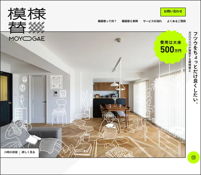
自然光の室内写真に手描きの人物や家具を重ね、蛍光グリーンの料金バッジと問い合わせ導線を効かせたサービスサイト。縦書きコピー、黒い細罫線、大きな余白が特徴。
オリジナルサイトを見るWarm rooms, hand-drawn everyday life, and a sharp flash of lime.
Website: moyogae.com Original URL: https://moyogae.com/ Final URL: https://moyogae.com/ Theme: light, with white and pale-gray surfaces, near-black structure, and fluorescent lime accents. Inspected: September 17, 2026, at 04:30 JST; supplied retrieval timestamp September 16, 2026, at 19:30:18.346 UTC. Viewports: 1440 × 1000 desktop and 390 × 844 mobile, in CSS pixels. Scope: the current homepage of a residential customization service: introductory scene, About, project previews, material photography, service flow, questions, contact banner, footer, and persistent navigation. Project-detail pages, the works index, and the contact form were not inspected.
Moyogae presents a modest transformation of ordinary homes through a deliberately distinctive visual system. Natural-light interior photographs establish the material world: timber, painted doors, pale walls, kitchen joinery, furniture, and plants. Loose drawings introduce the people and objects that make those spaces feel inhabited. White outlines sit over the opening photograph; black outlines and white-filled illustrations overlap later sections.
The interface supplies a crisp counterpoint. Near-black rules frame photographs and rectangular controls. A bright #bdff00 appears in the price badge, contact buttons, and circular Instagram link. Japanese headings remain relatively restrained, while the illustrated logo, vertical opening copy, generous spacing, and oversized footer wordmark carry the identity.
This is a service website with project browsing and informational sections. Its opening composition is important, but the reference also depends on the long editorial page, repeated heading pairs, horizontal photographic sequences, and the transition into a substantial contact area.
Warm rooms, hand-drawn everyday life, and a sharp flash of lime.
Website: moyogae.com Original URL: https://moyogae.com/ Final URL: https://moyogae.com/ Theme: light, with white and pale-gray surfaces, near-black structure, and fluorescent lime accents. Inspected: September 17, 2026, at 04:30 JST; supplied retrieval timestamp September 16, 2026, at 19:30:18.346 UTC. Viewports: 1440 × 1000 desktop and 390 × 844 mobile, in CSS pixels. Scope: the current homepage of a residential customization service: introductory scene, About, project previews, material photography, service flow, questions, contact banner, footer, and persistent navigation. Project-detail pages, the works index, and the contact form were not inspected.
Moyogae presents a modest transformation of ordinary homes through a deliberately distinctive visual system. Natural-light interior photographs establish the material world: timber, painted doors, pale walls, kitchen joinery, furniture, and plants. Loose drawings introduce the people and objects that make those spaces feel inhabited. White outlines sit over the opening photograph; black outlines and white-filled illustrations overlap later sections.
The interface supplies a crisp counterpoint. Near-black rules frame photographs and rectangular controls. A bright #bdff00 appears in the price badge, contact buttons, and circular Instagram link. Japanese headings remain relatively restrained, while the illustrated logo, vertical opening copy, generous spacing, and oversized footer wordmark carry the identity.
This is a service website with project browsing and informational sections. Its opening composition is important, but the reference also depends on the long editorial page, repeated heading pairs, horizontal photographic sequences, and the transition into a substantial contact area.
| Name | Value | Suggested token / source | Role and evidence |
|---|---|---|---|
| Signal Lime | #bdff00 |
--m-key; source --key |
Measured contact-button and Instagram backgrounds; visually repeated in the price badge |
| Structural Ink | #111111 |
--m-ink; source --Black |
Measured body text and active mobile gallery dots; visual reference for rules and linework |
| Link Ink | #1a1a1a |
--m-link |
Measured anchor text, including navigation and contact controls |
| White | #ffffff |
--m-paper; source --White |
Measured hero-caption background and reversed contact text; main light surface |
| Background Wash | Approximately #f5f5f5 |
--m-wash |
Visual estimate for large pale-gray curved fields; exact fill was not exposed |
| Inactive Step | #cccccc |
--m-step; source --Gray-Step |
Measured inactive pagination dots on mobile |
| Muted Text | #888888 |
--m-muted; source --Gray-Text |
Measured explanatory note beneath the approximate service price |
| Contact Scrim | Dark translucent neutral | --m-photo-scrim |
Visually observed over the contact photograph; opacity was not measured |
The site also declares --Red: #D00, but the supplied captures do not establish a visible role for it. Do not introduce red into the main visual system solely because that variable exists.
Numerous generic publishing-platform colors, gradients, and shadow presets occur in the custom-property inventory. Their presence does not demonstrate their use in this page. The visible design is flat and restrained: lime, ink, white, pale gray, and the natural colors of photography.
Recommended contact treatment: start with a black overlay around 40–45% opacity, then adjust against the selected photograph and actual text contrast. This is an implementation starting point, not a recovered source value.
Lime marks three different kinds of emphasis:
Keep these related by color, while retaining their distinct silhouettes. Ordinary project links and section headings do not need lime fills.
Computed family: YakuHanJP, area-normal, ryo-gothic-plusn, sans-serif.
This stack is reported for the body, navigation, section headings, project labels, and contact text. Use these exact identifiers only when the corresponding fonts are available. The evidence does not establish a separate display family for headings.
The default body weight is 500. Navigation and primary actions use 700. English section captions are generally 500, with the contact caption and copyright measured at 600.
The body element itself reports a 16px line height, but content paragraphs override it. The useful reading rhythm is approximately twice the font size: 16px / 32px on desktop and 15.6px / 31.2px on mobile. Copying the body element's line height onto paragraphs would lose the observed spaciousness.
The stacked Japanese logo, woven motif, Latin MOYOGAE wordmark, price lettering, and ROOVICE footer mark should be treated as artwork. Do not infer their typeface from a nearby computed text style. The price lettering is explicitly represented by an SVG image in the rendered evidence.
| Role | Desktop | Mobile | Weight | Notes |
|---|---|---|---|---|
| Main section heading | 40px / 40px |
29.12px / 29.12px |
500 |
About, Works, Flow, and Q&A |
| Contact heading | 40px / 40px |
33.28px / 33.28px |
500 |
Slightly larger than other mobile headings |
| English section caption | 12px / 12px |
12.48px / 12.48px |
500 |
Contact uses 600 |
| Main body copy | 16px / 32px |
15.6px / 31.2px |
500 |
Comfortable, open paragraph rhythm |
| Service facts | 16px / 28px |
15.6px / 27.3px |
500 |
Label/value information beneath About |
| Price qualification note | 12px / 28px |
11.44px / 20.02px |
500 |
Muted gray |
| Desktop navigation | 14px / 14px |
Hidden in the captured state | 700 |
The mobile menu replaces this row |
| Main vertical statement | 24px / 24px |
18.72px / 18.72px |
700 |
Tracking 0.72px and 0.5616px, respectively |
| Supporting vertical statement | 14px / 14px |
11.44px / 11.44px |
500 |
Tracking 1.12px at both inspected sizes |
| Project name | 24px / 48px |
20.8px / 41.6px |
500 |
Computed line height, not the smaller reported glyph rectangle |
| Project number | 14px / 14px |
12.48px / 12.48px |
500 |
Examples include No.5, No.4, and No.3 |
| All-projects action | 16px / 16px |
16.64px / 16.64px |
700 |
Outlined rectangular control |
| Contact introduction | 20px / 40px |
15.6px / 31.2px |
500 |
White over photography |
| Main contact action | 18px / 18px |
15.6px / 15.6px |
700 |
Lime fill |
| Copyright | 12px / 12px |
12px / 12px |
600 |
Small supporting footer text |
Do not add conspicuous tracking to all headings. Most measured interface text uses normal letter spacing. The vertical opening copy is the notable exception.
Desktop rhythm: broad multiples of 40px organize the page: 40px column gaps, 80px content margins, and 160–200px section entrances.
Mobile rhythm: the page preserves unusually generous section spacing. It narrows the content and reduces selected type sizes without collapsing the design into tightly packed blocks.
| Use | Desktop measurement | Mobile measurement |
|---|---|---|
| Main horizontal content inset | 80px |
Approximately 41.6px |
| Initial logo left inset | 40px |
Approximately 20.8px |
| Two-column gap | 40px, calculated from reported bounds |
Single-column layout |
| About and Works top padding | 160px |
161.2px |
| Flow and Q&A top padding | 200px |
161.2px |
| Heading-to-English-caption separation | 32px between reported boxes |
Approximately 29.1px |
| Mobile heading-group-to-About-copy gap | Not applicable to the side-by-side desktop arrangement | Approximately 66.5px |
| Space between project-row bounds | 80px |
Approximately 62.4px |
| Hero caption padding | 14px 20px |
Approximately 10.4px 20.8px |
| Contact paragraph-to-button gap | 50px |
Approximately 52.2px |
| Footer padding | 64px 0 53px |
Approximately 124.8px 0 41.6px |
| Element | Treatment | Evidence |
|---|---|---|
| Buttons, photo frames, project links | Square corners | Measured 0px radius on sampled links; visible framing |
| Instagram shortcut | Circle | Measured 50% radius |
| Mobile pagination dots | Circle | Measured 50% radius |
| Price badge | Repeated soft scallops | Visual observation; not a rounded rectangle |
| Background wash | Oversized organic curve | Visual observation; exact geometry unavailable |
| Most dark rules | Approximately 2px |
Screenshot estimate |
| Large desktop contact-button outline | Visually heavier, approximately 4px |
Screenshot estimate; border width was not included in the DOM sample |
There is no visible general-purpose shadow system. Hierarchy comes from outlines, contrasting fills, photographic scale, whitespace, and overlapping illustration.
| Element | At 1440 × 1000 | At 390 × 844 | Status |
|---|---|---|---|
| Document height | 6761.17px |
7701.14px |
Measured |
| Main content width | 1280px |
Approximately 306.8px |
Measured |
| Desktop text columns | 620px + 40px + 620px |
One content column | Measured/calculated |
| Initial logo bounds | 200 × 175px at (40, 40) |
Approximately 124.8 × 109.2px at (20.8, 42.6) |
Measured |
| Opening photo region | Approximately 1360 × 646px |
Approximately 348.4 × 312.4px |
Screenshot edges aligned with DOM positions |
| Opening photo top | Approximately 181px |
Approximately 99.2px |
Screenshot/DOM correspondence |
| Right-side opening rail | Approximately 80px |
Approximately 41.6px |
Calculated from photo extent |
| Hero project caption | 205 × 52px |
Approximately 202.6 × 44.8px |
Measured |
| Price seal exterior | Approximately 180px across |
Approximately 114px across |
Visual estimate |
| Header contact action | 132 × 46px |
Replaced by bottom contact shortcut | Measured |
| All-projects action | 339 × 52px |
Approximately 306.8 × 54.1px |
Measured |
| Contact section | 1440 × 595px |
Approximately 390 × 556.4px |
Measured |
| Main contact action | 620 × 80px |
Approximately 306.8 × 53px |
Measured |
| Instagram shortcut | 64 × 64px |
Approximately 66.5 × 66.5px |
Measured |
| Footer region | 1280 × 195px |
Approximately 306.8 × 268.4px |
Measured |
The measured header element is only 40px high on desktop and about 23.9px high on mobile. Its visible contents extend outside that box. Those values are not the height of the opening white band and should not be used as a conventional header-row height.
Role: make the page feel composed like a large illustrated sheet.
A fine black frame is visible along the viewport edges. White and very pale gray meet in broad curves behind the content. These shapes are much larger than individual components and are cropped by the viewport, creating a quiet background rhythm.
Keep the curves low contrast and subordinate to photography. The evidence does not reveal whether their original implementation uses images, masks, pseudo-elements, or another technique. A solid oversized ellipse is a reasonable approximation; a glossy gradient would change the appearance.
Role: retain identity and access to key sections while allowing the photographs to dominate.
The opening desktop logo is a 200 × 175px lockup at the upper left. It crosses the horizontal boundary between the upper surface and the hero photograph. The navigation sits toward the upper right, with four plain text links followed by a lime contact rectangle.
The observed destinations are:
| Label | Destination |
|---|---|
模様替って何? |
/#about |
模様替え事例 |
/works/ |
サービスの流れ |
/#flow |
よくあるご質問 |
/#qa |
お問い合わせ |
/contact/ |
Later desktop captures show a smaller logo, approximately half its initial width, while navigation remains at the top over underlying page content. The mobile bottom capture similarly shows a smaller logo than the opening capture. This establishes a compact state at sampled scroll positions, but not its trigger threshold or transition timing.
At 390px, the text navigation is replaced by a thin three-line menu symbol. Its reported visible bounds are about 31.2 × 16px. The expanded menu was not captured.
Role: demonstrate the service through an appealing inhabited room.
The composition has four primary layers:
The illustration follows the room's perspective sufficiently to feel placed within it. A seated reader, reclining person, cat, plants, and steaming cup add everyday activity without hiding the floor, kitchen, or daylight.
The capture does not establish whether the photograph and linework are one composite image or separate assets. Preserve their registration either way. A free-floating decorative overlay that drifts away from the furniture would lose the central effect.
The desktop image is a broad landscape composition. The phone uses a nearly square visible region, making the room and drawings smaller together rather than merely keeping the desktop rectangle at the same proportions.
Role: provide a distinctive statement while leaving the room photograph open.
The primary copy is フツウをちょっとだけ良くしたい。. The supporting line is ROOVICEが提案する模様替え.
On desktop, the primary and supporting statements occupy adjacent vertical columns in the right rail. The primary starts around x=1396, and the support around x=1372.
On mobile, the supporting line moves below the primary line in the same narrow rail. It begins around y=407.5 and continues to approximately y=585.1, beyond the bottom of the photograph. This extension is an intentional part of the opening composition; it is not a reason to force both lines into a short, centered horizontal heading.
Use real vertical text where possible. Preserve the difference between the bold statement and the smaller, more widely tracked supporting line.
Role: make the approximate budget immediately visible.
The seal combines a fluorescent scalloped silhouette with black lettering and a disproportionately large 500. The observed artwork text states 費用は大体500万円.
The text-image box measures 113 × 78.6px on desktop and approximately 71.8 × 49.9px on mobile. These are the inner lettering dimensions, not the exterior badge size.
Keep the seal near the photograph's upper-right corner, overlapping the composition rather than turning it into an ordinary navigation badge. Preserve the approximate-price wording; the About section also contains a qualification that proposals vary with property conditions.
Role: connect the opening scene to a real project.
A white rectangular tab contains the project name 川崎の部屋, a thin vertical divider, and the stronger action 詳しく見る. It links to the observed project-detail URL.
On desktop, the tab sits within the photograph's lower-left boundary. On mobile, its top edge begins near the photo's bottom and the tab projects below it. The mobile About section starts behind this protruding arrangement, with enough top space to keep the next heading separate.
Use a single clearly named project link. Retain the tab's modest size and square outline.
Role: create a consistent editorial structure for service information.
Each main section pairs a Japanese heading with a small English caption: About Moyogae, Works, Flow, or Q&A. The English caption sits below with an unusually generous gap, rather than being tightly attached as a subtitle.
The desktop About section divides the 1280px content width into two equal 620px columns separated by 40px. The left establishes the section identity and illustration; the right contains the explanation and service facts.
The facts are label/value rows covering eligible properties, approximate budget, and examples of work. In the reported desktop bounds, values begin at x=835, 95px inside the right column. On mobile, values begin at approximately x=124.8, around 83.2px inside the content column.
Keep this subordinate two-column fact structure on mobile, allowing the values to wrap. The page's larger title/copy columns, however, become a single vertical sequence.
Role: show multiple views of each completed interior without turning the page into a conventional card grid.
Three projects are represented in the supplied homepage evidence: 川崎の部屋, 葉山の部屋, and 金沢文庫の部屋, numbered No.5, No.4, and No.3.
On desktop, each project uses a long horizontal photographic sequence with a project name and smaller number below. The sampled linked region is approximately 1962.6px wide and begins at x=80, extending beyond the viewport. This is clear evidence of an expansive horizontal composition, but it does not establish dragging, automatic movement, or a particular scrolling mechanism.
The exposed photographs have square black frames. The visible desktop tiles appear approximately 320px wide, with narrow gaps; their exact individual bounds were not supplied. The observed thumbnail paths use a 640 × 360 naming convention, consistent with landscape imagery.
On mobile, each project exposes six pagination buttons. The first is black and the other five are gray in the captured DOM. The visible dots measure approximately 5.2px in diameter, with roughly 15.6px between their left edges. Their numeric text is hidden with a zero font size.
The gallery region reaches from the normal left content inset to the right viewport edge, while the project name and number remain aligned with the editorial content. Follow the rows with the outlined すべての事例をみる link.
Role: shift attention from whole rooms to the tactile details being changed.
The middle desktop capture shows a full-width band of adjacent photographs: a door or wall junction, chair legs and flooring, timber cabinetry, and stairs. There are no surrounding rounded cards or explanatory captions in this visible band.
Its visible height is approximately 404px at the inspected desktop size. A black-and-white seated figure holding a record sleeve overlaps the pale area above and the photographs below, with loose records extending farther down.
Preserve that boundary crossing. The illustration acts as a bridge between sections rather than an icon enclosed in a dedicated box. The ribbon's mobile crop and precise mobile illustration placement were not captured.
Role: explain the service and establish expectations.
The rendered structure contains the heading 工事完了までの流れ, the caption Flow, an illustration asset, a substantial process region, supporting copy, and a list of consultation situations.
The visible text states that the service can be provided over a total of two to four months and gives examples such as planning a purchase, already owning a home, or considering future changes.
The desktop text is positioned in the right 620px column; mobile text occupies the main 306.8px column. The exact process diagram, step count, connectors, and graphic labels are not exposed in the supplied visual captures or sampled elements. Do not invent a specific timeline anatomy from the duration alone.
Role: resolve practical concerns before contact.
The rendered page lists seven question prompts, each preceded by Q, covering property eligibility, construction area, budget overruns, consultation before purchase, detached houses, floor-area limits, and occupying the home during work.
Small trailing controls appear at the right edge of the desktop content column. Their sampled width is 16px. On mobile, the controls remain at the right of the narrower content area, and longer questions occupy more vertical space.
No answers or expanded states were captured. This supports documenting a question-list entry state, but not asserting an accordion animation or answer layout. For a new implementation, use a full-width button or native disclosure element rather than reproducing the sampled empty-link controls.
Role: make inquiry prominent while remaining within the interior-photography language.
The contact section fills the viewport width with a dining-room photograph and a dark translucent treatment. Text is white, and the main action returns to lime with black text and a dark outline.
At desktop size, the left column contains お問い合わせ and Contact. The right column contains two lines of introductory copy and a 620 × 80px 相談してみる link. The section is 595px high.
On mobile, the heading, English caption, paragraph, and button stack within the 306.8px content width. The section remains substantial at approximately 556.4px tall. The photograph uses a narrower crop, with the dining table and chairs still recognizable.
A drawing of books and a steaming cup crosses the upper contact boundary on desktop. On mobile, it moves to the lower boundary, bridging the photograph and the footer. Its placement changes with the composition rather than simply scaling down in place.
Role: close with the parent brand and retain convenient contact access.
The desktop footer places a large ROOVICE mark at the left and a small copyright at the right. The original page identifies © ROOVICE Co.,Ltd. and links the brand to roovice.com.
The reported brand-link width is 511px on desktop and approximately 306.8px on mobile. Its inline anchor height does not represent the full visible logo height; size the artwork by its own aspect ratio.
The lime Instagram circle stays near the lower-right viewport corner in all supplied scroll states. Its desktop position is 7px from the right and 60px from the bottom; mobile offsets are approximately 7.3px on both axes.
Mobile adds a lime お問い合わせ shortcut at the lower left, approximately 108.2 × 41.6px, with a hand-drawn arrow extending to its right. It is visible over both the About area and the footer. A new implementation should reserve space so these persistent controls do not obscure reading text or copyright.
| Treatment | Evidence | Implementation implication |
|---|---|---|
| Persistent header | Visible at the top in separated scroll captures | Keep navigation available across the page |
| Compact logo state | Later captures show an approximately half-size logo | Support an explicit compact state; threshold and animation are unknown |
| Instagram transform transition | Desktop computed style: 0.2s cubic-bezier(0.81, 0, 0.58, 1) |
This is the only specific transition timing exposed in the sample |
| Mobile Instagram transition | Sample reports all, without a meaningful duration |
Do not assume the desktop animation is identical on mobile |
| Mobile project pagination | Six buttons per project, with one black and five gray dots | Provide a current-slide state; transition and input behavior are unverified |
| In-page navigation | #about, #flow, and #qa links |
Anchor targets are established; smooth scrolling was not verified |
| Project and contact links | Explicit destinations in the rendered DOM | Use real links; destination-page behavior is outside scope |
| Menu control | Visible closed-state symbol | Expanded layout, focus management, and animation are unverified |
| Question controls | Seven prompts and trailing controls | Expanded behavior is unverified |
| Decorative illustrations | Static appearance in supplied captures | No evidence for animated drawing, floating, or parallax effects |
Most sampled elements report animation: none. This is an element-level observation, not proof that the full site has no motion. The collection process waited for finite motion and stability, temporarily paused perpetual animations during readiness checks, and then resumed them. Settled screenshots cannot establish the complete animation system.
Recommended motion policy: retain the observed short social-control timing if a transform effect is implemented. Keep additional state changes restrained, provide reduced-motion behavior, and avoid inventing continuous movement for every illustration.
| Surface | Appearance | Function |
|---|---|---|
| Main canvas | White with broad pale-gray curves | Quiet visual continuity between sections |
| Opening media | Bright interior photograph with white linework | Primary demonstration of the service |
| Project imagery | Natural photography inside black rectangular frames | Evidence of completed spaces |
| Secondary action | Transparent or white fill with dark outline | Project browsing without competing with contact |
| Primary action | Lime fill, black text, square dark border | Contact emphasis |
| Contact panel | Darkened interior photograph with white text | A distinct, readable closing invitation |
| Social shortcut | Lime circle with black outline icon | Persistent external brand access |
| Price seal | Lime scalloped artwork | Immediate approximate-budget recognition |
Do not translate this into an elevation hierarchy of floating cards. Most surfaces share the page plane; photography and illustration provide depth through composition.
Use bright, believable residential interiors. The observed rooms emphasize timber flooring, plywood or timber cabinetry, white walls, modest furniture, plants, and daylight through large windows. The photographs feel architectural without becoming empty luxury-showroom imagery.
The drawings are informal and specific: people reading or handling records, a cat, stacks of books, a hot drink, plants, and small furnishings. Their slight irregularities matter. White linework works over the hero photograph; black outlines with white interiors remain legible over pale backgrounds and the material ribbon.
Do not apply pixelated rendering to these assets. This page uses smooth architectural photography and drawn outlines, not a low-resolution raster aesthetic.
Paths below are relative to https://moyogae.com/. They identify resources exposed in the supplied rendered evidence, not files bundled with this document.
| Asset | Observed path | Confirmed role |
|---|---|---|
| Price lettering | wp-content/themes/wp-moyogae/assets/images/index/kv-badge-txt.svg |
Text inside the opening price seal |
| About illustration | wp-content/themes/wp-moyogae/assets/images/index/about-illust.webp |
Illustration referenced within About |
| Flow illustration | wp-content/themes/wp-moyogae/assets/images/index/flow-illust.webp |
Illustration referenced within Flow |
| Q&A illustration | wp-content/themes/wp-moyogae/assets/images/index/qa-illust.webp |
Illustration referenced within Q&A |
| Contact illustration | wp-content/themes/wp-moyogae/assets/images/common/sec-contact-illust.webp |
Books-and-cup decoration associated with Contact |
| Kawasaki project image | wp-content/uploads/2024/09/article-kv-640x360.jpg |
Project preview imagery |
| Additional Kawasaki images | wp-content/uploads/2024/09/C9I1257-640x360.jpg, wp-content/uploads/2024/09/C9I1184-640x360.jpg |
Additional project views |
| Hayama project images | wp-content/uploads/2024/09/AC9I9701-640x360.jpg, wp-content/uploads/2024/09/AC9I9782-640x360.jpg |
Project preview imagery |
| Kanazawa-bunko project images | wp-content/uploads/2024/09/C9I0154-640x360.jpg, wp-content/uploads/2024/09/C9I0138-640x360.jpg, wp-content/uploads/2024/09/C9I0160-640x360.jpg |
Project preview imagery |
The exact hero photograph, full badge silhouette, contact background, logo, and material-ribbon URLs were not included in the supplied asset evidence. Do not assign one of the project-thumbnail URLs to those roles without verification.
At 1440px, ordinary content sits between 80px side margins. About, Flow, Q&A, and Contact use the same left-identity/right-content relationship where their sampled positions are available. The two columns are each 620px wide with a 40px gap.
Photography is allowed to escape this framework. The opening scene starts at the left viewport edge; project sequences extend beyond the normal right boundary; the material ribbon and contact photograph span the full width. This alternation between disciplined text columns and expansive imagery is central to the page.
At 390px, the main text width is approximately 306.8px with 41.6px side margins. This is a relatively narrow reading column, about 78.7% of the viewport width. Logo and fixed-contact positioning use a smaller inset of approximately 20.8px.
The observed changes are structural:
The phone keeps approximately 161px of top space for the major informational sections. Do not uniformly halve all vertical spacing just because the layout has one column.
Several mobile measurements are consistent with scaling values from a 375px design width: 40 × 390 / 375 = 41.6, 28 × 390 / 375 = 29.12, and 15 × 390 / 375 = 15.6.
This is a useful calculated relationship, not a recovered source formula. The original breakpoint and behavior at intermediate widths were not supplied. The Quick Start uses this relationship as an explicitly recommended approximation, with a readability floor for body text.
#bdff00 as the unmistakable action and price accent.These are recommendations for a new implementation, not verified features of the original:
aria-expanded and aria-controls for the mobile menu, and manage focus when its panel opens.#ffffff.#f5f5f5, visually estimated.#111111.#1a1a1a.#bdff00.#cccccc.#888888.“Create a Japanese residential customization service homepage inspired by Moyogae. Use natural-light interior photography, warm timber, white walls, and hand-drawn domestic scenes. Build a mostly white canvas with oversized pale-gray curves, thin near-black frames, square buttons, and a fluorescent lime #bdff00 accent. The opening scene places a large illustrated logo at upper left, a room photograph with white line drawings beneath it, a scalloped approximate-price seal near the photograph's upper right, and a narrow vertical Japanese statement along the right edge. Follow with spacious Japanese-heading/English-caption sections, two equal text columns on desktop, horizontal project photo sequences, and a full-width darkened dining-room contact banner. On mobile, stack the content, retain the vertical rail, show compact navigation and a fixed contact shortcut, and move the contact illustration across the lower photograph boundary.”
This is an implementation adaptation, not the original stylesheet. It reproduces the measured palette, typography hierarchy, desktop columns, and mobile proportions. The 900px breakpoint is recommended; the original breakpoint is unknown. The pale-gray fill, 2px rules, and contact scrim are approximations.
Apply .moyogae to the page body. Place .hero-caption inside .hero-media; place .hero-taglines and .hero-badge directly inside .hero. The contact section uses a .section-grid containing its heading group and .contact-copy, with a separate .contact-photo image behind them. Use authorized artwork for the logos, scene, badge, and illustrations.
The .is-compact state must be set by application logic. Menu, pagination, and disclosure behavior also require separate implementation. The gallery below uses local native horizontal scrolling as a recommended baseline, not as a claim about the original site's interaction model.
:root {
  /* Measured colors */
  --m-ink: #111111;
  --m-link: #1a1a1a;
  --m-paper: #ffffff;
  --m-key: #bdff00;
  --m-step: #cccccc;
  --m-muted: #888888;

  /* Visual approximations */
  --m-wash: #f5f5f5;
  --m-rule: 2px;
  --m-photo-scrim: rgb(0 0 0 / 45%);

  /* Observed font identifiers; font files are not included */
  --m-font: YakuHanJP, area-normal, ryo-gothic-plusn, sans-serif;
  --m-body: 16px;
  --m-heading: 40px;
  --m-caption: 12px;
  --m-gutter: clamp(40px, 5.555556vw, 96px);
  --m-column-gap: 40px;
  --m-section-space: 160px;
  --m-social-motion: 200ms cubic-bezier(0.81, 0, 0.58, 1);
}

* { box-sizing: border-box; }

body.moyogae {
  margin: 0;
  color: var(--m-ink);
  background: var(--m-paper);
  font-family: var(--m-font);
  font-size: var(--m-body);
  font-weight: 500;
  line-height: 2;
}

.moyogae a { color: inherit; }
.moyogae img { display: block; max-width: 100%; }
.moyogae button { font: inherit; }

.page-frame {
  position: fixed;
  inset: 0;
  z-index: 100;
  border: var(--m-rule) solid var(--m-ink);
  pointer-events: none;
}

.container { margin-inline: var(--m-gutter); }

.section {
  padding-block-start: var(--m-section-space);
  scroll-margin-top: 140px;
}

.section--deep { padding-block-start: 200px; }

.section-grid {
  display: grid;
  grid-template-columns: repeat(2, minmax(0, 1fr));
  gap: var(--m-column-gap);
}

.section-heading h2 {
  margin: 0;
  font-size: var(--m-heading);
  font-weight: 500;
  line-height: 1;
}

.section-heading .english {
  margin: 32px 0 0;
  font-size: var(--m-caption);
  line-height: 1;
}

.section-copy p { margin: 0 0 2em; }

.service-facts {
  display: grid;
  grid-template-columns: 95px minmax(0, 1fr);
  row-gap: 32px;
  line-height: 1.75;
}

.service-facts dt,
.service-facts dd { margin: 0; }

.service-note {
  color: var(--m-muted);
  font-size: 12px;
  line-height: 1.75;
}

.site-header {
  position: fixed;
  inset: 0 0 auto;
  z-index: 40;
  height: 0;
}

.brand {
  position: absolute;
  top: 40px;
  left: 40px;
  width: 200px;
}

.brand img { width: 100%; height: auto; }

.site-nav {
  position: absolute;
  top: 60px;
  right: var(--m-gutter);
  display: flex;
  align-items: center;
  gap: 27px;
}

.site-nav > a {
  font-size: 14px;
  font-weight: 700;
  line-height: 1;
  text-decoration: none;
}

.button {
  display: inline-flex;
  align-items: center;
  justify-content: center;
  min-height: 52px;
  padding: 12px 20px;
  border: var(--m-rule) solid var(--m-ink);
  border-radius: 0;
  color: var(--m-link);
  background: transparent;
  font-size: 16px;
  font-weight: 700;
  line-height: 1.2;
  text-align: center;
  text-decoration: none;
}

.button--key { background: var(--m-key); }

.site-nav .button {
  width: 132px;
  min-height: 46px;
  padding: 8px;
  font-size: 16px;
}

.site-header.is-compact .brand { top: 20px; width: 100px; }
.site-header.is-compact .site-nav { top: 40px; }
.menu-toggle { display: none; }

.hero {
  position: relative;
  padding-block-start: 181px;
}

.hero-media {
  position: relative;
  width: calc(100% - var(--m-gutter));
  aspect-ratio: 1360 / 646;
  border: var(--m-rule) solid var(--m-ink);
}

.hero-scene {
  position: absolute;
  inset: 0;
  width: 100%;
  height: 100%;
  object-fit: cover;
}

.hero-taglines {
  position: absolute;
  top: 181px;
  right: 20px;
  display: flex;
  flex-direction: row-reverse;
  align-items: flex-start;
  gap: 10px;
}

.hero-taglines p {
  flex: none;
  margin: 0;
  writing-mode: vertical-rl;
  text-orientation: mixed;
  white-space: nowrap;
  line-height: 1;
}

.hero-statement {
  font-size: 24px;
  font-weight: 700;
  letter-spacing: 0.03em;
}

.hero-support {
  font-size: 14px;
  letter-spacing: 1.12px;
}

.hero-badge {
  position: absolute;
  top: 170px;
  right: calc(var(--m-gutter) - 14px);
  width: 180px;
  aspect-ratio: 1;
}

.hero-caption {
  position: absolute;
  bottom: calc(-1 * var(--m-rule));
  left: calc(-1 * var(--m-rule));
  display: flex;
  align-items: center;
  gap: 10px;
  min-height: 52px;
  padding: 14px 20px;
  border: var(--m-rule) solid var(--m-ink);
  background: var(--m-paper);
  font-size: 14px;
  line-height: 1.4;
  text-decoration: none;
}

.hero-caption strong {
  padding-inline-start: 10px;
  border-inline-start: 1px solid var(--m-ink);
}

.work-list {
  margin-block-start: 72px;
  padding-inline-start: var(--m-gutter);
}

.work-item { margin-block-end: 80px; }

.work-gallery {
  display: flex;
  gap: 8px;
  overflow-x: auto;
  overscroll-behavior-inline: contain;
  scroll-snap-type: x mandatory;
}

.work-gallery img {
  flex: 0 0 320px;
  width: 320px;
  max-width: none;
  aspect-ratio: 16 / 9;
  object-fit: cover;
  border: var(--m-rule) solid var(--m-ink);
  scroll-snap-align: start;
}

.work-caption {
  display: flex;
  align-items: baseline;
  gap: 24px;
  margin-block-start: 20px;
}

.work-title { margin: 0; font-size: 24px; line-height: 2; }
.work-number { font-size: 14px; line-height: 1; }
.works-all { width: 339px; max-width: 100%; }

.contact {
  position: relative;
  isolation: isolate;
  display: grid;
  align-items: center;
  min-height: 595px;
  margin-block-start: 200px;
  border-block: var(--m-rule) solid var(--m-ink);
  color: var(--m-paper);
}

.contact-photo,
.contact::before {
  position: absolute;
  inset: 0;
  width: 100%;
  height: 100%;
}

.contact-photo { z-index: -2; object-fit: cover; }
.contact::before { content: ''; z-index: -1; background: var(--m-photo-scrim); }
.contact .english { font-weight: 600; }
.contact-copy p { margin: 0; font-size: 20px; line-height: 2; }

.contact-copy .button {
  width: 100%;
  min-height: 80px;
  margin-block-start: 50px;
  color: var(--m-ink);
  font-size: 18px;
}

.contact-illustration {
  position: absolute;
  top: -160px;
  right: 20%;
  width: 240px;
  pointer-events: none;
}

.site-footer {
  display: flex;
  justify-content: space-between;
  align-items: center;
  gap: 40px;
  min-height: 195px;
  padding-block: 64px 53px;
}

.footer-brand { width: 511px; max-width: 100%; }
.copyright { margin: 0; font-size: 12px; font-weight: 600; line-height: 1; }

.social-link {
  position: fixed;
  right: 7px;
  bottom: 60px;
  z-index: 50;
  display: grid;
  place-items: center;
  width: 64px;
  height: 64px;
  border-radius: 50%;
  color: var(--m-ink);
  background: var(--m-key);
  transition: transform var(--m-social-motion);
}

.mobile-contact { display: none; }

/* Recommended keyboard treatment */
.moyogae :focus-visible {
  outline: 3px solid currentColor;
  outline-offset: 4px;
}

@media (max-width: 900px) {
  :root {
    /* Calculated approximation from the supplied mobile measurements */
    --m-u: calc(100vw / 375);
    --m-gutter: calc(40 * var(--m-u));
    --m-body: max(15px, calc(15 * var(--m-u)));
    --m-heading: calc(28 * var(--m-u));
    --m-caption: calc(12 * var(--m-u));
    --m-section-space: calc(155 * var(--m-u));
  }

  .section--deep { padding-block-start: var(--m-section-space); }
  .section-grid { grid-template-columns: minmax(0, 1fr); gap: calc(64 * var(--m-u)); }
  .section-heading .english { margin-block-start: calc(28 * var(--m-u)); }
  .service-facts { grid-template-columns: calc(80 * var(--m-u)) minmax(0, 1fr); }
  .site-nav { display: none; }

  .brand {
    top: calc(41 * var(--m-u));
    left: calc(20 * var(--m-u));
    width: calc(120 * var(--m-u));
  }

  .site-header.is-compact .brand {
    top: calc(41 * var(--m-u));
    width: calc(60 * var(--m-u));
  }

  .menu-toggle {
    position: absolute;
    top: 20px;
    right: calc(12 * var(--m-u));
    display: grid;
    place-items: center;
    width: 44px;
    height: 44px;
    padding: 0;
    border: 0;
    background: transparent;
    color: var(--m-ink);
  }

  .hero { padding-block-start: calc(95.37 * var(--m-u)); }
  .hero-media { aspect-ratio: 335 / 300; }

  .hero-taglines {
    top: calc(95.37 * var(--m-u));
    right: calc(10 * var(--m-u));
    flex-direction: column;
    align-items: center;
    gap: 0;
  }

  .hero-statement { font-size: calc(18 * var(--m-u)); }
  .hero-support { font-size: calc(11 * var(--m-u)); }

  .hero-badge {
    top: calc(86 * var(--m-u));
    right: calc(34 * var(--m-u));
    width: calc(110 * var(--m-u));
  }

  .hero-caption {
    top: calc(100% - var(--m-rule));
    bottom: auto;
    min-height: 44px;
    padding: calc(10 * var(--m-u)) calc(20 * var(--m-u));
    font-size: 12px;
  }

  .work-list { margin-block-start: calc(64 * var(--m-u)); }
  .work-item { margin-block-end: calc(60 * var(--m-u)); }
  .work-gallery img { flex-basis: 100%; width: 100%; }
  .work-title { font-size: calc(20 * var(--m-u)); }
  .work-number { font-size: calc(12 * var(--m-u)); }
  .works-all { width: 100%; min-height: calc(52 * var(--m-u)); }

  .contact {
    display: block;
    min-height: calc(535 * var(--m-u));
    margin-block-start: calc(164 * var(--m-u));
    padding-block: calc(75 * var(--m-u)) calc(160 * var(--m-u));
  }

  .contact .section-grid { gap: calc(40 * var(--m-u)); }
  .contact .section-heading h2 { font-size: calc(32 * var(--m-u)); }
  .contact .english { margin-block-start: calc(12 * var(--m-u)); }
  .contact-copy p { font-size: var(--m-body); }

  .contact-copy .button {
    min-height: calc(51 * var(--m-u));
    margin-block-start: calc(50 * var(--m-u));
    font-size: var(--m-body);
  }

  .contact-illustration {
    top: auto;
    bottom: -34px;
    right: 30%;
    width: 160px;
  }

  .site-footer {
    flex-direction: column;
    align-items: flex-start;
    gap: calc(40 * var(--m-u));
    padding-block: calc(120 * var(--m-u)) calc(100 * var(--m-u));
  }

  .footer-brand { width: 100%; }

  .social-link {
    right: calc(7 * var(--m-u));
    bottom: calc(7 * var(--m-u) + env(safe-area-inset-bottom, 0px));
    width: calc(64 * var(--m-u));
    height: calc(64 * var(--m-u));
  }

  .mobile-contact {
    position: fixed;
    left: calc(20 * var(--m-u));
    bottom: calc(20 * var(--m-u) + env(safe-area-inset-bottom, 0px));
    z-index: 50;
    display: inline-flex;
    width: calc(104 * var(--m-u));
    min-height: 44px;
    padding: 6px;
    font-size: 13px;
  }
}

@media (prefers-reduced-motion: reduce) {
  .social-link { transition: none; }
  .work-gallery { scroll-behavior: auto; }
}
The extra mobile footer clearance and minimum 44px controls are deliberate accessibility additions. The original footer padding and fixed-contact height are recorded separately above. Decorative background curves, the hand-drawn shortcut arrow, and exact artwork registration need their own assets or carefully composed vector work.
Optional mapping for an implementation already using Tailwind v4. This does not imply that the original site uses Tailwind. Define the preceding custom properties first.
@theme inline {
  --color-ink: var(--m-ink);
  --color-link-ink: var(--m-link);
  --color-paper: var(--m-paper);
  --color-wash: var(--m-wash);
  --color-signal: var(--m-key);
  --color-step: var(--m-step);
  --color-muted: var(--m-muted);

  --font-sans: var(--m-font);
  --text-body: var(--m-body);
  --text-section: var(--m-heading);
  --text-caption: var(--m-caption);

  --spacing-page: var(--m-gutter);
  --spacing-column: var(--m-column-gap);
  --spacing-section: var(--m-section-space);
}
模様替.This reference describes the current homepage represented by those captures and measurements. Exact measured values, visual estimates, calculated relationships, and implementation recommendations are distinguished throughout.
# Moyogae / 模様替 — Style Reference

> Warm rooms, hand-drawn everyday life, and a sharp flash of lime.

**Website:** [moyogae.com](https://moyogae.com/)
**Original URL:** https://moyogae.com/
**Final URL:** https://moyogae.com/
**Theme:** light, with white and pale-gray surfaces, near-black structure, and fluorescent lime accents.
**Inspected:** September 17, 2026, at 04:30 JST; supplied retrieval timestamp September 16, 2026, at 19:30:18.346 UTC.
**Viewports:** 1440 × 1000 desktop and 390 × 844 mobile, in CSS pixels.
**Scope:** the current homepage of a residential customization service: introductory scene, About, project previews, material photography, service flow, questions, contact banner, footer, and persistent navigation. Project-detail pages, the works index, and the contact form were not inspected.

Moyogae presents a modest transformation of ordinary homes through a deliberately distinctive visual system. Natural-light interior photographs establish the material world: timber, painted doors, pale walls, kitchen joinery, furniture, and plants. Loose drawings introduce the people and objects that make those spaces feel inhabited. White outlines sit over the opening photograph; black outlines and white-filled illustrations overlap later sections.

The interface supplies a crisp counterpoint. Near-black rules frame photographs and rectangular controls. A bright `#bdff00` appears in the price badge, contact buttons, and circular Instagram link. Japanese headings remain relatively restrained, while the illustrated logo, vertical opening copy, generous spacing, and oversized footer wordmark carry the identity.

This is a service website with project browsing and informational sections. Its opening composition is important, but the reference also depends on the long editorial page, repeated heading pairs, horizontal photographic sequences, and the transition into a substantial contact area.
# Moyogae / 模様替 — Style Reference

> Warm rooms, hand-drawn everyday life, and a sharp flash of lime.

**Website:** [moyogae.com](https://moyogae.com/)
**Original URL:** https://moyogae.com/
**Final URL:** https://moyogae.com/
**Theme:** light, with white and pale-gray surfaces, near-black structure, and fluorescent lime accents.
**Inspected:** September 17, 2026, at 04:30 JST; supplied retrieval timestamp September 16, 2026, at 19:30:18.346 UTC.
**Viewports:** 1440 × 1000 desktop and 390 × 844 mobile, in CSS pixels.
**Scope:** the current homepage of a residential customization service: introductory scene, About, project previews, material photography, service flow, questions, contact banner, footer, and persistent navigation. Project-detail pages, the works index, and the contact form were not inspected.

Moyogae presents a modest transformation of ordinary homes through a deliberately distinctive visual system. Natural-light interior photographs establish the material world: timber, painted doors, pale walls, kitchen joinery, furniture, and plants. Loose drawings introduce the people and objects that make those spaces feel inhabited. White outlines sit over the opening photograph; black outlines and white-filled illustrations overlap later sections.

The interface supplies a crisp counterpoint. Near-black rules frame photographs and rectangular controls. A bright `#bdff00` appears in the price badge, contact buttons, and circular Instagram link. Japanese headings remain relatively restrained, while the illustrated logo, vertical opening copy, generous spacing, and oversized footer wordmark carry the identity.

This is a service website with project browsing and informational sections. Its opening composition is important, but the reference also depends on the long editorial page, repeated heading pairs, horizontal photographic sequences, and the transition into a substantial contact area.

## How to Read This Reference

- **Measured** means reported by the supplied rendered DOM, computed styles, custom properties, or viewport metadata. Dimensions are rounded where useful.
- **Visually estimated** means inferred from the five current-page captures. Border thickness, some illustration dimensions, and the pale background color fall into this category.
- **Recommended** means an implementation choice for a new site. It does not establish how the original was built.
- **Token names** are reusable aliases unless explicitly identified as original custom properties.
- **Interaction evidence is limited.** Scroll-position captures show persistent controls and different logo sizes. Menu opening, gallery manipulation, question expansion, link destinations, and hover responses were not exercised in the supplied evidence.
- **Computed font families identify the declared stack.** They do not prove which font supplied every individual glyph.

## Tokens — Colors

### Default Palette

| Name | Value | Suggested token / source | Role and evidence |
| --- | --- | --- | --- |
| Signal Lime | `#bdff00` | `--m-key`; source `--key` | Measured contact-button and Instagram backgrounds; visually repeated in the price badge |
| Structural Ink | `#111111` | `--m-ink`; source `--Black` | Measured body text and active mobile gallery dots; visual reference for rules and linework |
| Link Ink | `#1a1a1a` | `--m-link` | Measured anchor text, including navigation and contact controls |
| White | `#ffffff` | `--m-paper`; source `--White` | Measured hero-caption background and reversed contact text; main light surface |
| Background Wash | Approximately `#f5f5f5` | `--m-wash` | Visual estimate for large pale-gray curved fields; exact fill was not exposed |
| Inactive Step | `#cccccc` | `--m-step`; source `--Gray-Step` | Measured inactive pagination dots on mobile |
| Muted Text | `#888888` | `--m-muted`; source `--Gray-Text` | Measured explanatory note beneath the approximate service price |
| Contact Scrim | Dark translucent neutral | `--m-photo-scrim` | Visually observed over the contact photograph; opacity was not measured |

The site also declares `--Red: #D00`, but the supplied captures do not establish a visible role for it. Do not introduce red into the main visual system solely because that variable exists.

Numerous generic publishing-platform colors, gradients, and shadow presets occur in the custom-property inventory. Their presence does not demonstrate their use in this page. The visible design is flat and restrained: lime, ink, white, pale gray, and the natural colors of photography.

**Recommended contact treatment:** start with a black overlay around 40–45% opacity, then adjust against the selected photograph and actual text contrast. This is an implementation starting point, not a recovered source value.

### Accent Distribution

Lime marks three different kinds of emphasis:

1. An irregular price seal in the opening scene.
2. Square-cornered contact controls of different sizes.
3. A circular social shortcut.

Keep these related by color, while retaining their distinct silhouettes. Ordinary project links and section headings do not need lime fills.

## Tokens — Typography

### Observed Interface Stack

**Computed family:** `YakuHanJP, area-normal, ryo-gothic-plusn, sans-serif`.

This stack is reported for the body, navigation, section headings, project labels, and contact text. Use these exact identifiers only when the corresponding fonts are available. The evidence does not establish a separate display family for headings.

The default body weight is `500`. Navigation and primary actions use `700`. English section captions are generally `500`, with the contact caption and copyright measured at `600`.

The body element itself reports a `16px` line height, but content paragraphs override it. The useful reading rhythm is approximately twice the font size: `16px / 32px` on desktop and `15.6px / 31.2px` on mobile. Copying the body element's line height onto paragraphs would lose the observed spaciousness.

### Logos and Price Lettering

The stacked Japanese logo, woven motif, Latin MOYOGAE wordmark, price lettering, and ROOVICE footer mark should be treated as artwork. Do not infer their typeface from a nearby computed text style. The price lettering is explicitly represented by an SVG image in the rendered evidence.

### Type Scale

| Role | Desktop | Mobile | Weight | Notes |
| --- | --- | --- | --- | --- |
| Main section heading | `40px / 40px` | `29.12px / 29.12px` | `500` | About, Works, Flow, and Q&A |
| Contact heading | `40px / 40px` | `33.28px / 33.28px` | `500` | Slightly larger than other mobile headings |
| English section caption | `12px / 12px` | `12.48px / 12.48px` | `500` | Contact uses `600` |
| Main body copy | `16px / 32px` | `15.6px / 31.2px` | `500` | Comfortable, open paragraph rhythm |
| Service facts | `16px / 28px` | `15.6px / 27.3px` | `500` | Label/value information beneath About |
| Price qualification note | `12px / 28px` | `11.44px / 20.02px` | `500` | Muted gray |
| Desktop navigation | `14px / 14px` | Hidden in the captured state | `700` | The mobile menu replaces this row |
| Main vertical statement | `24px / 24px` | `18.72px / 18.72px` | `700` | Tracking `0.72px` and `0.5616px`, respectively |
| Supporting vertical statement | `14px / 14px` | `11.44px / 11.44px` | `500` | Tracking `1.12px` at both inspected sizes |
| Project name | `24px / 48px` | `20.8px / 41.6px` | `500` | Computed line height, not the smaller reported glyph rectangle |
| Project number | `14px / 14px` | `12.48px / 12.48px` | `500` | Examples include `No.5`, `No.4`, and `No.3` |
| All-projects action | `16px / 16px` | `16.64px / 16.64px` | `700` | Outlined rectangular control |
| Contact introduction | `20px / 40px` | `15.6px / 31.2px` | `500` | White over photography |
| Main contact action | `18px / 18px` | `15.6px / 15.6px` | `700` | Lime fill |
| Copyright | `12px / 12px` | `12px / 12px` | `600` | Small supporting footer text |

Do not add conspicuous tracking to all headings. Most measured interface text uses normal letter spacing. The vertical opening copy is the notable exception.

## Tokens — Spacing & Shapes

**Desktop rhythm:** broad multiples of 40px organize the page: 40px column gaps, 80px content margins, and 160–200px section entrances.

**Mobile rhythm:** the page preserves unusually generous section spacing. It narrows the content and reduces selected type sizes without collapsing the design into tightly packed blocks.

### Spacing Scale

| Use | Desktop measurement | Mobile measurement |
| --- | --- | --- |
| Main horizontal content inset | `80px` | Approximately `41.6px` |
| Initial logo left inset | `40px` | Approximately `20.8px` |
| Two-column gap | `40px`, calculated from reported bounds | Single-column layout |
| About and Works top padding | `160px` | `161.2px` |
| Flow and Q&A top padding | `200px` | `161.2px` |
| Heading-to-English-caption separation | `32px` between reported boxes | Approximately `29.1px` |
| Mobile heading-group-to-About-copy gap | Not applicable to the side-by-side desktop arrangement | Approximately `66.5px` |
| Space between project-row bounds | `80px` | Approximately `62.4px` |
| Hero caption padding | `14px 20px` | Approximately `10.4px 20.8px` |
| Contact paragraph-to-button gap | `50px` | Approximately `52.2px` |
| Footer padding | `64px 0 53px` | Approximately `124.8px 0 41.6px` |

### Border Radius and Outlines

| Element | Treatment | Evidence |
| --- | --- | --- |
| Buttons, photo frames, project links | Square corners | Measured `0px` radius on sampled links; visible framing |
| Instagram shortcut | Circle | Measured `50%` radius |
| Mobile pagination dots | Circle | Measured `50%` radius |
| Price badge | Repeated soft scallops | Visual observation; not a rounded rectangle |
| Background wash | Oversized organic curve | Visual observation; exact geometry unavailable |
| Most dark rules | Approximately `2px` | Screenshot estimate |
| Large desktop contact-button outline | Visually heavier, approximately `4px` | Screenshot estimate; border width was not included in the DOM sample |

There is no visible general-purpose shadow system. Hierarchy comes from outlines, contrasting fills, photographic scale, whitespace, and overlapping illustration.

### Layout Measurements

| Element | At 1440 × 1000 | At 390 × 844 | Status |
| --- | --- | --- | --- |
| Document height | `6761.17px` | `7701.14px` | Measured |
| Main content width | `1280px` | Approximately `306.8px` | Measured |
| Desktop text columns | `620px + 40px + 620px` | One content column | Measured/calculated |
| Initial logo bounds | `200 × 175px` at `(40, 40)` | Approximately `124.8 × 109.2px` at `(20.8, 42.6)` | Measured |
| Opening photo region | Approximately `1360 × 646px` | Approximately `348.4 × 312.4px` | Screenshot edges aligned with DOM positions |
| Opening photo top | Approximately `181px` | Approximately `99.2px` | Screenshot/DOM correspondence |
| Right-side opening rail | Approximately `80px` | Approximately `41.6px` | Calculated from photo extent |
| Hero project caption | `205 × 52px` | Approximately `202.6 × 44.8px` | Measured |
| Price seal exterior | Approximately `180px` across | Approximately `114px` across | Visual estimate |
| Header contact action | `132 × 46px` | Replaced by bottom contact shortcut | Measured |
| All-projects action | `339 × 52px` | Approximately `306.8 × 54.1px` | Measured |
| Contact section | `1440 × 595px` | Approximately `390 × 556.4px` | Measured |
| Main contact action | `620 × 80px` | Approximately `306.8 × 53px` | Measured |
| Instagram shortcut | `64 × 64px` | Approximately `66.5 × 66.5px` | Measured |
| Footer region | `1280 × 195px` | Approximately `306.8 × 268.4px` | Measured |

The measured header element is only 40px high on desktop and about 23.9px high on mobile. Its visible contents extend outside that box. Those values are not the height of the opening white band and should not be used as a conventional header-row height.

## Components

### Page Frame and Background Wash

**Role:** make the page feel composed like a large illustrated sheet.

A fine black frame is visible along the viewport edges. White and very pale gray meet in broad curves behind the content. These shapes are much larger than individual components and are cropped by the viewport, creating a quiet background rhythm.

Keep the curves low contrast and subordinate to photography. The evidence does not reveal whether their original implementation uses images, masks, pseudo-elements, or another technique. A solid oversized ellipse is a reasonable approximation; a glossy gradient would change the appearance.

### Persistent Header

**Role:** retain identity and access to key sections while allowing the photographs to dominate.

The opening desktop logo is a 200 × 175px lockup at the upper left. It crosses the horizontal boundary between the upper surface and the hero photograph. The navigation sits toward the upper right, with four plain text links followed by a lime contact rectangle.

The observed destinations are:

| Label | Destination |
| --- | --- |
| `模様替って何?` | `/#about` |
| `模様替え事例` | `/works/` |
| `サービスの流れ` | `/#flow` |
| `よくあるご質問` | `/#qa` |
| `お問い合わせ` | `/contact/` |

Later desktop captures show a smaller logo, approximately half its initial width, while navigation remains at the top over underlying page content. The mobile bottom capture similarly shows a smaller logo than the opening capture. This establishes a compact state at sampled scroll positions, but not its trigger threshold or transition timing.

At 390px, the text navigation is replaced by a thin three-line menu symbol. Its reported visible bounds are about 31.2 × 16px. The expanded menu was not captured.

### Opening Interior Scene

**Role:** demonstrate the service through an appealing inhabited room.

The composition has four primary layers:

1. A large interior photograph, extending from the left edge to a reserved right-side rail.
2. White line drawings of people, furniture, books, plants, and domestic objects.
3. A lime price seal near the upper-right corner of the photographic area.
4. A white, outlined project link attached to the lower-left edge.

The illustration follows the room's perspective sufficiently to feel placed within it. A seated reader, reclining person, cat, plants, and steaming cup add everyday activity without hiding the floor, kitchen, or daylight.

The capture does not establish whether the photograph and linework are one composite image or separate assets. Preserve their registration either way. A free-floating decorative overlay that drifts away from the furniture would lose the central effect.

The desktop image is a broad landscape composition. The phone uses a nearly square visible region, making the room and drawings smaller together rather than merely keeping the desktop rectangle at the same proportions.

### Vertical Opening Copy

**Role:** provide a distinctive statement while leaving the room photograph open.

The primary copy is `フツウをちょっとだけ良くしたい。`. The supporting line is `ROOVICEが提案する模様替え`.

On desktop, the primary and supporting statements occupy adjacent vertical columns in the right rail. The primary starts around `x=1396`, and the support around `x=1372`.

On mobile, the supporting line moves below the primary line in the same narrow rail. It begins around `y=407.5` and continues to approximately `y=585.1`, beyond the bottom of the photograph. This extension is an intentional part of the opening composition; it is not a reason to force both lines into a short, centered horizontal heading.

Use real vertical text where possible. Preserve the difference between the bold statement and the smaller, more widely tracked supporting line.

### Scalloped Price Seal

**Role:** make the approximate budget immediately visible.

The seal combines a fluorescent scalloped silhouette with black lettering and a disproportionately large `500`. The observed artwork text states `費用は大体500万円`.

The text-image box measures `113 × 78.6px` on desktop and approximately `71.8 × 49.9px` on mobile. These are the inner lettering dimensions, not the exterior badge size.

Keep the seal near the photograph's upper-right corner, overlapping the composition rather than turning it into an ordinary navigation badge. Preserve the approximate-price wording; the About section also contains a qualification that proposals vary with property conditions.

### Attached Project Caption

**Role:** connect the opening scene to a real project.

A white rectangular tab contains the project name `川崎の部屋`, a thin vertical divider, and the stronger action `詳しく見る`. It links to the observed project-detail URL.

On desktop, the tab sits within the photograph's lower-left boundary. On mobile, its top edge begins near the photo's bottom and the tab projects below it. The mobile About section starts behind this protruding arrangement, with enough top space to keep the next heading separate.

Use a single clearly named project link. Retain the tab's modest size and square outline.

### Section Heading Pair and About Layout

**Role:** create a consistent editorial structure for service information.

Each main section pairs a Japanese heading with a small English caption: About Moyogae, Works, Flow, or Q&A. The English caption sits below with an unusually generous gap, rather than being tightly attached as a subtitle.

The desktop About section divides the 1280px content width into two equal 620px columns separated by 40px. The left establishes the section identity and illustration; the right contains the explanation and service facts.

The facts are label/value rows covering eligible properties, approximate budget, and examples of work. In the reported desktop bounds, values begin at `x=835`, 95px inside the right column. On mobile, values begin at approximately `x=124.8`, around 83.2px inside the content column.

Keep this subordinate two-column fact structure on mobile, allowing the values to wrap. The page's larger title/copy columns, however, become a single vertical sequence.

### Project Preview Rows

**Role:** show multiple views of each completed interior without turning the page into a conventional card grid.

Three projects are represented in the supplied homepage evidence: `川崎の部屋`, `葉山の部屋`, and `金沢文庫の部屋`, numbered `No.5`, `No.4`, and `No.3`.

On desktop, each project uses a long horizontal photographic sequence with a project name and smaller number below. The sampled linked region is approximately 1962.6px wide and begins at `x=80`, extending beyond the viewport. This is clear evidence of an expansive horizontal composition, but it does not establish dragging, automatic movement, or a particular scrolling mechanism.

The exposed photographs have square black frames. The visible desktop tiles appear approximately 320px wide, with narrow gaps; their exact individual bounds were not supplied. The observed thumbnail paths use a 640 × 360 naming convention, consistent with landscape imagery.

On mobile, each project exposes six pagination buttons. The first is black and the other five are gray in the captured DOM. The visible dots measure approximately 5.2px in diameter, with roughly 15.6px between their left edges. Their numeric text is hidden with a zero font size.

The gallery region reaches from the normal left content inset to the right viewport edge, while the project name and number remain aligned with the editorial content. Follow the rows with the outlined `すべての事例をみる` link.

### Material Photography Ribbon

**Role:** shift attention from whole rooms to the tactile details being changed.

The middle desktop capture shows a full-width band of adjacent photographs: a door or wall junction, chair legs and flooring, timber cabinetry, and stairs. There are no surrounding rounded cards or explanatory captions in this visible band.

Its visible height is approximately 404px at the inspected desktop size. A black-and-white seated figure holding a record sleeve overlaps the pale area above and the photographs below, with loose records extending farther down.

Preserve that boundary crossing. The illustration acts as a bridge between sections rather than an icon enclosed in a dedicated box. The ribbon's mobile crop and precise mobile illustration placement were not captured.

### Service Flow Section

**Role:** explain the service and establish expectations.

The rendered structure contains the heading `工事完了までの流れ`, the caption Flow, an illustration asset, a substantial process region, supporting copy, and a list of consultation situations.

The visible text states that the service can be provided over a total of two to four months and gives examples such as planning a purchase, already owning a home, or considering future changes.

The desktop text is positioned in the right 620px column; mobile text occupies the main 306.8px column. The exact process diagram, step count, connectors, and graphic labels are not exposed in the supplied visual captures or sampled elements. Do not invent a specific timeline anatomy from the duration alone.

### Questions Section

**Role:** resolve practical concerns before contact.

The rendered page lists seven question prompts, each preceded by `Q`, covering property eligibility, construction area, budget overruns, consultation before purchase, detached houses, floor-area limits, and occupying the home during work.

Small trailing controls appear at the right edge of the desktop content column. Their sampled width is 16px. On mobile, the controls remain at the right of the narrower content area, and longer questions occupy more vertical space.

No answers or expanded states were captured. This supports documenting a question-list entry state, but not asserting an accordion animation or answer layout. For a new implementation, use a full-width button or native disclosure element rather than reproducing the sampled empty-link controls.

### Photographic Contact Banner

**Role:** make inquiry prominent while remaining within the interior-photography language.

The contact section fills the viewport width with a dining-room photograph and a dark translucent treatment. Text is white, and the main action returns to lime with black text and a dark outline.

At desktop size, the left column contains `お問い合わせ` and Contact. The right column contains two lines of introductory copy and a 620 × 80px `相談してみる` link. The section is 595px high.

On mobile, the heading, English caption, paragraph, and button stack within the 306.8px content width. The section remains substantial at approximately 556.4px tall. The photograph uses a narrower crop, with the dining table and chairs still recognizable.

A drawing of books and a steaming cup crosses the upper contact boundary on desktop. On mobile, it moves to the lower boundary, bridging the photograph and the footer. Its placement changes with the composition rather than simply scaling down in place.

### Footer and Persistent Shortcuts

**Role:** close with the parent brand and retain convenient contact access.

The desktop footer places a large ROOVICE mark at the left and a small copyright at the right. The original page identifies `© ROOVICE Co.,Ltd.` and links the brand to [roovice.com](https://www.roovice.com/).

The reported brand-link width is 511px on desktop and approximately 306.8px on mobile. Its inline anchor height does not represent the full visible logo height; size the artwork by its own aspect ratio.

The lime Instagram circle stays near the lower-right viewport corner in all supplied scroll states. Its desktop position is 7px from the right and 60px from the bottom; mobile offsets are approximately 7.3px on both axes.

Mobile adds a lime `お問い合わせ` shortcut at the lower left, approximately 108.2 × 41.6px, with a hand-drawn arrow extending to its right. It is visible over both the About area and the footer. A new implementation should reserve space so these persistent controls do not obscure reading text or copyright.

## Tokens — Motion & Interaction

| Treatment | Evidence | Implementation implication |
| --- | --- | --- |
| Persistent header | Visible at the top in separated scroll captures | Keep navigation available across the page |
| Compact logo state | Later captures show an approximately half-size logo | Support an explicit compact state; threshold and animation are unknown |
| Instagram transform transition | Desktop computed style: `0.2s cubic-bezier(0.81, 0, 0.58, 1)` | This is the only specific transition timing exposed in the sample |
| Mobile Instagram transition | Sample reports `all`, without a meaningful duration | Do not assume the desktop animation is identical on mobile |
| Mobile project pagination | Six buttons per project, with one black and five gray dots | Provide a current-slide state; transition and input behavior are unverified |
| In-page navigation | `#about`, `#flow`, and `#qa` links | Anchor targets are established; smooth scrolling was not verified |
| Project and contact links | Explicit destinations in the rendered DOM | Use real links; destination-page behavior is outside scope |
| Menu control | Visible closed-state symbol | Expanded layout, focus management, and animation are unverified |
| Question controls | Seven prompts and trailing controls | Expanded behavior is unverified |
| Decorative illustrations | Static appearance in supplied captures | No evidence for animated drawing, floating, or parallax effects |

Most sampled elements report `animation: none`. This is an element-level observation, not proof that the full site has no motion. The collection process waited for finite motion and stability, temporarily paused perpetual animations during readiness checks, and then resumed them. Settled screenshots cannot establish the complete animation system.

**Recommended motion policy:** retain the observed short social-control timing if a transform effect is implemented. Keep additional state changes restrained, provide reduced-motion behavior, and avoid inventing continuous movement for every illustration.

## Surfaces

| Surface | Appearance | Function |
| --- | --- | --- |
| Main canvas | White with broad pale-gray curves | Quiet visual continuity between sections |
| Opening media | Bright interior photograph with white linework | Primary demonstration of the service |
| Project imagery | Natural photography inside black rectangular frames | Evidence of completed spaces |
| Secondary action | Transparent or white fill with dark outline | Project browsing without competing with contact |
| Primary action | Lime fill, black text, square dark border | Contact emphasis |
| Contact panel | Darkened interior photograph with white text | A distinct, readable closing invitation |
| Social shortcut | Lime circle with black outline icon | Persistent external brand access |
| Price seal | Lime scalloped artwork | Immediate approximate-budget recognition |

Do not translate this into an elevation hierarchy of floating cards. Most surfaces share the page plane; photography and illustration provide depth through composition.

## Imagery

Use bright, believable residential interiors. The observed rooms emphasize timber flooring, plywood or timber cabinetry, white walls, modest furniture, plants, and daylight through large windows. The photographs feel architectural without becoming empty luxury-showroom imagery.

The drawings are informal and specific: people reading or handling records, a cat, stacks of books, a hot drink, plants, and small furnishings. Their slight irregularities matter. White linework works over the hero photograph; black outlines with white interiors remain legible over pale backgrounds and the material ribbon.

Do not apply pixelated rendering to these assets. This page uses smooth architectural photography and drawn outlines, not a low-resolution raster aesthetic.

### Observed Asset References

Paths below are relative to `https://moyogae.com/`. They identify resources exposed in the supplied rendered evidence, not files bundled with this document.

| Asset | Observed path | Confirmed role |
| --- | --- | --- |
| Price lettering | `wp-content/themes/wp-moyogae/assets/images/index/kv-badge-txt.svg` | Text inside the opening price seal |
| About illustration | `wp-content/themes/wp-moyogae/assets/images/index/about-illust.webp` | Illustration referenced within About |
| Flow illustration | `wp-content/themes/wp-moyogae/assets/images/index/flow-illust.webp` | Illustration referenced within Flow |
| Q&A illustration | `wp-content/themes/wp-moyogae/assets/images/index/qa-illust.webp` | Illustration referenced within Q&A |
| Contact illustration | `wp-content/themes/wp-moyogae/assets/images/common/sec-contact-illust.webp` | Books-and-cup decoration associated with Contact |
| Kawasaki project image | `wp-content/uploads/2024/09/article-kv-640x360.jpg` | Project preview imagery |
| Additional Kawasaki images | `wp-content/uploads/2024/09/C9I1257-640x360.jpg`, `wp-content/uploads/2024/09/C9I1184-640x360.jpg` | Additional project views |
| Hayama project images | `wp-content/uploads/2024/09/AC9I9701-640x360.jpg`, `wp-content/uploads/2024/09/AC9I9782-640x360.jpg` | Project preview imagery |
| Kanazawa-bunko project images | `wp-content/uploads/2024/09/C9I0154-640x360.jpg`, `wp-content/uploads/2024/09/C9I0138-640x360.jpg`, `wp-content/uploads/2024/09/C9I0160-640x360.jpg` | Project preview imagery |

The exact hero photograph, full badge silhouette, contact background, logo, and material-ribbon URLs were not included in the supplied asset evidence. Do not assign one of the project-thumbnail URLs to those roles without verification.

## Layout & Responsive Behavior

### Desktop Composition

At 1440px, ordinary content sits between 80px side margins. About, Flow, Q&A, and Contact use the same left-identity/right-content relationship where their sampled positions are available. The two columns are each 620px wide with a 40px gap.

Photography is allowed to escape this framework. The opening scene starts at the left viewport edge; project sequences extend beyond the normal right boundary; the material ribbon and contact photograph span the full width. This alternation between disciplined text columns and expansive imagery is central to the page.

### Mobile Composition

At 390px, the main text width is approximately 306.8px with 41.6px side margins. This is a relatively narrow reading column, about 78.7% of the viewport width. Logo and fixed-contact positioning use a smaller inset of approximately 20.8px.

The observed changes are structural:

- Full navigation becomes a menu symbol.
- Large section columns stack vertically.
- The opening photograph becomes nearly square.
- Supporting vertical copy moves below the main vertical statement.
- The project caption projects below the photograph.
- Project galleries expose six pagination dots each.
- The contact banner stacks its title, copy, and action.
- The contact illustration moves from the upper boundary to the lower boundary.
- The footer becomes vertical, with additional space above the large brand mark.
- A fixed contact shortcut appears at the bottom left.

The phone keeps approximately 161px of top space for the major informational sections. Do not uniformly halve all vertical spacing just because the layout has one column.

### Scaling Evidence and Limits

Several mobile measurements are consistent with scaling values from a 375px design width: `40 × 390 / 375 = 41.6`, `28 × 390 / 375 = 29.12`, and `15 × 390 / 375 = 15.6`.

This is a useful calculated relationship, not a recovered source formula. The original breakpoint and behavior at intermediate widths were not supplied. The Quick Start uses this relationship as an explicitly recommended approximation, with a readability floor for body text.

## Do’s and Don’ts

### Do

- Keep `#bdff00` as the unmistakable action and price accent.
- Pair natural interior photography with domestic, hand-drawn details.
- Preserve the distinction between white hero linework and black-on-white section illustrations.
- Use square photo frames, outlined rectangular actions, and dark structural rules.
- Keep the illustrated logo as a complete lockup.
- Retain the narrow vertical copy rail and its mobile rearrangement.
- Use medium-weight Japanese headings with small English captions beneath.
- Preserve spacious body leading and long section entrances.
- Let illustrations overlap section boundaries in a controlled way.
- Keep project names and small sequence numbers tied to their image sequences.
- Give contact clear prominence in both desktop and mobile layouts.

### Don’t

- Don’t replace the project sequences with generic rounded cards.
- Don’t use lime as a full-page background or apply it to every heading.
- Don’t turn the approximate price seal into a guaranteed-price claim.
- Don’t rebuild the logo or price lettering with an assumed font.
- Don’t add shadows, glass blur, or glossy gradients to ordinary components.
- Don’t crop away the drawings that make the opening room feel inhabited.
- Don’t assume the horizontal project layout automatically scrolls or loops.
- Don’t invent expanded menu or Q&A styling as an observed feature.
- Don’t treat generic platform presets as the site's active palette.
- Don’t let fixed shortcuts cover essential text in a new implementation.

## Recommended Implementation Additions

These are recommendations for a new implementation, not verified features of the original:

- Give the logo, menu, Instagram link, and image-based price information accessible names or equivalent text.
- Use a button with `aria-expanded` and `aria-controls` for the mobile menu, and manage focus when its panel opens.
- Implement questions with semantic disclosure controls and make the full question row operable.
- Separate project navigation links from gallery pagination controls; avoid nested interactive elements.
- Increase the hit areas around small pagination marks. Their observed 5.2px visual diameter should not define their entire interactive target.
- Add visible keyboard focus styles that remain legible on lime, white, and photographic surfaces.
- Reserve bottom space for mobile shortcuts and safe-area insets so text and copyright remain reachable.
- Supply useful descriptions for project photographs and empty alternatives for purely decorative line drawings.
- Keep approximate pricing and its qualification available as real text, even when the visible badge uses artwork.
- Check contrast against the actual contact photograph instead of assuming one overlay opacity works for every crop.
- Respect reduced-motion preferences for compact-header changes and any gallery transitions added during implementation.

## Agent Prompt Guide

### Quick Color Reference

- Main canvas: `#ffffff`.
- Background curved wash: approximately `#f5f5f5`, visually estimated.
- Main text and structural rules: `#111111`.
- Link text: `#1a1a1a`.
- Price seal, primary actions, and Instagram circle: `#bdff00`.
- Inactive mobile gallery dots: `#cccccc`.
- Supporting qualification text: `#888888`.
- Contact text: white over a darkened photograph; source overlay opacity unknown.

### Overall Prompt

“Create a Japanese residential customization service homepage inspired by Moyogae. Use natural-light interior photography, warm timber, white walls, and hand-drawn domestic scenes. Build a mostly white canvas with oversized pale-gray curves, thin near-black frames, square buttons, and a fluorescent lime `#bdff00` accent. The opening scene places a large illustrated logo at upper left, a room photograph with white line drawings beneath it, a scalloped approximate-price seal near the photograph's upper right, and a narrow vertical Japanese statement along the right edge. Follow with spacious Japanese-heading/English-caption sections, two equal text columns on desktop, horizontal project photo sequences, and a full-width darkened dining-room contact banner. On mobile, stack the content, retain the vertical rail, show compact navigation and a fixed contact shortcut, and move the contact illustration across the lower photograph boundary.”

### Example Component Prompts

1. **Opening scene:** “A bright renovated apartment with timber flooring and a dark kitchen front, overlaid with loose white drawings of residents reading, plants, a cat, books, and a steaming drink. Add a narrow right-side vertical copy rail, a lime scalloped price seal, and a small white outlined project tab attached at bottom left. Keep the room legible.”
2. **Section introduction:** “A white and pale-gray editorial section with a medium-weight 40px Japanese heading at left, a small English caption below, and 16px Japanese body copy with 32px leading in a separate right column. Use 80px desktop side margins, two 620px columns, and a 40px gap at a 1440px viewport.”
3. **Project preview:** “A sequence of square-cornered landscape interior photographs with thin black borders, followed by a medium-weight project name and a small No.5 label. Let the sequence extend horizontally beyond the normal text column. For mobile, provide discrete pagination dots and keep the project caption aligned to the main content inset.”
4. **Contact banner:** “A full-width dining-room photograph under a dark translucent layer, with white Japanese copy and a strong lime rectangular inquiry button. Use a two-column desktop layout and a single-column phone layout. Place a loose black-and-white drawing of books and a steaming cup across a section boundary.”
5. **Mobile shortcuts:** “A lime rectangular contact link at lower left with a small hand-drawn arrow, balanced by a lime circular Instagram link at lower right. Preserve the thin black visual language, but provide generous touch targets and prevent overlap with page text.”

## Quick Start

### CSS Custom Properties

This is an implementation adaptation, not the original stylesheet. It reproduces the measured palette, typography hierarchy, desktop columns, and mobile proportions. The 900px breakpoint is recommended; the original breakpoint is unknown. The pale-gray fill, 2px rules, and contact scrim are approximations.

Apply `.moyogae` to the page body. Place `.hero-caption` inside `.hero-media`; place `.hero-taglines` and `.hero-badge` directly inside `.hero`. The contact section uses a `.section-grid` containing its heading group and `.contact-copy`, with a separate `.contact-photo` image behind them. Use authorized artwork for the logos, scene, badge, and illustrations.

The `.is-compact` state must be set by application logic. Menu, pagination, and disclosure behavior also require separate implementation. The gallery below uses local native horizontal scrolling as a recommended baseline, not as a claim about the original site's interaction model.

```css
:root {
  /* Measured colors */
  --m-ink: #111111;
  --m-link: #1a1a1a;
  --m-paper: #ffffff;
  --m-key: #bdff00;
  --m-step: #cccccc;
  --m-muted: #888888;

  /* Visual approximations */
  --m-wash: #f5f5f5;
  --m-rule: 2px;
  --m-photo-scrim: rgb(0 0 0 / 45%);

  /* Observed font identifiers; font files are not included */
  --m-font: YakuHanJP, area-normal, ryo-gothic-plusn, sans-serif;
  --m-body: 16px;
  --m-heading: 40px;
  --m-caption: 12px;
  --m-gutter: clamp(40px, 5.555556vw, 96px);
  --m-column-gap: 40px;
  --m-section-space: 160px;
  --m-social-motion: 200ms cubic-bezier(0.81, 0, 0.58, 1);
}

* { box-sizing: border-box; }

body.moyogae {
  margin: 0;
  color: var(--m-ink);
  background: var(--m-paper);
  font-family: var(--m-font);
  font-size: var(--m-body);
  font-weight: 500;
  line-height: 2;
}

.moyogae a { color: inherit; }
.moyogae img { display: block; max-width: 100%; }
.moyogae button { font: inherit; }

.page-frame {
  position: fixed;
  inset: 0;
  z-index: 100;
  border: var(--m-rule) solid var(--m-ink);
  pointer-events: none;
}

.container { margin-inline: var(--m-gutter); }

.section {
  padding-block-start: var(--m-section-space);
  scroll-margin-top: 140px;
}

.section--deep { padding-block-start: 200px; }

.section-grid {
  display: grid;
  grid-template-columns: repeat(2, minmax(0, 1fr));
  gap: var(--m-column-gap);
}

.section-heading h2 {
  margin: 0;
  font-size: var(--m-heading);
  font-weight: 500;
  line-height: 1;
}

.section-heading .english {
  margin: 32px 0 0;
  font-size: var(--m-caption);
  line-height: 1;
}

.section-copy p { margin: 0 0 2em; }

.service-facts {
  display: grid;
  grid-template-columns: 95px minmax(0, 1fr);
  row-gap: 32px;
  line-height: 1.75;
}

.service-facts dt,
.service-facts dd { margin: 0; }

.service-note {
  color: var(--m-muted);
  font-size: 12px;
  line-height: 1.75;
}

.site-header {
  position: fixed;
  inset: 0 0 auto;
  z-index: 40;
  height: 0;
}

.brand {
  position: absolute;
  top: 40px;
  left: 40px;
  width: 200px;
}

.brand img { width: 100%; height: auto; }

.site-nav {
  position: absolute;
  top: 60px;
  right: var(--m-gutter);
  display: flex;
  align-items: center;
  gap: 27px;
}

.site-nav > a {
  font-size: 14px;
  font-weight: 700;
  line-height: 1;
  text-decoration: none;
}

.button {
  display: inline-flex;
  align-items: center;
  justify-content: center;
  min-height: 52px;
  padding: 12px 20px;
  border: var(--m-rule) solid var(--m-ink);
  border-radius: 0;
  color: var(--m-link);
  background: transparent;
  font-size: 16px;
  font-weight: 700;
  line-height: 1.2;
  text-align: center;
  text-decoration: none;
}

.button--key { background: var(--m-key); }

.site-nav .button {
  width: 132px;
  min-height: 46px;
  padding: 8px;
  font-size: 16px;
}

.site-header.is-compact .brand { top: 20px; width: 100px; }
.site-header.is-compact .site-nav { top: 40px; }
.menu-toggle { display: none; }

.hero {
  position: relative;
  padding-block-start: 181px;
}

.hero-media {
  position: relative;
  width: calc(100% - var(--m-gutter));
  aspect-ratio: 1360 / 646;
  border: var(--m-rule) solid var(--m-ink);
}

.hero-scene {
  position: absolute;
  inset: 0;
  width: 100%;
  height: 100%;
  object-fit: cover;
}

.hero-taglines {
  position: absolute;
  top: 181px;
  right: 20px;
  display: flex;
  flex-direction: row-reverse;
  align-items: flex-start;
  gap: 10px;
}

.hero-taglines p {
  flex: none;
  margin: 0;
  writing-mode: vertical-rl;
  text-orientation: mixed;
  white-space: nowrap;
  line-height: 1;
}

.hero-statement {
  font-size: 24px;
  font-weight: 700;
  letter-spacing: 0.03em;
}

.hero-support {
  font-size: 14px;
  letter-spacing: 1.12px;
}

.hero-badge {
  position: absolute;
  top: 170px;
  right: calc(var(--m-gutter) - 14px);
  width: 180px;
  aspect-ratio: 1;
}

.hero-caption {
  position: absolute;
  bottom: calc(-1 * var(--m-rule));
  left: calc(-1 * var(--m-rule));
  display: flex;
  align-items: center;
  gap: 10px;
  min-height: 52px;
  padding: 14px 20px;
  border: var(--m-rule) solid var(--m-ink);
  background: var(--m-paper);
  font-size: 14px;
  line-height: 1.4;
  text-decoration: none;
}

.hero-caption strong {
  padding-inline-start: 10px;
  border-inline-start: 1px solid var(--m-ink);
}

.work-list {
  margin-block-start: 72px;
  padding-inline-start: var(--m-gutter);
}

.work-item { margin-block-end: 80px; }

.work-gallery {
  display: flex;
  gap: 8px;
  overflow-x: auto;
  overscroll-behavior-inline: contain;
  scroll-snap-type: x mandatory;
}

.work-gallery img {
  flex: 0 0 320px;
  width: 320px;
  max-width: none;
  aspect-ratio: 16 / 9;
  object-fit: cover;
  border: var(--m-rule) solid var(--m-ink);
  scroll-snap-align: start;
}

.work-caption {
  display: flex;
  align-items: baseline;
  gap: 24px;
  margin-block-start: 20px;
}

.work-title { margin: 0; font-size: 24px; line-height: 2; }
.work-number { font-size: 14px; line-height: 1; }
.works-all { width: 339px; max-width: 100%; }

.contact {
  position: relative;
  isolation: isolate;
  display: grid;
  align-items: center;
  min-height: 595px;
  margin-block-start: 200px;
  border-block: var(--m-rule) solid var(--m-ink);
  color: var(--m-paper);
}

.contact-photo,
.contact::before {
  position: absolute;
  inset: 0;
  width: 100%;
  height: 100%;
}

.contact-photo { z-index: -2; object-fit: cover; }
.contact::before { content: ''; z-index: -1; background: var(--m-photo-scrim); }
.contact .english { font-weight: 600; }
.contact-copy p { margin: 0; font-size: 20px; line-height: 2; }

.contact-copy .button {
  width: 100%;
  min-height: 80px;
  margin-block-start: 50px;
  color: var(--m-ink);
  font-size: 18px;
}

.contact-illustration {
  position: absolute;
  top: -160px;
  right: 20%;
  width: 240px;
  pointer-events: none;
}

.site-footer {
  display: flex;
  justify-content: space-between;
  align-items: center;
  gap: 40px;
  min-height: 195px;
  padding-block: 64px 53px;
}

.footer-brand { width: 511px; max-width: 100%; }
.copyright { margin: 0; font-size: 12px; font-weight: 600; line-height: 1; }

.social-link {
  position: fixed;
  right: 7px;
  bottom: 60px;
  z-index: 50;
  display: grid;
  place-items: center;
  width: 64px;
  height: 64px;
  border-radius: 50%;
  color: var(--m-ink);
  background: var(--m-key);
  transition: transform var(--m-social-motion);
}

.mobile-contact { display: none; }

/* Recommended keyboard treatment */
.moyogae :focus-visible {
  outline: 3px solid currentColor;
  outline-offset: 4px;
}

@media (max-width: 900px) {
  :root {
    /* Calculated approximation from the supplied mobile measurements */
    --m-u: calc(100vw / 375);
    --m-gutter: calc(40 * var(--m-u));
    --m-body: max(15px, calc(15 * var(--m-u)));
    --m-heading: calc(28 * var(--m-u));
    --m-caption: calc(12 * var(--m-u));
    --m-section-space: calc(155 * var(--m-u));
  }

  .section--deep { padding-block-start: var(--m-section-space); }
  .section-grid { grid-template-columns: minmax(0, 1fr); gap: calc(64 * var(--m-u)); }
  .section-heading .english { margin-block-start: calc(28 * var(--m-u)); }
  .service-facts { grid-template-columns: calc(80 * var(--m-u)) minmax(0, 1fr); }
  .site-nav { display: none; }

  .brand {
    top: calc(41 * var(--m-u));
    left: calc(20 * var(--m-u));
    width: calc(120 * var(--m-u));
  }

  .site-header.is-compact .brand {
    top: calc(41 * var(--m-u));
    width: calc(60 * var(--m-u));
  }

  .menu-toggle {
    position: absolute;
    top: 20px;
    right: calc(12 * var(--m-u));
    display: grid;
    place-items: center;
    width: 44px;
    height: 44px;
    padding: 0;
    border: 0;
    background: transparent;
    color: var(--m-ink);
  }

  .hero { padding-block-start: calc(95.37 * var(--m-u)); }
  .hero-media { aspect-ratio: 335 / 300; }

  .hero-taglines {
    top: calc(95.37 * var(--m-u));
    right: calc(10 * var(--m-u));
    flex-direction: column;
    align-items: center;
    gap: 0;
  }

  .hero-statement { font-size: calc(18 * var(--m-u)); }
  .hero-support { font-size: calc(11 * var(--m-u)); }

  .hero-badge {
    top: calc(86 * var(--m-u));
    right: calc(34 * var(--m-u));
    width: calc(110 * var(--m-u));
  }

  .hero-caption {
    top: calc(100% - var(--m-rule));
    bottom: auto;
    min-height: 44px;
    padding: calc(10 * var(--m-u)) calc(20 * var(--m-u));
    font-size: 12px;
  }

  .work-list { margin-block-start: calc(64 * var(--m-u)); }
  .work-item { margin-block-end: calc(60 * var(--m-u)); }
  .work-gallery img { flex-basis: 100%; width: 100%; }
  .work-title { font-size: calc(20 * var(--m-u)); }
  .work-number { font-size: calc(12 * var(--m-u)); }
  .works-all { width: 100%; min-height: calc(52 * var(--m-u)); }

  .contact {
    display: block;
    min-height: calc(535 * var(--m-u));
    margin-block-start: calc(164 * var(--m-u));
    padding-block: calc(75 * var(--m-u)) calc(160 * var(--m-u));
  }

  .contact .section-grid { gap: calc(40 * var(--m-u)); }
  .contact .section-heading h2 { font-size: calc(32 * var(--m-u)); }
  .contact .english { margin-block-start: calc(12 * var(--m-u)); }
  .contact-copy p { font-size: var(--m-body); }

  .contact-copy .button {
    min-height: calc(51 * var(--m-u));
    margin-block-start: calc(50 * var(--m-u));
    font-size: var(--m-body);
  }

  .contact-illustration {
    top: auto;
    bottom: -34px;
    right: 30%;
    width: 160px;
  }

  .site-footer {
    flex-direction: column;
    align-items: flex-start;
    gap: calc(40 * var(--m-u));
    padding-block: calc(120 * var(--m-u)) calc(100 * var(--m-u));
  }

  .footer-brand { width: 100%; }

  .social-link {
    right: calc(7 * var(--m-u));
    bottom: calc(7 * var(--m-u) + env(safe-area-inset-bottom, 0px));
    width: calc(64 * var(--m-u));
    height: calc(64 * var(--m-u));
  }

  .mobile-contact {
    position: fixed;
    left: calc(20 * var(--m-u));
    bottom: calc(20 * var(--m-u) + env(safe-area-inset-bottom, 0px));
    z-index: 50;
    display: inline-flex;
    width: calc(104 * var(--m-u));
    min-height: 44px;
    padding: 6px;
    font-size: 13px;
  }
}

@media (prefers-reduced-motion: reduce) {
  .social-link { transition: none; }
  .work-gallery { scroll-behavior: auto; }
}
```

The extra mobile footer clearance and minimum 44px controls are deliberate accessibility additions. The original footer padding and fixed-contact height are recorded separately above. Decorative background curves, the hand-drawn shortcut arrow, and exact artwork registration need their own assets or carefully composed vector work.

### Tailwind v4 Token Mapping

Optional mapping for an implementation already using Tailwind v4. This does not imply that the original site uses Tailwind. Define the preceding custom properties first.

```css
@theme inline {
  --color-ink: var(--m-ink);
  --color-link-ink: var(--m-link);
  --color-paper: var(--m-paper);
  --color-wash: var(--m-wash);
  --color-signal: var(--m-key);
  --color-step: var(--m-step);
  --color-muted: var(--m-muted);

  --font-sans: var(--m-font);
  --text-body: var(--m-body);
  --text-section: var(--m-heading);
  --text-caption: var(--m-caption);

  --spacing-page: var(--m-gutter);
  --spacing-column: var(--m-column-gap);
  --spacing-section: var(--m-section-space);
}
```

## Sources & Evidence

- [Moyogae — current homepage](https://moyogae.com/): original and final URL are identical; the supplied observation reports HTTP 200 and page title `模様替`.
- **Capture time:** September 16, 2026, 19:30:18.346 UTC, equivalent to September 17, 2026, 04:30:18.346 JST.
- **Desktop evidence:** three supplied current-page captures at 1440 × 1000, covering the opening view, the lower project/material-photography area, and the contact/footer area. The supplied DOM reports a document height of approximately 6761.17px.
- **Mobile evidence:** two supplied current-page captures at 390 × 844, covering the opening/About area and contact/footer. The supplied DOM reports a document height of approximately 7701.14px.
- **Rendered measurements:** element bounds, computed font stacks, sizes, weights, line heights, colors, selected transitions, custom properties, image references, and link destinations supplied with those viewports.
- **Observed state changes:** scrolling reveals persistent header and social controls, compact logo states, and the continuing mobile contact shortcut. No menu-open, question-answer, gallery-manipulation, or hover sequence was supplied.
- **Inspection limits:** only the supplied evidence was analyzed. No additional pages, assets, stylesheets, or linked destinations were fetched. Flow and Q&A have rendered structural evidence but no dedicated visual capture. Intermediate breakpoints, full motion behavior, delayed states, and destination-page behavior remain unverified.

This reference describes the current homepage represented by those captures and measurements. Exact measured values, visual estimates, calculated relationships, and implementation recommendations are distinguished throughout.スタイルやページの種類、ジャンルが近いデザインを集めました。